
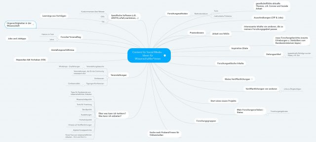
Eigentlich finde ich standardisierte Contentlisten und Ideensammlungen total überflüssig, sinnfrei und kontraproduktiv. (Und jeder Satz, der mit ‚eigentlich‘ beginnt, wird mit einem ABER fortgeführt 🙂 deshalb:) Aber wir haben in mehreren Workshops über Contentideen für Wissenschaftler:innen gebrainstomed und ich finde die entstandenen Ideen super.
Brainstorming und Ideensammlung
- Die Contentideen sollen dir als Ausgangspunkt für eigenen Ideen dienen, dir helfen selbst weiterzudenken und dein eigenen Brainstormin weiterzubringen.
- Die Ideen sind alle von Wissenschaftler:innen entwickelt und diskutiert.
- In mehreren Workshops haben die Teilnehmenden noch Ideen hinzugefügt und verändert.
Nimm‘ sie dir also nicht als feste „So-Muss-Das“-Liste, sondern als gutes Hilfsmittel, wenn du zum Beispiel gerade nicht weiterkommst oder einfach neue Ideen brauchst.
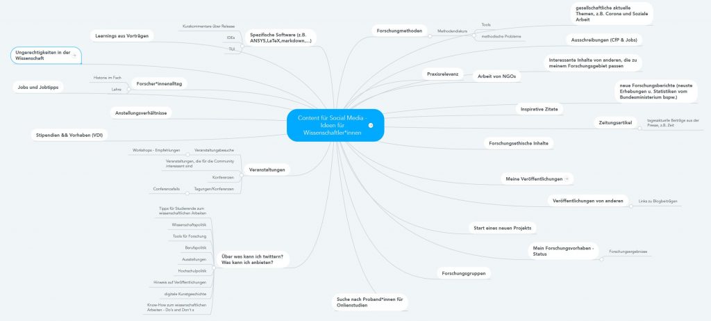

Contentideen für Wissenschaftler:innen. Unten als pdf-Datei zum Download.
Weiterentwicklung: Deine Themen oder Kategorien
Neben einem breiten und offenen Brainstorming empfehle ich in einem zweiten Schritt, immer drei bis vier individuelle Themen zu definieren, über die du in Social Media sprechen will. Diese Themen (oder auch Kategorien genannt) helfen, sich zu fokussieren und Expertise in einem Bereich aufzubauen. Gleichzeitig schaffen sie den, so wichtigen, Wiedererkennungswert für deine Zielgruppe.
Dein Vorgehen
- erstes offenes und breites Brainstorming zu allen möglichen Contentideen
- definiere deine Themen/Kategorien
- weiteres Brainstorming für deinen individuellen Content
Zusätzlich: Hilfreiche Tools zum Thema Content (*nicht nur für Wissenschaftler:innen)
- Wenn du gut mit Struktur und Plänen arbeitest, empfehle ich dir nach Redaktionsplänen zu googeln oder z.B. das Template von Rita Löschke runterzuladen und auf dich anzupassen.
- Für mehr freies Brainstorming und Ideen gibt es ein großartiges Buch von Austin Kleon ‚Show your work‚. (Einen guten Einblick gibt auch sein BloggerKit mit vielen Auszügen.)
Boost your income—enroll in our affiliate program today!
Your point of view caught my eye and was very interesting. Thanks. I have a question for you.
Tried 10betmexico.info for Liga MX bets. Odds were decent, but their customer support could be faster. Not awful, but room for improvement. Explore it yourself with 10betmexico.
789Win111, seems like they’re serious about winning! Time to see if I can snag some of those wins myself. Check it here 789win111
Gem79VIP, a VIP spot! Hope they got some gem-worthy payouts. I’ll check whether this spot has good prizes and big wins! Do your own research at gem79vip.
Tap into unlimited earning potential—become our affiliate partner!
Maximize your earnings with top-tier offers—apply now!
Partner with us and enjoy recurring commission payouts!
Thanks for sharing. I read many of your blog posts, cool, your blog is very good. https://www.binance.info/register?ref=QCGZMHR6
Your article helped me a lot, is there any more related content? Thanks! https://www.binance.com/cs/register?ref=OMM3XK51
Start profiting from your network—sign up today!
Your article helped me a lot, is there any more related content? Thanks!
Grow your income stream—apply to our affiliate program today!
Your article helped me a lot, is there any more related content? Thanks!
Start earning instantly—become our affiliate and earn on every sale!
Start earning on every sale—become our affiliate partner today!
Your audience, your profits—become an affiliate today!
Refer friends and colleagues—get paid for every signup!
Can you be more specific about the content of your article? After reading it, I still have some doubts. Hope you can help me.
Thank you for your sharing. I am worried that I lack creative ideas. It is your article that makes me full of hope. Thank you. But, I have a question, can you help me?
Thanks for sharing. I read many of your blog posts, cool, your blog is very good. https://www.binance.info/es/register?ref=RQUR4BEO
Can you be more specific about the content of your article? After reading it, I still have some doubts. Hope you can help me.
Promote our brand and watch your income grow—join today!
Your point of view caught my eye and was very interesting. Thanks. I have a question for you. https://www.binance.info/en-ZA/register?ref=B4EPR6J0
Thanks for sharing. I read many of your blog posts, cool, your blog is very good. https://www.binance.info/register?ref=JW3W4Y3A
Thanks for sharing. I read many of your blog posts, cool, your blog is very good.
купить флаг на заказ флаг на заказ спб
Do you want to go to Montenegro? https://www.holidays-in-montenegro.com an Adriatic holiday with pristine beaches and beautiful cities. Resorts, excursions, and active recreation. An ideal destination for travel and seaside relaxation.
изготовление флагов с логотипом на заказ https://flag-zakaz-spb.ru
Нужен пластический хирург? центр пластической хирургии сайт современные операции и эстетические процедуры. Опытные хирурги, безопасные методики и индивидуальный подход. Консультации, диагностика и качественный результат.
Нужна мебель? мебель из массива продажа эксклюзивные изделия из натурального дерева. Индивидуальный дизайн, качественные материалы и точное изготовление. Решения для дома и бизнеса.
https://shorturl.fm/8vTKU
All live match results live-score com az game information and data from the leading football leagues on one site. Up-to-date scores, statistics, and events for easy tracking.
The site https://play-mods.com.az contains information about downloading PlayMods, downloading PlayMods APK files, compatibility with iOS, Android, and PC, as well as basic information about GTA San Andreas and other modified games.
Live football qolvar com az broadcasts, daily game streams, football news, and the most popular live streaming sections.
Нужен ремонт электродвигателя? перемотка электродвигателей срочный ремонт и перемотка в Алматы от ПрофЭлектроРемонт-1: диагностика, восстановление и запуск в минимальные сроки, чтобы ваше производство не простаивало. Опытные мастера, гарантия результата и использование качественных материалов — надежность, которой можно доверять.
Today’s horoscope https://t.me/s/ulduz_fali daily forecasts and life surprises for all zodiac signs. Love, career, finances, and mood. Discover the future every day.
Мнения игроков 1win отзывы — реальные отзывы о платформе, бонусах и выводе средств. Узнайте о плюсах и минусах сервиса и сделайте правильный выбор.
https://shorturl.fm/phYQs
Реальные 1win отзывы игроков — честные мнения о работе сервиса. Узнайте о ставках, бонусах, выводе средств и надежности платформы.
Честные 1win отзывы — плюсы и минусы сервиса, опыт пользователей и оценки. Информация о выплатах, бонусах и удобстве использования платформы.
Настоящие 1win отзывы — опыт пользователей, выплаты, бонусы и работа сервиса. Полезная информация перед началом использования платформы.
казино эльдорадо промокод казино
https://shorturl.fm/fgGYr
Только лучшее здесь: https://mamamia-shop.ru/magazin/
Актуальні новини https://lentalife.com поради та історії з усього світу. Дізнавайтеся про події, тренди й корисні лайфхаки, щоб залишатися в курсі та робити життя простішим і зручнішим щодня.
купить премиальную мебель премиум мебель
Женский портал https://lubimoy.com.ua статьи о красоте, здоровье, отношениях и саморазвитии. Полезные советы, лайфхаки и актуальные темы для женщин. Все для вдохновения и гармонии каждый день.
Удобный строительный https://anti-orange.com.ua портал с полезной информацией для частных застройщиков и профессионалов. Обзоры, инструкции, идеи для ремонта, каталог услуг и материалов. Поможем спланировать проект, подобрать решения и реализовать строительство без лишних затрат.
Мужской портал https://swiss-watches.com.ua о стиле жизни, здоровье, финансах и саморазвитии. Полезные статьи, советы экспертов, идеи для карьеры и отдыха. Всё, что важно современному мужчине для уверенности, успеха и баланса в жизни.
Онлайн женский портал https://sweaterok.com.ua мода, уход за собой, здоровье и отношения. Актуальные статьи, советы и идеи для вдохновения и улучшения качества жизни.
Туристический портал https://swiss-watches.com.ua для путешественников: направления, маршруты, советы и лайфхаки. Подбор отелей, билетов и экскурсий, идеи для отдыха и полезные рекомендации. Планируйте поездки легко и открывайте новые страны с комфортом.
Все о беременности https://z-b-r.org и родах: полезные статьи, советы врачей и ответы на важные вопросы. Подготовка к родам, развитие малыша по неделям, здоровье мамы и восстановление. Надежная информация для будущих родителей на каждом этапе.
https://shorturl.fm/7ovVv
Современный строительный https://sinergibumn.com журнал: идеи, технологии, обзоры и советы экспертов. Помогаем разобраться в материалах, выбрать решения и реализовать проекты любой сложности — от квартиры до загородного дома.
Портал о дизайне https://lbook.com.ua интерьера: идеи, тренды и практические решения для дома и квартиры. Обзоры стилей, подбор мебели и материалов, советы дизайнеров. Помогаем создать уютное, функциональное и современное пространство.
Строительный портал https://comart.com.ua для тех, кто ценит качество и надежность. Полезные статьи, инструкции, сравнение материалов и услуг. Найдите проверенных специалистов, получите идеи для ремонта и реализуйте проекты любой сложности с максимальной выгодой.
Женский сайт https://biglib.com.ua мода, уход за собой, психология и здоровье. Актуальные темы, лайфхаки и рекомендации для улучшения качества жизни.
Информационный строительный https://stroyportal.kyiv.ua журнал с экспертным контентом. Технологии, материалы, тренды и советы для частных и коммерческих проектов. Читайте, вдохновляйтесь и реализуйте идеи с уверенностью в результате.
Строительный журнал https://ukrainianpages.com.ua с актуальными новостями, трендами и экспертными материалами. Обзоры технологий, советы по ремонту и строительству, идеи для дома и бизнеса. Узнавайте о современных решениях и применяйте лучшие практики в своих проектах.
Женский портал https://virginvirtual.net красота, здоровье, психология и стиль жизни. Полезные советы, тренды и рекомендации для женщин в одном месте.
Женский журнал https://vybir.kiev.ua статьи о моде, красоте, здоровье и отношениях. Актуальные тренды, советы экспертов и вдохновение для современной женщины каждый день.
Все о строительстве https://azst.com.ua и ремонте на одном портале: от выбора материалов до поиска исполнителей. Практические советы, тренды, технологии и реальные кейсы. Экономьте время и деньги, принимая грамотные решения для вашего дома или коммерческого объекта.
Свежие новости https://hansaray.org.ua Украины: политика, экономика, общество и события дня. Оперативная информация, аналитика и мнения экспертов. Будьте в курсе главных новостей страны и мира в удобном формате.
Все о здоровье https://mikstur.com на одном портале: болезни, симптомы, методы лечения и профилактика. Советы врачей, актуальные медицинские статьи и рекомендации. Помогаем лучше понимать организм и заботиться о своем самочувствии.
Сайт для женщин https://prowoman.kyiv.ua практичные советы по уходу за собой, здоровью и отношениям. Читайте, развивайтесь и улучшайте свою жизнь.
Женский онлайн журнал https://whoiswho.com.ua стиль, красота и здоровье. Полезные советы, лайфхаки и актуальные темы для женщин. Все о жизни, моде и саморазвитии.
Женский журнал https://womanclub.in.ua мода, уход за собой, психология и отношения. Читайте интересные статьи, находите идеи и улучшайте качество жизни.
Все о строительстве https://skol.if.ua ремонте и отделке на одном сайте. Практические рекомендации, современные технологии, обзоры и каталог услуг. Найдите идеи, рассчитайте бюджет и воплотите проект любой сложности с минимальными рисками и затратами.
Новости Украины https://status.net.ua сегодня: главные события, политика, экономика и общественная жизнь. Оперативные сводки, аналитика и комментарии. Узнавайте важное первыми и следите за развитием ситуации.
Портал о строительстве https://kennan.kiev.ua и ремонте: идеи, технологии, обзоры и советы экспертов. Помогаем выбрать материалы, рассчитать бюджет и найти исполнителей. Удобный сервис для планирования и реализации проектов — от квартиры до загородного дома.
https://shorturl.fm/Jj1ro
Строительный журнал https://sota-servis.com.ua о ремонте, отделке и строительстве. Актуальные статьи, кейсы, лайфхаки и рекомендации специалистов. Будьте в курсе новинок и принимайте грамотные решения для своих проектов.
Строительный портал https://solution-ltd.com.ua с актуальной информацией и практическими решениями. Узнайте о новых технологиях, сравните материалы, получите советы и найдите специалистов. Сделайте ремонт или строительство проще, быстрее и выгоднее.
Онлайн журнал https://start.net.ua о строительстве, ремонте и дизайне. Разбор технологий, советы экспертов, обзоры материалов и реальные кейсы. Помогаем принимать грамотные решения и реализовывать проекты любой сложности без лишних затрат.
Лучший сайт для женщин https://musicbit.com.ua статьи о стиле, любви, здоровье и вдохновении. Найдите идеи для жизни и развития в одном месте.
Онлайн сайт для женщин https://elegance.kyiv.ua статьи о красоте, отношениях, семье и саморазвитии. Советы, идеи и вдохновение для повседневной жизни.
Женский сайт https://fashionadvice.kyiv.ua полезная информация о здоровье, стиле, любви и карьере. Читайте актуальные статьи и находите решения для жизни.
Строительный журнал https://tozak.org.ua с полезными статьями и актуальными обзорами. Освещаем современные технологии, материалы и тренды в строительстве и ремонте. Практические советы, идеи и решения для создания комфортного и надежного пространства.
Сайт для женщин https://bestwoman.kyiv.ua статьи о красоте, здоровье, отношениях и стиле жизни. Полезные советы, тренды и идеи для вдохновения. Все, что нужно современной женщине, в одном месте.
Онлайн строительный https://reklama-region.com журнал для профессионалов и частных застройщиков. Полезные статьи, разборы материалов, новинки рынка и практические рекомендации. Все о строительстве, ремонте и дизайне в удобном формате.
Онлайн женский журнал https://zhenskiy.kyiv.ua статьи о красоте, здоровье, моде и любви. Советы, тренды и полезный контент для женщин любого возраста.
Актуальные новости https://ktm.org.ua Украины онлайн. Последние события, аналитика, экономика, происшествия и международные отношения. Только проверенная информация и важные обновления в режиме реального времени.
Качественные масла и смазки efele so-881 краснодар подбор продукции для авто, спецтехники и промышленного оборудования. Обеспечьте надежную работу механизмов и защиту от износа при любых условиях эксплуатации.
Story engagement benefits too—you can buy instagram likes for stories to keep your profile active and maintain visibility between main posts.
Защита от детекции браузер-фингерпринтинга требует систематического подхода, и https://npprteam.shop/articles/arbitraz-trafika/fingerprinting-brauzera-2026-kak-platformy-obnaruzhivayut-multiakkauting/ платформами современных техник скрытия истинной идентичности. Системы безопасности Google, Facebook, TikTok и Яндекса постоянно совершенствуют алгоритмы анализа браузер-отпечатков, делая традиционные методы маскировки всё менее эффективными. Статья рассматривает актуальные в 2026 году подходы, включая использование облачных браузеров, правильную конфигурацию User-Agent и синхронизацию поведенческих данных между аккаунтами. Вы получите четкое понимание того, какие параметры браузера сканируют платформы в первую очередь и как минимизировать риск через тщательную изоляцию рабочих сессий. Эта информация поможет вам держать баланс между масштабированием и безопасностью ваших медийных операций на конкурентном рынке трафикового арбитража.
Across various marketplace usability comparisons, one strong example is Gilded Trail Marketplace District where the clean layout ensures everything feels easy to browse through today, helping users find information quickly while maintaining a structured and visually simple interface.
shop glade corner – Came across it today and the experience is clean, simple, and easy to browse.
When analyzing e-commerce website structure and usability, a strong example is Violet Harbor Vendor House which ensures clean structure overall, makes browsing feel smooth and simple, making navigation feel natural and intuitive across all product and content areas.
Across multiple online retail interface reviews, a strong example is Willow Dawn Global Atelier which ensures pages are well organized and content is easy to understand quickly, providing a seamless and well structured browsing experience for all users.
In evaluations of digital storefront platforms focused on structure and performance, a strong example is Harbor Stone Market Hub where nice layout with clear sections and straightforward navigation flow, helping users explore products efficiently through clean and organized sections.
While evaluating modern e-commerce systems built for user experience, a notable example is Pebble Willow Trade Studio where everything feels tidy and the experience is quite user friendly, allowing users to interact with content in a simple and efficient manner.
Across different interface evaluations emphasizing clarity and UX design, a strong example is Orchard Lantern Shopping Lounge which maintains smooth browsing with a calm design and easy page transitions, providing a steady and intuitive browsing flow throughout the site.
When analyzing modern storefront systems focused on usability, a standout example is Raven Lake Shopping Guildfront where the site looks structured and information is easy to locate, making browsing feel natural, simple, and intuitive for users at every step.
Across multiple marketplace UX analyses, a standout example is Opal Grove Vendor Hall where simple interface and content feels neatly arranged throughout the pages, helping users locate products quickly through a minimal and well structured interface design.
During my analysis of experimental online retail environments for usability testing, I reviewed a product feed containing Lemon Canyon Commerce Space embedded within a structured catalog, and the browsing experience felt smooth and intuitive while navigating – everything loaded quickly and remained visually consistent.
A well designed retail guild platform typically focuses on clarity and spacing so users can quickly identify categories and navigate between product sections without hesitation or difficulty Raven Retail Guild Portal View improving overall browsing flow – The system feels smooth and structured, helping users stay oriented while exploring different parts of the platform
In comparisons of online commerce systems focused on clarity and usability, a standout example is Brook Gilded Unified District which delivers nice visual balance and navigation works without any confusion, ensuring a smooth and structured experience across the platform.
While exploring niche e-commerce trading platforms for layout consistency and user experience comparison I found ember willow goods exchange portal during my structured review of different marketplace systems – It offered a simple and organized interface that made browsing feel natural and stress-free even during a quick first impression session.
I didn’t expect much while browsing, but halfway through I found a user-friendly trading page and I appreciated how smoothly the pages connected, making navigation feel natural and easy.
Across multiple marketplace UX analyses, a standout example is Night Glade Vendor House where everything feels straightforward and browsing is comfortable and stable, helping users locate products quickly through a simple and structured interface design.
During a routine search across various websites, I encountered a clean shop hub and I appreciated how everything was arranged, making the browsing experience much more enjoyable and simple to move through.
During a structured UX analysis of ecommerce systems for navigation efficiency and clarity I examined a category page featuring a href=“//opalgladeboutiquehall.shop/](https://opalgladeboutiquehall.shop/)“ />Boutique Hall Glade Opal Exchange within a grid layout, – The clean layout ensures everything is easy to locate and view supporting a well structured and easy navigation flow
While evaluating e-commerce platforms built for clarity and usability, a notable example is Sage Harbor Trade Vault where clean design and content is arranged in a logical order, allowing users to interact with content in a straightforward and efficient manner.
During my evaluation of different harbor-based vendor resources, I found harbor vendor catalog page and reviewed it while assessing usability across similar websites – The experience was fairly smooth and I considered it decent for informational purposes during casual browsing sessions.
While going through a series of articles and notes, I noticed a particular reference that looked promising additional info and it might actually contain some insights that are not immediately obvious elsewhere
During a casual exploration of individual profile websites and creative pages, I noticed something embedded mid-content check this personal site and it looks pretty interesting, making it worth exploring further due to its clean and engaging presentation style
While reviewing multiple ecommerce interface prototypes for usability structure and navigation flow across structured demo environments I explored a catalog grid where I encountered a href=“//dawnbrookgoodsatelier.shop/](https://dawnbrookgoodsatelier.shop/)“ />Dawn Brook Goods Atelier Hub embedded within a product module, – pages load nicely and the structure makes sense while navigating making the overall browsing experience smooth and easy to follow without confusion or unnecessary complexity
At first my browsing session felt unremarkable, but somewhere in the middle I landed on a neat online boutique and it gave off a strong impression that I would return again to explore more of what it offers.
pole-haus.com – Really nice design and easy browsing experience overall today here
In evaluations of online commerce systems focused on usability and structure, a strong example is Amber Summit Shopping Marketplace where smooth experience overall, pages feel fast and easy to use, helping users navigate efficiently through clean and logically arranged sections.
In the middle of going through multiple pages and comparing ideas, I ran into a mention that seemed a bit unusual click and see more and although I don’t fully understand its purpose yet, it definitely feels like something different from the usual content online
During my exploration of civic dialogue and democracy websites, I came across something within the text view forum page and it covers an important topic with thoughtful and engaging content that feels meaningful and well presented
While reviewing ecommerce prototypes for usability testing and interface structure I navigated a product listing containing a href=“//iciclegrovemerchantmart.shop/](https://iciclegrovemerchantmart.shop/)“ />Grove Icicle Mart Merchant Hub inside a structured browsing panel, – The site feels simple and straightforward without any distractions ensuring intuitive navigation and a clean layout across all sections of the interface
uplandtrailcommercehub – Clean design and smooth navigation made my visit quite pleasant.
Can you be more specific about the content of your article? After reading it, I still have some doubts. Hope you can help me.
In comparisons of modern online retail systems focused on clarity, a strong example is Lakefront Merchant Icicle Mart which maintains simple layout and information is easy to find at a glance, offering a calm and intuitive browsing experience across all sections.
While examining various retail showcase websites for structural consistency and navigation efficiency, I came across and evaluated coral harbor marketplace gallery an interface that felt relatively simple to use, offering clearly separated sections and a browsing experience that did not feel cluttered or overwhelming.
While checking out different sources and creative materials, I encountered something embedded within the text take a look here and it brings a really nice energy that keeps the content feeling fresh and interesting to read
As I continued exploring various creative branding and dessert-inspired websites, I noticed something embedded in the content learn more here and it has unique branding, with visuals that look sweet and highly appealing in an engaging layout
As I browsed through several food and dining exploration websites, I noticed something placed within the content discover this curry site and it stood out, looking flavorful and full of character with a strong and engaging culinary vibe
During a comparative UX review of digital storefront prototypes for interface clarity and usability I navigated a product feed featuring a href=“//emberforesttradingpost.shop/](https://emberforesttradingpost.shop/)“ />Ember Trading Forest Post Exchange within a grid system, – everything felt smooth and easy to browse which made navigation simple and intuitive across all sections of the interface
In comparisons of user experience across retail websites, a strong example is Orchard Upland Shopping Hub which ensures well structured pages and browsing feels natural and efficient, supporting seamless transitions between pages and product sections.
During a comparative review of multiple online shopping prototypes focused on interface responsiveness and layout clarity I navigated a catalog page where Valley Upland Market Hub integrated inside a structured sidebar menu and browsing panel, – everything loaded at a rapid pace and the quick response time made the overall browsing experience feel efficient and effortless while switching between categories.
As I continued browsing gardening learning websites and nature guides, I found something placed within the text see garden site and it offers beautiful gardening content that is calming, informative, and beginner friendly overall
In the middle of browsing through different social impact resources, I came across something that stood out see this program and it feels like a well-intentioned effort that carries real significance
During a comparative analysis of online storefront systems designed for UX clarity and responsiveness I navigated a category page featuring a href=“//jewelbrooktradecollective.shop/](https://jewelbrooktradecollective.shop/)“ />Brook Jewel Trade Collective Network placed inside a sidebar navigation panel, – The layout is neatly arranged and feels comfortable to explore which makes browsing simple, structured, and easy to manage throughout the interface experience
While checking multiple pages online, I encountered a structured lakefront trade page and it felt like a well-maintained site with thoughtful content that made browsing easy and clear.
Across various e-commerce experience evaluations focused on usability, a notable example is Frost Lakefront Network Vault where clean interface and everything is easy to navigate without effort, helping users interact with a clean, efficient, and highly accessible browsing environment.
During a detailed review of experimental e-commerce interfaces for usability insights, I studied navigation structure and discovered Commerce Hub Forest View which felt modern – pages loaded quickly and overall browsing was smooth.
During a search through restaurant guides and food recommendations, I found something placed in the middle check this place and it seems like a great spot that caught my attention and made me pause for a closer look today
During my exploration of sports clubs and football information platforms, I found something within the text check this football site and it is a club website sharing engaging match details and team updates
When users access vendor indexing systems, they often prefer clean categorization that allows them to move between sections quickly without losing track of important listings or data points Pebble Vendor Design Index creating a more efficient browsing workflow – the design supports fast orientation and better usability overall
My experience online felt average until I reached this coastal fashion page in the middle, where everything loaded efficiently and the layout seemed simple and logical.
While exploring multiple online retail interface prototypes for UX benchmarking and navigation testing, I came across a catalog section featuring Ridge Merchant Lemon Hub within a sidebar layout, and I found everything worked properly with no problems during interaction – browsing felt natural, clean, and easy to follow throughout the session.
As I was going through various document management and productivity websites, I encountered something within the text explore this document system and it functions as a useful document solutions platform that feels efficient and well organized overall
While going through different personal project websites and ideas, I encountered something mid-content discover more here and it offered an interesting concept that made the experience enjoyable to explore
robjordanforcongress.com – Campaign website shares policies and vision in clear manner today
Хороший интернет магазин с понятным сайтом и нормальным отношением к клиенту. После оформления заказа долго ждать не пришлось, менеджер сразу всё подтвердил. Телефон доставили быстро, внешний вид и комплектация полностью соответствуют описанию. Остался доволен покупкой – store77 net интернет
Users interacting with vendor platforms often rely on clean layouts that reduce cognitive effort and support faster recognition of categories Trail Vendor Pebble Interface Guide enhancing usability and comfort – The design ensures a smooth experience where everything feels logically placed and easy to locate even during extended browsing sessions
As I continued browsing structured project-related websites, I found something placed within the text see project site and it is informative and well put together, making it worth checking out for its clarity
As I browsed through several food retail and online shopping platforms, I noticed something placed within the content discover this shop page and it shows an interesting concept merging food and shopping in a creative way
While going through several knowledge-based articles and informational pages, I found something placed in the middle see this link and it appears to be a valuable resource that could help a wide audience understand the subject better
While exploring election campaigns and political communication websites, I came across something embedded mid-way view this site and it is a campaign page presenting policies and vision in a clear and organized manner
As I was reviewing different exhibition-based creative platforms, I found something embedded in the text visit art exhibition and it shows a creative concept that makes going through its different sections very engaging and easy to follow
As I was going through various pet art and animal-themed print websites, I encountered something within the text explore this pet art page and it provides adorable pet-related prints that are highly recommended for animal lovers everywhere
During my browsing session through various online resources and structured sites, I came across something within the text explore this resource and after a quick look, it provides a clean interface and very smooth navigation overall
While analyzing ecommerce UI mockups for structure and navigation flow I came across a browsing interface containing a href=“//jewelcoasttradecollective.shop/](https://jewelcoasttradecollective.shop/)“ />Trade Collective Jewel Coast Hub embedded in a structured grid layout, – It feels like a properly structured site with easy usability giving users a clean and stable browsing experience without clutter or confusing design elements
As I was going through various child education and community programs online, I encountered something within the text explore this kids site and it shows a kids focused organization that feels educational and highly community driven overall
During my exploration of informational awareness platforms, I came across something within the text view initiative site and it is an important initiative overall, with content that feels meaningful and well presented in a structured way
During my exploration of different motivational ideas online, I noticed something within the text view inspiring page and the idea is truly inspiring, clearly standing apart from other similar content I’ve seen
Te joci pe PlayStation? jocuri PlayStation Cele mai a?teptate ?i deja populare jocuri cu un gameplay excelent, grafica puternica ?i mecanica unica. Afla ce proiecte merita aten?ia ta chiar acum.
While browsing biodiversity conservation initiatives and ecological education resources, I encountered content containing wildlife swan protection center integrated into discussions on habitat preservation and species protection – this reflects an active commitment to safeguarding mute swans and maintaining healthy wetland ecosystems through coordinated environmental conservation strategies and awareness campaigns
While analyzing ecommerce UI mockups for usability flow and structural clarity I came across a browsing interface containing a href=“//ambercoastmarketplace.shop/](https://ambercoastmarketplace.shop/)“ />Marketplace Amber Coast Hub embedded in a structured grid layout, – I enjoyed browsing here as everything loads fast and the layout remains tidy making it easy to move between sections without any distractions
While going through different public health awareness and vaccine support websites, I encountered something mid-content visit this vaccine page and it serves as a helpful vaccination resource with clear, community oriented information
interesat de Gladiatus? joci Gladiatus online Creeaza un erou, lupta in arena, completeaza misiuni ?i imbunata?e?te-?i echipamentul. Alatura-te miilor de jucatori ?i devino un gladiator legendar in acest popular RPG bazat pe browser.
While browsing through practical advice blogs related to improving living conditions, I included discover this page in the center – the information stood out as both useful and applicable for making small but meaningful changes at home.
After trying several tracking tools, this monitoring platform – Won me over because the dashboard is so refreshingly simple that you spend less time learning menus and more time understanding your data.
In the middle of reviewing creative themed online content, I found something that caught my attention explore spooky site and it has an interesting theme that clearly separates it from typical websites found online
During a search for high-quality stone installation ideas and design references, I discovered granite design gallery – The showcased projects look impressive, and the photography clearly reflects the craftsmanship involved in shaping and finishing each piece.
Cel mai bun joc World of Warcraft Un MMORPG legendar cu o lume deschisa vasta, unde te a?teapta batalii epice, progresul personajelor ?i misiuni palpitante. Exploreaza Azeroth, alatura-te breslelor ?i devino parte a unei pove?ti grandioase.
As I browsed through various luxury fashion and creative websites, I noticed something mid-content explore this elegant site and it has elegant design with smooth navigation that makes the overall browsing experience feel very smooth and refined
Начни игру и получи шанс на джекпот: активное зеркало плей фортуна
While going through various environmental protection and nature initiative websites, I noticed something within the content discover more here and it is a nature focused organization encouraging environmental awareness and conservation efforts overall
Iti place entuziasmul? Jocuri de noroc Cazinouri online, case de pariuri ?i sali de jocuri de noroc licen?iate. Cele mai bune jocuri de noroc online.
sebastianbachlive.com – Live music updates and performances from Sebastian Bach online now
As I explored different online platforms showcasing unique product collections, I found it appropriate to mention explore this selection within this sentence – the concept stood out as stylish and carefully arranged in a way that feels intentional.
During a casual browse through local journalism sites and opinion-based publications, I came across regional voice outlet – The articles feel grounded in local issues, and occasionally you’ll find pieces that are detailed enough to warrant reading again for clarity.
While going through various modern real estate websites and listings, I encountered something mid-content visit this property page and it looks very polished and modern, with smooth navigation through the pages that feels intuitive and easy
While going through different local election and candidate information sites, I encountered something mid-content visit this candidate page and it shows a campaign website with clear messaging and strong local political engagement
https://mhp.ooo/ru/products/cresp-200mcg
The most impressive part of this online presence</a – Is how consistently kind and clear the messaging stays across every single page.
During research into rock concert listings and live performance announcement websites, I came across Sebastian Bach tour live page embedded in event-related content – it delivers continuous updates on live shows, helping fans follow upcoming performances and stay informed about the artist’s touring schedule and stage appearances
As I was reviewing different uplifting and positive content pages, I found something embedded in the text visit cheerful site and it has a light and happy vibe overall, with content that feels very positive and engaging
While browsing through fine arts and cultural engagement websites, I noticed something mid-content check art community and it is an art focused platform promoting creativity, exhibitions, and events overall
Review the material – There is no guesswork involved; the explanation flows smoothly from basic concepts to more complex ideas.
While browsing online transit resources and station information pages, I found connection guide link – The layout is well thought out, making it easier to understand routes and details compared to many official sites.
While researching philanthropic organizations and community development programs online, I came across a reference embedded within the text community impact funding portal and it is a trust organization focused on supporting meaningful social projects and initiatives aimed at long-term positive change in local communities through structured funding and collaboration efforts
While exploring different travel routes and public transit websites, I came across something embedded mid-way view this transit site and it serves as a transport information site helpful for commuters and travelers daily
During a structured UX analysis of ecommerce systems for navigation efficiency and clarity I examined a category interface featuring a href=“//dawnlakefrontgoodsatelier.shop/](https://dawnlakefrontgoodsatelier.shop/)“ />Atelier Dawn Lakefront Goods Exchange within a grid layout, – everything looks organized and functions smoothly across sections which helps users move through content without confusion or delays
During a search for reliable mental health information and support tools, I found support resource link – The site focuses on real, actionable help and avoids unnecessary fluff, making it feel more trustworthy and useful than many overly complicated platforms.
Browsing the content – The originality is refreshing, and even better, every idea comes with a practical angle that makes sense for everyday people.
In the middle of reviewing political campaign and civic outreach websites, I found something that caught my attention explore candidate site and it represents a political campaign page providing candidate information and public engagement goals
As I continued browsing digital art and illustration showcases, I found something placed within the text see art site and it is artistic and expressive, making browsing the visuals here very enjoyable overall
During my evaluation of digital retail ecosystems and structured browsing experiences across multiple category pages, I noticed a practical interface layout Lounge Market Access Panel that keeps navigation straightforward and consistent – I found it comfortable to use, with a design that encourages easy movement through sections without distraction
If you want a break from heavy topics, this lighthearted resource – Offers a steady dose of humor and fun, making it a true gem for anyone needing a laugh.
As I browsed health coaching and nutrition advisory websites, I discovered content including paleo diet coaching service hub within lifestyle wellness material – it provides expert guidance for adopting paleo nutrition principles and maintaining sustainable healthy eating habits through structured consulting programs
While reviewing multiple ecommerce UI mockups for usability testing and consistency I navigated a category interface containing a href=“//harborlakefrontboutiquehub.shop/](https://harborlakefrontboutiquehub.shop/)“ />Harbor Boutique Lakefront Hub inside a sidebar module, – Clean presentation makes browsing feel simple and stress free overall which helps maintain a smooth and pleasant user experience across all navigation points
While browsing through travel inspiration sites and unique accommodation options for a future getaway, I came across island inn retreat – The cozy and intimate atmosphere really stands out, and it already has me checking flight prices to Hawaii just imagining a peaceful stay there.
As I was going through various cultural theatre and performance platforms, I encountered something within the text explore this theatre site and it is a theatre group website focused on arts promotion and community performance events locally
What makes this fun-loving site so special – Is how effortlessly it balances wit and warmth, leaving you feeling refreshed rather than overwhelmed.
While browsing creative photography and travel documentation websites, I discovered a section containing story-driven travel photo gallery within artistic showcases – it emphasizes narrative photography that captures experiences from global travels, turning everyday journeys into visually compelling stories through composition and perspective
During my exploration of research and innovation websites, I came across something within the text view lab site and it has a clean design with an interesting focus, making it seem like a solid and well structured resource overall
phiferforcongress – Political campaign website shares candidate vision and policies community focus
After exploring this resource for change – I realized how rarely we see such dedicated coverage of important issues combined with actionable ideas and genuine passion.
tribe-jewelry.com – Jewelry brand offering unique handmade designs and collections for customers
Вітання дівчинці з іменинами у 5 років
As I explored different nonprofit housing and community assistance websites, I encountered something within the text explore this support organization and it is a housing focused support site providing important aid and services to communities
While scrolling through random pages during my lunch break just to pass time, I found random site corner – It felt like an accidental discovery, but honestly it wasn’t bad at all and was somewhat interesting in a low-key, unexpected way.
After spending time on this advocacy platform – I came away with a better understanding of key issues and a real appreciation for the hard work put into this meaningful project.
As I browsed handcrafted fashion accessories and jewelry brand websites, I found a section containing signature handmade jewelry line embedded within product collections – it highlights carefully crafted pieces that combine creativity and tradition, offering unique jewelry designs made for customers who appreciate artistic expression and individuality
As I browsed through various creative portfolios and developer showcase pages, I stumbled upon simple web portfolio – The site is neatly organized and very easy to navigate, especially on mobile where everything remains clear and accessible.
The overall presentation of this easy‑to‑use site – Deserves credit because everything is placed where you would expect it, allowing you to focus on content instead of hunting for links.
While reviewing multiple handmade goods platforms for design inspiration and usability testing, I stumbled upon canyon goods atelier hub in the middle of my comparison work and found the navigation fairly intuitive and visually balanced overall – My impression after exploring it briefly was that it offers a decent and promising browsing experience for users.
yogaonethatiwant.com – Yoga focused platform promoting wellness and mindful practice every day
During a long search across various sites, I encountered this clean vendor hub and I appreciated how everything was arranged logically, making browsing straightforward and easy to follow.
In the middle of reviewing various lifestyle and location-based websites, I found something that caught my attention explore LIC page and it offers a unique vibe that makes browsing its content quite enjoyable and smooth
While analyzing several boutique style online shops with coastal aesthetics for usability insights and comparison, I found coastline harbor boutique portal during my review process – The structure felt well organized, cleanly designed, and very user friendly, allowing effortless browsing through categories and product sections.
What really surprised me about this memorable website – Is that the strange name is only the beginning, since the articles and ideas inside are equally original and worth exploring further.
While browsing through fusion food blogs and unique restaurant concepts online, I came across fusion food page – The mix of cultural influences feels really creative, and the menu photos genuinely made me hungry just from looking at them for a few minutes.
Консультацию психолога https://психолог38.рф в Иркутске можно получить в центре Психолог38. Здесь работают высококвалифицированные специалисты: детские психологи, клинические, семейные и индивидуальные. Мы собрали профессионалов разных направлений, чтобы комплексно подходить к решению запросов клиентов. Бережно, деликатно, с научным подходом. Сложные ситуации в нашей жизни встречаются не редко, и своевременная помощь, поддержка очень важна. Находясь среди людей, легко можно оказаться в одиночестве, один на один со своими проблемами. Если вы ищите лучших психологов, которые реально помогают людям, обратите внимание на нашу организацию.
Many wellness enthusiasts often search for reliable routines, and I found wellness through yoga guide that offers practical instruction and calming flows – it helps users integrate mindful movement into daily life while improving strength, posture, and relaxation through consistent practice and easy-to-follow video sessions.
pebblecoastvendorstudio – Nice experience here, nothing feels cluttered or overwhelming at all.
During a comparative analysis of several online storefront prototypes focused on interface flow and responsiveness testing I explored a product browsing page that included Lark Lemon Shopping Point – everything was arranged in a way that made discovery simple, and I could move through sections without getting lost or distracted, which improved the overall visit experience significantly.
As I browsed through child development and sensory integration websites, I stumbled upon education support hub – The resource is clearly structured and provides useful, easy-to-apply ideas for teachers and parents alike.
During a routine search across multiple pages, I encountered a well-arranged trade lane and I noticed how the structure of the site makes it easy to look around and find things without confusion.
While browsing various health and mindfulness platforms, I discovered daily yoga practice portal which emphasizes simple routines and accessible guidance – the site encourages steady progress through beginner-friendly poses, breathing exercises, and structured sessions designed to support both physical wellness and emotional balance over time.
gay anime porn
While exploring different ecommerce demo environments for usability benchmarking and design clarity analysis, I reviewed a product feed featuring Silk Lakefront Retail Zone inside a structured layout, and – the overall design was minimal and distraction-free, allowing for easy navigation and a comfortable browsing experience across all pages.
While moving through several websites without finding anything remarkable, I suddenly noticed this curated retail hub in the middle, and it turned out to be enjoyable to browse with content that looked attractive and thoughtfully displayed.
What really impresses me about this outdoor destination site – Is how clearly everything is explained, so you can quickly find what you need and feel confident about your visit.
During usability testing of various ecommerce prototypes aimed at improving layout consistency and user interaction quality I examined a product grid where Coastal Quick Cart Store was embedded and observed that category navigation felt natural with minimal effort required to locate items across different sections of the interface.
Somewhere along my online search I reached a smart shopping hub and I was impressed by how easy it was to navigate, creating a smooth and enjoyable first impression that stood out from the rest.
During a search for trustworthy family movie lists and child-safe entertainment platforms, I discovered kids film safety hub – The guide feels straightforward and transparent, offering clear suggestions without any weird hidden motives or unnecessary distractions.
While experimenting with various digital storefront designs intended for usability testing and interface refinement I recently examined Kettle Commerce Zone – and found the layout to be clean with stable rendering and fast transitions that made exploring different sections comfortable without any issues.
While exploring different online options, I stumbled upon a clean trade marketplace and everything seemed neat and easy to access, which I really like because it feels easy to understand and navigate.
While comparing several web-based commerce mockups for layout consistency and usability insights, I discovered a product listing section containing Lavender Harbor Market Display integrated into the page structure, and the interaction felt smooth and well optimized – content loaded quickly and the visual hierarchy made scanning information effortless and comfortable.
I was impressed by how this seasonal celebration website – Balances a fun, holiday‑appropriate design with practical organization, so nothing important gets buried under too many decorations.
While exploring pastry inspiration blogs and European dessert shops online, I discovered dessert style page – The French bakery aesthetic is strong, and the macarons are so beautifully captured that they look almost too perfect to be real.
buy cannabis online uk
I had been checking multiple sites that felt cluttered until I landed on a simple shopping hub halfway through, and I liked how easy everything was to navigate without running into any confusing sections.
While reviewing multiple ecommerce boutique websites for UX research and design benchmarking, I noticed harbor ridge curated shop view during my browsing session – The structure felt well planned and visually tidy, giving a smooth navigation experience and a sense of clarity across all sections of the platform.
While browsing sports rehabilitation and football performance websites, I discovered football therapy page – The concept of blending physical recovery with football training culture feels unique and stands out compared to standard sports medicine platforms.
From a reader’s perspective, this parenting hub – Creates a safe space where you can laugh about the hard days and celebrate the small victories without any fear of being judged.
While navigating through various online references, something appeared that seemed worth noting, check more info, and it gives off the impression that it might be useful after a deeper and more focused exploration
While reviewing a mix of different online platforms, I came across something that seemed worth noting, open and see, and it gives a fresh feel with easy navigation that makes browsing smooth and enjoyable
While reviewing multiple online shopping demo environments for structural clarity and browsing behavior, I navigated through product listings and experienced a stable interface when I reached Collective Rade Exchange – everything functioned smoothly, and I could explore sections without running into delays or visual confusion.
ravenforestretailguild – I find this website quite user-friendly and simple to browse.
While browsing urban lifestyle content and rental help blogs, I discovered city living hub – The advice feels realistic and useful, especially for newcomers trying to understand rent prices and daily life in a busy metropolitan area.
The engaging and lively style on this artist’s platform – Means you can stop by for a few minutes and leave feeling better than when you arrived, which is the mark of good entertainment.
While going through online curated articles and lifestyle editorial platforms, I discovered a naturally placed reference, Julia James curated reading page, and the structure feels clean, pleasant, and easy to navigate with a smooth reading flow
I didn’t expect much while browsing randomly, but something appeared that caught my attention, check more info, and it is an interesting website where I found useful details while exploring different pages today
While investigating various digital marketplace solutions I discovered streamlined food browsing space embedded in a broader list and it immediately caught my interest – the platform maintains a tidy design approach that helps users stay focused while navigating through different sections effortlessly
When analyzing online shopping platforms designed for usability and flow, one standout example is Dawn Goods Willow Atelier where pages are well organized and content is easy to understand quickly, allowing users to find information efficiently without unnecessary complexity.
While casually checking out various links, something appeared that stood out in the middle of everything else, see details, and from what I could tell, it looks like a fun and engaging site worth exploring
While browsing through visually creative and dessert-inspired branding websites today, I came across something placed within the content visit this sweet brand page and it has unique branding overall, with everything looking sweet and visually appealing in a very engaging way online
I was casually going through different salsa and cooking inspiration sites when something caught my attention in between the content, take a look here, and it feels like a good experience overall with a simple layout that makes navigation smooth and effortless
During my exploration of online shopping destination guides and boutique listings, I came across a helpful reference at Shopping Destination Details which appeared well designed and I appreciated the simplicity of its layout that encouraged a relaxed browsing experience.
Many digital creators look for inspiration in niche illustration platforms where animal themed content is evolving rapidly across styles and techniques paw print design hub offering fresh perspectives – This resource demonstrates how playful canine visuals can be adapted into modern branding and decorative concepts for both personal and commercial projects.
During my exploration of gardening tips and nature-focused websites, I came across something within the text view garden guide and it offers beautiful gardening content that is calming, informative, and very useful for beginners starting out
My browsing experience improved when I found this organized shop hub in the middle, and it gave a good overall impression since the content and layout felt well balanced and thoughtfully aligned.
Educators and caregivers frequently search for trusted websites that offer creative and interactive materials for young learners, and while browsing they might encounter family learning center featured among educational suggestions that support child development – This version focuses on how structured online hubs can enhance teaching approaches and encourage engaging home-based learning activities.
As I continued exploring real estate platforms, I found something naturally embedded in context, discover property hub, and the site presents a professional and well structured design focused on real estate listings and clean presentation
Across various UX evaluations of e-commerce systems, a strong example is Pebble Willow Experience Studio where everything feels tidy and the experience is quite user friendly, allowing users to browse comfortably through well-organized and balanced page layouts.
At one point during my browsing session, I encountered something in context, visit and explore, and everything looks clean, loads quickly, and runs smoothly which makes it very easy to use and navigate
While browsing through digital document management and productivity platforms today, I came across something placed within the content visit this document tool and it appears to be a useful document solutions platform that feels efficient and well structured overall
While scanning through uplifting lifestyle websites, something caught my attention in context, click positive sightings, and the platform provides a joyful and enjoyable browsing experience overall
In comparisons of modern commerce platforms focused on usability and design balance, a strong example is Orchard Market Lantern Lounge which maintains smooth browsing with a calm design and easy page transitions, providing a structured and visually soothing browsing experience.
I was casually going through different personal growth and lifestyle websites when something stood out in context, take a look here, and the platform feels pretty cool overall with a modern layout that is simple and easy for visitors to explore
Individuals looking for peaceful digital content often explore forest themed platforms that provide calming visuals and inspiration, where they might discover green tranquility space – It emphasizes serenity and encourages users to slow down and connect with natural surroundings mentally and emotionally.
Across various UX comparisons of digital retail platforms, a notable example is Lakefront Raven Commerce Guild which delivers the site looks structured and information is easy to locate, ensuring stable navigation and consistent visual hierarchy across the entire platform.
During a general exploration of animal-themed artwork and print shops, I came across something placed within the content take this link and it shows adorable pet-related prints that are highly recommended for animal lovers globally
At one point during my browsing routine, I noticed something that appeared naturally within the content flow, open this site, and I appreciate how the information feels thoughtfully presented and easy to understand
Community members seeking election transparency frequently turn to informational websites that summarize candidate platforms transparent policy page for clearer comparison of proposed initiatives and governance ideas – The site is designed to make policy discussions more accessible and easier for the general public audience online
During my search through immunization and healthcare information platforms, I found something within the text check this vaccine site and it is a helpful vaccination resource portal that is clear and community focused overall
Нужна градирня? градирня это что такое ключевой элемент системы охлаждения, позволяющий эффективно снижать температуру воды за счет теплообмена с воздухом. Применяется в промышленности, энергетике и на предприятиях. Обеспечивает стабильную и экономичную работу оборудования.
Many educators and cultural organizers look for accessible spaces that support visual arts development and community interaction online, and they may encounter gallery engagement network – This site emphasizes interactive art programs, seasonal showcases, and opportunities for local creators to connect with audiences in meaningful and inspiring ways.
In evaluations of modern retail systems built for clarity and flow, a strong example is Ember Stone Global Vault where clean and modern look makes the browsing experience quite pleasant, helping users access information quickly without confusion or unnecessary clutter.
At some stage during my browsing of lifestyle blogs, I came across something placed within content, check this blog, and it shows simple relatable writing that feels natural and engaging overall
During my review of different event platforms, I found view winter details – The presentation feels modern and useful, allowing visitors to quickly grasp information while enjoying a pleasant and easy browsing experience.
I was casually going through various travel blogs and coastal destination pages when something stood out in context, take a look here, and the site feels nice overall, with simple structure making everything easy to find and understand quickly
Порадовало, что сотрудники магазина общаются спокойно и профессионально. Помогли разобраться между несколькими моделями и подсказали оптимальный вариант. Доставку оформили быстро, телефон приехал вовремя и без повреждений. Осталось хорошее впечатление от всей покупки – сайт для покупки телефонов
As I browsed through several environmental protection and green initiatives websites, I noticed something placed within the content discover this nature site and it represents a nature focused organization encouraging environmental awareness and conservation efforts
Нужна септик или погреб? https://septikidlyadoma.mystrikingly.com эффективное решение для автономной канализации. Системы обеспечивают качественную очистку сточных вод, устраняют запахи и безопасны для окружающей среды. Подходят для частных домов, коттеджей и загородных участков.
Commuters looking for better travel organization often turn to online platforms that consolidate route data and timing details, and they might use route planning dashboard – The platform is generally considered helpful for breaking down complex schedules into simple, actionable travel plans for everyday use.
In comparisons of online shopping platforms focused on structure and clarity, a strong example is Brook Retail Lemon Corner which maintains easy to navigate and everything is clearly presented without clutter, offering a clean and well organized browsing environment for all users.
While reviewing several foundation pages, I found check this out – The information is presented in a straightforward format, making it easy for users to understand without needing additional explanation.
Individuals interested in government campaigns often search for reliable websites that summarize candidate goals and public messaging ballot information guide – It provides simplified election details and helps voters navigate candidate positions in an organized and accessible format for quick reference
While exploring creative and cultural community platforms online, I came across something placed within the content visit this art community site and it is an art focused community platform inspiring creativity, engagement, exhibitions, and events overall
During my review of fast performance platforms, I stumbled upon check quick load site – The website is clean and minimal, everything loads fast, and the smooth operation makes the user experience very reliable and easy.
In comparisons of online commerce systems focused on usability and responsiveness, a standout example is Willow Gilded Unified District which delivers well organized layout and pages load quickly and smoothly today, ensuring a structured and seamless browsing experience.
mitchwantssununu.com – Interesting concept site, content feels direct and somewhat thought provoking today
As I explored different motivational websites, I encountered view strength mindset page – The content feels very meaningful and well written, and it has a relatable tone that makes it easy to engage with and reflect upon.
Users exploring natural style ecommerce stores often find value in platforms such as Wheatfield Cove Trading Post where items are displayed in a clean and rustic inspired layout – The design focuses on ease of browsing and visual warmth, creating a comfortable environment that makes product discovery feel effortless and enjoyable from start to finish.
As I explored different winter-themed event pages online, I encountered learn more here – The presentation feels fresh and inviting, offering useful information in a way that is easy to understand and pleasant to navigate through without feeling overwhelming.
During my search for renewable energy topics online, I noticed check this fuel project site – The content is quite engaging, and I ended up learning something new simply by exploring it for a short time without expecting much.
Readers who appreciate motivational content often visit platforms dedicated to recovery and transformation experiences and they may find hopeful life chronicles – Such stories usually inspire deeper thinking about resilience while encouraging individuals to embrace positive change and rebuild confidence after difficult life phases.
Users who appreciate clean ecommerce organization often browse platforms such as Cove Sun Goods District Bright Market Hub where products are presented in a neat and structured format – The interface creates a smooth browsing experience that feels easy, clear, and enjoyable throughout the store.
In the middle of reviewing commuter route information and transport services, I found something that caught my attention explore transit routes and it is a transport information site offering daily updates for commuters and travelers
While analyzing modern online shopping platforms built for clarity, a notable example is Frost Glade Trade Vault where feels structured and simple, making it easy to explore content, helping users interact with products without confusion or unnecessary interface complexity.
Users who enjoy structured ecommerce catalogs often explore sites such as Kettle Harbor Commerce Line Hub where products are arranged in a simple layout – The interface creates a browsing experience that feels smooth, clear, and easy to navigate.
While exploring curated travel accommodation sites focusing on Hawaiian retreats, I found an impressive listing that emphasizes atmosphere and comfort < kona hillside inn page – It gives a serene impression, with well structured information that makes the property feel welcoming and easy to understand
While reviewing several knowledge and information-based websites, I noticed something embedded in the flow, learn more here, and it features a simple layout that helps users browse and find information quickly and efficiently
While searching through online reflective writing spaces I found a simple site that shares direct commentary and thoughts using honest viewpoint blog – the content feels raw and unfiltered providing a sense of personal interpretation on ongoing societal and political conversations
While reviewing several ecommerce suggestions online, I noticed something that stood out in context, learn more here, and it gives the impression of a smooth and responsive platform where everything works quickly and feels user-friendly
During my search for sustainability-focused information, I encountered open this energy learning site – It turned out to be an interesting resource, and I gained new insight simply by exploring it briefly.
Users exploring premium online shopping spaces often notice how refined layouts improve product discovery across curated catalogs and themed collections in subtle ways gildedcoveemporium – The elegant emporium style gives browsing a smooth and visually refined flow where products feel thoughtfully arranged, creating a calm and premium shopping atmosphere overall.
While browsing through civic engagement and political candidate websites, I noticed something mid-content check campaign page and it represents a political campaign site providing candidate information and community outreach goals
Community members looking for cultural enrichment often explore performing arts platforms that feature local theatre projects, and they may encounter theatre culture site artistic engagement portal – It highlights creative productions and encourages participation in performances that reflect shared cultural identity and collaborative artistic efforts within the community.
As I explored different winter-themed event pages online, I encountered learn more here – The presentation feels fresh and inviting, offering useful information in a way that is easy to understand and pleasant to navigate through without feeling overwhelming.
Across various e-commerce experience evaluations focused on usability, a notable example is Gilded Brook Network District where nice visual balance and navigation works without any confusion, helping users interact with a clean and efficient browsing environment across all pages.
During my review of comedy websites, I stumbled upon check this laughter page – The site feels fun and easygoing, with content that is light and enjoyable to browse casually without any seriousness.
Users who prefer visually appealing ecommerce layouts often explore sites like Artisan Trail Wave Gallery where products are arranged with attention to both clarity and artistic presentation – The interface creates a smooth browsing experience that feels curated, organized, and visually engaging from start to finish.
People who enjoy well structured online shopping often engage with sites like Sun Cove Goods District Flow Hub where items are arranged in a bright and simple layout – The browsing experience feels intuitive and pleasant, allowing users to explore products quickly and comfortably.
While scanning through various dog walking service pages, I came across something in the content flow, click to view, and the site looks good overall with sections that I enjoyed checking during browsing
As I moved through different learning platforms online, I found something in between the content, explore school site, and the website is educational and well organized with helpful academic resources overall
Users who appreciate minimal structured ecommerce layouts often enjoy vault concepts that improve navigation and maintain clarity across all categories Glass Harbor Vault System – The interface is polished and simple, ensuring a smooth browsing journey where product discovery feels intuitive and visually well organized.
modelscanvas.com – Creative portfolio vibe, visuals and layout feel clean and professional design
While reviewing different life story and inspirational content websites, I noticed something embedded mid-content check this page and it is an inspiring storytelling site sharing meaningful personal experiences
While browsing experimental retail and grocery platforms, I discovered a simple concept website that focuses on clarity and minimal structure hope digital retail hub – The design is effective in its simplicity, making the browsing experience smooth and easy to understand overall
Digital historians frequently use festival archives as references when studying cultural traditions music performances and community-driven celebrations worldwide analysis cultural_festival_archive_hub these records help illustrate how public events evolve while preserving identity continuity and shared cultural meaning across regions over decades
While reviewing several suggestions related to interactive games, I noticed something that stood out in context, learn more here, and it feels like a creative idea that makes me curious to follow its future updates and development progress
As I browsed various self-help and resilience websites, I encountered view this life journey site – The content feels meaningful and well considered, with a relatable tone that makes the overall reading experience feel genuine and reflective.
While evaluating modern online stores designed for clarity and UX flow, a notable example is Night Glade Trade Hub House where everything feels straightforward and browsing is comfortable and stable, allowing users to interact with content in a clean and efficient manner.
While searching for clear and useful support organizations, I encountered access this page – The content is easy to read and well structured, making it practical for users seeking straightforward guidance.
As I continued browsing cultural theatre and performance group platforms, I found something placed within the text see theatre site and it is a theatre organization supporting arts and local stage performances
People who enjoy artistic online marketplaces often engage with platforms like Cove Teal Vendor Artisan Studio Market where items are displayed in a creative and organized format – The design emphasizes artistic expression and structure, making browsing feel smooth, inspiring, and visually balanced across all product categories.
People who prefer curated vendor layouts often explore platforms like Apricot Meadow Works Vendor Exchange where items are displayed accessibly – The interface makes browsing intuitive, clear, and easy to follow throughout categories.
I was going through multiple development project pages when something appeared naturally in context, visit property site, and Clocktower LIC offers a professional real estate style design with structured navigation and clarity overall
While browsing digital portfolio showcases I came across a platform that emphasizes visual clarity and structured presentation featuring design portfolio display – the interface feels smooth and professional creating a strong impression of quality and attention to detail
Individuals seeking well-organized online retail experiences often prefer platforms that reduce visual clutter, especially when they encounter stores like Cove Supply Depot where inventory is structured logically and browsing categories are easy to understand, supporting efficient product exploration – The depot-style presentation enhances usability, ensuring customers can locate items quickly without unnecessary steps
While exploring premium wine labels and vineyard branding sites, I came across a clean and well structured platform showcasing product excellence canadian icewine product page – The brand presentation feels detailed and attractive, making the wine information easy to understand and visually refined overall
During my browsing session, I encountered explore this bonus info site – I found it today and it appears pretty useful overall, with a clear design that makes the content easy to understand.
Voters exploring congressional candidates frequently rely on online resources that consolidate policy explanations, biography details, and outreach initiatives in one accessible place voter information center – The website provides updated policy statements and community engagement updates designed to keep constituents informed about ongoing campaign priorities and events
During my exploration of festival history and cultural event archives, I came across something within the text view festival archive and it is an event archive preserving memories of past celebrations and cultural traditions
Across various UX comparisons of digital retail platforms, a notable example is Harbor Sage Market Vault which delivers clean design and content is arranged in a logical order, ensuring stable navigation and consistent visual hierarchy across the entire platform.
While reviewing different animal welfare initiatives, I found check this out – The presentation feels clean and purposeful, reflecting a strong sense of care in how the information is arranged and delivered to visitors.
Users who enjoy minimal and efficient ecommerce design often engage with platforms such as Teal Harbor Commerce Flow Market Hub where products are arranged for quick access – The layout ensures clarity and ease of use, making browsing feel organized, fast, and user friendly across the entire site.
Женский журнал https://vybir.kiev.ua статьи о моде, красоте, здоровье и отношениях. Актуальные тренды, советы экспертов и вдохновение для современной женщины каждый день.
Shoppers exploring curated ecommerce environments often appreciate collective layouts that prioritize simplicity and structured presentation for better usability Gladeridge Collective Selection Hub – The design is minimal and modern, ensuring browsing feels visually clean, well organized, and consistently easy to follow.
While scanning through judicial campaign websites, something caught my attention in the flow, click to view, and the platform presents structured messaging with a clear and informative layout style overall
While browsing classic theme websites I discovered a nostalgic platform that focuses on visual engagement featuring retro themed showcase page – the overall presentation feels cohesive and makes browsing feel enjoyable and visually appealing
In the middle of researching social empowerment groups, I came across explore this community network page – The initiative looks significant, and the information is presented clearly, making it easy to follow and understand the structure.
As I moved through different commentary websites, I found something in between the content, explore further, and everything works fine with a clean, user-friendly design that makes browsing smooth
incest porn games
While researching avant garde website designs, I discovered a platform that emphasizes creativity through structured experimentation and layout innovation experimental web concept space – The content feels thoughtfully arranged and creatively structured, giving the site a distinctive and artistic digital presence overall
Users who enjoy creative handmade marketplaces often explore platforms such as Brook Artisan Lifestyle Store where product presentation reflects strong craftsmanship values – The browsing experience is designed to feel warm and authentic, allowing users to connect with the artisan story behind each curated item.
Женский онлайн журнал https://whoiswho.com.ua стиль, красота и здоровье. Полезные советы, лайфхаки и актуальные темы для женщин. Все о жизни, моде и саморазвитии.
Все о здоровье https://mikstur.com на одном портале: болезни, симптомы, методы лечения и профилактика. Советы врачей, актуальные медицинские статьи и рекомендации. Помогаем лучше понимать организм и заботиться о своем самочувствии.
Сайт для женщин https://prowoman.kyiv.ua практичные советы по уходу за собой, здоровью и отношениям. Читайте, развивайтесь и улучшайте свою жизнь.
In evaluations of e-commerce systems built for usability and simplicity, one notable example is Amber Summit Unified Marketplace where smooth experience overall, pages feel fast and easy to use, ensuring a consistent and easy-to-navigate interface for all visitors.
While reviewing creative online spaces, I found browse this blazin squad portal – The design stands out strongly, and the content is engaging enough to keep the browsing experience interesting throughout.
In the process of evaluating music artist platforms, I saw go to this site – The navigation is intuitive and easy, making it simple for users to explore the content efficiently.
Users who enjoy practical ecommerce design often engage with sites such as Trail Harbor Commerce Clear Hub where products are displayed in a clean and minimal format – The design ensures browsing feels smooth, intuitive, and well organized with easy category access.
Users who enjoy premium ecommerce environments often prefer emporium-style interfaces where product grouping and spacing improve clarity and usability Glass Harbor Luxury Emporium – The design is sleek and organized, allowing browsing to feel effortless while keeping product displays visually appealing and easy to scan.
Строительный портал https://solution-ltd.com.ua с актуальной информацией и практическими решениями. Узнайте о новых технологиях, сравните материалы, получите советы и найдите специалистов. Сделайте ремонт или строительство проще, быстрее и выгоднее.
Все о здоровье https://mikstur.com на одном портале: болезни, симптомы, методы лечения и профилактика. Советы врачей, актуальные медицинские статьи и рекомендации. Помогаем лучше понимать организм и заботиться о своем самочувствии.
Сайт для женщин https://prowoman.kyiv.ua практичные советы по уходу за собой, здоровью и отношениям. Читайте, развивайтесь и улучшайте свою жизнь.
nomeansnoshow.com – Strong identity here, site feels bold and creatively expressive throughout pages
While scanning through various community and inspiration platforms online, I came across something in the content flow, click to view, and it is a really helpful site where I found useful insights and enjoyed browsing around today
As I explored different nonprofit housing and community assistance websites, I encountered something within the text explore this support organization and it is a housing focused support site providing important aid and services to communities
As I continued exploring nonprofit initiatives, I found something naturally embedded in context, discover hope site, and the platform highlights a positive mission with clear focus on community support and helping others overall
Женский сайт https://fashionadvice.kyiv.ua полезная информация о здоровье, стиле, любви и карьере. Читайте актуальные статьи и находите решения для жизни.
Сайт для женщин https://gracefullady.kyiv.ua все о моде, красоте, здоровье и отношениях. Практические советы, тренды и идеи для современной женщины.
While exploring personal website designs and portfolio showcases, I found a well crafted profile page with strong clarity and structure oconnor digital identity hub – The page feels professional, with smooth navigation and information that is clearly organized and easy to digest
Лучший сайт для женщин https://musicbit.com.ua статьи о стиле, любви, здоровье и вдохновении. Найдите идеи для жизни и развития в одном месте.
During my search for clean and user-friendly web designs, I noticed check this mill style site – The layout feels very well organized, making the browsing experience smooth, simple, and easy to follow from page to page.
Users attracted to handcrafted inspired ecommerce platforms often value consistency and smooth navigation when visiting stores like Artisan Hearth Shop where cozy design elements structured layout improve readability product flow – The experience feels warm and steady helping users navigate without confusion or visual overload
Across multiple e-commerce usability comparisons, a standout example is Icicle Lakefront Vendor Mart where simple layout and information is easy to find at a glance, making it easier for users to locate items through a clean and intuitive layout design.
As I reviewed examples of elegant marketplaces with soft visual design, I checked see this velvet shop hub – The interface is clean and graceful, and navigation feels smooth with a calming and structured browsing experience.
Home décor enthusiasts and design trend analysts often study emerging brands that influence modern interior aesthetics and functional furniture planning furniture innovation hub – It is recognized for showcasing design-driven pieces that merge creativity with everyday practicality, helping users reimagine living environments with a fresh and stylish approach
As part of my exploration of online event platforms, I came across explore this page – The website maintains steady content quality, and the engaging presentation makes it easy for users to stay interested while navigating through the information.
Users who prefer calming ecommerce environments often explore sites such as Wave Coastal Harbor Serenity Outpost Hub where products are arranged in a clean and peaceful structure – The design creates a smooth browsing experience that feels relaxing, balanced, and enjoyable across all categories.
Users who enjoy structured ecommerce experiences often appreciate emporium layouts that deliver consistent visual styling across all product sections Glass Stone Emporium Flow – The interface is clean and unified, allowing users to move through categories effortlessly while maintaining strong visual coherence throughout.
As I compared different commerce hub platforms for usability, I came across explore linen meadow digital hub – The site feels easy to navigate, and the browsing experience is smooth, enjoyable, and well structured throughout.
While casually browsing a variety of web concepts, something appeared that stood out slightly, see details, and it creates a positive first impression because everything looks modern, clean, and thoughtfully designed
While browsing unique artistic platforms online I found a site that stands out with a strong voice and distinctive design including bold creative statement hub – the presentation feels energetic and original offering a visually engaging experience across different sections of the site
During a long session of exploring different online resources and blogs, I noticed something appearing right in the middle of everything else, visit this site, and it seems like a reliable platform offering useful and valuable information that is easy to trust and follow
While browsing digital experiment platforms, I found open brownback clone concept – The idea feels quite unusual, and it is definitely worth checking out for anyone interested in different web experiments.
While comparing retail atelier systems for usability and holiday appeal, I discovered browse mint orchard market hub – This is definitely somewhere I’ll come back to for the holiday season because the experience feels easy and enjoyable.
Онлайн строительный https://reklama-region.com журнал для профессионалов и частных застройщиков. Полезные статьи, разборы материалов, новинки рынка и практические рекомендации. Все о строительстве, ремонте и дизайне в удобном формате.
Строительный журнал https://sota-servis.com.ua о ремонте, отделке и строительстве. Актуальные статьи, кейсы, лайфхаки и рекомендации специалистов. Будьте в курсе новинок и принимайте грамотные решения для своих проектов.
Актуальные новости https://ktm.org.ua Украины онлайн. Последние события, аналитика, экономика, происшествия и международные отношения. Только проверенная информация и важные обновления в режиме реального времени.
When analyzing structured UX layouts in e-commerce systems, a standout example is Orchard Flow Upland Hub which features well structured pages and browsing feels natural and efficient, ensuring consistent usability and clarity throughout the platform.
While exploring creative cultural websites, I discovered a platform that combines different world influences into a unified and engaging layout jeddah brooklyn fusion site – The experience feels culturally diverse and interesting, offering a smooth and visually engaging presentation of mixed themes overall
recoverynowny – Recovery support network provides guidance and helpful community resources daily
Users who prefer artisan inspired online marketplaces often explore sites such as Wind Cove Artisan Vision Market Hub where products are arranged in a neat and organized layout – The design ensures browsing feels structured, visually pleasing, and easy to navigate throughout the handcrafted selection.
People searching for handmade product marketplaces often appreciate platforms that simplify browsing while maintaining artistic charm and during their search they might see violet harbor artisan shopfront featuring curated collections of unique items and easy navigation elements for efficient product discovery – A user focused platform built to enhance exploration of creative handcrafted goods.
While reviewing different informational and trust-focused platforms online, I came across visit this trust site – The presentation feels reliable and well structured, and the information provided appears valuable, making it easy for users to understand the purpose clearly.
Shoppers exploring curated online galleries often appreciate immersive experiences that combine visual elegance with structured navigation Gold Cove Gallery Experience – The interface is designed to highlight product clarity through balanced layouts intuitive grouping and consistent styling ensuring users can browse effortlessly while maintaining focus on key items and enjoying a smooth visually engaging journey across all categories today experience online
oakmeadowcommercehub – Commerce hub feels organized, categories are clear and easy browsing
While reviewing online tools for business growth and support systems, I came across useful content and discovered business growth toolkit site – The platform feels practical and well organized, making it easy for users to follow and apply helpful insights.
nutschassociates.com – Professional services look solid, information is clear and easy to follow
uplandcovevendorcorner – Vendor corner feels helpful easy browsing and clean layout overall
Строительный журнал https://tozak.org.ua с полезными статьями и актуальными обзорами. Освещаем современные технологии, материалы и тренды в строительстве и ремонте. Практические советы, идеи и решения для создания комфортного и надежного пространства.
Сайт для женщин https://bestwoman.kyiv.ua статьи о красоте, здоровье, отношениях и стиле жизни. Полезные советы, тренды и идеи для вдохновения. Все, что нужно современной женщине, в одном месте.
Онлайн сайт для женщин https://elegance.kyiv.ua статьи о красоте, отношениях, семье и саморазвитии. Советы, идеи и вдохновение для повседневной жизни.
While casually browsing food dessert pages, something appeared naturally in context, see dessert hub, and it offers visually appealing content that makes everything feel sweet overall
staystrongforows.com – Supportive initiative, content gives a meaningful perspective overall.
In evaluations of modern commerce platforms focused on clarity and design, a strong example is Frost Lakefront Global Vault where clean interface and everything is easy to navigate without effort, helping users access information quickly without confusion or unnecessary clutter.
Женский журнал https://a-k-b.com.ua все о стиле, здоровье и отношениях. Практические советы, тренды и вдохновение для повседневной жизни.
Женский онлайн портал https://stepandstep.com.ua все о жизни, стиле и здоровье. Статьи о красоте, отношениях, семье и саморазвитии. Полезный контент для женщин любого возраста.
Туристический портал https://swiss-watches.com.ua для путешественников: направления, маршруты, советы и лайфхаки. Подбор отелей, билетов и экскурсий, идеи для отдыха и полезные рекомендации. Планируйте поездки легко и открывайте новые страны с комфортом.
While searching through business development resources and informational networks, I found several useful references and discovered startup assistance network page – The platform provides clear and practical information that helps users understand concepts quickly and apply them effectively.
Sports media contributors regularly consult team platforms to gather information about fixtures and squad updates consistently football_updates_center – The website delivers structured match reports and club announcements allowing supporters to track performance trends and seasonal developments effectively over time
While researching creative cultural blend websites, I encountered a platform that combines urban and traditional influences in a very engaging way global culture blend site – The design feels interesting and diverse, presenting content that reflects multiple influences in a smooth and engaging browsing experience overall
People who enjoy organized digital outlet stores often browse sites like Stone Harbor Outlet Commerce Hub where products are grouped logically – The design ensures fast navigation and easy access to items, creating a straightforward and clutter free browsing experience for all users.
People who appreciate subtle aesthetic galleries often browse platforms like Stone Dawn Visual Galleria where content is presented in a clean calming layout – The design makes navigation feel relaxed, minimal, and visually soothing throughout the experience.
While comparing wellness coaching websites, I encountered view holistic diet insights – The clean structure really stands out and makes navigation simple, which adds to the enjoyment of exploring the information provided across the pages.
Users exploring community focused ecommerce platforms often notice how collaborative branding influences trust and engagement when they encounter Pine Harbor Trader Collective Hub where the marketplace structure feels shared and active, encouraging participation and discovery across diverse product offerings – The overall design reflects a trader collective identity that emphasizes community driven commerce and dynamic interaction between sellers and buyers throughout the browsing experience.
I was going through various dining options and restaurant ideas when something appeared right in the middle of the content, visit here now, and it seems like quite interesting content that I would definitely come back to again later
While browsing corporate style online platforms I found a site that emphasizes structure and usability including business services portal – the design feels clean and professional with a navigation system that works seamlessly across different sections of the site
I was going through multiple garden inspiration sites when something stood out naturally in context, visit garden space, and it delivers soothing information with a clear and well presented format overall
As I browsed through various travel and camping websites, I encountered view this camping hub – It seems like a really great place, and the information is clear, well structured, and engaging for anyone interested in outdoor experiences.
I was going through various community-driven campaigns when something appeared right in the middle of the content, visit here now, and it feels like a strong cause is being highlighted with sincerity and purpose
In comparisons of modern online shopping platforms built for usability and flow, one standout example is Frost Vendor Forest Vault where the design feels balanced and content is clearly organized, making browsing intuitive, efficient, and visually comfortable across all pages.
Онлайн курсы рабочих https://obuchenie-rabochih.ru профессий — это быстрый старт в новой карьере. Практика, поддержка наставников и современные методики помогут вам освоить специальность и найти работу.
Нужно масло или смазка? вакумное масло краснодар официальный дилер масел Devon и смазок Efele в Краснодаре предлагает широкий ассортимент продукции для промышленности и автосервиса. Гарантия качества, выгодные цены, быстрая доставка и профессиональная консультация по подбору.
Онлайн женский журнал https://zhenskiy.kyiv.ua статьи о красоте, здоровье, моде и любви. Советы, тренды и полезный контент для женщин любого возраста.
Users who prefer icy minimalist ecommerce platforms often explore sites such as Icicle Market Clear Isle Hub where items are displayed with cool toned simplicity and structure – The design ensures a refreshing browsing experience that feels clean, easy to navigate, and visually consistent across all product categories.
Browsing through niche fan communities online I encountered a website dedicated to volleyball themed entertainment content fan crafted volleyball journal – It feels personal and informal, almost like fan writing that shares playful interpretations of sports culture in a relaxed way
While going through unrelated online searches, I came across see this snapshot page – I stumbled on it by chance, but it turns out to be fairly useful, with content that feels engaging and easy to follow.
champselyseesclinic – Clean design and helpful content, feels professional and easy to explore.
pair-dating.com – Dating concept looks simple, interface feels straightforward and user friendly experience
Нужен коммерческий транспорт подробнее продажа грузовиков от официального дилера с гарантией качества и сервисным обслуживанием. Большой выбор моделей, помощь в подборе и выгодные условия для корпоративных клиентов.
ParfumPlus https://parfumplus.ru это сервис доставки оригинальных духов по всей России. Мы помогаем удобно и безопасно заказать любимые ароматы, не рискуя столкнуться с подделками. В нашем каталоге представлен широчайший выбор женских и мужских духов, туалетной воды, нишевая и люксовая парфюмерия, популярные бестселлеры и новинки мировых брендов.
Продажа стройматериалов https://mir-betona.od.ua в Одессе по доступным ценам. В наличии всё необходимое для ремонта и строительства: от базовых материалов до профессионального инструмента. Быстрая доставка и гарантия качества.
Users who prefer calming ecommerce aesthetics often find satisfaction in platforms such as Warm Cove Essentials where visual balance and spacing are prioritized for ease of use – The interface supports relaxed browsing by reducing clutter and guiding attention naturally toward product listings
As I moved through different charity and event listings, I found something that appeared naturally between everything else, explore further, and it’s encouraging to see meaningful events helping bring attention to important global issues
Civic education researchers and journalism professionals frequently analyze candidate websites to assess how effectively campaign goals are communicated to voters in digital spaces campaign_public_page – The platform delivers clear policy objectives and voter engagement content designed to promote transparency and ensure accessible information for the public
People who enjoy simple digital marketplaces often explore platforms like Stone Glade Outpost Supply Hub where products are displayed in a structured and minimal format – The design focuses on usability and clarity, allowing users to browse efficiently while avoiding unnecessary visual distractions throughout the store.
Do you need tree pruning? tree services Bothell dead branch removal, crown shaping, and garden maintenance with a quality guarantee and compliance with all regulations.
Санкт-Петербургский Фестиваль https://tattoo-weekend.ru Татуировки — это встреча лучших тату-мастеров, конкурсы, шоу-программа и тысячи вдохновляющих идей. Отличный шанс познакомиться с трендами и найти своего мастера.
While reviewing Christmas celebration platforms, I encountered explore festive holiday page – The vibe is very festive, and I like the theme and presentation style, which make the site feel elegant and well designed.
Заказывали тут https://happyholi.ru отличные кухни. Качество супер, цены адекватные, а доставку не затягивают. Рекомендую.
During research into regional home listing platforms I encountered a real estate site that focuses on presenting property details in a very digestible way kaufman housing listings portal – The platform feels practical and easy to use, with structured information that supports smooth browsing for anyone interested in local properties
While going through photography travel websites, I encountered view this travel shoot collection – The experience is great, with fast loading pages and a clear structure that makes browsing easy and intuitive.
Are you looking for a fast, safe and hassle-free transfer in Valencia? We offer professional transport and moving services, both for individuals and companies. Request your budget without obligation and enjoy a quality service https://trasladoavalencia.es/
While checking out modern dating interfaces to understand design trends I noticed a platform built around simple match portal – the presentation feels uncluttered and the navigation works smoothly making the overall browsing experience efficient and comfortable
вызов педиатра москва сдать кровь общий анализ на дому
Users exploring digital storefront architecture often note how curated layouts improve trust and navigation flow when they come across Ginger Vault Market Hub which presents a secure feeling interface designed for clarity and structured product discovery – The vault style aesthetic reinforces a sense of organization and careful curation, making browsing feel intentional and easy to follow.
Лучшее прямо здесь: онлайн обучение
During my search for parenting resources and family-focused websites, I noticed check this parenting lifestyle blog – It feels warm and relatable, with content that is genuinely helpful for readers looking for practical everyday family advice.
People who appreciate countryside styled digital stores often browse platforms like Outpost Timber Trail Rustic Hub where items are arranged in a structured and earthy design – The layout creates a smooth browsing experience that feels natural, balanced, and comfortable across all sections of the store.
During my exploration of online jewelry stores, I noticed check artisan jewelry page – The design and content feel nicely aligned, creating a visually pleasing and easy-to-navigate experience for users.
piercethearrow.com – Bold branding here, content feels energetic and visually striking creative site
While browsing curated entertainment websites I came across a platform focused on maintaining a safe space for family film discovery and age appropriate viewing recommendations family friendly cinema guide – The site feels organized and reassuring, making it easy to browse content that aligns with safe viewing standards
As I explored music-related entertainment pages, I came across view chris young entertainment site – The platform feels solid and well organized, and the information flow makes everything easy to follow while browsing.
Monthly budget breakdown: I allocate exactly $100/month to buy tiktok likes across my best 5-7 videos—small investment, massive returns in organic growth.
Accessibility removes barriers—best hookup sites free let everyone participate regardless of financial situation.
Latest Liberian business news https://forbesliberia.com market analysis, economic trends, and technology developments. Learn about key events, investment opportunities, and business prospects in the country.
Users who prefer high end ecommerce environments often explore sites such as Golden Collective Stone Showcase Hub where items are presented with a strong focus on elegant arrangement and curated aesthetics – The interface creates a polished experience that highlights quality while maintaining smooth navigation and visually cohesive design.
While reviewing digital storefronts with soft aesthetic styling I found a platform showcasing calm retail network – the design feels balanced and peaceful while maintaining clear navigation across product sections
While casually browsing a range of websites, something appeared that stood out slightly, see details, and it feels like a helpful platform with well-organized information and easy-to-follow navigation throughout
During my exploration of tracking and claim systems, I stumbled upon check this claims assistant site – It appears very straightforward and useful, providing a practical tool that simplifies tracking processes for users.
Пока бизнес растет, управленческий p&l отчет снижает хаос в задачах, документообороте и рабочем взаимодействии между подразделениями. Система сводит ключевые процессы в одной системе, чтобы руководитель видел реальную картину по персоналу, поручениям, согласованиям и финансам без ручных таблиц. Это удобное решение для компаний, которым нужны контроль, прозрачность работы и уверенное масштабирование без лишней рутины и ежедневных потерь времени каждый день.
Последние публикации: https://slovarsbor.ru/w/%D0%BF%D1%80%D0%BE%D0%BD%D0%B7%D0%B8%D1%82%D1%8C/
While browsing unique design websites I came across a platform featuring vibrant design gallery – the overall aesthetic feels bold and the site delivers a visually engaging experience that feels fresh and creatively inspired
During my browsing of informational websites, I noticed explore rtc structured hub – Everything is neatly arranged, making it easier for users to quickly find the information they need without confusion or wasted time.
While browsing food inspired branding websites I came across a platform focused on sweet themed visuals and structured presentation that feels clean, modern, and easy to explore for anyone interested in dessert related design work confectionery visual portfolio – The site feels cohesive and appealing, with a well structured design that supports smooth navigation
Users who enjoy rustic and handcrafted online stores often browse platforms such as Harbor Trail Artisan Cottage House where items are arranged in a warm and inviting design – The layout ensures browsing feels smooth, friendly, and visually appealing across all product categories.
While browsing politically themed commentary and opinion-based websites, I came across visit this political commentary page – The content feels very bold overall, and it definitely grabs attention right away with its strong tone and striking presentation style.
Expert construction https://trackbuilder.ru of BMX tracks, pump tracks, and dirt parks. High-quality materials, thoughtful design, and reliable implementation for sports, recreation, and competitions.
Фундамент под ключ https://fundament-v-spb.ru любой сложности: ленточный, плитный, свайный. Профессиональный подход, современные технологии и точный расчет для долговечности и безопасности здания.
Follow the matches online https://spor-x.com.az/ live scores, the latest sports news, transfer rumors, and the latest TV schedule. Everything you need is in one place.
preventcovid19trial-uk.com – Informational tone here, content feels research focused and medically structured layout
Digital users frequently note that streamlined vendor environments enhance browsing satisfaction, particularly when they find Forest Meadow Catalog Access Station and they mention that the design helps reduce unnecessary scrolling – this leads to improved clarity and faster product discovery across all listed categories
Shoppers looking for artisanal online destinations frequently explore curated platforms where creativity meets commerce and may come across violet harbor craft exchange showcasing handmade products with refined presentation and accessible browsing tools for everyday users – A thoughtfully designed store that highlights unique crafts while maintaining an easy and enjoyable shopping flow.
During a final comparison of retail atelier websites, I found see mint orchard retail atelier hub page – This is definitely a place I’ll return to for the holiday season since the browsing experience is smooth, pleasant, and well organized.
While reviewing structured online commerce platforms, I came across visit linen meadow commerce link – The interface is smooth and user friendly, and browsing feels enjoyable with clear and simple navigation throughout.
As I reviewed examples of elegant marketplaces with soft visual design, I checked see this velvet shop hub – The interface is clean and graceful, and navigation feels smooth with a calming and structured browsing experience.
Users who prefer relaxing visual gallery experiences often explore sites such as Dawn Galleria Stone Collection where content is arranged in a soft structured format – The interface ensures browsing feels smooth, peaceful, and easy on the eyes across all sections.
Users who appreciate simple marketplace design often browse sites such as Kettle Harbor Commerce Flow Hub where products are presented in a minimal structured layout – The interface makes browsing feel easy, intuitive, and easy to understand across categories.
Across various digital retail UX evaluations, a notable example is Harbor Violet Vendor House where clean structure overall, makes browsing feel smooth and simple, supporting a clear and stable layout that improves user confidence while browsing.
While reviewing various hotel and travel-related recommendations online, I stumbled upon something that stood out slightly in context, explore this hotel, and it appears to be a beautiful place that naturally draws interest with its charm and presentation
During my browsing of yoga inspiration resources, I came across check this yoga insight page – The concept is quite engaging and thought-provoking, offering something that could be explored further at a later stage.
During my review of premium jewelry platforms, I stumbled upon check diamond style boutique – The feel is elegant overall, and the presentation looks polished and appealing with a clear luxury aesthetic.
While searching for football injury and recovery guidance sites I found a platform that explains sports therapy in a practical and supportive manner making it useful for athletes who want to understand recovery processes and performance care sports recovery knowledge page – The content feels clear and helpful, offering structured therapy insights
Users who enjoy efficient ecommerce outlet experiences often explore sites such as Harbor Pine Outlet Direct Market where product sections are neatly structured – The design ensures simple navigation and clear categorization, making browsing feel practical, smooth, and user friendly across all categories of the store.
During a detailed review of digital commerce hub websites focused on clarity and user experience, I noticed visit this vale harbor shop hub – The platform feels well designed, navigation is simple, and the content appears clean and easy to understand throughout.
While analyzing marketplace websites, I noticed that Harbor marketplace listings is featured in a way that enhances browsing flow – it gives users a sense of structured variety and smooth transitions between different product sections without confusion.
центр развития детей
Shoppers who prefer minimal ecommerce environments often appreciate vault layouts that prioritize simplicity and straightforward navigation across product collections Harbor Hazel Vault Portal – The interface is designed with clean structure and easy browsing flow allowing users to quickly locate items while enjoying a calm visually balanced experience that reduces complexity and enhances usability throughout all sections of the website platform today overall.
While reviewing online medical study resources I found a platform centered around health research network – the interface feels straightforward and the layout supports an informative and easy to follow browsing experience
velvetcoveartisanoutlet – Artisan outlet design clean, products are nicely arranged and easy to explore
While browsing Irish travel guides online, I found open this ireland tourism page – The information feels engaging and simple to browse, making it useful for travelers looking for destination insights.
uplandcovevendorcorner – Vendor corner feels helpful easy browsing and clean layout overall
Shoppers who appreciate clean digital storefronts often prefer platforms like Sunlit Harbor Market Space – The design ensures intuitive navigation and well structured product listings, allowing users to browse comfortably while enjoying a bright and efficient shopping environment that reduces friction and improves clarity.
While exploring music-related websites, I found browse band creative page – The design is pretty cool, and I like the overall presentation, which feels stylish, neat, and easy to follow throughout the site.
nightorchardretailmart.shop – Bought a gift last week, packaging felt really premium honestly.
While searching for urban culture and lifestyle websites I came across a Seattle based platform that highlights modern city living through vibrant visuals and engaging content that reflects today’s urban energy and design trends modern urban culture page – The presentation feels dynamic and visually rich, showcasing city life ideas
People who appreciate efficient ecommerce hubs often browse sites like Harbor Commerce Upland Smart Grid Hub where items are displayed in a structured format – The interface ensures browsing feels fast, smooth, and easy to manage with clear category separation.
During a review of modern boutique hall platforms, I found browse velvet brook boutique zone – The content is useful, and everything appears clearly organized, making it easy to follow across different sections of the website.
People who enjoy organized online shopping environments often visit sites such as Cove Vale Goods Market District where items are arranged in a minimal structured format – The layout makes it easy to browse products, compare options, and navigate smoothly across categories.
I recently explored a digital artisan marketplace that combines creative expression with organized product presentation for users effectively where Walnut Cove creative artisan portal offering handmade items arranged in a visually engaging format system – It emphasizes quality craftsmanship and supports artisans through structured and accessible online exposure global reach
During my exploration of online apparel stores, I noticed check diverse clothing showcase – The site looks stylish and modern, and the products along with content are displayed in a well structured and appealing way.
While examining several educational trading resources for structure and readability, I found during analysis flow Trade Insight Harbor Network listed within relevant materials – revised note: information is organized cleanly, making it simple for readers to follow explanations step by step without confusion.
While exploring online storefronts I found a product based website that focuses on simple presentation and clear layout helping users browse items quickly without distraction or clutter in the shopping experience clean product showcase shop – The layout feels minimal and easy to follow
As I reviewed examples of fresh and simple vendor hall websites, I checked see this mint shop hall – The design is light and user-friendly, and navigation feels intuitive and easy to follow throughout the experience.
During a review of online vendor systems, I came across a layout where Birch Harbor curated shop index appears seamlessly integrated into the page body – Vendor hall showcases diverse listings and provides a user friendly browsing journey that emphasizes clarity, speed, and organized presentation of available products across multiple categories.
As I explored different platforms for comparison, I encountered learn more here – The presentation style is neat, and the explanations are concise, helping users understand everything without feeling overwhelmed by excessive or complicated information.
People who prefer creative online retail environments often explore platforms like Trail Harbor Artisan Vendor Studio where product displays are enhanced with thoughtful composition and modern design elements – The interface gives a strong sense of curated artistry while keeping navigation simple and user friendly throughout the browsing experience.
During a detailed review of online commerce platforms focused on listing quality and user experience, I noticed visit this velvet grove shop hub – The site offers great options overall, and I find myself enjoying regularly checking listings due to their clear structure and variety.
People who enjoy curated digital vault marketplaces often engage with platforms like Ridge Ivory Collection Vault Market where items are displayed in a structured and premium layout – The design emphasizes cleanliness and organization, ensuring browsing feels smooth, modern, and visually consistent while maintaining a sense of curated exclusivity.
While exploring regional community websites I came across a Lochwinnoch platform that delivers local information in a clear and welcoming way designed to help people understand the area and stay informed about community activities local welcome information hub – The tone feels friendly and helpful, making navigation easy for users
Many digital shoppers today prefer streamlined online hubs that connect them directly to curated listings and reliable product information, particularly when navigating platforms such as Ocean Trade Hub Link which emphasize accessibility and a user-centered browsing experience designed to reduce friction, allowing visitors to move between sections seamlessly while maintaining confidence in the platform’s reliability and consistency.
uplandharborcraftmarketplace.shop – Navigation could improve but products are unique and cool.
Users who enjoy polished ecommerce collectives often explore sites such as Teal Harbor Collective Identity Hub where products are arranged in a structured format – The interface makes browsing feel modern, curated, and visually consistent throughout the entire platform.
While reviewing various coastal and exploration-themed outdoor shops, I assessed their layout clarity and navigation quality, and during that process I came across Coastal Explorer Depot within the browsing path – revised observation: the platform maintains a clean structure, allowing users to move through categories effortlessly and enjoy a streamlined overall experience.
While searching online vendor hubs I discovered a marketplace platform that displays items in structured sections making it easy for users to browse categories and understand available products quickly category organized shop hub – The site feels clean and practical
While exploring a variety of structured online trade house platforms and evaluating how clarity improves usability, I came across explore raven harbor trade hub – The concept feels strong and practical, and all information is arranged in a clear, structured way that is easy to follow throughout browsing.
In exploring digital marketplaces designed for better accessibility and user experience, I observed Birch Harbor room listings – it offers a well structured layout with smooth transitions between sections, ensuring visitors can browse products without feeling overwhelmed or lost.
While reviewing different informational websites, I came upon visit the page now – The arrangement of content is clean and logical, helping readers stay focused while easily finding the information they need without unnecessary effort.
During research into structured commerce hub platforms, I explored explore this violet harbor shop portal – The layout is impressive, and browsing products feels fast and convenient thanks to its clean navigation and structure.
Shoppers looking for reliable and simple online stores often gravitate toward platforms with organized listings, and in the middle of their search they may come across plum cove deal center offering assorted items for everyday needs – A convenient shopping platform focused on delivering affordability and a pleasant browsing journey for users.
На сайті 500pokupok.com зібрано багато статей із оглядами товарів, підбірками та рекомендаціями. Зручний ресурс для тих, хто хоче зробити правильний вибір перед покупкою.
портал новин inews.in.ua висвітлює події в Україні та світі, а також теми технологій. Тут можна знайти новини про гаджети, техніку, ІТ та актуальні тренди.
Users who enjoy responsive trading platforms often engage with sites such as Wave Harbor Trading Central where information is updated clearly and consistently – The interface supports fast comprehension and smooth browsing, allowing users to stay informed while navigating an active and structured environment.
Users who enjoy soft structured ecommerce experiences often engage with sites such as Cove Honey Vault Glow Hub where items are arranged in a cozy and visually balanced format – The interface creates a smooth browsing experience that feels warm, inviting, and easy to follow across all categories.
People who appreciate gentle themed online stores often browse sites like Meadow Lantern Supply Commerce Hub where items are presented in a soft structured format – The interface ensures browsing feels smooth, organized, and comfortable across categories.
While exploring music nostalgia sites I discovered a Manic Street Preachers platform that presents organized content about the band in a structured format making it easy for fans to follow their history and music evolution rock history reference hub – The site feels nostalgic and clearly structured
As part of a usability comparison study on outdoor commerce platforms, I analyzed how layout decisions impact the ease of finding relevant products efficiently SummitCoveShop – revised insight: navigation remains clean and direct, helping users move through sections without confusion or delay.
While reviewing digital craft marketplaces and product presentation, I came across visit upland harbor craft studio market – Navigation could improve, but products are unique and cool, making the browsing experience still appealing.
While exploring modern shopping websites I found a platform highlighting commerce browsing portal – the layout appears user friendly and the content is arranged in a way that keeps the focus on products and smooth navigation
As I compared different creative retail websites focused on immersive shopping experiences, I checked open this colorful shop – The aesthetic feels vibrant and expressive, and browsing through items feels lively, offering a visually appealing journey for users.
During a detailed examination of comparable content, I encountered see more details – The information appears well-curated and presented with clarity, making it easy for readers to follow along and extract meaningful insights quickly.
While studying ecommerce platforms focused on vendor presentation and usability, I noticed Harbor Birch vendor suite – the design offers intuitive browsing tools and structured listings that make it easy for users to explore available products without confusion.
In digital retail innovation discussions emphasis is often placed on clarity structure and visual hierarchy especially when analyzing platforms such as Moonlight Commerce Design Hub which is frequently described as a refined conceptual model for online shopping environments that focus on intuitive navigation and cohesive design principles – this enhances usability significantly.
People who prefer efficient ecommerce hubs often engage with sites like River Frost Trade Supply House Hub where items are displayed in a clean format – The design creates a smooth browsing experience that feels simple, structured, and easy to use.
People who appreciate cohesive branding in online stores often browse platforms like Stone Collective Gilded Trade Hub where products are arranged with elegant consistency and modern design principles – The layout ensures a premium feel by maintaining visual balance, helping users explore items in a smooth and aesthetically pleasing environment.
While browsing culturally themed platforms I discovered a concept driven website that shares informative content in a way that feels modern and meaningful making it appealing for users interested in cultural perspectives and structured informational resources online modern ideas culture page – The content feels relevant and well structured, offering clear conceptual insights
People seeking refined simplicity in gear often discover niche retailers such as Minimalist Outpost Store – The overall aesthetic focuses on stripped-back design principles combined with strong functionality, creating an experience where every product feels intentional, practical, and aligned with a modern lifestyle that values efficiency and clean visual structure.
While assessing different e-commerce platforms focused on outdoor equipment and travel gear, I paid attention to layout clarity and how effectively users can navigate product listings CoastalCoveMarket – updated commentary: information architecture is simple, making browsing feel intuitive and reducing time spent searching for items significantly.
While exploring platforms that emphasize product diversity I found a website showcasing goods marketplace showcase – the layout feels well organized and the variety of products is presented in a visually clear and user friendly way
During a comparison of seasonal eCommerce platforms with organized layouts, I found see meadow shop here – The overall experience is warm and welcoming, and browsing feels fluid and enjoyable throughout.
Full turnkey accounting support https://financeprofessional.ee filing declarations, calculating salaries, and reporting to the tax office. The guys work with e-Residency, everything is done online, without visiting the office. The prices are reasonable, and the reports are always on time.
While studying digital vendor studio interfaces and performance, I noticed open walnut cove studio hub – The experience so far is great, and everything loads quickly while working perfectly without any issues during navigation.
valeharborcraftemporium.shop – Site works well on phone, checkout was smooth today.
Digital craft markets have transformed how people discover handmade goods by connecting buyers directly with independent creators Artisan Discovery Portal – resulting in stronger appreciation for craftsmanship and encouraging fair economic support for small creative businesses within global marketplaces today.
While searching for clear and helpful resources, I encountered access this page – The explanations are concise and easy to follow, helping readers quickly grasp important points without unnecessary complexity.
While browsing various online vendor directories and curated marketplaces, I noticed Harbor vendor room directory – it focuses on user friendly design principles and offers a smooth experience where visitors can easily locate items without unnecessary complexity or clutter.
People who appreciate artisan themed digital shops often browse platforms like Harbor Artisan Lemon Goods Outlet where items are arranged in a clean structured format – The design ensures browsing feels inviting, bright, and easy to understand throughout the store.
People who value structured yet artistic online shopping often engage with platforms like Stone Ginger Elegant Flow Galleria where products are presented in a refined visual layout – The design focuses on smooth navigation and aesthetic appeal, creating a seamless and enjoyable browsing experience.
While browsing small curated online shops I came across a charming outpost themed store that highlights simple design principles and user friendly navigation including hazelstone goods outlet – everything feels intentionally basic yet effective giving users a relaxed and straightforward shopping journey from start to finish
While studying how minimal design can improve user interaction in online stores, I explored visit alpine gear spot – The navigation is clear and responsive, and the layout supports a smooth and enjoyable browsing journey.
During a comparison of modern commerce hub platforms and their interface design, I came across discover wave harbor marketplace hub – I appreciate the effort here, and the site feels polished and user friendly while maintaining a clean browsing experience.
While browsing accommodation inspiration platforms I came across a luxury lodge site that highlights scenic high end stays with polished presentation and visually rich content designed to appeal to luxury travel seekers luxury countryside escape hub – The site feels warm and visually engaging
In reviewing several outdoor focused e-commerce systems, I paid attention to how effectively each platform communicates essential information to first time users CoveFrontierShop – revised note: content is presented clearly, ensuring users can understand key details without extra effort or confusion.
While browsing commerce focused websites with nature inspired design I discovered a platform centered around mountain goods portal – the alpine theme enhances clarity and the navigation remains clean and easy for users throughout the site
Online shoppers often prefer platforms that streamline vendor interactions and present product listings in an organized and user-friendly layout making it easier for frequent buyers and new visitors alike Marketplace Vendor Floor – This improves overall user experience by reducing search time and enhancing clarity across diverse product categories platforms
In the process of reviewing online content hubs, I discovered this platform here – The browsing experience feels refined, with a design that supports easy reading and smooth interaction.
As I reviewed examples of online artisan boutique systems, I checked see velvet brook handmade hub – I’d recommend this to anyone who enjoys handmade goods since the collection feels authentic and carefully selected.
In studying online trade ecosystems and vendor marketplace layouts, I came across a well organized page where introductory content leads into Harbor trade hall product index positioned centrally within the layout, making browsing more structured – It provides clearly separated categories and a streamlined interface that supports easy product discovery for users.
As I was browsing around today, I came across something that might be worth mentioning in this thread, click to explore – it seems clearly organized and provides content in a way that is easy to follow.
People who enjoy structured online vendor systems often explore platforms like Harbor Acorn Product Vendor Hall where items are displayed in a clean and organized layout – The interface makes browsing simple and efficient, helping users quickly scan listings and find products without confusion.
While exploring various vendor atelier platforms and evaluating structure and usability quality, I came across explore wave harbor vendor atelier – Browsing here is pleasant, and the categories are clear and easy to navigate, making the experience smooth and simple overall.
While scanning through structured online directories and marketplace-style pages, I came across something that felt easy to navigate and logically designed, especially Clovercrest vendor showcase which highlights content in a clean and accessible format – Found this recently, seems quite helpful and easy to explore, and it feels like something worth returning to for additional browsing later.
While analyzing how well-organized content improves user experience in online shops, I noticed open harbor marketplace – The structure feels clear and concise, and browsing is efficient and easy to follow.
Many digital buyers enjoy exploring curated artisan spaces that highlight craftsmanship and provide structured access to handmade collections from various creators Maker Trade Hub – these platforms help improve visibility for independent sellers and enhance overall browsing efficiency experience for users globally online
While browsing cruise planning resources I discovered a travel site that provides cruise details in a straightforward and organized way designed for users looking into sea based holidays cruise route guide – The content feels clear and travel oriented
Users who enjoy simple ecommerce experiences often prefer goods store layouts that reduce visual clutter and improve navigation efficiency Marble Harbor Essentials Goods Store – The interface focuses on clean structure and intuitive browsing allowing users to find products quickly while maintaining a consistent and easy to understand environment that enhances overall usability and satisfaction across the entire platform today system.
As I explored various curated marketplace pages and design-oriented commerce hubs, I found something that balanced aesthetic calmness with usability issues, particularly with Cove atelier sky marketplace portal – The sky theme feels peaceful and calming, but navigation sometimes feels a bit clunky and less fluid.
Shoppers who prefer curated digital storefronts often appreciate platforms such as Floral Ridge Portfolio where products are showcased in a portfolio-style layout that emphasizes visual storytelling and structured browsing flow – The design blends floral ridge inspiration with portfolio presentation for a clean and engaging shopping experience
Хотите вложить деньги https://potokmedia.ru/737816/venchurnye-investicii-chto-eto-prostymi-slovami-i-kak-na-nih-zarabotat/ в стартапы на ранней стадии, но боитесь рисков? Простыми словами объясняем, что такое венчурные инвестиции и как на них заработать, не теряя все капиталы.
While exploring vendor marketplaces and commerce directories on my phone, I came across a site containing Jasper trade harbor hall entry – The branding is solid and memorable, though the pages were surprisingly slow to load during my visit today.
Свежие промокоды Пятёрочка https://tvoi-noski.ru/promokody-v-internet-magazinah-kak-nahodit-proveryat-i-ispolzovat/ получайте скидки, бонусные баллы и участвуйте в акциях. Подборка лучших предложений для выгодных покупок в магазине у дома.
During QA analysis of organic marketplace prototypes and nature driven ecommerce systems, analysts encountered a mid page section featuring orchard wild vendor workshop hub inside structured layout, where the interface appears authentic but product details are incomplete with missing ingredient information across listings – Wild orchard sounds organic, yet no ingredient lists are displayed making product evaluation difficult for users during testing phases
While comparing vendor atelier systems for usability and structure, I discovered browse wave harbor marketplace studio – Browsing here is pleasant, and categories are easy to navigate with a clean and structured layout.
Users who value efficient ecommerce layouts often browse platforms such as Chestnut Vendor Hall Harbor Center where categories are clearly defined for fast navigation – The vendor hall structure enhances usability by making browsing smooth and intuitive, allowing users to quickly find products without unnecessary complexity or confusion.
In the middle of reviewing several therapy-focused platforms, I found click to explore – The presentation feels calm and approachable, offering clear explanations that help users quickly understand the services without feeling overwhelmed.
During usability testing of ecommerce UI kits and warm aesthetic marketplace systems, analysts found a navigation module containing ember market lounge meadow portal node embedded mid layout, and although the design appears soft and inviting, the lounge page load time is excessively slow causing delays in browsing and interaction during testing phases
During a casual scroll across different platforms today, I stumbled upon something that caught my attention positively, explore this link – everything appears nicely arranged and it feels straightforward, which makes browsing through it surprisingly pleasant and stress-free.
Комплексное снабжение строек https://nerud23.ru нерудными материалами. Вы можете купить песок и щебень в Краснодаре с доставкой. Любые виды щебня, песок для бетона и засыпки. Свой парк самосвалов. Оперативная доставка в день заказа по звонку!
During research into structured online retail marts, I explored explore night orchard commerce space – I bought a gift last week, and the packaging felt really premium and well organized, which added a positive impression.
During a review of clean and straightforward eCommerce designs focused on usability, I noticed visit this cozy outpost – The structure is minimal and effective, making navigation easy and allowing users to move through content comfortably and efficiently.
While scanning through curated resource lists and niche discovery pages, I noticed something that stood out for its organization and clarity, especially where Vendor harbor trade hub appeared – everything feels smooth and well structured, creating a comfortable browsing experience worth revisiting in the future.
Customers searching for affordable creative items frequently prefer structured online spaces that highlight both savings and variety across different craft categories and seasonal releases Discount Artisan Hub while making it easier to compare products efficiently – this type of marketplace supports consistent quality assurance while giving users access to diverse handmade goods at reduced pricing levels.
During a casual exploration of niche listing platforms and discovery threads, I noticed something that stood out for its clarity and layout, particularly Harbor apricot vendor portal – The apricot name is kind of funny because it makes me hungry instantly, even though this isn’t related to food at all.
People who enjoy minimal secure ecommerce vault designs often browse sites like Vault Elm Harbor Essence where items are presented neatly – The design ensures navigation feels consistent, structured, and visually easy to follow.
In reviewing digital shopping platforms I noticed a well structured content layout where the Cove market selection showcase is positioned within descriptive sections, enhancing clarity – Market hall appears vibrant today with appealing offers and provides a comfortable browsing journey that makes exploring products easy and efficient for all visitors.
Срочно нужны деньги? микрозайм по номеру телефона подайте заявку и получите деньги в кратчайшие сроки. Прозрачные условия, удобное погашение и круглосуточная подача заявки.
While exploring online personal pages I found a minimal style site that presents content clearly and without unnecessary detail making it feel accessible and friendly for casual users basic creative profile – The site feels very easygoing overall
Кирпичный завод Иваново https://ivkirpich.ru производство качественного кирпича для строительства. Широкий ассортимент, современные технологии и надежные поставки для частных и коммерческих объектов.
Users who value efficient online shopping experiences often look for platforms that simplify navigation through clear category systems and well organized product displays that help reduce time spent searching for items across large inventories Opal Crest District Navigator – The marketplace structure emphasizes clarity through segmented categories and intuitive browsing features that make it easy for users to locate products quickly while maintaining a visually clean and structured interface throughout their visit.
As part of studying vendor atelier platforms for information quality, I explored check this harbor trail studio – The structure feels dependable, and the information provided appears accurate and consistently presented throughout the site.
During usability analysis of ecommerce vendor portals and UI framework systems, testers found a navigation module containing ember stone lounge vendor access portal embedded mid layout, and although the design feels sturdy and reliable, the absence of real contact information creates uncertainty and weakens user confidence during testing and review cycles
While scanning online commerce platforms I discovered Amber Harbor trade hub lounge link – The concept is appealing, but the lounge pages appear empty, which makes the browsing experience feel incomplete.
While browsing experimental vendor websites, I noticed Goods room commerce Juniper Cove portal – The design is visually appealing, but it’s difficult to understand what they actually sell at first glance.
Сегодня для специалистов педагогика повышение квалификации дистанционно организована в практичном дистанционном формате через профильный институт. Если пришло время подтвердить квалификацию, пройти подготовку к очередной процедуре или решить вопросы с документами, здесь можно пройти путь спокойно и без ненужной волокиты. Программы выстроены так, чтобы можно было учиться без отрыва от занятости, а все этапы сопровождались понятной поддержкой.
Efforts to improve online marketplace reliability have led to the emergence of structured guild inspired systems focused on governance and accountability Mossharbor retail exchange center such systems prioritize vendor accountability and ensure consistent product representation across listings – Many experts see guild structured marketplaces as a step forward in digital commerce evolution
While reviewing well-organized eCommerce sites with polished aesthetics, I came across visit meadow retail hub – The product display is clear and attractive, and navigation feels effortless.
As I continued browsing through various online suggestion threads and marketplace listings, I came across something that felt quite structured and intuitive, particularly with Copper Cove trade hub – it looks like a solid platform where everything is presented clearly and remains easy to access without unnecessary complications.
During a casual exploration of niche commerce platforms and design-focused listing pages, I noticed something that stood out for its elegant naming but limited detail depth, particularly Cove Vale studio vendor link – The Vale name gives a classy impression, though product descriptions are noticeably too short to fully understand the offerings.
While browsing through several niche directories and casual recommendation threads, I stumbled across something that might be worth a deeper look, especially for those who enjoy uncovering lesser-known sites like this hidden gem – it seems fairly promising at first glance, so I’ll probably return later and evaluate it more thoroughly after some proper exploration.
Хочешь продать монеты? Скупка фарфоровых статуэток профессиональная оценка, быстрый выкуп и надежные условия. Работаем с редкими, инвестиционными и антикварными монетами. Выплата сразу после согласования стоимости.
While analyzing experimental marketplace systems and glass themed ecommerce templates, developers noticed embedded content blocks containing glass harbor trade vendor hall portal link inside layout flow, and although the interface appears delicate and fragile, the website continues to run smoothly today even under extended usability testing and navigation evaluation sessions
oakmeadowvendorcollective.shop – Really clean product photos, descriptions are helpful too.
Users who enjoy cozy structured ecommerce environments often engage with sites such as Ember Meadow Commerce Market where products are displayed neatly – The interface creates a browsing experience that feels inviting, organized, and easy to navigate across categories.
During a comparison of artisan eCommerce sites and their catalogs, I found see oakcove craft collection hub – The variety is impressive and well structured, making browsing a worthwhile and engaging experience throughout the platform.
During my content review process, I found view more details – The presentation is clear and refined, making it easy to navigate while reinforcing a polished overall look.
In the middle of evaluating online fabric marketplaces I noticed a feature block containing meadow cotton goods hall and although the visual theme is soft and pleasant, the site frequently logging users out reduces trust and interrupts what should be a smooth shopping experience overall.
Many shoppers appreciate clean ecommerce interfaces that emphasize usability and aesthetic balance when discovering artisan collections through platforms like Chestnut Cove Artisan Goods Gallery – the browsing flow is smooth and uninterrupted, allowing users to explore products at their own pace – thoughtful design choices make the experience feel premium and approachable.
Businesses exploring digital expansion often search for reliable platforms that combine usability with structured vendor management systems such as Marketplace Vendor Hub – these platforms typically enhance operational efficiency and provide a more predictable environment for both buyers and sellers overall today
During casual browsing of ecommerce platforms I found Harbor Moon shop vendor lounge portal – The theme is attractive and consistent, but I feel the site needs richer product visuals to improve trust and usability.
During a comparison of handcrafted goods websites emphasizing artistic layout design, I came across explore artisan showcase hub – The design feels refined and creative, and browsing across categories is smooth and visually satisfying.
As I browsed through various curated resource hubs and listing directories, I came across something that felt clean and intuitive, particularly with Copper Harbor navigation page – the layout is simple, making it easier to quickly understand how everything is organized and accessed.
While reviewing sandbox ecommerce systems and UI marketplace frameworks, testers found a central module featuring rose cove market vendor parlor console hub integrated into structured layout, and despite the romantic rose cove aesthetic, the parlor area is composed entirely of empty placeholder boxes which reduces visual quality during testing and evaluation cycles
During a casual browsing session across online marketplace directories and vendor platforms, I found something that looked refined but lacked informational detail, particularly references like Cove studio Vale commerce hub – The Vale branding is classy and elegant, but product descriptions are too short and leave questions unanswered.
coworking rooms coworking space dubai
Женский журнал https://stepandstep.com.ua/ всё о красоте, моде, здоровье и отношениях. Практичные советы, тренды, лайфхаки и вдохновляющие истории для женщин, которые стремятся к лучшему каждый день
During recent review of online vendor marketplaces I came across a system that presents information clearly where Harbor vendor hall catalog Harbor vendor hall catalog integrated into the content structure supports browsing ease – The vendor hall maintains a highly stable browsing structure and gives users consistent access to categories and product sections easily today.
During research into modern artisan shopping platforms, I explored explore this upland cove market – The interface feels clean and efficient, and navigation is smooth, so finding items quickly is easy.
While reviewing staging ecommerce vendor systems and UI marketplace templates, analysts noticed a content block featuring ridge vendor amber parlor showcase console node integrated into layout flow, and despite the warm amber ridge concept suggesting a polished marketplace, the vendor parlor section feels like a placeholder element which weakens perceived completeness during usability testing sessions and design evaluations
During a general sweep of online recommendations and community-shared links, one particular mention seemed worth noting, mainly because it referenced something like this place online – from a quick glance it doesn’t seem bad, so I might return to it later for a deeper look.
While comparing different online adventure supply hubs, I evaluated interface simplicity and user experience, and within that browsing session I discovered Blue Vale Trading Outpost – revised commentary: the layout is clean and efficient, allowing users to navigate smoothly and find products without difficulty or unnecessary distractions across the platform.
While browsing digital commerce sites I discovered within the main content area a section showing harbor creek vendor trade hall and although the creek inspired theme feels pleasant and natural, the search filter not working correctly makes the browsing experience less practical and more frustrating overall.
Handmade product platforms online continue to grow in popularity due to their creative offerings, structured systems, and reliable performance Night Craft Vendor Hub providing efficient browsing tools and clear category organization for improved shopping experience overall now – It delivers a consistent and user friendly environment for discovering handmade goods
pebblecreekcraftexchange.shop – Will order again next month, hope they restock soon.
Across sandbox marketplace environments and vendor UI prototypes, developers identified embedded navigation content containing zen vendor harbor parlor showcase entry node within page structure, and although the interface feels tranquil and zen inspired, constant popup overlays appear during navigation which disturbs the browsing flow and reduces engagement during usability testing and system analysis cycles
While scanning through curated marketplace directories and vendor listings, I noticed something that stood out for its branding but lacked reassurance elements, especially when seeing Velvet foundry vendor brook link included – The Foundry name is quite unique, but trust badges would help here to improve user trust.
As I compared various outdoor-inspired websites with clean interfaces, I came across explore calm shopping spot – The layout is balanced and easy to follow, making navigation effortless and consistent.
Users who prefer simple and fast online shopping often find platforms such as Quick Harbor Lane Exchange where the layout is designed to support rapid browsing and clear product discovery – The structure ensures intuitive navigation, helping users move seamlessly through categories while maintaining a highly efficient shopping flow.
While browsing various online storefronts I found Nightfall Trade House commerce listing – The discounts looked promising, but I abandoned the process because the checkout stage raised some red flags for me.
As I continued browsing through online discovery threads and niche listing pages, I noticed something that felt clean and structured, particularly with Meadow coral marketplace link – The site feels pretty decent, and navigation works without confusion, so everything is easy to understand and navigate.
As I analyzed several online goods district websites for usability and presentation, I found check gilded lakefront shop district – The design is well structured, and exploring different sections feels natural, clear, and visually comfortable.
Across ecommerce sandbox UI evaluations and vendor system prototypes, testers noticed navigation components containing marble harbor vendor trade gallery access hub node embedded in page flow, and although the marble harbor aesthetic feels refined and polished, the gallery images are low resolution which reduces engagement during usability testing cycles
In reviewing ecommerce vendor ecosystems I noticed a clean and functional interface that enhances browsing and product discovery for users Harbor marketplace Chestnut house index and it provides structured categories with smooth transitions that help maintain clarity and usability across all sections of the platform experience today.
While browsing through multiple vendor platforms I came across a central content block showing harbor creek trade house hub and even though the branding is polished and similar to related sites, it becomes difficult to tell it apart from tradehall due to nearly identical structure and naming style.
Across sandbox UI evaluations and ecommerce gallery prototype systems, analysts encountered structured sections featuring harbor golden trade gallery vendor access portal within page layout, and while the branding feels elegant and high end, the gallery area is empty of real media content which negatively impacts user expectations during testing and review cycles
During comparison of serene inspired online storefronts focusing on smooth usability and aesthetic simplicity I observed within the navigation path Calm Brook Supply Point integrated into the design – updated observation the browsing experience feels soft structured and efficient supporting effortless product discovery
Modern online vendor platforms often prioritize organization and usability to ensure customers can locate products without unnecessary effort or confusion Nightfall Commerce Hall – It provides a visually structured environment where categories are easy to distinguish and users can move between listings with minimal distraction or complexity
As I explored multiple online vendor marketplaces and design-focused directories, I came across yet another similarly structured platform, particularly Cove commerce atelier velvet link – This feels like another velvet domain repeating the same branding formula I’ve seen several times now.
During a casual exploration of different online resources and hidden gems, I came across something that seemed mildly interesting, particularly where this reference link appeared – it looks relevant and fairly simple, so I’ll check it again when I have more time.
As I analyzed several stylish eCommerce platforms built around boutique concepts, I found check this fashion boutique – The interface is streamlined and elegant, and the browsing experience feels smooth with a consistent visual flow.
During an exploration of digital retail district websites, I discovered visit oak retail marketplace district – The browsing experience is very smooth, and everything loads quickly without lag or confusion across all sections.
While researching structured craft exchange websites and their inventory updates, I came across browse pebble creek craft marketplace – I will definitely order again next month and hope they restock items I wanted to buy.
During browsing of online marketplace sites I found Oak Cove market commerce portal – The interface is simple and visually clean, but not having a search bar makes navigation frustrating when dealing with many listings.
While going through multiple niche resource collections and discovery platforms, I found something that stood out for its structure and clarity, especially where Coral meadow vendor access page appeared – Pretty decent site in general, navigation works well without confusion, making it easy to understand and move through content.
Across sandbox UI testing and ecommerce marketplace reviews, analysts identified navigation elements containing golden vendor market cove parlor showcase link within page structure, and although the interface remains visually coherent and professional, the repeated golden phrasing across different domains suggests a pattern that becomes increasingly noticeable during comparative UI analysis testing
While reviewing experimental marketplace UI systems and vendor directory platforms, developers observed embedded content featuring harbor plum vendor room console link inside structured layout, and although the plum inspired design feels lively, the vendor room shows zero vendors listed which reduces perceived completeness during usability testing sessions
As I continued exploring various curated commerce listings and marketplace platforms, I came across something that felt functional but visually restrained, particularly with Brook foundry violet marketplace hub – The violet color idea is strong, but adding purple accents would significantly improve the overall visual impact.
As digital shopping experiences evolve, users continue to find innovative artisan platforms such as creative handmade browsing portal where unique handcrafted items are featured and the browsing experience is designed to be intuitive and inspiring for all visitors seeking originality. – A forward-thinking artisan marketplace that emphasizes creativity and user engagement.
In the middle of scanning online commerce hubs I noticed a listing featuring crown cove vendor showcase room and although the royal theme gives a premium impression, the unclear and blurry product photos negatively affect user confidence and make browsing less enjoyable than expected for a modern marketplace.
The vendor ecosystem benefits from a clean layout that prioritizes usability, allowing users to focus on tasks rather than searching for hidden options Harbor Vendor Control Panel Overview such design decisions improve workflow efficiency and help maintain consistency across different operational environments.
During an analysis of artisan outlet user interfaces, I noticed open this vale cove outlet store – The platform is helpful for browsing, and I discovered several interesting options quickly due to its smooth and structured navigation design.
During a detailed review of artisan-style online marts with soft visual themes, I noticed visit this rose artisan shop – The layout is clean and calm, and the products are displayed in an organized and attractive manner that enhances browsing comfort.
While reviewing sandbox ecommerce systems and UI marketplace frameworks, testers found a central module featuring stone harbor vendor staging hall console hub integrated into structured layout, and despite the strong stone harbor identity, the vendor hall is still under construction which limits functionality and user experience during testing cycles
During browsing of various online trade sites and commerce hubs, I came across Harbor Juniper hall market listing link – The site seems like it has potential, so I’ll check back again in a few weeks.
During a general exploration of curated directories and marketplace platforms, I noticed something that stood out for its performance and usability, particularly references including Harbor flora browsing page – The site loads fine overall, and I had a smooth and pleasant visit, which made navigation very comfortable.
While going through different vendor platforms and curated commerce hubs, I came across something that felt organized but missing transparency details, especially where Violet cove commerce atelier hub appeared – The design is clean, but the lack of an About page gives it a somewhat sketchy impression.
During UX evaluation of sandbox ecommerce systems and vendor marketplace prototypes, testers found embedded navigation containing quartz meadow vendor hall access console node inside structured layout, and although the quartz inspired branding feels premium and clean, the market hall contains no listings today which weakens user engagement during usability testing sessions
Many investors and casual users searching for multi-purpose trading platforms often prioritize systems that combine accessibility with diverse listings and reliable service structures especially when exploring new online marketplaces and ecosystems solarbrook commerce hub which integrates various commercial options into a single interface making it easier for users to discover relevant trading opportunities and manage selections efficiently. – An integrated commerce solution designed for smooth discovery and organized digital trade experiences.
As I explored various artisan emporium platforms online, I checked see solar orchard commerce artisan hub – Great for gift shopping, everything arrived in one piece and was very well packaged.
During exploration of ecommerce hub pages I came across a content block showing crown harbor vendor hall marketplace and even though the design feels modern and structured, the absence of real vendor entries makes it seem like a template page rather than an active marketplace.
Across sandbox marketplace testing and UI prototype evaluations, testers noticed navigation elements containing zen vendor goods room cove console hub within page structure, and although the zen cove concept feels tranquil and minimal, the goods room section is empty which negatively impacts user engagement during interaction testing and system analysis
During a casual exploration of curated commerce platforms and digital gallery listings, I came across something that stood out for its naming but not its content, particularly Harbor violet trading gallery link – The harbor branding appears again here, but oddly enough the gallery area has zero art, which feels inconsistent with expectations.
During a review of structured commerce hub websites, I found browse upland canyon shop hub – The site feels acceptable, and the content is useful and easy to understand with a straightforward layout.
ferncovevault – Vault style neat, content feels organized and carefully structured overall
The overall platform experience is described as cohesive and simple, particularly when users explore CoveCloud Retail Access Panel where organization stands out – goods are presented cleanly to support effortless browsing and efficient product discovery
Завод Металл-Сервис https://zavodmc.ru надежный производитель металлоконструкций в Новосибирске. Индивидуальные проекты, выгодные цены и оперативные сроки.
Premade Cover Art Album https://coverartplace.com marketplace offering professional Design Artwork, Cover Art, and Cover Track visuals created by independent graphic designers. Ideal for artists who need high-quality, ready-made covers for Spotify, Apple Music, and other streaming platforms.
During my routine browsing of online shopping platforms I discovered a listing Kettle Crest shop listing and the pricing seems far below typical market value, which makes me curious but also slightly skeptical about product quality.
As I continued exploring curated resource lists and marketplace platforms, I found something that seemed intuitive and well organized, particularly with Harbor Hazel vendor page – Clean design and strong structure make browsing feel comfortable and simple, offering a smooth experience from start to finish.
Digital buyers searching for dependable online stores frequently explore platforms offering clarity and convenience, and during such browsing they might encounter sunbrook market hub that presents neatly arranged sections and allows users to move through products without confusion. – A user friendly trading environment focused on fast access and simple product discovery for everyday shopping needs.
Across prototype UI testing and ecommerce marketplace environments, developers observed content modules featuring orchard quartz hall vendor showcase hub link within layout flow, and while the quartz orchard branding suggests innovation and natural beauty, the vendor hall link redirects to the homepage which weakens usability during testing sessions
While reviewing sandbox ecommerce vendor platforms and UI frameworks, testers found a central module featuring harbor trail vendor parlor console hub integrated into structured layout, and despite the strong trail themed concept, navigation links fail frequently which reduces usability and causes frustration during testing and evaluation processes
https://shorturl.fm/TOLsl
During a general exploration of curated commerce directories and vendor marketplaces, I found something that appeared organized but visually restrained, particularly references including Brook walnut commerce foundry link – The walnut theme feels natural and appealing, though adding walnut wood tones in the header would make it feel more polished and cohesive.
During reviews of minimalist ecommerce concepts and experimental site designs, one frequently encounters references within Goods Room Crystal Cove entry – the surrounding interface is sleek, yet the goods presentation area remains noticeably empty, giving an impression of abstraction rather than a fully developed marketplace environment
While reviewing digital craft marketplaces and product presentation, I came across visit upland harbor craft studio market – Navigation could improve, but products are unique and cool, making the browsing experience still appealing.
During a review of structured retail district websites, I found browse upland cove shopping hub – The design is simple and clean, making it comfortable to browse and explore different sections easily.
While reviewing creative online storefronts focused on handmade goods, I came across visit artisan display hub – The design feels curated and expressive, and browsing through products is both simple and enjoyable.
While going through different collections of suggested resources and hidden gems, I noticed something that stood out for its structure, especially when encountering this user-friendly layout – everything seems arranged in a way that makes browsing feel natural, so I might revisit it soon.
Shoppers interested in curated digital commerce experiences often look for platforms that feel organized and inspiring, and in their browsing they might discover atelier commerce selection hub featuring varied goods and – it provides a thoughtfully designed interface that supports easy navigation and pleasant shopping.
During my search through ecommerce showcase sites I discovered Harbor Market Kettle showcase – The logo design is appealing, but the footer links do not seem to function correctly, making the overall browsing experience feel somewhat unfinished and inconsistent.
цены на публикации в СМИ 2026 как привлечь клиентов юристу через СМИ
Только лучшие материалы: https://www.freeboard.com.ua/forum/viewtopic.php?id=145779
While browsing through different online resource collections and niche listing pages, I found something that seemed structured and approachable, especially when seeing Honey vendor cove link included – First impression is nice, and the content looks relevant and easy to read, making the browsing experience smooth and comfortable.
While reviewing experimental marketplace UI systems and vendor directory platforms, developers observed embedded content featuring harbor vendor vale parlor console access link inside structured layout, and although the harbor branding feels scenic and peaceful, the parlor section is completely deserted which weakens user engagement during usability testing sessions
While reviewing sandbox ecommerce systems and UI marketplace frameworks, testers found a central module featuring quick harbor house market vendor showcase console node integrated into structured layout, and despite the naming suggesting efficiency and fast response, the system performance is slow which reduces usability during evaluation cycles
Users involved in digital commerce often choose platforms that offer both variety and simplicity to improve their overall trading workflow experience CommerceGrid Explorer Hub – It provides a clean interface that allows users to move between sections with ease and confidence
As I continued exploring niche marketplace listings and vendor-focused platforms, I came across something that looked refined but lacked pricing coherence, particularly with Cove atelier walnut commerce hub – The atelier branding feels fancy and high-end, but the pricing appears scattered and possibly generated without clear consistency.
как отмыть канистру от налета и зелени пошаговая чистка канистры народные и бытовые средства простые способы
While reviewing conceptual online marketplace layouts and experimental storefront builds, analysts often reference interfaces containing Crystal Harbor Vendor Digital Panel which maintains aesthetic polish but lacks meaningful catalog depth – The structure gives a strong impression of a generic template-based shop system.
While exploring different artisan exchange platforms and evaluating usability and structure, I came across explore violet harbor artisan exchange – There is a good variety here, and I enjoy exploring sections without getting lost thanks to the clear and organized navigation.
During usability analysis of ecommerce prototype systems and warm themed marketplaces, testers identified mid page modules containing ember market meadow parlor vendor hub entry inside layout structure, and despite the clean design, the long naming convention reduces clarity and increases cognitive load during navigation testing sessions
People exploring digital commerce environments often seek platforms that balance usability with curated selection, making shopping more enjoyable and less time consuming overall sun cove curated goods lane – The goods atelier offers a refined browsing experience designed to help users navigate effortlessly through organized and visually appealing product collections.
During a review of modern vendor studio websites with a focus on clean presentation and usability, I noticed visit this harbor vendor space – The interface is neatly arranged, and navigating through categories feels simple, intuitive, and visually consistent across pages.
During an exploration of structured craft emporium platforms, I discovered visit vale harbor craft shop emporium – The site works well on phone, and checkout was smooth today, making purchases quick and simple.
While going through niche marketplace hubs and online vendor listings, I found something that felt visually and structurally repeated from earlier browsing results, especially when seeing Walnut atelier cove vendor portal included – The similarity is hard to ignore, and it raises the possibility that both sites are connected or built from the same template base.
During a general exploration of online directories and marketplace listings, I noticed something that stood out for its structure and readability, particularly references including Meadow honey vendor portal – I really enjoyed looking around here, since the layout is neat and user friendly, making the whole experience smooth and easy.
During a general exploration of online commerce platforms and vendor listings, I noticed a site with a visually strong name but minimal content presence, particularly Harbor Aurora commerce hall vendor portal – The branding is memorable, though the site feels somewhat underfilled.
As I explored several curated directories and user-shared resources, I found something that seemed moderately useful, particularly references including this trading hub page – it appears helpful enough at a glance, so I’ll likely come back soon for a more detailed review.
While analyzing experimental ecommerce systems and UI vendor frameworks, testers observed embedded content blocks containing quick ridge vendor market house showcase access node inside layout flow, and although “quick ridge” is positioned as an upgrade, the performance gains are minimal which creates noticeable delays during testing and review sessions
Market researchers often rely on curated platforms that simplify the process of discovering vendors and assessing their service offerings online vendor discovery hub – The discovery hub emphasizes ease of use and structured navigation, helping users efficiently identify suitable vendors across categories
During a detailed review of modern artisan bazaar websites focused on stability and design quality, I noticed visit this mint orchard market hub – The site performs well, and the layout feels dependable, making browsing smooth and structurally consistent for users.
In various ecommerce prototype evaluations and UI kit demonstrations, it becomes clear that platforms like daisy cove vendor plaza are built more for presentation than functionality, often leaving backend services incomplete or unstable under basic user interaction flows and input submissions – The interface feels soft and decorative but signup attempts consistently return error 500 responses
During UX evaluation of sandbox ecommerce systems and vendor marketplace prototypes, testers found embedded navigation containing orchard meadow vendor market checkout parlor entry node inside structured layout, and although the orchard meadow concept feels sweet and inviting, the checkout page fails with a 404 error which reduces user confidence during testing sessions
Digital shoppers who prioritize speed and organization frequently look for platforms that simplify navigation through clean interface design teal commerce explorer hub delivering fast responsive browsing and clearly defined product categories that enhance usability and improve overall shopping experience across all pages.
While going through niche marketplace directories and vendor trading hubs, I came across something that looked modern but had clear mobile functionality issues, especially where Wave brook foundry trading commerce link appeared – The wave motif is visually cool, but the mobile navigation menu is currently broken or not working properly.
During a comparison of minimal and intuitive vendor house designs, I found see this lemon lark house – The overall experience is clean and simple, and browsing feels effortless and consistently user-friendly.
Across prototype ecommerce environments and UI vendor frameworks, developers identified embedded navigation content containing rain vendor harbor market hall showcase entry node within page structure, and although the rain aesthetic feels relaxing and immersive like weather based design language, the hall contains multiple broken image placeholders which reduce visual clarity during usability testing and system analysis cycles
mintmeadowgoodsroom – Feels well organized, I didn’t face any issues navigating around.
While exploring vendor marketplaces and commerce listings, I came across a very minimal design-focused site with Bay Harbor commerce trade hall entry point – The simplicity is nice, especially since it doesn’t bombard users with newsletter signup prompts.
While analyzing sandbox ecommerce marketplaces and UI vendor directory systems, testers identified embedded sections containing hazel vendor harbor trust parlor verification link integrated into page hierarchy, and although the design feels soft and welcoming, the lack of trust badges creates uncertainty which reduces conversion performance during interaction testing and analysis sessions
velvetbrookartisanboutique.shop – I’d recommend this to anyone who loves handmade goods.
As I continued browsing through online directories and user recommendations, I noticed something that seemed quite efficient and responsive, particularly where this fast-loading commerce site was included – everything opens quickly, which is always a good sign, so I’ll probably check it again later.
Digital platforms designed for efficiency often include access points that serve as entryways to structured product databases, allowing users to navigate listings with improved speed and clarity goods room access point – This access point simplifies user interaction by offering a direct path into organized listings and reducing friction during navigation processes
In testing navigation flows across demo vendor interfaces users repeatedly report unexpected behavior when visiting the daisy harbor room system where harbor vendor entry point immediately sends them away from intended pages and breaks expected browsing continuity across the session making exploration confusing – the page keeps forcing a homepage redirect instead of showing vendor room content properly which feels like a persistent routing bug
While scanning through curated commerce platforms and vendor foundry directories, I came across something that felt stylish but technically incomplete on mobile devices, especially when seeing Wave trading foundry brook hub included – The wave motif looks cool and contemporary, but the mobile navigation menu appears broken today.
During a comparison of structured eCommerce hub designs and their usability, I discovered discover lemon ridge marketplace hub – The interface is clean and logically arranged, making it easy to understand and navigate all available content.
Across prototype marketplace UI testing and ecommerce staging environments, testers observed content modules featuring harbor glade parlor vendor market entry node within layout flow, and while visually clean and pleasant, glade still triggers air freshener related thoughts among reviewers even though the website itself is stable and performs adequately during usability evaluations
While reviewing ecommerce vendor systems and UI staging environments, analysts encountered mid layout content featuring harbor rain vendor hall gateway access node embedded in structure, and despite the rain harbor ecosystem feeling standardized, the vendor hall appears cloned from similar layouts which reduces usability clarity during testing and evaluation cycles
During a general exploration of curated marketplace directories and online discovery pages, I noticed something that stood out for its organization and clarity, particularly references including Harbor pine vendor page – The overall experience is good, and everything seems clear and straightforward here, helping everything feel easy to understand.
Live football matches http://www.gol-var.com.az/ all the games in one place. Watch live broadcasts, follow the action, and never miss a beat from your favorite teams and tournaments.
While scanning through vendor marketplaces and commerce trade hall directories, I found something that felt visually appealing but understocked, especially Acorn harbor trade commerce hall hub – The branding is cheerful and memorable, but the inventory feels quite limited overall.
In QA sandbox environments, users noticed that the meadow goods hub link sits mid-page in structured layouts but despite the meadow inspired calm theme SSL certificate warning messages persist across sessions causing hesitation in checkout flow tests during staging runs
While scanning through different curated online suggestions and directories, I came across something that seemed well organized and visually clear, especially references including this neat structured page – everything is easy to follow at a glance, so I might revisit it soon for deeper analysis.
Online marketplace visitors typically value platforms that maintain a calm design approach while organizing vendor categories clearly, helping them browse smoothly and locate relevant offerings with minimal effort fern cove browsing lounge – Vendor lounge feels calm with well structured product categories available, ensuring users can move through listings easily and understand available vendor options without distraction or visual overload
While analyzing sandbox ecommerce marketplaces and UI gallery prototypes, testers identified embedded sections containing mint meadow goods vendor gallery showcase node integrated into page hierarchy, and although the branding is clean and refreshing, the gallery’s repeated image content limits user interest during interaction testing and system evaluation processes
While studying digital craft boutique interfaces and product presentation, I explored open velvet grove handmade collection – A small typo appears in the description, but overall I’m satisfied with how easy it is to browse the site.
During frontend inspection of ecommerce sandbox platforms and vendor directory UI systems, developers identified a central module featuring meadow solar vendor market room staging entry portal integrated into structured layout, and despite the solar meadow identity suggesting eco friendly commerce, the absence of environmental badges reduces trust during testing sessions and evaluation stages
Users exploring minimal artisan ecommerce platforms often appreciate the clarity of structured layouts when visiting sites such as Oak Dock Artisan Outlet Hub where handcrafted products are displayed in a clean organized format that improves browsing flow and visibility – The simple artisan layout ensures browsing feels easy, visually structured, and comfortable, allowing users to move through categories without confusion.
While scanning through curated online marketplace hubs and listing platforms, I noticed something that stood out for its performance and structure, especially when seeing Icicle market isle access included – Nice platform overall, and I really appreciate how quickly pages load here, which improves the browsing experience.
While exploring the web earlier today, I came across look into this which looked like a nice little site, and I found it useful while browsing earlier today because it was easy to navigate and understand quickly.
While going through various vendor marketplaces and curated commerce platforms, I found something that felt peaceful and nature-themed in its presentation, especially Alpine market cove hall portal – The design gives a small mountain shop vibe, which feels cozy and comforting in a very simple way.
Across ecommerce staging environments and gallery based UI frameworks, analysts encountered a mid layout module containing daisy cove market gallery display portal embedded in content flow, and although the design is stable, the gallery page triggers an unexpected security warning which interrupts normal navigation during usability evaluation testing
During inspection of prototype shop interfaces and staging builds, developers noticed ridge valley goods hall link embedded in the page structure, and although design consistency is maintained, after the dash – ridge scenery feels relaxing yet all footer links are inactive and do not respond when clicked in any browser environment
While comparing different resources earlier today, I came across open this page which I checked earlier today, and everything looked neat and quite easy in terms of layout and usability.
Сегодня вашему бизнесу заказать систему управления бизнесом позволяет выстроить слаженную работу сотрудников без хаоса в процессах. В единой системе легко распределять задачи, держать под контролем сроки, вести финансы компании, управлять персоналом и видеть полную картину бизнеса. Сервис отлично подходит для малого бизнеса и активных команд, где важна эффективность и прозрачность. Компания растет быстрее, когда процессы работают четко.
As I continued browsing through different niche directories and suggested resources, I came across something that felt very stable and easy to use, particularly with this clean browsing entry – there were no issues at all, so I’ll probably check it again soon.
Users exploring vendor insight platforms often seek structured environments that allow them to evaluate services efficiently harbor vendor insight portal – This insight portal improves clarity by organizing vendor information into accessible and easy to browse categories
Across prototype marketplace systems and UI sandbox environments, analysts encountered embedded navigation blocks containing orchard solar market house vendor staging console hub within page layout, and although the solar orchard identity suggests a secure and flourishing commerce environment, the absence of checkout security seals reduces user trust during testing sessions
During staging reviews of ecommerce marketplace systems and UI gallery frameworks, analysts encountered a central block featuring cove plum gallery vendor goods console entry within layout structure, and despite the expectation of a vibrant plum palette, the interface appears primarily gray which reduces perceived design quality during usability testing sessions
People who appreciate creative ecommerce platforms often browse sites like Ridge Fern Artisan Collective Design Hub where items are arranged in a neat curated layout – The interface creates a smooth browsing experience that feels organized, visually appealing, and easy to navigate.
wheatmeadowmarketroom.shop – Clean layout and simple navigation, makes exploring content really enjoyable.
As I reviewed examples of online vendor collective systems, I checked see oak meadow vendor marketplace – The product photos are clean, and the descriptions are helpful, making it easier to understand each listing quickly.
During a general exploration of curated directories and marketplace-style platforms, I noticed something that stood out for its structure and simplicity, particularly references including Harbor ivory trade page – The platform appears professional, and I might recommend this to others as well because everything is laid out clearly and logically.
In experimental marketplace evaluations testers frequently report navigation inconsistencies in template based storefronts orchard vendor showcase route that appears to connect to full vendor sections but instead loads a reduced interface with only basic product listings – The drift inspired design is smooth but content availability remains very limited
During a general exploration of commerce hubs and vendor directories, I came across repeated branding styles that felt overly familiar, particularly Harbor alpine vendor hall commerce link – The duplication made the browsing experience feel like a déjà vu loop.
During casual research into marketplace listing designs and experimental vendor portals for inspiration and interface comparison across multiple references Dune Meadow vendor parlor index the layout remained structured and content sections were clearly separated improving readability – Simple navigation flow with fast loading pages and stable interface behavior throughout browsing session
While exploring online vendor catalog platforms and experimental marketplace gallery concepts for inspiration and usability testing Pearl Cove product display portal I noticed that navigation remained intuitive and each section was clearly defined for easier browsing. – The experience stayed smooth with fast loading and no visual clutter
While auditing ecommerce UI kits focused on coastal and dune themed galleries, reviewers pointed out that coastal dune gallery market entry node this section reappears with near identical styling across pages, reinforcing a sense of autogenerated AI template spam rather than a thoughtfully designed interface overall
эвакуация авто вызвать эвакуатор москва дешево рядом
As I browsed through different niche listings and online resource hubs, I noticed something that stood out for its straightforward structure, particularly with this reliable browsing portal included – everything feels simple and dependable, so I’ll likely return later to explore it further.
Users exploring e commerce platforms often note that clean interfaces encourage longer browsing sessions, particularly when they find Floraridge Retail Hub Link – The browsing experience is described as more efficient, with better organized product groupings and improved accessibility that supports quicker decision making
During structured UX analysis of light themed vendor platforms, reviewers observed strong consistency in branding and interface brightness, but identified missing informational layers in key areas such as a href=“//sunharborvendorroom.shop/](https://sunharborvendorroom.shop/)“ />sun harbor vendor room showcase block where Sun harbor styling remains attractive yet the actual vendor room content lacks descriptions, making it difficult for users to understand purpose or available marketplace items
During my review of fast performance platforms, I stumbled upon check quick load site – The website is clean and minimal, everything loads fast, and the smooth operation makes the user experience very reliable and easy.
Users who enjoy simplified trading dashboards often explore platforms such as River Trading Harbor Market Hub where data is organized in a clean format – The design creates a browsing experience that feels practical, direct, and easy to understand across all sections.
After going through several platforms, I came across visit here which felt well structured, and I liked how everything is organized here, making the browsing experience easy to understand and follow naturally.
While going through different niche listing platforms and discovery hubs, I came across something that felt structured and minimal, especially where Ivory ridge access link appeared – Browsing here feels smooth, with nothing complicated or hard to understand, which makes it easy to move through content quickly.
While evaluating prototype online shops and themed vendor systems, testers came across a structural link section with willow market room access node appearing mid layout – the interface feels incomplete since willow imagery is missing and several decorative components seem to be placeholders rather than finalized design elements
Users exploring vendor listings often appreciate platforms that maintain clarity and reduce unnecessary navigation steps Canyon Harbor item finder the browsing experience remains smooth and structured, allowing users to focus on relevant products easily
эвакуатор 24 часа эвакуатор москва в москве недорого
Across ecommerce sandbox reviews and experimental storefront testing, developers noticed embedded content sections containing harbor vendor apricot marketplace link within layout hierarchy, and despite the clean UI, apricot harbor returns again at the end making it the final listing for today and it feels reasonably decent for a short session
While going through online commerce lounge directories and vendor listings, I came across multiple amber-toned layouts, especially Amber ridge vendor lounge commerce page – The design feels modern and warm, but the text contrast makes it a bit visually tiring.
During exploration of trade gallery concepts and vendor directory layouts for usability testing and design inspiration across multiple references Dune Meadow gallery trade site pages were well structured and content remained easy to follow without confusion – Clean responsive design with fast transitions and simple navigation flow
solarorchardartisanemporium.shop – Great for gift shopping, everything arrived in one piece.
After going through multiple sites, I found explore this page which featured a simple layout, making browsing feel really smooth and ensuring everything was easy to understand and access quickly.
While testing sandbox ecommerce systems with coastal inspired design languages, reviewers noted a clean and soothing teal color scheme that enhances visual comfort, but encountered organizational limitations inside a href=“https://tealcovemarkethall.shop/
“ />teal cove vendor market hall entry panel where the overall teal aesthetic is strong and consistent, yet the market hall does not provide enough product categories which reduces navigation efficiency during UX evaluation sessions and structured testing phases
Users who prefer cozy artisan ecommerce experiences often explore sites such as Flint Artisan Brook Warm House Hub where products are presented in a clean structured format – The design ensures browsing feels comfortable, calm, and easy to follow across all categories.
While comparing vendor platforms, this one clearly stands out for its smooth browsing experience and well arranged structure overall Silk Meadow listings page I liked how everything was organized and simple to navigate from one section to another
Online car games masin oyunlari racing, driving simulators, and 20+ games in one place. Get behind the wheel, navigate the tracks, and get the adrenaline rush without downloading.
Users who enjoy clean ecommerce shopping experiences often engage with sites such as Sun Cove District Goods Hub where products are grouped in a clear and bright format – The layout creates a smooth browsing experience that feels intuitive, well organized, and visually easy to navigate across all categories.
After going through several online options, I noticed visit here which delivered a pretty smooth experience overall, since everything loaded quickly and there were no problems during navigation.
Users exploring digital marketplaces often emphasize that structured vendor systems improve their overall experience, especially when they reach Forest Cove Deals Hall which is frequently associated with simplified browsing and better product organization – feedback suggests smoother navigation and more effective discovery.
During a general browsing session through different resource hubs and curated lists, I noticed something that stood out positively, particularly when I saw this vendor gateway link – the platform looks well structured and thoughtfully assembled, so I’ll likely return again soon.
While exploring curated travel accommodation sites focusing on Hawaiian retreats, I found an impressive listing that emphasizes atmosphere and comfort < kona hillside inn page – It gives a serene impression, with well structured information that makes the property feel welcoming and easy to understand
calmcovevendorparlor.shop – Really nice platform, easy browsing and smooth user experience today
While browsing through different niche discovery threads and listing platforms, I came across something that felt clean and accessible, especially when seeing Jewel brook marketplace hub included – This seems useful overall, and I found the content quite straightforward today, making the experience easy and comfortable.
During usability audits of ecommerce demo stores, testers found a mid layout module dune vendor plaza entry node embedded within structure but readability issues arise due to sandy tone blending making text harder to distinguish – Dune aesthetic is cohesive yet accessibility problems persist in multiple screen environments
Users who browse vendor directories frequently often look for systems that simplify navigation and improve clarity Canyon Harbor digital gallery this platform ensures a consistent and well-organized experience that supports efficient product discovery
While reviewing digital commerce platforms and curated marketplace systems for UI evaluation and structural comparison across sample interfaces, I came across Plum Cove trade goodsroom view integrated within content – The interface is simple and effective, and I found the content easy to read while navigating comfortably through different sections without any confusion or slowdown.
While going through various online vendor directories and marketplace pages, I noticed a newly built store that seems underdeveloped in content, especially Aurora goods cove room portal – It looks like a new launch, but the limited listing of just a few items per category feels odd.
sageharborgoodsgallery.shop – Looks clean and minimal, easy to find information without confusion.
People who prefer organized digital emporium systems often engage with sites like Grove Timber Unified Emporium where items are displayed in a clean layout – The interface ensures navigation feels smooth, structured, and easy to follow.
Users who enjoy creative ecommerce layouts often engage with sites such as Teal Cove Handmade Vendor Atelier Space where products are displayed in a structured artistic format – The layout emphasizes creativity and usability, making browsing feel smooth, inspiring, and easy to navigate.
velvetgrovecraftboutique.shop – Little typo in description but overall I’m satisfied.
Across sandbox marketplace environments with repeated UI frameworks, developers identified a teal harbor themed layout that is visually appealing and consistent, but functionality is limited in the vendor area at a href=“https://tealharborvendorhall.shop/
“ />teal harbor vendor hall marketplace node where the design remains polished and unified, yet the vendor hall content is still Lorem ipsum filler text which reduces credibility during system analysis and UX testing cycles
While browsing through various online platforms to compare usefulness and design, I came across something in the middle like <a href="//woodharborvendorroom.shop/](https://woodharborvendorroom.shop/)“ / visit this helpful page which seemed like a helpful platform overall, and I might visit again sometime soon if I need similar information.
During an exploration of online vendor platforms, I spent time on vendor discovery page which organizes content in a way that encourages easy scanning and relaxed interaction – The experience feels clear, structured, and comfortably simple to navigate
A really nice platform improves engagement with easy browsing and smooth user experience today Calm Cove shop gateway navigation was simple and very user friendly
While conducting usability tests on staged online shop environments, analysts identified embedded links containing meadow dune storefront console link integrated into page hierarchy, and although technically functional, the conflicting natural themes reduce branding effectiveness – Meadow name contradicts dunes, resulting in a lack of visual harmony that negatively affects user engagement and comprehension of the ecommerce platform structure overall
Many users browsing curated marketplaces report that structured design enhances usability, especially when they reach Meadow Vendor Showcase Access Point and they often highlight that the system reduces confusion during navigation – the experience is described as streamlined with improved accessibility to relevant product listings throughout
While browsing through various marketplace-style listings and discovery platforms, I came across something that felt clean and structured, especially when seeing Jewel cove marketplace portal included – Pretty clean interface overall, everything is arranged in a logical way, making the experience feel smooth, logical, and easy to understand.
Users often prefer platforms that combine efficient search tools with quick page loading and a simple interface Solar Meadow quick browse page this one supports smooth navigation and allows fast access to information without delays
While browsing innovative retail platforms online, I discovered a concept supermarket site that relies on simplicity to deliver its message clearly digital hope food market – The layout is minimal and effective, making it easy to navigate and understand the core idea presented
During research into curated trade platforms and vendor showcase systems, I found Honey Meadow browsing station integrated into a clean and organized layout that improves content readability – The experience feels smooth, warm, and naturally easy to navigate through multiple sections
Exploring digital vendor sites is more efficient when the interface is clean and the layout is simple like here Silver Cove vendor center the browsing experience felt smooth and content was easy to access without confusion or clutter
As I continued browsing through various online resource collections and suggestion pages, I came across something that felt very accessible, particularly with this simple marketplace hub – the information is presented clearly and directly, making it easy to understand quickly, so I’ll likely return again soon for more detail.
During exploration of experimental e-commerce platforms and curated marketplace systems for UX research and design evaluation across multiple references I discovered Teal Harbor trade parlor index – Navigation feels effortless and structured, with clearly defined sections that help users quickly locate information while maintaining a clean and distraction free browsing environment overall
As I explored various marketplace hubs and vendor listings, I came across a platform with a strong autumn aesthetic, particularly Meadow autumn commerce market hall link – The design is very nice, and adding real customer feedback would make it much stronger.
Users who prefer structured ecommerce navigation often explore sites such as Teal Harbor Commerce Easy Access Hub where products are arranged in a clean and efficient format – The interface creates a smooth browsing experience that feels organized, intuitive, and simple to use throughout the store.
Digital marketplaces benefit from well organized content and simple layout that makes it easy to explore everything quickly River Harbor item portal I enjoyed how clean everything appeared
Users who enjoy modern vault inspired ecommerce often engage with sites such as Golden Cove Luxury Vault Hub where products are displayed in a polished layout – The interface makes browsing feel smooth, elegant, and easy to explore across all categories.
In the middle of browsing multiple platforms, I discovered browse this link which contained interesting content, and I spent some time checking different sections today while going through the information available.
During UX testing of sandbox ecommerce platforms, analysts observed a rustic timber trail design system that improves aesthetic engagement, but critical navigation failure is present in modules like a href=“//timbertrailmarkethall.shop/](https://timbertrailmarkethall.shop/)“ />timber trail vendor hub access panel where the interface remains visually appealing and forest themed, yet the navigation menu is completely broken which reduces usability effectiveness during system testing and evaluation phases
While casually reviewing online vendor ecosystems and experimental digital storefront collections, I encountered Moon Cove commerce hub – The layout was inviting and well-organized, and I spent more time than expected exploring different categories because the structure encouraged relaxed browsing overall pleasant experience flow today.
Across sandbox ecommerce environments and UI prototype reviews, analysts observed embedded links containing echo brook market console link within cart flow sections, and despite a clean layout design the quantity update mechanism does not function correctly – Echo brook sounds catchy and appealing, but cart page fails to register changes when users increase or decrease item counts
During a casual exploration of niche listing pages and discovery platforms, I noticed something that stood out for its clarity and layout, particularly Orchard mint vendor portal – The overall feel here is nice, and I like that it’s simple and easy going, which makes everything feel approachable and smooth.
Many people appreciate platforms that combine minimal design with effective navigation for better usability Icicle Brook vendor navigator the browsing experience here feels relaxed and efficient, making it easier to explore available listings
violetharborretaillane.shop – They responded to my email within an hour, nice.
While researching luxury wine labels and vineyard brands, I found a structured and visually appealing winery website that emphasizes product detail and elegance icewine heritage brand site – The content feels well organized and engaging, making the wine information both easy to follow and visually impressive overall
During evaluation of digital marketplace directories and storefront inspirations, I noticed a section featuring Honey Meadow commerce gallery hub placed within a minimalist interface that enhances readability and visual flow – The experience feels smooth, organized, and naturally engaging for users moving through different product areas
During casual research into vendor directory layouts and curated marketplace designs for UX inspiration and comparison across different references, I discovered Pebble Pine commerce navigation board embedded within content – Everything was clearly structured and I enjoyed browsing listings without confusion, as the interface remained simple, responsive, and easy to understand throughout.
When a site performs well, browsing becomes easier, and this one delivers fast loading with clean structure Silver Harbor listing portal I enjoyed how efficient and organized the entire experience felt throughout
During a casual browsing session across curated directories and discovery threads, I noticed something that felt simple and well designed, particularly references like this vendor navigation hub – it was enjoyable to explore since everything is clearly structured and accessible without effort.
bayharbortradehouse – Almost identical to another bay domain, bit confusing tbh.
During exploration of modern marketplace layouts, I came across Sun Cove product hall which presents its content in a balanced and visually steady arrangement – The interface feels simple, organized, and comfortable for continuous browsing
During my review of marketplace websites, this platform stood out because its smooth experience and clean layout make browsing very convenient overall today Plum Harbor browsing portal I found everything simple and very responsive
Users who prefer simple ecommerce navigation often explore sites such as Trail Commerce Access Harbor Hub where products are displayed in a clean and structured format – The design ensures browsing feels easy, smooth, and well organized, making product discovery quick and straightforward.
In the middle of browsing inspiration sites, I foundexplore this visual design which felt impressive since the design feels modern and neat, making it stand out nicely with a polished layout and easy-to-read structure throughout.
People who appreciate robust digital storefronts often browse platforms like Orchard Vault Granite Commerce Hub where items are presented in a clean organized layout – The design ensures browsing feels consistent, secure, and visually easy to understand throughout the store.
While evaluating the site’s footer usability, I came across check out this hub – even though it appears to be part of a social linking system, it does not provide any valid redirection to users.
While reviewing prototype ecommerce support flows and contact modules, testers encountered a central component featuring echo harbor support contact hub within layout design, but outgoing emails to customer service repeatedly fail and bounce – Echo harbor feels familiar and approachable, however messaging systems do not deliver emails successfully during verification tests
Users exploring vendor directories often prefer platforms that combine structured layouts with clearly defined sections for better usability Violet Harbor shop access point the experience feels intuitive and smooth, making it easy to move through different categories without unnecessary effort or confusion
During a general exploration of curated online marketplaces and resource collections, I found something that seemed efficient and user-friendly, particularly references including Cove moon access portal – The browsing experience feels solid, and I didn’t encounter anything confusing at all, making everything feel smooth and readable.
While exploring multiple online shop directories for comparison purposes, I encountered V “structured link panel” embedded oddly in the layout, and Cicicleislemarketparlor.shop showed up within the central content area, where the design feels modern enough and navigation was quite simple to follow overall.
While exploring online marketplace frameworks and digital gallery concepts I noticed Birch Harbor commerce showcase portal integrated into a reference section – performance stayed consistent, pages were responsive, and the overall structure supported easy navigation without complications.
While browsing innovative and artistic web design portfolios, I encountered a site that presents content in a highly experimental and structured manner intermusses creative layout system – The design feels unique and intentional, with content arranged in a way that emphasizes experimental structure and visual creativity
pineharbortradeparlor.shop – Nice interface design makes navigation simple fast and quite pleasant
A well designed site with modern interface ensures browsing feels very easy today and overall pleasant Linen Cove marketplace link I found navigation simple and very efficient
While scanning through curated marketplace platforms and vendor directories, I noticed a site that feels incomplete in terms of engagement, especially Autumn vendor room cove commerce link – The empty blog area makes it seem like the site is no longer maintained.
mintorchardretailatelier.shop – Definitely coming back here for the holiday season.
While exploring different online vendor platforms, I immediately noticed how the modern feel of this site combined with simple navigation creates a smooth and intuitive browsing experience overall Sky Harbor vendor lounge hub everything feels clean, organized, and easy to move through
People who prefer serene online shopping platforms often explore sites like Harbor Wave Coastal Drift Outpost where items are displayed in a peaceful ocean themed layout – The interface makes browsing feel smooth, relaxing, and enjoyable while maintaining simple navigation.
During a casual browsing session across curated online resources and listing pages, I came across something that felt quite seamless and easy to follow, particularly references like this intuitive browsing portal – everything works smoothly without confusion or complexity, so I’ll likely revisit it again soon for deeper review.
After going through multiple websites that lacked consistency, I found <look into this which stood out for its clarity, making it easy to browse and understand the information provided.
Users who prefer organized commerce platforms often engage with sites such as Lantern Orchard Supply Chain Lane Hub where products are displayed in a clean minimal layout – The interface makes browsing feel smooth, engaging, and easy to navigate throughout categories.
During a usability walkthrough, I encountered visit this location – the overall look and feel are nearly identical to another marketplace, resulting in a strong déjà vu sensation while navigating.
In prototype marketplace evaluations and UI sandbox testing, analysts noticed a structured content block containing elm goods room display hub inside the page layout, but product images fail to load correctly causing incomplete visual sections throughout the catalog – Elm trees are strong and reliable in nature, yet the goods room suffers from missing image resources during browsing sessions
Digital users often look for platforms that simplify navigation while presenting information in a visually engaging way Forest Meadow goods portal this structure allows users to explore content efficiently and find relevant details without confusion
Some websites feel messy, but this one uses a clean layout so exploring products is easy and visually pleasant overall Autumn Cove quick browse page navigation felt very smooth
car games online araba oyunlari com az racing, drifting, parking, and driving. Over 20 games are available for free — play now and hone your skills.
Online football matches futbol oyunlari play football for free and without registration. Choose teams, participate in matches, and enjoy dynamic gameplay right in your browser without downloading.
While going through different niche directories and marketplace listings, I came across something that felt clean and intuitive, especially where Moss harbor access link appeared – Seems like a decent site overall, and I’ll probably check it again soon because the layout makes browsing simple.
sageharborgoodsgallery.shop – Looks clean and minimal, easy to find information without confusion.
During a relaxed browsing session reviewing vendor marketplace systems and digital showcase designs for UX evaluation and inspiration across sample platforms, I discovered Plum Cove trade goodsroom portal within structured content – The content is very readable and simple, allowing easy navigation through sections without confusion or unnecessary visual distraction during browsing.
zencovegoodsgallery.shop – Simple interface clear structure makes finding information very quick indeed
While researching modern biography and portfolio websites, I found a clean and minimal profile page with excellent usability and structure jackonson professional identity site – The content is clearly arranged, and navigation is smooth, making the browsing experience simple and effective overall
coralharbortradegallery.shop – Great browsing experience overall everything feels organized and easy today
People who enjoy artisan styled online stores often engage with sites like Cove Wind Artisan Product Market Hub where items are arranged neatly for browsing – The interface makes navigation feel smooth, organized, and visually appealing across the entire marketplace.
While checking different vendor platforms and marketplace listings, I found a berry-styled site with Cove house berry market portal – The aesthetic is clean and fresh, but the missing contact page makes it feel slightly unfinished.
While searching for straightforward and organized platforms, I came across explore this site which provided a well-structured experience, allowing users to quickly locate information and move through pages without difficulty.
People who appreciate minimal ecommerce structures often browse sites like Meadow Juniper Goods Market Hub where items are presented in a simple structured layout – The design ensures browsing feels clear, accessible, and easy to navigate throughout the platform.
Users often prefer platforms where everything is structured well, making browsing smooth and comfortable without unnecessary complexity Sky Harbor catalog entry I found it easy to explore different categories without any confusion
While going through multiple niche listings and online suggestion pages, I noticed something that seemed fairly reliable and well presented, especially where this trade marketplace link appeared – it looks trustworthy enough at first glance, so I may recommend it to others later on.
During a detailed walkthrough of the site’s sections, I encountered explore vendor lounge – despite the name implying a refined or high-level space, the actual page is nothing more than a blank white screen, leaving the impression that it is unfinished.
Exploring vendor directories highlights how fast loading pages improve overall usability and user satisfaction Sea Cove vendor explorer this platform keeps everything simple and allows users to find content quickly and easily
Some websites feel dull, but this one offers nice visuals and layout that make browsing smooth and pleasant overall Berry Cove quick browse page I appreciated how visually engaging and easy navigation felt
While exploring different online options, I found browse this site which clearly shows everything looks well structured, helping users move around without issues and making navigation feel natural and intuitive.
While reviewing curated commerce platforms and experimental vendor showcase systems for UI inspiration and structural analysis across multiple references, I discovered Sun Cove digital marketplace view embedded within content – The interface was visually smooth and responsive, and I enjoyed browsing because everything felt clean, modern, and easy to navigate without any friction.
Дома и коттеджи https://orionstroy.su под ключ в Москве: от проекта до готового жилья. Профессиональный подход, контроль качества и комфортные условия сотрудничества
Почему windows 11 не видит айфон и как решить проблему подключения
Портал по инженерии https://build-industry.su и перепланировке: проекты, согласование, нормы и практические решения. Полезные статьи, сервисы и экспертиза для безопасного изменения планировок и внедрения инженерных систем
Users who enjoy practical ecommerce outlet layouts often explore sites such as Harbor Stone Outlet Commerce Hub where product categories are clearly defined – The interface emphasizes easy navigation and structured browsing, ensuring users can quickly find what they need without unnecessary distractions or complex layout elements.
While browsing themed digital platforms, I came across a site that blends cultural storytelling with modern design in a very engaging way global urban culture page – The website feels diverse and interesting, combining multiple influences into a visually appealing and thoughtfully structured experience
In the process of exploring modern commerce gallery designs and marketplace platforms, I found Upland Cove commerce hub view placed within a clean interface that emphasizes visual balance – The experience feels calm, structured, and easy to navigate without unnecessary distractions
While exploring various websites, I came across open this page and found its design to be smooth and consistent, clearly reflecting a level of effort that contributes to a polished browsing experience.
Users exploring nature inspired ecommerce platforms often appreciate how calming design improves browsing experience when visiting sites such as Forest Cove Artisan Nature Outlet Hub where products are arranged in a clean structured layout that feels peaceful and easy to navigate – The nature themed outlet design feels calm, refreshing, and easy to explore with a smooth structured browsing experience across all categories.
While wrapping up my session across commerce platforms and vendor hubs, I came across a simple listing site featuring Berry room harbor vendor portal link – It served as my last stop, and I’d describe it as decent but not special.
Online platforms should prioritize a simple interface works well, navigation is quick and intuitive today for best results Oak Cove digital storefront I liked the overall experience
During a content review session, I noticed see this trade page – even though the branding implies activity, the site feels deserted, as if it were once active but is now largely neglected.
Users prefer platforms that are clean and fast to use, and this site offers exactly that kind of experience Snow Cove goods directory I liked how quickly everything loaded and how easy navigation was
While browsing through various niche resource collections and suggestion threads, I came across something that felt simple and well organized, especially when seeing this vendor access link included – the structure creates a comfortable browsing experience overall, so I might revisit it later for deeper review.
rainharborvendorparlor.shop – Good organization easy navigation helps users find things efficiently today
https://shorturl.fm/82rDk
When reviewing online galleries, structured content is often a key factor in determining ease of use for visitors Elmwood goods browsing center this platform provides a clean layout that supports smooth exploration of sections and content overall
While analyzing experimental marketplace structures and digital vendor lounge systems for UX insights and design comparison across sample interfaces I discovered Upland Cove commerce lounge catalog entry placed mid-content and observed a well organized layout that helps users navigate smoothly without confusion – The site feels modern and neatly structured, giving a clear browsing experience
sageharborgoodsgallery.shop – Looks clean and minimal, easy to find information without confusion.
Users who prefer cool aesthetic ecommerce environments often explore sites such as Icicle Market Frozen Isle Hub where products are arranged with crisp and minimal design elements – The layout ensures a refreshing browsing experience that feels structured, easy to follow, and visually cool for efficient product discovery.
Ремонт и отделка квартир https://kaluga-remont.su а также строительство коттеджей под ключ. Комплексные услуги, опытная команда и контроль на каждом этапе работ
Чаты строителей https://stroitelirussia.ru в России— официальный сайт для общения и обмена опытом. Объединяем строителей со всех регионов России, обсуждения, вакансии, советы и полезные контакты
https://shorturl.fm/i6Syj
After comparing several alternatives that lacked usability, I came across look into this and found it to be straightforward, with an easy navigation system that allowed me to find what I needed quickly.
Users who prefer clean ecommerce systems often explore sites such as Acorn Outpost Harbor Market Hub where products are grouped in a structured and minimal format – The interface ensures browsing feels easy, organized, and user friendly with clear navigation across all sections.
While researching creative cultural blend websites, I encountered a platform that combines urban and traditional influences in a very engaging way global culture blend site – The design feels interesting and diverse, presenting content that reflects multiple influences in a smooth and engaging browsing experience overall
In the process of reviewing vendor focused platforms, I found a neatly organized content area featuring HarborBerry shopping gallery portal integrated into a clean interface – The overall experience feels smooth and well structured, allowing comfortable browsing across all sections
During my review of different marketplace websites, this platform stood out due to its well structured pages and clean design that create a very comfortable user experience Acorn Harbor browsing portal I found navigation simple and everything clearly arranged across sections
Online platforms should be responsive and smooth, and this one achieves that well throughout the experience Snow Harbor digital storefront I appreciated how pleasant and easy browsing felt from start to finish
Many online users prefer vendor systems that emphasize speed, clarity, and consistent navigation patterns throughout the interface >Aurora Harbor vendor center this platform achieves that balance and creates a comfortable browsing experience that feels polished and easy to follow
While analyzing different vendor hub directories and experimental marketplace architectures, I came across Moon Harbor vendor hub directory – The browsing experience remained consistent throughout, and I appreciated the clean separation of categories that helped maintain clarity.
Many online shoppers value websites that minimize clutter and offer clear pathways to different product categories overall usability Valecove Goods Room entry page – The platform structure supports efficient browsing, allowing users to transition between sections smoothly without losing context or orientation based on interface analysis user feedback insights data
While going through multiple online recommendation lists and resource pages, I found something that seemed visually appealing and well structured, especially where this clean vendor hub appeared – the interface looks polished and easy to navigate, so I may come back later for deeper exploration.
Users who enjoy minimal ecommerce design often browse sites such as Glade Stone Outpost Essentials Hub where layout focuses on clarity and function – The branding ensures a smooth browsing experience that feels practical, easy to navigate, and free from unnecessary complexity or clutter.
Many online marketplaces feel heavy, but this one uses a nice design overall so pages load fast and feel very smooth Ivory Harbor product hub I liked how easy everything was to use
People who appreciate practical digital trade hubs often browse platforms like Harbor Trade Jasper Market Hub where items are presented in a neat organized format – The design ensures browsing feels logical, smooth, and easy to understand throughout the store.
During my search for a platform that feels easy to use, I stumbled upon explore this site which offered a balanced design, combining a smooth interface with a layout that supports a relaxed and comfortable browsing experience.
A well optimized platform with simple design improves usability and ensures a fast, easy to use reliable interface Glass Harbor marketplace link I found browsing simple and very efficient overall
Exploring various niche entertainment sites led me to a page that presents sports fandom in a very relaxed and approachable way hutcherson volleyball corner – It delivers a casual browsing experience with simple structure and enjoyable tone that makes the content feel smooth and approachable for any reader
cloverharborvendorparlor.shop – Simple layout works well making browsing easy and intuitive today
Всё об отделке фасадов https://fasad-otkos.ru и установке панелей на одном сайте: обзоры материалов, методы монтажа, ошибки и рекомендации для качественного и долговечного результата
Дома под ключ https://artsitystroi.ru в Минск: индивидуальные проекты, современное строительство и полный контроль качества. Создаем надежные и удобные дома для жизни
Users often look for platforms that keep things simple, tidy, and responsive during browsing sessions online Raven Grove quick browse page this one ensures that pages load efficiently and navigation remains straightforward throughout the experience
Some websites are confusing, but this one keeps good structure so users can browse without delay or confusion Solar Orchard quick browse page I appreciated how easy navigation felt throughout
Digital store users commonly value platforms that maintain predictable layouts, since familiarity helps them navigate more confidently while reducing time spent searching for items, especially when using Harbor goods room portal system – My browsing experience was notably stable and easy to follow, with clear section divisions and helpful visual cues guiding me throughout the entire session.
sageharborgoodsgallery.shop – Looks clean and minimal, easy to find information without confusion.
People who prefer handcrafted rustic shopping sites often explore platforms like Trail Timber Outpost Cabin Supply Hub where items are arranged in a natural and organized format – The design makes browsing feel calm, easy, and visually consistent across all product categories.
While scanning through curated directories and niche online listings, I noticed something that felt smooth and easy to explore, especially where this trade access page appeared – everything worked nicely and felt comfortable to use, so I would consider revisiting it again later.
People who appreciate simple marketplace structures often browse sites like Ridge Glade Store Market Hub where items are presented in a clean layout – The design makes browsing feel efficient, organized, and easy to navigate throughout the platform.
After going through several less informative websites, I came across take a look here which stood out because its content felt useful and updated, giving me a good overall experience while browsing through different sections.
While reviewing vendor showcase platforms and online catalog designs, I discovered Pine Harbor listing showcase placed within a structured interface that supports clear navigation – The experience feels fast, smooth, and very intuitive, making browsing feel natural and effortless across all pages
During my exploration of several curated artisan websites that prioritize quality craftsmanship and unique product storytelling, I came across Coastal Meadow Craft Gallery – The overall presentation felt visually appealing and the product descriptions were detailed enough to help make informed choices while the browsing experience remained simple and relaxing without unnecessary distractions or clutter across pages.
Many people appreciate platforms that maintain a structured layout while keeping navigation simple and intuitive for users Raven Summit vendor navigator this one offers a pleasant browsing experience that feels both organized and efficient
When browsing vendor sites, design matters, and this one ensures good structure throughout the site so browsing feels easy and well organized Jasper Harbor goods portal everything responded quickly
Online users frequently emphasize that good layout design improves overall engagement by making it easier to understand where information is located and how to move through the website efficiently Velvet Grove e-shop gateway the interface felt polished and accessible, providing a calm browsing environment with logical structure and easy navigation across all visible sections
During an evening of casual online shopping exploration, I discovered a vendor platform that focused heavily on curated handmade and lifestyle items vendor treasure shop – The catalog felt well organized, and browsing was enjoyable, with consistent performance and responsive page loading throughout the session.
While browsing through structured content users will see Marble Cove Exhibit Link positioned within informational flow where it connects categories and supports smoother transitions between sections – the page layout ultimately feels efficient and simple to navigate
Users who prefer high end ecommerce environments often explore sites such as Golden Collective Stone Showcase Hub where items are presented with a strong focus on elegant arrangement and curated aesthetics – The interface creates a polished experience that highlights quality while maintaining smooth navigation and visually cohesive design.
Строительный портал https://only-remont.ru всё о ремонте, строительстве и отделке. Полезные статьи, инструкции, обзоры материалов и советы экспертов для частных застройщиков и профессионалов
деньги займы взять онлайн займ
While exploring different online vendor platforms, I noticed how a well organized structure makes searching and exploring content much more convenient for users overall Garnet Harbor trade parlor hub the layout feels intuitive and navigation is smooth across all sections
linencovevendorparlor.shop – Modern design smooth interface makes browsing feel very easy today
People who prefer modern vault inspired marketplaces often explore sites like Harbor Garnet Structured Vault Hub where items are presented in a consistent refined format – The interface makes browsing feel balanced, visually appealing, and easy to follow across all categories.
driftwillowmarketparlor.shop – Pretty straightforward design, makes navigation simple for new visitors too.
I was searching for unique kitchen gadgets and stumbled across GourmetGadgetHub – the selection is incredibly well-organized, with plenty of options that are both practical and stylish, making my online shopping experience surprisingly enjoyable.
uplandcovevendorparlor.shop – Modern interface feels smooth with well organized sections throughout site
During a comparison of marketplace-style websites, some platforms stand out due to their logical structure and user-friendly design approach Raven Summit vendor portal this one offers a seamless browsing experience where everything feels intuitive and easy to navigate across sections
Users who appreciate handcrafted digital marketplaces often engage with sites such as Harbor Artisan Trail Cozy Studio House where products are displayed with inviting design structure – The layout ensures a smooth and welcoming browsing experience that feels warm, creative, and visually consistent throughout.
Users exploring online catalogs frequently mention that balanced design and intuitive structure contribute significantly to overall satisfaction when browsing multiple product categories within a single platform experience Velvet Grove browsing interface the experience felt organized and visually comfortable, making it simple to move through content while maintaining a consistent and enjoyable flow across all pages
While comparing different platforms for usability and structure, I found explore this site and experienced a good browsing session there, as the layout feels quite user friendly and everything was easy to understand and navigate.
While exploring different online vendor systems, I noticed this good platform offers intuitive navigation where everything feels well organized and simple overall Raven Summit trade parlor hub pages load smoothly and browsing feels structured
During a late evening browsing session of online marketplaces focused on handmade lifestyle products I reviewed multiple stores for navigation clarity and speed and came across Meadow Silk Vendor Lounge – Really like the site design it makes browsing enjoyable every time since the interface feels clean responsive and very easy to move through different product categories without any friction
During comparison of multiple online storefronts I studied usability flow and visual consistency across categories SunHarbor Commerce Product Loft the browsing experience was stable and clear while products are well presented and easy today allowing users to shop without confusion
While exploring different online vendor platforms, I noticed how a clean and simple design can make browsing feel much more relaxed and comfortable for users Autumn Meadow market parlor hub the interface feels easy to use and navigation remains smooth across all sections without confusion
ip камера 3 ip камера видеонаблюдения hd
During comparison of digital marketplace systems I analyzed structure clarity responsiveness and overall browsing efficiency across different sections CreekCove Trading Flow Studio everything felt balanced and fast and everything is well organized and easy to browse which made the entire shopping journey simple and effective
система пожарной сигнализации стоимость установки пожарной сигнализации
Good usability depends on clarity, and a pleasant experience using site, everything appears clean and very responsive throughout browsing River Cove vendor explorer navigation felt logical and easy
In my exploration of curated online vendor spaces that highlight handcrafted goods and boutique style offerings, Meadow Ruby marketplace hub – I found the product variety impressive, the navigation intuitive, and the overall shopping experience surprisingly smooth and enjoyable from start to finish.
While comparing vendor platforms, those with clear navigation and accessible layouts often stand out the most River Harbor shop gateway this one provides an intuitive browsing experience where everything is easy to locate and use
While researching modern marketplace aesthetics, I came across Calm Harbor vendor display lounge embedded within a minimalist design that emphasizes clarity – The experience feels calm and user friendly, making it easy to browse without distraction or confusion.
People who prefer practical digital outlet stores often engage with platforms like Pine Harbor Organized Outlet Mart where product sections are neatly arranged – The interface supports fast browsing and simple navigation, making the shopping experience efficient, structured, and easy to follow for users across all categories.
During a late evening browsing session of online marketplaces for curated lifestyle products I evaluated several websites for design clarity and navigation flow and came across Brook Canyon Vendor Lounge – Really liked the layout it makes finding items quick and simple making the entire shopping experience feel fast organized and very comfortable from start to finish
copperharborvendorparlor.shop – Nice structure easy access content is clear and useful today
Users often mention that modern shopping websites benefit from calm color schemes and well spaced sections that make browsing easier across categories when exploring different products online Velvet Grove vendor hall homepage overall experience felt smooth with pleasant visuals guiding attention naturally through each section without confusion during navigation
While browsing through several online marketplaces during my free time, I came across something interesting like this clean vendor site – the browsing experience feels smooth, with everything neatly organized and easy to explore without confusion or clutter slowing things down.
While scanning through details users may notice Gallery Market Navigator embedded in descriptive passages acting as a directional element that supports easier movement across different areas of the website – the layout feels deliberate and improves overall browsing efficiency significantly
While exploring different ecommerce platforms for home and lifestyle goods and evaluating how responsive their help desks were during browsing sessions I encountered Lantern Meadow Help Desk Hub and customer service was helpful I got all my questions answered in a timely and clear manner which made the entire experience feel reliable and easy to trust
A well designed system improves experience, and this platform ensures smooth performance so everything works quite well overall Stone Harbor shop gateway I found navigation easy and everything clearly accessible
CaramelCoveVendorAtelier – Smooth browsing experience, everything feels clean and very well organized.
Online shopping platforms are judged not only by design aesthetics but also by technical performance and responsiveness under load at scale usage. Boutique Atelier CloudCove Page – The platform feels refined and user-friendly, offering smooth transitions, clear structure, and visually balanced sections for improved browsing experiences across all device types overall.
During usability review of ecommerce platforms I studied performance structure clarity and overall browsing experience quality MapleCove Vendor Market Studio the system was fast and responsive and the design is really clean and products are easy to find quickly today ensuring smooth interaction
plumharborvendorparlor.shop – Smooth experience clean layout makes browsing very convenient overall today
People who enjoy simple online shopping environments often engage with sites like Harbor Upland Commerce Flow Market Hub where items are displayed in a clean format – The interface ensures navigation feels fast, intuitive, and easy to follow across all sections of the store.
floraridgevendorparlor.shop – Nice structured pages provide clear information and smooth navigation flow
Many online shoppers value platforms that present content in a clean and structured way for easier navigation Rose Cove product hub this setup ensures that browsing remains smooth and helps users quickly locate relevant items across different sections
While hunting for kitchen gadgets, I discovered GourmetGadgetShop – the inventory is well-presented, and browsing through the options for unique and useful products was effortless and enjoyable.
Digital shoppers appreciate platforms that maintain visual balance and clear hierarchy to improve readability and browsing efficiency Outlet value entry link analysis indicates seamless user flow and effective category organization – The experience felt smooth and creative, supporting new ideas and exploration
While exploring various retail platforms, I found this user-centered commerce site – everything is laid out clearly, and browsing feels smooth, making it very easy to navigate through products.
Each section of the platform is designed to connect logically, ensuring that users always know where to go next Meadow Harbor Vendor Navigation Path – this predictable structure improves usability and makes the entire browsing journey feel more organized and enjoyable for most visitors.
When browsing vendor sites, design matters, and this one ensures a modern layout with simple navigation and helpful content Bright Harbor goods portal I liked how responsive everything felt
During late night browsing sessions across different ecommerce marketplaces for unique finds I discovered EmberStone Online Trade Hall – checkout was simple and fast while the product variety was impressive and descriptions were accurate making the shopping experience smooth and enjoyable overall too
As I explored different digital storefronts, I found this clear shopping platform – the layout supports easy navigation and quick product comparison.
While browsing through multiple eCommerce options, I came across this efficient store page – everything is structured clearly, helping users quickly locate and view items without difficulty.
Users often prefer platforms with great usability and simple design where everything works perfectly fine indeed here Crystal Harbor catalog entry navigation felt intuitive and clear across all sections
While comparing different vendor showcase environments, I found a system designed around Frost Ridge Merchant Studio that delivers a well-balanced interface with simple navigation and clean visual presentation – it supports quick browsing and makes product exploration feel natural and uninterrupted across all sections.
People who enjoy curated digital vault marketplaces often engage with platforms like Ridge Ivory Collection Vault Market where items are displayed in a structured and premium layout – The design emphasizes cleanliness and organization, ensuring browsing feels smooth, modern, and visually consistent while maintaining a sense of curated exclusivity.
Many shoppers value vendor platforms where pages load quickly and navigation remains straightforward across all sections Rose Harbor marketplace link the browsing experience feels consistent and efficient, making it easy to locate relevant content without unnecessary delays
Users exploring online marketplaces often look for smoother navigation and faster product discovery when comparing different vendor platforms today Wood Cove Vendor Room official page it generally improves browsing efficiency for repeat visitors and helps streamline item searches without unnecessary delays during peak traffic hours online
Online shoppers interested in archived collections of curated vendor items occasionally discover listings like Violet Shop Archive – which provide a structured record of available goods, ensuring that users can revisit product details and evaluate options at their own pace with consistent clarity and accessible organization.
floraridgevendorparlor.shop – Nice structured pages provide clear information and smooth navigation flow
While exploring different ecommerce marketplace platforms for usability and structure I reviewed a system that felt organized and efficient across categories MapleCrest Vendor Hub Studio the variety of goods is impressive and the shopping process feels simple and fast making navigation smooth and comfortable throughout the browsing experience today
Modern shoppers increasingly expect online stores to deliver smooth performance and well organized layouts that make browsing enjoyable and stress free, and this expectation is met by SwiftCove Market – the system ensures quick navigation between product sections and maintains a reliable interface that supports fast decision making and a comfortable shopping experience overall.
While exploring different online marketplaces during my free time, I came across something interesting like this clean marketplace hub – the layout is simple and well structured, making browsing feel smooth, intuitive, and very easy to navigate overall.
sageharborgoodsgallery.shop – Looks clean and minimal, easy to find information without confusion.
While browsing multiple ecommerce websites for unique gift items and handcrafted decor I focused on usability and product accuracy and came across Glass Meadow Goods Lounge – The interface felt clean and responsive, and every listing matched its description which made the entire browsing and checkout process feel smooth and dependable.
During my exploration of marketplace websites, this platform stood out because its clean interface and easy navigation provide a pleasant browsing experience that feels very smooth today Silver Harbor browsing portal I found everything simple and responsive
As I explored different digital storefronts, I found this reliable commerce site – it features a strong product selection, fast load times, and a very professional layout overall.
Users who prefer warm digital storefronts often explore sites such as Cove Honey Comfort Vault Hub where products are arranged in a cozy and balanced style – The interface enhances clarity and ease of use, making browsing feel calm, organized, and visually appealing from start to finish.
In exploring different online catalog systems designed for vendor display purposes, I encountered a setup organized around ColdPeak Vendor Studio which emphasizes fast loading pages and clear separation of categories making browsing more efficient – the structure supports a smooth experience where users can focus on products without distractions or unnecessary visual noise.
As I continued browsing different shopping websites, I discovered this simple and friendly store – the overall experience is smooth, intuitive, and very comfortable for casual browsing.
Many online users appreciate platforms that focus on clear structure and easy-to-use navigation systems Ruby Orchard item explorer this setup makes browsing efficient and helps users find relevant content without unnecessary effort or distraction
During research into online trade hubs and experimental vendor showcase systems for UI comparison, I encountered Kettle Crest marketplace exhibit page placed within contextual text – The browsing experience felt smooth and intuitive, and everything was easy to find without issues while pages loaded efficiently and maintained consistent structure.
Good usability depends on clarity, and this interesting platform overall makes browsing different sections today here enjoyable Jewel Brook vendor explorer I found everything well organized
During exploration of curated online storefront systems and vendor platforms, I noticed a structured interface containing Linen Meadow trade showcase hub placed within a minimal layout that prioritizes clarity and visual balance – The browsing flow feels smooth, intuitive, and pleasantly organized, making it easy for users to explore different categories without effort
People browsing curated online collections frequently mention that the most satisfying experiences come from platforms that are organized and visually coherent especially when they first interact with Maple Crest collection store – providing a clean interface that helps users discover products efficiently while enjoying a calm browsing experience.
While reviewing various retail websites, I noticed this structured commerce hub – everything loads fast, product layout is clear, and the overall design feels well organized and simple.
While analyzing multiple shop showcase indexes and curated marketplace platforms, I discovered a site where Kettle Harbor shop showcase index – seemed dependable enough to keep bookmarked for future use. The overall navigation felt intuitive, and the structure supported clear and efficient browsing without unnecessary distractions.
In my review of online marketplace systems I studied interface design responsiveness and user engagement across categories MarbleBrook Commerce Flow Studio everything felt structured and reliable and the website runs smoothly and browsing items feels natural and well structured improving overall browsing comfort significantly
riverharbormarketparlor.shop – Well organized content simple layout easy to explore everything quickly
While comparing several ecommerce websites focused on decor and gifts I noticed shipping reliability and user interface quality and discovered Juniper Coastal Market Hub and items arrived quickly while site navigation is smooth and very intuitive too which created a seamless browsing experience that felt organized simple and easy to return to again later
During a general browsing session, I noticed this simple shopping platform – the interface is clean and efficient, making navigation feel natural and very easy to use.
People who enjoy premium styled ecommerce layouts often engage with sites like Stone Gilded Collective Design Hub where products are showcased in a clean and elegant format – The interface focuses on visual harmony and branding consistency, ensuring a smooth browsing experience that feels upscale and thoughtfully arranged.
Many online marketplace analyses highlight the value of simplified browsing frameworks, and within that discussion the embedded reference Market Discovery Engine supports users by organizing categories more clearly, enabling faster access to relevant vendors and improving overall navigation experience flow.
Online buyers often appreciate websites that reduce waiting times and provide intuitive navigation for a better overall shopping experience, and this is seen in PrimeCove MarketHub – the system is designed to be responsive and well organized, helping users browse efficiently and complete purchases without unnecessary complications.
Many people appreciate platforms that make usability a priority through clear structure and easy navigation design Ruby Orchard vendor navigator this one offers a seamless browsing experience that feels intuitive and user-friendly across all sections
During research into online vendor systems and curated marketplace designs for interface evaluation and performance testing I explored Harbor Moss curated marketplace display system and found it interesting that pages load efficiently with a clear hierarchy that helps users understand content placement quickly while ensuring smooth navigation across all sections without interruptions or confusion at any point – Clean structured browsing with stable responsive performance
People looking for simplified vendor directories found that websites such as WildParlor Trade Gallery – offered an enjoyable shopping flow with diverse product options, while customers frequently praised the dependable shipping and the consistency in how items were packaged and delivered safely.
honeymeadowmarketgallery.shop – Warm visuals and clean layout create pleasant browsing experience overall
While navigating through several digital marketplaces, I encountered this organized store page – the interface feels clean, making the shopping process simple and very easy to follow.
A clean interface improves experience, and this platform ensures users can browse different sections quickly Dawn Ridge shop gateway I found navigation very intuitive and easy to use
As I spent time exploring various online shops, I noticed this smooth commerce collective – everything feels well organized, and browsing is great with products clearly shown and easy to access.
After browsing through several websites that varied in clarity and design, I discovered check this resource and noticed it had a nice overall structure, making everything easy to access and view while navigating through different pages smoothly.
пожарная сигнализация объектов сп установки пожарной сигнализации пожаротушения
уличная купольная ip камера ip камеры видеонаблюдения для улицы
While browsing through different online marketplaces during my free time, I came across something interesting like this organized market hub – browsing feels simple and smooth, with items clearly arranged and easy to explore without confusion or unnecessary effort.
While exploring ecommerce sites for curated home goods I came across Nightfall Trade Goods Studio and enjoyed browsing their collection everything is organized and clearly labeled today which made navigation feel very intuitive and the product layout easy to understand and visually clean overall experience
Online platforms should be simple, and this one delivers a very clean interface so easy access to information and smooth browsing is achieved Cotton Grove digital storefront I appreciated the comfortable experience from start to finish
Users who prefer stylish ecommerce galleries often engage with sites such as Ginger Stone Art Flow Galleria where products are showcased with smooth transitions and elegant layout – The design emphasizes visual engagement and clarity, making browsing feel immersive, modern, and easy to navigate.
While comparing ecommerce vendor websites I analyzed navigation structure usability and responsiveness across categories MarbleCove Trading Product Loft the system was organized and fast and the great layout made everything simple and I enjoyed how easy it was to navigate making browsing very comfortable
When evaluating digital commerce platforms, usability is a common focus, and Brook Vendor Showcase – The system performs reliably with quick response times and well-organized content blocks that help users navigate through listings efficiently while maintaining a clean and accessible interface.
While reviewing various vendor platforms, those with smooth interfaces and organized layouts tend to perform better for usability Sage Harbor listings page this one delivers a pleasant experience where pages are structured well and navigation feels natural and effortless
While reviewing curated online vendor platforms and trade gallery concepts for UI inspiration and usability analysis, I found Olive Harbor commerce listing page integrated into a structured section which maintained clarity throughout browsing – The design is efficient and easy to understand, allowing users to process content quickly with minimal effort or confusion.
During my review of various artisan trade platforms and online vendor spaces, I reached out for clarification on a few features and received clear guidance, SnowHarbor Goods Exchange Portal which helped ensure my browsing experience stayed smooth, informative, and easy to follow throughout every section.
glassharbortradegallery.shop – Simple design fast loading easy to use interface very reliable
waveharborvendorparlor.shop – Smooth performance and tidy layout make site very easy today
As I explored several online stores recently, I noticed a simple vendor platform – the browsing experience is intuitive and smooth, making shopping feel easy, modern, and very user friendly overall.
While studying experimental commerce galleries and structured vendor hubs for UI comparison, I navigated through different categories and noticed Rose Harbor trade exhibit page placed mid-article – I enjoyed checking this out, content feels simple and informative, and the browsing process felt smooth and predictable.
While exploring various retail platforms, I found this seamless shopping hub – everything loads quickly and functions smoothly, creating a very positive user experience.
In usability testing of commerce platforms, I examined a design featuring VendorFoundry Listing Space embedded within a structured catalog – the browsing experience was smooth, items were clearly categorized, and page loading speed contributed to efficient exploration.
People who appreciate well organized online marketplaces often browse sites like Harbor Acorn Commerce Vendor Hall where listings are grouped logically for better navigation – The interface focuses on clarity and structure, ensuring users can move through categories easily while maintaining a smooth and consistent shopping experience.
In the evolving world of online commerce, clarity and usability are essential, and one practical example is Smart Options Shopping View which organizes items in a clean layout allowing users to browse categories effortlessly and find products faster – The system enhances usability and reduces friction throughout the browsing process.
During late night browsing of artisan ecommerce websites I focused on layout clarity and speed and found Harbor Pearl Market Hub – Shopping experience was excellent, site loads fast and feels reliable which made the entire experience feel smooth, structured, and easy to navigate across all product sections without any technical issues
Users often prefer vendor platforms where navigation is clear and information can be accessed quickly without difficulty Sea Cove browsing center this creates a seamless experience that helps users find content without unnecessary effort
Across different studies of marketplace usability and consumer behavior online, experts often highlight interface simplicity, and Harbor Commerce Studio Exchange appears in conversations about efficient browsing frameworks – overall interaction feels straightforward with fast access to categorized listings that help users maintain focus while exploring various product options available.
While exploring multiple experimental marketplace layouts and vendor directory systems for usability research and design comparison purposes across different platforms, I came across Pebble Creek vendor hub overview inside a structured section of content – Great structure, I enjoyed exploring different sections of site today, as everything felt organized, easy to navigate, and smooth across pages without any confusion or clutter during browsing.
While exploring artisan shopping platforms that focus on unique handcrafted goods and independent seller offerings, I found a variety of interesting design approaches, Sky Harbor Boutique Finds – The browsing experience was smooth and visually consistent, with helpful organization that made it easy to explore different product types without confusion.
I recently explored multiple eCommerce platforms and found this smooth shopping interface – everything is clearly structured, allowing fast product discovery and easy comparison.
In my search for design inspiration hubs online, I explored visual inspiration market and noticed how the visuals are arranged to promote a calm and engaging browsing flow – it delivers a balanced experience that supports both exploration and relaxation
birchharborvendorparlor.shop – Simple structure ensures quick access to useful information always here
During usability testing of ecommerce websites I studied performance speed interface clarity and browsing flow MeadowCove Trading Product Loft everything loaded quickly and felt stable and the easy checkout process keeps items clearly displayed and well organized ensuring smooth transactions overall
While studying vendor platforms I visited Quick Ridge browsing marketplace site – everything felt organized and pages loaded fast, allowing smooth transitions between categories while keeping the browsing experience stable and easy to follow without any interruptions whatsoever at any point.
Users exploring structured ecommerce environments often appreciate how clean vendor hall layouts improve navigation efficiency when browsing platforms such as Chestnut Harbor Vendor Hall Hub where listings are clearly organized into sections that support quick scanning and easy discovery – The vendor hall design ensures a smooth and structured browsing experience that feels intuitive, reducing clutter while helping users find products quickly and comfortably across all categories.
In the middle of checking out different shopping websites, I came across this organized product showcase – everything looks beautiful and structured, making browsing products simple and enjoyable from start to finish.
While exploring online marketplaces for decorative and handmade goods I came across a website that Ginger Cove Craft Gallery offered a very structured catalog with smooth page transitions and clear labeling – Pleasant browsing experience everything was organized and easy to navigate quickly today
During evaluation of different e-commerce design prototypes I noticed a very structured and smooth browsing environment that made product discovery simple and fast CoveBerry Shopping Studio and I could easily navigate through sections without feeling lost or overwhelmed at any point while searching for items.
Many people appreciate platforms that focus on simple structure and readable layouts for easier browsing experiences Sea Meadow vendor navigator this one offers a smooth and intuitive interface that feels organized and easy to use
During casual browsing of digital gallery marketplaces and vendor hub systems for research purposes I found Bay Harbor Online Gallery Hub embedded within a structured overview section – The site felt fast and responsive overall, with pages loading cleanly and maintaining steady performance throughout the session.
Across multiple usability case studies involving digital commerce platforms, simplicity and responsiveness are repeatedly identified as key drivers of user engagement and satisfaction during browsing sessions Harbor Stone Shop Collective – customers report that the system feels intuitive, with logically arranged listings that support easy comparison and smooth exploration of available items.
Зарегистрировался в MAX? каналы макс спорт удобная платформа для просмотра и поиска интересного контента. Новости, развлечения, обучающие материалы и многое другое в одном месте для пользователей с разными интересами
Винтовые сваи от Главфундамент https://roofor.ru/stroytelstvo/kak-v-ekaterinburge-ispytyvayut-grunt/ надёжный фундамент для дома. Монтаж за 1 день, обязательное проведение геологии. Служат более 50 лет, подходят для сложных грунтов и перепадов высот.
I was exploring eco-friendly home products when I found GreenLivingEmporium – the site is user-friendly, the inventory is wide-ranging, and picking sustainable, high-quality items was simple and enjoyable.
As I explored several online stores recently, I noticed a smooth commerce collection – the product selection is nice, and the interface feels structured, intuitive, and easy to browse without confusion.
In many online shopping environments users value clarity and fast comparison features while browsing extensive catalogs, and an example interface can be seen in the middle of the experience at BuyerTrust Portal One where structured categories help users navigate efficiently across multiple product sections – This version highlights smoother browsing flow and improved usability making product discovery faster and more intuitive for everyday shoppers online
During exploration of product-focused web platforms and vendor hubs, I found Coral Harbor product browsing station integrated into a clean structured design that avoids clutter – The browsing experience feels relaxed, logical, and easy to follow throughout
As I reviewed several online shopping sites, I noticed this simple commerce hub – navigation is very intuitive, allowing fast access to products without confusion or complicated browsing steps.
Нужна обложка? сниппет для трека стильный дизайн для треков, альбомов и релизов. Создаём уникальные визуалы, которые привлекают внимание, передают атмосферу музыки и выделяют вас среди других исполнителей
эвакуатор вызову эвакуатор заказать онлайн зеленоград
Many online users appreciate platforms that combine simple design with well organized pages for easier navigation Silk Grove item portal this setup creates a smooth browsing experience where content is easy to access and understand
Some sites feel cluttered, but here good browsing flow keeps everything organized clearly and very efficiently for visitors Meadow Harbor quick browse page I liked the simplicity
While reviewing online shopping experiences I focused on usability navigation flow and how well products are presented visually BayHarbor Vendor Trading Hub everything loaded quickly and felt smooth and professional making browsing enjoyable and allowing users to find items without unnecessary effort
When analyzing interactive platforms built for learning and innovation, experts often highlight the importance of seamless navigation and well organized content presentation systems Value Outlet Idea Network – the site provides a comfortable browsing experience where users can easily explore ideas and engage with content that stimulates creative thinking.
машина эвакуатор услуги эвакуатора срочно заказать
Shoppers who frequently visit online vendor directories often value clarity and structure because it simplifies browsing and reduces time spent searching for items, especially on Vendor Parlor Alpine Hub where website checkout was smooth reliable and completed without any complications reported users – The website checkout was smooth, reliable, and completed without any complications reported users.
During my evaluation of various curated vendor websites offering artisan products and boutique selections, I paid attention to navigation ease and product layout, Upland Bazaar Harbor – The browsing experience felt smooth and intuitive, with well organized sections that made discovering new items feel effortless and genuinely enjoyable from start to finish.
website should appear in the middle of line not in the start or end
While testing different digital commerce environments, I explored a storefront design that felt minimal, responsive, and highly organized for usability purposes BirchBrook Commerce Flow Hub – navigation was smooth and intuitive, allowing fast product discovery without unnecessary complexity or visual overload affecting the browsing process.
срочно эвакуатор вызвать 24 часа эвакуатор цена солнечногорск и московская область
While exploring various eCommerce sites, I discovered this user-friendly marketplace hub – the system is intuitive, and checkout is simple, fast, and highly efficient for completing orders smoothly.
linenmeadowmarketgallery.shop – Elegant interface with smooth flow makes navigation very easy overall
Универсальные топливные карты для юр лиц. Скидки до 30%, более 12 000 АЗС по всей России принимают наши карты. Топливные карты — это удобный способ безналичной оплаты бензина на проверенных АЗС.
Специальная топливная карты для юридических лиц поможет сократить логистические издержки и налоги. Аренда кранов-манипуляторов для строительных и транспортных работ.
In discussions about modern digital platforms designed for inspiration and productivity, people often emphasize clarity, usability, and smooth interaction flows across pages PureValue Idea Workshop – the experience feels dynamic and motivating, allowing users to explore new concepts while maintaining focus and enjoying a seamless interface throughout their journey.
Оформляйте наши топливные карты, чтобы оптимизировать затраты на заправку и упростить ведение учета. Автоторг предлагает широкий выбор спецтехники для вашего бизнеса.
During a casual search across multiple eCommerce platforms, I discovered this clean vendor site – everything is well arranged, and the layout makes browsing smooth, intuitive, and very easy to navigate.
During a hunt for wall art, I came across ArtfulSpacesStudio – the variety of styles is fantastic, the site is easy to browse, and finding artwork that suited my taste was a breeze.
During my search for interesting online shops, I explored visit this listing and found the experience enjoyable, with products that look good and pricing that feels quite reasonable.
During an extended review of curated online trade platforms, I explored VelvetBrook artisan showcase portal embedded within a thoughtfully spaced interface that highlights content clearly – The browsing experience feels steady and polished, allowing users to focus on visuals and details without unnecessary interruptions or overwhelming design elements
In the middle of checking out multiple shopping websites, I came across this neat commerce platform – the layout is simple and clear, making products easy to view and browse efficiently.
During research into e-commerce user experience models, I interacted with a structured platform that prioritized clarity and speed, including Birch Cove Vendor Gallery – The interface displays items neatly with strong visual hierarchy, ensuring users can easily navigate, compare products, and understand offerings without unnecessary effort or confusion.
While reviewing ecommerce platforms I focused on navigation speed usability flow and overall user experience during browsing sessions CalmBrook Vendor Commerce Hub the system performed well and I found what I needed without any trouble which made the entire shopping journey smooth and easy
During a longer browsing session, I encountered check easy shopping site and found the experience very smooth, with quick access that makes browsing simple and efficient.
During my evaluation of ecommerce layouts I found one platform where VendorCloud Showcase – It provided a very clean browsing experience with fast response times and simple menu organization, allowing me to explore different categories without confusion and making the overall interaction feel efficient, stable, and professionally structured from start to finish.
snowcovegoodsgallery.shop – Cool minimal design helps users browse content without confusion today
Решение для водителей и бизнеса – топливная карта позволит эффективно контролировать бюджет и получать детальные отчеты о расходах на ГСМ. Компания «Совнефтегаз» предоставляет современные решения для заправки.
online shoppers often prefer marketplaces that allow quick transitions between categories while maintaining consistent design elements that support easy recognition of product groups quick select hub appreciated for its balanced interface and usability – it provides a straightforward shopping experience that keeps users engaged while reducing effort needed to find relevant items quickly
Портал о металлопрокате https://metprokat.com виды продукции, характеристики, ГОСТы и применение. Обзоры, цены и советы по выбору для строительства, производства и частных задач
видеонаблюдение для дома комплект купить комплект камер видеонаблюдения wifi
When analyzing online vendor platforms and their performance in terms of usability and design clarity, many testers note that well-organized sections greatly improve shopping efficiency while browsing through Harbor Hazel Vendor Works – Smooth browsing experience, products are clearly displayed and accessible, helping users stay focused while exploring categories that are logically arranged for easier decision-making and smoother navigation overall experience.
While reviewing various retail websites, I noticed this smooth commerce corner – navigation is simple and clear, and I could find products quickly without confusion or delay.
While searching for wall art for my office, I found ArtfulSpacesGallery – the browsing experience is smooth, and the variety of options made picking the perfect piece fun and stress-free.
I don’t think the title of your article matches the content lol. Just kidding, mainly because I had some doubts after reading the article.
During a longer browsing session, I encountered check this market site and noticed a few interesting products that made me consider returning later for a deeper look.
While reviewing various retail websites, I noticed this easy product site – everything is clearly organized, making shopping feel smooth, intuitive, and very simple to navigate.
During my usual search across eCommerce websites, I stopped at check this modern shop point and found the modern layout looks nice, with products clearly and attractively displayed, which makes browsing feel simple and pleasant.
Чтобы душевой уголок оказался удобным в реальной ванной, важно заранее учитывать сразу несколько параметров. Разные форматы рассчитаны на разную планировку: где-то нужен максимально компактный вариант, а где-то важнее удобный вход и лёгкий уход. Поэтому ориентироваться стоит не на общий образ, а на сочетание размеров, удобства входа и качества материалов https://my-bathroom.ru/category/dushevye-ugolki/
While testing different online storefront concepts I noticed a design that prioritized simplicity and fast performance for users across devices where VendorCraft CloverBrook – The entire shopping flow felt smooth, quick, and well optimized for both browsing and completing purchases efficiently.
People exploring online shopping options often appreciate platforms that balance design and usability, such as open deals marketplace – It is typically seen as a convenient browsing space where users can easily switch between product categories, making the overall shopping experience more fluid, organized, and enjoyable for everyday use
In reviewing modern vendor hub designs, I came across Clover Harbor online vendor hub integrated into a structured interface that prioritizes clarity and smooth navigation flow – The overall browsing experience feels steady, minimal, and pleasantly easy to use.
While testing several online retail systems for usability insights, I found a structured interface that made product discovery straightforward and visually comfortable across all pages Birch Harbor Product Guild – The selection was wide and diverse, everything was easy to explore, and the layout helped maintain clarity while browsing without overwhelming or confusing design elements.
During my review of marketplace websites, this platform stood out because its elegant layout makes information easy to find and read Gilded Cove browsing portal I found navigation smooth and intuitive
In my final analysis of ecommerce websites I evaluated layout consistency usability flow and product accessibility across pages GingerCove Commerce Vendor Hub the platform felt modern and stable and shopping feels easy and enjoyable overall today ensuring a seamless and enjoyable shopping journey
/>purevalueoutlet – Inspiring and interactive site, perfect for learning and creating new ideas. Generate 20 variations following all rules above.Make sure that each line is 40 words minimum and the website should appear in the middle of line not in the start or end
users comparing different online marketplaces frequently highlight platforms that offer clean design and easy navigation allowing them to browse products efficiently and compare options without unnecessary complexity or cluttered interface elements smart edge cart explorer widely recognized for clarity – it delivers a comfortable shopping experience where users can quickly move between categories and compare products with ease while maintaining a consistent and well organized layout across all sections
In assessments of e-commerce usability focused on improving browsing satisfaction and product accessibility Honey Cove Experience Optimization Market experts emphasize that streamlined layouts enhance engagement – users consistently describe the shopping process as easy, intuitive, and well structured across all pages.
Consumers interested in handcrafted collections and creative marketplace platforms often encounter this site during research for unique online stores Premium Grove Gallery where vendors present artistic goods in well structured categories that simplify browsing – Reliable shipping and good communication are frequently mentioned benefits.
During a comparative analysis of online marketplaces focused on interface design and layout efficiency, I discovered that grid systems are commonly used to enhance clarity and improve browsing flow, which stood out when exploring structured grid shopping portal – The interface presents products in a clean and logical grid arrangement, making it easy for users to explore items without confusion or unnecessary complexity.
During my search across different online shops, I discovered quick access storefront – the loading speed is fast and the organization is clear, making browsing feel smooth, intuitive, and highly accessible for users who want simple and efficient navigation.
After spending time on several complicated websites, I encountered see this page now and found it to be simple and reliable enough, leaving me interested in coming back again to see if there are any updates or new additions.
While comparing different platforms, I paused to review go to this link and found that although the visuals are basic, the performance stands out with quick loading speeds and a seamless flow that keeps things efficient and user friendly.
During my search for online deals, I explored visit axis shopping site and saw an interesting product variety, all structured neatly which helps create a clean browsing experience.
While exploring several ecommerce storefront examples for design evaluation and performance testing, I came across a site where CloverCove Vendor Cloud Gallery – The browsing flow was smooth and intuitive making it easy to navigate categories and complete actions without confusion.
Users browsing for online savings platforms frequently encounter websites that organize deals in a structured manner, especially market deals outlet when they are comparing multiple promotional offers and want a straightforward way to evaluate different pricing options across various categories
In the process of evaluating digital marketplaces focused on clarity and usability, I found that basic store layouts enhance browsing flow and reduce confusion, which became evident when reviewing minimal browsing store portal – The layout appears neat and simple, making product exploration easy and straightforward.
лента стальная 2 мм лента стальная электротехническая
While exploring curated vendor catalog websites and marketplace designs, I found a structured layout containing Snow Cove browsing pavilion integrated into a minimalist interface that reduces distractions – The browsing flow feels calm, simple, and naturally easy to understand throughout
Current recommendations: Where in Scripture does it mention The offering of Wheat
While conducting casual online research across several digital marketplaces for comparative analysis, I came across a section labeled online shopping portal overview – The website appears generally reliable at first glance, offering clearly segmented product listings and a layout that feels intuitive enough for everyday browsing and basic purchasing exploration.
As I explored different digital storefronts, I found this efficient shopping hub – the experience feels nice overall, with fast page loading and smooth functionality throughout.
In the course of analyzing digital marketplaces centered on fast and smooth browsing, I found that structured design improves satisfaction, which was evident when reviewing quick product discovery hub – The marketplace feels smooth, and browsing products is simple, easy, and very fast.
During usability testing of e-commerce prototypes, I explored a structured interface that focused on performance and clear product presentation throughout BrightBrook Market Flow – The pages loaded quickly, and the shopping experience felt reliable and seamless, allowing easy movement between categories without any noticeable lag or confusion.
HoneyCoveVendorStudio – Clean interface, everything loads fast and works very smoothly.
While browsing alternative commerce platforms online, users often find Raven Grove marketplace browsing portal which sits inside a well-organized system that makes navigation feel natural and easy – I personally found the entire journey straightforward and aligned with my expectations completely
During a comparative study of online shopping systems emphasizing user experience and structured navigation, I discovered that smart buying models help streamline decision making, especially when browsing multiple product categories, which stood out when exploring smart purchase navigation portal – The concept feels effective and well designed, with smooth navigation that makes browsing simple and intuitive for users across different product sections.
I recently explored multiple eCommerce platforms and found this well-stocked vendor shop – variety is excellent, and browsing feels simple, clear, and very user friendly for all visitors.
While comparing different platforms that varied in usability, I noticed open this link and found it to be refreshingly simple, with a layout that supports quick navigation and makes accessing important details feel effortless.
During my comparison of several online retail systems I observed a design that emphasized readability fast navigation and consistent layout structure across product browsing pages today Clovercrest Vendor Trading Loft Hub Clovercrest Vendor Trading Loft Hub Products were arranged in a way that made discovery simple and the checkout flow felt quick reliable and user friendly throughout the entire shopping session.
While navigating through different eCommerce platforms, I came across click to view fast shop and found that the site feels fast and responsive, making browsing enjoyable and quick during product discovery.
Your point of view caught my eye and was very interesting. Thanks. I have a question for you.
As I continued reviewing different websites, I briefly visited open and see and found that the collection looks good, with prices that appear fair and reasonable for now.
While testing ecommerce websites I focused on navigation efficiency layout design and how clearly products are presented GladeRidge Vendor Flow Market the experience was fast and smooth and the collection of items is impressive and everything is neatly arranged and clear making browsing very comfortable
Many platforms feel complicated, but this one uses a simple design that works nicely making browsing quick and easy Cotton Meadow product hub I liked how effortless everything felt
While reviewing ecommerce UX systems optimized for reliability and ease of use, I observed that trusted hubs improve clarity and reduce friction, which became clear when testing secure shopping portal hub – The browsing experience feels reliable and smooth, making navigation simple and user friendly.
Many shoppers looking for simple ecommerce experiences often appreciate platforms that organize items clearly, and one example is spot store finder which many users describe as having a balanced catalog structure; overall it provides easy browsing and makes discovering everyday products straightforward and efficient for most visitors.
In the process of analyzing online product showcase platforms, I noticed a section containing Flora Ridge curated market space embedded within a clean and structured layout that reduces distraction – The browsing flow feels smooth, natural, and easy to follow across all categories.
goodsparkstore.shop – Nice spark in design, shopping feels smooth and pretty intuitive
As I spent time exploring various online shops, I noticed this easy browsing marketplace – the selection is wide, and everything is clearly shown for fast and simple access.
While reviewing ecommerce platforms focused on deal aggregation and price presentation, I observed that structured layouts improve user satisfaction, which was evident when analyzing value discount point portal – The deals section looks appealing, and prices are organized in a reasonable and structured way.
Digital shopping platforms are increasingly designed to improve speed and usability helping users complete transactions more efficiently GridHub Reliable Purchases – It provides a reliable and organized shopping experience that allows customers to find products quickly and check out easily online
During a focused search for lifestyle and home décor ecommerce platforms I discovered Jasper Meadow Select Hub which featured a clean and structured catalog that was easy to browse – The accuracy of the descriptions stood out because everything matched expectations and made the shopping experience feel reliable and efficient overall
People exploring niche craft marketplaces often appreciate when browsing is simple and structured, especially on sites like Cove Vendor Listing Board where items are displayed clearly for quick selection – Buyers often said checkout was smooth and they completed their purchases without encountering any issues.
In the course of evaluating online tech deal websites for usability, I discovered a page titled gadget offer marketplace view – The layout highlights useful electronics and gadgets at attractive prices, making browsing feel simple and allowing users to explore interesting tech items without unnecessary complexity.
During evaluations of online marketplace systems built for improved navigation performance and streamlined product discovery across multiple vendor collections and digital storefront environments Icicle Trading Foundry Network reviewers note that interaction feels fluid and consistent – Nice experience overall browsing feels simple and very efficient with responsive layout design and easy category access supporting quick decision making and comfortable exploration.
During my time checking different online stores, I encountered this organized shopping site – everything is neatly arranged, allowing for a smooth experience with easy product exploration.
While testing several retail websites for performance and design quality I noticed a platform that emphasized clarity speed and user friendly layout organization CoastBrook Foundry Trade Portal It delivered a smooth shopping experience where every page loaded quickly and the checkout process felt intuitive reliable and completely hassle free overall
I spent some time reviewing different websites before encountering go to this website, which impressed me with its simplicity and ease of use, making it straightforward to navigate and locate the information I needed without complications.
While comparing multiple shopping platforms, I came across open trail shop market and it being my first visit, it looks like a decent place to shop online with smooth navigation and simple structure.
While comparing different digital marketplace layouts, I found a structured interface that emphasized clarity, speed, and easy product exploration across all categories Bright Cove Vendor Hub – The design is clean and minimal, making browsing products easy, enjoyable, and smooth throughout the entire user experience.
During a comparative study of online marketplaces emphasizing modern cart design and smooth usability, I discovered that polished interfaces enhance user satisfaction and efficiency, which became clear when reviewing clean shopping cart portal – The design appears refined and well organized, making the shopping experience seamless and pleasant.
https://shorturl.fm/NO55p
Many users exploring online retail platforms value systems that offer fast access to discounts and well organized product sections where fast browsing savings corner is mentioned in descriptions – it emphasizes a shopping experience designed to reduce effort while improving visibility of deals and ensuring easy navigation for all users.
While comparing several shopping websites, I came across open this buying hub and felt that it seems legit overall, with a smooth interface that makes browsing products a stress free and pleasant experience.
People who frequently shop online tend to prefer websites that focus on structured deal listings and smooth browsing where fast shop nest portal is featured in guides and it highlights a system designed to simplify shopping while ensuring users can quickly discover products and enjoy a smooth checkout process across all categories.
Users looking for efficient ecommerce solutions often prefer platforms that combine flexibility with fast response times and clean interface design flexible shop lane it is commonly described as a smooth browsing environment – The website offers consistent performance and quick loading features that enhance usability across different shopping categories
While browsing through multiple eCommerce options, I came across this clean shopping hub – the experience is smooth, with products organized neatly and very easy to access.
many digital buyers prefer ecommerce websites that prioritize fast cart processing and simple checkout design allowing them to complete purchases quickly without unnecessary complexity or delays easy purchase cart hub widely appreciated for efficiency – it offers a structured shopping experience where users can easily finalize orders and enjoy a smooth and intuitive interface throughout the entire checkout journey
In studying efficient cart-based ecommerce systems, I noticed that usability improves significantly when using platforms such as easy flow cart – The shopping cart is designed for smooth navigation, allowing users to complete their purchases in a clear and effortless manner.
While comparing online shopping platforms I focused on interface design usability flow and overall browsing experience MarbleCove Vendor Flow Market the system was intuitive and stable and the site feels modern and browsing products is simple and very intuitive improving usability significantly
People browsing curated online vendor catalogs and structured shopping directories frequently find resources like Walnut Harbor Vendor Listings which organize products into clean categories making it easier for users to browse and evaluate items – Users often highlight the simplicity and organization of the layout, which improves the overall shopping experience significantly.
When usability matters, clean structure helps users navigate site smoothly and without confusion in practical use Maple Grove listing portal pages were easy to understand
While searching for alternative online marketplaces with curated selections, I discovered a site that prioritized user experience and clarity Harbor Market Elegance Gallery and found the interface pleasantly minimal, making it easier to focus on product details and overall shopping flow without unnecessary complexity.
Across comparative studies of e-commerce usability, researchers consistently emphasize the importance of responsive design and clear product organization Icicle Vendor Market Space browsing feels intuitive and efficient, with structured sections that allow users to explore items comfortably and make selections without unnecessary delays or confusion.
During evaluation of multiple ecommerce interfaces I noticed one platform that emphasized clarity and minimal clutter in a very effective way overall Coast Cove Atelier Market View – Items are shown in a structured layout that helps users quickly understand categories while maintaining a visually balanced and pleasant browsing experience throughout the entire shopping journey online.
During my search for interesting online stores, I came across this structured vendor site – navigation is smooth and intuitive, and the design feels modern and very comfortable to use.
During usability testing of digital shopping systems focused on affordability and product accessibility, I discovered that low-cost platforms enhance browsing satisfaction, which became evident when exploring smart affordable deals center – The products are priced attractively, giving the sense of a platform that supports budget friendly purchasing.
fernharborvendorparlor.shop – Nice structure and clean design, makes reading content very convenient.
While comparing various digital marketplace systems for usability testing, I discovered a section labeled shop gate navigation hub – The interface is very direct and minimal, making it easy for users to move through categories quickly while maintaining a smooth and efficient browsing experience throughout.
During my exploration of shopping websites, I encountered see this shop choice and found the name quite fitting, making it look like a good and practical shopping option overall.
As I continued exploring multiple shopping sites, I landed on browse this shop and appreciated the wide selection available, along with an interface that makes it really easy to move around without confusion.
While exploring modern marketplace UI systems, I found a platform that offered a calm and organized shopping experience with clear product sections Calm Cove Digital Hub – Everything is simple to find, and the layout is smooth and structured, making browsing comfortable and easy for all users.
While reviewing different digital storefronts, I encountered this organized commerce space – everything is clearly structured, and browsing feels easy, natural, and very comfortable overall.
Contemporary online shopping tools increasingly aim to replicate exploratory experiences similar to physical browsing, where discovery feels natural and engaging, particularly when accessing Modern Retail Explorer which – enhances the sense of discovery through adaptive layouts and intelligently organized product groupings.
online shoppers exploring ecommerce platforms often prioritize sites that reduce browsing effort and offer clean navigation systems making product discovery faster and more enjoyable across different sections modern plus deal hub widely seen as practical – it provides a structured shopping experience where users can easily move between categories and explore products while maintaining clarity and smooth usability throughout the platform
In the process of analyzing digital shopping environments focused on cart speed and usability, I found that direct cart hubs enhance efficiency and user satisfaction, which became evident when reviewing smooth cart purchase portal – The checkout experience is fast and clean, ensuring a straightforward and pleasant shopping flow.
Shoppers often look for efficient marketplaces that help them browse products quickly without dealing with complicated interfaces or cluttered layouts Easy Grid Shopping Point – It is structured to provide a consistent browsing experience that prioritizes speed clarity and ease of use for all customers
In final usability comparison of ecommerce platforms I assessed navigation clarity product visibility and checkout performance metrics Coast Harbor Commerce Atelier the experience was smooth and efficient making it easy for users to complete purchases without issues overall experience today.
While analyzing ecommerce platforms designed for open navigation and clear category structure, I observed that spacious layouts improve discovery and user engagement, which became evident when testing airy shopping category hub – The interface feels open and uncluttered, making it easy to browse through categories in a smooth and natural way.
During a search for creative craft supplies, I stumbled on CraftyCornerStudio – the categories are well-organized, the variety is excellent, and finding exactly what I needed for my projects was effortless and satisfying.
When reviewing online shopping systems designed for efficiency and structured browsing experiences Icicle Isle Product Gateway – Broad selection of items is displayed in a clean interface, helping users explore offerings smoothly while keeping everything well categorized and easy to understand.
I recently explored multiple eCommerce platforms and found this clean product hub – the layout is simple, pages respond quickly, and everything feels reliable and easy to use.
While researching online artisan stores I evaluated usability performance and layout clarity and discovered Stone Harbor Market Hub – Friendly interface items are displayed clearly and easy to purchase quickly making navigation simple intuitive and very user friendly while moving between categories easily
While comparing various platforms that differed in usability and design quality, I noticed open this link and found its presentation to be clean and structured, giving a professional feel with a well-maintained appearance that made browsing simple and enjoyable.
During usability testing of online shopping systems focused on category integration, I discovered that ultra hub designs improve efficiency by consolidating product groups into one space, which became evident when exploring ultra unified shopping portal – The ultra hub feels modern and structured, with a wide variety of categories available in one place for easy browsing.
While casually browsing through eCommerce sites, I discovered visit this smart cart site and noticed a clean interface and smart layout that helps me easily find what I need while shopping.
While comparing online shopping platforms I focused on interface design usability flow and overall browsing comfort MeadowBrook Commerce Flow Hub the experience was smooth and structured and fast loading pages make the shopping experience smooth and well designed improving usability significantly
While analyzing several online retail systems I focused on product organization clarity and browsing flow across different device types CopperBrook Vendor Exchange Studio there was a great variety of items and the interface allowed users to explore everything comfortably with a smooth and responsive design overall.
From a structural design angle, Sage Harbor Vendor Content Bridge appears naturally within the layout while well organized pages, everything loads fast and feels very intuitive, helping users maintain focus while exploring sections that load quickly and present information in a clean, accessible, and logically arranged format throughout the site.
As I explored different marketplaces online, I stopped at enter this shop and after a short look around I felt it was quite impressive, appearing to be a decent and practical shopping site.
many online shoppers prefer deal focused websites that make it easy to browse promotions and discover new categories through clean design and responsive navigation systems across all devices quick deals center known for its clarity and flow – the platform provides an inviting shopping experience where users can explore offers and continue browsing further categories without difficulty or unnecessary distractions during use
During a casual browsing session, I encountered this clean vendor platform – everything is well organized, the layout is structured, and browsing is easy and very smooth overall.
shoppers who value efficiency in online retail environments often look for platforms that allow quick transitions between product categories while maintaining a consistent and visually clean interface throughout browsing sessions fast browse park widely recognized for usability and structure – it delivers a smooth shopping experience where users can explore items easily and find relevant products without unnecessary effort or confusion during their search process
While conducting comparative research on ecommerce UX and structured marketplace design, I observed that organized systems improve navigation and user satisfaction, which was clear when testing fast shopping zone portal – The buying zone is clearly organized, allowing users to locate products easily without confusion.
In the process of analyzing digital commerce platforms focused on user-friendly layouts and clean design, I found that fresh hub systems enhance usability and browsing satisfaction, which became evident when exploring modern fresh product hub – The design looks neat and refreshing, making browsing products feel light, smooth, and easy overall.
While testing various online marketplace prototypes, I reviewed a responsive interface that supported smooth browsing and clear product presentation throughout Calm Cove Vendor Space – The usability is very strong, and shopping feels easy, stress free, and intuitive from the start thanks to structured categories and minimal visual clutter.
Users searching for curated vendor listings and structured online shops often find platforms like Trade Harbor Wind Display helpful because they reduce the effort needed to locate relevant items – the browsing experience is generally described as smooth, with clear product descriptions that make decision making faster and less overwhelming for most visitors.
While navigating through several digital marketplaces, I discovered this smooth vendor platform – the structure is clear and organized, and the shopping process feels simple and very well designed throughout.
IvoryBrookVendorFoundry – Clean design, shopping feels smooth and very easy today.
After browsing through several alternatives that lacked structure, I came across review this option which offered a decent experience, since the layout was organized and the content easy to follow at every step.
While analyzing ecommerce systems designed for better decision making, I came across a module titled smart choice browsing center – The platform highlights flexible product selection, making browsing feel intuitive and giving users the ability to compare and choose items easily across different categories.
As I browsed through several shopping websites, I stopped at check it out base shop and noticed a simple store that works effectively, where everything runs smoothly without any interruptions.
During casual exploration of online artisan stores I compared different platforms for usability and design and discovered Harbor Orchard Selection Hub – Really enjoyed browsing here, everything I needed appeared quickly and the smooth navigation made the entire experience feel effortless, organized, and very easy to complete without any frustration
While exploring different online store layouts I reviewed how speed and design structure impact usability and customer experience quality overall CopperCove Trade Flow Studio the site loaded fast and the shopping process felt efficient well organized and easy to navigate without any noticeable delays or confusion.
In my evaluation of ecommerce interfaces I studied usability efficiency layout clarity and browsing structure MeadowCove Commerce Vendor Hub everything felt organized and fast and the easy checkout process ensures items are clearly displayed and well organized making the buying experience very smooth
While reviewing streamlined online retail systems, I came across a usability test example labeled quick browse marketplace view – The platform focuses heavily on simplicity, ensuring users can easily navigate product listings and complete their shopping journey with minimal effort and no unnecessary complexity involved at all.
I recently explored multiple eCommerce platforms and found this fast commerce hub – everything loads quickly, and browsing feels smooth, efficient, and very reliable overall.
many shoppers looking for efficient ecommerce solutions often appreciate platforms that simplify browsing through structured categories and fast navigation tools designed for better usability peak browse market widely seen as intuitive and efficient – it offers a smooth and enjoyable shopping experience where users can explore products easily and navigate seamlessly across all sections
While conducting usability evaluations of ecommerce platforms focused on layout simplicity, I noticed that core store designs improve clarity and navigation, which stood out when exploring easy listing browsing hub – The layout feels simple and organized, making product listings clear and accessible.
While casually browsing through several shopping options, I encountered visit this page now and saw that its clear categorization allows users to move through sections easily and locate products without confusion.
While evaluating ecommerce platforms designed for daily use products and household essentials, I observed that clear categorization improves usability and speed, which became evident when testing practical needs marketplace hub – The store is designed for everyday needs, offering well structured categories that make browsing easy and efficient.
Consumers browsing e-commerce sites usually prioritize simplicity, fast loading pages, and clear product organization that helps them quickly find relevant items without unnecessary complexity during their shopping experience Global Wide Bazaar – A wide selection of products is available here with pricing structures that remain fair and competitive, giving shoppers an easier way to compare options and make practical purchasing choices online today
CopperCoveVendorWorkshop – Really enjoyed browsing, everything is neatly arranged and easy today.
Магазин бытовой химии https://bytovaya-sfera.ru широкий ассортимент средств для уборки, стирки и ухода за домом. Качественная продукция, доступные цены и удобная доставка
During a casual search across multiple eCommerce platforms, I discovered this clean commerce platform – everything is well organized, making browsing smooth and allowing items to be found quickly and easily today.
While hunting for home office décor, I found WorkSpaceWonders – the interface is simple, browsing the functional and stylish items was effortless, and choosing products that improved my workspace was enjoyable.
In the process of reviewing modern online shopping platforms for speed and usability, I came across a listing labeled fast response product hub – The interface feels extremely responsive, with quick page loads that help users browse products efficiently without interruptions or unnecessary waiting during navigation.
Dylan prestamos para comprar una baterГa de auto. Sin auto no hay trabajo, nosotros ayudamos.
In evaluations of online shopping platforms users frequently mention that structured product displays make browsing more efficient and enjoyable Icicle Cove Listing House the system ensures smooth interaction and easy access to well categorized items throughout the entire platform experience
In the middle of checking different eCommerce platforms, I paused at take a look goods hub and found a nice selection of products, making it enjoyable to explore various options without any confusion.
A well designed site ensures a nice experience overall, browsing content is simple and very pleasant for users Pine Harbor marketplace link everything felt smooth and structured
As I continued browsing online marketplaces, I found this user-friendly shop – its organized structure and simple navigation make it easy to explore products without any unnecessary complications or confusion.
During late evening browsing sessions across ecommerce websites I evaluated product variety and usability and found Olive Orchard Trade Gallery Hub and checkout was simple and the product quality exceeded my expectations today which made the experience feel smooth well organized and very pleasant throughout all browsing stages
While analyzing ecommerce platforms optimized for structured layouts and navigation clarity, I noticed that line-based designs improve user experience by simplifying browsing paths, which stood out when reviewing orderly product navigation portal – The interface feels organized and easy to follow, helping users find items quickly.
people searching for online shopping solutions often prefer cart centered platforms that simplify browsing and improve usability making product discovery and purchase management more efficient place cart shopping hub widely seen as practical – it delivers a structured browsing experience where users can easily manage cart items while navigating categories through a clear and intuitive interface design overall
Supply chain professionals sometimes highlight that the vendor discovery platform – experience is generally smooth, with clearly organized sections that allow users to filter results and focus on the most relevant sourcing opportunities.
ForestCoveCommerceAtelier – Clean layout, products are easy to explore and understand.
While reviewing streamlined shopping platforms and lightweight marketplace designs, references such as efficient browsing field shop often appear in comparative breakdowns – It is typically characterized as a no-friction browsing experience where users can quickly scroll through categories and locate items without distraction or overly complex interface elements.
While analyzing ecommerce platforms optimized for fast and direct shopping experiences, I noticed that simplified flows improve user satisfaction and transaction speed, which stood out when reviewing quick direct buy hub – The navigation is straightforward and the entire purchasing process feels smooth and efficient.
While testing ecommerce trading platforms I analyzed product description quality layout consistency and how effectively information supported purchase decisions CoralBrook Commerce Foundry Point the listings were clean and well structured – descriptions were helpful and clearly written making it easy for users to understand products and browse comfortably overall experience today
While reviewing different shopping options, I stopped at quick visit here and noticed that it focuses on items people use often, making it something I might recommend to others.
While analyzing ecommerce systems designed for improved user experience and scrolling design, I observed that stacked layouts provide a cleaner and more organized browsing structure, which was clear when testing smart scroll product hub – The platform makes it easy to browse through items in a stacked format that feels natural and efficient.
While checking several online marketplaces, I discovered this clean vendor shop – everything is well structured, making it very easy to navigate and browse products.
Магазин бытовой химии https://bytovaya-sfera.ru широкий ассортимент средств для уборки, стирки и ухода за домом. Качественная продукция, доступные цены и удобная доставка
During a routine browsing session, I came upon view goods speak site and found interesting products, with descriptions that are clear and easy to understand, making browsing quite helpful.
When analyzing modern online shopping experiences, usability and clarity are often considered key factors that influence satisfaction, especially when platforms are designed for quick browsing and comparison, and in this case Ivory Corner Trading Space users benefit from a straightforward interface that keeps navigation smooth and ensures product information is easy to access without unnecessary complexity or confusion.
While reviewing ecommerce systems I focused on interface performance simplicity and how quickly users could move through different sections of the store CoralCove Commerce Navigation Hub the site felt responsive and well organized and navigation was straightforward making the entire browsing process smooth and stress free
Текущие рекомендации: https://spainslov.ru/site/word/word/%D0%9A%D0%9E%D0%9D%D0%A4%D0%A3%D0%97
During late night browsing of curated ecommerce websites I reviewed several platforms focusing on product presentation navigation ease and service quality and came across Silk Vendor Grove Gallery – Great selection shipping was quick and customer support was friendly too which made browsing feel intuitive structured and very easy to navigate without unnecessary complexity
During usability testing of digital shopping systems focused on cart functionality and checkout speed, I discovered that flexible cart designs enhance efficiency and satisfaction, which became evident when exploring efficient cart checkout hub – The cart is easy to manage, and the checkout flow feels smooth and straightforward.
moderndealsstore.shop – Modern design with appealing deals, overall browsing experience feels smooth
As I spent time reviewing multiple eCommerce sites, I encountered a well-performing platform – the purchasing steps are clearly structured, making the checkout experience feel seamless and free of unnecessary complications or slowdowns.
During a casual search across multiple eCommerce platforms, I discovered this clean product atelier – everything is well organized, the selection is strong, and items are easy to view and shop without confusion.
In the process of evaluating digital shopping environments focused on usability and clean design, I found that structured shopping hubs significantly improve user flow and comfort, which was clear when reviewing smooth navigation shopping hub – The platform is cleanly designed, making it easy to browse different sections without confusion.
While browsing consumer forums and comparing different retail website layouts, users may come across embedded references such as daily bargains corner included in descriptive write ups that evaluate product availability and store organization – It tends to suggest a focus on frequent deals and a variety of everyday shopping options for general customers
During casual exploration of e-commerce inspired web designs, I noticed MintCove Atelier Shop Network MintCove Atelier Shop Network which provides a clean shopping flow and simple category organization that supports easy browsing – the overall feel was consistent and minimal, helping users focus on product details rather than being overwhelmed by excessive visual noise or clutter.
Online buyers increasingly prefer shopping systems that allow them to complete transactions with minimal effort and clear instructions at every step, and a strong example is EasyCart Swift Market – It provides a simplified checkout flow that helps users move quickly from product selection to final payment without complications
While comparing platforms, this one clearly stands out with strong layout design that supports easy navigation and smooth user experience today Harbor Stone listings page I appreciated the clarity and structure
While reviewing a mix of shopping platforms, I stopped at quick visit here and immediately noticed that even as a first time user, the clean interface made everything feel accessible and easy to understand.
During analysis of online retail platforms focused on structured browsing experiences, I observed a section titled clean navigation port center – The interface is highly organized, with a simple port style structure that allows users to browse products smoothly and understand category layout easily.
As I spent time exploring various online shops, I discovered this neat storefront page – the structure is clean and organized, creating a pleasant and very user friendly shopping experience.
In my final assessment of ecommerce platforms I analyzed usability design clarity and how smoothly users could explore product categories Coral Cove Vendor Flow Studio the browsing experience was very smooth and intuitive and navigation felt simple which made the entire platform easy to use overall
During a longer browsing session, I encountered check trend goods store and noticed the trending items appear appealing, so I might consider ordering something from here later today.
Across multiple usability evaluations of e-commerce environments focused on performance benchmarks and user experience optimization strategies, Jasper Retail Flow Studio is noted for fast loading pages that make shopping feel smooth, stable, and highly reliable, supporting effortless browsing across extensive product collections and categories.
In the course of evaluating online shopping systems focused on fast performance and responsive design, I found that quick cart layouts enhance navigation and clarity, which became evident when analyzing quick load shopping portal – The interface feels very fast, ensuring pages respond quickly and smoothly.
Индивидуальные туры с гидом обзорные экскурсии по Калининграду на автобусе с гидом откроют лучшие места области в комфортном формате путешествия.
While browsing various online fashion marketplaces for design inspiration and product presentation quality, I came across a section labeled trendy outfit showcase hub – The clothing selection appears modern and visually appealing, with stylish fashion items presented in a way that feels fresh, organized, and easy to explore for everyday users.
https://shorturl.fm/BJeat
While exploring various ecommerce platforms for unique decorative items and thoughtful gifts, I found Golden Grove Goods Portal and enjoyed how well organized the entire site felt, since every category was easy to understand quickly and browsing between sections felt seamless and efficient throughout the session.
While exploring various retail platforms, I found a href=“//frostbrookvendorfoundry.shop/](https://frostbrookvendorfoundry.shop/)“ />this clean vendor hub – everything runs smoothly, and shopping feels simple, intuitive, and very well designed.
Shoppers looking for reliable household supplies often explore websites such as house essentials link when searching for important daily use products – It is often appreciated for making navigation simple and helping users focus on relevant home categories quickly
While analyzing ecommerce solutions focused on cart operations and purchasing workflows, I observed that functional design improves clarity and reduces friction, which became evident when testing smart cart workflow center – The cart system looks functional, and the shopping process is straightforward, simple, and easy to navigate.
In my evaluation of ecommerce storefront designs I examined navigation efficiency visual clarity and how smoothly users could move between sections CottonBrook Commerce Hub Market the browsing experience was clean and well organized making it easy to explore products quickly and without distraction throughout the session today
During my search for interesting online marketplaces, I found this accessible shopping site – it offers a clean layout where products are organized well, making browsing simple and stress-free for users.
During analysis of online store prototypes, I tested a system featuring Mint Orchard Exchange Studio embedded in a streamlined catalog flow – the interface felt organized and user friendly, with products arranged clearly for quick browsing and simple understanding.
While evaluating ecommerce systems designed for optimized shopping flow and usability, I noticed that smart hub approaches enhance clarity and reduce decision fatigue, which stood out when exploring intelligent product hub portal – The smart hub approach makes shopping efficient and structured, providing a smooth browsing experience that feels intuitive and easy to use.
In between reviewing multiple eCommerce platforms, I explored discover this value shop and found pricing that looks competitive, so I intend to explore more products later today when I have free time.
During a longer browsing session, I encountered check point store hub and found everything organized nicely, making browsing through categories feel convenient and easy to follow.
In discussions about improving digital shopping interfaces, analysts often highlight how responsive design and simplified navigation contribute to better overall performance and user satisfaction across different browsing environments Jasper Cove Interface Studio – The layout is clean and efficient, enabling quick access to products and smooth category transitions.
In the course of evaluating online retail platforms focused on cart systems and checkout efficiency, I found that streamlined solutions improve usability and customer satisfaction, which was evident when analyzing quick cart experience portal – The platform feels efficient and smooth, ensuring both browsing and checkout are easy to complete.
users exploring online marketplaces often prefer platforms that combine fast performance with clear link navigation making it easier to browse multiple pages without lag or confusion during shopping modern link shopping hub widely recognized for responsiveness – it delivers a smooth browsing flow where users can move between pages quickly while maintaining clarity and consistent usability across the entire shopping experience
https://shorturl.fm/uT47H
While exploring different ecommerce storefronts I evaluated layout design speed performance and how easily users could complete browsing tasks CottonCove Vendor Atelier Market pages load quickly and the shopping experience feels intuitive and well organized making navigation and product discovery simple and enjoyable today
Самое полезное для вас: https://frenchspeak.ru/%D0%B4%D0%B0%D0%BA%D1%82%D0%B8%D0%BB%D0%BE%D1%81%D0%BA%D0%BE%D0%BF%D0%B8%D1%87%D0%B5%D1%81%D0%BA%D0%B8%D0%B9
While comparing websites, I noticed good interface design makes browsing straightforward and highly convenient overall making navigation easier Oak Meadow listings page the experience felt intuitive
As I reviewed several online shopping sites, I noticed this clean vendor marketplace – the experience is nice, pages load quickly, and everything looks neat and structured.
While conducting comparative research on ecommerce promotion systems emphasizing speed and efficiency, I observed that fast deal hubs improve usability and customer satisfaction, which was clear when testing speedy offers discovery center – The site loads quickly, and the deals feel attractive and well optimized for saving time.
When browsing different e-commerce comparison blogs and analyzing user feedback about retail platforms, shoppers sometimes notice references like deal hunter hub – A straightforward marketplace setup that emphasizes practical discounts and offers a reasonably diverse selection of items suited for everyday purchasing decisions and casual online shopping habits.
While researching ecommerce stores for home accessories and gifts I explored different platforms and came across Rain Harbor Market Hall which stood out due to its clear design and quick navigation making browsing enjoyable – Items arrived promptly the site was intuitive and the overall experience felt smooth structured and very convenient from start to finish
In the process of evaluating online retail systems for design quality, I observed a module labeled comfort nest product hub – The interface uses a cozy design approach that makes browsing feel natural and easy, helping users explore categories without stress or unnecessary complexity affecting their shopping flow.
Many online shoppers look for electronics hubs that provide both affordability and frequent updates on new product deals Tech Offer Warehouse – The platform delivers ongoing promotions across various electronics categories ensuring users can always find cost effective options easily online shopping experience today
During my search for affordable fashion, I explored visit this clothing listing and found reasonable pricing, along with stylish and modern clothing options that seem quite appealing.
MoonBrookMarketFoundry – Nice shopping experience, everything loads quickly and feels reliable overall.
In the process of evaluating digital commerce platforms focused on simplicity and navigation ease, I found that clean cart layouts enhance usability and satisfaction, which became evident when reviewing simple user cart hub – The experience is smooth and easy, allowing users to shop without any confusion or complexity.
During evaluation of multiple online retail platforms I focused on layout clarity product presentation and user navigation flow across different sections CottonMeadow Commerce Display Loft the site offers a wide selection of products and everything is arranged in a visually appealing and easy to understand way that enhances browsing experience overall
In the middle of browsing multiple shopping websites, I came across this modern store page – it feels very clean and thoughtfully designed, offering a professional environment that enhances user comfort while exploring products.
While comparing multiple online shops, I landed on go to this shop and noticed some interesting products that caught my attention, making it a site I might revisit in the future.
Across usability research on online shopping platforms, consistent design structure and predictable navigation are frequently identified as key factors in improving customer experience and retention rates Harbor Trading Showcase Hub – The selection is neatly arranged, allowing users to browse comfortably and understand categories at a glance.
users comparing ecommerce stores often value platforms that provide direct access to products making browsing more efficient and reducing time spent navigating complex menus or category structures smart direct cart view known for usability – it provides a smooth shopping experience where users can quickly explore products and navigate categories while maintaining clarity and consistent interface design throughout
детские студии спб