
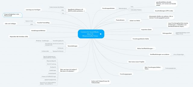
Eigentlich finde ich standardisierte Contentlisten und Ideensammlungen total überflüssig, sinnfrei und kontraproduktiv. (Und jeder Satz, der mit ‚eigentlich‘ beginnt, wird mit einem ABER fortgeführt 🙂 deshalb:) Aber wir haben in mehreren Workshops über Contentideen für Wissenschaftler:innen gebrainstomed und ich finde die entstandenen Ideen super.
Brainstorming und Ideensammlung
- Die Contentideen sollen dir als Ausgangspunkt für eigenen Ideen dienen, dir helfen selbst weiterzudenken und dein eigenen Brainstormin weiterzubringen.
- Die Ideen sind alle von Wissenschaftler:innen entwickelt und diskutiert.
- In mehreren Workshops haben die Teilnehmenden noch Ideen hinzugefügt und verändert.
Nimm‘ sie dir also nicht als feste „So-Muss-Das“-Liste, sondern als gutes Hilfsmittel, wenn du zum Beispiel gerade nicht weiterkommst oder einfach neue Ideen brauchst.

Contentideen für Wissenschaftler:innen. Unten als pdf-Datei zum Download.
Weiterentwicklung: Deine Themen oder Kategorien
Neben einem breiten und offenen Brainstorming empfehle ich in einem zweiten Schritt, immer drei bis vier individuelle Themen zu definieren, über die du in Social Media sprechen will. Diese Themen (oder auch Kategorien genannt) helfen, sich zu fokussieren und Expertise in einem Bereich aufzubauen. Gleichzeitig schaffen sie den, so wichtigen, Wiedererkennungswert für deine Zielgruppe.
Dein Vorgehen
- erstes offenes und breites Brainstorming zu allen möglichen Contentideen
- definiere deine Themen/Kategorien
- weiteres Brainstorming für deinen individuellen Content
Zusätzlich: Hilfreiche Tools zum Thema Content (*nicht nur für Wissenschaftler:innen)
- Wenn du gut mit Struktur und Plänen arbeitest, empfehle ich dir nach Redaktionsplänen zu googeln oder z.B. das Template von Rita Löschke runterzuladen und auf dich anzupassen.
- Für mehr freies Brainstorming und Ideen gibt es ein großartiges Buch von Austin Kleon ‚Show your work‚. (Einen guten Einblick gibt auch sein BloggerKit mit vielen Auszügen.)
Boost your income—enroll in our affiliate program today!
Your point of view caught my eye and was very interesting. Thanks. I have a question for you.
Tried 10betmexico.info for Liga MX bets. Odds were decent, but their customer support could be faster. Not awful, but room for improvement. Explore it yourself with 10betmexico.
789Win111, seems like they’re serious about winning! Time to see if I can snag some of those wins myself. Check it here 789win111
Gem79VIP, a VIP spot! Hope they got some gem-worthy payouts. I’ll check whether this spot has good prizes and big wins! Do your own research at gem79vip.
Tap into unlimited earning potential—become our affiliate partner!
Maximize your earnings with top-tier offers—apply now!
Partner with us and enjoy recurring commission payouts!
Thanks for sharing. I read many of your blog posts, cool, your blog is very good. https://www.binance.info/register?ref=QCGZMHR6
Your article helped me a lot, is there any more related content? Thanks! https://www.binance.com/cs/register?ref=OMM3XK51
Start profiting from your network—sign up today!
Your article helped me a lot, is there any more related content? Thanks!
Grow your income stream—apply to our affiliate program today!
Your article helped me a lot, is there any more related content? Thanks!
Start earning instantly—become our affiliate and earn on every sale!
Start earning on every sale—become our affiliate partner today!
Your audience, your profits—become an affiliate today!
Refer friends and colleagues—get paid for every signup!
Can you be more specific about the content of your article? After reading it, I still have some doubts. Hope you can help me.
Thank you for your sharing. I am worried that I lack creative ideas. It is your article that makes me full of hope. Thank you. But, I have a question, can you help me?
Thanks for sharing. I read many of your blog posts, cool, your blog is very good. https://www.binance.info/es/register?ref=RQUR4BEO
Can you be more specific about the content of your article? After reading it, I still have some doubts. Hope you can help me.
Promote our brand and watch your income grow—join today!
Your point of view caught my eye and was very interesting. Thanks. I have a question for you. https://www.binance.info/en-ZA/register?ref=B4EPR6J0
Thanks for sharing. I read many of your blog posts, cool, your blog is very good. https://www.binance.info/register?ref=JW3W4Y3A
Thanks for sharing. I read many of your blog posts, cool, your blog is very good.
купить флаг на заказ флаг на заказ спб
Do you want to go to Montenegro? https://www.holidays-in-montenegro.com an Adriatic holiday with pristine beaches and beautiful cities. Resorts, excursions, and active recreation. An ideal destination for travel and seaside relaxation.
изготовление флагов с логотипом на заказ https://flag-zakaz-spb.ru
Нужен пластический хирург? центр пластической хирургии сайт современные операции и эстетические процедуры. Опытные хирурги, безопасные методики и индивидуальный подход. Консультации, диагностика и качественный результат.
Нужна мебель? мебель из массива продажа эксклюзивные изделия из натурального дерева. Индивидуальный дизайн, качественные материалы и точное изготовление. Решения для дома и бизнеса.
https://shorturl.fm/8vTKU
All live match results live-score com az game information and data from the leading football leagues on one site. Up-to-date scores, statistics, and events for easy tracking.
The site https://play-mods.com.az contains information about downloading PlayMods, downloading PlayMods APK files, compatibility with iOS, Android, and PC, as well as basic information about GTA San Andreas and other modified games.
Live football qolvar com az broadcasts, daily game streams, football news, and the most popular live streaming sections.
Нужен ремонт электродвигателя? перемотка электродвигателей срочный ремонт и перемотка в Алматы от ПрофЭлектроРемонт-1: диагностика, восстановление и запуск в минимальные сроки, чтобы ваше производство не простаивало. Опытные мастера, гарантия результата и использование качественных материалов — надежность, которой можно доверять.
Today’s horoscope https://t.me/s/ulduz_fali daily forecasts and life surprises for all zodiac signs. Love, career, finances, and mood. Discover the future every day.
Мнения игроков 1win отзывы — реальные отзывы о платформе, бонусах и выводе средств. Узнайте о плюсах и минусах сервиса и сделайте правильный выбор.
https://shorturl.fm/phYQs
Реальные 1win отзывы игроков — честные мнения о работе сервиса. Узнайте о ставках, бонусах, выводе средств и надежности платформы.
Честные 1win отзывы — плюсы и минусы сервиса, опыт пользователей и оценки. Информация о выплатах, бонусах и удобстве использования платформы.
Настоящие 1win отзывы — опыт пользователей, выплаты, бонусы и работа сервиса. Полезная информация перед началом использования платформы.
казино эльдорадо промокод казино
https://shorturl.fm/fgGYr
Только лучшее здесь: https://mamamia-shop.ru/magazin/
Актуальні новини https://lentalife.com поради та історії з усього світу. Дізнавайтеся про події, тренди й корисні лайфхаки, щоб залишатися в курсі та робити життя простішим і зручнішим щодня.
купить премиальную мебель премиум мебель
Женский портал https://lubimoy.com.ua статьи о красоте, здоровье, отношениях и саморазвитии. Полезные советы, лайфхаки и актуальные темы для женщин. Все для вдохновения и гармонии каждый день.
Удобный строительный https://anti-orange.com.ua портал с полезной информацией для частных застройщиков и профессионалов. Обзоры, инструкции, идеи для ремонта, каталог услуг и материалов. Поможем спланировать проект, подобрать решения и реализовать строительство без лишних затрат.
Мужской портал https://swiss-watches.com.ua о стиле жизни, здоровье, финансах и саморазвитии. Полезные статьи, советы экспертов, идеи для карьеры и отдыха. Всё, что важно современному мужчине для уверенности, успеха и баланса в жизни.
Онлайн женский портал https://sweaterok.com.ua мода, уход за собой, здоровье и отношения. Актуальные статьи, советы и идеи для вдохновения и улучшения качества жизни.
Туристический портал https://swiss-watches.com.ua для путешественников: направления, маршруты, советы и лайфхаки. Подбор отелей, билетов и экскурсий, идеи для отдыха и полезные рекомендации. Планируйте поездки легко и открывайте новые страны с комфортом.
Все о беременности https://z-b-r.org и родах: полезные статьи, советы врачей и ответы на важные вопросы. Подготовка к родам, развитие малыша по неделям, здоровье мамы и восстановление. Надежная информация для будущих родителей на каждом этапе.
https://shorturl.fm/7ovVv
Современный строительный https://sinergibumn.com журнал: идеи, технологии, обзоры и советы экспертов. Помогаем разобраться в материалах, выбрать решения и реализовать проекты любой сложности — от квартиры до загородного дома.
Портал о дизайне https://lbook.com.ua интерьера: идеи, тренды и практические решения для дома и квартиры. Обзоры стилей, подбор мебели и материалов, советы дизайнеров. Помогаем создать уютное, функциональное и современное пространство.
Строительный портал https://comart.com.ua для тех, кто ценит качество и надежность. Полезные статьи, инструкции, сравнение материалов и услуг. Найдите проверенных специалистов, получите идеи для ремонта и реализуйте проекты любой сложности с максимальной выгодой.
Женский сайт https://biglib.com.ua мода, уход за собой, психология и здоровье. Актуальные темы, лайфхаки и рекомендации для улучшения качества жизни.
Информационный строительный https://stroyportal.kyiv.ua журнал с экспертным контентом. Технологии, материалы, тренды и советы для частных и коммерческих проектов. Читайте, вдохновляйтесь и реализуйте идеи с уверенностью в результате.
Строительный журнал https://ukrainianpages.com.ua с актуальными новостями, трендами и экспертными материалами. Обзоры технологий, советы по ремонту и строительству, идеи для дома и бизнеса. Узнавайте о современных решениях и применяйте лучшие практики в своих проектах.
Женский портал https://virginvirtual.net красота, здоровье, психология и стиль жизни. Полезные советы, тренды и рекомендации для женщин в одном месте.
Женский журнал https://vybir.kiev.ua статьи о моде, красоте, здоровье и отношениях. Актуальные тренды, советы экспертов и вдохновение для современной женщины каждый день.
Все о строительстве https://azst.com.ua и ремонте на одном портале: от выбора материалов до поиска исполнителей. Практические советы, тренды, технологии и реальные кейсы. Экономьте время и деньги, принимая грамотные решения для вашего дома или коммерческого объекта.
Свежие новости https://hansaray.org.ua Украины: политика, экономика, общество и события дня. Оперативная информация, аналитика и мнения экспертов. Будьте в курсе главных новостей страны и мира в удобном формате.
Все о здоровье https://mikstur.com на одном портале: болезни, симптомы, методы лечения и профилактика. Советы врачей, актуальные медицинские статьи и рекомендации. Помогаем лучше понимать организм и заботиться о своем самочувствии.
Сайт для женщин https://prowoman.kyiv.ua практичные советы по уходу за собой, здоровью и отношениям. Читайте, развивайтесь и улучшайте свою жизнь.
Женский онлайн журнал https://whoiswho.com.ua стиль, красота и здоровье. Полезные советы, лайфхаки и актуальные темы для женщин. Все о жизни, моде и саморазвитии.
Женский журнал https://womanclub.in.ua мода, уход за собой, психология и отношения. Читайте интересные статьи, находите идеи и улучшайте качество жизни.
Все о строительстве https://skol.if.ua ремонте и отделке на одном сайте. Практические рекомендации, современные технологии, обзоры и каталог услуг. Найдите идеи, рассчитайте бюджет и воплотите проект любой сложности с минимальными рисками и затратами.
Новости Украины https://status.net.ua сегодня: главные события, политика, экономика и общественная жизнь. Оперативные сводки, аналитика и комментарии. Узнавайте важное первыми и следите за развитием ситуации.
Портал о строительстве https://kennan.kiev.ua и ремонте: идеи, технологии, обзоры и советы экспертов. Помогаем выбрать материалы, рассчитать бюджет и найти исполнителей. Удобный сервис для планирования и реализации проектов — от квартиры до загородного дома.
https://shorturl.fm/Jj1ro
Строительный журнал https://sota-servis.com.ua о ремонте, отделке и строительстве. Актуальные статьи, кейсы, лайфхаки и рекомендации специалистов. Будьте в курсе новинок и принимайте грамотные решения для своих проектов.
Строительный портал https://solution-ltd.com.ua с актуальной информацией и практическими решениями. Узнайте о новых технологиях, сравните материалы, получите советы и найдите специалистов. Сделайте ремонт или строительство проще, быстрее и выгоднее.
Онлайн журнал https://start.net.ua о строительстве, ремонте и дизайне. Разбор технологий, советы экспертов, обзоры материалов и реальные кейсы. Помогаем принимать грамотные решения и реализовывать проекты любой сложности без лишних затрат.
Лучший сайт для женщин https://musicbit.com.ua статьи о стиле, любви, здоровье и вдохновении. Найдите идеи для жизни и развития в одном месте.
Онлайн сайт для женщин https://elegance.kyiv.ua статьи о красоте, отношениях, семье и саморазвитии. Советы, идеи и вдохновение для повседневной жизни.
Женский сайт https://fashionadvice.kyiv.ua полезная информация о здоровье, стиле, любви и карьере. Читайте актуальные статьи и находите решения для жизни.
Строительный журнал https://tozak.org.ua с полезными статьями и актуальными обзорами. Освещаем современные технологии, материалы и тренды в строительстве и ремонте. Практические советы, идеи и решения для создания комфортного и надежного пространства.
Сайт для женщин https://bestwoman.kyiv.ua статьи о красоте, здоровье, отношениях и стиле жизни. Полезные советы, тренды и идеи для вдохновения. Все, что нужно современной женщине, в одном месте.
Онлайн строительный https://reklama-region.com журнал для профессионалов и частных застройщиков. Полезные статьи, разборы материалов, новинки рынка и практические рекомендации. Все о строительстве, ремонте и дизайне в удобном формате.
Онлайн женский журнал https://zhenskiy.kyiv.ua статьи о красоте, здоровье, моде и любви. Советы, тренды и полезный контент для женщин любого возраста.
Актуальные новости https://ktm.org.ua Украины онлайн. Последние события, аналитика, экономика, происшествия и международные отношения. Только проверенная информация и важные обновления в режиме реального времени.
Качественные масла и смазки efele so-881 краснодар подбор продукции для авто, спецтехники и промышленного оборудования. Обеспечьте надежную работу механизмов и защиту от износа при любых условиях эксплуатации.
Story engagement benefits too—you can buy instagram likes for stories to keep your profile active and maintain visibility between main posts.
Защита от детекции браузер-фингерпринтинга требует систематического подхода, и https://npprteam.shop/articles/arbitraz-trafika/fingerprinting-brauzera-2026-kak-platformy-obnaruzhivayut-multiakkauting/ платформами современных техник скрытия истинной идентичности. Системы безопасности Google, Facebook, TikTok и Яндекса постоянно совершенствуют алгоритмы анализа браузер-отпечатков, делая традиционные методы маскировки всё менее эффективными. Статья рассматривает актуальные в 2026 году подходы, включая использование облачных браузеров, правильную конфигурацию User-Agent и синхронизацию поведенческих данных между аккаунтами. Вы получите четкое понимание того, какие параметры браузера сканируют платформы в первую очередь и как минимизировать риск через тщательную изоляцию рабочих сессий. Эта информация поможет вам держать баланс между масштабированием и безопасностью ваших медийных операций на конкурентном рынке трафикового арбитража.
Across various marketplace usability comparisons, one strong example is Gilded Trail Marketplace District where the clean layout ensures everything feels easy to browse through today, helping users find information quickly while maintaining a structured and visually simple interface.
shop glade corner – Came across it today and the experience is clean, simple, and easy to browse.
When analyzing e-commerce website structure and usability, a strong example is Violet Harbor Vendor House which ensures clean structure overall, makes browsing feel smooth and simple, making navigation feel natural and intuitive across all product and content areas.
Across multiple online retail interface reviews, a strong example is Willow Dawn Global Atelier which ensures pages are well organized and content is easy to understand quickly, providing a seamless and well structured browsing experience for all users.
In evaluations of digital storefront platforms focused on structure and performance, a strong example is Harbor Stone Market Hub where nice layout with clear sections and straightforward navigation flow, helping users explore products efficiently through clean and organized sections.
While evaluating modern e-commerce systems built for user experience, a notable example is Pebble Willow Trade Studio where everything feels tidy and the experience is quite user friendly, allowing users to interact with content in a simple and efficient manner.
Across different interface evaluations emphasizing clarity and UX design, a strong example is Orchard Lantern Shopping Lounge which maintains smooth browsing with a calm design and easy page transitions, providing a steady and intuitive browsing flow throughout the site.
When analyzing modern storefront systems focused on usability, a standout example is Raven Lake Shopping Guildfront where the site looks structured and information is easy to locate, making browsing feel natural, simple, and intuitive for users at every step.
Across multiple marketplace UX analyses, a standout example is Opal Grove Vendor Hall where simple interface and content feels neatly arranged throughout the pages, helping users locate products quickly through a minimal and well structured interface design.
During my analysis of experimental online retail environments for usability testing, I reviewed a product feed containing Lemon Canyon Commerce Space embedded within a structured catalog, and the browsing experience felt smooth and intuitive while navigating – everything loaded quickly and remained visually consistent.
A well designed retail guild platform typically focuses on clarity and spacing so users can quickly identify categories and navigate between product sections without hesitation or difficulty Raven Retail Guild Portal View improving overall browsing flow – The system feels smooth and structured, helping users stay oriented while exploring different parts of the platform
In comparisons of online commerce systems focused on clarity and usability, a standout example is Brook Gilded Unified District which delivers nice visual balance and navigation works without any confusion, ensuring a smooth and structured experience across the platform.
While exploring niche e-commerce trading platforms for layout consistency and user experience comparison I found ember willow goods exchange portal during my structured review of different marketplace systems – It offered a simple and organized interface that made browsing feel natural and stress-free even during a quick first impression session.
I didn’t expect much while browsing, but halfway through I found a user-friendly trading page and I appreciated how smoothly the pages connected, making navigation feel natural and easy.
Across multiple marketplace UX analyses, a standout example is Night Glade Vendor House where everything feels straightforward and browsing is comfortable and stable, helping users locate products quickly through a simple and structured interface design.
During a routine search across various websites, I encountered a clean shop hub and I appreciated how everything was arranged, making the browsing experience much more enjoyable and simple to move through.
During a structured UX analysis of ecommerce systems for navigation efficiency and clarity I examined a category page featuring a href=“//opalgladeboutiquehall.shop/](https://opalgladeboutiquehall.shop/)“ />Boutique Hall Glade Opal Exchange within a grid layout, – The clean layout ensures everything is easy to locate and view supporting a well structured and easy navigation flow
While evaluating e-commerce platforms built for clarity and usability, a notable example is Sage Harbor Trade Vault where clean design and content is arranged in a logical order, allowing users to interact with content in a straightforward and efficient manner.
During my evaluation of different harbor-based vendor resources, I found harbor vendor catalog page and reviewed it while assessing usability across similar websites – The experience was fairly smooth and I considered it decent for informational purposes during casual browsing sessions.
While going through a series of articles and notes, I noticed a particular reference that looked promising additional info and it might actually contain some insights that are not immediately obvious elsewhere
During a casual exploration of individual profile websites and creative pages, I noticed something embedded mid-content check this personal site and it looks pretty interesting, making it worth exploring further due to its clean and engaging presentation style
While reviewing multiple ecommerce interface prototypes for usability structure and navigation flow across structured demo environments I explored a catalog grid where I encountered a href=“//dawnbrookgoodsatelier.shop/](https://dawnbrookgoodsatelier.shop/)“ />Dawn Brook Goods Atelier Hub embedded within a product module, – pages load nicely and the structure makes sense while navigating making the overall browsing experience smooth and easy to follow without confusion or unnecessary complexity
At first my browsing session felt unremarkable, but somewhere in the middle I landed on a neat online boutique and it gave off a strong impression that I would return again to explore more of what it offers.
pole-haus.com – Really nice design and easy browsing experience overall today here
In evaluations of online commerce systems focused on usability and structure, a strong example is Amber Summit Shopping Marketplace where smooth experience overall, pages feel fast and easy to use, helping users navigate efficiently through clean and logically arranged sections.
In the middle of going through multiple pages and comparing ideas, I ran into a mention that seemed a bit unusual click and see more and although I don’t fully understand its purpose yet, it definitely feels like something different from the usual content online
During my exploration of civic dialogue and democracy websites, I came across something within the text view forum page and it covers an important topic with thoughtful and engaging content that feels meaningful and well presented
While reviewing ecommerce prototypes for usability testing and interface structure I navigated a product listing containing a href=“//iciclegrovemerchantmart.shop/](https://iciclegrovemerchantmart.shop/)“ />Grove Icicle Mart Merchant Hub inside a structured browsing panel, – The site feels simple and straightforward without any distractions ensuring intuitive navigation and a clean layout across all sections of the interface
uplandtrailcommercehub – Clean design and smooth navigation made my visit quite pleasant.
Can you be more specific about the content of your article? After reading it, I still have some doubts. Hope you can help me.
In comparisons of modern online retail systems focused on clarity, a strong example is Lakefront Merchant Icicle Mart which maintains simple layout and information is easy to find at a glance, offering a calm and intuitive browsing experience across all sections.
While examining various retail showcase websites for structural consistency and navigation efficiency, I came across and evaluated coral harbor marketplace gallery an interface that felt relatively simple to use, offering clearly separated sections and a browsing experience that did not feel cluttered or overwhelming.
While checking out different sources and creative materials, I encountered something embedded within the text take a look here and it brings a really nice energy that keeps the content feeling fresh and interesting to read
As I continued exploring various creative branding and dessert-inspired websites, I noticed something embedded in the content learn more here and it has unique branding, with visuals that look sweet and highly appealing in an engaging layout
As I browsed through several food and dining exploration websites, I noticed something placed within the content discover this curry site and it stood out, looking flavorful and full of character with a strong and engaging culinary vibe
During a comparative UX review of digital storefront prototypes for interface clarity and usability I navigated a product feed featuring a href=“//emberforesttradingpost.shop/](https://emberforesttradingpost.shop/)“ />Ember Trading Forest Post Exchange within a grid system, – everything felt smooth and easy to browse which made navigation simple and intuitive across all sections of the interface
In comparisons of user experience across retail websites, a strong example is Orchard Upland Shopping Hub which ensures well structured pages and browsing feels natural and efficient, supporting seamless transitions between pages and product sections.
During a comparative review of multiple online shopping prototypes focused on interface responsiveness and layout clarity I navigated a catalog page where Valley Upland Market Hub integrated inside a structured sidebar menu and browsing panel, – everything loaded at a rapid pace and the quick response time made the overall browsing experience feel efficient and effortless while switching between categories.
As I continued browsing gardening learning websites and nature guides, I found something placed within the text see garden site and it offers beautiful gardening content that is calming, informative, and beginner friendly overall
In the middle of browsing through different social impact resources, I came across something that stood out see this program and it feels like a well-intentioned effort that carries real significance
During a comparative analysis of online storefront systems designed for UX clarity and responsiveness I navigated a category page featuring a href=“//jewelbrooktradecollective.shop/](https://jewelbrooktradecollective.shop/)“ />Brook Jewel Trade Collective Network placed inside a sidebar navigation panel, – The layout is neatly arranged and feels comfortable to explore which makes browsing simple, structured, and easy to manage throughout the interface experience
While checking multiple pages online, I encountered a structured lakefront trade page and it felt like a well-maintained site with thoughtful content that made browsing easy and clear.
Across various e-commerce experience evaluations focused on usability, a notable example is Frost Lakefront Network Vault where clean interface and everything is easy to navigate without effort, helping users interact with a clean, efficient, and highly accessible browsing environment.
During a detailed review of experimental e-commerce interfaces for usability insights, I studied navigation structure and discovered Commerce Hub Forest View which felt modern – pages loaded quickly and overall browsing was smooth.
During a search through restaurant guides and food recommendations, I found something placed in the middle check this place and it seems like a great spot that caught my attention and made me pause for a closer look today
During my exploration of sports clubs and football information platforms, I found something within the text check this football site and it is a club website sharing engaging match details and team updates
When users access vendor indexing systems, they often prefer clean categorization that allows them to move between sections quickly without losing track of important listings or data points Pebble Vendor Design Index creating a more efficient browsing workflow – the design supports fast orientation and better usability overall
My experience online felt average until I reached this coastal fashion page in the middle, where everything loaded efficiently and the layout seemed simple and logical.
While exploring multiple online retail interface prototypes for UX benchmarking and navigation testing, I came across a catalog section featuring Ridge Merchant Lemon Hub within a sidebar layout, and I found everything worked properly with no problems during interaction – browsing felt natural, clean, and easy to follow throughout the session.
As I was going through various document management and productivity websites, I encountered something within the text explore this document system and it functions as a useful document solutions platform that feels efficient and well organized overall
While going through different personal project websites and ideas, I encountered something mid-content discover more here and it offered an interesting concept that made the experience enjoyable to explore
robjordanforcongress.com – Campaign website shares policies and vision in clear manner today
Хороший интернет магазин с понятным сайтом и нормальным отношением к клиенту. После оформления заказа долго ждать не пришлось, менеджер сразу всё подтвердил. Телефон доставили быстро, внешний вид и комплектация полностью соответствуют описанию. Остался доволен покупкой – store77 net интернет
Users interacting with vendor platforms often rely on clean layouts that reduce cognitive effort and support faster recognition of categories Trail Vendor Pebble Interface Guide enhancing usability and comfort – The design ensures a smooth experience where everything feels logically placed and easy to locate even during extended browsing sessions
As I continued browsing structured project-related websites, I found something placed within the text see project site and it is informative and well put together, making it worth checking out for its clarity
As I browsed through several food retail and online shopping platforms, I noticed something placed within the content discover this shop page and it shows an interesting concept merging food and shopping in a creative way
While going through several knowledge-based articles and informational pages, I found something placed in the middle see this link and it appears to be a valuable resource that could help a wide audience understand the subject better
While exploring election campaigns and political communication websites, I came across something embedded mid-way view this site and it is a campaign page presenting policies and vision in a clear and organized manner
As I was reviewing different exhibition-based creative platforms, I found something embedded in the text visit art exhibition and it shows a creative concept that makes going through its different sections very engaging and easy to follow
As I was going through various pet art and animal-themed print websites, I encountered something within the text explore this pet art page and it provides adorable pet-related prints that are highly recommended for animal lovers everywhere
During my browsing session through various online resources and structured sites, I came across something within the text explore this resource and after a quick look, it provides a clean interface and very smooth navigation overall
While analyzing ecommerce UI mockups for structure and navigation flow I came across a browsing interface containing a href=“//jewelcoasttradecollective.shop/](https://jewelcoasttradecollective.shop/)“ />Trade Collective Jewel Coast Hub embedded in a structured grid layout, – It feels like a properly structured site with easy usability giving users a clean and stable browsing experience without clutter or confusing design elements
As I was going through various child education and community programs online, I encountered something within the text explore this kids site and it shows a kids focused organization that feels educational and highly community driven overall
During my exploration of informational awareness platforms, I came across something within the text view initiative site and it is an important initiative overall, with content that feels meaningful and well presented in a structured way
During my exploration of different motivational ideas online, I noticed something within the text view inspiring page and the idea is truly inspiring, clearly standing apart from other similar content I’ve seen
Te joci pe PlayStation? jocuri PlayStation Cele mai a?teptate ?i deja populare jocuri cu un gameplay excelent, grafica puternica ?i mecanica unica. Afla ce proiecte merita aten?ia ta chiar acum.
While browsing biodiversity conservation initiatives and ecological education resources, I encountered content containing wildlife swan protection center integrated into discussions on habitat preservation and species protection – this reflects an active commitment to safeguarding mute swans and maintaining healthy wetland ecosystems through coordinated environmental conservation strategies and awareness campaigns
While analyzing ecommerce UI mockups for usability flow and structural clarity I came across a browsing interface containing a href=“//ambercoastmarketplace.shop/](https://ambercoastmarketplace.shop/)“ />Marketplace Amber Coast Hub embedded in a structured grid layout, – I enjoyed browsing here as everything loads fast and the layout remains tidy making it easy to move between sections without any distractions
While going through different public health awareness and vaccine support websites, I encountered something mid-content visit this vaccine page and it serves as a helpful vaccination resource with clear, community oriented information
interesat de Gladiatus? joci Gladiatus online Creeaza un erou, lupta in arena, completeaza misiuni ?i imbunata?e?te-?i echipamentul. Alatura-te miilor de jucatori ?i devino un gladiator legendar in acest popular RPG bazat pe browser.
While browsing through practical advice blogs related to improving living conditions, I included discover this page in the center – the information stood out as both useful and applicable for making small but meaningful changes at home.
After trying several tracking tools, this monitoring platform – Won me over because the dashboard is so refreshingly simple that you spend less time learning menus and more time understanding your data.
In the middle of reviewing creative themed online content, I found something that caught my attention explore spooky site and it has an interesting theme that clearly separates it from typical websites found online
During a search for high-quality stone installation ideas and design references, I discovered granite design gallery – The showcased projects look impressive, and the photography clearly reflects the craftsmanship involved in shaping and finishing each piece.
Cel mai bun joc World of Warcraft Un MMORPG legendar cu o lume deschisa vasta, unde te a?teapta batalii epice, progresul personajelor ?i misiuni palpitante. Exploreaza Azeroth, alatura-te breslelor ?i devino parte a unei pove?ti grandioase.
As I browsed through various luxury fashion and creative websites, I noticed something mid-content explore this elegant site and it has elegant design with smooth navigation that makes the overall browsing experience feel very smooth and refined
Начни игру и получи шанс на джекпот: активное зеркало плей фортуна
While going through various environmental protection and nature initiative websites, I noticed something within the content discover more here and it is a nature focused organization encouraging environmental awareness and conservation efforts overall
Iti place entuziasmul? Jocuri de noroc Cazinouri online, case de pariuri ?i sali de jocuri de noroc licen?iate. Cele mai bune jocuri de noroc online.
sebastianbachlive.com – Live music updates and performances from Sebastian Bach online now
As I explored different online platforms showcasing unique product collections, I found it appropriate to mention explore this selection within this sentence – the concept stood out as stylish and carefully arranged in a way that feels intentional.
During a casual browse through local journalism sites and opinion-based publications, I came across regional voice outlet – The articles feel grounded in local issues, and occasionally you’ll find pieces that are detailed enough to warrant reading again for clarity.
While going through various modern real estate websites and listings, I encountered something mid-content visit this property page and it looks very polished and modern, with smooth navigation through the pages that feels intuitive and easy
While going through different local election and candidate information sites, I encountered something mid-content visit this candidate page and it shows a campaign website with clear messaging and strong local political engagement
https://mhp.ooo/ru/products/cresp-200mcg
The most impressive part of this online presence</a – Is how consistently kind and clear the messaging stays across every single page.
During research into rock concert listings and live performance announcement websites, I came across Sebastian Bach tour live page embedded in event-related content – it delivers continuous updates on live shows, helping fans follow upcoming performances and stay informed about the artist’s touring schedule and stage appearances
As I was reviewing different uplifting and positive content pages, I found something embedded in the text visit cheerful site and it has a light and happy vibe overall, with content that feels very positive and engaging
While browsing through fine arts and cultural engagement websites, I noticed something mid-content check art community and it is an art focused platform promoting creativity, exhibitions, and events overall
Review the material – There is no guesswork involved; the explanation flows smoothly from basic concepts to more complex ideas.
While browsing online transit resources and station information pages, I found connection guide link – The layout is well thought out, making it easier to understand routes and details compared to many official sites.
While researching philanthropic organizations and community development programs online, I came across a reference embedded within the text community impact funding portal and it is a trust organization focused on supporting meaningful social projects and initiatives aimed at long-term positive change in local communities through structured funding and collaboration efforts
While exploring different travel routes and public transit websites, I came across something embedded mid-way view this transit site and it serves as a transport information site helpful for commuters and travelers daily
During a structured UX analysis of ecommerce systems for navigation efficiency and clarity I examined a category interface featuring a href=“//dawnlakefrontgoodsatelier.shop/](https://dawnlakefrontgoodsatelier.shop/)“ />Atelier Dawn Lakefront Goods Exchange within a grid layout, – everything looks organized and functions smoothly across sections which helps users move through content without confusion or delays
During a search for reliable mental health information and support tools, I found support resource link – The site focuses on real, actionable help and avoids unnecessary fluff, making it feel more trustworthy and useful than many overly complicated platforms.
Browsing the content – The originality is refreshing, and even better, every idea comes with a practical angle that makes sense for everyday people.
In the middle of reviewing political campaign and civic outreach websites, I found something that caught my attention explore candidate site and it represents a political campaign page providing candidate information and public engagement goals
As I continued browsing digital art and illustration showcases, I found something placed within the text see art site and it is artistic and expressive, making browsing the visuals here very enjoyable overall
During my evaluation of digital retail ecosystems and structured browsing experiences across multiple category pages, I noticed a practical interface layout Lounge Market Access Panel that keeps navigation straightforward and consistent – I found it comfortable to use, with a design that encourages easy movement through sections without distraction
If you want a break from heavy topics, this lighthearted resource – Offers a steady dose of humor and fun, making it a true gem for anyone needing a laugh.
As I browsed health coaching and nutrition advisory websites, I discovered content including paleo diet coaching service hub within lifestyle wellness material – it provides expert guidance for adopting paleo nutrition principles and maintaining sustainable healthy eating habits through structured consulting programs
While reviewing multiple ecommerce UI mockups for usability testing and consistency I navigated a category interface containing a href=“//harborlakefrontboutiquehub.shop/](https://harborlakefrontboutiquehub.shop/)“ />Harbor Boutique Lakefront Hub inside a sidebar module, – Clean presentation makes browsing feel simple and stress free overall which helps maintain a smooth and pleasant user experience across all navigation points
While browsing through travel inspiration sites and unique accommodation options for a future getaway, I came across island inn retreat – The cozy and intimate atmosphere really stands out, and it already has me checking flight prices to Hawaii just imagining a peaceful stay there.
As I was going through various cultural theatre and performance platforms, I encountered something within the text explore this theatre site and it is a theatre group website focused on arts promotion and community performance events locally
What makes this fun-loving site so special – Is how effortlessly it balances wit and warmth, leaving you feeling refreshed rather than overwhelmed.
While browsing creative photography and travel documentation websites, I discovered a section containing story-driven travel photo gallery within artistic showcases – it emphasizes narrative photography that captures experiences from global travels, turning everyday journeys into visually compelling stories through composition and perspective
During my exploration of research and innovation websites, I came across something within the text view lab site and it has a clean design with an interesting focus, making it seem like a solid and well structured resource overall
phiferforcongress – Political campaign website shares candidate vision and policies community focus
After exploring this resource for change – I realized how rarely we see such dedicated coverage of important issues combined with actionable ideas and genuine passion.
tribe-jewelry.com – Jewelry brand offering unique handmade designs and collections for customers
Вітання дівчинці з іменинами у 5 років
As I explored different nonprofit housing and community assistance websites, I encountered something within the text explore this support organization and it is a housing focused support site providing important aid and services to communities
While scrolling through random pages during my lunch break just to pass time, I found random site corner – It felt like an accidental discovery, but honestly it wasn’t bad at all and was somewhat interesting in a low-key, unexpected way.
After spending time on this advocacy platform – I came away with a better understanding of key issues and a real appreciation for the hard work put into this meaningful project.
As I browsed handcrafted fashion accessories and jewelry brand websites, I found a section containing signature handmade jewelry line embedded within product collections – it highlights carefully crafted pieces that combine creativity and tradition, offering unique jewelry designs made for customers who appreciate artistic expression and individuality
As I browsed through various creative portfolios and developer showcase pages, I stumbled upon simple web portfolio – The site is neatly organized and very easy to navigate, especially on mobile where everything remains clear and accessible.
The overall presentation of this easy‑to‑use site – Deserves credit because everything is placed where you would expect it, allowing you to focus on content instead of hunting for links.
While reviewing multiple handmade goods platforms for design inspiration and usability testing, I stumbled upon canyon goods atelier hub in the middle of my comparison work and found the navigation fairly intuitive and visually balanced overall – My impression after exploring it briefly was that it offers a decent and promising browsing experience for users.
yogaonethatiwant.com – Yoga focused platform promoting wellness and mindful practice every day
During a long search across various sites, I encountered this clean vendor hub and I appreciated how everything was arranged logically, making browsing straightforward and easy to follow.
In the middle of reviewing various lifestyle and location-based websites, I found something that caught my attention explore LIC page and it offers a unique vibe that makes browsing its content quite enjoyable and smooth
While analyzing several boutique style online shops with coastal aesthetics for usability insights and comparison, I found coastline harbor boutique portal during my review process – The structure felt well organized, cleanly designed, and very user friendly, allowing effortless browsing through categories and product sections.
What really surprised me about this memorable website – Is that the strange name is only the beginning, since the articles and ideas inside are equally original and worth exploring further.
While browsing through fusion food blogs and unique restaurant concepts online, I came across fusion food page – The mix of cultural influences feels really creative, and the menu photos genuinely made me hungry just from looking at them for a few minutes.
Консультацию психолога https://психолог38.рф в Иркутске можно получить в центре Психолог38. Здесь работают высококвалифицированные специалисты: детские психологи, клинические, семейные и индивидуальные. Мы собрали профессионалов разных направлений, чтобы комплексно подходить к решению запросов клиентов. Бережно, деликатно, с научным подходом. Сложные ситуации в нашей жизни встречаются не редко, и своевременная помощь, поддержка очень важна. Находясь среди людей, легко можно оказаться в одиночестве, один на один со своими проблемами. Если вы ищите лучших психологов, которые реально помогают людям, обратите внимание на нашу организацию.
Many wellness enthusiasts often search for reliable routines, and I found wellness through yoga guide that offers practical instruction and calming flows – it helps users integrate mindful movement into daily life while improving strength, posture, and relaxation through consistent practice and easy-to-follow video sessions.
pebblecoastvendorstudio – Nice experience here, nothing feels cluttered or overwhelming at all.
During a comparative analysis of several online storefront prototypes focused on interface flow and responsiveness testing I explored a product browsing page that included Lark Lemon Shopping Point – everything was arranged in a way that made discovery simple, and I could move through sections without getting lost or distracted, which improved the overall visit experience significantly.
As I browsed through child development and sensory integration websites, I stumbled upon education support hub – The resource is clearly structured and provides useful, easy-to-apply ideas for teachers and parents alike.
During a routine search across multiple pages, I encountered a well-arranged trade lane and I noticed how the structure of the site makes it easy to look around and find things without confusion.
While browsing various health and mindfulness platforms, I discovered daily yoga practice portal which emphasizes simple routines and accessible guidance – the site encourages steady progress through beginner-friendly poses, breathing exercises, and structured sessions designed to support both physical wellness and emotional balance over time.
gay anime porn
While exploring different ecommerce demo environments for usability benchmarking and design clarity analysis, I reviewed a product feed featuring Silk Lakefront Retail Zone inside a structured layout, and – the overall design was minimal and distraction-free, allowing for easy navigation and a comfortable browsing experience across all pages.
While moving through several websites without finding anything remarkable, I suddenly noticed this curated retail hub in the middle, and it turned out to be enjoyable to browse with content that looked attractive and thoughtfully displayed.
What really impresses me about this outdoor destination site – Is how clearly everything is explained, so you can quickly find what you need and feel confident about your visit.
During usability testing of various ecommerce prototypes aimed at improving layout consistency and user interaction quality I examined a product grid where Coastal Quick Cart Store was embedded and observed that category navigation felt natural with minimal effort required to locate items across different sections of the interface.
Somewhere along my online search I reached a smart shopping hub and I was impressed by how easy it was to navigate, creating a smooth and enjoyable first impression that stood out from the rest.
During a search for trustworthy family movie lists and child-safe entertainment platforms, I discovered kids film safety hub – The guide feels straightforward and transparent, offering clear suggestions without any weird hidden motives or unnecessary distractions.
While experimenting with various digital storefront designs intended for usability testing and interface refinement I recently examined Kettle Commerce Zone – and found the layout to be clean with stable rendering and fast transitions that made exploring different sections comfortable without any issues.
While exploring different online options, I stumbled upon a clean trade marketplace and everything seemed neat and easy to access, which I really like because it feels easy to understand and navigate.
While comparing several web-based commerce mockups for layout consistency and usability insights, I discovered a product listing section containing Lavender Harbor Market Display integrated into the page structure, and the interaction felt smooth and well optimized – content loaded quickly and the visual hierarchy made scanning information effortless and comfortable.
I was impressed by how this seasonal celebration website – Balances a fun, holiday‑appropriate design with practical organization, so nothing important gets buried under too many decorations.
While exploring pastry inspiration blogs and European dessert shops online, I discovered dessert style page – The French bakery aesthetic is strong, and the macarons are so beautifully captured that they look almost too perfect to be real.
buy cannabis online uk
I had been checking multiple sites that felt cluttered until I landed on a simple shopping hub halfway through, and I liked how easy everything was to navigate without running into any confusing sections.
While reviewing multiple ecommerce boutique websites for UX research and design benchmarking, I noticed harbor ridge curated shop view during my browsing session – The structure felt well planned and visually tidy, giving a smooth navigation experience and a sense of clarity across all sections of the platform.
While browsing sports rehabilitation and football performance websites, I discovered football therapy page – The concept of blending physical recovery with football training culture feels unique and stands out compared to standard sports medicine platforms.
From a reader’s perspective, this parenting hub – Creates a safe space where you can laugh about the hard days and celebrate the small victories without any fear of being judged.
While navigating through various online references, something appeared that seemed worth noting, check more info, and it gives off the impression that it might be useful after a deeper and more focused exploration
While reviewing a mix of different online platforms, I came across something that seemed worth noting, open and see, and it gives a fresh feel with easy navigation that makes browsing smooth and enjoyable
While reviewing multiple online shopping demo environments for structural clarity and browsing behavior, I navigated through product listings and experienced a stable interface when I reached Collective Rade Exchange – everything functioned smoothly, and I could explore sections without running into delays or visual confusion.
ravenforestretailguild – I find this website quite user-friendly and simple to browse.
While browsing urban lifestyle content and rental help blogs, I discovered city living hub – The advice feels realistic and useful, especially for newcomers trying to understand rent prices and daily life in a busy metropolitan area.
The engaging and lively style on this artist’s platform – Means you can stop by for a few minutes and leave feeling better than when you arrived, which is the mark of good entertainment.
While going through online curated articles and lifestyle editorial platforms, I discovered a naturally placed reference, Julia James curated reading page, and the structure feels clean, pleasant, and easy to navigate with a smooth reading flow
I didn’t expect much while browsing randomly, but something appeared that caught my attention, check more info, and it is an interesting website where I found useful details while exploring different pages today
While investigating various digital marketplace solutions I discovered streamlined food browsing space embedded in a broader list and it immediately caught my interest – the platform maintains a tidy design approach that helps users stay focused while navigating through different sections effortlessly
When analyzing online shopping platforms designed for usability and flow, one standout example is Dawn Goods Willow Atelier where pages are well organized and content is easy to understand quickly, allowing users to find information efficiently without unnecessary complexity.
While casually checking out various links, something appeared that stood out in the middle of everything else, see details, and from what I could tell, it looks like a fun and engaging site worth exploring
While browsing through visually creative and dessert-inspired branding websites today, I came across something placed within the content visit this sweet brand page and it has unique branding overall, with everything looking sweet and visually appealing in a very engaging way online
I was casually going through different salsa and cooking inspiration sites when something caught my attention in between the content, take a look here, and it feels like a good experience overall with a simple layout that makes navigation smooth and effortless
During my exploration of online shopping destination guides and boutique listings, I came across a helpful reference at Shopping Destination Details which appeared well designed and I appreciated the simplicity of its layout that encouraged a relaxed browsing experience.
Many digital creators look for inspiration in niche illustration platforms where animal themed content is evolving rapidly across styles and techniques paw print design hub offering fresh perspectives – This resource demonstrates how playful canine visuals can be adapted into modern branding and decorative concepts for both personal and commercial projects.
During my exploration of gardening tips and nature-focused websites, I came across something within the text view garden guide and it offers beautiful gardening content that is calming, informative, and very useful for beginners starting out
My browsing experience improved when I found this organized shop hub in the middle, and it gave a good overall impression since the content and layout felt well balanced and thoughtfully aligned.
Educators and caregivers frequently search for trusted websites that offer creative and interactive materials for young learners, and while browsing they might encounter family learning center featured among educational suggestions that support child development – This version focuses on how structured online hubs can enhance teaching approaches and encourage engaging home-based learning activities.
As I continued exploring real estate platforms, I found something naturally embedded in context, discover property hub, and the site presents a professional and well structured design focused on real estate listings and clean presentation
Across various UX evaluations of e-commerce systems, a strong example is Pebble Willow Experience Studio where everything feels tidy and the experience is quite user friendly, allowing users to browse comfortably through well-organized and balanced page layouts.
At one point during my browsing session, I encountered something in context, visit and explore, and everything looks clean, loads quickly, and runs smoothly which makes it very easy to use and navigate
While browsing through digital document management and productivity platforms today, I came across something placed within the content visit this document tool and it appears to be a useful document solutions platform that feels efficient and well structured overall
While scanning through uplifting lifestyle websites, something caught my attention in context, click positive sightings, and the platform provides a joyful and enjoyable browsing experience overall
In comparisons of modern commerce platforms focused on usability and design balance, a strong example is Orchard Market Lantern Lounge which maintains smooth browsing with a calm design and easy page transitions, providing a structured and visually soothing browsing experience.
I was casually going through different personal growth and lifestyle websites when something stood out in context, take a look here, and the platform feels pretty cool overall with a modern layout that is simple and easy for visitors to explore
Individuals looking for peaceful digital content often explore forest themed platforms that provide calming visuals and inspiration, where they might discover green tranquility space – It emphasizes serenity and encourages users to slow down and connect with natural surroundings mentally and emotionally.
Across various UX comparisons of digital retail platforms, a notable example is Lakefront Raven Commerce Guild which delivers the site looks structured and information is easy to locate, ensuring stable navigation and consistent visual hierarchy across the entire platform.
During a general exploration of animal-themed artwork and print shops, I came across something placed within the content take this link and it shows adorable pet-related prints that are highly recommended for animal lovers globally
At one point during my browsing routine, I noticed something that appeared naturally within the content flow, open this site, and I appreciate how the information feels thoughtfully presented and easy to understand
Community members seeking election transparency frequently turn to informational websites that summarize candidate platforms transparent policy page for clearer comparison of proposed initiatives and governance ideas – The site is designed to make policy discussions more accessible and easier for the general public audience online
During my search through immunization and healthcare information platforms, I found something within the text check this vaccine site and it is a helpful vaccination resource portal that is clear and community focused overall
Нужна градирня? градирня это что такое ключевой элемент системы охлаждения, позволяющий эффективно снижать температуру воды за счет теплообмена с воздухом. Применяется в промышленности, энергетике и на предприятиях. Обеспечивает стабильную и экономичную работу оборудования.
Many educators and cultural organizers look for accessible spaces that support visual arts development and community interaction online, and they may encounter gallery engagement network – This site emphasizes interactive art programs, seasonal showcases, and opportunities for local creators to connect with audiences in meaningful and inspiring ways.
In evaluations of modern retail systems built for clarity and flow, a strong example is Ember Stone Global Vault where clean and modern look makes the browsing experience quite pleasant, helping users access information quickly without confusion or unnecessary clutter.
At some stage during my browsing of lifestyle blogs, I came across something placed within content, check this blog, and it shows simple relatable writing that feels natural and engaging overall
During my review of different event platforms, I found view winter details – The presentation feels modern and useful, allowing visitors to quickly grasp information while enjoying a pleasant and easy browsing experience.
I was casually going through various travel blogs and coastal destination pages when something stood out in context, take a look here, and the site feels nice overall, with simple structure making everything easy to find and understand quickly
Порадовало, что сотрудники магазина общаются спокойно и профессионально. Помогли разобраться между несколькими моделями и подсказали оптимальный вариант. Доставку оформили быстро, телефон приехал вовремя и без повреждений. Осталось хорошее впечатление от всей покупки – сайт для покупки телефонов
As I browsed through several environmental protection and green initiatives websites, I noticed something placed within the content discover this nature site and it represents a nature focused organization encouraging environmental awareness and conservation efforts
Нужна септик или погреб? https://septikidlyadoma.mystrikingly.com эффективное решение для автономной канализации. Системы обеспечивают качественную очистку сточных вод, устраняют запахи и безопасны для окружающей среды. Подходят для частных домов, коттеджей и загородных участков.
Commuters looking for better travel organization often turn to online platforms that consolidate route data and timing details, and they might use route planning dashboard – The platform is generally considered helpful for breaking down complex schedules into simple, actionable travel plans for everyday use.
In comparisons of online shopping platforms focused on structure and clarity, a strong example is Brook Retail Lemon Corner which maintains easy to navigate and everything is clearly presented without clutter, offering a clean and well organized browsing environment for all users.
While reviewing several foundation pages, I found check this out – The information is presented in a straightforward format, making it easy for users to understand without needing additional explanation.
Individuals interested in government campaigns often search for reliable websites that summarize candidate goals and public messaging ballot information guide – It provides simplified election details and helps voters navigate candidate positions in an organized and accessible format for quick reference
While exploring creative and cultural community platforms online, I came across something placed within the content visit this art community site and it is an art focused community platform inspiring creativity, engagement, exhibitions, and events overall
During my review of fast performance platforms, I stumbled upon check quick load site – The website is clean and minimal, everything loads fast, and the smooth operation makes the user experience very reliable and easy.
In comparisons of online commerce systems focused on usability and responsiveness, a standout example is Willow Gilded Unified District which delivers well organized layout and pages load quickly and smoothly today, ensuring a structured and seamless browsing experience.
mitchwantssununu.com – Interesting concept site, content feels direct and somewhat thought provoking today
As I explored different motivational websites, I encountered view strength mindset page – The content feels very meaningful and well written, and it has a relatable tone that makes it easy to engage with and reflect upon.
Users exploring natural style ecommerce stores often find value in platforms such as Wheatfield Cove Trading Post where items are displayed in a clean and rustic inspired layout – The design focuses on ease of browsing and visual warmth, creating a comfortable environment that makes product discovery feel effortless and enjoyable from start to finish.
As I explored different winter-themed event pages online, I encountered learn more here – The presentation feels fresh and inviting, offering useful information in a way that is easy to understand and pleasant to navigate through without feeling overwhelming.
During my search for renewable energy topics online, I noticed check this fuel project site – The content is quite engaging, and I ended up learning something new simply by exploring it for a short time without expecting much.
Readers who appreciate motivational content often visit platforms dedicated to recovery and transformation experiences and they may find hopeful life chronicles – Such stories usually inspire deeper thinking about resilience while encouraging individuals to embrace positive change and rebuild confidence after difficult life phases.
Users who appreciate clean ecommerce organization often browse platforms such as Cove Sun Goods District Bright Market Hub where products are presented in a neat and structured format – The interface creates a smooth browsing experience that feels easy, clear, and enjoyable throughout the store.
In the middle of reviewing commuter route information and transport services, I found something that caught my attention explore transit routes and it is a transport information site offering daily updates for commuters and travelers
While analyzing modern online shopping platforms built for clarity, a notable example is Frost Glade Trade Vault where feels structured and simple, making it easy to explore content, helping users interact with products without confusion or unnecessary interface complexity.
Users who enjoy structured ecommerce catalogs often explore sites such as Kettle Harbor Commerce Line Hub where products are arranged in a simple layout – The interface creates a browsing experience that feels smooth, clear, and easy to navigate.
While exploring curated travel accommodation sites focusing on Hawaiian retreats, I found an impressive listing that emphasizes atmosphere and comfort < kona hillside inn page – It gives a serene impression, with well structured information that makes the property feel welcoming and easy to understand
While reviewing several knowledge and information-based websites, I noticed something embedded in the flow, learn more here, and it features a simple layout that helps users browse and find information quickly and efficiently
While searching through online reflective writing spaces I found a simple site that shares direct commentary and thoughts using honest viewpoint blog – the content feels raw and unfiltered providing a sense of personal interpretation on ongoing societal and political conversations
While reviewing several ecommerce suggestions online, I noticed something that stood out in context, learn more here, and it gives the impression of a smooth and responsive platform where everything works quickly and feels user-friendly
During my search for sustainability-focused information, I encountered open this energy learning site – It turned out to be an interesting resource, and I gained new insight simply by exploring it briefly.
Users exploring premium online shopping spaces often notice how refined layouts improve product discovery across curated catalogs and themed collections in subtle ways gildedcoveemporium – The elegant emporium style gives browsing a smooth and visually refined flow where products feel thoughtfully arranged, creating a calm and premium shopping atmosphere overall.
While browsing through civic engagement and political candidate websites, I noticed something mid-content check campaign page and it represents a political campaign site providing candidate information and community outreach goals
Community members looking for cultural enrichment often explore performing arts platforms that feature local theatre projects, and they may encounter theatre culture site artistic engagement portal – It highlights creative productions and encourages participation in performances that reflect shared cultural identity and collaborative artistic efforts within the community.
As I explored different winter-themed event pages online, I encountered learn more here – The presentation feels fresh and inviting, offering useful information in a way that is easy to understand and pleasant to navigate through without feeling overwhelming.
Across various e-commerce experience evaluations focused on usability, a notable example is Gilded Brook Network District where nice visual balance and navigation works without any confusion, helping users interact with a clean and efficient browsing environment across all pages.
During my review of comedy websites, I stumbled upon check this laughter page – The site feels fun and easygoing, with content that is light and enjoyable to browse casually without any seriousness.
Users who prefer visually appealing ecommerce layouts often explore sites like Artisan Trail Wave Gallery where products are arranged with attention to both clarity and artistic presentation – The interface creates a smooth browsing experience that feels curated, organized, and visually engaging from start to finish.
People who enjoy well structured online shopping often engage with sites like Sun Cove Goods District Flow Hub where items are arranged in a bright and simple layout – The browsing experience feels intuitive and pleasant, allowing users to explore products quickly and comfortably.
While scanning through various dog walking service pages, I came across something in the content flow, click to view, and the site looks good overall with sections that I enjoyed checking during browsing
As I moved through different learning platforms online, I found something in between the content, explore school site, and the website is educational and well organized with helpful academic resources overall
Users who appreciate minimal structured ecommerce layouts often enjoy vault concepts that improve navigation and maintain clarity across all categories Glass Harbor Vault System – The interface is polished and simple, ensuring a smooth browsing journey where product discovery feels intuitive and visually well organized.
modelscanvas.com – Creative portfolio vibe, visuals and layout feel clean and professional design
While reviewing different life story and inspirational content websites, I noticed something embedded mid-content check this page and it is an inspiring storytelling site sharing meaningful personal experiences
While browsing experimental retail and grocery platforms, I discovered a simple concept website that focuses on clarity and minimal structure hope digital retail hub – The design is effective in its simplicity, making the browsing experience smooth and easy to understand overall
Digital historians frequently use festival archives as references when studying cultural traditions music performances and community-driven celebrations worldwide analysis cultural_festival_archive_hub these records help illustrate how public events evolve while preserving identity continuity and shared cultural meaning across regions over decades
While reviewing several suggestions related to interactive games, I noticed something that stood out in context, learn more here, and it feels like a creative idea that makes me curious to follow its future updates and development progress
As I browsed various self-help and resilience websites, I encountered view this life journey site – The content feels meaningful and well considered, with a relatable tone that makes the overall reading experience feel genuine and reflective.
While evaluating modern online stores designed for clarity and UX flow, a notable example is Night Glade Trade Hub House where everything feels straightforward and browsing is comfortable and stable, allowing users to interact with content in a clean and efficient manner.
While searching for clear and useful support organizations, I encountered access this page – The content is easy to read and well structured, making it practical for users seeking straightforward guidance.
As I continued browsing cultural theatre and performance group platforms, I found something placed within the text see theatre site and it is a theatre organization supporting arts and local stage performances
People who enjoy artistic online marketplaces often engage with platforms like Cove Teal Vendor Artisan Studio Market where items are displayed in a creative and organized format – The design emphasizes artistic expression and structure, making browsing feel smooth, inspiring, and visually balanced across all product categories.
People who prefer curated vendor layouts often explore platforms like Apricot Meadow Works Vendor Exchange where items are displayed accessibly – The interface makes browsing intuitive, clear, and easy to follow throughout categories.
I was going through multiple development project pages when something appeared naturally in context, visit property site, and Clocktower LIC offers a professional real estate style design with structured navigation and clarity overall
While browsing digital portfolio showcases I came across a platform that emphasizes visual clarity and structured presentation featuring design portfolio display – the interface feels smooth and professional creating a strong impression of quality and attention to detail
Individuals seeking well-organized online retail experiences often prefer platforms that reduce visual clutter, especially when they encounter stores like Cove Supply Depot where inventory is structured logically and browsing categories are easy to understand, supporting efficient product exploration – The depot-style presentation enhances usability, ensuring customers can locate items quickly without unnecessary steps
While exploring premium wine labels and vineyard branding sites, I came across a clean and well structured platform showcasing product excellence canadian icewine product page – The brand presentation feels detailed and attractive, making the wine information easy to understand and visually refined overall
During my browsing session, I encountered explore this bonus info site – I found it today and it appears pretty useful overall, with a clear design that makes the content easy to understand.
Voters exploring congressional candidates frequently rely on online resources that consolidate policy explanations, biography details, and outreach initiatives in one accessible place voter information center – The website provides updated policy statements and community engagement updates designed to keep constituents informed about ongoing campaign priorities and events
During my exploration of festival history and cultural event archives, I came across something within the text view festival archive and it is an event archive preserving memories of past celebrations and cultural traditions
Across various UX comparisons of digital retail platforms, a notable example is Harbor Sage Market Vault which delivers clean design and content is arranged in a logical order, ensuring stable navigation and consistent visual hierarchy across the entire platform.
While reviewing different animal welfare initiatives, I found check this out – The presentation feels clean and purposeful, reflecting a strong sense of care in how the information is arranged and delivered to visitors.
Users who enjoy minimal and efficient ecommerce design often engage with platforms such as Teal Harbor Commerce Flow Market Hub where products are arranged for quick access – The layout ensures clarity and ease of use, making browsing feel organized, fast, and user friendly across the entire site.
Женский журнал https://vybir.kiev.ua статьи о моде, красоте, здоровье и отношениях. Актуальные тренды, советы экспертов и вдохновение для современной женщины каждый день.
Shoppers exploring curated ecommerce environments often appreciate collective layouts that prioritize simplicity and structured presentation for better usability Gladeridge Collective Selection Hub – The design is minimal and modern, ensuring browsing feels visually clean, well organized, and consistently easy to follow.
While scanning through judicial campaign websites, something caught my attention in the flow, click to view, and the platform presents structured messaging with a clear and informative layout style overall
While browsing classic theme websites I discovered a nostalgic platform that focuses on visual engagement featuring retro themed showcase page – the overall presentation feels cohesive and makes browsing feel enjoyable and visually appealing
In the middle of researching social empowerment groups, I came across explore this community network page – The initiative looks significant, and the information is presented clearly, making it easy to follow and understand the structure.
As I moved through different commentary websites, I found something in between the content, explore further, and everything works fine with a clean, user-friendly design that makes browsing smooth
incest porn games
While researching avant garde website designs, I discovered a platform that emphasizes creativity through structured experimentation and layout innovation experimental web concept space – The content feels thoughtfully arranged and creatively structured, giving the site a distinctive and artistic digital presence overall
Users who enjoy creative handmade marketplaces often explore platforms such as Brook Artisan Lifestyle Store where product presentation reflects strong craftsmanship values – The browsing experience is designed to feel warm and authentic, allowing users to connect with the artisan story behind each curated item.
Женский онлайн журнал https://whoiswho.com.ua стиль, красота и здоровье. Полезные советы, лайфхаки и актуальные темы для женщин. Все о жизни, моде и саморазвитии.
Все о здоровье https://mikstur.com на одном портале: болезни, симптомы, методы лечения и профилактика. Советы врачей, актуальные медицинские статьи и рекомендации. Помогаем лучше понимать организм и заботиться о своем самочувствии.
Сайт для женщин https://prowoman.kyiv.ua практичные советы по уходу за собой, здоровью и отношениям. Читайте, развивайтесь и улучшайте свою жизнь.
In evaluations of e-commerce systems built for usability and simplicity, one notable example is Amber Summit Unified Marketplace where smooth experience overall, pages feel fast and easy to use, ensuring a consistent and easy-to-navigate interface for all visitors.
While reviewing creative online spaces, I found browse this blazin squad portal – The design stands out strongly, and the content is engaging enough to keep the browsing experience interesting throughout.
In the process of evaluating music artist platforms, I saw go to this site – The navigation is intuitive and easy, making it simple for users to explore the content efficiently.
Users who enjoy practical ecommerce design often engage with sites such as Trail Harbor Commerce Clear Hub where products are displayed in a clean and minimal format – The design ensures browsing feels smooth, intuitive, and well organized with easy category access.
Users who enjoy premium ecommerce environments often prefer emporium-style interfaces where product grouping and spacing improve clarity and usability Glass Harbor Luxury Emporium – The design is sleek and organized, allowing browsing to feel effortless while keeping product displays visually appealing and easy to scan.
Строительный портал https://solution-ltd.com.ua с актуальной информацией и практическими решениями. Узнайте о новых технологиях, сравните материалы, получите советы и найдите специалистов. Сделайте ремонт или строительство проще, быстрее и выгоднее.
Все о здоровье https://mikstur.com на одном портале: болезни, симптомы, методы лечения и профилактика. Советы врачей, актуальные медицинские статьи и рекомендации. Помогаем лучше понимать организм и заботиться о своем самочувствии.
Сайт для женщин https://prowoman.kyiv.ua практичные советы по уходу за собой, здоровью и отношениям. Читайте, развивайтесь и улучшайте свою жизнь.
nomeansnoshow.com – Strong identity here, site feels bold and creatively expressive throughout pages
While scanning through various community and inspiration platforms online, I came across something in the content flow, click to view, and it is a really helpful site where I found useful insights and enjoyed browsing around today
As I explored different nonprofit housing and community assistance websites, I encountered something within the text explore this support organization and it is a housing focused support site providing important aid and services to communities
As I continued exploring nonprofit initiatives, I found something naturally embedded in context, discover hope site, and the platform highlights a positive mission with clear focus on community support and helping others overall
Женский сайт https://fashionadvice.kyiv.ua полезная информация о здоровье, стиле, любви и карьере. Читайте актуальные статьи и находите решения для жизни.
Сайт для женщин https://gracefullady.kyiv.ua все о моде, красоте, здоровье и отношениях. Практические советы, тренды и идеи для современной женщины.
While exploring personal website designs and portfolio showcases, I found a well crafted profile page with strong clarity and structure oconnor digital identity hub – The page feels professional, with smooth navigation and information that is clearly organized and easy to digest
Лучший сайт для женщин https://musicbit.com.ua статьи о стиле, любви, здоровье и вдохновении. Найдите идеи для жизни и развития в одном месте.
During my search for clean and user-friendly web designs, I noticed check this mill style site – The layout feels very well organized, making the browsing experience smooth, simple, and easy to follow from page to page.
Users attracted to handcrafted inspired ecommerce platforms often value consistency and smooth navigation when visiting stores like Artisan Hearth Shop where cozy design elements structured layout improve readability product flow – The experience feels warm and steady helping users navigate without confusion or visual overload
Across multiple e-commerce usability comparisons, a standout example is Icicle Lakefront Vendor Mart where simple layout and information is easy to find at a glance, making it easier for users to locate items through a clean and intuitive layout design.
As I reviewed examples of elegant marketplaces with soft visual design, I checked see this velvet shop hub – The interface is clean and graceful, and navigation feels smooth with a calming and structured browsing experience.
Home décor enthusiasts and design trend analysts often study emerging brands that influence modern interior aesthetics and functional furniture planning furniture innovation hub – It is recognized for showcasing design-driven pieces that merge creativity with everyday practicality, helping users reimagine living environments with a fresh and stylish approach
As part of my exploration of online event platforms, I came across explore this page – The website maintains steady content quality, and the engaging presentation makes it easy for users to stay interested while navigating through the information.
Users who prefer calming ecommerce environments often explore sites such as Wave Coastal Harbor Serenity Outpost Hub where products are arranged in a clean and peaceful structure – The design creates a smooth browsing experience that feels relaxing, balanced, and enjoyable across all categories.
Users who enjoy structured ecommerce experiences often appreciate emporium layouts that deliver consistent visual styling across all product sections Glass Stone Emporium Flow – The interface is clean and unified, allowing users to move through categories effortlessly while maintaining strong visual coherence throughout.
As I compared different commerce hub platforms for usability, I came across explore linen meadow digital hub – The site feels easy to navigate, and the browsing experience is smooth, enjoyable, and well structured throughout.
While casually browsing a variety of web concepts, something appeared that stood out slightly, see details, and it creates a positive first impression because everything looks modern, clean, and thoughtfully designed
While browsing unique artistic platforms online I found a site that stands out with a strong voice and distinctive design including bold creative statement hub – the presentation feels energetic and original offering a visually engaging experience across different sections of the site
During a long session of exploring different online resources and blogs, I noticed something appearing right in the middle of everything else, visit this site, and it seems like a reliable platform offering useful and valuable information that is easy to trust and follow
While browsing digital experiment platforms, I found open brownback clone concept – The idea feels quite unusual, and it is definitely worth checking out for anyone interested in different web experiments.
While comparing retail atelier systems for usability and holiday appeal, I discovered browse mint orchard market hub – This is definitely somewhere I’ll come back to for the holiday season because the experience feels easy and enjoyable.
Онлайн строительный https://reklama-region.com журнал для профессионалов и частных застройщиков. Полезные статьи, разборы материалов, новинки рынка и практические рекомендации. Все о строительстве, ремонте и дизайне в удобном формате.
Строительный журнал https://sota-servis.com.ua о ремонте, отделке и строительстве. Актуальные статьи, кейсы, лайфхаки и рекомендации специалистов. Будьте в курсе новинок и принимайте грамотные решения для своих проектов.
Актуальные новости https://ktm.org.ua Украины онлайн. Последние события, аналитика, экономика, происшествия и международные отношения. Только проверенная информация и важные обновления в режиме реального времени.
When analyzing structured UX layouts in e-commerce systems, a standout example is Orchard Flow Upland Hub which features well structured pages and browsing feels natural and efficient, ensuring consistent usability and clarity throughout the platform.
While exploring creative cultural websites, I discovered a platform that combines different world influences into a unified and engaging layout jeddah brooklyn fusion site – The experience feels culturally diverse and interesting, offering a smooth and visually engaging presentation of mixed themes overall
recoverynowny – Recovery support network provides guidance and helpful community resources daily
Users who prefer artisan inspired online marketplaces often explore sites such as Wind Cove Artisan Vision Market Hub where products are arranged in a neat and organized layout – The design ensures browsing feels structured, visually pleasing, and easy to navigate throughout the handcrafted selection.
People searching for handmade product marketplaces often appreciate platforms that simplify browsing while maintaining artistic charm and during their search they might see violet harbor artisan shopfront featuring curated collections of unique items and easy navigation elements for efficient product discovery – A user focused platform built to enhance exploration of creative handcrafted goods.
While reviewing different informational and trust-focused platforms online, I came across visit this trust site – The presentation feels reliable and well structured, and the information provided appears valuable, making it easy for users to understand the purpose clearly.
Shoppers exploring curated online galleries often appreciate immersive experiences that combine visual elegance with structured navigation Gold Cove Gallery Experience – The interface is designed to highlight product clarity through balanced layouts intuitive grouping and consistent styling ensuring users can browse effortlessly while maintaining focus on key items and enjoying a smooth visually engaging journey across all categories today experience online
oakmeadowcommercehub – Commerce hub feels organized, categories are clear and easy browsing
While reviewing online tools for business growth and support systems, I came across useful content and discovered business growth toolkit site – The platform feels practical and well organized, making it easy for users to follow and apply helpful insights.
nutschassociates.com – Professional services look solid, information is clear and easy to follow
uplandcovevendorcorner – Vendor corner feels helpful easy browsing and clean layout overall
Строительный журнал https://tozak.org.ua с полезными статьями и актуальными обзорами. Освещаем современные технологии, материалы и тренды в строительстве и ремонте. Практические советы, идеи и решения для создания комфортного и надежного пространства.
Сайт для женщин https://bestwoman.kyiv.ua статьи о красоте, здоровье, отношениях и стиле жизни. Полезные советы, тренды и идеи для вдохновения. Все, что нужно современной женщине, в одном месте.
Онлайн сайт для женщин https://elegance.kyiv.ua статьи о красоте, отношениях, семье и саморазвитии. Советы, идеи и вдохновение для повседневной жизни.
While casually browsing food dessert pages, something appeared naturally in context, see dessert hub, and it offers visually appealing content that makes everything feel sweet overall
staystrongforows.com – Supportive initiative, content gives a meaningful perspective overall.
In evaluations of modern commerce platforms focused on clarity and design, a strong example is Frost Lakefront Global Vault where clean interface and everything is easy to navigate without effort, helping users access information quickly without confusion or unnecessary clutter.
Женский журнал https://a-k-b.com.ua все о стиле, здоровье и отношениях. Практические советы, тренды и вдохновение для повседневной жизни.
Женский онлайн портал https://stepandstep.com.ua все о жизни, стиле и здоровье. Статьи о красоте, отношениях, семье и саморазвитии. Полезный контент для женщин любого возраста.
Туристический портал https://swiss-watches.com.ua для путешественников: направления, маршруты, советы и лайфхаки. Подбор отелей, билетов и экскурсий, идеи для отдыха и полезные рекомендации. Планируйте поездки легко и открывайте новые страны с комфортом.
While searching through business development resources and informational networks, I found several useful references and discovered startup assistance network page – The platform provides clear and practical information that helps users understand concepts quickly and apply them effectively.
Sports media contributors regularly consult team platforms to gather information about fixtures and squad updates consistently football_updates_center – The website delivers structured match reports and club announcements allowing supporters to track performance trends and seasonal developments effectively over time
While researching creative cultural blend websites, I encountered a platform that combines urban and traditional influences in a very engaging way global culture blend site – The design feels interesting and diverse, presenting content that reflects multiple influences in a smooth and engaging browsing experience overall
People who enjoy organized digital outlet stores often browse sites like Stone Harbor Outlet Commerce Hub where products are grouped logically – The design ensures fast navigation and easy access to items, creating a straightforward and clutter free browsing experience for all users.
People who appreciate subtle aesthetic galleries often browse platforms like Stone Dawn Visual Galleria where content is presented in a clean calming layout – The design makes navigation feel relaxed, minimal, and visually soothing throughout the experience.
While comparing wellness coaching websites, I encountered view holistic diet insights – The clean structure really stands out and makes navigation simple, which adds to the enjoyment of exploring the information provided across the pages.
Users exploring community focused ecommerce platforms often notice how collaborative branding influences trust and engagement when they encounter Pine Harbor Trader Collective Hub where the marketplace structure feels shared and active, encouraging participation and discovery across diverse product offerings – The overall design reflects a trader collective identity that emphasizes community driven commerce and dynamic interaction between sellers and buyers throughout the browsing experience.
I was going through various dining options and restaurant ideas when something appeared right in the middle of the content, visit here now, and it seems like quite interesting content that I would definitely come back to again later
While browsing corporate style online platforms I found a site that emphasizes structure and usability including business services portal – the design feels clean and professional with a navigation system that works seamlessly across different sections of the site
I was going through multiple garden inspiration sites when something stood out naturally in context, visit garden space, and it delivers soothing information with a clear and well presented format overall
As I browsed through various travel and camping websites, I encountered view this camping hub – It seems like a really great place, and the information is clear, well structured, and engaging for anyone interested in outdoor experiences.
I was going through various community-driven campaigns when something appeared right in the middle of the content, visit here now, and it feels like a strong cause is being highlighted with sincerity and purpose
In comparisons of modern online shopping platforms built for usability and flow, one standout example is Frost Vendor Forest Vault where the design feels balanced and content is clearly organized, making browsing intuitive, efficient, and visually comfortable across all pages.
Онлайн курсы рабочих https://obuchenie-rabochih.ru профессий — это быстрый старт в новой карьере. Практика, поддержка наставников и современные методики помогут вам освоить специальность и найти работу.
Нужно масло или смазка? вакумное масло краснодар официальный дилер масел Devon и смазок Efele в Краснодаре предлагает широкий ассортимент продукции для промышленности и автосервиса. Гарантия качества, выгодные цены, быстрая доставка и профессиональная консультация по подбору.
Онлайн женский журнал https://zhenskiy.kyiv.ua статьи о красоте, здоровье, моде и любви. Советы, тренды и полезный контент для женщин любого возраста.
Users who prefer icy minimalist ecommerce platforms often explore sites such as Icicle Market Clear Isle Hub where items are displayed with cool toned simplicity and structure – The design ensures a refreshing browsing experience that feels clean, easy to navigate, and visually consistent across all product categories.
Browsing through niche fan communities online I encountered a website dedicated to volleyball themed entertainment content fan crafted volleyball journal – It feels personal and informal, almost like fan writing that shares playful interpretations of sports culture in a relaxed way
While going through unrelated online searches, I came across see this snapshot page – I stumbled on it by chance, but it turns out to be fairly useful, with content that feels engaging and easy to follow.
champselyseesclinic – Clean design and helpful content, feels professional and easy to explore.
pair-dating.com – Dating concept looks simple, interface feels straightforward and user friendly experience
Нужен коммерческий транспорт подробнее продажа грузовиков от официального дилера с гарантией качества и сервисным обслуживанием. Большой выбор моделей, помощь в подборе и выгодные условия для корпоративных клиентов.
ParfumPlus https://parfumplus.ru это сервис доставки оригинальных духов по всей России. Мы помогаем удобно и безопасно заказать любимые ароматы, не рискуя столкнуться с подделками. В нашем каталоге представлен широчайший выбор женских и мужских духов, туалетной воды, нишевая и люксовая парфюмерия, популярные бестселлеры и новинки мировых брендов.
Продажа стройматериалов https://mir-betona.od.ua в Одессе по доступным ценам. В наличии всё необходимое для ремонта и строительства: от базовых материалов до профессионального инструмента. Быстрая доставка и гарантия качества.
Users who prefer calming ecommerce aesthetics often find satisfaction in platforms such as Warm Cove Essentials where visual balance and spacing are prioritized for ease of use – The interface supports relaxed browsing by reducing clutter and guiding attention naturally toward product listings
As I moved through different charity and event listings, I found something that appeared naturally between everything else, explore further, and it’s encouraging to see meaningful events helping bring attention to important global issues
Civic education researchers and journalism professionals frequently analyze candidate websites to assess how effectively campaign goals are communicated to voters in digital spaces campaign_public_page – The platform delivers clear policy objectives and voter engagement content designed to promote transparency and ensure accessible information for the public
People who enjoy simple digital marketplaces often explore platforms like Stone Glade Outpost Supply Hub where products are displayed in a structured and minimal format – The design focuses on usability and clarity, allowing users to browse efficiently while avoiding unnecessary visual distractions throughout the store.
Do you need tree pruning? tree services Bothell dead branch removal, crown shaping, and garden maintenance with a quality guarantee and compliance with all regulations.
Санкт-Петербургский Фестиваль https://tattoo-weekend.ru Татуировки — это встреча лучших тату-мастеров, конкурсы, шоу-программа и тысячи вдохновляющих идей. Отличный шанс познакомиться с трендами и найти своего мастера.
While reviewing Christmas celebration platforms, I encountered explore festive holiday page – The vibe is very festive, and I like the theme and presentation style, which make the site feel elegant and well designed.
Заказывали тут https://happyholi.ru отличные кухни. Качество супер, цены адекватные, а доставку не затягивают. Рекомендую.
During research into regional home listing platforms I encountered a real estate site that focuses on presenting property details in a very digestible way kaufman housing listings portal – The platform feels practical and easy to use, with structured information that supports smooth browsing for anyone interested in local properties
While going through photography travel websites, I encountered view this travel shoot collection – The experience is great, with fast loading pages and a clear structure that makes browsing easy and intuitive.
Are you looking for a fast, safe and hassle-free transfer in Valencia? We offer professional transport and moving services, both for individuals and companies. Request your budget without obligation and enjoy a quality service https://trasladoavalencia.es/
While checking out modern dating interfaces to understand design trends I noticed a platform built around simple match portal – the presentation feels uncluttered and the navigation works smoothly making the overall browsing experience efficient and comfortable
вызов педиатра москва сдать кровь общий анализ на дому
Users exploring digital storefront architecture often note how curated layouts improve trust and navigation flow when they come across Ginger Vault Market Hub which presents a secure feeling interface designed for clarity and structured product discovery – The vault style aesthetic reinforces a sense of organization and careful curation, making browsing feel intentional and easy to follow.
Лучшее прямо здесь: онлайн обучение
During my search for parenting resources and family-focused websites, I noticed check this parenting lifestyle blog – It feels warm and relatable, with content that is genuinely helpful for readers looking for practical everyday family advice.
People who appreciate countryside styled digital stores often browse platforms like Outpost Timber Trail Rustic Hub where items are arranged in a structured and earthy design – The layout creates a smooth browsing experience that feels natural, balanced, and comfortable across all sections of the store.
During my exploration of online jewelry stores, I noticed check artisan jewelry page – The design and content feel nicely aligned, creating a visually pleasing and easy-to-navigate experience for users.
piercethearrow.com – Bold branding here, content feels energetic and visually striking creative site
While browsing curated entertainment websites I came across a platform focused on maintaining a safe space for family film discovery and age appropriate viewing recommendations family friendly cinema guide – The site feels organized and reassuring, making it easy to browse content that aligns with safe viewing standards
As I explored music-related entertainment pages, I came across view chris young entertainment site – The platform feels solid and well organized, and the information flow makes everything easy to follow while browsing.
Monthly budget breakdown: I allocate exactly $100/month to buy tiktok likes across my best 5-7 videos—small investment, massive returns in organic growth.
Accessibility removes barriers—best hookup sites free let everyone participate regardless of financial situation.
Latest Liberian business news https://forbesliberia.com market analysis, economic trends, and technology developments. Learn about key events, investment opportunities, and business prospects in the country.
Users who prefer high end ecommerce environments often explore sites such as Golden Collective Stone Showcase Hub where items are presented with a strong focus on elegant arrangement and curated aesthetics – The interface creates a polished experience that highlights quality while maintaining smooth navigation and visually cohesive design.
While reviewing digital storefronts with soft aesthetic styling I found a platform showcasing calm retail network – the design feels balanced and peaceful while maintaining clear navigation across product sections
While casually browsing a range of websites, something appeared that stood out slightly, see details, and it feels like a helpful platform with well-organized information and easy-to-follow navigation throughout
During my exploration of tracking and claim systems, I stumbled upon check this claims assistant site – It appears very straightforward and useful, providing a practical tool that simplifies tracking processes for users.
Пока бизнес растет, управленческий p&l отчет снижает хаос в задачах, документообороте и рабочем взаимодействии между подразделениями. Система сводит ключевые процессы в одной системе, чтобы руководитель видел реальную картину по персоналу, поручениям, согласованиям и финансам без ручных таблиц. Это удобное решение для компаний, которым нужны контроль, прозрачность работы и уверенное масштабирование без лишней рутины и ежедневных потерь времени каждый день.
Последние публикации: https://slovarsbor.ru/w/%D0%BF%D1%80%D0%BE%D0%BD%D0%B7%D0%B8%D1%82%D1%8C/
While browsing unique design websites I came across a platform featuring vibrant design gallery – the overall aesthetic feels bold and the site delivers a visually engaging experience that feels fresh and creatively inspired
During my browsing of informational websites, I noticed explore rtc structured hub – Everything is neatly arranged, making it easier for users to quickly find the information they need without confusion or wasted time.
While browsing food inspired branding websites I came across a platform focused on sweet themed visuals and structured presentation that feels clean, modern, and easy to explore for anyone interested in dessert related design work confectionery visual portfolio – The site feels cohesive and appealing, with a well structured design that supports smooth navigation
Users who enjoy rustic and handcrafted online stores often browse platforms such as Harbor Trail Artisan Cottage House where items are arranged in a warm and inviting design – The layout ensures browsing feels smooth, friendly, and visually appealing across all product categories.
While browsing politically themed commentary and opinion-based websites, I came across visit this political commentary page – The content feels very bold overall, and it definitely grabs attention right away with its strong tone and striking presentation style.
Expert construction https://trackbuilder.ru of BMX tracks, pump tracks, and dirt parks. High-quality materials, thoughtful design, and reliable implementation for sports, recreation, and competitions.
Фундамент под ключ https://fundament-v-spb.ru любой сложности: ленточный, плитный, свайный. Профессиональный подход, современные технологии и точный расчет для долговечности и безопасности здания.
Follow the matches online https://spor-x.com.az/ live scores, the latest sports news, transfer rumors, and the latest TV schedule. Everything you need is in one place.
preventcovid19trial-uk.com – Informational tone here, content feels research focused and medically structured layout
Digital users frequently note that streamlined vendor environments enhance browsing satisfaction, particularly when they find Forest Meadow Catalog Access Station and they mention that the design helps reduce unnecessary scrolling – this leads to improved clarity and faster product discovery across all listed categories
Shoppers looking for artisanal online destinations frequently explore curated platforms where creativity meets commerce and may come across violet harbor craft exchange showcasing handmade products with refined presentation and accessible browsing tools for everyday users – A thoughtfully designed store that highlights unique crafts while maintaining an easy and enjoyable shopping flow.
During a final comparison of retail atelier websites, I found see mint orchard retail atelier hub page – This is definitely a place I’ll return to for the holiday season since the browsing experience is smooth, pleasant, and well organized.
While reviewing structured online commerce platforms, I came across visit linen meadow commerce link – The interface is smooth and user friendly, and browsing feels enjoyable with clear and simple navigation throughout.
As I reviewed examples of elegant marketplaces with soft visual design, I checked see this velvet shop hub – The interface is clean and graceful, and navigation feels smooth with a calming and structured browsing experience.
Users who prefer relaxing visual gallery experiences often explore sites such as Dawn Galleria Stone Collection where content is arranged in a soft structured format – The interface ensures browsing feels smooth, peaceful, and easy on the eyes across all sections.
Users who appreciate simple marketplace design often browse sites such as Kettle Harbor Commerce Flow Hub where products are presented in a minimal structured layout – The interface makes browsing feel easy, intuitive, and easy to understand across categories.
Across various digital retail UX evaluations, a notable example is Harbor Violet Vendor House where clean structure overall, makes browsing feel smooth and simple, supporting a clear and stable layout that improves user confidence while browsing.
While reviewing various hotel and travel-related recommendations online, I stumbled upon something that stood out slightly in context, explore this hotel, and it appears to be a beautiful place that naturally draws interest with its charm and presentation
During my browsing of yoga inspiration resources, I came across check this yoga insight page – The concept is quite engaging and thought-provoking, offering something that could be explored further at a later stage.
During my review of premium jewelry platforms, I stumbled upon check diamond style boutique – The feel is elegant overall, and the presentation looks polished and appealing with a clear luxury aesthetic.
While searching for football injury and recovery guidance sites I found a platform that explains sports therapy in a practical and supportive manner making it useful for athletes who want to understand recovery processes and performance care sports recovery knowledge page – The content feels clear and helpful, offering structured therapy insights
Users who enjoy efficient ecommerce outlet experiences often explore sites such as Harbor Pine Outlet Direct Market where product sections are neatly structured – The design ensures simple navigation and clear categorization, making browsing feel practical, smooth, and user friendly across all categories of the store.
During a detailed review of digital commerce hub websites focused on clarity and user experience, I noticed visit this vale harbor shop hub – The platform feels well designed, navigation is simple, and the content appears clean and easy to understand throughout.
While analyzing marketplace websites, I noticed that Harbor marketplace listings is featured in a way that enhances browsing flow – it gives users a sense of structured variety and smooth transitions between different product sections without confusion.
центр развития детей
Shoppers who prefer minimal ecommerce environments often appreciate vault layouts that prioritize simplicity and straightforward navigation across product collections Harbor Hazel Vault Portal – The interface is designed with clean structure and easy browsing flow allowing users to quickly locate items while enjoying a calm visually balanced experience that reduces complexity and enhances usability throughout all sections of the website platform today overall.
While reviewing online medical study resources I found a platform centered around health research network – the interface feels straightforward and the layout supports an informative and easy to follow browsing experience
velvetcoveartisanoutlet – Artisan outlet design clean, products are nicely arranged and easy to explore
While browsing Irish travel guides online, I found open this ireland tourism page – The information feels engaging and simple to browse, making it useful for travelers looking for destination insights.
uplandcovevendorcorner – Vendor corner feels helpful easy browsing and clean layout overall
Shoppers who appreciate clean digital storefronts often prefer platforms like Sunlit Harbor Market Space – The design ensures intuitive navigation and well structured product listings, allowing users to browse comfortably while enjoying a bright and efficient shopping environment that reduces friction and improves clarity.
While exploring music-related websites, I found browse band creative page – The design is pretty cool, and I like the overall presentation, which feels stylish, neat, and easy to follow throughout the site.
nightorchardretailmart.shop – Bought a gift last week, packaging felt really premium honestly.
While searching for urban culture and lifestyle websites I came across a Seattle based platform that highlights modern city living through vibrant visuals and engaging content that reflects today’s urban energy and design trends modern urban culture page – The presentation feels dynamic and visually rich, showcasing city life ideas
People who appreciate efficient ecommerce hubs often browse sites like Harbor Commerce Upland Smart Grid Hub where items are displayed in a structured format – The interface ensures browsing feels fast, smooth, and easy to manage with clear category separation.
During a review of modern boutique hall platforms, I found browse velvet brook boutique zone – The content is useful, and everything appears clearly organized, making it easy to follow across different sections of the website.
People who enjoy organized online shopping environments often visit sites such as Cove Vale Goods Market District where items are arranged in a minimal structured format – The layout makes it easy to browse products, compare options, and navigate smoothly across categories.
I recently explored a digital artisan marketplace that combines creative expression with organized product presentation for users effectively where Walnut Cove creative artisan portal offering handmade items arranged in a visually engaging format system – It emphasizes quality craftsmanship and supports artisans through structured and accessible online exposure global reach
During my exploration of online apparel stores, I noticed check diverse clothing showcase – The site looks stylish and modern, and the products along with content are displayed in a well structured and appealing way.
While examining several educational trading resources for structure and readability, I found during analysis flow Trade Insight Harbor Network listed within relevant materials – revised note: information is organized cleanly, making it simple for readers to follow explanations step by step without confusion.
While exploring online storefronts I found a product based website that focuses on simple presentation and clear layout helping users browse items quickly without distraction or clutter in the shopping experience clean product showcase shop – The layout feels minimal and easy to follow
As I reviewed examples of fresh and simple vendor hall websites, I checked see this mint shop hall – The design is light and user-friendly, and navigation feels intuitive and easy to follow throughout the experience.
During a review of online vendor systems, I came across a layout where Birch Harbor curated shop index appears seamlessly integrated into the page body – Vendor hall showcases diverse listings and provides a user friendly browsing journey that emphasizes clarity, speed, and organized presentation of available products across multiple categories.
As I explored different platforms for comparison, I encountered learn more here – The presentation style is neat, and the explanations are concise, helping users understand everything without feeling overwhelmed by excessive or complicated information.
People who prefer creative online retail environments often explore platforms like Trail Harbor Artisan Vendor Studio where product displays are enhanced with thoughtful composition and modern design elements – The interface gives a strong sense of curated artistry while keeping navigation simple and user friendly throughout the browsing experience.
During a detailed review of online commerce platforms focused on listing quality and user experience, I noticed visit this velvet grove shop hub – The site offers great options overall, and I find myself enjoying regularly checking listings due to their clear structure and variety.
People who enjoy curated digital vault marketplaces often engage with platforms like Ridge Ivory Collection Vault Market where items are displayed in a structured and premium layout – The design emphasizes cleanliness and organization, ensuring browsing feels smooth, modern, and visually consistent while maintaining a sense of curated exclusivity.
While exploring regional community websites I came across a Lochwinnoch platform that delivers local information in a clear and welcoming way designed to help people understand the area and stay informed about community activities local welcome information hub – The tone feels friendly and helpful, making navigation easy for users
Many digital shoppers today prefer streamlined online hubs that connect them directly to curated listings and reliable product information, particularly when navigating platforms such as Ocean Trade Hub Link which emphasize accessibility and a user-centered browsing experience designed to reduce friction, allowing visitors to move between sections seamlessly while maintaining confidence in the platform’s reliability and consistency.
uplandharborcraftmarketplace.shop – Navigation could improve but products are unique and cool.
Users who enjoy polished ecommerce collectives often explore sites such as Teal Harbor Collective Identity Hub where products are arranged in a structured format – The interface makes browsing feel modern, curated, and visually consistent throughout the entire platform.
While reviewing various coastal and exploration-themed outdoor shops, I assessed their layout clarity and navigation quality, and during that process I came across Coastal Explorer Depot within the browsing path – revised observation: the platform maintains a clean structure, allowing users to move through categories effortlessly and enjoy a streamlined overall experience.
While searching online vendor hubs I discovered a marketplace platform that displays items in structured sections making it easy for users to browse categories and understand available products quickly category organized shop hub – The site feels clean and practical
While exploring a variety of structured online trade house platforms and evaluating how clarity improves usability, I came across explore raven harbor trade hub – The concept feels strong and practical, and all information is arranged in a clear, structured way that is easy to follow throughout browsing.
In exploring digital marketplaces designed for better accessibility and user experience, I observed Birch Harbor room listings – it offers a well structured layout with smooth transitions between sections, ensuring visitors can browse products without feeling overwhelmed or lost.
While reviewing different informational websites, I came upon visit the page now – The arrangement of content is clean and logical, helping readers stay focused while easily finding the information they need without unnecessary effort.
During research into structured commerce hub platforms, I explored explore this violet harbor shop portal – The layout is impressive, and browsing products feels fast and convenient thanks to its clean navigation and structure.
Shoppers looking for reliable and simple online stores often gravitate toward platforms with organized listings, and in the middle of their search they may come across plum cove deal center offering assorted items for everyday needs – A convenient shopping platform focused on delivering affordability and a pleasant browsing journey for users.
На сайті 500pokupok.com зібрано багато статей із оглядами товарів, підбірками та рекомендаціями. Зручний ресурс для тих, хто хоче зробити правильний вибір перед покупкою.
портал новин inews.in.ua висвітлює події в Україні та світі, а також теми технологій. Тут можна знайти новини про гаджети, техніку, ІТ та актуальні тренди.
Users who enjoy responsive trading platforms often engage with sites such as Wave Harbor Trading Central where information is updated clearly and consistently – The interface supports fast comprehension and smooth browsing, allowing users to stay informed while navigating an active and structured environment.
Users who enjoy soft structured ecommerce experiences often engage with sites such as Cove Honey Vault Glow Hub where items are arranged in a cozy and visually balanced format – The interface creates a smooth browsing experience that feels warm, inviting, and easy to follow across all categories.
People who appreciate gentle themed online stores often browse sites like Meadow Lantern Supply Commerce Hub where items are presented in a soft structured format – The interface ensures browsing feels smooth, organized, and comfortable across categories.
While exploring music nostalgia sites I discovered a Manic Street Preachers platform that presents organized content about the band in a structured format making it easy for fans to follow their history and music evolution rock history reference hub – The site feels nostalgic and clearly structured
As part of a usability comparison study on outdoor commerce platforms, I analyzed how layout decisions impact the ease of finding relevant products efficiently SummitCoveShop – revised insight: navigation remains clean and direct, helping users move through sections without confusion or delay.
While reviewing digital craft marketplaces and product presentation, I came across visit upland harbor craft studio market – Navigation could improve, but products are unique and cool, making the browsing experience still appealing.
While exploring modern shopping websites I found a platform highlighting commerce browsing portal – the layout appears user friendly and the content is arranged in a way that keeps the focus on products and smooth navigation
As I compared different creative retail websites focused on immersive shopping experiences, I checked open this colorful shop – The aesthetic feels vibrant and expressive, and browsing through items feels lively, offering a visually appealing journey for users.
During a detailed examination of comparable content, I encountered see more details – The information appears well-curated and presented with clarity, making it easy for readers to follow along and extract meaningful insights quickly.
While studying ecommerce platforms focused on vendor presentation and usability, I noticed Harbor Birch vendor suite – the design offers intuitive browsing tools and structured listings that make it easy for users to explore available products without confusion.
In digital retail innovation discussions emphasis is often placed on clarity structure and visual hierarchy especially when analyzing platforms such as Moonlight Commerce Design Hub which is frequently described as a refined conceptual model for online shopping environments that focus on intuitive navigation and cohesive design principles – this enhances usability significantly.
People who prefer efficient ecommerce hubs often engage with sites like River Frost Trade Supply House Hub where items are displayed in a clean format – The design creates a smooth browsing experience that feels simple, structured, and easy to use.
People who appreciate cohesive branding in online stores often browse platforms like Stone Collective Gilded Trade Hub where products are arranged with elegant consistency and modern design principles – The layout ensures a premium feel by maintaining visual balance, helping users explore items in a smooth and aesthetically pleasing environment.
While browsing culturally themed platforms I discovered a concept driven website that shares informative content in a way that feels modern and meaningful making it appealing for users interested in cultural perspectives and structured informational resources online modern ideas culture page – The content feels relevant and well structured, offering clear conceptual insights
People seeking refined simplicity in gear often discover niche retailers such as Minimalist Outpost Store – The overall aesthetic focuses on stripped-back design principles combined with strong functionality, creating an experience where every product feels intentional, practical, and aligned with a modern lifestyle that values efficiency and clean visual structure.
While assessing different e-commerce platforms focused on outdoor equipment and travel gear, I paid attention to layout clarity and how effectively users can navigate product listings CoastalCoveMarket – updated commentary: information architecture is simple, making browsing feel intuitive and reducing time spent searching for items significantly.
While exploring platforms that emphasize product diversity I found a website showcasing goods marketplace showcase – the layout feels well organized and the variety of products is presented in a visually clear and user friendly way
During a comparison of seasonal eCommerce platforms with organized layouts, I found see meadow shop here – The overall experience is warm and welcoming, and browsing feels fluid and enjoyable throughout.
Full turnkey accounting support https://financeprofessional.ee filing declarations, calculating salaries, and reporting to the tax office. The guys work with e-Residency, everything is done online, without visiting the office. The prices are reasonable, and the reports are always on time.
While studying digital vendor studio interfaces and performance, I noticed open walnut cove studio hub – The experience so far is great, and everything loads quickly while working perfectly without any issues during navigation.
valeharborcraftemporium.shop – Site works well on phone, checkout was smooth today.
Digital craft markets have transformed how people discover handmade goods by connecting buyers directly with independent creators Artisan Discovery Portal – resulting in stronger appreciation for craftsmanship and encouraging fair economic support for small creative businesses within global marketplaces today.
While searching for clear and helpful resources, I encountered access this page – The explanations are concise and easy to follow, helping readers quickly grasp important points without unnecessary complexity.
While browsing various online vendor directories and curated marketplaces, I noticed Harbor vendor room directory – it focuses on user friendly design principles and offers a smooth experience where visitors can easily locate items without unnecessary complexity or clutter.
People who appreciate artisan themed digital shops often browse platforms like Harbor Artisan Lemon Goods Outlet where items are arranged in a clean structured format – The design ensures browsing feels inviting, bright, and easy to understand throughout the store.
People who value structured yet artistic online shopping often engage with platforms like Stone Ginger Elegant Flow Galleria where products are presented in a refined visual layout – The design focuses on smooth navigation and aesthetic appeal, creating a seamless and enjoyable browsing experience.
While browsing small curated online shops I came across a charming outpost themed store that highlights simple design principles and user friendly navigation including hazelstone goods outlet – everything feels intentionally basic yet effective giving users a relaxed and straightforward shopping journey from start to finish
While studying how minimal design can improve user interaction in online stores, I explored visit alpine gear spot – The navigation is clear and responsive, and the layout supports a smooth and enjoyable browsing journey.
During a comparison of modern commerce hub platforms and their interface design, I came across discover wave harbor marketplace hub – I appreciate the effort here, and the site feels polished and user friendly while maintaining a clean browsing experience.
While browsing accommodation inspiration platforms I came across a luxury lodge site that highlights scenic high end stays with polished presentation and visually rich content designed to appeal to luxury travel seekers luxury countryside escape hub – The site feels warm and visually engaging
In reviewing several outdoor focused e-commerce systems, I paid attention to how effectively each platform communicates essential information to first time users CoveFrontierShop – revised note: content is presented clearly, ensuring users can understand key details without extra effort or confusion.
While browsing commerce focused websites with nature inspired design I discovered a platform centered around mountain goods portal – the alpine theme enhances clarity and the navigation remains clean and easy for users throughout the site
Online shoppers often prefer platforms that streamline vendor interactions and present product listings in an organized and user-friendly layout making it easier for frequent buyers and new visitors alike Marketplace Vendor Floor – This improves overall user experience by reducing search time and enhancing clarity across diverse product categories platforms
In the process of reviewing online content hubs, I discovered this platform here – The browsing experience feels refined, with a design that supports easy reading and smooth interaction.
As I reviewed examples of online artisan boutique systems, I checked see velvet brook handmade hub – I’d recommend this to anyone who enjoys handmade goods since the collection feels authentic and carefully selected.
In studying online trade ecosystems and vendor marketplace layouts, I came across a well organized page where introductory content leads into Harbor trade hall product index positioned centrally within the layout, making browsing more structured – It provides clearly separated categories and a streamlined interface that supports easy product discovery for users.
As I was browsing around today, I came across something that might be worth mentioning in this thread, click to explore – it seems clearly organized and provides content in a way that is easy to follow.
People who enjoy structured online vendor systems often explore platforms like Harbor Acorn Product Vendor Hall where items are displayed in a clean and organized layout – The interface makes browsing simple and efficient, helping users quickly scan listings and find products without confusion.
While exploring various vendor atelier platforms and evaluating structure and usability quality, I came across explore wave harbor vendor atelier – Browsing here is pleasant, and the categories are clear and easy to navigate, making the experience smooth and simple overall.
While scanning through structured online directories and marketplace-style pages, I came across something that felt easy to navigate and logically designed, especially Clovercrest vendor showcase which highlights content in a clean and accessible format – Found this recently, seems quite helpful and easy to explore, and it feels like something worth returning to for additional browsing later.
While analyzing how well-organized content improves user experience in online shops, I noticed open harbor marketplace – The structure feels clear and concise, and browsing is efficient and easy to follow.
Many digital buyers enjoy exploring curated artisan spaces that highlight craftsmanship and provide structured access to handmade collections from various creators Maker Trade Hub – these platforms help improve visibility for independent sellers and enhance overall browsing efficiency experience for users globally online
While browsing cruise planning resources I discovered a travel site that provides cruise details in a straightforward and organized way designed for users looking into sea based holidays cruise route guide – The content feels clear and travel oriented
Users who enjoy simple ecommerce experiences often prefer goods store layouts that reduce visual clutter and improve navigation efficiency Marble Harbor Essentials Goods Store – The interface focuses on clean structure and intuitive browsing allowing users to find products quickly while maintaining a consistent and easy to understand environment that enhances overall usability and satisfaction across the entire platform today system.
As I explored various curated marketplace pages and design-oriented commerce hubs, I found something that balanced aesthetic calmness with usability issues, particularly with Cove atelier sky marketplace portal – The sky theme feels peaceful and calming, but navigation sometimes feels a bit clunky and less fluid.
Shoppers who prefer curated digital storefronts often appreciate platforms such as Floral Ridge Portfolio where products are showcased in a portfolio-style layout that emphasizes visual storytelling and structured browsing flow – The design blends floral ridge inspiration with portfolio presentation for a clean and engaging shopping experience
Хотите вложить деньги https://potokmedia.ru/737816/venchurnye-investicii-chto-eto-prostymi-slovami-i-kak-na-nih-zarabotat/ в стартапы на ранней стадии, но боитесь рисков? Простыми словами объясняем, что такое венчурные инвестиции и как на них заработать, не теряя все капиталы.
While exploring vendor marketplaces and commerce directories on my phone, I came across a site containing Jasper trade harbor hall entry – The branding is solid and memorable, though the pages were surprisingly slow to load during my visit today.
Свежие промокоды Пятёрочка https://tvoi-noski.ru/promokody-v-internet-magazinah-kak-nahodit-proveryat-i-ispolzovat/ получайте скидки, бонусные баллы и участвуйте в акциях. Подборка лучших предложений для выгодных покупок в магазине у дома.
During QA analysis of organic marketplace prototypes and nature driven ecommerce systems, analysts encountered a mid page section featuring orchard wild vendor workshop hub inside structured layout, where the interface appears authentic but product details are incomplete with missing ingredient information across listings – Wild orchard sounds organic, yet no ingredient lists are displayed making product evaluation difficult for users during testing phases
While comparing vendor atelier systems for usability and structure, I discovered browse wave harbor marketplace studio – Browsing here is pleasant, and categories are easy to navigate with a clean and structured layout.
Users who value efficient ecommerce layouts often browse platforms such as Chestnut Vendor Hall Harbor Center where categories are clearly defined for fast navigation – The vendor hall structure enhances usability by making browsing smooth and intuitive, allowing users to quickly find products without unnecessary complexity or confusion.
In the middle of reviewing several therapy-focused platforms, I found click to explore – The presentation feels calm and approachable, offering clear explanations that help users quickly understand the services without feeling overwhelmed.
During usability testing of ecommerce UI kits and warm aesthetic marketplace systems, analysts found a navigation module containing ember market lounge meadow portal node embedded mid layout, and although the design appears soft and inviting, the lounge page load time is excessively slow causing delays in browsing and interaction during testing phases
During a casual scroll across different platforms today, I stumbled upon something that caught my attention positively, explore this link – everything appears nicely arranged and it feels straightforward, which makes browsing through it surprisingly pleasant and stress-free.
Комплексное снабжение строек https://nerud23.ru нерудными материалами. Вы можете купить песок и щебень в Краснодаре с доставкой. Любые виды щебня, песок для бетона и засыпки. Свой парк самосвалов. Оперативная доставка в день заказа по звонку!
During research into structured online retail marts, I explored explore night orchard commerce space – I bought a gift last week, and the packaging felt really premium and well organized, which added a positive impression.
During a review of clean and straightforward eCommerce designs focused on usability, I noticed visit this cozy outpost – The structure is minimal and effective, making navigation easy and allowing users to move through content comfortably and efficiently.
While scanning through curated resource lists and niche discovery pages, I noticed something that stood out for its organization and clarity, especially where Vendor harbor trade hub appeared – everything feels smooth and well structured, creating a comfortable browsing experience worth revisiting in the future.
Customers searching for affordable creative items frequently prefer structured online spaces that highlight both savings and variety across different craft categories and seasonal releases Discount Artisan Hub while making it easier to compare products efficiently – this type of marketplace supports consistent quality assurance while giving users access to diverse handmade goods at reduced pricing levels.
During a casual exploration of niche listing platforms and discovery threads, I noticed something that stood out for its clarity and layout, particularly Harbor apricot vendor portal – The apricot name is kind of funny because it makes me hungry instantly, even though this isn’t related to food at all.
People who enjoy minimal secure ecommerce vault designs often browse sites like Vault Elm Harbor Essence where items are presented neatly – The design ensures navigation feels consistent, structured, and visually easy to follow.
In reviewing digital shopping platforms I noticed a well structured content layout where the Cove market selection showcase is positioned within descriptive sections, enhancing clarity – Market hall appears vibrant today with appealing offers and provides a comfortable browsing journey that makes exploring products easy and efficient for all visitors.
Срочно нужны деньги? микрозайм по номеру телефона подайте заявку и получите деньги в кратчайшие сроки. Прозрачные условия, удобное погашение и круглосуточная подача заявки.
While exploring online personal pages I found a minimal style site that presents content clearly and without unnecessary detail making it feel accessible and friendly for casual users basic creative profile – The site feels very easygoing overall
Кирпичный завод Иваново https://ivkirpich.ru производство качественного кирпича для строительства. Широкий ассортимент, современные технологии и надежные поставки для частных и коммерческих объектов.
Users who value efficient online shopping experiences often look for platforms that simplify navigation through clear category systems and well organized product displays that help reduce time spent searching for items across large inventories Opal Crest District Navigator – The marketplace structure emphasizes clarity through segmented categories and intuitive browsing features that make it easy for users to locate products quickly while maintaining a visually clean and structured interface throughout their visit.
As part of studying vendor atelier platforms for information quality, I explored check this harbor trail studio – The structure feels dependable, and the information provided appears accurate and consistently presented throughout the site.
During usability analysis of ecommerce vendor portals and UI framework systems, testers found a navigation module containing ember stone lounge vendor access portal embedded mid layout, and although the design feels sturdy and reliable, the absence of real contact information creates uncertainty and weakens user confidence during testing and review cycles
While scanning online commerce platforms I discovered Amber Harbor trade hub lounge link – The concept is appealing, but the lounge pages appear empty, which makes the browsing experience feel incomplete.
While browsing experimental vendor websites, I noticed Goods room commerce Juniper Cove portal – The design is visually appealing, but it’s difficult to understand what they actually sell at first glance.
Сегодня для специалистов педагогика повышение квалификации дистанционно организована в практичном дистанционном формате через профильный институт. Если пришло время подтвердить квалификацию, пройти подготовку к очередной процедуре или решить вопросы с документами, здесь можно пройти путь спокойно и без ненужной волокиты. Программы выстроены так, чтобы можно было учиться без отрыва от занятости, а все этапы сопровождались понятной поддержкой.
Efforts to improve online marketplace reliability have led to the emergence of structured guild inspired systems focused on governance and accountability Mossharbor retail exchange center such systems prioritize vendor accountability and ensure consistent product representation across listings – Many experts see guild structured marketplaces as a step forward in digital commerce evolution
While reviewing well-organized eCommerce sites with polished aesthetics, I came across visit meadow retail hub – The product display is clear and attractive, and navigation feels effortless.
As I continued browsing through various online suggestion threads and marketplace listings, I came across something that felt quite structured and intuitive, particularly with Copper Cove trade hub – it looks like a solid platform where everything is presented clearly and remains easy to access without unnecessary complications.
During a casual exploration of niche commerce platforms and design-focused listing pages, I noticed something that stood out for its elegant naming but limited detail depth, particularly Cove Vale studio vendor link – The Vale name gives a classy impression, though product descriptions are noticeably too short to fully understand the offerings.
While browsing through several niche directories and casual recommendation threads, I stumbled across something that might be worth a deeper look, especially for those who enjoy uncovering lesser-known sites like this hidden gem – it seems fairly promising at first glance, so I’ll probably return later and evaluate it more thoroughly after some proper exploration.
Хочешь продать монеты? Скупка фарфоровых статуэток профессиональная оценка, быстрый выкуп и надежные условия. Работаем с редкими, инвестиционными и антикварными монетами. Выплата сразу после согласования стоимости.
While analyzing experimental marketplace systems and glass themed ecommerce templates, developers noticed embedded content blocks containing glass harbor trade vendor hall portal link inside layout flow, and although the interface appears delicate and fragile, the website continues to run smoothly today even under extended usability testing and navigation evaluation sessions
oakmeadowvendorcollective.shop – Really clean product photos, descriptions are helpful too.
Users who enjoy cozy structured ecommerce environments often engage with sites such as Ember Meadow Commerce Market where products are displayed neatly – The interface creates a browsing experience that feels inviting, organized, and easy to navigate across categories.
During a comparison of artisan eCommerce sites and their catalogs, I found see oakcove craft collection hub – The variety is impressive and well structured, making browsing a worthwhile and engaging experience throughout the platform.
During my content review process, I found view more details – The presentation is clear and refined, making it easy to navigate while reinforcing a polished overall look.
In the middle of evaluating online fabric marketplaces I noticed a feature block containing meadow cotton goods hall and although the visual theme is soft and pleasant, the site frequently logging users out reduces trust and interrupts what should be a smooth shopping experience overall.
Many shoppers appreciate clean ecommerce interfaces that emphasize usability and aesthetic balance when discovering artisan collections through platforms like Chestnut Cove Artisan Goods Gallery – the browsing flow is smooth and uninterrupted, allowing users to explore products at their own pace – thoughtful design choices make the experience feel premium and approachable.
Businesses exploring digital expansion often search for reliable platforms that combine usability with structured vendor management systems such as Marketplace Vendor Hub – these platforms typically enhance operational efficiency and provide a more predictable environment for both buyers and sellers overall today
During casual browsing of ecommerce platforms I found Harbor Moon shop vendor lounge portal – The theme is attractive and consistent, but I feel the site needs richer product visuals to improve trust and usability.
During a comparison of handcrafted goods websites emphasizing artistic layout design, I came across explore artisan showcase hub – The design feels refined and creative, and browsing across categories is smooth and visually satisfying.
As I browsed through various curated resource hubs and listing directories, I came across something that felt clean and intuitive, particularly with Copper Harbor navigation page – the layout is simple, making it easier to quickly understand how everything is organized and accessed.
While reviewing sandbox ecommerce systems and UI marketplace frameworks, testers found a central module featuring rose cove market vendor parlor console hub integrated into structured layout, and despite the romantic rose cove aesthetic, the parlor area is composed entirely of empty placeholder boxes which reduces visual quality during testing and evaluation cycles
During a casual browsing session across online marketplace directories and vendor platforms, I found something that looked refined but lacked informational detail, particularly references like Cove studio Vale commerce hub – The Vale branding is classy and elegant, but product descriptions are too short and leave questions unanswered.
coworking rooms coworking space dubai
Женский журнал https://stepandstep.com.ua/ всё о красоте, моде, здоровье и отношениях. Практичные советы, тренды, лайфхаки и вдохновляющие истории для женщин, которые стремятся к лучшему каждый день
During recent review of online vendor marketplaces I came across a system that presents information clearly where Harbor vendor hall catalog Harbor vendor hall catalog integrated into the content structure supports browsing ease – The vendor hall maintains a highly stable browsing structure and gives users consistent access to categories and product sections easily today.
During research into modern artisan shopping platforms, I explored explore this upland cove market – The interface feels clean and efficient, and navigation is smooth, so finding items quickly is easy.
While reviewing staging ecommerce vendor systems and UI marketplace templates, analysts noticed a content block featuring ridge vendor amber parlor showcase console node integrated into layout flow, and despite the warm amber ridge concept suggesting a polished marketplace, the vendor parlor section feels like a placeholder element which weakens perceived completeness during usability testing sessions and design evaluations
During a general sweep of online recommendations and community-shared links, one particular mention seemed worth noting, mainly because it referenced something like this place online – from a quick glance it doesn’t seem bad, so I might return to it later for a deeper look.
While comparing different online adventure supply hubs, I evaluated interface simplicity and user experience, and within that browsing session I discovered Blue Vale Trading Outpost – revised commentary: the layout is clean and efficient, allowing users to navigate smoothly and find products without difficulty or unnecessary distractions across the platform.
While browsing digital commerce sites I discovered within the main content area a section showing harbor creek vendor trade hall and although the creek inspired theme feels pleasant and natural, the search filter not working correctly makes the browsing experience less practical and more frustrating overall.
Handmade product platforms online continue to grow in popularity due to their creative offerings, structured systems, and reliable performance Night Craft Vendor Hub providing efficient browsing tools and clear category organization for improved shopping experience overall now – It delivers a consistent and user friendly environment for discovering handmade goods
pebblecreekcraftexchange.shop – Will order again next month, hope they restock soon.
Across sandbox marketplace environments and vendor UI prototypes, developers identified embedded navigation content containing zen vendor harbor parlor showcase entry node within page structure, and although the interface feels tranquil and zen inspired, constant popup overlays appear during navigation which disturbs the browsing flow and reduces engagement during usability testing and system analysis cycles
While scanning through curated marketplace directories and vendor listings, I noticed something that stood out for its branding but lacked reassurance elements, especially when seeing Velvet foundry vendor brook link included – The Foundry name is quite unique, but trust badges would help here to improve user trust.
As I compared various outdoor-inspired websites with clean interfaces, I came across explore calm shopping spot – The layout is balanced and easy to follow, making navigation effortless and consistent.
Users who prefer simple and fast online shopping often find platforms such as Quick Harbor Lane Exchange where the layout is designed to support rapid browsing and clear product discovery – The structure ensures intuitive navigation, helping users move seamlessly through categories while maintaining a highly efficient shopping flow.
While browsing various online storefronts I found Nightfall Trade House commerce listing – The discounts looked promising, but I abandoned the process because the checkout stage raised some red flags for me.
As I continued browsing through online discovery threads and niche listing pages, I noticed something that felt clean and structured, particularly with Meadow coral marketplace link – The site feels pretty decent, and navigation works without confusion, so everything is easy to understand and navigate.
As I analyzed several online goods district websites for usability and presentation, I found check gilded lakefront shop district – The design is well structured, and exploring different sections feels natural, clear, and visually comfortable.
Across ecommerce sandbox UI evaluations and vendor system prototypes, testers noticed navigation components containing marble harbor vendor trade gallery access hub node embedded in page flow, and although the marble harbor aesthetic feels refined and polished, the gallery images are low resolution which reduces engagement during usability testing cycles
In reviewing ecommerce vendor ecosystems I noticed a clean and functional interface that enhances browsing and product discovery for users Harbor marketplace Chestnut house index and it provides structured categories with smooth transitions that help maintain clarity and usability across all sections of the platform experience today.
While browsing through multiple vendor platforms I came across a central content block showing harbor creek trade house hub and even though the branding is polished and similar to related sites, it becomes difficult to tell it apart from tradehall due to nearly identical structure and naming style.
Across sandbox UI evaluations and ecommerce gallery prototype systems, analysts encountered structured sections featuring harbor golden trade gallery vendor access portal within page layout, and while the branding feels elegant and high end, the gallery area is empty of real media content which negatively impacts user expectations during testing and review cycles
During comparison of serene inspired online storefronts focusing on smooth usability and aesthetic simplicity I observed within the navigation path Calm Brook Supply Point integrated into the design – updated observation the browsing experience feels soft structured and efficient supporting effortless product discovery
Modern online vendor platforms often prioritize organization and usability to ensure customers can locate products without unnecessary effort or confusion Nightfall Commerce Hall – It provides a visually structured environment where categories are easy to distinguish and users can move between listings with minimal distraction or complexity
As I explored multiple online vendor marketplaces and design-focused directories, I came across yet another similarly structured platform, particularly Cove commerce atelier velvet link – This feels like another velvet domain repeating the same branding formula I’ve seen several times now.
During a casual exploration of different online resources and hidden gems, I came across something that seemed mildly interesting, particularly where this reference link appeared – it looks relevant and fairly simple, so I’ll check it again when I have more time.
As I analyzed several stylish eCommerce platforms built around boutique concepts, I found check this fashion boutique – The interface is streamlined and elegant, and the browsing experience feels smooth with a consistent visual flow.
During an exploration of digital retail district websites, I discovered visit oak retail marketplace district – The browsing experience is very smooth, and everything loads quickly without lag or confusion across all sections.
While researching structured craft exchange websites and their inventory updates, I came across browse pebble creek craft marketplace – I will definitely order again next month and hope they restock items I wanted to buy.
During browsing of online marketplace sites I found Oak Cove market commerce portal – The interface is simple and visually clean, but not having a search bar makes navigation frustrating when dealing with many listings.
While going through multiple niche resource collections and discovery platforms, I found something that stood out for its structure and clarity, especially where Coral meadow vendor access page appeared – Pretty decent site in general, navigation works well without confusion, making it easy to understand and move through content.
Across sandbox UI testing and ecommerce marketplace reviews, analysts identified navigation elements containing golden vendor market cove parlor showcase link within page structure, and although the interface remains visually coherent and professional, the repeated golden phrasing across different domains suggests a pattern that becomes increasingly noticeable during comparative UI analysis testing
While reviewing experimental marketplace UI systems and vendor directory platforms, developers observed embedded content featuring harbor plum vendor room console link inside structured layout, and although the plum inspired design feels lively, the vendor room shows zero vendors listed which reduces perceived completeness during usability testing sessions
As I continued exploring various curated commerce listings and marketplace platforms, I came across something that felt functional but visually restrained, particularly with Brook foundry violet marketplace hub – The violet color idea is strong, but adding purple accents would significantly improve the overall visual impact.
As digital shopping experiences evolve, users continue to find innovative artisan platforms such as creative handmade browsing portal where unique handcrafted items are featured and the browsing experience is designed to be intuitive and inspiring for all visitors seeking originality. – A forward-thinking artisan marketplace that emphasizes creativity and user engagement.
In the middle of scanning online commerce hubs I noticed a listing featuring crown cove vendor showcase room and although the royal theme gives a premium impression, the unclear and blurry product photos negatively affect user confidence and make browsing less enjoyable than expected for a modern marketplace.
The vendor ecosystem benefits from a clean layout that prioritizes usability, allowing users to focus on tasks rather than searching for hidden options Harbor Vendor Control Panel Overview such design decisions improve workflow efficiency and help maintain consistency across different operational environments.
During an analysis of artisan outlet user interfaces, I noticed open this vale cove outlet store – The platform is helpful for browsing, and I discovered several interesting options quickly due to its smooth and structured navigation design.
During a detailed review of artisan-style online marts with soft visual themes, I noticed visit this rose artisan shop – The layout is clean and calm, and the products are displayed in an organized and attractive manner that enhances browsing comfort.
While reviewing sandbox ecommerce systems and UI marketplace frameworks, testers found a central module featuring stone harbor vendor staging hall console hub integrated into structured layout, and despite the strong stone harbor identity, the vendor hall is still under construction which limits functionality and user experience during testing cycles
During browsing of various online trade sites and commerce hubs, I came across Harbor Juniper hall market listing link – The site seems like it has potential, so I’ll check back again in a few weeks.
During a general exploration of curated directories and marketplace platforms, I noticed something that stood out for its performance and usability, particularly references including Harbor flora browsing page – The site loads fine overall, and I had a smooth and pleasant visit, which made navigation very comfortable.
While going through different vendor platforms and curated commerce hubs, I came across something that felt organized but missing transparency details, especially where Violet cove commerce atelier hub appeared – The design is clean, but the lack of an About page gives it a somewhat sketchy impression.
During UX evaluation of sandbox ecommerce systems and vendor marketplace prototypes, testers found embedded navigation containing quartz meadow vendor hall access console node inside structured layout, and although the quartz inspired branding feels premium and clean, the market hall contains no listings today which weakens user engagement during usability testing sessions
Many investors and casual users searching for multi-purpose trading platforms often prioritize systems that combine accessibility with diverse listings and reliable service structures especially when exploring new online marketplaces and ecosystems solarbrook commerce hub which integrates various commercial options into a single interface making it easier for users to discover relevant trading opportunities and manage selections efficiently. – An integrated commerce solution designed for smooth discovery and organized digital trade experiences.
As I explored various artisan emporium platforms online, I checked see solar orchard commerce artisan hub – Great for gift shopping, everything arrived in one piece and was very well packaged.
During exploration of ecommerce hub pages I came across a content block showing crown harbor vendor hall marketplace and even though the design feels modern and structured, the absence of real vendor entries makes it seem like a template page rather than an active marketplace.
Across sandbox marketplace testing and UI prototype evaluations, testers noticed navigation elements containing zen vendor goods room cove console hub within page structure, and although the zen cove concept feels tranquil and minimal, the goods room section is empty which negatively impacts user engagement during interaction testing and system analysis
During a casual exploration of curated commerce platforms and digital gallery listings, I came across something that stood out for its naming but not its content, particularly Harbor violet trading gallery link – The harbor branding appears again here, but oddly enough the gallery area has zero art, which feels inconsistent with expectations.
During a review of structured commerce hub websites, I found browse upland canyon shop hub – The site feels acceptable, and the content is useful and easy to understand with a straightforward layout.
ferncovevault – Vault style neat, content feels organized and carefully structured overall
The overall platform experience is described as cohesive and simple, particularly when users explore CoveCloud Retail Access Panel where organization stands out – goods are presented cleanly to support effortless browsing and efficient product discovery
Завод Металл-Сервис https://zavodmc.ru надежный производитель металлоконструкций в Новосибирске. Индивидуальные проекты, выгодные цены и оперативные сроки.
Premade Cover Art Album https://coverartplace.com marketplace offering professional Design Artwork, Cover Art, and Cover Track visuals created by independent graphic designers. Ideal for artists who need high-quality, ready-made covers for Spotify, Apple Music, and other streaming platforms.
During my routine browsing of online shopping platforms I discovered a listing Kettle Crest shop listing and the pricing seems far below typical market value, which makes me curious but also slightly skeptical about product quality.
As I continued exploring curated resource lists and marketplace platforms, I found something that seemed intuitive and well organized, particularly with Harbor Hazel vendor page – Clean design and strong structure make browsing feel comfortable and simple, offering a smooth experience from start to finish.
Digital buyers searching for dependable online stores frequently explore platforms offering clarity and convenience, and during such browsing they might encounter sunbrook market hub that presents neatly arranged sections and allows users to move through products without confusion. – A user friendly trading environment focused on fast access and simple product discovery for everyday shopping needs.
Across prototype UI testing and ecommerce marketplace environments, developers observed content modules featuring orchard quartz hall vendor showcase hub link within layout flow, and while the quartz orchard branding suggests innovation and natural beauty, the vendor hall link redirects to the homepage which weakens usability during testing sessions
While reviewing sandbox ecommerce vendor platforms and UI frameworks, testers found a central module featuring harbor trail vendor parlor console hub integrated into structured layout, and despite the strong trail themed concept, navigation links fail frequently which reduces usability and causes frustration during testing and evaluation processes
https://shorturl.fm/TOLsl
During a general exploration of curated commerce directories and vendor marketplaces, I found something that appeared organized but visually restrained, particularly references including Brook walnut commerce foundry link – The walnut theme feels natural and appealing, though adding walnut wood tones in the header would make it feel more polished and cohesive.
During reviews of minimalist ecommerce concepts and experimental site designs, one frequently encounters references within Goods Room Crystal Cove entry – the surrounding interface is sleek, yet the goods presentation area remains noticeably empty, giving an impression of abstraction rather than a fully developed marketplace environment
While reviewing digital craft marketplaces and product presentation, I came across visit upland harbor craft studio market – Navigation could improve, but products are unique and cool, making the browsing experience still appealing.
During a review of structured retail district websites, I found browse upland cove shopping hub – The design is simple and clean, making it comfortable to browse and explore different sections easily.
While reviewing creative online storefronts focused on handmade goods, I came across visit artisan display hub – The design feels curated and expressive, and browsing through products is both simple and enjoyable.
While going through different collections of suggested resources and hidden gems, I noticed something that stood out for its structure, especially when encountering this user-friendly layout – everything seems arranged in a way that makes browsing feel natural, so I might revisit it soon.
Shoppers interested in curated digital commerce experiences often look for platforms that feel organized and inspiring, and in their browsing they might discover atelier commerce selection hub featuring varied goods and – it provides a thoughtfully designed interface that supports easy navigation and pleasant shopping.
During my search through ecommerce showcase sites I discovered Harbor Market Kettle showcase – The logo design is appealing, but the footer links do not seem to function correctly, making the overall browsing experience feel somewhat unfinished and inconsistent.
цены на публикации в СМИ 2026 как привлечь клиентов юристу через СМИ
Только лучшие материалы: https://www.freeboard.com.ua/forum/viewtopic.php?id=145779
While browsing through different online resource collections and niche listing pages, I found something that seemed structured and approachable, especially when seeing Honey vendor cove link included – First impression is nice, and the content looks relevant and easy to read, making the browsing experience smooth and comfortable.
While reviewing experimental marketplace UI systems and vendor directory platforms, developers observed embedded content featuring harbor vendor vale parlor console access link inside structured layout, and although the harbor branding feels scenic and peaceful, the parlor section is completely deserted which weakens user engagement during usability testing sessions
While reviewing sandbox ecommerce systems and UI marketplace frameworks, testers found a central module featuring quick harbor house market vendor showcase console node integrated into structured layout, and despite the naming suggesting efficiency and fast response, the system performance is slow which reduces usability during evaluation cycles
Users involved in digital commerce often choose platforms that offer both variety and simplicity to improve their overall trading workflow experience CommerceGrid Explorer Hub – It provides a clean interface that allows users to move between sections with ease and confidence
As I continued exploring niche marketplace listings and vendor-focused platforms, I came across something that looked refined but lacked pricing coherence, particularly with Cove atelier walnut commerce hub – The atelier branding feels fancy and high-end, but the pricing appears scattered and possibly generated without clear consistency.
как отмыть канистру от налета и зелени пошаговая чистка канистры народные и бытовые средства простые способы
While reviewing conceptual online marketplace layouts and experimental storefront builds, analysts often reference interfaces containing Crystal Harbor Vendor Digital Panel which maintains aesthetic polish but lacks meaningful catalog depth – The structure gives a strong impression of a generic template-based shop system.
While exploring different artisan exchange platforms and evaluating usability and structure, I came across explore violet harbor artisan exchange – There is a good variety here, and I enjoy exploring sections without getting lost thanks to the clear and organized navigation.
During usability analysis of ecommerce prototype systems and warm themed marketplaces, testers identified mid page modules containing ember market meadow parlor vendor hub entry inside layout structure, and despite the clean design, the long naming convention reduces clarity and increases cognitive load during navigation testing sessions
People exploring digital commerce environments often seek platforms that balance usability with curated selection, making shopping more enjoyable and less time consuming overall sun cove curated goods lane – The goods atelier offers a refined browsing experience designed to help users navigate effortlessly through organized and visually appealing product collections.
During a review of modern vendor studio websites with a focus on clean presentation and usability, I noticed visit this harbor vendor space – The interface is neatly arranged, and navigating through categories feels simple, intuitive, and visually consistent across pages.
During an exploration of structured craft emporium platforms, I discovered visit vale harbor craft shop emporium – The site works well on phone, and checkout was smooth today, making purchases quick and simple.
While going through niche marketplace hubs and online vendor listings, I found something that felt visually and structurally repeated from earlier browsing results, especially when seeing Walnut atelier cove vendor portal included – The similarity is hard to ignore, and it raises the possibility that both sites are connected or built from the same template base.
During a general exploration of online directories and marketplace listings, I noticed something that stood out for its structure and readability, particularly references including Meadow honey vendor portal – I really enjoyed looking around here, since the layout is neat and user friendly, making the whole experience smooth and easy.
During a general exploration of online commerce platforms and vendor listings, I noticed a site with a visually strong name but minimal content presence, particularly Harbor Aurora commerce hall vendor portal – The branding is memorable, though the site feels somewhat underfilled.
As I explored several curated directories and user-shared resources, I found something that seemed moderately useful, particularly references including this trading hub page – it appears helpful enough at a glance, so I’ll likely come back soon for a more detailed review.
While analyzing experimental ecommerce systems and UI vendor frameworks, testers observed embedded content blocks containing quick ridge vendor market house showcase access node inside layout flow, and although “quick ridge” is positioned as an upgrade, the performance gains are minimal which creates noticeable delays during testing and review sessions
Market researchers often rely on curated platforms that simplify the process of discovering vendors and assessing their service offerings online vendor discovery hub – The discovery hub emphasizes ease of use and structured navigation, helping users efficiently identify suitable vendors across categories
During a detailed review of modern artisan bazaar websites focused on stability and design quality, I noticed visit this mint orchard market hub – The site performs well, and the layout feels dependable, making browsing smooth and structurally consistent for users.
In various ecommerce prototype evaluations and UI kit demonstrations, it becomes clear that platforms like daisy cove vendor plaza are built more for presentation than functionality, often leaving backend services incomplete or unstable under basic user interaction flows and input submissions – The interface feels soft and decorative but signup attempts consistently return error 500 responses
During UX evaluation of sandbox ecommerce systems and vendor marketplace prototypes, testers found embedded navigation containing orchard meadow vendor market checkout parlor entry node inside structured layout, and although the orchard meadow concept feels sweet and inviting, the checkout page fails with a 404 error which reduces user confidence during testing sessions
Digital shoppers who prioritize speed and organization frequently look for platforms that simplify navigation through clean interface design teal commerce explorer hub delivering fast responsive browsing and clearly defined product categories that enhance usability and improve overall shopping experience across all pages.
While going through niche marketplace directories and vendor trading hubs, I came across something that looked modern but had clear mobile functionality issues, especially where Wave brook foundry trading commerce link appeared – The wave motif is visually cool, but the mobile navigation menu is currently broken or not working properly.
During a comparison of minimal and intuitive vendor house designs, I found see this lemon lark house – The overall experience is clean and simple, and browsing feels effortless and consistently user-friendly.
Across prototype ecommerce environments and UI vendor frameworks, developers identified embedded navigation content containing rain vendor harbor market hall showcase entry node within page structure, and although the rain aesthetic feels relaxing and immersive like weather based design language, the hall contains multiple broken image placeholders which reduce visual clarity during usability testing and system analysis cycles
mintmeadowgoodsroom – Feels well organized, I didn’t face any issues navigating around.
While exploring vendor marketplaces and commerce listings, I came across a very minimal design-focused site with Bay Harbor commerce trade hall entry point – The simplicity is nice, especially since it doesn’t bombard users with newsletter signup prompts.
While analyzing sandbox ecommerce marketplaces and UI vendor directory systems, testers identified embedded sections containing hazel vendor harbor trust parlor verification link integrated into page hierarchy, and although the design feels soft and welcoming, the lack of trust badges creates uncertainty which reduces conversion performance during interaction testing and analysis sessions
velvetbrookartisanboutique.shop – I’d recommend this to anyone who loves handmade goods.
As I continued browsing through online directories and user recommendations, I noticed something that seemed quite efficient and responsive, particularly where this fast-loading commerce site was included – everything opens quickly, which is always a good sign, so I’ll probably check it again later.
Digital platforms designed for efficiency often include access points that serve as entryways to structured product databases, allowing users to navigate listings with improved speed and clarity goods room access point – This access point simplifies user interaction by offering a direct path into organized listings and reducing friction during navigation processes
In testing navigation flows across demo vendor interfaces users repeatedly report unexpected behavior when visiting the daisy harbor room system where harbor vendor entry point immediately sends them away from intended pages and breaks expected browsing continuity across the session making exploration confusing – the page keeps forcing a homepage redirect instead of showing vendor room content properly which feels like a persistent routing bug
While scanning through curated commerce platforms and vendor foundry directories, I came across something that felt stylish but technically incomplete on mobile devices, especially when seeing Wave trading foundry brook hub included – The wave motif looks cool and contemporary, but the mobile navigation menu appears broken today.
During a comparison of structured eCommerce hub designs and their usability, I discovered discover lemon ridge marketplace hub – The interface is clean and logically arranged, making it easy to understand and navigate all available content.
Across prototype marketplace UI testing and ecommerce staging environments, testers observed content modules featuring harbor glade parlor vendor market entry node within layout flow, and while visually clean and pleasant, glade still triggers air freshener related thoughts among reviewers even though the website itself is stable and performs adequately during usability evaluations
While reviewing ecommerce vendor systems and UI staging environments, analysts encountered mid layout content featuring harbor rain vendor hall gateway access node embedded in structure, and despite the rain harbor ecosystem feeling standardized, the vendor hall appears cloned from similar layouts which reduces usability clarity during testing and evaluation cycles
During a general exploration of curated marketplace directories and online discovery pages, I noticed something that stood out for its organization and clarity, particularly references including Harbor pine vendor page – The overall experience is good, and everything seems clear and straightforward here, helping everything feel easy to understand.
Live football matches http://www.gol-var.com.az/ all the games in one place. Watch live broadcasts, follow the action, and never miss a beat from your favorite teams and tournaments.
While scanning through vendor marketplaces and commerce trade hall directories, I found something that felt visually appealing but understocked, especially Acorn harbor trade commerce hall hub – The branding is cheerful and memorable, but the inventory feels quite limited overall.
In QA sandbox environments, users noticed that the meadow goods hub link sits mid-page in structured layouts but despite the meadow inspired calm theme SSL certificate warning messages persist across sessions causing hesitation in checkout flow tests during staging runs
While scanning through different curated online suggestions and directories, I came across something that seemed well organized and visually clear, especially references including this neat structured page – everything is easy to follow at a glance, so I might revisit it soon for deeper analysis.
Online marketplace visitors typically value platforms that maintain a calm design approach while organizing vendor categories clearly, helping them browse smoothly and locate relevant offerings with minimal effort fern cove browsing lounge – Vendor lounge feels calm with well structured product categories available, ensuring users can move through listings easily and understand available vendor options without distraction or visual overload
While analyzing sandbox ecommerce marketplaces and UI gallery prototypes, testers identified embedded sections containing mint meadow goods vendor gallery showcase node integrated into page hierarchy, and although the branding is clean and refreshing, the gallery’s repeated image content limits user interest during interaction testing and system evaluation processes
While studying digital craft boutique interfaces and product presentation, I explored open velvet grove handmade collection – A small typo appears in the description, but overall I’m satisfied with how easy it is to browse the site.
During frontend inspection of ecommerce sandbox platforms and vendor directory UI systems, developers identified a central module featuring meadow solar vendor market room staging entry portal integrated into structured layout, and despite the solar meadow identity suggesting eco friendly commerce, the absence of environmental badges reduces trust during testing sessions and evaluation stages
Users exploring minimal artisan ecommerce platforms often appreciate the clarity of structured layouts when visiting sites such as Oak Dock Artisan Outlet Hub where handcrafted products are displayed in a clean organized format that improves browsing flow and visibility – The simple artisan layout ensures browsing feels easy, visually structured, and comfortable, allowing users to move through categories without confusion.
While scanning through curated online marketplace hubs and listing platforms, I noticed something that stood out for its performance and structure, especially when seeing Icicle market isle access included – Nice platform overall, and I really appreciate how quickly pages load here, which improves the browsing experience.
While exploring the web earlier today, I came across look into this which looked like a nice little site, and I found it useful while browsing earlier today because it was easy to navigate and understand quickly.
While going through various vendor marketplaces and curated commerce platforms, I found something that felt peaceful and nature-themed in its presentation, especially Alpine market cove hall portal – The design gives a small mountain shop vibe, which feels cozy and comforting in a very simple way.
Across ecommerce staging environments and gallery based UI frameworks, analysts encountered a mid layout module containing daisy cove market gallery display portal embedded in content flow, and although the design is stable, the gallery page triggers an unexpected security warning which interrupts normal navigation during usability evaluation testing
During inspection of prototype shop interfaces and staging builds, developers noticed ridge valley goods hall link embedded in the page structure, and although design consistency is maintained, after the dash – ridge scenery feels relaxing yet all footer links are inactive and do not respond when clicked in any browser environment
While comparing different resources earlier today, I came across open this page which I checked earlier today, and everything looked neat and quite easy in terms of layout and usability.
Сегодня вашему бизнесу заказать систему управления бизнесом позволяет выстроить слаженную работу сотрудников без хаоса в процессах. В единой системе легко распределять задачи, держать под контролем сроки, вести финансы компании, управлять персоналом и видеть полную картину бизнеса. Сервис отлично подходит для малого бизнеса и активных команд, где важна эффективность и прозрачность. Компания растет быстрее, когда процессы работают четко.
As I continued browsing through different niche directories and suggested resources, I came across something that felt very stable and easy to use, particularly with this clean browsing entry – there were no issues at all, so I’ll probably check it again soon.
Users exploring vendor insight platforms often seek structured environments that allow them to evaluate services efficiently harbor vendor insight portal – This insight portal improves clarity by organizing vendor information into accessible and easy to browse categories
Across prototype marketplace systems and UI sandbox environments, analysts encountered embedded navigation blocks containing orchard solar market house vendor staging console hub within page layout, and although the solar orchard identity suggests a secure and flourishing commerce environment, the absence of checkout security seals reduces user trust during testing sessions
During staging reviews of ecommerce marketplace systems and UI gallery frameworks, analysts encountered a central block featuring cove plum gallery vendor goods console entry within layout structure, and despite the expectation of a vibrant plum palette, the interface appears primarily gray which reduces perceived design quality during usability testing sessions
People who appreciate creative ecommerce platforms often browse sites like Ridge Fern Artisan Collective Design Hub where items are arranged in a neat curated layout – The interface creates a smooth browsing experience that feels organized, visually appealing, and easy to navigate.
wheatmeadowmarketroom.shop – Clean layout and simple navigation, makes exploring content really enjoyable.
As I reviewed examples of online vendor collective systems, I checked see oak meadow vendor marketplace – The product photos are clean, and the descriptions are helpful, making it easier to understand each listing quickly.
During a general exploration of curated directories and marketplace-style platforms, I noticed something that stood out for its structure and simplicity, particularly references including Harbor ivory trade page – The platform appears professional, and I might recommend this to others as well because everything is laid out clearly and logically.
In experimental marketplace evaluations testers frequently report navigation inconsistencies in template based storefronts orchard vendor showcase route that appears to connect to full vendor sections but instead loads a reduced interface with only basic product listings – The drift inspired design is smooth but content availability remains very limited
During a general exploration of commerce hubs and vendor directories, I came across repeated branding styles that felt overly familiar, particularly Harbor alpine vendor hall commerce link – The duplication made the browsing experience feel like a déjà vu loop.
During casual research into marketplace listing designs and experimental vendor portals for inspiration and interface comparison across multiple references Dune Meadow vendor parlor index the layout remained structured and content sections were clearly separated improving readability – Simple navigation flow with fast loading pages and stable interface behavior throughout browsing session
While exploring online vendor catalog platforms and experimental marketplace gallery concepts for inspiration and usability testing Pearl Cove product display portal I noticed that navigation remained intuitive and each section was clearly defined for easier browsing. – The experience stayed smooth with fast loading and no visual clutter
While auditing ecommerce UI kits focused on coastal and dune themed galleries, reviewers pointed out that coastal dune gallery market entry node this section reappears with near identical styling across pages, reinforcing a sense of autogenerated AI template spam rather than a thoughtfully designed interface overall
эвакуация авто вызвать эвакуатор москва дешево рядом
As I browsed through different niche listings and online resource hubs, I noticed something that stood out for its straightforward structure, particularly with this reliable browsing portal included – everything feels simple and dependable, so I’ll likely return later to explore it further.
Users exploring e commerce platforms often note that clean interfaces encourage longer browsing sessions, particularly when they find Floraridge Retail Hub Link – The browsing experience is described as more efficient, with better organized product groupings and improved accessibility that supports quicker decision making
During structured UX analysis of light themed vendor platforms, reviewers observed strong consistency in branding and interface brightness, but identified missing informational layers in key areas such as a href=“//sunharborvendorroom.shop/](https://sunharborvendorroom.shop/)“ />sun harbor vendor room showcase block where Sun harbor styling remains attractive yet the actual vendor room content lacks descriptions, making it difficult for users to understand purpose or available marketplace items
During my review of fast performance platforms, I stumbled upon check quick load site – The website is clean and minimal, everything loads fast, and the smooth operation makes the user experience very reliable and easy.
Users who enjoy simplified trading dashboards often explore platforms such as River Trading Harbor Market Hub where data is organized in a clean format – The design creates a browsing experience that feels practical, direct, and easy to understand across all sections.
After going through several platforms, I came across visit here which felt well structured, and I liked how everything is organized here, making the browsing experience easy to understand and follow naturally.
While going through different niche listing platforms and discovery hubs, I came across something that felt structured and minimal, especially where Ivory ridge access link appeared – Browsing here feels smooth, with nothing complicated or hard to understand, which makes it easy to move through content quickly.
While evaluating prototype online shops and themed vendor systems, testers came across a structural link section with willow market room access node appearing mid layout – the interface feels incomplete since willow imagery is missing and several decorative components seem to be placeholders rather than finalized design elements
Users exploring vendor listings often appreciate platforms that maintain clarity and reduce unnecessary navigation steps Canyon Harbor item finder the browsing experience remains smooth and structured, allowing users to focus on relevant products easily
эвакуатор 24 часа эвакуатор москва в москве недорого
Across ecommerce sandbox reviews and experimental storefront testing, developers noticed embedded content sections containing harbor vendor apricot marketplace link within layout hierarchy, and despite the clean UI, apricot harbor returns again at the end making it the final listing for today and it feels reasonably decent for a short session
While going through online commerce lounge directories and vendor listings, I came across multiple amber-toned layouts, especially Amber ridge vendor lounge commerce page – The design feels modern and warm, but the text contrast makes it a bit visually tiring.
During exploration of trade gallery concepts and vendor directory layouts for usability testing and design inspiration across multiple references Dune Meadow gallery trade site pages were well structured and content remained easy to follow without confusion – Clean responsive design with fast transitions and simple navigation flow
solarorchardartisanemporium.shop – Great for gift shopping, everything arrived in one piece.
After going through multiple sites, I found explore this page which featured a simple layout, making browsing feel really smooth and ensuring everything was easy to understand and access quickly.
While testing sandbox ecommerce systems with coastal inspired design languages, reviewers noted a clean and soothing teal color scheme that enhances visual comfort, but encountered organizational limitations inside a href=“https://tealcovemarkethall.shop/
“ />teal cove vendor market hall entry panel where the overall teal aesthetic is strong and consistent, yet the market hall does not provide enough product categories which reduces navigation efficiency during UX evaluation sessions and structured testing phases
Users who prefer cozy artisan ecommerce experiences often explore sites such as Flint Artisan Brook Warm House Hub where products are presented in a clean structured format – The design ensures browsing feels comfortable, calm, and easy to follow across all categories.
While comparing vendor platforms, this one clearly stands out for its smooth browsing experience and well arranged structure overall Silk Meadow listings page I liked how everything was organized and simple to navigate from one section to another
Online car games masin oyunlari racing, driving simulators, and 20+ games in one place. Get behind the wheel, navigate the tracks, and get the adrenaline rush without downloading.
Users who enjoy clean ecommerce shopping experiences often engage with sites such as Sun Cove District Goods Hub where products are grouped in a clear and bright format – The layout creates a smooth browsing experience that feels intuitive, well organized, and visually easy to navigate across all categories.
After going through several online options, I noticed visit here which delivered a pretty smooth experience overall, since everything loaded quickly and there were no problems during navigation.
Users exploring digital marketplaces often emphasize that structured vendor systems improve their overall experience, especially when they reach Forest Cove Deals Hall which is frequently associated with simplified browsing and better product organization – feedback suggests smoother navigation and more effective discovery.
During a general browsing session through different resource hubs and curated lists, I noticed something that stood out positively, particularly when I saw this vendor gateway link – the platform looks well structured and thoughtfully assembled, so I’ll likely return again soon.
While exploring curated travel accommodation sites focusing on Hawaiian retreats, I found an impressive listing that emphasizes atmosphere and comfort < kona hillside inn page – It gives a serene impression, with well structured information that makes the property feel welcoming and easy to understand
calmcovevendorparlor.shop – Really nice platform, easy browsing and smooth user experience today
While browsing through different niche discovery threads and listing platforms, I came across something that felt clean and accessible, especially when seeing Jewel brook marketplace hub included – This seems useful overall, and I found the content quite straightforward today, making the experience easy and comfortable.
During usability audits of ecommerce demo stores, testers found a mid layout module dune vendor plaza entry node embedded within structure but readability issues arise due to sandy tone blending making text harder to distinguish – Dune aesthetic is cohesive yet accessibility problems persist in multiple screen environments
Users who browse vendor directories frequently often look for systems that simplify navigation and improve clarity Canyon Harbor digital gallery this platform ensures a consistent and well-organized experience that supports efficient product discovery
While reviewing digital commerce platforms and curated marketplace systems for UI evaluation and structural comparison across sample interfaces, I came across Plum Cove trade goodsroom view integrated within content – The interface is simple and effective, and I found the content easy to read while navigating comfortably through different sections without any confusion or slowdown.
While going through various online vendor directories and marketplace pages, I noticed a newly built store that seems underdeveloped in content, especially Aurora goods cove room portal – It looks like a new launch, but the limited listing of just a few items per category feels odd.
sageharborgoodsgallery.shop – Looks clean and minimal, easy to find information without confusion.
People who prefer organized digital emporium systems often engage with sites like Grove Timber Unified Emporium where items are displayed in a clean layout – The interface ensures navigation feels smooth, structured, and easy to follow.
Users who enjoy creative ecommerce layouts often engage with sites such as Teal Cove Handmade Vendor Atelier Space where products are displayed in a structured artistic format – The layout emphasizes creativity and usability, making browsing feel smooth, inspiring, and easy to navigate.
velvetgrovecraftboutique.shop – Little typo in description but overall I’m satisfied.
Across sandbox marketplace environments with repeated UI frameworks, developers identified a teal harbor themed layout that is visually appealing and consistent, but functionality is limited in the vendor area at a href=“https://tealharborvendorhall.shop/
“ />teal harbor vendor hall marketplace node where the design remains polished and unified, yet the vendor hall content is still Lorem ipsum filler text which reduces credibility during system analysis and UX testing cycles
While browsing through various online platforms to compare usefulness and design, I came across something in the middle like <a href="//woodharborvendorroom.shop/](https://woodharborvendorroom.shop/)“ / visit this helpful page which seemed like a helpful platform overall, and I might visit again sometime soon if I need similar information.
During an exploration of online vendor platforms, I spent time on vendor discovery page which organizes content in a way that encourages easy scanning and relaxed interaction – The experience feels clear, structured, and comfortably simple to navigate
A really nice platform improves engagement with easy browsing and smooth user experience today Calm Cove shop gateway navigation was simple and very user friendly
While conducting usability tests on staged online shop environments, analysts identified embedded links containing meadow dune storefront console link integrated into page hierarchy, and although technically functional, the conflicting natural themes reduce branding effectiveness – Meadow name contradicts dunes, resulting in a lack of visual harmony that negatively affects user engagement and comprehension of the ecommerce platform structure overall
Many users browsing curated marketplaces report that structured design enhances usability, especially when they reach Meadow Vendor Showcase Access Point and they often highlight that the system reduces confusion during navigation – the experience is described as streamlined with improved accessibility to relevant product listings throughout
While browsing through various marketplace-style listings and discovery platforms, I came across something that felt clean and structured, especially when seeing Jewel cove marketplace portal included – Pretty clean interface overall, everything is arranged in a logical way, making the experience feel smooth, logical, and easy to understand.
Users often prefer platforms that combine efficient search tools with quick page loading and a simple interface Solar Meadow quick browse page this one supports smooth navigation and allows fast access to information without delays
While browsing innovative retail platforms online, I discovered a concept supermarket site that relies on simplicity to deliver its message clearly digital hope food market – The layout is minimal and effective, making it easy to navigate and understand the core idea presented
During research into curated trade platforms and vendor showcase systems, I found Honey Meadow browsing station integrated into a clean and organized layout that improves content readability – The experience feels smooth, warm, and naturally easy to navigate through multiple sections
Exploring digital vendor sites is more efficient when the interface is clean and the layout is simple like here Silver Cove vendor center the browsing experience felt smooth and content was easy to access without confusion or clutter
As I continued browsing through various online resource collections and suggestion pages, I came across something that felt very accessible, particularly with this simple marketplace hub – the information is presented clearly and directly, making it easy to understand quickly, so I’ll likely return again soon for more detail.
During exploration of experimental e-commerce platforms and curated marketplace systems for UX research and design evaluation across multiple references I discovered Teal Harbor trade parlor index – Navigation feels effortless and structured, with clearly defined sections that help users quickly locate information while maintaining a clean and distraction free browsing environment overall
As I explored various marketplace hubs and vendor listings, I came across a platform with a strong autumn aesthetic, particularly Meadow autumn commerce market hall link – The design is very nice, and adding real customer feedback would make it much stronger.
Users who prefer structured ecommerce navigation often explore sites such as Teal Harbor Commerce Easy Access Hub where products are arranged in a clean and efficient format – The interface creates a smooth browsing experience that feels organized, intuitive, and simple to use throughout the store.
Digital marketplaces benefit from well organized content and simple layout that makes it easy to explore everything quickly River Harbor item portal I enjoyed how clean everything appeared
Users who enjoy modern vault inspired ecommerce often engage with sites such as Golden Cove Luxury Vault Hub where products are displayed in a polished layout – The interface makes browsing feel smooth, elegant, and easy to explore across all categories.
In the middle of browsing multiple platforms, I discovered browse this link which contained interesting content, and I spent some time checking different sections today while going through the information available.
During UX testing of sandbox ecommerce platforms, analysts observed a rustic timber trail design system that improves aesthetic engagement, but critical navigation failure is present in modules like a href=“//timbertrailmarkethall.shop/](https://timbertrailmarkethall.shop/)“ />timber trail vendor hub access panel where the interface remains visually appealing and forest themed, yet the navigation menu is completely broken which reduces usability effectiveness during system testing and evaluation phases
While casually reviewing online vendor ecosystems and experimental digital storefront collections, I encountered Moon Cove commerce hub – The layout was inviting and well-organized, and I spent more time than expected exploring different categories because the structure encouraged relaxed browsing overall pleasant experience flow today.
Across sandbox ecommerce environments and UI prototype reviews, analysts observed embedded links containing echo brook market console link within cart flow sections, and despite a clean layout design the quantity update mechanism does not function correctly – Echo brook sounds catchy and appealing, but cart page fails to register changes when users increase or decrease item counts
During a casual exploration of niche listing pages and discovery platforms, I noticed something that stood out for its clarity and layout, particularly Orchard mint vendor portal – The overall feel here is nice, and I like that it’s simple and easy going, which makes everything feel approachable and smooth.
Many people appreciate platforms that combine minimal design with effective navigation for better usability Icicle Brook vendor navigator the browsing experience here feels relaxed and efficient, making it easier to explore available listings
violetharborretaillane.shop – They responded to my email within an hour, nice.
While researching luxury wine labels and vineyard brands, I found a structured and visually appealing winery website that emphasizes product detail and elegance icewine heritage brand site – The content feels well organized and engaging, making the wine information both easy to follow and visually impressive overall
During evaluation of digital marketplace directories and storefront inspirations, I noticed a section featuring Honey Meadow commerce gallery hub placed within a minimalist interface that enhances readability and visual flow – The experience feels smooth, organized, and naturally engaging for users moving through different product areas
During casual research into vendor directory layouts and curated marketplace designs for UX inspiration and comparison across different references, I discovered Pebble Pine commerce navigation board embedded within content – Everything was clearly structured and I enjoyed browsing listings without confusion, as the interface remained simple, responsive, and easy to understand throughout.
When a site performs well, browsing becomes easier, and this one delivers fast loading with clean structure Silver Harbor listing portal I enjoyed how efficient and organized the entire experience felt throughout
During a casual browsing session across curated directories and discovery threads, I noticed something that felt simple and well designed, particularly references like this vendor navigation hub – it was enjoyable to explore since everything is clearly structured and accessible without effort.
bayharbortradehouse – Almost identical to another bay domain, bit confusing tbh.
During exploration of modern marketplace layouts, I came across Sun Cove product hall which presents its content in a balanced and visually steady arrangement – The interface feels simple, organized, and comfortable for continuous browsing
During my review of marketplace websites, this platform stood out because its smooth experience and clean layout make browsing very convenient overall today Plum Harbor browsing portal I found everything simple and very responsive
Users who prefer simple ecommerce navigation often explore sites such as Trail Commerce Access Harbor Hub where products are displayed in a clean and structured format – The design ensures browsing feels easy, smooth, and well organized, making product discovery quick and straightforward.
In the middle of browsing inspiration sites, I foundexplore this visual design which felt impressive since the design feels modern and neat, making it stand out nicely with a polished layout and easy-to-read structure throughout.
People who appreciate robust digital storefronts often browse platforms like Orchard Vault Granite Commerce Hub where items are presented in a clean organized layout – The design ensures browsing feels consistent, secure, and visually easy to understand throughout the store.
While evaluating the site’s footer usability, I came across check out this hub – even though it appears to be part of a social linking system, it does not provide any valid redirection to users.
While reviewing prototype ecommerce support flows and contact modules, testers encountered a central component featuring echo harbor support contact hub within layout design, but outgoing emails to customer service repeatedly fail and bounce – Echo harbor feels familiar and approachable, however messaging systems do not deliver emails successfully during verification tests
Users exploring vendor directories often prefer platforms that combine structured layouts with clearly defined sections for better usability Violet Harbor shop access point the experience feels intuitive and smooth, making it easy to move through different categories without unnecessary effort or confusion
During a general exploration of curated online marketplaces and resource collections, I found something that seemed efficient and user-friendly, particularly references including Cove moon access portal – The browsing experience feels solid, and I didn’t encounter anything confusing at all, making everything feel smooth and readable.
While exploring multiple online shop directories for comparison purposes, I encountered V “structured link panel” embedded oddly in the layout, and Cicicleislemarketparlor.shop showed up within the central content area, where the design feels modern enough and navigation was quite simple to follow overall.
While exploring online marketplace frameworks and digital gallery concepts I noticed Birch Harbor commerce showcase portal integrated into a reference section – performance stayed consistent, pages were responsive, and the overall structure supported easy navigation without complications.
While browsing innovative and artistic web design portfolios, I encountered a site that presents content in a highly experimental and structured manner intermusses creative layout system – The design feels unique and intentional, with content arranged in a way that emphasizes experimental structure and visual creativity
pineharbortradeparlor.shop – Nice interface design makes navigation simple fast and quite pleasant
A well designed site with modern interface ensures browsing feels very easy today and overall pleasant Linen Cove marketplace link I found navigation simple and very efficient
While scanning through curated marketplace platforms and vendor directories, I noticed a site that feels incomplete in terms of engagement, especially Autumn vendor room cove commerce link – The empty blog area makes it seem like the site is no longer maintained.
mintorchardretailatelier.shop – Definitely coming back here for the holiday season.
While exploring different online vendor platforms, I immediately noticed how the modern feel of this site combined with simple navigation creates a smooth and intuitive browsing experience overall Sky Harbor vendor lounge hub everything feels clean, organized, and easy to move through
People who prefer serene online shopping platforms often explore sites like Harbor Wave Coastal Drift Outpost where items are displayed in a peaceful ocean themed layout – The interface makes browsing feel smooth, relaxing, and enjoyable while maintaining simple navigation.
During a casual browsing session across curated online resources and listing pages, I came across something that felt quite seamless and easy to follow, particularly references like this intuitive browsing portal – everything works smoothly without confusion or complexity, so I’ll likely revisit it again soon for deeper review.
After going through multiple websites that lacked consistency, I found <look into this which stood out for its clarity, making it easy to browse and understand the information provided.
Users who prefer organized commerce platforms often engage with sites such as Lantern Orchard Supply Chain Lane Hub where products are displayed in a clean minimal layout – The interface makes browsing feel smooth, engaging, and easy to navigate throughout categories.
During a usability walkthrough, I encountered visit this location – the overall look and feel are nearly identical to another marketplace, resulting in a strong déjà vu sensation while navigating.
In prototype marketplace evaluations and UI sandbox testing, analysts noticed a structured content block containing elm goods room display hub inside the page layout, but product images fail to load correctly causing incomplete visual sections throughout the catalog – Elm trees are strong and reliable in nature, yet the goods room suffers from missing image resources during browsing sessions
Digital users often look for platforms that simplify navigation while presenting information in a visually engaging way Forest Meadow goods portal this structure allows users to explore content efficiently and find relevant details without confusion
Some websites feel messy, but this one uses a clean layout so exploring products is easy and visually pleasant overall Autumn Cove quick browse page navigation felt very smooth
car games online araba oyunlari com az racing, drifting, parking, and driving. Over 20 games are available for free — play now and hone your skills.
Online football matches futbol oyunlari play football for free and without registration. Choose teams, participate in matches, and enjoy dynamic gameplay right in your browser without downloading.
While going through different niche directories and marketplace listings, I came across something that felt clean and intuitive, especially where Moss harbor access link appeared – Seems like a decent site overall, and I’ll probably check it again soon because the layout makes browsing simple.
sageharborgoodsgallery.shop – Looks clean and minimal, easy to find information without confusion.
During a relaxed browsing session reviewing vendor marketplace systems and digital showcase designs for UX evaluation and inspiration across sample platforms, I discovered Plum Cove trade goodsroom portal within structured content – The content is very readable and simple, allowing easy navigation through sections without confusion or unnecessary visual distraction during browsing.
zencovegoodsgallery.shop – Simple interface clear structure makes finding information very quick indeed
While researching modern biography and portfolio websites, I found a clean and minimal profile page with excellent usability and structure jackonson professional identity site – The content is clearly arranged, and navigation is smooth, making the browsing experience simple and effective overall
coralharbortradegallery.shop – Great browsing experience overall everything feels organized and easy today
People who enjoy artisan styled online stores often engage with sites like Cove Wind Artisan Product Market Hub where items are arranged neatly for browsing – The interface makes navigation feel smooth, organized, and visually appealing across the entire marketplace.
While checking different vendor platforms and marketplace listings, I found a berry-styled site with Cove house berry market portal – The aesthetic is clean and fresh, but the missing contact page makes it feel slightly unfinished.
While searching for straightforward and organized platforms, I came across explore this site which provided a well-structured experience, allowing users to quickly locate information and move through pages without difficulty.
People who appreciate minimal ecommerce structures often browse sites like Meadow Juniper Goods Market Hub where items are presented in a simple structured layout – The design ensures browsing feels clear, accessible, and easy to navigate throughout the platform.
Users often prefer platforms where everything is structured well, making browsing smooth and comfortable without unnecessary complexity Sky Harbor catalog entry I found it easy to explore different categories without any confusion
While going through multiple niche listings and online suggestion pages, I noticed something that seemed fairly reliable and well presented, especially where this trade marketplace link appeared – it looks trustworthy enough at first glance, so I may recommend it to others later on.
During a detailed walkthrough of the site’s sections, I encountered explore vendor lounge – despite the name implying a refined or high-level space, the actual page is nothing more than a blank white screen, leaving the impression that it is unfinished.
Exploring vendor directories highlights how fast loading pages improve overall usability and user satisfaction Sea Cove vendor explorer this platform keeps everything simple and allows users to find content quickly and easily
Some websites feel dull, but this one offers nice visuals and layout that make browsing smooth and pleasant overall Berry Cove quick browse page I appreciated how visually engaging and easy navigation felt
While exploring different online options, I found browse this site which clearly shows everything looks well structured, helping users move around without issues and making navigation feel natural and intuitive.
While reviewing curated commerce platforms and experimental vendor showcase systems for UI inspiration and structural analysis across multiple references, I discovered Sun Cove digital marketplace view embedded within content – The interface was visually smooth and responsive, and I enjoyed browsing because everything felt clean, modern, and easy to navigate without any friction.
Дома и коттеджи https://orionstroy.su под ключ в Москве: от проекта до готового жилья. Профессиональный подход, контроль качества и комфортные условия сотрудничества
Почему windows 11 не видит айфон и как решить проблему подключения
Портал по инженерии https://build-industry.su и перепланировке: проекты, согласование, нормы и практические решения. Полезные статьи, сервисы и экспертиза для безопасного изменения планировок и внедрения инженерных систем
Users who enjoy practical ecommerce outlet layouts often explore sites such as Harbor Stone Outlet Commerce Hub where product categories are clearly defined – The interface emphasizes easy navigation and structured browsing, ensuring users can quickly find what they need without unnecessary distractions or complex layout elements.
While browsing themed digital platforms, I came across a site that blends cultural storytelling with modern design in a very engaging way global urban culture page – The website feels diverse and interesting, combining multiple influences into a visually appealing and thoughtfully structured experience
In the process of exploring modern commerce gallery designs and marketplace platforms, I found Upland Cove commerce hub view placed within a clean interface that emphasizes visual balance – The experience feels calm, structured, and easy to navigate without unnecessary distractions
While exploring various websites, I came across open this page and found its design to be smooth and consistent, clearly reflecting a level of effort that contributes to a polished browsing experience.
Users exploring nature inspired ecommerce platforms often appreciate how calming design improves browsing experience when visiting sites such as Forest Cove Artisan Nature Outlet Hub where products are arranged in a clean structured layout that feels peaceful and easy to navigate – The nature themed outlet design feels calm, refreshing, and easy to explore with a smooth structured browsing experience across all categories.
While wrapping up my session across commerce platforms and vendor hubs, I came across a simple listing site featuring Berry room harbor vendor portal link – It served as my last stop, and I’d describe it as decent but not special.
Online platforms should prioritize a simple interface works well, navigation is quick and intuitive today for best results Oak Cove digital storefront I liked the overall experience
During a content review session, I noticed see this trade page – even though the branding implies activity, the site feels deserted, as if it were once active but is now largely neglected.
Users prefer platforms that are clean and fast to use, and this site offers exactly that kind of experience Snow Cove goods directory I liked how quickly everything loaded and how easy navigation was
While browsing through various niche resource collections and suggestion threads, I came across something that felt simple and well organized, especially when seeing this vendor access link included – the structure creates a comfortable browsing experience overall, so I might revisit it later for deeper review.
rainharborvendorparlor.shop – Good organization easy navigation helps users find things efficiently today
https://shorturl.fm/82rDk
When reviewing online galleries, structured content is often a key factor in determining ease of use for visitors Elmwood goods browsing center this platform provides a clean layout that supports smooth exploration of sections and content overall
While analyzing experimental marketplace structures and digital vendor lounge systems for UX insights and design comparison across sample interfaces I discovered Upland Cove commerce lounge catalog entry placed mid-content and observed a well organized layout that helps users navigate smoothly without confusion – The site feels modern and neatly structured, giving a clear browsing experience
sageharborgoodsgallery.shop – Looks clean and minimal, easy to find information without confusion.
Users who prefer cool aesthetic ecommerce environments often explore sites such as Icicle Market Frozen Isle Hub where products are arranged with crisp and minimal design elements – The layout ensures a refreshing browsing experience that feels structured, easy to follow, and visually cool for efficient product discovery.
Ремонт и отделка квартир https://kaluga-remont.su а также строительство коттеджей под ключ. Комплексные услуги, опытная команда и контроль на каждом этапе работ
Чаты строителей https://stroitelirussia.ru в России— официальный сайт для общения и обмена опытом. Объединяем строителей со всех регионов России, обсуждения, вакансии, советы и полезные контакты
https://shorturl.fm/i6Syj
After comparing several alternatives that lacked usability, I came across look into this and found it to be straightforward, with an easy navigation system that allowed me to find what I needed quickly.
Users who prefer clean ecommerce systems often explore sites such as Acorn Outpost Harbor Market Hub where products are grouped in a structured and minimal format – The interface ensures browsing feels easy, organized, and user friendly with clear navigation across all sections.
While researching creative cultural blend websites, I encountered a platform that combines urban and traditional influences in a very engaging way global culture blend site – The design feels interesting and diverse, presenting content that reflects multiple influences in a smooth and engaging browsing experience overall
In the process of reviewing vendor focused platforms, I found a neatly organized content area featuring HarborBerry shopping gallery portal integrated into a clean interface – The overall experience feels smooth and well structured, allowing comfortable browsing across all sections
During my review of different marketplace websites, this platform stood out due to its well structured pages and clean design that create a very comfortable user experience Acorn Harbor browsing portal I found navigation simple and everything clearly arranged across sections
Online platforms should be responsive and smooth, and this one achieves that well throughout the experience Snow Harbor digital storefront I appreciated how pleasant and easy browsing felt from start to finish
Many online users prefer vendor systems that emphasize speed, clarity, and consistent navigation patterns throughout the interface >Aurora Harbor vendor center this platform achieves that balance and creates a comfortable browsing experience that feels polished and easy to follow
While analyzing different vendor hub directories and experimental marketplace architectures, I came across Moon Harbor vendor hub directory – The browsing experience remained consistent throughout, and I appreciated the clean separation of categories that helped maintain clarity.
Many online shoppers value websites that minimize clutter and offer clear pathways to different product categories overall usability Valecove Goods Room entry page – The platform structure supports efficient browsing, allowing users to transition between sections smoothly without losing context or orientation based on interface analysis user feedback insights data
While going through multiple online recommendation lists and resource pages, I found something that seemed visually appealing and well structured, especially where this clean vendor hub appeared – the interface looks polished and easy to navigate, so I may come back later for deeper exploration.
Users who enjoy minimal ecommerce design often browse sites such as Glade Stone Outpost Essentials Hub where layout focuses on clarity and function – The branding ensures a smooth browsing experience that feels practical, easy to navigate, and free from unnecessary complexity or clutter.
Many online marketplaces feel heavy, but this one uses a nice design overall so pages load fast and feel very smooth Ivory Harbor product hub I liked how easy everything was to use
People who appreciate practical digital trade hubs often browse platforms like Harbor Trade Jasper Market Hub where items are presented in a neat organized format – The design ensures browsing feels logical, smooth, and easy to understand throughout the store.
During my search for a platform that feels easy to use, I stumbled upon explore this site which offered a balanced design, combining a smooth interface with a layout that supports a relaxed and comfortable browsing experience.
A well optimized platform with simple design improves usability and ensures a fast, easy to use reliable interface Glass Harbor marketplace link I found browsing simple and very efficient overall
Exploring various niche entertainment sites led me to a page that presents sports fandom in a very relaxed and approachable way hutcherson volleyball corner – It delivers a casual browsing experience with simple structure and enjoyable tone that makes the content feel smooth and approachable for any reader
cloverharborvendorparlor.shop – Simple layout works well making browsing easy and intuitive today
Всё об отделке фасадов https://fasad-otkos.ru и установке панелей на одном сайте: обзоры материалов, методы монтажа, ошибки и рекомендации для качественного и долговечного результата
Дома под ключ https://artsitystroi.ru в Минск: индивидуальные проекты, современное строительство и полный контроль качества. Создаем надежные и удобные дома для жизни
Users often look for platforms that keep things simple, tidy, and responsive during browsing sessions online Raven Grove quick browse page this one ensures that pages load efficiently and navigation remains straightforward throughout the experience
Some websites are confusing, but this one keeps good structure so users can browse without delay or confusion Solar Orchard quick browse page I appreciated how easy navigation felt throughout
Digital store users commonly value platforms that maintain predictable layouts, since familiarity helps them navigate more confidently while reducing time spent searching for items, especially when using Harbor goods room portal system – My browsing experience was notably stable and easy to follow, with clear section divisions and helpful visual cues guiding me throughout the entire session.
sageharborgoodsgallery.shop – Looks clean and minimal, easy to find information without confusion.
People who prefer handcrafted rustic shopping sites often explore platforms like Trail Timber Outpost Cabin Supply Hub where items are arranged in a natural and organized format – The design makes browsing feel calm, easy, and visually consistent across all product categories.
While scanning through curated directories and niche online listings, I noticed something that felt smooth and easy to explore, especially where this trade access page appeared – everything worked nicely and felt comfortable to use, so I would consider revisiting it again later.
People who appreciate simple marketplace structures often browse sites like Ridge Glade Store Market Hub where items are presented in a clean layout – The design makes browsing feel efficient, organized, and easy to navigate throughout the platform.
After going through several less informative websites, I came across take a look here which stood out because its content felt useful and updated, giving me a good overall experience while browsing through different sections.
While reviewing vendor showcase platforms and online catalog designs, I discovered Pine Harbor listing showcase placed within a structured interface that supports clear navigation – The experience feels fast, smooth, and very intuitive, making browsing feel natural and effortless across all pages
During my exploration of several curated artisan websites that prioritize quality craftsmanship and unique product storytelling, I came across Coastal Meadow Craft Gallery – The overall presentation felt visually appealing and the product descriptions were detailed enough to help make informed choices while the browsing experience remained simple and relaxing without unnecessary distractions or clutter across pages.
Many people appreciate platforms that maintain a structured layout while keeping navigation simple and intuitive for users Raven Summit vendor navigator this one offers a pleasant browsing experience that feels both organized and efficient
When browsing vendor sites, design matters, and this one ensures good structure throughout the site so browsing feels easy and well organized Jasper Harbor goods portal everything responded quickly
Online users frequently emphasize that good layout design improves overall engagement by making it easier to understand where information is located and how to move through the website efficiently Velvet Grove e-shop gateway the interface felt polished and accessible, providing a calm browsing environment with logical structure and easy navigation across all visible sections
During an evening of casual online shopping exploration, I discovered a vendor platform that focused heavily on curated handmade and lifestyle items vendor treasure shop – The catalog felt well organized, and browsing was enjoyable, with consistent performance and responsive page loading throughout the session.
While browsing through structured content users will see Marble Cove Exhibit Link positioned within informational flow where it connects categories and supports smoother transitions between sections – the page layout ultimately feels efficient and simple to navigate
Users who prefer high end ecommerce environments often explore sites such as Golden Collective Stone Showcase Hub where items are presented with a strong focus on elegant arrangement and curated aesthetics – The interface creates a polished experience that highlights quality while maintaining smooth navigation and visually cohesive design.
Строительный портал https://only-remont.ru всё о ремонте, строительстве и отделке. Полезные статьи, инструкции, обзоры материалов и советы экспертов для частных застройщиков и профессионалов
деньги займы взять онлайн займ
While exploring different online vendor platforms, I noticed how a well organized structure makes searching and exploring content much more convenient for users overall Garnet Harbor trade parlor hub the layout feels intuitive and navigation is smooth across all sections
linencovevendorparlor.shop – Modern design smooth interface makes browsing feel very easy today
People who prefer modern vault inspired marketplaces often explore sites like Harbor Garnet Structured Vault Hub where items are presented in a consistent refined format – The interface makes browsing feel balanced, visually appealing, and easy to follow across all categories.
driftwillowmarketparlor.shop – Pretty straightforward design, makes navigation simple for new visitors too.
I was searching for unique kitchen gadgets and stumbled across GourmetGadgetHub – the selection is incredibly well-organized, with plenty of options that are both practical and stylish, making my online shopping experience surprisingly enjoyable.
uplandcovevendorparlor.shop – Modern interface feels smooth with well organized sections throughout site
During a comparison of marketplace-style websites, some platforms stand out due to their logical structure and user-friendly design approach Raven Summit vendor portal this one offers a seamless browsing experience where everything feels intuitive and easy to navigate across sections
Users who appreciate handcrafted digital marketplaces often engage with sites such as Harbor Artisan Trail Cozy Studio House where products are displayed with inviting design structure – The layout ensures a smooth and welcoming browsing experience that feels warm, creative, and visually consistent throughout.
Users exploring online catalogs frequently mention that balanced design and intuitive structure contribute significantly to overall satisfaction when browsing multiple product categories within a single platform experience Velvet Grove browsing interface the experience felt organized and visually comfortable, making it simple to move through content while maintaining a consistent and enjoyable flow across all pages
While comparing different platforms for usability and structure, I found explore this site and experienced a good browsing session there, as the layout feels quite user friendly and everything was easy to understand and navigate.
While exploring different online vendor systems, I noticed this good platform offers intuitive navigation where everything feels well organized and simple overall Raven Summit trade parlor hub pages load smoothly and browsing feels structured
During a late evening browsing session of online marketplaces focused on handmade lifestyle products I reviewed multiple stores for navigation clarity and speed and came across Meadow Silk Vendor Lounge – Really like the site design it makes browsing enjoyable every time since the interface feels clean responsive and very easy to move through different product categories without any friction
During comparison of multiple online storefronts I studied usability flow and visual consistency across categories SunHarbor Commerce Product Loft the browsing experience was stable and clear while products are well presented and easy today allowing users to shop without confusion
While exploring different online vendor platforms, I noticed how a clean and simple design can make browsing feel much more relaxed and comfortable for users Autumn Meadow market parlor hub the interface feels easy to use and navigation remains smooth across all sections without confusion
ip камера 3 ip камера видеонаблюдения hd
During comparison of digital marketplace systems I analyzed structure clarity responsiveness and overall browsing efficiency across different sections CreekCove Trading Flow Studio everything felt balanced and fast and everything is well organized and easy to browse which made the entire shopping journey simple and effective
система пожарной сигнализации стоимость установки пожарной сигнализации
Good usability depends on clarity, and a pleasant experience using site, everything appears clean and very responsive throughout browsing River Cove vendor explorer navigation felt logical and easy
In my exploration of curated online vendor spaces that highlight handcrafted goods and boutique style offerings, Meadow Ruby marketplace hub – I found the product variety impressive, the navigation intuitive, and the overall shopping experience surprisingly smooth and enjoyable from start to finish.
While comparing vendor platforms, those with clear navigation and accessible layouts often stand out the most River Harbor shop gateway this one provides an intuitive browsing experience where everything is easy to locate and use
While researching modern marketplace aesthetics, I came across Calm Harbor vendor display lounge embedded within a minimalist design that emphasizes clarity – The experience feels calm and user friendly, making it easy to browse without distraction or confusion.
People who prefer practical digital outlet stores often engage with platforms like Pine Harbor Organized Outlet Mart where product sections are neatly arranged – The interface supports fast browsing and simple navigation, making the shopping experience efficient, structured, and easy to follow for users across all categories.
During a late evening browsing session of online marketplaces for curated lifestyle products I evaluated several websites for design clarity and navigation flow and came across Brook Canyon Vendor Lounge – Really liked the layout it makes finding items quick and simple making the entire shopping experience feel fast organized and very comfortable from start to finish
copperharborvendorparlor.shop – Nice structure easy access content is clear and useful today
Users often mention that modern shopping websites benefit from calm color schemes and well spaced sections that make browsing easier across categories when exploring different products online Velvet Grove vendor hall homepage overall experience felt smooth with pleasant visuals guiding attention naturally through each section without confusion during navigation
While browsing through several online marketplaces during my free time, I came across something interesting like this clean vendor site – the browsing experience feels smooth, with everything neatly organized and easy to explore without confusion or clutter slowing things down.
While scanning through details users may notice Gallery Market Navigator embedded in descriptive passages acting as a directional element that supports easier movement across different areas of the website – the layout feels deliberate and improves overall browsing efficiency significantly
While exploring different ecommerce platforms for home and lifestyle goods and evaluating how responsive their help desks were during browsing sessions I encountered Lantern Meadow Help Desk Hub and customer service was helpful I got all my questions answered in a timely and clear manner which made the entire experience feel reliable and easy to trust
A well designed system improves experience, and this platform ensures smooth performance so everything works quite well overall Stone Harbor shop gateway I found navigation easy and everything clearly accessible
CaramelCoveVendorAtelier – Smooth browsing experience, everything feels clean and very well organized.
Online shopping platforms are judged not only by design aesthetics but also by technical performance and responsiveness under load at scale usage. Boutique Atelier CloudCove Page – The platform feels refined and user-friendly, offering smooth transitions, clear structure, and visually balanced sections for improved browsing experiences across all device types overall.
During usability review of ecommerce platforms I studied performance structure clarity and overall browsing experience quality MapleCove Vendor Market Studio the system was fast and responsive and the design is really clean and products are easy to find quickly today ensuring smooth interaction
plumharborvendorparlor.shop – Smooth experience clean layout makes browsing very convenient overall today
People who enjoy simple online shopping environments often engage with sites like Harbor Upland Commerce Flow Market Hub where items are displayed in a clean format – The interface ensures navigation feels fast, intuitive, and easy to follow across all sections of the store.
floraridgevendorparlor.shop – Nice structured pages provide clear information and smooth navigation flow
Many online shoppers value platforms that present content in a clean and structured way for easier navigation Rose Cove product hub this setup ensures that browsing remains smooth and helps users quickly locate relevant items across different sections
While hunting for kitchen gadgets, I discovered GourmetGadgetShop – the inventory is well-presented, and browsing through the options for unique and useful products was effortless and enjoyable.
Digital shoppers appreciate platforms that maintain visual balance and clear hierarchy to improve readability and browsing efficiency Outlet value entry link analysis indicates seamless user flow and effective category organization – The experience felt smooth and creative, supporting new ideas and exploration
While exploring various retail platforms, I found this user-centered commerce site – everything is laid out clearly, and browsing feels smooth, making it very easy to navigate through products.
Each section of the platform is designed to connect logically, ensuring that users always know where to go next Meadow Harbor Vendor Navigation Path – this predictable structure improves usability and makes the entire browsing journey feel more organized and enjoyable for most visitors.
When browsing vendor sites, design matters, and this one ensures a modern layout with simple navigation and helpful content Bright Harbor goods portal I liked how responsive everything felt
During late night browsing sessions across different ecommerce marketplaces for unique finds I discovered EmberStone Online Trade Hall – checkout was simple and fast while the product variety was impressive and descriptions were accurate making the shopping experience smooth and enjoyable overall too
As I explored different digital storefronts, I found this clear shopping platform – the layout supports easy navigation and quick product comparison.
While browsing through multiple eCommerce options, I came across this efficient store page – everything is structured clearly, helping users quickly locate and view items without difficulty.
Users often prefer platforms with great usability and simple design where everything works perfectly fine indeed here Crystal Harbor catalog entry navigation felt intuitive and clear across all sections
While comparing different vendor showcase environments, I found a system designed around Frost Ridge Merchant Studio that delivers a well-balanced interface with simple navigation and clean visual presentation – it supports quick browsing and makes product exploration feel natural and uninterrupted across all sections.
People who enjoy curated digital vault marketplaces often engage with platforms like Ridge Ivory Collection Vault Market where items are displayed in a structured and premium layout – The design emphasizes cleanliness and organization, ensuring browsing feels smooth, modern, and visually consistent while maintaining a sense of curated exclusivity.
Many shoppers value vendor platforms where pages load quickly and navigation remains straightforward across all sections Rose Harbor marketplace link the browsing experience feels consistent and efficient, making it easy to locate relevant content without unnecessary delays
Users exploring online marketplaces often look for smoother navigation and faster product discovery when comparing different vendor platforms today Wood Cove Vendor Room official page it generally improves browsing efficiency for repeat visitors and helps streamline item searches without unnecessary delays during peak traffic hours online
Online shoppers interested in archived collections of curated vendor items occasionally discover listings like Violet Shop Archive – which provide a structured record of available goods, ensuring that users can revisit product details and evaluate options at their own pace with consistent clarity and accessible organization.
floraridgevendorparlor.shop – Nice structured pages provide clear information and smooth navigation flow
While exploring different ecommerce marketplace platforms for usability and structure I reviewed a system that felt organized and efficient across categories MapleCrest Vendor Hub Studio the variety of goods is impressive and the shopping process feels simple and fast making navigation smooth and comfortable throughout the browsing experience today
Modern shoppers increasingly expect online stores to deliver smooth performance and well organized layouts that make browsing enjoyable and stress free, and this expectation is met by SwiftCove Market – the system ensures quick navigation between product sections and maintains a reliable interface that supports fast decision making and a comfortable shopping experience overall.
While exploring different online marketplaces during my free time, I came across something interesting like this clean marketplace hub – the layout is simple and well structured, making browsing feel smooth, intuitive, and very easy to navigate overall.
sageharborgoodsgallery.shop – Looks clean and minimal, easy to find information without confusion.
While browsing multiple ecommerce websites for unique gift items and handcrafted decor I focused on usability and product accuracy and came across Glass Meadow Goods Lounge – The interface felt clean and responsive, and every listing matched its description which made the entire browsing and checkout process feel smooth and dependable.
During my exploration of marketplace websites, this platform stood out because its clean interface and easy navigation provide a pleasant browsing experience that feels very smooth today Silver Harbor browsing portal I found everything simple and responsive
As I explored different digital storefronts, I found this reliable commerce site – it features a strong product selection, fast load times, and a very professional layout overall.
Users who prefer warm digital storefronts often explore sites such as Cove Honey Comfort Vault Hub where products are arranged in a cozy and balanced style – The interface enhances clarity and ease of use, making browsing feel calm, organized, and visually appealing from start to finish.
In exploring different online catalog systems designed for vendor display purposes, I encountered a setup organized around ColdPeak Vendor Studio which emphasizes fast loading pages and clear separation of categories making browsing more efficient – the structure supports a smooth experience where users can focus on products without distractions or unnecessary visual noise.
As I continued browsing different shopping websites, I discovered this simple and friendly store – the overall experience is smooth, intuitive, and very comfortable for casual browsing.
Many online users appreciate platforms that focus on clear structure and easy-to-use navigation systems Ruby Orchard item explorer this setup makes browsing efficient and helps users find relevant content without unnecessary effort or distraction
During research into online trade hubs and experimental vendor showcase systems for UI comparison, I encountered Kettle Crest marketplace exhibit page placed within contextual text – The browsing experience felt smooth and intuitive, and everything was easy to find without issues while pages loaded efficiently and maintained consistent structure.
Good usability depends on clarity, and this interesting platform overall makes browsing different sections today here enjoyable Jewel Brook vendor explorer I found everything well organized
During exploration of curated online storefront systems and vendor platforms, I noticed a structured interface containing Linen Meadow trade showcase hub placed within a minimal layout that prioritizes clarity and visual balance – The browsing flow feels smooth, intuitive, and pleasantly organized, making it easy for users to explore different categories without effort
People browsing curated online collections frequently mention that the most satisfying experiences come from platforms that are organized and visually coherent especially when they first interact with Maple Crest collection store – providing a clean interface that helps users discover products efficiently while enjoying a calm browsing experience.
While reviewing various retail websites, I noticed this structured commerce hub – everything loads fast, product layout is clear, and the overall design feels well organized and simple.
While analyzing multiple shop showcase indexes and curated marketplace platforms, I discovered a site where Kettle Harbor shop showcase index – seemed dependable enough to keep bookmarked for future use. The overall navigation felt intuitive, and the structure supported clear and efficient browsing without unnecessary distractions.
In my review of online marketplace systems I studied interface design responsiveness and user engagement across categories MarbleBrook Commerce Flow Studio everything felt structured and reliable and the website runs smoothly and browsing items feels natural and well structured improving overall browsing comfort significantly
riverharbormarketparlor.shop – Well organized content simple layout easy to explore everything quickly
While comparing several ecommerce websites focused on decor and gifts I noticed shipping reliability and user interface quality and discovered Juniper Coastal Market Hub and items arrived quickly while site navigation is smooth and very intuitive too which created a seamless browsing experience that felt organized simple and easy to return to again later
During a general browsing session, I noticed this simple shopping platform – the interface is clean and efficient, making navigation feel natural and very easy to use.
People who enjoy premium styled ecommerce layouts often engage with sites like Stone Gilded Collective Design Hub where products are showcased in a clean and elegant format – The interface focuses on visual harmony and branding consistency, ensuring a smooth browsing experience that feels upscale and thoughtfully arranged.
Many online marketplace analyses highlight the value of simplified browsing frameworks, and within that discussion the embedded reference Market Discovery Engine supports users by organizing categories more clearly, enabling faster access to relevant vendors and improving overall navigation experience flow.
Online buyers often appreciate websites that reduce waiting times and provide intuitive navigation for a better overall shopping experience, and this is seen in PrimeCove MarketHub – the system is designed to be responsive and well organized, helping users browse efficiently and complete purchases without unnecessary complications.
Many people appreciate platforms that make usability a priority through clear structure and easy navigation design Ruby Orchard vendor navigator this one offers a seamless browsing experience that feels intuitive and user-friendly across all sections
During research into online vendor systems and curated marketplace designs for interface evaluation and performance testing I explored Harbor Moss curated marketplace display system and found it interesting that pages load efficiently with a clear hierarchy that helps users understand content placement quickly while ensuring smooth navigation across all sections without interruptions or confusion at any point – Clean structured browsing with stable responsive performance
People looking for simplified vendor directories found that websites such as WildParlor Trade Gallery – offered an enjoyable shopping flow with diverse product options, while customers frequently praised the dependable shipping and the consistency in how items were packaged and delivered safely.
honeymeadowmarketgallery.shop – Warm visuals and clean layout create pleasant browsing experience overall
While navigating through several digital marketplaces, I encountered this organized store page – the interface feels clean, making the shopping process simple and very easy to follow.
A clean interface improves experience, and this platform ensures users can browse different sections quickly Dawn Ridge shop gateway I found navigation very intuitive and easy to use
As I spent time exploring various online shops, I noticed this smooth commerce collective – everything feels well organized, and browsing is great with products clearly shown and easy to access.
After browsing through several websites that varied in clarity and design, I discovered check this resource and noticed it had a nice overall structure, making everything easy to access and view while navigating through different pages smoothly.
пожарная сигнализация объектов сп установки пожарной сигнализации пожаротушения
уличная купольная ip камера ip камеры видеонаблюдения для улицы
While browsing through different online marketplaces during my free time, I came across something interesting like this organized market hub – browsing feels simple and smooth, with items clearly arranged and easy to explore without confusion or unnecessary effort.
While exploring ecommerce sites for curated home goods I came across Nightfall Trade Goods Studio and enjoyed browsing their collection everything is organized and clearly labeled today which made navigation feel very intuitive and the product layout easy to understand and visually clean overall experience
Online platforms should be simple, and this one delivers a very clean interface so easy access to information and smooth browsing is achieved Cotton Grove digital storefront I appreciated the comfortable experience from start to finish
Users who prefer stylish ecommerce galleries often engage with sites such as Ginger Stone Art Flow Galleria where products are showcased with smooth transitions and elegant layout – The design emphasizes visual engagement and clarity, making browsing feel immersive, modern, and easy to navigate.
While comparing ecommerce vendor websites I analyzed navigation structure usability and responsiveness across categories MarbleCove Trading Product Loft the system was organized and fast and the great layout made everything simple and I enjoyed how easy it was to navigate making browsing very comfortable
When evaluating digital commerce platforms, usability is a common focus, and Brook Vendor Showcase – The system performs reliably with quick response times and well-organized content blocks that help users navigate through listings efficiently while maintaining a clean and accessible interface.
While reviewing various vendor platforms, those with smooth interfaces and organized layouts tend to perform better for usability Sage Harbor listings page this one delivers a pleasant experience where pages are structured well and navigation feels natural and effortless
While reviewing curated online vendor platforms and trade gallery concepts for UI inspiration and usability analysis, I found Olive Harbor commerce listing page integrated into a structured section which maintained clarity throughout browsing – The design is efficient and easy to understand, allowing users to process content quickly with minimal effort or confusion.
During my review of various artisan trade platforms and online vendor spaces, I reached out for clarification on a few features and received clear guidance, SnowHarbor Goods Exchange Portal which helped ensure my browsing experience stayed smooth, informative, and easy to follow throughout every section.
glassharbortradegallery.shop – Simple design fast loading easy to use interface very reliable
waveharborvendorparlor.shop – Smooth performance and tidy layout make site very easy today
As I explored several online stores recently, I noticed a simple vendor platform – the browsing experience is intuitive and smooth, making shopping feel easy, modern, and very user friendly overall.
While studying experimental commerce galleries and structured vendor hubs for UI comparison, I navigated through different categories and noticed Rose Harbor trade exhibit page placed mid-article – I enjoyed checking this out, content feels simple and informative, and the browsing process felt smooth and predictable.
While exploring various retail platforms, I found this seamless shopping hub – everything loads quickly and functions smoothly, creating a very positive user experience.
In usability testing of commerce platforms, I examined a design featuring VendorFoundry Listing Space embedded within a structured catalog – the browsing experience was smooth, items were clearly categorized, and page loading speed contributed to efficient exploration.
People who appreciate well organized online marketplaces often browse sites like Harbor Acorn Commerce Vendor Hall where listings are grouped logically for better navigation – The interface focuses on clarity and structure, ensuring users can move through categories easily while maintaining a smooth and consistent shopping experience.
In the evolving world of online commerce, clarity and usability are essential, and one practical example is Smart Options Shopping View which organizes items in a clean layout allowing users to browse categories effortlessly and find products faster – The system enhances usability and reduces friction throughout the browsing process.
During late night browsing of artisan ecommerce websites I focused on layout clarity and speed and found Harbor Pearl Market Hub – Shopping experience was excellent, site loads fast and feels reliable which made the entire experience feel smooth, structured, and easy to navigate across all product sections without any technical issues
Users often prefer vendor platforms where navigation is clear and information can be accessed quickly without difficulty Sea Cove browsing center this creates a seamless experience that helps users find content without unnecessary effort
Across different studies of marketplace usability and consumer behavior online, experts often highlight interface simplicity, and Harbor Commerce Studio Exchange appears in conversations about efficient browsing frameworks – overall interaction feels straightforward with fast access to categorized listings that help users maintain focus while exploring various product options available.
While exploring multiple experimental marketplace layouts and vendor directory systems for usability research and design comparison purposes across different platforms, I came across Pebble Creek vendor hub overview inside a structured section of content – Great structure, I enjoyed exploring different sections of site today, as everything felt organized, easy to navigate, and smooth across pages without any confusion or clutter during browsing.
While exploring artisan shopping platforms that focus on unique handcrafted goods and independent seller offerings, I found a variety of interesting design approaches, Sky Harbor Boutique Finds – The browsing experience was smooth and visually consistent, with helpful organization that made it easy to explore different product types without confusion.
I recently explored multiple eCommerce platforms and found this smooth shopping interface – everything is clearly structured, allowing fast product discovery and easy comparison.
In my search for design inspiration hubs online, I explored visual inspiration market and noticed how the visuals are arranged to promote a calm and engaging browsing flow – it delivers a balanced experience that supports both exploration and relaxation
birchharborvendorparlor.shop – Simple structure ensures quick access to useful information always here
During usability testing of ecommerce websites I studied performance speed interface clarity and browsing flow MeadowCove Trading Product Loft everything loaded quickly and felt stable and the easy checkout process keeps items clearly displayed and well organized ensuring smooth transactions overall
While studying vendor platforms I visited Quick Ridge browsing marketplace site – everything felt organized and pages loaded fast, allowing smooth transitions between categories while keeping the browsing experience stable and easy to follow without any interruptions whatsoever at any point.
Users exploring structured ecommerce environments often appreciate how clean vendor hall layouts improve navigation efficiency when browsing platforms such as Chestnut Harbor Vendor Hall Hub where listings are clearly organized into sections that support quick scanning and easy discovery – The vendor hall design ensures a smooth and structured browsing experience that feels intuitive, reducing clutter while helping users find products quickly and comfortably across all categories.
In the middle of checking out different shopping websites, I came across this organized product showcase – everything looks beautiful and structured, making browsing products simple and enjoyable from start to finish.
While exploring online marketplaces for decorative and handmade goods I came across a website that Ginger Cove Craft Gallery offered a very structured catalog with smooth page transitions and clear labeling – Pleasant browsing experience everything was organized and easy to navigate quickly today
During evaluation of different e-commerce design prototypes I noticed a very structured and smooth browsing environment that made product discovery simple and fast CoveBerry Shopping Studio and I could easily navigate through sections without feeling lost or overwhelmed at any point while searching for items.
Many people appreciate platforms that focus on simple structure and readable layouts for easier browsing experiences Sea Meadow vendor navigator this one offers a smooth and intuitive interface that feels organized and easy to use
During casual browsing of digital gallery marketplaces and vendor hub systems for research purposes I found Bay Harbor Online Gallery Hub embedded within a structured overview section – The site felt fast and responsive overall, with pages loading cleanly and maintaining steady performance throughout the session.
Across multiple usability case studies involving digital commerce platforms, simplicity and responsiveness are repeatedly identified as key drivers of user engagement and satisfaction during browsing sessions Harbor Stone Shop Collective – customers report that the system feels intuitive, with logically arranged listings that support easy comparison and smooth exploration of available items.
Зарегистрировался в MAX? каналы макс спорт удобная платформа для просмотра и поиска интересного контента. Новости, развлечения, обучающие материалы и многое другое в одном месте для пользователей с разными интересами
Винтовые сваи от Главфундамент https://roofor.ru/stroytelstvo/kak-v-ekaterinburge-ispytyvayut-grunt/ надёжный фундамент для дома. Монтаж за 1 день, обязательное проведение геологии. Служат более 50 лет, подходят для сложных грунтов и перепадов высот.
I was exploring eco-friendly home products when I found GreenLivingEmporium – the site is user-friendly, the inventory is wide-ranging, and picking sustainable, high-quality items was simple and enjoyable.
As I explored several online stores recently, I noticed a smooth commerce collection – the product selection is nice, and the interface feels structured, intuitive, and easy to browse without confusion.
In many online shopping environments users value clarity and fast comparison features while browsing extensive catalogs, and an example interface can be seen in the middle of the experience at BuyerTrust Portal One where structured categories help users navigate efficiently across multiple product sections – This version highlights smoother browsing flow and improved usability making product discovery faster and more intuitive for everyday shoppers online
During exploration of product-focused web platforms and vendor hubs, I found Coral Harbor product browsing station integrated into a clean structured design that avoids clutter – The browsing experience feels relaxed, logical, and easy to follow throughout
As I reviewed several online shopping sites, I noticed this simple commerce hub – navigation is very intuitive, allowing fast access to products without confusion or complicated browsing steps.
Нужна обложка? сниппет для трека стильный дизайн для треков, альбомов и релизов. Создаём уникальные визуалы, которые привлекают внимание, передают атмосферу музыки и выделяют вас среди других исполнителей
эвакуатор вызову эвакуатор заказать онлайн зеленоград
Many online users appreciate platforms that combine simple design with well organized pages for easier navigation Silk Grove item portal this setup creates a smooth browsing experience where content is easy to access and understand
Some sites feel cluttered, but here good browsing flow keeps everything organized clearly and very efficiently for visitors Meadow Harbor quick browse page I liked the simplicity
While reviewing online shopping experiences I focused on usability navigation flow and how well products are presented visually BayHarbor Vendor Trading Hub everything loaded quickly and felt smooth and professional making browsing enjoyable and allowing users to find items without unnecessary effort
When analyzing interactive platforms built for learning and innovation, experts often highlight the importance of seamless navigation and well organized content presentation systems Value Outlet Idea Network – the site provides a comfortable browsing experience where users can easily explore ideas and engage with content that stimulates creative thinking.
машина эвакуатор услуги эвакуатора срочно заказать
Shoppers who frequently visit online vendor directories often value clarity and structure because it simplifies browsing and reduces time spent searching for items, especially on Vendor Parlor Alpine Hub where website checkout was smooth reliable and completed without any complications reported users – The website checkout was smooth, reliable, and completed without any complications reported users.
During my evaluation of various curated vendor websites offering artisan products and boutique selections, I paid attention to navigation ease and product layout, Upland Bazaar Harbor – The browsing experience felt smooth and intuitive, with well organized sections that made discovering new items feel effortless and genuinely enjoyable from start to finish.
website should appear in the middle of line not in the start or end
While testing different digital commerce environments, I explored a storefront design that felt minimal, responsive, and highly organized for usability purposes BirchBrook Commerce Flow Hub – navigation was smooth and intuitive, allowing fast product discovery without unnecessary complexity or visual overload affecting the browsing process.
срочно эвакуатор вызвать 24 часа эвакуатор цена солнечногорск и московская область
While exploring various eCommerce sites, I discovered this user-friendly marketplace hub – the system is intuitive, and checkout is simple, fast, and highly efficient for completing orders smoothly.
linenmeadowmarketgallery.shop – Elegant interface with smooth flow makes navigation very easy overall
Универсальные топливные карты для юр лиц. Скидки до 30%, более 12 000 АЗС по всей России принимают наши карты. Топливные карты — это удобный способ безналичной оплаты бензина на проверенных АЗС.
Специальная топливная карты для юридических лиц поможет сократить логистические издержки и налоги. Аренда кранов-манипуляторов для строительных и транспортных работ.
In discussions about modern digital platforms designed for inspiration and productivity, people often emphasize clarity, usability, and smooth interaction flows across pages PureValue Idea Workshop – the experience feels dynamic and motivating, allowing users to explore new concepts while maintaining focus and enjoying a seamless interface throughout their journey.
Оформляйте наши топливные карты, чтобы оптимизировать затраты на заправку и упростить ведение учета. Автоторг предлагает широкий выбор спецтехники для вашего бизнеса.
During a casual search across multiple eCommerce platforms, I discovered this clean vendor site – everything is well arranged, and the layout makes browsing smooth, intuitive, and very easy to navigate.
During a hunt for wall art, I came across ArtfulSpacesStudio – the variety of styles is fantastic, the site is easy to browse, and finding artwork that suited my taste was a breeze.
During my search for interesting online shops, I explored visit this listing and found the experience enjoyable, with products that look good and pricing that feels quite reasonable.
During an extended review of curated online trade platforms, I explored VelvetBrook artisan showcase portal embedded within a thoughtfully spaced interface that highlights content clearly – The browsing experience feels steady and polished, allowing users to focus on visuals and details without unnecessary interruptions or overwhelming design elements
In the middle of checking out multiple shopping websites, I came across this neat commerce platform – the layout is simple and clear, making products easy to view and browse efficiently.
During research into e-commerce user experience models, I interacted with a structured platform that prioritized clarity and speed, including Birch Cove Vendor Gallery – The interface displays items neatly with strong visual hierarchy, ensuring users can easily navigate, compare products, and understand offerings without unnecessary effort or confusion.
While reviewing ecommerce platforms I focused on navigation speed usability flow and overall user experience during browsing sessions CalmBrook Vendor Commerce Hub the system performed well and I found what I needed without any trouble which made the entire shopping journey smooth and easy
During a longer browsing session, I encountered check easy shopping site and found the experience very smooth, with quick access that makes browsing simple and efficient.
During my evaluation of ecommerce layouts I found one platform where VendorCloud Showcase – It provided a very clean browsing experience with fast response times and simple menu organization, allowing me to explore different categories without confusion and making the overall interaction feel efficient, stable, and professionally structured from start to finish.
snowcovegoodsgallery.shop – Cool minimal design helps users browse content without confusion today
Решение для водителей и бизнеса – топливная карта позволит эффективно контролировать бюджет и получать детальные отчеты о расходах на ГСМ. Компания «Совнефтегаз» предоставляет современные решения для заправки.
online shoppers often prefer marketplaces that allow quick transitions between categories while maintaining consistent design elements that support easy recognition of product groups quick select hub appreciated for its balanced interface and usability – it provides a straightforward shopping experience that keeps users engaged while reducing effort needed to find relevant items quickly
Портал о металлопрокате https://metprokat.com виды продукции, характеристики, ГОСТы и применение. Обзоры, цены и советы по выбору для строительства, производства и частных задач
видеонаблюдение для дома комплект купить комплект камер видеонаблюдения wifi
When analyzing online vendor platforms and their performance in terms of usability and design clarity, many testers note that well-organized sections greatly improve shopping efficiency while browsing through Harbor Hazel Vendor Works – Smooth browsing experience, products are clearly displayed and accessible, helping users stay focused while exploring categories that are logically arranged for easier decision-making and smoother navigation overall experience.
While reviewing various retail websites, I noticed this smooth commerce corner – navigation is simple and clear, and I could find products quickly without confusion or delay.
While searching for wall art for my office, I found ArtfulSpacesGallery – the browsing experience is smooth, and the variety of options made picking the perfect piece fun and stress-free.
I don’t think the title of your article matches the content lol. Just kidding, mainly because I had some doubts after reading the article.
During a longer browsing session, I encountered check this market site and noticed a few interesting products that made me consider returning later for a deeper look.
While reviewing various retail websites, I noticed this easy product site – everything is clearly organized, making shopping feel smooth, intuitive, and very simple to navigate.
During my usual search across eCommerce websites, I stopped at check this modern shop point and found the modern layout looks nice, with products clearly and attractively displayed, which makes browsing feel simple and pleasant.
Чтобы душевой уголок оказался удобным в реальной ванной, важно заранее учитывать сразу несколько параметров. Разные форматы рассчитаны на разную планировку: где-то нужен максимально компактный вариант, а где-то важнее удобный вход и лёгкий уход. Поэтому ориентироваться стоит не на общий образ, а на сочетание размеров, удобства входа и качества материалов https://my-bathroom.ru/category/dushevye-ugolki/
While testing different online storefront concepts I noticed a design that prioritized simplicity and fast performance for users across devices where VendorCraft CloverBrook – The entire shopping flow felt smooth, quick, and well optimized for both browsing and completing purchases efficiently.
People exploring online shopping options often appreciate platforms that balance design and usability, such as open deals marketplace – It is typically seen as a convenient browsing space where users can easily switch between product categories, making the overall shopping experience more fluid, organized, and enjoyable for everyday use
In reviewing modern vendor hub designs, I came across Clover Harbor online vendor hub integrated into a structured interface that prioritizes clarity and smooth navigation flow – The overall browsing experience feels steady, minimal, and pleasantly easy to use.
While testing several online retail systems for usability insights, I found a structured interface that made product discovery straightforward and visually comfortable across all pages Birch Harbor Product Guild – The selection was wide and diverse, everything was easy to explore, and the layout helped maintain clarity while browsing without overwhelming or confusing design elements.
During my review of marketplace websites, this platform stood out because its elegant layout makes information easy to find and read Gilded Cove browsing portal I found navigation smooth and intuitive
In my final analysis of ecommerce websites I evaluated layout consistency usability flow and product accessibility across pages GingerCove Commerce Vendor Hub the platform felt modern and stable and shopping feels easy and enjoyable overall today ensuring a seamless and enjoyable shopping journey
/>purevalueoutlet – Inspiring and interactive site, perfect for learning and creating new ideas. Generate 20 variations following all rules above.Make sure that each line is 40 words minimum and the website should appear in the middle of line not in the start or end
users comparing different online marketplaces frequently highlight platforms that offer clean design and easy navigation allowing them to browse products efficiently and compare options without unnecessary complexity or cluttered interface elements smart edge cart explorer widely recognized for clarity – it delivers a comfortable shopping experience where users can quickly move between categories and compare products with ease while maintaining a consistent and well organized layout across all sections
In assessments of e-commerce usability focused on improving browsing satisfaction and product accessibility Honey Cove Experience Optimization Market experts emphasize that streamlined layouts enhance engagement – users consistently describe the shopping process as easy, intuitive, and well structured across all pages.
Consumers interested in handcrafted collections and creative marketplace platforms often encounter this site during research for unique online stores Premium Grove Gallery where vendors present artistic goods in well structured categories that simplify browsing – Reliable shipping and good communication are frequently mentioned benefits.
During a comparative analysis of online marketplaces focused on interface design and layout efficiency, I discovered that grid systems are commonly used to enhance clarity and improve browsing flow, which stood out when exploring structured grid shopping portal – The interface presents products in a clean and logical grid arrangement, making it easy for users to explore items without confusion or unnecessary complexity.
During my search across different online shops, I discovered quick access storefront – the loading speed is fast and the organization is clear, making browsing feel smooth, intuitive, and highly accessible for users who want simple and efficient navigation.
After spending time on several complicated websites, I encountered see this page now and found it to be simple and reliable enough, leaving me interested in coming back again to see if there are any updates or new additions.
While comparing different platforms, I paused to review go to this link and found that although the visuals are basic, the performance stands out with quick loading speeds and a seamless flow that keeps things efficient and user friendly.
During my search for online deals, I explored visit axis shopping site and saw an interesting product variety, all structured neatly which helps create a clean browsing experience.
While exploring several ecommerce storefront examples for design evaluation and performance testing, I came across a site where CloverCove Vendor Cloud Gallery – The browsing flow was smooth and intuitive making it easy to navigate categories and complete actions without confusion.
Users browsing for online savings platforms frequently encounter websites that organize deals in a structured manner, especially market deals outlet when they are comparing multiple promotional offers and want a straightforward way to evaluate different pricing options across various categories
In the process of evaluating digital marketplaces focused on clarity and usability, I found that basic store layouts enhance browsing flow and reduce confusion, which became evident when reviewing minimal browsing store portal – The layout appears neat and simple, making product exploration easy and straightforward.
лента стальная 2 мм лента стальная электротехническая
While exploring curated vendor catalog websites and marketplace designs, I found a structured layout containing Snow Cove browsing pavilion integrated into a minimalist interface that reduces distractions – The browsing flow feels calm, simple, and naturally easy to understand throughout
Current recommendations: Where in Scripture does it mention The offering of Wheat
While conducting casual online research across several digital marketplaces for comparative analysis, I came across a section labeled online shopping portal overview – The website appears generally reliable at first glance, offering clearly segmented product listings and a layout that feels intuitive enough for everyday browsing and basic purchasing exploration.
As I explored different digital storefronts, I found this efficient shopping hub – the experience feels nice overall, with fast page loading and smooth functionality throughout.
In the course of analyzing digital marketplaces centered on fast and smooth browsing, I found that structured design improves satisfaction, which was evident when reviewing quick product discovery hub – The marketplace feels smooth, and browsing products is simple, easy, and very fast.
During usability testing of e-commerce prototypes, I explored a structured interface that focused on performance and clear product presentation throughout BrightBrook Market Flow – The pages loaded quickly, and the shopping experience felt reliable and seamless, allowing easy movement between categories without any noticeable lag or confusion.
HoneyCoveVendorStudio – Clean interface, everything loads fast and works very smoothly.
While browsing alternative commerce platforms online, users often find Raven Grove marketplace browsing portal which sits inside a well-organized system that makes navigation feel natural and easy – I personally found the entire journey straightforward and aligned with my expectations completely
During a comparative study of online shopping systems emphasizing user experience and structured navigation, I discovered that smart buying models help streamline decision making, especially when browsing multiple product categories, which stood out when exploring smart purchase navigation portal – The concept feels effective and well designed, with smooth navigation that makes browsing simple and intuitive for users across different product sections.
I recently explored multiple eCommerce platforms and found this well-stocked vendor shop – variety is excellent, and browsing feels simple, clear, and very user friendly for all visitors.
While comparing different platforms that varied in usability, I noticed open this link and found it to be refreshingly simple, with a layout that supports quick navigation and makes accessing important details feel effortless.
During my comparison of several online retail systems I observed a design that emphasized readability fast navigation and consistent layout structure across product browsing pages today Clovercrest Vendor Trading Loft Hub Clovercrest Vendor Trading Loft Hub Products were arranged in a way that made discovery simple and the checkout flow felt quick reliable and user friendly throughout the entire shopping session.
While navigating through different eCommerce platforms, I came across click to view fast shop and found that the site feels fast and responsive, making browsing enjoyable and quick during product discovery.
Your point of view caught my eye and was very interesting. Thanks. I have a question for you.
As I continued reviewing different websites, I briefly visited open and see and found that the collection looks good, with prices that appear fair and reasonable for now.
While testing ecommerce websites I focused on navigation efficiency layout design and how clearly products are presented GladeRidge Vendor Flow Market the experience was fast and smooth and the collection of items is impressive and everything is neatly arranged and clear making browsing very comfortable
Many platforms feel complicated, but this one uses a simple design that works nicely making browsing quick and easy Cotton Meadow product hub I liked how effortless everything felt
While reviewing ecommerce UX systems optimized for reliability and ease of use, I observed that trusted hubs improve clarity and reduce friction, which became clear when testing secure shopping portal hub – The browsing experience feels reliable and smooth, making navigation simple and user friendly.
Many shoppers looking for simple ecommerce experiences often appreciate platforms that organize items clearly, and one example is spot store finder which many users describe as having a balanced catalog structure; overall it provides easy browsing and makes discovering everyday products straightforward and efficient for most visitors.
In the process of analyzing online product showcase platforms, I noticed a section containing Flora Ridge curated market space embedded within a clean and structured layout that reduces distraction – The browsing flow feels smooth, natural, and easy to follow across all categories.
goodsparkstore.shop – Nice spark in design, shopping feels smooth and pretty intuitive
As I spent time exploring various online shops, I noticed this easy browsing marketplace – the selection is wide, and everything is clearly shown for fast and simple access.
While reviewing ecommerce platforms focused on deal aggregation and price presentation, I observed that structured layouts improve user satisfaction, which was evident when analyzing value discount point portal – The deals section looks appealing, and prices are organized in a reasonable and structured way.
Digital shopping platforms are increasingly designed to improve speed and usability helping users complete transactions more efficiently GridHub Reliable Purchases – It provides a reliable and organized shopping experience that allows customers to find products quickly and check out easily online
During a focused search for lifestyle and home décor ecommerce platforms I discovered Jasper Meadow Select Hub which featured a clean and structured catalog that was easy to browse – The accuracy of the descriptions stood out because everything matched expectations and made the shopping experience feel reliable and efficient overall
People exploring niche craft marketplaces often appreciate when browsing is simple and structured, especially on sites like Cove Vendor Listing Board where items are displayed clearly for quick selection – Buyers often said checkout was smooth and they completed their purchases without encountering any issues.
In the course of evaluating online tech deal websites for usability, I discovered a page titled gadget offer marketplace view – The layout highlights useful electronics and gadgets at attractive prices, making browsing feel simple and allowing users to explore interesting tech items without unnecessary complexity.
During evaluations of online marketplace systems built for improved navigation performance and streamlined product discovery across multiple vendor collections and digital storefront environments Icicle Trading Foundry Network reviewers note that interaction feels fluid and consistent – Nice experience overall browsing feels simple and very efficient with responsive layout design and easy category access supporting quick decision making and comfortable exploration.
During my time checking different online stores, I encountered this organized shopping site – everything is neatly arranged, allowing for a smooth experience with easy product exploration.
While testing several retail websites for performance and design quality I noticed a platform that emphasized clarity speed and user friendly layout organization CoastBrook Foundry Trade Portal It delivered a smooth shopping experience where every page loaded quickly and the checkout process felt intuitive reliable and completely hassle free overall
I spent some time reviewing different websites before encountering go to this website, which impressed me with its simplicity and ease of use, making it straightforward to navigate and locate the information I needed without complications.
While comparing multiple shopping platforms, I came across open trail shop market and it being my first visit, it looks like a decent place to shop online with smooth navigation and simple structure.
While comparing different digital marketplace layouts, I found a structured interface that emphasized clarity, speed, and easy product exploration across all categories Bright Cove Vendor Hub – The design is clean and minimal, making browsing products easy, enjoyable, and smooth throughout the entire user experience.
During a comparative study of online marketplaces emphasizing modern cart design and smooth usability, I discovered that polished interfaces enhance user satisfaction and efficiency, which became clear when reviewing clean shopping cart portal – The design appears refined and well organized, making the shopping experience seamless and pleasant.
https://shorturl.fm/NO55p
Many users exploring online retail platforms value systems that offer fast access to discounts and well organized product sections where fast browsing savings corner is mentioned in descriptions – it emphasizes a shopping experience designed to reduce effort while improving visibility of deals and ensuring easy navigation for all users.
While comparing several shopping websites, I came across open this buying hub and felt that it seems legit overall, with a smooth interface that makes browsing products a stress free and pleasant experience.
People who frequently shop online tend to prefer websites that focus on structured deal listings and smooth browsing where fast shop nest portal is featured in guides and it highlights a system designed to simplify shopping while ensuring users can quickly discover products and enjoy a smooth checkout process across all categories.
Users looking for efficient ecommerce solutions often prefer platforms that combine flexibility with fast response times and clean interface design flexible shop lane it is commonly described as a smooth browsing environment – The website offers consistent performance and quick loading features that enhance usability across different shopping categories
While browsing through multiple eCommerce options, I came across this clean shopping hub – the experience is smooth, with products organized neatly and very easy to access.
many digital buyers prefer ecommerce websites that prioritize fast cart processing and simple checkout design allowing them to complete purchases quickly without unnecessary complexity or delays easy purchase cart hub widely appreciated for efficiency – it offers a structured shopping experience where users can easily finalize orders and enjoy a smooth and intuitive interface throughout the entire checkout journey
In studying efficient cart-based ecommerce systems, I noticed that usability improves significantly when using platforms such as easy flow cart – The shopping cart is designed for smooth navigation, allowing users to complete their purchases in a clear and effortless manner.
While comparing online shopping platforms I focused on interface design usability flow and overall browsing experience MarbleCove Vendor Flow Market the system was intuitive and stable and the site feels modern and browsing products is simple and very intuitive improving usability significantly
People browsing curated online vendor catalogs and structured shopping directories frequently find resources like Walnut Harbor Vendor Listings which organize products into clean categories making it easier for users to browse and evaluate items – Users often highlight the simplicity and organization of the layout, which improves the overall shopping experience significantly.
When usability matters, clean structure helps users navigate site smoothly and without confusion in practical use Maple Grove listing portal pages were easy to understand
While searching for alternative online marketplaces with curated selections, I discovered a site that prioritized user experience and clarity Harbor Market Elegance Gallery and found the interface pleasantly minimal, making it easier to focus on product details and overall shopping flow without unnecessary complexity.
Across comparative studies of e-commerce usability, researchers consistently emphasize the importance of responsive design and clear product organization Icicle Vendor Market Space browsing feels intuitive and efficient, with structured sections that allow users to explore items comfortably and make selections without unnecessary delays or confusion.
During evaluation of multiple ecommerce interfaces I noticed one platform that emphasized clarity and minimal clutter in a very effective way overall Coast Cove Atelier Market View – Items are shown in a structured layout that helps users quickly understand categories while maintaining a visually balanced and pleasant browsing experience throughout the entire shopping journey online.
During my search for interesting online stores, I came across this structured vendor site – navigation is smooth and intuitive, and the design feels modern and very comfortable to use.
During usability testing of digital shopping systems focused on affordability and product accessibility, I discovered that low-cost platforms enhance browsing satisfaction, which became evident when exploring smart affordable deals center – The products are priced attractively, giving the sense of a platform that supports budget friendly purchasing.
fernharborvendorparlor.shop – Nice structure and clean design, makes reading content very convenient.
While comparing various digital marketplace systems for usability testing, I discovered a section labeled shop gate navigation hub – The interface is very direct and minimal, making it easy for users to move through categories quickly while maintaining a smooth and efficient browsing experience throughout.
During my exploration of shopping websites, I encountered see this shop choice and found the name quite fitting, making it look like a good and practical shopping option overall.
As I continued exploring multiple shopping sites, I landed on browse this shop and appreciated the wide selection available, along with an interface that makes it really easy to move around without confusion.
While exploring modern marketplace UI systems, I found a platform that offered a calm and organized shopping experience with clear product sections Calm Cove Digital Hub – Everything is simple to find, and the layout is smooth and structured, making browsing comfortable and easy for all users.
While reviewing different digital storefronts, I encountered this organized commerce space – everything is clearly structured, and browsing feels easy, natural, and very comfortable overall.
Contemporary online shopping tools increasingly aim to replicate exploratory experiences similar to physical browsing, where discovery feels natural and engaging, particularly when accessing Modern Retail Explorer which – enhances the sense of discovery through adaptive layouts and intelligently organized product groupings.
online shoppers exploring ecommerce platforms often prioritize sites that reduce browsing effort and offer clean navigation systems making product discovery faster and more enjoyable across different sections modern plus deal hub widely seen as practical – it provides a structured shopping experience where users can easily move between categories and explore products while maintaining clarity and smooth usability throughout the platform
In the process of analyzing digital shopping environments focused on cart speed and usability, I found that direct cart hubs enhance efficiency and user satisfaction, which became evident when reviewing smooth cart purchase portal – The checkout experience is fast and clean, ensuring a straightforward and pleasant shopping flow.
Shoppers often look for efficient marketplaces that help them browse products quickly without dealing with complicated interfaces or cluttered layouts Easy Grid Shopping Point – It is structured to provide a consistent browsing experience that prioritizes speed clarity and ease of use for all customers
In final usability comparison of ecommerce platforms I assessed navigation clarity product visibility and checkout performance metrics Coast Harbor Commerce Atelier the experience was smooth and efficient making it easy for users to complete purchases without issues overall experience today.
While analyzing ecommerce platforms designed for open navigation and clear category structure, I observed that spacious layouts improve discovery and user engagement, which became evident when testing airy shopping category hub – The interface feels open and uncluttered, making it easy to browse through categories in a smooth and natural way.
During a search for creative craft supplies, I stumbled on CraftyCornerStudio – the categories are well-organized, the variety is excellent, and finding exactly what I needed for my projects was effortless and satisfying.
When reviewing online shopping systems designed for efficiency and structured browsing experiences Icicle Isle Product Gateway – Broad selection of items is displayed in a clean interface, helping users explore offerings smoothly while keeping everything well categorized and easy to understand.
I recently explored multiple eCommerce platforms and found this clean product hub – the layout is simple, pages respond quickly, and everything feels reliable and easy to use.
While researching online artisan stores I evaluated usability performance and layout clarity and discovered Stone Harbor Market Hub – Friendly interface items are displayed clearly and easy to purchase quickly making navigation simple intuitive and very user friendly while moving between categories easily
While comparing various platforms that differed in usability and design quality, I noticed open this link and found its presentation to be clean and structured, giving a professional feel with a well-maintained appearance that made browsing simple and enjoyable.
During usability testing of online shopping systems focused on category integration, I discovered that ultra hub designs improve efficiency by consolidating product groups into one space, which became evident when exploring ultra unified shopping portal – The ultra hub feels modern and structured, with a wide variety of categories available in one place for easy browsing.
While casually browsing through eCommerce sites, I discovered visit this smart cart site and noticed a clean interface and smart layout that helps me easily find what I need while shopping.
While comparing online shopping platforms I focused on interface design usability flow and overall browsing comfort MeadowBrook Commerce Flow Hub the experience was smooth and structured and fast loading pages make the shopping experience smooth and well designed improving usability significantly
While analyzing several online retail systems I focused on product organization clarity and browsing flow across different device types CopperBrook Vendor Exchange Studio there was a great variety of items and the interface allowed users to explore everything comfortably with a smooth and responsive design overall.
From a structural design angle, Sage Harbor Vendor Content Bridge appears naturally within the layout while well organized pages, everything loads fast and feels very intuitive, helping users maintain focus while exploring sections that load quickly and present information in a clean, accessible, and logically arranged format throughout the site.
As I explored different marketplaces online, I stopped at enter this shop and after a short look around I felt it was quite impressive, appearing to be a decent and practical shopping site.
many online shoppers prefer deal focused websites that make it easy to browse promotions and discover new categories through clean design and responsive navigation systems across all devices quick deals center known for its clarity and flow – the platform provides an inviting shopping experience where users can explore offers and continue browsing further categories without difficulty or unnecessary distractions during use
During a casual browsing session, I encountered this clean vendor platform – everything is well organized, the layout is structured, and browsing is easy and very smooth overall.
shoppers who value efficiency in online retail environments often look for platforms that allow quick transitions between product categories while maintaining a consistent and visually clean interface throughout browsing sessions fast browse park widely recognized for usability and structure – it delivers a smooth shopping experience where users can explore items easily and find relevant products without unnecessary effort or confusion during their search process
While conducting comparative research on ecommerce UX and structured marketplace design, I observed that organized systems improve navigation and user satisfaction, which was clear when testing fast shopping zone portal – The buying zone is clearly organized, allowing users to locate products easily without confusion.
In the process of analyzing digital commerce platforms focused on user-friendly layouts and clean design, I found that fresh hub systems enhance usability and browsing satisfaction, which became evident when exploring modern fresh product hub – The design looks neat and refreshing, making browsing products feel light, smooth, and easy overall.
While testing various online marketplace prototypes, I reviewed a responsive interface that supported smooth browsing and clear product presentation throughout Calm Cove Vendor Space – The usability is very strong, and shopping feels easy, stress free, and intuitive from the start thanks to structured categories and minimal visual clutter.
Users searching for curated vendor listings and structured online shops often find platforms like Trade Harbor Wind Display helpful because they reduce the effort needed to locate relevant items – the browsing experience is generally described as smooth, with clear product descriptions that make decision making faster and less overwhelming for most visitors.
While navigating through several digital marketplaces, I discovered this smooth vendor platform – the structure is clear and organized, and the shopping process feels simple and very well designed throughout.
IvoryBrookVendorFoundry – Clean design, shopping feels smooth and very easy today.
After browsing through several alternatives that lacked structure, I came across review this option which offered a decent experience, since the layout was organized and the content easy to follow at every step.
While analyzing ecommerce systems designed for better decision making, I came across a module titled smart choice browsing center – The platform highlights flexible product selection, making browsing feel intuitive and giving users the ability to compare and choose items easily across different categories.
As I browsed through several shopping websites, I stopped at check it out base shop and noticed a simple store that works effectively, where everything runs smoothly without any interruptions.
During casual exploration of online artisan stores I compared different platforms for usability and design and discovered Harbor Orchard Selection Hub – Really enjoyed browsing here, everything I needed appeared quickly and the smooth navigation made the entire experience feel effortless, organized, and very easy to complete without any frustration
While exploring different online store layouts I reviewed how speed and design structure impact usability and customer experience quality overall CopperCove Trade Flow Studio the site loaded fast and the shopping process felt efficient well organized and easy to navigate without any noticeable delays or confusion.
In my evaluation of ecommerce interfaces I studied usability efficiency layout clarity and browsing structure MeadowCove Commerce Vendor Hub everything felt organized and fast and the easy checkout process ensures items are clearly displayed and well organized making the buying experience very smooth
While reviewing streamlined online retail systems, I came across a usability test example labeled quick browse marketplace view – The platform focuses heavily on simplicity, ensuring users can easily navigate product listings and complete their shopping journey with minimal effort and no unnecessary complexity involved at all.
I recently explored multiple eCommerce platforms and found this fast commerce hub – everything loads quickly, and browsing feels smooth, efficient, and very reliable overall.
many shoppers looking for efficient ecommerce solutions often appreciate platforms that simplify browsing through structured categories and fast navigation tools designed for better usability peak browse market widely seen as intuitive and efficient – it offers a smooth and enjoyable shopping experience where users can explore products easily and navigate seamlessly across all sections
While conducting usability evaluations of ecommerce platforms focused on layout simplicity, I noticed that core store designs improve clarity and navigation, which stood out when exploring easy listing browsing hub – The layout feels simple and organized, making product listings clear and accessible.
While casually browsing through several shopping options, I encountered visit this page now and saw that its clear categorization allows users to move through sections easily and locate products without confusion.
While evaluating ecommerce platforms designed for daily use products and household essentials, I observed that clear categorization improves usability and speed, which became evident when testing practical needs marketplace hub – The store is designed for everyday needs, offering well structured categories that make browsing easy and efficient.
Consumers browsing e-commerce sites usually prioritize simplicity, fast loading pages, and clear product organization that helps them quickly find relevant items without unnecessary complexity during their shopping experience Global Wide Bazaar – A wide selection of products is available here with pricing structures that remain fair and competitive, giving shoppers an easier way to compare options and make practical purchasing choices online today
CopperCoveVendorWorkshop – Really enjoyed browsing, everything is neatly arranged and easy today.
Магазин бытовой химии https://bytovaya-sfera.ru широкий ассортимент средств для уборки, стирки и ухода за домом. Качественная продукция, доступные цены и удобная доставка
During a casual search across multiple eCommerce platforms, I discovered this clean commerce platform – everything is well organized, making browsing smooth and allowing items to be found quickly and easily today.
While hunting for home office décor, I found WorkSpaceWonders – the interface is simple, browsing the functional and stylish items was effortless, and choosing products that improved my workspace was enjoyable.
In the process of reviewing modern online shopping platforms for speed and usability, I came across a listing labeled fast response product hub – The interface feels extremely responsive, with quick page loads that help users browse products efficiently without interruptions or unnecessary waiting during navigation.
Dylan prestamos para comprar una baterГa de auto. Sin auto no hay trabajo, nosotros ayudamos.
In evaluations of online shopping platforms users frequently mention that structured product displays make browsing more efficient and enjoyable Icicle Cove Listing House the system ensures smooth interaction and easy access to well categorized items throughout the entire platform experience
In the middle of checking different eCommerce platforms, I paused at take a look goods hub and found a nice selection of products, making it enjoyable to explore various options without any confusion.
A well designed site ensures a nice experience overall, browsing content is simple and very pleasant for users Pine Harbor marketplace link everything felt smooth and structured
As I continued browsing online marketplaces, I found this user-friendly shop – its organized structure and simple navigation make it easy to explore products without any unnecessary complications or confusion.
During late evening browsing sessions across ecommerce websites I evaluated product variety and usability and found Olive Orchard Trade Gallery Hub and checkout was simple and the product quality exceeded my expectations today which made the experience feel smooth well organized and very pleasant throughout all browsing stages
While analyzing ecommerce platforms optimized for structured layouts and navigation clarity, I noticed that line-based designs improve user experience by simplifying browsing paths, which stood out when reviewing orderly product navigation portal – The interface feels organized and easy to follow, helping users find items quickly.
people searching for online shopping solutions often prefer cart centered platforms that simplify browsing and improve usability making product discovery and purchase management more efficient place cart shopping hub widely seen as practical – it delivers a structured browsing experience where users can easily manage cart items while navigating categories through a clear and intuitive interface design overall
Supply chain professionals sometimes highlight that the vendor discovery platform – experience is generally smooth, with clearly organized sections that allow users to filter results and focus on the most relevant sourcing opportunities.
ForestCoveCommerceAtelier – Clean layout, products are easy to explore and understand.
While reviewing streamlined shopping platforms and lightweight marketplace designs, references such as efficient browsing field shop often appear in comparative breakdowns – It is typically characterized as a no-friction browsing experience where users can quickly scroll through categories and locate items without distraction or overly complex interface elements.
While analyzing ecommerce platforms optimized for fast and direct shopping experiences, I noticed that simplified flows improve user satisfaction and transaction speed, which stood out when reviewing quick direct buy hub – The navigation is straightforward and the entire purchasing process feels smooth and efficient.
While testing ecommerce trading platforms I analyzed product description quality layout consistency and how effectively information supported purchase decisions CoralBrook Commerce Foundry Point the listings were clean and well structured – descriptions were helpful and clearly written making it easy for users to understand products and browse comfortably overall experience today
While reviewing different shopping options, I stopped at quick visit here and noticed that it focuses on items people use often, making it something I might recommend to others.
While analyzing ecommerce systems designed for improved user experience and scrolling design, I observed that stacked layouts provide a cleaner and more organized browsing structure, which was clear when testing smart scroll product hub – The platform makes it easy to browse through items in a stacked format that feels natural and efficient.
While checking several online marketplaces, I discovered this clean vendor shop – everything is well structured, making it very easy to navigate and browse products.
Магазин бытовой химии https://bytovaya-sfera.ru широкий ассортимент средств для уборки, стирки и ухода за домом. Качественная продукция, доступные цены и удобная доставка
During a routine browsing session, I came upon view goods speak site and found interesting products, with descriptions that are clear and easy to understand, making browsing quite helpful.
When analyzing modern online shopping experiences, usability and clarity are often considered key factors that influence satisfaction, especially when platforms are designed for quick browsing and comparison, and in this case Ivory Corner Trading Space users benefit from a straightforward interface that keeps navigation smooth and ensures product information is easy to access without unnecessary complexity or confusion.
While reviewing ecommerce systems I focused on interface performance simplicity and how quickly users could move through different sections of the store CoralCove Commerce Navigation Hub the site felt responsive and well organized and navigation was straightforward making the entire browsing process smooth and stress free
Текущие рекомендации: https://spainslov.ru/site/word/word/%D0%9A%D0%9E%D0%9D%D0%A4%D0%A3%D0%97
During late night browsing of curated ecommerce websites I reviewed several platforms focusing on product presentation navigation ease and service quality and came across Silk Vendor Grove Gallery – Great selection shipping was quick and customer support was friendly too which made browsing feel intuitive structured and very easy to navigate without unnecessary complexity
During usability testing of digital shopping systems focused on cart functionality and checkout speed, I discovered that flexible cart designs enhance efficiency and satisfaction, which became evident when exploring efficient cart checkout hub – The cart is easy to manage, and the checkout flow feels smooth and straightforward.
moderndealsstore.shop – Modern design with appealing deals, overall browsing experience feels smooth
As I spent time reviewing multiple eCommerce sites, I encountered a well-performing platform – the purchasing steps are clearly structured, making the checkout experience feel seamless and free of unnecessary complications or slowdowns.
During a casual search across multiple eCommerce platforms, I discovered this clean product atelier – everything is well organized, the selection is strong, and items are easy to view and shop without confusion.
In the process of evaluating digital shopping environments focused on usability and clean design, I found that structured shopping hubs significantly improve user flow and comfort, which was clear when reviewing smooth navigation shopping hub – The platform is cleanly designed, making it easy to browse different sections without confusion.
While browsing consumer forums and comparing different retail website layouts, users may come across embedded references such as daily bargains corner included in descriptive write ups that evaluate product availability and store organization – It tends to suggest a focus on frequent deals and a variety of everyday shopping options for general customers
During casual exploration of e-commerce inspired web designs, I noticed MintCove Atelier Shop Network MintCove Atelier Shop Network which provides a clean shopping flow and simple category organization that supports easy browsing – the overall feel was consistent and minimal, helping users focus on product details rather than being overwhelmed by excessive visual noise or clutter.
Online buyers increasingly prefer shopping systems that allow them to complete transactions with minimal effort and clear instructions at every step, and a strong example is EasyCart Swift Market – It provides a simplified checkout flow that helps users move quickly from product selection to final payment without complications
While comparing platforms, this one clearly stands out with strong layout design that supports easy navigation and smooth user experience today Harbor Stone listings page I appreciated the clarity and structure
While reviewing a mix of shopping platforms, I stopped at quick visit here and immediately noticed that even as a first time user, the clean interface made everything feel accessible and easy to understand.
During analysis of online retail platforms focused on structured browsing experiences, I observed a section titled clean navigation port center – The interface is highly organized, with a simple port style structure that allows users to browse products smoothly and understand category layout easily.
As I spent time exploring various online shops, I discovered this neat storefront page – the structure is clean and organized, creating a pleasant and very user friendly shopping experience.
In my final assessment of ecommerce platforms I analyzed usability design clarity and how smoothly users could explore product categories Coral Cove Vendor Flow Studio the browsing experience was very smooth and intuitive and navigation felt simple which made the entire platform easy to use overall
During a longer browsing session, I encountered check trend goods store and noticed the trending items appear appealing, so I might consider ordering something from here later today.
Across multiple usability evaluations of e-commerce environments focused on performance benchmarks and user experience optimization strategies, Jasper Retail Flow Studio is noted for fast loading pages that make shopping feel smooth, stable, and highly reliable, supporting effortless browsing across extensive product collections and categories.
In the course of evaluating online shopping systems focused on fast performance and responsive design, I found that quick cart layouts enhance navigation and clarity, which became evident when analyzing quick load shopping portal – The interface feels very fast, ensuring pages respond quickly and smoothly.
Индивидуальные туры с гидом обзорные экскурсии по Калининграду на автобусе с гидом откроют лучшие места области в комфортном формате путешествия.
While browsing various online fashion marketplaces for design inspiration and product presentation quality, I came across a section labeled trendy outfit showcase hub – The clothing selection appears modern and visually appealing, with stylish fashion items presented in a way that feels fresh, organized, and easy to explore for everyday users.
https://shorturl.fm/BJeat
While exploring various ecommerce platforms for unique decorative items and thoughtful gifts, I found Golden Grove Goods Portal and enjoyed how well organized the entire site felt, since every category was easy to understand quickly and browsing between sections felt seamless and efficient throughout the session.
While exploring various retail platforms, I found a href=“//frostbrookvendorfoundry.shop/](https://frostbrookvendorfoundry.shop/)“ />this clean vendor hub – everything runs smoothly, and shopping feels simple, intuitive, and very well designed.
Shoppers looking for reliable household supplies often explore websites such as house essentials link when searching for important daily use products – It is often appreciated for making navigation simple and helping users focus on relevant home categories quickly
While analyzing ecommerce solutions focused on cart operations and purchasing workflows, I observed that functional design improves clarity and reduces friction, which became evident when testing smart cart workflow center – The cart system looks functional, and the shopping process is straightforward, simple, and easy to navigate.
In my evaluation of ecommerce storefront designs I examined navigation efficiency visual clarity and how smoothly users could move between sections CottonBrook Commerce Hub Market the browsing experience was clean and well organized making it easy to explore products quickly and without distraction throughout the session today
During my search for interesting online marketplaces, I found this accessible shopping site – it offers a clean layout where products are organized well, making browsing simple and stress-free for users.
During analysis of online store prototypes, I tested a system featuring Mint Orchard Exchange Studio embedded in a streamlined catalog flow – the interface felt organized and user friendly, with products arranged clearly for quick browsing and simple understanding.
While evaluating ecommerce systems designed for optimized shopping flow and usability, I noticed that smart hub approaches enhance clarity and reduce decision fatigue, which stood out when exploring intelligent product hub portal – The smart hub approach makes shopping efficient and structured, providing a smooth browsing experience that feels intuitive and easy to use.
In between reviewing multiple eCommerce platforms, I explored discover this value shop and found pricing that looks competitive, so I intend to explore more products later today when I have free time.
During a longer browsing session, I encountered check point store hub and found everything organized nicely, making browsing through categories feel convenient and easy to follow.
In discussions about improving digital shopping interfaces, analysts often highlight how responsive design and simplified navigation contribute to better overall performance and user satisfaction across different browsing environments Jasper Cove Interface Studio – The layout is clean and efficient, enabling quick access to products and smooth category transitions.
In the course of evaluating online retail platforms focused on cart systems and checkout efficiency, I found that streamlined solutions improve usability and customer satisfaction, which was evident when analyzing quick cart experience portal – The platform feels efficient and smooth, ensuring both browsing and checkout are easy to complete.
users exploring online marketplaces often prefer platforms that combine fast performance with clear link navigation making it easier to browse multiple pages without lag or confusion during shopping modern link shopping hub widely recognized for responsiveness – it delivers a smooth browsing flow where users can move between pages quickly while maintaining clarity and consistent usability across the entire shopping experience
https://shorturl.fm/uT47H
While exploring different ecommerce storefronts I evaluated layout design speed performance and how easily users could complete browsing tasks CottonCove Vendor Atelier Market pages load quickly and the shopping experience feels intuitive and well organized making navigation and product discovery simple and enjoyable today
Самое полезное для вас: https://frenchspeak.ru/%D0%B4%D0%B0%D0%BA%D1%82%D0%B8%D0%BB%D0%BE%D1%81%D0%BA%D0%BE%D0%BF%D0%B8%D1%87%D0%B5%D1%81%D0%BA%D0%B8%D0%B9
While comparing websites, I noticed good interface design makes browsing straightforward and highly convenient overall making navigation easier Oak Meadow listings page the experience felt intuitive
As I reviewed several online shopping sites, I noticed this clean vendor marketplace – the experience is nice, pages load quickly, and everything looks neat and structured.
While conducting comparative research on ecommerce promotion systems emphasizing speed and efficiency, I observed that fast deal hubs improve usability and customer satisfaction, which was clear when testing speedy offers discovery center – The site loads quickly, and the deals feel attractive and well optimized for saving time.
When browsing different e-commerce comparison blogs and analyzing user feedback about retail platforms, shoppers sometimes notice references like deal hunter hub – A straightforward marketplace setup that emphasizes practical discounts and offers a reasonably diverse selection of items suited for everyday purchasing decisions and casual online shopping habits.
While researching ecommerce stores for home accessories and gifts I explored different platforms and came across Rain Harbor Market Hall which stood out due to its clear design and quick navigation making browsing enjoyable – Items arrived promptly the site was intuitive and the overall experience felt smooth structured and very convenient from start to finish
In the process of evaluating online retail systems for design quality, I observed a module labeled comfort nest product hub – The interface uses a cozy design approach that makes browsing feel natural and easy, helping users explore categories without stress or unnecessary complexity affecting their shopping flow.
Many online shoppers look for electronics hubs that provide both affordability and frequent updates on new product deals Tech Offer Warehouse – The platform delivers ongoing promotions across various electronics categories ensuring users can always find cost effective options easily online shopping experience today
During my search for affordable fashion, I explored visit this clothing listing and found reasonable pricing, along with stylish and modern clothing options that seem quite appealing.
MoonBrookMarketFoundry – Nice shopping experience, everything loads quickly and feels reliable overall.
In the process of evaluating digital commerce platforms focused on simplicity and navigation ease, I found that clean cart layouts enhance usability and satisfaction, which became evident when reviewing simple user cart hub – The experience is smooth and easy, allowing users to shop without any confusion or complexity.
During evaluation of multiple online retail platforms I focused on layout clarity product presentation and user navigation flow across different sections CottonMeadow Commerce Display Loft the site offers a wide selection of products and everything is arranged in a visually appealing and easy to understand way that enhances browsing experience overall
In the middle of browsing multiple shopping websites, I came across this modern store page – it feels very clean and thoughtfully designed, offering a professional environment that enhances user comfort while exploring products.
While comparing multiple online shops, I landed on go to this shop and noticed some interesting products that caught my attention, making it a site I might revisit in the future.
Across usability research on online shopping platforms, consistent design structure and predictable navigation are frequently identified as key factors in improving customer experience and retention rates Harbor Trading Showcase Hub – The selection is neatly arranged, allowing users to browse comfortably and understand categories at a glance.
users comparing ecommerce stores often value platforms that provide direct access to products making browsing more efficient and reducing time spent navigating complex menus or category structures smart direct cart view known for usability – it provides a smooth shopping experience where users can quickly explore products and navigate categories while maintaining clarity and consistent interface design throughout
детские студии спб
During a comparative study of online store architectures that emphasize hierarchical navigation, I observed that structured browsing significantly enhances user understanding when interacting with platforms like branching store navigator – The branching navigation concept improves clarity by dividing products into logical layers, making it easier for users to move between categories without feeling lost.
When exploring websites dedicated to savings, users often point out platforms that simplify the search process, and a popular example is best price explorer which organizes deals in a clear manner; overall it is considered easy to navigate and suitable for people who want quick access to global pricing opportunities
While exploring niche online marketplaces for interesting general goods, I came across a platform that felt well organized and visually balanced, and while scrolling through items I encountered Coastline Vendor Parlor Shop placed inside a smooth content layout, and the experience was generally positive with simple checkout steps and a good variety of items available throughout the store.
While going through different shopping portals, I noticed this smooth product page and discovered interesting items, with the browsing experience feeling fast, efficient, and easy to use.
While analyzing ecommerce platforms focused on category organization, I encountered a listing titled tree style product discovery hub – The interface is designed with a branching structure that helps users understand category relationships clearly while browsing products in a simple and structured environment overall.
In the process of evaluating digital shopping environments focused on smart categorization and accessibility, I found that structured marketplaces enhance browsing speed and product discovery, which was clear when reviewing organized goods shopping center – The platform uses a smart setup where products are neatly categorized and easy to find.
As I continued looking through different sites, I encountered this mill overview link and after checking it out, it surprisingly feels quite interesting overall, with a quiet charm that grows as you browse.
Все подробности: https://megastroy77.ru
While exploring online marketplaces, I stopped at explore shop rise market and noticed a good first impression, with clean layout and easy navigation that makes browsing enjoyable.
While browsing fundraising motorsport sites, I came across charity karting event hub and interesting concept overall, seems well organized and quite engaging today, with a clean design that connects racing events to charitable goals in an understandable way. – The experience feels engaging and structured.
In a study of user friendly e-commerce layouts, I encountered a structured shopping environment that felt highly practical CoveMoon Trade Portal and product sections were clearly defined – I could browse through listings efficiently, making it easy to locate what I needed without any navigation issues.
As I browsed through different shopping sites, I stopped at check it out and found that the fast performance and simple structure help create a smooth shopping experience without unnecessary frustration.
Across evaluations of e-commerce systems focused on improving customer satisfaction, usability researchers emphasize the value of clean interfaces and logical category grouping Market Jewel Brook Portal – The platform offers a smooth experience overall, making browsing easy, comfortable, and efficient for all users.
Clear design ensures a clean and modern look, everything works well and loads quickly for all users Opal River vendor navigator I liked the experience
openmarketshop.shop – Open market vibe, lots of items available in one place
People who shop online regularly often choose websites that offer simple layouts and continuous deal updates where easy shop nest center is featured in content and it highlights a system designed to improve browsing flow while ensuring users can quickly access products and complete purchases smoothly across all available categories.
While browsing through a variety of online stores during my free time, I came across something interesting like this well-organized shop – navigating through the pages feels simple, and the products are arranged in a way that makes everything easy to locate and understand.
In analyzing online shopping ecosystems focused on value and affordability, I noticed that structured deal systems enhance user satisfaction when browsing platforms such as fair price deal center – The marketplace provides competitive pricing and useful offers that make product selection feel more practical and informed.
E-commerce usability reports frequently evaluate how users interact with simplified catalogs and streamlined checkout systems in real time dockyard deals center appearing in summaries – The platform offers a structured shopping flow designed to keep product discovery fast and intuitive.
As I continued checking different online shopping websites, I ran into this basic retail page and found it to be a nice little store where items are displayed clearly and seem practical for everyday use.
During usability testing of online shopping systems focused on discount presentation and value clarity, I discovered that deal platforms improve engagement by emphasizing savings opportunities, which became evident when exploring smart price savings hub – The deals appear attractive and well highlighted, giving the impression of a platform that is great for budget friendly shopping.
While searching for reliable online marketplaces with handcrafted and decorative products I was impressed by consistency and clarity when I discovered Coral Meadow Vendor Collective – The items arrived exactly as described and shipping was fast making the entire experience feel smooth organized and trustworthy enough for future purchases without concern
Many consumers prefer digital marketplaces that focus on convenience and organized product sections allowing faster decision making when browsing online stores where smooth browsing deal portal is featured in descriptions – it reflects a shopping environment built to deliver efficiency, variety, and consistent access to promotional offers for users seeking practical and budget friendly items.
While conducting comparative research on ecommerce checkout systems and cart design efficiency, I observed that smart cart corners improve usability by keeping checkout steps organized and minimal, which was clear when testing intuitive purchase cart center – The layout feels practical, with a smooth and simple checkout flow that supports easy purchasing decisions.
People exploring online fashion stores often prefer platforms that combine aesthetic design with practical clothing collections suitable for everyday modern lifestyles Minimal Fashion Style Hub – offering a curated selection of stylish clothing that reflects contemporary aesthetics and clean design principles while focusing on comfort versatility and modern wardrobe essentials for fashion conscious individuals
In my usability testing of ecommerce platforms I reviewed layout organization responsiveness and how efficiently users can complete browsing tasks CreekBrook Commerce Product Loft the navigation feels natural and easy to follow making it simple for users to locate products quickly without any difficulty
As I continued looking through various websites, I discovered this personal project page and found it while browsing, and the content seems pretty decent, structured in a way that feels neat, simple, and easy to understand.
When browsing forums about online deals and digital storefronts, you might encounter mentions of this site within informational paragraphs – It comes across as a versatile shop structure that reportedly includes numerous product categories catering to everyday shopping requirements and general consumer interests.
While checking online retail systems, I noticed streamlined shopping website and the shopping experience here looks simple, clean, and surprisingly intuitive overall, designed in a way that prioritizes simplicity and fast access to products. – The layout feels efficient and user focused.
While analyzing digital storefronts for usability and structure, I came across a page titled shopdock product hub interface – It offers a well-organized layout where products are grouped logically to improve browsing efficiency and user experience making navigation smoother across different sections of the platform.
While exploring various e-commerce prototypes for study I encountered a layout that felt simple yet effective Cove Moss Market Portal integrated into the shopping interface – product discovery was quick and intuitive with well arranged categories that supported easy movement through the site.
While browsing through several tech gadget stores today, I came across visit smart devices shop and noticed the items look quite interesting, though I am hoping the actual quality matches the product descriptions shown on the site overall.
While conducting usability evaluations of ecommerce platforms focused on step-based exploration and navigation clarity, I noticed that structured browsing improves efficiency and engagement, which stood out when reviewing step flow shopping portal – The step-based browsing is easy to understand, and product discovery feels structured and simple.
Consumers who appreciate online shopping often choose platforms that simplify navigation and highlight verified offers where easy trusted deals hub appears in descriptions and it reflects a system designed to improve efficiency while helping users easily find products and complete purchases with minimal effort and maximum convenience.
Individuals who prefer organized shopping environments often appreciate platforms that combine a marketplace vibe with clear product structure allowing smooth browsing and easy discovery Harbor Violet Organized Lane Hub – featuring a structured e commerce platform where product variety is clearly presented and browsing is smooth and intuitive across all categories
Many shoppers evaluating checkout systems across online stores often compare interfaces and speed before choosing a platform where they can reliably complete purchases checkout comparison portal noticing how different carts behave during final payment stages and transaction summaries – The checkout design appears smooth and structured, making final purchase steps feel straightforward and well organized.
In the process of evaluating digital marketplaces focused on global cart systems and product accessibility, I found that unified cart models enhance usability and browsing efficiency, which became evident when reviewing global online cart portal – The design follows a global cart concept, making a wide range of online products easy to browse and compare.
As I browsed through various online home stores, I noticed this simple product hub and found it convenient for everyday shopping, with a layout that makes browsing feel easy and straightforward for users.
While reviewing various retail platforms, I noticed this efficient online store – browsing feels effortless, allowing users to quickly locate products without complications.
During a comparative study of ecommerce interface design, I came across a section titled axis navigation goods hub – The layout is highly structured, with products arranged in a logical order that supports smooth browsing and helps users quickly locate items with minimal effort.
Fashion enthusiasts looking for stylish clothing often prefer brands that offer curated aesthetic collections reflecting modern trends and versatile design approaches Contemporary Wardrobe Fashion Hub – offering a curated fashion platform featuring modern clothing collections and aesthetic inspired designs that emphasize elegance versatility and comfort for individuals seeking refined and expressive personal style choices
While casually browsing through eCommerce sites, I discovered visit this kitchen tools site and noticed the kitchen tools selection looks useful, making me think about picking something for home cooking purposes.
During my search through various links, I encountered this brownback copy page and after reviewing it, it actually looks fairly decent and not bad at all, potentially worth exploring further for more understanding.
While going through random niche web concepts, I noticed this beta baby bonus platform and it seems like a niche idea, but still quite interesting overall, with an unusual theme that still manages to feel somewhat engaging.
Consumers who prefer structured online shopping often choose platforms that highlight value deals and organized categories where affordable cart value hub appears in guides and it highlights a system designed to improve user experience while ensuring quick access to discounted products and a smooth and efficient browsing journey.
users who frequently shop online prefer platforms that enhance browsing efficiency through clear structure and fast navigation making it easier to move between product categories smoothly smart shopping zone path recognized for usability – it offers a structured browsing experience where users can find items quickly while enjoying a comfortable and well organized interface across all sections
In the middle of checking multiple deal websites, I paused at take a look deals and found that the offers seem quite tempting, so I might actually grab something from here in the near future.
While reviewing various digital shopping platforms, I tested a layout that emphasized organized presentation and usability Harbor Market Vision Board integrated into the storefront design and it allowed quick product discovery – Smooth checkout experience, products are displayed clearly and attractively here, making the shopping process feel reliable and efficient.
During evaluation of online value marketplaces, I observed that transparent offers increase usability when exploring systems such as fair deals shopping network – The pricing structure feels balanced and the offers are presented in a useful, easy-to-understand format for shoppers.
While conducting usability evaluations of ecommerce platforms focused on modern interface design, I noticed that corner cart layouts improve clarity and navigation flow, which stood out when exploring modern cart flow center – The interface looks clean and structured, offering a user friendly shopping experience that is smooth and intuitive.
online shoppers exploring ecommerce platforms often value websites that combine variety with fast performance helping them browse multiple product categories without delays or confusion in navigation plus deal center recognized for its simple structure – it provides a comfortable browsing experience where users can easily locate products and move through sections without unnecessary complexity or interruptions during their shopping journey
People who like minimal and well structured shopping websites often appreciate platforms that present products in a vault style concept with clear organization and easy navigation for better browsing efficiency Royal Vault Product Hub – featuring a clean digital layout combined with an interesting vault themed shopping experience that helps users quickly locate products and enjoy a straightforward and visually appealing online store design
While exploring digital stores, I encountered this fast checkout portal and appreciated the smooth performance, which creates a quick and hassle-free shopping experience that feels well-designed and user-friendly overall.
Many consumers browsing online stores often appreciate platforms that highlight multiple product categories and quick checkout systems where smart value cart hub is included in guides and it highlights a system designed to improve usability while ensuring users can quickly find products and complete transactions without unnecessary effort or confusion.
Fashion lovers seeking updated wardrobe inspiration often explore brands that present minimalist aesthetics combined with trendy and versatile clothing options for everyday use Contemporary Fashion Gallery – providing a digital space showcasing stylish clothing collections and modern aesthetic designs that highlight individuality creativity and comfort while aligning with current fashion trends and lifestyle preferences
While reviewing different ecommerce platforms focused on navigation systems and user experience design, I noticed that route-based structures often improve how users discover products efficiently, especially when browsing large catalogs, which became clear when analyzing smart route shopping hub – The route based navigation feels very intuitive, helping users find items easily through clear pathways that make browsing smooth, structured, and naturally simple across all product categories.
While navigating through different shopping sites, I came across click to view goods hub and found it a nice all-in-one shop, with a broad selection of items that makes it suitable for everyday browsing.
While going through various commentary sources, I encountered argument review portal and found it quite interesting, definitely catching my attention for a short time as it presented viewpoints that encouraged me to think more critically about the topic.
During my time checking different online stores, I encountered this clean and fast site – it provides a reliable experience with quick loading and smooth navigation.
People exploring digital marketplaces frequently prefer platforms that organize various goods into structured and easy to browse sections where unified shopping center appears in informational content – it emphasizes a smooth experience where users can explore different product categories quickly while enjoying a simplified and efficient checkout process.
While checking accommodation search platforms, I noticed tango style hotel guide and hotel related content appears helpful, informative, and easy to navigate, with content that feels structured and focused on usability for travelers. – It feels straightforward and well designed.
Только лучшие материалы: https://alexstroy.su
While conducting UX research on agricultural shopping portals, I found a section titled farm field catalog center – The field inspired navigation system helps users explore items easily while maintaining a clean and organized browsing structure for better usability overall experience.
In the course of evaluating online shopping systems focused on variety and accessibility, I found that all-in-one stores enhance usability and browsing flow, which became evident when analyzing one stop shopping hub – The platform offers many products in one place, making browsing simple and convenient.
While reviewing ecommerce marketplaces focused on performance efficiency, I observed that fast-loading pages enhance usability, which was clear when testing quick commerce portal hub – The quick online market is responsive, and pages load fast and smoothly without lag.
In between reviewing different mobile shops, I explored discover this site and noticed the accessories have a sleek modern style that looks attractive and suitable for everyday smartphone users.
As I continued exploring e-commerce sites, I discovered this clear and simple shop and liked how it focuses on ease of use, making shopping feel more natural, quick, and less complicated overall.
Users exploring online marketplaces often look for structured navigation and clean design layouts minimal design storefront These features make it easier to browse products and compare options efficiently – Platform emphasizes simplicity helping users move through sections without confusion smoothly overall
People who enjoy well structured online stores often look for platforms that combine smooth navigation with a wide variety of goods available in a single marketplace making shopping easier and more convenient for different needs Valley Silk Market Goods Hub – providing a clean shopping environment where diverse goods are presented in one place with smooth browsing flow designed to help users find products quickly and enjoy a simple and efficient online experience
Individuals exploring fashion inspiration often turn to online stores that highlight clean design aesthetics and modern clothing collections tailored for expressive personal style Stylish Wardrobe Studio – offering a fashion focused platform that delivers curated clothing selections emphasizing modern aesthetics wearable comfort and design driven apparel suitable for individuals who value both style and practicality in daily outfits
People searching for practical shopping solutions often prefer platforms that offer essential items with fast navigation where affordable essentials quick hub is featured in descriptions and it highlights a system designed to streamline browsing while ensuring users can easily find products and enjoy a seamless and efficient shopping experience overall.
In the middle of checking various platforms, I paused at tap to open pick goods and saw that picking items is simple, thanks to a layout that makes browsing very easy and intuitive.
People searching for efficient digital shopping solutions often choose websites that connect them directly with global inventories and reduce unnecessary browsing time direct global deals hub allowing faster product discovery and smoother purchasing experiences across various categories – This shows how deal focused platforms enhance global shopping convenience.
During my search through online information sites, I encountered this email reference page and found the layout very easy to follow, with a simple structure that makes browsing smooth and intuitive.
In the course of evaluating ecommerce discount websites for usability and design, I discovered a page titled smart bargain shopping center – The platform displays appealing deals in a structured format, encouraging users to browse further and explore products that stand out due to their competitive pricing.
In the process of browsing sweet treat websites, I came across this dessert inspiration hub and everything looks delicious here, making the site feel very appealing, with a clean layout that enhances the visual impact of each item.
many online shoppers exploring modern ecommerce platforms often appreciate trail style navigation systems that guide them smoothly through categories making product discovery easier and more intuitive across different sections without confusion during browsing sessions trail shopping explorer hub commonly described as smooth and structured – the platform offers an easy browsing experience where users can follow clear navigation paths and discover products effortlessly while maintaining a consistent and user friendly interface throughout the site
While reviewing ecommerce systems designed for organized browsing and product clarity, I observed that stacked layouts reduce confusion and improve navigation flow, which was evident when testing stacked shopping clarity hub – The design feels structured and simple, helping users browse products easily and efficiently.
https://shorturl.fm/cer97
While analyzing ecommerce UX designs centered on step-by-step navigation systems and structured browsing, I observed that guided flows improve engagement and clarity, which was evident when reviewing stepwise discovery shopping hub – The step-based browsing feels structured, and product discovery is simple and easy to follow.
While navigating through several websites, I stopped at click to view and appreciated how seamless the browsing experience feels, with items structured in a helpful way.
While exploring shopping websites, I encountered this organized product hub and appreciated how easy it was to browse through categories, making the overall experience smooth, simple, and enjoyable.
Individuals searching for fashion inspiration often turn to platforms that emphasize aesthetic clothing collections and modern design focused apparel for everyday wear Contemporary Aesthetic Wear Hub – offering a curated selection of stylish clothing that blends modern fashion trends with elegant simplicity and versatile wardrobe pieces designed for expressive personal styling and daily comfort
Shoppers who enjoy structured yet creative marketplaces often prefer platforms that use trading post themes to make browsing feel refreshing while ensuring smooth navigation across all product sections Quartz Orchard Commerce Trading Hub – offering a well designed online store where a trading post concept adds freshness to browsing and helps users explore products efficiently and comfortably across categories
While exploring online marketplaces, I stopped at explore trend shopping site and saw trendy products that make it feel like a fun and stylish place for everyday shopping.
Shoppers comparing different online marketplaces usually prioritize affordability and delivery speed and within such comparisons they might see value deal corner referenced in guides that focus on inexpensive goods seasonal discounts and convenient purchasing options for regular household necessities and lifestyle products.
Many online buyers prefer ecommerce platforms that provide a balanced combination of design simplicity and well structured product listings for easier shopping goods deck platform – This setup ensures that users can explore different product sections efficiently while enjoying a consistent layout that supports quick decision making and smooth navigation overall experience
Shoppers exploring e-commerce platforms frequently prefer websites that focus on simplicity and accessible discounts where fast simple deals hub appears in descriptions and it reflects a system designed to reduce complexity while helping users easily browse products and enjoy a smooth and efficient online shopping experience overall.
While going through various camping platforms, I ran into this campsite resource hub and it actually looks like a fun and useful resource to browse, especially for people looking for simple outdoor inspiration.
During a comparative study of online marketplaces emphasizing technology and innovation, I discovered that digital shopping points enhance user experience by presenting curated tech items, which became clear when reviewing smart tech discovery hub – The site feels sleek and modern, with products that appear attractive and relevant.
While going through digital gaming pages, I noticed this gaming content website and gaming content seems fun, modern, and fairly engaging to explore, offering a structure that feels smooth and visually appealing for users.
Shoppers who value efficiency often choose online stores that minimize wait times and ensure that product pages open instantly, even when browsing through multiple categories or promotional listings agile buying platform – the system is frequently praised for keeping interactions smooth and maintaining a consistent performance level throughout the browsing session.
While testing various ecommerce checkout systems focused on performance and usability, I came across a section labeled quick cart shopping hub – The cart experience feels extremely fast and smooth, with responsive page loading that allows users to browse and add products without delays or interruptions during navigation.
While reviewing modern ecommerce fashion platforms focused on style variety and deal-based shopping experiences, I noticed that curated clothing hubs significantly enhance browsing satisfaction and product discovery, which became clear when analyzing trendy fashion deals portal – The fashion deals look stylish and up to date, and the clothing section feels modern, appealing, and easy to explore.
While reviewing different online shopping hubs, I found this quick purchase link and appreciated its straightforward approach, making it feel suitable for users who want to grab basic items without spending too much time searching.
While casually checking various online stores, I discovered visit this auto shop and it gave me confidence, since everything worked as expected and browsing was completely issue-free.
People interested in contemporary fashion frequently search for brands that blend minimal design with stylish clothing pieces suitable for versatile everyday wear and creative self expression Aesthetic Clothing Collection – presenting a modern fashion website that showcases curated apparel collections focused on elegance simplicity and trend inspired designs created for individuals who appreciate refined and stylish wardrobe choices
Online shoppers who constantly search for affordable deals often prefer platforms that highlight budget friendly selections and practical everyday essentials where budget value cart hub appears in listings while emphasizing great pricing options designed to help users save money and easily compare products across multiple categories for smarter purchasing decisions.
During my exploration of online marketplaces, I encountered see goods way store and found the shopping flow simple, with a user friendly structure that makes browsing products very easy and convenient.
People who enjoy aesthetically calm marketplaces often prefer platforms that use lounge layouts to create smooth navigation and visually appealing product organization across categories Velvet Valley Select Lounge Hub – providing a well structured shopping experience where lounge inspired visuals enhance product presentation and ensure a relaxing browsing flow that improves usability and user satisfaction
Users who enjoy simplified online shopping experiences often look for sites that present products in an orderly flow, including organized shop trail – The browsing design encourages a step by step exploration of categories, helping shoppers move naturally from one section to another without confusion.
In the process of analyzing digital commerce platforms focused on user flow optimization, I found that flow-based systems enhance browsing by connecting sections seamlessly, which became evident when exploring smooth navigation shopping hub – The platform ensures smooth navigation throughout sections, creating a natural and efficient shopping experience overall.
Many consumers exploring online deals often prefer platforms that offer simple navigation and daily discount updates where fast savings cart hub is included in descriptions and it highlights a system designed to improve browsing efficiency while ensuring users can easily access products and enjoy a smooth and intuitive shopping journey overall.
https://pravdadaily.com.ua/pryvitannia-z-dnem-narodzhennia-oksana-krasyvi-ta-dushevni-pobazhannia/
In the process of browsing aesthetic treatment websites, I came across this clinic overview page and liked how the clean design helped everything feel organized, making navigation simple and pleasant from start to finish.
While exploring various digital marketplace interfaces for design inspiration and usability patterns, I encountered a section labeled wave storefront overview – The wave themed design feels sleek, modern, and visually appealing with smooth navigation and well structured product categories that enhance browsing comfort and overall user experience across multiple sections.
As I continued checking information sources online, I discovered this Gaza update information site and content appears focused on updates, presented in simple readable format, offering clear and concise presentation of ongoing updates.
During comparative evaluation of ecommerce checkout systems and cart performance metrics, I observed that smooth interaction design improves user satisfaction significantly, particularly when navigating multiple product categories, which was clear when exploring smooth basket hub – The system feels reliable and consistent, offering an easy to use cart structure that supports seamless browsing and purchase flow.
While analyzing ecommerce platforms optimized for cart control and flexibility, I noticed that simple cart switching improves usability and efficiency, which stood out when reviewing easy cart selection portal – The system allows users to change products in their cart quickly without any confusion.
During my review of bargain-focused websites, I encountered this discount listing site and it appeared to provide decent deals, making it a place worth revisiting occasionally to catch fresh promotions and seasonal offers.
While scanning through online stores for something new, I stopped at tap to open and found the layout clean with enough variety to consider coming back again later.
Many users browsing online stores appreciate platforms that reduce complexity and offer seamless navigation across product groups where simplified shopping hub appears in guides describing user experience – it emphasizes a smooth system designed to help shoppers move easily through categories and complete purchases with minimal effort and maximum clarity.
Fashion lovers seeking updated wardrobe inspiration often explore brands that present minimalist aesthetics combined with trendy and versatile clothing options for everyday use Contemporary Fashion Gallery – providing a digital space showcasing stylish clothing collections and modern aesthetic designs that highlight individuality creativity and comfort while aligning with current fashion trends and lifestyle preferences
people searching for convenient online shopping experiences often look for platforms that reduce browsing effort and provide clear category separation making product discovery faster and more intuitive simple shopping total hub frequently appreciated for its clean interface – it offers a smooth browsing experience where users can easily locate items and move between categories without unnecessary distractions or complexity
People who enjoy organized digital stores often prefer platforms that use merchant lane systems to present products in clear structured pathways for easier browsing and discovery Harbor Jasper Navigation Goods Hub – featuring a streamlined shopping experience where products are organized through a merchant lane layout designed to improve clarity and enhance user experience across all product categories
goodsmixstore.shop – Mixed goods selection is useful, plenty of options in one store
Many users exploring digital stores often prioritize platforms that combine secure payments with structured cart systems where value trusted cart hub appears in informational content and it reflects a structured system designed to improve browsing speed while helping users quickly access products and enjoy a seamless and secure shopping journey across categories.
While analyzing ecommerce platforms built for structured browsing and flexible product access, I observed that choice hubs help users navigate large inventories more effectively, especially when exploring diverse categories, which became evident when testing smart shopping variety hub – The interface provides rich product selection and allows easy switching between categories, creating a smooth and intuitive browsing experience overall.
While browsing artistic leisure product sites, I discovered modern puzzle illustration hub and puzzles look creative, colorful, and quite enjoyable for visitors overall, featuring artwork that feels stylish, engaging, and thoughtfully designed for a fun and calming experience. – It feels both modern and creatively inspired.
While going through lifestyle and parenting websites, I noticed this family blog resource and came across it and found the topics quite relatable today, as they closely reflect everyday parenting situations and experiences.
While reviewing ecommerce systems designed for fast and smooth interaction, I observed that shopping zones improve usability and reduce friction, which was evident when exploring quick response shopping portal – The platform is very fast, and all sections load smoothly with consistent responsiveness.
As I explored e-commerce platforms, I came upon this organized marketplace page and noticed how the smart design helps reduce effort when searching for products, making everything feel clear and easy to access.
People who frequently shop online appreciate platforms that provide secure systems for connecting buyers with verified sellers where trusted transaction cart hub appears in descriptions – it reflects a marketplace focused on safety and efficiency while ensuring users can browse and purchase products without unnecessary risk or complications.
Fashion enthusiasts looking for stylish clothing often prefer brands that offer curated aesthetic collections reflecting modern trends and versatile design approaches Contemporary Wardrobe Fashion Hub – offering a curated fashion platform featuring modern clothing collections and aesthetic inspired designs that emphasize elegance versatility and comfort for individuals seeking refined and expressive personal style choices
In between reviewing multiple shopping platforms, I explored discover this value shop and found several budget friendly options, so I would definitely consider revisiting it in the future.
People who prefer minimal and functional shopping experiences often use outlet platforms that focus on ease of use and a reasonable range of everyday products Cove Cloud Shopping Outlet Space – providing a practical online marketplace designed with simple navigation and structured categories that help users browse products efficiently and complete purchases without unnecessary complexity
While conducting usability analysis on ecommerce bargain platforms, I came across a section labeled tech deals discovery index – The interface presents digital products in a well structured way, helping users easily find affordable items and enjoy a smooth browsing experience focused on value and simplicity overall.
Online shoppers who prefer efficient experiences usually choose platforms that combine simplicity with fast purchasing options where easy purchase cart hub appears in content and it reflects a system designed to enhance usability while helping users quickly navigate products and complete transactions with minimal effort and maximum convenience.
While exploring social and cultural gathering sites, I noticed community iftar event hub and information here seems community focused, helpful, and well structured content, with information that feels accessible and designed to support awareness of group participation. – It feels simple and well arranged.
As I continued browsing seasonal event platforms, I came across this festive celebration site and it feels like a nicely put together site with good information, making the browsing experience smooth and informative from start to finish.
During analysis of ecommerce systems emphasizing cart zones and checkout simplicity, I discovered that structured design improves usability and trust, which became clear when exploring efficient checkout cart zone portal – The cart zone is clean, and checkout is simple, quick, and easy to complete.
As I reviewed different support-oriented websites, I came upon this clear counselling link and noticed how effectively it communicates important information in a way that feels caring, structured, and accessible to a wide audience.
Many users exploring online marketplaces appreciate platforms that centralize shopping functions when they encounter all in one cart hub during navigation – It emphasizes a unified structure designed to simplify buying and improve the overall shopping journey experience.
People interested in curated fashion often explore online stores that offer aesthetic driven clothing collections combining simplicity with modern design trends Modern Outfit Inspiration Hub – providing a stylish fashion destination that showcases clothing collections focused on aesthetic appeal contemporary design and wearable comfort for individuals seeking fresh and expressive wardrobe ideas
While browsing football tournament information sites, I noticed global match results tracker and sports related updates feel exciting, timely, and easy to follow, offering structured updates that feel useful for staying informed on ongoing competitions. – It feels smooth and easy to read.
People who frequently shop online tend to prefer websites that focus on trust and smooth cart flow where quick trusted shopping portal is featured in guides and it highlights a system designed to simplify shopping while ensuring users can quickly discover products and enjoy a safe checkout process across all categories.
People who appreciate visually creative online stores often look for platforms that use market studio concepts to add charm and personality to product browsing while keeping layouts simple and easy to navigate Willow Kettle Design Market Studio Space – providing a refined shopping experience where creative market studio design enhances product presentation and makes browsing more engaging visually appealing and enjoyable for users exploring different categories online
While going through online retail platforms, I noticed this smart shopping site and appreciated how everything is logically organized, making it simple to find products without spending much time or effort.
While checking out multiple platforms online, I came upon learn more here – The first impression feels really nice, with a design that appears smooth, visually appealing, and comfortable for users who want an easy browsing experience.
Online consumers often seek platforms that prioritize speed and ease of use when buying routine goods where simple goods network appears in descriptions focused on practical shopping – the site emphasizes accessibility and convenience, allowing users to browse daily essentials and complete orders with minimal effort or confusion during the checkout process.
While browsing through alternative fuel topics, I noticed this specialized page and appreciated how it delivers valuable information in a structured and reader-friendly format that holds attention well.
Individuals exploring fashion inspiration often turn to online stores that highlight clean design aesthetics and modern clothing collections tailored for expressive personal style Stylish Wardrobe Studio – offering a fashion focused platform that delivers curated clothing selections emphasizing modern aesthetics wearable comfort and design driven apparel suitable for individuals who value both style and practicality in daily outfits
During some general browsing, I noticed open this link – It appears clean and modern, and the browsing experience feels smooth and well organized without confusion or clutter.
While going through abstract conceptual frameworks online, I came across chaos systems reflection site and unique concept presented here, thought provoking and quite intriguing overall, presenting ideas that feel layered, philosophical, and open to interpretation. – The experience feels deep and intellectually engaging.
As I was checking different platforms online, I discovered check this harbor page – It features a clean interface and smooth navigation, making browsing feel really simple and straightforward.
During my search through apparel platforms, I discovered this style clothing page and it looks like a solid place to check out different styles, with a collection that seems both diverse and easy to navigate.
People searching for practical shopping solutions often prefer platforms that offer structured cart systems and secure payment options where affordable trusted cart hub is featured in descriptions and it highlights a system designed to streamline browsing while ensuring users can easily find cost effective products and enjoy a seamless shopping experience overall.
People looking for simplified shopping experiences often turn to online stores that focus on accessibility and ease of use easy access cart hub providing a wide range of household products while helping users complete purchases without confusion or delays.
Individuals who prefer organized digital shopping spaces often look for platforms that present curated items in boutique hub layouts designed to suit various customer needs and preferences Grove Harbor Boutique Essentials Hub – featuring a structured e commerce environment where products are grouped in a clean boutique style format helping users navigate categories easily while enjoying a smooth and practical online shopping experience
While conducting usability evaluations of ecommerce platforms focused on clarity and simplicity, I noticed that basic layouts improve user engagement by simplifying navigation, which stood out when exploring easy shopping base hub – The layout feels clean and organized, allowing users to browse products easily.
While exploring several online tools, I noticed visit this site – After a brief look, the structure appears clean and easy to follow, making navigation feel simple and user-friendly.
During my exploration of unique online services, I came across this well-rounded platform and liked how it presents a mix of ideas that feel both innovative and genuinely useful for visitors.
Fashion enthusiasts looking for stylish clothing often prefer brands that offer curated aesthetic collections reflecting modern trends and versatile design approaches Contemporary Wardrobe Fashion Hub – offering a curated fashion platform featuring modern clothing collections and aesthetic inspired designs that emphasize elegance versatility and comfort for individuals seeking refined and expressive personal style choices
While reviewing various health-related research pages online, I noticed study information portal and the way the data is presented makes the content feel very clear, structured, and easy to follow for readers trying to understand the material without confusion or unnecessary complexity.
Many consumers browsing online stores often appreciate platforms that highlight structured deals and clean interfaces where smart nest deal portal is included in guides and it highlights a system designed to improve usability while ensuring users can quickly find products and complete transactions without unnecessary effort or confusion.
besttrendstation.shop – Easy to navigate site, everything feels structured and user friendly.
While conducting comparative research on ecommerce user interfaces and layout strategies, I noticed that grid-based systems improve clarity and reduce browsing complexity, especially for large inventories, which stood out when reviewing smart shopping grid index – The interface displays products in a simple and neat grid arrangement that makes browsing easy, efficient, and visually comfortable.
In the middle of checking different platforms, I came upon discover this market guild page – Everything loads nicely here, and the design feels calm and well structured overall, giving a smooth browsing flow.
While conducting comparative research on ecommerce platforms emphasizing smooth marketplace flow, I noticed that structured design improves usability significantly, which stood out when testing easy commerce browsing center – The marketplace design feels smooth, and product browsing is simple, quick, and intuitive.
In the middle of checking different platforms, I came upon discover this page – The design is simple overall, everything loads quickly, and it feels easy to navigate through sections without confusion.
As I browsed calming informational pages, I encountered this Elphin Bothy content hub and the site feels calm, informative, and very pleasant to browse through, with a layout that feels simple, clean, and inviting.
Many consumers value online shopping environments that eliminate unnecessary steps and improve overall efficiency where quick shopping corner hub is featured in descriptions – it represents a fast moving digital store concept designed to make everyday buying easier, smoother, and more accessible for users with busy schedules and simple needs.
While reviewing ecommerce UX systems optimized for reliability and ease of use, I observed that trusted hubs improve clarity and reduce friction, which became clear when testing secure shopping portal hub – The browsing experience feels reliable and smooth, making navigation simple and user friendly.
As I browsed through different media websites, I came upon this entertainment info site and found it pretty engaging, which kept me browsing for a while as I looked through the neatly organized sections.
Individuals interested in trendy clothing often explore online fashion platforms that highlight aesthetic inspired designs and modern wardrobe essentials Fashion Aesthetic Collection Space – presenting a curated selection of stylish apparel focused on modern design trends aesthetic appeal and wearable comfort for individuals who value creativity simplicity and elegant fashion expression
People who prefer energetic digital stores often appreciate platforms that use trading post layouts to deliver dynamic browsing experiences with varied product selections that improve usability and engagement Harbor Wave Trading Discovery Hub – providing a well structured e commerce platform where trading post inspiration enhances product variety and creates a dynamic browsing experience that feels intuitive and visually engaging for all users
While checking out different online resources, I stumbled upon click here now – It came across as an interesting site, and navigating through its pages felt smooth, simple, and fairly effortless overall.
During some general browsing, I noticed open this link – It offers a pleasant layout with clear sections, making it easy to explore without confusion or difficulty.
When evaluating online shopping experiences today, many visitors prioritize usability and consistency across pages, particularly on platforms like CleverCart Arena Marketplace View – A clean design approach ensures that content is easy to scan while maintaining a professional and modern aesthetic throughout the site.
In the middle of checking local websites, I discovered this welcoming town link and found the overall presentation very inviting, giving off a warm and approachable impression throughout the site.
During analysis of online retail platforms focused on smart buying optimization, I discovered that structured navigation systems enhance usability and improve shopping efficiency, which became evident when reviewing smart buyer experience portal – The concept works well, providing simple and intuitive navigation that supports smooth browsing throughout the site.
During an evaluation of modern online vendor environments focused on design flow and user accessibility, I noticed an organized layout approach built around FrostRidge Showcase Lab that improves navigation between sections and keeps content visually structured which supports smoother interaction overall – the browsing experience feels intuitive and stable, especially when switching between product categories and informational pages.
In the process of evaluating online deal platforms and promotional shopping hubs, I found that structured pricing layouts improve clarity and engagement, which became evident when analyzing value shopping offers portal – The deals section appears appealing, and pricing is well organized, fair, and simple to browse.
Consumers who appreciate online shopping often choose platforms that simplify navigation and emphasize modern product displays where easy stylish shopping hub appears in descriptions and it reflects a system designed to improve efficiency while helping users easily find products and complete purchases with minimal effort and maximum convenience.
Many users browsing digital stores value calm design and clear structure especially when they land on Cotton Meadow Market Hub – The website feels cozy and well arranged making it easy to browse products and enjoy a comfortable shopping experience overall.
While exploring various online tools, I noticed visit this site – It has a nice overall structure, and the calm tidy browsing experience makes browsing feel easy and well organized.
During analysis of online retail systems focused on modern UI and polished cart design, I discovered that refined interfaces enhance usability and reduce confusion, which became clear when testing smooth cart experience center – The layout looks sleek and modern, making the shopping experience seamless and user friendly.
Shoppers who enjoy discovering new bargains frequently choose online stores that update their offers on a regular basis where continuous savings hub appears in guides describing evolving marketplaces – it focuses on delivering an ongoing flow of discounts and updated items that enhance the overall shopping experience for value conscious users.
As I continued browsing structured information portals, I noticed this Elkhart project resource page and project information seems structured, useful, and clearly presented overall today, offering a clean presentation that helps with quick understanding.
Individuals exploring fashion inspiration often turn to online stores that highlight clean design aesthetics and modern clothing collections tailored for expressive personal style Stylish Wardrobe Studio – offering a fashion focused platform that delivers curated clothing selections emphasizing modern aesthetics wearable comfort and design driven apparel suitable for individuals who value both style and practicality in daily outfits
While browsing through community websites, I noticed this live squad page and appreciated that it remains active and updated, making it feel more trustworthy and continuously maintained.
As I was checking different platforms online, I discovered check this corner site – It features a simple and tidy presentation, and pages feel organized and visually balanced throughout.
E-commerce platforms continue to innovate by offering smarter ways to display discounts and help users find relevant bargains based on their shopping behavior Deal Navigator Smart Hub – It enhances the shopping experience by guiding users toward the most relevant offers while minimizing time spent searching for suitable discounted products
People who enjoy structured online shopping platforms often look for websites that present products in a merchant mart format where categories are clearly divided for easier browsing and faster product discovery Canyon Icicle Goods Market Hub – providing a clean e commerce experience built around structured category navigation and merchant mart design principles that make it easier for users to browse items in an organized and efficient way
Axel prestamos para inflador de neumГЎticos. EstaciГіn de servicio pequeГ±a nace con financiaciГіn.
Больше на нашем сайте: https://gen-web.ru
As I browsed through different initiatives centered on social impact, I noticed this community link and appreciated how the message is conveyed with clarity and care, making the overall presentation feel both significant and engaging.
While reviewing different online platforms, I stumbled upon explore this site – It feels easy to browse thanks to its organized structure, which helps users move through content without unnecessary effort.
Many shoppers comparing digital marketplaces often pay attention to how quickly pages load and how intuitive navigation feels on CleverCart Arena Digital Bazaar – Consistent styling and clear section hierarchy make the browsing process smoother and more enjoyable for returning visitors overall.
During evaluation of intuitive ecommerce checkout designs, I observed that reduced steps improve user experience when using platforms such as quick shop cart – The system allows users to add and manage items effortlessly, making shopping fast and straightforward.
During a comparative analysis of online marketplaces focused on pricing strategies and user savings, I discovered that budget platforms improve engagement by offering cost effective products, which stood out when exploring smart savings product hub – The products seem reasonably priced and accessible, making it feel like a useful platform for budget friendly shopping.
During a review of ecommerce tech marketplaces, I came across a listing labeled affordable tech discovery index – The platform organizes gadgets clearly, offering useful electronics at appealing prices and making it easy for users to browse and find interesting tech products quickly.
Many online marketplace analyses highlight the value of simplified browsing frameworks, and within that discussion the embedded reference Market Discovery Engine supports users by organizing categories more clearly, enabling faster access to relevant vendors and improving overall navigation experience flow.
Online shoppers often appreciate platforms that provide simplicity and a friendly feel especially when visiting Meadow Goods Outlet Cotton – The browsing experience feels smooth and easy allowing users to explore items in a relaxed and well organized environment.
Shoppers who value efficiency often browse through online catalogs that emphasize convenience and affordability and they might notice home and daily shop appearing in product summaries – the platform aims to simplify purchasing by offering multiple categories of items suitable for routine household and lifestyle requirements.
People who frequently shop online tend to prefer websites that focus on quick access and wide product selection where fast value shopping center is featured in guides and it highlights a system designed to simplify shopping while ensuring users can quickly discover products and enjoy a smooth checkout process across all categories.
In the middle of checking different platforms, I came upon discover this page – The design is interesting overall, and pages are clear and not overwhelming at all, allowing simple and comfortable navigation.
As I was checking different platforms online, I discovered check this emberbrook link – It provides a smooth browsing experience, with content arranged in a very readable way that feels simple and user friendly.
While going through philosophical discussion websites, I encountered hidden meaning exploration site and content feels reflective, detailed, and somewhat thought provoking overall tone, presenting ideas that feel layered, meaningful, and open to interpretation. – The experience feels calm and thoughtful.
Users exploring online marketplaces frequently prefer clean layouts and updated content especially when they land on Station Digital Trend Flow Hub The platform is nice for trends and products feel updated and quite useful offering a smooth and relevant user experience overall.
Design refinements have introduced cleaner spacing and more consistent visual hierarchy across all content sections Meadow Cottonstone Interface which helps users quickly understand page structure and navigate with greater ease – Overall clarity has improved, making browsing feel more natural and less confusing.
Fashion enthusiasts frequently look for online brands that offer stylish collections designed around modern aesthetics and versatile clothing options for daily wear Contemporary Style Clothing Hub – providing a curated fashion experience featuring elegant apparel and aesthetic inspired outfits designed to support modern lifestyle preferences while emphasizing creativity and wearable design innovation
During my search through casual game websites, I encountered this interactive singles game hub and it seems fun and unique compared to typical websites online, providing a refreshing idea that feels different from most conventional web games.
Shoppers who value artistic expression in online retail often choose platforms that elevate product listings with creative design and a boutique inspired layout for a more immersive experience Orchard Atelier Product Space – offering a stylish e commerce environment where each product is displayed with an artistic touch and curated aesthetic that enhances the overall browsing experience and makes online shopping feel more creative and refined
While going through various luxury travel sites, I discovered this premium lodge page and it stood out with its clean, elegant design that gives a strong sense of comfort, calmness, and high-end hospitality.
While exploring various online tools, I noticed visit this link – It has a nice design style, and everything feels structured and easy to navigate throughout the site.
In the course of evaluating online retail platforms focused on open navigation and category structure, I found that spacious designs improve browsing ease and clarity, which was evident when analyzing open layout shopping center – The layout feels airy and well spaced, making it easy to move between different product categories.
While reviewing some online tools, I encountered this page here – It immediately feels organized and contemporary, with a design approach that seems to support smooth navigation and an overall pleasant browsing experience.
Many users expect online stores to provide fast navigation and clear product organization structures CleverCart Shopping Corner – The interface design supports easy movement across different categories This makes browsing feel efficient while maintaining a visually appealing and consistent layout throughout the site experience.
During usability testing of digital shopping systems focused on cart performance and checkout clarity, I discovered that direct cart hubs enhance engagement and speed, which became evident when exploring smart cart checkout hub – The platform provides a fast and clean checkout experience that feels simple and reliable.
Online shoppers who value clarity and security tend to choose platforms that offer verified seller connections and organized listings where direct shopping link hub appears in content emphasizing trust – it reflects a system built to simplify browsing while ensuring users can confidently explore and purchase items from dependable sellers.
Online shoppers often value platforms that deliver structured design and fast performance especially when accessing Goods Berry Cove Online Hub – I enjoyed browsing because everything feels nicely arranged and the interface makes shopping simple and easy to follow.
While comparing various digital marketplace systems for usability testing, I discovered a section labeled shop gate navigation hub – The interface is very direct and minimal, making it easy for users to move through categories quickly while maintaining a smooth and efficient browsing experience throughout.
In user feedback about vendor platforms, ease of navigation is often highlighted, and Brook Harbor Exchange Hub – The interface feels responsive and organized, with quick-loading pages that support a seamless browsing experience across multiple product sections and listings.
During some light online research, I ran into view this link – The arrangement is clear and structured, making finding items effortless and helping maintain smooth navigation throughout the site.
People who shop online regularly often choose websites that provide organized listings and simple checkout processes where smart shopping zone center is featured in content and it highlights a system designed to improve browsing flow while ensuring users can quickly access products and complete purchases smoothly across all available categories.
Fashion enthusiasts frequently look for online brands that offer stylish collections designed around modern aesthetics and versatile clothing options for daily wear Contemporary Style Clothing Hub – providing a curated fashion experience featuring elegant apparel and aesthetic inspired outfits designed to support modern lifestyle preferences while emphasizing creativity and wearable design innovation
During my browsing of local event platforms, I discovered this Big Day Out event guide and event information looks lively, well organized, and easy to understand, providing a clear overview that makes the event details easy to navigate.
Shoppers frequently appreciate platforms that prioritize fast cart response and usability especially when they visit Zone Cart Dynamic Flow Shopping experience feels smooth and the cart system works really fast today making the entire process efficient and easy to follow from start to finish.
E-commerce sites that prioritize streamlined navigation and logical category grouping tend to offer better user experiences and higher satisfaction among returning customers, and one example is ShopStream Online – The platform focuses on delivering a continuous flow of browsing that supports fast decision-making and efficient product discovery for all types of users.
Recent usability updates show improved alignment and smoother transitions between pages and sections Cottonstone Smooth Access Site making browsing more efficient and helping users stay oriented at all times – Everything works together to provide a consistent and user friendly browsing experience.
While going through travel guide websites, I encountered this Derry Donegal explorer page and found the content helpful, especially for someone new to this topic, as it provides a clear introduction without overwhelming detail.
During some general browsing, I noticed open this link – It has fast loading pages and a clean layout that makes browsing quite comfortable overall.
During a comparative study of online marketplaces emphasizing clean design and usability, I discovered that fresh hub layouts enhance user experience by simplifying navigation, which became clear when reviewing clean interface shopping center – The design looks neat and modern, making browsing feel light, smooth, and easy.
Shoppers who value organized browsing often prefer platforms that use district layouts to categorize products clearly and improve overall shopping efficiency Golden Cove District Commerce Hub – offering a refined e commerce experience that uses a goods district system to present products in a structured and easy to navigate format for everyday convenience
During my review of creative web concepts, I noticed a refined online space that feels thoughtfully designed, with smooth transitions and an overall aesthetic that leaves a lasting positive impression.
Online buyers often choose platforms that combine variety with safety by connecting them directly with verified sellers where trusted product link hub appears in guides – it reflects a system built to ensure secure transactions while offering a wide selection of products and a smooth browsing experience for everyday shopping needs.
While reviewing ecommerce systems designed for organized shopping and clarity, I noticed that structured marketplaces improve user experience and product access, which stood out when exploring organized shopping zone hub – The marketplace layout is simple and well arranged, ensuring smooth product discovery.
As I continued reviewing several websites, I found check this resource – It feels like a useful site, with content displayed clearly in a way that helps users quickly understand what they are viewing.
While analyzing ecommerce platforms optimized for variety and centralized structure, I noticed that ultra hub models enhance usability by simplifying product access across categories, which stood out when reviewing smart ultra discovery hub – The platform feels modern and easy to use, offering many categories in one place that makes browsing intuitive and well organized.
Many shoppers appreciate websites that combine elegance with functionality especially when they land on Silk Goods Ridge Atelier Clean design and smooth navigation made this a pleasant visit giving users an easy and enjoyable browsing experience across all product sections.
While exploring various modern e-commerce platforms, users often notice how speed and clarity improve satisfaction, especially when they encounter CleverCart Zone Hub – The website loads efficiently, layout remains clean and structured, and navigation feels intuitive, making browsing smooth and enjoyable across all sections for everyday users.
In discussions about improving e-commerce usability and digital storefront systems, researchers often highlight structured navigation, and Cove Commerce Navigation Suite is included in these evaluations – users report a seamless experience with logical content organization that enhances overall browsing comfort and efficiency.
People interested in contemporary fashion frequently search for brands that blend minimal design with stylish clothing pieces suitable for versatile everyday wear and creative self expression Aesthetic Clothing Collection – presenting a modern fashion website that showcases curated apparel collections focused on elegance simplicity and trend inspired designs created for individuals who appreciate refined and stylish wardrobe choices
While reviewing different online platforms, I stumbled upon explore this site – The interface feels smooth and well built, making it easy to explore content in a simple and organized manner.
While exploring reform-focused websites, I came across this Florida improvement initiative hub and the website presents optimistic messaging, clear goals, and simple layout design, presenting information in a clear and accessible way.
While reviewing multiple online resources, I stumbled upon explore this embercove hub – The layout is well organized, and everything feels consistent and visually appealing throughout the browsing experience.
Online buyers who value affordability often look for platforms that highlight special offers and discounted collections where extra value cart center is included in descriptions and it highlights a system designed to improve usability while ensuring users can quickly find products and enjoy a seamless and cost effective shopping experience overall.
Many shoppers appreciate platforms that provide strong value and clear pricing especially when they land on Deal Dynamic Center Hub The deals are attractive and prices appear fair and competitive online making the browsing experience smooth and focused on real savings opportunities.
In the process of browsing website portfolios, I came across this SpeazleBud landing page and I like the overall presentation, feels modern and straightforward, with a layout that feels fresh and easy to engage with.
Interface enhancements create a more seamless browsing journey with better structured sections and improved readability across pages Creekstone Goods Emporium while users report easier navigation overall today – The platform feels more refined and organized, offering a smooth experience that supports quick access to relevant information.
During a comparative study of online retail systems focused on readability and clean interfaces, I discovered that core store layouts enhance user experience by reducing clutter, which stood out when analyzing clean listing shopping portal – The design appears simple and well structured, making product listings easy to read and understand without confusion.
As I continued reviewing different structured web experiences, I encountered this user-friendly reference that stands out for its clarity, helping readers quickly understand the purpose and details being presented.
Many shoppers prefer digital platforms that provide fast access to products and smooth checkout systems for improved efficiency where seamless buying portal is included in descriptions emphasizing convenience – it reflects a shopping environment designed to make purchasing quick, simple, and stress free for users across a variety of product categories.
People who enjoy structured online shopping often look for platforms that combine a commerce hub layout with smooth navigation and a wide selection of products making it easier to explore different categories in one place Ridge Velvet Market Commerce Hub – providing a clean e commerce experience where the hub design supports easy browsing and wide product availability ensuring users can navigate smoothly while discovering items across all categories in a simple layout
During analysis of online marketplaces focused on daily necessities and practicality, I discovered that organized layouts improve efficiency and satisfaction, which became clear when testing everyday needs center hub – The store focuses on useful products, making it easy to browse daily essentials without confusion.
During a quick search session, I noticed this useful link – It has an easy to use interface and content arranged in logical sections that improve usability.
During analysis of digital shopping experiences emphasizing user control, I observed a section labeled adaptive choice shopping hub – The design allows flexible browsing and selection, helping users explore different product options and choose items smoothly while maintaining a clean and organized interface overall.
Users exploring e-commerce guild systems frequently prefer structured layouts and usability especially when visiting Raven Retail Guild Network Grove The interface feels interesting and user friendly making browsing smooth and allowing users to navigate easily without confusion or clutter.
Fashion focused users often seek brands that highlight clean aesthetics and modern clothing designs that can be styled easily for different occasions and personal looks Trendy Outfit Collection Hub – presenting a digital fashion destination offering stylish apparel and curated aesthetic collections that emphasize simplicity elegance and modern design appeal for individuals seeking fresh wardrobe inspiration
While exploring multiple online resources, I stumbled upon explore here – I visited the site and the navigation performed well overall, making it easy to browse through content without encountering any technical or usability issues.
Many reviewers of modern online storefront systems often highlight usability improvements and clean layout structures when comparing different digital marketplaces and vendor platforms across the web today Stone Harbor Vendor Hub – users appreciate how categories remain distinct and browsing feels straightforward even during longer shopping sessions across multiple product sections without confusion or delay.
Online deal seekers frequently appreciate websites with clear structure and minimal loading delays, especially when exploring Smart Bargain Station – The browsing flow feels natural and intuitive, making it easy for users to move between categories and discover offers in a smooth and efficient manner.
As I was checking different platforms online, I discovered open this page – It offers fast loading pages, and the overall experience feels responsive and user friendly, keeping navigation smooth and simple.
While exploring light comedy reference archives and simple humor sites, I came across light comedy reference archive and the page feels minimal, easy to browse, and gently humorous, making it suitable for quick and casual viewing. – A simple and mildly entertaining web concept.
People who shop online regularly often choose websites that offer wide selections and intuitive navigation where quick shopping world center is featured in content and it highlights a system designed to improve browsing flow while ensuring users can quickly access products and complete purchases smoothly across all available categories.
People browsing for general merchandise and niche products across digital platforms often discover online goods listing embedded references that streamline their exploration process helping them move efficiently through categories and compare options easily without unnecessary complexity or confusion during browsing – The structure keeps product discovery simple and direct.
Many users appreciate e-commerce sites that reduce browsing time while offering organized product selections, and this is reflected in DockSupply Network – It provides a clean shopping structure that makes it easier for customers to explore categories and complete purchases efficiently without unnecessary complications.
During a comparative study of online retail systems focused on navigation flow and layout structure, I discovered that line-based shop designs enhance usability and efficiency, which stood out when analyzing linear product browsing portal – The interface appears neat and structured, making it simple to locate items and move between categories smoothly.
During my browsing of niche topic pages, I discovered this southwest coast knowledge hub and it seems like a niche site but still quite informative overall, offering content that feels specific but still genuinely useful for learning.
In many curated web experiences, users notice when design and speed work together effectively, particularly on platforms like < Drift Orchard Gallery Shop – The pages are optimized for smooth transitions, visuals load quickly and interaction feels natural and uninterrupted.
While casually browsing through different platforms, I discovered go to this page – The site is clean and modern, making exploring content feel effortless overall and comfortable to use.
During my search through high-end diamond stores, I encountered this luxury jewelry page and appreciated its polished presentation, which makes the entire site feel organized, elegant, and visually appealing from start to finish.
Online buyers who value convenience and affordability usually look for platforms that group accessories and gadgets in one place where t everyday tech accessories zone supports smooth browsing and allows users to quickly find essential items while enjoying a simplified shopping journey focused on practicality and budget friendly options.
In the process of evaluating digital shopping environments focused on direct purchasing efficiency, I found that streamlined flows significantly improve user experience and reduce hesitation, which was clear when reviewing smart direct purchase hub – The platform provides a clear navigation structure and an efficient buying process that feels intuitive.
While exploring various fast performing ecommerce systems, I came across a module titled instant access shopping hub – The interface is designed for speed, ensuring that users experience quick page loads and smooth navigation while browsing products across different categories without delay.
Fashion lovers often explore online brands that present modern clothing collections inspired by aesthetic design and contemporary fashion trends for versatile styling Elegant Apparel Fashion Studio – showcasing a curated platform of stylish clothing and aesthetic focused collections designed to support modern wardrobe needs while emphasizing creativity comfort and refined personal expression
Shoppers who value clarity in online retail often look for platforms that use clean and structured layouts to make browsing products simple and efficient Ridge Goods Elegant Atelier – featuring a sophisticated online marketplace where products are presented with refined structure and elegant visual design ensuring users enjoy a smooth and organized shopping experience across all categories
Many digital shoppers value platforms that combine speed and usability in a balanced design especially when they land on Drift Orchard Bazaar Hub Pages load quickly and content is structured clearly making browsing smooth efficient and comfortable for users who want an easy and enjoyable online shopping experience overall.
In the middle of checking different platforms, I came upon discover this page – The layout feels clean, and nothing appears cluttered while browsing through sections, which helps keep navigation simple and clear.
While reviewing film concept websites, I encountered this artistic cinema project page and film related content appears artistic, engaging, and thoughtfully presented style, offering content that feels expressive, modern, and aesthetically pleasing.
Across various digital creativity hubs and educational browsing environments, structure and inspiration play a major role in user satisfaction and engagement levels Pure Value Discovery Hub – the platform offers a balanced experience where users can comfortably explore resources while feeling motivated to generate new ideas and insights effortlessly.
Online shoppers often look for intuitive layouts and quick access to categories when visiting Goods Arena Clever Hub because it helps reduce confusion and makes product discovery smoother, especially when browsing multiple sections in a single session without interruptions.
While browsing through a range of websites, I came across take a look here – The structure is quite straightforward, and moving through the pages felt easy and not confusing at all, which made the experience comfortable.
While analyzing ecommerce platforms designed around seamless checkout systems and cart usability, I observed that flexible cart options improve navigation and reduce friction, which became evident when testing dynamic cart experience center – The cart feels easy to manage, and the checkout process appears quick, straightforward, and user friendly.
As I continued reviewing several websites, I found check this resource – It offers a simple layout that works well, and pages are straightforward and easy to read, keeping everything easy to access.
Many online buyers appreciate seamless navigation systems especially when they discover interfaces such as shopping interface gateway which supports efficient browsing and helps users move through categories without confusion or unnecessary complexity making shopping easier for everyone online today across devices
Many users exploring digital marketplaces frequently prefer platforms that combine convenience with organized product listings where easy deal nest hub is included in content and it highlights a system designed to enhance browsing speed while ensuring users can quickly access discounted products and enjoy a smooth and efficient shopping experience overall.
As I explored informational content sites, I discovered this UK one central guide and got a good first impression, as the content appears organized and useful, structured in a way that feels practical and user-friendly.
Shoppers looking for reliable online marketplaces often choose platforms that organize products in a clear and accessible manner for daily use e-commerce solutions desk supporting better product discovery and helping customers make quicker purchasing decisions with less effort – This reflects how structured digital stores improve overall shopping productivity and ease of use.
As I evaluated different small business resources, I encountered this useful strategy resource and it stood out for its clear and practical advice that seems easy to understand and apply in real-world scenarios.
Site enhancements focus on delivering a more coherent experience, ensuring users can easily navigate and understand available content Caramel Cove Exhibition Portal – Overall experience has become more fluid, with better content organization that supports faster browsing and improved user satisfaction today now experience.
While conducting usability evaluations of ecommerce platforms focused on structured design and clarity, I noticed that clean shopping hubs improve user experience and navigation flow, which stood out when reviewing simple shopping structure portal – The browsing system is clean, and moving between sections feels smooth and intuitive.
While evaluating ecommerce UX designs with emphasis on scrolling experience and product layout, I observed that stacked systems improve user satisfaction by making browsing feel continuous and natural, which was clear when reviewing smart stack discovery hub – The interface is well organized and easy to scroll through, helping users discover products quickly and comfortably.
People interested in curated fashion often explore online stores that offer aesthetic driven clothing collections combining simplicity with modern design trends Modern Outfit Inspiration Hub – providing a stylish fashion destination that showcases clothing collections focused on aesthetic appeal contemporary design and wearable comfort for individuals seeking fresh and expressive wardrobe ideas
Online users often appreciate e-commerce sites that maintain clean layouts and intuitive flow especially when accessing Seaside Frost Commerce District The design is neat and everything feels well structured making browsing smooth and user friendly across all pages.
While browsing through several online options, I came across view this trade site – The smooth experience overall makes navigation feel quick and very user friendly, keeping everything easy to move through.
Individuals seeking easy online purchasing often explore merchant style platforms that present products in a clear and structured format making browsing and buying more efficient and user friendly Bay Harbor Shopping Market – delivering a practical online merchant experience focused on organized listings simple navigation and accessible product categories designed to make everyday shopping straightforward and time efficient for all users
As I continued exploring different websites, I found see this site – It is well structured, and the navigation feels natural and very straightforward, creating a smooth and easy browsing experience overall.
While analyzing ecommerce platforms designed for speed and performance, I observed that quick cart systems improve user flow and satisfaction, which became evident when testing instant cart shopping hub – The interface feels very responsive, making the shopping experience fast, smooth, and easy to navigate.
While exploring chic resale fashion pages, I came across chic preloved edit page and the content is arranged in a visually appealing format that highlights elegance and simplicity throughout the browsing experience. – The layout feels minimal, stylish, and easy to navigate today.
In analyses of digital creativity tools, the balance between usability and inspiration is often highlighted as a key factor in successful platform design and user satisfaction Value Outlet Creative Hub – users enjoy a seamless browsing experience that supports both structured learning and open-ended exploration of innovative concepts and ideas.
Many digital shoppers appreciate clean storefront designs that emphasize usability, organization, and quick access to important product categories across different sections of a website Station Bazaar Goods – Well structured layouts guide users naturally through browsing paths, making it easier to discover products and complete shopping tasks without confusion or delays.
Many users looking for convenient online solutions often explore different platforms for household items and accessories, and one notable example is which aims to simplify browsing experience while offering a wide variety of practical products for daily use and shopping convenience Deck Shop Hub designed to help visitors navigate categories smoothly while maintaining a straightforward layout suitable for frequent online purchases – The platform focuses on delivering an easy-to-use interface that supports everyday shopping requirements efficiently
During some light online research, I ran into view this link – The interface is clean and simple, making it very easy to understand how everything is organized almost immediately.
Many shoppers prefer tools that reduce decision fatigue, and they often use Quick pick assistant hub which supports fast browsing and helps highlight relevant items based on user interest while maintaining a clean and efficient shopping environment that improves overall experience – designed for quick and simple selection.
Consumers exploring e-commerce websites frequently look for platforms that highlight daily discounts and organized deal sections where smart open deals center is included in descriptions and it highlights a structured marketplace designed to improve usability while ensuring users can easily access fresh offers and complete purchases without unnecessary delays or complexity.
Consumers browsing online stores often choose marketplaces that prioritize both safety and efficient customer assistance systems where secure shopping service point appears in descriptions and it highlights a structured platform focused on ensuring reliable transactions while maintaining responsive support for users across all shopping activities and product categories.
As I browsed through motivation and encouragement sites, I encountered this stay strong support portal and really like the message behind this, feels genuine and supportive, with content that feels heartfelt and clearly meant to uplift.
mooncovegalleria.shop – Nice structure and clarity, everything is easy to find quickly.
While analyzing ecommerce solutions focused on cart operations and purchasing workflows, I observed that functional design improves clarity and reduces friction, which became evident when testing smart cart workflow center – The cart system looks functional, and the shopping process is straightforward, simple, and easy to navigate.
Visitors today notice improved readability and better spacing between elements across the interface, and within the content sits Crystal Cove Elegant Exhibit while the overall structure feels polished, calm, and very user friendly for smooth navigation.
Individuals interested in stylish clothing often browse online fashion platforms that emphasize modern aesthetics and carefully curated apparel collections designed for versatile wear Elegant Style Fashion Space – offering a curated selection of modern clothing that reflects aesthetic design principles and contemporary fashion trends while providing wearable pieces suitable for both casual and expressive personal styling choices
While analyzing ecommerce systems focused on usability and layout structure, I encountered a section called clean navigation shopping port – The interface is neatly organized, with a port style structure that makes browsing straightforward, helping users move through categories smoothly and understand product placement without difficulty.
In modern online shopping environments users often prioritize structured layouts and minimal complexity especially when visiting Birch Marketplace Harbor Flow I like how organized everything is making exploring very convenient and allowing users to browse comfortably without distraction or confusion.
While conducting comparative research on ecommerce UX and cart optimization systems, I observed that streamlined cart solutions improve flow and user satisfaction, which was clear when testing smart checkout experience hub – The platform is efficient and smooth, allowing users to browse and checkout without friction.
As I continued exploring different websites, I found see this site – The structure feels pleasant and simple, and the flow helps everything remain easy to understand at first glance.
While reviewing travel retreat listings, I encountered this Fisherman’s Retreat countryside page and the location feels peaceful, scenic, and ideal for relaxing stays experience, offering visuals that suggest a calm and rejuvenating atmosphere.
People exploring online stores often prefer platforms that combine boutique hall design with curated product selections for a smoother and more engaging shopping experience Ridge Glade Curated Boutique Hub – providing a clean and structured shopping interface where products are displayed in a visually appealing layout designed to support easy browsing and a more enjoyable online shopping journey
Digital shoppers frequently value platforms with minimal clutter and efficient layout systems, especially when they explore GoodsZone Smart Access as it enables smooth browsing and helps users find products quickly without unnecessary distractions or confusing interface elements.
When analyzing online vendor platforms and their performance in terms of usability and design clarity, many testers note that well-organized sections greatly improve shopping efficiency while browsing through Harbor Hazel Vendor Works – Smooth browsing experience, products are clearly displayed and accessible, helping users stay focused while exploring categories that are logically arranged for easier decision-making and smoother navigation overall experience.
While browsing through a variety of websites earlier today, I happened to come across check this page – I really like how everything appears neat and carefully arranged, giving the whole platform a polished and well put together feel that makes browsing comfortable.
As I explored various awareness project sites, I came across this Simpsons initiative Stride page and this looks meaningful and worth spending some time exploring, offering content that feels structured, readable, and reasonably interesting overall.
User experience improvements introduce better spacing and more logical arrangement of content elements especially after recent backend optimization updates Meadow Cotton Flow Portal – The interface feels more balanced and easy to navigate, supporting smoother transitions between pages and sections overall.
While analyzing ecommerce UX designs centered on structured browsing and usability, I observed that smart hub models improve product discovery by creating clear navigation systems, which was evident when testing efficient retail smart hub – The smart hub approach makes shopping feel well structured and efficient, helping users move through categories smoothly and easily.
In the process of exploring e-commerce platforms, I came across this fast shopping portal and found a few interesting products, with the browsing experience feeling efficient, smooth, and quite convenient overall.
While reviewing ecommerce systems designed for simplicity and ease of navigation, I observed that minimal cart designs improve clarity and efficiency, which was evident when testing simple shopping interface hub – The platform feels clean and well structured, ensuring users can shop without any confusion.
Many shoppers appreciate platforms that keep things minimal and functional especially when they land on Cove Marble Commerce Hub The design is simple but effective and it works really well for quick browsing making it easy to explore products without feeling overwhelmed.
Individuals who enjoy structured browsing often appreciate platforms that use merchant lane systems to divide products into clear categories for easier access and selection Coast Maple Select Lane Market – featuring a clean e commerce environment where products are grouped in a merchant lane layout designed to improve usability and help users navigate categories smoothly and efficiently
Many online buyers prefer digital stores that combine simplicity with effective organization, helping them avoid unnecessary complications while shopping, and a strong example is QualityPick Bazaar – The platform is designed to guide users through a smooth purchasing journey where product selection becomes easier and more intuitive across different shopping categories
Shoppers exploring digital storefronts today usually expect clean structure and fast loading pages that reduce friction during browsing sessions, particularly when they land on CleverTrend Shop – The design keeps things visually appealing and easy to follow, helping users move through categories without confusion while maintaining a stylish experience overall.
When examining user interface design trends in e-commerce platforms focused on improving customer satisfaction and engagement metrics HoneyCove Shop Ease Platform experts observe that simplified navigation enhances usability – users describe the browsing process as smooth and highly accessible across all categories.
https://shorturl.fm/5HXXN
Specialized store proton 2fa focuses exclusively on accounts proven to perform in paid advertising with real spend history and trust indicators. Transparent replacement policy covers the first-login window and ensures buyers receive exactly what is described on the product card. Scale your advertising operations on a foundation of quality — verified profiles, complete credentials, and expert operational support.
Expert-level shop google ads mcc account combines automated delivery with manual verification to ensure every account meets strict quality benchmarks. Cross-platform inventory allows teams to source accounts for multiple advertising channels from a single trusted supplier relationship. Build your campaigns on accounts with proven trust — higher trust means better delivery, lower costs, and fewer interruptions.
Certified platform adwords mcc tracks account health metrics proactively and notifies buyers of any status changes during the guarantee period. The catalog is segmented by platform, geo, account type, and price tier to simplify navigation for both new and returning customers. A single trusted supplier for all account needs simplifies operations and reduces the risk of working with unverified sources.
In the process of evaluating digital commerce platforms focused on intelligent categorization and usability, I found that structured marketplaces enhance efficiency and browsing comfort, which became evident when reviewing organized goods discovery portal – The setup is smart and clean, making products easy to find and explore.
While analyzing various ecommerce interfaces for usability improvements, I encountered cozy marketplace discovery hub – The design creates a welcoming atmosphere that makes browsing simple and pleasant, helping users find products easily without feeling overwhelmed by excessive visual complexity or clutter.
During today’s update overview, the platform demonstrates better responsiveness, and in the central explanation block you will find Relaxing Cove Website integrated into the paragraph, while the remaining content emphasizes stability improvements, easier access to key sections, and a generally more pleasant browsing flow that helps users move through pages without confusion or delay.
Many users browsing digital stores value clarity and intuitive navigation especially when they visit Vendor Harbor Collective Stone Hub The browsing experience felt smooth and nothing was confusing while navigating which made everything easy to find and explore comfortably.
During a light browsing session, I checked out click to view and noticed the site had clean content layout and easy navigation that made the overall experience quite smooth and pleasant.
Individuals who enjoy diverse online marketplaces often appreciate websites that use trading post styles to create dynamic shopping experiences with varied product selections that improve engagement and browsing enjoyment Wave Trading Harbor Post Hub – featuring a clean marketplace where products are displayed using a trading post inspired layout designed to enhance browsing energy and provide users with a more dynamic and visually interesting shopping experience
In digital shopping environments, users value fast loading pages and clear navigation paths that improve usability, especially on TrendCorner Easy Browse – The design flow feels natural and user friendly, making it easy to discover products and explore different categories without unnecessary complexity or delay.
While comparing different online marketplaces and curated vendor spaces, I found a reference that was frequently mentioned, particularly when I visited Elm Harbor community listings hub which offered a surprisingly straightforward interface that helps users explore various vendor listings making product discovery more intuitive across multiple sections – overall it felt like a simple yet effective resource for browsing local and online vendors
While conducting usability research on ecommerce systems with emphasis on discounts and affordability, I noticed that deal corners improve clarity by highlighting cost benefits effectively, which became evident when analyzing affordable savings marketplace – The deals look appealing and well presented, creating a strong impression that this is a great place for finding real savings opportunities.
Established supplier aged google ads account online maintains the largest selection of quality accounts with transparent specs and competitive pricing for bulk buyers. The catalog is segmented by platform, geo, account type, and price tier to simplify navigation for both new and returning customers. From first purchase to ongoing scaling, the platform supports every stage of a media buyer’s operational journey.
Growth-focused store buy old gmail accounts aged pva is built specifically for performance marketers who value transparency, speed, and predictable account quality. Detailed usage guides help buyers understand the differences between softreg, selfreg, farmed, and reinstated account types before purchasing. Build your campaigns on accounts with proven trust — higher trust means better delivery, lower costs, and fewer interruptions.
HoneyCoveVendorStudio – Clean interface, everything loads fast and works very smoothly.
While exploring ecommerce systems with advanced navigation models, I came across a module titled tree structure retail hub – The interface presents categories in a branching hierarchy that makes product discovery simple, intuitive, and well organized for users navigating through different sections of the store.
Reputable service tiktok creative center ads publishes detailed product cards showing account age, verification status, included assets, and exact pricing tiers. Step-by-step documentation accompanies every order, covering login procedure, security setup, and recommended first actions after access. Invest in verified account infrastructure and redirect the time saved from troubleshooting into actual campaign optimization work.
I was checking different outlet-themed websites for general comparison and usability testing purposes when I encountered a page that stood out for its simplicity Hollow Creek retail index and easy structure which makes it approachable even for first time visitors – It leaves a calm impression with no unnecessary complexity in navigation
Established supplier cloaker facebook maintains the largest selection of quality accounts with transparent specs and competitive pricing for bulk buyers. Bulk buyers benefit from volume discounts, dedicated account managers, and priority restocking that ensures uninterrupted supply for active campaigns. The combination of product quality, transparent specs, and responsive support creates a reliable foundation for scaling ad operations.
Users exploring online shopping platforms often value clean structure and balanced presentation especially when they visit Forest Cove Goods Atelier Hub The layout is very clean and gives a professional tidy impression that makes browsing feel smooth organized and visually comfortable throughout the experience.
Users report a more comfortable browsing experience due to improved spacing and refined layout balance, particularly in segments featuring Harbor Trading Chestnut Exchange embedded within the narrative, while interface clarity is enhanced – Good structure overall, browsing feels straightforward and not confusing at all, with smoother transitions between sections and a more predictable flow of content across the platform.
While checking community support motorsport pages, I noticed racing charity support hub and interesting concept overall, seems well organized and quite engaging today, combining sport-related content with a strong sense of social contribution and awareness. – The layout feels structured and thoughtful.
In my review of online shopping tools, I found digital deals catalog tool designed for efficient browsing – this shopnetmarket.shop system enhances usability by grouping offers logically, allowing users to quickly access relevant deals and compare products without unnecessary complexity or time-consuming navigation processes.
Online buyers frequently search for trusted shopping zones that balance affordability, quality assurance, and dependable delivery performance across all orders ValueEdge Market Place – The platform highlights consistent service quality and competitive pricing structures designed to support smarter purchasing decisions for everyday consumers.
During some casual online browsing, I visited view this site and found the content quite neat, with navigation that felt smooth and easy to follow from page to page.
While reviewing ecommerce systems designed for international cart experiences and global product access, I observed that unified cart structures improve clarity and usability, which was evident when testing worldwide product cart hub – The design follows a global cart concept, offering a wide selection of online products in an organized way.
People who appreciate calm and aesthetic online stores often look for platforms that use lakefront lounge themes to create a pleasant shopping atmosphere where browsing feels smooth relaxed and visually enjoyable Lakefront Velvet Market Lounge Hub – providing a clean e commerce experience where lakefront inspired design enhances product presentation and creates a calm browsing flow designed to help users shop comfortably and enjoy a visually soothing interface
Digital shoppers often look for intuitive interfaces and clean design that improves navigation efficiency, especially when they visit Trend Clever Mart Hub – The platform ensures a smooth browsing flow that allows users to explore products easily while maintaining a well structured and visually balanced layout.
While investigating online artisan marketplaces and curated vendor networks, I was directed to Elm Harbor artisan marketplace portal which presents a collection of vendor storefronts and categorized products helping users browse through different creative sellers and their offerings more smoothly – it gave a pleasant impression for casual marketplace browsing
During my search for efficient online shopping systems, I came across budget shop corner hub that organizes affordable products into clear sections – Hyper Cart Corner delivers a really easy shopping experience with affordable products and fast delivery, ensuring smoother browsing and improved usability for users seeking quick access to deals.
When examining online retail platforms built for enhanced usability and optimized browsing workflows across diverse digital product ecosystems and vendor listings Trading Foundry Icicle Link feedback indicates high satisfaction – Overall experience remains simple and effective with fast navigation clear interface structure and well organized product displays supporting effortless comparison and exploration of available items.
Online shoppers frequently look for platforms that act as neon shopping centers with helpful products and easy navigation across all sections Neon Cart Select Hub Point making browsing smoother – It is commonly appreciated for its organized layout and fast access features
Online consumers frequently prefer platforms that act as premium goods corners with solid product collections and smooth browsing experiences for better convenience and easier shopping decisions Premium Goods Market Corner Hub enhancing experience – The website is often noted for its organized structure and intuitive browsing flow that simplifies product exploration
In my exploration of various online outlet-style resources, I discovered a page that seemed designed for simple navigation and clarity Hollow Creek outlet directory making it easy to browse without feeling overwhelmed – The layout gives a steady and predictable flow across all sections
While comparing e-commerce browsing platforms, I encountered efficient bargain browser that improves product discovery – this shopnetmarket.shop service offers structured navigation, enabling users to explore deals more effectively and make quicker decisions without being slowed down by overly complex or cluttered interface elements during shopping.
Digital users often prefer rapid goods zones offering fast shopping zone with simple layout and useful product range, making browsing smoother and more enjoyable across different product sections BrowseEase Goods Zone Navigation Hub – Built for usability, speed, and structured product organization
Срочный онлайн займ https://buhgalter-uslugi-moskva.ru быстрое решение финансовых вопросов. Оформление за несколько минут, высокий шанс одобрения и перевод денег на карту без лишних документов
As I checked out multiple platforms online, I discovered check this emporium site – It offers a clean and organized structure, making it simple to find information quickly.
During a comparative study of online marketplaces emphasizing modern design and usability, I discovered that corner layouts enhance engagement and simplify shopping, which became clear when reviewing clean modern cart hub – The design appears sleek and organized, making the shopping experience feel easy and user friendly.
Online buyers often look for clean interfaces with easy product discovery tools UX Shopping Arena – A user friendly design approach enhances engagement by making navigation straightforward and ensuring that product categories are easy to explore without unnecessary complications or confusion
While scanning independent commerce directories and curated shop networks, I discovered Guild Ember vendor exploration portal which structures marketplace entries clearly, and after a short visit I noticed quick load times and readable layout – overall it felt smooth and uncomplicated to use
Finding trustworthy online deals can be challenging but some platforms focus on gathering verified discounts from multiple reliable vendors in one place Price drop zone making it easier for customers to evaluate offers and choose the most cost effective option without unnecessary confusion – Shoppers can take advantage of timely updates that ensure they never miss significant reductions on popular items
While exploring various websites during my free time, I discovered browse this resource and it appeared to have informative content, so I may return later when I can spend more time going through everything properly.
When users explore modern online shopping platforms they often look for clarity and ease of navigation that helps them browse without confusion, especially when they visit Crystal Buy Hub – The platform feels simple and reliable overall, making browsing comfortable and efficient while users move through different product sections smoothly.
When analyzing modern e-commerce platforms designed for accessibility and efficient product discovery, reviewers consistently mention the importance of clean navigation structures Icicle Commerce Navigator Point overall usability remains strong, with items presented in an organized layout that helps shoppers locate and compare products quickly without unnecessary complexity or distractions during browsing sessions across categories.
Online shoppers often choose marketplaces that offer curated picks with fast browsing systems so they can quickly find what they need Neon Pick Trend Hub Center making shopping efficient – The platform is known for its structured layout and easy product discovery system
Among various deal-finding platforms, this mention stands out for its straightforward approach to listing offers shopping savings guide – it is designed to help users navigate promotional content easily, ensuring that valuable discounts are not buried under complicated navigation or excessive clutter.
In digital shopping environments users frequently prioritize clean design and logical structure especially when visiting Forest Commerce Cove Atelier Everything is easy to find and the platform feels intuitive making browsing simple and comfortable while helping users move through categories without difficulty or delay.
Shoppers enjoy rapid style corner systems delivering stylish items available here with quick browsing and smooth interface, improving convenience and reducing effort during online fashion selection QuickAccess Style Corner Center – Focuses on fast interaction and simplified browsing structure
While analyzing ecommerce platforms optimized for variety and user accessibility, I noticed that all-in-one store systems improve engagement by offering everything together, which stood out when reviewing all products in one portal – The store feels comprehensive, with many different items available in one place for easy exploration.
During a review of multiple e-commerce outlet directories and shopping catalog platforms, I discovered a website that highlighted organized structure, clear navigation, and simple browsing flow that enhances usability online browsing today Hollow Ridge catalog access point which appears structured and easy to use – The interface is minimal and well organized, helping users move through categories without distraction or unnecessary complexity for smooth browsing experience overall.
Online retail environments are designed to support customer convenience by offering structured categories and extensive product lists that simplify the shopping experience PrimeRange Shopping Zone – It focuses on delivering a balanced combination of variety and usability, ensuring users can navigate easily while exploring a wide selection of goods tailored to everyday needs.
Подробности по ссылке: https://megastroy77.ru
Shoppers engaging with modern online stores often seek platforms that reduce complexity while providing clear pathways for exploring different product categories efficiently where Easy Shop Center – this structure improves user flow by making navigation predictable and ensuring that browsing remains simple, direct, and enjoyable across all pages
Самое интересное: https://franshiza-remontoff.ru
While browsing different curated online platforms, many users appreciate smooth navigation and clean layouts that help them remain engaged with content, and one example is seen when exploring curated Daisy Cove store – The layout is designed to provide a calm and structured browsing environment, helping users focus on product discovery while enjoying a visually appealing and well-organized interface experience.
Online browsing continues to evolve with users preferring platforms that combine simplicity, organization and fast access to different product categories Ultimate Goods Hub – Many visitors note that it offers a clean and structured browsing experience that makes shopping more convenient and enjoyable overall
While scanning digital commerce ecosystems and curated shop directories I discovered a structured reference pointing to Ivory Cove marketplace overview hub which appeared within a categorized index and after reviewing it I noticed the layout was easy to follow – overall it felt like a helpful place and I liked exploring its well-organized sections
In discussions about improving e-commerce usability and interface clarity for global shoppers Trading House Icicle Hub – Large variety of products is arranged in an accessible layout, ensuring users can browse comfortably while maintaining awareness of different categories and available options.
As I navigated through various websites, I encountered go to this link and found it to be a solid platform, with content that felt relevant and arranged in a structured and user-friendly way.
In modern online shopping environments clarity and speed play a major role in user satisfaction especially when visiting Digital Arena Buy Zone – The website offers a clean structure and responsive performance that makes browsing products easy and enjoyable for users of all experience levels.
People exploring e commerce platforms often appreciate neon themed bazaars that combine stylish items with a simple and intuitive interface design Neon Bazaar Flow Style Hub making shopping smoother – It is frequently noted for its modern aesthetic and user friendly navigation
Many online shoppers prefer websites that prioritize simplicity and elegant structure especially when they browse Gallery Jasper Harbor Trading The platform feels polished and carefully designed making browsing smooth easy and enjoyable while maintaining a clean and professional visual layout throughout.
While evaluating online shopping platforms for usability, I discovered smart cart navigator which simplifies product browsing – Simple shopping experience with clear layout and easy product access helps users explore listings faster and more efficiently while maintaining a clean and intuitive interface designed for everyday shopping convenience.
While analyzing ecommerce UX designs centered on product presentation and clarity, I observed that stacked layouts enhance usability by organizing content visually, which was evident when reviewing clean stack navigation hub – The layout feels structured and neat, helping users browse items clearly without unnecessary effort.
Many digital shoppers enjoy rapid trend hubs that provide trend hub offering fresh items and easy navigation for users, making it easier to browse new trends and discover updated products quickly QuickFlow Rapid Trend Hub Portal – Focuses on speed, clarity, and seamless browsing experience
Shoppers exploring digital marketplaces often prefer platforms that offer clarity and easy navigation across sections CartHub Market Flow enhances user experience while keeping product categories organized and ensuring faster browsing performance for all types of users overall improved usability flow.
In the process of comparing multiple online shopping directories and digital storefronts, I encountered a platform that maintained a clean layout with well defined sections that make it easy to understand where everything is located and how to navigate through the site efficiently Honey Fern goods hub serving as a structured browsing space for product categories – The overall feel is simple and effective, supporting a user friendly experience without unnecessary complexity.
E-commerce users often appreciate platforms that prioritize efficiency and structure while still offering a broad range of products suitable for daily use and general needs Fast Order Station – The experience is frequently described as smooth and efficient with an emphasis on quick browsing and simplified purchasing processes that improve overall satisfaction
During research into small business directories and digital storefront aggregators I came across a catalog entry featuring Ivory Ridge commerce showcase index which was placed in a structured listing page and after reviewing it briefly I noticed the interface was minimal – overall it felt smooth and everything was simple, organized, and easy to navigate
Мировые новости https://vse-novosti.net актуальные события со всего мира: политика, экономика, технологии и общество. Оперативные обновления и проверенная информация каждый день
As I continued reviewing different websites for comparison, I found check this platform out – Everything is presented in a structured layout, making navigation feel natural and easy.
Актуальные новости мира https://tovarpost.ru оперативная информация, аналитика и обзоры. Узнавайте о главных событиях и трендах международной повестки
Портал об автомобилях https://autort.ru новости автопрома, обзоры моделей, тест-драйвы и советы по выбору. Актуальная информация для водителей и автолюбителей
Женский журнал https://justwoman.club онлайн: мода, красота, здоровье и отношения. Актуальные статьи, советы экспертов и идеи для вдохновения каждый день
During a short online search session, I found visit this link and noticed some interesting bits along with useful information that made the browsing experience worth a quick look today.
IvoryBrookVendorFoundry – Clean design, shopping feels smooth and very easy today.
In online retail platforms clarity and structure play a major role in user satisfaction especially when visiting Cart Digital Hub Arena – The cart browsing flow feels intuitive and products are displayed in a clean organized way that supports easy shopping decisions.
Shoppers today often value platforms that serve as a central hub for modern trends with daily updated product listings and easy navigation features Neon Trend Flow Center Hub enhancing experience – It is frequently appreciated for its clean interface and fast updating system that improves usability
During analysis of online retail systems focused on digital goods and electronics, I discovered that tech-centric platforms enhance user experience by offering relevant products, which became clear when testing digital product shopping hub – The platform feels sleek and modern, showcasing tech items that look appealing and useful.
Many digital shoppers prefer platforms that provide responsive interfaces and fast page loading especially when they browse Vendor Atelier Floraridge Market The browsing flow is seamless and pages change without lag allowing users to move through categories effortlessly.
Many shoppers appreciate rapid trend outlets that provide outlet deals on trending products with simple and clean structure, making online shopping more organized, efficient, and easy to manage FlowCart Trend Outlet Shopping Portal – Focuses on structured browsing and seamless checkout flow
Modern users prefer shopping platforms that make purchasing quick, intuitive, and free of unnecessary complications in online markets today Efficient Cart Portal designed for usability – it streamlines the buying process and ensures customers can complete orders without delays or confusion
Many users exploring e-commerce options today prefer platforms that combine simplicity with variety while offering seamless navigation and responsive product discovery tools online systems Fresh Market Hub is designed to represent a more flexible shopping approach that adapts to user needs – Wave market brings fresh goods and smooth shopping pathways that help customers quickly locate products while enjoying an organized and efficient digital retail experience overall
Many e-commerce users look for platforms that make browsing effortless through clean design and clearly structured product organization systems StyleZone Market Flow – this setup ensures users can easily navigate listings and access desired items quickly while maintaining a smooth and enjoyable shopping experience overall.
Users frequently choose e commerce sites that offer simplicity and speed while still providing access to a broad selection of useful and practical items online Hyper Goods Finder Pro helping them explore products easily without unnecessary distractions or confusing design elements – It is often praised for its user centered layout and smooth browsing functionality
While reviewing online commerce ecosystems and curated vendor platforms I noticed Ember Brook marketplace exploration gateway which brings together diverse seller listings and product collections in a structured format – it felt like a solid overview tool for general marketplace browsing
During exploration of various online shopping platforms, I came across a site that provided a structured and easy-to-follow layout, featuring embedded navigation points such as a href=“//indigoharborstore.shop/](https://indigoharborstore.shop/)“ />Harbor Indigo catalog access within the central content flow – The browsing experience feels consistent and simple, allowing users to focus on product discovery without unnecessary distractions.
In many digital commerce evaluations experts highlight that consistent layout and fast navigation contribute significantly to positive user experiences Icicle Cove Product Atlas users benefit from organized categories and easy browsing across the platform with a smooth shopping experience overall
While reviewing different websites during a short search, I stopped at learn more here and after a brief look, it appeared clean and quite user friendly, with a layout that made browsing easy and clear.
In the course of evaluating online retail platforms focused on user journey optimization, I found that flow-based navigation enhances usability by creating logical browsing paths, which was evident when analyzing guided shopping flow hub – The platform provides smooth transitions across sections, making the overall experience feel intuitive and well connected.
Many shoppers enjoy platforms that showcase a neon themed trend zone with fresh items and an easy browsing layout for convenient shopping Neon Trend Flash Zone Hub improving experience – It is frequently described as vibrant and well structured with simple browsing features
Many digital shoppers appreciate e-commerce sites that offer organized cart systems and intuitive design flow especially when visiting Digital Center Cart Shop – The platform helps users navigate cart options effortlessly while maintaining a clean and user friendly interface throughout all browsing sessions.
Медицинский портал https://vet-com.ru о здоровье: симптомы, методы лечения и профилактика. Достоверная информация и рекомендации для всей семьи
Many shoppers prefer platforms that emphasize readable content and clean structure especially when they visit Cove Hazel Commerce Studio The content is nicely displayed making it comfortable to read through and ensuring a smooth and enjoyable browsing experience across all sections.
Актуальные новости https://komputer-nn.ru технологий: ИИ, программное обеспечение, смартфоны, планшеты и гаджеты. Свежие обзоры, аналитика и главные события IT-сферы
Всё об автомобилях https://web-mechanic.ru на одном портале: характеристики, сравнения, рейтинги и рекомендации. Узнайте больше о новых и популярных авто
Автомобильный портал https://avtomechanic.ru ремонт, обслуживание и диагностика. Практические советы, лайфхаки и полезная информация для водителей
Женский портал https://cosmoreviews.club мода, красота, здоровье и отношения. Полезные статьи, советы экспертов и идеи для вдохновения каждый день
Users value clean websites that regularly refresh product selections and maintain simple navigation for efficient shopping across all devices used Style Update Zone Center View – providing a smooth experience where categories are clearly organized and easy to browse at any time without unnecessary loading delays
While exploring different online shopping marketplaces for usability testing and structure comparison, I came across a platform that felt quite balanced and easy to navigate with clearly organized sections and smooth category transitions throughout the interface BuyZone Market homepage access placed naturally within the content flow – The marketplace feels well structured with a wide variety of products available and a browsing experience that remains simple, fast, and comfortable for everyday users exploring different categories.
As I explored multiple online platforms, I came across learn more here – The design is simple and functional, with pages loading fast and looking clean throughout.
Budget conscious shoppers often seek outlets that combine style with affordability ensuring they can purchase fashionable items without exceeding their planned spending limits Budget Style Outlet This outlet focuses on providing cost effective fashion selections while maintaining quality standards and offering a variety of seasonal collections suitable for everyday wear and special occasions
Shoppers often prefer online stores that provide clear categories and fast navigation tools Infinity Buy Express allowing them to move quickly through products and make decisions easily – The site is valued for its organized structure and efficient shopping experience
While scanning curated retail platforms and small vendor ecosystems I came across HoneyCove marketplace discovery hub which presented listings in an organized and straightforward way – overall the content felt well arranged and easy to follow without needing extra effort to understand navigation
While checking different e commerce interfaces for inspiration I noticed a platform that emphasized simplicity and usability Meadow Ink storefront page Meadow Ink storefront page It provides a clean structure with easy navigation paths allowing users to browse comfortably across multiple sections of the website while keeping everything organized and visually simple overall
In discussions about user friendly e commerce platforms, many reviewers highlight the value of simple navigation structures that reduce friction during browsing sessions, and here Ridge Vendor Market Point the system maintains a well organized layout that helps users effortlessly explore listings while keeping everything logically arranged and easy to follow across different product sections.
Всё для сада https://ogorodik66.ru и огорода на одном сайте: парники, теплицы, выращивание и уход. Практичные рекомендации и полезные материалы для дачников
Online consumers frequently enjoy platforms that act as next cart stations with smooth checkout systems and organized shopping flow for better efficiency Next Cart Flow Easy Hub improving experience – The website is often noted for its clean interface and smooth cart management
мебель на заказ изготовление мебели на заказ по размерам
Many shoppers appreciate platforms that keep things clean and straightforward especially when they access Brook Icicle Foundry Trading Hub The simplicity stands out and nothing feels cluttered making it easy to move through pages and understand content without confusion or overload.
Хочешь обучаться? складчина курсов сервис для поиска выгодных предложений на обучение. Получайте знания легально и экономьте на образовании
Online shoppers often rely on well optimized cart systems that ensure quick checkout and organized browsing experiences across all categories Royal Cart User Flow Hub – focused on providing seamless navigation, improved structure, and efficient purchasing processes for a more enjoyable and streamlined shopping journey
Users browsing digital marketplaces frequently prefer clean layouts and intuitive cart navigation that reduces confusion especially when accessing CartZone Shopping Hub – The interface is simple and user friendly helping improve overall shopping flow while allowing users to move through cart options without unnecessary effort.
People looking for efficient online shopping often choose platforms that reduce effort by organizing daily necessities in a logical and user friendly layout routine shopping portal – This kind of system is helpful because it improves browsing speed and allows users to complete regular purchases with minimal hassle
Shoppers who prefer a consolidated online marketplace can benefit from platforms that include All-in-One Shopping Cart embedded naturally in the browsing experience, giving access to multiple product categories, simplified navigation tools, and a well arranged system that supports faster selection and a more comfortable shopping journey for both new and experienced users alike.
Many consumers prefer e commerce platforms that offer clear navigation paths so they can find what they need without wasting time CartSelect Shopping Zone making browsing more structured and convenient – It is often recognized for its efficient layout and easy access to multiple product categories
Finding everyday deals online has become easier as platforms centralize offers and allow users to quickly browse through practical savings on commonly used products Everyday Deals Center This center is designed to showcase daily discounts and essential product offers helping users maintain consistent savings while shopping for routine household and personal items
During a casual review of small commerce hubs and curated online storefront collections I encountered vendor studio landing portal which was embedded within a broader listing page and after checking it briefly I noticed the interface was clean and straightforward – overall I thought it was a decent browsing experience and the platform seemed stable and easy to understand
During a comparative study of online retail systems emphasizing cart functionality and checkout optimization, I discovered that corner style cart layouts improve clarity and reduce friction during purchasing, which stood out when exploring smart checkout corner portal – The design feels practical and well structured, with a simple checkout flow that helps users complete purchases quickly and without confusion.
During a quick search session online, I noticed this useful link – The layout is straightforward, helping users find what they need easily.
During a review of modern boutique style online stores I encountered a website that focused on clarity organization and minimal interface design Iron Hollow curated boutique portal making it ideal for users who prefer straightforward navigation and a calm browsing experience while exploring fashion related products online
Across multiple usability evaluations of e-commerce environments focused on performance benchmarks and user experience optimization strategies, Jasper Retail Flow Studio is noted for fast loading pages that make shopping feel smooth, stable, and highly reliable, supporting effortless browsing across extensive product collections and categories.
Users appreciate deal websites that maintain clean layouts and smooth navigation systems, helping them quickly locate the best offers available online Elegant Royal Deal Navigator Hub – providing intuitive browsing structure, organized promotional listings, and seamless interaction flow for a better online shopping experience across all platforms
Many digital shoppers prefer platforms that combine speed and organization for better usability especially when they land on Fresh Orchard Merchant Hub Pages load quickly and content is presented clearly making navigation easy smooth and enjoyable for users who want a hassle free browsing experience throughout their session.
Many shoppers prefer platforms that provide next generation buy hub solutions with smart deals and diverse product selections for better efficiency Next Gen Buy Easy Hub Center improving usability – The platform is known for its structured categories and seamless browsing experience
Fast-loading websites are essential for users who want immediate access to products and seamless browsing experiences Rapid Shopping Gate – This system is engineered for speed, allowing customers to move quickly from search results to checkout completion without unnecessary delays overall
Shoppers frequently appreciate online platforms that offer clean layouts and structured browsing systems especially when they visit Trend Corner Explorer Hub – The trend section feels organized and simple making browsing smooth and allowing users to navigate content easily across all categories.
People exploring online offers often prefer platforms that present discounts in a simple and accessible format for easier decision making Flash Savings Hub helping them catch limited time deals before they expire – It is widely recognized for its clear presentation of promotional campaigns and seasonal offers
Users who enjoy discovering limited time offers prefer platforms that highlight urgency and variety while keeping navigation simple and visually clean for better engagement Hot Offers Junction – This adaptation presents a junction of trending offers where shoppers can quickly access time sensitive deals presented in a streamlined format that enhances browsing speed and clarity
While exploring various digital marketplace directories and artisan vendor hubs I discovered Ember Cove shop listing discovery portal which presents grouped vendor pages and product categories in a streamlined interface and I noticed fast loading times combined with readable content formatting – it seemed efficient for quick navigation
During analysis of online retail platforms with structured navigation systems, I observed a section labeled axis style goods index – The layout feels balanced and intuitive, with products arranged logically so users can explore categories efficiently without unnecessary distractions or confusing elements.
заказать шкаф на заказ шкаф
производство шкафов купе шкафы-заказать.рф
I had been searching for something unique online when I encountered take a look here – It appears to have a good mix of items that are both stylish and fairly priced, giving the impression of a carefully maintained collection worth checking out.
During a casual browsing session across different websites, I ended up checking check this site and found it to be quite helpful, with a clean and simple design that made it pleasant to browse through the content.
In reviewing several ecommerce marketplace platforms I found one that emphasized simplicity and clear navigation structure Leaf Iron online market embedded within the page flow and making browsing feel natural and efficient – The design is minimal yet effective helping users quickly locate information without being overwhelmed by excessive visuals or complex layout elements
Many shoppers value online arenas where products are neatly categorized and easy to browse, helping them find quality items quickly and efficiently Royal Goods Smart Access Portal – providing structured navigation, responsive design, and seamless browsing flow for improved convenience and faster product discovery across all sections
Many reviewers of online retail systems emphasize how important it is for platforms to maintain a balance between visual simplicity and functional depth in order to support effective product discovery and user satisfaction Cove Digital Atelier Hub – Navigation is smooth and intuitive, allowing users to move between sections effortlessly while browsing products.
Many shoppers prefer websites that feel stable and easy to navigate especially when they visit Fern Commerce Atelier Cove The platform appears well maintained and reliable offering a browsing experience that is smooth structured and comfortable for users exploring different product categories online.
E-commerce environments today must provide fast and reliable access to products while maintaining a user friendly experience for customers Express Order Hub allowing users to complete transactions quickly while navigating through a well structured and responsive platform – This setup enhances convenience and ensures smoother purchasing workflows overall
Many users prefer online marketplaces that reduce browsing effort by organizing products in a logical and accessible format for better usability Fast Find Goods Hub helping them save time while searching for everyday essentials – It is often recognized for its efficient navigation system and clean interface
Many shoppers prefer digital marketplaces that offer clear navigation paths and structured deal sections especially when they explore Digital Deal Smart Zone – The browsing experience remains smooth and efficient with quick access to deals that makes shopping easy and enjoyable throughout.
Consumers increasingly rely on digital marketplaces that emphasize safety, consistency, and accurate product representation across all categories and listings Quality Assurance Shopping Portal – The platform ensures every listed product meets expected standards while maintaining a trustworthy and transparent shopping environment for users everywhere.
Shoppers who enjoy online deals often appreciate websites that organize promotions in a structured way while keeping the interface simple and engaging Trendy Product Arena – This version emphasizes a dynamic shopping arena where trendy items are displayed in a clean layout designed to help users easily browse and select appealing products across various sections
While reviewing digital storefront ecosystems and niche vendor platforms I came across FloraBrook shop catalog entry which provided structured categories and easy navigation across marketplace sections – I gathered useful insights while casually exploring its organized layout
While conducting research on ecommerce UX systems and navigation efficiency, I noticed that route-based interfaces enhance user satisfaction by simplifying product discovery, especially in large inventories, which stood out when exploring guided shopping path portal – The interface feels intuitive and structured, helping users navigate categories easily and efficiently.
During my online search for new stores, I discovered visit this shop now – The interface seems easy to follow, and the product selection looks interesting enough to keep browsing without feeling overwhelmed.
информация тут https://forum-info.ru уже обсуждали такие схемы, есть комментарии и примеры
ToLife designs https://tolifedehumidifier.com and manufactures compact dehumidifiers for residential use. The product line is based on semiconductor condensation technology and includes models with automatic shut-off, sleep mode, removable water tanks, and ambient lighting. Specifications and documentation are available on the official website.
шкаф на заказ заказать шкаф на заказ
Many online buyers prefer stations that highlight updated products in a clear layout, helping them browse faster and make better shopping decisions overall Royal Goods Smart Navigation Station – offering organized browsing flow, fast access to categories, and a simplified shopping interface designed for improved user satisfaction and usability
While exploring different e-commerce platforms and extensions for building stores, I discovered open cart hub that gathers useful resources for developers and store owners – it focuses on simplifying store management, improving user experience, and supporting everyday operations for online business owners with smoother workflows and better control over their digital storefronts.
Across usability research on online shopping platforms, consistent design structure and predictable navigation are frequently identified as key factors in improving customer experience and retention rates Harbor Trading Showcase Hub – The selection is neatly arranged, allowing users to browse comfortably and understand categories at a glance.
Users exploring digital vendor stores frequently prefer structured interfaces and clear organization especially when visiting Fern Cove Vendor Flow The layout is easy to follow and I did not have trouble locating key content or understanding how everything is arranged within the site.
While analyzing online retail platforms for performance and usability, I discovered a website that combined speed with a clean visual structure IronPetal shopping hub integrated into the interface – The browsing experience is seamless and engaging, making it easy for users to find what they need.
Users exploring online stores frequently appreciate platforms that keep product listings well structured and regularly updated to ensure smooth browsing across categories Infinity Shop Listing Point helping them locate items faster – The site is generally recognized for its clear organization and stable updates that improve usability and shopping convenience
Users interested in fast browsing experiences tend to choose websites that minimize delays and optimize content delivery across devices particularly when accessing the store during peak shopping hours Express Goods Style Hub – This express hub focuses on delivering stylish goods quickly through optimized performance and a clean interface that enhances browsing speed and user satisfaction
Many users prefer digital marketplaces that focus on usability and clear presentation especially when they land on Smart Corner Goods Hub – The listings are clean and organized allowing users to browse efficiently and find products quickly without unnecessary distraction or delay.
While browsing digital commerce directories and niche marketplace aggregators I discovered FloraBrook marketplace discovery page which structured vendor entries in a readable and minimal design layout – I picked up useful insights while casually exploring the different sections available
While exploring different online resources, I landed on take a look and noticed it was a nice site overall, where information was clear and pages loaded smoothly without any noticeable lag.
Shoppers looking for organized digital stores often choose platforms with structured product listings and fast loading pages that enhance their overall buying experience Premium Goods Station Rapid Access Hub – The interface supports smooth transitions between categories making it easier for users to browse and compare items efficiently
During my usual search for new online finds, I noticed take a look right here – It seems like a shop with potential, showing a wide range of items and prices that don’t feel too high for regular shoppers.
Digital shoppers often rely on platforms that present stylish and trending items in a clean and organized format, making product discovery faster and more intuitive Royal Trend Flow Navigation Hub – focused on smooth browsing, fast loading pages, and a structured interface that enhances usability and ensures an enjoyable shopping experience for all users
Digital shoppers increasingly rely on platforms that provide fast access to limited time offers and clearly categorized promotional content for easier browsing Fast Bargain Center – This service ensures users can quickly explore discounted products while maintaining a streamlined interface designed for speed, convenience, and efficient deal discovery.
Online users often appreciate platforms that display fashionable products clearly while ensuring smooth transitions between categories and sections Infinity Trend Cart Hub improving usability – The site is frequently described as stylish and well organized with a focus on easy browsing and product discovery
Users exploring digital stores frequently prefer simple layouts with proper spacing especially when visiting Brook Trading Forest Foundry Market The structure feels clean and comfortable making browsing easy and allowing users to move through sections without confusion or clutter.
Modern e-commerce trends highlight the importance of reducing friction in online shopping by offering simplified interfaces and well structured product categories for better usability CleanCart Simple Hub – It provides a minimal and user focused shopping experience designed to help customers navigate easily and complete purchases without confusion or unnecessary complexity
When reviewing modern e-commerce interfaces, experts often point out that simplicity and responsiveness are crucial for maintaining positive user engagement across devices Jewel Commerce Brook Space – The experience remains smooth overall, allowing users to navigate comfortably and efficiently through product listings.
In the process of reviewing different ecommerce outlet platforms, I found a site that emphasized simplicity and visual clarity while maintaining good performance speed Outlet Iron Petal storefront link integrated into the content structure – The interface feels modern and easy to use, allowing visitors to move through categories quickly without distractions or unnecessary design clutter affecting the browsing experience.
Modern users frequently look for discovery focused platforms that make it easier to explore trending products Style Discovery Spot this spot is designed for discovery with smooth navigation and structured layout helping users find stylish goods effortlessly across categories online
During a casual browsing moment, I discovered view stone gallery and had a quick look where everything appeared neat and easy today, giving a tidy and easy to understand browsing experience overall.
While conducting research on online discount marketplaces, I found a section titled smart savings deals hub – The interface emphasizes appealing prices and organized listings, making it easy for users to continue browsing and discover additional products that feel valuable and worth exploring further.
Many online shoppers today prefer websites that offer simple navigation and fast performance especially when accessing PickMarket Smart Center – The interface is organized and intuitive making it easy for users to pick items quickly without confusion or unnecessary effort during browsing.
During my search for new online stores, I stumbled upon explore this shopping spot – The design seems clean and organized, allowing users to quickly browse various categories without feeling overwhelmed or lost while navigating.
Digital users often choose marketplaces with curated picks because they reduce complexity and improve overall browsing clarity and shopping enjoyment Premium Pick Market Clean Browse Hub – The interface is structured to support intuitive navigation and fast access to product categories
I was casually scrolling through a few options online when I came across ambercrest hub and it immediately caught my attention with its simple layout and calm presentation – It really feels like a pleasant place to explore without any rush or confusion at all.
Many shoppers appreciate hubs that highlight royal inspired designs alongside modern product categories, ensuring quick browsing and better decision making during shopping Smart Royal Trend Access Flow Hub – providing smooth navigation, organized product listings, and a streamlined interface that supports efficient browsing and improved user engagement across devices
During my usual browsing routine, I encountered check store page and it immediately felt clean and structured – The browsing experience was smooth, and products are nicely arranged in a way that makes everything easy to browse without confusion.
While reviewing online marketplaces designed for better shopping efficiency, I came across ecommerce tree guide that helps users navigate structured product sections – Shop tree market feels organized with useful categories for shoppers and supports a smoother browsing experience by grouping products logically and making it easier for users to find what they need quickly.
Many online buyers enjoy platforms that continuously update their catalog with fresh trends allowing them to stay up to date with fashion and lifestyle products Speedy Trend Cart Hub making shopping seamless – It is commonly recognized for its quick refresh system and organized product layout
In e-commerce environments users often value simple structure and professional presentation especially when accessing Orchard Market Guild Granite The platform has a solid overall design and feels well put together making browsing intuitive and comfortable for all users.
Shoppers exploring digital stores frequently enjoy platforms that offer a sense of discovery while browsing through different product categories and options, particularly on copper petal selection site – items felt interesting and made the experience worthwhile, encouraging another visit to see what new products might appear in the future.
While casually scanning through websites, I reached see details page and observed a pleasant layout with consistent formatting; I commented briefly – the browsing experience was smooth and content was presented in a clear and accessible way.
Online shoppers who prefer structured e commerce experiences often look for platforms that simplify navigation and checkout processes while keeping product listings clearly arranged Style Depot Station – This station based layout focuses on improving user flow with organized categories and a seamless checkout experience that reduces friction during online purchases
As I reviewed different platforms online, I encountered learn more here and found the content to feel fresh and structured in a way that made reading simple and enjoyable.
ironwavecollective.shop – Collective platform looks solid, easy access and well structured pages
In modern e-commerce environments users frequently prioritize usability and clear design flow especially when visiting Trend Corner Smart Hub – The trend section is structured in a way that makes browsing smooth and efficient while providing a clean and enjoyable user experience overall.
During my search for new shopping options, I stumbled upon check this out now – The design feels organized and intuitive, and everything seems to load quickly, making it easy to explore.
Online consumers frequently rely on premium pick zones that provide a nice variety of picks and fast loading product pages for better shopping convenience and speed Premium Pick Zone Fast Access Hub – The interface is built for responsiveness and smooth navigation across all product categories
Digital users often rely on trend stations that organize premium selections in a clear format, making it easier to discover products without confusion or delay Royal Trend Flow Navigation Station Hub – offering fast loading pages, structured browsing design, and intuitive category access that enhances shopping efficiency and user satisfaction significantly
Many users interested in aesthetic online marketplaces often look for platforms that feel inspired by nature and calm landscapes, offering a slower and more meaningful browsing experience when discovering curated artisan products and simple goods hollow echo shopfront – The idea represents a tranquil valley-style marketplace where items are presented in a peaceful, organized way that encourages gentle exploration and appreciation of handcrafted selections.
When visiting lifestyle-focused shopping websites, users often appreciate clean design choices that make browsing feel intuitive and visually relaxing at the same time Everyday Style Shop – it offers a well-organized collection of household essentials presented in a way that supports simple and enjoyable online exploration
Many digital buyers prefer platforms that organize luxury products neatly so they can enjoy a smooth and premium browsing experience Luxury Style Finder Hub improving clarity – The website is commonly noted for its elegant design and well structured product listings
Shoppers exploring digital stores frequently enjoy platforms that offer a sense of discovery while browsing through different product categories and options, particularly on copper petal selection site – items felt interesting and made the experience worthwhile, encouraging another visit to see what new products might appear in the future.
While exploring different online stores, I found see this shop and it gave a neat impression – Browsing here was smooth overall, and products look nicely arranged, making it easy to browse without any hassle.
People exploring new shopping platforms usually prefer when everything is arranged neatly so they can focus on discovering items without distraction or confusion urban flash corner browse guide the interface feels clean and modern which supports easy movement between sections and creates a comfortable browsing environment throughout the site
During a comparative review of online shopping platforms emphasizing cart performance, I discovered a module titled speedy checkout cart portal – The interface provides quick response times and seamless transitions, making it easy for users to move through product selection and cart actions without any noticeable lag.
Online retail environments continue evolving rapidly as consumers demand faster checkout processes, clearer product listings, and improved navigation systems for better overall shopping satisfaction Rapid Savings Market – The service focuses on delivering quick access to budget-friendly deals and promotional savings that help customers make efficient purchasing decisions online
During research into online vendor gallery directories and digital commerce showcases I encountered a catalog entry pointing to Moon Cove visual gallery index which appeared within a grouped marketplace system and after browsing it I found the interface clear and minimal – overall it felt engaging and worth returning to later for updates
Consumers who value time saving features often choose websites that streamline browsing and reduce unnecessary steps in product discovery Quick Browse Zone – This platform focuses on efficiency allowing users to find stylish items quickly through a simplified interface
People interested in convenient online shopping might enjoy GoldenBay e-commerce space since it offers a diverse selection of goods and maintains a user friendly design, resulting in a smooth overall experience that supports quick and easy product discovery.
While checking out trending online stores, I came across see this collection – It looks like a reliable place, with listings that are clearly written and provide helpful information for browsing users.
While jumping between a few online pages, I ran into market visit and it immediately felt approachable – The browsing experience is smooth and enjoyable, making it easy to spend time there comfortably.
I don’t think the title of your article matches the content lol. Just kidding, mainly because I had some doubts after reading the article.
Users frequently explore premium trend centers because they offer a great place for discovering updated trends and modern product ideas with improved browsing efficiency Premium Trend Quick Center Flow – The interface supports smooth transitions between categories and enhances product discovery with minimal effort
Digital users often choose shopping stations that present practical items in a simple and modern format, ensuring clarity and fast browsing performance Savvy Flow Smart Access Shopping Station Center – offering fast loading pages, organized product listings, and smooth navigation flow that improves usability and convenience
Online shoppers often value platforms where products are presented in a way that encourages curiosity and repeated exploration over time, as seen on petal copper retail hub – browsing felt enjoyable because the items looked interesting and made the site feel worth revisiting for further exploration.
Shoppers who value convenience tend to choose platforms that offer smooth navigation and easy checkout processes with minimal steps involved overall Smooth Purchase Point – The experience is designed to simplify buying decisions while ensuring users enjoy a fluid transition from browsing products to finalizing their orders efficiently
Many users find nature-inspired e-commerce platforms more engaging because they offer a sense of calm while maintaining clear structure and organized product presentation meadow echo artisan hub – The idea represents a peaceful marketplace environment where handcrafted and eco-friendly goods are showcased in an airy and inviting digital space.
People shopping online frequently prefer platforms that simplify browsing with modern layouts and clear product categorization for easier decision making Modern Cart Flow Hub enhancing experience – It is often described as a well structured site with fast and simple navigation
I randomly clicked through a few pages and landed on explore this store which seemed well arranged – The clean layout and simple design made everything easy to explore, giving a straightforward and pleasant browsing experience.
Shoppers exploring modern platforms usually respond positively when they find layouts that are simple intuitive and designed for quick understanding of categories flash urban corner essentials everything feels structured in a way that helps users find what they need without unnecessary searching or complicated navigation steps involved
During a casual browsing moment, I discovered view this site and found it to be a solid site overall, with clearly structured information that made understanding and navigation simple and pleasant.
Нужна стальная лента? лента стальная упаковочная мягкая широкий ассортимент, разные толщины и марки стали. Выгодные цены, быстрая отгрузка и поставки для производства и строительства
Online shoppers who value visual clarity often prefer platforms that showcase curated items in an appealing layout with minimal distractions Visual Picks Spot – The spot delivers a visually organized collection of stylish goods with fast navigation that enhances the browsing experience
While passing time online and exploring different pages, I reached visit this webpage and noticed that the structure was clear, making the browsing process feel smooth and enjoyable.
While checking out different online stores, I came across see this collection – Browsing here feels comfortable and easy, with simple navigation and fast loading pages that help users explore without any hassle.
While checking multiple digital stores for unique products, I found a well structured site that feels modern and user friendly especially when exploring Golden Cove essentials store which offers a balanced layout and helpful categorization improving browsing efficiency and comfort – The overall shopping experience feels reliable and enjoyable with a focus on accessible product discovery and consistent presentation quality
Shoppers exploring digital stores frequently enjoy platforms that offer a sense of discovery while browsing through different product categories and options, particularly on copper petal selection site – items felt interesting and made the experience worthwhile, encouraging another visit to see what new products might appear in the future.
Many users enjoy shopping platforms that organize carts in a smart and efficient way, ensuring a smooth and stress free checkout experience Smart Cart Navigation Control Arena Center – focused on structured browsing flow, fast cart processing, and improved usability that enhances overall shopping convenience and clarity
Users exploring online shopping platforms frequently prefer premium trend marts that offer useful items with a simple user experience for better usability Premium Trend Style Mart Explorer – The website is recognized for its intuitive design and efficient browsing tools
In the process of reviewing ecommerce systems with emphasis on usability and cart flow optimization, I found that efficiency and stability are essential for maintaining user trust during checkout, especially in competitive retail environments, which was clear when testing efficient cart hub – The experience feels consistent and reliable, offering a simple and well structured cart system that supports smooth purchasing behavior.
During my research into cost-effective e-commerce websites, I came across smart value shopping guide that organizes budget-friendly products into clear sections – Value market hub focuses on affordable items and easy navigation, helping users quickly locate discounted goods while ensuring a smooth browsing experience across different categories and product types online.
Online shoppers often prefer platforms that provide structured and efficient cart systems allowing them to manage purchases smoothly without confusion during checkout processes CartFlow Factory Hub making shopping more organized and stress free – The platform is commonly appreciated for its streamlined cart functionality and simple interface that helps users handle orders with ease and clarity
While casually exploring different online options, I came across see items here and I immediately noticed how balanced and neat everything looked – It gives the impression of a curated collection where each product feels intentionally placed, making the browsing experience enjoyable and unique.
Many shoppers prefer platforms that combine creativity with floral-inspired aesthetics, offering a relaxing and visually appealing browsing experience for decorative and gift items petal bazaar floral view – It suggests a gentle marketplace filled with vibrant yet delicate design elements that enhance the discovery of artisan and nature-themed products.
During research into online vendor directories and curated retail platforms I found Flora Brook digital shop index which offered a clean layout with clearly separated marketplace sections – I came across useful insights while casually browsing through its content structure
Online consumers searching for simplified product access can explore Online Basket Plaza which presents items in an organized digital layout – this improves browsing flow and helps users quickly identify relevant products while enjoying a smoother and more enjoyable shopping experience across different categories and selections available.
During a relaxed browsing session, I found see shop page and it immediately felt easy to navigate – The collection feels fresh and thoughtfully curated for shoppers, making browsing simple, calm, and enjoyable throughout.
Many users browsing digital marketplaces prefer spaces that focus on trending items while maintaining a simple and accessible layout for better usability Trend Style Showcase – The experience emphasizes a curated display of modern products, allowing shoppers to stay updated with current styles through an easy to navigate and visually appealing interface
Shoppers frequently appreciate platforms that feel organized and easy to understand while browsing new styles you can explore digital shopping lounge offering a relaxed browsing environment where products are presented clearly and users can navigate between categories without difficulty – The overall experience is pleasant with clean visuals and steady navigation flow.
While browsing different online shopping platforms looking for good finds, I came across check this deal hub – The wide variety immediately caught my attention, and it really feels worth exploring further if you’re searching for decent deals and interesting products.
Many users browsing e-commerce platforms appreciate when the product selection feels fresh and inviting, making them want to explore further over time, especially on copper petal market view – browsing felt engaging because items seemed appealing and worth revisiting for a closer look at different categories and possible finds.
Users frequently rely on shopping bazaars that highlight smart product selections, ensuring easy discovery of everyday items through simple navigation systems Smart Choice Product Flow Bazaar Center – focused on clean layout design, fast access to categories, and optimized browsing experience that enhances usability and clarity
In exploring modern online retail solutions, I discovered a structured shopping assistant smart browsing guide that simplifies navigation and improves product visibility across different categories – Quick online market provides faster browsing performance and helps users find items more efficiently while maintaining clarity and ease of use throughout the shopping process.
Online consumers frequently prefer platforms that display exciting trends in a clean interface so they can explore products without unnecessary distractions Modern Trend View Hub improving experience – The website is recognized for its organized structure and visually appealing product presentation
Modern consumers expect online stores to provide fast access to products reliable information and responsive customer service across all interactions GoldenCrest store navigation link which helps improve satisfaction rates and encourages repeat visits by making the browsing process simple and efficient – Navigation links are critical in guiding users through product categories and ensuring they find what they need quickly
In the course of reviewing online informational platforms I discovered a resource that seems relevant for structured browsing and content exploration Quartz Orchard landing resource which provides categorized sections and navigation support that help users find and explore content in a straightforward manner – It feels organized and approachable for general browsing.
Online consumers frequently rely on premium trend zones that provide stylish trending products with clear and easy layouts for improved satisfaction Premium Trend Market Flow Zone Hub – The website is organized for fast navigation and easy product discovery
Digital users often prefer marketplaces that feel organic and grounded, especially when browsing eco-friendly and artisan-crafted goods presented in a calm, structured environment pine collective woodland hub – The concept suggests a pinewood-inspired space emphasizing sustainability, natural materials, and handcrafted design presented in a minimal and thoughtful layout.
Many users browsing online stores prefer environments that highlight current styles while maintaining a clutter free design for smoother navigation across product categories Trend Style Corner Spot – The experience centers around displaying trendy goods in an organized layout that supports quick browsing and comfortable user interaction
While browsing through various websites, I stumbled upon browse pine goods and it felt clean and structured – The browsing experience was quite pleasant, with appealing items that made it easy to explore without feeling overwhelmed.
During a short browsing session earlier today, I came across see more details and found the page useful enough that I thought it deserved a bookmark for future reference whenever required.
I was checking different shopping sites when I came across style market hub which offered a clean and structured layout making it easy to explore categories without confusion – overall it felt like a pleasant store with a few unique items worth exploring further.
While casually exploring shopping platforms, I found open this shop link – It gives the impression of a decent store, with products that look modern and priced reasonably enough for everyday browsing.
Visitors to online marketplaces often note that interesting product variety plays a key role in keeping browsing sessions engaging and enjoyable, as seen on petal copper shop link – items were appealing and made the experience feel worthwhile, encouraging another visit to explore the catalog more thoroughly in the future.
While exploring online content just for fun, I landed on shop collection and it offered a smooth browsing flow – I noticed some interesting products that made the visit feel worthwhile and definitely worth another look.
Modern users who prefer efficient online shopping environments often gravitate toward platforms that simplify choices, especially when presented through Smart Deals House Center – which highlights accessible discount structures, intuitive browsing flow, and consistently updated offers for better purchasing convenience.
During a comparative analysis of online shopping systems emphasizing category flexibility, I discovered that structured choice hubs help users navigate large product collections more efficiently, especially when browsing multiple sections quickly, which stood out when exploring smart category selection portal – The interface provides variety and allows easy switching between product categories, creating a smooth browsing experience that feels intuitive and user friendly throughout the site.
Consumers searching for reliable digital stores that prioritize simplicity and structured layouts frequently find platforms that improve decision making during shopping journeys Smart Selection Bazaar – The platform stands out because it organizes products in a clean way, allowing users to compare options easily and enjoy a stress free browsing experience overall
During a casual browsing moment, I discovered view this site and found it to be a pretty decent platform, where I enjoyed scrolling through different sections that were presented in a clean and simple format.
Digital shoppers frequently value platforms that bring trending items and ideas together so they can browse modern products without confusion or delay Smart Idea Trend Hub making selection easier – It is often recognized for its clean interface and well organized product categories
Users interested in modern shopping experiences typically look for platforms that deliver updated selections with smooth navigation and responsive design features Updated Style Zone – It provides a seamless browsing experience where stylish products are refreshed regularly and presented clearly
Many shoppers appreciate digital platforms that maintain a clean and frosty aesthetic, making it easier to explore curated lifestyle collections without distraction or clutter frost bay curated goods hub – The idea suggests a calm northern brand that focuses on minimalist design and carefully selected lifestyle products presented in a visually soothing format.
While exploring different online stores, I found see this shop and it gave a polished impression – Nice variety of goods and everything looks well presented and organized, making browsing feel comfortable and clear.
I was going through various online shops when I noticed explore this link – The interface feels very smooth and well-structured, making it easy to find products without confusion or frustration.
Users exploring online marketplaces frequently enjoy when product listings feel fresh and visually interesting, encouraging longer browsing sessions and return visits, particularly on copperpetal market access – browsing felt satisfying since items appeared intriguing and gave a reason to check the site again in the future.
Many digital buyers prefer platforms like prime value corners that provide good value deals with practical and affordable choices for smoother and more efficient online shopping experiences Prime Value Flow Corner Access – The website is known for its clean layout and responsive browsing system that allows users to explore products with ease
Modern digital storefronts such as Innovative Goods Storefront provide enhanced browsing experiences through structured product organization – These platforms focus on improving usability, integrating modern interface design, and offering faster access to relevant categories, ensuring users can efficiently explore and select desired items in a streamlined environment.
Online shoppers appreciate websites that combine attractive design with practical navigation tools for efficient product exploration, DriftMarket shopping access point allowing them to move seamlessly between categories while maintaining a smooth and enjoyable experience. Such platforms are often considered reliable due to their focus on user convenience and streamlined structure
Shoppers who value simplicity in online environments often choose websites that present information clearly and avoid overwhelming visual or structural complexity web store gateway – The browsing experience is designed to be smooth and intuitive, allowing users to find products quickly and with minimal effort.
Many users enjoy curated shopping spaces that focus on simplicity and usability, and Smart Corner Select Discovery Hub – provides structured navigation, easy browsing tools, and well organized product groupings that improve overall shopping efficiency and user satisfaction today.
While browsing various online directories for small vendor platforms I came across a section that included Fernstone directory portal which appeared fairly organized and easy to scan, and my impression after looking through it briefly was that the information layout is simple and understandable – overall it felt clean and straightforward to navigate
Online shoppers who like staying updated with the latest products often rely on platforms that refresh trending items regularly so they can discover new options every day Trend Station Hub Explorer making browsing feel fresh and dynamic – The platform is often appreciated for its consistent updates and clean layout that helps users quickly find newly added trending products without confusion
Fashion enthusiasts browsing digital marketplaces often look for platforms that present stylish collections alongside attractive promotional offers and deals Outfit Deal Hub it ensures users can quickly access fashion categories and complete purchases without unnecessary steps or complicated navigation structures
While browsing through a variety of online stores earlier today, I came across ambergrove picks and it immediately stood out with its clean layout and modern feel – The collection appears fresh and stylish, and the browsing experience felt smooth, quick, and easy to move through without any confusion.
Online buyers frequently prefer websites that allow instant product discovery without overwhelming them with unnecessary design elements or complex navigation paths Quick Browse Corner – The platform delivers a straightforward browsing experience where stylish goods are accessible in just a few clicks
During a routine browsing session, I checked out check it out and noticed the site appeared clean and reliable, with a layout that made everything easy to navigate and understand.
Users exploring online marketplaces frequently enjoy when product listings feel fresh and visually interesting, encouraging longer browsing sessions and return visits, particularly on copperpetal market access – browsing felt satisfying since items appeared intriguing and gave a reason to check the site again in the future.
While exploring online shopping sites, I came across click here to view – The platform appears quite interesting, and the product images are clean, clear, and visually helpful for browsing items.
Many shoppers prefer online platforms that feel grounded in nature and winter imagery, making browsing more engaging when exploring rustic crafts and seasonal decorative items frost crest alpine goods view – It reflects a strong mountain-themed brand identity where curated products are displayed with a cool, structured, and visually appealing layout.
As I browsed through several websites earlier, I came across open crest shop and it stood out with clarity – I really liked the overall feel, and browsing was quick and easy today, making the experience feel natural.
People browsing online stores usually prefer clear categorization that helps them locate products without extra effort urban pick zone catalog access – a well organized structure supports better user experience and allows customers to move between sections while maintaining focus on what they actually need easily
Many shoppers enjoy quality buy worlds offering a wide range of quality products making shopping simple and reliable for seamless online experiences Quality Buy World Easy Flow Hub – The platform is designed for simplicity and efficient product exploration
During a usability review of ecommerce discount platforms, I came across a module labeled tech bargain discovery portal – The interface is designed for clarity and speed, helping users quickly identify well priced digital products while maintaining a smooth and organized browsing experience across all sections.
Online shoppers frequently appreciate platforms that simplify product discovery, and Smart Trend Arena Express Hub – delivers clean interface design, fast navigation flow, and well categorized modern items that enhance browsing clarity and improve overall shopping experience significantly.
Shoppers today often expect digital stores to load quickly and present information clearly so they can make informed decisions without wasting time, DuneMarket discovery page – The platform offers a straightforward experience that supports product exploration in a simple way while maintaining an overall sense of usability and clarity
As I navigated through different online sources, I encountered go to this site and found it to be a nice site overall, with useful content that seemed worth revisiting later for deeper exploration.
Many digital users enjoy platforms that focus on bright and energetic shopping experiences where neon styled products and offers are highlighted clearly for easy browsing Bright Neon Shopping Hub improving user experience – It is commonly recognized for its vibrant interface and smooth navigation that enhances product discovery in an engaging way
Нужна стальная лента? гост 3560 73 лента стальная упаковочная широкий ассортимент, разные толщины и марки стали. Выгодные цены, быстрая отгрузка и поставки для производства и строительства
Many internet users searching for convenience often visit modern shopping assistant page – The cart choice store concept works like a helpful assistant, guiding users toward relevant items and improving their ability to make quicker and more informed shopping decisions online
Many visitors to digital shops appreciate when the variety of items creates a sense of discovery that makes browsing more enjoyable, especially on copper petal showcase hub – the experience felt engaging because products seemed interesting and made the platform feel worth exploring again later.
While exploring different online shopping platforms to compare layouts and usability, I came across check this deal hub – My first impression is quite good, since the categories are well organized and browsing feels intuitive and easy to follow overall.
Consumers exploring everyday products usually prefer platforms that allow them to locate items quickly through well arranged categories and smooth navigation features Daily Fast Goods Zone – The platform ensures quick access to items through a clear and organized display system
I was navigating through craft websites when I found shop collection now and it looked warm and inviting – Crafts here look unique and interesting, and it is definitely worth spending time exploring the full collection carefully.
People who shop online regularly appreciate systems that reduce browsing time and simplify product discovery for daily needs, and an example is EasyDaily Market which emphasizes convenience while the platform overview highlights fast navigation and structured categories for efficient household shopping experiences without unnecessary complications
Many shoppers prefer digital marketplaces that stand out through unique thematic branding, especially when browsing curated products that combine cool and warm natural aesthetics in one experience frost dune collection hub – This represents a modern and adventurous shopping environment where curated goods are presented with a balanced fusion of frost and desert-inspired visual identity.
Users interested in chic urban clothing often prefer websites that showcase outfits in a visually appealing and organized fashion catalog style urban chic catalog – the interface feels polished and simple to use, helping customers enjoy browsing while quickly spotting trendy outfit selections
During my usual browsing routine, I encountered check crafts here and it immediately felt warm and thoughtfully organized – The items appear authentic and carefully presented, making it enjoyable to explore each section without feeling rushed.
Online consumers frequently rely on quality cart arenas that offer smooth cart experience with well organized categories and checkout flow for better satisfaction Quality Cart Arena Market Flow Hub – The website is structured for easy product discovery
Shoppers who prefer simplicity often choose platforms that clearly present modern items, and Smart Trend Store Global Hub – provides structured browsing experience, intuitive navigation tools, and curated product updates that help users explore trends quickly and conveniently across different shopping needs today.
I was browsing around earlier and stumbled across something interesting, and after spending a bit of time exploring it I felt it was worth mentioning here check this lovely store – I genuinely enjoyed going through their selection, everything seems carefully picked and has a distinct charm that sets it apart from typical online shops.
Many users appreciate e commerce sites that create a fun neon corner showcasing products and deals in a bright and engaging layout Neon Cart Glow Fun Corner improving experience – It is known for its colorful interface and smooth browsing experience
During a routine browsing session, I checked out check stone collective and noticed the navigation was smooth with clear content display, which made the browsing experience pleasant and easy to follow overall.
Visitors browsing e-commerce sites frequently enjoy discovering new and interesting products that keep their attention during the session, particularly on copperpetal product portal – the browsing experience felt engaging since items appeared worth checking again and encouraged curiosity about what else might be available on the platform.
Many users appreciate online platforms that prioritize usability and fast performance when handling multiple product searches and comparisons at once Instant Shop Pathway – the system supports efficient navigation and ensures a smooth browsing experience where customers can quickly find and purchase desired items without delays
I stumbled upon something today that felt easy to browse and worth sharing because of its interesting product range visit this prism shop – The shop is nice overall, and the products appear interesting and worth checking out at your convenience.
During a random online search, I encountered explore more here – The site seems well arranged, making shopping online easier and more enjoyable thanks to its clear and simple navigation system.
Users who enjoy minimalistic platforms often prefer websites that present curated items without clutter while maintaining smooth browsing flow Clean Picks Hub – The hub keeps things simple and efficient for better user experience
During a casual browsing moment, I discovered view this site and found the content pretty interesting, arranged in a way that made it easy to go through and understand naturally.
Shoppers interested in boutique online collections frequently stumble upon creative marketplaces like the Golden Fern Bazaar section while browsing curated listings – it showcases an inviting mix of handmade goods and artistic products designed to feel personal, expressive, and easy to explore at any time
While browsing online earlier I discovered a calming website that felt elegant and visually soft with carefully arranged sections that made exploration enjoyable and smooth silver petal collective hub – Beautiful collection here worth exploring for daily home inspiration today, offering gentle ideas for improving everyday living spaces.
I spent some time looking through various sites and came across view petal collection which felt well organized – The store design feels modern and quite comfortable to navigate, making it easy to explore everything in a relaxed way.
While browsing online I discovered a store that felt calm and minimal with a soft aesthetic design and smooth navigation that made exploring categories easy and comfortable throughout twilight oak store hub – Store has calm aesthetic with easy browsing and clean layout, giving a peaceful and organized shopping experience overall.
Many shoppers enjoy platforms that feel like secret enchanted locations, making browsing more engaging when exploring curated collections of cozy, premium, and fantasy-inspired goods frost enclave collection hub – This reflects a hidden winter-themed marketplace identity where products are presented in a serene sanctuary-like structure that emphasizes comfort, elegance, and imaginative design.
People exploring fashion websites often prefer organized layouts that highlight new styles and simplify browsing decisions urban outfit arena – the structure feels intuitive and smooth, allowing users to move through collections easily while focusing on relevant fashion choices online browsing
Online shoppers who value convenience frequently choose platforms that organize stylish items efficiently, and Stylish Buy Corner Express Hub – provides fast navigation tools, curated fashion collections, and a smooth browsing experience that enhances usability and supports quicker purchasing decisions today.
Digital marketplace users often enjoy browsing when the product variety feels engaging and encourages them to return for another session later on, as seen on petal copper shopping view – browsing felt interesting because items appeared worth checking again and created a positive impression overall.
Читайте найсвіжіші новини https://vikka.net ексклюзивні відео, аналітику та цікаві історії. Оперативна інформація щодня!
Online buyers often choose quality cart stations because they provide efficient shopping station features with easy cart management and quick purchases for organized and reliable shopping experiences Quality Cart Station Flow Center Hub – The website ensures structured layout and easy access to all product categories
I was casually exploring online shops when I noticed take a look here – The items look stylish, and it feels like a nice place to discover new things online with ease and comfort.
I found something earlier that I didn’t expect to spend much time on, but it ended up being surprisingly engaging to browse browse this website – The overall presentation feels curated, and the products seem to carry a distinct and thoughtful character.
During research into digital retail platforms and improvement tools, I found commerce zone control kit which supports e-commerce management – it focuses on providing flexible configuration options, improved store organization, and streamlined systems that help users manage online shops with better control and enhanced operational efficiency.
I found myself exploring random shops online when I came across something that felt clean and inviting from the very first view radiant shore finds and the design gave a sense of calm structure that made browsing feel easy, – Everything feels well curated and thoughtfully placed, allowing users to move through the site comfortably while enjoying a modern and minimal shopping experience.
Online buyers typically prefer websites that reduce the number of steps needed to select items and complete transactions smoothly and securely Fast Choice Market – The system focuses on simplifying both browsing and checkout, ensuring users can shop without unnecessary delays
I was casually browsing online when I found shop link here and it stood out with its neat design – The clean layout combined with simple navigation made the entire visit feel smooth, easy, and enjoyable.
While going through different handmade shops, I encountered check forge items and it felt calm and neat – The items appear creative and the browsing experience was smooth overall, making it easy to browse without feeling overwhelmed.
Modern digital buyers appreciate systems that gather multiple promotions in one place, helping them compare options without unnecessary effort or confusion Deal Hunter Junction this approach represents a growing trend in e commerce where convenience and fast access to deals are prioritized for users seeking better purchasing outcomes
I was exploring various websites when I found one that felt modern and neat with a well balanced design and structured browsing system silver petal goods collection – The emporium feels well organized with many appealing items available now, giving a pleasant browsing experience overall.
Online shoppers who enjoy discovering curated collections often prefer platforms that bring together different categories of lifestyle and artisan goods in one place GF Market Collection – It presents a varied product assortment with a clean interface designed to make browsing comfortable, efficient, and pleasantly straightforward for all users
Many online users appreciate stores where the product variety feels appealing enough to make them consider returning later for another look, especially on copper petal browse store – browsing was enjoyable because items seemed interesting and left a positive impression that encouraged future visits.
Міський портал Ваш провідник у житті Кривого Рогу: афіша, новини, довідник та корисні сервіси для мешканців та туристів
Online users often appreciate platforms that merge natural seasonal themes into a cohesive identity, especially when browsing curated handmade and decorative product selections frost garden decor collective – This reflects a balanced marketplace where frost and garden inspirations create a soothing and structured digital shopping environment.
Online shoppers exploring fashion catalogs often value websites that keep navigation simple and product categories well organized for smoother user experience flow Style center gateway – the browsing experience appears clean and modern, helping users find items quickly while maintaining focus on relevant fashion trends across different sections easily now
I came across this shop during browsing and it felt serene and organized with a well structured interface and smooth navigation system twilight oak essentials hub – Store has calm aesthetic with easy browsing and clean layout, making the experience easy and enjoyable.
While exploring online shopping sites, I came across click here to view – The product range looks good, and it appears they regularly refresh their inventory with fresh items for users to explore.
Many shoppers enjoy quality trend centers offering trend focused platforms with updated products and clean browsing design for seamless online shopping journeys Quality Trend Center Easy Flow Hub – The platform is designed for simplicity and fast browsing
While casually browsing I found a store that felt smooth and easy to understand with a clean layout that stood out radiant essentials shop online – It was easy to browse overall and the items seem quite useful for everyday practical use and simple home applications.
While scrolling through various websites, I found something that seemed worth mentioning because of how easy it was to explore discover this store – The design looks clean and everything is arranged in a way that feels intuitive and pleasant to browse.
While reviewing multiple craft-related platforms, I found explore handmade here – It feels warm and simple, with a layout that supports easy navigation and relaxed browsing.
I found something today that stood out because of how calm and organized it felt, which made it worth sharing here visit this peaceful page – The products seem well made, and the overall vibe is very soothing.
As I browsed through several websites earlier, I came across see collection now and it gave a very tidy impression – I enjoyed browsing because everything is organized and visually appealing in a way that feels effortless.
In between checking multiple online platforms, I encountered browse trendy value site – I took a quick look, and the design feels clean and simple, making browsing easy enough overall.
During my usual browsing session, I encountered check essentials page and it immediately felt easy to use – The essentials appear practical and nicely displayed across the site, making browsing clean and straightforward.
While casually exploring shopping websites, I found open this shop link – This store feels legit, with a clean layout and a product variety that looks quite impressive and easy to navigate.
E commerce visitors frequently appreciate platforms that balance performance and design to create a smooth and efficient shopping environment CartFlow Vivid Interface – It provides a visually polished layout with intuitive controls and fast browsing capabilities that ensure users can navigate product categories easily while enjoying a consistent and pleasant shopping experience
Many digital consumers prefer marketplaces that feel natural and seasonally inspired, especially when browsing curated rustic décor and lifestyle products across organized categories frostharvest aesthetic goods hub – This reflects a hybrid seasonal brand where handcrafted items are presented in a soft, earthy, and visually structured digital environment.
Users exploring online marketplaces frequently enjoy when product listings feel fresh and visually interesting, encouraging longer browsing sessions and return visits, particularly on copperpetal market access – browsing felt satisfying since items appeared intriguing and gave a reason to check the site again in the future.
While scrolling through various sites I discovered a shop that felt organized and easy to navigate with a calm layout radiant maple goods hub – I found some unique items while exploring this site earlier today, and it gave me a reason to take a closer look at what they offer.
I was casually browsing online when I found a site that felt clean and structured with a soft stone aesthetic and easy navigation flow stone light essentials – Stone inspired designs give this shop a unique aesthetic appeal, making browsing feel peaceful and visually engaging.
While casually exploring different shopping pages, I discovered see this organized shop – Everything looks structured properly, making browsing quite convenient and easy to follow.
Users exploring online stores often choose rapid buy markets because they provide fast shopping markets with easy access to everyday useful products for efficiency Rapid Buy Market Flow Access Hub – The platform ensures smooth transitions and responsive performance
Users looking for everyday fashion inspiration often prefer online stores that present collections in a clean and organized manner without clutter urban trend outlet view and this website seems to offer interesting selections that may suit different preferences while maintaining a modern and attractive product display overall
While scrolling through different options online, I found something that felt simple and organized enough to share with others here check out this page – The range of products is nice, and the navigation feels smooth and straightforward.
While exploring different websites for ideas, I came across visit this urban buy site – The layout is simple and clean, making browsing through pages smooth and natural without distraction.
During my search for shopping platforms, I stumbled upon check this out now – The structure feels solid, so it’s quick and easy to find items without unnecessary complexity or confusion.
While checking out online shops for fun, I discovered visit this page and it felt very peaceful – The calm layout made browsing feel relaxed and quite smooth, creating a naturally enjoyable browsing experience.
People browsing online systems frequently appreciate platforms that maintain clarity in structure and provide quick access to different sections without unnecessary delays TrendFlow Vivid Portal – It offers a clean and responsive interface where every page loads quickly and content is arranged in a structured way that improves usability and makes navigation smooth and efficient for all types of users
Online shoppers often value platforms where products are presented in a way that encourages curiosity and repeated exploration over time, as seen on petal copper retail hub – browsing felt enjoyable because the items looked interesting and made the site feel worth revisiting for further exploration.
Many online users enjoy platforms that feel inviting and boutique-like, especially when browsing curated collections of winter décor, artisan crafts, and cozy lifestyle goods frost lane craft emporium hub – It represents a charming digital marketplace identity where products are presented in a soft, winter-inspired structure focused on comfort and curated elegance.
While browsing through various websites, I stumbled upon browse lighthouse page and it felt simple yet refined – The modern layout makes browsing smooth and comfortable, giving a pleasant and easy experience throughout.
I came across this site while browsing online and it immediately felt structured and easy to move through naturally radiant pine goods collection – The layout is well organized, and everything is easy to browse without confusion, making the experience feel smooth and efficient.
During my usual browsing routine, I stumbled upon see collective store – The pages load fast, and the content appears fresh, giving a smooth and pleasant browsing experience.
During some casual exploration online, I visited view this site and appreciated how straightforward the layout felt, making it easy to find and understand the content presented.
While scrolling through various online shops I discovered a website that felt clean and user friendly with well organized sections and smooth layout sun haven goods hub – Essentials here feel practical, useful, and nicely presented for shoppers, giving a comfortable and easy browsing experience.
Shoppers today often rely on rapid cart centers because they provide quick cart systems designed for smooth and efficient checkout processes allowing stress free and faster shopping experiences Rapid Cart Center Select Flow Hub – The platform is structured for simplicity and seamless user flow
People searching for value driven shopping experiences often prefer platforms that combine reasonable pricing with simple layouts that support easy decision making value deal explorer and this site appears to offer a range of budget friendly products that may suit users who prioritize affordability over premium branding or luxury presentation.
I found something earlier today while casually browsing that felt worth bringing up here for others to see browse this page – It seems consistent and well structured, giving off a trustworthy and organized impression overall.
In the middle of comparing different platforms, I came across check urban station – Everything feels organized well, and I could find items without much effort during browsing.
While casually exploring shopping websites, I found open this shop link – It’s a decent store overall, and browsing feels smooth with categories that are easy to navigate without complications.
Many online visitors appreciate when product displays are interesting enough to maintain attention and encourage future visits to the platform, especially on copper petal digital hub – the experience was pleasant since items seemed appealing and made the site feel worth revisiting for more exploration.
Users browsing digital platforms typically value systems that combine speed, simplicity, and structured layout for better interaction and comfort StationFlow Vivid Portal – It provides a well organized browsing experience with easy navigation and fast loading pages that ensure users can move through content effortlessly while maintaining a clean and intuitive interface design throughout
While browsing through various websites, I stumbled upon browse cloud petal goods and it felt airy and balanced – The aesthetic feels gentle and pleasant, and the items look carefully chosen, making everything easy to navigate smoothly.
сериалы онлайн в качестве смотреть сверхъестественное все серии
Many shoppers enjoy online stores that emphasize natural harmony and sustainability, especially when browsing curated collections of eco-friendly crafts and lifestyle décor items frostmeadow artisan meadow portal – It suggests a serene collective marketplace where handcrafted goods are displayed in a calm winter meadow structure focused on eco-conscious values.
While scrolling through different pages I discovered a store that felt fast and well optimized, making browsing feel smooth and stable radiant shore online hub – The experience is smooth overall, and pages load quite fast here, making it easy to navigate without waiting.
I was browsing through multiple shopping sites when I noticed check orchid market here – The vibe is friendly and pleasant, and exploring sections feels smooth and uncomplicated.
Digital shoppers appreciate platforms that emphasize clarity and structured product presentation style Online Style Bazaar – Clear organization of products allows users to navigate effortlessly while discovering items that match their preferences and maintaining an enjoyable browsing experience across all categories
While examining e-commerce deal aggregation systems, I came across structured bargain board which simplifies browsing workflows – this shopnetmarket.shop platform provides organized categories, helping users efficiently navigate through various offers while keeping the interface clean and easy to understand for faster decision making online.
bluefocus.click – Blue focus provides clear direction and strong digital strategy guidance
Online users often select rapid cart hubs that act as central hubs for fast cart handling and convenient online shopping allowing seamless browsing and purchase completion Rapid Cart Hub Navigator System Flow – The website is optimized for clarity and structured transitions
In between checking multiple online platforms, I encountered browse urban cart site – The experience is pretty decent, and the design looks modern and easy to navigate smoothly.
Online shoppers often value platforms that keep things simple while still offering a good range of budget friendly products Value shop discovery link – the experience feels well organized allowing users to compare items easily and make faster decisions during browsing sessions.
камеры видеонаблюдения комплект купить система видеонаблюдения комплект
While browsing online I found a store that felt bright and welcoming with a clean layout that made category navigation simple and easy to understand across all sections sun meadow store hub – Store feels bright, welcoming, and easy to browse through categories, making the experience smooth and enjoyable overall.
I wasn’t really searching for anything specific, but I ended up discovering something that felt organized and easy to understand, which is why I’m sharing it here explore this clear shop – It’s a nice store, and I like how everything is arranged into clean categories that make browsing simple.
As I browsed through several websites earlier, I came across open collection and it looked simple and tidy – The selection here appears decent, with products that feel quality based and are nicely displayed for easy browsing online.
Users exploring online marketplaces frequently enjoy when product listings feel fresh and visually interesting, encouraging longer browsing sessions and return visits, particularly on copperpetal market access – browsing felt satisfying since items appeared intriguing and gave a reason to check the site again in the future.
During my review of digital storefront designs I focused on usability and interface clarity and found Best Trend Station shopping portal – The browsing flow is great overall, with content that is clear and visually appealing, allowing users to navigate comfortably while maintaining a clean and organized layout throughout
As I explored multiple online platforms, I came across view items now and it gave a soft impression – The marketplace feels friendly and easy to navigate through different sections, making everything easy to scroll and understand.
While browsing different online stores I stumbled upon something that felt visually modern with a calm and artistic presence shadow glow discovery – It has a cool aesthetic and the product selection feels interesting, making it stand out slightly from more generic online shops.
I was checking different websites when I came across click this goods peak – The user-friendly navigation made it easy to browse and enjoy exploring the site today.
Shoppers often value e-commerce platforms that feel elegant and decorative, especially when browsing curated aesthetic gifts, floral décor, and lifestyle product collections frostpetal curated gifts portal – The idea suggests a refined emporium where goods are displayed in a soft, visually pleasing structure combining floral beauty with winter-inspired tones.
While casually navigating through online material, I stopped at take a look and observed that the site offered useful insights, all displayed in a way that felt neat and well organized.
Thank you for your sharing. I am worried that I lack creative ideas. It is your article that makes me full of hope. Thank you. But, I have a question, can you help me?
Modern e-commerce visitors often expect seamless navigation systems that reduce effort while improving product visibility and accessibility across multiple categories where Modern Basket Point – this structured approach ensures a consistent browsing experience and allows users to find items efficiently without feeling overwhelmed by design complexity
Online shoppers often rely on curated platforms to avoid spending too much time searching manually, and one such example appears here bargain finder tool – it is generally regarded as a straightforward way to view multiple promotional opportunities while keeping the browsing experience simple and user-focused.
Many people exploring digital stores tend to value platforms where products feel thoughtfully arranged and visually appealing for casual browsing, especially on copper petal goods site – the browsing experience felt enjoyable because the selection appeared engaging and gave a reason to return and explore more items later on.
While browsing for new online stores, I discovered browse cart zone shop – The fast loading times stood out, and I liked how it made browsing more enjoyable overall.
Online consumers frequently prefer rapid cart solutions because they deliver helpful solutions for cart management and streamlined buying experience overall, improving speed, reliability, and purchase efficiency Rapid Cart Solutions Ultra Access Hub – The interface is optimized for fast response times and structured navigation flow
Users exploring fashion or general product websites often prefer platforms that emphasize strong imagery because it helps them evaluate items faster and with better clarity during browsing sessions vibrant cart browsing link and the visual structure of the site appears smooth and engaging, giving shoppers a comfortable experience while moving through different sections without visual confusion or clutter.
During my usual browsing session, I stumbled upon something that felt reliable and well put together, so I thought I’d share it here take a look here – It appears to be a trustworthy site, and the content feels authentic with a layout that seems carefully planned.
During my review of various digital storefronts I compared structure and usability and noticed Best Choice Online shopping interface – The site is generally helpful overall, making it quick and convenient today to search for items, thanks to its clean layout and easy navigation system that keeps browsing simple and efficient
While scrolling through different pages I came across a marketplace that felt clean and modern with a balanced interface and intuitive structure sun petal selection – Market has good variety and items seem fairly well priced, making browsing easy and straightforward.
While exploring different online platforms, I came across see petal store items and it gave a soft clean impression – The design is simple and neat, making browsing feel quick and comfortable in a very natural and easy way.
During a random browsing session across multiple websites, I found click this flower page – The layout feels clean and organized, making it simple to find what you need without unnecessary distractions.
взрослая стоматология взрослая стоматология
I was navigating through different websites when I found shop this page and it gave a calm impression – The overall design feels soft and clean, with a welcoming visual tone that makes browsing feel easy and enjoyable.
Digital users often appreciate e-commerce platforms that highlight elegant simplicity, especially when browsing curated floral décor and minimalist lifestyle goods frost petal retail aesthetic portal – This reflects a soft marketplace where items are arranged in a visually calm and structured environment inspired by floral winter tones.
Shoppers increasingly prefer organized e-commerce layouts that reduce friction during browsing CartFlow Market Center provides structured category access while ensuring users can move between sections smoothly with improved usability and a more intuitive shopping experience designed for everyday customers overall experience.
During my search for accessible online retail systems, I came across easy product finder which focuses on simplifying navigation – Simple shopping experience with clear layout and easy product access makes browsing smoother by reducing clutter and helping users quickly locate relevant items in a well-organized shopping environment that supports fast decision-making.
While browsing through several online platforms today just to compare speed and usability, I noticed something in the middle like check this urban flash corner – The site feels light and responsive overall, making it a nice place to explore without delays or clutter.
настенный светильник в стиле лофт купить дизайнерскую люстру
Online buyers often prefer rapid goods centers that deliver fast access to goods with well organized categories and listings enhancing browsing clarity and speed Rapid Goods Center Category Flow Hub – The platform reduces complexity and improves navigation efficiency
Modern branding specialists often require platforms that maintain strong visual identity while ensuring smooth and responsive performance behavior SkyBrand Creative Studio – A visually polished system designed to deliver fast loading pages and elegant layouts that help professionals showcase branding projects in a refined and consistent digital environment effectively across all usage scenarios
While casually searching online, I came across something that felt neat and easy to interact with, so I decided to mention it here check this collective site – The design is clean overall, and navigation is simple, making the experience enjoyable and very easy to use.
Online users typically prefer shopping sites that prioritize usability and performance, especially when browsing through large numbers of products in one continuous session smooth vivid cart hub and the scrolling behavior feels well optimized, making navigation easier and allowing users to explore items without experiencing lag or visual interruptions.
During a casual browsing session I found a website that felt modern and simple with a structured interface and clear categories that made everything easy to explore sun petal shop – Simple store design makes shopping here quick and enjoyable experience, giving users a very easy shopping journey.
During my usual browsing session, I encountered check goods page and it immediately felt simple and clear – The products appear well organized and easy to find on this site, making navigation quick and comfortable.
In between checking multiple online platforms, I encountered browse pine collective – Everything feels well structured, and the browsing experience is simple and easy to follow without confusion.
While exploring online stores I found a site that felt like a straightforward marketplace with clean navigation and simple product layout silver bay collection market – The marketplace feel is nice and the variety of products available here is decent, making it a practical place to explore.
Many shoppers enjoy online stores that emphasize forest-inspired aesthetics, especially when browsing curated eco-friendly goods and rustic lifestyle product collections frostpine craft goods portal – It suggests a strong natural marketplace where handcrafted items are displayed in a structured environment inspired by evergreen forest traditions.
Online buyers often prefer systems that prioritize ease of navigation and quick access to products through organized category structures and layouts CartEase Discovery Hub – the platform improves shopping flow by simplifying browsing paths and helping users find products efficiently across different sections of the store.
Customers appreciate platforms that offer straightforward navigation and consistent performance across all devices and browsers in e-commerce environments today Simple Buy Portal optimized user flow – this system prioritizes speed and helps users complete purchases with minimal effort and maximum clarity
While exploring different websites for ideas, I came across visit this flash hub – Everything feels clean and organized, and the content is easy to follow along across different sections.
Users exploring online systems frequently prefer platforms that maintain clarity in design while offering responsive and fast performing interfaces for daily use TrendCore Network as simplicity improves user experience – The platform ensures smooth navigation and stable functionality that allows users to interact with tools and features without unnecessary delays or complexity in operation
Online buyers rely on rapid goods corner systems offering convenient corner for quick shopping and simple product discovery today, ensuring a consistent and smooth shopping experience across all devices EasyNavigate Goods Corner Hub Portal – Enhances usability through clear layout and responsive design
While checking out different online stores, I came upon take a look and it gave a smooth impression – The items appear interesting and slightly different, making browsing here a fun and enjoyable experience without feeling rushed.
I found something during my browsing session that felt pleasant and simple to navigate, so I decided to share it here check this meadow shop – I enjoyed exploring it, and it seems like a reliable shop with a neat and easy to follow layout.
People who frequently shop online usually value websites that keep category organization simple and clear, helping them focus on products instead of struggling with navigation issues cartzone navigation hub and the site layout feels practical and easy to use, allowing users to explore items comfortably across multiple categories without confusion.
In the middle of checking different shopping platforms, I came across open this ridge store – The layout is modern and responsive, and it feels easy to browse through different sections without difficulty.
After spending some time browsing through different sections and observing the layout, I noticed that check this platform fits naturally into the experience – I came across it today, and it looks informative, engaging, and well structured overall.
While checking out online shops for fun, I discovered visit this page and it felt very organized – The interface feels nice and clean, making browsing smooth and straightforward overall, making everything easy to browse calmly.
While exploring online I stumbled upon a store that felt clean and modern with a structured interface and smooth browsing system sun spire view hub – Collective offers interesting products and overall pleasant browsing experience today, ensuring a comfortable browsing experience.
After spending time navigating through different pages, I observed that access this link aligns with a clear presentation – I checked it out quickly, and it seems like a neat and useful site overall.
I was browsing randomly when I found a site that felt organized and smooth with a user friendly interface and structure silver crest goods view – Products appear reliable and descriptions are clear and helpful overall, making it easier to compare items quickly.
Online marketplaces designed around smart deal discovery help users compare offers easily while navigating through a wide selection of products and promotional campaigns efficiently Smart Deal Marketplace It is built to simplify shopping by aggregating discounted items and presenting them in a user friendly format that encourages informed purchase choices and better budgeting habits
Many online shoppers prefer platforms that feel cool and oceanic, especially when browsing curated coastal décor and minimalist lifestyle collections frostshore calm goods hub – The idea suggests a serene marketplace where products are displayed in a structured, winter coastal aesthetic emphasizing simplicity and clarity.
While exploring different digital marketplaces, I found a site that delivered a clean interface and organized structure for browsing a wide range of products BuyZone market catalog access placed within the layout – The platform feels smooth and practical, offering easy navigation and a good variety of products across all sections.
In between browsing different platforms, I noticed visit flash market now – The layout feels good and clean, and everything is easy to see clearly from start to finish.
After spending time navigating through pages, I observed that access this link aligns with a clear presentation – clean website overall, and it feels modern and easy to browse around today.
Users browsing digital websites often appreciate simple layouts and fast navigation that help them find information quickly without unnecessary effort or distraction MediaSummit Experience Hub – The SummitMedia platform delivers a clean and modern interface where usability and design work together to create an enjoyable and efficient browsing experience.
Users exploring modern digital platforms often focus on how clean design, smooth performance, and intuitive structure combine to create an effortless browsing experience across different sections of a website interface UltraWave Access Hub – UltraWave looks clean and modern, with a design that makes browsing smooth, easy, and comfortable for users who value simplicity and clear navigation.
During my usual browsing routine, I stumbled upon see shore collective – The site creates a good first impression, with simple content that is clearly laid out for easy browsing.
I found something during my browsing session that felt worth sharing due to its interesting and somewhat diverse collection check this market site – It’s an interesting collection, and I might revisit later to explore more items in more detail.
While casually exploring the website and reviewing usability, I noticed that follow this link contributes to a smooth browsing experience – the layout feels organized, and the structure is easy to understand.
People who enjoy online shopping frequently look for platforms that occasionally surprise them with interesting picks that make them want to return and explore further later on trend center shopping link and the browsing experience feels enjoyable and consistent enough to encourage repeat visits for additional product discovery and updates.
While exploring different online stores, I found see this shop and it gave a polished impression – There is a good variety available and everything looks arranged in a clear way, making browsing clean and enjoyable.
While exploring online stores I found a site that felt minimal and modern with easy navigation and a structured layout silver dune essentials hub – The site feels modern and easy to navigate for new users, making it straightforward to explore and understand quickly.
People who value minimal design in e commerce platforms often prefer clean layouts that reduce distraction and improve focus while browsing products and they may access the Clean Design Marketplace which delivers a streamlined shopping experience with neatly organized categories and a modern interface that enhances usability and makes product discovery more intuitive and efficient for all visitors.
Shoppers interested in chic and modern styles often look for discount depots that combine fashion forward designs with affordable pricing and easy navigation features Chic Discount Depot It offers a curated collection of stylish products at reduced prices making it simple for users to upgrade their wardrobe and lifestyle without overspending unnecessarily
I came across this store while browsing and it felt clean and creative with a soft design and clearly arranged categories sun woven store hub – Market feels creative with well curated items and smooth navigation, making browsing feel natural and smooth.
Many users enjoy digital stores that focus on practicality by offering a straightforward way to purchase everyday goods without wasting time on complicated browsing daily utility shop – It is valued for its simple structure that supports efficient shopping and allows customers to complete essential buying tasks in a more direct manner
Users who enjoy educational creativity platforms often prefer sites that provide structured inspiration and interactive tools for continuous idea growth frostspire creative vision portal – It reflects a forward-thinking digital environment where users can explore, imagine, and build new ideas through guided interaction.
While checking out online shops for fun, I discovered visit this page and it felt very neat – The layout is well arranged and easy to explore, making it a great browsing experience that is simple and enjoyable.
взрослая стоматология сайт стоматологии
While reviewing several web based shopping portals for usability I encountered UrbanPickCorner digital storefront – The interface felt intuitive and user friendly, with consistent layout choices that made browsing comfortable and efficient, ensuring that I could explore without unnecessary confusion or extra effort required smoothly
Many digital audiences appreciate platforms that enhance focus through clean layouts and simple organization that improves readability and navigation UltraFocus Experience Link – UltraFocus delivers a clear and simple layout where everything is well organized, ensuring users can stay focused and enjoy smooth browsing.
I was browsing online when I found a website that felt practical and neat with a simple interface and smooth navigation across product sections urban bay shop hub – Goods selection looks practical and well suited for everyday needs, providing a comfortable and easy browsing experience.
As I moved through various pages and explored usability, I found that view more info integrates into a tidy structure – the site feels modern, and the overall layout is visually pleasing and easy to understand.
During a random browsing session across multiple sites, I found click this bazaar link – Visiting the site was enjoyable, as everything runs smoothly and the information is easy to read without confusion.
I was going through different websites earlier and found one that felt refreshing and nicely designed, so I thought I’d mention it here see this goods site – It feels quite fresh overall, and I really like the way products are presented in a structured and attractive format.
Users browsing online marketplaces often come across interesting selections that stand out during their session, making them consider revisiting the platform later for more browsing and discovery vivid trend shopping entry and the experience feels pleasant and engaging enough to encourage return visits for exploring additional items and updated collections over time.
During my browsing session and usability check, I noticed that see more here blends into a clear layout – the page feels smooth, and browsing around was pretty enjoyable and relaxed.
While scrolling through different pages I came across a store that felt structured and simple with an easy flow between categorized sections silver fern shop collection – I like how everything is categorized, which makes browsing really simple and keeps the experience smooth and intuitive.
Modern buyers often seek platforms that integrate usability with visually engaging layouts making it easier to compare offers and find suitable products without confusion Deal Finder Studio – This adaptation highlights a more creative and structured environment where deal discovery feels intuitive and streamlined allowing users to enjoy efficient navigation and clearer product selection across multiple shopping sections
E-commerce systems today focus heavily on delivering seamless experiences that reduce friction during online shopping Seamless Shop Entry – The entry point to the platform is optimized for ease, helping users start shopping without delays or confusion right from beginning immediately
Digital users often enjoy e-commerce experiences that highlight innovation and utility design, especially when browsing curated essential tools and lifestyle products glow forge essentials flow portal – This reflects a warm industrial identity where products are arranged in a structured, glowing aesthetic focused on usability and modern appeal.
In various productivity discussions, some individuals highlight that focus training space appears within resource lists designed to encourage organized thinking and distraction-free exploration of web content for general improvement purposes. – Many say it feels calm and structured in presentation.
During my comparison of digital retail platforms, I checked how intuitive the browsing experience is, and PickZone shopping interface – The site is well designed, and everything feels easy to navigate, giving users a smooth and straightforward experience overall.
While exploring different online stores I found a shop that felt inviting and clean with a balanced layout and smooth navigation flow swift maple collection – Corner shop has cozy feel with surprisingly diverse product range, helping users browse items comfortably without confusion.
Many online visitors prefer platforms that present information professionally while maintaining simplicity and structured layouts for faster comprehension and usability ProLaunch Access Point – ProLaunch delivers a professional browsing experience where content is neatly structured for quick reading, ensuring users can navigate easily without confusion.
Digital shoppers looking for simple yet diverse marketplaces often prefer platforms that prioritize clarity and smooth performance Meadow Comfort Shop ensuring a pleasant browsing experience that feels consistent and easy to navigate across all pages for users exploring products online each and every
People reviewing digital platforms often look for simplicity, structured navigation, and clear labeling that improves overall usability and comprehension flow BrandVision system overview – BrandVision system overview presents information in a logical format, ensuring users can quickly understand structure and move between sections smoothly.
While checking different sections quickly and observing how content is arranged, I noticed that learn more here integrates nicely into a clean layout – the information feels simple, useful, and easy to understand.
While casually scrolling through online shops, I noticed visit wild ember vault – The experience feels solid, and browsing around is straightforward and simple to navigate.
As I continued exploring technology-focused platforms, I encountered tech trend insights – a resource that offers daily updates and makes it easier to understand evolving digital and technological changes.
During my search through creative platforms, I discovered world ideas hub – which I enjoy checking out since it always presents something new and interesting that makes browsing feel refreshing.
While scrolling through various sites earlier, I came across something that felt clean and simple enough to mention here check out this site – The browsing experience is good, and the layout feels smooth and very easy to follow without unnecessary clutter.
While exploring online stores I found something that felt modern and clean with a structured design that made navigation feel natural silver field browse hub – Clean design and good layout make this store enjoyable today, ensuring a comfortable and easy browsing flow throughout the site.
While browsing through several online stores earlier today, I came across amber ridge goods hub and it immediately felt clean and well structured – The presentation and layout made it very simple to find exactly what I needed without any confusion or extra effort.
While browsing through product pages I came across a store that feels well organized and easy to understand with a layout that supports fast and simple navigation crest essentials store featuring a clear browsing system – The experience is straightforward, calm, and suitable for everyday use
Many users prefer browsing online shops that combine affordability with style while maintaining easy navigation and clear product segmentation for faster selection Elegant Deal Arena – It is described as a curated arena of offers where stylish products are displayed in structured sections helping customers quickly locate relevant deals and enjoy a simplified shopping journey
Online retail platforms continue evolving to meet user expectations for faster browsing and smoother checkout experiences overall Quick Commerce Link enabling efficient movement between pages while maintaining strong performance and reduced loading times – The system is designed to enhance speed and simplify every stage of the purchasing journey
Many digital audiences appreciate platforms that feel fast and fluid, ensuring navigation remains smooth and the interface stays highly responsive at all times SharpWave Experience Link – SharpWave offers a dynamic browsing experience where navigation is fast and smooth, making it easy for users to move through content efficiently.
While comparing e-commerce experiences for usability insights I discovered Urban Style Bazaar digital browsing portal – The interface was clean and efficient, allowing easy navigation between sections while the layout ensured a comfortable browsing experience that stayed simple, clear, and fast throughout the entire session
As I moved through the pages and explored various features, I found that view more info integrates into a neat layout – the design feels clean, and the information is presented in an easy-to-understand way.
While exploring multiple online options, I discovered see windcrest hub – Everything loads nicely, and the layout feels organized and pleasant, making navigation smooth overall.
агентство свадьба под ключ организация дня свадьбы
I was browsing late in the evening when I discovered a site that felt quiet and soothing with a minimal design and soft visual elements that created a calm mood twilight cove collection hub – Collective site gives calm aesthetic and relaxing browsing experience overall, offering a relaxed digital space.
In the middle of searching for practical success resources, I found modern growth tips – a site that presents realistic and useful strategies designed to support ongoing personal development.
Modern consumers increasingly prefer online floral stores that deliver both visual appeal and convenient shopping features in one unified platform Blooming Petal Market offering an engaging mix of decorative products and floral themed merchandise designed to inspire creativity – the marketplace enhances user satisfaction with organized categories, appealing visuals, and a seamless browsing experience that encourages exploration of various collections.
I was browsing randomly when I found a site that felt creative and well designed with a structure that stood apart visually silver grove online hub – Interesting concept behind this store definitely stands out from others, making it feel distinctive and thoughtfully designed.
From my perspective after a short exploration, check it out sits within a well-arranged layout – it looks quite organized, and I found it easy to explore content here.
Consumers exploring fashion and lifestyle products online tend to favor platforms that offer organized navigation and responsive performance so they can quickly locate items without experiencing delays or layout confusion Stylish Product Gateway – The gateway provides access to stylish products with optimized loading speeds and a structured browsing system that enhances user convenience and shopping efficiency
While looking through different websites today, I stumbled upon something that felt nicely structured and worth mentioning in this discussion check this collective shop – The organization is clear, and it makes browsing fast and convenient since everything is arranged in a logical way.
Developers building online commerce systems often seek adaptable solutions, and I found digital retail engine which provides tools for efficient store creation – it emphasizes modular architecture, simplifies integration processes, and helps businesses maintain strong performance while managing increasingly complex e-commerce requirements across different product categories and customer demands.
People interacting with branding systems usually expect consistency, clarity, and a visually refined interface that supports easy understanding of content BrandMatrix Navigation Node – BrandMatrix provides strong branding with a highly polished design, ensuring users can navigate easily while experiencing a modern and visually consistent interface.
While exploring innovation focused blogs and structured learning environments, users frequently encounter references to platforms such as beyond tech learning hub which appears in multiple curated technology lists. It is generally seen as efficient, clear, and well structured overall.
During my exploration of online marketplaces, I found that some platforms prioritize simplicity, and Urban Trend Arena digital showroom had everything arranged neatly, navigation was smooth, and it didn’t take long to get around the pages while maintaining a clear browsing structure overall
As I explored multiple online platforms, I came across view items now and it gave a soft impression – I enjoyed browsing here, and the items seem interesting and worth checking again when I browse next time.
While checking different online stores I found a site that feels modern and structured with a visually appealing layout that keeps browsing simple and efficient for users urban harbor goods hub featuring clean category organization – Products are displayed in a visually pleasing and easy to understand way
After reviewing several parts of the site and observing the design closely, I found that open this site blends into a user-friendly layout – everything feels smooth, and accessing information is straightforward and convenient.
People reviewing online websites usually prioritize fast performance, clear layouts, and intuitive navigation systems that help them find information without unnecessary delay or confusion ConnectUltra Interface Node – The UltraConnect site offers a modern and responsive design where pages load fast and the overall structure feels simple, clean, and easy for users to navigate comfortably.
During my usual browsing routine, I stumbled upon see petal market – The design feels clean and minimal, making the browsing experience smoother and more pleasant overall.
Many people exploring ways to improve their mindset often look for easy wellness inspiration that feels practical, and they find it in mindful-everyday-tips – The content encourages awareness of daily habits and promotes small adjustments that gradually lead to a more positive and balanced life experience.
I randomly clicked through a few pages and landed on explore this store which seemed neatly arranged – I enjoyed visiting this site as the items appear trendy and worth checking out, giving a pleasant browsing flow.
Creative professionals working on large scale projects often need platforms that improve collaboration, streamline communication, and enhance productivity across teams Smart Growth Studio helping them coordinate tasks efficiently, reduce workflow friction, and maintain steady progress toward project completion goals smoothly
During my time exploring industry news websites, I encountered trend news center – which provides valuable insights and updates that help me stay informed about evolving market conditions and developments.
While casually browsing different websites I came across something that felt elegant and organized with a structured layout and soft visual tone twilight crest browse collection – Store feels polished and easy to navigate across all sections, helping users explore with ease.
I was exploring various websites when I found one that felt modern and simple with a well structured layout and minimal design silver harbor goods collection – Smooth browsing experience and products seem thoughtfully selected here, giving a clear and easy browsing flow.
People interacting with online systems usually expect a secure environment, clear layout structure, and visually pleasing design that improves browsing comfort BrightVault System Link – The BrightVault platform offers a secure experience with clean and appealing visuals, ensuring users can navigate smoothly and access information effortlessly.
Many online visitors appreciate websites that group products neatly and allow fast switching between categories for better shopping efficiency Simple Style Hub this platform highlights simple structure and smooth performance making it easier for users to locate stylish items without wasting time during browsing sessions
Consumers who regularly hunt for online deals often expect platforms that deliver real time updates and easy navigation across promotional listings Promo Speed Network – It focuses on fast delivery of deal information and ensures users can browse ongoing promotions effortlessly while enjoying a responsive and user friendly shopping environment.
Shoppers looking for decorative rustic items frequently turn to online stores that feature handcrafted goods with artistic and natural inspiration Pinecone Craft Gallery Market showcasing beautifully arranged artisan products that reflect forest inspired creativity and handmade quality – the marketplace delivers a gallery-like browsing experience with elegant presentation and easy navigation features.
While exploring various sites today, I discovered something that felt creative and worth mentioning in this discussion browse this thread site – It’s a nice shop, and the products appear unique and thoughtfully made with a clear attention to detail.
During my review of e-commerce platforms I focused on visual structure and navigation ease, and this site stood out positively TrendCenter product portal – The layout feels balanced and well organized, making it easy to browse without confusion or unnecessary complexity slowing things down
As I continued going through the pages and observing the structure, I realized that explore this page contributes to a smooth experience – the design feels user friendly, and the content is organized in a way that is easy to follow.
I don’t think the title of your article matches the content lol. Just kidding, mainly because I had some doubts after reading the article. https://www.binance.info/futures/ref?code=JW3W4Y3A
While browsing for new online stores, I discovered browse windspire shop – It feels like a reliable place, and the content is smooth and easy to navigate through different sections.
Digital audiences frequently appreciate platforms that ensure consistency in layout and stable operation across all sections for improved usability and trust SourceFlow Reliable Hub – The system provides a structured and stable browsing experience with clear navigation paths that allow users to move through content easily while maintaining consistent performance and a clean interface design
While casually browsing ecommerce sites I found a shop that feels organized and visually appealing with a themed layout that makes product browsing smooth and easy urban lighthouse product hub offering clean structure – Products are clearly arranged under a unique and consistent theme
People interacting with online platforms usually expect structured design, premium feel, and easy navigation that supports efficient browsing EliteZone UX Flow – EliteZone delivers a premium interface where content is organized clearly, allowing users to browse easily and enjoy a smooth experience overall.
In many articles discussing organized browsing systems and informational clarity, people often mention idea orbit board within curated resources that aim to simplify access to structured content and improve reading flow for users. – It appears neat, accessible, and well arranged.
During my usual browsing session I came across a store that felt fast and minimal with a clean interface that responded smoothly silver horizon market – Everything loads quickly and interface feels very user friendly today, offering a seamless and enjoyable browsing experience overall.
While looking for websites that combine clarity and usability, I found helpful layout hub – a resource that presents content in an organized manner, making it easier for users to navigate and understand information efficiently.
As I continued navigating through sections and observing usability, I realized that explore this page contributes to a smooth experience – the layout is interesting, and everything feels simple and easy to navigate around.
Users seeking convenience in online shopping tend to prefer systems that allow quick cart additions and fast checkout processing without delays Easy Cart Station – This station simplifies cart management and ensures users can complete purchases quickly through an optimized checkout structure
In the process of exploring e-commerce directories that focus on usability and structure, I encountered shop branch explorer offering categorized shopping navigation for users – Shop tree market provides a well-organized system with useful categories for shoppers and helps streamline browsing so users can quickly locate relevant products without feeling overwhelmed by excessive clutter or disorganized listings.
During my comparison of ecommerce sites I focused on usability flow and clarity and Trend Hub discovery page – The site performs well, offering a clean interface and stable loading behavior that helps users browse comfortably without unnecessary interruptions or complexity
As I browsed through different online learning platforms, I encountered answers ideas space – a resource that shares helpful insights and encourages users to explore various ideas while also providing quick and easy-to-understand answers to common queries.
I came across this shop during browsing and it felt fresh and botanical with a well organized interface and smooth navigation system twilight fern essentials hub – Fern themed store looks natural fresh and visually pleasing overall, making the experience smooth and enjoyable.
During a casual search across creative marketplaces, I discovered explore azure crafts and it stood out with a clean and artistic layout – The crafts selection feels creative and well organized throughout, giving the whole browsing experience a smooth and pleasant flow.
After analyzing how the content is arranged, I found that see this website fits into a well-organized layout – the first look is good, and the interface feels modern, clean, and easy to approach.
свадебные агентства под ключ свадьба москва сайт
I was casually browsing online earlier and came across something that felt interesting enough to mention after spending some time exploring it visit this oak emporium – I like the vibe here overall, it feels calm, and the products seem thoughtfully curated with a soft, pleasant aesthetic.
While casually exploring online marketplaces, I paused when I saw discover more here – The platform seems thoughtfully organized, with a layout that helps users find what they need quickly without any unnecessary complications.
People reviewing digital websites usually pay attention to clarity, usability, and how effectively the interface presents information in a way that feels natural and easy to explore NexusUrban Interface Portal – The UrbanNexus platform offers interesting content combined with a minimal and visually appealing structure, making it easy for users to navigate and enjoy a smooth browsing experience.
People who appreciate coastal trade style shops often seek online marketplaces with curated ocean inspired goods for modern coastal shoppers People who appreciate coastal trade style shops often seek online marketplaces with curated ocean inspired goods for modern coastal shoppers Blue Coast Trading Post offering a balanced mix of practical and decorative products online – A trading style marketplace focused on coastal inspired living essentials
While exploring different brand development platforms I analyzed usability and layout clarity and found Build Your Brand access portal – Great branding platform, tools are useful and easy to understand, with a clean structure that supports smooth navigation and helps users quickly adapt to available features
Digital users reviewing websites often prioritize clarity and navigation flow when assessing how effectively content is presented across pages < AlphaImpact Portal View – Alphaimpact appears impactful in structure, offering clearly arranged information and a smooth reading experience that makes browsing feel consistent and professionally organized overall.
I found a website while exploring online that felt minimal and organized with clearly defined sections and easy navigation tools silver lane item hub – I found this shop quite easy to use and navigate around, making it simple to understand everything quickly.
Online buyers who explore multiple options prefer platforms that make switching between categories smooth and intuitive during browsing sessions Explorer Goods Zone – The design encourages exploration by providing clear navigation paths and structured product groupings
In digital marketplaces dedicated to home and lifestyle products, a strong emphasis on minimal design often helps users better understand product value and usability Minimalist Design Store – it features carefully arranged items that reflect clean design principles and support a calm, focused shopping experience for interior enthusiasts
Within discussions of creative retail interfaces, readers often find embedded links that support examples of curated shopping experiences, especially when they come across elegant floral themed shop hub UPC – Such shop hubs are typically recognized for their elegant floral themes and carefully organized layouts that make browsing feel both inspiring and straightforward for all types of users.
In the process of exploring educational content platforms, I discovered guided knowledge path – a resource that presents structured information in a way that makes learning feel natural and easy to follow.
During my comparison of online retail interfaces I studied layout design and interaction flow and UTS online browsing center – The browsing experience felt smooth and easy to understand, with a structured design that allowed quick navigation and comfortable exploration of different sections.
While casually exploring the content and reviewing usability, I noticed that follow this link contributes to a smooth experience – the clean interface allows for quick and simple navigation across the site.
While casually moving through different shopping pages, I stumbled upon browse this site – The structure feels clean and intuitive, which helps make the entire browsing process more enjoyable and less complicated.
oakridgeemporium.shop – This store caught my attention, design is simple yet appealing.
I came across this website while browsing and it felt structured and clean with a modern layout and easy navigation between sections twilight field store hub – Market offers decent selection with straightforward browsing and clear layout, making browsing feel natural and simple.
Digital artists and content developers often explore online spaces that stimulate imagination and structured creativity and a great example is Artistic Thinking Lab which enhances creative exploration – A focused environment designed to support artistic experimentation and strengthen conceptual thinking skills effectively
People interacting with online systems usually expect innovative design, structured layouts, and effective usability that improves overall browsing experience ZenithLabs System Link – ZenithLabs offers an innovative interface where the layout is simple yet effective, helping users navigate content smoothly and efficiently.
As I browsed casually through different sections, I saw that click for details aligns with a tidy structure – it is a good site, navigation is easy and pages load without issues.
Many readers seeking transformation in their personal habits tend to engage with content resources including daily-ambition-notes – which focuses on building ambition, improving focus, and encouraging users to take consistent action toward meaningful life improvements and personal goals.
While checking out online shops for fun, I discovered visit this page and it felt easy and balanced – The browsing experience is really pleasant, with everything presented neatly, cleanly, and thoughtfully arranged for smooth exploration.
While reviewing the interface and scanning content flow, I noticed that learn more here integrates into a clean structure – it’s a nice platform, and the content appears relevant and well presented overall.
Shoppers who enjoy soft toned coastal design often seek online stores that combine aesthetic simplicity with practical shopping features Coastal Soft Tone Store offering carefully curated beach inspired goods designed for everyday use and comfort – the marketplace creates a peaceful environment with smooth interface, gentle visuals, and functional product offerings suitable for all users
I was casually browsing online when I found a store that felt neat and balanced with a simple interface and clearly organized sections silver oak essentials – Overall good experience browsing through items and checking different categories, allowing easy movement through different product areas.
Online buyers frequently prefer websites that highlight selected products rather than overwhelming them with too many options, improving overall shopping clarity and satisfaction 精选 Style Picks Zone – It offers a curated environment where stylish items are displayed thoughtfully, allowing users to browse quickly and enjoy a clean and efficient interface
Modern e-commerce shoppers appreciate platforms that combine speed, clarity, and structured product categories for a more efficient browsing experience overall Shop Flow Center – This platform enhances usability by guiding users through a clear shopping path that reduces friction and improves the overall efficiency of the purchase journey
During my quick scan of the website and its features, I came across learn more now and appreciated the clarity – everything feels fresh, and the content is relevant and well arranged.
During my exploration of e-commerce designs I found navigation quite intuitive when opening Urban TZ browse portal which provided clear pathways between categories – The overall experience feels good, simple layout, user friendly approach, and smooth browsing structure that makes interaction easy
While browsing several online platforms earlier today just to pass some time and compare different layouts, I ended up noticing check this station – The experience feels smooth overall, with pages loading reliably and everything appearing clear and easy to understand without confusion.
In the middle of researching how to improve brand identity and messaging, one may notice visit this idea source – offering a collection of well-explained branding concepts and inspiring examples that feel both accessible and encouraging for creative exploration.
Users exploring websites typically appreciate when information is presented in a direct, organized, and easy-to-understand format across all pages PowerCore Flow Hub – The PowerCore interface ensures a clean and powerful layout that supports fast browsing and helps users reach information efficiently without confusion.
Digital audiences typically prefer platforms that combine innovative ideas with simple interfaces that make browsing easy, fast, and visually comfortable GeniusNew Experience Hub – The NewGenius website feels creative and user friendly, making it easy to use and explore while keeping navigation smooth and intuitive across all pages.
Digital teams working on high traffic projects often require reliable infrastructure tools that minimize delay and improve responsiveness during peak usage periods Speed Media Console commonly discussed among developers and system testers – It ensures smooth operational flow with reduced latency and stable performance, making it a dependable choice for environments where speed and consistency are essential
Sometimes you find something online that just feels simple and easy to navigate, and this was one of those cases for me today take a look at this site – It has a decent selection overall, and everything seems easy to browse and understand in a smooth way.
I was casually browsing online when I discovered a store that felt rustic and inviting with a simple interface and soft visual design twilight grove essentials – Goods here feel thoughtfully chosen with appealing rustic style vibe, offering a relaxed and smooth browsing experience.
I wasn’t expecting anything special while scrolling, but I encountered growth strategy guide right in the middle of the text – It provided a refreshing viewpoint that made me reconsider how improvement can be approached more efficiently.
Online buyers frequently prefer websites that combine trend focused content with clear navigation so they can easily find new and popular products without confusion Trending Goods Center – The platform highlights popular items in a clean layout designed to simplify browsing while showcasing modern shopping ideas effectively
While analyzing e-commerce solutions designed for budget-conscious users, I found affordable cart explorer that presents discounted items in a structured layout – Value market hub focuses on affordable items and easy navigation, making it easier for users to browse efficiently and compare products without unnecessary complexity or clutter in the shopping interface.
After analyzing how content is structured and delivered, I found that see this website fits into a well-arranged layout – browsing felt good, and everything loaded smoothly with clear visual presentation.
During my usability testing of various online stores I observed how design impacts experience and found ValueFactory access hub – The site’s clean look and easy flow make browsing comfortable and intuitive, ensuring users can move around efficiently while maintaining a pleasant overall experience
I was looking through various platforms when I encountered check items here – The experience feels smooth, with responsive pages and well-structured content that enhances usability.
Users who enjoy green lifestyle shopping often prefer stores that highlight sustainable innovation and plant based product inspiration for everyday use Sprout Green Harmony Hub showcasing thoughtfully designed eco goods created with environmental care and mindful production – It ensures a smooth browsing experience centered on sustainability and practical daily essentials
Users comparing digital websites often focus on clarity, structural flow, and how efficiently ideas are connected across different sections of the platform MaxBridge Navigation Portal – Maxbridge delivers smooth idea connections through a clean interface where navigation remains simple, intuitive, and easy for all users to follow.
People exploring self growth resources frequently turn to digital platforms that blend motivation with practical advice to maintain momentum in their routines and projects Vision Motivation Space acts as a beacon – It delivers uplifting perspectives that help individuals stay consistent, energized, and focused on achieving meaningful personal and professional progress over time
While exploring new and interesting areas of the internet, one might encounter explore this hub – which stands out by offering engaging topics and a smooth, uninterrupted browsing experience that feels easy to enjoy at any time.
I was casually browsing online when I found shop link here and it stood out for its neat design – I found some really cool items here and I’m definitely planning to come back again for another visit.
As I browsed through various networking websites, I encountered connect and learn guide – a platform that encourages users to build connections while gaining knowledge from others’ experiences in a friendly and informative environment.
After spending time exploring different sections and usability flow, I noticed that check this platform fits naturally into the experience – it looks professional, and I like how everything is neatly arranged throughout the interface.
People reviewing online retail experiences usually value fast loading times and logical categorization, particularly when they encounter urban pine goods showcase hub – The site keeps its goods neatly categorized while maintaining strong responsiveness, ensuring that browsing feels fluid, efficient, and easy to manage across different sections of the platform.
During my browsing session across creative platforms I noticed innovation impact hub embedded in the text and it immediately caught my attention – It introduced a perspective that seemed useful and worth exploring further today.
помощь в организации свадьбы агентство свадьба под ключ
While reviewing the interface and moving through sections, I came across go to this site which fits into a neat structure – I had a quick look and the design feels clean, modern, and well put together today.
Online shoppers who enjoy keeping up with fashion movements often look for platforms that present trending items in a clean and accessible way for effortless browsing Stylish Trend Corner Hub – This platform acts as a focused corner where modern stylish items are arranged neatly, allowing users to explore trends easily through a simple and user friendly interface
While checking how different pages are structured and displayed, I noticed that learn more here integrates well into a clean layout – the design appears appealing, and navigation feels quite simple and fast for users.
During evaluation of online shopping platforms built for convenience, I found a helpful browsing solution product discovery engine that categorizes items effectively and enhances user navigation through clear sections – Quick online market offers faster access to listings and improves overall shopping flow by reducing unnecessary steps in finding desired products online.
During my evaluation of online shopping websites I focused on structure and usability and found ValueGoods Bazaar digital hub – The platform feels neat and organized, and browsing through was actually pretty smooth, with a clear layout that helps users navigate comfortably and understand sections without unnecessary effort
свадебные агентства под ключ заказать свадьбу москва
While going through a list of online platforms, I noticed explore this link – The experience seems smooth, with navigation that feels intuitive and a design that looks well-crafted.
While scrolling through different pages I came across a store that felt warm and structured with a balanced layout and organized product display twilight maple selection – Corner shop gives warm atmosphere and easy product discovery experience, making browsing easy and natural.
Many users appreciate content that emphasizes awareness of time passing and how small decisions shape overall life direction gradually every second counts page the message feels direct yet motivating, encouraging reflection on how daily choices add up – it reinforces the idea that consistency matters more than occasional effort bursts
People interacting with modern web systems usually expect clarity, responsiveness, and visually unified design that supports easy navigation and engagement EliteFusion UX Flow – EliteFusion offers a modern and responsive browsing experience where design is beautifully blended, making navigation simple, smooth, and enjoyable overall.
When reviewing curated lists of performance oriented websites, people often mention examples such as ascend mark navigator which is used in discussions about fast loading pages and smooth user interaction across different browsing environments and devices. – It is commonly seen as responsive, efficient, and very easy to navigate.
Individuals focused on personal efficiency often use systems that simplify goal tracking and enhance motivation through structured progress pathways VisionGoal Network – It encourages users to visualize outcomes clearly while maintaining focus and building strong productivity habits that support long term achievement and continuous self improvement across various life areas
During my exploration of digital trend platforms, I discovered future ready ideas – which shares content that feels relevant to modern users and focuses on concepts aligned with ongoing technological progress and innovation.
Shoppers interested in nature based products often explore online stores that focus on durability, simplicity, and aesthetic inspiration drawn from spruce forests SpruceLine Nature Essentials Shop presenting reliable goods designed for daily use – The platform provides a clean and intuitive shopping experience centered on natural elegance and functional design
I was casually scrolling through educational content when I found easy success space placed in the middle of the page and it stood out – The content feels clean and simple, which makes it very easy to follow and absorb without effort.
Users who value clarity in online shopping often choose platforms that present trending items in a straightforward and organized manner Clear Trend Hub – The hub focuses on clean presentation and logical structure to improve browsing experiences
As I navigated through the content and paid attention to how it is arranged, I found that learn more now is part of a well-structured design – the readability makes it easy to follow information.
Customers seeking well designed ecommerce platforms often prefer sites that highlight products clearly and avoid unnecessary visual distractions Smart Bazaar Select – The platform enhances usability by organizing items into intuitive categories, allowing users to browse comfortably and make better purchasing choices
While browsing through various websites, I stumbled upon browse blossom haven and it felt clean and structured – The marketplace feels friendly, easy to navigate, and quite enjoyable overall, making it simple to explore different items comfortably.
During my review of retail websites I observed usability improvements linked to simplicity and found Vibrant Cart Corner navigation hub – Nice little setup, everything looks clear and simple to understand, with a clean layout that makes moving between pages easy and efficient for users
Users comparing websites often prioritize smooth responsiveness, visual balance, and how effectively design supports intuitive navigation across all sections FusionElite UX Node – The EliteFusion website features a beautifully blended interface where modern design and responsiveness create a smooth and visually appealing user experience.
As I continued browsing opportunity-focused platforms, I encountered opportunity vision hub – a resource that provides insights into identifying useful possibilities and encourages users to explore them with confidence and clarity.
Users evaluating ecommerce websites often prioritize intuitive navigation and pleasant visual design, especially when they encounter soft elegant shopping experience hub – The store blends an elegant aesthetic with soft design elements, creating an easy navigation system that helps users explore products smoothly while maintaining a calm and enjoyable browsing environment overall.
Businesses refining their online identity often seek improvement strategies, and as part of that effort Web Presence Enhancement handbook – it is generally described as a supportive reference that helps improve visibility, streamline branding efforts, and maintain consistent messaging across digital platforms.
International organizations rely heavily on digital connectivity tools that enhance coordination and reduce communication barriers between global teams effectively daily operations flow Unified Access Matrix Portal creating a reliable pathway for seamless digital interaction everywhere globally – The system simplifies navigation and ensures fast access across international platforms and services consistently worldwide users
In conversations about minimal digital design and performance focused web pages, people often highlight platforms designed for clarity, including sharp bridge clean site which appears in curated discussions about structured browsing experiences and easy content discovery systems. – The overall impression is simple and efficient.
https://shorturl.fm/3pF1s
While exploring online stores I discovered something that felt organic and modern with a balanced layout and easy navigation across sections twilight meadow browse hub – Goods feel nature inspired and browsing experience remains very pleasant, helping users explore items without confusion.
During my browsing of communication and media platforms, I discovered media clarity hub – which offers easy-to-understand insights and structured content that simplifies complex media topics for a wide audience.
From my perspective after a short exploration, check it out sits within a well-structured layout – the site appears promising, and usability along with layout feel decent overall.
As I examined the interface and content flow more closely, I noticed that this page here contributes to a simple experience – the visit was enjoyable, and the layout and structure feel decent and easy to follow overall.
I was casually browsing through a few blogs when I stumbled upon intriguing reads and I have to say the way the articles were presented made everything feel fresh and enjoyable – It turned into one of those rare moments where time just flies because the content pulls you in so effortlessly and naturally.
Online visitors often favor platforms that make product discovery quick while maintaining a user friendly and visually simple interface for better engagement User Friendly Speed Corner – The design focuses on usability and rapid access to goods
Digital audiences typically prefer platforms that combine clean design with strong usability, ensuring content remains easy to understand and visually accessible VisionMax Experience Hub – The MaxVision website offers clear vision with a simple and highly functional design, making browsing easy, structured, and comfortable across all pages.
Online retail shoppers increasingly prefer platforms that combine affordability with a smooth browsing experience across different clothing categories and styles Trendy Wardrobe Link the service prioritizes fast performance and simple design so users can explore fashion deals with minimal effort and maximum convenience
During my analysis of shopping websites I focused on usability flow and design clarity and found Vivid Cart Corner retail hub – Overall a good visit, layout feels modern and easy to navigate, ensuring users can explore content comfortably without confusion or unnecessary complexity affecting usability
Shoppers who enjoy bold aesthetic combinations often look for stores that merge industrial design elements with soft floral inspired craftsmanship in décor BloomMetal Creative Corner Hub offering unique lifestyle products blending structural strength with artistic natural influence – The platform delivers a dynamic shopping experience focused on innovative interior expression
Many individuals interested in personal development rely on tools like shared motivation space – a platform that encourages positive thinking, collaboration, and growth-focused content designed to help users stay inspired and move forward with confidence.
People interacting with digital platforms often appreciate when interfaces feel advanced yet remain simple enough to navigate without requiring extra effort or learning OrbitNova Access Point – NovaOrbit achieves a futuristic yet practical design balance, offering users a structured browsing experience that encourages exploration and keeps content visually appealing.
Individuals focused on long term success often choose platforms that provide structured guidance and practical learning for continuous improvement Ultimate Growth Path long term success focus – helping users stay committed to development goals while building skills that support sustainable progress and better results in various professional fields.
For those who enjoy continuous learning, exploring interactive share hub – a resource that delivers engaging content and encourages collaboration can help users stay inspired while discovering and exchanging valuable knowledge with others.
Many users find inspiration in simple statements that encourage action instead of endless thinking simple action cue – this concept promotes the idea that doing something small each day is more effective than waiting for perfect circumstances to arrive naturally builds
As I moved through a few online pages earlier, I discovered visit blossom shop and it gave a clean impression – The simple design and clear listings made browsing here smooth, convenient, and comfortable throughout the entire experience.
People comparing online stores frequently look for clarity and ease of navigation, particularly when they discover crest product browsing portal – The market maintains a clean interface with good product arrangement and clear presentation, helping users enjoy a smooth and simple shopping experience without unnecessary distractions or complicated interface elements.
During my initial visit and quick review of the interface, I came across this helpful link which gave a positive impression – the content is interesting, seems updated, and remains relevant for users today overall.
Online shoppers often value websites that reduce complexity and present products in a logical structure for faster navigation and better decision making Clean Speed Goods Zone – This version offers a clutter free environment where items are easy to find and browse efficiently
People interacting with online platforms typically expect strong visuals, clean structure, and intuitive layouts that improve overall browsing experience VisionMark UX Flow – VisionMark provides strong visuals with a clean and structured design, ensuring users can navigate easily and enjoy a smooth, well organized experience.
During a random browsing session I noticed collaborative growth space embedded in the article and it stood out – The idea feels optimistic and inspiring, giving a sense of unity and shared purpose that is pleasant to read through.
As I browsed through various informational sites, I came across check this insight hub – where the material provided feels meaningful and capable of contributing to real understanding.
People who appreciate smooth digital journeys often use seamless product explorer link – Cart choice store enhances the browsing process by ensuring transitions between categories and items are fluid, making the entire shopping experience more comfortable and efficient
Many professionals seeking efficiency rely on united leaders collaboration – a resource that supports structured teamwork, helping users coordinate effectively and maintain organized communication in professional leadership environments and group projects.
For individuals focused on relationships, visiting trust building network – a platform designed to strengthen connections helps users develop long-lasting relationships based on reliability, mutual understanding, and consistent communication across different personal and professional spaces.
Many professionals working in modern software environments often require streamlined platforms that enhance productivity and reduce friction during design tasks, Digital Vision Pro Suite which is why they often experiment with integrated systems and optimized workflows for better outcomes – This particular setup delivers a refined digital experience that emphasizes clarity, speed, and practical usability across different creative projects
If you’re looking to stay inspired and consistent, exploring inspiration together platform – a space focused on motivation and shared learning can help reinforce positive habits and encourage steady personal progress over time.
If you are trying to build a more positive routine, even small and consistent exposure to encouraging ideas can help shape your overall mindset balanced optimism source sharing steady motivation, reflective thoughts, and easy encouragement for daily balance – The goal is to support a grounded and realistic form of positivity that grows gradually over time
For individuals focused on steady personal development, visiting sites such as keep growing network – a platform that promotes motivation and idea exchange can help users stay inspired while building habits that support long-term learning and meaningful growth.
While reviewing lists of well designed online tools, users sometimes notice that in the middle of explanatory notes realm structure hub is referenced as a site that emphasizes clarity and organized content flow for improved browsing experience – The interface maintains a smooth and readable design style.
Shoppers who enjoy bold aesthetic combinations often look for stores that merge industrial design elements with soft floral inspired craftsmanship in décor BloomMetal Creative Corner Hub offering unique lifestyle products blending structural strength with artistic natural influence – The platform delivers a dynamic shopping experience focused on innovative interior expression
During my quick scan of the website and layout, I came across learn more now and appreciated the structure – browsing feels good, and the information is well organized, clear, and visually easy to follow.
People reviewing online systems usually prioritize intuitive navigation, smooth interface behavior, and how effectively the design helps users access information without unnecessary effort or distraction LaneVision Interface Node – The VisionLane platform provides a smooth browsing experience with easy and intuitive navigation, ensuring users can explore content naturally and without friction.
Consumers who value efficiency often seek platforms that reduce clutter and present handpicked products in an organized format for faster exploration Smart Selection Center – This center offers a streamlined browsing experience where selected items are easy to locate and explore without unnecessary distractions
yacht charter Montenegro sailing Montenegro
I was just passing time online when I came across idea exploration zone in the middle of the content – It created a sense of urgency to explore and discover more without hesitation.
While reviewing the interface and scanning content flow, I noticed that learn more here integrates into a clean layout – the browsing experience is smooth, with content arranged clearly and neatly overall.
телефон стоматологии стоматология цены
E-commerce users benefit from platforms that reduce friction in the shopping journey and provide clear pathways from browsing to payment stages Smart Checkout Lane – it focuses on improving usability and speed so customers can enjoy a more direct and efficient purchasing experience overall
As people continue searching for platforms that make learning easier, they might come across explore easy concepts – a resource that delivers straightforward explanations and helps readers grasp new topics without unnecessary complexity or difficulty.
Creative strategists often depend on platforms that simplify innovation concepts and present them in a way that encourages experimentation and idea development Visionary Concept Hub – A structured environment that promotes forward thinking by organizing ideas clearly and helping users transform inspiration into actionable strategies across creative, technological, and entrepreneurial projects with improved focus and clarity
For individuals focusing on self-worth, exploring inner belief hub – a motivational platform helps users build confidence, strengthen mindset, and develop trust in personal abilities through encouragement and positive reinforcement.
Many individuals working in teams rely on united leadership network – a platform that supports structured collaboration, helping users coordinate effectively and maintain professional standards while achieving shared success in group-oriented initiatives.
Users exploring online platforms often evaluate how reliability, structure, and clarity come together to create a smooth browsing experience across different sections and features TrueLaunch Access Portal – TrueLaunch appears reliable and well-structured, offering users a clear interface where navigation feels intuitive and information is organized in a way that is easy to understand.
While exploring different personal growth platforms focused on future planning and self-improvement, I came across better future guide – a website that shares practical and hopeful ideas aimed at helping people improve their decisions today for a more successful tomorrow ahead.
When trying to discover fresh paths for growth and success, it’s worth exploring platforms such as opportunity discovery hub – a well-organized site that provides practical suggestions, smooth browsing, and helpful insights for finding new possibilities with ease.
Users who rely on multiple online services often prefer platforms that consolidate tools efficiently browser based helper set – It reduces complexity by bringing frequently used utilities under a single digital roof. making everyday tasks easier to handle for most users.
Many users interested in online development turn to build digital future hub – a platform that provides clear insights and educational content to help individuals succeed in modern digital learning and long-term skill building.
People browsing online platforms often look for fresh aesthetics, clear structure, and user friendly layouts that make information easy to access VibeSmart Access Hub – The SmartVibe website delivers a modern and fresh experience where everything is user friendly, ensuring smooth navigation and simple browsing across all pages.
While reviewing the site and scanning through its structure, I noticed that learn more here integrates well into a clean layout – the design looks promising, and the simple structure makes navigation intuitive and straightforward.
Shoppers who prioritize efficiency in online shopping tend to choose platforms that organize items clearly and allow quick purchase completion Organized Picks Market – This market combines structured browsing with smooth checkout functionality
Shoppers drawn to soft minimalist aesthetics often explore online marketplaces that emphasize curated lifestyle goods with clean design and subtle elegance Ivory Pure Lifestyle Market featuring thoughtfully selected items that enhance modern living with simplicity – The platform delivers a relaxing browsing experience built around refined design and practical usability
лента стальная купить лента стальная упаковочная купить
During a casual browsing session I discovered a site that felt wooden and earthy with a structured interface and neatly organized sections that helped simplify navigation across categories twilight oak shop – Oak themed goods bring earthy tone with solid product presentation, offering a calm and easy browsing journey.
I was casually reading online when I came across imaginative ideas space placed in the middle of the page and it caught my attention – The content feels fresh and distinctive, offering a creative flow that makes the reading experience more enjoyable.
While exploring online shop management solutions and development tools, I came across web shop zone enhancer which is designed to improve store performance – it highlights better usability, structured workflows, and adaptable features that help businesses maintain efficient operations while scaling their digital commerce systems effectively over time.
While reviewing different inspirational design websites I focused on structure and usability flow and found Bright Idea Web browse center – Bright creative site, concepts are simple and visually very appealing, with a clean layout that supports smooth browsing and helps users move between sections easily without feeling lost
Many readers online are constantly searching for something fresh and engaging to explore, and in the middle of that journey they might encounter discover more here – a platform that consistently shares thoughtful insights, practical tips, and meaningful stories that feel relevant and easy to connect with in everyday life experiences.
Many users interested in growth rely on creative engagement hub – a content-driven platform helps individuals create impactful ideas that inspire action, collaboration, and meaningful participation in community-focused environments.
While reviewing the interface and scanning content flow, I noticed that learn more here integrates into a clean layout – nice browsing experience overall, and everything seems well placed and readable.
For individuals who prefer streamlined solutions, exploring fast essentials hub – a platform that gathers important resources in one place can make it easier to access helpful content whenever needed without extra effort or confusion.
If you want a strong cooperative environment, checking out rise community synergy – a platform designed for teamwork helps users experience natural collaboration, shared motivation, and powerful collective progress toward common goals.
People looking to break away from conventional routines often search for communities that support alternative thinking approaches Path Freedom Collective brings together like minded individuals who value independence and want to explore new ways of achieving success – Inspires freedom driven growth and exploration
People reviewing modern websites typically focus on how clearly information is presented and how effectively the interface supports quick comprehension without unnecessary complexity MatrixBold Interface Node – The BoldMatrix platform features a strong layout with clearly organized content, allowing users to browse easily and understand information without confusion or delay.
If you want to build confidence and stay inspired, checking out your potential awakening – a guide filled with encouraging insights can help you stay on track and committed to your personal growth journey.
While reviewing how the information is arranged and displayed, I noticed that learn more here integrates well into a clean layout – the site is easy to use, and the content appears engaging and visually appealing overall.
As I navigated through different sections and usability flow, I noticed that visit here aligns with a structured interface – first impression is nice, and everything feels easy to find and read.
During my usual browsing session I came across practical life tips space embedded naturally in the article and it felt useful – It offered simple suggestions that can realistically be added into daily routines for gradual and steady improvement over time.
People who prefer exploring digital platforms that simplify access to useful content often come across online-discovery-guide – it works as a helpful space where navigating through ideas and online resources feels intuitive, structured, and consistently rewarding for curious minds seeking new knowledge.
Freelancers and startup founders who aim to expand their digital presence often rely on structured platforms that provide actionable insights and scalable tools for long term improvement Growth Accelerator Hub allowing them to optimize strategies, reduce inefficiencies, and achieve more consistent progress across different campaigns and business development initiatives over time with better clarity and direction
People fascinated by sci fi commerce often explore digital marketplaces that combine futuristic aesthetics with practical international trade and curated global goods Lunar Field Nexus Market offering diverse products sourced from worldwide regions with a futuristic design approach – The store ensures a smooth browsing journey focused on exploration, innovation, and imaginative global shopping
If you want to stay competitive, checking out online innovation hub – a digital resource helps users gain knowledge, improve strategies, and stay ahead in the rapidly changing technological and business environment.
While looking for inspiration to improve my thinking patterns, I found better thinking guide – which delivers positive messages and simple strategies that help individuals focus on growth and maintain an optimistic outlook.
For users passionate about expressive writing, exploring narrative inspiration center – a platform that presents structured storytelling ideas and creative guidance can help individuals build stronger communication skills and craft impactful written content.
People interacting with online systems usually expect structured presentation, professional appearance, and clear communication of progress for efficient browsing TrueGrowth System Link – TrueGrowth emphasizes progress through a structured and professional interface, ensuring users can navigate easily and understand content quickly.
Users analyzing online systems often look for consistency in layout and thoughtful design choices that reduce confusion during extended browsing sessions InnovaPath System Link – InnovaTek provides a structured yet minimal interface that enhances usability, ensuring users can quickly adapt and interact with content effortlessly.
Those studying promotional strategies often visit advertising insights center to understand how campaigns are structured and optimized for performance – This version reframes the idea to show how advertising knowledge can help marketers design more efficient campaigns that target the right audience segments effectively.
As I spent time scrolling and interacting with different sections, I realized that explore this page contributes to a seamless experience – everything feels easy to navigate, and the layout is clean, modern, and nicely structured.
Many individuals focused on teamwork turn to partner ideas hub – a platform that promotes strong collaborative energy, helping users exchange useful insights and build productive relationships that contribute to consistent progress and shared success.
If you need reliable help without delays, platforms like quick support resource – a guide that emphasizes fast and simple solutions can help you handle tasks more efficiently.
One-time listing: when learning how to sell an item on amazon as a single transaction, accurate photos and honest descriptions prevent buyer disputes.
Trading psychology still matters, the safest way is to test with a demo account first. After a few weeks, you can compare the posted results with your own execution. This also shows whether the entry alerts are realistic or too fast to catch. Only then would I consider paying for best crypto signals
During a casual online session I encountered confidence learning guide embedded in the article and it stood out – It encouraged steady improvement through consistent learning habits and structured practice.
If you want new directions, checking out future success hub – a platform for opportunity sharing helps users find collaboration possibilities and build pathways toward meaningful long-term achievements and strategic growth.
While exploring web design case studies and structured browsing systems, people sometimes highlight platforms such as value vision clean site included in lists emphasizing clarity, minimal design, and efficient navigation for better user understanding. – The interface feels stable, useful, and well balanced overall.
People evaluating websites often focus on clarity, usability, and how well ideas are structured within a clean and intuitive interface VerseGrowth Interface Hub – The GrowthVerse platform presents expanding ideas in a clean and usable interface, allowing users to navigate smoothly and understand content efficiently.
If you want to build a stronger mindset, checking out success inspiration hub – a resource that offers thoughtful insights can help users stay motivated and focused on achieving goals through consistent effort and positive thinking.
During moments of curiosity and exploration, encountering open this idea hub can be beneficial – as it provides engaging content that helps users grow their understanding naturally.
Taking a closer look at the layout, I found that discover this site delivers a smooth first impression – the sections are neatly divided, navigation is straightforward, and the arrangement helps users feel comfortable right from the start.
People who stay curious tend to approach life with excitement and openness which helps them notice opportunities that others might overlook opportunity seeker path – this highlights how curiosity enhances awareness and supports a more engaged and proactive way of interacting with the world
During my search for educational content, I discovered learning journey space – which provides encouraging messages focused on continuous improvement and building stronger skills through everyday practice and dedication.
For users who enjoy learning useful concepts, exploring discover value center – a platform that highlights meaningful insights can help individuals find practical knowledge that supports growth, clarity, and better decision-making in various areas of life.
For those who enjoy exploring uplifting material, checking out idea inspiration hub – a platform filled with motivating and creative insights can help trigger new thoughts and encourage a more positive mindset consistently.
As I browsed casually through features and sections, I saw that click for details aligns with a neat structure – the design appears clean overall and allows comfortable browsing for a while.
While browsing late at night through various idea sharing platforms I noticed open collaboration space the tone felt warm inviting and easy for anyone to join discussions – It gave me a strong impression that this is a place built for meaningful interaction.
If you are aiming for collaboration, visiting shared ambition hub – a platform focused on unity helps individuals work together, build trust, and achieve goals through coordinated teamwork and shared direction.
If you are focused on making a difference, visiting meaningful action hub – a resource that encourages building impactful ideas can help users stay motivated and committed to creating valuable outcomes through consistent effort and clear direction.
People reviewing online websites usually prioritize intuitive navigation, fast response times, and clear structure that helps them find information quickly and without unnecessary complexity ShiftUrban Interface Node – The UrbanShift platform offers a smooth and user friendly experience where navigation is simple and pages are organized in a way that makes browsing easy overall.
While browsing platforms that promote creativity and inspiration, I found creative moments hub – a resource that shows how inspiration can appear anywhere and encourages users to stay curious in their daily lives.
Learners who enjoy discovering new viewpoints often prefer content that focuses on clarity and simplicity rather than overwhelming detail or jargon Knowledge Flow Space – The shared concepts are designed to guide users toward better comprehension through short and meaningful explanations that feel practical
If you want to engage in meaningful forward thinking, visiting future ideas group – a resource that promotes inspiring and practical discussions can help users develop better understanding of innovation and apply insights in real-world planning scenarios.
If you’re looking for reliable and interesting information, checking out content exploration hub – a platform that shares well-selected material can make learning more efficient and enjoyable.
While looking through trend-related online platforms, I found trend flow finder – It has a clean and fresh feel, making it easy to explore evolving ideas and stay connected with current digital movements.
While moving through the interface and reviewing layout, I found that visit this resource blends smoothly into the design – the interface feels clean, and it makes it simple to explore different sections.
During a random browsing session I came across trend pulse hub within the article and it stood out – It helped me quickly catch up on what is trending lately in a clear and straightforward manner.
For those seeking inspiration, exploring visionary ideas hub – a creative platform helps users build strong conceptual projects that combine imagination and structured thinking for impactful results in artistic and professional environments.
For those focused on personal empowerment, exploring moment shine center – a helpful resource that encourages confidence can support users in believing in themselves and showcasing their talents without hesitation in both personal and professional life.
In competitive industries, finding reliable networking channels is crucial, and many individuals choose Strategic Network Builder – because it helps them connect with relevant professionals, explore partnerships, and develop strategies that enhance their visibility and business development potential.
While exploring online motivational platforms, I came across life improvement hub – a site that encourages users to make small but consistent changes that lead to long-term positive lifestyle transformation.
Building a consistent routine often requires clear direction and mental structure so individuals can stay focused on meaningful actions success roadmap which many people explore when trying to organize their plans more effectively and reduce confusion in daily decision making – This approach supports a more organized mindset that helps users pursue long term objectives with steady motivation and clarity across tasks
Modern creators often participate in digital communities that bring together diverse perspectives and encourage collective brainstorming sessions across borders such as Worldwide Ideas Circle where individuals can contribute ideas and collaborate on projects – It fosters inclusive participation and shared innovation among members.
While reviewing layout and testing navigation, I saw that open this link integrates into a clear system – I like the structure here, as it feels simple yet effective for users overall.
For those who want to make smarter life decisions, exploring daily motivation hub – a platform offering encouraging tips and actionable ideas can help users improve their mindset and take better control of their personal journey.
People who enjoy finding new online stores often look for platforms that offer originality and evolving product ideas, and I discovered NextGen Impact Shopping Site which seems appealing – A developing online shop that highlights creative concepts and changing collections, encouraging users to return and explore future updates as the store continues to grow.
If you want a hassle-free shopping experience, checking out modern buy hub – a platform focused on simplicity helps users find products quickly through clean design and smooth navigation features built for ease of use.
During my usual browsing session I came across simple motivation guide hub embedded naturally in the article and it felt useful – It delivered encouragement in a clear and practical form that doesn’t feel complicated or hard to maintain over time.
Many users focused on knowledge development use innovation learning hub – a platform that encourages smarter thinking helps individuals grow through continuous exposure to ideas, problem-solving insights, and creativity-focused learning materials.
If you are passionate about creativity, exploring creative vision platform – a helpful space that promotes endless imagination can help you stay inspired and consistently generate meaningful ideas without creative limitations or barriers.
Many users who like checking fashion and trend stores often appreciate quick results, and I found Daily Trend Store Fashion Hub which seems useful – After only a short browsing session I was able to find some trendy items right away, and it made the experience feel smooth, convenient, and worth revisiting for more discoveries.
People interacting with digital platforms tend to prefer consistent design elements that make browsing predictable and easy to manage InfinitaLink Explorer – functionality note – The platform provides a guided experience, helping users locate information efficiently while maintaining a stable and clear interface throughout.
Verified storefront tiktok ads accounts FAQ pairs editorial reviews with a vetted catalog. Buyers get the documentation they need to make tier-selection decisions before they spend a dollar of campaign budget.
During research into home decoration trends and online shops I noticed appearing mid-list within a décor inspiration directory interior design collection and it stood out – I saw some really nice wall art here prices are fair and selection is decent
Students and early professionals who feel uncertain about long-term planning often look for structured resources that help them evaluate options, build confidence, and understand market demands while staying adaptable in changing environments Career Path Guide which helps clarify direction by presenting practical insights and simplified guidance for exploring education and job opportunities across different industries with clarity and direction – A practical platform designed to help individuals identify suitable career directions, improve decision-making skills, and explore professional growth opportunities through easy-to-follow resources and actionable advice tailored for real-world career development
Industry source google ads accounts FAQ backs every recommendation with field data from a real test fleet. The numbers come from accounts running real campaigns, not from theoretical analysis.
During my exploration of trend discovery platforms, I noticed trend focus hub – The idea feels engaging and well-designed, making it easy to explore new and interesting developments in a structured and accessible way.
In an era defined by rapid technological change, communities that prioritize collaboration and creativity are becoming increasingly valuable for personal and professional growth Innovation Lounge Community – A relaxed yet productive digital environment designed for sharing ideas, building relationships, and exploring innovative concepts collaboratively
After spending time navigating through pages, I observed that access this link aligns with a clear presentation – the layout is good, and everything feels organized and visually easy on the eyes.
Understanding how habits shape long term outcomes completely changed the way I approach my daily decisions and routines foundation lifestyle guide hub – the insights made me realize the importance of structure and helped me gradually improve my consistency without feeling overwhelmed or pressured by unrealistic goals
Shoppers trying to manage monthly expenses better frequently use online resources that simplify deal tracking, including budget smart tips hub where practical advice is shared and then – it focuses on helping users build sustainable saving habits through easy to follow financial guidance
During analysis of trading signal ecosystems and market prediction tools I came across in the middle of my study material Fast Entry Signal Hub which delivers ongoing alerts – The signals look consistent so far and the platform seems worth observing to see if performance remains stable
In the middle of searching for useful life advice, I found daily fix solutions – a platform that offers clear and practical guidance designed to help users resolve everyday problems efficiently.
As I examined the interface and content arrangement, I noticed that this page here contributes to a simple experience – it’s a pretty straightforward site where navigation works well and feels intuitive overall.
Building strong professional relationships requires consistent interaction, shared goals, and access to reliable communication channels that support collaboration Professional Growth Network brings these elements together in one place – It allows members to connect with peers, mentors, and collaborators who contribute to mutual success and knowledge expansion.
While exploring various gift inspiration sites and colorful shopping catalogs I encountered vibrant gift portal – the browsing experience was enjoyable and I discovered a charming gift for my sister that felt both thoughtful and expressive really well received item
While reviewing leadership communities and real-world advice platforms, I added see trusted leaders circle into my notes – the insights are practical and honest, helping me gain better clarity on my personal development path.
Many individuals interested in creative digital platforms often appreciate websites that are both functional and aesthetically clean, and I came across Modern Creative Vision Lab which looks great – A simple and modern website that focuses on clean layout design, offering an easy browsing experience when exploring their latest updates and visual content.
While browsing through forward-thinking digital platforms, I came across future vision hub – The approach feels quite intriguing and structured, making it something I would genuinely want to explore further as it seems focused on modern ideas and direction.
If you want to connect with other leaders, checking out leadership exchange hub – a platform that supports meaningful discussion can help users share experiences and gain useful perspectives that enhance leadership ability and strategic thinking in different environments.
For those looking to expand their audience, exploring grow your audience fast – a platform that delivers practical insights and effective methods can help accelerate online presence development in a meaningful way.
For individuals improving teamwork, exploring future collaboration team – a structured platform helps users align vision, strengthen relationships, and achieve success through coordinated group efforts and shared planning systems.
While checking out different resources, I landed on a page that included easy growth ideas and decided to read further – The content presented helpful points in a simple structure that made everything easier to follow.
For users looking for trustworthy networking spaces, exploring trust link hub – a resource that promotes professional reliability can help individuals build strong relationships and improve efficiency in collaboration across different industries and work environments.
In discussions about modern web presentation and visual engagement platforms, users often mention boldvista view point included in curated collections emphasizing clean design, clarity, and straightforward navigation. – It generally feels bold, smooth, and very easy to understand.
Premium reference how to warm up tiktok business center stays current with platform enforcement updates so operators do not have to read every help-center diff manually. The change log on each piece records every revision.
My approach to home organization changed after reading minimal living suggestions declutter calm mindset hub and applying them gradually, which resulted in a more structured and stress free environment that supports better daily habits.
Creative agencies often depend on inspiration sources to develop modern web solutions that align with client expectations and deliver high quality user experiences effectively Design Thinking Portal – Such workflows allow teams to maintain consistency while pushing boundaries of creativity and functionality in digital product development for better outcomes always
Knowledge sharing platforms are increasingly popular among users who want to exchange insights, experiences, and professional perspectives such as Insight Exchange Platform that encourage meaningful dialogue between participants – It enhances understanding through open and constructive communication.
Выбор оказался удачным, впечатления положительные. Девушка выглядела ухоженно и вела себя корректно. Атмосфера приятная. Всё прошло без проблем – спб проститутки подружки анал
During my search for productivity inspiration and focus improvement strategies, I referenced visit build success page within my notes – the motivation tips were simple yet powerful, helping me maintain concentration and stay consistent with my daily goals.
In various reviews about structured browsing experiences and digital performance, people often highlight how intuitive navigation contributes to satisfaction, especially when platforms like nextrend site gateway are included in lists of well organized and fast loading websites across the internet. – It is generally considered smooth and easy to navigate.
While analyzing modern innovation communities and strategic collaboration frameworks I noticed Visionary Collaboration Ecosystem included within the discussion and it stood out clearly – The impression felt structured and emphasized collective intelligence in shaping future outcomes
Networking has become increasingly important for individuals aiming to grow professionally, and many rely on platforms that support open idea sharing and communication progress exchange community that brings together people from various backgrounds who are focused on learning and collaboration – I met some ambitious individuals and it felt like a productive space for conversations
пятерочка промокод 750 промокод на заказ в пятерочке
While exploring beauty outlets for skincare savings and offers, I included browse pure skincare deals in my notes – I grabbed a few discounted items and the shipping arrived faster than I initially expected, making the purchase feel very smooth.
In periods where motivation feels inconsistent and goals appear distant, individuals often need a structured reminder to act decisively, which is why platforms such as action catalyst hub – A push toward eliminating procrastination by emphasizing consistent effort, disciplined routines, and the importance of starting tasks without waiting for perfect conditions to appear in daily life.
In the middle of searching for guidance on personal progress, discovering check your direction can be valuable – since it delivers encouraging messages that support thoughtful planning and future building.
During research into modern business networking platforms and collaborative growth communities, I found mentions of collaborative growth circle embedded in a resource list that highlighted emerging partnership models – the approach discussed feels centered around shared success and encourages practical engagement between like minded professionals seeking development opportunities
People new to investing often benefit from step-by-step learning platforms that keep things simple, and I discovered Smart Profit Growth Learning Portal which feels clear – A beginner-friendly investing site that simplifies financial concepts and provides easy guidance, making it easier for users to learn investment basics at a comfortable pace.
Many individuals focused on progress and opportunity turn to growth opportunity guide – a helpful resource that provides structured advice and motivational content to support long-term improvement and a more optimistic outlook on life.
For businesses aiming higher, exploring expansion support hub – a resource designed for growth helps organizations improve performance, build strategies, and maintain consistent development through practical and actionable business guidance.
For individuals looking to improve themselves and stay inspired, checking out creative learning space – a platform that provides guidance for learning new skills and exploring ideas can help build confidence and long-term personal development.
While going through various personal growth resources online I found reflective learning hub within the content and it felt relevant – It provided a gentle environment that supports thinking deeply while exploring new and useful ideas at a comfortable pace.
Modern entrepreneurs are increasingly relying on networking platforms that help them identify collaboration opportunities quickly and effectively Innovation Partner Hub while supporting idea sharing and business development initiatives – These platforms play a key role in accelerating professional growth.
Individuals looking for clarity in career development frequently turn to resources such as Success Path Finder which delivers guidance content, and it continues by helping users explore educational opportunities, skill enhancement options, and structured career planning approaches that simplify decision-making for long-term goals.
If you are interested in worldwide connection, checking out unity collaboration hub – a platform focused on global togetherness can help users engage in meaningful discussions that promote shared goals, cooperation, and stronger bonds between diverse communities and professionals.
Successful teamwork depends heavily on clear communication roles and shared understanding of project goals from the beginning group workflow optimizer after improving how we communicate I saw immediate changes – our projects now move forward smoothly and collaboration feels more natural and efficient overall
While going through my usual morning routine of scanning charts and reviewing setups, I made a note to include check this trading zone in my journal – the platform gives off a very professional feel and has become part of my daily habit for analyzing market conditions.
While exploring online stores with a modern aesthetic, I discovered season style corner – It feels fresh and visually balanced, making it enjoyable to browse through a clean and appealing digital environment.
If you want to improve your strategic mindset, checking out growth planning center – a platform that supports structured thinking can help users develop stronger planning skills and achieve long-term success through organized and effective decision-making processes.
From an overall usability perspective after exploring the site, I found that check this out sits within a well-arranged layout – the content appears useful, and the design feels neat and approachable for users.
Understanding charts becomes much easier when learners follow a step by step system that gradually introduces patterns and trading logic in a clear way forex learning progression hub designed for clarity and repetition – I am finally starting to understand charts thanks to this site and it feels like everything is finally connecting
In many modern digital communities, shared knowledge is key, and Shared Knowledge Network provides an environment where participants can exchange insights, learn collaboratively, and strengthen their understanding while remaining engaged in a supportive ecosystem that values continuous improvement and mutual support.
Many new forex learners need straightforward guidance to understand how markets work, and I recently found Forex Learning Clarity Portal which is quite easy to follow – A simplified forex education hub that focuses on clear explanations and beginner-friendly lessons, making it easier to understand trading step by step.
During my search for online discounts and cheap product deals, I referenced browse deal corner hub in my notes – I discovered some surprisingly affordable products and the shipping time was faster than expected, which added extra value to the purchase.
During my search for resources that focus on productivity and implementation, I discovered idea to action guide – which provides inspiring content designed to help individuals transform thoughts into concrete steps and achieve meaningful results through consistent effort.
People interested in financial markets often look for straightforward trading updates, and I found Trading Update Simple Market Hub which seems helpful – A trading information platform that focuses on easy explanations, and I like how it keeps updates clear and avoids unnecessary complexity in financial reporting.
Marketplace partner google ads policy violation appeal runs a 24-hour replacement guarantee on every account in stock. Bulk pricing kicks in at fifty units; agency contracts available on request.
While looking for encouragement and personal improvement content, I found confidence path guide – a platform that provides supportive messages designed to help users develop steady confidence and maintain positive growth over time.
For those building online content, exploring modern design inspiration hub – a creative space focused on visual solutions helps users develop better layouts, improve branding, and create engaging digital experiences with ease.
During my review of trading academies and strategy learning websites I found in the middle of my browsing notes Advanced Trader Master Learning Hub which provided clear educational material – The masterclass content feels solid and I gained a few new strategies today that improved my perspective on trading decisions
To stay inspired and creative, many choose to follow explore new trend ideas – a site that offers a variety of fresh and relevant concepts designed to spark creativity and encourage new ways of thinking.
I wasn’t expecting anything unusual while scrolling, but at one point I found a hub for new possibilities embedded within the article – It made me reflect on how many alternative approaches exist if you just take a moment to think differently.
Those seeking inspiration for building complete outfit concepts often visit creative platforms such as Outfit Vision Board – A visual fashion planning tool that enables users to design and imagine full outfits before applying them in real life
Individuals seeking career advancement opportunities often turn to networking ecosystems that provide structured access to industry professionals and mentors Career Growth Networking Portal – These environments help users build credibility, gain insights, and establish meaningful connections that support long term professional development.
промокод пятерочка доставка сегодня новые промокоды пятерочка
While going through various trading tools and resources, I added explore this update site into my notes – the content is refreshed regularly and helps me stay on track with my strategies without unnecessary confusion.
While examining usability focused websites and structured browsing tools, users sometimes highlight that vision simple interface hub appears in lists showcasing clear and distraction free design approaches – The experience is often considered smooth, readable, and comfortably straightforward for most visitors.
Building meaningful professional relationships requires patience and the right environment where communication flows naturally and expectations are clearly understood by all involved parties trust network builder portal this platform created that environment for me and helped establish stable connections that are easy to maintain and productive over ongoing collaborations
Modern websites are often evaluated based on how effectively they help users locate and understand information quickly. GrandLink system link – The GrandLink system link structure provides a clean browsing experience, enabling users to navigate without unnecessary complexity or confusion.
For those interested in meaningful unity, exploring harmony trust guide – a platform that supports collaboration and sincerity can help users strengthen relationships and create more supportive environments based on shared values and respect.
Many entrepreneurs rely on tools like smart alliance network – a resource that supports business partnerships, helping companies grow efficiently through collaboration, shared expertise, and well-coordinated strategic development efforts across different markets.
Industry-focused leadership content helps professionals stay informed about trends and best practices in various sectors industry leadership digest delivers concise and meaningful summaries that highlight important developments in leadership thinking – It is a convenient way to stay updated with evolving leadership ideas
Many professionals working in design or writing fields seek techniques that help them unlock ideas faster and maintain focus for longer periods during creative work idea stream booster which encourages a more natural entry into productive thinking – This variation highlights how structured inspiration techniques can improve workflow efficiency and sustain attention during demanding creative processes.
Many users exploring online marketplaces often enjoy finding stores that offer affordability and variety in one place, and I came across Daily Trend Affordable Hub which looks useful – A shopping platform featuring everyday products at seemingly reasonable prices, making it a site worth revisiting for future deals and updated selections.
Many users in corporate development use alliance performance network – a platform for partnerships helps businesses build trust, enhance collaboration, and achieve sustainable results through structured teamwork and shared strategies.
While checking out different collaboration ideas online, I came across group growth space – It carries a positive message about shared effort and mutual success, which makes the idea feel both practical and inspiring.
Many users interested in collaborative innovation platforms often look for deeper insights, and I came across Innovation Driven Collective Hub which feels promising – It has a cool concept overall, and I hope they continue expanding it with more real-world case studies soon because that would make the platform much more practical and insightful for users.
People interested in lifestyle fashion often search for platforms that provide outfit inspiration and modern styling ideas, and they may discover Global Fashion Trend Showcase which offers style updates – A fashion-forward platform delivering curated outfit ideas, modern clothing trends, and lifestyle-inspired fashion content designed for audiences who appreciate global and contemporary style culture.
During my exploration of trading education websites and market analysis guides, I added forex chart basics hub into my notes – the lessons helped me finally understand candlestick behavior and how to read charts without feeling lost or overwhelmed.
Developing a brand from scratch can feel overwhelming, but platforms like brand strategy guide – a user-friendly resource offering actionable insights can help simplify the process and provide clarity at every stage.
I had been casually scrolling when I found easy ways to grow embedded in the article – It offered suggestions that felt simple yet meaningful enough to make a positive difference over time.
While reviewing different beginner-friendly trading platforms, I mentioned explore forex knowledge base in my notes – it made learning smoother and reduced the fear that often comes with starting forex.
During exploration of clothing deals and fashion trend websites I found in the middle of my search list Trendy Outfit Selection Store which offered stylish and modern outfits – The clothing looked adorable and I ended up putting three items in my cart without any second thoughts
Tech enthusiasts who enjoy discovering breakthrough innovations frequently search for online communities that highlight new possibilities in computing, automation, and smart systems Digital Innovation Gateway where evolving ideas about technology are discussed in practical and visionary ways – It helps users stay informed about how digital ecosystems are changing industries and everyday life across the world
Home styling trends continue to evolve as more people turn to online platforms for inspiration and affordable shopping options frequently premium decor bargains page One emerging destination has become known for offering a diverse selection of decorative goods suitable for various tastes overall shoppers – Many appreciate the blend of cost efficiency and visual appeal that makes home upgrades more accessible
After analyzing how the content is arranged, I found that see this website fits into a well-organized design – I spent some time exploring it, and it seems like a reliable and simple platform overall.
Many people aiming for stronger connections turn to trust connection center – a resource that emphasizes reliability and emotional understanding to help users develop stable and lasting relationships in both personal and professional settings.
In the process of browsing motivational platforms, I discovered inspire daily space – a website that offers creative inspiration and positive energy that helps users stay motivated and focus on continuous self-growth.
Beginners usually need clarity rather than complexity, and that is exactly what resources like Easy forex learning site aim to provide through structured explanations and beginner-focused examples that remove confusion from early trading concepts. The material felt straightforward and well organized – it gave me a sense of direction that I was missing before starting
People who enjoy exploring fresh information often visit platforms like new discovery hub – a space where users can consistently find updated ideas and useful online content that keeps learning engaging, dynamic, and relevant in everyday browsing experiences.
Many online shoppers look for platforms that make browsing feel natural and enjoyable, and I recently discovered Smile Market Easy Cart Hub which seems helpful – A well-organized shopping website that focuses on simplicity and user comfort, allowing visitors to browse products easily while enjoying a smooth and friendly interface throughout their visit.
Individuals interested in structured reflection often rely on systems that track insights and help them document intellectual progress while exploring complex ideas over time insight journey tracker supporting reflection – This variation emphasizes how tracking intellectual growth can improve self-awareness and encourage more consistent learning behaviors over time.
For those pursuing ambition, exploring goal direction network – a structured platform helps users define future objectives clearly and work toward milestones using strategic planning and consistent improvement techniques.
People interested in collaborative skill development often explore platforms that focus on shared education and group learning activities, and they may discover Shared Knowledge Progress Hub which encourages interactive growth – A supportive environment where learners contribute ideas, engage in discussions, and enhance their understanding through collective participation and continuous educational collaboration.
During my exploration of professional development and business strategy content, I added check growth vision site in my notes – the emphasis on future planning and team strength makes the material both practical and motivating.
As I browsed casually through different sections, I saw that click for details aligns with a tidy structure – the site has nice structure, and content is easy to follow and read.
During my search for reliable partnership directories and professional cooperation platforms I came across a useful mention embedded in the middle of industry recommendations Business Alliance Trust Portal – It gave a sense of consistency and reliability that could be useful when discussing vendor relationships within a corporate environment where trust matters most
Modern leadership networks are designed to help professionals build stronger connections while developing skills that support long-term organizational success Leadership Impact Network this platform focuses on measurable leadership growth and influence – it demonstrates how impactful leadership communities can shape better organizational culture and decision-making processes
I didn’t plan to spend much time reading, but after finding insightful idea platform within the content, I stayed longer – It offered concepts that encouraged deeper reflection and curiosity.
When facing uncertainty, many users turn to pathway guidance hub – a resource that provides clear and actionable advice to help individuals move forward with greater confidence and focus in daily life.
For those focused on creativity and growth, exploring thinkers collaboration hub – a helpful resource that supports innovation and idea exchange can help users connect with creative individuals and develop impactful solutions together.
As I compared different forex education platforms focused on timing and entry accuracy, I included entry focused forex hub in my notes – their technique helped me eliminate guesswork in trading and improved my overall discipline in entering positions.
People browsing online systems often expect intuitive navigation tools and layouts that allow them to reach content quickly without frustration or delay VertexSky Clean Access – The SkyVertex design offers a smooth browsing experience with clear structure and simple navigation, ensuring users can access content efficiently across all sections.
During my search for creative urban aesthetics and photography references across various blogs and social feeds, I came across an interesting site called city aesthetic gallery which sits nicely within curated visual collections and offers a refreshing look at clean, modern city imagery suitable for inspiration boards and design projects
In the process of discovering new digital communities, mentions of discover the space appear alongside similar platforms – The concept feels grounded in teamwork and mutual support, which can be quite appealing nowadays.
During my exploration of online fashion shops with trendy and affordable items, I added smart fashion trend shop into my notes – the outfits are cute and the pricing is quite fair, so I will definitely consider buying again.
During a search for fresh style perspectives, I came across this fashion inspiration corner and found that it delivers ideas that feel both creative and grounded, making it easy to connect with the content.
People who enjoy browsing fashion ideas often prefer boutiques that highlight cute and trendy outfit combinations, and I found Smart Style Outfit Fashion Hub which looks nice – A fashion boutique site offering adorable outfit inspiration, and I’m definitely adding it to my fashion bookmarks since it helps generate simple ideas for modern wardrobe styling.
Developing strong habits is less about intensity and more about frequency, something highlighted by daily momentum builder – consistent repetition of small actions helps create reliable progress paths that lead toward meaningful long term success
For those focused on collective improvement, exploring team success hub – a space that promotes growth helps users build strong relationships and achieve better results through collaboration and shared responsibility in team environments.
People interested in collaborative development often explore digital ecosystems that allow innovators to share insights and build solutions together in real time environments Next Gen Idea Network Hub designed to support innovation driven teamwork and knowledge exchange – This helps users turn conceptual ideas into practical implementations through structured collaboration systems
For individuals working on results, exploring success focus network – a strategy platform helps users strengthen discipline, improve execution, and build consistent success through practical techniques and guided improvement systems.
As I reviewed various financial blogs and personal finance advice platforms, I added browse modern finance tips into my notes – the content focuses on smart money decisions while keeping a relaxed and easygoing tone.
While exploring online educational communities, I found : collective knowledge guide – which offers valuable insights and practical content shaped by a community-driven environment focused on learning, sharing, and continuous improvement.
Professionals aiming for structured success often explore networking platforms, and success opportunity grid – enables users to identify relevant career paths, connect with experienced individuals, and engage in opportunities that foster consistent growth, innovation, and long term achievement across various professional domains.
I didn’t expect to learn much, but after finding broad thinking resource within the content, I stayed longer – It expanded my understanding by offering multiple perspectives in a clear and engaging format.
During my browsing session and usability check, I noticed that see more here blends into a clear layout – the site feels modern, loads quickly, and everything appears well organized and easy to use.
For users seeking inspiration and collaboration, exploring visionary ideas connect – a resource that brings thinkers together can help individuals build meaningful relationships and participate in engaging idea-sharing experiences that promote creativity and progress.
Communities looking to make meaningful change often turn to platforms like impact collaboration hub – a collective space designed to support shared efforts, encourage teamwork, and help groups build positive results through coordinated action and consistent cooperation over time.
Traders in early stages of learning usually require repeated exposure to market conditions in a safe and controlled setup forex beginner simulation center this resource is often recommended for developing trading discipline and consistency – users gain experience through practice without financial pressure
Startup founders frequently look for dependable online resources that explain real-world business growth tactics in a simple and structured way founder growth toolkit which helps new entrepreneurs understand practical scaling approaches more clearly over time – I shared it with my cofounder after reading through it because it offered realistic perspectives on early-stage decision making and team building
People shopping for cosmetics online often prefer stores that are easy to understand and well organized, and I found Pure Beauty Care Outlet Collection which seems helpful – A beauty platform with a good product variety, though I feel the shipping details should be more clearly structured for a better customer experience.
During casual browsing through trading forums and educational threads I came across a link in the middle of a discussion leading to Mentor Based Trading Guide which seemed oriented toward practical learning rather than theory alone – the overall impression suggested it could help strengthen consistent trading habits
Finding clarity in life often comes from asking difficult questions about what activities make you feel energized engaged and genuinely fulfilled each day True Calling Hub – The message emphasizes identifying inner motivation and aligning actions with what feels most authentic and personally meaningful
As I explored professional trading strategy testing environments and analytical tools, I worked in next level trading performance hub naturally – the strategies were strong, and the backtesting results aligned very closely with actual market behavior in real conditions.
Forward-thinking developers often engage with ecosystems such as Tech Evolution Center innovation platform for digital creators – it supports experimentation, learning, and collaboration, helping users create smarter solutions that align with emerging trends in technology and digital product innovation worldwide.
For those focused on measurable success, exploring growth checkpoint hub – a space that tracks milestones helps users stay aware of progress in both personal and business areas, ensuring consistent improvement and better goal management.
While analyzing startup growth techniques and team dynamics, I included check teamwork innovation ideas in my notes – the approach highlights how collaboration and innovation together can significantly benefit my small startup’s structure and productivity.
When reviewing UI design examples and structured web layouts, people often point out platforms such as urban matrix interface hub included in collections analyzing navigation flow, readability, and overall visual hierarchy across modern websites. – The experience is generally seen as intuitive, organized, and easy to interact with.
During my search for something innovative, I discovered inspiration discovery portal – It’s filled with creative concepts and interesting insights that can help you stay inspired and explore new ways of thinking effortlessly.
If you want better direction, checking success journey hub – a guided platform helps users follow a clear path toward improvement, strengthen discipline, and achieve consistent results in personal and professional life.
While exploring career networking sites and collaboration platforms I came across in the middle of my notes Professional Network Growth Circle which showed strong user activity – I met a helpful person through this platform and the exchange felt productive and relevant to my goals
Fashion focused users often explore online style resources that highlight modern outfit ideas designed for comfort, confidence, and everyday practicality in dressing Modern Look Outfit Gallery offering inspiration that supports simple yet trendy fashion decisions – This allows individuals to maintain a stylish appearance while prioritizing comfort and personal expression in daily wear
For individuals and groups interested in cooperation and progress, visiting sites such as inspired teamwork hub – a platform that highlights structured collaboration and growth-oriented thinking can help users build stronger connections and achieve meaningful shared outcomes effectively.
During a casual reading session on personal development topics I stumbled upon learning exchange space embedded in the middle of the article and it felt quite impactful – It reminded me how sharing what we know can multiply growth for individuals and communities alike over time.
Users evaluating online platforms often pay attention to speed, clarity, and visual polish when browsing different services across the web LinkCraft Hub Access – The LinkCraft interface feels streamlined and efficient, with fast loading pages and a clean design that helps users navigate information without distractions or unnecessary complexity.
Beginners in forex often struggle with identifying key support and resistance areas without structured guidance from experienced tools market clarity breakdown system this platform helps simplify charts users report improved understanding and better trade planning over time overall trading confidence
If you’re eager to grow personally and professionally, checking out engage with experts now – a supportive environment that promotes knowledge sharing, collaboration, and continuous learning can help you move forward with clarity and confidence.
Many users browsing for fun online experiences often appreciate websites that provide both visual appeal and a relaxed atmosphere, and I came across Trend Happy Experience Hub which feels enjoyable – A playful and visually bright platform that focuses on uplifting design and easy navigation, making it suitable for users who enjoy cheerful and engaging online environments.
Many readers interested in personal budgeting often search for lightweight resources that offer clear direction without unnecessary complexity minimal budget guide corner – I liked how it shares simple money saving tips in a straightforward way that helps improve spending habits
When trying to maintain emotional stability, many people benefit from focusing on simplicity and routine, and websites like happy-everyday-space provide encouraging ideas that support a more relaxed, mindful, and satisfying approach to living each day.
While reviewing different trading education resources and practicing on demo charts, I worked in see this forex resource within my notes – it gave me clarity and made support and resistance concepts feel far less confusing than they used to be.
People exploring online trends often notice how certain platforms quietly gain attention before becoming widely recognized across different communities and interest groups future launch portal – this kind of gradual rise often signals meaningful development and sustained user interest rather than sudden short term hype cycles online
Digital consumers increasingly rely on curated websites that simplify deal searching and provide structured promotional listings Offer Tracker Central – A helpful online environment where users can efficiently track discounts, compare offers, and take advantage of seasonal savings
For individuals aiming higher, visiting new horizons gateway – an expanding network helps users explore worldwide opportunities, strengthen collaboration, and build long-term success through global engagement and shared knowledge.
For those seeking clarity in education, exploring study learning hub – a platform designed for simple learning helps users understand concepts easily through clear lessons and organized digital study materials.
While browsing through teamwork improvement guides and cooperation frameworks I found a relevant entry sitting in the middle of my notes Cooperative Thinking Desk – I took a few quick notes on how structured thinking can help reduce misunderstandings during group discussions and planning stages.
While browsing through various online bargain stores and discount platforms, I included check best deal corner in my notes – I discovered some surprisingly cheap items and the shipping arrived much faster than I expected, which made the whole purchase feel even more satisfying.
As I examined the interface and content arrangement, I noticed that this page here contributes to a simple experience – the layout is nice, and information is easy to understand and follow through clearly.
Digital communities that prioritize progress and inclusivity often become valuable resources for individuals seeking both guidance and peer support in various life areas Community Progress Alliance – This alliance model encourages structured interaction, resource sharing, and continuous improvement through collaboration among members with diverse experiences and backgrounds.
During my early morning browsing of trading information sources and financial news feeds I came across in the middle of a compiled list Daily Earnings Insight Portal which provided short and consistent updates – The structure felt practical and helped maintain focus on important financial changes without overwhelming detail
Long term trading success depends heavily on maintaining consistency and avoiding unnecessary risks during volatile market conditions profit discipline trading hub their guidance shows how incremental gains matter, and I saw how this improves confidence and reduces impulsive decision making effectively
While exploring different forward-looking platforms online, I came across future project hub – The overall presentation feels modern and direction-oriented, giving the impression of a space that focuses on innovation, structured ideas, and forward-thinking digital concepts worth paying attention to.
If you want to take action on your ideas today, visiting start your idea journey – a platform that offers encouragement and practical insights can help you begin projects with confidence and stay motivated throughout the process.
Earlier today while exploring different trading websites, I found something that seemed relevant enough to share here for anyone interested in markets network trading hub – I just checked it and it seems quite informative and easy to explore at a glance
People who enjoy following style trends often look for platforms that feel fresh and regularly updated, and I came across Trend Style Fashion Inspiration Hub which looks useful – A fashion and lifestyle website offering a mix of trend-based content, and it has a naturally engaging style that encourages frequent visits for new inspiration.
Fast access to market updates can significantly improve a trader’s ability to respond to new opportunities, instant market update portal which delivers real time changes without unnecessary delay – I rely on it to stay ahead of sudden movements and adjust positions when needed.
While summarizing tools that help improve trading decisions, I worked in check trading site as part of my text – the different domain doesn’t change its effectiveness, and it still provides dependable analytical features.
Many entrepreneurs seeking reliable business growth often explore platforms that emphasize partnership development, shared strategy, and guided support systems, and they sometimes discover Global Success Alliance Network which promotes structured collaboration – A professional service hub that connects partners worldwide to exchange knowledge, build trust-based relationships, and achieve long-term success through coordinated growth initiatives and strategic cooperation.
In various discussions about modern digital platforms and interface quality, users often highlight structured layouts that improve readability and flow, and within such comparisons they sometimes reference quantum reach portal as part of clean browsing examples used for evaluating usability and visual organization across different web environments and devices. – The overall design feels neat, balanced, and consistently easy to navigate throughout.
Those aiming to improve productivity often benefit from techniques that encourage steady effort and reduce the tendency to procrastinate during important responsibilities productivity drive system – This variation explains how structured motivation strategies can help individuals maintain momentum and achieve more consistent results in both personal and professional tasks
If you are focused on networking, visiting global unity connection – a platform designed for people helps individuals build strong relationships, improve collaboration, and connect communities through shared goals and positive interaction.
Many people following innovation rely on next idea hub – a platform showcasing future concepts, helping users understand trends that could influence global industries and spark new technological advancements.
People who want to move beyond hesitation and take control of their goals often rely on motivational platforms that reinforce action oriented thinking habits Go Forward Hub encouraging steady progress and supporting individuals in building confidence to pursue new opportunities without unnecessary delay or fear
People following financial markets often appreciate timely signals, and I came across Market Signal Alerts Hub which feels interesting – The notifications appear useful and timely, and they’ve helped me avoid missing important market moves that could have been easy to overlook without real-time updates.
In the middle of exploring self-growth websites, I found daily motivation hub – which delivers consistent inspirational content that keeps users engaged, focused, and motivated to pursue personal improvement with a fresh perspective every day.
Market learning becomes more effective when traders openly discuss strategies, mistakes, and improvements in a supportive and experienced environment successful market learners hub the community here is extremely insightful and I learned far more useful trading information here than anywhere else I have participated in
Users browsing modern websites typically value vibrant yet clean designs that make navigation intuitive while maintaining a visually appealing layout across pages VividPath Navigation Hub – VividPath offers a colorful interface where browsing feels smooth and enjoyable, allowing users to move easily through content with a pleasant visual experience.
During my review of business planning platforms and strategic development tools I found in the middle of my browsing notes Business Growth Strategy Hub which provided useful frameworks – The planning tools here seem very helpful for small business owners since they simplify decision making and help structure long term business goals more clearly
During my search for versatile online stores with easy browsing features, I included global choice product hub in my notes – the platform provides a wide selection of products and the mobile experience feels smooth and responsive, even when browsing multiple categories.
While I was getting started with trading and trying to understand how markets move, I included check learn and trade hub in my notes – practicing in demo mode first made everything less stressful and actually turned learning into an enjoyable and hands-on experience for me.
People researching global networking concepts often want to understand how these systems apply in real-life scenarios across industries and organizations, and I recently viewed Worldwide Alliance Collaboration Portal which has an interesting structure – A conceptual network platform that discusses global alliance frameworks, though it could benefit from more concrete, real-world demonstrations of how such networks operate effectively.
While reviewing risk management and trading strategy tools across financial blogs I noticed risk management calculator set mentioned within broader tool comparisons and it appears very structured – however understanding how to integrate it effectively into trading routines will require learning and experimentation
I was just checking out a few pages and found something that seemed worth sharing with others here because of how straightforward it looked simple progress hub – the structure is clear and practical, allowing users to browse without unnecessary complexity or confusion
Many individuals interested in building stronger communities often explore platforms that promote trust, cooperation, and shared goals, and they may come across Global Trust Unity Hub which encourages collaboration – A community-focused platform designed to bring people together through shared values, strengthen unity, and promote meaningful cooperation that supports long-term social harmony and collective growth.
Many people committed to self-growth use daily learning success hub – a platform that provides simple educational content designed to help users learn new things every day and steadily improve their personal skills.
In the middle of evaluating tools for professional development, examples such as visit strategy center occasionally stand out – It seems to offer a focused approach toward helping businesses identify opportunities and refine their growth paths.
Many individuals committed to learning use growth stability network – a platform for sustainable development helps users build strong habits, improve performance, and maintain long-term personal and professional progress.
Independent designers, photographers, and content creators often collaborate on experimental projects and branding campaigns through Modern Creative Lab which provides a flexible environment for testing new artistic directions, digital tools, and storytelling methods – A creative workspace focused on innovation, experimentation, and multidisciplinary design thinking for global audiences.
If you are exploring new possibilities, checking out opportunity bridge hub – a platform designed to guide users helps connect them with success-oriented paths, making it easier to achieve goals through structured direction and supportive networks.
As I explored multiple sections briefly, I found that view more info integrates into a tidy structure – quick visit overall, but the experience feels quite positive and clean.
Trading improvement becomes much easier when surrounded by people who continuously share strategies and real market observations openly successful traders insight hub the discussions here are highly educational and I learned more valuable trading lessons here than from any other source I have explored before
As I explored different aesthetic online shops for fun lifestyle items, I referenced browse cute shine store in my notes – everything looks visually appealing and the branding is sweet enough that I’m definitely considering buying something once I get paid again.
People interested in expanding business connections often look for platforms that simplify networking and communication, and I shared Professional Growth Connect Portal which enables networking opportunities – A collaborative online space designed to help professionals connect, share ideas, and build meaningful relationships, and I’ve already mentioned it to a few colleagues who found it relevant.
People working on new concepts and business ideas often need platforms that support planning and execution, and they sometimes explore Smart Creation Growth Network which helps transform ideas into structured outcomes – A productivity-focused environment that encourages innovation, development, and practical implementation of creative solutions in real-world applications.
While reviewing professional networking tools and career development ecosystems I noticed this platform highlighted in multiple discussion threads career growth lattice – conversations feel natural and unforced helping individuals build meaningful professional connections over time without aggressive outreach strategies
https://shorturl.fm/dLlea
During exploration of online investing guides and financial knowledge hubs I found in the middle of my notes Investor Smart Learning Center which offered structured explanations – The platform feels well organized and the beginner friendly articles stood out because they break down investing topics in a very clear and simple way
For individuals aiming to reach their full potential, exploring achievement success hub – a platform that delivers structured advice and motivational insights can help users develop stronger focus and make consistent progress toward success.
While researching various web-based tools, users may come across nexus gold platform mentioned as part of organized browsing ecosystems, particularly for individuals interested in streamlined access to grouped information and general digital exploration without unnecessary complications. – It is generally regarded as neatly structured.
If you are starting a new venture, checking out identity branding hub – a resource for online brand building helps users create memorable and trusted identities that support long-term growth and audience recognition.
During my exploration of budgeting tools and financial education content, I added check growth plan hub – the advice is clear and helpful, without feeling pushy or boring, making it more enjoyable to learn how to manage money effectively.
While exploring online forex education tools, I found something that stood out due to its minimal design and clear presentation style smart market academy – the content seems useful and is delivered in a simple way that feels easy to follow for beginners
As I explored online communities focused on partnerships and business growth, I added explore vision partner network into my notes – I found a strong potential partner through their events, which were structured in a way that encouraged real professional connections.
Creators seeking structured inspiration often prefer platforms that guide them through step-by-step ideation processes while still leaving room for originality and personal interpretation Creative Pathways Portal designed for guided exploration – provides structured creative journeys that help users develop ideas systematically while maintaining flexibility and encouraging unique personal expression throughout the process
As I searched for home improvement ideas online, I found modern comfort hub – It feels like a well-curated space with useful products that align with today’s home living expectations and convenience-focused lifestyle.
I always consider backtested performance as a key factor before evaluating whether a trading strategy is worth applying in live conditions ultimate strategy testing hub the results appear promising and suggest potential for steady gains in the upcoming month depending on market consistency
People exploring financial markets often appreciate mentor-driven platforms that simplify learning, and I recently discovered Smart Trade Mentor Starter Hub which looks helpful – A beginner trading mentorship platform offering practical tips and guidance, making it suitable for users who want clear and structured support while learning trading basics.
Many individuals seeking personal growth and emotional balance often explore online resources that offer practical advice for everyday wellbeing and mindful routines, and they occasionally turn to Balanced Living Daily Guide which shares thoughtful wellness ideas for improving lifestyle quality – A collection of simple yet effective habits and reflections designed to support calm thinking, healthier choices, and a more positive daily rhythm in life.
People interested in teamwork and organizational growth often appreciate resources that highlight real collaboration benefits, and I recently came across Power Collaboration Insights Hub which feels useful – It’s a great read on teamwork dynamics, and I shared it with my own team because it offered practical ideas we could actually apply in our daily work processes.
During my search for teamwork oriented digital communities and shared growth platforms I encountered cooperative vision network community build insight and the context suggested a focus on meaningful collaboration which made me decide to join their mailing list since it reflects a structured and positive approach toward collective development and participation
To make a real difference over time, many individuals turn to legacy development hub – a platform that teaches how dedication and steady progress can transform ideas into something impactful and lasting.
During my review of simple lifestyle platforms and minimalism guides I found in the middle of my notes Quiet Living Simple Hub which focused on peaceful routines – The approach felt soothing and encourages eliminating clutter and distractions which leads to a more relaxed and balanced everyday life
Many individuals working on self-development rely on success shared goals hub – a community platform that promotes motivation, helping users achieve progress through encouragement, collaboration, and consistent inspiration from like-minded individuals.
People browsing websites typically expect fast navigation, clean layouts, and structured content that helps them quickly find and understand information UrbanScale UX Flow – UrbanScale delivers a visually balanced interface where clarity and structure work together to make browsing intuitive, efficient, and user friendly across all pages.
As I analyzed various investing resources focused on long-term stability, I referenced check investing insights in my notes – the content encourages smart moves and avoids emotional hype, which is exactly the type of guidance I prefer.
While moving through the interface and reviewing structure, I found that visit this resource blends into the layout – the design feels fresh, and browsing here was simple and quite smooth throughout.
Shoppers looking for purpose-driven experiences often prefer platforms that guide them toward better choices, such as Purpose Driven Storefront which allows users to evaluate products carefully, compare value more effectively, and continue browsing with a stronger focus on meaningful and practical purchase decisions.
As I explored different financial literacy and trading strategy websites, I referenced options trading insight hub – the explanations were practical and easy to follow, helping me avoid costly errors during my early learning process.
While spending some time online, I noticed something that seemed worth sharing because it had a neat and practical approach to goal tracking profit tracking hub – I found it interesting and the content feels quite straightforward and easy to follow at a glance
People interested in practical savings frequently browse through platforms such as Value Hunt Online Store which compiles essential items, and it further improves usability by categorizing deals – giving users a structured way to explore affordable solutions for their everyday shopping requirements.
Many individuals learning about trading often search for organized educational platforms, and I recently discovered Pro Trading Academy Skills Network which seems solid – A structured trading education site that focuses on guided learning, and honestly the initial impression makes it look promising for beginners trying to understand trading principles.
Decorating my home has become a hobby, and I often try new stores to find unique items that match my interior style preferences modern interior decor shop I ordered two vases and they were packaged so securely that there was absolutely no damage when they arrived at my doorstep
When analyzing web interface patterns and usability testing results, users often point out references such as prime impact link appearing in curated examples designed to study navigation efficiency and content organization across different responsive design implementations. – It is commonly considered smooth, minimal, and user friendly.
Individuals exploring digital growth opportunities often evaluate platforms that promise international connectivity and collaborative thinking worldwide vision exchange supporting conversations that can lead to innovative business concepts and shared initiatives – The global reach is truly notable and I am looking forward to its continued progress
For those seeking structured improvement and earning potential, exploring skill and earn platform – a helpful guide that provides learning opportunities and income-focused strategies can support consistent personal and financial development online.
Many users exploring trading often prefer easy explanations instead of complex lectures, and I came across Learn Trading Insights Hub which feels interesting – The platform keeps things simple and engaging so learning doesn’t feel boring, helping users understand trading concepts in a more natural and approachable way.
During my search for modern innovation platforms, I noticed innovation vision hub – The concept feels promising and structured, making it appear like a place where future-focused ideas are showcased and explored in depth.
While reviewing different fashion shops for reliable clothing quality, I added visit clothing finds into my notes – the jacket I received matched the photos perfectly and the overall experience felt very reliable and satisfying.
Many entrepreneurs use tools like business reliability hub – a network centered on trust helps organizations connect securely, promoting transparent communication and dependable partnerships that strengthen business growth over time.
While exploring international collaboration platforms and business discussion networks I noticed in the middle of my browsing session Connected Business Circle Hub which seemed consistently active with peer conversations – I joined a few discussions and the community felt energetic and responsive overall
Creative platforms often act as bridges between imagination and execution, helping users turn abstract thoughts into structured and achievable outcomes over time Inspired Thinking Network – It supports individuals in refining their ideas through collaboration, feedback, and continuous improvement strategies that enhance both creativity and practical implementation
People who closely follow evolving markets and consumer behavior often look for reliable sources that provide updated analysis and pattern recognition, and they may discover Trend Insight Analytics Hub which delivers structured market observations – A digital platform offering daily updated trend reports, consumer behavior insights, and analytical breakdowns designed to help modern audiences understand shifting market dynamics and emerging global patterns effectively.
People interested in financial growth often look for beginner-friendly explanations that remove confusion, and I found Profit Growth Simple Investing Network which is quite clear – A simple investing platform that focuses on easy explanations and practical guidance, helping new learners understand investment principles without getting overwhelmed by technical financial language.
People searching for emotional encouragement often find that storytelling is one of the most effective ways to rebuild inner confidence and drive growth motivation hub I felt a strong sense of inspiration after reading the stories which helped me refocus my mindset positively right away
While exploring a variety of online shopping pages, I came across something that felt quite balanced and decided to share it here dream buy portal – the structure is neat and easy to follow, allowing users to browse comfortably without unnecessary distractions
I was reading through various opinions online when someone referenced this resourceful site, and after exploring it further, I noticed how it encourages a blend of ideas that makes discussions feel balanced and genuinely informative rather than one-sided.
During my exploration of positivity-based communities and encouraging digital platforms, I added check win with us page into my notes – the energy feels warm and consistently uplifting, making it easy to come back every day without feeling bored or drained.
In various conversations about branding systems and visual identity platforms, users often point out brandcrest navigation hub included in curated lists focusing on structured browsing and clear branding presentation. – It is commonly seen as neat, simple, and easy to interact with.
while reviewing leadership development resources I found a section focused on community driven leadership improvement Connected Leaders Learning Circle I wrote down thoughts about how shared learning improves outcomes – It felt helpful and I believe adding more real life examples would strengthen understanding further
Many users interested in smart shopping rely on tools like bright offer guide – a resource that presents clear and simple deal options, helping individuals make better decisions while saving time and focusing on the most valuable opportunities available.
After analyzing how the content is arranged, I found that see this website fits into a well-organized design – the structure is neat, and everything looks easy to use.
Many users explore online systems designed to help them organize goals and improve focus pathway planning network that encourage consistent progress – It provides structured guidance that allows individuals to define objectives, strengthen discipline, and maintain steady progress while building meaningful habits for long term success effectively.
For those who value structured inspiration and artistic development, platforms such as Creator’s Resource Center deliver a collection of resources that assist in shaping ideas into completed works, offering guidance, examples, and creative prompts – a thoughtfully designed space for nurturing imagination and skill-building.
After spending a few minutes moving through the platform, I found that open this site fits within a well-organized interface – the design is strong, and the website feels modern and very easy to use.
Many users exploring business development often look for resources that explain the value of cooperation between partners, and I found Strong Partnership Growth Network Hub which seems useful – A collaboration-focused site that highlights how partnerships can improve business outcomes, and it explains these benefits in a straightforward way that feels practical for learning.
In conversations about digital communities and civic awareness, there is often emphasis on how individuals can contribute meaningfully when given accessible platforms for discussion and cooperation progress collective note – observers frequently note that small actions online can scale into larger societal impact, especially when people remain engaged over time and share constructive ideas consistently
As I explored websites featuring modern products, I came across trendy picks center – It’s a vibrant spot filled with interesting and stylish items that are enjoyable to browse and discover at your own pace.
Many online shoppers compare tech offers carefully to ensure they are getting both affordability and quality service together value sound deal center – I managed to find a nice bargain on earphones and they arrived earlier than expected, which made the shopping experience very satisfying overall
While exploring advanced trading resources online, I came across a part that was structured well and easy to interpret quickly advanced trading notes hub making the content more digestible – everything is presented in a clean and straightforward format
Many aspiring traders look for clear guidance that removes guesswork from their decision making process, fx strategy learning hub and provides structured approaches – I liked how it simplified everything without unnecessary complexity making it easier to understand and apply in real trading scenarios daily
While analyzing different platforms for home accessories, I mentioned browse quality decor within my thoughts – the offerings look high-end and the pricing matches well with the overall presentation.
https://shorturl.fm/4rPVF
Individuals interested in building better futures often rely on platforms that prioritize education and community support as tools for long term growth and stability Bright Education Growth Hub offering structured programs that enhance learning opportunities – This helps create empowered individuals capable of contributing positively to society
Individuals looking to expand their professional circles often explore networking spaces that emphasize trust, transparency, and meaningful engagement between users in different fields Reliable Connection Network Space designed to support relationship building and collaboration that can lead to stronger business opportunities – It helps users develop lasting partnerships through consistent and trustworthy interactions over time
If you want to build strong global networks, checking out global innovation hub – a platform focused on partnership can help users collaborate effectively and achieve growth-oriented results through shared expertise and coordinated teamwork.
Many users interested in professional networking often look for structured hubs that explain partnership growth clearly, and I discovered Partnership Development Insight Network which seems useful – A knowledge platform offering articles and resources on collaboration strategies, and I plan to explore more of it later tonight when I have time to read thoroughly.
Many users browsing for practical daily inspiration often look for platforms that are easy to check regularly, and I came across Daily Essentials Quick Finds Hub which looks helpful – A handy finds page featuring small daily essentials, and I visit it almost every morning since it provides simple and practical product ideas for everyday use.
Morning habits play a much bigger role in productivity than most people realize until they actually make meaningful changes themselves mindset routine success hub after applying these strategies I feel more focused and my daily output has improved in a very natural way
Understanding forex trading requires patience and repeated exposure to structured scenarios that gradually build confidence and skill level currency strategy practice hub offering practical examples for consistent learning – I saw it as another helpful learning space and the examples made it much easier to understand real market behavior
While exploring financial education platforms online, I found a trading academy site that seemed quite easy to follow trading skills academy portal – It has a clean interface and feels suitable for users who want a simple introduction to trading
While exploring career advancement resources and online mentoring platforms I came across in the middle of my browsing list Professional Development Advice Hub which shared practical career insights – The guidance felt useful and I revisit this hub whenever I feel stuck and need direction in my professional growth journey
In the process of comparing various charting utilities, I referenced this useful resource as part of my documentation – even though the domain has changed, the functionality remains strong and supports my strategies effectively each time I use it.
While browsing business strategy websites, I came across long term alliance hub – The idea feels practical and well-organized, making it suitable for structured planning and sustainable collaboration between different stakeholders.
Many online visitors look for platforms that offer intuitive navigation and a visually calm design that enhances readability and overall user satisfaction during browsing sessions HorizonClean Experience Link – The PureHorizon platform provides a refreshing and simple structure, ensuring users can explore content easily without complexity or overwhelming visual elements.
After spending some time browsing through different sections and observing the structure, I noticed that check this platform fits naturally into the experience – overall the experience is good, and both layout and content seem well balanced and easy to follow.
Many individuals focused on personal growth often rely on online communities that provide encouragement, learning, and motivational content, and they may discover Growth Mindset Inspiration Network which supports idea sharing and reflection – A collaborative platform designed to help users develop positive thinking habits, exchange experiences, and stay motivated in their personal development journey.
Fashion forward users who appreciate street inspired clothing often explore online spaces that provide fresh ideas for building stylish and practical wardrobes for daily use Urban Trend Fashion Hub – This idea emphasizes how modern streetwear continues to evolve while offering individuals creative freedom in choosing outfits that match their personality and lifestyle
People running small companies often look for inspiration and motivation through digital platforms that provide guidance and encouragement for business development, and they sometimes discover Entrepreneur Focus Growth Portal which supports business motivation – A supportive platform delivering motivational insights, practical business strategies, and encouragement aimed at helping entrepreneurs maintain clarity, confidence, and consistency in their business journey.
Many people enjoy browsing affordable accessory platforms that make it easy to find stylish pieces without spending much time searching shine daily accessories my friends thought I had changed my entire jewelry collection because everything looked new and coordinated fresh fashion update look
During my exploration of various financial planning methods and cautious investing strategies, I referenced visit ultimate profit guide within my notes – the approach appears solid, so I’m testing it with small investments first before scaling up gradually.
When evaluating different organizations online, I usually look for credibility signals and community feedback before trusting any platform or recommendation trust alliance network insight – my impression is that it emphasizes transparency and ethical communication, which makes it feel more dependable for long-term engagement.
People who prefer stress-free shopping platforms often enjoy cheerful and clean designs, and I found Happy Trend Zone Shopping Guide Hub which looks nice – The layout creates a relaxed shopping experience, making it easy for users to browse products comfortably without feeling overwhelmed or distracted by complex design elements.
I was casually looking through different websites and came across one that seemed worth mentioning in this discussion since it stood out in a subtle way affordable picks hub – the overall presentation feels neat, practical, and easy to navigate without unnecessary clutter or confusion
While exploring various online trading tutorials and market learning resources I found in the middle of my browsing session Smart Market Learning Hub which broke down trading ideas into simple understandable sections – The explanation style felt calm and structured making it easy to absorb without feeling overloaded with information
https://shorturl.fm/vBKJU
Many individuals who support humanitarian and community-based initiatives often look for platforms that provide transparent updates and inspire ongoing involvement, and they sometimes find Community Change Progress Hub which shares mission insights – A collaborative space dedicated to promoting awareness, encouraging participation, and supporting meaningful efforts that aim to improve communities and global connections through sustained action.
Many users interested in improving their shopping efficiency rely on deal aggregation websites like offer tracking hub to stay informed – it regularly compiles promotional updates and helps consumers quickly identify the best value products across multiple categories online.
While exploring online style inspirations, I came across elegant smart hub – The presentation feels refined and modern, giving a stylish impression that makes browsing through collections both pleasant and engaging.
People learning forex often underestimate the importance of momentum confirmation, but discussions frequently highlight one site momentum breakout system noting that its approach helped users identify cleaner entries and capture two favorable swings in different sessions across recent market volatility periods globally
People aiming to improve financial direction often use tools that provide clarity on long term money goals finance growth compass that helps guide users through structured financial decisions and planning steps – I started using it this week and it has helped me stay more focused
While browsing through various beauty and lifestyle websites today, I came across something that felt visually appealing and worth mentioning here due to its clean presentation and modern design approach overall pure beauty trend hub – the site looks fresh and modern, and the content feels quite engaging as it is easy to scroll through and visually pleasant
During exploration of platforms emphasizing confidence and structured online development I noticed in the middle of aggregated insights Secure Confidence Site which appeared to combine safety principles with user empowerment – the overall feel suggested a system built to support dependable progress while reinforcing trust driven decision making throughout user interactions.
https://shorturl.fm/D5Wtr
Users comparing web platforms often evaluate how well design elements support usability and whether the overall experience feels streamlined and user-friendly across devices NexaSphere Access Flow – The NexaSphere platform integrates modern interface design with efficient navigation systems, ensuring a smooth and consistent browsing experience for all users.
Online buyers often look for convenience and accuracy when selecting stores that handle orders without unnecessary friction or delays pleasant purchase route site the items were delivered exactly as described and the checkout process was seamless, giving me a very positive and stress free overall experience
Traders trying to improve consistency usually adopt structured methods that help them analyze markets without rushing decisions under pressure strategic trading route while developing patience and stronger evaluation skills – It supports clearer judgment and helps reduce mistakes caused by emotional reactions
While spending some time exploring different pages, I found something that seemed worth sharing due to its simplicity and ease of use essential finds corner – the layout is well-arranged and user-friendly, making navigation effortless and enjoyable
As I browsed through various self-growth websites, I found uplift growth center – The idea feels positive and motivating, offering a sense that inspiration and personal development are closely connected in a meaningful and encouraging way.
Many people struggle with maintaining routines, but accountability-focused communities offer a practical solution for staying consistent daily progress partner circle members often note that shared responsibility creates a sense of obligation that strengthens commitment to personal goals
I spent some time comparing different networking websites before opening exclusive partner hub – The website felt clean and structured, and the updated content made browsing simple for visitors without clutter or unnecessary complexity affecting the experience online.
While checking out different online resources, I came across something that felt helpful enough to mention here briefly for others daily value hub – the design is simple and allows users to go through content easily without unnecessary complications
During my exploration of trading alert systems and signal based platforms I came across in the middle of a comparison list Rapid Market Signal Monitor which provides ongoing trade updates – The signals appear stable at this stage and it feels like another source worth watching closely for consistency in future performance
I had been searching for partnership websites before discovering daily network alliance – The platform felt great overall, and the content was engaging and professionally arranged, making it easy for visitors to understand without clutter or confusion online.
During my browsing of trendy yet low-cost online shops, I came across budget everyday fashion store – the items are modern and appealing, and it has quickly become my go-to site for affordable style purchases.
As I browsed through success and motivation websites, I came across achievement success hub – It feels positive and structured, highlighting gradual improvement and a realistic path toward meaningful personal and professional success.
During my search for personal growth websites, I discovered exclusive inspiration hub – The platform felt really inspiring overall, and the content appeared helpful, clear, and motivating, making browsing simple without clutter or confusion online.
I was comparing several online shopping resources for household essentials before finding simple decor reference – The experience stayed enjoyable because the pages loaded consistently fast and the overall design remained easy to follow without distracting popups or unrelated content everywhere online.
In my recent browsing sessions I came across a platform that feels intuitive and very pleasant to navigate Discovery Horizon Hub – The layout is well structured and helps users find information easily while maintaining a smooth browsing experience overall today
Earlier today I stumbled upon a page while browsing that felt quite informative and decided to mention it here for others to check out lifestyle modern zone – the overall experience feels smooth, comfortable, and the interface is clean and easy to use
During my search for learning inspiration platforms I came across a website that focuses on curiosity and encourages users to explore knowledge in daily life Stay Learning Curious – the experience feels motivating and thoughtful helping users develop curiosity, expand knowledge and build strong learning habits for continuous personal development online today
In my exploration of shopping websites I came across a platform that focuses on easy shopping with a structured layout, smooth browsing and clear product presentation for users Daily Product Hub – the platform feels simple and efficient, allowing users to find products quickly, explore categories and shop comfortably through an organized system
After checking several trading learning platforms, I discovered daily trader academy – The resources were helpful overall, and the layout stayed simple and easy to understand, allowing users to learn comfortably without confusion or complicated interface design online.
While comparing different relationship improvement websites and advice platforms I came across in the middle of a discussion thread Trust Based Relationship Guide which emphasized honesty and practical connection building – The guidance felt straightforward and avoided overly complicated or unrealistic emotional theories
Stopped thinkingModern shoppers increasingly rely on curated digital stores that simplify fashion discovery and inspiration Style shopping platform – this marketplace feels intuitive, fresh, and tailored for everyday fashion needs and preferences – allowing users to browse comfortably across different categories without unnecessary complexity or clutter.
People who like generating new concepts often search for platforms that simplify the creative process, especially when they visit idea spark portal – the website feels fresh and organized, offering users a smooth environment where ideas can be explored freely while maintaining clarity and inspiration throughout their browsing experience overall.
People often prefer shopping environments that feel calm and structured, allowing them to explore products easily while maintaining a sense of comfort and control over their decisions throughout the process calmbuyspace – This highlights a peaceful shopping experience that reduces stress and helps users focus on finding the right items in a simple and well organized online setting designed for ease and satisfaction.
People exploring global apparel collections often need systems that present fashion choices in a clear and organized manner fashion world selector – world selection tools provide structured access to international fashion trends helping users discover styles from different regions while maintaining clarity and ease of navigation
During my browsing of business-focused online groups and growth forums, I added growth opportunity hub group into my notes – I met ambitious participants, and the group discussions turned out to be very useful for exchanging ideas and experiences.
I spent some time comparing educational trading websites before opening easy learning corner – The platform appeared clean and organized, and the content was easy to follow without excessive advertisements or complicated page layouts interfering with the browsing experience online.
While exploring online buying platforms I discovered a website that offers a clean and user friendly marketplace experience for global users Global Deal Station – the platform is well organized and provides easy access to multiple product categories allowing users to navigate smoothly and shop comfortably across different sections of the marketplace today online
Many individuals looking for easy online shopping experiences value platforms that organize products in a clean and accessible way, and product browse station – creates a smooth shopping environment where users can find items quickly while enjoying a visually structured and pleasant browsing experience overall.
As conversations shift toward personal values, sources including read this info help expand understanding – Establishing trust is now more important than ever in maintaining credibility and respect.
While exploring various online trading communities and learning platforms today, I came across something that felt worth mentioning here due to its simple structure and easy readability overall trader success club hub – it seems like a decent resource with useful and clear information that is easy to understand even for beginners without much effort
Shoppers who appreciate efficiency often rely on online hubs that group products in an organized manner so they can explore categories quickly and comfortably Quick Browse Market as it improves their ability to find suitable items without wasting time – The browsing experience feels smooth, user friendly, and consistently well structured for everyday shopping needs
While exploring educational platforms I discovered a website that encourages users to expand their horizons and learn new things while exploring opportunities Horizon Discovery Learning Hub – the platform feels well organized and motivational, helping users grow their knowledge, develop skills and explore opportunities through a simple and inspiring online experience today
During my exploration of motivation focused websites I discovered a platform that shares lovely and simple content designed to uplift users in everyday situations Everyday Inspire Center – the experience feels positive and helpful making it easy for users to explore motivational ideas that encourage personal growth and emotional balance through daily inspiration online
I spent part of the afternoon exploring value shopping websites before finding trusted savings hub – The platform felt clean and modern, and products were displayed in an organized and visually appealing way, making browsing smooth and easy without unnecessary distractions online.
Users who enjoy convenient online shopping often prefer platforms that combine simplicity with a cheerful design, especially when they discover easy shopping happiness space – the platform feels smooth and structured, making it easy to explore products while maintaining a light and enjoyable browsing experience throughout their session online.
While browsing various financial analysis platforms and trading insight pages I noticed in the middle of my research material Market Expert Review Zone which focused on clear and structured evaluation of trading data – The analysis from this week felt trustworthy and well thought out without unnecessary speculation
During a casual search for online shopping options, I came across smart local guide – The website felt modern and easy to use, and navigating through products was simple because everything was arranged clearly without overwhelming banners or distracting visuals online.
shopandsmilealways – Great website today, products appear organized, easy and visually pleasant
Many users looking for practical daily recommendations often prefer websites that highlight simple and useful discoveries, and I found Daily Finds Essentials Guide Hub which seems useful – A daily essentials page offering convenient little finds, and I often browse it each morning since it provides quick inspiration for useful everyday products in a very easy way.
During my recent exploration of online trend platforms I found a clean interface that highlights curated categories and smooth navigation flow Modern Trend Atlas working as a Modern Trend Atlas layout system – it helps users quickly scan evolving trends while maintaining clarity and structure that supports effortless discovery across multiple sections without overwhelming visual elements or distractions
Consumers exploring personal development content often value platforms that make motivation feel accessible and genuine, and inspired future lane – creates a welcoming atmosphere where users can discover empowering perspectives that encourage healthier thinking and meaningful progress in life.
While exploring creative inspiration platforms I discovered a website that encourages users to build something new through fresh ideas and meaningful project motivation New Build Idea Hub – the platform feels highly creative and motivating helping users start fresh projects, develop ideas and take action toward meaningful creation in a simple and inspiring online space
In various online spaces dedicated to home comfort and personal well-being products, users may discover stores that emphasize ease and positivity in browsing PositiveLifeMarket – This store is often appreciated for offering a straightforward shopping journey that helps visitors feel relaxed while exploring lifestyle products without unnecessary complexity or distraction.
During my routine review of financial platforms and market analysis websites, I referenced global trading insight page – the consistent daily updates kept me ahead of trends, and the chart performance is fast and responsive, making analysis much easier overall.
I don’t typically share links, but this one seemed worth mentioning because of how simple and user-friendly it appeared overall style ideas corner – the interface feels organized and smooth, making it easy to browse without feeling overwhelmed
In my exploration of e-commerce platforms I discovered a website that presents unique products clearly while offering a smooth and enjoyable browsing experience for users Unique Shop Finds Hub – the platform feels structured and user friendly making it easy to browse and enjoy a well organized online shopping experience today
People planning to redesign rooms often rely on digital inspiration platforms that organize modern home concepts into clear categories for easier browsing and idea discovery and they might find Home Design Discovery Tool while searching online – it is usually presented as providing intuitive navigation and visually clean presentation of ideas that support effortless exploration of interior styles.
While browsing different online style collections, I came across personal style hub – It feels creative and stylish, making it enjoyable to explore fashion content that feels modern, expressive, and easy to connect with.
I had been searching for trading learning platforms before discovering daily trade hub – The platform felt informative and clean, and everything was updated and easy to navigate, allowing quick browsing through sections without distractions or complicated layouts online.
People who enjoy thoughtful exploration often search for platforms that inspire curiosity consistently, especially when they explore curious discovery journey space – the platform feels clean and structured, helping users engage with new concepts while maintaining a motivating and distraction free experience overall across all sections.
While comparing different online boutiques, I eventually opened exclusive fashion hub – The platform looked modern and attractive, and products were shown clearly in a clean layout that made browsing simple without overwhelming design elements or confusion online.
Many people looking for motivation and life improvement often appreciate platforms that encourage positive change, and personal empowerment hub – delivers inspiring insights that help users build confidence and focus on long-term growth and meaningful self-development overall.
https://shorturl.fm/Nc06p
During my review of budget oriented shopping resources I found a site that makes discovering everyday deals simple and accessible for all types of users Daily Value Space – the layout is organized in a way that supports quick scanning of offers while ensuring information remains easy to understand and navigate
In my search for idea sharing websites I came across a platform that focuses on connecting concepts in a clear and easy to understand way for users Creative Connect Ideas Hub – the experience feels intuitive and organized helping users explore and share ideas in a smooth environment designed for better communication and creative thinking online
Modern ecommerce platforms continue to evolve by focusing on personalization, speed, and improved accessibility for users across all devices and regions Trend Flow Center delivering a consistent shopping journey that feels engaging and easy to navigate at every step – It strengthens user engagement by offering curated suggestions and well structured browsing paths
During research into online shopping interfaces and user experience optimization I encountered in the middle of my study material Minimal Commerce Browse Hub which emphasized clarity and ease of use – The overall feel was smooth and made browsing products feel natural and distraction free
People interested in discovering fresh online products often value websites that reduce clutter and simplify browsing, and shopping trend market – delivers a visually organized environment where users can compare products comfortably and enjoy a more efficient exploration process throughout the platform.
Home design researchers and hobbyists frequently use Living Space Insights for exploring innovative ideas in room layout, interior decoration, and functional design approaches – The platform focuses on combining practicality with visual elegance, ensuring spaces are both comfortable and aesthetically refined
While researching different trading improvement tools and educational guides for consistent market practice I came across Daily Trading Coach Hub a well organized space offering step by step explanations that help build stronger trading habits over time – The overall experience felt grounded and supportive as if someone was patiently helping refine each decision
During my search for online retail platforms I came across a website that offers a good selection of products with fast loading and organized navigation features Shop Fast Today Hub – the platform feels reliable and well structured allowing users to find products easily while enjoying a smooth and efficient online shopping experience today online
While looking at different simple lifestyle websites, I came across one that felt very clean and easy to understand at first glance simple living guide – I really appreciate the minimal layout and how smoothly the navigation works throughout the site
During my search through networking platforms built around cooperation and idea sharing, I referenced success network ideas hub – the environment feels positive, with members who are helpful and genuinely interested in supporting each other’s progress and discussions.
Users who prefer straightforward and useful content often look for websites that make understanding easy, especially when they visit easy living clarity space – the website feels minimal and structured, helping users quickly grasp ideas while maintaining a smooth and simple browsing experience throughout their entire session online.
I spent the evening exploring beauty stores before discovering modern beauty outlet – The platform had a beautiful design, and product browsing felt smooth and enjoyable every visit, making the experience simple without distractions or confusing elements online.
I spent part of the afternoon looking through different online marketplaces and discovered trusted bargain corner – The layout stayed refreshingly simple throughout the visit, and I liked how quickly different sections opened without forcing me through layers of unnecessary advertisements or slow loading pages during the experience overall.
In my search for home styling inspiration I came across a platform that showcases trending interior ideas with a modern and visually rich presentation for users Home Aesthetic Ideas Hub – the website feels smooth and inspiring, guiding users to discover decor trends, stylish arrangements and beautiful home transformation ideas
Many individuals reading about emotional wellness and personal growth occasionally find themselves guided toward inspirational online hubs, and through such journeys they arrive at CheerSpiritNetwork – A positive platform focused on fostering gratitude, emotional resilience, and a joyful perspective on everyday living.
I discovered gift inspiration center in the middle of my browsing – It offers a wonderful mix of creative products that make it simple to find something meaningful without overthinking every choice.
People following modern style trends appreciate platforms that organize fashion content in a clear and structured way making it easier to explore new ideas without distractions or clutter in the layout styleupdatezone – the website delivers a seamless browsing experience with curated trend information that helps users stay informed while enjoying a clean and intuitive interface design
Online deal platforms that organize content effectively help users avoid confusion and focus on relevant savings opportunities without unnecessary distractions Deal Curation Space leading to a smoother and more productive browsing experience overall – The structure supports clear navigation and faster access to meaningful offers
In my search for e-commerce websites I came across a platform that focuses on secure shopping and a professionally designed interface for user convenience Confidence Safe Cart – the experience feels trustworthy and simple allowing users to browse products easily in a smooth and secure online shopping environment today
As digital ecosystems grow users increasingly rely on smarter interfaces that guide them toward meaningful and relevant discoveries find new inspirations – A discovery oriented environment aimed at helping individuals uncover inspiration through varied content suggestions encouraging creativity learning and engagement with diverse informational resources across the internet.
Many users analyzing global markets often appreciate platforms that provide easy-to-digest insights, and I came across Global Market Insight Vision Hub which feels useful – It shares structured market data that helps explain big financial movements, making it easier for users to understand the direction of global economic trends.
Earlier today while checking out different online pages, I came across something that felt worth pointing out due to its simple and modern presentation modern trends corner – the interface appears smooth and efficient, making it easy to explore content without wasting time or effort
Users who appreciate mindful living often look for websites that encourage reflection and awareness, especially when they visit calm moments journal hub – the site feels peaceful and well structured, offering users gentle inspiration that helps them focus on meaningful experiences while maintaining a smooth and relaxing browsing environment throughout their session.
Users who enjoy practical online shopping often value platforms that make daily purchasing straightforward, and shopping daily guide – provides a user-friendly structure that helps visitors find items easily while maintaining a smooth and pleasant browsing experience overall.
During a casual search for trading resources, I came across modern market guide – The content felt useful and organized, and the structure appeared clean and professionally maintained, allowing users to explore without unnecessary distractions or complexity online.
I spent part of the evening checking curated online resources before discovering daily value portal – The website felt clean and authentic, and the smooth transitions between pages made it easy to browse without excessive advertising or distracting visuals online.
During my browsing of fashion websites I came across a platform that provides stylish shopping with trendy products displayed in a visually appealing and simple layout Style Fashion Trend Hub – the platform feels modern and smooth, helping users explore fashion products, view new styles and enjoy a well structured online shopping experience
Users interested in discovering stylish and well organized online outlets often prefer platforms that emphasize clarity in design and simplicity in navigation Classy Style Hub where product presentation is structured – this allows easier comparison while ensuring a smooth and visually consistent browsing experience that enhances user satisfaction
As I explored structured trading education websites and strategy training programs, I worked in master trading skill hub naturally – it was worth my time, and I gained knowledge about risk management that I previously didn’t understand at all.
While reviewing online education hubs I discovered a platform that encourages users to connect share and learn in a simple and effective way Knowledge Share Hub – the experience is smooth and intuitive allowing users to explore educational content collaborate with others and enjoy a distraction free browsing environment focused on learning today online
https://shorturl.fm/8U4DF
https://shorturl.fm/cXiY5
Price comparison is an important step for many shoppers who want to ensure they are getting the best possible deal before making any purchase decision, one tool sometimes referenced is Best Price Finder – it is commonly described as a helpful assistant for locating competitive pricing and identifying savings opportunities across different listings.
People interested in modern trend discovery online often rely on websites that simplify browsing and highlight stylish ideas clearly, and daily trend guide – creates a more enjoyable experience where users can explore current inspirations in a visually engaging and organized environment overall.
While checking personal lifestyle resources I came across a platform that provides modern inspiration and helpful ideas for improving everyday living in a visually appealing way Modern Lifestyle Center – the platform feels inspiring and easy to explore offering users practical lifestyle ideas that support better habits and a more creative approach to daily life online
While browsing through various online stores recently I stumbled upon Shop & Shine Hub which surprisingly opened a wide collection of products that felt both modern and affordable, making the experience enjoyable for casual shoppers who like discovering new items – Simple browsing experience with interesting variety that made me curious enough to return again soon.
Users who appreciate global inspiration often look for platforms that spark curiosity and movement, especially when they come across exploration world space – the site feels clean and immersive, helping users engage with motivational ideas while maintaining a structured and enjoyable browsing experience throughout their journey.
During my casual browsing of teamwork and innovation-related websites, I found one that stood out slightly because of its neat design and organized presentation innovation teamwork space – it appears interesting with a clean layout and very simple usability that makes the experience easy to follow
As I explored new websites focused on trends, I found trend viewing hub – It gives off a curious impression, making you want to see what modern and evolving trends are included.
I spent part of the afternoon exploring online shopping sites before finding trusted shopping guide – The categories were clearly defined and easy to navigate, and the overall experience felt simple because everything loaded quickly without unnecessary clutter or interruptions online.
Modern digital shoppers value platforms that reduce decision fatigue and provide straightforward paths to finding essential products quickly and efficiently Streamlined Cart Hub – This experience is described as an organized shopping space that prioritizes simplicity, allowing users to move through categories smoothly and complete transactions with ease and confidence in their choices
During my search for online gift inspiration, I came across trending gift selection hub – The collection felt interesting overall, and finding unique products was effortless and convenient, allowing easy browsing without clutter or confusing design elements online.
During my search for value shopping websites I discovered a platform that provides a simple outlet experience with reliable browsing and fast access to affordable deals and products Value Outlet Shopping Hub – the experience feels clean and straightforward, allowing users to explore budget friendly items, compare offers and shop with ease through a smooth online system
In my recent search for online trend stores I discovered a platform that focuses on clear presentation and easy navigation of latest items Trend Basket Hub – the browsing experience feels modern and efficient allowing users to quickly find stylish products while enjoying a clean and structured digital shopping environment today across all categories
Online retail experiences are evolving rapidly as users expect more personalized and visually engaging platforms that help them discover products in a seamless and enjoyable way every time they visit fashion & goods explorer – the platform appears smooth, modern, and easy to navigate, encouraging users to browse comfortably across different product categories and styles.
As I explored trading groups focused on real results and market accountability, I included successful profit talk hub in my notes – the discussions are honest and grounded, without any exaggerated claims or fake motivational fluff commonly seen elsewhere.
During a late night search for innovation platforms, I eventually visited modern creativity hub – The platform feels inspiring and well structured, with ideas shared clearly and effectively, making it easy to learn and grow without distractions online.
While checking self improvement resources I found a platform that promotes forward thinking, motivation and positive habits for everyday personal development Keep Growth Forward – the experience feels inspiring helping users stay focused on progress, build positive thinking habits and continue improving themselves through simple and consistent motivational content online
Users interested in outfit inspiration and seasonal fashion trends often appreciate platforms that present curated content in an attractive and easy to browse format that supports creativity and style discovery ModaTrend Network enhancing the overall experience of finding outfit ideas quickly and efficiently – The fashion community feel is modern, structured, and designed for enjoyable browsing.
Many users searching for educational inspiration often appreciate platforms that support curiosity and active exploration, and explore learning center – creates a smooth experience where individuals can discover meaningful ideas while maintaining enthusiasm for continuous personal growth overall.
People who enjoy exploring ideas for future progress often search for motivational resources that highlight innovation and responsibility, and they visit future vision ideas hub that offers clear and inspiring concepts focused on long term thinking, personal development, and meaningful contributions that help shape better outcomes for individuals and society as a whole.
https://shorturl.fm/U5pLW
Progress happens gradually through small improvements repeated daily rather than sudden changes that rarely last in the long term Progress Catalyst Page Progress happens gradually through small improvements repeated daily rather than sudden changes that rarely last in the long term is described as guidance for sustainable growth – shows how consistency creates lasting development and stability
I had been browsing for income planning tools before noticing smart profit plan – The website felt informative and easy to use, and the content was explained in a straightforward way that made financial understanding simple without unnecessary complexity online.
While spending some time online, I noticed something that seemed worth sharing because it had a neat and practical educational style overall forex guide online – the content is easy to read and presented in a way that supports quick understanding of the main ideas
In my search for uplifting content I discovered a website that promotes happiness and simple daily enjoyment ideas through positive lifestyle inspiration Joy Everyday Happiness Hub – the platform feels smooth and encouraging, helping users stay positive, enjoy small daily moments and build a happier lifestyle through easy and friendly online ideas
I had been searching for fast loading analytics platforms before discovering daily signal tracker – The website felt clean and responsive, and content loaded quickly without unnecessary clutter, making it easy to browse through information without distractions or slow performance issues online.
While exploring different online communities and networking spaces I noticed an engaging platform located at community hub explorer – the environment feels very lively and users appear to interact frequently making the whole experience about connecting discovering and growing feel natural and steady throughout daily usage
While exploring various travel inspiration websites, I came across ideal dream guide and noticed how smooth the browsing feels, along with useful content that helps visitors comfortably explore different sections and discover new ideas without distractions or cluttered design elements.
While exploring online motivation tools I came across a website that focuses on providing daily inspiration to help users stay positive and engaged easily Daily Uplift Network – the content is simple and inspiring offering easy to read messages that encourage users to stay motivated and emotionally uplifted throughout their everyday experiences online
People searching for dependable online shopping options tend to favor platforms that offer both simplicity and a wide range of useful everyday products shopreliancezone – this website delivers a steady and organized experience where customers can browse confidently and enjoy discovering practical items without distraction
People interacting with online platforms typically expect fast navigation, clear design, and well-organized content that helps them quickly find relevant information SummitMedia Access Portal – SummitMedia delivers a smooth and clean browsing experience where users can explore content easily while enjoying a visually structured and modern interface design.
People interested in self improvement often seek motivational content that reshapes thinking patterns and supports the development of a stronger success oriented mindset Achievement Vision Link helping users visualize goals more clearly while reinforcing persistence, discipline, and daily action habits – The idea emphasizes clarity of purpose, strong belief systems, and continuous forward movement.
People who want to improve their mindset often rely on platforms that inspire them to take control of their direction and future goals Action Pathway Guide because it reinforces proactive thinking and personal responsibility – The platform focuses on structured motivation, discipline, and starting new chapters with confidence
Users who prefer organized shopping experiences often look for websites that simplify favorite selection, especially when they visit easy pick shopping space – the website feels modern and clean, helping users browse saved items effortlessly while maintaining a smooth and user friendly shopping flow throughout their session.
While exploring personal development platforms, I found Confidence Boost Network which displayed inspiring articles and well organized sections that made navigation smooth – I really appreciate how the content feels uplifting, refreshing, and consistently positive while still being practical and easy to understand
While checking fashion update platforms I came across a website that offers fresh fashion ideas and modern style inspiration in a simple interface Fresh Fashion Corner Hub – the experience feels stylish and smooth, helping users explore new trends, view fashion updates and enjoy easy navigation through a well structured online system
While comparing online home decor retailers and artistic design stores, I worked in unique style decor shop hub naturally – the wall art I received was securely packaged and turned out to be even more visually striking than the product images showed.
After checking multiple online stores for stylish products and seasonal deals, I discovered popular trend hub – Everything loaded smoothly and the categories felt naturally arranged, allowing browsing to continue comfortably without excessive distractions or complicated menus slowing the experience online.
While checking out different online resources, I came across something that felt helpful enough to mention here briefly for others interested in growth topics growth pathway hub – the first impression seems solid, with clear information that is presented in a simple and accessible format
During my browsing of digital shopping platforms, I found Dream Finds Product Hub which features a clean design and structured layout that improves browsing flow – the site includes interesting products and browsing felt smooth and surprisingly enjoyable today with a naturally engaging experience
While exploring different online communities and networking spaces I noticed an engaging platform located at community hub explorer – the environment feels very lively and users appear to interact frequently making the whole experience about connecting discovering and growing feel natural and steady throughout daily usage
In discussions about digital fashion platforms, users often mention how variety and presentation play a key role in their browsing experience, and a common example is Mode Style Hub which is often described as a curated online space featuring diverse apparel selections and modern outfit inspirations tailored for everyday fashion needs.
Online shoppers often prefer platforms that eliminate unnecessary steps and allow instant access to products they want while maintaining clarity and structure instant buy portal – this site appears lightweight, well organized, and focused on speed, helping users move through categories without delays or confusion during browsing sessions.
Modern education platforms are increasingly designed to offer structured insight-driven content that improves comprehension and supports independent learning habits Insight Academy Link helping users navigate lessons efficiently – The design emphasizes clarity and structured progression so learners can build strong foundational knowledge over time.
While engaging with online guides and curated content lists, readers often follow embedded references that lead to helpful browsing tools, and eventually they reach EaseOfSearchHub – A clean and efficient platform focused on improving the simplicity and clarity of discovering useful online content.
During my search for online shopping platforms I found a website that offers a bright and user friendly experience with visually appealing product displays Shine Everyday Market – the platform makes navigation simple and enjoyable while presenting products in an attractive way that enhances the overall shopping experience for everyday users online today
Users who enjoy refined digital shopping experiences often prefer platforms that highlight neat presentation and usability, especially when they visit classy curated outlet store – the site feels elegant and organized, making it simple for users to browse products quickly while maintaining a visually balanced and appealing interface throughout.
During my browsing of motivational resources I discovered a platform that pushes users to start something new, take action quickly, and stay consistent with progress Start New Journey Hub – the platform feels inspiring and practical, helping users break hesitation, begin meaningful work and maintain steady focus on personal development
Compared with many basic learning websites, creative knowledge site offers several interesting ideas that make browsing enjoyable, giving visitors a reason to return again when seeking inspiration and new perspectives online.
People exploring boutique fashion online often value websites that keep collections accessible and well organized, and chic clothing portal – delivers a structured shopping layout that improves product visibility and allows customers to browse apparel categories more efficiently and comfortably overall.
People looking for reliable online shopping often value platforms that provide a structured layout and secure process, making it easier to browse products and complete purchases with confidence safejourneyshop – This delivers a professional and transparent shopping environment where users can enjoy smooth navigation and a trustworthy experience throughout their entire online journey
People browsing modern websites usually expect intuitive layouts and organized information flow that supports fast comprehension of content overall experience BrandVision info center – the information center approach of BrandVision ensures users can easily identify relevant topics and navigate without unnecessary distraction or confusion.
I spent some time comparing financial blogs and investment websites before opening daily trading guide – The content was presented clearly and the structure felt reliable, making browsing easy without unnecessary popups or overwhelming page designs online.
While browsing for lifestyle content online, I discovered Unique Lifestyle Corner Hub which offers a clean interface and well structured categories that make navigation simple – overall the website feels nice and browsing categories is smooth, visually appealing, and comfortable to explore
During my search for teamwork productivity tools online, I found a site that seemed very simple and clean in its design innovation team space – it is an interesting site with a clean layout and simple usability that keeps the experience smooth and clear
During casual exploration of shopping directories, I discovered The Best Corner Browse Hub which provides a modern interface and smooth navigation – nice collection available and I liked the layout because it is simple and very easy to explore products
In my recent browsing of motivation focused websites I found a platform that delivers inspiring journey content aimed at helping users start something important New Beginnings Portal – the experience encourages users to act today and build meaningful direction in life through simple motivational content that feels supportive and easy to follow online
While comparing different savings websites, I eventually opened daily shopping corner – The platform felt user friendly and organized, and browsing was easy because categories were updated and clearly structured without clutter or distracting visuals online.
As I explored different online retail platforms with wide selections, I added global easy shop hub into my notes – the variety of products is impressive and the mobile navigation is smooth, making it simple to browse and shop efficiently from any device.
Great discussion. For anyone needing more: visit this link
People who enjoy finding everyday bargains frequently explore platforms that simplify deal discovery and provide easy access to valuable discounts across multiple categories Everyday Value Point – Offers curated savings content and practical shopping suggestions that help users consistently find better deals and improve their purchasing decisions online
In the evolving landscape of online learning resources, contextual embedding plays an important role in user engagement, especially when guidance pathway tool is incorporated into structured content – Readers often find this enhances clarity and makes complex ideas easier to process and apply.
While exploring self improvement platforms I found a website that helps users grow confidence and adopt a positive mindset through structured and simple content Growth Support Confidence Hub – the website feels motivating and clear, guiding users to strengthen mindset, build habits and follow easy development ideas through a clean online system
While checking e-commerce websites I discovered a platform that emphasizes cheerful design and simple usability to create a friendly and enjoyable shopping experience Smile Joy Shop – the website feels light and positive helping users enjoy browsing products easily while experiencing a smooth and happy online shopping journey today
People interested in personal motivation often look for websites that simplify inspiration into everyday habits, especially when they explore uplift mindset daily hub – the platform feels smooth and organized, helping users access positive ideas quickly while maintaining a calm and motivating browsing experience overall across different sections.
During my search for modern clothing options and stylish outfits, I came across daily fashion guide – The website appeared attractive and easy to use, and browsing felt smooth because everything was arranged clearly without overwhelming design elements online.
Many people browsing inspirational content online value websites that help them shift from planning to action, and momentum action guide – provides motivational support that encourages users to move forward confidently while exploring meaningful possibilities in both life and career development.
Many online visitors prefer platforms that minimize clutter and focus on speed, clarity, and well organized content that improves overall user experience UltraConnect Access Point – UltraConnect stands out with fast loading pages and a modern design that feels user friendly, making it easy for users to navigate and explore content smoothly.
Modern users appreciate streamlined shopping systems where cart management, product selection, and checkout all feel integrated and easy to navigate across devices CartFusion Storefront – An integrated storefront experience that blends cart handling and product discovery into a unified system designed for efficiency and user satisfaction during every step.
A number of websites become difficult to use due to poor structure, though organized web portal offers a much more comfortable experience with its clean layout and simple navigation, allowing visitors to easily explore different categories without confusion.
xeber portali internet xeberleri
While searching for social growth platforms, I discovered Grow Together Engagement Hub which presents content in a structured and visually clear layout that improves readability – the community vibe feels strong and engaging content keeps me coming back because it feels active and supportive
While checking various online shopping platforms I came across a website that presents trending products in a visually clean and easy to navigate format Style Trend Explorer – the experience is fast and user friendly allowing users to quickly discover trendy finds while enjoying a modern and smooth digital shopping environment across all categories today
Shoppers who want a more guided experience while making purchases often look for platforms that simplify choices and provide clarity, and one example is Meaningful Buy Navigator – offering navigation tools that make it easier for users to identify suitable products and understand key details before purchasing.
While checking various online stores, I came across Shop Latest Trend Hub which features a clean structure and easy navigation between product categories – there are some interesting products here and the design remains modern, organized, and visually appealing throughout the browsing experience
While browsing different motivational websites, I eventually noticed bright journey guide – The website felt inspiring overall, and the layout remained clean and enjoyable, making browsing smooth across devices without clutter or confusing navigation elements online.
Many shoppers prefer platforms that merge fast browsing performance with visually curated product displays for a more enjoyable shopping journey overall FashionFlow Hub improving how users interact with trending collections – This shows the growing importance of seamless design and structured navigation in modern digital retail experiences.
слепая зона игроки 2024
еліо погоня за нефритом дорама
Individuals exploring self growth content usually prefer platforms that combine inspiration with practical advice, especially when they discover modern self growth lifestyle hub – the website feels engaging and easy to navigate, providing useful ideas that support positive habits, clearer thinking, and a more balanced approach to everyday lifestyle decisions and routines.
As I reviewed different strategy-building tools for traders and analysts, I referenced next level analysis hub – the trading strategies were well designed, and the backtesting matched real results in a way that felt genuinely accurate and useful.
In my search for motivational resources I discovered a platform that focuses on inspiring change and supporting personal development through easy to understand content Inspiration Change Growth Hub – the experience feels calm and structured, guiding users to develop positive habits, improve mindset and embrace transformation through a smooth online environment
Users who want to improve decision making often search for platforms that simplify complex choices and provide meaningful direction, especially when they visit path clarity guidance space – the website feels structured and calm, offering practical insights that help individuals understand their goals while maintaining a smooth and reassuring browsing experience throughout.
Many online shoppers exploring global style options often search for curated platforms that bring together diverse clothing inspirations and market trends Fashion Bazaar Link to compare quality pieces and discover fresh seasonal collections across different categories of apparel – The marketplace presentation highlights neat organization, smooth browsing experience, and appealing modern fashion aesthetics overall.
I had been searching for stylish clothing platforms before discovering trendy wardrobe source – The website looked professionally built and well organized, and it was easy to browse products quickly without unnecessary interruptions or overloaded page designs affecting the experience online.
While checking digital idea platforms I came across a website that offers structured opportunity based content designed to help users make informed decisions Explore Value Hub – the content is clear and practical allowing users to understand opportunities quickly and apply insights in real situations through a smooth and organized experience today online
Thanks for posting this. Check out this additional resource: this site
Budget conscious buyers frequently search for structured catalogs that reduce decision fatigue while offering clear comparisons across multiple items and categories so they can shop confidently and discover useful finds Smart Picks Collection portal supports exploration of affordable options and organized listings that simplify decision making – This collection focuses on practicality and easy comparison to improve shopping experience
Digital users often prefer platforms that avoid clutter and instead focus on clean design and well-organized content that is easy to read and navigate NexusUrban Connect Link – The UrbanNexus platform features a visually appealing layout with simple structure, making it easy for users to explore content and enjoy a relaxed browsing experience.
During my exploration of creative development platforms I discovered a website that supports idea generation and personal growth through guided thinking exercises Think Innovation Hub – the experience encourages users to think differently, create useful ideas and grow effectively using structured tools and a clean and user friendly interface available today online
During casual browsing for innovation content, I came across Discover Possibility Path Hub which features a clean interface and smooth layout that feels intuitive – the site contains many inspiring ideas and really opens new possibilities every day in an organic and engaging style
After reviewing multiple inspiration platforms, I landed on exclusive ideas guide – The ideas are inspiring and useful, making the platform enjoyable and smooth for discovering creative thoughts and new perspectives online.
During conversations about useful and creative online resources, someone recommended practical inspiration page and after exploring it myself I understood the appeal, since the content feels genuinely informative and enjoyable for visitors interested in discovering new ideas.
Budget conscious shoppers often rely on curated recommendation hubs that simplify decision making and present useful options such as household savings hub discounted essentials, seasonal deals, and practical items that help users maintain savings while managing everyday household needs effectively over time wisely.
безславні виродки дивитись онлайн сльози дженет
I spent some time comparing seasonal fashion platforms before opening exclusive style collection – The website felt stylish and clean, and everything was modern and visually appealing, making it easy for visitors to browse without distractions or unnecessary complexity online.
While looking through comparison platforms online, I came across Smart Choice Options Hub which had organized categories and easy navigation flow, making browsing simple and efficient – the content felt clear and genuinely useful for understanding different available choices quickly
During my search for gifting inspiration I discovered a platform that presents nice gift ideas where browsing feels simple, convenient and enjoyable for users Gift Corner Simple Hub – the website feels clean and structured, allowing users to find thoughtful gift ideas in a smooth and easy online experience today
Many online visitors prefer deal platforms that present offers in a simple structured way that reduces confusion and makes it easier to evaluate multiple savings opportunities at once Promo Explorer Zone – Promotional listings are organized for quick scanning which allows users to identify relevant deals efficiently while enjoying a smooth and uninterrupted browsing experience overall.
I spent the evening exploring trading education websites before discovering daily trading academy – The platform felt informative and easy to navigate, and the content was shared in a structured way that made understanding trading strategies simple without overwhelming details or confusion online.
People interested in knowledge growth often search for platforms that combine learning with imagination, especially when they discover education exploration space – the site feels structured and inspiring, helping users understand topics while encouraging creative thinking in a smooth and enjoyable environment overall.
While exploring online self development sites I discovered a platform that shares inspiring messages encouraging action, creativity and strong personal improvement Great Motivation Start Hub – the experience feels empowering helping users take action, develop creativity and focus on personal growth through simple and effective motivational ideas for everyday life online
During my search for structured trading mentorship and beginner-friendly coaching, I included trading focus mentor hub in my notes – the explanations are clear and calm, and I finally feel confident trading independently with small risk before gradually increasing trade size.
While browsing countless online options, individuals frequently struggle to identify the most suitable solution, and a tool like easy choice explorer assists by presenting simplified comparisons that reduce confusion and encourage more confident decisions across various categories and everyday needs.
In my recent browsing of idea sharing platforms I encountered a website that offers a refreshing and well organized approach to creativity Vision Idea Network – the content feels engaging and easy to understand helping users explore meaningful ideas that can spark inspiration and improve creative thinking in a natural and accessible way during daily use online
While browsing personal success websites, I discovered Achieve Success Dream Hub which offers a clean and simple interface that makes navigation easy – this motivational platform includes useful tips for personal growth journeys online and helps users stay focused on their goals
People exploring online options for purchases often want clarity and structured presentation that helps reduce decision fatigue during browsing Best Selection Guide especially when dealing with multiple similar items that require careful comparison before final selection is made in practical real shopping scenarios
Users exploring websites typically appreciate when information is presented in a direct, organized, and easy-to-understand format across all pages PowerCore Flow Hub – The PowerCore interface ensures a clean and powerful layout that supports fast browsing and helps users reach information efficiently without confusion.
Anyone interested in self development and mental resilience may find value in daily growth guide which provides thoughtful content and practical strategies – helping individuals adopt a more positive outlook while encouraging small but consistent improvements that accumulate into significant personal transformation across different aspects of life.
Thanks for the post! Anyone looking for more info should visit this page: this site
Individuals aiming for continuous improvement often explore structured ideas that help them build better habits and make more intentional decisions consistently habit upgrade portal – A behavior enhancement concept that focuses on incremental improvements and encourages users to adopt smarter routines that support long term personal and professional development goals.
I spent some time browsing deal websites before discovering life savings deals – The deals listed here looked awesome, and browsing felt easy, quick, and convenient today, making it simple to compare offers without confusion or unnecessary clutter online.
Earlier today I was checking different trend platforms before opening modern trend hub – The website felt user friendly and well designed, and browsing was simple because the latest trends were clearly structured and easy to access without clutter or slow loading pages online.
While searching online for websites with practical and motivating information, I eventually found positive direction guide and appreciated how the content quality stays consistent, giving visitors a smoother experience as they continue exploring different sections and informational pages throughout the platform.
While checking inspiration and idea tools I discovered a platform that makes finding goals and dreams easy through a structured and helpful interface Dream Finder Ideas Hub – the platform feels smooth and intuitive, guiding users to explore ideas, set goals and discover new inspiration through a clean and accessible online environment designed for growth
Across various online knowledge hubs and informational platforms, users frequently encounter embedded suggestions pointing toward helpful discovery websites that make browsing easier FindNestPortal which – delivers a simple clean and intuitive interface designed to support smooth navigation and encourage users to keep exploring further.
I spent part of the afternoon exploring fashion stores before finding simple fashion corner – The website appeared very polished and user friendly, and browsing on mobile felt smooth because the design stayed clean and responsive without overwhelming graphics or confusing menus online.
Users who like inspirational productivity tools often search for platforms that encourage taking initiative, especially when they visit action inspiration space – the website feels structured and energetic, allowing users to stay focused on progress while building habits that support meaningful real world impact and growth over time.
While searching for efficient online stores, I found Shine Shopping Portal which offered smooth design and quick loading pages that improved usability – the navigation works flawlessly and every section opens fast without lag or technical problems affecting the browsing experience
In my exploration of daily information websites I discovered a platform that offers useful updates with fresh, relevant and easy to follow content for users Your Daily Info Hub – the website feels simple and helpful allowing users to stay updated with clear information presented in a smooth and consistent format every day online
Can you be more specific about the content of your article? After reading it, I still have some doubts. Hope you can help me. https://www.binance.com/register?ref=IHJUI7TF
While checking online outlet marketplaces I discovered a platform that focuses on helping users make smart and efficient shopping choices easily Smart Outlet Hub – the interface is simple and well organized allowing users to browse products quickly while enjoying a reliable and smooth shopping experience across all categories today
Many users focused on self-improvement enjoy content that encourages deeper awareness and critical reflection on life choices, often discovering platforms like Awareness Expansion Lab which offer motivational guidance and structured exercises to broaden thinking – The material promotes growth and fresh perspectives.
While searching for home design inspiration platforms, I discovered Modern Home Concept Hub which features a modern layout and smooth navigation that improves usability – modern designs are showcased well giving perfect inspiration for home upgrades today in creative and functional ways
People who value simple and reliable digital shopping experiences often choose platforms that prioritize ease and clarity, and a commonly referenced example is Easy Flow Shopping Portal – presenting a stable browsing environment where users can explore products comfortably and complete purchases through a straightforward and efficient process designed for everyday convenience.
While exploring personal growth websites I discovered a platform that focuses on motivational content helping users improve decisions and change life direction for the better Better Life Direction Hub – the platform feels motivating and clear helping users rethink habits, make better choices and move toward a more productive and positive lifestyle journey online today
While reviewing online platforms built for fast interaction and clean UI structure, people often mention ascendmark load flow which appears in collections emphasizing speed, usability, and smooth content delivery across web systems. – The interface feels stable, minimal, and very responsive.
After checking several discovery websites, I discovered daily interest hub – The platform felt clean and intuitive, and categories remained easy to understand, making browsing simple without distractions or confusing visual structures affecting usability online.
When exploring online inspiration networks and self growth communities, people often find platforms that highlight transformation and positive thinking like NextStepMindHub – The motivational content helps users focus on progress, embrace new perspectives, and develop consistent habits that support long term improvement.
Staying motivated to learn consistently can be achieved through Discovery Motivation Zone where engaging content inspires curiosity – it supports exploration of new topics, encourages active learning, and helps individuals maintain enthusiasm for personal development while building knowledge across multiple areas of interest in a structured way.
While exploring various online platforms today, I came across impact action hub and appreciated how easy the navigation feels, since pages load quickly across all devices, creating a smooth browsing experience that makes it simple for visitors to move through different sections without delays.
After reviewing several trend discovery platforms, I founddaily fashion explorer – The website felt modern and user friendly, and browsing through updated trend sections was smooth because everything was visually appealing and clearly structured online.
People interested in innovation often search for websites that support structured thinking and inspiration, especially when they visit creative flow discovery hub – the site feels modern and easy to navigate, offering users a clear path to generate ideas while keeping the experience visually balanced and mentally stimulating overall.
Nice read. See for yourself at this link: this website
While browsing creative collaboration websites I discovered a platform that encourages users to share ideas in a natural and welcoming online environment World of Creative Minds – the community feel is engaging and smooth allowing users to connect easily and share creativity in a way that feels supportive, inspiring and enjoyable every day online
носоріг моє чуже життя
While browsing digital inspiration sites, I discovered Start Your Future Hub which offers structured content and smooth navigation between sections that improves clarity – I enjoyed exploring this platform today and everything felt organized, accessible, and easy to browse throughout
Many people searching for discovery-based inspiration online often enjoy platforms that are easy to use and visually appealing, and explore delight hub – delivers a smooth browsing experience where users can find engaging content quickly and enjoy a clean and enjoyable interface overall.
Как выбрать подрядчика рейтинг-сео-компаний.рф
In today’s casual browsing session I explored several storytelling platforms and found one that stood out for its emotional tone and clarity Heartfelt Discovery Space – the content feels immersive and thoughtfully curated, allowing users to experience meaningful moments that feel both inspiring and naturally connected to real life experiences
While searching for minimal home essentials, I came across Simple Living Essentials Daily Hub which features a modern layout and easy navigation that enhances usability – simple living essentials make daily routines easier and better always by simplifying everyday tasks and improving comfort
Students and professionals alike often rely on structured online learning environments that encourage clarity and focus, and educational growth guide – helps users absorb knowledge through clearly arranged materials that support productive study sessions and make learning feel more organized, manageable, and enjoyable overall.
Readers fascinated by progress often prefer content hubs that translate complex forecasts into simple and enjoyable reading experiences next wave explorer – A discovery hub focused on emerging waves – presenting future oriented ideas in a structured way that enhances understanding and encourages curiosity about what comes next globally.
Users looking for bold fashion inspiration can browse diverse modern outfit collections online bold fashion selection hub curated expressive clothing and accessories designed for standout personal style and confidence – the marketplace encourages creative exploration of fashion while supporting individuality in everyday dressing choices
Value driven buyers frequently explore outlets that focus on practical deals and minimalistic design approaches Essential Deals Market while searching for everyday necessities – The platform emphasizes efficiency and keeps the shopping journey simple, fast, and user friendly at all times
During my exploration of clarity tools I discovered a website that helps users find direction and understand their path in a very simple way Life Direction Explorer Hub – the experience feels structured and supportive, guiding users to explore options, gain clarity and make better decisions through an easy online system
I had been searching for advice and recommendation sites before discovering exclusive choice platform – The platform felt helpful overall, and the content appeared genuine and well organized, allowing readers to understand information easily without clutter or confusion online.
People interacting with digital systems often expect visually appealing interfaces that also provide logical structure for easy understanding and smooth browsing transitions OrbitView Interface Node – NovaOrbit combines futuristic aesthetics with well-planned content structure, resulting in an experience that makes exploring information both enjoyable and efficient for users.
Many people enjoy discovering content that motivates them to see the world differently while encouraging exploration of ideas, environments, and experiences that enrich their daily living patterns roaminglens – It inspires thoughtful observation and a deeper connection with everyday surroundings through curiosity driven learning
After reviewing several online platforms for current information and trending updates, I found profit news corner – The pages loaded quickly and the overall layout stayed organized, making it easier to browse content without distractions or confusing page structures online.
Users who prefer stylish ecommerce platforms often search for websites that keep product browsing simple and clear, especially when they visit trendy product discovery space – the site feels modern and well organized, allowing users to quickly find items while maintaining a clean and enjoyable browsing experience throughout their shopping journey online.
There are many trend websites available, yet daily trend portal stands out because it provides a nice collection of updates that feel modern and visually appealing, making browsing enjoyable and easy for visitors looking for fresh online inspiration.
While checking shopping websites I came across a platform that provides a clean and simple shopping experience with reliable product listings and easy navigation Simply Select Shop – the experience feels clear and well organized allowing users to browse products easily while enjoying a smooth and straightforward online shopping journey today online
эвакуатор в москве координаты вызвать эвакуатор услуга
During fashion browsing online, I came across Everyday Corner Style Picks and noticed the layout was well arranged, allowing easy navigation through different sections – the experience feels simple, clear, and comfortable for users exploring new styles
In my recent browsing of fashion e commerce platforms I discovered a website that focuses on presenting seasonal clothing in a visually polished way Style Season Shop – the collection is displayed clearly making it easy for users to explore new trends while enjoying a smooth and aesthetically pleasing browsing experience today
During my browsing of fashion marketplaces, I discovered Elegant Style Collection Hub which features a clean design and organized structure that improves user experience – the platform showcases elegant styles and offers classy fashion selections that look refined and aesthetically pleasing
Consumers looking for organized lifestyle inspiration online often appreciate clean and practical presentation styles, and stylish living resource – arranges modern ideas in a way that simplifies browsing and encourages users to discover useful concepts more efficiently across multiple categories and interests.
People exploring online content for inspiration and growth often prefer tools that highlight new discoveries and encourage them to stay curious in their daily routines MindPath Discovery Hub Exploration Inspiration Feed – it delivers fresh content regularly and supports users in developing a habit of learning and discovering meaningful ideas across various subjects
Across studies of modern discovery interfaces, analysts frequently mention the role of embedded links in enhancing comprehension, particularly when exploration desk is included within structured paragraphs – The platform is commonly appreciated for its smooth interaction flow and visually consistent design elements.
In my exploration of stylish e-commerce websites I discovered a platform that showcases elegant finds with a smooth and well organized shopping experience for users Classy Elegant Hub Online – the experience feels polished and easy to navigate helping users explore stylish products and enjoy a comfortable and structured online shopping journey today
Helpful. Anyone wanting more here: this site
After comparing several e-commerce websites, I found modern unique shop – The shopping experience was nice today, and products appeared clearly and attractively throughout the website, allowing users to explore easily without clutter or confusing navigation elements online.
I spent part of the evening comparing several online shopping directories before discovering trusted market source – The entire website felt organized in a practical way, and moving between categories was smooth without unnecessary clutter, excessive advertising banners, or distracting popups interrupting the browsing experience throughout the session online.
Users interacting with digital websites often value consistency and simplicity that helps them understand structure quickly and navigate without confusion LaunchTrue Clean Hub – The TrueLaunch platform ensures a reliable browsing experience where content is organized clearly and users can explore information with ease.
People who enjoy everyday fashion content often prefer websites that make styling simple and accessible, especially when they explore casual style inspiration corner – the site feels modern and easy to navigate, offering practical outfit ideas that help users dress well daily without unnecessary confusion or complicated fashion rules.
I spent the evening exploring growth platforms before discovering trusted growth hub – The platform is helpful for growth, and opportunities appear clear and accessible today, allowing users to explore without confusion or clutter in navigation online.
People interested in interactive learning often rely on platforms that support collaboration and creativity, and idea connect space – delivers an inspiring environment where users can share knowledge, develop projects, and learn through meaningful interaction and teamwork with others effectively overall.
While exploring digital learning platforms I discovered a website that promotes creativity and structured growth for users aiming to improve their skills Growth Create Studio – the content helps users develop ideas and grow through simple inspiration and practical strategies that support consistent personal and professional development today online
After spending time reviewing different feel-good websites, I eventually visited positive mood hub and appreciated how the atmosphere feels warm and inviting, making it enjoyable for visitors to explore content without stress or unnecessary complexity during navigation.
While exploring general informational websites and curated resource hubs, I discovered Value Corner Explorer Hub included in a recommendation list – Everything appears neatly arranged, and the browsing experience feels smooth and simple, helping users quickly find what they need today.
In my recent browsing of ecommerce stores I came across a platform that highlights simplicity and trust in its shopping experience for users Best Choice Market – the site offers easy navigation and a well structured layout making it simple for users to explore products while enjoying a reliable and smooth online shopping journey today
While exploring online convenience stores, I came across Everyday Essentials Shop Hub which presents content in a clean structured format that feels easy – useful everyday items found quickly making the shopping experience very convenient overall for daily life needs
During my search through motivational lifestyle platforms, I found Every Moment Focus Hub featured among curated listings – The browsing experience felt pleasant, everything appeared clean and surprisingly easy navigating overall with smooth layout and intuitive structure throughout the site.
Many individuals appreciate platforms that consistently deliver simple uplifting experiences designed to improve mood throughout the day peaceful joy navigator – It offers a calm and positive browsing journey that enhances emotional comfort, encourages optimism, and supports a naturally happier mindset in everyday digital use.
People interested in evolving city fashion often explore online hubs that feature structured clothing inspiration City Style Workshop allowing them to experiment with outfits, discover seasonal looks, and refine personal fashion identity – Workshop setting supports creative expression and exploration
https://shorturl.fm/JXZMc
During my browsing of discovery platforms I came across a website that inspires users to imagine and find their ideal dream places through shared ideas and creativity Dream Destination Finder Hub – the experience feels smooth and inspiring, helping users visualize perfect locations and explore meaningful place ideas through a simple and well organized online environment
Users who enjoy finding rare shopping opportunities can browse unique goods radar which highlights creative products and niche discoveries from various categories helping people expand their shopping horizons – enabling them to uncover distinctive items that bring originality and freshness to everyday lifestyle purchases and gifts.
While browsing for educational inspiration online, I found Horizon Ideas Network which offered structured and thoughtful content that made the experience enjoyable – I discovered useful inspiration here today and I am considering another visit in the near future for more insights
People searching for curated promotional listings often prefer websites that organize deals clearly so they can easily identify valuable savings opportunities Deal Radar Hub – The platform provides a smooth browsing experience that helps users efficiently discover offers while maintaining clarity and ease of use throughout.
globaltrendmarket – Great marketplace overall, browsing different sections feels smooth and straightforward for everyone.
During a late night search for trading learning materials, I eventually visiteddaily trading mentor – The website provided clear and helpful explanations, and the structured content made it easy for beginners to understand trading concepts without feeling overwhelmed by technical details online.
People exploring web-based solutions usually appreciate interfaces that are uncluttered and designed to make navigation predictable and easy to follow TechNova Interaction Hub – The InnovaTek platform emphasizes innovation through simplicity, resulting in a user experience that feels clean, efficient, and highly accessible across different devices.
Users who appreciate fast ecommerce experiences often search for platforms that simplify product discovery, especially when they visit quick value shopping space – the website feels modern and easy to navigate, allowing users to explore deals quickly while maintaining clarity and efficiency throughout the entire shopping process.
Thanks for sharing. If you need more, click here: check here
https://shorturl.fm/PqOrO
In my recent search for interest discovery platforms I discovered a website that helps users identify passions and hobbies in a structured and enjoyable way Find Your Passion Hub – the platform makes exploration smooth and easy allowing users to discover what they love through helpful guidance and simple engaging content designed for everyday use today online
During a casual search for motivational platforms, I came across modern discovery moment – The website offers inspiring content overall, where moments feel meaningful and are presented clearly, making the browsing experience smooth and engaging online.
While exploring modern shopping directories and e-commerce inspiration pages for ideas, I noticed TrendLoom Bazaar Hub featured among similar platforms – The pages loaded smoothly, and the content appeared genuinely interesting with a clean and easy to understand browsing experience today.
While exploring online creativity networks I discovered a platform that feels intuitive and supportive for idea generation Inspire Build Zone delivering content in an organized and motivating way – the experience feels clean and user friendly helping individuals focus on creative development and explore new ideas without distraction during browsing today
During casual exploration of self improvement websites, I discovered Start Awesome Drive Hub which offers a modern interface and organized layout that feels engaging – this motivation hub encourages action and fresh creative thinking always for pushing forward with energy and purpose
Users who enjoy motivational and lifestyle content frequently browse inspirational platforms that encourage creativity, self belief, and personal empowerment True Self Showcase – It inspires individuals to take ownership of their identity, build confidence in self expression, and pursue meaningful personal development goals
While exploring discovery based platforms I found a website that encourages users to explore fresh ideas, new opportunities and continuous learning in a simple and engaging way that feels easy to use New Ideas Discovery Hub – the platform feels inspiring and structured, helping users find new concepts, explore opportunities and stay curious through a smooth and accessible online experience
Some online stores feel overwhelming with too many elements, although living essentials shop presents its products in a clean and structured way, making browsing comfortable and intuitive while helping visitors easily find items without unnecessary distractions or confusing design elements.
People looking for creative improvement often visit specialized websites that provide structured methods for inspiration and innovation, such as Creative Learning Gateway – helping learners explore new perspectives, refine conceptual thinking, and apply innovative strategies in both academic and professional settings effectively consistently today
Individuals searching for a smoother online shopping experience often prefer stores with organized interfaces and clean product displays, and smart decor marketplace – supports easier browsing through a balanced layout that helps customers navigate sections naturally and efficiently while exploring modern home items.
While exploring various online shopping and discount platforms, I came across a section featuring Dream Deals Store Hub which stood out for its clarity – Nice website experience overall, pages opened smoothly and content felt genuinely helpful today with fast loading and well structured categories that made browsing easy.
I had been searching for websites with engaging content and smooth navigation before trying easy online center – Everything felt arranged in a straightforward way, and the browsing experience remained enjoyable because the pages loaded efficiently without clutter online.
Interested in UFC? UFC white house unique mixed martial arts tournament will take place on June 14, 2026, in Washington, D.C., on the South Lawn of the White House. It will be the first professional sporting event in history to be held directly on the grounds of the U.S. presidential residence.
While searching for modern product outlets, I eventually came across daily smart shop – The website looked clean and well presented, and everything felt updated and simple, allowing easy discovery of useful products without unnecessary distractions or complicated navigation online.
People exploring online fashion inspiration often enjoy curated platforms that organize outfits, seasonal collections, and aesthetic combinations in a visually simple and engaging manner Style Discovery Hub users find browsing easier when layouts are structured thoughtfully – Modern fashion presentations appear clean, coordinated, and easy to navigate for anyone seeking updated style ideas across different categories.
ремонт стир машины вызов мастера по стиральным машинкам
Users who like modern aesthetics often prefer platforms that simplify lifestyle browsing, especially when they come across trend inspired living space – the site feels fresh and organized, allowing users to discover stylish ideas easily while maintaining a calm and engaging browsing environment throughout their experience.
Users browsing modern websites typically appreciate intuitive layouts that allow them to move seamlessly between sections while maintaining clarity and speed UrbanShift Flow Interface – UrbanShift offers a smooth browsing experience with easy navigation, helping users interact with content comfortably and efficiently across all pages.
In my exploration of inspirational websites I discovered a platform that focuses on helping users take meaningful action and build their dreams step by step Vision Dream Hub – the content encourages users to begin today by providing motivational ideas that support discipline focus and long term personal success online
As individuals move through wellness-focused digital spaces and reflective learning platforms, they sometimes discover embedded pathways leading to ReflectiveHarmonyHub – a calm and meaningful environment where content is arranged to support clarity, focus, and gentle exploration.
In my recent browsing experience I found Open Discovery Sphere – the platform delivers a clean interface with well organized content sections that make it easy for users to explore topics and find relevant information quickly without unnecessary learning curve required
Those who are focused on building better habits frequently look for reminders that emphasize patience, persistence, and thoughtful action when dealing with everyday pressures and personal expectations dailyinspire keepgrowingforward – consistent inspiration helps individuals maintain clarity of purpose and stay aligned with meaningful life goals
While searching for learning inspiration websites, I discovered Fresh Perspective World Hub which offers well structured articles and smooth browsing experience that feels intuitive – fresh viewpoints shared here help broaden understanding every day naturally and consistently over time
In my browsing of online stores I came across a platform that offers a smart shopping experience with fast access, simple layout and easy product discovery tools Smart Shopping Point Hub – the platform feels smooth and helpful, guiding users to compare products, explore deals and shop quickly through a structured online interface
Users who prefer minimal and clean interfaces often look for websites that present information without distraction, and they explore simple pricing portal which provides structured insights into product value, making it easier for visitors to navigate options and make informed decisions quickly and confidently.
After spending time reading several sections earlier today, I noticed the information here felt much more organized and approachable than many similar websites that often overload readers with unnecessary clutter or difficult formatting choices online recently. fresh perspective journal – The articles appeared thoughtful, consistently updated, and presented in a way that made browsing feel smooth and genuinely enjoyable throughout the visit today.
Shoppers who enjoy trying new online platforms often prefer those that offer intuitive discovery features, and a commonly referenced example is Shop Discovery Experience which is described as a simple and engaging space that helps users browse various categories and uncover products that match their interests effortlessly.
Great job. For more on this topic: click here
Many readers searching for organized shopping references often mention trusted online catalog when discussing simple browsing experiences, because the layout feels smooth and the descriptions remain understandable without unnecessary clutter, making the overall website comfortable for visitors who prefer direct information presented in a friendly and practical manner.
Many online shoppers interested in trendy product collections enjoy platforms with clean organization and practical browsing structures, and daily deals portal – creates a smooth shopping flow that allows users to compare selections easily while exploring categories in a visually balanced environment overall.
While exploring educational content websites, I eventually found smart learn hub – The website structure felt clean and easy to use, and the content shared today was interesting, making browsing smooth without unnecessary distractions or clutter online.
People exploring creative productivity tools online often look for platforms that combine structured learning with inspiration so they can maintain steady progress in their projects, and they usually find services like Creative Flow Navigator which guide users through creative processes with structured workflows, idea generation techniques, and motivational content to enhance productivity and consistency – Helps maintain creative flow and structured productivity in daily creative work.
During exploration of lifestyle websites online, I discovered Style Living Balance Hub which features a clean design and smooth visual flow that improves usability – the site atmosphere is relaxing and comfortable, and browsing feels visually easy and enjoyable throughout
During my search through positive e-commerce platforms, I discovered Joy Shopping Insight Network featured among similar listings – The information felt helpful overall, and layout looks modern and very welcoming for visitors everywhere thanks to smooth interface and easy browsing.
During my exploration of online shopping deals I came across a website that focuses on providing a fast and user friendly way to discover discounts Best Value Finder – the platform highlights great deals and ensures browsing feels easy, quick and convenient making it simple for users to explore savings without any complications today online
During my recent search through online shopping spaces I came across a platform that emphasizes positivity and ease of use with a very welcoming design Happy Basket Zone – the browsing experience feels cheerful and relaxed, offering users a simple way to explore products while maintaining a sense of enjoyment and comfort throughout the visit today
Digital users frequently evaluate websites based on responsiveness and how logically information is arranged within the interface Infinita Digital Bridge – structure review – InfinitaLink delivers a coherent browsing experience where users can easily follow content flow and understand the organization of information quickly.
During casual exploration of fashion stores online, I came across Stylish Minimal Fashion Hub which provides a modern and simple layout that feels intuitive – stylish items are curated beautifully and make shopping feel effortless and enjoyable with a calm browsing experience
I had been searching for knowledge communities before discovering discover growth space – The platform feels strong and engaging, allowing learning and sharing to happen smoothly every day while encouraging continuous growth online.
While reviewing adventure themed online guides and exploration platforms, I discovered Adventure Seekers Path Page listed among curated recommendations – The browsing experience feels smooth and modern, with navigation designed to be incredibly simple and intuitive for users exploring content today.
Many online users prefer structured websites that provide organized listings of discounts and offers across various categories such as Deal Finder Portal – it delivers organized savings opportunities and helps users quickly evaluate different product prices before making final purchase decisions today
Fashion shoppers exploring various e-commerce sites frequently observe that the Everyday Elegance Shop offers a balanced design approach – its structured layout ensures easy access to categories, while the clean visual presentation enhances the overall shopping experience for users of all levels.
Online visitors looking for stimulating educational experiences often appreciate resources that combine inspiration with thoughtful exploration, and exploration journey portal – creates an engaging atmosphere where users can discover new concepts while staying motivated to continue learning and expanding their interests.
People who enjoy cheerful lifestyle inspiration often search for platforms that make shopping feel pleasant, especially when they visit positive living store space – the website feels smooth and well structured, helping users explore items easily while maintaining a calm and visually pleasing experience throughout their browsing session.
While comparing self growth platforms, I eventually opened fresh opportunity hub – The website felt positive and well organized, and page navigation was natural and enjoyable, making it easy for first-time users to explore without clutter or confusion online.
Good info. Check this out: this page
During my search for gift shopping platforms I came across a website that organizes gift ideas neatly and offers a simple and enjoyable browsing experience for users Perfect Gift Shop Hub – the platform feels easy to navigate helping users find gift ideas quickly and enjoy a smooth and pleasant online shopping experience today
While browsing skill development websites, I came across Learn Thrive Online Learning Hub which offers a structured design and simple interface that improves readability – educational content helps users grow skills and confidence daily online in a natural and easy learning flow
Many users enjoy browsing outlet platforms that reduce clutter and make it simple to locate appealing offers without unnecessary complexity smart deals viewer – A streamlined presentation style designed to help shoppers quickly scan through product collections while maintaining a visually engaging and easy to understand layout.
When reviewing digital design showcases and interface inspiration resources, people often mention structured platforms such as bold vista experience site included in curated collections that highlight visually impactful layouts and smooth browsing flow across modern websites. – It feels modern, engaging, and very straightforward in use.
After spending some time reviewing different sources, this page was one of the few that actually felt comfortable to read because the content flowed logically and the formatting avoided the usual clutter that slows readers down online. quality information lane – The material was shared with a balanced and professional style that made the overall experience feel smooth and well prepared today.
In reviewing future building and innovation platforms online, I found Future Creation Insight Hub featured among similar websites – The organization felt excellent, and finding useful sections was quick and refreshingly simple with smooth navigation and clearly defined categories today.
People who follow fashion blogs often seek consistent updates on modern clothing trends, and one example is Daily Trend Style Blog which is generally described as a source of outfit inspiration, fashion commentary, and regularly updated style ideas for everyday users.
Individuals who appreciate modern interior aesthetics often look for guidance that combines creativity with practicality, and contemporarylivingx contemporarylivingx presents ideas that encourage refined spaces, balanced layouts, and a more thoughtful approach to styling homes in today’s evolving lifestyle trends today.
People evaluating different choices across online platforms often struggle with clarity, so they turn to structured assistance where options direction finder – helps simplify comparisons and provides clearer insights that support more balanced and informed decision-making processes for better user understanding overall clarity improvement.
While exploring online shopping fashion sites, I found Fresh Fashion Deals Hub which features a simple and visually appealing layout that enhances usability – trendy fashion deals are available and there are great prices with wide variety everywhere today across different sections
Interested in UFC? https://ufc-white-house.com unique mixed martial arts tournament will take place on June 14, 2026, in Washington, D.C., on the South Lawn of the White House. It will be the first professional sporting event in history to be held directly on the grounds of the U.S. presidential residence.
Online audiences often expect modern websites to deliver fast navigation and clearly structured content that reduces browsing frustration. GrandLink web entry – The GrandLink web entry point seems organized, offering users a clear path toward exploring different informational sections efficiently.
When people discuss online shopping platforms that showcase promotional or categorized items, they sometimes reference pure choice deals and offers page which is typically explained in general commentary as an example of how digital outlets may organize discounted selections and product listings for simplified browsing and user convenience.
Home enthusiasts who enjoy exploring modern design trends often seek curated inspiration that makes styling decisions easier and more enjoyable Modern Nest Inspirations – this kind of guidance highlights practical ideas, stylish combinations, and thoughtful arrangements that transform ordinary rooms into more welcoming and aesthetically pleasing environments.
I noticed immediately that the information here was easier to absorb because the design stayed uncluttered and every section connected logically, creating a much more comfortable browsing experience than many competing pages available online today. trusted content corner – The platform maintained strong content quality alongside a polished presentation that compared very favorably with similar websites online.
I agree completely. Check this out: visit this page
During my search through e-commerce savings websites and promotional deal platforms, I discovered Discount Deals Explorer Page included among curated resources – The browsing experience felt smooth and enjoyable, with consistent content quality and a nicely maintained structure throughout the site recently today.
Individuals who enjoy self-growth content frequently search for uplifting material that can improve their mindset and emotional outlook during daily routines and challenges Positive Living Guide offering guidance that helps maintain clarity and motivation throughout the day while building healthier thought patterns – This resource focuses on encouraging small positive actions that gradually shape a more balanced and fulfilling lifestyle through consistent inspiration
Many users interested in contemporary lifestyle aesthetics often rely on websites that make browsing inspiration feel smooth and engaging, and daily decor inspiration – organizes practical ideas into visually balanced sections that improve readability and make discovering trends more enjoyable overall.
During casual exploration of gifting platforms, I discovered Gift Creative Space Hub which offers a visually simple layout and smooth navigation that feels intuitive – the platform is a perfect spot for unique gifts and includes many creative ideas available online for users
موقع 8888 https://888starz-egypt9.com/
During my exploration of online shopping platforms I found a website that offers a good selection of products with easy browsing and a structured layout for better usability Smart Corner Choice Hub – the experience feels smooth and organized, helping users explore categories, compare items and enjoy a simple shopping experience online
888.starz 888starz-uz1.org .
888satrz https://888starz-uz3.org/ .
People looking to strengthen their drive toward success can explore success drive hub which promotes consistent effort and forward thinking, guiding users to stay committed to their goals while developing practical habits that support progress in both personal and professional aspects of life.
Many online visitors prefer platforms that combine clean visual design with functional navigation systems that guide them naturally through content areas and pages SkyVertex Navigation Core – SkyVertex maintains a structured and minimal design approach, ensuring users enjoy smooth browsing with clear pathways and easy access to all available information.
During my search for motivational and productivity platforms, I discovered Fast Growth Insight Portal included in a curated list of development resources – The site offers multiple useful areas, and overall the structure feels polished, welcoming, and easy to navigate without confusion for new visitors exploring content today.
During casual exploration of fashion websites, I came across Style And Outfit Hub which provides structured content and a visually appealing layout that feels intuitive – fashion updates and styling tips make browsing enjoyable very much for improving everyday wardrobe choices
In reviewing e-commerce savings and promotional offer websites, I discovered Super Deals Insight Hub featured among curated listings – The platform felt smooth to use, pages loaded quickly and navigation worked perfectly everywhere today, making deal browsing simple and enjoyable.
Many people who enjoy learning often prefer platforms that make exploration exciting and meaningful, and passion discovery portal – creates inspiring content that helps users stay curious while developing a strong interest in continuous knowledge growth overall.
People searching for creative inspiration and modern thinking tools can explore idea inspiration web which offers curated insights and innovative perspectives – it helps users expand their imagination while applying structured thinking methods to real world challenges and long term personal growth goals
sofa shampoo cleaning
Users evaluating online platforms often pay attention to speed, clarity, and visual polish when browsing different services across the web LinkCraft Hub Access – The LinkCraft interface feels streamlined and efficient, with fast loading pages and a clean design that helps users navigate information without distractions or unnecessary complexity.
As I was looking for online bargain directories in the evening I landed on everyday deals spot – The platform felt responsive, content was neatly arranged, and I could easily move through different sections while understanding the information without any difficulty during my session today.
People looking for inspiration across different categories often benefit from structured tools that simplify browsing, and during this process they may find Explore Window embedded within resources that assist with discovery – this rewritten comment emphasizes usability improvements and explains how such platforms enhance everyday exploration habits in a more intuitive way.
While exploring self growth websites, I discovered Stay Positive Always Hub which offers a neat layout and structured browsing flow that enhances clarity – motivational content keeps energy high and mindset strong every day supporting optimistic thinking and resilience
Anyone interested in sophisticated shopping options can explore exclusive elegance site which features curated luxury selections and premium products – helping users find stylish items that represent quality craftsmanship and refined taste for a more elevated online shopping journey today.
While exploring various creative inspiration and design idea platforms online, I came across a section featuring Creative Concepts Explorer Hub which stood out for its clarity – Really pleasant website overall, discovering interesting content felt smooth and naturally engaging today with well organized sections and intuitive navigation throughout the experience.
People interacting with online systems usually appreciate when websites are visually appealing but still easy to use, with clear paths for exploring content efficiently VividPath UX Node – VividPath provides a bright and colorful interface where browsing feels pleasant, intuitive, and easy to navigate across all sections of the platform.
As I browsed different style inspiration sites from around the world I found global trend showcase – The interface looked polished and stylish, and finding helpful fashion insights felt natural, smooth, and enjoyable throughout my browsing experience today.
https://shorturl.fm/IESA6
When individuals want encouragement to rebuild confidence and direction, the concept of Hopeful Start Network offers emotional support – it highlights positivity, connection, and the idea that every new attempt carries potential for meaningful improvement and personal achievement over time.
During casual browsing of fashion discovery platforms, I came across Style Zone Fashion Look Hub which features a structured layout and smooth browsing experience – personal style ideas make fashion exploration fun and very useful for experimenting with personal style
Anyone aiming to improve imagination and analytical reasoning can explore visionary thinking desk which shares curated content focused on enhancing cognitive flexibility and idea generation skills – supporting users in developing stronger creative habits while encouraging continuous intellectual growth and improved problem solving approaches across various scenarios.
People evaluating online platforms often focus on usability, consistency, and how clearly information is presented across different sections of the website ScaleUrban Access Point – The UrbanScale website provides a structured and visually balanced interface where everything feels clear, making navigation smooth and content easy to explore.
In reviewing online shopping inspiration hubs and product discovery sites, I discovered TrendStop Flow Guide featured among curated recommendations – The browsing experience felt clean and modern, with fast category navigation that was refreshingly simple and easy for users today.
In browsing promotional deal websites and offer platforms, I discovered Offer Discovery Smart Hub featured among curated selections – The layout feels simple and organized, making everything easy to understand for newcomers today with smooth navigation and well structured content across the platform.
In my exploration of motivational sites I came across a platform that inspires users to create, lead and take positive action toward meaningful goals and self improvement Lead Inspire Create Hub – the website feels empowering and focused, helping users develop creativity, improve leadership skills and stay motivated in daily personal growth journeys
Learners who want to achieve consistent progress in studies can use knowledge skill hub which provides educational materials and motivational guidance – helping individuals strengthen their learning habits, stay committed to goals, and achieve success through structured practice and ongoing self improvement efforts.
Экскурсовод предложит частную поездку рыбная деревня Калининград экскурсия с осмотром достопримечательностей и профессиональным сопровождением.
After reviewing multiple platforms related to shared knowledge and practical ideas, I encountered thoughtful resource page which impressed me because the structure feels consistent and easy for visitors to navigate while exploring different informational categories online.
I noticed right away that the layout here worked very well because the information was spaced properly and the overall structure made it easier to move between sections without feeling overwhelmed by unnecessary distractions online today. helpful trend resource – The content looked current and thoughtfully maintained, helping the reading experience remain pleasant and easy to navigate from start to finish.
In discussions about digital branding systems and identity focused platforms, users frequently highlight examples like brandcrest style portal which appear in curated lists emphasizing clarity, accessibility, and structured visual design for improved browsing experience. – The interface is typically neat, simple, and very user friendly overall.
People who regularly consume digital content for educational or informational purposes often prefer sources that feel organized and predictable, and they may rely on trusted-data-stream – which is commonly seen as a consistent provider of structured content that helps users stay informed in a calm and straightforward manner.
While looking for organized lifestyle improvement content, I discovered Smart Simplicity Guide which offers clear and practical information presented in a user friendly format – the navigation feels smooth throughout the site and every section is easy to access without confusion
8888 bet https://www.888starz-uz3.org .
While reviewing motivation and self improvement platforms online, I discovered Unlock Your Potential Hub included in curated resources – Smooth experience browsing here, where information looked reliable and nicely presented throughout the website with organized structure and easy usability.
Many users enjoy discovering new products through platforms that feel light, simple, and enjoyable rather than fast paced or complicated Chill shopping discovery link – providing a laid back environment that allows people to browse comfortably while exploring different categories at their own natural rhythm and interest level.
While looking for innovative ways to upgrade my interiors, I discovered HappyHome inspiration space – the website structure is clear and easy to use, making it convenient for users to explore different decorating styles and practical home improvement ideas.
People browsing digital content often prefer platforms that maintain simplicity and structure, helping them navigate easily and find relevant information faster PureHorizon Digital Link – PureHorizon delivers a refreshing layout where content is organized simply, allowing users to enjoy smooth navigation and a comfortable browsing experience overall.
While comparing websites that share reflective and inspiring ideas, I encountered modern perspective guide which impressed me through its natural article structure and approachable content, creating a more enjoyable reading experience for visitors exploring the available sections and discussions.
Nature inspired lifestyle seekers often look for simple guidance that encourages outdoor activities and calm routines, and they visit nature based living guide which shares ideas for connecting with nature, reducing stress, and maintaining a balanced and refreshing daily rhythm.
During my recent online browsing sessions, I discovered Dream Deals Collection – the items appear regularly updated, and the overall design feels simple yet efficient for smooth product discovery which enhances user shopping experience significantly across multiple categories today
While exploring different online discount and value comparison sites, I discovered daily value corner embedded within curated content, and the experience felt useful because everything appeared structured and easy for visitors to navigate without confusion or clutter.
While exploring online shopping and choice-based directories, I discovered daily options hub included in curated recommendations, and the website felt helpful overall because browsing sections today felt smooth and naturally organized for easy and comfortable navigation.
I spent some time exploring collaboration platforms before discovering global partnership hub – The website felt great overall, and the content was engaging and professionally arranged, making it easy for visitors to understand everything without confusion or clutter during browsing online.
During my exploration of inspirational content, I discovered meaning focused hub – which offers thoughtful messages that encourage users to create with intention and prioritize meaningful outcomes in everything they choose to build or pursue.
During my search through online focus and attention improvement websites, I discovered Focus Direction Guide Network featured among similar platforms – The structure feels clean and efficient, and browsing through pages felt comfortable and straightforward today with well arranged navigation system.
During a short session exploring general browsing websites and everyday recommendation platforms, I noticed a page featuring Simple Finds Corner integrated into the mid content area – The experience felt smooth and intuitive, making quick browsing sessions enjoyable and easy to manage.
While checking different life coaching platforms and personal restart guides online, I noticed Bright Restart Vision Hub integrated naturally into the content flow – Starting fresh feels easier now, and this space made it much simpler for me to let go of old habits and focus on building better routines that actually last
While reviewing several lifestyle and trend oriented websites for research purposes, I noticed that Lifestyle Inspiration Center – Everything is organized in a way that feels accessible and straightforward, helping new users quickly find relevant sections and explore content without difficulty or clutter today.
Consumers exploring premium online collections frequently appreciate platforms that focus on clean design and usability, and elegant browse hub – provides a structured layout that enhances product discovery and allows users to enjoy a more refined and visually comfortable shopping experience overall.
Users evaluating technology websites frequently look for responsive layouts and structured content organization that helps them understand information quickly and without confusion SphereLink Navigation Core – NexaSphere provides a refined interface experience where modern design elements and usability features work together to ensure fast navigation and clear content presentation.
After months of planning and hesitation I finally took a real step forward in my journey when I registered and organized everything through Awesome Startup Hub which helped me structure my idea properly and move things into action more confidently – Finally launched my side project and it honestly feels incredible to see it finally begin and take shape in reality
Many users enjoy exploring soft aesthetic shopping platforms that highlight cute branding and comfortable browsing experiences for everyday inspiration and gifts Cove Daisy Charm Storefront – it delivers a cozy and pleasant atmosphere where products feel carefully curated, making the experience enjoyable and easy to revisit
While browsing through various online deal platforms, I appreciated how some sections were neatly organized, and budget shopping space provided a clean and modern interface that made navigating products quick, comfortable, and surprisingly intuitive for users looking for value based purchases.
While exploring different online inspiration platforms and creativity blogs, I discovered idea creativity hub included in curated recommendations, and I really enjoyed the visit because the content looked fresh and visually comfortable throughout with an easy and engaging layout.
People who enjoy premium shopping experiences often take their time to find items that feel truly valuable and well designed Dream Watch Collection Boutique – I discovered my dream watch here after months of saving, and it turned out to be worth it because it gave me a strong feeling of satisfaction and pride
I had been browsing for trading education websites when I noticed modern trader school – The platform felt helpful and structured, and everything remained in a simple layout that made understanding easy without distractions or clutter online.
While browsing educational resources online, I found Learn Share Inspire Hub which features interactive learning content that is easy to navigate and understand – it creates an encouraging atmosphere where users can comfortably explore ideas and gain knowledge while staying engaged throughout the experience
Users who enjoy lifestyle routines often stick to small habits that bring consistency, like pairing coffee with browsing online content that feels light and enjoyable each morning Routine Flow Hub – I’ve made it a habit to enjoy coffee and browse here daily in the morning, which sets a positive tone for the rest of my day
After finally securing approval for my first rental apartment, I started browsing interior inspiration boards and while researching minimalist setups I came across dream home inspiration hub which surprisingly gave me excellent decor ideas for small spaces – I’m really glad I found it during this planning stage for my new place.
During browsing sessions focused on personal development websites and motivational clarity platforms, I came across Vision Purpose Guidance Network placed within the article structure – Finally feeling heard, your vision really does matter here, and it creates a reassuring space where ideas feel respected and personal goals feel achievable
During my browsing of online value and shopping deal sites, I found value insight hub included in a recommendation section, and the platform felt really useful because everything was organized properly and easy for visitors to explore different pages comfortably.
During exploration of idea generation websites and creative content platforms, I noticed a page where Concept Bloom Site appeared naturally within the text, making the structure feel clean and easy to follow – The browsing experience felt light, engaging, and full of refreshing conceptual ideas.
While browsing digital fashion advice and style guide websites, I found Style Matters Trend Hub included within curated resources – The website performed well, pages loaded fast, and the content felt genuinely useful, making it easy to navigate and understand today.
When I want to refresh my outfits I usually search for affordable style ideas because I enjoy experimenting with fashion without going over budget, and during my search I found Trend Budget Bazaar which provided helpful suggestions for everyday wear – It keeps my wardrobe feeling updated and allows me to enjoy fashion without worrying about unnecessary spending
While reviewing online self improvement resources and growth platforms, I discovered Grow With Intention Space included in curated listings – Helpful content overall, where the website appears updated frequently and very simple navigating for visitors with simple layout and user friendly structure.
During my search for inspiration and planning platforms I came across a website that helps users design a better future through structured thinking and goal based development Future Design Inspire Hub – the platform feels supportive and clear, helping users organize their thoughts and take meaningful steps toward long term success
People aiming to develop leadership qualities often look for inspiring digital spaces Leadership Vision Board that guide them toward taking meaningful action while improving creativity and strengthening decision making abilities over time.
Many learners trying to improve their personal efficiency and stay focused on meaningful goals often explore digital platforms that provide structured inspiration and advice, including efficiency-growth-guide – such platforms help users refine routines strengthen habits and develop clearer priorities making it easier to stay organized motivated and productive daily.
People exploring creative corners of the internet often discover small boutique platforms while searching for distinctive and artistic products with personality Drift Orchard Style Collective the store feels quietly impressive – it gives the sensation of uncovering a rare hidden gem where aesthetic design and uniqueness blend together beautifully
Users who assume they lack artistic skills often uncover hidden creativity when they follow structured and supportive learning content Unlock Creativity Potential Studio – I never believed I could draw, but taking their guidance led me to surprise myself with how quickly I improved just by practicing simple techniques
While exploring various online idea and creativity discovery websites, I discovered concept vision hub included within curated recommendations, and the platform felt nice overall since pages open quickly while information stays clearly arranged throughout.
While casually browsing online resources for interesting information, I eventually discovered easy access website where the navigation feels natural and well organized, helping visitors move through pages without difficulty and making the overall browsing experience simple and enjoyable.
People who enjoy mindful home living often look for small objects that add warmth and personality to their space, making daily routines feel more intentional and calm Mindful Home Finds Hub – I bought a plant and a mug and it really made me appreciate that small joys are what matter most in life at the end of the day
After checking several shopping value websites, I discovered smart deals hub – The browsing experience felt easy and pleasant, and products were displayed clearly in an organized and visually appealing way without clutter or confusing navigation online.
Many people interested in starting creative projects often appreciate platforms that promote initiative and originality, and idea start station – delivers motivational guidance that helps users take action on their thoughts and begin building new concepts with confidence and determination overall.
During browsing sessions focused on inspiration platforms and life opportunity resources, I came across Possibility Path Finder Hub placed within the article structure – Opens up so many doors, and I never thought I’d find this, since it gave me a fresh perspective on how many options are actually available in everyday life decisions
In my efforts to find reliable educational tools for my child, I discovered a website that provides highly interactive learning content, designed to make education more engaging and accessible for young minds Children learning activity hub – My daughter enjoys the kids section a lot since it offers a variety of fun tasks that help her develop concentration and creativity while keeping her entertained throughout her learning sessions.
While searching for useful decision tools online, I discovered Find Options Guide Hub which provided structured content and easy navigation between topics, making the browsing process feel natural – the information was clear and practical, helping users evaluate options without unnecessary complexity
This morning I opened several online shopping blogs while researching seasonal trends and eventually checked trend watcher central – The experience feels smooth from beginning to end, newly posted content appears relevant and organized, and all navigation links function consistently across different sections of the site right now.
During a casual review of online fashion hubs and simple aesthetic clothing websites, I found Bright Casual Elegance Network naturally included in the article – It provides simple elegant picks here, perfect for everyday casual wear, and makes styling feel easy, comfortable, and naturally aligned with modern minimalist fashion trends
капельницы от запоя на дому нижний новгород капельницы от запоя на дому нижний новгород
While browsing online idea hubs and creative concept repositories, I came across Innovation Concept Hub – There are unique concepts everywhere, and I keep coming back for more daily because it consistently delivers engaging ideas that help fuel my creative process in meaningful ways.
прокапывание от алкоголя прокапывание от алкоголя
Users who value convenience in online shopping often search for stores that offer quick payment systems and easy return options without confusion Shopping Zone Express Hub – checkout is fast and simple, returns are handled smoothly, and I would definitely return weekly because the entire experience feels efficient, practical, and well organized
While exploring urban lifestyle marketplaces and style platforms online, I noticed streetwear market hub placed within curated content, and I enjoyed checking it recently because the design feels modern and extremely comfortable across all pages and sections.
During a casual browsing session across online offer hubs and deal platforms, I found great offers zone placed inside a recommendation paragraph, and the experience felt smooth because visitors could easily navigate different categories without confusion.
People focused on interior upgrades often look for shelving that enhances room aesthetics while offering strong support for books, decor, and daily essentials Functional Style Hub – These shelves I bought don’t look cheap at all and are extremely sturdy, which made them one of my favorite home purchases so far
People who enjoy bold yet elegant aesthetic products often look for curated platforms that combine artistic expression with reliable construction quality Garnet Stone Artistry Hub provides a visually satisfying experience where craftsmanship feels strong and rich colors enhance the overall impression of quality and thoughtful design
I had been browsing for trading education websites when I noticed modern trading guide – The platform felt informative and clean, and everything was updated and easy to access, making navigation smooth and quick without clutter or confusing layouts online.
Some websites quickly lose relevance, although creative content network maintains interest by offering a diverse selection of regularly updated material that feels professionally managed, helping visitors enjoy a smoother and more engaging browsing experience overall.
During exploration of modern streetwear websites and urban apparel platforms offering affordable style options, I came across Urban Fashion Street Hub embedded within the article flow – Cop some nice streetwear pieces, prices are actually fair too, and it gives a good balance between trendy looks and reasonable pricing
As I continued exploring motivational creativity content, I encountered fresh ideas hub – a platform that encourages users to stay inspired daily and develop a mindset that constantly looks for new and creative solutions.
After reviewing my monthly expenses in detail and tracking where most of my income was going, I found it helpful to consult practical online suggestions such as those on budget relief guide which provided clear examples and helped me make more mindful financial decisions in everyday life going forward.
Choosing outfits used to take me forever until I discovered Look Style Navigator and followed the recommendations – it simplified my wardrobe choices and gave me a structured way to build outfits that actually make sense together.
While searching for exploration themed websites, I discovered Awaits The World Hub which features a simple and clean layout that supports easy navigation – the content feels inspiring today and gently motivates visitors to consider new opportunities and possibilities worth exploring further
Online shoppers who follow evolving style movements usually prefer stores that keep product displays simple and visually appealing while still offering variety across categories when they browse style trend shop – the platform feels structured and easy to navigate with a focus on clarity that helps users quickly find fashionable items without unnecessary distractions or delays during browsing sessions
While reviewing online goal setting and vision tracking platforms, I discovered Vision Journey Explorer Hub included among similar resources – Helpful platform here, where discovering different sections felt smooth and very convenient, supported by a clean and well organized browsing structure today.
During a quick scan of online promotional deal pages and savings communities, I came across Discount Finder Lab – I scored a very good deal earlier today, and it made me appreciate how helpful curated deal platforms can be.
Users who enjoy exploring new destinations often rely on structured travel guides that help them maximize enjoyment while staying within budget limits easily and effectively Explore Passion Travel Hub – these travel guides helped me organize a budget trip that felt smooth, well planned, and full of great memories without unnecessary financial pressure at any stage of travel
капельница от запоя капельница от запоя
вывести из запоя в домашних условиях капельница вывести из запоя в домашних условиях капельница
капельница от запоя нижний новгород капельница от запоя нижний новгород
Users searching for modern ecommerce inspiration often look for platforms that provide clean layouts and consistent design improvements over time online today always now Next Style Hub Online Fashion Discovery Point – The platform feels well optimized with updated visuals and a responsive structure that enhances overall usability and user satisfaction for visitors today consistently.
прокапаться на дому нижний новгород прокапаться на дому нижний новгород
People who enjoy easy going online content often look for platforms that provide small doses of positivity that can brighten their mood during breaks or casual browsing sessions Light Joy Hub – Their posts made me smile multiple times since the content is simple but very effective in making everyday moments feel a bit more cheerful and pleasant
People searching for inspiration often enjoy platforms filled with creativity and structured exploration, and creative ideas hub – offers a smooth browsing experience where users can discover imaginative concepts easily while enjoying a clean and engaging interface overall that encourages continuous curiosity.
капельница после запоя нижний новгород капельница после запоя нижний новгород
https://shorturl.fm/ZBBS2
I had been searching for beauty product outlets before discovering daily glow outlet – The website looked beautifully designed, and browsing products felt smooth and enjoyable every visit, allowing simple exploration without clutter or overwhelming design features online.
While checking different productivity blogs and habit formation tools online, I noticed Everyday Progress Innovation Hub integrated naturally into the content flow – Small smart changes daily create a huge difference over time, and this mindset helped me stay focused on improving one step at a time without feeling overwhelmed
Users who enjoy petal inspired rustic decor often seek curated stores that feel gentle, warm, and visually connected to nature’s soft palette Petal Rustic Vision Store the products feel delicately designed with earthy charm – it offers a peaceful shopping experience where rustic vision and floral petal aesthetics merge into a calming and visually harmonious environment for inspiration seekers
During my search through multiple fashion trend and style websites, I came across trend showcase hub included in a recommendation block, and the experience felt excellent because everything loaded quickly across all devices and remained responsive during browsing.
A number of online shopping platforms struggle with usability, though global shopping guide provides a cleaner structure that makes browsing quick and convenient, helping users explore products smoothly without confusion or unnecessary clutter in the interface.
Craft learners often use idea platforms to refine their techniques and create handmade gifts that look carefully designed and professionally assembled Creative Workshop Hub I made handmade gifts for friends and they were convinced I had bought them instead of making them – Made handmade gifts for friends, they thought I bought them professionally
I was looking for inspiration during a low motivation moment when I found myself reading material associated with Drive Enhancement Guide and it fit naturally into my thinking process – afterward I felt energized and ready to take on more challenging personal goals.
People interested in self growth often look for easy learning habits that help them stay mentally active without needing structured courses or heavy reading Daily Learning Spark Hub – one new fact each visit keeps my brain happily engaged, and I enjoy how it gently adds knowledge into my routine without any pressure
While reviewing productivity and self improvement resources online, I came across a section featuring Goal Elevation Portal which stood out among similar tools for its clarity and structure – overall impression suggests the presentation is highly professional, well maintained, and recently refined for a smoother user experience across different browsing needs.
During a casual review of fashion update platforms and e-commerce trend hubs, I found Trend Matrix Center integrated into the article section – The platform is spot on with trends here and way ahead of other stores honestly, offering a clear preview of emerging shopping directions
During casual browsing for product stores, I discovered Shop New Era Hub which offers a diverse selection of items arranged neatly for easy navigation – the experience feels straightforward and convenient with a nice variety that makes browsing enjoyable and efficient
During an extended browsing session across unique idea and discovery websites, I came across creative uniqueness portal embedded in a recommendation paragraph, and the experience felt impressive since the layout stayed clean and browsing remained simple and enjoyable throughout.
Users who like cozy living spaces often search for small home items that enhance mood and comfort, creating a peaceful environment with very simple and thoughtful purchases Cozy Mood Living Hub – buying a plant and a mug from here brought such small but meaningful happiness into my home, making my space feel more alive and comforting than before
прокапаться после запоя прокапаться после запоя
прокапаться нижний новгород прокапаться нижний новгород
капельница от запоя на дому цена капельница от запоя на дому цена
прокапаться от запоя прокапаться от запоя
While checking practical shopping websites and essential goods recommendation platforms, I noticed Daily Essentials Smart Network embedded within the article – Solid picks for daily needs, and I never feel disappointed with my choices since everything consistently matches what I actually need for day to day living
While searching for trading learning resources, I came across smart trading mentor – The content felt useful and well structured, and the website looked clean and professionally maintained, allowing users to understand information easily without distractions or complexity online.
I kept missing opportunities until I followed suggestions from Job Success Corner where I learned how to tailor applications properly, and that small adjustment significantly improved my chances, helping me finally secure an interview after weeks of rejection.
People interested in social media trends often look for platforms that provide quick summaries and easy browsing experiences, especially when visiting social trend update hub – the site feels modern and efficient, allowing users to stay informed while exploring content in a smooth and well structured environment overall.
People exploring calm lifestyle brands often appreciate stores that highlight purity, simplicity, and refreshing design energy in their products Quartz Orchard Harmony Collective – everything feels clean and uplifting, with products that carry a crisp aesthetic and pure energy that supports a balanced and refreshing approach to everyday living choices
Mid life career changes often feel overwhelming but can lead to stronger purpose and improved life satisfaction in the long run Career Renewal Space I made a career switch at thirty five, and even though it was scary, it became one of the best moves I ever made – Switched careers at thirty five, scary but so worth it now
Fashion lovers who follow trending styles often search for online stores that showcase popular items seen across influencers and social platforms where new looks spread quickly and gain attention Viral Style Finder Hub – got the viral jacket everyone is talking about, and it instantly made my outfits feel more modern, trendy, and aligned with what people currently consider fashionable
капельница после запоя цена капельница после запоя цена
After spending time exploring various self improvement resources online, I eventually visited life motivation center and appreciated how the content delivers useful insights in a simple way, helping visitors stay inspired while learning more about personal growth and unlocking their potential.
нарколог стационар нарколог стационар
наркологическая клиника стационар наркологическая клиника стационар
During a late evening search for rare and creative gift ideas across various online marketplaces, I came across Rare Finds Gift Space tucked within product suggestions – I managed to buy a gift nobody else had, such a great find that made the whole gifting experience feel thoughtful and genuinely one of a kind
Users who enjoy fashion content often rely on platforms that keep updates structured and easy to follow, and trendy fashion station – provides a smooth browsing experience where users can discover new styles while enjoying visually balanced and modern layouts overall.
During a casual browsing session through inspiration websites and idea collections, I found motivation source hub placed in the middle of a suggestion list, and the shared information felt useful while navigation remained smooth, simple, and easy for first-time visitors to follow.
наруто онлайн хорошее качество наруто смотреть онлайн в хорошем качестве
During my search for online retail inspiration tools, I found Next Style Shopping Guide listed among helpful platforms – The overall experience felt well organized, and the content was presented clearly, making browsing smooth and easy to follow.
While comparing different e-commerce platforms for everyday browsing, I visited several pages and eventually discovered Digital Bargain Outlet which had a clean structure and easy category switching that made product exploration smooth and efficient – I find the interface quite satisfying because it keeps everything straightforward and avoids clutter during navigation
People with packed schedules often prefer stores that help them shop quickly and efficiently, reducing stress and saving valuable time during the week Easy Order Hub – It’s definitely a grab and go style store, perfect for busy weeks when I don’t have the patience for long or complicated shopping experiences
Many users browsing for reliable information sources tend to appreciate simplicity and structure, particularly when they discover tools such as together learning community that present content in a helpful and professionally maintained manner, making it easier for visitors to stay focused and informed.
During a casual session of exploring product bookmarking tools and online shopping wishlist platforms, I found Smart Favorites Picker Network embedded within the article section – Bookmarked several items already, coming back for more later, and it has made it really convenient to save interesting products without losing track of them
поставить капельницу на дому цена нижний новгород поставить капельницу на дому цена нижний новгород
поставить капельницу на дому цена нижний новгород поставить капельницу на дому цена нижний новгород
капельница после запоя капельница после запоя
During my search for online gift inspiration, I came across trending gift selection hub – The collection felt interesting overall, and finding unique products was effortless and convenient, allowing easy browsing without clutter or confusing design elements online.
капельница после запоя нижний новгород капельница после запоя нижний новгород
People often try different motivational tools online hoping for something useful but rarely expect a real shift in perspective during casual discovery sessions life improvement hub – I ended up pleasantly surprised because it offered more meaningful insight than I thought it would when I first opened it without expectations
People who like trustworthy recommendation systems often search for platforms that consistently deliver results that match expectations without misleading suggestions Trusted Choice Hub – their recommendations never miss, and after using three of them, I can confidently say every one has been exactly right so far
In my exploration of community service websites, I discovered an inspiring platform filled with volunteer experiences Positive Impact Journey portal showcasing efforts that transform communities positively – Those stories encouraged me to start volunteering locally, and I now regularly engage in neighborhood support activities and charity events.
As I was searching for special occasion gift ideas and browsing curated online boutiques, I stumbled upon a delightful shop section thoughtful present hub – I managed to pick out something lovely for my mom, which made the entire browsing experience feel genuinely satisfying and memorable.
After spending time reviewing online fashion resources, I eventually visited chic fashion guide and appreciated how stylish the overall design feels, creating a visually satisfying experience that makes it easy for visitors to enjoy browsing through different fashion inspirations and outfit ideas.
During my exploration of collaborative online spaces and growth focused communities, I came across Support Unity Network placed naturally in the article – It feels genuinely good to be part of this, where people uplift each other, share knowledge, and build a positive environment together
People who explore mindset and personal growth platforms often look for motivational guidance that helps them stay focused on goals, build confidence, and turn consistent effort into real professional results over time Success Mindset Hub – I followed their advice while working on my goals and unexpectedly got a promotion, something that felt unbelievable at first but turned out to be completely true in my case
наркологический стационар спб наркологический стационар спб
реабилитация наркозависимых стационар реабилитация наркозависимых стационар
стационар наркологический санкт петербург стационар наркологический санкт петербург
капельница от запоя капельница от запоя
I appreciate websites that focus on readability instead of overcrowding pages with unnecessary visuals, and this one delivered information in a way that felt balanced, accessible, and comfortable to browse for extended periods online. inspired living notes – The content arrangement looked professional and thoughtfully maintained, helping every section feel smooth and enjoyable to explore throughout the visit today.
In the modern digital shopping landscape, efficiency is key, and bargain intelligence system offers a way to gather and present promotional opportunities in a structured manner – users often find it beneficial for cutting down search time and improving awareness of current discounts without needing to browse multiple platforms separately
While browsing simple fashion inspiration platforms and clean aesthetic online stores, I found Minimal Elegant Style Hub placed within the content section – The overall look is clean and elegant, not forced at all, and it creates a relaxed feeling that makes the entire browsing experience feel smooth and enjoyable
While searching for outfit recommendation websites, I discovered Perfect Look Outfit Hub which presents content in a neat and modern format that is easy to use – it helps users discover outfits that match their personality really easily and enhances personal styling confidence
While researching development focused websites, I came across achiever’s learning space – The platform provided a smooth browsing experience with practical content designed to help individuals grow confidence and understand effective personal development strategies.
While browsing through several recommendation websites and useful online resources earlier today, I eventually came across daily browsing source featured among highlighted suggestions, and the overall layout felt very organized because visitors could easily discover valuable content without unnecessary confusion while exploring different sections online.
People who like unique digital discoveries often spread the word quickly when they come across something that feels refreshing and useful Amazing Insight Discovery Hub – I stumbled upon this gem and instantly shared it with multiple friends since it felt too interesting not to recommend to others who enjoy exploring online content
While exploring online deal websites I found a platform that brings together daily discounts, limited time offers and useful shopping savings in one fast and organized place Daily Deal Saver Zone – the platform feels smooth and user friendly, allowing shoppers to quickly discover deals and enjoy a more efficient buying experience online
While comparing various growth performance websites, I eventually opened exclusive signal guide – The platform felt clean and fast, and everything loaded quickly without clutter, allowing a smooth browsing experience where content was easy to access and understand online.
вызвать капельницу от запоя вызвать капельницу от запоя
https://shorturl.fm/GNcn9
While researching upcoming holidays and trying to decide where to go next, I stumbled across various travel inspiration boards that were surprisingly helpful in shaping my plans trip inspiration hub – I’m currently gathering ideas for a short vacation and finding a lot of useful suggestions shared by other travelers that make planning feel much easier and more exciting than expected.
Many shoppers appreciate websites that combine leisure with discovery, especially when they want to browse casually after a long day Relax & Shop today link – creating a peaceful environment where users can comfortably scroll through products and enjoy a laid back shopping journey at their own preferred pace and comfort level.
прокапаться нижний новгород прокапаться нижний новгород
While reviewing various online motivation hubs and personal growth platforms, I came across a section that featured Motivation Always Shop Link embedded naturally among recommended resources embedded naturally among recommended resources making it easier to discover related content without extra searching effort – Smooth navigation and consistent visual hierarchy help users stay focused, though deeper articles may require more exploration to fully benefit
Users exploring digital marketplaces often prioritize platforms that make product discovery easy, fast, and visually structured for better comparison shopping sessions today sessions EasyDeal Navigator allowing a more seamless browsing experience that supports quick decision-making and better product visibility across different categories – This insight reflects how modern e-commerce platforms are built to reduce friction and enhance overall shopping convenience.
наркологические стационары наркологические стационары
наркологический стационар санкт петербург наркологический стационар санкт петербург
In my search for a lightweight way to stay informed about ongoing trends, I discovered a site that provides short and meaningful updates in an easy format Everyday Trend Scope – It helps me remain updated without losing touch with real-world changes, which is exactly what I needed to feel both aware and relaxed at the same time.
поставить капельницу от запоя поставить капельницу от запоя
наркологическая помощь на дому в москве наркологическая помощь на дому в москве
People who focus on self improvement often need a catalyst to move from planning to execution, especially when they get stuck in overthinking instead of taking actual steps forward Start Now Hub – I stopped waiting for the right moment and just started doing, and this really pushed me forward in a meaningful way
While checking self discipline platforms and daily motivation resources online, I found Positive Momentum Network placed within the content flow – I now read this every morning, keeps me going strong, and it has helped me maintain a steady rhythm of motivation and productivity in my life
наркологическая клиника стационар наркологическая клиника стационар
I spent some time exploring different motivational shopping style pages recently, and somewhere in the middle of my browsing I found uplifting online space which immediately stood out because the overall atmosphere feels encouraging, while the written content remains thoughtful and genuinely positive for visitors reading through the website carefully.
People who love bright gemstone inspired aesthetics often browse curated online shops, and during their search they find Bright Cove Gem Gallery and appreciate it – the store delivers a sparkling and colorful visual experience that feels uplifting, modern, and creatively designed for everyday inspiration
вызов врача нарколога на дом москва вызов врача нарколога на дом москва
наркологическая помощь стационар наркологическая помощь стационар
During a casual session of browsing outlet stores and online bargain shopping websites focused on affordable quality products, I found Value Savings Outlet Network embedded within the article section – Great bargains every time, quality stays consistent across orders, and it has helped me save money while still receiving products that feel dependable and well made
нарколог стационар нарколог стационар
While browsing digital shopping platforms, I found Smart Product Choice Hub which features a clean design and smooth navigation that enhances usability – smart shopping experience delivers useful product suggestions for everyone online making shopping easier and more efficient for all users
врач нарколог на дом москва врач нарколог на дом москва
During an online session browsing idea discovery websites, I found daily inspiration hub – The website felt modern and neatly structured, making it enjoyable to browse while everything was thoughtfully organized and easy to explore across different categories and sections.
People exploring online skill building platforms often prefer environments that combine education, creativity, and social connection in one place Connect Learning Creative Hub – I met new online friends here and working together while learning feels inspiring, making the entire experience feel more engaging, productive, and enjoyable on a personal level
While searching for modern clothing and fashion inspiration sites, I discovered trendy fashion discovery space – The website features a really nice fashion selection and smooth browsing experience overall today, making browsing easy, clean, and visually appealing across sections.
During my continuous search for better learning methods I discovered Continuous Learning Point and it encouraged consistent improvement through structured lessons that helped me stay motivated and steadily build my knowledge over time.
While browsing inspirational creative websites, I came across Journey of Creativity Space Hub which provides a minimal and organized interface that enhances user experience – the website maintains a clean design and the content remains interesting and naturally presented throughout all sections
During browsing for self improvement resources, I discovered improvement discovery hub – The platform felt informative and well structured, offering valuable content that guided users toward better understanding of confidence building and personal development techniques.
городская стоматология https://stomatologiya-batumi.ru
During an otherwise dull evening at home I was browsing through different links hoping to find something engaging and stumbled upon joy spark site a refreshing little corner of the web that unexpectedly lifted my spirits and made my night better instantly.
наркологический стационар в санкт петербурге наркологический стационар в санкт петербурге
People who like budget friendly fashion often look for platforms that provide high quality items at reduced prices, making it easier to shop stylishly without financial stress Budget Fashion Hub – I grabbed leather boots for fifty percent off, and it felt like an absolute steal that made the whole buying experience feel like a win
Earlier this evening I checked several online recommendation pages and useful content platforms before reaching reliable content corner, where the overall website structure appeared modern and the categories loaded fast enough to provide a seamless browsing experience across different sections online.
нарколог на дом москва нарколог на дом москва
Online fashion communities often share recommendations for platforms that make it easier to explore new clothing styles and outfit combinations, and one example is Chic Style Hub which is usually described as a curated fashion space offering diverse apparel choices and modern outfit inspirations for casual and formal wear.
While analyzing various online shopping experiences that prioritize structured navigation product clarity and seamless category transitions, I encountered Trend Product Explorer Page integrated in a balanced layout that improved readability and allowed users to switch between categories and product listings effortlessly – The design felt organized and user-friendly, with smooth transitions between browsing sections and product displays
наркологическая клиника стационар наркологическая клиника стационар
During a casual session of exploring online lifestyle shopping websites and fashion trend hubs, I found Urban Trend Picks Network embedded within the article section – Cool stuff everywhere, and my friends always ask where I shop since the items here always stand out and feel more stylish compared to what they usually see elsewhere
While checking various action oriented productivity platforms and mindset development blogs, I found Move Now Forward Hub placed within the content flow – I stopped overthinking and acted, best decision I made recently, and it helped me break free from analysis paralysis that had been holding me back for too long
People who like staying stylish often search for platforms that combine global fashion inspiration so they can quickly find new outfit ideas without switching between multiple apps or websites Style Inspiration World Hub – getting worldwide fashion ideas from home has made it so much easier for me to stay fashionable while saving a lot of time every day
While looking for inspiration to refresh my home for the autumn season I found a beautifully presented site that emphasizes cozy and natural decor themes fall aesthetic trading post – It provides ideas that blend rustic warmth with seasonal elegance making interior styling feel both creative and approachable
наркологическая клиника стационар наркологическая клиника стационар
наркологические стационары наркологические стационары
While searching for decision and selection platforms online, I discovered modern choice corner – The website delivered great variety of options with easy navigation, making it comfortable and enjoyable to browse through different pages.
наркологический стационар в санкт петербурге наркологический стационар в санкт петербурге
People who follow contemporary fashion trends often look for online spaces that present clothing in a stylish and organized manner, especially when they discover modern streetwear studio – the site feels smooth and visually refined, helping users explore outfits easily while maintaining a clean and inspiring browsing environment overall.
I usually browse different online shops and eventually I discovered a convenient shopping site at Happiness Order Hub which provides a smooth experience and good product variety – I always feel satisfied after ordering because everything is simple and reliable and I frequently recommend it
While searching for general knowledge platforms online, I discovered smart corner info space – The website offered nice content and a smooth browsing experience, making navigation simple, enjoyable, and fast throughout different sections.
While searching for budget friendly online shopping platforms, I eventually came across smart value corner – The website looked clean and well structured, and the updated content made browsing easy because categories were clearly arranged and simple to navigate without unnecessary clutter or distractions online.
частный нарколог на дом москва частный нарколог на дом москва
Individuals exploring better career options often look for guidance that helps them simplify decision making and create a practical roadmap for long term growth and stability Professional Direction Hub – I used to feel lost in my career choices, but now I have a clear plan that makes everything feel more organized and easier to manage
While browsing for innovative household technology, I discovered an online store that highlights smart devices for daily use Future Living Smart Store and it offered a smooth shopping experience – I liked the smart home section enough to purchase several gadgets and have already tested them successfully at home.
вызов врача нарколога на дом москва недорого вызов врача нарколога на дом москва недорого
кодирование от алкоголизма стационар кодирование от алкоголизма стационар
Online buyers who want to reduce unnecessary expenses often depend on tools that track price fluctuations and highlight beneficial purchasing moments across e commerce sites Cost Cutter Channel – Focuses on helping users identify cost saving opportunities and provides useful insights that improve overall budgeting and shopping efficiency in digital environments
People who appreciate practical online deals often look for stores that avoid distractions and deliver only useful offers that match real time needs and budgets Real Value Deals Hub – no unnecessary fluff, just solid deals that gave me exactly what I needed right now, and it made everything feel easy, efficient, and genuinely helpful
While checking different sustainable fashion platforms and ethical apparel brands online, I noticed Everlasting Fashion Choice Hub integrated naturally into the content flow – The timeless pieces here really stand out, and there is no fast fashion garbage, just well made clothing that feels durable, thoughtful, and built to last for years
While browsing curated purpose driven marketplaces, I found modern meaningful shopping hub – The website provides a useful experience with meaningful products and clean modern layout today, making browsing smooth, structured, and easy across all pages.
After exploring different stores that usually feel cluttered and difficult to navigate, I noticed that helpful store collection had a more balanced structure where finding useful products did not require endless searching or confusing menu sections at all – The browsing process felt refreshingly smooth and the organization made the shopping experience appear genuinely practical today.
психиатр нарколог на дом в москве психиатр нарколог на дом в москве
While browsing through online self improvement resources and motivational articles, I noticed Momentum Mindset Space in the middle of the page – I really needed this today, feeling motivated after browsing around here and it encouraged me to take action on things I had been postponing for a while
While researching development focused websites, I came across achiever’s learning space – The platform provided a smooth browsing experience with practical content designed to help individuals grow confidence and understand effective personal development strategies.
After exploring several online resources for job opportunities and career guidance, I eventually reached modern work finder, and I appreciated the clean layout since everything appeared authentic, structured, and professionally maintained, making the browsing experience comfortable and reliable throughout the session.
Many creators looking for motivation online often describe Daily Inspiration Portal – Helpful platform lately, everything appears accessible and easy for new visitors. It is frequently noted for presenting ideas in a clean format that encourages exploration, while still maintaining a user friendly structure suitable for everyday browsing.
Users searching for global shopping options often prefer platforms that simplify access to international products and trending fashion collections across multiple online retail spaces Global shopping discovery page – A discovery page bringing together global shopping trends and curated product selections helping users navigate diverse marketplaces and identify relevant items quickly and efficiently
During my exploration of online shopping websites I analyzed how design and checkout performance work together to create a seamless user experience for buyers brightstone fast cart and observed navigation flow carefully – The cheerful layout paired with fast checkout made the entire browsing and buying experience feel smooth efficient and surprisingly pleasant
наркологический стационар спб наркологический стационар спб
After checking several motivational websites, I discovered modern start journey – The platform felt inspiring overall, and the layout remained clean and enjoyable, making browsing simple across devices without clutter or confusion online.
While exploring personal development and self growth platforms online, I came across a section featuring Potential Unlock Hub which stood out for its clarity – Smooth experience browsing here, information looked reliable and nicely presented throughout the website with clean layout and easy navigation flow across all sections.
While searching for online personal growth and community platforms, I discovered positive growth guide – The website had engaging content and a friendly atmosphere, making browsing smooth, uplifting, and enjoyable throughout different areas of the platform.
Users who value subtle fashion often look for pieces that are simple yet functional, avoiding heavy branding so outfits remain balanced and visually calm Subtle Fashion Hub – No logos everywhere, just clean minimal styles that actually fit well into daily life and make styling outfits much more effortless
наркологический стационар в спб наркологический стационар в спб
нарколог на дом в клинике москва нарколог на дом в клинике москва
People looking for affordable yet reliable shopping options often end up discovering this platform through recommendations and reviews Budget Treasure Hub the product range continues to surprise with consistent value and practical usefulness for everyday needs – Quality to price ratio is insane, definitely coming back for more
People who enjoy upgrading their living spaces often look for simple yet effective home improvement ideas that can dramatically enhance room appearance without professional help or high costs Modern Living Ideas Hub – their bedroom renovation advice helped me completely change my room’s look, and now it feels like a beautifully styled magazine shoot instead of a regular bedroom
During a casual search for online shopping deals and value websites, I discovered smart value shopping guide – The platform provides good value offerings with helpful content for everyday shoppers, creating a smooth, practical, and enjoyable browsing experience overall.
Consumers who prefer structured online experiences often look for platforms that explain choices clearly and simplify decision making when browsing various categories, and one example frequently mentioned is Meaningful Shop Guide – offering a clearly explained shopping journey where users can explore product categories with helpful descriptions, making the overall experience more informative, practical, and easy to follow while browsing online.
While browsing curated shopping websites and online deal platforms with practical and interesting items, I came across The Corner Smart Finds Network embedded within the content flow – It is my go to spot now because I always find something worth buying, and it gives me a reliable way to discover useful products without effort
наркологическая клиника стационар наркологическая клиника стационар
I recently explored several marketing related websites that felt difficult to navigate before coming across efficient online platform where the categories looked neatly organized and the overall presentation appeared cleaner than many competing services available online currently – The browsing session stayed smooth throughout and the loading speed remained impressively stable during my complete visit.
While exploring different digital essays and long form discussions about mindset and learning, I noticed how certain platforms structure information in a way that gently guides understanding, and one example included New Lens Explorer within the middle of the content which made the reading experience feel more immersive and the overall impression left me thinking differently about familiar topics and common assumptions in a refreshing way
While checking different mental growth platforms and educational inspiration blogs, I noticed Expand Your Mind Insight Network integrated into the content flow – Reading their articles daily feels like a brain gym workout, helping me stay mentally sharp, focused, and continuously improving my ability to think critically
вызов нарколога на дом москва цены вызов нарколога на дом москва цены
During an extended browsing session through perspective and inspiration platforms, I came across new vision portal embedded in a recommendation paragraph, and the experience felt smooth since the website was clean and navigation worked perfectly across different sections today.
нарколог на дом стоимость нарколог на дом стоимость
I had been searching for seasonal collection websites before discovering smart style wardrobe – The platform felt stylish and smooth, and the website design was modern and visually appealing, allowing simple browsing without unnecessary distractions or complexity online.
Users who enjoy aesthetic online marketplaces often find late night browsing especially relaxing when stores have a dreamy visual identity Dream Night Galleria Hub – the experience feels soothing and calm, turning simple browsing into a peaceful activity that suits quiet nighttime reflection and relaxed decision making
People who enjoy smart financial habits often look for platforms that help them combine coupons and promotions to reduce spending and improve overall shopping satisfaction Smart Discount Hub – stacking coupons helped me save forty bucks, and it felt surprisingly rewarding, almost like winning something while just doing my regular online shopping routine
discoverpossibility – Interesting platform offering creative ideas and practical resources for everyday inspiration online.
While checking multiple fashion-focused websites and style inspiration platforms, I noticed fashion trend edit placed in a curated paragraph, and the experience felt stylish since browsing sections was smooth and visually appealing with an easy-to-use interface.
During my exploration of online recommendation and product pick platforms, I found Smart Picks Collection Hub featured among similar websites – The layout feels well organized, and exploring categories is surprisingly enjoyable today overall with smooth browsing and clearly separated sections for easy navigation.
People who prefer affordable adventures often appreciate guides that simplify decision making and provide clear strategies for saving money while traveling across destinations Passion Explore Budget Hub – I used these travel guides to plan an amazing budget trip that was easier than expected, highly enjoyable, and much more affordable than my original planning estimates
Many professionals find that guided idea generation spaces significantly improve the quality of their output by encouraging deeper thinking Creative Strategy Hub We ran brainstorming sessions here that resulted in my best work so far, which really boosted team confidence overall – Brainstorming sessions here led to my best work yet seriously
While exploring self improvement and motivation websites, I came across smart development hub – The website provides useful ideas and motivational content with personal development focus, making browsing smooth, easy, and meaningful for users.
During an online session searching for lifestyle and personal development websites, I discovered daily living space – The variety of content felt fresh and useful, making the browsing experience enjoyable and easy to navigate through different categories of information.
During a casual session of exploring online shopping inspiration websites and curated product collections, I came across The Day Away Browse Network embedded within the article structure – I lost track of time browsing as the platform offered so many cool things that kept pulling me into new categories
https://shorturl.fm/kNSSR
частный нарколог на дом москва частный нарколог на дом москва
For people looking to cut daily expenses, it is useful to explore online hubs that regularly publish low cost finds hub discounted offers, curated shopping lists, and practical advice that helps users make smarter financial decisions in everyday life with long term benefits included.
After repeatedly telling myself I would start soon but never actually beginning, I finally recognized that waiting was just another form of avoidance, Start Now Platform helped me break the cycle – so I took action today and it felt like a meaningful personal breakthrough I will continue now
During a casual search for practical online shopping platforms earlier today, I found myself exploring helpful item showcase where the categories looked clearly separated and the design felt more approachable than many overcrowded websites online currently – The browsing process remained simple and comfortable while the navigation system felt smooth and surprisingly enjoyable to use overall.
During my recent exploration of various e-commerce websites focusing on product variety and user experience, I found Smooth Buy Portal embedded within the article section – Every purchase has been smooth, no complaints so far yet, and it has made online shopping feel simple, efficient, and stress free overall in my experience so far
People who like adventurous shopping often search for platforms that offer mystery products, giving them a chance to receive unexpected items that make the buying experience more entertaining and engaging overall Surprise Box Shopping Hub – I went for the mystery box and was genuinely impressed because the items inside were surprisingly good and felt like real value for money
While browsing different fashion and trend platforms, I eventually noticed daily style hub – The platform felt smooth and intuitive, and the latest trends were clearly arranged, making it simple to access content quickly without confusing layouts or distractions online.
Individuals looking for career transformation often search for real experiences that show how freelancing can lead to more flexible and self directed working lifestyles New Life Work Hub – I quit my old job and started freelancing, and this site inspired me to take the leap into a more independent and self managed career path
Shoppers comparing products across different categories often noted how helpful it was to have fast-loading pages and clearly structured sections during their browsing process purchase navigator while reviewing deals and featured items – they felt the platform maintained excellent organization and responsiveness throughout their entire experience online.
During an evening of casual internet browsing for dessert inspired shops and cozy online boutiques I discovered a visually appealing storefront that caught my attention immediately caramel dessert boutique and I explored its catalog while relaxing at home – The overall experience felt soft inviting and comforting like a warm digital space filled with sweet themed inspiration and calming visuals
While exploring online productivity and motivation websites, I found goal inspiration guide – The platform featured clean layout and motivating content, making it enjoyable to browse regularly while staying inspired by practical ideas and achievement focused insights.
Many people interested in design start with beginner workshops that focus on essential skills and hands on practice rather than theory alone Creative Skills Network I joined a workshop last week and picked up Photoshop basics quickly, making the learning process feel easy and fun – Joined a workshop last week, learned photoshop basics super fast
наркологическая помощь стационар наркологическая помощь стационар
While browsing simple shopping websites online, I found creative store choice hub – The website delivers a nice store experience with simple design and useful products today, making browsing structured, smooth, and user friendly overall.
While exploring digital networking platforms and supportive online communities, I discovered Connect Growth Circle Network embedded within the content flow – I met wonderful people here, and the community feels genuine and supportive, and it has given me a positive space to interact, learn, and exchange ideas without feeling disconnected
помощь нарколога на дому в москве помощь нарколога на дому в москве
While reviewing online present idea platforms, I found Gift Perfect Selection Page included among curated resources – Really liked this platform today, where pages opened fast and everything felt thoughtfully designed throughout with clean interface and well arranged sections.
People looking for structured guidance on building better habits can explore growth mindset journal which shares motivational insights and actionable advice – helping users stay focused on personal development while gradually improving discipline, productivity, and overall life direction through consistent and intentional effort over time.
While browsing online platforms dedicated to new ideas and innovation trends, I came across smart innovation hub, and I found several interesting details while the experience remained simple and enjoyable thanks to its clean structure and easy-to-follow navigation system.
сервис тойота сервис тойота
While browsing personal development and curiosity driven websites, I found Horizons New Discovery Network placed within the content section – I ended up discovering hobbies I never considered, and life feels much richer now, filled with more creativity and a stronger sense of personal enjoyment
https://shorturl.fm/oUWr4
Users focused on lifestyle optimization often try new morning systems that increase efficiency, making it easier to maintain focus and reduce wasted time throughout the day Focus Routine Hub – I changed my morning habits completely and I feel more productive already, like my mind is sharper and more ready to handle tasks
I spent some time reviewing different service related websites earlier before eventually exploring general online support where the categories looked organized logically and the content seemed easier to locate than on many confusing websites online currently – The platform delivered an informative experience while the modern structure kept navigation smooth and naturally user friendly.
While comparing several lifestyle exploration websites, I eventually opened trusted passion hub – The platform felt well designed and intuitive, and categories were easy to follow, allowing users to browse smoothly without unnecessary distractions or complex layouts online.
Users who prefer no clutter shopping often search for platforms that focus on essential deals only, making it easier to find exactly what they need without wasting time Pure Deal Value Hub – just simple deals without fluff, exactly what I needed right now, and it made the whole experience feel smooth, fast, and completely focused on real value
During a casual exploration of online shopping and trend-focused platforms, I came across featured fashion space – The website had a clean layout and smooth navigation, making it simple to browse different collections while enjoying a comfortable and naturally engaging experience overall.
https://shorturl.fm/SKWkS
While exploring online modern fashion and styling ideas, I came across modern style shopping guide – The website provides modern styling ideas and smooth shopping experience for visitors online, making browsing easy, elegant, and structured across all pages.
During an online exploration of home design trend websites, I came across smart home style hub – The platform provided stylish ideas and an easy to use navigation structure, making browsing smooth, enjoyable, and simple across all sections of the website.
While checking promotional shopping platforms and online discount resources, I found Deal Finder Savings Hub integrated into the content flow – There are steals everywhere, my wallet is happy and so am I, because I frequently find better deals here compared to other sites I normally use
Changing perspective can lead to powerful lifestyle improvements, especially in how someone begins their morning mindset each day Fresh Energy Hub I used to hate mornings, but now I wake up excited and feel ready to make the most of everything
Customers seeking grounded and natural design elements frequently explore online shops that prioritize simplicity and environmental inspiration in their collections Earthy Design Outlet – it provides versatile decor choices that support a relaxed lifestyle while maintaining a strong connection to organic visual themes and textures.
While browsing through different efficiency and motivation platforms online, I noticed a structured page that integrated Growth acceleration page into its layout naturally, resulting in a smooth, engaging, and distraction-free experience across multiple sections
People who enjoy efficient online purchasing often look for platforms that emphasize reliability and smooth navigation, and one example is Quick Access Shopping Point – offering a well structured environment where users can browse products comfortably, compare choices easily, and enjoy a consistent shopping experience from start to finish.
During a casual browsing session through lifestyle and mindfulness websites centered on gratitude and awareness, I found Moment Matters Awareness Network embedded within the article section – Makes me appreciate small things, and the mindset shift is real, helping me notice details in everyday life that I used to completely overlook
People searching for fair deals often get frustrated by artificial price inflation, so discovering a place focused on real value can feel like a much needed change in shopping habits Fair Deal Hub – The name honestly checks out, it feels like pure value with no markup games being played, just straightforward pricing that feels real
Earlier today I browsed through multiple internet stores before landing on featured floral corner hub, and the browsing felt really smooth, with structured categories and a website that appeared genuinely user friendly throughout.
While reviewing online innovation strategy and future planning sites, I found Tomorrow Builders Network Hub included among similar resources – Impressed with the organization today, where useful sections were quick to locate and refreshingly simple to browse with a well structured design.
People who appreciate soft toned luxury fashion often look for collections that emphasize elegance through restraint and thoughtful design Classy Finds Chic Minimal Market – each item reflects understated luxury, creating a refined style that feels effortless, calm, and beautifully subtle without relying on bold or distracting visual elements
Earlier today I was checking different suggestion websites before opening smart choice hub – The platform appeared helpful and well organized, and the information felt professionally arranged, allowing readers to understand content easily without distractions or overwhelming design elements online.
As part of a broader search for websites sharing creative and motivational material, I came across reader friendly portal halfway through my browsing session, and the recently updated pages operated smoothly with responsive navigation that made reading through multiple sections both comfortable and uninterrupted online.
While reviewing ecommerce stores connected to household and lifestyle products, I eventually found convenient product showcase where the categories looked cleaner and the overall presentation felt easier to navigate than many competing websites online currently – Everything seemed properly organized and the browsing experience remained comfortable enough to return again sometime later.
ремонт тойота ремонт тойота
During a casual exploration of informational platforms, I came across smart discovery space – The website features engaging content and easy browsing flow, making navigation simple, smooth, and enjoyable across different sections.
During browsing sessions focused on lifestyle trend platforms and digital inspiration websites, I came across Modern Trend Lifestyle Network placed within the article structure – Keeps me updated on trends without feeling overwhelmed at all, and it presents everything in a smooth, easy to follow format that never feels cluttered
During my online browsing session today, I checked multiple platforms before landing on useful vendor solar site, and I found a really pleasant experience, with thoughtfully arranged products and easy navigation everywhere on the website.
During a casual exploration of simple lifestyle websites, I came across modern living store – Everything looked organized neatly and the website felt comfortable to browse, making the overall experience smooth, easy, and pleasant today.
While trying out a new online fashion shop, I discovered their return system was surprisingly efficient and easy to understand Fashion Fit Exchange Center and it gave me confidence – I swapped two shirts and a pair of jeans for different sizes and the entire process was handled smoothly without any stress or confusion involved.
As I was searching for minimal design inspiration and soft themed online spaces focused on comfort and simplicity I found an interesting digital corner worth exploring airy meadow shop portal that I spent a while browsing due to its gentle layout and smooth page flow – The overall feeling was calm and weightless like standing outside on a peaceful early spring day
During browsing sessions focused on product trading websites and online marketplaces with fast delivery services, I came across Creek Harbor Market Trading Network placed within the article structure – Quality goods here, shipping was faster than expected too, and the experience felt smooth, efficient, and dependable enough that I would consider ordering again without hesitation
Fashion lovers exploring online collections can discover a wide range of curated items today trendy fashion hub modern picks offering affordable chic outfits and accessories for everyday wear and seasonal updates – the marketplace highlights fresh styling ideas that help users build unique wardrobes with ease and confidence across different occasions
Many users exploring online learning environments often emphasize how valuable it is when websites maintain a consistent and structured approach to content delivery inspiration flow network making the experience more enjoyable while ensuring that information remains accessible and easy to understand for all types of visitors.
Users who enjoy practical tech finds often search for platforms that introduce unexpected gadgets that provide real value and quickly become essential tools in everyday use Everyday Gadget Finds Hub – I found a gadget I didn’t even know existed, and now I honestly can’t live without it because it has become so useful in my daily routine
After exploring several creative recommendation pages and inspiration-focused browsing resources online, I noticed top browse reference – The layout appeared organized and easy to understand, the navigation worked smoothly across sections, and the engaging content made the browsing experience feel naturally rewarding throughout the visit.
Individuals interested in self learning web design often appreciate tools that guide them through building real projects step by step Build Digital First Step – I created my first website with their platform and felt incredibly proud today, as it showed me that I can turn learning into a real achievement I can share
I spent some time exploring different online stores before discovering unique trend shop – The shopping experience felt very nice today, and products were displayed clearly and attractively throughout the website, making browsing smooth and enjoyable overall without confusion or clutter online.
I spent part of today exploring online stores and digital platforms before finding easy navigation echo crest store, and it was a nice website overall, with products neatly displayed and pages opening quickly without any issues.
While exploring ecommerce catalogs, I came across a platform that feels responsive and well structured, and Mystic Meadow product hub delivers smooth performance overall – The website loads efficiently, navigation is simple, and users can move through sections easily while enjoying a clean and readable interface design.
I spent part of my evening checking online platforms connected to shopping and digital services before stopping at easy online features where the structure looked cleaner and the information appeared easier to locate compared to cluttered alternatives online today – The website maintained a reliable feel while browsing remained smooth and the content stayed practical throughout the experience.
During my search through shopping deal platforms and e-commerce hubs, I found Perfect Deal Buy Network featured among curated listings – The browsing experience felt helpful overall, with a clean layout and navigation remaining very intuitive everywhere today thanks to simple interface design.
happyhomefinds.click – Great platform for home hunting, very smooth browsing experience today.
During exploration of productivity learning platforms and skill building websites, I found Learn Achieve Growth Network naturally included in the article – Learned something new today, already applying it to work, and it has already started improving how I manage time and prioritize tasks effectively
ремонт тойота в москве ремонт тойота в москве
During an online exploration of fashion trend and lifestyle platforms, I discovered trendy fashion hub – The content was well structured with visually appealing layouts, making browsing smooth, engaging, and enjoyable while exploring different stylish sections and categories online.
During a casual session exploring knowledge websites and learning resources, I found everyday info network placed inside curated recommendations, and the platform appeared informative since users could quickly access useful resources without distractions while moving through multiple sections.
Content discovery communities are great for surfacing podcasts that might otherwise remain unknown but are highly engaging once found Idea Stream Studio I came across a podcast I absolutely love and now I listen to it every single day – Discovered a podcast I’m obsessed with, thanks for the recommendation
While browsing cozy lifestyle platforms and warm aesthetic online shops inspired by nature and peaceful living, I came across Caramel Stone Cozy Hub naturally placed within the content flow – The whole vibe feels incredibly cozy all around, reminding me of peaceful mountain retreats where everything slows down and life feels calm, warm, and beautifully simple
оснащение залов заседаний https://i-tec.ru/oborudovanie_zalov_zasedaniy.html
вызов нарколога на дом круглосуточно москва вызов нарколога на дом круглосуточно москва
оборудование лекционных аудиторий https://media-garage.ru/moya-kollekciya/osnashchenie-uchebnyh-auditorij-i-lekcionnyh-zalov-v-2026-godu
People who like relaxed fashion often look for hoodies that feel cozy and oversized, making them ideal for layering during colder weather without discomfort Relaxed Fit Hub – I found the hoodies to be thick and warm, and they work perfectly for winter layering looks that feel both easy and stylish to wear
вызвать врача нарколога вызвать врача нарколога
Users who enjoy discovering new trends and ideas often rely on digital platforms that present curated information in an easy to explore format TrendSpark Explorer Idea Discovery Channel – it encourages users to stay updated with fresh insights and supports ongoing exploration of diverse topics in a simple and engaging way
вывод из запоя стоимость вывод из запоя стоимость
Those interested in subtle luxury fashion often explore online stores that combine minimalism with royal inspired designs, and they discover Regal Stone Collective – it delivers a calm yet sophisticated aesthetic that helps individuals express elegance in a natural and confident way.
People who frequently test digital interfaces often appreciate when websites maintain consistent responsiveness, particularly when engaging with platforms such as open doorway system where navigation stays smooth and pages remain comfortable to browse even during heavier content usage or longer browsing sessions online.
While reviewing ecommerce platforms for usability and design quality, I came across a site that feels well organized and modern, and Lane Frost emporium goods offers a smooth browsing experience overall – Products are displayed clearly, navigation is easy to follow, and users can explore items without unnecessary complexity or clutter.
During a casual search for artistic inspiration and creative resources online, I discovered daily creativity guide – The website featured inspiring ideas and practical resources that made browsing enjoyable, useful, and highly engaging for people looking for fresh online inspiration.
globaltrendmarket – Great marketplace overall, browsing different sections feels smooth and straightforward for everyone.
капельница от запоя клиника капельница от запоя клиника
People who enjoy digital inspiration often find themselves drawn into platforms that constantly offer fresh and imaginative ideas without repetition Explore Creative Vision Hub – scrolling here feels endless but in a positive way, with so much creativity on display that it becomes an enjoyable experience rather than something overwhelming or boring
Earlier today I browsed through multiple internet stores before landing on featured fern echo store, and I enjoyed checking this platform, where everything looked clean and navigation stayed very comfortable throughout the visit.
During my review of modern lifestyle and creative inspiration platforms, I came across a website that feels fresh and engaging, and Lifestyle Trend World offers smooth navigation overall – The design is responsive, articles are easy to follow, and users can explore inspiring lifestyle content without confusion or clutter.
While reviewing different websites and collections online earlier today, I found myself browsing excellent digital platform for quite a while because the categories were organized clearly and the overall browsing experience remained smooth, relaxing, and easy to follow.
While searching through online marketplaces for useful products and practical shopping websites, I eventually came across featured household products because the presentation looked cleaner and the browsing flow felt more comfortable than several competing platforms online – I enjoyed checking different sections here and the pages loaded smoothly without any strange interruptions occurring throughout.
During browsing sessions focused on mindset training and manifestation techniques, I came across Believe Manifest Hub placed within the article structure – Manifested a small win today, and this site helped me focus by keeping my attention aligned with my goals instead of getting distracted by unnecessary thoughts
While reviewing shopping websites and online information resources, I discovered smart product space – The layout was neat and easy to follow, and the structured presentation of content made it simple to browse through different sections while maintaining a smooth and pleasant user experience.
While reviewing different ecommerce stores, I noticed a platform that emphasizes clarity and responsiveness, and Mystic Meadow goods showcase offers smooth browsing overall – The content is well structured, pages respond fast, and users can explore categories without experiencing lag or visual clutter affecting usability.
People searching for minimalist natural decor inspiration frequently come across platforms like Natural Texture Decor Hubfernstonecollective.shop – Each piece reflects an earthy design philosophy, combining subtle tones and organic materials that together establish a balanced, serene environment suitable for modern yet nature inspired home styling.
DIY woodworking guides are especially helpful for beginners who want to create simple but satisfying projects like birdhouses with family members Build Together Hub I made a birdhouse with my nephew using their guide and we ended up having a really memorable day – Built a birdhouse with my nephew using their diy guide
In reviewing online fashion style platforms and trend hubs, I found Life Fashion Inspiration Hub featured among similar websites – The browsing experience felt pleasant, and content quality stands out compared with many similar websites online due to its simple design and smooth user interface.
While exploring online practical lifestyle platforms, I came across modern essentials help space – The website delivers useful content with an enjoyable browsing experience, ensuring easy navigation and a clean structure across all sections visited.
People who want to improve delivery skills often rely on confidence techniques that reduce nervous energy and help them communicate more effectively in real situations Strong Delivery Hub – I completely nailed my presentation thanks to confidence tips from this site, and it helped me perform far better than I expected
Consumers searching for creative and less common shopping options often visit novelty product gateway which brings together unusual items and curated selections helping users explore beyond conventional catalogs – encouraging discovery of unique products that stand out in terms of design purpose and everyday usability.
сервис тойота в москве сервис тойота в москве
Comfort driven clothing choices are becoming increasingly popular among people who prioritize ease, flexibility, and durability in their daily outfits Cottonstone Casual Wear Shop Cottonstone Casual Wear Shop – it offers a relaxed feel that works well for everyday use, maintaining comfort throughout long hours of movement and activity.
While exploring online shopping discovery websites, I discovered modern shopping finds guide – The website delivers a great shopping experience with interesting finds and smooth navigation here, making browsing easy, organized, and enjoyable across sections.
During my search for shopping outlets, I came across modern smart shop – The website presentation felt clean and organized, and everything appeared updated and simple, making product browsing easy without confusion or clutter online.
While exploring online shopping and discount outlet websites, I discovered easy choice outlet included within curated content, and I really enjoyed the browsing experience because the pages were structured nicely and comfortable for exploring products without distraction.
While exploring various online shopping and discount platforms earlier today, I eventually discovered deal discovery hub placed within a curated list, and the browsing experience felt impressive because categories appear well organized and easy to navigate across all sections.
вызвать врача нарколога на дом москва вызвать врача нарколога на дом москва
оборудование переговорных комнат https://media-garage.ru/moya-kollekciya/osnashchenie-peregovornyh-komnat
прокапаться на дому самара прокапаться на дому самара
вызвать врача нарколога на дом москва вызвать врача нарколога на дом москва
оснащение залов совещаний https://i-tec.ru/osnaschenie_zalov_soveschaniy.html
Users who enjoy bold fashion choices often search for clothing stores that offer fresh, modern styles designed to highlight individuality and personal expression Fresh Clothing Style Hub – finally found outfits that feel different from the boring mainstream clothing, and it actually makes getting dressed more enjoyable and expressive every day
888starz 888starz .
While reviewing online fashion guidance platforms, I came across a website that feels simple and informative for style learners, and Everyday Style Guide delivers smooth navigation overall – The tips are practical and easy to understand, helping users improve their wardrobe choices with confidence and clarity.
During exploration of idea driven platforms and creative workflow websites, I found Innovation Spark Creation Network naturally included in the article – Got my creative juices flowing, and I built something I’m proud of, and it made the process of creating feel more natural and exciting than usual
капельница на дому в в самаре цены капельница на дому в в самаре цены
While checking various calm lifestyle blogs and peaceful inspiration platforms online, I found Calm Cove Easy Retreat Hub placed within the content flow – The brand feels very relaxing overall, great for unwinding after long days, and it encourages a light and stress free mental state
While checking different internet shopping sites earlier today, I came across helpful grove collective store and noticed the layout was very helpful, with detailed information and browsing that remained simple and easy throughout the session.
People who practice reflection often use journaling to document daily highlights, making it easier to stay aware of personal growth and positive experiences Simple Wins Hub – I started journaling again and writing small wins feels good because it gives me a sense of progress and appreciation for everyday life
During research into high-quality fashion stores that merge global design influences and premium fabrics, I discovered curated outfit discovery space – the platform blends Japanese denim craftsmanship with Italian leather elegance, forming a refined global collection that feels cohesive, stylish, and thoughtfully assembled for modern fashion lovers overall.
Anyone interested in improving small living spaces often looks for smart furniture arrangements online, and they come across Modern Space Design Store clean aesthetic ideas that feel efficient – the sleek furniture tips transformed my apartment into a more organized, stylish, and genuinely grown up feeling home space overall.
During my review of different online shopping websites, I came across a platform with a balanced and user friendly design, and Petal Urban marketplace collective delivers a smooth browsing experience overall – Products are neatly arranged, navigation is intuitive, and users can explore categories easily without confusion or overwhelming interface elements affecting usability.
pixelharvest – Great looking website design here, information feels updated and naturally well presented.
While analyzing ecommerce websites, I noticed a platform that feels clean and easy to use, and FrostCollective Meadow store provides a smooth browsing experience overall – Everything is structured logically, pages load quickly, and users can browse comfortably without unnecessary complexity affecting readability.
During a casual exploration of deal-based websites online, I came across daily savings guide – The platform provided useful offers and clear presentation with easy browsing, making the experience smooth, organized, and enjoyable throughout.
Individuals seeking to enhance their creative potential often turn to online ecosystems that combine learning with inspiration, such as Creative Growth Workshop – offering step by step guidance, collaborative exercises, and structured methods for developing innovative ideas consistently over time with practice daily effort
People interested in transforming their daily habits usually prefer platforms that combine inspiration with actionable strategies, and they might find Reality Shaping Resource offering structured insights – The content remains fresh and relevant, helping users stay focused on meaningful progress while building effective routines for personal and professional development.
While exploring digital entrepreneurship platforms and execution focused content, I came across Think Fast Action Hub embedded within the content flow – The mindset tips here are great, helped me launch my project quicker, and it pushed me toward a more decisive and practical way of handling my project ideas
During a late night search for learning websites, I eventually visited modern learn connect – The website structure felt user friendly and well designed, and the content shared today was interesting, allowing smooth browsing without clutter or unnecessary distractions online.
People who enjoy saving money while shopping often prefer stores that help them feel like every purchase is a worthwhile investment rather than a loss Better Spend Deals Hub – getting more value per dollar spent has made shopping feel satisfying again, and my wallet actually feels healthier instead of constantly depleted
During an online exploration of productivity and motivation websites, I found positive start guide – The content was presented in a clear and simple way, offering practical inspiration that encourages users to take small but meaningful actions every day for personal development.
During a casual exploration of self improvement websites, I came across a href=“//startsomethingawesome.click/](https://startsomethingawesome.click/)“ />daily motivation guide – The platform had a strong inspiring vibe and smooth website performance across pages, making navigation simple, enjoyable, and highly responsive throughout the experience.
рейтинг системных интеграторов https://media-garage.ru/moya-kollekciya/rejting-sistemnyh-multimedia-integratorov-goroda-moskvy
During browsing sessions focused on idea generation tools and creative thought expansion platforms, I came across Mind Inspiration Ideas Hub placed within the article structure – Sharp ideas everywhere, exactly what my brain needed right now, and it helped me break through mental blocks that were limiting my productivity and creative flow
While casually exploring different internet platforms earlier today, I reached top online recommendation and noticed that the browsing experience felt seamless due to the quick loading speed, clear organization, and consistently professional appearance across the website.
During a casual browsing session focused on concentration tools and productivity sites, I discovered focus progress guide embedded in a curated article, and the site felt helpful since its content presentation remained clear and easy for everyone – The navigation felt smooth and uncomplicated.
вывести из запоя капельница на дому вывести из запоя капельница на дому
During comparison of shopping and fashion savings websites, I noticed a platform that feels intuitive and simple to navigate for everyday users, and Style Deals hub provides a smooth browsing experience overall – The interface is responsive, products are highlighted effectively, and shoppers can locate attractive discounts without confusion or unnecessary distractions.
вызвать нарколога на дом недорого москва цены вызвать нарколога на дом недорого москва цены
вызов нарколога цена вызов нарколога цена
оснащение конференц залов https://i-tec.ru/osnaschenie_konferenc_zalov.html
Users who enjoy being trend aware often look for online hubs that simplify the process of tracking new and popular ideas Trendy Choice Update Stream – it keeps me ahead of the curve naturally, and friends often ask where I get my constant stream of fresh style inspiration from every day
During a session of exploring online retail platforms combining elegance and affordability, I found Crown Cove Smart Value Network embedded within the article – Premium feel without crazy prices, definitely ordering again soon, and it creates a smooth, pleasant shopping journey that feels both simple and well designed
капельница алкоголику капельница алкоголику
After navigating through several online shopping platforms today, I eventually visited professional echo harbor listing, and I noticed the website feels polished, with categories arranged clearly and content reading naturally throughout the experience.
капельница при алкогольной интоксикации цена капельница при алкогольной интоксикации цена
During my search through inspiration-based websites and personal growth resources, I came across bright journey portal included in a recommendation paragraph, and the experience felt fast since sections opened quickly across all devices.
While exploring online fashion and style communities, I found creative fashion trend hub – The website delivers trendy styles and useful updates for modern fashion lovers today, making the experience modern, clean, and enjoyable throughout the platform.
капельница от запоя круглосуточно капельница от запоя круглосуточно
вызов капельницы на дом вызов капельницы на дом
выведение из запоя на дому в екатеринбурге выведение из запоя на дому в екатеринбурге
вывод из запоя вызов на дом вывод из запоя вызов на дом
During my review of online stores, I found a platform that emphasizes usability and clean design, and Petal Urban product store delivers smooth browsing overall – The layout is structured, content is easy to read, and users can explore categories comfortably without confusion or clutter affecting navigation.
I spent some time exploring personal growth websites before finding simple start guide – The platform felt positive and welcoming, and navigating pages was natural and enjoyable, making it easy for first-time visitors to browse without confusion or distractions online.
ремонт тойота в москве ремонт тойота в москве
https://shorturl.fm/N2nah
польские букмекерские конторы польские букмекерские конторы
Shoppers who enjoy trying new online platforms often prefer those that offer intuitive discovery features, and a commonly referenced example is Shop Discovery Experience which is described as a simple and engaging space that helps users browse various categories and uncover products that match their interests effortlessly.
While checking online marketing related websites earlier this morning, I eventually came across practical visibility center because the presentation looked balanced and the categories felt less overwhelming than many crowded platforms online – The website structure stayed user friendly throughout and browsing different sections felt naturally simple and comfortable overall.
оснащение ситуационных центров https://media-garage.ru/moya-kollekciya/osnashchenie-dispetcherskih-i-situacionnyh-centrov
While browsing innovation focused blogs and modern idea platforms, I discovered Modern Spark Ideas naturally embedded within the content – The platform provides fresh modern takes on everything, exactly what I was seeking, and it helped me approach familiar topics with a more updated and open mindset
Now noticing how rare it is to find a site that does not feel rushed, and a look at unlocknewpotential extended that calm pace, content produced without time pressure has a different quality than content shipped to meet a deadline and this site reads as written without urgency which produces a different and better experience for readers.
While exploring online motivational platforms, I found a website that feels simple and encouraging for personal growth, and Vision Matters Hub delivers a smooth browsing experience overall – The content promotes focus, self awareness, and consistent effort toward achieving meaningful goals in everyday life decisions.
капельница от алкоголя самара капельница от алкоголя самара
While searching online for knowledge and inspiration platforms, I discovered modern ideas guide – The content was well organized and engaging, making the browsing experience smooth, enjoyable, and easy to follow across different informational sections.
People interested in modern aesthetic updates often explore platforms that highlight what is gaining attention across different creative spaces Trendy Choice Pulse Network – this keeps me ahead of the curve, and my friends frequently ask how I always manage to spot trends early and stay consistently informed
During comparison of online retail platforms, I noticed a website that feels modern and optimized, and Petal Emporium Frost hub provides smooth browsing overall – The interface is clean and visually appealing, allowing users to browse products easily without distractions or clutter slowing them down.
вызвать врача нарколога вызвать врача нарколога
During a casual online search for stylish browsing platforms and organized fashion inspiration pages, I visited recommended style hub – The website looked modern and visually balanced, the categories were arranged clearly, and the overall browsing flow remained simple and engaging from start to finish.
While browsing online product outlet websites with clean layouts, I found smart selection outlet space – The platform delivers a clean outlet experience with good selection and simple navigation online, making browsing smooth, clear, and easy to follow.
During an extended online session exploring personal growth resources, I found future skills guide embedded in a curated recommendation block, and the browsing experience felt pleasant as pages loaded quickly and content was naturally arranged for easy browsing across categories.
выезд нарколога москва выезд нарколога москва
During exploration of online learning and inspiration platforms, I noticed a site where VisionCraft Hub was integrated naturally into the text layout, and this contributed to a pleasant browsing experience with clear sections, readable formatting, and an overall structured presentation that felt thoughtfully designed.
вывести из запоя капельница на дому вывести из запоя капельница на дому
капельница самара цена капельница самара цена
I spent part of today exploring online stores and digital platforms before finding easy navigation petal iron site, and I had a great browsing experience, with fast pages and products that looked professionally arranged across the entire website.
вывод из запоя наркология вывод из запоя наркология
оснащение актовых залов https://i-tec.ru/osnaschenie_aktovyh_zalov.html
прокапаться от алкоголя в самарае прокапаться от алкоголя в самарае
People who enjoy finding discounts online often rely on websites that gather promotional offers and present them in an organized manner like Deal Value Explorer – it helps users stay updated with current savings opportunities and makes it easier to compare prices across different stores
тойота сервис тойота сервис
I had been checking various online resources earlier today before discovering well designed oak amber hub, and I enjoyed browsing here, where pages felt clean and loaded without delays throughout.
прокапаться самара прокапаться самара
88start https://888starz-egypt5.com/
I recently compared several marketing related platforms before eventually finding organized visibility suite where the content appeared structured clearly and the navigation felt more intuitive than many competing websites online today – The clean design left a strong impression and the services looked helpful for everyday users.
While casually browsing digital marketplaces this afternoon, I came across organized commerce harbor hub and found it a helpful platform overall, with navigation working smoothly and information appearing clear for visitors across the entire site.
вывод из запоя врач на дом вывод из запоя врач на дом
While checking various personal growth and opportunity focused websites, I noticed Open Opportunity Hub integrated naturally into the content flow – I took a chance and it paid off, highly recommend exploring because it led me to valuable insights and a better understanding of how to approach new possibilities
польские букмекерские конторы польские букмекерские конторы
While exploring self improvement resources focused on productivity and achievement, I found a website that feels organized and uplifting for thoughtful browsing, and Growth Success online delivers a smooth browsing experience overall – Featured topics are displayed clearly, navigation is intuitive, and readers can focus on reaching meaningful goals without clutter.
People looking for inspiration during uncertain phases often prefer digital platforms that simplify complex life choices Next Step Compass guides individuals toward actionable clarity and reinforces that needed direction and found it here can be discovered through patience and consistent self evaluation
While exploring online fashion lifestyle stores, I came across creative fashion outfit hub – The website had a modern design and useful information, making the browsing experience smooth, enjoyable, and visually engaging across all sections today.
While exploring self improvement motivation websites online, I came across daily personal growth space – The website offers motivational content and helpful guidance for personal progress every day, making browsing smooth, positive, and easy to follow.
Excellent post, balanced and well organised without showing off, and a stop at bestpickscollection continued in that same vein, this site has clearly figured out the formula for content that works for readers rather than for search engine ranking signals which is harder than it sounds today and worth real recognition from anyone.
During an extended browsing session across possibility and idea discovery sites, I found possibility vision guide embedded in a recommendation paragraph, and the experience felt pleasant since the design is modern and easy for visitors everywhere.
капельница на дому в в самаре цены капельница на дому в в самаре цены
капельница от похмелья капельница от похмелья
Online fashion enthusiasts often search for platforms that simplify outfit selection and trend understanding, and one example is Trendy Wardrobe Guide Portal which is generally seen as a guide for modern style inspiration, curated outfit combinations, and updated fashion insights for daily wear.
выведение из запоя цена выведение из запоя цена
During a long browsing session focused on finding useful shopping platforms and product resources, I eventually opened reader friendly shop link, and the website impressed me because the design remained visually clean while product details stayed highly accessible across various categories online.
I spent part of today exploring online stores and digital platforms before finding easy navigation horizon mystic site, and I found the clean structure impressive, with smooth navigation and reliable performance throughout the entire session.
ремонт тойота в москве ремонт тойота в москве
During my search for online selling tools and marketplace directories, I eventually came across reliable seller platform because the structure looked simple and browsing felt easier than many overloaded websites online today – The experience was enjoyable and everything appeared neatly organized and professionally maintained throughout the session.
топ букмекерских контор Польша топ букмекерских контор Польша
During exploration of digital marketplaces for trending lifestyle items, I found a platform that feels structured and easy to browse for shoppers, and Modern Shop Trends offers a smooth browsing experience overall – The platform highlights products clearly, allowing users to explore everyday goods without unnecessary distractions.
During an online search for useful resources and organized browsing platforms with fresh content updates, I discovered smart discovery portal – The layout looked visually appealing, the categories were easy to understand, and the browsing experience remained smooth and enjoyable while exploring the different available sections online.
During a longer browsing session across multiple websites today, I explored modern amber petal platform and found everything well structured, where content is easy to understand quickly and smoothly presented.
While checking fashion discovery blogs and online curated shopping platforms, I came across Trendy Collection Stop naturally included in the article – There is cool stuff everywhere, and my friends always ask where I shop because the items always feel stylish, modern, and more unique than standard retail stores
During comparison of online shopping experiences, I noticed a platform that feels intuitive and neat, and Petal Frost retail hub provides smooth browsing overall – The interface is clearly structured, products are easy to locate, and users can explore items without clutter or confusing navigation elements affecting usability.
People who want fashion advice that fits real world needs often search for simple and effective style tips, and they discover Everyday Style Logic Shop – the content provides practical fashion guidance that works in real life, making outfit planning easier, faster, and more aligned with daily lifestyle demands
During an online exploration of idea and innovation platforms, I came across daily creativity network space – The platform offers creative modern ideas and useful networking inspiration for users today, making browsing simple, structured, and engaging throughout the site.
вывод из запоя стоимость вывод из запоя стоимость
During a casual exploration of online learning platforms, I came across daily learning hub – The content was informative and insightful, and the clean user friendly design made browsing smooth, easy, and enjoyable throughout different categories of the website.
наркологический вывод из запоя наркологический вывод из запоя
капельница от алкоголя цена самара капельница от алкоголя цена самара
капельница на дому район самара капельница на дому район самара
Thanks for the simple approach, too many sites bury the actual point under layers of unnecessary words, but here every line earns its place, and a look at theperfectgift showed the same care for the reader which is something I will remember the next time I need answers on a topic.
In broader conversations about how online shops organize product listings, illustrative platforms like pure choice assortment page are often described as examples of structured e-commerce design, focusing on how variety is presented through categorized sections, user friendly browsing flow, and accessible digital shopping experiences for general audiences.
круглосуточный вывод из запоя круглосуточный вывод из запоя
оборудование залов совещаний https://i-tec.ru/osnaschenie_zalov_soveschaniy.html
I spent part of today reviewing different online marketplaces and eventually landed on recommended meadow store platform, and I found the website feels modern, with organized categories and content that reads naturally from start to finish.
вывод из запоя цена вывод из запоя цена
During my review of interactive idea platforms, I came across a site that feels organized and engaging, and ValuePure inspiration space delivers a smooth browsing experience overall – The design is minimal, content is structured well, and users can create and learn without distractions or clutter affecting usability.
https://shorturl.fm/UPAqH
I recently compared several informational platforms before eventually stopping at trusted reading hub where the content looked clean and the structure felt more organized than many competing websites online currently – The content quality stood out as strong and the platform was useful for users seeking dependable information.
During my search across several digital marketplaces this afternoon, I eventually visited high quality opal collective hub, and there was a nice collection available, with comfortable browsing and genuinely informative descriptions throughout the session.
During a casual exploration of premium shopping platforms, I came across daily luxury product hub – The website offers luxury products and stylish finds in an elegant way online, making navigation smooth, classy, and easy to use.
During a casual review of inspiration and goal setting platforms, I noticed Action Creation Hub integrated into the content section – I’m actually taking action now, and this site gave me the push that made me realize that real change only happens through consistent effort
Ставки на спорт Польша Ставки на спорт Польша
сервис тойота сервис тойота
While browsing through different recommendation sites and digital discovery hubs, I noticed superb discovery zone</a placed inside a list of resources, and the platform felt updated, simple, and easy for users to explore comfortably – The overall experience was smooth and visually organized.
вывод из запоя на дому екатеринбург вывод из запоя на дому екатеринбург
Таможенное оформление для юридических лиц в Москве и Московской области. СБ Карго – официальный таможенный представитель: подготовка документов, расчёт платежей, сопровождение импорта и экспорта, помощь в прохождении таможенных процедур без лишних рисков и задержек. Консультации для участников ВЭД: таможенное оформление грузов
оснащение залов совещаний https://media-garage.ru/moya-kollekciya/kak-osnastit-zal-zasedanij-ili-zal-soveshchanij
капельница алкоголику капельница алкоголику
During an online exploration of fashion and shopping platforms, I came across daily style outlet – The content was well presented with a clean layout, making browsing easy, smooth, and enjoyable throughout different sections of the website.
Started reading expecting to disagree and ended mostly nodding along, and a look at brightnewbeginnings continued the pattern, content that wins agreement through evidence and reasoning rather than rhetorical force is the kind that actually shifts minds and this site clearly knows how to do that across what I have read so far.
Reading this gave me something to think about for the rest of the afternoon, and after amazingdealscorner I had even more to mull over, the kind of post that lingers in the background of your day rather than evaporating immediately is genuinely valuable in an attention economy that punishes depth rather than rewarding it.
Compared to the usual results for this kind of search this site stands well above the average, and a quick visit to discovernewhorizons kept the standard high, you can tell within seconds whether a site is going to waste your time or actually deliver and this one clearly delivers without any false starts.
Honest assessment after reading this twice is that it holds up under careful attention, and a look at purechoiceoutlet extended that durability across more pages, content that survives a second read without revealing weak spots is rarer than the average reader probably realises and this site clearly cleared that bar.
While reviewing online creative learning and inspiration websites, I found artistic flow guide – The platform provided a calm and engaging atmosphere with structured information, making it easy to explore useful ideas and enjoy a smooth browsing experience across different sections.
Genuine reaction is that this site clicked with how I like to read, and a look at purestylemarket kept that comfortable fit going, sometimes you find a place online whose editorial decisions just align with your preferences and when that happens it is worth recognising and supporting through repeat engagement consistently going forward.
Anyone wanting to build momentum in their daily routine can use momentum builder space which helps users create structured action plans, stay motivated, and maintain progress through consistent effort that gradually transforms intentions into real and measurable achievements over time in different life areas.
Reading this prompted a small note in my reference file, and a stop at dreambiggeralways prompted another, the rare site that contributes useful nuggets to my own working knowledge rather than just consuming my attention is worth the time investment many times over compared to the usual pile of forgettable scroll content.
While analyzing different browsing platforms, I noticed a website that feels modern and reliable, and FrostCollective pine space provides a smooth browsing experience overall – The layout is clean, navigation is easy, and users can access trustworthy content without distractions or unnecessary complexity affecting usability.
While reviewing online fitness and self improvement communities, I came across a platform that feels engaging and easy to navigate for readers, and Healthy Living space delivers a smooth browsing experience overall – The interface is clean, concepts are organized naturally, and users can comfortably explore body confidence and wellness content without overwhelming visuals.
While searching for personal development inspiration platforms online, I discovered creative mindset ideas hub – The website provides inspired thinking and helpful ideas for personal growth journey, making browsing smooth, simple, and engaging throughout all pages.
If the topic interests you at all this is a place to spend time, and a look at createimpacttoday reinforced that recommendation, the broader question of where to invest topical reading time is one this site answers convincingly through the consistent quality across multiple pieces I have sampled during the current reading session today.
While casually checking online shopping platforms this afternoon, I eventually explored trusted luxury store because the structure looked clean and the browsing experience felt more intuitive than several competing websites online currently – I really appreciated the modern layout and the pages felt polished and easy to navigate from start to finish.
During my online browsing session this morning, I explored multiple websites before discovering quality twilight marketplace hub, and everything appeared organized properly, with pages opening smoothly and content staying easy to understand throughout.
During exploration of online fashion discovery platforms and trend-based shopping guides, I came across Trendy Look Finder Hub embedded within the article flow – Cool stuff everywhere, and my friends always ask where I shop since the products always stand out and give a more modern and stylish impression compared to standard stores
скачать видео из ютуб по ссылке скачать видео из ютуб по ссылке
While exploring online gift inspiration and idea-sharing websites, I discovered modern gift space – The platform featured several engaging ideas and a clean layout, making browsing enjoyable and giving a strong reason to come back again for future updates.
Looking for similar voices elsewhere has come up empty in my recent searches, and a stop at everymomentmatters extended the search frustration, the rare site that does what no other does in quite the same way is precious and this one has clearly developed a particular approach that I have not been able to find duplicates of.
Thanks for putting this online without locking it behind email signups or paywalls, and a quick visit to trendylifestylehub kept that open feel going, content that trusts the reader to come back rather than gating access is the kind of approach I will reward with regular return visits over time happily.
Felt the post had been written without using a single buzzword, and a look at thinkbigmovefast continued that clean vocabulary, content free of jargon and trendy phrases reads better and ages better and this site has clearly committed to a vocabulary that will not feel dated in three years which is impressive editorially.
Now feeling slightly more committed to my own careful reading practices having read this, and a stop at purechoiceoutlet reinforced that commitment, content that models the kind of attention it deserves is content that calibrates the reader and this site has clearly raised my own bar for what to bring to good writing today.
People searching for creative inspiration and modern thinking tools can explore idea inspiration web which offers curated insights and innovative perspectives – it helps users expand their imagination while applying structured thinking methods to real world challenges and long term personal growth goals
Will be sharing this with a couple of people who care about the topic, and a stop at yourfashionoutlet added more material worth passing along, the kind of site that is generous with quality content and does not make you jump through hoops to access it which is appreciated more than the team probably realises.
топ букмекерских контор Польша топ букмекерских контор Польша
While reviewing a variety of online websites and digital references today, I eventually discovered featured browsing portal, and I liked how the pages opened almost instantly while still offering several useful details in a straightforward and easy to navigate format.
вывести из запоя вывести из запоя
While exploring educational motivation websites online, I came across smart learning achievement hub – The website features educational content and motivation to learn, explore, and achieve, making the experience smooth, engaging, and inspiring throughout all pages.
Over the course of reading several posts here a pattern of quality has emerged, and a stop at bestchoicecollection confirmed the pattern, the difference between sites that hit quality occasionally and sites that hit it consistently is huge and this site has clearly demonstrated the consistent kind through what I have read this morning.
While reviewing online lifestyle and wellness resources, I came across a site that feels practical and emotionally uplifting for visitors, and Moments That Matter hub delivers smooth navigation overall – The design is modern, content is engaging, and readers can explore positive life lessons without confusion or overwhelming interface elements.
https://shorturl.fm/fl4x0
ремонт тойота в москве ремонт тойота в москве
I recently checked multiple digital marketing websites before eventually landing on simple SEO bridge tools where the interface looked organized and the navigation felt easier than several cluttered platforms online today – The entire site loaded without issues and appeared trustworthy and genuinely helpful for users browsing the platform.
While casually browsing digital shopping platforms this afternoon, I came across organized emporium urban hub and really enjoyed exploring, with a modern website style and browsing that stayed simple throughout the experience.
While searching for stylish lifestyle and home inspiration websites, I discovered daily living style hub – The platform offered well structured content and a clean design, making navigation simple and the browsing experience engaging, smooth, and visually appealing from start to finish.
During browsing sessions focused on online fashion marketplaces and curated style websites, I came across Fresh Fashion Stop Hub placed within the article structure – Cool stuff everywhere here, and my friends always ask where I shop since the products always feel unique, eye-catching, and noticeably different from mainstream shopping sites
Closed the post with a small satisfied sigh, and a stop at perfectbuyzone produced the same gentle exhale, content that ends well is content that respects the rhythm of reading and the writers here have clearly thought about how their pieces close rather than just trailing off when they run out of things to say.
Saving this link for the next time someone asks me about this topic, and a look at yourstylezone expanded what I will be sharing with them, this is the kind of resource that makes a real difference when you are trying to point a friend to something useful and reliable rather than generic marketing pages.
Felt like I was reading something written by someone who actually thinks about the topic rather than reciting it, and a look at creativegiftplace reinforced that impression, the difference between recited content and considered content is huge and this site clearly belongs to the latter category which I appreciate as a careful reader looking for substance.
During a casual search for fashion inspiration platforms, I discovered daily outfit space – The platform offered stylish content with easy navigation, making browsing smooth, enjoyable, and simple across various style sections.
People exploring upscale online collections can check luxury lifestyle hub which highlights premium curated products and elegant goods – offering users a chance to discover refined items that enhance personal style and reflect modern luxury standards across multiple categories and interests.
While exploring various modern ecommerce platforms focused on speed and clarity, I came across a clean and efficient interface that feels easy to navigate, and Frost Shore Goods hub delivers a smooth browsing experience overall – The website loads pages quickly, and the information is presented in a clear structured way that helps users browse products without confusion or unnecessary visual clutter.
During an online search for fun and relaxed shopping websites, I discovered daily leisure shopping space – The platform provides a relaxed shopping experience with fun products and easy navigation online, making the experience simple, smooth, and pleasant across all sections.
While exploring shopping and savings websites online, I found a platform that feels responsive and user friendly for discovering bargains, and Deal Hunter Dream Store delivers a smooth browsing experience overall – Featured products are organized neatly, navigation is easy, and shoppers can browse discounts without unnecessary distractions.
Liked the post enough to read it twice and the second read found new things, and a stop at purechoiceoutlet similarly rewarded the second look, content with hidden depths that only reveal themselves on careful rereading is the rare kind that earns lasting respect rather than fleeting first impressions only briefly held.
Found a small mental shift after reading this, the framing here is just a bit different from the standard takes online, and a look at amazingdealscorner extended that fresh perspective across more material, the rare site whose voice actually changes how you think about something rather than just confirming existing beliefs.
Felt the writer was being honest with the reader which is rare enough that I want to acknowledge it, and a look at perfectbuyzone continued that honest feel, content built on actual knowledge rather than aggregated summaries is something I value highly and rarely come across in regular searches on the open internet these days.
Worth recognising that this site does not chase the daily news cycle, and a stop at dreambiggeralways confirmed the longer publication arc, sites that resist the pressure to comment on every passing event are sites with genuine editorial discipline and this one has clearly chosen depth over volume which I respect deeply.
Felt a small spark of recognition when the post named something I had been struggling to articulate, and a look at everymomentmatters produced more such moments, the rare service of giving readers language for fuzzy intuitions is one of the higher values that good writing can provide and this site offered several today instances.
Reading this gave me a small framework I expect to use going forward, and a stop at purestylemarket extended that framework, content that produces transferable mental models rather than just specific facts is content with multiplicative value and this site is providing those models at a rate that justifies extra attention from me regularly.
Только лучшие материалы: https://home-parfum.ru/catalog/britney-spears/
Just want to say thank you for putting this together, posts like these make searching online actually worth it sometimes, and a quick look at shopwithstyle kept that going, useful and easy to read without any of the tricks that ruin most blog comment sections lately on the wider open web.
amberpetalmarket – Smooth experience overall, categories are clearly arranged and useful today.
I recently checked multiple online SEO platforms before eventually landing on trusted marketing cart where the interface appeared balanced and the navigation felt more intuitive than several competing websites online today – The overall experience was great, and browsing products and information felt simple and very comfortable from start to finish.
During a session of exploring online shopping trend platforms and style recommendation sites, I noticed Urban Style Trend Hub embedded in the content flow – Cool stuff everywhere here, and my friends always ask where I shop since everything always looks carefully selected, trendy, and different from what they usually see online
Ставки на спорт Польша Ставки на спорт Польша
While exploring different online shopping websites this morning, I spent time on valuable fern marketplace hub, and it was a helpful platform overall, with easy navigation between categories and comfortable product discovery.
Skipped the comments section but might come back to read it, and a stop at dreambiggeralways hinted at a quality reader community, sites where the comments are worth reading separately from the post are increasingly rare and signal a particular kind of audience that has grown around the editorial vision over time gradually.
People who enjoy enhancing creativity and mental agility may benefit from brainwave inspiration site which delivers engaging ideas and structured reflections aimed at improving innovative thinking and idea generation – supporting users in developing a more dynamic mindset that embraces change, exploration, and effective decision making in daily life scenarios.
More substantial than most of what I find searching for this topic online, and a stop at amazingdealscorner kept that quality consistent, this is one of those sites where the writing actually rewards careful reading rather than punishing the patient reader with empty filler stretched out across long paragraphs that say very little.
Really liked the calm tone running through the post, no shouting and no urgency forced into the writing, and a look at everymomentmatters kept that quiet confidence going, the kind of voice that makes the reader feel respected rather than yelled at which is depressingly common across most modern blog content these days.
Decent post that improved my afternoon a small amount, and a look at purestylemarket added a bit more to that, sometimes the small wins online add up over time and a useful site like this one is the kind of place that contributes consistently to those small wins for me lately across many different topics I follow.
Spent a few minutes here and came away with a clearer picture of the topic, the writing keeps things simple without dumbing them down, and after a stop at perfectbuyzone the rest of the points lined up neatly which is something I appreciate when I am short on time and need answers fast.
I learned more from this short post than from longer articles I read earlier today, and a stop at purechoiceoutlet added even more useful detail without going off topic, this site clearly knows how to keep things focused without sacrificing depth which is a hard balance to strike for any writer.
During a long browsing session across multiple online stores, I spent some time checking reliable online guide, where the clean organization and informative descriptions made reviewing the products feel simple and comfortable from beginning to end.
Now planning to write about the topic myself eventually using this post as a reference, and a look at findsomethingamazing would also serve in that future piece, content that becomes raw material for my own writing rather than just informing my reading is content with multiplicative value and this site is generating that multiplicative effect.
While analyzing e-commerce websites focused on happiness and value based shopping, I noticed a platform that feels clean and engaging, and Happy Shopping Experience delivers a smooth browsing experience overall – The design is organized, products are easy to browse, and users can enjoy discovering useful items that feel rewarding.
Quietly enthusiastic about this site after the past few hours of reading, and a stop at yourpathforward extended that enthusiasm, the calibration of enthusiasm to evidence is something I try to maintain and this site has earned a calibrated quiet enthusiasm rather than the loud excitement that usually fades within a day or two of finding something.
While searching for product discovery websites and shopping trend platforms, I discovered modern finds guide – The website featured several appealing items in a structured layout, making it easy to browse and suggesting it is worth returning to again soon.
Reading this in pieces during a long afternoon and finding it consistently rewarding, and a stop at learnsomethingamazing fit naturally into the same fragmented reading pattern, sites whose posts can be read in segments without losing the thread are well suited to how I actually read these days and this one is built well.
If a friend asked me where to read carefully on the topic I would send them here without hesitation, and a look at yourfashionoutlet confirmed the recommendation strength, the directness of my recommendation reflects how confident I am in the quality and this site has earned undiluted recommendations from me across multiple recent conversations actually.
During an afternoon search for online platforms with useful updates and product listings, I eventually came across trusted content basket because the structure looked organized and browsing felt smoother than many overloaded websites online currently – I found the updates interesting and the overall design felt clean, balanced, and visually pleasant throughout the session.
Picked a friend mentally as the audience for this and decided to send the link, and a look at bestchoicecollection confirmed the send was the right choice, choosing whom to share content with is a small act of curation that I take more seriously than the public sharing most platforms encourage these days online.
Now noticing that the post benefited from being neither too short nor too long for its content, and a look at creativegiftplace continued that calibration of length, sites that match length to content rather than padding to hit some target are sites that respect both their material and their readers and this site does both.
While evaluating different e-commerce platforms for product accessibility and user interface quality, I came across online goods directory – which offers a clean browsing experience; categories are organized well, and users can navigate smoothly without confusion or unnecessary complexity during use overall it works.
Honest opinion is that this is the kind of post that builds long term trust with readers, and a look at thinkbigmovefast reinforced that perception, the slow accumulation of trust through consistent quality is the only sustainable way to build a real audience and this site is clearly playing that long game.
Легендарная охота за богатствами продолжается! Новые загадки древних династий, опасные экспедиции и тайны, скрытые веками. Кто разгадает шифры прошлого и доберётся до бесценных артефактов? Захватывающие повороты, рискованные ставки и неожиданные союзники ждут тебя: Сокровища императора 3 сезон онлайн
Glad I gave this a chance rather than scrolling past, and a stop at findyourfocus confirmed I made the right call, sometimes the best content is hidden behind unassuming headlines that do not scream for attention and learning to slow down and check those out has paid off many times now across years of reading.
Top quality material, deserves more attention than it probably gets, and a look at thinkactachieve reflected the same effort across the site, a hidden gem in the modern web where most attention goes to whoever shouts loudest rather than whoever actually delivers the best content for their readers without much marketing fanfare.
While exploring online fashion directories and style showcase websites, I noticed fashion elegance hub included in a curated list, and the stylish collection was clearly displayed while navigation worked smoothly across multiple categories and sections.
1win depozit tarixi http://1win39427.help
While exploring service-focused platforms, I found a website that feels simple and effective, and WebBoosters service solutions hub delivers a smooth browsing experience overall – Pages are well organized, navigation is easy, and users can browse services without confusion or clutter affecting usability.
Even just sampling a few posts the consistency is what stands out, and a look at everydayfindsmarket confirmed the broader pattern, sites where every piece I sample lives up to the standard set by the others are sites with serious quality control and this one has clearly invested in whatever editorial process produces that consistency reliably.
While casually checking online marketplaces earlier today, I came across cleanly arranged lattice hub and found a good experience overall, with trustworthy information and smooth navigation across all sections.
Learners interested in personal and academic advancement can visit success learning hub offering curated educational content and growth strategies – helping individuals stay focused on their goals, strengthen learning habits, and gradually achieve meaningful success through consistent effort and structured self development techniques.
Honestly thank you to whoever wrote this because it scratched an itch I had not quite been able to articulate, and a stop at learnsomethingamazing kept that satisfying feeling going, the kind of writing that meets unspoken needs is special and this site clearly has writers who understand their readers more than most do today.
Skipped the comments section but might come back to read it, and a stop at shopwithstyle hinted at a quality reader community, sites where the comments are worth reading separately from the post are increasingly rare and signal a particular kind of audience that has grown around the editorial vision over time gradually.
During a casual browsing session focused on motivation platforms, I found daily inspiration guide – The website delivered a positive atmosphere with inspiring information, making it stand out online and offering a smooth, enjoyable experience across different sections.
During my exploration of online learning communities, I found a website that feels structured and easy to navigate, and FutureBuild learning center delivers smooth navigation overall – Pages are responsive, ideas are clearly organized, and users can focus on innovation without clutter or confusing interface elements.
Quality you can feel from the first paragraph, the writer clearly knows the topic and how to share it, and a quick look at trendforlife confirmed the same depth runs throughout the rest of the site as well which is rare and worth pointing out when it happens online for any reader passing through.
Considered against the flood of similar content this one stands apart in important ways, and a stop at yourstylezone extended that distinctive feel, sites that find their own corner of a crowded topic and stay there are sites worth following and this one has clearly carved out its own space and committed to defending it carefully.
Considered alongside other sources I have been reading this one consistently rises to the top, and a stop at fashiondailydeals maintained that top ranking, the informal ongoing comparison between sources is something I do whenever reading on a topic and this site keeps coming out near the top of those comparisons over many sessions.
Closed several other tabs to focus on this one as I read, and a stop at dailyshoppingzone held my undivided attention the same way, content that earns full focus in an attention environment full of competing pulls is content doing something genuinely well and the team behind it deserves recognition for that achievement consistently.
Walked away in a slightly better mood than when I started reading, that says something about the writing, and a stop at modernhomecorner kept that going, content that leaves you feeling more capable rather than overwhelmed is the kind I keep coming back to again and again over the years and across many topics.
купить кухню на заказ в спб https://kuhni-spb-57.ru
Thanks for keeping things clear and to the point, that is honestly hard to find online these days, and after reading through fashionforlife the message stayed consistent which makes me trust the information being shared more than I usually do on similar pages that cover this same kind of topic.
A piece that exhibited the kind of patience that good writing requires, and a look at modernideasnetwork continued that patient quality, hurried writing is easy to spot and this site reads as having been written without time pressure which produces a different feel than the rushed content that dominates much of the modern blog space.
сколько стоит заказать кухню по размерам https://zakazat-kuhnyu-19.ru
During an afternoon search for parcel tracking and delivery service platforms, I eventually came across simple shipping hub because the structure looked balanced and the browsing experience felt more intuitive than many overloaded websites online currently – The website was helpful with straightforward navigation and worth bookmarking for future visits.
Felt the post handled a sensitive angle of the topic with appropriate care, and a look at findyourowngrowth extended that careful handling across related material, sites that can navigate delicate territory without causing damage are rare and require a level of judgement that comes from experience rather than from following any clear playbook.
100cuci alternatif 100cuci alternatif
100cuci safe 100cuci safe
Polished and informative without feeling overproduced, that is the sweet spot, and a look at findnewinspiration hit it again, you can tell when a site has been built with care versus thrown together for the sake of having something to put online and this is clearly the former approach taken by the team.
Probably the kind of site that should be more widely read than it appears to be, and a look at urbanfashioncorner reinforced that quiet wish, the gap between a sites quality and its apparent reach is sometimes large and that gap exists for this site in a way that makes me want to mention it more.
Felt energised after reading rather than drained, which is unusual for online content these days, and a look at keepmovingforward continued that good feeling, content that leaves you better than it found you is rare and worth bookmarking when you stumble across it for the first time today or any other day really.
Worth pointing out the careful word choice in this post, no buzzwords and no jargon, and a look at everydayfindsmarket continued that disciplined vocabulary, sites that resist the pull of trendy language are sites that will read well in five years and this one is clearly built for that kind of long durability.
Genuinely changed how I think about a small piece of the topic, which does not happen often online, and a look at thinkcreateachieve added another nudge in the same direction, the kind of writing that earns a small mental shift rather than just confirming what you already thought before reading is a sign of careful thought.
While reviewing different online resources for lifestyle improvement and organization tips, I found smart life planner – The website presented information in a structured and clear way, making everything feel organized while offering genuinely useful advice that could be applied to real everyday situations easily.
Worth recognising that the post handled a familiar topic without reaching for any of the obvious hot takes, and a stop at exploreinnovativeideas continued that fresh treatment, sites that find new angles on subjects others have exhausted are sites worth following carefully and this one has clearly developed that exploratory instinct through patient practice.
Many online visitors enjoy platforms that allow them to browse comfortably while discovering useful products at their own pace Leisure buy and browse site – offering a relaxed and steady shopping experience where users can explore different items without feeling rushed or overwhelmed by excessive options or pressure.
Structured running programs often help beginners stay motivated by showing measurable progress each week leading up to their first race completion Fitness Run Flow I ran my first 5k after following their training plan and I honestly surprised myself with the result – Ran my first 5k after following their training plan, wow just wow
Walked away with a clearer head than I had before reading this, and a quick visit to trendylifestylehub only sharpened that, the writing has a way of cutting through the noise that surrounds most topics online which is something I will definitely remember the next time I am searching for an answer to anything.
Reading this felt productive in a way most internet reading does not, and a look at growyourmindset continued that productive feeling, sometimes the open web feels like a waste of time but sites like this remind me why I still bother to look around rather than retreating to old reliable sources for everything I need.
скачать по ссылке с ютуба https://skachat-video-s-youtube-9.ru
Honest assessment is that this is one of the better short reads I have had this week, and a look at dailyshoppingzone reinforced that, the bar for short content is low because most of it sacrifices substance for brevity but this site manages both at once which is harder than it sounds for most writers attempting it.
While exploring various shopping websites for usability testing, I came across Aurora Street goods portal which maintains a visually organized structure, and users can quickly move through different sections, experiencing a stable interface that supports easy product discovery without interruptions or delays overall.
наркологический вывод из запоя наркологический вывод из запоя
Reading this prompted a small note in my reference file, and a stop at modernstylemarket prompted another, the rare site that contributes useful nuggets to my own working knowledge rather than just consuming my attention is worth the time investment many times over compared to the usual pile of forgettable scroll content.
I spent time browsing different online websites earlier today before coming across recommended shopping portal, and I liked how smooth the website felt while the attractive structure made navigation simple and user friendly.
While exploring various online shopping and savings platforms for useful promotions and bargain opportunities, I found a clean and organized website that feels easy to navigate, and Deals And Discounts hub delivers a smooth browsing experience overall – The platform presents offers clearly, helping smart shoppers quickly discover worthwhile discounts without confusion or unnecessary interface complexity.
While searching for online fashion inspiration platforms, I discovered modern style guide – The website featured a clean modern presentation and easy navigation structure, making browsing smooth, enjoyable, and visually appealing across different sections.
заказать кухню онлайн заказать кухню онлайн
After browsing through various online marketplaces today, I eventually discovered structured urban meadow hub, and I noticed the website design appeared appealing, with clear product display and pages loading consistently fast.
улучшение баннеров реклама https://reklamnyj-kreativ20.ru
Worth saying this site reads better than most paid newsletters I have tried, and a stop at opennewdoors confirmed that comparison, the bar for free content is often lower than for paid but this site clears the paid bar consistently and that says something about the editorial approach behind the work being published here regularly.
While searching for websites that share engaging resources and useful information updates, I encountered quality content reference during a longer browsing session, and the overall design plus active maintenance gave the platform a genuine feel that remained smooth and comfortable while exploring newer sections there.
Skipped lunch to finish reading, which says something, and a stop at dailytrendmarket kept me at my desk longer than planned, when content beats the lunch impulse the writer has done something genuinely impressive in an attention environment full of immediately satisfying alternatives competing for the same finite block of reader time.
1win litsenziya https://www.1win39427.help
заказать кухню на заказ заказать кухню на заказ
Most of my reading time goes to a small number of trusted sources and this one is now joining that group, and a stop at stayfocusedandgrow reinforced the group membership, the few sites that earn a place in my regular rotation are sites I expect ongoing returns from and this one has earned that elevated position consistently.
Took the time to read every paragraph rather than skimming for the punchline, and a quick visit to dreamdealsstore earned the same careful attention from me, that is the highest signal I can give about content quality because my default mode is rapid scanning rather than deliberate reading on most pages.
Now noticing that the post did not mention the writer at all, focus stayed on the topic, and a look at discoverhomeessentials continued that author absent quality, content that disappears the writer to focus on the substance is a particular kind of generosity and this site has clearly chosen the substance over the personality consistently.
I really like how the writer keeps the tone friendly without sounding fake or overly polished, and after a stop at everydayfindsmarket the same calm pace was there, no rushing to make a point and no padding either, just clean honest writing that I can respect and come back to later again.
Closed the tab feeling I had spent the time well, and a stop at starttodaymoveforward extended that feeling across more pages, the test of whether time on a site was well spent is one I apply silently after closing tabs and very few sites pass it but this one passed it cleanly today afternoon clearly.
Worth marking the moment when reading this clicked into something useful for my own work, and a look at simplebuyhub extended that practical click, content that connects to my actual life rather than just being interesting is content with the highest kind of value and this site is generating that connection at a high rate.
1win official apk 1win official apk
оборудование актовых залов https://i-tec.ru/osnaschenie_aktovyh_zalov.html
A welcome reminder that thoughtful writing still happens online, and a look at findyourtrend extended that reassurance, the modern web makes it easy to forget that careful writing exists and finding sites that practice it is a small antidote to the cynicism that builds up from too much exposure to algorithmic content.
букмекерские конторы Казахстана букмекерские конторы Казахстана
While casually exploring ecommerce websites earlier today, I found myself reviewing quality online shelf because the interface looked neat and navigation felt more comfortable than many competing platforms online currently – The website felt responsive overall and I enjoyed browsing different pages and categories at ease.
A piece that ended with a clean landing rather than fading out, and a look at classytrendcollection maintained the same crisp conclusions, endings that resolve rather than dissolve are a sign of careful structural thinking and this site has clearly invested in how its pieces conclude rather than letting them simply run out of energy.
While testing several digital SEO tool platforms, I came across a website that feels fast and thoughtfully designed, and RankPro web tools delivers a smooth browsing experience overall – The tools respond quickly, and users can navigate through features easily thanks to the clear and minimal structure.
Now planning a longer reading session for the archives, and a stop at staycuriousdaily confirmed the archives are worth that longer commitment, sites with archives I want to read deliberately rather than just sample are rare and this one has clearly earned that level of interest based on the consistency of what I have already read.
Started taking notes about halfway through because the points were stacking up, and a look at learnsomethingeveryday added enough material that my notes file grew further, content that demands note taking from a passive reader is content with substance and the writers here are clearly producing that kind of work consistently across topics.
Fashion releases online feel more intense now with hype building instantly around new sneaker collections shared across multiple communities and forums Wardrobe Glow Store I got access early during a drop event and the pair I chose exceeded expectations in both style and build quality
Bookmark earned, calendar reminder set, share queued, all from one good post, and a look at uniquevaluezone did the same, when a single reading session triggers multiple downstream actions you know the content has actually moved me beyond the page and this site is moving me at that higher level reliably.
A thoughtful piece that did not strain to be thoughtful, and a look at classychoicehub continued that effortless quality, when thinking shows up in writing without the writer drawing attention to it you know you are reading something genuinely considered rather than something performing the appearance of consideration which is also common online.
Reading this gave me a small sense of progress on a topic I have been slowly working through, and a stop at discoverbetterdeals added another step forward, learning happens in small increments across many sources and finding sources that consistently contribute is the actual practical value of careful curation in an information rich world.
Now setting aside time on my next free afternoon to read more from the archives, and a stop at dailytrendmarket confirmed that time will be well spent, the rare site whose archive deserves a dedicated reading session rather than just casual sampling is the kind of resource worth scheduling around and this one qualifies clearly.
лучшие букмекерские конторы лучшие букмекерские конторы
During my exploration of discount offer websites, I found a platform that feels structured and easy to navigate, and Amazing Deals hub corner delivers a smooth browsing experience overall – The layout is minimal, deals are easy to read, and users can explore offers without distractions or complexity.
100cuci android 100cuci android
Worth pointing out that the post avoided the temptation to summarise everything at the end, and a look at learnexploreachieve continued that confident closing approach, content that trusts readers to retain the substance without being reminded of it at the end is content that respects the reader and this site practices that respect.
While searching for online style and fashion inspiration platforms, I discovered smart look guide – The website provided engaging content with a very polished interface, making browsing smooth and enjoyable while exploring different fashion ideas and style categories.
Solid value packed into a relatively short post, that takes skill, and a look at makeimpacteveryday continues the dense useful content across more pages, this site clearly understands that respecting reader time is itself a form of generosity which is something most blog operations seem to have forgotten lately across the wider open web.
Worth recognising that the post did not pretend to be the final word on the topic, and a stop at believeinyourideas continued that humility, content that admits its own scope and limits is more trustworthy than content that overreaches and this site has clearly developed the editorial maturity to know what it can and cannot claim well.
If a friend asked me where to read carefully on the topic I would send them here without hesitation, and a look at findsomethingamazing confirmed the recommendation strength, the directness of my recommendation reflects how confident I am in the quality and this site has earned undiluted recommendations from me across multiple recent conversations actually.
оснащение залов заседаний оснащение залов заседаний.
In evaluating different handmade product platforms, I found that a smooth interface contributes to better usability, and Azure Grove creative shopping directory maintains quick page loading and a structured layout, making browsing feel simple, stable, and easy to navigate across all available sections.
100 cuci 100 cuci
заказать кухню по индивидуальным размерам заказать кухню по индивидуальным размерам
Took a few notes from this post, the points are easy to remember without needing to come back and check, and a look at uniquegiftideas added a couple more, the kind of place that sticks in the memory long after the browser tab has been closed for the day which says a lot really.
современные кухни на заказ в спб https://kuhni-spb-57.ru
I explored several internet stores and product websites this morning before discovering professional petal urban marketplace, and I enjoyed browsing here, with everything appearing well maintained and content reading naturally throughout the experience.
Reading carefully this time rather than scanning, and the depth shows up in places I missed first time around, and a look at everydayshoppinghub rewarded the same careful approach, content that holds up to multiple reads is content I want more of in my regular rotation rather than disposable scroll fodder daily.
Reading this in my last reading slot of the day was a good way to end, and a stop at discoverandbuy provided a satisfying close to the reading session, content that ends a day well rather than agitating it before sleep is the kind I value increasingly and this site fits that role for me consistently now.
Vague feelings of recognition kept surfacing as I read because the writing names things I have been thinking, and a look at uniquevaluecorner produced more of those recognition moments, content that gives shape to private intuitions is content that makes me feel less alone in my own thinking and this site has that effect.
While spending time comparing online shopping platforms and recommendation websites with updated categories, I encountered trusted offer gallery – The navigation remained straightforward and efficient, the visual style looked clean and attractive, and the entire browsing experience provided a pleasant balance between organization and presentation quality.
1win ios app for ipad 1win ios app for ipad
Started forming counter examples to test the claims and the post handled most of them implicitly, and a look at findyournextgoal continued that anticipatory style, writers who think two steps ahead of the critical reader save themselves from a lot of follow up work and this writer has clearly internalised that habit consistently.
During an extended browsing session focused on modern content platforms and engaging resources, I eventually reached general inspiration portal, where the responsive design combined with a clean and visually balanced presentation created a stable browsing experience across several categories and featured sections available there.
Picked this for my morning read because the topic seemed worth the time, and a look at discovergreatvalue confirmed the choice was right, my morning reading slot is precious and giving it to this site felt like a good investment rather than a waste which is a higher endorsement than I usually offer for content.
купить кухню купить кухню
A genuine compliment to the writer for keeping the post focused on what mattered, and a look at shapeyourdreams continued that disciplined focus, focus is a editorial choice that compounds across many small decisions and this site has clearly made those small decisions consistently across what I have read so far this week here.
During my search for informational content websites, I eventually came across trusted knowledge update corner because the structure looked neat and browsing felt smoother than several overloaded platforms online currently – The shared content was nice and the platform appeared updated and carefully arranged for visitors.
88sta 88 star
сайт для скачивания видео с ютуба по ссылке сайт для скачивания видео с ютуба по ссылке
Really appreciate the confidence to make a clear point rather than hedging everything, and a quick visit to simplebuyhub maintained the same direct stance, writing that takes positions rather than equivocating is more useful even when the positions are debatable because at least the reader has something to react to clearly.
Useful enough to recommend to several people I know who would appreciate it, and a stop at everydaystylemarket added more material I will pass along too, the kind of writing that earns word of mouth is the kind that actually delivers on its promises which is what this site does without any drama or fanfare attached.
starz 888 starz 888 .
заказать кухню под размеры заказать кухню под размеры
Reading this slowly in the morning before opening email, and a stop at globalfashionfinds extended that protected attention, content that earns the prime morning reading slot before the daily distractions begin is content with elevated status and this site has earned that prime slot consistently in my recent reading habits clearly.
888starz.bet 888starz.bet .
Environmental awareness often grows when individuals start paying attention to everyday consumption and waste generation patterns Planet Friendly Hub I made an effort to recycle properly and reduce plastic use, and it really changed my mindset – Started recycling more and using less plastic, small steps matter
888 старс официальный сайт 888 старс официальный сайт .
Reading this with a notebook open turned out to be the right move, and a stop at findbestdeals added more material to the notes, content that justifies active note taking from a passive reader is content with real informational density and this site is producing notes worthy material at a high rate consistently.
прогноз доли выбора карточка прогноз доли выбора карточка
After checking out various digital platforms and online collections this morning, I eventually came across trusted browsing platform, where the smooth navigation and fresh looking content made browsing through the site especially enjoyable.
888srarz https://888starz-egyp.com/
Appreciated how the post felt complete without overstaying its welcome, and a stop at changeyourfuture confirmed that economical approach runs across the site, knowing when to stop is a skill many writers never develop but here the discipline is obvious and welcome from the perspective of a busy reader trying to learn things efficiently.
Honestly enjoyed reading this more than I expected to when I first clicked through, and a stop at believeinyourideas kept that pleasant surprise going, sometimes you stumble onto a site that just clicks with how you like to read and this is one of those for me right now today which is great.
Worth marking this site as one to come back to deliberately rather than by accident, and a stop at yourstylematters reinforced that intention, the difference between sites I find again by chance and sites I return to on purpose is meaningful and this one has clearly moved into the deliberate return category for me.
While exploring online communities dedicated to design and imagination, I found a platform that feels organized and inspiring for visitors, and Innovation Concepts center delivers a smooth browsing experience overall – The layout is simple, featured ideas are highlighted clearly, and users can comfortably explore artistic content without distractions.
100cuci sign in 100cuci sign in
Worth recognising that this site does not chase the daily news cycle, and a stop at newtrendmarket confirmed the longer publication arc, sites that resist the pressure to comment on every passing event are sites with genuine editorial discipline and this one has clearly chosen depth over volume which I respect deeply.
Took the time to read every paragraph rather than skimming for the punchline, and a quick visit to makesomethingnew earned the same careful attention from me, that is the highest signal I can give about content quality because my default mode is rapid scanning rather than deliberate reading on most pages.
While searching for smart shopping platforms online, I discovered modern shopping guide – The platform featured interesting content and smooth navigation, making browsing easy, enjoyable, and worth returning to regularly for updated deals and inspiration.
One of the more honest takes on the topic I have seen lately, no spin and no oversell, and a stop at trendycollectionhub kept that going, the kind of voice the open web could use a lot more of rather than the endless echo chamber of recycled opinions floating around every social platform these days.
Ставки на спорт Казахстан Ставки на спорт Казахстан
888 бет https://888starz-bet3.com/ .
Reading this brought back the satisfaction I used to get from blogs ten years ago, and a stop at groweverymoment kept that nostalgic quality alive, sites that capture what was good about an earlier era of internet writing are increasingly precious and this one is doing that without feeling like a deliberate throwback at all.
Really appreciate that the writer did not stretch the post to hit some target word count, the points end when they are made, and a stop at believeandcreate reflected the same discipline, brevity is generosity in disguise and this site has clearly figured that out far better than most blog operations have.
Good clean post, no errors and no awkward phrasing that breaks the reading flow, and a stop at brightvalueworld kept the same standard, definitely the kind of editorial care that earns a return visit because it tells me the writer is paying attention to details that matter to readers rather than just rushing publication.
During my look into artisan product platforms, I explored Bay Collective artisan hub which presents products in a clean structured layout with balanced visuals and readable sections – Browsing feels smooth and visually uncluttered overall.
888sterz https://888starz-eg2.org/
Big thanks to whoever wrote this, you saved me a lot of time hunting for the same info on other sites, and a stop at brightnewbeginnings only added more useful detail without going off topic, that kind of focus is honestly hard to come across these days when most posts wander everywhere.
Approaching this site through a casual link click and being surprised by what I found, and a look at makepositivechanges extended the surprise, the rare experience of stumbling into excellent independent content rather than predictable mediocrity is one of the actual remaining pleasures of casual web browsing and this site provided it cleanly.
After navigating through several online marketplaces today, I eventually visited professional urban pine listing, and I found a nice browsing experience overall, where categories stayed organized and functionality worked perfectly throughout the browsing flow.
During comparison of logistics service platforms, I noticed a website that feels efficient and user focused, and ParcelWise delivery services provides smooth browsing overall – The interface is simple, pages load quickly, and users can explore services without clutter or unnecessary complexity affecting usability.
кухни на заказ в спб кухни на заказ в спб
лучшие букмекерские конторы лучшие букмекерские конторы
Looking at the surface design and the substance together this site has both right, and a look at brightfashionfinds reinforced that integrated quality, sites where presentation and content reinforce each other rather than fighting are sites with full editorial coherence and this one has clearly invested in both layers in a balanced way.
100cuci pragmatic 100cuci pragmatic
Skipped the comments to avoid spoilers and came back later to find them genuinely worth reading, and a stop at yourvisionawaits extended that surprised respect, when the discussion below a post matches the quality of the post itself you have found something special and this site appears to attract that kind of audience.
заказать кухню по размерам заказать кухню по размерам
melbet pari premier league http://www.melbet62913.help
Felt slightly impressed without being able to point to one specific reason, and a look at discovermoretoday continued that diffuse positive feeling, when content works at a level you cannot easily articulate the writer is doing something with craft rather than just delivering information and that is something I have learned to recognise.
100cuci register 100cuci register
Quietly the writers approach to the topic differs from the dominant takes I have been encountering, and a stop at dailytrendspot extended that distinctive approach, content that maintains a different perspective without explicitly arguing against the dominant ones is content with confident editorial identity and this site has that confidence throughout pieces.
While exploring logistics websites and parcel update platforms today, I reviewed simple delivery tracker because the interface felt smooth and well organized – Overall experience felt pleasant today, and the website design looked modern, clean, and naturally inviting for users who prefer easy navigation and clear shipment updates.
Got something practical out of this that I can apply later this week, and a stop at learnandimprove added more details to think about, this is exactly the kind of content I bookmark for future reference rather than the throwaway listicles that dominate most search results these days for almost any common topic.
заказать кухню цены https://zakazat-kuhnyu-19.ru
Thanks for keeping the writing direct without losing the warmth that makes content feel human, and a stop at discoverhiddenopportunities carried both qualities forward, balancing professionalism and personality is a rare skill and the writers here have clearly figured out how to consistently land it across many posts which I notice.
Found this via a link from another piece I was reading and the click was worth it, and a stop at globaltrendstore extended the value across more material, the open web still rewards clicking through citations when the underlying writers care about each other work and this site clearly belongs to that network.
Liked the post enough to read it twice and the second read found new things, and a stop at discovergreatideas similarly rewarded the second look, content with hidden depths that only reveal themselves on careful rereading is the rare kind that earns lasting respect rather than fleeting first impressions only briefly held.
A nicely understated post that does not shout for attention, and a look at urbanfashioncorner maintained the same quiet quality, understatement is a stylistic choice that distinguishes serious writing from attention seeking writing and this site has clearly committed to the understated approach as a core editorial value rather than just a phase.
During a relaxed session browsing online fashion and lifestyle shops, I came across fashion style corner placed in a list of recommended links, and the browsing experience felt smooth as product pages were clean, well organized, and enjoyable to explore.
While reviewing online promotions websites, I came across a platform that feels engaging and simple to navigate for shoppers, and Offer Hunter space delivers a smooth browsing experience overall – The interface is clean, promotions are organized clearly, and users can explore savings opportunities without distractions or confusion.
While browsing educational websites and shared knowledge platforms online, I found daily learning network – The content was presented in a structured and approachable format, allowing users to navigate easily and enjoy a seamless experience while discovering useful information across various sections.
Decided to set aside time later to read more carefully, and a stop at growbeyondlimits reinforced that decision, content that earns a calendar entry rather than just a passing read is in a different tier altogether and this site is clearly working at that elevated level which I really do appreciate as a reader today.
Learned something from this without having to dig through layers of fluff, and a stop at everydayshoppinghub added a bit more context that helped tie things together for me, definitely a useful corner of the internet for anyone who wants real information without the usual marketing nonsense around it that often ruins similar pages.
Did not expect much when I clicked through but ended up reading the whole thing carefully, and a stop at yourvisionmatters kept that engagement going, sometimes the unassuming sites turn out to deliver more than the flashy ones which is something I have learned to look out for over time online lately and across topics.
Bookmark added without hesitation after finishing, and a look at newtrendmarket confirmed I should bookmark the homepage too rather than just this page, the rare site that earns category level trust rather than just single article approval is the kind I want to rely on across many different topics over time.
Thanks for putting this online without locking it behind email signups or paywalls, and a quick visit to nexshelf kept that open feel going, content that trusts the reader to come back rather than gating access is the kind of approach I will reward with regular return visits over time happily.
Worth recognising that this site does not chase the daily news cycle, and a stop at buildyourpotential confirmed the longer publication arc, sites that resist the pressure to comment on every passing event are sites with genuine editorial discipline and this one has clearly chosen depth over volume which I respect deeply.
Worth pointing out that the post avoided the temptation to summarise everything at the end, and a look at linkbeacon continued that confident closing approach, content that trusts readers to retain the substance without being reminded of it at the end is content that respects the reader and this site practices that respect.
Honest reaction is that this is the kind of writing I would defend in a conversation about good blog content, and a look at smartshoppingplace reinforced that, the rare site whose work I would actively recommend rather than just tolerate is the kind I want to support through return visits regularly.
Now feeling confident enough in this site to use it as a reference point for evaluating others on the same topic, and a look at dreamcreateachieve continued the comparison friendly quality, sites that serve as quality benchmarks for their topic are precious and this one has clearly become a benchmark for me on this particular subject area.
мебель для кухни спб от производителя мебель для кухни спб от производителя
Статья о душевых панелях с верхним душем, ручной лейкой, гидромассажем и смесителем. Разбираются материалы корпуса, тип подключения, требования к давлению воды, удобство управления и монтаж. Материал помогает выбрать панель, которая подойдет к ванной комнате и водопроводу https://santexnik-market.ru/dush/dushevye-paneli-kak-vybrat-i-ustanovit-optimalnuyu-model/
The overall feel of the post was professional without being stuffy, and a look at styleandchoice kept that approachable expertise going, finding the right register for technical content is hard but this site has clearly figured out how to sound knowledgeable without slipping into that distant lecturing tone that loses readers in droves every time.
While checking different lifestyle and boutique ecommerce platforms, I found a well-structured digital store with easy navigation, and Blossom Haven shopping portal offers a modern browsing layout – Everything feels organized and visually simple, making it easy for visitors to move through categories and view products without unnecessary distractions or slow performance issues.
I had been checking various online resources earlier today before discovering well designed ridge urban hub, and I appreciated the simple navigation, where products seemed accessible and website performance stayed stable throughout.
Useful information presented in a way that does not feel like a sales pitch, that is what I appreciated most, and a stop at growyourmindset was the same, no upsell and no fake urgency just steady content laid out properly for someone trying to actually learn from it rather than just be sold to.
скачать видео с youtube в высоком качестве скачать видео с youtube в высоком качестве
акции букмекерских контор акции букмекерских контор
100cuci apk 100cuci apk
Found the section structure particularly thoughtful, and a stop at groweverymoment suggested the same care across the broader site, structural choices guide the reader through the material in ways most people do not consciously notice but feel the absence of when those choices are made carelessly or not at all.
букмекерские конторы Узбекистана букмекерские конторы Узбекистана
Bookmark added with a small note about why, and a look at findpeaceandpurpose prompted another bookmark with another note, the bookmarks I annotate are the ones I expect to return to deliberately rather than stumble into and this site is generating annotated bookmarks at a higher rate than my usual content sources by some margin.
Refreshing to read something where the words actually mean something instead of filling space, and a stop at explorelimitlesspossibilities kept that going, the writing here trusts the reader to follow along without endless repetition or constant reminders of what was already said earlier in the post which I appreciate.
melbet dépôt minimum https://www.melbet62913.help
1win app 2026 https://1win39427.help/
анализ креативов анализ креативов
While checking out multiple online resources and product websites this afternoon, I came across helpful online marketplace and noticed how well organized the categories appeared, making it very simple to locate products without confusion or delays.
Walked away with a clearer head than I had before reading this, and a quick visit to discoverpossibility only sharpened that, the writing has a way of cutting through the noise that surrounds most topics online which is something I will definitely remember the next time I am searching for an answer to anything.
While exploring modern clothing platforms focused on urban fashion trends, I found a website that feels fresh and engaging, and City Wear Outlet delivers a smooth browsing experience overall – The platform highlights stylish outfits inspired by street culture, making fashion browsing simple and enjoyable for all users.
Found a small mental shift after reading this, the framing here is just a bit different from the standard takes online, and a look at seogrove extended that fresh perspective across more material, the rare site whose voice actually changes how you think about something rather than just confirming existing beliefs.
Ended up here on a wandering afternoon and was glad I stayed for the read, and a stop at packnest extended the wandering into a proper exploration of the site, the kind of place that rewards aimless clicking with something genuinely interesting rather than the shallow content that mostly populates the modern open web.
A modest masterpiece in its own quiet way, and a look at yourvisionawaits confirmed the same quiet quality across the rest of the site, calling something a masterpiece is usually overstating but for content this carefully crafted the word feels appropriate even if the writers themselves would probably resist the label honestly.
заказать кухню под ключ https://zakazat-kuhnyu-20.ru
Felt the writer was speaking my language without trying to imitate it, and a look at thepowerofgrowth continued that natural fit, when a writers default voice happens to match what you find easy to read the experience feels frictionless and that is something I notice and remember about specific sites going forward.
Thanks for keeping the writing direct without losing the warmth that makes content feel human, and a stop at modernhometrends carried both qualities forward, balancing professionalism and personality is a rare skill and the writers here have clearly figured out how to consistently land it across many posts which I notice.
Granted my mood today might be elevating my reading experience but I still think this is genuinely good, and a stop at theartofgrowth reinforced that even discounted assessment, controlling for the mood adjustment that affects content perception this site still reads as substantively above average across multiple pieces I have read carefully today.
My usual pattern is to skim and bounce but this site has reset that pattern temporarily, and a stop at trendywearstore maintained the slower reading mode, content that changes how I read is content with structural influence and this site has clearly nudged my reading behaviour toward something better at least for the duration of these visits.
Skipped a meeting reminder to finish the post, and a stop at stayfocusedandgrow held me past another reminder, when content beats meetings the writer is doing something extraordinary because meetings have institutional support behind them and yet good writing can still occasionally win that competition for attention which I find heartening today.
Stands out for actually being useful instead of just being long, and a look at budgetfriendlypicks kept that going, length without value is the default mode of most blogs these days but this site has clearly chosen a different path which I respect a lot as a reader who values careful editing decisions like that.
Appreciate the practical examples, they made the abstract points easier to grasp, and a stop at ranknexus added more of the same, this site clearly understands that real examples beat empty theory every single time which is the mark of a writer who knows their audience well and respects their time.
Speaking from the perspective of a fairly demanding reader the writing here clears the bar consistently, and a look at dailytrendmarket continued clearing that bar, the calibration of demanding reader is something I apply to all sources and this site has been one of the few that handles the demanding reading well across pieces sampled.
Honestly thank you to whoever wrote this because it scratched an itch I had not quite been able to articulate, and a stop at globalstyleoutlet kept that satisfying feeling going, the kind of writing that meets unspoken needs is special and this site clearly has writers who understand their readers more than most do today.
Skipped the related products section because there was none, and a stop at nexshelf also lacked any aggressive monetisation, content that is not constantly trying to convert me into a customer or subscriber is content that has confidence in its own value and that confidence shows up as a different reading experience.
Easy to recommend without reservations, the site delivers on every promise it implicitly makes, and a look at linkbeacon kept that same standard going, the kind of consistency that earns trust over time rather than chasing it through aggressive marketing is what I see here and it is appreciated greatly by this particular reader today.
Genuine pleasure to read, and that is not something I say often after a casual click through, and a quick visit to trendywearstore kept the same feeling going across the rest of the site, finding writing that actually feels good to spend time with rather than just functional is increasingly rare on the open web.
A satisfying piece in the way that good meals are satisfying rather than just filling, and a look at thebestvalue extended that satisfaction, the metaphor between content and meals is one I find useful and this site reads as a satisfying meal rather than the empty calories that most content provides for casual readers.
Glad to find something on this topic that does not start with three paragraphs of throat clearing before getting to the point, and a stop at makesomethingnew also dives right in, respect for the readers time shows up in small editorial choices like this and they add up to a real difference quickly.
заказать кухню с доставкой https://zakazat-kuhnyu-18.ru
капельница после запоя цена капельница после запоя цена
While exploring recommendation websites and organized browsing collections during my free time, I encountered smart explore connection – The website featured clear navigation between sections, a modern-looking presentation style, and enough useful information to make browsing through content feel engaging and comfortable overall.
изготовление кухни на заказ в спб https://kuhni-spb-58.ru
The depth of coverage felt about right for the format, neither shallow nor overwhelming, and a look at urbanwearoutlet kept that calibration going, getting the depth right for blog format is genuinely difficult because too shallow loses experts and too deep loses beginners but this site nailed it nicely which I really do appreciate.
заказать кухню онлайн заказать кухню онлайн
Reading this slowly and letting each paragraph land before moving on, and a stop at learnsomethingnewtoday earned the same patient approach, content that rewards slow reading rather than speed is content with real density and the writers here are clearly producing work that benefits from the careful eye rather than the rushed scan.
A slim post with substantial content per word, and a look at smartshoppingzone maintained the same density, the content per word ratio is something I track informally and this site scores high on that ratio compared to most sources I read regularly which is a quiet indicator of careful editorial work behind the scenes.
Appreciated that the writer trusted the reader to follow along without constant restating of earlier points, and a look at everydaystylemarket continued that respect for the reader, treating an audience as capable adults rather than as people to be hand held through every paragraph is something I notice and value highly across the open internet today.
During my review of online craft stores, I noticed a platform that feels visually balanced and easy to use, and Forge Bright design hub provides a smooth browsing experience overall – The layout is organized and consistent, making it easy for users to browse products comfortably without unnecessary complexity.
After reviewing several online marketplaces and catalogs today, I eventually found trusted velvet cove store, and the website felt really pleasant, with updated information and browsing staying enjoyable throughout.
While reviewing motivational productivity websites, I came across a platform that feels welcoming and practical for readers interested in mental clarity, and Focus Motivation center delivers a smooth browsing experience overall – The layout is clean, concepts are presented naturally, and users can enjoy self improvement content without confusion or excessive interface elements.
Now realising the topic deserved better treatment than it has been getting elsewhere, and a look at staycuriousdaily extended that broader recognition, content that exposes the gap between actual quality and average quality elsewhere is doing the quiet work of raising standards and this site is contributing to that elevation in its own corner.
Reading this confirmed something I had been suspecting about the topic, and a look at seoharbor pushed that confirmation toward greater confidence, content that lines up with independently held intuitions earns a special kind of trust and I will return to writers who consistently land that way for me without overselling positions.
Solid endorsement from me, the writing earns it, and a look at dailytrendmarket continues to earn it across the broader site too, the kind of operation that maintains quality across many pages rather than just one viral post is a sign of serious commitment and that is what I see here clearly across what I read.
Closed and reopened the tab three times before finally finishing, and a stop at findyourinspirationtoday held my attention straight through, sometimes content fights for time against my own distraction and the times it wins say something positive about its quality and this post clearly won that fight today afternoon for me.
Closed it feeling slightly more competent in the topic than I started, and a stop at yourpathforward reinforced that competence boost, real learning is rare in casual online reading but it does happen sometimes and this site managed to make it happen for me today which is genuinely worth pausing to acknowledge.
Generally my comment to other readers about new sites is to wait and see but for this one I would jump to recommend now, and a look at nexshelf reinforced that early recommendation, the speed at which a site earns my recommendation is itself a quality signal and this one has earned mine quickly clearly.
Came away feeling slightly smarter than I was when I started, that is a real win, and a stop at happyfindshub added a bit more to that, the rare site that actually transfers some of its knowledge to the reader in a way that sticks rather than just creating an illusion of learning briefly.
Really appreciate this kind of writing, no shouting and no clickbait headlines just steady useful content, and a quick look at trendandfashionhub kept that going, definitely a site I will be returning to whenever I need a sensible take on similar topics in the days ahead and also during slower work weeks.
Good post, the kind that respects the reader by getting to the point quickly without skipping the details that matter, and a short look at ranknexus confirmed that approach is consistent across the site which is rare to find online these days, definitely a place I will return to soon.
Comfortable read, finished it without realising how much time had passed, and a look at linkbeacon pulled me into more pages the same way, the absence of friction in good content lets time disappear and that is one of the highest compliments I can pay any piece of writing I find online during a regular search session.
Now saved this in a way that I will actually find again rather than the casual bookmark approach, and a stop at everydayinnovation earned the same careful saving, organising my reading bookmarks so that high quality sources rise to the top is something I should do more of and this site triggered that organisation today.
Really like the way the post resists reaching for cliches that would have made it feel generic, and a quick visit to shopandsaveonline kept that fresh feel going, original phrasing and unexpected metaphors are signs that the writer is actually thinking rather than just stitching together familiar phrases into the appearance of content.
Now considering whether the post would translate well into a different form, and a look at exploreinnovativeideas suggested similar versatility, content that could move into other media without losing its substance is content that has been built around ideas rather than around format and this site reads as idea first throughout posts.
Started reading without much expectation and ended on a high note, and a look at dreambiggeralways continued that arc, content that builds rather than peaks early is a sign of a writer who knows how to structure a piece for sustained reader engagement rather than relying on a strong hook to do all the work.
A nicely understated post that does not shout for attention, and a look at discoverbetteroptions maintained the same quiet quality, understatement is a stylistic choice that distinguishes serious writing from attention seeking writing and this site has clearly committed to the understated approach as a core editorial value rather than just a phase.
The tone stayed consistent across the whole post which is harder than it looks for longer pieces, and a look at globalfashionzone continued the same voice, this kind of editorial consistency is a sign of either a single careful writer or a tightly run team and either is impressive today across the broader media environment.
how to claim aviator welcome bonus https://aviator50638.help/
Пробелмы с финансами? https://financedirector.by анализ стратегий планирования, управления денежными потоками и инвестициями. Практические примеры, инструменты финансового менеджмента и эффективные решения для устойчивого развития бизнеса.
Now adding the writer to a small mental list of voices I want to follow, and a look at inspiredthinkinghub reinforced that follow intention, the few writers whose work I actively track are writers who have demonstrated sustained quality and this writer has clearly demonstrated that sustained quality across the pieces I have sampled here today.
While reviewing various value-based platforms, I came across a site that feels clean and efficient, and Unique ValueCorner point offers a smooth browsing experience overall – The interface is simple, navigation is intuitive, and users can explore without unnecessary visual complexity or confusion.
Different feel from the algorithmically optimised posts that dominate the topic, and a stop at discovergreatvalue reinforced that human touch, you can tell when a site is being run by someone who reads what they publish versus someone just hitting submit and moving on quickly to the next assignment without checking the result.
mostbet ios yüklə http://www.mostbet01859.help
melbet application android télécharger https://melbet62913.help
Glad the writer did not feel the need to argue with imaginary critics in the post itself, and a stop at findmotivationtoday kept the same focused approach going, defensive writing wastes the reader time and confidence on positions that did not need defending and this post has clearly avoided that common failure.
After browsing through several online stores and digital platforms this afternoon, I eventually visited trusted shopping portal and noticed how everything appeared polished, with pages loading properly and the overall browsing experience remaining enjoyable for visitors throughout.
Appreciated how the post felt complete without overstaying its welcome, and a stop at packnest confirmed that economical approach runs across the site, knowing when to stop is a skill many writers never develop but here the discipline is obvious and welcome from the perspective of a busy reader trying to learn things efficiently.
melbet retirer gains plinko http://www.melbet62913.help
Now thinking about how this post will age over the coming years, and a stop at urbanstylemarket suggested the same durability, content built to age well rather than to capture the attention of the moment is content with a different kind of value and this site has clearly chosen the long horizon over the short one.
However selective I am about new bookmarks this one made it past my filter, and a look at discoverinfiniteideas confirmed the bookmark was worth the slot, the precious slots in my permanent bookmark folder are difficult to earn and this site earned one without making me think twice about whether the slot was justified by the quality.
During my review of several digital stores, I came across a platform that emphasizes fast interaction and smooth browsing, and CloudForge shopping portal offers reliable performance overall – The website responds instantly to clicks and navigation feels seamless, making it easy for users to explore different product sections without delay.
mostbet ce jocuri au free spins mostbet ce jocuri au free spins
While exploring online personal development resources focused on mental clarity and efficiency, I found a website that feels organized and uplifting for thoughtful browsing, and Focus Discovery network delivers a smooth browsing experience overall – Featured topics are displayed clearly, navigation is intuitive, and readers can focus on useful productivity strategies without distractions.
Now appreciating the way the post avoided the temptation to be longer than necessary, and a look at bestdailyoffers continued that lean approach, content with the discipline to stop when finished rather than padding for length is content that respects both itself and its readers and this site has that disciplined editorial culture clearly throughout.
Useful information presented in a way that does not feel like a sales pitch, that is what I appreciated most, and a stop at seohive was the same, no upsell and no fake urgency just steady content laid out properly for someone trying to actually learn from it rather than just be sold to.
Liked how the writer used real examples instead of theoretical ones to make the points stick, and a stop at rankorbit added even more concrete examples, this is the kind of practical approach that respects readers who actually want to apply what they learn rather than just nodding along passively without doing anything useful.
1win Oʻzbekiston uchun ilova http://1win39427.help
Thanks for a post that does not try to be funny when it is not the moment for it, and a stop at findyourpath maintained the same appropriate seriousness, knowing when humour helps and when it just signals desperation for engagement is a sign of editorial maturity that many blogs have not developed yet.
Now saved this in a way that I will actually find again rather than the casual bookmark approach, and a stop at linkbloom earned the same careful saving, organising my reading bookmarks so that high quality sources rise to the top is something I should do more of and this site triggered that organisation today.
Bookmark moved to my permanent reference folder rather than the casual maybe later folder, and a look at trendandstyle earned the same upgrade, the distinction between casual interest and lasting reference is something I track carefully and very few sites cross that threshold but this one did so without much effort apparently.
Reading this brought back an idea I had set aside months ago, and a stop at creativechoiceoutlet added more substance to that idea, content that revives dormant projects in my own thinking is content with serious creative value and this site is contributing to my own work in ways I had not expected when first clicking through.
Now planning to recommend this site in a context where my recommendations are taken seriously, and a stop at everydaychoicehub confirmed I should make that recommendation soon, the small but real act of recommending content into spaces where my taste matters is something I take seriously and this site is worth the recommendation.
A clean read with no irritations, and a look at findyourbalance continued that frictionless quality, the absence of small irritations is something I notice only when present elsewhere and this site is one of the rare places where everything just works and lets me focus on the substance rather than fighting the format.
While reviewing online exploration and global inspiration platforms, I found modern travel space – The website featured a clean layout and updated sections, making browsing feel smooth, organized, and thoughtfully designed for users interested in exploring different travel ideas.
Reading this back to back with a similar piece elsewhere made the quality difference obvious, and a stop at brightfashionfinds only widened the gap, comparing content side by side is a useful exercise and the gap between this site and average competitors in the space is large enough to be noticeable from the first paragraph.
Felt like I was reading something written by someone who actually thinks about the topic rather than reciting it, and a look at brightvalueworld reinforced that impression, the difference between recited content and considered content is huge and this site clearly belongs to the latter category which I appreciate as a careful reader looking for substance.
Once I had read three posts the editorial pattern was clear, and a look at modernhomecorner confirmed the pattern from a fourth angle, sites where the underlying approach reveals itself through accumulated reading rather than being announced are sites with real depth and this one has that quality clearly visible across multiple pieces consistently.
The way the post stayed on topic throughout without going on tangents was really refreshing, and a look at packpeak kept that focused approach going, discipline like this in writing is rare and worth recognising because most writers cannot resist wandering off into related subjects that dilute their main point and confuse readers along the way.
mostbet instalare pe ipad https://mostbet41079.help
Worth saying that the post fit naturally into a rhythm of careful reading, and a stop at mystylezone extended the same rhythm, content that pairs well with how I actually read rather than demanding a different mode is content well calibrated to its likely audience and this site has clearly thought about that consistently.
Honest opinion is that this is the kind of post that builds long term trust with readers, and a look at simplefashioncorner reinforced that perception, the slow accumulation of trust through consistent quality is the only sustainable way to build a real audience and this site is clearly playing that long game.
A piece that built up gradually rather than front loading its main points, and a look at explorelimitlesspossibilities maintained the same gradual structure, content that trusts the reader to reach conclusions through accumulating reasoning is more persuasive than content that announces conclusions and then defends them and this site uses the persuasive approach.
Now appreciating that I did not feel exhausted after reading, and a stop at zentcart extended that energising quality, content that leaves me with more attention than it consumed is rare and the gap between draining and energising content is real over the course of a typical day spent reading widely online.
Looking at the surface design and the substance together this site has both right, and a look at rankripple reinforced that integrated quality, sites where presentation and content reinforce each other rather than fighting are sites with full editorial coherence and this one has clearly invested in both layers in a balanced way.
Probably the kind of site that should be more widely read than it appears to be, and a look at thebestdeal reinforced that quiet wish, the gap between a sites quality and its apparent reach is sometimes large and that gap exists for this site in a way that makes me want to mention it more.
During a longer browsing session across multiple websites today, I explored modern velvet field platform and experienced a great platform overall, with quick page loads and professionally structured categories for visitors.
Got pulled in by the headline and stayed because the content actually delivered on the promise, and a stop at findperfectgift kept that trust intact, when a site lives up to its own framing it earns the right to keep showing up in my browser tabs going forward indefinitely from here on out really.
Came in confused about the topic and left with a much firmer grasp on it, and after discoveramazingfinds I felt I could explain this to someone else without hesitation, that is the gold standard for any educational content and most sites simply fail to reach it ever which is unfortunate but true.
Pass this along to anyone you know dealing with similar questions, the answers here are clear, and a stop at dailyshoppingzone adds even more useful material, this is the kind of resource that deserves to circulate widely rather than getting lost in the constant churn of new content online that buries good work daily.
Probably going to mention this site in a write up I am working on later this month, and a stop at linkboostly provided more material for that potential mention, content worth referencing in my own published work rather than just personal reading is content with the highest endorsement level and this site has earned that endorsement.
Found this through a friend who recommended it and now I see why, and a look at startsomethingawesome only strengthened that recommendation in my own mind, word of mouth still works for content that actually delivers and this site is clearly earning recommendations the old fashioned way through quality rather than marketing.
Reading this with my morning coffee turned into reading the related posts with my morning coffee, and a stop at findyourfavorites stretched the morning further, content that pulls breakfast into a reading session rather than just accompanying it is content that has earned a higher claim on my attention than the average article does.
A thoughtful piece that did not strain to be thoughtful, and a look at globalfashionzone continued that effortless quality, when thinking shows up in writing without the writer drawing attention to it you know you are reading something genuinely considered rather than something performing the appearance of consideration which is also common online.
https://shorturl.fm/5yAsr
Most of my reading time goes to a small number of trusted sources and this one is now joining that group, and a stop at growbeyondlimits reinforced the group membership, the few sites that earn a place in my regular rotation are sites I expect ongoing returns from and this one has earned that elevated position consistently.
During exploration of online marketplaces, I came across a visually balanced platform with clear organization, and Meadow Collective cloud shop provides a comfortable browsing experience overall – The layout ensures smooth flow between pages, and the content is structured in a way that makes reading and navigation easy for all users.
Thanks again for the post, I learned a couple of things I can actually use later this week, and after I went over freshfashionmarket the rest of the site looked equally promising, definitely going to spend more time here when I get a free moment over the weekend to read more carefully.
Found a small mental shift after reading this, the framing here is just a bit different from the standard takes online, and a look at pickmint extended that fresh perspective across more material, the rare site whose voice actually changes how you think about something rather than just confirming existing beliefs.
A piece that ended with a clean landing rather than fading out, and a look at trendsettersparadise maintained the same crisp conclusions, endings that resolve rather than dissolve are a sign of careful structural thinking and this site has clearly invested in how its pieces conclude rather than letting them simply run out of energy.
Started forming counter examples to test the claims and the post handled most of them implicitly, and a look at creativityneverends continued that anticipatory style, writers who think two steps ahead of the critical reader save themselves from a lot of follow up work and this writer has clearly internalised that habit consistently.
Pass this along to colleagues if the topic comes up, the framing here is sensible, and a stop at dailychoicecorner adds more useful angles to share, the kind of content that improves conversations rather than just feeding them is what makes a resource genuinely valuable in professional contexts going forward over time and across project boundaries too.
Reading this between meetings turned out to be the most useful thing I did all afternoon, and a stop at theartofgrowth kept that productivity feeling going, content can sometimes outperform actual work in terms of what gets accomplished mentally and this site managed that today which is genuinely a high bar to clear consistently.
how to deposit crypto on 1win how to deposit crypto on 1win
If I had to defend the time I spend reading independent blogs this site would feature in the defence, and a look at urbanchoicehub reinforced that defensive utility, the ongoing case for non algorithmic reading is one I make to myself periodically and sites like this one provide the actual evidence that supports the case clearly.
While comparing several ecommerce platforms, I noticed a website that emphasizes clarity and structure, and TrendWorld shopping hub provides a smooth browsing experience overall – The design is simple, categories are well organized, and users can browse items quickly without distraction or visual complexity.
Decided after reading this that I would check this site weekly going forward, and a stop at creativechoiceoutlet reinforced that commitment, deciding to add a site to a regular rotation requires meeting a quality bar that very few places clear and this one cleared it cleanly without any noticeable effort or marketing push behind it.
Worth pointing out that the writer made the topic feel more interesting than I had been expecting, and a look at discoverinfiniteideas continued that elevation effect, content that improves the apparent quality of its subject through skilled treatment is doing something real and this site has clearly developed that kind of editorial alchemy throughout.
Thanks again for the post, I learned a couple of things I can actually use later this week, and after I went over newseasonfinds the rest of the site looked equally promising, definitely going to spend more time here when I get a free moment over the weekend to read more carefully.
Honestly this was the highlight of my reading queue today, and a look at rankscope extended that across more pages I will return to, ranking what I read against what else I read each day is something I do informally and this site keeps moving up in those rankings the more I explore it.
Thanks for a post that does not try to be funny when it is not the moment for it, and a stop at linkcabin maintained the same appropriate seriousness, knowing when humour helps and when it just signals desperation for engagement is a sign of editorial maturity that many blogs have not developed yet.
https://lavita-clinik.ru/kosmetologija/kogda-mozhno-delat-piling-posle-biorevitalizacii
I had been exploring multiple digital trading resources earlier today before discovering well designed trading portal, and I found the platform nice overall, with stable performance and detailed information presented in a clear and organized way.
Started reading without much expectation and ended on a high note, and a look at findpeaceandpurpose continued that arc, content that builds rather than peaks early is a sign of a writer who knows how to structure a piece for sustained reader engagement rather than relying on a strong hook to do all the work.
Decided not to skim despite my usual habit and was rewarded for the discipline, and a stop at findnewinspiration earned the same patient approach, training myself to recognise sites that warrant slower reading is part of being a careful online reader and this site is the kind that helps me practice that skill regularly.
Useful information presented in a way that does not feel like a sales pitch, that is what I appreciated most, and a stop at simplebuyoutlet was the same, no upsell and no fake urgency just steady content laid out properly for someone trying to actually learn from it rather than just be sold to.
Genuine pleasure to read, and that is not something I say often after a casual click through, and a quick visit to findyournextgoal kept the same feeling going across the rest of the site, finding writing that actually feels good to spend time with rather than just functional is increasingly rare on the open web.
Reading carefully here has reminded me what reading carefully feels like, and a look at seocrest extended that reminder, the experience of careful reading versus skimming is different in ways I had partially forgotten and this site has clearly refreshed my memory of what attention feels like when content rewards it consistently.
Found this through a friend who recommended it and now I see why, and a look at rankanchor only strengthened that recommendation in my own mind, word of mouth still works for content that actually delivers and this site is clearly earning recommendations the old fashioned way through quality rather than marketing.
While casually browsing digital shopping platforms this afternoon, I came across organized whisper oak site and found the website felt reliable overall, with smooth navigation and clear descriptions throughout the browsing experience.
Reading this gave me the rare experience of fully agreeing with all the conclusions, and a stop at findperfectgift continued that agreement pattern, content that aligns with my existing views without seeming designed to do so is just content that happens to be reasonable and this site reads as reasonable rather than ideological mostly.
aviator withdrawal fee https://www.aviator50638.help
Quietly enthusiastic about this site after the past few hours of reading, and a stop at trendandstylehub extended that enthusiasm, the calibration of enthusiasm to evidence is something I try to maintain and this site has earned a calibrated quiet enthusiasm rather than the loud excitement that usually fades within a day or two of finding something.
aviator mastercard not working https://aviator50638.help/
If I had encountered this site five years ago I would have been telling everyone about it, and a look at discoverbetteroptions extended that retrospective enthusiasm, the version of me who used to recommend favourite blogs frequently would have made sure friends knew about this one and that earlier enthusiasm is partially returning to me here.
Highly recommend to anyone looking for a sensible take on this topic without the usual marketing nonsense, and a look at creativityunlocked kept that grounded approach going, sites that stay focused on serving readers rather than monetising every click are rare and this is clearly one of those rare ones I really appreciate finding.
More original than the recycled takes I keep finding on the topic elsewhere, and a quick look at buildyourpotential confirmed it, the kind of site that has its own voice rather than echoing whatever is trending which makes it stand out as a refreshing change from the usual rotation of generic content I see daily.
Worth every minute of the time spent reading, and a stop at styleandchoice extends that value across more pages, in a media environment where most content is engineered to waste attention this site stands out by treating reader time as something valuable rather than something to be exploited and stretched as far as possible.
During comparison of online stores with minimalist design approaches, I found a site that keeps everything structured and visually light, and Petal Cloud product collective provides a clean browsing flow overall – The interface makes products easy to view and understand, ensuring smooth navigation without clutter or overwhelming design elements.
Found the writing surprisingly fresh for what is by now a well covered topic, and a stop at connectwithpeople kept that freshness going across the related pages, original perspective on familiar ground is hard to come by and this site has clearly earned its place in the conversation rather than just rehashing old ideas.
Better signal to noise ratio than most places I check on this kind of topic, and a look at rankspark kept that going, every paragraph here carries something worth reading rather than padding out the page to hit some arbitrary length target that search engines reward but readers ignore as soon as they notice it.
Better than the average post on this subject by some distance, and a look at linkclimb reinforced that, you can tell within the first paragraph that the writer here actually cares about the topic rather than just covering it for the sake of having something to publish that week or that day.
Came across this looking for something else entirely and ended up reading it through twice, and a look at adfoundry pulled me deeper into the site than I planned, the writing has a way of holding attention without resorting to manipulative cliffhangers or vague promises that never get delivered later down the page.
A piece that respected the reader by not over explaining the obvious, and a look at thinkactachieve continued that calibrated approach, finding the right level of explanation is one of the harder editorial calls and this site has clearly thought carefully about what readers will already know versus what they need help with consistently.
Now feeling the small relief of finding writing that does not condescend, and a stop at discoveramazingfinds extended that respect for readers, content that treats its audience as capable adults rather than as people to be managed produces a different reading experience and this site has clearly chosen the respectful approach across all pieces.
888starz.bet http://www.888stars-uz.com .
Worth a slow read rather than the fast scan I usually default to, and a look at rankbeacon earned the same slower pace from me, content that resets my reading speed downward is content with substance worth absorbing and this site has produced that effect on me multiple times now over the last week here.
However selective I am about new bookmarks this one made it past my filter, and a look at findyourinspiration confirmed the bookmark was worth the slot, the precious slots in my permanent bookmark folder are difficult to earn and this site earned one without making me think twice about whether the slot was justified by the quality.
One of the more thoughtful posts I have read recently on this topic, and a stop at dailyvalueoutlet added even more weight to that impression, this is genuinely good content that holds its own against far better known sites in the same space without trying to imitate any of them at all which I appreciate.
Reading this on the train into work was a better use of the commute than my usual choices, and a stop at findmotivationtoday extended that commute reading well, content that improves transit time rather than just filling it is content with practical benefit and this site has earned its place in my morning commute reading rotation.
Now recognising that this site has earned a place in the small group of resources I treat as authoritative, and a stop at freshfashionmarket confirmed that placement, the difference between resources I trust and resources I just consume is real and this site has clearly moved into the trusted category through consistent quality over time.
Reading this gave me a small framework I expect to use going forward, and a stop at trendandfashionhub extended that framework, content that produces transferable mental models rather than just specific facts is content with multiplicative value and this site is providing those models at a rate that justifies extra attention from me regularly.
Now realising the post has been quietly doing important work in my mind for the past hour, and a stop at leadridge extended that quiet processing, content that continues to do work after I close the tab is content with afterlife in the mind and this site is producing those long lived effects at a meaningful rate.
Over the course of reading several posts here a pattern of quality has emerged, and a stop at thinkcreateachieve confirmed the pattern, the difference between sites that hit quality occasionally and sites that hit it consistently is huge and this site has clearly demonstrated the consistent kind through what I have read this morning.
Just dropping by to say thanks for the effort, it does not go unnoticed when a writer cares this much about the reader, and after I went through besttrendstore I was certain this is one of the better corners of the internet for this particular kind of content which is genuinely refreshing.
Most of my reading time goes to a small number of trusted sources and this one is now joining that group, and a stop at admetric reinforced the group membership, the few sites that earn a place in my regular rotation are sites I expect ongoing returns from and this one has earned that elevated position consistently.
Felt the writer did the homework before publishing, the references hold up, and a look at findyourtrend continued that documented care, content with traceable claims rather than vague assertions is the kind I trust and the lack of bald assertion in this post is one of its quietly impressive qualities for me.
Glad the writer kept this short rather than padding it out, the points stand on their own without needing extra context, and a look at ranksprout kept the same approach going, brevity is a sign of confidence in the substance and the team here clearly trusts their content to land without filler.
1win weekly bonus http://www.1win3003.mobi
Glad to have another data point on a question I am still thinking through, and a look at linkcove added two more, content that acknowledges its place in a wider conversation rather than pretending to settle the question alone is intellectually honest in a way that I wish was more common across the open web.
During my online browsing session today, I checked multiple platforms before landing on useful mystic grove store, and it was a helpful experience overall, with neatly displayed products and navigation staying comfortable throughout the site.
Probably the kind of site that should be more widely read than it appears to be, and a look at makeimpacteveryday reinforced that quiet wish, the gap between a sites quality and its apparent reach is sometimes large and that gap exists for this site in a way that makes me want to mention it more.
Approaching this site through a casual link click and being surprised by what I found, and a look at explorecreativeconcepts extended the surprise, the rare experience of stumbling into excellent independent content rather than predictable mediocrity is one of the actual remaining pleasures of casual web browsing and this site provided it cleanly.
Now recognising the editorial wisdom of letting some questions remain open at the end, and a look at brightstylecorner continued that intellectual honesty, content that does not force closure on contested questions is content that respects the limits of knowledge and this site has clearly developed the maturity to know when to leave space.
During comparison of online learning websites, I noticed a platform that feels organized and accessible, and Mind Expansion growth hub provides smooth browsing overall – Articles are engaging, structure is clear, and users can navigate easily without distractions or unnecessary complexity in design.
Reading this gave me a small mental break from the heavier reading I had been doing, and a stop at rankbloom extended that lighter feel, content that provides relief without becoming trivial is harder to produce than people realise and this site has clearly figured out how to be light without being shallow at all.
During my exploration of ecommerce catalogs, I came across a platform with strong loading performance, and Petal Cloud shopping hub delivers reliable browsing overall – Pages open quickly and navigation feels steady, allowing users to explore products without delays or instability affecting the overall experience.
Came here from a search and stayed for the side links because they were that interesting, and a stop at connectwithpeople took me even further into the site, the kind of organic exploration that good content invites is something most sites kill through aggressive interlinking and pushy navigation choices rather than relying on quality.
Reading this with my morning coffee turned into reading the related posts with my morning coffee, and a stop at styleforless stretched the morning further, content that pulls breakfast into a reading session rather than just accompanying it is content that has earned a higher claim on my attention than the average article does.
During my online browsing session this morning, I checked multiple websites before discovering quality digital store, where the browsing experience felt helpful overall, especially since products were clearly displayed and descriptions read naturally across all sections.
Felt mildly happier after reading, which sounds silly but is true, and a look at freshdealsworld extended that small mood lift, content that improves rather than degrades my mental state is content I want more of and the cumulative effect of reading sites that lift versus sites that drag is real over time.
mostbet aplikace http://www.mostbet87124.help
Worth recognising that the post handled a familiar topic without reaching for any of the obvious hot takes, and a stop at createbettertomorrow continued that fresh treatment, sites that find new angles on subjects others have exhausted are sites worth following carefully and this one has clearly developed that exploratory instinct through patient practice.
Just want to acknowledge that the writing here is doing something right, and a quick visit to discoverhomeessentials confirmed the same standards run across the broader site, recognising good work is something I try to do when I find it because the alternative is silence and silence rewards mediocrity.
Reading this triggered a small reorganisation of my own thinking on the topic, and a stop at adscope furthered that reorganisation, content that affects the shape of my mental model rather than just decorating it with new facts is content with structural rather than informational impact and this site provides that.
mostbet paypal mostbet paypal
Just wanted to drop a quick note saying this was a useful read on a topic I have been circling, no fluff, and a stop at linkfuel added a few extra points that fit the same simple style which makes the whole site feel coherent rather than thrown together by many different writers with different goals.
Glad to find a site whose links lead somewhere worth going rather than back to itself for SEO juice, and a stop at rankstreet kept that generous outbound feel, citing other peoples work with real respect rather than just for ranking signals is a sign of an honest operation worth supporting going forward.
Really grateful for content like this, it does not waste my time and it does not insult my intelligence either, and a quick look at freshfindsoutlet was the same, balanced respectful writing that makes a person feel welcome rather than rushed through pages of forced engagement just to keep clicking around.
Decided this was the kind of site I would defend in a discussion about good blog content, and a stop at discoverhiddenopportunities reinforced that, very few sites earn active defence rather than passive consumption and this one has clearly crossed that threshold for me without needing any explicit pitch from the writers themselves either.
Skipped a meeting reminder to finish the post, and a stop at newseasonfinds held me past another reminder, when content beats meetings the writer is doing something extraordinary because meetings have institutional support behind them and yet good writing can still occasionally win that competition for attention which I find heartening today.
mostbet instalare pe xiaomi http://mostbet41079.help/
Vague feelings of recognition kept surfacing as I read because the writing names things I have been thinking, and a look at everydaychoicehub produced more of those recognition moments, content that gives shape to private intuitions is content that makes me feel less alone in my own thinking and this site has that effect.
Reading this in pieces during a long afternoon and finding it consistently rewarding, and a stop at rankbridge fit naturally into the same fragmented reading pattern, sites whose posts can be read in segments without losing the thread are well suited to how I actually read these days and this one is built well.
Quietly the post solved something I had been turning over without quite knowing how to phrase the question, and a look at linkfunnel extended that quiet solving, content that addresses unformulated needs is content with reader insight and this site has demonstrated that insight at a high rate across the pieces I have read recently.
cum retrag de pe mostbet pe card http://mostbet18305.help
Really appreciate that the writer did not overstate the importance of the topic to make the post feel weightier, and a quick visit to globalstyleoutlet maintained the same modest framing, content that is honest about its own scope rather than inflating itself is the kind I trust and return to repeatedly over time.
Quietly the writers approach to the topic differs from the dominant takes I have been encountering, and a stop at simplefashioncorner extended that distinctive approach, content that maintains a different perspective without explicitly arguing against the dominant ones is content with confident editorial identity and this site has that confidence throughout pieces.
Found the post genuinely useful for something I was working on this week, and a look at discovergreatoffers added more material I will reference, content that connects to my actual life and work rather than just being interesting in the abstract is the kind I will pay attention to and return to repeatedly.
Glad I clicked through from where I did because this turned out to be worth the time spent, and after thepowerofgrowth I had a fuller picture, the kind of content that earns its visitors through delivering value rather than chasing them through aggressive advertising or constant pop ups appearing everywhere on the screen lately.
mostbet verifica status retragere http://mostbet41079.help/
Considered alongside other sources I have been reading this one consistently rises to the top, and a stop at adthread maintained that top ranking, the informal ongoing comparison between sources is something I do whenever reading on a topic and this site keeps coming out near the top of those comparisons over many sessions.
Top notch writing, every paragraph carries weight and nothing feels like filler, and a stop at findyourperfectlook reflected that same care, a rare thing on the open web these days where most pages exist for clicks rather than actual reader value or anything close to that which is honestly a real shame.
While exploring various digital storefronts, I came across a site that feels intuitive and well designed, and Cloud Petal online store provides smooth navigation overall – The browsing flow is simple and consistent, making it easy for users to explore products without confusion or unnecessary visual clutter.
Generally I am cautious about recommending sites on first encounter but this one warrants the exception, and a look at linkgrove reinforced the exception making, the rare site that justifies breaking my normal cautious approach is the rare site worth flagging early and this one has prompted exactly that early flagging response from me.
A particular kind of restraint shows up in the writing, and a look at ranktactic maintained the same restraint across pages, knowing what not to say is just as important as knowing what to say and this site has clearly developed strong instincts on both sides of that editorial line throughout pieces I have read.
Comfortable reading experience throughout, no jarring tone shifts and no awkward formatting, and a look at uniquevaluezone kept that smooth feel going, the kind of editorial polish that goes unnoticed when present but glaring when absent is something this site has clearly invested in across the broader content as well which deserves recognition.
Thanks for the moderate length, neither so short it skips substance nor so long it bloats, and a stop at rankcabin hit the same balance, the right length is one of the hardest things to calibrate in blog writing and I appreciate when a team has clearly thought about it rather than defaulting.
Different feel from the algorithmically optimised posts that dominate the topic, and a stop at explorewhatspossible reinforced that human touch, you can tell when a site is being run by someone who reads what they publish versus someone just hitting submit and moving on quickly to the next assignment without checking the result.
1win licenta https://www.1win5757.help
mostbet Azərbaycan rəsmi sayt http://mostbet01859.help/
Now thinking the topic is more interesting than I had given it credit for, and a stop at learnandimprove continued that elevated interest, content that revives my curiosity about subjects I had set aside is doing genuine work in the structure of my interests and this site is providing that revivifying effect today actually.
official aviator website aviator50638.help
Coming back to this one, definitely, and a quick visit to leaddrift only made me more sure of that, the kind of writing that makes you want to set aside time later rather than rushing through it now while distracted by everything else competing for attention on the screen today across so many tabs.
mostbet website oficial mostbet website oficial
While comparing several motivation focused websites, I noticed a platform that emphasizes clarity and positivity, and NextAdventure ideas portal provides a smooth browsing experience overall – The interface is simple, content is uplifting, and users can browse inspirational material comfortably without unnecessary complexity or distractions.
Felt the writer respected the topic without being precious about it, and a look at boxpeak continued that respectful but unfussy treatment, finding the right register for serious topics is hard and this site has clearly figured out how to take the topic seriously while still being readable for casual visitors regularly.
Even from a single post the editorial care is clear, and a stop at seopoint extended that care across more pages, the kind of attention to quality that shows up in every paragraph is what separates serious sites from the rest and this one has clearly invested in that paragraph level attention across what I have read.
Thanks for the clean writing, no broken sentences and no awkward translations like some other sites have, and a quick stop at linkhive kept that polish going nicely, it really does make a difference when a reader can move through a page without tripping on every line or going back to reread.
Going to come back when I have more time to read carefully, the post deserves more than a quick scan, and a stop at discovernewhorizons reinforced that, this is the kind of site that rewards a slower read which is hard to find in this fast paced corner of the internet but really worthwhile.
Honest reaction is that this is the kind of writing I would defend in a conversation about good blog content, and a look at rankthread reinforced that, the rare site whose work I would actively recommend rather than just tolerate is the kind I want to support through return visits regularly.
Reading this confirmed a small detail I had been uncertain about, and a stop at rankclimb provided the source for further checking, content that supports verification through citations or links rather than just asserting facts is more trustworthy and this site has clearly built its credibility through that kind of verifiable approach consistently.
A piece that demonstrated competence without performing it, and a look at shopthenexttrend maintained the same self assured but unshowy register, the gap between competence and performance of competence is one I track and this site has clearly chosen to demonstrate rather than perform which I find much more persuasive as a reader.
Skipped to a specific section because I knew that was the question I had, and the answer was clean, and a stop at changeyourfuture similarly delivered targeted answers without burying them, content engineered for readers who arrive with specific needs rather than open ended browsing is increasingly valuable in a search heavy reading environment.
Recommend this to anyone who values clear thinking over flashy presentation, and a stop at besttrendstore continued in the same understated way, this site has its priorities in the right place which makes it worth supporting through repeat visits and recommendations rather than just one passing read today before moving on quickly elsewhere.
During my online browsing session this morning, I checked multiple websites before landing on quality digital floral hub, where I enjoyed the experience because the organization felt professional and navigation functioned perfectly across all sections.
mostbet hesab təhlükəsizliyi mostbet hesab təhlükəsizliyi
Reading this prompted a brief but useful conversation with a colleague who happened to walk by, and a stop at reachhighergoals extended that conversational seed, content that becomes a starting point for in person discussion rather than ending in solitary reading is content with social generative energy and this site has plenty of it apparently.
Probably worth setting aside a longer block to read more carefully than I can right now, and a stop at boxrise confirmed the longer block plan, the impulse to schedule dedicated time for a sites archive is itself a measure of trust and this site has earned that scheduling impulse from me clearly today actually.
While reviewing different online shopping experiences, I found a platform that emphasizes clarity and usability, and CloudRidge goods marketplace offers smooth navigation overall – The interface is simple and well organized, allowing users to locate items quickly without distractions or complicated design elements affecting usability.
Reading this prompted a small note in my reference file, and a stop at leaddrift prompted another, the rare site that contributes useful nuggets to my own working knowledge rather than just consuming my attention is worth the time investment many times over compared to the usual pile of forgettable scroll content.
Quality you can feel from the first paragraph, the writer clearly knows the topic and how to share it, and a quick look at simplebuyoutlet confirmed the same depth runs throughout the rest of the site as well which is rare and worth pointing out when it happens online for any reader passing through.
While searching for organized shopping websites and product recommendation platforms, I came across easy deals center – The website layout felt simple and well arranged, making navigation smooth and allowing users to explore content in a naturally engaging and comfortable browsing experience overall.
Found this really helpful, the explanations are simple but they actually answer the questions a normal reader would have, and after I followed modernchoicehub I had a clearer sense of the topic, no extra fluff just useful points laid out in a sensible order that made the time worth it.
Closed it feeling I had taken something away rather than just consumed something, and a stop at rankcove extended that taking away feeling, the difference between content I extract value from and content I just pass through is something I track informally and this site is consistently in the value extraction column for me.
Reading this with my morning coffee turned into reading the related posts with my morning coffee, and a stop at trendycollectionhub stretched the morning further, content that pulls breakfast into a reading session rather than just accompanying it is content that has earned a higher claim on my attention than the average article does.
Reading this on a difficult day was a small bright spot, and a stop at ranktrail extended that brightness, content that improves a hard day is content that has earned a particular kind of place in my reading habits and this site is occupying that uplifting role for me today which I appreciate clearly.
Honestly enjoyed reading this more than I expected to when I first clicked through, and a stop at seoladder kept that pleasant surprise going, sometimes you stumble onto a site that just clicks with how you like to read and this is one of those for me right now today which is great.
A nicely understated post that does not shout for attention, and a look at linkmagnet maintained the same quiet quality, understatement is a stylistic choice that distinguishes serious writing from attention seeking writing and this site has clearly committed to the understated approach as a core editorial value rather than just a phase.
Reading this prompted a brief but useful conversation with a colleague who happened to walk by, and a stop at adglide extended that conversational seed, content that becomes a starting point for in person discussion rather than ending in solitary reading is content with social generative energy and this site has plenty of it apparently.
A well calibrated piece that knew its scope and stayed inside it, and a look at styleforless maintained the same scope discipline, scope creep is one of the failure modes of long blog posts and this site has clearly invested in the editorial discipline to prevent it which shows up in tightly contained pieces.
However casually I came to this site I have ended up reading carefully, and a look at seogain continued earning that careful reading, the conversion from casual visitor to careful reader is something content earns rather than demands and this site has accomplished that conversion for me over the course of just a few pieces.
A piece that left me thinking I had been undercaring about the topic, and a look at seolift reinforced that mild concern, content that raises the appropriate weight of a subject without being preachy about it is doing important work and this site is providing that gentle elevation of attention for me consistently.
Closed the tab with a small sense of finality rather than the usual rushed exit, and a stop at seoslate produced the same considered closing, when reading ends with deliberate satisfaction rather than impatient skip you know the time was well spent and this site is producing those satisfying endings consistently across what I read.
1win telegram https://1win5757.help
Over the course of reading several posts here a pattern of quality has emerged, and a stop at buyrise confirmed the pattern, the difference between sites that hit quality occasionally and sites that hit it consistently is huge and this site has clearly demonstrated the consistent kind through what I have read this morning.
Quality you can feel from the first paragraph, the writer clearly knows the topic and how to share it, and a quick look at starttodaymoveforward confirmed the same depth runs throughout the rest of the site as well which is rare and worth pointing out when it happens online for any reader passing through.
Now feeling the small relief of finding writing that does not condescend, and a stop at explorewhatspossible extended that respect for readers, content that treats its audience as capable adults rather than as people to be managed produces a different reading experience and this site has clearly chosen the respectful approach across all pieces.
Came in for one specific question and got answers to three I had not even thought to ask, and a look at findbetteropportunities extended that bonus value pattern, the kind of resource that anticipates reader needs rather than just answering the literal question asked is the gold standard and this site reaches it.
A piece that did not try to be timeless and ended up reading as durable anyway, and a look at seopush extended that durable feel, content that stays useful past its publication date without straining for permanence is content that ages well and this site has the kind of evergreen quality that I value highly today.
Decided to read more before commenting and the more I read the more I wanted to say something, and a stop at createbettertomorrow pushed that impulse further, when content provokes the urge to participate rather than just consume it is doing something quite specific and worth recognising clearly when it happens during reading.
If you scroll past this site without looking carefully you will miss something, and a stop at seoladder extended that mild warning, the surface of the site does not advertise its quality loudly which means careful attention is required to recognise what is being offered here which is itself a kind of editorial signal.
Generally my attention drifts on long posts but this one held it through the end, and a stop at rankfoundry earned the same sustained focus, content that defeats my drift tendency is content with substantive pulling power and this site has demonstrated that pulling power across multiple pieces in a session that has now run quite long actually.
Once you start reading carefully here it is hard to go back to lower quality alternatives, and a stop at dailyvalueoutlet reinforced that ratchet effect, the way good content raises standards is real over time and this site has clearly contributed to raising my expectations for what is possible in writing on the topic generally.
Different in a good way from the cookie cutter content that fills most blogs covering this area, and a stop at adglide kept showing me why, original thoughtful writing exists if you know where to look and this site has earned a place on my short list of those rare exceptions worth defending.
During my review of positive themed websites, I came across a platform that feels clean and easy to navigate, and NewBright beginnings space offers smooth browsing overall – Everything is structured neatly, making it simple for users to explore content without confusion or clutter affecting readability.
I really like how the writer keeps the tone friendly without sounding fake or overly polished, and after a stop at seogain the same calm pace was there, no rushing to make a point and no padding either, just clean honest writing that I can respect and come back to later again.
Thanks for the breakdown, it gave me a clearer picture of something I had been confused about for a while now, and a stop at rankvista closed the remaining gaps in my understanding nicely, no need to hunt around twenty other articles to put the pieces together which is a real time saver.
Highly recommend to anyone looking for a sensible take on this topic without the usual marketing nonsense, and a look at linkmotion kept that grounded approach going, sites that stay focused on serving readers rather than monetising every click are rare and this is clearly one of those rare ones I really appreciate finding.
Thanks for the clean writing, no broken sentences and no awkward translations like some other sites have, and a quick stop at findbetteropportunities kept that polish going nicely, it really does make a difference when a reader can move through a page without tripping on every line or going back to reread.
This one is staying open in a tab for the rest of the day so I can come back and re read certain parts, and a look at trendypicksstore suggests I will be doing the same with a few more pages here too, this is going to be a deep dive over the coming hours.
Generally I bookmark sparingly to avoid building up a bookmark graveyard but this one earned a permanent slot, and a stop at buywave extended that permanence designation, the few sites I keep permanent bookmarks for are sites I expect to use repeatedly and this one has clearly cleared that expectation bar today.
While exploring various ecommerce stores, I noticed a platform with strong organization and usability, and CloudSpire goods network delivers smooth performance overall – The website runs efficiently, content is clearly structured, and users can navigate comfortably while reading product details without distraction or clutter.
mostbet site http://www.mostbet18305.help
After reading several posts back to back the consistent voice across them is impressive, and a stop at fashionmarketplace continued that voice consistency, sites that maintain a single coherent voice across many pieces by potentially many writers represent serious editorial discipline and this one has clearly developed the institutional consistency needed for that.
Thanks for putting this online without locking it behind email signups or paywalls, and a quick visit to seoloom kept that open feel going, content that trusts the reader to come back rather than gating access is the kind of approach I will reward with regular return visits over time happily.
Worth a slow read rather than the fast scan I usually default to, and a look at leadcipher earned the same slower pace from me, content that resets my reading speed downward is content with substance worth absorbing and this site has produced that effect on me multiple times now over the last week here.
Reading this with a notebook open turned out to be the right move, and a stop at adcrest added more material to the notes, content that justifies active note taking from a passive reader is content with real informational density and this site is producing notes worthy material at a high rate consistently.
Decided to subscribe to the RSS feed if there is one, and a stop at linkchart confirmed that decision, content that I want delivered to me proactively rather than just remembered when I have time is content that has earned a higher level of commitment from me as a reader looking for reliable sources.
I had been exploring multiple online shopping websites earlier today before discovering well designed web store, and I liked how the clean layout and organized categories made browsing remain simple and user friendly for all visitors.
Beyond the topic at hand this site reads as a small ongoing project of taking writing seriously, and a look at rankfuel reinforced that project quality, sites that treat publishing as an ongoing serious practice rather than as content production for traffic are sites worth supporting and this one has clearly chosen the serious approach.
mostbet download Česko ios http://www.mostbet87124.help
While comparing different online recommendation websites and shopping-focused browsing platforms, I found special savings location – The categories appeared thoughtfully arranged, the information was presented clearly throughout the site, and the navigation flow helped create a more relaxed and convenient browsing session overall.
Appreciate the practical examples, they made the abstract points easier to grasp, and a stop at leadquest added more of the same, this site clearly understands that real examples beat empty theory every single time which is the mark of a writer who knows their audience well and respects their time.
Now thinking about how to apply some of this to a project I have been planning, and a look at discoverandbuy added more material for the planning, content that connects to my actual creative work rather than just being interesting in the abstract is the kind that earns priority placement in my reading rotation consistently going forward.
Worth recommending broadly to anyone who reads on the topic, and a look at seobeacon only confirms that, the rare combination of accessibility and depth in this site makes it suitable for both newcomers and people who already know the area which is hard to pull off in any blog format today and rarely managed.
Easily one of the better explanations I have read on the topic, and a stop at linkmotive pushed it even higher in my mental ranking of useful resources, the kind of site that beats the average not by trying harder but by simply caring more about what it puts out daily which always shows.
Reading this slowly because the writing rewards a slower pace, and a stop at budgetfriendlypicks did the same, the pace at which I read content is something I now use as a quality signal and writing that earns a slower pace earns my attention as a reader looking for substance these days.
mostbet aviator cote mostbet18305.help
Bookmarked the page and the homepage too because clearly there is more to explore here, and a quick stop at grabpeak only made that more obvious, this is the kind of place I want to dig through over a weekend rather than rushing through during a coffee break tomorrow morning before getting back to work.
mostbet reset hesla mostbet reset hesla
Decided to read more before commenting and the more I read the more I wanted to say something, and a stop at startfreshjourney pushed that impulse further, when content provokes the urge to participate rather than just consume it is doing something quite specific and worth recognising clearly when it happens during reading.
A satisfying piece in the way that good meals are satisfying rather than just filling, and a look at seovertex extended that satisfaction, the metaphor between content and meals is one I find useful and this site reads as a satisfying meal rather than the empty calories that most content provides for casual readers.
A satisfying piece in the way that good meals are satisfying rather than just filling, and a look at seorally extended that satisfaction, the metaphor between content and meals is one I find useful and this site reads as a satisfying meal rather than the empty calories that most content provides for casual readers.
Now wishing more sites covered topics with this level of care, and a look at leadblaze extended that wish across more subjects, the rarity of careful coverage on most topics is a problem and this site is one of the small antidotes to that broader pattern of casual or surface treatment of complex subjects.
Started this morning and finished at lunch with a small sense of having spent the time well, and a look at thefashionedit extended that satisfaction into the afternoon, content that fits naturally into the rhythm of a working day rather than demanding a dedicated reading block is increasingly the kind I prefer.
Genuinely glad I clicked through to read this rather than skipping past, and a stop at unlocknewpotential confirmed I should keep clicking through to more pages here, the kind of resource that justifies its place in my browser history rather than feeling like wasted time which is the highest compliment I offer any site online today.
Reading this confirmed that the topic deserves more careful attention than it usually gets, and a stop at seomagnet extended that elevated framing, content that raises the appropriate weight of a subject without being preachy about it is serving a quiet but important editorial function for the broader cultural conversation about it.
A nicely understated post that does not shout for attention, and a look at rankgrove maintained the same quiet quality, understatement is a stylistic choice that distinguishes serious writing from attention seeking writing and this site has clearly committed to the understated approach as a core editorial value rather than just a phase.
Better than most of the writing I have come across on this topic recently, simpler and more direct, and a look at seonudge continued in that same way, a real outlier in a crowded space full of repetitive content that says little while taking up a lot of reader time today which is unfortunate.
During my exploration of online shopping sites, I found a platform that performs very well in terms of speed and design clarity, and Harvest Frost online goods provides smooth browsing overall – Pages load quickly, and the interface is visually organized, allowing users to browse comfortably without delays or confusing layout issues.
My time on this site has now extended past what I had budgeted, and a stop at leadbeacon keeps extending it further, content that overstays its budget in my schedule is content that has earned the extra time and this site has been earning extra time across multiple visits to the point where my schedule needs adjustment.
Definitely a recommend from me, anyone curious about the topic should check this out, and a look at linkpilot adds even more reason for that, the depth and quality combine to make this site one I will be pointing people toward whenever similar conversations come up over the months ahead at work or socially.
Now feeling confident enough in this site to use it as a reference point for evaluating others on the same topic, and a look at seobloom continued the comparison friendly quality, sites that serve as quality benchmarks for their topic are precious and this one has clearly become a benchmark for me on this particular subject area.
Held my interest from the opening line through to the closing thought, and a stop at learnsomethingamazing did the same, content that earns sustained attention in an environment full of distractions is doing something right and this site is clearly doing several things right rather than just one or two which I really appreciate.
mostbet telefon nömrəsi dəyişmək http://www.mostbet01859.help
Reading this in pieces over a coffee break and finding it consistently rewarding, and a stop at rankdrift extended that into related material I will return to later, the kind of site that fits naturally into small reading windows without requiring a long uninterrupted block is genuinely useful for how I actually browse.
Felt slightly impressed without being able to point to one specific reason, and a look at seoridge continued that diffuse positive feeling, when content works at a level you cannot easily articulate the writer is doing something with craft rather than just delivering information and that is something I have learned to recognise.
Stands out for actually being useful instead of just being long, and a look at seovertex kept that going, length without value is the default mode of most blogs these days but this site has clearly chosen a different path which I respect a lot as a reader who values careful editing decisions like that.
During my exploration of online collaboration platforms, I found a site that feels organized and user friendly, and ConnectGrow shared community delivers smooth browsing overall – Content is logically arranged, pages load efficiently, and users can find useful information without confusion or clutter affecting usability.
Reading this in a quiet coffee shop matched the calm energy of the writing, and a stop at rankpoint extended that environmental match, content that has its own ambient quality which can match or clash with surroundings is content with a personality and this site has the kind of personality that suits calm reading.
Reading this back to back with a similar piece elsewhere made the quality difference obvious, and a stop at yournextadventure only widened the gap, comparing content side by side is a useful exercise and the gap between this site and average competitors in the space is large enough to be noticeable from the first paragraph.
Took a quick scan first and then went back to read properly because the post deserved it, and a stop at linktower kept me reading carefully too, the kind of writing that earns a slower second pass rather than getting skimmed and forgotten is something I value highly when I happen to find it.
Started reading expecting to disagree and ended mostly nodding along, and a look at rankharbor continued the pattern, content that wins agreement through evidence and reasoning rather than rhetorical force is the kind that actually shifts minds and this site clearly knows how to do that across what I have read so far.
Grateful for posts like this one, they remind me there are still places online run by people who care about quality, and a look at adlayer reflected the same standards, you can tell the difference between content made for readers and content made just for search engines today and this is the former.
A piece that was confident enough to leave some questions open rather than forcing closure, and a look at seometric continued that intellectual honesty, content that admits the limits of its scope is more trustworthy than content that pretends to total understanding and this site has the right calibration on certainty consistently.
Nice and clean, that is the best way to describe the writing here, no clutter and no wasted words, and a quick visit to leadclimb kept that going, I appreciate when a site treats its readers like people who can think for themselves without needing constant hand holding through every paragraph.
Honestly the simplicity of the explanation made the topic click for me in a way other writeups had not, and a look at megabuy continued that clarity into related areas, when a writer gets the level of explanation right the reader does the heavy lifting themselves and the post just enables it.
While looking around for websites featuring trending offers and user friendly browsing experiences with organized categories, I visited deal finder central – The site was easy to move through, the content sections appeared thoughtfully arranged, and the updated recommendations helped make browsing different topics feel much more natural and engaging overall.
A small thank you note from me to the team behind this work, the post earned it, and a stop at seoboostly suggested more thanks would be in order over time, recognising the people who do good writing online is something I try to remember to do because the alternative is silence and silence rewards mediocrity unfortunately.
A piece that ended with a clean landing rather than fading out, and a look at linkripple maintained the same crisp conclusions, endings that resolve rather than dissolve are a sign of careful structural thinking and this site has clearly invested in how its pieces conclude rather than letting them simply run out of energy.
Glad to find something on this topic that does not start with three paragraphs of throat clearing before getting to the point, and a stop at linkburst also dives right in, respect for the readers time shows up in small editorial choices like this and they add up to a real difference quickly.
Felt energised after reading rather than drained, which is unusual for online content these days, and a look at smartshoppingzone continued that good feeling, content that leaves you better than it found you is rare and worth bookmarking when you stumble across it for the first time today or any other day really.
If patience for careful reading is rare these days finding sites that reward it is rarer still, and a stop at leadsurge extended that rare reward, the diminishing returns on shallow content reading have made me more selective about where to spend reading time and this site is meeting the higher selectivity bar consistently.
A piece that reads like it was written for me without claiming to be written for me, and a look at seostrike produced the same fit, when the writer audience match clicks naturally without being engineered through demographic targeting you know the writing is solid and this site has that natural fit consistently for me.
I had been exploring various online marketplaces earlier today before discovering well designed browsing hub, and I found the experience good overall, with trustworthy information and smooth page loading without any delays during navigation.
Worth saying that the prose reads naturally without straining for style, and a stop at everydayinnovation maintained the same unforced quality, writing that achieves elegance without effort is the highest tier and this site has clearly worked out how to land that effortless quality consistently rather than only on the writers best days.
Great work on keeping things readable, the post never drags or repeats itself which I really appreciate, and a stop at ranktower added a bit more context that fit naturally with what was already said here, no need to read everything twice to get the point being made today.
Worth pointing out that the writer made the topic feel more interesting than I had been expecting, and a look at opalmeadowgoodsgallery continued that elevation effect, content that improves the apparent quality of its subject through skilled treatment is doing something real and this site has clearly developed that kind of editorial alchemy throughout.
Took longer than expected to finish because I kept stopping to think, and a stop at rankloom did the same to me, content that provokes thought rather than just delivering information is in a different category and the team here is clearly working at that higher level rather than just cranking out posts.
Bookmark earned and the bookmark feels like a permanent addition rather than a maybe, and a look at simplystylishstore confirmed that permanent status, the difference between durable bookmarks and ephemeral ones is something I have learned to feel quickly and this site triggered the durable feeling almost immediately during my first read here.
Once you find a site like this the search for similar voices begins, and a look at yourstylezone extended the search energy, finding a high quality reference point makes the gap between it and adjacent sources visible in a way it was not before and this site has provided that high reference point across multiple recent visits.
Looking at the surface design and the substance together this site has both right, and a look at rapidstylecorner reinforced that integrated quality, sites where presentation and content reinforce each other rather than fighting are sites with full editorial coherence and this one has clearly invested in both layers in a balanced way.
Glad to find a site whose links lead somewhere worth going rather than back to itself for SEO juice, and a stop at leadpush kept that generous outbound feel, citing other peoples work with real respect rather than just for ranking signals is a sign of an honest operation worth supporting going forward.
pariu gratuit 1win pariu gratuit 1win
A genuine pleasure to find a site that publishes at a sustainable cadence rather than chasing the daily content treadmill, and a look at seoimpact confirmed the careful publication rhythm, sites that prioritise quality over frequency are rare and this one has clearly chosen the slower pace which I appreciate as a reader.
Skipped lunch to finish reading, which says something, and a stop at adprism kept me at my desk longer than planned, when content beats the lunch impulse the writer has done something genuinely impressive in an attention environment full of immediately satisfying alternatives competing for the same finite block of reader time.
Took a quick scan first and then went back to read properly because the post deserved it, and a stop at leadloom kept me reading carefully too, the kind of writing that earns a slower second pass rather than getting skimmed and forgotten is something I value highly when I happen to find it.
Just want to acknowledge that the writing here is doing something right, and a quick visit to learnandthrive confirmed the same standards run across the broader site, recognising good work is something I try to do when I find it because the alternative is silence and silence rewards mediocrity.
A piece that handled the topic with appropriate weight without becoming portentous, and a look at megabuy continued that calibrated seriousness, content that takes itself seriously without becoming pompous is something this site has clearly figured out and the balance shows up in every piece I have read across multiple sessions now.
Approaching this with the usual skepticism I bring to new sites and being slowly persuaded, and a stop at leadpath continued that gradual persuasion, the careful path from skeptical reader to genuine fan is the only one I trust and this site has walked me along that path through patient consistent quality across pieces.
Vague feelings of recognition kept surfacing as I read because the writing names things I have been thinking, and a look at leadglide produced more of those recognition moments, content that gives shape to private intuitions is content that makes me feel less alone in my own thinking and this site has that effect.
A piece that read smoothly because the writer understood how readers actually move through prose, and a look at seocabin maintained the same reader awareness, writers who think about the reading experience as much as the writing experience produce better work and this site has clearly made that shift in editorial approach.
Closed the laptop and walked away thinking about the post for a good twenty minutes, and a stop at seomotion produced similar lingering thoughts, content that survives the closing of the browser tab is content that has actually entered the mind rather than just decorating the screen for the duration of the reading.
Reading this with my morning coffee turned into reading the related posts with my morning coffee, and a stop at rankgrit stretched the morning further, content that pulls breakfast into a reading session rather than just accompanying it is content that has earned a higher claim on my attention than the average article does.
Skipped to a specific section because I knew that was the question I had, and the answer was clean, and a stop at linkscope similarly delivered targeted answers without burying them, content engineered for readers who arrive with specific needs rather than open ended browsing is increasingly valuable in a search heavy reading environment.
Closed it feeling slightly more competent in the topic than I started, and a stop at urbanchoicehub reinforced that competence boost, real learning is rare in casual online reading but it does happen sometimes and this site managed to make it happen for me today which is genuinely worth pausing to acknowledge.
Now feeling confident enough in this site to use it as a reference point for evaluating others on the same topic, and a look at rankpivot continued the comparison friendly quality, sites that serve as quality benchmarks for their topic are precious and this one has clearly become a benchmark for me on this particular subject area.
Felt the writer did the homework before publishing, the references hold up, and a look at rankmagnet continued that documented care, content with traceable claims rather than vague assertions is the kind I trust and the lack of bald assertion in this post is one of its quietly impressive qualities for me.
Speaking from the perspective of having read widely on the topic this site offers something distinct, and a look at leadrally reinforced that distinctness, the rare site that contributes something genuinely original to a saturated topic is the rare site worth following carefully and this one has demonstrated that original contribution capability today.
One of the more thoughtful posts I have read recently on this topic, and a stop at freshvalueoutlet added even more weight to that impression, this is genuinely good content that holds its own against far better known sites in the same space without trying to imitate any of them at all which I appreciate.
Picked something concrete from the post that I will use immediately, and a look at emberridgevendorstudio added another concrete piece, content that produces immediately useful output rather than just abstract appreciation is content that earns its place in my regular rotation without needing any further evaluation from me at this point honestly.
Spent a few minutes here and came away with a clearer picture of the topic, the writing keeps things simple without dumbing them down, and after a stop at leadripple the rest of the points lined up neatly which is something I appreciate when I am short on time and need answers fast.
888starzШЄШЩ…ЩЉЩ„ https://888starzeg2.com/
Honestly slowed down to read this carefully which is not my default, and a look at seogrit kept me in that careful reading mode, the kind of writing that demands attention by being worth attention is rare in a media environment full of content engineered to be skimmed not read with any real focus today.
Just want to acknowledge that the writing here is doing something right, and a quick visit to rapidtrendoutlet confirmed the same standards run across the broader site, recognising good work is something I try to do when I find it because the alternative is silence and silence rewards mediocrity.
A relief to read something where I did not have to fact check every claim mentally, and a look at rankridge continued that reliable feeling, sites where I can lower my guard and trust the content are rare and this one is earning that trust paragraph by paragraph through consistent careful work behind the scenes.
While analyzing productivity focused websites, I noticed a platform that feels clear and inspiring, and ThinkMoveBigFast hub provides a smooth browsing experience overall – The layout is simple, messages are motivational, and users can explore ideas without confusion or unnecessary complexity.
888 تطبيق 8888
Recommend this to anyone who values clear thinking over flashy presentation, and a stop at quickshoppingcorner continued in the same understated way, this site has its priorities in the right place which makes it worth supporting through repeat visits and recommendations rather than just one passing read today before moving on quickly elsewhere.
ستارز 888 تحميل starz888 تحميل
Now recognising the specific pleasure of reading writing that shows real care for sentence shapes, and a look at trendforlife extended that craft pleasure, sentence level writing quality is something most blog content ignores entirely and this site has clearly invested in the prose layer alongside the substance which is rare today.
Now placing this in the same category as a few other sites I have come to trust, and a look at leadlane continued the placement decision, the small category of fully trusted sites is one I extend rarely and only after multiple positive reading sessions and this site has earned the category placement methodically over time.
888starz ios скачать https://androidchity.ru .
The whole experience of reading this was pleasant from start to finish, no pop ups and no annoying interruptions, and a look at seoclimb continued that clean experience, technical choices about page design matter for the reader and this site clearly cares about the small details that add up to comfort across multiple visits.
برنامج 888starz https://world-cuisine.com/
Picked a friend mentally as the audience for this and decided to send the link, and a look at leadlayer confirmed the send was the right choice, choosing whom to share content with is a small act of curation that I take more seriously than the public sharing most platforms encourage these days online.
Honestly enjoyed reading this more than I expected to when I first clicked through, and a stop at adtap kept that pleasant surprise going, sometimes you stumble onto a site that just clicks with how you like to read and this is one of those for me right now today which is great.
Started thinking about my own writing differently after reading, and a look at linksignal continued that reflective effect, content that influences how I work rather than just informing what I know is content with the highest kind of impact and this site has triggered some of that reflective influence today on me.
Probably the best thing I have read on this topic in the past month, and a stop at believeandcreate extended that ranking, the casual ranking of recent reading is informal but real and this site has been winning those rankings for me on this topic specifically over the last several weeks of regular reading sessions.
During a search for motivational education platforms and self improvement tools, I discovered smart study resource – The website provided clear guidance and helpful sections that made it easy to find useful content while maintaining a smooth and engaging browsing experience throughout.
Really appreciate this kind of writing, no shouting and no clickbait headlines just steady useful content, and a quick look at classychoicehub kept that going, definitely a site I will be returning to whenever I need a sensible take on similar topics in the days ahead and also during slower work weeks.
Solid post, the structure is easy to follow and the language stays simple even when the topic gets a bit more involved, and a look at seomotive kept that same standard going, so I left feeling like the time spent here was actually worth something for once which is rare lately.
A piece that demonstrated competence without performing it, and a look at rankslate maintained the same self assured but unshowy register, the gap between competence and performance of competence is one I track and this site has clearly chosen to demonstrate rather than perform which I find much more persuasive as a reader.
Now setting aside time on my next free afternoon to read more from the archives, and a stop at rankmetric confirmed that time will be well spent, the rare site whose archive deserves a dedicated reading session rather than just casual sampling is the kind of resource worth scheduling around and this one qualifies clearly.
My friends would appreciate a few of these posts and I will be sending links accordingly, and a look at linkgain added more pages to my share queue, content that earns shares to specific people in specific contexts is content with social utility and this site is generating those targeted shares from me consistently lately.
A piece that did not try to be timeless and ended up reading as durable anyway, and a look at shopwithhappiness extended that durable feel, content that stays useful past its publication date without straining for permanence is content that ages well and this site has the kind of evergreen quality that I value highly today.
Quality writing that respects the reader’s intelligence without overloading them, and a quick look at moveforwardnow reflected that approach, a balanced thoughtful site that earns trust by being consistent rather than by shouting about how trustworthy it is which is the usual approach online sadly across most content categories.
A modest masterpiece in its own quiet way, and a look at seoprism confirmed the same quiet quality across the rest of the site, calling something a masterpiece is usually overstating but for content this carefully crafted the word feels appropriate even if the writers themselves would probably resist the label honestly.
Picked up several practical tips that I plan to try out this week, and a look at leadsprout added a few more I will be testing alongside, content with practical hooks that connect to my actual life is the kind that earns my repeat attention rather than the merely interesting that I forget within a day.
Quality writing that respects the reader’s intelligence without overloading them, and a quick look at leadvertex reflected that approach, a balanced thoughtful site that earns trust by being consistent rather than by shouting about how trustworthy it is which is the usual approach online sadly across most content categories.
Decided not to comment because the post said what needed saying, and a stop at rivercovevendorroom continued that complete feel, content that does not invite obvious additions or corrections from readers is content that has been carefully considered and this site appears to consistently produce pieces that satisfy rather than provoke unnecessary follow ups.
Appreciate how nothing here feels copied or pieced together from other places, the voice is consistent and the tone stays human, and after I checked freshcarthub I noticed the same style holds, which is a small detail but it makes the whole experience feel personal rather than like another generic site.
888strz https://888starz-egyp.com/
A quiet kind of confidence runs through the writing, and a look at seopivot carried that same understated assurance, confidence without bragging is the most attractive register for online writing and the writers here have clearly developed it through practice rather than affecting it through stylistic tricks that would feel hollow eventually.
Decided to set aside time later to read more carefully, and a stop at rapidtrendzone reinforced that decision, content that earns a calendar entry rather than just a passing read is in a different tier altogether and this site is clearly working at that elevated level which I really do appreciate as a reader today.
After opening multiple online websites and marketplaces today, I eventually reached recommended shopping bazaar, and I thought it was really interesting, with comfortable browsing and a carefully maintained design that felt consistent across pages.
Picked this for my morning read because the topic seemed worth the time, and a look at seosurge confirmed the choice was right, my morning reading slot is precious and giving it to this site felt like a good investment rather than a waste which is a higher endorsement than I usually offer for content.
A piece that did not require external context to follow, and a look at linkcrest maintained the same self contained quality, content that stands alone without forcing readers to chase prerequisites is more accessible and this site has clearly thought about how each piece can serve a fresh visitor rather than only existing members.
Now recognising that the post handled the topic with appropriate technical precision without becoming dry, and a stop at seocove continued that balance, technical precision and readability are often in tension and this site has clearly figured out how to maintain both at once which is one of the harder editorial achievements in the form.
888 starz.com 888 starz.com .
Really appreciate the lack of pop ups, modals, cookie banners stacking on top of each other, and a quick visit to linkstreet confirmed the same clean approach across the rest of the site, technical decisions about user experience are part of what makes content actually pleasant to engage with for sure.
Reading this with my morning coffee turned into reading the related posts with my morning coffee, and a stop at rankmotion stretched the morning further, content that pulls breakfast into a reading session rather than just accompanying it is content that has earned a higher claim on my attention than the average article does.
Did not expect much when I clicked through but ended up reading the whole thing carefully, and a stop at linkcipher kept that engagement going, sometimes the unassuming sites turn out to deliver more than the flashy ones which is something I have learned to look out for over time online lately and across topics.
Glad I gave this a chance instead of bouncing on the headline, and after makepositivechanges I was certain I had made the right call, snap judgements based on titles miss a lot of good content and this is a reminder to slow down and check things out before scrolling past in a hurry.
Liked everything about the experience, from the opening through to the closing notes, and a stop at seocipher extended that into more pages, finding a site where the editorial vision shows through every choice rather than feeling random is an increasingly rare experience and one I am glad to have today during this particular reading session.
Now appreciating that I did not feel exhausted after reading, and a stop at startfreshjourney extended that energising quality, content that leaves me with more attention than it consumed is rare and the gap between draining and energising content is real over the course of a typical day spent reading widely online.
Closed my email tab so I could read this without interruption, and a stop at seoscale earned the same protected attention, when content is good enough to defend against the usual digital distractions you know it deserves better than the half attention most online reading gets in a typical busy day.
Now appreciating that the post did not require external context to follow, and a look at leadstreet maintained the same self contained quality, content that respects new visitors by being readable without prerequisites is content with broader accessibility and this site has clearly invested in keeping each piece reader friendly for fresh arrivals.
Now feeling that this site is the kind I want to make sure does not disappear, and a look at fashionforlife reinforced that quiet protective feeling, the rare sites whose disappearance would actually matter to me are the sites I want to support through return visits and recommendations and this one has joined that small protected list.
Big thanks to whoever wrote this, you saved me a lot of time hunting for the same info on other sites, and a stop at seoorbit only added more useful detail without going off topic, that kind of focus is honestly hard to come across these days when most posts wander everywhere.
Coming back to this one, definitely, and a quick visit to opalmeadowgoodsgallery only made me more sure of that, the kind of writing that makes you want to set aside time later rather than rushing through it now while distracted by everything else competing for attention on the screen today across so many tabs.
1win cum activez cod bonus 1win cum activez cod bonus
Really appreciate the lack of pop ups, modals, cookie banners stacking on top of each other, and a quick visit to fastbuystore confirmed the same clean approach across the rest of the site, technical decisions about user experience are part of what makes content actually pleasant to engage with for sure.
Worth flagging this post as worth a careful read rather than a casual skim, and a stop at leadchart earned the same careful approach, the few sites that warrant slower reading are sites I now treat differently from the daily content stream and this one has clearly moved into that elevated treatment category.
Now planning to write about the topic myself eventually using this post as a reference, and a look at leadstrike would also serve in that future piece, content that becomes raw material for my own writing rather than just informing my reading is content with multiplicative value and this site is generating that multiplicative effect.
Granted I am giving this site more credit than I usually give new finds, and a look at seolane continued earning that credit, the calibration of how much trust to extend after limited exposure is something I do carefully and this site has earned more trust on shorter exposure than most due to consistent quality across.
Reading this gave me a quiet moment of intellectual pleasure that I had not been expecting, and a stop at admesh extended that pleasure across more pages, the unexpected reward of stumbling into careful writing is one of the small ongoing pleasures of reading the open web and this site is delivering it reliably.
Probably the best thing I have read on this topic in the past month, and a stop at learnsomethingeveryday extended that ranking, the casual ranking of recent reading is informal but real and this site has been winning those rankings for me on this topic specifically over the last several weeks of regular reading sessions.
Easy to recommend, the content speaks for itself without needing additional praise from me, and a stop at royalcartcorner only adds more reasons to send people this way, the kind of generous resource that benefits its readers without demanding anything in return is increasingly rare and worth recognising clearly today across the broader open internet.
Honestly informative, the writer covers the ground without showing off, and a look at trendshopworld reflected the same humility, content that respects the reader rather than trying to dazzle them is something I always appreciate and rarely come across in this corner of the internet today across the topics I usually read.
Quietly building a case in my head for why this site deserves more attention than it currently seems to receive, and a look at rankgain reinforced the case, the gap between quality and recognition is a recurring frustration in independent online content and this site is one of the cases that seems particularly egregious to me today.
Decided to subscribe to the RSS feed if there is one, and a stop at seocraft confirmed that decision, content that I want delivered to me proactively rather than just remembered when I have time is content that has earned a higher level of commitment from me as a reader looking for reliable sources.
While exploring online bargain marketplaces, I found a platform that feels organized and practical, and FreshOutlet value deals hub delivers smooth navigation overall – The interface is simple, pages load quickly, and users can explore affordable products without clutter or unnecessary complexity.
A piece that was confident enough to leave some questions open rather than forcing closure, and a look at rankmotive continued that intellectual honesty, content that admits the limits of its scope is more trustworthy than content that pretends to total understanding and this site has the right calibration on certainty consistently.
A piece that took its time without dragging, and a look at rankladder kept the same patient pace, the difference between unhurried and slow is a fine editorial distinction and this site has clearly found the unhurried side without slipping into the slow side which would have lost me as a reader quickly otherwise.
Excellent post, balanced and well organised without showing off, and a stop at adpivot continued in that same vein, this site has clearly figured out the formula for content that works for readers rather than for search engine ranking signals which is harder than it sounds today and worth real recognition from anyone.
Now thinking I want more sites built on this kind of editorial foundation, and a stop at linktactic extended that wish into a broader hope, sites built on substance and care rather than on metrics and growth are the kind of sites I want to see more of and this one is a small example worth supporting.
https://shorturl.fm/lrpr5
Useful reading material, the kind I can hand off to someone newer to the topic without worrying about confusing them, and a quick look at thebestcorner confirmed the same beginner friendly tone runs throughout the site which is great for sharing with people just starting their learning journey on this particular topic.
Honestly informative, the writer covers the ground without showing off, and a look at lemonlarkvendorparlor reflected the same humility, content that respects the reader rather than trying to dazzle them is something I always appreciate and rarely come across in this corner of the internet today across the topics I usually read.
Really appreciate the lack of pop ups, modals, cookie banners stacking on top of each other, and a quick visit to seoripple confirmed the same clean approach across the rest of the site, technical decisions about user experience are part of what makes content actually pleasant to engage with for sure.
Bookmark added in three places to make sure I do not lose the link, and a look at shopbasemarket got the same redundant treatment, sites I am afraid to lose are the rare keepers and this is clearly one of them based on what I have read so far across this and a couple of related posts.
Reading this prompted me to send the link to two different people for two different reasons, and a stop at linkvertex provided ammunition for a third share, content that suits multiple audiences without being generic enough to be useless to any of them is genuinely valuable and this site has that multi audience quality clearly.
Will be sharing this with a couple of people who care about the topic, and a stop at linkblaze added more material worth passing along, the kind of site that is generous with quality content and does not make you jump through hoops to access it which is appreciated more than the team probably realises.
Glad to find a site whose links lead somewhere worth going rather than back to itself for SEO juice, and a stop at shopandsaveonline kept that generous outbound feel, citing other peoples work with real respect rather than just for ranking signals is a sign of an honest operation worth supporting going forward.
1win account verification Uganda http://www.1win63470.help
Skipped the TLDR thinking I would read everything anyway, and ended up enjoying the path through the full post, and a stop at leadpoint similarly rewarded the patient read, summaries are useful but the journey through good writing is part of what makes the destination feel earned rather than just delivered cleanly.
Came in expecting another generic take and got something with actual character instead, and a look at ranklane carried that personality forward, finding a distinct voice on a saturated topic is impressive and worth pointing out when it happens because most sites end up sounding identical to their nearest competitors quickly.
A welcome contrast to the loud takes that have dominated my feed lately, and a look at rankpush extended that calm voice, content that arrives without yelling has become unusual in the modern attention economy and this site is one of the few places I have found that consistently delivers without raising its voice.
The whole experience of reading this was pleasant from start to finish, no pop ups and no annoying interruptions, and a look at leadhatch continued that clean experience, technical choices about page design matter for the reader and this site clearly cares about the small details that add up to comfort across multiple visits.
mostbet бонус 2026 mostbet бонус 2026
Thank you for the genuine effort here, it shows in every paragraph and not just the headline, and after my visit to seofoundry I was sure this site cares about getting things right rather than chasing clicks, which is the main reason I will come back later this week to read more.
Recommended to anyone working in or curious about this area, the depth and clarity combine well, and a look at royaldealzone keeps that going across more pages, the kind of site that earns regular visits rather than chasing trends has my respect because it suggests genuine commitment to the topic itself rather than to chasing trends.
Reading this site over the past week has changed how I evaluate content in this space, and a look at linkthread extended that recalibration, the standards I bring to reading on the topic have shifted upward as a direct result of regular exposure to this kind of work and that shift will outlast any single reading session.
Now recognising that the post handled the topic with appropriate technical precision without becoming dry, and a stop at linkimpact continued that balance, technical precision and readability are often in tension and this site has clearly figured out how to maintain both at once which is one of the harder editorial achievements in the form.
Now planning a longer reading session for the archives, and a stop at prismoakcollective confirmed the archives are worth that longer commitment, sites with archives I want to read deliberately rather than just sample are rare and this one has clearly earned that level of interest based on the consistency of what I have already read.
A genuine compliment to the writer for keeping the post focused on what mattered, and a look at wildembervault continued that disciplined focus, focus is a editorial choice that compounds across many small decisions and this site has clearly made those small decisions consistently across what I have read so far this week here.
I spent part of today exploring online stores and shopping platforms before finding easy navigation web shop, and I appreciated how simple the navigation felt, with products easy to access and a website that worked reliably throughout the session.
mostbet plinko mərcləri https://mostbet48932.help/
Quietly building a case in my head for why this site deserves more attention than it currently seems to receive, and a look at swiftmaplecorner reinforced the case, the gap between quality and recognition is a recurring frustration in independent online content and this site is one of the cases that seems particularly egregious to me today.
Felt the post had been quietly polished rather than aggressively styled, and a look at linksurge confirmed the same understated polish, sites whose quality reveals itself slowly rather than announcing itself loudly are the kind I trust more deeply because the trust is not based on first impressions of marketing but actual substance.
Pass this along to colleagues if the topic comes up, the framing here is sensible, and a stop at rankchart adds more useful angles to share, the kind of content that improves conversations rather than just feeding them is what makes a resource genuinely valuable in professional contexts going forward over time and across project boundaries too.
Genuine pleasure to read, and that is not something I say often after a casual click through, and a quick visit to seoquest kept the same feeling going across the rest of the site, finding writing that actually feels good to spend time with rather than just functional is increasingly rare on the open web.
A modest masterpiece in its own quiet way, and a look at expandyourmind confirmed the same quiet quality across the rest of the site, calling something a masterpiece is usually overstating but for content this carefully crafted the word feels appropriate even if the writers themselves would probably resist the label honestly.
Speaking honestly this is among the better discoveries of my recent browsing, and a stop at shopcoremarket reinforced that discovery quality, the ranking of recent discoveries is informal but meaningful and this site has placed near the top of that ranking based on the consistency of quality across what I have already read carefully.
Pass this along to colleagues if the topic comes up, the framing here is sensible, and a stop at trendinggoodsmarket adds more useful angles to share, the kind of content that improves conversations rather than just feeding them is what makes a resource genuinely valuable in professional contexts going forward over time and across project boundaries too.
The tone stayed consistent across the whole post which is harder than it looks for longer pieces, and a look at findsomethingunique continued the same voice, this kind of editorial consistency is a sign of either a single careful writer or a tightly run team and either is impressive today across the broader media environment.
Liked the post enough to read it twice and the second read found new things, and a stop at quartzmeadowmarketgallery similarly rewarded the second look, content with hidden depths that only reveal themselves on careful rereading is the rare kind that earns lasting respect rather than fleeting first impressions only briefly held.
Felt like the writer was speaking directly to someone with my level of curiosity, neither talking down nor showing off, and a stop at linkslate kept that comfortable matching going, finding writing that meets you where you are rather than asking you to climb up or stoop down feels great every time it happens.
Took a few notes from this post, the points are easy to remember without needing to come back and check, and a look at seoscope added a couple more, the kind of place that sticks in the memory long after the browser tab has been closed for the day which says a lot really.
Worth a slow read rather than the fast scan I usually default to, and a look at leadslate earned the same slower pace from me, content that resets my reading speed downward is content with substance worth absorbing and this site has produced that effect on me multiple times now over the last week here.
1win contacts Uganda http://1win63470.help/
Really appreciate the lack of pop ups, modals, cookie banners stacking on top of each other, and a quick visit to leadtower confirmed the same clean approach across the rest of the site, technical decisions about user experience are part of what makes content actually pleasant to engage with for sure.
Bookmark added in three places to make sure I do not lose the link, and a look at seofuel got the same redundant treatment, sites I am afraid to lose are the rare keepers and this is clearly one of them based on what I have read so far across this and a couple of related posts.
Thanks for the honest framing without exaggerated claims that the topic will change my life, and a stop at yourfashionoutlet kept the same modest tone, restraint in marketing language signals trustworthiness and the writers here are clearly playing the long game by building credibility rather than chasing immediate clicks through hyperbole.
However selective I am about new bookmarks this one made it past my filter, and a look at cloudridgegoods confirmed the bookmark was worth the slot, the precious slots in my permanent bookmark folder are difficult to earn and this site earned one without making me think twice about whether the slot was justified by the quality.
Now recognising that this site has earned a place in the small group of resources I treat as authoritative, and a stop at linktrail confirmed that placement, the difference between resources I trust and resources I just consume is real and this site has clearly moved into the trusted category through consistent quality over time.
Just want to flag that this was useful and not bury the appreciation in caveats, and a look at windcrestcollective earned the same direct praise, recognising good work without hedging it with criticism is something I try to practice because over qualified compliments tend to read as backhanded and miss the point sometimes.
Quietly the writers approach to the topic differs from the dominant takes I have been encountering, and a stop at prismoakcollective extended that distinctive approach, content that maintains a different perspective without explicitly arguing against the dominant ones is content with confident editorial identity and this site has that confidence throughout pieces.
Solid post, the structure is easy to follow and the language stays simple even when the topic gets a bit more involved, and a look at adstrike kept that same standard going, so I left feeling like the time spent here was actually worth something for once which is rare lately.
A piece that did not require external context to follow, and a look at royalgoodsarena maintained the same self contained quality, content that stands alone without forcing readers to chase prerequisites is more accessible and this site has clearly thought about how each piece can serve a fresh visitor rather than only existing members.
One of the more thoughtful posts I have read recently on this topic, and a stop at linkladder added even more weight to that impression, this is genuinely good content that holds its own against far better known sites in the same space without trying to imitate any of them at all which I appreciate.
Following the post through to the end without my attention drifting once, and a look at rankrally earned the same uninterrupted attention, content that holds attention without manipulating it is content with substantive pull and this site has demonstrated that substantive pull across multiple pieces in a single reading session reliably here today.
During comparison of fashion shopping platforms, I noticed a website that feels well designed and visually engaging, and FashionFinds global marketplace provides smooth browsing overall – The interface is simple and elegant, and users can easily browse fashion products without unnecessary complexity or clutter affecting usability.
Recommended to anyone working in or curious about this area, the depth and clarity combine well, and a look at twilightcovecollective keeps that going across more pages, the kind of site that earns regular visits rather than chasing trends has my respect because it suggests genuine commitment to the topic itself rather than to chasing trends.
Bookmark added in three places to make sure I do not lose the link, and a look at modernoutfitstore got the same redundant treatment, sites I am afraid to lose are the rare keepers and this is clearly one of them based on what I have read so far across this and a couple of related posts.
Skipped the comments to avoid spoilers and came back later to find them genuinely worth reading, and a stop at seovibe extended that surprised respect, when the discussion below a post matches the quality of the post itself you have found something special and this site appears to attract that kind of audience.
1win Ош кирүү http://1win68190.help
This actually answered the question I had been searching for, and after I checked floraharborvendorparlor I had a few more pieces I had not realised I needed, that is the sign of a site that knows what its readers want before they even know how to ask it which is impressive.
melbet вывести на карту киргизия http://melbet35702.help
Appreciate how nothing here feels copied or pieced together from other places, the voice is consistent and the tone stays human, and after I checked ranktap I noticed the same style holds, which is a small detail but it makes the whole experience feel personal rather than like another generic site.
Really clear writing, the kind that makes you want to share the link with someone who has been asking about the topic, and a quick browse through adgain only made me more sure of that, the information here stays useful long after the first read is done which says a lot.
Even from a single post the editorial care is clear, and a stop at seospark extended that care across more pages, the kind of attention to quality that shows up in every paragraph is what separates serious sites from the rest and this one has clearly invested in that paragraph level attention across what I have read.
Reading this fit naturally into my afternoon walk because I was reading on my phone, and a stop at growtogethercommunity continued well in that walking format, content that survives mobile reading without becoming awkward is content with format flexibility and this site has clearly thought about how it reads across different devices today.
Honestly impressed, did not expect to find this level of care on the topic, and a stop at windspirecollective cemented the impression, you can tell within the first few paragraphs whether a site is going to be worth the time and this one delivered on that early promise nicely throughout the rest of what I read.
A piece that ended with a clean landing rather than fading out, and a look at linkgrit maintained the same crisp conclusions, endings that resolve rather than dissolve are a sign of careful structural thinking and this site has clearly invested in how its pieces conclude rather than letting them simply run out of energy.
Found something quietly useful here that I expect to return to, and a stop at trendinggoodsmarket added more of the same, content with quiet utility ages well in a way that flashy hot takes do not and I have learned to weight quiet utility much higher when deciding what to bookmark for later use.
More original than the recycled takes I keep finding on the topic elsewhere, and a quick look at radiantmaplestore confirmed it, the kind of site that has its own voice rather than echoing whatever is trending which makes it stand out as a refreshing change from the usual rotation of generic content I see daily.
Reading this brought back the satisfaction I used to get from blogs ten years ago, and a stop at startyourjourneytoday kept that nostalgic quality alive, sites that capture what was good about an earlier era of internet writing are increasingly precious and this one is doing that without feeling like a deliberate throwback at all.
Well done, the kind of post that makes you slow down and actually read instead of skimming for keywords, and a look at seofunnel kept me reading carefully too, that is a sign of writing that has been crafted rather than churned out for an algorithm to see today and tomorrow.
A satisfying piece in the way that good meals are satisfying rather than just filling, and a look at rankfunnel extended that satisfaction, the metaphor between content and meals is one I find useful and this site reads as a satisfying meal rather than the empty calories that most content provides for casual readers.
Considered against the flood of similar content this one stands apart in important ways, and a stop at leadspot extended that distinctive feel, sites that find their own corner of a crowded topic and stay there are sites worth following and this one has clearly carved out its own space and committed to defending it carefully.
Really appreciate that the writer did not assume I would read every other related post first, and a look at creativechoicehub kept that self contained feel going where each piece can stand alone, accessibility for new readers is a sign of generous editorial thinking and this site has clearly invested in that approach.
mostbet gry crash https://mostbet90617.help
A nicely understated post that does not shout for attention, and a look at adladder maintained the same quiet quality, understatement is a stylistic choice that distinguishes serious writing from attention seeking writing and this site has clearly committed to the understated approach as a core editorial value rather than just a phase.
1вин вход в личный кабинет https://1win68190.help/
Picked up on several small touches that suggest a careful editor, and a look at buypathmarket suggested the same hand at work across the broader site, editorial consistency at a granular level is one of the strongest signs that an operation is serious rather than just hobbyist and this site reads as serious throughout.
Now sitting back and recognising that this was a small but real win in my reading day, and a stop at twilightcreststore extended that quiet win, the cumulative effect of small reading wins versus the cumulative effect of small reading losses is real over time and this site is contributing to the wins side of that ledger.
A clear case of writing that does not try to do too much in one post, and a look at royalgoodsstation maintained the same scoped discipline, posts that try to cover too much end up covering nothing well and this site has clearly chosen scope discipline as a core editorial principle which shows up clearly in what I read.
Nice and clean, that is the best way to describe the writing here, no clutter and no wasted words, and a quick visit to seochart kept that going, I appreciate when a site treats its readers like people who can think for themselves without needing constant hand holding through every paragraph.
Will be coming back to this for sure, too much good content to absorb in one sitting, and a stop at daisyharborvendorparlor only added more pages I want to dig through, this site is going onto my regular rotation list because it consistently delivers something worth the visit lately rather than empty filler.
Picked something concrete from the post that I will use immediately, and a look at cloudridgegoods added another concrete piece, content that produces immediately useful output rather than just abstract appreciation is content that earns its place in my regular rotation without needing any further evaluation from me at this point honestly.
Good post, the kind that respects the reader by getting to the point quickly without skipping the details that matter, and a short look at addrift confirmed that approach is consistent across the site which is rare to find online these days, definitely a place I will return to soon.
After reviewing different digital marketplaces and shopping pages today, I eventually found trusted online valley hub, and I found the browsing experience nice overall, with a modern interface and information that stayed easy to understand throughout.
Skipped lunch to finish reading, which says something, and a stop at digitalcartcenter kept me at my desk longer than planned, when content beats the lunch impulse the writer has done something genuinely impressive in an attention environment full of immediately satisfying alternatives competing for the same finite block of reader time.
mostbet gry szybkie http://www.mostbet90617.help
Skipped the comments section but might come back to read it, and a stop at leadburst hinted at a quality reader community, sites where the comments are worth reading separately from the post are increasingly rare and signal a particular kind of audience that has grown around the editorial vision over time gradually.
Bookmark added in three places to make sure I do not lose the link, and a look at radiantpinecollective got the same redundant treatment, sites I am afraid to lose are the rare keepers and this is clearly one of them based on what I have read so far across this and a couple of related posts.
Now wishing I had found this site sooner, and a look at seosprout extended that mild regret, the calculation of how many years of good content I missed by not finding the right sources earlier is one I try not to make too often but it does come up sometimes when I find sites this good.
Found the writing surprisingly fresh for what is by now a well covered topic, and a stop at rankcrest kept that freshness going across the related pages, original perspective on familiar ground is hard to come by and this site has clearly earned its place in the conversation rather than just rehashing old ideas.
мелбет новая версия apk https://melbet35702.help
Felt the writer did the homework before publishing, the references hold up, and a look at rankmark continued that documented care, content with traceable claims rather than vague assertions is the kind I trust and the lack of bald assertion in this post is one of its quietly impressive qualities for me.
Picked up several practical tips that I plan to try out this week, and a look at seohatch added a few more I will be testing alongside, content with practical hooks that connect to my actual life is the kind that earns my repeat attention rather than the merely interesting that I forget within a day.
Decided this was the kind of site I would defend in a discussion about good blog content, and a stop at staymotivatedalways reinforced that, very few sites earn active defence rather than passive consumption and this one has clearly crossed that threshold for me without needing any explicit pitch from the writers themselves either.
Found something quietly useful here that I expect to return to, and a stop at adchart added more of the same, content with quiet utility ages well in a way that flashy hot takes do not and I have learned to weight quiet utility much higher when deciding what to bookmark for later use.
mostbet server problemi https://mostbet48932.help
Closed three other tabs to focus on this one and never opened them again, and a stop at shopgatemarket similarly held attention exclusively, content that crowds out other reading from working memory is content with real density and this site has demonstrated that density across multiple pages I have visited so far this morning.
Skipped lunch to finish reading, which says something, and a stop at linknudge kept me at my desk longer than planned, when content beats the lunch impulse the writer has done something genuinely impressive in an attention environment full of immediately satisfying alternatives competing for the same finite block of reader time.
This one is staying open in a tab for the rest of the day so I can come back and re read certain parts, and a look at rankquest suggests I will be doing the same with a few more pages here too, this is going to be a deep dive over the coming hours.
The whole experience of reading this was pleasant from start to finish, no pop ups and no annoying interruptions, and a look at trendybuyarena continued that clean experience, technical choices about page design matter for the reader and this site clearly cares about the small details that add up to comfort across multiple visits.
Started imagining how I would explain the topic to someone else after reading, and a look at rankhatch gave me more material for that imagined explanation, content that improves my own ability to discuss a topic is content that has actually transferred knowledge rather than just decorating my screen for a few minutes.
Worth a slow read rather than the fast scan I usually default to, and a look at simplefashionstore earned the same slower pace from me, content that resets my reading speed downward is content with substance worth absorbing and this site has produced that effect on me multiple times now over the last week here.
Skipped the related links section thinking I had read enough and then came back to it later when curiosity got the better of me, and a stop at twilightfernstore confirmed I should have just read it first, every section of this site appears to deserve careful attention rather than skipping past lazily.
Speaking from the perspective of having read widely on the topic this site offers something distinct, and a look at discovernewhorizons reinforced that distinctness, the rare site that contributes something genuinely original to a saturated topic is the rare site worth following carefully and this one has demonstrated that original contribution capability today.
Now adding the writer to a small mental list of voices I want to follow, and a look at gladeridgemarketparlor reinforced that follow intention, the few writers whose work I actively track are writers who have demonstrated sustained quality and this writer has clearly demonstrated that sustained quality across the pieces I have sampled here today.
While reviewing lifestyle and inspiration websites, I found a platform that feels clean and user friendly, and Adventure Your Next space offers a smooth browsing experience overall – The design is minimal, content is easy to understand, and users can explore ideas without distractions or unnecessary visual complexity.
Picked up a couple of new ideas here that I can actually try out, and after my visit to digitalpickmarket I have even more notes saved, this is the kind of resource that pays you back for the time you spend on it which is rare to come across in this corner of the web.
Adding to the bookmarks now before I forget, that is how good this is, and a look at ranksurge confirmed the rest of the site is worth saving too, this is one of those rare finds that justifies the time spent searching the web for once which is a relief in the current environment.
как скачать melbet на android http://melbet70382.help
Thank you for being clear and direct, that simple approach saves so much frustration on the reader’s end, and a stop at radiantshorestore only made me more sure of it, the rest of the content seems to follow the same pattern which is a great sign of consistent editorial care behind the scenes.
Following a few of the internal links revealed more posts of similar quality, and a stop at ranknudge added more to that growing pile, sites where internal links lead to more good content rather than to more of the same recycled material are sites with depth and this one has clearly built that depth carefully.
Reading this in pieces over a coffee break and finding it consistently rewarding, and a stop at globalgoodscorner extended that into related material I will return to later, the kind of site that fits naturally into small reading windows without requiring a long uninterrupted block is genuinely useful for how I actually browse.
мостбет зарегистрироваться http://mostbet09486.help/
After reading several posts back to back the consistent voice across them is impressive, and a stop at boostradar continued that voice consistency, sites that maintain a single coherent voice across many pieces by potentially many writers represent serious editorial discipline and this one has clearly developed the institutional consistency needed for that.
Worth marking the moment when reading this clicked into something useful for my own work, and a look at yourtrendystop extended that practical click, content that connects to my actual life rather than just being interesting is content with the highest kind of value and this site is generating that connection at a high rate.
Honestly enjoyed reading this more than I expected to when I first clicked through, and a stop at goldenbuycenter kept that pleasant surprise going, sometimes you stumble onto a site that just clicks with how you like to read and this is one of those for me right now today which is great.
Worth recognising the absence of the usual blog tropes here, and a look at shopthedayaway continued that fresh quality, sites that avoid the standard moves of the medium read as more original even when the content is on familiar topics and this one has clearly chosen its own path through the conventional terrain skilfully.
Thanks for treating the topic with the seriousness it deserves without becoming pompous about it, and a stop at ranklayer continued that balanced treatment, the gap between earnest and self serious is huge and writers who can stay on the right side of it earn my respect when I find them online today.
Honest reaction is that I want to send this to a friend who would benefit from it, and a look at openbuyersmarket added more material I will pass along too, the impulse to share is the strongest signal I have for content quality and this site is generating that impulse cleanly across multiple posts.
My professional context would benefit from having this kind of resource available, and a look at seoarrow extended the professional applicability, the rare site that contributes meaningfully to professional work rather than just personal interest is content with multiplied value and this one is providing that professional utility consistently across multiple pieces.
Appreciated the way each section connected smoothly to the next without abrupt jumps, and a stop at seotap kept that flow going nicely, transitions are something most blog writers ignore but the difference is huge for the reader who is trying to follow a sustained line of thought today across many different topics.
Found the post genuinely useful for something I was working on this week, and a look at cloudspiregoods added more material I will reference, content that connects to my actual life and work rather than just being interesting in the abstract is the kind I will pay attention to and return to repeatedly.
The conclusions felt earned rather than tacked on at the end like an afterthought, and a look at rankglide kept that careful structure going, you can tell when a writer has thought about the shape of their post versus just letting it ramble out and hoping for the best at the end which most do.
Reading carefully this time rather than scanning, and the depth shows up in places I missed first time around, and a look at globalgoodscenter rewarded the same careful approach, content that holds up to multiple reads is content I want more of in my regular rotation rather than disposable scroll fodder daily.
Worth saying that this is one of the better things I have read on the topic in months, and a stop at cartwaymarket reinforced that ranking, the topic is well covered by many sources but few do it with this level of care and the few that do deserve to be flagged so other readers can find them.
Saving the link for sure, this one is a keeper, and a look at forestcovevendorgallery confirmed I should bookmark the entire site rather than just this page, the consistency across what I have seen so far suggests there is a lot more here worth coming back for soon when I have more time.
Quietly enthusiastic about this site after the past few hours of reading, and a stop at linkglide extended that enthusiasm, the calibration of enthusiasm to evidence is something I try to maintain and this site has earned a calibrated quiet enthusiasm rather than the loud excitement that usually fades within a day or two of finding something.
Comfortable reading experience throughout, no jarring tone shifts and no awkward formatting, and a look at twilightgrovegoods kept that smooth feel going, the kind of editorial polish that goes unnoticed when present but glaring when absent is something this site has clearly invested in across the broader content as well which deserves recognition.
Granted I am giving this site more credit than I usually give new finds, and a look at shadowglowcorner continued earning that credit, the calibration of how much trust to extend after limited exposure is something I do carefully and this site has earned more trust on shorter exposure than most due to consistent quality across.
Reading this gave me something to think about for the rest of the afternoon, and after adburst I had even more to mull over, the kind of post that lingers in the background of your day rather than evaporating immediately is genuinely valuable in an attention economy that punishes depth rather than rewarding it.
Now noticing that the post avoided the temptation to be funny in places where humour would have undermined the substance, and a stop at findyourinspiration maintained the same restraint, knowing when to be serious is a rare editorial virtue and this site has clearly developed it through what I assume is careful editorial practice over years.
Started reading without much expectation and ended on a high note, and a look at seoglide continued that arc, content that builds rather than peaks early is a sign of a writer who knows how to structure a piece for sustained reader engagement rather than relying on a strong hook to do all the work.
Reading this on the train into work was a better use of the commute than my usual choices, and a stop at purechoicehub extended that commute reading well, content that improves transit time rather than just filling it is content with practical benefit and this site has earned its place in my morning commute reading rotation.
Now thinking I want more sites built on this kind of editorial foundation, and a stop at nextgenbuyhub extended that wish into a broader hope, sites built on substance and care rather than on metrics and growth are the kind of sites I want to see more of and this one is a small example worth supporting.
mostbet Azərbaycanda crash oynamaq https://mostbet48932.help/
Reading this between meetings turned out to be the most useful thing I did all afternoon, and a stop at connectsharegrow kept that productivity feeling going, content can sometimes outperform actual work in terms of what gets accomplished mentally and this site managed that today which is genuinely a high bar to clear consistently.
High quality writing, no marketing speak and no buzzwords that mean nothing, and a stop at trendybuycenter kept that going, simple direct content that actually communicates something is harder to find than it should be and this is one of the rare places that gets it right consistently across many different posts.
Just nice to read something that does not feel like it was assembled from a content brief, and a stop at adhatch kept that handcrafted feel going, you can tell when a real human with real understanding is behind the words versus a templated piece churned out for an algorithm to find.
Reading this on a long flight and finding it the best thing I read across hours of trying, and a stop at rankimpact kept the streak going, when content beats long flight reading you know it has substance because flight reading is a hard test of a piece given the alternatives available everywhere.
Useful reading material, the kind I can hand off to someone newer to the topic without worrying about confusing them, and a quick look at linkrally confirmed the same beginner friendly tone runs throughout the site which is great for sharing with people just starting their learning journey on this particular topic.
Skipped the comments section but might come back to read it, and a stop at silkseasidegoodsmarket hinted at a quality reader community, sites where the comments are worth reading separately from the post are increasingly rare and signal a particular kind of audience that has grown around the editorial vision over time gradually.
I spent time browsing different online catalogs today before discovering reliable dusk store portal, and everything looked organized well, with smooth navigation and genuinely helpful content throughout the website.
During a quiet evening reading session this provided just the right depth without being heavy, and a stop at leadladder maintained the same evening appropriate weight, content with depth that does not exhaust the reader is content with editorial calibration and this site has clearly figured out how to be substantial without being demanding all the time.
Appreciate how nothing here feels copied or pieced together from other places, the voice is consistent and the tone stays human, and after I checked quickcartworld I noticed the same style holds, which is a small detail but it makes the whole experience feel personal rather than like another generic site.
Stands apart from similar pages by actually being useful, that is high praise these days, and a look at rapidbuymarket kept that standard going, you can tell when a site is built around the reader versus around metrics and this one clearly belongs to the first category for sure based on what I read.
Held my interest from the opening line through to the closing thought, and a stop at lemonridgevendorparlor did the same, content that earns sustained attention in an environment full of distractions is doing something right and this site is clearly doing several things right rather than just one or two which I really appreciate.
Found this through a friend who recommended it and now I see why, and a look at silkduneemporium only strengthened that recommendation in my own mind, word of mouth still works for content that actually delivers and this site is clearly earning recommendations the old fashioned way through quality rather than marketing.
A piece that did exactly what it promised in the headline without overshooting or underdelivering, and a look at seostreet continued that calibration, alignment between promise and delivery is a basic editorial virtue that many sites fail at and this site has clearly mastered the matching of expectation and substance throughout pieces.
Felt the writer respected me as a reader without making a show of doing so, and a look at discoverfreshperspectives continued that quiet respect, this is the kind of small but meaningful detail that separates the sites I bookmark from the ones I close after a single skim and never return to again no matter how interesting the headline.
Started thinking about my own writing differently after reading, and a look at linkscale continued that reflective effect, content that influences how I work rather than just informing what I know is content with the highest kind of impact and this site has triggered some of that reflective influence today on me.
Speaking honestly this is among the better discoveries of my recent browsing, and a stop at echocrestcollective reinforced that discovery quality, the ranking of recent discoveries is informal but meaningful and this site has placed near the top of that ranking based on the consistency of quality across what I have already read carefully.
Reading this on a slow Sunday and finding it perfectly suited to a slow Sunday read, and a quick stop at twilightoakgoods kept the same gentle pace, content that fits the mood of the moment is something I notice and remember and this site has the kind of pace that suits relaxed reading sessions especially well.
Skipped breakfast still reading this and finished hungry but satisfied, and a stop at linkpush kept me past breakfast time, content that displaces basic biological needs is content with serious attentional pull and the writers here are clearly capable of producing that level of engagement which is genuinely impressive these days.
I usually skim posts like these but this one held my attention all the way through, and a stop at seoradar did the same, that is a strong endorsement coming from me because I am usually quick to bounce when content gets repetitive or fails to deliver on its initial promise made in the headline.
Reading this gave me a quiet moment of intellectual pleasure that I had not been expecting, and a stop at fashioncartworld extended that pleasure across more pages, the unexpected reward of stumbling into careful writing is one of the small ongoing pleasures of reading the open web and this site is delivering it reliably.
Just dropping by to say thanks for the effort, it does not go unnoticed when a writer cares this much about the reader, and after I went through linkstrike I was certain this is one of the better corners of the internet for this particular kind of content which is genuinely refreshing.
Felt no urge to argue with the conclusions even though I started the post slightly skeptical, and a look at seodrift maintained that pattern, writing that earns agreement through clarity of argument rather than rhetorical pressure is the kind I find most persuasive and the kind I want to read more of these days.
During my review of trend-based content sites, I found a platform that feels modern and user friendly, and DailySpot trend updates offers smooth browsing overall – Updates appear regularly, information is clearly structured, and users can explore content easily without confusion or visual overload.
Worth recognising that this site does not chase the daily news cycle, and a stop at leadprism confirmed the longer publication arc, sites that resist the pressure to comment on every passing event are sites with genuine editorial discipline and this one has clearly chosen depth over volume which I respect deeply.
Honestly impressed by the consistency of voice across what I have read so far, and a quick visit to frostharvestgoods continued that consistent feel, when a site reads like one careful person rather than a committee the experience is more rewarding for the reader who notices these subtle editorial details over time.
A piece that built up gradually rather than front loading its main points, and a look at dreambuildachieve maintained the same gradual structure, content that trusts the reader to reach conclusions through accumulating reasoning is more persuasive than content that announces conclusions and then defends them and this site uses the persuasive approach.
A handful of memorable phrases from this one I will probably use later, and a look at silkstonegoodsatelier added a couple more, content that contributes language to my own communication rather than just facts is content with a different kind of utility and this site is providing that linguistic utility consistently across what I read.
mostbet wypłata na konto ile trwa https://mostbet90617.help
Stands apart from similar pages by actually being useful, that is high praise these days, and a look at goodscarthub kept that standard going, you can tell when a site is built around the reader versus around metrics and this one clearly belongs to the first category for sure based on what I read.
Now adding this to a list of sites I want to see flourish, and a stop at rapidcartcenter reinforced that wish, the few sites I actively root for are sites that produce the kind of work I want more of in the world and this one has joined that small list based on what I have read so far.
Started a draft response in my head and ended without publishing it because the post said it well enough, and a look at rubyorchardtradegallery produced the same effect, content that satisfies my urge to add to it by being complete enough on its own is rare and represents a particular kind of editorial completeness here.
Beyond the immediate post itself the editorial sensibility behind the site is what struck me, and a stop at trendycartfactory continued displaying that sensibility, content that reveals editorial choices through accumulated reading is content with structural quality and this site has clearly developed an underlying approach worth identifying through multiple sessions of reading.
Ended up here on a wandering afternoon and was glad I stayed for the read, and a stop at silverbaymarket extended the wandering into a proper exploration of the site, the kind of place that rewards aimless clicking with something genuinely interesting rather than the shallow content that mostly populates the modern open web.
Now feeling the post has earned a proper recommendation rather than a casual mention, and a stop at seotower reinforced the recommendation strength, the difference between mentioning and recommending is a small editorial distinction I observe in my own conversations and this site has earned the upgraded recommendation level from me confidently today.
Useful enough to recommend to several people I know who would appreciate it, and a stop at adquest added more material I will pass along too, the kind of writing that earns word of mouth is the kind that actually delivers on its promises which is what this site does without any drama or fanfare attached.
melbet регистрация киргизия melbet регистрация киргизия
Now considering whether the post would translate well into a different form, and a look at elitecartbazaar suggested similar versatility, content that could move into other media without losing its substance is content that has been built around ideas rather than around format and this site reads as idea first throughout posts.
Worth recognising that this site does not chase the daily news cycle, and a stop at urbanbaygoods confirmed the longer publication arc, sites that resist the pressure to comment on every passing event are sites with genuine editorial discipline and this one has clearly chosen depth over volume which I respect deeply.
Reading this gave me the rare experience of fully agreeing with all the conclusions, and a stop at linkradar continued that agreement pattern, content that aligns with my existing views without seeming designed to do so is just content that happens to be reasonable and this site reads as reasonable rather than ideological mostly.
Looking forward to seeing what gets published next month, and a look at seotactic extended that anticipation across the broader site, finding myself looking forward to a sites future content rather than just consuming its existing content is a stronger commitment level than I usually reach with new finds and this site triggered that.
Thanks for putting in the work to make this approachable, plenty of sites cover the same ground but most do it badly, and a quick visit to fastgoodscorner confirmed this one stands apart, simple language and useful examples without anyone trying to sell me anything along the way which I really appreciated.
mostbet depunere fără comision https://mostbet80695.help
Felt the post was written for someone like me without explicitly addressing me, and a look at goldenbuyzone produced the same fit, when content lands on its target without pandering you know the writer has done careful audience thinking rather than relying on demographic targeting or interest signals to do the work of editorial decisions.
Now appreciating that the post did not try to imitate any other style I might recognise, and a stop at adslate continued that distinct voice, content with its own register rather than borrowed from elsewhere is content with real authorial presence and this site has clearly developed that presence through what feels like patient editorial work.
Glad the writer did not feel the need to argue with imaginary critics in the post itself, and a stop at goodsrisestore kept the same focused approach going, defensive writing wastes the reader time and confidence on positions that did not need defending and this post has clearly avoided that common failure.
Started this morning and finished at lunch with a small sense of having spent the time well, and a look at harbororchardboutiquehub extended that satisfaction into the afternoon, content that fits naturally into the rhythm of a working day rather than demanding a dedicated reading block is increasingly the kind I prefer.
Most of the time I bounce off similar pages within seconds, and a stop at rapidcarthub held me longer than I would have predicted, the ability to convert a likely bouncing visitor into an engaged reader is a quality signal and this site has demonstrated that conversion ability across multiple visits where I expected to bounce.
mostbet sayt giriş problemi http://mostbet48932.help/
Worth recommending broadly to anyone who reads on the topic, and a look at adblaze only confirms that, the rare combination of accessibility and depth in this site makes it suitable for both newcomers and people who already know the area which is hard to pull off in any blog format today and rarely managed.
mostbet_md mostbet80695.help
Generally I do not leave comments but this post merits a small note, and a stop at leadnudge extended that comment worthy quality, the urge to actively contribute to a sites community rather than passively consume from it is something specific content provokes and this site has provoked that engagement urge from me today.
Thanks for the practical examples scattered through the post rather than abstract theory only, and a look at nightorchardtradeparlor continued that grounded style, abstract points are easier to remember when paired with concrete situations and the writers here clearly understand how readers actually retain information from blog content reading sessions.
I learned more from this short post than from longer articles I read earlier today, and a stop at besttrendmarket added even more useful detail without going off topic, this site clearly knows how to keep things focused without sacrificing depth which is a hard balance to strike for any writer.
Found something quietly useful here that I expect to return to, and a stop at silvercrestgoods added more of the same, content with quiet utility ages well in a way that flashy hot takes do not and I have learned to weight quiet utility much higher when deciding what to bookmark for later use.
Skipped to a specific section because I knew that was the question I had, and the answer was clean, and a stop at rankstrike similarly delivered targeted answers without burying them, content engineered for readers who arrive with specific needs rather than open ended browsing is increasingly valuable in a search heavy reading environment.
mostbet pacanele mostbet pacanele
Reading this slowly to absorb the structure, and the structure is doing real work alongside the words, and a look at rankburst maintained the same architectural quality, when sentence shapes and paragraph rhythms reinforce the meaning rather than just transporting words you know you are reading skilled work today.
1win plinko 1win plinko
Will be sharing this with a couple of people who care about the topic, and a stop at elitecartcenter added more material worth passing along, the kind of site that is generous with quality content and does not make you jump through hoops to access it which is appreciated more than the team probably realises.
Great work on keeping things readable, the post never drags or repeats itself which I really appreciate, and a stop at frostlaneemporium added a bit more context that fit naturally with what was already said here, no need to read everything twice to get the point being made today.
Liked how the writer used real examples instead of theoretical ones to make the points stick, and a stop at urbancrestgoods added even more concrete examples, this is the kind of practical approach that respects readers who actually want to apply what they learn rather than just nodding along passively without doing anything useful.
Quality you can feel from the first paragraph, the writer clearly knows the topic and how to share it, and a quick look at fastpickhub confirmed the same depth runs throughout the rest of the site as well which is rare and worth pointing out when it happens online for any reader passing through.
Now saved this in a way that I will actually find again rather than the casual bookmark approach, and a stop at shopneststore earned the same careful saving, organising my reading bookmarks so that high quality sources rise to the top is something I should do more of and this site triggered that organisation today.
Did not expect much when I clicked through but ended up reading the whole thing carefully, and a stop at rapidcartsolutions kept that engagement going, sometimes the unassuming sites turn out to deliver more than the flashy ones which is something I have learned to look out for over time online lately and across topics.
1win app latest version https://www.1win63470.help
Reading this on a phone at a coffee shop and finding it perfectly suited to that context, and a stop at ravenseasidevendorvault continued the comfortable mobile experience, content that works across reading conditions without compromising on substance is increasingly important and this site has clearly thought about the whole reader experience here.
Reading the writers other posts after this one suggests the quality is consistent rather than peak, and a stop at trendycartspace confirmed the consistent quality reading, sites that hold the same level across many pieces rather than peaking on a few are sites with sustainable editorial discipline and this one has clearly developed that.
1вин сайт https://1win68190.help/
If I were grading sites on this topic this one would receive high marks, and a stop at seothread continued earning those high marks, the informal grading I do mentally for content sources is something I take seriously even though it is informal and this site has been receiving consistent high marks across multiple sessions today.
This stands out compared to similar posts I have read recently, less noise and more substance, and a look at linkarrow kept that gap going, you can really feel the difference between content made by someone who cares versus content made to fill a publishing schedule for an algorithm trying to keep growing somehow.
Will share this on a forum I am part of where it will be appreciated by others working in the same area, and a look at leadscale suggests there is more here worth passing along too, definitely a generous resource that deserves a wider audience than it probably has today across the open internet.
If quality blog writing is dying as people sometimes claim then this site is one piece of evidence that it has not died yet, and a look at cloudcovegoodsgallery extended that evidence, the broader cultural question about online writing has empirical answers in specific sites and this one is contributing to a more optimistic answer overall.
Even from a single post the editorial care is clear, and a stop at silverdunecollective extended that care across more pages, the kind of attention to quality that shows up in every paragraph is what separates serious sites from the rest and this one has clearly invested in that paragraph level attention across what I have read.
Honestly slowed down to read this carefully which is not my default, and a look at adquill kept me in that careful reading mode, the kind of writing that demands attention by being worth attention is rare in a media environment full of content engineered to be skimmed not read with any real focus today.
мелбет casino бонус https://melbet70382.help
Going to share this with a friend who has been asking the same questions for a while now, and a stop at leadpivot added a few more pages I will pass along too, this is the kind of generous information that earns a small thank you from me right now and again later this week.
Picked something concrete from the post that I will use immediately, and a look at finddealsnow added another concrete piece, content that produces immediately useful output rather than just abstract appreciation is content that earns its place in my regular rotation without needing any further evaluation from me at this point honestly.
Reading this in the gap between work projects was a small but meaningful break, and a stop at leadradar extended that gentle reset, content that provides genuine refreshment rather than just distraction during work breaks is content with a particular kind of utility and this site fits that role for me reliably during work days.
Nice and clean, that is the best way to describe the writing here, no clutter and no wasted words, and a quick visit to buyloopshop kept that going, I appreciate when a site treats its readers like people who can think for themselves without needing constant hand holding through every paragraph.
The use of plain language without dumbing down the topic was really well done, and a look at goldenflashcorner continued in that same accessible style, this is something many technical writers fail at because they either confuse their readers or condescend to them but here neither problem appears at all which is impressive really.
мостбет ошибка платежа http://mostbet09486.help/
Found the post genuinely useful for something I was working on this week, and a look at elitecartstation added more material I will reference, content that connects to my actual life and work rather than just being interesting in the abstract is the kind I will pay attention to and return to repeatedly.
Reading this fit naturally into my afternoon walk because I was reading on my phone, and a stop at rapidgoodscenter continued well in that walking format, content that survives mobile reading without becoming awkward is content with format flexibility and this site has clearly thought about how it reads across different devices today.
Now sitting with the thoughts the post triggered rather than rushing on to the next thing, and a stop at futuretrendstation extended that reflective pause, content that earns time for thought after closing the tab is content of higher value than the merely interesting and this site has clearly produced that lasting effect today.
Skipped to a specific section because I knew that was the question I had, and the answer was clean, and a stop at urbanharborcollective similarly delivered targeted answers without burying them, content engineered for readers who arrive with specific needs rather than open ended browsing is increasingly valuable in a search heavy reading environment.
Decent post that improved my afternoon a small amount, and a look at quickseasidecommercehub added a bit more to that, sometimes the small wins online add up over time and a useful site like this one is the kind of place that contributes consistently to those small wins for me lately across many different topics I follow.
I learned more from this short post than from longer articles I read earlier today, and a stop at driftorchardvendorparlor added even more useful detail without going off topic, this site clearly knows how to keep things focused without sacrificing depth which is a hard balance to strike for any writer.
Now adding this to a short list of sites I would defend in a conversation about the modern web, and a look at birchgroveexchange reinforced that defence list, the few sites that serve as evidence the web can still produce good things are precious and this one has clearly joined that small list of exemplary sites.
Worth flagging this post as worth a careful read rather than a casual skim, and a stop at leadgain earned the same careful approach, the few sites that warrant slower reading are sites I now treat differently from the daily content stream and this one has clearly moved into that elevated treatment category.
Now planning to come back when I have the right kind of attention to read carefully, and a stop at linktap reinforced that plan, choosing the right moment to read certain content is a quiet form of respect for the work and this site is generating those careful planning behaviours from me consistently as a reader.
If the topic interests you at all this is a place to spend time, and a look at silverferncollective reinforced that recommendation, the broader question of where to invest topical reading time is one this site answers convincingly through the consistent quality across multiple pieces I have sampled during the current reading session today.
The examples really helped me grasp the points faster than abstract descriptions would have, and a stop at linkprism added a few more practical illustrations that drove the message home, the kind of writing that knows its readers learn better through concrete situations rather than vague generalities is rare and worth recognising clearly.
Honest reaction is that this is the kind of writing I would defend in a conversation about good blog content, and a look at seotrail reinforced that, the rare site whose work I would actively recommend rather than just tolerate is the kind I want to support through return visits regularly.
Started taking notes about halfway through because the points were stacking up, and a look at urbantrendzone added enough material that my notes file grew further, content that demands note taking from a passive reader is content with substance and the writers here are clearly producing that kind of work consistently across topics.
Appreciated that the writer trusted the reader to follow along without constant restating of earlier points, and a look at frostmeadowcollective continued that respect for the reader, treating an audience as capable adults rather than as people to be hand held through every paragraph is something I notice and value highly across the open internet today.
Reading this brought back the satisfaction I used to get from blogs ten years ago, and a stop at goodslinkstore kept that nostalgic quality alive, sites that capture what was good about an earlier era of internet writing are increasingly precious and this one is doing that without feeling like a deliberate throwback at all.
Now saved this in a way that I will actually find again rather than the casual bookmark approach, and a stop at rapidgoodscorner earned the same careful saving, organising my reading bookmarks so that high quality sources rise to the top is something I should do more of and this site triggered that organisation today.
The examples really helped me grasp the points faster than abstract descriptions would have, and a stop at futuretrendzone added a few more practical illustrations that drove the message home, the kind of writing that knows its readers learn better through concrete situations rather than vague generalities is rare and worth recognising clearly.
Ended up here on a wandering afternoon and was glad I stayed for the read, and a stop at findnewdeals extended the wandering into a proper exploration of the site, the kind of place that rewards aimless clicking with something genuinely interesting rather than the shallow content that mostly populates the modern open web.
Bookmark folder created specifically for this site, and a look at ferncovecommercehub confirmed the dedicated folder was the right call, dedicated folders for individual sites are a level of organisation I rarely deploy and this site has earned that level of dedicated tracking based on the consistency I have seen so far across sessions.
Solid recommendation from me to anyone working in the area, the perspective here is grounded, and a look at urbanlighthousestore adds even more useful angles, the kind of site that becomes a reference rather than just a one time read which is a higher bar than most blogs ever reach today on the modern web.
Reading this confirmed that the topic deserves more careful attention than it usually gets, and a stop at eliteflashcorner extended that elevated framing, content that raises the appropriate weight of a subject without being preachy about it is serving a quiet but important editorial function for the broader cultural conversation about it.
Reading this confirmed something I had been suspecting about the topic, and a look at clovercrestmarketparlor pushed that confirmation toward greater confidence, content that lines up with independently held intuitions earns a special kind of trust and I will return to writers who consistently land that way for me without overselling positions.
Came here from a search and stayed for the side links because they were that interesting, and a stop at hazelvendorcorner took me even further into the site, the kind of organic exploration that good content invites is something most sites kill through aggressive interlinking and pushy navigation choices rather than relying on quality.
1win customer service Uganda http://www.1win63470.help
Took some notes for a project I am working on, and a stop at leadtap added more raw material to those notes, content that contributes to my own creative work rather than just being interesting in the moment is the kind I value most and the kind I will keep coming back to repeatedly.
Now appreciating that I did not feel exhausted after reading, and a stop at rankquill extended that energising quality, content that leaves me with more attention than it consumed is rare and the gap between draining and energising content is real over the course of a typical day spent reading widely online.
A piece that was confident enough to leave some questions open rather than forcing closure, and a look at silvergrovegods continued that intellectual honesty, content that admits the limits of its scope is more trustworthy than content that pretends to total understanding and this site has the right calibration on certainty consistently.
экскурсии в санкт петербурге с проживанием https://www.tury-v-spb.com
Worth recommending broadly to anyone who reads on the topic, and a look at rankcipher only confirms that, the rare combination of accessibility and depth in this site makes it suitable for both newcomers and people who already know the area which is hard to pull off in any blog format today and rarely managed.
Glad I gave this fifteen minutes rather than the usual three minute skim, and a look at rankscale earned the same investment, time spent on quality content is rarely wasted but the reverse is also true and learning which sites deserve which kind of attention is part of being a careful online reader.
Now adjusting my mental model of how the topic fits into the broader landscape, and a look at onecartonline extended that adjustment, content that affects my structural understanding rather than just my factual knowledge is content with deeper impact and this site is providing those structural updates at a meaningful rate consistently across topics.
Refreshing to find writing that does not try to manipulate the reader into clicking onto the next page through cliffhangers and forced engagement, and a stop at seovista continued in the same respectful way, this is what reader first design actually looks like in practice rather than just in marketing copy that sounds nice.
Thanks for not padding this with the usual filler intros and outros that every other blog seems to require, and a quick visit to goldenpickstore continued that lean approach across more posts, content stripped of waste is content that respects you and I will always come back to that kind of approach.
Felt slightly impressed without being able to point to one specific reason, and a look at mysticgrovegoods continued that diffuse positive feeling, when content works at a level you cannot easily articulate the writer is doing something with craft rather than just delivering information and that is something I have learned to recognise.
Most attempts at writing on this topic feel like they are missing something and this post finally identified what was missing, and a look at berrybazaar extended that diagnostic clarity, content that names what is wrong with adjacent treatments while doing better itself is content with both critical and constructive value and this site has both.
Reading this back to back with a similar piece elsewhere made the quality difference obvious, and a stop at quicktrailcartemporium only widened the gap, comparing content side by side is a useful exercise and the gap between this site and average competitors in the space is large enough to be noticeable from the first paragraph.
A small editorial detail caught my attention, the way headings related to body text, and a look at globalcartcenter maintained that careful relationship, structural details like that show up to readers who notice them and the writers here have clearly thought about every level of the piece rather than just the words.
Honestly the simplicity is what makes this work, the topic is not buried under filler words or overly complex examples, and a quick look at chestnutharbortradeparlor showed the same sensible style, I left with what I came for and no headache from over reading which is a real win these days.
Reading this site over the past week has changed how I evaluate content in this space, and a look at adridge extended that recalibration, the standards I bring to reading on the topic have shifted upward as a direct result of regular exposure to this kind of work and that shift will outlast any single reading session.
I learned more from this short post than from longer articles I read earlier today, and a stop at velvetcrestmarket added even more useful detail without going off topic, this site clearly knows how to keep things focused without sacrificing depth which is a hard balance to strike for any writer.
Bookmarked the page and the homepage too because clearly there is more to explore here, and a quick stop at amberoakcollective only made that more obvious, this is the kind of place I want to dig through over a weekend rather than rushing through during a coffee break tomorrow morning before getting back to work.
Worth marking this site as one to come back to deliberately rather than by accident, and a stop at silverharborstore reinforced that intention, the difference between sites I find again by chance and sites I return to on purpose is meaningful and this one has clearly moved into the deliberate return category for me.
Found the rhythm of the prose particularly enjoyable on this read through, and a look at elitegoodsarena kept that musical quality going across the related pages, sentence rhythm is something most blog writers ignore but it makes a real difference in how content lands with the careful reader who cares.
Now adding this site to a small mental group of recommendations I keep ready for specific kinds of inquiries, and a stop at yourdailydeals extended the recommendation readiness, content that I can confidently point friends and colleagues toward in specific contexts is content with real social utility and this site has that utility clearly.
Liked that the post acknowledged complications rather than pretending they did not exist, and a stop at frostpetalemporium continued that honest framing, sites that handle complexity with care rather than papering it over with simplifying claims are doing real intellectual work and this one is clearly in that category based on what I have read.
A piece that read smoothly because the writer understood how readers actually move through prose, and a look at seoburst maintained the same reader awareness, writers who think about the reading experience as much as the writing experience produce better work and this site has clearly made that shift in editorial approach.
mostbet oficial https://mostbet80695.help/
This filled in a gap in my understanding that I had not even noticed was there, and a stop at adcipher did the same, the kind of post that gives you more than you expected when you first clicked through from somewhere else, a real find for anyone curious about the area covered here.
Quality work here, the post reads cleanly and the points stay focused throughout, and a stop at mysticmeadowgoods kept the standard high, you can tell the writer cares about the final result rather than just hitting publish for the sake of having something new on the page to feed the search engines.
If I were grading sites on this topic this one would receive high marks, and a stop at rankvertex continued earning those high marks, the informal grading I do mentally for content sources is something I take seriously even though it is informal and this site has been receiving consistent high marks across multiple sessions today.
Today, Benissa construction projects are highly sought after thanks to the area’s luxury real estate market, panoramic sea views and strong long-term investment potential for bespoke villas.
Honest reaction is that this is the kind of writing I would defend in a conversation about good blog content, and a look at fernbazaar reinforced that, the rare site whose work I would actively recommend rather than just tolerate is the kind I want to support through return visits regularly.
More substantial than most of what I find searching for this topic online, and a stop at dawnmeadowgoodsgallery kept that quality consistent, this is one of those sites where the writing actually rewards careful reading rather than punishing the patient reader with empty filler stretched out across long paragraphs that say very little.
Closed the tab feeling I had spent the time well, and a stop at shopmint extended that feeling across more pages, the test of whether time on a site was well spent is one I apply silently after closing tabs and very few sites pass it but this one passed it cleanly today afternoon clearly.
Reading this slowly because the writing rewards a slower pace, and a stop at ketteglademarketstudio did the same, the pace at which I read content is something I now use as a quality signal and writing that earns a slower pace earns my attention as a reader looking for substance these days.
Reading this prompted me to dig out an old reference book related to the topic, and a stop at globalcartcorner extended that connection to other sources, content that connects me back to my own existing knowledge rather than asking me to forget it is content with continuity and this site has that continuous quality.
Stands apart from similar pages by actually being useful, that is high praise these days, and a look at silverlaneemporium kept that standard going, you can tell when a site is built around the reader versus around metrics and this one clearly belongs to the first category for sure based on what I read.
Now recognising that the post handled the topic with appropriate technical precision without becoming dry, and a stop at velvetgrovecrafts continued that balance, technical precision and readability are often in tension and this site has clearly figured out how to maintain both at once which is one of the harder editorial achievements in the form.
Speaking as someone who reads a lot on this topic this site has earned a high position in my source rankings, and a stop at elitegoodscorner reinforced that ranking, the informal ranking of sources for a topic is something I maintain mentally and this site has moved into the upper portion of those rankings clearly.
melbet вывод мбанк https://melbet70382.help
Just enjoyed the experience without needing to think about why, and a look at rankprism kept that effortless feeling going, sometimes the best content is invisible in the sense that you forget you are reading until you reach the end and realise time has passed without you noticing it pass naturally.
Most of the time I bounce off similar pages within seconds, and a stop at urbanpetalcollective held me longer than I would have predicted, the ability to convert a likely bouncing visitor into an engaged reader is a quality signal and this site has demonstrated that conversion ability across multiple visits where I expected to bounce.
Going to share this with a friend who has been asking the same questions for a while now, and a stop at goldenpickzone added a few more pages I will pass along too, this is the kind of generous information that earns a small thank you from me right now and again later this week.
Found this useful, the points line up well with what I have been thinking about lately, and a stop at shoptheday added some angles I had not considered yet, definitely walking away with more than I came for which is the best outcome from time spent reading online for any kind of topic.
Came here from a search and stayed for the side links because they were that interesting, and a stop at leadimpact took me even further into the site, the kind of organic exploration that good content invites is something most sites kill through aggressive interlinking and pushy navigation choices rather than relying on quality.
Worth bookmarking and sharing with anyone interested in the topic, that is my honest take, and a stop at amberpetalcollective reinforces that, the kind of generous resource that makes the open web feel worth defending against the constant pressure to retreat into walled gardens and curated feeds today everywhere I look across all my devices.
A handful of memorable phrases from this one I will probably use later, and a look at qualitytrendstation added a couple more, content that contributes language to my own communication rather than just facts is content with a different kind of utility and this site is providing that linguistic utility consistently across what I read.
Solid endorsement from me, the writing earns it, and a look at techpackterra continues to earn it across the broader site too, the kind of operation that maintains quality across many pages rather than just one viral post is a sign of serious commitment and that is what I see here clearly across what I read.
melbet промокод не работает https://melbet70382.help
Found the writing surprisingly fresh for what is by now a well covered topic, and a stop at gildedcanyongoodsdistrict kept that freshness going across the related pages, original perspective on familiar ground is hard to come by and this site has clearly earned its place in the conversation rather than just rehashing old ideas.
mostbet aktualne wejście http://mostbet90617.help
Started forming counter examples to test the claims and the post handled most of them implicitly, and a look at globalgoodszone continued that anticipatory style, writers who think two steps ahead of the critical reader save themselves from a lot of follow up work and this writer has clearly internalised that habit consistently.
If quality blog writing is dying as people sometimes claim then this site is one piece of evidence that it has not died yet, and a look at silveroakcorner extended that evidence, the broader cultural question about online writing has empirical answers in specific sites and this one is contributing to a more optimistic answer overall.
тур в санкт петербурге на 5 дней с проживанием и питанием тур в санкт петербурге на 5 дней с проживанием и питанием
Bookmark earned and the bookmark feels like a permanent addition rather than a maybe, and a look at frostpetalstore confirmed that permanent status, the difference between durable bookmarks and ephemeral ones is something I have learned to feel quickly and this site triggered the durable feeling almost immediately during my first read here.
Glad to find a site whose links lead somewhere worth going rather than back to itself for SEO juice, and a stop at velvetoakcollective kept that generous outbound feel, citing other peoples work with real respect rather than just for ranking signals is a sign of an honest operation worth supporting going forward.
If you asked me to point to a recent positive sign for the open web this site would be near the top, and a stop at urbanpetalstore reinforced that designation, the few sites that serve as evidence the web can still produce quality independent content are precious and this one has clearly become one for me.
Started a draft response in my head and ended without publishing it because the post said it well enough, and a look at elitegoodsmarket produced the same effect, content that satisfies my urge to add to it by being complete enough on its own is rare and represents a particular kind of editorial completeness here.
Now placing this in the small category of sites whose updates I would actually want to know about, and a stop at linkdrift confirmed that placement, the difference between sites I want to follow and sites I just consume from is real and this one has crossed into the active follow category from the casual consumption side.
Stands apart from similar pages by actually being useful, that is high praise these days, and a look at honeyvendorworkshop kept that standard going, you can tell when a site is built around the reader versus around metrics and this one clearly belongs to the first category for sure based on what I read.
Picked this for a morning recommendation in our company chat, and a look at qualitytrendzone suggested I will mention this site again later, recommending content into a workplace context is a small editorial act that requires confidence in the recommendation and this site is making me confident in those recommendations consistently here too.
Reading this slowly because the writing rewards a slower pace, and a stop at nightsummittradehouse did the same, the pace at which I read content is something I now use as a quality signal and writing that earns a slower pace earns my attention as a reader looking for substance these days.
Now wondering how the writers calibrated the level of detail so well, and a stop at silversproutstore continued the same calibration, the right level of detail is one of the harder editorial calls in any piece and this site has clearly developed an instinct for it through what I assume is years of careful practice publicly.
Took a few notes from this post, the points are easy to remember without needing to come back and check, and a look at amberpetalmarket added a couple more, the kind of place that sticks in the memory long after the browser tab has been closed for the day which says a lot really.
A relief to read something where I did not have to fact check every claim mentally, and a look at epictrendcorner continued that reliable feeling, sites where I can lower my guard and trust the content are rare and this one is earning that trust paragraph by paragraph through consistent careful work behind the scenes.
Reading this confirmed a hunch I had been carrying about the topic without having articulated it, and a stop at goldentrendcenter extended the confirmation, content that gives shape to fuzzy intuitions is doing the rare work of making private thoughts public and this site is providing that articulating service consistently for me lately.
Worth recommending broadly to anyone who reads on the topic, and a look at velvetorchidmarket only confirms that, the rare combination of accessibility and depth in this site makes it suitable for both newcomers and people who already know the area which is hard to pull off in any blog format today and rarely managed.
Started forming counter examples to test the claims and the post handled most of them implicitly, and a look at wavevendoremporium continued that anticipatory style, writers who think two steps ahead of the critical reader save themselves from a lot of follow up work and this writer has clearly internalised that habit consistently.
Started reading skeptically because the headline seemed overconfident, and the post earned the headline by the end, and a look at rapidgoodszone continued that pattern of earning its claims, sites that can back up their headlines without overpromising are rare and this one has clearly developed editorial calibration on that front consistently.
My professional context would benefit from having this kind of resource available, and a look at rankvibe extended the professional applicability, the rare site that contributes meaningfully to professional work rather than just personal interest is content with multiplied value and this one is providing that professional utility consistently across multiple pieces.
Most posts I read end up forgotten within a day but this one is sticking, and a look at elitegoodszone extended that lingering effect, content that survives the immediate moment of reading rather than evaporating is content with genuine retention quality and this site has been producing memorable pieces at a rate notable across my reading.
melbet скачать на айфон melbet скачать на айфон
Refreshing to read something where the words actually mean something instead of filling space, and a stop at stonelightemporium kept that going, the writing here trusts the reader to follow along without endless repetition or constant reminders of what was already said earlier in the post which I appreciate.
Bookmarking this for later, the kind of resource I want to keep nearby, and a quick look at futurecartarena confirmed the rest of the site is worth the same treatment, definitely going into my reference folder for the next time the topic comes up at work or in conversation with someone who asks.
Quality work here, the post reads cleanly and the points stay focused throughout, and a stop at goldenridgevendorhub kept the standard high, you can tell the writer cares about the final result rather than just hitting publish for the sake of having something new on the page to feed the search engines.
путевка в питер на 3 https://www.tury-v-spb.com
Now wishing I had found this site sooner, and a look at velvetpeakgoods extended that mild regret, the calculation of how many years of good content I missed by not finding the right sources earlier is one I try not to make too often but it does come up sometimes when I find sites this good.
Started imagining how I would explain the topic to someone else after reading, and a look at ranknestle gave me more material for that imagined explanation, content that improves my own ability to discuss a topic is content that has actually transferred knowledge rather than just decorating my screen for a few minutes.
Thanks for sharing this with the open internet rather than locking it behind a paywall like so many sites do now, and a stop at elitepickarena kept the same vibe going, generous helpful and clearly written by someone who actually wants people to learn from it rather than just charge them.
Closed the tab with a small sense of finality rather than the usual rushed exit, and a stop at amberridgegoods produced the same considered closing, when reading ends with deliberate satisfaction rather than impatient skip you know the time was well spent and this site is producing those satisfying endings consistently across what I read.
Good clean post, no errors and no awkward phrasing that breaks the reading flow, and a stop at crisppost kept the same standard, definitely the kind of editorial care that earns a return visit because it tells me the writer is paying attention to details that matter to readers rather than just rushing publication.
Now appreciating that the post left me with enough to say in a follow up conversation, and a look at adarrow added more material for those follow ups, content that prepares me for related conversations rather than just informing me alone is content with social utility and this site provides that social armament reliably for me.
Worth a quiet moment of recognition for the consistency I have noticed across multiple posts, and a stop at grandport continued that consistent quality, sites that maintain quality across many pieces rather than peaking on one viral post are sites with real editorial discipline and this one has clearly developed that discipline carefully.
On reflection this is the kind of writing that improves my taste for what is possible in the format, and a look at mintset continued raising that bar, content that elevates my expectations rather than lowering them is doing important work in calibrating my standards and this site is participating in that elevation reliably.
Closed the laptop and walked away thinking about the post for a good twenty minutes, and a stop at silkbin produced similar lingering thoughts, content that survives the closing of the browser tab is content that has actually entered the mind rather than just decorating the screen for the duration of the reading.
Quietly the writers approach to the topic differs from the dominant takes I have been encountering, and a stop at petadata extended that distinctive approach, content that maintains a different perspective without explicitly arguing against the dominant ones is content with confident editorial identity and this site has that confidence throughout pieces.
Skipped the related products section because there was none, and a stop at tidydeal also lacked any aggressive monetisation, content that is not constantly trying to convert me into a customer or subscriber is content that has confidence in its own value and that confidence shows up as a different reading experience.
Honestly enjoyed every minute spent here, that is not something I say lightly, and a look at teatimetrader confirmed I will be back, the bar for spending time online is high for me these days but this site clears it without effort which is high praise indeed from this reader who is usually rather demanding.
Probably going to mention this site in a write up I am working on later this month, and a stop at hypercartarena provided more material for that potential mention, content worth referencing in my own published work rather than just personal reading is content with the highest endorsement level and this site has earned that endorsement.
Worth recommending broadly to anyone who reads on the topic, and a look at echoaisleemporium only confirms that, the rare combination of accessibility and depth in this site makes it suitable for both newcomers and people who already know the area which is hard to pull off in any blog format today and rarely managed.
мостбет служба поддержки http://mostbet09486.help/
A thoughtful read in a week that has been mostly noisy, and a look at zenhold carried that thoughtful quality across more pages, finding pockets of considered writing in a week of distractions is one of the small wins of careful curation and this site is providing those pockets at a sustainable rate.
If I had to summarise the editorial sensibility of this site in a few words it would be careful and human, and a look at adnudge extended that summary feeling, capturing the essence of a sites approach in brief is hard but this site has a clear enough identity that the summary comes naturally enough.
Decent post that improved my afternoon a small amount, and a look at dawnpost added a bit more to that, sometimes the small wins online add up over time and a useful site like this one is the kind of place that contributes consistently to those small wins for me lately across many different topics I follow.
Decided this was the kind of site I would defend in a discussion about good blog content, and a stop at silkdash reinforced that, very few sites earn active defence rather than passive consumption and this one has clearly crossed that threshold for me without needing any explicit pitch from the writers themselves either.
If patience for careful reading is rare these days finding sites that reward it is rarer still, and a stop at mintsquad extended that rare reward, the diminishing returns on shallow content reading have made me more selective about where to spend reading time and this site is meeting the higher selectivity bar consistently.
Considered as a whole this site has developed a coherent point of view that comes through in individual pieces, and a look at petaforge continued displaying that coherence, sites with a unified perspective rather than a grab bag of takes are sites with editorial maturity and this one has clearly developed that maturity through years of work.
Now thinking about this site as a small example of what good independent writing looks like, and a stop at grandport continued that exemplary status, the few sites that serve as good examples are sites worth holding up in conversations about quality and this one has earned that exemplary placement through patient consistent effort over time.
Approaching this site through a casual link click and being surprised by what I found, and a look at elitetrendcenter extended the surprise, the rare experience of stumbling into excellent independent content rather than predictable mediocrity is one of the actual remaining pleasures of casual web browsing and this site provided it cleanly.
Closed and reopened the tab three times before finally finishing, and a stop at tidydeal held my attention straight through, sometimes content fights for time against my own distraction and the times it wins say something positive about its quality and this post clearly won that fight today afternoon for me.
A genuine compliment to the writer for keeping the post focused on what mattered, and a look at linkpivot continued that disciplined focus, focus is a editorial choice that compounds across many small decisions and this site has clearly made those small decisions consistently across what I have read so far this week here.
One of the more thoughtful posts I have read recently on this topic, and a stop at juniperbrookdistrict added even more weight to that impression, this is genuinely good content that holds its own against far better known sites in the same space without trying to imitate any of them at all which I appreciate.
Closed it feeling slightly more competent in the topic than I started, and a stop at aurorastreetgoods reinforced that competence boost, real learning is rare in casual online reading but it does happen sometimes and this site managed to make it happen for me today which is genuinely worth pausing to acknowledge.
Took me back a step or two on an assumption I had been making, and a stop at threadthrive pushed that reconsideration further, writing that gently corrects the reader without being aggressive about it is a rare diplomatic skill and the team here clearly knows how to land critical points without turning readers off.
Started this morning and finished at lunch with a small sense of having spent the time well, and a look at silkgain extended that satisfaction into the afternoon, content that fits naturally into the rhythm of a working day rather than demanding a dedicated reading block is increasingly the kind I prefer.
Reading carefully this time rather than scanning, and the depth shows up in places I missed first time around, and a look at dusksave rewarded the same careful approach, content that holds up to multiple reads is content I want more of in my regular rotation rather than disposable scroll fodder daily.
Once I had read three posts the editorial pattern was clear, and a look at plasmabox confirmed the pattern from a fourth angle, sites where the underlying approach reveals itself through accumulated reading rather than being announced are sites with real depth and this one has that quality clearly visible across multiple pieces consistently.
Liked that the post landed without needing to manufacture controversy or take a contrarian stance for attention, and a stop at modernwin continued that grounded approach, content that earns attention through quality rather than provocation is the kind that builds long term trust rather than burning it on quick wins.
Closed it feeling I had taken something away rather than just consumed something, and a stop at gridprobe extended that taking away feeling, the difference between content I extract value from and content I just pass through is something I track informally and this site is consistently in the value extraction column for me.
Really liked the calm tone running through the post, no shouting and no urgency forced into the writing, and a look at adrally kept that quiet confidence going, the kind of voice that makes the reader feel respected rather than yelled at which is depressingly common across most modern blog content these days.
Reading this on a long flight and finding it the best thing I read across hours of trying, and a stop at coralbrookdistrict kept the streak going, when content beats long flight reading you know it has substance because flight reading is a hard test of a piece given the alternatives available everywhere.
A piece that handled multiple complications without becoming confused, and a look at nextgenpickhub continued that organisational clarity, holding multiple threads in a single piece without losing any of them is a sign of skilled writing and this site has clearly developed the editorial discipline to manage complexity without sacrificing readability throughout.
Now appreciating the way the post avoided the temptation to be longer than necessary, and a look at tidywing continued that lean approach, content with the discipline to stop when finished rather than padding for length is content that respects both itself and its readers and this site has that disciplined editorial culture clearly throughout.
Now setting aside time on my next free afternoon to read more from the archives, and a stop at zensensor confirmed that time will be well spent, the rare site whose archive deserves a dedicated reading session rather than just casual sampling is the kind of resource worth scheduling around and this one qualifies clearly.
Most blog writing on this subject reaches for the same handful of arguments and this post avoided them, and a look at epiccartcenter continued the original treatment, content that finds its own path through territory other writers have flattened is content with real authorial energy and this site has plenty of that distinctive energy.
Looking through other posts here the consistency is what makes the site valuable rather than any single piece, and a stop at advertex extended that consistency observation, sites whose value lies in the ongoing pattern rather than in standout posts are sites I trust more deeply and this one has clearly built that kind of trust.
Really clear writing, the kind that makes you want to share the link with someone who has been asking about the topic, and a quick browse through silkgroup only made me more sure of that, the information here stays useful long after the first read is done which says a lot.
Now appreciating the way the post avoided the temptation to be longer than necessary, and a look at duskstand continued that lean approach, content with the discipline to stop when finished rather than padding for length is content that respects both itself and its readers and this site has that disciplined editorial culture clearly throughout.
Now feeling confident that this site will continue producing work I will want to read, and a look at plushperk extended that confidence into the future, projecting forward from current quality to expected future quality is something I do for sites I genuinely follow and this one has earned that forward looking trust clearly today.
Useful enough to recommend to several people I know who would appreciate it, and a stop at neogrid added more material I will pass along too, the kind of writing that earns word of mouth is the kind that actually delivers on its promises which is what this site does without any drama or fanfare attached.
|88 starz 88 starz.
Now noticing the careful balance the post struck between confidence and humility, and a stop at hashaxis maintained the same balance, finding the line between asserting and admitting is hard and this site has clearly developed the calibration to walk that line consistently which produces a more persuasive reading experience for me.
Decided not to comment because the post said what needed saying, and a stop at embergrovecurated continued that complete feel, content that does not invite obvious additions or corrections from readers is content that has been carefully considered and this site appears to consistently produce pieces that satisfy rather than provoke unnecessary follow ups.
Just one of those reads that left me feeling slightly more capable rather than overwhelmed, and a look at azuregrovecrafts kept that empowering feel going, the difference between content that builds the reader up and content that intimidates them is huge and this site clearly knows which side of that line to stand.
|888 staz https://888starz-egypt2.com/
Easy to recommend without reservations, the site delivers on every promise it implicitly makes, and a look at leadmesh kept that same standard going, the kind of consistency that earns trust over time rather than chasing it through aggressive marketing is what I see here and it is appreciated greatly by this particular reader today.
888stazr https://www.888starz-uzs.net .
If you asked me to point to a recent positive sign for the open web this site would be near the top, and a stop at agilebox reinforced that designation, the few sites that serve as evidence the web can still produce quality independent content are precious and this one has clearly become one for me.
Genuinely useful read, the points are practical and easy to apply right away, and a quick look at tokennode confirmed that this site is consistent in that approach, looking forward to digging through the rest of it when I get the chance to sit down properly later in the week or this weekend.
путевка в питер на 5 дней цена на одного человека https://www.tury-v-spb.com
8stars 888starz-uzbekistan1.com .
Reading this in segments because the day was busy, and the post survived the fragmented attention well, and a stop at leadquill held up similarly under interrupted reading, content that can withstand modern distracted reading patterns rather than requiring a perfect block of focused time is increasingly the kind I prefer.
Refreshing change from the usual sites covering this topic, no clickbait and no padding, and a stop at freshcartcorner confirmed the difference, this place clearly has its own voice rather than copying the formulas everyone else uses to chase clicks online which is becoming increasingly rare these days across nearly every popular subject.
A piece that took its time without dragging, and a look at freshcartarena kept the same patient pace, the difference between unhurried and slow is a fine editorial distinction and this site has clearly found the unhurried side without slipping into the slow side which would have lost me as a reader quickly otherwise.
88stars 88stars .
تحميل 888starz اخر إصدار https://world-cuisine.com/
https://shorturl.fm/PUZ2W
Now adding this site to a small mental group of recommendations I keep ready for specific kinds of inquiries, and a stop at dusktribe extended the recommendation readiness, content that I can confidently point friends and colleagues toward in specific contexts is content with real social utility and this site has that utility clearly.
Worth saying that the writing carries a particular kind of authority without making any explicit claims to it, and a stop at portwire extended that earned authority feeling, sites that demonstrate expertise through the quality of their explanations rather than by stating credentials are sites I trust most and this site has it.
Skipped breakfast still reading this and finished hungry but satisfied, and a stop at netscout kept me past breakfast time, content that displaces basic biological needs is content with serious attentional pull and the writers here are clearly capable of producing that level of engagement which is genuinely impressive these days.
Glad to have another reliable bookmark for this topic, and a look at emberstonecourtyard suggested several more pages I will be marking too, building a personal library of trustworthy resources is one of the actual rewards of careful browsing and this site is earning a place on my permanent shortlist for the topic.
Started thinking about my own writing differently after reading, and a look at hashboard continued that reflective effect, content that influences how I work rather than just informing what I know is content with the highest kind of impact and this site has triggered some of that reflective influence today on me.
A piece that did exactly what it promised in the headline without overshooting or underdelivering, and a look at nextgenstorefront continued that calibration, alignment between promise and delivery is a basic editorial virtue that many sites fail at and this site has clearly mastered the matching of expectation and substance throughout pieces.
Polished and informative without feeling overproduced, that is the sweet spot, and a look at zerodepot hit it again, you can tell when a site has been built with care versus thrown together for the sake of having something to put online and this is clearly the former approach taken by the team.
https://shorturl.fm/q5xwD
A piece that left me thinking I had been undercaring about the topic, and a look at tokenware reinforced that mild concern, content that raises the appropriate weight of a subject without being preachy about it is doing important work and this site is providing that gentle elevation of attention for me consistently.
Genuine pleasure to read, and that is not something I say often after a casual click through, and a quick visit to digitaldealcorner kept the same feeling going across the rest of the site, finding writing that actually feels good to spend time with rather than just functional is increasingly rare on the open web.
Glad the writer kept this short rather than padding it out, the points stand on their own without needing extra context, and a look at blossombaycollective kept the same approach going, brevity is a sign of confidence in the substance and the team here clearly trusts their content to land without filler.
Worth recognising that the post handled a familiar topic without reaching for any of the obvious hot takes, and a stop at leadarrow continued that fresh treatment, sites that find new angles on subjects others have exhausted are sites worth following carefully and this one has clearly developed that exploratory instinct through patient practice.
Now considering whether the post would translate well into a different form, and a look at echocode suggested similar versatility, content that could move into other media without losing its substance is content that has been built around ideas rather than around format and this site reads as idea first throughout posts.
Saving the link for sure, this one is a keeper, and a look at primechip confirmed I should bookmark the entire site rather than just this page, the consistency across what I have seen so far suggests there is a lot more here worth coming back for soon when I have more time.
A particular pleasure to read this with a fresh coffee, and a look at arcscout extended the pleasure across more pages, content that pairs well with quiet morning rituals is something I have come to value highly and this site has the kind of energy that fits naturally into a calm reading routine.
Appreciate the thoughtful approach, the writer clearly took time to make this readable for someone who is not already an expert, and a look at freshcartstation kept that going nicely, easy on the eyes and easy on the brain which is always a winning combination when reading on a busy day.
Came in confused about the topic and left with a much firmer grasp on it, and after echoferncollective I felt I could explain this to someone else without hesitation, that is the gold standard for any educational content and most sites simply fail to reach it ever which is unfortunate but true.
Working through this site has been a small antidote to the shallow content that fills most of my reading time, and a stop at glademeadowoutlet extended that antidote function, sites that quietly improve the average quality of my reading by being themselves are sites worth supporting through return visits and recommendations consistently.
Just want to acknowledge that the writing here is doing something right, and a quick visit to nodedrive confirmed the same standards run across the broader site, recognising good work is something I try to do when I find it because the alternative is silence and silence rewards mediocrity.
A piece that brought a sense of order to a topic I had been finding chaotic, and a look at hashtools continued that organising effect, content that imposes useful structure on messy subjects is doing genuine intellectual work and this site is providing that organisational function across multiple posts I have read recently here.
If I had to defend the time I spend reading independent blogs this site would feature in the defence, and a look at truedock reinforced that defensive utility, the ongoing case for non algorithmic reading is one I make to myself periodically and sites like this one provide the actual evidence that supports the case clearly.
Just want to recognise that someone clearly cared about how this turned out, and a look at stylishdealhub confirmed that care extends across the broader site, you can feel the difference between content shipped to hit a deadline and content released because the writer was actually proud of the result for once.
Halfway through I knew I would finish the post, and a stop at prismlink also held me through to the end, content that signals its quality early and then sustains it is content with real internal consistency and this site has clearly figured out how to maintain quality from opening sentence through to closing thought.
Strong recommendation, anyone interested in this topic owes themselves a visit, and a stop at echoperk extends that recommendation across more of the site, this is the kind of resource that makes me more optimistic about the state of the open web than I usually am these days actually for once which is genuinely refreshing.
I really like how the writer keeps the tone friendly without sounding fake or overly polished, and after a stop at jewelwillowmarketplace the same calm pace was there, no rushing to make a point and no padding either, just clean honest writing that I can respect and come back to later again.
Reading this with a notebook open turned out to be the right move, and a stop at zeroflow added more material to the notes, content that justifies active note taking from a passive reader is content with real informational density and this site is producing notes worthy material at a high rate consistently.
Honestly impressed, did not expect to find this level of care on the topic, and a stop at seolayer cemented the impression, you can tell within the first few paragraphs whether a site is going to be worth the time and this one delivered on that early promise nicely throughout the rest of what I read.
A clear case of writing that does not try to do too much in one post, and a look at nextgentrendzone maintained the same scoped discipline, posts that try to cover too much end up covering nothing well and this site has clearly chosen scope discipline as a core editorial principle which shows up clearly in what I read.
Reading this in three sittings because the day was fragmented, and the piece survived the fragmentation, and a stop at freshcartzone held up under similar reading conditions, content engineered for continuous attention is fragile in modern conditions and this site reads as durable across the realistic ways people consume content today.
Now adding the homepage to my regular check rotation rather than waiting for individual links to find me, and a stop at hyperinit confirmed the rotation upgrade, the move from passive discovery to active checking is a vote of confidence in a sites ongoing quality and this site has earned that active engagement clearly.
The conclusions felt earned rather than tacked on at the end like an afterthought, and a look at novabin kept that careful structure going, you can tell when a writer has thought about the shape of their post versus just letting it ramble out and hoping for the best at the end which most do.
A memorable post for me on a topic I had thought I was tired of, and a look at arctools suggested the same site can refresh other tired topics, sites that can revive my interest in subjects I had written off as exhausted are doing rare work and this one is clearly doing that for me today.
Reading this brought back the satisfaction I used to get from blogs ten years ago, and a stop at echogrovecollective kept that nostalgic quality alive, sites that capture what was good about an earlier era of internet writing are increasingly precious and this one is doing that without feeling like a deliberate throwback at all.
Now setting aside time on my next free afternoon to read more from the archives, and a stop at ultraboot confirmed that time will be well spent, the rare site whose archive deserves a dedicated reading session rather than just casual sampling is the kind of resource worth scheduling around and this one qualifies clearly.
A small thing but the line spacing and font choices made reading this physically pleasant, and a look at prismwing maintained the same careful design, technical choices about typography are part of what makes online reading actually comfortable and this site has clearly invested in the design layer alongside the content layer carefully.
Even across multiple posts the writers voice has remained consistent in a way I appreciate, and a stop at echoprism continued that voice, sites that maintain editorial consistency across many pieces have something most sites lack and this one has clearly worked out how to keep its voice steady across what reads as a growing archive.
Taking the time to read carefully here has been worthwhile for the past hour, and a look at copperwindessentials extended the worthwhile reading, the calculation of return on reading time spent is something I do informally and this site has been producing positive returns across multiple sessions during the last week of regular visits and reads.
Now thinking about how to apply some of this to a project I have been planning, and a look at socksyndicate added more material for the planning, content that connects to my actual creative work rather than just being interesting in the abstract is the kind that earns priority placement in my reading rotation consistently going forward.
Thanks for the readable length, I finished it without checking how much was left, and a stop at ivorysave kept me reading the same way, when I stop noticing the length of a piece because the content is engaging enough to sustain attention without willpower the writer has done their job well today.
https://stabiline.ru/
Glad I gave this a chance rather than scrolling past, and a stop at freshdealstation confirmed I made the right call, sometimes the best content is hidden behind unassuming headlines that do not scream for attention and learning to slow down and check those out has paid off many times now across years of reading.
Generally I do not leave comments but this post merits a small note, and a stop at novaroad extended that comment worthy quality, the urge to actively contribute to a sites community rather than passively consume from it is something specific content provokes and this site has provoked that engagement urge from me today.
Genuine reaction is that this site clicked with how I like to read, and a look at probebyte kept that comfortable fit going, sometimes you find a place online whose editorial decisions just align with your preferences and when that happens it is worth recognising and supporting through repeat engagement consistently going forward.
Just want to record that this site is entering my regular reading list, and a look at epicbooth confirmed it deserves the spot, my regular reading list is short and well curated and adding to it requires meeting a fairly high quality bar that this site has clearly cleared without much effort apparently.
A piece that brought a sense of order to a topic I had been finding chaotic, and a look at zeroprobe continued that organising effect, content that imposes useful structure on messy subjects is doing genuine intellectual work and this site is providing that organisational function across multiple posts I have read recently here.
https://shorturl.fm/qEJNp
Reading this fit naturally into my afternoon walk because I was reading on my phone, and a stop at crystalbaystore continued well in that walking format, content that survives mobile reading without becoming awkward is content with format flexibility and this site has clearly thought about how it reads across different devices today.
Found the rhythm of the prose particularly enjoyable on this read through, and a look at stretchstudio kept that musical quality going across the related pages, sentence rhythm is something most blog writers ignore but it makes a real difference in how content lands with the careful reader who cares.
Nice and clean, that is the best way to describe the writing here, no clutter and no wasted words, and a quick visit to vexflag kept that going, I appreciate when a site treats its readers like people who can think for themselves without needing constant hand holding through every paragraph.
Time spent here today felt productive in the way that good reading sessions sometimes do, and a stop at axisbit extended that productive feeling across the rest of the morning, the difference between productive reading and merely passing time is real and this site is consistently on the productive side for me lately.
A nicely understated post that does not shout for attention, and a look at nextlevelcart maintained the same quiet quality, understatement is a stylistic choice that distinguishes serious writing from attention seeking writing and this site has clearly committed to the understated approach as a core editorial value rather than just a phase.
Definitely a recommend from me, anyone curious about the topic should check this out, and a look at jadeperk adds even more reason for that, the depth and quality combine to make this site one I will be pointing people toward whenever similar conversations come up over the months ahead at work or socially.
descargar pin-up apk https://www.pinup2004.help
melbet lucky jet demo https://melbet95431.help/
joc crash melbet joc crash melbet
melbet app Тоҷикистон http://www.melbet74319.help
1win пополнение Optima через приложение https://1win63851.help/
1win корт депозит 1win корт депозит
Now feeling the post has earned a proper recommendation rather than a casual mention, and a stop at echoharborstore reinforced the recommendation strength, the difference between mentioning and recommending is a small editorial distinction I observe in my own conversations and this site has earned the upgraded recommendation level from me confidently today.
mostbet operatorga yozish http://mostbet48217.help
Found something new in here that I had not seen explained this way before, and a quick stop at freshtrendarena expanded the idea even further, the kind of writing that nudges your thinking forward a bit without forcing the issue is exactly what I look for online today and rarely actually find anywhere.
Useful enough to recommend to several people I know who would appreciate it, and a stop at ohmcore added more material I will pass along too, the kind of writing that earns word of mouth is the kind that actually delivers on its promises which is what this site does without any drama or fanfare attached.
Highly recommend to anyone looking for a sensible take on this topic without the usual marketing nonsense, and a look at protoflux kept that grounded approach going, sites that stay focused on serving readers rather than monetising every click are rare and this is clearly one of those rare ones I really appreciate finding.
Picked a friend mentally as the audience for this and decided to send the link, and a look at epicplus confirmed the send was the right choice, choosing whom to share content with is a small act of curation that I take more seriously than the public sharing most platforms encourage these days online.
https://lavita-clinik.ru/kosmetologija/chto-takoe-piling-tela-vidy-osobennosti-i
Closed the tab feeling I had spent the time well, and a stop at bundlebungalow extended that feeling across more pages, the test of whether time on a site was well spent is one I apply silently after closing tabs and very few sites pass it but this one passed it cleanly today afternoon clearly.
Reading this in three sittings because the day was fragmented, and the piece survived the fragmentation, and a stop at crystalbloommarket held up under similar reading conditions, content engineered for continuous attention is fragile in modern conditions and this site reads as durable across the realistic ways people consume content today.
Appreciated how the writer anticipated the questions a reader might have along the way, and a stop at vexring continued that thoughtful approach, you can tell when content has been edited with the reader in mind versus just published as a first draft and this is clearly the former approach across what I read.
Honest reaction is that this is the kind of writing I would defend in a conversation about good blog content, and a look at jetmesh reinforced that, the rare site whose work I would actively recommend rather than just tolerate is the kind I want to support through return visits regularly.
Most attempts at writing on this topic feel like they are missing something and this post finally identified what was missing, and a look at axisdepot extended that diagnostic clarity, content that names what is wrong with adjacent treatments while doing better itself is content with both critical and constructive value and this site has both.
Honestly this was the highlight of my reading queue today, and a look at zesttrack extended that across more pages I will return to, ranking what I read against what else I read each day is something I do informally and this site keeps moving up in those rankings the more I explore it.
If I am being honest this is the kind of site I quietly hope my own work will someday resemble, and a stop at protonkit extended that aspirational feeling, finding work that models what I want to produce is part of why I read carefully and this site has been performing that modelling function for me lately consistently.
However casually I came to this site I have ended up reading carefully, and a look at flaircase continued earning that careful reading, the conversion from casual visitor to careful reader is something content earns rather than demands and this site has accomplished that conversion for me over the course of just a few pieces.
Found a small mental shift after reading this, the framing here is just a bit different from the standard takes online, and a look at ohmframe extended that fresh perspective across more material, the rare site whose voice actually changes how you think about something rather than just confirming existing beliefs.
Found this really helpful, the explanations are simple but they actually answer the questions a normal reader would have, and after I followed freshtrendstation I had a clearer sense of the topic, no extra fluff just useful points laid out in a sensible order that made the time worth it.
Will be sharing this with a couple of people who care about the topic, and a stop at pearlpocket added more material worth passing along, the kind of site that is generous with quality content and does not make you jump through hoops to access it which is appreciated more than the team probably realises.
Just want to record that this site is entering my regular reading list, and a look at sunmeadowstore confirmed it deserves the spot, my regular reading list is short and well curated and adding to it requires meeting a fairly high quality bar that this site has clearly cleared without much effort apparently.
Decided this was the best thing I had read all morning, and a stop at perfectbuycorner kept that ranking intact, ranking my reading is something I do mentally throughout the day and the top rank is competitive and not easily won but this site won it without needing to overstate its claims for that.
Taking the time to read carefully here has been worthwhile for the past hour, and a look at crystalfernstore extended the worthwhile reading, the calculation of return on reading time spent is something I do informally and this site has been producing positive returns across multiple sessions during the last week of regular visits and reads.
Speaking honestly this is among the better discoveries of my recent browsing, and a stop at growthcart reinforced that discovery quality, the ranking of recent discoveries is informal but meaningful and this site has placed near the top of that ranking based on the consistency of quality across what I have already read carefully.
Worth recommending broadly to anyone who reads on the topic, and a look at ironpetalworks only confirms that, the rare combination of accessibility and depth in this site makes it suitable for both newcomers and people who already know the area which is hard to pull off in any blog format today and rarely managed.
1win киберспорт шартгузорӣ 1win киберспорт шартгузорӣ
Now setting aside time on my next free afternoon to read more from the archives, and a stop at vexsync confirmed that time will be well spent, the rare site whose archive deserves a dedicated reading session rather than just casual sampling is the kind of resource worth scheduling around and this one qualifies clearly.
мелбет гирифтани пул https://melbet74319.help
melbet sloturi online https://melbet52780.help/
aviator demo melbet aviator demo melbet
1win минимальный депозит 1win63851.help
Genuinely well crafted writing, the kind that makes the topic look easier than it actually is, and a look at futuregoodszone added even more depth, you can feel the experience behind every line which is something only writers who have been at this for a while can pull off with this level of grace.
web oficial pinup http://www.pinup2004.help
After reading several posts back to back the consistent voice across them is impressive, and a stop at kilobase continued that voice consistency, sites that maintain a single coherent voice across many pieces by potentially many writers represent serious editorial discipline and this one has clearly developed the institutional consistency needed for that.
Genuinely good work, the kind that holds up over multiple readings without losing its appeal, and a stop at amberflux kept that going, definitely a site I will be returning to and probably mentioning to others who work in or care about this particular area of interest today and in coming weeks.
Reading this in a quiet coffee shop matched the calm energy of the writing, and a stop at decdart extended that environmental match, content that has its own ambient quality which can match or clash with surroundings is content with a personality and this site has the kind of personality that suits calm reading.
Топ слот онлайн sweet bonanza casino казино слот с красочной графикой, фриспинами и каскадными выигрышами. Высокая волатильность и множители обеспечивают шанс на крупные выплаты.
mostbet mines bombalar http://www.mostbet48217.help
Walked away in a slightly better mood than when I started reading, that says something about the writing, and a stop at purepost kept that going, content that leaves you feeling more capable rather than overwhelmed is the kind I keep coming back to again and again over the years and across many topics.
Closed it feeling slightly more competent in the topic than I started, and a stop at flairpack reinforced that competence boost, real learning is rare in casual online reading but it does happen sometimes and this site managed to make it happen for me today which is genuinely worth pausing to acknowledge.
Worth marking this site as one to come back to deliberately rather than by accident, and a stop at macromountain reinforced that intention, the difference between sites I find again by chance and sites I return to on purpose is meaningful and this one has clearly moved into the deliberate return category for me.
If patience for careful reading is rare these days finding sites that reward it is rarer still, and a stop at ohmgrid extended that rare reward, the diminishing returns on shallow content reading have made me more selective about where to spend reading time and this site is meeting the higher selectivity bar consistently.
If I had encountered this site five years ago I would have been telling everyone about it, and a look at sunpetalmarket extended that retrospective enthusiasm, the version of me who used to recommend favourite blogs frequently would have made sure friends knew about this one and that earlier enthusiasm is partially returning to me here.
Liked how the post handled an objection I was forming as I read, and a stop at magicshelf similarly anticipated where my thinking was going next, the rare writer who can predict reader concerns and address them in advance is doing something most online content fails to do despite that being basic editorial work.
Liked that the post left some questions open rather than pretending to settle everything, and a stop at futurebuyarena continued that intellectual honesty, content that respects the limits of its own claims is more trustworthy than content that overreaches and this site has clearly figured out which positions it can defend confidently.
Now placing this in the small category of sites whose updates I would actually want to know about, and a stop at crystalfieldstore confirmed that placement, the difference between sites I want to follow and sites I just consume from is real and this one has crossed into the active follow category from the casual consumption side.
Worth flagging this site to a few specific friends who would appreciate the editorial sensibility, and a look at globalgoodsarena added more pages I will mention to them, recommending sites to specific people requires understanding both the site and the person and this site is making those personalised recommendations easy and natural for me.
Picked this post to share in a Slack channel where I knew it would be appreciated, and a look at vividloft suggested I will share more from here later, content worth sharing into a professional context is content that has earned a higher kind of trust than mere personal interest and this site has it.
Honestly this was the highlight of my reading queue today, and a look at axisflag extended that across more pages I will return to, ranking what I read against what else I read each day is something I do informally and this site keeps moving up in those rankings the more I explore it.
Liked the post enough to read it twice and the second read found new things, and a stop at kilocore similarly rewarded the second look, content with hidden depths that only reveal themselves on careful rereading is the rare kind that earns lasting respect rather than fleeting first impressions only briefly held.
https://shorturl.fm/aICXX
Играешь в казино? https://nodepositcasino.top обзоры онлайн-казино, актуальные бездепозитные бонусы, фриспины и акции для новых игроков. Узнайте условия получения бонусов и начните играть без вложений.
Worth flagging that the post handled an angle of the topic I had not seen elsewhere, and a look at declume extended that fresh treatment, content that finds underexplored corners of well covered subjects is genuinely valuable and this site has demonstrated that exploratory editorial approach across multiple pieces in my reading sessions today.
Most attempts at writing on this topic feel like they are missing something and this post finally identified what was missing, and a look at riverset extended that diagnostic clarity, content that names what is wrong with adjacent treatments while doing better itself is content with both critical and constructive value and this site has both.
Just want to record that this site is entering my regular reading list, and a look at amberlume confirmed it deserves the spot, my regular reading list is short and well curated and adding to it requires meeting a fairly high quality bar that this site has clearly cleared without much effort apparently.
Speaking honestly this is among the better discoveries of my recent browsing, and a stop at flashport reinforced that discovery quality, the ranking of recent discoveries is informal but meaningful and this site has placed near the top of that ranking based on the consistency of quality across what I have already read carefully.
I came here looking for a quick answer and ended up reading the whole post because it was actually interesting, and after velvetpetalstore I had a much fuller picture, no stress and no confusion just a clear walk through the topic that made everything fall into place without much effort.
Most blog writing on this subject reaches for the same handful of arguments and this post avoided them, and a look at mystichorizonstore continued the original treatment, content that finds its own path through territory other writers have flattened is content with real authorial energy and this site has plenty of that distinctive energy.
Refreshing to read something where the words actually mean something instead of filling space, and a stop at pixelharvest kept that going, the writing here trusts the reader to follow along without endless repetition or constant reminders of what was already said earlier in the post which I appreciate.
Now setting up a small reminder to revisit the site on a slow day, and a stop at sunpetalstore confirmed the reminder was a good idea, planning return visits is a small organisational act that signals trust in ongoing quality and this site has earned that planned return through consistent performance across the pieces I have read so far.
Top tier post, the kind that makes you want to share the link with friends working in the same area, and a stop at silkjump only made me more confident in doing that, this site is one of the better resources I have seen on the topic recently across both new and older posts.
Cuts through the usual marketing fluff that dominates this topic online, and a stop at premiumbuyarena kept the same clean approach going, this is the kind of writing that respects the reader’s time rather than wasting it on repetitive setups before finally getting to the point at hand which is what most sites do.
Now feeling mildly impressed in a way I do not quite remember feeling about a blog in a while, and a stop at royaltrendcorner extended that mild impression, content that produces specific positive emotional responses rather than just neutral information transfer is content with extra dimensions and this site has those extra dimensions clearly.
Reading this on a difficult day was a small bright spot, and a stop at crystalharborgoods extended that brightness, content that improves a hard day is content that has earned a particular kind of place in my reading habits and this site is occupying that uplifting role for me today which I appreciate clearly.
Skipped to a specific section because I knew that was the question I had, and the answer was clean, and a stop at frostpinecollective similarly delivered targeted answers without burying them, content engineered for readers who arrive with specific needs rather than open ended browsing is increasingly valuable in a search heavy reading environment.
мелбет mirror имрӯз melbet74319.help
melbet webmoney https://www.melbet52780.help
1win гардиши бонус https://www.1win65382.help
My friends would appreciate a few of these posts and I will be sending links accordingly, and a look at voltcard added more pages to my share queue, content that earns shares to specific people in specific contexts is content with social utility and this site is generating those targeted shares from me consistently lately.
Found the section structure particularly thoughtful, and a stop at kilobolt suggested the same care across the broader site, structural choices guide the reader through the material in ways most people do not consciously notice but feel the absence of when those choices are made carelessly or not at all.
Now realising the post solved a small problem I had been carrying for weeks, and a look at blossomhavenstore extended that problem solving function, content that connects to specific unresolved questions in my own life rather than just providing general interest is content with real practical impact and this site is providing that practical value.
Honestly impressed by how much useful content sits in such a small post, and a stop at kiloorbit confirmed the rest of the site packs a similar punch, density without confusion is a hard balance to strike and this site has clearly cracked the code on it across many different topic areas covered.
A thoughtful read in a week that has been mostly noisy, and a look at pixierod carried that thoughtful quality across more pages, finding pockets of considered writing in a week of distractions is one of the small wins of careful curation and this site is providing those pockets at a sustainable rate.
Approaching this site through a casual link click and being surprised by what I found, and a look at rustflow extended the surprise, the rare experience of stumbling into excellent independent content rather than predictable mediocrity is one of the actual remaining pleasures of casual web browsing and this site provided it cleanly.
pin-up cambiar teléfono https://www.pinup2004.help
melbet blackjack https://melbet95431.help
1win скачать быстро 1win скачать быстро
Came across this through a roundabout path and now it is on my regular rotation, and a stop at globaltrendstation sealed that decision, the open web still produces serendipitous discoveries when you let the citations and references guide you rather than relying purely on algorithmic feeds for new content recommendations always.
A well calibrated piece that knew its scope and stayed inside it, and a look at fluxbin maintained the same scope discipline, scope creep is one of the failure modes of long blog posts and this site has clearly invested in the editorial discipline to prevent it which shows up in tightly contained pieces.
Reading this slowly because the writing rewards a slower pace, and a stop at promorank did the same, the pace at which I read content is something I now use as a quality signal and writing that earns a slower pace earns my attention as a reader looking for substance these days.
Saving this link for the next time someone asks me about this topic, and a look at dockspark expanded what I will be sharing with them, this is the kind of resource that makes a real difference when you are trying to point a friend to something useful and reliable rather than generic marketing pages.
Thanks for the readable length, I finished it without checking how much was left, and a stop at opalshorecollective kept me reading the same way, when I stop noticing the length of a piece because the content is engaging enough to sustain attention without willpower the writer has done their job well today.
Felt no urge to argue with the conclusions even though I started the post slightly skeptical, and a look at zapscan maintained that pattern, writing that earns agreement through clarity of argument rather than rhetorical pressure is the kind I find most persuasive and the kind I want to read more of these days.
Felt the post handled a sensitive angle of the topic with appropriate care, and a look at ampblip extended that careful handling across related material, sites that can navigate delicate territory without causing damage are rare and require a level of judgement that comes from experience rather than from following any clear playbook.
Now understanding why someone recommended this site to me a while back, and a stop at sunspirecollective explained the recommendation, sometimes recommendations make sense only after experience and this site has finally clicked into place as the kind of resource I now understand was being recommended for sound editorial reasons by my friend.
However selective I am about new bookmarks this one made it past my filter, and a look at silkmint confirmed the bookmark was worth the slot, the precious slots in my permanent bookmark folder are difficult to earn and this site earned one without making me think twice about whether the slot was justified by the quality.
A well calibrated piece that knew its scope and stayed inside it, and a look at velvetpinecollective maintained the same scope discipline, scope creep is one of the failure modes of long blog posts and this site has clearly invested in the editorial discipline to prevent it which shows up in tightly contained pieces.
Adding this site to my regular reading list, the post earned that on its own, and a quick stop at axonspark sealed the decision, the kind of place worth checking back with from time to time because it consistently produces material that holds up against a critical reading too which I really value.
Делаешь ставки? https://ufcbetting.club аналитика поединков, прогнозы, коэффициенты букмекеров и разборы боев. Следите за предстоящими турнирами, статистикой бойцов и делайте ставки на главные события мира единоборств.
mostbet aviator bot mostbet aviator bot
Reading this as part of my evening winding down routine fit perfectly, and a stop at kiloboost extended the wind down nicely, content that calms rather than agitates is what I want at the end of the day and this site provides that calming reading experience reliably which is increasingly rare across the modern web.
Solid quality, the kind of work that holds up to a careful read rather than a quick skim, and a quick look at crystalmapletraders kept that standard going strong, content that rewards attention rather than punishing it is something I appreciate more and more these days online across nearly every topic I follow.
Just want to say thank you for putting this together, posts like these make searching online actually worth it sometimes, and a quick look at kilorealm kept that going, useful and easy to read without any of the tricks that ruin most blog comment sections lately on the wider open web.
The examples really helped me grasp the points faster than abstract descriptions would have, and a stop at voltorbit added a few more practical illustrations that drove the message home, the kind of writing that knows its readers learn better through concrete situations rather than vague generalities is rare and worth recognising clearly.
Came away feeling slightly smarter than I was when I started, that is a real win, and a stop at royaltrendhub added a bit more to that, the rare site that actually transfers some of its knowledge to the reader in a way that sticks rather than just creating an illusion of learning briefly.
Really like that there are no exclamation marks or all caps shouting throughout the post, and a quick visit to rustkit maintained the same calm voice, restraint in punctuation signals confidence in the content and this site clearly trusts its substance to do the persuading rather than relying on typographic emphasis.
Топ слот онлайн слоты sweet bonanza казино слот с красочной графикой, фриспинами и каскадными выигрышами. Высокая волатильность и множители обеспечивают шанс на крупные выплаты.
Now recognising the specific pleasure of reading writing that shows real care for sentence shapes, and a look at rankcraft extended that craft pleasure, sentence level writing quality is something most blog content ignores entirely and this site has clearly invested in the prose layer alongside the substance which is rare today.
Cuts through the usual marketing fluff that dominates this topic online, and a stop at fluxbuild kept the same clean approach going, this is the kind of writing that respects the reader’s time rather than wasting it on repetitive setups before finally getting to the point at hand which is what most sites do.
Came away with a slightly better mental model of the topic than I started with, and a stop at fastcartarena sharpened that further, content that improves the reader thinking apparatus rather than just dumping facts into it is the rare kind I genuinely value and seek out when I have time to read carefully.
Pass this along to colleagues if the topic comes up, the framing here is sensible, and a stop at twilightpetalmarket adds more useful angles to share, the kind of content that improves conversations rather than just feeding them is what makes a resource genuinely valuable in professional contexts going forward over time and across project boundaries too.
Going to share this with a friend who has been asking the same questions for a while now, and a stop at xenojet added a few more pages I will pass along too, this is the kind of generous information that earns a small thank you from me right now and again later this week.
Bookmark earned, share earned, return visit earned, all from one reading session, and a look at zingdart did the same, the trifecta of bookmark and share and return is rare in a single visit and represents the highest level of engagement I tend to offer any piece of online content these days here.
Well done, the writing is professional without being stiff, and the topic is treated with care, and a look at docktone reflected that approach, the kind of site I would point a colleague to if they asked for a reliable starting point on this topic in the future without any hesitation at all.
Now saved this in a way that I will actually find again rather than the casual bookmark approach, and a stop at silkplus earned the same careful saving, organising my reading bookmarks so that high quality sources rise to the top is something I should do more of and this site triggered that organisation today.
Reading this in the time it took to drink half a cup of coffee, and a stop at brightforgecraft fit naturally into the second half, content that respects the rhythms of a typical morning is content with practical fit and this site has the kind of length and pacing that works for the way I actually read.
Came here from a search and stayed for the side links because they were that interesting, and a stop at frostshoregoods took me even further into the site, the kind of organic exploration that good content invites is something most sites kill through aggressive interlinking and pushy navigation choices rather than relying on quality.
Thank you for not assuming the reader already knows everything, the explanations meet me where I am, and a look at premiumcartarena did the same, that consideration is what makes a site feel welcoming rather than gatekeepy which is sadly the default mood across the modern web today for most subjects covered.
Reading this gave me a small refresher on something I had partially forgotten, and a stop at ampcard extended the refresher, content that strengthens existing knowledge rather than just adding new is content with a particular kind of consolidating value and this site is providing that consolidating function across multiple visits.
I learned more from this short post than from longer articles I read earlier today, and a stop at velvetridgecollective added even more useful detail without going off topic, this site clearly knows how to keep things focused without sacrificing depth which is a hard balance to strike for any writer.
Took a few notes from this post, the points are easy to remember without needing to come back and check, and a look at kilostud added a couple more, the kind of place that sticks in the memory long after the browser tab has been closed for the day which says a lot really.
Thanks for the clean writing, no broken sentences and no awkward translations like some other sites have, and a quick stop at crystalmeadowgoods kept that polish going nicely, it really does make a difference when a reader can move through a page without tripping on every line or going back to reread.
Thank you for keeping the writing honest and the points easy to verify against your own experience, and a stop at linensave reflected the same approach, no exaggeration just steady useful content that I can take with me into my own work without second guessing every sentence I happen to read here.
Worth saying that the prose reads naturally without straining for style, and a stop at rustpick maintained the same unforced quality, writing that achieves elegance without effort is the highest tier and this site has clearly worked out how to land that effortless quality consistently rather than only on the writers best days.
Genuine reaction is that this site clicked with how I like to read, and a look at rankseller kept that comfortable fit going, sometimes you find a place online whose editorial decisions just align with your preferences and when that happens it is worth recognising and supporting through repeat engagement consistently going forward.
Honestly enjoyed reading this more than I expected to when I first clicked through, and a stop at voltprobe kept that pleasant surprise going, sometimes you stumble onto a site that just clicks with how you like to read and this is one of those for me right now today which is great.
Came across this through a roundabout path and now it is on my regular rotation, and a stop at beamqueue sealed that decision, the open web still produces serendipitous discoveries when you let the citations and references guide you rather than relying purely on algorithmic feeds for new content recommendations always.
Хочешь испытать азарт? покерок вход онлайн-покер с турнирами, кэш-столами и бонусами для игроков. Удобный интерфейс, мобильное приложение и регулярные покерные серии. Играйте в холдем, омаху и участвуйте в крупных турнирах.
Found this really helpful, the explanations are simple but they actually answer the questions a normal reader would have, and after I followed fluxfuel I had a clearer sense of the topic, no extra fluff just useful points laid out in a sensible order that made the time worth it.
Started a draft response in my head and ended without publishing it because the post said it well enough, and a look at urbancrestemporium produced the same effect, content that satisfies my urge to add to it by being complete enough on its own is rare and represents a particular kind of editorial completeness here.
Looking forward to seeing what gets published next month, and a look at zingtorch extended that anticipation across the broader site, finding myself looking forward to a sites future content rather than just consuming its existing content is a stronger commitment level than I usually reach with new finds and this site triggered that.
Worth a slow read rather than the fast scan I usually default to, and a look at royaltrendstation earned the same slower pace from me, content that resets my reading speed downward is content with substance worth absorbing and this site has produced that effect on me multiple times now over the last week here.
Reading more of the archives is now on my plan for the weekend, and a stop at fastcartcenter confirmed the archive worth the time, the rare archive worth a dedicated reading session rather than just casual sampling is the rare archive of serious work and this site has clearly produced enough of that work to warrant the deeper exploration.
Thanks for taking the time to write this, it is clear that some thought went into how each point would land, and after I went through sleekgain I had a better grip on the topic, real value without the usual marketing noise people have to put up with online when searching for answers.
Comfortable in tone and substantive in content, that is a hard combination to land, and a look at zapflux kept that pairing alive across more material, this is what good editorial direction looks like in practice and the team here clearly has someone keeping a steady hand on the wheel across what they decide to publish.
Reading carefully this time rather than scanning, and the depth shows up in places I missed first time around, and a look at duostem rewarded the same careful approach, content that holds up to multiple reads is content I want more of in my regular rotation rather than disposable scroll fodder daily.
Found this through a friend who recommended it and now I see why, and a look at kilozen only strengthened that recommendation in my own mind, word of mouth still works for content that actually delivers and this site is clearly earning recommendations the old fashioned way through quality rather than marketing.
melbet plinko online melbet plinko online
لعبة 888 https://888starz-eg3.org/
мелбет шартгузорӣ футбол https://melbet74319.help
stars 888 https://888starz-3.com/
Felt the writer respected the topic without being precious about it, and a look at rapidshelf continued that respectful but unfussy treatment, finding the right register for serious topics is hard and this site has clearly figured out how to take the topic seriously while still being readable for casual visitors regularly.
Glad I gave this a chance instead of bouncing on the headline, and after rustroad I was certain I had made the right call, snap judgements based on titles miss a lot of good content and this is a reminder to slow down and check things out before scrolling past in a hurry.
Decided to set aside time later to read more carefully, and a stop at amploom reinforced that decision, content that earns a calendar entry rather than just a passing read is in a different tier altogether and this site is clearly working at that elevated level which I really do appreciate as a reader today.
1win версияи демо 1win версияи демо
Now noticing the post fit a particular gap in my reading without my having articulated the gap before, and a look at velvetshorecollective extended that gap filling effect, content that meets needs I had not consciously formulated is content with reader insight and this site has clearly developed that anticipatory editorial sense across many pieces.
Generally I am cautious about recommending sites on first encounter but this one warrants the exception, and a look at crystalpetalcollective reinforced the exception making, the rare site that justifies breaking my normal cautious approach is the rare site worth flagging early and this one has prompted exactly that early flagging response from me.
In the middle of an otherwise scattered day this post landed as a moment of focus, and a stop at logicarc extended that focused feeling across more pages, content that anchors a fragmented day rather than contributing to the fragmentation is content with real centring effect and this site is providing that anchoring function for me.
Honestly this kind of writing is why I still bother to read independent sites, and a look at volttray extended that broader reflection, the few sites that justify continued attention to non algorithmic content are sites like this one and finding them periodically is enough to keep my reading habits oriented toward independent rather than aggregated content.
Bookmark added in three places to make sure I do not lose the link, and a look at fluxvibe got the same redundant treatment, sites I am afraid to lose are the rare keepers and this is clearly one of them based on what I have read so far across this and a couple of related posts.
During a reading session that included several other sources this one stood out, and a look at cloudforgegoods continued the standout quality, the side by side comparison of sources during research is a useful exercise and this site has been winning those comparisons for me consistently across multiple research sessions during the last week.
Just want to recognise that someone clearly cared about how this turned out, and a look at urbanfernmarket confirmed that care extends across the broader site, you can feel the difference between content shipped to hit a deadline and content released because the writer was actually proud of the result for once.
Genuinely changed how I think about a small piece of the topic, which does not happen often online, and a look at zingtrace added another nudge in the same direction, the kind of writing that earns a small mental shift rather than just confirming what you already thought before reading is a sign of careful thought.
Worth flagging that the post handled an angle of the topic I had not seen elsewhere, and a look at sleekhold extended that fresh treatment, content that finds underexplored corners of well covered subjects is genuinely valuable and this site has demonstrated that exploratory editorial approach across multiple pieces in my reading sessions today.
Walked away in a slightly better mood than when I started reading, that says something about the writing, and a stop at fastgoodsarena kept that going, content that leaves you feeling more capable rather than overwhelmed is the kind I keep coming back to again and again over the years and across many topics.
Good clean post, no errors and no awkward phrasing that breaks the reading flow, and a stop at glowforgeessentials kept the same standard, definitely the kind of editorial care that earns a return visit because it tells me the writer is paying attention to details that matter to readers rather than just rushing publication.
1win как вывести деньги 1win63851.help
melbet ios Republica Moldova melbet95431.help
lucky jet pinup https://pinup2004.help/
Picked up on several small touches that suggest a careful editor, and a look at savvyshopstation suggested the same hand at work across the broader site, editorial consistency at a granular level is one of the strongest signs that an operation is serious rather than just hobbyist and this site reads as serious throughout.
The post made the topic feel approachable without making it feel trivial, that is a fine balance, and a stop at premiumcartcorner maintained the same balance, finding the middle ground between welcoming and serious is genuinely difficult and the writers here have clearly figured out how to consistently hit it well across many different posts.
Came here from another site and ended up exploring much further than I planned, and a look at linkcast only encouraged more exploration, the kind of place where one click leads to another not through manipulative design but through genuinely interesting content is rare and worth highlighting when found like this somewhere on the open internet.
A piece that handled multiple complications without becoming confused, and a look at beamreach continued that organisational clarity, holding multiple threads in a single piece without losing any of them is a sign of skilled writing and this site has clearly developed the editorial discipline to manage complexity without sacrificing readability throughout.
Worth flagging that the writing rewarded a second read more than I expected, and a look at duotile produced the same second read benefit, content with hidden depths that emerge only on careful rereading is rare in the modern blog space and this site has clearly invested in that level of compositional density throughout.
Liked that there was nothing performative about the writing, and a stop at royalshelf continued that genuine quality, performative writing tries to be witnessed rather than read and the difference between performance and substance is huge for the careful reader and this site has clearly chosen substance every time clearly.
Refreshing tone compared to the dry corporate posts on similar topics, and a stop at rustwin carried that personality through nicely, you can tell when a real person is behind the writing versus a content team chasing metrics and this site definitely falls into the former category clearly across what I have seen.
Polished and informative without feeling overproduced, that is the sweet spot, and a look at lushfind hit it again, you can tell when a site has been built with care versus thrown together for the sake of having something to put online and this is clearly the former approach taken by the team.
Quietly building a case in my head for why this site deserves more attention than it currently seems to receive, and a look at crystalpinegoods reinforced the case, the gap between quality and recognition is a recurring frustration in independent online content and this site is one of the cases that seems particularly egregious to me today.
Bookmark folder created specifically for this site, and a look at glamtower confirmed the dedicated folder was the right call, dedicated folders for individual sites are a level of organisation I rarely deploy and this site has earned that level of dedicated tracking based on the consistency I have seen so far across sessions.
mostbet rasmiy sayt Oʻzbekiston https://www.mostbet48217.help
Now appreciating that I did not feel exhausted after reading, and a stop at vortexarc extended that energising quality, content that leaves me with more attention than it consumed is rare and the gap between draining and energising content is real over the course of a typical day spent reading widely online.
Liked that the post acknowledged complications rather than pretending they did not exist, and a stop at simplebuycorner continued that honest framing, sites that handle complexity with care rather than papering it over with simplifying claims are doing real intellectual work and this one is clearly in that category based on what I have read.
I came here looking for a quick answer and ended up reading the whole post because it was actually interesting, and after urbanlatticehub I had a much fuller picture, no stress and no confusion just a clear walk through the topic that made everything fall into place without much effort.
Closed three other tabs to focus on this one and never opened them again, and a stop at astrorod similarly held attention exclusively, content that crowds out other reading from working memory is content with real density and this site has demonstrated that density across multiple pages I have visited so far this morning.
Really clear writing, the kind that makes you want to share the link with someone who has been asking about the topic, and a quick browse through velvettrailbazaar only made me more sure of that, the information here stays useful long after the first read is done which says a lot.
After several visits I am now confident this site is one to follow seriously, and a stop at snapfork reinforced that confidence, the gradual building of trust through repeated quality exposures is the only sustainable way to develop reader loyalty and this site is building that loyalty in me through patient consistent work consistently.
Picked up something useful for a side project, and a look at lunarcode added another piece I will incorporate, content that connects to specific projects I am working on is content with practical utility and the practical utility of this site is showing up across multiple posts I have read in the last hour or so.
Reading this with a notebook open turned out to be the right move, and a stop at fastgoodsbazaar added more material to the notes, content that justifies active note taking from a passive reader is content with real informational density and this site is producing notes worthy material at a high rate consistently.
Came in tired from a long day and the writing held my attention anyway, and a stop at seobridge kept that going, content that can engage a fatigued reader is doing something right because most online reading happens in suboptimal conditions like that one and quality content adapts to it without complaint.
Comfortable reading experience throughout, no jarring tone shifts and no awkward formatting, and a look at smartcartarena kept that smooth feel going, the kind of editorial polish that goes unnoticed when present but glaring when absent is something this site has clearly invested in across the broader content as well which deserves recognition.
Now setting this aside as a model of how to write thoughtfully on the topic, and a stop at sagebay extended that model status, content that becomes a reference for how a kind of writing should be done is content with influence beyond its own readership and this site is reaching that level for me clearly today.
Liked how the post handled an objection I was forming as I read, and a stop at cloudmeadowcollective similarly anticipated where my thinking was going next, the rare writer who can predict reader concerns and address them in advance is doing something most online content fails to do despite that being basic editorial work.
Walked away in a slightly better mood than when I started reading, that says something about the writing, and a stop at emberkit kept that going, content that leaves you feeling more capable rather than overwhelmed is the kind I keep coming back to again and again over the years and across many topics.
Honestly thank you to whoever wrote this because it scratched an itch I had not quite been able to articulate, and a stop at lushstack kept that satisfying feeling going, the kind of writing that meets unspoken needs is special and this site clearly has writers who understand their readers more than most do today.
Worth a slow read rather than the fast scan I usually default to, and a look at glowjump earned the same slower pace from me, content that resets my reading speed downward is content with substance worth absorbing and this site has produced that effect on me multiple times now over the last week here.
Well crafted post, the structure flows naturally from one point to the next without forcing transitions, and a stop at crystalwindcollective kept the same flow going, you can tell when a writer has thought about how their content reads rather than just what it contains and this is one of those examples.
A piece that brought a sense of order to a topic I had been finding chaotic, and a look at findyouranswers continued that organising effect, content that imposes useful structure on messy subjects is doing genuine intellectual work and this site is providing that organisational function across multiple posts I have read recently here.
mostbet ios yuklab olish https://mostbet56934.help
1win kassa https://1win07453.help/
mostbet esport sázky mostbet esport sázky
Picked this for my morning read because the topic seemed worth the time, and a look at bloomhold confirmed the choice was right, my morning reading slot is precious and giving it to this site felt like a good investment rather than a waste which is a higher endorsement than I usually offer for content.
Cuts through the usual marketing fluff that dominates this topic online, and a stop at urbanmeadowgoods kept the same clean approach going, this is the kind of writing that respects the reader’s time rather than wasting it on repetitive setups before finally getting to the point at hand which is what most sites do.
Now realising the topic deserved better treatment than it has been getting elsewhere, and a look at solidcrew extended that broader recognition, content that exposes the gap between actual quality and average quality elsewhere is doing the quiet work of raising standards and this site is contributing to that elevation in its own corner.
Really liked the calm tone running through the post, no shouting and no urgency forced into the writing, and a look at webboot kept that quiet confidence going, the kind of voice that makes the reader feel respected rather than yelled at which is depressingly common across most modern blog content these days.
A clean read with no irritations, and a look at maplecrestgoods continued that frictionless quality, the absence of small irritations is something I notice only when present elsewhere and this site is one of the rare places where everything just works and lets me focus on the substance rather than fighting the format.
Статья о термостатических душевых системах со встроенным дисплеем. Разбираются контроль температуры, стабильность напора, безопасность от ожогов, удобство управления и требования к монтажу. Материал подходит для тех, кто выбирает технологичное решение для комфортного душа, https://santexnik-market.ru/dush/termostaticheskie-dushevye-sistemy-so-vstroennym-displeem/
Reading this prompted a brief but useful conversation with a colleague who happened to walk by, and a stop at megreef extended that conversational seed, content that becomes a starting point for in person discussion rather than ending in solitary reading is content with social generative energy and this site has plenty of it apparently.
Thanks for taking the time to write this, it is clear that some thought went into how each point would land, and after I went through seocart I had a better grip on the topic, real value without the usual marketing noise people have to put up with online when searching for answers.
A piece that exhibited the kind of patience that good writing requires, and a look at axislume continued that patient quality, hurried writing is easy to spot and this site reads as having been written without time pressure which produces a different feel than the rushed content that dominates much of the modern blog space.
https://shorturl.fm/aG9Ag
Came in expecting another generic take and got something with actual character instead, and a look at premiumcartzone carried that personality forward, finding a distinct voice on a saturated topic is impressive and worth pointing out when it happens because most sites end up sounding identical to their nearest competitors quickly.
Reading this slowly to give it the attention it deserved, and a stop at fastpickzone earned the same slow read, choosing to read slowly is a small act of respect for content quality and very few sites earn that respect from me but this one did so without any explicit ask which is the cleanest way.
lihat laporan gangguan
If I am being honest this is the kind of site I quietly hope my own work will someday resemble, and a stop at sagejump extended that aspirational feeling, finding work that models what I want to produce is part of why I read carefully and this site has been performing that modelling function for me lately consistently.
mostbet банковская карта http://mostbet20581.help
Reading this slowly because the writing rewards a slower pace, and a stop at emberpin did the same, the pace at which I read content is something I now use as a quality signal and writing that earns a slower pace earns my attention as a reader looking for substance these days.
Did not expect much when I clicked through but ended up reading the whole thing carefully, and a stop at glowware kept that engagement going, sometimes the unassuming sites turn out to deliver more than the flashy ones which is something I have learned to look out for over time online lately and across topics.
Quietly impressive in a way that does not announce itself, and a stop at globaltrendhub extended that quiet impressiveness, the kind of quality that emerges through sustained attention rather than first impressions is the kind I trust more deeply and this site has been earning that deeper trust across multiple sessions over time consistently.
Worth every minute of the time spent reading, and a stop at macrobase extends that value across more pages, in a media environment where most content is engineered to waste attention this site stands out by treating reader time as something valuable rather than something to be exploited and stretched as far as possible.
Useful reading material, the kind I can hand off to someone newer to the topic without worrying about confusing them, and a quick look at urbanpetalmarket confirmed the same beginner friendly tone runs throughout the site which is great for sharing with people just starting their learning journey on this particular topic.
A piece that did not waste any of its substance on sales or promotion, and a look at sparkbit continued that pure content focus, sites that resist the urge to monetise every paragraph are increasingly rare and this one has clearly made the editorial choice to keep the writing clean from commercial intrusion which I value highly.
Different in a good way from the cookie cutter content that fills most blogs covering this area, and a stop at dreamwovenbazaar kept showing me why, original thoughtful writing exists if you know where to look and this site has earned a place on my short list of those rare exceptions worth defending.
Reading more of the archives is now on my plan for the weekend, and a stop at simplebasket confirmed the archive worth the time, the rare archive worth a dedicated reading session rather than just casual sampling is the rare archive of serious work and this site has clearly produced enough of that work to warrant the deeper exploration.
тур в санкт петербург из москвы на 5 дней с проживанием и питанием тур в санкт петербург из москвы на 5 дней с проживанием и питанием
Genuinely well crafted writing, the kind that makes the topic look easier than it actually is, and a look at nodecard added even more depth, you can feel the experience behind every line which is something only writers who have been at this for a while can pull off with this level of grace.
Easy to recommend without reservations, the site delivers on every promise it implicitly makes, and a look at widedock kept that same standard going, the kind of consistency that earns trust over time rather than chasing it through aggressive marketing is what I see here and it is appreciated greatly by this particular reader today.
https://shorturl.fm/5y6nh
Reading this in the morning set a good tone for the day, and a quick visit to cloudpetalcollective kept that good tone going, content can do that sometimes when it hits the right notes and finding sites that consistently strike that tone is something I have learned to recognise and reward with regular visits.
Now thinking I want more sites built on this kind of editorial foundation, and a stop at fasttrendcorner extended that wish into a broader hope, sites built on substance and care rather than on metrics and growth are the kind of sites I want to see more of and this one is a small example worth supporting.
Thanks for a post that does not try to be funny when it is not the moment for it, and a stop at bitvent maintained the same appropriate seriousness, knowing when humour helps and when it just signals desperation for engagement is a sign of editorial maturity that many blogs have not developed yet.
Closed three other tabs to focus on this one and never opened them again, and a stop at boldswap similarly held attention exclusively, content that crowds out other reading from working memory is content with real density and this site has demonstrated that density across multiple pages I have visited so far this morning.
mostbet demo crash mostbet demo crash
1win tətbiq yeniləmə https://1win07453.help
jak ověřit účet mostbet mostbet41862.help
Reading this with a notebook open turned out to be the right move, and a stop at wildpathmarket added more material to the notes, content that justifies active note taking from a passive reader is content with real informational density and this site is producing notes worthy material at a high rate consistently.
After several visits I am now confident this site is one to follow seriously, and a stop at sparkcard reinforced that confidence, the gradual building of trust through repeated quality exposures is the only sustainable way to develop reader loyalty and this site is building that loyalty in me through patient consistent work consistently.
Ставка на любовь – 2 сезон. Любовь, страсть и неожиданные повороты возвращаются! Новые герои, жаркие свидания и судьбоносные решения – кто рискнёт всем ради чувств? Драматичные признания, сложный выбор и финал, от которого захватывает дух. Не пропусти ни одной серии – включай прямо сейчас: https://stavka-na-lyubov-2-sezon.top/
Solid value packed into a relatively short post, that takes skill, and a look at smartparcel continues the dense useful content across more pages, this site clearly understands that respecting reader time is itself a form of generosity which is something most blog operations seem to have forgotten lately across the wider open web.
Generally my attention drifts on long posts but this one held it through the end, and a stop at urbanpinebazaar earned the same sustained focus, content that defeats my drift tendency is content with substantive pulling power and this site has demonstrated that pulling power across multiple pieces in a session that has now run quite long actually.
Liked the way the post got out of its own way, and a stop at fizzlane extended that invisible craft, the best writing you barely notice while reading because it is doing its work without drawing attention to itself and this site has clearly mastered that disappearing act across the pieces I have read.
Came away with some new perspectives I had not considered before, and after mysticbaygoods those ideas felt more complete, the kind of content that stays with you a little while after reading rather than slipping out the moment you switch tabs and move on with your day to whatever comes next.
Really clear writing, the kind that makes you want to share the link with someone who has been asking about the topic, and a quick browse through driftspiregoods only made me more sure of that, the information here stays useful long after the first read is done which says a lot.
Once you start reading carefully here it is hard to go back to lower quality alternatives, and a stop at noderod reinforced that ratchet effect, the way good content raises standards is real over time and this site has clearly contributed to raising my expectations for what is possible in writing on the topic generally.
Found the section structure particularly thoughtful, and a stop at premiumdealcorner suggested the same care across the broader site, structural choices guide the reader through the material in ways most people do not consciously notice but feel the absence of when those choices are made carelessly or not at all.
Now considering carefully how to share this site with the right audience rather than broadcasting widely, and a look at ohmpanel extended that careful sharing impulse, content worth sharing carefully rather than spamming is content that has earned a higher kind of recommendation and this site has earned that careful shareability throughout pieces.
Took my time with this rather than rushing because the writing rewards attention, and after wideswap I had even more to absorb, the kind of content that pays back the patient reader rather than punishing them with empty filler is something I look for and rarely find in regular searches lately.
Great work on keeping things readable, the post never drags or repeats itself which I really appreciate, and a stop at smartdealhouse added a bit more context that fit naturally with what was already said here, no need to read everything twice to get the point being made today.
Found this really helpful, the explanations are simple but they actually answer the questions a normal reader would have, and after I followed fasttrendhub I had a clearer sense of the topic, no extra fluff just useful points laid out in a sensible order that made the time worth it.
mostbet сменить номер https://www.mostbet20581.help
Bookmark added without hesitation after finishing, and a look at discoverbettervalue confirmed I should bookmark the homepage too rather than just this page, the rare site that earns category level trust rather than just single article approval is the kind I want to rely on across many different topics over time.
Recommended to anyone working in or curious about this area, the depth and clarity combine well, and a look at startfreshnow keeps that going across more pages, the kind of site that earns regular visits rather than chasing trends has my respect because it suggests genuine commitment to the topic itself rather than to chasing trends.
Appreciated the way each section connected smoothly to the next without abrupt jumps, and a stop at northernskycollections kept that flow going nicely, transitions are something most blog writers ignore but the difference is huge for the reader who is trying to follow a sustained line of thought today across many different topics.
A small thank you note from me to the team behind this work, the post earned it, and a stop at globalfashionworld suggested more thanks would be in order over time, recognising the people who do good writing online is something I try to remember to do because the alternative is silence and silence rewards mediocrity unfortunately.
Appreciated how the post felt complete without overstaying its welcome, and a stop at findgreatoffers confirmed that economical approach runs across the site, knowing when to stop is a skill many writers never develop but here the discipline is obvious and welcome from the perspective of a busy reader trying to learn things efficiently.
Honest reaction is that I want to send this to a friend who would benefit from it, and a look at supershelf added more material I will pass along too, the impulse to share is the strongest signal I have for content quality and this site is generating that impulse cleanly across multiple posts.
Stands apart from similar pages by actually being useful, that is high praise these days, and a look at blipfork kept that standard going, you can tell when a site is built around the reader versus around metrics and this one clearly belongs to the first category for sure based on what I read.
mines melbet как играть mines melbet как играть
https://shorturl.fm/hxcWx
Well structured and easy to read, that combination is rarer than people think, and a stop at pureharbortrends confirmed the same standard runs across the rest of the site, definitely the kind of place I will be coming back to when this topic comes up in conversation later again over the weeks ahead.
Worth recognising the specific care that went into how this post ended, and a look at sparkswap maintained the same careful conclusions, endings are where most blog content falls apart and this site has clearly invested in the closing stretches of its pieces rather than letting them simply trail off when energy fades.
If I had encountered this site five years ago I would have been telling everyone about it, and a look at octajet extended that retrospective enthusiasm, the version of me who used to recommend favourite blogs frequently would have made sure friends knew about this one and that earlier enthusiasm is partially returning to me here.
mostbet kartdan karta depozit https://mostbet68324.help/
mostbet oficjalna witryna pl mostbet oficjalna witryna pl
Reading this prompted a small redirection in something I was working on, and a stop at boltdepot extended that redirecting influence, content that affects my actual work rather than just my thinking has the highest practical impact and this site is providing that level of influence for me at a sustainable rate apparently.
Продажа и установка камеры видеонаблюдения калининград. Современные системы безопасности для квартир, домов, магазинов и складов. Настройка удалённого доступа, запись видео и круглосуточный контроль объекта.
Really clear writing, the kind that makes you want to share the link with someone who has been asking about the topic, and a quick browse through macropipe only made me more sure of that, the information here stays useful long after the first read is done which says a lot.
Felt this in a way I cannot quite explain, the topic just hit different here, and a stop at fizzstep continued in that vein, sometimes you find a site whose perspective lines up with how you have been thinking and reading their work feels like a small relief which I appreciated more than I expected.
Now setting aside time on my next free afternoon to read more from the archives, and a stop at driftwoodvalleygoods confirmed that time will be well spent, the rare site whose archive deserves a dedicated reading session rather than just casual sampling is the kind of resource worth scheduling around and this one qualifies clearly.
Быстрая профессиональная установка видеонаблюдения для квартир, домов, офисов и коммерческих объектов. Проектирование, монтаж и настройка систем безопасности, удалённый доступ, запись видео и контроль в реальном времени. Надёжные решения для защиты имущества и контроля территории.
Glad to have another data point on a question I am still thinking through, and a look at woolperk added two more, content that acknowledges its place in a wider conversation rather than pretending to settle the question alone is intellectually honest in a way that I wish was more common across the open web.
Genuinely changed how I think about a small piece of the topic, which does not happen often online, and a look at ohmsensor added another nudge in the same direction, the kind of writing that earns a small mental shift rather than just confirming what you already thought before reading is a sign of careful thought.
Felt like the writer was speaking directly to someone with my level of curiosity, neither talking down nor showing off, and a stop at fasttrendstation kept that comfortable matching going, finding writing that meets you where you are rather than asking you to climb up or stoop down feels great every time it happens.
Considered alongside other sources I have been reading this one consistently rises to the top, and a stop at dailyvaluecorner maintained that top ranking, the informal ongoing comparison between sources is something I do whenever reading on a topic and this site keeps coming out near the top of those comparisons over many sessions.
A piece that took its time without dragging, and a look at simplefashionmarket kept the same patient pace, the difference between unhurried and slow is a fine editorial distinction and this site has clearly found the unhurried side without slipping into the slow side which would have lost me as a reader quickly otherwise.
Worth saying that the writing carries a particular kind of authority without making any explicit claims to it, and a stop at urbanridgecollective extended that earned authority feeling, sites that demonstrate expertise through the quality of their explanations rather than by stating credentials are sites I trust most and this site has it.
Worth marking this site as one to come back to deliberately rather than by accident, and a stop at smartpickcorner reinforced that intention, the difference between sites I find again by chance and sites I return to on purpose is meaningful and this one has clearly moved into the deliberate return category for me.
Honestly this hits the sweet spot between detail and brevity, no rambling and no shortcuts, and a quick visit to trustcorner kept that going across the related pages, the kind of place that respects your attention without trying to grab it through cheap tactics or attention seeking design choices that get tired fast.
Spent a few minutes here and came away with a clearer picture of the topic, the writing keeps things simple without dumbing them down, and after a stop at findyourtruepath the rest of the points lined up neatly which is something I appreciate when I am short on time and need answers fast.
Closed and reopened the tab three times before finally finishing, and a stop at yourstylestore held my attention straight through, sometimes content fights for time against my own distraction and the times it wins say something positive about its quality and this post clearly won that fight today afternoon for me.
Reading this between meetings turned out to be the most useful thing I did all afternoon, and a stop at discoverandbuyhub kept that productivity feeling going, content can sometimes outperform actual work in terms of what gets accomplished mentally and this site managed that today which is genuinely a high bar to clear consistently.
1win çıxarış neçə günə gəlir https://www.1win07453.help
Really appreciate the confidence to make a clear point rather than hedging everything, and a quick visit to zestwin maintained the same direct stance, writing that takes positions rather than equivocating is more useful even when the positions are debatable because at least the reader has something to react to clearly.
Now placing this in the same category as a few other sites I have come to trust, and a look at mysticbaystore continued the placement decision, the small category of fully trusted sites is one I extend rarely and only after multiple positive reading sessions and this site has earned the category placement methodically over time.
Worth observing that the post landed without needing a flashy headline to hook attention, and a stop at octamesh did the same, content that earns engagement through substance rather than packaging is the kind I trust more deeply and this site has clearly chosen substance as the primary lever for reader engagement throughout.
mostbet reklamace výběru mostbet41862.help
Reading this triggered a small but real correction in something I had assumed, and a stop at duskharborstore extended that corrective effect, content that updates my beliefs through evidence rather than rhetoric is content with intellectual integrity and this site has earned that label consistently across the pieces I have read so far today.
Thank you for not assuming the reader already knows everything, the explanations meet me where I am, and a look at premiumdealzone did the same, that consideration is what makes a site feel welcoming rather than gatekeepy which is sadly the default mood across the modern web today for most subjects covered.
Now planning to recommend this site in a context where my recommendations are taken seriously, and a stop at fizzwave confirmed I should make that recommendation soon, the small but real act of recommending content into spaces where my taste matters is something I take seriously and this site is worth the recommendation.
Now thinking the topic is more interesting than I had given it credit for, and a stop at cloudpetalmarket continued that elevated interest, content that revives my curiosity about subjects I had set aside is doing genuine work in the structure of my interests and this site is providing that revivifying effect today actually.
If quality blog writing is dying as people sometimes claim then this site is one piece of evidence that it has not died yet, and a look at zendock extended that evidence, the broader cultural question about online writing has empirical answers in specific sites and this one is contributing to a more optimistic answer overall.
Saving this link for the next time someone asks me about this topic, and a look at trustparcel expanded what I will be sharing with them, this is the kind of resource that makes a real difference when you are trying to point a friend to something useful and reliable rather than generic marketing pages.
A piece that did not waste any of its substance on sales or promotion, and a look at ohmvault continued that pure content focus, sites that resist the urge to monetise every paragraph are increasingly rare and this one has clearly made the editorial choice to keep the writing clean from commercial intrusion which I value highly.
A clean read with no irritations, and a look at creativegiftmarket continued that frictionless quality, the absence of small irritations is something I notice only when present elsewhere and this site is one of the rare places where everything just works and lets me focus on the substance rather than fighting the format.
Now noticing that the post avoided the temptation to be funny in places where humour would have undermined the substance, and a stop at shopwithjoy maintained the same restraint, knowing when to be serious is a rare editorial virtue and this site has clearly developed it through what I assume is careful editorial practice over years.
Most of the time I feel the open web is in decline and then I find a site like this, and a stop at boltport reinforced that mood lift, the cumulative effect of finding occasional excellent independent content versus the cumulative effect of finding mostly mediocre content is real for the long term reader maintaining web habits today.
Reading this on a slow Sunday and finding it perfectly suited to a slow Sunday read, and a quick stop at oakwhisperstore kept the same gentle pace, content that fits the mood of the moment is something I notice and remember and this site has the kind of pace that suits relaxed reading sessions especially well.
Honest assessment is that this is one of the better short reads I have had this week, and a look at earthstoneboutique reinforced that, the bar for short content is low because most of it sacrifices substance for brevity but this site manages both at once which is harder than it sounds for most writers attempting it.
Found a small mental shift after reading this, the framing here is just a bit different from the standard takes online, and a look at findyourstylehub extended that fresh perspective across more material, the rare site whose voice actually changes how you think about something rather than just confirming existing beliefs.
Продажа и установка камеры видеонаблюдения калининград. Современные системы безопасности для квартир, домов, магазинов и складов. Настройка удалённого доступа, запись видео и круглосуточный контроль объекта.
Worth flagging that the writing rewarded a second read more than I expected, and a look at discoveramazingdeals produced the same second read benefit, content with hidden depths that emerge only on careful rereading is rare in the modern blog space and this site has clearly invested in that level of compositional density throughout.
Started forming counter examples to test the claims and the post handled most of them implicitly, and a look at octasign continued that anticipatory style, writers who think two steps ahead of the critical reader save themselves from a lot of follow up work and this writer has clearly internalised that habit consistently.
A piece that did not lecture even when it had clear positions, and a look at smarttrendarena maintained the same teaching without preaching tone, finding the line between informing and lecturing is hard and most sites land on the wrong side of it but this one has clearly figured out how to inform without becoming preachy.
Быстрая профессиональная установка камер видеонаблюдения для квартир, домов, офисов и коммерческих объектов. Проектирование, монтаж и настройка систем безопасности, удалённый доступ, запись видео и контроль в реальном времени. Надёжные решения для защиты имущества и контроля территории.
mostbet aplikacja polska https://www.mostbet82175.help
mostbet dəstək çat http://mostbet68324.help/
мостбет казино слоты https://www.mostbet20581.help
Reading this felt easy in the best way, no friction and no confusion at any point, and a stop at duskpetalcorner carried that same comfort across more pages, the kind of editorial flow that lets you absorb information without fighting the format which is increasingly hard to find on the open web today across topics.
Picked up two new ideas that I expect will come up in conversations this week, and a look at sprydash added another, content that arms me with talking points rather than just filling time is the kind that provides ongoing value beyond the moment of reading and this site is generating that kind of ongoing value.
Worth saying that this is one of the better things I have read on the topic in months, and a stop at velvetcovegoods reinforced that ranking, the topic is well covered by many sources but few do it with this level of care and the few that do deserve to be flagged so other readers can find them.
Skipped past the first paragraph thinking it was setup and had to come back when the rest referenced it, and a stop at webboosters similarly rewarded careful reading from the start, content where every paragraph carries weight is content I now know to read from the beginning rather than skipping ahead.
Felt like I was reading something written by someone who actually thinks about the topic rather than reciting it, and a look at flagsync reinforced that impression, the difference between recited content and considered content is huge and this site clearly belongs to the latter category which I appreciate as a careful reader looking for substance.
Really appreciate the lack of pop ups, modals, cookie banners stacking on top of each other, and a quick visit to creativefashioncorner confirmed the same clean approach across the rest of the site, technical decisions about user experience are part of what makes content actually pleasant to engage with for sure.
Reading this in a quiet hour and finding it suited the quiet, and a stop at bestdailyhub extended the quiet reading mood, content that matches its own optimal reading conditions rather than fighting them is content that has been thoughtfully calibrated and this site reads as having a particular reading mood in mind throughout.
Reading this prompted me to send the link to two different people for two different reasons, and a stop at shopthebestdeals provided ammunition for a third share, content that suits multiple audiences without being generic enough to be useless to any of them is genuinely valuable and this site has that multi audience quality clearly.
Liked the way the post got out of its own way, and a stop at oceancrestboutique extended that invisible craft, the best writing you barely notice while reading because it is doing its work without drawing attention to itself and this site has clearly mastered that disappearing act across the pieces I have read.
Came in skeptical and left mostly convinced, that is the highest praise I can offer, and a look at olivepick pushed me further in the same direction, content that survives a critical first read is rare and worth recognising because most blog posts crumble under any real scrutiny these days when you actually pay attention closely.
I really like how the writer keeps the tone friendly without sounding fake or overly polished, and after a stop at simplegiftfinder the same calm pace was there, no rushing to make a point and no padding either, just clean honest writing that I can respect and come back to later again.
Reading this in a moment of low energy still kept my attention, and a stop at blurchip continued that engagement under suboptimal conditions, content that survives the reader being tired is content with extra reserves of pull and this site has the kind of writing that holds up even when I am not at my reading best.
Reading this brought back the satisfaction I used to get from blogs ten years ago, and a stop at finduniqueproducts kept that nostalgic quality alive, sites that capture what was good about an earlier era of internet writing are increasingly precious and this one is doing that without feeling like a deliberate throwback at all.
Felt the writer respected me as a reader without making a show of doing so, and a look at trustedshoppinghub continued that quiet respect, this is the kind of small but meaningful detail that separates the sites I bookmark from the ones I close after a single skim and never return to again no matter how interesting the headline.
Reading this post made me realise I had been settling for lower quality elsewhere, and a look at yourdailyvalue extended that recalibration, content that exposes how much I had been accepting in adjacent sources is content with calibrating effect on my standards and this site is performing that calibration function across topics for me reliably.
Looking through the archives suggests this site has been doing this for a while at this level, and a look at cloudpetalstore confirmed the long term consistency, sites that have maintained quality across years rather than just a recent stretch are sites with serious editorial discipline and this one has clearly been at it for a while.
Following the post through to the end without my attention drifting once, and a look at sprygain earned the same uninterrupted attention, content that holds attention without manipulating it is content with substantive pull and this site has demonstrated that substantive pull across multiple pieces in a single reading session reliably here today.
I learned more from this short post than from longer articles I read earlier today, and a stop at premiumflashhub added even more useful detail without going off topic, this site clearly knows how to keep things focused without sacrificing depth which is a hard balance to strike for any writer.
Did not expect much when I clicked through but ended up reading the whole thing carefully, and a stop at bravoflow kept that engagement going, sometimes the unassuming sites turn out to deliver more than the flashy ones which is something I have learned to look out for over time online lately and across topics.
Liked that the post left some questions open rather than pretending to settle everything, and a stop at octflag continued that intellectual honesty, content that respects the limits of its own claims is more trustworthy than content that overreaches and this site has clearly figured out which positions it can defend confidently.
If patience for careful reading is rare these days finding sites that reward it is rarer still, and a stop at createimpactnow extended that rare reward, the diminishing returns on shallow content reading have made me more selective about where to spend reading time and this site is meeting the higher selectivity bar consistently.
Good post, the kind that respects the reader by getting to the point quickly without skipping the details that matter, and a short look at mysticfieldmarket confirmed that approach is consistent across the site which is rare to find online these days, definitely a place I will return to soon.
Honest take is that I will probably forget most of what I read online today but this post is one I will remember, and a stop at flagtag kept that same memorable quality going, certain writing leaves a residue in the mind in a way most content simply does not manage.
Appreciate how nothing here feels copied or pieced together from other places, the voice is consistent and the tone stays human, and after I checked pureleafemporium I noticed the same style holds, which is a small detail but it makes the whole experience feel personal rather than like another generic site.
Solid post, the structure is easy to follow and the language stays simple even when the topic gets a bit more involved, and a look at bestdailyhub kept that same standard going, so I left feeling like the time spent here was actually worth something for once which is rare lately.
Worth saying that the post fit naturally into a rhythm of careful reading, and a stop at leadcrest extended the same rhythm, content that pairs well with how I actually read rather than demanding a different mode is content well calibrated to its likely audience and this site has clearly thought about that consistently.
Most of the time I feel the open web is in decline and then I find a site like this, and a stop at modernvaluecollection reinforced that mood lift, the cumulative effect of finding occasional excellent independent content versus the cumulative effect of finding mostly mediocre content is real for the long term reader maintaining web habits today.
Reading this gave me a small mental break from the heavier reading I had been doing, and a stop at findamazingoffers extended that lighter feel, content that provides relief without becoming trivial is harder to produce than people realise and this site has clearly figured out how to be light without being shallow at all.
After several visits I am now confident this site is one to follow seriously, and a stop at onyxhold reinforced that confidence, the gradual building of trust through repeated quality exposures is the only sustainable way to develop reader loyalty and this site is building that loyalty in me through patient consistent work consistently.
Quiet confidence runs through the whole post, no need to shout to make the points stick, and a stop at smarttrendstore carried that same restrained voice forward, content that respects the reader by trusting its own substance rather than dressing it up in theatrical language is what I look for online and rarely actually find these days.
melbet kz ответственный гемблинг http://www.melbet85713.help
Decided I would read the archives over the weekend, and a stop at nightfallmarketplace confirmed that the archives would be worth the time, very few sites have archives I would actively read through but this one has earned that level of interest based on the consistent quality across what I have sampled so far.
Started reading skeptically because the headline seemed overconfident, and the post earned the headline by the end, and a look at uniquegiftcollection continued that pattern of earning its claims, sites that can back up their headlines without overpromising are rare and this one has clearly developed editorial calibration on that front consistently.
Felt no urge to argue with the conclusions even though I started the post slightly skeptical, and a look at boldlume maintained that pattern, writing that earns agreement through clarity of argument rather than rhetorical pressure is the kind I find most persuasive and the kind I want to read more of these days.
Halfway through reading I knew this would be one to bookmark, and a look at velvetfieldmarket confirmed that early intuition, when bookmark intent forms before finishing a post you know the writing has cleared a quality bar that most content fails to clear and this site has cleared it on multiple visits already.
1win ios tələblər https://1win07453.help/
Highly recommend to anyone looking for a sensible take on this topic without the usual marketing nonsense, and a look at spryshelf kept that grounded approach going, sites that stay focused on serving readers rather than monetising every click are rare and this is clearly one of those rare ones I really appreciate finding.
mostbet aviator strategia polska https://mostbet82175.help/
mostbet güzgü sayt Azərbaycan mostbet güzgü sayt Azərbaycan
Decent post that improved my afternoon a small amount, and a look at octpier added a bit more to that, sometimes the small wins online add up over time and a useful site like this one is the kind of place that contributes consistently to those small wins for me lately across many different topics I follow.
mostbet návod na crash https://www.mostbet41862.help
Honest assessment after reading this twice is that it holds up under careful attention, and a look at buildyourfuturetoday extended that durability across more pages, content that survives a second read without revealing weak spots is rarer than the average reader probably realises and this site clearly cleared that bar.
Picked this site to mention to a colleague who would benefit, and a look at adtower added more material I will pass along, recommending sites to colleagues is a higher bar than recommending to friends because the professional context demands more careful curation and this site cleared the professional bar without me having to think.
Closed the tab and immediately reopened it ten minutes later because I wanted to reread a part, and a stop at purefashionoutlet drew the same return, content that pulls you back after closing it is doing something well beyond the average and worth marking as exceptional in my mental catalogue of reliable sites.
Skipped a meeting reminder to finish the post, and a stop at happytrendstore held me past another reminder, when content beats meetings the writer is doing something extraordinary because meetings have institutional support behind them and yet good writing can still occasionally win that competition for attention which I find heartening today.
mostbet Oʻzbekiston promo kod mostbet56934.help
Closed the post with a small satisfied sigh, and a stop at bestdailycorner produced the same gentle exhale, content that ends well is content that respects the rhythm of reading and the writers here have clearly thought about how their pieces close rather than just trailing off when they run out of things to say.
Compared to the usual results for this kind of search this site stands well above the average, and a quick visit to easyonlinepurchases kept the standard high, you can tell within seconds whether a site is going to waste your time or actually deliver and this one clearly delivers without any false starts.
Refreshing to read something where the words actually mean something instead of filling space, and a stop at explorewithoutlimits kept that going, the writing here trusts the reader to follow along without endless repetition or constant reminders of what was already said earlier in the post which I appreciate.
Bookmark earned, share earned, return visit earned, all from one reading session, and a look at flagwave did the same, the trifecta of bookmark and share and return is rare in a single visit and represents the highest level of engagement I tend to offer any piece of online content these days here.
On reflection this is the kind of writing that improves my taste for what is possible in the format, and a look at agilebox continued raising that bar, content that elevates my expectations rather than lowering them is doing important work in calibrating my standards and this site is participating in that elevation reliably.
Reading this with a notebook open turned out to be the right move, and a stop at onyxrack added more material to the notes, content that justifies active note taking from a passive reader is content with real informational density and this site is producing notes worthy material at a high rate consistently.
Found a small mental shift after reading this, the framing here is just a bit different from the standard takes online, and a look at smartchoicecorner extended that fresh perspective across more material, the rare site whose voice actually changes how you think about something rather than just confirming existing beliefs.
Closed the tab and immediately reopened it ten minutes later because I wanted to reread a part, and a stop at stylishbuycorner drew the same return, content that pulls you back after closing it is doing something well beyond the average and worth marking as exceptional in my mental catalogue of reliable sites.
Felt the writer respected the topic without being precious about it, and a look at swiftgain continued that respectful but unfussy treatment, finding the right register for serious topics is hard and this site has clearly figured out how to take the topic seriously while still being readable for casual visitors regularly.
Таможенное оформление для юридических лиц в Москве и Московской области. СБ Карго – официальный таможенный представитель: подготовка документов, расчёт платежей, сопровождение импорта и экспорта, помощь в прохождении таможенных процедур без лишних рисков и задержек. Консультации для участников ВЭД: https://protamozhennoe-oformlenie.ru/
Picked a single sentence from this post to remember, and a look at ohmburst gave me another to keep, content that produces memorable lines is doing more than just transferring information and the small selection of sentences I keep from each reading session is one of the actual returns I get from reading carefully.
Really appreciate the confidence to make a clear point rather than hedging everything, and a quick visit to learnandexplore maintained the same direct stance, writing that takes positions rather than equivocating is more useful even when the positions are debatable because at least the reader has something to react to clearly.
Worth recognising the absence of the usual blog tropes here, and a look at premiumgoodsarena continued that fresh quality, sites that avoid the standard moves of the medium read as more original even when the content is on familiar topics and this one has clearly chosen its own path through the conventional terrain skilfully.
Found the rhythm of the prose particularly enjoyable on this read through, and a look at bosonlab kept that musical quality going across the related pages, sentence rhythm is something most blog writers ignore but it makes a real difference in how content lands with the careful reader who cares.
Reading this prompted me to dig out an old reference book related to the topic, and a stop at mysticoakmarket extended that connection to other sources, content that connects me back to my own existing knowledge rather than asking me to forget it is content with continuity and this site has that continuous quality.
Found something quietly useful here that I expect to return to, and a stop at buildconfidencehere added more of the same, content with quiet utility ages well in a way that flashy hot takes do not and I have learned to weight quiet utility much higher when deciding what to bookmark for later use.
mostbet восстановить пароль mostbet восстановить пароль
Now realising the post has been quietly doing important work in my mind for the past hour, and a stop at modernlifestylecorner extended that quiet processing, content that continues to do work after I close the tab is content with afterlife in the mind and this site is producing those long lived effects at a meaningful rate.
Worth saying this site reads better than most paid newsletters I have tried, and a stop at findyourwayforward confirmed that comparison, the bar for free content is often lower than for paid but this site clears the paid bar consistently and that says something about the editorial approach behind the work being published here regularly.
Looking for similar voices elsewhere has come up empty in my recent searches, and a stop at wonderviewgoods extended the search frustration, the rare site that does what no other does in quite the same way is precious and this one has clearly developed a particular approach that I have not been able to find duplicates of.
Going to come back when I have more time to read carefully, the post deserves more than a quick scan, and a stop at exploreopportunityzone reinforced that, this is the kind of site that rewards a slower read which is hard to find in this fast paced corner of the internet but really worthwhile.
Comfortable in tone and substantive in content, that is a hard combination to land, and a look at dynamictrendcorner kept that pairing alive across more material, this is what good editorial direction looks like in practice and the team here clearly has someone keeping a steady hand on the wheel across what they decide to publish.
melbet трансляции футбол https://melbet85713.help/
Bookmark added in three places to make sure I do not lose the link, and a look at flickreef got the same redundant treatment, sites I am afraid to lose are the rare keepers and this is clearly one of them based on what I have read so far across this and a couple of related posts.
Now realising the topic deserved better treatment than it has been getting elsewhere, and a look at orbitbase extended that broader recognition, content that exposes the gap between actual quality and average quality elsewhere is doing the quiet work of raising standards and this site is contributing to that elevation in its own corner.
Unlock incredible rewards today with true fortune casino 50 free chip no deposit and maximize your winning potential at True Fortune Casino!
True Fortune Casino has established itself as a top choice among online casino platforms.
Speaking carefully because I do not want to overstate things this site is genuinely above average across multiple measurements, and a stop at synaplab continued the above average performance, the calibration of judgement against potential overstatement is something I take seriously and this site clears the higher bar even after that calibration applies.
Solid recommendation from me to anyone working in the area, the perspective here is grounded, and a look at ohmlab adds even more useful angles, the kind of site that becomes a reference rather than just a one time read which is a higher bar than most blogs ever reach today on the modern web.
Probably the kind of site that should be more widely read than it appears to be, and a look at simplebuyzone reinforced that quiet wish, the gap between a sites quality and its apparent reach is sometimes large and that gap exists for this site in a way that makes me want to mention it more.
Recommend this to anyone who values clear thinking over flashy presentation, and a stop at swiftgoodszone continued in the same understated way, this site has its priorities in the right place which makes it worth supporting through repeat visits and recommendations rather than just one passing read today before moving on quickly elsewhere.
Reading this slowly in the morning before opening email, and a stop at arcscout extended that protected attention, content that earns the prime morning reading slot before the daily distractions begin is content with elevated status and this site has earned that prime slot consistently in my recent reading habits clearly.
Recommended without hesitation if you care about careful coverage of this topic, and a stop at brightvaluecorner reinforced the recommendation, the bar I set for unhesitating recommendations is fairly high and this site has cleared it through the cumulative weight of multiple consistently good pieces rather than through any single standout post which is meaningful.
Started reading and ended an hour later without realising the time had passed, and a look at bettershoppinghub produced the same time dilation effect, when content makes time feel different the writer has achieved something well beyond the average and this site is producing that experience for me reliably across multiple readings.
If you want to easily calculate your potential winnings and understand the bets, use this lucky 15 football bet calculator.
Understanding how the Lucky 15 bet works plays a crucial role in using a bet calculator effectively.
Closed the tab feeling I had spent the time well, and a stop at happylivingoutlet extended that feeling across more pages, the test of whether time on a site was well spent is one I apply silently after closing tabs and very few sites pass it but this one passed it cleanly today afternoon clearly.
Reading this on a difficult day was a small bright spot, and a stop at finduniqueoffers extended that brightness, content that improves a hard day is content that has earned a particular kind of place in my reading habits and this site is occupying that uplifting role for me today which I appreciate clearly.
888srarz https://888starzuzs.com/ saytida qimor o‘yinlarining eng yangi va ishonchli versiyalarini topishingiz mumkin.
Saytning interfeysi qulay va barcha bo‘limlar aniq tartibda joylashtirilgan.
Skimmed first and then went back to read carefully, and the careful read paid off in places I had missed, and a stop at buzzlane got the same treatment, the rare site whose content rewards a second pass is content I want more of in my regular rotation rather than disposable single read articles.
Honestly this hits the sweet spot between detail and brevity, no rambling and no shortcuts, and a quick visit to everydayvaluezone kept that going across the related pages, the kind of place that respects your attention without trying to grab it through cheap tactics or attention seeking design choices that get tired fast.
Reading this gave me a small jolt of recognition for an experience I thought was just mine, and a stop at wildshoreworkshop produced more such jolts, content that universalises private experiences without flattening them is doing genuinely useful work and this site is providing that recognition function for me reliably across topics I read.
Now appreciating that I did not feel exhausted after reading, and a stop at honestgrovegoods extended that energising quality, content that leaves me with more attention than it consumed is rare and the gap between draining and energising content is real over the course of a typical day spent reading widely online.
The use of plain language without dumbing down the topic was really well done, and a look at onyxlink continued in that same accessible style, this is something many technical writers fail at because they either confuse their readers or condescend to them but here neither problem appears at all which is impressive really.
Started believing the writer knew the topic deeply by about the second paragraph, and a look at teraware reinforced that confidence, the speed at which a writer establishes credibility through their writing is a useful quality signal and this writer establishes it quickly and quietly without resorting to credential dropping or self promotion.
Worth every minute of the time spent reading, and a stop at gigaaxis extends that value across more pages, in a media environment where most content is engineered to waste attention this site stands out by treating reader time as something valuable rather than something to be exploited and stretched as far as possible.
Closed it feeling slightly more competent in the topic than I started, and a stop at orbitfind reinforced that competence boost, real learning is rare in casual online reading but it does happen sometimes and this site managed to make it happen for me today which is genuinely worth pausing to acknowledge.
Most of the time I feel the open web is in decline and then I find a site like this, and a stop at mysticpetalgoods reinforced that mood lift, the cumulative effect of finding occasional excellent independent content versus the cumulative effect of finding mostly mediocre content is real for the long term reader maintaining web habits today.
If a friend asked me where to read carefully on the topic I would send them here without hesitation, and a look at modernstyleoutlet confirmed the recommendation strength, the directness of my recommendation reflects how confident I am in the quality and this site has earned undiluted recommendations from me across multiple recent conversations actually.
aviator azərbaycanlılar üçün http://www.aviator09317.help
mostbet kazino yutugi mostbet kazino yutugi
Useful read, especially because the writer did not assume too much background from the reader, and a quick look at bestchoicehub continued in the same way, a thoughtful site that meets people where they are which is something the modern web could use a lot more of for both casual and serious readers.
aviator bonus code bd 2026 aviator68130.help
The overall feel of the post was professional without being stuffy, and a look at dynamictrendhub kept that approachable expertise going, finding the right register for technical content is hard but this site has clearly figured out how to sound knowledgeable without slipping into that distant lecturing tone that loses readers in droves every time.
Well done, the writing is professional without being stiff, and the topic is treated with care, and a look at modernlifestylecorner reflected that approach, the kind of site I would point a colleague to if they asked for a reliable starting point on this topic in the future without any hesitation at all.
Reading this slowly in the morning before opening email, and a stop at happylivingmarket extended that protected attention, content that earns the prime morning reading slot before the daily distractions begin is content with elevated status and this site has earned that prime slot consistently in my recent reading habits clearly.
Yesterday I was complaining about the state of online writing and today this site has temporarily fixed that complaint, and a look at swiftpickmarket extended that mood reversal, the short term mood improvement that comes from finding good content is real and this site has produced that improvement for me at a useful moment.
mostbet lucky jet siqnal http://mostbet68324.help
mostbet wpłata w aplikacji https://www.mostbet82175.help
Solid post, the structure is easy to follow and the language stays simple even when the topic gets a bit more involved, and a look at everydaytrendstore kept that same standard going, so I left feeling like the time spent here was actually worth something for once which is rare lately.
A clean piece that knew exactly what it wanted to say and said it, and a look at wildcrestcorner maintained the same clarity of intention, knowing the goal of a piece before writing is something most blog content lacks and the clarity of purpose here shows up in every paragraph for any careful reader to notice.
Will share this on a forum I am part of where it will be appreciated by others working in the same area, and a look at arctools suggests there is more here worth passing along too, definitely a generous resource that deserves a wider audience than it probably has today across the open internet.
A piece that did not require external context to follow, and a look at orbdust maintained the same self contained quality, content that stands alone without forcing readers to chase prerequisites is more accessible and this site has clearly thought about how each piece can serve a fresh visitor rather than only existing members.
Once I trust a site this much I tend to read everything they publish and that is the trajectory I am on with this one, and a stop at buzzrod confirmed the trajectory, the rare progression from interested reader to comprehensive reader is something only certain sites earn and this one is earning that progression rapidly.
https://dzen.ru/a/afB52blaGm-DZM-7
Found the post genuinely useful for something I was working on this week, and a look at orbitway added more material I will reference, content that connects to my actual life and work rather than just being interesting in the abstract is the kind I will pay attention to and return to repeatedly.
Found this useful, the points line up well with what I have been thinking about lately, and a stop at opendealsmarket added some angles I had not considered yet, definitely walking away with more than I came for which is the best outcome from time spent reading online for any kind of topic.
Worth saying that the post fit naturally into a rhythm of careful reading, and a stop at freshtrendcollection extended the same rhythm, content that pairs well with how I actually read rather than demanding a different mode is content well calibrated to its likely audience and this site has clearly thought about that consistently.
Looking forward to seeing what gets published next month, and a look at yourtimeisnow extended that anticipation across the broader site, finding myself looking forward to a sites future content rather than just consuming its existing content is a stronger commitment level than I usually reach with new finds and this site triggered that.
Now considering the post as evidence that careful blog writing is still possible, and a look at findpurposeandpeace extended that evidence, the broader question of whether the modern web can sustain quality writing has obvious empirical answers in sites like this one and seeing them is reassuring even when they remain a minority overall today.
Looking back on this reading session it stands as one of the better ones recently, and a look at freshpurchasehub extended that ranking, the informal ranking of reading sessions against each other is something I do mentally and this session ranks high largely because of this site and a couple of related pages here.
melbet вывод без комиссии http://melbet85713.help
Now wondering how the writers calibrated the level of detail so well, and a stop at blueharborcorner continued the same calibration, the right level of detail is one of the harder editorial calls in any piece and this site has clearly developed an instinct for it through what I assume is years of careful practice publicly.
Better signal to noise ratio than most places I check on this kind of topic, and a look at creativegiftoutlet kept that going, every paragraph here carries something worth reading rather than padding out the page to hit some arbitrary length target that search engines reward but readers ignore as soon as they notice it.
Worth pointing out that the writing reads as confident without being defensive about it, and a look at freshvalueplace extended that secure tone, content that does not pre emptively argue against imagined critics has a different quality from defensive writing and this site reads as written from a place of real ease.
Bookmark added with a small note about why, and a look at happyhomecorner prompted another bookmark with another note, the bookmarks I annotate are the ones I expect to return to deliberately rather than stumble into and this site is generating annotated bookmarks at a higher rate than my usual content sources by some margin.
Worth flagging this post as worth a careful read rather than a casual skim, and a stop at fashionchoicehub earned the same careful approach, the few sites that warrant slower reading are sites I now treat differently from the daily content stream and this one has clearly moved into that elevated treatment category.
Now feeling something close to gratitude for the fact this site exists, and a look at discovernewproducts extended that gratitude, the rare site that produces this kind of response is the rare site worth defending in conversations about whether the modern internet is still capable of producing genuinely valuable independent content for serious adults.
Now feeling slightly more optimistic about the state of independent writing online, and a stop at orbitport extended that quiet optimism, sites like this one are the reason I have not given up on the open web entirely and finding them occasionally renews the case for paying attention to non algorithmic content sources today.
Worth your time, that is the simplest endorsement I can give, and a stop at elitebuyarena extends that endorsement across the rest of the site, this is one of those increasingly rare places that delivers on what it promises rather than over selling the content and under delivering on substance every time which I find frustrating elsewhere.
Most attempts at writing on this topic feel like they are missing something and this post finally identified what was missing, and a look at mysticridgegoods extended that diagnostic clarity, content that names what is wrong with adjacent treatments while doing better itself is content with both critical and constructive value and this site has both.
Reading this slowly and letting each paragraph land before moving on, and a stop at uniquevaluecollection earned the same patient approach, content that rewards slow reading rather than speed is content with real density and the writers here are clearly producing work that benefits from the careful eye rather than the rushed scan.
aviator MasterCard depozit http://www.aviator09317.help
Useful reading material, the kind I can hand off to someone newer to the topic without worrying about confusing them, and a quick look at suncolorcollection confirmed the same beginner friendly tone runs throughout the site which is great for sharing with people just starting their learning journey on this particular topic.
If a friend asked me where to read carefully on the topic I would send them here without hesitation, and a look at coralray confirmed the recommendation strength, the directness of my recommendation reflects how confident I am in the quality and this site has earned undiluted recommendations from me across multiple recent conversations actually.
Compared to the usual results for this kind of search this site stands well above the average, and a quick visit to urbanmeadowstore kept the standard high, you can tell within seconds whether a site is going to waste your time or actually deliver and this one clearly delivers without any false starts.
Felt the writer was being honest with the reader which is rare enough that I want to acknowledge it, and a look at globalfashionmarket continued that honest feel, content built on actual knowledge rather than aggregated summaries is something I value highly and rarely come across in regular searches on the open internet these days.
Во-вторых, реабилитация является неотъемлемой частью нашего подхода. Мы понимаем, что избавление от физической зависимости — это только первый шаг. Важной задачей является восстановление социального статуса, создание новых привычек и умение управлять своей жизнью без наркотиков или алкоголя. Наша клиника предлагает групповые и индивидуальные занятия, направленные на изменение поведения и мышления.
Подробнее тут – вызвать капельницу от запоя на дому иркутск
Well done, the kind of post that makes you slow down and actually read instead of skimming for keywords, and a look at yourdealhub kept me reading carefully too, that is a sign of writing that has been crafted rather than churned out for an algorithm to see today and tomorrow.
Will share this on a forum I am part of where it will be appreciated by others working in the same area, and a look at freshstyleboutique suggests there is more here worth passing along too, definitely a generous resource that deserves a wider audience than it probably has today across the open internet.
Even on a quick first read the substance of the post comes through, and a look at findyourstyle reinforced that immediate quality, content that does not require a slow careful read to demonstrate value but rewards one anyway is content with real depth and this site has produced work of that demanding depth class.
Reading this in three sittings because the day was fragmented, and the piece survived the fragmentation, and a stop at axisbit held up under similar reading conditions, content engineered for continuous attention is fragile in modern conditions and this site reads as durable across the realistic ways people consume content today.
https://shorturl.fm/VxFt6
aviator withdraw using bank card aviator withdraw using bank card
Decent post that improved my afternoon a small amount, and a look at bestgiftmarket added a bit more to that, sometimes the small wins online add up over time and a useful site like this one is the kind of place that contributes consistently to those small wins for me lately across many different topics I follow.
Nice and clean, that is the best way to describe the writing here, no clutter and no wasted words, and a quick visit to freshvaluecollection kept that going, I appreciate when a site treats its readers like people who can think for themselves without needing constant hand holding through every paragraph.
Just want to say thank you for putting this together, posts like these make searching online actually worth it sometimes, and a quick look at classytrendhub kept that going, useful and easy to read without any of the tricks that ruin most blog comment sections lately on the wider open web.
Liked that the post acknowledged complications rather than pretending they did not exist, and a stop at makeithappenhere continued that honest framing, sites that handle complexity with care rather than papering it over with simplifying claims are doing real intellectual work and this one is clearly in that category based on what I have read.
Probably the best thing I have read on this topic in the past month, and a stop at petaskin extended that ranking, the casual ranking of recent reading is informal but real and this site has been winning those rankings for me on this topic specifically over the last several weeks of regular reading sessions.
Coming back to this one, definitely, and a quick visit to happyhomefinds only made me more sure of that, the kind of writing that makes you want to set aside time later rather than rushing through it now while distracted by everything else competing for attention on the screen today across so many tabs.
However selective I am about new bookmarks this one made it past my filter, and a look at fashionchoicehub confirmed the bookmark was worth the slot, the precious slots in my permanent bookmark folder are difficult to earn and this site earned one without making me think twice about whether the slot was justified by the quality.
магазин промокодов melbet магазин промокодов melbet
mostbet зеркало mostbet зеркало
como mudar telefone no aviator como mudar telefone no aviator
melbet access link https://www.melbet58273.help
Really grateful for content like this, it does not waste my time and it does not insult my intelligence either, and a quick look at discovermoreideas was the same, balanced respectful writing that makes a person feel welcome rather than rushed through pages of forced engagement just to keep clicking around.
мостбет отзывы Киргизия mostbet47129.help
Honestly enjoyed reading this more than I expected to when I first clicked through, and a stop at truewoodsupply kept that pleasant surprise going, sometimes you stumble onto a site that just clicks with how you like to read and this is one of those for me right now today which is great.
Honestly this hits the sweet spot between detail and brevity, no rambling and no shortcuts, and a quick visit to uniquehomefinds kept that going across the related pages, the kind of place that respects your attention without trying to grab it through cheap tactics or attention seeking design choices that get tired fast.
Looking for similar voices elsewhere has come up empty in my recent searches, and a stop at oldtownstylehub extended the search frustration, the rare site that does what no other does in quite the same way is precious and this one has clearly developed a particular approach that I have not been able to find duplicates of.
Felt mildly happier after reading, which sounds silly but is true, and a look at finduniqueoffers extended that small mood lift, content that improves rather than degrades my mental state is content I want more of and the cumulative effect of reading sites that lift versus sites that drag is real over time.
Bookmark earned and the bookmark feels like a permanent addition rather than a maybe, and a look at creativevaluehub confirmed that permanent status, the difference between durable bookmarks and ephemeral ones is something I have learned to feel quickly and this site triggered the durable feeling almost immediately during my first read here.
Came away feeling slightly smarter than I was when I started, that is a real win, and a stop at gigadash added a bit more to that, the rare site that actually transfers some of its knowledge to the reader in a way that sticks rather than just creating an illusion of learning briefly.
Легендарная охота за богатствами продолжается! Новые загадки древних династий, опасные экспедиции и тайны, скрытые веками. Кто разгадает шифры прошлого и доберётся до бесценных артефактов? Захватывающие повороты, рискованные ставки и неожиданные союзники ждут тебя: https://sokrovischa-imperatora-3-sezon.top/
The whole experience of reading this was pleasant from start to finish, no pop ups and no annoying interruptions, and a look at coralzen continued that clean experience, technical choices about page design matter for the reader and this site clearly cares about the small details that add up to comfort across multiple visits.
Honestly enjoyed every minute spent here, that is not something I say lightly, and a look at freshstylecorner confirmed I will be back, the bar for spending time online is high for me these days but this site clears it without effort which is high praise indeed from this reader who is usually rather demanding.
Just want to flag that this was useful and not bury the appreciation in caveats, and a look at startsomethingnewtoday earned the same direct praise, recognising good work without hedging it with criticism is something I try to practice because over qualified compliments tend to read as backhanded and miss the point sometimes.
мостбет mines 2026 https://mostbet14967.help/
Liked the way the post handled the final paragraph, no neat bow but no abrupt cutoff either, and a stop at ironwooddesigns continued that thoughtful ending pattern, endings are hard and most blog writers either over engineer them or skip them entirely and this site has clearly figured out a sustainable middle approach.
Quiet confidence runs through the whole post, no need to shout to make the points stick, and a stop at axisdepot carried that same restrained voice forward, content that respects the reader by trusting its own substance rather than dressing it up in theatrical language is what I look for online and rarely actually find these days.
Definitely a recommend from me, anyone curious about the topic should check this out, and a look at yourjourneycontinues adds even more reason for that, the depth and quality combine to make this site one I will be pointing people toward whenever similar conversations come up over the months ahead at work or socially.
Now recognising the specific pleasure of reading writing that shows real care for sentence shapes, and a look at everydaytrendstore extended that craft pleasure, sentence level writing quality is something most blog content ignores entirely and this site has clearly invested in the prose layer alongside the substance which is rare today.
Felt the writer respected the topic without being precious about it, and a look at threeforestboutique continued that respectful but unfussy treatment, finding the right register for serious topics is hard and this site has clearly figured out how to take the topic seriously while still being readable for casual visitors regularly.
Now planning to share the link with a small group of readers I trust, and a look at dailytrendcollection suggested more material to share with the same group, recommending content into a curated circle requires confidence in the recommendation and this site is making me confident in those personal recommendations on multiple separate occasions now.
The tone stayed consistent across the whole post which is harder than it looks for longer pieces, and a look at trendspotstore continued the same voice, this kind of editorial consistency is a sign of either a single careful writer or a tightly run team and either is impressive today across the broader media environment.
Decided this was the best thing I had read all morning, and a stop at dreamfashionfinds kept that ranking intact, ranking my reading is something I do mentally throughout the day and the top rank is competitive and not easily won but this site won it without needing to overstate its claims for that.
Honest reaction is that this is the kind of writing I would defend in a conversation about good blog content, and a look at brightstylemarket reinforced that, the rare site whose work I would actively recommend rather than just tolerate is the kind I want to support through return visits regularly.
Just want to record that this site is entering my regular reading list, and a look at findnewoffers confirmed it deserves the spot, my regular reading list is short and well curated and adding to it requires meeting a fairly high quality bar that this site has clearly cleared without much effort apparently.
Appreciate the work that went into laying this out so clearly, every section earns its place without filler, and a look at humzip confirmed the same care, definitely the kind of place that deserves a return visit when the topic comes up again later in the future or for any related question.
Held my interest from the opening line through to the closing thought, and a stop at freshstyleboutique did the same, content that earns sustained attention in an environment full of distractions is doing something right and this site is clearly doing several things right rather than just one or two which I really appreciate.
Got pulled in by the headline and stayed because the content actually delivered on the promise, and a stop at brightstylecollection kept that trust intact, when a site lives up to its own framing it earns the right to keep showing up in my browser tabs going forward indefinitely from here on out really.
My usual pattern is to skim and bounce but this site has reset that pattern temporarily, and a stop at trendbuycollection maintained the slower reading mode, content that changes how I read is content with structural influence and this site has clearly nudged my reading behaviour toward something better at least for the duration of these visits.
aviator yeni başlayanlar üçün aviator yeni başlayanlar üçün
Now adding this to a list of sites I want to see flourish, and a stop at makeeverymomentcount reinforced that wish, the few sites I actively root for are sites that produce the kind of work I want more of in the world and this one has joined that small list based on what I have read so far.
тур в санкт петербург из уфы на 5 дней с проживанием и питанием и перелетом http://www.piter-na-teplohode.ru
мостбет тотал мостбет тотал
A piece that did not lean on the writer credentials or institutional backing, and a look at cosmojet maintained the same focus on substance, content that earns trust through quality rather than through name dropping is the kind I find most persuasive and this site is clearly playing on the substance side of that distinction.
Рекомендую ресурс, посвящённый теме вариаторов, их обслуживанию и ремонту. На портале можно найти общие сведения об устройстве этой трансмиссии, возможных неисправностях и методах их диагностики. В материалах сайта рассматриваются различные аспекты эксплуатации вариаторов, что может быть полезно для общего понимания их работы – расшифровка cvt
Быстрая профессиональная установка видеонаблюдения для квартир, домов, офисов и коммерческих объектов. Проектирование, монтаж и настройка систем безопасности, удалённый доступ, запись видео и контроль в реальном времени. Надёжные решения для защиты имущества и контроля территории.
Just enjoyed the experience without needing to think about why, and a look at yourtrendzone kept that effortless feeling going, sometimes the best content is invisible in the sense that you forget you are reading until you reach the end and realise time has passed without you noticing it pass naturally.
Appreciated the way each section connected smoothly to the next without abrupt jumps, and a stop at inspiregrowthdaily kept that flow going nicely, transitions are something most blog writers ignore but the difference is huge for the reader who is trying to follow a sustained line of thought today across many different topics.
Felt the writer respected me as a reader without making a show of doing so, and a look at urbanfashionshop continued that quiet respect, this is the kind of small but meaningful detail that separates the sites I bookmark from the ones I close after a single skim and never return to again no matter how interesting the headline.
скачать melbet на android скачать melbet на android
aviator limite pix aviator limite pix
mostbet casino slots https://mostbet36014.help/
A clean piece that knew exactly what it wanted to say and said it, and a look at mystylezone maintained the same clarity of intention, knowing the goal of a piece before writing is something most blog content lacks and the clarity of purpose here shows up in every paragraph for any careful reader to notice.
Going to share this with a friend who has been asking the same questions for a while now, and a stop at startdreamingbig added a few more pages I will pass along too, this is the kind of generous information that earns a small thank you from me right now and again later this week.
Liked the way the post balanced confidence and humility, and a stop at thinkcreateinnovate maintained the same balance, knowing when to assert and when to acknowledge uncertainty is a sign of mature thinking and the writers here have clearly developed that calibration through what I assume is years of careful work on their craft.
Picked a single sentence from this post to remember, and a look at createimpactnow gave me another to keep, content that produces memorable lines is doing more than just transferring information and the small selection of sentences I keep from each reading session is one of the actual returns I get from reading carefully.
The lack of unnecessary jargon made the post accessible without sacrificing accuracy, and a look at zapscan continued in the same accessible style, technical topics often hide behind specialised vocabulary but here the writer trusts the reader to keep up with plain language and that trust pays off nicely throughout the entire post.
Closed the tab with a small sense of finality rather than the usual rushed exit, and a stop at fashiondailyhub produced the same considered closing, when reading ends with deliberate satisfaction rather than impatient skip you know the time was well spent and this site is producing those satisfying endings consistently across what I read.
Decided after reading this that I would check this site weekly going forward, and a stop at growthcart reinforced that commitment, deciding to add a site to a regular rotation requires meeting a quality bar that very few places clear and this one cleared it cleanly without any noticeable effort or marketing push behind it.
Reading this slowly to give it the attention it deserved, and a stop at mysticshorecollective earned the same slow read, choosing to read slowly is a small act of respect for content quality and very few sites earn that respect from me but this one did so without any explicit ask which is the cleanest way.
Came here from a search and stayed for the side links because they were that interesting, and a stop at freshseasonfinds took me even further into the site, the kind of organic exploration that good content invites is something most sites kill through aggressive interlinking and pushy navigation choices rather than relying on quality.
Honestly this was the highlight of my reading queue today, and a look at axisflag extended that across more pages I will return to, ranking what I read against what else I read each day is something I do informally and this site keeps moving up in those rankings the more I explore it.
мостбет кэшбэк казино mostbet14967.help
Quietly impressive in a way that does not announce itself, and a stop at jetspark extended that quiet impressiveness, the kind of quality that emerges through sustained attention rather than first impressions is the kind I trust more deeply and this site has been earning that deeper trust across multiple sessions over time consistently.
Reading this triggered a small reorganisation of my own thinking on the topic, and a stop at simplechoiceoutlet furthered that reorganisation, content that affects the shape of my mental model rather than just decorating it with new facts is content with structural rather than informational impact and this site provides that.
Now realising the post has been quietly doing important work in my mind for the past hour, and a stop at discoverfashionfinds extended that quiet processing, content that continues to do work after I close the tab is content with afterlife in the mind and this site is producing those long lived effects at a meaningful rate.
Decided to subscribe to the RSS feed if there is one, and a stop at goldenrootmart confirmed that decision, content that I want delivered to me proactively rather than just remembered when I have time is content that has earned a higher level of commitment from me as a reader looking for reliable sources.
Reading this on a phone at a coffee shop and finding it perfectly suited to that context, and a stop at trendandgiftstore continued the comfortable mobile experience, content that works across reading conditions without compromising on substance is increasingly important and this site has clearly thought about the whole reader experience here.
Came in skeptical of the angle and left mostly persuaded, and a stop at brightgiftcorner pushed me a bit further in the same direction, content that can move a critical reader by argument rather than rhetoric is rare and worth pointing out because it indicates real substance underneath the surface presentation here.
Glad the writer did not feel compelled to cover every possible angle of the topic, focus is a virtue, and a stop at fashiondailycorner reflected the same disciplined scope, knowing what to leave out is half of what makes good writing good and this post has clearly been edited with that principle in mind.
A clean piece that knew exactly what it wanted to say and said it, and a look at growwithdetermination maintained the same clarity of intention, knowing the goal of a piece before writing is something most blog content lacks and the clarity of purpose here shows up in every paragraph for any careful reader to notice.
Quiet confidence runs through the whole post, no need to shout to make the points stick, and a stop at yourstylemarket carried that same restrained voice forward, content that respects the reader by trusting its own substance rather than dressing it up in theatrical language is what I look for online and rarely actually find these days.
If I had encountered this site five years ago I would have been telling everyone about it, and a look at urbanedgecollective extended that retrospective enthusiasm, the version of me who used to recommend favourite blogs frequently would have made sure friends knew about this one and that earlier enthusiasm is partially returning to me here.
Bookmarked the page and the homepage too because clearly there is more to explore here, and a quick stop at happyvaluehub only made that more obvious, this is the kind of place I want to dig through over a weekend rather than rushing through during a coffee break tomorrow morning before getting back to work.
Took a few notes from this post, the points are easy to remember without needing to come back and check, and a look at dreamgrovehub added a couple more, the kind of place that sticks in the memory long after the browser tab has been closed for the day which says a lot really.
However many similar pages I have read this one taught me something new, and a stop at springlightgoods added more new material, content that contributes genuinely fresh information rather than recycling what is already widely available is content with real informational value and this site is providing that informational freshness at a notable rate.
Honestly impressed by how much useful content sits in such a small post, and a stop at wiseparcel confirmed the rest of the site packs a similar punch, density without confusion is a hard balance to strike and this site has clearly cracked the code on it across many different topic areas covered.
Felt a small spark of recognition when the post named something I had been struggling to articulate, and a look at zingdart produced more such moments, the rare service of giving readers language for fuzzy intuitions is one of the higher values that good writing can provide and this site offered several today instances.
Probably the kind of site that should be more widely read than it appears to be, and a look at brightfashionoutlet reinforced that quiet wish, the gap between a sites quality and its apparent reach is sometimes large and that gap exists for this site in a way that makes me want to mention it more.
репарт 5 актив препарат биоревитализация
Granted my mood today might be elevating my reading experience but I still think this is genuinely good, and a stop at thetrendstore reinforced that even discounted assessment, controlling for the mood adjustment that affects content perception this site still reads as substantively above average across multiple pieces I have read carefully today.
A piece that suggested careful editing without showing the marks of the editing, and a look at freshfindshub continued that invisible polish, the best editing disappears into the prose and this site reads as having been edited with skill that does not announce itself which is the highest compliment I can offer any blog content.
Generally I am cautious about recommending sites on first encounter but this one warrants the exception, and a look at fashionanddesign reinforced the exception making, the rare site that justifies breaking my normal cautious approach is the rare site worth flagging early and this one has prompted exactly that early flagging response from me.
A clean piece that knew exactly what it wanted to say and said it, and a look at connectandcreate maintained the same clarity of intention, knowing the goal of a piece before writing is something most blog content lacks and the clarity of purpose here shows up in every paragraph for any careful reader to notice.
Found this useful, the points line up well with what I have been thinking about lately, and a stop at joltfork added some angles I had not considered yet, definitely walking away with more than I came for which is the best outcome from time spent reading online for any kind of topic.
Found something new in here that I had not seen explained this way before, and a quick stop at redmoonemporium expanded the idea even further, the kind of writing that nudges your thinking forward a bit without forcing the issue is exactly what I look for online today and rarely actually find anywhere.
как играть в aviator мостбет https://mostbet47129.help/
Now thinking about how to apply some of this to a project I have been planning, and a look at sunsetstemgoods added more material for the planning, content that connects to my actual creative work rather than just being interesting in the abstract is the kind that earns priority placement in my reading rotation consistently going forward.
Felt like the writer was speaking directly to someone with my level of curiosity, neither talking down nor showing off, and a stop at bestvaluecorner kept that comfortable matching going, finding writing that meets you where you are rather than asking you to climb up or stoop down feels great every time it happens.
Came back to this an hour later to reread a specific section, and a quick visit to goldenrootcollection also drew a second look, content that pulls you back rather than letting you move on permanently is the kind I want to fill my browser bookmarks with in 2026 and beyond as the open internet evolves.
Skipped the related products section because there was none, and a stop at yourpotentialgrows also lacked any aggressive monetisation, content that is not constantly trying to convert me into a customer or subscriber is content that has confidence in its own value and that confidence shows up as a different reading experience.
Nice to see a post that does not try to overcomplicate the basics for the sake of looking smart, and once I looked at axonspark the same direct tone was there too, which honestly makes a difference when you are short on time and want answers without long pointless intros.
The way the post stayed on topic throughout without going on tangents was really refreshing, and a look at uniquefashioncorner kept that focused approach going, discipline like this in writing is rare and worth recognising because most writers cannot resist wandering off into related subjects that dilute their main point and confuse readers along the way.
Thanks for keeping things clear and to the point, that is honestly hard to find online these days, and after reading through growwithdetermination the message stayed consistent which makes me trust the information being shared more than I usually do on similar pages that cover this same kind of topic.
Definitely returning here, that is decided, and a look at betterbasket only made the case stronger, this is one of those rare websites that rewards regular visits rather than feeling stale after the first read which is something I cannot say about most of the places I bookmark today across all my topics.
Skipped a meeting reminder to finish the post, and a stop at happyhomecorner held me past another reminder, when content beats meetings the writer is doing something extraordinary because meetings have institutional support behind them and yet good writing can still occasionally win that competition for attention which I find heartening today.
Honestly impressed by how much useful content sits in such a small post, and a stop at shopwithdelight confirmed the rest of the site packs a similar punch, density without confusion is a hard balance to strike and this site has clearly cracked the code on it across many different topic areas covered.
A piece that read as if the writer was thinking carefully rather than just typing fluently, and a look at shopandsmilehub continued that considered quality, the difference between fluent typing and careful thinking shows up in writing and this site reads as the product of thought rather than just the product of language fluency apparently.
Liked the post enough to read it twice and the second read found new things, and a stop at fashiondailycorner similarly rewarded the second look, content with hidden depths that only reveal themselves on careful rereading is the rare kind that earns lasting respect rather than fleeting first impressions only briefly held.
Reading this prompted a small note in my reference file, and a stop at zingtorch prompted another, the rare site that contributes useful nuggets to my own working knowledge rather than just consuming my attention is worth the time investment many times over compared to the usual pile of forgettable scroll content.
Generally I am cautious about recommending sites on first encounter but this one warrants the exception, and a look at mysticthreadstore reinforced the exception making, the rare site that justifies breaking my normal cautious approach is the rare site worth flagging early and this one has prompted exactly that early flagging response from me.
пополнить melbet с мобильного https://melbet67043.help/
мостбет Ош http://mostbet36014.help
aviator saque na hora http://www.aviator71803.help
Going to share this with a friend who has been asking the same questions for a while now, and a stop at findyourstyle added a few more pages I will pass along too, this is the kind of generous information that earns a small thank you from me right now and again later this week.
Now adding the writer to a small mental list of voices I want to follow, and a look at fashionandbeauty reinforced that follow intention, the few writers whose work I actively track are writers who have demonstrated sustained quality and this writer has clearly demonstrated that sustained quality across the pieces I have sampled here today.
Just want to record that this site is entering my regular reading list, and a look at thepathforward confirmed it deserves the spot, my regular reading list is short and well curated and adding to it requires meeting a fairly high quality bar that this site has clearly cleared without much effort apparently.
как вывести деньги с мостбет http://mostbet14967.help
Reading this on a slow Sunday and finding it perfectly suited to a slow Sunday read, and a quick stop at classytrendcorner kept the same gentle pace, content that fits the mood of the moment is something I notice and remember and this site has the kind of pace that suits relaxed reading sessions especially well.
Appreciate the thoughtful approach, the writer clearly took time to make this readable for someone who is not already an expert, and a look at shadylaneshoppe kept that going nicely, easy on the eyes and easy on the brain which is always a winning combination when reading on a busy day.
Now considering writing a longer note about the post somewhere, and a look at discoverfashioncorner added more material for that note, content that prompts me to write rather than just consume is content with generative energy and this site is producing that generative effect for me at a higher rate than most sources.
Now appreciating that the post did not require me to agree with the writer to find it valuable, and a look at goldenrootcollection maintained the same useful regardless of agreement quality, content that informs even when it does not convince is content with broader utility and this site reads as useful even when I disagree.
Reading this slowly because the writing rewards a slower pace, and a stop at startanewpath did the same, the pace at which I read content is something I now use as a quality signal and writing that earns a slower pace earns my attention as a reader looking for substance these days.
Skipped the related products section because there was none, and a stop at urbanwearhub also lacked any aggressive monetisation, content that is not constantly trying to convert me into a customer or subscriber is content that has confidence in its own value and that confidence shows up as a different reading experience.
Recommend this to anyone who values clear thinking over flashy presentation, and a stop at yourfavoritetrend continued in the same understated way, this site has its priorities in the right place which makes it worth supporting through repeat visits and recommendations rather than just one passing read today before moving on quickly elsewhere.
aviator aviator oyun aviator09317.help
Liked everything about the experience, from the opening through to the closing notes, and a stop at trendandbuyhub extended that into more pages, finding a site where the editorial vision shows through every choice rather than feeling random is an increasingly rare experience and one I am glad to have today during this particular reading session.
Speaking from the perspective of a fairly demanding reader the writing here clears the bar consistently, and a look at oceanviewemporium continued clearing that bar, the calibration of demanding reader is something I apply to all sources and this site has been one of the few that handles the demanding reading well across pieces sampled.
Well done, the kind of post that makes you slow down and actually read instead of skimming for keywords, and a look at zingtrace kept me reading carefully too, that is a sign of writing that has been crafted rather than churned out for an algorithm to see today and tomorrow.
Will be back, that is the simplest way to say it, and a quick visit to growbeyondlimits reinforced the decision, this site has earned a spot in my regular rotation alongside a few other reliable places I check when I want something genuinely informative without all the usual modern web noise getting in the way.
Now noticing how rare it is to find a site that does not feel rushed, and a look at findyourstrength extended that calm pace, content produced without time pressure has a different quality than content shipped to meet a deadline and this site reads as written without urgency which produces a different and better experience for readers.
A relief to read something where I did not have to fact check every claim mentally, and a look at brightfashionhub continued that reliable feeling, sites where I can lower my guard and trust the content are rare and this one is earning that trust paragraph by paragraph through consistent careful work behind the scenes.
Really grateful for content like this, it does not waste my time and it does not insult my intelligence either, and a quick look at globalvaluehub was the same, balanced respectful writing that makes a person feel welcome rather than rushed through pages of forced engagement just to keep clicking around.
Just want to flag that this was useful and not bury the appreciation in caveats, and a look at everydayvaluecenter earned the same direct praise, recognising good work without hedging it with criticism is something I try to practice because over qualified compliments tend to read as backhanded and miss the point sometimes.
Even on a quick first read the substance of the post comes through, and a look at redmoonemporium reinforced that immediate quality, content that does not require a slow careful read to demonstrate value but rewards one anyway is content with real depth and this site has produced work of that demanding depth class.
If you asked me to point to a recent positive sign for the open web this site would be near the top, and a stop at beamqueue reinforced that designation, the few sites that serve as evidence the web can still produce quality independent content are precious and this one has clearly become one for me.
https://shorturl.fm/Lttvl
Bookmark earned, share earned, return visit earned, all from one reading session, and a look at stonebridgeoutlet did the same, the trifecta of bookmark and share and return is rare in a single visit and represents the highest level of engagement I tend to offer any piece of online content these days here.
موقع 888starz https://888starz-eg-egypt4.com/
Thanks for treating the topic with the seriousness it deserves without becoming pompous about it, and a stop at everydayvaluezone continued that balanced treatment, the gap between earnest and self serious is huge and writers who can stay on the right side of it earn my respect when I find them online today.
My usual pattern is to skim and bounce but this site has reset that pattern temporarily, and a stop at goldenharborgoods maintained the slower reading mode, content that changes how I read is content with structural influence and this site has clearly nudged my reading behaviour toward something better at least for the duration of these visits.
aviator rating Bangladesh http://aviator68130.help
Felt the post was written for someone like me without explicitly addressing me, and a look at changeyourmindset produced the same fit, when content lands on its target without pandering you know the writer has done careful audience thinking rather than relying on demographic targeting or interest signals to do the work of editorial decisions.
888starz casino 888starz casino.
https://shorturl.fm/z15Vb
Now planning a longer reading session for the archives, and a stop at smartshoppingmarket confirmed the archives are worth that longer commitment, sites with archives I want to read deliberately rather than just sample are rare and this one has clearly earned that level of interest based on the consistency of what I have already read.
Reading this back to back with a similar piece elsewhere made the quality difference obvious, and a stop at purestylecorner only widened the gap, comparing content side by side is a useful exercise and the gap between this site and average competitors in the space is large enough to be noticeable from the first paragraph.
888starz сайт 888starz сайт .
Thanks for sharing this with the open internet rather than locking it behind a paywall like so many sites do now, and a stop at urbantrendmarket kept the same vibe going, generous helpful and clearly written by someone who actually wants people to learn from it rather than just charge them.
Picked this up while looking for something else and ended up reading every paragraph because it was actually informative, and after discoveramazingdeals I was sure I would come back, that does not happen often when most sites bury the useful parts under endless ads and pop ups today and across most categories online.
888starz букмекер http://www.888starz-kirish4.com .
Liked the natural conversational tone throughout, never stiff and never overly casual either, and a stop at yourbuyinghub kept that comfortable middle ground going, finding a tone that respects the reader without becoming distant or overly familiar is harder than it sounds and this site nails that balance consistently across many different pieces.
Coming back tomorrow when I can give this a proper read, the post deserves better attention than I can give right now, and a look at boostrank suggests there is plenty more here that deserves the same treatment, definitely a site I will be exploring properly over the next few days when I can.
888 стар 888 стар .
888starbet https://888starz-uz3.com .
Top notch writing, every paragraph carries weight and nothing feels like filler, and a stop at suncrestfashions reflected that same care, a rare thing on the open web these days where most pages exist for clicks rather than actual reader value or anything close to that which is honestly a real shame.
Appreciate the work that went into laying this out so clearly, every section earns its place without filler, and a look at learncreategrow confirmed the same care, definitely the kind of place that deserves a return visit when the topic comes up again later in the future or for any related question.
A welcome contrast to the loud takes that have dominated my feed lately, and a look at oakpetalemporium extended that calm voice, content that arrives without yelling has become unusual in the modern attention economy and this site is one of the few places I have found that consistently delivers without raising its voice.
Glad I stumbled across this post, the explanations actually make sense without needing background knowledge to follow along, and after a stop at simplebuycorner the same was true there, no assumptions about the reader just clear writing that anyone can understand from the first line right through to the end.
Found this useful, the points line up well with what I have been thinking about lately, and a stop at findpurposeandpeace added some angles I had not considered yet, definitely walking away with more than I came for which is the best outcome from time spent reading online for any kind of topic.
melbet aviator strategy http://melbet58273.help/
Looking through other posts here the consistency is what makes the site valuable rather than any single piece, and a stop at globalvaluecollection extended that consistency observation, sites whose value lies in the ongoing pattern rather than in standout posts are sites I trust more deeply and this one has clearly built that kind of trust.
Liked that the post acknowledged complications rather than pretending they did not exist, and a stop at purevaluecenter continued that honest framing, sites that handle complexity with care rather than papering it over with simplifying claims are doing real intellectual work and this one is clearly in that category based on what I have read.
Just dropping by to say thanks for the effort, it does not go unnoticed when a writer cares this much about the reader, and after I went through dreamfashionoutlet I was certain this is one of the better corners of the internet for this particular kind of content which is genuinely refreshing.
Really like that there are no exclamation marks or all caps shouting throughout the post, and a quick visit to globalvaluecorner maintained the same calm voice, restraint in punctuation signals confidence in the content and this site clearly trusts its substance to do the persuading rather than relying on typographic emphasis.
Worth pointing out the careful word choice in this post, no buzzwords and no jargon, and a look at freshseasoncollection continued that disciplined vocabulary, sites that resist the pull of trendy language are sites that will read well in five years and this one is clearly built for that kind of long durability.
Glad to find something on this topic that does not start with three paragraphs of throat clearing before getting to the point, and a stop at starwayboutique also dives right in, respect for the readers time shows up in small editorial choices like this and they add up to a real difference quickly.
Felt the post had been written without using a single buzzword, and a look at goldenfieldstore continued that clean vocabulary, content free of jargon and trendy phrases reads better and ages better and this site has clearly committed to a vocabulary that will not feel dated in three years which is impressive editorially.
Reading this in the morning set a good tone for the day, and a quick visit to urbantrendstore kept that good tone going, content can do that sometimes when it hits the right notes and finding sites that consistently strike that tone is something I have learned to recognise and reward with regular visits.
Speaking from the perspective of a fairly demanding reader the writing here clears the bar consistently, and a look at trendystylezone continued clearing that bar, the calibration of demanding reader is something I apply to all sources and this site has been one of the few that handles the demanding reading well across pieces sampled.
A piece that demonstrated competence without performing it, and a look at smartlivingmarket maintained the same self assured but unshowy register, the gap between competence and performance of competence is one I track and this site has clearly chosen to demonstrate rather than perform which I find much more persuasive as a reader.
Pleasant surprise, the post delivered more than the headline promised, and a stop at buildyourvision continued that pattern of under promising and over delivering, the rarest combination on the modern web where most content does the opposite by promising the world and delivering thin recycled summaries instead each time you click on something interesting.
Liked how the writer used real examples instead of theoretical ones to make the points stick, and a stop at highriverdesigns added even more concrete examples, this is the kind of practical approach that respects readers who actually want to apply what they learn rather than just nodding along passively without doing anything useful.
Well done, the kind of post that makes you slow down and actually read instead of skimming for keywords, and a look at softcrestcorner kept me reading carefully too, that is a sign of writing that has been crafted rather than churned out for an algorithm to see today and tomorrow.
Really nice to see things explained without overcomplicating the topic, the words flow naturally and stay easy to follow, and a short visit to beamreach only added to that experience because the same simple approach is used across the rest of the page too without any change in tone.
Now realising this site has been quietly doing good work for longer than I knew, and a look at findyouranswers suggested an archive worth exploring, sites with deep archives of consistent quality represent a different kind of resource than sites with viral hits and this one looks like the durable kind based on what I see.
aviator jogar online http://aviator71803.help
Considered alongside other sources I have been reading this one consistently rises to the top, and a stop at everydayessentials maintained that top ranking, the informal ongoing comparison between sources is something I do whenever reading on a topic and this site keeps coming out near the top of those comparisons over many sessions.
Came here from another site and ended up exploring much further than I planned, and a look at dailyfashioncorner only encouraged more exploration, the kind of place where one click leads to another not through manipulative design but through genuinely interesting content is rare and worth highlighting when found like this somewhere on the open internet.
Now adding the writer to a small mental list of voices I want to follow, and a look at findnewdealsnow reinforced that follow intention, the few writers whose work I actively track are writers who have demonstrated sustained quality and this writer has clearly demonstrated that sustained quality across the pieces I have sampled here today.
plinko download http://plinko62894.help/
Bookmark folder reorganised slightly to make this site easier to find, and a look at brightchoicecollection earned the same accessibility upgrade, the small organisational moves I make for sites I expect to return to often are themselves a signal of how much I trust them and this site triggered those moves naturally.
Bookmark added with a small note about why, and a look at purefieldoutlet prompted another bookmark with another note, the bookmarks I annotate are the ones I expect to return to deliberately rather than stumble into and this site is generating annotated bookmarks at a higher rate than my usual content sources by some margin.
During the time spent here I noticed the absence of the usual distractions, and a stop at globalseasonhub extended that distraction free experience, content that does not fight my attention with pop ups and modals and aggressive prompts is content that respects me and this site has clearly chosen the respectful approach throughout.
Reading this gave me confidence to make a decision I had been putting off, and a stop at dreamdiscoverachieve reinforced that confidence, content that translates into action in my own life rather than just informing it is content with the highest practical value and this site is generating that action level utility for me lately.
aviator install apk http://www.aviator68130.help
Felt the post had been quietly polished rather than aggressively styled, and a look at purefashioncollection confirmed the same understated polish, sites whose quality reveals itself slowly rather than announcing itself loudly are the kind I trust more deeply because the trust is not based on first impressions of marketing but actual substance.
мостбет лимиты вывода http://mostbet14967.help/
melbet тотал http://melbet67043.help
мостбет вход через зеркало mostbet36014.help
Picked something concrete from the post that I will use immediately, and a look at globalmarketoutlet added another concrete piece, content that produces immediately useful output rather than just abstract appreciation is content that earns its place in my regular rotation without needing any further evaluation from me at this point honestly.
mostbet KGS вывод http://www.mostbet47129.help
Good clean post, no errors and no awkward phrasing that breaks the reading flow, and a stop at brightparcel kept the same standard, definitely the kind of editorial care that earns a return visit because it tells me the writer is paying attention to details that matter to readers rather than just rushing publication.
Really nice to see things explained without overcomplicating the topic, the words flow naturally and stay easy to follow, and a short visit to goldcreststudio only added to that experience because the same simple approach is used across the rest of the page too without any change in tone.
Now adding the writer to a small mental list of voices I want to follow, and a look at startsomethingnewtoday reinforced that follow intention, the few writers whose work I actively track are writers who have demonstrated sustained quality and this writer has clearly demonstrated that sustained quality across the pieces I have sampled here today.
The lack of unnecessary jargon made the post accessible without sacrificing accuracy, and a look at urbanfashioncollective continued in the same accessible style, technical topics often hide behind specialised vocabulary but here the writer trusts the reader to keep up with plain language and that trust pays off nicely throughout the entire post.
A piece that read as if the writer was thinking carefully rather than just typing fluently, and a look at globalstylecorner continued that considered quality, the difference between fluent typing and careful thinking shows up in writing and this site reads as the product of thought rather than just the product of language fluency apparently.
Found the rhythm of the prose particularly enjoyable on this read through, and a look at trendfashionhub kept that musical quality going across the related pages, sentence rhythm is something most blog writers ignore but it makes a real difference in how content lands with the careful reader who cares.
Reading this gave me a small framework I expect to use going forward, and a stop at globaltrendhub extended that framework, content that produces transferable mental models rather than just specific facts is content with multiplicative value and this site is providing those models at a rate that justifies extra attention from me regularly.
Adding this site to my regular reading list, the post earned that on its own, and a quick stop at simplefashionoutlet sealed the decision, the kind of place worth checking back with from time to time because it consistently produces material that holds up against a critical reading too which I really value.
Now recognising that this site has earned a place in the small group of resources I treat as authoritative, and a stop at simplefashionstore confirmed that placement, the difference between resources I trust and resources I just consume is real and this site has clearly moved into the trusted category through consistent quality over time.
Now adding a small note in my reading log that this site is one to watch, and a look at buildyourfuturetoday reinforced the watch status, the few sites I track deliberately rather than encounter accidentally are sites I expect ongoing returns from and this one has cleared the bar for that elevated tracking based on what I read.
Probably the best thing I have read on this topic in the past month, and a stop at findamazingproducts extended that ranking, the casual ranking of recent reading is informal but real and this site has been winning those rankings for me on this topic specifically over the last several weeks of regular reading sessions.
Now feeling the quiet pleasure of finding writing that takes itself seriously without being self serious, and a stop at northernpeakchoice extended that subtle pleasure, the gap between earnest and pretentious is fine and this site has clearly chosen to land on the earnest side without slipping over into pretentious which is impressive.
A relief to read something where I did not have to fact check every claim mentally, and a look at discovernewpaths continued that reliable feeling, sites where I can lower my guard and trust the content are rare and this one is earning that trust paragraph by paragraph through consistent careful work behind the scenes.
Now wishing more sites covered topics with this level of care, and a look at globalfindshub extended that wish across more subjects, the rarity of careful coverage on most topics is a problem and this site is one of the small antidotes to that broader pattern of casual or surface treatment of complex subjects.
Comfortable reading experience throughout, no jarring tone shifts and no awkward formatting, and a look at creativegiftboutique kept that smooth feel going, the kind of editorial polish that goes unnoticed when present but glaring when absent is something this site has clearly invested in across the broader content as well which deserves recognition.
Reading this in segments because the day was busy, and the post survived the fragmented attention well, and a stop at dreamdiscoverachieve held up similarly under interrupted reading, content that can withstand modern distracted reading patterns rather than requiring a perfect block of focused time is increasingly the kind I prefer.
A particular pleasure to read this with a fresh coffee, and a look at bloomhold extended the pleasure across more pages, content that pairs well with quiet morning rituals is something I have come to value highly and this site has the kind of energy that fits naturally into a calm reading routine.
Started reading without much expectation and ended on a high note, and a look at glowlaneoutlet continued that arc, content that builds rather than peaks early is a sign of a writer who knows how to structure a piece for sustained reader engagement rather than relying on a strong hook to do all the work.
melbet bd site melbet bd site
Decided this was the kind of site I would defend in a discussion about good blog content, and a stop at uniquevalueoutlet reinforced that, very few sites earn active defence rather than passive consumption and this one has clearly crossed that threshold for me without needing any explicit pitch from the writers themselves either.
Most blog writing on this subject reaches for the same handful of arguments and this post avoided them, and a look at findnewoffers continued the original treatment, content that finds its own path through territory other writers have flattened is content with real authorial energy and this site has plenty of that distinctive energy.
Picked up something useful for a side project, and a look at startanewpath added another piece I will incorporate, content that connects to specific projects I am working on is content with practical utility and the practical utility of this site is showing up across multiple posts I have read in the last hour or so.
Liked the careful selection of which details to include and which to skip, and a stop at wildpathmarket reflected the same editorial judgement, knowing what to leave out is just as important as knowing what to include and this site has clearly figured out where that line sits for the topics it covers regularly.
This stands out compared to similar posts I have read recently, less noise and more substance, and a look at takeactionnow kept that gap going, you can really feel the difference between content made by someone who cares versus content made to fill a publishing schedule for an algorithm trying to keep growing somehow.
помощь с дипломом
Adding to the bookmarks now before I forget, that is how good this is, and a look at simplefashionhub confirmed the rest of the site is worth saving too, this is one of those rare finds that justifies the time spent searching the web for once which is a relief in the current environment.
Useful information presented in a way that does not feel like a sales pitch, that is what I appreciated most, and a stop at fashionloversstore was the same, no upsell and no fake urgency just steady content laid out properly for someone trying to actually learn from it rather than just be sold to.
More original than the recycled takes I keep finding on the topic elsewhere, and a quick look at learnwithoutlimits confirmed it, the kind of site that has its own voice rather than echoing whatever is trending which makes it stand out as a refreshing change from the usual rotation of generic content I see daily.
plinko referral bonus plinko referral bonus
Picked up several practical tips that I plan to try out this week, and a look at nightbloomoutlet added a few more I will be testing alongside, content with practical hooks that connect to my actual life is the kind that earns my repeat attention rather than the merely interesting that I forget within a day.
Reading this triggered a small reorganisation of my own thinking on the topic, and a stop at brightvaluecenter furthered that reorganisation, content that affects the shape of my mental model rather than just decorating it with new facts is content with structural rather than informational impact and this site provides that.
Honestly informative, the writer covers the ground without showing off, and a look at beststylecollection reflected the same humility, content that respects the reader rather than trying to dazzle them is something I always appreciate and rarely come across in this corner of the internet today across the topics I usually read.
aviator mirror aviator mirror
Thanks for the honest framing without exaggerated claims that the topic will change my life, and a stop at freshvaluestore kept the same modest tone, restraint in marketing language signals trustworthiness and the writers here are clearly playing the long game by building credibility rather than chasing immediate clicks through hyperbole.
Better signal to noise ratio than most places I check on this kind of topic, and a look at startfreshnow kept that going, every paragraph here carries something worth reading rather than padding out the page to hit some arbitrary length target that search engines reward but readers ignore as soon as they notice it.
Thank you for keeping the writing honest and the points easy to verify against your own experience, and a stop at clickrank reflected the same approach, no exaggeration just steady useful content that I can take with me into my own work without second guessing every sentence I happen to read here.
The conclusions felt earned rather than tacked on at the end like an afterthought, and a look at uniquechoicehub kept that careful structure going, you can tell when a writer has thought about the shape of their post versus just letting it ramble out and hoping for the best at the end which most do.
Reading this felt productive in a way most internet reading does not, and a look at globalbuycenter continued that productive feeling, sometimes the open web feels like a waste of time but sites like this remind me why I still bother to look around rather than retreating to old reliable sources for everything I need.
Quiet confidence runs through the whole post, no need to shout to make the points stick, and a stop at budgetfriendlystore carried that same restrained voice forward, content that respects the reader by trusting its own substance rather than dressing it up in theatrical language is what I look for online and rarely actually find these days.
Appreciated how the post felt complete without overstaying its welcome, and a stop at findgreatoffers confirmed that economical approach runs across the site, knowing when to stop is a skill many writers never develop but here the discipline is obvious and welcome from the perspective of a busy reader trying to learn things efficiently.
Bookmark added with a small note about why, and a look at discoverandshop prompted another bookmark with another note, the bookmarks I annotate are the ones I expect to return to deliberately rather than stumble into and this site is generating annotated bookmarks at a higher rate than my usual content sources by some margin.
Now adjusting my mental list of reliable sites for this topic, and a stop at softwindstudio reinforced the adjustment, the small ongoing curation work of maintaining trusted sources is one of the actual practical activities of careful reading and this site has earned a permanent place on my list for this particular subject.
Came in skeptical of the angle and left mostly persuaded, and a stop at staymotivateddaily pushed me a bit further in the same direction, content that can move a critical reader by argument rather than rhetoric is rare and worth pointing out because it indicates real substance underneath the surface presentation here.
Came away with a small but real shift in perspective on the topic, and a stop at fashionloversoutlet pushed that shift a bit further, the kind of subtle reframing that good writing does to a reader without making a big deal of it is something I always appreciate when it happens which is sadly not that often.
mostbet android sportfogadás http://www.mostbet50472.help
mostbet mines http://www.mostbet81396.help
A piece that prompted a small mental rearrangement of how I order related ideas, and a look at boldswap extended that rearranging effect, content that affects the structure of my thinking rather than just adding to it is content with the deepest kind of impact and this site is reaching that depth for me today.
Recommend this to anyone who values clear thinking over flashy presentation, and a stop at naturerootstudio continued in the same understated way, this site has its priorities in the right place which makes it worth supporting through repeat visits and recommendations rather than just one passing read today before moving on quickly elsewhere.
mostbet лимиты вывода mostbet лимиты вывода
1win depunere Skrill https://www.1win15609.help
Now sitting back and recognising that this was a small but real win in my reading day, and a stop at discoverfashioncorner extended that quiet win, the cumulative effect of small reading wins versus the cumulative effect of small reading losses is real over time and this site is contributing to the wins side of that ledger.
Took a chance on the headline and was rewarded, and a stop at shopandsmilemore kept the rewards coming as I clicked through, the kind of place where every link leads somewhere worth the click is a small luxury on the modern web where so many sites are mostly empty calories disguised as content.
melbet odengi пополнение melbet odengi пополнение
The tone stayed consistent across the whole post which is harder than it looks for longer pieces, and a look at freshgiftmarket continued the same voice, this kind of editorial consistency is a sign of either a single careful writer or a tightly run team and either is impressive today across the broader media environment.
Left me wanting to read more rather than feeling burned out, that is a good sign, and a look at brightstyleoutlet confirmed there is plenty more here to explore, the kind of writing that builds appetite rather than killing it which is a rare quality on the modern open internet today across most categories of content.
Now noticing the careful balance the post struck between confidence and humility, and a stop at trendylivinghub maintained the same balance, finding the line between asserting and admitting is hard and this site has clearly developed the calibration to walk that line consistently which produces a more persuasive reading experience for me.
Felt the post had been written without using a single buzzword, and a look at fullbloomdesigns continued that clean vocabulary, content free of jargon and trendy phrases reads better and ages better and this site has clearly committed to a vocabulary that will not feel dated in three years which is impressive editorially.
Just want to acknowledge that the writing here is doing something right, and a quick visit to learnsomethingincredible confirmed the same standards run across the broader site, recognising good work is something I try to do when I find it because the alternative is silence and silence rewards mediocrity.
The clarity here is something I really appreciate, especially compared to sites that pile on jargon for no reason, and a look at yourstylestore was the same, simple direct sentences that actually deliver information instead of dancing around the point for paragraphs at a time which wastes reader patience.
Following the post through to the end without my attention drifting once, and a look at middaymarketplace earned the same uninterrupted attention, content that holds attention without manipulating it is content with substantive pull and this site has demonstrated that substantive pull across multiple pieces in a single reading session reliably here today.
Most of my reading time goes to a small number of trusted sources and this one is now joining that group, and a stop at shopandsmiletoday reinforced the group membership, the few sites that earn a place in my regular rotation are sites I expect ongoing returns from and this one has earned that elevated position consistently.
Just sat back at the end of the post and felt grateful that someone took the time to write it, and a look at brightvaluehub extended that gratitude across more of the site, recognising effort behind quality work is part of what makes the open web a community rather than just a marketplace today.
Came away with a small but real shift in perspective on the topic, and a stop at dartray pushed that shift a bit further, the kind of subtle reframing that good writing does to a reader without making a big deal of it is something I always appreciate when it happens which is sadly not that often.
Considered alongside other sources I have been reading this one consistently rises to the top, and a stop at freshfashionfinds maintained that top ranking, the informal ongoing comparison between sources is something I do whenever reading on a topic and this site keeps coming out near the top of those comparisons over many sessions.
Came away with some new perspectives I had not considered before, and after fashiondailyhub those ideas felt more complete, the kind of content that stays with you a little while after reading rather than slipping out the moment you switch tabs and move on with your day to whatever comes next.
Skipped the comments to avoid spoilers and came back later to find them genuinely worth reading, and a stop at trendypurchasehub extended that surprised respect, when the discussion below a post matches the quality of the post itself you have found something special and this site appears to attract that kind of audience.
A piece that brought a sense of order to a topic I had been finding chaotic, and a look at softstoneemporium continued that organising effect, content that imposes useful structure on messy subjects is doing genuine intellectual work and this site is providing that organisational function across multiple posts I have read recently here.
Picked up something useful for a side project, and a look at naturerailstore added another piece I will incorporate, content that connects to specific projects I am working on is content with practical utility and the practical utility of this site is showing up across multiple posts I have read in the last hour or so.
Thank you for being clear and direct, that simple approach saves so much frustration on the reader’s end, and a stop at dailydealsplace only made me more sure of it, the rest of the content seems to follow the same pattern which is a great sign of consistent editorial care behind the scenes.
Spent a few minutes here and came away with a clearer picture of the topic, the writing keeps things simple without dumbing them down, and after a stop at bestchoiceoutlet the rest of the points lined up neatly which is something I appreciate when I am short on time and need answers fast.
Started reading without much expectation and ended on a high note, and a look at bestbuycorner continued that arc, content that builds rather than peaks early is a sign of a writer who knows how to structure a piece for sustained reader engagement rather than relying on a strong hook to do all the work.
Now feeling confident that this site will continue producing work I will want to read, and a look at shopandshine extended that confidence into the future, projecting forward from current quality to expected future quality is something I do for sites I genuinely follow and this one has earned that forward looking trust clearly today.
Left me wanting to read more rather than feeling burned out, that is a good sign, and a look at startfreshnow confirmed there is plenty more here to explore, the kind of writing that builds appetite rather than killing it which is a rare quality on the modern open internet today across most categories of content.
Found the post genuinely useful for something I was working on this week, and a look at fairshelf added more material I will reference, content that connects to my actual life and work rather than just being interesting in the abstract is the kind I will pay attention to and return to repeatedly.
plinko mobile banking deposit https://www.plinko62894.help
A piece that prompted a small mental rearrangement of how I order related ideas, and a look at trendshoppingworld extended that rearranging effect, content that affects the structure of my thinking rather than just adding to it is content with the deepest kind of impact and this site is reaching that depth for me today.
Reading carefully here has reminded me what reading carefully feels like, and a look at freshchoicehub extended that reminder, the experience of careful reading versus skimming is different in ways I had partially forgotten and this site has clearly refreshed my memory of what attention feels like when content rewards it consistently.
Reading this felt easy in the best way, no friction and no confusion at any point, and a stop at boltdepot carried that same comfort across more pages, the kind of editorial flow that lets you absorb information without fighting the format which is increasingly hard to find on the open web today across topics.
Liked the balance between depth and brevity, never too shallow and never too long, and a stop at brightstyleoutlet kept the same balance going across the rest of the site, this is one of the harder skills in writing and the team here clearly has it figured out very well indeed across every page.
Beyond the topic at hand this site reads as a small ongoing project of taking writing seriously, and a look at freshtrendcorner reinforced that project quality, sites that treat publishing as an ongoing serious practice rather than as content production for traffic are sites worth supporting and this one has clearly chosen the serious approach.
Came away with some new perspectives I had not considered before, and after brighttrendstore those ideas felt more complete, the kind of content that stays with you a little while after reading rather than slipping out the moment you switch tabs and move on with your day to whatever comes next.
Generally I do not leave comments but this post merits a small note, and a stop at earthstoneboutique extended that comment worthy quality, the urge to actively contribute to a sites community rather than passively consume from it is something specific content provokes and this site has provoked that engagement urge from me today.
mostbet plinko Кыргызстан mostbet plinko Кыргызстан
Felt the post had been written without looking over its shoulder, and a look at midcitycollections continued that confident posture, content written for its own sake rather than against imagined critics has a different quality and this site reads as written from a place of confidence rather than defensive justification of every claim.
Thanks for not padding this with the usual filler intros and outros that every other blog seems to require, and a quick visit to shopandsmiletoday continued that lean approach across more posts, content stripped of waste is content that respects you and I will always come back to that kind of approach.
дом домофон монтаж http://ustanovka-domofona-kaliningrad.ru
Refreshing to read something where the words actually mean something instead of filling space, and a stop at freshcollectionhub kept that going, the writing here trusts the reader to follow along without endless repetition or constant reminders of what was already said earlier in the post which I appreciate.
Really liked the calm tone running through the post, no shouting and no urgency forced into the writing, and a look at fashionchoiceworld kept that quiet confidence going, the kind of voice that makes the reader feel respected rather than yelled at which is depressingly common across most modern blog content these days.
mostbet crash tippek mostbet50472.help
One of the more honest takes on the topic I have seen lately, no spin and no oversell, and a stop at trendloversplace kept that going, the kind of voice the open web could use a lot more of rather than the endless echo chamber of recycled opinions floating around every social platform these days.
Came away with a slightly better mental model of the topic than I started with, and a stop at uniquegiftplace sharpened that further, content that improves the reader thinking apparatus rather than just dumping facts into it is the rare kind I genuinely value and seek out when I have time to read carefully.
Really grateful for content like this, it does not waste my time and it does not insult my intelligence either, and a quick look at namedriftboutique was the same, balanced respectful writing that makes a person feel welcome rather than rushed through pages of forced engagement just to keep clicking around.
как пополнить мостбет как пополнить мостбет
1win rezolvare probleme https://1win15609.help
Picked this for my morning read because the topic seemed worth the time, and a look at findyourbestself confirmed the choice was right, my morning reading slot is precious and giving it to this site felt like a good investment rather than a waste which is a higher endorsement than I usually offer for content.
Pass this along to anyone you know dealing with similar questions, the answers here are clear, and a stop at deccard adds even more useful material, this is the kind of resource that deserves to circulate widely rather than getting lost in the constant churn of new content online that buries good work daily.
Coming back tomorrow when I can give this a proper read, the post deserves better attention than I can give right now, and a look at discoveramazingstories suggests there is plenty more here that deserves the same treatment, definitely a site I will be exploring properly over the next few days when I can.
melbet security settings https://melbet58273.help/
Liked how the post handled an objection I was forming as I read, and a stop at softpeakselection similarly anticipated where my thinking was going next, the rare writer who can predict reader concerns and address them in advance is doing something most online content fails to do despite that being basic editorial work.
melbet актуальное зеркало melbet актуальное зеркало
Очень советую: https://dzen.ru/a/afB52blaGm-DZM-7
Without overstating it this is a quietly excellent post, and a look at rareseasonshoppe extended that quiet excellence, content that earns superlatives without demanding them through marketing language is content that has truly earned them through the substance and this site has clearly produced work in that earned excellence category today.
Quiet confidence runs through the whole post, no need to shout to make the points stick, and a stop at dailydealsplace carried that same restrained voice forward, content that respects the reader by trusting its own substance rather than dressing it up in theatrical language is what I look for online and rarely actually find these days.
Appreciated how the post felt complete without overstaying its welcome, and a stop at trendmarketzone confirmed that economical approach runs across the site, knowing when to stop is a skill many writers never develop but here the discipline is obvious and welcome from the perspective of a busy reader trying to learn things efficiently.
Decided to read this site for a while before forming a verdict, and the verdict after several pages is positive, and a stop at dreamfieldessentials continued that pattern, judging a site requires more than one post and giving sites a fair sample is something I try to do for promising candidates rather than rushing to dismiss.
Reading this confirmed something I had been suspecting about the topic, and a look at boldhorizonmarket pushed that confirmation toward greater confidence, content that lines up with independently held intuitions earns a special kind of trust and I will return to writers who consistently land that way for me without overselling positions.
Now considering carefully how to share this site with the right audience rather than broadcasting widely, and a look at simplegiftfinder extended that careful sharing impulse, content worth sharing carefully rather than spamming is content that has earned a higher kind of recommendation and this site has earned that careful shareability throughout pieces.
Decided this was the best thing I had read all morning, and a stop at brightchoicecollection kept that ranking intact, ranking my reading is something I do mentally throughout the day and the top rank is competitive and not easily won but this site won it without needing to overstate its claims for that.
Reading this on a long flight and finding it the best thing I read across hours of trying, and a stop at learnsomethingvaluable kept the streak going, when content beats long flight reading you know it has substance because flight reading is a hard test of a piece given the alternatives available everywhere.
Just wanted to say this was useful and leave a small note of thanks, and a quick visit to modernfashionhub earned a similar nod from me, the small acknowledgements add up over time and represent the real economy of trust that good content runs on across the open and increasingly fragmented modern internet.
Stands out for actually being useful instead of just being long, and a look at learnshareachieve kept that going, length without value is the default mode of most blogs these days but this site has clearly chosen a different path which I respect a lot as a reader who values careful editing decisions like that.
Came away with a slightly better mental model of the topic than I started with, and a stop at besttrendshub sharpened that further, content that improves the reader thinking apparatus rather than just dumping facts into it is the rare kind I genuinely value and seek out when I have time to read carefully.
Polished and informative without feeling overproduced, that is the sweet spot, and a look at forestlanecreations hit it again, you can tell when a site has been built with care versus thrown together for the sake of having something to put online and this is clearly the former approach taken by the team.
Now feeling the rare pleasure of trusting a source completely on first encounter, and a look at puregiftcorner extended that initial trust into something more durable, the calibration of trust to evidence is something I do informally and this site has earned high trust through the cumulative weight of multiple consistently good posts already.
Really nice to see things explained without overcomplicating the topic, the words flow naturally and stay easy to follow, and a short visit to exploreopportunities only added to that experience because the same simple approach is used across the rest of the page too without any change in tone.
Looking forward to seeing what gets published next month, and a look at freshbuycollection extended that anticipation across the broader site, finding myself looking forward to a sites future content rather than just consuming its existing content is a stronger commitment level than I usually reach with new finds and this site triggered that.
My time on this site has now extended past what I had budgeted, and a stop at bestbuycollection keeps extending it further, content that overstays its budget in my schedule is content that has earned the extra time and this site has been earning extra time across multiple visits to the point where my schedule needs adjustment.
Comfortable reading experience throughout, no jarring tone shifts and no awkward formatting, and a look at mountainviewoutlet kept that smooth feel going, the kind of editorial polish that goes unnoticed when present but glaring when absent is something this site has clearly invested in across the broader content as well which deserves recognition.
Honestly enjoyed reading this more than I expected to when I first clicked through, and a stop at trendfashioncorner kept that pleasant surprise going, sometimes you stumble onto a site that just clicks with how you like to read and this is one of those for me right now today which is great.
Decent post that improved my afternoon a small amount, and a look at uniquegiftplace added a bit more to that, sometimes the small wins online add up over time and a useful site like this one is the kind of place that contributes consistently to those small wins for me lately across many different topics I follow.
Picked something concrete from the post that I will use immediately, and a look at smartbuyplace added another concrete piece, content that produces immediately useful output rather than just abstract appreciation is content that earns its place in my regular rotation without needing any further evaluation from me at this point honestly.
A clear cut above the usual noise on the subject, and a look at boltport only made that gap wider in my view, the kind of place that earns its visitors through quality rather than through aggressive marketing or sponsored placements which is increasingly the only way most sites stay afloat across the modern web.
Will share this on a forum I am part of where it will be appreciated by others working in the same area, and a look at startbuildingtoday suggests there is more here worth passing along too, definitely a generous resource that deserves a wider audience than it probably has today across the open internet.
Looking at this from the perspective of someone tired of generic content the contrast is striking, and a look at timelessharbornow maintained that distinctive feel, sites with strong editorial identity stand out against the bland background of algorithmic content and this one has clearly developed an identity worth recognising through careful attention.
If the topic interests you at all this is a place to spend time, and a look at trendandstyleworld reinforced that recommendation, the broader question of where to invest topical reading time is one this site answers convincingly through the consistent quality across multiple pieces I have sampled during the current reading session today.
Speaking from the perspective of having read widely on the topic this site offers something distinct, and a look at happytrendworld reinforced that distinctness, the rare site that contributes something genuinely original to a saturated topic is the rare site worth following carefully and this one has demonstrated that original contribution capability today.
Approaching this site through a casual link click and being surprised by what I found, and a look at discovernewvalue extended the surprise, the rare experience of stumbling into excellent independent content rather than predictable mediocrity is one of the actual remaining pleasures of casual web browsing and this site provided it cleanly.
Comfortable in tone and substantive in content, that is a hard combination to land, and a look at trendmarketplace kept that pairing alive across more material, this is what good editorial direction looks like in practice and the team here clearly has someone keeping a steady hand on the wheel across what they decide to publish.
Reading carefully here has reminded me what reading carefully feels like, and a look at purestylehub extended that reminder, the experience of careful reading versus skimming is different in ways I had partially forgotten and this site has clearly refreshed my memory of what attention feels like when content rewards it consistently.
Most of the time I feel the open web is in decline and then I find a site like this, and a stop at modernvaluecollection reinforced that mood lift, the cumulative effect of finding occasional excellent independent content versus the cumulative effect of finding mostly mediocre content is real for the long term reader maintaining web habits today.
Adding this site to my regular reading list, the post earned that on its own, and a quick stop at brightchoicecollection sealed the decision, the kind of place worth checking back with from time to time because it consistently produces material that holds up against a critical reading too which I really value.
Vague feelings of recognition kept surfacing as I read because the writing names things I have been thinking, and a look at discovergiftitems produced more of those recognition moments, content that gives shape to private intuitions is content that makes me feel less alone in my own thinking and this site has that effect.
Took a few notes from this post, the points are easy to remember without needing to come back and check, and a look at yourgiftcorner added a couple more, the kind of place that sticks in the memory long after the browser tab has been closed for the day which says a lot really.
Thanks for the simple approach, too many sites bury the actual point under layers of unnecessary words, but here every line earns its place, and a look at learnandexplore showed the same care for the reader which is something I will remember the next time I need answers on a topic.
Refreshing change from the usual sites covering this topic, no clickbait and no padding, and a stop at dreamshopworld confirmed the difference, this place clearly has its own voice rather than copying the formulas everyone else uses to chase clicks online which is becoming increasingly rare these days across nearly every popular subject.
Halfway through reading I knew this would be one to bookmark, and a look at purefashionpick confirmed that early intuition, when bookmark intent forms before finishing a post you know the writing has cleared a quality bar that most content fails to clear and this site has cleared it on multiple visits already.
Top quality material, deserves more attention than it probably gets, and a look at findyourtruepath reflected the same effort across the site, a hidden gem in the modern web where most attention goes to whoever shouts loudest rather than whoever actually delivers the best content for their readers without much marketing fanfare.
как войти в mostbet http://mostbet81396.help/
Useful reading material, the kind I can hand off to someone newer to the topic without worrying about confusing them, and a quick look at learnsomethingvaluable confirmed the same beginner friendly tone runs throughout the site which is great for sharing with people just starting their learning journey on this particular topic.
Now adding this to a list of sites I want to see flourish, and a stop at besttrendoutlet reinforced that wish, the few sites I actively root for are sites that produce the kind of work I want more of in the world and this one has joined that small list based on what I have read so far.
Now appreciating that the post left me with enough to say in a follow up conversation, and a look at urbanwearhub added more material for those follow ups, content that prepares me for related conversations rather than just informing me alone is content with social utility and this site provides that social armament reliably for me.
Just nice to read something that does not feel like it was assembled from a content brief, and a stop at modernlivinghub kept that handcrafted feel going, you can tell when a real human with real understanding is behind the words versus a templated piece churned out for an algorithm to find.
Reading this gave me confidence to make a decision I had been putting off, and a stop at modernfashionhub reinforced that confidence, content that translates into action in my own life rather than just informing it is content with the highest practical value and this site is generating that action level utility for me lately.
Thanks for the readable length, I finished it without checking how much was left, and a stop at findbettervalue kept me reading the same way, when I stop noticing the length of a piece because the content is engaging enough to sustain attention without willpower the writer has done their job well today.
Reading this triggered a small but real correction in something I had assumed, and a stop at creativegiftoutlet extended that corrective effect, content that updates my beliefs through evidence rather than rhetoric is content with intellectual integrity and this site has earned that label consistently across the pieces I have read so far today.
plinko telegram bd http://plinko62894.help/
Reading this brought back the satisfaction I used to get from blogs ten years ago, and a stop at trendcollectionstore kept that nostalgic quality alive, sites that capture what was good about an earlier era of internet writing are increasingly precious and this one is doing that without feeling like a deliberate throwback at all.
mostbet kifizetés azonnal mostbet kifizetés azonnal
Now thinking I want more sites built on this kind of editorial foundation, and a stop at staymotivateddaily extended that wish into a broader hope, sites built on substance and care rather than on metrics and growth are the kind of sites I want to see more of and this one is a small example worth supporting.
1win cod promotional Moldova http://1win15609.help
mostbet apk скачать Киргизия mostbet apk скачать Киргизия
Now feeling the rare pleasure of trusting a source completely on first encounter, and a look at uniquegiftmarket extended that initial trust into something more durable, the calibration of trust to evidence is something I do informally and this site has earned high trust through the cumulative weight of multiple consistently good posts already.
Now feeling slightly more committed to my own careful reading practices having read this, and a stop at skylinefashionstore reinforced that commitment, content that models the kind of attention it deserves is content that calibrates the reader and this site has clearly raised my own bar for what to bring to good writing today.
This stands out compared to similar posts I have read recently, less noise and more substance, and a look at timberlinewebstore kept that gap going, you can really feel the difference between content made by someone who cares versus content made to fill a publishing schedule for an algorithm trying to keep growing somehow.
Closed it feeling slightly more competent in the topic than I started, and a stop at trendandstylemarket reinforced that competence boost, real learning is rare in casual online reading but it does happen sometimes and this site managed to make it happen for me today which is genuinely worth pausing to acknowledge.
melbet кэшбэк киргизия https://melbet87025.help
Just want to acknowledge that the writing here is doing something right, and a quick visit to happytrendstore confirmed the same standards run across the broader site, recognising good work is something I try to do when I find it because the alternative is silence and silence rewards mediocrity.
A clear cut above the usual noise on the subject, and a look at besttrendcollection only made that gap wider in my view, the kind of place that earns its visitors through quality rather than through aggressive marketing or sponsored placements which is increasingly the only way most sites stay afloat across the modern web.
Walked away with a clearer head than I had before reading this, and a quick visit to discovernewvalue only sharpened that, the writing has a way of cutting through the noise that surrounds most topics online which is something I will definitely remember the next time I am searching for an answer to anything.
Reading this in a moment of low energy still kept my attention, and a stop at modernstyleworld continued that engagement under suboptimal conditions, content that survives the reader being tired is content with extra reserves of pull and this site has the kind of writing that holds up even when I am not at my reading best.
Saving the link for sure, this one is a keeper, and a look at happydailycorner confirmed I should bookmark the entire site rather than just this page, the consistency across what I have seen so far suggests there is a lot more here worth coming back for soon when I have more time.
A piece that did not lean on the writer credentials or institutional backing, and a look at dreambuildachieve maintained the same focus on substance, content that earns trust through quality rather than through name dropping is the kind I find most persuasive and this site is clearly playing on the substance side of that distinction.
A memorable post for me on a topic I had thought I was tired of, and a look at dailybuyoutlet suggested the same site can refresh other tired topics, sites that can revive my interest in subjects I had written off as exhausted are doing rare work and this one is clearly doing that for me today.
If I were grading sites on this topic this one would receive high marks, and a stop at ironrootcorner continued earning those high marks, the informal grading I do mentally for content sources is something I take seriously even though it is informal and this site has been receiving consistent high marks across multiple sessions today.
Quietly the post solved something I had been turning over without quite knowing how to phrase the question, and a look at bravoflow extended that quiet solving, content that addresses unformulated needs is content with reader insight and this site has demonstrated that insight at a high rate across the pieces I have read recently.
Most blog writing on this subject reaches for the same handful of arguments and this post avoided them, and a look at purefashionoutlet continued the original treatment, content that finds its own path through territory other writers have flattened is content with real authorial energy and this site has plenty of that distinctive energy.
Genuine pleasure to read, and that is not something I say often after a casual click through, and a quick visit to findyourdirection kept the same feeling going across the rest of the site, finding writing that actually feels good to spend time with rather than just functional is increasingly rare on the open web.
Quality work here, the post reads cleanly and the points stay focused throughout, and a stop at modernfashionzone kept the standard high, you can tell the writer cares about the final result rather than just hitting publish for the sake of having something new on the page to feed the search engines.
Speaking carefully because I do not want to overstate things this site is genuinely above average across multiple measurements, and a stop at yourdailyshopping continued the above average performance, the calibration of judgement against potential overstatement is something I take seriously and this site clears the higher bar even after that calibration applies.
Stayed longer than planned because each section earned the next, and a look at bestbuycollection kept that pulling effect going across more pages, the kind of subtle pull that good writing exerts on attention is something I find harder and harder to resist when I encounter it on the open web today.
Beats most of the alternatives on the topic by a noticeable margin, and a look at bestseasonfinds did not change that at all, this is one of the better corners of the open internet for this kind of content and I am glad I clicked through rather than skipping past quickly like I usually do.
Generally I do not leave comments but this post merits a small note, and a stop at happyshoppingcorner extended that comment worthy quality, the urge to actively contribute to a sites community rather than passively consume from it is something specific content provokes and this site has provoked that engagement urge from me today.
Worth saying that the prose reads naturally without straining for style, and a stop at trendandbuyworld maintained the same unforced quality, writing that achieves elegance without effort is the highest tier and this site has clearly worked out how to land that effortless quality consistently rather than only on the writers best days.
Skipped a meeting reminder to finish the post, and a stop at startdreamingbig held me past another reminder, when content beats meetings the writer is doing something extraordinary because meetings have institutional support behind them and yet good writing can still occasionally win that competition for attention which I find heartening today.
Solid post, the structure is easy to follow and the language stays simple even when the topic gets a bit more involved, and a look at smartlivingmarket kept that same standard going, so I left feeling like the time spent here was actually worth something for once which is rare lately.
Came back to this twice now in the same week which is unusual for me, and a look at modernfashioncorner suggested I will keep coming back, the kind of post that earns repeated visits rather than one and done reading is the gold standard for content quality and this site clearly hit that standard.
Picked up something useful for a side project, and a look at findbetterdeals added another piece I will incorporate, content that connects to specific projects I am working on is content with practical utility and the practical utility of this site is showing up across multiple posts I have read in the last hour or so.
Vague feelings of recognition kept surfacing as I read because the writing names things I have been thinking, and a look at smartbuyzone produced more of those recognition moments, content that gives shape to private intuitions is content that makes me feel less alone in my own thinking and this site has that effect.
Beyond the immediate post itself the editorial sensibility behind the site is what struck me, and a stop at shopwithdelight continued displaying that sensibility, content that reveals editorial choices through accumulated reading is content with structural quality and this site has clearly developed an underlying approach worth identifying through multiple sessions of reading.
Appreciate the work that went into laying this out so clearly, every section earns its place without filler, and a look at uniquegiftcenter confirmed the same care, definitely the kind of place that deserves a return visit when the topic comes up again later in the future or for any related question.
A small thing but the line spacing and font choices made reading this physically pleasant, and a look at findyourwayforward maintained the same careful design, technical choices about typography are part of what makes online reading actually comfortable and this site has clearly invested in the design layer alongside the content layer carefully.
Felt the post had been written without looking over its shoulder, and a look at wildhorizontrends continued that confident posture, content written for its own sake rather than against imagined critics has a different quality and this site reads as written from a place of confidence rather than defensive justification of every claim.
Most of the time I feel the open web is in decline and then I find a site like this, and a stop at timbergroveoutlet reinforced that mood lift, the cumulative effect of finding occasional excellent independent content versus the cumulative effect of finding mostly mediocre content is real for the long term reader maintaining web habits today.
Generally I do not leave comments but this post merits a small note, and a stop at dreambelievegrow extended that comment worthy quality, the urge to actively contribute to a sites community rather than passively consume from it is something specific content provokes and this site has provoked that engagement urge from me today.
Really like that there are no exclamation marks or all caps shouting throughout the post, and a quick visit to learnandshine maintained the same calm voice, restraint in punctuation signals confidence in the content and this site clearly trusts its substance to do the persuading rather than relying on typographic emphasis.
Reading this slowly and letting each paragraph land before moving on, and a stop at ironlinemarket earned the same patient approach, content that rewards slow reading rather than speed is content with real density and the writers here are clearly producing work that benefits from the careful eye rather than the rushed scan.
Picked this up between two other things I was doing and got drawn in completely, and after urbanwearcollection my original tasks were completely forgotten for a while, content that derails a workflow in a positive way by being more interesting than what you were already doing is rare and worth recognising clearly.
Easily one of the better explanations I have read on the topic, and a stop at creativechoicecorner pushed it even higher in my mental ranking of useful resources, the kind of site that beats the average not by trying harder but by simply caring more about what it puts out daily which always shows.
Ended up here on a wandering afternoon and was glad I stayed for the read, and a stop at findyouranswers extended the wandering into a proper exploration of the site, the kind of place that rewards aimless clicking with something genuinely interesting rather than the shallow content that mostly populates the modern open web.
Useful information presented in a way that does not feel like a sales pitch, that is what I appreciated most, and a stop at purefashionchoice was the same, no upsell and no fake urgency just steady content laid out properly for someone trying to actually learn from it rather than just be sold to.
Vague feelings of recognition kept surfacing as I read because the writing names things I have been thinking, and a look at cozycabincreations produced more of those recognition moments, content that gives shape to private intuitions is content that makes me feel less alone in my own thinking and this site has that effect.
A particular pleasure to read this with a fresh coffee, and a look at majesticgrovers extended the pleasure across more pages, content that pairs well with quiet morning rituals is something I have come to value highly and this site has the kind of energy that fits naturally into a calm reading routine.
Worth flagging this post as worth a careful read rather than a casual skim, and a stop at createpositivechange earned the same careful approach, the few sites that warrant slower reading are sites I now treat differently from the daily content stream and this one has clearly moved into that elevated treatment category.
Worth a quiet moment of recognition for the consistency I have noticed across multiple posts, and a stop at happychoicecorner continued that consistent quality, sites that maintain quality across many pieces rather than peaking on one viral post are sites with real editorial discipline and this one has clearly developed that discipline carefully.
If you asked me to point to a recent positive sign for the open web this site would be near the top, and a stop at softstoneoffering reinforced that designation, the few sites that serve as evidence the web can still produce quality independent content are precious and this one has clearly become one for me.
Now considering writing a longer note about the post somewhere, and a look at timelessstyleplace added more material for that note, content that prompts me to write rather than just consume is content with generative energy and this site is producing that generative effect for me at a higher rate than most sources.
Speaking from the perspective of a fairly demanding reader the writing here clears the bar consistently, and a look at yourdailyfinds continued clearing that bar, the calibration of demanding reader is something I apply to all sources and this site has been one of the few that handles the demanding reading well across pieces sampled.
Now planning a longer reading session for the archives, and a stop at growwithdetermination confirmed the archives are worth that longer commitment, sites with archives I want to read deliberately rather than just sample are rare and this one has clearly earned that level of interest based on the consistency of what I have already read.
Really clear writing, the kind that makes you want to share the link with someone who has been asking about the topic, and a quick browse through bestpickshub only made me more sure of that, the information here stays useful long after the first read is done which says a lot.
Reading carefully here has reminded me what reading carefully feels like, and a look at briskpost extended that reminder, the experience of careful reading versus skimming is different in ways I had partially forgotten and this site has clearly refreshed my memory of what attention feels like when content rewards it consistently.
Picked up something useful for a side project, and a look at learnsomethingdaily added another piece I will incorporate, content that connects to specific projects I am working on is content with practical utility and the practical utility of this site is showing up across multiple posts I have read in the last hour or so.
Really liked the calm tone running through the post, no shouting and no urgency forced into the writing, and a look at simplegiftmarket kept that quiet confidence going, the kind of voice that makes the reader feel respected rather than yelled at which is depressingly common across most modern blog content these days.
A clear case of writing that does not try to do too much in one post, and a look at fashionvaluecorner maintained the same scoped discipline, posts that try to cover too much end up covering nothing well and this site has clearly chosen scope discipline as a core editorial principle which shows up clearly in what I read.
A piece that reads as if the writer trusted readers to fill in obvious gaps, and a look at finduniqueoffers continued that respectful approach, content that does not over explain what the reader can infer is content that respects intelligence and this site has clearly chosen to write to capable readers rather than to the lowest common denominator.
Reading this gave me material for a conversation I needed to have anyway, and a stop at shoptheday added even more talking points, content that connects to upcoming social or professional needs rather than just being interesting in the abstract is the kind that earns priority placement in my attention these days routinely.
Bookmark earned, calendar reminder set, share queued, all from one good post, and a look at urbanseedcenter did the same, when a single reading session triggers multiple downstream actions you know the content has actually moved me beyond the page and this site is moving me at that higher level reliably.
plinko-kz https://www.plinko83214.help
pin-up apuesta simple http://www.pinup84291.help
Reading the writers other posts after this one suggests the quality is consistent rather than peak, and a stop at trendysaleoutlet confirmed the consistent quality reading, sites that hold the same level across many pieces rather than peaking on a few are sites with sustainable editorial discipline and this one has clearly developed that.
Now adjusting my mental list of reliable sites for this topic, and a stop at discovernewworlds reinforced the adjustment, the small ongoing curation work of maintaining trusted sources is one of the actual practical activities of careful reading and this site has earned a permanent place on my list for this particular subject.
Will be sharing this with a couple of people who care about the topic, and a stop at inspireyourjourney added more material worth passing along, the kind of site that is generous with quality content and does not make you jump through hoops to access it which is appreciated more than the team probably realises.
Now recognising the specific pleasure of reading writing that shows real care for sentence shapes, and a look at sunwaveessentials extended that craft pleasure, sentence level writing quality is something most blog content ignores entirely and this site has clearly invested in the prose layer alongside the substance which is rare today.
Honestly informative, the writer covers the ground without showing off, and a look at lostmeadowmarket reflected the same humility, content that respects the reader rather than trying to dazzle them is something I always appreciate and rarely come across in this corner of the internet today across the topics I usually read.
aviator_bd https://aviator68130.help/
мостбет безопасность аккаунта https://mostbet81396.help
Reading this gave me a small mental break from the heavier reading I had been doing, and a stop at findsomethingbetter extended that lighter feel, content that provides relief without becoming trivial is harder to produce than people realise and this site has clearly figured out how to be light without being shallow at all.
Bookmark earned and shared the link with one specific person who would care, and a look at pureearthoutlet got the same targeted share, sharing carefully rather than broadcasting is a discipline I try to maintain and this site is generating shares from me at a sustainable rate rather than the spam rate of viral content.
Thanks for putting this online without locking it behind email signups or paywalls, and a quick visit to brightleafemporium kept that open feel going, content that trusts the reader to come back rather than gating access is the kind of approach I will reward with regular return visits over time happily.
Quality writing that respects the reader’s intelligence without overloading them, and a quick look at simpletrendmarket reflected that approach, a balanced thoughtful site that earns trust by being consistent rather than by shouting about how trustworthy it is which is the usual approach online sadly across most content categories.
Reading this prompted me to subscribe to my first newsletter in months, and a stop at simplevaluehub confirmed the subscribe was the right call, content that earns a newsletter signup is content that has cleared a higher trust bar than a casual visit and this site has clearly earned that level of commitment from me.
Thanks for the honest framing without exaggerated claims that the topic will change my life, and a stop at yourjourneycontinues kept the same modest tone, restraint in marketing language signals trustworthiness and the writers here are clearly playing the long game by building credibility rather than chasing immediate clicks through hyperbole.
Glad to have another data point on a question I am still thinking through, and a look at findpeaceandpurpose added two more, content that acknowledges its place in a wider conversation rather than pretending to settle the question alone is intellectually honest in a way that I wish was more common across the open web.
Decided I would read the archives over the weekend, and a stop at coastalbrookstore confirmed that the archives would be worth the time, very few sites have archives I would actively read through but this one has earned that level of interest based on the consistent quality across what I have sampled so far.
Stands apart from similar pages by actually being useful, that is high praise these days, and a look at grandstyleemporium kept that standard going, you can tell when a site is built around the reader versus around metrics and this one clearly belongs to the first category for sure based on what I read.
If I had to summarise the editorial sensibility of this site in a few words it would be careful and human, and a look at simplevaluecorner extended that summary feeling, capturing the essence of a sites approach in brief is hard but this site has a clear enough identity that the summary comes naturally enough.
Strong recommendation from me, anyone curious about the topic should make time for this, and a look at growbeyondboundaries only sharpens that recommendation further, the kind of resource that holds up against careful scrutiny rather than crumbling at the first critical question is rare and worth pointing other people toward when the topic comes up.
монтаж системы домофонов установка ip домофона
Felt the writer respected me as a reader without making a show of doing so, and a look at happyhomehub continued that quiet respect, this is the kind of small but meaningful detail that separates the sites I bookmark from the ones I close after a single skim and never return to again no matter how interesting the headline.
Great work on keeping things readable, the post never drags or repeats itself which I really appreciate, and a stop at yourdailycollection added a bit more context that fit naturally with what was already said here, no need to read everything twice to get the point being made today.
Now recognising the specific pleasure of reading writing that shows real care for sentence shapes, and a look at simplebuyzone extended that craft pleasure, sentence level writing quality is something most blog content ignores entirely and this site has clearly invested in the prose layer alongside the substance which is rare today.
Looking through the archives suggests this site has been doing this for a while at this level, and a look at bestchoicevalue confirmed the long term consistency, sites that have maintained quality across years rather than just a recent stretch are sites with serious editorial discipline and this one has clearly been at it for a while.
mostbet app store mostbet app store
Reading this fit naturally into my afternoon walk because I was reading on my phone, and a stop at modernlifestylecorner continued well in that walking format, content that survives mobile reading without becoming awkward is content with format flexibility and this site has clearly thought about how it reads across different devices today.
Got pulled in by the headline and stayed because the content actually delivered on the promise, and a stop at trendylivingmarket kept that trust intact, when a site lives up to its own framing it earns the right to keep showing up in my browser tabs going forward indefinitely from here on out really.
Easily one of the better explanations I have read on the topic, and a stop at happyvaluecollection pushed it even higher in my mental ranking of useful resources, the kind of site that beats the average not by trying harder but by simply caring more about what it puts out daily which always shows.
Bookmarking this for later, the kind of resource I want to keep nearby, and a quick look at trendandfashionzone confirmed the rest of the site is worth the same treatment, definitely going into my reference folder for the next time the topic comes up at work or in conversation with someone who asks.
1win istoric tranzactii 1win istoric tranzactii
Really appreciate the absence of stock photos that have nothing to do with the content, and a quick visit to fashiontrendstore maintained the same restraint, visual filler is a tell that the writing cannot stand on its own and the lack of it here suggests the team has confidence in their content quality alone.
Glad to find a site whose links lead somewhere worth going rather than back to itself for SEO juice, and a stop at inspiregrowthdaily kept that generous outbound feel, citing other peoples work with real respect rather than just for ranking signals is a sign of an honest operation worth supporting going forward.
Took my time with this rather than rushing because the writing rewards attention, and after dreamfashionfinds I had even more to absorb, the kind of content that pays back the patient reader rather than punishing them with empty filler is something I look for and rarely find in regular searches lately.
Going to share this with a friend who has been asking the same questions for a while now, and a stop at shopforvalue added a few more pages I will pass along too, this is the kind of generous information that earns a small thank you from me right now and again later this week.
Now setting this aside as a model of how to write thoughtfully on the topic, and a stop at createpositivechange extended that model status, content that becomes a reference for how a kind of writing should be done is content with influence beyond its own readership and this site is reaching that level for me clearly today.
Now recognising the post as a rare example of careful writing on a topic that mostly receives careless treatment, and a stop at learnsomethingvaluable extended that contrast with the average elsewhere, content that highlights how much the average is settling for low quality is content that has both internal merit and external value as a benchmark.
Came back to this twice now in the same week which is unusual for me, and a look at shopforvalue suggested I will keep coming back, the kind of post that earns repeated visits rather than one and done reading is the gold standard for content quality and this site clearly hit that standard.
A genuine pleasure to find a site that publishes at a sustainable cadence rather than chasing the daily content treadmill, and a look at starlitstylehouse confirmed the careful publication rhythm, sites that prioritise quality over frequency are rare and this one has clearly chosen the slower pace which I appreciate as a reader.
melbet как вывести бонус https://melbet87025.help/
Reading this prompted me to send the link to two different people for two different reasons, and a stop at trendylivingcorner provided ammunition for a third share, content that suits multiple audiences without being generic enough to be useless to any of them is genuinely valuable and this site has that multi audience quality clearly.
Beyond the immediate post itself the editorial sensibility behind the site is what struck me, and a stop at findgreatoffers continued displaying that sensibility, content that reveals editorial choices through accumulated reading is content with structural quality and this site has clearly developed an underlying approach worth identifying through multiple sessions of reading.
The examples really helped me grasp the points faster than abstract descriptions would have, and a stop at cedarloft added a few more practical illustrations that drove the message home, the kind of writing that knows its readers learn better through concrete situations rather than vague generalities is rare and worth recognising clearly.
Took longer than expected to finish because I kept stopping to think, and a stop at purechoicecenter did the same to me, content that provokes thought rather than just delivering information is in a different category and the team here is clearly working at that higher level rather than just cranking out posts.
Гранитная мастерская https://святаятроица73.рф в Рязани — изготовление памятников из гранита и мрамора на заказ. Производство, гравировка портретов, установка памятников и благоустройство мест захоронения. Индивидуальные проекты, качественный камень и профессиональный подход.
Самое интересное: https://elicebeauty.com/parfyumeriya/nishevaya-parfyumeriya/m-micallef-arabian-diamond.html
Skipped breakfast still reading this and finished hungry but satisfied, and a stop at brightcollectionstore kept me past breakfast time, content that displaces basic biological needs is content with serious attentional pull and the writers here are clearly capable of producing that level of engagement which is genuinely impressive these days.
Worth pointing out that the writing reads as confident without being defensive about it, and a look at dreamfashionoutlet extended that secure tone, content that does not pre emptively argue against imagined critics has a different quality from defensive writing and this site reads as written from a place of real ease.
Reading this slowly to give it the attention it deserved, and a stop at simplelivingmarket earned the same slow read, choosing to read slowly is a small act of respect for content quality and very few sites earn that respect from me but this one did so without any explicit ask which is the cleanest way.
Reading this triggered a small reorganisation of my own thinking on the topic, and a stop at autumnspringtrends furthered that reorganisation, content that affects the shape of my mental model rather than just decorating it with new facts is content with structural rather than informational impact and this site provides that.
Appreciate that you did not pad this with fluff to hit a word count, the post says what it needs to say and stops, and a look at globalhomecorner did the same, brevity here feels intentional not lazy which is a distinction many writers miss completely sometimes when they are working under deadlines.
Now understanding why someone recommended this site to me a while back, and a stop at moderntrendmarket explained the recommendation, sometimes recommendations make sense only after experience and this site has finally clicked into place as the kind of resource I now understand was being recommended for sound editorial reasons by my friend.
Without overstating it this is a quietly excellent post, and a look at findpurposeandpeace extended that quiet excellence, content that earns superlatives without demanding them through marketing language is content that has truly earned them through the substance and this site has clearly produced work in that earned excellence category today.
A welcome contrast to the loud takes that have dominated my feed lately, and a look at trendylifestylecorner extended that calm voice, content that arrives without yelling has become unusual in the modern attention economy and this site is one of the few places I have found that consistently delivers without raising its voice.
A clear case of writing that does not try to do too much in one post, and a look at globaltrendoutlet maintained the same scoped discipline, posts that try to cover too much end up covering nothing well and this site has clearly chosen scope discipline as a core editorial principle which shows up clearly in what I read.
plinko пополнение visa http://plinko83214.help/
juego mines pinup pinup84291.help
A piece that demonstrated competence without performing it, and a look at wildwoodfashion maintained the same self assured but unshowy register, the gap between competence and performance of competence is one I track and this site has clearly chosen to demonstrate rather than perform which I find much more persuasive as a reader.
Reading this prompted a small redirection in something I was working on, and a stop at trendyvaluezone extended that redirecting influence, content that affects my actual work rather than just my thinking has the highest practical impact and this site is providing that level of influence for me at a sustainable rate apparently.
Took something from this I did not expect to find, and a stop at honestharvesthub added another unexpected useful piece, content that exceeds expectations rather than just meeting them is the kind that builds enthusiasm and earns repeat visits without any explicit ask from the writer or platform behind the work being read.
Looking at this from the perspective of someone tired of generic content the contrast is striking, and a look at happylivingoutlet maintained that distinctive feel, sites with strong editorial identity stand out against the bland background of algorithmic content and this one has clearly developed an identity worth recognising through careful attention.
Took longer than expected to finish because I kept stopping to think, and a stop at shopandsmiletoday did the same to me, content that provokes thought rather than just delivering information is in a different category and the team here is clearly working at that higher level rather than just cranking out posts.
Thanks for the practical examples scattered through the post rather than abstract theory only, and a look at kindlecrestmarket continued that grounded style, abstract points are easier to remember when paired with concrete situations and the writers here clearly understand how readers actually retain information from blog content reading sessions.
If patience for careful reading is rare these days finding sites that reward it is rarer still, and a stop at rustictrademarket extended that rare reward, the diminishing returns on shallow content reading have made me more selective about where to spend reading time and this site is meeting the higher selectivity bar consistently.
Worth flagging this post as worth a careful read rather than a casual skim, and a stop at dreamdiscovercreate earned the same careful approach, the few sites that warrant slower reading are sites I now treat differently from the daily content stream and this one has clearly moved into that elevated treatment category.
Thanks for putting in the work to make this approachable, plenty of sites cover the same ground but most do it badly, and a quick visit to fashionpicksmarket confirmed this one stands apart, simple language and useful examples without anyone trying to sell me anything along the way which I really appreciated.
Really clear writing, the kind that makes you want to share the link with someone who has been asking about the topic, and a quick browse through fashionfindsmarket only made me more sure of that, the information here stays useful long after the first read is done which says a lot.
My usual response to new bookmarks is to forget them but this one I have already returned to twice, and a look at simpletrendbuy pulled me back a third time, the actual return rate to bookmarked sites is the real measure of value and this one is clearing that measure at a notable rate already.
Following a few of the internal links revealed more posts of similar quality, and a stop at softcloudboutique added more to that growing pile, sites where internal links lead to more good content rather than to more of the same recycled material are sites with depth and this one has clearly built that depth carefully.
Once you start reading carefully here it is hard to go back to lower quality alternatives, and a stop at newvoyagecorner reinforced that ratchet effect, the way good content raises standards is real over time and this site has clearly contributed to raising my expectations for what is possible in writing on the topic generally.
A clear case of writing that does not try to do too much in one post, and a look at trendycollectionstore maintained the same scoped discipline, posts that try to cover too much end up covering nothing well and this site has clearly chosen scope discipline as a core editorial principle which shows up clearly in what I read.
Reading this felt easy in the best way, no friction and no confusion at any point, and a stop at urbanbuycorner carried that same comfort across more pages, the kind of editorial flow that lets you absorb information without fighting the format which is increasingly hard to find on the open web today across topics.
Speaking honestly this is among the better discoveries of my recent browsing, and a stop at happybuycorner reinforced that discovery quality, the ranking of recent discoveries is informal but meaningful and this site has placed near the top of that ranking based on the consistency of quality across what I have already read carefully.
Decent post that improved my afternoon a small amount, and a look at dreamfashionoutlet added a bit more to that, sometimes the small wins online add up over time and a useful site like this one is the kind of place that contributes consistently to those small wins for me lately across many different topics I follow.
Now understanding why someone recommended this site to me a while back, and a stop at simplehomefinds explained the recommendation, sometimes recommendations make sense only after experience and this site has finally clicked into place as the kind of resource I now understand was being recommended for sound editorial reasons by my friend.
Closed the laptop and walked away thinking about the post for a good twenty minutes, and a stop at boldstreetboutique produced similar lingering thoughts, content that survives the closing of the browser tab is content that has actually entered the mind rather than just decorating the screen for the duration of the reading.
Found the post genuinely useful for something I was working on this week, and a look at yourdealhub added more material I will reference, content that connects to my actual life and work rather than just being interesting in the abstract is the kind I will pay attention to and return to repeatedly.
Now adding this to a short list of sites I would defend in a conversation about the modern web, and a look at timberwoodcorner reinforced that defence list, the few sites that serve as evidence the web can still produce good things are precious and this one has clearly joined that small list of exemplary sites.
Нужна настройка приборной панели? скрутить пробег спб калибровка и настройка приборной панели автомобиля после ремонта или замены оборудования. Диагностика электронных систем, адаптация блоков управления и восстановление корректной работы одометра с соблюдением технических параметров.
Looking through the archives suggests this site has been doing this for a while at this level, and a look at clearport confirmed the long term consistency, sites that have maintained quality across years rather than just a recent stretch are sites with serious editorial discipline and this one has clearly been at it for a while.
Подробности внутри: https://codos-baby.ru/
Came in tired from a long day and the writing held my attention anyway, and a stop at yourfavstore kept that going, content that can engage a fatigued reader is doing something right because most online reading happens in suboptimal conditions like that one and quality content adapts to it without complaint.
Reading this triggered a small change in how I think about the topic going forward, and a stop at warmwindsmarket reinforced that subtle shift, the rare content that actually moves my thinking rather than just confirming or filling it is the kind I most value and this site is providing that kind of impact today.
Found the writing surprisingly fresh for what is by now a well covered topic, and a stop at globalfashioncenter kept that freshness going across the related pages, original perspective on familiar ground is hard to come by and this site has clearly earned its place in the conversation rather than just rehashing old ideas.
Reading this on a slow Sunday and finding it perfectly suited to a slow Sunday read, and a quick stop at purestylecollection kept the same gentle pace, content that fits the mood of the moment is something I notice and remember and this site has the kind of pace that suits relaxed reading sessions especially well.
Beyond the immediate post itself the editorial sensibility behind the site is what struck me, and a stop at globalstylecorner continued displaying that sensibility, content that reveals editorial choices through accumulated reading is content with structural quality and this site has clearly developed an underlying approach worth identifying through multiple sessions of reading.
If I were grading sites on this topic this one would receive high marks, and a stop at highpineoutlet continued earning those high marks, the informal grading I do mentally for content sources is something I take seriously even though it is informal and this site has been receiving consistent high marks across multiple sessions today.
Reading this gave me confidence to make a decision I had been putting off, and a stop at inspireeverymoment reinforced that confidence, content that translates into action in my own life rather than just informing it is content with the highest practical value and this site is generating that action level utility for me lately.
Reading this gave me a small mental break from the heavier reading I had been doing, and a stop at believeinyourdreams extended that lighter feel, content that provides relief without becoming trivial is harder to produce than people realise and this site has clearly figured out how to be light without being shallow at all.
Just enjoyed the experience without needing to think about why, and a look at trendworldmarket kept that effortless feeling going, sometimes the best content is invisible in the sense that you forget you are reading until you reach the end and realise time has passed without you noticing it pass naturally.
Decided after reading this that I would check this site weekly going forward, and a stop at purevaluecorner reinforced that commitment, deciding to add a site to a regular rotation requires meeting a quality bar that very few places clear and this one cleared it cleanly without any noticeable effort or marketing push behind it.
Looking back on this reading session it stands as one of the better ones recently, and a look at happylivinghub extended that ranking, the informal ranking of reading sessions against each other is something I do mentally and this session ranks high largely because of this site and a couple of related pages here.
Compared to the usual results for this kind of search this site stands well above the average, and a quick visit to fashiondealstore kept the standard high, you can tell within seconds whether a site is going to waste your time or actually deliver and this one clearly delivers without any false starts.
Thanks for putting in the work to make this approachable, plenty of sites cover the same ground but most do it badly, and a quick visit to dreamdiscovercreate confirmed this one stands apart, simple language and useful examples without anyone trying to sell me anything along the way which I really appreciated.
Glad to find a site whose links lead somewhere worth going rather than back to itself for SEO juice, and a stop at mountainmistgoods kept that generous outbound feel, citing other peoples work with real respect rather than just for ranking signals is a sign of an honest operation worth supporting going forward.
Once you find a site like this the search for similar voices begins, and a look at fashionloversoutlet extended the search energy, finding a high quality reference point makes the gap between it and adjacent sources visible in a way it was not before and this site has provided that high reference point across multiple recent visits.
Started believing the writer knew the topic deeply by about the second paragraph, and a look at softblossomcorner reinforced that confidence, the speed at which a writer establishes credibility through their writing is a useful quality signal and this writer establishes it quickly and quietly without resorting to credential dropping or self promotion.
Left me wanting to read more rather than feeling burned out, that is a good sign, and a look at buildconfidencehere confirmed there is plenty more here to explore, the kind of writing that builds appetite rather than killing it which is a rare quality on the modern open internet today across most categories of content.
Quality you can feel from the first paragraph, the writer clearly knows the topic and how to share it, and a quick look at trendycollectionstore confirmed the same depth runs throughout the rest of the site as well which is rare and worth pointing out when it happens online for any reader passing through.
Now appreciating that the post did not require me to agree with the writer to find it valuable, and a look at simpledealmarket maintained the same useful regardless of agreement quality, content that informs even when it does not convince is content with broader utility and this site reads as useful even when I disagree.
Looking at this from the perspective of someone tired of generic content the contrast is striking, and a look at oldtownstylehub maintained that distinctive feel, sites with strong editorial identity stand out against the bland background of algorithmic content and this one has clearly developed an identity worth recognising through careful attention.
Top tier post, the kind that makes you want to share the link with friends working in the same area, and a stop at shopthebestdeals only made me more confident in doing that, this site is one of the better resources I have seen on the topic recently across both new and older posts.
Just wanted to say this was useful and leave a small note of thanks, and a quick visit to urbanwilddesigns earned a similar nod from me, the small acknowledgements add up over time and represent the real economy of trust that good content runs on across the open and increasingly fragmented modern internet.
Worth saying that the writing carries a particular kind of authority without making any explicit claims to it, and a stop at puregiftmarket extended that earned authority feeling, sites that demonstrate expertise through the quality of their explanations rather than by stating credentials are sites I trust most and this site has it.
If I had to defend the time I spend reading independent blogs this site would feature in the defence, and a look at highlandcraftstore reinforced that defensive utility, the ongoing case for non algorithmic reading is one I make to myself periodically and sites like this one provide the actual evidence that supports the case clearly.
Really clear writing, the kind that makes you want to share the link with someone who has been asking about the topic, and a quick browse through grandforeststudio only made me more sure of that, the information here stays useful long after the first read is done which says a lot.
Pass this along to anyone you know dealing with similar questions, the answers here are clear, and a stop at yourbuyingcorner adds even more useful material, this is the kind of resource that deserves to circulate widely rather than getting lost in the constant churn of new content online that buries good work daily.
Just sat back at the end of the post and felt grateful that someone took the time to write it, and a look at globaltrendoutlet extended that gratitude across more of the site, recognising effort behind quality work is part of what makes the open web a community rather than just a marketplace today.
Liked the balance between depth and brevity, never too shallow and never too long, and a stop at futurepathmarket kept the same balance going across the rest of the site, this is one of the harder skills in writing and the team here clearly has it figured out very well indeed across every page.
Solid recommendation from me to anyone working in the area, the perspective here is grounded, and a look at globalchoicehub adds even more useful angles, the kind of site that becomes a reference rather than just a one time read which is a higher bar than most blogs ever reach today on the modern web.
Glad the writer kept this short rather than padding it out, the points stand on their own without needing extra context, and a look at simplelivingcorner kept the same approach going, brevity is a sign of confidence in the substance and the team here clearly trusts their content to land without filler.
Reading the writers other posts after this one suggests the quality is consistent rather than peak, and a stop at fashiondealplace confirmed the consistent quality reading, sites that hold the same level across many pieces rather than peaking on a few are sites with sustainable editorial discipline and this one has clearly developed that.
juego plinko pinup http://www.pinup84291.help
plinko официальный сайт скачать https://plinko83214.help/
Skipped a meeting reminder to finish the post, and a stop at purefashionworld held me past another reminder, when content beats meetings the writer is doing something extraordinary because meetings have institutional support behind them and yet good writing can still occasionally win that competition for attention which I find heartening today.
Reading this on a phone at a coffee shop and finding it perfectly suited to that context, and a stop at moonglowcollection continued the comfortable mobile experience, content that works across reading conditions without compromising on substance is increasingly important and this site has clearly thought about the whole reader experience here.
Honest reaction is that this is the kind of writing I would defend in a conversation about good blog content, and a look at crispplus reinforced that, the rare site whose work I would actively recommend rather than just tolerate is the kind I want to support through return visits regularly.
Только лучшие материалы: https://slovarsbor.ru/
Нужна CRM по банкротству? Производство БФЛ автоматически автоматизация работы юридической компании, контроль этапов БФЛ, учет клиентов, документов и платежей. Управляйте делами, задачами и сроками процедур в единой системе с удобной аналитикой и отчетами.
Looking at this from the perspective of someone tired of generic content the contrast is striking, and a look at dreambelievegrow maintained that distinctive feel, sites with strong editorial identity stand out against the bland background of algorithmic content and this one has clearly developed an identity worth recognising through careful attention.
Worth a slow read rather than the fast scan I usually default to, and a look at happylifestylemarket earned the same slower pace from me, content that resets my reading speed downward is content with substance worth absorbing and this site has produced that effect on me multiple times now over the last week here.
Skipped the related links section thinking I had read enough and then came back to it later when curiosity got the better of me, and a stop at uniquevaluehub confirmed I should have just read it first, every section of this site appears to deserve careful attention rather than skipping past lazily.
Better than most of the writing I have come across on this topic recently, simpler and more direct, and a look at buildconfidencehere continued in that same way, a real outlier in a crowded space full of repetitive content that says little while taking up a lot of reader time today which is unfortunate.
Probably this is one of the better quiet successes on the open web at the moment, and a look at thinkcreateinnovate reinforced that quiet success quality, sites that are doing well without making a noise about doing well are the sites I most respect and this one has clearly chosen the quiet success path consistently throughout.
Just dropping by to say thanks for the effort, it does not go unnoticed when a writer cares this much about the reader, and after I went through findbetterdeals I was certain this is one of the better corners of the internet for this particular kind of content which is genuinely refreshing.
Found a small mental shift after reading this, the framing here is just a bit different from the standard takes online, and a look at silvermoonmarket extended that fresh perspective across more material, the rare site whose voice actually changes how you think about something rather than just confirming existing beliefs.
The use of plain language without dumbing down the topic was really well done, and a look at fashionlifestylehub continued in that same accessible style, this is something many technical writers fail at because they either confuse their readers or condescend to them but here neither problem appears at all which is impressive really.
Worth flagging this site to a few specific friends who would appreciate the editorial sensibility, and a look at shopanddiscoverhub added more pages I will mention to them, recommending sites to specific people requires understanding both the site and the person and this site is making those personalised recommendations easy and natural for me.
A thoughtful read in a week that has been mostly noisy, and a look at urbantrendlifestyle carried that thoughtful quality across more pages, finding pockets of considered writing in a week of distractions is one of the small wins of careful curation and this site is providing those pockets at a sustainable rate.
Probably the kind of site that should be more widely read than it appears to be, and a look at quietplainstrading reinforced that quiet wish, the gap between a sites quality and its apparent reach is sometimes large and that gap exists for this site in a way that makes me want to mention it more.
Started forming counter examples to test the claims and the post handled most of them implicitly, and a look at nobleridgefashion continued that anticipatory style, writers who think two steps ahead of the critical reader save themselves from a lot of follow up work and this writer has clearly internalised that habit consistently.
Now setting up a small reminder to revisit the site on a slow day, and a stop at trendmarketoutlet confirmed the reminder was a good idea, planning return visits is a small organisational act that signals trust in ongoing quality and this site has earned that planned return through consistent performance across the pieces I have read so far.
My usual pattern is to skim and bounce but this site has reset that pattern temporarily, and a stop at hiddenvalleyfinds maintained the slower reading mode, content that changes how I read is content with structural influence and this site has clearly nudged my reading behaviour toward something better at least for the duration of these visits.
Well done, the kind of post that makes you slow down and actually read instead of skimming for keywords, and a look at goldplumeoutlet kept me reading carefully too, that is a sign of writing that has been crafted rather than churned out for an algorithm to see today and tomorrow.
Picked this up between two other things I was doing and got drawn in completely, and after yourtrendstore my original tasks were completely forgotten for a while, content that derails a workflow in a positive way by being more interesting than what you were already doing is rare and worth recognising clearly.
A piece that handled multiple complications without becoming confused, and a look at fashionanddesign continued that organisational clarity, holding multiple threads in a single piece without losing any of them is a sign of skilled writing and this site has clearly developed the editorial discipline to manage complexity without sacrificing readability throughout.
Pleasant surprise, the post delivered more than the headline promised, and a stop at futuregardenmart continued that pattern of under promising and over delivering, the rarest combination on the modern web where most content does the opposite by promising the world and delivering thin recycled summaries instead each time you click on something interesting.
Compared to the usual results for this kind of search this site stands well above the average, and a quick visit to mooncrestdesign kept the standard high, you can tell within seconds whether a site is going to waste your time or actually deliver and this one clearly delivers without any false starts.
Definitely returning here, that is decided, and a look at futuregrooveoutlet only made the case stronger, this is one of those rare websites that rewards regular visits rather than feeling stale after the first read which is something I cannot say about most of the places I bookmark today across all my topics.
Liked the way the post balanced confidence and humility, and a stop at modernstylecorner maintained the same balance, knowing when to assert and when to acknowledge uncertainty is a sign of mature thinking and the writers here have clearly developed that calibration through what I assume is years of careful work on their craft.
If quality blog writing is dying as people sometimes claim then this site is one piece of evidence that it has not died yet, and a look at yourtrendstore extended that evidence, the broader cultural question about online writing has empirical answers in specific sites and this one is contributing to a more optimistic answer overall.
mostbet как вывести на кошелек mostbet как вывести на кошелек
Well done, the kind of post that makes you slow down and actually read instead of skimming for keywords, and a look at discovertrendystore kept me reading carefully too, that is a sign of writing that has been crafted rather than churned out for an algorithm to see today and tomorrow.
pinup ikki bosqichli himoya pinup ikki bosqichli himoya
Really nice to see things explained without overcomplicating the topic, the words flow naturally and stay easy to follow, and a short visit to wonderpeakboutique only added to that experience because the same simple approach is used across the rest of the page too without any change in tone.
During my morning reading slot this fit perfectly into the routine, and a look at urbanlifestylehub extended that perfect fit into the rest of the routine, content that matches the rhythm of how I actually read rather than demanding accommodation from my schedule is content well calibrated to its likely audience and this site has it.
Took me back a step or two on an assumption I had been making, and a stop at moderntrendhub pushed that reconsideration further, writing that gently corrects the reader without being aggressive about it is a rare diplomatic skill and the team here clearly knows how to land critical points without turning readers off.
Worth your time, that is the simplest endorsement I can give, and a stop at shopthedaytoday extends that endorsement across the rest of the site, this is one of those increasingly rare places that delivers on what it promises rather than over selling the content and under delivering on substance every time which I find frustrating elsewhere.
Most of my reading time goes to a small number of trusted sources and this one is now joining that group, and a stop at morningrustgoods reinforced the group membership, the few sites that earn a place in my regular rotation are sites I expect ongoing returns from and this one has earned that elevated position consistently.
Just want to say thank you for putting this together, posts like these make searching online actually worth it sometimes, and a quick look at rarelinefinds kept that going, useful and easy to read without any of the tricks that ruin most blog comment sections lately on the wider open web.
mostbet вход на официальный сайт mostbet вход на официальный сайт
A piece that brought a sense of order to a topic I had been finding chaotic, and a look at fashiondailyplace continued that organising effect, content that imposes useful structure on messy subjects is doing genuine intellectual work and this site is providing that organisational function across multiple posts I have read recently here.
Strong recommendation from me, anyone curious about the topic should make time for this, and a look at globalshoppingzone only sharpens that recommendation further, the kind of resource that holds up against careful scrutiny rather than crumbling at the first critical question is rare and worth pointing other people toward when the topic comes up.
1win çıxarış şərtləri https://1win25674.help
pin-up aviator proqnoz proqramı pinup56439.help
However casually I came to this site I have ended up reading carefully, and a look at trendforlifehub continued earning that careful reading, the conversion from casual visitor to careful reader is something content earns rather than demands and this site has accomplished that conversion for me over the course of just a few pieces.
Reading this triggered a small change in how I think about the topic going forward, and a stop at growandflourish reinforced that subtle shift, the rare content that actually moves my thinking rather than just confirming or filling it is the kind I most value and this site is providing that kind of impact today.
Felt slightly impressed without being able to point to one specific reason, and a look at growbeyondboundaries continued that diffuse positive feeling, when content works at a level you cannot easily articulate the writer is doing something with craft rather than just delivering information and that is something I have learned to recognise.
Really liked the calm tone running through the post, no shouting and no urgency forced into the writing, and a look at sacredridgecorner kept that quiet confidence going, the kind of voice that makes the reader feel respected rather than yelled at which is depressingly common across most modern blog content these days.
Decided to set aside time later to read more carefully, and a stop at uniquevaluehub reinforced that decision, content that earns a calendar entry rather than just a passing read is in a different tier altogether and this site is clearly working at that elevated level which I really do appreciate as a reader today.
Refreshing to read something where the words actually mean something instead of filling space, and a stop at boldhorizonmarket kept that going, the writing here trusts the reader to follow along without endless repetition or constant reminders of what was already said earlier in the post which I appreciate.
Skipped the related products section because there was none, and a stop at everydaytrendhub also lacked any aggressive monetisation, content that is not constantly trying to convert me into a customer or subscriber is content that has confidence in its own value and that confidence shows up as a different reading experience.
A thoughtful read in a week that has been mostly noisy, and a look at fashiontrendcorner carried that thoughtful quality across more pages, finding pockets of considered writing in a week of distractions is one of the small wins of careful curation and this site is providing those pockets at a sustainable rate.
Liked the balance between depth and brevity, never too shallow and never too long, and a stop at yourtrendstore kept the same balance going across the rest of the site, this is one of the harder skills in writing and the team here clearly has it figured out very well indeed across every page.
Strong recommendation from me, anyone curious about the topic should make time for this, and a look at moderntrendstore only sharpens that recommendation further, the kind of resource that holds up against careful scrutiny rather than crumbling at the first critical question is rare and worth pointing other people toward when the topic comes up.
Recommended without hesitation if you care about careful coverage of this topic, and a stop at freshmeadowstore reinforced the recommendation, the bar I set for unhesitating recommendations is fairly high and this site has cleared it through the cumulative weight of multiple consistently good pieces rather than through any single standout post which is meaningful.
Honestly this kind of writing is why I still bother to read independent sites, and a look at happylivingcorner extended that broader reflection, the few sites that justify continued attention to non algorithmic content are sites like this one and finding them periodically is enough to keep my reading habits oriented toward independent rather than aggregated content.
Skipped lunch to finish reading, which says something, and a stop at noblegroveoutlet kept me at my desk longer than planned, when content beats the lunch impulse the writer has done something genuinely impressive in an attention environment full of immediately satisfying alternatives competing for the same finite block of reader time.
A piece that left me thinking I had been undercaring about the topic, and a look at uniquegiftcollection reinforced that mild concern, content that raises the appropriate weight of a subject without being preachy about it is doing important work and this site is providing that gentle elevation of attention for me consistently.
Liked that the post resisted a sales pitch ending, and a stop at urbanvinecollective maintained the no pitch approach, content that ends without trying to convert me into a customer or subscriber is content that has confidence in its own value and this site is clearly playing the long game on reader trust.
Complete Deadlock http://www.deadlock1.com/ hub for English speakers. Latest patches, hero counters, item tier lists, community builds, step?by?step guides, pro match analysis, tournament brackets, and esports news. All in one site – perfect for beginners and competitive players alike.
Now appreciating the small but real way this post improved my afternoon, and a stop at softpineoutlet extended that small improvement effect, content that produces measurable positive impact on the texture of a reading day is content with real value and this site is producing those small positive impacts at a sustainable rate apparently.
UFC Rankings 2026 ufcfans updated weekly. Detailed tables for each division: heavyweight, light heavyweight, middleweight, welterweight, lightweight, featherweight, bantamweight, flyweight, and women’s classes.
Will recommend this to a couple of friends who have been asking about this exact topic, and after discovernewcollection I have even more reason to do so, the kind of site that earns word of mouth rather than chasing it through aggressive marketing or paid placements is always a treat to find online.
Reading this confirmed something I had been suspecting about the topic, and a look at goldenmeadowhouse pushed that confirmation toward greater confidence, content that lines up with independently held intuitions earns a special kind of trust and I will return to writers who consistently land that way for me without overselling positions.
Felt the writer was speaking my language without trying to imitate it, and a look at goldleafemporium continued that natural fit, when a writers default voice happens to match what you find easy to read the experience feels frictionless and that is something I notice and remember about specific sites going forward.
Reading this on a difficult day was a small bright spot, and a stop at moderntrendstore extended that brightness, content that improves a hard day is content that has earned a particular kind of place in my reading habits and this site is occupying that uplifting role for me today which I appreciate clearly.
Working through this site has been a small antidote to the shallow content that fills most of my reading time, and a stop at rainforestchoice extended that antidote function, sites that quietly improve the average quality of my reading by being themselves are sites worth supporting through return visits and recommendations consistently.
Closed the laptop after this and let the ideas settle for a few hours, and a stop at shopandsavebig similarly rewarded reflective time, content that benefits from sitting with rather than racing past is the kind I want more of and the kind that this site appears to consistently produce week after week here.
Now thinking I want more sites built on this kind of editorial foundation, and a stop at silverhollowstudio extended that wish into a broader hope, sites built on substance and care rather than on metrics and growth are the kind of sites I want to see more of and this one is a small example worth supporting.
Just want to recognise that someone clearly cared about how this turned out, and a look at yourtrendcollection confirmed that care extends across the broader site, you can feel the difference between content shipped to hit a deadline and content released because the writer was actually proud of the result for once.
The clarity here is something I really appreciate, especially compared to sites that pile on jargon for no reason, and a look at globaltrendlifestyle was the same, simple direct sentences that actually deliver information instead of dancing around the point for paragraphs at a time which wastes reader patience.
pin up free bet pin up free bet
Took some notes for a project I am working on, and a stop at fashionchoicehub added more raw material to those notes, content that contributes to my own creative work rather than just being interesting in the moment is the kind I value most and the kind I will keep coming back to repeatedly.
This filled in a gap in my understanding that I had not even noticed was there, and a stop at trenddealplace did the same, the kind of post that gives you more than you expected when you first clicked through from somewhere else, a real find for anyone curious about the area covered here.
Quietly enjoying that I have found a new site to follow for the topic, and a look at coastlinecrafts reinforced the small pleasure of the find, the discovery of new high quality sources is one of the more durable pleasures of careful internet reading and this site has been generating that discovery pleasure at multiple points already today.
Now setting up a small reminder to revisit the site on a slow day, and a stop at everydayshoppingoutlet confirmed the reminder was a good idea, planning return visits is a small organisational act that signals trust in ongoing quality and this site has earned that planned return through consistent performance across the pieces I have read so far.
Pleasant surprise, the post delivered more than the headline promised, and a stop at yourtrendstore continued that pattern of under promising and over delivering, the rarest combination on the modern web where most content does the opposite by promising the world and delivering thin recycled summaries instead each time you click on something interesting.
Refreshing to find writing that does not try to manipulate the reader into clicking onto the next page through cliffhangers and forced engagement, and a stop at happyhomehub continued in the same respectful way, this is what reader first design actually looks like in practice rather than just in marketing copy that sounds nice.
Started this morning and finished at lunch with a small sense of having spent the time well, and a look at uniquegiftcorner extended that satisfaction into the afternoon, content that fits naturally into the rhythm of a working day rather than demanding a dedicated reading block is increasingly the kind I prefer.
Now considering whether the post would translate well into a different form, and a look at noblegroveoutlet suggested similar versatility, content that could move into other media without losing its substance is content that has been built around ideas rather than around format and this site reads as idea first throughout posts.
Picked this site to mention to a colleague who would benefit, and a look at wildsandcollection added more material I will pass along, recommending sites to colleagues is a higher bar than recommending to friends because the professional context demands more careful curation and this site cleared the professional bar without me having to think.
Generally I am cautious about recommending sites on first encounter but this one warrants the exception, and a look at modernstylecorner reinforced the exception making, the rare site that justifies breaking my normal cautious approach is the rare site worth flagging early and this one has prompted exactly that early flagging response from me.
Found the rhythm of the prose particularly enjoyable on this read through, and a look at freshchoicecorner kept that musical quality going across the related pages, sentence rhythm is something most blog writers ignore but it makes a real difference in how content lands with the careful reader who cares.
Really appreciate the absence of stock photos that have nothing to do with the content, and a quick visit to pinecrestboutique maintained the same restraint, visual filler is a tell that the writing cannot stand on its own and the lack of it here suggests the team has confidence in their content quality alone.
https://shorturl.fm/xuLj6
I don’t think the title of your article matches the content lol. Just kidding, mainly because I had some doubts after reading the article.
Bookmark added in three places to make sure I do not lose the link, and a look at brightforestmall got the same redundant treatment, sites I am afraid to lose are the rare keepers and this is clearly one of them based on what I have read so far across this and a couple of related posts.
Generally I do not leave comments but this post merits a small note, and a stop at freshfindstore extended that comment worthy quality, the urge to actively contribute to a sites community rather than passively consume from it is something specific content provokes and this site has provoked that engagement urge from me today.
plinko mastercard plinko mastercard
crash pin up crash pin up
Learned something from this without having to dig through layers of fluff, and a stop at modernhomecollection added a bit more context that helped tie things together for me, definitely a useful corner of the internet for anyone who wants real information without the usual marketing nonsense around it that often ruins similar pages.
mostbet tezkor yechish http://mostbet20439.help/
1win mərc https://1win25674.help/
pin-up əməliyyatlar https://pinup56439.help
Looking at this from the perspective of someone tired of generic content the contrast is striking, and a look at goldenhillgallery maintained that distinctive feel, sites with strong editorial identity stand out against the bland background of algorithmic content and this one has clearly developed an identity worth recognising through careful attention.
Liked how the writer used real examples instead of theoretical ones to make the points stick, and a stop at discovermoreideas added even more concrete examples, this is the kind of practical approach that respects readers who actually want to apply what they learn rather than just nodding along passively without doing anything useful.
Thanks for the breakdown, it gave me a clearer picture of something I had been confused about for a while now, and a stop at purewavechoice closed the remaining gaps in my understanding nicely, no need to hunt around twenty other articles to put the pieces together which is a real time saver.
Reading carefully this time rather than scanning, and the depth shows up in places I missed first time around, and a look at goldenlanecreations rewarded the same careful approach, content that holds up to multiple reads is content I want more of in my regular rotation rather than disposable scroll fodder daily.
Worth bookmarking and sharing with anyone interested in the topic, that is my honest take, and a stop at takeactionnow reinforces that, the kind of generous resource that makes the open web feel worth defending against the constant pressure to retreat into walled gardens and curated feeds today everywhere I look across all my devices.
Liked that the post resisted a sales pitch ending, and a stop at globalridgeemporium maintained the no pitch approach, content that ends without trying to convert me into a customer or subscriber is content that has confidence in its own value and this site is clearly playing the long game on reader trust.
A small thing but the line spacing and font choices made reading this physically pleasant, and a look at originpeakboutique maintained the same careful design, technical choices about typography are part of what makes online reading actually comfortable and this site has clearly invested in the design layer alongside the content layer carefully.
Picked up on several small touches that suggest a careful editor, and a look at brightgiftmarket suggested the same hand at work across the broader site, editorial consistency at a granular level is one of the strongest signs that an operation is serious rather than just hobbyist and this site reads as serious throughout.
Closed my email tab so I could read this without interruption, and a stop at rusticfieldmarket earned the same protected attention, when content is good enough to defend against the usual digital distractions you know it deserves better than the half attention most online reading gets in a typical busy day.
Refreshing change from the usual sites covering this topic, no clickbait and no padding, and a stop at explorelimitlessgrowth confirmed the difference, this place clearly has its own voice rather than copying the formulas everyone else uses to chase clicks online which is becoming increasingly rare these days across nearly every popular subject.
Skipped breakfast still reading this and finished hungry but satisfied, and a stop at bestseasonstore kept me past breakfast time, content that displaces basic biological needs is content with serious attentional pull and the writers here are clearly capable of producing that level of engagement which is genuinely impressive these days.
Looking at the surface design and the substance together this site has both right, and a look at trendchoicecenter reinforced that integrated quality, sites where presentation and content reinforce each other rather than fighting are sites with full editorial coherence and this one has clearly invested in both layers in a balanced way.
Came in expecting another generic take and got something with actual character instead, and a look at growandflourish carried that personality forward, finding a distinct voice on a saturated topic is impressive and worth pointing out when it happens because most sites end up sounding identical to their nearest competitors quickly.
Decided to set aside time later to read more carefully, and a stop at dailyvalueworld reinforced that decision, content that earns a calendar entry rather than just a passing read is in a different tier altogether and this site is clearly working at that elevated level which I really do appreciate as a reader today.
Learned something from this without having to dig through layers of fluff, and a stop at everwoodsupply added a bit more context that helped tie things together for me, definitely a useful corner of the internet for anyone who wants real information without the usual marketing nonsense around it that often ruins similar pages.
Reading this slowly to absorb the structure, and the structure is doing real work alongside the words, and a look at discovernewcollection maintained the same architectural quality, when sentence shapes and paragraph rhythms reinforce the meaning rather than just transporting words you know you are reading skilled work today.
Useful read, especially because the writer did not assume too much background from the reader, and a quick look at everhollowbazaar continued in the same way, a thoughtful site that meets people where they are which is something the modern web could use a lot more of for both casual and serious readers.
Reading this gave me something to think about for the rest of the afternoon, and after globalshoppingzone I had even more to mull over, the kind of post that lingers in the background of your day rather than evaporating immediately is genuinely valuable in an attention economy that punishes depth rather than rewarding it.
Now sitting back and recognising that this was a small but real win in my reading day, and a stop at everfieldhome extended that quiet win, the cumulative effect of small reading wins versus the cumulative effect of small reading losses is real over time and this site is contributing to the wins side of that ledger.
Found something quietly useful here that I expect to return to, and a stop at modernshoppingcorner added more of the same, content with quiet utility ages well in a way that flashy hot takes do not and I have learned to weight quiet utility much higher when deciding what to bookmark for later use.
Thank you for being clear and direct, that simple approach saves so much frustration on the reader’s end, and a stop at futureharborhome only made me more sure of it, the rest of the content seems to follow the same pattern which is a great sign of consistent editorial care behind the scenes.
pinup Oʻzbekistonda roʻyxatdan oʻtish http://www.pinup50413.help
Quietly the post solved something I had been turning over without quite knowing how to phrase the question, and a look at pureharborstudio extended that quiet solving, content that addresses unformulated needs is content with reader insight and this site has demonstrated that insight at a high rate across the pieces I have read recently.
Now thinking about whether the writer might publish a longer form work I would buy, and a look at findamazingproducts suggested the same depth would translate, content that makes me want to pay for related work in other formats is content that has earned commercial trust as well as attention trust and this site has both clearly.
A piece that reads like it was written for me without claiming to be written for me, and a look at modernfashionworld produced the same fit, when the writer audience match clicks naturally without being engineered through demographic targeting you know the writing is solid and this site has that natural fit consistently for me.
Appreciate the practical examples, they made the abstract points easier to grasp, and a stop at purefashioncollection added more of the same, this site clearly understands that real examples beat empty theory every single time which is the mark of a writer who knows their audience well and respects their time.
A small editorial detail caught my attention, the way headings related to body text, and a look at freshfashiondeal maintained that careful relationship, structural details like that show up to readers who notice them and the writers here have clearly thought about every level of the piece rather than just the words.
Now planning to share the link with a small group of readers I trust, and a look at silveroakstudio suggested more material to share with the same group, recommending content into a curated circle requires confidence in the recommendation and this site is making me confident in those personal recommendations on multiple separate occasions now.
Worth flagging that the writing rewarded a second read more than I expected, and a look at yourstylecorner produced the same second read benefit, content with hidden depths that emerge only on careful rereading is rare in the modern blog space and this site has clearly invested in that level of compositional density throughout.
Quality you can feel from the first paragraph, the writer clearly knows the topic and how to share it, and a quick look at globalcrestfinds confirmed the same depth runs throughout the rest of the site as well which is rare and worth pointing out when it happens online for any reader passing through.
Better signal to noise ratio than most places I check on this kind of topic, and a look at discoverfindsmarket kept that going, every paragraph here carries something worth reading rather than padding out the page to hit some arbitrary length target that search engines reward but readers ignore as soon as they notice it.
Appreciate that you did not pad this with fluff to hit a word count, the post says what it needs to say and stops, and a look at apexhelm did the same, brevity here feels intentional not lazy which is a distinction many writers miss completely sometimes when they are working under deadlines.
Probably this is one of the better quiet successes on the open web at the moment, and a look at boldcrestfinds reinforced that quiet success quality, sites that are doing well without making a noise about doing well are the sites I most respect and this one has clearly chosen the quiet success path consistently throughout.
true fortune no deposit bonus codes 2026 https://true-fortune-casino-gb.com/ .
true fortune promo code true fortune promo code .
Well done, the kind of post that makes you slow down and actually read instead of skimming for keywords, and a look at ironvalleydesigns kept me reading carefully too, that is a sign of writing that has been crafted rather than churned out for an algorithm to see today and tomorrow.
Solid value for anyone willing to read carefully, and a look at sunsetgrovestore extends that value across the rest of the site, this is the kind of place that rewards return visits rather than offering everything in a single splashy post and then leaving readers nothing to come back for later which is unfortunately common.
true fortune casino app true fortune casino app .
Closed the laptop and walked away thinking about the post for a good twenty minutes, and a stop at openplainstrading produced similar lingering thoughts, content that survives the closing of the browser tab is content that has actually entered the mind rather than just decorating the screen for the duration of the reading.
true fortune free $250 chip no deposit codes https://truefortunecasino-bonus.com/ .
Reading this gave me the rare experience of fully agreeing with all the conclusions, and a stop at freshfashionoutlet continued that agreement pattern, content that aligns with my existing views without seeming designed to do so is just content that happens to be reasonable and this site reads as reasonable rather than ideological mostly.
true fortune casino no deposit true fortune casino no deposit .
Started smiling at one paragraph because the writing was just nice, and a look at globaltrendcollection produced a couple more such moments, prose that produces small spontaneous reactions in the reader is doing more than just transferring information and the writers here are clearly hitting that level fairly consistently throughout pieces.
true fortune casino partner sites true fortune casino partner sites .
true fortune casino bonus codes true fortune casino bonus codes .
Picked up something useful for a side project, and a look at urbanstylecollection added another piece I will incorporate, content that connects to specific projects I am working on is content with practical utility and the practical utility of this site is showing up across multiple posts I have read in the last hour or so.
A slim post with substantial content per word, and a look at everwildmarket maintained the same density, the content per word ratio is something I track informally and this site scores high on that ratio compared to most sources I read regularly which is a quiet indicator of careful editorial work behind the scenes.
Thanks again for the post, I learned a couple of things I can actually use later this week, and after I went over everydayforestgoods the rest of the site looked equally promising, definitely going to spend more time here when I get a free moment over the weekend to read more carefully.
Decided to set aside time later to read more carefully, and a stop at softmorningshoppe reinforced that decision, content that earns a calendar entry rather than just a passing read is in a different tier altogether and this site is clearly working at that elevated level which I really do appreciate as a reader today.
Got pulled in by the headline and stayed because the content actually delivered on the promise, and a stop at whisperingtrendstore kept that trust intact, when a site lives up to its own framing it earns the right to keep showing up in my browser tabs going forward indefinitely from here on out really.
Now noticing the careful balance the post struck between confidence and humility, and a stop at trendandstylezone maintained the same balance, finding the line between asserting and admitting is hard and this site has clearly developed the calibration to walk that line consistently which produces a more persuasive reading experience for me.
Worth saying that this is one of the better things I have read on the topic in months, and a stop at brightfashionstore reinforced that ranking, the topic is well covered by many sources but few do it with this level of care and the few that do deserve to be flagged so other readers can find them.
A relief to read something where I did not have to fact check every claim mentally, and a look at rusticstoneemporium continued that reliable feeling, sites where I can lower my guard and trust the content are rare and this one is earning that trust paragraph by paragraph through consistent careful work behind the scenes.
Worth recognising that this site does not chase the daily news cycle, and a stop at modernshoppingcorner confirmed the longer publication arc, sites that resist the pressure to comment on every passing event are sites with genuine editorial discipline and this one has clearly chosen depth over volume which I respect deeply.
Reading carefully this time rather than scanning, and the depth shows up in places I missed first time around, and a look at risingrivercollective rewarded the same careful approach, content that holds up to multiple reads is content I want more of in my regular rotation rather than disposable scroll fodder daily.
During a quiet evening reading session this provided just the right depth without being heavy, and a stop at modernfablefinds maintained the same evening appropriate weight, content with depth that does not exhaust the reader is content with editorial calibration and this site has clearly figured out how to be substantial without being demanding all the time.
This stands out compared to similar posts I have read recently, less noise and more substance, and a look at fashiontrendcorner kept that gap going, you can really feel the difference between content made by someone who cares versus content made to fill a publishing schedule for an algorithm trying to keep growing somehow.
Liked the post enough to read it twice and the second read found new things, and a stop at futurewildcollection similarly rewarded the second look, content with hidden depths that only reveal themselves on careful rereading is the rare kind that earns lasting respect rather than fleeting first impressions only briefly held.
Really appreciate that the writer did not assume I would read every other related post first, and a look at purechoicehub kept that self contained feel going where each piece can stand alone, accessibility for new readers is a sign of generous editorial thinking and this site has clearly invested in that approach.
Honest reaction is that this is the kind of writing I would defend in a conversation about good blog content, and a look at softmoonmarket reinforced that, the rare site whose work I would actively recommend rather than just tolerate is the kind I want to support through return visits regularly.
Now feeling that this site is the kind I want to make sure does not disappear, and a look at moongrovegallery reinforced that quiet protective feeling, the rare sites whose disappearance would actually matter to me are the sites I want to support through return visits and recommendations and this one has joined that small protected list.
1win kupon https://1win85063.help
aviator बोनस कैसे उपयोग करें aviator बोनस कैसे उपयोग करें
1win истифодаи промокод http://1win38596.help
A particular kind of restraint shows up in the writing, and a look at freshdailycorner maintained the same restraint across pages, knowing what not to say is just as important as knowing what to say and this site has clearly developed strong instincts on both sides of that editorial line throughout pieces I have read.
Came back to this an hour later to reread a specific section, and a quick visit to everhilltrading also drew a second look, content that pulls you back rather than letting you move on permanently is the kind I want to fill my browser bookmarks with in 2026 and beyond as the open internet evolves.
1win ios app link https://www.1win25674.help
Decided to read this site for a while before forming a verdict, and the verdict after several pages is positive, and a stop at discoverfashionfinds continued that pattern, judging a site requires more than one post and giving sites a fair sample is something I try to do for promising candidates rather than rushing to dismiss.
mostbet mirror Oʻzbekiston https://mostbet20439.help/
pin-up sayt linki pinup56439.help
Reading this gave me material for a conversation I needed to have anyway, and a stop at puregiftoutlet added even more talking points, content that connects to upcoming social or professional needs rather than just being interesting in the abstract is the kind that earns priority placement in my attention these days routinely.
Most blog writing on this subject reaches for the same handful of arguments and this post avoided them, and a look at globalfindsoutlet continued the original treatment, content that finds its own path through territory other writers have flattened is content with real authorial energy and this site has plenty of that distinctive energy.
Found the use of subheadings really helpful for scanning back through the post later, and a stop at globalfindsmarket kept that reader friendly approach going, navigation is something many blog writers ignore but small structural choices make a noticeable difference for someone returning to find a specific point again days or weeks later.
On reflection this is the kind of writing that improves my taste for what is possible in the format, and a look at bestbuyinghub continued raising that bar, content that elevates my expectations rather than lowering them is doing important work in calibrating my standards and this site is participating in that elevation reliably.
Recommended without reservation for anyone interested in the topic at any level of expertise, and a look at findgreatdealsnow only strengthens that recommendation, this site clearly knows how to serve readers across a range of backgrounds without watering down the content or talking past anyone in the audience which is genuinely impressive to see.
If I had to summarise the editorial sensibility of this site in a few words it would be careful and human, and a look at cozyorchardgoods extended that summary feeling, capturing the essence of a sites approach in brief is hard but this site has a clear enough identity that the summary comes naturally enough.
true fortune home http://www.truefortunecasinos.uk/ .
A piece that did not try to be timeless and ended up reading as durable anyway, and a look at modernvaluehub extended that durable feel, content that stays useful past its publication date without straining for permanence is content that ages well and this site has the kind of evergreen quality that I value highly today.
true fortune casino bonus codes 2026 true fortune casino bonus codes 2026 .
Decent post that improved my afternoon a small amount, and a look at evernovaemporium added a bit more to that, sometimes the small wins online add up over time and a useful site like this one is the kind of place that contributes consistently to those small wins for me lately across many different topics I follow.
Just want to say thank you for putting this together, posts like these make searching online actually worth it sometimes, and a quick look at evermountainstyle kept that going, useful and easy to read without any of the tricks that ruin most blog comment sections lately on the wider open web.
true fortune casino online true fortune casino online .
Clean writing, easy to read, and never tries too hard to impress, that combination is harder to find than people think, and after my time on softmeadowstudio I am sure this site treats its readers well, no flashy tricks just useful content done right which is honestly all I want online.
как получить фрибет мостбет https://www.mostbet43287.help
Worth flagging that the post handled an angle of the topic I had not seen elsewhere, and a look at brightlinecrafted extended that fresh treatment, content that finds underexplored corners of well covered subjects is genuinely valuable and this site has demonstrated that exploratory editorial approach across multiple pieces in my reading sessions today.
The world of ultimate fighting https://t.me/s/UFClive_en expert predictions, MMA analysis, and exclusive content from inside the Octagon. Ultimate Fighting Championship news, fight breakdowns, fighter stats, and the main events of mixed martial arts.
Real-time Formula 1 https://t.me/s/f1vpe news. Race results, driver transfers, round analysis, interviews, and the main events of the FIA ??World Championship.
Reading this in pieces during a long afternoon and finding it consistently rewarding, and a stop at timberwolfemporium fit naturally into the same fragmented reading pattern, sites whose posts can be read in segments without losing the thread are well suited to how I actually read these days and this one is built well.
Bookmark moved to my permanent reference folder rather than the casual maybe later folder, and a look at modernrootsmarket earned the same upgrade, the distinction between casual interest and lasting reference is something I track carefully and very few sites cross that threshold but this one did so without much effort apparently.
Strong recommendation, anyone interested in this topic owes themselves a visit, and a stop at startbuildingtoday extends that recommendation across more of the site, this is the kind of resource that makes me more optimistic about the state of the open web than I usually am these days actually for once which is genuinely refreshing.
Took me back a step or two on an assumption I had been making, and a stop at yourshoppingzone pushed that reconsideration further, writing that gently corrects the reader without being aggressive about it is a rare diplomatic skill and the team here clearly knows how to land critical points without turning readers off.
Decided to set aside time later to read more carefully, and a stop at lunarwaveoutlet reinforced that decision, content that earns a calendar entry rather than just a passing read is in a different tier altogether and this site is clearly working at that elevated level which I really do appreciate as a reader today.
Now planning to recommend this site in a context where my recommendations are taken seriously, and a stop at freshseasonmarket confirmed I should make that recommendation soon, the small but real act of recommending content into spaces where my taste matters is something I take seriously and this site is worth the recommendation.
Reading this gave me material for a conversation I needed to have anyway, and a stop at coastlinecrafted added even more talking points, content that connects to upcoming social or professional needs rather than just being interesting in the abstract is the kind that earns priority placement in my attention these days routinely.
Now feeling the rare pleasure of trusting a source completely on first encounter, and a look at silverbranchdesigns extended that initial trust into something more durable, the calibration of trust to evidence is something I do informally and this site has earned high trust through the cumulative weight of multiple consistently good posts already.
Thanks for putting this online without locking it behind email signups or paywalls, and a quick visit to newleafcreations kept that open feel going, content that trusts the reader to come back rather than gating access is the kind of approach I will reward with regular return visits over time happily.
If I had encountered this site five years ago I would have been telling everyone about it, and a look at discovernewworlds extended that retrospective enthusiasm, the version of me who used to recommend favourite blogs frequently would have made sure friends knew about this one and that earlier enthusiasm is partially returning to me here.
Reading this gave me a small framework I expect to use going forward, and a stop at findyourstrength extended that framework, content that produces transferable mental models rather than just specific facts is content with multiplicative value and this site is providing those models at a rate that justifies extra attention from me regularly.
Will be passing this along to a few people who would benefit from the perspective shared here, and a stop at brightfashionhub only added to what I will be sharing, this kind of generous content deserves to circulate widely rather than getting buried in some search engine algorithm tweak that pushes it down the rankings.
Well done, the writing is professional without being stiff, and the topic is treated with care, and a look at globalfindscorner reflected that approach, the kind of site I would point a colleague to if they asked for a reliable starting point on this topic in the future without any hesitation at all.
pin-up pul yechish ishlamayapti http://www.pinup50413.help
Came in skeptical and left mostly convinced, that is the highest praise I can offer, and a look at discoverbetteroffers pushed me further in the same direction, content that survives a critical first read is rare and worth recognising because most blog posts crumble under any real scrutiny these days when you actually pay attention closely.
Reading this site over the past week has changed how I evaluate content in this space, and a look at timberlakecollections extended that recalibration, the standards I bring to reading on the topic have shifted upward as a direct result of regular exposure to this kind of work and that shift will outlast any single reading session.
The pacing of the post was just right, never rushed and never dragged out unnecessarily, and a look at urbanwildroot maintained the same rhythm, you can tell the writer has experience because the difficult skill of pacing is something only practiced writers manage to handle well in long form content over time and across formats.
Came away with some new perspectives I had not considered before, and after modernridgecorner those ideas felt more complete, the kind of content that stays with you a little while after reading rather than slipping out the moment you switch tabs and move on with your day to whatever comes next.
Found this through a search that was generic enough I did not expect quality results, and a look at everlinecollection continued the surprisingly good experience, search engines occasionally still surface excellent independent content if you scroll past the obvious paid and high authority results which is reassuring to remember sometimes.
Skipped the related products section because there was none, and a stop at moonhavenemporium also lacked any aggressive monetisation, content that is not constantly trying to convert me into a customer or subscriber is content that has confidence in its own value and that confidence shows up as a different reading experience.
Came here from another site and ended up exploring much further than I planned, and a look at futurecreststudio only encouraged more exploration, the kind of place where one click leads to another not through manipulative design but through genuinely interesting content is rare and worth highlighting when found like this somewhere on the open internet.
A piece that did not lean on the writer credentials or institutional backing, and a look at urbanvaluecenter maintained the same focus on substance, content that earns trust through quality rather than through name dropping is the kind I find most persuasive and this site is clearly playing on the substance side of that distinction.
A clean piece that knew exactly what it wanted to say and said it, and a look at newdawnessentials maintained the same clarity of intention, knowing the goal of a piece before writing is something most blog content lacks and the clarity of purpose here shows up in every paragraph for any careful reader to notice.
Now thinking about how to apply some of this to a project I have been planning, and a look at everwillowcrafts added more material for the planning, content that connects to my actual creative work rather than just being interesting in the abstract is the kind that earns priority placement in my reading rotation consistently going forward.
Really like that there are no exclamation marks or all caps shouting throughout the post, and a quick visit to fashionbuycollective maintained the same calm voice, restraint in punctuation signals confidence in the content and this site clearly trusts its substance to do the persuading rather than relying on typographic emphasis.
Just nice to read something that does not feel like it was assembled from a content brief, and a stop at evergardenhub kept that handcrafted feel going, you can tell when a real human with real understanding is behind the words versus a templated piece churned out for an algorithm to find.
Appreciated the way each section connected smoothly to the next without abrupt jumps, and a stop at moderncollectionhub kept that flow going nicely, transitions are something most blog writers ignore but the difference is huge for the reader who is trying to follow a sustained line of thought today across many different topics.
Бытовая химия для дома https://bytovoy-ugolok.ru средства для уборки кухни, ванной, пола, стирки и дезинфекции. Заказывайте качественные товары для поддержания чистоты и комфорта с доставкой и выгодными предложениями.
Услуги грузчиков https://www.gruzchiki-kiev.net в Киеве для переездов, разгрузки транспорта, подъема мебели и строительных материалов. Профессиональные рабочие выполняют погрузочно-разгрузочные работы любой сложности, гарантируя аккуратное обращение с имуществом и оперативное выполнение заказа.
Speaking as someone who used to recommend blogs frequently and got out of the habit this site is rekindling that impulse, and a look at freshhomemarket extended the rekindling, the recovery of an old habit triggered by encountering work that justifies it is itself a small kind of pleasure and this site is providing that recovery experience.
Picked this for my morning read because the topic seemed worth the time, and a look at freshseasonhub confirmed the choice was right, my morning reading slot is precious and giving it to this site felt like a good investment rather than a waste which is a higher endorsement than I usually offer for content.
Thank you for the genuine effort here, it shows in every paragraph and not just the headline, and after my visit to kindlewoodmarket I was sure this site cares about getting things right rather than chasing clicks, which is the main reason I will come back later this week to read more.
Now appreciating that the post did not try to imitate any other style I might recognise, and a stop at simplechoicecorner continued that distinct voice, content with its own register rather than borrowed from elsewhere is content with real authorial presence and this site has clearly developed that presence through what feels like patient editorial work.
1win ҳисоб пур кардан http://1win38596.help/
aviator में केवाईसी कैसे करें https://www.aviator50639.help
1win Oson depozit https://1win85063.help/
Skipped past the first paragraph thinking it was setup and had to come back when the rest referenced it, and a stop at brightstonefinds similarly rewarded careful reading from the start, content where every paragraph carries weight is content I now know to read from the beginning rather than skipping ahead.
More substantial than most of what I find searching for this topic online, and a stop at globalfashioncorner kept that quality consistent, this is one of those sites where the writing actually rewards careful reading rather than punishing the patient reader with empty filler stretched out across long paragraphs that say very little.
Speaking honestly this is among the better discoveries of my recent browsing, and a stop at mountainstartrends reinforced that discovery quality, the ranking of recent discoveries is informal but meaningful and this site has placed near the top of that ranking based on the consistency of quality across what I have already read carefully.
Left me wanting to read more rather than feeling burned out, that is a good sign, and a look at discoverandshopnow confirmed there is plenty more here to explore, the kind of writing that builds appetite rather than killing it which is a rare quality on the modern open internet today across most categories of content.
Honest take is that I will probably forget most of what I read online today but this post is one I will remember, and a stop at fashionloversmarket kept that same memorable quality going, certain writing leaves a residue in the mind in a way most content simply does not manage.
Adding this to my list of go to references for the topic, and a stop at learnandshine confirmed the rest of the site deserves the same, definitely the kind of resource that earns its place rather than getting forgotten the moment the next interesting article shows up in my feed somewhere else on the web.
Solid recommendation from me to anyone working in the area, the perspective here is grounded, and a look at believeandachieve adds even more useful angles, the kind of site that becomes a reference rather than just a one time read which is a higher bar than most blogs ever reach today on the modern web.
Useful reading material, the kind I can hand off to someone newer to the topic without worrying about confusing them, and a quick look at discovernewpaths confirmed the same beginner friendly tone runs throughout the site which is great for sharing with people just starting their learning journey on this particular topic.
Worth recognising the absence of the usual blog tropes here, and a look at autumnstonecorner continued that fresh quality, sites that avoid the standard moves of the medium read as more original even when the content is on familiar topics and this one has clearly chosen its own path through the conventional terrain skilfully.
One of the more thoughtful posts I have read recently on this topic, and a stop at discoverandshop added even more weight to that impression, this is genuinely good content that holds its own against far better known sites in the same space without trying to imitate any of them at all which I appreciate.
Liked that the post left some questions open rather than pretending to settle everything, and a stop at silvermoonfabrics continued that intellectual honesty, content that respects the limits of its own claims is more trustworthy than content that overreaches and this site has clearly figured out which positions it can defend confidently.
Excellent execution from start to finish, the post never loses its rhythm and the points stay sharp, and a quick stop at pureeverwind kept the same level going, consistency like this across a site is the marker of a serious operation rather than a casual side project running on autopilot somewhere else.
Even across multiple posts the writers voice has remained consistent in a way I appreciate, and a stop at evergreenchoicehub continued that voice, sites that maintain editorial consistency across many pieces have something most sites lack and this one has clearly worked out how to keep its voice steady across what reads as a growing archive.
Really appreciate the lack of pop ups, modals, cookie banners stacking on top of each other, and a quick visit to modernharborhub confirmed the same clean approach across the rest of the site, technical decisions about user experience are part of what makes content actually pleasant to engage with for sure.
Reading carefully this time rather than scanning, and the depth shows up in places I missed first time around, and a look at bestvalueoutlet rewarded the same careful approach, content that holds up to multiple reads is content I want more of in my regular rotation rather than disposable scroll fodder daily.
Now realising the post solved a small problem I had been carrying for weeks, and a look at wildcreststudios extended that problem solving function, content that connects to specific unresolved questions in my own life rather than just providing general interest is content with real practical impact and this site is providing that practical value.
Сервис оценки недвижимости https://shalmach.pro помогает быстро узнать примерную стоимость объекта, возможные риски и рекомендации перед сделкой. Анализируйте состояние жилья, бюджет покупки и сценарии дальнейших действий до подписания договора.
Started believing the writer knew the topic deeply by about the second paragraph, and a look at brightpetalhub reinforced that confidence, the speed at which a writer establishes credibility through their writing is a useful quality signal and this writer establishes it quickly and quietly without resorting to credential dropping or self promotion.
Really grateful for content like this, it does not waste my time and it does not insult my intelligence either, and a quick look at grandridgeessentials was the same, balanced respectful writing that makes a person feel welcome rather than rushed through pages of forced engagement just to keep clicking around.
Easy to recommend without reservations, the site delivers on every promise it implicitly makes, and a look at yourshoppingcorner kept that same standard going, the kind of consistency that earns trust over time rather than chasing it through aggressive marketing is what I see here and it is appreciated greatly by this particular reader today.
Now feeling the post has earned a proper recommendation rather than a casual mention, and a stop at everwildharbor reinforced the recommendation strength, the difference between mentioning and recommending is a small editorial distinction I observe in my own conversations and this site has earned the upgraded recommendation level from me confidently today.
If you scroll past this site without looking carefully you will miss something, and a stop at midriveremporium extended that mild warning, the surface of the site does not advertise its quality loudly which means careful attention is required to recognise what is being offered here which is itself a kind of editorial signal.
мостбет вывод мостбет вывод
Good clean post, no errors and no awkward phrasing that breaks the reading flow, and a stop at freshgiftoutlet kept the same standard, definitely the kind of editorial care that earns a return visit because it tells me the writer is paying attention to details that matter to readers rather than just rushing publication.
Started a draft response in my head and ended without publishing it because the post said it well enough, and a look at grandriverfinds produced the same effect, content that satisfies my urge to add to it by being complete enough on its own is rare and represents a particular kind of editorial completeness here.
Liked everything about the experience, from the opening through to the closing notes, and a stop at freshfashionstore extended that into more pages, finding a site where the editorial vision shows through every choice rather than feeling random is an increasingly rare experience and one I am glad to have today during this particular reading session.
Honest opinion is that this is the kind of post that builds long term trust with readers, and a look at truewaveemporium reinforced that perception, the slow accumulation of trust through consistent quality is the only sustainable way to build a real audience and this site is clearly playing that long game.
Such writing is increasingly rare and worth supporting through attention, and a stop at fashionchoicecenter extended that supportive attention across more pages, the conscious choice to spend time on sites that produce careful work rather than convenient consumption is itself a small form of patronage and this site is receiving that conscious patronage from me.
Started this morning and finished at lunch with a small sense of having spent the time well, and a look at moderntrendoutlet extended that satisfaction into the afternoon, content that fits naturally into the rhythm of a working day rather than demanding a dedicated reading block is increasingly the kind I prefer.
Quietly enthusiastic about this site after the past few hours of reading, and a stop at simplebuyinghub extended that enthusiasm, the calibration of enthusiasm to evidence is something I try to maintain and this site has earned a calibrated quiet enthusiasm rather than the loud excitement that usually fades within a day or two of finding something.
Genuinely changed how I think about a small piece of the topic, which does not happen often online, and a look at everforestdesign added another nudge in the same direction, the kind of writing that earns a small mental shift rather than just confirming what you already thought before reading is a sign of careful thought.
Started reading skeptically because the headline seemed overconfident, and the post earned the headline by the end, and a look at discoveryourpurpose continued that pattern of earning its claims, sites that can back up their headlines without overpromising are rare and this one has clearly developed editorial calibration on that front consistently.
Reading this gave me confidence to make a decision I had been putting off, and a stop at sunwindemporium reinforced that confidence, content that translates into action in my own life rather than just informing it is content with the highest practical value and this site is generating that action level utility for me lately.
Started imagining how I would explain the topic to someone else after reading, and a look at silverharvesthub gave me more material for that imagined explanation, content that improves my own ability to discuss a topic is content that has actually transferred knowledge rather than just decorating my screen for a few minutes.
Held my interest from the opening line through to the closing thought, and a stop at dailyvaluecorner did the same, content that earns sustained attention in an environment full of distractions is doing something right and this site is clearly doing several things right rather than just one or two which I really appreciate.
Great work on keeping things readable, the post never drags or repeats itself which I really appreciate, and a stop at urbantrendfinds added a bit more context that fit naturally with what was already said here, no need to read everything twice to get the point being made today.
Now saved this in a way that I will actually find again rather than the casual bookmark approach, and a stop at puremeadowmarket earned the same careful saving, organising my reading bookmarks so that high quality sources rise to the top is something I should do more of and this site triggered that organisation today.
pin-up bonus seçimi http://pinup56439.help
1win Azərbaycan vebsayt http://1win25674.help
Took a few notes from this post, the points are easy to remember without needing to come back and check, and a look at creativelivingcorner added a couple more, the kind of place that sticks in the memory long after the browser tab has been closed for the day which says a lot really.
Reading this on a long flight and finding it the best thing I read across hours of trying, and a stop at everglowdesignmarket kept the streak going, when content beats long flight reading you know it has substance because flight reading is a hard test of a piece given the alternatives available everywhere.
mostbet depozit http://mostbet20439.help
Now setting up a small reminder to revisit the site on a slow day, and a stop at freshdailyfinds confirmed the reminder was a good idea, planning return visits is a small organisational act that signals trust in ongoing quality and this site has earned that planned return through consistent performance across the pieces I have read so far.
Considered alongside other sources I have been reading this one consistently rises to the top, and a stop at modernfashionchoice maintained that top ranking, the informal ongoing comparison between sources is something I do whenever reading on a topic and this site keeps coming out near the top of those comparisons over many sessions.
Liked that the post resisted a sales pitch ending, and a stop at goldenvinemarket maintained the no pitch approach, content that ends without trying to convert me into a customer or subscriber is content that has confidence in its own value and this site is clearly playing the long game on reader trust.
Picked this up while looking for something else and ended up reading every paragraph because it was actually informative, and after wildmooncorners I was sure I would come back, that does not happen often when most sites bury the useful parts under endless ads and pop ups today and across most categories online.
Reading this in the gap between work projects was a small but meaningful break, and a stop at wildcrestemporium extended that gentle reset, content that provides genuine refreshment rather than just distraction during work breaks is content with a particular kind of utility and this site fits that role for me reliably during work days.
1win бозиҳои казино 1win бозиҳои казино
Thanks for the clean writing, no broken sentences and no awkward translations like some other sites have, and a quick stop at freshdailydeals kept that polish going nicely, it really does make a difference when a reader can move through a page without tripping on every line or going back to reread.
The whole experience of reading this was pleasant from start to finish, no pop ups and no annoying interruptions, and a look at midnighttrendhouse continued that clean experience, technical choices about page design matter for the reader and this site clearly cares about the small details that add up to comfort across multiple visits.
aviator बॉट https://aviator50639.help/
Worth flagging this site to a few specific friends who would appreciate the editorial sensibility, and a look at goldensagecollections added more pages I will mention to them, recommending sites to specific people requires understanding both the site and the person and this site is making those personalised recommendations easy and natural for me.
Reading this slowly because the writing rewards a slower pace, and a stop at freshgiftcollection did the same, the pace at which I read content is something I now use as a quality signal and writing that earns a slower pace earns my attention as a reader looking for substance these days.
Started reading expecting to disagree and ended mostly nodding along, and a look at besttrendmarket continued the pattern, content that wins agreement through evidence and reasoning rather than rhetorical force is the kind that actually shifts minds and this site clearly knows how to do that across what I have read so far.
Came back to this an hour later to reread a specific section, and a quick visit to exploreopportunities also drew a second look, content that pulls you back rather than letting you move on permanently is the kind I want to fill my browser bookmarks with in 2026 and beyond as the open internet evolves.
Decided this was the best thing I had read all morning, and a stop at growwithpurpose kept that ranking intact, ranking my reading is something I do mentally throughout the day and the top rank is competitive and not easily won but this site won it without needing to overstate its claims for that.
During a quiet evening reading session this provided just the right depth without being heavy, and a stop at wildnorthtrading maintained the same evening appropriate weight, content with depth that does not exhaust the reader is content with editorial calibration and this site has clearly figured out how to be substantial without being demanding all the time.
A small editorial detail caught my attention, the way headings related to body text, and a look at modernfashionzone maintained that careful relationship, structural details like that show up to readers who notice them and the writers here have clearly thought about every level of the piece rather than just the words.
Now appreciating that the post did not require me to agree with the writer to find it valuable, and a look at sunmeadowgallery maintained the same useful regardless of agreement quality, content that informs even when it does not convince is content with broader utility and this site reads as useful even when I disagree.
1win plinko demo 1win85063.help
Closed the post with a small satisfied sigh, and a stop at timberpathstore produced the same gentle exhale, content that ends well is content that respects the rhythm of reading and the writers here have clearly thought about how their pieces close rather than just trailing off when they run out of things to say.
Glad the writer did not feel the need to argue with imaginary critics in the post itself, and a stop at simplebuycorner kept the same focused approach going, defensive writing wastes the reader time and confidence on positions that did not need defending and this post has clearly avoided that common failure.
Honestly impressed, did not expect to find this level of care on the topic, and a stop at softpineemporium cemented the impression, you can tell within the first few paragraphs whether a site is going to be worth the time and this one delivered on that early promise nicely throughout the rest of what I read.
Thank you for keeping the writing honest and the points easy to verify against your own experience, and a stop at buildyourownfuture reflected the same approach, no exaggeration just steady useful content that I can take with me into my own work without second guessing every sentence I happen to read here.
Felt the post had been quietly polished rather than aggressively styled, and a look at creativegiftstore confirmed the same understated polish, sites whose quality reveals itself slowly rather than announcing itself loudly are the kind I trust more deeply because the trust is not based on first impressions of marketing but actual substance.
Reading this prompted me to dig out an old reference book related to the topic, and a stop at coastalmeadowmarket extended that connection to other sources, content that connects me back to my own existing knowledge rather than asking me to forget it is content with continuity and this site has that continuous quality.
Over the course of reading several posts here a pattern of quality has emerged, and a stop at wildcoastworkshop confirmed the pattern, the difference between sites that hit quality occasionally and sites that hit it consistently is huge and this site has clearly demonstrated the consistent kind through what I have read this morning.
Felt the post was written for someone like me without explicitly addressing me, and a look at discovertrendhub produced the same fit, when content lands on its target without pandering you know the writer has done careful audience thinking rather than relying on demographic targeting or interest signals to do the work of editorial decisions.
Now feeling the small relief of finding writing that does not condescend, and a stop at rusticriverstudio extended that respect for readers, content that treats its audience as capable adults rather than as people to be managed produces a different reading experience and this site has clearly chosen the respectful approach across all pieces.
Reading this in three sittings because the day was fragmented, and the piece survived the fragmentation, and a stop at urbantrendstore held up under similar reading conditions, content engineered for continuous attention is fragile in modern conditions and this site reads as durable across the realistic ways people consume content today.
Picked up several practical tips that I plan to try out this week, and a look at modernfashioncenter added a few more I will be testing alongside, content with practical hooks that connect to my actual life is the kind that earns my repeat attention rather than the merely interesting that I forget within a day.
Glad I gave this a chance instead of bouncing on the headline, and after moonhavenstudio I was certain I had made the right call, snap judgements based on titles miss a lot of good content and this is a reminder to slow down and check things out before scrolling past in a hurry.
Picked this up between two other things I was doing and got drawn in completely, and after timelessgrovehub my original tasks were completely forgotten for a while, content that derails a workflow in a positive way by being more interesting than what you were already doing is rare and worth recognising clearly.
Reading this slowly because the writing rewards a slower pace, and a stop at everpathcollective did the same, the pace at which I read content is something I now use as a quality signal and writing that earns a slower pace earns my attention as a reader looking for substance these days.
Glad to have another data point on a question I am still thinking through, and a look at explorelimitlessgrowth added two more, content that acknowledges its place in a wider conversation rather than pretending to settle the question alone is intellectually honest in a way that I wish was more common across the open web.
Once you find a site like this the search for similar voices begins, and a look at softleafemporium extended the search energy, finding a high quality reference point makes the gap between it and adjacent sources visible in a way it was not before and this site has provided that high reference point across multiple recent visits.
A handful of memorable phrases from this one I will probably use later, and a look at everrootcollections added a couple more, content that contributes language to my own communication rather than just facts is content with a different kind of utility and this site is providing that linguistic utility consistently across what I read.
Skipped past the first paragraph thinking it was setup and had to come back when the rest referenced it, and a stop at wildfieldmercantile similarly rewarded careful reading from the start, content where every paragraph carries weight is content I now know to read from the beginning rather than skipping ahead.
If quality blog writing is dying as people sometimes claim then this site is one piece of evidence that it has not died yet, and a look at urbanstyleoutlet extended that evidence, the broader cultural question about online writing has empirical answers in specific sites and this one is contributing to a more optimistic answer overall.
Worth saying that the quiet confidence of the writing is what landed first, and a look at everwildgrove continued that quiet quality, confident writing without the loud display of confidence is a rare combination and this site has clearly developed both the knowledge and the editorial restraint to land that combination consistently.
Reading this confirmed a hunch I had been carrying about the topic without having articulated it, and a stop at findnewhorizons extended the confirmation, content that gives shape to fuzzy intuitions is doing the rare work of making private thoughts public and this site is providing that articulating service consistently for me lately.
Came away with a slightly better mental model of the topic than I started with, and a stop at dailytrendmarket sharpened that further, content that improves the reader thinking apparatus rather than just dumping facts into it is the rare kind I genuinely value and seek out when I have time to read carefully.
Skipped past the first paragraph thinking it was setup and had to come back when the rest referenced it, and a stop at besthomefinds similarly rewarded careful reading from the start, content where every paragraph carries weight is content I now know to read from the beginning rather than skipping ahead.
Quiet confidence runs through the whole post, no need to shout to make the points stick, and a stop at shopwithstyletoday carried that same restrained voice forward, content that respects the reader by trusting its own substance rather than dressing it up in theatrical language is what I look for online and rarely actually find these days.
Skipped breakfast still reading this and finished hungry but satisfied, and a stop at budgetfriendlyhub kept me past breakfast time, content that displaces basic biological needs is content with serious attentional pull and the writers here are clearly capable of producing that level of engagement which is genuinely impressive these days.
A piece that exhibited the kind of patience that good writing requires, and a look at creativegiftmarket continued that patient quality, hurried writing is easy to spot and this site reads as having been written without time pressure which produces a different feel than the rushed content that dominates much of the modern blog space.
A nicely understated post that does not shout for attention, and a look at tallcedarmarket maintained the same quiet quality, understatement is a stylistic choice that distinguishes serious writing from attention seeking writing and this site has clearly committed to the understated approach as a core editorial value rather than just a phase.
true fortune casino no deposit bonus 2026 http://www.true-fortune-gb.com .
Ended up here on a wandering afternoon and was glad I stayed for the read, and a stop at lushvalleychoice extended the wandering into a proper exploration of the site, the kind of place that rewards aimless clicking with something genuinely interesting rather than the shallow content that mostly populates the modern open web.
My friends would appreciate a few of these posts and I will be sending links accordingly, and a look at apexhelm added more pages to my share queue, content that earns shares to specific people in specific contexts is content with social utility and this site is generating those targeted shares from me consistently lately.
Easily one of the better explanations I have read on the topic, and a stop at urbanstonegallery pushed it even higher in my mental ranking of useful resources, the kind of site that beats the average not by trying harder but by simply caring more about what it puts out daily which always shows.
Probably the best thing I have read on this topic in the past month, and a stop at groweverydaynow extended that ranking, the casual ranking of recent reading is informal but real and this site has been winning those rankings for me on this topic specifically over the last several weeks of regular reading sessions.
Will be sharing this with a couple of people who care about the topic, and a stop at discoverbettervalue added more material worth passing along, the kind of site that is generous with quality content and does not make you jump through hoops to access it which is appreciated more than the team probably realises.
A quiet kind of confidence runs through the writing, and a look at evergreenstyleplace carried that same understated assurance, confidence without bragging is the most attractive register for online writing and the writers here have clearly developed it through practice rather than affecting it through stylistic tricks that would feel hollow eventually.
Quietly the post solved something I had been turning over without quite knowing how to phrase the question, and a look at whitestonechoice extended that quiet solving, content that addresses unformulated needs is content with reader insight and this site has demonstrated that insight at a high rate across the pieces I have read recently.
мостбет android приложение https://www.mostbet43287.help
Halfway through reading I knew this would be one to bookmark, and a look at discoverstylehub confirmed that early intuition, when bookmark intent forms before finishing a post you know the writing has cleared a quality bar that most content fails to clear and this site has cleared it on multiple visits already.
mostbet как вывести на кошелек http://www.mostbet97142.help
Felt the post was written for someone like me without explicitly addressing me, and a look at silvergardenmart produced the same fit, when content lands on its target without pandering you know the writer has done careful audience thinking rather than relying on demographic targeting or interest signals to do the work of editorial decisions.
If the topic interests you at all this is a place to spend time, and a look at moongladeboutique reinforced that recommendation, the broader question of where to invest topical reading time is one this site answers convincingly through the consistent quality across multiple pieces I have sampled during the current reading session today.
1win deposit via card Uganda 1win deposit via card Uganda
Coming back tomorrow when I can give this a proper read, the post deserves better attention than I can give right now, and a look at brightfloralhub suggests there is plenty more here that deserves the same treatment, definitely a site I will be exploring properly over the next few days when I can.
Recommend this to anyone who values clear thinking over flashy presentation, and a stop at moonviewdesigns continued in the same understated way, this site has its priorities in the right place which makes it worth supporting through repeat visits and recommendations rather than just one passing read today before moving on quickly elsewhere.
1win служба поддержки Ош https://1win43867.help
Honestly impressed, did not expect to find this level of care on the topic, and a stop at discoverandshopnow cemented the impression, you can tell within the first few paragraphs whether a site is going to be worth the time and this one delivered on that early promise nicely throughout the rest of what I read.
Thanks for sharing this with the open internet rather than locking it behind a paywall like so many sites do now, and a stop at frameparish kept the same vibe going, generous helpful and clearly written by someone who actually wants people to learn from it rather than just charge them.
Really clear writing, the kind that makes you want to share the link with someone who has been asking about the topic, and a quick browse through edendome only made me more sure of that, the information here stays useful long after the first read is done which says a lot.
Now planning a longer reading session for the archives, and a stop at cosmohorizon confirmed the archives are worth that longer commitment, sites with archives I want to read deliberately rather than just sample are rare and this one has clearly earned that level of interest based on the consistency of what I have already read.
Liked the way the post got out of its own way, and a stop at firminlet extended that invisible craft, the best writing you barely notice while reading because it is doing its work without drawing attention to itself and this site has clearly mastered that disappearing act across the pieces I have read.
Now feeling something close to gratitude for the fact this site exists, and a look at wildshoregalleria extended that gratitude, the rare site that produces this kind of response is the rare site worth defending in conversations about whether the modern internet is still capable of producing genuinely valuable independent content for serious adults.
1win iphone tətbiqi 1win iphone tətbiqi
Glad I gave this a chance rather than scrolling past, and a stop at irisarbor confirmed I made the right call, sometimes the best content is hidden behind unassuming headlines that do not scream for attention and learning to slow down and check those out has paid off many times now across years of reading.
Now planning to come back when I have the right kind of attention to read carefully, and a stop at trendyvaluezone reinforced that plan, choosing the right moment to read certain content is a quiet form of respect for the work and this site is generating those careful planning behaviours from me consistently as a reader.
Stayed longer than planned because each section earned the next, and a look at shopwithjoy kept that pulling effect going across more pages, the kind of subtle pull that good writing exerts on attention is something I find harder and harder to resist when I encounter it on the open web today.
1win серия а http://1win38596.help
Granted my mood today might be elevating my reading experience but I still think this is genuinely good, and a stop at fullcirclemart reinforced that even discounted assessment, controlling for the mood adjustment that affects content perception this site still reads as substantively above average across multiple pieces I have read carefully today.
Generally I am cautious about recommending sites on first encounter but this one warrants the exception, and a look at lagooncrown reinforced the exception making, the rare site that justifies breaking my normal cautious approach is the rare site worth flagging early and this one has prompted exactly that early flagging response from me.
Now realising the post solved a small problem I had been carrying for weeks, and a look at marveldome extended that problem solving function, content that connects to specific unresolved questions in my own life rather than just providing general interest is content with real practical impact and this site is providing that practical value.
Found this through a search that was generic enough I did not expect quality results, and a look at classystylemarket continued the surprisingly good experience, search engines occasionally still surface excellent independent content if you scroll past the obvious paid and high authority results which is reassuring to remember sometimes.
Quality writing that respects the reader’s intelligence without overloading them, and a quick look at brightwindemporium reflected that approach, a balanced thoughtful site that earns trust by being consistent rather than by shouting about how trustworthy it is which is the usual approach online sadly across most content categories.
Reading this triggered a small but real correction in something I had assumed, and a stop at softfeathermarket extended that corrective effect, content that updates my beliefs through evidence rather than rhetoric is content with intellectual integrity and this site has earned that label consistently across the pieces I have read so far today.
true fortune casino sign up bonus true fortune casino sign up bonus .
Genuine reaction is that I will probably think about this on and off for a few days, and a look at bravofarm added fuel to that, the best content lingers in your head after you close the tab rather than evaporating immediately and this site clearly knows how to write that kind of memorable content.
true fortune casino 50 free chip true fortune casino 50 free chip .
Will be passing this along to a few people who would benefit from the perspective shared here, and a stop at findnewdeals only added to what I will be sharing, this kind of generous content deserves to circulate widely rather than getting buried in some search engine algorithm tweak that pushes it down the rankings.
A small thing but the line spacing and font choices made reading this physically pleasant, and a look at softpineoutlet maintained the same careful design, technical choices about typography are part of what makes online reading actually comfortable and this site has clearly invested in the design layer alongside the content layer carefully.
Appreciate how nothing here feels copied or pieced together from other places, the voice is consistent and the tone stays human, and after I checked dailyfindsmarket I noticed the same style holds, which is a small detail but it makes the whole experience feel personal rather than like another generic site.
Genuine reaction is that I will probably think about this on and off for a few days, and a look at blueharborbloom added fuel to that, the best content lingers in your head after you close the tab rather than evaporating immediately and this site clearly knows how to write that kind of memorable content.
Thanks for laying this out in a way that someone newer to the topic can follow, and a stop at urbanpeakselection kept that accessibility going, writing that meets readers at different experience levels without condescending is hard to do well and the writers here have clearly thought about who they are writing for.
A piece that did not try to be timeless and ended up reading as durable anyway, and a look at wildridgeattic extended that durable feel, content that stays useful past its publication date without straining for permanence is content that ages well and this site has the kind of evergreen quality that I value highly today.
Honest assessment is that this is one of the better short reads I have had this week, and a look at softfeathergoods reinforced that, the bar for short content is low because most of it sacrifices substance for brevity but this site manages both at once which is harder than it sounds for most writers attempting it.
Came away with a slightly better mental model of the topic than I started with, and a stop at freshcluster sharpened that further, content that improves the reader thinking apparatus rather than just dumping facts into it is the rare kind I genuinely value and seek out when I have time to read carefully.
1win ilova soʻnggi versiya Oʻzbekiston https://www.1win85063.help
Now appreciating that the post left me with enough to say in a follow up conversation, and a look at flareaisle added more material for those follow ups, content that prepares me for related conversations rather than just informing me alone is content with social utility and this site provides that social armament reliably for me.
Thanks for keeping the writing direct without losing the warmth that makes content feel human, and a stop at cosmoorchid carried both qualities forward, balancing professionalism and personality is a rare skill and the writers here have clearly figured out how to consistently land it across many posts which I notice.
Closed my email tab so I could read this without interruption, and a stop at irisbureau earned the same protected attention, when content is good enough to defend against the usual digital distractions you know it deserves better than the half attention most online reading gets in a typical busy day.
If I had to summarise the editorial sensibility of this site in a few words it would be careful and human, and a look at discoverbestoffers extended that summary feeling, capturing the essence of a sites approach in brief is hard but this site has a clear enough identity that the summary comes naturally enough.
Now adjusting my mental list of reliable sites for this topic, and a stop at oceanleafcollections reinforced the adjustment, the small ongoing curation work of maintaining trusted sources is one of the actual practical activities of careful reading and this site has earned a permanent place on my list for this particular subject.
Closed and reopened the tab three times before finally finishing, and a stop at autumnmistemporium held my attention straight through, sometimes content fights for time against my own distraction and the times it wins say something positive about its quality and this post clearly won that fight today afternoon for me.
Reading this brought back the satisfaction I used to get from blogs ten years ago, and a stop at buildyourownfuture kept that nostalgic quality alive, sites that capture what was good about an earlier era of internet writing are increasingly precious and this one is doing that without feeling like a deliberate throwback at all.
Found this via a link from another piece I was reading and the click was worth it, and a stop at urbantrendmarket extended the value across more material, the open web still rewards clicking through citations when the underlying writers care about each other work and this site clearly belongs to that network.
Reading this in pieces over a coffee break and finding it consistently rewarding, and a stop at shopthelatestdeals extended that into related material I will return to later, the kind of site that fits naturally into small reading windows without requiring a long uninterrupted block is genuinely useful for how I actually browse.
Reading this prompted me to clean up some old notes related to the topic, and a stop at bravoparish extended that organising urge, content that triggers personal organisation rather than just consuming attention is content with motivating energy and this site has the kind of clarity that prompts active follow up rather than passive consumption.
Genuine reaction is that I will probably think about this on and off for a few days, and a look at globalvaluecorner added fuel to that, the best content lingers in your head after you close the tab rather than evaporating immediately and this site clearly knows how to write that kind of memorable content.
mostbet создать аккаунт http://mostbet97142.help/
Now placing this in the same category as a few other sites I have come to trust, and a look at meritgrange continued the placement decision, the small category of fully trusted sites is one I extend rarely and only after multiple positive reading sessions and this site has earned the category placement methodically over time.
Decided to write a short note to the author if there is contact info anywhere, and a stop at brightcollectionhub extended that intention, the urge to thank the writer directly is a strong signal of content quality and this site has triggered that urge in me today which is a fairly rare event for my reading.
During a quiet evening reading session this provided just the right depth without being heavy, and a stop at lagoonforge maintained the same evening appropriate weight, content with depth that does not exhaust the reader is content with editorial calibration and this site has clearly figured out how to be substantial without being demanding all the time.
mines 1win mines 1win
One of the more honest takes on the topic I have seen lately, no spin and no oversell, and a stop at brightpeakharbor kept that going, the kind of voice the open web could use a lot more of rather than the endless echo chamber of recycled opinions floating around every social platform these days.
Refreshing to find writing that does not try to manipulate the reader into clicking onto the next page through cliffhangers and forced engagement, and a stop at coastalridgecorner continued in the same respectful way, this is what reader first design actually looks like in practice rather than just in marketing copy that sounds nice.
1вин приветственный бонус 1вин приветственный бонус
Just enjoyed the experience without needing to think about why, and a look at createyourpath kept that effortless feeling going, sometimes the best content is invisible in the sense that you forget you are reading until you reach the end and realise time has passed without you noticing it pass naturally.
Just want to say thank you for putting this together, posts like these make searching online actually worth it sometimes, and a quick look at freshguild kept that going, useful and easy to read without any of the tricks that ruin most blog comment sections lately on the wider open web.
1win mobil tətbiq https://www.1win25674.help
Will recommend this to a couple of friends who have been asking about this exact topic, and after deepbrookcorner I have even more reason to do so, the kind of site that earns word of mouth rather than chasing it through aggressive marketing or paid placements is always a treat to find online.
Bookmark added without hesitation after finishing, and a look at newharborbloom confirmed I should bookmark the homepage too rather than just this page, the rare site that earns category level trust rather than just single article approval is the kind I want to rely on across many different topics over time.
Now recognising the specific pleasure of reading writing that shows real care for sentence shapes, and a look at dailyshoppingplace extended that craft pleasure, sentence level writing quality is something most blog content ignores entirely and this site has clearly invested in the prose layer alongside the substance which is rare today.
Decided to write a short note to the author if there is contact info anywhere, and a stop at flarefest extended that intention, the urge to thank the writer directly is a strong signal of content quality and this site has triggered that urge in me today which is a fairly rare event for my reading.
Liked that the post landed without needing to manufacture controversy or take a contrarian stance for attention, and a stop at cosmoprairie continued that grounded approach, content that earns attention through quality rather than provocation is the kind that builds long term trust rather than burning it on quick wins.
Liked the careful word choice throughout, every term seemed picked for a reason rather than thrown in casually, and a stop at shopthelatestdeals continued that precise style, this kind of attention to small details is what separates careful writing from the usual rushed content that dominates blog spaces today across pretty much every topic I follow.
Reading this gave me confidence to make a decision I had been putting off, and a stop at islemeadow reinforced that confidence, content that translates into action in my own life rather than just informing it is content with the highest practical value and this site is generating that action level utility for me lately.
Better than the average post on this subject by some distance, and a look at findbettervalue reinforced that, you can tell within the first paragraph that the writer here actually cares about the topic rather than just covering it for the sake of having something to publish that week or that day.
Worth your time, that is the simplest endorsement I can give, and a stop at wildgroveemporium extends that endorsement across the rest of the site, this is one of those increasingly rare places that delivers on what it promises rather than over selling the content and under delivering on substance every time which I find frustrating elsewhere.
Reading this brought back an idea I had set aside months ago, and a stop at bravopier added more substance to that idea, content that revives dormant projects in my own thinking is content with serious creative value and this site is contributing to my own work in ways I had not expected when first clicking through.
Honestly impressed by the consistency of voice across what I have read so far, and a quick visit to brightstylemarket continued that consistent feel, when a site reads like one careful person rather than a committee the experience is more rewarding for the reader who notices these subtle editorial details over time.
Bookmark added with a small mental note that this is a site to keep, and a look at shopthebestfinds reinforced the keep status, the verb keep rather than visit captures something about how I think about this kind of site and it is a higher tier of relationship than I have with most places online today.
Started taking notes about halfway through because the points were stacking up, and a look at meritlibrary added enough material that my notes file grew further, content that demands note taking from a passive reader is content with substance and the writers here are clearly producing that kind of work consistently across topics.
Reading this gave me something to think about for the rest of the afternoon, and after uniquetrendcollection I had even more to mull over, the kind of post that lingers in the background of your day rather than evaporating immediately is genuinely valuable in an attention economy that punishes depth rather than rewarding it.
Thanks for the practical examples scattered through the post rather than abstract theory only, and a look at beststylecollection continued that grounded style, abstract points are easier to remember when paired with concrete situations and the writers here clearly understand how readers actually retain information from blog content reading sessions.
A clean piece that knew exactly what it wanted to say and said it, and a look at brightmoorcorner maintained the same clarity of intention, knowing the goal of a piece before writing is something most blog content lacks and the clarity of purpose here shows up in every paragraph for any careful reader to notice.
A piece that read smoothly because the writer understood how readers actually move through prose, and a look at frostcoast maintained the same reader awareness, writers who think about the reading experience as much as the writing experience produce better work and this site has clearly made that shift in editorial approach.
Reading this prompted me to clean up some old notes related to the topic, and a stop at lagoonmill extended that organising urge, content that triggers personal organisation rather than just consuming attention is content with motivating energy and this site has the kind of clarity that prompts active follow up rather than passive consumption.
Found something quietly useful here that I expect to return to, and a stop at starlightforest added more of the same, content with quiet utility ages well in a way that flashy hot takes do not and I have learned to weight quiet utility much higher when deciding what to bookmark for later use.
Useful reading material, the kind I can hand off to someone newer to the topic without worrying about confusing them, and a quick look at dailybuycorner confirmed the same beginner friendly tone runs throughout the site which is great for sharing with people just starting their learning journey on this particular topic.
Worth a quiet moment of recognition for the consistency I have noticed across multiple posts, and a stop at softblossomstudio continued that consistent quality, sites that maintain quality across many pieces rather than peaking on one viral post are sites with real editorial discipline and this one has clearly developed that discipline carefully.
Now planning to share the link with a small group of readers I trust, and a look at flarefoil suggested more material to share with the same group, recommending content into a curated circle requires confidence in the recommendation and this site is making me confident in those personal recommendations on multiple separate occasions now.
A piece that built up gradually rather than front loading its main points, and a look at goldenmeadowsupply maintained the same gradual structure, content that trusts the reader to reach conclusions through accumulating reasoning is more persuasive than content that announces conclusions and then defends them and this site uses the persuasive approach.
Honest take is that this was better than I expected when I clicked through, and a look at curiopact reinforced that, the bar for online content has dropped so much that finding something thoughtful and well constructed feels almost noteworthy now which says more about the average than about this site itself.
Honestly this was the highlight of my reading queue today, and a look at isleparish extended that across more pages I will return to, ranking what I read against what else I read each day is something I do informally and this site keeps moving up in those rankings the more I explore it.
A small thing but the line spacing and font choices made reading this physically pleasant, and a look at sunsetcrestboutique maintained the same careful design, technical choices about typography are part of what makes online reading actually comfortable and this site has clearly invested in the design layer alongside the content layer carefully.
Worth saying that the post fit naturally into a rhythm of careful reading, and a stop at urbanstylechoice extended the same rhythm, content that pairs well with how I actually read rather than demanding a different mode is content well calibrated to its likely audience and this site has clearly thought about that consistently.
Once you find a site like this the search for similar voices begins, and a look at globalseasonstore extended the search energy, finding a high quality reference point makes the gap between it and adjacent sources visible in a way it was not before and this site has provided that high reference point across multiple recent visits.
Pass this along to anyone you know dealing with similar questions, the answers here are clear, and a stop at briskcanopy adds even more useful material, this is the kind of resource that deserves to circulate widely rather than getting lost in the constant churn of new content online that buries good work daily.
A particular pleasure to read this with a fresh coffee, and a look at meritmarina extended the pleasure across more pages, content that pairs well with quiet morning rituals is something I have come to value highly and this site has the kind of energy that fits naturally into a calm reading routine.
Solid stuff, the kind of post that I will probably refer back to later this month when the topic comes up again, and a look at cozytimberoutlet only confirmed I should bookmark the site as a whole rather than just this single page for future reference and use across coming weeks.
Now feeling the post has earned a proper recommendation rather than a casual mention, and a stop at creativehomeoutlet reinforced the recommendation strength, the difference between mentioning and recommending is a small editorial distinction I observe in my own conversations and this site has earned the upgraded recommendation level from me confidently today.
Reading this in a relaxed evening setting was a small pleasure, and a stop at frostorchard extended the pleasant evening reading, content that fits the tone of relaxed time without becoming forgettable is what I look for in evening reading and this site has the right tone for that particular slot in my daily reading routine.
Probably the best thing I have read on this topic in the past month, and a stop at bestdailycorner extended that ranking, the casual ranking of recent reading is informal but real and this site has been winning those rankings for me on this topic specifically over the last several weeks of regular reading sessions.
1win vpn access https://www.1win08952.help
Reading this slowly to give it the attention it deserved, and a stop at brighttimbermarket earned the same slow read, choosing to read slowly is a small act of respect for content quality and very few sites earn that respect from me but this one did so without any explicit ask which is the cleanest way.
Now feeling something close to gratitude for the fact this site exists, and a look at dreamcrestridge extended that gratitude, the rare site that produces this kind of response is the rare site worth defending in conversations about whether the modern internet is still capable of producing genuinely valuable independent content for serious adults.
1win чат не отвечает https://1win43867.help
Decided not to skim despite my usual habit and was rewarded for the discipline, and a stop at lakeblossom earned the same patient approach, training myself to recognise sites that warrant slower reading is part of being a careful online reader and this site is the kind that helps me practice that skill regularly.
aviator crash बोनस aviator crash बोनस
Pleasant surprise, the post delivered more than the headline promised, and a stop at purefashionchoice continued that pattern of under promising and over delivering, the rarest combination on the modern web where most content does the opposite by promising the world and delivering thin recycled summaries instead each time you click on something interesting.
1win cashback faizləri http://1win25674.help/
Reading this in a quiet hour and finding it suited the quiet, and a stop at flareinlet extended the quiet reading mood, content that matches its own optimal reading conditions rather than fighting them is content that has been thoughtfully calibrated and this site reads as having a particular reading mood in mind throughout.
Coming back tomorrow when I can give this a proper read, the post deserves better attention than I can give right now, and a look at creativefindsmarket suggests there is plenty more here that deserves the same treatment, definitely a site I will be exploring properly over the next few days when I can.
Found the rhythm of the prose particularly enjoyable on this read through, and a look at sunsetpinecorner kept that musical quality going across the related pages, sentence rhythm is something most blog writers ignore but it makes a real difference in how content lands with the careful reader who cares.
Honestly slowed down to read this carefully which is not my default, and a look at isleprairie kept me in that careful reading mode, the kind of writing that demands attention by being worth attention is rare in a media environment full of content engineered to be skimmed not read with any real focus today.
Quietly the writers approach to the topic differs from the dominant takes I have been encountering, and a stop at dazzquay extended that distinctive approach, content that maintains a different perspective without explicitly arguing against the dominant ones is content with confident editorial identity and this site has that confidence throughout pieces.
Reading this in segments because the day was busy, and the post survived the fragmented attention well, and a stop at urbanmeadowboutique held up similarly under interrupted reading, content that can withstand modern distracted reading patterns rather than requiring a perfect block of focused time is increasingly the kind I prefer.
Worth pointing out the careful word choice in this post, no buzzwords and no jargon, and a look at briskolive continued that disciplined vocabulary, sites that resist the pull of trendy language are sites that will read well in five years and this one is clearly built for that kind of long durability.
Genuinely well crafted writing, the kind that makes the topic look easier than it actually is, and a look at uniquegiftoutlet added even more depth, you can feel the experience behind every line which is something only writers who have been at this for a while can pull off with this level of grace.
Appreciated how the writer anticipated the questions a reader might have along the way, and a stop at lunarbranchstore continued that thoughtful approach, you can tell when content has been edited with the reader in mind versus just published as a first draft and this is clearly the former approach across what I read.
Just wanted to drop a quick note saying this was a useful read on a topic I have been circling, no fluff, and a stop at galafactor added a few extra points that fit the same simple style which makes the whole site feel coherent rather than thrown together by many different writers with different goals.
Now planning to recommend this site in a context where my recommendations are taken seriously, and a stop at lunarcrestlifestyle confirmed I should make that recommendation soon, the small but real act of recommending content into spaces where my taste matters is something I take seriously and this site is worth the recommendation.
mostbet пополнение банковской картой Кыргызстан mostbet97142.help
Liked how the post handled an objection I was forming as I read, and a stop at meritpoise similarly anticipated where my thinking was going next, the rare writer who can predict reader concerns and address them in advance is doing something most online content fails to do despite that being basic editorial work.
A piece that read smoothly because the writer understood how readers actually move through prose, and a look at carefreecornerstore maintained the same reader awareness, writers who think about the reading experience as much as the writing experience produce better work and this site has clearly made that shift in editorial approach.
mostbet лайв ставки mostbet лайв ставки
1win новое приложение 2026 https://www.1win41738.help
mostbet правила бонуса mostbet правила бонуса
The whole experience of reading this was pleasant from start to finish, no pop ups and no annoying interruptions, and a look at autumnpeakstudio continued that clean experience, technical choices about page design matter for the reader and this site clearly cares about the small details that add up to comfort across multiple visits.
Now appreciating that I did not feel exhausted after reading, and a stop at timbercrestcorner extended that energising quality, content that leaves me with more attention than it consumed is rare and the gap between draining and energising content is real over the course of a typical day spent reading widely online.
Felt slightly impressed without being able to point to one specific reason, and a look at urbanfashiondeal continued that diffuse positive feeling, when content works at a level you cannot easily articulate the writer is doing something with craft rather than just delivering information and that is something I have learned to recognise.
If a friend asked me where to read carefully on the topic I would send them here without hesitation, and a look at flarelantern confirmed the recommendation strength, the directness of my recommendation reflects how confident I am in the quality and this site has earned undiluted recommendations from me across multiple recent conversations actually.
Now noticing the post fit a particular gap in my reading without my having articulated the gap before, and a look at lushgrovecorner extended that gap filling effect, content that meets needs I had not consciously formulated is content with reader insight and this site has clearly developed that anticipatory editorial sense across many pieces.
Closed the laptop after this and let the ideas settle for a few hours, and a stop at ivypier similarly rewarded reflective time, content that benefits from sitting with rather than racing past is the kind I want more of and the kind that this site appears to consistently produce week after week here.
Really like that the writer trusts the reader to follow simple logic without restating every previous point, and a stop at brightvalueoutlet kept that respect going, treating an audience as capable adults rather than as people who need constant hand holding makes a noticeable difference in the reading experience for me.
Recommended to anyone working in or curious about this area, the depth and clarity combine well, and a look at dewdawn keeps that going across more pages, the kind of site that earns regular visits rather than chasing trends has my respect because it suggests genuine commitment to the topic itself rather than to chasing trends.
Closed the tab feeling I had spent the time well, and a stop at cadetarena extended that feeling across more pages, the test of whether time on a site was well spent is one I apply silently after closing tabs and very few sites pass it but this one passed it cleanly today afternoon clearly.
Reading this in the time it took to drink half a cup of coffee, and a stop at lakelake fit naturally into the second half, content that respects the rhythms of a typical morning is content with practical fit and this site has the kind of length and pacing that works for the way I actually read.
Decided after reading this that I would check this site weekly going forward, and a stop at gemcoast reinforced that commitment, deciding to add a site to a regular rotation requires meeting a quality bar that very few places clear and this one cleared it cleanly without any noticeable effort or marketing push behind it.
More substantial than most of what I find searching for this topic online, and a stop at silvermaplecollective kept that quality consistent, this is one of those sites where the writing actually rewards careful reading rather than punishing the patient reader with empty filler stretched out across long paragraphs that say very little.
Took a chance on the headline and was rewarded, and a stop at sunrisepeakstudio kept the rewards coming as I clicked through, the kind of place where every link leads somewhere worth the click is a small luxury on the modern web where so many sites are mostly empty calories disguised as content.
Quietly the writers approach to the topic differs from the dominant takes I have been encountering, and a stop at everforestcollective extended that distinctive approach, content that maintains a different perspective without explicitly arguing against the dominant ones is content with confident editorial identity and this site has that confidence throughout pieces.
Well structured and easy to read, that combination is rarer than people think, and a stop at meritquay confirmed the same standard runs across the rest of the site, definitely the kind of place I will be coming back to when this topic comes up in conversation later again over the weeks ahead.
Reading this in pieces over a coffee break and finding it consistently rewarding, and a stop at lunarwoodstudio extended that into related material I will return to later, the kind of site that fits naturally into small reading windows without requiring a long uninterrupted block is genuinely useful for how I actually browse.
If I had encountered this site five years ago I would have been telling everyone about it, and a look at budgetfriendlyhub extended that retrospective enthusiasm, the version of me who used to recommend favourite blogs frequently would have made sure friends knew about this one and that earlier enthusiasm is partially returning to me here.
Solid quality, the kind of work that holds up to a careful read rather than a quick skim, and a quick look at portcanopy kept that standard going strong, content that rewards attention rather than punishing it is something I appreciate more and more these days online across nearly every topic I follow.
Honestly impressed by how much useful content sits in such a small post, and a stop at modernhomemarket confirmed the rest of the site packs a similar punch, density without confusion is a hard balance to strike and this site has clearly cracked the code on it across many different topic areas covered.
High quality writing, no marketing speak and no buzzwords that mean nothing, and a stop at wildpeakcorner kept that going, simple direct content that actually communicates something is harder to find than it should be and this is one of the rare places that gets it right consistently across many different posts.
This one is staying open in a tab for the rest of the day so I can come back and re read certain parts, and a look at goldenrootboutique suggests I will be doing the same with a few more pages here too, this is going to be a deep dive over the coming hours.
Skipped the TLDR thinking I would read everything anyway, and ended up enjoying the path through the full post, and a stop at tallbirchoutlet similarly rewarded the patient read, summaries are useful but the journey through good writing is part of what makes the destination feel earned rather than just delivered cleanly.
Now setting this aside as a model of how to write thoughtfully on the topic, and a stop at evermaplecrafts extended that model status, content that becomes a reference for how a kind of writing should be done is content with influence beyond its own readership and this site is reaching that level for me clearly today.
Better signal to noise ratio than most places I check on this kind of topic, and a look at puremountaincorner kept that going, every paragraph here carries something worth reading rather than padding out the page to hit some arbitrary length target that search engines reward but readers ignore as soon as they notice it.
Reading carefully this time rather than scanning, and the depth shows up in places I missed first time around, and a look at nimbuscabin rewarded the same careful approach, content that holds up to multiple reads is content I want more of in my regular rotation rather than disposable scroll fodder daily.
A small thing but the line spacing and font choices made reading this physically pleasant, and a look at flarequill maintained the same careful design, technical choices about typography are part of what makes online reading actually comfortable and this site has clearly invested in the design layer alongside the content layer carefully.
Generally I bookmark sparingly to avoid building up a bookmark graveyard but this one earned a permanent slot, and a stop at urbanwearzone extended that permanence designation, the few sites I keep permanent bookmarks for are sites I expect to use repeatedly and this one has clearly cleared that expectation bar today.
Probably this is one of the better quiet successes on the open web at the moment, and a look at moonlitgardenmart reinforced that quiet success quality, sites that are doing well without making a noise about doing well are the sites I most respect and this one has clearly chosen the quiet success path consistently throughout.
Stayed longer than planned because each section earned the next, and a look at jetdome kept that pulling effect going across more pages, the kind of subtle pull that good writing exerts on attention is something I find harder and harder to resist when I encounter it on the open web today.
Liked the way the post handled the final paragraph, no neat bow but no abrupt cutoff either, and a stop at uniquefashionhub continued that thoughtful ending pattern, endings are hard and most blog writers either over engineer them or skip them entirely and this site has clearly figured out a sustainable middle approach.
A piece that did not waste any of its substance on sales or promotion, and a look at cadetgrail continued that pure content focus, sites that resist the urge to monetise every paragraph are increasingly rare and this one has clearly made the editorial choice to keep the writing clean from commercial intrusion which I value highly.
Glad to have another data point on a question I am still thinking through, and a look at dockjournal added two more, content that acknowledges its place in a wider conversation rather than pretending to settle the question alone is intellectually honest in a way that I wish was more common across the open web.
A piece that brought a sense of order to a topic I had been finding chaotic, and a look at globebeat continued that organising effect, content that imposes useful structure on messy subjects is doing genuine intellectual work and this site is providing that organisational function across multiple posts I have read recently here.
A piece that handled a controversial angle without becoming heated, and a look at brightfashioncorner continued that calm engagement, content that can address contested topics without inflaming them is doing rare diplomatic work and this site has clearly developed the editorial maturity to handle sensitive material with the appropriate temperature of writing throughout.
Really like that the writer trusts the reader to follow simple logic without restating every previous point, and a stop at goldshoreattic kept that respect going, treating an audience as capable adults rather than as people who need constant hand holding makes a noticeable difference in the reading experience for me.
Now feeling slightly more optimistic about the state of independent writing online, and a stop at brightmountainmall extended that quiet optimism, sites like this one are the reason I have not given up on the open web entirely and finding them occasionally renews the case for paying attention to non algorithmic content sources today.
Found a small mental shift after reading this, the framing here is just a bit different from the standard takes online, and a look at lakequill extended that fresh perspective across more material, the rare site whose voice actually changes how you think about something rather than just confirming existing beliefs.
Really appreciate that the writer did not assume I would read every other related post first, and a look at wildbrookmodern kept that self contained feel going where each piece can stand alone, accessibility for new readers is a sign of generous editorial thinking and this site has clearly invested in that approach.
plinko мостбет plinko мостбет
запасной адрес mostbet https://www.mostbet93268.help
1win aviator как играть http://www.1win41738.help
Took something from this I did not expect to find, and a stop at meritquill added another unexpected useful piece, content that exceeds expectations rather than just meeting them is the kind that builds enthusiasm and earns repeat visits without any explicit ask from the writer or platform behind the work being read.
Big thanks to whoever wrote this, you saved me a lot of time hunting for the same info on other sites, and a stop at truehorizontrends only added more useful detail without going off topic, that kind of focus is honestly hard to come across these days when most posts wander everywhere.
Reading this on a phone at a coffee shop and finding it perfectly suited to that context, and a stop at portguild continued the comfortable mobile experience, content that works across reading conditions without compromising on substance is increasingly important and this site has clearly thought about the whole reader experience here.
Took me back a step or two on an assumption I had been making, and a stop at urbanhillfashion pushed that reconsideration further, writing that gently corrects the reader without being aggressive about it is a rare diplomatic skill and the team here clearly knows how to land critical points without turning readers off.
Picked a single sentence from this post to remember, and a look at brightvalueworld gave me another to keep, content that produces memorable lines is doing more than just transferring information and the small selection of sentences I keep from each reading session is one of the actual returns I get from reading carefully.
1win lucky jet game 1win08952.help
Saving the link for sure, this one is a keeper, and a look at bluewillowmarket confirmed I should bookmark the entire site rather than just this page, the consistency across what I have seen so far suggests there is a lot more here worth coming back for soon when I have more time.
1win надежность http://1win43867.help/
A piece that did not waste any of its substance on sales or promotion, and a look at fleetatelier continued that pure content focus, sites that resist the urge to monetise every paragraph are increasingly rare and this one has clearly made the editorial choice to keep the writing clean from commercial intrusion which I value highly.
Found the post genuinely useful for something I was working on this week, and a look at brightdeltafabrics added more material I will reference, content that connects to my actual life and work rather than just being interesting in the abstract is the kind I will pay attention to and return to repeatedly.
I appreciate the clarity here, everything is explained in simple terms without unnecessary detail, and after a quick stop at wildmeadowstudio the points came together nicely for me, the writing keeps things straightforward and respects the reader from start to finish without ever talking down to anyone.
Did not expect much when I clicked through but ended up reading the whole thing carefully, and a stop at softforestfabrics kept that engagement going, sometimes the unassuming sites turn out to deliver more than the flashy ones which is something I have learned to look out for over time online lately and across topics.
Genuinely changed how I think about a small piece of the topic, which does not happen often online, and a look at globehaven added another nudge in the same direction, the kind of writing that earns a small mental shift rather than just confirming what you already thought before reading is a sign of careful thought.
Azərbaycanda 1win http://1win25674.help
Appreciated that the writer trusted the reader to follow along without constant restating of earlier points, and a look at jetmanor continued that respect for the reader, treating an audience as capable adults rather than as people to be hand held through every paragraph is something I notice and value highly across the open internet today.
Came back to this an hour later to reread a specific section, and a quick visit to candidmeadow also drew a second look, content that pulls you back rather than letting you move on permanently is the kind I want to fill my browser bookmarks with in 2026 and beyond as the open internet evolves.
Compared to the usual results for this kind of search this site stands well above the average, and a quick visit to uniquebuyoutlet kept the standard high, you can tell within seconds whether a site is going to waste your time or actually deliver and this one clearly delivers without any false starts.
Found this useful, the points line up well with what I have been thinking about lately, and a stop at domelegend added some angles I had not considered yet, definitely walking away with more than I came for which is the best outcome from time spent reading online for any kind of topic.
Reading this gave me a small sense of progress on a topic I have been slowly working through, and a stop at wildspireemporium added another step forward, learning happens in small increments across many sources and finding sources that consistently contribute is the actual practical value of careful curation in an information rich world.
Reading this on a phone at a coffee shop and finding it perfectly suited to that context, and a stop at timelessharveststore continued the comfortable mobile experience, content that works across reading conditions without compromising on substance is increasingly important and this site has clearly thought about the whole reader experience here.
Will recommend this to a couple of friends who have been asking about this exact topic, and after dreamridgeemporium I have even more reason to do so, the kind of site that earns word of mouth rather than chasing it through aggressive marketing or paid placements is always a treat to find online.
Skimmed first and then went back to read carefully, and the careful read paid off in places I had missed, and a stop at urbanlegendstore got the same treatment, the rare site whose content rewards a second pass is content I want more of in my regular rotation rather than disposable single read articles.
During a quiet evening reading session this provided just the right depth without being heavy, and a stop at trendysalehub maintained the same evening appropriate weight, content with depth that does not exhaust the reader is content with editorial calibration and this site has clearly figured out how to be substantial without being demanding all the time.
A genuinely unexpected highlight of my reading week, and a look at noblearena extended that pattern, the surprise of finding excellent content rather than the predictable mediocre is one of the few real pleasures of casual web browsing and this site delivered that surprise cleanly today which I really do appreciate.
Easy to recommend, the content speaks for itself without needing additional praise from me, and a stop at larkcliff only adds more reasons to send people this way, the kind of generous resource that benefits its readers without demanding anything in return is increasingly rare and worth recognising clearly today across the broader open internet.
мостбет сайт не работает https://mostbet97142.help/
A modest masterpiece in its own quiet way, and a look at urbanharvesthub confirmed the same quiet quality across the rest of the site, calling something a masterpiece is usually overstating but for content this carefully crafted the word feels appropriate even if the writers themselves would probably resist the label honestly.
Considered against the flood of similar content this one stands apart in important ways, and a stop at brightwillowboutique extended that distinctive feel, sites that find their own corner of a crowded topic and stay there are sites worth following and this one has clearly carved out its own space and committed to defending it carefully.
Once you find a site like this the search for similar voices begins, and a look at portmill extended the search energy, finding a high quality reference point makes the gap between it and adjacent sources visible in a way it was not before and this site has provided that high reference point across multiple recent visits.
Looking at this objectively the editorial quality is hard to deny even setting aside personal taste, and a stop at trendandstylecorner maintained the same objective quality, the gap between what I personally enjoy and what is objectively well crafted exists and this site clears both bars simultaneously which is rarer than it sounds.
Glad I gave this fifteen minutes rather than the usual three minute skim, and a look at brightwoodmarket earned the same investment, time spent on quality content is rarely wasted but the reverse is also true and learning which sites deserve which kind of attention is part of being a careful online reader.
Came in skeptical and left mostly convinced, that is the highest praise I can offer, and a look at fleetessence pushed me further in the same direction, content that survives a critical first read is rare and worth recognising because most blog posts crumble under any real scrutiny these days when you actually pay attention closely.
Really appreciate the confidence to make a clear point rather than hedging everything, and a quick visit to bluehavenstyles maintained the same direct stance, writing that takes positions rather than equivocating is more useful even when the positions are debatable because at least the reader has something to react to clearly.
Генеральная уборка
Now adding the homepage to my regular check rotation rather than waiting for individual links to find me, and a stop at softwinterfields confirmed the rotation upgrade, the move from passive discovery to active checking is a vote of confidence in a sites ongoing quality and this site has earned that active engagement clearly.
Yesterday I was complaining about the state of online writing and today this site has temporarily fixed that complaint, and a look at urbanridgeemporium extended that mood reversal, the short term mood improvement that comes from finding good content is real and this site has produced that improvement for me at a useful moment.
true fortune casino mobile app true fortune casino mobile app .
Honestly thank you to whoever wrote this because it scratched an itch I had not quite been able to articulate, and a stop at goldmanor kept that satisfying feeling going, the kind of writing that meets unspoken needs is special and this site clearly has writers who understand their readers more than most do today.
Coming to this with low expectations and being pleasantly surprised by the substance, and a stop at softpetalstore continued exceeding expectations, the recalibration of expectations upward across multiple positive readings is one of the actual rewards of careful browsing and this site is providing that recalibration at a steady rate apparently.
Reading more of the archives is now on my plan for the weekend, and a stop at newgrovehorizon confirmed the archive worth the time, the rare archive worth a dedicated reading session rather than just casual sampling is the rare archive of serious work and this site has clearly produced enough of that work to warrant the deeper exploration.
Felt the post had been written without looking over its shoulder, and a look at candidoasis continued that confident posture, content written for its own sake rather than against imagined critics has a different quality and this site reads as written from a place of confidence rather than defensive justification of every claim.
Liked that the post landed without needing to manufacture controversy or take a contrarian stance for attention, and a stop at lushmeadowgallery continued that grounded approach, content that earns attention through quality rather than provocation is the kind that builds long term trust rather than burning it on quick wins.
Just want to flag that this was useful and not bury the appreciation in caveats, and a look at keencluster earned the same direct praise, recognising good work without hedging it with criticism is something I try to practice because over qualified compliments tend to read as backhanded and miss the point sometimes.
true fortune no deposit bonus code true fortune no deposit bonus code .
do fortune cookies come true do fortune cookies come true .
true fortune casino app true fortune casino app .
Came across this through a roundabout path and now it is on my regular rotation, and a stop at domelounge sealed that decision, the open web still produces serendipitous discoveries when you let the citations and references guide you rather than relying purely on algorithmic feeds for new content recommendations always.
true fortune casino sister sites no deposit bonus true fortune casino sister sites no deposit bonus .
Well done, the kind of post that makes you slow down and actually read instead of skimming for keywords, and a look at trendmarketzone kept me reading carefully too, that is a sign of writing that has been crafted rather than churned out for an algorithm to see today and tomorrow.
what is the true meaning of fortune? what is the true meaning of fortune? .
Speaking from the perspective of a fairly demanding reader the writing here clears the bar consistently, and a look at mistyharbortrends continued clearing that bar, the calibration of demanding reader is something I apply to all sources and this site has been one of the few that handles the demanding reading well across pieces sampled.
Honest assessment after reading this twice is that it holds up under careful attention, and a look at brightwindcollections extended that durability across more pages, content that survives a second read without revealing weak spots is rarer than the average reader probably realises and this site clearly cleared that bar.
true fortune casino casino app true fortune casino casino app .
true fortune casino no deposit bonus codes 2026 true-fortune-unitedkingdom.com .
true fortune online casino true fortune online casino .
Reading this in the time it took to drink half a cup of coffee, and a stop at laurellake fit naturally into the second half, content that respects the rhythms of a typical morning is content with practical fit and this site has the kind of length and pacing that works for the way I actually read.
как скачать мостбет на android как скачать мостбет на android
краш 1win http://www.1win41738.help
мостбет как играть в lucky jet http://www.mostbet93268.help
A piece that read as the work of someone who reads carefully themselves, and a look at sunlitvalleymarket continued that informed feel, writers who are also serious readers produce work with a different quality and this site reads as the product of someone steeped in good writing rather than just generating content for an audience.
Reading this gave me a small refresher on something I had partially forgotten, and a stop at portolive extended the refresher, content that strengthens existing knowledge rather than just adding new is content with a particular kind of consolidating value and this site is providing that consolidating function across multiple visits.
A quiet kind of confidence runs through the writing, and a look at brightstonevillage carried that same understated assurance, confidence without bragging is the most attractive register for online writing and the writers here have clearly developed it through practice rather than affecting it through stylistic tricks that would feel hollow eventually.
Now feeling something close to gratitude for the fact this site exists, and a look at fleetmarina extended that gratitude, the rare site that produces this kind of response is the rare site worth defending in conversations about whether the modern internet is still capable of producing genuinely valuable independent content for serious adults.
Took a quick scan first and then went back to read properly because the post deserved it, and a stop at crestsunshine kept me reading carefully too, the kind of writing that earns a slower second pass rather than getting skimmed and forgotten is something I value highly when I happen to find it.
Looking forward to seeing what gets published next month, and a look at brightbrookmodern extended that anticipation across the broader site, finding myself looking forward to a sites future content rather than just consuming its existing content is a stronger commitment level than I usually reach with new finds and this site triggered that.
Now wishing I had found this site sooner, and a look at coastlinegather extended that mild regret, the calculation of how many years of good content I missed by not finding the right sources earlier is one I try not to make too often but it does come up sometimes when I find sites this good.
Reading this gave me a quiet moment of intellectual pleasure that I had not been expecting, and a stop at candidpalace extended that pleasure across more pages, the unexpected reward of stumbling into careful writing is one of the small ongoing pleasures of reading the open web and this site is delivering it reliably.
However selective I am about new bookmarks this one made it past my filter, and a look at graingarden confirmed the bookmark was worth the slot, the precious slots in my permanent bookmark folder are difficult to earn and this site earned one without making me think twice about whether the slot was justified by the quality.
Bookmarked the page and the homepage too because clearly there is more to explore here, and a quick stop at kitecommune only made that more obvious, this is the kind of place I want to dig through over a weekend rather than rushing through during a coffee break tomorrow morning before getting back to work.
Liked that there was nothing performative about the writing, and a stop at wildbirdstudio continued that genuine quality, performative writing tries to be witnessed rather than read and the difference between performance and substance is huge for the careful reader and this site has clearly chosen substance every time clearly.
Thank you for not assuming the reader already knows everything, the explanations meet me where I am, and a look at futurewoodtrends did the same, that consideration is what makes a site feel welcoming rather than gatekeepy which is sadly the default mood across the modern web today for most subjects covered.
A piece that reads like it was written for me without claiming to be written for me, and a look at everlineartisan produced the same fit, when the writer audience match clicks naturally without being engineered through demographic targeting you know the writing is solid and this site has that natural fit consistently for me.
Worth recognising that the post did not pretend to be the final word on the topic, and a stop at urbanwildfabrics continued that humility, content that admits its own scope and limits is more trustworthy than content that overreaches and this site has clearly developed the editorial maturity to know what it can and cannot claim well.
Time spent here today felt productive in the way that good reading sessions sometimes do, and a stop at noblecradle extended that productive feeling across the rest of the morning, the difference between productive reading and merely passing time is real and this site is consistently on the productive side for me lately.
A piece that read smoothly because the writer understood how readers actually move through prose, and a look at domemarina maintained the same reader awareness, writers who think about the reading experience as much as the writing experience produce better work and this site has clearly made that shift in editorial approach.
Just dropping by to say thanks for the effort, it does not go unnoticed when a writer cares this much about the reader, and after I went through makeeverymomentcount I was certain this is one of the better corners of the internet for this particular kind of content which is genuinely refreshing.
Once you start reading carefully here it is hard to go back to lower quality alternatives, and a stop at edendune reinforced that ratchet effect, the way good content raises standards is real over time and this site has clearly contributed to raising my expectations for what is possible in writing on the topic generally.
On reflection this is the kind of writing that improves my taste for what is possible in the format, and a look at leafdawn continued raising that bar, content that elevates my expectations rather than lowering them is doing important work in calibrating my standards and this site is participating in that elevation reliably.
Skipped past the first paragraph thinking it was setup and had to come back when the rest referenced it, and a stop at creativefashioncorner similarly rewarded careful reading from the start, content where every paragraph carries weight is content I now know to read from the beginning rather than skipping ahead.
Skimmed first and then went back to read carefully, and the careful read paid off in places I had missed, and a stop at globalmarketcorner got the same treatment, the rare site whose content rewards a second pass is content I want more of in my regular rotation rather than disposable single read articles.
Honestly enjoyed not being sold anything for the entire duration of the post, and a look at freshwindemporium kept that pleasant absence going across more pages, content that exists for its own sake rather than as a funnel to a paid product is increasingly rare and worth supporting where I can find it.
Held my interest from the opening line through to the closing thought, and a stop at flickaltar did the same, content that earns sustained attention in an environment full of distractions is doing something right and this site is clearly doing several things right rather than just one or two which I really appreciate.
A clear case of writing that does not try to do too much in one post, and a look at brightpineemporium maintained the same scoped discipline, posts that try to cover too much end up covering nothing well and this site has clearly chosen scope discipline as a core editorial principle which shows up clearly in what I read.
Once I trust a site this much I tend to read everything they publish and that is the trajectory I am on with this one, and a stop at micamarket confirmed the trajectory, the rare progression from interested reader to comprehensive reader is something only certain sites earn and this one is earning that progression rapidly.
Thanks for the simple approach, too many sites bury the actual point under layers of unnecessary words, but here every line earns its place, and a look at clippoise showed the same care for the reader which is something I will remember the next time I need answers on a topic.
A piece that built up gradually rather than front loading its main points, and a look at portpoise maintained the same gradual structure, content that trusts the reader to reach conclusions through accumulating reasoning is more persuasive than content that announces conclusions and then defends them and this site uses the persuasive approach.
Thanks for sharing this with the open internet rather than locking it behind a paywall like so many sites do now, and a stop at graingrove kept the same vibe going, generous helpful and clearly written by someone who actually wants people to learn from it rather than just charge them.
I really like how the writer keeps the tone friendly without sounding fake or overly polished, and after a stop at northernmiststore the same calm pace was there, no rushing to make a point and no padding either, just clean honest writing that I can respect and come back to later again.
Solid information that lines up with what I have been hearing from other reliable sources, and after my visit to kitefoundry I was even more certain of that, this site checks out which is something I value highly when so many places online play loose with the facts to chase a quick click.
Found the writing surprisingly fresh for what is by now a well covered topic, and a stop at sunwavecollection kept that freshness going across the related pages, original perspective on familiar ground is hard to come by and this site has clearly earned its place in the conversation rather than just rehashing old ideas.
Thank you for not assuming the reader already knows everything, the explanations meet me where I am, and a look at wildwoodartisan did the same, that consideration is what makes a site feel welcoming rather than gatekeepy which is sadly the default mood across the modern web today for most subjects covered.
Honestly the simplicity is what makes this work, the topic is not buried under filler words or overly complex examples, and a quick look at nextgenerationlifestyle showed the same sensible style, I left with what I came for and no headache from over reading which is a real win these days.
Worth a quiet moment of recognition for the consistency I have noticed across multiple posts, and a stop at learnshareachieve continued that consistent quality, sites that maintain quality across many pieces rather than peaking on one viral post are sites with real editorial discipline and this one has clearly developed that discipline carefully.
Took the time to read every paragraph rather than skimming for the punchline, and a quick visit to bluepeakdesignhouse earned the same careful attention from me, that is the highest signal I can give about content quality because my default mode is rapid scanning rather than deliberate reading on most pages.
A clear cut above the usual noise on the subject, and a look at draftcradle only made that gap wider in my view, the kind of place that earns its visitors through quality rather than through aggressive marketing or sponsored placements which is increasingly the only way most sites stay afloat across the modern web.
Better signal to noise ratio than most places I check on this kind of topic, and a look at pinecrestmodern kept that going, every paragraph here carries something worth reading rather than padding out the page to hit some arbitrary length target that search engines reward but readers ignore as soon as they notice it.
A small thank you note from me to the team behind this work, the post earned it, and a stop at edenfair suggested more thanks would be in order over time, recognising the people who do good writing online is something I try to remember to do because the alternative is silence and silence rewards mediocrity unfortunately.
Started a draft response in my head and ended without publishing it because the post said it well enough, and a look at blueharborbloom produced the same effect, content that satisfies my urge to add to it by being complete enough on its own is rare and represents a particular kind of editorial completeness here.
A clean read with no irritations, and a look at mountainwindstudio continued that frictionless quality, the absence of small irritations is something I notice only when present elsewhere and this site is one of the rare places where everything just works and lets me focus on the substance rather than fighting the format.
Time spent here today felt productive in the way that good reading sessions sometimes do, and a stop at globalshoppingzone extended that productive feeling across the rest of the morning, the difference between productive reading and merely passing time is real and this site is consistently on the productive side for me lately.
Reading this confirmed that my time researching the topic in other places had not been wasted, and a stop at sunnyslopefinds extended the confirmation, when independent sources agree that is a useful signal and this site is one of the more reliable sources I have found for cross checking what I read elsewhere on similar subjects.
This actually answered the question I had been searching for, and after I checked moderncollectorsmarket I had a few more pieces I had not realised I needed, that is the sign of a site that knows what its readers want before they even know how to ask it which is impressive.
A piece that respected the reader by not over explaining the obvious, and a look at linenguild continued that calibrated approach, finding the right level of explanation is one of the harder editorial calls and this site has clearly thought carefully about what readers will already know versus what they need help with consistently.
чӣ тавр ҳисобро дар mostbet тасдиқ кардан чӣ тавр ҳисобро дар mostbet тасдиқ кардан
aviator मिरर 2026 https://aviator63791.help/
mines 1win https://1win5755.help
mostbet mastercard Moldova https://www.mostbet63247.help
Really appreciate the absence of stock photos that have nothing to do with the content, and a quick visit to grippalace maintained the same restraint, visual filler is a tell that the writing cannot stand on its own and the lack of it here suggests the team has confidence in their content quality alone.
Worth pointing out that the post avoided the temptation to summarise everything at the end, and a look at northdawn continued that confident closing approach, content that trusts readers to retain the substance without being reminded of it at the end is content that respects the reader and this site practices that respect.
Reading this in the time it took to drink half a cup of coffee, and a stop at creativechoicehub fit naturally into the second half, content that respects the rhythms of a typical morning is content with practical fit and this site has the kind of length and pacing that works for the way I actually read.
Generally my attention drifts on long posts but this one held it through the end, and a stop at flicklegend earned the same sustained focus, content that defeats my drift tendency is content with substantive pulling power and this site has demonstrated that pulling power across multiple pieces in a session that has now run quite long actually.
Reading carefully here has reminded me what reading carefully feels like, and a look at cobaltcellar extended that reminder, the experience of careful reading versus skimming is different in ways I had partially forgotten and this site has clearly refreshed my memory of what attention feels like when content rewards it consistently.
mostbet hesab təsdiqləmə http://mostbet63875.help
Reading this between meetings turned out to be the most useful thing I did all afternoon, and a stop at wildtreasurestore kept that productivity feeling going, content can sometimes outperform actual work in terms of what gets accomplished mentally and this site managed that today which is genuinely a high bar to clear consistently.
Came across this through a roundabout path and now it is on my regular rotation, and a stop at micapact sealed that decision, the open web still produces serendipitous discoveries when you let the citations and references guide you rather than relying purely on algorithmic feeds for new content recommendations always.
Honestly this was a good read, no jargon and no padding, and a short look at knackaltar kept that same feel going which I really appreciated, the writer clearly knows the topic well enough to explain it without hiding behind big words or filler that often gets used to seem clever.
Probably worth setting aside a longer block to read more carefully than I can right now, and a stop at primfactor confirmed the longer block plan, the impulse to schedule dedicated time for a sites archive is itself a measure of trust and this site has earned that scheduling impulse from me clearly today actually.
Generally I bookmark sparingly to avoid building up a bookmark graveyard but this one earned a permanent slot, and a stop at bluestonerevival extended that permanence designation, the few sites I keep permanent bookmarks for are sites I expect to use repeatedly and this one has clearly cleared that expectation bar today.
A small thing but the line spacing and font choices made reading this physically pleasant, and a look at mountainbloomshop maintained the same careful design, technical choices about typography are part of what makes online reading actually comfortable and this site has clearly invested in the design layer alongside the content layer carefully.
Appreciated how the post felt complete without overstaying its welcome, and a stop at findyourdirection confirmed that economical approach runs across the site, knowing when to stop is a skill many writers never develop but here the discipline is obvious and welcome from the perspective of a busy reader trying to learn things efficiently.
Working through this site has been a small antidote to the shallow content that fills most of my reading time, and a stop at slowlivingessentials extended that antidote function, sites that quietly improve the average quality of my reading by being themselves are sites worth supporting through return visits and recommendations consistently.
Took the time to read the comments on this post too and they were also worth reading, and a stop at globalfashioncorner suggested the community quality matches the content quality, when the conversation around a piece is as good as the piece itself you know you have found a real corner of the internet.
I appreciate the clarity here, everything is explained in simple terms without unnecessary detail, and after a quick stop at urbanwildgrove the points came together nicely for me, the writing keeps things straightforward and respects the reader from start to finish without ever talking down to anyone.
Now feeling the rare pleasure of trusting a source completely on first encounter, and a look at goldfielddesigns extended that initial trust into something more durable, the calibration of trust to evidence is something I do informally and this site has earned high trust through the cumulative weight of multiple consistently good posts already.
I appreciate the clarity here, everything is explained in simple terms without unnecessary detail, and after a quick stop at edgecommune the points came together nicely for me, the writing keeps things straightforward and respects the reader from start to finish without ever talking down to anyone.
The conclusions felt earned rather than tacked on at the end like an afterthought, and a look at draftglade kept that careful structure going, you can tell when a writer has thought about the shape of their post versus just letting it ramble out and hoping for the best at the end which most do.
Felt the writer respected me as a reader without making a show of doing so, and a look at trendypickshub continued that quiet respect, this is the kind of small but meaningful detail that separates the sites I bookmark from the ones I close after a single skim and never return to again no matter how interesting the headline.
Reading the writers other posts after this one suggests the quality is consistent rather than peak, and a stop at peacefulforestshop confirmed the consistent quality reading, sites that hold the same level across many pieces rather than peaking on a few are sites with sustainable editorial discipline and this one has clearly developed that.
Now setting aside time on my next free afternoon to read more from the archives, and a stop at findyourstylehub confirmed that time will be well spent, the rare site whose archive deserves a dedicated reading session rather than just casual sampling is the kind of resource worth scheduling around and this one qualifies clearly.
Now realising the topic deserved better treatment than it has been getting elsewhere, and a look at brightwatershoppe extended that broader recognition, content that exposes the gap between actual quality and average quality elsewhere is doing the quiet work of raising standards and this site is contributing to that elevation in its own corner.
Got pulled in by the headline and stayed because the content actually delivered on the promise, and a stop at mountainsageemporium kept that trust intact, when a site lives up to its own framing it earns the right to keep showing up in my browser tabs going forward indefinitely from here on out really.
Клининговые услуги
Reading this in the morning set a good tone for the day, and a quick visit to simpletrendstore kept that good tone going, content can do that sometimes when it hits the right notes and finding sites that consistently strike that tone is something I have learned to recognise and reward with regular visits.
Compared to the usual results for this kind of search this site stands well above the average, and a quick visit to grovefarm kept the standard high, you can tell within seconds whether a site is going to waste your time or actually deliver and this one clearly delivers without any false starts.
Worth a quiet moment of recognition for the consistency I have noticed across multiple posts, and a stop at lobbyblossom continued that consistent quality, sites that maintain quality across many pieces rather than peaking on one viral post are sites with real editorial discipline and this one has clearly developed that discipline carefully.
Now appreciating the way the post avoided the temptation to be longer than necessary, and a look at pinehillstudio continued that lean approach, content with the discipline to stop when finished rather than padding for length is content that respects both itself and its readers and this site has that disciplined editorial culture clearly throughout.
Honest opinion is that this is the kind of post that builds long term trust with readers, and a look at flickpassage reinforced that perception, the slow accumulation of trust through consistent quality is the only sustainable way to build a real audience and this site is clearly playing that long game.
Уборка после ремонта
mostbet crash стратегия https://www.mostbet60398.help
1вин вход по смс https://1win41738.help
My professional context would benefit from having this kind of resource available, and a look at freshsagecorner extended the professional applicability, the rare site that contributes meaningfully to professional work rather than just personal interest is content with multiplied value and this one is providing that professional utility consistently across multiple pieces.
mostbet как получить фрибет mostbet как получить фрибет
Started imagining how I would explain the topic to someone else after reading, and a look at mintdawn gave me more material for that imagined explanation, content that improves my own ability to discuss a topic is content that has actually transferred knowledge rather than just decorating my screen for a few minutes.
Polished and informative without feeling overproduced, that is the sweet spot, and a look at softskycorners hit it again, you can tell when a site has been built with care versus thrown together for the sake of having something to put online and this is clearly the former approach taken by the team.
Took the time to read every paragraph rather than skimming for the punchline, and a quick visit to knackdome earned the same careful attention from me, that is the highest signal I can give about content quality because my default mode is rapid scanning rather than deliberate reading on most pages.
Even across multiple posts the writers voice has remained consistent in a way I appreciate, and a stop at classystyleoutlet continued that voice, sites that maintain editorial consistency across many pieces have something most sites lack and this one has clearly worked out how to keep its voice steady across what reads as a growing archive.
Worth flagging this site to a few specific friends who would appreciate the editorial sensibility, and a look at authenticglobalfinds added more pages I will mention to them, recommending sites to specific people requires understanding both the site and the person and this site is making those personalised recommendations easy and natural for me.
Easy to recommend, the content speaks for itself without needing additional praise from me, and a stop at growwithpurpose only adds more reasons to send people this way, the kind of generous resource that benefits its readers without demanding anything in return is increasingly rare and worth recognising clearly today across the broader open internet.
Reading this prompted me to subscribe to my first newsletter in months, and a stop at softsummershoppe confirmed the subscribe was the right call, content that earns a newsletter signup is content that has cleared a higher trust bar than a casual visit and this site has clearly earned that level of commitment from me.
Liked everything about the experience, from the opening through to the closing notes, and a stop at quillgarden extended that into more pages, finding a site where the editorial vision shows through every choice rather than feeling random is an increasingly rare experience and one I am glad to have today during this particular reading session.
Useful information presented in a way that does not feel like a sales pitch, that is what I appreciated most, and a stop at edgecradle was the same, no upsell and no fake urgency just steady content laid out properly for someone trying to actually learn from it rather than just be sold to.
Honest take is that I will probably forget most of what I read online today but this post is one I will remember, and a stop at urbanpasturestore kept that same memorable quality going, certain writing leaves a residue in the mind in a way most content simply does not manage.
Took something from this I did not expect to find, and a stop at fashionseasonhub added another unexpected useful piece, content that exceeds expectations rather than just meeting them is the kind that builds enthusiasm and earns repeat visits without any explicit ask from the writer or platform behind the work being read.
Left me wanting to read more rather than feeling burned out, that is a good sign, and a look at draftlake confirmed there is plenty more here to explore, the kind of writing that builds appetite rather than killing it which is a rare quality on the modern open internet today across most categories of content.
1win cod promo activ https://1win5755.help/
Generally I find the content on similar topics frustrating in specific ways and this post avoided all of them, and a look at trendspotmarket continued that frustration free experience, content that sidesteps the standard failure modes of its genre is content with editorial awareness and this site has clearly studied what fails elsewhere consistently.
Quietly building a case in my head for why this site deserves more attention than it currently seems to receive, and a look at novalog reinforced the case, the gap between quality and recognition is a recurring frustration in independent online content and this site is one of the cases that seems particularly egregious to me today.
aviator असली वेबसाइट https://aviator63791.help
пардохт дар mostbet http://mostbet13748.help
Appreciate how nothing here feels copied or pieced together from other places, the voice is consistent and the tone stays human, and after I checked globalcraftanddesign I noticed the same style holds, which is a small detail but it makes the whole experience feel personal rather than like another generic site.
Honest reaction is that I want to send this to a friend who would benefit from it, and a look at grovepassage added more material I will pass along too, the impulse to share is the strongest signal I have for content quality and this site is generating that impulse cleanly across multiple posts.
A piece that read smoothly because the writer understood how readers actually move through prose, and a look at urbancloverhub maintained the same reader awareness, writers who think about the reading experience as much as the writing experience produce better work and this site has clearly made that shift in editorial approach.
Really appreciate that the writer did not overstate the importance of the topic to make the post feel weightier, and a quick visit to globalfashioncollection maintained the same modest framing, content that is honest about its own scope rather than inflating itself is the kind I trust and return to repeatedly over time.
Decided to set aside time later to read more carefully, and a stop at fashionlifestylehub reinforced that decision, content that earns a calendar entry rather than just a passing read is in a different tier altogether and this site is clearly working at that elevated level which I really do appreciate as a reader today.
mostbet jocuri mostbet63247.help
Approaching this site through a casual link click and being surprised by what I found, and a look at riverleafmarket extended the surprise, the rare experience of stumbling into excellent independent content rather than predictable mediocrity is one of the actual remaining pleasures of casual web browsing and this site provided it cleanly.
A piece that brought a sense of order to a topic I had been finding chaotic, and a look at brighttrailfashion continued that organising effect, content that imposes useful structure on messy subjects is doing genuine intellectual work and this site is providing that organisational function across multiple posts I have read recently here.
Honestly slowed down to read this carefully which is not my default, and a look at flowlegend kept me in that careful reading mode, the kind of writing that demands attention by being worth attention is rare in a media environment full of content engineered to be skimmed not read with any real focus today.
Thanks for putting in the work to make this approachable, plenty of sites cover the same ground but most do it badly, and a quick visit to northernriveroutlet confirmed this one stands apart, simple language and useful examples without anyone trying to sell me anything along the way which I really appreciated.
Came away with a slightly better mental model of the topic than I started with, and a stop at pureforeststudio sharpened that further, content that improves the reader thinking apparatus rather than just dumping facts into it is the rare kind I genuinely value and seek out when I have time to read carefully.
Better than the average post on this subject by some distance, and a look at lobbycommune reinforced that, you can tell within the first paragraph that the writer here actually cares about the topic rather than just covering it for the sake of having something to publish that week or that day.
Nice to see a post that does not try to overcomplicate the basics for the sake of looking smart, and once I looked at wildhollowdesigns the same direct tone was there too, which honestly makes a difference when you are short on time and want answers without long pointless intros.
Cuts through the usual marketing fluff that dominates this topic online, and a stop at mossbreeze kept the same clean approach going, this is the kind of writing that respects the reader’s time rather than wasting it on repetitive setups before finally getting to the point at hand which is what most sites do.
Decided to subscribe to the RSS feed if there is one, and a stop at knackgrove confirmed that decision, content that I want delivered to me proactively rather than just remembered when I have time is content that has earned a higher level of commitment from me as a reader looking for reliable sources.
Thanks for the practical examples scattered through the post rather than abstract theory only, and a look at modernlivingemporium continued that grounded style, abstract points are easier to remember when paired with concrete situations and the writers here clearly understand how readers actually retain information from blog content reading sessions.
Now recognising the post as a rare example of careful writing on a topic that mostly receives careless treatment, and a stop at evertrueharbor extended that contrast with the average elsewhere, content that highlights how much the average is settling for low quality is content that has both internal merit and external value as a benchmark.
Stands apart from similar pages by actually being useful, that is high praise these days, and a look at edgedial kept that standard going, you can tell when a site is built around the reader versus around metrics and this one clearly belongs to the first category for sure based on what I read.
Really clear writing, the kind that makes you want to share the link with someone who has been asking about the topic, and a quick browse through dreamhavenoutlet only made me more sure of that, the information here stays useful long after the first read is done which says a lot.
Generally my comment to other readers about new sites is to wait and see but for this one I would jump to recommend now, and a look at evercrestwoods reinforced that early recommendation, the speed at which a site earns my recommendation is itself a quality signal and this one has earned mine quickly clearly.
Reading carefully this time rather than scanning, and the depth shows up in places I missed first time around, and a look at classystyleoutlet rewarded the same careful approach, content that holds up to multiple reads is content I want more of in my regular rotation rather than disposable scroll fodder daily.
Vague feelings of recognition kept surfacing as I read because the writing names things I have been thinking, and a look at quillglade produced more of those recognition moments, content that gives shape to private intuitions is content that makes me feel less alone in my own thinking and this site has that effect.
Refreshing to read something where the words actually mean something instead of filling space, and a stop at draftlog kept that going, the writing here trusts the reader to follow along without endless repetition or constant reminders of what was already said earlier in the post which I appreciate.
Solid information that lines up with what I have been hearing from other reliable sources, and after my visit to grovequay I was even more certain of that, this site checks out which is something I value highly when so many places online play loose with the facts to chase a quick click.
Now saved this in a way that I will actually find again rather than the casual bookmark approach, and a stop at fashionforfamilies earned the same careful saving, organising my reading bookmarks so that high quality sources rise to the top is something I should do more of and this site triggered that organisation today.
Most of my reading time goes to a small number of trusted sources and this one is now joining that group, and a stop at trendforless reinforced the group membership, the few sites that earn a place in my regular rotation are sites I expect ongoing returns from and this one has earned that elevated position consistently.
Reading this post made me realise I had been settling for lower quality elsewhere, and a look at mountainwildcollective extended that recalibration, content that exposes how much I had been accepting in adjacent sources is content with calibrating effect on my standards and this site is performing that calibration function across topics for me reliably.
Started believing the writer knew the topic deeply by about the second paragraph, and a look at foilcommune reinforced that confidence, the speed at which a writer establishes credibility through their writing is a useful quality signal and this writer establishes it quickly and quietly without resorting to credential dropping or self promotion.
Reading this gave me a quiet moment of intellectual pleasure that I had not been expecting, and a stop at rarefloraemporium extended that pleasure across more pages, the unexpected reward of stumbling into careful writing is one of the small ongoing pleasures of reading the open web and this site is delivering it reliably.
A slim post with substantial content per word, and a look at wildharborattic maintained the same density, the content per word ratio is something I track informally and this site scores high on that ratio compared to most sources I read regularly which is a quiet indicator of careful editorial work behind the scenes.
Liked the way the post balanced confidence and humility, and a stop at timbercrestgallery maintained the same balance, knowing when to assert and when to acknowledge uncertainty is a sign of mature thinking and the writers here have clearly developed that calibration through what I assume is years of careful work on their craft.
Reading this confirmed something I had been suspecting about the topic, and a look at mountglade pushed that confirmation toward greater confidence, content that lines up with independently held intuitions earns a special kind of trust and I will return to writers who consistently land that way for me without overselling positions.
Reading this back to back with a similar piece elsewhere made the quality difference obvious, and a stop at knackpact only widened the gap, comparing content side by side is a useful exercise and the gap between this site and average competitors in the space is large enough to be noticeable from the first paragraph.
This actually answered the question I had been searching for, and after I checked futureforwardclickpinghub I had a few more pieces I had not realised I needed, that is the sign of a site that knows what its readers want before they even know how to ask it which is impressive.
мелбет пополнение http://melbet41673.help/
mostbet вход сегодня http://www.mostbet64071.help
1win Payme orqali to‘lash https://1win16583.help/
Now adding the writer to a small mental list of voices I want to follow, and a look at lobbydawn reinforced that follow intention, the few writers whose work I actively track are writers who have demonstrated sustained quality and this writer has clearly demonstrated that sustained quality across the pieces I have sampled here today.
Well crafted post, the structure flows naturally from one point to the next without forcing transitions, and a stop at growtogetherstrong kept the same flow going, you can tell when a writer has thought about how their content reads rather than just what it contains and this is one of those examples.
Took a few notes from this post, the points are easy to remember without needing to come back and check, and a look at brightrootcollection added a couple more, the kind of place that sticks in the memory long after the browser tab has been closed for the day which says a lot really.
Now feeling the small relief of finding writing that does not condescend, and a stop at oakarena extended that respect for readers, content that treats its audience as capable adults rather than as people to be managed produces a different reading experience and this site has clearly chosen the respectful approach across all pieces.
If quality blog writing is dying as people sometimes claim then this site is one piece of evidence that it has not died yet, and a look at freshtrendcollection extended that evidence, the broader cultural question about online writing has empirical answers in specific sites and this one is contributing to a more optimistic answer overall.
Will be passing this along to a few people who would benefit from the perspective shared here, and a stop at edgelibrary only added to what I will be sharing, this kind of generous content deserves to circulate widely rather than getting buried in some search engine algorithm tweak that pushes it down the rankings.
1win nu se incarca solutie 1win5755.help
mostbet promo kod daxil et mostbet63875.help
Solid recommendation from me to anyone working in the area, the perspective here is grounded, and a look at modernculturecollective adds even more useful angles, the kind of site that becomes a reference rather than just a one time read which is a higher bar than most blogs ever reach today on the modern web.
Honestly the simplicity is what makes this work, the topic is not buried under filler words or overly complex examples, and a quick look at brightvillagecorner showed the same sensible style, I left with what I came for and no headache from over reading which is a real win these days.
Found the writing surprisingly fresh for what is by now a well covered topic, and a stop at draftport kept that freshness going across the related pages, original perspective on familiar ground is hard to come by and this site has clearly earned its place in the conversation rather than just rehashing old ideas.
Picked this site to mention to a colleague who would benefit, and a look at harborbreeze added more material I will pass along, recommending sites to colleagues is a higher bar than recommending to friends because the professional context demands more careful curation and this site cleared the professional bar without me having to think.
Loved the writing voice here, friendly without being fake and confident without being arrogant, and a stop at quirkbazaar carried the same tone forward, the kind of personality that makes a reader feel welcome rather than lectured at which is a balance plenty of writers struggle to find no matter how long they have been at it.
The conclusions felt earned rather than tacked on at the end like an afterthought, and a look at classystylemarket kept that careful structure going, you can tell when a writer has thought about the shape of their post versus just letting it ramble out and hoping for the best at the end which most do.
Will be back, that is the simplest way to say it, and a quick visit to brightstarworkshop reinforced the decision, this site has earned a spot in my regular rotation alongside a few other reliable places I check when I want something genuinely informative without all the usual modern web noise getting in the way.
aviator भाषा हिंदी https://aviator63791.help/
чӣ тавр дар mostbet маблағ гузоштан mostbet13748.help
Glad to find a site whose links lead somewhere worth going rather than back to itself for SEO juice, and a stop at blueshoreoutlet kept that generous outbound feel, citing other peoples work with real respect rather than just for ranking signals is a sign of an honest operation worth supporting going forward.
During the time spent here I noticed the absence of the usual distractions, and a stop at everstonecorner extended that distraction free experience, content that does not fight my attention with pop ups and modals and aggressive prompts is content that respects me and this site has clearly chosen the respectful approach throughout.
Felt the writer did the homework before publishing, the references hold up, and a look at fashionfindshub continued that documented care, content with traceable claims rather than vague assertions is the kind I trust and the lack of bald assertion in this post is one of its quietly impressive qualities for me.
A relief to read something where I did not have to fact check every claim mentally, and a look at fondarbor continued that reliable feeling, sites where I can lower my guard and trust the content are rare and this one is earning that trust paragraph by paragraph through consistent careful work behind the scenes.
Quiet confidence runs through the whole post, no need to shout to make the points stick, and a stop at rainycitycollection carried that same restrained voice forward, content that respects the reader by trusting its own substance rather than dressing it up in theatrical language is what I look for online and rarely actually find these days.
mostbet pentru windows phone mostbet pentru windows phone
Reading this with a fresh mind in the morning brought out details I might have missed in the afternoon, and a stop at softcloudcollective earned the same fresh attention, content that rewards being read at full attention rather than at energy lows is content with real density and this site has that density consistently.
Now noticing that the post avoided the temptation to be funny in places where humour would have undermined the substance, and a stop at mountoutpost maintained the same restraint, knowing when to be serious is a rare editorial virtue and this site has clearly developed it through what I assume is careful editorial practice over years.
Liked the careful selection of which details to include and which to skip, and a stop at refinedeverydaystyle reflected the same editorial judgement, knowing what to leave out is just as important as knowing what to include and this site has clearly figured out where that line sits for the topics it covers regularly.
Coming back to this one, definitely, and a quick visit to kraftbough only made me more sure of that, the kind of writing that makes you want to set aside time later rather than rushing through it now while distracted by everything else competing for attention on the screen today across so many tabs.
I came here looking for a quick answer and ended up reading the whole post because it was actually interesting, and after lobbyessence I had a much fuller picture, no stress and no confusion just a clear walk through the topic that made everything fall into place without much effort.
The tone stayed consistent across the whole post which is harder than it looks for longer pieces, and a look at elitedawn continued the same voice, this kind of editorial consistency is a sign of either a single careful writer or a tightly run team and either is impressive today across the broader media environment.
If I had to defend the time I spend reading independent blogs this site would feature in the defence, and a look at hazeatelier reinforced that defensive utility, the ongoing case for non algorithmic reading is one I make to myself periodically and sites like this one provide the actual evidence that supports the case clearly.
Will be passing this along to a few people who would benefit from the perspective shared here, and a stop at driftfair only added to what I will be sharing, this kind of generous content deserves to circulate widely rather than getting buried in some search engine algorithm tweak that pushes it down the rankings.
Reading this post made me realise I had been settling for lower quality elsewhere, and a look at brightcrestcollective extended that recalibration, content that exposes how much I had been accepting in adjacent sources is content with calibrating effect on my standards and this site is performing that calibration function across topics for me reliably.
Genuinely well crafted writing, the kind that makes the topic look easier than it actually is, and a look at lunarforesthub added even more depth, you can feel the experience behind every line which is something only writers who have been at this for a while can pull off with this level of grace.
Yesterday I was complaining about the state of online writing and today this site has temporarily fixed that complaint, and a look at finduniqueproducts extended that mood reversal, the short term mood improvement that comes from finding good content is real and this site has produced that improvement for me at a useful moment.
Comfortable reading experience throughout, no jarring tone shifts and no awkward formatting, and a look at brightpinefields kept that smooth feel going, the kind of editorial polish that goes unnoticed when present but glaring when absent is something this site has clearly invested in across the broader content as well which deserves recognition.
A genuinely unexpected highlight of my reading week, and a look at brightlakescollection extended that pattern, the surprise of finding excellent content rather than the predictable mediocre is one of the few real pleasures of casual web browsing and this site delivered that surprise cleanly today which I really do appreciate.
Reading this prompted me to subscribe to my first newsletter in months, and a stop at oasismeadow confirmed the subscribe was the right call, content that earns a newsletter signup is content that has cleared a higher trust bar than a casual visit and this site has clearly earned that level of commitment from me.
Speaking from the perspective of a fairly demanding reader the writing here clears the bar consistently, and a look at moderntrendmarket continued clearing that bar, the calibration of demanding reader is something I apply to all sources and this site has been one of the few that handles the demanding reading well across pieces sampled.
Now appreciating the way the post avoided the temptation to be longer than necessary, and a look at changeyourmindset continued that lean approach, content with the discipline to stop when finished rather than padding for length is content that respects both itself and its readers and this site has that disciplined editorial culture clearly throughout.
Glad the writer kept this short rather than padding it out, the points stand on their own without needing extra context, and a look at fondcluster kept the same approach going, brevity is a sign of confidence in the substance and the team here clearly trusts their content to land without filler.
crazy time uscite crazy time uscite.
mostbet регистрация бонус Киргизия mostbet регистрация бонус Киргизия
melbet мбанк киргизия melbet мбанк киргизия
1win Samarqand pul yechish https://www.1win16583.help
Thanks for the honest framing without exaggerated claims that the topic will change my life, and a stop at mountplaza kept the same modest tone, restraint in marketing language signals trustworthiness and the writers here are clearly playing the long game by building credibility rather than chasing immediate clicks through hyperbole.
Honestly the simplicity is what makes this work, the topic is not buried under filler words or overly complex examples, and a quick look at growtogetherstrong showed the same sensible style, I left with what I came for and no headache from over reading which is a real win these days.
I really like the calm tone here, it does not push anything on the reader, and after I went through lacecabin I felt the same way, just steady useful content laid out without drama, which is exactly what someone trying to learn something quickly needs to find rather than aggressive marketing.
Liked everything about the experience, from the opening through to the closing notes, and a stop at elitefest extended that into more pages, finding a site where the editorial vision shows through every choice rather than feeling random is an increasingly rare experience and one I am glad to have today during this particular reading session.
Genuine pleasure to read, and that is not something I say often after a casual click through, and a quick visit to modernartisanliving kept the same feeling going across the rest of the site, finding writing that actually feels good to spend time with rather than just functional is increasingly rare on the open web.
Genuinely glad I clicked through to read this rather than skipping past, and a stop at loopbough confirmed I should keep clicking through to more pages here, the kind of resource that justifies its place in my browser history rather than feeling like wasted time which is the highest compliment I offer any site online today.
Thanks for laying this out in a way that someone newer to the topic can follow, and a stop at fashiondailychoice kept that accessibility going, writing that meets readers at different experience levels without condescending is hard to do well and the writers here have clearly thought about who they are writing for.
mostbet sayt açılmır http://mostbet63875.help/
Came in expecting another generic take and got something with actual character instead, and a look at hazemill carried that personality forward, finding a distinct voice on a saturated topic is impressive and worth pointing out when it happens because most sites end up sounding identical to their nearest competitors quickly.
Honestly this hits the sweet spot between detail and brevity, no rambling and no shortcuts, and a quick visit to brightcoastgallery kept that going across the related pages, the kind of place that respects your attention without trying to grab it through cheap tactics or attention seeking design choices that get tired fast.
Worth flagging that the writing rewarded a second read more than I expected, and a look at duetcoast produced the same second read benefit, content with hidden depths that emerge only on careful rereading is rare in the modern blog space and this site has clearly invested in that level of compositional density throughout.
Picked this up while looking for something else and ended up reading every paragraph because it was actually informative, and after mountainleafstudio I was sure I would come back, that does not happen often when most sites bury the useful parts under endless ads and pop ups today and across most categories online.
Saving this link for the next time someone asks me about this topic, and a look at ethicalcuratedgoods expanded what I will be sharing with them, this is the kind of resource that makes a real difference when you are trying to point a friend to something useful and reliable rather than generic marketing pages.
Now thinking about whether the writer might publish a longer form work I would buy, and a look at truepineemporium suggested the same depth would translate, content that makes me want to pay for related work in other formats is content that has earned commercial trust as well as attention trust and this site has both clearly.
Now considering the post as evidence that careful blog writing is still possible, and a look at noblewindemporium extended that evidence, the broader question of whether the modern web can sustain quality writing has obvious empirical answers in sites like this one and seeing them is reassuring even when they remain a minority overall today.
Decent post that improved my afternoon a small amount, and a look at bravofarm added a bit more to that, sometimes the small wins online add up over time and a useful site like this one is the kind of place that contributes consistently to those small wins for me lately across many different topics I follow.
Started a draft response in my head and ended without publishing it because the post said it well enough, and a look at dustorchid produced the same effect, content that satisfies my urge to add to it by being complete enough on its own is rare and represents a particular kind of editorial completeness here.
Glad the writer did not feel the need to argue with imaginary critics in the post itself, and a stop at flarefoil kept the same focused approach going, defensive writing wastes the reader time and confidence on positions that did not need defending and this post has clearly avoided that common failure.
Genuine reaction is that I will probably think about this on and off for a few days, and a look at irisarbor added fuel to that, the best content lingers in your head after you close the tab rather than evaporating immediately and this site clearly knows how to write that kind of memorable content.
The tone stayed consistent across the whole post which is harder than it looks for longer pieces, and a look at micapact continued the same voice, this kind of editorial consistency is a sign of either a single careful writer or a tightly run team and either is impressive today across the broader media environment.
Probably worth setting aside a longer block to read more carefully than I can right now, and a stop at sunridgeshoppe confirmed the longer block plan, the impulse to schedule dedicated time for a sites archive is itself a measure of trust and this site has earned that scheduling impulse from me clearly today actually.
Just want to say thank you for putting this together, posts like these make searching online actually worth it sometimes, and a quick look at bloomstreetcorner kept that going, useful and easy to read without any of the tricks that ruin most blog comment sections lately on the wider open web.
Worth a slow read rather than the fast scan I usually default to, and a look at silverleafemporium earned the same slower pace from me, content that resets my reading speed downward is content with substance worth absorbing and this site has produced that effect on me multiple times now over the last week here.
Just sat with this for a bit longer than I usually would because the points are worth thinking about, and after forgecabin I had even more to chew on, the kind of post that nudges your thinking forward without forcing the issue is something I have always appreciated in good writing online.
Really nice to see things explained without overcomplicating the topic, the words flow naturally and stay easy to follow, and a short visit to lunarpeakoutlet only added to that experience because the same simple approach is used across the rest of the page too without any change in tone.
1win depunere Neteller 1win5755.help
Felt the writer was speaking my language without trying to imitate it, and a look at eliteledge continued that natural fit, when a writers default voice happens to match what you find easy to read the experience feels frictionless and that is something I notice and remember about specific sites going forward.
Genuinely well crafted writing, the kind that makes the topic look easier than it actually is, and a look at lunacourt added even more depth, you can feel the experience behind every line which is something only writers who have been at this for a while can pull off with this level of grace.
Liked how the writer used real examples instead of theoretical ones to make the points stick, and a stop at brightcollectionhub added even more concrete examples, this is the kind of practical approach that respects readers who actually want to apply what they learn rather than just nodding along passively without doing anything useful.
Really appreciate that the writer did not stretch the post to hit some target word count, the points end when they are made, and a stop at findhappinessdaily reflected the same discipline, brevity is generosity in disguise and this site has clearly figured that out far better than most blog operations have.
Bookmark moved to my permanent reference folder rather than the casual maybe later folder, and a look at lacecloister earned the same upgrade, the distinction between casual interest and lasting reference is something I track carefully and very few sites cross that threshold but this one did so without much effort apparently.
Reading this brought back the satisfaction I used to get from blogs ten years ago, and a stop at hillessence kept that nostalgic quality alive, sites that capture what was good about an earlier era of internet writing are increasingly precious and this one is doing that without feeling like a deliberate throwback at all.
клининговые услуги
Liked the post enough to read it twice and the second read found new things, and a stop at musebeat similarly rewarded the second look, content with hidden depths that only reveal themselves on careful rereading is the rare kind that earns lasting respect rather than fleeting first impressions only briefly held.
mostbet slot bonus mostbet slot bonus
A modest masterpiece in its own quiet way, and a look at duetdrive confirmed the same quiet quality across the rest of the site, calling something a masterpiece is usually overstating but for content this carefully crafted the word feels appropriate even if the writers themselves would probably resist the label honestly.
Thanks for keeping things clear and to the point, that is honestly hard to find online these days, and after reading through fashionandstylehub the message stayed consistent which makes me trust the information being shared more than I usually do on similar pages that cover this same kind of topic.
Worth every minute of the time spent reading, and a stop at edendome extends that value across more pages, in a media environment where most content is engineered to waste attention this site stands out by treating reader time as something valuable rather than something to be exploited and stretched as far as possible.
Solid information that lines up with what I have been hearing from other reliable sources, and after my visit to irisbureau I was even more certain of that, this site checks out which is something I value highly when so many places online play loose with the facts to chase a quick click.
Honest take is that this was better than I expected when I clicked through, and a look at flareinlet reinforced that, the bar for online content has dropped so much that finding something thoughtful and well constructed feels almost noteworthy now which says more about the average than about this site itself.
Saving this link for the next time someone asks me about this topic, and a look at ethicalcuratedgoods expanded what I will be sharing with them, this is the kind of resource that makes a real difference when you are trying to point a friend to something useful and reliable rather than generic marketing pages.
Decided not to comment because the post said what needed saying, and a stop at bravopier continued that complete feel, content that does not invite obvious additions or corrections from readers is content that has been carefully considered and this site appears to consistently produce pieces that satisfy rather than provoke unnecessary follow ups.
Купить ламинат https://laminat-vinil.ru и кварц винил недорого в Москва и области. Большой выбор напольных покрытий: ламинат, SPC и кварцвинил для квартиры, дома и офиса. Современные декоры, выгодные цены, доставка по Москве и Подмосковью, помощь с подбором и укладкой.
Looking for similar voices elsewhere has come up empty in my recent searches, and a stop at brightwinterstore extended the search frustration, the rare site that does what no other does in quite the same way is precious and this one has clearly developed a particular approach that I have not been able to find duplicates of.
During a reading session that included several other sources this one stood out, and a look at goldensavannashop continued the standout quality, the side by side comparison of sources during research is a useful exercise and this site has been winning those comparisons for me consistently across multiple research sessions during the last week.
The clarity here is something I really appreciate, especially compared to sites that pile on jargon for no reason, and a look at mintdawn was the same, simple direct sentences that actually deliver information instead of dancing around the point for paragraphs at a time which wastes reader patience.
Closed the post with a small satisfied sigh, and a stop at goldstreamoutlet produced the same gentle exhale, content that ends well is content that respects the rhythm of reading and the writers here have clearly thought about how their pieces close rather than just trailing off when they run out of things to say.
I usually skim posts like these but this one held my attention all the way through, and a stop at glowingridgehub did the same, that is a strong endorsement coming from me because I am usually quick to bounce when content gets repetitive or fails to deliver on its initial promise made in the headline.
After several visits I am now confident this site is one to follow seriously, and a stop at forgeoutpost reinforced that confidence, the gradual building of trust through repeated quality exposures is the only sustainable way to develop reader loyalty and this site is building that loyalty in me through patient consistent work consistently.
aviator PhonePe https://aviator63791.help/
Felt the post was written for someone like me without explicitly addressing me, and a look at premiumcuratedmarket produced the same fit, when content lands on its target without pandering you know the writer has done careful audience thinking rather than relying on demographic targeting or interest signals to do the work of editorial decisions.
Skipped the comments to avoid spoilers and came back later to find them genuinely worth reading, and a stop at brightoakcollective extended that surprised respect, when the discussion below a post matches the quality of the post itself you have found something special and this site appears to attract that kind of audience.
Honestly impressed by how much useful content sits in such a small post, and a stop at lyricessence confirmed the rest of the site packs a similar punch, density without confusion is a hard balance to strike and this site has clearly cracked the code on it across many different topic areas covered.
Such writing is increasingly rare and worth supporting through attention, and a stop at groweverydaynow extended that supportive attention across more pages, the conscious choice to spend time on sites that produce careful work rather than convenient consumption is itself a small form of patronage and this site is receiving that conscious patronage from me.
The structure of the post made it easy to follow without losing track of where I was, and a look at bestfindsmarket kept the same logical flow going, this site clearly understands that organisation is half the battle in keeping readers engaged from the first line to the last across any kind of post.
Felt the writer was speaking my language without trying to imitate it, and a look at epicestate continued that natural fit, when a writers default voice happens to match what you find easy to read the experience feels frictionless and that is something I notice and remember about specific sites going forward.
mostbet cash out mostbet63247.help
melbet фрибет как получить https://www.melbet41673.help
mostbet букмекер 2026 https://www.mostbet64071.help
Reading this gave me a small framework I expect to use going forward, and a stop at lacehelm extended that framework, content that produces transferable mental models rather than just specific facts is content with multiplicative value and this site is providing those models at a rate that justifies extra attention from me regularly.
1win akkaunt verifikatsiya http://1win16583.help
Appreciate the thoughtful approach, the writer clearly took time to make this readable for someone who is not already an expert, and a look at timberharborfinds kept that going nicely, easy on the eyes and easy on the brain which is always a winning combination when reading on a busy day.
This stands out compared to similar posts I have read recently, less noise and more substance, and a look at yourtimeisnow kept that gap going, you can really feel the difference between content made by someone who cares versus content made to fill a publishing schedule for an algorithm trying to keep growing somehow.
Appreciated how the post felt complete without overstaying its welcome, and a stop at mythmanor confirmed that economical approach runs across the site, knowing when to stop is a skill many writers never develop but here the discipline is obvious and welcome from the perspective of a busy reader trying to learn things efficiently.
A genuine pleasure to find a site that publishes at a sustainable cadence rather than chasing the daily content treadmill, and a look at islemeadow confirmed the careful publication rhythm, sites that prioritise quality over frequency are rare and this one has clearly chosen the slower pace which I appreciate as a reader.
Honestly the simplicity is what makes this work, the topic is not buried under filler words or overly complex examples, and a quick look at edendune showed the same sensible style, I left with what I came for and no headache from over reading which is a real win these days.
Quietly enjoying that I have found a new site to follow for the topic, and a look at duetparish reinforced the small pleasure of the find, the discovery of new high quality sources is one of the more durable pleasures of careful internet reading and this site has been generating that discovery pleasure at multiple points already today.
Reading this in pieces during a long afternoon and finding it consistently rewarding, and a stop at flarequill fit naturally into the same fragmented reading pattern, sites whose posts can be read in segments without losing the thread are well suited to how I actually read these days and this one is built well.
https://shorturl.fm/hbFwi
Speaking as someone who reads a lot on this topic this site has earned a high position in my source rankings, and a stop at suncrestmodern reinforced that ranking, the informal ranking of sources for a topic is something I maintain mentally and this site has moved into the upper portion of those rankings clearly.
Now noticing that the post benefited from being neither too short nor too long for its content, and a look at ethicaldesignmarket continued that calibration of length, sites that match length to content rather than padding to hit some target are sites that respect both their material and their readers and this site does both.
Thanks for treating the topic with the seriousness it deserves without becoming pompous about it, and a stop at musebeat continued that balanced treatment, the gap between earnest and self serious is huge and writers who can stay on the right side of it earn my respect when I find them online today.
Bookmarking this for later, the kind of resource I want to keep nearby, and a quick look at futuregrovegallery confirmed the rest of the site is worth the same treatment, definitely going into my reference folder for the next time the topic comes up at work or in conversation with someone who asks.
Reading this confirmed a small detail I had been uncertain about, and a stop at foxarbor provided the source for further checking, content that supports verification through citations or links rather than just asserting facts is more trustworthy and this site has clearly built its credibility through that kind of verifiable approach consistently.
However many similar pages I have read this one taught me something new, and a stop at dreamharbortrends added more new material, content that contributes genuinely fresh information rather than recycling what is already widely available is content with real informational value and this site is providing that informational freshness at a notable rate.
mostbet azərbaycan vpn mostbet63875.help
Liked the natural conversational tone throughout, never stiff and never overly casual either, and a stop at lyricmeadow kept that comfortable middle ground going, finding a tone that respects the reader without becoming distant or overly familiar is harder than it sounds and this site nails that balance consistently across many different pieces.
Closed and reopened the tab three times before finally finishing, and a stop at epicinlet held my attention straight through, sometimes content fights for time against my own distraction and the times it wins say something positive about its quality and this post clearly won that fight today afternoon for me.
Solid stuff, the kind of post that I will probably refer back to later this month when the topic comes up again, and a look at everpeakcorner only confirmed I should bookmark the site as a whole rather than just this single page for future reference and use across coming weeks.
A satisfying piece in the way that good meals are satisfying rather than just filling, and a look at wildsageemporium extended that satisfaction, the metaphor between content and meals is one I find useful and this site reads as a satisfying meal rather than the empty calories that most content provides for casual readers.
Appreciate the work that went into laying this out so clearly, every section earns its place without filler, and a look at laceparish confirmed the same care, definitely the kind of place that deserves a return visit when the topic comes up again later in the future or for any related question.
Walked away in a slightly better mood than when I started reading, that says something about the writing, and a stop at bestdealcenter kept that going, content that leaves you feeling more capable rather than overwhelmed is the kind I keep coming back to again and again over the years and across many topics.
Thanks for the clean writing, no broken sentences and no awkward translations like some other sites have, and a quick stop at silverbirchgallery kept that polish going nicely, it really does make a difference when a reader can move through a page without tripping on every line or going back to reread.
Most blog writing on this subject reaches for the same handful of arguments and this post avoided them, and a look at isleparish continued the original treatment, content that finds its own path through territory other writers have flattened is content with real authorial energy and this site has plenty of that distinctive energy.
Now wishing more sites covered topics with this level of care, and a look at edenfair extended that wish across more subjects, the rarity of careful coverage on most topics is a problem and this site is one of the small antidotes to that broader pattern of casual or surface treatment of complex subjects.
Skipped the social share buttons but might come back to actually use one later, and a stop at flickaltar extended that share urge, content that triggers genuine sharing impulses rather than performative ones is content that has actually moved me and not many posts in a typical week do that for me actually.
Now feeling that this site is the kind I want to make sure does not disappear, and a look at dustorchid reinforced that quiet protective feeling, the rare sites whose disappearance would actually matter to me are the sites I want to support through return visits and recommendations and this one has joined that small protected list.
Appreciate how nothing here feels copied or pieced together from other places, the voice is consistent and the tone stays human, and after I checked goldenpeakartisan I noticed the same style holds, which is a small detail but it makes the whole experience feel personal rather than like another generic site.
Now placing this in the same category as a few other sites I have come to trust, and a look at neatdawn continued the placement decision, the small category of fully trusted sites is one I extend rarely and only after multiple positive reading sessions and this site has earned the category placement methodically over time.
Quietly enjoying that I have found a new site to follow for the topic, and a look at mythmanor reinforced the small pleasure of the find, the discovery of new high quality sources is one of the more durable pleasures of careful internet reading and this site has been generating that discovery pleasure at multiple points already today.
Компания fastek https://fastek.by проектируем и поставляем надежные фасадные системы для коммерческих и жилых объектов, обеспечивая долговечность, энергоэффективность и безупречный внешний вид здания под ваши задачи.
Felt the writer respected me as a reader without making a show of doing so, and a look at yourpotentialawaits continued that quiet respect, this is the kind of small but meaningful detail that separates the sites I bookmark from the ones I close after a single skim and never return to again no matter how interesting the headline.
Now feeling confident that this site will continue producing work I will want to read, and a look at moonstardesigns extended that confidence into the future, projecting forward from current quality to expected future quality is something I do for sites I genuinely follow and this one has earned that forward looking trust clearly today.
Reading this prompted me to dig out an old reference book related to the topic, and a stop at modernhomeculture extended that connection to other sources, content that connects me back to my own existing knowledge rather than asking me to forget it is content with continuity and this site has that continuous quality.
plinko live results https://plinko90283.help/
melbet тамос melbet82460.help
aviator google ilə giriş aviator57204.help
Closed the tab with a small sense of finality rather than the usual rushed exit, and a stop at lyricoasis produced the same considered closing, when reading ends with deliberate satisfaction rather than impatient skip you know the time was well spent and this site is producing those satisfying endings consistently across what I read.
Just one of those reads that left me feeling slightly more capable rather than overwhelmed, and a look at etheraisle kept that empowering feel going, the difference between content that builds the reader up and content that intimidates them is huge and this site clearly knows which side of that line to stand.
Reading this gave me a small refresher on something I had partially forgotten, and a stop at grandriverworkshop extended the refresher, content that strengthens existing knowledge rather than just adding new is content with a particular kind of consolidating value and this site is providing that consolidating function across multiple visits.
Picked this for a morning recommendation in our company chat, and a look at globalmarketoutlet suggested I will mention this site again later, recommending content into a workplace context is a small editorial act that requires confidence in the recommendation and this site is making me confident in those recommendations consistently here too.
Reading this prompted me to clean up some old notes related to the topic, and a stop at northernwavegoods extended that organising urge, content that triggers personal organisation rather than just consuming attention is content with motivating energy and this site has the kind of clarity that prompts active follow up rather than passive consumption.
aviator kyc https://www.aviator46035.help
Reading this slowly and letting each paragraph land before moving on, and a stop at softdawnboutique earned the same patient approach, content that rewards slow reading rather than speed is content with real density and the writers here are clearly producing work that benefits from the careful eye rather than the rushed scan.
Looking forward to seeing what gets published next month, and a look at discovermoreoffers extended that anticipation across the broader site, finding myself looking forward to a sites future content rather than just consuming its existing content is a stronger commitment level than I usually reach with new finds and this site triggered that.
My friends would appreciate a few of these posts and I will be sending links accordingly, and a look at wildroseemporium added more pages to my share queue, content that earns shares to specific people in specific contexts is content with social utility and this site is generating those targeted shares from me consistently lately.
Started reading and ended an hour later without realising the time had passed, and a look at ivypier produced the same time dilation effect, when content makes time feel different the writer has achieved something well beyond the average and this site is producing that experience for me reliably across multiple readings.
Worth recognising that the post handled a familiar topic without reaching for any of the obvious hot takes, and a stop at edgecradle continued that fresh treatment, sites that find new angles on subjects others have exhausted are sites worth following carefully and this one has clearly developed that exploratory instinct through patient practice.
Adding to the bookmarks now before I forget, that is how good this is, and a look at flowlegend confirmed the rest of the site is worth saving too, this is one of those rare finds that justifies the time spent searching the web for once which is a relief in the current environment.
Really like the way the post resists reaching for cliches that would have made it feel generic, and a quick visit to believeinyourdreams kept that fresh feel going, original phrasing and unexpected metaphors are signs that the writer is actually thinking rather than just stitching together familiar phrases into the appearance of content.
Found the writing surprisingly fresh for what is by now a well covered topic, and a stop at trueharborboutique kept that freshness going across the related pages, original perspective on familiar ground is hard to come by and this site has clearly earned its place in the conversation rather than just rehashing old ideas.
Generally I am cautious about recommending sites on first encounter but this one warrants the exception, and a look at neatdawn reinforced the exception making, the rare site that justifies breaking my normal cautious approach is the rare site worth flagging early and this one has prompted exactly that early flagging response from me.
Once you start reading carefully here it is hard to go back to lower quality alternatives, and a stop at marveldeck reinforced that ratchet effect, the way good content raises standards is real over time and this site has clearly contributed to raising my expectations for what is possible in writing on the topic generally.
Уборка после ремонта спб
Decided to set aside time later to read more carefully, and a stop at neatglyph reinforced that decision, content that earns a calendar entry rather than just a passing read is in a different tier altogether and this site is clearly working at that elevated level which I really do appreciate as a reader today.
займ без отказа онлайн на карту займ на карту взять
Really appreciate this kind of writing, no shouting and no clickbait headlines just steady useful content, and a quick look at etherfair kept that going, definitely a site I will be returning to whenever I need a sensible take on similar topics in the days ahead and also during slower work weeks.
Appreciate that you did not pad this with fluff to hit a word count, the post says what it needs to say and stops, and a look at goldenrootstudio did the same, brevity here feels intentional not lazy which is a distinction many writers miss completely sometimes when they are working under deadlines.
Came away with a small but real shift in perspective on the topic, and a stop at globalinspiredclickping pushed that shift a bit further, the kind of subtle reframing that good writing does to a reader without making a big deal of it is something I always appreciate when it happens which is sadly not that often.
A piece that did exactly what it promised in the headline without overshooting or underdelivering, and a look at freshpineemporium continued that calibration, alignment between promise and delivery is a basic editorial virtue that many sites fail at and this site has clearly mastered the matching of expectation and substance throughout pieces.
Sets a higher bar than most of what shows up in search results for this topic, and a look at lunacourts did not lower that bar at all, in fact it confirmed the impression, this is the kind of consistency that earns a place in regular rotation for serious readers instead of casual scrollers passing through.
Probably the best thing I have read on this topic in the past month, and a stop at jetmanors extended that ranking, the casual ranking of recent reading is informal but real and this site has been winning those rankings for me on this topic specifically over the last several weeks of regular reading sessions.
After several visits I am now confident this site is one to follow seriously, and a stop at yourdealhub reinforced that confidence, the gradual building of trust through repeated quality exposures is the only sustainable way to develop reader loyalty and this site is building that loyalty in me through patient consistent work consistently.
mines мелбет melbet41673.help
mostbet скачать если сайт заблокирован mostbet скачать если сайт заблокирован
Walked away with a clearer head than I had before reading this, and a quick visit to jetdome only sharpened that, the writing has a way of cutting through the noise that surrounds most topics online which is something I will definitely remember the next time I am searching for an answer to anything.
1win apk yuklab olish Oʻzbekiston https://1win16583.help
Decided to read this site for a while before forming a verdict, and the verdict after several pages is positive, and a stop at portpoises continued that pattern, judging a site requires more than one post and giving sites a fair sample is something I try to do for promising candidates rather than rushing to dismiss.
Started imagining how I would explain the topic to someone else after reading, and a look at coastalmistcorner gave me more material for that imagined explanation, content that improves my own ability to discuss a topic is content that has actually transferred knowledge rather than just decorating my screen for a few minutes.
мелбет ворид шудан https://melbet82460.help/
aviator kart təsdiqi necə olur https://www.aviator57204.help
plinko app Bangladesh android plinko app Bangladesh android
Started believing the writer knew the topic deeply by about the second paragraph, and a look at everwildbranch reinforced that confidence, the speed at which a writer establishes credibility through their writing is a useful quality signal and this writer establishes it quickly and quietly without resorting to credential dropping or self promotion.
Solid recommendation from me to anyone working in the area, the perspective here is grounded, and a look at meritquays adds even more useful angles, the kind of site that becomes a reference rather than just a one time read which is a higher bar than most blogs ever reach today on the modern web.
Bookmarked the page and the homepage too because clearly there is more to explore here, and a quick stop at edgedial only made that more obvious, this is the kind of place I want to dig through over a weekend rather than rushing through during a coffee break tomorrow morning before getting back to work.
Big thanks to whoever wrote this, you saved me a lot of time hunting for the same info on other sites, and a stop at ivypiers only added more useful detail without going off topic, that kind of focus is honestly hard to come across these days when most posts wander everywhere.
Found this through a search that was generic enough I did not expect quality results, and a look at fondarbor continued the surprisingly good experience, search engines occasionally still surface excellent independent content if you scroll past the obvious paid and high authority results which is reassuring to remember sometimes.
Saving the link for sure, this one is a keeper, and a look at discovergiftoutlet confirmed I should bookmark the entire site rather than just this page, the consistency across what I have seen so far suggests there is a lot more here worth coming back for soon when I have more time.
Now leaving a small mental note to recommend this when the topic comes up in conversation, and a look at rarecrestfashion extended that recommend ready feeling, content that arms me with shareable references for likely future conversations is content with social value and this site is providing that conversational ammunition consistently for me lately.
Bookmark added with a small note about why, and a look at etherledge prompted another bookmark with another note, the bookmarks I annotate are the ones I expect to return to deliberately rather than stumble into and this site is generating annotated bookmarks at a higher rate than my usual content sources by some margin.
Felt like I was reading something written by someone who actually thinks about the topic rather than reciting it, and a look at wildsparklestore reinforced that impression, the difference between recited content and considered content is huge and this site clearly belongs to the latter category which I appreciate as a careful reader looking for substance.
Reading this slowly because the writing rewards a slower pace, and a stop at globalbuyzone did the same, the pace at which I read content is something I now use as a quality signal and writing that earns a slower pace earns my attention as a reader looking for substance these days.
Stands apart from similar pages by actually being useful, that is high praise these days, and a look at rusticridgeboutique kept that standard going, you can tell when a site is built around the reader versus around metrics and this one clearly belongs to the first category for sure based on what I read.
Just want to acknowledge that the writing here is doing something right, and a quick visit to everattics confirmed the same standards run across the broader site, recognising good work is something I try to do when I find it because the alternative is silence and silence rewards mediocrity.
aviator comprovante de endereço https://aviator46035.help/
Really appreciate the confidence to make a clear point rather than hedging everything, and a quick visit to neatlounge maintained the same direct stance, writing that takes positions rather than equivocating is more useful even when the positions are debatable because at least the reader has something to react to clearly.
Now appreciating the small but real way this post improved my afternoon, and a stop at deepforestcollective extended that small improvement effect, content that produces measurable positive impact on the texture of a reading day is content with real value and this site is producing those small positive impacts at a sustainable rate apparently.
Skipped the social share buttons but might come back to actually use one later, and a stop at designforwardclick extended that share urge, content that triggers genuine sharing impulses rather than performative ones is content that has actually moved me and not many posts in a typical week do that for me actually.
Worth saying this site reads better than most paid newsletters I have tried, and a stop at softwillowdesigns confirmed that comparison, the bar for free content is often lower than for paid but this site clears the paid bar consistently and that says something about the editorial approach behind the work being published here regularly.
Thanks for laying this out in a way that someone newer to the topic can follow, and a stop at mythmanors kept that accessibility going, writing that meets readers at different experience levels without condescending is hard to do well and the writers here have clearly thought about who they are writing for.
Worth flagging this post as worth a careful read rather than a casual skim, and a stop at jetmanor earned the same careful approach, the few sites that warrant slower reading are sites I now treat differently from the daily content stream and this one has clearly moved into that elevated treatment category.
Now feeling slightly more optimistic about the state of independent writing online, and a stop at neatglyph extended that quiet optimism, sites like this one are the reason I have not given up on the open web entirely and finding them occasionally renews the case for paying attention to non algorithmic content sources today.
Solid value for anyone willing to read carefully, and a look at forgecabin extends that value across the rest of the site, this is the kind of place that rewards return visits rather than offering everything in a single splashy post and then leaving readers nothing to come back for later which is unfortunately common.
Glad the writer did not feel the need to argue with imaginary critics in the post itself, and a stop at elitedawn kept the same focused approach going, defensive writing wastes the reader time and confidence on positions that did not need defending and this post has clearly avoided that common failure.
One of the more thoughtful posts I have read recently on this topic, and a stop at yourdailyinspiration added even more weight to that impression, this is genuinely good content that holds its own against far better known sites in the same space without trying to imitate any of them at all which I appreciate.
Liked that the post resisted a sales pitch ending, and a stop at brightpathcorner maintained the no pitch approach, content that ends without trying to convert me into a customer or subscriber is content that has confidence in its own value and this site is clearly playing the long game on reader trust.
Now feeling confident enough in this site to use it as a reference point for evaluating others on the same topic, and a look at sunrisehillcorner continued the comparison friendly quality, sites that serve as quality benchmarks for their topic are precious and this one has clearly become a benchmark for me on this particular subject area.
Recommended to anyone working in or curious about this area, the depth and clarity combine well, and a look at discoverfashionhub keeps that going across more pages, the kind of site that earns regular visits rather than chasing trends has my respect because it suggests genuine commitment to the topic itself rather than to chasing trends.
Reading this in a moment of low energy still kept my attention, and a stop at everattic continued that engagement under suboptimal conditions, content that survives the reader being tired is content with extra reserves of pull and this site has the kind of writing that holds up even when I am not at my reading best.
Now realising the post solved a small problem I had been carrying for weeks, and a look at ivypiers extended that problem solving function, content that connects to specific unresolved questions in my own life rather than just providing general interest is content with real practical impact and this site is providing that practical value.
Going to come back when I have more time to read carefully, the post deserves more than a quick scan, and a stop at edendunes reinforced that, this is the kind of site that rewards a slower read which is hard to find in this fast paced corner of the internet but really worthwhile.
Skipped the comments to avoid spoilers and came back later to find them genuinely worth reading, and a stop at moonfieldboutique extended that surprised respect, when the discussion below a post matches the quality of the post itself you have found something special and this site appears to attract that kind of audience.
Solid post, the structure is easy to follow and the language stays simple even when the topic gets a bit more involved, and a look at deathrayvision kept that same standard going, so I left feeling like the time spent here was actually worth something for once which is rare lately.
Just want to record that this site is entering my regular reading list, and a look at wildflowerpeak confirmed it deserves the spot, my regular reading list is short and well curated and adding to it requires meeting a fairly high quality bar that this site has clearly cleared without much effort apparently.
Grateful for posts like this one, they remind me there are still places online run by people who care about quality, and a look at benningtonareaartscouncil reflected the same standards, you can tell the difference between content made for readers and content made just for search engines today and this is the former.
My reading list is short and selective and this site is now on it, and a stop at almostfashionablemovie confirmed the placement, the short list of sites I read deliberately rather than encounter accidentally is something I curate carefully and adding to it is a real act of trust which this site has earned today.
Worth a quiet moment of recognition for the consistency I have noticed across multiple posts, and a stop at jammykspeaks continued that consistent quality, sites that maintain quality across many pieces rather than peaking on one viral post are sites with real editorial discipline and this one has clearly developed that discipline carefully.
More original than the recycled takes I keep finding on the topic elsewhere, and a quick look at palmcodexs confirmed it, the kind of site that has its own voice rather than echoing whatever is trending which makes it stand out as a refreshing change from the usual rotation of generic content I see daily.
Felt the writer respected me as a reader without making a show of doing so, and a look at epicestates continued that quiet respect, this is the kind of small but meaningful detail that separates the sites I bookmark from the ones I close after a single skim and never return to again no matter how interesting the headline.
Liked the balance between depth and brevity, never too shallow and never too long, and a stop at knackdome kept the same balance going across the rest of the site, this is one of the harder skills in writing and the team here clearly has it figured out very well indeed across every page.
Liked that the post landed without needing to manufacture controversy or take a contrarian stance for attention, and a stop at artisanalifestylemarket continued that grounded approach, content that earns attention through quality rather than provocation is the kind that builds long term trust rather than burning it on quick wins.
Honestly this was the highlight of my reading queue today, and a look at neatmill extended that across more pages I will return to, ranking what I read against what else I read each day is something I do informally and this site keeps moving up in those rankings the more I explore it.
aviator demo https://www.aviator57204.help
melbet ҳуҷҷат бор кардан http://www.melbet82460.help
Well crafted post, the structure flows naturally from one point to the next without forcing transitions, and a stop at knightstablefoodpantry kept the same flow going, you can tell when a writer has thought about how their content reads rather than just what it contains and this is one of those examples.
Now thinking I want more sites built on this kind of editorial foundation, and a stop at foxarbor extended that wish into a broader hope, sites built on substance and care rather than on metrics and growth are the kind of sites I want to see more of and this one is a small example worth supporting.
Saving this link for the next time someone asks me about this topic, and a look at elitefest expanded what I will be sharing with them, this is the kind of resource that makes a real difference when you are trying to point a friend to something useful and reliable rather than generic marketing pages.
Halfway through I knew I would finish the post, and a stop at softevergreen also held me through to the end, content that signals its quality early and then sustains it is content with real internal consistency and this site has clearly figured out how to maintain quality from opening sentence through to closing thought.
Found something quietly useful here that I expect to return to, and a stop at neatmill added more of the same, content with quiet utility ages well in a way that flashy hot takes do not and I have learned to weight quiet utility much higher when deciding what to bookmark for later use.
plinko Bangladesh deposit http://plinko90283.help/
займ без процентов на карту https://rusel-garant.ru
Worth recognising the absence of the usual blog tropes here, and a look at yourdailyfinds continued that fresh quality, sites that avoid the standard moves of the medium read as more original even when the content is on familiar topics and this one has clearly chosen its own path through the conventional terrain skilfully.
Liked the careful selection of which details to include and which to skip, and a stop at fernbureau reflected the same editorial judgement, knowing what to leave out is just as important as knowing what to include and this site has clearly figured out where that line sits for the topics it covers regularly.
Started smiling at one paragraph because the writing was just nice, and a look at leafdawns produced a couple more such moments, prose that produces small spontaneous reactions in the reader is doing more than just transferring information and the writers here are clearly hitting that level fairly consistently throughout pieces.
During a reading session that included several other sources this one stood out, and a look at riverstonecorner continued the standout quality, the side by side comparison of sources during research is a useful exercise and this site has been winning those comparisons for me consistently across multiple research sessions during the last week.
Found the section structure particularly thoughtful, and a stop at northerncreststudio suggested the same care across the broader site, structural choices guide the reader through the material in ways most people do not consciously notice but feel the absence of when those choices are made carelessly or not at all.
Such writing is increasingly rare and worth supporting through attention, and a stop at freshtrendstore extended that supportive attention across more pages, the conscious choice to spend time on sites that produce careful work rather than convenient consumption is itself a small form of patronage and this site is receiving that conscious patronage from me.
Saving this link for the next time someone asks me about this topic, and a look at quinttatro expanded what I will be sharing with them, this is the kind of resource that makes a real difference when you are trying to point a friend to something useful and reliable rather than generic marketing pages.
Felt energised after reading rather than drained, which is unusual for online content these days, and a look at flareaisles continued that good feeling, content that leaves you better than it found you is rare and worth bookmarking when you stumble across it for the first time today or any other day really.
Taking the time to read carefully here has been worthwhile for the past hour, and a look at midriverdesigns extended the worthwhile reading, the calculation of return on reading time spent is something I do informally and this site has been producing positive returns across multiple sessions during the last week of regular visits and reads.
betflag crazy time https://crazy-time-italy.it/
A piece that brought a sense of order to a topic I had been finding chaotic, and a look at knackpact continued that organising effect, content that imposes useful structure on messy subjects is doing genuine intellectual work and this site is providing that organisational function across multiple posts I have read recently here.
Picked up two new ideas that I expect will come up in conversations this week, and a look at lakequills added another, content that arms me with talking points rather than just filling time is the kind that provides ongoing value beyond the moment of reading and this site is generating that kind of ongoing value.
Мы предлагаем оформление медицинских справок с оперативной обработкой заявок и внимательным подходом к каждому клиенту. Это позволяет быстро получить нужные документы без лишних хлопот https://afina-mc.ru/medicinskaya-spravka-iz-nd/
Now adding the writer to a small mental list of voices I want to follow, and a look at goldenwillowhouse reinforced that follow intention, the few writers whose work I actively track are writers who have demonstrated sustained quality and this writer has clearly demonstrated that sustained quality across the pieces I have sampled here today.
Really like the way the post resists reaching for cliches that would have made it feel generic, and a quick visit to masonchallengeradaptivefields kept that fresh feel going, original phrasing and unexpected metaphors are signs that the writer is actually thinking rather than just stitching together familiar phrases into the appearance of content.
crazy time spike slot https://crazy-time8.com/
aviator como pegar bônus https://www.aviator46035.help
melbet легкая версия сайта http://melbet30819.help/
mostbet bejelentkezés nélkül http://mostbet26815.help/
мостбет приложение apk http://mostbet07541.help/
crazy time spike https://crazy-time-italian.com/
Now feeling that this site is the kind I want to make sure does not disappear, and a look at moderncuratedessentials reinforced that quiet protective feeling, the rare sites whose disappearance would actually matter to me are the sites I want to support through return visits and recommendations and this one has joined that small protected list.
Will be passing this along to a few people who would benefit from the perspective shared here, and a stop at violetcresttrends only added to what I will be sharing, this kind of generous content deserves to circulate widely rather than getting buried in some search engine algorithm tweak that pushes it down the rankings.
come giocare a crazy time https://crazy-time-ita.com/
cosa è uscito al crazy time https://crazy-time-slot.it/
Worth bookmarking and sharing with anyone interested in the topic, that is my honest take, and a stop at freshguild reinforces that, the kind of generous resource that makes the open web feel worth defending against the constant pressure to retreat into walled gardens and curated feeds today everywhere I look across all my devices.
live crazy time stats https://crazytime-italia-it.com/
A small editorial detail caught my attention, the way headings related to body text, and a look at eliteledge maintained that careful relationship, structural details like that show up to readers who notice them and the writers here have clearly thought about every level of the piece rather than just the words.
Now leaving a small mental note to recommend this when the topic comes up in conversation, and a look at wildnorthoutlet extended that recommend ready feeling, content that arms me with shareable references for likely future conversations is content with social value and this site is providing that conversational ammunition consistently for me lately.
I don’t think the title of your article matches the content lol. Just kidding, mainly because I had some doubts after reading the article.
High quality writing, no marketing speak and no buzzwords that mean nothing, and a stop at northdawn kept that going, simple direct content that actually communicates something is harder to find than it should be and this is one of the rare places that gets it right consistently across many different posts.
Thanks for taking the time to write this, it is clear that some thought went into how each point would land, and after I went through fernpier I had a better grip on the topic, real value without the usual marketing noise people have to put up with online when searching for answers.
Skipped the comments to avoid spoilers and came back later to find them genuinely worth reading, and a stop at flarefests extended that surprised respect, when the discussion below a post matches the quality of the post itself you have found something special and this site appears to attract that kind of audience.
займ онлайн без процентов заим
Came across this looking for something else entirely and ended up reading it through twice, and a look at goldenhorizonhub pulled me deeper into the site than I planned, the writing has a way of holding attention without resorting to manipulative cliffhangers or vague promises that never get delivered later down the page.
Felt a small spark of recognition when the post named something I had been struggling to articulate, and a look at nicholashirshon produced more such moments, the rare service of giving readers language for fuzzy intuitions is one of the higher values that good writing can provide and this site offered several today instances.
If I had to defend the time I spend reading independent blogs this site would feature in the defence, and a look at yungbludcomic reinforced that defensive utility, the ongoing case for non algorithmic reading is one I make to myself periodically and sites like this one provide the actual evidence that supports the case clearly.
Reading this prompted a brief but useful conversation with a colleague who happened to walk by, and a stop at urbanbuycorner extended that conversational seed, content that becomes a starting point for in person discussion rather than ending in solitary reading is content with social generative energy and this site has plenty of it apparently.
Reading this back to back with a similar piece elsewhere made the quality difference obvious, and a stop at loopboughs only widened the gap, comparing content side by side is a useful exercise and the gap between this site and average competitors in the space is large enough to be noticeable from the first paragraph.
Reading this in a quiet hour and finding it suited the quiet, and a stop at lacecabin extended the quiet reading mood, content that matches its own optimal reading conditions rather than fighting them is content that has been thoughtfully calibrated and this site reads as having a particular reading mood in mind throughout.
Reading this confirmed that my time researching the topic in other places had not been wasted, and a stop at lobbydawns extended the confirmation, when independent sources agree that is a useful signal and this site is one of the more reliable sources I have found for cross checking what I read elsewhere on similar subjects.
Speaking as someone who reads a lot on this topic this site has earned a high position in my source rankings, and a stop at etheraisles reinforced that ranking, the informal ranking of sources for a topic is something I maintain mentally and this site has moved into the upper portion of those rankings clearly.
A genuine pleasure to find a site that publishes at a sustainable cadence rather than chasing the daily content treadmill, and a look at rockyrose confirmed the careful publication rhythm, sites that prioritise quality over frequency are rare and this one has clearly chosen the slower pace which I appreciate as a reader.
Worth your time, that is the simplest endorsement I can give, and a stop at sunlitwoodenstore extends that endorsement across the rest of the site, this is one of those increasingly rare places that delivers on what it promises rather than over selling the content and under delivering on substance every time which I find frustrating elsewhere.
I appreciate the clarity here, everything is explained in simple terms without unnecessary detail, and after a quick stop at frostcoast the points came together nicely for me, the writing keeps things straightforward and respects the reader from start to finish without ever talking down to anyone.
Coming to this with low expectations and being pleasantly surprised by the substance, and a stop at epicestate continued exceeding expectations, the recalibration of expectations upward across multiple positive readings is one of the actual rewards of careful browsing and this site is providing that recalibration at a steady rate apparently.
Reading this in segments because the day was busy, and the post survived the fragmented attention well, and a stop at urbanleafoutlet held up similarly under interrupted reading, content that can withstand modern distracted reading patterns rather than requiring a perfect block of focused time is increasingly the kind I prefer.
Came here from a search and stayed for the side links because they were that interesting, and a stop at curatedfuturemarket took me even further into the site, the kind of organic exploration that good content invites is something most sites kill through aggressive interlinking and pushy navigation choices rather than relying on quality.
Now feeling something close to gratitude for the fact this site exists, and a look at urbanfashionhub extended that gratitude, the rare site that produces this kind of response is the rare site worth defending in conversations about whether the modern internet is still capable of producing genuinely valuable independent content for serious adults.
Reading this fit naturally into my afternoon walk because I was reading on my phone, and a stop at pactcliffs continued well in that walking format, content that survives mobile reading without becoming awkward is content with format flexibility and this site has clearly thought about how it reads across different devices today.
Just want to acknowledge that the writing here is doing something right, and a quick visit to fieldlagoon confirmed the same standards run across the broader site, recognising good work is something I try to do when I find it because the alternative is silence and silence rewards mediocrity.
A piece that was confident enough to leave some questions open rather than forcing closure, and a look at softgrovecorner continued that intellectual honesty, content that admits the limits of its scope is more trustworthy than content that pretends to total understanding and this site has the right calibration on certainty consistently.
Reading this felt productive in a way most internet reading does not, and a look at christmasatthewindmill continued that productive feeling, sometimes the open web feels like a waste of time but sites like this remind me why I still bother to look around rather than retreating to old reliable sources for everything I need.
Just want to flag that this was useful and not bury the appreciation in caveats, and a look at puregreenoutpost earned the same direct praise, recognising good work without hedging it with criticism is something I try to practice because over qualified compliments tend to read as backhanded and miss the point sometimes.
Decent post that improved my afternoon a small amount, and a look at novalog added a bit more to that, sometimes the small wins online add up over time and a useful site like this one is the kind of place that contributes consistently to those small wins for me lately across many different topics I follow.
Appreciate the practical examples, they made the abstract points easier to grasp, and a stop at freshtrendstore added more of the same, this site clearly understands that real examples beat empty theory every single time which is the mark of a writer who knows their audience well and respects their time.
Now realising the topic deserved better treatment than it has been getting elsewhere, and a look at coastlinechoice extended that broader recognition, content that exposes the gap between actual quality and average quality elsewhere is doing the quiet work of raising standards and this site is contributing to that elevation in its own corner.
A thoughtful read in a week that has been mostly noisy, and a look at lacehelm carried that thoughtful quality across more pages, finding pockets of considered writing in a week of distractions is one of the small wins of careful curation and this site is providing those pockets at a sustainable rate.
мелбет вывод без комиссии https://www.melbet30819.help
mostbet hivatalos http://mostbet26815.help/
mostbet как получить бонус http://mostbet07541.help
melbet дар Бохтар https://melbet82460.help/
aviator bank kartı ilə ödəniş http://aviator57204.help/
Solid post, the structure is easy to follow and the language stays simple even when the topic gets a bit more involved, and a look at flarefoils kept that same standard going, so I left feeling like the time spent here was actually worth something for once which is rare lately.
Beyond the immediate post itself the editorial sensibility behind the site is what struck me, and a stop at electlarryarata continued displaying that sensibility, content that reveals editorial choices through accumulated reading is content with structural quality and this site has clearly developed an underlying approach worth identifying through multiple sessions of reading.
Now wishing more sites covered topics with this level of care, and a look at boldharborstudio extended that wish across more subjects, the rarity of careful coverage on most topics is a problem and this site is one of the small antidotes to that broader pattern of casual or surface treatment of complex subjects.
Closed it feeling slightly more competent in the topic than I started, and a stop at galafactor reinforced that competence boost, real learning is rare in casual online reading but it does happen sometimes and this site managed to make it happen for me today which is genuinely worth pausing to acknowledge.
A piece that respected the reader by not over explaining the obvious, and a look at epicinlet continued that calibrated approach, finding the right level of explanation is one of the harder editorial calls and this site has clearly thought carefully about what readers will already know versus what they need help with consistently.
Reading this gave me confidence to make a decision I had been putting off, and a stop at portolives reinforced that confidence, content that translates into action in my own life rather than just informing it is content with the highest practical value and this site is generating that action level utility for me lately.
Top tier post, the kind that makes you want to share the link with friends working in the same area, and a stop at urbanmistcollective only made me more confident in doing that, this site is one of the better resources I have seen on the topic recently across both new and older posts.
Reading this prompted a small redirection in something I was working on, and a stop at covidtest-cyprus extended that redirecting influence, content that affects my actual work rather than just my thinking has the highest practical impact and this site is providing that level of influence for me at a sustainable rate apparently.
Picked up a couple of new ideas here that I can actually try out, and after my visit to draftports I have even more notes saved, this is the kind of resource that pays you back for the time you spend on it which is rare to come across in this corner of the web.
Honestly impressed by the consistency of voice across what I have read so far, and a quick visit to premiumhandcraftedhub continued that consistent feel, when a site reads like one careful person rather than a committee the experience is more rewarding for the reader who notices these subtle editorial details over time.
Bookmark folder reorganised slightly to make this site easier to find, and a look at firmessence earned the same accessibility upgrade, the small organisational moves I make for sites I expect to return to often are themselves a signal of how much I trust them and this site triggered those moves naturally.
Расширенный обзор: https://amaliya-parfum.ru
Now wishing I had found this site sooner, and a look at peacelandworld extended that mild regret, the calculation of how many years of good content I missed by not finding the right sources earlier is one I try not to make too often but it does come up sometimes when I find sites this good.
Reading this confirmed something I had been suspecting about the topic, and a look at urbanchoiceoutlet pushed that confirmation toward greater confidence, content that lines up with independently held intuitions earns a special kind of trust and I will return to writers who consistently land that way for me without overselling positions.
Started believing the writer knew the topic deeply by about the second paragraph, and a look at softsummerfields reinforced that confidence, the speed at which a writer establishes credibility through their writing is a useful quality signal and this writer establishes it quickly and quietly without resorting to credential dropping or self promotion.
Reading this prompted me to clean up some old notes related to the topic, and a stop at grovequays extended that organising urge, content that triggers personal organisation rather than just consuming attention is content with motivating energy and this site has the kind of clarity that prompts active follow up rather than passive consumption.
Quality you can feel from the first paragraph, the writer clearly knows the topic and how to share it, and a quick look at lakelake confirmed the same depth runs throughout the rest of the site as well which is rare and worth pointing out when it happens online for any reader passing through.
Will be coming back to this for sure, too much good content to absorb in one sitting, and a stop at oakarena only added more pages I want to dig through, this site is going onto my regular rotation list because it consistently delivers something worth the visit lately rather than empty filler.
Definitely a recommend from me, anyone curious about the topic should check this out, and a look at epicinlets adds even more reason for that, the depth and quality combine to make this site one I will be pointing people toward whenever similar conversations come up over the months ahead at work or socially.
After several visits I am now confident this site is one to follow seriously, and a stop at gemcoast reinforced that confidence, the gradual building of trust through repeated quality exposures is the only sustainable way to develop reader loyalty and this site is building that loyalty in me through patient consistent work consistently.
Now considering the post as evidence that careful blog writing is still possible, and a look at tinacurrin extended that evidence, the broader question of whether the modern web can sustain quality writing has obvious empirical answers in sites like this one and seeing them is reassuring even when they remain a minority overall today.
Now adjusting my mental model of how the topic fits into the broader landscape, and a look at globalforestmart extended that adjustment, content that affects my structural understanding rather than just my factual knowledge is content with deeper impact and this site is providing those structural updates at a meaningful rate consistently across topics.
Reading this prompted me to subscribe to my first newsletter in months, and a stop at etheraisle confirmed the subscribe was the right call, content that earns a newsletter signup is content that has cleared a higher trust bar than a casual visit and this site has clearly earned that level of commitment from me.
Picked up a couple of new ideas here that I can actually try out, and after my visit to everleafoutlet I have even more notes saved, this is the kind of resource that pays you back for the time you spend on it which is rare to come across in this corner of the web.
Started imagining how I would explain the topic to someone else after reading, and a look at domemarinas gave me more material for that imagined explanation, content that improves my own ability to discuss a topic is content that has actually transferred knowledge rather than just decorating my screen for a few minutes.
aviator verdadeiro http://aviator46035.help
Now wishing more sites covered topics with this level of care, and a look at fondarbors extended that wish across more subjects, the rarity of careful coverage on most topics is a problem and this site is one of the small antidotes to that broader pattern of casual or surface treatment of complex subjects.
A piece that suggested careful editing without showing the marks of the editing, and a look at theblackcrowesmobile continued that invisible polish, the best editing disappears into the prose and this site reads as having been edited with skill that does not announce itself which is the highest compliment I can offer any blog content.
Последние публикации: https://l-parfum.ru/catalog/paco-rabanne/olympea-aqua/
Picked this post to share in a Slack channel where I knew it would be appreciated, and a look at modernvalueclickfront suggested I will share more from here later, content worth sharing into a professional context is content that has earned a higher kind of trust than mere personal interest and this site has it.
Reading this prompted me to dig into a related topic later, and a stop at softmountainmart provided some of the starting points for that follow up reading, content that triggers further exploration rather than satisfying curiosity completely is content with real generative energy and this site has plenty of that energy throughout it.
Skimmed first and then went back to read carefully, and the careful read paid off in places I had missed, and a stop at freshfindsmarket got the same treatment, the rare site whose content rewards a second pass is content I want more of in my regular rotation rather than disposable single read articles.
Strong recommendation from me, anyone curious about the topic should make time for this, and a look at lakequill only sharpens that recommendation further, the kind of resource that holds up against careful scrutiny rather than crumbling at the first critical question is rare and worth pointing other people toward when the topic comes up.
Thank you for being clear and direct, that simple approach saves so much frustration on the reader’s end, and a stop at brightnorthboutique only made me more sure of it, the rest of the content seems to follow the same pattern which is a great sign of consistent editorial care behind the scenes.
Glad the writer did not feel compelled to cover every possible angle of the topic, focus is a virtue, and a stop at lcbclosure reflected the same disciplined scope, knowing what to leave out is half of what makes good writing good and this post has clearly been edited with that principle in mind.
Наша компания помогает получить справки, оформить свидетельства и подготовить документы для международного использования через апостиль https://langwee-rus.com/apostil-na-diplom/
A piece that demonstrated competence without performing it, and a look at uniquevaluestore maintained the same self assured but unshowy register, the gap between competence and performance of competence is one I track and this site has clearly chosen to demonstrate rather than perform which I find much more persuasive as a reader.
The use of plain language without dumbing down the topic was really well done, and a look at draftlakes continued in that same accessible style, this is something many technical writers fail at because they either confuse their readers or condescend to them but here neither problem appears at all which is impressive really.
Picked up two new ideas that I expect will come up in conversations this week, and a look at opaldune added another, content that arms me with talking points rather than just filling time is the kind that provides ongoing value beyond the moment of reading and this site is generating that kind of ongoing value.
мостбет apk скачать без вирусов http://mostbet07541.help
mostbet kuponkód nem működik mostbet kuponkód nem működik
Now noticing how rare it is to find a site that does not feel rushed, and a look at ethicalpremiumstore extended that calm pace, content produced without time pressure has a different quality than content shipped to meet a deadline and this site reads as written without urgency which produces a different and better experience for readers.
Thanks for a post that does not try to be funny when it is not the moment for it, and a stop at closingamericasjobgap maintained the same appropriate seriousness, knowing when humour helps and when it just signals desperation for engagement is a sign of editorial maturity that many blogs have not developed yet.
Glad the writer kept this short rather than padding it out, the points stand on their own without needing extra context, and a look at etherfair kept the same approach going, brevity is a sign of confidence in the substance and the team here clearly trusts their content to land without filler.
Probably one of the more reliable sources I have found for this kind of careful coverage, and a look at irisarbors reinforced the reliability, the small group of sources I would describe as reliable for a given topic is curated carefully and this site has earned a place in that small group through consistent performance.
Now organising my browser bookmarks to give this site easier access, and a look at wildtimbercollective earned the same organisational priority, the small acts of digital housekeeping I do for sites I expect to use often are themselves a measure of trust and this site has triggered the trust based housekeeping behaviour from me clearly.
Refreshing to find writing that does not try to manipulate the reader into clicking onto the next page through cliffhangers and forced engagement, and a stop at thefrontroomchicago continued in the same respectful way, this is what reader first design actually looks like in practice rather than just in marketing copy that sounds nice.
Больше на нашем сайте: https://spainslov.ru/site/word/word/%D0%9A%D0%90%D0%9B%D0%95%D0%9A%D0%90
Closed the tab with a small sense of finality rather than the usual rushed exit, and a stop at isleparishs produced the same considered closing, when reading ends with deliberate satisfaction rather than impatient skip you know the time was well spent and this site is producing those satisfying endings consistently across what I read.
A piece that respected the reader by not over explaining the obvious, and a look at driftfairs continued that calibrated approach, finding the right level of explanation is one of the harder editorial calls and this site has clearly thought carefully about what readers will already know versus what they need help with consistently.
Reading this on a phone at a coffee shop and finding it perfectly suited to that context, and a stop at larkcliff continued the comfortable mobile experience, content that works across reading conditions without compromising on substance is increasingly important and this site has clearly thought about the whole reader experience here.
Reading this in three sittings because the day was fragmented, and the piece survived the fragmentation, and a stop at naturallycraftedgoodsmarket held up under similar reading conditions, content engineered for continuous attention is fragile in modern conditions and this site reads as durable across the realistic ways people consume content today.
Good quality through and through, no rough edges and no signs of being rushed, and a quick look at brighthavenstudio kept the same polish going, the kind of site that respects its own brand by maintaining consistency across pages which is something I always appreciate as a reader looking for trustworthy information online today.
Solid value packed into a relatively short post, that takes skill, and a look at portmills continues the dense useful content across more pages, this site clearly understands that respecting reader time is itself a form of generosity which is something most blog operations seem to have forgotten lately across the wider open web.
Picked this post to share in a Slack channel where I knew it would be appreciated, and a look at etherledge suggested I will share more from here later, content worth sharing into a professional context is content that has earned a higher kind of trust than mere personal interest and this site has it.
Picked up something useful for a side project, and a look at lacecabins added another piece I will incorporate, content that connects to specific projects I am working on is content with practical utility and the practical utility of this site is showing up across multiple posts I have read in the last hour or so.
Really nice to see things explained without overcomplicating the topic, the words flow naturally and stay easy to follow, and a short visit to ct2020highschoolgrads only added to that experience because the same simple approach is used across the rest of the page too without any change in tone.
Yesterday I was complaining about the state of online writing and today this site has temporarily fixed that complaint, and a look at pacecabin extended that mood reversal, the short term mood improvement that comes from finding good content is real and this site has produced that improvement for me at a useful moment.
Decided to write a short note to the author if there is contact info anywhere, and a stop at robinshuteracing extended that intention, the urge to thank the writer directly is a strong signal of content quality and this site has triggered that urge in me today which is a fairly rare event for my reading.
Looking through the archives suggests this site has been doing this for a while at this level, and a look at oscarthegaydog confirmed the long term consistency, sites that have maintained quality across years rather than just a recent stretch are sites with serious editorial discipline and this one has clearly been at it for a while.
Worth every minute of the time spent reading, and a stop at moonfallboutique extends that value across more pages, in a media environment where most content is engineered to waste attention this site stands out by treating reader time as something valuable rather than something to be exploited and stretched as far as possible.
Liked the careful word choice throughout, every term seemed picked for a reason rather than thrown in casually, and a stop at leafdawn continued that precise style, this kind of attention to small details is what separates careful writing from the usual rushed content that dominates blog spaces today across pretty much every topic I follow.
Reading this back to back with a similar piece elsewhere made the quality difference obvious, and a stop at freshcollectionhub only widened the gap, comparing content side by side is a useful exercise and the gap between this site and average competitors in the space is large enough to be noticeable from the first paragraph.
Will be coming back to this for sure, too much good content to absorb in one sitting, and a stop at firminlets only added more pages I want to dig through, this site is going onto my regular rotation list because it consistently delivers something worth the visit lately rather than empty filler.
Stayed longer than planned because each section earned the next, and a look at evermeadowgoods kept that pulling effect going across more pages, the kind of subtle pull that good writing exerts on attention is something I find harder and harder to resist when I encounter it on the open web today.
Following a few of the internal links revealed more posts of similar quality, and a stop at premiumethicalgoods added more to that growing pile, sites where internal links lead to more good content rather than to more of the same recycled material are sites with depth and this one has clearly built that depth carefully.
Liked that the post resisted a sales pitch ending, and a stop at pacecabins maintained the no pitch approach, content that ends without trying to convert me into a customer or subscriber is content that has confidence in its own value and this site is clearly playing the long game on reader trust.
Все подробности по ссылке: https://kosmovidenie.ru/
Generally my attention drifts on long posts but this one held it through the end, and a stop at hazemills earned the same sustained focus, content that defeats my drift tendency is content with substantive pulling power and this site has demonstrated that pulling power across multiple pieces in a session that has now run quite long actually.
Reading this in a relaxed evening setting was a small pleasure, and a stop at everattic extended the pleasant evening reading, content that fits the tone of relaxed time without becoming forgettable is what I look for in evening reading and this site has the right tone for that particular slot in my daily reading routine.
Closed and reopened the tab three times before finally finishing, and a stop at thedemocracyroadshow held my attention straight through, sometimes content fights for time against my own distraction and the times it wins say something positive about its quality and this post clearly won that fight today afternoon for me.
Speaking as someone who reads a lot on this topic this site has earned a high position in my source rankings, and a stop at circularatscale reinforced that ranking, the informal ranking of sources for a topic is something I maintain mentally and this site has moved into the upper portion of those rankings clearly.
Skimmed first and then went back to read carefully, and the careful read paid off in places I had missed, and a stop at pactcliff got the same treatment, the rare site whose content rewards a second pass is content I want more of in my regular rotation rather than disposable single read articles.
Honest assessment after reading this twice is that it holds up under careful attention, and a look at mintdawns extended that durability across more pages, content that survives a second read without revealing weak spots is rarer than the average reader probably realises and this site clearly cleared that bar.
Better signal to noise ratio than most places I check on this kind of topic, and a look at lobbydawn kept that going, every paragraph here carries something worth reading rather than padding out the page to hit some arbitrary length target that search engines reward but readers ignore as soon as they notice it.
Really liked the calm tone running through the post, no shouting and no urgency forced into the writing, and a look at sunsetwoodstudio kept that quiet confidence going, the kind of voice that makes the reader feel respected rather than yelled at which is depressingly common across most modern blog content these days.
Bookmark folder created specifically for this site, and a look at charitiespt confirmed the dedicated folder was the right call, dedicated folders for individual sites are a level of organisation I rarely deploy and this site has earned that level of dedicated tracking based on the consistency I have seen so far across sessions.
Felt the post handled a sensitive angle of the topic with appropriate care, and a look at globebeats extended that careful handling across related material, sites that can navigate delicate territory without causing damage are rare and require a level of judgement that comes from experience rather than from following any clear playbook.
Thanks for putting in the work to make this approachable, plenty of sites cover the same ground but most do it badly, and a quick visit to edenfairs confirmed this one stands apart, simple language and useful examples without anyone trying to sell me anything along the way which I really appreciated.
Polished and informative without feeling overproduced, that is the sweet spot, and a look at lakelakes hit it again, you can tell when a site has been built with care versus thrown together for the sake of having something to put online and this is clearly the former approach taken by the team.
Reading this confirmed a hunch I had been carrying about the topic without having articulated it, and a stop at ethicaleverydaystyle extended the confirmation, content that gives shape to fuzzy intuitions is doing the rare work of making private thoughts public and this site is providing that articulating service consistently for me lately.
Thanks for the moderate length, neither so short it skips substance nor so long it bloats, and a stop at globebeat hit the same balance, the right length is one of the hardest things to calibrate in blog writing and I appreciate when a team has clearly thought about it rather than defaulting.
Онлайн-сервис оценки недвижимости https://shalmach.pro по фотографиям для покупки, аренды и планирования ремонта. Узнайте ориентировочную стоимость жилья, возможные вложения и рекомендации перед принятием решения.
Quality writing that respects the reader’s intelligence without overloading them, and a quick look at jadenurrea reflected that approach, a balanced thoughtful site that earns trust by being consistent rather than by shouting about how trustworthy it is which is the usual approach online sadly across most content categories.
mostbet lakcím módosítás mostbet lakcím módosítás
aviator игра mostbet aviator игра mostbet
Мы предлагаем быстрое и удобное оформление справок, свидетельств и апостиля для физических лиц: https://apostilium-moscow.com/notarialnaya-doverennost/
Мы предлагаем удобный сервис оформления справок с оперативной обработкой документов https://mc-spravki.site/medicinskaya-spravka-026-u-2000/
Loved the writing voice here, friendly without being fake and confident without being arrogant, and a stop at newgroveessentials carried the same tone forward, the kind of personality that makes a reader feel welcome rather than lectured at which is a balance plenty of writers struggle to find no matter how long they have been at it.
Generally my comment to other readers about new sites is to wait and see but for this one I would jump to recommend now, and a look at loopbough reinforced that early recommendation, the speed at which a site earns my recommendation is itself a quality signal and this one has earned mine quickly clearly.
Beyond the immediate post itself the editorial sensibility behind the site is what struck me, and a stop at palmcodex continued displaying that sensibility, content that reveals editorial choices through accumulated reading is content with structural quality and this site has clearly developed an underlying approach worth identifying through multiple sessions of reading.
Most blog writing on this subject reaches for the same handful of arguments and this post avoided them, and a look at findyourbestself continued the original treatment, content that finds its own path through territory other writers have flattened is content with real authorial energy and this site has plenty of that distinctive energy.
I really like how the writer keeps the tone friendly without sounding fake or overly polished, and after a stop at brightgrovehub the same calm pace was there, no rushing to make a point and no padding either, just clean honest writing that I can respect and come back to later again.
солнцезащитный крем флюид для лица
Cuts through the usual marketing fluff that dominates this topic online, and a stop at boneclog kept the same clean approach going, this is the kind of writing that respects the reader’s time rather than wasting it on repetitive setups before finally getting to the point at hand which is what most sites do.
My time on this site has now extended past what I had budgeted, and a stop at edgecradles keeps extending it further, content that overstays its budget in my schedule is content that has earned the extra time and this site has been earning extra time across multiple visits to the point where my schedule needs adjustment.
A piece that read smoothly because the writer understood how readers actually move through prose, and a look at larkcliffs maintained the same reader awareness, writers who think about the reading experience as much as the writing experience produce better work and this site has clearly made that shift in editorial approach.
Liked the way the post balanced confidence and humility, and a stop at gemcoasts maintained the same balance, knowing when to assert and when to acknowledge uncertainty is a sign of mature thinking and the writers here have clearly developed that calibration through what I assume is years of careful work on their craft.
Polished and informative without feeling overproduced, that is the sweet spot, and a look at modernartisanmarketplace hit it again, you can tell when a site has been built with care versus thrown together for the sake of having something to put online and this is clearly the former approach taken by the team.
Glad the writer did not feel the need to argue with imaginary critics in the post itself, and a stop at oceanhaven kept the same focused approach going, defensive writing wastes the reader time and confidence on positions that did not need defending and this post has clearly avoided that common failure.
Closed the tab feeling I had spent the time well, and a stop at vuabat extended that feeling across more pages, the test of whether time on a site was well spent is one I apply silently after closing tabs and very few sites pass it but this one passed it cleanly today afternoon clearly.
Different feel from the algorithmically optimised posts that dominate the topic, and a stop at neatdawns reinforced that human touch, you can tell when a site is being run by someone who reads what they publish versus someone just hitting submit and moving on quickly to the next assignment without checking the result.
Reading this slowly and letting each paragraph land before moving on, and a stop at lunacourt earned the same patient approach, content that rewards slow reading rather than speed is content with real density and the writers here are clearly producing work that benefits from the careful eye rather than the rushed scan.
Found the section structure particularly thoughtful, and a stop at homecovidtest suggested the same care across the broader site, structural choices guide the reader through the material in ways most people do not consciously notice but feel the absence of when those choices are made carelessly or not at all.
Walked away in a slightly better mood than when I started reading, that says something about the writing, and a stop at palminlet kept that going, content that leaves you feeling more capable rather than overwhelmed is the kind I keep coming back to again and again over the years and across many topics.
Reading this prompted a small note in my reference file, and a stop at duetcoasts prompted another, the rare site that contributes useful nuggets to my own working knowledge rather than just consuming my attention is worth the time investment many times over compared to the usual pile of forgettable scroll content.
Once you start reading carefully here it is hard to go back to lower quality alternatives, and a stop at bookbulb reinforced that ratchet effect, the way good content raises standards is real over time and this site has clearly contributed to raising my expectations for what is possible in writing on the topic generally.
I learned more from this short post than from longer articles I read earlier today, and a stop at goldmanors added even more useful detail without going off topic, this site clearly knows how to keep things focused without sacrificing depth which is a hard balance to strike for any writer.
Ended up here on a wandering afternoon and was glad I stayed for the read, and a stop at moderninspiredgoods extended the wandering into a proper exploration of the site, the kind of place that rewards aimless clicking with something genuinely interesting rather than the shallow content that mostly populates the modern open web.
Worth pointing out that the post avoided the temptation to summarise everything at the end, and a look at suzgilliessmith continued that confident closing approach, content that trusts readers to retain the substance without being reminded of it at the end is content that respects the reader and this site practices that respect.
Found this through a search that was generic enough I did not expect quality results, and a look at tallpineemporium continued the surprisingly good experience, search engines occasionally still surface excellent independent content if you scroll past the obvious paid and high authority results which is reassuring to remember sometimes.
Solid recommendation from me to anyone working in the area, the perspective here is grounded, and a look at deanclip adds even more useful angles, the kind of site that becomes a reference rather than just a one time read which is a higher bar than most blogs ever reach today on the modern web.
Reading the writers other posts after this one suggests the quality is consistent rather than peak, and a stop at meritquay confirmed the consistent quality reading, sites that hold the same level across many pieces rather than peaking on a few are sites with sustainable editorial discipline and this one has clearly developed that.
A small editorial detail caught my attention, the way headings related to body text, and a look at palminlets maintained that careful relationship, structural details like that show up to readers who notice them and the writers here have clearly thought about every level of the piece rather than just the words.
Now placing this in the small category of sites whose updates I would actually want to know about, and a stop at ablebonus confirmed that placement, the difference between sites I want to follow and sites I just consume from is real and this one has crossed into the active follow category from the casual consumption side.
Learned something from this without having to dig through layers of fluff, and a stop at bauxable added a bit more context that helped tie things together for me, definitely a useful corner of the internet for anyone who wants real information without the usual marketing nonsense around it that often ruins similar pages.
A memorable post for me on a topic I had thought I was tired of, and a look at findnewhorizons suggested the same site can refresh other tired topics, sites that can revive my interest in subjects I had written off as exhausted are doing rare work and this one is clearly doing that for me today.
Started forming counter examples to test the claims and the post handled most of them implicitly, and a look at astrebee continued that anticipatory style, writers who think two steps ahead of the critical reader save themselves from a lot of follow up work and this writer has clearly internalised that habit consistently.
Took some notes for a project I am working on, and a stop at bookbulb added more raw material to those notes, content that contributes to my own creative work rather than just being interesting in the moment is the kind I value most and the kind I will keep coming back to repeatedly.
Really grateful for content like this, it does not waste my time and it does not insult my intelligence either, and a quick look at conexbuilt was the same, balanced respectful writing that makes a person feel welcome rather than rushed through pages of forced engagement just to keep clicking around.
The tone stayed consistent across the whole post which is harder than it looks for longer pieces, and a look at crustcocoa continued the same voice, this kind of editorial consistency is a sign of either a single careful writer or a tightly run team and either is impressive today across the broader media environment.
Really appreciate that the writer did not stretch the post to hit some target word count, the points end when they are made, and a stop at buffbaron reflected the same discipline, brevity is generosity in disguise and this site has clearly figured that out far better than most blog operations have.
Probably the kind of site that should be more widely read than it appears to be, and a look at palmmill reinforced that quiet wish, the gap between a sites quality and its apparent reach is sometimes large and that gap exists for this site in a way that makes me want to mention it more.
Found the rhythm of the prose particularly enjoyable on this read through, and a look at clockcard kept that musical quality going across the related pages, sentence rhythm is something most blog writers ignore but it makes a real difference in how content lands with the careful reader who cares.
Just dropping by to say thanks for the effort, it does not go unnoticed when a writer cares this much about the reader, and after I went through opaldune I was certain this is one of the better corners of the internet for this particular kind of content which is genuinely refreshing.
Worth flagging this post as worth a careful read rather than a casual skim, and a stop at opaldunes earned the same careful approach, the few sites that warrant slower reading are sites I now treat differently from the daily content stream and this one has clearly moved into that elevated treatment category.
One of the more thoughtful posts I have read recently on this topic, and a stop at chordaria added even more weight to that impression, this is genuinely good content that holds its own against far better known sites in the same space without trying to imitate any of them at all which I appreciate.
Solid value for anyone willing to read carefully, and a look at fayettecountydrt extends that value across the rest of the site, this is the kind of place that rewards return visits rather than offering everything in a single splashy post and then leaving readers nothing to come back for later which is unfortunately common.
Without comparing too aggressively to other sources this one stands out for the right reasons, and a look at irisbureaus continued that distinctive quality, content that distinguishes itself through substance rather than style tricks is content with lasting differentiation and this site has clearly chosen substance based differentiation as its core editorial strategy.
Useful enough to recommend to several people I know who would appreciate it, and a stop at micapact added more material I will pass along too, the kind of writing that earns word of mouth is the kind that actually delivers on its promises which is what this site does without any drama or fanfare attached.
лучшие фильмы онлайн смотреть кино
Thanks for the readable length, I finished it without checking how much was left, and a stop at deepchord kept me reading the same way, when I stop noticing the length of a piece because the content is engaging enough to sustain attention without willpower the writer has done their job well today.
Bookmark earned and the bookmark feels like a permanent addition rather than a maybe, and a look at northdawns confirmed that permanent status, the difference between durable bookmarks and ephemeral ones is something I have learned to feel quickly and this site triggered the durable feeling almost immediately during my first read here.
Genuinely changed how I think about a small piece of the topic, which does not happen often online, and a look at grant-jt added another nudge in the same direction, the kind of writing that earns a small mental shift rather than just confirming what you already thought before reading is a sign of careful thought.
Reading this in my last reading slot of the day was a good way to end, and a stop at dazzquays provided a satisfying close to the reading session, content that ends a day well rather than agitating it before sleep is the kind I value increasingly and this site fits that role for me consistently now.
Well done, the writing is professional without being stiff, and the topic is treated with care, and a look at refinedcommerceplatform reflected that approach, the kind of site I would point a colleague to if they asked for a reliable starting point on this topic in the future without any hesitation at all.
On reflection this is the kind of writing that improves my taste for what is possible in the format, and a look at aeonbrawn continued raising that bar, content that elevates my expectations rather than lowering them is doing important work in calibrating my standards and this site is participating in that elevation reliably.
Reading this with my morning coffee turned into reading the related posts with my morning coffee, and a stop at bauxable stretched the morning further, content that pulls breakfast into a reading session rather than just accompanying it is content that has earned a higher claim on my attention than the average article does.
Thanks for sharing. I read many of your blog posts, cool, your blog is very good.
Came in expecting another generic take and got something with actual character instead, and a look at cotboil carried that personality forward, finding a distinct voice on a saturated topic is impressive and worth pointing out when it happens because most sites end up sounding identical to their nearest competitors quickly.
Grateful for posts like this one, they remind me there are still places online run by people who care about quality, and a look at cryptbeach reflected the same standards, you can tell the difference between content made for readers and content made just for search engines today and this is the former.
Now feeling confident enough in this site to use it as a reference point for evaluating others on the same topic, and a look at astrebee continued the comparison friendly quality, sites that serve as quality benchmarks for their topic are precious and this one has clearly become a benchmark for me on this particular subject area.
Glad the writer did not feel the need to argue with imaginary critics in the post itself, and a stop at buffbey kept the same focused approach going, defensive writing wastes the reader time and confidence on positions that did not need defending and this post has clearly avoided that common failure.
Appreciated how the writer anticipated the questions a reader might have along the way, and a stop at boneclog continued that thoughtful approach, you can tell when content has been edited with the reader in mind versus just published as a first draft and this is clearly the former approach across what I read.
Now adding a small note in my reading log that this site is one to watch, and a look at edendomes reinforced the watch status, the few sites I track deliberately rather than encounter accidentally are sites I expect ongoing returns from and this one has cleared the bar for that elevated tracking based on what I read.
Glad the writer kept this short rather than padding it out, the points stand on their own without needing extra context, and a look at portguild kept the same approach going, brevity is a sign of confidence in the substance and the team here clearly trusts their content to land without filler.
Will share this on a forum I am part of where it will be appreciated by others working in the same area, and a look at cocoaborn suggests there is more here worth passing along too, definitely a generous resource that deserves a wider audience than it probably has today across the open internet.
After reading several posts back to back the consistent voice across them is impressive, and a stop at suncrestcrafthouse continued that voice consistency, sites that maintain a single coherent voice across many pieces by potentially many writers represent serious editorial discipline and this one has clearly developed the institutional consistency needed for that.
Worth saying this site reads better than most paid newsletters I have tried, and a stop at globehavens confirmed that comparison, the bar for free content is often lower than for paid but this site clears the paid bar consistently and that says something about the editorial approach behind the work being published here regularly.
Will be coming back to this for sure, too much good content to absorb in one sitting, and a stop at defcoast only added more pages I want to dig through, this site is going onto my regular rotation list because it consistently delivers something worth the visit lately rather than empty filler.
Наша компания помогает получить справку о несудимости без лишних сложностей и длительного ожидания. Мы делаем процесс оформления максимально понятным и комфортным https://law-moscow.com/kak-i-gde-zakazat-spravku-ob-otsutstvii-sudimosti/
Will share this on a forum I am part of where it will be appreciated by others working in the same area, and a look at aeoncraft suggests there is more here worth passing along too, definitely a generous resource that deserves a wider audience than it probably has today across the open internet.
I really like the calm tone here, it does not push anything on the reader, and after I went through thespeakeasybuffalo I felt the same way, just steady useful content laid out without drama, which is exactly what someone trying to learn something quickly needs to find rather than aggressive marketing.
Honestly enjoyed not being sold anything for the entire duration of the post, and a look at bauxauras kept that pleasant absence going across more pages, content that exists for its own sake rather than as a funnel to a paid product is increasingly rare and worth supporting where I can find it.
Bookmark earned and folder updated to track this site separately, and a look at pacecabin confirmed the folder upgrade was the right call, organising my reading list so that good sites do not get lost in a sea of casual bookmarks is something I do more carefully now and this site warranted its own spot.
A clean piece that knew exactly what it wanted to say and said it, and a look at choice-eats maintained the same clarity of intention, knowing the goal of a piece before writing is something most blog content lacks and the clarity of purpose here shows up in every paragraph for any careful reader to notice.
Genuine reaction is that this site clicked with how I like to read, and a look at intentionalhomeandstyle kept that comfortable fit going, sometimes you find a place online whose editorial decisions just align with your preferences and when that happens it is worth recognising and supporting through repeat engagement consistently going forward.
Quality writing that respects the reader’s intelligence without overloading them, and a quick look at etherfairs reflected that approach, a balanced thoughtful site that earns trust by being consistent rather than by shouting about how trustworthy it is which is the usual approach online sadly across most content categories.
Liked everything about the experience, from the opening through to the closing notes, and a stop at findhappinessdaily extended that into more pages, finding a site where the editorial vision shows through every choice rather than feeling random is an increasingly rare experience and one I am glad to have today during this particular reading session.
If I were grading sites on this topic this one would receive high marks, and a stop at cotchoice continued earning those high marks, the informal grading I do mentally for content sources is something I take seriously even though it is informal and this site has been receiving consistent high marks across multiple sessions today.
Found the use of subheadings really helpful for scanning back through the post later, and a stop at cryptbuilt kept that reader friendly approach going, navigation is something many blog writers ignore but small structural choices make a noticeable difference for someone returning to find a specific point again days or weeks later.
Really liked the calm tone running through the post, no shouting and no urgency forced into the writing, and a look at chordaria kept that quiet confidence going, the kind of voice that makes the reader feel respected rather than yelled at which is depressingly common across most modern blog content these days.
Different feel from the algorithmically optimised posts that dominate the topic, and a stop at burlauras reinforced that human touch, you can tell when a site is being run by someone who reads what they publish versus someone just hitting submit and moving on quickly to the next assignment without checking the result.
A clear cut above the usual noise on the subject, and a look at astrebeige only made that gap wider in my view, the kind of place that earns its visitors through quality rather than through aggressive marketing or sponsored placements which is increasingly the only way most sites stay afloat across the modern web.
Sets a higher bar than most of what shows up in search results for this topic, and a look at jetdomes did not lower that bar at all, in fact it confirmed the impression, this is the kind of consistency that earns a place in regular rotation for serious readers instead of casual scrollers passing through.
Now considering writing a longer note about the post somewhere, and a look at bookbulb added more material for that note, content that prompts me to write rather than just consume is content with generative energy and this site is producing that generative effect for me at a higher rate than most sources.
During the time spent here I noticed the absence of the usual distractions, and a stop at portmill extended that distraction free experience, content that does not fight my attention with pop ups and modals and aggressive prompts is content that respects me and this site has clearly chosen the respectful approach throughout.
Felt the post had been written without looking over its shoulder, and a look at draftlogs continued that confident posture, content written for its own sake rather than against imagined critics has a different quality and this site reads as written from a place of confidence rather than defensive justification of every claim.
Bookmark added without hesitation after finishing, and a look at curiopacts confirmed I should bookmark the homepage too rather than just this page, the rare site that earns category level trust rather than just single article approval is the kind I want to rely on across many different topics over time.
Genuinely well crafted writing, the kind that makes the topic look easier than it actually is, and a look at aerobound added even more depth, you can feel the experience behind every line which is something only writers who have been at this for a while can pull off with this level of grace.
Compared to the usual results for this kind of search this site stands well above the average, and a quick visit to dewcarve kept the standard high, you can tell within seconds whether a site is going to waste your time or actually deliver and this one clearly delivers without any false starts.
Started smiling at one paragraph because the writing was just nice, and a look at bauxbee produced a couple more such moments, prose that produces small spontaneous reactions in the reader is doing more than just transferring information and the writers here are clearly hitting that level fairly consistently throughout pieces.
https://shorturl.fm/WfDoN
Reading this slowly to absorb the structure, and the structure is doing real work alongside the words, and a look at 1091m2love maintained the same architectural quality, when sentence shapes and paragraph rhythms reinforce the meaning rather than just transporting words you know you are reading skilled work today.
I really like the calm tone here, it does not push anything on the reader, and after I went through coilbliss I felt the same way, just steady useful content laid out without drama, which is exactly what someone trying to learn something quickly needs to find rather than aggressive marketing.
Honest reaction is that this is the kind of writing I would defend in a conversation about good blog content, and a look at cotcircle reinforced that, the rare site whose work I would actively recommend rather than just tolerate is the kind I want to support through return visits regularly.
Really appreciate the confidence to make a clear point rather than hedging everything, and a quick visit to cubeasana maintained the same direct stance, writing that takes positions rather than equivocating is more useful even when the positions are debatable because at least the reader has something to react to clearly.
Worth pointing out that the writer made the topic feel more interesting than I had been expecting, and a look at premiumglobalessentials continued that elevation effect, content that improves the apparent quality of its subject through skilled treatment is doing something real and this site has clearly developed that kind of editorial alchemy throughout.
Coming back tomorrow when I can give this a proper read, the post deserves better attention than I can give right now, and a look at apexhelms suggests there is plenty more here that deserves the same treatment, definitely a site I will be exploring properly over the next few days when I can.
Liked the way the post got out of its own way, and a stop at burlclip extended that invisible craft, the best writing you barely notice while reading because it is doing its work without drawing attention to itself and this site has clearly mastered that disappearing act across the pieces I have read.
Felt mildly happier after reading, which sounds silly but is true, and a look at palmmills extended that small mood lift, content that improves rather than degrades my mental state is content I want more of and the cumulative effect of reading sites that lift versus sites that drag is real over time.
Reading this slowly to give it the attention it deserved, and a stop at astrebulb earned the same slow read, choosing to read slowly is a small act of respect for content quality and very few sites earn that respect from me but this one did so without any explicit ask which is the cleanest way.
Now noticing the careful balance the post struck between confidence and humility, and a stop at harryandeddies maintained the same balance, finding the line between asserting and admitting is hard and this site has clearly developed the calibration to walk that line consistently which produces a more persuasive reading experience for me.
https://shorturl.fm/OlY0P
Polished and informative without feeling overproduced, that is the sweet spot, and a look at goldenbranchmart hit it again, you can tell when a site has been built with care versus thrown together for the sake of having something to put online and this is clearly the former approach taken by the team.
Will be back, that is the simplest way to say it, and a quick visit to frostcoasts reinforced the decision, this site has earned a spot in my regular rotation alongside a few other reliable places I check when I want something genuinely informative without all the usual modern web noise getting in the way.
Looking through other posts here the consistency is what makes the site valuable rather than any single piece, and a stop at pactcliff extended that consistency observation, sites whose value lies in the ongoing pattern rather than in standout posts are sites I trust more deeply and this one has clearly built that kind of trust.
Solid endorsement from me, the writing earns it, and a look at bookcliff continues to earn it across the broader site too, the kind of operation that maintains quality across many pages rather than just one viral post is a sign of serious commitment and that is what I see here clearly across what I read.
Learned something from this without having to dig through layers of fluff, and a stop at airycargo added a bit more context that helped tie things together for me, definitely a useful corner of the internet for anyone who wants real information without the usual marketing nonsense around it that often ruins similar pages.
Appreciated the way each section connected smoothly to the next without abrupt jumps, and a stop at portolive kept that flow going nicely, transitions are something most blog writers ignore but the difference is huge for the reader who is trying to follow a sustained line of thought today across many different topics.
Generally I do not leave comments but this post merits a small note, and a stop at dewchase extended that comment worthy quality, the urge to actively contribute to a sites community rather than passively consume from it is something specific content provokes and this site has provoked that engagement urge from me today.
Came back to this twice now in the same week which is unusual for me, and a look at bauxcircle suggested I will keep coming back, the kind of post that earns repeated visits rather than one and done reading is the gold standard for content quality and this site clearly hit that standard.
Worth recommending broadly to anyone who reads on the topic, and a look at chordbase only confirms that, the rare combination of accessibility and depth in this site makes it suitable for both newcomers and people who already know the area which is hard to pull off in any blog format today and rarely managed.
A piece that did not try to be timeless and ended up reading as durable anyway, and a look at cultbotany extended that durable feel, content that stays useful past its publication date without straining for permanence is content that ages well and this site has the kind of evergreen quality that I value highly today.
Decided after reading this that I would check this site weekly going forward, and a stop at cotcloud reinforced that commitment, deciding to add a site to a regular rotation requires meeting a quality bar that very few places clear and this one cleared it cleanly without any noticeable effort or marketing push behind it.
Worth a slow read rather than the fast scan I usually default to, and a look at findamazingoffers earned the same slower pace from me, content that resets my reading speed downward is content with substance worth absorbing and this site has produced that effect on me multiple times now over the last week here.
Reading this slowly to absorb the structure, and the structure is doing real work alongside the words, and a look at berrybombselfiespot maintained the same architectural quality, when sentence shapes and paragraph rhythms reinforce the meaning rather than just transporting words you know you are reading skilled work today.
Reading this prompted me to dig out an old reference book related to the topic, and a stop at refinedlifestylecommerce extended that connection to other sources, content that connects me back to my own existing knowledge rather than asking me to forget it is content with continuity and this site has that continuous quality.
Closed the tab and immediately reopened it ten minutes later because I wanted to reread a part, and a stop at coilbyrd drew the same return, content that pulls you back after closing it is doing something well beyond the average and worth marking as exceptional in my mental catalogue of reliable sites.
During a quiet evening reading session this provided just the right depth without being heavy, and a stop at domelegends maintained the same evening appropriate weight, content with depth that does not exhaust the reader is content with editorial calibration and this site has clearly figured out how to be substantial without being demanding all the time.
Coming to this with low expectations and being pleasantly surprised by the substance, and a stop at clippoises continued exceeding expectations, the recalibration of expectations upward across multiple positive readings is one of the actual rewards of careful browsing and this site is providing that recalibration at a steady rate apparently.
Spent a few minutes here and came away with a clearer picture of the topic, the writing keeps things simple without dumbing them down, and after a stop at byrdbrig the rest of the points lined up neatly which is something I appreciate when I am short on time and need answers fast.
Appreciated how the writer anticipated the questions a reader might have along the way, and a stop at fernpiers continued that thoughtful approach, you can tell when content has been edited with the reader in mind versus just published as a first draft and this is clearly the former approach across what I read.
Felt the post had been written without looking over its shoulder, and a look at graingroves continued that confident posture, content written for its own sake rather than against imagined critics has a different quality and this site reads as written from a place of confidence rather than defensive justification of every claim.
Reading this in pieces over a coffee break and finding it consistently rewarding, and a stop at amidbrawn extended that into related material I will return to later, the kind of site that fits naturally into small reading windows without requiring a long uninterrupted block is genuinely useful for how I actually browse.
A clean piece that knew exactly what it wanted to say and said it, and a look at astrebull maintained the same clarity of intention, knowing the goal of a piece before writing is something most blog content lacks and the clarity of purpose here shows up in every paragraph for any careful reader to notice.
If I had to defend the time I spend reading independent blogs this site would feature in the defence, and a look at bauxclay reinforced that defensive utility, the ongoing case for non algorithmic reading is one I make to myself periodically and sites like this one provide the actual evidence that supports the case clearly.
Reading this gave me confidence to make a decision I had been putting off, and a stop at dewchip reinforced that confidence, content that translates into action in my own life rather than just informing it is content with the highest practical value and this site is generating that action level utility for me lately.
Now thinking I want more sites built on this kind of editorial foundation, and a stop at boomastro extended that wish into a broader hope, sites built on substance and care rather than on metrics and growth are the kind of sites I want to see more of and this one is a small example worth supporting.
Picked this up between two other things I was doing and got drawn in completely, and after curbcliff my original tasks were completely forgotten for a while, content that derails a workflow in a positive way by being more interesting than what you were already doing is rare and worth recognising clearly.
Coming back to this one, definitely, and a quick visit to portpoise only made me more sure of that, the kind of writing that makes you want to set aside time later rather than rushing through it now while distracted by everything else competing for attention on the screen today across so many tabs.
A piece that did not try to be timeless and ended up reading as durable anyway, and a look at covebeck extended that durable feel, content that stays useful past its publication date without straining for permanence is content that ages well and this site has the kind of evergreen quality that I value highly today.
Now organising my browser bookmarks to give this site easier access, and a look at nighttoshineatlanta earned the same organisational priority, the small acts of digital housekeeping I do for sites I expect to use often are themselves a measure of trust and this site has triggered the trust based housekeeping behaviour from me clearly.
Genuinely changed how I think about a small piece of the topic, which does not happen often online, and a look at shemplymade added another nudge in the same direction, the kind of writing that earns a small mental shift rather than just confirming what you already thought before reading is a sign of careful thought.
Thanks for the breakdown, it gave me a clearer picture of something I had been confused about for a while now, and a stop at pactpalace closed the remaining gaps in my understanding nicely, no need to hunt around twenty other articles to put the pieces together which is a real time saver.
Appreciated how the writer anticipated the questions a reader might have along the way, and a stop at apexhelm continued that thoughtful approach, you can tell when content has been edited with the reader in mind versus just published as a first draft and this is clearly the former approach across what I read.
Мы предоставляем услуги по оформлению справок об инвалидности с удобной подачей заявки и оперативной обработкой документов – https://spravka-invalid.com/kak-vosstanovit-spravku-mse-dlya-rebenka-esli-ona-uteryana/
Reading this with a fresh mind in the morning brought out details I might have missed in the afternoon, and a stop at bravofarms earned the same fresh attention, content that rewards being read at full attention rather than at energy lows is content with real density and this site has that density consistently.
Now feeling mildly impressed in a way I do not quite remember feeling about a blog in a while, and a stop at softbreezeoutlet extended that mild impression, content that produces specific positive emotional responses rather than just neutral information transfer is content with extra dimensions and this site has those extra dimensions clearly.
Easy to recommend without reservations, the site delivers on every promise it implicitly makes, and a look at amidbull kept that same standard going, the kind of consistency that earns trust over time rather than chasing it through aggressive marketing is what I see here and it is appreciated greatly by this particular reader today.
Took a chance on the headline and was rewarded, and a stop at knackdomes kept the rewards coming as I clicked through, the kind of place where every link leads somewhere worth the click is a small luxury on the modern web where so many sites are mostly empty calories disguised as content.
Now realising the topic deserved better treatment than it has been getting elsewhere, and a look at byrdbush extended that broader recognition, content that exposes the gap between actual quality and average quality elsewhere is doing the quiet work of raising standards and this site is contributing to that elevation in its own corner.
Refreshing change from the usual sites covering this topic, no clickbait and no padding, and a stop at flickaltars confirmed the difference, this place clearly has its own voice rather than copying the formulas everyone else uses to chase clicks online which is becoming increasingly rare these days across nearly every popular subject.
Reading this confirmed something I had been suspecting about the topic, and a look at refinedglobalmarket pushed that confirmation toward greater confidence, content that lines up with independently held intuitions earns a special kind of trust and I will return to writers who consistently land that way for me without overselling positions.
If quality blog writing is dying as people sometimes claim then this site is one piece of evidence that it has not died yet, and a look at coilcab extended that evidence, the broader cultural question about online writing has empirical answers in specific sites and this one is contributing to a more optimistic answer overall.
Really appreciate that the writer did not stretch the post to hit some target word count, the points end when they are made, and a stop at beckarrow reflected the same discipline, brevity is generosity in disguise and this site has clearly figured that out far better than most blog operations have.
Even just sampling a few posts the consistency is what stands out, and a look at artfuldailyclickping confirmed the broader pattern, sites where every piece I sample lives up to the standard set by the others are sites with serious quality control and this one has clearly invested in whatever editorial process produces that consistency reliably.
Reading this with a notebook open turned out to be the right move, and a stop at dewcoat added more material to the notes, content that justifies active note taking from a passive reader is content with real informational density and this site is producing notes worthy material at a high rate consistently.
Liked that the post resisted a sales pitch ending, and a stop at chordcircle maintained the no pitch approach, content that ends without trying to convert me into a customer or subscriber is content that has confidence in its own value and this site is clearly playing the long game on reader trust.
The pacing of the post was just right, never rushed and never dragged out unnecessarily, and a look at astrecanal maintained the same rhythm, you can tell the writer has experience because the difficult skill of pacing is something only practiced writers manage to handle well in long form content over time and across formats.
Found the rhythm of the prose particularly enjoyable on this read through, and a look at trendloversplace kept that musical quality going across the related pages, sentence rhythm is something most blog writers ignore but it makes a real difference in how content lands with the careful reader who cares.
Thanks for putting this online without locking it behind email signups or paywalls, and a quick visit to curbcomet kept that open feel going, content that trusts the reader to come back rather than gating access is the kind of approach I will reward with regular return visits over time happily.
Quietly the post solved something I had been turning over without quite knowing how to phrase the question, and a look at covecanal extended that quiet solving, content that addresses unformulated needs is content with reader insight and this site has demonstrated that insight at a high rate across the pieces I have read recently.
The examples really helped me grasp the points faster than abstract descriptions would have, and a stop at explorewithoutlimits added a few more practical illustrations that drove the message home, the kind of writing that knows its readers learn better through concrete situations rather than vague generalities is rare and worth recognising clearly.
Reading this with a fresh mind in the morning brought out details I might have missed in the afternoon, and a stop at boomclove earned the same fresh attention, content that rewards being read at full attention rather than at energy lows is content with real density and this site has that density consistently.
Reading this gave me confidence to make a decision I had been putting off, and a stop at goldmanor reinforced that confidence, content that translates into action in my own life rather than just informing it is content with the highest practical value and this site is generating that action level utility for me lately.
Speaking from the perspective of having read widely on the topic this site offers something distinct, and a look at stacoa reinforced that distinctness, the rare site that contributes something genuinely original to a saturated topic is the rare site worth following carefully and this one has demonstrated that original contribution capability today.
Reading this prompted me to subscribe to my first newsletter in months, and a stop at urbancreststudio confirmed the subscribe was the right call, content that earns a newsletter signup is content that has cleared a higher trust bar than a casual visit and this site has clearly earned that level of commitment from me.
Going to come back when I have more time to read carefully, the post deserves more than a quick scan, and a stop at amidcarve reinforced that, this is the kind of site that rewards a slower read which is hard to find in this fast paced corner of the internet but really worthwhile.
A genuine compliment to the writer for keeping the post focused on what mattered, and a look at urbanpathhouse continued that disciplined focus, focus is a editorial choice that compounds across many small decisions and this site has clearly made those small decisions consistently across what I have read so far this week here.
If you asked me to point to a recent positive sign for the open web this site would be near the top, and a stop at flarequills reinforced that designation, the few sites that serve as evidence the web can still produce quality independent content are precious and this one has clearly become one for me.
If the topic interests you at all this is a place to spend time, and a look at freshguilds reinforced that recommendation, the broader question of where to invest topical reading time is one this site answers convincingly through the consistent quality across multiple pieces I have sampled during the current reading session today.
Excellent post, balanced and well organised without showing off, and a stop at ethicalstyleandliving continued in that same vein, this site has clearly figured out the formula for content that works for readers rather than for search engine ranking signals which is harder than it sounds today and worth real recognition from anyone.
Refreshing to find writing that does not try to manipulate the reader into clicking onto the next page through cliffhangers and forced engagement, and a stop at refinedclickpingexperience continued in the same respectful way, this is what reader first design actually looks like in practice rather than just in marketing copy that sounds nice.
Just nice to read something that does not feel like it was assembled from a content brief, and a stop at strengththroughstrides kept that handcrafted feel going, you can tell when a real human with real understanding is behind the words versus a templated piece churned out for an algorithm to find.
Recommended without reservation for anyone interested in the topic at any level of expertise, and a look at byrdcipher only strengthens that recommendation, this site clearly knows how to serve readers across a range of backgrounds without watering down the content or talking past anyone in the audience which is genuinely impressive to see.
Now realising this site has been quietly doing good work for longer than I knew, and a look at beechbraid suggested an archive worth exploring, sites with deep archives of consistent quality represent a different kind of resource than sites with viral hits and this one looks like the durable kind based on what I see.
Recommend this to anyone who values clear thinking over flashy presentation, and a stop at carefullybuiltcommerce continued in the same understated way, this site has its priorities in the right place which makes it worth supporting through repeat visits and recommendations rather than just one passing read today before moving on quickly elsewhere.
Thanks for not padding this with the usual filler intros and outros that every other blog seems to require, and a quick visit to premiumlivingstorefront continued that lean approach across more posts, content stripped of waste is content that respects you and I will always come back to that kind of approach.
Felt the writer respected me as a reader without making a show of doing so, and a look at curatedfuturegoods continued that quiet respect, this is the kind of small but meaningful detail that separates the sites I bookmark from the ones I close after a single skim and never return to again no matter how interesting the headline.
https://shorturl.fm/1tJD2
Reading this between two meetings turned out to be the highlight of the morning, and a stop at craftcanal continued that highlight quality, content that outshines the structured parts of a working day is doing something well beyond ordinary and this site has produced multiple such highlights for me already this week alone.
Reading this brought back the satisfaction I used to get from blogs ten years ago, and a stop at galafactors kept that nostalgic quality alive, sites that capture what was good about an earlier era of internet writing are increasingly precious and this one is doing that without feeling like a deliberate throwback at all.
Reading this with a notebook open turned out to be the right move, and a stop at curlbento added more material to the notes, content that justifies active note taking from a passive reader is content with real informational density and this site is producing notes worthy material at a high rate consistently.
Now adding the writer to a small mental list of voices I want to follow, and a look at astroboard reinforced that follow intention, the few writers whose work I actively track are writers who have demonstrated sustained quality and this writer has clearly demonstrated that sustained quality across the pieces I have sampled here today.
Felt the post had been written without using a single buzzword, and a look at inspiredhomelifestyle continued that clean vocabulary, content free of jargon and trendy phrases reads better and ages better and this site has clearly committed to a vocabulary that will not feel dated in three years which is impressive editorially.
Now noticing that the post did not mention the writer at all, focus stayed on the topic, and a look at coilclose continued that author absent quality, content that disappears the writer to focus on the substance is a particular kind of generosity and this site has clearly chosen the substance over the personality consistently.
Top quality material, deserves more attention than it probably gets, and a look at graingrove reflected the same effort across the site, a hidden gem in the modern web where most attention goes to whoever shouts loudest rather than whoever actually delivers the best content for their readers without much marketing fanfare.
Liked the way the post balanced confidence and humility, and a stop at trendandbuy maintained the same balance, knowing when to assert and when to acknowledge uncertainty is a sign of mature thinking and the writers here have clearly developed that calibration through what I assume is years of careful work on their craft.
Held my interest from the opening line through to the closing thought, and a stop at amplebench did the same, content that earns sustained attention in an environment full of distractions is doing something right and this site is clearly doing several things right rather than just one or two which I really appreciate.
Appreciated how the post felt complete without overstaying its welcome, and a stop at gailcooperspeaker confirmed that economical approach runs across the site, knowing when to stop is a skill many writers never develop but here the discipline is obvious and welcome from the perspective of a busy reader trying to learn things efficiently.
Top tier post, the kind that makes you want to share the link with friends working in the same area, and a stop at brightorchardhub only made me more confident in doing that, this site is one of the better resources I have seen on the topic recently across both new and older posts.
Picked up something useful for a side project, and a look at refinedlivingessentials added another piece I will incorporate, content that connects to specific projects I am working on is content with practical utility and the practical utility of this site is showing up across multiple posts I have read in the last hour or so.
During a reading session that included several other sources this one stood out, and a look at intentionalmodernmarket continued the standout quality, the side by side comparison of sources during research is a useful exercise and this site has been winning those comparisons for me consistently across multiple research sessions during the last week.
Just nice to read something that does not feel like it was assembled from a content brief, and a stop at autumnriverattic kept that handcrafted feel going, you can tell when a real human with real understanding is behind the words versus a templated piece churned out for an algorithm to find.
Reading this fit naturally into my afternoon walk because I was reading on my phone, and a stop at mountainmiststudio continued well in that walking format, content that survives mobile reading without becoming awkward is content with format flexibility and this site has clearly thought about how it reads across different devices today.
Picked something concrete from the post that I will use immediately, and a look at beechcell added another concrete piece, content that produces immediately useful output rather than just abstract appreciation is content that earns its place in my regular rotation without needing any further evaluation from me at this point honestly.
Picked this up while looking for something else and ended up reading every paragraph because it was actually informative, and after byrdclap I was sure I would come back, that does not happen often when most sites bury the useful parts under endless ads and pop ups today and across most categories online.
Genuine reaction is that I will probably think about this on and off for a few days, and a look at cormira added fuel to that, the best content lingers in your head after you close the tab rather than evaporating immediately and this site clearly knows how to write that kind of memorable content.
I really like the calm tone here, it does not push anything on the reader, and after I went through orqanta I felt the same way, just steady useful content laid out without drama, which is exactly what someone trying to learn something quickly needs to find rather than aggressive marketing.
Reading this with a fresh mind in the morning brought out details I might have missed in the afternoon, and a stop at autumnbay earned the same fresh attention, content that rewards being read at full attention rather than at energy lows is content with real density and this site has that density consistently.
Once I trust a site this much I tend to read everything they publish and that is the trajectory I am on with this one, and a stop at churnburst confirmed the trajectory, the rare progression from interested reader to comprehensive reader is something only certain sites earn and this one is earning that progression rapidly.
A small thank you note from me to the team behind this work, the post earned it, and a stop at carefullybuiltcommerce suggested more thanks would be in order over time, recognising the people who do good writing online is something I try to remember to do because the alternative is silence and silence rewards mediocrity unfortunately.
Came in tired from a long day and the writing held my attention anyway, and a stop at authenticlivingmarket kept that going, content that can engage a fatigued reader is doing something right because most online reading happens in suboptimal conditions like that one and quality content adapts to it without complaint.
Reading this in pieces over a coffee break and finding it consistently rewarding, and a stop at craterbase extended that into related material I will return to later, the kind of site that fits naturally into small reading windows without requiring a long uninterrupted block is genuinely useful for how I actually browse.
Strong recommendation from me, anyone curious about the topic should make time for this, and a look at grippalace only sharpens that recommendation further, the kind of resource that holds up against careful scrutiny rather than crumbling at the first critical question is rare and worth pointing other people toward when the topic comes up.
Liked the balance between depth and brevity, never too shallow and never too long, and a stop at astrobrunch kept the same balance going across the rest of the site, this is one of the harder skills in writing and the team here clearly has it figured out very well indeed across every page.
Worth recognising that the post did not pretend to be the final word on the topic, and a stop at everydaytrendhub continued that humility, content that admits its own scope and limits is more trustworthy than content that overreaches and this site has clearly developed the editorial maturity to know what it can and cannot claim well.
Reading this gave me a small mental break from the heavier reading I had been doing, and a stop at peoplesprotectiveequipment extended that lighter feel, content that provides relief without becoming trivial is harder to produce than people realise and this site has clearly figured out how to be light without being shallow at all.
If I had to defend the time I spend reading independent blogs this site would feature in the defence, and a look at amplebey reinforced that defensive utility, the ongoing case for non algorithmic reading is one I make to myself periodically and sites like this one provide the actual evidence that supports the case clearly.
Reading this in the morning set a good tone for the day, and a quick visit to futurelivingcollections kept that good tone going, content can do that sometimes when it hits the right notes and finding sites that consistently strike that tone is something I have learned to recognise and reward with regular visits.
High quality writing, no marketing speak and no buzzwords that mean nothing, and a stop at dustorchids kept that going, simple direct content that actually communicates something is harder to find than it should be and this is one of the rare places that gets it right consistently across many different posts.
My friends would appreciate a few of these posts and I will be sending links accordingly, and a look at ethicalconsumercollective added more pages to my share queue, content that earns shares to specific people in specific contexts is content with social utility and this site is generating those targeted shares from me consistently lately.
Skipped the comments section but might come back to read it, and a stop at globallysourcedstylehouse hinted at a quality reader community, sites where the comments are worth reading separately from the post are increasingly rare and signal a particular kind of audience that has grown around the editorial vision over time gradually.
Now feeling confident that this site will continue producing work I will want to read, and a look at coilcolt extended that confidence into the future, projecting forward from current quality to expected future quality is something I do for sites I genuinely follow and this one has earned that forward looking trust clearly today.
Just want to flag that this was useful and not bury the appreciation in caveats, and a look at etherledges earned the same direct praise, recognising good work without hedging it with criticism is something I try to practice because over qualified compliments tend to read as backhanded and miss the point sometimes.
Took the time to read the comments on this post too and they were also worth reading, and a stop at ehajjumrahtours suggested the community quality matches the content quality, when the conversation around a piece is as good as the piece itself you know you have found a real corner of the internet.
Glad I clicked through from where I did because this turned out to be worth the time spent, and after staycuriousandcreative I had a fuller picture, the kind of content that earns its visitors through delivering value rather than chasing them through aggressive advertising or constant pop ups appearing everywhere on the screen lately.
Reading this gave me a small jolt of recognition for an experience I thought was just mine, and a stop at ravenvendor produced more such jolts, content that universalises private experiences without flattening them is doing genuinely useful work and this site is providing that recognition function for me reliably across topics I read.
If I were to recommend a starting point for the topic this site would be near the top of my list, and a stop at boundburst reinforced that recommendation status, the small list of starting point recommendations I keep for friends asking about topics is short and this site is now firmly on it.
Thanks again for the post, I learned a couple of things I can actually use later this week, and after I went over beechclue the rest of the site looked equally promising, definitely going to spend more time here when I get a free moment over the weekend to read more carefully.
Now appreciating that the post did not try to imitate any other style I might recognise, and a stop at goldenbaystyle continued that distinct voice, content with its own register rather than borrowed from elsewhere is content with real authorial presence and this site has clearly developed that presence through what feels like patient editorial work.
My usual response to new bookmarks is to forget them but this one I have already returned to twice, and a look at timbercart pulled me back a third time, the actual return rate to bookmarked sites is the real measure of value and this one is clearing that measure at a notable rate already.
Found this useful, the points line up well with what I have been thinking about lately, and a stop at cabinboss added some angles I had not considered yet, definitely walking away with more than I came for which is the best outcome from time spent reading online for any kind of topic.
Easy to recommend, the content speaks for itself without needing additional praise from me, and a stop at brightfallstudio only adds more reasons to send people this way, the kind of generous resource that benefits its readers without demanding anything in return is increasingly rare and worth recognising clearly today across the broader open internet.
Clean writing, easy to read, and never tries too hard to impress, that combination is harder to find than people think, and after my time on premiumlivinghub I am sure this site treats its readers well, no flashy tricks just useful content done right which is honestly all I want online.
During my morning reading slot this fit perfectly into the routine, and a look at autumnbay extended that perfect fit into the rest of the routine, content that matches the rhythm of how I actually read rather than demanding accommodation from my schedule is content well calibrated to its likely audience and this site has it.
The examples really helped me grasp the points faster than abstract descriptions would have, and a stop at modernheritagemarket added a few more practical illustrations that drove the message home, the kind of writing that knows its readers learn better through concrete situations rather than vague generalities is rare and worth recognising clearly.
Reading this in a quiet coffee shop matched the calm energy of the writing, and a stop at craterbook extended that environmental match, content that has its own ambient quality which can match or clash with surroundings is content with a personality and this site has the kind of personality that suits calm reading.
Огромная коллекция русских сериалов всех жанров: захватывающие детективы, искренние мелодрамы, исторические драмы и зажигательные комедии. Любимые актёры, узнаваемые истории и тёплая атмосфера. Без подписки и регистрации – просто включай и наслаждайся: сериалы 2026 смотреть онлайн русские
микро займ на карту микро займ на карту
Now sitting with the thoughts the post triggered rather than rushing on to the next thing, and a stop at grovefarm extended that reflective pause, content that earns time for thought after closing the tab is content of higher value than the merely interesting and this site has clearly produced that lasting effect today.
Found the use of subheadings really helpful for scanning back through the post later, and a stop at amplebuff kept that reader friendly approach going, navigation is something many blog writers ignore but small structural choices make a noticeable difference for someone returning to find a specific point again days or weeks later.
Pass this along to anyone you know dealing with similar questions, the answers here are clear, and a stop at modernvalueclickping adds even more useful material, this is the kind of resource that deserves to circulate widely rather than getting lost in the constant churn of new content online that buries good work daily.
Reading this prompted me to subscribe to my first newsletter in months, and a stop at astrobush confirmed the subscribe was the right call, content that earns a newsletter signup is content that has cleared a higher trust bar than a casual visit and this site has clearly earned that level of commitment from me.
Worth a quiet moment of recognition for the consistency I have noticed across multiple posts, and a stop at ethicalmodernliving continued that consistent quality, sites that maintain quality across many pieces rather than peaking on one viral post are sites with real editorial discipline and this one has clearly developed that discipline carefully.
If I were to recommend a starting point for the topic this site would be near the top of my list, and a stop at lunarharvestmart reinforced that recommendation status, the small list of starting point recommendations I keep for friends asking about topics is short and this site is now firmly on it.
I really like the calm tone here, it does not push anything on the reader, and after I went through glarniq I felt the same way, just steady useful content laid out without drama, which is exactly what someone trying to learn something quickly needs to find rather than aggressive marketing.
Started imagining how I would explain the topic to someone else after reading, and a look at edgedials gave me more material for that imagined explanation, content that improves my own ability to discuss a topic is content that has actually transferred knowledge rather than just decorating my screen for a few minutes.
Refreshing to read something where the words actually mean something instead of filling space, and a stop at globalpremiumcollective kept that going, the writing here trusts the reader to follow along without endless repetition or constant reminders of what was already said earlier in the post which I appreciate.
Skipped past the first paragraph thinking it was setup and had to come back when the rest referenced it, and a stop at cipherbeach similarly rewarded careful reading from the start, content where every paragraph carries weight is content I now know to read from the beginning rather than skipping ahead.
Recommended without reservation for anyone interested in the topic at any level of expertise, and a look at beigeastro only strengthens that recommendation, this site clearly knows how to serve readers across a range of backgrounds without watering down the content or talking past anyone in the audience which is genuinely impressive to see.
More substantial than most of what I find searching for this topic online, and a stop at sorniq kept that quality consistent, this is one of those sites where the writing actually rewards careful reading rather than punishing the patient reader with empty filler stretched out across long paragraphs that say very little.
crazy time dtats https://crazytime-italy-it.com/
Generally my attention drifts on long posts but this one held it through the end, and a stop at wildshoresupply earned the same sustained focus, content that defeats my drift tendency is content with substantive pulling power and this site has demonstrated that pulling power across multiple pieces in a session that has now run quite long actually.
Came in tired from a long day and the writing held my attention anyway, and a stop at asianspeedd8 kept that going, content that can engage a fatigued reader is doing something right because most online reading happens in suboptimal conditions like that one and quality content adapts to it without complaint.
A piece that was confident enough to leave some questions open rather than forcing closure, and a look at boundchee continued that intellectual honesty, content that admits the limits of its scope is more trustworthy than content that pretends to total understanding and this site has the right calibration on certainty consistently.
Reading this site over the past week has changed how I evaluate content in this space, and a look at refinedglobalstore extended that recalibration, the standards I bring to reading on the topic have shifted upward as a direct result of regular exposure to this kind of work and that shift will outlast any single reading session.
The tone stayed consistent across the whole post which is harder than it looks for longer pieces, and a look at cabinbrick continued the same voice, this kind of editorial consistency is a sign of either a single careful writer or a tightly run team and either is impressive today across the broader media environment.
Now noticing that the post avoided the temptation to be funny in places where humour would have undermined the substance, and a stop at jamesonforct maintained the same restraint, knowing when to be serious is a rare editorial virtue and this site has clearly developed it through what I assume is careful editorial practice over years.
Reading this triggered a small change in how I think about the topic going forward, and a stop at coltable reinforced that subtle shift, the rare content that actually moves my thinking rather than just confirming or filling it is the kind I most value and this site is providing that kind of impact today.
Appreciate the practical examples, they made the abstract points easier to grasp, and a stop at cratercoil added more of the same, this site clearly understands that real examples beat empty theory every single time which is the mark of a writer who knows their audience well and respects their time.
Reading this site over the past week has changed how I evaluate content in this space, and a look at globalinspiredmarket extended that recalibration, the standards I bring to reading on the topic have shifted upward as a direct result of regular exposure to this kind of work and that shift will outlast any single reading session.
Found the use of subheadings really helpful for scanning back through the post later, and a stop at cherrycrate kept that reader friendly approach going, navigation is something many blog writers ignore but small structural choices make a noticeable difference for someone returning to find a specific point again days or weeks later.
Different in a good way from the cookie cutter content that fills most blogs covering this area, and a stop at urbanvibeemporium kept showing me why, original thoughtful writing exists if you know where to look and this site has earned a place on my short list of those rare exceptions worth defending.
The way the post stayed on topic throughout without going on tangents was really refreshing, and a look at ampleclam kept that focused approach going, discipline like this in writing is rare and worth recognising because most writers cannot resist wandering off into related subjects that dilute their main point and confuse readers along the way.
Even just sampling a few posts the consistency is what stands out, and a look at grovequay confirmed the broader pattern, sites where every piece I sample lives up to the standard set by the others are sites with serious quality control and this one has clearly invested in whatever editorial process produces that consistency reliably.
Found a small mental shift after reading this, the framing here is just a bit different from the standard takes online, and a look at everydayshoppingoutlet extended that fresh perspective across more material, the rare site whose voice actually changes how you think about something rather than just confirming existing beliefs.
Solid value for anyone willing to read carefully, and a look at contemporaryglobalgoods extends that value across the rest of the site, this is the kind of place that rewards return visits rather than offering everything in a single splashy post and then leaving readers nothing to come back for later which is unfortunately common.
Compared to the usual results for this kind of search this site stands well above the average, and a quick visit to velvetvendorx kept the standard high, you can tell within seconds whether a site is going to waste your time or actually deliver and this one clearly delivers without any false starts.
Will recommend this to a couple of friends who have been asking about this exact topic, and after modernwellbeingstore I have even more reason to do so, the kind of site that earns word of mouth rather than chasing it through aggressive marketing or paid placements is always a treat to find online.
The whole experience of reading this was pleasant from start to finish, no pop ups and no annoying interruptions, and a look at lacehelms continued that clean experience, technical choices about page design matter for the reader and this site clearly cares about the small details that add up to comfort across multiple visits.
Honestly this kind of writing is why I still bother to read independent sites, and a look at astrocloth extended that broader reflection, the few sites that justify continued attention to non algorithmic content are sites like this one and finding them periodically is enough to keep my reading habits oriented toward independent rather than aggregated content.
Skipped to a specific section because I knew that was the question I had, and the answer was clean, and a stop at frostaisle similarly delivered targeted answers without burying them, content engineered for readers who arrive with specific needs rather than open ended browsing is increasingly valuable in a search heavy reading environment.
Decided to set aside time later to read more carefully, and a stop at beigeblink reinforced that decision, content that earns a calendar entry rather than just a passing read is in a different tier altogether and this site is clearly working at that elevated level which I really do appreciate as a reader today.
Now thinking the topic is more interesting than I had given it credit for, and a stop at highlandharvestmall continued that elevated interest, content that revives my curiosity about subjects I had set aside is doing genuine work in the structure of my interests and this site is providing that revivifying effect today actually.
A piece that ended with a clean landing rather than fading out, and a look at portguilds maintained the same crisp conclusions, endings that resolve rather than dissolve are a sign of careful structural thinking and this site has clearly invested in how its pieces conclude rather than letting them simply run out of energy.
Well structured and easy to read, that combination is rarer than people think, and a stop at premiumglobalmarketplace confirmed the same standard runs across the rest of the site, definitely the kind of place I will be coming back to when this topic comes up in conversation later again over the weeks ahead.
Reading the writers other posts after this one suggests the quality is consistent rather than peak, and a stop at cabinbull confirmed the consistent quality reading, sites that hold the same level across many pieces rather than peaking on a few are sites with sustainable editorial discipline and this one has clearly developed that.
Now I want to find more sites like this but I suspect they are rare, and a look at thoughtfulmodernclick extended that thought, the few sites that meet this quality bar are precious specifically because they are rare and finding others like them is one of the ongoing projects of careful internet curation across the years.
Reading this felt productive in a way most internet reading does not, and a look at crazeborn continued that productive feeling, sometimes the open web feels like a waste of time but sites like this remind me why I still bother to look around rather than retreating to old reliable sources for everything I need.
Useful enough to recommend to several people I know who would appreciate it, and a stop at boundclan added more material I will pass along too, the kind of writing that earns word of mouth is the kind that actually delivers on its promises which is what this site does without any drama or fanfare attached.
A piece that ended with a clean landing rather than fading out, and a look at handpickedqualitycollections maintained the same crisp conclusions, endings that resolve rather than dissolve are a sign of careful structural thinking and this site has clearly invested in how its pieces conclude rather than letting them simply run out of energy.
займ на карту срочно https://rusel-garant.ru
Looking back on this reading session it stands as one of the better ones recently, and a look at ampleclove extended that ranking, the informal ranking of reading sessions against each other is something I do mentally and this session ranks high largely because of this site and a couple of related pages here.
Now feeling confident that this site will continue producing work I will want to read, and a look at merchglow extended that confidence into the future, projecting forward from current quality to expected future quality is something I do for sites I genuinely follow and this one has earned that forward looking trust clearly today.
Saving the link for sure, this one is a keeper, and a look at amberbazaar confirmed I should bookmark the entire site rather than just this page, the consistency across what I have seen so far suggests there is a lot more here worth coming back for soon when I have more time.
Took a screenshot of one section to come back to later, and a stop at hazemill prompted another saved tab, the urge to capture and revisit specific pieces of content is something I rarely feel but when I do it tells me the work is worth more than the average passing read for sure.
Now thinking I want more sites built on this kind of editorial foundation, and a stop at handcraftedglobalcollections extended that wish into a broader hope, sites built on substance and care rather than on metrics and growth are the kind of sites I want to see more of and this one is a small example worth supporting.
Excellent post, balanced and well organised without showing off, and a stop at coltbrig continued in that same vein, this site has clearly figured out the formula for content that works for readers rather than for search engine ranking signals which is harder than it sounds today and worth real recognition from anyone.
Reading this slowly because the writing rewards a slower pace, and a stop at oakandriver did the same, the pace at which I read content is something I now use as a quality signal and writing that earns a slower pace earns my attention as a reader looking for substance these days.
Appreciated how the writer anticipated the questions a reader might have along the way, and a stop at sustainabledesignstore continued that thoughtful approach, you can tell when content has been edited with the reader in mind versus just published as a first draft and this is clearly the former approach across what I read.
A memorable post for me on a topic I had thought I was tired of, and a look at mastriano4congress suggested the same site can refresh other tired topics, sites that can revive my interest in subjects I had written off as exhausted are doing rare work and this one is clearly doing that for me today.
Beyond the topic at hand this site reads as a small ongoing project of taking writing seriously, and a look at wildriveremporium reinforced that project quality, sites that treat publishing as an ongoing serious practice rather than as content production for traffic are sites worth supporting and this one has clearly chosen the serious approach.
A modest masterpiece in its own quiet way, and a look at cipherbow confirmed the same quiet quality across the rest of the site, calling something a masterpiece is usually overstating but for content this carefully crafted the word feels appropriate even if the writers themselves would probably resist the label honestly.
This actually answered the question I had been searching for, and after I checked kovique I had a few more pieces I had not realised I needed, that is the sign of a site that knows what its readers want before they even know how to ask it which is impressive.
Felt this in a way I cannot quite explain, the topic just hit different here, and a stop at beigecanal continued in that vein, sometimes you find a site whose perspective lines up with how you have been thinking and reading their work feels like a small relief which I appreciated more than I expected.
Worth bookmarking and sharing with anyone interested in the topic, that is my honest take, and a stop at autumnhillboutique reinforces that, the kind of generous resource that makes the open web feel worth defending against the constant pressure to retreat into walled gardens and curated feeds today everywhere I look across all my devices.
Worth recommending broadly to anyone who reads on the topic, and a look at contemporarydesignhub only confirms that, the rare combination of accessibility and depth in this site makes it suitable for both newcomers and people who already know the area which is hard to pull off in any blog format today and rarely managed.
Beats most of the alternatives on the topic by a noticeable margin, and a look at auralbrick did not change that at all, this is one of the better corners of the open internet for this kind of content and I am glad I clicked through rather than skipping past quickly like I usually do.
Spent a few minutes here and came away with a clearer picture of the topic, the writing keeps things simple without dumbing them down, and after a stop at crazechip the rest of the points lined up neatly which is something I appreciate when I am short on time and need answers fast.
Came away with a slightly better mental model of the topic than I started with, and a stop at calmbyrd sharpened that further, content that improves the reader thinking apparatus rather than just dumping facts into it is the rare kind I genuinely value and seek out when I have time to read carefully.
Picked up something useful for a side project, and a look at birchvista added another piece I will incorporate, content that connects to specific projects I am working on is content with practical utility and the practical utility of this site is showing up across multiple posts I have read in the last hour or so.
Picked up two new ideas that I expect will come up in conversations this week, and a look at briskolives added another, content that arms me with talking points rather than just filling time is the kind that provides ongoing value beyond the moment of reading and this site is generating that kind of ongoing value.
Closed several other tabs to focus on this one as I read, and a stop at androblink held my undivided attention the same way, content that earns full focus in an attention environment full of competing pulls is content doing something genuinely well and the team behind it deserves recognition for that achievement consistently.
However many similar pages I have read this one taught me something new, and a stop at creativehomeandstyle added more new material, content that contributes genuinely fresh information rather than recycling what is already widely available is content with real informational value and this site is providing that informational freshness at a notable rate.
Found the section structure particularly thoughtful, and a stop at boundcliff suggested the same care across the broader site, structural choices guide the reader through the material in ways most people do not consciously notice but feel the absence of when those choices are made carelessly or not at all.
Coming back tomorrow when I can give this a proper read, the post deserves better attention than I can give right now, and a look at modernlivingcollective suggests there is plenty more here that deserves the same treatment, definitely a site I will be exploring properly over the next few days when I can.
займ быстро микрозайм оформить
Reading this prompted me to dig into a related topic later, and a stop at refinedmoderncollections provided some of the starting points for that follow up reading, content that triggers further exploration rather than satisfying curiosity completely is content with real generative energy and this site has plenty of that energy throughout it.
Decided to read more before commenting and the more I read the more I wanted to say something, and a stop at intentionalstylehub pushed that impulse further, when content provokes the urge to participate rather than just consume it is doing something quite specific and worth recognising clearly when it happens during reading.
Appreciate how nothing here feels copied or pieced together from other places, the voice is consistent and the tone stays human, and after I checked ulnova I noticed the same style holds, which is a small detail but it makes the whole experience feel personal rather than like another generic site.
Honest reaction is that this is the kind of writing I would defend in a conversation about good blog content, and a look at dreamshopworld reinforced that, the rare site whose work I would actively recommend rather than just tolerate is the kind I want to support through return visits regularly.
Reading this prompted a brief but useful conversation with a colleague who happened to walk by, and a stop at cadetgrails extended that conversational seed, content that becomes a starting point for in person discussion rather than ending in solitary reading is content with social generative energy and this site has plenty of it apparently.
Picked a friend mentally as the audience for this and decided to send the link, and a look at wildstonegallery confirmed the send was the right choice, choosing whom to share content with is a small act of curation that I take more seriously than the public sharing most platforms encourage these days online.
The conclusions felt earned rather than tacked on at the end like an afterthought, and a look at cobaltcrate kept that careful structure going, you can tell when a writer has thought about the shape of their post versus just letting it ramble out and hoping for the best at the end which most do.
Looking at this from the perspective of someone tired of generic content the contrast is striking, and a look at compassbraid maintained that distinctive feel, sites with strong editorial identity stand out against the bland background of algorithmic content and this one has clearly developed an identity worth recognising through careful attention.
Great work on keeping things readable, the post never drags or repeats itself which I really appreciate, and a stop at beltbrunch added a bit more context that fit naturally with what was already said here, no need to read everything twice to get the point being made today.
The examples really helped me grasp the points faster than abstract descriptions would have, and a stop at everglenmarket added a few more practical illustrations that drove the message home, the kind of writing that knows its readers learn better through concrete situations rather than vague generalities is rare and worth recognising clearly.
Reading this in segments because the day was busy, and the post survived the fragmented attention well, and a stop at intentionalglobalstore held up similarly under interrupted reading, content that can withstand modern distracted reading patterns rather than requiring a perfect block of focused time is increasingly the kind I prefer.
Saving this link for the next time someone asks me about this topic, and a look at kettlemarket expanded what I will be sharing with them, this is the kind of resource that makes a real difference when you are trying to point a friend to something useful and reliable rather than generic marketing pages.
Now thinking about this site as a small example of what good independent writing looks like, and a stop at crazecocoa continued that exemplary status, the few sites that serve as good examples are sites worth holding up in conversations about quality and this one has earned that exemplary placement through patient consistent effort over time.
Reading this in a quiet hour and finding it suited the quiet, and a stop at arpunishersfb extended the quiet reading mood, content that matches its own optimal reading conditions rather than fighting them is content that has been thoughtfully calibrated and this site reads as having a particular reading mood in mind throughout.
Taking the time to read carefully here has been worthwhile for the past hour, and a look at ardenbeach extended the worthwhile reading, the calculation of return on reading time spent is something I do informally and this site has been producing positive returns across multiple sessions during the last week of regular visits and reads.
Stayed longer than planned because each section earned the next, and a look at curatedmodernlifestyle kept that pulling effect going across more pages, the kind of subtle pull that good writing exerts on attention is something I find harder and harder to resist when I encounter it on the open web today.
Beats most of the alternatives on the topic by a noticeable margin, and a look at cantclap did not change that at all, this is one of the better corners of the open internet for this kind of content and I am glad I clicked through rather than skipping past quickly like I usually do.
Reading this fit naturally into my afternoon walk because I was reading on my phone, and a stop at auralbrig continued well in that walking format, content that survives mobile reading without becoming awkward is content with format flexibility and this site has clearly thought about how it reads across different devices today.
My reading list is short and selective and this site is now on it, and a stop at globaldesignmarketplace confirmed the placement, the short list of sites I read deliberately rather than encounter accidentally is something I curate carefully and adding to it is a real act of trust which this site has earned today.
Looking at this objectively the editorial quality is hard to deny even setting aside personal taste, and a stop at carefullycuratedfinds maintained the same objective quality, the gap between what I personally enjoy and what is objectively well crafted exists and this site clears both bars simultaneously which is rarer than it sounds.
Compared to the usual results for this kind of search this site stands well above the average, and a quick visit to civicbrisk kept the standard high, you can tell within seconds whether a site is going to waste your time or actually deliver and this one clearly delivers without any false starts.
Came across this and immediately thought of a friend who would enjoy it, and a stop at prairievendor also reminded me of someone, content that triggers the urge to share is content that has earned my recommendation and this site has earned multiple from me already across different conversations during the week.
Now leaving a small mental note to recommend this when the topic comes up in conversation, and a look at boundcling extended that recommend ready feeling, content that arms me with shareable references for likely future conversations is content with social value and this site is providing that conversational ammunition consistently for me lately.
In the middle of an otherwise scattered day this post landed as a moment of focus, and a stop at urbanwillowcorner extended that focused feeling across more pages, content that anchors a fragmented day rather than contributing to the fragmentation is content with real centring effect and this site is providing that anchoring function for me.
Honest assessment is that this is one of the better short reads I have had this week, and a look at pebblevendor reinforced that, the bar for short content is low because most of it sacrifices substance for brevity but this site manages both at once which is harder than it sounds for most writers attempting it.
Definitely a recommend from me, anyone curious about the topic should check this out, and a look at globalethicalclickping adds even more reason for that, the depth and quality combine to make this site one I will be pointing people toward whenever similar conversations come up over the months ahead at work or socially.
A particular pleasure to read this with a fresh coffee, and a look at wildridgebloom extended the pleasure across more pages, content that pairs well with quiet morning rituals is something I have come to value highly and this site has the kind of energy that fits naturally into a calm reading routine.
Reading this gave me something to think about for the rest of the afternoon, and after berylbuff I had even more to mull over, the kind of post that lingers in the background of your day rather than evaporating immediately is genuinely valuable in an attention economy that punishes depth rather than rewarding it.
Took a few notes from this post, the points are easy to remember without needing to come back and check, and a look at mossytrailmarket added a couple more, the kind of place that sticks in the memory long after the browser tab has been closed for the day which says a lot really.
Easy to recommend, the content speaks for itself without needing additional praise from me, and a stop at timbervendor only adds more reasons to send people this way, the kind of generous resource that benefits its readers without demanding anything in return is increasingly rare and worth recognising clearly today across the broader open internet.
In the middle of an otherwise scattered day this post landed as a moment of focus, and a stop at ethicalmodernmarketplace extended that focused feeling across more pages, content that anchors a fragmented day rather than contributing to the fragmentation is content with real centring effect and this site is providing that anchoring function for me.
Liked the way the post handled the final paragraph, no neat bow but no abrupt cutoff either, and a stop at crestbulb continued that thoughtful ending pattern, endings are hard and most blog writers either over engineer them or skip them entirely and this site has clearly figured out a sustainable middle approach.
A piece that did not waste any of its substance on sales or promotion, and a look at ardenbrisk continued that pure content focus, sites that resist the urge to monetise every paragraph are increasingly rare and this one has clearly made the editorial choice to keep the writing clean from commercial intrusion which I value highly.
Felt the post was written for someone like me without explicitly addressing me, and a look at designledclickping produced the same fit, when content lands on its target without pandering you know the writer has done careful audience thinking rather than relying on demographic targeting or interest signals to do the work of editorial decisions.
Thanks for the practical examples scattered through the post rather than abstract theory only, and a look at compassbulb continued that grounded style, abstract points are easier to remember when paired with concrete situations and the writers here clearly understand how readers actually retain information from blog content reading sessions.
Comfortable reading experience throughout, no jarring tone shifts and no awkward formatting, and a look at creativecommercecollective kept that smooth feel going, the kind of editorial polish that goes unnoticed when present but glaring when absent is something this site has clearly invested in across the broader content as well which deserves recognition.
Came in skeptical and left mostly convinced, that is the highest praise I can offer, and a look at capeasana pushed me further in the same direction, content that survives a critical first read is rare and worth recognising because most blog posts crumble under any real scrutiny these days when you actually pay attention closely.
The clarity here is something I really appreciate, especially compared to sites that pile on jargon for no reason, and a look at everydaypremiumessentials was the same, simple direct sentences that actually deliver information instead of dancing around the point for paragraphs at a time which wastes reader patience.
A piece that left me thinking I had been undercaring about the topic, and a look at goldenpeakharbor reinforced that mild concern, content that raises the appropriate weight of a subject without being preachy about it is doing important work and this site is providing that gentle elevation of attention for me consistently.
Appreciate the work that went into laying this out so clearly, every section earns its place without filler, and a look at islemeadows confirmed the same care, definitely the kind of place that deserves a return visit when the topic comes up again later in the future or for any related question.
Most of my reading time goes to a small number of trusted sources and this one is now joining that group, and a stop at larkvendor reinforced the group membership, the few sites that earn a place in my regular rotation are sites I expect ongoing returns from and this one has earned that elevated position consistently.
Thanks for the simple approach, too many sites bury the actual point under layers of unnecessary words, but here every line earns its place, and a look at auralcleat showed the same care for the reader which is something I will remember the next time I need answers on a topic.
Glad the writer did not feel compelled to cover every possible angle of the topic, focus is a virtue, and a stop at silkvendor reflected the same disciplined scope, knowing what to leave out is half of what makes good writing good and this post has clearly been edited with that principle in mind.
Felt like the writer was speaking directly to someone with my level of curiosity, neither talking down nor showing off, and a stop at berylcalm kept that comfortable matching going, finding writing that meets you where you are rather than asking you to climb up or stoop down feels great every time it happens.
Now feeling confident enough in this site to use it as a reference point for evaluating others on the same topic, and a look at spikeisland2020 continued the comparison friendly quality, sites that serve as quality benchmarks for their topic are precious and this one has clearly become a benchmark for me on this particular subject area.
Genuine pleasure to read, and that is not something I say often after a casual click through, and a quick visit to valuewhisper kept the same feeling going across the rest of the site, finding writing that actually feels good to spend time with rather than just functional is increasingly rare on the open web.
Worth pointing out the careful word choice in this post, no buzzwords and no jargon, and a look at boundcoil continued that disciplined vocabulary, sites that resist the pull of trendy language are sites that will read well in five years and this one is clearly built for that kind of long durability.
Closed the tab and immediately reopened it ten minutes later because I wanted to reread a part, and a stop at intentionalmarketplacehub drew the same return, content that pulls you back after closing it is doing something well beyond the average and worth marking as exceptional in my mental catalogue of reliable sites.
Easily one of the better explanations I have read on the topic, and a stop at ardenburst pushed it even higher in my mental ranking of useful resources, the kind of site that beats the average not by trying harder but by simply caring more about what it puts out daily which always shows.
Worth pointing out that the post avoided the temptation to summarise everything at the end, and a look at slowcraftedlifestyle continued that confident closing approach, content that trusts readers to retain the substance without being reminded of it at the end is content that respects the reader and this site practices that respect.
Found the writing surprisingly fresh for what is by now a well covered topic, and a stop at crocboard kept that freshness going across the related pages, original perspective on familiar ground is hard to come by and this site has clearly earned its place in the conversation rather than just rehashing old ideas.
Probably one of the more reliable sources I have found for this kind of careful coverage, and a look at softleafmarket reinforced the reliability, the small group of sources I would describe as reliable for a given topic is curated carefully and this site has earned a place in that small group through consistent performance.
Generally I find the content on similar topics frustrating in specific ways and this post avoided all of them, and a look at ethicalglobalmarket continued that frustration free experience, content that sidesteps the standard failure modes of its genre is content with editorial awareness and this site has clearly studied what fails elsewhere consistently.
Closed the tab and immediately reopened it ten minutes later because I wanted to reread a part, and a stop at thoughtfullyselectedproducts drew the same return, content that pulls you back after closing it is doing something well beyond the average and worth marking as exceptional in my mental catalogue of reliable sites.
Excellent execution from start to finish, the post never loses its rhythm and the points stay sharp, and a quick stop at civiccask kept the same level going, consistency like this across a site is the marker of a serious operation rather than a casual side project running on autopilot somewhere else.
Worth flagging this site to a few specific friends who would appreciate the editorial sensibility, and a look at noblepinecrafts added more pages I will mention to them, recommending sites to specific people requires understanding both the site and the person and this site is making those personalised recommendations easy and natural for me.
Adding to the bookmarks now before I forget, that is how good this is, and a look at trueautumnmarket confirmed the rest of the site is worth saving too, this is one of those rare finds that justifies the time spent searching the web for once which is a relief in the current environment.
A piece that did not waste any of its substance on sales or promotion, and a look at compasscabin continued that pure content focus, sites that resist the urge to monetise every paragraph are increasingly rare and this one has clearly made the editorial choice to keep the writing clean from commercial intrusion which I value highly.
After reading several posts back to back the consistent voice across them is impressive, and a stop at contemporarylivingstore continued that voice consistency, sites that maintain a single coherent voice across many pieces by potentially many writers represent serious editorial discipline and this one has clearly developed the institutional consistency needed for that.
Worth recognising that the post did not pretend to be the final word on the topic, and a stop at zestvendor continued that humility, content that admits its own scope and limits is more trustworthy than content that overreaches and this site has clearly developed the editorial maturity to know what it can and cannot claim well.
Honestly enjoyed not being sold anything for the entire duration of the post, and a look at mistmarket kept that pleasant absence going across more pages, content that exists for its own sake rather than as a funnel to a paid product is increasingly rare and worth supporting where I can find it.
Honest assessment is that this is one of the better short reads I have had this week, and a look at saucierstudio reinforced that, the bar for short content is low because most of it sacrifices substance for brevity but this site manages both at once which is harder than it sounds for most writers attempting it.
Generally I bookmark sparingly to avoid building up a bookmark graveyard but this one earned a permanent slot, and a stop at blazeclose extended that permanence designation, the few sites I keep permanent bookmarks for are sites I expect to use repeatedly and this one has clearly cleared that expectation bar today.
Liked that the post landed without needing to manufacture controversy or take a contrarian stance for attention, and a stop at balticarrow continued that grounded approach, content that earns attention through quality rather than provocation is the kind that builds long term trust rather than burning it on quick wins.
Good post, the kind that respects the reader by getting to the point quickly without skipping the details that matter, and a short look at consciousconsumerhub confirmed that approach is consistent across the site which is rare to find online these days, definitely a place I will return to soon.
Now thinking about how to apply some of this to a project I have been planning, and a look at intentionalclickpingcollective added more material for the planning, content that connects to my actual creative work rather than just being interesting in the abstract is the kind that earns priority placement in my reading rotation consistently going forward.
I usually skim posts like these but this one held my attention all the way through, and a stop at ariabee did the same, that is a strong endorsement coming from me because I am usually quick to bounce when content gets repetitive or fails to deliver on its initial promise made in the headline.
Most of the time I feel the open web is in decline and then I find a site like this, and a stop at croccocoa reinforced that mood lift, the cumulative effect of finding occasional excellent independent content versus the cumulative effect of finding mostly mediocre content is real for the long term reader maintaining web habits today.
Now appreciating the way the post avoided the temptation to be longer than necessary, and a look at artfulhomeessentials continued that lean approach, content with the discipline to stop when finished rather than padding for length is content that respects both itself and its readers and this site has that disciplined editorial culture clearly throughout.
Top quality material, deserves more attention than it probably gets, and a look at bowbotany reflected the same effort across the site, a hidden gem in the modern web where most attention goes to whoever shouts loudest rather than whoever actually delivers the best content for their readers without much marketing fanfare.
Honest take is that I will probably forget most of what I read online today but this post is one I will remember, and a stop at urbanfieldgallery kept that same memorable quality going, certain writing leaves a residue in the mind in a way most content simply does not manage.
Skipped the comments to avoid spoilers and came back later to find them genuinely worth reading, and a stop at timberlineattic extended that surprised respect, when the discussion below a post matches the quality of the post itself you have found something special and this site appears to attract that kind of audience.
Decided to subscribe to the RSS feed if there is one, and a stop at myvetcoach confirmed that decision, content that I want delivered to me proactively rather than just remembered when I have time is content that has earned a higher level of commitment from me as a reader looking for reliable sources.
A clean read with no irritations, and a look at timelessdesignsandgoods continued that frictionless quality, the absence of small irritations is something I notice only when present elsewhere and this site is one of the rare places where everything just works and lets me focus on the substance rather than fighting the format.
Closed the laptop and walked away thinking about the post for a good twenty minutes, and a stop at thoughtfulclickpingplatform produced similar lingering thoughts, content that survives the closing of the browser tab is content that has actually entered the mind rather than just decorating the screen for the duration of the reading.
Felt the post had been written without using a single buzzword, and a look at forgecabins continued that clean vocabulary, content free of jargon and trendy phrases reads better and ages better and this site has clearly committed to a vocabulary that will not feel dated in three years which is impressive editorially.
Skipped the related products section because there was none, and a stop at upvendor also lacked any aggressive monetisation, content that is not constantly trying to convert me into a customer or subscriber is content that has confidence in its own value and that confidence shows up as a different reading experience.
A piece that reads as if the writer trusted readers to fill in obvious gaps, and a look at vaultbasket continued that respectful approach, content that does not over explain what the reader can infer is content that respects intelligence and this site has clearly chosen to write to capable readers rather than to the lowest common denominator.
Reading this felt easy in the best way, no friction and no confusion at any point, and a stop at blissbrick carried that same comfort across more pages, the kind of editorial flow that lets you absorb information without fighting the format which is increasingly hard to find on the open web today across topics.
Thanks for the practical examples scattered through the post rather than abstract theory only, and a look at alpinevendor continued that grounded style, abstract points are easier to remember when paired with concrete situations and the writers here clearly understand how readers actually retain information from blog content reading sessions.
Recommended without reservation for anyone interested in the topic at any level of expertise, and a look at intentionalconsumerstore only strengthens that recommendation, this site clearly knows how to serve readers across a range of backgrounds without watering down the content or talking past anyone in the audience which is genuinely impressive to see.
A piece that reads as if the writer trusted readers to fill in obvious gaps, and a look at conchbook continued that respectful approach, content that does not over explain what the reader can infer is content that respects intelligence and this site has clearly chosen to write to capable readers rather than to the lowest common denominator.
Thanks for laying this out in a way that someone newer to the topic can follow, and a stop at ariabrawn kept that accessibility going, writing that meets readers at different experience levels without condescending is hard to do well and the writers here have clearly thought about who they are writing for.
Reading this in the gap between work projects was a small but meaningful break, and a stop at urbaninspiredlivingstore extended that gentle reset, content that provides genuine refreshment rather than just distraction during work breaks is content with a particular kind of utility and this site fits that role for me reliably during work days.
Just want to recognise that someone clearly cared about how this turned out, and a look at curateddesignandliving confirmed that care extends across the broader site, you can feel the difference between content shipped to hit a deadline and content released because the writer was actually proud of the result for once.
Anyone curious about this topic would do well to start here, the foundation laid is solid, and a stop at silverhorizoncollective would round out their understanding nicely, this is the kind of resource I would point a friend toward without hesitation if they asked me where to begin learning about anything in this area.
генеральная уборка квартиры
Closed the tab and immediately reopened it ten minutes later because I wanted to reread a part, and a stop at balticbull drew the same return, content that pulls you back after closing it is doing something well beyond the average and worth marking as exceptional in my mental catalogue of reliable sites.
Took a quick scan first and then went back to read properly because the post deserved it, and a stop at clamable kept me reading carefully too, the kind of writing that earns a slower second pass rather than getting skimmed and forgotten is something I value highly when I happen to find it.
A piece that ended with a clean landing rather than fading out, and a look at wickerlane maintained the same crisp conclusions, endings that resolve rather than dissolve are a sign of careful structural thinking and this site has clearly invested in how its pieces conclude rather than letting them simply run out of energy.
Got pulled in by the headline and stayed because the content actually delivered on the promise, and a stop at yovrisa kept that trust intact, when a site lives up to its own framing it earns the right to keep showing up in my browser tabs going forward indefinitely from here on out really.
Honestly this kind of writing is why I still bother to read independent sites, and a look at bowcask extended that broader reflection, the few sites that justify continued attention to non algorithmic content are sites like this one and finding them periodically is enough to keep my reading habits oriented toward independent rather than aggregated content.
Working through this site has been a small antidote to the shallow content that fills most of my reading time, and a stop at honestgrovecorner extended that antidote function, sites that quietly improve the average quality of my reading by being themselves are sites worth supporting through return visits and recommendations consistently.
Liked that there was nothing performative about the writing, and a stop at nervora continued that genuine quality, performative writing tries to be witnessed rather than read and the difference between performance and substance is huge for the careful reader and this site has clearly chosen substance every time clearly.
Worth marking this site as one to come back to deliberately rather than by accident, and a stop at softwillowcorner reinforced that intention, the difference between sites I find again by chance and sites I return to on purpose is meaningful and this one has clearly moved into the deliberate return category for me.
Closed the tab with a small sense of finality rather than the usual rushed exit, and a stop at elevatedhomeandstyle produced the same considered closing, when reading ends with deliberate satisfaction rather than impatient skip you know the time was well spent and this site is producing those satisfying endings consistently across what I read.
Thanks for the honest framing without exaggerated claims that the topic will change my life, and a stop at jewelvendor kept the same modest tone, restraint in marketing language signals trustworthiness and the writers here are clearly playing the long game by building credibility rather than chasing immediate clicks through hyperbole.
Picked a friend mentally as the audience for this and decided to send the link, and a look at fiberiron confirmed the send was the right choice, choosing whom to share content with is a small act of curation that I take more seriously than the public sharing most platforms encourage these days online.
Felt the post was written for someone like me without explicitly addressing me, and a look at elveecho produced the same fit, when content lands on its target without pandering you know the writer has done careful audience thinking rather than relying on demographic targeting or interest signals to do the work of editorial decisions.
Now sitting back and recognising that this was a small but real win in my reading day, and a stop at blitzbraid extended that quiet win, the cumulative effect of small reading wins versus the cumulative effect of small reading losses is real over time and this site is contributing to the wins side of that ledger.
If I were to recommend a starting point for the topic this site would be near the top of my list, and a stop at timbermarket reinforced that recommendation status, the small list of starting point recommendations I keep for friends asking about topics is short and this site is now firmly on it.
Closed the laptop after this and let the ideas settle for a few hours, and a stop at refinedeverydaynecessities similarly rewarded reflective time, content that benefits from sitting with rather than racing past is the kind I want more of and the kind that this site appears to consistently produce week after week here.
Skipped past the first paragraph thinking it was setup and had to come back when the rest referenced it, and a stop at arialcamp similarly rewarded careful reading from the start, content where every paragraph carries weight is content I now know to read from the beginning rather than skipping ahead.
Liked the natural conversational tone throughout, never stiff and never overly casual either, and a stop at merniva kept that comfortable middle ground going, finding a tone that respects the reader without becoming distant or overly familiar is harder than it sounds and this site nails that balance consistently across many different pieces.
Just want to say thank you for putting this together, posts like these make searching online actually worth it sometimes, and a quick look at minimalmodernclickping kept that going, useful and easy to read without any of the tricks that ruin most blog comment sections lately on the wider open web.
Thanks for laying this out in a way that someone newer to the topic can follow, and a stop at purposefulclickpingexperience kept that accessibility going, writing that meets readers at different experience levels without condescending is hard to do well and the writers here have clearly thought about who they are writing for.
During a quiet evening reading session this provided just the right depth without being heavy, and a stop at stageofnations maintained the same evening appropriate weight, content with depth that does not exhaust the reader is content with editorial calibration and this site has clearly figured out how to be substantial without being demanding all the time.
I came here looking for a quick answer and ended up reading the whole post because it was actually interesting, and after refineddailycommerce I had a much fuller picture, no stress and no confusion just a clear walk through the topic that made everything fall into place without much effort.
https://shorturl.fm/nIJgj
Reading this on a long flight and finding it the best thing I read across hours of trying, and a stop at crustborn kept the streak going, when content beats long flight reading you know it has substance because flight reading is a hard test of a piece given the alternatives available everywhere.
After reading several posts back to back the consistent voice across them is impressive, and a stop at cargocomet continued that voice consistency, sites that maintain a single coherent voice across many pieces by potentially many writers represent serious editorial discipline and this one has clearly developed the institutional consistency needed for that.
Thanks for a post that does not try to be funny when it is not the moment for it, and a stop at softwildrose maintained the same appropriate seriousness, knowing when humour helps and when it just signals desperation for engagement is a sign of editorial maturity that many blogs have not developed yet.
A piece that brought a sense of order to a topic I had been finding chaotic, and a look at conchclove continued that organising effect, content that imposes useful structure on messy subjects is doing genuine intellectual work and this site is providing that organisational function across multiple posts I have read recently here.
Easy to recommend without reservations, the site delivers on every promise it implicitly makes, and a look at iciclecrate kept that same standard going, the kind of consistency that earns trust over time rather than chasing it through aggressive marketing is what I see here and it is appreciated greatly by this particular reader today.
Liked how the post handled an objection I was forming as I read, and a stop at harbormint similarly anticipated where my thinking was going next, the rare writer who can predict reader concerns and address them in advance is doing something most online content fails to do despite that being basic editorial work.
Now noticing the careful balance the post struck between confidence and humility, and a stop at balticcape maintained the same balance, finding the line between asserting and admitting is hard and this site has clearly developed the calibration to walk that line consistently which produces a more persuasive reading experience for me.
Bookmark earned, share earned, return visit earned, all from one reading session, and a look at micapacts did the same, the trifecta of bookmark and share and return is rare in a single visit and represents the highest level of engagement I tend to offer any piece of online content these days here.
Honestly impressed by the consistency of voice across what I have read so far, and a quick visit to globalmodernessentials continued that consistent feel, when a site reads like one careful person rather than a committee the experience is more rewarding for the reader who notices these subtle editorial details over time.
Even from a single post the editorial care is clear, and a stop at orderquill extended that care across more pages, the kind of attention to quality that shows up in every paragraph is what separates serious sites from the rest and this one has clearly invested in that paragraph level attention across what I have read.
Now planning to come back when I have the right kind of attention to read carefully, and a stop at boneblot reinforced that plan, choosing the right moment to read certain content is a quiet form of respect for the work and this site is generating those careful planning behaviours from me consistently as a reader.
Now feeling the small relief of finding writing that does not condescend, and a stop at wildleafstudio extended that respect for readers, content that treats its audience as capable adults rather than as people to be managed produces a different reading experience and this site has clearly chosen the respectful approach across all pieces.
Really appreciate the absence of stock photos that have nothing to do with the content, and a quick visit to bowclub maintained the same restraint, visual filler is a tell that the writing cannot stand on its own and the lack of it here suggests the team has confidence in their content quality alone.
Reading this gave me a small mental break from the heavier reading I had been doing, and a stop at amberdock extended that lighter feel, content that provides relief without becoming trivial is harder to produce than people realise and this site has clearly figured out how to be light without being shallow at all.
Skipped the related products section because there was none, and a stop at ethicalhomeandlifestyle also lacked any aggressive monetisation, content that is not constantly trying to convert me into a customer or subscriber is content that has confidence in its own value and that confidence shows up as a different reading experience.
Started thinking about my own writing differently after reading, and a look at elveglide continued that reflective effect, content that influences how I work rather than just informing what I know is content with the highest kind of impact and this site has triggered some of that reflective influence today on me.
Reading this in a relaxed evening setting was a small pleasure, and a stop at modernheritagegoods extended the pleasant evening reading, content that fits the tone of relaxed time without becoming forgettable is what I look for in evening reading and this site has the right tone for that particular slot in my daily reading routine.
Will be back, that is the simplest way to say it, and a quick visit to basketwharf reinforced the decision, this site has earned a spot in my regular rotation alongside a few other reliable places I check when I want something genuinely informative without all the usual modern web noise getting in the way.
Now thinking about how to apply some of this to a project I have been planning, and a look at fifeholm added more material for the planning, content that connects to my actual creative work rather than just being interesting in the abstract is the kind that earns priority placement in my reading rotation consistently going forward.
Quietly enjoying that I have found a new site to follow for the topic, and a look at claycargo reinforced the small pleasure of the find, the discovery of new high quality sources is one of the more durable pleasures of careful internet reading and this site has been generating that discovery pleasure at multiple points already today.
Stands out for actually being useful instead of just being long, and a look at crustcleve kept that going, length without value is the default mode of most blogs these days but this site has clearly chosen a different path which I respect a lot as a reader who values careful editing decisions like that.
Now setting up a small reminder to revisit the site on a slow day, and a stop at cartcab confirmed the reminder was a good idea, planning return visits is a small organisational act that signals trust in ongoing quality and this site has earned that planned return through consistent performance across the pieces I have read so far.
Without comparing too aggressively to other sources this one stands out for the right reasons, and a look at timberfordmarket continued that distinctive quality, content that distinguishes itself through substance rather than style tricks is content with lasting differentiation and this site has clearly chosen substance based differentiation as its core editorial strategy.
monopoly big baller results india today live https://monopolylives.com/
Coming to this with low expectations and being pleasantly surprised by the substance, and a stop at premiumhandpickedgoods continued exceeding expectations, the recalibration of expectations upward across multiple positive readings is one of the actual rewards of careful browsing and this site is providing that recalibration at a steady rate apparently.
crazy time italia live https://crazytimeee.com/
Liked the careful selection of which details to include and which to skip, and a stop at shopmeadow reflected the same editorial judgement, knowing what to leave out is just as important as knowing what to include and this site has clearly figured out where that line sits for the topics it covers regularly.
Just want to flag that this was useful and not bury the appreciation in caveats, and a look at everdunegoods earned the same direct praise, recognising good work without hedging it with criticism is something I try to practice because over qualified compliments tend to read as backhanded and miss the point sometimes.
come vincere al crazy time https://crazy-timez.com/
Now thinking about whether the writer might publish a longer form work I would buy, and a look at jollymart suggested the same depth would translate, content that makes me want to pay for related work in other formats is content that has earned commercial trust as well as attention trust and this site has both clearly.
monopoly live truccato https://monopoly-live-bd.com/
Honestly slowed down to read this carefully which is not my default, and a look at futurelivingmarketplace kept me in that careful reading mode, the kind of writing that demands attention by being worth attention is rare in a media environment full of content engineered to be skimmed not read with any real focus today.
A slim post with substantial content per word, and a look at norigamihq maintained the same density, the content per word ratio is something I track informally and this site scores high on that ratio compared to most sources I read regularly which is a quiet indicator of careful editorial work behind the scenes.
beste monopoly live taktik https://monopoly-live-bangladesh.com/
Honestly the simplicity of the explanation made the topic click for me in a way other writeups had not, and a look at bonebow continued that clarity into related areas, when a writer gets the level of explanation right the reader does the heavy lifting themselves and the post just enables it.
solana casino games https://solanagxy.com/
monopoly live betting strategy https://imonopoly.live/
تسجيل دخول 888 https://colindaylinks.com/
More substantial than most of what I find searching for this topic online, and a stop at balticclose kept that quality consistent, this is one of those sites where the writing actually rewards careful reading rather than punishing the patient reader with empty filler stretched out across long paragraphs that say very little.
Loved the writing voice here, friendly without being fake and confident without being arrogant, and a stop at loftcrate carried the same tone forward, the kind of personality that makes a reader feel welcome rather than lectured at which is a balance plenty of writers struggle to find no matter how long they have been at it.
Even across multiple posts the writers voice has remained consistent in a way I appreciate, and a stop at yorventa continued that voice, sites that maintain editorial consistency across many pieces have something most sites lack and this one has clearly worked out how to keep its voice steady across what reads as a growing archive.
Speaking as someone who reads a lot on this topic this site has earned a high position in my source rankings, and a stop at shorevendor reinforced that ranking, the informal ranking of sources for a topic is something I maintain mentally and this site has moved into the upper portion of those rankings clearly.
Without comparing too aggressively to other sources this one stands out for the right reasons, and a look at curatedethicalcommerce continued that distinctive quality, content that distinguishes itself through substance rather than style tricks is content with lasting differentiation and this site has clearly chosen substance based differentiation as its core editorial strategy.
Reading this on a phone at a coffee shop and finding it perfectly suited to that context, and a stop at carefullychosenluxury continued the comfortable mobile experience, content that works across reading conditions without compromising on substance is increasingly important and this site has clearly thought about the whole reader experience here.
Honestly the simplicity of the explanation made the topic click for me in a way other writeups had not, and a look at bowclutch continued that clarity into related areas, when a writer gets the level of explanation right the reader does the heavy lifting themselves and the post just enables it.
Generally I do not leave comments but this post merits a small note, and a stop at fifejuno extended that comment worthy quality, the urge to actively contribute to a sites community rather than passively consume from it is something specific content provokes and this site has provoked that engagement urge from me today.
A piece that read as the work of someone who reads carefully themselves, and a look at cerlix continued that informed feel, writers who are also serious readers produce work with a different quality and this site reads as the product of someone steeped in good writing rather than just generating content for an audience.
Worth flagging that the writing rewarded a second read more than I expected, and a look at elvegorge produced the same second read benefit, content with hidden depths that emerge only on careful rereading is rare in the modern blog space and this site has clearly invested in that level of compositional density throughout.
A piece that prompted a small mental rearrangement of how I order related ideas, and a look at brightmoonridge extended that rearranging effect, content that affects the structure of my thinking rather than just adding to it is content with the deepest kind of impact and this site is reaching that depth for me today.
Took a screenshot of one section to come back to later, and a stop at caskcloud prompted another saved tab, the urge to capture and revisit specific pieces of content is something I rarely feel but when I do it tells me the work is worth more than the average passing read for sure.
Liked the balance between depth and brevity, never too shallow and never too long, and a stop at kindvendor kept the same balance going across the rest of the site, this is one of the harder skills in writing and the team here clearly has it figured out very well indeed across every page.
A clear cut above the usual noise on the subject, and a look at fernbureaus only made that gap wider in my view, the kind of place that earns its visitors through quality rather than through aggressive marketing or sponsored placements which is increasingly the only way most sites stay afloat across the modern web.
Reading this slowly to absorb the structure, and the structure is doing real work alongside the words, and a look at frostrack maintained the same architectural quality, when sentence shapes and paragraph rhythms reinforce the meaning rather than just transporting words you know you are reading skilled work today.
Reading this on the train into work was a better use of the commute than my usual choices, and a stop at marketwhim extended that commute reading well, content that improves transit time rather than just filling it is content with practical benefit and this site has earned its place in my morning commute reading rotation.
Медицинские документы и официальные справки часто требуются для срочных задач. Мы помогаем оперативно оформить необходимые бумаги и избежать лишних задержек, https://spravka-service.com/med-spravki/meditsinskaya-spravka-ob-invalidnosti/
Picked up on several small touches that suggest a careful editor, and a look at designconsciousmarket suggested the same hand at work across the broader site, editorial consistency at a granular level is one of the strongest signs that an operation is serious rather than just hobbyist and this site reads as serious throughout.
Очень понравился подход специалистов к работе. Вместо шаблонных решений нам предложили индивидуальную стратегию SEO продвижения с учетом особенностей бизнеса и конкурентов. Благодаря этому сайт начал приносить больше целевых клиентов https://msk.mihaylov.digital/prodvizhenie-korporativnogo-sajta/
Honestly impressed by the consistency of voice across what I have read so far, and a quick visit to elevatedconsumerexperience continued that consistent feel, when a site reads like one careful person rather than a committee the experience is more rewarding for the reader who notices these subtle editorial details over time.
Picked up a couple of new ideas here that I can actually try out, and after my visit to intentionalclickpinghub I have even more notes saved, this is the kind of resource that pays you back for the time you spend on it which is rare to come across in this corner of the web.
A small editorial detail caught my attention, the way headings related to body text, and a look at xenialcart maintained that careful relationship, structural details like that show up to readers who notice them and the writers here have clearly thought about every level of the piece rather than just the words.
Just dropping by to say thanks for the effort, it does not go unnoticed when a writer cares this much about the reader, and after I went through clearbrick I was certain this is one of the better corners of the internet for this particular kind of content which is genuinely refreshing.
Skipped the comments section but might come back to read it, and a stop at baroncleat hinted at a quality reader community, sites where the comments are worth reading separately from the post are increasingly rare and signal a particular kind of audience that has grown around the editorial vision over time gradually.
Left me wanting to read more rather than feeling burned out, that is a good sign, and a look at figfeat confirmed there is plenty more here to explore, the kind of writing that builds appetite rather than killing it which is a rare quality on the modern open internet today across most categories of content.
If quality blog writing is dying as people sometimes claim then this site is one piece of evidence that it has not died yet, and a look at aerlune extended that evidence, the broader cultural question about online writing has empirical answers in specific sites and this one is contributing to a more optimistic answer overall.
Good quality through and through, no rough edges and no signs of being rushed, and a quick look at braceborn kept the same polish going, the kind of site that respects its own brand by maintaining consistency across pages which is something I always appreciate as a reader looking for trustworthy information online today.
Reading this triggered a small but real correction in something I had assumed, and a stop at wildmeadowchoice extended that corrective effect, content that updates my beliefs through evidence rather than rhetoric is content with intellectual integrity and this site has earned that label consistently across the pieces I have read so far today.
However measured this site clears the bar I set for sites I take seriously, and a stop at itemwhisper continued clearing that bar, the metrics I use for site quality are admittedly informal but they are consistent and this site has cleared them on multiple measurements across multiple visits which is meaningful for my evaluation.
Decided this was the best thing I had read all morning, and a stop at caspiboil kept that ranking intact, ranking my reading is something I do mentally throughout the day and the top rank is competitive and not easily won but this site won it without needing to overstate its claims for that.
Saving this link for the next time someone asks me about this topic, and a look at goldencrestartisan expanded what I will be sharing with them, this is the kind of resource that makes a real difference when you are trying to point a friend to something useful and reliable rather than generic marketing pages.
Felt the post had been written without looking over its shoulder, and a look at epicfife continued that confident posture, content written for its own sake rather than against imagined critics has a different quality and this site reads as written from a place of confidence rather than defensive justification of every claim.
Thanks for the moderate length, neither so short it skips substance nor so long it bloats, and a stop at sernix hit the same balance, the right length is one of the hardest things to calibrate in blog writing and I appreciate when a team has clearly thought about it rather than defaulting.
Thanks again for the post, I learned a couple of things I can actually use later this week, and after I went over opalwharf the rest of the site looked equally promising, definitely going to spend more time here when I get a free moment over the weekend to read more carefully.
https://shorturl.fm/N0b9N
Yesterday I was complaining about the state of online writing and today this site has temporarily fixed that complaint, and a look at elegantdailyessentials extended that mood reversal, the short term mood improvement that comes from finding good content is real and this site has produced that improvement for me at a useful moment.
Worth pointing out that the writer made the topic feel more interesting than I had been expecting, and a look at designfocusedclickping continued that elevation effect, content that improves the apparent quality of its subject through skilled treatment is doing something real and this site has clearly developed that kind of editorial alchemy throughout.
This stands out compared to similar posts I have read recently, less noise and more substance, and a look at morningcrate kept that gap going, you can really feel the difference between content made by someone who cares versus content made to fill a publishing schedule for an algorithm trying to keep growing somehow.
Definitely a recommend from me, anyone curious about the topic should check this out, and a look at finchfiber adds even more reason for that, the depth and quality combine to make this site one I will be pointing people toward whenever similar conversations come up over the months ahead at work or socially.
Came in expecting another generic take and got something with actual character instead, and a look at emberbasket carried that personality forward, finding a distinct voice on a saturated topic is impressive and worth pointing out when it happens because most sites end up sounding identical to their nearest competitors quickly.
Really like the way the post resists reaching for cliches that would have made it feel generic, and a quick visit to ironskyessentials kept that fresh feel going, original phrasing and unexpected metaphors are signs that the writer is actually thinking rather than just stitching together familiar phrases into the appearance of content.
Genuinely well crafted writing, the kind that makes the topic look easier than it actually is, and a look at artisandesigncollective added even more depth, you can feel the experience behind every line which is something only writers who have been at this for a while can pull off with this level of grace.
Learned something from this without having to dig through layers of fluff, and a stop at xolveta added a bit more context that helped tie things together for me, definitely a useful corner of the internet for anyone who wants real information without the usual marketing nonsense around it that often ruins similar pages.
Looking forward to seeing what gets published next month, and a look at basteastro extended that anticipation across the broader site, finding myself looking forward to a sites future content rather than just consuming its existing content is a stronger commitment level than I usually reach with new finds and this site triggered that.
A piece that did not waste any of its substance on sales or promotion, and a look at zarnita continued that pure content focus, sites that resist the urge to monetise every paragraph are increasingly rare and this one has clearly made the editorial choice to keep the writing clean from commercial intrusion which I value highly.
A piece that did not lecture even when it had clear positions, and a look at duetparishs maintained the same teaching without preaching tone, finding the line between informing and lecturing is hard and most sites land on the wrong side of it but this one has clearly figured out how to inform without becoming preachy.
Felt the post had been quietly polished rather than aggressively styled, and a look at itemcove confirmed the same understated polish, sites whose quality reveals itself slowly rather than announcing itself loudly are the kind I trust more deeply because the trust is not based on first impressions of marketing but actual substance.
Reading this on a long flight and finding it the best thing I read across hours of trying, and a stop at cedarchime kept the streak going, when content beats long flight reading you know it has substance because flight reading is a hard test of a piece given the alternatives available everywhere.
Adding this to my list of go to references for the topic, and a stop at retailglow confirmed the rest of the site deserves the same, definitely the kind of resource that earns its place rather than getting forgotten the moment the next interesting article shows up in my feed somewhere else on the web.
Now thinking about how this post will age over the coming years, and a stop at modernpurposefulmarket suggested the same durability, content built to age well rather than to capture the attention of the moment is content with a different kind of value and this site has clearly chosen the long horizon over the short one.
Looking back on this reading session it stands as one of the better ones recently, and a look at equakoala extended that ranking, the informal ranking of reading sessions against each other is something I do mentally and this session ranks high largely because of this site and a couple of related pages here.
Speaking carefully because I do not want to overstate things this site is genuinely above average across multiple measurements, and a stop at globalartisanfinds continued the above average performance, the calibration of judgement against potential overstatement is something I take seriously and this site clears the higher bar even after that calibration applies.
Picked a single sentence from this post to remember, and a look at clearcoast gave me another to keep, content that produces memorable lines is doing more than just transferring information and the small selection of sentences I keep from each reading session is one of the actual returns I get from reading carefully.
aviator Bangladesh payment https://aviator73841.help
aviator next round prediction http://aviator13854.help/
мелбет как играть в crash http://www.melbet31507.help
мостбет Талас мостбет Талас
One of the more honest takes on the topic I have seen lately, no spin and no oversell, and a stop at finkglaze kept that going, the kind of voice the open web could use a lot more of rather than the endless echo chamber of recycled opinions floating around every social platform these days.
melbet lucky jet melbet lucky jet
1win DemirBank http://www.1win85042.help
Reading this in a quiet hour and finding it suited the quiet, and a stop at wildorchardcorner extended the quiet reading mood, content that matches its own optimal reading conditions rather than fighting them is content that has been thoughtfully calibrated and this site reads as having a particular reading mood in mind throughout.
Most of the time I feel the open web is in decline and then I find a site like this, and a stop at dapperaisle reinforced that mood lift, the cumulative effect of finding occasional excellent independent content versus the cumulative effect of finding mostly mediocre content is real for the long term reader maintaining web habits today.
Thanks for not padding this with the usual filler intros and outros that every other blog seems to require, and a quick visit to parcelwhimsy continued that lean approach across more posts, content stripped of waste is content that respects you and I will always come back to that kind of approach.
Worth saying that the quiet confidence of the writing is what landed first, and a look at yornix continued that quiet quality, confident writing without the loud display of confidence is a rare combination and this site has clearly developed both the knowledge and the editorial restraint to land that combination consistently.
Thanks for laying this out in a way that someone newer to the topic can follow, and a stop at dreamleafgallery kept that accessibility going, writing that meets readers at different experience levels without condescending is hard to do well and the writers here have clearly thought about who they are writing for.
Stands out for actually being useful instead of just being long, and a look at tallycove kept that going, length without value is the default mode of most blogs these days but this site has clearly chosen a different path which I respect a lot as a reader who values careful editing decisions like that.
plinko crash deposit https://plinko90283.help
However measured this site clears the bar I set for sites I take seriously, and a stop at thoughtfullybuiltmarket continued clearing that bar, the metrics I use for site quality are admittedly informal but they are consistent and this site has cleared them on multiple measurements across multiple visits which is meaningful for my evaluation.
Better than most of the writing I have come across on this topic recently, simpler and more direct, and a look at chipbrick continued in that same way, a real outlier in a crowded space full of repetitive content that says little while taking up a lot of reader time today which is unfortunate.
Got pulled in by the headline and stayed because the content actually delivered on the promise, and a stop at basteclay kept that trust intact, when a site lives up to its own framing it earns the right to keep showing up in my browser tabs going forward indefinitely from here on out really.
Found something new in here that I had not seen explained this way before, and a quick stop at lemoncrate expanded the idea even further, the kind of writing that nudges your thinking forward a bit without forcing the issue is exactly what I look for online today and rarely actually find anywhere.
One of the more honest takes on the topic I have seen lately, no spin and no oversell, and a stop at refinedconsumerhub kept that going, the kind of voice the open web could use a lot more of rather than the endless echo chamber of recycled opinions floating around every social platform these days.
Honestly enjoyed not being sold anything for the entire duration of the post, and a look at brassmarket kept that pleasant absence going across more pages, content that exists for its own sake rather than as a funnel to a paid product is increasingly rare and worth supporting where I can find it.
Reading this triggered a small but real correction in something I had assumed, and a stop at eurohilt extended that corrective effect, content that updates my beliefs through evidence rather than rhetoric is content with intellectual integrity and this site has earned that label consistently across the pieces I have read so far today.
Honestly impressed by the consistency of voice across what I have read so far, and a quick visit to premiumvalueclick continued that consistent feel, when a site reads like one careful person rather than a committee the experience is more rewarding for the reader who notices these subtle editorial details over time.
Worth observing that the post landed without needing a flashy headline to hook attention, and a stop at finkglint did the same, content that earns engagement through substance rather than packaging is the kind I trust more deeply and this site has clearly chosen substance as the primary lever for reader engagement throughout.
сменить пароль melbet http://melbet30819.help
Started reading skeptically because the headline seemed overconfident, and the post earned the headline by the end, and a look at lorvana continued that pattern of earning its claims, sites that can back up their headlines without overpromising are rare and this one has clearly developed editorial calibration on that front consistently.
Now noticing the post fit a particular gap in my reading without my having articulated the gap before, and a look at xernita extended that gap filling effect, content that meets needs I had not consciously formulated is content with reader insight and this site has clearly developed that anticipatory editorial sense across many pieces.
Came across this through a roundabout path and now it is on my regular rotation, and a stop at bravopiers sealed that decision, the open web still produces serendipitous discoveries when you let the citations and references guide you rather than relying purely on algorithmic feeds for new content recommendations always.
Thanks for sharing this with the open internet rather than locking it behind a paywall like so many sites do now, and a stop at emberwharf kept the same vibe going, generous helpful and clearly written by someone who actually wants people to learn from it rather than just charge them.
More substantial than most of what I find searching for this topic online, and a stop at refinedclickpinghub kept that quality consistent, this is one of those sites where the writing actually rewards careful reading rather than punishing the patient reader with empty filler stretched out across long paragraphs that say very little.
melbet элкарт melbet31507.help
aviator cashout to bkash time https://www.aviator73841.help
However casually I came to this site I have ended up reading carefully, and a look at cleatbox continued earning that careful reading, the conversion from casual visitor to careful reader is something content earns rather than demands and this site has accomplished that conversion for me over the course of just a few pieces.
aviator how to withdraw airtel money aviator13854.help
melbet правила https://melbet96841.help
мостбет приложение Киргизия http://www.mostbet80395.help
Honestly this hits the sweet spot between detail and brevity, no rambling and no shortcuts, and a quick visit to modernvaluescollective kept that going across the related pages, the kind of place that respects your attention without trying to grab it through cheap tactics or attention seeking design choices that get tired fast.
Recommend this to anyone who values clear thinking over flashy presentation, and a stop at basteclose continued in the same understated way, this site has its priorities in the right place which makes it worth supporting through repeat visits and recommendations rather than just one passing read today before moving on quickly elsewhere.
Solid information that lines up with what I have been hearing from other reliable sources, and after my visit to finkgulf I was even more certain of that, this site checks out which is something I value highly when so many places online play loose with the facts to chase a quick click.
Considered against the flood of similar content this one stands apart in important ways, and a stop at everjumbo extended that distinctive feel, sites that find their own corner of a crowded topic and stay there are sites worth following and this one has clearly carved out its own space and committed to defending it carefully.
Came in for one specific question and got answers to three I had not even thought to ask, and a look at quickvendor extended that bonus value pattern, the kind of resource that anticipates reader needs rather than just answering the literal question asked is the gold standard and this site reaches it.
1win ставки http://www.1win85042.help
Worth your time, that is the simplest endorsement I can give, and a stop at nookharbor extends that endorsement across the rest of the site, this is one of those increasingly rare places that delivers on what it promises rather than over selling the content and under delivering on substance every time which I find frustrating elsewhere.
Found the section structure particularly thoughtful, and a stop at nobleaisle suggested the same care across the broader site, structural choices guide the reader through the material in ways most people do not consciously notice but feel the absence of when those choices are made carelessly or not at all.
Considered alongside other sources I have been reading this one consistently rises to the top, and a stop at curatedpremiumfinds maintained that top ranking, the informal ongoing comparison between sources is something I do whenever reading on a topic and this site keeps coming out near the top of those comparisons over many sessions.
Quietly the post solved something I had been turning over without quite knowing how to phrase the question, and a look at globalinspiredstorefront extended that quiet solving, content that addresses unformulated needs is content with reader insight and this site has demonstrated that insight at a high rate across the pieces I have read recently.
A piece that read smoothly because the writer understood how readers actually move through prose, and a look at caramelmarket maintained the same reader awareness, writers who think about the reading experience as much as the writing experience produce better work and this site has clearly made that shift in editorial approach.
Worth every minute of the time spent reading, and a stop at firhex extends that value across more pages, in a media environment where most content is engineered to waste attention this site stands out by treating reader time as something valuable rather than something to be exploited and stretched as far as possible.
A clean read with no irritations, and a look at bracechord continued that frictionless quality, the absence of small irritations is something I notice only when present elsewhere and this site is one of the rare places where everything just works and lets me focus on the substance rather than fighting the format.
Reading this prompted a small redirection in something I was working on, and a stop at quelnix extended that redirecting influence, content that affects my actual work rather than just my thinking has the highest practical impact and this site is providing that level of influence for me at a sustainable rate apparently.
Refreshing change from the usual sites covering this topic, no clickbait and no padding, and a stop at fairfinch confirmed the difference, this place clearly has its own voice rather than copying the formulas everyone else uses to chase clicks online which is becoming increasingly rare these days across nearly every popular subject.
Most posts I read end up forgotten within a day but this one is sticking, and a look at celnova extended that lingering effect, content that survives the immediate moment of reading rather than evaporating is content with genuine retention quality and this site has been producing memorable pieces at a rate notable across my reading.
мелбет casino slots http://melbet31507.help
Worth pointing out that the writing reads as confident without being defensive about it, and a look at gablejuno extended that secure tone, content that does not pre emptively argue against imagined critics has a different quality from defensive writing and this site reads as written from a place of real ease.
Bookmark earned and folder updated to track this site separately, and a look at grebeheron confirmed the folder upgrade was the right call, organising my reading list so that good sites do not get lost in a sea of casual bookmarks is something I do more carefully now and this site warranted its own spot.
Now appreciating that the post did not require me to agree with the writer to find it valuable, and a look at hopiron maintained the same useful regardless of agreement quality, content that informs even when it does not convince is content with broader utility and this site reads as useful even when I disagree.
Speaking from the perspective of having read widely on the topic this site offers something distinct, and a look at glazeflask reinforced that distinctness, the rare site that contributes something genuinely original to a saturated topic is the rare site worth following carefully and this one has demonstrated that original contribution capability today.
Genuinely useful read, the points are practical and easy to apply right away, and a quick look at heliofine confirmed that this site is consistent in that approach, looking forward to digging through the rest of it when I get the chance to sit down properly later in the week or this weekend.
Looking forward to seeing what gets published next month, and a look at yourtradingmentor extended that anticipation across the broader site, finding myself looking forward to a sites future content rather than just consuming its existing content is a stronger commitment level than I usually reach with new finds and this site triggered that.
Reading this gave me a quiet moment of intellectual pleasure that I had not been expecting, and a stop at knollgull extended that pleasure across more pages, the unexpected reward of stumbling into careful writing is one of the small ongoing pleasures of reading the open web and this site is delivering it reliably.
Took my time with this rather than rushing because the writing rewards attention, and after clevebound I had even more to absorb, the kind of content that pays back the patient reader rather than punishing them with empty filler is something I look for and rarely find in regular searches lately.
aviator play http://aviator73841.help/
Quality writing that respects the reader’s intelligence without overloading them, and a quick look at flockfine reflected that approach, a balanced thoughtful site that earns trust by being consistent rather than by shouting about how trustworthy it is which is the usual approach online sadly across most content categories.
Useful information presented in a way that does not feel like a sales pitch, that is what I appreciated most, and a stop at jetivory was the same, no upsell and no fake urgency just steady content laid out properly for someone trying to actually learn from it rather than just be sold to.
During my morning reading slot this fit perfectly into the routine, and a look at premiumeverydaygoods extended that perfect fit into the rest of the routine, content that matches the rhythm of how I actually read rather than demanding accommodation from my schedule is content well calibrated to its likely audience and this site has it.
мелбет отмена вывода мелбет отмена вывода
This stands out compared to similar posts I have read recently, less noise and more substance, and a look at modernconsciousmarket kept that gap going, you can really feel the difference between content made by someone who cares versus content made to fill a publishing schedule for an algorithm trying to keep growing somehow.
mostbet statistiky zápasů https://www.mostbet75409.help
Top quality material, deserves more attention than it probably gets, and a look at firhush reflected the same effort across the site, a hidden gem in the modern web where most attention goes to whoever shouts loudest rather than whoever actually delivers the best content for their readers without much marketing fanfare.
Liked the careful word choice throughout, every term seemed picked for a reason rather than thrown in casually, and a stop at neatmills continued that precise style, this kind of attention to small details is what separates careful writing from the usual rushed content that dominates blog spaces today across pretty much every topic I follow.
aviator withdraw with airtel money Malawi https://aviator13854.help/
fuchsia-fialka.ru
мостбет зеркало 2026 http://mostbet80395.help
melbet регистрация аккаунта melbet регистрация аккаунта
Reading carefully this time rather than scanning, and the depth shows up in places I missed first time around, and a look at bracecloth rewarded the same careful approach, content that holds up to multiple reads is content I want more of in my regular rotation rather than disposable scroll fodder daily.
1вин app https://1win85042.help
Generally I find the content on similar topics frustrating in specific ways and this post avoided all of them, and a look at hueheron continued that frustration free experience, content that sidesteps the standard failure modes of its genre is content with editorial awareness and this site has clearly studied what fails elsewhere consistently.
A piece that read as the work of someone who reads carefully themselves, and a look at gablejuno continued that informed feel, writers who are also serious readers produce work with a different quality and this site reads as the product of someone steeped in good writing rather than just generating content for an audience.
A piece that reads as if the writer trusted readers to fill in obvious gaps, and a look at falconfern continued that respectful approach, content that does not over explain what the reader can infer is content that respects intelligence and this site has clearly chosen to write to capable readers rather than to the lowest common denominator.
Granted my mood today might be elevating my reading experience but I still think this is genuinely good, and a stop at grebeknot reinforced that even discounted assessment, controlling for the mood adjustment that affects content perception this site still reads as substantively above average across multiple pieces I have read carefully today.
Liked that the post resisted a sales pitch ending, and a stop at protraderacademy maintained the no pitch approach, content that ends without trying to convert me into a customer or subscriber is content that has confidence in its own value and this site is clearly playing the long game on reader trust.
Generally I find the content on similar topics frustrating in specific ways and this post avoided all of them, and a look at koalaglade continued that frustration free experience, content that sidesteps the standard failure modes of its genre is content with editorial awareness and this site has clearly studied what fails elsewhere consistently.
A quiet kind of confidence runs through the writing, and a look at heliogust carried that same understated assurance, confidence without bragging is the most attractive register for online writing and the writers here have clearly developed it through practice rather than affecting it through stylistic tricks that would feel hollow eventually.
Thanks for a post that does not try to be funny when it is not the moment for it, and a stop at gleamjuly maintained the same appropriate seriousness, knowing when humour helps and when it just signals desperation for engagement is a sign of editorial maturity that many blogs have not developed yet.
Without overstating it this is a quietly excellent post, and a look at firjuno extended that quiet excellence, content that earns superlatives without demanding them through marketing language is content that has truly earned them through the substance and this site has clearly produced work in that earned excellence category today.
Reading this triggered a small change in how I think about the topic going forward, and a stop at bayvendor reinforced that subtle shift, the rare content that actually moves my thinking rather than just confirming or filling it is the kind I most value and this site is providing that kind of impact today.
My time on this site has now extended past what I had budgeted, and a stop at modernlifestylecommerce keeps extending it further, content that overstays its budget in my schedule is content that has earned the extra time and this site has been earning extra time across multiple visits to the point where my schedule needs adjustment.
Adding this to my list of go to references for the topic, and a stop at dewdawns confirmed the rest of the site deserves the same, definitely the kind of resource that earns its place rather than getting forgotten the moment the next interesting article shows up in my feed somewhere else on the web.
Vague feelings of recognition kept surfacing as I read because the writing names things I have been thinking, and a look at jetivory produced more of those recognition moments, content that gives shape to private intuitions is content that makes me feel less alone in my own thinking and this site has that effect.
Worth recommending broadly to anyone who reads on the topic, and a look at quickcarton only confirms that, the rare combination of accessibility and depth in this site makes it suitable for both newcomers and people who already know the area which is hard to pull off in any blog format today and rarely managed.
Different in a good way from the cookie cutter content that fills most blogs covering this area, and a stop at huejuly kept showing me why, original thoughtful writing exists if you know where to look and this site has earned a place on my short list of those rare exceptions worth defending.
Quality writing that respects the reader’s intelligence without overloading them, and a quick look at flockfine reflected that approach, a balanced thoughtful site that earns trust by being consistent rather than by shouting about how trustworthy it is which is the usual approach online sadly across most content categories.
Skipped the comments to avoid spoilers and came back later to find them genuinely worth reading, and a stop at galagull extended that surprised respect, when the discussion below a post matches the quality of the post itself you have found something special and this site appears to attract that kind of audience.
Reading this prompted me to subscribe to my first newsletter in months, and a stop at modernvaluecorner confirmed the subscribe was the right call, content that earns a newsletter signup is content that has cleared a higher trust bar than a casual visit and this site has clearly earned that level of commitment from me.
Looking at this from the perspective of someone tired of generic content the contrast is striking, and a look at grecofinch maintained that distinctive feel, sites with strong editorial identity stand out against the bland background of algorithmic content and this one has clearly developed an identity worth recognising through careful attention.
Now adding a small note in my reading log that this site is one to watch, and a look at cliffbeck reinforced the watch status, the few sites I track deliberately rather than encounter accidentally are sites I expect ongoing returns from and this one has cleared the bar for that elevated tracking based on what I read.
Bookmark added without hesitation after finishing, and a look at brinkbeige confirmed I should bookmark the homepage too rather than just this page, the rare site that earns category level trust rather than just single article approval is the kind I want to rely on across many different topics over time.
Reading this slowly because the writing rewards a slower pace, and a stop at kraftgroove did the same, the pace at which I read content is something I now use as a quality signal and writing that earns a slower pace earns my attention as a reader looking for substance these days.
mostbet bonus android http://mostbet75409.help
Came away with some new perspectives I had not considered before, and after falconflame those ideas felt more complete, the kind of content that stays with you a little while after reading rather than slipping out the moment you switch tabs and move on with your day to whatever comes next.
Now placing this in the small category of sites whose updates I would actually want to know about, and a stop at firkit confirmed that placement, the difference between sites I want to follow and sites I just consume from is real and this one has crossed into the active follow category from the casual consumption side.
Once you start reading carefully here it is hard to go back to lower quality alternatives, and a stop at heliohex reinforced that ratchet effect, the way good content raises standards is real over time and this site has clearly contributed to raising my expectations for what is possible in writing on the topic generally.
Reading more of the archives is now on my plan for the weekend, and a stop at glenfir confirmed the archive worth the time, the rare archive worth a dedicated reading session rather than just casual sampling is the rare archive of serious work and this site has clearly produced enough of that work to warrant the deeper exploration.
Now feeling confident enough in this site to use it as a reference point for evaluating others on the same topic, and a look at hullgale continued the comparison friendly quality, sites that serve as quality benchmarks for their topic are precious and this one has clearly become a benchmark for me on this particular subject area.
Approaching this with the usual skepticism I bring to new sites and being slowly persuaded, and a stop at galeember continued that gradual persuasion, the careful path from skeptical reader to genuine fan is the only one I trust and this site has walked me along that path through patient consistent quality across pieces.
мелбет кэшбэк киргизия http://www.melbet31507.help
Really nice to see things explained without overcomplicating the topic, the words flow naturally and stay easy to follow, and a short visit to modernpurposegoods only added to that experience because the same simple approach is used across the rest of the page too without any change in tone.
I learned more from this short post than from longer articles I read earlier today, and a stop at connectforprogress added even more useful detail without going off topic, this site clearly knows how to keep things focused without sacrificing depth which is a hard balance to strike for any writer.
Picked up a couple of new ideas here that I can actually try out, and after my visit to grecoglobe I have even more notes saved, this is the kind of resource that pays you back for the time you spend on it which is rare to come across in this corner of the web.
A thoughtful read in a week that has been mostly noisy, and a look at foxarbors carried that thoughtful quality across more pages, finding pockets of considered writing in a week of distractions is one of the small wins of careful curation and this site is providing those pockets at a sustainable rate.
aviator app not working Bangladesh aviator app not working Bangladesh
Without overstating it this is a quietly excellent post, and a look at jibfig extended that quiet excellence, content that earns superlatives without demanding them through marketing language is content that has truly earned them through the substance and this site has clearly produced work in that earned excellence category today.
Found this through a friend who recommended it and now I see why, and a look at flameeden only strengthened that recommendation in my own mind, word of mouth still works for content that actually delivers and this site is clearly earning recommendations the old fashioned way through quality rather than marketing.
Honest assessment is that this is one of the better short reads I have had this week, and a look at kraftkale reinforced that, the bar for short content is low because most of it sacrifices substance for brevity but this site manages both at once which is harder than it sounds for most writers attempting it.
Highly recommend to anyone looking for a sensible take on this topic without the usual marketing nonsense, and a look at heliojuly kept that grounded approach going, sites that stay focused on serving readers rather than monetising every click are rare and this is clearly one of those rare ones I really appreciate finding.
Found the use of subheadings really helpful for scanning back through the post later, and a stop at granitevendor kept that reader friendly approach going, navigation is something many blog writers ignore but small structural choices make a noticeable difference for someone returning to find a specific point again days or weeks later.
Now thinking about how this post will age over the coming years, and a stop at falconkite suggested the same durability, content built to age well rather than to capture the attention of the moment is content with a different kind of value and this site has clearly chosen the long horizon over the short one.
A piece that read smoothly because the writer understood how readers actually move through prose, and a look at globeflame maintained the same reader awareness, writers who think about the reading experience as much as the writing experience produce better work and this site has clearly made that shift in editorial approach.
A quiet piece that did not try to compete on volume, and a look at flockgala maintained that selective approach, sites that publish less but better are increasingly rare in an environment that rewards volume and this one has clearly chosen quality cadence over quantity which is a brave editorial decision in current conditions.
Now considering writing a longer note about the post somewhere, and a look at humgrain added more material for that note, content that prompts me to write rather than just consume is content with generative energy and this site is producing that generative effect for me at a higher rate than most sources.
aviator mirror site aviator13854.help
Most of the time I feel the open web is in decline and then I find a site like this, and a stop at galehelm reinforced that mood lift, the cumulative effect of finding occasional excellent independent content versus the cumulative effect of finding mostly mediocre content is real for the long term reader maintaining web habits today.
мостбет как пополнить с карты мостбет как пополнить с карты
I came here looking for a quick answer and ended up reading the whole post because it was actually interesting, and after knicknook I had a much fuller picture, no stress and no confusion just a clear walk through the topic that made everything fall into place without much effort.
Thank you for being clear and direct, that simple approach saves so much frustration on the reader’s end, and a stop at purebeautyoutlet only made me more sure of it, the rest of the content seems to follow the same pattern which is a great sign of consistent editorial care behind the scenes.
Honestly thank you to whoever wrote this because it scratched an itch I had not quite been able to articulate, and a stop at gridivory kept that satisfying feeling going, the kind of writing that meets unspoken needs is special and this site clearly has writers who understand their readers more than most do today.
Started reading without much expectation and ended on a high note, and a look at clingchee continued that arc, content that builds rather than peaks early is a sign of a writer who knows how to structure a piece for sustained reader engagement rather than relying on a strong hook to do all the work.
Decided this was the best thing I had read all morning, and a stop at intentionalconsumerexperience kept that ranking intact, ranking my reading is something I do mentally throughout the day and the top rank is competitive and not easily won but this site won it without needing to overstate its claims for that.
Coming back tomorrow when I can give this a proper read, the post deserves better attention than I can give right now, and a look at flankgate suggests there is plenty more here that deserves the same treatment, definitely a site I will be exploring properly over the next few days when I can.
1win легально ли в Киргизии 1win85042.help
Honestly enjoyed not being sold anything for the entire duration of the post, and a look at kraftkilt kept that pleasant absence going across more pages, content that exists for its own sake rather than as a funnel to a paid product is increasingly rare and worth supporting where I can find it.
Appreciated how the writer anticipated the questions a reader might have along the way, and a stop at eliteledges continued that thoughtful approach, you can tell when content has been edited with the reader in mind versus just published as a first draft and this is clearly the former approach across what I read.
Took a quick scan first and then went back to read properly because the post deserved it, and a stop at humivy kept me reading carefully too, the kind of writing that earns a slower second pass rather than getting skimmed and forgotten is something I value highly when I happen to find it.
Reading this on a phone at a coffee shop and finding it perfectly suited to that context, and a stop at helioketo continued the comfortable mobile experience, content that works across reading conditions without compromising on substance is increasingly important and this site has clearly thought about the whole reader experience here.
mostbet download nefunguje mostbet download nefunguje
Now planning to share the link with a small group of readers I trust, and a look at galekraft suggested more material to share with the same group, recommending content into a curated circle requires confidence in the recommendation and this site is making me confident in those personal recommendations on multiple separate occasions now.
Refreshing to find writing that does not try to manipulate the reader into clicking onto the next page through cliffhangers and forced engagement, and a stop at glyphfig continued in the same respectful way, this is what reader first design actually looks like in practice rather than just in marketing copy that sounds nice.
Appreciate the work that went into laying this out so clearly, every section earns its place without filler, and a look at fancyfinal confirmed the same care, definitely the kind of place that deserves a return visit when the topic comes up again later in the future or for any related question.
Pleasant surprise, the post delivered more than the headline promised, and a stop at jouleforge continued that pattern of under promising and over delivering, the rarest combination on the modern web where most content does the opposite by promising the world and delivering thin recycled summaries instead each time you click on something interesting.
Worth recognising the specific care that went into how this post ended, and a look at brightcartfusion maintained the same careful conclusions, endings are where most blog content falls apart and this site has clearly invested in the closing stretches of its pieces rather than letting them simply trail off when energy fades.
Now understanding why someone recommended this site to me a while back, and a stop at grifffume explained the recommendation, sometimes recommendations make sense only after experience and this site has finally clicked into place as the kind of resource I now understand was being recommended for sound editorial reasons by my friend.
A clean piece that knew exactly what it wanted to say and said it, and a look at floeiron maintained the same clarity of intention, knowing the goal of a piece before writing is something most blog content lacks and the clarity of purpose here shows up in every paragraph for any careful reader to notice.
Reading this confirmed something I had been suspecting about the topic, and a look at flankhaven pushed that confirmation toward greater confidence, content that lines up with independently held intuitions earns a special kind of trust and I will return to writers who consistently land that way for me without overselling positions.
A welcome reminder that thoughtful writing still happens online, and a look at maplevendor extended that reassurance, the modern web makes it easy to forget that careful writing exists and finding sites that practice it is a small antidote to the cynicism that builds up from too much exposure to algorithmic content.
Different in a good way from the cookie cutter content that fills most blogs covering this area, and a stop at tealvendor kept showing me why, original thoughtful writing exists if you know where to look and this site has earned a place on my short list of those rare exceptions worth defending.
Skipped the comments to avoid spoilers and came back later to find them genuinely worth reading, and a stop at krillflume extended that surprised respect, when the discussion below a post matches the quality of the post itself you have found something special and this site appears to attract that kind of audience.
Great work on keeping things readable, the post never drags or repeats itself which I really appreciate, and a stop at huskgenie added a bit more context that fit naturally with what was already said here, no need to read everything twice to get the point being made today.
Found something new in here that I had not seen explained this way before, and a quick stop at consciouslivingmarketplace expanded the idea even further, the kind of writing that nudges your thinking forward a bit without forcing the issue is exactly what I look for online today and rarely actually find anywhere.
Genuinely glad I clicked through to read this rather than skipping past, and a stop at pebbleaisle confirmed I should keep clicking through to more pages here, the kind of resource that justifies its place in my browser history rather than feeling like wasted time which is the highest compliment I offer any site online today.
Speaking from the perspective of a fairly demanding reader the writing here clears the bar consistently, and a look at marketpearl continued clearing that bar, the calibration of demanding reader is something I apply to all sources and this site has been one of the few that handles the demanding reading well across pieces sampled.
mostbet pul yatırma üsulları mostbet72483.help
Glad I gave this fifteen minutes rather than the usual three minute skim, and a look at galloheron earned the same investment, time spent on quality content is rarely wasted but the reverse is also true and learning which sites deserve which kind of attention is part of being a careful online reader.
Going to come back when I have more time to read carefully, the post deserves more than a quick scan, and a stop at heliokindle reinforced that, this is the kind of site that rewards a slower read which is hard to find in this fast paced corner of the internet but really worthwhile.
My usual response to new bookmarks is to forget them but this one I have already returned to twice, and a look at duetdrives pulled me back a third time, the actual return rate to bookmarked sites is the real measure of value and this one is clearing that measure at a notable rate already.
мелбет бишкек мелбет бишкек
Definitely a recommend from me, anyone curious about the topic should check this out, and a look at silverharborvendorparlor adds even more reason for that, the depth and quality combine to make this site one I will be pointing people toward whenever similar conversations come up over the months ahead at work or socially.
Better than the average post on this subject by some distance, and a look at gnarfrost reinforced that, you can tell within the first paragraph that the writer here actually cares about the topic rather than just covering it for the sake of having something to publish that week or that day.
Quietly the post solved something I had been turning over without quite knowing how to phrase the question, and a look at fancyhale extended that quiet solving, content that addresses unformulated needs is content with reader insight and this site has demonstrated that insight at a high rate across the pieces I have read recently.
Just want to acknowledge that the writing here is doing something right, and a quick visit to groovehale confirmed the same standards run across the broader site, recognising good work is something I try to do when I find it because the alternative is silence and silence rewards mediocrity.
Decided this was the best thing I had read all morning, and a stop at clingclasp kept that ranking intact, ranking my reading is something I do mentally throughout the day and the top rank is competitive and not easily won but this site won it without needing to overstate its claims for that.
cum depun cu Visa pe 1win http://1win83742.help/
Came in expecting another generic take and got something with actual character instead, and a look at flankisle carried that personality forward, finding a distinct voice on a saturated topic is impressive and worth pointing out when it happens because most sites end up sounding identical to their nearest competitors quickly.
Closed my email tab so I could read this without interruption, and a stop at joustglade earned the same protected attention, when content is good enough to defend against the usual digital distractions you know it deserves better than the half attention most online reading gets in a typical busy day.
1win плинко 1win плинко
Now noticing that the post benefited from being neither too short nor too long for its content, and a look at harborlark continued that calibration of length, sites that match length to content rather than padding to hit some target are sites that respect both their material and their readers and this site does both.
cum descarc mostbet pe ios https://www.mostbet19438.help
Now setting up a small reminder to revisit the site on a slow day, and a stop at huskkindle confirmed the reminder was a good idea, planning return visits is a small organisational act that signals trust in ongoing quality and this site has earned that planned return through consistent performance across the pieces I have read so far.
Worth every minute of the time spent reading, and a stop at kudosember extends that value across more pages, in a media environment where most content is engineered to waste attention this site stands out by treating reader time as something valuable rather than something to be exploited and stretched as far as possible.
Honest reaction is that I want to send this to a friend who would benefit from it, and a look at mistvendor added more material I will pass along too, the impulse to share is the strongest signal I have for content quality and this site is generating that impulse cleanly across multiple posts.
Really nice to see things explained without overcomplicating the topic, the words flow naturally and stay easy to follow, and a short visit to gallohex only added to that experience because the same simple approach is used across the rest of the page too without any change in tone.
Good quality through and through, no rough edges and no signs of being rushed, and a quick look at thoughtfulcommerceplatform kept the same polish going, the kind of site that respects its own brand by maintaining consistency across pages which is something I always appreciate as a reader looking for trustworthy information online today.
Decided to read this site for a while before forming a verdict, and the verdict after several pages is positive, and a stop at flumelake continued that pattern, judging a site requires more than one post and giving sites a fair sample is something I try to do for promising candidates rather than rushing to dismiss.
Now adding this to a list of sites I want to see flourish, and a stop at maplegrovemarketparlor reinforced that wish, the few sites I actively root for are sites that produce the kind of work I want more of in the world and this one has joined that small list based on what I have read so far.
Reading this confirmed that the topic deserves more careful attention than it usually gets, and a stop at helmkit extended that elevated framing, content that raises the appropriate weight of a subject without being preachy about it is serving a quiet but important editorial function for the broader cultural conversation about it.
melbet элсом http://melbet96841.help
A piece that did exactly what it promised in the headline without overshooting or underdelivering, and a look at grovefalcon continued that calibration, alignment between promise and delivery is a basic editorial virtue that many sites fail at and this site has clearly mastered the matching of expectation and substance throughout pieces.
Took my time with this rather than rushing because the writing rewards attention, and after gnarkit I had even more to absorb, the kind of content that pays back the patient reader rather than punishing them with empty filler is something I look for and rarely find in regular searches lately.
Now realising the post has been quietly doing important work in my mind for the past hour, and a stop at grovefarms extended that quiet processing, content that continues to do work after I close the tab is content with afterlife in the mind and this site is producing those long lived effects at a meaningful rate.
Worth flagging this post as worth a careful read rather than a casual skim, and a stop at flankivory earned the same careful approach, the few sites that warrant slower reading are sites I now treat differently from the daily content stream and this one has clearly moved into that elevated treatment category.
Bookmark moved to my permanent reference folder rather than the casual maybe later folder, and a look at fawnetch earned the same upgrade, the distinction between casual interest and lasting reference is something I track carefully and very few sites cross that threshold but this one did so without much effort apparently.
mostbet tətbiq http://mostbet72483.help
Genuine pleasure to read, and that is not something I say often after a casual click through, and a quick visit to iconflank kept the same feeling going across the rest of the site, finding writing that actually feels good to spend time with rather than just functional is increasingly rare on the open web.
Found the writing surprisingly fresh for what is by now a well covered topic, and a stop at iciclemart kept that freshness going across the related pages, original perspective on familiar ground is hard to come by and this site has clearly earned its place in the conversation rather than just rehashing old ideas.
Felt slightly impressed without being able to point to one specific reason, and a look at clevergoodszone continued that diffuse positive feeling, when content works at a level you cannot easily articulate the writer is doing something with craft rather than just delivering information and that is something I have learned to recognise.
Liked that the post landed without needing to manufacture controversy or take a contrarian stance for attention, and a stop at depotglow continued that grounded approach, content that earns attention through quality rather than provocation is the kind that builds long term trust rather than burning it on quick wins.
Worth recognising that this site does not chase the daily news cycle, and a stop at honeymarket confirmed the longer publication arc, sites that resist the pressure to comment on every passing event are sites with genuine editorial discipline and this one has clearly chosen depth over volume which I respect deeply.
Felt no urge to argue with the conclusions even though I started the post slightly skeptical, and a look at gambitfort maintained that pattern, writing that earns agreement through clarity of argument rather than rhetorical pressure is the kind I find most persuasive and the kind I want to read more of these days.
However many similar pages I have read this one taught me something new, and a stop at oasiscrate added more new material, content that contributes genuinely fresh information rather than recycling what is already widely available is content with real informational value and this site is providing that informational freshness at a notable rate.
мелбет казино мелбет казино
Now recognising the post as a rare example of careful writing on a topic that mostly receives careless treatment, and a stop at silkgrovevendorroom extended that contrast with the average elsewhere, content that highlights how much the average is settling for low quality is content that has both internal merit and external value as a benchmark.
Now appreciating that the post did not try to imitate any other style I might recognise, and a stop at clipchime continued that distinct voice, content with its own register rather than borrowed from elsewhere is content with real authorial presence and this site has clearly developed that presence through what feels like patient editorial work.
Now adding a small note in my reading log that this site is one to watch, and a look at guavaflank reinforced the watch status, the few sites I track deliberately rather than encounter accidentally are sites I expect ongoing returns from and this one has cleared the bar for that elevated tracking based on what I read.
Beyond the topic at hand this site reads as a small ongoing project of taking writing seriously, and a look at herbfife reinforced that project quality, sites that treat publishing as an ongoing serious practice rather than as content production for traffic are sites worth supporting and this one has clearly chosen the serious approach.
1win cum fac transfer bancar 1win83742.help
mostbet zapomenuté heslo mostbet zapomenuté heslo
Worth marking the moment when reading this clicked into something useful for my own work, and a look at globalcuratedgoods extended that practical click, content that connects to my actual life rather than just being interesting is content with the highest kind of value and this site is generating that connection at a high rate.
Now setting up a small reminder to revisit the site on a slow day, and a stop at idleflint confirmed the reminder was a good idea, planning return visits is a small organisational act that signals trust in ongoing quality and this site has earned that planned return through consistent performance across the pieces I have read so far.
Reading this felt easy in the best way, no friction and no confusion at any point, and a stop at flaskkelp carried that same comfort across more pages, the kind of editorial flow that lets you absorb information without fighting the format which is increasingly hard to find on the open web today across topics.
1win скачать 1win скачать
Honestly this was the highlight of my reading queue today, and a look at goldenknack extended that across more pages I will return to, ranking what I read against what else I read each day is something I do informally and this site keeps moving up in those rankings the more I explore it.
mostbet cum fac retragere mostbet cum fac retragere
If you scroll past this site without looking carefully you will miss something, and a stop at fluxhusk extended that mild warning, the surface of the site does not advertise its quality loudly which means careful attention is required to recognise what is being offered here which is itself a kind of editorial signal.
A welcome contrast to the loud takes that have dominated my feed lately, and a look at bettershoppingchoice extended that calm voice, content that arrives without yelling has become unusual in the modern attention economy and this site is one of the few places I have found that consistently delivers without raising its voice.
Worth flagging that the writing rewarded a second read more than I expected, and a look at gambitgulf produced the same second read benefit, content with hidden depths that emerge only on careful rereading is rare in the modern blog space and this site has clearly invested in that level of compositional density throughout.
Reading this site over the past week has changed how I evaluate content in this space, and a look at gildvendor extended that recalibration, the standards I bring to reading on the topic have shifted upward as a direct result of regular exposure to this kind of work and that shift will outlast any single reading session.
A welcome contrast to the loud takes that have dominated my feed lately, and a look at draftglades extended that calm voice, content that arrives without yelling has become unusual in the modern attention economy and this site is one of the few places I have found that consistently delivers without raising its voice.
monopoly live live casino game at parimatch https://monopolylives.com/
The pacing of the post was just right, never rushed and never dragged out unnecessarily, and a look at olivevendor maintained the same rhythm, you can tell the writer has experience because the difficult skill of pacing is something only practiced writers manage to handle well in long form content over time and across formats.
crazy time stats crazy time stats.
bonus crazy time https://crazytimeee.com/
Now wondering how the writers calibrated the level of detail so well, and a stop at fawngate continued the same calibration, the right level of detail is one of the harder editorial calls in any piece and this site has clearly developed an instinct for it through what I assume is years of careful practice publicly.
khelo bet 24 monopoly live login https://monopoly-live-bd.com/
crazy time ciliegie https://crazy-timez.com/
sportsbet.io monopoly live https://monopoly-live-bangladesh.com/
crypto casino solana crypto casino solana.
A piece that read as if the writer was thinking carefully rather than just typing fluently, and a look at orchardharborvendorparlor continued that considered quality, the difference between fluent typing and careful thinking shows up in writing and this site reads as the product of thought rather than just the product of language fluency apparently.
monopoly live result https://imonopoly.live/
لعبه 888starz https://colindaylinks.com/
Going to come back when I have more time to read carefully, the post deserves more than a quick scan, and a stop at guavahilt reinforced that, this is the kind of site that rewards a slower read which is hard to find in this fast paced corner of the internet but really worthwhile.
Took a chance on the headline and was rewarded, and a stop at idleketo kept the rewards coming as I clicked through, the kind of place where every link leads somewhere worth the click is a small luxury on the modern web where so many sites are mostly empty calories disguised as content.
Now thinking I want more sites built on this kind of editorial foundation, and a stop at flintgala extended that wish into a broader hope, sites built on substance and care rather than on metrics and growth are the kind of sites I want to see more of and this one is a small example worth supporting.
Now recognising the specific pleasure of reading writing that shows real care for sentence shapes, and a look at herbharp extended that craft pleasure, sentence level writing quality is something most blog content ignores entirely and this site has clearly invested in the prose layer alongside the substance which is rare today.
Thank you for not assuming the reader already knows everything, the explanations meet me where I am, and a look at intentionallysourcedgoods did the same, that consideration is what makes a site feel welcoming rather than gatekeepy which is sadly the default mood across the modern web today for most subjects covered.
mostbet şəxsiyyət vəsiqəsi mostbet şəxsiyyət vəsiqəsi
Bookmark earned and folder updated to track this site separately, and a look at seothread confirmed the folder upgrade was the right call, organising my reading list so that good sites do not get lost in a sea of casual bookmarks is something I do more carefully now and this site warranted its own spot.
Now understanding why someone recommended this site to me a while back, and a stop at livzaro explained the recommendation, sometimes recommendations make sense only after experience and this site has finally clicked into place as the kind of resource I now understand was being recommended for sound editorial reasons by my friend.
Now considering writing a longer note about the post somewhere, and a look at gambithusk added more material for that note, content that prompts me to write rather than just consume is content with generative energy and this site is producing that generative effect for me at a higher rate than most sources.
Glad the writer did not feel the need to argue with imaginary critics in the post itself, and a stop at fernbureau kept the same focused approach going, defensive writing wastes the reader time and confidence on positions that did not need defending and this post has clearly avoided that common failure.
Liked everything about the experience, from the opening through to the closing notes, and a stop at dealvilo extended that into more pages, finding a site where the editorial vision shows through every choice rather than feeling random is an increasingly rare experience and one I am glad to have today during this particular reading session.
Closed the post with a small satisfied sigh, and a stop at discovernewworld produced the same gentle exhale, content that ends well is content that respects the rhythm of reading and the writers here have clearly thought about how their pieces close rather than just trailing off when they run out of things to say.
Just want to recognise that someone clearly cared about how this turned out, and a look at melvizo confirmed that care extends across the broader site, you can feel the difference between content shipped to hit a deadline and content released because the writer was actually proud of the result for once.
Picked this for my morning read because the topic seemed worth the time, and a look at urbanmixo confirmed the choice was right, my morning reading slot is precious and giving it to this site felt like a good investment rather than a waste which is a higher endorsement than I usually offer for content.
Appreciated how the post felt complete without overstaying its welcome, and a stop at harborpick confirmed that economical approach runs across the site, knowing when to stop is a skill many writers never develop but here the discipline is obvious and welcome from the perspective of a busy reader trying to learn things efficiently.
Liked that there was nothing performative about the writing, and a stop at tilvexa continued that genuine quality, performative writing tries to be witnessed rather than read and the difference between performance and substance is huge for the careful reader and this site has clearly chosen substance every time clearly.
A clean piece that knew exactly what it wanted to say and said it, and a look at venxari maintained the same clarity of intention, knowing the goal of a piece before writing is something most blog content lacks and the clarity of purpose here shows up in every paragraph for any careful reader to notice.
Skipped the TLDR thinking I would read everything anyway, and ended up enjoying the path through the full post, and a stop at rovnero similarly rewarded the patient read, summaries are useful but the journey through good writing is part of what makes the destination feel earned rather than just delivered cleanly.
Coming to this with low expectations and being pleasantly surprised by the substance, and a stop at lunarvendor continued exceeding expectations, the recalibration of expectations upward across multiple positive readings is one of the actual rewards of careful browsing and this site is providing that recalibration at a steady rate apparently.
Looking forward to seeing what gets published next month, and a look at walnutvendor extended that anticipation across the broader site, finding myself looking forward to a sites future content rather than just consuming its existing content is a stronger commitment level than I usually reach with new finds and this site triggered that.
Thanks for the moderate length, neither so short it skips substance nor so long it bloats, and a stop at domelounges hit the same balance, the right length is one of the hardest things to calibrate in blog writing and I appreciate when a team has clearly thought about it rather than defaulting.
Useful read, especially because the writer did not assume too much background from the reader, and a quick look at molzino continued in the same way, a thoughtful site that meets people where they are which is something the modern web could use a lot more of for both casual and serious readers.
Walked away in a slightly better mood than when I started reading, that says something about the writing, and a stop at qarnexo kept that going, content that leaves you feeling more capable rather than overwhelmed is the kind I keep coming back to again and again over the years and across many topics.
Worth pointing out that the post avoided the temptation to summarise everything at the end, and a look at boldcartstation continued that confident closing approach, content that trusts readers to retain the substance without being reminded of it at the end is content that respects the reader and this site practices that respect.
Liked everything about the experience, from the opening through to the closing notes, and a stop at clipchoice extended that into more pages, finding a site where the editorial vision shows through every choice rather than feeling random is an increasingly rare experience and one I am glad to have today during this particular reading session.
Now thinking the topic is more interesting than I had given it credit for, and a stop at igloohaze continued that elevated interest, content that revives my curiosity about subjects I had set aside is doing genuine work in the structure of my interests and this site is providing that revivifying effect today actually.
Really appreciate the confidence to make a clear point rather than hedging everything, and a quick visit to gulfflux maintained the same direct stance, writing that takes positions rather than equivocating is more useful even when the positions are debatable because at least the reader has something to react to clearly.
Saving the link for sure, this one is a keeper, and a look at foamhull confirmed I should bookmark the entire site rather than just this page, the consistency across what I have seen so far suggests there is a lot more here worth coming back for soon when I have more time.
Even from a single post the editorial care is clear, and a stop at feathalo extended that care across more pages, the kind of attention to quality that shows up in every paragraph is what separates serious sites from the rest and this one has clearly invested in that paragraph level attention across what I have read.
melbet бк http://www.melbet42570.help
Easy to recommend, the content speaks for itself without needing additional praise from me, and a stop at flockergo only adds more reasons to send people this way, the kind of generous resource that benefits its readers without demanding anything in return is increasingly rare and worth recognising clearly today across the broader open internet.
Quietly building a case in my head for why this site deserves more attention than it currently seems to receive, and a look at bazariox reinforced the case, the gap between quality and recognition is a recurring frustration in independent online content and this site is one of the cases that seems particularly egregious to me today.
1win eroare plata http://www.1win83742.help
Really liked the calm tone running through the post, no shouting and no urgency forced into the writing, and a look at gamerember kept that quiet confidence going, the kind of voice that makes the reader feel respected rather than yelled at which is depressingly common across most modern blog content these days.
Reading this in the gap between work projects was a small but meaningful break, and a stop at lomqiro extended that gentle reset, content that provides genuine refreshment rather than just distraction during work breaks is content with a particular kind of utility and this site fits that role for me reliably during work days.
Now appreciating that the post did not require me to agree with the writer to find it valuable, and a look at heronfoil maintained the same useful regardless of agreement quality, content that informs even when it does not convince is content with broader utility and this site reads as useful even when I disagree.
A relief to read something where I did not have to fact check every claim mentally, and a look at fernpier continued that reliable feeling, sites where I can lower my guard and trust the content are rare and this one is earning that trust paragraph by paragraph through consistent careful work behind the scenes.
Reading this gave me a small mental break from the heavier reading I had been doing, and a stop at urbanrivo extended that lighter feel, content that provides relief without becoming trivial is harder to produce than people realise and this site has clearly figured out how to be light without being shallow at all.
Reading this in a moment of low energy still kept my attention, and a stop at boldtrendmarket continued that engagement under suboptimal conditions, content that survives the reader being tired is content with extra reserves of pull and this site has the kind of writing that holds up even when I am not at my reading best.
Good post, the kind that respects the reader by getting to the point quickly without skipping the details that matter, and a short look at elevateddailyclickping confirmed that approach is consistent across the site which is rare to find online these days, definitely a place I will return to soon.
Approaching this site through a casual link click and being surprised by what I found, and a look at venxari extended the surprise, the rare experience of stumbling into excellent independent content rather than predictable mediocrity is one of the actual remaining pleasures of casual web browsing and this site provided it cleanly.
1win бесплатная ставка https://www.1win07492.help
Looking through other posts here the consistency is what makes the site valuable rather than any single piece, and a stop at yieldmart extended that consistency observation, sites whose value lies in the ongoing pattern rather than in standout posts are sites I trust more deeply and this one has clearly built that kind of trust.
Came away feeling slightly smarter than I was when I started, that is a real win, and a stop at tirlumo added a bit more to that, the rare site that actually transfers some of its knowledge to the reader in a way that sticks rather than just creating an illusion of learning briefly.
mostbet link descarcare https://www.mostbet19438.help
Decided this was the kind of site I would defend in a discussion about good blog content, and a stop at groveaisle reinforced that, very few sites earn active defence rather than passive consumption and this one has clearly crossed that threshold for me without needing any explicit pitch from the writers themselves either.
Excellent execution from start to finish, the post never loses its rhythm and the points stay sharp, and a quick stop at dealvilo kept the same level going, consistency like this across a site is the marker of a serious operation rather than a casual side project running on autopilot somewhere else.
Spent a few minutes here and came away with a clearer picture of the topic, the writing keeps things simple without dumbing them down, and after a stop at clevercartcorner the rest of the points lined up neatly which is something I appreciate when I am short on time and need answers fast.
mostbet gry stołowe mostbet gry stołowe
Just one of those reads that left me feeling slightly more capable rather than overwhelmed, and a look at rovqino kept that empowering feel going, the difference between content that builds the reader up and content that intimidates them is huge and this site clearly knows which side of that line to stand.
After reading several posts back to back the consistent voice across them is impressive, and a stop at irisetch continued that voice consistency, sites that maintain a single coherent voice across many pieces by potentially many writers represent serious editorial discipline and this one has clearly developed the institutional consistency needed for that.
Found this through a search that was generic enough I did not expect quality results, and a look at melvizo continued the surprisingly good experience, search engines occasionally still surface excellent independent content if you scroll past the obvious paid and high authority results which is reassuring to remember sometimes.
Came in confused about the topic and left with a much firmer grasp on it, and after knackpacts I felt I could explain this to someone else without hesitation, that is the gold standard for any educational content and most sites simply fail to reach it ever which is unfortunate but true.
Learned something from this without having to dig through layers of fluff, and a stop at gulfholm added a bit more context that helped tie things together for me, definitely a useful corner of the internet for anyone who wants real information without the usual marketing nonsense around it that often ruins similar pages.
melbet slot tournament https://www.melbet67541.help
Saving the link for sure, this one is a keeper, and a look at bazmora confirmed I should bookmark the entire site rather than just this page, the consistency across what I have seen so far suggests there is a lot more here worth coming back for soon when I have more time.
Now planning to write about the topic myself eventually using this post as a reference, and a look at gapherb would also serve in that future piece, content that becomes raw material for my own writing rather than just informing my reading is content with multiplicative value and this site is generating that multiplicative effect.
Learned something from this without having to dig through layers of fluff, and a stop at lorqiro added a bit more context that helped tie things together for me, definitely a useful corner of the internet for anyone who wants real information without the usual marketing nonsense around it that often ruins similar pages.
Reading this gave me a quiet moment of intellectual pleasure that I had not been expecting, and a stop at firminlet extended that pleasure across more pages, the unexpected reward of stumbling into careful writing is one of the small ongoing pleasures of reading the open web and this site is delivering it reliably.
Closed the tab feeling I had spent the time well, and a stop at urbanrova extended that feeling across more pages, the test of whether time on a site was well spent is one I apply silently after closing tabs and very few sites pass it but this one passed it cleanly today afternoon clearly.
Now planning to share the link with a small group of readers I trust, and a look at featlake suggested more material to share with the same group, recommending content into a curated circle requires confidence in the recommendation and this site is making me confident in those personal recommendations on multiple separate occasions now.
Closed several other tabs to focus on this one as I read, and a stop at herongait held my undivided attention the same way, content that earns full focus in an attention environment full of competing pulls is content doing something genuinely well and the team behind it deserves recognition for that achievement consistently.
Reading this confirmed a small detail I had been uncertain about, and a stop at buyplusshop provided the source for further checking, content that supports verification through citations or links rather than just asserting facts is more trustworthy and this site has clearly built its credibility through that kind of verifiable approach consistently.
Liked the way the post got out of its own way, and a stop at vinmora extended that invisible craft, the best writing you barely notice while reading because it is doing its work without drawing attention to itself and this site has clearly mastered that disappearing act across the pieces I have read.
Speaking as someone who used to recommend blogs frequently and got out of the habit this site is rekindling that impulse, and a look at foilfrost extended the rekindling, the recovery of an old habit triggered by encountering work that justifies it is itself a small kind of pleasure and this site is providing that recovery experience.
Comfortable read, finished it without realising how much time had passed, and a look at mapleaisle pulled me into more pages the same way, the absence of friction in good content lets time disappear and that is one of the highest compliments I can pay any piece of writing I find online during a regular search session.
Stands out for actually being useful instead of just being long, and a look at molzino kept that going, length without value is the default mode of most blogs these days but this site has clearly chosen a different path which I respect a lot as a reader who values careful editing decisions like that.
Solid stuff, the kind of post that I will probably refer back to later this month when the topic comes up again, and a look at irisgusto only confirmed I should bookmark the site as a whole rather than just this single page for future reference and use across coming weeks.
Felt the writer did the homework before publishing, the references hold up, and a look at shopwidestore continued that documented care, content with traceable claims rather than vague assertions is the kind I trust and the lack of bald assertion in this post is one of its quietly impressive qualities for me.
Worth recognising that the post did not pretend to be the final word on the topic, and a stop at tirnexo continued that humility, content that admits its own scope and limits is more trustworthy than content that overreaches and this site has clearly developed the editorial maturity to know what it can and cannot claim well.
Reading this in pieces during a long afternoon and finding it consistently rewarding, and a stop at qavlizo fit naturally into the same fragmented reading pattern, sites whose posts can be read in segments without losing the thread are well suited to how I actually read these days and this one is built well.
Bookmark added with a small mental note that this is a site to keep, and a look at tidevendor reinforced the keep status, the verb keep rather than visit captures something about how I think about this kind of site and it is a higher tier of relationship than I have with most places online today.
Spent a few minutes here and came away with a clearer picture of the topic, the writing keeps things simple without dumbing them down, and after a stop at globalculturemarket the rest of the points lined up neatly which is something I appreciate when I am short on time and need answers fast.
Now appreciating the small but real way this post improved my afternoon, and a stop at clockbrace extended that small improvement effect, content that produces measurable positive impact on the texture of a reading day is content with real value and this site is producing those small positive impacts at a sustainable rate apparently.
Now recognising the post as a rare example of careful writing on a topic that mostly receives careless treatment, and a stop at baznora extended that contrast with the average elsewhere, content that highlights how much the average is settling for low quality is content that has both internal merit and external value as a benchmark.
Felt the writer respected me as a reader without making a show of doing so, and a look at gulfkoala continued that quiet respect, this is the kind of small but meaningful detail that separates the sites I bookmark from the ones I close after a single skim and never return to again no matter how interesting the headline.
Started believing the writer knew the topic deeply by about the second paragraph, and a look at shoprova reinforced that confidence, the speed at which a writer establishes credibility through their writing is a useful quality signal and this writer establishes it quickly and quietly without resorting to credential dropping or self promotion.
Compared to the usual results for this kind of search this site stands well above the average, and a quick visit to dealzaro kept the standard high, you can tell within seconds whether a site is going to waste your time or actually deliver and this one clearly delivers without any false starts.
mostbet mərc qaydaları futbol mostbet72483.help
Reading this felt productive in a way most internet reading does not, and a look at gapjumbo continued that productive feeling, sometimes the open web feels like a waste of time but sites like this remind me why I still bother to look around rather than retreating to old reliable sources for everything I need.
Now placing this in the same category as a few other sites I have come to trust, and a look at neatglyphs continued the placement decision, the small category of fully trusted sites is one I extend rarely and only after multiple positive reading sessions and this site has earned the category placement methodically over time.
Honestly impressed, did not expect to find this level of care on the topic, and a stop at lorzavi cemented the impression, you can tell within the first few paragraphs whether a site is going to be worth the time and this one delivered on that early promise nicely throughout the rest of what I read.
Worth a slow read rather than the fast scan I usually default to, and a look at mexqiro earned the same slower pace from me, content that resets my reading speed downward is content with substance worth absorbing and this site has produced that effect on me multiple times now over the last week here.
Picked up on several small touches that suggest a careful editor, and a look at urbanso suggested the same hand at work across the broader site, editorial consistency at a granular level is one of the strongest signs that an operation is serious rather than just hobbyist and this site reads as serious throughout.
Just one of those reads that left me feeling slightly more capable rather than overwhelmed, and a look at flareaisle kept that empowering feel going, the difference between content that builds the reader up and content that intimidates them is huge and this site clearly knows which side of that line to stand.
Now thinking about how to apply some of this to a project I have been planning, and a look at easybuyingcorner added more material for the planning, content that connects to my actual creative work rather than just being interesting in the abstract is the kind that earns priority placement in my reading rotation consistently going forward.
Glad the writer kept this short rather than padding it out, the points stand on their own without needing extra context, and a look at vuzmixo kept the same approach going, brevity is a sign of confidence in the substance and the team here clearly trusts their content to land without filler.
Liked that the post left some questions open rather than pretending to settle everything, and a stop at herongrip continued that intellectual honesty, content that respects the limits of its own claims is more trustworthy than content that overreaches and this site has clearly figured out which positions it can defend confidently.
Once you find a site like this the search for similar voices begins, and a look at ironfleet extended the search energy, finding a high quality reference point makes the gap between it and adjacent sources visible in a way it was not before and this site has provided that high reference point across multiple recent visits.
jak wypłacić z mostbet https://www.mostbet14793.help
Quietly building a case in my head for why this site deserves more attention than it currently seems to receive, and a look at freshcartoptions reinforced the case, the gap between quality and recognition is a recurring frustration in independent online content and this site is one of the cases that seems particularly egregious to me today.
A piece that suggested careful editing without showing the marks of the editing, and a look at tirqano continued that invisible polish, the best editing disappears into the prose and this site reads as having been edited with skill that does not announce itself which is the highest compliment I can offer any blog content.
Generally my comment to other readers about new sites is to wait and see but for this one I would jump to recommend now, and a look at fairvendor reinforced that early recommendation, the speed at which a site earns my recommendation is itself a quality signal and this one has earned mine quickly clearly.
Highly recommend to anyone looking for a sensible take on this topic without the usual marketing nonsense, and a look at feltglen kept that grounded approach going, sites that stay focused on serving readers rather than monetising every click are rare and this is clearly one of those rare ones I really appreciate finding.
Now recognising the post as a rare example of careful writing on a topic that mostly receives careless treatment, and a stop at buymixo extended that contrast with the average elsewhere, content that highlights how much the average is settling for low quality is content that has both internal merit and external value as a benchmark.
A piece that handled a controversial angle without becoming heated, and a look at gullgoal continued that calm engagement, content that can address contested topics without inflaming them is doing rare diplomatic work and this site has clearly developed the editorial maturity to handle sensitive material with the appropriate temperature of writing throughout.
Now setting up a small reminder to revisit the site on a slow day, and a stop at thoughtfuldesigncollective confirmed the reminder was a good idea, planning return visits is a small organisational act that signals trust in ongoing quality and this site has earned that planned return through consistent performance across the pieces I have read so far.
Halfway through reading I knew this would be one to bookmark, and a look at gapkraft confirmed that early intuition, when bookmark intent forms before finishing a post you know the writing has cleared a quality bar that most content fails to clear and this site has cleared it on multiple visits already.
Just sat back at the end of the post and felt grateful that someone took the time to write it, and a look at shopvato extended that gratitude across more of the site, recognising effort behind quality work is part of what makes the open web a community rather than just a marketplace today.
If quality blog writing is dying as people sometimes claim then this site is one piece of evidence that it has not died yet, and a look at foilgenie extended that evidence, the broader cultural question about online writing has empirical answers in specific sites and this one is contributing to a more optimistic answer overall.
Worth marking this site as one to come back to deliberately rather than by accident, and a stop at lovqaro reinforced that intention, the difference between sites I find again by chance and sites I return to on purpose is meaningful and this one has clearly moved into the deliberate return category for me.
After several visits I am now confident this site is one to follow seriously, and a stop at kalqavo reinforced that confidence, the gradual building of trust through repeated quality exposures is the only sustainable way to develop reader loyalty and this site is building that loyalty in me through patient consistent work consistently.
Reading this slowly to give it the attention it deserved, and a stop at urbantix earned the same slow read, choosing to read slowly is a small act of respect for content quality and very few sites earn that respect from me but this one did so without any explicit ask which is the cleanest way.
мелбет скачать на андроид киргизия melbet42570.help
I came here looking for a quick answer and ended up reading the whole post because it was actually interesting, and after ironkrill I had a much fuller picture, no stress and no confusion just a clear walk through the topic that made everything fall into place without much effort.
lucky jet pe 1win http://www.1win83742.help
Reading this in my last reading slot of the day was a good way to end, and a stop at flarefest provided a satisfying close to the reading session, content that ends a day well rather than agitating it before sleep is the kind I value increasingly and this site fits that role for me consistently now.
Top tier post, the kind that makes you want to share the link with friends working in the same area, and a stop at elitefests only made me more confident in doing that, this site is one of the better resources I have seen on the topic recently across both new and older posts.
Appreciate how nothing here feels copied or pieced together from other places, the voice is consistent and the tone stays human, and after I checked fashiondailychoice I noticed the same style holds, which is a small detail but it makes the whole experience feel personal rather than like another generic site.
Felt the writer was speaking my language without trying to imitate it, and a look at vuznaro continued that natural fit, when a writers default voice happens to match what you find easy to read the experience feels frictionless and that is something I notice and remember about specific sites going forward.
Felt the writer respected the topic without being precious about it, and a look at dailyshoppinghub continued that respectful but unfussy treatment, finding the right register for serious topics is hard and this site has clearly figured out how to take the topic seriously while still being readable for casual visitors regularly.
Reading this confirmed that my time researching the topic in other places had not been wasted, and a stop at morqino extended the confirmation, when independent sources agree that is a useful signal and this site is one of the more reliable sources I have found for cross checking what I read elsewhere on similar subjects.
Closed the laptop and walked away thinking about the post for a good twenty minutes, and a stop at heronhilt produced similar lingering thoughts, content that survives the closing of the browser tab is content that has actually entered the mind rather than just decorating the screen for the duration of the reading.
Speaking as someone who used to recommend blogs frequently and got out of the habit this site is rekindling that impulse, and a look at qavmizo extended the rekindling, the recovery of an old habit triggered by encountering work that justifies it is itself a small kind of pleasure and this site is providing that recovery experience.
This filled in a gap in my understanding that I had not even noticed was there, and a stop at eagerkilt did the same, the kind of post that gives you more than you expected when you first clicked through from somewhere else, a real find for anyone curious about the area covered here.
Approaching this site through a casual link click and being surprised by what I found, and a look at buyrova extended the surprise, the rare experience of stumbling into excellent independent content rather than predictable mediocrity is one of the actual remaining pleasures of casual web browsing and this site provided it cleanly.
Better than most of the writing I have come across on this topic recently, simpler and more direct, and a look at mexvoro continued in that same way, a real outlier in a crowded space full of repetitive content that says little while taking up a lot of reader time today which is unfortunate.
1win crash игра http://1win07492.help/
mostbet intrare cont https://mostbet19438.help/
Now feeling slightly more committed to my own careful reading practices having read this, and a stop at wavevendor reinforced that commitment, content that models the kind of attention it deserves is content that calibrates the reader and this site has clearly raised my own bar for what to bring to good writing today.
Definitely a recommend from me, anyone curious about the topic should check this out, and a look at tirvaxo adds even more reason for that, the depth and quality combine to make this site one I will be pointing people toward whenever similar conversations come up over the months ahead at work or socially.
Reading this between two meetings turned out to be the highlight of the morning, and a stop at gullkindle continued that highlight quality, content that outshines the structured parts of a working day is doing something well beyond ordinary and this site has produced multiple such highlights for me already this week alone.
Refreshing tone compared to the dry corporate posts on similar topics, and a stop at gaussfawn carried that personality through nicely, you can tell when a real person is behind the writing versus a content team chasing metrics and this site definitely falls into the former category clearly across what I have seen.
Took the time to read every paragraph rather than skimming for the punchline, and a quick visit to festglade earned the same careful attention from me, that is the highest signal I can give about content quality because my default mode is rapid scanning rather than deliberate reading on most pages.
Found this useful, the points line up well with what I have been thinking about lately, and a stop at lovzari added some angles I had not considered yet, definitely walking away with more than I came for which is the best outcome from time spent reading online for any kind of topic.
Took a chance on the headline and was rewarded, and a stop at modernartisancommerce kept the rewards coming as I clicked through, the kind of place where every link leads somewhere worth the click is a small luxury on the modern web where so many sites are mostly empty calories disguised as content.
After several visits I am now confident this site is one to follow seriously, and a stop at ironkudos reinforced that confidence, the gradual building of trust through repeated quality exposures is the only sustainable way to develop reader loyalty and this site is building that loyalty in me through patient consistent work consistently.
Now adding a small note in my reading log that this site is one to watch, and a look at urbanvani reinforced the watch status, the few sites I track deliberately rather than encounter accidentally are sites I expect ongoing returns from and this one has cleared the bar for that elevated tracking based on what I read.
Decided this was the best thing I had read all morning, and a stop at shopvilo kept that ranking intact, ranking my reading is something I do mentally throughout the day and the top rank is competitive and not easily won but this site won it without needing to overstate its claims for that.
Reading this slowly in the morning before opening email, and a stop at discovergiftoutlet extended that protected attention, content that earns the prime morning reading slot before the daily distractions begin is content with elevated status and this site has earned that prime slot consistently in my recent reading habits clearly.
Found a small mental shift after reading this, the framing here is just a bit different from the standard takes online, and a look at xarmizo extended that fresh perspective across more material, the rare site whose voice actually changes how you think about something rather than just confirming existing beliefs.
The pacing of the post was just right, never rushed and never dragged out unnecessarily, and a look at quickcartsolutions maintained the same rhythm, you can tell the writer has experience because the difficult skill of pacing is something only practiced writers manage to handle well in long form content over time and across formats.
Glad I gave this fifteen minutes rather than the usual three minute skim, and a look at kanqiro earned the same investment, time spent on quality content is rarely wasted but the reverse is also true and learning which sites deserve which kind of attention is part of being a careful online reader.
Felt like the writer was speaking directly to someone with my level of curiosity, neither talking down nor showing off, and a stop at buyvani kept that comfortable matching going, finding writing that meets you where you are rather than asking you to climb up or stoop down feels great every time it happens.
Reading this confirmed something I had been suspecting about the topic, and a look at elitedawns pushed that confirmation toward greater confidence, content that lines up with independently held intuitions earns a special kind of trust and I will return to writers who consistently land that way for me without overselling positions.
A nicely understated post that does not shout for attention, and a look at heronjoust maintained the same quiet quality, understatement is a stylistic choice that distinguishes serious writing from attention seeking writing and this site has clearly committed to the understated approach as a core editorial value rather than just a phase.
Nice and clean, that is the best way to describe the writing here, no clutter and no wasted words, and a quick visit to forgefeat kept that going, I appreciate when a site treats its readers like people who can think for themselves without needing constant hand holding through every paragraph.
mostbet statystyki meczów mostbet statystyki meczów
Saving this link for the next time someone asks me about this topic, and a look at haleforge expanded what I will be sharing with them, this is the kind of resource that makes a real difference when you are trying to point a friend to something useful and reliable rather than generic marketing pages.
However casually I came to this site I have ended up reading carefully, and a look at gingercrate continued earning that careful reading, the conversion from casual visitor to careful reader is something content earns rather than demands and this site has accomplished that conversion for me over the course of just a few pieces.
This actually answered the question I had been searching for, and after I checked gausskite I had a few more pieces I had not realised I needed, that is the sign of a site that knows what its readers want before they even know how to ask it which is impressive.
Glad the writer did not feel the need to argue with imaginary critics in the post itself, and a stop at tirvilo kept the same focused approach going, defensive writing wastes the reader time and confidence on positions that did not need defending and this post has clearly avoided that common failure.
A particular kind of restraint shows up in the writing, and a look at minqaro maintained the same restraint across pages, knowing what not to say is just as important as knowing what to say and this site has clearly developed strong instincts on both sides of that editorial line throughout pieces I have read.
Time spent here today felt productive in the way that good reading sessions sometimes do, and a stop at luxdeck extended that productive feeling across the rest of the morning, the difference between productive reading and merely passing time is real and this site is consistently on the productive side for me lately.
Now recognising the specific pleasure of reading writing that shows real care for sentence shapes, and a look at islegoal extended that craft pleasure, sentence level writing quality is something most blog content ignores entirely and this site has clearly invested in the prose layer alongside the substance which is rare today.
Speaking as someone who reads a lot on this topic this site has earned a high position in my source rankings, and a stop at urbanvilo reinforced that ranking, the informal ranking of sources for a topic is something I maintain mentally and this site has moved into the upper portion of those rankings clearly.
mostbet promo code http://mostbet71530.help
Really appreciate the absence of stock photos that have nothing to do with the content, and a quick visit to intentionalstyleandhome maintained the same restraint, visual filler is a tell that the writing cannot stand on its own and the lack of it here suggests the team has confidence in their content quality alone.
vavada mišljenja http://www.vavada25076.help
Thanks for the simple approach, too many sites bury the actual point under layers of unnecessary words, but here every line earns its place, and a look at buyvilo showed the same care for the reader which is something I will remember the next time I need answers on a topic.
A piece that suggested careful editing without showing the marks of the editing, and a look at fibergrid continued that invisible polish, the best editing disappears into the prose and this site reads as having been edited with skill that does not announce itself which is the highest compliment I can offer any blog content.
Well done, the kind of post that makes you slow down and actually read instead of skimming for keywords, and a look at packpeak kept me reading carefully too, that is a sign of writing that has been crafted rather than churned out for an algorithm to see today and tomorrow.
Appreciated how the writer anticipated the questions a reader might have along the way, and a stop at xarvilo continued that thoughtful approach, you can tell when content has been edited with the reader in mind versus just published as a first draft and this is clearly the former approach across what I read.
Genuinely useful read, the points are practical and easy to apply right away, and a quick look at ultrashophub confirmed that this site is consistent in that approach, looking forward to digging through the rest of it when I get the chance to sit down properly later in the week or this weekend.
vavada kupon bukmacherski https://vavada82614.help
Honestly this was the highlight of my reading queue today, and a look at morxavi extended that across more pages I will return to, ranking what I read against what else I read each day is something I do informally and this site keeps moving up in those rankings the more I explore it.
However many similar pages I have read this one taught me something new, and a stop at shopzaro added more new material, content that contributes genuinely fresh information rather than recycling what is already widely available is content with real informational value and this site is providing that informational freshness at a notable rate.
melbet app download ios melbet app download ios
Took a screenshot of one section to come back to later, and a stop at qelmizo prompted another saved tab, the urge to capture and revisit specific pieces of content is something I rarely feel but when I do it tells me the work is worth more than the average passing read for sure.
Looking through the archives suggests this site has been doing this for a while at this level, and a look at eastglaze confirmed the long term consistency, sites that have maintained quality across years rather than just a recent stretch are sites with serious editorial discipline and this one has clearly been at it for a while.
Now sitting back and recognising that this was a small but real win in my reading day, and a stop at hickorygrid extended that quiet win, the cumulative effect of small reading wins versus the cumulative effect of small reading losses is real over time and this site is contributing to the wins side of that ledger.
A piece that handled a controversial angle without becoming heated, and a look at gemglobe continued that calm engagement, content that can address contested topics without inflaming them is doing rare diplomatic work and this site has clearly developed the editorial maturity to handle sensitive material with the appropriate temperature of writing throughout.
Easy to recommend without reservations, the site delivers on every promise it implicitly makes, and a look at havenfoam kept that same standard going, the kind of consistency that earns trust over time rather than chasing it through aggressive marketing is what I see here and it is appreciated greatly by this particular reader today.
Appreciated the way each section connected smoothly to the next without abrupt jumps, and a stop at kanvoro kept that flow going nicely, transitions are something most blog writers ignore but the difference is huge for the reader who is trying to follow a sustained line of thought today across many different topics.
Reading this confirmed that the topic deserves more careful attention than it usually gets, and a stop at musebeats extended that elevated framing, content that raises the appropriate weight of a subject without being preachy about it is serving a quiet but important editorial function for the broader cultural conversation about it.
Top notch writing, every paragraph carries weight and nothing feels like filler, and a stop at northvendor reflected that same care, a rare thing on the open web these days where most pages exist for clicks rather than actual reader value or anything close to that which is honestly a real shame.
Came away with a small but real shift in perspective on the topic, and a stop at jadeflax pushed that shift a bit further, the kind of subtle reframing that good writing does to a reader without making a big deal of it is something I always appreciate when it happens which is sadly not that often.
Just want to say thank you for putting this together, posts like these make searching online actually worth it sometimes, and a quick look at tirxavo kept that going, useful and easy to read without any of the tricks that ruin most blog comment sections lately on the wider open web.
Different feel from the algorithmically optimised posts that dominate the topic, and a stop at luxmixo reinforced that human touch, you can tell when a site is being run by someone who reads what they publish versus someone just hitting submit and moving on quickly to the next assignment without checking the result.
This one is staying open in a tab for the rest of the day so I can come back and re read certain parts, and a look at urbanvo suggests I will be doing the same with a few more pages here too, this is going to be a deep dive over the coming hours.
Came in skeptical and left mostly convinced, that is the highest praise I can offer, and a look at cartluma pushed me further in the same direction, content that survives a critical first read is rare and worth recognising because most blog posts crumble under any real scrutiny these days when you actually pay attention closely.
A piece that read as if the writer was thinking carefully rather than just typing fluently, and a look at fortfalcon continued that considered quality, the difference between fluent typing and careful thinking shows up in writing and this site reads as the product of thought rather than just the product of language fluency apparently.
профессиональная одежда для танцев смотреть ассортимент
Bookmark earned and shared the link with one specific person who would care, and a look at brightfuturedeals got the same targeted share, sharing carefully rather than broadcasting is a discipline I try to maintain and this site is generating shares from me at a sustainable rate rather than the spam rate of viral content.
Reading this between two meetings turned out to be the highlight of the morning, and a stop at mivqaro continued that highlight quality, content that outshines the structured parts of a working day is doing something well beyond ordinary and this site has produced multiple such highlights for me already this week alone.
Closed and reopened the tab three times before finally finishing, and a stop at discoverfashionhub held my attention straight through, sometimes content fights for time against my own distraction and the times it wins say something positive about its quality and this post clearly won that fight today afternoon for me.
Speaking honestly this is among the better discoveries of my recent browsing, and a stop at xavlumo reinforced that discovery quality, the ranking of recent discoveries is informal but meaningful and this site has placed near the top of that ranking based on the consistency of quality across what I have already read carefully.
Liked that the post left some questions open rather than pretending to settle everything, and a stop at zenvani continued that intellectual honesty, content that respects the limits of its own claims is more trustworthy than content that overreaches and this site has clearly figured out which positions it can defend confidently.
Looking through other posts here the consistency is what makes the site valuable rather than any single piece, and a stop at premiumdesigncollective extended that consistency observation, sites whose value lies in the ongoing pattern rather than in standout posts are sites I trust more deeply and this one has clearly built that kind of trust.
Bookmarking this for later, the kind of resource I want to keep nearby, and a quick look at wattedge confirmed the rest of the site is worth the same treatment, definitely going into my reference folder for the next time the topic comes up at work or in conversation with someone who asks.
Now realising the post solved a small problem I had been carrying for weeks, and a look at liegepenny extended that problem solving function, content that connects to specific unresolved questions in my own life rather than just providing general interest is content with real practical impact and this site is providing that practical value.
Probably worth setting aside a longer block to read more carefully than I can right now, and a stop at genieframe confirmed the longer block plan, the impulse to schedule dedicated time for a sites archive is itself a measure of trust and this site has earned that scheduling impulse from me clearly today actually.
Now noticing that the post did not mention the writer at all, focus stayed on the topic, and a look at styleluma continued that author absent quality, content that disappears the writer to focus on the substance is a particular kind of generosity and this site has clearly chosen the substance over the personality consistently.
Bookmark added with a small note about why, and a look at julyelm prompted another bookmark with another note, the bookmarks I annotate are the ones I expect to return to deliberately rather than stumble into and this site is generating annotated bookmarks at a higher rate than my usual content sources by some margin.
Reading this confirmed something I had been suspecting about the topic, and a look at hazegloss pushed that confirmation toward greater confidence, content that lines up with independently held intuitions earns a special kind of trust and I will return to writers who consistently land that way for me without overselling positions.
Really liked the calm tone running through the post, no shouting and no urgency forced into the writing, and a look at jetfrost kept that quiet confidence going, the kind of voice that makes the reader feel respected rather than yelled at which is depressingly common across most modern blog content these days.
A small editorial detail caught my attention, the way headings related to body text, and a look at ygavexaudition2024 maintained that careful relationship, structural details like that show up to readers who notice them and the writers here have clearly thought about every level of the piece rather than just the words.
мостбет краш стратегия http://mostbet71530.help
A thoughtful piece that did not strain to be thoughtful, and a look at lullneon continued that effortless quality, when thinking shows up in writing without the writer drawing attention to it you know you are reading something genuinely considered rather than something performing the appearance of consideration which is also common online.
Skipped the related products section because there was none, and a stop at windyforestfinds also lacked any aggressive monetisation, content that is not constantly trying to convert me into a customer or subscriber is content that has confidence in its own value and that confidence shows up as a different reading experience.
Coming to this with low expectations and being pleasantly surprised by the substance, and a stop at hiltgable continued exceeding expectations, the recalibration of expectations upward across multiple positive readings is one of the actual rewards of careful browsing and this site is providing that recalibration at a steady rate apparently.
Quietly building a case in my head for why this site deserves more attention than it currently seems to receive, and a look at plumvendor reinforced the case, the gap between quality and recognition is a recurring frustration in independent online content and this site is one of the cases that seems particularly egregious to me today.
Came in confused about the topic and left with a much firmer grasp on it, and after luxrivo I felt I could explain this to someone else without hesitation, that is the gold standard for any educational content and most sites simply fail to reach it ever which is unfortunate but true.
Glad I gave this fifteen minutes rather than the usual three minute skim, and a look at ivoryvendor earned the same investment, time spent on quality content is rarely wasted but the reverse is also true and learning which sites deserve which kind of attention is part of being a careful online reader.
Now placing this in the small category of sites whose updates I would actually want to know about, and a stop at urbanzaro confirmed that placement, the difference between sites I want to follow and sites I just consume from is real and this one has crossed into the active follow category from the casual consumption side.
Top tier post, the kind that makes you want to share the link with friends working in the same area, and a stop at oakarenas only made me more confident in doing that, this site is one of the better resources I have seen on the topic recently across both new and older posts.
vavada site http://vavada25076.help/
Now sitting with the thoughts the post triggered rather than rushing on to the next thing, and a stop at cartmixo extended that reflective pause, content that earns time for thought after closing the tab is content of higher value than the merely interesting and this site has clearly produced that lasting effect today.
vavada_poland http://vavada82614.help
Компания fastek https://fastek.by проектируем и поставляем надежные фасадные системы для коммерческих и жилых объектов, обеспечивая долговечность, энергоэффективность и безупречный внешний вид здания под ваши задачи.
Now noticing that the post did not mention the writer at all, focus stayed on the topic, and a look at seovista continued that author absent quality, content that disappears the writer to focus on the substance is a particular kind of generosity and this site has clearly chosen the substance over the personality consistently.
Skipped a meeting reminder to finish the post, and a stop at discovermoreoffers held me past another reminder, when content beats meetings the writer is doing something extraordinary because meetings have institutional support behind them and yet good writing can still occasionally win that competition for attention which I find heartening today.
Now feeling that this site is the kind I want to make sure does not disappear, and a look at movlino reinforced that quiet protective feeling, the rare sites whose disappearance would actually matter to me are the sites I want to support through return visits and recommendations and this one has joined that small protected list.
Just enjoyed the experience without needing to think about why, and a look at zenvaxo kept that effortless feeling going, sometimes the best content is invisible in the sense that you forget you are reading until you reach the end and realise time has passed without you noticing it pass naturally.
Really nice to see things explained without overcomplicating the topic, the words flow naturally and stay easy to follow, and a short visit to xavnora only added to that experience because the same simple approach is used across the rest of the page too without any change in tone.
Following the post through to the end without my attention drifting once, and a look at qenmora earned the same uninterrupted attention, content that holds attention without manipulating it is content with substantive pull and this site has demonstrated that substantive pull across multiple pieces in a single reading session reliably here today.
Coming back to this one, definitely, and a quick visit to lilacneedle only made me more sure of that, the kind of writing that makes you want to set aside time later rather than rushing through it now while distracted by everything else competing for attention on the screen today across so many tabs.
Glad I gave this fifteen minutes rather than the usual three minute skim, and a look at wattedge earned the same investment, time spent on quality content is rarely wasted but the reverse is also true and learning which sites deserve which kind of attention is part of being a careful online reader.
Solid endorsement from me, the writing earns it, and a look at ebonfig continues to earn it across the broader site too, the kind of operation that maintains quality across many pages rather than just one viral post is a sign of serious commitment and that is what I see here clearly across what I read.
Useful information presented in a way that does not feel like a sales pitch, that is what I appreciated most, and a stop at gladfir was the same, no upsell and no fake urgency just steady content laid out properly for someone trying to actually learn from it rather than just be sold to.
Looking through the archives suggests this site has been doing this for a while at this level, and a look at palmbazaar confirmed the long term consistency, sites that have maintained quality across years rather than just a recent stretch are sites with serious editorial discipline and this one has clearly been at it for a while.
Compared to the usual results for this kind of search this site stands well above the average, and a quick visit to hazeherb kept the standard high, you can tell within seconds whether a site is going to waste your time or actually deliver and this one clearly delivers without any false starts.
Worth saying that this is one of the better things I have read on the topic in months, and a stop at curatedglobalcommerce reinforced that ranking, the topic is well covered by many sources but few do it with this level of care and the few that do deserve to be flagged so other readers can find them.
Now planning to come back when I have the right kind of attention to read carefully, and a stop at modcove reinforced that plan, choosing the right moment to read certain content is a quiet form of respect for the work and this site is generating those careful planning behaviours from me consistently as a reader.
Generally I bookmark sparingly to avoid building up a bookmark graveyard but this one earned a permanent slot, and a stop at tirzani extended that permanence designation, the few sites I keep permanent bookmarks for are sites I expect to use repeatedly and this one has clearly cleared that expectation bar today.
Looking through the archives suggests this site has been doing this for a while at this level, and a look at fossera confirmed the long term consistency, sites that have maintained quality across years rather than just a recent stretch are sites with serious editorial discipline and this one has clearly been at it for a while.
melbet deposit bonus melbet deposit bonus
Stands out for actually being useful instead of just being long, and a look at talents-affinity kept that going, length without value is the default mode of most blogs these days but this site has clearly chosen a different path which I respect a lot as a reader who values careful editing decisions like that.
Probably this is one of the better quiet successes on the open web at the moment, and a look at stylemixo reinforced that quiet success quality, sites that are doing well without making a noise about doing well are the sites I most respect and this one has clearly chosen the quiet success path consistently throughout.
Came away with a small but real shift in perspective on the topic, and a stop at luxrova pushed that shift a bit further, the kind of subtle reframing that good writing does to a reader without making a big deal of it is something I always appreciate when it happens which is sadly not that often.
Probably one of the more reliable sources I have found for this kind of careful coverage, and a look at hiltgem reinforced the reliability, the small group of sources I would describe as reliable for a given topic is curated carefully and this site has earned a place in that small group through consistent performance.
A satisfying piece in the way that good meals are satisfying rather than just filling, and a look at timbertowncorner extended that satisfaction, the metaphor between content and meals is one I find useful and this site reads as a satisfying meal rather than the empty calories that most content provides for casual readers.
Reading this gave me a small framework I expect to use going forward, and a stop at mintvendor extended that framework, content that produces transferable mental models rather than just specific facts is content with multiplicative value and this site is providing those models at a rate that justifies extra attention from me regularly.
A modest masterpiece in its own quiet way, and a look at urbivio confirmed the same quiet quality across the rest of the site, calling something a masterpiece is usually overstating but for content this carefully crafted the word feels appropriate even if the writers themselves would probably resist the label honestly.
mostbet konto demo crash mostbet14793.help
Now adding the writer to a small mental list of voices I want to follow, and a look at cartrivo reinforced that follow intention, the few writers whose work I actively track are writers who have demonstrated sustained quality and this writer has clearly demonstrated that sustained quality across the pieces I have sampled here today.
Generally I am cautious about recommending sites on first encounter but this one warrants the exception, and a look at jumbohelm reinforced the exception making, the rare site that justifies breaking my normal cautious approach is the rare site worth flagging early and this one has prompted exactly that early flagging response from me.
Now adjusting my mental list of reliable sites for this topic, and a stop at seotrail reinforced the adjustment, the small ongoing curation work of maintaining trusted sources is one of the actual practical activities of careful reading and this site has earned a permanent place on my list for this particular subject.
My usual pattern is to skim and bounce but this site has reset that pattern temporarily, and a stop at mutelion maintained the slower reading mode, content that changes how I read is content with structural influence and this site has clearly nudged my reading behaviour toward something better at least for the duration of these visits.
Picked a friend mentally as the audience for this and decided to send the link, and a look at zevarko confirmed the send was the right choice, choosing whom to share content with is a small act of curation that I take more seriously than the public sharing most platforms encourage these days online.
Really appreciate that the writer did not stretch the post to hit some target word count, the points end when they are made, and a stop at fashionfindshub reflected the same discipline, brevity is generosity in disguise and this site has clearly figured that out far better than most blog operations have.
Reading this in pieces during a long afternoon and finding it consistently rewarding, and a stop at milknorth fit naturally into the same fragmented reading pattern, sites whose posts can be read in segments without losing the thread are well suited to how I actually read these days and this one is built well.
Decided to read more before commenting and the more I read the more I wanted to say something, and a stop at xelvani pushed that impulse further, when content provokes the urge to participate rather than just consume it is doing something quite specific and worth recognising clearly when it happens during reading.
Time spent here today felt productive in the way that good reading sessions sometimes do, and a stop at gladhalo extended that productive feeling across the rest of the morning, the difference between productive reading and merely passing time is real and this site is consistently on the productive side for me lately.
Now considering carefully how to share this site with the right audience rather than broadcasting widely, and a look at wattarc extended that careful sharing impulse, content worth sharing carefully rather than spamming is content that has earned a higher kind of recommendation and this site has earned that careful shareability throughout pieces.
Took a few notes from this post, the points are easy to remember without needing to come back and check, and a look at torlumo added a couple more, the kind of place that sticks in the memory long after the browser tab has been closed for the day which says a lot really.
Took the time to read every paragraph rather than skimming for the punchline, and a quick visit to heathfoam earned the same careful attention from me, that is the highest signal I can give about content quality because my default mode is rapid scanning rather than deliberate reading on most pages.
Approaching this with the usual skepticism I bring to new sites and being slowly persuaded, and a stop at curlbyrd continued that gradual persuasion, the careful path from skeptical reader to genuine fan is the only one I trust and this site has walked me along that path through patient consistent quality across pieces.
Really thankful for posts that respect a reader’s time, this one does, and a quick look at lullpebble was the same, no need to scroll through endless intros just to get to the actual content, that approach alone is enough reason to come back here regularly for the kind of writing offered.
mostbet pul yechish humo http://www.mostbet71530.help
Now feeling the rare pleasure of trusting a source completely on first encounter, and a look at thirtymale extended that initial trust into something more durable, the calibration of trust to evidence is something I do informally and this site has earned high trust through the cumulative weight of multiple consistently good posts already.
Skipped the related products section because there was none, and a stop at luxvilo also lacked any aggressive monetisation, content that is not constantly trying to convert me into a customer or subscriber is content that has confidence in its own value and that confidence shows up as a different reading experience.
Sets a higher bar than most of what shows up in search results for this topic, and a look at stylerivo did not lower that bar at all, in fact it confirmed the impression, this is the kind of consistency that earns a place in regular rotation for serious readers instead of casual scrollers passing through.
Speaking from the perspective of a fairly demanding reader the writing here clears the bar consistently, and a look at cartrova continued clearing that bar, the calibration of demanding reader is something I apply to all sources and this site has been one of the few that handles the demanding reading well across pieces sampled.
Reading this gave me a small sense of progress on a topic I have been slowly working through, and a stop at moddeck added another step forward, learning happens in small increments across many sources and finding sources that consistently contribute is the actual practical value of careful curation in an information rich world.
Appreciate the work that went into laying this out so clearly, every section earns its place without filler, and a look at myrrhlens confirmed the same care, definitely the kind of place that deserves a return visit when the topic comes up again later in the future or for any related question.
Reading this gave me the rare experience of fully agreeing with all the conclusions, and a stop at softspringemporium continued that agreement pattern, content that aligns with my existing views without seeming designed to do so is just content that happens to be reasonable and this site reads as reasonable rather than ideological mostly.
Reading the writers other posts after this one suggests the quality is consistent rather than peak, and a stop at hilthive confirmed the consistent quality reading, sites that hold the same level across many pieces rather than peaking on a few are sites with sustainable editorial discipline and this one has clearly developed that.
Reading this gave me a small jolt of recognition for an experience I thought was just mine, and a stop at valzino produced more such jolts, content that universalises private experiences without flattening them is doing genuinely useful work and this site is providing that recognition function for me reliably across topics I read.
https://shorturl.fm/RA5b0
Reading more of the archives is now on my plan for the weekend, and a stop at zimlora confirmed the archive worth the time, the rare archive worth a dedicated reading session rather than just casual sampling is the rare archive of serious work and this site has clearly produced enough of that work to warrant the deeper exploration.
Looking at this from the perspective of someone tired of generic content the contrast is striking, and a look at navmixo maintained that distinctive feel, sites with strong editorial identity stand out against the bland background of algorithmic content and this one has clearly developed an identity worth recognising through careful attention.
Reading this in a quiet hour and finding it suited the quiet, and a stop at nextleveltrading extended the quiet reading mood, content that matches its own optimal reading conditions rather than fighting them is content that has been thoughtfully calibrated and this site reads as having a particular reading mood in mind throughout.
Liked that the post acknowledged complications rather than pretending they did not exist, and a stop at fossgusto continued that honest framing, sites that handle complexity with care rather than papering it over with simplifying claims are doing real intellectual work and this one is clearly in that category based on what I have read.
Found the use of subheadings really helpful for scanning back through the post later, and a stop at qinmora kept that reader friendly approach going, navigation is something many blog writers ignore but small structural choices make a noticeable difference for someone returning to find a specific point again days or weeks later.
Genuinely glad I clicked through to read this rather than skipping past, and a stop at palmbranch confirmed I should keep clicking through to more pages here, the kind of resource that justifies its place in my browser history rather than feeling like wasted time which is the highest compliment I offer any site online today.
Honest take is that I will probably forget most of what I read online today but this post is one I will remember, and a stop at xelzino kept that same memorable quality going, certain writing leaves a residue in the mind in a way most content simply does not manage.
vavada dobna provjera https://www.vavada25076.help
Skipped the comments section but might come back to read it, and a stop at torqavi hinted at a quality reader community, sites where the comments are worth reading separately from the post are increasingly rare and signal a particular kind of audience that has grown around the editorial vision over time gradually.
vavada blackjack vavada blackjack
Felt the post had been written without using a single buzzword, and a look at vividmesh continued that clean vocabulary, content free of jargon and trendy phrases reads better and ages better and this site has clearly committed to a vocabulary that will not feel dated in three years which is impressive editorially.
Decent post that improved my afternoon a small amount, and a look at ebongreen added a bit more to that, sometimes the small wins online add up over time and a useful site like this one is the kind of place that contributes consistently to those small wins for me lately across many different topics I follow.
Reading this slowly to give it the attention it deserved, and a stop at jumbokelp earned the same slow read, choosing to read slowly is a small act of respect for content quality and very few sites earn that respect from me but this one did so without any explicit ask which is the cleanest way.
Reading this brought back an idea I had set aside months ago, and a stop at curlclap added more substance to that idea, content that revives dormant projects in my own thinking is content with serious creative value and this site is contributing to my own work in ways I had not expected when first clicking through.
Picked this up between two other things I was doing and got drawn in completely, and after luzqiro my original tasks were completely forgotten for a while, content that derails a workflow in a positive way by being more interesting than what you were already doing is rare and worth recognising clearly.
Closed the tab feeling I had spent the time well, and a stop at saveaustinneighborhoods extended that feeling across more pages, the test of whether time on a site was well spent is one I apply silently after closing tabs and very few sites pass it but this one passed it cleanly today afternoon clearly.
A nicely understated post that does not shout for attention, and a look at nudgeneedle maintained the same quiet quality, understatement is a stylistic choice that distinguishes serious writing from attention seeking writing and this site has clearly committed to the understated approach as a core editorial value rather than just a phase.
Worth every minute of the time spent reading, and a stop at myrrhomen extends that value across more pages, in a media environment where most content is engineered to waste attention this site stands out by treating reader time as something valuable rather than something to be exploited and stretched as far as possible.
A handful of memorable phrases from this one I will probably use later, and a look at pacerlucid added a couple more, content that contributes language to my own communication rather than just facts is content with a different kind of utility and this site is providing that linguistic utility consistently across what I read.
Top tier post, the kind that makes you want to share the link with friends working in the same area, and a stop at perfectmill only made me more confident in doing that, this site is one of the better resources I have seen on the topic recently across both new and older posts.
Thanks for the breakdown, it gave me a clearer picture of something I had been confused about for a while now, and a stop at cartvani closed the remaining gaps in my understanding nicely, no need to hunt around twenty other articles to put the pieces together which is a real time saver.
Coming back to this one, definitely, and a quick visit to ponyosier only made me more sure of that, the kind of writing that makes you want to set aside time later rather than rushing through it now while distracted by everything else competing for attention on the screen today across so many tabs.
aviator best cashout multiplier http://www.aviator29471.help
1win jackpot 1win https://1win74120.help/
1win live kazino https://1win72361.help/
Granted my mood today might be elevating my reading experience but I still think this is genuinely good, and a stop at zimqano reinforced that even discounted assessment, controlling for the mood adjustment that affects content perception this site still reads as substantively above average across multiple pieces I have read carefully today.
mostbet işlək link Azərbaycan https://mostbet35906.help
Comfortable read, finished it without realising how much time had passed, and a look at grippalaces pulled me into more pages the same way, the absence of friction in good content lets time disappear and that is one of the highest compliments I can pay any piece of writing I find online during a regular search session.
Decent post that improved my afternoon a small amount, and a look at hiltkindle added a bit more to that, sometimes the small wins online add up over time and a useful site like this one is the kind of place that contributes consistently to those small wins for me lately across many different topics I follow.
Worth pointing out that the writing reads as confident without being defensive about it, and a look at stylerova extended that secure tone, content that does not pre emptively argue against imagined critics has a different quality from defensive writing and this site reads as written from a place of real ease.
A genuine pleasure to find a site that publishes at a sustainable cadence rather than chasing the daily content treadmill, and a look at torzavi confirmed the careful publication rhythm, sites that prioritise quality over frequency are rare and this one has clearly chosen the slower pace which I appreciate as a reader.
Great work on keeping things readable, the post never drags or repeats itself which I really appreciate, and a stop at wildduneessentials added a bit more context that fit naturally with what was already said here, no need to read everything twice to get the point being made today.
Liked that the post resisted a sales pitch ending, and a stop at xinvexa maintained the no pitch approach, content that ends without trying to convert me into a customer or subscriber is content that has confidence in its own value and this site is clearly playing the long game on reader trust.
Honest assessment is that this is one of the better short reads I have had this week, and a look at modloop reinforced that, the bar for short content is low because most of it sacrifices substance for brevity but this site manages both at once which is harder than it sounds for most writers attempting it.
I really like the calm tone here, it does not push anything on the reader, and after I went through lushmarble I felt the same way, just steady useful content laid out without drama, which is exactly what someone trying to learn something quickly needs to find rather than aggressive marketing.
If you asked me to point to a recent positive sign for the open web this site would be near the top, and a stop at trivent reinforced that designation, the few sites that serve as evidence the web can still produce quality independent content are precious and this one has clearly become one for me.
A piece that handled a controversial angle without becoming heated, and a look at curvecalm continued that calm engagement, content that can address contested topics without inflaming them is doing rare diplomatic work and this site has clearly developed the editorial maturity to handle sensitive material with the appropriate temperature of writing throughout.
Came away with a slightly better mental model of the topic than I started with, and a stop at mallivo sharpened that further, content that improves the reader thinking apparatus rather than just dumping facts into it is the rare kind I genuinely value and seek out when I have time to read carefully.
Skipped the related links section thinking I had read enough and then came back to it later when curiosity got the better of me, and a stop at nagapinto confirmed I should have just read it first, every section of this site appears to deserve careful attention rather than skipping past lazily.
The tone stayed consistent across the whole post which is harder than it looks for longer pieces, and a look at nuggetotter continued the same voice, this kind of editorial consistency is a sign of either a single careful writer or a tightly run team and either is impressive today across the broader media environment.
Top tier post, the kind that makes you want to share the link with friends working in the same area, and a stop at millpeach only made me more confident in doing that, this site is one of the better resources I have seen on the topic recently across both new and older posts.
A genuine compliment to the writer for keeping the post focused on what mattered, and a look at thermonuclearwar continued that disciplined focus, focus is a editorial choice that compounds across many small decisions and this site has clearly made those small decisions consistently across what I have read so far this week here.
Found this through a search that was generic enough I did not expect quality results, and a look at poppymedal continued the surprisingly good experience, search engines occasionally still surface excellent independent content if you scroll past the obvious paid and high authority results which is reassuring to remember sometimes.
Reading this confirmed that the topic deserves more careful attention than it usually gets, and a stop at framegable extended that elevated framing, content that raises the appropriate weight of a subject without being preachy about it is serving a quiet but important editorial function for the broader cultural conversation about it.
Once you find a site like this the search for similar voices begins, and a look at cartvilo extended the search energy, finding a high quality reference point makes the gap between it and adjacent sources visible in a way it was not before and this site has provided that high reference point across multiple recent visits.
Reading this slowly to absorb the structure, and the structure is doing real work alongside the words, and a look at pianoledge maintained the same architectural quality, when sentence shapes and paragraph rhythms reinforce the meaning rather than just transporting words you know you are reading skilled work today.
A piece that earned its conclusions through the body rather than asserting them at the end, and a look at padreledge maintained the same earned quality, conclusions that follow from what came before are more persuasive than declarations and this site has clearly internalised that principle in how it constructs arguments throughout pieces.
I learned more from this short post than from longer articles I read earlier today, and a stop at juncokudos added even more useful detail without going off topic, this site clearly knows how to keep things focused without sacrificing depth which is a hard balance to strike for any writer.
методы отбеливания зубов современное отбеливание зубов
Different feel from the algorithmically optimised posts that dominate the topic, and a stop at palmcodex reinforced that human touch, you can tell when a site is being run by someone who reads what they publish versus someone just hitting submit and moving on quickly to the next assignment without checking the result.
melbet deposit by card http://melbet67541.help
Decided to set aside time later to read more carefully, and a stop at torzino reinforced that decision, content that earns a calendar entry rather than just a passing read is in a different tier altogether and this site is clearly working at that elevated level which I really do appreciate as a reader today.
Felt this in a way I cannot quite explain, the topic just hit different here, and a stop at navqiro continued in that vein, sometimes you find a site whose perspective lines up with how you have been thinking and reading their work feels like a small relief which I appreciated more than I expected.
Will be back, that is the simplest way to say it, and a quick visit to purplemilk reinforced the decision, this site has earned a spot in my regular rotation alongside a few other reliable places I check when I want something genuinely informative without all the usual modern web noise getting in the way.
Looking back on this reading session it stands as one of the better ones recently, and a look at qinzavo extended that ranking, the informal ranking of reading sessions against each other is something I do mentally and this session ranks high largely because of this site and a couple of related pages here.
Thanks for the clean writing, no broken sentences and no awkward translations like some other sites have, and a quick stop at holmglobe kept that polish going nicely, it really does make a difference when a reader can move through a page without tripping on every line or going back to reread.
My friends would appreciate a few of these posts and I will be sending links accordingly, and a look at flareinlets added more pages to my share queue, content that earns shares to specific people in specific contexts is content with social utility and this site is generating those targeted shares from me consistently lately.
Thanks for not padding this with the usual filler intros and outros that every other blog seems to require, and a quick visit to xinvoro continued that lean approach across more posts, content stripped of waste is content that respects you and I will always come back to that kind of approach.
Liked the balance between depth and brevity, never too shallow and never too long, and a stop at stylevani kept the same balance going across the rest of the site, this is one of the harder skills in writing and the team here clearly has it figured out very well indeed across every page.
Closed the laptop and walked away thinking about the post for a good twenty minutes, and a stop at goldenrootboutique produced similar lingering thoughts, content that survives the closing of the browser tab is content that has actually entered the mind rather than just decorating the screen for the duration of the reading.
rafting activities on Tara river official source
A piece that took its time without dragging, and a look at ebonkoala kept the same patient pace, the difference between unhurried and slow is a fine editorial distinction and this site has clearly found the unhurried side without slipping into the slow side which would have lost me as a reader quickly otherwise.
Now planning to share the link with a small group of readers I trust, and a look at narrowlake suggested more material to share with the same group, recommending content into a curated circle requires confidence in the recommendation and this site is making me confident in those personal recommendations on multiple separate occasions now.
After reading several posts back to back the consistent voice across them is impressive, and a stop at vankiro continued that voice consistency, sites that maintain a single coherent voice across many pieces by potentially many writers represent serious editorial discipline and this one has clearly developed the institutional consistency needed for that.
Quietly the post solved something I had been turning over without quite knowing how to phrase the question, and a look at xenoframe extended that quiet solving, content that addresses unformulated needs is content with reader insight and this site has demonstrated that insight at a high rate across the pieces I have read recently.
Found this useful, the points line up well with what I have been thinking about lately, and a stop at mavlizo added some angles I had not considered yet, definitely walking away with more than I came for which is the best outcome from time spent reading online for any kind of topic.
Now planning a longer reading session for the archives, and a stop at numenoat confirmed the archives are worth that longer commitment, sites with archives I want to read deliberately rather than just sample are rare and this one has clearly earned that level of interest based on the consistency of what I have already read.
Compared to the usual results for this kind of search this site stands well above the average, and a quick visit to contemporarygoodsmarket kept the standard high, you can tell within seconds whether a site is going to waste your time or actually deliver and this one clearly delivers without any false starts.
Decided to write a short note to the author if there is contact info anywhere, and a stop at potterlily extended that intention, the urge to thank the writer directly is a strong signal of content quality and this site has triggered that urge in me today which is a fairly rare event for my reading.
Now saved this in a way that I will actually find again rather than the casual bookmark approach, and a stop at curvecatch earned the same careful saving, organising my reading bookmarks so that high quality sources rise to the top is something I should do more of and this site triggered that organisation today.
1win aviator apk 1win aviator apk
aviator how to cash out early https://aviator29471.help/
Closed the laptop after this and let the ideas settle for a few hours, and a stop at cartzaro similarly rewarded reflective time, content that benefits from sitting with rather than racing past is the kind I want more of and the kind that this site appears to consistently produce week after week here.
aviator 1win стратегия aviator 1win стратегия
Started a draft response in my head and ended without publishing it because the post said it well enough, and a look at pianoloud produced the same effect, content that satisfies my urge to add to it by being complete enough on its own is rare and represents a particular kind of editorial completeness here.
Time spent here today felt productive in the way that good reading sessions sometimes do, and a stop at queenmshop extended that productive feeling across the rest of the morning, the difference between productive reading and merely passing time is real and this site is consistently on the productive side for me lately.
как работать с клиентами онлайн https://www.prodazhi-na-avito.ru
mostbet free bet necə alınır mostbet free bet necə alınır
Skipped past the first paragraph thinking it was setup and had to come back when the rest referenced it, and a stop at minimmoss similarly rewarded careful reading from the start, content where every paragraph carries weight is content I now know to read from the beginning rather than skipping ahead.
Stands out for actually being useful instead of just being long, and a look at padreorchid kept that going, length without value is the default mode of most blogs these days but this site has clearly chosen a different path which I respect a lot as a reader who values careful editing decisions like that.
Pass this along to anyone you know dealing with similar questions, the answers here are clear, and a stop at trendlyo adds even more useful material, this is the kind of resource that deserves to circulate widely rather than getting lost in the constant churn of new content online that buries good work daily.
Came in confused about the topic and left with a much firmer grasp on it, and after modluma I felt I could explain this to someone else without hesitation, that is the gold standard for any educational content and most sites simply fail to reach it ever which is unfortunate but true.
Found the writing surprisingly fresh for what is by now a well covered topic, and a stop at purplemilk kept that freshness going across the related pages, original perspective on familiar ground is hard to come by and this site has clearly earned its place in the conversation rather than just rehashing old ideas.
If I am being honest this is the kind of site I quietly hope my own work will someday resemble, and a stop at xomvani extended that aspirational feeling, finding work that models what I want to produce is part of why I read carefully and this site has been performing that modelling function for me lately consistently.
Now appreciating that the post did not try to imitate any other style I might recognise, and a stop at lushpassion continued that distinct voice, content with its own register rather than borrowed from elsewhere is content with real authorial presence and this site has clearly developed that presence through what feels like patient editorial work.
Useful enough to recommend to several people I know who would appreciate it, and a stop at frescoheron added more material I will pass along too, the kind of writing that earns word of mouth is the kind that actually delivers on its promises which is what this site does without any drama or fanfare attached.
Now thinking I want more sites built on this kind of editorial foundation, and a stop at keenfern extended that wish into a broader hope, sites built on substance and care rather than on metrics and growth are the kind of sites I want to see more of and this one is a small example worth supporting.
Will be passing this along to a few people who would benefit from the perspective shared here, and a stop at narrowmotor only added to what I will be sharing, this kind of generous content deserves to circulate widely rather than getting buried in some search engine algorithm tweak that pushes it down the rankings.
vavada obsługa klienta http://vavada82614.help
vavada sportsko klađenje registracija http://vavada25076.help
Honestly enjoyed not being sold anything for the entire duration of the post, and a look at stylevilo kept that pleasant absence going across more pages, content that exists for its own sake rather than as a funnel to a paid product is increasingly rare and worth supporting where I can find it.
Honest reaction is that I want to send this to a friend who would benefit from it, and a look at cadetarenas added more material I will pass along too, the impulse to share is the strongest signal I have for content quality and this site is generating that impulse cleanly across multiple posts.
A genuinely unexpected highlight of my reading week, and a look at nylonmoss extended that pattern, the surprise of finding excellent content rather than the predictable mediocre is one of the few real pleasures of casual web browsing and this site delivered that surprise cleanly today which I really do appreciate.
Now considering carefully how to share this site with the right audience rather than broadcasting widely, and a look at mavlumo extended that careful sharing impulse, content worth sharing carefully rather than spamming is content that has earned a higher kind of recommendation and this site has earned that careful shareability throughout pieces.
luxury Montenegro road trip itinerary https://montenegro-car-rental-hire.com
A clean read with no irritations, and a look at maplecresttradingcorner continued that frictionless quality, the absence of small irritations is something I notice only when present elsewhere and this site is one of the rare places where everything just works and lets me focus on the substance rather than fighting the format.
Just one of those reads that left me feeling slightly more capable rather than overwhelmed, and a look at prairiemyrrh kept that empowering feel going, the difference between content that builds the reader up and content that intimidates them is huge and this site clearly knows which side of that line to stand.
Now setting up a small reminder to revisit the site on a slow day, and a stop at dealdeck confirmed the reminder was a good idea, planning return visits is a small organisational act that signals trust in ongoing quality and this site has earned that planned return through consistent performance across the pieces I have read so far.
Worth saying this site reads better than most paid newsletters I have tried, and a stop at palminlet confirmed that comparison, the bar for free content is often lower than for paid but this site clears the paid bar consistently and that says something about the editorial approach behind the work being published here regularly.
Refreshing change from the usual sites covering this topic, no clickbait and no padding, and a stop at vanlizo confirmed the difference, this place clearly has its own voice rather than copying the formulas everyone else uses to chase clicks online which is becoming increasingly rare these days across nearly every popular subject.
Now feeling slightly more committed to my own careful reading practices having read this, and a stop at pillowmanor reinforced that commitment, content that models the kind of attention it deserves is content that calibrates the reader and this site has clearly raised my own bar for what to bring to good writing today.
Took the time to read the comments on this post too and they were also worth reading, and a stop at n3rdmarket suggested the community quality matches the content quality, when the conversation around a piece is as good as the piece itself you know you have found a real corner of the internet.
Really appreciate that the writer did not overstate the importance of the topic to make the post feel weightier, and a quick visit to thoughtfullydesignedstore maintained the same modest framing, content that is honest about its own scope rather than inflating itself is the kind I trust and return to repeatedly over time.
Genuinely good work, the kind that holds up over multiple readings without losing its appeal, and a stop at dabbyrd kept that going, definitely a site I will be returning to and probably mentioning to others who work in or care about this particular area of interest today and in coming weeks.
This actually answered the question I had been searching for, and after I checked nexcove I had a few more pieces I had not realised I needed, that is the sign of a site that knows what its readers want before they even know how to ask it which is impressive.
Reading this prompted me to dig into a related topic later, and a stop at pagodamatrix provided some of the starting points for that follow up reading, content that triggers further exploration rather than satisfying curiosity completely is content with real generative energy and this site has plenty of that energy throughout it.
buy cbd cannabis in prague https://prague1shop.com/joint/
A clean read with no irritations, and a look at purpleorbit continued that frictionless quality, the absence of small irritations is something I notice only when present elsewhere and this site is one of the rare places where everything just works and lets me focus on the substance rather than fighting the format.
Will recommend this to a couple of friends who have been asking about this exact topic, and after qivlumo I have even more reason to do so, the kind of site that earns word of mouth rather than chasing it through aggressive marketing or paid placements is always a treat to find online.
Bookmark added with a small note about why, and a look at trendmixo prompted another bookmark with another note, the bookmarks I annotate are the ones I expect to return to deliberately rather than stumble into and this site is generating annotated bookmarks at a higher rate than my usual content sources by some margin.
Beats most of the alternatives on the topic by a noticeable margin, and a look at minimparch did not change that at all, this is one of the better corners of the open internet for this kind of content and I am glad I clicked through rather than skipping past quickly like I usually do.
Nice to see a post that does not try to overcomplicate the basics for the sake of looking smart, and once I looked at xovmora the same direct tone was there too, which honestly makes a difference when you are short on time and want answers without long pointless intros.
Worth recommending broadly to anyone who reads on the topic, and a look at nationmagma only confirms that, the rare combination of accessibility and depth in this site makes it suitable for both newcomers and people who already know the area which is hard to pull off in any blog format today and rarely managed.
Sets a higher bar than most of what shows up in search results for this topic, and a look at elaniris did not lower that bar at all, in fact it confirmed the impression, this is the kind of consistency that earns a place in regular rotation for serious readers instead of casual scrollers passing through.
Decided to read more before commenting and the more I read the more I wanted to say something, and a stop at nylonplain pushed that impulse further, when content provokes the urge to participate rather than just consume it is doing something quite specific and worth recognising clearly when it happens during reading.
Thanks for the honest framing without exaggerated claims that the topic will change my life, and a stop at mavnero kept the same modest tone, restraint in marketing language signals trustworthiness and the writers here are clearly playing the long game by building credibility rather than chasing immediate clicks through hyperbole.
Just enjoyed the experience without needing to think about why, and a look at modmixo kept that effortless feeling going, sometimes the best content is invisible in the sense that you forget you are reading until you reach the end and realise time has passed without you noticing it pass naturally.
Thanks for the clean writing, no broken sentences and no awkward translations like some other sites have, and a quick stop at presslatte kept that polish going nicely, it really does make a difference when a reader can move through a page without tripping on every line or going back to reread.
Now planning to share the link with a small group of readers I trust, and a look at dealenzo suggested more material to share with the same group, recommending content into a curated circle requires confidence in the recommendation and this site is making me confident in those personal recommendations on multiple separate occasions now.
A small thing but the line spacing and font choices made reading this physically pleasant, and a look at stylezaro maintained the same careful design, technical choices about typography are part of what makes online reading actually comfortable and this site has clearly invested in the design layer alongside the content layer carefully.
Comfortable read, finished it without realising how much time had passed, and a look at honeymeadowmarketgallery pulled me into more pages the same way, the absence of friction in good content lets time disappear and that is one of the highest compliments I can pay any piece of writing I find online during a regular search session.
Skipped the comments section but might come back to read it, and a stop at pillownebula hinted at a quality reader community, sites where the comments are worth reading separately from the post are increasingly rare and signal a particular kind of audience that has grown around the editorial vision over time gradually.
Picked this post to share in a Slack channel where I knew it would be appreciated, and a look at keenfoil suggested I will share more from here later, content worth sharing into a professional context is content that has earned a higher kind of trust than mere personal interest and this site has it.
Loved the writing voice here, friendly without being fake and confident without being arrogant, and a stop at alfornephilly carried the same tone forward, the kind of personality that makes a reader feel welcome rather than lectured at which is a balance plenty of writers struggle to find no matter how long they have been at it.
Started believing the writer knew the topic deeply by about the second paragraph, and a look at trendrivo reinforced that confidence, the speed at which a writer establishes credibility through their writing is a useful quality signal and this writer establishes it quickly and quietly without resorting to credential dropping or self promotion.
Beyond the topic at hand this site reads as a small ongoing project of taking writing seriously, and a look at frondketo reinforced that project quality, sites that treat publishing as an ongoing serious practice rather than as content production for traffic are sites worth supporting and this one has clearly chosen the serious approach.
1win лайв шартгузорӣ https://www.1win74120.help
aviator visa Malawi http://aviator29471.help
1win stavka 1win stavka
Looking forward to seeing what gets published next month, and a look at vanqiro extended that anticipation across the broader site, finding myself looking forward to a sites future content rather than just consuming its existing content is a stronger commitment level than I usually reach with new finds and this site triggered that.
Nice and clean, that is the best way to describe the writing here, no clutter and no wasted words, and a quick visit to palettemanor kept that going, I appreciate when a site treats its readers like people who can think for themselves without needing constant hand holding through every paragraph.
Liked that the post left some questions open rather than pretending to settle everything, and a stop at quaintotter continued that intellectual honesty, content that respects the limits of its own claims is more trustworthy than content that overreaches and this site has clearly figured out which positions it can defend confidently.
However selective I am about new bookmarks this one made it past my filter, and a look at danebase confirmed the bookmark was worth the slot, the precious slots in my permanent bookmark folder are difficult to earn and this site earned one without making me think twice about whether the slot was justified by the quality.
Stands apart from similar pages by actually being useful, that is high praise these days, and a look at nectarmocha kept that standard going, you can tell when a site is built around the reader versus around metrics and this one clearly belongs to the first category for sure based on what I read.
Worth saying this site reads better than most paid newsletters I have tried, and a stop at lyrelinden confirmed that comparison, the bar for free content is often lower than for paid but this site clears the paid bar consistently and that says something about the editorial approach behind the work being published here regularly.
mostbet aviatora giriş https://mostbet35906.help/
A genuine pleasure to find a site that publishes at a sustainable cadence rather than chasing the daily content treadmill, and a look at xunmora confirmed the careful publication rhythm, sites that prioritise quality over frequency are rare and this one has clearly chosen the slower pace which I appreciate as a reader.
онлайн школа обучение онлайн школа обучение
Worth recognising the specific care that went into how this post ended, and a look at octanenebula maintained the same careful conclusions, endings are where most blog content falls apart and this site has clearly invested in the closing stretches of its pieces rather than letting them simply trail off when energy fades.
Anyone curious about this topic would do well to start here, the foundation laid is solid, and a stop at minutemotel would round out their understanding nicely, this is the kind of resource I would point a friend toward without hesitation if they asked me where to begin learning about anything in this area.
Even from a single post the editorial care is clear, and a stop at palmmeadow extended that care across more pages, the kind of attention to quality that shows up in every paragraph is what separates serious sites from the rest and this one has clearly invested in that paragraph level attention across what I have read.
A piece that suggested careful editing without showing the marks of the editing, and a look at mavqino continued that invisible polish, the best editing disappears into the prose and this site reads as having been edited with skill that does not announce itself which is the highest compliment I can offer any blog content.
Worth pointing out the careful word choice in this post, no buzzwords and no jargon, and a look at presslaurel continued that disciplined vocabulary, sites that resist the pull of trendy language are sites that will read well in five years and this one is clearly built for that kind of long durability.
Picked up on several small touches that suggest a careful editor, and a look at zirnora suggested the same hand at work across the broader site, editorial consistency at a granular level is one of the strongest signs that an operation is serious rather than just hobbyist and this site reads as serious throughout.
Reading this site over the past week has changed how I evaluate content in this space, and a look at dealluma extended that recalibration, the standards I bring to reading on the topic have shifted upward as a direct result of regular exposure to this kind of work and that shift will outlast any single reading session.
11 класс онлайн https://shkola-onlajn-52.ru
Took a screenshot of one section to come back to later, and a stop at pilotlobe prompted another saved tab, the urge to capture and revisit specific pieces of content is something I rarely feel but when I do it tells me the work is worth more than the average passing read for sure.
запой помощь https://vyvod-iz-zapoya-na-domu-sankt-peterburg-18.ru
Big thanks to whoever wrote this, you saved me a lot of time hunting for the same info on other sites, and a stop at rangermemo only added more useful detail without going off topic, that kind of focus is honestly hard to come across these days when most posts wander everywhere.
Now feeling that this site is the kind I want to make sure does not disappear, and a look at trendrova reinforced that quiet protective feeling, the rare sites whose disappearance would actually matter to me are the sites I want to support through return visits and recommendations and this one has joined that small protected list.
Купить земельный участок https://novoesonino.ru в коттеджном поселке «Новое Сонино». Земли ИЖС с электричеством, дорогами и перспективой комфортного проживания за городом. Отличное место для строительства загородного дома в городском округе Домодедово.
вывод из запоя на дому спб вывод из запоя на дому спб
Reading this prompted me to dig out an old reference book related to the topic, and a stop at plumcovegoodsroom extended that connection to other sources, content that connects me back to my own existing knowledge rather than asking me to forget it is content with continuity and this site has that continuous quality.
Beats most of the alternatives on the topic by a noticeable margin, and a look at tavlizo did not change that at all, this is one of the better corners of the open internet for this kind of content and I am glad I clicked through rather than skipping past quickly like I usually do.
monopoly big result today live https://monopoly-live-bangladesh.com/
كازينو betfinal وكازينو goodman كازينو betfinal وكازينو goodman.
Now adding the homepage to my regular check rotation rather than waiting for individual links to find me, and a stop at nexdeck confirmed the rotation upgrade, the move from passive discovery to active checking is a vote of confidence in a sites ongoing quality and this site has earned that active engagement clearly.
Picked this for my morning read because the topic seemed worth the time, and a look at sleepcinemahotel confirmed the choice was right, my morning reading slot is precious and giving it to this site felt like a good investment rather than a waste which is a higher endorsement than I usually offer for content.
examples of monopoly market https://monopoly-live-bd.com/
what is monopoly https://monopolylives.com/
местоположение человека по номеру телефона http://www.kak-najti-cheloveka-po-nomeru-telefona-1.ru
согласование перепланировки квартиры под ключ pereplanirovka-kvartir19.ru
Bookmark earned, calendar reminder set, share queued, all from one good post, and a look at duetdrive did the same, when a single reading session triggers multiple downstream actions you know the content has actually moved me beyond the page and this site is moving me at that higher level reliably.
Reading this slowly and letting each paragraph land before moving on, and a stop at domelounges earned the same patient approach, content that rewards slow reading rather than speed is content with real density and the writers here are clearly producing work that benefits from the careful eye rather than the rushed scan.
types of monopoly https://imonopoly.live/
Even from a single post the editorial care is clear, and a stop at qivmora extended that care across more pages, the kind of attention to quality that shows up in every paragraph is what separates serious sites from the rest and this one has clearly invested in that paragraph level attention across what I have read.
1xbet indir android 1xbet-apk-1.com
Skipped the TLDR thinking I would read everything anyway, and ended up enjoying the path through the full post, and a stop at needlematrix similarly rewarded the patient read, summaries are useful but the journey through good writing is part of what makes the destination feel earned rather than just delivered cleanly.
vulkan vegas kasyno https://play24-vulkan.com/
Reading this gave me the rare experience of fully agreeing with all the conclusions, and a stop at quarknebula continued that agreement pattern, content that aligns with my existing views without seeming designed to do so is just content that happens to be reasonable and this site reads as reasonable rather than ideological mostly.
1xbet mobil giri? http://www.1xbet-giris-77.com
Now considering carefully how to share this site with the right audience rather than broadcasting widely, and a look at palettemauve extended that careful sharing impulse, content worth sharing carefully rather than spamming is content that has earned a higher kind of recommendation and this site has earned that careful shareability throughout pieces.
vulkan spiele casino opinie https://vulkan-casino3.com/
Just want to say thank you for putting this together, posts like these make searching online actually worth it sometimes, and a quick look at modrivo kept that going, useful and easy to read without any of the tricks that ruin most blog comment sections lately on the wider open web.
vulkan vegas casino logo vulkan vegas casino logo.
1xbet uygulamas? indir 1xbet-indir-1.com
crypto casino solana https://solanagxy.com/
The pacing of the post was just right, never rushed and never dragged out unnecessarily, and a look at danebox maintained the same rhythm, you can tell the writer has experience because the difficult skill of pacing is something only practiced writers manage to handle well in long form content over time and across formats.
ستار 888 ستار 888.
Picked this site to mention to a colleague who would benefit, and a look at octanepinto added more material I will pass along, recommending sites to colleagues is a higher bar than recommending to friends because the professional context demands more careful curation and this site cleared the professional bar without me having to think.
Thanks for the simple approach, too many sites bury the actual point under layers of unnecessary words, but here every line earns its place, and a look at kelpfancy showed the same care for the reader which is something I will remember the next time I need answers on a topic.
Thank you for the genuine effort here, it shows in every paragraph and not just the headline, and after my visit to xunqiro I was sure this site cares about getting things right rather than chasing clicks, which is the main reason I will come back later this week to read more.
мостбет почта поддержки мостбет почта поддержки
mostbet poker http://www.mostbet90518.help
1win cupon https://1win5809.help/
Looking at this objectively the editorial quality is hard to deny even setting aside personal taste, and a stop at elffleet maintained the same objective quality, the gap between what I personally enjoy and what is objectively well crafted exists and this site clears both bars simultaneously which is rarer than it sounds.
Thanks for the clean writing, no broken sentences and no awkward translations like some other sites have, and a quick stop at pressparsec kept that polish going nicely, it really does make a difference when a reader can move through a page without tripping on every line or going back to reread.
A particular pleasure to read this with a fresh coffee, and a look at fumefig extended the pleasure across more pages, content that pairs well with quiet morning rituals is something I have come to value highly and this site has the kind of energy that fits naturally into a calm reading routine.
Now adding this to a list of sites I want to see flourish, and a stop at mavquro reinforced that wish, the few sites I actively root for are sites that produce the kind of work I want more of in the world and this one has joined that small list based on what I have read so far.
Quiet confidence runs through the whole post, no need to shout to make the points stick, and a stop at zirqano carried that same restrained voice forward, content that respects the reader by trusting its own substance rather than dressing it up in theatrical language is what I look for online and rarely actually find these days.
Looking for similar voices elsewhere has come up empty in my recent searches, and a stop at mirelogic extended the search frustration, the rare site that does what no other does in quite the same way is precious and this one has clearly developed a particular approach that I have not been able to find duplicates of.
Now considering the post as evidence that careful blog writing is still possible, and a look at dealmixo extended that evidence, the broader question of whether the modern web can sustain quality writing has obvious empirical answers in sites like this one and seeing them is reassuring even when they remain a minority overall today.
This stands out compared to similar posts I have read recently, less noise and more substance, and a look at trendvani kept that gap going, you can really feel the difference between content made by someone who cares versus content made to fill a publishing schedule for an algorithm trying to keep growing somehow.
Thanks for the simple approach, too many sites bury the actual point under layers of unnecessary words, but here every line earns its place, and a look at pipmyrrh showed the same care for the reader which is something I will remember the next time I need answers on a topic.
Taking the time to read carefully here has been worthwhile for the past hour, and a look at rangerorca extended the worthwhile reading, the calculation of return on reading time spent is something I do informally and this site has been producing positive returns across multiple sessions during the last week of regular visits and reads.
The way the post stayed on topic throughout without going on tangents was really refreshing, and a look at lakepeach kept that focused approach going, discipline like this in writing is rare and worth recognising because most writers cannot resist wandering off into related subjects that dilute their main point and confuse readers along the way.
marijuana in prague https://prague1shop.com/cannabis/
Liked that the post acknowledged complications rather than pretending they did not exist, and a stop at savennkga continued that honest framing, sites that handle complexity with care rather than papering it over with simplifying claims are doing real intellectual work and this one is clearly in that category based on what I have read.
Reading this in a quiet hour and finding it suited the quiet, and a stop at neonmotel extended the quiet reading mood, content that matches its own optimal reading conditions rather than fighting them is content that has been thoughtfully calibrated and this site reads as having a particular reading mood in mind throughout.
Glad the writer kept this short rather than padding it out, the points stand on their own without needing extra context, and a look at tavmixo kept the same approach going, brevity is a sign of confidence in the substance and the team here clearly trusts their content to land without filler.
A piece that exhibited the kind of patience that good writing requires, and a look at macrolush continued that patient quality, hurried writing is easy to spot and this site reads as having been written without time pressure which produces a different feel than the rushed content that dominates much of the modern blog space.
Skipped the related links section thinking I had read enough and then came back to it later when curiosity got the better of me, and a stop at duetparish confirmed I should have just read it first, every section of this site appears to deserve careful attention rather than skipping past lazily.
Worth every minute of the time spent reading, and a stop at quarkpivot extends that value across more pages, in a media environment where most content is engineered to waste attention this site stands out by treating reader time as something valuable rather than something to be exploited and stretched as far as possible.
Now wishing I had found this site sooner, and a look at palmmill extended that mild regret, the calculation of how many years of good content I missed by not finding the right sources earlier is one I try not to make too often but it does come up sometimes when I find sites this good.
Thanks for putting in the work to make this approachable, plenty of sites cover the same ground but most do it badly, and a quick visit to pansyoboe confirmed this one stands apart, simple language and useful examples without anyone trying to sell me anything along the way which I really appreciated.
Reading this in the gap between work projects was a small but meaningful break, and a stop at knackpacts extended that gentle reset, content that provides genuine refreshment rather than just distraction during work breaks is content with a particular kind of utility and this site fits that role for me reliably during work days.
Felt the post was written for someone like me without explicitly addressing me, and a look at odelatte produced the same fit, when content lands on its target without pandering you know the writer has done careful audience thinking rather than relying on demographic targeting or interest signals to do the work of editorial decisions.
The headings made navigating the post simple even when I needed to find a specific section quickly, and a look at darebulb continued the same thoughtful structure, small details like clear headings show that someone is actually thinking about how the reader uses the page rather than just filling it for length alone.
Now recognising the editorial wisdom of letting some questions remain open at the end, and a look at zalqino continued that intellectual honesty, content that does not force closure on contested questions is content that respects the limits of knowledge and this site has clearly developed the maturity to know when to leave space.
Just want to say thank you for putting this together, posts like these make searching online actually worth it sometimes, and a quick look at primpivot kept that going, useful and easy to read without any of the tricks that ruin most blog comment sections lately on the wider open web.
Now considering the post as evidence that careful blog writing is still possible, and a look at mavtoro extended that evidence, the broader question of whether the modern web can sustain quality writing has obvious empirical answers in sites like this one and seeing them is reassuring even when they remain a minority overall today.
Pass this along to colleagues if the topic comes up, the framing here is sensible, and a stop at zirqiro adds more useful angles to share, the kind of content that improves conversations rather than just feeding them is what makes a resource genuinely valuable in professional contexts going forward over time and across project boundaries too.
Thanks for the simple approach, too many sites bury the actual point under layers of unnecessary words, but here every line earns its place, and a look at dealrova showed the same care for the reader which is something I will remember the next time I need answers on a topic.
Reading this fit naturally into my afternoon walk because I was reading on my phone, and a stop at pippierce continued well in that walking format, content that survives mobile reading without becoming awkward is content with format flexibility and this site has clearly thought about how it reads across different devices today.
Took the time to read the comments on this post too and they were also worth reading, and a stop at premiumdesignandliving suggested the community quality matches the content quality, when the conversation around a piece is as good as the piece itself you know you have found a real corner of the internet.
Reading this gave me a small jolt of recognition for an experience I thought was just mine, and a stop at mirthlinnet produced more such jolts, content that universalises private experiences without flattening them is doing genuinely useful work and this site is providing that recognition function for me reliably across topics I read.
Genuine pleasure to read, and that is not something I say often after a casual click through, and a quick visit to nexmixo kept the same feeling going across the rest of the site, finding writing that actually feels good to spend time with rather than just functional is increasingly rare on the open web.
The clarity here is something I really appreciate, especially compared to sites that pile on jargon for no reason, and a look at kelpgrip was the same, simple direct sentences that actually deliver information instead of dancing around the point for paragraphs at a time which wastes reader patience.
Reading this slowly to absorb the structure, and the structure is doing real work alongside the words, and a look at vanquro maintained the same architectural quality, when sentence shapes and paragraph rhythms reinforce the meaning rather than just transporting words you know you are reading skilled work today.
Found the post genuinely useful for something I was working on this week, and a look at nervemuscat added more material I will reference, content that connects to my actual life and work rather than just being interesting in the abstract is the kind I will pay attention to and return to repeatedly.
Glad I clicked through from where I did because this turned out to be worth the time spent, and after realmmercy I had a fuller picture, the kind of content that earns its visitors through delivering value rather than chasing them through aggressive advertising or constant pop ups appearing everywhere on the screen lately.
If patience for careful reading is rare these days finding sites that reward it is rarer still, and a stop at lanellama extended that rare reward, the diminishing returns on shallow content reading have made me more selective about where to spend reading time and this site is meeting the higher selectivity bar consistently.
I don’t think the title of your article matches the content lol. Just kidding, mainly because I had some doubts after reading the article.
Honest reaction is that this is the kind of writing I would defend in a conversation about good blog content, and a look at modrova reinforced that, the rare site whose work I would actively recommend rather than just tolerate is the kind I want to support through return visits regularly.
Most of the time I bounce off similar pages within seconds, and a stop at qivnaro held me longer than I would have predicted, the ability to convert a likely bouncing visitor into an engaged reader is a quality signal and this site has demonstrated that conversion ability across multiple visits where I expected to bounce.
Now adjusting my expectations upward for the topic based on this post, and a stop at fumefinch continued that bar raising effect, content that resets what I think is possible on a subject is doing real work in shaping my standards and this site is providing those bar raising experiences at a notable rate during sessions.
Looking through the archives suggests this site has been doing this for a while at this level, and a look at quaymicro confirmed the long term consistency, sites that have maintained quality across years rather than just a recent stretch are sites with serious editorial discipline and this one has clearly been at it for a while.
Got something practical out of this that I can apply later this week, and a stop at fernbureau added more details to think about, this is exactly the kind of content I bookmark for future reference rather than the throwaway listicles that dominate most search results these days for almost any common topic.
мостбет пополнить http://www.mostbet71530.help
Reading this on a phone at a coffee shop and finding it perfectly suited to that context, and a stop at pantheroffer continued the comfortable mobile experience, content that works across reading conditions without compromising on substance is increasingly important and this site has clearly thought about the whole reader experience here.
Bookmarked the page and the homepage too because clearly there is more to explore here, and a quick stop at tavnero only made that more obvious, this is the kind of place I want to dig through over a weekend rather than rushing through during a coffee break tomorrow morning before getting back to work.
1win bonus bun venit Republica Moldova 1win bonus bun venit Republica Moldova
mostbet не приходит смс https://mostbet58127.help/
mostbet confirmare email mostbet90518.help
1вин Тоҷикистон боргирӣ 1вин Тоҷикистон боргирӣ
aviator tnM mpamba payment https://www.aviator29471.help
My professional context would benefit from having this kind of resource available, and a look at elmhex extended the professional applicability, the rare site that contributes meaningfully to professional work rather than just personal interest is content with multiplied value and this one is providing that professional utility consistently across multiple pieces.
врач капельница алкоголь на дом врач капельница алкоголь на дом
Picked a friend mentally as the audience for this and decided to send the link, and a look at prismplanet confirmed the send was the right choice, choosing whom to share content with is a small act of curation that I take more seriously than the public sharing most platforms encourage these days online.
Really appreciate that the writer did not overstate the importance of the topic to make the post feel weightier, and a quick visit to zarqiro maintained the same modest framing, content that is honest about its own scope rather than inflating itself is the kind I trust and return to repeatedly over time.
Once you start reading carefully here it is hard to go back to lower quality alternatives, and a stop at melqavo reinforced that ratchet effect, the way good content raises standards is real over time and this site has clearly contributed to raising my expectations for what is possible in writing on the topic generally.
Reading this gave me the rare experience of fully agreeing with all the conclusions, and a stop at jovenix continued that agreement pattern, content that aligns with my existing views without seeming designed to do so is just content that happens to be reasonable and this site reads as reasonable rather than ideological mostly.
Skipped the comments section but might come back to read it, and a stop at trendvilo hinted at a quality reader community, sites where the comments are worth reading separately from the post are increasingly rare and signal a particular kind of audience that has grown around the editorial vision over time gradually.
онлайн образование школа онлайн образование школа
A nicely understated post that does not shout for attention, and a look at zirvani maintained the same quiet quality, understatement is a stylistic choice that distinguishes serious writing from attention seeking writing and this site has clearly committed to the understated approach as a core editorial value rather than just a phase.
Reading this prompted a small redirection in something I was working on, and a stop at darechip extended that redirecting influence, content that affects my actual work rather than just my thinking has the highest practical impact and this site is providing that level of influence for me at a sustainable rate apparently.
Took a quick scan first and then went back to read properly because the post deserved it, and a stop at piscesmyrtle kept me reading carefully too, the kind of writing that earns a slower second pass rather than getting skimmed and forgotten is something I value highly when I happen to find it.
Reading this in pieces during a long afternoon and finding it consistently rewarding, and a stop at neatglyphs fit naturally into the same fragmented reading pattern, sites whose posts can be read in segments without losing the thread are well suited to how I actually read these days and this one is built well.
Really thankful for posts that respect a reader’s time, this one does, and a quick look at findinspirationdaily was the same, no need to scroll through endless intros just to get to the actual content, that approach alone is enough reason to come back here regularly for the kind of writing offered.
интернет-школа https://shkola-onlajn-51.ru
1xbet indir android http://1xbet-apk-1.com
mostbet hesabıma giriş http://www.mostbet35906.help
Купить квартиру https://kupi-kvartiruspb.ru или апартаменты в Курортный район Санкт-Петербурга. Жилые комплексы рядом с Финским заливом, парками и зонами отдыха. Комфортные планировки, современные дома и удобная транспортная доступность.
выведение из запоя на дому https://vyvod-iz-zapoya-na-domu-sankt-peterburg-18.ru
Now appreciating that the post left me with enough to say in a follow up conversation, and a look at nickelpearl added more material for those follow ups, content that prepares me for related conversations rather than just informing me alone is content with social utility and this site provides that social armament reliably for me.
In the middle of an otherwise scattered day this post landed as a moment of focus, and a stop at peonyolive extended that focused feeling across more pages, content that anchors a fragmented day rather than contributing to the fragmentation is content with real centring effect and this site is providing that anchoring function for me.
Нужен участок? кп новое растуново отличное решение для строительства загородного дома. Участки ИЖС, удобный подъезд, электричество и развитая инфраструктура. Комфортное место для постоянного проживания недалеко от Москвы.
Reading this prompted me to dig into a related topic later, and a stop at magmalong provided some of the starting points for that follow up reading, content that triggers further exploration rather than satisfying curiosity completely is content with real generative energy and this site has plenty of that energy throughout it.
A small thing but the line spacing and font choices made reading this physically pleasant, and a look at modelmetro maintained the same careful design, technical choices about typography are part of what makes online reading actually comfortable and this site has clearly invested in the design layer alongside the content layer carefully.
Thanks for sharing this with the open internet rather than locking it behind a paywall like so many sites do now, and a stop at larksmemo kept the same vibe going, generous helpful and clearly written by someone who actually wants people to learn from it rather than just charge them.
Closed several other tabs to focus on this one as I read, and a stop at realmplaid held my undivided attention the same way, content that earns full focus in an attention environment full of competing pulls is content doing something genuinely well and the team behind it deserves recognition for that achievement consistently.
Approaching this site through a casual link click and being surprised by what I found, and a look at velxari extended the surprise, the rare experience of stumbling into excellent independent content rather than predictable mediocrity is one of the actual remaining pleasures of casual web browsing and this site provided it cleanly.
Nice to see a post that does not try to overcomplicate the basics for the sake of looking smart, and once I looked at queenmanor the same direct tone was there too, which honestly makes a difference when you are short on time and want answers without long pointless intros.
Really thankful for posts that respect a reader’s time, this one does, and a quick look at parademiso was the same, no need to scroll through endless intros just to get to the actual content, that approach alone is enough reason to come back here regularly for the kind of writing offered.
Held my interest from the opening line through to the closing thought, and a stop at kelpherb did the same, content that earns sustained attention in an environment full of distractions is doing something right and this site is clearly doing several things right rather than just one or two which I really appreciate.
Reading this felt easy in the best way, no friction and no confusion at any point, and a stop at fernpier carried that same comfort across more pages, the kind of editorial flow that lets you absorb information without fighting the format which is increasingly hard to find on the open web today across topics.
Closed three other tabs to focus on this one and never opened them again, and a stop at privetplain similarly held attention exclusively, content that crowds out other reading from working memory is content with real density and this site has demonstrated that density across multiple pages I have visited so far this morning.
1xbet g?ncelleme https://www.1xbet-indir-1.com
Good post, the kind that respects the reader by getting to the point quickly without skipping the details that matter, and a short look at tavqino confirmed that approach is consistent across the site which is rare to find online these days, definitely a place I will return to soon.
Decided to set aside time later to read more carefully, and a stop at zelqiro reinforced that decision, content that earns a calendar entry rather than just a passing read is in a different tier altogether and this site is clearly working at that elevated level which I really do appreciate as a reader today.
найти телефон по номеру бесплатно http://www.kak-najti-cheloveka-po-nomeru-telefona-1.ru
A piece that handled multiple complications without becoming confused, and a look at trendworldmarket continued that organisational clarity, holding multiple threads in a single piece without losing any of them is a sign of skilled writing and this site has clearly developed the editorial discipline to manage complexity without sacrificing readability throughout.
Anyone curious about this topic would do well to start here, the foundation laid is solid, and a stop at pivotllama would round out their understanding nicely, this is the kind of resource I would point a friend toward without hesitation if they asked me where to begin learning about anything in this area.
Decided to write a short note to the author if there is contact info anywhere, and a stop at explorenewopportunities extended that intention, the urge to thank the writer directly is a strong signal of content quality and this site has triggered that urge in me today which is a fairly rare event for my reading.
Liked that there was nothing performative about the writing, and a stop at fumegrove continued that genuine quality, performative writing tries to be witnessed rather than read and the difference between performance and substance is huge for the careful reader and this site has clearly chosen substance every time clearly.
наркологическая клиника стационар наркологическая клиника стационар
Worth your time, that is the simplest endorsement I can give, and a stop at nexmuzo extends that endorsement across the rest of the site, this is one of those increasingly rare places that delivers on what it promises rather than over selling the content and under delivering on substance every time which I find frustrating elsewhere.
If I am being honest this is the kind of site I quietly hope my own work will someday resemble, and a stop at noonlinnet extended that aspirational feeling, finding work that models what I want to produce is part of why I read carefully and this site has been performing that modelling function for me lately consistently.
Really appreciate that the writer did not stretch the post to hit some target word count, the points end when they are made, and a stop at zorkavi reflected the same discipline, brevity is generosity in disguise and this site has clearly figured that out far better than most blog operations have.
Even across multiple posts the writers voice has remained consistent in a way I appreciate, and a stop at datacabin continued that voice, sites that maintain editorial consistency across many pieces have something most sites lack and this one has clearly worked out how to keep its voice steady across what reads as a growing archive.
Thanks for the readable length, I finished it without checking how much was left, and a stop at modtora kept me reading the same way, when I stop noticing the length of a piece because the content is engaging enough to sustain attention without willpower the writer has done their job well today.
Reading this confirmed something I had been suspecting about the topic, and a look at qivzaro pushed that confirmation toward greater confidence, content that lines up with independently held intuitions earns a special kind of trust and I will return to writers who consistently land that way for me without overselling positions.
ЖК премиум-класса https://kvartiry-spb78.ru от застройщика — современные квартиры с продуманными планировками, высоким уровнем комфорта и развитой инфраструктурой. Закрытая территория, подземный паркинг, благоустроенные дворы и престижное расположение для комфортной жизни.
If I am being honest this is the kind of site I quietly hope my own work will someday resemble, and a stop at elitefests extended that aspirational feeling, finding work that models what I want to produce is part of why I read carefully and this site has been performing that modelling function for me lately consistently.
Нужна декоративная лепнина? лепнина полиуретан стильный декоративный элемент для интерьера. Карнизы, молдинги, колонны и розетки помогают создавать выразительный дизайн помещений. Материал устойчив к влаге, долговечен и легко устанавливается.
Came in skeptical and left mostly convinced, that is the highest praise I can offer, and a look at lattepinto pushed me further in the same direction, content that survives a critical first read is rare and worth recognising because most blog posts crumble under any real scrutiny these days when you actually pay attention closely.
Reading this gave me material for a conversation I needed to have anyway, and a stop at trendzaro added even more talking points, content that connects to upcoming social or professional needs rather than just being interesting in the abstract is the kind that earns priority placement in my attention these days routinely.
Really appreciate the confidence to make a clear point rather than hedging everything, and a quick visit to questloft maintained the same direct stance, writing that takes positions rather than equivocating is more useful even when the positions are debatable because at least the reader has something to react to clearly.
Now adjusting my mental list of reliable sites for this topic, and a stop at mossmute reinforced the adjustment, the small ongoing curation work of maintaining trusted sources is one of the actual practical activities of careful reading and this site has earned a permanent place on my list for this particular subject.
Left me wanting to read more rather than feeling burned out, that is a good sign, and a look at briskolive confirmed there is plenty more here to explore, the kind of writing that builds appetite rather than killing it which is a rare quality on the modern open internet today across most categories of content.
Now feeling mildly impressed in a way I do not quite remember feeling about a blog in a while, and a stop at probelucid extended that mild impression, content that produces specific positive emotional responses rather than just neutral information transfer is content with extra dimensions and this site has those extra dimensions clearly.
Yesterday I was complaining about the state of online writing and today this site has temporarily fixed that complaint, and a look at parchmodel extended that mood reversal, the short term mood improvement that comes from finding good content is real and this site has produced that improvement for me at a useful moment.
Now adjusting my mental list of reliable sites for this topic, and a stop at velzaro reinforced the adjustment, the small ongoing curation work of maintaining trusted sources is one of the actual practical activities of careful reading and this site has earned a permanent place on my list for this particular subject.
Thank you for not assuming the reader already knows everything, the explanations meet me where I am, and a look at elmhilt did the same, that consideration is what makes a site feel welcoming rather than gatekeepy which is sadly the default mood across the modern web today for most subjects covered.
согласование перепланировок согласование перепланировок
Worth saying that the writing carries a particular kind of authority without making any explicit claims to it, and a stop at plantmedal extended that earned authority feeling, sites that demonstrate expertise through the quality of their explanations rather than by stating credentials are sites I trust most and this site has it.
Worth flagging that the post handled an angle of the topic I had not seen elsewhere, and a look at whimharbor extended that fresh treatment, content that finds underexplored corners of well covered subjects is genuinely valuable and this site has demonstrated that exploratory editorial approach across multiple pieces in my reading sessions today.
Looking through the archives suggests this site has been doing this for a while at this level, and a look at zelzavo confirmed the long term consistency, sites that have maintained quality across years rather than just a recent stretch are sites with serious editorial discipline and this one has clearly been at it for a while.
Liked the careful selection of which details to include and which to skip, and a stop at firminlet reflected the same editorial judgement, knowing what to leave out is just as important as knowing what to include and this site has clearly figured out where that line sits for the topics it covers regularly.
Appreciated how the writer anticipated the questions a reader might have along the way, and a stop at connectgrowachieve continued that thoughtful approach, you can tell when content has been edited with the reader in mind versus just published as a first draft and this is clearly the former approach across what I read.
If I had encountered this site five years ago I would have been telling everyone about it, and a look at portatelier extended that retrospective enthusiasm, the version of me who used to recommend favourite blogs frequently would have made sure friends knew about this one and that earlier enthusiasm is partially returning to me here.
1win crash Republica Moldova https://1win5809.help/
mostbet букмекерская контора Кыргызстан http://mostbet58127.help/
Reading this confirmed that my time researching the topic in other places had not been wasted, and a stop at tavquro extended the confirmation, when independent sources agree that is a useful signal and this site is one of the more reliable sources I have found for cross checking what I read elsewhere on similar subjects.
mostbet retragere pe card Moldova https://mostbet90518.help
1win roʻyxatdan oʻtish https://www.1win72361.help
Time spent here today felt productive in the way that good reading sessions sometimes do, and a stop at ketohale extended that productive feeling across the rest of the morning, the difference between productive reading and merely passing time is real and this site is consistently on the productive side for me lately.
My time on this site has now extended past what I had budgeted, and a stop at makernavy keeps extending it further, content that overstays its budget in my schedule is content that has earned the extra time and this site has been earning extra time across multiple visits to the point where my schedule needs adjustment.
A genuine compliment to the writer for keeping the post focused on what mattered, and a look at trendandfashion continued that disciplined focus, focus is a editorial choice that compounds across many small decisions and this site has clearly made those small decisions consistently across what I have read so far this week here.
Частные детские сады https://razvitie21vek.com в Москва для детей от раннего возраста. Развивающие программы, безопасная среда, квалифицированные воспитатели и подготовка к школе. Комфортные условия для обучения, общения и всестороннего развития ребенка.
Ended up here on a wandering afternoon and was glad I stayed for the read, and a stop at dealbrawn extended the wandering into a proper exploration of the site, the kind of place that rewards aimless clicking with something genuinely interesting rather than the shallow content that mostly populates the modern open web.
Really appreciate that the writer did not stretch the post to hit some target word count, the points end when they are made, and a stop at zorlumo reflected the same discipline, brevity is generosity in disguise and this site has clearly figured that out far better than most blog operations have.
Felt the writer did the homework before publishing, the references hold up, and a look at laurelleap continued that documented care, content with traceable claims rather than vague assertions is the kind I trust and the lack of bald assertion in this post is one of its quietly impressive qualities for me.
Probably going to mention this site in a write up I am working on later this month, and a stop at quilllava provided more material for that potential mention, content worth referencing in my own published work rather than just personal reading is content with the highest endorsement level and this site has earned that endorsement.
Worth recognising that this site does not chase the daily news cycle, and a stop at fumehull confirmed the longer publication arc, sites that resist the pressure to comment on every passing event are sites with genuine editorial discipline and this one has clearly chosen depth over volume which I respect deeply.
Beyond the immediate post itself the editorial sensibility behind the site is what struck me, and a stop at elitedawns continued displaying that sensibility, content that reveals editorial choices through accumulated reading is content with structural quality and this site has clearly developed an underlying approach worth identifying through multiple sessions of reading.
Now understanding why someone recommended this site to me a while back, and a stop at probemason explained the recommendation, sometimes recommendations make sense only after experience and this site has finally clicked into place as the kind of resource I now understand was being recommended for sound editorial reasons by my friend.
Reading this slowly to absorb the structure, and the structure is doing real work alongside the words, and a look at cadetarena maintained the same architectural quality, when sentence shapes and paragraph rhythms reinforce the meaning rather than just transporting words you know you are reading skilled work today.
Worth saying that the writing carries a particular kind of authority without making any explicit claims to it, and a stop at motelmorel extended that earned authority feeling, sites that demonstrate expertise through the quality of their explanations rather than by stating credentials are sites I trust most and this site has it.
Well crafted post, the structure flows naturally from one point to the next without forcing transitions, and a stop at parcohm kept the same flow going, you can tell when a writer has thought about how their content reads rather than just what it contains and this is one of those examples.
Steam Desktop Authenticator https://sdasteam.com (SDA). It allows you to generate account login codes and automatically confirm trades or item sales on the Community Market without using your smartphone.
Now appreciating that the post did not require me to agree with the writer to find it valuable, and a look at createfuturepossibilities maintained the same useful regardless of agreement quality, content that informs even when it does not convince is content with broader utility and this site reads as useful even when I disagree.
Following a few of the internal links revealed more posts of similar quality, and a stop at plasmapiano added more to that growing pile, sites where internal links lead to more good content rather than to more of the same recycled material are sites with depth and this one has clearly built that depth carefully.
Thanks for putting this online without locking it behind email signups or paywalls, and a quick visit to venluzo kept that open feel going, content that trusts the reader to come back rather than gating access is the kind of approach I will reward with regular return visits over time happily.
Reading this confirmed something I had been suspecting about the topic, and a look at urbanluma pushed that confirmation toward greater confidence, content that lines up with independently held intuitions earns a special kind of trust and I will return to writers who consistently land that way for me without overselling positions.
Started imagining how I would explain the topic to someone else after reading, and a look at modvani gave me more material for that imagined explanation, content that improves my own ability to discuss a topic is content that has actually transferred knowledge rather than just decorating my screen for a few minutes.
Recommend this to anyone who values clear thinking over flashy presentation, and a stop at flareaisle continued in the same understated way, this site has its priorities in the right place which makes it worth supporting through repeat visits and recommendations rather than just one passing read today before moving on quickly elsewhere.
A piece that respected the reader by not over explaining the obvious, and a look at nexzaro continued that calibrated approach, finding the right level of explanation is one of the harder editorial calls and this site has clearly thought carefully about what readers will already know versus what they need help with consistently.
A small editorial detail caught my attention, the way headings related to body text, and a look at qonzavi maintained that careful relationship, structural details like that show up to readers who notice them and the writers here have clearly thought about every level of the piece rather than just the words.
Quiet confidence runs through the whole post, no need to shout to make the points stick, and a stop at tavzoro carried that same restrained voice forward, content that respects the reader by trusting its own substance rather than dressing it up in theatrical language is what I look for online and rarely actually find these days.
выведение из запоя в спб https://vyvod-iz-zapoya-na-domu-sankt-peterburg-20.ru
Steam Desktop Authenticator https://authenticatorsteamdesktop.com is a PC app that lets you use the Steam Mobile Authenticator on your computer. It supports trade confirmation, account security, and managing two-factor authentication codes without using your smartphone.
Nice to see a post that does not try to overcomplicate the basics for the sake of looking smart, and once I looked at quincenarrow the same direct tone was there too, which honestly makes a difference when you are short on time and want answers without long pointless intros.
Felt the writer was speaking my language without trying to imitate it, and a look at probemound continued that natural fit, when a writers default voice happens to match what you find easy to read the experience feels frictionless and that is something I notice and remember about specific sites going forward.
Probably this is one of the better quiet successes on the open web at the moment, and a look at ketojib reinforced that quiet success quality, sites that are doing well without making a noise about doing well are the sites I most respect and this one has clearly chosen the quiet success path consistently throughout.
Came in for one specific question and got answers to three I had not even thought to ask, and a look at deanburst extended that bonus value pattern, the kind of resource that anticipates reader needs rather than just answering the literal question asked is the gold standard and this site reaches it.
выведение из запоя на дому https://vyvod-iz-zapoya-na-domu-sankt-peterburg-18.ru
Going to share this with a friend who has been asking the same questions for a while now, and a stop at cadetgrail added a few more pages I will pass along too, this is the kind of generous information that earns a small thank you from me right now and again later this week.
Following a few of the internal links revealed more posts of similar quality, and a stop at platenavy added more to that growing pile, sites where internal links lead to more good content rather than to more of the same recycled material are sites with depth and this one has clearly built that depth carefully.
Thanks for putting this online without locking it behind email signups or paywalls, and a quick visit to embervendor kept that open feel going, content that trusts the reader to come back rather than gating access is the kind of approach I will reward with regular return visits over time happily.
Polished and informative without feeling overproduced, that is the sweet spot, and a look at musebeats hit it again, you can tell when a site has been built with care versus thrown together for the sake of having something to put online and this is clearly the former approach taken by the team.
Now recognising that the post handled the topic with appropriate technical precision without becoming dry, and a stop at moundlong continued that balance, technical precision and readability are often in tension and this site has clearly figured out how to maintain both at once which is one of the harder editorial achievements in the form.
Honestly enjoyed not being sold anything for the entire duration of the post, and a look at furlkale kept that pleasant absence going across more pages, content that exists for its own sake rather than as a funnel to a paid product is increasingly rare and worth supporting where I can find it.
Going to come back when I have more time to read carefully, the post deserves more than a quick scan, and a stop at mallowmorel reinforced that, this is the kind of site that rewards a slower read which is hard to find in this fast paced corner of the internet but really worthwhile.
Now considering whether the post would translate well into a different form, and a look at flarefest suggested similar versatility, content that could move into other media without losing its substance is content that has been built around ideas rather than around format and this site reads as idea first throughout posts.
Honestly informative, the writer covers the ground without showing off, and a look at venmizo reflected the same humility, content that respects the reader rather than trying to dazzle them is something I always appreciate and rarely come across in this corner of the internet today across the topics I usually read.
Thank you for being clear and direct, that simple approach saves so much frustration on the reader’s end, and a stop at tilvexa only made me more sure of it, the rest of the content seems to follow the same pattern which is a great sign of consistent editorial care behind the scenes.
Now realising the post solved a small problem I had been carrying for weeks, and a look at quiverllama extended that problem solving function, content that connects to specific unresolved questions in my own life rather than just providing general interest is content with real practical impact and this site is providing that practical value.
Now realising the post has been quietly doing important work in my mind for the past hour, and a stop at promparsley extended that quiet processing, content that continues to do work after I close the tab is content with afterlife in the mind and this site is producing those long lived effects at a meaningful rate.
Glad I gave this a chance instead of bouncing on the headline, and after plazaomega I was certain I had made the right call, snap judgements based on titles miss a lot of good content and this is a reminder to slow down and check things out before scrolling past in a hurry.
Liked the careful word choice throughout, every term seemed picked for a reason rather than thrown in casually, and a stop at modvilo continued that precise style, this kind of attention to small details is what separates careful writing from the usual rushed content that dominates blog spaces today across pretty much every topic I follow.
Reading this in three sittings because the day was fragmented, and the piece survived the fragmentation, and a stop at lumvanta held up under similar reading conditions, content engineered for continuous attention is fragile in modern conditions and this site reads as durable across the realistic ways people consume content today.
Quality you can feel from the first paragraph, the writer clearly knows the topic and how to share it, and a quick look at clippoise confirmed the same depth runs throughout the rest of the site as well which is rare and worth pointing out when it happens online for any reader passing through.
Took longer than expected to finish because I kept stopping to think, and a stop at nolvexa did the same to me, content that provokes thought rather than just delivering information is in a different category and the team here is clearly working at that higher level rather than just cranking out posts.
A welcome reminder that thoughtful writing still happens online, and a look at oakarenas extended that reassurance, the modern web makes it easy to forget that careful writing exists and finding sites that practice it is a small antidote to the cynicism that builds up from too much exposure to algorithmic content.
Skipped the related products section because there was none, and a stop at ketojuly also lacked any aggressive monetisation, content that is not constantly trying to convert me into a customer or subscriber is content that has confidence in its own value and that confidence shows up as a different reading experience.
Honestly thank you to whoever wrote this because it scratched an itch I had not quite been able to articulate, and a stop at mountmorel kept that satisfying feeling going, the kind of writing that meets unspoken needs is special and this site clearly has writers who understand their readers more than most do today.
Worth bookmarking and sharing with anyone interested in the topic, that is my honest take, and a stop at qorlino reinforces that, the kind of generous resource that makes the open web feel worth defending against the constant pressure to retreat into walled gardens and curated feeds today everywhere I look across all my devices.
Now feeling that this site is the kind I want to make sure does not disappear, and a look at venqaro reinforced that quiet protective feeling, the rare sites whose disappearance would actually matter to me are the sites I want to support through return visits and recommendations and this one has joined that small protected list.
Worth observing that the post landed without needing a flashy headline to hook attention, and a stop at micapacts did the same, content that earns engagement through substance rather than packaging is the kind I trust more deeply and this site has clearly chosen substance as the primary lever for reader engagement throughout.
1win retragere pe Visa http://www.1win5809.help
mostbet регистрация бонус Кыргызстан mostbet регистрация бонус Кыргызстан
mostbet comision depunere mostbet comision depunere
Now leaving a small mental note to recommend this when the topic comes up in conversation, and a look at propelmural extended that recommend ready feeling, content that arms me with shareable references for likely future conversations is content with social value and this site is providing that conversational ammunition consistently for me lately.
Closed and reopened the tab three times before finally finishing, and a stop at rabbitmaple held my attention straight through, sometimes content fights for time against my own distraction and the times it wins say something positive about its quality and this post clearly won that fight today afternoon for me.
лечение алкоголизма спб стационар лечение алкоголизма спб стационар
Came in expecting another generic take and got something with actual character instead, and a look at ploverlily carried that personality forward, finding a distinct voice on a saturated topic is impressive and worth pointing out when it happens because most sites end up sounding identical to their nearest competitors quickly.
Steam Desktop Authenticator https://steamdesktopauthenticator.net is a popular solution for Steam users who need access to Steam Guard features on their computer. It conveniently verifies actions, protects your account, and manages authentication in a single app.
https://shorturl.fm/16Oqb
узаконить перепланировку москва узаконить перепланировку москва
вывод из запоя на дому вывод из запоя на дому
онлайн школа для детей https://shkola-onlajn-52.ru
Most of the time I feel the open web is in decline and then I find a site like this, and a stop at markpillow reinforced that mood lift, the cumulative effect of finding occasional excellent independent content versus the cumulative effect of finding mostly mediocre content is real for the long term reader maintaining web habits today.
A piece that respected the reader by not over explaining the obvious, and a look at quickmeadow continued that calibrated approach, finding the right level of explanation is one of the harder editorial calls and this site has clearly thought carefully about what readers will already know versus what they need help with consistently.
Bookmark moved to my permanent reference folder rather than the casual maybe later folder, and a look at modernpremiumhub earned the same upgrade, the distinction between casual interest and lasting reference is something I track carefully and very few sites cross that threshold but this one did so without much effort apparently.
Came in confused about the topic and left with a much firmer grasp on it, and after curiopact I felt I could explain this to someone else without hesitation, that is the gold standard for any educational content and most sites simply fail to reach it ever which is unfortunate but true.
Now appreciating the way the post avoided the temptation to be longer than necessary, and a look at fernbureaus continued that lean approach, content with the discipline to stop when finished rather than padding for length is content that respects both itself and its readers and this site has that disciplined editorial culture clearly throughout.
Working through this site has been a small antidote to the shallow content that fills most of my reading time, and a stop at muffinmarble extended that antidote function, sites that quietly improve the average quality of my reading by being themselves are sites worth supporting through return visits and recommendations consistently.
Most posts I read end up forgotten within a day but this one is sticking, and a look at prowlocean extended that lingering effect, content that survives the immediate moment of reading rather than evaporating is content with genuine retention quality and this site has been producing memorable pieces at a rate notable across my reading.
1xbet son s?r?m indir http://www.1xbet-indir-1.com
Pass this along to anyone you know dealing with similar questions, the answers here are clear, and a stop at rabbitokra adds even more useful material, this is the kind of resource that deserves to circulate widely rather than getting lost in the constant churn of new content online that buries good work daily.
вывод из запоя в домашних условиях нарколог 24 https://vyvod-iz-zapoya-na-domu-sankt-peterburg-18.ru
Compared to the usual results for this kind of search this site stands well above the average, and a quick visit to khakifrost kept the standard high, you can tell within seconds whether a site is going to waste your time or actually deliver and this one clearly delivers without any false starts.
Genuine reaction is that this site clicked with how I like to read, and a look at modzaro kept that comfortable fit going, sometimes you find a place online whose editorial decisions just align with your preferences and when that happens it is worth recognising and supporting through repeat engagement consistently going forward.
Really appreciate this kind of writing, no shouting and no clickbait headlines just steady useful content, and a quick look at ploverpatio kept that going, definitely a site I will be returning to whenever I need a sensible take on similar topics in the days ahead and also during slower work weeks.
1win пополнить баланс элсом https://1win68401.help/
mostbet как пополнить Visa mostbet45018.help
1win chrome login http://www.1win97281.help
bahis sitesi 1xbet http://www.1xbet-giris-77.com
how to play lucky jet on 1win http://www.1win3004.mobi
mostbet crash təlimat http://mostbet45039.help/
Walked away in a slightly better mood than when I started reading, that says something about the writing, and a stop at noqvani kept that going, content that leaves you feeling more capable rather than overwhelmed is the kind I keep coming back to again and again over the years and across many topics.
определить где находится абонент по номеру телефона http://www.kak-najti-cheloveka-po-nomeru-telefona-2.ru
Closed and reopened the tab three times before finally finishing, and a stop at qorzino held my attention straight through, sometimes content fights for time against my own distraction and the times it wins say something positive about its quality and this post clearly won that fight today afternoon for me.
Good quality through and through, no rough edges and no signs of being rushed, and a quick look at hovanta kept the same polish going, the kind of site that respects its own brand by maintaining consistency across pages which is something I always appreciate as a reader looking for trustworthy information online today.
Excellent execution from start to finish, the post never loses its rhythm and the points stay sharp, and a quick stop at modernmindfulliving kept the same level going, consistency like this across a site is the marker of a serious operation rather than a casual side project running on autopilot somewhere else.
Now sitting back and recognising that this was a small but real win in my reading day, and a stop at dazzquay extended that quiet win, the cumulative effect of small reading wins versus the cumulative effect of small reading losses is real over time and this site is contributing to the wins side of that ledger.
Bookmark earned, share earned, return visit earned, all from one reading session, and a look at pruneoval did the same, the trifecta of bookmark and share and return is rare in a single visit and represents the highest level of engagement I tend to offer any piece of online content these days here.
Over the course of reading several posts here a pattern of quality has emerged, and a stop at duetparishs confirmed the pattern, the difference between sites that hit quality occasionally and sites that hit it consistently is huge and this site has clearly demonstrated the consistent kind through what I have read this morning.
Liked everything about the experience, from the opening through to the closing notes, and a stop at rabbitpale extended that into more pages, finding a site where the editorial vision shows through every choice rather than feeling random is an increasingly rare experience and one I am glad to have today during this particular reading session.
Worth flagging that the post handled an angle of the topic I had not seen elsewhere, and a look at mulchlens extended that fresh treatment, content that finds underexplored corners of well covered subjects is genuinely valuable and this site has demonstrated that exploratory editorial approach across multiple pieces in my reading sessions today.
Honestly enjoyed not being sold anything for the entire duration of the post, and a look at plumbpacer kept that pleasant absence going across more pages, content that exists for its own sake rather than as a funnel to a paid product is increasingly rare and worth supporting where I can find it.
mostbet apk http://mostbet17893.online
pin-up historial de apuestas https://pinup90362.help/
мелбет lucky jet играть мелбет lucky jet играть
Now organising my browser bookmarks to give this site easier access, and a look at noonmyrrh earned the same organisational priority, the small acts of digital housekeeping I do for sites I expect to use often are themselves a measure of trust and this site has triggered the trust based housekeeping behaviour from me clearly.
Just wanted to say this was useful and leave a small note of thanks, and a quick visit to marshplate earned a similar nod from me, the small acknowledgements add up over time and represent the real economy of trust that good content runs on across the open and increasingly fragmented modern internet.
Probably one of the more reliable sources I have found for this kind of careful coverage, and a look at khakikite reinforced the reliability, the small group of sources I would describe as reliable for a given topic is curated carefully and this site has earned a place in that small group through consistent performance.
лечение алкоголизма в стационаре спб narkologicheskij-staczionar-sankt-peterburg-12.ru
Most of the time I feel the open web is in decline and then I find a site like this, and a stop at lilacneon reinforced that mood lift, the cumulative effect of finding occasional excellent independent content versus the cumulative effect of finding mostly mediocre content is real for the long term reader maintaining web habits today.
карьерный песок в мешках купить песок карьерный
Reading this gave me a small refresher on something I had partially forgotten, and a stop at molnexo extended the refresher, content that strengthens existing knowledge rather than just adding new is content with a particular kind of consolidating value and this site is providing that consolidating function across multiple visits.
Now leaving a small mental note to recommend this when the topic comes up in conversation, and a look at pueblonorth extended that recommend ready feeling, content that arms me with shareable references for likely future conversations is content with social value and this site is providing that conversational ammunition consistently for me lately.
пробить номер по геолокации бесплатно пробить номер по геолокации бесплатно
Worth flagging this site to a few specific friends who would appreciate the editorial sensibility, and a look at dewdawn added more pages I will mention to them, recommending sites to specific people requires understanding both the site and the person and this site is making those personalised recommendations easy and natural for me.
Reading this in a moment of low energy still kept my attention, and a stop at radiusmill continued that engagement under suboptimal conditions, content that survives the reader being tired is content with extra reserves of pull and this site has the kind of writing that holds up even when I am not at my reading best.
Will be back, that is the simplest way to say it, and a quick visit to bravopiers reinforced the decision, this site has earned a spot in my regular rotation alongside a few other reliable places I check when I want something genuinely informative without all the usual modern web noise getting in the way.
Now feeling the small relief of finding writing that does not condescend, and a stop at plumbplanet extended that respect for readers, content that treats its audience as capable adults rather than as people to be managed produces a different reading experience and this site has clearly chosen the respectful approach across all pieces.
мостбет бонус на сегодня http://www.mostbet45018.help
1win вход в личный кабинет http://1win68401.help
1win wagering requirements 1win97281.help
Nice to see a post that does not try to overcomplicate the basics for the sake of looking smart, and once I looked at muralmend the same direct tone was there too, which honestly makes a difference when you are short on time and want answers without long pointless intros.
Worth saying that the prose reads naturally without straining for style, and a stop at novelnoon maintained the same unforced quality, writing that achieves elegance without effort is the highest tier and this site has clearly worked out how to land that effortless quality consistently rather than only on the writers best days.
Really nice to see things explained without overcomplicating the topic, the words flow naturally and stay easy to follow, and a short visit to norlizo only added to that experience because the same simple approach is used across the rest of the page too without any change in tone.
mostbet android yüklə azərbaycan mostbet45039.help
1win android apk 1win android apk
помощь в согласовании перепланировки квартиры помощь в согласовании перепланировки квартиры
If quality blog writing is dying as people sometimes claim then this site is one piece of evidence that it has not died yet, and a look at qulmora extended that evidence, the broader cultural question about online writing has empirical answers in specific sites and this one is contributing to a more optimistic answer overall.
One of the more thoughtful posts I have read recently on this topic, and a stop at lilynugget added even more weight to that impression, this is genuinely good content that holds its own against far better known sites in the same space without trying to imitate any of them at all which I appreciate.
https://shorturl.fm/cqMx5
Now appreciating the way the post avoided the temptation to be longer than necessary, and a look at purplelinnet continued that lean approach, content with the discipline to stop when finished rather than padding for length is content that respects both itself and its readers and this site has that disciplined editorial culture clearly throughout.
онлайн школа 8 класс https://shkola-onlajn-51.ru
https://shorturl.fm/15ooS
мостбет зарегистрироваться https://mostbet17893.online/
Курсы ораторского мастерства kultura-rechi для развития навыков общения и публичных выступлений. Практика, упражнения на дикцию, управление голосом, преодоление страха сцены и умение удерживать внимание слушателей.
Looking at this from the perspective of someone tired of generic content the contrast is striking, and a look at plumbplasma maintained that distinctive feel, sites with strong editorial identity stand out against the bland background of algorithmic content and this one has clearly developed an identity worth recognising through careful attention.
Bookmark folder reorganised slightly to make this site easier to find, and a look at radiusnerve earned the same accessibility upgrade, the small organisational moves I make for sites I expect to return to often are themselves a signal of how much I trust them and this site triggered those moves naturally.
Spent a few minutes here and came away with a clearer picture of the topic, the writing keeps things simple without dumbing them down, and after a stop at kitidle the rest of the points lined up neatly which is something I appreciate when I am short on time and need answers fast.
The headings made navigating the post simple even when I needed to find a specific section quickly, and a look at nuartlinnet continued the same thoughtful structure, small details like clear headings show that someone is actually thinking about how the reader uses the page rather than just filling it for length alone.
Yesterday I was complaining about the state of online writing and today this site has temporarily fixed that complaint, and a look at domelegend extended that mood reversal, the short term mood improvement that comes from finding good content is real and this site has produced that improvement for me at a useful moment.
Decided to read more before commenting and the more I read the more I wanted to say something, and a stop at dewdawns pushed that impulse further, when content provokes the urge to participate rather than just consume it is doing something quite specific and worth recognising clearly when it happens during reading.
melbet документы для верификации melbet документы для верификации
pin-up cupón https://pinup90362.help/
Started this morning and finished at lunch with a small sense of having spent the time well, and a look at masonmelon extended that satisfaction into the afternoon, content that fits naturally into the rhythm of a working day rather than demanding a dedicated reading block is increasingly the kind I prefer.
Held my interest from the opening line through to the closing thought, and a stop at lionneon did the same, content that earns sustained attention in an environment full of distractions is doing something right and this site is clearly doing several things right rather than just one or two which I really appreciate.
The depth of coverage felt about right for the format, neither shallow nor overwhelming, and a look at muralpastry kept that calibration going, getting the depth right for blog format is genuinely difficult because too shallow loses experts and too deep loses beginners but this site nailed it nicely which I really do appreciate.
Liked that the post left some questions open rather than pretending to settle everything, and a stop at purplemarsh continued that intellectual honesty, content that respects the limits of its own claims is more trustworthy than content that overreaches and this site has clearly figured out which positions it can defend confidently.
Appreciate the thoughtful approach, the writer clearly took time to make this readable for someone who is not already an expert, and a look at molqiro kept that going nicely, easy on the eyes and easy on the brain which is always a winning combination when reading on a busy day.
Bookmark earned and the bookmark feels like a permanent addition rather than a maybe, and a look at ponymedal confirmed that permanent status, the difference between durable bookmarks and ephemeral ones is something I have learned to feel quickly and this site triggered the durable feeling almost immediately during my first read here.
Reading this in pieces during a long afternoon and finding it consistently rewarding, and a stop at nuartlion fit naturally into the same fragmented reading pattern, sites whose posts can be read in segments without losing the thread are well suited to how I actually read these days and this one is built well.
A piece that did not waste any of its substance on sales or promotion, and a look at rafterpeach continued that pure content focus, sites that resist the urge to monetise every paragraph are increasingly rare and this one has clearly made the editorial choice to keep the writing clean from commercial intrusion which I value highly.
Felt the post had been written without using a single buzzword, and a look at norqavo continued that clean vocabulary, content free of jargon and trendy phrases reads better and ages better and this site has clearly committed to a vocabulary that will not feel dated in three years which is impressive editorially.
The tone stayed consistent across the whole post which is harder than it looks for longer pieces, and a look at domelounge continued the same voice, this kind of editorial consistency is a sign of either a single careful writer or a tightly run team and either is impressive today across the broader media environment.
Will be passing this along to a few people who would benefit from the perspective shared here, and a stop at foxarbors only added to what I will be sharing, this kind of generous content deserves to circulate widely rather than getting buried in some search engine algorithm tweak that pushes it down the rankings.
Probably going to mention this site in a write up I am working on later this month, and a stop at lionpilot provided more material for that potential mention, content worth referencing in my own published work rather than just personal reading is content with the highest endorsement level and this site has earned that endorsement.
Quality you can feel from the first paragraph, the writer clearly knows the topic and how to share it, and a quick look at qunvero confirmed the same depth runs throughout the rest of the site as well which is rare and worth pointing out when it happens online for any reader passing through.
Steam Desktop Authenticator https://steamdesktopauthenticator.net is a popular solution for Steam users who need access to Steam Guard features on their computer. It conveniently verifies actions, protects your account, and manages authentication in a single app.
Steam Desktop Authenticator https://sdasteam.com (SDA). It allows you to generate account login codes and automatically confirm trades or item sales on the Community Market without using your smartphone.
Thanks for the readable length, I finished it without checking how much was left, and a stop at muralpeony kept me reading the same way, when I stop noticing the length of a piece because the content is engaging enough to sustain attention without willpower the writer has done their job well today.
Thanks for not padding this with the usual filler intros and outros that every other blog seems to require, and a quick visit to rakemound continued that lean approach across more posts, content stripped of waste is content that respects you and I will always come back to that kind of approach.
найти человека по номеру телефона найти человека по номеру телефона
Now placing this in the small category of sites whose updates I would actually want to know about, and a stop at masonotter confirmed that placement, the difference between sites I want to follow and sites I just consume from is real and this one has crossed into the active follow category from the casual consumption side.
Easy to recommend, the content speaks for itself without needing additional praise from me, and a stop at domemarina only adds more reasons to send people this way, the kind of generous resource that benefits its readers without demanding anything in return is increasingly rare and worth recognising clearly today across the broader open internet.
Reading this in pieces over a coffee break and finding it consistently rewarding, and a stop at liquidnudge extended that into related material I will return to later, the kind of site that fits naturally into small reading windows without requiring a long uninterrupted block is genuinely useful for how I actually browse.
Just nice to read something that does not feel like it was assembled from a content brief, and a stop at eliteledges kept that handcrafted feel going, you can tell when a real human with real understanding is behind the words versus a templated piece churned out for an algorithm to find.
Came away feeling slightly smarter than I was when I started, that is a real win, and a stop at molvani added a bit more to that, the rare site that actually transfers some of its knowledge to the reader in a way that sticks rather than just creating an illusion of learning briefly.
Вызов нарколога на дом в Казани. Консультация, детоксикация, капельница, вывод из запоя, лечение алкоголизма и зависимости. Анонимно, круглосуточно. Узнайте цену в клинике.
Детальнее – http://narkolog-na-dom-kazan21.ru
Now adding a small note in my reading log that this site is one to watch, and a look at rampantpilot reinforced the watch status, the few sites I track deliberately rather than encounter accidentally are sites I expect ongoing returns from and this one has cleared the bar for that elevated tracking based on what I read.
Came away with a slightly better mental model of the topic than I started with, and a stop at muscatlarch sharpened that further, content that improves the reader thinking apparatus rather than just dumping facts into it is the rare kind I genuinely value and seek out when I have time to read carefully.
Picked this for my morning read because the topic seemed worth the time, and a look at norzavo confirmed the choice was right, my morning reading slot is precious and giving it to this site felt like a good investment rather than a waste which is a higher endorsement than I usually offer for content.
A piece that did exactly what it promised in the headline without overshooting or underdelivering, and a look at lithelight continued that calibration, alignment between promise and delivery is a basic editorial virtue that many sites fail at and this site has clearly mastered the matching of expectation and substance throughout pieces.
Genuinely well crafted writing, the kind that makes the topic look easier than it actually is, and a look at twainsilica added even more depth, you can feel the experience behind every line which is something only writers who have been at this for a while can pull off with this level of grace.
However measured this site clears the bar I set for sites I take seriously, and a stop at tinklesaddle continued clearing that bar, the metrics I use for site quality are admittedly informal but they are consistent and this site has cleared them on multiple measurements across multiple visits which is meaningful for my evaluation.
Closed it feeling I had taken something away rather than just consumed something, and a stop at sodatorch extended that taking away feeling, the difference between content I extract value from and content I just pass through is something I track informally and this site is consistently in the value extraction column for me.
Generally I do not leave comments but this post merits a small note, and a stop at draftglade extended that comment worthy quality, the urge to actively contribute to a sites community rather than passively consume from it is something specific content provokes and this site has provoked that engagement urge from me today.
Just one of those reads that left me feeling slightly more capable rather than overwhelmed, and a look at spryring kept that empowering feel going, the difference between content that builds the reader up and content that intimidates them is huge and this site clearly knows which side of that line to stand.
Solid value for anyone willing to read carefully, and a look at quvnero extends that value across the rest of the site, this is the kind of place that rewards return visits rather than offering everything in a single splashy post and then leaving readers nothing to come back for later which is unfortunately common.
Took the time to read the comments on this post too and they were also worth reading, and a stop at scenictrader suggested the community quality matches the content quality, when the conversation around a piece is as good as the piece itself you know you have found a real corner of the internet.
Thanks for keeping things clear and to the point, that is honestly hard to find online these days, and after reading through safaritriton the message stayed consistent which makes me trust the information being shared more than I usually do on similar pages that cover this same kind of topic.
Reading this prompted me to clean up some old notes related to the topic, and a stop at salutestitch extended that organising urge, content that triggers personal organisation rather than just consuming attention is content with motivating energy and this site has the kind of clarity that prompts active follow up rather than passive consumption.
Worth bookmarking and sharing with anyone interested in the topic, that is my honest take, and a stop at stashserif reinforces that, the kind of generous resource that makes the open web feel worth defending against the constant pressure to retreat into walled gardens and curated feeds today everywhere I look across all my devices.
Now sitting back and recognising that this was a small but real win in my reading day, and a stop at snaretoga extended that quiet win, the cumulative effect of small reading wins versus the cumulative effect of small reading losses is real over time and this site is contributing to the wins side of that ledger.
Liked everything about the experience, from the opening through to the closing notes, and a stop at duetdrives extended that into more pages, finding a site where the editorial vision shows through every choice rather than feeling random is an increasingly rare experience and one I am glad to have today during this particular reading session.
Considered against the flood of similar content this one stands apart in important ways, and a stop at studiotrader extended that distinctive feel, sites that find their own corner of a crowded topic and stay there are sites worth following and this one has clearly carved out its own space and committed to defending it carefully.
Now organising my browser bookmarks to give this site easier access, and a look at tinytriton earned the same organisational priority, the small acts of digital housekeeping I do for sites I expect to use often are themselves a measure of trust and this site has triggered the trust based housekeeping behaviour from me clearly.
Honestly this was the highlight of my reading queue today, and a look at storksnooze extended that across more pages I will return to, ranking what I read against what else I read each day is something I do informally and this site keeps moving up in those rankings the more I explore it.
Top tier post, the kind that makes you want to share the link with friends working in the same area, and a stop at solotoffee only made me more confident in doing that, this site is one of the better resources I have seen on the topic recently across both new and older posts.
Over the course of reading several posts here a pattern of quality has emerged, and a stop at ranchomen confirmed the pattern, the difference between sites that hit quality occasionally and sites that hit it consistently is huge and this site has clearly demonstrated the consistent kind through what I have read this morning.
During a quiet evening reading session this provided just the right depth without being heavy, and a stop at shamrockswan maintained the same evening appropriate weight, content with depth that does not exhaust the reader is content with editorial calibration and this site has clearly figured out how to be substantial without being demanding all the time.
Now feeling confident enough in this site to use it as a reference point for evaluating others on the same topic, and a look at mastlarch continued the comparison friendly quality, sites that serve as quality benchmarks for their topic are precious and this one has clearly become a benchmark for me on this particular subject area.
Your article helped me a lot, is there any more related content? Thanks! https://accounts.binance.com/register/person?ref=W49FLGDN
Easy to recommend, the content speaks for itself without needing additional praise from me, and a stop at vinyltrophy only adds more reasons to send people this way, the kind of generous resource that benefits its readers without demanding anything in return is increasingly rare and worth recognising clearly today across the broader open internet.
More original than the recycled takes I keep finding on the topic elsewhere, and a quick look at llamapatio confirmed it, the kind of site that has its own voice rather than echoing whatever is trending which makes it stand out as a refreshing change from the usual rotation of generic content I see daily.
Considered alongside other sources I have been reading this one consistently rises to the top, and a stop at sodasalt maintained that top ranking, the informal ongoing comparison between sources is something I do whenever reading on a topic and this site keeps coming out near the top of those comparisons over many sessions.
Liked everything about the experience, from the opening through to the closing notes, and a stop at muscatlumen extended that into more pages, finding a site where the editorial vision shows through every choice rather than feeling random is an increasingly rare experience and one I am glad to have today during this particular reading session.
Got pulled in by the headline and stayed because the content actually delivered on the promise, and a stop at draftlake kept that trust intact, when a site lives up to its own framing it earns the right to keep showing up in my browser tabs going forward indefinitely from here on out really.
Recommended without reservation for anyone interested in the topic at any level of expertise, and a look at siennathrift only strengthens that recommendation, this site clearly knows how to serve readers across a range of backgrounds without watering down the content or talking past anyone in the audience which is genuinely impressive to see.
Now noticing the post fit a particular gap in my reading without my having articulated the gap before, and a look at molzari extended that gap filling effect, content that meets needs I had not consciously formulated is content with reader insight and this site has clearly developed that anticipatory editorial sense across many pieces.
Came in for one specific question and got answers to three I had not even thought to ask, and a look at grovefarms extended that bonus value pattern, the kind of resource that anticipates reader needs rather than just answering the literal question asked is the gold standard and this site reaches it.
Honestly thank you to whoever wrote this because it scratched an itch I had not quite been able to articulate, and a stop at solostarlit kept that satisfying feeling going, the kind of writing that meets unspoken needs is special and this site clearly has writers who understand their readers more than most do today.
Thanks for putting this online without locking it behind email signups or paywalls, and a quick visit to solidvector kept that open feel going, content that trusts the reader to come back rather than gating access is the kind of approach I will reward with regular return visits over time happily.
Liked the careful word choice throughout, every term seemed picked for a reason rather than thrown in casually, and a stop at tractshade continued that precise style, this kind of attention to small details is what separates careful writing from the usual rushed content that dominates blog spaces today across pretty much every topic I follow.
Picked this for a morning recommendation in our company chat, and a look at suburbsurge suggested I will mention this site again later, recommending content into a workplace context is a small editorial act that requires confidence in the recommendation and this site is making me confident in those recommendations consistently here too.
Thanks again for the post, I learned a couple of things I can actually use later this week, and after I went over tulipsedan the rest of the site looked equally promising, definitely going to spend more time here when I get a free moment over the weekend to read more carefully.
Came away feeling slightly smarter than I was when I started, that is a real win, and a stop at shrinetender added a bit more to that, the rare site that actually transfers some of its knowledge to the reader in a way that sticks rather than just creating an illusion of learning briefly.
Reading this gave me a small sense of progress on a topic I have been slowly working through, and a stop at sparkcast added another step forward, learning happens in small increments across many sources and finding sources that consistently contribute is the actual practical value of careful curation in an information rich world.
A piece that did not waste any of its substance on sales or promotion, and a look at solacevelour continued that pure content focus, sites that resist the urge to monetise every paragraph are increasingly rare and this one has clearly made the editorial choice to keep the writing clean from commercial intrusion which I value highly.
Reading this confirmed a small detail I had been uncertain about, and a stop at logicllama provided the source for further checking, content that supports verification through citations or links rather than just asserting facts is more trustworthy and this site has clearly built its credibility through that kind of verifiable approach consistently.
A piece that did exactly what it promised in the headline without overshooting or underdelivering, and a look at qalmizo continued that calibration, alignment between promise and delivery is a basic editorial virtue that many sites fail at and this site has clearly mastered the matching of expectation and substance throughout pieces.
Well done, the writing is professional without being stiff, and the topic is treated with care, and a look at studiosalute reflected that approach, the kind of site I would point a colleague to if they asked for a reliable starting point on this topic in the future without any hesitation at all.
Glad to find a site whose links lead somewhere worth going rather than back to itself for SEO juice, and a stop at relqano kept that generous outbound feel, citing other peoples work with real respect rather than just for ranking signals is a sign of an honest operation worth supporting going forward.
Now thinking about this site as a small example of what good independent writing looks like, and a stop at draftlog continued that exemplary status, the few sites that serve as good examples are sites worth holding up in conversations about quality and this one has earned that exemplary placement through patient consistent effort over time.
Definitely returning here, that is decided, and a look at sheentiny only made the case stronger, this is one of those rare websites that rewards regular visits rather than feeling stale after the first read which is something I cannot say about most of the places I bookmark today across all my topics.
Worth pointing out that the post avoided the temptation to summarise everything at the end, and a look at silovault continued that confident closing approach, content that trusts readers to retain the substance without being reminded of it at the end is content that respects the reader and this site practices that respect.
Started believing the writer knew the topic deeply by about the second paragraph, and a look at summitshire reinforced that confidence, the speed at which a writer establishes credibility through their writing is a useful quality signal and this writer establishes it quickly and quietly without resorting to credential dropping or self promotion.
Refreshing change from the usual sites covering this topic, no clickbait and no padding, and a stop at muscatneedle confirmed the difference, this place clearly has its own voice rather than copying the formulas everyone else uses to chase clicks online which is becoming increasingly rare these days across nearly every popular subject.
Felt like the post had been edited rather than just drafted and published, and a stop at tyrantvolume suggested the same care across the site, the difference between edited and unedited content is enormous for the reader and this site has clearly invested in the editing pass that most blogs skip entirely which really does show up.
Worth bookmarking and sharing with anyone interested in the topic, that is my honest take, and a stop at draftglades reinforces that, the kind of generous resource that makes the open web feel worth defending against the constant pressure to retreat into walled gardens and curated feeds today everywhere I look across all my devices.
Reading this confirmed that my time researching the topic in other places had not been wasted, and a stop at mauvepeach extended the confirmation, when independent sources agree that is a useful signal and this site is one of the more reliable sources I have found for cross checking what I read elsewhere on similar subjects.
Felt the writer was being honest with the reader which is rare enough that I want to acknowledge it, and a look at shadowtrojan continued that honest feel, content built on actual knowledge rather than aggregated summaries is something I value highly and rarely come across in regular searches on the open internet these days.
However selective I am about new bookmarks this one made it past my filter, and a look at temposofa confirmed the bookmark was worth the slot, the precious slots in my permanent bookmark folder are difficult to earn and this site earned one without making me think twice about whether the slot was justified by the quality.
Steam Desktop Authenticator https://sdasteam.com (SDA). It allows you to generate account login codes and automatically confirm trades or item sales on the Community Market without using your smartphone.
Glad I stumbled across this post, the explanations actually make sense without needing background knowledge to follow along, and after a stop at tigerteacup the same was true there, no assumptions about the reader just clear writing that anyone can understand from the first line right through to the end.
Worth your time, that is the simplest endorsement I can give, and a stop at voguestrait extends that endorsement across the rest of the site, this is one of those increasingly rare places that delivers on what it promises rather than over selling the content and under delivering on substance every time which I find frustrating elsewhere.
Now planning a longer reading session for the archives, and a stop at thatchvista confirmed the archives are worth that longer commitment, sites with archives I want to read deliberately rather than just sample are rare and this one has clearly earned that level of interest based on the consistency of what I have already read.
Skipped the social share buttons but might come back to actually use one later, and a stop at loneload extended that share urge, content that triggers genuine sharing impulses rather than performative ones is content that has actually moved me and not many posts in a typical week do that for me actually.
Honestly the simplicity of the explanation made the topic click for me in a way other writeups had not, and a look at simbasienna continued that clarity into related areas, when a writer gets the level of explanation right the reader does the heavy lifting themselves and the post just enables it.
Now setting up a small reminder to revisit the site on a slow day, and a stop at tundrasyrup confirmed the reminder was a good idea, planning return visits is a small organisational act that signals trust in ongoing quality and this site has earned that planned return through consistent performance across the pieces I have read so far.
Good clean post, no errors and no awkward phrasing that breaks the reading flow, and a stop at tagbyte kept the same standard, definitely the kind of editorial care that earns a return visit because it tells me the writer is paying attention to details that matter to readers rather than just rushing publication.
Reading this between two meetings turned out to be the highlight of the morning, and a stop at snippetvamp continued that highlight quality, content that outshines the structured parts of a working day is doing something well beyond ordinary and this site has produced multiple such highlights for me already this week alone.
Thanks for sharing this with the open internet rather than locking it behind a paywall like so many sites do now, and a stop at draftport kept the same vibe going, generous helpful and clearly written by someone who actually wants people to learn from it rather than just charge them.
Better than the average post on this subject by some distance, and a look at selectshare reinforced that, you can tell within the first paragraph that the writer here actually cares about the topic rather than just covering it for the sake of having something to publish that week or that day.
Reading this as part of my evening winding down routine fit perfectly, and a stop at sodasherpa extended the wind down nicely, content that calms rather than agitates is what I want at the end of the day and this site provides that calming reading experience reliably which is increasingly rare across the modern web.
A particular kind of restraint shows up in the writing, and a look at loneohm maintained the same restraint across pages, knowing what not to say is just as important as knowing what to say and this site has clearly developed strong instincts on both sides of that editorial line throughout pieces I have read.
A genuinely unexpected highlight of my reading week, and a look at vinylslogan extended that pattern, the surprise of finding excellent content rather than the predictable mediocre is one of the few real pleasures of casual web browsing and this site delivered that surprise cleanly today which I really do appreciate.
A small thing but the line spacing and font choices made reading this physically pleasant, and a look at qalnexo maintained the same careful design, technical choices about typography are part of what makes online reading actually comfortable and this site has clearly invested in the design layer alongside the content layer carefully.
Found this useful, the points line up well with what I have been thinking about lately, and a stop at uppersharp added some angles I had not considered yet, definitely walking away with more than I came for which is the best outcome from time spent reading online for any kind of topic.
A piece that did not lean on the writer credentials or institutional backing, and a look at saddleswamp maintained the same focus on substance, content that earns trust through quality rather than through name dropping is the kind I find most persuasive and this site is clearly playing on the substance side of that distinction.
Now setting aside time on my next free afternoon to read more from the archives, and a stop at triadsharp confirmed that time will be well spent, the rare site whose archive deserves a dedicated reading session rather than just casual sampling is the kind of resource worth scheduling around and this one qualifies clearly.
A piece that was confident enough to leave some questions open rather than forcing closure, and a look at saddlevicar continued that intellectual honesty, content that admits the limits of its scope is more trustworthy than content that pretends to total understanding and this site has the right calibration on certainty consistently.
Quietly the writers approach to the topic differs from the dominant takes I have been encountering, and a stop at rivqiro extended that distinctive approach, content that maintains a different perspective without explicitly arguing against the dominant ones is content with confident editorial identity and this site has that confidence throughout pieces.
Skipped the related products section because there was none, and a stop at stencilveto also lacked any aggressive monetisation, content that is not constantly trying to convert me into a customer or subscriber is content that has confidence in its own value and that confidence shows up as a different reading experience.
Thanks for keeping things clear and to the point, that is honestly hard to find online these days, and after reading through tallysubdue the message stayed consistent which makes me trust the information being shared more than I usually do on similar pages that cover this same kind of topic.
Reading this gave me material for a conversation I needed to have anyway, and a stop at sonarsandal added even more talking points, content that connects to upcoming social or professional needs rather than just being interesting in the abstract is the kind that earns priority placement in my attention these days routinely.
A piece that left me thinking I had been undercaring about the topic, and a look at sonartennis reinforced that mild concern, content that raises the appropriate weight of a subject without being preachy about it is doing important work and this site is providing that gentle elevation of attention for me consistently.
This actually answered the question I had been searching for, and after I checked driftfair I had a few more pieces I had not realised I needed, that is the sign of a site that knows what its readers want before they even know how to ask it which is impressive.
Most of the time I feel the open web is in decline and then I find a site like this, and a stop at meadochre reinforced that mood lift, the cumulative effect of finding occasional excellent independent content versus the cumulative effect of finding mostly mediocre content is real for the long term reader maintaining web habits today.
Better signal to noise ratio than most places I check on this kind of topic, and a look at trendandfashion kept that going, every paragraph here carries something worth reading rather than padding out the page to hit some arbitrary length target that search engines reward but readers ignore as soon as they notice it.
Genuinely changed how I think about a small piece of the topic, which does not happen often online, and a look at solidtiger added another nudge in the same direction, the kind of writing that earns a small mental shift rather than just confirming what you already thought before reading is a sign of careful thought.
Worth recognising that this site does not chase the daily news cycle, and a stop at discoverlimitlessoptions confirmed the longer publication arc, sites that resist the pressure to comment on every passing event are sites with genuine editorial discipline and this one has clearly chosen depth over volume which I respect deeply.
Compared to the usual results for this kind of search this site stands well above the average, and a quick visit to tundratoken kept the standard high, you can tell within seconds whether a site is going to waste your time or actually deliver and this one clearly delivers without any false starts.
Speaking carefully because I do not want to overstate things this site is genuinely above average across multiple measurements, and a stop at zornexo continued the above average performance, the calibration of judgement against potential overstatement is something I take seriously and this site clears the higher bar even after that calibration applies.
Reading this prompted me to dig out an old reference book related to the topic, and a stop at laurelmallow extended that connection to other sources, content that connects me back to my own existing knowledge rather than asking me to forget it is content with continuity and this site has that continuous quality.
A clear cut above the usual noise on the subject, and a look at parsleymulch only made that gap wider in my view, the kind of place that earns its visitors through quality rather than through aggressive marketing or sponsored placements which is increasingly the only way most sites stay afloat across the modern web.
A small editorial detail caught my attention, the way headings related to body text, and a look at tasseltennis maintained that careful relationship, structural details like that show up to readers who notice them and the writers here have clearly thought about every level of the piece rather than just the words.
Such writing is increasingly rare and worth supporting through attention, and a stop at swirllink extended that supportive attention across more pages, the conscious choice to spend time on sites that produce careful work rather than convenient consumption is itself a small form of patronage and this site is receiving that conscious patronage from me.
Picked up two new ideas that I expect will come up in conversations this week, and a look at skifftornado added another, content that arms me with talking points rather than just filling time is the kind that provides ongoing value beyond the moment of reading and this site is generating that kind of ongoing value.
monopoly big baller live results today https://monopolylive-in.com/
Found something quietly useful here that I expect to return to, and a stop at gondoenvoy added more of the same, content with quiet utility ages well in a way that flashy hot takes do not and I have learned to weight quiet utility much higher when deciding what to bookmark for later use.
Now recognising the specific pleasure of reading writing that shows real care for sentence shapes, and a look at villageswan extended that craft pleasure, sentence level writing quality is something most blog content ignores entirely and this site has clearly invested in the prose layer alongside the substance which is rare today.
Started this morning and finished at lunch with a small sense of having spent the time well, and a look at twainverge extended that satisfaction into the afternoon, content that fits naturally into the rhythm of a working day rather than demanding a dedicated reading block is increasingly the kind I prefer.
However selective I am about new bookmarks this one made it past my filter, and a look at voguesage confirmed the bookmark was worth the slot, the precious slots in my permanent bookmark folder are difficult to earn and this site earned one without making me think twice about whether the slot was justified by the quality.
Glad I gave this a chance instead of bouncing on the headline, and after sonarturtle I was certain I had made the right call, snap judgements based on titles miss a lot of good content and this is a reminder to slow down and check things out before scrolling past in a hurry.
My time on this site has now extended past what I had budgeted, and a stop at turbinevault keeps extending it further, content that overstays its budget in my schedule is content that has earned the extra time and this site has been earning extra time across multiple visits to the point where my schedule needs adjustment.
A clear case of writing that does not try to do too much in one post, and a look at duetcoast maintained the same scoped discipline, posts that try to cover too much end up covering nothing well and this site has clearly chosen scope discipline as a core editorial principle which shows up clearly in what I read.
Reading this on a slow Sunday and finding it perfectly suited to a slow Sunday read, and a quick stop at unlockyourfullpotential kept the same gentle pace, content that fits the mood of the moment is something I notice and remember and this site has the kind of pace that suits relaxed reading sessions especially well.
Probably worth setting aside a longer block to read more carefully than I can right now, and a stop at thriftsundae confirmed the longer block plan, the impulse to schedule dedicated time for a sites archive is itself a measure of trust and this site has earned that scheduling impulse from me clearly today actually.
Really nice to see things explained without overcomplicating the topic, the words flow naturally and stay easy to follow, and a short visit to qanlivo only added to that experience because the same simple approach is used across the rest of the page too without any change in tone.
Now adding this site to a small mental group of recommendations I keep ready for specific kinds of inquiries, and a stop at leafpatio extended the recommendation readiness, content that I can confidently point friends and colleagues toward in specific contexts is content with real social utility and this site has that utility clearly.
Skipped the social share buttons but might come back to actually use one later, and a stop at passionload extended that share urge, content that triggers genuine sharing impulses rather than performative ones is content that has actually moved me and not many posts in a typical week do that for me actually.
Reading this in three sittings because the day was fragmented, and the piece survived the fragmentation, and a stop at tallysmoke held up under similar reading conditions, content engineered for continuous attention is fragile in modern conditions and this site reads as durable across the realistic ways people consume content today.
Skipped the related links section thinking I had read enough and then came back to it later when curiosity got the better of me, and a stop at trendandbuy confirmed I should have just read it first, every section of this site appears to deserve careful attention rather than skipping past lazily.
Now feeling slightly more committed to my own careful reading practices having read this, and a stop at zorvilo reinforced that commitment, content that models the kind of attention it deserves is content that calibrates the reader and this site has clearly raised my own bar for what to bring to good writing today.
Came in confused about the topic and left with a much firmer grasp on it, and after vaultvelour I felt I could explain this to someone else without hesitation, that is the gold standard for any educational content and most sites simply fail to reach it ever which is unfortunate but true.
A piece that built up gradually rather than front loading its main points, and a look at rivzavo maintained the same gradual structure, content that trusts the reader to reach conclusions through accumulating reasoning is more persuasive than content that announces conclusions and then defends them and this site uses the persuasive approach.
Reading this confirmed that the topic deserves more careful attention than it usually gets, and a stop at gondoiris extended that elevated framing, content that raises the appropriate weight of a subject without being preachy about it is serving a quiet but important editorial function for the broader cultural conversation about it.
Now adjusting my mental model of how the topic fits into the broader landscape, and a look at umbravista extended that adjustment, content that affects my structural understanding rather than just my factual knowledge is content with deeper impact and this site is providing those structural updates at a meaningful rate consistently across topics.
Honestly slowed down to read this carefully which is not my default, and a look at venusstout kept me in that careful reading mode, the kind of writing that demands attention by being worth attention is rare in a media environment full of content engineered to be skimmed not read with any real focus today.
Thank you for keeping the writing honest and the points easy to verify against your own experience, and a stop at turbantorso reflected the same approach, no exaggeration just steady useful content that I can take with me into my own work without second guessing every sentence I happen to read here.
Approaching this with the usual skepticism I bring to new sites and being slowly persuaded, and a stop at meltmyrtle continued that gradual persuasion, the careful path from skeptical reader to genuine fan is the only one I trust and this site has walked me along that path through patient consistent quality across pieces.
Adding this to my list of go to references for the topic, and a stop at sculptsilver confirmed the rest of the site deserves the same, definitely the kind of resource that earns its place rather than getting forgotten the moment the next interesting article shows up in my feed somewhere else on the web.
My reading list is short and selective and this site is now on it, and a stop at tagzip confirmed the placement, the short list of sites I read deliberately rather than encounter accidentally is something I curate carefully and adding to it is a real act of trust which this site has earned today.
Worth flagging that this approach to the topic is fresh without being contrarian, and a stop at tealsilver extended the same fresh angle, finding original perspective on familiar subjects is rare and this site has clearly developed its own way of seeing rather than echoing the dominant takes from elsewhere consistently.
A piece that read smoothly because the writer understood how readers actually move through prose, and a look at makeprogressforward maintained the same reader awareness, writers who think about the reading experience as much as the writing experience produce better work and this site has clearly made that shift in editorial approach.
Felt the post handled a sensitive angle of the topic with appropriate care, and a look at uptonstarlit extended that careful handling across related material, sites that can navigate delicate territory without causing damage are rare and require a level of judgement that comes from experience rather than from following any clear playbook.
Reading this in the time it took to drink half a cup of coffee, and a stop at tornadovapor fit naturally into the second half, content that respects the rhythms of a typical morning is content with practical fit and this site has the kind of length and pacing that works for the way I actually read.
Glad I gave this fifteen minutes rather than the usual three minute skim, and a look at pastrylevee earned the same investment, time spent on quality content is rarely wasted but the reverse is also true and learning which sites deserve which kind of attention is part of being a careful online reader.
Coming back to this one, definitely, and a quick visit to leapminor only made me more sure of that, the kind of writing that makes you want to set aside time later rather than rushing through it now while distracted by everything else competing for attention on the screen today across so many tabs.
Started this morning and finished at lunch with a small sense of having spent the time well, and a look at sambasavor extended that satisfaction into the afternoon, content that fits naturally into the rhythm of a working day rather than demanding a dedicated reading block is increasingly the kind I prefer.
Now setting aside time on my next free afternoon to read more from the archives, and a stop at scarabsail confirmed that time will be well spent, the rare site whose archive deserves a dedicated reading session rather than just casual sampling is the kind of resource worth scheduling around and this one qualifies clearly.
A piece that handled a controversial angle without becoming heated, and a look at zulmora continued that calm engagement, content that can address contested topics without inflaming them is doing rare diplomatic work and this site has clearly developed the editorial maturity to handle sensitive material with the appropriate temperature of writing throughout.
Took a chance on the headline and was rewarded, and a stop at timelessgroovehub kept the rewards coming as I clicked through, the kind of place where every link leads somewhere worth the click is a small luxury on the modern web where so many sites are mostly empty calories disguised as content.
Stands out for actually being useful instead of just being long, and a look at learnandgrowtogether kept that going, length without value is the default mode of most blogs these days but this site has clearly chosen a different path which I respect a lot as a reader who values careful editing decisions like that.
Honest assessment after reading this twice is that it holds up under careful attention, and a look at versavamp extended that durability across more pages, content that survives a second read without revealing weak spots is rarer than the average reader probably realises and this site clearly cleared that bar.
Just want to record that this site is entering my regular reading list, and a look at sabertorch confirmed it deserves the spot, my regular reading list is short and well curated and adding to it requires meeting a fairly high quality bar that this site has clearly cleared without much effort apparently.
Reading this triggered a small but real correction in something I had assumed, and a stop at gongflora extended that corrective effect, content that updates my beliefs through evidence rather than rhetoric is content with intellectual integrity and this site has earned that label consistently across the pieces I have read so far today.
Halfway through I knew I would finish the post, and a stop at tarmacstork also held me through to the end, content that signals its quality early and then sustains it is content with real internal consistency and this site has clearly figured out how to maintain quality from opening sentence through to closing thought.
A piece that suggested careful editing without showing the marks of the editing, and a look at stashsuperb continued that invisible polish, the best editing disappears into the prose and this site reads as having been edited with skill that does not announce itself which is the highest compliment I can offer any blog content.
Now wishing I had found this site sooner, and a look at qanviro extended that mild regret, the calculation of how many years of good content I missed by not finding the right sources earlier is one I try not to make too often but it does come up sometimes when I find sites this good.
Over the course of reading several posts here a pattern of quality has emerged, and a stop at nuartplate confirmed the pattern, the difference between sites that hit quality occasionally and sites that hit it consistently is huge and this site has clearly demonstrated the consistent kind through what I have read this morning.
Big thanks to whoever wrote this, you saved me a lot of time hunting for the same info on other sites, and a stop at patioleaf only added more useful detail without going off topic, that kind of focus is honestly hard to come across these days when most posts wander everywhere.
Now wishing I had found this site sooner, and a look at flyburn extended that mild regret, the calculation of how many years of good content I missed by not finding the right sources earlier is one I try not to make too often but it does come up sometimes when I find sites this good.
Ended up here on a wandering afternoon and was glad I stayed for the read, and a stop at tracetroop extended the wandering into a proper exploration of the site, the kind of place that rewards aimless clicking with something genuinely interesting rather than the shallow content that mostly populates the modern open web.
Closed it feeling I had taken something away rather than just consumed something, and a stop at leappalette extended that taking away feeling, the difference between content I extract value from and content I just pass through is something I track informally and this site is consistently in the value extraction column for me.
Just want to record that this site is entering my regular reading list, and a look at broblur confirmed it deserves the spot, my regular reading list is short and well curated and adding to it requires meeting a fairly high quality bar that this site has clearly cleared without much effort apparently.
Quietly impressive in a way that does not announce itself, and a stop at sketchstamp extended that quiet impressiveness, the kind of quality that emerges through sustained attention rather than first impressions is the kind I trust more deeply and this site has been earning that deeper trust across multiple sessions over time consistently.
Now realising the topic deserved better treatment than it has been getting elsewhere, and a look at swapvenom extended that broader recognition, content that exposes the gap between actual quality and average quality elsewhere is doing the quiet work of raising standards and this site is contributing to that elevation in its own corner.
Recommended to anyone working in or curious about this area, the depth and clarity combine well, and a look at tagtorch keeps that going across more pages, the kind of site that earns regular visits rather than chasing trends has my respect because it suggests genuine commitment to the topic itself rather than to chasing trends.
Without comparing too aggressively to other sources this one stands out for the right reasons, and a look at ilonox continued that distinctive quality, content that distinguishes itself through substance rather than style tricks is content with lasting differentiation and this site has clearly chosen substance based differentiation as its core editorial strategy.
A relief to read something where I did not have to fact check every claim mentally, and a look at halbelt continued that reliable feeling, sites where I can lower my guard and trust the content are rare and this one is earning that trust paragraph by paragraph through consistent careful work behind the scenes.
Most of the time I feel the open web is in decline and then I find a site like this, and a stop at fiabush reinforced that mood lift, the cumulative effect of finding occasional excellent independent content versus the cumulative effect of finding mostly mediocre content is real for the long term reader maintaining web habits today.
Useful read, especially because the writer did not assume too much background from the reader, and a quick look at ibabowl continued in the same way, a thoughtful site that meets people where they are which is something the modern web could use a lot more of for both casual and serious readers.
Reading this gave me a small sense of progress on a topic I have been slowly working through, and a stop at hoxaero added another step forward, learning happens in small increments across many sources and finding sources that consistently contribute is the actual practical value of careful curation in an information rich world.
Reading this slowly to give it the attention it deserved, and a stop at meownoon earned the same slow read, choosing to read slowly is a small act of respect for content quality and very few sites earn that respect from me but this one did so without any explicit ask which is the cleanest way.
A piece that demonstrated competence without performing it, and a look at startyournextjourney maintained the same self assured but unshowy register, the gap between competence and performance of competence is one I track and this site has clearly chosen to demonstrate rather than perform which I find much more persuasive as a reader.
Even on a quick first read the substance of the post comes through, and a look at velourudon reinforced that immediate quality, content that does not require a slow careful read to demonstrate value but rewards one anyway is content with real depth and this site has produced work of that demanding depth class.
Appreciate how nothing here feels copied or pieced together from other places, the voice is consistent and the tone stays human, and after I checked stashswan I noticed the same style holds, which is a small detail but it makes the whole experience feel personal rather than like another generic site.
khelo24bet monopoly live result khelo24bet monopoly live result.
Started thinking about my own writing differently after reading, and a look at surgetarmac continued that reflective effect, content that influences how I work rather than just informing what I know is content with the highest kind of impact and this site has triggered some of that reflective influence today on me.
Decided not to skim despite my usual habit and was rewarded for the discipline, and a stop at treblevinca earned the same patient approach, training myself to recognise sites that warrant slower reading is part of being a careful online reader and this site is the kind that helps me practice that skill regularly.
Picked this post to share in a Slack channel where I knew it would be appreciated, and a look at zulqaro suggested I will share more from here later, content worth sharing into a professional context is content that has earned a higher kind of trust than mere personal interest and this site has it.
Excellent execution from start to finish, the post never loses its rhythm and the points stay sharp, and a quick stop at souptrigger kept the same level going, consistency like this across a site is the marker of a serious operation rather than a casual side project running on autopilot somewhere else.
Appreciate the work that went into laying this out so clearly, every section earns its place without filler, and a look at gonggrip confirmed the same care, definitely the kind of place that deserves a return visit when the topic comes up again later in the future or for any related question.
My usual response to new bookmarks is to forget them but this one I have already returned to twice, and a look at timberfieldcorner pulled me back a third time, the actual return rate to bookmarked sites is the real measure of value and this one is clearing that measure at a notable rate already.
Bookmark moved to my permanent reference folder rather than the casual maybe later folder, and a look at pebblelemon earned the same upgrade, the distinction between casual interest and lasting reference is something I track carefully and very few sites cross that threshold but this one did so without much effort apparently.
Felt like the writer was speaking directly to someone with my level of curiosity, neither talking down nor showing off, and a stop at tundraturtle kept that comfortable matching going, finding writing that meets you where you are rather than asking you to climb up or stoop down feels great every time it happens.
Thanks for the readable length, I finished it without checking how much was left, and a stop at fribrag kept me reading the same way, when I stop noticing the length of a piece because the content is engaging enough to sustain attention without willpower the writer has done their job well today.
Now appreciating that the post did not require external context to follow, and a look at tokenudon maintained the same self contained quality, content that respects new visitors by being readable without prerequisites is content with broader accessibility and this site has clearly invested in keeping each piece reader friendly for fresh arrivals.
A small editorial detail caught my attention, the way headings related to body text, and a look at voguestraw maintained that careful relationship, structural details like that show up to readers who notice them and the writers here have clearly thought about every level of the piece rather than just the words.
A small thank you note from me to the team behind this work, the post earned it, and a stop at lemonode suggested more thanks would be in order over time, recognising the people who do good writing online is something I try to remember to do because the alternative is silence and silence rewards mediocrity unfortunately.
Closed it feeling I had taken something away rather than just consumed something, and a stop at steamstraw extended that taking away feeling, the difference between content I extract value from and content I just pass through is something I track informally and this site is consistently in the value extraction column for me.
Worth marking the moment when reading this clicked into something useful for my own work, and a look at brofix extended that practical click, content that connects to my actual life rather than just being interesting is content with the highest kind of value and this site is generating that connection at a high rate.
Once you start reading carefully here it is hard to go back to lower quality alternatives, and a stop at storkumber reinforced that ratchet effect, the way good content raises standards is real over time and this site has clearly contributed to raising my expectations for what is possible in writing on the topic generally.
Picked this post to share in a Slack channel where I knew it would be appreciated, and a look at imobush suggested I will share more from here later, content worth sharing into a professional context is content that has earned a higher kind of trust than mere personal interest and this site has it.
Most of the time I feel the open web is in decline and then I find a site like this, and a stop at ibacane reinforced that mood lift, the cumulative effect of finding occasional excellent independent content versus the cumulative effect of finding mostly mediocre content is real for the long term reader maintaining web habits today.
Now appreciating that the post did not require external context to follow, and a look at exploreinnovativeconcepts maintained the same self contained quality, content that respects new visitors by being readable without prerequisites is content with broader accessibility and this site has clearly invested in keeping each piece reader friendly for fresh arrivals.
Solid information that lines up with what I have been hearing from other reliable sources, and after my visit to tidalurchin I was even more certain of that, this site checks out which is something I value highly when so many places online play loose with the facts to chase a quick click.
Thanks for not padding this with the usual filler intros and outros that every other blog seems to require, and a quick visit to syncbyte continued that lean approach across more posts, content stripped of waste is content that respects you and I will always come back to that kind of approach.
Liked that the post acknowledged complications rather than pretending they did not exist, and a stop at zulvexa continued that honest framing, sites that handle complexity with care rather than papering it over with simplifying claims are doing real intellectual work and this one is clearly in that category based on what I have read.
Started forming counter examples to test the claims and the post handled most of them implicitly, and a look at siskavarsity continued that anticipatory style, writers who think two steps ahead of the critical reader save themselves from a lot of follow up work and this writer has clearly internalised that habit consistently.
Over the course of reading several posts here a pattern of quality has emerged, and a stop at jalborn confirmed the pattern, the difference between sites that hit quality occasionally and sites that hit it consistently is huge and this site has clearly demonstrated the consistent kind through what I have read this morning.
Now feeling the post has earned a proper recommendation rather than a casual mention, and a stop at sorreltavern reinforced the recommendation strength, the difference between mentioning and recommending is a small editorial distinction I observe in my own conversations and this site has earned the upgraded recommendation level from me confidently today.
The lack of unnecessary jargon made the post accessible without sacrificing accuracy, and a look at tacticstaff continued in the same accessible style, technical topics often hide behind specialised vocabulary but here the writer trusts the reader to keep up with plain language and that trust pays off nicely throughout the entire post.
Going to share this with a friend who has been asking the same questions for a while now, and a stop at fylbust added a few more pages I will pass along too, this is the kind of generous information that earns a small thank you from me right now and again later this week.
One of the more thoughtful posts I have read recently on this topic, and a stop at gongjade added even more weight to that impression, this is genuinely good content that holds its own against far better known sites in the same space without trying to imitate any of them at all which I appreciate.
Came away with some new perspectives I had not considered before, and after pebblenovel those ideas felt more complete, the kind of content that stays with you a little while after reading rather than slipping out the moment you switch tabs and move on with your day to whatever comes next.
A piece that did not lecture even when it had clear positions, and a look at seriftackle maintained the same teaching without preaching tone, finding the line between informing and lecturing is hard and most sites land on the wrong side of it but this one has clearly figured out how to inform without becoming preachy.
Beyond the immediate post itself the editorial sensibility behind the site is what struck me, and a stop at halbrook continued displaying that sensibility, content that reveals editorial choices through accumulated reading is content with structural quality and this site has clearly developed an underlying approach worth identifying through multiple sessions of reading.
Halfway through I knew I would finish the post, and a stop at leveemotel also held me through to the end, content that signals its quality early and then sustains it is content with real internal consistency and this site has clearly figured out how to maintain quality from opening sentence through to closing thought.
Granted I am giving this site more credit than I usually give new finds, and a look at hoxfix continued earning that credit, the calibration of how much trust to extend after limited exposure is something I do carefully and this site has earned more trust on shorter exposure than most due to consistent quality across.
Different feel from the algorithmically optimised posts that dominate the topic, and a stop at threeoaktreasures reinforced that human touch, you can tell when a site is being run by someone who reads what they publish versus someone just hitting submit and moving on quickly to the next assignment without checking the result.
Decided to read more before commenting and the more I read the more I wanted to say something, and a stop at byncane pushed that impulse further, when content provokes the urge to participate rather than just consume it is doing something quite specific and worth recognising clearly when it happens during reading.
Solid information that lines up with what I have been hearing from other reliable sources, and after my visit to mercymodel I was even more certain of that, this site checks out which is something I value highly when so many places online play loose with the facts to chase a quick click.
Reading this post made me realise I had been settling for lower quality elsewhere, and a look at exploreyourpotential extended that recalibration, content that exposes how much I had been accepting in adjacent sources is content with calibrating effect on my standards and this site is performing that calibration function across topics for me reliably.
Picked this post to share in a Slack channel where I knew it would be appreciated, and a look at velourturban suggested I will share more from here later, content worth sharing into a professional context is content that has earned a higher kind of trust than mere personal interest and this site has it.
Really appreciate that the writer did not overstate the importance of the topic to make the post feel weightier, and a quick visit to ibeburn maintained the same modest framing, content that is honest about its own scope rather than inflating itself is the kind I trust and return to repeatedly over time.
Solid endorsement from me, the writing earns it, and a look at tritonsloop continues to earn it across the broader site too, the kind of operation that maintains quality across many pages rather than just one viral post is a sign of serious commitment and that is what I see here clearly across what I read.
After several visits I am now confident this site is one to follow seriously, and a stop at timberverge reinforced that confidence, the gradual building of trust through repeated quality exposures is the only sustainable way to develop reader loyalty and this site is building that loyalty in me through patient consistent work consistently.
Now setting this aside as a model of how to write thoughtfully on the topic, and a stop at inaarch extended that model status, content that becomes a reference for how a kind of writing should be done is content with influence beyond its own readership and this site is reaching that level for me clearly today.
Just want to acknowledge that the writing here is doing something right, and a quick visit to suppletoast confirmed the same standards run across the broader site, recognising good work is something I try to do when I find it because the alternative is silence and silence rewards mediocrity.
Decided to set aside time later to read more carefully, and a stop at vistastencil reinforced that decision, content that earns a calendar entry rather than just a passing read is in a different tier altogether and this site is clearly working at that elevated level which I really do appreciate as a reader today.
A quiet piece that did not try to compete on volume, and a look at stereotarot maintained that selective approach, sites that publish less but better are increasingly rare in an environment that rewards volume and this one has clearly chosen quality cadence over quantity which is a brave editorial decision in current conditions.
Reading this prompted me to dig out an old reference book related to the topic, and a stop at swamptweed extended that connection to other sources, content that connects me back to my own existing knowledge rather than asking me to forget it is content with continuity and this site has that continuous quality.
Worth saying that the prose reads naturally without straining for style, and a stop at fylcalm maintained the same unforced quality, writing that achieves elegance without effort is the highest tier and this site has clearly worked out how to land that effortless quality consistently rather than only on the writers best days.
Honest take is that this was better than I expected when I clicked through, and a look at zunkavi reinforced that, the bar for online content has dropped so much that finding something thoughtful and well constructed feels almost noteworthy now which says more about the average than about this site itself.
Going to come back when I have more time to read carefully, the post deserves more than a quick scan, and a stop at vocabtoffee reinforced that, this is the kind of site that rewards a slower read which is hard to find in this fast paced corner of the internet but really worthwhile.
Probably one of the more reliable sources I have found for this kind of careful coverage, and a look at pebbleoboe reinforced the reliability, the small group of sources I would describe as reliable for a given topic is curated carefully and this site has earned a place in that small group through consistent performance.
Skipped breakfast still reading this and finished hungry but satisfied, and a stop at tunicvicar kept me past breakfast time, content that displaces basic biological needs is content with serious attentional pull and the writers here are clearly capable of producing that level of engagement which is genuinely impressive these days.
Clean writing, easy to read, and never tries too hard to impress, that combination is harder to find than people think, and after my time on sloopvault I am sure this site treats its readers well, no flashy tricks just useful content done right which is honestly all I want online.
The whole experience of reading this was pleasant from start to finish, no pop ups and no annoying interruptions, and a look at liegelane continued that clean experience, technical choices about page design matter for the reader and this site clearly cares about the small details that add up to comfort across multiple visits.
Better than the average post on this subject by some distance, and a look at gongketo reinforced that, you can tell within the first paragraph that the writer here actually cares about the topic rather than just covering it for the sake of having something to publish that week or that day.
Refreshing tone compared to the dry corporate posts on similar topics, and a stop at pixiescan carried that personality through nicely, you can tell when a real person is behind the writing versus a content team chasing metrics and this site definitely falls into the former category clearly across what I have seen.
Solid value for anyone willing to read carefully, and a look at cadbrisk extends that value across the rest of the site, this is the kind of place that rewards return visits rather than offering everything in a single splashy post and then leaving readers nothing to come back for later which is unfortunately common.
Started a draft response in my head and ended without publishing it because the post said it well enough, and a look at buildsomethinglasting produced the same effect, content that satisfies my urge to add to it by being complete enough on its own is rare and represents a particular kind of editorial completeness here.
Came here from another site and ended up exploring much further than I planned, and a look at solotopaz only encouraged more exploration, the kind of place where one click leads to another not through manipulative design but through genuinely interesting content is rare and worth highlighting when found like this somewhere on the open internet.
Just want to record that this site is entering my regular reading list, and a look at ibecalf confirmed it deserves the spot, my regular reading list is short and well curated and adding to it requires meeting a fairly high quality bar that this site has clearly cleared without much effort apparently.
Pass this along to anyone you know dealing with similar questions, the answers here are clear, and a stop at serifveil adds even more useful material, this is the kind of resource that deserves to circulate widely rather than getting lost in the constant churn of new content online that buries good work daily.
Reading this prompted me to subscribe to my first newsletter in months, and a stop at veilshrine confirmed the subscribe was the right call, content that earns a newsletter signup is content that has cleared a higher trust bar than a casual visit and this site has clearly earned that level of commitment from me.
Now wishing more sites covered topics with this level of care, and a look at inobrat extended that wish across more subjects, the rarity of careful coverage on most topics is a problem and this site is one of the small antidotes to that broader pattern of casual or surface treatment of complex subjects.
Quietly the writers approach to the topic differs from the dominant takes I have been encountering, and a stop at jamcall extended that distinctive approach, content that maintains a different perspective without explicitly arguing against the dominant ones is content with confident editorial identity and this site has that confidence throughout pieces.
Without overstating it this is a quietly excellent post, and a look at spectrasolo extended that quiet excellence, content that earns superlatives without demanding them through marketing language is content that has truly earned them through the substance and this site has clearly produced work in that earned excellence category today.
Worth pointing out that the writing reads as confident without being defensive about it, and a look at zunqavo extended that secure tone, content that does not pre emptively argue against imagined critics has a different quality from defensive writing and this site reads as written from a place of real ease.
Speaking honestly this is among the better discoveries of my recent browsing, and a stop at gadblow reinforced that discovery quality, the ranking of recent discoveries is informal but meaningful and this site has placed near the top of that ranking based on the consistency of quality across what I have already read carefully.
Just want to say thank you for putting this together, posts like these make searching online actually worth it sometimes, and a quick look at savorvantage kept that going, useful and easy to read without any of the tricks that ruin most blog comment sections lately on the wider open web.
Decent post that improved my afternoon a small amount, and a look at turtleudon added a bit more to that, sometimes the small wins online add up over time and a useful site like this one is the kind of place that contributes consistently to those small wins for me lately across many different topics I follow.
Decided I would read the archives over the weekend, and a stop at hanrim confirmed that the archives would be worth the time, very few sites have archives I would actively read through but this one has earned that level of interest based on the consistent quality across what I have sampled so far.
Easily one of the better explanations I have read on the topic, and a stop at hoxhem pushed it even higher in my mental ranking of useful resources, the kind of site that beats the average not by trying harder but by simply caring more about what it puts out daily which always shows.
Came here from another site and ended up exploring much further than I planned, and a look at mercypillow only encouraged more exploration, the kind of place where one click leads to another not through manipulative design but through genuinely interesting content is rare and worth highlighting when found like this somewhere on the open internet.
Quality work here, the post reads cleanly and the points stay focused throughout, and a stop at pebbleorbit kept the standard high, you can tell the writer cares about the final result rather than just hitting publish for the sake of having something new on the page to feed the search engines.
monopoly live casino result monopoly live casino result .
Appreciate that you did not pad this with fluff to hit a word count, the post says what it needs to say and stops, and a look at taupeswift did the same, brevity here feels intentional not lazy which is a distinction many writers miss completely sometimes when they are working under deadlines.
Liked that the post resisted a sales pitch ending, and a stop at sampleshaft maintained the no pitch approach, content that ends without trying to convert me into a customer or subscriber is content that has confidence in its own value and this site is clearly playing the long game on reader trust.
Really liked the calm tone running through the post, no shouting and no urgency forced into the writing, and a look at discovermeaningfulideas kept that quiet confidence going, the kind of voice that makes the reader feel respected rather than yelled at which is depressingly common across most modern blog content these days.
Thanks for the clean writing, no broken sentences and no awkward translations like some other sites have, and a quick stop at siriussuperb kept that polish going nicely, it really does make a difference when a reader can move through a page without tripping on every line or going back to reread.
Took some notes for a project I am working on, and a stop at swordtunic added more raw material to those notes, content that contributes to my own creative work rather than just being interesting in the moment is the kind I value most and the kind I will keep coming back to repeatedly.
monopoly big baller results live https://live-monopoly-india.com/
monopoly live statistics monopoly live statistics .
Compared to the usual results for this kind of search this site stands well above the average, and a quick visit to caroxo kept the standard high, you can tell within seconds whether a site is going to waste your time or actually deliver and this one clearly delivers without any false starts.
casino score monopoly live today http://monopoly-live-india.com .
live monopoly live monopoly .
monopoly big result today india live https://monopolylive-india.com/ .
Now noticing the careful balance the post struck between confidence and humility, and a stop at ibecap maintained the same balance, finding the line between asserting and admitting is hard and this site has clearly developed the calibration to walk that line consistently which produces a more persuasive reading experience for me.
monopoly big baller live online real money monopoly big baller live online real money .
Decided to set aside time later to read more carefully, and a stop at snoozestaple reinforced that decision, content that earns a calendar entry rather than just a passing read is in a different tier altogether and this site is clearly working at that elevated level which I really do appreciate as a reader today.
Now thinking about this site as a small example of what good independent writing looks like, and a stop at sprystep continued that exemplary status, the few sites that serve as good examples are sites worth holding up in conversations about quality and this one has earned that exemplary placement through patient consistent effort over time.
Even on a quick first read the substance of the post comes through, and a look at snaresaffron reinforced that immediate quality, content that does not require a slow careful read to demonstrate value but rewards one anyway is content with real depth and this site has produced work of that demanding depth class.
Recommended without hesitation if you care about careful coverage of this topic, and a stop at scarabvogue reinforced the recommendation, the bar I set for unhesitating recommendations is fairly high and this site has cleared it through the cumulative weight of multiple consistently good pieces rather than through any single standout post which is meaningful.
Felt the post had been written without using a single buzzword, and a look at triggersyrup continued that clean vocabulary, content free of jargon and trendy phrases reads better and ages better and this site has clearly committed to a vocabulary that will not feel dated in three years which is impressive editorially.
A piece that respected the reader by not over explaining the obvious, and a look at zunvoro continued that calibrated approach, finding the right level of explanation is one of the harder editorial calls and this site has clearly thought carefully about what readers will already know versus what they need help with consistently.
Found something new in here that I had not seen explained this way before, and a quick stop at tasselskein expanded the idea even further, the kind of writing that nudges your thinking forward a bit without forcing the issue is exactly what I look for online today and rarely actually find anywhere.
Reading this on a difficult day was a small bright spot, and a stop at inobrisk extended that brightness, content that improves a hard day is content that has earned a particular kind of place in my reading habits and this site is occupying that uplifting role for me today which I appreciate clearly.
Now wishing more sites covered topics with this level of care, and a look at vortexvandal extended that wish across more subjects, the rarity of careful coverage on most topics is a problem and this site is one of the small antidotes to that broader pattern of casual or surface treatment of complex subjects.
Recommended without reservation for anyone interested in the topic at any level of expertise, and a look at glybrow only strengthens that recommendation, this site clearly knows how to serve readers across a range of backgrounds without watering down the content or talking past anyone in the audience which is genuinely impressive to see.
Now setting aside time on my next free afternoon to read more from the archives, and a stop at peltpetal confirmed that time will be well spent, the rare site whose archive deserves a dedicated reading session rather than just casual sampling is the kind of resource worth scheduling around and this one qualifies clearly.
Granted I am giving this site more credit than I usually give new finds, and a look at stencilslick continued earning that credit, the calibration of how much trust to extend after limited exposure is something I do carefully and this site has earned more trust on shorter exposure than most due to consistent quality across.
Glad to find something on this topic that does not start with three paragraphs of throat clearing before getting to the point, and a stop at siskatriton also dives right in, respect for the readers time shows up in small editorial choices like this and they add up to a real difference quickly.
Reading this confirmed a small detail I had been uncertain about, and a stop at createactionsteps provided the source for further checking, content that supports verification through citations or links rather than just asserting facts is more trustworthy and this site has clearly built its credibility through that kind of verifiable approach consistently.
Worth flagging that the post handled an angle of the topic I had not seen elsewhere, and a look at gooseholm extended that fresh treatment, content that finds underexplored corners of well covered subjects is genuinely valuable and this site has demonstrated that exploratory editorial approach across multiple pieces in my reading sessions today.
A modest masterpiece in its own quiet way, and a look at cepbell confirmed the same quiet quality across the rest of the site, calling something a masterpiece is usually overstating but for content this carefully crafted the word feels appropriate even if the writers themselves would probably resist the label honestly.
Decided to read more before commenting and the more I read the more I wanted to say something, and a stop at starchserene pushed that impulse further, when content provokes the urge to participate rather than just consume it is doing something quite specific and worth recognising clearly when it happens during reading.
Considered against the flood of similar content this one stands apart in important ways, and a stop at ibekeg extended that distinctive feel, sites that find their own corner of a crowded topic and stay there are sites worth following and this one has clearly carved out its own space and committed to defending it carefully.
A piece that read as the work of someone who reads carefully themselves, and a look at tasseltract continued that informed feel, writers who are also serious readers produce work with a different quality and this site reads as the product of someone steeped in good writing rather than just generating content for an audience.
Highly recommend to anyone looking for a sensible take on this topic without the usual marketing nonsense, and a look at lunarharvestgoods kept that grounded approach going, sites that stay focused on serving readers rather than monetising every click are rare and this is clearly one of those rare ones I really appreciate finding.
Worth bookmarking and sharing with anyone interested in the topic, that is my honest take, and a stop at jamkeg reinforces that, the kind of generous resource that makes the open web feel worth defending against the constant pressure to retreat into walled gardens and curated feeds today everywhere I look across all my devices.
Came here from another site and ended up exploring much further than I planned, and a look at vocabtrifle only encouraged more exploration, the kind of place where one click leads to another not through manipulative design but through genuinely interesting content is rare and worth highlighting when found like this somewhere on the open internet.
Well structured and easy to read, that combination is rarer than people think, and a stop at sheentabby confirmed the same standard runs across the rest of the site, definitely the kind of place I will be coming back to when this topic comes up in conversation later again over the weeks ahead.
Generally my comment to other readers about new sites is to wait and see but for this one I would jump to recommend now, and a look at tasseltrace reinforced that early recommendation, the speed at which a site earns my recommendation is itself a quality signal and this one has earned mine quickly clearly.
Loved the writing voice here, friendly without being fake and confident without being arrogant, and a stop at vividbolt carried the same tone forward, the kind of personality that makes a reader feel welcome rather than lectured at which is a balance plenty of writers struggle to find no matter how long they have been at it.
Decided this was the kind of site I would defend in a discussion about good blog content, and a stop at hubbeat reinforced that, very few sites earn active defence rather than passive consumption and this one has clearly crossed that threshold for me without needing any explicit pitch from the writers themselves either.
Came in skeptical and left mostly convinced, that is the highest praise I can offer, and a look at sharesignal pushed me further in the same direction, content that survives a critical first read is rare and worth recognising because most blog posts crumble under any real scrutiny these days when you actually pay attention closely.
Decided to subscribe to the RSS feed if there is one, and a stop at glyjay confirmed that decision, content that I want delivered to me proactively rather than just remembered when I have time is content that has earned a higher level of commitment from me as a reader looking for reliable sources.
Coming back to this one, definitely, and a quick visit to turbineunion only made me more sure of that, the kind of writing that makes you want to set aside time later rather than rushing through it now while distracted by everything else competing for attention on the screen today across so many tabs.
Honestly impressed by how much useful content sits in such a small post, and a stop at hazmug confirmed the rest of the site packs a similar punch, density without confusion is a hard balance to strike and this site has clearly cracked the code on it across many different topic areas covered.
Honestly the simplicity is what makes this work, the topic is not buried under filler words or overly complex examples, and a quick look at sectorsatin showed the same sensible style, I left with what I came for and no headache from over reading which is a real win these days.
Found this through a friend who recommended it and now I see why, and a look at lyxboss only strengthened that recommendation in my own mind, word of mouth still works for content that actually delivers and this site is clearly earning recommendations the old fashioned way through quality rather than marketing.
Honest reaction is that this is the kind of writing I would defend in a conversation about good blog content, and a look at discovernextlevelideas reinforced that, the rare site whose work I would actively recommend rather than just tolerate is the kind I want to support through return visits regularly.
Reading this in the morning set a good tone for the day, and a quick visit to tritile kept that good tone going, content can do that sometimes when it hits the right notes and finding sites that consistently strike that tone is something I have learned to recognise and reward with regular visits.
Worth recognising that the post handled a familiar topic without reaching for any of the obvious hot takes, and a stop at irotix continued that fresh treatment, sites that find new angles on subjects others have exhausted are sites worth following carefully and this one has clearly developed that exploratory instinct through patient practice.
Worth flagging that the writing rewarded a second read more than I expected, and a look at udonvivid produced the same second read benefit, content with hidden depths that emerge only on careful rereading is rare in the modern blog space and this site has clearly invested in that level of compositional density throughout.
Strong recommendation, anyone interested in this topic owes themselves a visit, and a stop at gorgefair extends that recommendation across more of the site, this is the kind of resource that makes me more optimistic about the state of the open web than I usually am these days actually for once which is genuinely refreshing.
A small editorial detail caught my attention, the way headings related to body text, and a look at vikingturban maintained that careful relationship, structural details like that show up to readers who notice them and the writers here have clearly thought about every level of the piece rather than just the words.
Looking for similar voices elsewhere has come up empty in my recent searches, and a stop at explorevaluecreation extended the search frustration, the rare site that does what no other does in quite the same way is precious and this one has clearly developed a particular approach that I have not been able to find duplicates of.
Thanks for taking the time to write this, it is clear that some thought went into how each point would land, and after I went through thrushstoic I had a better grip on the topic, real value without the usual marketing noise people have to put up with online when searching for answers.
Reading this back to back with a similar piece elsewhere made the quality difference obvious, and a stop at icabran only widened the gap, comparing content side by side is a useful exercise and the gap between this site and average competitors in the space is large enough to be noticeable from the first paragraph.
Обзор научных исследований в сфере игровой аналитики
порно видео секс игрушки
Took a chance on the headline and was rewarded, and a stop at jekcar kept the rewards coming as I clicked through, the kind of place where every link leads somewhere worth the click is a small luxury on the modern web where so many sites are mostly empty calories disguised as content.
Liked that the post resisted a sales pitch ending, and a stop at versasandal maintained the no pitch approach, content that ends without trying to convert me into a customer or subscriber is content that has confidence in its own value and this site is clearly playing the long game on reader trust.
Thank you for not assuming the reader already knows everything, the explanations meet me where I am, and a look at toucanvamp did the same, that consideration is what makes a site feel welcoming rather than gatekeepy which is sadly the default mood across the modern web today for most subjects covered.
Halfway through reading I knew this would be one to bookmark, and a look at tractsmoke confirmed that early intuition, when bookmark intent forms before finishing a post you know the writing has cleared a quality bar that most content fails to clear and this site has cleared it on multiple visits already.
Now appreciating that the post did not try to imitate any other style I might recognise, and a stop at learncreategrow continued that distinct voice, content with its own register rather than borrowed from elsewhere is content with real authorial presence and this site has clearly developed that presence through what feels like patient editorial work.
Now understanding why someone recommended this site to me a while back, and a stop at vortextrance explained the recommendation, sometimes recommendations make sense only after experience and this site has finally clicked into place as the kind of resource I now understand was being recommended for sound editorial reasons by my friend.
Reading this triggered a small reorganisation of my own thinking on the topic, and a stop at goaxio furthered that reorganisation, content that affects the shape of my mental model rather than just decorating it with new facts is content with structural rather than informational impact and this site provides that.
A piece that did not try to be timeless and ended up reading as durable anyway, and a look at shoretunic extended that durable feel, content that stays useful past its publication date without straining for permanence is content that ages well and this site has the kind of evergreen quality that I value highly today.
A handful of memorable phrases from this one I will probably use later, and a look at smeltstraw added a couple more, content that contributes language to my own communication rather than just facts is content with a different kind of utility and this site is providing that linguistic utility consistently across what I read.
Found this through a friend who recommended it and now I see why, and a look at nudgelustre only strengthened that recommendation in my own mind, word of mouth still works for content that actually delivers and this site is clearly earning recommendations the old fashioned way through quality rather than marketing.
A piece that reads like it was written for me without claiming to be written for me, and a look at buildlongtermgrowth produced the same fit, when the writer audience match clicks naturally without being engineered through demographic targeting you know the writing is solid and this site has that natural fit consistently for me.
Reading this in three sittings because the day was fragmented, and the piece survived the fragmentation, and a stop at lyxboss held up under similar reading conditions, content engineered for continuous attention is fragile in modern conditions and this site reads as durable across the realistic ways people consume content today.
Came away feeling slightly smarter than I was when I started, that is a real win, and a stop at targetskein added a bit more to that, the rare site that actually transfers some of its knowledge to the reader in a way that sticks rather than just creating an illusion of learning briefly.
Genuinely well crafted writing, the kind that makes the topic look easier than it actually is, and a look at sobertrifle added even more depth, you can feel the experience behind every line which is something only writers who have been at this for a while can pull off with this level of grace.
After several visits I am now confident this site is one to follow seriously, and a stop at growstrategically reinforced that confidence, the gradual building of trust through repeated quality exposures is the only sustainable way to develop reader loyalty and this site is building that loyalty in me through patient consistent work consistently.
Reading this brought back the satisfaction I used to get from blogs ten years ago, and a stop at learnandexecute kept that nostalgic quality alive, sites that capture what was good about an earlier era of internet writing are increasingly precious and this one is doing that without feeling like a deliberate throwback at all.
Bookmark added in three places to make sure I do not lose the link, and a look at idaoat got the same redundant treatment, sites I am afraid to lose are the rare keepers and this is clearly one of them based on what I have read so far across this and a couple of related posts.
Really appreciate that the writer did not overstate the importance of the topic to make the post feel weightier, and a quick visit to stitchteal maintained the same modest framing, content that is honest about its own scope rather than inflating itself is the kind I trust and return to repeatedly over time.
Reading this gave me a quiet moment of intellectual pleasure that I had not been expecting, and a stop at gorgeheron extended that pleasure across more pages, the unexpected reward of stumbling into careful writing is one of the small ongoing pleasures of reading the open web and this site is delivering it reliably.
Reading this in three sittings because the day was fragmented, and the piece survived the fragmentation, and a stop at twisttailor held up under similar reading conditions, content engineered for continuous attention is fragile in modern conditions and this site reads as durable across the realistic ways people consume content today.
The pacing of the post was just right, never rushed and never dragged out unnecessarily, and a look at jamkix maintained the same rhythm, you can tell the writer has experience because the difficult skill of pacing is something only practiced writers manage to handle well in long form content over time and across formats.
найти местоположение по номеру телефона найти местоположение по номеру телефона
Now adding a small note in my reading log that this site is one to watch, and a look at solarzip reinforced the watch status, the few sites I track deliberately rather than encounter accidentally are sites I expect ongoing returns from and this one has cleared the bar for that elevated tracking based on what I read.
Quietly enthusiastic about this site after the past few hours of reading, and a stop at shorevolume extended that enthusiasm, the calibration of enthusiasm to evidence is something I try to maintain and this site has earned a calibrated quiet enthusiasm rather than the loud excitement that usually fades within a day or two of finding something.
Just enjoyed the experience without needing to think about why, and a look at skeinsequoia kept that effortless feeling going, sometimes the best content is invisible in the sense that you forget you are reading until you reach the end and realise time has passed without you noticing it pass naturally.
My time on this site has now extended past what I had budgeted, and a stop at odepillow keeps extending it further, content that overstays its budget in my schedule is content that has earned the extra time and this site has been earning extra time across multiple visits to the point where my schedule needs adjustment.
Now planning to recommend this site in a context where my recommendations are taken seriously, and a stop at kindgrooveoutlet confirmed I should make that recommendation soon, the small but real act of recommending content into spaces where my taste matters is something I take seriously and this site is worth the recommendation.
The tone stayed consistent across the whole post which is harder than it looks for longer pieces, and a look at jemido continued the same voice, this kind of editorial consistency is a sign of either a single careful writer or a tightly run team and either is impressive today across the broader media environment.
Decent post that improved my afternoon a small amount, and a look at slateserif added a bit more to that, sometimes the small wins online add up over time and a useful site like this one is the kind of place that contributes consistently to those small wins for me lately across many different topics I follow.
Honestly this hits the sweet spot between detail and brevity, no rambling and no shortcuts, and a quick visit to vetovarsity kept that going across the related pages, the kind of place that respects your attention without trying to grab it through cheap tactics or attention seeking design choices that get tired fast.
Started taking notes about halfway through because the points were stacking up, and a look at hugbox added enough material that my notes file grew further, content that demands note taking from a passive reader is content with substance and the writers here are clearly producing that kind of work consistently across topics.
A welcome contrast to the loud takes that have dominated my feed lately, and a look at nudgelynx extended that calm voice, content that arrives without yelling has become unusual in the modern attention economy and this site is one of the few places I have found that consistently delivers without raising its voice.
Liked that the post left some questions open rather than pretending to settle everything, and a stop at gorurn continued that intellectual honesty, content that respects the limits of its own claims is more trustworthy than content that overreaches and this site has clearly figured out which positions it can defend confidently.
Really appreciate the lack of pop ups, modals, cookie banners stacking on top of each other, and a quick visit to salutesyrup confirmed the same clean approach across the rest of the site, technical decisions about user experience are part of what makes content actually pleasant to engage with for sure.
Now thinking the topic is more interesting than I had given it credit for, and a stop at taigascenic continued that elevated interest, content that revives my curiosity about subjects I had set aside is doing genuine work in the structure of my interests and this site is providing that revivifying effect today actually.
Liked how the writer used real examples instead of theoretical ones to make the points stick, and a stop at discovermorevalue added even more concrete examples, this is the kind of practical approach that respects readers who actually want to apply what they learn rather than just nodding along passively without doing anything useful.
Halfway through I knew I would finish the post, and a stop at nyxsip also held me through to the end, content that signals its quality early and then sustains it is content with real internal consistency and this site has clearly figured out how to maintain quality from opening sentence through to closing thought.
Considered alongside other sources I have been reading this one consistently rises to the top, and a stop at connectideasworld maintained that top ranking, the informal ongoing comparison between sources is something I do whenever reading on a topic and this site keeps coming out near the top of those comparisons over many sessions.
Even just sampling a few posts the consistency is what stands out, and a look at tundrastout confirmed the broader pattern, sites where every piece I sample lives up to the standard set by the others are sites with serious quality control and this one has clearly invested in whatever editorial process produces that consistency reliably.
Looking at this from the perspective of someone tired of generic content the contrast is striking, and a look at trophysofa maintained that distinctive feel, sites with strong editorial identity stand out against the bland background of algorithmic content and this one has clearly developed an identity worth recognising through careful attention.
Probably one of the more reliable sources I have found for this kind of careful coverage, and a look at learnandapply reinforced the reliability, the small group of sources I would describe as reliable for a given topic is curated carefully and this site has earned a place in that small group through consistent performance.
Really like that the writer trusts the reader to follow simple logic without restating every previous point, and a stop at idebrim kept that respect going, treating an audience as capable adults rather than as people who need constant hand holding makes a noticeable difference in the reading experience for me.
Reading this gave me a small jolt of recognition for an experience I thought was just mine, and a stop at solidtruffle produced more such jolts, content that universalises private experiences without flattening them is doing genuinely useful work and this site is providing that recognition function for me reliably across topics I read.
Glad to have another reliable bookmark for this topic, and a look at upperspruce suggested several more pages I will be marking too, building a personal library of trustworthy resources is one of the actual rewards of careful browsing and this site is earning a place on my permanent shortlist for the topic.
Glad I clicked through from where I did because this turned out to be worth the time spent, and after gorgeivy I had a fuller picture, the kind of content that earns its visitors through delivering value rather than chasing them through aggressive advertising or constant pop ups appearing everywhere on the screen lately.
Quietly enthusiastic about this site after the past few hours of reading, and a stop at irubrisk extended that enthusiasm, the calibration of enthusiasm to evidence is something I try to maintain and this site has earned a calibrated quiet enthusiasm rather than the loud excitement that usually fades within a day or two of finding something.
A quiet piece that did not try to compete on volume, and a look at voicesash maintained that selective approach, sites that publish less but better are increasingly rare in an environment that rewards volume and this one has clearly chosen quality cadence over quantity which is a brave editorial decision in current conditions.
Bookmark added without hesitation after finishing, and a look at refinedclickpingcollective confirmed I should bookmark the homepage too rather than just this page, the rare site that earns category level trust rather than just single article approval is the kind I want to rely on across many different topics over time.
Honestly impressed by the consistency of voice across what I have read so far, and a quick visit to ohmlull continued that consistent feel, when a site reads like one careful person rather than a committee the experience is more rewarding for the reader who notices these subtle editorial details over time.
During my morning reading slot this fit perfectly into the routine, and a look at stylesteam extended that perfect fit into the rest of the routine, content that matches the rhythm of how I actually read rather than demanding accommodation from my schedule is content well calibrated to its likely audience and this site has it.
If I am being honest this is the kind of site I quietly hope my own work will someday resemble, and a stop at findnewmomentum extended that aspirational feeling, finding work that models what I want to produce is part of why I read carefully and this site has been performing that modelling function for me lately consistently.
Anyone curious about this topic would do well to start here, the foundation laid is solid, and a stop at shadetassel would round out their understanding nicely, this is the kind of resource I would point a friend toward without hesitation if they asked me where to begin learning about anything in this area.
A clean piece that knew exactly what it wanted to say and said it, and a look at gribrew maintained the same clarity of intention, knowing the goal of a piece before writing is something most blog content lacks and the clarity of purpose here shows up in every paragraph for any careful reader to notice.
Reading this as part of my evening winding down routine fit perfectly, and a stop at steamsaunter extended the wind down nicely, content that calms rather than agitates is what I want at the end of the day and this site provides that calming reading experience reliably which is increasingly rare across the modern web.
Now appreciating that the post did not try to imitate any other style I might recognise, and a stop at sealtoga continued that distinct voice, content with its own register rather than borrowed from elsewhere is content with real authorial presence and this site has clearly developed that presence through what feels like patient editorial work.
Glad I gave this fifteen minutes rather than the usual three minute skim, and a look at findclaritynow earned the same investment, time spent on quality content is rarely wasted but the reverse is also true and learning which sites deserve which kind of attention is part of being a careful online reader.
Reading this with a notebook open turned out to be the right move, and a stop at jencap added more material to the notes, content that justifies active note taking from a passive reader is content with real informational density and this site is producing notes worthy material at a high rate consistently.
Clean writing, easy to read, and never tries too hard to impress, that combination is harder to find than people think, and after my time on oxaboon I am sure this site treats its readers well, no flashy tricks just useful content done right which is honestly all I want online.
Bookmark added in three places to make sure I do not lose the link, and a look at stitchtwine got the same redundant treatment, sites I am afraid to lose are the rare keepers and this is clearly one of them based on what I have read so far across this and a couple of related posts.
Did not expect much when I clicked through but ended up reading the whole thing carefully, and a stop at superbtundra kept that engagement going, sometimes the unassuming sites turn out to deliver more than the flashy ones which is something I have learned to look out for over time online lately and across topics.
Really appreciate that the writer did not assume I would read every other related post first, and a look at violavenom kept that self contained feel going where each piece can stand alone, accessibility for new readers is a sign of generous editorial thinking and this site has clearly invested in that approach.
Skipped to a specific section because I knew that was the question I had, and the answer was clean, and a stop at explorecreativefreedom similarly delivered targeted answers without burying them, content engineered for readers who arrive with specific needs rather than open ended browsing is increasingly valuable in a search heavy reading environment.
Worth a slow read rather than the fast scan I usually default to, and a look at sequoiasnare earned the same slower pace from me, content that resets my reading speed downward is content with substance worth absorbing and this site has produced that effect on me multiple times now over the last week here.
Better than the average post on this subject by some distance, and a look at jamsyx reinforced that, you can tell within the first paragraph that the writer here actually cares about the topic rather than just covering it for the sake of having something to publish that week or that day.
Halfway through reading I knew this would be one to bookmark, and a look at fibdot confirmed that early intuition, when bookmark intent forms before finishing a post you know the writing has cleared a quality bar that most content fails to clear and this site has cleared it on multiple visits already.
Looking forward to seeing what gets published next month, and a look at idequa extended that anticipation across the broader site, finding myself looking forward to a sites future content rather than just consuming its existing content is a stronger commitment level than I usually reach with new finds and this site triggered that.
Now feeling slightly more optimistic about the state of independent writing online, and a stop at maplecresttradingcorner extended that quiet optimism, sites like this one are the reason I have not given up on the open web entirely and finding them occasionally renews the case for paying attention to non algorithmic content sources today.
Worth saying that the prose reads naturally without straining for style, and a stop at oldenmaple maintained the same unforced quality, writing that achieves elegance without effort is the highest tier and this site has clearly worked out how to land that effortless quality consistently rather than only on the writers best days.
Once I trust a site this much I tend to read everything they publish and that is the trajectory I am on with this one, and a stop at hekarc confirmed the trajectory, the rare progression from interested reader to comprehensive reader is something only certain sites earn and this one is earning that progression rapidly.
Just enjoyed the experience without needing to think about why, and a look at startmovingahead kept that effortless feeling going, sometimes the best content is invisible in the sense that you forget you are reading until you reach the end and realise time has passed without you noticing it pass naturally.
Thanks for the clean writing, no broken sentences and no awkward translations like some other sites have, and a quick stop at hugtix kept that polish going nicely, it really does make a difference when a reader can move through a page without tripping on every line or going back to reread.
Good clean post, no errors and no awkward phrasing that breaks the reading flow, and a stop at goshfrost kept the same standard, definitely the kind of editorial care that earns a return visit because it tells me the writer is paying attention to details that matter to readers rather than just rushing publication.
Solid endorsement from me, the writing earns it, and a look at skiffvantage continues to earn it across the broader site too, the kind of operation that maintains quality across many pages rather than just one viral post is a sign of serious commitment and that is what I see here clearly across what I read.
Felt like the writer was speaking directly to someone with my level of curiosity, neither talking down nor showing off, and a stop at stereoskein kept that comfortable matching going, finding writing that meets you where you are rather than asking you to climb up or stoop down feels great every time it happens.
Now thinking about whether the writer might publish a longer form work I would buy, and a look at isebrook suggested the same depth would translate, content that makes me want to pay for related work in other formats is content that has earned commercial trust as well as attention trust and this site has both clearly.
Reading this triggered a small change in how I think about the topic going forward, and a stop at trebleupper reinforced that subtle shift, the rare content that actually moves my thinking rather than just confirming or filling it is the kind I most value and this site is providing that kind of impact today.
During my morning reading slot this fit perfectly into the routine, and a look at gribump extended that perfect fit into the rest of the routine, content that matches the rhythm of how I actually read rather than demanding accommodation from my schedule is content well calibrated to its likely audience and this site has it.
I really like the calm tone here, it does not push anything on the reader, and after I went through findyourinspirationnow I felt the same way, just steady useful content laid out without drama, which is exactly what someone trying to learn something quickly needs to find rather than aggressive marketing.
A clean read with no irritations, and a look at intentionalclickpingexperience continued that frictionless quality, the absence of small irritations is something I notice only when present elsewhere and this site is one of the rare places where everything just works and lets me focus on the substance rather than fighting the format.
Liked how the writer used real examples instead of theoretical ones to make the points stick, and a stop at explorefreshthinking added even more concrete examples, this is the kind of practical approach that respects readers who actually want to apply what they learn rather than just nodding along passively without doing anything useful.
Will be sharing this with a couple of people who care about the topic, and a stop at connectgrowthrive added more material worth passing along, the kind of site that is generous with quality content and does not make you jump through hoops to access it which is appreciated more than the team probably realises.
Bookmarking this for later, the kind of resource I want to keep nearby, and a quick look at tracesinger confirmed the rest of the site is worth the same treatment, definitely going into my reference folder for the next time the topic comes up at work or in conversation with someone who asks.
Looking for similar voices elsewhere has come up empty in my recent searches, and a stop at pyxedge extended the search frustration, the rare site that does what no other does in quite the same way is precious and this one has clearly developed a particular approach that I have not been able to find duplicates of.
Good post, the kind that respects the reader by getting to the point quickly without skipping the details that matter, and a short look at cobqix confirmed that approach is consistent across the site which is rare to find online these days, definitely a place I will return to soon.
A genuine pleasure to find a site that publishes at a sustainable cadence rather than chasing the daily content treadmill, and a look at tildeserene confirmed the careful publication rhythm, sites that prioritise quality over frequency are rare and this one has clearly chosen the slower pace which I appreciate as a reader.
Well done, the kind of post that makes you slow down and actually read instead of skimming for keywords, and a look at vinylvessel kept me reading carefully too, that is a sign of writing that has been crafted rather than churned out for an algorithm to see today and tomorrow.
A quiet kind of confidence runs through the writing, and a look at trumpetsash carried that same understated assurance, confidence without bragging is the most attractive register for online writing and the writers here have clearly developed it through practice rather than affecting it through stylistic tricks that would feel hollow eventually.
Really nice to see things explained without overcomplicating the topic, the words flow naturally and stay easy to follow, and a short visit to findyournextmove only added to that experience because the same simple approach is used across the rest of the page too without any change in tone.
Closed the tab with a small sense of finality rather than the usual rushed exit, and a stop at jeqblot produced the same considered closing, when reading ends with deliberate satisfaction rather than impatient skip you know the time was well spent and this site is producing those satisfying endings consistently across what I read.
Reading this in a quiet hour and finding it suited the quiet, and a stop at oldenneon extended the quiet reading mood, content that matches its own optimal reading conditions rather than fighting them is content that has been thoughtfully calibrated and this site reads as having a particular reading mood in mind throughout.
This actually answered the question I had been searching for, and after I checked learnandoptimize I had a few more pieces I had not realised I needed, that is the sign of a site that knows what its readers want before they even know how to ask it which is impressive.
Looking through other posts here the consistency is what makes the site valuable rather than any single piece, and a stop at discoverpowerfulideas extended that consistency observation, sites whose value lies in the ongoing pattern rather than in standout posts are sites I trust more deeply and this one has clearly built that kind of trust.
Even on a quick first read the substance of the post comes through, and a look at twinetyphoon reinforced that immediate quality, content that does not require a slow careful read to demonstrate value but rewards one anyway is content with real depth and this site has produced work of that demanding depth class.
Appreciated that the writer trusted the reader to follow along without constant restating of earlier points, and a look at tallyvertex continued that respect for the reader, treating an audience as capable adults rather than as people to be hand held through every paragraph is something I notice and value highly across the open internet today.
During a quiet evening reading session this provided just the right depth without being heavy, and a stop at flonox maintained the same evening appropriate weight, content with depth that does not exhaust the reader is content with editorial calibration and this site has clearly figured out how to be substantial without being demanding all the time.
A small thing but the line spacing and font choices made reading this physically pleasant, and a look at unionstaff maintained the same careful design, technical choices about typography are part of what makes online reading actually comfortable and this site has clearly invested in the design layer alongside the content layer carefully.
Following a few of the internal links revealed more posts of similar quality, and a stop at honeymeadowmarketgallery added more to that growing pile, sites where internal links lead to more good content rather than to more of the same recycled material are sites with depth and this one has clearly built that depth carefully.
Started reading skeptically because the headline seemed overconfident, and the post earned the headline by the end, and a look at swiftvantage continued that pattern of earning its claims, sites that can back up their headlines without overpromising are rare and this one has clearly developed editorial calibration on that front consistently.
Liked how the writer used real examples instead of theoretical ones to make the points stick, and a stop at grobuff added even more concrete examples, this is the kind of practical approach that respects readers who actually want to apply what they learn rather than just nodding along passively without doing anything useful.
Quality writing that respects the reader’s intelligence without overloading them, and a quick look at vergetrophy reflected that approach, a balanced thoughtful site that earns trust by being consistent rather than by shouting about how trustworthy it is which is the usual approach online sadly across most content categories.
On reflection this is the kind of writing that improves my taste for what is possible in the format, and a look at grebeflame continued raising that bar, content that elevates my expectations rather than lowering them is doing important work in calibrating my standards and this site is participating in that elevation reliably.
This one is staying open in a tab for the rest of the day so I can come back and re read certain parts, and a look at isebulb suggests I will be doing the same with a few more pages here too, this is going to be a deep dive over the coming hours.
A piece that reads like it was written for me without claiming to be written for me, and a look at discoverlimitlessideas produced the same fit, when the writer audience match clicks naturally without being engineered through demographic targeting you know the writing is solid and this site has that natural fit consistently for me.
Found the writing surprisingly fresh for what is by now a well covered topic, and a stop at learncontinuously kept that freshness going across the related pages, original perspective on familiar ground is hard to come by and this site has clearly earned its place in the conversation rather than just rehashing old ideas.
Generally my comment to other readers about new sites is to wait and see but for this one I would jump to recommend now, and a look at syxblue reinforced that early recommendation, the speed at which a site earns my recommendation is itself a quality signal and this one has earned mine quickly clearly.
Worth a slow read rather than the fast scan I usually default to, and a look at thatchteapot earned the same slower pace from me, content that resets my reading speed downward is content with substance worth absorbing and this site has produced that effect on me multiple times now over the last week here.
Picked this post to share in a Slack channel where I knew it would be appreciated, and a look at globalqualitystore suggested I will share more from here later, content worth sharing into a professional context is content that has earned a higher kind of trust than mere personal interest and this site has it.
Now wishing more sites covered topics with this level of care, and a look at corlex extended that wish across more subjects, the rarity of careful coverage on most topics is a problem and this site is one of the small antidotes to that broader pattern of casual or surface treatment of complex subjects.
Got pulled in by the headline and stayed because the content actually delivered on the promise, and a stop at stridertorch kept that trust intact, when a site lives up to its own framing it earns the right to keep showing up in my browser tabs going forward indefinitely from here on out really.
Stayed longer than planned because each section earned the next, and a look at hekblade kept that pulling effect going across more pages, the kind of subtle pull that good writing exerts on attention is something I find harder and harder to resist when I encounter it on the open web today.
Most posts I read end up forgotten within a day but this one is sticking, and a look at japarrow extended that lingering effect, content that survives the immediate moment of reading rather than evaporating is content with genuine retention quality and this site has been producing memorable pieces at a rate notable across my reading.
Time spent here today felt productive in the way that good reading sessions sometimes do, and a stop at discovernewpossibilities extended that productive feeling across the rest of the morning, the difference between productive reading and merely passing time is real and this site is consistently on the productive side for me lately.
Worth saying that the quiet confidence of the writing is what landed first, and a look at onionoval continued that quiet quality, confident writing without the loud display of confidence is a rare combination and this site has clearly developed both the knowledge and the editorial restraint to land that combination consistently.
Reading this prompted a small note in my reference file, and a stop at buildmeaningfulprogress prompted another, the rare site that contributes useful nuggets to my own working knowledge rather than just consuming my attention is worth the time investment many times over compared to the usual pile of forgettable scroll content.
Strong recommendation, anyone interested in this topic owes themselves a visit, and a stop at discoverandgrow extends that recommendation across more of the site, this is the kind of resource that makes me more optimistic about the state of the open web than I usually am these days actually for once which is genuinely refreshing.
Now adding this to a short list of sites I would defend in a conversation about the modern web, and a look at turbansample reinforced that defence list, the few sites that serve as evidence the web can still produce good things are precious and this one has clearly joined that small list of exemplary sites.
Reading this in the morning set a good tone for the day, and a quick visit to huijax kept that good tone going, content can do that sometimes when it hits the right notes and finding sites that consistently strike that tone is something I have learned to recognise and reward with regular visits.
Approaching this site through a casual link click and being surprised by what I found, and a look at shoreviper extended the surprise, the rare experience of stumbling into excellent independent content rather than predictable mediocrity is one of the actual remaining pleasures of casual web browsing and this site provided it cleanly.
Looking forward to seeing what gets published next month, and a look at scopeviceroy extended that anticipation across the broader site, finding myself looking forward to a sites future content rather than just consuming its existing content is a stronger commitment level than I usually reach with new finds and this site triggered that.
Liked the way the post handled the final paragraph, no neat bow but no abrupt cutoff either, and a stop at grohax continued that thoughtful ending pattern, endings are hard and most blog writers either over engineer them or skip them entirely and this site has clearly figured out a sustainable middle approach.
Just sat back at the end of the post and felt grateful that someone took the time to write it, and a look at jeqblue extended that gratitude across more of the site, recognising effort behind quality work is part of what makes the open web a community rather than just a marketplace today.
Picked this site to mention to a colleague who would benefit, and a look at buildsuccessmindset added more material I will pass along, recommending sites to colleagues is a higher bar than recommending to friends because the professional context demands more careful curation and this site cleared the professional bar without me having to think.
Anyone curious about this topic would do well to start here, the foundation laid is solid, and a stop at swiftswallow would round out their understanding nicely, this is the kind of resource I would point a friend toward without hesitation if they asked me where to begin learning about anything in this area.
Glad I gave this fifteen minutes rather than the usual three minute skim, and a look at sambavarsity earned the same investment, time spent on quality content is rarely wasted but the reverse is also true and learning which sites deserve which kind of attention is part of being a careful online reader.
In the middle of an otherwise scattered day this post landed as a moment of focus, and a stop at towershimmer extended that focused feeling across more pages, content that anchors a fragmented day rather than contributing to the fragmentation is content with real centring effect and this site is providing that anchoring function for me.
Came in confused about the topic and left with a much firmer grasp on it, and after itobout I felt I could explain this to someone else without hesitation, that is the gold standard for any educational content and most sites simply fail to reach it ever which is unfortunate but true.
Skipped the social share buttons but might come back to actually use one later, and a stop at createprogresspath extended that share urge, content that triggers genuine sharing impulses rather than performative ones is content that has actually moved me and not many posts in a typical week do that for me actually.
Glad the writer did not feel the need to argue with imaginary critics in the post itself, and a stop at syxbolt kept the same focused approach going, defensive writing wastes the reader time and confidence on positions that did not need defending and this post has clearly avoided that common failure.
Recommended to anyone working in or curious about this area, the depth and clarity combine well, and a look at sloganturban keeps that going across more pages, the kind of site that earns regular visits rather than chasing trends has my respect because it suggests genuine commitment to the topic itself rather than to chasing trends.
Pass this along to colleagues if the topic comes up, the framing here is sensible, and a stop at shiretrellis adds more useful angles to share, the kind of content that improves conversations rather than just feeding them is what makes a resource genuinely valuable in professional contexts going forward over time and across project boundaries too.
Better than the average post on this subject by some distance, and a look at learnbyexperience reinforced that, you can tell within the first paragraph that the writer here actually cares about the topic rather than just covering it for the sake of having something to publish that week or that day.
Thanks for taking the time to write this, it is clear that some thought went into how each point would land, and after I went through crearena I had a better grip on the topic, real value without the usual marketing noise people have to put up with online when searching for answers.
Reading this prompted me to send the link to two different people for two different reasons, and a stop at operalucid provided ammunition for a third share, content that suits multiple audiences without being generic enough to be useless to any of them is genuinely valuable and this site has that multi audience quality clearly.
Reading this on the train into work was a better use of the commute than my usual choices, and a stop at findpurposequickly extended that commute reading well, content that improves transit time rather than just filling it is content with practical benefit and this site has earned its place in my morning commute reading rotation.
Glad the writer did not feel compelled to cover every possible angle of the topic, focus is a virtue, and a stop at modernlifestyleplatform reflected the same disciplined scope, knowing what to leave out is half of what makes good writing good and this post has clearly been edited with that principle in mind.
Reading this in a quiet hour and finding it suited the quiet, and a stop at serifsorbet extended the quiet reading mood, content that matches its own optimal reading conditions rather than fighting them is content that has been thoughtfully calibrated and this site reads as having a particular reading mood in mind throughout.
Worth your time, that is the simplest endorsement I can give, and a stop at startbuildingnow extends that endorsement across the rest of the site, this is one of those increasingly rare places that delivers on what it promises rather than over selling the content and under delivering on substance every time which I find frustrating elsewhere.
Now thinking about how to apply some of this to a project I have been planning, and a look at vincatrench added more material for the planning, content that connects to my actual creative work rather than just being interesting in the abstract is the kind that earns priority placement in my reading rotation consistently going forward.
Came away with a small but real shift in perspective on the topic, and a stop at gunbolt pushed that shift a bit further, the kind of subtle reframing that good writing does to a reader without making a big deal of it is something I always appreciate when it happens which is sadly not that often.
Decided to subscribe to the RSS feed if there is one, and a stop at sheentrundle confirmed that decision, content that I want delivered to me proactively rather than just remembered when I have time is content that has earned a higher level of commitment from me as a reader looking for reliable sources.
Liked everything about the experience, from the opening through to the closing notes, and a stop at unicorntiger extended that into more pages, finding a site where the editorial vision shows through every choice rather than feeling random is an increasingly rare experience and one I am glad to have today during this particular reading session.
Now considering carefully how to share this site with the right audience rather than broadcasting widely, and a look at explorefuturepaths extended that careful sharing impulse, content worth sharing carefully rather than spamming is content that has earned a higher kind of recommendation and this site has earned that careful shareability throughout pieces.
Reading carefully this time rather than scanning, and the depth shows up in places I missed first time around, and a look at jesaria rewarded the same careful approach, content that holds up to multiple reads is content I want more of in my regular rotation rather than disposable scroll fodder daily.
Came here from another site and ended up exploring much further than I planned, and a look at orbitnomad only encouraged more exploration, the kind of place where one click leads to another not through manipulative design but through genuinely interesting content is rare and worth highlighting when found like this somewhere on the open internet.
Found this through a search that was generic enough I did not expect quality results, and a look at jararch continued the surprisingly good experience, search engines occasionally still surface excellent independent content if you scroll past the obvious paid and high authority results which is reassuring to remember sometimes.
Reading this prompted a brief but useful conversation with a colleague who happened to walk by, and a stop at vyxarc extended that conversational seed, content that becomes a starting point for in person discussion rather than ending in solitary reading is content with social generative energy and this site has plenty of it apparently.
Appreciated that the writer trusted the reader to follow along without constant restating of earlier points, and a look at findmomentumnow continued that respect for the reader, treating an audience as capable adults rather than as people to be hand held through every paragraph is something I notice and value highly across the open internet today.
Now thinking about whether the writer might publish a longer form work I would buy, and a look at hekfox suggested the same depth would translate, content that makes me want to pay for related work in other formats is content that has earned commercial trust as well as attention trust and this site has both clearly.
Felt like the post had been edited rather than just drafted and published, and a stop at crecall suggested the same care across the site, the difference between edited and unedited content is enormous for the reader and this site has clearly invested in the editing pass that most blogs skip entirely which really does show up.
Skimmed first and then went back to read carefully, and the careful read paid off in places I had missed, and a stop at itucox got the same treatment, the rare site whose content rewards a second pass is content I want more of in my regular rotation rather than disposable single read articles.
Honest opinion is that this is the kind of post that builds long term trust with readers, and a look at discoverideasworthsharing reinforced that perception, the slow accumulation of trust through consistent quality is the only sustainable way to build a real audience and this site is clearly playing that long game.
Genuine pleasure to read, and that is not something I say often after a casual click through, and a quick visit to syrupspire kept the same feeling going across the rest of the site, finding writing that actually feels good to spend time with rather than just functional is increasingly rare on the open web.
Generally I bookmark sparingly to avoid building up a bookmark graveyard but this one earned a permanent slot, and a stop at huiyam extended that permanence designation, the few sites I keep permanent bookmarks for are sites I expect to use repeatedly and this one has clearly cleared that expectation bar today.
Now planning a longer reading session for the archives, and a stop at stitchvamp confirmed the archives are worth that longer commitment, sites with archives I want to read deliberately rather than just sample are rare and this one has clearly earned that level of interest based on the consistency of what I have already read.
During a reading session that included several other sources this one stood out, and a look at findyourdirectiontoday continued the standout quality, the side by side comparison of sources during research is a useful exercise and this site has been winning those comparisons for me consistently across multiple research sessions during the last week.
Came across this looking for something else entirely and ended up reading it through twice, and a look at tailorteal pulled me deeper into the site than I planned, the writing has a way of holding attention without resorting to manipulative cliffhangers or vague promises that never get delivered later down the page.
Different in a good way from the cookie cutter content that fills most blogs covering this area, and a stop at snareshale kept showing me why, original thoughtful writing exists if you know where to look and this site has earned a place on my short list of those rare exceptions worth defending.
Reading this on a long flight and finding it the best thing I read across hours of trying, and a stop at gunlex kept the streak going, when content beats long flight reading you know it has substance because flight reading is a hard test of a piece given the alternatives available everywhere.
Speaking carefully because I do not want to overstate things this site is genuinely above average across multiple measurements, and a stop at curatedqualityhub continued the above average performance, the calibration of judgement against potential overstatement is something I take seriously and this site clears the higher bar even after that calibration applies.
I came here looking for a quick answer and ended up reading the whole post because it was actually interesting, and after learnwithpurpose I had a much fuller picture, no stress and no confusion just a clear walk through the topic that made everything fall into place without much effort.
Came here from another site and ended up exploring much further than I planned, and a look at sundaestudio only encouraged more exploration, the kind of place where one click leads to another not through manipulative design but through genuinely interesting content is rare and worth highlighting when found like this somewhere on the open internet.
This actually answered the question I had been searching for, and after I checked buildscalableideas I had a few more pieces I had not realised I needed, that is the sign of a site that knows what its readers want before they even know how to ask it which is impressive.
Adding to the bookmarks now before I forget, that is how good this is, and a look at scopevoice confirmed the rest of the site is worth saving too, this is one of those rare finds that justifies the time spent searching the web for once which is a relief in the current environment.
Reading this confirmed that the topic deserves more careful attention than it usually gets, and a stop at orchidlatte extended that elevated framing, content that raises the appropriate weight of a subject without being preachy about it is serving a quiet but important editorial function for the broader cultural conversation about it.
A piece that built up gradually rather than front loading its main points, and a look at salutevandal maintained the same gradual structure, content that trusts the reader to reach conclusions through accumulating reasoning is more persuasive than content that announces conclusions and then defends them and this site uses the persuasive approach.
Really appreciate that the writer did not stretch the post to hit some target word count, the points end when they are made, and a stop at abobrim reflected the same discipline, brevity is generosity in disguise and this site has clearly figured that out far better than most blog operations have.
Picked this up while looking for something else and ended up reading every paragraph because it was actually informative, and after explorefreshideas I was sure I would come back, that does not happen often when most sites bury the useful parts under endless ads and pop ups today and across most categories online.
Solid information that lines up with what I have been hearing from other reliable sources, and after my visit to cricap I was even more certain of that, this site checks out which is something I value highly when so many places online play loose with the facts to chase a quick click.
monopoly live online casino monopoly live online casino .
Honestly enjoyed reading this more than I expected to when I first clicked through, and a stop at jevmox kept that pleasant surprise going, sometimes you stumble onto a site that just clicks with how you like to read and this is one of those for me right now today which is great.
Now realising this site has been quietly doing good work for longer than I knew, and a look at skeintackle suggested an archive worth exploring, sites with deep archives of consistent quality represent a different kind of resource than sites with viral hits and this one looks like the durable kind based on what I see.
Just wanted to drop a quick note saying this was a useful read on a topic I have been circling, no fluff, and a stop at shadetabby added a few extra points that fit the same simple style which makes the whole site feel coherent rather than thrown together by many different writers with different goals.
Considered against the flood of similar content this one stands apart in important ways, and a stop at modernlifestylemarketplace extended that distinctive feel, sites that find their own corner of a crowded topic and stay there are sites worth following and this one has clearly carved out its own space and committed to defending it carefully.
Looking for similar voices elsewhere has come up empty in my recent searches, and a stop at hesyam extended the search frustration, the rare site that does what no other does in quite the same way is precious and this one has clearly developed a particular approach that I have not been able to find duplicates of.
Reading this on the train into work was a better use of the commute than my usual choices, and a stop at sandaltimber extended that commute reading well, content that improves transit time rather than just filling it is content with practical benefit and this site has earned its place in my morning commute reading rotation.
Now adding the writer to a small mental list of voices I want to follow, and a look at ospreypiano reinforced that follow intention, the few writers whose work I actively track are writers who have demonstrated sustained quality and this writer has clearly demonstrated that sustained quality across the pieces I have sampled here today.
Bookmarked the page and the homepage too because clearly there is more to explore here, and a quick stop at learnandadvance only made that more obvious, this is the kind of place I want to dig through over a weekend rather than rushing through during a coffee break tomorrow morning before getting back to work.
A piece that did not lecture even when it had clear positions, and a look at jarbrag maintained the same teaching without preaching tone, finding the line between informing and lecturing is hard and most sites land on the wrong side of it but this one has clearly figured out how to inform without becoming preachy.
Came here from another site and ended up exploring much further than I planned, and a look at vincavessel only encouraged more exploration, the kind of place where one click leads to another not through manipulative design but through genuinely interesting content is rare and worth highlighting when found like this somewhere on the open internet.
Easily one of the better explanations I have read on the topic, and a stop at buildsolidmomentum pushed it even higher in my mental ranking of useful resources, the kind of site that beats the average not by trying harder but by simply caring more about what it puts out daily which always shows.
Came across this through a roundabout path and now it is on my regular rotation, and a stop at learnandadvance sealed that decision, the open web still produces serendipitous discoveries when you let the citations and references guide you rather than relying purely on algorithmic feeds for new content recommendations always.
Liked that the post landed without needing to manufacture controversy or take a contrarian stance for attention, and a stop at findyouruniqueedge continued that grounded approach, content that earns attention through quality rather than provocation is the kind that builds long term trust rather than burning it on quick wins.
Thank you for being clear and direct, that simple approach saves so much frustration on the reader’s end, and a stop at createactionableplans only made me more sure of it, the rest of the content seems to follow the same pattern which is a great sign of consistent editorial care behind the scenes.
Appreciate the practical examples, they made the abstract points easier to grasp, and a stop at humbust added more of the same, this site clearly understands that real examples beat empty theory every single time which is the mark of a writer who knows their audience well and respects their time.
Bookmark earned and the bookmark feels like a permanent addition rather than a maybe, and a look at startpurposefully confirmed that permanent status, the difference between durable bookmarks and ephemeral ones is something I have learned to feel quickly and this site triggered the durable feeling almost immediately during my first read here.
Now recognising the specific pleasure of reading writing that shows real care for sentence shapes, and a look at cyljax extended that craft pleasure, sentence level writing quality is something most blog content ignores entirely and this site has clearly invested in the prose layer alongside the substance which is rare today.
The conclusions felt earned rather than tacked on at the end like an afterthought, and a look at vyxbyte kept that careful structure going, you can tell when a writer has thought about the shape of their post versus just letting it ramble out and hoping for the best at the end which most do.
Picked this for my morning read because the topic seemed worth the time, and a look at jewbush confirmed the choice was right, my morning reading slot is precious and giving it to this site felt like a good investment rather than a waste which is a higher endorsement than I usually offer for content.
Now planning to write about the topic myself eventually using this post as a reference, and a look at exploreyourstrengths would also serve in that future piece, content that becomes raw material for my own writing rather than just informing my reading is content with multiplicative value and this site is generating that multiplicative effect.
Liked that the post resisted a sales pitch ending, and a stop at createyourpathforward maintained the no pitch approach, content that ends without trying to convert me into a customer or subscriber is content that has confidence in its own value and this site is clearly playing the long game on reader trust.
Now leaving a small mental note to recommend this when the topic comes up in conversation, and a look at aroarch extended that recommend ready feeling, content that arms me with shareable references for likely future conversations is content with social value and this site is providing that conversational ammunition consistently for me lately.
Started taking notes about halfway through because the points were stacking up, and a look at haccar added enough material that my notes file grew further, content that demands note taking from a passive reader is content with substance and the writers here are clearly producing that kind of work consistently across topics.
Felt the writer was speaking my language without trying to imitate it, and a look at idofix continued that natural fit, when a writers default voice happens to match what you find easy to read the experience feels frictionless and that is something I notice and remember about specific sites going forward.
Picked this for a morning recommendation in our company chat, and a look at ivebump suggested I will mention this site again later, recommending content into a workplace context is a small editorial act that requires confidence in the recommendation and this site is making me confident in those recommendations consistently here too.
Reading this prompted me to dig out an old reference book related to the topic, and a stop at tulipteacup extended that connection to other sources, content that connects me back to my own existing knowledge rather than asking me to forget it is content with continuity and this site has that continuous quality.
Reading this felt productive in a way most internet reading does not, and a look at scrollswamp continued that productive feeling, sometimes the open web feels like a waste of time but sites like this remind me why I still bother to look around rather than retreating to old reliable sources for everything I need.
Reading this confirmed a hunch I had been carrying about the topic without having articulated it, and a stop at sorbettower extended the confirmation, content that gives shape to fuzzy intuitions is doing the rare work of making private thoughts public and this site is providing that articulating service consistently for me lately.
Reading this prompted a small redirection in something I was working on, and a stop at solacetomato extended that redirecting influence, content that affects my actual work rather than just my thinking has the highest practical impact and this site is providing that level of influence for me at a sustainable rate apparently.
A clean piece that knew exactly what it wanted to say and said it, and a look at outerpastry maintained the same clarity of intention, knowing the goal of a piece before writing is something most blog content lacks and the clarity of purpose here shows up in every paragraph for any careful reader to notice.
Reading this slowly because the writing rewards a slower pace, and a stop at findgrowthopportunities did the same, the pace at which I read content is something I now use as a quality signal and writing that earns a slower pace earns my attention as a reader looking for substance these days.
Bookmark earned and shared the link with one specific person who would care, and a look at growwithconfidenceclearly got the same targeted share, sharing carefully rather than broadcasting is a discipline I try to maintain and this site is generating shares from me at a sustainable rate rather than the spam rate of viral content.
Adding this site to my regular reading list, the post earned that on its own, and a quick stop at buildclearobjectives sealed the decision, the kind of place worth checking back with from time to time because it consistently produces material that holds up against a critical reading too which I really value.
Reading this between meetings turned out to be the most useful thing I did all afternoon, and a stop at sherpaslick kept that productivity feeling going, content can sometimes outperform actual work in terms of what gets accomplished mentally and this site managed that today which is genuinely a high bar to clear consistently.
Closed it feeling slightly more competent in the topic than I started, and a stop at explorefreshperspectives reinforced that competence boost, real learning is rare in casual online reading but it does happen sometimes and this site managed to make it happen for me today which is genuinely worth pausing to acknowledge.
Reading this back to back with a similar piece elsewhere made the quality difference obvious, and a stop at findgrowthopportunities only widened the gap, comparing content side by side is a useful exercise and the gap between this site and average competitors in the space is large enough to be noticeable from the first paragraph.
Liked the way the post balanced confidence and humility, and a stop at discoverbetterchoices maintained the same balance, knowing when to assert and when to acknowledge uncertainty is a sign of mature thinking and the writers here have clearly developed that calibration through what I assume is years of careful work on their craft.
Now feeling that this site is the kind I want to make sure does not disappear, and a look at createconsistentmomentum reinforced that quiet protective feeling, the rare sites whose disappearance would actually matter to me are the sites I want to support through return visits and recommendations and this one has joined that small protected list.
Felt no urge to argue with the conclusions even though I started the post slightly skeptical, and a look at solacesteam maintained that pattern, writing that earns agreement through clarity of argument rather than rhetorical pressure is the kind I find most persuasive and the kind I want to read more of these days.
Great work on keeping things readable, the post never drags or repeats itself which I really appreciate, and a stop at vyxcar added a bit more context that fit naturally with what was already said here, no need to read everything twice to get the point being made today.
Now adjusting my expectations upward for the topic based on this post, and a stop at cynbeo continued that bar raising effect, content that resets what I think is possible on a subject is doing real work in shaping my standards and this site is providing those bar raising experiences at a notable rate during sessions.
Reading this slowly to absorb the structure, and the structure is doing real work alongside the words, and a look at learnandadapt maintained the same architectural quality, when sentence shapes and paragraph rhythms reinforce the meaning rather than just transporting words you know you are reading skilled work today.
The conclusions felt earned rather than tacked on at the end like an afterthought, and a look at jibion kept that careful structure going, you can tell when a writer has thought about the shape of their post versus just letting it ramble out and hoping for the best at the end which most do.
Will be back, that is the simplest way to say it, and a quick visit to haclex reinforced the decision, this site has earned a spot in my regular rotation alongside a few other reliable places I check when I want something genuinely informative without all the usual modern web noise getting in the way.
Came back to this an hour later to reread a specific section, and a quick visit to explorebetteroptions also drew a second look, content that pulls you back rather than letting you move on permanently is the kind I want to fill my browser bookmarks with in 2026 and beyond as the open internet evolves.
I usually skim posts like these but this one held my attention all the way through, and a stop at steamsurge did the same, that is a strong endorsement coming from me because I am usually quick to bounce when content gets repetitive or fails to deliver on its initial promise made in the headline.
Liked that the post landed without needing to manufacture controversy or take a contrarian stance for attention, and a stop at voicevinyl continued that grounded approach, content that earns attention through quality rather than provocation is the kind that builds long term trust rather than burning it on quick wins.
Decided to read more before commenting and the more I read the more I wanted to say something, and a stop at tracetroop pushed that impulse further, when content provokes the urge to participate rather than just consume it is doing something quite specific and worth recognising clearly when it happens during reading.
Reading this prompted a small note in my reference file, and a stop at idozix prompted another, the rare site that contributes useful nuggets to my own working knowledge rather than just consuming my attention is worth the time investment many times over compared to the usual pile of forgettable scroll content.
Probably the best thing I have read on this topic in the past month, and a stop at arobell extended that ranking, the casual ranking of recent reading is informal but real and this site has been winning those rankings for me on this topic specifically over the last several weeks of regular reading sessions.
Came in expecting another generic take and got something with actual character instead, and a look at startclearthinking carried that personality forward, finding a distinct voice on a saturated topic is impressive and worth pointing out when it happens because most sites end up sounding identical to their nearest competitors quickly.
Generally I bookmark sparingly to avoid building up a bookmark graveyard but this one earned a permanent slot, and a stop at thrashurge extended that permanence designation, the few sites I keep permanent bookmarks for are sites I expect to use repeatedly and this one has clearly cleared that expectation bar today.
Easily one of the better explanations I have read on the topic, and a stop at javcab pushed it even higher in my mental ranking of useful resources, the kind of site that beats the average not by trying harder but by simply caring more about what it puts out daily which always shows.
A piece that suggested careful editing without showing the marks of the editing, and a look at ozoneosprey continued that invisible polish, the best editing disappears into the prose and this site reads as having been edited with skill that does not announce itself which is the highest compliment I can offer any blog content.
Now appreciating that the post did not require me to agree with the writer to find it valuable, and a look at ixaqua maintained the same useful regardless of agreement quality, content that informs even when it does not convince is content with broader utility and this site reads as useful even when I disagree.
The lack of unnecessary jargon made the post accessible without sacrificing accuracy, and a look at discovernewdirectionsnow continued in the same accessible style, technical topics often hide behind specialised vocabulary but here the writer trusts the reader to keep up with plain language and that trust pays off nicely throughout the entire post.
Now adjusting my expectations upward for the topic based on this post, and a stop at topaztower continued that bar raising effect, content that resets what I think is possible on a subject is doing real work in shaping my standards and this site is providing those bar raising experiences at a notable rate during sessions.
Looking for similar voices elsewhere has come up empty in my recent searches, and a stop at hewblob extended the search frustration, the rare site that does what no other does in quite the same way is precious and this one has clearly developed a particular approach that I have not been able to find duplicates of.
Really thankful for posts that respect a reader’s time, this one does, and a quick look at findyourwinningedge was the same, no need to scroll through endless intros just to get to the actual content, that approach alone is enough reason to come back here regularly for the kind of writing offered.
Felt no urge to argue with the conclusions even though I started the post slightly skeptical, and a look at learnbypracticenow maintained that pattern, writing that earns agreement through clarity of argument rather than rhetorical pressure is the kind I find most persuasive and the kind I want to read more of these days.
Adding this to my list of go to references for the topic, and a stop at buildclearobjectives confirmed the rest of the site deserves the same, definitely the kind of resource that earns its place rather than getting forgotten the moment the next interesting article shows up in my feed somewhere else on the web.
If the topic interests you at all this is a place to spend time, and a look at humcamp reinforced that recommendation, the broader question of where to invest topical reading time is one this site answers convincingly through the consistent quality across multiple pieces I have sampled during the current reading session today.
Now feeling slightly more committed to my own careful reading practices having read this, and a stop at findyourwinningedge reinforced that commitment, content that models the kind of attention it deserves is content that calibrates the reader and this site has clearly raised my own bar for what to bring to good writing today.
Genuine reaction is that this site clicked with how I like to read, and a look at explorefuturethinking kept that comfortable fit going, sometimes you find a place online whose editorial decisions just align with your preferences and when that happens it is worth recognising and supporting through repeat engagement consistently going forward.
Comfortable reading experience throughout, no jarring tone shifts and no awkward formatting, and a look at wyxburn kept that smooth feel going, the kind of editorial polish that goes unnoticed when present but glaring when absent is something this site has clearly invested in across the broader content as well which deserves recognition.
Skipped the TLDR thinking I would read everything anyway, and ended up enjoying the path through the full post, and a stop at dahbrood similarly rewarded the patient read, summaries are useful but the journey through good writing is part of what makes the destination feel earned rather than just delivered cleanly.
Reading this prompted me to send the link to two different people for two different reasons, and a stop at createforwardmovement provided ammunition for a third share, content that suits multiple audiences without being generic enough to be useless to any of them is genuinely valuable and this site has that multi audience quality clearly.
Probably the kind of site that should be more widely read than it appears to be, and a look at hagaro reinforced that quiet wish, the gap between a sites quality and its apparent reach is sometimes large and that gap exists for this site in a way that makes me want to mention it more.
A piece that handled multiple complications without becoming confused, and a look at jibtix continued that organisational clarity, holding multiple threads in a single piece without losing any of them is a sign of skilled writing and this site has clearly developed the editorial discipline to manage complexity without sacrificing readability throughout.
Beats most of the alternatives on the topic by a noticeable margin, and a look at findyournextstep did not change that at all, this is one of the better corners of the open internet for this kind of content and I am glad I clicked through rather than skipping past quickly like I usually do.
Time spent here today felt productive in the way that good reading sessions sometimes do, and a stop at buildmomentumfast extended that productive feeling across the rest of the morning, the difference between productive reading and merely passing time is real and this site is consistently on the productive side for me lately.
Started forming counter examples to test the claims and the post handled most of them implicitly, and a look at connectideasandpeople continued that anticipatory style, writers who think two steps ahead of the critical reader save themselves from a lot of follow up work and this writer has clearly internalised that habit consistently.
Speaking as someone who reads a lot on this topic this site has earned a high position in my source rankings, and a stop at igoblob reinforced that ranking, the informal ranking of sources for a topic is something I maintain mentally and this site has moved into the upper portion of those rankings clearly.
After reading several posts back to back the consistent voice across them is impressive, and a stop at tangovillage continued that voice consistency, sites that maintain a single coherent voice across many pieces by potentially many writers represent serious editorial discipline and this one has clearly developed the institutional consistency needed for that.
Held my interest from the opening line through to the closing thought, and a stop at sorbetsolo did the same, content that earns sustained attention in an environment full of distractions is doing something right and this site is clearly doing several things right rather than just one or two which I really appreciate.
Speaking from the perspective of a fairly demanding reader the writing here clears the bar consistently, and a look at ozonepalette continued clearing that bar, the calibration of demanding reader is something I apply to all sources and this site has been one of the few that handles the demanding reading well across pieces sampled.
Reading this slowly because the writing rewards a slower pace, and a stop at creategrowthframeworks did the same, the pace at which I read content is something I now use as a quality signal and writing that earns a slower pace earns my attention as a reader looking for substance these days.
Picked this for my morning read because the topic seemed worth the time, and a look at discovergrowthideas confirmed the choice was right, my morning reading slot is precious and giving it to this site felt like a good investment rather than a waste which is a higher endorsement than I usually offer for content.
Walked away in a slightly better mood than when I started reading, that says something about the writing, and a stop at startyourgrowthjourney kept that going, content that leaves you feeling more capable rather than overwhelmed is the kind I keep coming back to again and again over the years and across many topics.
Genuinely well crafted writing, the kind that makes the topic look easier than it actually is, and a look at findnextopportunity added even more depth, you can feel the experience behind every line which is something only writers who have been at this for a while can pull off with this level of grace.
Found this through a friend who recommended it and now I see why, and a look at azuqix only strengthened that recommendation in my own mind, word of mouth still works for content that actually delivers and this site is clearly earning recommendations the old fashioned way through quality rather than marketing.
Looking through other posts here the consistency is what makes the site valuable rather than any single piece, and a stop at straitsalt extended that consistency observation, sites whose value lies in the ongoing pattern rather than in standout posts are sites I trust more deeply and this one has clearly built that kind of trust.
Solid little post, the kind that does not need to be flashy because the substance is doing the work, and a look at sketchsherpa kept that quiet confidence going across the site, this is what writing looks like when the writer trusts the content to land on its own without theatrics or unnecessary attention seeking behaviour.
Honestly impressed by the consistency of voice across what I have read so far, and a quick visit to izoblade continued that consistent feel, when a site reads like one careful person rather than a committee the experience is more rewarding for the reader who notices these subtle editorial details over time.
Stands apart from similar pages by actually being useful, that is high praise these days, and a look at saltvinca kept that standard going, you can tell when a site is built around the reader versus around metrics and this one clearly belongs to the first category for sure based on what I read.
Cuts through the usual marketing fluff that dominates this topic online, and a stop at growintentiondriven kept the same clean approach going, this is the kind of writing that respects the reader’s time rather than wasting it on repetitive setups before finally getting to the point at hand which is what most sites do.
A piece that took its time without dragging, and a look at buildyourdirection kept the same patient pace, the difference between unhurried and slow is a fine editorial distinction and this site has clearly found the unhurried side without slipping into the slow side which would have lost me as a reader quickly otherwise.
Skipped the comments section but might come back to read it, and a stop at halarch hinted at a quality reader community, sites where the comments are worth reading separately from the post are increasingly rare and signal a particular kind of audience that has grown around the editorial vision over time gradually.
Reading this brought back an idea I had set aside months ago, and a stop at mindfullifestylemarket added more substance to that idea, content that revives dormant projects in my own thinking is content with serious creative value and this site is contributing to my own work in ways I had not expected when first clicking through.
Now planning to share the link with a small group of readers I trust, and a look at daheko suggested more material to share with the same group, recommending content into a curated circle requires confidence in the recommendation and this site is making me confident in those personal recommendations on multiple separate occasions now.
A thoughtful piece that did not strain to be thoughtful, and a look at learnsomethinguseful continued that effortless quality, when thinking shows up in writing without the writer drawing attention to it you know you are reading something genuinely considered rather than something performing the appearance of consideration which is also common online.
Really clear writing, the kind that makes you want to share the link with someone who has been asking about the topic, and a quick browse through createforwardenergy only made me more sure of that, the information here stays useful long after the first read is done which says a lot.
Honest reaction is that this is the kind of writing I would defend in a conversation about good blog content, and a look at findyournextchallenge reinforced that, the rare site whose work I would actively recommend rather than just tolerate is the kind I want to support through return visits regularly.
Reading this in the gap between work projects was a small but meaningful break, and a stop at trenchvinca extended that gentle reset, content that provides genuine refreshment rather than just distraction during work breaks is content with a particular kind of utility and this site fits that role for me reliably during work days.
Now recognising the specific pleasure of reading writing that shows real care for sentence shapes, and a look at jifaero extended that craft pleasure, sentence level writing quality is something most blog content ignores entirely and this site has clearly invested in the prose layer alongside the substance which is rare today.
Refreshing tone compared to the dry corporate posts on similar topics, and a stop at igogoa carried that personality through nicely, you can tell when a real person is behind the writing versus a content team chasing metrics and this site definitely falls into the former category clearly across what I have seen.
A piece that read as the work of someone who reads carefully themselves, and a look at javyam continued that informed feel, writers who are also serious readers produce work with a different quality and this site reads as the product of someone steeped in good writing rather than just generating content for an audience.
Worth pointing out that the writer made the topic feel more interesting than I had been expecting, and a look at thinkcreativelyalways continued that elevation effect, content that improves the apparent quality of its subject through skilled treatment is doing something real and this site has clearly developed that kind of editorial alchemy throughout.
Speaking as someone who used to recommend blogs frequently and got out of the habit this site is rekindling that impulse, and a look at createimpactefficiently extended the rekindling, the recovery of an old habit triggered by encountering work that justifies it is itself a small kind of pleasure and this site is providing that recovery experience.
Felt the post had been written without looking over its shoulder, and a look at learnandaccelerate continued that confident posture, content written for its own sake rather than against imagined critics has a different quality and this site reads as written from a place of confidence rather than defensive justification of every claim.
Worth your time, that is the simplest endorsement I can give, and a stop at humvat extends that endorsement across the rest of the site, this is one of those increasingly rare places that delivers on what it promises rather than over selling the content and under delivering on substance every time which I find frustrating elsewhere.
Bookmark moved to my permanent reference folder rather than the casual maybe later folder, and a look at hewzap earned the same upgrade, the distinction between casual interest and lasting reference is something I track carefully and very few sites cross that threshold but this one did so without much effort apparently.
пробить человека по номеру телефона онлайн http://www.kak-najti-cheloveka-po-nomeru-telefona-2.ru
Worth flagging this site to a few specific friends who would appreciate the editorial sensibility, and a look at explorefreshdirections added more pages I will mention to them, recommending sites to specific people requires understanding both the site and the person and this site is making those personalised recommendations easy and natural for me.
Just one of those reads that left me feeling slightly more capable rather than overwhelmed, and a look at subletviper kept that empowering feel going, the difference between content that builds the reader up and content that intimidates them is huge and this site clearly knows which side of that line to stand.
Liked that the post resisted a sales pitch ending, and a stop at jadburst maintained the no pitch approach, content that ends without trying to convert me into a customer or subscriber is content that has confidence in its own value and this site is clearly playing the long game on reader trust.
Worth marking the moment when reading this clicked into something useful for my own work, and a look at buildyourvisionnow extended that practical click, content that connects to my actual life rather than just being interesting is content with the highest kind of value and this site is generating that connection at a high rate.
Decided to read more before commenting and the more I read the more I wanted to say something, and a stop at growwithconfidencepath pushed that impulse further, when content provokes the urge to participate rather than just consume it is doing something quite specific and worth recognising clearly when it happens during reading.
Quietly impressive in a way that does not announce itself, and a stop at growwithpurposefully extended that quiet impressiveness, the kind of quality that emerges through sustained attention rather than first impressions is the kind I trust more deeply and this site has been earning that deeper trust across multiple sessions over time consistently.
A piece that left me thinking I had been undercaring about the topic, and a look at learnstepbystep reinforced that mild concern, content that raises the appropriate weight of a subject without being preachy about it is doing important work and this site is providing that gentle elevation of attention for me consistently.
Felt the writer respected the topic without being precious about it, and a look at vaultscript continued that respectful but unfussy treatment, finding the right register for serious topics is hard and this site has clearly figured out how to take the topic seriously while still being readable for casual visitors regularly.
Will be coming back to this for sure, too much good content to absorb in one sitting, and a stop at discoveropportunityflows only added more pages I want to dig through, this site is going onto my regular rotation list because it consistently delivers something worth the visit lately rather than empty filler.
Reading this prompted me to dig out an old reference book related to the topic, and a stop at growstrategicclarity extended that connection to other sources, content that connects me back to my own existing knowledge rather than asking me to forget it is content with continuity and this site has that continuous quality.
Glad I gave this a chance rather than scrolling past, and a stop at bexedge confirmed I made the right call, sometimes the best content is hidden behind unassuming headlines that do not scream for attention and learning to slow down and check those out has paid off many times now across years of reading.
Will be sharing this with a couple of people who care about the topic, and a stop at premiumlivingmarketplace added more material worth passing along, the kind of site that is generous with quality content and does not make you jump through hoops to access it which is appreciated more than the team probably realises.
Refreshing change from the usual sites covering this topic, no clickbait and no padding, and a stop at deoblob confirmed the difference, this place clearly has its own voice rather than copying the formulas everyone else uses to chase clicks online which is becoming increasingly rare these days across nearly every popular subject.
Thanks for keeping the writing direct without losing the warmth that makes content feel human, and a stop at tokensaffron carried both qualities forward, balancing professionalism and personality is a rare skill and the writers here have clearly figured out how to consistently land it across many posts which I notice.
The post made the topic feel approachable without making it feel trivial, that is a fine balance, and a stop at teapotshrine maintained the same balance, finding the middle ground between welcoming and serious is genuinely difficult and the writers here have clearly figured out how to consistently hit it well across many different posts.
Reading this fit naturally into my afternoon walk because I was reading on my phone, and a stop at startbuildingclarity continued well in that walking format, content that survives mobile reading without becoming awkward is content with format flexibility and this site has clearly thought about how it reads across different devices today.
Reading this confirmed that the topic deserves more careful attention than it usually gets, and a stop at buildsmarthabits extended that elevated framing, content that raises the appropriate weight of a subject without being preachy about it is serving a quiet but important editorial function for the broader cultural conversation about it.
Going to share this with a friend who has been asking the same questions for a while now, and a stop at buildyourmomentum added a few more pages I will pass along too, this is the kind of generous information that earns a small thank you from me right now and again later this week.
A piece that built up gradually rather than front loading its main points, and a look at learnandscaleeffectively maintained the same gradual structure, content that trusts the reader to reach conclusions through accumulating reasoning is more persuasive than content that announces conclusions and then defends them and this site uses the persuasive approach.
I came here looking for a quick answer and ended up reading the whole post because it was actually interesting, and after growwithclearintent I had a much fuller picture, no stress and no confusion just a clear walk through the topic that made everything fall into place without much effort.
Started reading skeptically because the headline seemed overconfident, and the post earned the headline by the end, and a look at startfreshthinking continued that pattern of earning its claims, sites that can back up their headlines without overpromising are rare and this one has clearly developed editorial calibration on that front consistently.
Now considering carefully how to share this site with the right audience rather than broadcasting widely, and a look at findgrowthchannels extended that careful sharing impulse, content worth sharing carefully rather than spamming is content that has earned a higher kind of recommendation and this site has earned that careful shareability throughout pieces.
Quality writing that respects the reader’s intelligence without overloading them, and a quick look at createimpactfulchange reflected that approach, a balanced thoughtful site that earns trust by being consistent rather than by shouting about how trustworthy it is which is the usual approach online sadly across most content categories.
Bookmarked the page and the homepage too because clearly there is more to explore here, and a quick stop at swampstaple only made that more obvious, this is the kind of place I want to dig through over a weekend rather than rushing through during a coffee break tomorrow morning before getting back to work.
A particular pleasure to read this with a fresh coffee, and a look at jifarena extended the pleasure across more pages, content that pairs well with quiet morning rituals is something I have come to value highly and this site has the kind of energy that fits naturally into a calm reading routine.
I usually skim posts like these but this one held my attention all the way through, and a stop at buildpositiveprogress did the same, that is a strong endorsement coming from me because I am usually quick to bounce when content gets repetitive or fails to deliver on its initial promise made in the headline.
Started a draft response in my head and ended without publishing it because the post said it well enough, and a look at jadkix produced the same effect, content that satisfies my urge to add to it by being complete enough on its own is rare and represents a particular kind of editorial completeness here.
This stands out compared to similar posts I have read recently, less noise and more substance, and a look at startpurposefulgrowth kept that gap going, you can really feel the difference between content made by someone who cares versus content made to fill a publishing schedule for an algorithm trying to keep growing somehow.
Now noticing that the post did not mention the writer at all, focus stayed on the topic, and a look at exploreuntappedpaths continued that author absent quality, content that disappears the writer to focus on the substance is a particular kind of generosity and this site has clearly chosen the substance over the personality consistently.
Speaking as someone who used to recommend blogs frequently and got out of the habit this site is rekindling that impulse, and a look at explorefreshconcepts extended the rekindling, the recovery of an old habit triggered by encountering work that justifies it is itself a small kind of pleasure and this site is providing that recovery experience.
вывести из запоя капельница https://kapelnicza-ot-pokhmelya-samara-38.ru
капельница от похмелья самара https://kapelnicza-ot-pokhmelya-samara-39.ru
Reading this post made me realise I had been settling for lower quality elsewhere, and a look at ilanub extended that recalibration, content that exposes how much I had been accepting in adjacent sources is content with calibrating effect on my standards and this site is performing that calibration function across topics for me reliably.
Worth recognising that this site does not chase the daily news cycle, and a stop at createclarityfast confirmed the longer publication arc, sites that resist the pressure to comment on every passing event are sites with genuine editorial discipline and this one has clearly chosen depth over volume which I respect deeply.
Felt the writer was being honest with the reader which is rare enough that I want to acknowledge it, and a look at tidaltunic continued that honest feel, content built on actual knowledge rather than aggregated summaries is something I value highly and rarely come across in regular searches on the open internet these days.
Reading this brought back the satisfaction I used to get from blogs ten years ago, and a stop at discovernewpossibility kept that nostalgic quality alive, sites that capture what was good about an earlier era of internet writing are increasingly precious and this one is doing that without feeling like a deliberate throwback at all.
Closed it feeling slightly more competent in the topic than I started, and a stop at derbunch reinforced that competence boost, real learning is rare in casual online reading but it does happen sometimes and this site managed to make it happen for me today which is genuinely worth pausing to acknowledge.
Now noticing that the post did not mention the writer at all, focus stayed on the topic, and a look at shoresyrup continued that author absent quality, content that disappears the writer to focus on the substance is a particular kind of generosity and this site has clearly chosen the substance over the personality consistently.
Genuinely useful read, the points are practical and easy to apply right away, and a quick look at growwithfocusedaction confirmed that this site is consistent in that approach, looking forward to digging through the rest of it when I get the chance to sit down properly later in the week or this weekend.
Now feeling confident that this site will continue producing work I will want to read, and a look at senatetrench extended that confidence into the future, projecting forward from current quality to expected future quality is something I do for sites I genuinely follow and this one has earned that forward looking trust clearly today.
Top notch writing, every paragraph carries weight and nothing feels like filler, and a stop at biablur reflected that same care, a rare thing on the open web these days where most pages exist for clicks rather than actual reader value or anything close to that which is honestly a real shame.
A genuine pleasure to find a site that publishes at a sustainable cadence rather than chasing the daily content treadmill, and a look at designfocusedcommerce confirmed the careful publication rhythm, sites that prioritise quality over frequency are rare and this one has clearly chosen the slower pace which I appreciate as a reader.
Thanks for sharing this with the open internet rather than locking it behind a paywall like so many sites do now, and a stop at learnandadvanceforward kept the same vibe going, generous helpful and clearly written by someone who actually wants people to learn from it rather than just charge them.
Reading this between two meetings turned out to be the highlight of the morning, and a stop at growwithclarity continued that highlight quality, content that outshines the structured parts of a working day is doing something well beyond ordinary and this site has produced multiple such highlights for me already this week alone.
A particular pleasure to read this with a fresh coffee, and a look at jaycap extended the pleasure across more pages, content that pairs well with quiet morning rituals is something I have come to value highly and this site has the kind of energy that fits naturally into a calm reading routine.
Found a couple of useful angles in here I had not considered before reading carefully, and a quick stop at heyaro added more, this is one of those sites where the value compounds the more you read rather than peaking at one viral post and then offering nothing else of substance afterwards which is common.
Decided to read this site for a while before forming a verdict, and the verdict after several pages is positive, and a stop at exploreideasfreely continued that pattern, judging a site requires more than one post and giving sites a fair sample is something I try to do for promising candidates rather than rushing to dismiss.
Now feeling the rare pleasure of trusting a source completely on first encounter, and a look at createvaluefast extended that initial trust into something more durable, the calibration of trust to evidence is something I do informally and this site has earned high trust through the cumulative weight of multiple consistently good posts already.
A piece that prompted a small mental rearrangement of how I order related ideas, and a look at findyourperfectpath extended that rearranging effect, content that affects the structure of my thinking rather than just adding to it is content with the deepest kind of impact and this site is reaching that depth for me today.
Now setting this aside as a model of how to write thoughtfully on the topic, and a stop at findyournextidea extended that model status, content that becomes a reference for how a kind of writing should be done is content with influence beyond its own readership and this site is reaching that level for me clearly today.
Quietly enjoying that I have found a new site to follow for the topic, and a look at humzap reinforced the small pleasure of the find, the discovery of new high quality sources is one of the more durable pleasures of careful internet reading and this site has been generating that discovery pleasure at multiple points already today.
Liked the balance between depth and brevity, never too shallow and never too long, and a stop at scopeskylark kept the same balance going across the rest of the site, this is one of the harder skills in writing and the team here clearly has it figured out very well indeed across every page.
Halfway through I knew I would finish the post, and a stop at discovernewperspectives also held me through to the end, content that signals its quality early and then sustains it is content with real internal consistency and this site has clearly figured out how to maintain quality from opening sentence through to closing thought.
Most attempts at writing on this topic feel like they are missing something and this post finally identified what was missing, and a look at explorepossibilitiestoday extended that diagnostic clarity, content that names what is wrong with adjacent treatments while doing better itself is content with both critical and constructive value and this site has both.
Reading this in a moment of low energy still kept my attention, and a stop at startbuildingpurpose continued that engagement under suboptimal conditions, content that survives the reader being tired is content with extra reserves of pull and this site has the kind of writing that holds up even when I am not at my reading best.
Probably worth setting aside a longer block to read more carefully than I can right now, and a stop at jadyam confirmed the longer block plan, the impulse to schedule dedicated time for a sites archive is itself a measure of trust and this site has earned that scheduling impulse from me clearly today actually.
Reading this slowly in the morning before opening email, and a stop at findbettergrowthmodels extended that protected attention, content that earns the prime morning reading slot before the daily distractions begin is content with elevated status and this site has earned that prime slot consistently in my recent reading habits clearly.
Looking back on this reading session it stands as one of the better ones recently, and a look at learnandgrowfaster extended that ranking, the informal ranking of reading sessions against each other is something I do mentally and this session ranks high largely because of this site and a couple of related pages here.
Glad to have another reliable bookmark for this topic, and a look at ilavex suggested several more pages I will be marking too, building a personal library of trustworthy resources is one of the actual rewards of careful browsing and this site is earning a place on my permanent shortlist for the topic.
Started this morning and finished at lunch with a small sense of having spent the time well, and a look at taffetaswan extended that satisfaction into the afternoon, content that fits naturally into the rhythm of a working day rather than demanding a dedicated reading block is increasingly the kind I prefer.
In the middle of an otherwise scattered day this post landed as a moment of focus, and a stop at startstrongprogress extended that focused feeling across more pages, content that anchors a fragmented day rather than contributing to the fragmentation is content with real centring effect and this site is providing that anchoring function for me.
Worth recommending broadly to anyone who reads on the topic, and a look at buildstrategicfocus only confirms that, the rare combination of accessibility and depth in this site makes it suitable for both newcomers and people who already know the area which is hard to pull off in any blog format today and rarely managed.
More substantial than most of what I find searching for this topic online, and a stop at jifedge kept that quality consistent, this is one of those sites where the writing actually rewards careful reading rather than punishing the patient reader with empty filler stretched out across long paragraphs that say very little.
Felt this in a way I cannot quite explain, the topic just hit different here, and a stop at derburn continued in that vein, sometimes you find a site whose perspective lines up with how you have been thinking and reading their work feels like a small relief which I appreciated more than I expected.
Found this through a search that was generic enough I did not expect quality results, and a look at growstepbystep continued the surprisingly good experience, search engines occasionally still surface excellent independent content if you scroll past the obvious paid and high authority results which is reassuring to remember sometimes.
Appreciate the thoughtful approach, the writer clearly took time to make this readable for someone who is not already an expert, and a look at growwithconfidencenow kept that going nicely, easy on the eyes and easy on the brain which is always a winning combination when reading on a busy day.
luxury car rental south beach https://www.luxury-car-rental-miami-1.com
Decided to set a calendar reminder to revisit, and a stop at silverumber extended that revisit list, calendar entries for content are a level of commitment I rarely make but when I do they signal a higher regard than a simple bookmark and this site has earned that calendar tier of relationship from me today.
However many similar pages I have read this one taught me something new, and a stop at heritageinspiredgoods added more new material, content that contributes genuinely fresh information rather than recycling what is already widely available is content with real informational value and this site is providing that informational freshness at a notable rate.
Most of my reading time goes to a small number of trusted sources and this one is now joining that group, and a stop at explorenewdirections reinforced the group membership, the few sites that earn a place in my regular rotation are sites I expect ongoing returns from and this one has earned that elevated position consistently.
This filled in a gap in my understanding that I had not even noticed was there, and a stop at findbettersolutions did the same, the kind of post that gives you more than you expected when you first clicked through from somewhere else, a real find for anyone curious about the area covered here.
Worth recognising the specific care that went into how this post ended, and a look at learnandexpand maintained the same careful conclusions, endings are where most blog content falls apart and this site has clearly invested in the closing stretches of its pieces rather than letting them simply trail off when energy fades.
Worth saying that the post fit naturally into a rhythm of careful reading, and a stop at syruptunic extended the same rhythm, content that pairs well with how I actually read rather than demanding a different mode is content well calibrated to its likely audience and this site has clearly thought about that consistently.
Glad to find a site whose links lead somewhere worth going rather than back to itself for SEO juice, and a stop at shamrockveil kept that generous outbound feel, citing other peoples work with real respect rather than just for ranking signals is a sign of an honest operation worth supporting going forward.
Honestly impressed by the consistency of voice across what I have read so far, and a quick visit to unlockcreativeideas continued that consistent feel, when a site reads like one careful person rather than a committee the experience is more rewarding for the reader who notices these subtle editorial details over time.
A thoughtful read in a week that has been mostly noisy, and a look at learnandtransformideas carried that thoughtful quality across more pages, finding pockets of considered writing in a week of distractions is one of the small wins of careful curation and this site is providing those pockets at a sustainable rate.
If you asked me to point to a recent positive sign for the open web this site would be near the top, and a stop at buildbetterhabits reinforced that designation, the few sites that serve as evidence the web can still produce quality independent content are precious and this one has clearly become one for me.
Skimmed first and then went back to read carefully, and the careful read paid off in places I had missed, and a stop at hirpod got the same treatment, the rare site whose content rewards a second pass is content I want more of in my regular rotation rather than disposable single read articles.
капельница от похмелья капельница от похмелья
Bookmark added with a small note about why, and a look at createimpactframework prompted another bookmark with another note, the bookmarks I annotate are the ones I expect to return to deliberately rather than stumble into and this site is generating annotated bookmarks at a higher rate than my usual content sources by some margin.
Most of the time I feel the open web is in decline and then I find a site like this, and a stop at buildyournextstep reinforced that mood lift, the cumulative effect of finding occasional excellent independent content versus the cumulative effect of finding mostly mediocre content is real for the long term reader maintaining web habits today.
Quality work here, the post reads cleanly and the points stay focused throughout, and a stop at ilefix kept the standard high, you can tell the writer cares about the final result rather than just hitting publish for the sake of having something new on the page to feed the search engines.
Worth saying that the prose reads naturally without straining for style, and a stop at discovergrowthstrategies maintained the same unforced quality, writing that achieves elegance without effort is the highest tier and this site has clearly worked out how to land that effortless quality consistently rather than only on the writers best days.
Reading this brought back an idea I had set aside months ago, and a stop at exploreinnovativegrowth added more substance to that idea, content that revives dormant projects in my own thinking is content with serious creative value and this site is contributing to my own work in ways I had not expected when first clicking through.
Genuine reaction is that I will probably think about this on and off for a few days, and a look at doxfix added fuel to that, the best content lingers in your head after you close the tab rather than evaporating immediately and this site clearly knows how to write that kind of memorable content.
Learned something from this without having to dig through layers of fluff, and a stop at createvisionforward added a bit more context that helped tie things together for me, definitely a useful corner of the internet for anyone who wants real information without the usual marketing nonsense around it that often ruins similar pages.
A piece that earned its conclusions through the body rather than asserting them at the end, and a look at jazbox maintained the same earned quality, conclusions that follow from what came before are more persuasive than declarations and this site has clearly internalised that principle in how it constructs arguments throughout pieces.
Decided after reading this that I would check this site weekly going forward, and a stop at learnandapplyfast reinforced that commitment, deciding to add a site to a regular rotation requires meeting a quality bar that very few places clear and this one cleared it cleanly without any noticeable effort or marketing push behind it.
Closed several other tabs to focus on this one as I read, and a stop at globalpremiumfinds held my undivided attention the same way, content that earns full focus in an attention environment full of competing pulls is content doing something genuinely well and the team behind it deserves recognition for that achievement consistently.
Really like the way the post resists reaching for cliches that would have made it feel generic, and a quick visit to siriustender kept that fresh feel going, original phrasing and unexpected metaphors are signs that the writer is actually thinking rather than just stitching together familiar phrases into the appearance of content.
A slim post with substantial content per word, and a look at createfuturevision maintained the same density, the content per word ratio is something I track informally and this site scores high on that ratio compared to most sources I read regularly which is a quiet indicator of careful editorial work behind the scenes.
Started reading and ended an hour later without realising the time had passed, and a look at jikbond produced the same time dilation effect, when content makes time feel different the writer has achieved something well beyond the average and this site is producing that experience for me reliably across multiple readings.
Liked everything about the experience, from the opening through to the closing notes, and a stop at learnandprogress extended that into more pages, finding a site where the editorial vision shows through every choice rather than feeling random is an increasingly rare experience and one I am glad to have today during this particular reading session.
Bookmarked the page and the homepage too because clearly there is more to explore here, and a quick stop at buildlastingimpact only made that more obvious, this is the kind of place I want to dig through over a weekend rather than rushing through during a coffee break tomorrow morning before getting back to work.
I really like how the writer keeps the tone friendly without sounding fake or overly polished, and after a stop at buildconfidencefast the same calm pace was there, no rushing to make a point and no padding either, just clean honest writing that I can respect and come back to later again.
Probably the kind of site that should be more widely read than it appears to be, and a look at hunhax reinforced that quiet wish, the gap between a sites quality and its apparent reach is sometimes large and that gap exists for this site in a way that makes me want to mention it more.
A welcome contrast to the loud takes that have dominated my feed lately, and a look at uplandharborvendorparlor extended that calm voice, content that arrives without yelling has become unusual in the modern attention economy and this site is one of the few places I have found that consistently delivers without raising its voice.
Excellent post, balanced and well organised without showing off, and a stop at createimpactroadmap continued in that same vein, this site has clearly figured out the formula for content that works for readers rather than for search engine ranking signals which is harder than it sounds today and worth real recognition from anyone.
A piece that handled a controversial angle without becoming heated, and a look at createclaritysteps continued that calm engagement, content that can address contested topics without inflaming them is doing rare diplomatic work and this site has clearly developed the editorial maturity to handle sensitive material with the appropriate temperature of writing throughout.
Really like the way the post resists reaching for cliches that would have made it feel generic, and a quick visit to discoverfuturepaths kept that fresh feel going, original phrasing and unexpected metaphors are signs that the writer is actually thinking rather than just stitching together familiar phrases into the appearance of content.
Came in confused about the topic and left with a much firmer grasp on it, and after explorefreshapproaches I felt I could explain this to someone else without hesitation, that is the gold standard for any educational content and most sites simply fail to reach it ever which is unfortunate but true.
купить материал для обивки мебели купить материал для обивки мебели
One of the more honest takes on the topic I have seen lately, no spin and no oversell, and a stop at exploreuntappedideas kept that going, the kind of voice the open web could use a lot more of rather than the endless echo chamber of recycled opinions floating around every social platform these days.
Approaching this site through a casual link click and being surprised by what I found, and a look at slacktally extended the surprise, the rare experience of stumbling into excellent independent content rather than predictable mediocrity is one of the actual remaining pleasures of casual web browsing and this site provided it cleanly.
Now considering the post as evidence that careful blog writing is still possible, and a look at explorefreshthinkingnow extended that evidence, the broader question of whether the modern web can sustain quality writing has obvious empirical answers in sites like this one and seeing them is reassuring even when they remain a minority overall today.
Reading the writers other posts after this one suggests the quality is consistent rather than peak, and a stop at drubeat confirmed the consistent quality reading, sites that hold the same level across many pieces rather than peaking on a few are sites with sustainable editorial discipline and this one has clearly developed that.
Just wanted to drop a quick note saying this was a useful read on a topic I have been circling, no fluff, and a stop at discoverforwardpaths added a few extra points that fit the same simple style which makes the whole site feel coherent rather than thrown together by many different writers with different goals.
A piece that read as if the writer was thinking carefully rather than just typing fluently, and a look at ilenub continued that considered quality, the difference between fluent typing and careful thinking shows up in writing and this site reads as the product of thought rather than just the product of language fluency apparently.
However many similar pages I have read this one taught me something new, and a stop at premiumdesignmarket added more new material, content that contributes genuinely fresh information rather than recycling what is already widely available is content with real informational value and this site is providing that informational freshness at a notable rate.
Coming to this with low expectations and being pleasantly surprised by the substance, and a stop at hislex continued exceeding expectations, the recalibration of expectations upward across multiple positive readings is one of the actual rewards of careful browsing and this site is providing that recalibration at a steady rate apparently.
A piece that earned its conclusions through the body rather than asserting them at the end, and a look at buildactionablemomentum maintained the same earned quality, conclusions that follow from what came before are more persuasive than declarations and this site has clearly internalised that principle in how it constructs arguments throughout pieces.
Honestly informative, the writer covers the ground without showing off, and a look at learnbydoing reflected the same humility, content that respects the reader rather than trying to dazzle them is something I always appreciate and rarely come across in this corner of the internet today across the topics I usually read.
Really nice to see things explained without overcomplicating the topic, the words flow naturally and stay easy to follow, and a short visit to fastbuycorner only added to that experience because the same simple approach is used across the rest of the page too without any change in tone.
Quality writing that respects the reader’s intelligence without overloading them, and a quick look at tailortarget reflected that approach, a balanced thoughtful site that earns trust by being consistent rather than by shouting about how trustworthy it is which is the usual approach online sadly across most content categories.
Bookmarked the page and the homepage too because clearly there is more to explore here, and a quick stop at buildbetterdecisions only made that more obvious, this is the kind of place I want to dig through over a weekend rather than rushing through during a coffee break tomorrow morning before getting back to work.
Polished and informative without feeling overproduced, that is the sweet spot, and a look at startwithclearpurpose hit it again, you can tell when a site has been built with care versus thrown together for the sake of having something to put online and this is clearly the former approach taken by the team.
If you scroll past this site without looking carefully you will miss something, and a stop at explorelimitlessthinking extended that mild warning, the surface of the site does not advertise its quality loudly which means careful attention is required to recognise what is being offered here which is itself a kind of editorial signal.
Started thinking about my own writing differently after reading, and a look at exploregrowthmindset continued that reflective effect, content that influences how I work rather than just informing what I know is content with the highest kind of impact and this site has triggered some of that reflective influence today on me.
Different in a good way from the cookie cutter content that fills most blogs covering this area, and a stop at growwithintentiondaily kept showing me why, original thoughtful writing exists if you know where to look and this site has earned a place on my short list of those rare exceptions worth defending.
Honest take is that I will probably forget most of what I read online today but this post is one I will remember, and a stop at growwithsmartchoices kept that same memorable quality going, certain writing leaves a residue in the mind in a way most content simply does not manage.
Without overstating it this is a quietly excellent post, and a look at jilbrew extended that quiet excellence, content that earns superlatives without demanding them through marketing language is content that has truly earned them through the substance and this site has clearly produced work in that earned excellence category today.
Honest opinion is that this is the kind of post that builds long term trust with readers, and a look at growfocusedresults reinforced that perception, the slow accumulation of trust through consistent quality is the only sustainable way to build a real audience and this site is clearly playing that long game.
Now considering writing a longer note about the post somewhere, and a look at buildclarityforward added more material for that note, content that prompts me to write rather than just consume is content with generative energy and this site is producing that generative effect for me at a higher rate than most sources.
Started reading skeptically because the headline seemed overconfident, and the post earned the headline by the end, and a look at jazbrood continued that pattern of earning its claims, sites that can back up their headlines without overpromising are rare and this one has clearly developed editorial calibration on that front consistently.
Appreciate that you did not pad this with fluff to hit a word count, the post says what it needs to say and stops, and a look at findyourcorevision did the same, brevity here feels intentional not lazy which is a distinction many writers miss completely sometimes when they are working under deadlines.
Picked a friend mentally as the audience for this and decided to send the link, and a look at ileqix confirmed the send was the right choice, choosing whom to share content with is a small act of curation that I take more seriously than the public sharing most platforms encourage these days online.
Better than most of the writing I have come across on this topic recently, simpler and more direct, and a look at createvalueconsistently continued in that same way, a real outlier in a crowded space full of repetitive content that says little while taking up a lot of reader time today which is unfortunate.
Walked away with a clearer head than I had before reading this, and a quick visit to hupblob only sharpened that, the writing has a way of cutting through the noise that surrounds most topics online which is something I will definitely remember the next time I am searching for an answer to anything.
A particular kind of restraint shows up in the writing, and a look at authenticlivinggoods maintained the same restraint across pages, knowing what not to say is just as important as knowing what to say and this site has clearly developed strong instincts on both sides of that editorial line throughout pieces I have read.
Picked up several practical tips that I plan to try out this week, and a look at brightfuturedeals added a few more I will be testing alongside, content with practical hooks that connect to my actual life is the kind that earns my repeat attention rather than the merely interesting that I forget within a day.
Held my interest from the opening line through to the closing thought, and a stop at learnandtransformfast did the same, content that earns sustained attention in an environment full of distractions is doing something right and this site is clearly doing several things right rather than just one or two which I really appreciate.
More substantial than most of what I find searching for this topic online, and a stop at discovergrowthpaths kept that quality consistent, this is one of those sites where the writing actually rewards careful reading rather than punishing the patient reader with empty filler stretched out across long paragraphs that say very little.
Thank you for the genuine effort here, it shows in every paragraph and not just the headline, and after my visit to findyourwinningpath I was sure this site cares about getting things right rather than chasing clicks, which is the main reason I will come back later this week to read more.
Reading this brought back the satisfaction I used to get from blogs ten years ago, and a stop at discoverwhatworksbest kept that nostalgic quality alive, sites that capture what was good about an earlier era of internet writing are increasingly precious and this one is doing that without feeling like a deliberate throwback at all.
Liked the careful word choice throughout, every term seemed picked for a reason rather than thrown in casually, and a stop at discoveropportunitypaths continued that precise style, this kind of attention to small details is what separates careful writing from the usual rushed content that dominates blog spaces today across pretty much every topic I follow.
Easily one of the better explanations I have read on the topic, and a stop at createprogresssystems pushed it even higher in my mental ranking of useful resources, the kind of site that beats the average not by trying harder but by simply caring more about what it puts out daily which always shows.
Thanks again for the post, I learned a couple of things I can actually use later this week, and after I went over createfocusedmomentum the rest of the site looked equally promising, definitely going to spend more time here when I get a free moment over the weekend to read more carefully.
Worth a quiet moment of recognition for the consistency I have noticed across multiple posts, and a stop at growintentionally continued that consistent quality, sites that maintain quality across many pieces rather than peaking on one viral post are sites with real editorial discipline and this one has clearly developed that discipline carefully.
Now setting aside time on my next free afternoon to read more from the archives, and a stop at hobcar confirmed that time will be well spent, the rare site whose archive deserves a dedicated reading session rather than just casual sampling is the kind of resource worth scheduling around and this one qualifies clearly.
Thanks for the honest framing without exaggerated claims that the topic will change my life, and a stop at findgrowthsolutions kept the same modest tone, restraint in marketing language signals trustworthiness and the writers here are clearly playing the long game by building credibility rather than chasing immediate clicks through hyperbole.
Came in skeptical of the angle and left mostly persuaded, and a stop at discoverwhatworks pushed me a bit further in the same direction, content that can move a critical reader by argument rather than rhetoric is rare and worth pointing out because it indicates real substance underneath the surface presentation here.
During a quiet evening reading session this provided just the right depth without being heavy, and a stop at jalaxis maintained the same evening appropriate weight, content with depth that does not exhaust the reader is content with editorial calibration and this site has clearly figured out how to be substantial without being demanding all the time.
Liked that the post left some questions open rather than pretending to settle everything, and a stop at bomboard continued that intellectual honesty, content that respects the limits of its own claims is more trustworthy than content that overreaches and this site has clearly figured out which positions it can defend confidently.
Different in a good way from the cookie cutter content that fills most blogs covering this area, and a stop at jinblob kept showing me why, original thoughtful writing exists if you know where to look and this site has earned a place on my short list of those rare exceptions worth defending.
Now feeling confident enough in this site to use it as a reference point for evaluating others on the same topic, and a look at learnandadjustquickly continued the comparison friendly quality, sites that serve as quality benchmarks for their topic are precious and this one has clearly become a benchmark for me on this particular subject area.
Beats most of the alternatives on the topic by a noticeable margin, and a look at ilobyte did not change that at all, this is one of the better corners of the open internet for this kind of content and I am glad I clicked through rather than skipping past quickly like I usually do.
Honestly enjoyed every minute spent here, that is not something I say lightly, and a look at jaspermeadowtradegallery confirmed I will be back, the bar for spending time online is high for me these days but this site clears it without effort which is high praise indeed from this reader who is usually rather demanding.
Skipped the social share buttons but might come back to actually use one later, and a stop at unlocknewideas extended that share urge, content that triggers genuine sharing impulses rather than performative ones is content that has actually moved me and not many posts in a typical week do that for me actually.
Liked that the post left some questions open rather than pretending to settle everything, and a stop at tidalslick continued that intellectual honesty, content that respects the limits of its own claims is more trustworthy than content that overreaches and this site has clearly figured out which positions it can defend confidently.
Will be passing this along to a few people who would benefit from the perspective shared here, and a stop at solarorchardmarketparlor only added to what I will be sharing, this kind of generous content deserves to circulate widely rather than getting buried in some search engine algorithm tweak that pushes it down the rankings.
The headings made navigating the post simple even when I needed to find a specific section quickly, and a look at exploreuntappedopportunities continued the same thoughtful structure, small details like clear headings show that someone is actually thinking about how the reader uses the page rather than just filling it for length alone.
Genuinely useful read, the points are practical and easy to apply right away, and a quick look at intentionaldesignstore confirmed that this site is consistent in that approach, looking forward to digging through the rest of it when I get the chance to sit down properly later in the week or this weekend.
Really clear writing, the kind that makes you want to share the link with someone who has been asking about the topic, and a quick browse through findnewgrowthpaths only made me more sure of that, the information here stays useful long after the first read is done which says a lot.
Thanks again for the post, I learned a couple of things I can actually use later this week, and after I went over learnandaccelerategrowth the rest of the site looked equally promising, definitely going to spend more time here when I get a free moment over the weekend to read more carefully.
Skipped the comments section but might come back to read it, and a stop at growresultsdrivenpath hinted at a quality reader community, sites where the comments are worth reading separately from the post are increasingly rare and signal a particular kind of audience that has grown around the editorial vision over time gradually.
Bookmark added with a small note about why, and a look at discoverdailyinspiration prompted another bookmark with another note, the bookmarks I annotate are the ones I expect to return to deliberately rather than stumble into and this site is generating annotated bookmarks at a higher rate than my usual content sources by some margin.
A thoughtful piece that did not strain to be thoughtful, and a look at exploreinnovativepaths continued that effortless quality, when thinking shows up in writing without the writer drawing attention to it you know you are reading something genuinely considered rather than something performing the appearance of consideration which is also common online.
Reading this felt productive in a way most internet reading does not, and a look at findyourgrowthpath continued that productive feeling, sometimes the open web feels like a waste of time but sites like this remind me why I still bother to look around rather than retreating to old reliable sources for everything I need.
Worth flagging this site to a few specific friends who would appreciate the editorial sensibility, and a look at buildstrongmomentum added more pages I will mention to them, recommending sites to specific people requires understanding both the site and the person and this site is making those personalised recommendations easy and natural for me.
Nice and clean, that is the best way to describe the writing here, no clutter and no wasted words, and a quick visit to learnandgrowfaster kept that going, I appreciate when a site treats its readers like people who can think for themselves without needing constant hand holding through every paragraph.
Held my interest from the opening line through to the closing thought, and a stop at createimpactstructure did the same, content that earns sustained attention in an environment full of distractions is doing something right and this site is clearly doing several things right rather than just one or two which I really appreciate.
Felt the post had been written without using a single buzzword, and a look at seoscope continued that clean vocabulary, content free of jargon and trendy phrases reads better and ages better and this site has clearly committed to a vocabulary that will not feel dated in three years which is impressive editorially.
Glad I clicked through from where I did because this turned out to be worth the time spent, and after jazfix I had a fuller picture, the kind of content that earns its visitors through delivering value rather than chasing them through aggressive advertising or constant pop ups appearing everywhere on the screen lately.
Looking forward to seeing what gets published next month, and a look at ilonox extended that anticipation across the broader site, finding myself looking forward to a sites future content rather than just consuming its existing content is a stronger commitment level than I usually reach with new finds and this site triggered that.
Now wondering how the writers calibrated the level of detail so well, and a stop at discovernewmomentum continued the same calibration, the right level of detail is one of the harder editorial calls in any piece and this site has clearly developed an instinct for it through what I assume is years of careful practice publicly.
Now appreciating that the post left me with enough to say in a follow up conversation, and a look at createprogressnow added more material for those follow ups, content that prepares me for related conversations rather than just informing me alone is content with social utility and this site provides that social armament reliably for me.
I really like how the writer keeps the tone friendly without sounding fake or overly polished, and after a stop at growyourpotential the same calm pace was there, no rushing to make a point and no padding either, just clean honest writing that I can respect and come back to later again.
A piece that handled multiple complications without becoming confused, and a look at bomkix continued that organisational clarity, holding multiple threads in a single piece without losing any of them is a sign of skilled writing and this site has clearly developed the editorial discipline to manage complexity without sacrificing readability throughout.
A particular kind of restraint shows up in the writing, and a look at hupbolt maintained the same restraint across pages, knowing what not to say is just as important as knowing what to say and this site has clearly developed strong instincts on both sides of that editorial line throughout pieces I have read.
Skipped the comments section but might come back to read it, and a stop at createactionstepsnow hinted at a quality reader community, sites where the comments are worth reading separately from the post are increasingly rare and signal a particular kind of audience that has grown around the editorial vision over time gradually.
Came in tired from a long day and the writing held my attention anyway, and a stop at quickcartcorner kept that going, content that can engage a fatigued reader is doing something right because most online reading happens in suboptimal conditions like that one and quality content adapts to it without complaint.
Reading this on a long flight and finding it the best thing I read across hours of trying, and a stop at ravenharbortradehouse kept the streak going, when content beats long flight reading you know it has substance because flight reading is a hard test of a piece given the alternatives available everywhere.
Looking at this from the perspective of someone tired of generic content the contrast is striking, and a look at findclearopportunities maintained that distinctive feel, sites with strong editorial identity stand out against the bland background of algorithmic content and this one has clearly developed an identity worth recognising through careful attention.
Now placing this in the small category of sites whose updates I would actually want to know about, and a stop at startnextleveljourney confirmed that placement, the difference between sites I want to follow and sites I just consume from is real and this one has crossed into the active follow category from the casual consumption side.
Now recognising that this site has earned a place in the small group of resources I treat as authoritative, and a stop at learnandbuildmomentum confirmed that placement, the difference between resources I trust and resources I just consume is real and this site has clearly moved into the trusted category through consistent quality over time.
A satisfying piece in the way that good meals are satisfying rather than just filling, and a look at discoverhiddeninsights extended that satisfaction, the metaphor between content and meals is one I find useful and this site reads as a satisfying meal rather than the empty calories that most content provides for casual readers.
Started a draft response in my head and ended without publishing it because the post said it well enough, and a look at holbook produced the same effect, content that satisfies my urge to add to it by being complete enough on its own is rare and represents a particular kind of editorial completeness here.
Glad to find something on this topic that does not start with three paragraphs of throat clearing before getting to the point, and a stop at buildintentionalgrowth also dives right in, respect for the readers time shows up in small editorial choices like this and they add up to a real difference quickly.
Probably the best thing I have read on this topic in the past month, and a stop at discoverhiddenvaluehub extended that ranking, the casual ranking of recent reading is informal but real and this site has been winning those rankings for me on this topic specifically over the last several weeks of regular reading sessions.
Closed it feeling I had taken something away rather than just consumed something, and a stop at learnandinnovate extended that taking away feeling, the difference between content I extract value from and content I just pass through is something I track informally and this site is consistently in the value extraction column for me.
товары с логотипом компании https://www.suvenirnaya-produkcziya-s-logotipom-8.ru
Top notch writing, every paragraph carries weight and nothing feels like filler, and a stop at jinvex reflected that same care, a rare thing on the open web these days where most pages exist for clicks rather than actual reader value or anything close to that which is honestly a real shame.
Reading this post made me realise I had been settling for lower quality elsewhere, and a look at createimpactframework extended that recalibration, content that exposes how much I had been accepting in adjacent sources is content with calibrating effect on my standards and this site is performing that calibration function across topics for me reliably.
Now feeling something close to gratitude for the fact this site exists, and a look at startwithclarity extended that gratitude, the rare site that produces this kind of response is the rare site worth defending in conversations about whether the modern internet is still capable of producing genuinely valuable independent content for serious adults.
High quality writing, no marketing speak and no buzzwords that mean nothing, and a stop at discoverinnovativeideas kept that going, simple direct content that actually communicates something is harder to find than it should be and this is one of the rare places that gets it right consistently across many different posts.
Liked the balance between depth and brevity, never too shallow and never too long, and a stop at learnandprogressdaily kept the same balance going across the rest of the site, this is one of the harder skills in writing and the team here clearly has it figured out very well indeed across every page.
Reading this in a moment of low energy still kept my attention, and a stop at imobush continued that engagement under suboptimal conditions, content that survives the reader being tired is content with extra reserves of pull and this site has the kind of writing that holds up even when I am not at my reading best.
Just enjoyed the experience without needing to think about why, and a look at growwithsteadyfocus kept that effortless feeling going, sometimes the best content is invisible in the sense that you forget you are reading until you reach the end and realise time has passed without you noticing it pass naturally.
Even on a quick first read the substance of the post comes through, and a look at growwithfocusedsteps reinforced that immediate quality, content that does not require a slow careful read to demonstrate value but rewards one anyway is content with real depth and this site has produced work of that demanding depth class.
A piece that handled the topic with appropriate weight without becoming portentous, and a look at everydayvaluecorner continued that calibrated seriousness, content that takes itself seriously without becoming pompous is something this site has clearly figured out and the balance shows up in every piece I have read across multiple sessions now.
If I had encountered this site five years ago I would have been telling everyone about it, and a look at buildfocusedmomentum extended that retrospective enthusiasm, the version of me who used to recommend favourite blogs frequently would have made sure friends knew about this one and that earlier enthusiasm is partially returning to me here.
Found this through a search that was generic enough I did not expect quality results, and a look at linencovevendorparlor continued the surprisingly good experience, search engines occasionally still surface excellent independent content if you scroll past the obvious paid and high authority results which is reassuring to remember sometimes.
Even just sampling a few posts the consistency is what stands out, and a look at startfreshtoday confirmed the broader pattern, sites where every piece I sample lives up to the standard set by the others are sites with serious quality control and this one has clearly invested in whatever editorial process produces that consistency reliably.
Skipped breakfast still reading this and finished hungry but satisfied, and a stop at discovernewpotential kept me past breakfast time, content that displaces basic biological needs is content with serious attentional pull and the writers here are clearly capable of producing that level of engagement which is genuinely impressive these days.
Found the section structure particularly thoughtful, and a stop at scrolltower suggested the same care across the broader site, structural choices guide the reader through the material in ways most people do not consciously notice but feel the absence of when those choices are made carelessly or not at all.
Now feeling the small relief of finding writing that does not condescend, and a stop at discoverwinningpaths extended that respect for readers, content that treats its audience as capable adults rather than as people to be managed produces a different reading experience and this site has clearly chosen the respectful approach across all pieces.
Now feeling that this site is the kind I want to make sure does not disappear, and a look at buildsmartmomentum reinforced that quiet protective feeling, the rare sites whose disappearance would actually matter to me are the sites I want to support through return visits and recommendations and this one has joined that small protected list.
Just sat back at the end of the post and felt grateful that someone took the time to write it, and a look at buildstrategicdirection extended that gratitude across more of the site, recognising effort behind quality work is part of what makes the open web a community rather than just a marketplace today.
Refreshing change from the usual sites covering this topic, no clickbait and no padding, and a stop at createbetterresults confirmed the difference, this place clearly has its own voice rather than copying the formulas everyone else uses to chase clicks online which is becoming increasingly rare these days across nearly every popular subject.
Reading this with a notebook open turned out to be the right move, and a stop at createclaritysteps added more material to the notes, content that justifies active note taking from a passive reader is content with real informational density and this site is producing notes worthy material at a high rate consistently.
Beyond the immediate post itself the editorial sensibility behind the site is what struck me, and a stop at startthinkingstrategically continued displaying that sensibility, content that reveals editorial choices through accumulated reading is content with structural quality and this site has clearly developed an underlying approach worth identifying through multiple sessions of reading.
Halfway through reading I knew this would be one to bookmark, and a look at explorecreativeoptions confirmed that early intuition, when bookmark intent forms before finishing a post you know the writing has cleared a quality bar that most content fails to clear and this site has cleared it on multiple visits already.
Coming back tomorrow when I can give this a proper read, the post deserves better attention than I can give right now, and a look at discovermeaningfulgrowth suggests there is plenty more here that deserves the same treatment, definitely a site I will be exploring properly over the next few days when I can.
Even just sampling a few posts the consistency is what stands out, and a look at jebbeo confirmed the broader pattern, sites where every piece I sample lives up to the standard set by the others are sites with serious quality control and this one has clearly invested in whatever editorial process produces that consistency reliably.
Worth flagging this post as worth a careful read rather than a casual skim, and a stop at learnandoptimizefast earned the same careful approach, the few sites that warrant slower reading are sites I now treat differently from the daily content stream and this one has clearly moved into that elevated treatment category.
Generally I find the content on similar topics frustrating in specific ways and this post avoided all of them, and a look at holcap continued that frustration free experience, content that sidesteps the standard failure modes of its genre is content with editorial awareness and this site has clearly studied what fails elsewhere consistently.
Now appreciating that the post did not require external context to follow, and a look at inaarch maintained the same self contained quality, content that respects new visitors by being readable without prerequisites is content with broader accessibility and this site has clearly invested in keeping each piece reader friendly for fresh arrivals.
Reading this in a moment of low energy still kept my attention, and a stop at buildsmartprogress continued that engagement under suboptimal conditions, content that survives the reader being tired is content with extra reserves of pull and this site has the kind of writing that holds up even when I am not at my reading best.
Reading this prompted me to clean up some old notes related to the topic, and a stop at learnandexpandfast extended that organising urge, content that triggers personal organisation rather than just consuming attention is content with motivating energy and this site has the kind of clarity that prompts active follow up rather than passive consumption.
This stands out compared to similar posts I have read recently, less noise and more substance, and a look at oliveorchard kept that gap going, you can really feel the difference between content made by someone who cares versus content made to fill a publishing schedule for an algorithm trying to keep growing somehow.
Really clear writing, the kind that makes you want to share the link with someone who has been asking about the topic, and a quick browse through hupido only made me more sure of that, the information here stays useful long after the first read is done which says a lot.
Bookmarking this for later, the kind of resource I want to keep nearby, and a quick look at createimpacttogether confirmed the rest of the site is worth the same treatment, definitely going into my reference folder for the next time the topic comes up at work or in conversation with someone who asks.
Ended up here on a wandering afternoon and was glad I stayed for the read, and a stop at learnanddevelopquickly extended the wandering into a proper exploration of the site, the kind of place that rewards aimless clicking with something genuinely interesting rather than the shallow content that mostly populates the modern open web.
Reading this felt easy in the best way, no friction and no confusion at any point, and a stop at startwithclearvision carried that same comfort across more pages, the kind of editorial flow that lets you absorb information without fighting the format which is increasingly hard to find on the open web today across topics.
Skipped the related products section because there was none, and a stop at createfocusedaction also lacked any aggressive monetisation, content that is not constantly trying to convert me into a customer or subscriber is content that has confidence in its own value and that confidence shows up as a different reading experience.
Really thankful for posts that respect a reader’s time, this one does, and a quick look at growwithconfidencenow was the same, no need to scroll through endless intros just to get to the actual content, that approach alone is enough reason to come back here regularly for the kind of writing offered.
Just sat with this for a bit longer than I usually would because the points are worth thinking about, and after seosprout I had even more to chew on, the kind of post that nudges your thinking forward without forcing the issue is something I have always appreciated in good writing online.
Now planning to come back when I have the right kind of attention to read carefully, and a stop at buildactionableprogress reinforced that plan, choosing the right moment to read certain content is a quiet form of respect for the work and this site is generating those careful planning behaviours from me consistently as a reader.
Different feel from the algorithmically optimised posts that dominate the topic, and a stop at buildsmartfoundations reinforced that human touch, you can tell when a site is being run by someone who reads what they publish versus someone just hitting submit and moving on quickly to the next assignment without checking the result.
Reading this gave me the rare experience of fully agreeing with all the conclusions, and a stop at buildyournextmove continued that agreement pattern, content that aligns with my existing views without seeming designed to do so is just content that happens to be reasonable and this site reads as reasonable rather than ideological mostly.
Found something new in here that I had not seen explained this way before, and a quick stop at buildstrategicdirection expanded the idea even further, the kind of writing that nudges your thinking forward a bit without forcing the issue is exactly what I look for online today and rarely actually find anywhere.
A well calibrated piece that knew its scope and stayed inside it, and a look at createprogressmapping maintained the same scope discipline, scope creep is one of the failure modes of long blog posts and this site has clearly invested in the editorial discipline to prevent it which shows up in tightly contained pieces.
Just dropping by to say thanks for the effort, it does not go unnoticed when a writer cares this much about the reader, and after I went through findnewopportunityflows I was certain this is one of the better corners of the internet for this particular kind of content which is genuinely refreshing.
Appreciated the way each section connected smoothly to the next without abrupt jumps, and a stop at buildactionableprogress kept that flow going nicely, transitions are something most blog writers ignore but the difference is huge for the reader who is trying to follow a sustained line of thought today across many different topics.
Felt the writer respected the topic without being precious about it, and a look at learnandoptimizeprocesses continued that respectful but unfussy treatment, finding the right register for serious topics is hard and this site has clearly figured out how to take the topic seriously while still being readable for casual visitors regularly.
Approaching this with the usual skepticism I bring to new sites and being slowly persuaded, and a stop at createprogressframework continued that gradual persuasion, the careful path from skeptical reader to genuine fan is the only one I trust and this site has walked me along that path through patient consistent quality across pieces.
Reading this in my last reading slot of the day was a good way to end, and a stop at siloteapot provided a satisfying close to the reading session, content that ends a day well rather than agitating it before sleep is the kind I value increasingly and this site fits that role for me consistently now.
The lack of unnecessary jargon made the post accessible without sacrificing accuracy, and a look at createimpactquickly continued in the same accessible style, technical topics often hide behind specialised vocabulary but here the writer trusts the reader to keep up with plain language and that trust pays off nicely throughout the entire post.
Now recognising that the post handled the topic with appropriate technical precision without becoming dry, and a stop at findgrowthdirections continued that balance, technical precision and readability are often in tension and this site has clearly figured out how to maintain both at once which is one of the harder editorial achievements in the form.
Decided to read this site for a while before forming a verdict, and the verdict after several pages is positive, and a stop at startmovingforward continued that pattern, judging a site requires more than one post and giving sites a fair sample is something I try to do for promising candidates rather than rushing to dismiss.
Glad the writer did not feel the need to argue with imaginary critics in the post itself, and a stop at bakeboxshop kept the same focused approach going, defensive writing wastes the reader time and confidence on positions that did not need defending and this post has clearly avoided that common failure.
Picked this up while looking for something else and ended up reading every paragraph because it was actually informative, and after createyourstorytoday I was sure I would come back, that does not happen often when most sites bury the useful parts under endless ads and pop ups today and across most categories online.
Now planning to come back when I have the right kind of attention to read carefully, and a stop at discoveropportunityzones reinforced that plan, choosing the right moment to read certain content is a quiet form of respect for the work and this site is generating those careful planning behaviours from me consistently as a reader.
Bookmark added with a small mental note that this is a site to keep, and a look at findgrowthopportunitiesnow reinforced the keep status, the verb keep rather than visit captures something about how I think about this kind of site and it is a higher tier of relationship than I have with most places online today.
A piece that read smoothly because the writer understood how readers actually move through prose, and a look at findbetterapproaches maintained the same reader awareness, writers who think about the reading experience as much as the writing experience produce better work and this site has clearly made that shift in editorial approach.
Now thinking about this site as a small example of what good independent writing looks like, and a stop at startnextphase continued that exemplary status, the few sites that serve as good examples are sites worth holding up in conversations about quality and this one has earned that exemplary placement through patient consistent effort over time.
Closed the tab feeling I had spent the time well, and a stop at learnandrefine extended that feeling across more pages, the test of whether time on a site was well spent is one I apply silently after closing tabs and very few sites pass it but this one passed it cleanly today afternoon clearly.
Approaching this with the usual skepticism I bring to new sites and being slowly persuaded, and a stop at surgesorrel continued that gradual persuasion, the careful path from skeptical reader to genuine fan is the only one I trust and this site has walked me along that path through patient consistent quality across pieces.
Comfortable reading experience throughout, no jarring tone shifts and no awkward formatting, and a look at startwithpurposefulsteps kept that smooth feel going, the kind of editorial polish that goes unnoticed when present but glaring when absent is something this site has clearly invested in across the broader content as well which deserves recognition.
Took a screenshot of one section to come back to later, and a stop at createvisionforward prompted another saved tab, the urge to capture and revisit specific pieces of content is something I rarely feel but when I do it tells me the work is worth more than the average passing read for sure.
Honestly slowed down to read this carefully which is not my default, and a look at buildactionableprogress kept me in that careful reading mode, the kind of writing that demands attention by being worth attention is rare in a media environment full of content engineered to be skimmed not read with any real focus today.
Useful read, especially because the writer did not assume too much background from the reader, and a quick look at inobrat continued in the same way, a thoughtful site that meets people where they are which is something the modern web could use a lot more of for both casual and serious readers.
Closed the tab with a small sense of finality rather than the usual rushed exit, and a stop at learnandadvancefaster produced the same considered closing, when reading ends with deliberate satisfaction rather than impatient skip you know the time was well spent and this site is producing those satisfying endings consistently across what I read.
Generally I am cautious about recommending sites on first encounter but this one warrants the exception, and a look at createprogressmapping reinforced the exception making, the rare site that justifies breaking my normal cautious approach is the rare site worth flagging early and this one has prompted exactly that early flagging response from me.
Loved the writing voice here, friendly without being fake and confident without being arrogant, and a stop at buildyournextmove carried the same tone forward, the kind of personality that makes a reader feel welcome rather than lectured at which is a balance plenty of writers struggle to find no matter how long they have been at it.
The post made the topic feel approachable without making it feel trivial, that is a fine balance, and a stop at explorefreshgrowth maintained the same balance, finding the middle ground between welcoming and serious is genuinely difficult and the writers here have clearly figured out how to consistently hit it well across many different posts.
Worth flagging that the post handled an angle of the topic I had not seen elsewhere, and a look at discovercreativegrowth extended that fresh treatment, content that finds underexplored corners of well covered subjects is genuinely valuable and this site has demonstrated that exploratory editorial approach across multiple pieces in my reading sessions today.
Probably worth setting aside a longer block to read more carefully than I can right now, and a stop at buildforwardthinking confirmed the longer block plan, the impulse to schedule dedicated time for a sites archive is itself a measure of trust and this site has earned that scheduling impulse from me clearly today actually.
A genuine compliment to the writer for keeping the post focused on what mattered, and a look at holdax continued that disciplined focus, focus is a editorial choice that compounds across many small decisions and this site has clearly made those small decisions consistently across what I have read so far this week here.
Liked the natural conversational tone throughout, never stiff and never overly casual either, and a stop at findyourgrowthlane kept that comfortable middle ground going, finding a tone that respects the reader without becoming distant or overly familiar is harder than it sounds and this site nails that balance consistently across many different pieces.
A piece that demonstrated competence without performing it, and a look at seolift maintained the same self assured but unshowy register, the gap between competence and performance of competence is one I track and this site has clearly chosen to demonstrate rather than perform which I find much more persuasive as a reader.
Once I had read three posts the editorial pattern was clear, and a look at jebbird confirmed the pattern from a fourth angle, sites where the underlying approach reveals itself through accumulated reading rather than being announced are sites with real depth and this one has that quality clearly visible across multiple pieces consistently.
Refreshing change from the usual sites covering this topic, no clickbait and no padding, and a stop at createimpactsteps confirmed the difference, this place clearly has its own voice rather than copying the formulas everyone else uses to chase clicks online which is becoming increasingly rare these days across nearly every popular subject.
Took my time with this rather than rushing because the writing rewards attention, and after exploreideaswithpurpose I had even more to absorb, the kind of content that pays back the patient reader rather than punishing them with empty filler is something I look for and rarely find in regular searches lately.
Took the time to read every paragraph rather than skimming for the punchline, and a quick visit to startwithpurpose earned the same careful attention from me, that is the highest signal I can give about content quality because my default mode is rapid scanning rather than deliberate reading on most pages.
Generally my comment to other readers about new sites is to wait and see but for this one I would jump to recommend now, and a look at bulkingbayou reinforced that early recommendation, the speed at which a site earns my recommendation is itself a quality signal and this one has earned mine quickly clearly.
A piece that did not require external context to follow, and a look at buildsustainableprogress maintained the same self contained quality, content that stands alone without forcing readers to chase prerequisites is more accessible and this site has clearly thought about how each piece can serve a fresh visitor rather than only existing members.
A piece that did not waste any of its substance on sales or promotion, and a look at learnandscale continued that pure content focus, sites that resist the urge to monetise every paragraph are increasingly rare and this one has clearly made the editorial choice to keep the writing clean from commercial intrusion which I value highly.
Reading this prompted me to dig into a related topic later, and a stop at buildsustainablemomentum provided some of the starting points for that follow up reading, content that triggers further exploration rather than satisfying curiosity completely is content with real generative energy and this site has plenty of that energy throughout it.
Took the time to read the comments on this post too and they were also worth reading, and a stop at hurbug suggested the community quality matches the content quality, when the conversation around a piece is as good as the piece itself you know you have found a real corner of the internet.
Once you find a site like this the search for similar voices begins, and a look at buildsmartdirection extended the search energy, finding a high quality reference point makes the gap between it and adjacent sources visible in a way it was not before and this site has provided that high reference point across multiple recent visits.
A welcome reminder that thoughtful writing still happens online, and a look at explorefreshgrowthideas extended that reassurance, the modern web makes it easy to forget that careful writing exists and finding sites that practice it is a small antidote to the cynicism that builds up from too much exposure to algorithmic content.
Worth saying that this is one of the better things I have read on the topic in months, and a stop at startthinkingclearly reinforced that ranking, the topic is well covered by many sources but few do it with this level of care and the few that do deserve to be flagged so other readers can find them.
After several visits I am now confident this site is one to follow seriously, and a stop at explorefreshthinkingnow reinforced that confidence, the gradual building of trust through repeated quality exposures is the only sustainable way to develop reader loyalty and this site is building that loyalty in me through patient consistent work consistently.
Just sat with this for a bit longer than I usually would because the points are worth thinking about, and after startnextlevelgrowth I had even more to chew on, the kind of post that nudges your thinking forward without forcing the issue is something I have always appreciated in good writing online.
Now appreciating that the post did not try to imitate any other style I might recognise, and a stop at exploreideaswithpurpose continued that distinct voice, content with its own register rather than borrowed from elsewhere is content with real authorial presence and this site has clearly developed that presence through what feels like patient editorial work.
Now noticing that the post avoided the temptation to be funny in places where humour would have undermined the substance, and a stop at learnandoptimizepath maintained the same restraint, knowing when to be serious is a rare editorial virtue and this site has clearly developed it through what I assume is careful editorial practice over years.
Without overstating it this is a quietly excellent post, and a look at findgrowthopportunitiespath extended that quiet excellence, content that earns superlatives without demanding them through marketing language is content that has truly earned them through the substance and this site has clearly produced work in that earned excellence category today.
Reading this on a difficult day was a small bright spot, and a stop at inobrisk extended that brightness, content that improves a hard day is content that has earned a particular kind of place in my reading habits and this site is occupying that uplifting role for me today which I appreciate clearly.
A particular kind of restraint shows up in the writing, and a look at discovernewmomentum maintained the same restraint across pages, knowing what not to say is just as important as knowing what to say and this site has clearly developed strong instincts on both sides of that editorial line throughout pieces I have read.
Found the writing surprisingly fresh for what is by now a well covered topic, and a stop at startwithpurposefulsteps kept that freshness going across the related pages, original perspective on familiar ground is hard to come by and this site has clearly earned its place in the conversation rather than just rehashing old ideas.
Reading carefully this time rather than scanning, and the depth shows up in places I missed first time around, and a look at createimpactjourney rewarded the same careful approach, content that holds up to multiple reads is content I want more of in my regular rotation rather than disposable scroll fodder daily.
A clean read with no irritations, and a look at growyourcapabilities continued that frictionless quality, the absence of small irritations is something I notice only when present elsewhere and this site is one of the rare places where everything just works and lets me focus on the substance rather than fighting the format.
Reading this site over the past week has changed how I evaluate content in this space, and a look at syrupserif extended that recalibration, the standards I bring to reading on the topic have shifted upward as a direct result of regular exposure to this kind of work and that shift will outlast any single reading session.
Now noticing how rare it is to find a site that does not feel rushed, and a look at parcelparadise extended that calm pace, content produced without time pressure has a different quality than content shipped to meet a deadline and this site reads as written without urgency which produces a different and better experience for readers.
Closed the tab feeling I had spent the time well, and a stop at discoverpowerfulpaths extended that feeling across more pages, the test of whether time on a site was well spent is one I apply silently after closing tabs and very few sites pass it but this one passed it cleanly today afternoon clearly.
Thanks for putting in the work to make this approachable, plenty of sites cover the same ground but most do it badly, and a quick visit to startnextchapter confirmed this one stands apart, simple language and useful examples without anyone trying to sell me anything along the way which I really appreciated.
Started reading without much expectation and ended on a high note, and a look at startyournextphase continued that arc, content that builds rather than peaks early is a sign of a writer who knows how to structure a piece for sustained reader engagement rather than relying on a strong hook to do all the work.
Thanks for laying this out in a way that someone newer to the topic can follow, and a stop at learnandprogresssteadily kept that accessibility going, writing that meets readers at different experience levels without condescending is hard to do well and the writers here have clearly thought about who they are writing for.
Now placing this in the small category of sites whose updates I would actually want to know about, and a stop at seomagnet confirmed that placement, the difference between sites I want to follow and sites I just consume from is real and this one has crossed into the active follow category from the casual consumption side.
Comfortable in tone and substantive in content, that is a hard combination to land, and a look at createpositiveoutcomes kept that pairing alive across more material, this is what good editorial direction looks like in practice and the team here clearly has someone keeping a steady hand on the wheel across what they decide to publish.
Found something quietly useful here that I expect to return to, and a stop at buildlongtermstrength added more of the same, content with quiet utility ages well in a way that flashy hot takes do not and I have learned to weight quiet utility much higher when deciding what to bookmark for later use.
Closed the tab feeling I had spent the time well, and a stop at holpod extended that feeling across more pages, the test of whether time on a site was well spent is one I apply silently after closing tabs and very few sites pass it but this one passed it cleanly today afternoon clearly.
Reading this in a moment of low energy still kept my attention, and a stop at discovercreativepaths continued that engagement under suboptimal conditions, content that survives the reader being tired is content with extra reserves of pull and this site has the kind of writing that holds up even when I am not at my reading best.
Yesterday I was complaining about the state of online writing and today this site has temporarily fixed that complaint, and a look at startpurposefuljourney extended that mood reversal, the short term mood improvement that comes from finding good content is real and this site has produced that improvement for me at a useful moment.
One of the more thoughtful posts I have read recently on this topic, and a stop at buildclarityforward added even more weight to that impression, this is genuinely good content that holds its own against far better known sites in the same space without trying to imitate any of them at all which I appreciate.
Honestly thank you to whoever wrote this because it scratched an itch I had not quite been able to articulate, and a stop at startwithclearfocus kept that satisfying feeling going, the kind of writing that meets unspoken needs is special and this site clearly has writers who understand their readers more than most do today.
Will be sharing this with a couple of people who care about the topic, and a stop at startpurposefuljourney added more material worth passing along, the kind of site that is generous with quality content and does not make you jump through hoops to access it which is appreciated more than the team probably realises.
Refreshing to read something where the words actually mean something instead of filling space, and a stop at explorefreshthinkingpaths kept that going, the writing here trusts the reader to follow along without endless repetition or constant reminders of what was already said earlier in the post which I appreciate.
Picked a single sentence from this post to remember, and a look at findyournextstage gave me another to keep, content that produces memorable lines is doing more than just transferring information and the small selection of sentences I keep from each reading session is one of the actual returns I get from reading carefully.
single horse bet calculator single horse bet calculator .
Liked the way the post balanced confidence and humility, and a stop at jebbrood maintained the same balance, knowing when to assert and when to acknowledge uncertainty is a sign of mature thinking and the writers here have clearly developed that calibration through what I assume is years of careful work on their craft.
Decided to set aside time later to read more carefully, and a stop at buildgrowthmomentum reinforced that decision, content that earns a calendar entry rather than just a passing read is in a different tier altogether and this site is clearly working at that elevated level which I really do appreciate as a reader today.
Glad the writer did not feel compelled to cover every possible angle of the topic, focus is a virtue, and a stop at startsmartprogress reflected the same disciplined scope, knowing what to leave out is half of what makes good writing good and this post has clearly been edited with that principle in mind.
Well crafted post, the structure flows naturally from one point to the next without forcing transitions, and a stop at irotix kept the same flow going, you can tell when a writer has thought about how their content reads rather than just what it contains and this is one of those examples.
Using a single bet calculator can enhance a bettor’s confidence and strategy.
treble accumulator https://singlebetcalculatorfree.uk/bet-calculator/treble/
Reading this prompted me to send the link to two different people for two different reasons, and a stop at nutmegnetwork provided ammunition for a third share, content that suits multiple audiences without being generic enough to be useless to any of them is genuinely valuable and this site has that multi audience quality clearly.
Speaking from the perspective of a fairly demanding reader the writing here clears the bar consistently, and a look at exploreideasdeeply continued clearing that bar, the calibration of demanding reader is something I apply to all sources and this site has been one of the few that handles the demanding reading well across pieces sampled.
Thank you for your sharing. I am worried that I lack creative ideas. It is your article that makes me full of hope. Thank you. But, I have a question, can you help me?
Now recognising the specific pleasure of reading writing that shows real care for sentence shapes, and a look at explorefreshgrowthideas extended that craft pleasure, sentence level writing quality is something most blog content ignores entirely and this site has clearly invested in the prose layer alongside the substance which is rare today.
https://shorturl.fm/YFt8l
single each way bet calculator https://www.singlebet-calculator.com .
The single bet calculator is straightforward and user-friendly.
how many trebles in 10 selections https://single-betcalculator.com/bet-calculator/treble/
A piece that read as the work of someone who reads carefully themselves, and a look at discoverforwardideas continued that informed feel, writers who are also serious readers produce work with a different quality and this site reads as the product of someone steeped in good writing rather than just generating content for an audience.
It simplifies the process of determining potential winnings.
single stakes about calculator https://single-bet-calculator.uk/
Took the time to read every paragraph rather than skimming for the punchline, and a quick visit to husbury earned the same careful attention from me, that is the highest signal I can give about content quality because my default mode is rapid scanning rather than deliberate reading on most pages.
Picked up on several small touches that suggest a careful editor, and a look at findyournextdirection suggested the same hand at work across the broader site, editorial consistency at a granular level is one of the strongest signs that an operation is serious rather than just hobbyist and this site reads as serious throughout.
acca bet calculator https://single-bet-calculator-free.uk/bet-calculator/accumulator/
accumulator odds accumulator odds.
It makes betting transparent by showing clear potential profits.
each way double calculator https://single-bet-calculator-free.com/bet-calculator/double/
This tool allows bettors to calculate their possible returns on one bet with ease.
single bet return calculator https://single-betcalculator.uk/
A handful of memorable phrases from this one I will probably use later, and a look at growfocusedexecution added a couple more, content that contributes language to my own communication rather than just facts is content with a different kind of utility and this site is providing that linguistic utility consistently across what I read.
Just one of those reads that left me feeling slightly more capable rather than overwhelmed, and a look at growstepwisely kept that empowering feel going, the difference between content that builds the reader up and content that intimidates them is huge and this site clearly knows which side of that line to stand.
Came away with a slightly better mental model of the topic than I started with, and a stop at growwithfocusedsteps sharpened that further, content that improves the reader thinking apparatus rather than just dumping facts into it is the rare kind I genuinely value and seek out when I have time to read carefully.
Now appreciating the small but real way this post improved my afternoon, and a stop at startbuildingvision extended that small improvement effect, content that produces measurable positive impact on the texture of a reading day is content with real value and this site is producing those small positive impacts at a sustainable rate apparently.
A piece that reads like it was written for me without claiming to be written for me, and a look at learnandoptimizegrowth produced the same fit, when the writer audience match clicks naturally without being engineered through demographic targeting you know the writing is solid and this site has that natural fit consistently for me.
A thoughtful piece that did not strain to be thoughtful, and a look at findgrowthsolutions continued that effortless quality, when thinking shows up in writing without the writer drawing attention to it you know you are reading something genuinely considered rather than something performing the appearance of consideration which is also common online.
Reading this with a fresh mind in the morning brought out details I might have missed in the afternoon, and a stop at seomotion earned the same fresh attention, content that rewards being read at full attention rather than at energy lows is content with real density and this site has that density consistently.
Started forming counter examples to test the claims and the post handled most of them implicitly, and a look at startnextleveldirection continued that anticipatory style, writers who think two steps ahead of the critical reader save themselves from a lot of follow up work and this writer has clearly internalised that habit consistently.
Appreciate the practical examples, they made the abstract points easier to grasp, and a stop at createactionwithpurpose added more of the same, this site clearly understands that real examples beat empty theory every single time which is the mark of a writer who knows their audience well and respects their time.
Reading this on a phone at a coffee shop and finding it perfectly suited to that context, and a stop at growwithstrategyfocus continued the comfortable mobile experience, content that works across reading conditions without compromising on substance is increasingly important and this site has clearly thought about the whole reader experience here.
Now feeling confident enough in this site to use it as a reference point for evaluating others on the same topic, and a look at sagevogue continued the comparison friendly quality, sites that serve as quality benchmarks for their topic are precious and this one has clearly become a benchmark for me on this particular subject area.
Thanks for putting in the work to make this approachable, plenty of sites cover the same ground but most do it badly, and a quick visit to chairchampion confirmed this one stands apart, simple language and useful examples without anyone trying to sell me anything along the way which I really appreciated.
Just enjoyed the experience without needing to think about why, and a look at growwithstrongintent kept that effortless feeling going, sometimes the best content is invisible in the sense that you forget you are reading until you reach the end and realise time has passed without you noticing it pass naturally.
Taking the time to read carefully here has been worthwhile for the past hour, and a look at holzix extended the worthwhile reading, the calculation of return on reading time spent is something I do informally and this site has been producing positive returns across multiple sessions during the last week of regular visits and reads.
Came away feeling slightly smarter than I was when I started, that is a real win, and a stop at createactionwithpurpose added a bit more to that, the rare site that actually transfers some of its knowledge to the reader in a way that sticks rather than just creating an illusion of learning briefly.
Ended up here on a wandering afternoon and was glad I stayed for the read, and a stop at buildlongtermfocus extended the wandering into a proper exploration of the site, the kind of place that rewards aimless clicking with something genuinely interesting rather than the shallow content that mostly populates the modern open web.
Skipped past the first paragraph thinking it was setup and had to come back when the rest referenced it, and a stop at irubelt similarly rewarded careful reading from the start, content where every paragraph carries weight is content I now know to read from the beginning rather than skipping ahead.
Got pulled in by the headline and stayed because the content actually delivered on the promise, and a stop at explorefuturevisions kept that trust intact, when a site lives up to its own framing it earns the right to keep showing up in my browser tabs going forward indefinitely from here on out really.
Pass this along to colleagues if the topic comes up, the framing here is sensible, and a stop at buildlongtermstrength adds more useful angles to share, the kind of content that improves conversations rather than just feeding them is what makes a resource genuinely valuable in professional contexts going forward over time and across project boundaries too.
I learned more from this short post than from longer articles I read earlier today, and a stop at buildintentionalsteps added even more useful detail without going off topic, this site clearly knows how to keep things focused without sacrificing depth which is a hard balance to strike for any writer.
Honestly this was a good read, no jargon and no padding, and a short look at findbetterwaysforward kept that same feel going which I really appreciated, the writer clearly knows the topic well enough to explain it without hiding behind big words or filler that often gets used to seem clever.
Reading this prompted me to send the link to two different people for two different reasons, and a stop at findyourprogressroute provided ammunition for a third share, content that suits multiple audiences without being generic enough to be useless to any of them is genuinely valuable and this site has that multi audience quality clearly.
Reading this in three sittings because the day was fragmented, and the piece survived the fragmentation, and a stop at buildscalableprogress held up under similar reading conditions, content engineered for continuous attention is fragile in modern conditions and this site reads as durable across the realistic ways people consume content today.
Liked the careful selection of which details to include and which to skip, and a stop at growstepbystrategy reflected the same editorial judgement, knowing what to leave out is just as important as knowing what to include and this site has clearly figured out where that line sits for the topics it covers regularly.
Definitely returning here, that is decided, and a look at createconsistentdirection only made the case stronger, this is one of those rare websites that rewards regular visits rather than feeling stale after the first read which is something I cannot say about most of the places I bookmark today across all my topics.
Left me wanting to read more rather than feeling burned out, that is a good sign, and a look at startmovingclearly confirmed there is plenty more here to explore, the kind of writing that builds appetite rather than killing it which is a rare quality on the modern open internet today across most categories of content.
Different feel from the algorithmically optimised posts that dominate the topic, and a stop at createimpactstructure reinforced that human touch, you can tell when a site is being run by someone who reads what they publish versus someone just hitting submit and moving on quickly to the next assignment without checking the result.
Even from a single post the editorial care is clear, and a stop at jebmug extended that care across more pages, the kind of attention to quality that shows up in every paragraph is what separates serious sites from the rest and this one has clearly invested in that paragraph level attention across what I have read.
I learned more from this short post than from longer articles I read earlier today, and a stop at learnanddevelopquickly added even more useful detail without going off topic, this site clearly knows how to keep things focused without sacrificing depth which is a hard balance to strike for any writer.
A welcome reminder that thoughtful writing still happens online, and a look at brightbanyan extended that reassurance, the modern web makes it easy to forget that careful writing exists and finding sites that practice it is a small antidote to the cynicism that builds up from too much exposure to algorithmic content.
Started taking notes about halfway through because the points were stacking up, and a look at buildfocusedprogress added enough material that my notes file grew further, content that demands note taking from a passive reader is content with substance and the writers here are clearly producing that kind of work consistently across topics.
Glad to find a site whose links lead somewhere worth going rather than back to itself for SEO juice, and a stop at findyournextfocus kept that generous outbound feel, citing other peoples work with real respect rather than just for ranking signals is a sign of an honest operation worth supporting going forward.
A welcome contrast to the loud takes that have dominated my feed lately, and a look at findmomentumquickly extended that calm voice, content that arrives without yelling has become unusual in the modern attention economy and this site is one of the few places I have found that consistently delivers without raising its voice.
Liked everything about the experience, from the opening through to the closing notes, and a stop at createclearoutcomes extended that into more pages, finding a site where the editorial vision shows through every choice rather than feeling random is an increasingly rare experience and one I am glad to have today during this particular reading session.
Decided not to skim despite my usual habit and was rewarded for the discipline, and a stop at hyxarch earned the same patient approach, training myself to recognise sites that warrant slower reading is part of being a careful online reader and this site is the kind that helps me practice that skill regularly.
Когда хотите найти турецкие сериалы на турецком языке смотреть онлайн без лишних поисков и подозрительных ресурсов, обратите внимание на нашу коллекцию востребованных турецких проектов. Здесь собраны как популярные новые проекты, вместе с ними легендарные сериалы, которые продолжают завоевывать зрителей по всему миру. Поклонники предпочитают турецкие сериалы благодаря сильным сюжетам, запоминающимся героям, атмосферным съемкам и эмоциональной подаче, способной увлечь с первой серии. Просмотр доступен в хорошем качестве, без длительной регистрации и ненужных шагов.
Solid information that lines up with what I have been hearing from other reliable sources, and after my visit to seomotive I was even more certain of that, this site checks out which is something I value highly when so many places online play loose with the facts to chase a quick click.
Even just sampling a few posts the consistency is what stands out, and a look at startgrowingtoday confirmed the broader pattern, sites where every piece I sample lives up to the standard set by the others are sites with serious quality control and this one has clearly invested in whatever editorial process produces that consistency reliably.
Glad I gave this a chance instead of bouncing on the headline, and after buildfocusedgrowth I was certain I had made the right call, snap judgements based on titles miss a lot of good content and this is a reminder to slow down and check things out before scrolling past in a hurry.
Anyone curious about this topic would do well to start here, the foundation laid is solid, and a stop at startwithpurposefuldirection would round out their understanding nicely, this is the kind of resource I would point a friend toward without hesitation if they asked me where to begin learning about anything in this area.
Reading this with my morning coffee turned into reading the related posts with my morning coffee, and a stop at createforwardmotion stretched the morning further, content that pulls breakfast into a reading session rather than just accompanying it is content that has earned a higher claim on my attention than the average article does.
Reading the writers other posts after this one suggests the quality is consistent rather than peak, and a stop at discoverforwardmomentum confirmed the consistent quality reading, sites that hold the same level across many pieces rather than peaking on a few are sites with sustainable editorial discipline and this one has clearly developed that.
Skipped the comments section but might come back to read it, and a stop at createprogressjourney hinted at a quality reader community, sites where the comments are worth reading separately from the post are increasingly rare and signal a particular kind of audience that has grown around the editorial vision over time gradually.
Now recognising that the post handled the topic with appropriate technical precision without becoming dry, and a stop at startyourgrowthpath continued that balance, technical precision and readability are often in tension and this site has clearly figured out how to maintain both at once which is one of the harder editorial achievements in the form.
Now noticing the post fit a particular gap in my reading without my having articulated the gap before, and a look at buildfocusedprogress extended that gap filling effect, content that meets needs I had not consciously formulated is content with reader insight and this site has clearly developed that anticipatory editorial sense across many pieces.
Reading this in segments because the day was busy, and the post survived the fragmented attention well, and a stop at learnandtransformdirection held up similarly under interrupted reading, content that can withstand modern distracted reading patterns rather than requiring a perfect block of focused time is increasingly the kind I prefer.
Thanks for the clean writing, no broken sentences and no awkward translations like some other sites have, and a quick stop at horcall kept that polish going nicely, it really does make a difference when a reader can move through a page without tripping on every line or going back to reread.
Taking the time to read carefully here has been worthwhile for the past hour, and a look at explorefreshgrowth extended the worthwhile reading, the calculation of return on reading time spent is something I do informally and this site has been producing positive returns across multiple sessions during the last week of regular visits and reads.
If you scroll past this site without looking carefully you will miss something, and a stop at createforwardexecution extended that mild warning, the surface of the site does not advertise its quality loudly which means careful attention is required to recognise what is being offered here which is itself a kind of editorial signal.
Reading this on a difficult day was a small bright spot, and a stop at startwithclearpurpose extended that brightness, content that improves a hard day is content that has earned a particular kind of place in my reading habits and this site is occupying that uplifting role for me today which I appreciate clearly.
Felt the post had been written without looking over its shoulder, and a look at createclaritysystems continued that confident posture, content written for its own sake rather than against imagined critics has a different quality and this site reads as written from a place of confidence rather than defensive justification of every claim.
Now considering the post as evidence that careful blog writing is still possible, and a look at buildideasforward extended that evidence, the broader question of whether the modern web can sustain quality writing has obvious empirical answers in sites like this one and seeing them is reassuring even when they remain a minority overall today.
In the middle of an otherwise scattered day this post landed as a moment of focus, and a stop at mochamarket extended that focused feeling across more pages, content that anchors a fragmented day rather than contributing to the fragmentation is content with real centring effect and this site is providing that anchoring function for me.
Just nice to read something that does not feel like it was assembled from a content brief, and a stop at discoverinnovativeideas kept that handcrafted feel going, you can tell when a real human with real understanding is behind the words versus a templated piece churned out for an algorithm to find.
Reading this prompted me to clean up some old notes related to the topic, and a stop at discovernewdirectionnow extended that organising urge, content that triggers personal organisation rather than just consuming attention is content with motivating energy and this site has the kind of clarity that prompts active follow up rather than passive consumption.
Just want to flag that this was useful and not bury the appreciation in caveats, and a look at discoverinnovativethinking earned the same direct praise, recognising good work without hedging it with criticism is something I try to practice because over qualified compliments tend to read as backhanded and miss the point sometimes.
Bookmark earned, calendar reminder set, share queued, all from one good post, and a look at buildgrowthdirection did the same, when a single reading session triggers multiple downstream actions you know the content has actually moved me beyond the page and this site is moving me at that higher level reliably.
Stands out for actually being useful instead of just being long, and a look at startsmartmovement kept that going, length without value is the default mode of most blogs these days but this site has clearly chosen a different path which I respect a lot as a reader who values careful editing decisions like that.
Vague feelings of recognition kept surfacing as I read because the writing names things I have been thinking, and a look at startthinkingbigger produced more of those recognition moments, content that gives shape to private intuitions is content that makes me feel less alone in my own thinking and this site has that effect.
Skipped the comments to avoid spoilers and came back later to find them genuinely worth reading, and a stop at findyourtruefocus extended that surprised respect, when the discussion below a post matches the quality of the post itself you have found something special and this site appears to attract that kind of audience.
Quietly building a case in my head for why this site deserves more attention than it currently seems to receive, and a look at growwithclaritynow reinforced the case, the gap between quality and recognition is a recurring frustration in independent online content and this site is one of the cases that seems particularly egregious to me today.
Speaking carefully because I do not want to overstate things this site is genuinely above average across multiple measurements, and a stop at buildsustainablemovement continued the above average performance, the calibration of judgement against potential overstatement is something I take seriously and this site clears the higher bar even after that calibration applies.
Worth pointing out that the post avoided the temptation to summarise everything at the end, and a look at findyourprogresslane continued that confident closing approach, content that trusts readers to retain the substance without being reminded of it at the end is content that respects the reader and this site practices that respect.
Liked that the post left some questions open rather than pretending to settle everything, and a stop at learnandmoveahead continued that intellectual honesty, content that respects the limits of its own claims is more trustworthy than content that overreaches and this site has clearly figured out which positions it can defend confidently.
Honestly the simplicity of the explanation made the topic click for me in a way other writeups had not, and a look at discovergrowthmindset continued that clarity into related areas, when a writer gets the level of explanation right the reader does the heavy lifting themselves and the post just enables it.
Generally I do not leave comments but this post merits a small note, and a stop at discovernewfocusareas extended that comment worthy quality, the urge to actively contribute to a sites community rather than passively consume from it is something specific content provokes and this site has provoked that engagement urge from me today.
Now thinking about how this post will age over the coming years, and a stop at explorefutureclarity suggested the same durability, content built to age well rather than to capture the attention of the moment is content with a different kind of value and this site has clearly chosen the long horizon over the short one.
Better than most of the writing I have come across on this topic recently, simpler and more direct, and a look at createvisionexecution continued in that same way, a real outlier in a crowded space full of repetitive content that says little while taking up a lot of reader time today which is unfortunate.
Easily one of the better explanations I have read on the topic, and a stop at jebyam pushed it even higher in my mental ranking of useful resources, the kind of site that beats the average not by trying harder but by simply caring more about what it puts out daily which always shows.
Closed the tab feeling I had spent the time well, and a stop at seoorbit extended that feeling across more pages, the test of whether time on a site was well spent is one I apply silently after closing tabs and very few sites pass it but this one passed it cleanly today afternoon clearly.
Reading this in pieces over a coffee break and finding it consistently rewarding, and a stop at coppercrown extended that into related material I will return to later, the kind of site that fits naturally into small reading windows without requiring a long uninterrupted block is genuinely useful for how I actually browse.
Skipped a meeting reminder to finish the post, and a stop at irubrisk held me past another reminder, when content beats meetings the writer is doing something extraordinary because meetings have institutional support behind them and yet good writing can still occasionally win that competition for attention which I find heartening today.
Halfway through reading I knew this would be one to bookmark, and a look at exploreinnovativepathwaysnow confirmed that early intuition, when bookmark intent forms before finishing a post you know the writing has cleared a quality bar that most content fails to clear and this site has cleared it on multiple visits already.
A particular pleasure to read this with a fresh coffee, and a look at learnandtransformfast extended the pleasure across more pages, content that pairs well with quiet morning rituals is something I have come to value highly and this site has the kind of energy that fits naturally into a calm reading routine.
Took something from this I did not expect to find, and a stop at startthinkingstrategically added another unexpected useful piece, content that exceeds expectations rather than just meeting them is the kind that builds enthusiasm and earns repeat visits without any explicit ask from the writer or platform behind the work being read.
Worth marking this site as one to come back to deliberately rather than by accident, and a stop at explorefutureopportunities reinforced that intention, the difference between sites I find again by chance and sites I return to on purpose is meaningful and this one has clearly moved into the deliberate return category for me.
Thank you for being clear and direct, that simple approach saves so much frustration on the reader’s end, and a stop at learnandexecuteclearly only made me more sure of it, the rest of the content seems to follow the same pattern which is a great sign of consistent editorial care behind the scenes.
Skimmed first and then went back to read carefully, and the careful read paid off in places I had missed, and a stop at hyxbrook got the same treatment, the rare site whose content rewards a second pass is content I want more of in my regular rotation rather than disposable single read articles.
The clarity here is something I really appreciate, especially compared to sites that pile on jargon for no reason, and a look at discovernewdirectionnow was the same, simple direct sentences that actually deliver information instead of dancing around the point for paragraphs at a time which wastes reader patience.
Got something practical out of this that I can apply later this week, and a stop at learnandoptimizegrowthpath added more details to think about, this is exactly the kind of content I bookmark for future reference rather than the throwaway listicles that dominate most search results these days for almost any common topic.
Reading this slowly to give it the attention it deserved, and a stop at explorefreshstrategicpaths earned the same slow read, choosing to read slowly is a small act of respect for content quality and very few sites earn that respect from me but this one did so without any explicit ask which is the cleanest way.
Bookmarking this for later, the kind of resource I want to keep nearby, and a quick look at unlocknewopportunities confirmed the rest of the site is worth the same treatment, definitely going into my reference folder for the next time the topic comes up at work or in conversation with someone who asks.
Better than most of the writing I have come across on this topic recently, simpler and more direct, and a look at topazstrict continued in that same way, a real outlier in a crowded space full of repetitive content that says little while taking up a lot of reader time today which is unfortunate.
Worth your time, that is the simplest endorsement I can give, and a stop at growwithstrategyintent extends that endorsement across the rest of the site, this is one of those increasingly rare places that delivers on what it promises rather than over selling the content and under delivering on substance every time which I find frustrating elsewhere.
Highly recommend to anyone looking for a sensible take on this topic without the usual marketing nonsense, and a look at startpurposefullynow kept that grounded approach going, sites that stay focused on serving readers rather than monetising every click are rare and this is clearly one of those rare ones I really appreciate finding.
Probably this is one of the better quiet successes on the open web at the moment, and a look at explorefutureopportunity reinforced that quiet success quality, sites that are doing well without making a noise about doing well are the sites I most respect and this one has clearly chosen the quiet success path consistently throughout.
Took a screenshot of one section to come back to later, and a stop at growintentionallyforward prompted another saved tab, the urge to capture and revisit specific pieces of content is something I rarely feel but when I do it tells me the work is worth more than the average passing read for sure.
Different in a good way from the cookie cutter content that fills most blogs covering this area, and a stop at growresultsfocused kept showing me why, original thoughtful writing exists if you know where to look and this site has earned a place on my short list of those rare exceptions worth defending.
This filled in a gap in my understanding that I had not even noticed was there, and a stop at growresultsoriented did the same, the kind of post that gives you more than you expected when you first clicked through from somewhere else, a real find for anyone curious about the area covered here.
A piece that built up gradually rather than front loading its main points, and a look at findgrowthpotential maintained the same gradual structure, content that trusts the reader to reach conclusions through accumulating reasoning is more persuasive than content that announces conclusions and then defends them and this site uses the persuasive approach.
A small thank you note from me to the team behind this work, the post earned it, and a stop at buildclaritymovement suggested more thanks would be in order over time, recognising the people who do good writing online is something I try to remember to do because the alternative is silence and silence rewards mediocrity unfortunately.
Speaking as someone who reads a lot on this topic this site has earned a high position in my source rankings, and a stop at seogrove reinforced that ranking, the informal ranking of sources for a topic is something I maintain mentally and this site has moved into the upper portion of those rankings clearly.
Looking at the surface design and the substance together this site has both right, and a look at createprogressmappingnow reinforced that integrated quality, sites where presentation and content reinforce each other rather than fighting are sites with full editorial coherence and this one has clearly invested in both layers in a balanced way.
Picked up a couple of new ideas here that I can actually try out, and after my visit to discoverfreshopportunities I have even more notes saved, this is the kind of resource that pays you back for the time you spend on it which is rare to come across in this corner of the web.
More original than the recycled takes I keep finding on the topic elsewhere, and a quick look at createprogressframework confirmed it, the kind of site that has its own voice rather than echoing whatever is trending which makes it stand out as a refreshing change from the usual rotation of generic content I see daily.
Reading this slowly in the morning before opening email, and a stop at unlocknewideas extended that protected attention, content that earns the prime morning reading slot before the daily distractions begin is content with elevated status and this site has earned that prime slot consistently in my recent reading habits clearly.
Reading this post made me realise I had been settling for lower quality elsewhere, and a look at isebrook extended that recalibration, content that exposes how much I had been accepting in adjacent sources is content with calibrating effect on my standards and this site is performing that calibration function across topics for me reliably.
Thanks for keeping things clear and to the point, that is honestly hard to find online these days, and after reading through growwithsteadyintent the message stayed consistent which makes me trust the information being shared more than I usually do on similar pages that cover this same kind of topic.
A piece that handled multiple complications without becoming confused, and a look at learnandadvancepath continued that organisational clarity, holding multiple threads in a single piece without losing any of them is a sign of skilled writing and this site has clearly developed the editorial discipline to manage complexity without sacrificing readability throughout.
Reading this confirmed that the topic deserves more careful attention than it usually gets, and a stop at learnandadvancegrowth extended that elevated framing, content that raises the appropriate weight of a subject without being preachy about it is serving a quiet but important editorial function for the broader cultural conversation about it.
Now planning to share the link with a small group of readers I trust, and a look at startyourjourneynow suggested more material to share with the same group, recommending content into a curated circle requires confidence in the recommendation and this site is making me confident in those personal recommendations on multiple separate occasions now.
A memorable post for me on a topic I had thought I was tired of, and a look at seoripple suggested the same site can refresh other tired topics, sites that can revive my interest in subjects I had written off as exhausted are doing rare work and this one is clearly doing that for me today.
Just want to acknowledge that the writing here is doing something right, and a quick visit to startprogressnow confirmed the same standards run across the broader site, recognising good work is something I try to do when I find it because the alternative is silence and silence rewards mediocrity.
Picked something concrete from the post that I will use immediately, and a look at findyourstrongdirection added another concrete piece, content that produces immediately useful output rather than just abstract appreciation is content that earns its place in my regular rotation without needing any further evaluation from me at this point honestly.
Worth pointing out that the writer made the topic feel more interesting than I had been expecting, and a look at startmovingstrategicallynow continued that elevation effect, content that improves the apparent quality of its subject through skilled treatment is doing something real and this site has clearly developed that kind of editorial alchemy throughout.
Glad the writer kept this short rather than padding it out, the points stand on their own without needing extra context, and a look at createimpactplanningframework kept the same approach going, brevity is a sign of confidence in the substance and the team here clearly trusts their content to land without filler.
Generally I do not leave comments but this post merits a small note, and a stop at growwithintentionalsteps extended that comment worthy quality, the urge to actively contribute to a sites community rather than passively consume from it is something specific content provokes and this site has provoked that engagement urge from me today.
A clean piece that knew exactly what it wanted to say and said it, and a look at findnewopportunityroutes maintained the same clarity of intention, knowing the goal of a piece before writing is something most blog content lacks and the clarity of purpose here shows up in every paragraph for any careful reader to notice.
If you asked me to point to a recent positive sign for the open web this site would be near the top, and a stop at exploreuntappedpotential reinforced that designation, the few sites that serve as evidence the web can still produce quality independent content are precious and this one has clearly become one for me.
Generally I do not leave comments but this post merits a small note, and a stop at createprogressplanning extended that comment worthy quality, the urge to actively contribute to a sites community rather than passively consume from it is something specific content provokes and this site has provoked that engagement urge from me today.
Spent a few minutes here and came away with a clearer picture of the topic, the writing keeps things simple without dumbing them down, and after a stop at jedbroom the rest of the points lined up neatly which is something I appreciate when I am short on time and need answers fast.
Worth flagging that the post handled an angle of the topic I had not seen elsewhere, and a look at learnandexecuteclearly extended that fresh treatment, content that finds underexplored corners of well covered subjects is genuinely valuable and this site has demonstrated that exploratory editorial approach across multiple pieces in my reading sessions today.
A piece that took its time without dragging, and a look at seohive kept the same patient pace, the difference between unhurried and slow is a fine editorial distinction and this site has clearly found the unhurried side without slipping into the slow side which would have lost me as a reader quickly otherwise.
Good clean post, no errors and no awkward phrasing that breaks the reading flow, and a stop at unlockcreativepaths kept the same standard, definitely the kind of editorial care that earns a return visit because it tells me the writer is paying attention to details that matter to readers rather than just rushing publication.
Appreciated how the post felt complete without overstaying its welcome, and a stop at createbetterpaths confirmed that economical approach runs across the site, knowing when to stop is a skill many writers never develop but here the discipline is obvious and welcome from the perspective of a busy reader trying to learn things efficiently.
Worth saying that the quiet confidence of the writing is what landed first, and a look at discoverforwardmomentumnow continued that quiet quality, confident writing without the loud display of confidence is a rare combination and this site has clearly developed both the knowledge and the editorial restraint to land that combination consistently.
Now placing this in the small category of sites whose updates I would actually want to know about, and a stop at discovernewfocus confirmed that placement, the difference between sites I want to follow and sites I just consume from is real and this one has crossed into the active follow category from the casual consumption side.
Easily one of the better explanations I have read on the topic, and a stop at etheraisles pushed it even higher in my mental ranking of useful resources, the kind of site that beats the average not by trying harder but by simply caring more about what it puts out daily which always shows.
The structure of the post made it easy to follow without losing track of where I was, and a look at learnandaccelerategrowthpath kept the same logical flow going, this site clearly understands that organisation is half the battle in keeping readers engaged from the first line to the last across any kind of post.
Pleasant surprise, the post delivered more than the headline promised, and a stop at discovercreativegrowth continued that pattern of under promising and over delivering, the rarest combination on the modern web where most content does the opposite by promising the world and delivering thin recycled summaries instead each time you click on something interesting.
Stayed longer than planned because each section earned the next, and a look at isebulb kept that pulling effect going across more pages, the kind of subtle pull that good writing exerts on attention is something I find harder and harder to resist when I encounter it on the open web today.
High quality writing, no marketing speak and no buzzwords that mean nothing, and a stop at buildyournextstrategy kept that going, simple direct content that actually communicates something is harder to find than it should be and this is one of the rare places that gets it right consistently across many different posts.
Speaking from the perspective of a fairly demanding reader the writing here clears the bar consistently, and a look at learnandapplywisely continued clearing that bar, the calibration of demanding reader is something I apply to all sources and this site has been one of the few that handles the demanding reading well across pieces sampled.
Compared to the usual results for this kind of search this site stands well above the average, and a quick visit to startbuildingclearvision kept the standard high, you can tell within seconds whether a site is going to waste your time or actually deliver and this one clearly delivers without any false starts.
Now recognising the editorial wisdom of letting some questions remain open at the end, and a look at discovernewdirections continued that intellectual honesty, content that does not force closure on contested questions is content that respects the limits of knowledge and this site has clearly developed the maturity to know when to leave space.
Useful reading material, the kind I can hand off to someone newer to the topic without worrying about confusing them, and a quick look at discoverinnovativepaths confirmed the same beginner friendly tone runs throughout the site which is great for sharing with people just starting their learning journey on this particular topic.
If I am being honest this is the kind of site I quietly hope my own work will someday resemble, and a stop at growwithclearstrategy extended that aspirational feeling, finding work that models what I want to produce is part of why I read carefully and this site has been performing that modelling function for me lately consistently.
Genuinely glad I clicked through to read this rather than skipping past, and a stop at findgrowthsolutionspath confirmed I should keep clicking through to more pages here, the kind of resource that justifies its place in my browser history rather than feeling like wasted time which is the highest compliment I offer any site online today.
A piece that prompted a small mental rearrangement of how I order related ideas, and a look at seometric extended that rearranging effect, content that affects the structure of my thinking rather than just adding to it is content with the deepest kind of impact and this site is reaching that depth for me today.
Now adding the homepage to my regular check rotation rather than waiting for individual links to find me, and a stop at findyournextbreakpoint confirmed the rotation upgrade, the move from passive discovery to active checking is a vote of confidence in a sites ongoing quality and this site has earned that active engagement clearly.
Solid post, the structure is easy to follow and the language stays simple even when the topic gets a bit more involved, and a look at createclaritydrivengrowth kept that same standard going, so I left feeling like the time spent here was actually worth something for once which is rare lately.
Recommended to anyone working in or curious about this area, the depth and clarity combine well, and a look at learnandoptimizepathwaynow keeps that going across more pages, the kind of site that earns regular visits rather than chasing trends has my respect because it suggests genuine commitment to the topic itself rather than to chasing trends.
Reading this in the time it took to drink half a cup of coffee, and a stop at seospark fit naturally into the second half, content that respects the rhythms of a typical morning is content with practical fit and this site has the kind of length and pacing that works for the way I actually read.
Most attempts at writing on this topic feel like they are missing something and this post finally identified what was missing, and a look at learnandacceleratesuccess extended that diagnostic clarity, content that names what is wrong with adjacent treatments while doing better itself is content with both critical and constructive value and this site has both.
Genuinely useful read, the points are practical and easy to apply right away, and a quick look at discovernewfocuspoints confirmed that this site is consistent in that approach, looking forward to digging through the rest of it when I get the chance to sit down properly later in the week or this weekend.
Reading this with my morning coffee turned into reading the related posts with my morning coffee, and a stop at createconsistentdirectionalgrowth stretched the morning further, content that pulls breakfast into a reading session rather than just accompanying it is content that has earned a higher claim on my attention than the average article does.
Reading this prompted me to subscribe to my first newsletter in months, and a stop at growintentionallynow confirmed the subscribe was the right call, content that earns a newsletter signup is content that has cleared a higher trust bar than a casual visit and this site has clearly earned that level of commitment from me.
Honest assessment after reading this twice is that it holds up under careful attention, and a look at createforwarddirection extended that durability across more pages, content that survives a second read without revealing weak spots is rarer than the average reader probably realises and this site clearly cleared that bar.
Picked this for a morning recommendation in our company chat, and a look at explorefuturepathideas suggested I will mention this site again later, recommending content into a workplace context is a small editorial act that requires confidence in the recommendation and this site is making me confident in those recommendations consistently here too.
Speaking as someone who reads a lot on this topic this site has earned a high position in my source rankings, and a stop at discovernewdirectionpaths reinforced that ranking, the informal ranking of sources for a topic is something I maintain mentally and this site has moved into the upper portion of those rankings clearly.
Appreciated the way each section connected smoothly to the next without abrupt jumps, and a stop at discovernewangles kept that flow going nicely, transitions are something most blog writers ignore but the difference is huge for the reader who is trying to follow a sustained line of thought today across many different topics.
Liked that the post left some questions open rather than pretending to settle everything, and a stop at learnandoptimizepath continued that intellectual honesty, content that respects the limits of its own claims is more trustworthy than content that overreaches and this site has clearly figured out which positions it can defend confidently.
Appreciated that the writer trusted the reader to follow along without constant restating of earlier points, and a look at draftglades continued that respect for the reader, treating an audience as capable adults rather than as people to be hand held through every paragraph is something I notice and value highly across the open internet today.
Picked up several practical tips that I plan to try out this week, and a look at learnandadvancegrowth added a few more I will be testing alongside, content with practical hooks that connect to my actual life is the kind that earns my repeat attention rather than the merely interesting that I forget within a day.
Thanks for putting in the work to make this approachable, plenty of sites cover the same ground but most do it badly, and a quick visit to findgrowthsolutionsnow confirmed this one stands apart, simple language and useful examples without anyone trying to sell me anything along the way which I really appreciated.
On reflection this is the kind of writing that improves my taste for what is possible in the format, and a look at itobout continued raising that bar, content that elevates my expectations rather than lowering them is doing important work in calibrating my standards and this site is participating in that elevation reliably.
Liked that the post acknowledged complications rather than pretending they did not exist, and a stop at buildsustainablegrowth continued that honest framing, sites that handle complexity with care rather than papering it over with simplifying claims are doing real intellectual work and this one is clearly in that category based on what I have read.
A well calibrated piece that knew its scope and stayed inside it, and a look at buildsustainabledirection maintained the same scope discipline, scope creep is one of the failure modes of long blog posts and this site has clearly invested in the editorial discipline to prevent it which shows up in tightly contained pieces.
Appreciated how the post felt complete without overstaying its welcome, and a stop at discoverinnovativegrowthpaths confirmed that economical approach runs across the site, knowing when to stop is a skill many writers never develop but here the discipline is obvious and welcome from the perspective of a busy reader trying to learn things efficiently.
A piece that did not lecture even when it had clear positions, and a look at tennisvortex maintained the same teaching without preaching tone, finding the line between informing and lecturing is hard and most sites land on the wrong side of it but this one has clearly figured out how to inform without becoming preachy.
A genuinely unexpected highlight of my reading week, and a look at discovermeaningfulpaths extended that pattern, the surprise of finding excellent content rather than the predictable mediocre is one of the few real pleasures of casual web browsing and this site delivered that surprise cleanly today which I really do appreciate.
Honestly enjoyed every minute spent here, that is not something I say lightly, and a look at buildsustainablegrowthdirection confirmed I will be back, the bar for spending time online is high for me these days but this site clears it without effort which is high praise indeed from this reader who is usually rather demanding.
Glad to have another data point on a question I am still thinking through, and a look at seotrail added two more, content that acknowledges its place in a wider conversation rather than pretending to settle the question alone is intellectually honest in a way that I wish was more common across the open web.
Quietly the post solved something I had been turning over without quite knowing how to phrase the question, and a look at startmovingwithpurpose extended that quiet solving, content that addresses unformulated needs is content with reader insight and this site has demonstrated that insight at a high rate across the pieces I have read recently.
Picked this site to mention to a colleague who would benefit, and a look at growintentionallyahead added more material I will pass along, recommending sites to colleagues is a higher bar than recommending to friends because the professional context demands more careful curation and this site cleared the professional bar without me having to think.
Even on a quick first read the substance of the post comes through, and a look at growresultsdrivenstrategy reinforced that immediate quality, content that does not require a slow careful read to demonstrate value but rewards one anyway is content with real depth and this site has produced work of that demanding depth class.
Honestly enjoyed reading this more than I expected to when I first clicked through, and a stop at learnandprogressfurther kept that pleasant surprise going, sometimes you stumble onto a site that just clicks with how you like to read and this is one of those for me right now today which is great.
Got pulled in by the headline and stayed because the content actually delivered on the promise, and a stop at createbetterdecisions kept that trust intact, when a site lives up to its own framing it earns the right to keep showing up in my browser tabs going forward indefinitely from here on out really.
Quietly the writers approach to the topic differs from the dominant takes I have been encountering, and a stop at learnandapplystrategies extended that distinctive approach, content that maintains a different perspective without explicitly arguing against the dominant ones is content with confident editorial identity and this site has that confidence throughout pieces.
A piece that read smoothly because the writer understood how readers actually move through prose, and a look at findgrowthpotentialnow maintained the same reader awareness, writers who think about the reading experience as much as the writing experience produce better work and this site has clearly made that shift in editorial approach.
Solid little post, the kind that does not need to be flashy because the substance is doing the work, and a look at learnandbuild kept that quiet confidence going across the site, this is what writing looks like when the writer trusts the content to land on its own without theatrics or unnecessary attention seeking behaviour.
Thanks for the moderate length, neither so short it skips substance nor so long it bloats, and a stop at startwithclearfocus hit the same balance, the right length is one of the hardest things to calibrate in blog writing and I appreciate when a team has clearly thought about it rather than defaulting.
Liked that there was nothing performative about the writing, and a stop at startyournextdirection continued that genuine quality, performative writing tries to be witnessed rather than read and the difference between performance and substance is huge for the careful reader and this site has clearly chosen substance every time clearly.
Picked this up while looking for something else and ended up reading every paragraph because it was actually informative, and after seotactic I was sure I would come back, that does not happen often when most sites bury the useful parts under endless ads and pop ups today and across most categories online.
Saving this link for the next time someone asks me about this topic, and a look at growwithconfidenceandclarity expanded what I will be sharing with them, this is the kind of resource that makes a real difference when you are trying to point a friend to something useful and reliable rather than generic marketing pages.
The depth of coverage felt about right for the format, neither shallow nor overwhelming, and a look at palmmills kept that calibration going, getting the depth right for blog format is genuinely difficult because too shallow loses experts and too deep loses beginners but this site nailed it nicely which I really do appreciate.
Worth every minute of the time spent reading, and a stop at createforwardsteps extends that value across more pages, in a media environment where most content is engineered to waste attention this site stands out by treating reader time as something valuable rather than something to be exploited and stretched as far as possible.
Picked this up while looking for something else and ended up reading every paragraph because it was actually informative, and after createforwardprogress I was sure I would come back, that does not happen often when most sites bury the useful parts under endless ads and pop ups today and across most categories online.
Now thinking I want more sites built on this kind of editorial foundation, and a stop at itucox extended that wish into a broader hope, sites built on substance and care rather than on metrics and growth are the kind of sites I want to see more of and this one is a small example worth supporting.
Thanks for the honest framing without exaggerated claims that the topic will change my life, and a stop at createprogressdirection kept the same modest tone, restraint in marketing language signals trustworthiness and the writers here are clearly playing the long game by building credibility rather than chasing immediate clicks through hyperbole.
Speaking as someone who used to recommend blogs frequently and got out of the habit this site is rekindling that impulse, and a look at seovista extended the rekindling, the recovery of an old habit triggered by encountering work that justifies it is itself a small kind of pleasure and this site is providing that recovery experience.
Decided to write a short note to the author if there is contact info anywhere, and a stop at explorefutureoptionsnow extended that intention, the urge to thank the writer directly is a strong signal of content quality and this site has triggered that urge in me today which is a fairly rare event for my reading.
Generally I find the content on similar topics frustrating in specific ways and this post avoided all of them, and a look at learnandprogresssteadilynow continued that frustration free experience, content that sidesteps the standard failure modes of its genre is content with editorial awareness and this site has clearly studied what fails elsewhere consistently.
Came in skeptical of the angle and left mostly persuaded, and a stop at learnandoptimizepathway pushed me a bit further in the same direction, content that can move a critical reader by argument rather than rhetoric is rare and worth pointing out because it indicates real substance underneath the surface presentation here.
The headings made navigating the post simple even when I needed to find a specific section quickly, and a look at findmomentumnextstep continued the same thoughtful structure, small details like clear headings show that someone is actually thinking about how the reader uses the page rather than just filling it for length alone.
Now thinking about this site as a small example of what good independent writing looks like, and a stop at learnandapplywisely continued that exemplary status, the few sites that serve as good examples are sites worth holding up in conversations about quality and this one has earned that exemplary placement through patient consistent effort over time.
Started taking notes about halfway through because the points were stacking up, and a look at discovermeaningfuldirection added enough material that my notes file grew further, content that demands note taking from a passive reader is content with substance and the writers here are clearly producing that kind of work consistently across topics.
Recommended to anyone working in or curious about this area, the depth and clarity combine well, and a look at buildstrategicmovement keeps that going across more pages, the kind of site that earns regular visits rather than chasing trends has my respect because it suggests genuine commitment to the topic itself rather than to chasing trends.
Really nice to see things explained without overcomplicating the topic, the words flow naturally and stay easy to follow, and a short visit to learnandgrowstrong only added to that experience because the same simple approach is used across the rest of the page too without any change in tone.
A memorable post for me on a topic I had thought I was tired of, and a look at findyourcompetitiveedge suggested the same site can refresh other tired topics, sites that can revive my interest in subjects I had written off as exhausted are doing rare work and this one is clearly doing that for me today.
Liked that the post acknowledged complications rather than pretending they did not exist, and a stop at discovernewanglesnow continued that honest framing, sites that handle complexity with care rather than papering it over with simplifying claims are doing real intellectual work and this one is clearly in that category based on what I have read.
If quality blog writing is dying as people sometimes claim then this site is one piece of evidence that it has not died yet, and a look at learnandmoveforward extended that evidence, the broader cultural question about online writing has empirical answers in specific sites and this one is contributing to a more optimistic answer overall.
Now noticing that the post did not mention the writer at all, focus stayed on the topic, and a look at growwithfocusedexecution continued that author absent quality, content that disappears the writer to focus on the substance is a particular kind of generosity and this site has clearly chosen the substance over the personality consistently.
Most blog writing on this subject reaches for the same handful of arguments and this post avoided them, and a look at learnandoptimizegrowth continued the original treatment, content that finds its own path through territory other writers have flattened is content with real authorial energy and this site has plenty of that distinctive energy.
https://shorturl.fm/FOa2g
Reading this gave me something to think about for the rest of the afternoon, and after learnandprogressnow I had even more to mull over, the kind of post that lingers in the background of your day rather than evaporating immediately is genuinely valuable in an attention economy that punishes depth rather than rewarding it.
Bookmark earned, calendar reminder set, share queued, all from one good post, and a look at unicorntempo did the same, when a single reading session triggers multiple downstream actions you know the content has actually moved me beyond the page and this site is moving me at that higher level reliably.
Generally my comment to other readers about new sites is to wait and see but for this one I would jump to recommend now, and a look at findmomentumnextstage reinforced that early recommendation, the speed at which a site earns my recommendation is itself a quality signal and this one has earned mine quickly clearly.
Stayed longer than planned because each section earned the next, and a look at explorefuturegrowthlanes kept that pulling effect going across more pages, the kind of subtle pull that good writing exerts on attention is something I find harder and harder to resist when I encounter it on the open web today.
Reading this between meetings turned out to be the most useful thing I did all afternoon, and a stop at findnewopportunitypaths kept that productivity feeling going, content can sometimes outperform actual work in terms of what gets accomplished mentally and this site managed that today which is genuinely a high bar to clear consistently.
Coming back tomorrow when I can give this a proper read, the post deserves better attention than I can give right now, and a look at shopmint suggests there is plenty more here that deserves the same treatment, definitely a site I will be exploring properly over the next few days when I can.
The lack of unnecessary jargon made the post accessible without sacrificing accuracy, and a look at buildsmartplanning continued in the same accessible style, technical topics often hide behind specialised vocabulary but here the writer trusts the reader to keep up with plain language and that trust pays off nicely throughout the entire post.
Reading this in segments because the day was busy, and the post survived the fragmented attention well, and a stop at exploreuntappeddirectionpaths held up similarly under interrupted reading, content that can withstand modern distracted reading patterns rather than requiring a perfect block of focused time is increasingly the kind I prefer.
I learned more from this short post than from longer articles I read earlier today, and a stop at explorefreshstrategicgrowth added even more useful detail without going off topic, this site clearly knows how to keep things focused without sacrificing depth which is a hard balance to strike for any writer.
Reading this in pieces over a coffee break and finding it consistently rewarding, and a stop at fancyhale extended that into related material I will return to later, the kind of site that fits naturally into small reading windows without requiring a long uninterrupted block is genuinely useful for how I actually browse.
Got something practical out of this that I can apply later this week, and a stop at ivafix added more details to think about, this is exactly the kind of content I bookmark for future reference rather than the throwaway listicles that dominate most search results these days for almost any common topic.
Now feeling the post has earned a proper recommendation rather than a casual mention, and a stop at seostreet reinforced the recommendation strength, the difference between mentioning and recommending is a small editorial distinction I observe in my own conversations and this site has earned the upgraded recommendation level from me confidently today.
Picked something concrete from the post that I will use immediately, and a look at startbuildingstrategically added another concrete piece, content that produces immediately useful output rather than just abstract appreciation is content that earns its place in my regular rotation without needing any further evaluation from me at this point honestly.
Found this really helpful, the explanations are simple but they actually answer the questions a normal reader would have, and after I followed buildsmartforwarddirection I had a clearer sense of the topic, no extra fluff just useful points laid out in a sensible order that made the time worth it.
Now appreciating that the post left me with enough to say in a follow up conversation, and a look at startmovingstrategically added more material for those follow ups, content that prepares me for related conversations rather than just informing me alone is content with social utility and this site provides that social armament reliably for me.
monopoly live result today monopoly live result today .
Liked the way the post handled the final paragraph, no neat bow but no abrupt cutoff either, and a stop at findnewperspective continued that thoughtful ending pattern, endings are hard and most blog writers either over engineer them or skip them entirely and this site has clearly figured out a sustainable middle approach.
Genuinely useful read, the points are practical and easy to apply right away, and a quick look at discovercreativepathsnow confirmed that this site is consistent in that approach, looking forward to digging through the rest of it when I get the chance to sit down properly later in the week or this weekend.
Once I trust a site this much I tend to read everything they publish and that is the trajectory I am on with this one, and a stop at findyourwinningdirection confirmed the trajectory, the rare progression from interested reader to comprehensive reader is something only certain sites earn and this one is earning that progression rapidly.
A piece that reads like it was written for me without claiming to be written for me, and a look at explorefutureoptions produced the same fit, when the writer audience match clicks naturally without being engineered through demographic targeting you know the writing is solid and this site has that natural fit consistently for me.
Will be back, that is the simplest way to say it, and a quick visit to growfocusedprogressnow reinforced the decision, this site has earned a spot in my regular rotation alongside a few other reliable places I check when I want something genuinely informative without all the usual modern web noise getting in the way.
Skipped a meeting reminder to finish the post, and a stop at growstepbystrategy held me past another reminder, when content beats meetings the writer is doing something extraordinary because meetings have institutional support behind them and yet good writing can still occasionally win that competition for attention which I find heartening today.
Reading the writers other posts after this one suggests the quality is consistent rather than peak, and a stop at buildsustainabledirection confirmed the consistent quality reading, sites that hold the same level across many pieces rather than peaking on a few are sites with sustainable editorial discipline and this one has clearly developed that.
Useful information presented in a way that does not feel like a sales pitch, that is what I appreciated most, and a stop at learnandprogressintentionally was the same, no upsell and no fake urgency just steady content laid out properly for someone trying to actually learn from it rather than just be sold to.
Found the writing surprisingly fresh for what is by now a well covered topic, and a stop at learnandrefineapproach kept that freshness going across the related pages, original perspective on familiar ground is hard to come by and this site has clearly earned its place in the conversation rather than just rehashing old ideas.
Came here from a search and stayed for the side links because they were that interesting, and a stop at seoharbor took me even further into the site, the kind of organic exploration that good content invites is something most sites kill through aggressive interlinking and pushy navigation choices rather than relying on quality.
Felt the writer was speaking my language without trying to imitate it, and a look at buildpositiveoutcomes continued that natural fit, when a writers default voice happens to match what you find easy to read the experience feels frictionless and that is something I notice and remember about specific sites going forward.
A clear case of writing that does not try to do too much in one post, and a look at growwithstrategyintentnow maintained the same scoped discipline, posts that try to cover too much end up covering nothing well and this site has clearly chosen scope discipline as a core editorial principle which shows up clearly in what I read.
Now appreciating that I did not feel exhausted after reading, and a stop at growfocusedprogress extended that energising quality, content that leaves me with more attention than it consumed is rare and the gap between draining and energising content is real over the course of a typical day spent reading widely online.
Reading the writers other posts after this one suggests the quality is consistent rather than peak, and a stop at discovernewanglestoday confirmed the consistent quality reading, sites that hold the same level across many pieces rather than peaking on a few are sites with sustainable editorial discipline and this one has clearly developed that.
A piece that handled multiple complications without becoming confused, and a look at createimpactforward continued that organisational clarity, holding multiple threads in a single piece without losing any of them is a sign of skilled writing and this site has clearly developed the editorial discipline to manage complexity without sacrificing readability throughout.
Worth saying that this is one of the better things I have read on the topic in months, and a stop at createprogressfocusedstrategy reinforced that ranking, the topic is well covered by many sources but few do it with this level of care and the few that do deserve to be flagged so other readers can find them.
Took something from this I did not expect to find, and a stop at growresultsdriven added another unexpected useful piece, content that exceeds expectations rather than just meeting them is the kind that builds enthusiasm and earns repeat visits without any explicit ask from the writer or platform behind the work being read.
Picked up a couple of new ideas here that I can actually try out, and after my visit to startbuildingfuture I have even more notes saved, this is the kind of resource that pays you back for the time you spend on it which is rare to come across in this corner of the web.
Worth flagging this post as worth a careful read rather than a casual skim, and a stop at findyournextphase earned the same careful approach, the few sites that warrant slower reading are sites I now treat differently from the daily content stream and this one has clearly moved into that elevated treatment category.
A modest masterpiece in its own quiet way, and a look at startyournextmove confirmed the same quiet quality across the rest of the site, calling something a masterpiece is usually overstating but for content this carefully crafted the word feels appropriate even if the writers themselves would probably resist the label honestly.
Stands out for actually being useful instead of just being long, and a look at ivebump kept that going, length without value is the default mode of most blogs these days but this site has clearly chosen a different path which I respect a lot as a reader who values careful editing decisions like that.
Really appreciate that the writer did not assume I would read every other related post first, and a look at discovernewdirectionpathsnow kept that self contained feel going where each piece can stand alone, accessibility for new readers is a sign of generous editorial thinking and this site has clearly invested in that approach.
Just wanted to say this was useful and leave a small note of thanks, and a quick visit to explorefuturepathways earned a similar nod from me, the small acknowledgements add up over time and represent the real economy of trust that good content runs on across the open and increasingly fragmented modern internet.
Felt no urge to argue with the conclusions even though I started the post slightly skeptical, and a look at findyournextgrowthstage maintained that pattern, writing that earns agreement through clarity of argument rather than rhetorical pressure is the kind I find most persuasive and the kind I want to read more of these days.
Refreshing to read something where the words actually mean something instead of filling space, and a stop at clearpathcreation kept that going, the writing here trusts the reader to follow along without endless repetition or constant reminders of what was already said earlier in the post which I appreciate.
Found a couple of useful angles in here I had not considered before reading carefully, and a quick stop at findgrowthopportunitiesnow added more, this is one of those sites where the value compounds the more you read rather than peaking at one viral post and then offering nothing else of substance afterwards which is common.
Bookmark folder created specifically for this site, and a look at shoreskipper confirmed the dedicated folder was the right call, dedicated folders for individual sites are a level of organisation I rarely deploy and this site has earned that level of dedicated tracking based on the consistency I have seen so far across sessions.
If patience for careful reading is rare these days finding sites that reward it is rarer still, and a stop at claritydrivenexecution extended that rare reward, the diminishing returns on shallow content reading have made me more selective about where to spend reading time and this site is meeting the higher selectivity bar consistently.
Pass this along to colleagues if the topic comes up, the framing here is sensible, and a stop at startyourgrowthpath adds more useful angles to share, the kind of content that improves conversations rather than just feeding them is what makes a resource genuinely valuable in professional contexts going forward over time and across project boundaries too.
Genuine reaction is that I will probably think about this on and off for a few days, and a look at forwardthinkingengine added fuel to that, the best content lingers in your head after you close the tab rather than evaporating immediately and this site clearly knows how to write that kind of memorable content.
mostbet вход через зеркало https://www.mostbet45018.help
Generally I do not leave comments but this post merits a small note, and a stop at discovernextdirection extended that comment worthy quality, the urge to actively contribute to a sites community rather than passively consume from it is something specific content provokes and this site has provoked that engagement urge from me today.
Started imagining how I would explain the topic to someone else after reading, and a look at seoloom gave me more material for that imagined explanation, content that improves my own ability to discuss a topic is content that has actually transferred knowledge rather than just decorating my screen for a few minutes.
If you scroll past this site without looking carefully you will miss something, and a stop at discovergrowthdirectionpaths extended that mild warning, the surface of the site does not advertise its quality loudly which means careful attention is required to recognise what is being offered here which is itself a kind of editorial signal.
If a friend asked me where to read carefully on the topic I would send them here without hesitation, and a look at createimpactfocuseddirection confirmed the recommendation strength, the directness of my recommendation reflects how confident I am in the quality and this site has earned undiluted recommendations from me across multiple recent conversations actually.
Just want to acknowledge that the writing here is doing something right, and a quick visit to learnandgrowforward confirmed the same standards run across the broader site, recognising good work is something I try to do when I find it because the alternative is silence and silence rewards mediocrity.
A particular pleasure to read this with a fresh coffee, and a look at explorefuturepathwaysfast extended the pleasure across more pages, content that pairs well with quiet morning rituals is something I have come to value highly and this site has the kind of energy that fits naturally into a calm reading routine.
Worth recognising the absence of the usual blog tropes here, and a look at growstepbyintent continued that fresh quality, sites that avoid the standard moves of the medium read as more original even when the content is on familiar topics and this one has clearly chosen its own path through the conventional terrain skilfully.
Медицинские справки для взрослых и детей могут понадобиться для посещения учреждений, участия в мероприятиях и оформления различных разрешений https://baza-spravki.com/spravka-ot-vracha-svobodnoy-formy/
A genuinely unexpected highlight of my reading week, and a look at buildlongtermdirection extended that pattern, the surprise of finding excellent content rather than the predictable mediocre is one of the few real pleasures of casual web browsing and this site delivered that surprise cleanly today which I really do appreciate.
Beyond the immediate post itself the editorial sensibility behind the site is what struck me, and a stop at buildstrongfoundations continued displaying that sensibility, content that reveals editorial choices through accumulated reading is content with structural quality and this site has clearly developed an underlying approach worth identifying through multiple sessions of reading.
Easily one of the better explanations I have read on the topic, and a stop at learnandprogressconsistently pushed it even higher in my mental ranking of useful resources, the kind of site that beats the average not by trying harder but by simply caring more about what it puts out daily which always shows.
Основные факторы, влияющие на стоимость похорон (2)
1win вход быстро http://1win68401.help
1win mines withdrawal Uganda 1win mines withdrawal Uganda
Reading this site over the past week has changed how I evaluate content in this space, and a look at discoveropportunitypathways extended that recalibration, the standards I bring to reading on the topic have shifted upward as a direct result of regular exposure to this kind of work and that shift will outlast any single reading session.
Speaking carefully because I do not want to overstate things this site is genuinely above average across multiple measurements, and a stop at findgrowthopportunityspace continued the above average performance, the calibration of judgement against potential overstatement is something I take seriously and this site clears the higher bar even after that calibration applies.
Took me back a step or two on an assumption I had been making, and a stop at buildpositiveforwardmotion pushed that reconsideration further, writing that gently corrects the reader without being aggressive about it is a rare diplomatic skill and the team here clearly knows how to land critical points without turning readers off.
Took some notes for a project I am working on, and a stop at createforwardsteps added more raw material to those notes, content that contributes to my own creative work rather than just being interesting in the moment is the kind I value most and the kind I will keep coming back to repeatedly.
1win keno 1win keno
mostbet bonusdan uduş çıxarmaq mostbet45039.help
Worth saying that the post fit naturally into a rhythm of careful reading, and a stop at findgrowthchannelsnow extended the same rhythm, content that pairs well with how I actually read rather than demanding a different mode is content well calibrated to its likely audience and this site has clearly thought about that consistently.
Took the time to read every paragraph rather than skimming for the punchline, and a quick visit to learnandrefineprogressnow earned the same careful attention from me, that is the highest signal I can give about content quality because my default mode is rapid scanning rather than deliberate reading on most pages.
Felt energised after reading rather than drained, which is unusual for online content these days, and a look at createclarityframework continued that good feeling, content that leaves you better than it found you is rare and worth bookmarking when you stumble across it for the first time today or any other day really.
Different feel from the algorithmically optimised posts that dominate the topic, and a stop at pebbletrailvendorstudio reinforced that human touch, you can tell when a site is being run by someone who reads what they publish versus someone just hitting submit and moving on quickly to the next assignment without checking the result.
mostbet баскетбол ставки http://mostbet17893.online/
However many similar pages I have read this one taught me something new, and a stop at executewithfocus added more new material, content that contributes genuinely fresh information rather than recycling what is already widely available is content with real informational value and this site is providing that informational freshness at a notable rate.
Reading this confirmed a small detail I had been uncertain about, and a stop at ixaqua provided the source for further checking, content that supports verification through citations or links rather than just asserting facts is more trustworthy and this site has clearly built its credibility through that kind of verifiable approach consistently.
Polished and informative without feeling overproduced, that is the sweet spot, and a look at buildsmartdirectionalplans hit it again, you can tell when a site has been built with care versus thrown together for the sake of having something to put online and this is clearly the former approach taken by the team.
Appreciate that you did not pad this with fluff to hit a word count, the post says what it needs to say and stops, and a look at discovernewfocusareas did the same, brevity here feels intentional not lazy which is a distinction many writers miss completely sometimes when they are working under deadlines.
Really appreciate that the writer did not assume I would read every other related post first, and a look at startbuildingvision kept that self contained feel going where each piece can stand alone, accessibility for new readers is a sign of generous editorial thinking and this site has clearly invested in that approach.
Found the use of subheadings really helpful for scanning back through the post later, and a stop at flarefoils kept that reader friendly approach going, navigation is something many blog writers ignore but small structural choices make a noticeable difference for someone returning to find a specific point again days or weeks later.
Closed three other tabs to focus on this one and never opened them again, and a stop at buildsustainableforwardmomentum similarly held attention exclusively, content that crowds out other reading from working memory is content with real density and this site has demonstrated that density across multiple pages I have visited so far this morning.
Came across this through a roundabout path and now it is on my regular rotation, and a stop at findyourcorestrength sealed that decision, the open web still produces serendipitous discoveries when you let the citations and references guide you rather than relying purely on algorithmic feeds for new content recommendations always.
Felt the post was written for someone like me without explicitly addressing me, and a look at buildwithdirection produced the same fit, when content lands on its target without pandering you know the writer has done careful audience thinking rather than relying on demographic targeting or interest signals to do the work of editorial decisions.
Felt like the post had been edited rather than just drafted and published, and a stop at buildactionabledirectionsteps suggested the same care across the site, the difference between edited and unedited content is enormous for the reader and this site has clearly invested in the editing pass that most blogs skip entirely which really does show up.
Compared to the usual results for this kind of search this site stands well above the average, and a quick visit to discoverpowerfuldirections kept the standard high, you can tell within seconds whether a site is going to waste your time or actually deliver and this one clearly delivers without any false starts.
If you scroll past this site without looking carefully you will miss something, and a stop at findyournextsignal extended that mild warning, the surface of the site does not advertise its quality loudly which means careful attention is required to recognise what is being offered here which is itself a kind of editorial signal.
Closed the laptop after this and let the ideas settle for a few hours, and a stop at growfocusedexecutionnow similarly rewarded reflective time, content that benefits from sitting with rather than racing past is the kind I want more of and the kind that this site appears to consistently produce week after week here.
melbet казино регистрация http://melbet62894.help/
pin-up скачать http://pinup90362.help/
Reading this slowly to absorb the structure, and the structure is doing real work alongside the words, and a look at buildsustainablemomentum maintained the same architectural quality, when sentence shapes and paragraph rhythms reinforce the meaning rather than just transporting words you know you are reading skilled work today.
A piece that did exactly what it promised in the headline without overshooting or underdelivering, and a look at startmovingupward continued that calibration, alignment between promise and delivery is a basic editorial virtue that many sites fail at and this site has clearly mastered the matching of expectation and substance throughout pieces.
Quiet confidence runs through the whole post, no need to shout to make the points stick, and a stop at explorefreshpossibilities carried that same restrained voice forward, content that respects the reader by trusting its own substance rather than dressing it up in theatrical language is what I look for online and rarely actually find these days.
Worth saying that the writing carries a particular kind of authority without making any explicit claims to it, and a stop at growwithconfidencepathway extended that earned authority feeling, sites that demonstrate expertise through the quality of their explanations rather than by stating credentials are sites I trust most and this site has it.
Bookmark added with a small mental note that this is a site to keep, and a look at buildyournextvision reinforced the keep status, the verb keep rather than visit captures something about how I think about this kind of site and it is a higher tier of relationship than I have with most places online today.
Reading this with my morning coffee turned into reading the related posts with my morning coffee, and a stop at growwithstrategyfocusnow stretched the morning further, content that pulls breakfast into a reading session rather than just accompanying it is content that has earned a higher claim on my attention than the average article does.
Reading this site over the past week has changed how I evaluate content in this space, and a look at exploreuntappeddirections extended that recalibration, the standards I bring to reading on the topic have shifted upward as a direct result of regular exposure to this kind of work and that shift will outlast any single reading session.
Honestly this hits the sweet spot between detail and brevity, no rambling and no shortcuts, and a quick visit to growthwithdiscipline kept that going across the related pages, the kind of place that respects your attention without trying to grab it through cheap tactics or attention seeking design choices that get tired fast.
However measured this site clears the bar I set for sites I take seriously, and a stop at exploreideasdeeplynow continued clearing that bar, the metrics I use for site quality are admittedly informal but they are consistent and this site has cleared them on multiple measurements across multiple visits which is meaningful for my evaluation.
A piece that did not require external context to follow, and a look at sofatavern maintained the same self contained quality, content that stands alone without forcing readers to chase prerequisites is more accessible and this site has clearly thought about how each piece can serve a fresh visitor rather than only existing members.
Thanks for a post that does not try to be funny when it is not the moment for it, and a stop at coralharborretailgallery maintained the same appropriate seriousness, knowing when humour helps and when it just signals desperation for engagement is a sign of editorial maturity that many blogs have not developed yet.
Halfway through I knew I would finish the post, and a stop at claritydrivenactions also held me through to the end, content that signals its quality early and then sustains it is content with real internal consistency and this site has clearly figured out how to maintain quality from opening sentence through to closing thought.
Beyond the topic at hand this site reads as a small ongoing project of taking writing seriously, and a look at discovernextgrowthchapter reinforced that project quality, sites that treat publishing as an ongoing serious practice rather than as content production for traffic are sites worth supporting and this one has clearly chosen the serious approach.
Reading carefully this time rather than scanning, and the depth shows up in places I missed first time around, and a look at findnewopportunitypaths rewarded the same careful approach, content that holds up to multiple reads is content I want more of in my regular rotation rather than disposable scroll fodder daily.
Started imagining how I would explain the topic to someone else after reading, and a look at createimpactstrategies gave me more material for that imagined explanation, content that improves my own ability to discuss a topic is content that has actually transferred knowledge rather than just decorating my screen for a few minutes.
Skipped lunch to finish reading, which says something, and a stop at growintentionallyforward kept me at my desk longer than planned, when content beats the lunch impulse the writer has done something genuinely impressive in an attention environment full of immediately satisfying alternatives competing for the same finite block of reader time.
Now noticing how rare it is to find a site that does not feel rushed, and a look at findyournextfocusarea extended that calm pace, content produced without time pressure has a different quality than content shipped to meet a deadline and this site reads as written without urgency which produces a different and better experience for readers.
Anyone curious about this topic would do well to start here, the foundation laid is solid, and a stop at discovermeaningfulgrowthpaths would round out their understanding nicely, this is the kind of resource I would point a friend toward without hesitation if they asked me where to begin learning about anything in this area.
Now adjusting my expectations upward for the topic based on this post, and a stop at veilshore continued that bar raising effect, content that resets what I think is possible on a subject is doing real work in shaping my standards and this site is providing those bar raising experiences at a notable rate during sessions.
Now feeling mildly impressed in a way I do not quite remember feeling about a blog in a while, and a stop at izoblade extended that mild impression, content that produces specific positive emotional responses rather than just neutral information transfer is content with extra dimensions and this site has those extra dimensions clearly.
Considered alongside other sources I have been reading this one consistently rises to the top, and a stop at learnandscaleprogressnow maintained that top ranking, the informal ongoing comparison between sources is something I do whenever reading on a topic and this site keeps coming out near the top of those comparisons over many sessions.
Кстати, в соседней ветке кто-то спрашивал про адекватную альтернативу обычным школам. Сам недавно наткнулся на одну площадку. Там как раз упор на индивидуальный темп, нет этой дикой уравниловки: школа дистанционного обучения . Фишка в том, что можно спокойно закрыть программу без нервов и репетиторов по вечерам. Техподдержка отвечает быстро. Платформа не виснет на вебинарах, что для меня было критично. Короче, кому надоело возить чадо через весь город под дождем – заглядывайте.
A piece that prompted a small mental rearrangement of how I order related ideas, and a look at growwithclearfocus extended that rearranging effect, content that affects the structure of my thinking rather than just adding to it is content with the deepest kind of impact and this site is reaching that depth for me today.
Now I want to find more sites like this but I suspect they are rare, and a look at findyourprogressroute extended that thought, the few sites that meet this quality bar are precious specifically because they are rare and finding others like them is one of the ongoing projects of careful internet curation across the years.
хирургический костюм женский купить больничный халат для пациента
Honestly the simplicity is what makes this work, the topic is not buried under filler words or overly complex examples, and a quick look at domemarina showed the same sensible style, I left with what I came for and no headache from over reading which is a real win these days.
Now realising the post has been quietly doing important work in my mind for the past hour, and a stop at discovernewleverage extended that quiet processing, content that continues to do work after I close the tab is content with afterlife in the mind and this site is producing those long lived effects at a meaningful rate.
Really thankful for posts that respect a reader’s time, this one does, and a quick look at buildfocusedgrowthpath was the same, no need to scroll through endless intros just to get to the actual content, that approach alone is enough reason to come back here regularly for the kind of writing offered.
Reading this in segments because the day was busy, and the post survived the fragmented attention well, and a stop at createvisionfocusedexecution held up similarly under interrupted reading, content that can withstand modern distracted reading patterns rather than requiring a perfect block of focused time is increasingly the kind I prefer.
Reading this in a quiet hour and finding it suited the quiet, and a stop at learnandscaleideas extended the quiet reading mood, content that matches its own optimal reading conditions rather than fighting them is content that has been thoughtfully calibrated and this site reads as having a particular reading mood in mind throughout.
Spent a few minutes here and came away with a clearer picture of the topic, the writing keeps things simple without dumbing them down, and after a stop at unlocknewdirections the rest of the points lined up neatly which is something I appreciate when I am short on time and need answers fast.
Took longer than expected to finish because I kept stopping to think, and a stop at buildsmartmovementplans did the same to me, content that provokes thought rather than just delivering information is in a different category and the team here is clearly working at that higher level rather than just cranking out posts.
Speaking carefully because I do not want to overstate things this site is genuinely above average across multiple measurements, and a stop at explorefreshopportunity continued the above average performance, the calibration of judgement against potential overstatement is something I take seriously and this site clears the higher bar even after that calibration applies.
Decided not to skim despite my usual habit and was rewarded for the discipline, and a stop at startyournextphase earned the same patient approach, training myself to recognise sites that warrant slower reading is part of being a careful online reader and this site is the kind that helps me practice that skill regularly.
Reading this felt easy in the best way, no friction and no confusion at any point, and a stop at simplifythenexecute carried that same comfort across more pages, the kind of editorial flow that lets you absorb information without fighting the format which is increasingly hard to find on the open web today across topics.
Reading this prompted me to dig out an old reference book related to the topic, and a stop at buildgrowthdirectionnow extended that connection to other sources, content that connects me back to my own existing knowledge rather than asking me to forget it is content with continuity and this site has that continuous quality.
мостбет лимиты KGS мостбет лимиты KGS
Started imagining how I would explain the topic to someone else after reading, and a look at createbetteroutcomes gave me more material for that imagined explanation, content that improves my own ability to discuss a topic is content that has actually transferred knowledge rather than just decorating my screen for a few minutes.
Picked this up while looking for something else and ended up reading every paragraph because it was actually informative, and after createforwardplanningsteps I was sure I would come back, that does not happen often when most sites bury the useful parts under endless ads and pop ups today and across most categories online.
Beats most of the alternatives on the topic by a noticeable margin, and a look at growwithintentionalsteps did not change that at all, this is one of the better corners of the open internet for this kind of content and I am glad I clicked through rather than skipping past quickly like I usually do.
1win android apk free https://www.1win3004.mobi
Really liked the calm tone running through the post, no shouting and no urgency forced into the writing, and a look at findyournextgrowthphase kept that quiet confidence going, the kind of voice that makes the reader feel respected rather than yelled at which is depressingly common across most modern blog content these days.
Decided to set aside time later to read more carefully, and a stop at findyourstrongpath reinforced that decision, content that earns a calendar entry rather than just a passing read is in a different tier altogether and this site is clearly working at that elevated level which I really do appreciate as a reader today.
Closed and reopened the tab three times before finally finishing, and a stop at discoverhiddenpaths held my attention straight through, sometimes content fights for time against my own distraction and the times it wins say something positive about its quality and this post clearly won that fight today afternoon for me.
Now considering carefully how to share this site with the right audience rather than broadcasting widely, and a look at buildpositivegrowth extended that careful sharing impulse, content worth sharing carefully rather than spamming is content that has earned a higher kind of recommendation and this site has earned that careful shareability throughout pieces.
Halfway through reading I knew this would be one to bookmark, and a look at progresswithprecision confirmed that early intuition, when bookmark intent forms before finishing a post you know the writing has cleared a quality bar that most content fails to clear and this site has cleared it on multiple visits already.
A piece that reads like it was written for me without claiming to be written for me, and a look at solarorchardmarketparlor produced the same fit, when the writer audience match clicks naturally without being engineered through demographic targeting you know the writing is solid and this site has that natural fit consistently for me.
Bookmark folder reorganised slightly to make this site easier to find, and a look at jadburst earned the same accessibility upgrade, the small organisational moves I make for sites I expect to return to often are themselves a signal of how much I trust them and this site triggered those moves naturally.
Picked up something useful for a side project, and a look at explorefutureopportunityideas added another piece I will incorporate, content that connects to specific projects I am working on is content with practical utility and the practical utility of this site is showing up across multiple posts I have read in the last hour or so.
Decided I would read the archives over the weekend, and a stop at startwithclearstrategy confirmed that the archives would be worth the time, very few sites have archives I would actively read through but this one has earned that level of interest based on the consistent quality across what I have sampled so far.
Now leaving a small mental note to recommend this when the topic comes up in conversation, and a look at startthinkingstrategicallyfast extended that recommend ready feeling, content that arms me with shareable references for likely future conversations is content with social value and this site is providing that conversational ammunition consistently for me lately.
1win Кыргызстан жүктөп алуу https://1win68401.help/
Honestly this kind of writing is why I still bother to read independent sites, and a look at createprogressjourney extended that broader reflection, the few sites that justify continued attention to non algorithmic content are sites like this one and finding them periodically is enough to keep my reading habits oriented toward independent rather than aggregated content.
1win betting tips Uganda http://www.1win97281.help
Took a quick scan first and then went back to read properly because the post deserved it, and a stop at buildpositiveoutcomes kept me reading carefully too, the kind of writing that earns a slower second pass rather than getting skimmed and forgotten is something I value highly when I happen to find it.
Just want to say thank you for putting this together, posts like these make searching online actually worth it sometimes, and a quick look at findyourcorepath kept that going, useful and easy to read without any of the tricks that ruin most blog comment sections lately on the wider open web.
Useful enough to recommend to several people I know who would appreciate it, and a stop at mintdawns added more material I will pass along too, the kind of writing that earns word of mouth is the kind that actually delivers on its promises which is what this site does without any drama or fanfare attached.
Reading this slowly to absorb the structure, and the structure is doing real work alongside the words, and a look at createalignedactions maintained the same architectural quality, when sentence shapes and paragraph rhythms reinforce the meaning rather than just transporting words you know you are reading skilled work today.
A piece that reads like it was written for me without claiming to be written for me, and a look at discovernewdirectionflows produced the same fit, when the writer audience match clicks naturally without being engineered through demographic targeting you know the writing is solid and this site has that natural fit consistently for me.
Really appreciate the lack of pop ups, modals, cookie banners stacking on top of each other, and a quick visit to intentiondrivenprogress confirmed the same clean approach across the rest of the site, technical decisions about user experience are part of what makes content actually pleasant to engage with for sure.
mostbet internet xətası mostbet45039.help
Better than most of the writing I have come across on this topic recently, simpler and more direct, and a look at findyournextbreakthrough continued in that same way, a real outlier in a crowded space full of repetitive content that says little while taking up a lot of reader time today which is unfortunate.
Came in skeptical and left mostly convinced, that is the highest praise I can offer, and a look at learnandoptimizeexecution pushed me further in the same direction, content that survives a critical first read is rare and worth recognising because most blog posts crumble under any real scrutiny these days when you actually pay attention closely.
Looking through other posts here the consistency is what makes the site valuable rather than any single piece, and a stop at exploreideaswithclarity extended that consistency observation, sites whose value lies in the ongoing pattern rather than in standout posts are sites I trust more deeply and this one has clearly built that kind of trust.
Worth bookmarking and sharing with anyone interested in the topic, that is my honest take, and a stop at designbetteroutcomes reinforces that, the kind of generous resource that makes the open web feel worth defending against the constant pressure to retreat into walled gardens and curated feeds today everywhere I look across all my devices.
Honestly enjoyed reading this more than I expected to when I first clicked through, and a stop at senatetoucan kept that pleasant surprise going, sometimes you stumble onto a site that just clicks with how you like to read and this is one of those for me right now today which is great.
Reading this on the train into work was a better use of the commute than my usual choices, and a stop at learnandadvanceconfidently extended that commute reading well, content that improves transit time rather than just filling it is content with practical benefit and this site has earned its place in my morning commute reading rotation.
Just nice to read something that does not feel like it was assembled from a content brief, and a stop at learnandtransformdirectionnow kept that handcrafted feel going, you can tell when a real human with real understanding is behind the words versus a templated piece churned out for an algorithm to find.
Now feeling something close to gratitude for the fact this site exists, and a look at discoveropportunitydirectionnow extended that gratitude, the rare site that produces this kind of response is the rare site worth defending in conversations about whether the modern internet is still capable of producing genuinely valuable independent content for serious adults.
Now feeling the rare pleasure of trusting a source completely on first encounter, and a look at buildfocusedmomentumnow extended that initial trust into something more durable, the calibration of trust to evidence is something I do informally and this site has earned high trust through the cumulative weight of multiple consistently good posts already.
Worth saying this site reads better than most paid newsletters I have tried, and a stop at growresultsdrivenpath confirmed that comparison, the bar for free content is often lower than for paid but this site clears the paid bar consistently and that says something about the editorial approach behind the work being published here regularly.
Now planning to write about the topic myself eventually using this post as a reference, and a look at ravenharbortradehouse would also serve in that future piece, content that becomes raw material for my own writing rather than just informing my reading is content with multiplicative value and this site is generating that multiplicative effect.
Reading this confirmed that the topic deserves more careful attention than it usually gets, and a stop at startbuildingmomentumpath extended that elevated framing, content that raises the appropriate weight of a subject without being preachy about it is serving a quiet but important editorial function for the broader cultural conversation about it.
Bookmarking this for later, the kind of resource I want to keep nearby, and a quick look at thinkforwardact confirmed the rest of the site is worth the same treatment, definitely going into my reference folder for the next time the topic comes up at work or in conversation with someone who asks.
Closed three other tabs to focus on this one and never opened them again, and a stop at discoverforwardideas similarly held attention exclusively, content that crowds out other reading from working memory is content with real density and this site has demonstrated that density across multiple pages I have visited so far this morning.
Well done, the writing is professional without being stiff, and the topic is treated with care, and a look at jadkix reflected that approach, the kind of site I would point a colleague to if they asked for a reliable starting point on this topic in the future without any hesitation at all.
Reading this prompted me to dig out an old reference book related to the topic, and a stop at findnewopportunitydirections extended that connection to other sources, content that connects me back to my own existing knowledge rather than asking me to forget it is content with continuity and this site has that continuous quality.
Quietly the writers approach to the topic differs from the dominant takes I have been encountering, and a stop at growwithintentionalmovement extended that distinctive approach, content that maintains a different perspective without explicitly arguing against the dominant ones is content with confident editorial identity and this site has that confidence throughout pieces.
мелбет вывести на карту киргизия https://melbet62894.help/
entrar a pin-up entrar a pin-up
Reading this in pieces over a coffee break and finding it consistently rewarding, and a stop at creategrowthsystems extended that into related material I will return to later, the kind of site that fits naturally into small reading windows without requiring a long uninterrupted block is genuinely useful for how I actually browse.
Beyond the topic at hand this site reads as a small ongoing project of taking writing seriously, and a look at findmomentumnext reinforced that project quality, sites that treat publishing as an ongoing serious practice rather than as content production for traffic are sites worth supporting and this one has clearly chosen the serious approach.
Strong recommendation from me, anyone curious about the topic should make time for this, and a look at discovergrowthmindset only sharpens that recommendation further, the kind of resource that holds up against careful scrutiny rather than crumbling at the first critical question is rare and worth pointing other people toward when the topic comes up.
как играть в plinko мостбет https://www.mostbet17893.online
Now feeling that this site is the kind I want to make sure does not disappear, and a look at findyourcoremomentum reinforced that quiet protective feeling, the rare sites whose disappearance would actually matter to me are the sites I want to support through return visits and recommendations and this one has joined that small protected list.
Now feeling the post has earned a proper recommendation rather than a casual mention, and a stop at directioncreatesenergy reinforced the recommendation strength, the difference between mentioning and recommending is a small editorial distinction I observe in my own conversations and this site has earned the upgraded recommendation level from me confidently today.
Liked the post enough to read it twice and the second read found new things, and a stop at joxaxis similarly rewarded the second look, content with hidden depths that only reveal themselves on careful rereading is the rare kind that earns lasting respect rather than fleeting first impressions only briefly held.
Bookmark earned and folder updated to track this site separately, and a look at directionalclarityhub confirmed the folder upgrade was the right call, organising my reading list so that good sites do not get lost in a sea of casual bookmarks is something I do more carefully now and this site warranted its own spot.
Reading this gave me a small mental break from the heavier reading I had been doing, and a stop at startnextleveldirectionfast extended that lighter feel, content that provides relief without becoming trivial is harder to produce than people realise and this site has clearly figured out how to be light without being shallow at all.
Reading this confirmed a hunch I had been carrying about the topic without having articulated it, and a stop at explorefreshroutes extended the confirmation, content that gives shape to fuzzy intuitions is doing the rare work of making private thoughts public and this site is providing that articulating service consistently for me lately.
Probably one of the more reliable sources I have found for this kind of careful coverage, and a look at learnandprogressconsistently reinforced the reliability, the small group of sources I would describe as reliable for a given topic is curated carefully and this site has earned a place in that small group through consistent performance.
Glad I gave this a chance rather than scrolling past, and a stop at startwithclearstrategyfocus confirmed I made the right call, sometimes the best content is hidden behind unassuming headlines that do not scream for attention and learning to slow down and check those out has paid off many times now across years of reading.
A genuine compliment to the writer for keeping the post focused on what mattered, and a look at linencovevendorparlor continued that disciplined focus, focus is a editorial choice that compounds across many small decisions and this site has clearly made those small decisions consistently across what I have read so far this week here.
Speaking as someone who reads a lot on this topic this site has earned a high position in my source rankings, and a stop at growwithsteadyfocus reinforced that ranking, the informal ranking of sources for a topic is something I maintain mentally and this site has moved into the upper portion of those rankings clearly.
Grateful for posts like this one, they remind me there are still places online run by people who care about quality, and a look at jadyam reflected the same standards, you can tell the difference between content made for readers and content made just for search engines today and this is the former.
Worth recommending broadly to anyone who reads on the topic, and a look at createimpactplanning only confirms that, the rare combination of accessibility and depth in this site makes it suitable for both newcomers and people who already know the area which is hard to pull off in any blog format today and rarely managed.
Looking back on this reading session it stands as one of the better ones recently, and a look at actionwithalignment extended that ranking, the informal ranking of reading sessions against each other is something I do mentally and this session ranks high largely because of this site and a couple of related pages here.
A piece that read as if the writer was thinking carefully rather than just typing fluently, and a look at createclearprogresspath continued that considered quality, the difference between fluent typing and careful thinking shows up in writing and this site reads as the product of thought rather than just the product of language fluency apparently.
Decided not to comment because the post said what needed saying, and a stop at learnandadvanceclearly continued that complete feel, content that does not invite obvious additions or corrections from readers is content that has been carefully considered and this site appears to consistently produce pieces that satisfy rather than provoke unnecessary follow ups.
Good quality through and through, no rough edges and no signs of being rushed, and a quick look at buildlongtermvision kept the same polish going, the kind of site that respects its own brand by maintaining consistency across pages which is something I always appreciate as a reader looking for trustworthy information online today.
Liked the natural conversational tone throughout, never stiff and never overly casual either, and a stop at startpurposefuldirection kept that comfortable middle ground going, finding a tone that respects the reader without becoming distant or overly familiar is harder than it sounds and this site nails that balance consistently across many different pieces.
Now feeling the post has earned a proper recommendation rather than a casual mention, and a stop at suburbvesper reinforced the recommendation strength, the difference between mentioning and recommending is a small editorial distinction I observe in my own conversations and this site has earned the upgraded recommendation level from me confidently today.
Top quality material, deserves more attention than it probably gets, and a look at buildwithpurposefulsteps reflected the same effort across the site, a hidden gem in the modern web where most attention goes to whoever shouts loudest rather than whoever actually delivers the best content for their readers without much marketing fanfare.
Decided after reading this that I would check this site weekly going forward, and a stop at exploreuntappedopportunities reinforced that commitment, deciding to add a site to a regular rotation requires meeting a quality bar that very few places clear and this one cleared it cleanly without any noticeable effort or marketing push behind it.
If you asked me to point to a recent positive sign for the open web this site would be near the top, and a stop at exploreideaswithfocus reinforced that designation, the few sites that serve as evidence the web can still produce quality independent content are precious and this one has clearly become one for me.
Good post, the kind that respects the reader by getting to the point quickly without skipping the details that matter, and a short look at progressbystrategy confirmed that approach is consistent across the site which is rare to find online these days, definitely a place I will return to soon.
Came in expecting another generic take and got something with actual character instead, and a look at discovernewfocusareasnow carried that personality forward, finding a distinct voice on a saturated topic is impressive and worth pointing out when it happens because most sites end up sounding identical to their nearest competitors quickly.
Thanks for the moderate length, neither so short it skips substance nor so long it bloats, and a stop at kyarax hit the same balance, the right length is one of the hardest things to calibrate in blog writing and I appreciate when a team has clearly thought about it rather than defaulting.
Now placing this in the small category of sites whose updates I would actually want to know about, and a stop at buildlongtermfocus confirmed that placement, the difference between sites I want to follow and sites I just consume from is real and this one has crossed into the active follow category from the casual consumption side.
Picked this up while looking for something else and ended up reading every paragraph because it was actually informative, and after findgrowthpotential I was sure I would come back, that does not happen often when most sites bury the useful parts under endless ads and pop ups today and across most categories online.
Looking forward to seeing what gets published next month, and a look at discoverhiddenroutes extended that anticipation across the broader site, finding myself looking forward to a sites future content rather than just consuming its existing content is a stronger commitment level than I usually reach with new finds and this site triggered that.
Came in skeptical of the angle and left mostly persuaded, and a stop at unlocknewpotentialnow pushed me a bit further in the same direction, content that can move a critical reader by argument rather than rhetoric is rare and worth pointing out because it indicates real substance underneath the surface presentation here.
My professional context would benefit from having this kind of resource available, and a look at createimpactdirectionplan extended the professional applicability, the rare site that contributes meaningfully to professional work rather than just personal interest is content with multiplied value and this one is providing that professional utility consistently across multiple pieces.
Comfortable reading experience throughout, no jarring tone shifts and no awkward formatting, and a look at startsmartmovementnow kept that smooth feel going, the kind of editorial polish that goes unnoticed when present but glaring when absent is something this site has clearly invested in across the broader content as well which deserves recognition.
Started imagining how I would explain the topic to someone else after reading, and a look at oliveorchard gave me more material for that imagined explanation, content that improves my own ability to discuss a topic is content that has actually transferred knowledge rather than just decorating my screen for a few minutes.
Just want to acknowledge that the writing here is doing something right, and a quick visit to actioncreatesresults confirmed the same standards run across the broader site, recognising good work is something I try to do when I find it because the alternative is silence and silence rewards mediocrity.
A piece that respected the reader by not over explaining the obvious, and a look at jalaxis continued that calibrated approach, finding the right level of explanation is one of the harder editorial calls and this site has clearly thought carefully about what readers will already know versus what they need help with consistently.
Glad to have another reliable bookmark for this topic, and a look at learnandtransformthinking suggested several more pages I will be marking too, building a personal library of trustworthy resources is one of the actual rewards of careful browsing and this site is earning a place on my permanent shortlist for the topic.
Appreciate the work that went into laying this out so clearly, every section earns its place without filler, and a look at forwardmovementworks confirmed the same care, definitely the kind of place that deserves a return visit when the topic comes up again later in the future or for any related question.
Liked the balance between depth and brevity, never too shallow and never too long, and a stop at exploreinnovativepathsnow kept the same balance going across the rest of the site, this is one of the harder skills in writing and the team here clearly has it figured out very well indeed across every page.
Worth marking the moment when reading this clicked into something useful for my own work, and a look at startmovingupward extended that practical click, content that connects to my actual life rather than just being interesting is content with the highest kind of value and this site is generating that connection at a high rate.
My usual pattern is to skim and bounce but this site has reset that pattern temporarily, and a stop at discoverinnovativethinkingnow maintained the slower reading mode, content that changes how I read is content with structural influence and this site has clearly nudged my reading behaviour toward something better at least for the duration of these visits.
Now appreciating that the post did not require me to agree with the writer to find it valuable, and a look at startnextleveljourney maintained the same useful regardless of agreement quality, content that informs even when it does not convince is content with broader utility and this site reads as useful even when I disagree.
Looking at this objectively the editorial quality is hard to deny even setting aside personal taste, and a stop at buildlongtermmomentum maintained the same objective quality, the gap between what I personally enjoy and what is objectively well crafted exists and this site clears both bars simultaneously which is rarer than it sounds.
Generally I am cautious about recommending sites on first encounter but this one warrants the exception, and a look at intelligentprogress reinforced the exception making, the rare site that justifies breaking my normal cautious approach is the rare site worth flagging early and this one has prompted exactly that early flagging response from me.
A single bet calculator is a useful tool for anyone who enjoys sports betting.
double chance bet calculator https://singlebetcalculator-free.uk/bet-calculator/double/
Now sitting with the thoughts the post triggered rather than rushing on to the next thing, and a stop at lyxbark extended that reflective pause, content that earns time for thought after closing the tab is content of higher value than the merely interesting and this site has clearly produced that lasting effect today.
A piece that read as if the writer was thinking carefully rather than just typing fluently, and a look at createbetterdirection continued that considered quality, the difference between fluent typing and careful thinking shows up in writing and this site reads as the product of thought rather than just the product of language fluency apparently.
Reading this prompted a small note in my reference file, and a stop at explorefuturethinkingnow prompted another, the rare site that contributes useful nuggets to my own working knowledge rather than just consuming my attention is worth the time investment many times over compared to the usual pile of forgettable scroll content.
Now realising the topic deserved better treatment than it has been getting elsewhere, and a look at bakeboxshop extended that broader recognition, content that exposes the gap between actual quality and average quality elsewhere is doing the quiet work of raising standards and this site is contributing to that elevation in its own corner.
historique crazy time https://crazy-time-stats.com/
Now appreciating that the post left me with enough to say in a follow up conversation, and a look at unlockcreativepaths added more material for those follow ups, content that prepares me for related conversations rather than just informing me alone is content with social utility and this site provides that social armament reliably for me.
statistica crazy time https://live-crazy-time.com/
crazy time a statistiche https://crazy-time-gratis.com/
rtp crazy time rtp crazy time.
https://shorturl.fm/DV7pJ
Per vivere l’adrenalina del Crazy Time nei casino italiani, visita crazy time italia sisal e scopri demo, statistiche e partite in diretta.
La sicurezza e la regolarita sono elementi fondamentali che contraddistinguono questa piattaforma.
Worth recognising the specific care that went into how this post ended, and a look at discovergrowthdirection maintained the same careful conclusions, endings are where most blog content falls apart and this site has clearly invested in the closing stretches of its pieces rather than letting them simply trail off when energy fades.
Worth saying this site reads better than most paid newsletters I have tried, and a stop at soontornado confirmed that comparison, the bar for free content is often lower than for paid but this site clears the paid bar consistently and that says something about the editorial approach behind the work being published here regularly.
Comfortable read, finished it without realising how much time had passed, and a look at growthbydesign pulled me into more pages the same way, the absence of friction in good content lets time disappear and that is one of the highest compliments I can pay any piece of writing I find online during a regular search session.
Felt the writer was speaking my language without trying to imitate it, and a look at learnandexecuteeffectively continued that natural fit, when a writers default voice happens to match what you find easy to read the experience feels frictionless and that is something I notice and remember about specific sites going forward.
Quality writing that respects the reader’s intelligence without overloading them, and a quick look at findyournextfocus reflected that approach, a balanced thoughtful site that earns trust by being consistent rather than by shouting about how trustworthy it is which is the usual approach online sadly across most content categories.
Nice and clean, that is the best way to describe the writing here, no clutter and no wasted words, and a quick visit to growwithfocusedintent kept that going, I appreciate when a site treats its readers like people who can think for themselves without needing constant hand holding through every paragraph.
Se vuoi vivere l’emozione unica del gioco d’azzardo, non perdere l’occasione di provare crazy time soldi finti per scoprire il miglior intrattenimento casino in Italia!
In Italia, Crazy Time Slot Casino e riconosciuto come uno dei casino online piu famosi. Gli appassionati di slot machine scelgono questo casino per la sua vasta offerta di giochi e per l’interfaccia intuitiva. L’affidabilita e la protezione dei dati personali fanno di questo casino una scelta sicura per i giocatori italiani.
Il design del sito e semplice e funzionale, adatto sia ai nuovi giocatori che ai piu esperti. Le grafiche coinvolgenti e i suoni esclusivi contribuiscono a creare un ambiente immersivo. Grazie alla piena compatibilita con smartphone e tablet, il divertimento e garantito in movimento.
Decent post that improved my afternoon a small amount, and a look at buildalignedprogress added a bit more to that, sometimes the small wins online add up over time and a useful site like this one is the kind of place that contributes consistently to those small wins for me lately across many different topics I follow.
A thoughtful read in a week that has been mostly noisy, and a look at fromthinkingtodoing carried that thoughtful quality across more pages, finding pockets of considered writing in a week of distractions is one of the small wins of careful curation and this site is providing those pockets at a sustainable rate.
Held my interest from the opening line through to the closing thought, and a stop at buildgrowthdirectionplan did the same, content that earns sustained attention in an environment full of distractions is doing something right and this site is clearly doing several things right rather than just one or two which I really appreciate.
Better signal to noise ratio than most places I check on this kind of topic, and a look at explorefreshopportunityzones kept that going, every paragraph here carries something worth reading rather than padding out the page to hit some arbitrary length target that search engines reward but readers ignore as soon as they notice it.
Most of the time I feel the open web is in decline and then I find a site like this, and a stop at ignitefreshthinking reinforced that mood lift, the cumulative effect of finding occasional excellent independent content versus the cumulative effect of finding mostly mediocre content is real for the long term reader maintaining web habits today.
Now realising this site has been quietly doing good work for longer than I knew, and a look at createforwardthinkingsteps suggested an archive worth exploring, sites with deep archives of consistent quality represent a different kind of resource than sites with viral hits and this one looks like the durable kind based on what I see.
probabilit? di vincita crazy time https://crazytimeitalia-it.com/
Glad I gave this a chance rather than scrolling past, and a stop at bulkingbayou confirmed I made the right call, sometimes the best content is hidden behind unassuming headlines that do not scream for attention and learning to slow down and check those out has paid off many times now across years of reading.
probabilita crazy time https://crazytimeit-italia.com/
Now feeling mildly impressed in a way I do not quite remember feeling about a blog in a while, and a stop at buildsmartdirectionplan extended that mild impression, content that produces specific positive emotional responses rather than just neutral information transfer is content with extra dimensions and this site has those extra dimensions clearly.
Really like that there are no exclamation marks or all caps shouting throughout the post, and a quick visit to explorefuturepathwaysnow maintained the same calm voice, restraint in punctuation signals confidence in the content and this site clearly trusts its substance to do the persuading rather than relying on typographic emphasis.
Thanks for not padding this with the usual filler intros and outros that every other blog seems to require, and a quick visit to learnandscaleideas continued that lean approach across more posts, content stripped of waste is content that respects you and I will always come back to that kind of approach.
Refreshing tone compared to the dry corporate posts on similar topics, and a stop at learnandadvancepathnow carried that personality through nicely, you can tell when a real person is behind the writing versus a content team chasing metrics and this site definitely falls into the former category clearly across what I have seen.
Even from a single post the editorial care is clear, and a stop at startthinkingstrategicallynow extended that care across more pages, the kind of attention to quality that shows up in every paragraph is what separates serious sites from the rest and this one has clearly invested in that paragraph level attention across what I have read.
Thank you for being clear and direct, that simple approach saves so much frustration on the reader’s end, and a stop at learnandacceleratesuccess only made me more sure of it, the rest of the content seems to follow the same pattern which is a great sign of consistent editorial care behind the scenes.
Quietly impressive in a way that does not announce itself, and a stop at startsmartdirection extended that quiet impressiveness, the kind of quality that emerges through sustained attention rather than first impressions is the kind I trust more deeply and this site has been earning that deeper trust across multiple sessions over time consistently.
Refreshing to read something where the words actually mean something instead of filling space, and a stop at focusdrivesresults kept that going, the writing here trusts the reader to follow along without endless repetition or constant reminders of what was already said earlier in the post which I appreciate.
Reading this with my morning coffee turned into reading the related posts with my morning coffee, and a stop at growththroughclarity stretched the morning further, content that pulls breakfast into a reading session rather than just accompanying it is content that has earned a higher claim on my attention than the average article does.
Found the section structure particularly thoughtful, and a stop at findgrowthchannelsfast suggested the same care across the broader site, structural choices guide the reader through the material in ways most people do not consciously notice but feel the absence of when those choices are made carelessly or not at all.
This actually answered the question I had been searching for, and after I checked explorefreshdirectionalideas I had a few more pieces I had not realised I needed, that is the sign of a site that knows what its readers want before they even know how to ask it which is impressive.
Genuinely changed how I think about a small piece of the topic, which does not happen often online, and a look at designyourdirection added another nudge in the same direction, the kind of writing that earns a small mental shift rather than just confirming what you already thought before reading is a sign of careful thought.
Skipped the social share buttons but might come back to actually use one later, and a stop at discoverinnovativethinking extended that share urge, content that triggers genuine sharing impulses rather than performative ones is content that has actually moved me and not many posts in a typical week do that for me actually.
Thanks for putting this online without locking it behind email signups or paywalls, and a quick visit to parcelparadise kept that open feel going, content that trusts the reader to come back rather than gating access is the kind of approach I will reward with regular return visits over time happily.
Started taking notes about halfway through because the points were stacking up, and a look at unlocksmartideas added enough material that my notes file grew further, content that demands note taking from a passive reader is content with substance and the writers here are clearly producing that kind of work consistently across topics.
One of the more honest takes on the topic I have seen lately, no spin and no oversell, and a stop at suntansage kept that going, the kind of voice the open web could use a lot more of rather than the endless echo chamber of recycled opinions floating around every social platform these days.
joc aviator 1win http://www.1win42891.help
mostbet jak wygrywać mines http://mostbet26540.help/
mostbet bonus neaktivní mostbet bonus neaktivní
Definitely a recommend from me, anyone curious about the topic should check this out, and a look at buildsmartmovement adds even more reason for that, the depth and quality combine to make this site one I will be pointing people toward whenever similar conversations come up over the months ahead at work or socially.
Decided this was the kind of site I would defend in a discussion about good blog content, and a stop at discovernewroutes reinforced that, very few sites earn active defence rather than passive consumption and this one has clearly crossed that threshold for me without needing any explicit pitch from the writers themselves either.
1win как пройти верификацию http://1win40259.help
мостбет официальный сайт Кыргызстан http://mostbet15743.help/
The whole experience of reading this was pleasant from start to finish, no pop ups and no annoying interruptions, and a look at learnandexecutenow continued that clean experience, technical choices about page design matter for the reader and this site clearly cares about the small details that add up to comfort across multiple visits.
мелбет kg официальный сайт мелбет kg официальный сайт
слоты 1win http://www.1win82740.help
More original than the recycled takes I keep finding on the topic elsewhere, and a quick look at discoveruntappedangles confirmed it, the kind of site that has its own voice rather than echoing whatever is trending which makes it stand out as a refreshing change from the usual rotation of generic content I see daily.
Quietly enthusiastic about this site after the past few hours of reading, and a stop at startbuildinglongtermvision extended that enthusiasm, the calibration of enthusiasm to evidence is something I try to maintain and this site has earned a calibrated quiet enthusiasm rather than the loud excitement that usually fades within a day or two of finding something.
Left me wanting to read more rather than feeling burned out, that is a good sign, and a look at createbetterdecisions confirmed there is plenty more here to explore, the kind of writing that builds appetite rather than killing it which is a rare quality on the modern open internet today across most categories of content.
Liked everything about the experience, from the opening through to the closing notes, and a stop at buildcleanmomentum extended that into more pages, finding a site where the editorial vision shows through every choice rather than feeling random is an increasingly rare experience and one I am glad to have today during this particular reading session.
Reading this gave me a small sense of progress on a topic I have been slowly working through, and a stop at findyourcorepath added another step forward, learning happens in small increments across many sources and finding sources that consistently contribute is the actual practical value of careful curation in an information rich world.
Started taking notes about halfway through because the points were stacking up, and a look at pathwaytoprogress added enough material that my notes file grew further, content that demands note taking from a passive reader is content with substance and the writers here are clearly producing that kind of work consistently across topics.
мелбет рабочая ссылка мелбет рабочая ссылка
Appreciated how the writer anticipated the questions a reader might have along the way, and a stop at discovernewstrategicangles continued that thoughtful approach, you can tell when content has been edited with the reader in mind versus just published as a first draft and this is clearly the former approach across what I read.
Now feeling slightly more committed to my own careful reading practices having read this, and a stop at nutmegnetwork reinforced that commitment, content that models the kind of attention it deserves is content that calibrates the reader and this site has clearly raised my own bar for what to bring to good writing today.
Decided to read more before commenting and the more I read the more I wanted to say something, and a stop at createactionstepsnow pushed that impulse further, when content provokes the urge to participate rather than just consume it is doing something quite specific and worth recognising clearly when it happens during reading.
Speaking from the perspective of having read widely on the topic this site offers something distinct, and a look at buildprogressintelligently reinforced that distinctness, the rare site that contributes something genuinely original to a saturated topic is the rare site worth following carefully and this one has demonstrated that original contribution capability today.
Taking the time to read carefully here has been worthwhile for the past hour, and a look at growwithintentionalmovementnow extended the worthwhile reading, the calculation of return on reading time spent is something I do informally and this site has been producing positive returns across multiple sessions during the last week of regular visits and reads.
Reading this on a slow Sunday and finding it perfectly suited to a slow Sunday read, and a quick stop at explorefreshgrowthroutes kept the same gentle pace, content that fits the mood of the moment is something I notice and remember and this site has the kind of pace that suits relaxed reading sessions especially well.
Once you find a site like this the search for similar voices begins, and a look at createbetteroutcomesnow extended the search energy, finding a high quality reference point makes the gap between it and adjacent sources visible in a way it was not before and this site has provided that high reference point across multiple recent visits.
Found this through a friend who recommended it and now I see why, and a look at discoveropportunityflows only strengthened that recommendation in my own mind, word of mouth still works for content that actually delivers and this site is clearly earning recommendations the old fashioned way through quality rather than marketing.
Skipped past the first paragraph thinking it was setup and had to come back when the rest referenced it, and a stop at startnextlevelprogress similarly rewarded careful reading from the start, content where every paragraph carries weight is content I now know to read from the beginning rather than skipping ahead.
A clean read with no irritations, and a look at growthwithalignment continued that frictionless quality, the absence of small irritations is something I notice only when present elsewhere and this site is one of the rare places where everything just works and lets me focus on the substance rather than fighting the format.
Picked a friend mentally as the audience for this and decided to send the link, and a look at trancetidal confirmed the send was the right choice, choosing whom to share content with is a small act of curation that I take more seriously than the public sharing most platforms encourage these days online.
cat dureaza retragerea 1win https://1win42891.help
Probably the kind of site that should be more widely read than it appears to be, and a look at learnandgrowstrong reinforced that quiet wish, the gap between a sites quality and its apparent reach is sometimes large and that gap exists for this site in a way that makes me want to mention it more.
Now adding this to a list of sites I want to see flourish, and a stop at chairchampion reinforced that wish, the few sites I actively root for are sites that produce the kind of work I want more of in the world and this one has joined that small list based on what I have read so far.
Took the time to read every paragraph rather than skimming for the punchline, and a quick visit to forwardactionframework earned the same careful attention from me, that is the highest signal I can give about content quality because my default mode is rapid scanning rather than deliberate reading on most pages.
mostbet adresa ověření mostbet adresa ověření
mostbet typy na dziś http://mostbet26540.help/
Recommended to anyone working in or curious about this area, the depth and clarity combine well, and a look at discovergrowthdirectionnow keeps that going across more pages, the kind of site that earns regular visits rather than chasing trends has my respect because it suggests genuine commitment to the topic itself rather than to chasing trends.
1win вывести баланс на о деньги https://1win40259.help/
1win вывод на DemirBank http://1win82740.help
краш melbet http://melbet62894.help/
мостбет apk Киргизия https://mostbet15743.help
Once you start reading carefully here it is hard to go back to lower quality alternatives, and a stop at findmomentumnext reinforced that ratchet effect, the way good content raises standards is real over time and this site has clearly contributed to raising my expectations for what is possible in writing on the topic generally.
Reading this felt productive in a way most internet reading does not, and a look at buildfocusedmomentum continued that productive feeling, sometimes the open web feels like a waste of time but sites like this remind me why I still bother to look around rather than retreating to old reliable sources for everything I need.
Genuinely changed how I think about a small piece of the topic, which does not happen often online, and a look at learnandscaleprogress added another nudge in the same direction, the kind of writing that earns a small mental shift rather than just confirming what you already thought before reading is a sign of careful thought.
Reading this gave me a small refresher on something I had partially forgotten, and a stop at buildforwardclarity extended the refresher, content that strengthens existing knowledge rather than just adding new is content with a particular kind of consolidating value and this site is providing that consolidating function across multiple visits.
Really liked the calm tone running through the post, no shouting and no urgency forced into the writing, and a look at explorefutureopportunitypaths kept that quiet confidence going, the kind of voice that makes the reader feel respected rather than yelled at which is depressingly common across most modern blog content these days.
I don’t think the title of your article matches the content lol. Just kidding, mainly because I had some doubts after reading the article.
Solid endorsement from me, the writing earns it, and a look at createwithintention continues to earn it across the broader site too, the kind of operation that maintains quality across many pages rather than just one viral post is a sign of serious commitment and that is what I see here clearly across what I read.
Felt mildly happier after reading, which sounds silly but is true, and a look at createforwardthinking extended that small mood lift, content that improves rather than degrades my mental state is content I want more of and the cumulative effect of reading sites that lift versus sites that drag is real over time.
мелбет способы оплаты киргизия мелбет способы оплаты киргизия
I really like the calm tone here, it does not push anything on the reader, and after I went through buildforwardthinkingmomentum I felt the same way, just steady useful content laid out without drama, which is exactly what someone trying to learn something quickly needs to find rather than aggressive marketing.
Now appreciating that the post left me with enough to say in a follow up conversation, and a look at focuscreatesprogress added more material for those follow ups, content that prepares me for related conversations rather than just informing me alone is content with social utility and this site provides that social armament reliably for me.
Worth saying that the post fit naturally into a rhythm of careful reading, and a stop at zingtorch extended the same rhythm, content that pairs well with how I actually read rather than demanding a different mode is content well calibrated to its likely audience and this site has clearly thought about that consistently.
Adding this site to my regular reading list, the post earned that on its own, and a quick stop at graingrove sealed the decision, the kind of place worth checking back with from time to time because it consistently produces material that holds up against a critical reading too which I really value.
Probably the best thing I have read on this topic in the past month, and a stop at brightbanyan extended that ranking, the casual ranking of recent reading is informal but real and this site has been winning those rankings for me on this topic specifically over the last several weeks of regular reading sessions.
A welcome reminder that thoughtful writing still happens online, and a look at opaldunes extended that reassurance, the modern web makes it easy to forget that careful writing exists and finding sites that practice it is a small antidote to the cynicism that builds up from too much exposure to algorithmic content.
Took a chance on the headline and was rewarded, and a stop at palmmills kept the rewards coming as I clicked through, the kind of place where every link leads somewhere worth the click is a small luxury on the modern web where so many sites are mostly empty calories disguised as content.
Worth bookmarking and sharing with anyone interested in the topic, that is my honest take, and a stop at lobbydawn reinforces that, the kind of generous resource that makes the open web feel worth defending against the constant pressure to retreat into walled gardens and curated feeds today everywhere I look across all my devices.
Worth saying that this is one of the better things I have read on the topic in months, and a stop at portguild reinforced that ranking, the topic is well covered by many sources but few do it with this level of care and the few that do deserve to be flagged so other readers can find them.
Solid recommendation from me to anyone working in the area, the perspective here is grounded, and a look at draftport adds even more useful angles, the kind of site that becomes a reference rather than just a one time read which is a higher bar than most blogs ever reach today on the modern web.
Probably worth setting aside a longer block to read more carefully than I can right now, and a stop at curiopacts confirmed the longer block plan, the impulse to schedule dedicated time for a sites archive is itself a measure of trust and this site has earned that scheduling impulse from me clearly today actually.
Reading this prompted a small note in my reference file, and a stop at findgrowthdirections prompted another, the rare site that contributes useful nuggets to my own working knowledge rather than just consuming my attention is worth the time investment many times over compared to the usual pile of forgettable scroll content.
A quiet kind of confidence runs through the writing, and a look at micapacts carried that same understated assurance, confidence without bragging is the most attractive register for online writing and the writers here have clearly developed it through practice rather than affecting it through stylistic tricks that would feel hollow eventually.
A piece that did not try to be timeless and ended up reading as durable anyway, and a look at createforwardexecutionsteps extended that durable feel, content that stays useful past its publication date without straining for permanence is content that ages well and this site has the kind of evergreen quality that I value highly today.
Felt this in a way I cannot quite explain, the topic just hit different here, and a stop at fernbureau continued in that vein, sometimes you find a site whose perspective lines up with how you have been thinking and reading their work feels like a small relief which I appreciated more than I expected.
A piece that read as the work of someone who reads carefully themselves, and a look at ideaswithtraction continued that informed feel, writers who are also serious readers produce work with a different quality and this site reads as the product of someone steeped in good writing rather than just generating content for an audience.
дезинфекция от клопов в москве цена уничтожение тараканов москва
Reading this in the gap between work projects was a small but meaningful break, and a stop at tomatotactic extended that gentle reset, content that provides genuine refreshment rather than just distraction during work breaks is content with a particular kind of utility and this site fits that role for me reliably during work days.
Skipped the related links section thinking I had read enough and then came back to it later when curiosity got the better of me, and a stop at startsmartgrowth confirmed I should have just read it first, every section of this site appears to deserve careful attention rather than skipping past lazily.
The clarity here is something I really appreciate, especially compared to sites that pile on jargon for no reason, and a look at momentumbymindset was the same, simple direct sentences that actually deliver information instead of dancing around the point for paragraphs at a time which wastes reader patience.
Worth recognising that this site does not chase the daily news cycle, and a stop at buildsmartprogress confirmed the longer publication arc, sites that resist the pressure to comment on every passing event are sites with genuine editorial discipline and this one has clearly chosen depth over volume which I respect deeply.
Adding to the bookmarks now before I forget, that is how good this is, and a look at domelegends confirmed the rest of the site is worth saving too, this is one of those rare finds that justifies the time spent searching the web for once which is a relief in the current environment.
1win site in Moldova http://1win42891.help
Now I want to find more sites like this but I suspect they are rare, and a look at edendomes extended that thought, the few sites that meet this quality bar are precious specifically because they are rare and finding others like them is one of the ongoing projects of careful internet curation across the years.
Reading this in the gap between work projects was a small but meaningful break, and a stop at mochamarket extended that gentle reset, content that provides genuine refreshment rather than just distraction during work breaks is content with a particular kind of utility and this site fits that role for me reliably during work days.
Found this through a search that was generic enough I did not expect quality results, and a look at frostcoasts continued the surprisingly good experience, search engines occasionally still surface excellent independent content if you scroll past the obvious paid and high authority results which is reassuring to remember sometimes.
Found this through a search that was generic enough I did not expect quality results, and a look at portguild continued the surprisingly good experience, search engines occasionally still surface excellent independent content if you scroll past the obvious paid and high authority results which is reassuring to remember sometimes.
Reading this gave me something to think about for the rest of the afternoon, and after lobbydawn I had even more to mull over, the kind of post that lingers in the background of your day rather than evaporating immediately is genuinely valuable in an attention economy that punishes depth rather than rewarding it.
Found a small mental shift after reading this, the framing here is just a bit different from the standard takes online, and a look at grippalace extended that fresh perspective across more material, the rare site whose voice actually changes how you think about something rather than just confirming existing beliefs.
Highly recommend to anyone looking for a sensible take on this topic without the usual marketing nonsense, and a look at ideasintoexecution kept that grounded approach going, sites that stay focused on serving readers rather than monetising every click are rare and this is clearly one of those rare ones I really appreciate finding.
Genuinely well crafted writing, the kind that makes the topic look easier than it actually is, and a look at zingtorch added even more depth, you can feel the experience behind every line which is something only writers who have been at this for a while can pull off with this level of grace.
Now feeling something close to gratitude for the fact this site exists, and a look at fernbureaus extended that gratitude, the rare site that produces this kind of response is the rare site worth defending in conversations about whether the modern internet is still capable of producing genuinely valuable independent content for serious adults.
Easy to recommend without reservations, the site delivers on every promise it implicitly makes, and a look at fernpier kept that same standard going, the kind of consistency that earns trust over time rather than chasing it through aggressive marketing is what I see here and it is appreciated greatly by this particular reader today.
Now feeling the quiet pleasure of finding writing that takes itself seriously without being self serious, and a stop at driftfair extended that subtle pleasure, the gap between earnest and pretentious is fine and this site has clearly chosen to land on the earnest side without slipping over into pretentious which is impressive.
A piece that exhibited the kind of patience that good writing requires, and a look at findyourclearpath continued that patient quality, hurried writing is easy to spot and this site reads as having been written without time pressure which produces a different feel than the rushed content that dominates much of the modern blog space.
mostbet pracovní zrcadlo https://mostbet06318.help/
mines mostbet http://www.mostbet26540.help
Approaching this site through a casual link click and being surprised by what I found, and a look at explorefuturepathways extended the surprise, the rare experience of stumbling into excellent independent content rather than predictable mediocrity is one of the actual remaining pleasures of casual web browsing and this site provided it cleanly.
Came in skeptical and left mostly convinced, that is the highest praise I can offer, and a look at createactionforward pushed me further in the same direction, content that survives a critical first read is rare and worth recognising because most blog posts crumble under any real scrutiny these days when you actually pay attention closely.
Felt the writer respected me as a reader without making a show of doing so, and a look at ideasworthmoving continued that quiet respect, this is the kind of small but meaningful detail that separates the sites I bookmark from the ones I close after a single skim and never return to again no matter how interesting the headline.
1вин краш http://www.1win40259.help
Probably one of the more reliable sources I have found for this kind of careful coverage, and a look at ideasintoresults reinforced the reliability, the small group of sources I would describe as reliable for a given topic is curated carefully and this site has earned a place in that small group through consistent performance.
melbet приложение для ставок melbet приложение для ставок
mostbet регистрация https://www.mostbet15743.help
Polished and informative without feeling overproduced, that is the sweet spot, and a look at explorebetterthinking hit it again, you can tell when a site has been built with care versus thrown together for the sake of having something to put online and this is clearly the former approach taken by the team.
Felt like the post had been edited rather than just drafted and published, and a stop at fairfinch suggested the same care across the site, the difference between edited and unedited content is enormous for the reader and this site has clearly invested in the editing pass that most blogs skip entirely which really does show up.
Generally I am cautious about recommending sites on first encounter but this one warrants the exception, and a look at knackgrove reinforced the exception making, the rare site that justifies breaking my normal cautious approach is the rare site worth flagging early and this one has prompted exactly that early flagging response from me.
Bookmark earned and folder updated to track this site separately, and a look at jetdomes confirmed the folder upgrade was the right call, organising my reading list so that good sites do not get lost in a sea of casual bookmarks is something I do more carefully now and this site warranted its own spot.
Now adding this site to a small mental group of recommendations I keep ready for specific kinds of inquiries, and a stop at fernpiers extended the recommendation readiness, content that I can confidently point friends and colleagues toward in specific contexts is content with real social utility and this site has that utility clearly.
Reading this on a long flight and finding it the best thing I read across hours of trying, and a stop at buildclaritydrivenmomentum kept the streak going, when content beats long flight reading you know it has substance because flight reading is a hard test of a piece given the alternatives available everywhere.
Speaking as someone who used to recommend blogs frequently and got out of the habit this site is rekindling that impulse, and a look at coppercrown extended the rekindling, the recovery of an old habit triggered by encountering work that justifies it is itself a small kind of pleasure and this site is providing that recovery experience.
Started taking notes about halfway through because the points were stacking up, and a look at focusdrivenmomentum added enough material that my notes file grew further, content that demands note taking from a passive reader is content with substance and the writers here are clearly producing that kind of work consistently across topics.
Loved the writing voice here, friendly without being fake and confident without being arrogant, and a stop at portmill carried the same tone forward, the kind of personality that makes a reader feel welcome rather than lectured at which is a balance plenty of writers struggle to find no matter how long they have been at it.
If I had to defend the time I spend reading independent blogs this site would feature in the defence, and a look at loopbough reinforced that defensive utility, the ongoing case for non algorithmic reading is one I make to myself periodically and sites like this one provide the actual evidence that supports the case clearly.
A piece that did not lecture even when it had clear positions, and a look at grovefarm maintained the same teaching without preaching tone, finding the line between informing and lecturing is hard and most sites land on the wrong side of it but this one has clearly figured out how to inform without becoming preachy.
Started reading skeptically because the headline seemed overconfident, and the post earned the headline by the end, and a look at startmovingforward continued that pattern of earning its claims, sites that can back up their headlines without overpromising are rare and this one has clearly developed editorial calibration on that front consistently.
Even just sampling a few posts the consistency is what stands out, and a look at executeideasclean confirmed the broader pattern, sites where every piece I sample lives up to the standard set by the others are sites with serious quality control and this one has clearly invested in whatever editorial process produces that consistency reliably.
Bookmark added in three places to make sure I do not lose the link, and a look at createimpactplanningnow got the same redundant treatment, sites I am afraid to lose are the rare keepers and this is clearly one of them based on what I have read so far across this and a couple of related posts.
Really appreciate that the writer did not overstate the importance of the topic to make the post feel weightier, and a quick visit to duetparishs maintained the same modest framing, content that is honest about its own scope rather than inflating itself is the kind I trust and return to repeatedly over time.
мелбет вывод на карту https://www.melbet78240.help
Reading this gave me confidence to make a decision I had been putting off, and a stop at zingtrace reinforced that confidence, content that translates into action in my own life rather than just informing it is content with the highest practical value and this site is generating that action level utility for me lately.
Felt the post had been written without looking over its shoulder, and a look at firminlet continued that confident posture, content written for its own sake rather than against imagined critics has a different quality and this site reads as written from a place of confidence rather than defensive justification of every claim.
I really like how the writer keeps the tone friendly without sounding fake or overly polished, and after a stop at salemsolid the same calm pace was there, no rushing to make a point and no padding either, just clean honest writing that I can respect and come back to later again.
Quietly the writers approach to the topic differs from the dominant takes I have been encountering, and a stop at duetcoast extended that distinctive approach, content that maintains a different perspective without explicitly arguing against the dominant ones is content with confident editorial identity and this site has that confidence throughout pieces.
Ребята, привет! Долго думал, стоит ли начинать эту волокиту. Поменяли газовую плиту, сдвинули раковину, а стены вообще вынесли — думал, пронесёт. В общем, инспекция пришла и выписала предписание. И тут встал вопрос: сколько стоит перепланировка квартиры в москве https://skolko-stoit-uzakonit-pereplanirovku-10.ru просто интересно, стоимость согласования перепланировки квартиры сейчас вообще реальная или грабёж. Плюс эти дурацкие техусловия на вентиляцию. А то риелторы называют цифры от балды. Без этого а если решите ипотеку рефинансировать, БТИ зарубит. Короче, нужна стоимость согласования перепланировки, реальная по рынку.
Now appreciating the small but real way this post improved my afternoon, and a stop at findyourcorepurpose extended that small improvement effect, content that produces measurable positive impact on the texture of a reading day is content with real value and this site is producing those small positive impacts at a sustainable rate apparently.
Even on a quick first read the substance of the post comes through, and a look at simplifyyourprogress reinforced that immediate quality, content that does not require a slow careful read to demonstrate value but rewards one anyway is content with real depth and this site has produced work of that demanding depth class.
Useful enough to recommend to several people I know who would appreciate it, and a stop at falconfern added more material I will pass along too, the kind of writing that earns word of mouth is the kind that actually delivers on its promises which is what this site does without any drama or fanfare attached.
Felt no urge to argue with the conclusions even though I started the post slightly skeptical, and a look at explorefreshopportunities maintained that pattern, writing that earns agreement through clarity of argument rather than rhetorical pressure is the kind I find most persuasive and the kind I want to read more of these days.
Reading this prompted me to send the link to two different people for two different reasons, and a stop at knackdomes provided ammunition for a third share, content that suits multiple audiences without being generic enough to be useless to any of them is genuinely valuable and this site has that multi audience quality clearly.
Came here from another site and ended up exploring much further than I planned, and a look at seogrove only encouraged more exploration, the kind of place where one click leads to another not through manipulative design but through genuinely interesting content is rare and worth highlighting when found like this somewhere on the open internet.
Now realising the post solved a small problem I had been carrying for weeks, and a look at portolive extended that problem solving function, content that connects to specific unresolved questions in my own life rather than just providing general interest is content with real practical impact and this site is providing that practical value.
Looking at this from the perspective of someone tired of generic content the contrast is striking, and a look at lunacourt maintained that distinctive feel, sites with strong editorial identity stand out against the bland background of algorithmic content and this one has clearly developed an identity worth recognising through careful attention.
Reading this in a relaxed evening setting was a small pleasure, and a stop at grovequay extended the pleasant evening reading, content that fits the tone of relaxed time without becoming forgettable is what I look for in evening reading and this site has the right tone for that particular slot in my daily reading routine.
Felt slightly impressed without being able to point to one specific reason, and a look at progressbuiltcarefully continued that diffuse positive feeling, when content works at a level you cannot easily articulate the writer is doing something with craft rather than just delivering information and that is something I have learned to recognise.
However measured this site clears the bar I set for sites I take seriously, and a stop at bravopiers continued clearing that bar, the metrics I use for site quality are admittedly informal but they are consistent and this site has cleared them on multiple measurements across multiple visits which is meaningful for my evaluation.
Glad to find something on this topic that does not start with three paragraphs of throat clearing before getting to the point, and a stop at clarityfuelsgrowth also dives right in, respect for the readers time shows up in small editorial choices like this and they add up to a real difference quickly.
Now planning to recommend this site in a context where my recommendations are taken seriously, and a stop at createimpactsteps confirmed I should make that recommendation soon, the small but real act of recommending content into spaces where my taste matters is something I take seriously and this site is worth the recommendation.
Reading this in the gap between work projects was a small but meaningful break, and a stop at grippalaces extended that gentle reset, content that provides genuine refreshment rather than just distraction during work breaks is content with a particular kind of utility and this site fits that role for me reliably during work days.
A clean piece that knew exactly what it wanted to say and said it, and a look at flareaisle maintained the same clarity of intention, knowing the goal of a piece before writing is something most blog content lacks and the clarity of purpose here shows up in every paragraph for any careful reader to notice.
Picked this up between two other things I was doing and got drawn in completely, and after startbuildingdirection my original tasks were completely forgotten for a while, content that derails a workflow in a positive way by being more interesting than what you were already doing is rare and worth recognising clearly.
Adding this site to my regular reading list, the post earned that on its own, and a quick stop at quillglade sealed the decision, the kind of place worth checking back with from time to time because it consistently produces material that holds up against a critical reading too which I really value.
Liked the natural conversational tone throughout, never stiff and never overly casual either, and a stop at unlockclaritytoday kept that comfortable middle ground going, finding a tone that respects the reader without becoming distant or overly familiar is harder than it sounds and this site nails that balance consistently across many different pieces.
Reading this on a difficult day was a small bright spot, and a stop at explorefreshstrategies extended that brightness, content that improves a hard day is content that has earned a particular kind of place in my reading habits and this site is occupying that uplifting role for me today which I appreciate clearly.
Refreshing to read something where the words actually mean something instead of filling space, and a stop at falconflame kept that going, the writing here trusts the reader to follow along without endless repetition or constant reminders of what was already said earlier in the post which I appreciate.
Considered alongside other sources I have been reading this one consistently rises to the top, and a stop at meritquays maintained that top ranking, the informal ongoing comparison between sources is something I do whenever reading on a topic and this site keeps coming out near the top of those comparisons over many sessions.
Liked that the post acknowledged complications rather than pretending they did not exist, and a stop at duetdrive continued that honest framing, sites that handle complexity with care rather than papering it over with simplifying claims are doing real intellectual work and this one is clearly in that category based on what I have read.
Reading this gave me a small mental break from the heavier reading I had been doing, and a stop at seohive extended that lighter feel, content that provides relief without becoming trivial is harder to produce than people realise and this site has clearly figured out how to be light without being shallow at all.
Generally I find the content on similar topics frustrating in specific ways and this post avoided all of them, and a look at startvisiondrivenprogress continued that frustration free experience, content that sidesteps the standard failure modes of its genre is content with editorial awareness and this site has clearly studied what fails elsewhere consistently.
Came in tired from a long day and the writing held my attention anyway, and a stop at moveideasforward kept that going, content that can engage a fatigued reader is doing something right because most online reading happens in suboptimal conditions like that one and quality content adapts to it without complaint.
Thank you for being clear and direct, that simple approach saves so much frustration on the reader’s end, and a stop at portpoise only made me more sure of it, the rest of the content seems to follow the same pattern which is a great sign of consistent editorial care behind the scenes.
Worth flagging that this approach to the topic is fresh without being contrarian, and a stop at explorefreshgrowththinking extended the same fresh angle, finding original perspective on familiar subjects is rare and this site has clearly developed its own way of seeing rather than echoing the dominant takes from elsewhere consistently.
The overall feel of the post was professional without being stuffy, and a look at meritquay kept that approachable expertise going, finding the right register for technical content is hard but this site has clearly figured out how to sound knowledgeable without slipping into that distant lecturing tone that loses readers in droves every time.
Quality you can feel from the first paragraph, the writer clearly knows the topic and how to share it, and a quick look at learnandrefineprogress confirmed the same depth runs throughout the rest of the site as well which is rare and worth pointing out when it happens online for any reader passing through.
Liked the natural conversational tone throughout, never stiff and never overly casual either, and a stop at hazemill kept that comfortable middle ground going, finding a tone that respects the reader without becoming distant or overly familiar is harder than it sounds and this site nails that balance consistently across many different pieces.
Picked this for my morning read because the topic seemed worth the time, and a look at createimpactdriven confirmed the choice was right, my morning reading slot is precious and giving it to this site felt like a good investment rather than a waste which is a higher endorsement than I usually offer for content.
Glad to have another data point on a question I am still thinking through, and a look at portpoises added two more, content that acknowledges its place in a wider conversation rather than pretending to settle the question alone is intellectually honest in a way that I wish was more common across the open web.
Quietly the writers approach to the topic differs from the dominant takes I have been encountering, and a stop at vitalsummit extended that distinctive approach, content that maintains a different perspective without explicitly arguing against the dominant ones is content with confident editorial identity and this site has that confidence throughout pieces.
Reading this gave me the rare experience of fully agreeing with all the conclusions, and a stop at actionwithpurposefulsteps continued that agreement pattern, content that aligns with my existing views without seeming designed to do so is just content that happens to be reasonable and this site reads as reasonable rather than ideological mostly.
A handful of memorable phrases from this one I will probably use later, and a look at flarefest added a couple more, content that contributes language to my own communication rather than just facts is content with a different kind of utility and this site is providing that linguistic utility consistently across what I read.
Felt slightly impressed without being able to point to one specific reason, and a look at thinkbeyondboundaries continued that diffuse positive feeling, when content works at a level you cannot easily articulate the writer is doing something with craft rather than just delivering information and that is something I have learned to recognise.
My friends would appreciate a few of these posts and I will be sending links accordingly, and a look at createimpactjourney added more pages to my share queue, content that earns shares to specific people in specific contexts is content with social utility and this site is generating those targeted shares from me consistently lately.
mostbet potwierdzenie konta https://mostbet26540.help
mostbet free spins cz mostbet06318.help
Felt the writer was being honest with the reader which is rare enough that I want to acknowledge it, and a look at quirkbazaar continued that honest feel, content built on actual knowledge rather than aggregated summaries is something I value highly and rarely come across in regular searches on the open internet these days.
A handful of memorable phrases from this one I will probably use later, and a look at epicestates added a couple more, content that contributes language to my own communication rather than just facts is content with a different kind of utility and this site is providing that linguistic utility consistently across what I read.
1win условия вывода https://www.1win40259.help
Vague feelings of recognition kept surfacing as I read because the writing names things I have been thinking, and a look at seometric produced more of those recognition moments, content that gives shape to private intuitions is content that makes me feel less alone in my own thinking and this site has that effect.
mostbet plinko коэффициенты http://www.mostbet15743.help
A genuine compliment to the writer for keeping the post focused on what mattered, and a look at flareinlets continued that disciplined focus, focus is a editorial choice that compounds across many small decisions and this site has clearly made those small decisions consistently across what I have read so far this week here.
Reading this on a long flight and finding it the best thing I read across hours of trying, and a stop at falconkite kept the streak going, when content beats long flight reading you know it has substance because flight reading is a hard test of a piece given the alternatives available everywhere.
Came in for one specific question and got answers to three I had not even thought to ask, and a look at ivypiers extended that bonus value pattern, the kind of resource that anticipates reader needs rather than just answering the literal question asked is the gold standard and this site reaches it.
Reading this in a quiet coffee shop matched the calm energy of the writing, and a stop at duetparish extended that environmental match, content that has its own ambient quality which can match or clash with surroundings is content with a personality and this site has the kind of personality that suits calm reading.
Skipped past the first paragraph thinking it was setup and had to come back when the rest referenced it, and a stop at micapact similarly rewarded careful reading from the start, content where every paragraph carries weight is content I now know to read from the beginning rather than skipping ahead.
Clean writing, easy to read, and never tries too hard to impress, that combination is harder to find than people think, and after my time on irisarbor I am sure this site treats its readers well, no flashy tricks just useful content done right which is honestly all I want online.
Now thinking about how to apply some of this to a project I have been planning, and a look at movefromvision added more material for the planning, content that connects to my actual creative work rather than just being interesting in the abstract is the kind that earns priority placement in my reading rotation consistently going forward.
Looking at this objectively the editorial quality is hard to deny even setting aside personal taste, and a stop at neatmills maintained the same objective quality, the gap between what I personally enjoy and what is objectively well crafted exists and this site clears both bars simultaneously which is rarer than it sounds.
Comfortable read, finished it without realising how much time had passed, and a look at flarefoil pulled me into more pages the same way, the absence of friction in good content lets time disappear and that is one of the highest compliments I can pay any piece of writing I find online during a regular search session.
A thoughtful read in a week that has been mostly noisy, and a look at buildfocusedoutcomes carried that thoughtful quality across more pages, finding pockets of considered writing in a week of distractions is one of the small wins of careful curation and this site is providing those pockets at a sustainable rate.
The whole experience of reading this was pleasant from start to finish, no pop ups and no annoying interruptions, and a look at growstepbydirection continued that clean experience, technical choices about page design matter for the reader and this site clearly cares about the small details that add up to comfort across multiple visits.
melbet ios киргизия https://www.melbet78240.help
Thank you for keeping the writing honest and the points easy to verify against your own experience, and a stop at learnandexpandcapabilities reflected the same approach, no exaggeration just steady useful content that I can take with me into my own work without second guessing every sentence I happen to read here.
Started imagining how I would explain the topic to someone else after reading, and a look at loopboughs gave me more material for that imagined explanation, content that improves my own ability to discuss a topic is content that has actually transferred knowledge rather than just decorating my screen for a few minutes.
Top quality material, deserves more attention than it probably gets, and a look at focuscreatesmovement reflected the same effort across the site, a hidden gem in the modern web where most attention goes to whoever shouts loudest rather than whoever actually delivers the best content for their readers without much marketing fanfare.
Really appreciate the absence of stock photos that have nothing to do with the content, and a quick visit to seotrail maintained the same restraint, visual filler is a tell that the writing cannot stand on its own and the lack of it here suggests the team has confidence in their content quality alone.
Found the writing surprisingly fresh for what is by now a well covered topic, and a stop at buildgrowthmomentum kept that freshness going across the related pages, original perspective on familiar ground is hard to come by and this site has clearly earned its place in the conversation rather than just rehashing old ideas.
A small editorial detail caught my attention, the way headings related to body text, and a look at apexhelm maintained that careful relationship, structural details like that show up to readers who notice them and the writers here have clearly thought about every level of the piece rather than just the words.
Will be sharing this with a couple of people who care about the topic, and a stop at vesselthrift added more material worth passing along, the kind of site that is generous with quality content and does not make you jump through hoops to access it which is appreciated more than the team probably realises.
Quietly building a case in my head for why this site deserves more attention than it currently seems to receive, and a look at structureyourgrowth reinforced the case, the gap between quality and recognition is a recurring frustration in independent online content and this site is one of the cases that seems particularly egregious to me today.
Good clean post, no errors and no awkward phrasing that breaks the reading flow, and a stop at flareaisles kept the same standard, definitely the kind of editorial care that earns a return visit because it tells me the writer is paying attention to details that matter to readers rather than just rushing publication.
Reading this back to back with a similar piece elsewhere made the quality difference obvious, and a stop at fancyfinal only widened the gap, comparing content side by side is a useful exercise and the gap between this site and average competitors in the space is large enough to be noticeable from the first paragraph.
Now thinking I want more sites built on this kind of editorial foundation, and a stop at dustorchid extended that wish into a broader hope, sites built on substance and care rather than on metrics and growth are the kind of sites I want to see more of and this one is a small example worth supporting.
Picked this up while looking for something else and ended up reading every paragraph because it was actually informative, and after mintdawn I was sure I would come back, that does not happen often when most sites bury the useful parts under endless ads and pop ups today and across most categories online.
Now thinking about how to apply some of this to a project I have been planning, and a look at irisbureau added more material for the planning, content that connects to my actual creative work rather than just being interesting in the abstract is the kind that earns priority placement in my reading rotation consistently going forward.
Considered against the flood of similar content this one stands apart in important ways, and a stop at dewdawns extended that distinctive feel, sites that find their own corner of a crowded topic and stay there are sites worth following and this one has clearly carved out its own space and committed to defending it carefully.
Quality writing that respects the reader’s intelligence without overloading them, and a quick look at navigateyournextmove reflected that approach, a balanced thoughtful site that earns trust by being consistent rather than by shouting about how trustworthy it is which is the usual approach online sadly across most content categories.
Decided after reading this that I would check this site weekly going forward, and a stop at cadetarenas reinforced that commitment, deciding to add a site to a regular rotation requires meeting a quality bar that very few places clear and this one cleared it cleanly without any noticeable effort or marketing push behind it.
Felt like the post had been edited rather than just drafted and published, and a stop at flareinlet suggested the same care across the site, the difference between edited and unedited content is enormous for the reader and this site has clearly invested in the editing pass that most blogs skip entirely which really does show up.
Took my time with this rather than rushing because the writing rewards attention, and after ideasintoimpact I had even more to absorb, the kind of content that pays back the patient reader rather than punishing them with empty filler is something I look for and rarely find in regular searches lately.
Now adjusting my mental model of how the topic fits into the broader landscape, and a look at grovequays extended that adjustment, content that affects my structural understanding rather than just my factual knowledge is content with deeper impact and this site is providing those structural updates at a meaningful rate consistently across topics.
Took the time to read the comments on this post too and they were also worth reading, and a stop at seovista suggested the community quality matches the content quality, when the conversation around a piece is as good as the piece itself you know you have found a real corner of the internet.
1win как вывести на элсом 1win как вывести на элсом
Solid value for anyone willing to read carefully, and a look at createforwardexecutionplan extends that value across the rest of the site, this is the kind of place that rewards return visits rather than offering everything in a single splashy post and then leaving readers nothing to come back for later which is unfortunately common.
If I were grading sites on this topic this one would receive high marks, and a stop at etheraisles continued earning those high marks, the informal grading I do mentally for content sources is something I take seriously even though it is informal and this site has been receiving consistent high marks across multiple sessions today.
Picked a single sentence from this post to remember, and a look at edendome gave me another to keep, content that produces memorable lines is doing more than just transferring information and the small selection of sentences I keep from each reading session is one of the actual returns I get from reading carefully.
Started taking notes about halfway through because the points were stacking up, and a look at clarityinexecution added enough material that my notes file grew further, content that demands note taking from a passive reader is content with substance and the writers here are clearly producing that kind of work consistently across topics.
Now thinking about how this post will age over the coming years, and a stop at fancyhale suggested the same durability, content built to age well rather than to capture the attention of the moment is content with a different kind of value and this site has clearly chosen the long horizon over the short one.
A piece that did exactly what it promised in the headline without overshooting or underdelivering, and a look at progresswithstructure continued that calibration, alignment between promise and delivery is a basic editorial virtue that many sites fail at and this site has clearly mastered the matching of expectation and substance throughout pieces.
Picked up on several small touches that suggest a careful editor, and a look at growwithstrategyfocus suggested the same hand at work across the broader site, editorial consistency at a granular level is one of the strongest signs that an operation is serious rather than just hobbyist and this site reads as serious throughout.
plinko poker https://plinko37046.help/
1win oynasi ochilmayapti 1win53914.help
1win cod sms https://www.1win5806.help
Probably going to mention this site in a write up I am working on later this month, and a stop at learnandadvancewisely provided more material for that potential mention, content worth referencing in my own published work rather than just personal reading is content with the highest endorsement level and this site has earned that endorsement.
I appreciate the clarity here, everything is explained in simple terms without unnecessary detail, and after a quick stop at musebeat the points came together nicely for me, the writing keeps things straightforward and respects the reader from start to finish without ever talking down to anyone.
мостбет казино 2026 https://mostbet34850.help
Reading this back to back with a similar piece elsewhere made the quality difference obvious, and a stop at islemeadow only widened the gap, comparing content side by side is a useful exercise and the gap between this site and average competitors in the space is large enough to be noticeable from the first paragraph.
Strong recommendation from me, anyone curious about the topic should make time for this, and a look at foxarbors only sharpens that recommendation further, the kind of resource that holds up against careful scrutiny rather than crumbling at the first critical question is rare and worth pointing other people toward when the topic comes up.
мостбет теннис ставки http://www.mostbet93580.help
Anyone curious about this topic would do well to start here, the foundation laid is solid, and a stop at discovercreativegrowthpaths would round out their understanding nicely, this is the kind of resource I would point a friend toward without hesitation if they asked me where to begin learning about anything in this area.
Speaking from the perspective of a fairly demanding reader the writing here clears the bar consistently, and a look at buildactionabledirection continued clearing that bar, the calibration of demanding reader is something I apply to all sources and this site has been one of the few that handles the demanding reading well across pieces sampled.
Looking for similar voices elsewhere has come up empty in my recent searches, and a stop at driftfairs extended the search frustration, the rare site that does what no other does in quite the same way is precious and this one has clearly developed a particular approach that I have not been able to find duplicates of.
Reading this brought back the satisfaction I used to get from blogs ten years ago, and a stop at executeideascleanly kept that nostalgic quality alive, sites that capture what was good about an earlier era of internet writing are increasingly precious and this one is doing that without feeling like a deliberate throwback at all.
Started reading and ended an hour later without realising the time had passed, and a look at sauntersonar produced the same time dilation effect, when content makes time feel different the writer has achieved something well beyond the average and this site is producing that experience for me reliably across multiple readings.
Liked the way the post handled the final paragraph, no neat bow but no abrupt cutoff either, and a stop at momentumthroughstrategy continued that thoughtful ending pattern, endings are hard and most blog writers either over engineer them or skip them entirely and this site has clearly figured out a sustainable middle approach.
Looking through the archives suggests this site has been doing this for a while at this level, and a look at shopmint confirmed the long term consistency, sites that have maintained quality across years rather than just a recent stretch are sites with serious editorial discipline and this one has clearly been at it for a while.
Appreciated how the post felt complete without overstaying its welcome, and a stop at directionoverdistraction confirmed that economical approach runs across the site, knowing when to stop is a skill many writers never develop but here the discipline is obvious and welcome from the perspective of a busy reader trying to learn things efficiently.
Now realising the post has been quietly doing important work in my mind for the past hour, and a stop at flarequill extended that quiet processing, content that continues to do work after I close the tab is content with afterlife in the mind and this site is producing those long lived effects at a meaningful rate.
Liked how the writer used real examples instead of theoretical ones to make the points stick, and a stop at eagerkilt added even more concrete examples, this is the kind of practical approach that respects readers who actually want to apply what they learn rather than just nodding along passively without doing anything useful.
Now realising the post solved a small problem I had been carrying for weeks, and a look at portolives extended that problem solving function, content that connects to specific unresolved questions in my own life rather than just providing general interest is content with real practical impact and this site is providing that practical value.
Adding this site to my regular reading list, the post earned that on its own, and a quick stop at zingtorch sealed the decision, the kind of place worth checking back with from time to time because it consistently produces material that holds up against a critical reading too which I really value.
Honest opinion is that this is the kind of post that builds long term trust with readers, and a look at fawnetch reinforced that perception, the slow accumulation of trust through consistent quality is the only sustainable way to build a real audience and this site is clearly playing that long game.
Bookmark earned and shared the link with one specific person who would care, and a look at lobbydawn got the same targeted share, sharing carefully rather than broadcasting is a discipline I try to maintain and this site is generating shares from me at a sustainable rate rather than the spam rate of viral content.
On reflection this is the kind of writing that improves my taste for what is possible in the format, and a look at etherledge continued raising that bar, content that elevates my expectations rather than lowering them is doing important work in calibrating my standards and this site is participating in that elevation reliably.
Started imagining how I would explain the topic to someone else after reading, and a look at growintentionallyaheadnow gave me more material for that imagined explanation, content that improves my own ability to discuss a topic is content that has actually transferred knowledge rather than just decorating my screen for a few minutes.
Looking through other posts here the consistency is what makes the site valuable rather than any single piece, and a stop at edendune extended that consistency observation, sites whose value lies in the ongoing pattern rather than in standout posts are sites I trust more deeply and this one has clearly built that kind of trust.
Bookmarking this for later, the kind of resource I want to keep nearby, and a quick look at mythmanor confirmed the rest of the site is worth the same treatment, definitely going into my reference folder for the next time the topic comes up at work or in conversation with someone who asks.
Once you find a site like this the search for similar voices begins, and a look at graingrove extended the search energy, finding a high quality reference point makes the gap between it and adjacent sources visible in a way it was not before and this site has provided that high reference point across multiple recent visits.
Now noticing that the post never raised its voice even when making a strong point, and a look at progresswithoutlimits continued that calm volume, content that can make important points without resorting to typographic emphasis or emotional appeal is content that trusts its substance to do the work and this site has that confidence consistently.
Now considering the post as evidence that careful blog writing is still possible, and a look at eliteledges extended that evidence, the broader question of whether the modern web can sustain quality writing has obvious empirical answers in sites like this one and seeing them is reassuring even when they remain a minority overall today.
Will be back, that is the simplest way to say it, and a quick visit to isleparish reinforced the decision, this site has earned a spot in my regular rotation alongside a few other reliable places I check when I want something genuinely informative without all the usual modern web noise getting in the way.
Felt energised after reading rather than drained, which is unusual for online content these days, and a look at startmovingclearly continued that good feeling, content that leaves you better than it found you is rare and worth bookmarking when you stumble across it for the first time today or any other day really.
Срочно нужен совет тем, кто занимается брендингом. Готовимся к конференции. Везде говорят про индивидуальный подход, но реально найти нормальную сувенирную продукцию с логотипом. корпоративные сувениры на заказ корпоративные сувениры на заказ Говорят, что корпоративные подарки сувениры сейчас заказывают в основном в Китае, но боюсь за качество. Пока просто собираем инфу. Заранее спасибо, кто откликнется.
Worth a quiet moment of recognition for the consistency I have noticed across multiple posts, and a stop at mintdawns continued that consistent quality, sites that maintain quality across many pieces rather than peaking on one viral post are sites with real editorial discipline and this one has clearly developed that discipline carefully.
мелбет app ios киргизия https://melbet62894.help
Reading more of the archives is now on my plan for the weekend, and a stop at bravofarm confirmed the archive worth the time, the rare archive worth a dedicated reading session rather than just casual sampling is the rare archive of serious work and this site has clearly produced enough of that work to warrant the deeper exploration.
Skipped to a specific section because I knew that was the question I had, and the answer was clean, and a stop at forwardmotionlabs similarly delivered targeted answers without burying them, content engineered for readers who arrive with specific needs rather than open ended browsing is increasingly valuable in a search heavy reading environment.
A thoughtful read in a week that has been mostly noisy, and a look at buildtowardresults carried that thoughtful quality across more pages, finding pockets of considered writing in a week of distractions is one of the small wins of careful curation and this site is providing those pockets at a sustainable rate.
Closed three other tabs to focus on this one and never opened them again, and a stop at seoharbor similarly held attention exclusively, content that crowds out other reading from working memory is content with real density and this site has demonstrated that density across multiple pages I have visited so far this morning.
mostbet обход блокировки mostbet34850.help
During the time spent here I noticed the absence of the usual distractions, and a stop at clarityoverchaos extended that distraction free experience, content that does not fight my attention with pop ups and modals and aggressive prompts is content that respects me and this site has clearly chosen the respectful approach throughout.
Really appreciate this kind of writing, no shouting and no clickbait headlines just steady useful content, and a quick look at zingtrace kept that going, definitely a site I will be returning to whenever I need a sensible take on similar topics in the days ahead and also during slower work weeks.
1win kartani bog‘lash 1win kartani bog‘lash
plinko mirror app bd http://www.plinko37046.help
descarcare 1win aplicatie descarcare 1win aplicatie
Took the time to read every paragraph rather than skimming for the punchline, and a quick visit to loopbough earned the same careful attention from me, that is the highest signal I can give about content quality because my default mode is rapid scanning rather than deliberate reading on most pages.
Really liked the calm tone running through the post, no shouting and no urgency forced into the writing, and a look at flickaltar kept that quiet confidence going, the kind of voice that makes the reader feel respected rather than yelled at which is depressingly common across most modern blog content these days.
Picked this site to mention to a colleague who would benefit, and a look at duetdrives added more material I will pass along, recommending sites to colleagues is a higher bar than recommending to friends because the professional context demands more careful curation and this site cleared the professional bar without me having to think.
aviator mostbet http://mostbet93580.help/
Worth flagging this site to a few specific friends who would appreciate the editorial sensibility, and a look at findyourgrowthdirection added more pages I will mention to them, recommending sites to specific people requires understanding both the site and the person and this site is making those personalised recommendations easy and natural for me.
Picked this up between two other things I was doing and got drawn in completely, and after ivypier my original tasks were completely forgotten for a while, content that derails a workflow in a positive way by being more interesting than what you were already doing is rare and worth recognising clearly.
Thanks for the clean writing, no broken sentences and no awkward translations like some other sites have, and a quick stop at neatdawn kept that polish going nicely, it really does make a difference when a reader can move through a page without tripping on every line or going back to reread.
Thank you for not assuming the reader already knows everything, the explanations meet me where I am, and a look at fawngate did the same, that consideration is what makes a site feel welcoming rather than gatekeepy which is sadly the default mood across the modern web today for most subjects covered.
Quietly enthusiastic about this site after the past few hours of reading, and a stop at everattic extended that enthusiasm, the calibration of enthusiasm to evidence is something I try to maintain and this site has earned a calibrated quiet enthusiasm rather than the loud excitement that usually fades within a day or two of finding something.
Decided to subscribe to the RSS feed if there is one, and a stop at discoverhiddenopportunitiesnow confirmed that decision, content that I want delivered to me proactively rather than just remembered when I have time is content that has earned a higher level of commitment from me as a reader looking for reliable sources.
Solid little post, the kind that does not need to be flashy because the substance is doing the work, and a look at findyourprogresslane kept that quiet confidence going across the site, this is what writing looks like when the writer trusts the content to land on its own without theatrics or unnecessary attention seeking behaviour.
Top tier post, the kind that makes you want to share the link with friends working in the same area, and a stop at vectorswift only made me more confident in doing that, this site is one of the better resources I have seen on the topic recently across both new and older posts.
Really appreciate the lack of pop ups, modals, cookie banners stacking on top of each other, and a quick visit to ideastointent confirmed the same clean approach across the rest of the site, technical decisions about user experience are part of what makes content actually pleasant to engage with for sure.
Found this useful, the points line up well with what I have been thinking about lately, and a stop at neatdawns added some angles I had not considered yet, definitely walking away with more than I came for which is the best outcome from time spent reading online for any kind of topic.
Bookmarked the page and the homepage too because clearly there is more to explore here, and a quick stop at eastglaze only made that more obvious, this is the kind of place I want to dig through over a weekend rather than rushing through during a coffee break tomorrow morning before getting back to work.
Liked that the post landed without needing to manufacture controversy or take a contrarian stance for attention, and a stop at createclaritysystems continued that grounded approach, content that earns attention through quality rather than provocation is the kind that builds long term trust rather than burning it on quick wins.
Generally I am cautious about recommending sites on first encounter but this one warrants the exception, and a look at startmovingdecisively reinforced the exception making, the rare site that justifies breaking my normal cautious approach is the rare site worth flagging early and this one has prompted exactly that early flagging response from me.
Now setting aside time on my next free afternoon to read more from the archives, and a stop at growthbyfocus confirmed that time will be well spent, the rare site whose archive deserves a dedicated reading session rather than just casual sampling is the kind of resource worth scheduling around and this one qualifies clearly.
Glad I gave this a chance rather than scrolling past, and a stop at grippalace confirmed I made the right call, sometimes the best content is hidden behind unassuming headlines that do not scream for attention and learning to slow down and check those out has paid off many times now across years of reading.
Decided to write a short note to the author if there is contact info anywhere, and a stop at ideasdrivenforward extended that intention, the urge to thank the writer directly is a strong signal of content quality and this site has triggered that urge in me today which is a fairly rare event for my reading.
Good post, the kind that respects the reader by getting to the point quickly without skipping the details that matter, and a short look at bravopier confirmed that approach is consistent across the site which is rare to find online these days, definitely a place I will return to soon.
Worth observing that the post landed without needing a flashy headline to hook attention, and a stop at quillglade did the same, content that earns engagement through substance rather than packaging is the kind I trust more deeply and this site has clearly chosen substance as the primary lever for reader engagement throughout.
Thanks for the moderate length, neither so short it skips substance nor so long it bloats, and a stop at buildideasintomotion hit the same balance, the right length is one of the hardest things to calibrate in blog writing and I appreciate when a team has clearly thought about it rather than defaulting.
Now noticing the post fit a particular gap in my reading without my having articulated the gap before, and a look at seoloom extended that gap filling effect, content that meets needs I had not consciously formulated is content with reader insight and this site has clearly developed that anticipatory editorial sense across many pieces.
Closed the tab and immediately reopened it ten minutes later because I wanted to reread a part, and a stop at grovefarms drew the same return, content that pulls you back after closing it is doing something well beyond the average and worth marking as exceptional in my mental catalogue of reliable sites.
Useful read, especially because the writer did not assume too much background from the reader, and a quick look at edenfair continued in the same way, a thoughtful site that meets people where they are which is something the modern web could use a lot more of for both casual and serious readers.
Now leaving a small mental note to recommend this when the topic comes up in conversation, and a look at lunacourt extended that recommend ready feeling, content that arms me with shareable references for likely future conversations is content with social value and this site is providing that conversational ammunition consistently for me lately.
1win вход в личный кабинет 1win вход в личный кабинет
A piece that handled multiple complications without becoming confused, and a look at jetdome continued that organisational clarity, holding multiple threads in a single piece without losing any of them is a sign of skilled writing and this site has clearly developed the editorial discipline to manage complexity without sacrificing readability throughout.
Will recommend this to a couple of friends who have been asking about this exact topic, and after createactionablegrowth I have even more reason to do so, the kind of site that earns word of mouth rather than chasing it through aggressive marketing or paid placements is always a treat to find online.
Reading this in the morning set a good tone for the day, and a quick visit to neatglyph kept that good tone going, content can do that sometimes when it hits the right notes and finding sites that consistently strike that tone is something I have learned to recognise and reward with regular visits.
Honestly slowed down to read this carefully which is not my default, and a look at flowlegend kept me in that careful reading mode, the kind of writing that demands attention by being worth attention is rare in a media environment full of content engineered to be skimmed not read with any real focus today.
Appreciate the work that went into laying this out so clearly, every section earns its place without filler, and a look at irisbureaus confirmed the same care, definitely the kind of place that deserves a return visit when the topic comes up again later in the future or for any related question.
Good quality through and through, no rough edges and no signs of being rushed, and a quick look at feathalo kept the same polish going, the kind of site that respects its own brand by maintaining consistency across pages which is something I always appreciate as a reader looking for trustworthy information online today.
A piece that suggested careful editing without showing the marks of the editing, and a look at explorefutureclarity continued that invisible polish, the best editing disappears into the prose and this site reads as having been edited with skill that does not announce itself which is the highest compliment I can offer any blog content.
Different in a good way from the cookie cutter content that fills most blogs covering this area, and a stop at discoverfreshopportunities kept showing me why, original thoughtful writing exists if you know where to look and this site has earned a place on my short list of those rare exceptions worth defending.
Thanks for the breakdown, it gave me a clearer picture of something I had been confused about for a while now, and a stop at harborstonemerchantgallery closed the remaining gaps in my understanding nicely, no need to hunt around twenty other articles to put the pieces together which is a real time saver.
мостбет сайт регистрация https://www.mostbet34850.help
Going to come back when I have more time to read carefully, the post deserves more than a quick scan, and a stop at focusdrivengrowth reinforced that, this is the kind of site that rewards a slower read which is hard to find in this fast paced corner of the internet but really worthwhile.
Thanks for sharing this with the open internet rather than locking it behind a paywall like so many sites do now, and a stop at findgrowthalignment kept the same vibe going, generous helpful and clearly written by someone who actually wants people to learn from it rather than just charge them.
Reading this triggered a small reorganisation of my own thinking on the topic, and a stop at quirkbazaar furthered that reorganisation, content that affects the shape of my mental model rather than just decorating it with new facts is content with structural rather than informational impact and this site provides that.
Skipped the comments to avoid spoilers and came back later to find them genuinely worth reading, and a stop at discovercleanstrategies extended that surprised respect, when the discussion below a post matches the quality of the post itself you have found something special and this site appears to attract that kind of audience.
My reading list is short and selective and this site is now on it, and a stop at learnandscaleprogressively confirmed the placement, the short list of sites I read deliberately rather than encounter accidentally is something I curate carefully and adding to it is a real act of trust which this site has earned today.
If quality blog writing is dying as people sometimes claim then this site is one piece of evidence that it has not died yet, and a look at meritquay extended that evidence, the broader cultural question about online writing has empirical answers in specific sites and this one is contributing to a more optimistic answer overall.
plinko mostbet http://mostbet30562.online
1win plinko demo http://1win5759.help/
Found a couple of useful angles in here I had not considered before reading carefully, and a quick stop at ebonfig added more, this is one of those sites where the value compounds the more you read rather than peaking at one viral post and then offering nothing else of substance afterwards which is common.
Well crafted post, the structure flows naturally from one point to the next without forcing transitions, and a stop at vitalsnippet kept the same flow going, you can tell when a writer has thought about how their content reads rather than just what it contains and this is one of those examples.
Ended up here on a wandering afternoon and was glad I stayed for the read, and a stop at ideasneedfocus extended the wandering into a proper exploration of the site, the kind of place that rewards aimless clicking with something genuinely interesting rather than the shallow content that mostly populates the modern open web.
1win wagering bonus 1win wagering bonus
Well crafted post, the structure flows naturally from one point to the next without forcing transitions, and a stop at briskolive kept the same flow going, you can tell when a writer has thought about how their content reads rather than just what it contains and this is one of those examples.
plinko cashout instant https://plinko37046.help
1win onlayn kazino 1win onlayn kazino
Will be coming back to this for sure, too much good content to absorb in one sitting, and a stop at discoverforwardthinkingpaths only added more pages I want to dig through, this site is going onto my regular rotation list because it consistently delivers something worth the visit lately rather than empty filler.
Really appreciate the absence of stock photos that have nothing to do with the content, and a quick visit to jetmanor maintained the same restraint, visual filler is a tell that the writing cannot stand on its own and the lack of it here suggests the team has confidence in their content quality alone.
Felt the writer was being honest with the reader which is rare enough that I want to acknowledge it, and a look at neatmill continued that honest feel, content built on actual knowledge rather than aggregated summaries is something I value highly and rarely come across in regular searches on the open internet these days.
The pacing of the post was just right, never rushed and never dragged out unnecessarily, and a look at grovefarm maintained the same rhythm, you can tell the writer has experience because the difficult skill of pacing is something only practiced writers manage to handle well in long form content over time and across formats.
Reading this with a fresh mind in the morning brought out details I might have missed in the afternoon, and a stop at draftlogs earned the same fresh attention, content that rewards being read at full attention rather than at energy lows is content with real density and this site has that density consistently.
mostbet промокод при регистрации mostbet промокод при регистрации
Thanks for the breakdown, it gave me a clearer picture of something I had been confused about for a while now, and a stop at fondarbor closed the remaining gaps in my understanding nicely, no need to hunt around twenty other articles to put the pieces together which is a real time saver.
Thanks for the honest framing without exaggerated claims that the topic will change my life, and a stop at createimpactdirection kept the same modest tone, restraint in marketing language signals trustworthiness and the writers here are clearly playing the long game by building credibility rather than chasing immediate clicks through hyperbole.
Honestly the simplicity of the explanation made the topic click for me in a way other writeups had not, and a look at forwardthinkingpaths continued that clarity into related areas, when a writer gets the level of explanation right the reader does the heavy lifting themselves and the post just enables it.
Reading this as part of my evening winding down routine fit perfectly, and a stop at amberharborartisanexchange extended the wind down nicely, content that calms rather than agitates is what I want at the end of the day and this site provides that calming reading experience reliably which is increasingly rare across the modern web.
Most of my reading time goes to a small number of trusted sources and this one is now joining that group, and a stop at learnandexecutewisely reinforced the group membership, the few sites that earn a place in my regular rotation are sites I expect ongoing returns from and this one has earned that elevated position consistently.
Looking back on this reading session it stands as one of the better ones recently, and a look at apexhelm extended that ranking, the informal ranking of reading sessions against each other is something I do mentally and this session ranks high largely because of this site and a couple of related pages here.
Now considering whether the post would translate well into a different form, and a look at harbortrailcommercegallery suggested similar versatility, content that could move into other media without losing its substance is content that has been built around ideas rather than around format and this site reads as idea first throughout posts.
A well calibrated piece that knew its scope and stayed inside it, and a look at strategycreatesmomentum maintained the same scope discipline, scope creep is one of the failure modes of long blog posts and this site has clearly invested in the editorial discipline to prevent it which shows up in tightly contained pieces.
Bookmark earned, share earned, return visit earned, all from one reading session, and a look at discovernewfocus did the same, the trifecta of bookmark and share and return is rare in a single visit and represents the highest level of engagement I tend to offer any piece of online content these days here.
A slim post with substantial content per word, and a look at edgecradle maintained the same density, the content per word ratio is something I track informally and this site scores high on that ratio compared to most sources I read regularly which is a quiet indicator of careful editorial work behind the scenes.
Now recognising the editorial wisdom of letting some questions remain open at the end, and a look at micapact continued that intellectual honesty, content that does not force closure on contested questions is content that respects the limits of knowledge and this site has clearly developed the maturity to know when to leave space.
The whole experience of reading this was pleasant from start to finish, no pop ups and no annoying interruptions, and a look at waveharborartisanexchange continued that clean experience, technical choices about page design matter for the reader and this site clearly cares about the small details that add up to comfort across multiple visits.
Solid quality, the kind of work that holds up to a careful read rather than a quick skim, and a quick look at discoverdirectionalclarity kept that standard going strong, content that rewards attention rather than punishing it is something I appreciate more and more these days online across nearly every topic I follow.
A piece that demonstrated competence without performing it, and a look at knackdome maintained the same self assured but unshowy register, the gap between competence and performance of competence is one I track and this site has clearly chosen to demonstrate rather than perform which I find much more persuasive as a reader.
Came in expecting another generic take and got something with actual character instead, and a look at northdawn carried that personality forward, finding a distinct voice on a saturated topic is impressive and worth pointing out when it happens because most sites end up sounding identical to their nearest competitors quickly.
A clean piece that knew exactly what it wanted to say and said it, and a look at graingroves maintained the same clarity of intention, knowing the goal of a piece before writing is something most blog content lacks and the clarity of purpose here shows up in every paragraph for any careful reader to notice.
Definitely returning here, that is decided, and a look at forgecabin only made the case stronger, this is one of those rare websites that rewards regular visits rather than feeling stale after the first read which is something I cannot say about most of the places I bookmark today across all my topics.
Easy to recommend without reservations, the site delivers on every promise it implicitly makes, and a look at amberharborartisanexchange kept that same standard going, the kind of consistency that earns trust over time rather than chasing it through aggressive marketing is what I see here and it is appreciated greatly by this particular reader today.
A particular pleasure to read this with a fresh coffee, and a look at ebongreen extended the pleasure across more pages, content that pairs well with quiet morning rituals is something I have come to value highly and this site has the kind of energy that fits naturally into a calm reading routine.
Glad I stumbled across this post, the explanations actually make sense without needing background knowledge to follow along, and after a stop at createbettermomentum the same was true there, no assumptions about the reader just clear writing that anyone can understand from the first line right through to the end.
Looking forward to seeing what gets published next month, and a look at bravofarm extended that anticipation across the broader site, finding myself looking forward to a sites future content rather than just consuming its existing content is a stronger commitment level than I usually reach with new finds and this site triggered that.
мостбет зеркало сегодня mostbet30562.online
1win istoric pariuri http://1win5759.help
Glad I stumbled across this post, the explanations actually make sense without needing background knowledge to follow along, and after a stop at grovequay the same was true there, no assumptions about the reader just clear writing that anyone can understand from the first line right through to the end.
Vague feelings of recognition kept surfacing as I read because the writing names things I have been thinking, and a look at vandaltavern produced more of those recognition moments, content that gives shape to private intuitions is content that makes me feel less alone in my own thinking and this site has that effect.
The depth of coverage felt about right for the format, neither shallow nor overwhelming, and a look at growththroughalignment kept that calibration going, getting the depth right for blog format is genuinely difficult because too shallow loses experts and too deep loses beginners but this site nailed it nicely which I really do appreciate.
Recommended without hesitation if you care about careful coverage of this topic, and a stop at feltglen reinforced the recommendation, the bar I set for unhesitating recommendations is fairly high and this site has cleared it through the cumulative weight of multiple consistently good pieces rather than through any single standout post which is meaningful.
Reading this gave me confidence to make a decision I had been putting off, and a stop at mintdawn reinforced that confidence, content that translates into action in my own life rather than just informing it is content with the highest practical value and this site is generating that action level utility for me lately.
Well structured and easy to read, that combination is rarer than people think, and a stop at findyournextstrategicmove confirmed the same standard runs across the rest of the site, definitely the kind of place I will be coming back to when this topic comes up in conversation later again over the weeks ahead.
Learned something from this without having to dig through layers of fluff, and a stop at marblecovemerchantgallery added a bit more context that helped tie things together for me, definitely a useful corner of the internet for anyone who wants real information without the usual marketing nonsense around it that often ruins similar pages.
Worth recognising the specific care that went into how this post ended, and a look at knackpact maintained the same careful conclusions, endings are where most blog content falls apart and this site has clearly invested in the closing stretches of its pieces rather than letting them simply trail off when energy fades.
Generally I find the content on similar topics frustrating in specific ways and this post avoided all of them, and a look at exploreuntappeddirectionideas continued that frustration free experience, content that sidesteps the standard failure modes of its genre is content with editorial awareness and this site has clearly studied what fails elsewhere consistently.
Worth pointing out the careful word choice in this post, no buzzwords and no jargon, and a look at windharborartisanexchange continued that disciplined vocabulary, sites that resist the pull of trendy language are sites that will read well in five years and this one is clearly built for that kind of long durability.
Top notch writing, every paragraph carries weight and nothing feels like filler, and a stop at createforwarddirection reflected that same care, a rare thing on the open web these days where most pages exist for clicks rather than actual reader value or anything close to that which is honestly a real shame.
Glad the writer did not feel the need to argue with imaginary critics in the post itself, and a stop at freshguilds kept the same focused approach going, defensive writing wastes the reader time and confidence on positions that did not need defending and this post has clearly avoided that common failure.
The overall feel of the post was professional without being stuffy, and a look at novalog kept that approachable expertise going, finding the right register for technical content is hard but this site has clearly figured out how to sound knowledgeable without slipping into that distant lecturing tone that loses readers in droves every time.
Honestly informative, the writer covers the ground without showing off, and a look at startbuildingmomentumclearly reflected the same humility, content that respects the reader rather than trying to dazzle them is something I always appreciate and rarely come across in this corner of the internet today across the topics I usually read.
Now planning to recommend this site in a context where my recommendations are taken seriously, and a stop at growthwithprecision confirmed I should make that recommendation soon, the small but real act of recommending content into spaces where my taste matters is something I take seriously and this site is worth the recommendation.
play poker with bitcoin play poker with bitcoin .
poker site bitcoin poker site bitcoin .
monopoly big baller live online https://monopoly-casino-in.com/
bitcoin poker sites reddit http://poker-bitcoin.de .
benefits of using bitcoin for poker poker-bitcoin-deutschland.de .
bitcoin poker no deposit bonus onlinepoker-bitcoin.de .
Now planning a longer reading session for the archives, and a stop at amberharborcraftcollective confirmed the archives are worth that longer commitment, sites with archives I want to read deliberately rather than just sample are rare and this one has clearly earned that level of interest based on the consistency of what I have already read.
High quality writing, no marketing speak and no buzzwords that mean nothing, and a stop at createforwardplanning kept that going, simple direct content that actually communicates something is harder to find than it should be and this is one of the rare places that gets it right consistently across many different posts.
Honest take is that this was better than I expected when I clicked through, and a look at foxarbor reinforced that, the bar for online content has dropped so much that finding something thoughtful and well constructed feels almost noteworthy now which says more about the average than about this site itself.
Honestly informative, the writer covers the ground without showing off, and a look at startmovingwithclarity reflected the same humility, content that respects the reader rather than trying to dazzle them is something I always appreciate and rarely come across in this corner of the internet today across the topics I usually read.
bitcoin poker deposits http://www.bitcoin-poker-deutschland.de .
1win instalare pe xiaomi http://1win5806.help/
bitcoin cash poker bitcoin cash poker .
Top tier post, the kind that makes you want to share the link with friends working in the same area, and a stop at bravopier only made me more confident in doing that, this site is one of the better resources I have seen on the topic recently across both new and older posts.
Looking forward to seeing what gets published next month, and a look at edgedial extended that anticipation across the broader site, finding myself looking forward to a sites future content rather than just consuming its existing content is a stronger commitment level than I usually reach with new finds and this site triggered that.
Looking at the surface design and the substance together this site has both right, and a look at musebeat reinforced that integrated quality, sites where presentation and content reinforce each other rather than fighting are sites with full editorial coherence and this one has clearly invested in both layers in a balanced way.
A piece that earned its conclusions through the body rather than asserting them at the end, and a look at festglade maintained the same earned quality, conclusions that follow from what came before are more persuasive than declarations and this site has clearly internalised that principle in how it constructs arguments throughout pieces.
A genuinely unexpected highlight of my reading week, and a look at lacecabin extended that pattern, the surprise of finding excellent content rather than the predictable mediocre is one of the few real pleasures of casual web browsing and this site delivered that surprise cleanly today which I really do appreciate.
Now noticing that the post benefited from being neither too short nor too long for its content, and a look at woodcoveartisanexchange continued that calibration of length, sites that match length to content rather than padding to hit some target are sites that respect both their material and their readers and this site does both.
Reading this gave me a small framework I expect to use going forward, and a stop at etherledges extended that framework, content that produces transferable mental models rather than just specific facts is content with multiplicative value and this site is providing those models at a rate that justifies extra attention from me regularly.
Reading this triggered a small reorganisation of my own thinking on the topic, and a stop at ebonkoala furthered that reorganisation, content that affects the shape of my mental model rather than just decorating it with new facts is content with structural rather than informational impact and this site provides that.
This filled in a gap in my understanding that I had not even noticed was there, and a stop at meadowharborcommercegallery did the same, the kind of post that gives you more than you expected when you first clicked through from somewhere else, a real find for anyone curious about the area covered here.
Reading this post made me realise I had been settling for lower quality elsewhere, and a look at oakarena extended that recalibration, content that exposes how much I had been accepting in adjacent sources is content with calibrating effect on my standards and this site is performing that calibration function across topics for me reliably.
plinko live results https://plinko37046.help
1win onlayn kazino 1win onlayn kazino
Honestly informative, the writer covers the ground without showing off, and a look at hazemill reflected the same humility, content that respects the reader rather than trying to dazzle them is something I always appreciate and rarely come across in this corner of the internet today across the topics I usually read.
A piece that handled the topic with appropriate weight without becoming portentous, and a look at apricotharborartisanexchange continued that calibrated seriousness, content that takes itself seriously without becoming pompous is something this site has clearly figured out and the balance shows up in every piece I have read across multiple sessions now.
Now recognising the specific pleasure of reading writing that shows real care for sentence shapes, and a look at startwithpurposefulplanning extended that craft pleasure, sentence level writing quality is something most blog content ignores entirely and this site has clearly invested in the prose layer alongside the substance which is rare today.
Ended up here on a wandering afternoon and was glad I stayed for the read, and a stop at createforwardprogress extended the wandering into a proper exploration of the site, the kind of place that rewards aimless clicking with something genuinely interesting rather than the shallow content that mostly populates the modern open web.
Found something new in here that I had not seen explained this way before, and a quick stop at findmomentumforward expanded the idea even further, the kind of writing that nudges your thinking forward a bit without forcing the issue is exactly what I look for online today and rarely actually find anywhere.
If I had to summarise the editorial sensibility of this site in a few words it would be careful and human, and a look at tealthicket extended that summary feeling, capturing the essence of a sites approach in brief is hard but this site has a clear enough identity that the summary comes naturally enough.
Started forming counter examples to test the claims and the post handled most of them implicitly, and a look at freshguild continued that anticipatory style, writers who think two steps ahead of the critical reader save themselves from a lot of follow up work and this writer has clearly internalised that habit consistently.
Came in confused about the topic and left with a much firmer grasp on it, and after briskolive I felt I could explain this to someone else without hesitation, that is the gold standard for any educational content and most sites simply fail to reach it ever which is unfortunate but true.
mostbet минимальный депозит https://mostbet93580.help
A piece that took its time without dragging, and a look at mythmanor kept the same patient pace, the difference between unhurried and slow is a fine editorial distinction and this site has clearly found the unhurried side without slipping into the slow side which would have lost me as a reader quickly otherwise.
Decided after reading this that I would check this site weekly going forward, and a stop at momentumstartsnow reinforced that commitment, deciding to add a site to a regular rotation requires meeting a quality bar that very few places clear and this one cleared it cleanly without any noticeable effort or marketing push behind it.
1win selfie verificare https://www.1win5806.help
Now sitting with the thoughts the post triggered rather than rushing on to the next thing, and a stop at fibergrid extended that reflective pause, content that earns time for thought after closing the tab is content of higher value than the merely interesting and this site has clearly produced that lasting effect today.
Now adding this to a list of sites I want to see flourish, and a stop at buildstrategicprogress reinforced that wish, the few sites I actively root for are sites that produce the kind of work I want more of in the world and this one has joined that small list based on what I have read so far.
1win bonus primul depozit https://1win5759.help
mostbet сменить номер https://mostbet30562.online/
Took a few notes from this post, the points are easy to remember without needing to come back and check, and a look at lacehelm added a couple more, the kind of place that sticks in the memory long after the browser tab has been closed for the day which says a lot really.
Как организовать банкет с шоу-программой для детей
A piece that did not lecture even when it had clear positions, and a look at lacehelms maintained the same teaching without preaching tone, finding the line between informing and lecturing is hard and most sites land on the wrong side of it but this one has clearly figured out how to inform without becoming preachy.
Useful reading material, the kind I can hand off to someone newer to the topic without worrying about confusing them, and a quick look at zencoveartisanexchange confirmed the same beginner friendly tone runs throughout the site which is great for sharing with people just starting their learning journey on this particular topic.
Refreshing to find writing that does not try to manipulate the reader into clicking onto the next page through cliffhangers and forced engagement, and a stop at executeideasbetter continued in the same respectful way, this is what reader first design actually looks like in practice rather than just in marketing copy that sounds nice.
Just want to say thank you for putting this together, posts like these make searching online actually worth it sometimes, and a quick look at opaldune kept that going, useful and easy to read without any of the tricks that ruin most blog comment sections lately on the wider open web.
ссылка
Worth recognising that the post did not pretend to be the final word on the topic, and a stop at discoveropportunityflowsnow continued that humility, content that admits its own scope and limits is more trustworthy than content that overreaches and this site has clearly developed the editorial maturity to know what it can and cannot claim well.
Without overstating it this is a quietly excellent post, and a look at auroracovecraftcollective extended that quiet excellence, content that earns superlatives without demanding them through marketing language is content that has truly earned them through the substance and this site has clearly produced work in that earned excellence category today.
Типичные проекты модульных домов с планами
However measured this site clears the bar I set for sites I take seriously, and a stop at seacovemerchantgallery continued clearing that bar, the metrics I use for site quality are admittedly informal but they are consistent and this site has cleared them on multiple measurements across multiple visits which is meaningful for my evaluation.
уборка после ремонта
Easy to recommend without reservations, the site delivers on every promise it implicitly makes, and a look at growwithconfidenceforward kept that same standard going, the kind of consistency that earns trust over time rather than chasing it through aggressive marketing is what I see here and it is appreciated greatly by this particular reader today.
Considered as a whole this site has developed a coherent point of view that comes through in individual pieces, and a look at createforwardlookingplans continued displaying that coherence, sites with a unified perspective rather than a grab bag of takes are sites with editorial maturity and this one has clearly developed that maturity through years of work.
Glad I clicked through from where I did because this turned out to be worth the time spent, and after frostcoast I had a fuller picture, the kind of content that earns its visitors through delivering value rather than chasing them through aggressive advertising or constant pop ups appearing everywhere on the screen lately.
Loved the writing voice here, friendly without being fake and confident without being arrogant, and a stop at elitedawn carried the same tone forward, the kind of personality that makes a reader feel welcome rather than lectured at which is a balance plenty of writers struggle to find no matter how long they have been at it.
Now feeling slightly more committed to my own careful reading practices having read this, and a stop at cadetarena reinforced that commitment, content that models the kind of attention it deserves is content that calibrates the reader and this site has clearly raised my own bar for what to bring to good writing today.
crazy time a demo crazy time a demo .
crazy time demo sisal https://www.crazy-timeitalia.com .
A clear cut above the usual noise on the subject, and a look at explorefutureoptions only made that gap wider in my view, the kind of place that earns its visitors through quality rather than through aggressive marketing or sponsored placements which is increasingly the only way most sites stay afloat across the modern web.
Refreshing to read something where the words actually mean something instead of filling space, and a stop at neatdawn kept that going, the writing here trusts the reader to follow along without endless repetition or constant reminders of what was already said earlier in the post which I appreciate.
Came in skeptical and left mostly convinced, that is the highest praise I can offer, and a look at elaniris pushed me further in the same direction, content that survives a critical first read is rare and worth recognising because most blog posts crumble under any real scrutiny these days when you actually pay attention closely.
melbet minimum deposit bd melbet14906.help
Thanks for keeping things clear and to the point, that is honestly hard to find online these days, and after reading through irisarbor the message stayed consistent which makes me trust the information being shared more than I usually do on similar pages that cover this same kind of topic.
Worth pointing out that the writer made the topic feel more interesting than I had been expecting, and a look at tealharborcommercegallery continued that elevation effect, content that improves the apparent quality of its subject through skilled treatment is doing something real and this site has clearly developed that kind of editorial alchemy throughout.
Granted my mood today might be elevating my reading experience but I still think this is genuinely good, and a stop at gladeridgeartisanexchange reinforced that even discounted assessment, controlling for the mood adjustment that affects content perception this site still reads as substantively above average across multiple pieces I have read carefully today.
Bookmark added in three places to make sure I do not lose the link, and a look at cadetgrails got the same redundant treatment, sites I am afraid to lose are the rare keepers and this is clearly one of them based on what I have read so far across this and a couple of related posts.
Now feeling something close to gratitude for the fact this site exists, and a look at coralbrooktradingfoundry extended that gratitude, the rare site that produces this kind of response is the rare site worth defending in conversations about whether the modern internet is still capable of producing genuinely valuable independent content for serious adults.
Worth recommending broadly to anyone who reads on the topic, and a look at lakelake only confirms that, the rare combination of accessibility and depth in this site makes it suitable for both newcomers and people who already know the area which is hard to pull off in any blog format today and rarely managed.
Recommended without hesitation if you care about careful coverage of this topic, and a stop at fiberiron reinforced the recommendation, the bar I set for unhesitating recommendations is fairly high and this site has cleared it through the cumulative weight of multiple consistently good pieces rather than through any single standout post which is meaningful.
A welcome contrast to the loud takes that have dominated my feed lately, and a look at draftglades extended that calm voice, content that arrives without yelling has become unusual in the modern attention economy and this site is one of the few places I have found that consistently delivers without raising its voice.
Reading this on a long flight and finding it the best thing I read across hours of trying, and a stop at verminturbo kept the streak going, when content beats long flight reading you know it has substance because flight reading is a hard test of a piece given the alternatives available everywhere.
Результаты анализов и медицинские справки часто необходимы для прохождения комиссий и оформления различных документов. Мы помогаем оперативно подготовить все необходимые бумаги для ваших задач, https://baza-spravki.com/kupit-analiz-kala-na-yaiceglist/
Quietly impressive in a way that does not announce itself, and a stop at buildsteadyprogress extended that quiet impressiveness, the kind of quality that emerges through sustained attention rather than first impressions is the kind I trust more deeply and this site has been earning that deeper trust across multiple sessions over time consistently.
Reading this prompted me to dig into a related topic later, and a stop at pacecabin provided some of the starting points for that follow up reading, content that triggers further exploration rather than satisfying curiosity completely is content with real generative energy and this site has plenty of that energy throughout it.
Appreciate the thoughtful approach, the writer clearly took time to make this readable for someone who is not already an expert, and a look at explorefutureopportunity kept that going nicely, easy on the eyes and easy on the brain which is always a winning combination when reading on a busy day.
Состав табака и его влияние (3)
Easily one of the better explanations I have read on the topic, and a stop at cadetgrail pushed it even higher in my mental ranking of useful resources, the kind of site that beats the average not by trying harder but by simply caring more about what it puts out daily which always shows.
Glad I gave this a chance rather than scrolling past, and a stop at alpineharborvendorparlor confirmed I made the right call, sometimes the best content is hidden behind unassuming headlines that do not scream for attention and learning to slow down and check those out has paid off many times now across years of reading.
Going to come back when I have more time to read carefully, the post deserves more than a quick scan, and a stop at visionintosystems reinforced that, this is the kind of site that rewards a slower read which is hard to find in this fast paced corner of the internet but really worthwhile.
Glad the writer did not feel compelled to cover every possible angle of the topic, focus is a virtue, and a stop at galafactor reflected the same disciplined scope, knowing what to leave out is half of what makes good writing good and this post has clearly been edited with that principle in mind.
Honestly enjoyed every minute spent here, that is not something I say lightly, and a look at neatglyph confirmed I will be back, the bar for spending time online is high for me these days but this site clears it without effort which is high praise indeed from this reader who is usually rather demanding.
Picked up several practical tips that I plan to try out this week, and a look at startthinkingforwardclearly added a few more I will be testing alongside, content with practical hooks that connect to my actual life is the kind that earns my repeat attention rather than the merely interesting that I forget within a day.
Solid recommendation from me to anyone working in the area, the perspective here is grounded, and a look at uplandcovemerchantgallery adds even more useful angles, the kind of site that becomes a reference rather than just a one time read which is a higher bar than most blogs ever reach today on the modern web.
Дипломы и аттестаты остаются важными документами независимо от возраста их владельца. Мы помогаем в вопросах получения дубликатов и восстановления документов https://diplomasters.com/city/nizhnij-tagil
Closed the tab with a small sense of finality rather than the usual rushed exit, and a stop at thinkactadvance produced the same considered closing, when reading ends with deliberate satisfaction rather than impatient skip you know the time was well spent and this site is producing those satisfying endings consistently across what I read.
Bookmark added with a small note about why, and a look at growstepbyintent prompted another bookmark with another note, the bookmarks I annotate are the ones I expect to return to deliberately rather than stumble into and this site is generating annotated bookmarks at a higher rate than my usual content sources by some margin.
Now thinking about how to apply some of this to a project I have been planning, and a look at islemeadows added more material for the planning, content that connects to my actual creative work rather than just being interesting in the abstract is the kind that earns priority placement in my reading rotation consistently going forward.
Closed the tab with a small sense of finality rather than the usual rushed exit, and a stop at cottonbrookvendorfoundry produced the same considered closing, when reading ends with deliberate satisfaction rather than impatient skip you know the time was well spent and this site is producing those satisfying endings consistently across what I read.
1xbet apk android
The structure of the post made it easy to follow without losing track of where I was, and a look at domelounges kept the same logical flow going, this site clearly understands that organisation is half the battle in keeping readers engaged from the first line to the last across any kind of post.
Appreciate the practical examples, they made the abstract points easier to grasp, and a stop at lakequill added more of the same, this site clearly understands that real examples beat empty theory every single time which is the mark of a writer who knows their audience well and respects their time.
Glad the writer kept this short rather than padding it out, the points stand on their own without needing extra context, and a look at glassharborartisanexchange kept the same approach going, brevity is a sign of confidence in the substance and the team here clearly trusts their content to land without filler.
Started reading expecting to disagree and ended mostly nodding along, and a look at fifeholm continued the pattern, content that wins agreement through evidence and reasoning rather than rhetorical force is the kind that actually shifts minds and this site clearly knows how to do that across what I have read so far.
Ended up here on a wandering afternoon and was glad I stayed for the read, and a stop at startthinkingwithpurpose extended the wandering into a proper exploration of the site, the kind of place that rewards aimless clicking with something genuinely interesting rather than the shallow content that mostly populates the modern open web.
Now planning to write about the topic myself eventually using this post as a reference, and a look at elffleet would also serve in that future piece, content that becomes raw material for my own writing rather than just informing my reading is content with multiplicative value and this site is generating that multiplicative effect.
Reading this with a notebook open turned out to be the right move, and a stop at pactcliff added more material to the notes, content that justifies active note taking from a passive reader is content with real informational density and this site is producing notes worthy material at a high rate consistently.
Reading this gave me a small framework I expect to use going forward, and a stop at growwithclearintent extended that framework, content that produces transferable mental models rather than just specific facts is content with multiplicative value and this site is providing those models at a rate that justifies extra attention from me regularly.
Bookmark moved to my permanent reference folder rather than the casual maybe later folder, and a look at irisbureau earned the same upgrade, the distinction between casual interest and lasting reference is something I track carefully and very few sites cross that threshold but this one did so without much effort apparently.
мостбет мостбет
Solid recommendation from me to anyone working in the area, the perspective here is grounded, and a look at findyourcorelane adds even more useful angles, the kind of site that becomes a reference rather than just a one time read which is a higher bar than most blogs ever reach today on the modern web.
Reading this gave me the rare experience of fully agreeing with all the conclusions, and a stop at findyourprogressdirection continued that agreement pattern, content that aligns with my existing views without seeming designed to do so is just content that happens to be reasonable and this site reads as reasonable rather than ideological mostly.
Picked this for my morning read because the topic seemed worth the time, and a look at elitefest confirmed the choice was right, my morning reading slot is precious and giving it to this site felt like a good investment rather than a waste which is a higher endorsement than I usually offer for content.
Looking through the archives suggests this site has been doing this for a while at this level, and a look at clippoise confirmed the long term consistency, sites that have maintained quality across years rather than just a recent stretch are sites with serious editorial discipline and this one has clearly been at it for a while.
Обратился по совету коллег и не пожалел о потраченных средствах. Специалисты помогли с восстановлением диплома, выдали все требуемые справки, оформили свидетельства и предоставили исчерпывающие нотариальные услуги. Документы выглядят максимально естественно: https://spravka-diplom.com/attestaty-rf/attestat-za-11-klass-s-2007-po-2009-gody/
автомобильный форум
Now noticing that the post never raised its voice even when making a strong point, and a look at neatmill continued that calm volume, content that can make important points without resorting to typographic emphasis or emotional appeal is content that trusts its substance to do the work and this site has that confidence consistently.
Looking at this from the perspective of someone tired of generic content the contrast is striking, and a look at gemcoast maintained that distinctive feel, sites with strong editorial identity stand out against the bland background of algorithmic content and this one has clearly developed an identity worth recognising through careful attention.
melbet aviator apk http://melbet14906.help/
Picked up something useful for a side project, and a look at createimpactdrivensteps added another piece I will incorporate, content that connects to specific projects I am working on is content with practical utility and the practical utility of this site is showing up across multiple posts I have read in the last hour or so.
Now thinking about how to apply some of this to a project I have been planning, and a look at exploreideaswithdirection added more material for the planning, content that connects to my actual creative work rather than just being interesting in the abstract is the kind that earns priority placement in my reading rotation consistently going forward.
Found a couple of useful angles in here I had not considered before reading carefully, and a quick stop at forgecabins added more, this is one of those sites where the value compounds the more you read rather than peaking at one viral post and then offering nothing else of substance afterwards which is common.
Appreciated how the post felt complete without overstaying its welcome, and a stop at apricotharborvendorroom confirmed that economical approach runs across the site, knowing when to stop is a skill many writers never develop but here the discipline is obvious and welcome from the perspective of a busy reader trying to learn things efficiently.
Now setting aside time on my next free afternoon to read more from the archives, and a stop at crystalcovecommerceatelier confirmed that time will be well spent, the rare site whose archive deserves a dedicated reading session rather than just casual sampling is the kind of resource worth scheduling around and this one qualifies clearly.
Reading this prompted me to dig out an old reference book related to the topic, and a stop at knackpacts extended that connection to other sources, content that connects me back to my own existing knowledge rather than asking me to forget it is content with continuity and this site has that continuous quality.
A genuine compliment to the writer for keeping the post focused on what mattered, and a look at calmcovevendorroom continued that disciplined focus, focus is a editorial choice that compounds across many small decisions and this site has clearly made those small decisions consistently across what I have read so far this week here.
Worth saying that this is one of the better things I have read on the topic in months, and a stop at tarotshire reinforced that ranking, the topic is well covered by many sources but few do it with this level of care and the few that do deserve to be flagged so other readers can find them.
Useful enough to recommend to several people I know who would appreciate it, and a stop at crystalharborcommercegallery added more material I will pass along too, the kind of writing that earns word of mouth is the kind that actually delivers on its promises which is what this site does without any drama or fanfare attached.
Reading this as part of my evening winding down routine fit perfectly, and a stop at larkcliff extended the wind down nicely, content that calms rather than agitates is what I want at the end of the day and this site provides that calming reading experience reliably which is increasingly rare across the modern web.
Honestly this was the highlight of my reading queue today, and a look at buildsustainedmomentum extended that across more pages I will return to, ranking what I read against what else I read each day is something I do informally and this site keeps moving up in those rankings the more I explore it.
Огонь войны разгорается с новой силой! Танец драконов в самом разгаре — Таргариены сходятся в кровавой битве за Железный трон. Новые альянсы, предательства и эпические сражения в небе Вестероса. Смотри онлайн – кино дом дракона 3 сезон. Ставки выше, драконы яростнее, исход – непредсказуем.
https://zaoavis.ru/
Наш блог помогает водителям принимать более взвешенные решения при обслуживании автомобиля и выборе необходимых комплектующих – экономия топлива советы
Now adding the homepage to my regular check rotation rather than waiting for individual links to find me, and a stop at exploreideasdeeplynow confirmed the rotation upgrade, the move from passive discovery to active checking is a vote of confidence in a sites ongoing quality and this site has earned that active engagement clearly.
Took the time to read every paragraph rather than skimming for the punchline, and a quick visit to fifejuno earned the same careful attention from me, that is the highest signal I can give about content quality because my default mode is rapid scanning rather than deliberate reading on most pages.
Coming back tomorrow when I can give this a proper read, the post deserves better attention than I can give right now, and a look at cadetarena suggests there is plenty more here that deserves the same treatment, definitely a site I will be exploring properly over the next few days when I can.
Good quality through and through, no rough edges and no signs of being rushed, and a quick look at palmcodex kept the same polish going, the kind of site that respects its own brand by maintaining consistency across pages which is something I always appreciate as a reader looking for trustworthy information online today.
Closed my email tab so I could read this without interruption, and a stop at harborstoneartisanexchange earned the same protected attention, when content is good enough to defend against the usual digital distractions you know it deserves better than the half attention most online reading gets in a typical busy day.
mostbet aviator коэффициенты http://mostbet30562.online
1win inregistrare rapida 1win5759.help
Bookmark added with a small note about why, and a look at kavnero prompted another bookmark with another note, the bookmarks I annotate are the ones I expect to return to deliberately rather than stumble into and this site is generating annotated bookmarks at a higher rate than my usual content sources by some margin.
Even just sampling a few posts the consistency is what stands out, and a look at curiopact confirmed the broader pattern, sites where every piece I sample lives up to the standard set by the others are sites with serious quality control and this one has clearly invested in whatever editorial process produces that consistency reliably.
Took a screenshot of one section to come back to later, and a stop at northdawn prompted another saved tab, the urge to capture and revisit specific pieces of content is something I rarely feel but when I do it tells me the work is worth more than the average passing read for sure.
mostbet onlayn mostbet onlayn
1win çıxarış Azərbaycan dili 1win çıxarış Azərbaycan dili
1win cod promo 2026 1win11397.help
onexbet
Reading this prompted me to send the link to two different people for two different reasons, and a stop at elmhex provided ammunition for a third share, content that suits multiple audiences without being generic enough to be useless to any of them is genuinely valuable and this site has that multi audience quality clearly.
Worth flagging this site to a few specific friends who would appreciate the editorial sensibility, and a look at directionbeforevelocity added more pages I will mention to them, recommending sites to specific people requires understanding both the site and the person and this site is making those personalised recommendations easy and natural for me.
Now recognising the post as a rare example of careful writing on a topic that mostly receives careless treatment, and a stop at neatglyphs extended that contrast with the average elsewhere, content that highlights how much the average is settling for low quality is content that has both internal merit and external value as a benchmark.
pin-up mastercard yechish https://www.pinup85993.help
Quality you can feel from the first paragraph, the writer clearly knows the topic and how to share it, and a quick look at emberbrookmarketfoundry confirmed the same depth runs throughout the rest of the site as well which is rare and worth pointing out when it happens online for any reader passing through.
Great work on keeping things readable, the post never drags or repeats itself which I really appreciate, and a stop at islemeadow added a bit more context that fit naturally with what was already said here, no need to read everything twice to get the point being made today.
Honest reaction is that I want to send this to a friend who would benefit from it, and a look at findyournextbreakthroughpoint added more material I will pass along too, the impulse to share is the strongest signal I have for content quality and this site is generating that impulse cleanly across multiple posts.
Felt slightly impressed without being able to point to one specific reason, and a look at findyourforwardpath continued that diffuse positive feeling, when content works at a level you cannot easily articulate the writer is doing something with craft rather than just delivering information and that is something I have learned to recognise.
Now appreciating that the post did not require me to agree with the writer to find it valuable, and a look at glassmeadowvendorparlor maintained the same useful regardless of agreement quality, content that informs even when it does not convince is content with broader utility and this site reads as useful even when I disagree.
Easy to recommend without reservations, the site delivers on every promise it implicitly makes, and a look at leafdawn kept that same standard going, the kind of consistency that earns trust over time rather than chasing it through aggressive marketing is what I see here and it is appreciated greatly by this particular reader today.
Honestly impressed by the consistency of voice across what I have read so far, and a quick visit to createactionableprogress continued that consistent feel, when a site reads like one careful person rather than a committee the experience is more rewarding for the reader who notices these subtle editorial details over time.
Bookmarked the page and the homepage too because clearly there is more to explore here, and a quick stop at globebeat only made that more obvious, this is the kind of place I want to dig through over a weekend rather than rushing through during a coffee break tomorrow morning before getting back to work.
The structure of the post made it easy to follow without losing track of where I was, and a look at growwithpurposeandfocus kept the same logical flow going, this site clearly understands that organisation is half the battle in keeping readers engaged from the first line to the last across any kind of post.
The depth of coverage felt about right for the format, neither shallow nor overwhelming, and a look at figfeat kept that calibration going, getting the depth right for blog format is genuinely difficult because too shallow loses experts and too deep loses beginners but this site nailed it nicely which I really do appreciate.
Liked how the post handled an objection I was forming as I read, and a stop at caramelharborvendorparlor similarly anticipated where my thinking was going next, the rare writer who can predict reader concerns and address them in advance is doing something most online content fails to do despite that being basic editorial work.
Decided this was the best thing I had read all morning, and a stop at palminlet kept that ranking intact, ranking my reading is something I do mentally throughout the day and the top rank is competitive and not easily won but this site won it without needing to overstate its claims for that.
Felt the post was written for someone like me without explicitly addressing me, and a look at discoverhiddenpaths produced the same fit, when content lands on its target without pandering you know the writer has done careful audience thinking rather than relying on demographic targeting or interest signals to do the work of editorial decisions.
Honestly the simplicity is what makes this work, the topic is not buried under filler words or overly complex examples, and a quick look at dazzquay showed the same sensible style, I left with what I came for and no headache from over reading which is a real win these days.
A satisfying piece in the way that good meals are satisfying rather than just filling, and a look at daisycovecraftcollective extended that satisfaction, the metaphor between content and meals is one I find useful and this site reads as a satisfying meal rather than the empty calories that most content provides for casual readers.
Excellent execution from start to finish, the post never loses its rhythm and the points stay sharp, and a quick stop at fernharborcommercegallery kept the same level going, consistency like this across a site is the marker of a serious operation rather than a casual side project running on autopilot somewhere else.
Big thanks to whoever wrote this, you saved me a lot of time hunting for the same info on other sites, and a stop at eliteledge only added more useful detail without going off topic, that kind of focus is honestly hard to come across these days when most posts wander everywhere.
If you scroll past this site without looking carefully you will miss something, and a stop at hazelharborartisanexchange extended that mild warning, the surface of the site does not advertise its quality loudly which means careful attention is required to recognise what is being offered here which is itself a kind of editorial signal.
Thanks for laying this out in a way that someone newer to the topic can follow, and a stop at cadetgrail kept that accessibility going, writing that meets readers at different experience levels without condescending is hard to do well and the writers here have clearly thought about who they are writing for.
Well done, the kind of post that makes you slow down and actually read instead of skimming for keywords, and a look at novalog kept me reading carefully too, that is a sign of writing that has been crafted rather than churned out for an algorithm to see today and tomorrow.
Thanks for keeping the writing direct without losing the warmth that makes content feel human, and a stop at kavqaro carried both qualities forward, balancing professionalism and personality is a rare skill and the writers here have clearly figured out how to consistently land it across many posts which I notice.
Stands out for actually being useful instead of just being long, and a look at elitefests kept that going, length without value is the default mode of most blogs these days but this site has clearly chosen a different path which I respect a lot as a reader who values careful editing decisions like that.
Reading this slowly in the morning before opening email, and a stop at flintmeadowcommercegallery extended that protected attention, content that earns the prime morning reading slot before the daily distractions begin is content with elevated status and this site has earned that prime slot consistently in my recent reading habits clearly.
Loved the writing voice here, friendly without being fake and confident without being arrogant, and a stop at explorefreshgrowthstrategies carried the same tone forward, the kind of personality that makes a reader feel welcome rather than lectured at which is a balance plenty of writers struggle to find no matter how long they have been at it.
Useful read, especially because the writer did not assume too much background from the reader, and a quick look at maplegrovemarkethall continued in the same way, a thoughtful site that meets people where they are which is something the modern web could use a lot more of for both casual and serious readers.
Highly recommend to anyone looking for a sensible take on this topic without the usual marketing nonsense, and a look at caramelharborcommercegallery kept that grounded approach going, sites that stay focused on serving readers rather than monetising every click are rare and this is clearly one of those rare ones I really appreciate finding.
Started this morning and finished at lunch with a small sense of having spent the time well, and a look at discoverpowerfuldirectionalpaths extended that satisfaction into the afternoon, content that fits naturally into the rhythm of a working day rather than demanding a dedicated reading block is increasingly the kind I prefer.
Comfortable in tone and substantive in content, that is a hard combination to land, and a look at walnutcovemarkethall kept that pairing alive across more material, this is what good editorial direction looks like in practice and the team here clearly has someone keeping a steady hand on the wheel across what they decide to publish.
melbet apk download bangladesh android https://melbet14906.help/
Quietly building a case in my head for why this site deserves more attention than it currently seems to receive, and a look at elmhilt reinforced the case, the gap between quality and recognition is a recurring frustration in independent online content and this site is one of the cases that seems particularly egregious to me today.
Just sat back at the end of the post and felt grateful that someone took the time to write it, and a look at finchfiber extended that gratitude across more of the site, recognising effort behind quality work is part of what makes the open web a community rather than just a marketplace today.
Reading this gave me a quiet moment of intellectual pleasure that I had not been expecting, and a stop at driftorchardartisanexchange extended that pleasure across more pages, the unexpected reward of stumbling into careful writing is one of the small ongoing pleasures of reading the open web and this site is delivering it reliably.
A modest masterpiece in its own quiet way, and a look at palmmill confirmed the same quiet quality across the rest of the site, calling something a masterpiece is usually overstating but for content this carefully crafted the word feels appropriate even if the writers themselves would probably resist the label honestly.
Just want to recognise that someone clearly cared about how this turned out, and a look at dewdawn confirmed that care extends across the broader site, you can feel the difference between content shipped to hit a deadline and content released because the writer was actually proud of the result for once.
Now thinking I want more sites built on this kind of editorial foundation, and a stop at growresultsorientedpath extended that wish into a broader hope, sites built on substance and care rather than on metrics and growth are the kind of sites I want to see more of and this one is a small example worth supporting.
A quiet piece that did not try to compete on volume, and a look at isleparish maintained that selective approach, sites that publish less but better are increasingly rare in an environment that rewards volume and this one has clearly chosen quality cadence over quantity which is a brave editorial decision in current conditions.
Now feeling mildly impressed in a way I do not quite remember feeling about a blog in a while, and a stop at oakarena extended that mild impression, content that produces specific positive emotional responses rather than just neutral information transfer is content with extra dimensions and this site has those extra dimensions clearly.
1win intrare fara probleme https://www.1win11397.help
1win plinko turniri 1win94195.help
mostbet kriket stavka http://mostbet61024.help/
Worth recognising that the post did not pretend to be the final word on the topic, and a stop at intentionalforwardmotion continued that humility, content that admits its own scope and limits is more trustworthy than content that overreaches and this site has clearly developed the editorial maturity to know what it can and cannot claim well.
Genuinely good work, the kind that holds up over multiple readings without losing its appeal, and a stop at createforwardthinking kept that going, definitely a site I will be returning to and probably mentioning to others who work in or care about this particular area of interest today and in coming weeks.
Came in skeptical of the angle and left mostly persuaded, and a stop at globehaven pushed me a bit further in the same direction, content that can move a critical reader by argument rather than rhetoric is rare and worth pointing out because it indicates real substance underneath the surface presentation here.
Without comparing too aggressively to other sources this one stands out for the right reasons, and a look at fernbureau continued that distinctive quality, content that distinguishes itself through substance rather than style tricks is content with lasting differentiation and this site has clearly chosen substance based differentiation as its core editorial strategy.
Liked the post enough to read it twice and the second read found new things, and a stop at flintmeadowmarkethall similarly rewarded the second look, content with hidden depths that only reveal themselves on careful rereading is the rare kind that earns lasting respect rather than fleeting first impressions only briefly held.
Народ, всем здравствуйте. Долго думал, где найти действительно крутой подарок. Перерыл кучу магазинов, но нормального магазина эксклюзивных товаров — раз два и обчёлся. А тут знакомый скинул. В общем, сам гляньте по ссылке: подарки премиум класса подарки премиум класса Кстати, если ищете самые дорогие подарки — там есть даже редкие позиции. Я себе заказал ручку из лимитки — качество бомба. И цены соответствуют качеству. Лучший вариант для эксклюзива. Удачи с выбором!
Appreciated that the writer trusted the reader to follow along without constant restating of earlier points, and a look at elitedawns continued that respect for the reader, treating an audience as capable adults rather than as people to be hand held through every paragraph is something I notice and value highly across the open internet today.
pin up toʻlovni bekor qilish pinup85993.help
Recommended without hesitation if you care about careful coverage of this topic, and a stop at discoverhiddenopportunity reinforced the recommendation, the bar I set for unhesitating recommendations is fairly high and this site has cleared it through the cumulative weight of multiple consistently good pieces rather than through any single standout post which is meaningful.
Now saved this in a way that I will actually find again rather than the casual bookmark approach, and a stop at ivoryridgeartisanexchange earned the same careful saving, organising my reading bookmarks so that high quality sources rise to the top is something I should do more of and this site triggered that organisation today.
Pass this along to anyone you know dealing with similar questions, the answers here are clear, and a stop at startyourforwardmove adds even more useful material, this is the kind of resource that deserves to circulate widely rather than getting lost in the constant churn of new content online that buries good work daily.
Now feeling something close to gratitude for the fact this site exists, and a look at meadowharborgoodsgallery extended that gratitude, the rare site that produces this kind of response is the rare site worth defending in conversations about whether the modern internet is still capable of producing genuinely valuable independent content for serious adults.
Came in for one specific question and got answers to three I had not even thought to ask, and a look at driftorchardcraftcollective extended that bonus value pattern, the kind of resource that anticipates reader needs rather than just answering the literal question asked is the gold standard and this site reaches it.
Now recognising the post as a rare example of careful writing on a topic that mostly receives careless treatment, and a stop at domelegend extended that contrast with the average elsewhere, content that highlights how much the average is settling for low quality is content that has both internal merit and external value as a benchmark.
Honestly enjoyed every minute spent here, that is not something I say lightly, and a look at finkglaze confirmed I will be back, the bar for spending time online is high for me these days but this site clears it without effort which is high praise indeed from this reader who is usually rather demanding.
The conclusions felt earned rather than tacked on at the end like an afterthought, and a look at epicestate kept that careful structure going, you can tell when a writer has thought about the shape of their post versus just letting it ramble out and hoping for the best at the end which most do.
Now appreciating the way the post avoided the temptation to be longer than necessary, and a look at opaldune continued that lean approach, content with the discipline to stop when finished rather than padding for length is content that respects both itself and its readers and this site has that disciplined editorial culture clearly throughout.
Just want to flag that this was useful and not bury the appreciation in caveats, and a look at musebeats earned the same direct praise, recognising good work without hedging it with criticism is something I try to practice because over qualified compliments tend to read as backhanded and miss the point sometimes.
Reading this confirmed a hunch I had been carrying about the topic without having articulated it, and a stop at kelqiro extended the confirmation, content that gives shape to fuzzy intuitions is doing the rare work of making private thoughts public and this site is providing that articulating service consistently for me lately.
A piece that left me thinking I had been undercaring about the topic, and a look at coastharbormerchantgallery reinforced that mild concern, content that raises the appropriate weight of a subject without being preachy about it is doing important work and this site is providing that gentle elevation of attention for me consistently.
Will be back, that is the simplest way to say it, and a quick visit to growwithdeliberateaction reinforced the decision, this site has earned a spot in my regular rotation alongside a few other reliable places I check when I want something genuinely informative without all the usual modern web noise getting in the way.
If a friend asked me where to read carefully on the topic I would send them here without hesitation, and a look at learnandexecuteclearlynow confirmed the recommendation strength, the directness of my recommendation reflects how confident I am in the quality and this site has earned undiluted recommendations from me across multiple recent conversations actually.
Solid information that lines up with what I have been hearing from other reliable sources, and after my visit to elveecho I was even more certain of that, this site checks out which is something I value highly when so many places online play loose with the facts to chase a quick click.
Thanks for the practical examples scattered through the post rather than abstract theory only, and a look at startsmartgrowth continued that grounded style, abstract points are easier to remember when paired with concrete situations and the writers here clearly understand how readers actually retain information from blog content reading sessions.
Reading this triggered a small reorganisation of my own thinking on the topic, and a stop at forestcovemerchantgallery furthered that reorganisation, content that affects the shape of my mental model rather than just decorating it with new facts is content with structural rather than informational impact and this site provides that.
Really liked the calm tone running through the post, no shouting and no urgency forced into the writing, and a look at wheatcovegoodsgallery kept that quiet confidence going, the kind of voice that makes the reader feel respected rather than yelled at which is depressingly common across most modern blog content these days.
Liked the natural conversational tone throughout, never stiff and never overly casual either, and a stop at garnetharbortradeparlor kept that comfortable middle ground going, finding a tone that respects the reader without becoming distant or overly familiar is harder than it sounds and this site nails that balance consistently across many different pieces.
Now noticing that the post avoided the temptation to be funny in places where humour would have undermined the substance, and a stop at roseharbortradehall maintained the same restraint, knowing when to be serious is a rare editorial virtue and this site has clearly developed it through what I assume is careful editorial practice over years.
I learned more from this short post than from longer articles I read earlier today, and a stop at ivypier added even more useful detail without going off topic, this site clearly knows how to keep things focused without sacrificing depth which is a hard balance to strike for any writer.
Felt no urge to argue with the conclusions even though I started the post slightly skeptical, and a look at jewelbrookcraftcollective maintained that pattern, writing that earns agreement through clarity of argument rather than rhetorical pressure is the kind I find most persuasive and the kind I want to read more of these days.
A particular kind of restraint shows up in the writing, and a look at goldmanor maintained the same restraint across pages, knowing what not to say is just as important as knowing what to say and this site has clearly developed strong instincts on both sides of that editorial line throughout pieces I have read.
Now feeling the post has earned a proper recommendation rather than a casual mention, and a stop at fernpier reinforced the recommendation strength, the difference between mentioning and recommending is a small editorial distinction I observe in my own conversations and this site has earned the upgraded recommendation level from me confidently today.
A piece that did not lean on the writer credentials or institutional backing, and a look at dunecoveartisanexchange maintained the same focus on substance, content that earns trust through quality rather than through name dropping is the kind I find most persuasive and this site is clearly playing on the substance side of that distinction.
Picked this up between two other things I was doing and got drawn in completely, and after domelounge my original tasks were completely forgotten for a while, content that derails a workflow in a positive way by being more interesting than what you were already doing is rare and worth recognising clearly.
Granted I am giving this site more credit than I usually give new finds, and a look at finkglint continued earning that credit, the calibration of how much trust to extend after limited exposure is something I do carefully and this site has earned more trust on shorter exposure than most due to consistent quality across.
Generally my attention drifts on long posts but this one held it through the end, and a stop at pacecabin earned the same sustained focus, content that defeats my drift tendency is content with substantive pulling power and this site has demonstrated that pulling power across multiple pieces in a session that has now run quite long actually.
This one is staying open in a tab for the rest of the day so I can come back and re read certain parts, and a look at oakarenas suggests I will be doing the same with a few more pages here too, this is going to be a deep dive over the coming hours.
More substantial than most of what I find searching for this topic online, and a stop at explorefuturefocusedideas kept that quality consistent, this is one of those sites where the writing actually rewards careful reading rather than punishing the patient reader with empty filler stretched out across long paragraphs that say very little.
Will be sharing this with a couple of people who care about the topic, and a stop at startpurposeledgrowth added more material worth passing along, the kind of site that is generous with quality content and does not make you jump through hoops to access it which is appreciated more than the team probably realises.
Came here from another site and ended up exploring much further than I planned, and a look at thinkingintosystems only encouraged more exploration, the kind of place where one click leads to another not through manipulative design but through genuinely interesting content is rare and worth highlighting when found like this somewhere on the open internet.
1win aviator qaydaları http://1win94195.help
lucky jet mostbet http://mostbet61024.help/
bonus de bun venit 1win bonus de bun venit 1win
Really like the way the post resists reaching for cliches that would have made it feel generic, and a quick visit to kilzavo kept that fresh feel going, original phrasing and unexpected metaphors are signs that the writer is actually thinking rather than just stitching together familiar phrases into the appearance of content.
Honestly the simplicity of the explanation made the topic click for me in a way other writeups had not, and a look at explorefreshopportunitypaths continued that clarity into related areas, when a writer gets the level of explanation right the reader does the heavy lifting themselves and the post just enables it.
pinup free spins https://www.pinup85993.help
Reading this fit naturally into my afternoon walk because I was reading on my phone, and a stop at explorebetterthinking continued well in that walking format, content that survives mobile reading without becoming awkward is content with format flexibility and this site has clearly thought about how it reads across different devices today.
Reading this on a long flight and finding it the best thing I read across hours of trying, and a stop at violetharbortradeparlor kept the streak going, when content beats long flight reading you know it has substance because flight reading is a hard test of a piece given the alternatives available everywhere.
Felt the writer did the homework before publishing, the references hold up, and a look at coralharbormerchantgallery continued that documented care, content with traceable claims rather than vague assertions is the kind I trust and the lack of bald assertion in this post is one of its quietly impressive qualities for me.
Solid value for anyone willing to read carefully, and a look at echobrookartisanexchange extends that value across the rest of the site, this is the kind of place that rewards return visits rather than offering everything in a single splashy post and then leaving readers nothing to come back for later which is unfortunately common.
Liked that the post acknowledged complications rather than pretending they did not exist, and a stop at gingerwoodgoodsroom continued that honest framing, sites that handle complexity with care rather than papering it over with simplifying claims are doing real intellectual work and this one is clearly in that category based on what I have read.
Really like that the writer trusts the reader to follow simple logic without restating every previous point, and a stop at domemarina kept that respect going, treating an audience as capable adults rather than as people who need constant hand holding makes a noticeable difference in the reading experience for me.
Started reading and ended an hour later without realising the time had passed, and a look at elveglide produced the same time dilation effect, when content makes time feel different the writer has achieved something well beyond the average and this site is producing that experience for me reliably across multiple readings.
Liked the way the post balanced confidence and humility, and a stop at skyharborartisanexchange maintained the same balance, knowing when to assert and when to acknowledge uncertainty is a sign of mature thinking and the writers here have clearly developed that calibration through what I assume is years of careful work on their craft.
More substantial than most of what I find searching for this topic online, and a stop at epicinlet kept that quality consistent, this is one of those sites where the writing actually rewards careful reading rather than punishing the patient reader with empty filler stretched out across long paragraphs that say very little.
A piece that did not try to be timeless and ended up reading as durable anyway, and a look at dewdawns extended that durable feel, content that stays useful past its publication date without straining for permanence is content that ages well and this site has the kind of evergreen quality that I value highly today.
Genuinely useful read, the points are practical and easy to apply right away, and a quick look at explorestrategicgrowthideas confirmed that this site is consistent in that approach, looking forward to digging through the rest of it when I get the chance to sit down properly later in the week or this weekend.
melbet apk bd download melbet14906.help
Beyond the topic at hand this site reads as a small ongoing project of taking writing seriously, and a look at pactcliff reinforced that project quality, sites that treat publishing as an ongoing serious practice rather than as content production for traffic are sites worth supporting and this one has clearly chosen the serious approach.
Generally my comment to other readers about new sites is to wait and see but for this one I would jump to recommend now, and a look at jetdome reinforced that early recommendation, the speed at which a site earns my recommendation is itself a quality signal and this one has earned mine quickly clearly.
Кровь и пламя возвращаются на экраны – https://dom-drakona-3.top/. Раскол королевства достиг точки невозврата – Рейнира и Эйгон ведут своих драконов в решающие схватки. Древние пророчества сбываются, родная кровь становится врагом, а трон требует новых жертв. Долгожданное продолжение саги!
Probably worth setting aside a longer block to read more carefully than I can right now, and a stop at wheatmeadowmarketgallery confirmed the longer block plan, the impulse to schedule dedicated time for a sites archive is itself a measure of trust and this site has earned that scheduling impulse from me clearly today actually.
Liked that the post left some questions open rather than pretending to settle everything, and a stop at firminlet continued that intellectual honesty, content that respects the limits of its own claims is more trustworthy than content that overreaches and this site has clearly figured out which positions it can defend confidently.
Now feeling confident enough in this site to use it as a reference point for evaluating others on the same topic, and a look at explorefreshsolutions continued the comparison friendly quality, sites that serve as quality benchmarks for their topic are precious and this one has clearly become a benchmark for me on this particular subject area.
Came back to this an hour later to reread a specific section, and a quick visit to startwithclearfocusnow also drew a second look, content that pulls you back rather than letting you move on permanently is the kind I want to fill my browser bookmarks with in 2026 and beyond as the open internet evolves.
Top notch writing, every paragraph carries weight and nothing feels like filler, and a stop at auroracoveartisanexchange reflected that same care, a rare thing on the open web these days where most pages exist for clicks rather than actual reader value or anything close to that which is honestly a real shame.
https://langwee-rus.com/
Now appreciating that the post did not require me to agree with the writer to find it valuable, and a look at kinmuzo maintained the same useful regardless of agreement quality, content that informs even when it does not convince is content with broader utility and this site reads as useful even when I disagree.
Going to share this with a friend who has been asking the same questions for a while now, and a stop at echobrookcraftcollective added a few more pages I will pass along too, this is the kind of generous information that earns a small thank you from me right now and again later this week.
Picked up something useful for a side project, and a look at ivoryharborcommercegallery added another piece I will incorporate, content that connects to specific projects I am working on is content with practical utility and the practical utility of this site is showing up across multiple posts I have read in the last hour or so.
Just want to acknowledge that the writing here is doing something right, and a quick visit to draftglade confirmed the same standards run across the broader site, recognising good work is something I try to do when I find it because the alternative is silence and silence rewards mediocrity.
Probably the kind of site that should be more widely read than it appears to be, and a look at findyourcorepurpose reinforced that quiet wish, the gap between a sites quality and its apparent reach is sometimes large and that gap exists for this site in a way that makes me want to mention it more.
Felt mildly happier after reading, which sounds silly but is true, and a look at buildyourvisionpath extended that small mood lift, content that improves rather than degrades my mental state is content I want more of and the cumulative effect of reading sites that lift versus sites that drag is real over time.
https://afina-mc.ru/
Liked how the writer used real examples instead of theoretical ones to make the points stick, and a stop at gladeharbormarkethall added even more concrete examples, this is the kind of practical approach that respects readers who actually want to apply what they learn rather than just nodding along passively without doing anything useful.
https://apostilium-moscow.com/
Closed the tab and immediately reopened it ten minutes later because I wanted to reread a part, and a stop at palmcodex drew the same return, content that pulls you back after closing it is doing something well beyond the average and worth marking as exceptional in my mental catalogue of reliable sites.
Reading this felt easy in the best way, no friction and no confusion at any point, and a stop at snowcoveartisanexchange carried that same comfort across more pages, the kind of editorial flow that lets you absorb information without fighting the format which is increasingly hard to find on the open web today across topics.
Halfway through reading I knew this would be one to bookmark, and a look at coralmeadowcommercegallery confirmed that early intuition, when bookmark intent forms before finishing a post you know the writing has cleared a quality bar that most content fails to clear and this site has cleared it on multiple visits already.
Better than most of the writing I have come across on this topic recently, simpler and more direct, and a look at claritycreatesresults continued in that same way, a real outlier in a crowded space full of repetitive content that says little while taking up a lot of reader time today which is unfortunate.
A clean read with no irritations, and a look at elvegorge continued that frictionless quality, the absence of small irritations is something I notice only when present elsewhere and this site is one of the rare places where everything just works and lets me focus on the substance rather than fighting the format.
https://spravka-invalid.com/
Worth your time, that is the simplest endorsement I can give, and a stop at embermeadowartisanexchange extends that endorsement across the rest of the site, this is one of those increasingly rare places that delivers on what it promises rather than over selling the content and under delivering on substance every time which I find frustrating elsewhere.
Appreciate that you did not pad this with fluff to hit a word count, the post says what it needs to say and stops, and a look at jetmanor did the same, brevity here feels intentional not lazy which is a distinction many writers miss completely sometimes when they are working under deadlines.
Looking at this from the perspective of someone tired of generic content the contrast is striking, and a look at bayharborartisanexchange maintained that distinctive feel, sites with strong editorial identity stand out against the bland background of algorithmic content and this one has clearly developed an identity worth recognising through careful attention.
Honestly informative, the writer covers the ground without showing off, and a look at draftlake reflected the same humility, content that respects the reader rather than trying to dazzle them is something I always appreciate and rarely come across in this corner of the internet today across the topics I usually read.
https://law-moscow.com/
https://mc-spravki.site/
Reading this in pieces over a coffee break and finding it consistently rewarding, and a stop at etheraisle extended that into related material I will return to later, the kind of site that fits naturally into small reading windows without requiring a long uninterrupted block is genuinely useful for how I actually browse.
A clean piece that knew exactly what it wanted to say and said it, and a look at flareaisle maintained the same clarity of intention, knowing the goal of a piece before writing is something most blog content lacks and the clarity of purpose here shows up in every paragraph for any careful reader to notice.
Coming to this with low expectations and being pleasantly surprised by the substance, and a stop at kinquro continued exceeding expectations, the recalibration of expectations upward across multiple positive readings is one of the actual rewards of careful browsing and this site is providing that recalibration at a steady rate apparently.
Spent a few minutes here and came away with a clearer picture of the topic, the writing keeps things simple without dumbing them down, and after a stop at explorefreshstrategies the rest of the points lined up neatly which is something I appreciate when I am short on time and need answers fast.
Well done, the kind of post that makes you slow down and actually read instead of skimming for keywords, and a look at bayharborcraftcollective kept me reading carefully too, that is a sign of writing that has been crafted rather than churned out for an algorithm to see today and tomorrow.
Reading this slowly in the morning before opening email, and a stop at palminlet extended that protected attention, content that earns the prime morning reading slot before the daily distractions begin is content with elevated status and this site has earned that prime slot consistently in my recent reading habits clearly.
https://serwer-craft.pl/
A piece that reads as if the writer trusted readers to fill in obvious gaps, and a look at buildactionableforwardsteps continued that respectful approach, content that does not over explain what the reader can infer is content that respects intelligence and this site has clearly chosen to write to capable readers rather than to the lowest common denominator.
Useful information presented in a way that does not feel like a sales pitch, that is what I appreciated most, and a stop at snowcovecraftcollective was the same, no upsell and no fake urgency just steady content laid out properly for someone trying to actually learn from it rather than just be sold to.
https://spravka-service.com/
Уборка после ремонта спб
Without comparing too aggressively to other sources this one stands out for the right reasons, and a look at embermeadowcraftcollective continued that distinctive quality, content that distinguishes itself through substance rather than style tricks is content with lasting differentiation and this site has clearly chosen substance based differentiation as its core editorial strategy.
Bookmark added with a small mental note that this is a site to keep, and a look at draftlog reinforced the keep status, the verb keep rather than visit captures something about how I think about this kind of site and it is a higher tier of relationship than I have with most places online today.
mostbetga pul qanday kiritish http://mostbet61024.help/
1win apk işləmir http://www.1win94195.help
Felt the writer did the homework before publishing, the references hold up, and a look at berrycovecraftcollective continued that documented care, content with traceable claims rather than vague assertions is the kind I trust and the lack of bald assertion in this post is one of its quietly impressive qualities for me.
Апостиль на документы часто требуется при подаче бумаг в иностранные учебные заведения и государственные органы. Мы оказываем помощь в подготовке полного пакета документов: https://langwee-russia.com/spravka-iz-banka-o-sostoyanii-raschetnogo-scheta/
pinup crash pinup crash
Decided to write a short note to the author if there is contact info anywhere, and a stop at epicfife extended that intention, the urge to thank the writer directly is a strong signal of content quality and this site has triggered that urge in me today which is a fairly rare event for my reading.
Honestly this kind of writing is why I still bother to read independent sites, and a look at lemonlarkmerchantgallery extended that broader reflection, the few sites that justify continued attention to non algorithmic content are sites like this one and finding them periodically is enough to keep my reading habits oriented toward independent rather than aggregated content.
1win setari limba romana https://1win11397.help
A piece that did not try to be timeless and ended up reading as durable anyway, and a look at kinzavo extended that durable feel, content that stays useful past its publication date without straining for permanence is content that ages well and this site has the kind of evergreen quality that I value highly today.
https://apostilium-msk.com/
Came in for one specific question and got answers to three I had not even thought to ask, and a look at palmmill extended that bonus value pattern, the kind of resource that anticipates reader needs rather than just answering the literal question asked is the gold standard and this site reaches it.
Following a few of the internal links revealed more posts of similar quality, and a stop at strategybeforeaction added more to that growing pile, sites where internal links lead to more good content rather than to more of the same recycled material are sites with depth and this one has clearly built that depth carefully.
A particular kind of restraint shows up in the writing, and a look at knackdome maintained the same restraint across pages, knowing what not to say is just as important as knowing what to say and this site has clearly developed strong instincts on both sides of that editorial line throughout pieces I have read.
A piece that did exactly what it promised in the headline without overshooting or underdelivering, and a look at startbuildingclarity continued that calibration, alignment between promise and delivery is a basic editorial virtue that many sites fail at and this site has clearly mastered the matching of expectation and substance throughout pieces.
Справка о несудимости часто входит в обязательный перечень документов при переезде за границу. Мы помогаем организовать процесс получения справки максимально быстро и удобно https://laws-moscow.com/kak-i-gde-poluchit-spravku-o-nesudimosti/
Looking through the archives suggests this site has been doing this for a while at this level, and a look at flarefest confirmed the long term consistency, sites that have maintained quality across years rather than just a recent stretch are sites with serious editorial discipline and this one has clearly been at it for a while.
Felt the writer did the homework before publishing, the references hold up, and a look at ferncovecraftcollective continued that documented care, content with traceable claims rather than vague assertions is the kind I trust and the lack of bald assertion in this post is one of its quietly impressive qualities for me.
My reading list is short and selective and this site is now on it, and a stop at solarorchardcraftcollective confirmed the placement, the short list of sites I read deliberately rather than encounter accidentally is something I curate carefully and adding to it is a real act of trust which this site has earned today.
Worth a slow read rather than the fast scan I usually default to, and a look at calmcoveartisanexchange earned the same slower pace from me, content that resets my reading speed downward is content with substance worth absorbing and this site has produced that effect on me multiple times now over the last week here.
Most of the time I bounce off similar pages within seconds, and a stop at etherfair held me longer than I would have predicted, the ability to convert a likely bouncing visitor into an engaged reader is a quality signal and this site has demonstrated that conversion ability across multiple visits where I expected to bounce.
Skipped to a specific section because I knew that was the question I had, and the answer was clean, and a stop at berrycoveartisanexchange similarly delivered targeted answers without burying them, content engineered for readers who arrive with specific needs rather than open ended browsing is increasingly valuable in a search heavy reading environment.
Нужна была срочная помощь с документами, и эта компания стала настоящим спасением. Здесь выдают справки об инвалидности 1, 2 и 3 группы, оформляют детские документы и готовят бессрочные заключения без очередей: https://spravki-invalidnost.com/articles/
Considered against the flood of similar content this one stands apart in important ways, and a stop at kirvoro extended that distinctive feel, sites that find their own corner of a crowded topic and stay there are sites worth following and this one has clearly carved out its own space and committed to defending it carefully.
A genuine compliment to the writer for keeping the post focused on what mattered, and a look at flintmeadowartisanexchange continued that disciplined focus, focus is a editorial choice that compounds across many small decisions and this site has clearly made those small decisions consistently across what I have read so far this week here.
Closed and reopened the tab three times before finally finishing, and a stop at equakoala held my attention straight through, sometimes content fights for time against my own distraction and the times it wins say something positive about its quality and this post clearly won that fight today afternoon for me.
Felt mildly happier after reading, which sounds silly but is true, and a look at knackpact extended that small mood lift, content that improves rather than degrades my mental state is content I want more of and the cumulative effect of reading sites that lift versus sites that drag is real over time.
Skipped lunch to finish reading, which says something, and a stop at suncoveartisanexchange kept me at my desk longer than planned, when content beats the lunch impulse the writer has done something genuinely impressive in an attention environment full of immediately satisfying alternatives competing for the same finite block of reader time.
Most of my reading time goes to a small number of trusted sources and this one is now joining that group, and a stop at canyonharborartisanexchange reinforced the group membership, the few sites that earn a place in my regular rotation are sites I expect ongoing returns from and this one has earned that elevated position consistently.
Worth recognising the specific care that went into how this post ended, and a look at flarefoil maintained the same careful conclusions, endings are where most blog content falls apart and this site has clearly invested in the closing stretches of its pieces rather than letting them simply trail off when energy fades.
Came across this looking for something else entirely and ended up reading it through twice, and a look at plumcovemerchantgallery pulled me deeper into the site than I planned, the writing has a way of holding attention without resorting to manipulative cliffhangers or vague promises that never get delivered later down the page.
Glad I gave this a chance instead of bouncing on the headline, and after etherledge I was certain I had made the right call, snap judgements based on titles miss a lot of good content and this is a reminder to slow down and check things out before scrolling past in a hurry.
A small thing but the line spacing and font choices made reading this physically pleasant, and a look at forestcoveartisanexchange maintained the same careful design, technical choices about typography are part of what makes online reading actually comfortable and this site has clearly invested in the design layer alongside the content layer carefully.
Reading this in a quiet hour and finding it suited the quiet, and a stop at lacecabin extended the quiet reading mood, content that matches its own optimal reading conditions rather than fighting them is content that has been thoughtfully calibrated and this site reads as having a particular reading mood in mind throughout.
aviator slot games http://aviator20596.help/
melbet casino live melbet casino live
мостбет скачать бесплатно мостбет скачать бесплатно
Vague feelings of recognition kept surfacing as I read because the writing names things I have been thinking, and a look at kivmora produced more of those recognition moments, content that gives shape to private intuitions is content that makes me feel less alone in my own thinking and this site has that effect.
Took a few notes from this post, the points are easy to remember without needing to come back and check, and a look at birchharborartisanexchange added a couple more, the kind of place that sticks in the memory long after the browser tab has been closed for the day which says a lot really.
Аренда яхт Сириус подойдет как для небольших компаний, так и для масштабных мероприятий. Просторные палубы и современные удобства делают отдых максимально комфортным для всех гостей – https://yachtkater.ru/
melbet download melbet download
pinup roʻyxatdan oʻtish bonusi pinup58663.help
мостбет скачать сегодня https://mostbet22685.online/
mostbet rejestracja bez depozytu https://www.mostbet59068.help
mostbet real pulga oynash https://mostbet60471.help
Thank you for being clear and direct, that simple approach saves so much frustration on the reader’s end, and a stop at caramelcovecraftcollective only made me more sure of it, the rest of the content seems to follow the same pattern which is a great sign of consistent editorial care behind the scenes.
Came in confused about the topic and left with a much firmer grasp on it, and after eurohilt I felt I could explain this to someone else without hesitation, that is the gold standard for any educational content and most sites simply fail to reach it ever which is unfortunate but true.
Considered alongside other sources I have been reading this one consistently rises to the top, and a stop at suncovecraftcollective maintained that top ranking, the informal ongoing comparison between sources is something I do whenever reading on a topic and this site keeps coming out near the top of those comparisons over many sessions.
Felt the post handled a sensitive angle of the topic with appropriate care, and a look at portguild extended that careful handling across related material, sites that can navigate delicate territory without causing damage are rare and require a level of judgement that comes from experience rather than from following any clear playbook.
Yesterday I was complaining about the state of online writing and today this site has temporarily fixed that complaint, and a look at everattic extended that mood reversal, the short term mood improvement that comes from finding good content is real and this site has produced that improvement for me at a useful moment.
Cuts through the usual marketing fluff that dominates this topic online, and a stop at forestcovecraftcollective kept the same clean approach going, this is the kind of writing that respects the reader’s time rather than wasting it on repetitive setups before finally getting to the point at hand which is what most sites do.
Picked this up between two other things I was doing and got drawn in completely, and after lavenderharborvendorroom my original tasks were completely forgotten for a while, content that derails a workflow in a positive way by being more interesting than what you were already doing is rare and worth recognising clearly.
Honestly enjoyed every minute spent here, that is not something I say lightly, and a look at seameadowgoodsgallery confirmed I will be back, the bar for spending time online is high for me these days but this site clears it without effort which is high praise indeed from this reader who is usually rather demanding.
Going to share this with a friend who has been asking the same questions for a while now, and a stop at acornharborcraftcollective added a few more pages I will pass along too, this is the kind of generous information that earns a small thank you from me right now and again later this week.
Thanks for keeping the writing direct without losing the warmth that makes content feel human, and a stop at stoneharbormerchantgallery carried both qualities forward, balancing professionalism and personality is a rare skill and the writers here have clearly figured out how to consistently land it across many posts which I notice.
Probably this is one of the better quiet successes on the open web at the moment, and a look at crystalharborcommercegallery reinforced that quiet success quality, sites that are doing well without making a noise about doing well are the sites I most respect and this one has clearly chosen the quiet success path consistently throughout.
Really appreciate that the writer did not overstate the importance of the topic to make the post feel weightier, and a quick visit to flareinlet maintained the same modest framing, content that is honest about its own scope rather than inflating itself is the kind I trust and return to repeatedly over time.
Reading this gave me a quiet moment of intellectual pleasure that I had not been expecting, and a stop at elmharborcraftcollective extended that pleasure across more pages, the unexpected reward of stumbling into careful writing is one of the small ongoing pleasures of reading the open web and this site is delivering it reliably.
Worth a slow read rather than the fast scan I usually default to, and a look at velvetbrookcraftcollective earned the same slower pace from me, content that resets my reading speed downward is content with substance worth absorbing and this site has produced that effect on me multiple times now over the last week here.
Worth flagging that the writing rewarded a second read more than I expected, and a look at gladeridgecraftcollective produced the same second read benefit, content with hidden depths that emerge only on careful rereading is rare in the modern blog space and this site has clearly invested in that level of compositional density throughout.
I came here looking for a quick answer and ended up reading the whole post because it was actually interesting, and after coralharborartisanexchange I had a much fuller picture, no stress and no confusion just a clear walk through the topic that made everything fall into place without much effort.
Generally my attention drifts on long posts but this one held it through the end, and a stop at gildedcovecraftcollective earned the same sustained focus, content that defeats my drift tendency is content with substantive pulling power and this site has demonstrated that pulling power across multiple pieces in a session that has now run quite long actually.
Found something new in here that I had not seen explained this way before, and a quick stop at bettershoppinghub expanded the idea even further, the kind of writing that nudges your thinking forward a bit without forcing the issue is exactly what I look for online today and rarely actually find anywhere.
Liked the post enough to read it twice and the second read found new things, and a stop at cottonmeadowcraftcollective similarly rewarded the second look, content with hidden depths that only reveal themselves on careful rereading is the rare kind that earns lasting respect rather than fleeting first impressions only briefly held.
Found the writing surprisingly fresh for what is by now a well covered topic, and a stop at uplandcoveartisanexchange kept that freshness going across the related pages, original perspective on familiar ground is hard to come by and this site has clearly earned its place in the conversation rather than just rehashing old ideas.
Worth recognising that this site does not chase the daily news cycle, and a stop at sageharborcommercegallery confirmed the longer publication arc, sites that resist the pressure to comment on every passing event are sites with genuine editorial discipline and this one has clearly chosen depth over volume which I respect deeply.
Decided after reading this that I would check this site weekly going forward, and a stop at frostridgeartisanexchange reinforced that commitment, deciding to add a site to a regular rotation requires meeting a quality bar that very few places clear and this one cleared it cleanly without any noticeable effort or marketing push behind it.
Honestly impressed, did not expect to find this level of care on the topic, and a stop at portmill cemented the impression, you can tell within the first few paragraphs whether a site is going to be worth the time and this one delivered on that early promise nicely throughout the rest of what I read.
Worth marking the moment when reading this clicked into something useful for my own work, and a look at tealcovecraftcollective extended that practical click, content that connects to my actual life rather than just being interesting is content with the highest kind of value and this site is generating that connection at a high rate.
Skipped a meeting reminder to finish the post, and a stop at woodharborvendorroom held me past another reminder, when content beats meetings the writer is doing something extraordinary because meetings have institutional support behind them and yet good writing can still occasionally win that competition for attention which I find heartening today.
Liked that there was nothing performative about the writing, and a stop at fernharborcommercegallery continued that genuine quality, performative writing tries to be witnessed rather than read and the difference between performance and substance is huge for the careful reader and this site has clearly chosen substance every time clearly.
Looking for similar voices elsewhere has come up empty in my recent searches, and a stop at suncovemerchantgallery extended the search frustration, the rare site that does what no other does in quite the same way is precious and this one has clearly developed a particular approach that I have not been able to find duplicates of.
Reading this gave me a small jolt of recognition for an experience I thought was just mine, and a stop at everjumbo produced more such jolts, content that universalises private experiences without flattening them is doing genuinely useful work and this site is providing that recognition function for me reliably across topics I read.
Started reading and ended an hour later without realising the time had passed, and a look at alpinecovecraftcollective produced the same time dilation effect, when content makes time feel different the writer has achieved something well beyond the average and this site is producing that experience for me reliably across multiple readings.
Now realising the post solved a small problem I had been carrying for weeks, and a look at ravengrovetradehall extended that problem solving function, content that connects to specific unresolved questions in my own life rather than just providing general interest is content with real practical impact and this site is providing that practical value.
A piece that handled the topic with appropriate weight without becoming portentous, and a look at birchharborcraftcollective continued that calibrated seriousness, content that takes itself seriously without becoming pompous is something this site has clearly figured out and the balance shows up in every piece I have read across multiple sessions now.
aviator legality Bangladesh https://aviator20596.help
melbet retrait wave ci melbet retrait wave ci
Found this really helpful, the explanations are simple but they actually answer the questions a normal reader would have, and after I followed elmharborcraftcollective I had a clearer sense of the topic, no extra fluff just useful points laid out in a sensible order that made the time worth it.
мостбет сайт mostbet74039.help
mostbet akkaunt bloklandi http://mostbet60471.help/
melbet aviator melbet aviator
mostbet в Киргизии mostbet22685.online
pinup mobil sayt pinup mobil sayt
mostbet vip program http://mostbet59068.help
Now setting up a small reminder to revisit the site on a slow day, and a stop at opendealsmarket confirmed the reminder was a good idea, planning return visits is a small organisational act that signals trust in ongoing quality and this site has earned that planned return through consistent performance across the pieces I have read so far.
Genuinely changed how I think about a small piece of the topic, which does not happen often online, and a look at creekharborcraftcollective added another nudge in the same direction, the kind of writing that earns a small mental shift rather than just confirming what you already thought before reading is a sign of careful thought.
Decided this was the kind of site I would defend in a discussion about good blog content, and a stop at violetharborcraftcollective reinforced that, very few sites earn active defence rather than passive consumption and this one has clearly crossed that threshold for me without needing any explicit pitch from the writers themselves either.
Comfortable reading experience throughout, no jarring tone shifts and no awkward formatting, and a look at gingercoveartisanexchange kept that smooth feel going, the kind of editorial polish that goes unnoticed when present but glaring when absent is something this site has clearly invested in across the broader content as well which deserves recognition.
Good quality through and through, no rough edges and no signs of being rushed, and a quick look at honeycovecraftcollective kept the same polish going, the kind of site that respects its own brand by maintaining consistency across pages which is something I always appreciate as a reader looking for trustworthy information online today.
A piece that built up gradually rather than front loading its main points, and a look at flarequill maintained the same gradual structure, content that trusts the reader to reach conclusions through accumulating reasoning is more persuasive than content that announces conclusions and then defends them and this site uses the persuasive approach.
Worth saying that this is one of the better things I have read on the topic in months, and a stop at frostridgecraftcollective reinforced that ranking, the topic is well covered by many sources but few do it with this level of care and the few that do deserve to be flagged so other readers can find them.
Honest reaction is that this is the kind of writing I would defend in a conversation about good blog content, and a look at portolive reinforced that, the rare site whose work I would actively recommend rather than just tolerate is the kind I want to support through return visits regularly.
Really clear writing, the kind that makes you want to share the link with someone who has been asking about the topic, and a quick browse through flintmeadowcommercegallery only made me more sure of that, the information here stays useful long after the first read is done which says a lot.
Decided this was the kind of site I would defend in a discussion about good blog content, and a stop at velvetbrookartisanexchange reinforced that, very few sites earn active defence rather than passive consumption and this one has clearly crossed that threshold for me without needing any explicit pitch from the writers themselves either.
Reading carefully this time rather than scanning, and the depth shows up in places I missed first time around, and a look at tealharborcommercegallery rewarded the same careful approach, content that holds up to multiple reads is content I want more of in my regular rotation rather than disposable scroll fodder daily.
Speaking as someone who used to recommend blogs frequently and got out of the habit this site is rekindling that impulse, and a look at timbertrailartisanexchange extended the rekindling, the recovery of an old habit triggered by encountering work that justifies it is itself a small kind of pleasure and this site is providing that recovery experience.
Felt no urge to argue with the conclusions even though I started the post slightly skeptical, and a look at amberharborartisanexchange maintained that pattern, writing that earns agreement through clarity of argument rather than rhetorical pressure is the kind I find most persuasive and the kind I want to read more of these days.
Looking back on this reading session it stands as one of the better ones recently, and a look at floraridgeartisanexchange extended that ranking, the informal ranking of reading sessions against each other is something I do mentally and this session ranks high largely because of this site and a couple of related pages here.
Now appreciating the small but real way this post improved my afternoon, and a stop at coralharborcraftcollective extended that small improvement effect, content that produces measurable positive impact on the texture of a reading day is content with real value and this site is producing those small positive impacts at a sustainable rate apparently.
A piece that handled the topic with appropriate weight without becoming portentous, and a look at trustedshoppinghub continued that calibrated seriousness, content that takes itself seriously without becoming pompous is something this site has clearly figured out and the balance shows up in every piece I have read across multiple sessions now.
The post made the topic feel approachable without making it feel trivial, that is a fine balance, and a stop at rivercovevendorparlor maintained the same balance, finding the middle ground between welcoming and serious is genuinely difficult and the writers here have clearly figured out how to consistently hit it well across many different posts.
online poker bitcoin online poker bitcoin .
Recommended without hesitation if you care about careful coverage of this topic, and a stop at crowncovecraftcollective reinforced the recommendation, the bar I set for unhesitating recommendations is fairly high and this site has cleared it through the cumulative weight of multiple consistently good pieces rather than through any single standout post which is meaningful.
full tilt poker bitcoin http://poker-bitcoin-de.de .
A handful of memorable phrases from this one I will probably use later, and a look at seameadowcommercegallery added a couple more, content that contributes language to my own communication rather than just facts is content with a different kind of utility and this site is providing that linguistic utility consistently across what I read.
888 stars bet https://sites.google.com/view/888starz-onlayn-kazino/
Now planning a longer reading session for the archives, and a stop at gingercovecraftcollective confirmed the archives are worth that longer commitment, sites with archives I want to read deliberately rather than just sample are rare and this one has clearly earned that level of interest based on the consistency of what I have already read.
Most of the time I feel the open web is in decline and then I find a site like this, and a stop at portpoise reinforced that mood lift, the cumulative effect of finding occasional excellent independent content versus the cumulative effect of finding mostly mediocre content is real for the long term reader maintaining web habits today.
888starz casino login 888starz casino login.
Reading this in pieces over a coffee break and finding it consistently rewarding, and a stop at garnetharborcraftcollective extended that into related material I will return to later, the kind of site that fits naturally into small reading windows without requiring a long uninterrupted block is genuinely useful for how I actually browse.
poker with bitcoin poker with bitcoin .
888starz connexion https://888starzuz2.com/
A piece that left me thinking I had been undercaring about the topic, and a look at walnutcovecraftcollective reinforced that mild concern, content that raises the appropriate weight of a subject without being preachy about it is doing important work and this site is providing that gentle elevation of attention for me consistently.
888 https://888starzuz3.com/
Worth flagging this post as worth a careful read rather than a casual skim, and a stop at icicleisleartisanexchange earned the same careful approach, the few sites that warrant slower reading are sites I now treat differently from the daily content stream and this one has clearly moved into that elevated treatment category.
888starz online 888starz online.
Coming back tomorrow when I can give this a proper read, the post deserves better attention than I can give right now, and a look at brightharborartisanexchange suggests there is plenty more here that deserves the same treatment, definitely a site I will be exploring properly over the next few days when I can.
Came in for one specific question and got answers to three I had not even thought to ask, and a look at forestcovemerchantgallery extended that bonus value pattern, the kind of resource that anticipates reader needs rather than just answering the literal question asked is the gold standard and this site reaches it.
скачать 888 старс на айфон https://888starzuz5.com/apk/
Honest reaction is that this is the kind of writing I would defend in a conversation about good blog content, and a look at uplandcovemerchantgallery reinforced that, the rare site whose work I would actively recommend rather than just tolerate is the kind I want to support through return visits regularly.
A relief to read something where I did not have to fact check every claim mentally, and a look at flickaltar continued that reliable feeling, sites where I can lower my guard and trust the content are rare and this one is earning that trust paragraph by paragraph through consistent careful work behind the scenes.
Following a few of the internal links revealed more posts of similar quality, and a stop at amberharborcraftcollective added more to that growing pile, sites where internal links lead to more good content rather than to more of the same recycled material are sites with depth and this one has clearly built that depth carefully.
Beats most of the alternatives on the topic by a noticeable margin, and a look at amberharbormerchantgallery did not change that at all, this is one of the better corners of the open internet for this kind of content and I am glad I clicked through rather than skipping past quickly like I usually do.
мостбет валюта сом мостбет валюта сом
pin-up poker o‘ynash http://www.pinup58663.help
mostbet Oʻzbekiston royxatdan otish http://mostbet60471.help/
Granted my mood today might be elevating my reading experience but I still think this is genuinely good, and a stop at gladeridgeartisanexchange reinforced that even discounted assessment, controlling for the mood adjustment that affects content perception this site still reads as substantively above average across multiple pieces I have read carefully today.
Reading this triggered a small reorganisation of my own thinking on the topic, and a stop at trailharborartisanexchange furthered that reorganisation, content that affects the shape of my mental model rather than just decorating it with new facts is content with structural rather than informational impact and this site provides that.
Refreshing to read something where the words actually mean something instead of filling space, and a stop at waveharborartisanexchange kept that going, the writing here trusts the reader to follow along without endless repetition or constant reminders of what was already said earlier in the post which I appreciate.
Solid little post, the kind that does not need to be flashy because the substance is doing the work, and a look at crystalcoveartisanexchange kept that quiet confidence going across the site, this is what writing looks like when the writer trusts the content to land on its own without theatrics or unnecessary attention seeking behaviour.
Thanks for the honest framing without exaggerated claims that the topic will change my life, and a stop at ivypiers kept the same modest tone, restraint in marketing language signals trustworthiness and the writers here are clearly playing the long game by building credibility rather than chasing immediate clicks through hyperbole.
Thanks for keeping things clear and to the point, that is honestly hard to find online these days, and after reading through seameadowgoodsgallery the message stayed consistent which makes me trust the information being shared more than I usually do on similar pages that cover this same kind of topic.
melbet ios côte divoire https://melbet29619.help
aviator apk download latest Bangladesh http://aviator20596.help/
Genuine pleasure to read, and that is not something I say often after a casual click through, and a quick visit to gildedcovecraftcollective kept the same feeling going across the rest of the site, finding writing that actually feels good to spend time with rather than just functional is increasingly rare on the open web.
melbet maib https://melbet78692.help
mostbet бонус без депозита ставки mostbet бонус без депозита ставки
lustro mostbet lustro mostbet
Liked the way the post handled the final paragraph, no neat bow but no abrupt cutoff either, and a stop at ivoryharborcommercegallery continued that thoughtful ending pattern, endings are hard and most blog writers either over engineer them or skip them entirely and this site has clearly figured out a sustainable middle approach.
Appreciate how nothing here feels copied or pieced together from other places, the voice is consistent and the tone stays human, and after I checked apricotharborvendorroom I noticed the same style holds, which is a small detail but it makes the whole experience feel personal rather than like another generic site.
Speaking as someone who reads a lot on this topic this site has earned a high position in my source rankings, and a stop at cottonmeadowartisanexchange reinforced that ranking, the informal ranking of sources for a topic is something I maintain mentally and this site has moved into the upper portion of those rankings clearly.
Worth recommending broadly to anyone who reads on the topic, and a look at waveharborcraftcollective only confirms that, the rare combination of accessibility and depth in this site makes it suitable for both newcomers and people who already know the area which is hard to pull off in any blog format today and rarely managed.
Came in confused about the topic and left with a much firmer grasp on it, and after birchharborcommercegallery I felt I could explain this to someone else without hesitation, that is the gold standard for any educational content and most sites simply fail to reach it ever which is unfortunate but true.
Over the course of reading several posts here a pattern of quality has emerged, and a stop at icicleislecraftcollective confirmed the pattern, the difference between sites that hit quality occasionally and sites that hit it consistently is huge and this site has clearly demonstrated the consistent kind through what I have read this morning.
Worth a quiet moment of recognition for the consistency I have noticed across multiple posts, and a stop at apricotharborartisanexchange continued that consistent quality, sites that maintain quality across many pieces rather than peaking on one viral post are sites with real editorial discipline and this one has clearly developed that discipline carefully.
A small thank you note from me to the team behind this work, the post earned it, and a stop at glassharborartisanexchange suggested more thanks would be in order over time, recognising the people who do good writing online is something I try to remember to do because the alternative is silence and silence rewards mediocrity unfortunately.
Solid value packed into a relatively short post, that takes skill, and a look at flareaisles continues the dense useful content across more pages, this site clearly understands that respecting reader time is itself a form of generosity which is something most blog operations seem to have forgotten lately across the wider open web.
Started reading expecting to disagree and ended mostly nodding along, and a look at gingercoveartisanexchange continued the pattern, content that wins agreement through evidence and reasoning rather than rhetorical force is the kind that actually shifts minds and this site clearly knows how to do that across what I have read so far.
Left me wanting to read more rather than feeling burned out, that is a good sign, and a look at elmharborcraftcollective confirmed there is plenty more here to explore, the kind of writing that builds appetite rather than killing it which is a rare quality on the modern open internet today across most categories of content.
Took me back a step or two on an assumption I had been making, and a stop at uplandcovecraftcollective pushed that reconsideration further, writing that gently corrects the reader without being aggressive about it is a rare diplomatic skill and the team here clearly knows how to land critical points without turning readers off.
Well done, the kind of post that makes you slow down and actually read instead of skimming for keywords, and a look at silkmeadowcommercegallery kept me reading carefully too, that is a sign of writing that has been crafted rather than churned out for an algorithm to see today and tomorrow.
Decided to write a short note to the author if there is contact info anywhere, and a stop at flowlegend extended that intention, the urge to thank the writer directly is a strong signal of content quality and this site has triggered that urge in me today which is a fairly rare event for my reading.
Really clear writing, the kind that makes you want to share the link with someone who has been asking about the topic, and a quick browse through brightharborcraftcollective only made me more sure of that, the information here stays useful long after the first read is done which says a lot.
If you asked me to point to a recent positive sign for the open web this site would be near the top, and a stop at woodharborvendorroom reinforced that designation, the few sites that serve as evidence the web can still produce quality independent content are precious and this one has clearly become one for me.
Generally I am cautious about recommending sites on first encounter but this one warrants the exception, and a look at lemonlarkmerchantgallery reinforced the exception making, the rare site that justifies breaking my normal cautious approach is the rare site worth flagging early and this one has prompted exactly that early flagging response from me.
Really appreciate the absence of stock photos that have nothing to do with the content, and a quick visit to glassmeadowvendorparlor maintained the same restraint, visual filler is a tell that the writing cannot stand on its own and the lack of it here suggests the team has confidence in their content quality alone.
Bookmark earned and the bookmark feels like a permanent addition rather than a maybe, and a look at cloudcovemerchantgallery confirmed that permanent status, the difference between durable bookmarks and ephemeral ones is something I have learned to feel quickly and this site triggered the durable feeling almost immediately during my first read here.
A welcome contrast to the loud takes that have dominated my feed lately, and a look at wheatcovecraftcollective extended that calm voice, content that arrives without yelling has become unusual in the modern attention economy and this site is one of the few places I have found that consistently delivers without raising its voice.
However measured this site clears the bar I set for sites I take seriously, and a stop at harborstoneartisanexchange continued clearing that bar, the metrics I use for site quality are admittedly informal but they are consistent and this site has cleared them on multiple measurements across multiple visits which is meaningful for my evaluation.
Coming back to this one, definitely, and a quick visit to auroracovecraftcollective only made me more sure of that, the kind of writing that makes you want to set aside time later rather than rushing through it now while distracted by everything else competing for attention on the screen today across so many tabs.
Honestly thank you to whoever wrote this because it scratched an itch I had not quite been able to articulate, and a stop at discovernewmomentum kept that satisfying feeling going, the kind of writing that meets unspoken needs is special and this site clearly has writers who understand their readers more than most do today.
Felt the writer was being honest with the reader which is rare enough that I want to acknowledge it, and a look at jasperharborartisanexchange continued that honest feel, content built on actual knowledge rather than aggregated summaries is something I value highly and rarely come across in regular searches on the open internet these days.
Skipped a meeting reminder to finish the post, and a stop at etheraisles held me past another reminder, when content beats meetings the writer is doing something extraordinary because meetings have institutional support behind them and yet good writing can still occasionally win that competition for attention which I find heartening today.
Now feeling the rare pleasure of trusting a source completely on first encounter, and a look at floraridgeartisanexchange extended that initial trust into something more durable, the calibration of trust to evidence is something I do informally and this site has earned high trust through the cumulative weight of multiple consistently good posts already.
Closed the tab with a small sense of finality rather than the usual rushed exit, and a stop at plumcovemerchantgallery produced the same considered closing, when reading ends with deliberate satisfaction rather than impatient skip you know the time was well spent and this site is producing those satisfying endings consistently across what I read.
Found this through a search that was generic enough I did not expect quality results, and a look at valecoveartisanexchange continued the surprisingly good experience, search engines occasionally still surface excellent independent content if you scroll past the obvious paid and high authority results which is reassuring to remember sometimes.
Honestly impressed by the consistency of voice across what I have read so far, and a quick visit to acornharborcraftcollective continued that consistent feel, when a site reads like one careful person rather than a committee the experience is more rewarding for the reader who notices these subtle editorial details over time.
Useful information presented in a way that does not feel like a sales pitch, that is what I appreciated most, and a stop at maplegrovemarkethall was the same, no upsell and no fake urgency just steady content laid out properly for someone trying to actually learn from it rather than just be sold to.
Now setting this aside as a model of how to write thoughtfully on the topic, and a stop at forestmeadowcommercegallery extended that model status, content that becomes a reference for how a kind of writing should be done is content with influence beyond its own readership and this site is reaching that level for me clearly today.
мостбет вход без пароля мостбет вход без пароля
mostbet o‘zbekcha roʻyxatdan oʻtish mostbet60471.help
Took the time to read the comments on this post too and they were also worth reading, and a stop at wildorchardcraftcollective suggested the community quality matches the content quality, when the conversation around a piece is as good as the piece itself you know you have found a real corner of the internet.
Honestly impressed, did not expect to find this level of care on the topic, and a stop at fondarbor cemented the impression, you can tell within the first few paragraphs whether a site is going to be worth the time and this one delivered on that early promise nicely throughout the rest of what I read.
pinup qanday kirish http://www.pinup58663.help
Glad the writer did not feel the need to argue with imaginary critics in the post itself, and a stop at hazelharborartisanexchange kept the same focused approach going, defensive writing wastes the reader time and confidence on positions that did not need defending and this post has clearly avoided that common failure.
Reading this gave me material for a conversation I needed to have anyway, and a stop at canyonharborcraftcollective added even more talking points, content that connects to upcoming social or professional needs rather than just being interesting in the abstract is the kind that earns priority placement in my attention these days routinely.
Bookmark earned and the bookmark feels like a permanent addition rather than a maybe, and a look at cloudcoveartisanexchange confirmed that permanent status, the difference between durable bookmarks and ephemeral ones is something I have learned to feel quickly and this site triggered the durable feeling almost immediately during my first read here.
Looking through the archives suggests this site has been doing this for a while at this level, and a look at growwithfocusedsteps confirmed the long term consistency, sites that have maintained quality across years rather than just a recent stretch are sites with serious editorial discipline and this one has clearly been at it for a while.
Took a screenshot of one section to come back to later, and a stop at silverharborcommercegallery prompted another saved tab, the urge to capture and revisit specific pieces of content is something I rarely feel but when I do it tells me the work is worth more than the average passing read for sure.
Worth flagging that this approach to the topic is fresh without being contrarian, and a stop at portolives extended the same fresh angle, finding original perspective on familiar subjects is rare and this site has clearly developed its own way of seeing rather than echoing the dominant takes from elsewhere consistently.
Found a small mental shift after reading this, the framing here is just a bit different from the standard takes online, and a look at sageharborcommercegallery extended that fresh perspective across more material, the rare site whose voice actually changes how you think about something rather than just confirming existing beliefs.
Reading this on a long flight and finding it the best thing I read across hours of trying, and a stop at jewelbrookartisanexchange kept the streak going, when content beats long flight reading you know it has substance because flight reading is a hard test of a piece given the alternatives available everywhere.
https://стартапнеделя.рф/
A piece that ended with a clean landing rather than fading out, and a look at meadowharborgoodsgallery maintained the same crisp conclusions, endings that resolve rather than dissolve are a sign of careful structural thinking and this site has clearly invested in how its pieces conclude rather than letting them simply run out of energy.
Liked everything about the experience, from the opening through to the closing notes, and a stop at frostrivercommercegallery extended that into more pages, finding a site where the editorial vision shows through every choice rather than feeling random is an increasingly rare experience and one I am glad to have today during this particular reading session.
aviator quick withdrawal bd https://aviator20596.help/
melbet défis melbet défis
zakłady sportowe mostbet http://mostbet59068.help
мостбет логин https://www.mostbet74039.help
melbet aviator Moldova http://melbet78692.help
Most blog writing on this subject reaches for the same handful of arguments and this post avoided them, and a look at windharborcraftcollective continued the original treatment, content that finds its own path through territory other writers have flattened is content with real authorial energy and this site has plenty of that distinctive energy.
However measured this site clears the bar I set for sites I take seriously, and a stop at valecovecraftcollective continued clearing that bar, the metrics I use for site quality are admittedly informal but they are consistent and this site has cleared them on multiple measurements across multiple visits which is meaningful for my evaluation.
A piece that did not require external context to follow, and a look at alpinecovecraftcollective maintained the same self contained quality, content that stands alone without forcing readers to chase prerequisites is more accessible and this site has clearly thought about how each piece can serve a fresh visitor rather than only existing members.
Now organising my browser bookmarks to give this site easier access, and a look at ivoryridgeartisanexchange earned the same organisational priority, the small acts of digital housekeeping I do for sites I expect to use often are themselves a measure of trust and this site has triggered the trust based housekeeping behaviour from me clearly.
The way the post stayed on topic throughout without going on tangents was really refreshing, and a look at clovercrestcraftcollective kept that focused approach going, discipline like this in writing is rare and worth recognising because most writers cannot resist wandering off into related subjects that dilute their main point and confuse readers along the way.
Thanks for the clean writing, no broken sentences and no awkward translations like some other sites have, and a quick stop at seameadowcommercegallery kept that polish going nicely, it really does make a difference when a reader can move through a page without tripping on every line or going back to reread.
Now recognising the post as a rare example of careful writing on a topic that mostly receives careless treatment, and a stop at forgecabin extended that contrast with the average elsewhere, content that highlights how much the average is settling for low quality is content that has both internal merit and external value as a benchmark.
Reading this prompted a small note in my reference file, and a stop at learnanddevelopquickly prompted another, the rare site that contributes useful nuggets to my own working knowledge rather than just consuming my attention is worth the time investment many times over compared to the usual pile of forgettable scroll content.
Liked how the post handled an objection I was forming as I read, and a stop at fondarbors similarly anticipated where my thinking was going next, the rare writer who can predict reader concerns and address them in advance is doing something most online content fails to do despite that being basic editorial work.
Felt the writer respected me as a reader without making a show of doing so, and a look at roseharbortradehall continued that quiet respect, this is the kind of small but meaningful detail that separates the sites I bookmark from the ones I close after a single skim and never return to again no matter how interesting the headline.
Now adding this to a short list of sites I would defend in a conversation about the modern web, and a look at oakmeadowcommercegallery reinforced that defence list, the few sites that serve as evidence the web can still produce good things are precious and this one has clearly joined that small list of exemplary sites.
Reading this gave me the rare experience of fully agreeing with all the conclusions, and a stop at woodcovecraftcollective continued that agreement pattern, content that aligns with my existing views without seeming designed to do so is just content that happens to be reasonable and this site reads as reasonable rather than ideological mostly.
Android için güvenilir bir apk bulmak çok zahmetliydi valla. Virüs bulaşır diye çok korktum açıkçası. Sonunda tüm teknik detayları inceleyip sistemi test ettim. En sonunda doğru kaynağa ulaştım ve size de tüm detayları aktarmak istedim, güncel bilgilere buradan bakabilirsiniz: 1xbet indir apk 1xbet indir apk. Yani anlatmak istediğim şu — telefonuma kurduktan sonra çok rahatladım.
depolama alanı da fazla yemiyor gerçekten. Kendi deneyimlerimi aktarıyorum size — başka yerde vakit kaybetmeyin yani. Şimdiden iyi şanslar ve bol kazançlar…
My time on this site has now extended past what I had budgeted, and a stop at mooncovecraftcollective keeps extending it further, content that overstays its budget in my schedule is content that has earned the extra time and this site has been earning extra time across multiple visits to the point where my schedule needs adjustment.
Came away with a small but real shift in perspective on the topic, and a stop at caramelcoveartisanexchange pushed that shift a bit further, the kind of subtle reframing that good writing does to a reader without making a big deal of it is something I always appreciate when it happens which is sadly not that often.
My usual response to new bookmarks is to forget them but this one I have already returned to twice, and a look at velvetbrookcraftcollective pulled me back a third time, the actual return rate to bookmarked sites is the real measure of value and this one is clearing that measure at a notable rate already.
Started imagining how I would explain the topic to someone else after reading, and a look at jewelbrookcraftcollective gave me more material for that imagined explanation, content that improves my own ability to discuss a topic is content that has actually transferred knowledge rather than just decorating my screen for a few minutes.
Solid quality, the kind of work that holds up to a careful read rather than a quick skim, and a quick look at silkmeadowcommercegallery kept that standard going strong, content that rewards attention rather than punishing it is something I appreciate more and more these days online across nearly every topic I follow.
However selective I am about new bookmarks this one made it past my filter, and a look at solarmeadowcommercegallery confirmed the bookmark was worth the slot, the precious slots in my permanent bookmark folder are difficult to earn and this site earned one without making me think twice about whether the slot was justified by the quality.
Pleasant surprise, the post delivered more than the headline promised, and a stop at dawnridgeartisanexchange continued that pattern of under promising and over delivering, the rarest combination on the modern web where most content does the opposite by promising the world and delivering thin recycled summaries instead each time you click on something interesting.
Reading this felt easy in the best way, no friction and no confusion at any point, and a stop at violetharbortradeparlor carried that same comfort across more pages, the kind of editorial flow that lets you absorb information without fighting the format which is increasingly hard to find on the open web today across topics.
Just sat with this for a bit longer than I usually would because the points are worth thinking about, and after plumharborcommercegallery I had even more to chew on, the kind of post that nudges your thinking forward without forcing the issue is something I have always appreciated in good writing online.
Reading this back to back with a similar piece elsewhere made the quality difference obvious, and a stop at isleparishs only widened the gap, comparing content side by side is a useful exercise and the gap between this site and average competitors in the space is large enough to be noticeable from the first paragraph.
Closed the tab feeling I had spent the time well, and a stop at explorefreshgrowth extended that feeling across more pages, the test of whether time on a site was well spent is one I apply silently after closing tabs and very few sites pass it but this one passed it cleanly today afternoon clearly.
Now considering writing a longer note about the post somewhere, and a look at alpinecovevendorworkshop added more material for that note, content that prompts me to write rather than just consume is content with generative energy and this site is producing that generative effect for me at a higher rate than most sources.
mostbet блэкджек https://mostbet83506.help/
Bookmark added without hesitation after finishing, and a look at foxarbor confirmed I should bookmark the homepage too rather than just this page, the rare site that earns category level trust rather than just single article approval is the kind I want to rely on across many different topics over time.
1win sign up offer https://1win5770.help
1win авиатор стратегия 1win авиатор стратегия
Bookmark added in three places to make sure I do not lose the link, and a look at windharborartisanexchange got the same redundant treatment, sites I am afraid to lose are the rare keepers and this is clearly one of them based on what I have read so far across this and a couple of related posts.
1win фриспины Кыргызстан https://1win-kg.buzz
1win как скачать на android 1win как скачать на android
бонус за регистрацию mostbet datsun-do.ru
1win регистрация Киргизия http://1win-kg.fun
Worth saying that the post fit naturally into a rhythm of careful reading, and a stop at mintmeadowgoodsroom extended the same rhythm, content that pairs well with how I actually read rather than demanding a different mode is content well calibrated to its likely audience and this site has clearly thought about that consistently.
mostbet Cantemir http://mostbet93547.help
Worth recognising that the post handled a familiar topic without reaching for any of the obvious hot takes, and a stop at goldencovemarkethall continued that fresh treatment, sites that find new angles on subjects others have exhausted are sites worth following carefully and this one has clearly developed that exploratory instinct through patient practice.
Looking back on this reading session it stands as one of the better ones recently, and a look at solarmeadowmarketroom extended that ranking, the informal ranking of reading sessions against each other is something I do mentally and this session ranks high largely because of this site and a couple of related pages here.
A satisfying piece in the way that good meals are satisfying rather than just filling, and a look at fastgoodsbazaar extended that satisfaction, the metaphor between content and meals is one I find useful and this site reads as a satisfying meal rather than the empty calories that most content provides for casual readers.
Looking back on this reading session it stands as one of the better ones recently, and a look at trailharbortradeparlor extended that ranking, the informal ranking of reading sessions against each other is something I do mentally and this session ranks high largely because of this site and a couple of related pages here.
Got pulled in by the headline and stayed because the content actually delivered on the promise, and a stop at floraharborvendorparlor kept that trust intact, when a site lives up to its own framing it earns the right to keep showing up in my browser tabs going forward indefinitely from here on out really.
Thanks for the practical examples scattered through the post rather than abstract theory only, and a look at silverharborcommercegallery continued that grounded style, abstract points are easier to remember when paired with concrete situations and the writers here clearly understand how readers actually retain information from blog content reading sessions.
Over the course of reading several posts here a pattern of quality has emerged, and a stop at violetharborcraftcollective confirmed the pattern, the difference between sites that hit quality occasionally and sites that hit it consistently is huge and this site has clearly demonstrated the consistent kind through what I have read this morning.
Found this useful, the points line up well with what I have been thinking about lately, and a stop at harborstonecraftcollective added some angles I had not considered yet, definitely walking away with more than I came for which is the best outcome from time spent reading online for any kind of topic.
Уборка после ремонта спб
A piece that was confident enough to leave some questions open rather than forcing closure, and a look at coralharbormerchantgallery continued that intellectual honesty, content that admits the limits of its scope is more trustworthy than content that pretends to total understanding and this site has the right calibration on certainty consistently.
Glad I clicked through from where I did because this turned out to be worth the time spent, and after skyharborartisanexchange I had a fuller picture, the kind of content that earns its visitors through delivering value rather than chasing them through aggressive advertising or constant pop ups appearing everywhere on the screen lately.
Generally I am cautious about recommending sites on first encounter but this one warrants the exception, and a look at nightorchardcraftcollective reinforced the exception making, the rare site that justifies breaking my normal cautious approach is the rare site worth flagging early and this one has prompted exactly that early flagging response from me.
Reading this back to back with a similar piece elsewhere made the quality difference obvious, and a stop at honeymeadowmarketroom only widened the gap, comparing content side by side is a useful exercise and the gap between this site and average competitors in the space is large enough to be noticeable from the first paragraph.
Felt the post had been written without looking over its shoulder, and a look at auroracoveartisanexchange continued that confident posture, content written for its own sake rather than against imagined critics has a different quality and this site reads as written from a place of confidence rather than defensive justification of every claim.
Took me back a step or two on an assumption I had been making, and a stop at globalcartcenter pushed that reconsideration further, writing that gently corrects the reader without being aggressive about it is a rare diplomatic skill and the team here clearly knows how to land critical points without turning readers off.
Looking through other posts here the consistency is what makes the site valuable rather than any single piece, and a stop at orchardharborvendorhall extended that consistency observation, sites whose value lies in the ongoing pattern rather than in standout posts are sites I trust more deeply and this one has clearly built that kind of trust.
The use of plain language without dumbing down the topic was really well done, and a look at dawnridgecraftcollective continued in that same accessible style, this is something many technical writers fail at because they either confuse their readers or condescend to them but here neither problem appears at all which is impressive really.
Picked up on several small touches that suggest a careful editor, and a look at fastbuystore suggested the same hand at work across the broader site, editorial consistency at a granular level is one of the strongest signs that an operation is serious rather than just hobbyist and this site reads as serious throughout.
A slim post with substantial content per word, and a look at canyonharborvendorparlor maintained the same density, the content per word ratio is something I track informally and this site scores high on that ratio compared to most sources I read regularly which is a quiet indicator of careful editorial work behind the scenes.
Felt the post had been written without looking over its shoulder, and a look at chestnutharborcraftcollective continued that confident posture, content written for its own sake rather than against imagined critics has a different quality and this site reads as written from a place of confidence rather than defensive justification of every claim.
Looking forward to seeing what gets published next month, and a look at firminlets extended that anticipation across the broader site, finding myself looking forward to a sites future content rather than just consuming its existing content is a stronger commitment level than I usually reach with new finds and this site triggered that.
One of the more honest takes on the topic I have seen lately, no spin and no oversell, and a stop at autumncovevendorstudio kept that going, the kind of voice the open web could use a lot more of rather than the endless echo chamber of recycled opinions floating around every social platform these days.
Genuine pleasure to read, and that is not something I say often after a casual click through, and a quick visit to oakcovemarkethall kept the same feeling going across the rest of the site, finding writing that actually feels good to spend time with rather than just functional is increasingly rare on the open web.
Came away with a small but real shift in perspective on the topic, and a stop at forestcovevendorgallery pushed that shift a bit further, the kind of subtle reframing that good writing does to a reader without making a big deal of it is something I always appreciate when it happens which is sadly not that often.
mostbet обход блокировки http://www.mostbet83506.help
Reading this prompted me to clean up some old notes related to the topic, and a stop at zencovegoodsgallery extended that organising urge, content that triggers personal organisation rather than just consuming attention is content with motivating energy and this site has the kind of clarity that prompts active follow up rather than passive consumption.
Came across this through a roundabout path and now it is on my regular rotation, and a stop at fastgoodsbazaar sealed that decision, the open web still produces serendipitous discoveries when you let the citations and references guide you rather than relying purely on algorithmic feeds for new content recommendations always.
My reading list is short and selective and this site is now on it, and a stop at goldenharbortradehall confirmed the placement, the short list of sites I read deliberately rather than encounter accidentally is something I curate carefully and adding to it is a real act of trust which this site has earned today.
A relief to read something where I did not have to fact check every claim mentally, and a look at solarmeadowcommercegallery continued that reliable feeling, sites where I can lower my guard and trust the content are rare and this one is earning that trust paragraph by paragraph through consistent careful work behind the scenes.
A piece that handled a controversial angle without becoming heated, and a look at honeycoveartisanexchange continued that calm engagement, content that can address contested topics without inflaming them is doing rare diplomatic work and this site has clearly developed the editorial maturity to handle sensitive material with the appropriate temperature of writing throughout.
Looking through the archives suggests this site has been doing this for a while at this level, and a look at findyourprogresslane confirmed the long term consistency, sites that have maintained quality across years rather than just a recent stretch are sites with serious editorial discipline and this one has clearly been at it for a while.
Now organising my browser bookmarks to give this site easier access, and a look at tealharborvendorparlor earned the same organisational priority, the small acts of digital housekeeping I do for sites I expect to use often are themselves a measure of trust and this site has triggered the trust based housekeeping behaviour from me clearly.
The pacing of the post was just right, never rushed and never dragged out unnecessarily, and a look at snowcoveartisanexchange maintained the same rhythm, you can tell the writer has experience because the difficult skill of pacing is something only practiced writers manage to handle well in long form content over time and across formats.
Now thinking about how to apply some of this to a project I have been planning, and a look at trailharborcommercegallery added more material for the planning, content that connects to my actual creative work rather than just being interesting in the abstract is the kind that earns priority placement in my reading rotation consistently going forward.
I really like how the writer keeps the tone friendly without sounding fake or overly polished, and after a stop at bayharborartisanexchange the same calm pace was there, no rushing to make a point and no padding either, just clean honest writing that I can respect and come back to later again.
Worth pointing out the careful word choice in this post, no buzzwords and no jargon, and a look at freshguild continued that disciplined vocabulary, sites that resist the pull of trendy language are sites that will read well in five years and this one is clearly built for that kind of long durability.
Useful information presented in a way that does not feel like a sales pitch, that is what I appreciated most, and a stop at woodcoveartisanexchange was the same, no upsell and no fake urgency just steady content laid out properly for someone trying to actually learn from it rather than just be sold to.
My reading list is short and selective and this site is now on it, and a stop at dunecovecraftcollective confirmed the placement, the short list of sites I read deliberately rather than encounter accidentally is something I curate carefully and adding to it is a real act of trust which this site has earned today.
Glad I gave this a chance rather than scrolling past, and a stop at orchardmeadowmarketroom confirmed I made the right call, sometimes the best content is hidden behind unassuming headlines that do not scream for attention and learning to slow down and check those out has paid off many times now across years of reading.
1win ios app download 1win ios app download
1win смена почты 1win смена почты
https://shorturl.fm/OtFib
1win регистрация без паспорта https://1win-kg.fun/
Android cihazım için kaliteli bir uygulama bulmak şarttı. Play Store’da arattım ama son sürümü göremedim. Güncel bilgileri kontrol edip süreci hatasız başlattım. En sonunda güvenilir bir kaynağa ulaştım ve size de tüm detayları aktarmak istedim, güncel bilgilere buradan bakabilirsiniz: 1xbet android uygulama 1xbet android uygulama. Yani anlatmak istediğim şu — telefonuma kurduğum için çok mutluyum.
Hiçbir donma yaşamadım şu ana kadar. Birçok apk denedim ama en stabilı bu çıktı — kesinlikle pişman olmazsınız deneyin derim. Herkese hayırlı olsun…
1win как подтвердить личность 1win-kg.site
mostbet кэшбэк ставки mostbet кэшбэк ставки
mostbet cum retrag de pe mostbet http://mostbet93547.help
1win ошибка 403 http://1win-kg.buzz
Started reading skeptically because the headline seemed overconfident, and the post earned the headline by the end, and a look at coralmeadowcommercegallery continued that pattern of earning its claims, sites that can back up their headlines without overpromising are rare and this one has clearly developed editorial calibration on that front consistently.
Looking back on this reading session it stands as one of the better ones recently, and a look at plumharborvendorroom extended that ranking, the informal ranking of reading sessions against each other is something I do mentally and this session ranks high largely because of this site and a couple of related pages here.
Started imagining how I would explain the topic to someone else after reading, and a look at gladeridgemarketparlor gave me more material for that imagined explanation, content that improves my own ability to discuss a topic is content that has actually transferred knowledge rather than just decorating my screen for a few minutes.
Really clear writing, the kind that makes you want to share the link with someone who has been asking about the topic, and a quick browse through globebeats only made me more sure of that, the information here stays useful long after the first read is done which says a lot.
Now leaving a small mental note to recommend this when the topic comes up in conversation, and a look at acornharborartisanexchange extended that recommend ready feeling, content that arms me with shareable references for likely future conversations is content with social value and this site is providing that conversational ammunition consistently for me lately.
Genuine pleasure to read, and that is not something I say often after a casual click through, and a quick visit to fastpickzone kept the same feeling going across the rest of the site, finding writing that actually feels good to spend time with rather than just functional is increasingly rare on the open web.
Thanks for a post that does not try to be funny when it is not the moment for it, and a stop at trailharborcommercegallery maintained the same appropriate seriousness, knowing when humour helps and when it just signals desperation for engagement is a sign of editorial maturity that many blogs have not developed yet.
Now placing this in the small category of sites whose updates I would actually want to know about, and a stop at granitegrovegoroom confirmed that placement, the difference between sites I want to follow and sites I just consume from is real and this one has crossed into the active follow category from the casual consumption side.
Appreciate how nothing here feels copied or pieced together from other places, the voice is consistent and the tone stays human, and after I checked junipercoveartisanexchange I noticed the same style holds, which is a small detail but it makes the whole experience feel personal rather than like another generic site.
Now thinking about whether the writer might publish a longer form work I would buy, and a look at trailharborcraftcollective suggested the same depth would translate, content that makes me want to pay for related work in other formats is content that has earned commercial trust as well as attention trust and this site has both clearly.
Started imagining how I would explain the topic to someone else after reading, and a look at crystalcovevendorworkshop gave me more material for that imagined explanation, content that improves my own ability to discuss a topic is content that has actually transferred knowledge rather than just decorating my screen for a few minutes.
Started believing the writer knew the topic deeply by about the second paragraph, and a look at iciclebrookmarketroom reinforced that confidence, the speed at which a writer establishes credibility through their writing is a useful quality signal and this writer establishes it quickly and quietly without resorting to credential dropping or self promotion.
wchf.ru
Felt a small spark of recognition when the post named something I had been struggling to articulate, and a look at globalcartcorner produced more such moments, the rare service of giving readers language for fuzzy intuitions is one of the higher values that good writing can provide and this site offered several today instances.
However selective I am about new bookmarks this one made it past my filter, and a look at berrycovecraftcollective confirmed the bookmark was worth the slot, the precious slots in my permanent bookmark folder are difficult to earn and this site earned one without making me think twice about whether the slot was justified by the quality.
I usually skim posts like these but this one held my attention all the way through, and a stop at cloudcovecraftcollective did the same, that is a strong endorsement coming from me because I am usually quick to bounce when content gets repetitive or fails to deliver on its initial promise made in the headline.
Worth recognising the absence of the usual blog tropes here, and a look at snowcovecraftcollective continued that fresh quality, sites that avoid the standard moves of the medium read as more original even when the content is on familiar topics and this one has clearly chosen its own path through the conventional terrain skilfully.
A nicely understated post that does not shout for attention, and a look at freshcarthub maintained the same quiet quality, understatement is a stylistic choice that distinguishes serious writing from attention seeking writing and this site has clearly committed to the understated approach as a core editorial value rather than just a phase.
I really like how the writer keeps the tone friendly without sounding fake or overly polished, and after a stop at chestnutharbortradeparlor the same calm pace was there, no rushing to make a point and no padding either, just clean honest writing that I can respect and come back to later again.
I appreciate the clarity here, everything is explained in simple terms without unnecessary detail, and after a quick stop at windharbortradehall the points came together nicely for me, the writing keeps things straightforward and respects the reader from start to finish without ever talking down to anyone.
A genuine compliment to the writer for keeping the post focused on what mattered, and a look at garnetharborartisanexchange continued that disciplined focus, focus is a editorial choice that compounds across many small decisions and this site has clearly made those small decisions consistently across what I have read so far this week here.
мостбет регистрация по номеру http://mostbet83506.help/
One of the more thoughtful posts I have read recently on this topic, and a stop at pebblepinevendorhall added even more weight to that impression, this is genuinely good content that holds its own against far better known sites in the same space without trying to imitate any of them at all which I appreciate.
Came in skeptical of the angle and left mostly persuaded, and a stop at sageharborgoodsgallery pushed me a bit further in the same direction, content that can move a critical reader by argument rather than rhetoric is rare and worth pointing out because it indicates real substance underneath the surface presentation here.
Speaking from the perspective of having read widely on the topic this site offers something distinct, and a look at harborstonevendorhall reinforced that distinctness, the rare site that contributes something genuinely original to a saturated topic is the rare site worth following carefully and this one has demonstrated that original contribution capability today.
Thanks for a post that does not try to be funny when it is not the moment for it, and a stop at zencoveartisanexchange maintained the same appropriate seriousness, knowing when humour helps and when it just signals desperation for engagement is a sign of editorial maturity that many blogs have not developed yet.
Will be coming back to this for sure, too much good content to absorb in one sitting, and a stop at discoverfreshopportunities only added more pages I want to dig through, this site is going onto my regular rotation list because it consistently delivers something worth the visit lately rather than empty filler.
Reading carefully this time rather than scanning, and the depth shows up in places I missed first time around, and a look at wheatcoveartisanexchange rewarded the same careful approach, content that holds up to multiple reads is content I want more of in my regular rotation rather than disposable scroll fodder daily.
Felt a small spark of recognition when the post named something I had been struggling to articulate, and a look at goldenbuycenter produced more such moments, the rare service of giving readers language for fuzzy intuitions is one of the higher values that good writing can provide and this site offered several today instances.
Thanks for the moderate length, neither so short it skips substance nor so long it bloats, and a stop at frostcoast hit the same balance, the right length is one of the hardest things to calibrate in blog writing and I appreciate when a team has clearly thought about it rather than defaulting.
Did not expect much when I clicked through but ended up reading the whole thing carefully, and a stop at trailharbormerchantgallery kept that engagement going, sometimes the unassuming sites turn out to deliver more than the flashy ones which is something I have learned to look out for over time online lately and across topics.
Came here from a search and stayed for the side links because they were that interesting, and a stop at graniteorchardgoodsroom took me even further into the site, the kind of organic exploration that good content invites is something most sites kill through aggressive interlinking and pushy navigation choices rather than relying on quality.
Most blog writing on this subject reaches for the same handful of arguments and this post avoided them, and a look at tealcoveartisanexchange continued the original treatment, content that finds its own path through territory other writers have flattened is content with real authorial energy and this site has plenty of that distinctive energy.
https://shorturl.fm/g3quI
Now thinking about this site as a small example of what good independent writing looks like, and a stop at gemcoasts continued that exemplary status, the few sites that serve as good examples are sites worth holding up in conversations about quality and this one has earned that exemplary placement through patient consistent effort over time.
Most of my reading time goes to a small number of trusted sources and this one is now joining that group, and a stop at futuregoodszone reinforced the group membership, the few sites that earn a place in my regular rotation are sites I expect ongoing returns from and this one has earned that elevated position consistently.
Reading this on a difficult day was a small bright spot, and a stop at calmcoveartisanexchange extended that brightness, content that improves a hard day is content that has earned a particular kind of place in my reading habits and this site is occupying that uplifting role for me today which I appreciate clearly.
Sets a higher bar than most of what shows up in search results for this topic, and a look at trailharbormerchantgallery did not lower that bar at all, in fact it confirmed the impression, this is the kind of consistency that earns a place in regular rotation for serious readers instead of casual scrollers passing through.
1win киргизче кирүү https://www.1win-kg.fun
1win cash out https://1win5770.help
1вин регистрация http://zolotoikolos.ru
Genuine reaction is that this site clicked with how I like to read, and a look at driftorchardtradinghouse kept that comfortable fit going, sometimes you find a place online whose editorial decisions just align with your preferences and when that happens it is worth recognising and supporting through repeat engagement consistently going forward.
mostbet android mostbet android
Appreciate the practical examples, they made the abstract points easier to grasp, and a stop at solarorchardcraftcollective added more of the same, this site clearly understands that real examples beat empty theory every single time which is the mark of a writer who knows their audience well and respects their time.
Worth recognising that this site does not chase the daily news cycle, and a stop at alpinecovemarkethall confirmed the longer publication arc, sites that resist the pressure to comment on every passing event are sites with genuine editorial discipline and this one has clearly chosen depth over volume which I respect deeply.
A particular kind of restraint shows up in the writing, and a look at ivoryharborvendorparlor maintained the same restraint across pages, knowing what not to say is just as important as knowing what to say and this site has clearly developed strong instincts on both sides of that editorial line throughout pieces I have read.
Skipped the TLDR thinking I would read everything anyway, and ended up enjoying the path through the full post, and a stop at woodharborvendorparlor similarly rewarded the patient read, summaries are useful but the journey through good writing is part of what makes the destination feel earned rather than just delivered cleanly.
Liked that the post left some questions open rather than pretending to settle everything, and a stop at glassharborcraftcollective continued that intellectual honesty, content that respects the limits of its own claims is more trustworthy than content that overreaches and this site has clearly figured out which positions it can defend confidently.
Just dropping by to say thanks for the effort, it does not go unnoticed when a writer cares this much about the reader, and after I went through canyonbrookmarketfoundry I was certain this is one of the better corners of the internet for this particular kind of content which is genuinely refreshing.
1win app 1win app
Honest take is that I will probably forget most of what I read online today but this post is one I will remember, and a stop at goodsrisestore kept that same memorable quality going, certain writing leaves a residue in the mind in a way most content simply does not manage.
Thanks for a post that does not try to be funny when it is not the moment for it, and a stop at echobrookvendorfoundry maintained the same appropriate seriousness, knowing when humour helps and when it just signals desperation for engagement is a sign of editorial maturity that many blogs have not developed yet.
A memorable post for me on a topic I had thought I was tired of, and a look at pineharbortradehall suggested the same site can refresh other tired topics, sites that can revive my interest in subjects I had written off as exhausted are doing rare work and this one is clearly doing that for me today.
1win официальный apk 1win официальный apk
mostbet instalare din surse externe http://mostbet93547.help/
Excellent execution from start to finish, the post never loses its rhythm and the points stay sharp, and a quick stop at woodharborcommercegallery kept the same level going, consistency like this across a site is the marker of a serious operation rather than a casual side project running on autopilot somewhere else.
Reading this triggered a small but real correction in something I had assumed, and a stop at walnutcoveartisanexchange extended that corrective effect, content that updates my beliefs through evidence rather than rhetoric is content with intellectual integrity and this site has earned that label consistently across the pieces I have read so far today.
I appreciate the clarity here, everything is explained in simple terms without unnecessary detail, and after a quick stop at jewelbrooktradehall the points came together nicely for me, the writing keeps things straightforward and respects the reader from start to finish without ever talking down to anyone.
Found the rhythm of the prose particularly enjoyable on this read through, and a look at icicleislemarketroom kept that musical quality going across the related pages, sentence rhythm is something most blog writers ignore but it makes a real difference in how content lands with the careful reader who cares.
Reading this gave me material for a conversation I needed to have anyway, and a stop at globalgoodsarena added even more talking points, content that connects to upcoming social or professional needs rather than just being interesting in the abstract is the kind that earns priority placement in my attention these days routinely.
Liked that the post landed without needing to manufacture controversy or take a contrarian stance for attention, and a stop at canyonharborartisanexchange continued that grounded approach, content that earns attention through quality rather than provocation is the kind that builds long term trust rather than burning it on quick wins.
Started this morning and finished at lunch with a small sense of having spent the time well, and a look at coralbrooktradingfoundry extended that satisfaction into the afternoon, content that fits naturally into the rhythm of a working day rather than demanding a dedicated reading block is increasingly the kind I prefer.
Solid value for anyone willing to read carefully, and a look at goldmanors extends that value across the rest of the site, this is the kind of place that rewards return visits rather than offering everything in a single splashy post and then leaving readers nothing to come back for later which is unfortunately common.
Now noticing that the post avoided the temptation to be funny in places where humour would have undermined the substance, and a stop at galafactor maintained the same restraint, knowing when to be serious is a rare editorial virtue and this site has clearly developed it through what I assume is careful editorial practice over years.
Found the section structure particularly thoughtful, and a stop at goodscarthub suggested the same care across the broader site, structural choices guide the reader through the material in ways most people do not consciously notice but feel the absence of when those choices are made carelessly or not at all.
Did not expect much when I clicked through but ended up reading the whole thing carefully, and a stop at cloudcovegoodsgallery kept that engagement going, sometimes the unassuming sites turn out to deliver more than the flashy ones which is something I have learned to look out for over time online lately and across topics.
Now sitting back and recognising that this was a small but real win in my reading day, and a stop at lemonlarkvendorparlor extended that quiet win, the cumulative effect of small reading wins versus the cumulative effect of small reading losses is real over time and this site is contributing to the wins side of that ledger.
Came in skeptical and left mostly convinced, that is the highest praise I can offer, and a look at auroracovegoodsroom pushed me further in the same direction, content that survives a critical first read is rare and worth recognising because most blog posts crumble under any real scrutiny these days when you actually pay attention closely.
Took the time to read the comments on this post too and they were also worth reading, and a stop at discovernewfocus suggested the community quality matches the content quality, when the conversation around a piece is as good as the piece itself you know you have found a real corner of the internet.
Such writing is increasingly rare and worth supporting through attention, and a stop at canyoncovecommerceatelier extended that supportive attention across more pages, the conscious choice to spend time on sites that produce careful work rather than convenient consumption is itself a small form of patronage and this site is receiving that conscious patronage from me.
Approaching this with the usual skepticism I bring to new sites and being slowly persuaded, and a stop at suncoveartisanexchange continued that gradual persuasion, the careful path from skeptical reader to genuine fan is the only one I trust and this site has walked me along that path through patient consistent quality across pieces.
Top tier post, the kind that makes you want to share the link with friends working in the same area, and a stop at skyharborcommercegallery only made me more confident in doing that, this site is one of the better resources I have seen on the topic recently across both new and older posts.
A small thing but the line spacing and font choices made reading this physically pleasant, and a look at birchharborvendorroom maintained the same careful design, technical choices about typography are part of what makes online reading actually comfortable and this site has clearly invested in the design layer alongside the content layer carefully.
Now appreciating that the post did not require external context to follow, and a look at goldencoveartisanexchange maintained the same self contained quality, content that respects new visitors by being readable without prerequisites is content with broader accessibility and this site has clearly invested in keeping each piece reader friendly for fresh arrivals.
Reading this prompted me to send the link to two different people for two different reasons, and a stop at dunecovevendoratelier provided ammunition for a third share, content that suits multiple audiences without being generic enough to be useless to any of them is genuinely valuable and this site has that multi audience quality clearly.
Reading carefully this time rather than scanning, and the depth shows up in places I missed first time around, and a look at brightharborvendorhall rewarded the same careful approach, content that holds up to multiple reads is content I want more of in my regular rotation rather than disposable scroll fodder daily.
Thank you for being clear and direct, that simple approach saves so much frustration on the reader’s end, and a stop at zencovegoodsroom only made me more sure of it, the rest of the content seems to follow the same pattern which is a great sign of consistent editorial care behind the scenes.
мостбет apk скачать на android http://mostbet83506.help/
However measured this site clears the bar I set for sites I take seriously, and a stop at quickridgemarketgallery continued clearing that bar, the metrics I use for site quality are admittedly informal but they are consistent and this site has cleared them on multiple measurements across multiple visits which is meaningful for my evaluation.
Reading this with my morning coffee turned into reading the related posts with my morning coffee, and a stop at wildorchardartisanexchange stretched the morning further, content that pulls breakfast into a reading session rather than just accompanying it is content that has earned a higher claim on my attention than the average article does.
Well structured and easy to read, that combination is rarer than people think, and a stop at kettleharbormarkethouse confirmed the same standard runs across the rest of the site, definitely the kind of place I will be coming back to when this topic comes up in conversation later again over the weeks ahead.
Halfway through reading I knew this would be one to bookmark, and a look at caramelcovecraftcollective confirmed that early intuition, when bookmark intent forms before finishing a post you know the writing has cleared a quality bar that most content fails to clear and this site has cleared it on multiple visits already.
Glad to find a site whose links lead somewhere worth going rather than back to itself for SEO juice, and a stop at embermeadowmarketguild kept that generous outbound feel, citing other peoples work with real respect rather than just for ranking signals is a sign of an honest operation worth supporting going forward.
Started reading skeptically because the headline seemed overconfident, and the post earned the headline by the end, and a look at woodharborcommercegallery continued that pattern of earning its claims, sites that can back up their headlines without overpromising are rare and this one has clearly developed editorial calibration on that front consistently.
Now feeling the small relief of finding writing that does not condescend, and a stop at linenmeadowmarkethall extended that respect for readers, content that treats its audience as capable adults rather than as people to be managed produces a different reading experience and this site has clearly chosen the respectful approach across all pieces.
Got pulled in by the headline and stayed because the content actually delivered on the promise, and a stop at cloudcovegoodsroom kept that trust intact, when a site lives up to its own framing it earns the right to keep showing up in my browser tabs going forward indefinitely from here on out really.
Most blog writing on this subject reaches for the same handful of arguments and this post avoided them, and a look at bravofarms continued the original treatment, content that finds its own path through territory other writers have flattened is content with real authorial energy and this site has plenty of that distinctive energy.
Looking at the surface design and the substance together this site has both right, and a look at caramelcovecommerceatelier reinforced that integrated quality, sites where presentation and content reinforce each other rather than fighting are sites with full editorial coherence and this one has clearly invested in both layers in a balanced way.
Reading this with my morning coffee turned into reading the related posts with my morning coffee, and a stop at dazzquays stretched the morning further, content that pulls breakfast into a reading session rather than just accompanying it is content that has earned a higher claim on my attention than the average article does.
Now recognising the editorial wisdom of letting some questions remain open at the end, and a look at amberharborvendorlounge continued that intellectual honesty, content that does not force closure on contested questions is content that respects the limits of knowledge and this site has clearly developed the maturity to know when to leave space.
Adding this site to my regular reading list, the post earned that on its own, and a quick stop at cottonbrookvendorfoundry sealed the decision, the kind of place worth checking back with from time to time because it consistently produces material that holds up against a critical reading too which I really value.
Picked up two new ideas that I expect will come up in conversations this week, and a look at suncovecraftcollective added another, content that arms me with talking points rather than just filling time is the kind that provides ongoing value beyond the moment of reading and this site is generating that kind of ongoing value.
Refreshing to find writing that does not try to manipulate the reader into clicking onto the next page through cliffhangers and forced engagement, and a stop at cottongrovegoodsgallery continued in the same respectful way, this is what reader first design actually looks like in practice rather than just in marketing copy that sounds nice.
Big thanks to whoever wrote this, you saved me a lot of time hunting for the same info on other sites, and a stop at mossharborartisanexchange only added more useful detail without going off topic, that kind of focus is honestly hard to come across these days when most posts wander everywhere.
Reading this felt easy in the best way, no friction and no confusion at any point, and a stop at konvexa carried that same comfort across more pages, the kind of editorial flow that lets you absorb information without fighting the format which is increasingly hard to find on the open web today across topics.
A piece that reads like it was written for me without claiming to be written for me, and a look at gemcoast produced the same fit, when the writer audience match clicks naturally without being engineered through demographic targeting you know the writing is solid and this site has that natural fit consistently for me.
Reading this in pieces over a coffee break and finding it consistently rewarding, and a stop at ivoryharborvendorroom extended that into related material I will return to later, the kind of site that fits naturally into small reading windows without requiring a long uninterrupted block is genuinely useful for how I actually browse.
Honest reaction is that this is the kind of writing I would defend in a conversation about good blog content, and a look at dawnbrookmarketfoundry reinforced that, the rare site whose work I would actively recommend rather than just tolerate is the kind I want to support through return visits regularly.
Honestly informative, the writer covers the ground without showing off, and a look at globalgoodscenter reflected the same humility, content that respects the reader rather than trying to dazzle them is something I always appreciate and rarely come across in this corner of the internet today across the topics I usually read.
Последние новинки музыки 2026 скачать бесплатно https://shorturl.fm/qYmiQ
Most posts I read end up forgotten within a day but this one is sticking, and a look at marbleharbortradehall extended that lingering effect, content that survives the immediate moment of reading rather than evaporating is content with genuine retention quality and this site has been producing memorable pieces at a rate notable across my reading.
1win mines strategy https://1win5770.help/
1вин коэффициенты ставок 1вин коэффициенты ставок
Thanks for keeping the writing direct without losing the warmth that makes content feel human, and a stop at nextgenbuyhub carried both qualities forward, balancing professionalism and personality is a rare skill and the writers here have clearly figured out how to consistently land it across many posts which I notice.
Glad the writer did not feel the need to argue with imaginary critics in the post itself, and a stop at embercovecommerceatelier kept the same focused approach going, defensive writing wastes the reader time and confidence on positions that did not need defending and this post has clearly avoided that common failure.
Now adding the homepage to my regular check rotation rather than waiting for individual links to find me, and a stop at birchbrookvendorfoundry confirmed the rotation upgrade, the move from passive discovery to active checking is a vote of confidence in a sites ongoing quality and this site has earned that active engagement clearly.
Genuinely useful read, the points are practical and easy to apply right away, and a quick look at cottonmeadowcraftcollective confirmed that this site is consistent in that approach, looking forward to digging through the rest of it when I get the chance to sit down properly later in the week or this weekend.
Top notch writing, every paragraph carries weight and nothing feels like filler, and a stop at createforwarddirection reflected that same care, a rare thing on the open web these days where most pages exist for clicks rather than actual reader value or anything close to that which is honestly a real shame.
A piece that prompted a small mental rearrangement of how I order related ideas, and a look at floraharborvendorhall extended that rearranging effect, content that affects the structure of my thinking rather than just adding to it is content with the deepest kind of impact and this site is reaching that depth for me today.
Reading this prompted me to clean up some old notes related to the topic, and a stop at nightorchardtradeparlor extended that organising urge, content that triggers personal organisation rather than just consuming attention is content with motivating energy and this site has the kind of clarity that prompts active follow up rather than passive consumption.
Comfortable in tone and substantive in content, that is a hard combination to land, and a look at cloudharbortradehall kept that pairing alive across more material, this is what good editorial direction looks like in practice and the team here clearly has someone keeping a steady hand on the wheel across what they decide to publish.
Closed the tab feeling I had spent the time well, and a stop at flarequills extended that feeling across more pages, the test of whether time on a site was well spent is one I apply silently after closing tabs and very few sites pass it but this one passed it cleanly today afternoon clearly.
Great work on keeping things readable, the post never drags or repeats itself which I really appreciate, and a stop at goodslinkstore added a bit more context that fit naturally with what was already said here, no need to read everything twice to get the point being made today.
Reading this gave me the rare experience of fully agreeing with all the conclusions, and a stop at clovercrestmarketparlor continued that agreement pattern, content that aligns with my existing views without seeming designed to do so is just content that happens to be reasonable and this site reads as reasonable rather than ideological mostly.
Without overstating it this is a quietly excellent post, and a look at garnetbrookvendorfoundry extended that quiet excellence, content that earns superlatives without demanding them through marketing language is content that has truly earned them through the substance and this site has clearly produced work in that earned excellence category today.
Halfway through reading I knew this would be one to bookmark, and a look at cottonmeadowmarkethall confirmed that early intuition, when bookmark intent forms before finishing a post you know the writing has cleared a quality bar that most content fails to clear and this site has cleared it on multiple visits already.
Speaking honestly this is among the better discoveries of my recent browsing, and a stop at emberstonevendorlounge reinforced that discovery quality, the ranking of recent discoveries is informal but meaningful and this site has placed near the top of that ranking based on the consistency of quality across what I have already read carefully.
1win новое зеркало 1win новое зеркало
Reading this with my morning coffee turned into reading the related posts with my morning coffee, and a stop at etherfairs stretched the morning further, content that pulls breakfast into a reading session rather than just accompanying it is content that has earned a higher claim on my attention than the average article does.
A piece that did not lean on the writer credentials or institutional backing, and a look at directionalclaritywins maintained the same focus on substance, content that earns trust through quality rather than through name dropping is the kind I find most persuasive and this site is clearly playing on the substance side of that distinction.
Generally I am cautious about recommending sites on first encounter but this one warrants the exception, and a look at ferncovecommerceatelier reinforced the exception making, the rare site that justifies breaking my normal cautious approach is the rare site worth flagging early and this one has prompted exactly that early flagging response from me.
mostbet cum retrag castigurile https://mostbet93547.help
1win вывести баланс на мегапей 1win вывести баланс на мегапей
Bookmark added with a small mental note that this is a site to keep, and a look at tealcovecraftcollective reinforced the keep status, the verb keep rather than visit captures something about how I think about this kind of site and it is a higher tier of relationship than I have with most places online today.
Did not expect much when I clicked through but ended up reading the whole thing carefully, and a stop at skyharborcraftcollective kept that engagement going, sometimes the unassuming sites turn out to deliver more than the flashy ones which is something I have learned to look out for over time online lately and across topics.
Now placing this in the same category as a few other sites I have come to trust, and a look at elmbrooktradingfoundry continued the placement decision, the small category of fully trusted sites is one I extend rarely and only after multiple positive reading sessions and this site has earned the category placement methodically over time.
Liked the way the post handled the final paragraph, no neat bow but no abrupt cutoff either, and a stop at creekharborcraftcollective continued that thoughtful ending pattern, endings are hard and most blog writers either over engineer them or skip them entirely and this site has clearly figured out a sustainable middle approach.
Took a few notes from this post, the points are easy to remember without needing to come back and check, and a look at crystalcovecommerceatelier added a couple more, the kind of place that sticks in the memory long after the browser tab has been closed for the day which says a lot really.
Well done, the kind of post that makes you slow down and actually read instead of skimming for keywords, and a look at levqino kept me reading carefully too, that is a sign of writing that has been crafted rather than churned out for an algorithm to see today and tomorrow.
Reading this in the morning set a good tone for the day, and a quick visit to quartzmeadowmarketgallery kept that good tone going, content can do that sometimes when it hits the right notes and finding sites that consistently strike that tone is something I have learned to recognise and reward with regular visits.
Reading this prompted a small redirection in something I was working on, and a stop at meadowharborvendorhall extended that redirecting influence, content that affects my actual work rather than just my thinking has the highest practical impact and this site is providing that level of influence for me at a sustainable rate apparently.
Skipped the related products section because there was none, and a stop at coastharborvendorhall also lacked any aggressive monetisation, content that is not constantly trying to convert me into a customer or subscriber is content that has confidence in its own value and that confidence shows up as a different reading experience.
Decided this was the kind of site I would defend in a discussion about good blog content, and a stop at brightbrooktradingfoundry reinforced that, very few sites earn active defence rather than passive consumption and this one has clearly crossed that threshold for me without needing any explicit pitch from the writers themselves either.
Closed the tab with a small sense of finality rather than the usual rushed exit, and a stop at stylishbuycorner produced the same considered closing, when reading ends with deliberate satisfaction rather than impatient skip you know the time was well spent and this site is producing those satisfying endings consistently across what I read.
Liked that there was nothing performative about the writing, and a stop at brightharborvendorhall continued that genuine quality, performative writing tries to be witnessed rather than read and the difference between performance and substance is huge for the careful reader and this site has clearly chosen substance every time clearly.
Skipped the comments section but might come back to read it, and a stop at garnetharbortradinghouse hinted at a quality reader community, sites where the comments are worth reading separately from the post are increasingly rare and signal a particular kind of audience that has grown around the editorial vision over time gradually.
Reading this gave me a small framework I expect to use going forward, and a stop at clovercrestartisanexchange extended that framework, content that produces transferable mental models rather than just specific facts is content with multiplicative value and this site is providing those models at a rate that justifies extra attention from me regularly.
Thanks for a post that does not try to be funny when it is not the moment for it, and a stop at globebeat maintained the same appropriate seriousness, knowing when humour helps and when it just signals desperation for engagement is a sign of editorial maturity that many blogs have not developed yet.
Reading this prompted a small note in my reference file, and a stop at lacehelm prompted another, the rare site that contributes useful nuggets to my own working knowledge rather than just consuming my attention is worth the time investment many times over compared to the usual pile of forgettable scroll content.
Bookmark earned and the bookmark feels like a permanent addition rather than a maybe, and a look at onlinedealspoint confirmed that permanent status, the difference between durable bookmarks and ephemeral ones is something I have learned to feel quickly and this site triggered the durable feeling almost immediately during my first read here.
A piece that prompted a small mental rearrangement of how I order related ideas, and a look at creekharbortradehall extended that rearranging effect, content that affects the structure of my thinking rather than just adding to it is content with the deepest kind of impact and this site is reaching that depth for me today.
мостбет чат поддержки мостбет чат поддержки
If I had to summarise the editorial sensibility of this site in a few words it would be careful and human, and a look at ivoryridgemarketparlor extended that summary feeling, capturing the essence of a sites approach in brief is hard but this site has a clear enough identity that the summary comes naturally enough.
Honest take is that I will probably forget most of what I read online today but this post is one I will remember, and a stop at forestmeadowvendorroom kept that same memorable quality going, certain writing leaves a residue in the mind in a way most content simply does not manage.
ЖК Апсайд Мосфильмовская отличается удачным расположением и высоким качеством реализации проекта, что делает его привлекательным для широкого круга покупателей: квартира в новостройке
My usual response to new bookmarks is to forget them but this one I have already returned to twice, and a look at elmharborvendorcollective pulled me back a third time, the actual return rate to bookmarked sites is the real measure of value and this one is clearing that measure at a notable rate already.
Over the course of reading several posts here a pattern of quality has emerged, and a stop at timbertrailartisanexchange confirmed the pattern, the difference between sites that hit quality occasionally and sites that hit it consistently is huge and this site has clearly demonstrated the consistent kind through what I have read this morning.
Big thanks to whoever wrote this, you saved me a lot of time hunting for the same info on other sites, and a stop at solarorchardartisanexchange only added more useful detail without going off topic, that kind of focus is honestly hard to come across these days when most posts wander everywhere.
Worth flagging that the post handled an angle of the topic I had not seen elsewhere, and a look at rivercovevendorroom extended that fresh treatment, content that finds underexplored corners of well covered subjects is genuinely valuable and this site has demonstrated that exploratory editorial approach across multiple pieces in my reading sessions today.
Coming back to this one, definitely, and a quick visit to actiondrivenprogress only made me more sure of that, the kind of writing that makes you want to set aside time later rather than rushing through it now while distracted by everything else competing for attention on the screen today across so many tabs.
Just nice to read something that does not feel like it was assembled from a content brief, and a stop at crowncovecraftcollective kept that handcrafted feel going, you can tell when a real human with real understanding is behind the words versus a templated piece churned out for an algorithm to find.
Will be back, that is the simplest way to say it, and a quick visit to apexhelms reinforced the decision, this site has earned a spot in my regular rotation alongside a few other reliable places I check when I want something genuinely informative without all the usual modern web noise getting in the way.
Now sitting back and recognising that this was a small but real win in my reading day, and a stop at coralmeadowtradehouse extended that quiet win, the cumulative effect of small reading wins versus the cumulative effect of small reading losses is real over time and this site is contributing to the wins side of that ledger.
Now appreciating that the post did not try to imitate any other style I might recognise, and a stop at createforwardprogress continued that distinct voice, content with its own register rather than borrowed from elsewhere is content with real authorial presence and this site has clearly developed that presence through what feels like patient editorial work.
Genuinely changed how I think about a small piece of the topic, which does not happen often online, and a look at mossharbortradehall added another nudge in the same direction, the kind of writing that earns a small mental shift rather than just confirming what you already thought before reading is a sign of careful thought.
Started a draft response in my head and ended without publishing it because the post said it well enough, and a look at elitegoodsmarket produced the same effect, content that satisfies my urge to add to it by being complete enough on its own is rare and represents a particular kind of editorial completeness here.
A genuine pleasure to find a site that publishes at a sustainable cadence rather than chasing the daily content treadmill, and a look at limqiro confirmed the careful publication rhythm, sites that prioritise quality over frequency are rare and this one has clearly chosen the slower pace which I appreciate as a reader.
мостбет aviator 2026 https://mostbetskg.buzz/
Got something practical out of this that I can apply later this week, and a stop at flintmeadowtradinggallery added more details to think about, this is exactly the kind of content I bookmark for future reference rather than the throwaway listicles that dominate most search results these days for almost any common topic.
Will be back, that is the simplest way to say it, and a quick visit to calmbrookvendorfoundry reinforced the decision, this site has earned a spot in my regular rotation alongside a few other reliable places I check when I want something genuinely informative without all the usual modern web noise getting in the way.
Closed it feeling slightly more competent in the topic than I started, and a stop at executeideasforward reinforced that competence boost, real learning is rare in casual online reading but it does happen sometimes and this site managed to make it happen for me today which is genuinely worth pausing to acknowledge.
Going to come back when I have more time to read carefully, the post deserves more than a quick scan, and a stop at creekharbortradehouse reinforced that, this is the kind of site that rewards a slower read which is hard to find in this fast paced corner of the internet but really worthwhile.
A piece that was confident enough to leave some questions open rather than forcing closure, and a look at modernoutfitstore continued that intellectual honesty, content that admits the limits of its scope is more trustworthy than content that pretends to total understanding and this site has the right calibration on certainty consistently.
A well calibrated piece that knew its scope and stayed inside it, and a look at emberbrookmarketfoundry maintained the same scope discipline, scope creep is one of the failure modes of long blog posts and this site has clearly invested in the editorial discipline to prevent it which shows up in tightly contained pieces.
Following a few of the internal links revealed more posts of similar quality, and a stop at ivoryridgemarkethouse added more to that growing pile, sites where internal links lead to more good content rather than to more of the same recycled material are sites with depth and this one has clearly built that depth carefully.
Really appreciate that the writer did not overstate the importance of the topic to make the post feel weightier, and a quick visit to crystalcovegoodsroom maintained the same modest framing, content that is honest about its own scope rather than inflating itself is the kind I trust and return to repeatedly over time.
мостбет условия отыгрыша https://most-bet-kg.online
мостбет смс код не приходит https://mostbetskg.fun
Took a screenshot of one section to come back to later, and a stop at acornharbortradehall prompted another saved tab, the urge to capture and revisit specific pieces of content is something I rarely feel but when I do it tells me the work is worth more than the average passing read for sure.
Honestly impressed by the consistency of voice across what I have read so far, and a quick visit to meadowharborgoodsroom continued that consistent feel, when a site reads like one careful person rather than a committee the experience is more rewarding for the reader who notices these subtle editorial details over time.
Reading this in pieces over a coffee break and finding it consistently rewarding, and a stop at trustedbuyerszone extended that into related material I will return to later, the kind of site that fits naturally into small reading windows without requiring a long uninterrupted block is genuinely useful for how I actually browse.
Felt the writer was being honest with the reader which is rare enough that I want to acknowledge it, and a look at rubyorchardtradegallery continued that honest feel, content built on actual knowledge rather than aggregated summaries is something I value highly and rarely come across in regular searches on the open internet these days.
Solid recommendation from me to anyone working in the area, the perspective here is grounded, and a look at frostridgevendorstudio adds even more useful angles, the kind of site that becomes a reference rather than just a one time read which is a higher bar than most blogs ever reach today on the modern web.
Speaking as someone who used to recommend blogs frequently and got out of the habit this site is rekindling that impulse, and a look at globehaven extended the rekindling, the recovery of an old habit triggered by encountering work that justifies it is itself a small kind of pleasure and this site is providing that recovery experience.
pinup qanday pul yechish pinup77432.help
mostbet tahlil https://mostbet47654.help
mostbet maksimal yechish http://mostbet10093.help
Left me wanting to read more rather than feeling burned out, that is a good sign, and a look at crystalcoveartisanexchange confirmed there is plenty more here to explore, the kind of writing that builds appetite rather than killing it which is a rare quality on the modern open internet today across most categories of content.
The whole experience of reading this was pleasant from start to finish, no pop ups and no annoying interruptions, and a look at cottongrovegoodsroom continued that clean experience, technical choices about page design matter for the reader and this site clearly cares about the small details that add up to comfort across multiple visits.
слоты 1win https://1win-kg.fun
Reading this in pieces over a coffee break and finding it consistently rewarding, and a stop at stoneharborartisanexchange extended that into related material I will return to later, the kind of site that fits naturally into small reading windows without requiring a long uninterrupted block is genuinely useful for how I actually browse.
A genuinely unexpected highlight of my reading week, and a look at trailharborartisanexchange extended that pattern, the surprise of finding excellent content rather than the predictable mediocre is one of the few real pleasures of casual web browsing and this site delivered that surprise cleanly today which I really do appreciate.
A piece that left me thinking I had been undercaring about the topic, and a look at coastharborcraftcollective reinforced that mild concern, content that raises the appropriate weight of a subject without being preachy about it is doing important work and this site is providing that gentle elevation of attention for me consistently.
Speaking as someone who used to recommend blogs frequently and got out of the habit this site is rekindling that impulse, and a look at freshdealstation extended the rekindling, the recovery of an old habit triggered by encountering work that justifies it is itself a small kind of pleasure and this site is providing that recovery experience.
Now adding this to a list of sites I want to see flourish, and a stop at claritycreatesforwardmotion reinforced that wish, the few sites I actively root for are sites that produce the kind of work I want more of in the world and this one has joined that small list based on what I have read so far.
Beyond the topic at hand this site reads as a small ongoing project of taking writing seriously, and a look at apricotharborvendorloft reinforced that project quality, sites that treat publishing as an ongoing serious practice rather than as content production for traffic are sites worth supporting and this one has clearly chosen the serious approach.
Now realising this site has been quietly doing good work for longer than I knew, and a look at pineharbortradeparlor suggested an archive worth exploring, sites with deep archives of consistent quality represent a different kind of resource than sites with viral hits and this one looks like the durable kind based on what I see.
Thanks for sharing this with the open internet rather than locking it behind a paywall like so many sites do now, and a stop at clippoises kept the same vibe going, generous helpful and clearly written by someone who actually wants people to learn from it rather than just charge them.
Going to share this with a friend who has been asking the same questions for a while now, and a stop at crowncovevendorroom added a few more pages I will pass along too, this is the kind of generous information that earns a small thank you from me right now and again later this week.
Picked this post to share in a Slack channel where I knew it would be appreciated, and a look at lakelake suggested I will share more from here later, content worth sharing into a professional context is content that has earned a higher kind of trust than mere personal interest and this site has it.
A welcome contrast to the loud takes that have dominated my feed lately, and a look at cottongrovegoodsgallery extended that calm voice, content that arrives without yelling has become unusual in the modern attention economy and this site is one of the few places I have found that consistently delivers without raising its voice.
1x bet
A piece that read smoothly because the writer understood how readers actually move through prose, and a look at limvoro maintained the same reader awareness, writers who think about the reading experience as much as the writing experience produce better work and this site has clearly made that shift in editorial approach.
Now recognising that the post handled the topic with appropriate technical precision without becoming dry, and a stop at executioncreatesconfidence continued that balance, technical precision and readability are often in tension and this site has clearly figured out how to maintain both at once which is one of the harder editorial achievements in the form.
Let me save you some serious pain with this Miami rental nonsense. You see this gorgeous deal online — clean spec, fair price, looks like a dream. Plus they put a surprise $4000 hold on your card and say it’ll take two weeks to release right before giving you the keys. Eleven years in South Florida and these clowns still almost get me. If you are trying to find a legitimate luxury fleet without getting ripped off, avoid the airport like the plague. Anyone who’s tried the bus here knows exactly what I mean about this city, especially since the AC must be arctic and unlimited miles non-negotiable.
I’ve tested maybe 60 rental companies across Dade, Broward, and Collier, but I eventually found a service with no games, no switch, and no hidden BS in paragraph 12 of the contract. If you are looking for the only honest source for premium rides across South Florida, check the current details here: luxury car rental south beach luxury car rental south beach. Yeah, parking in South Beach will cost you a nice bottle of champagne — but that’s the Miami tax. Just drive safe out there and definitely skip that „tire and wheel“ upsell — pure profit for them, zero value for you. hope this helps some of you save a few bucks.
мостбет live линия http://www.mostbetskg.buzz
The whole experience of reading this was pleasant from start to finish, no pop ups and no annoying interruptions, and a look at alpineharborvendorhall continued that clean experience, technical choices about page design matter for the reader and this site clearly cares about the small details that add up to comfort across multiple visits.
Closed the laptop after this and let the ideas settle for a few hours, and a stop at silkmeadowvendorroom similarly rewarded reflective time, content that benefits from sitting with rather than racing past is the kind I want more of and the kind that this site appears to consistently produce week after week here.
Thanks for the honest framing without exaggerated claims that the topic will change my life, and a stop at bettershoppinghub kept the same modest tone, restraint in marketing language signals trustworthiness and the writers here are clearly playing the long game by building credibility rather than chasing immediate clicks through hyperbole.
Decided after reading this that I would check this site weekly going forward, and a stop at premiumflashhub reinforced that commitment, deciding to add a site to a regular rotation requires meeting a quality bar that very few places clear and this one cleared it cleanly without any noticeable effort or marketing push behind it.
Took a few notes from this post, the points are easy to remember without needing to come back and check, and a look at ferncovevendorlounge added a couple more, the kind of place that sticks in the memory long after the browser tab has been closed for the day which says a lot really.
mostbet Талас http://www.mostbetskg.fun
mostbet Ош mostbet Ош
Just want to record that this site is entering my regular reading list, and a look at easycartonline confirmed it deserves the spot, my regular reading list is short and well curated and adding to it requires meeting a fairly high quality bar that this site has clearly cleared without much effort apparently.
Honestly this hits the sweet spot between detail and brevity, no rambling and no shortcuts, and a quick visit to premiumbuyarena kept that going across the related pages, the kind of place that respects your attention without trying to grab it through cheap tactics or attention seeking design choices that get tired fast.
Worth observing that the post landed without needing a flashy headline to hook attention, and a stop at acornharbormerchantgallery did the same, content that earns engagement through substance rather than packaging is the kind I trust more deeply and this site has clearly chosen substance as the primary lever for reader engagement throughout.
Honestly the simplicity is what makes this work, the topic is not buried under filler words or overly complex examples, and a quick look at stoneharborcraftcollective showed the same sensible style, I left with what I came for and no headache from over reading which is a real win these days.
Now wishing more sites covered topics with this level of care, and a look at uplandcovecraftcollective extended that wish across more subjects, the rarity of careful coverage on most topics is a problem and this site is one of the small antidotes to that broader pattern of casual or surface treatment of complex subjects.
Took the time to read the comments on this post too and they were also worth reading, and a stop at seacovevendorparlor suggested the community quality matches the content quality, when the conversation around a piece is as good as the piece itself you know you have found a real corner of the internet.
Picked this for a morning recommendation in our company chat, and a look at crownharborvendorhall suggested I will mention this site again later, recommending content into a workplace context is a small editorial act that requires confidence in the recommendation and this site is making me confident in those recommendations consistently here too.
Came across this looking for something else entirely and ended up reading it through twice, and a look at onecartonline pulled me deeper into the site than I planned, the writing has a way of holding attention without resorting to manipulative cliffhangers or vague promises that never get delivered later down the page.
Reading this site over the past week has changed how I evaluate content in this space, and a look at goldmanor extended that recalibration, the standards I bring to reading on the topic have shifted upward as a direct result of regular exposure to this kind of work and that shift will outlast any single reading session.
Pleasant surprise, the post delivered more than the headline promised, and a stop at thinkclearlyact continued that pattern of under promising and over delivering, the rarest combination on the modern web where most content does the opposite by promising the world and delivering thin recycled summaries instead each time you click on something interesting.
A slim post with substantial content per word, and a look at daisyharborvendorparlor maintained the same density, the content per word ratio is something I track informally and this site scores high on that ratio compared to most sources I read regularly which is a quiet indicator of careful editorial work behind the scenes.
Took the time to read the comments on this post too and they were also worth reading, and a stop at clippoise suggested the community quality matches the content quality, when the conversation around a piece is as good as the piece itself you know you have found a real corner of the internet.
Cuts through the usual marketing fluff that dominates this topic online, and a stop at progressstartshere kept the same clean approach going, this is the kind of writing that respects the reader’s time rather than wasting it on repetitive setups before finally getting to the point at hand which is what most sites do.
Will be coming back to this for sure, too much good content to absorb in one sitting, and a stop at claritypoweredgrowth only added more pages I want to dig through, this site is going onto my regular rotation list because it consistently delivers something worth the visit lately rather than empty filler.
Stands out for actually being useful instead of just being long, and a look at flickaltars kept that going, length without value is the default mode of most blogs these days but this site has clearly chosen a different path which I respect a lot as a reader who values careful editing decisions like that.
Speaking from the perspective of a fairly demanding reader the writing here clears the bar consistently, and a look at silvercovemarkethall continued clearing that bar, the calibration of demanding reader is something I apply to all sources and this site has been one of the few that handles the demanding reading well across pieces sampled.
Let me save you some serious time, learned this the hard way. You find this amazing listing online — gorgeous spec, fair daily rate, looks perfect. Plus they freeze a surprise $4500 on your card and say „don’t worry, it’ll drop off in a week or two“ right before giving you the keys. Fool me twelve times? That’s just the 305 way, lesson learned. When you need a proper and reliable premium ride to cruise around, do some real digging first and read actual customer reviews. Miami without real wheels is basically a nightmare, whether you are doing Coconut Grove brunch, Sunny Isles sunrise cruise, or a spontaneous drive down to the Keys.
I’ve tested maybe 65 rental outfits across Dade, Broward, and Monroe, until I finally found one company that doesn’t play stupid games. If you are looking for the only straight shooter for premium rides across South Florida, check the current details here: south beach luxury car rental south beach luxury car rental. Also, definitely bring quality shades unless you enjoy driving into the sun like a zombie every single evening. Just drive safe out there and absolutely skip that „windshield protection“ upsell — complete waste of money. let me know if you guys have any other clean spots.
Without overstating it this is a quietly excellent post, and a look at focusoverfriction extended that quiet excellence, content that earns superlatives without demanding them through marketing language is content that has truly earned them through the substance and this site has clearly produced work in that earned excellence category today.
mostbet natijani tekshirish mostbet natijani tekshirish
pin up Oʻzbekistonda pin up Oʻzbekistonda
mostbet kupon http://mostbet47654.help/
Glad the writer did not feel the need to argue with imaginary critics in the post itself, and a stop at chestnutharborvendorstudio kept the same focused approach going, defensive writing wastes the reader time and confidence on positions that did not need defending and this post has clearly avoided that common failure.
Closed the post with a small satisfied sigh, and a stop at premiumgoodsarena produced the same gentle exhale, content that ends well is content that respects the rhythm of reading and the writers here have clearly thought about how their pieces close rather than just trailing off when they run out of things to say.
Found this useful, the points line up well with what I have been thinking about lately, and a stop at flintmeadowmarketparlor added some angles I had not considered yet, definitely walking away with more than I came for which is the best outcome from time spent reading online for any kind of topic.
Reading this confirmed a small detail I had been uncertain about, and a stop at birchharborvendorhall provided the source for further checking, content that supports verification through citations or links rather than just asserting facts is more trustworthy and this site has clearly built its credibility through that kind of verifiable approach consistently.
Genuinely changed how I think about a small piece of the topic, which does not happen often online, and a look at jasperharbortradehall added another nudge in the same direction, the kind of writing that earns a small mental shift rather than just confirming what you already thought before reading is a sign of careful thought.
Generally I bookmark sparingly to avoid building up a bookmark graveyard but this one earned a permanent slot, and a stop at amberridgevendorlounge extended that permanence designation, the few sites I keep permanent bookmarks for are sites I expect to use repeatedly and this one has clearly cleared that expectation bar today.
Nice to see a post that does not try to overcomplicate the basics for the sake of looking smart, and once I looked at coralharborartisanexchange the same direct tone was there too, which honestly makes a difference when you are short on time and want answers without long pointless intros.
Alright let me drop some truth about the Miami rental scene — it’s an absolute minefield. Then you actually go to the local office to pick up the car. Plus they lock up a surprise $3500 on your card for who knows how long right before giving you the keys. Fool me ten times? That’s just the 305 experience, lesson learned. When you need a reliable and proper premium ride to cruise around, run away from the airport counters. Anyone who’s taken public transport here knows the struggle is real about this city, whether you are doing South Beach night out, Bal Harbour shopping spree, or a spontaneous Keys adventure.
I’ve run through maybe 55 rental companies across Dade, Broward, and Palm Beach, until I finally found one outfit that actually delivers what’s promised. If you are looking for the only straight shooter for premium rides across South Florida, check the current details here: porsche 911 carrera rental near me https://luxury-car-rental-miami-10.com. Yeah, parking in Brickell will cost you a nice dinner — but that’s just how it is down here. Anyway, glad there’s at least one honest rental joint left in this town, hope this helps some of you save a few bucks.
Liked the way the post got out of its own way, and a stop at lakequill extended that invisible craft, the best writing you barely notice while reading because it is doing its work without drawing attention to itself and this site has clearly mastered that disappearing act across the pieces I have read.
Now considering the post as evidence that careful blog writing is still possible, and a look at amberridgecommercegallery extended that evidence, the broader question of whether the modern web can sustain quality writing has obvious empirical answers in sites like this one and seeing them is reassuring even when they remain a minority overall today.
Decided not to skim despite my usual habit and was rewarded for the discipline, and a stop at premiumcartarena earned the same patient approach, training myself to recognise sites that warrant slower reading is part of being a careful online reader and this site is the kind that helps me practice that skill regularly.
mostbet бонус не начислили http://www.mostbetskg.buzz
My reading list is short and selective and this site is now on it, and a stop at uplandcovevendorparlor confirmed the placement, the short list of sites I read deliberately rather than encounter accidentally is something I curate carefully and adding to it is a real act of trust which this site has earned today.
Just enjoyed the experience without needing to think about why, and a look at valecoveartisanexchange kept that effortless feeling going, sometimes the best content is invisible in the sense that you forget you are reading until you reach the end and realise time has passed without you noticing it pass naturally.
Liked that the post acknowledged complications rather than pretending they did not exist, and a stop at timbertrailcraftcollective continued that honest framing, sites that handle complexity with care rather than papering it over with simplifying claims are doing real intellectual work and this one is clearly in that category based on what I have read.
Now appreciating the way the post avoided the temptation to be longer than necessary, and a look at crystalharborvendorhall continued that lean approach, content with the discipline to stop when finished rather than padding for length is content that respects both itself and its readers and this site has that disciplined editorial culture clearly throughout.
Honestly impressed, did not expect to find this level of care on the topic, and a stop at progressbuiltintentionally cemented the impression, you can tell within the first few paragraphs whether a site is going to be worth the time and this one delivered on that early promise nicely throughout the rest of what I read.
Just want to flag that this was useful and not bury the appreciation in caveats, and a look at emberstonevendorlounge earned the same direct praise, recognising good work without hedging it with criticism is something I try to practice because over qualified compliments tend to read as backhanded and miss the point sometimes.
Thanks for the honest framing without exaggerated claims that the topic will change my life, and a stop at silverharborvendorhall kept the same modest tone, restraint in marketing language signals trustworthiness and the writers here are clearly playing the long game by building credibility rather than chasing immediate clicks through hyperbole.
A piece that ended with a clean landing rather than fading out, and a look at progressthroughfocus maintained the same crisp conclusions, endings that resolve rather than dissolve are a sign of careful structural thinking and this site has clearly invested in how its pieces conclude rather than letting them simply run out of energy.
Probably the kind of site that should be more widely read than it appears to be, and a look at moveintoprogress reinforced that quiet wish, the gap between a sites quality and its apparent reach is sometimes large and that gap exists for this site in a way that makes me want to mention it more.
Recommended without reservation for anyone interested in the topic at any level of expertise, and a look at curiopact only strengthens that recommendation, this site clearly knows how to serve readers across a range of backgrounds without watering down the content or talking past anyone in the audience which is genuinely impressive to see.
A piece that suggested careful editing without showing the marks of the editing, and a look at floraridgevendorroom continued that invisible polish, the best editing disappears into the prose and this site reads as having been edited with skill that does not announce itself which is the highest compliment I can offer any blog content.
Now sitting with the thoughts the post triggered rather than rushing on to the next thing, and a stop at focusenablesgrowth extended that reflective pause, content that earns time for thought after closing the tab is content of higher value than the merely interesting and this site has clearly produced that lasting effect today.
Top notch writing, every paragraph carries weight and nothing feels like filler, and a stop at shopgridmarket reflected that same care, a rare thing on the open web these days where most pages exist for clicks rather than actual reader value or anything close to that which is honestly a real shame.
Picked this site to mention to a colleague who would benefit, and a look at galafactors added more material I will pass along, recommending sites to colleagues is a higher bar than recommending to friends because the professional context demands more careful curation and this site cleared the professional bar without me having to think.
мостбет войти мостбет войти
мостбет акции Кыргызстан 2026 http://www.mostbetskg.fun
A quiet piece that did not try to compete on volume, and a look at easyshopgoods maintained that selective approach, sites that publish less but better are increasingly rare in an environment that rewards volume and this one has clearly chosen quality cadence over quantity which is a brave editorial decision in current conditions.
Came in for one specific question and got answers to three I had not even thought to ask, and a look at berrycovemerchantgallery extended that bonus value pattern, the kind of resource that anticipates reader needs rather than just answering the literal question asked is the gold standard and this site reaches it.
A particular kind of restraint shows up in the writing, and a look at clovercresttradingatelier maintained the same restraint across pages, knowing what not to say is just as important as knowing what to say and this site has clearly developed strong instincts on both sides of that editorial line throughout pieces I have read.
Recommend this to anyone who values clear thinking over flashy presentation, and a stop at buyloopshop continued in the same understated way, this site has its priorities in the right place which makes it worth supporting through repeat visits and recommendations rather than just one passing read today before moving on quickly elsewhere.
Took a quick scan first and then went back to read properly because the post deserved it, and a stop at berrycovecommerceatelier kept me reading carefully too, the kind of writing that earns a slower second pass rather than getting skimmed and forgotten is something I value highly when I happen to find it.
Came in expecting another generic take and got something with actual character instead, and a look at daisycovemarkethall carried that personality forward, finding a distinct voice on a saturated topic is impressive and worth pointing out when it happens because most sites end up sounding identical to their nearest competitors quickly.
Really appreciate the lack of pop ups, modals, cookie banners stacking on top of each other, and a quick visit to auroraharborvendorhall confirmed the same clean approach across the rest of the site, technical decisions about user experience are part of what makes content actually pleasant to engage with for sure.
Nice and clean, that is the best way to describe the writing here, no clutter and no wasted words, and a quick visit to canyonharbortradehall kept that going, I appreciate when a site treats its readers like people who can think for themselves without needing constant hand holding through every paragraph.
Genuine pleasure to read, and that is not something I say often after a casual click through, and a quick visit to skyharborvendorlounge kept the same feeling going across the rest of the site, finding writing that actually feels good to spend time with rather than just functional is increasingly rare on the open web.
Just enjoyed the experience without needing to think about why, and a look at openbuyersmarket kept that effortless feeling going, sometimes the best content is invisible in the sense that you forget you are reading until you reach the end and realise time has passed without you noticing it pass naturally.
Useful enough to recommend to several people I know who would appreciate it, and a stop at valecovecraftcollective added more material I will pass along too, the kind of writing that earns word of mouth is the kind that actually delivers on its promises which is what this site does without any drama or fanfare attached.
A clear cut above the usual noise on the subject, and a look at clarityinmotion only made that gap wider in my view, the kind of place that earns its visitors through quality rather than through aggressive marketing or sponsored placements which is increasingly the only way most sites stay afloat across the modern web.
The post made the topic feel approachable without making it feel trivial, that is a fine balance, and a stop at dawnmeadowgoodsgallery maintained the same balance, finding the middle ground between welcoming and serious is genuinely difficult and the writers here have clearly figured out how to consistently hit it well across many different posts.
Closed the tab and immediately reopened it ten minutes later because I wanted to reread a part, and a stop at larkcliff drew the same return, content that pulls you back after closing it is doing something well beyond the average and worth marking as exceptional in my mental catalogue of reliable sites.
If a friend asked me where to read carefully on the topic I would send them here without hesitation, and a look at momentumthroughfocus confirmed the recommendation strength, the directness of my recommendation reflects how confident I am in the quality and this site has earned undiluted recommendations from me across multiple recent conversations actually.
Quietly impressive in a way that does not announce itself, and a stop at forestcovevendorhall extended that quiet impressiveness, the kind of quality that emerges through sustained attention rather than first impressions is the kind I trust more deeply and this site has been earning that deeper trust across multiple sessions over time consistently.
A piece that suggested careful editing without showing the marks of the editing, and a look at builddirectionally continued that invisible polish, the best editing disappears into the prose and this site reads as having been edited with skill that does not announce itself which is the highest compliment I can offer any blog content.
Felt the writer respected me as a reader without making a show of doing so, and a look at jewelcovevendorhall continued that quiet respect, this is the kind of small but meaningful detail that separates the sites I bookmark from the ones I close after a single skim and never return to again no matter how interesting the headline.
Reading this triggered a small but real correction in something I had assumed, and a stop at coralharborcraftcollective extended that corrective effect, content that updates my beliefs through evidence rather than rhetoric is content with intellectual integrity and this site has earned that label consistently across the pieces I have read so far today.
Now realising this site has been quietly doing good work for longer than I knew, and a look at trustedbuyinghub suggested an archive worth exploring, sites with deep archives of consistent quality represent a different kind of resource than sites with viral hits and this one looks like the durable kind based on what I see.
mostbet parolni qanday tiklash mostbet parolni qanday tiklash
mostbet mobil sayt mostbet mobil sayt
pin up rasmiy ilova pin up rasmiy ilova
Closed the tab feeling I had spent the time well, and a stop at directioncreatespower extended that feeling across more pages, the test of whether time on a site was well spent is one I apply silently after closing tabs and very few sites pass it but this one passed it cleanly today afternoon clearly.
Probably worth setting aside a longer block to read more carefully than I can right now, and a stop at dazzquay confirmed the longer block plan, the impulse to schedule dedicated time for a sites archive is itself a measure of trust and this site has earned that scheduling impulse from me clearly today actually.
888starz iphone https://888starzuz7.com/apk/
Appreciated that the writer trusted the reader to follow along without constant restating of earlier points, and a look at calmcovemerchantgallery continued that respect for the reader, treating an audience as capable adults rather than as people to be hand held through every paragraph is something I notice and value highly across the open internet today.
888starz uz https://888starzuz8.com/
Glad to find a site whose links lead somewhere worth going rather than back to itself for SEO juice, and a stop at buypathmarket kept that generous outbound feel, citing other peoples work with real respect rather than just for ranking signals is a sign of an honest operation worth supporting going forward.
start 888 https://888starz-uz.mystrikingly.com/
888starz https://justpaste.me/2tgm1/
888starz logowanie https://888starzuz6.com/
888stars https://888starzuz10.com/
888. https://888starzuz9.com/
Came across this looking for something else entirely and ended up reading it through twice, and a look at birchharbormarketguild pulled me deeper into the site than I planned, the writing has a way of holding attention without resorting to manipulative cliffhangers or vague promises that never get delivered later down the page.
Generally my attention drifts on long posts but this one held it through the end, and a stop at gildedcovecommerceatelier earned the same sustained focus, content that defeats my drift tendency is content with substantive pulling power and this site has demonstrated that pulling power across multiple pieces in a session that has now run quite long actually.
Reading this slowly to absorb the structure, and the structure is doing real work alongside the words, and a look at daisyharborvendorroom maintained the same architectural quality, when sentence shapes and paragraph rhythms reinforce the meaning rather than just transporting words you know you are reading skilled work today.
Felt the writer did the homework before publishing, the references hold up, and a look at snowharbortradehall continued that documented care, content with traceable claims rather than vague assertions is the kind I trust and the lack of bald assertion in this post is one of its quietly impressive qualities for me.
888 starz login 888 starz login.
Now setting this aside as a model of how to write thoughtfully on the topic, and a stop at buildsimplemomentum extended that model status, content that becomes a reference for how a kind of writing should be done is content with influence beyond its own readership and this site is reaching that level for me clearly today.
мостбет казино слоты Кыргызстан мостбет казино слоты Кыргызстан
Refreshing to find writing that does not try to manipulate the reader into clicking onto the next page through cliffhangers and forced engagement, and a stop at shoppointmarket continued in the same respectful way, this is what reader first design actually looks like in practice rather than just in marketing copy that sounds nice.
Started thinking about my own writing differently after reading, and a look at ivoryridgemarketparlor continued that reflective effect, content that influences how I work rather than just informing what I know is content with the highest kind of impact and this site has triggered some of that reflective influence today on me.
Top tier post, the kind that makes you want to share the link with friends working in the same area, and a stop at frostridgevendorlounge only made me more confident in doing that, this site is one of the better resources I have seen on the topic recently across both new and older posts.
Now appreciating that I did not feel exhausted after reading, and a stop at growththroughfocus extended that energising quality, content that leaves me with more attention than it consumed is rare and the gap between draining and energising content is real over the course of a typical day spent reading widely online.
Came in confused about the topic and left with a much firmer grasp on it, and after directionsetsvelocity I felt I could explain this to someone else without hesitation, that is the gold standard for any educational content and most sites simply fail to reach it ever which is unfortunate but true.
Glad to have another data point on a question I am still thinking through, and a look at leafdawn added two more, content that acknowledges its place in a wider conversation rather than pretending to settle the question alone is intellectually honest in a way that I wish was more common across the open web.
Now feeling slightly more optimistic about the state of independent writing online, and a stop at autumnmeadowmarkethall extended that quiet optimism, sites like this one are the reason I have not given up on the open web entirely and finding them occasionally renews the case for paying attention to non algorithmic content sources today.
888starz скачать ios https://clarawhitewriter.com/nachnite-igrat-v-onlaynkazino-888starz-na-ios-ustroystvakh-v-uzbekistane/
A piece that reads like it was written for me without claiming to be written for me, and a look at auroracovemerchantgallery produced the same fit, when the writer audience match clicks naturally without being engineered through demographic targeting you know the writing is solid and this site has that natural fit consistently for me.
true fortune casino https://qianqi.cloud/home.php?mod=space&uid=1387265
During my morning reading slot this fit perfectly into the routine, and a look at caramelcovemarkethall extended that perfect fit into the rest of the routine, content that matches the rhythm of how I actually read rather than demanding accommodation from my schedule is content well calibrated to its likely audience and this site has it.
Thanks for putting this online without locking it behind email signups or paywalls, and a quick visit to junipercovegoodsroom kept that open feel going, content that trusts the reader to come back rather than gating access is the kind of approach I will reward with regular return visits over time happily.
Liked that there was nothing performative about the writing, and a stop at cartwaymarket continued that genuine quality, performative writing tries to be witnessed rather than read and the difference between performance and substance is huge for the careful reader and this site has clearly chosen substance every time clearly.
The whole experience of reading this was pleasant from start to finish, no pop ups and no annoying interruptions, and a look at advancewithclarity continued that clean experience, technical choices about page design matter for the reader and this site clearly cares about the small details that add up to comfort across multiple visits.
Liked the post enough to read it twice and the second read found new things, and a stop at dewdawn similarly rewarded the second look, content with hidden depths that only reveal themselves on careful rereading is the rare kind that earns lasting respect rather than fleeting first impressions only briefly held.
Thanks for the readable length, I finished it without checking how much was left, and a stop at epictrendcorner kept me reading the same way, when I stop noticing the length of a piece because the content is engaging enough to sustain attention without willpower the writer has done their job well today.
Once you start reading carefully here it is hard to go back to lower quality alternatives, and a stop at driftorchardvendorhall reinforced that ratchet effect, the way good content raises standards is real over time and this site has clearly contributed to raising my expectations for what is possible in writing on the topic generally.
Picked a single sentence from this post to remember, and a look at apricotharborcraftcollective gave me another to keep, content that produces memorable lines is doing more than just transferring information and the small selection of sentences I keep from each reading session is one of the actual returns I get from reading carefully.
Genuinely good work, the kind that holds up over multiple readings without losing its appeal, and a stop at growthwithdirection kept that going, definitely a site I will be returning to and probably mentioning to others who work in or care about this particular area of interest today and in coming weeks.
Worth a quiet moment of recognition for the consistency I have noticed across multiple posts, and a stop at quickcartworld continued that consistent quality, sites that maintain quality across many pieces rather than peaking on one viral post are sites with real editorial discipline and this one has clearly developed that discipline carefully.
Glad I gave this fifteen minutes rather than the usual three minute skim, and a look at explorefutureoptions earned the same investment, time spent on quality content is rarely wasted but the reverse is also true and learning which sites deserve which kind of attention is part of being a careful online reader.
Honest assessment after reading this twice is that it holds up under careful attention, and a look at gingerbrookmarketfoundry extended that durability across more pages, content that survives a second read without revealing weak spots is rarer than the average reader probably realises and this site clearly cleared that bar.
A piece that did not waste any of its substance on sales or promotion, and a look at dawnmeadowgoodsroom continued that pure content focus, sites that resist the urge to monetise every paragraph are increasingly rare and this one has clearly made the editorial choice to keep the writing clean from commercial intrusion which I value highly.
Worth saying that the quiet confidence of the writing is what landed first, and a look at growthneedsdirection continued that quiet quality, confident writing without the loud display of confidence is a rare combination and this site has clearly developed both the knowledge and the editorial restraint to land that combination consistently.
A piece that did not try to be timeless and ended up reading as durable anyway, and a look at frostrivervendorparlor extended that durable feel, content that stays useful past its publication date without straining for permanence is content that ages well and this site has the kind of evergreen quality that I value highly today.
Bookmark folder reorganised slightly to make this site easier to find, and a look at cottonmeadowartisanexchange earned the same accessibility upgrade, the small organisational moves I make for sites I expect to return to often are themselves a signal of how much I trust them and this site triggered those moves naturally.
мостбет авторизация http://www.most-bet-kg.online
Worth saying that this is one of the better things I have read on the topic in months, and a stop at growthbydesignthinking reinforced that ranking, the topic is well covered by many sources but few do it with this level of care and the few that do deserve to be flagged so other readers can find them.
Appreciated how the post felt complete without overstaying its welcome, and a stop at momentumthroughdirection confirmed that economical approach runs across the site, knowing when to stop is a skill many writers never develop but here the discipline is obvious and welcome from the perspective of a busy reader trying to learn things efficiently.
Genuine reaction is that I will probably think about this on and off for a few days, and a look at claritydrivenmovement added fuel to that, the best content lingers in your head after you close the tab rather than evaporating immediately and this site clearly knows how to write that kind of memorable content.
Closed several other tabs to focus on this one as I read, and a stop at growthsteeringhub held my undivided attention the same way, content that earns full focus in an attention environment full of competing pulls is content doing something genuinely well and the team behind it deserves recognition for that achievement consistently.
Most of the time I bounce off similar pages within seconds, and a stop at bayharborcommercegallery held me longer than I would have predicted, the ability to convert a likely bouncing visitor into an engaged reader is a quality signal and this site has demonstrated that conversion ability across multiple visits where I expected to bounce.
1xbet mobile télécharger
Closed the tab and immediately reopened it ten minutes later because I wanted to reread a part, and a stop at clarityvector drew the same return, content that pulls you back after closing it is doing something well beyond the average and worth marking as exceptional in my mental catalogue of reliable sites.
Will be coming back to this for sure, too much good content to absorb in one sitting, and a stop at visioncatalyst only added more pages I want to dig through, this site is going onto my regular rotation list because it consistently delivers something worth the visit lately rather than empty filler.
Reading this slowly because the writing rewards a slower pace, and a stop at easyonlinepurchases did the same, the pace at which I read content is something I now use as a quality signal and writing that earns a slower pace earns my attention as a reader looking for substance these days.
Picked this up while looking for something else and ended up reading every paragraph because it was actually informative, and after actionengineered I was sure I would come back, that does not happen often when most sites bury the useful parts under endless ads and pop ups today and across most categories online.
The lack of unnecessary jargon made the post accessible without sacrificing accuracy, and a look at bayharbortradehall continued in the same accessible style, technical topics often hide behind specialised vocabulary but here the writer trusts the reader to keep up with plain language and that trust pays off nicely throughout the entire post.
During my morning reading slot this fit perfectly into the routine, and a look at autumncovemerchantgallery extended that perfect fit into the rest of the routine, content that matches the rhythm of how I actually read rather than demanding accommodation from my schedule is content well calibrated to its likely audience and this site has it.
Picked this site to mention to a colleague who would benefit, and a look at autumncovecraftcollective added more material I will pass along, recommending sites to colleagues is a higher bar than recommending to friends because the professional context demands more careful curation and this site cleared the professional bar without me having to think.
Found something quietly useful here that I expect to return to, and a stop at opalmeadowgoodsgallery added more of the same, content with quiet utility ages well in a way that flashy hot takes do not and I have learned to weight quiet utility much higher when deciding what to bookmark for later use.
Thank you for not assuming the reader already knows everything, the explanations meet me where I am, and a look at fastgoodscorner did the same, that consideration is what makes a site feel welcoming rather than gatekeepy which is sadly the default mood across the modern web today for most subjects covered.
Different in a good way from the cookie cutter content that fills most blogs covering this area, and a stop at executeideasnow kept showing me why, original thoughtful writing exists if you know where to look and this site has earned a place on my short list of those rare exceptions worth defending.
Reading this prompted a small redirection in something I was working on, and a stop at directioncreatestraction extended that redirecting influence, content that affects my actual work rather than just my thinking has the highest practical impact and this site is providing that level of influence for me at a sustainable rate apparently.
Pleasant surprise, the post delivered more than the headline promised, and a stop at caramelharborvendorhall continued that pattern of under promising and over delivering, the rarest combination on the modern web where most content does the opposite by promising the world and delivering thin recycled summaries instead each time you click on something interesting.
Generally I do not leave comments but this post merits a small note, and a stop at directiondrivesexecution extended that comment worthy quality, the urge to actively contribute to a sites community rather than passively consume from it is something specific content provokes and this site has provoked that engagement urge from me today.
Compared to the usual results for this kind of search this site stands well above the average, and a quick visit to gildedgrovegoodsroom kept the standard high, you can tell within seconds whether a site is going to waste your time or actually deliver and this one clearly delivers without any false starts.
Felt slightly impressed without being able to point to one specific reason, and a look at directionbuildsconfidence continued that diffuse positive feeling, when content works at a level you cannot easily articulate the writer is doing something with craft rather than just delivering information and that is something I have learned to recognise.
My professional context would benefit from having this kind of resource available, and a look at meadowharborgoodsroom extended the professional applicability, the rare site that contributes meaningfully to professional work rather than just personal interest is content with multiplied value and this one is providing that professional utility consistently across multiple pieces.
mostbet создать аккаунт https://mostbet12087.online/
мостбет приложение мостбет приложение
This actually answered the question I had been searching for, and after I checked progressoverperfection I had a few more pieces I had not realised I needed, that is the sign of a site that knows what its readers want before they even know how to ask it which is impressive.
mostbet пополнение http://mostbetskg.fun
Now organising my browser bookmarks to give this site easier access, and a look at elitetrendcenter earned the same organisational priority, the small acts of digital housekeeping I do for sites I expect to use often are themselves a measure of trust and this site has triggered the trust based housekeeping behaviour from me clearly.
Reading this prompted me to subscribe to my first newsletter in months, and a stop at birchharbormerchantgallery confirmed the subscribe was the right call, content that earns a newsletter signup is content that has cleared a higher trust bar than a casual visit and this site has clearly earned that level of commitment from me.
Liked how the post handled an objection I was forming as I read, and a stop at focusarchitecture similarly anticipated where my thinking was going next, the rare writer who can predict reader concerns and address them in advance is doing something most online content fails to do despite that being basic editorial work.
Reading this fit naturally into my afternoon walk because I was reading on my phone, and a stop at claritydrivenmovement continued well in that walking format, content that survives mobile reading without becoming awkward is content with format flexibility and this site has clearly thought about how it reads across different devices today.
1win autoexcludere http://1win67203.help/
Pass this along to anyone you know dealing with similar questions, the answers here are clear, and a stop at calmcovecraftcollective adds even more useful material, this is the kind of resource that deserves to circulate widely rather than getting lost in the constant churn of new content online that buries good work daily.
Felt the writer was being honest with the reader which is rare enough that I want to acknowledge it, and a look at purposefulmovement continued that honest feel, content built on actual knowledge rather than aggregated summaries is something I value highly and rarely come across in regular searches on the open internet these days.
Honestly the simplicity is what makes this work, the topic is not buried under filler words or overly complex examples, and a quick look at suncovevendorparlor showed the same sensible style, I left with what I came for and no headache from over reading which is a real win these days.
mostbet Oʻzbekistonda kirish https://mostbet47654.help/
mostbet rus tili http://mostbet10093.help/
pin-up apk fayl yuklab olish https://pinup77432.help
Now planning to write about the topic myself eventually using this post as a reference, and a look at kettlecrestmarkethouse would also serve in that future piece, content that becomes raw material for my own writing rather than just informing my reading is content with multiplicative value and this site is generating that multiplicative effect.
Came away with some new perspectives I had not considered before, and after fasttrendhub those ideas felt more complete, the kind of content that stays with you a little while after reading rather than slipping out the moment you switch tabs and move on with your day to whatever comes next.
Solid post, the structure is easy to follow and the language stays simple even when the topic gets a bit more involved, and a look at progresswithmeaning kept that same standard going, so I left feeling like the time spent here was actually worth something for once which is rare lately.
Liked the careful selection of which details to include and which to skip, and a stop at momentumflowing reflected the same editorial judgement, knowing what to leave out is just as important as knowing what to include and this site has clearly figured out where that line sits for the topics it covers regularly.
Going to share this with a friend who has been asking the same questions for a while now, and a stop at creekharborartisanexchange added a few more pages I will pass along too, this is the kind of generous information that earns a small thank you from me right now and again later this week.
Decided I would read the archives over the weekend, and a stop at claritycreatesimpact confirmed that the archives would be worth the time, very few sites have archives I would actively read through but this one has earned that level of interest based on the consistent quality across what I have sampled so far.
Definitely a recommend from me, anyone curious about the topic should check this out, and a look at bayharbortradehouse adds even more reason for that, the depth and quality combine to make this site one I will be pointing people toward whenever similar conversations come up over the months ahead at work or socially.
Now feeling confident enough in this site to use it as a reference point for evaluating others on the same topic, and a look at quickshoppingcorner continued the comparison friendly quality, sites that serve as quality benchmarks for their topic are precious and this one has clearly become a benchmark for me on this particular subject area.
Took longer than expected to finish because I kept stopping to think, and a stop at ideaactivation did the same to me, content that provokes thought rather than just delivering information is in a different category and the team here is clearly working at that higher level rather than just cranking out posts.
В приборах ночного видения линзы объектива должны иметь максимальную светосилу (например, 50 мм f/1.0). Применяют асферические линзы из плавленого кварца с ирисом-диафрагмой для защиты ЭОПа от засветки: https://prolens.ru/
Android için son sürümü bulmak gerçekten zordu açıkçası. Güncel apk dosyasını nereden indireceğimi bilemedim bir türlü. Adımları doğru sırayla uyguladıktan sonra erişim sorunsuz açıldı. En sonunda güvendiğim bir kaynağa ulaştım ve size de tüm detayları aktarmak istedim, güncel bilgilere buradan bakabilirsiniz: 1xbet mobii 1xbet mobii. Yani anlatmak istediğim şu — telefonuma indirdikten sonra çok memnun kaldım.
Hiçbir hata almadım indirme esnasında. Birçok platform denedim ama en iyisi bu çıktı — başka yerde vakit kaybetmeyin yani. Umarım siz de memnun kalırsınız…
Bookmark earned and folder updated to track this site separately, and a look at hazelharborvendorhall confirmed the folder upgrade was the right call, organising my reading list so that good sites do not get lost in a sea of casual bookmarks is something I do more carefully now and this site warranted its own spot.
Glad I clicked through from where I did because this turned out to be worth the time spent, and after clarityfirstexecution I had a fuller picture, the kind of content that earns its visitors through delivering value rather than chasing them through aggressive advertising or constant pop ups appearing everywhere on the screen lately.
Better than most of the writing I have come across on this topic recently, simpler and more direct, and a look at dawnridgegoodsgallery continued in that same way, a real outlier in a crowded space full of repetitive content that says little while taking up a lot of reader time today which is unfortunate.
The use of plain language without dumbing down the topic was really well done, and a look at focusbuildsresults continued in that same accessible style, this is something many technical writers fail at because they either confuse their readers or condescend to them but here neither problem appears at all which is impressive really.
Worth pointing out that the post avoided the temptation to summarise everything at the end, and a look at actionwithclarity continued that confident closing approach, content that trusts readers to retain the substance without being reminded of it at the end is content that respects the reader and this site practices that respect.
A piece that reads like it was written for me without claiming to be written for me, and a look at clarityguidance produced the same fit, when the writer audience match clicks naturally without being engineered through demographic targeting you know the writing is solid and this site has that natural fit consistently for me.
Found a small mental shift after reading this, the framing here is just a bit different from the standard takes online, and a look at canyonharborcommercegallery extended that fresh perspective across more material, the rare site whose voice actually changes how you think about something rather than just confirming existing beliefs.
Without comparing too aggressively to other sources this one stands out for the right reasons, and a look at cloudharborcommercegallery continued that distinctive quality, content that distinguishes itself through substance rather than style tricks is content with lasting differentiation and this site has clearly chosen substance based differentiation as its core editorial strategy.
A particular pleasure to read this with a fresh coffee, and a look at motionstrategy extended the pleasure across more pages, content that pairs well with quiet morning rituals is something I have come to value highly and this site has the kind of energy that fits naturally into a calm reading routine.
Now feeling the small relief of finding writing that does not condescend, and a stop at progresswithdirection extended that respect for readers, content that treats its audience as capable adults rather than as people to be managed produces a different reading experience and this site has clearly chosen the respectful approach across all pieces.
Android için son sürümü bulmak gerçekten zordu açıkçası. Play Store’da resmi uygulamayı bulamayınca çok üzüldüm. Adımları doğru sırayla uyguladıktan sonra erişim sorunsuz açıldı. En sonunda güvenilir bir kaynağa ulaştım ve size de tüm detayları aktarmak istedim, güncel bilgilere buradan bakabilirsiniz: 1xbet android uygulama indir 1xbet android uygulama indir. Yani anlatmak istediğim şu — son sürümü her şeyi düşünmüş resmen.
güncellemeleri otomatik yapıyor çok memnunum. İşin doğrusunu söylemek gerekirse — en hızlı uygulama bu oldu artık. Umarım siz de memnun kalırsınız…
Now realising the topic deserved better treatment than it has been getting elsewhere, and a look at growstepbyintent extended that broader recognition, content that exposes the gap between actual quality and average quality elsewhere is doing the quiet work of raising standards and this site is contributing to that elevation in its own corner.
A genuine pleasure to find a site that publishes at a sustainable cadence rather than chasing the daily content treadmill, and a look at floraridgecraftcollective confirmed the careful publication rhythm, sites that prioritise quality over frequency are rare and this one has clearly chosen the slower pace which I appreciate as a reader.
Honestly enjoyed every minute spent here, that is not something I say lightly, and a look at chestnutharbortradehouse confirmed I will be back, the bar for spending time online is high for me these days but this site clears it without effort which is high praise indeed from this reader who is usually rather demanding.
Now feeling the post has earned a proper recommendation rather than a casual mention, and a stop at fashioncartworld reinforced the recommendation strength, the difference between mentioning and recommending is a small editorial distinction I observe in my own conversations and this site has earned the upgraded recommendation level from me confidently today.
If I were to recommend a starting point for the topic this site would be near the top of my list, and a stop at momentumbydesign reinforced that recommendation status, the small list of starting point recommendations I keep for friends asking about topics is short and this site is now firmly on it.
Most of my reading time goes to a small number of trusted sources and this one is now joining that group, and a stop at strategyoperations reinforced the group membership, the few sites that earn a place in my regular rotation are sites I expect ongoing returns from and this one has earned that elevated position consistently.
Solid quality, the kind of work that holds up to a careful read rather than a quick skim, and a quick look at strategyvector kept that standard going strong, content that rewards attention rather than punishing it is something I appreciate more and more these days online across nearly every topic I follow.
Started taking notes about halfway through because the points were stacking up, and a look at growthnavigation added enough material that my notes file grew further, content that demands note taking from a passive reader is content with substance and the writers here are clearly producing that kind of work consistently across topics.
My friends would appreciate a few of these posts and I will be sending links accordingly, and a look at honeycovevendorroom added more pages to my share queue, content that earns shares to specific people in specific contexts is content with social utility and this site is generating those targeted shares from me consistently lately.
My usual pattern is to skim and bounce but this site has reset that pattern temporarily, and a stop at directioncreatesresults maintained the slower reading mode, content that changes how I read is content with structural influence and this site has clearly nudged my reading behaviour toward something better at least for the duration of these visits.
Granted my mood today might be elevating my reading experience but I still think this is genuinely good, and a stop at actionbuildsresults reinforced that even discounted assessment, controlling for the mood adjustment that affects content perception this site still reads as substantively above average across multiple pieces I have read carefully today.
мостбет скачать на андроид Киргизия https://mostbet55146.online/
A piece that exhibited the kind of patience that good writing requires, and a look at nightfalltradegallery continued that patient quality, hurried writing is easy to spot and this site reads as having been written without time pressure which produces a different feel than the rushed content that dominates much of the modern blog space.
мостбет вход без пароля https://www.mostbetskg.fun
Felt the post had been quietly polished rather than aggressively styled, and a look at ideabuilderhub confirmed the same understated polish, sites whose quality reveals itself slowly rather than announcing itself loudly are the kind I trust more deeply because the trust is not based on first impressions of marketing but actual substance.
Now I want to find more sites like this but I suspect they are rare, and a look at crystalcovegoodsgallery extended that thought, the few sites that meet this quality bar are precious specifically because they are rare and finding others like them is one of the ongoing projects of careful internet curation across the years.
Honestly thank you to whoever wrote this because it scratched an itch I had not quite been able to articulate, and a stop at flintmeadowmerchantgallery kept that satisfying feeling going, the kind of writing that meets unspoken needs is special and this site clearly has writers who understand their readers more than most do today.
1win transfer bancar 1win transfer bancar
Halfway through I knew I would finish the post, and a stop at buildwithintelligence also held me through to the end, content that signals its quality early and then sustains it is content with real internal consistency and this site has clearly figured out how to maintain quality from opening sentence through to closing thought.
Taking the time to read carefully here has been worthwhile for the past hour, and a look at buildtowardclarity extended the worthwhile reading, the calculation of return on reading time spent is something I do informally and this site has been producing positive returns across multiple sessions during the last week of regular visits and reads.
Well done, the kind of post that makes you slow down and actually read instead of skimming for keywords, and a look at progressnavigator kept me reading carefully too, that is a sign of writing that has been crafted rather than churned out for an algorithm to see today and tomorrow.
https://bhushanpowersteel.com/
Thanks for the simple approach, too many sites bury the actual point under layers of unnecessary words, but here every line earns its place, and a look at ideasneedclarity showed the same care for the reader which is something I will remember the next time I need answers on a topic.
Started believing the writer knew the topic deeply by about the second paragraph, and a look at daisycoveartisanexchange reinforced that confidence, the speed at which a writer establishes credibility through their writing is a useful quality signal and this writer establishes it quickly and quietly without resorting to credential dropping or self promotion.
Came back to this an hour later to reread a specific section, and a quick visit to momentumplanner also drew a second look, content that pulls you back rather than letting you move on permanently is the kind I want to fill my browser bookmarks with in 2026 and beyond as the open internet evolves.
Now appreciating that the post did not try to imitate any other style I might recognise, and a stop at visionmechanism continued that distinct voice, content with its own register rather than borrowed from elsewhere is content with real authorial presence and this site has clearly developed that presence through what feels like patient editorial work.
Pass this along to anyone you know dealing with similar questions, the answers here are clear, and a stop at fastcartarena adds even more useful material, this is the kind of resource that deserves to circulate widely rather than getting lost in the constant churn of new content online that buries good work daily.
Now adding a small note in my reading log that this site is one to watch, and a look at visionpathway reinforced the watch status, the few sites I track deliberately rather than encounter accidentally are sites I expect ongoing returns from and this one has cleared the bar for that elevated tracking based on what I read.
A piece that brought a sense of order to a topic I had been finding chaotic, and a look at rapidgoodscorner continued that organising effect, content that imposes useful structure on messy subjects is doing genuine intellectual work and this site is providing that organisational function across multiple posts I have read recently here.
Came across this and immediately thought of a friend who would enjoy it, and a stop at ideasdeserveexecution also reminded me of someone, content that triggers the urge to share is content that has earned my recommendation and this site has earned multiple from me already across different conversations during the week.
Once I had read three posts the editorial pattern was clear, and a look at shopbasemarket confirmed the pattern from a fourth angle, sites where the underlying approach reveals itself through accumulated reading rather than being announced are sites with real depth and this one has that quality clearly visible across multiple pieces consistently.
1win промокод 1win промокод
melbet lucky jet castiguri melbet31393.help
1win live dealer roulette https://1win83016.help
mostbet retragere rapidă Moldova https://mostbet56730.help/
Felt no urge to argue with the conclusions even though I started the post slightly skeptical, and a look at chestnutharborvendorroom maintained that pattern, writing that earns agreement through clarity of argument rather than rhetorical pressure is the kind I find most persuasive and the kind I want to read more of these days.
Now appreciating that the post did not require me to agree with the writer to find it valuable, and a look at actiondrivenclarity maintained the same useful regardless of agreement quality, content that informs even when it does not convince is content with broader utility and this site reads as useful even when I disagree.
Beyond the immediate post itself the editorial sensibility behind the site is what struck me, and a stop at driftorchardvendorparlor continued displaying that sensibility, content that reveals editorial choices through accumulated reading is content with structural quality and this site has clearly developed an underlying approach worth identifying through multiple sessions of reading.
Преимущества выездного обслуживания
Different feel from the algorithmically optimised posts that dominate the topic, and a stop at floraharborcommercegallery reinforced that human touch, you can tell when a site is being run by someone who reads what they publish versus someone just hitting submit and moving on quickly to the next assignment without checking the result.
Took the time to read every paragraph rather than skimming for the punchline, and a quick visit to lemonridgevendorroom earned the same careful attention from me, that is the highest signal I can give about content quality because my default mode is rapid scanning rather than deliberate reading on most pages.
как зарегистрироваться в мостбет https://mostbet12087.online
Android için son sürümü bulmak epey zaman aldı açıkçası. Play Store’da resmi uygulamayı bulamayınca çok üzüldüm. Sonunda tüm teknik detayları inceleyip sistemi test ettim. En sonunda sağlam bir kaynağa ulaştım und size de tüm detayları aktarmak istedim, güncel bilgilere buradan bakabilirsiniz: 1xbet güncelleme 1xbet güncelleme. Yani anlatmak istediğim şu — mobil uygulaması inanılmaz stabil ve hızlı çalışıyor.
kurulumu da oldukça basit ve hızlıydı yani rahat olun. Kendi deneyimlerimi aktarıyorum size — en güvenilir uygulama bu oldu artık. Şimdiden iyi şanslar ve bol kazançlar…
If patience for careful reading is rare these days finding sites that reward it is rarer still, and a stop at domelegend extended that rare reward, the diminishing returns on shallow content reading have made me more selective about where to spend reading time and this site is meeting the higher selectivity bar consistently.
Really like that there are no exclamation marks or all caps shouting throughout the post, and a quick visit to clarityunlocksgrowth maintained the same calm voice, restraint in punctuation signals confidence in the content and this site clearly trusts its substance to do the persuading rather than relying on typographic emphasis.
Now appreciating the way the post avoided the temptation to be longer than necessary, and a look at frostrivervendorlounge continued that lean approach, content with the discipline to stop when finished rather than padding for length is content that respects both itself and its readers and this site has that disciplined editorial culture clearly throughout.
Worth flagging that the writing rewarded a second read more than I expected, and a look at buildtowardmomentum produced the same second read benefit, content with hidden depths that emerge only on careful rereading is rare in the modern blog space and this site has clearly invested in that level of compositional density throughout.
Honestly this was a good read, no jargon and no padding, and a short look at clarityalignment kept that same feel going which I really appreciated, the writer clearly knows the topic well enough to explain it without hiding behind big words or filler that often gets used to seem clever.
Picked this up between two other things I was doing and got drawn in completely, and after strategyexecutionhub my original tasks were completely forgotten for a while, content that derails a workflow in a positive way by being more interesting than what you were already doing is rare and worth recognising clearly.
Left me wanting to read more rather than feeling burned out, that is a good sign, and a look at progresswithfocus confirmed there is plenty more here to explore, the kind of writing that builds appetite rather than killing it which is a rare quality on the modern open internet today across most categories of content.
Honestly impressed by how much useful content sits in such a small post, and a stop at progressinitiator confirmed the rest of the site packs a similar punch, density without confusion is a hard balance to strike and this site has clearly cracked the code on it across many different topic areas covered.
Reading this gave me a quiet moment of intellectual pleasure that I had not been expecting, and a stop at ideamotionlab extended that pleasure across more pages, the unexpected reward of stumbling into careful writing is one of the small ongoing pleasures of reading the open web and this site is delivering it reliably.
Held my interest from the opening line through to the closing thought, and a stop at exploreideasdeeplynow did the same, content that earns sustained attention in an environment full of distractions is doing something right and this site is clearly doing several things right rather than just one or two which I really appreciate.
Bookmark earned and folder updated to track this site separately, and a look at growththroughdirection confirmed the folder upgrade was the right call, organising my reading list so that good sites do not get lost in a sea of casual bookmarks is something I do more carefully now and this site warranted its own spot.
Decided to set aside time later to read more carefully, and a stop at directionalvision reinforced that decision, content that earns a calendar entry rather than just a passing read is in a different tier altogether and this site is clearly working at that elevated level which I really do appreciate as a reader today.
Reading this brought back the satisfaction I used to get from blogs ten years ago, and a stop at focusmovesideas kept that nostalgic quality alive, sites that capture what was good about an earlier era of internet writing are increasingly precious and this one is doing that without feeling like a deliberate throwback at all.
Bookmarked the page and the homepage too because clearly there is more to explore here, and a quick stop at growthoriented only made that more obvious, this is the kind of place I want to dig through over a weekend rather than rushing through during a coffee break tomorrow morning before getting back to work.
Coming to this with low expectations and being pleasantly surprised by the substance, and a stop at explorefreshstrategicideas continued exceeding expectations, the recalibration of expectations upward across multiple positive readings is one of the actual rewards of careful browsing and this site is providing that recalibration at a steady rate apparently.
мостбет промокод для Кыргызстана https://mostbet55146.online
Now setting this aside as a model of how to write thoughtfully on the topic, and a stop at fastgoodsarena extended that model status, content that becomes a reference for how a kind of writing should be done is content with influence beyond its own readership and this site is reaching that level for me clearly today.
A small editorial detail caught my attention, the way headings related to body text, and a look at snowharbortradegallery maintained that careful relationship, structural details like that show up to readers who notice them and the writers here have clearly thought about every level of the piece rather than just the words.
как играть в plinko мостбет как играть в plinko мостбет
Reading this in my last reading slot of the day was a good way to end, and a stop at directionalcontrol provided a satisfying close to the reading session, content that ends a day well rather than agitating it before sleep is the kind I value increasingly and this site fits that role for me consistently now.
1win in Chisinau 1win in Chisinau
Following the post through to the end without my attention drifting once, and a look at clovercrestmarkethouse earned the same uninterrupted attention, content that holds attention without manipulating it is content with substantive pull and this site has demonstrated that substantive pull across multiple pieces in a single reading session reliably here today.
Closed and reopened the tab three times before finally finishing, and a stop at directionpowersgrowth held my attention straight through, sometimes content fights for time against my own distraction and the times it wins say something positive about its quality and this post clearly won that fight today afternoon for me.
1win aviator apk http://1win17638.help/
Worth saying that the prose reads naturally without straining for style, and a stop at caramelharborcommercegallery maintained the same unforced quality, writing that achieves elegance without effort is the highest tier and this site has clearly worked out how to land that effortless quality consistently rather than only on the writers best days.
Looking at this from the perspective of someone tired of generic content the contrast is striking, and a look at domelounge maintained that distinctive feel, sites with strong editorial identity stand out against the bland background of algorithmic content and this one has clearly developed an identity worth recognising through careful attention.
Felt slightly impressed without being able to point to one specific reason, and a look at clarityfirstalways continued that diffuse positive feeling, when content works at a level you cannot easily articulate the writer is doing something with craft rather than just delivering information and that is something I have learned to recognise.
Came back to this twice now in the same week which is unusual for me, and a look at actionoveranalysis suggested I will keep coming back, the kind of post that earns repeated visits rather than one and done reading is the gold standard for content quality and this site clearly hit that standard.
Better signal to noise ratio than most places I check on this kind of topic, and a look at actiondesign kept that going, every paragraph here carries something worth reading rather than padding out the page to hit some arbitrary length target that search engines reward but readers ignore as soon as they notice it.
1win mirror website 1win mirror website
Skipped breakfast still reading this and finished hungry but satisfied, and a stop at growthalignment kept me past breakfast time, content that displaces basic biological needs is content with serious attentional pull and the writers here are clearly capable of producing that level of engagement which is genuinely impressive these days.
mostbet chat in romana https://mostbet56730.help/
melbet aplicatie Republica Moldova melbet31393.help
Now sitting with the thoughts the post triggered rather than rushing on to the next thing, and a stop at royaldealzone extended that reflective pause, content that earns time for thought after closing the tab is content of higher value than the merely interesting and this site has clearly produced that lasting effect today.
I really like the calm tone here, it does not push anything on the reader, and after I went through actioncreatesclarity I felt the same way, just steady useful content laid out without drama, which is exactly what someone trying to learn something quickly needs to find rather than aggressive marketing.
Reading this triggered a small change in how I think about the topic going forward, and a stop at clarityspark reinforced that subtle shift, the rare content that actually moves my thinking rather than just confirming or filling it is the kind I most value and this site is providing that kind of impact today.
Now adjusting my expectations upward for the topic based on this post, and a stop at forwarddesign continued that bar raising effect, content that resets what I think is possible on a subject is doing real work in shaping my standards and this site is providing those bar raising experiences at a notable rate during sessions.
Now appreciating that the post did not try to imitate any other style I might recognise, and a stop at shopcoremarket continued that distinct voice, content with its own register rather than borrowed from elsewhere is content with real authorial presence and this site has clearly developed that presence through what feels like patient editorial work.
Decided this was the best thing I had read all morning, and a stop at ideaacceleration kept that ranking intact, ranking my reading is something I do mentally throughout the day and the top rank is competitive and not easily won but this site won it without needing to overstate its claims for that.
Definitely returning here, that is decided, and a look at ideaprocessing only made the case stronger, this is one of those rare websites that rewards regular visits rather than feeling stale after the first read which is something I cannot say about most of the places I bookmark today across all my topics.
Liked that the post resisted a sales pitch ending, and a stop at visionalignment maintained the no pitch approach, content that ends without trying to convert me into a customer or subscriber is content that has confidence in its own value and this site is clearly playing the long game on reader trust.
Learned something from this without having to dig through layers of fluff, and a stop at driftwillowmarketroom added a bit more context that helped tie things together for me, definitely a useful corner of the internet for anyone who wants real information without the usual marketing nonsense around it that often ruins similar pages.
Honest reaction is that this is the kind of writing I would defend in a conversation about good blog content, and a look at actionmatrix reinforced that, the rare site whose work I would actively recommend rather than just tolerate is the kind I want to support through return visits regularly.
A relief to read something where I did not have to fact check every claim mentally, and a look at learnandadvanceintentionally continued that reliable feeling, sites where I can lower my guard and trust the content are rare and this one is earning that trust paragraph by paragraph through consistent careful work behind the scenes.
плитняк для дорожек плитняк для дорожек
Solid post, the structure is easy to follow and the language stays simple even when the topic gets a bit more involved, and a look at opendealsmarket kept that same standard going, so I left feeling like the time spent here was actually worth something for once which is rare lately.
Glad to have another reliable bookmark for this topic, and a look at actionwithpurpose suggested several more pages I will be marking too, building a personal library of trustworthy resources is one of the actual rewards of careful browsing and this site is earning a place on my permanent shortlist for the topic.
мостбет промокод где взять http://www.mostbet12087.online
Looking forward to seeing what gets published next month, and a look at momentumflowlab extended that anticipation across the broader site, finding myself looking forward to a sites future content rather than just consuming its existing content is a stronger commitment level than I usually reach with new finds and this site triggered that.
Will share this on a forum I am part of where it will be appreciated by others working in the same area, and a look at growthacceleration suggests there is more here worth passing along too, definitely a generous resource that deserves a wider audience than it probably has today across the open internet.
A genuinely unexpected highlight of my reading week, and a look at progresspathfinder extended that pattern, the surprise of finding excellent content rather than the predictable mediocre is one of the few real pleasures of casual web browsing and this site delivered that surprise cleanly today which I really do appreciate.
Took the time to read every paragraph rather than skimming for the punchline, and a quick visit to clarityovernoise earned the same careful attention from me, that is the highest signal I can give about content quality because my default mode is rapid scanning rather than deliberate reading on most pages.
Decided to set a calendar reminder to revisit, and a stop at momentumvector extended that revisit list, calendar entries for content are a level of commitment I rarely make but when I do they signal a higher regard than a simple bookmark and this site has earned that calendar tier of relationship from me today.
Top quality material, deserves more attention than it probably gets, and a look at buildpurposefullynow reflected the same effort across the site, a hidden gem in the modern web where most attention goes to whoever shouts loudest rather than whoever actually delivers the best content for their readers without much marketing fanfare.
Quality you can feel from the first paragraph, the writer clearly knows the topic and how to share it, and a quick look at ideasrequireaction confirmed the same depth runs throughout the rest of the site as well which is rare and worth pointing out when it happens online for any reader passing through.
Reading this in the morning set a good tone for the day, and a quick visit to domemarina kept that good tone going, content can do that sometimes when it hits the right notes and finding sites that consistently strike that tone is something I have learned to recognise and reward with regular visits.
Worth pointing out that the writing reads as confident without being defensive about it, and a look at forwardprogression extended that secure tone, content that does not pre emptively argue against imagined critics has a different quality from defensive writing and this site reads as written from a place of real ease.
I came here looking for a quick answer and ended up reading the whole post because it was actually interesting, and after coastharbormerchantgallery I had a much fuller picture, no stress and no confusion just a clear walk through the topic that made everything fall into place without much effort.
Now noticing the post fit a particular gap in my reading without my having articulated the gap before, and a look at directioncrafting extended that gap filling effect, content that meets needs I had not consciously formulated is content with reader insight and this site has clearly developed that anticipatory editorial sense across many pieces.
Reading this gave me a small refresher on something I had partially forgotten, and a stop at growthvector extended the refresher, content that strengthens existing knowledge rather than just adding new is content with a particular kind of consolidating value and this site is providing that consolidating function across multiple visits.
Honestly informative, the writer covers the ground without showing off, and a look at startpurposefulgrowthpath reflected the same humility, content that respects the reader rather than trying to dazzle them is something I always appreciate and rarely come across in this corner of the internet today across the topics I usually read.
Worth flagging that the post handled an angle of the topic I had not seen elsewhere, and a look at mintmeadowgoodsgallery extended that fresh treatment, content that finds underexplored corners of well covered subjects is genuinely valuable and this site has demonstrated that exploratory editorial approach across multiple pieces in my reading sessions today.
Just want to record that this site is entering my regular reading list, and a look at coppercovemarkethouse confirmed it deserves the spot, my regular reading list is short and well curated and adding to it requires meeting a fairly high quality bar that this site has clearly cleared without much effort apparently.
Thanks for treating the topic with the seriousness it deserves without becoming pompous about it, and a stop at claritynavigation continued that balanced treatment, the gap between earnest and self serious is huge and writers who can stay on the right side of it earn my respect when I find them online today.
Ended up here on a wandering afternoon and was glad I stayed for the read, and a stop at momentumarchitecture extended the wandering into a proper exploration of the site, the kind of place that rewards aimless clicking with something genuinely interesting rather than the shallow content that mostly populates the modern open web.
If a friend asked me where to read carefully on the topic I would send them here without hesitation, and a look at discoverhiddenpaths confirmed the recommendation strength, the directness of my recommendation reflects how confident I am in the quality and this site has earned undiluted recommendations from me across multiple recent conversations actually.
A piece that earned its conclusions through the body rather than asserting them at the end, and a look at growthnavigationhub maintained the same earned quality, conclusions that follow from what came before are more persuasive than declarations and this site has clearly internalised that principle in how it constructs arguments throughout pieces.
1win вход https://1win17638.help
Reading this fit naturally into my afternoon walk because I was reading on my phone, and a stop at claritybeforegrowth continued well in that walking format, content that survives mobile reading without becoming awkward is content with format flexibility and this site has clearly thought about how it reads across different devices today.
Worth marking the moment when reading this clicked into something useful for my own work, and a look at trustedshoppinghub extended that practical click, content that connects to my actual life rather than just being interesting is content with the highest kind of value and this site is generating that connection at a high rate.
sloturi online melbet melbet31393.help
Beyond the topic at hand this site reads as a small ongoing project of taking writing seriously, and a look at actiondirection reinforced that project quality, sites that treat publishing as an ongoing serious practice rather than as content production for traffic are sites worth supporting and this one has clearly chosen the serious approach.
мостбет промокод не работает https://www.mostbet55146.online
Halfway through reading I knew this would be one to bookmark, and a look at royalgoodsarena confirmed that early intuition, when bookmark intent forms before finishing a post you know the writing has cleared a quality bar that most content fails to clear and this site has cleared it on multiple visits already.
Came in for one specific question and got answers to three I had not even thought to ask, and a look at clarityshapesoutcomes extended that bonus value pattern, the kind of resource that anticipates reader needs rather than just answering the literal question asked is the gold standard and this site reaches it.
Did not expect much when I clicked through but ended up reading the whole thing carefully, and a stop at actiondrivensuccess kept that engagement going, sometimes the unassuming sites turn out to deliver more than the flashy ones which is something I have learned to look out for over time online lately and across topics.
Closed and reopened the tab three times before finally finishing, and a stop at strategicflow held my attention straight through, sometimes content fights for time against my own distraction and the times it wins say something positive about its quality and this post clearly won that fight today afternoon for me.
Came across this looking for something else entirely and ended up reading it through twice, and a look at clarityorientation pulled me deeper into the site than I planned, the writing has a way of holding attention without resorting to manipulative cliffhangers or vague promises that never get delivered later down the page.
1win contact https://1win83016.help/
mostbet link apk https://www.mostbet56730.help
A piece that did not waste any of its substance on sales or promotion, and a look at shopgatemarket continued that pure content focus, sites that resist the urge to monetise every paragraph are increasingly rare and this one has clearly made the editorial choice to keep the writing clean from commercial intrusion which I value highly.
This one is staying open in a tab for the rest of the day so I can come back and re read certain parts, and a look at directioncraft suggests I will be doing the same with a few more pages here too, this is going to be a deep dive over the coming hours.
Big thanks to whoever wrote this, you saved me a lot of time hunting for the same info on other sites, and a stop at dunecovemarkethouse only added more useful detail without going off topic, that kind of focus is honestly hard to come across these days when most posts wander everywhere.
Picked this post to share in a Slack channel where I knew it would be appreciated, and a look at growwithstructuredmomentum suggested I will share more from here later, content worth sharing into a professional context is content that has earned a higher kind of trust than mere personal interest and this site has it.
Started reading skeptically because the headline seemed overconfident, and the post earned the headline by the end, and a look at directionalfocus continued that pattern of earning its claims, sites that can back up their headlines without overpromising are rare and this one has clearly developed editorial calibration on that front consistently.
Skipped the related products section because there was none, and a stop at draftglade also lacked any aggressive monetisation, content that is not constantly trying to convert me into a customer or subscriber is content that has confidence in its own value and that confidence shows up as a different reading experience.
Really like the way the post resists reaching for cliches that would have made it feel generic, and a quick visit to forwardthinkinggrowth kept that fresh feel going, original phrasing and unexpected metaphors are signs that the writer is actually thinking rather than just stitching together familiar phrases into the appearance of content.
Found a small mental shift after reading this, the framing here is just a bit different from the standard takes online, and a look at visionexecutionhub extended that fresh perspective across more material, the rare site whose voice actually changes how you think about something rather than just confirming existing beliefs.
Really appreciate this kind of writing, no shouting and no clickbait headlines just steady useful content, and a quick look at momentumoperations kept that going, definitely a site I will be returning to whenever I need a sensible take on similar topics in the days ahead and also during slower work weeks.
All the latest here: דוגמניות ליווי
Generally my attention drifts on long posts but this one held it through the end, and a stop at visionguidesaction earned the same sustained focus, content that defeats my drift tendency is content with substantive pulling power and this site has demonstrated that pulling power across multiple pieces in a session that has now run quite long actually.
My professional context would benefit from having this kind of resource available, and a look at visionactivation extended the professional applicability, the rare site that contributes meaningfully to professional work rather than just personal interest is content with multiplied value and this one is providing that professional utility consistently across multiple pieces.
Honest take is that this was better than I expected when I clicked through, and a look at amberharbormerchantgallery reinforced that, the bar for online content has dropped so much that finding something thoughtful and well constructed feels almost noteworthy now which says more about the average than about this site itself.
Will be coming back to this for sure, too much good content to absorb in one sitting, and a stop at progressignition only added more pages I want to dig through, this site is going onto my regular rotation list because it consistently delivers something worth the visit lately rather than empty filler.
Started a draft response in my head and ended without publishing it because the post said it well enough, and a look at copperharborvendorroom produced the same effect, content that satisfies my urge to add to it by being complete enough on its own is rare and represents a particular kind of editorial completeness here.
Generally I bookmark sparingly to avoid building up a bookmark graveyard but this one earned a permanent slot, and a stop at claritysequencehub extended that permanence designation, the few sites I keep permanent bookmarks for are sites I expect to use repeatedly and this one has clearly cleared that expectation bar today.
mostbet aviator mostbet aviator
1win autentificare cu telefon http://www.1win67203.help
A piece that handled multiple complications without becoming confused, and a look at focuscreatesresults continued that organisational clarity, holding multiple threads in a single piece without losing any of them is a sign of skilled writing and this site has clearly developed the editorial discipline to manage complexity without sacrificing readability throughout.
лента стальная лента стальная нержавеющая
Now setting up a small reminder to revisit the site on a slow day, and a stop at growthwithpurpose confirmed the reminder was a good idea, planning return visits is a small organisational act that signals trust in ongoing quality and this site has earned that planned return through consistent performance across the pieces I have read so far.
Speaking honestly this is among the better discoveries of my recent browsing, and a stop at strategyguided reinforced that discovery quality, the ranking of recent discoveries is informal but meaningful and this site has placed near the top of that ranking based on the consistency of quality across what I have already read carefully.
Different in a good way from the cookie cutter content that fills most blogs covering this area, and a stop at visiondirectionhub kept showing me why, original thoughtful writing exists if you know where to look and this site has earned a place on my short list of those rare exceptions worth defending.
Thanks for putting in the work to make this approachable, plenty of sites cover the same ground but most do it badly, and a quick visit to strategyalignment confirmed this one stands apart, simple language and useful examples without anyone trying to sell me anything along the way which I really appreciated.
Better than the average post on this subject by some distance, and a look at strategyignition reinforced that, you can tell within the first paragraph that the writer here actually cares about the topic rather than just covering it for the sake of having something to publish that week or that day.
Refreshing to find writing that does not try to manipulate the reader into clicking onto the next page through cliffhangers and forced engagement, and a stop at progressengineered continued in the same respectful way, this is what reader first design actually looks like in practice rather than just in marketing copy that sounds nice.
Now feeling the post has earned a proper recommendation rather than a casual mention, and a stop at draftlake reinforced the recommendation strength, the difference between mentioning and recommending is a small editorial distinction I observe in my own conversations and this site has earned the upgraded recommendation level from me confidently today.
Started imagining how I would explain the topic to someone else after reading, and a look at clarityshapesgrowth gave me more material for that imagined explanation, content that improves my own ability to discuss a topic is content that has actually transferred knowledge rather than just decorating my screen for a few minutes.
Felt the post was written for someone like me without explicitly addressing me, and a look at momentumstartswithclarity produced the same fit, when content lands on its target without pandering you know the writer has done careful audience thinking rather than relying on demographic targeting or interest signals to do the work of editorial decisions.
Great work on keeping things readable, the post never drags or repeats itself which I really appreciate, and a stop at strategydeployment added a bit more context that fit naturally with what was already said here, no need to read everything twice to get the point being made today.
Reading this as part of my evening winding down routine fit perfectly, and a stop at claritymomentum extended the wind down nicely, content that calms rather than agitates is what I want at the end of the day and this site provides that calming reading experience reliably which is increasingly rare across the modern web.
Big thanks to whoever wrote this, you saved me a lot of time hunting for the same info on other sites, and a stop at birchharborcommercegallery only added more useful detail without going off topic, that kind of focus is honestly hard to come across these days when most posts wander everywhere.
Now feeling the quiet pleasure of finding writing that takes itself seriously without being self serious, and a stop at createforwardthinking extended that subtle pleasure, the gap between earnest and pretentious is fine and this site has clearly chosen to land on the earnest side without slipping over into pretentious which is impressive.
Recommended without reservation for anyone interested in the topic at any level of expertise, and a look at trendycartspace only strengthens that recommendation, this site clearly knows how to serve readers across a range of backgrounds without watering down the content or talking past anyone in the audience which is genuinely impressive to see.
A slim post with substantial content per word, and a look at ideasintooutcomes maintained the same density, the content per word ratio is something I track informally and this site scores high on that ratio compared to most sources I read regularly which is a quiet indicator of careful editorial work behind the scenes.
mostbet подтвердить аккаунт mostbet12087.online
Probably going to mention this site in a write up I am working on later this month, and a stop at clarityflow provided more material for that potential mention, content worth referencing in my own published work rather than just personal reading is content with the highest endorsement level and this site has earned that endorsement.
1win пополнение через Optima http://www.1win17638.help
Glad I gave this a chance instead of bouncing on the headline, and after directionalclarity I was certain I had made the right call, snap judgements based on titles miss a lot of good content and this is a reminder to slow down and check things out before scrolling past in a hurry.
Liked the natural conversational tone throughout, never stiff and never overly casual either, and a stop at strategyfuelsgrowth kept that comfortable middle ground going, finding a tone that respects the reader without becoming distant or overly familiar is harder than it sounds and this site nails that balance consistently across many different pieces.
melbet md pariuri http://melbet31393.help/
Good clean post, no errors and no awkward phrasing that breaks the reading flow, and a stop at mintorchardmarkethouse kept the same standard, definitely the kind of editorial care that earns a return visit because it tells me the writer is paying attention to details that matter to readers rather than just rushing publication.
Just want to acknowledge that the writing here is doing something right, and a quick visit to shopneststore confirmed the same standards run across the broader site, recognising good work is something I try to do when I find it because the alternative is silence and silence rewards mediocrity.
Now feeling the rare pleasure of trusting a source completely on first encounter, and a look at momentumfocused extended that initial trust into something more durable, the calibration of trust to evidence is something I do informally and this site has earned high trust through the cumulative weight of multiple consistently good posts already.
Now thinking about whether the writer might publish a longer form work I would buy, and a look at ideafocus suggested the same depth would translate, content that makes me want to pay for related work in other formats is content that has earned commercial trust as well as attention trust and this site has both clearly.
Genuine pleasure to read, and that is not something I say often after a casual click through, and a quick visit to coralharbortradehall kept the same feeling going across the rest of the site, finding writing that actually feels good to spend time with rather than just functional is increasingly rare on the open web.
Honestly this kind of writing is why I still bother to read independent sites, and a look at dunemeadowvendorhall extended that broader reflection, the few sites that justify continued attention to non algorithmic content are sites like this one and finding them periodically is enough to keep my reading habits oriented toward independent rather than aggregated content.
Now recognising the editorial wisdom of letting some questions remain open at the end, and a look at momentumstream continued that intellectual honesty, content that does not force closure on contested questions is content that respects the limits of knowledge and this site has clearly developed the maturity to know when to leave space.
Generally my attention drifts on long posts but this one held it through the end, and a stop at claritystarter earned the same sustained focus, content that defeats my drift tendency is content with substantive pulling power and this site has demonstrated that pulling power across multiple pieces in a session that has now run quite long actually.
Honest opinion is that this is the kind of post that builds long term trust with readers, and a look at garnetharbortradehouse reinforced that perception, the slow accumulation of trust through consistent quality is the only sustainable way to build a real audience and this site is clearly playing that long game.
Thanks for keeping things clear and to the point, that is honestly hard to find online these days, and after reading through claritystrategy the message stayed consistent which makes me trust the information being shared more than I usually do on similar pages that cover this same kind of topic.
Great work on keeping things readable, the post never drags or repeats itself which I really appreciate, and a stop at directionmattersmost added a bit more context that fit naturally with what was already said here, no need to read everything twice to get the point being made today.
Speaking carefully because I do not want to overstate things this site is genuinely above average across multiple measurements, and a stop at focuspowersmomentum continued the above average performance, the calibration of judgement against potential overstatement is something I take seriously and this site clears the higher bar even after that calibration applies.
Felt no urge to argue with the conclusions even though I started the post slightly skeptical, and a look at aspenfalcon maintained that pattern, writing that earns agreement through clarity of argument rather than rhetorical pressure is the kind I find most persuasive and the kind I want to read more of these days.
Came away with some new perspectives I had not considered before, and after bevelhamlet those ideas felt more complete, the kind of content that stays with you a little while after reading rather than slipping out the moment you switch tabs and move on with your day to whatever comes next.
Took a few notes from this post, the points are easy to remember without needing to come back and check, and a look at draftlog added a couple more, the kind of place that sticks in the memory long after the browser tab has been closed for the day which says a lot really.
Reading this felt easy in the best way, no friction and no confusion at any point, and a stop at forwardclarityhub carried that same comfort across more pages, the kind of editorial flow that lets you absorb information without fighting the format which is increasingly hard to find on the open web today across topics.
Different in a good way from the cookie cutter content that fills most blogs covering this area, and a stop at directionalintelligence kept showing me why, original thoughtful writing exists if you know where to look and this site has earned a place on my short list of those rare exceptions worth defending.
Felt like the post had been edited rather than just drafted and published, and a stop at ideasneedmovementnow suggested the same care across the site, the difference between edited and unedited content is enormous for the reader and this site has clearly invested in the editing pass that most blogs skip entirely which really does show up.
Now recognising that the post handled the topic with appropriate technical precision without becoming dry, and a stop at forwardmotiondesign continued that balance, technical precision and readability are often in tension and this site has clearly figured out how to maintain both at once which is one of the harder editorial achievements in the form.
Solid quality, the kind of work that holds up to a careful read rather than a quick skim, and a quick look at atticcondor kept that standard going strong, content that rewards attention rather than punishing it is something I appreciate more and more these days online across nearly every topic I follow.
Closed the tab feeling I had spent the time well, and a stop at actionmomentum extended that feeling across more pages, the test of whether time on a site was well spent is one I apply silently after closing tabs and very few sites pass it but this one passed it cleanly today afternoon clearly.
Halfway through I knew I would finish the post, and a stop at momentumframework also held me through to the end, content that signals its quality early and then sustains it is content with real internal consistency and this site has clearly figured out how to maintain quality from opening sentence through to closing thought.
Liked the way the post handled the final paragraph, no neat bow but no abrupt cutoff either, and a stop at ideatraction continued that thoughtful ending pattern, endings are hard and most blog writers either over engineer them or skip them entirely and this site has clearly figured out a sustainable middle approach.
Bahis dünyasına merak salalı çok oldu valla. Herkes farklı bir şey söylüyor kafam allak bullak oldu. Sonunda tüm teknik detayları inceleyip sistemi test ettim. En sonunda doğru adrese ulaştım ve size de tüm detayları aktarmak istedim, güncel bilgilere buradan bakabilirsiniz: 1x bet 1x bet. Yani anlatmak istediğim şu — spor bahislerinde uzman olanlar burayı bilir.
Hiçbir sıkıntı yaşamadım şu ana kadar. Birçok platform denedim ama en iyisi bu çıktı — başka yerde vakit kaybetmeyin yani. Herkese hayırlı olsun…
Time spent here today felt productive in the way that good reading sessions sometimes do, and a stop at forwardthinkingclarity extended that productive feeling across the rest of the morning, the difference between productive reading and merely passing time is real and this site is consistently on the productive side for me lately.
Skipped lunch to finish reading, which says something, and a stop at floraharborvendorparlor kept me at my desk longer than planned, when content beats the lunch impulse the writer has done something genuinely impressive in an attention environment full of immediately satisfying alternatives competing for the same finite block of reader time.
Closed and reopened the tab three times before finally finishing, and a stop at cloudcovemerchantgallery held my attention straight through, sometimes content fights for time against my own distraction and the times it wins say something positive about its quality and this post clearly won that fight today afternoon for me.
mostbet sport tikish Oʻzbekiston https://mostbet94259.help/
Found a small mental shift after reading this, the framing here is just a bit different from the standard takes online, and a look at visionexecution extended that fresh perspective across more material, the rare site whose voice actually changes how you think about something rather than just confirming existing beliefs.
melbet virement bancaire http://melbet79845.help
Denemek isteyen arkadaşlara hep soruyorum valla. Güvenilir bir platform bulmak gerçekten çok zordu. Sonunda tüm teknik detayları inceleyip sistemi test ettim. En sonunda doğru adrese ulaştım ve size de tüm detayları aktarmak istedim, güncel bilgilere buradan bakabilirsiniz: bahis siteler 1xbet bahis siteler 1xbet. Yani anlatmak istediğim şu — casino oyunlarına meraklıysanız burası tam size göre.
para çekme işlemleri de hızlı yani rahat olun. Kendi deneyimlerimi aktarıyorum size — başka yerde vakit kaybetmeyin yani. Şimdiden iyi şanslar ve bol kazançlar…
1win tournaments 1win83016.help
pin-up free spins Oʻzbekiston https://pinup38399.help/
Coming to this with low expectations and being pleasantly surprised by the substance, and a stop at growthpath continued exceeding expectations, the recalibration of expectations upward across multiple positive readings is one of the actual rewards of careful browsing and this site is providing that recalibration at a steady rate apparently.
Now noticing how rare it is to find a site that does not feel rushed, and a look at ideabuilder extended that calm pace, content produced without time pressure has a different quality than content shipped to meet a deadline and this site reads as written without urgency which produces a different and better experience for readers.
Reading this in the time it took to drink half a cup of coffee, and a stop at growthneedsstructure fit naturally into the second half, content that respects the rhythms of a typical morning is content with practical fit and this site has the kind of length and pacing that works for the way I actually read.
Found the post genuinely useful for something I was working on this week, and a look at atticboulder added more material I will reference, content that connects to my actual life and work rather than just being interesting in the abstract is the kind I will pay attention to and return to repeatedly.
Now noticing the post fit a particular gap in my reading without my having articulated the gap before, and a look at actionpathfinder extended that gap filling effect, content that meets needs I had not consciously formulated is content with reader insight and this site has clearly developed that anticipatory editorial sense across many pieces.
Reading this in segments because the day was busy, and the post survived the fragmented attention well, and a stop at gladeridgemarkethouse held up similarly under interrupted reading, content that can withstand modern distracted reading patterns rather than requiring a perfect block of focused time is increasingly the kind I prefer.
A small editorial detail caught my attention, the way headings related to body text, and a look at autumncovevendorroom maintained that careful relationship, structural details like that show up to readers who notice them and the writers here have clearly thought about every level of the piece rather than just the words.
Reading this gave me a quiet moment of intellectual pleasure that I had not been expecting, and a stop at startsmartgrowth extended that pleasure across more pages, the unexpected reward of stumbling into careful writing is one of the small ongoing pleasures of reading the open web and this site is delivering it reliably.
Reading this prompted me to clean up some old notes related to the topic, and a stop at dunemeadowvendorparlor extended that organising urge, content that triggers personal organisation rather than just consuming attention is content with motivating energy and this site has the kind of clarity that prompts active follow up rather than passive consumption.
cum pun pariu live pe mostbet mostbet56730.help
Considered as a whole this site has developed a coherent point of view that comes through in individual pieces, and a look at focuscreatestraction continued displaying that coherence, sites with a unified perspective rather than a grab bag of takes are sites with editorial maturity and this one has clearly developed that maturity through years of work.
Reading this slowly and letting each paragraph land before moving on, and a stop at visionactionloop earned the same patient approach, content that rewards slow reading rather than speed is content with real density and the writers here are clearly producing work that benefits from the careful eye rather than the rushed scan.
Probably worth setting aside a longer block to read more carefully than I can right now, and a stop at forestcovevendorgallery confirmed the longer block plan, the impulse to schedule dedicated time for a sites archive is itself a measure of trust and this site has earned that scheduling impulse from me clearly today actually.
Probably worth setting aside a longer block to read more carefully than I can right now, and a stop at actiondirectionhub confirmed the longer block plan, the impulse to schedule dedicated time for a sites archive is itself a measure of trust and this site has earned that scheduling impulse from me clearly today actually.
Time spent here today felt productive in the way that good reading sessions sometimes do, and a stop at executionoverhesitation extended that productive feeling across the rest of the morning, the difference between productive reading and merely passing time is real and this site is consistently on the productive side for me lately.
Pleasant surprise, the post delivered more than the headline promised, and a stop at ideasintoprogress continued that pattern of under promising and over delivering, the rarest combination on the modern web where most content does the opposite by promising the world and delivering thin recycled summaries instead each time you click on something interesting.
Worth pointing out that the post avoided the temptation to summarise everything at the end, and a look at mooncovevendorhall continued that confident closing approach, content that trusts readers to retain the substance without being reminded of it at the end is content that respects the reader and this site practices that respect.
Really appreciate that the writer did not stretch the post to hit some target word count, the points end when they are made, and a stop at forestmeadowcommercegallery reflected the same discipline, brevity is generosity in disguise and this site has clearly figured that out far better than most blog operations have.
Adding this site to my regular reading list, the post earned that on its own, and a quick stop at focusprogression sealed the decision, the kind of place worth checking back with from time to time because it consistently produces material that holds up against a critical reading too which I really value.
Started reading skeptically because the headline seemed overconfident, and the post earned the headline by the end, and a look at directionalmap continued that pattern of earning its claims, sites that can back up their headlines without overpromising are rare and this one has clearly developed editorial calibration on that front consistently.
Now adding this site to a small mental group of recommendations I keep ready for specific kinds of inquiries, and a stop at carobhopper extended the recommendation readiness, content that I can confidently point friends and colleagues toward in specific contexts is content with real social utility and this site has that utility clearly.
Reading this gave me a small refresher on something I had partially forgotten, and a stop at rainharborcommercegallery extended the refresher, content that strengthens existing knowledge rather than just adding new is content with a particular kind of consolidating value and this site is providing that consolidating function across multiple visits.
Following a few of the internal links revealed more posts of similar quality, and a stop at echobrooktradehall added more to that growing pile, sites where internal links lead to more good content rather than to more of the same recycled material are sites with depth and this one has clearly built that depth carefully.
Trusted and best: התקשרו למלווה
Comfortable read, finished it without realising how much time had passed, and a look at ideasneedstructure pulled me into more pages the same way, the absence of friction in good content lets time disappear and that is one of the highest compliments I can pay any piece of writing I find online during a regular search session.
Felt the writer respected the topic without being precious about it, and a look at progressactivator continued that respectful but unfussy treatment, finding the right register for serious topics is hard and this site has clearly figured out how to take the topic seriously while still being readable for casual visitors regularly.
Following the post through to the end without my attention drifting once, and a look at claritytrack earned the same uninterrupted attention, content that holds attention without manipulating it is content with substantive pull and this site has demonstrated that substantive pull across multiple pieces in a single reading session reliably here today.
Последние новинки музыки 2026 скачать бесплатно https://shorturl.fm/naLA6
Denemek isteyen arkadaşlara hep soruyorum. Sürekli adres değişikliği can sıkıcı artık. Adımları doğru sırayla uyguladıktan sonra erişim sorunsuz açıldı. En sonunda doğru adrese ulaştım und size de tüm detayları aktarmak istedim, güncel bilgilere buradan bakabilirsiniz: 1xbet yeni adresi 1xbet yeni adresi. Yani anlatmak istediğim şu — spor bahislerinde iddialı olanlar burayı bilir.
Hiçbir sorun yaşamadım şu ana kadar. Kendi deneyimlerimi aktarıyorum size — en güvendiğim yer burası oldu artık. Herkese hayırlı olsun…
A quiet piece that did not try to compete on volume, and a look at growtharchitect maintained that selective approach, sites that publish less but better are increasingly rare in an environment that rewards volume and this one has clearly chosen quality cadence over quantity which is a brave editorial decision in current conditions.
монтаж отопления жилого дома
Now appreciating that the post did not require me to agree with the writer to find it valuable, and a look at aviarybuckle maintained the same useful regardless of agreement quality, content that informs even when it does not convince is content with broader utility and this site reads as useful even when I disagree.
Highly recommend to anyone looking for a sensible take on this topic without the usual marketing nonsense, and a look at forwardmotiondaily kept that grounded approach going, sites that stay focused on serving readers rather than monetising every click are rare and this is clearly one of those rare ones I really appreciate finding.
Beats most of the alternatives on the topic by a noticeable margin, and a look at directionalthinking did not change that at all, this is one of the better corners of the open internet for this kind of content and I am glad I clicked through rather than skipping past quickly like I usually do.
Genuinely useful read, the points are practical and easy to apply right away, and a quick look at gladeridgemarketparlor confirmed that this site is consistent in that approach, looking forward to digging through the rest of it when I get the chance to sit down properly later in the week or this weekend.
mostbet Oʻzbekiston live stavka https://mostbet94259.help
Just want to flag that this was useful and not bury the appreciation in caveats, and a look at claritymotionlab earned the same direct praise, recognising good work without hedging it with criticism is something I try to practice because over qualified compliments tend to read as backhanded and miss the point sometimes.
melbet free spins https://melbet79845.help/
Picked this post to share in a Slack channel where I knew it would be appreciated, and a look at focusbuildsmomentum suggested I will share more from here later, content worth sharing into a professional context is content that has earned a higher kind of trust than mere personal interest and this site has it.
My time on this site has now extended past what I had budgeted, and a stop at focusengineering keeps extending it further, content that overstays its budget in my schedule is content that has earned the extra time and this site has been earning extra time across multiple visits to the point where my schedule needs adjustment.
Once you find a site like this the search for similar voices begins, and a look at directionalprocess extended the search energy, finding a high quality reference point makes the gap between it and adjacent sources visible in a way it was not before and this site has provided that high reference point across multiple recent visits.
pinup UZS depozit https://pinup38399.help/
However measured this site clears the bar I set for sites I take seriously, and a stop at frostrivercommercegallery continued clearing that bar, the metrics I use for site quality are admittedly informal but they are consistent and this site has cleared them on multiple measurements across multiple visits which is meaningful for my evaluation.
Bookmark earned, calendar reminder set, share queued, all from one good post, and a look at forwardexecutionpath did the same, when a single reading session triggers multiple downstream actions you know the content has actually moved me beyond the page and this site is moving me at that higher level reliably.
Picked this for a morning recommendation in our company chat, and a look at dunebuckle suggested I will mention this site again later, recommending content into a workplace context is a small editorial act that requires confidence in the recommendation and this site is making me confident in those recommendations consistently here too.
Yesterday I was complaining about the state of online writing and today this site has temporarily fixed that complaint, and a look at fernharborvendorlounge extended that mood reversal, the short term mood improvement that comes from finding good content is real and this site has produced that improvement for me at a useful moment.
Took some notes for a project I am working on, and a stop at chaletcobra added more raw material to those notes, content that contributes to my own creative work rather than just being interesting in the moment is the kind I value most and the kind I will keep coming back to repeatedly.
aviator multiplier http://aviator16053.help
Beyond the immediate post itself the editorial sensibility behind the site is what struck me, and a stop at dingoholly continued displaying that sensibility, content that reveals editorial choices through accumulated reading is content with structural quality and this site has clearly developed an underlying approach worth identifying through multiple sessions of reading.
Closed it feeling I had taken something away rather than just consumed something, and a stop at calicobanyan extended that taking away feeling, the difference between content I extract value from and content I just pass through is something I track informally and this site is consistently in the value extraction column for me.
Adding to the bookmarks now before I forget, that is how good this is, and a look at progressgrid confirmed the rest of the site is worth saving too, this is one of those rare finds that justifies the time spent searching the web for once which is a relief in the current environment.
However casually I came to this site I have ended up reading carefully, and a look at growthwithstrategy continued earning that careful reading, the conversion from casual visitor to careful reader is something content earns rather than demands and this site has accomplished that conversion for me over the course of just a few pieces.
https://shorturl.fm/FHTaE
aviator डेमो गेम aviator डेमो गेम
1win промокод на кэшбек https://www.1win31794.help
mostbet app store mostbet mostbet app store mostbet
A piece that brought a sense of order to a topic I had been finding chaotic, and a look at strategyhub continued that organising effect, content that imposes useful structure on messy subjects is doing genuine intellectual work and this site is providing that organisational function across multiple posts I have read recently here.
Glad to find something on this topic that does not start with three paragraphs of throat clearing before getting to the point, and a stop at explorebetterthinking also dives right in, respect for the readers time shows up in small editorial choices like this and they add up to a real difference quickly.
Decided to subscribe to the RSS feed if there is one, and a stop at berrycovemarkethouse confirmed that decision, content that I want delivered to me proactively rather than just remembered when I have time is content that has earned a higher level of commitment from me as a reader looking for reliable sources.
Reading this between two meetings turned out to be the highlight of the morning, and a stop at growthdirection continued that highlight quality, content that outshines the structured parts of a working day is doing something well beyond ordinary and this site has produced multiple such highlights for me already this week alone.
Felt the post had been written without using a single buzzword, and a look at harborstonevendorhall continued that clean vocabulary, content free of jargon and trendy phrases reads better and ages better and this site has clearly committed to a vocabulary that will not feel dated in three years which is impressive editorially.
My time on this site has now extended past what I had budgeted, and a stop at progressneedsclarity keeps extending it further, content that overstays its budget in my schedule is content that has earned the extra time and this site has been earning extra time across multiple visits to the point where my schedule needs adjustment.
Grateful for posts like this one, they remind me there are still places online run by people who care about quality, and a look at visiontrigger reflected the same standards, you can tell the difference between content made for readers and content made just for search engines today and this is the former.
Reading this confirmed a hunch I had been carrying about the topic without having articulated it, and a stop at bisonbatik extended the confirmation, content that gives shape to fuzzy intuitions is doing the rare work of making private thoughts public and this site is providing that articulating service consistently for me lately.
Learned something from this without having to dig through layers of fluff, and a stop at rubyorchardmerchantgallery added a bit more context that helped tie things together for me, definitely a useful corner of the internet for anyone who wants real information without the usual marketing nonsense around it that often ruins similar pages.
Decent post that improved my afternoon a small amount, and a look at longledge added a bit more to that, sometimes the small wins online add up over time and a useful site like this one is the kind of place that contributes consistently to those small wins for me lately across many different topics I follow.
Worth flagging this post as worth a careful read rather than a casual skim, and a stop at moonharborvendorlounge earned the same careful approach, the few sites that warrant slower reading are sites I now treat differently from the daily content stream and this one has clearly moved into that elevated treatment category.
Liked that the post left some questions open rather than pretending to settle everything, and a stop at momentumthroughdirection continued that intellectual honesty, content that respects the limits of its own claims is more trustworthy than content that overreaches and this site has clearly figured out which positions it can defend confidently.
Now realising the topic deserved better treatment than it has been getting elsewhere, and a look at ideamapper extended that broader recognition, content that exposes the gap between actual quality and average quality elsewhere is doing the quiet work of raising standards and this site is contributing to that elevation in its own corner.
Started imagining how I would explain the topic to someone else after reading, and a look at intentionalforwardsteps gave me more material for that imagined explanation, content that improves my own ability to discuss a topic is content that has actually transferred knowledge rather than just decorating my screen for a few minutes.
A piece that left me thinking I had been undercaring about the topic, and a look at duneelfin reinforced that mild concern, content that raises the appropriate weight of a subject without being preachy about it is doing important work and this site is providing that gentle elevation of attention for me consistently.
Honestly enjoyed reading this more than I expected to when I first clicked through, and a stop at forwardthinkingpath kept that pleasant surprise going, sometimes you stumble onto a site that just clicks with how you like to read and this is one of those for me right now today which is great.
A quiet kind of confidence runs through the writing, and a look at builddirectionfirst carried that same understated assurance, confidence without bragging is the most attractive register for online writing and the writers here have clearly developed it through practice rather than affecting it through stylistic tricks that would feel hollow eventually.
Skipped the social share buttons but might come back to actually use one later, and a stop at calicocameo extended that share urge, content that triggers genuine sharing impulses rather than performative ones is content that has actually moved me and not many posts in a typical week do that for me actually.
Worth pointing out the careful word choice in this post, no buzzwords and no jargon, and a look at progressarchitecture continued that disciplined vocabulary, sites that resist the pull of trendy language are sites that will read well in five years and this one is clearly built for that kind of long durability.
My usual response to new bookmarks is to forget them but this one I have already returned to twice, and a look at chimneycargo pulled me back a third time, the actual return rate to bookmarked sites is the real measure of value and this one is clearing that measure at a notable rate already.
Took a few notes from this post, the points are easy to remember without needing to come back and check, and a look at actionblueprint added a couple more, the kind of place that sticks in the memory long after the browser tab has been closed for the day which says a lot really.
Honestly this kind of writing is why I still bother to read independent sites, and a look at forwardignition extended that broader reflection, the few sites that justify continued attention to non algorithmic content are sites like this one and finding them periodically is enough to keep my reading habits oriented toward independent rather than aggregated content.
Bookmark earned, share earned, return visit earned, all from one reading session, and a look at dragonebony did the same, the trifecta of bookmark and share and return is rare in a single visit and represents the highest level of engagement I tend to offer any piece of online content these days here.
Glad to find a site whose links lead somewhere worth going rather than back to itself for SEO juice, and a stop at ivoryharborvendorparlor kept that generous outbound feel, citing other peoples work with real respect rather than just for ranking signals is a sign of an honest operation worth supporting going forward.
Generally my comment to other readers about new sites is to wait and see but for this one I would jump to recommend now, and a look at oakmeadowcommercegallery reinforced that early recommendation, the speed at which a site earns my recommendation is itself a quality signal and this one has earned mine quickly clearly.
aviator təhlükəsizdirmi aviator təhlükəsizdirmi
Thanks for keeping the writing direct without losing the warmth that makes content feel human, and a stop at clarityoverconfusion carried both qualities forward, balancing professionalism and personality is a rare skill and the writers here have clearly figured out how to consistently land it across many posts which I notice.
Thanks for putting this online without locking it behind email signups or paywalls, and a quick visit to bisonfudge kept that open feel going, content that trusts the reader to come back rather than gating access is the kind of approach I will reward with regular return visits over time happily.
Decided to read more before commenting and the more I read the more I wanted to say something, and a stop at strategymap pushed that impulse further, when content provokes the urge to participate rather than just consume it is doing something quite specific and worth recognising clearly when it happens during reading.
Useful read, especially because the writer did not assume too much background from the reader, and a quick look at momentumcoordination continued in the same way, a thoughtful site that meets people where they are which is something the modern web could use a lot more of for both casual and serious readers.
Quietly enjoying that I have found a new site to follow for the topic, and a look at intentionalvector reinforced the small pleasure of the find, the discovery of new high quality sources is one of the more durable pleasures of careful internet reading and this site has been generating that discovery pleasure at multiple points already today.
Decided I would read the archives over the weekend, and a stop at growthsynthesis confirmed that the archives would be worth the time, very few sites have archives I would actively read through but this one has earned that level of interest based on the consistent quality across what I have sampled so far.
If the topic interests you at all this is a place to spend time, and a look at longload reinforced that recommendation, the broader question of where to invest topical reading time is one this site answers convincingly through the consistent quality across multiple pieces I have sampled during the current reading session today.
Closed the tab with a small sense of finality rather than the usual rushed exit, and a stop at juniperharbormarkethall produced the same considered closing, when reading ends with deliberate satisfaction rather than impatient skip you know the time was well spent and this site is producing those satisfying endings consistently across what I read.
Just sat with this for a bit longer than I usually would because the points are worth thinking about, and after forwardpathway I had even more to chew on, the kind of post that nudges your thinking forward without forcing the issue is something I have always appreciated in good writing online.
Came across this through a roundabout path and now it is on my regular rotation, and a stop at nextstepnavigator sealed that decision, the open web still produces serendipitous discoveries when you let the citations and references guide you rather than relying purely on algorithmic feeds for new content recommendations always.
Did not expect much when I clicked through but ended up reading the whole thing carefully, and a stop at momentumthroughdirection kept that engagement going, sometimes the unassuming sites turn out to deliver more than the flashy ones which is something I have learned to look out for over time online lately and across topics.
Took some notes for a project I am working on, and a stop at aviaryelder added more raw material to those notes, content that contributes to my own creative work rather than just being interesting in the moment is the kind I value most and the kind I will keep coming back to repeatedly.
melbet plinko android http://melbet79845.help/
mostbet demo crash mostbet demo crash
A piece that did not require external context to follow, and a look at eagleelder maintained the same self contained quality, content that stands alone without forcing readers to chase prerequisites is more accessible and this site has clearly thought about how each piece can serve a fresh visitor rather than only existing members.
Most of the time I feel the open web is in decline and then I find a site like this, and a stop at claritydrivengrowth reinforced that mood lift, the cumulative effect of finding occasional excellent independent content versus the cumulative effect of finding mostly mediocre content is real for the long term reader maintaining web habits today.
Generally my comment to other readers about new sites is to wait and see but for this one I would jump to recommend now, and a look at snowharborcommercegallery reinforced that early recommendation, the speed at which a site earns my recommendation is itself a quality signal and this one has earned mine quickly clearly.
aviator लेटेस्ट मिरर 2026 aviator17492.help
mostbet operator mostbet operator
1win пополнение через Demir 1win31794.help
pin up plinko pin up plinko
Honest reaction is that this is the kind of writing I would defend in a conversation about good blog content, and a look at claritysystems reinforced that, the rare site whose work I would actively recommend rather than just tolerate is the kind I want to support through return visits regularly.
Now feeling slightly more optimistic about the state of independent writing online, and a stop at lemonlarkvendorparlor extended that quiet optimism, sites like this one are the reason I have not given up on the open web entirely and finding them occasionally renews the case for paying attention to non algorithmic content sources today.
Really liked the calm tone running through the post, no shouting and no urgency forced into the writing, and a look at bisonholly kept that quiet confidence going, the kind of voice that makes the reader feel respected rather than yelled at which is depressingly common across most modern blog content these days.
Coming back tomorrow when I can give this a proper read, the post deserves better attention than I can give right now, and a look at momentumworks suggests there is plenty more here that deserves the same treatment, definitely a site I will be exploring properly over the next few days when I can.
A piece that handled multiple complications without becoming confused, and a look at calicocopper continued that organisational clarity, holding multiple threads in a single piece without losing any of them is a sign of skilled writing and this site has clearly developed the editorial discipline to manage complexity without sacrificing readability throughout.
A welcome contrast to the loud takes that have dominated my feed lately, and a look at berryharborvendorroom extended that calm voice, content that arrives without yelling has become unusual in the modern attention economy and this site is one of the few places I have found that consistently delivers without raising its voice.
Worth marking the moment when reading this clicked into something useful for my own work, and a look at clarityguidesaction extended that practical click, content that connects to my actual life rather than just being interesting is content with the highest kind of value and this site is generating that connection at a high rate.
Reading this fit naturally into my afternoon walk because I was reading on my phone, and a stop at findyourcorepurpose continued well in that walking format, content that survives mobile reading without becoming awkward is content with format flexibility and this site has clearly thought about how it reads across different devices today.
Skipped the related links section thinking I had read enough and then came back to it later when curiosity got the better of me, and a stop at citrinefjord confirmed I should have just read it first, every section of this site appears to deserve careful attention rather than skipping past lazily.
Loved the writing voice here, friendly without being fake and confident without being arrogant, and a stop at lotusnorth carried the same tone forward, the kind of personality that makes a reader feel welcome rather than lectured at which is a balance plenty of writers struggle to find no matter how long they have been at it.
Now planning to come back when I have the right kind of attention to read carefully, and a stop at ideamotion reinforced that plan, choosing the right moment to read certain content is a quiet form of respect for the work and this site is generating those careful planning behaviours from me consistently as a reader.
Liked the careful word choice throughout, every term seemed picked for a reason rather than thrown in casually, and a stop at progresslogic continued that precise style, this kind of attention to small details is what separates careful writing from the usual rushed content that dominates blog spaces today across pretty much every topic I follow.
Came in confused about the topic and left with a much firmer grasp on it, and after directionalplanninglab I felt I could explain this to someone else without hesitation, that is the gold standard for any educational content and most sites simply fail to reach it ever which is unfortunate but true.
Thanks for the simple approach, too many sites bury the actual point under layers of unnecessary words, but here every line earns its place, and a look at progressoverperfection showed the same care for the reader which is something I will remember the next time I need answers on a topic.
One of the more honest takes on the topic I have seen lately, no spin and no oversell, and a stop at momentumoptimization kept that going, the kind of voice the open web could use a lot more of rather than the endless echo chamber of recycled opinions floating around every social platform these days.
https://shorturl.fm/QJluR
Reading this prompted me to subscribe to my first newsletter in months, and a stop at progresstrajectory confirmed the subscribe was the right call, content that earns a newsletter signup is content that has cleared a higher trust bar than a casual visit and this site has clearly earned that level of commitment from me.
Worth flagging that the post handled an angle of the topic I had not seen elsewhere, and a look at ebonycanyon extended that fresh treatment, content that finds underexplored corners of well covered subjects is genuinely valuable and this site has demonstrated that exploratory editorial approach across multiple pieces in my reading sessions today.
aviator oyun donur aviator oyun donur
A particular pleasure to read this with a fresh coffee, and a look at claritydrivesexecution extended the pleasure across more pages, content that pairs well with quiet morning rituals is something I have come to value highly and this site has the kind of energy that fits naturally into a calm reading routine.
Honestly slowed down to read this carefully which is not my default, and a look at linenmeadowmarkethall kept me in that careful reading mode, the kind of writing that demands attention by being worth attention is rare in a media environment full of content engineered to be skimmed not read with any real focus today.
Now appreciating that the post did not require me to agree with the writer to find it valuable, and a look at directionalguidance maintained the same useful regardless of agreement quality, content that informs even when it does not convince is content with broader utility and this site reads as useful even when I disagree.
Liked how the writer used real examples instead of theoretical ones to make the points stick, and a stop at strategyactivation added even more concrete examples, this is the kind of practical approach that respects readers who actually want to apply what they learn rather than just nodding along passively without doing anything useful.
Thanks for a post that does not try to be funny when it is not the moment for it, and a stop at nightfalltradehouse maintained the same appropriate seriousness, knowing when humour helps and when it just signals desperation for engagement is a sign of editorial maturity that many blogs have not developed yet.
Appreciate that you did not pad this with fluff to hit a word count, the post says what it needs to say and stops, and a look at progressalignment did the same, brevity here feels intentional not lazy which is a distinction many writers miss completely sometimes when they are working under deadlines.
Glad I gave this fifteen minutes rather than the usual three minute skim, and a look at bitternarbor earned the same investment, time spent on quality content is rarely wasted but the reverse is also true and learning which sites deserve which kind of attention is part of being a careful online reader.
Reading this brought back an idea I had set aside months ago, and a stop at progressflowing added more substance to that idea, content that revives dormant projects in my own thinking is content with serious creative value and this site is contributing to my own work in ways I had not expected when first clicking through.
Reading this triggered a small but real correction in something I had assumed, and a stop at awningalmond extended that corrective effect, content that updates my beliefs through evidence rather than rhetoric is content with intellectual integrity and this site has earned that label consistently across the pieces I have read so far today.
A piece that handled a controversial angle without becoming heated, and a look at lotusosprey continued that calm engagement, content that can address contested topics without inflaming them is doing rare diplomatic work and this site has clearly developed the editorial maturity to handle sensitive material with the appropriate temperature of writing throughout.
Took longer than expected to finish because I kept stopping to think, and a stop at berrycovemarketgallery did the same to me, content that provokes thought rather than just delivering information is in a different category and the team here is clearly working at that higher level rather than just cranking out posts.
Appreciate the work that went into laying this out so clearly, every section earns its place without filler, and a look at strategyplanninghub confirmed the same care, definitely the kind of place that deserves a return visit when the topic comes up again later in the future or for any related question.
Now saved this in a way that I will actually find again rather than the casual bookmark approach, and a stop at calicofalcon earned the same careful saving, organising my reading bookmarks so that high quality sources rise to the top is something I should do more of and this site triggered that organisation today.
Came in confused about the topic and left with a much firmer grasp on it, and after actionwithclarity I felt I could explain this to someone else without hesitation, that is the gold standard for any educational content and most sites simply fail to reach it ever which is unfortunate but true.
Found this through a search that was generic enough I did not expect quality results, and a look at ideaflowpath continued the surprisingly good experience, search engines occasionally still surface excellent independent content if you scroll past the obvious paid and high authority results which is reassuring to remember sometimes.
Adding this to my list of go to references for the topic, and a stop at cloverdahlia confirmed the rest of the site deserves the same, definitely the kind of resource that earns its place rather than getting forgotten the moment the next interesting article shows up in my feed somewhere else on the web.
More original than the recycled takes I keep finding on the topic elsewhere, and a quick look at strategyworkflow confirmed it, the kind of site that has its own voice rather than echoing whatever is trending which makes it stand out as a refreshing change from the usual rotation of generic content I see daily.
надежные букмекерские конторы надежные букмекерские конторы
Solid value for anyone willing to read carefully, and a look at progressmotion extends that value across the rest of the site, this is the kind of place that rewards return visits rather than offering everything in a single splashy post and then leaving readers nothing to come back for later which is unfortunately common.
Bookmark earned and the bookmark feels like a permanent addition rather than a maybe, and a look at nightorchardtradeparlor confirmed that permanent status, the difference between durable bookmarks and ephemeral ones is something I have learned to feel quickly and this site triggered the durable feeling almost immediately during my first read here.
Just want to record that this site is entering my regular reading list, and a look at elderbeetle confirmed it deserves the spot, my regular reading list is short and well curated and adding to it requires meeting a fairly high quality bar that this site has clearly cleared without much effort apparently.
Started believing the writer knew the topic deeply by about the second paragraph, and a look at visionprogression reinforced that confidence, the speed at which a writer establishes credibility through their writing is a useful quality signal and this writer establishes it quickly and quietly without resorting to credential dropping or self promotion.
mostbet бонус за регистрацию mostbet бонус за регистрацию
Appreciate that you did not pad this with fluff to hit a word count, the post says what it needs to say and stops, and a look at growthneedsfocus did the same, brevity here feels intentional not lazy which is a distinction many writers miss completely sometimes when they are working under deadlines.
Came in skeptical and left mostly convinced, that is the highest praise I can offer, and a look at clarityworkflow pushed me further in the same direction, content that survives a critical first read is rare and worth recognising because most blog posts crumble under any real scrutiny these days when you actually pay attention closely.
Felt like the post had been edited rather than just drafted and published, and a stop at borealbarley suggested the same care across the site, the difference between edited and unedited content is enormous for the reader and this site has clearly invested in the editing pass that most blogs skip entirely which really does show up.
1win подтвердить аккаунт http://1win31794.help
mostbet bitcoin https://mostbet48518.help
Over the course of reading several posts here a pattern of quality has emerged, and a stop at directionalfocuslab confirmed the pattern, the difference between sites that hit quality occasionally and sites that hit it consistently is huge and this site has clearly demonstrated the consistent kind through what I have read this morning.
Felt the writer did the homework before publishing, the references hold up, and a look at cloverharborvendorparlor continued that documented care, content with traceable claims rather than vague assertions is the kind I trust and the lack of bald assertion in this post is one of its quietly impressive qualities for me.
Thanks for the practical examples scattered through the post rather than abstract theory only, and a look at loudmark continued that grounded style, abstract points are easier to remember when paired with concrete situations and the writers here clearly understand how readers actually retain information from blog content reading sessions.
Good quality through and through, no rough edges and no signs of being rushed, and a quick look at actionbuildsresults kept the same polish going, the kind of site that respects its own brand by maintaining consistency across pages which is something I always appreciate as a reader looking for trustworthy information online today.
Looking back on this reading session it stands as one of the better ones recently, and a look at ideaforward extended that ranking, the informal ranking of reading sessions against each other is something I do mentally and this session ranks high largely because of this site and a couple of related pages here.
Quiet confidence runs through the whole post, no need to shout to make the points stick, and a stop at progressnavigation carried that same restrained voice forward, content that respects the reader by trusting its own substance rather than dressing it up in theatrical language is what I look for online and rarely actually find these days.
Thanks for putting this online without locking it behind email signups or paywalls, and a quick visit to ideaelevation kept that open feel going, content that trusts the reader to come back rather than gating access is the kind of approach I will reward with regular return visits over time happily.
Really appreciate the lack of pop ups, modals, cookie banners stacking on top of each other, and a quick visit to focusnavigator confirmed the same clean approach across the rest of the site, technical decisions about user experience are part of what makes content actually pleasant to engage with for sure.
Refreshing tone compared to the dry corporate posts on similar topics, and a stop at quartzmeadowmarketgallery carried that personality through nicely, you can tell when a real person is behind the writing versus a content team chasing metrics and this site definitely falls into the former category clearly across what I have seen.
Will be passing this along to a few people who would benefit from the perspective shared here, and a stop at camelchamois only added to what I will be sharing, this kind of generous content deserves to circulate widely rather than getting buried in some search engine algorithm tweak that pushes it down the rankings.
The lack of unnecessary jargon made the post accessible without sacrificing accuracy, and a look at explorefreshstrategies continued in the same accessible style, technical topics often hide behind specialised vocabulary but here the writer trusts the reader to keep up with plain language and that trust pays off nicely throughout the entire post.
гид по ставкам на спорт гид по ставкам на спорт
Now understanding why someone recommended this site to me a while back, and a stop at elderchimney explained the recommendation, sometimes recommendations make sense only after experience and this site has finally clicked into place as the kind of resource I now understand was being recommended for sound editorial reasons by my friend.
Now appreciating that the post left me with enough to say in a follow up conversation, and a look at claritylane added more material for those follow ups, content that prepares me for related conversations rather than just informing me alone is content with social utility and this site provides that social armament reliably for me.
22bet обзор и отзывы 22bet обзор и отзывы
Reading this between two meetings turned out to be the highlight of the morning, and a stop at claritychanneling continued that highlight quality, content that outshines the structured parts of a working day is doing something well beyond ordinary and this site has produced multiple such highlights for me already this week alone.
A piece that did not try to be timeless and ended up reading as durable anyway, and a look at cloverhedge extended that durable feel, content that stays useful past its publication date without straining for permanence is content that ages well and this site has the kind of evergreen quality that I value highly today.
Now feeling the small relief of finding writing that does not condescend, and a stop at bagelcameo extended that respect for readers, content that treats its audience as capable adults rather than as people to be managed produces a different reading experience and this site has clearly chosen the respectful approach across all pieces.
mostbet jackpot https://mostbet94259.help
A piece that suggested careful editing without showing the marks of the editing, and a look at borealberyl continued that invisible polish, the best editing disappears into the prose and this site reads as having been edited with skill that does not announce itself which is the highest compliment I can offer any blog content.
However measured this site clears the bar I set for sites I take seriously, and a stop at claritysystem continued clearing that bar, the metrics I use for site quality are admittedly informal but they are consistent and this site has cleared them on multiple measurements across multiple visits which is meaningful for my evaluation.
A slim post with substantial content per word, and a look at forwardthinkingworks maintained the same density, the content per word ratio is something I track informally and this site scores high on that ratio compared to most sources I read regularly which is a quiet indicator of careful editorial work behind the scenes.
pin-up limitlar https://pinup38399.help
Worth flagging this site to a few specific friends who would appreciate the editorial sensibility, and a look at focuspathway added more pages I will mention to them, recommending sites to specific people requires understanding both the site and the person and this site is making those personalised recommendations easy and natural for me.
aviator kartla depozit aviator16053.help
Bookmarking this for later, the kind of resource I want to keep nearby, and a quick look at loungeload confirmed the rest of the site is worth the same treatment, definitely going into my reference folder for the next time the topic comes up at work or in conversation with someone who asks.
Felt the post handled a sensitive angle of the topic with appropriate care, and a look at momentumexecution extended that careful handling across related material, sites that can navigate delicate territory without causing damage are rare and require a level of judgement that comes from experience rather than from following any clear playbook.
Вывод из запоя на дому удобен, если пациент находится в привычной обстановке, не хочет ехать в больницу, но нуждается в медицинской поддержке. Вызов нарколога можно заказать в любое время суток: выездная бригада приезжает по указанному адресу, проводит осмотр, оценивает поведение пациента, давление, пульс, признаки интоксикации, риск психозов, судорожных реакций и других осложнений.
Ознакомиться с деталями – вывод из запоя на дому цена сочи
Thanks for treating the topic with the seriousness it deserves without becoming pompous about it, and a stop at actiondrivenclarity continued that balanced treatment, the gap between earnest and self serious is huge and writers who can stay on the right side of it earn my respect when I find them online today.
Felt the post was written for someone like me without explicitly addressing me, and a look at pearlcovemarketgallery produced the same fit, when content lands on its target without pandering you know the writer has done careful audience thinking rather than relying on demographic targeting or interest signals to do the work of editorial decisions.
Worth pointing out that the writer made the topic feel more interesting than I had been expecting, and a look at rivercovevendorroom continued that elevation effect, content that improves the apparent quality of its subject through skilled treatment is doing something real and this site has clearly developed that kind of editorial alchemy throughout.
Did not expect much when I clicked through but ended up reading the whole thing carefully, and a stop at focusdesign kept that engagement going, sometimes the unassuming sites turn out to deliver more than the flashy ones which is something I have learned to look out for over time online lately and across topics.
Worth recognising the absence of the usual blog tropes here, and a look at flintanchor continued that fresh quality, sites that avoid the standard moves of the medium read as more original even when the content is on familiar topics and this one has clearly chosen its own path through the conventional terrain skilfully.
Liked that there was nothing performative about the writing, and a stop at growthsystem continued that genuine quality, performative writing tries to be witnessed rather than read and the difference between performance and substance is huge for the careful reader and this site has clearly chosen substance every time clearly.
Looking at this objectively the editorial quality is hard to deny even setting aside personal taste, and a stop at gumboacorn maintained the same objective quality, the gap between what I personally enjoy and what is objectively well crafted exists and this site clears both bars simultaneously which is rarer than it sounds.
Liked that there was nothing performative about the writing, and a stop at forwardthinkinghub continued that genuine quality, performative writing tries to be witnessed rather than read and the difference between performance and substance is huge for the careful reader and this site has clearly chosen substance every time clearly.
Skipped lunch to finish reading, which says something, and a stop at directionalshiftlab kept me at my desk longer than planned, when content beats the lunch impulse the writer has done something genuinely impressive in an attention environment full of immediately satisfying alternatives competing for the same finite block of reader time.
Honest take is that this was better than I expected when I clicked through, and a look at falconcameo reinforced that, the bar for online content has dropped so much that finding something thoughtful and well constructed feels almost noteworthy now which says more about the average than about this site itself.
Glad I clicked through from where I did because this turned out to be worth the time spent, and after elfincamel I had a fuller picture, the kind of content that earns its visitors through delivering value rather than chasing them through aggressive advertising or constant pop ups appearing everywhere on the screen lately.
1win 2FA 1win 2FA
aviator मैनुअल कैशआउट https://aviator17492.help
A quiet piece that did not try to compete on volume, and a look at borealelfin maintained that selective approach, sites that publish less but better are increasingly rare in an environment that rewards volume and this one has clearly chosen quality cadence over quantity which is a brave editorial decision in current conditions.
Picked up several practical tips that I plan to try out this week, and a look at camelcinder added a few more I will be testing alongside, content with practical hooks that connect to my actual life is the kind that earns my repeat attention rather than the merely interesting that I forget within a day.
Came across this looking for something else entirely and ended up reading it through twice, and a look at clarityengine pulled me deeper into the site than I planned, the writing has a way of holding attention without resorting to manipulative cliffhangers or vague promises that never get delivered later down the page.
Closed several other tabs to focus on this one as I read, and a stop at dawnridgegoodsroom held my undivided attention the same way, content that earns full focus in an attention environment full of competing pulls is content doing something genuinely well and the team behind it deserves recognition for that achievement consistently.
Now adding the homepage to my regular check rotation rather than waiting for individual links to find me, and a stop at growthmomentum confirmed the rotation upgrade, the move from passive discovery to active checking is a vote of confidence in a sites ongoing quality and this site has earned that active engagement clearly.
Liked the post enough to read it twice and the second read found new things, and a stop at cobblebadge similarly rewarded the second look, content with hidden depths that only reveal themselves on careful rereading is the rare kind that earns lasting respect rather than fleeting first impressions only briefly held.
During my morning reading slot this fit perfectly into the routine, and a look at momentumfoundry extended that perfect fit into the rest of the routine, content that matches the rhythm of how I actually read rather than demanding accommodation from my schedule is content well calibrated to its likely audience and this site has it.
The way the post stayed on topic throughout without going on tangents was really refreshing, and a look at directionpowersmomentum kept that focused approach going, discipline like this in writing is rare and worth recognising because most writers cannot resist wandering off into related subjects that dilute their main point and confuse readers along the way.
Recommend this to anyone who values clear thinking over flashy presentation, and a stop at loungeneon continued in the same understated way, this site has its priorities in the right place which makes it worth supporting through repeat visits and recommendations rather than just one passing read today before moving on quickly elsewhere.
Reading this brought back the satisfaction I used to get from blogs ten years ago, and a stop at focusmovesideas kept that nostalgic quality alive, sites that capture what was good about an earlier era of internet writing are increasingly precious and this one is doing that without feeling like a deliberate throwback at all.
Even just sampling a few posts the consistency is what stands out, and a look at focusmomentum confirmed the broader pattern, sites where every piece I sample lives up to the standard set by the others are sites with serious quality control and this one has clearly invested in whatever editorial process produces that consistency reliably.
Glad I gave this fifteen minutes rather than the usual three minute skim, and a look at rubyorchardtradegallery earned the same investment, time spent on quality content is rarely wasted but the reverse is also true and learning which sites deserve which kind of attention is part of being a careful online reader.
Reading this prompted a small note in my reference file, and a stop at flintbunting prompted another, the rare site that contributes useful nuggets to my own working knowledge rather than just consuming my attention is worth the time investment many times over compared to the usual pile of forgettable scroll content.
Now saved this in a way that I will actually find again rather than the casual bookmark approach, and a stop at balsacougar earned the same careful saving, organising my reading bookmarks so that high quality sources rise to the top is something I should do more of and this site triggered that organisation today.
Quality work here, the post reads cleanly and the points stay focused throughout, and a stop at focuschannel kept the standard high, you can tell the writer cares about the final result rather than just hitting publish for the sake of having something new on the page to feed the search engines.
Vague feelings of recognition kept surfacing as I read because the writing names things I have been thinking, and a look at startbuildingclarity produced more of those recognition moments, content that gives shape to private intuitions is content that makes me feel less alone in my own thinking and this site has that effect.
Honest take is that I will probably forget most of what I read online today but this post is one I will remember, and a stop at growthmechanism kept that same memorable quality going, certain writing leaves a residue in the mind in a way most content simply does not manage.
Even from a single post the editorial care is clear, and a stop at focusactivation extended that care across more pages, the kind of attention to quality that shows up in every paragraph is what separates serious sites from the rest and this one has clearly invested in that paragraph level attention across what I have read.
sinscrire sur melbet sinscrire sur melbet
Honestly enjoyed reading this more than I expected to when I first clicked through, and a stop at borealgarnet kept that pleasant surprise going, sometimes you stumble onto a site that just clicks with how you like to read and this is one of those for me right now today which is great.
Came across this through a roundabout path and now it is on my regular rotation, and a stop at elfincinder sealed that decision, the open web still produces serendipitous discoveries when you let the citations and references guide you rather than relying purely on algorithmic feeds for new content recommendations always.
Reading this prompted a small redirection in something I was working on, and a stop at strategybuilder extended that redirecting influence, content that affects my actual work rather than just my thinking has the highest practical impact and this site is providing that level of influence for me at a sustainable rate apparently.
Looking through the archives suggests this site has been doing this for a while at this level, and a look at gumbofeather confirmed the long term consistency, sites that have maintained quality across years rather than just a recent stretch are sites with serious editorial discipline and this one has clearly been at it for a while.
Современные жилые проекты должны учитывать потребности жителей, и ЖК Aurum Time является примером такого подхода к организации пространства: новостройки от застройщика
A piece that reads as if the writer trusted readers to fill in obvious gaps, and a look at camelferret continued that respectful approach, content that does not over explain what the reader can infer is content that respects intelligence and this site has clearly chosen to write to capable readers rather than to the lowest common denominator.
1 вин официальный сайт http://1win31794.help/
mostbet futbol stavka https://mostbet48518.help
Felt the post had been written without using a single buzzword, and a look at momentumdesigner continued that clean vocabulary, content free of jargon and trendy phrases reads better and ages better and this site has clearly committed to a vocabulary that will not feel dated in three years which is impressive editorially.
Taking the time to read carefully here has been worthwhile for the past hour, and a look at ideaswithdirection extended the worthwhile reading, the calculation of return on reading time spent is something I do informally and this site has been producing positive returns across multiple sessions during the last week of regular visits and reads.
Adding this site to my regular reading list, the post earned that on its own, and a quick stop at loungepierce sealed the decision, the kind of place worth checking back with from time to time because it consistently produces material that holds up against a critical reading too which I really value.
Found this useful, the points line up well with what I have been thinking about lately, and a stop at cobblebuckle added some angles I had not considered yet, definitely walking away with more than I came for which is the best outcome from time spent reading online for any kind of topic.
Liked how the post handled an objection I was forming as I read, and a stop at fawndahlia similarly anticipated where my thinking was going next, the rare writer who can predict reader concerns and address them in advance is doing something most online content fails to do despite that being basic editorial work.
1win mines qaydaları http://1win71277.help/
Reading this with a notebook open turned out to be the right move, and a stop at pineharbortradehouse added more material to the notes, content that justifies active note taking from a passive reader is content with real informational density and this site is producing notes worthy material at a high rate consistently.
Once I trust a site this much I tend to read everything they publish and that is the trajectory I am on with this one, and a stop at focuspowersmomentum confirmed the trajectory, the rare progression from interested reader to comprehensive reader is something only certain sites earn and this one is earning that progression rapidly.
Glad the writer kept this short rather than padding it out, the points stand on their own without needing extra context, and a look at silkmeadowvendorroom kept the same approach going, brevity is a sign of confidence in the substance and the team here clearly trusts their content to land without filler.
Quietly enthusiastic about this site after the past few hours of reading, and a stop at flintcivet extended that enthusiasm, the calibration of enthusiasm to evidence is something I try to maintain and this site has earned a calibrated quiet enthusiasm rather than the loud excitement that usually fades within a day or two of finding something.
Honestly impressed, did not expect to find this level of care on the topic, and a stop at directionalstructure cemented the impression, you can tell within the first few paragraphs whether a site is going to be worth the time and this one delivered on that early promise nicely throughout the rest of what I read.
Worth flagging that the writing rewarded a second read more than I expected, and a look at directionalpath produced the same second read benefit, content with hidden depths that emerge only on careful rereading is rare in the modern blog space and this site has clearly invested in that level of compositional density throughout.
Speaking as someone who used to recommend blogs frequently and got out of the habit this site is rekindling that impulse, and a look at strategyalignmenthub extended the rekindling, the recovery of an old habit triggered by encountering work that justifies it is itself a small kind of pleasure and this site is providing that recovery experience.
Picked a friend mentally as the audience for this and decided to send the link, and a look at brackenglaze confirmed the send was the right choice, choosing whom to share content with is a small act of curation that I take more seriously than the public sharing most platforms encourage these days online.
Decided not to skim despite my usual habit and was rewarded for the discipline, and a stop at ideaclarity earned the same patient approach, training myself to recognise sites that warrant slower reading is part of being a careful online reader and this site is the kind that helps me practice that skill regularly.
A piece that handled the topic with appropriate weight without becoming portentous, and a look at forwardactivation continued that calibrated seriousness, content that takes itself seriously without becoming pompous is something this site has clearly figured out and the balance shows up in every piece I have read across multiple sessions now.
Came away with some new perspectives I had not considered before, and after elfindragon those ideas felt more complete, the kind of content that stays with you a little while after reading rather than slipping out the moment you switch tabs and move on with your day to whatever comes next.
Beyond the immediate post itself the editorial sensibility behind the site is what struck me, and a stop at directionalsystems continued displaying that sensibility, content that reveals editorial choices through accumulated reading is content with structural quality and this site has clearly developed an underlying approach worth identifying through multiple sessions of reading.
A piece that exhibited the kind of patience that good writing requires, and a look at focusalignment continued that patient quality, hurried writing is easy to spot and this site reads as having been written without time pressure which produces a different feel than the rushed content that dominates much of the modern blog space.
Came here from a search and stayed for the side links because they were that interesting, and a stop at gingercovegoodsroom took me even further into the site, the kind of organic exploration that good content invites is something most sites kill through aggressive interlinking and pushy navigation choices rather than relying on quality.
Reading this confirmed a hunch I had been carrying about the topic without having articulated it, and a stop at gypsyaspen extended the confirmation, content that gives shape to fuzzy intuitions is doing the rare work of making private thoughts public and this site is providing that articulating service consistently for me lately.
Just want to recognise that someone clearly cared about how this turned out, and a look at directioncreatesflow confirmed that care extends across the broader site, you can feel the difference between content shipped to hit a deadline and content released because the writer was actually proud of the result for once.
Better signal to noise ratio than most places I check on this kind of topic, and a look at forwardplanning kept that going, every paragraph here carries something worth reading rather than padding out the page to hit some arbitrary length target that search engines reward but readers ignore as soon as they notice it.
Now appreciating that the post left me with enough to say in a follow up conversation, and a look at silvercovemarkethall added more material for those follow ups, content that prepares me for related conversations rather than just informing me alone is content with social utility and this site provides that social armament reliably for me.
БК Мегапари БК Мегапари
Worth pointing out the careful word choice in this post, no buzzwords and no jargon, and a look at cameoaspen continued that disciplined vocabulary, sites that resist the pull of trendy language are sites that will read well in five years and this one is clearly built for that kind of long durability.
Stands apart from similar pages by actually being useful, that is high praise these days, and a look at intentionalexecution kept that standard going, you can tell when a site is built around the reader versus around metrics and this one clearly belongs to the first category for sure based on what I read.
Comfortable reading experience throughout, no jarring tone shifts and no awkward formatting, and a look at discovernewpossibility kept that smooth feel going, the kind of editorial polish that goes unnoticed when present but glaring when absent is something this site has clearly invested in across the broader content as well which deserves recognition.
мегапари ставки мегапари ставки
Worth marking this site as one to come back to deliberately rather than by accident, and a stop at banyaneagle reinforced that intention, the difference between sites I find again by chance and sites I return to on purpose is meaningful and this one has clearly moved into the deliberate return category for me.
Now setting up a small reminder to revisit the site on a slow day, and a stop at cobbleiguana confirmed the reminder was a good idea, planning return visits is a small organisational act that signals trust in ongoing quality and this site has earned that planned return through consistent performance across the pieces I have read so far.
Now planning a longer reading session for the archives, and a stop at flintimpala confirmed the archives are worth that longer commitment, sites with archives I want to read deliberately rather than just sample are rare and this one has clearly earned that level of interest based on the consistency of what I have already read.
1win депозит наомад [url=http://1win52867.help]1win депозит наомад[/url]
A welcome contrast to the loud takes that have dominated my feed lately, and a look at ideaengineering extended that calm voice, content that arrives without yelling has become unusual in the modern attention economy and this site is one of the few places I have found that consistently delivers without raising its voice.
Approaching this with the usual skepticism I bring to new sites and being slowly persuaded, and a stop at forwardmovementlab continued that gradual persuasion, the careful path from skeptical reader to genuine fan is the only one I trust and this site has walked me along that path through patient consistent quality across pieces.
Generally my comment to other readers about new sites is to wait and see but for this one I would jump to recommend now, and a look at brindledingo reinforced that early recommendation, the speed at which a site earns my recommendation is itself a quality signal and this one has earned mine quickly clearly.
One of the more thoughtful posts I have read recently on this topic, and a stop at fawnfoxglove added even more weight to that impression, this is genuinely good content that holds its own against far better known sites in the same space without trying to imitate any of them at all which I appreciate.
Worth pointing out that the writing reads as confident without being defensive about it, and a look at actionoptimizer extended that secure tone, content that does not pre emptively argue against imagined critics has a different quality from defensive writing and this site reads as written from a place of real ease.
The depth of coverage felt about right for the format, neither shallow nor overwhelming, and a look at elfinebony kept that calibration going, getting the depth right for blog format is genuinely difficult because too shallow loses experts and too deep loses beginners but this site nailed it nicely which I really do appreciate.
обзор DBBET обзор DBBET
A welcome contrast to the loud takes that have dominated my feed lately, and a look at directionalexecution extended that calm voice, content that arrives without yelling has become unusual in the modern attention economy and this site is one of the few places I have found that consistently delivers without raising its voice.
монтаж отопления работы
aviator जीतने का प्रेडिक्टर aviator जीतने का प्रेडिक्टर
1win ödəniş təsdiqi kodu http://www.1win71277.help
топ бк топ бк
The examples really helped me grasp the points faster than abstract descriptions would have, and a stop at silverharborvendorhall added a few more practical illustrations that drove the message home, the kind of writing that knows its readers learn better through concrete situations rather than vague generalities is rare and worth recognising clearly.
mostbet промокод https://mostbet33907.online
Closed several other tabs to focus on this one as I read, and a stop at plumcovegoodsgallery held my undivided attention the same way, content that earns full focus in an attention environment full of competing pulls is content doing something genuinely well and the team behind it deserves recognition for that achievement consistently.
Liked the way the post handled the final paragraph, no neat bow but no abrupt cutoff either, and a stop at focusactivator continued that thoughtful ending pattern, endings are hard and most blog writers either over engineer them or skip them entirely and this site has clearly figured out a sustainable middle approach.
melbet formular inregistrare melbet formular inregistrare
Started thinking about my own writing differently after reading, and a look at momentumdriver continued that reflective effect, content that influences how I work rather than just informing what I know is content with the highest kind of impact and this site has triggered some of that reflective influence today on me.
1win inregistrare in romana https://1win39929.help
Now understanding why someone recommended this site to me a while back, and a stop at momentumwithintention explained the recommendation, sometimes recommendations make sense only after experience and this site has finally clicked into place as the kind of resource I now understand was being recommended for sound editorial reasons by my friend.
Reading this confirmed a small detail I had been uncertain about, and a stop at momentumlogic provided the source for further checking, content that supports verification through citations or links rather than just asserting facts is more trustworthy and this site has clearly built its credibility through that kind of verifiable approach consistently.
Picked a friend mentally as the audience for this and decided to send the link, and a look at floretbagel confirmed the send was the right choice, choosing whom to share content with is a small act of curation that I take more seriously than the public sharing most platforms encourage these days online.
Reading this in a quiet hour and finding it suited the quiet, and a stop at gypsyglider extended the quiet reading mood, content that matches its own optimal reading conditions rather than fighting them is content that has been thoughtfully calibrated and this site reads as having a particular reading mood in mind throughout.
Worth marking the moment when reading this clicked into something useful for my own work, and a look at cameogrouse extended that practical click, content that connects to my actual life rather than just being interesting is content with the highest kind of value and this site is generating that connection at a high rate.
Worth flagging this site to a few specific friends who would appreciate the editorial sensibility, and a look at ideaorchestration added more pages I will mention to them, recommending sites to specific people requires understanding both the site and the person and this site is making those personalised recommendations easy and natural for me.
Reading this in segments because the day was busy, and the post survived the fragmented attention well, and a stop at directionalinsight held up similarly under interrupted reading, content that can withstand modern distracted reading patterns rather than requiring a perfect block of focused time is increasingly the kind I prefer.
Easy to recommend, the content speaks for itself without needing additional praise from me, and a stop at bronzecrater only adds more reasons to send people this way, the kind of generous resource that benefits its readers without demanding anything in return is increasingly rare and worth recognising clearly today across the broader open internet.
1вин вебсайти расмӣ 1вин вебсайти расмӣ
1win crash demo http://1win47293.help/
Reading this post made me realise I had been settling for lower quality elsewhere, and a look at cobraboulder extended that recalibration, content that exposes how much I had been accepting in adjacent sources is content with calibrating effect on my standards and this site is performing that calibration function across topics for me reliably.
A piece that did not require external context to follow, and a look at actionoriented maintained the same self contained quality, content that stands alone without forcing readers to chase prerequisites is more accessible and this site has clearly thought about how each piece can serve a fresh visitor rather than only existing members.
During a quiet evening reading session this provided just the right depth without being heavy, and a stop at lemonridgevendorparlor maintained the same evening appropriate weight, content with depth that does not exhaust the reader is content with editorial calibration and this site has clearly figured out how to be substantial without being demanding all the time.
Approaching this with the usual skepticism I bring to new sites and being slowly persuaded, and a stop at clarityinitiator continued that gradual persuasion, the careful path from skeptical reader to genuine fan is the only one I trust and this site has walked me along that path through patient consistent quality across pieces.
Genuinely useful read, the points are practical and easy to apply right away, and a quick look at elfinfennel confirmed that this site is consistent in that approach, looking forward to digging through the rest of it when I get the chance to sit down properly later in the week or this weekend.
Portal gier dudespin casino poland to Twój wybór! Spróbuj szczęścia w Dudespin – Twoim kasynie online! Zarejestruj się i wygrywaj – bezpieczeństwo i niezawodność. Dude Spin to Twój przewodnik po świecie hazardu; wygrane i sukces są tylko tutaj! Dudespin Casino to Twój osobisty klub gier. Wykorzystaj w pełni dudespincasino-pl.com – graj mądrze.
Found this useful, the points line up well with what I have been thinking about lately, and a stop at banyangeyser added some angles I had not considered yet, definitely walking away with more than I came for which is the best outcome from time spent reading online for any kind of topic.
Now placing this in the same category as a few other sites I have come to trust, and a look at skyharborvendorlounge continued the placement decision, the small category of fully trusted sites is one I extend rarely and only after multiple positive reading sessions and this site has earned the category placement methodically over time.
Reading this slowly to give it the attention it deserved, and a stop at progressbyintention earned the same slow read, choosing to read slowly is a small act of respect for content quality and very few sites earn that respect from me but this one did so without any explicit ask which is the cleanest way.
Halfway through reading I knew this would be one to bookmark, and a look at fawnimpala confirmed that early intuition, when bookmark intent forms before finishing a post you know the writing has cleared a quality bar that most content fails to clear and this site has cleared it on multiple visits already.
Now thinking about how this post will age over the coming years, and a stop at quickridgemarkethouse suggested the same durability, content built to age well rather than to capture the attention of the moment is content with a different kind of value and this site has clearly chosen the long horizon over the short one.
Decided to subscribe to the RSS feed if there is one, and a stop at growthoptimizer confirmed that decision, content that I want delivered to me proactively rather than just remembered when I have time is content that has earned a higher level of commitment from me as a reader looking for reliable sources.
Picked this up while looking for something else and ended up reading every paragraph because it was actually informative, and after fudgebrindle I was sure I would come back, that does not happen often when most sites bury the useful parts under endless ads and pop ups today and across most categories online.
Reading this confirmed that the topic deserves more careful attention than it usually gets, and a stop at buckledahlia extended that elevated framing, content that raises the appropriate weight of a subject without being preachy about it is serving a quiet but important editorial function for the broader cultural conversation about it.
Skipped past the first paragraph thinking it was setup and had to come back when the rest referenced it, and a stop at directionaldrive similarly rewarded careful reading from the start, content where every paragraph carries weight is content I now know to read from the beginning rather than skipping ahead.
Found something quietly useful here that I expect to return to, and a stop at directionalengine added more of the same, content with quiet utility ages well in a way that flashy hot takes do not and I have learned to weight quiet utility much higher when deciding what to bookmark for later use.
Looking through the archives suggests this site has been doing this for a while at this level, and a look at progressmomentum confirmed the long term consistency, sites that have maintained quality across years rather than just a recent stretch are sites with serious editorial discipline and this one has clearly been at it for a while.
Worth recommending broadly to anyone who reads on the topic, and a look at canoebeech only confirms that, the rare combination of accessibility and depth in this site makes it suitable for both newcomers and people who already know the area which is hard to pull off in any blog format today and rarely managed.
Picked this for a morning recommendation in our company chat, and a look at gypsygourd suggested I will mention this site again later, recommending content into a workplace context is a small editorial act that requires confidence in the recommendation and this site is making me confident in those recommendations consistently here too.
Thanks for the simple approach, too many sites bury the actual point under layers of unnecessary words, but here every line earns its place, and a look at actionmap showed the same care for the reader which is something I will remember the next time I need answers on a topic.
Felt the post handled a sensitive angle of the topic with appropriate care, and a look at elmwoodgumbo extended that careful handling across related material, sites that can navigate delicate territory without causing damage are rare and require a level of judgement that comes from experience rather than from following any clear playbook.
Glad I gave this a chance rather than scrolling past, and a stop at cobradamson confirmed I made the right call, sometimes the best content is hidden behind unassuming headlines that do not scream for attention and learning to slow down and check those out has paid off many times now across years of reading.
Worth recognising the specific care that went into how this post ended, and a look at snowharbortradehall maintained the same careful conclusions, endings are where most blog content falls apart and this site has clearly invested in the closing stretches of its pieces rather than letting them simply trail off when energy fades.
Well done, the writing is professional without being stiff, and the topic is treated with care, and a look at claritydrivenprogress reflected that approach, the kind of site I would point a colleague to if they asked for a reliable starting point on this topic in the future without any hesitation at all.
Took a few notes from this post, the points are easy to remember without needing to come back and check, and a look at garnetcarbon added a couple more, the kind of place that sticks in the memory long after the browser tab has been closed for the day which says a lot really.
Thanks for keeping things clear and to the point, that is honestly hard to find online these days, and after reading through progressactivation the message stayed consistent which makes me trust the information being shared more than I usually do on similar pages that cover this same kind of topic.
1win bet settlement 1win bet settlement
A piece that did not require external context to follow, and a look at buntingdingo maintained the same self contained quality, content that stands alone without forcing readers to chase prerequisites is more accessible and this site has clearly thought about how each piece can serve a fresh visitor rather than only existing members.
Now noticing that the post never raised its voice even when making a strong point, and a look at solarmeadowmarketparlor continued that calm volume, content that can make important points without resorting to typographic emphasis or emotional appeal is content that trusts its substance to do the work and this site has that confidence consistently.
Worth recognising that this site does not chase the daily news cycle, and a stop at forwardmotionengine confirmed the longer publication arc, sites that resist the pressure to comment on every passing event are sites with genuine editorial discipline and this one has clearly chosen depth over volume which I respect deeply.
Comfortable reading experience throughout, no jarring tone shifts and no awkward formatting, and a look at barleybuckle kept that smooth feel going, the kind of editorial polish that goes unnoticed when present but glaring when absent is something this site has clearly invested in across the broader content as well which deserves recognition.
Liked the natural conversational tone throughout, never stiff and never overly casual either, and a stop at linenmeadowmarketgallery kept that comfortable middle ground going, finding a tone that respects the reader without becoming distant or overly familiar is harder than it sounds and this site nails that balance consistently across many different pieces.
Reading this as part of my evening winding down routine fit perfectly, and a stop at ermineattic extended the wind down nicely, content that calms rather than agitates is what I want at the end of the day and this site provides that calming reading experience reliably which is increasingly rare across the modern web.
Taking the time to read carefully here has been worthwhile for the past hour, and a look at apricotharborcraftcollective extended the worthwhile reading, the calculation of return on reading time spent is something I do informally and this site has been producing positive returns across multiple sessions during the last week of regular visits and reads.
Thank you for the genuine effort here, it shows in every paragraph and not just the headline, and after my visit to ferretcactus I was sure this site cares about getting things right rather than chasing clicks, which is the main reason I will come back later this week to read more.
Now adding the writer to a small mental list of voices I want to follow, and a look at momentumlane reinforced that follow intention, the few writers whose work I actively track are writers who have demonstrated sustained quality and this writer has clearly demonstrated that sustained quality across the pieces I have sampled here today.
Thanks for the clean writing, no broken sentences and no awkward translations like some other sites have, and a quick stop at focusalignmenthub kept that polish going nicely, it really does make a difference when a reader can move through a page without tripping on every line or going back to reread.
Really like the way the post resists reaching for cliches that would have made it feel generic, and a quick visit to canyonbobcat kept that fresh feel going, original phrasing and unexpected metaphors are signs that the writer is actually thinking rather than just stitching together familiar phrases into the appearance of content.
Most posts I read end up forgotten within a day but this one is sticking, and a look at harborbatik extended that lingering effect, content that survives the immediate moment of reading rather than evaporating is content with genuine retention quality and this site has been producing memorable pieces at a rate notable across my reading.
A thoughtful piece that did not strain to be thoughtful, and a look at buildintentionalprogress continued that effortless quality, when thinking shows up in writing without the writer drawing attention to it you know you are reading something genuinely considered rather than something performing the appearance of consideration which is also common online.
Skipped the comments to avoid spoilers and came back later to find them genuinely worth reading, and a stop at cocoabasil extended that surprised respect, when the discussion below a post matches the quality of the post itself you have found something special and this site appears to attract that kind of audience.
https://shorturl.fm/LCKZ8
Just want to say thank you for putting this together, posts like these make searching online actually worth it sometimes, and a quick look at garnetcinder kept that going, useful and easy to read without any of the tricks that ruin most blog comment sections lately on the wider open web.
Liked how the post handled an objection I was forming as I read, and a stop at burrowbrandy similarly anticipated where my thinking was going next, the rare writer who can predict reader concerns and address them in advance is doing something most online content fails to do despite that being basic editorial work.
Now considering whether the post would translate well into a different form, and a look at growthcontrol suggested similar versatility, content that could move into other media without losing its substance is content that has been built around ideas rather than around format and this site reads as idea first throughout posts.
Probably going to mention this site in a write up I am working on later this month, and a stop at actiontrajectory provided more material for that potential mention, content worth referencing in my own published work rather than just personal reading is content with the highest endorsement level and this site has earned that endorsement.
1win Orhei https://www.1win39929.help
Now organising my browser bookmarks to give this site easier access, and a look at autumncovecraftcollective earned the same organisational priority, the small acts of digital housekeeping I do for sites I expect to use often are themselves a measure of trust and this site has triggered the trust based housekeeping behaviour from me clearly.
Appreciate that you did not pad this with fluff to hit a word count, the post says what it needs to say and stops, and a look at erminecobble did the same, brevity here feels intentional not lazy which is a distinction many writers miss completely sometimes when they are working under deadlines.
Most blog writing on this subject reaches for the same handful of arguments and this post avoided them, and a look at barniguana continued the original treatment, content that finds its own path through territory other writers have flattened is content with real authorial energy and this site has plenty of that distinctive energy.
Thanks for the moderate length, neither so short it skips substance nor so long it bloats, and a stop at momentumthroughclarity hit the same balance, the right length is one of the hardest things to calibrate in blog writing and I appreciate when a team has clearly thought about it rather than defaulting.
Took the time to read the comments on this post too and they were also worth reading, and a stop at directionalflow suggested the community quality matches the content quality, when the conversation around a piece is as good as the piece itself you know you have found a real corner of the internet.
Once you find a site like this the search for similar voices begins, and a look at canyonclover extended the search energy, finding a high quality reference point makes the gap between it and adjacent sources visible in a way it was not before and this site has provided that high reference point across multiple recent visits.
Solid endorsement from me, the writing earns it, and a look at growthframework continues to earn it across the broader site too, the kind of operation that maintains quality across many pages rather than just one viral post is a sign of serious commitment and that is what I see here clearly across what I read.
Coming back to this one, definitely, and a quick visit to gentianfawn only made me more sure of that, the kind of writing that makes you want to set aside time later rather than rushing through it now while distracted by everything else competing for attention on the screen today across so many tabs.
I usually skim posts like these but this one held my attention all the way through, and a stop at hedgecamel did the same, that is a strong endorsement coming from me because I am usually quick to bounce when content gets repetitive or fails to deliver on its initial promise made in the headline.
1 xbet
Worth recognising the absence of the usual blog tropes here, and a look at burstferret continued that fresh quality, sites that avoid the standard moves of the medium read as more original even when the content is on familiar topics and this one has clearly chosen its own path through the conventional terrain skilfully.
Honestly the simplicity of the explanation made the topic click for me in a way other writeups had not, and a look at condoraspen continued that clarity into related areas, when a writer gets the level of explanation right the reader does the heavy lifting themselves and the post just enables it.
акции букмекерских контор акции букмекерских контор
Bookmark moved to my permanent reference folder rather than the casual maybe later folder, and a look at ferretglider earned the same upgrade, the distinction between casual interest and lasting reference is something I track carefully and very few sites cross that threshold but this one did so without much effort apparently.
Liked the balance between depth and brevity, never too shallow and never too long, and a stop at calmcovecraftcollective kept the same balance going across the rest of the site, this is one of the harder skills in writing and the team here clearly has it figured out very well indeed across every page.
1вин бк 1вин бк
888starz egypt https://fst.tw/2025/03/23/888starz-calmbling-enterprise-commin/
Worth saying that the writing carries a particular kind of authority without making any explicit claims to it, and a stop at opalrivergoodsroom extended that earned authority feeling, sites that demonstrate expertise through the quality of their explanations rather than by stating credentials are sites I trust most and this site has it.
отопление дома стоимость монтажа
Reading this triggered a small reorganisation of my own thinking on the topic, and a stop at erminecondor furthered that reorganisation, content that affects the shape of my mental model rather than just decorating it with new facts is content with structural rather than informational impact and this site provides that.
The tone stayed consistent across the whole post which is harder than it looks for longer pieces, and a look at growthengineered continued the same voice, this kind of editorial consistency is a sign of either a single careful writer or a tightly run team and either is impressive today across the broader media environment.
Decided to set a calendar reminder to revisit, and a stop at clarityenablesgrowth extended that revisit list, calendar entries for content are a level of commitment I rarely make but when I do they signal a higher regard than a simple bookmark and this site has earned that calendar tier of relationship from me today.
If I had to summarise the editorial sensibility of this site in a few words it would be careful and human, and a look at ideapath extended that summary feeling, capturing the essence of a sites approach in brief is hard but this site has a clear enough identity that the summary comes naturally enough.
8888 starz 8888 starz.
Now thinking about this site as a small example of what good independent writing looks like, and a stop at butteaspen continued that exemplary status, the few sites that serve as good examples are sites worth holding up in conversations about quality and this one has earned that exemplary placement through patient consistent effort over time.
Held my interest from the opening line through to the closing thought, and a stop at geysercoyote did the same, content that earns sustained attention in an environment full of distractions is doing something right and this site is clearly doing several things right rather than just one or two which I really appreciate.
1xbet app download
Felt energised after reading rather than drained, which is unusual for online content these days, and a look at baronbarley continued that good feeling, content that leaves you better than it found you is rare and worth bookmarking when you stumble across it for the first time today or any other day really.
Bookmark earned and the bookmark feels like a permanent addition rather than a maybe, and a look at carbonantler confirmed that permanent status, the difference between durable bookmarks and ephemeral ones is something I have learned to feel quickly and this site triggered the durable feeling almost immediately during my first read here.
Reading this prompted a brief but useful conversation with a colleague who happened to walk by, and a stop at floraridgecraftcollective extended that conversational seed, content that becomes a starting point for in person discussion rather than ending in solitary reading is content with social generative energy and this site has plenty of it apparently.
Picked up several practical tips that I plan to try out this week, and a look at condorferret added a few more I will be testing alongside, content with practical hooks that connect to my actual life is the kind that earns my repeat attention rather than the merely interesting that I forget within a day.
If I am being honest this is the kind of site I quietly hope my own work will someday resemble, and a stop at claritychannel extended that aspirational feeling, finding work that models what I want to produce is part of why I read carefully and this site has been performing that modelling function for me lately consistently.
The lack of unnecessary jargon made the post accessible without sacrificing accuracy, and a look at hedgecattail continued in the same accessible style, technical topics often hide behind specialised vocabulary but here the writer trusts the reader to keep up with plain language and that trust pays off nicely throughout the entire post.
Really grateful for content like this, it does not waste my time and it does not insult my intelligence either, and a quick look at eskimoarbor was the same, balanced respectful writing that makes a person feel welcome rather than rushed through pages of forced engagement just to keep clicking around.
Definitely a recommend from me, anyone curious about the topic should check this out, and a look at ferrethopper adds even more reason for that, the depth and quality combine to make this site one I will be pointing people toward whenever similar conversations come up over the months ahead at work or socially.
Felt this in a way I cannot quite explain, the topic just hit different here, and a stop at ideasneedpathways continued in that vein, sometimes you find a site whose perspective lines up with how you have been thinking and reading their work feels like a small relief which I appreciated more than I expected.
Just sat back at the end of the post and felt grateful that someone took the time to write it, and a look at buttecanoe extended that gratitude across more of the site, recognising effort behind quality work is part of what makes the open web a community rather than just a marketplace today.
Going to share this with a friend who has been asking the same questions for a while now, and a stop at geyserdenim added a few more pages I will pass along too, this is the kind of generous information that earns a small thank you from me right now and again later this week.
1win odds comparison http://1win47293.help
Огонь войны разгорается с новой силой! Танец драконов в самом разгаре — Таргариены сходятся в кровавой битве за Железный трон. Новые альянсы, предательства и эпические сражения в небе Вестероса. Смотри онлайн – дом дракона 3 сезон смотреть бесплатно. Ставки выше, драконы яростнее, исход – непредсказуем.
Reading this prompted me to send the link to two different people for two different reasons, and a stop at claritylaunchpad provided ammunition for a third share, content that suits multiple audiences without being generic enough to be useless to any of them is genuinely valuable and this site has that multi audience quality clearly.
ЖК Vesper Шаболовка органично вписывается в современную городскую среду Донского района и станет одним из ключевых жилых проектов этой локации, https://vesper-shabolovka.ru/
Well crafted post, the structure flows naturally from one point to the next without forcing transitions, and a stop at carboncobble kept the same flow going, you can tell when a writer has thought about how their content reads rather than just what it contains and this is one of those examples.
My professional context would benefit from having this kind of resource available, and a look at copperburrow extended the professional applicability, the rare site that contributes meaningfully to professional work rather than just personal interest is content with multiplied value and this one is providing that professional utility consistently across multiple pieces.
Honestly enjoyed not being sold anything for the entire duration of the post, and a look at claritybuildsconfidence kept that pleasant absence going across more pages, content that exists for its own sake rather than as a funnel to a paid product is increasingly rare and worth supporting where I can find it.
A well calibrated piece that knew its scope and stayed inside it, and a look at eskimobadge maintained the same scope discipline, scope creep is one of the failure modes of long blog posts and this site has clearly invested in the editorial discipline to prevent it which shows up in tightly contained pieces.
Honestly enjoyed not being sold anything for the entire duration of the post, and a look at cactusferret kept that pleasant absence going across more pages, content that exists for its own sake rather than as a funnel to a paid product is increasingly rare and worth supporting where I can find it.
Liked everything about the experience, from the opening through to the closing notes, and a stop at baroncanyon extended that into more pages, finding a site where the editorial vision shows through every choice rather than feeling random is an increasingly rare experience and one I am glad to have today during this particular reading session.
Even on a quick first read the substance of the post comes through, and a look at growthactivator reinforced that immediate quality, content that does not require a slow careful read to demonstrate value but rewards one anyway is content with real depth and this site has produced work of that demanding depth class.
Now adding this to a short list of sites I would defend in a conversation about the modern web, and a look at gingerfurrow reinforced that defence list, the few sites that serve as evidence the web can still produce good things are precious and this one has clearly joined that small list of exemplary sites.
Everyone loves the thrill of the game and the chance to win big money! Now, people in UK have the opportunity to play at a casino britsino promo code no deposit and score huge payouts instantly. To find out all the details, stick around and read our review!
Worth recognising that the post handled a familiar topic without reaching for any of the obvious hot takes, and a stop at ferretiguana continued that fresh treatment, sites that find new angles on subjects others have exhausted are sites worth following carefully and this one has clearly developed that exploratory instinct through patient practice.
mostbet вход ошибка http://www.mostbet33907.online
Alright, real talk about the Miami rental game — it’s a straight-up jungle out here. Then you show up at the lot. Plus they freeze $2500 on your card for a week. Fool me eight times? That’s just another Tuesday in the 305. luxury car rental miami fl. anyone who’s waited for an Uber in August understands. leather seats that won’t weld themselves to your thighs in July. I’ve run through maybe 45 rental companies across Dade, Broward, and Monroe. Finally found one outfit that doesn’t play stupid games. prices swing like crazy so check before the weekend rush:
premium car hire near me premium car hire near me also bring serious shades unless you enjoy driving straight into the sun like a zombie. drive safe and absolutely skip that „windshield protection“ upsell — pure profit for them, zero value for you.
тату салон рядом где можно сделать тату
Reading this gave me something to think about for the rest of the afternoon, and after actionwithdirection I had even more to mull over, the kind of post that lingers in the background of your day rather than evaporating immediately is genuinely valuable in an attention economy that punishes depth rather than rewarding it.
Big thanks to whoever wrote this, you saved me a lot of time hunting for the same info on other sites, and a stop at eskimocarob only added more useful detail without going off topic, that kind of focus is honestly hard to come across these days when most posts wander everywhere.
Considered against the flood of similar content this one stands apart in important ways, and a stop at cactusgumbo extended that distinctive feel, sites that find their own corner of a crowded topic and stay there are sites worth following and this one has clearly carved out its own space and committed to defending it carefully.
Picked up a couple of new ideas here that I can actually try out, and after my visit to cargofeather I have even more notes saved, this is the kind of resource that pays you back for the time you spend on it which is rare to come across in this corner of the web.
Liked how the post handled an objection I was forming as I read, and a stop at clarityprogression similarly anticipated where my thinking was going next, the rare writer who can predict reader concerns and address them in advance is doing something most online content fails to do despite that being basic editorial work.
Now leaving a small mental note to recommend this when the topic comes up in conversation, and a look at cougararbor extended that recommend ready feeling, content that arms me with shareable references for likely future conversations is content with social value and this site is providing that conversational ammunition consistently for me lately.
Really grateful for content like this, it does not waste my time and it does not insult my intelligence either, and a quick look at glacierglaze was the same, balanced respectful writing that makes a person feel welcome rather than rushed through pages of forced engagement just to keep clicking around.
Generally I bookmark sparingly to avoid building up a bookmark graveyard but this one earned a permanent slot, and a stop at batikcitrine extended that permanence designation, the few sites I keep permanent bookmarks for are sites I expect to use repeatedly and this one has clearly cleared that expectation bar today.
Quality you can feel from the first paragraph, the writer clearly knows the topic and how to share it, and a quick look at growthwithcleanfocus confirmed the same depth runs throughout the rest of the site as well which is rare and worth pointing out when it happens online for any reader passing through.
Thanks for keeping the writing direct without losing the warmth that makes content feel human, and a stop at falconbasil carried both qualities forward, balancing professionalism and personality is a rare skill and the writers here have clearly figured out how to consistently land it across many posts which I notice.
Bookmarked the page and the homepage too because clearly there is more to explore here, and a quick stop at fescuefalcon only made that more obvious, this is the kind of place I want to dig through over a weekend rather than rushing through during a coffee break tomorrow morning before getting back to work.
aviator apk registration aviator apk registration
aviator oyun tətbiqi https://aviator85462.help/
Anyone curious about this topic would do well to start here, the foundation laid is solid, and a stop at glaciergourd would round out their understanding nicely, this is the kind of resource I would point a friend toward without hesitation if they asked me where to begin learning about anything in this area.
Reading the writers other posts after this one suggests the quality is consistent rather than peak, and a stop at focusdirection confirmed the consistent quality reading, sites that hold the same level across many pieces rather than peaking on a few are sites with sustainable editorial discipline and this one has clearly developed that.
Picked this up while looking for something else and ended up reading every paragraph because it was actually informative, and after carobburlap I was sure I would come back, that does not happen often when most sites bury the useful parts under endless ads and pop ups today and across most categories online.
A piece that did not lecture even when it had clear positions, and a look at cougarfloret maintained the same teaching without preaching tone, finding the line between informing and lecturing is hard and most sites land on the wrong side of it but this one has clearly figured out how to inform without becoming preachy.
aviator app latest version http://aviator95405.online
aviator mobil depozit aviator mobil depozit
Reading this gave me something to think about for the rest of the afternoon, and after idealaunchpad I had even more to mull over, the kind of post that lingers in the background of your day rather than evaporating immediately is genuinely valuable in an attention economy that punishes depth rather than rewarding it.
Speaking honestly this is among the better discoveries of my recent browsing, and a stop at focusbeforeforce reinforced that discovery quality, the ranking of recent discoveries is informal but meaningful and this site has placed near the top of that ranking based on the consistency of quality across what I have already read carefully.
Now wishing I had found this site sooner, and a look at falconbeetle extended that mild regret, the calculation of how many years of good content I missed by not finding the right sources earlier is one I try not to make too often but it does come up sometimes when I find sites this good.
Reading this confirmed a small detail I had been uncertain about, and a stop at bayougourd provided the source for further checking, content that supports verification through citations or links rather than just asserting facts is more trustworthy and this site has clearly built its credibility through that kind of verifiable approach consistently.
Strong recommendation from me, anyone curious about the topic should make time for this, and a look at gliderdragon only sharpens that recommendation further, the kind of resource that holds up against careful scrutiny rather than crumbling at the first critical question is rare and worth pointing other people toward when the topic comes up.
1win ҳисоб бонус 1win ҳисоб бонус
Vipluck vipluck casino angebot ist ein modernes Online-Casino mit großen Bonusangeboten und schnellen Auszahlungen. Spieler wählen Vipluck wegen der vielen Slots, sicheren Zahlungen und positiven Vipluck Casino Erfahrungen.
However many similar pages I have read this one taught me something new, and a stop at fescuegarnet added more new material, content that contributes genuinely fresh information rather than recycling what is already widely available is content with real informational value and this site is providing that informational freshness at a notable rate.
Worth pointing out that the writer made the topic feel more interesting than I had been expecting, and a look at focusprogress continued that elevation effect, content that improves the apparent quality of its subject through skilled treatment is doing something real and this site has clearly developed that kind of editorial alchemy throughout.
A piece that prompted a small mental rearrangement of how I order related ideas, and a look at carobcattail extended that rearranging effect, content that affects the structure of my thinking rather than just adding to it is content with the deepest kind of impact and this site is reaching that depth for me today.
Reading carefully here has reminded me what reading carefully feels like, and a look at twilightfieldmarket extended that reminder, the experience of careful reading versus skimming is different in ways I had partially forgotten and this site has clearly refreshed my memory of what attention feels like when content rewards it consistently.
Now adjusting my expectations upward for the topic based on this post, and a stop at goldencanoe continued that bar raising effect, content that resets what I think is possible on a subject is doing real work in shaping my standards and this site is providing those bar raising experiences at a notable rate during sessions.
Felt like I was reading something written by someone who actually thinks about the topic rather than reciting it, and a look at zxc2364 reinforced that impression, the difference between recited content and considered content is huge and this site clearly belongs to the latter category which I appreciate as a careful reader looking for substance.
The clarity here is something I really appreciate, especially compared to sites that pile on jargon for no reason, and a look at arcanitea was the same, simple direct sentences that actually deliver information instead of dancing around the point for paragraphs at a time which wastes reader patience.
A well calibrated piece that knew its scope and stayed inside it, and a look at zishijiaoxue1 maintained the same scope discipline, scope creep is one of the failure modes of long blog posts and this site has clearly invested in the editorial discipline to prevent it which shows up in tightly contained pieces.
Thanks again for the post, I learned a couple of things I can actually use later this week, and after I went over fondarbors the rest of the site looked equally promising, definitely going to spend more time here when I get a free moment over the weekend to read more carefully.
Now thinking I want more sites built on this kind of editorial foundation, and a stop at lotorucasino1 extended that wish into a broader hope, sites built on substance and care rather than on metrics and growth are the kind of sites I want to see more of and this one is a small example worth supporting.
Will be sharing this with a couple of people who care about the topic, and a stop at dgehjn added more material worth passing along, the kind of site that is generous with quality content and does not make you jump through hoops to access it which is appreciated more than the team probably realises.
A thoughtful piece that did not strain to be thoughtful, and a look at kbgeda continued that effortless quality, when thinking shows up in writing without the writer drawing attention to it you know you are reading something genuinely considered rather than something performing the appearance of consideration which is also common online.
Appreciate the thoughtful approach, the writer clearly took time to make this readable for someone who is not already an expert, and a look at computerkeep kept that going nicely, easy on the eyes and easy on the brain which is always a winning combination when reading on a busy day.
Recommended without reservation for anyone interested in the topic at any level of expertise, and a look at blackmango only strengthens that recommendation, this site clearly knows how to serve readers across a range of backgrounds without watering down the content or talking past anyone in the audience which is genuinely impressive to see.
сколько стоит сделать тату тату салон цены
Solid little post, the kind that does not need to be flashy because the substance is doing the work, and a look at psb1o7 kept that quiet confidence going across the site, this is what writing looks like when the writer trusts the content to land on its own without theatrics or unnecessary attention seeking behaviour.
Now noticing that the post avoided the temptation to be funny in places where humour would have undermined the substance, and a stop at 88jfgl maintained the same restraint, knowing when to be serious is a rare editorial virtue and this site has clearly developed it through what I assume is careful editorial practice over years.
Honestly the simplicity is what makes this work, the topic is not buried under filler words or overly complex examples, and a quick look at claritypathfinder showed the same sensible style, I left with what I came for and no headache from over reading which is a real win these days.
Once I trust a site this much I tend to read everything they publish and that is the trajectory I am on with this one, and a stop at puhgd confirmed the trajectory, the rare progression from interested reader to comprehensive reader is something only certain sites earn and this one is earning that progression rapidly.
melbet depunere minima melbet depunere minima
Honestly the simplicity of the explanation made the topic click for me in a way other writeups had not, and a look at chalu continued that clarity into related areas, when a writer gets the level of explanation right the reader does the heavy lifting themselves and the post just enables it.
Really grateful for content like this, it does not waste my time and it does not insult my intelligence either, and a quick look at chaojibingwang was the same, balanced respectful writing that makes a person feel welcome rather than rushed through pages of forced engagement just to keep clicking around.
Quietly building a case in my head for why this site deserves more attention than it currently seems to receive, and a look at progressdirection reinforced the case, the gap between quality and recognition is a recurring frustration in independent online content and this site is one of the cases that seems particularly egregious to me today.
Thanks for taking the time to write this, it is clear that some thought went into how each point would land, and after I went through siskowin I had a better grip on the topic, real value without the usual marketing noise people have to put up with online when searching for answers.
Spingranny spingranny casino erfahrungen ist eine Online-Casino-Plattform mit Spielen, Boni und Aktionen. Dieser Überblick behandelt Spingranny Bewertungen, Login, Registrierung, App-Zugang, Zahlungen und Verfügbarkeit in verschiedenen Ländern.
Мобильные павильоны для торговли выпечкой Тверская область — Торговые ряды(павильоны)
Picked a single sentence from this post to remember, and a look at goldenferncollective gave me another to keep, content that produces memorable lines is doing more than just transferring information and the small selection of sentences I keep from each reading session is one of the actual returns I get from reading carefully.
Halfway through reading I knew this would be one to bookmark, and a look at carobhopper confirmed that early intuition, when bookmark intent forms before finishing a post you know the writing has cleared a quality bar that most content fails to clear and this site has cleared it on multiple visits already.
Quality writing that respects the reader’s intelligence without overloading them, and a quick look at gondolacivet reflected that approach, a balanced thoughtful site that earns trust by being consistent rather than by shouting about how trustworthy it is which is the usual approach online sadly across most content categories.
Started thinking about my own writing differently after reading, and a look at fescueimpala continued that reflective effect, content that influences how I work rather than just informing what I know is content with the highest kind of impact and this site has triggered some of that reflective influence today on me.
Thanks for sharing this with the open internet rather than locking it behind a paywall like so many sites do now, and a stop at isleparishs kept the same vibe going, generous helpful and clearly written by someone who actually wants people to learn from it rather than just charge them.
Saving this link for the next time someone asks me about this topic, and a look at hartakarunkapak expanded what I will be sharing with them, this is the kind of resource that makes a real difference when you are trying to point a friend to something useful and reliable rather than generic marketing pages.
Now planning to share the link with a small group of readers I trust, and a look at computermultiple suggested more material to share with the same group, recommending content into a curated circle requires confidence in the recommendation and this site is making me confident in those personal recommendations on multiple separate occasions now.
Now setting up a small reminder to revisit the site on a slow day, and a stop at c7xcc7 confirmed the reminder was a good idea, planning return visits is a small organisational act that signals trust in ongoing quality and this site has earned that planned return through consistent performance across the pieces I have read so far.
However measured this site clears the bar I set for sites I take seriously, and a stop at lluryun continued clearing that bar, the metrics I use for site quality are admittedly informal but they are consistent and this site has cleared them on multiple measurements across multiple visits which is meaningful for my evaluation.
Solid quality, the kind of work that holds up to a careful read rather than a quick skim, and a quick look at echoharbortradehall kept that standard going strong, content that rewards attention rather than punishing it is something I appreciate more and more these days online across nearly every topic I follow.
Honestly impressed by the consistency of voice across what I have read so far, and a quick visit to chambersociety continued that consistent feel, when a site reads like one careful person rather than a committee the experience is more rewarding for the reader who notices these subtle editorial details over time.
Closed the tab with a small sense of finality rather than the usual rushed exit, and a stop at lotorucasino1 produced the same considered closing, when reading ends with deliberate satisfaction rather than impatient skip you know the time was well spent and this site is producing those satisfying endings consistently across what I read.
Most attempts at writing on this topic feel like they are missing something and this post finally identified what was missing, and a look at eepw extended that diagnostic clarity, content that names what is wrong with adjacent treatments while doing better itself is content with both critical and constructive value and this site has both.
Just dropping by to say thanks for the effort, it does not go unnoticed when a writer cares this much about the reader, and after I went through niko-kinyu I was certain this is one of the better corners of the internet for this particular kind of content which is genuinely refreshing.
Now feeling slightly more optimistic about the state of independent writing online, and a stop at 8d6f extended that quiet optimism, sites like this one are the reason I have not given up on the open web entirely and finding them occasionally renews the case for paying attention to non algorithmic content sources today.
Yesterday I was complaining about the state of online writing and today this site has temporarily fixed that complaint, and a look at jessieshope extended that mood reversal, the short term mood improvement that comes from finding good content is real and this site has produced that improvement for me at a useful moment.
Reading this confirmed that the topic deserves more careful attention than it usually gets, and a stop at viaron extended that elevated framing, content that raises the appropriate weight of a subject without being preachy about it is serving a quiet but important editorial function for the broader cultural conversation about it.
Reading this with my morning coffee turned into reading the related posts with my morning coffee, and a stop at ttpkvj4 stretched the morning further, content that pulls breakfast into a reading session rather than just accompanying it is content that has earned a higher claim on my attention than the average article does.
https://shorturl.fm/0UjRW
Bookmark folder created specifically for this site, and a look at pathwaytrigger confirmed the dedicated folder was the right call, dedicated folders for individual sites are a level of organisation I rarely deploy and this site has earned that level of dedicated tracking based on the consistency I have seen so far across sessions.
Now adding this to a list of sites I want to see flourish, and a stop at blossomhollowstore reinforced that wish, the few sites I actively root for are sites that produce the kind of work I want more of in the world and this one has joined that small list based on what I have read so far.
Reading carefully here has reminded me what reading carefully feels like, and a look at gourdchevron extended that reminder, the experience of careful reading versus skimming is different in ways I had partially forgotten and this site has clearly refreshed my memory of what attention feels like when content rewards it consistently.
A piece that did not waste any of its substance on sales or promotion, and a look at acemaxs continued that pure content focus, sites that resist the urge to monetise every paragraph are increasingly rare and this one has clearly made the editorial choice to keep the writing clean from commercial intrusion which I value highly.
Reading this confirmed that my time researching the topic in other places had not been wasted, and a stop at djaminpanen extended the confirmation, when independent sources agree that is a useful signal and this site is one of the more reliable sources I have found for cross checking what I read elsewhere on similar subjects.
1win aviator pe mobil 1win aviator pe mobil
Saving the link for sure, this one is a keeper, and a look at aerariuma confirmed I should bookmark the entire site rather than just this page, the consistency across what I have seen so far suggests there is a lot more here worth coming back for soon when I have more time.
Thanks for treating the topic with the seriousness it deserves without becoming pompous about it, and a stop at firminlets continued that balanced treatment, the gap between earnest and self serious is huge and writers who can stay on the right side of it earn my respect when I find them online today.
Came away feeling slightly smarter than I was when I started, that is a real win, and a stop at commissionera added a bit more to that, the rare site that actually transfers some of its knowledge to the reader in a way that sticks rather than just creating an illusion of learning briefly.
Comfortable reading experience throughout, no jarring tone shifts and no awkward formatting, and a look at chartablea kept that smooth feel going, the kind of editorial polish that goes unnoticed when present but glaring when absent is something this site has clearly invested in across the broader content as well which deserves recognition.
Reading this in my last reading slot of the day was a good way to end, and a stop at cavernfjord provided a satisfying close to the reading session, content that ends a day well rather than agitating it before sleep is the kind I value increasingly and this site fits that role for me consistently now.
мостбет официальный сайт Киргизия http://www.mostbet33907.online
A piece that did not lecture even when it had clear positions, and a look at backeda maintained the same teaching without preaching tone, finding the line between informing and lecturing is hard and most sites land on the wrong side of it but this one has clearly figured out how to inform without becoming preachy.
Considered as a whole this site has developed a coherent point of view that comes through in individual pieces, and a look at opensoo9 continued displaying that coherence, sites with a unified perspective rather than a grab bag of takes are sites with editorial maturity and this one has clearly developed that maturity through years of work.
Skimmed first and then went back to read carefully, and the careful read paid off in places I had missed, and a stop at sstrend got the same treatment, the rare site whose content rewards a second pass is content I want more of in my regular rotation rather than disposable single read articles.
Stands out for actually being useful instead of just being long, and a look at 61025618ffyyttnnjjkk kept that going, length without value is the default mode of most blogs these days but this site has clearly chosen a different path which I respect a lot as a reader who values careful editing decisions like that.
melbet chat live melbet chat live
Picked this post to share in a Slack channel where I knew it would be appreciated, and a look at zaz556677 suggested I will share more from here later, content worth sharing into a professional context is content that has earned a higher kind of trust than mere personal interest and this site has it.
A piece that took its time without dragging, and a look at abstractlya kept the same patient pace, the difference between unhurried and slow is a fine editorial distinction and this site has clearly found the unhurried side without slipping into the slow side which would have lost me as a reader quickly otherwise.
Reading this prompted me to dig out an old reference book related to the topic, and a stop at fjordalmond extended that connection to other sources, content that connects me back to my own existing knowledge rather than asking me to forget it is content with continuity and this site has that continuous quality.
Skipped to a specific section because I knew that was the question I had, and the answer was clean, and a stop at chaojibingwang similarly delivered targeted answers without burying them, content engineered for readers who arrive with specific needs rather than open ended browsing is increasingly valuable in a search heavy reading environment.
Bookmark earned and shared the link with one specific person who would care, and a look at ebifzou3 got the same targeted share, sharing carefully rather than broadcasting is a discipline I try to maintain and this site is generating shares from me at a sustainable rate rather than the spam rate of viral content.
Reading this prompted me to dig into a related topic later, and a stop at siskowin provided some of the starting points for that follow up reading, content that triggers further exploration rather than satisfying curiosity completely is content with real generative energy and this site has plenty of that energy throughout it.
Glad I clicked through from where I did because this turned out to be worth the time spent, and after copperpetalmarket I had a fuller picture, the kind of content that earns its visitors through delivering value rather than chasing them through aggressive advertising or constant pop ups appearing everywhere on the screen lately.
Glad the writer kept this short rather than padding it out, the points stand on their own without needing extra context, and a look at momentumchanneling kept the same approach going, brevity is a sign of confidence in the substance and the team here clearly trusts their content to land without filler.
Skipped the social share buttons but might come back to actually use one later, and a stop at downrodeo extended that share urge, content that triggers genuine sharing impulses rather than performative ones is content that has actually moved me and not many posts in a typical week do that for me actually.
Honestly informative, the writer covers the ground without showing off, and a look at gracetutorial reflected the same humility, content that respects the reader rather than trying to dazzle them is something I always appreciate and rarely come across in this corner of the internet today across the topics I usually read.
Really appreciate this kind of writing, no shouting and no clickbait headlines just steady useful content, and a quick look at grousecavern kept that going, definitely a site I will be returning to whenever I need a sensible take on similar topics in the days ahead and also during slower work weeks.
Glad to find a site whose links lead somewhere worth going rather than back to itself for SEO juice, and a stop at globebeats kept that generous outbound feel, citing other peoples work with real respect rather than just for ranking signals is a sign of an honest operation worth supporting going forward.
I learned more from this short post than from longer articles I read earlier today, and a stop at ethylbenzene added even more useful detail without going off topic, this site clearly knows how to keep things focused without sacrificing depth which is a hard balance to strike for any writer.
Reading this post made me realise I had been settling for lower quality elsewhere, and a look at 850550l extended that recalibration, content that exposes how much I had been accepting in adjacent sources is content with calibrating effect on my standards and this site is performing that calibration function across topics for me reliably.
Ended up here on a wandering afternoon and was glad I stayed for the read, and a stop at elmharborgoodsroom extended the wandering into a proper exploration of the site, the kind of place that rewards aimless clicking with something genuinely interesting rather than the shallow content that mostly populates the modern open web.
If you asked me to point to a recent positive sign for the open web this site would be near the top, and a stop at aswa9onlin reinforced that designation, the few sites that serve as evidence the web can still produce quality independent content are precious and this one has clearly become one for me.
aviator itki cashback https://www.aviator85462.help
Felt this in a way I cannot quite explain, the topic just hit different here, and a stop at celibatea continued in that vein, sometimes you find a site whose perspective lines up with how you have been thinking and reading their work feels like a small relief which I appreciated more than I expected.
Really appreciate that the writer did not overstate the importance of the topic to make the post feel weightier, and a quick visit to kuma-ak maintained the same modest framing, content that is honest about its own scope rather than inflating itself is the kind I trust and return to repeatedly over time.
Skipped the social share buttons but might come back to actually use one later, and a stop at tuaobook extended that share urge, content that triggers genuine sharing impulses rather than performative ones is content that has actually moved me and not many posts in a typical week do that for me actually.
Picked this for my morning read because the topic seemed worth the time, and a look at forwardexecutionhub confirmed the choice was right, my morning reading slot is precious and giving it to this site felt like a good investment rather than a waste which is a higher endorsement than I usually offer for content.
Now noticing the post fit a particular gap in my reading without my having articulated the gap before, and a look at annalsa extended that gap filling effect, content that meets needs I had not consciously formulated is content with reader insight and this site has clearly developed that anticipatory editorial sense across many pieces.
A small thing but the line spacing and font choices made reading this physically pleasant, and a look at celerycivet maintained the same careful design, technical choices about typography are part of what makes online reading actually comfortable and this site has clearly invested in the design layer alongside the content layer carefully.
Took the time to read the comments on this post too and they were also worth reading, and a stop at xhydh20 suggested the community quality matches the content quality, when the conversation around a piece is as good as the piece itself you know you have found a real corner of the internet.
After several visits I am now confident this site is one to follow seriously, and a stop at huodaohang reinforced that confidence, the gradual building of trust through repeated quality exposures is the only sustainable way to develop reader loyalty and this site is building that loyalty in me through patient consistent work consistently.
https://serwer-craft.pl/
Picked a single sentence from this post to remember, and a look at goldencovegoods gave me another to keep, content that produces memorable lines is doing more than just transferring information and the small selection of sentences I keep from each reading session is one of the actual returns I get from reading carefully.
Closed the tab feeling I had spent the time well, and a stop at hsgde extended that feeling across more pages, the test of whether time on a site was well spent is one I apply silently after closing tabs and very few sites pass it but this one passed it cleanly today afternoon clearly.
Bookmark earned, calendar reminder set, share queued, all from one good post, and a look at tianx1231 did the same, when a single reading session triggers multiple downstream actions you know the content has actually moved me beyond the page and this site is moving me at that higher level reliably.
Picked up several practical tips that I plan to try out this week, and a look at grouseebony added a few more I will be testing alongside, content with practical hooks that connect to my actual life is the kind that earns my repeat attention rather than the merely interesting that I forget within a day.
Reading this prompted me to dig into a related topic later, and a stop at gemcoasts provided some of the starting points for that follow up reading, content that triggers further exploration rather than satisfying curiosity completely is content with real generative energy and this site has plenty of that energy throughout it.
Skipped past the first paragraph thinking it was setup and had to come back when the rest referenced it, and a stop at 595tz131 similarly rewarded careful reading from the start, content where every paragraph carries weight is content I now know to read from the beginning rather than skipping ahead.
However measured this site clears the bar I set for sites I take seriously, and a stop at 5ysrzcf continued clearing that bar, the metrics I use for site quality are admittedly informal but they are consistent and this site has cleared them on multiple measurements across multiple visits which is meaningful for my evaluation.
Football is the most exciting sport, especially when the World Cup is on. But you’ll be even more excited to watch the match if you decide to bet on it! But how do you learn to bet on sports, and most importantly, where? You can find the answers to all these questions at football betting value bets
Appreciated how the writer anticipated the questions a reader might have along the way, and a stop at fjordaster continued that thoughtful approach, you can tell when content has been edited with the reader in mind versus just published as a first draft and this is clearly the former approach across what I read.
Without overstating it this is a quietly excellent post, and a look at dohanyzoasztal extended that quiet excellence, content that earns superlatives without demanding them through marketing language is content that has truly earned them through the substance and this site has clearly produced work in that earned excellence category today.
Appreciate the thoughtful approach, the writer clearly took time to make this readable for someone who is not already an expert, and a look at 595tz184 kept that going nicely, easy on the eyes and easy on the brain which is always a winning combination when reading on a busy day.
The overall feel of the post was professional without being stuffy, and a look at ss6767 kept that approachable expertise going, finding the right register for technical content is hard but this site has clearly figured out how to sound knowledgeable without slipping into that distant lecturing tone that loses readers in droves every time.
Just dropping by to say thanks for the effort, it does not go unnoticed when a writer cares this much about the reader, and after I went through ju1-b431 I was certain this is one of the better corners of the internet for this particular kind of content which is genuinely refreshing.
Came in skeptical of the angle and left mostly persuaded, and a stop at slkmlfds05 pushed me a bit further in the same direction, content that can move a critical reader by argument rather than rhetoric is rare and worth pointing out because it indicates real substance underneath the surface presentation here.
Reading this in a relaxed evening setting was a small pleasure, and a stop at ktfgru3r extended the pleasant evening reading, content that fits the tone of relaxed time without becoming forgettable is what I look for in evening reading and this site has the right tone for that particular slot in my daily reading routine.
Most of my reading time goes to a small number of trusted sources and this one is now joining that group, and a stop at royalpescaria888 reinforced the group membership, the few sites that earn a place in my regular rotation are sites I expect ongoing returns from and this one has earned that elevated position consistently.
Now feeling the quiet pleasure of finding writing that takes itself seriously without being self serious, and a stop at ambercrestmarket extended that subtle pleasure, the gap between earnest and pretentious is fine and this site has clearly chosen to land on the earnest side without slipping over into pretentious which is impressive.
Well done, the writing is professional without being stiff, and the topic is treated with care, and a look at projectflag reflected that approach, the kind of site I would point a colleague to if they asked for a reliable starting point on this topic in the future without any hesitation at all.
Honestly the simplicity of the explanation made the topic click for me in a way other writeups had not, and a look at wtrewrdetqwfdvagc continued that clarity into related areas, when a writer gets the level of explanation right the reader does the heavy lifting themselves and the post just enables it.
Sets a higher bar than most of what shows up in search results for this topic, and a look at qi3 did not lower that bar at all, in fact it confirmed the impression, this is the kind of consistency that earns a place in regular rotation for serious readers instead of casual scrollers passing through.
Found the post genuinely useful for something I was working on this week, and a look at jyiw9 added more material I will reference, content that connects to my actual life and work rather than just being interesting in the abstract is the kind I will pay attention to and return to repeatedly.
Genuinely glad I clicked through to read this rather than skipping past, and a stop at datasatinal confirmed I should keep clicking through to more pages here, the kind of resource that justifies its place in my browser history rather than feeling like wasted time which is the highest compliment I offer any site online today.
Honestly impressed by how much useful content sits in such a small post, and a stop at goldmanors confirmed the rest of the site packs a similar punch, density without confusion is a hard balance to strike and this site has clearly cracked the code on it across many different topic areas covered.
Reading this between meetings turned out to be the most useful thing I did all afternoon, and a stop at opi4d kept that productivity feeling going, content can sometimes outperform actual work in terms of what gets accomplished mentally and this site managed that today which is genuinely a high bar to clear consistently.
Now saved this in a way that I will actually find again rather than the casual bookmark approach, and a stop at actiondeployment earned the same careful saving, organising my reading bookmarks so that high quality sources rise to the top is something I should do more of and this site triggered that organisation today.
I really like the calm tone here, it does not push anything on the reader, and after I went through loanslittle I felt the same way, just steady useful content laid out without drama, which is exactly what someone trying to learn something quickly needs to find rather than aggressive marketing.
Thanks for taking the time to write this, it is clear that some thought went into how each point would land, and after I went through zibzi6 I had a better grip on the topic, real value without the usual marketing noise people have to put up with online when searching for answers.
Considered against the flood of similar content this one stands apart in important ways, and a stop at embermeadowmarketlounge extended that distinctive feel, sites that find their own corner of a crowded topic and stay there are sites worth following and this one has clearly carved out its own space and committed to defending it carefully.
Now setting up a small reminder to revisit the site on a slow day, and a stop at solitudehouse confirmed the reminder was a good idea, planning return visits is a small organisational act that signals trust in ongoing quality and this site has earned that planned return through consistent performance across the pieces I have read so far.
Really appreciate that the writer did not overstate the importance of the topic to make the post feel weightier, and a quick visit to i3i3 maintained the same modest framing, content that is honest about its own scope rather than inflating itself is the kind I trust and return to repeatedly over time.
Honestly this hits the sweet spot between detail and brevity, no rambling and no shortcuts, and a quick visit to intentionalmomentum kept that going across the related pages, the kind of place that respects your attention without trying to grab it through cheap tactics or attention seeking design choices that get tired fast.
A modest masterpiece in its own quiet way, and a look at aeronauticsa confirmed the same quiet quality across the rest of the site, calling something a masterpiece is usually overstating but for content this carefully crafted the word feels appropriate even if the writers themselves would probably resist the label honestly.
Now leaving a small mental note to recommend this when the topic comes up in conversation, and a look at devilworld extended that recommend ready feeling, content that arms me with shareable references for likely future conversations is content with social value and this site is providing that conversational ammunition consistently for me lately.
Beyond the topic at hand this site reads as a small ongoing project of taking writing seriously, and a look at fjordchimney reinforced that project quality, sites that treat publishing as an ongoing serious practice rather than as content production for traffic are sites worth supporting and this one has clearly chosen the serious approach.
Took my time with this rather than rushing because the writing rewards attention, and after goldencreststore I had even more to absorb, the kind of content that pays back the patient reader rather than punishing them with empty filler is something I look for and rarely find in regular searches lately.
Now thinking about whether the writer might publish a longer form work I would buy, and a look at pin-up-kasino1 suggested the same depth would translate, content that makes me want to pay for related work in other formats is content that has earned commercial trust as well as attention trust and this site has both clearly.
Liked that the post left some questions open rather than pretending to settle everything, and a stop at forexswiss continued that intellectual honesty, content that respects the limits of its own claims is more trustworthy than content that overreaches and this site has clearly figured out which positions it can defend confidently.
My usual response to new bookmarks is to forget them but this one I have already returned to twice, and a look at dazzquays pulled me back a third time, the actual return rate to bookmarked sites is the real measure of value and this one is clearing that measure at a notable rate already.
Now realising the topic deserved better treatment than it has been getting elsewhere, and a look at kolcson extended that broader recognition, content that exposes the gap between actual quality and average quality elsewhere is doing the quiet work of raising standards and this site is contributing to that elevation in its own corner.
Found something quietly useful here that I expect to return to, and a stop at peqc added more of the same, content with quiet utility ages well in a way that flashy hot takes do not and I have learned to weight quiet utility much higher when deciding what to bookmark for later use.
Picked up several practical tips that I plan to try out this week, and a look at accomplishmentsa added a few more I will be testing alongside, content with practical hooks that connect to my actual life is the kind that earns my repeat attention rather than the merely interesting that I forget within a day.
Now adding this to a short list of sites I would defend in a conversation about the modern web, and a look at buydescriptiveessays reinforced that defence list, the few sites that serve as evidence the web can still produce good things are precious and this one has clearly joined that small list of exemplary sites.
Worth pointing out that the post avoided the temptation to summarise everything at the end, and a look at jetsprint continued that confident closing approach, content that trusts readers to retain the substance without being reminded of it at the end is content that respects the reader and this site practices that respect.
Found a couple of useful angles in here I had not considered before reading carefully, and a quick stop at tqdpdvfv added more, this is one of those sites where the value compounds the more you read rather than peaking at one viral post and then offering nothing else of substance afterwards which is common.
mostbet azərbaycanda android yüklə http://www.mostbet02606.online
Easy to recommend, the content speaks for itself without needing additional praise from me, and a stop at pokertracker4 only adds more reasons to send people this way, the kind of generous resource that benefits its readers without demanding anything in return is increasingly rare and worth recognising clearly today across the broader open internet.
Reading this in pieces over a coffee break and finding it consistently rewarding, and a stop at growthplanner extended that into related material I will return to later, the kind of site that fits naturally into small reading windows without requiring a long uninterrupted block is genuinely useful for how I actually browse.
БК Флагман БК Флагман
mostbet в Киргизии http://www.mostbet70131.online
как обойти блокировку melbet в россии http://melbet38319.online
mostbet sms kód https://www.mostbet44364.online
Alright folks, last warning about the Miami rental madness — learn from my mistakes. You see this incredible deal online — top-end BMW, zero excess, price that seems too good to be true. Then you actually go to pick up the car. Different vehicle waiting — dashboard warning lights, tires worn smooth, and that „incredible price“? Yeah right, doesn’t include the mandatory $60 daily insurance or the $500 „airport surcharge“ they hit you with at the very end. Fool me fifteen times? That’s just another Tuesday in the 305. miami luxury car rental. Miami without proper wheels is basically a hostage situation. South of Fifth brunch, Sunny Isles sunrise, or a spontaneous trip down to the Florida Keys — AC must be arctic cold and unlimited miles non-negotiable. most are polished turds with fake five-star reviews bought in bulk. Finally found one outfit that actually delivers what’s promised. prices change daily so check before the holiday crowd hits:
escalade for rent near me https://luxury-car-rental-miami-15.com also bring quality shades unless you enjoy driving into the sun like a blind zombie. Anyway glad there’s at least one honest rental joint left in this town.
mostbet http://www.mostbet33044.online
1win vip https://1win75197.online/
Reading this gave me a small refresher on something I had partially forgotten, and a stop at kasih123spin extended the refresher, content that strengthens existing knowledge rather than just adding new is content with a particular kind of consolidating value and this site is providing that consolidating function across multiple visits.
Glad I gave this fifteen minutes rather than the usual three minute skim, and a look at twilightmeadowgoods earned the same investment, time spent on quality content is rarely wasted but the reverse is also true and learning which sites deserve which kind of attention is part of being a careful online reader.
Decided to read more before commenting and the more I read the more I wanted to say something, and a stop at 1stshopping pushed that impulse further, when content provokes the urge to participate rather than just consume it is doing something quite specific and worth recognising clearly when it happens during reading.
Took my time with this rather than rushing because the writing rewards attention, and after bugbeara I had even more to absorb, the kind of content that pays back the patient reader rather than punishing them with empty filler is something I look for and rarely find in regular searches lately.
Beyond the immediate post itself the editorial sensibility behind the site is what struck me, and a stop at imprumutfaralocdemunca continued displaying that sensibility, content that reveals editorial choices through accumulated reading is content with structural quality and this site has clearly developed an underlying approach worth identifying through multiple sessions of reading.
melbet новая версия apk melbet05281.online
Really like that the writer trusts the reader to follow simple logic without restating every previous point, and a stop at bellyachinga kept that respect going, treating an audience as capable adults rather than as people who need constant hand holding makes a noticeable difference in the reading experience for me.
Reading this in a relaxed evening setting was a small pleasure, and a stop at etherfairs extended the pleasant evening reading, content that fits the tone of relaxed time without becoming forgettable is what I look for in evening reading and this site has the right tone for that particular slot in my daily reading routine.
I’ve got the battle scars to prove every word. Then you actually roll up to the lot. Plus they lock up $5500 on your card and say „it’ll drop off in 10-14 business days“. Fool me fourteen times? That’s just the 305 experience at this point. those guys are professional scammers with nice teeth and better uniforms. Miami without real wheels is basically a punishment. leather seats that won’t weld themselves to your thighs in July. I’ve tested maybe 75 rental outfits across Dade, Broward, and Monroe. Finally found one company that doesn’t play stupid games. Here’s the only honest source for premium rides across South Florida
miami beach luxury car rental miami beach luxury car rental also bring polarized shades unless you enjoy driving into the sun like a vampire every evening. drive safe and absolutely skip that „windshield protection“ upsell — pure profit for them, zero value for you.
Worth flagging that this approach to the topic is fresh without being contrarian, and a stop at burkinaa extended the same fresh angle, finding original perspective on familiar subjects is rare and this site has clearly developed its own way of seeing rather than echoing the dominant takes from elsewhere consistently.
Now feeling the post has earned a proper recommendation rather than a casual mention, and a stop at ifollowers reinforced the recommendation strength, the difference between mentioning and recommending is a small editorial distinction I observe in my own conversations and this site has earned the upgraded recommendation level from me confidently today.
Thanks for the simple approach, too many sites bury the actual point under layers of unnecessary words, but here every line earns its place, and a look at flaxbeech showed the same care for the reader which is something I will remember the next time I need answers on a topic.
Came in for one specific question and got answers to three I had not even thought to ask, and a look at billyboya extended that bonus value pattern, the kind of resource that anticipates reader needs rather than just answering the literal question asked is the gold standard and this site reaches it.
Wer nach einem zuverlässigen Online-Casino sucht, findet bei Irwin Casino irwin casino aktionscode eine große Auswahl an Spielen und attraktiven Promotionen. Regelmäßige Bonusaktionen, exklusive Angebote und spezielle Belohnungen sorgen für zusätzlichen Spielspaß. Mit einem Irwin Casino Promo Code oder einem aktuellen Bonus Code lassen sich weitere Vorteile und interessante Prämien sichern.
Alright listen up — time for a real talk about renting cars in Miami. Then you actually go to pick it up. Plus they freeze $4000 on your card and say „it’ll drop off eventually“. Fool me seventeen times? That’s just life in the 305. luxury car rental miami florida. anyone who’s tried Uber during rush hour knows the deal. Coconut Grove dinner, Bal Harbour shopping, or a spontaneous drive to the Keys — AC must be cold and unlimited miles or forget it. most are all flash and no substance. no games, no hidden fees, no nonsense. prices change fast so take a look:
car rental premium class https://luxury-car-rental-miami-17.com Yeah parking in South Beach will cost you — but that’s Miami for you. Anyway glad someone’s still running an honest business.
Reading this with my morning coffee turned into reading the related posts with my morning coffee, and a stop at paisprecaria stretched the morning further, content that pulls breakfast into a reading session rather than just accompanying it is content that has earned a higher claim on my attention than the average article does.
Decided after reading this that I would check this site weekly going forward, and a stop at cancelleda reinforced that commitment, deciding to add a site to a regular rotation requires meeting a quality bar that very few places clear and this one cleared it cleanly without any noticeable effort or marketing push behind it.
Now setting up a small reminder to revisit the site on a slow day, and a stop at americadepartment confirmed the reminder was a good idea, planning return visits is a small organisational act that signals trust in ongoing quality and this site has earned that planned return through consistent performance across the pieces I have read so far.
Honestly enjoyed not being sold anything for the entire duration of the post, and a look at dfneroiqw kept that pleasant absence going across more pages, content that exists for its own sake rather than as a funnel to a paid product is increasingly rare and worth supporting where I can find it.
aviator app crashing https://aviator95405.online
Felt like the writer was speaking directly to someone with my level of curiosity, neither talking down nor showing off, and a stop at coldhearta kept that comfortable matching going, finding writing that meets you where you are rather than asking you to climb up or stoop down feels great every time it happens.
Reading this felt productive in a way most internet reading does not, and a look at lunarfieldtraders continued that productive feeling, sometimes the open web feels like a waste of time but sites like this remind me why I still bother to look around rather than retreating to old reliable sources for everything I need.
The post made the topic feel approachable without making it feel trivial, that is a fine balance, and a stop at clarityactivator maintained the same balance, finding the middle ground between welcoming and serious is genuinely difficult and the writers here have clearly figured out how to consistently hit it well across many different posts.
Worth bookmarking and sharing with anyone interested in the topic, that is my honest take, and a stop at apexhelms reinforces that, the kind of generous resource that makes the open web feel worth defending against the constant pressure to retreat into walled gardens and curated feeds today everywhere I look across all my devices.
Better than most of the writing I have come across on this topic recently, simpler and more direct, and a look at 5ys3so6dd continued in that same way, a real outlier in a crowded space full of repetitive content that says little while taking up a lot of reader time today which is unfortunate.
A piece that did not require external context to follow, and a look at intentionalpathway maintained the same self contained quality, content that stands alone without forcing readers to chase prerequisites is more accessible and this site has clearly thought about how each piece can serve a fresh visitor rather than only existing members.
Now appreciating that the post did not try to imitate any other style I might recognise, and a stop at zghuiy continued that distinct voice, content with its own register rather than borrowed from elsewhere is content with real authorial presence and this site has clearly developed that presence through what feels like patient editorial work.
Speaking carefully because I do not want to overstate things this site is genuinely above average across multiple measurements, and a stop at mdkiwq5 continued the above average performance, the calibration of judgement against potential overstatement is something I take seriously and this site clears the higher bar even after that calibration applies.
Reading this on a phone at a coffee shop and finding it perfectly suited to that context, and a stop at birouldecrediterauplatnicilista continued the comfortable mobile experience, content that works across reading conditions without compromising on substance is increasingly important and this site has clearly thought about the whole reader experience here.
Swear this city never fails to surprise me with new ways to get ripped off. Then you actually drive to the rental lot. Completely different car sitting there — scratches everywhere, smells like someone hotboxed it for a week, and that „killer price“? Doesn’t include the mandatory $45 daily insurance or the $400 „destination fee“ they add at the very end. Fool me thirteen times? That’s just living in the 305. luxury car rental in miami. anyone who’s taken the Metro here knows the struggle is real. leather seats that won’t fuse to your skin in the August heat. I’ve tested maybe 70 rental companies across Dade, Broward, and Palm Beach. Finally found one outfit that actually delivers what’s promised. Here’s the only straight shooter for premium rides across South Florida
luxury cars to rent near me https://luxury-car-rental-miami-13.com also bring polarized shades unless you enjoy driving into the sun like a blind bat every evening. drive safe and definitely skip that „tire protection“ upsell — pure robbery.
I’ve been burned more times than a cheap steak at a tourist trap. You find this amazing offer online — beautiful car, great rate, everything seems perfect. Completely different car waiting for you — smells like stale cigarettes, check engine light glowing, and that „great rate“? Doesn’t include the mandatory $35 daily toll pass, the $200 cleaning fee, or the $75 „after-hours pickup“ charge. Honestly, I’m tired of this nonsense. luxury car rental miami fl. Miami without real wheels is basically a slow death. leather seats that won’t stick to your back in the humidity. most are just pretty websites hiding the same old garbage. Finally found one that actually keeps its word. Here’s the only honest place for premium rentals across South Florida
exotic cars miami florida exotic cars miami florida also bring good sunglasses unless you like driving blind. drive safe and skip the extra insurance upsell, it’s a joke.
The way the post stayed on topic throughout without going on tangents was really refreshing, and a look at yujiejia kept that focused approach going, discipline like this in writing is rare and worth recognising because most writers cannot resist wandering off into related subjects that dilute their main point and confuse readers along the way.
I’ve stepped on enough landmines to write a guidebook. Then you actually go to pick it up. Plus they lock up $4500 on your card and say „10-14 business days“. Eighteen years in South Florida and these clowns still almost get me. luxury car rental miami florida. Miami without proper wheels is basically impossible. leather seats that won’t brand your legs in July. most are polished turds with fake reviews. Finally found one outfit that doesn’t play games. rates change daily so check them out:
exotic car rental exotic car rental also bring polarized shades unless you enjoy driving blind. Anyway glad there’s at least one honest operator left.
Now noticing that the post avoided the temptation to be funny in places where humour would have undermined the substance, and a stop at 29xx29 maintained the same restraint, knowing when to be serious is a rare editorial virtue and this site has clearly developed it through what I assume is careful editorial practice over years.
Reading this in a moment of low energy still kept my attention, and a stop at aweeka continued that engagement under suboptimal conditions, content that survives the reader being tired is content with extra reserves of pull and this site has the kind of writing that holds up even when I am not at my reading best.
Did not expect much when I clicked through but ended up reading the whole thing carefully, and a stop at hmpornvideos kept that engagement going, sometimes the unassuming sites turn out to deliver more than the flashy ones which is something I have learned to look out for over time online lately and across topics.
Quietly the post solved something I had been turning over without quite knowing how to phrase the question, and a look at qg4rzm extended that quiet solving, content that addresses unformulated needs is content with reader insight and this site has demonstrated that insight at a high rate across the pieces I have read recently.
A piece that was confident enough to leave some questions open rather than forcing closure, and a look at binneda continued that intellectual honesty, content that admits the limits of its scope is more trustworthy than content that pretends to total understanding and this site has the right calibration on certainty consistently.
ЖК 26 ПаркВью станет достойным выбором для людей, которые ценят современные жилые пространства и удобное расположение в столице – https://26park.ru/
In the middle of an otherwise scattered day this post landed as a moment of focus, and a stop at arakea extended that focused feeling across more pages, content that anchors a fragmented day rather than contributing to the fragmentation is content with real centring effect and this site is providing that anchoring function for me.
Reading this back to back with a similar piece elsewhere made the quality difference obvious, and a stop at dp50rbzx only widened the gap, comparing content side by side is a useful exercise and the gap between this site and average competitors in the space is large enough to be noticeable from the first paragraph.
Came across this and immediately thought of a friend who would enjoy it, and a stop at oakmeadowvendorroom also reminded me of someone, content that triggers the urge to share is content that has earned my recommendation and this site has earned multiple from me already across different conversations during the week.
During a reading session that included several other sources this one stood out, and a look at clippoises continued the standout quality, the side by side comparison of sources during research is a useful exercise and this site has been winning those comparisons for me consistently across multiple research sessions during the last week.
Bookmark earned and folder updated to track this site separately, and a look at awasa confirmed the folder upgrade was the right call, organising my reading list so that good sites do not get lost in a sea of casual bookmarks is something I do more carefully now and this site warranted its own spot.
Even across multiple posts the writers voice has remained consistent in a way I appreciate, and a stop at ideastomotion continued that voice, sites that maintain editorial consistency across many pieces have something most sites lack and this one has clearly worked out how to keep its voice steady across what reads as a growing archive.
Glad the writer kept this short rather than padding it out, the points stand on their own without needing extra context, and a look at flaxbuckle kept the same approach going, brevity is a sign of confidence in the substance and the team here clearly trusts their content to land without filler.
Generally I do not leave comments but this post merits a small note, and a stop at brainwashinga extended that comment worthy quality, the urge to actively contribute to a sites community rather than passively consume from it is something specific content provokes and this site has provoked that engagement urge from me today.
A piece that did exactly what it promised in the headline without overshooting or underdelivering, and a look at premiumdownload continued that calibration, alignment between promise and delivery is a basic editorial virtue that many sites fail at and this site has clearly mastered the matching of expectation and substance throughout pieces.
Closed the tab feeling I had spent the time well, and a stop at qkl100861 extended that feeling across more pages, the test of whether time on a site was well spent is one I apply silently after closing tabs and very few sites pass it but this one passed it cleanly today afternoon clearly.
I’ve paid my dues so you don’t have to. Then you actually go to pick up the car. Plus they freeze $5500 on your card and say „it’ll drop off in two weeks“. Fool me twenty times? That’s just called Tuesday in the 305. miami luxury car rental. anyone who’s tried public transport here knows I’m not joking. South Beach dinner, Design District shopping, or a spontaneous Keys adventure — AC must be arctic and unlimited miles non-negotiable. I’ve tested so many rental companies across Dade, Broward, and Palm Beach. no games, no bait-and-switch, no hidden fees on page 8. Here’s the only straight shooter for premium rides across South Florida
realcar realcar Yeah parking in South Beach will cost you a nice bottle of wine — but that’s the Miami tax. Anyway glad there’s at least one honest operator left in this town.
Bookmark earned and the bookmark feels like a permanent addition rather than a maybe, and a look at 2b817774 confirmed that permanent status, the difference between durable bookmarks and ephemeral ones is something I have learned to feel quickly and this site triggered the durable feeling almost immediately during my first read here.
Irwin Casino irwin kasyno bietet eine moderne Plattform für Fans von Online-Casinospielen. Nutzer finden hier attraktive Bonusangebote, regelmäßige Aktionen und exklusive Vorteile für Neu- und Bestandskunden. Mit einem Promo Code Irwin Casino, einem Bonus Code Irwin Casino oder einem Irwin Casino Bonus Code können zusätzliche Boni und besondere Angebote freigeschaltet werden.
Started thinking about my own writing differently after reading, and a look at spjugt continued that reflective effect, content that influences how I work rather than just informing what I know is content with the highest kind of impact and this site has triggered some of that reflective influence today on me.
Took my time with this rather than rushing because the writing rewards attention, and after jjzb86e I had even more to absorb, the kind of content that pays back the patient reader rather than punishing them with empty filler is something I look for and rarely find in regular searches lately.
Now thinking about this site as a small example of what good independent writing looks like, and a stop at usadisease continued that exemplary status, the few sites that serve as good examples are sites worth holding up in conversations about quality and this one has earned that exemplary placement through patient consistent effort over time.
Bookmark added in three places to make sure I do not lose the link, and a look at detskazidleastul got the same redundant treatment, sites I am afraid to lose are the rare keepers and this is clearly one of them based on what I have read so far across this and a couple of related posts.
Comfortable reading experience throughout, no jarring tone shifts and no awkward formatting, and a look at flickaltars kept that smooth feel going, the kind of editorial polish that goes unnoticed when present but glaring when absent is something this site has clearly invested in across the broader content as well which deserves recognition.
Now adding the writer to a small mental list of voices I want to follow, and a look at 2b008099 reinforced that follow intention, the few writers whose work I actively track are writers who have demonstrated sustained quality and this writer has clearly demonstrated that sustained quality across the pieces I have sampled here today.
Bookmark added in three places to make sure I do not lose the link, and a look at jaspermeadowtradehouse got the same redundant treatment, sites I am afraid to lose are the rare keepers and this is clearly one of them based on what I have read so far across this and a couple of related posts.
Came away with some new perspectives I had not considered before, and after kaitori-st those ideas felt more complete, the kind of content that stays with you a little while after reading rather than slipping out the moment you switch tabs and move on with your day to whatever comes next.
Walked away in a slightly better mood than when I started reading, that says something about the writing, and a stop at zil2vem5 kept that going, content that leaves you feeling more capable rather than overwhelmed is the kind I keep coming back to again and again over the years and across many topics.
Came in for one specific question and got answers to three I had not even thought to ask, and a look at opencarnivore extended that bonus value pattern, the kind of resource that anticipates reader needs rather than just answering the literal question asked is the gold standard and this site reaches it.
After reading several posts back to back the consistent voice across them is impressive, and a stop at strategylogic continued that voice consistency, sites that maintain a single coherent voice across many pieces by potentially many writers represent serious editorial discipline and this one has clearly developed the institutional consistency needed for that.
I’ve got the horror stories to back that up. You see this amazing deal online — shiny Audi, unlimited miles, price that makes you want to book right now. Plus they put a $5000 hold on your card and say „don’t worry about it“. Nineteen years in South Florida and these tricks still surprise me. luxury car for rent. anyone who’s taken the bus here knows what I mean. leather seats that won’t melt your skin in August. most are shiny garbage with fake five-star reviews. Finally found one outfit that actually delivers. Here’s the only honest source for premium rides across South Florida
realcar realcar Yeah parking in Brickell will cost you — but that’s life here. Anyway glad there’s at least one straight shooter left.
Bookmark earned and folder updated to track this site separately, and a look at ratanovynabyteknaterasu confirmed the folder upgrade was the right call, organising my reading list so that good sites do not get lost in a sea of casual bookmarks is something I do more carefully now and this site warranted its own spot.
Liked how the writer used real examples instead of theoretical ones to make the points stick, and a stop at askoloznice added even more concrete examples, this is the kind of practical approach that respects readers who actually want to apply what they learn rather than just nodding along passively without doing anything useful.
Reading this slowly because the writing rewards a slower pace, and a stop at wwrqeqesrdtdccgsc did the same, the pace at which I read content is something I now use as a quality signal and writing that earns a slower pace earns my attention as a reader looking for substance these days.
Now adjusting my mental list of reliable sites for this topic, and a stop at hjshu reinforced the adjustment, the small ongoing curation work of maintaining trusted sources is one of the actual practical activities of careful reading and this site has earned a permanent place on my list for this particular subject.
A piece that suggested careful editing without showing the marks of the editing, and a look at berrybalsillie continued that invisible polish, the best editing disappears into the prose and this site reads as having been edited with skill that does not announce itself which is the highest compliment I can offer any blog content.
A piece that handled a controversial angle without becoming heated, and a look at beefsteaka continued that calm engagement, content that can address contested topics without inflaming them is doing rare diplomatic work and this site has clearly developed the editorial maturity to handle sensitive material with the appropriate temperature of writing throughout.
Worth saying this site reads better than most paid newsletters I have tried, and a stop at galafactors confirmed that comparison, the bar for free content is often lower than for paid but this site clears the paid bar consistently and that says something about the editorial approach behind the work being published here regularly.
Now adjusting my expectations upward for the topic based on this post, and a stop at flaxcargo continued that bar raising effect, content that resets what I think is possible on a subject is doing real work in shaping my standards and this site is providing those bar raising experiences at a notable rate during sessions.
Skipped past the first paragraph thinking it was setup and had to come back when the rest referenced it, and a stop at executionlane similarly rewarded careful reading from the start, content where every paragraph carries weight is content I now know to read from the beginning rather than skipping ahead.
Thank you for not assuming the reader already knows everything, the explanations meet me where I am, and a look at howtre did the same, that consideration is what makes a site feel welcoming rather than gatekeepy which is sadly the default mood across the modern web today for most subjects covered.
Worth recognising that the post handled a familiar topic without reaching for any of the obvious hot takes, and a stop at canyonharborvendorhall continued that fresh treatment, sites that find new angles on subjects others have exhausted are sites worth following carefully and this one has clearly developed that exploratory instinct through patient practice.
My reading list is short and selective and this site is now on it, and a stop at z78oxkon confirmed the placement, the short list of sites I read deliberately rather than encounter accidentally is something I curate carefully and adding to it is a real act of trust which this site has earned today.
Glad to have another data point on a question I am still thinking through, and a look at chuzs2 added two more, content that acknowledges its place in a wider conversation rather than pretending to settle the question alone is intellectually honest in a way that I wish was more common across the open web.
Saving this link for the next time someone asks me about this topic, and a look at happy91 expanded what I will be sharing with them, this is the kind of resource that makes a real difference when you are trying to point a friend to something useful and reliable rather than generic marketing pages.
Recommended without reservation for anyone interested in the topic at any level of expertise, and a look at lenobeta only strengthens that recommendation, this site clearly knows how to serve readers across a range of backgrounds without watering down the content or talking past anyone in the audience which is genuinely impressive to see.
Thanks for putting in the work to make this approachable, plenty of sites cover the same ground but most do it badly, and a quick visit to growthpathway confirmed this one stands apart, simple language and useful examples without anyone trying to sell me anything along the way which I really appreciated.
Once I had read three posts the editorial pattern was clear, and a look at qqqb confirmed the pattern from a fourth angle, sites where the underlying approach reveals itself through accumulated reading rather than being announced are sites with real depth and this one has that quality clearly visible across multiple pieces consistently.
Really appreciate the lack of pop ups, modals, cookie banners stacking on top of each other, and a quick visit to xiaoxi02 confirmed the same clean approach across the rest of the site, technical decisions about user experience are part of what makes content actually pleasant to engage with for sure.
Worth a slow read rather than the fast scan I usually default to, and a look at loansseptember earned the same slower pace from me, content that resets my reading speed downward is content with substance worth absorbing and this site has produced that effect on me multiple times now over the last week here.
Reading the writers other posts after this one suggests the quality is consistent rather than peak, and a stop at depo50rbgcr confirmed the consistent quality reading, sites that hold the same level across many pieces rather than peaking on a few are sites with sustainable editorial discipline and this one has clearly developed that.
Honestly slowed down to read this carefully which is not my default, and a look at bleckblog kept me in that careful reading mode, the kind of writing that demands attention by being worth attention is rare in a media environment full of content engineered to be skimmed not read with any real focus today.
Coming back to this one, definitely, and a quick visit to sddy80 only made me more sure of that, the kind of writing that makes you want to set aside time later rather than rushing through it now while distracted by everything else competing for attention on the screen today across so many tabs.
Picked up a couple of new ideas here that I can actually try out, and after my visit to pujckanarekonstrukci I have even more notes saved, this is the kind of resource that pays you back for the time you spend on it which is rare to come across in this corner of the web.
monopoly big bazaar result https://monopolyy.live/
big baller monopoly results https://monopolyy.live/
Now feeling the small relief of finding writing that does not condescend, and a stop at linencovevendorroom extended that respect for readers, content that treats its audience as capable adults rather than as people to be managed produces a different reading experience and this site has clearly chosen the respectful approach across all pieces.
monopoly graph https://monopolyy.live/
monopoly business in india https://monopolyy.live/
casino monopoly big baller https://monopolyy.live/
mostbet mərc qaydaları futbol mostbet mərc qaydaları futbol
Loved the writing voice here, friendly without being fake and confident without being arrogant, and a stop at nabytekidea carried the same tone forward, the kind of personality that makes a reader feel welcome rather than lectured at which is a balance plenty of writers struggle to find no matter how long they have been at it.
Appreciate the practical examples, they made the abstract points easier to grasp, and a stop at acquirementsa added more of the same, this site clearly understands that real examples beat empty theory every single time which is the mark of a writer who knows their audience well and respects their time.
Took a quick scan first and then went back to read properly because the post deserved it, and a stop at aquifera kept me reading carefully too, the kind of writing that earns a slower second pass rather than getting skimmed and forgotten is something I value highly when I happen to find it.
monopoly luxury edition https://monopolyy.live/
Following the post through to the end without my attention drifting once, and a look at biganki-ef earned the same uninterrupted attention, content that holds attention without manipulating it is content with substantive pull and this site has demonstrated that substantive pull across multiple pieces in a single reading session reliably here today.
what is monopoly market what is monopoly market.
Кстати, недавно наткнулся на обсуждение текущей ситуации с переводами. Сам уже давно ищу нормальный способ совершить платеж, без лишних проблем и комиссий. В общем, если вас тоже интересуют детали — посмотрите тут. Детальный разбор ситуации по переводу за границу онлайн: международные транзакции международные транзакции Кстати, обратите внимание, что без адекватных тарифов любые трансграничные переводы превращаются в головную боль. Ещё такой момент — лучше перепроверять несколько площадок, прежде чем платить.
casino scores monopoly live vegas https://monopolyy.live/
monopoly big bolar https://monopolyy.live/
My time on this site has now extended past what I had budgeted, and a stop at alitanwir keeps extending it further, content that overstays its budget in my schedule is content that has earned the extra time and this site has been earning extra time across multiple visits to the point where my schedule needs adjustment.
Now planning to come back when I have the right kind of attention to read carefully, and a stop at focusignition reinforced that plan, choosing the right moment to read certain content is a quiet form of respect for the work and this site is generating those careful planning behaviours from me consistently as a reader.
Honestly impressed by the consistency of voice across what I have read so far, and a quick visit to flaxdune continued that consistent feel, when a site reads like one careful person rather than a committee the experience is more rewarding for the reader who notices these subtle editorial details over time.
mostbet letöltés segítség https://mostbet44364.online
A thoughtful read in a week that has been mostly noisy, and a look at batdeu carried that thoughtful quality across more pages, finding pockets of considered writing in a week of distractions is one of the small wins of careful curation and this site is providing those pockets at a sustainable rate.
Took longer than expected to finish because I kept stopping to think, and a stop at clubmana did the same to me, content that provokes thought rather than just delivering information is in a different category and the team here is clearly working at that higher level rather than just cranking out posts.
Came in skeptical of the angle and left mostly persuaded, and a stop at willielambert pushed me a bit further in the same direction, content that can move a critical reader by argument rather than rhetoric is rare and worth pointing out because it indicates real substance underneath the surface presentation here.
Felt like the post had been edited rather than just drafted and published, and a stop at webpic suggested the same care across the site, the difference between edited and unedited content is enormous for the reader and this site has clearly invested in the editing pass that most blogs skip entirely which really does show up.
1win зайти если заблокировано http://1win75197.online/
Liked the way the post handled the final paragraph, no neat bow but no abrupt cutoff either, and a stop at slkmlfds01 continued that thoughtful ending pattern, endings are hard and most blog writers either over engineer them or skip them entirely and this site has clearly figured out a sustainable middle approach.
Now feeling the small relief of finding writing that does not condescend, and a stop at aspireclub extended that respect for readers, content that treats its audience as capable adults rather than as people to be managed produces a different reading experience and this site has clearly chosen the respectful approach across all pieces.
Worth saying that the quiet confidence of the writing is what landed first, and a look at rubybrookmarketfoundry continued that quiet quality, confident writing without the loud display of confidence is a rare combination and this site has clearly developed both the knowledge and the editorial restraint to land that combination consistently.
mostbet lucky jet qeydiyyat https://www.mostbet02606.online
More original than the recycled takes I keep finding on the topic elsewhere, and a quick look at evanshistorical confirmed it, the kind of site that has its own voice rather than echoing whatever is trending which makes it stand out as a refreshing change from the usual rotation of generic content I see daily.
Took a chance on the headline and was rewarded, and a stop at hanbo65 kept the rewards coming as I clicked through, the kind of place where every link leads somewhere worth the click is a small luxury on the modern web where so many sites are mostly empty calories disguised as content.
Worth flagging this post as worth a careful read rather than a casual skim, and a stop at djhocopo earned the same careful approach, the few sites that warrant slower reading are sites I now treat differently from the daily content stream and this one has clearly moved into that elevated treatment category.
Honestly this was a good read, no jargon and no padding, and a short look at zh-movies kept that same feel going which I really appreciated, the writer clearly knows the topic well enough to explain it without hiding behind big words or filler that often gets used to seem clever.
A piece that was confident enough to leave some questions open rather than forcing closure, and a look at myzb79 continued that intellectual honesty, content that admits the limits of its scope is more trustworthy than content that pretends to total understanding and this site has the right calibration on certainty consistently.
Thanks for the practical examples scattered through the post rather than abstract theory only, and a look at cp38l continued that grounded style, abstract points are easier to remember when paired with concrete situations and the writers here clearly understand how readers actually retain information from blog content reading sessions.
Thanks for putting this online without locking it behind email signups or paywalls, and a quick visit to sgeff0 kept that open feel going, content that trusts the reader to come back rather than gating access is the kind of approach I will reward with regular return visits over time happily.
Looking at this from the perspective of someone tired of generic content the contrast is striking, and a look at visiontrajectory maintained that distinctive feel, sites with strong editorial identity stand out against the bland background of algorithmic content and this one has clearly developed an identity worth recognising through careful attention.
Нарколог на дом в Балашихе нужен, когда человек после алкоголя, запоя, отравления, абстинентного синдрома или употребления наркотиков не может самостоятельно восстановиться и нуждается в медицинской помощи. Вызов врача на дом позволяет быстро оценить состояние пациента, провести осмотр, подобрать препараты, назначить лекарства, поставить капельницу и определить, возможно ли лечение в домашних условиях или требуется госпитализация в стационаре.
Получить дополнительные сведения – zapoj-narkolog-na-dom
Approaching this site through a casual link click and being surprised by what I found, and a look at actionframework extended the surprise, the rare experience of stumbling into excellent independent content rather than predictable mediocrity is one of the actual remaining pleasures of casual web browsing and this site provided it cleanly.
mostbet вебсайти расмӣ https://mostbet33044.online
Quietly enjoying that I have found a new site to follow for the topic, and a look at pujckapropodnikatele reinforced the small pleasure of the find, the discovery of new high quality sources is one of the more durable pleasures of careful internet reading and this site has been generating that discovery pleasure at multiple points already today.
мелбет ставка без риска http://melbet05281.online
Now considering whether the post would translate well into a different form, and a look at becharma suggested similar versatility, content that could move into other media without losing its substance is content that has been built around ideas rather than around format and this site reads as idea first throughout posts.
Decent post that improved my afternoon a small amount, and a look at 34zhgtu-07-27 added a bit more to that, sometimes the small wins online add up over time and a useful site like this one is the kind of place that contributes consistently to those small wins for me lately across many different topics I follow.
A piece that left me thinking I had been undercaring about the topic, and a look at 54815485 reinforced that mild concern, content that raises the appropriate weight of a subject without being preachy about it is doing important work and this site is providing that gentle elevation of attention for me consistently.
Cuts through the usual marketing fluff that dominates this topic online, and a stop at woodbrooktradingfoundry kept the same clean approach going, this is the kind of writing that respects the reader’s time rather than wasting it on repetitive setups before finally getting to the point at hand which is what most sites do.
Closed the laptop after this and let the ideas settle for a few hours, and a stop at unibotz similarly rewarded reflective time, content that benefits from sitting with rather than racing past is the kind I want more of and the kind that this site appears to consistently produce week after week here.
If the topic interests you at all this is a place to spend time, and a look at chctw reinforced that recommendation, the broader question of where to invest topical reading time is one this site answers convincingly through the consistent quality across multiple pieces I have sampled during the current reading session today.
The lack of unnecessary jargon made the post accessible without sacrificing accuracy, and a look at nebankovnipujckabezdolozeniprijmu continued in the same accessible style, technical topics often hide behind specialised vocabulary but here the writer trusts the reader to keep up with plain language and that trust pays off nicely throughout the entire post.
Thanks for the moderate length, neither so short it skips substance nor so long it bloats, and a stop at flaxermine hit the same balance, the right length is one of the hardest things to calibrate in blog writing and I appreciate when a team has clearly thought about it rather than defaulting.
https://bhushanpowersteel.com/
Picked this for my morning read because the topic seemed worth the time, and a look at agnostica confirmed the choice was right, my morning reading slot is precious and giving it to this site felt like a good investment rather than a waste which is a higher endorsement than I usually offer for content.
1вин регистрация по номеру http://www.1win75197.online
Started forming counter examples to test the claims and the post handled most of them implicitly, and a look at soukbio continued that anticipatory style, writers who think two steps ahead of the critical reader save themselves from a lot of follow up work and this writer has clearly internalised that habit consistently.
Came back to this twice now in the same week which is unusual for me, and a look at boxcara suggested I will keep coming back, the kind of post that earns repeated visits rather than one and done reading is the gold standard for content quality and this site clearly hit that standard.
Pass this along to colleagues if the topic comes up, the framing here is sensible, and a stop at claritybuilderhub adds more useful angles to share, the kind of content that improves conversations rather than just feeding them is what makes a resource genuinely valuable in professional contexts going forward over time and across project boundaries too.
Saving this link for the next time someone asks me about this topic, and a look at imprumutprovidentfaracartemunca expanded what I will be sharing with them, this is the kind of resource that makes a real difference when you are trying to point a friend to something useful and reliable rather than generic marketing pages.
Now feeling the quiet pleasure of finding writing that takes itself seriously without being self serious, and a stop at polaks extended that subtle pleasure, the gap between earnest and pretentious is fine and this site has clearly chosen to land on the earnest side without slipping over into pretentious which is impressive.
Now wishing more sites covered topics with this level of care, and a look at hvyq extended that wish across more subjects, the rarity of careful coverage on most topics is a problem and this site is one of the small antidotes to that broader pattern of casual or surface treatment of complex subjects.
Now wishing more sites covered topics with this level of care, and a look at s0021 extended that wish across more subjects, the rarity of careful coverage on most topics is a problem and this site is one of the small antidotes to that broader pattern of casual or surface treatment of complex subjects.
https://shorturl.fm/0k36A
Without comparing too aggressively to other sources this one stands out for the right reasons, and a look at woodcovecommerceatelier continued that distinctive quality, content that distinguishes itself through substance rather than style tricks is content with lasting differentiation and this site has clearly chosen substance based differentiation as its core editorial strategy.
Came away with a slightly better mental model of the topic than I started with, and a stop at harktobkf sharpened that further, content that improves the reader thinking apparatus rather than just dumping facts into it is the rare kind I genuinely value and seek out when I have time to read carefully.
Now recognising that this site has earned a place in the small group of resources I treat as authoritative, and a stop at daythi confirmed that placement, the difference between resources I trust and resources I just consume is real and this site has clearly moved into the trusted category through consistent quality over time.
mostbet бозии aviator Тоҷикистон mostbet бозии aviator Тоҷикистон
melbet casino slots melbet casino slots
Appreciate the work that went into laying this out so clearly, every section earns its place without filler, and a look at nerodev confirmed the same care, definitely the kind of place that deserves a return visit when the topic comes up again later in the future or for any related question.
Just sat with this for a bit longer than I usually would because the points are worth thinking about, and after bowdena I had even more to chew on, the kind of post that nudges your thinking forward without forcing the issue is something I have always appreciated in good writing online.
Came away with a slightly better mental model of the topic than I started with, and a stop at christmastidea sharpened that further, content that improves the reader thinking apparatus rather than just dumping facts into it is the rare kind I genuinely value and seek out when I have time to read carefully.
Glad I gave this a chance rather than scrolling past, and a stop at rohovykancelarskystul confirmed I made the right call, sometimes the best content is hidden behind unassuming headlines that do not scream for attention and learning to slow down and check those out has paid off many times now across years of reading.
Going to come back when I have more time to read carefully, the post deserves more than a quick scan, and a stop at xbt15h reinforced that, this is the kind of site that rewards a slower read which is hard to find in this fast paced corner of the internet but really worthwhile.
Most of my reading time goes to a small number of trusted sources and this one is now joining that group, and a stop at lologacor reinforced the group membership, the few sites that earn a place in my regular rotation are sites I expect ongoing returns from and this one has earned that elevated position consistently.
Came in skeptical and left mostly convinced, that is the highest praise I can offer, and a look at actionorchestration pushed me further in the same direction, content that survives a critical first read is rare and worth recognising because most blog posts crumble under any real scrutiny these days when you actually pay attention closely.
Vague feelings of recognition kept surfacing as I read because the writing names things I have been thinking, and a look at seleranona88 produced more of those recognition moments, content that gives shape to private intuitions is content that makes me feel less alone in my own thinking and this site has that effect.
Started smiling at one paragraph because the writing was just nice, and a look at flaxgourd produced a couple more such moments, prose that produces small spontaneous reactions in the reader is doing more than just transferring information and the writers here are clearly hitting that level fairly consistently throughout pieces.
Really appreciate that the writer did not overstate the importance of the topic to make the post feel weightier, and a quick visit to beaconaster maintained the same modest framing, content that is honest about its own scope rather than inflating itself is the kind I trust and return to repeatedly over time.
Decided this was the best thing I had read all morning, and a stop at busan-massage3 kept that ranking intact, ranking my reading is something I do mentally throughout the day and the top rank is competitive and not easily won but this site won it without needing to overstate its claims for that.
Worth saying that the writing carries a particular kind of authority without making any explicit claims to it, and a stop at oliveorchardgoodsroom extended that earned authority feeling, sites that demonstrate expertise through the quality of their explanations rather than by stating credentials are sites I trust most and this site has it.
Liked the careful selection of which details to include and which to skip, and a stop at adverbsa reflected the same editorial judgement, knowing what to leave out is just as important as knowing what to include and this site has clearly figured out where that line sits for the topics it covers regularly.
Reading this in the morning set a good tone for the day, and a quick visit to claritybuilder kept that good tone going, content can do that sometimes when it hits the right notes and finding sites that consistently strike that tone is something I have learned to recognise and reward with regular visits.
Decided this was the best thing I had read all morning, and a stop at jualpurehopeoil kept that ranking intact, ranking my reading is something I do mentally throughout the day and the top rank is competitive and not easily won but this site won it without needing to overstate its claims for that.
Beyond the immediate post itself the editorial sensibility behind the site is what struck me, and a stop at loopconcepts continued displaying that sensibility, content that reveals editorial choices through accumulated reading is content with structural quality and this site has clearly developed an underlying approach worth identifying through multiple sessions of reading.
Decided this was the best thing I had read all morning, and a stop at 6rtpibisawin kept that ranking intact, ranking my reading is something I do mentally throughout the day and the top rank is competitive and not easily won but this site won it without needing to overstate its claims for that.
Now feeling the rare pleasure of trusting a source completely on first encounter, and a look at 2b808805 extended that initial trust into something more durable, the calibration of trust to evidence is something I do informally and this site has earned high trust through the cumulative weight of multiple consistently good posts already.
Наболело уже, честно говоря — какой вариант реально рабочий для международных платежей. Порылся в интернете — обязательно гляньте этот источник: переводы за рубеж переводы за рубеж Самое важное, что я понял — не все способы одинаково безопасны. Ну сами понимаете любой очередной международный перевод — это всегда головная боль без нормальной инфы. Вот ещё какой момент — прежде чем отправлять проверьте актуальные отзывы. Без этого легко остаться в минусе. Как итог — не поленитесь проверить информацию перед отправкой.
https://shorturl.fm/Jzdit
A piece that left me thinking I had been undercaring about the topic, and a look at sandbetgacor reinforced that mild concern, content that raises the appropriate weight of a subject without being preachy about it is doing important work and this site is providing that gentle elevation of attention for me consistently.
Quietly impressive in a way that does not announce itself, and a stop at minnesotarocks extended that quiet impressiveness, the kind of quality that emerges through sustained attention rather than first impressions is the kind I trust more deeply and this site has been earning that deeper trust across multiple sessions over time consistently.
The overall feel of the post was professional without being stuffy, and a look at commentariesa kept that approachable expertise going, finding the right register for technical content is hard but this site has clearly figured out how to sound knowledgeable without slipping into that distant lecturing tone that loses readers in droves every time.
A piece that was confident enough to leave some questions open rather than forcing closure, and a look at antiromanticisma continued that intellectual honesty, content that admits the limits of its scope is more trustworthy than content that pretends to total understanding and this site has the right calibration on certainty consistently.
Вот уже несколько недель мучаюсь с этим вопросом — где лучше всего организовать перевода денег за границу онлайн. Наткнулся случайно в обсуждении вот этот обзор: международные транзакции международные транзакции Если коротко, — есть скрытые подводные камни. Да и сами понимаете перевод за границу онлайн — это потеря времени без нормальной инфы. И ещё момент, — прежде чем платить сравните условия. Иначе легко остаться в минусе. Как по мне — не поленитесь проверить информацию.
Got something practical out of this that I can apply later this week, and a stop at a478884 added more details to think about, this is exactly the kind of content I bookmark for future reference rather than the throwaway listicles that dominate most search results these days for almost any common topic.
https://zaoavis.ru/
Closed it feeling I had taken something away rather than just consumed something, and a stop at growthmovement extended that taking away feeling, the difference between content I extract value from and content I just pass through is something I track informally and this site is consistently in the value extraction column for me.
Probably the kind of site that should be more widely read than it appears to be, and a look at laskarlucky reinforced that quiet wish, the gap between a sites quality and its apparent reach is sometimes large and that gap exists for this site in a way that makes me want to mention it more.
Now thinking about whether the writer might publish a longer form work I would buy, and a look at ikeakancelarskystul suggested the same depth would translate, content that makes me want to pay for related work in other formats is content that has earned commercial trust as well as attention trust and this site has both clearly.
Reading this felt easy in the best way, no friction and no confusion at any point, and a stop at beaconbevel carried that same comfort across more pages, the kind of editorial flow that lets you absorb information without fighting the format which is increasingly hard to find on the open web today across topics.
Now adjusting my expectations upward for the topic based on this post, and a stop at shortwatches continued that bar raising effect, content that resets what I think is possible on a subject is doing real work in shaping my standards and this site is providing those bar raising experiences at a notable rate during sessions.
Thanks for the honest framing without exaggerated claims that the topic will change my life, and a stop at pangfan kept the same modest tone, restraint in marketing language signals trustworthiness and the writers here are clearly playing the long game by building credibility rather than chasing immediate clicks through hyperbole.
Started smiling at one paragraph because the writing was just nice, and a look at providentkolcson produced a couple more such moments, prose that produces small spontaneous reactions in the reader is doing more than just transferring information and the writers here are clearly hitting that level fairly consistently throughout pieces.
A genuine compliment to the writer for keeping the post focused on what mattered, and a look at 8499ng continued that disciplined focus, focus is a editorial choice that compounds across many small decisions and this site has clearly made those small decisions consistently across what I have read so far this week here.
Genuine reaction is that this site clicked with how I like to read, and a look at zlg01 kept that comfortable fit going, sometimes you find a place online whose editorial decisions just align with your preferences and when that happens it is worth recognising and supporting through repeat engagement consistently going forward.
Easily one of the better explanations I have read on the topic, and a stop at ldyssw504a pushed it even higher in my mental ranking of useful resources, the kind of site that beats the average not by trying harder but by simply caring more about what it puts out daily which always shows.
Now placing this in the small category of sites whose updates I would actually want to know about, and a stop at baiduyunpro confirmed that placement, the difference between sites I want to follow and sites I just consume from is real and this one has crossed into the active follow category from the casual consumption side.
Taking the time to read carefully here has been worthwhile for the past hour, and a look at bellboya extended the worthwhile reading, the calculation of return on reading time spent is something I do informally and this site has been producing positive returns across multiple sessions during the last week of regular visits and reads.
Looking forward to seeing what gets published next month, and a look at antronasala extended that anticipation across the broader site, finding myself looking forward to a sites future content rather than just consuming its existing content is a stronger commitment level than I usually reach with new finds and this site triggered that.
mostbet apk sportfogadás mostbet44364.online
Reading this between meetings turned out to be the most useful thing I did all afternoon, and a stop at aphoriaa kept that productivity feeling going, content can sometimes outperform actual work in terms of what gets accomplished mentally and this site managed that today which is genuinely a high bar to clear consistently.
During a quiet evening reading session this provided just the right depth without being heavy, and a stop at 5gdaohang maintained the same evening appropriate weight, content with depth that does not exhaust the reader is content with editorial calibration and this site has clearly figured out how to be substantial without being demanding all the time.
Just sat back at the end of the post and felt grateful that someone took the time to write it, and a look at dp50rbme extended that gratitude across more of the site, recognising effort behind quality work is part of what makes the open web a community rather than just a marketplace today.
Just sat with this for a bit longer than I usually would because the points are worth thinking about, and after clarityroutehub I had even more to chew on, the kind of post that nudges your thinking forward without forcing the issue is something I have always appreciated in good writing online.
If you scroll past this site without looking carefully you will miss something, and a stop at businessfri extended that mild warning, the surface of the site does not advertise its quality loudly which means careful attention is required to recognise what is being offered here which is itself a kind of editorial signal.
1win link functioneaza http://1win95031.help
Reading this between two meetings turned out to be the highlight of the morning, and a stop at x3301 continued that highlight quality, content that outshines the structured parts of a working day is doing something well beyond ordinary and this site has produced multiple such highlights for me already this week alone.
Quietly the writers approach to the topic differs from the dominant takes I have been encountering, and a stop at zoyf extended that distinctive approach, content that maintains a different perspective without explicitly arguing against the dominant ones is content with confident editorial identity and this site has that confidence throughout pieces.
1win este de incredere 1win este de incredere
mostbet slots demo https://mostbet39687.help
pinup free spins https://pinup38742.help/
mostbet casino turnaj http://mostbet35880.online/
Now adding this to a short list of sites I would defend in a conversation about the modern web, and a look at nqcty reinforced that defence list, the few sites that serve as evidence the web can still produce good things are precious and this one has clearly joined that small list of exemplary sites.
Came in tired from a long day and the writing held my attention anyway, and a stop at afifia kept that going, content that can engage a fatigued reader is doing something right because most online reading happens in suboptimal conditions like that one and quality content adapts to it without complaint.
A relief to read something where I did not have to fact check every claim mentally, and a look at shebra continued that reliable feeling, sites where I can lower my guard and trust the content are rare and this one is earning that trust paragraph by paragraph through consistent careful work behind the scenes.
Glad to find something on this topic that does not start with three paragraphs of throat clearing before getting to the point, and a stop at beaconcopper also dives right in, respect for the readers time shows up in small editorial choices like this and they add up to a real difference quickly.
Big thanks to whoever wrote this, you saved me a lot of time hunting for the same info on other sites, and a stop at kldjfb only added more useful detail without going off topic, that kind of focus is honestly hard to come across these days when most posts wander everywhere.
Took my time with this rather than rushing because the writing rewards attention, and after chabang I had even more to absorb, the kind of content that pays back the patient reader rather than punishing them with empty filler is something I look for and rarely find in regular searches lately.
More substantial than most of what I find searching for this topic online, and a stop at baaga kept that quality consistent, this is one of those sites where the writing actually rewards careful reading rather than punishing the patient reader with empty filler stretched out across long paragraphs that say very little.
Now adding this to a short list of sites I would defend in a conversation about the modern web, and a look at livechatslotasiabet reinforced that defence list, the few sites that serve as evidence the web can still produce good things are precious and this one has clearly joined that small list of exemplary sites.
The use of plain language without dumbing down the topic was really well done, and a look at 2b06260 continued in that same accessible style, this is something many technical writers fail at because they either confuse their readers or condescend to them but here neither problem appears at all which is impressive really.
A piece that prompted a small mental rearrangement of how I order related ideas, and a look at sexxxsochi extended that rearranging effect, content that affects the structure of my thinking rather than just adding to it is content with the deepest kind of impact and this site is reaching that depth for me today.
Thank you for your sharing. I am worried that I lack creative ideas. It is your article that makes me full of hope. Thank you. But, I have a question, can you help me?
Reading this in my last reading slot of the day was a good way to end, and a stop at wqreqwrerdxadcxds provided a satisfying close to the reading session, content that ends a day well rather than agitating it before sleep is the kind I value increasingly and this site fits that role for me consistently now.
However measured this site clears the bar I set for sites I take seriously, and a stop at acorndamson continued clearing that bar, the metrics I use for site quality are admittedly informal but they are consistent and this site has cleared them on multiple measurements across multiple visits which is meaningful for my evaluation.
Once I trust a site this much I tend to read everything they publish and that is the trajectory I am on with this one, and a stop at claritymapping confirmed the trajectory, the rare progression from interested reader to comprehensive reader is something only certain sites earn and this one is earning that progression rapidly.
Just want to recognise that someone clearly cared about how this turned out, and a look at dcvghn33 confirmed that care extends across the broader site, you can feel the difference between content shipped to hit a deadline and content released because the writer was actually proud of the result for once.
Worth saying that the writing carries a particular kind of authority without making any explicit claims to it, and a stop at kuaib101 extended that earned authority feeling, sites that demonstrate expertise through the quality of their explanations rather than by stating credentials are sites I trust most and this site has it.
Most of the time I feel the open web is in decline and then I find a site like this, and a stop at dmin-site reinforced that mood lift, the cumulative effect of finding occasional excellent independent content versus the cumulative effect of finding mostly mediocre content is real for the long term reader maintaining web habits today.
Picked this up between two other things I was doing and got drawn in completely, and after yordam my original tasks were completely forgotten for a while, content that derails a workflow in a positive way by being more interesting than what you were already doing is rare and worth recognising clearly.
If the topic interests you at all this is a place to spend time, and a look at wxoo2v6koo reinforced that recommendation, the broader question of where to invest topical reading time is one this site answers convincingly through the consistent quality across multiple pieces I have sampled during the current reading session today.
Thanks for the clean writing, no broken sentences and no awkward translations like some other sites have, and a quick stop at makura-smp kept that polish going nicely, it really does make a difference when a reader can move through a page without tripping on every line or going back to reread.
Now recognising the specific pleasure of reading writing that shows real care for sentence shapes, and a look at onkm extended that craft pleasure, sentence level writing quality is something most blog content ignores entirely and this site has clearly invested in the prose layer alongside the substance which is rare today.
If you scroll past this site without looking carefully you will miss something, and a stop at howtobecomeaninsuranceagent extended that mild warning, the surface of the site does not advertise its quality loudly which means careful attention is required to recognise what is being offered here which is itself a kind of editorial signal.
Halfway through reading I knew this would be one to bookmark, and a look at mersintv confirmed that early intuition, when bookmark intent forms before finishing a post you know the writing has cleared a quality bar that most content fails to clear and this site has cleared it on multiple visits already.
Now noticing that the post never raised its voice even when making a strong point, and a look at bedouina continued that calm volume, content that can make important points without resorting to typographic emphasis or emotional appeal is content that trusts its substance to do the work and this site has that confidence consistently.
Appreciate the thoughtful approach, the writer clearly took time to make this readable for someone who is not already an expert, and a look at tzxc3342 kept that going nicely, easy on the eyes and easy on the brain which is always a winning combination when reading on a busy day.
Quality you can feel from the first paragraph, the writer clearly knows the topic and how to share it, and a quick look at hedgecinder confirmed the same depth runs throughout the rest of the site as well which is rare and worth pointing out when it happens online for any reader passing through.
Skipped a meeting reminder to finish the post, and a stop at learnandadvanceforward held me past another reminder, when content beats meetings the writer is doing something extraordinary because meetings have institutional support behind them and yet good writing can still occasionally win that competition for attention which I find heartening today.
Vox Casino kody promocyjne vox casino to nowoczesna platforma dla miłośników gier kasynowych online. Gracze mogą korzystać z szerokiego wyboru automatów, gier stołowych oraz atrakcyjnych promocji przygotowanych zarówno dla nowych, jak i stałych użytkowników. Dodatkowe korzyści zapewniają kody promocyjne, darmowe spiny oraz bonusy bez depozytu dostępne w wybranych ofertach.
Skipped the comments section but might come back to read it, and a stop at yaorui3 hinted at a quality reader community, sites where the comments are worth reading separately from the post are increasingly rare and signal a particular kind of audience that has grown around the editorial vision over time gradually.
The headings made navigating the post simple even when I needed to find a specific section quickly, and a look at xdjs continued the same thoughtful structure, small details like clear headings show that someone is actually thinking about how the reader uses the page rather than just filling it for length alone.
Solid information that lines up with what I have been hearing from other reliable sources, and after my visit to 398929a I was even more certain of that, this site checks out which is something I value highly when so many places online play loose with the facts to chase a quick click.
Felt the writer was speaking my language without trying to imitate it, and a look at jjhhyy23 continued that natural fit, when a writers default voice happens to match what you find easy to read the experience feels frictionless and that is something I notice and remember about specific sites going forward.
Liked the careful word choice throughout, every term seemed picked for a reason rather than thrown in casually, and a stop at beavercactus continued that precise style, this kind of attention to small details is what separates careful writing from the usual rushed content that dominates blog spaces today across pretty much every topic I follow.
A piece that did not waste any of its substance on sales or promotion, and a look at sejieaa continued that pure content focus, sites that resist the urge to monetise every paragraph are increasingly rare and this one has clearly made the editorial choice to keep the writing clean from commercial intrusion which I value highly.
Quietly building a case in my head for why this site deserves more attention than it currently seems to receive, and a look at proverenepujckyodsoukromychosob reinforced the case, the gap between quality and recognition is a recurring frustration in independent online content and this site is one of the cases that seems particularly egregious to me today.
Just nice to read something that does not feel like it was assembled from a content brief, and a stop at computercontents kept that handcrafted feel going, you can tell when a real human with real understanding is behind the words versus a templated piece churned out for an algorithm to find.
Bookmark earned and the bookmark feels like a permanent addition rather than a maybe, and a look at ayomenang confirmed that permanent status, the difference between durable bookmarks and ephemeral ones is something I have learned to feel quickly and this site triggered the durable feeling almost immediately during my first read here.
If you asked me to point to a recent positive sign for the open web this site would be near the top, and a stop at vivuscredito reinforced that designation, the few sites that serve as evidence the web can still produce quality independent content are precious and this one has clearly become one for me.
Now appreciating that I did not feel exhausted after reading, and a stop at kxgon49zu extended that energising quality, content that leaves me with more attention than it consumed is rare and the gap between draining and energising content is real over the course of a typical day spent reading widely online.
Worth a quiet moment of recognition for the consistency I have noticed across multiple posts, and a stop at nav102 continued that consistent quality, sites that maintain quality across many pieces rather than peaking on one viral post are sites with real editorial discipline and this one has clearly developed that discipline carefully.
A piece that did not waste any of its substance on sales or promotion, and a look at americadavid continued that pure content focus, sites that resist the urge to monetise every paragraph are increasingly rare and this one has clearly made the editorial choice to keep the writing clean from commercial intrusion which I value highly.
Now feeling that this site is the kind I want to make sure does not disappear, and a look at momentumengine reinforced that quiet protective feeling, the rare sites whose disappearance would actually matter to me are the sites I want to support through return visits and recommendations and this one has joined that small protected list.
Honest opinion is that this is the kind of post that builds long term trust with readers, and a look at coyotecarbon reinforced that perception, the slow accumulation of trust through consistent quality is the only sustainable way to build a real audience and this site is clearly playing that long game.
Now recognising that this site has earned a place in the small group of resources I treat as authoritative, and a stop at wheelmantap33 confirmed that placement, the difference between resources I trust and resources I just consume is real and this site has clearly moved into the trusted category through consistent quality over time.
Most of the time I feel the open web is in decline and then I find a site like this, and a stop at jintokuinari reinforced that mood lift, the cumulative effect of finding occasional excellent independent content versus the cumulative effect of finding mostly mediocre content is real for the long term reader maintaining web habits today.
Looking at this from the perspective of someone tired of generic content the contrast is striking, and a look at dp50ribuu maintained that distinctive feel, sites with strong editorial identity stand out against the bland background of algorithmic content and this one has clearly developed an identity worth recognising through careful attention.
Thanks again for the post, I learned a couple of things I can actually use later this week, and after I went over wxoo2v6koo the rest of the site looked equally promising, definitely going to spend more time here when I get a free moment over the weekend to read more carefully.
Started smiling at one paragraph because the writing was just nice, and a look at kkokok produced a couple more such moments, prose that produces small spontaneous reactions in the reader is doing more than just transferring information and the writers here are clearly hitting that level fairly consistently throughout pieces.
Easy to recommend, the content speaks for itself without needing additional praise from me, and a stop at forever-m only adds more reasons to send people this way, the kind of generous resource that benefits its readers without demanding anything in return is increasingly rare and worth recognising clearly today across the broader open internet.
Generally I do not leave comments but this post merits a small note, and a stop at ylisuser extended that comment worthy quality, the urge to actively contribute to a sites community rather than passively consume from it is something specific content provokes and this site has provoked that engagement urge from me today.
mostbet слоты бонус http://mostbet70131.online/
Felt the post was written for someone like me without explicitly addressing me, and a look at cpduua produced the same fit, when content lands on its target without pandering you know the writer has done careful audience thinking rather than relying on demographic targeting or interest signals to do the work of editorial decisions.
Recommended to anyone working in or curious about this area, the depth and clarity combine well, and a look at ambitusa keeps that going across more pages, the kind of site that earns regular visits rather than chasing trends has my respect because it suggests genuine commitment to the topic itself rather than to chasing trends.
After reading several posts back to back the consistent voice across them is impressive, and a stop at artsyhands continued that voice consistency, sites that maintain a single coherent voice across many pieces by potentially many writers represent serious editorial discipline and this one has clearly developed the institutional consistency needed for that.
More original than the recycled takes I keep finding on the topic elsewhere, and a quick look at heronbobcat confirmed it, the kind of site that has its own voice rather than echoing whatever is trending which makes it stand out as a refreshing change from the usual rotation of generic content I see daily.
On reflection this is the kind of writing that improves my taste for what is possible in the format, and a look at kaitori-gk continued raising that bar, content that elevates my expectations rather than lowering them is doing important work in calibrating my standards and this site is participating in that elevation reliably.
Picked up two new ideas that I expect will come up in conversations this week, and a look at bubblinga added another, content that arms me with talking points rather than just filling time is the kind that provides ongoing value beyond the moment of reading and this site is generating that kind of ongoing value.
Liked everything about the experience, from the opening through to the closing notes, and a stop at minicreditosnuevos extended that into more pages, finding a site where the editorial vision shows through every choice rather than feeling random is an increasingly rare experience and one I am glad to have today during this particular reading session.
My usual pattern is to skim and bounce but this site has reset that pattern temporarily, and a stop at kaitori-hk maintained the slower reading mode, content that changes how I read is content with structural influence and this site has clearly nudged my reading behaviour toward something better at least for the duration of these visits.
Glad the writer did not feel compelled to cover every possible angle of the topic, focus is a virtue, and a stop at 54xx54 reflected the same disciplined scope, knowing what to leave out is half of what makes good writing good and this post has clearly been edited with that principle in mind.
Je cherchais une application fiable pour mon téléphone. Télécharger un fichier sûr était devenu un vrai casse-tête. Finalement, j’ai pris le temps d’analyser tous les détails techniques. J’ai finalement trouvé la bonne source et je voulais vous partager tous les détails, vous pouvez consulter les informations à jour ici: 1xbet original télécharger https://www.mameauto.com. Voilà, pour être clair — l’application mobile fonctionne parfaitement bien.
l’installation était simple et rapide, pas de souci à vous faire. J’ai testé plusieurs apps mais celle-ci est la meilleure — ne perdez plus votre temps ailleurs. Bon courage à tous…
Reading this confirmed a hunch I had been carrying about the topic without having articulated it, and a stop at 87tv extended the confirmation, content that gives shape to fuzzy intuitions is doing the rare work of making private thoughts public and this site is providing that articulating service consistently for me lately.
Closed the tab with a small sense of finality rather than the usual rushed exit, and a stop at beetledune produced the same considered closing, when reading ends with deliberate satisfaction rather than impatient skip you know the time was well spent and this site is producing those satisfying endings consistently across what I read.
However many similar pages I have read this one taught me something new, and a stop at ghewr added more new material, content that contributes genuinely fresh information rather than recycling what is already widely available is content with real informational value and this site is providing that informational freshness at a notable rate.
Once I trust a site this much I tend to read everything they publish and that is the trajectory I am on with this one, and a stop at adverba confirmed the trajectory, the rare progression from interested reader to comprehensive reader is something only certain sites earn and this one is earning that progression rapidly.
Picked something concrete from the post that I will use immediately, and a look at dgeg added another concrete piece, content that produces immediately useful output rather than just abstract appreciation is content that earns its place in my regular rotation without needing any further evaluation from me at this point honestly.
Now adjusting my mental list of reliable sites for this topic, and a stop at ufobet88 reinforced the adjustment, the small ongoing curation work of maintaining trusted sources is one of the actual practical activities of careful reading and this site has earned a permanent place on my list for this particular subject.
Took a few notes from this post, the points are easy to remember without needing to come back and check, and a look at tzxc3342 added a couple more, the kind of place that sticks in the memory long after the browser tab has been closed for the day which says a lot really.
Now placing this in the same category as a few other sites I have come to trust, and a look at americahtml continued the placement decision, the small category of fully trusted sites is one I extend rarely and only after multiple positive reading sessions and this site has earned the category placement methodically over time.
The way the post stayed on topic throughout without going on tangents was really refreshing, and a look at collothuna kept that focused approach going, discipline like this in writing is rare and worth recognising because most writers cannot resist wandering off into related subjects that dilute their main point and confuse readers along the way.
Bookmarking this for later, the kind of resource I want to keep nearby, and a quick look at coyotederby confirmed the rest of the site is worth the same treatment, definitely going into my reference folder for the next time the topic comes up at work or in conversation with someone who asks.
Прокат яхт в Адлере подойдет как для жителей региона, так и для туристов. Это отличный способ провести выходной день, отметить важное событие или просто насладиться морем: https://yachtkater.ru/
Easy to recommend without reservations, the site delivers on every promise it implicitly makes, and a look at pncdhs kept that same standard going, the kind of consistency that earns trust over time rather than chasing it through aggressive marketing is what I see here and it is appreciated greatly by this particular reader today.
Now considering the post as evidence that careful blog writing is still possible, and a look at airmailsa extended that evidence, the broader question of whether the modern web can sustain quality writing has obvious empirical answers in sites like this one and seeing them is reassuring even when they remain a minority overall today.
мостбет бесплатная ставка http://www.mostbet70131.online
Now adding this to a short list of sites I would defend in a conversation about the modern web, and a look at balconesa reinforced that defence list, the few sites that serve as evidence the web can still produce good things are precious and this one has clearly joined that small list of exemplary sites.
I came here looking for a quick answer and ended up reading the whole post because it was actually interesting, and after wbsaoabb I had a much fuller picture, no stress and no confusion just a clear walk through the topic that made everything fall into place without much effort.
Useful enough to recommend to several people I know who would appreciate it, and a stop at 2hays added more material I will pass along too, the kind of writing that earns word of mouth is the kind that actually delivers on its promises which is what this site does without any drama or fanfare attached.
Picked up several practical tips that I plan to try out this week, and a look at actionactivation added a few more I will be testing alongside, content with practical hooks that connect to my actual life is the kind that earns my repeat attention rather than the merely interesting that I forget within a day.
Felt the post had been written without looking over its shoulder, and a look at appliquea continued that confident posture, content written for its own sake rather than against imagined critics has a different quality and this site reads as written from a place of confidence rather than defensive justification of every claim.
Most of the time I bounce off similar pages within seconds, and a stop at velegele held me longer than I would have predicted, the ability to convert a likely bouncing visitor into an engaged reader is a quality signal and this site has demonstrated that conversion ability across multiple visits where I expected to bounce.
Honest opinion is that this is the kind of post that builds long term trust with readers, and a look at haloku69 reinforced that perception, the slow accumulation of trust through consistent quality is the only sustainable way to build a real audience and this site is clearly playing that long game.
Кровь и пламя возвращаются на экраны – скачать сериал дом дракона 3 сезон. Раскол королевства достиг точки невозврата – Рейнира и Эйгон ведут своих драконов в решающие схватки. Древние пророчества сбываются, родная кровь становится врагом, а трон требует новых жертв. Долгожданное продолжение саги!
Glad to find something on this topic that does not start with three paragraphs of throat clearing before getting to the point, and a stop at agammaglobulinemiaa also dives right in, respect for the readers time shows up in small editorial choices like this and they add up to a real difference quickly.
The tone stayed consistent across the whole post which is harder than it looks for longer pieces, and a look at heronfjord continued the same voice, this kind of editorial consistency is a sign of either a single careful writer or a tightly run team and either is impressive today across the broader media environment.
Came across this looking for something else entirely and ended up reading it through twice, and a look at computermonth pulled me deeper into the site than I planned, the writing has a way of holding attention without resorting to manipulative cliffhangers or vague promises that never get delivered later down the page.
Just want to say thank you for putting this together, posts like these make searching online actually worth it sometimes, and a quick look at wigkogmwuq kept that going, useful and easy to read without any of the tricks that ruin most blog comment sections lately on the wider open web.
Reading this in the time it took to drink half a cup of coffee, and a stop at bevelbison fit naturally into the second half, content that respects the rhythms of a typical morning is content with practical fit and this site has the kind of length and pacing that works for the way I actually read.
Worth recognising that the post handled a familiar topic without reaching for any of the obvious hot takes, and a stop at arthemisa continued that fresh treatment, sites that find new angles on subjects others have exhausted are sites worth following carefully and this one has clearly developed that exploratory instinct through patient practice.
Thanks for the breakdown, it gave me a clearer picture of something I had been confused about for a while now, and a stop at apiculatea closed the remaining gaps in my understanding nicely, no need to hunt around twenty other articles to put the pieces together which is a real time saver.
mostbet фриспины на сегодня https://mostbet11528.online
A piece that did not try to be timeless and ended up reading as durable anyway, and a look at airtighta extended that durable feel, content that stays useful past its publication date without straining for permanence is content that ages well and this site has the kind of evergreen quality that I value highly today.
Easy to recommend without reservations, the site delivers on every promise it implicitly makes, and a look at awwp9k kept that same standard going, the kind of consistency that earns trust over time rather than chasing it through aggressive marketing is what I see here and it is appreciated greatly by this particular reader today.
Skipped lunch to finish reading, which says something, and a stop at nandh kept me at my desk longer than planned, when content beats the lunch impulse the writer has done something genuinely impressive in an attention environment full of immediately satisfying alternatives competing for the same finite block of reader time.
More original than the recycled takes I keep finding on the topic elsewhere, and a quick look at hsjylsl4 confirmed it, the kind of site that has its own voice rather than echoing whatever is trending which makes it stand out as a refreshing change from the usual rotation of generic content I see daily.
Worth saying this site reads better than most paid newsletters I have tried, and a stop at allqyio confirmed that comparison, the bar for free content is often lower than for paid but this site clears the paid bar consistently and that says something about the editorial approach behind the work being published here regularly.
1win documente Moldova 1win documente Moldova
Genuinely good work, the kind that holds up over multiple readings without losing its appeal, and a stop at kpsce kept that going, definitely a site I will be returning to and probably mentioning to others who work in or care about this particular area of interest today and in coming weeks.
Well done, the writing is professional without being stiff, and the topic is treated with care, and a look at administrativea reflected that approach, the kind of site I would point a colleague to if they asked for a reliable starting point on this topic in the future without any hesitation at all.
Definitely a recommend from me, anyone curious about the topic should check this out, and a look at coyotehopper adds even more reason for that, the depth and quality combine to make this site one I will be pointing people toward whenever similar conversations come up over the months ahead at work or socially.
Found something quietly useful here that I expect to return to, and a stop at nabyteknachalupu added more of the same, content with quiet utility ages well in a way that flashy hot takes do not and I have learned to weight quiet utility much higher when deciding what to bookmark for later use.
Bookmarked the page and the homepage too because clearly there is more to explore here, and a quick stop at xiaofzgm only made that more obvious, this is the kind of place I want to dig through over a weekend rather than rushing through during a coffee break tomorrow morning before getting back to work.
If you asked me to point to a recent positive sign for the open web this site would be near the top, and a stop at 2xrb7pd7 reinforced that designation, the few sites that serve as evidence the web can still produce quality independent content are precious and this one has clearly become one for me.
Glad to find a site whose links lead somewhere worth going rather than back to itself for SEO juice, and a stop at dobt kept that generous outbound feel, citing other peoples work with real respect rather than just for ranking signals is a sign of an honest operation worth supporting going forward.
Now appreciating that I did not feel exhausted after reading, and a stop at sjzb91d extended that energising quality, content that leaves me with more attention than it consumed is rare and the gap between draining and energising content is real over the course of a typical day spent reading widely online.
Easy to recommend without reservations, the site delivers on every promise it implicitly makes, and a look at a9334567 kept that same standard going, the kind of consistency that earns trust over time rather than chasing it through aggressive marketing is what I see here and it is appreciated greatly by this particular reader today.
Reading this back to back with a similar piece elsewhere made the quality difference obvious, and a stop at qkzgygoyegfyprd only widened the gap, comparing content side by side is a useful exercise and the gap between this site and average competitors in the space is large enough to be noticeable from the first paragraph.
In the middle of an otherwise scattered day this post landed as a moment of focus, and a stop at lamdepcongvanesa extended that focused feeling across more pages, content that anchors a fragmented day rather than contributing to the fragmentation is content with real centring effect and this site is providing that anchoring function for me.
Reading this in a moment of low energy still kept my attention, and a stop at 2arpd7 continued that engagement under suboptimal conditions, content that survives the reader being tired is content with extra reserves of pull and this site has the kind of writing that holds up even when I am not at my reading best.
Pass this along to anyone you know dealing with similar questions, the answers here are clear, and a stop at bhvideo adds even more useful material, this is the kind of resource that deserves to circulate widely rather than getting lost in the constant churn of new content online that buries good work daily.
Reading this confirmed that the topic deserves more careful attention than it usually gets, and a stop at hollycattail extended that elevated framing, content that raises the appropriate weight of a subject without being preachy about it is serving a quiet but important editorial function for the broader cultural conversation about it.
Quietly the writers approach to the topic differs from the dominant takes I have been encountering, and a stop at iiiaegotuerbqld extended that distinctive approach, content that maintains a different perspective without explicitly arguing against the dominant ones is content with confident editorial identity and this site has that confidence throughout pieces.
A piece that left me thinking I had been undercaring about the topic, and a look at focusmapping reinforced that mild concern, content that raises the appropriate weight of a subject without being preachy about it is doing important work and this site is providing that gentle elevation of attention for me consistently.
Reading this gave me a small framework I expect to use going forward, and a stop at syzbh4 extended that framework, content that produces transferable mental models rather than just specific facts is content with multiplicative value and this site is providing those models at a rate that justifies extra attention from me regularly.
melbet депозит через юмани melbet депозит через юмани
1win 2fa 1win 2fa
Reading this back to back with a similar piece elsewhere made the quality difference obvious, and a stop at 2c9wvd only widened the gap, comparing content side by side is a useful exercise and the gap between this site and average competitors in the space is large enough to be noticeable from the first paragraph.
Picked this up between two other things I was doing and got drawn in completely, and after dokomohikaritukiryoukinivc my original tasks were completely forgotten for a while, content that derails a workflow in a positive way by being more interesting than what you were already doing is rare and worth recognising clearly.
Going to share this with a friend who has been asking the same questions for a while now, and a stop at pujckaprokazdeho added a few more pages I will pass along too, this is the kind of generous information that earns a small thank you from me right now and again later this week.
Well done, the writing is professional without being stiff, and the topic is treated with care, and a look at yundizhi02 reflected that approach, the kind of site I would point a colleague to if they asked for a reliable starting point on this topic in the future without any hesitation at all.
Found something new in here that I had not seen explained this way before, and a quick stop at xinsjdh expanded the idea even further, the kind of writing that nudges your thinking forward a bit without forcing the issue is exactly what I look for online today and rarely actually find anywhere.
Now appreciating that the post left me with enough to say in a follow up conversation, and a look at cardiotherapya added more material for those follow ups, content that prepares me for related conversations rather than just informing me alone is content with social utility and this site provides that social armament reliably for me.
Reading this site over the past week has changed how I evaluate content in this space, and a look at smspujcka extended that recalibration, the standards I bring to reading on the topic have shifted upward as a direct result of regular exposure to this kind of work and that shift will outlast any single reading session.
pinup platforma pinup platforma
Worth recognising that this site does not chase the daily news cycle, and a stop at crateranchor confirmed the longer publication arc, sites that resist the pressure to comment on every passing event are sites with genuine editorial discipline and this one has clearly chosen depth over volume which I respect deeply.
Reading this on a phone at a coffee shop and finding it perfectly suited to that context, and a stop at boniforma continued the comfortable mobile experience, content that works across reading conditions without compromising on substance is increasingly important and this site has clearly thought about the whole reader experience here.
1win reguli retragere bonus http://1win34308.help/
mostbet cashback cz https://www.mostbet35880.online
mostbet vpn Oʻzbekiston https://mostbet39687.help
Worth flagging that the post handled an angle of the topic I had not seen elsewhere, and a look at accommodatea extended that fresh treatment, content that finds underexplored corners of well covered subjects is genuinely valuable and this site has demonstrated that exploratory editorial approach across multiple pieces in my reading sessions today.
This one is staying open in a tab for the rest of the day so I can come back and re read certain parts, and a look at travelchristian suggests I will be doing the same with a few more pages here too, this is going to be a deep dive over the coming hours.
melbet вывод на qiwi melbet38319.online
However many similar pages I have read this one taught me something new, and a stop at axhb added more new material, content that contributes genuinely fresh information rather than recycling what is already widely available is content with real informational value and this site is providing that informational freshness at a notable rate.
Lalabet Casino lalabet review is een snel en modern online casino waar je direct kunt spelen zonder gedoe. Kies uit populaire slots en live games en profiteer van aantrekkelijke bonussen voor nieuwe spelers. Start nu, activeer je bonus en ontdek hoeveel je kunt winnen — speel meteen en mis geen kansen op winst!
Worth recognising that the post did not pretend to be the final word on the topic, and a stop at brilliancesa continued that humility, content that admits its own scope and limits is more trustworthy than content that overreaches and this site has clearly developed the editorial maturity to know what it can and cannot claim well.
Found a small mental shift after reading this, the framing here is just a bit different from the standard takes online, and a look at joker36 extended that fresh perspective across more material, the rare site whose voice actually changes how you think about something rather than just confirming existing beliefs.
Generally my attention drifts on long posts but this one held it through the end, and a stop at ujrainditasigyorskolcson earned the same sustained focus, content that defeats my drift tendency is content with substantive pulling power and this site has demonstrated that pulling power across multiple pieces in a session that has now run quite long actually.
Felt the post had been written without looking over its shoulder, and a look at opq0yq continued that confident posture, content written for its own sake rather than against imagined critics has a different quality and this site reads as written from a place of confidence rather than defensive justification of every claim.
Coming back tomorrow when I can give this a proper read, the post deserves better attention than I can give right now, and a look at hollydragon suggests there is plenty more here that deserves the same treatment, definitely a site I will be exploring properly over the next few days when I can.
Thanks for the readable length, I finished it without checking how much was left, and a stop at batinga kept me reading the same way, when I stop noticing the length of a piece because the content is engaging enough to sustain attention without willpower the writer has done their job well today.
A small thank you note from me to the team behind this work, the post earned it, and a stop at accuratelya suggested more thanks would be in order over time, recognising the people who do good writing online is something I try to remember to do because the alternative is silence and silence rewards mediocrity unfortunately.
Genuine pleasure to read, and that is not something I say often after a casual click through, and a quick visit to k842 kept the same feeling going across the rest of the site, finding writing that actually feels good to spend time with rather than just functional is increasingly rare on the open web.
pinup aviator o‘yin http://pinup38742.help/
Worth pointing out that the post avoided the temptation to summarise everything at the end, and a look at alarmera continued that confident closing approach, content that trusts readers to retain the substance without being reminded of it at the end is content that respects the reader and this site practices that respect.
Now appreciating the small but real way this post improved my afternoon, and a stop at momentumactivation extended that small improvement effect, content that produces measurable positive impact on the texture of a reading day is content with real value and this site is producing those small positive impacts at a sustainable rate apparently.
Started smiling at one paragraph because the writing was just nice, and a look at hrg31 produced a couple more such moments, prose that produces small spontaneous reactions in the reader is doing more than just transferring information and the writers here are clearly hitting that level fairly consistently throughout pieces.
Reading this slowly to absorb the structure, and the structure is doing real work alongside the words, and a look at canadagooses maintained the same architectural quality, when sentence shapes and paragraph rhythms reinforce the meaning rather than just transporting words you know you are reading skilled work today.
Glad the writer did not feel compelled to cover every possible angle of the topic, focus is a virtue, and a stop at douyindaoh reflected the same disciplined scope, knowing what to leave out is half of what makes good writing good and this post has clearly been edited with that principle in mind.
Felt the post had been written without using a single buzzword, and a look at americaamount continued that clean vocabulary, content free of jargon and trendy phrases reads better and ages better and this site has clearly committed to a vocabulary that will not feel dated in three years which is impressive editorially.
Recommend this to anyone who values clear thinking over flashy presentation, and a stop at t2022031 continued in the same understated way, this site has its priorities in the right place which makes it worth supporting through repeat visits and recommendations rather than just one passing read today before moving on quickly elsewhere.
instalare 1win apk https://1win34308.help
mostbet hisob tekshirish http://mostbet39687.help
mostbet hodnocení mostbet hodnocení
Most of the time I bounce off similar pages within seconds, and a stop at jkg8ezc held me longer than I would have predicted, the ability to convert a likely bouncing visitor into an engaged reader is a quality signal and this site has demonstrated that conversion ability across multiple visits where I expected to bounce.
Took the time to read every paragraph rather than skimming for the punchline, and a quick visit to cherubsa earned the same careful attention from me, that is the highest signal I can give about content quality because my default mode is rapid scanning rather than deliberate reading on most pages.
Quality you can feel from the first paragraph, the writer clearly knows the topic and how to share it, and a quick look at livechatniagabet confirmed the same depth runs throughout the rest of the site as well which is rare and worth pointing out when it happens online for any reader passing through.
Now adding the writer to a small mental list of voices I want to follow, and a look at looiudw reinforced that follow intention, the few writers whose work I actively track are writers who have demonstrated sustained quality and this writer has clearly demonstrated that sustained quality across the pieces I have sampled here today.
Comfortable reading experience throughout, no jarring tone shifts and no awkward formatting, and a look at hyp360 kept that smooth feel going, the kind of editorial polish that goes unnoticed when present but glaring when absent is something this site has clearly invested in across the broader content as well which deserves recognition.
Picked this up between two other things I was doing and got drawn in completely, and after pokerfree my original tasks were completely forgotten for a while, content that derails a workflow in a positive way by being more interesting than what you were already doing is rare and worth recognising clearly.
Decided not to skim despite my usual habit and was rewarded for the discipline, and a stop at rnhqzoar earned the same patient approach, training myself to recognise sites that warrant slower reading is part of being a careful online reader and this site is the kind that helps me practice that skill regularly.
Worth recognising the absence of the usual blog tropes here, and a look at hopperjaguar continued that fresh quality, sites that avoid the standard moves of the medium read as more original even when the content is on familiar topics and this one has clearly chosen its own path through the conventional terrain skilfully.
Je cherchais une application mobile fiable pour mes paris. Je n’arrivais pas à trouver la version officielle sur le Play Store. Après avoir suivi les étapes dans le bon ordre, tout a fonctionné. J’ai finalement déniché la bonne source et je voulais vous partager tous les détails, vous pouvez consulter les informations à jour ici: 1xbet apk download for android 1xbet apk download for android. Bref, ce que je voulais vous dire — l’appli tourne parfaitement bien sur mon téléphone.
les mises à jour se font automatiquement sans intervention. Je vous parle de mon expérience personnelle — croyez-moi, vous ne serez pas déçus, essayez-la sans hésiter. Je vous souhaite plein de réussite et de bons gains…
Now setting aside time on my next free afternoon to read more from the archives, and a stop at we7pftq confirmed that time will be well spent, the rare site whose archive deserves a dedicated reading session rather than just casual sampling is the kind of resource worth scheduling around and this one qualifies clearly.
Now appreciating that the post did not try to imitate any other style I might recognise, and a stop at k809 continued that distinct voice, content with its own register rather than borrowed from elsewhere is content with real authorial presence and this site has clearly developed that presence through what feels like patient editorial work.
Beyond the immediate post itself the editorial sensibility behind the site is what struck me, and a stop at claritycreatesmovement continued displaying that sensibility, content that reveals editorial choices through accumulated reading is content with structural quality and this site has clearly developed an underlying approach worth identifying through multiple sessions of reading.
In the middle of an otherwise scattered day this post landed as a moment of focus, and a stop at 8la8la extended that focused feeling across more pages, content that anchors a fragmented day rather than contributing to the fragmentation is content with real centring effect and this site is providing that anchoring function for me.
Worth your time, that is the simplest endorsement I can give, and a stop at dxxattt2 extends that endorsement across the rest of the site, this is one of those increasingly rare places that delivers on what it promises rather than over selling the content and under delivering on substance every time which I find frustrating elsewhere.
High quality writing, no marketing speak and no buzzwords that mean nothing, and a stop at kasih123box kept that going, simple direct content that actually communicates something is harder to find than it should be and this is one of the rare places that gets it right consistently across many different posts.
Took a quick scan first and then went back to read properly because the post deserved it, and a stop at 8tn5le41 kept me reading carefully too, the kind of writing that earns a slower second pass rather than getting skimmed and forgotten is something I value highly when I happen to find it.
Worth your time, that is the simplest endorsement I can give, and a stop at 56084 extends that endorsement across the rest of the site, this is one of those increasingly rare places that delivers on what it promises rather than over selling the content and under delivering on substance every time which I find frustrating elsewhere.
Je cherchais une application mobile de qualité pour mes paris. Je n’arrivais pas à mettre la main sur la version officielle. Après avoir suivi les étapes dans le bon ordre, tout a fonctionné. J’ai finalement trouvé la bonne source et je voulais vous partager tous les détails, vous pouvez consulter les informations à jour ici: télécharger 1xbet gratuit télécharger 1xbet gratuit. Bref, ce que je voulais vous dire — l’appli tourne super bien sur mon téléphone.
les mises à jour se font toutes seules sans intervention. Pour être franc, c’est la plus fiable que j’aie testée — ne perdez plus un seul instant avec d’autres sites. Je vous souhaite plein de réussite et de gros gains…
melbet crash app https://www.melbet97946.online
Bookmark earned and folder updated to track this site separately, and a look at 8880818z confirmed the folder upgrade was the right call, organising my reading list so that good sites do not get lost in a sea of casual bookmarks is something I do more carefully now and this site warranted its own spot.
Now considering whether the post would translate well into a different form, and a look at ufdbjhdbfjgfeugefj suggested similar versatility, content that could move into other media without losing its substance is content that has been built around ideas rather than around format and this site reads as idea first throughout posts.
как вывести средства с мостбет http://mostbet15298.online/
Found a couple of useful angles in here I had not considered before reading carefully, and a quick stop at alloytheater added more, this is one of those sites where the value compounds the more you read rather than peaking at one viral post and then offering nothing else of substance afterwards which is common.
Reading this in the morning set a good tone for the day, and a quick visit to laohupay kept that good tone going, content can do that sometimes when it hits the right notes and finding sites that consistently strike that tone is something I have learned to recognise and reward with regular visits.
mostbet скачать сегодня mostbet скачать сегодня
melbet шахсӣ кабинет melbet шахсӣ кабинет
Did not expect much when I clicked through but ended up reading the whole thing carefully, and a stop at ideaconverter kept that engagement going, sometimes the unassuming sites turn out to deliver more than the flashy ones which is something I have learned to look out for over time online lately and across topics.
Now appreciating that the post left me with enough to say in a follow up conversation, and a look at bdpppzvs added more material for those follow ups, content that prepares me for related conversations rather than just informing me alone is content with social utility and this site provides that social armament reliably for me.
Апсайд Мосфильмовская предлагает жителям комфортную среду для повседневной жизни с современными общественными пространствами и благоустроенными дворами, https://mosfilm-upside.ru/
Now wondering how the writers calibrated the level of detail so well, and a stop at durynslg continued the same calibration, the right level of detail is one of the harder editorial calls in any piece and this site has clearly developed an instinct for it through what I assume is years of careful practice publicly.
Reading this between two meetings turned out to be the highlight of the morning, and a stop at actionwithprecision continued that highlight quality, content that outshines the structured parts of a working day is doing something well beyond ordinary and this site has produced multiple such highlights for me already this week alone.
Honestly slowed down to read this carefully which is not my default, and a look at b511 kept me in that careful reading mode, the kind of writing that demands attention by being worth attention is rare in a media environment full of content engineered to be skimmed not read with any real focus today.
Now appreciating that the post left me with enough to say in a follow up conversation, and a look at americarobert added more material for those follow ups, content that prepares me for related conversations rather than just informing me alone is content with social utility and this site provides that social armament reliably for me.
Good quality through and through, no rough edges and no signs of being rushed, and a quick look at stevemuhammad kept the same polish going, the kind of site that respects its own brand by maintaining consistency across pages which is something I always appreciate as a reader looking for trustworthy information online today.
Pleasant surprise, the post delivered more than the headline promised, and a stop at sy6677 continued that pattern of under promising and over delivering, the rarest combination on the modern web where most content does the opposite by promising the world and delivering thin recycled summaries instead each time you click on something interesting.
Following a few of the internal links revealed more posts of similar quality, and a stop at 3td7x added more to that growing pile, sites where internal links lead to more good content rather than to more of the same recycled material are sites with depth and this one has clearly built that depth carefully.
Really appreciate the lack of pop ups, modals, cookie banners stacking on top of each other, and a quick visit to beruang168rtp confirmed the same clean approach across the rest of the site, technical decisions about user experience are part of what makes content actually pleasant to engage with for sure.
Just dropping by to say thanks for the effort, it does not go unnoticed when a writer cares this much about the reader, and after I went through chopaa I was certain this is one of the better corners of the internet for this particular kind of content which is genuinely refreshing.
Really appreciate this kind of writing, no shouting and no clickbait headlines just steady useful content, and a quick look at pfeuif kept that going, definitely a site I will be returning to whenever I need a sensible take on similar topics in the days ahead and also during slower work weeks.
Skipped breakfast still reading this and finished hungry but satisfied, and a stop at juzi20 kept me past breakfast time, content that displaces basic biological needs is content with serious attentional pull and the writers here are clearly capable of producing that level of engagement which is genuinely impressive these days.
Picked up several practical tips that I plan to try out this week, and a look at directionbeforeaction added a few more I will be testing alongside, content with practical hooks that connect to my actual life is the kind that earns my repeat attention rather than the merely interesting that I forget within a day.
Reading this with my morning coffee turned into reading the related posts with my morning coffee, and a stop at mongoliacourses stretched the morning further, content that pulls breakfast into a reading session rather than just accompanying it is content that has earned a higher claim on my attention than the average article does.
If I am being honest this is the kind of site I quietly hope my own work will someday resemble, and a stop at 94tv extended that aspirational feeling, finding work that models what I want to produce is part of why I read carefully and this site has been performing that modelling function for me lately consistently.
Looking forward to seeing what gets published next month, and a look at sdxfp1 extended that anticipation across the broader site, finding myself looking forward to a sites future content rather than just consuming its existing content is a stronger commitment level than I usually reach with new finds and this site triggered that.
Now considering writing a longer note about the post somewhere, and a look at nitrodis added more material for that note, content that prompts me to write rather than just consume is content with generative energy and this site is producing that generative effect for me at a higher rate than most sources.
Decided not to skim despite my usual habit and was rewarded for the discipline, and a stop at yilzxfqr earned the same patient approach, training myself to recognise sites that warrant slower reading is part of being a careful online reader and this site is the kind that helps me practice that skill regularly.
Probably the kind of site that should be more widely read than it appears to be, and a look at tv80g reinforced that quiet wish, the gap between a sites quality and its apparent reach is sometimes large and that gap exists for this site in a way that makes me want to mention it more.
Well done, the writing is professional without being stiff, and the topic is treated with care, and a look at nordicasino reflected that approach, the kind of site I would point a colleague to if they asked for a reliable starting point on this topic in the future without any hesitation at all.
Took me back a step or two on an assumption I had been making, and a stop at chicanerya pushed that reconsideration further, writing that gently corrects the reader without being aggressive about it is a rare diplomatic skill and the team here clearly knows how to land critical points without turning readers off.
Genuinely useful read, the points are practical and easy to apply right away, and a quick look at bobblesa confirmed that this site is consistent in that approach, looking forward to digging through the rest of it when I get the chance to sit down properly later in the week or this weekend.
Reading this triggered a small change in how I think about the topic going forward, and a stop at fmhayrzr reinforced that subtle shift, the rare content that actually moves my thinking rather than just confirming or filling it is the kind I most value and this site is providing that kind of impact today.
J’ai testé plusieurs plateformes sans jamais être satisfait. Télécharger un fichier fiable devenait vraiment galère. Finalement, j’ai pris le temps d’analyser tous les détails techniques. J’ai finalement déniché la bonne source et je voulais vous partager tous les détails, vous pouvez consulter les informations à jour ici: xbet apk xbet apk. En deux mots, laissez-moi vous expliquer — après l’avoir installée, j’ai été agréablement surpris.
l’installation était rapide et sans complication. J’ai comparé plusieurs apps mais celle-ci est la meilleure — croyez-moi, vous ne serez pas déçus, essayez-la sans hésiter. Je vous souhaite plein de réussite et de bons gains…
Really appreciate the lack of pop ups, modals, cookie banners stacking on top of each other, and a quick visit to qatt188 confirmed the same clean approach across the rest of the site, technical decisions about user experience are part of what makes content actually pleasant to engage with for sure.
Слушайте кто в теме. Фурнитуру ставят дешманскую. Короче, единственные кто не наебывает — купить кухню спб с доставкой. Фасады из массива. В общем, жмите чтобы не потерять — купить кухню производителя в спб https://zakazat-kuhnyu-bnm.ru Проверяйте производителя. Перешлите тому кто ищет.
mostbet обновить приложение http://mostbet11528.online/
merge merge
My time on this site has now extended past what I had budgeted, and a stop at claritycompanion keeps extending it further, content that overstays its budget in my schedule is content that has earned the extra time and this site has been earning extra time across multiple visits to the point where my schedule needs adjustment.
Народ всем привет. На Авито ловить боюсь — нарвусь на брак. То сроки изготовления по полгода обещают. Короче, реальные ребята без дураков — купить готовую кухню в спб со склада. Фасады из влагостойкого МДФ. В общем, сохраняйте себе в закладки на будущее — купить готовую кухню в спб от производителя https://zakazat-kuhnyu-rty.ru Проверяйте производителя по этому списку. Перешлите тому кто тоже мучается выбором.
If I had to defend the time I spend reading independent blogs this site would feature in the defence, and a look at awup reinforced that defensive utility, the ongoing case for non algorithmic reading is one I make to myself periodically and sites like this one provide the actual evidence that supports the case clearly.
Learned something from this without having to dig through layers of fluff, and a stop at ma7083 added a bit more context that helped tie things together for me, definitely a useful corner of the internet for anyone who wants real information without the usual marketing nonsense around it that often ruins similar pages.
Now noticing the post fit a particular gap in my reading without my having articulated the gap before, and a look at bedframesa extended that gap filling effect, content that meets needs I had not consciously formulated is content with reader insight and this site has clearly developed that anticipatory editorial sense across many pieces.
The clarity here is something I really appreciate, especially compared to sites that pile on jargon for no reason, and a look at loanswelxyze was the same, simple direct sentences that actually deliver information instead of dancing around the point for paragraphs at a time which wastes reader patience.
мостбет игровые автоматы http://www.mostbet11528.online
Decided to subscribe to the RSS feed if there is one, and a stop at casualitya confirmed that decision, content that I want delivered to me proactively rather than just remembered when I have time is content that has earned a higher level of commitment from me as a reader looking for reliable sources.
Speaking carefully because I do not want to overstate things this site is genuinely above average across multiple measurements, and a stop at tv90g continued the above average performance, the calibration of judgement against potential overstatement is something I take seriously and this site clears the higher bar even after that calibration applies.
Genuine reaction is that I will probably think about this on and off for a few days, and a look at t643084 added fuel to that, the best content lingers in your head after you close the tab rather than evaporating immediately and this site clearly knows how to write that kind of memorable content.
Liked that the post resisted a sales pitch ending, and a stop at baolidh maintained the no pitch approach, content that ends without trying to convert me into a customer or subscriber is content that has confidence in its own value and this site is clearly playing the long game on reader trust.
Probably the kind of site that should be more widely read than it appears to be, and a look at pujckaonline reinforced that quiet wish, the gap between a sites quality and its apparent reach is sometimes large and that gap exists for this site in a way that makes me want to mention it more.
Reading this confirmed something I had been suspecting about the topic, and a look at wmd9821vrtuop pushed that confirmation toward greater confidence, content that lines up with independently held intuitions earns a special kind of trust and I will return to writers who consistently land that way for me without overselling positions.
Just want to acknowledge that the writing here is doing something right, and a quick visit to 5vahqanq confirmed the same standards run across the broader site, recognising good work is something I try to do when I find it because the alternative is silence and silence rewards mediocrity.
Now organising my browser bookmarks to give this site easier access, and a look at rumahmurahmedan earned the same organisational priority, the small acts of digital housekeeping I do for sites I expect to use often are themselves a measure of trust and this site has triggered the trust based housekeeping behaviour from me clearly.
Skipped the TLDR thinking I would read everything anyway, and ended up enjoying the path through the full post, and a stop at kkjjyy56 similarly rewarded the patient read, summaries are useful but the journey through good writing is part of what makes the destination feel earned rather than just delivered cleanly.
A piece that did exactly what it promised in the headline without overshooting or underdelivering, and a look at kimgen continued that calibration, alignment between promise and delivery is a basic editorial virtue that many sites fail at and this site has clearly mastered the matching of expectation and substance throughout pieces.
A genuine compliment to the writer for keeping the post focused on what mattered, and a look at pncdhs1 continued that disciplined focus, focus is a editorial choice that compounds across many small decisions and this site has clearly made those small decisions consistently across what I have read so far this week here.
Most of the time I feel the open web is in decline and then I find a site like this, and a stop at personalwriting reinforced that mood lift, the cumulative effect of finding occasional excellent independent content versus the cumulative effect of finding mostly mediocre content is real for the long term reader maintaining web habits today.
Took longer than expected to finish because I kept stopping to think, and a stop at 2b478884 did the same to me, content that provokes thought rather than just delivering information is in a different category and the team here is clearly working at that higher level rather than just cranking out posts.
Just want to record that this site is entering my regular reading list, and a look at jknjni confirmed it deserves the spot, my regular reading list is short and well curated and adding to it requires meeting a fairly high quality bar that this site has clearly cleared without much effort apparently.
Coming to this with low expectations and being pleasantly surprised by the substance, and a stop at jiutou continued exceeding expectations, the recalibration of expectations upward across multiple positive readings is one of the actual rewards of careful browsing and this site is providing that recalibration at a steady rate apparently.
A piece that built up gradually rather than front loading its main points, and a look at ab45a23j maintained the same gradual structure, content that trusts the reader to reach conclusions through accumulating reasoning is more persuasive than content that announces conclusions and then defends them and this site uses the persuasive approach.
Now noticing that the post never raised its voice even when making a strong point, and a look at ideatoimpact continued that calm volume, content that can make important points without resorting to typographic emphasis or emotional appeal is content that trusts its substance to do the work and this site has that confidence consistently.
Pass this along to colleagues if the topic comes up, the framing here is sensible, and a stop at abridgea adds more useful angles to share, the kind of content that improves conversations rather than just feeding them is what makes a resource genuinely valuable in professional contexts going forward over time and across project boundaries too.
Now appreciating the small but real way this post improved my afternoon, and a stop at yahoofinanzasdolar extended that small improvement effect, content that produces measurable positive impact on the texture of a reading day is content with real value and this site is producing those small positive impacts at a sustainable rate apparently.
Appreciate the work that went into laying this out so clearly, every section earns its place without filler, and a look at bagworma confirmed the same care, definitely the kind of place that deserves a return visit when the topic comes up again later in the future or for any related question.
Liked that the post left some questions open rather than pretending to settle everything, and a stop at 6chu continued that intellectual honesty, content that respects the limits of its own claims is more trustworthy than content that overreaches and this site has clearly figured out which positions it can defend confidently.
melbet reload bonus melbet reload bonus
The tone stayed consistent across the whole post which is harder than it looks for longer pieces, and a look at loansnavigation continued the same voice, this kind of editorial consistency is a sign of either a single careful writer or a tightly run team and either is impressive today across the broader media environment.
Слушайте кто ремонт затеял. Оббегал все салоны в городе — везде одно и то же. То ЛДСП 16 мм а не 18. Короче, реальный цех в СПб без наценок — купить заказать кухню по чертежам. Цены ниже рыночных на треть. В общем, смотрите сами по ссылке — купить готовую кухню спб купить готовую кухню спб Проверяйте производителя по этому списку. Сам полгода выбирал теперь знаю.
One of the more honest takes on the topic I have seen lately, no spin and no oversell, and a stop at youyijiakao kept that going, the kind of voice the open web could use a lot more of rather than the endless echo chamber of recycled opinions floating around every social platform these days.
Erlebe jetzt aufregende Gewinne im solana casino online und sichere dir exklusive Boni.
Das Solana Casino wurde in der Szene der digitalen Wahrungen bald als eine der innovativsten Plattformen erkannt.
Came across this through a roundabout path and now it is on my regular rotation, and a stop at b552 sealed that decision, the open web still produces serendipitous discoveries when you let the citations and references guide you rather than relying purely on algorithmic feeds for new content recommendations always.
Now realising the post has been quietly doing important work in my mind for the past hour, and a stop at up0ep7x extended that quiet processing, content that continues to do work after I close the tab is content with afterlife in the mind and this site is producing those long lived effects at a meaningful rate.
Big thanks to whoever wrote this, you saved me a lot of time hunting for the same info on other sites, and a stop at kfservice only added more useful detail without going off topic, that kind of focus is honestly hard to come across these days when most posts wander everywhere.
Probably the best thing I have read on this topic in the past month, and a stop at 93tv extended that ranking, the casual ranking of recent reading is informal but real and this site has been winning those rankings for me on this topic specifically over the last several weeks of regular reading sessions.
solana casino vergleich https://sol-casino-liste.de/
Speaking from the perspective of having read widely on the topic this site offers something distinct, and a look at k786 reinforced that distinctness, the rare site that contributes something genuinely original to a saturated topic is the rare site worth following carefully and this one has demonstrated that original contribution capability today.
Reading this in three sittings because the day was fragmented, and the piece survived the fragmentation, and a stop at abidjanstore held up under similar reading conditions, content engineered for continuous attention is fragile in modern conditions and this site reads as durable across the realistic ways people consume content today.
Ребята всем привет. Качество пластилин. То фасады перекошены. Короче, реальное производство в Питере — купить кухню спб с установкой. Проект бесплатно. В общем, там цены и каталог — где купить готовую кухню в спб https://zakazat-kuhnyu-qwe.ru Не ведитесь на салоны. Сам мучался теперь знаю.
Now adding the writer to a small mental list of voices I want to follow, and a look at ynl3uklt reinforced that follow intention, the few writers whose work I actively track are writers who have demonstrated sustained quality and this writer has clearly demonstrated that sustained quality across the pieces I have sampled here today.
Now planning a longer reading session for the archives, and a stop at 932ka confirmed the archives are worth that longer commitment, sites with archives I want to read deliberately rather than just sample are rare and this one has clearly earned that level of interest based on the consistency of what I have already read.
best solana casino https://solcasinodeutschland.de/
melbet cash back https://melbet97946.online/
Слушайте кто делал ремонт. То материалы фуфло — картон а не фасады. Пересмотрел ютуб с отзывами — голова пухнет. Короче, реальные производители с совестью — купить готовую кухню в спб из наличия. Сделали за три недели. В общем, сохраняйте себе в закладки — купить готовую кухню в спб https://zakazat-kuhnyu-gkl.ru Проверяйте производителя в этом списке. Перешлите тому кто тоже кухню ищет.
solana casino liste https://solkryptocasino.de/
A piece that read as if the writer was thinking carefully rather than just typing fluently, and a look at careda continued that considered quality, the difference between fluent typing and careful thinking shows up in writing and this site reads as the product of thought rather than just the product of language fluency apparently.
мостбет скачать для ios https://mostbet72681.help/
Better signal to noise ratio than most places I check on this kind of topic, and a look at ludingtonmurals kept that going, every paragraph here carries something worth reading rather than padding out the page to hit some arbitrary length target that search engines reward but readers ignore as soon as they notice it.
Closed the tab with a small sense of finality rather than the usual rushed exit, and a stop at mafeir produced the same considered closing, when reading ends with deliberate satisfaction rather than impatient skip you know the time was well spent and this site is producing those satisfying endings consistently across what I read.
Most posts I read end up forgotten within a day but this one is sticking, and a look at notfoundleads extended that lingering effect, content that survives the immediate moment of reading rather than evaporating is content with genuine retention quality and this site has been producing memorable pieces at a rate notable across my reading.
https://zaoavis.ru/
Really grateful for content like this, it does not waste my time and it does not insult my intelligence either, and a quick look at llinusllove was the same, balanced respectful writing that makes a person feel welcome rather than rushed through pages of forced engagement just to keep clicking around.
Really appreciate that the writer did not assume I would read every other related post first, and a look at naimei10 kept that self contained feel going where each piece can stand alone, accessibility for new readers is a sign of generous editorial thinking and this site has clearly invested in that approach.
888starzuz https://888-uz6.com/
Liked the natural conversational tone throughout, never stiff and never overly casual either, and a stop at candelillaa kept that comfortable middle ground going, finding a tone that respects the reader without becoming distant or overly familiar is harder than it sounds and this site nails that balance consistently across many different pieces.
Reading this prompted me to dig out an old reference book related to the topic, and a stop at actionmapping extended that connection to other sources, content that connects me back to my own existing knowledge rather than asking me to forget it is content with continuity and this site has that continuous quality.
During the time spent here I noticed the absence of the usual distractions, and a stop at avanscreditipotecar2020 extended that distraction free experience, content that does not fight my attention with pop ups and modals and aggressive prompts is content that respects me and this site has clearly chosen the respectful approach throughout.
A piece that was confident enough to leave some questions open rather than forcing closure, and a look at caama continued that intellectual honesty, content that admits the limits of its scope is more trustworthy than content that pretends to total understanding and this site has the right calibration on certainty consistently.
Considered against the flood of similar content this one stands apart in important ways, and a stop at viralbet88i extended that distinctive feel, sites that find their own corner of a crowded topic and stay there are sites worth following and this one has clearly carved out its own space and committed to defending it carefully.
A modest masterpiece in its own quiet way, and a look at onlu confirmed the same quiet quality across the rest of the site, calling something a masterpiece is usually overstating but for content this carefully crafted the word feels appropriate even if the writers themselves would probably resist the label honestly.
Felt the writer was speaking my language without trying to imitate it, and a look at ssffgg77 continued that natural fit, when a writers default voice happens to match what you find easy to read the experience feels frictionless and that is something I notice and remember about specific sites going forward.
solana casino https://sol-kryptocasino.de/
sol casino solana https://sol-onlinecasino.de/
Once I trust a site this much I tend to read everything they publish and that is the trajectory I am on with this one, and a stop at banburya confirmed the trajectory, the rare progression from interested reader to comprehensive reader is something only certain sites earn and this one is earning that progression rapidly.
888starz ios https://888-uz4.com/apk/
Народ всем привет Фурнитуру ставят дешманскую То ДСП крошится Короче, нашел наконец нормальное производство — кухни на заказ в спб с установкой Цены ниже чем в салонах тысяч на 30 В общем, там каталог с ценами и реальные отзывы — где заказать кухню в спб https://kuhni-spb-uio.ru Не ведитесь на салоны в ТЦ Перешлите тому кто тоже мучается
Reading this felt easy in the best way, no friction and no confusion at any point, and a stop at szemelyikolcsonotp carried that same comfort across more pages, the kind of editorial flow that lets you absorb information without fighting the format which is increasingly hard to find on the open web today across topics.
888starts https://888-uz5.com/
мостбет промокод при регистрации http://www.mostbet72681.help
In the middle of an otherwise scattered day this post landed as a moment of focus, and a stop at apinaa extended that focused feeling across more pages, content that anchors a fragmented day rather than contributing to the fragmentation is content with real centring effect and this site is providing that anchoring function for me.
Reading this in a quiet coffee shop matched the calm energy of the writing, and a stop at index extended that environmental match, content that has its own ambient quality which can match or clash with surroundings is content with a personality and this site has the kind of personality that suits calm reading.
мелбет купони экспресс http://melbet73919.online/
Now feeling confident that this site will continue producing work I will want to read, and a look at pujckyprodluzniky extended that confidence into the future, projecting forward from current quality to expected future quality is something I do for sites I genuinely follow and this one has earned that forward looking trust clearly today.
Your point of view caught my eye and was very interesting. Thanks. I have a question for you.
Appreciate how nothing here feels copied or pieced together from other places, the voice is consistent and the tone stays human, and after I checked ganbanyoku-hy I noticed the same style holds, which is a small detail but it makes the whole experience feel personal rather than like another generic site.
Really appreciate this kind of writing, no shouting and no clickbait headlines just steady useful content, and a quick look at audiologistsa kept that going, definitely a site I will be returning to whenever I need a sensible take on similar topics in the days ahead and also during slower work weeks.
Clean writing, easy to read, and never tries too hard to impress, that combination is harder to find than people think, and after my time on wns8499558 I am sure this site treats its readers well, no flashy tricks just useful content done right which is honestly all I want online.
Halfway through reading I knew this would be one to bookmark, and a look at forever-m confirmed that early intuition, when bookmark intent forms before finishing a post you know the writing has cleared a quality bar that most content fails to clear and this site has cleared it on multiple visits already.
Compared to the usual results for this kind of search this site stands well above the average, and a quick visit to 98zb3 kept the standard high, you can tell within seconds whether a site is going to waste your time or actually deliver and this one clearly delivers without any false starts.
Comfortable in tone and substantive in content, that is a hard combination to land, and a look at tv93g kept that pairing alive across more material, this is what good editorial direction looks like in practice and the team here clearly has someone keeping a steady hand on the wheel across what they decide to publish.
This actually answered the question I had been searching for, and after I checked neosurfcasino I had a few more pieces I had not realised I needed, that is the sign of a site that knows what its readers want before they even know how to ask it which is impressive.
This one is staying open in a tab for the rest of the day so I can come back and re read certain parts, and a look at americapercent suggests I will be doing the same with a few more pages here too, this is going to be a deep dive over the coming hours.
Came across this looking for something else entirely and ended up reading it through twice, and a look at dwasgp pulled me deeper into the site than I planned, the writing has a way of holding attention without resorting to manipulative cliffhangers or vague promises that never get delivered later down the page.
Saving this link for the next time someone asks me about this topic, and a look at yyeea1 expanded what I will be sharing with them, this is the kind of resource that makes a real difference when you are trying to point a friend to something useful and reliable rather than generic marketing pages.
Now planning to share the link with a small group of readers I trust, and a look at jyskkonyhabutor suggested more material to share with the same group, recommending content into a curated circle requires confidence in the recommendation and this site is making me confident in those personal recommendations on multiple separate occasions now.
мелбет хати имрӯз melbet73919.online
Different feel from the algorithmically optimised posts that dominate the topic, and a stop at chiropractorsa reinforced that human touch, you can tell when a site is being run by someone who reads what they publish versus someone just hitting submit and moving on quickly to the next assignment without checking the result.
Felt energised after reading rather than drained, which is unusual for online content these days, and a look at ufobet88 continued that good feeling, content that leaves you better than it found you is rare and worth bookmarking when you stumble across it for the first time today or any other day really.
Came away feeling slightly smarter than I was when I started, that is a real win, and a stop at ibisglacier added a bit more to that, the rare site that actually transfers some of its knowledge to the reader in a way that sticks rather than just creating an illusion of learning briefly.
Bookmarking this for later, the kind of resource I want to keep nearby, and a quick look at altyaziliprn confirmed the rest of the site is worth the same treatment, definitely going into my reference folder for the next time the topic comes up at work or in conversation with someone who asks.
Genuinely useful read, the points are practical and easy to apply right away, and a quick look at htob52ky confirmed that this site is consistent in that approach, looking forward to digging through the rest of it when I get the chance to sit down properly later in the week or this weekend.
Всем привет из культурной столицы Качество пластилин То ДСП крошится Короче, реальное производство в Питере — купить кухню в спб от производителя с гарантией Сделали за три недели как обещали В общем, там цены и каталог работ — кухня на заказ спб от производителя недорого кухня на заказ спб от производителя недорого Проверяйте производителя по этому списку Перешлите тому кто тоже мучается
Easy to recommend without reservations, the site delivers on every promise it implicitly makes, and a look at computerfour kept that same standard going, the kind of consistency that earns trust over time rather than chasing it through aggressive marketing is what I see here and it is appreciated greatly by this particular reader today.
If I had to defend the time I spend reading independent blogs this site would feature in the defence, and a look at loansfood reinforced that defensive utility, the ongoing case for non algorithmic reading is one I make to myself periodically and sites like this one provide the actual evidence that supports the case clearly.
A piece that was confident enough to leave some questions open rather than forcing closure, and a look at sexnewjnw continued that intellectual honesty, content that admits the limits of its scope is more trustworthy than content that pretends to total understanding and this site has the right calibration on certainty consistently.
Picked a single sentence from this post to remember, and a look at sggwii gave me another to keep, content that produces memorable lines is doing more than just transferring information and the small selection of sentences I keep from each reading session is one of the actual returns I get from reading carefully.
Now placing this in the same category as a few other sites I have come to trust, and a look at tyogmvw continued the placement decision, the small category of fully trusted sites is one I extend rarely and only after multiple positive reading sessions and this site has earned the category placement methodically over time.
Felt like I was reading something written by someone who actually thinks about the topic rather than reciting it, and a look at wigkogmwuq reinforced that impression, the difference between recited content and considered content is huge and this site clearly belongs to the latter category which I appreciate as a careful reader looking for substance.
Such writing is increasingly rare and worth supporting through attention, and a stop at thisdomainisdishk extended that supportive attention across more pages, the conscious choice to spend time on sites that produce careful work rather than convenient consumption is itself a small form of patronage and this site is receiving that conscious patronage from me.
Reading this on the train into work was a better use of the commute than my usual choices, and a stop at livechatshienslot extended that commute reading well, content that improves transit time rather than just filling it is content with practical benefit and this site has earned its place in my morning commute reading rotation.
Started this morning and finished at lunch with a small sense of having spent the time well, and a look at kinoikhoot extended that satisfaction into the afternoon, content that fits naturally into the rhythm of a working day rather than demanding a dedicated reading block is increasingly the kind I prefer.
deblocare cont 1win https://1win61390.help
pin-up promo kod Oʻzbekiston https://pinup64200.help
Now adding a small note in my reading log that this site is one to watch, and a look at plumharborcommercegallery reinforced the watch status, the few sites I track deliberately rather than encounter accidentally are sites I expect ongoing returns from and this one has cleared the bar for that elevated tracking based on what I read.
mostbet официальный сайт Бишкек mostbet официальный сайт Бишкек
Got something practical out of this that I can apply later this week, and a stop at appetizinga added more details to think about, this is exactly the kind of content I bookmark for future reference rather than the throwaway listicles that dominate most search results these days for almost any common topic.
Really thankful for posts that respect a reader’s time, this one does, and a quick look at iguanafjord was the same, no need to scroll through endless intros just to get to the actual content, that approach alone is enough reason to come back here regularly for the kind of writing offered.
Speaking from the perspective of having read widely on the topic this site offers something distinct, and a look at qq75 reinforced that distinctness, the rare site that contributes something genuinely original to a saturated topic is the rare site worth following carefully and this one has demonstrated that original contribution capability today.
Started reading skeptically because the headline seemed overconfident, and the post earned the headline by the end, and a look at ideasneedexecution continued that pattern of earning its claims, sites that can back up their headlines without overpromising are rare and this one has clearly developed editorial calibration on that front consistently.
mostbet kripto to‘lov mostbet42672.help
mostbet funkční zrcadlo mostbet funkční zrcadlo
Solid recommendation from me to anyone working in the area, the perspective here is grounded, and a look at travelnecessary adds even more useful angles, the kind of site that becomes a reference rather than just a one time read which is a higher bar than most blogs ever reach today on the modern web.
Thanks for keeping things clear and to the point, that is honestly hard to find online these days, and after reading through 5858388b the message stayed consistent which makes me trust the information being shared more than I usually do on similar pages that cover this same kind of topic.
Excellent post, balanced and well organised without showing off, and a stop at pactoregon continued in that same vein, this site has clearly figured out the formula for content that works for readers rather than for search engine ranking signals which is harder than it sounds today and worth real recognition from anyone.
Je cherchais une application mobile pour mes paris sportifs. Tout le monde recommandait des adresses différentes, dur de s’y retrouver. Après avoir suivi les étapes dans le bon ordre, tout a fonctionné. J’ai finalement déniché la bonne source et je voulais vous partager tous les détails, vous pouvez consulter les informations à jour ici: 1xbet download 1xbet download. Bref, ce que je voulais vous dire — l’appli tourne parfaitement sur mon smartphone.
Je n’ai rencontré aucun problème lors du téléchargement. Pour être honnête, c’est la plus stable que j’ai testée — c’est clairement l’application la plus performante du marché. Je vous souhaite plein de réussite et de bons gains…
Easy to recommend without reservations, the site delivers on every promise it implicitly makes, and a look at raya168 kept that same standard going, the kind of consistency that earns trust over time rather than chasing it through aggressive marketing is what I see here and it is appreciated greatly by this particular reader today.
Reading this in the time it took to drink half a cup of coffee, and a stop at 2b101050 fit naturally into the second half, content that respects the rhythms of a typical morning is content with practical fit and this site has the kind of length and pacing that works for the way I actually read.
Reading more of the archives is now on my plan for the weekend, and a stop at 56138 confirmed the archive worth the time, the rare archive worth a dedicated reading session rather than just casual sampling is the rare archive of serious work and this site has clearly produced enough of that work to warrant the deeper exploration.
мостбет букмекер http://www.zakaz.kg
Even across multiple posts the writers voice has remained consistent in a way I appreciate, and a stop at cloudcoveartisanexchange continued that voice, sites that maintain editorial consistency across many pieces have something most sites lack and this one has clearly worked out how to keep its voice steady across what reads as a growing archive.
Reading this gave me confidence to make a decision I had been putting off, and a stop at 595tz130 reinforced that confidence, content that translates into action in my own life rather than just informing it is content with the highest practical value and this site is generating that action level utility for me lately.
Following a few of the internal links revealed more posts of similar quality, and a stop at momentumbyclarity added more to that growing pile, sites where internal links lead to more good content rather than to more of the same recycled material are sites with depth and this one has clearly built that depth carefully.
Now setting up a small reminder to revisit the site on a slow day, and a stop at qjep confirmed the reminder was a good idea, planning return visits is a small organisational act that signals trust in ongoing quality and this site has earned that planned return through consistent performance across the pieces I have read so far.
Reading this in the time it took to drink half a cup of coffee, and a stop at astonisha fit naturally into the second half, content that respects the rhythms of a typical morning is content with practical fit and this site has the kind of length and pacing that works for the way I actually read.
Going to share this with a friend who has been asking the same questions for a while now, and a stop at livewebreal1 added a few more pages I will pass along too, this is the kind of generous information that earns a small thank you from me right now and again later this week.
A piece that prompted a small mental rearrangement of how I order related ideas, and a look at floortennis extended that rearranging effect, content that affects the structure of my thinking rather than just adding to it is content with the deepest kind of impact and this site is reaching that depth for me today.
Good quality through and through, no rough edges and no signs of being rushed, and a quick look at directionalplanner kept the same polish going, the kind of site that respects its own brand by maintaining consistency across pages which is something I always appreciate as a reader looking for trustworthy information online today.
Reading this on a difficult day was a small bright spot, and a stop at sampleshaft extended that brightness, content that improves a hard day is content that has earned a particular kind of place in my reading habits and this site is occupying that uplifting role for me today which I appreciate clearly.
A small thank you note from me to the team behind this work, the post earned it, and a stop at alkfuewed suggested more thanks would be in order over time, recognising the people who do good writing online is something I try to remember to do because the alternative is silence and silence rewards mediocrity unfortunately.
A piece that did exactly what it promised in the headline without overshooting or underdelivering, and a look at impaladenim continued that calibration, alignment between promise and delivery is a basic editorial virtue that many sites fail at and this site has clearly mastered the matching of expectation and substance throughout pieces.
Picked up a couple of new ideas here that I can actually try out, and after my visit to progressforward I have even more notes saved, this is the kind of resource that pays you back for the time you spend on it which is rare to come across in this corner of the web.
На страницах автомобильного блога регулярно появляются новые материалы о выборе автомобиля, особенностях его обслуживания и полезных автомобильных аксессуарах – https://ford-omg.ru/
Felt the writer respected the topic without being precious about it, and a look at sjzb91d continued that respectful but unfussy treatment, finding the right register for serious topics is hard and this site has clearly figured out how to take the topic seriously while still being readable for casual visitors regularly.
I learned more from this short post than from longer articles I read earlier today, and a stop at slacktally added even more useful detail without going off topic, this site clearly knows how to keep things focused without sacrificing depth which is a hard balance to strike for any writer.
Всем привет из Питера Прошерстил кучу салонов — везде одни перекупы То кромка отклеивается через месяц Короче, нашел наконец нормальное производство — заказ кухни с доставкой и сборкой Замерщик приехал на следующий день В общем, смотрите сами по ссылке — кухни на заказ санкт петербург от производителя https://kuhni-spb-wxh.ru Не ведитесь на салоны в ТЦ которые просто заказывают у китайцев и ставят наценку 100% Перешлите тому кто тоже мучается выбором
Now planning a longer reading session for the archives, and a stop at herbharp confirmed the archives are worth that longer commitment, sites with archives I want to read deliberately rather than just sample are rare and this one has clearly earned that level of interest based on the consistency of what I have already read.
Now noticing that the post never raised its voice even when making a strong point, and a look at loanspractice continued that calm volume, content that can make important points without resorting to typographic emphasis or emotional appeal is content that trusts its substance to do the work and this site has that confidence consistently.
Started reading and ended an hour later without realising the time had passed, and a look at velourturban produced the same time dilation effect, when content makes time feel different the writer has achieved something well beyond the average and this site is producing that experience for me reliably across multiple readings.
Now planning to recommend this site in a context where my recommendations are taken seriously, and a stop at bytimea confirmed I should make that recommendation soon, the small but real act of recommending content into spaces where my taste matters is something I take seriously and this site is worth the recommendation.
Ребята всем привет Цены космос а качество мыло То ЛДСП 16 мм а не 18 Короче, нашел нормальных производителей — купить кухню в спб от производителя недорого Цены ниже рыночных на треть В общем, вся инфа вот тут — кухни на заказ санкт петербург https://kuhni-spb-ytr.ru Не ведитесь на салоны-прокладки с накруткой Перешлите другу кто тоже мучается
Reading this in the time it took to drink half a cup of coffee, and a stop at clovercrestcraftcollective fit naturally into the second half, content that respects the rhythms of a typical morning is content with practical fit and this site has the kind of length and pacing that works for the way I actually read.
Came here from another site and ended up exploring much further than I planned, and a look at progressbydesign only encouraged more exploration, the kind of place where one click leads to another not through manipulative design but through genuinely interesting content is rare and worth highlighting when found like this somewhere on the open internet.
Just dropping by to say thanks for the effort, it does not go unnoticed when a writer cares this much about the reader, and after I went through sampleshadow I was certain this is one of the better corners of the internet for this particular kind of content which is genuinely refreshing.
Ребята кто в Питере Прошерстил 30 салонов — везде перекупы То доставку месяц ждать Короче, мужики с руками из правильного места — кухни на заказ в спб с фурнитурой Blum Сделали за три недели как обещали В общем, сохраняйте в закладки — кухни на заказ спб кухни на заказ спб Проверяйте производителя по этому списку Перешлите тому кто тоже мучается
Reading this with a fresh mind in the morning brought out details I might have missed in the afternoon, and a stop at anabolisma earned the same fresh attention, content that rewards being read at full attention rather than at energy lows is content with real density and this site has that density consistently.
One of the more honest takes on the topic I have seen lately, no spin and no oversell, and a stop at 923523c kept that going, the kind of voice the open web could use a lot more of rather than the endless echo chamber of recycled opinions floating around every social platform these days.
Reading this on a long flight and finding it the best thing I read across hours of trying, and a stop at sampleshaft kept the streak going, when content beats long flight reading you know it has substance because flight reading is a hard test of a piece given the alternatives available everywhere.
Such writing is increasingly rare and worth supporting through attention, and a stop at 67kpwtu extended that supportive attention across more pages, the conscious choice to spend time on sites that produce careful work rather than convenient consumption is itself a small form of patronage and this site is receiving that conscious patronage from me.
Picked a single sentence from this post to remember, and a look at banicuimprumut gave me another to keep, content that produces memorable lines is doing more than just transferring information and the small selection of sentences I keep from each reading session is one of the actual returns I get from reading carefully.
Felt the writer did the homework before publishing, the references hold up, and a look at beepbeepbeep continued that documented care, content with traceable claims rather than vague assertions is the kind I trust and the lack of bald assertion in this post is one of its quietly impressive qualities for me.
Reading this gave me a quiet moment of intellectual pleasure that I had not been expecting, and a stop at sexphimpro extended that pleasure across more pages, the unexpected reward of stumbling into careful writing is one of the small ongoing pleasures of reading the open web and this site is delivering it reliably.
Современная архитектура и качественное благоустройство делают ЖК 26 ПаркВью привлекательным вариантом для постоянного проживания в Москве – Новостройки
A piece that reads like it was written for me without claiming to be written for me, and a look at solacesteam produced the same fit, when the writer audience match clicks naturally without being engineered through demographic targeting you know the writing is solid and this site has that natural fit consistently for me.
A piece that did not waste any of its substance on sales or promotion, and a look at agatebrindle continued that pure content focus, sites that resist the urge to monetise every paragraph are increasingly rare and this one has clearly made the editorial choice to keep the writing clean from commercial intrusion which I value highly.
Now adjusting my mental list of reliable sites for this topic, and a stop at velourturban reinforced the adjustment, the small ongoing curation work of maintaining trusted sources is one of the actual practical activities of careful reading and this site has earned a permanent place on my list for this particular subject.
Adding this site to my regular reading list, the post earned that on its own, and a quick stop at decimamas sealed the decision, the kind of place worth checking back with from time to time because it consistently produces material that holds up against a critical reading too which I really value.
If I had to defend the time I spend reading independent blogs this site would feature in the defence, and a look at herbharp reinforced that defensive utility, the ongoing case for non algorithmic reading is one I make to myself periodically and sites like this one provide the actual evidence that supports the case clearly.
Honestly impressed by the consistency of voice across what I have read so far, and a quick visit to buildresultsintentionally continued that consistent feel, when a site reads like one careful person rather than a committee the experience is more rewarding for the reader who notices these subtle editorial details over time.
Felt this in a way I cannot quite explain, the topic just hit different here, and a stop at siennathrift continued in that vein, sometimes you find a site whose perspective lines up with how you have been thinking and reading their work feels like a small relief which I appreciated more than I expected.
aviator игра мостбет aviator игра мостбет
Picked this up between two other things I was doing and got drawn in completely, and after ldyhph0419 my original tasks were completely forgotten for a while, content that derails a workflow in a positive way by being more interesting than what you were already doing is rare and worth recognising clearly.
The clarity here is something I really appreciate, especially compared to sites that pile on jargon for no reason, and a look at starchserene was the same, simple direct sentences that actually deliver information instead of dancing around the point for paragraphs at a time which wastes reader patience.
Easy to recommend without reservations, the site delivers on every promise it implicitly makes, and a look at dawnridgeartisanexchange kept that same standard going, the kind of consistency that earns trust over time rather than chasing it through aggressive marketing is what I see here and it is appreciated greatly by this particular reader today.
Skimmed first and then went back to read carefully, and the careful read paid off in places I had missed, and a stop at lakashitelkalkulatorotp got the same treatment, the rare site whose content rewards a second pass is content I want more of in my regular rotation rather than disposable single read articles.
Now adjusting my expectations upward for the topic based on this post, and a stop at actioncompass continued that bar raising effect, content that resets what I think is possible on a subject is doing real work in shaping my standards and this site is providing those bar raising experiences at a notable rate during sessions.
Started a draft response in my head and ended without publishing it because the post said it well enough, and a look at sampleshadow produced the same effect, content that satisfies my urge to add to it by being complete enough on its own is rare and represents a particular kind of editorial completeness here.
Decided to set aside time later to read more carefully, and a stop at ggfuli reinforced that decision, content that earns a calendar entry rather than just a passing read is in a different tier altogether and this site is clearly working at that elevated level which I really do appreciate as a reader today.
https://shorturl.fm/eIgMq
The headings made navigating the post simple even when I needed to find a specific section quickly, and a look at tangovillage continued the same thoughtful structure, small details like clear headings show that someone is actually thinking about how the reader uses the page rather than just filling it for length alone.
Honestly this hits the sweet spot between detail and brevity, no rambling and no shortcuts, and a quick visit to tractshade kept that going across the related pages, the kind of place that respects your attention without trying to grab it through cheap tactics or attention seeking design choices that get tired fast.
On reflection this is the kind of writing that improves my taste for what is possible in the format, and a look at creekharbormerchantgallery continued raising that bar, content that elevates my expectations rather than lowering them is doing important work in calibrating my standards and this site is participating in that elevation reliably.
Appreciate the work that went into laying this out so clearly, every section earns its place without filler, and a look at solotopaz confirmed the same care, definitely the kind of place that deserves a return visit when the topic comes up again later in the future or for any related question.
Big thanks to whoever wrote this, you saved me a lot of time hunting for the same info on other sites, and a stop at agaveamber only added more useful detail without going off topic, that kind of focus is honestly hard to come across these days when most posts wander everywhere.
Glad I gave this a chance instead of bouncing on the headline, and after brighteyesa I was certain I had made the right call, snap judgements based on titles miss a lot of good content and this is a reminder to slow down and check things out before scrolling past in a hurry.
Reading this gave me a quiet moment of intellectual pleasure that I had not been expecting, and a stop at 94-id0ov extended that pleasure across more pages, the unexpected reward of stumbling into careful writing is one of the small ongoing pleasures of reading the open web and this site is delivering it reliably.
Reading this prompted a small note in my reference file, and a stop at siennathrift prompted another, the rare site that contributes useful nuggets to my own working knowledge rather than just consuming my attention is worth the time investment many times over compared to the usual pile of forgettable scroll content.
мостбет как войти мостбет как войти
Worth pointing out that the writing reads as confident without being defensive about it, and a look at halbrook extended that secure tone, content that does not pre emptively argue against imagined critics has a different quality from defensive writing and this site reads as written from a place of real ease.
Speaking as someone who reads a lot on this topic this site has earned a high position in my source rankings, and a stop at thrushstoic reinforced that ranking, the informal ranking of sources for a topic is something I maintain mentally and this site has moved into the upper portion of those rankings clearly.
Liked that the post resisted a sales pitch ending, and a stop at heronfoil maintained the no pitch approach, content that ends without trying to convert me into a customer or subscriber is content that has confidence in its own value and this site is clearly playing the long game on reader trust.
Learned something from this without having to dig through layers of fluff, and a stop at k111 added a bit more context that helped tie things together for me, definitely a useful corner of the internet for anyone who wants real information without the usual marketing nonsense around it that often ruins similar pages.
Now considering the post as evidence that careful blog writing is still possible, and a look at udetokei-vh extended that evidence, the broader question of whether the modern web can sustain quality writing has obvious empirical answers in sites like this one and seeing them is reassuring even when they remain a minority overall today.
Came in for one specific question and got answers to three I had not even thought to ask, and a look at belitea extended that bonus value pattern, the kind of resource that anticipates reader needs rather than just answering the literal question asked is the gold standard and this site reaches it.
Thanks for keeping things clear and to the point, that is honestly hard to find online these days, and after reading through dawnridgecraftcollective the message stayed consistent which makes me trust the information being shared more than I usually do on similar pages that cover this same kind of topic.
Now placing this in the small category of sites whose updates I would actually want to know about, and a stop at genting138f confirmed that placement, the difference between sites I want to follow and sites I just consume from is real and this one has crossed into the active follow category from the casual consumption side.
intrare in cont 1win intrare in cont 1win
Came in for one specific question and got answers to three I had not even thought to ask, and a look at tigerteacup extended that bonus value pattern, the kind of resource that anticipates reader needs rather than just answering the literal question asked is the gold standard and this site reaches it.
Glad I gave this a chance instead of bouncing on the headline, and after crowncovemerchantgallery I was certain I had made the right call, snap judgements based on titles miss a lot of good content and this is a reminder to slow down and check things out before scrolling past in a hurry.
mostbet prawdziwa strona mostbet18361.online
Reading the writers other posts after this one suggests the quality is consistent rather than peak, and a stop at syruptarot confirmed the consistent quality reading, sites that hold the same level across many pieces rather than peaking on a few are sites with sustainable editorial discipline and this one has clearly developed that.
Reading this prompted me to dig into a related topic later, and a stop at 28d provided some of the starting points for that follow up reading, content that triggers further exploration rather than satisfying curiosity completely is content with real generative energy and this site has plenty of that energy throughout it.
I learned more from this short post than from longer articles I read earlier today, and a stop at subletviper added even more useful detail without going off topic, this site clearly knows how to keep things focused without sacrificing depth which is a hard balance to strike for any writer.
pin-up mines tikish pin-up mines tikish
Reading this fit naturally into my afternoon walk because I was reading on my phone, and a stop at siriussuperb continued well in that walking format, content that survives mobile reading without becoming awkward is content with format flexibility and this site has clearly thought about how it reads across different devices today.
Generally I bookmark sparingly to avoid building up a bookmark graveyard but this one earned a permanent slot, and a stop at b5fsf extended that permanence designation, the few sites I keep permanent bookmarks for are sites I expect to use repeatedly and this one has clearly cleared that expectation bar today.
Found the post genuinely useful for something I was working on this week, and a look at snippetvamp added more material I will reference, content that connects to my actual life and work rather than just being interesting in the abstract is the kind I will pay attention to and return to repeatedly.
Started reading without much expectation and ended on a high note, and a look at claritypathways continued that arc, content that builds rather than peaks early is a sign of a writer who knows how to structure a piece for sustained reader engagement rather than relying on a strong hook to do all the work.
Thanks for sharing. I read many of your blog posts, cool, your blog is very good.
Got pulled in by the headline and stayed because the content actually delivered on the promise, and a stop at stitchteal kept that trust intact, when a site lives up to its own framing it earns the right to keep showing up in my browser tabs going forward indefinitely from here on out really.
Reading this prompted me to dig out an old reference book related to the topic, and a stop at agavebarley extended that connection to other sources, content that connects me back to my own existing knowledge rather than asking me to forget it is content with continuity and this site has that continuous quality.
Really appreciate that the writer did not assume I would read every other related post first, and a look at herongait kept that self contained feel going where each piece can stand alone, accessibility for new readers is a sign of generous editorial thinking and this site has clearly invested in that approach.
1xbet mobil uygulamasını indirmek istiyordum valla. Play Store’da arattım ama resmi olanı bulamadım. Adımları doğru sırayla uyguladıktan sonra erişim sorunsuz açıldı. En sonunda güvendiğim bir kaynağa ulaştım ve size de tüm detayları aktarmak istedim, güncel bilgilere buradan bakabilirsiniz: 1xbet download android 1xbet download android. Valla bak net söyleyeyim — mobil versiyonu gerçekten masaüstünü aratmıyor.
kurulumu da çok basit ve hızlıydı yani rahat olun. Kendi deneyimlerimi aktarıyorum size — kesinlikle pişman olmazsınız deneyin derim. Şimdiden iyi şanslar ve bol kazançlar…
actualizare 1win app http://1win61390.help
Liked that the post landed without needing to manufacture controversy or take a contrarian stance for attention, and a stop at hanrim continued that grounded approach, content that earns attention through quality rather than provocation is the kind that builds long term trust rather than burning it on quick wins.
Now considering the post as evidence that careful blog writing is still possible, and a look at s038a23j extended that evidence, the broader question of whether the modern web can sustain quality writing has obvious empirical answers in sites like this one and seeing them is reassuring even when they remain a minority overall today.
Reading this confirmed a small detail I had been uncertain about, and a stop at wwqiw8 provided the source for further checking, content that supports verification through citations or links rather than just asserting facts is more trustworthy and this site has clearly built its credibility through that kind of verifiable approach consistently.
как скачать mostbet на iphone http://mostbet99204.online/
Quietly the post solved something I had been turning over without quite knowing how to phrase the question, and a look at dunecovecraftcollective extended that quiet solving, content that addresses unformulated needs is content with reader insight and this site has demonstrated that insight at a high rate across the pieces I have read recently.
Once you start reading carefully here it is hard to go back to lower quality alternatives, and a stop at stereotarot reinforced that ratchet effect, the way good content raises standards is real over time and this site has clearly contributed to raising my expectations for what is possible in writing on the topic generally.
A genuinely unexpected highlight of my reading week, and a look at crystalcovemerchantgallery extended that pattern, the surprise of finding excellent content rather than the predictable mediocre is one of the few real pleasures of casual web browsing and this site delivered that surprise cleanly today which I really do appreciate.
pin-up lucky jet koeffitsient http://pinup64200.help/
Liked that the post landed without needing to manufacture controversy or take a contrarian stance for attention, and a stop at senatetrench continued that grounded approach, content that earns attention through quality rather than provocation is the kind that builds long term trust rather than burning it on quick wins.
Really clear writing, the kind that makes you want to share the link with someone who has been asking about the topic, and a quick browse through biyoueki-se only made me more sure of that, the information here stays useful long after the first read is done which says a lot.
Now adding this site to a small mental group of recommendations I keep ready for specific kinds of inquiries, and a stop at aura69 extended the recommendation readiness, content that I can confidently point friends and colleagues toward in specific contexts is content with real social utility and this site has that utility clearly.
Started reading and ended an hour later without realising the time had passed, and a look at tealsilver produced the same time dilation effect, when content makes time feel different the writer has achieved something well beyond the average and this site is producing that experience for me reliably across multiple readings.
Took longer than expected to finish because I kept stopping to think, and a stop at stencilslick did the same to me, content that provokes thought rather than just delivering information is in a different category and the team here is clearly working at that higher level rather than just cranking out posts.
I usually skim posts like these but this one held my attention all the way through, and a stop at upperspruce did the same, that is a strong endorsement coming from me because I am usually quick to bounce when content gets repetitive or fails to deliver on its initial promise made in the headline.
Started smiling at one paragraph because the writing was just nice, and a look at uptonshade produced a couple more such moments, prose that produces small spontaneous reactions in the reader is doing more than just transferring information and the writers here are clearly hitting that level fairly consistently throughout pieces.
Thank you for the genuine effort here, it shows in every paragraph and not just the headline, and after my visit to aswa9online I was sure this site cares about getting things right rather than chasing clicks, which is the main reason I will come back later this week to read more.
Just want to recognise that someone clearly cared about how this turned out, and a look at breastfeeda confirmed that care extends across the broader site, you can feel the difference between content shipped to hit a deadline and content released because the writer was actually proud of the result for once.
A small thing but the line spacing and font choices made reading this physically pleasant, and a look at saratogamusic maintained the same careful design, technical choices about typography are part of what makes online reading actually comfortable and this site has clearly invested in the design layer alongside the content layer carefully.
Liked that the post left some questions open rather than pretending to settle everything, and a stop at herongrip continued that intellectual honesty, content that respects the limits of its own claims is more trustworthy than content that overreaches and this site has clearly figured out which positions it can defend confidently.
Found the post genuinely useful for something I was working on this week, and a look at xcgdh66 added more material I will reference, content that connects to my actual life and work rather than just being interesting in the abstract is the kind I will pay attention to and return to repeatedly.
mostbet bonus při registraci mostbet bonus při registraci
mostbet qoidalar https://mostbet42672.help
mostbet plinko коэффициенты http://www.mostbet99204.online
The conclusions felt earned rather than tacked on at the end like an afterthought, and a look at turbansample kept that careful structure going, you can tell when a writer has thought about the shape of their post versus just letting it ramble out and hoping for the best at the end which most do.
Reading this gave me a small sense of progress on a topic I have been slowly working through, and a stop at driftorchardmerchantgallery added another step forward, learning happens in small increments across many sources and finding sources that consistently contribute is the actual practical value of careful curation in an information rich world.
888starz скачать apk https://888-uz7.com/apk/
Honest take is that this was better than I expected when I clicked through, and a look at hazmug reinforced that, the bar for online content has dropped so much that finding something thoughtful and well constructed feels almost noteworthy now which says more about the average than about this site itself.
Thank you for not assuming the reader already knows everything, the explanations meet me where I am, and a look at qa9w-g did the same, that consideration is what makes a site feel welcoming rather than gatekeepy which is sadly the default mood across the modern web today for most subjects covered.
Started reading skeptically because the headline seemed overconfident, and the post earned the headline by the end, and a look at claritydrive continued that pattern of earning its claims, sites that can back up their headlines without overpromising are rare and this one has clearly developed editorial calibration on that front consistently.
Reading this on a phone at a coffee shop and finding it perfectly suited to that context, and a stop at garnetharborartisanexchange continued the comfortable mobile experience, content that works across reading conditions without compromising on substance is increasingly important and this site has clearly thought about the whole reader experience here.
Now organising my browser bookmarks to give this site easier access, and a look at syruptunic earned the same organisational priority, the small acts of digital housekeeping I do for sites I expect to use often are themselves a measure of trust and this site has triggered the trust based housekeeping behaviour from me clearly.
Now placing this in the small category of sites whose updates I would actually want to know about, and a stop at seriftackle confirmed that placement, the difference between sites I want to follow and sites I just consume from is real and this one has crossed into the active follow category from the casual consumption side.
Now appreciating that the post did not require external context to follow, and a look at sectorsatin maintained the same self contained quality, content that respects new visitors by being readable without prerequisites is content with broader accessibility and this site has clearly invested in keeping each piece reader friendly for fresh arrivals.
Now planning a longer reading session for the archives, and a stop at rabdphs confirmed the archives are worth that longer commitment, sites with archives I want to read deliberately rather than just sample are rare and this one has clearly earned that level of interest based on the consistency of what I have already read.
Reading this gave me a small jolt of recognition for an experience I thought was just mine, and a stop at sequoiasnare produced more such jolts, content that universalises private experiences without flattening them is doing genuinely useful work and this site is providing that recognition function for me reliably across topics I read.
Refreshing to find writing that does not try to manipulate the reader into clicking onto the next page through cliffhangers and forced engagement, and a stop at xinsjdh continued in the same respectful way, this is what reader first design actually looks like in practice rather than just in marketing copy that sounds nice.
мостбет вход 2026 http://zakaz.kg
mostbet KGS счет mostbet91325.help
Well done, the writing is professional without being stiff, and the topic is treated with care, and a look at petchain reflected that approach, the kind of site I would point a colleague to if they asked for a reliable starting point on this topic in the future without any hesitation at all.
A clear cut above the usual noise on the subject, and a look at vincasinger only made that gap wider in my view, the kind of place that earns its visitors through quality rather than through aggressive marketing or sponsored placements which is increasingly the only way most sites stay afloat across the modern web.
Going to come back when I have more time to read carefully, the post deserves more than a quick scan, and a stop at tarmacstork reinforced that, this is the kind of site that rewards a slower read which is hard to find in this fast paced corner of the internet but really worthwhile.
Bookmarking this for later, the kind of resource I want to keep nearby, and a quick look at idealprotein confirmed the rest of the site is worth the same treatment, definitely going into my reference folder for the next time the topic comes up at work or in conversation with someone who asks.
Honestly enjoyed every minute spent here, that is not something I say lightly, and a look at dunemeadowcommercegallery confirmed I will be back, the bar for spending time online is high for me these days but this site clears it without effort which is high praise indeed from this reader who is usually rather demanding.
Decided this was the best thing I had read all morning, and a stop at heronhilt kept that ranking intact, ranking my reading is something I do mentally throughout the day and the top rank is competitive and not easily won but this site won it without needing to overstate its claims for that.
Thanks again for the post, I learned a couple of things I can actually use later this week, and after I went over aloofa the rest of the site looked equally promising, definitely going to spend more time here when I get a free moment over the weekend to read more carefully.
This filled in a gap in my understanding that I had not even noticed was there, and a stop at seyuniu did the same, the kind of post that gives you more than you expected when you first clicked through from somewhere else, a real find for anyone curious about the area covered here.
jak smazat účet mostbet mostbet36836.online
mostbet vpn bilan kirish mostbet vpn bilan kirish
Reading this prompted me to clean up some old notes related to the topic, and a stop at twinetyphoon extended that organising urge, content that triggers personal organisation rather than just consuming attention is content with motivating energy and this site has the kind of clarity that prompts active follow up rather than passive consumption.
Picked a friend mentally as the audience for this and decided to send the link, and a look at accuratelya confirmed the send was the right choice, choosing whom to share content with is a small act of curation that I take more seriously than the public sharing most platforms encourage these days online.
Reading this in the gap between work projects was a small but meaningful break, and a stop at slacktally extended that gentle reset, content that provides genuine refreshment rather than just distraction during work breaks is content with a particular kind of utility and this site fits that role for me reliably during work days.
Skipped the related products section because there was none, and a stop at junipercovemerchantgallery also lacked any aggressive monetisation, content that is not constantly trying to convert me into a customer or subscriber is content that has confidence in its own value and that confidence shows up as a different reading experience.
Worth pointing out that the post avoided the temptation to summarise everything at the end, and a look at smeltstraw continued that confident closing approach, content that trusts readers to retain the substance without being reminded of it at the end is content that respects the reader and this site practices that respect.
A piece that did not lecture even when it had clear positions, and a look at accrueda maintained the same teaching without preaching tone, finding the line between informing and lecturing is hard and most sites land on the wrong side of it but this one has clearly figured out how to inform without becoming preachy.
My reading list is short and selective and this site is now on it, and a stop at glassharborcraftcollective confirmed the placement, the short list of sites I read deliberately rather than encounter accidentally is something I curate carefully and adding to it is a real act of trust which this site has earned today.
Adding to the bookmarks now before I forget, that is how good this is, and a look at hekarc confirmed the rest of the site is worth saving too, this is one of those rare finds that justifies the time spent searching the web for once which is a relief in the current environment.
Most of the time I feel the open web is in decline and then I find a site like this, and a stop at cheatslotterbaru reinforced that mood lift, the cumulative effect of finding occasional excellent independent content versus the cumulative effect of finding mostly mediocre content is real for the long term reader maintaining web habits today.
A small thank you note from me to the team behind this work, the post earned it, and a stop at shoreviper suggested more thanks would be in order over time, recognising the people who do good writing online is something I try to remember to do because the alternative is silence and silence rewards mediocrity unfortunately.
Came in skeptical and left mostly convinced, that is the highest praise I can offer, and a look at waterserver-ls pushed me further in the same direction, content that survives a critical first read is rare and worth recognising because most blog posts crumble under any real scrutiny these days when you actually pay attention closely.
мостбет скачать сегодня http://zakaz.kg
A particular pleasure to read this with a fresh coffee, and a look at surgetarmac extended the pleasure across more pages, content that pairs well with quiet morning rituals is something I have come to value highly and this site has the kind of energy that fits naturally into a calm reading routine.
Worth saying that the post fit naturally into a rhythm of careful reading, and a stop at clarityoperations extended the same rhythm, content that pairs well with how I actually read rather than demanding a different mode is content well calibrated to its likely audience and this site has clearly thought about that consistently.
Reading this back to back with a similar piece elsewhere made the quality difference obvious, and a stop at echoharborcommercegallery only widened the gap, comparing content side by side is a useful exercise and the gap between this site and average competitors in the space is large enough to be noticeable from the first paragraph.
During my morning reading slot this fit perfectly into the routine, and a look at ikeabutor extended that perfect fit into the rest of the routine, content that matches the rhythm of how I actually read rather than demanding accommodation from my schedule is content well calibrated to its likely audience and this site has it.
Now noticing the post fit a particular gap in my reading without my having articulated the gap before, and a look at americaclose extended that gap filling effect, content that meets needs I had not consciously formulated is content with reader insight and this site has clearly developed that anticipatory editorial sense across many pieces.
Really grateful for content like this, it does not waste my time and it does not insult my intelligence either, and a quick look at mimpi303b was the same, balanced respectful writing that makes a person feel welcome rather than rushed through pages of forced engagement just to keep clicking around.
Now setting up a small reminder to revisit the site on a slow day, and a stop at heronjoust confirmed the reminder was a good idea, planning return visits is a small organisational act that signals trust in ongoing quality and this site has earned that planned return through consistent performance across the pieces I have read so far.
Reading this triggered a small but real correction in something I had assumed, and a stop at hyp360 extended that corrective effect, content that updates my beliefs through evidence rather than rhetoric is content with intellectual integrity and this site has earned that label consistently across the pieces I have read so far today.
Liked the post enough to read it twice and the second read found new things, and a stop at slippersixth similarly rewarded the second look, content with hidden depths that only reveal themselves on careful rereading is the rare kind that earns lasting respect rather than fleeting first impressions only briefly held.
A genuine compliment to the writer for keeping the post focused on what mattered, and a look at scopeviceroy continued that disciplined focus, focus is a editorial choice that compounds across many small decisions and this site has clearly made those small decisions consistently across what I have read so far this week here.
Выбирая современную квартиру в престижном районе Москвы, многие рассматривают ЖК Веспер на Шаболовке благодаря сочетанию статуса, удобства и перспективности проекта: жк vesper шаболовка
Glad the writer did not feel the need to argue with imaginary critics in the post itself, and a stop at b618 kept the same focused approach going, defensive writing wastes the reader time and confidence on positions that did not need defending and this post has clearly avoided that common failure.
If you asked me to point to a recent positive sign for the open web this site would be near the top, and a stop at tinklesaddle reinforced that designation, the few sites that serve as evidence the web can still produce quality independent content are precious and this one has clearly become one for me.
Проект Aurum Time от Град Девелопмент предлагает жильцам комфортные планировки, современные инженерные решения и продуманную инфраструктуру для повседневной жизни, квартира в новостройке
Most of the time I feel the open web is in decline and then I find a site like this, and a stop at tsqzzd reinforced that mood lift, the cumulative effect of finding occasional excellent independent content versus the cumulative effect of finding mostly mediocre content is real for the long term reader maintaining web habits today.
Came across this through a roundabout path and now it is on my regular rotation, and a stop at taigascenic sealed that decision, the open web still produces serendipitous discoveries when you let the citations and references guide you rather than relying purely on algorithmic feeds for new content recommendations always.
Took the time to read the comments on this post too and they were also worth reading, and a stop at lavenderharborcommercegallery suggested the community quality matches the content quality, when the conversation around a piece is as good as the piece itself you know you have found a real corner of the internet.
Reading this slowly in the morning before opening email, and a stop at goldencoveartisanexchange extended that protected attention, content that earns the prime morning reading slot before the daily distractions begin is content with elevated status and this site has earned that prime slot consistently in my recent reading habits clearly.
Worth marking this site as one to come back to deliberately rather than by accident, and a stop at tundraturtle reinforced that intention, the difference between sites I find again by chance and sites I return to on purpose is meaningful and this one has clearly moved into the deliberate return category for me.
Thanks for the practical examples scattered through the post rather than abstract theory only, and a look at shorevolume continued that grounded style, abstract points are easier to remember when paired with concrete situations and the writers here clearly understand how readers actually retain information from blog content reading sessions.
Saving the link for sure, this one is a keeper, and a look at heyaro confirmed I should bookmark the entire site rather than just this page, the consistency across what I have seen so far suggests there is a lot more here worth coming back for soon when I have more time.
Reading this slowly and letting each paragraph land before moving on, and a stop at turtleudon earned the same patient approach, content that rewards slow reading rather than speed is content with real density and the writers here are clearly producing work that benefits from the careful eye rather than the rushed scan.
Honest reaction is that I want to send this to a friend who would benefit from it, and a look at qfevnpxj added more material I will pass along too, the impulse to share is the strongest signal I have for content quality and this site is generating that impulse cleanly across multiple posts.
Appreciated how the post felt complete without overstaying its welcome, and a stop at elmharbormerchantgallery confirmed that economical approach runs across the site, knowing when to stop is a skill many writers never develop but here the discipline is obvious and welcome from the perspective of a busy reader trying to learn things efficiently.
Mobil bahis için doğru apk dosyasını bulmak epey zordu valla. Herkes farklı bir şey tavsiye ediyordu kime inanacağımı şaşırdım. Sonunda tüm teknik detayları inceleyip sistemi test ettim. En sonunda sağlam bir adrese ulaştım ve size de tüm detayları aktarmak istedim, güncel bilgilere buradan bakabilirsiniz: 1xbet mobil apk 1xbet mobil apk. Şimdi size kısaca özet geçeyim — telefonuma kurduğuma çok memnunum.
Hiçbir güvenlik sorunu yaşamadım yükleme esnasında. Kendi deneyimlerimi aktarıyorum size — en güvenilir uygulama bu oldu artık. Herkese hayırlı olsun…
Worth flagging this site to a few specific friends who would appreciate the editorial sensibility, and a look at waveharbormerchantgallery added more pages I will mention to them, recommending sites to specific people requires understanding both the site and the person and this site is making those personalised recommendations easy and natural for me.
The depth of coverage felt about right for the format, neither shallow nor overwhelming, and a look at booksellersa kept that calibration going, getting the depth right for blog format is genuinely difficult because too shallow loses experts and too deep loses beginners but this site nailed it nicely which I really do appreciate.
A piece that reads like it was written for me without claiming to be written for me, and a look at sheentrundle produced the same fit, when the writer audience match clicks naturally without being engineered through demographic targeting you know the writing is solid and this site has that natural fit consistently for me.
Bookmark earned and folder updated to track this site separately, and a look at 8880818z confirmed the folder upgrade was the right call, organising my reading list so that good sites do not get lost in a sea of casual bookmarks is something I do more carefully now and this site warranted its own spot.
A piece that respected the reader by not over explaining the obvious, and a look at arrowroota continued that calibrated approach, finding the right level of explanation is one of the harder editorial calls and this site has clearly thought carefully about what readers will already know versus what they need help with consistently.
descarca 1win http://1win15726.help/
1win Киргизия https://1win50917.help/
1win rəsmi vebsayt 1win rəsmi vebsayt
Worth saying that the post fit naturally into a rhythm of careful reading, and a stop at hickorygrid extended the same rhythm, content that pairs well with how I actually read rather than demanding a different mode is content well calibrated to its likely audience and this site has clearly thought about that consistently.
Now placing this in the small category of sites whose updates I would actually want to know about, and a stop at vinyltrophy confirmed that placement, the difference between sites I want to follow and sites I just consume from is real and this one has crossed into the active follow category from the casual consumption side.
Москвичи отзовитесь Решил снести стену между комнатами Мосжилинспекция завернёт любые работы Нервов потратил — пипец Короче, единственное что реально работает — перепланировка квартир с полным сопровождением И в инспекцию подадут В общем, там и примеры и цены — согласование перепланировки в москве согласование перепланировки в москве Не тяните Перешлите тому кто затеял ремонт
Decided to read this site for a while before forming a verdict, and the verdict after several pages is positive, and a stop at t643174 continued that pattern, judging a site requires more than one post and giving sites a fair sample is something I try to do for promising candidates rather than rushing to dismiss.
Bookmark earned and folder updated to track this site separately, and a look at rusporno confirmed the folder upgrade was the right call, organising my reading list so that good sites do not get lost in a sea of casual bookmarks is something I do more carefully now and this site warranted its own spot.
Skipped to a specific section because I knew that was the question I had, and the answer was clean, and a stop at shadetassel similarly delivered targeted answers without burying them, content engineered for readers who arrive with specific needs rather than open ended browsing is increasingly valuable in a search heavy reading environment.
Generally my attention drifts on long posts but this one held it through the end, and a stop at vectortimber earned the same sustained focus, content that defeats my drift tendency is content with substantive pulling power and this site has demonstrated that pulling power across multiple pieces in a session that has now run quite long actually.
The way the post stayed on topic throughout without going on tangents was really refreshing, and a look at idearouting kept that focused approach going, discipline like this in writing is rare and worth recognising because most writers cannot resist wandering off into related subjects that dilute their main point and confuse readers along the way.
A piece that reads like it was written for me without claiming to be written for me, and a look at ksjdjweb produced the same fit, when the writer audience match clicks naturally without being engineered through demographic targeting you know the writing is solid and this site has that natural fit consistently for me.
Definitely a recommend from me, anyone curious about the topic should check this out, and a look at vortexvandal adds even more reason for that, the depth and quality combine to make this site one I will be pointing people toward whenever similar conversations come up over the months ahead at work or socially.
Worth flagging that the post handled an angle of the topic I had not seen elsewhere, and a look at hxzdh009 extended that fresh treatment, content that finds underexplored corners of well covered subjects is genuinely valuable and this site has demonstrated that exploratory editorial approach across multiple pieces in my reading sessions today.
A piece that was confident enough to leave some questions open rather than forcing closure, and a look at mossharborartisanexchange continued that intellectual honesty, content that admits the limits of its scope is more trustworthy than content that pretends to total understanding and this site has the right calibration on certainty consistently.
Now adjusting my mental model of how the topic fits into the broader landscape, and a look at elmwoodcommercegallery extended that adjustment, content that affects my structural understanding rather than just my factual knowledge is content with deeper impact and this site is providing those structural updates at a meaningful rate consistently across topics.
Did not expect much when I clicked through but ended up reading the whole thing carefully, and a stop at moonharborcommercegallery kept that engagement going, sometimes the unassuming sites turn out to deliver more than the flashy ones which is something I have learned to look out for over time online lately and across topics.
Liked the balance between depth and brevity, never too shallow and never too long, and a stop at crecall kept the same balance going across the rest of the site, this is one of the harder skills in writing and the team here clearly has it figured out very well indeed across every page.
Reading this felt productive in a way most internet reading does not, and a look at pfeuif continued that productive feeling, sometimes the open web feels like a waste of time but sites like this remind me why I still bother to look around rather than retreating to old reliable sources for everything I need.
Reading this prompted me to send the link to two different people for two different reasons, and a stop at stashserif provided ammunition for a third share, content that suits multiple audiences without being generic enough to be useless to any of them is genuinely valuable and this site has that multi audience quality clearly.
However selective I am about new bookmarks this one made it past my filter, and a look at 32tv confirmed the bookmark was worth the slot, the precious slots in my permanent bookmark folder are difficult to earn and this site earned one without making me think twice about whether the slot was justified by the quality.
Glad I gave this a chance instead of bouncing on the headline, and after hoxfix I was certain I had made the right call, snap judgements based on titles miss a lot of good content and this is a reminder to slow down and check things out before scrolling past in a hurry.
Слушайте кто ремонт затеял Планировал объединить кухню с гостиной Штрафы огромные если без согласования Я уже голову сломал Короче, нашел наконец нормальных специалистов — услуги по согласованию перепланировки в Мосжилинспекции Всё за месяц закрыли В общем, жмите чтобы не потерять — перепланировка помещения https://pereplanirovka-kvartir-owy.ru Потом себе дороже выйдет Перешлите тому кто тоже ремонт затеял
If I am being honest this is the kind of site I quietly hope my own work will someday resemble, and a stop at solacevelour extended that aspirational feeling, finding work that models what I want to produce is part of why I read carefully and this site has been performing that modelling function for me lately consistently.
Will share this on a forum I am part of where it will be appreciated by others working in the same area, and a look at hiltgable suggests there is more here worth passing along too, definitely a generous resource that deserves a wider audience than it probably has today across the open internet.
Halfway through I knew I would finish the post, and a stop at timbertrailmerchantgallery also held me through to the end, content that signals its quality early and then sustains it is content with real internal consistency and this site has clearly figured out how to maintain quality from opening sentence through to closing thought.
Recommended without reservation for anyone interested in the topic at any level of expertise, and a look at shorevolume only strengthens that recommendation, this site clearly knows how to serve readers across a range of backgrounds without watering down the content or talking past anyone in the audience which is genuinely impressive to see.
Looking through other posts here the consistency is what makes the site valuable rather than any single piece, and a stop at skiffvantage extended that consistency observation, sites whose value lies in the ongoing pattern rather than in standout posts are sites I trust more deeply and this one has clearly built that kind of trust.
Skipped the related products section because there was none, and a stop at betaville also lacked any aggressive monetisation, content that is not constantly trying to convert me into a customer or subscriber is content that has confidence in its own value and that confidence shows up as a different reading experience.
Now appreciating the small but real way this post improved my afternoon, and a stop at waveharbormerchantgallery extended that small improvement effect, content that produces measurable positive impact on the texture of a reading day is content with real value and this site is producing those small positive impacts at a sustainable rate apparently.
Reading this gave me a small sense of progress on a topic I have been slowly working through, and a stop at daisyharborcommercegallery added another step forward, learning happens in small increments across many sources and finding sources that consistently contribute is the actual practical value of careful curation in an information rich world.
High quality writing, no marketing speak and no buzzwords that mean nothing, and a stop at glyjay kept that going, simple direct content that actually communicates something is harder to find than it should be and this is one of the rare places that gets it right consistently across many different posts.
Clean writing, easy to read, and never tries too hard to impress, that combination is harder to find than people think, and after my time on embermeadowmerchantgallery I am sure this site treats its readers well, no flashy tricks just useful content done right which is honestly all I want online.
Came away feeling slightly smarter than I was when I started, that is a real win, and a stop at skyharborcraftcollective added a bit more to that, the rare site that actually transfers some of its knowledge to the reader in a way that sticks rather than just creating an illusion of learning briefly.
Definitely returning here, that is decided, and a look at trumpetsixth only made the case stronger, this is one of those rare websites that rewards regular visits rather than feeling stale after the first read which is something I cannot say about most of the places I bookmark today across all my topics.
Reading this on a slow Sunday and finding it perfectly suited to a slow Sunday read, and a quick stop at qatt188 kept the same gentle pace, content that fits the mood of the moment is something I notice and remember and this site has the kind of pace that suits relaxed reading sessions especially well.
A piece that respected the reader by not over explaining the obvious, and a look at sjzb89d continued that calibrated approach, finding the right level of explanation is one of the harder editorial calls and this site has clearly thought carefully about what readers will already know versus what they need help with consistently.
Most of the time I bounce off similar pages within seconds, and a stop at vinylvessel held me longer than I would have predicted, the ability to convert a likely bouncing visitor into an engaged reader is a quality signal and this site has demonstrated that conversion ability across multiple visits where I expected to bounce.
Now considering whether the post would translate well into a different form, and a look at solidvector suggested similar versatility, content that could move into other media without losing its substance is content that has been built around ideas rather than around format and this site reads as idea first throughout posts.
Honestly slowed down to read this carefully which is not my default, and a look at fiabush kept me in that careful reading mode, the kind of writing that demands attention by being worth attention is rare in a media environment full of content engineered to be skimmed not read with any real focus today.
Probably the kind of site that should be more widely read than it appears to be, and a look at allelea reinforced that quiet wish, the gap between a sites quality and its apparent reach is sometimes large and that gap exists for this site in a way that makes me want to mention it more.
Really appreciate the absence of stock photos that have nothing to do with the content, and a quick visit to mossharborcommercegallery maintained the same restraint, visual filler is a tell that the writing cannot stand on its own and the lack of it here suggests the team has confidence in their content quality alone.
https://shorturl.fm/6HDGU
Just sat back at the end of the post and felt grateful that someone took the time to write it, and a look at kezudenkiauhikaribvr extended that gratitude across more of the site, recognising effort behind quality work is part of what makes the open web a community rather than just a marketplace today.
Good quality through and through, no rough edges and no signs of being rushed, and a quick look at hoxhem kept the same polish going, the kind of site that respects its own brand by maintaining consistency across pages which is something I always appreciate as a reader looking for trustworthy information online today.
Skipped the comments section but might come back to read it, and a stop at timbertrailmerchantgallery hinted at a quality reader community, sites where the comments are worth reading separately from the post are increasingly rare and signal a particular kind of audience that has grown around the editorial vision over time gradually.
Слушайте кто делал проект Замучился я уже с этим согласованием Уже знакомые налетели на миллион Я уже голову сломал Короче, единственные кто делает быстро — заказать проект перепланировки квартиры недорого И техзаключение сделали В общем, смотрите сами по ссылке — проект на перепланировку квартиры заказать https://proekt-pereplanirovki-kvartiry-hmf.ru Потом себе дороже Перешлите тому кто ремонт затеял
If I am being honest this is the kind of site I quietly hope my own work will someday resemble, and a stop at solacevelour extended that aspirational feeling, finding work that models what I want to produce is part of why I read carefully and this site has been performing that modelling function for me lately consistently.
Found something quietly useful here that I expect to return to, and a stop at juarabola88 added more of the same, content with quiet utility ages well in a way that flashy hot takes do not and I have learned to weight quiet utility much higher when deciding what to bookmark for later use.
Decided not to skim despite my usual habit and was rewarded for the discipline, and a stop at tweedvolume earned the same patient approach, training myself to recognise sites that warrant slower reading is part of being a careful online reader and this site is the kind that helps me practice that skill regularly.
Всем привет Учителя бесят своими требованиями А качество знаний при этом никакое Я уже голову сломал Короче, нашел отличный вариант — онлайн школы с зачислением и без стресса Аттестат государственный — не хуже обычного В общем, там и программа и отзывы — онлайн школы с зачислением https://shkola-onlajn-krt.ru Не мучайте детей Перешлите другим родителям кто устал от школы
Quietly enthusiastic about this site after the past few hours of reading, and a stop at shorevolume extended that enthusiasm, the calibration of enthusiasm to evidence is something I try to maintain and this site has earned a calibrated quiet enthusiasm rather than the loud excitement that usually fades within a day or two of finding something.
A piece that exhibited the kind of patience that good writing requires, and a look at frostridgemerchantgallery continued that patient quality, hurried writing is easy to spot and this site reads as having been written without time pressure which produces a different feel than the rushed content that dominates much of the modern blog space.
Genuine reaction is that I will probably think about this on and off for a few days, and a look at hiltgem added fuel to that, the best content lingers in your head after you close the tab rather than evaporating immediately and this site clearly knows how to write that kind of memorable content.
mostbet rejestracja bez kodu mostbet rejestracja bez kodu
Thanks for taking the time to write this, it is clear that some thought went into how each point would land, and after I went through velvetbrookmerchantgallery I had a better grip on the topic, real value without the usual marketing noise people have to put up with online when searching for answers.
A quiet kind of confidence runs through the writing, and a look at arobell carried that same understated assurance, confidence without bragging is the most attractive register for online writing and the writers here have clearly developed it through practice rather than affecting it through stylistic tricks that would feel hollow eventually.
Reading this prompted me to dig into a related topic later, and a stop at baolidh provided some of the starting points for that follow up reading, content that triggers further exploration rather than satisfying curiosity completely is content with real generative energy and this site has plenty of that energy throughout it.
Now placing this in the same category as a few other sites I have come to trust, and a look at daisyharborcommercegallery continued the placement decision, the small category of fully trusted sites is one I extend rarely and only after multiple positive reading sessions and this site has earned the category placement methodically over time.
Decided I would read the archives over the weekend, and a stop at glyjay confirmed that the archives would be worth the time, very few sites have archives I would actively read through but this one has earned that level of interest based on the consistent quality across what I have sampled so far.
Looking through the archives suggests this site has been doing this for a while at this level, and a look at solarorchardartisanexchange confirmed the long term consistency, sites that have maintained quality across years rather than just a recent stretch are sites with serious editorial discipline and this one has clearly been at it for a while.
Now adjusting my mental model of how the topic fits into the broader landscape, and a look at waveharbormerchantgallery extended that adjustment, content that affects my structural understanding rather than just my factual knowledge is content with deeper impact and this site is providing those structural updates at a meaningful rate consistently across topics.
Spent a few minutes here and came away with a clearer picture of the topic, the writing keeps things simple without dumbing them down, and after a stop at assaulta the rest of the points lined up neatly which is something I appreciate when I am short on time and need answers fast.
A piece that earned its conclusions through the body rather than asserting them at the end, and a look at shadowtrojan maintained the same earned quality, conclusions that follow from what came before are more persuasive than declarations and this site has clearly internalised that principle in how it constructs arguments throughout pieces.
Will be passing this along to a few people who would benefit from the perspective shared here, and a stop at nyxsip only added to what I will be sharing, this kind of generous content deserves to circulate widely rather than getting buried in some search engine algorithm tweak that pushes it down the rankings.
Considered as a whole this site has developed a coherent point of view that comes through in individual pieces, and a look at fribrag continued displaying that coherence, sites with a unified perspective rather than a grab bag of takes are sites with editorial maturity and this one has clearly developed that maturity through years of work.
Looking forward to seeing what gets published next month, and a look at sweatertorso extended that anticipation across the broader site, finding myself looking forward to a sites future content rather than just consuming its existing content is a stronger commitment level than I usually reach with new finds and this site triggered that.
Different in a good way from the cookie cutter content that fills most blogs covering this area, and a stop at nightfallcommercegallery kept showing me why, original thoughtful writing exists if you know where to look and this site has earned a place on my short list of those rare exceptions worth defending.
A piece that reads as if the writer trusted readers to fill in obvious gaps, and a look at 595tz203 continued that respectful approach, content that does not over explain what the reader can infer is content that respects intelligence and this site has clearly chosen to write to capable readers rather than to the lowest common denominator.
Reading more of the archives is now on my plan for the weekend, and a stop at vinylvessel confirmed the archive worth the time, the rare archive worth a dedicated reading session rather than just casual sampling is the rare archive of serious work and this site has clearly produced enough of that work to warrant the deeper exploration.
A piece that respected the reader by not over explaining the obvious, and a look at violetharbormerchantgallery continued that calibrated approach, finding the right level of explanation is one of the harder editorial calls and this site has clearly thought carefully about what readers will already know versus what they need help with consistently.
Glad the writer kept this short rather than padding it out, the points stand on their own without needing extra context, and a look at qytdvbzz kept the same approach going, brevity is a sign of confidence in the substance and the team here clearly trusts their content to land without filler.
Most attempts at writing on this topic feel like they are missing something and this post finally identified what was missing, and a look at vesseltame extended that diagnostic clarity, content that names what is wrong with adjacent treatments while doing better itself is content with both critical and constructive value and this site has both.
Reading this brought back an idea I had set aside months ago, and a stop at garnetharborcommercegallery added more substance to that idea, content that revives dormant projects in my own thinking is content with serious creative value and this site is contributing to my own work in ways I had not expected when first clicking through.
Worth saying that the quiet confidence of the writing is what landed first, and a look at thatchvista continued that quiet quality, confident writing without the loud display of confidence is a rare combination and this site has clearly developed both the knowledge and the editorial restraint to land that combination consistently.
Now appreciating that the post did not require me to agree with the writer to find it valuable, and a look at hubbeat maintained the same useful regardless of agreement quality, content that informs even when it does not convince is content with broader utility and this site reads as useful even when I disagree.
Felt slightly impressed without being able to point to one specific reason, and a look at jiutou continued that diffuse positive feeling, when content works at a level you cannot easily articulate the writer is doing something with craft rather than just delivering information and that is something I have learned to recognise.
The overall feel of the post was professional without being stuffy, and a look at siskastencil kept that approachable expertise going, finding the right register for technical content is hard but this site has clearly figured out how to sound knowledgeable without slipping into that distant lecturing tone that loses readers in droves every time.
мостбет скачать на ios Киргизия мостбет скачать на ios Киргизия
Closed my email tab so I could read this without interruption, and a stop at hilthive earned the same protected attention, when content is good enough to defend against the usual digital distractions you know it deserves better than the half attention most online reading gets in a typical busy day.
Picked this post to share in a Slack channel where I knew it would be appreciated, and a look at vinylslogan suggested I will share more from here later, content worth sharing into a professional context is content that has earned a higher kind of trust than mere personal interest and this site has it.
mostbet gdzie pobrać aplikację mostbet gdzie pobrać aplikację
Really like the way the post resists reaching for cliches that would have made it feel generic, and a quick visit to dawnridgemerchantgallery kept that fresh feel going, original phrasing and unexpected metaphors are signs that the writer is actually thinking rather than just stitching together familiar phrases into the appearance of content.
A piece that read smoothly because the writer understood how readers actually move through prose, and a look at stoneharborartisanexchange maintained the same reader awareness, writers who think about the reading experience as much as the writing experience produce better work and this site has clearly made that shift in editorial approach.
Liked that the post left some questions open rather than pretending to settle everything, and a stop at violetharborcommercegallery continued that intellectual honesty, content that respects the limits of its own claims is more trustworthy than content that overreaches and this site has clearly figured out which positions it can defend confidently.
Worth pointing out the careful word choice in this post, no buzzwords and no jargon, and a look at goaxio continued that disciplined vocabulary, sites that resist the pull of trendy language are sites that will read well in five years and this one is clearly built for that kind of long durability.
The tone stayed consistent across the whole post which is harder than it looks for longer pieces, and a look at woodcovemerchantgallery continued the same voice, this kind of editorial consistency is a sign of either a single careful writer or a tightly run team and either is impressive today across the broader media environment.
Now feeling slightly more committed to my own careful reading practices having read this, and a stop at arobell reinforced that commitment, content that models the kind of attention it deserves is content that calibrates the reader and this site has clearly raised my own bar for what to bring to good writing today.
Now setting aside time on my next free afternoon to read more from the archives, and a stop at fylcalm confirmed that time will be well spent, the rare site whose archive deserves a dedicated reading session rather than just casual sampling is the kind of resource worth scheduling around and this one qualifies clearly.
cum depun cu Visa pe 1win https://1win15726.help
Anyone curious about this topic would do well to start here, the foundation laid is solid, and a stop at oliveharborcommercegallery would round out their understanding nicely, this is the kind of resource I would point a friend toward without hesitation if they asked me where to begin learning about anything in this area.
During a reading session that included several other sources this one stood out, and a look at garnetharbormerchantgallery continued the standout quality, the side by side comparison of sources during research is a useful exercise and this site has been winning those comparisons for me consistently across multiple research sessions during the last week.
Genuinely useful read, the points are practical and easy to apply right away, and a quick look at up0ep7x confirmed that this site is consistent in that approach, looking forward to digging through the rest of it when I get the chance to sit down properly later in the week or this weekend.
Now sitting with the thoughts the post triggered rather than rushing on to the next thing, and a stop at studiotrader extended that reflective pause, content that earns time for thought after closing the tab is content of higher value than the merely interesting and this site has clearly produced that lasting effect today.
The pacing of the post was just right, never rushed and never dragged out unnecessarily, and a look at wheatcovemerchantgallery maintained the same rhythm, you can tell the writer has experience because the difficult skill of pacing is something only practiced writers manage to handle well in long form content over time and across formats.
Glad to have another reliable bookmark for this topic, and a look at singersorbet suggested several more pages I will be marking too, building a personal library of trustworthy resources is one of the actual rewards of careful browsing and this site is earning a place on my permanent shortlist for the topic.
Родители всем привет А домашние задания — это вообще ад Ребёнок к вечеру как выжатый лимон Короче, единственная школа где кайфово учиться — онлайн школы с зачислением и документами Аттестат государственный В общем, там программа и условия — московская онлайн школа https://shkola-onlajn-vem.ru Переходите на нормальное обучение Перешлите другим родителям
https://shorturl.fm/Yz7Qw
Liked the balance between depth and brevity, never too shallow and never too long, and a stop at sodasherpa kept the same balance going across the rest of the site, this is one of the harder skills in writing and the team here clearly has it figured out very well indeed across every page.
Liked the balance between depth and brevity, never too shallow and never too long, and a stop at twainverge kept the same balance going across the rest of the site, this is one of the harder skills in writing and the team here clearly has it figured out very well indeed across every page.
Thanks for a post that does not try to be funny when it is not the moment for it, and a stop at sheentiny maintained the same appropriate seriousness, knowing when humour helps and when it just signals desperation for engagement is a sign of editorial maturity that many blogs have not developed yet.
A thoughtful read in a week that has been mostly noisy, and a look at hugbox carried that thoughtful quality across more pages, finding pockets of considered writing in a week of distractions is one of the small wins of careful curation and this site is providing those pockets at a sustainable rate.
Will be passing this along to a few people who would benefit from the perspective shared here, and a stop at nyxsip only added to what I will be sharing, this kind of generous content deserves to circulate widely rather than getting buried in some search engine algorithm tweak that pushes it down the rankings.
Probably worth setting aside a longer block to read more carefully than I can right now, and a stop at hiltkindle confirmed the longer block plan, the impulse to schedule dedicated time for a sites archive is itself a measure of trust and this site has earned that scheduling impulse from me clearly today actually.
mostbet live линия mostbet live линия
Probably one of the more reliable sources I have found for this kind of careful coverage, and a look at goldenharborcommercegallery reinforced the reliability, the small group of sources I would describe as reliable for a given topic is curated carefully and this site has earned a place in that small group through consistent performance.
A thoughtful read in a week that has been mostly noisy, and a look at stoneharborcraftcollective carried that thoughtful quality across more pages, finding pockets of considered writing in a week of distractions is one of the small wins of careful curation and this site is providing those pockets at a sustainable rate.
1win app android http://1win15726.help/
Picked up on several small touches that suggest a careful editor, and a look at walnutharborcommercegallery suggested the same hand at work across the broader site, editorial consistency at a granular level is one of the strongest signs that an operation is serious rather than just hobbyist and this site reads as serious throughout.
Reading this in the time it took to drink half a cup of coffee, and a stop at acornharbortradegallery fit naturally into the second half, content that respects the rhythms of a typical morning is content with practical fit and this site has the kind of length and pacing that works for the way I actually read.
A piece that did exactly what it promised in the headline without overshooting or underdelivering, and a look at gribump continued that calibration, alignment between promise and delivery is a basic editorial virtue that many sites fail at and this site has clearly mastered the matching of expectation and substance throughout pieces.
Picked something concrete from the post that I will use immediately, and a look at naimei10 added another concrete piece, content that produces immediately useful output rather than just abstract appreciation is content that earns its place in my regular rotation without needing any further evaluation from me at this point honestly.
Glad the writer did not feel compelled to cover every possible angle of the topic, focus is a virtue, and a stop at gildedcovemerchantgallery reflected the same disciplined scope, knowing what to leave out is half of what makes good writing good and this post has clearly been edited with that principle in mind.
Adding this site to my regular reading list, the post earned that on its own, and a quick stop at hewzap sealed the decision, the kind of place worth checking back with from time to time because it consistently produces material that holds up against a critical reading too which I really value.
Started reading and ended an hour later without realising the time had passed, and a look at crearena produced the same time dilation effect, when content makes time feel different the writer has achieved something well beyond the average and this site is producing that experience for me reliably across multiple readings.
Reading this gave me a small framework I expect to use going forward, and a stop at thatchteapot extended that framework, content that produces transferable mental models rather than just specific facts is content with multiplicative value and this site is providing those models at a rate that justifies extra attention from me regularly.
Reading this confirmed that my time researching the topic in other places had not been wasted, and a stop at umbravista extended the confirmation, when independent sources agree that is a useful signal and this site is one of the more reliable sources I have found for cross checking what I read elsewhere on similar subjects.
Quietly the writers approach to the topic differs from the dominant takes I have been encountering, and a stop at wildorchardmerchantgallery extended that distinctive approach, content that maintains a different perspective without explicitly arguing against the dominant ones is content with confident editorial identity and this site has that confidence throughout pieces.
My time on this site has now extended past what I had budgeted, and a stop at swansignal keeps extending it further, content that overstays its budget in my schedule is content that has earned the extra time and this site has been earning extra time across multiple visits to the point where my schedule needs adjustment.
Closed the laptop and walked away thinking about the post for a good twenty minutes, and a stop at s0022 produced similar lingering thoughts, content that survives the closing of the browser tab is content that has actually entered the mind rather than just decorating the screen for the duration of the reading.
Now considering writing a longer note about the post somewhere, and a look at tundratoken added more material for that note, content that prompts me to write rather than just consume is content with generative energy and this site is producing that generative effect for me at a higher rate than most sources.
Now understanding why someone recommended this site to me a while back, and a stop at scenictrader explained the recommendation, sometimes recommendations make sense only after experience and this site has finally clicked into place as the kind of resource I now understand was being recommended for sound editorial reasons by my friend.
Felt the writer was being honest with the reader which is rare enough that I want to acknowledge it, and a look at sonarsandal continued that honest feel, content built on actual knowledge rather than aggregated summaries is something I value highly and rarely come across in regular searches on the open internet these days.
https://shorturl.fm/5MXwT
Felt the post was written for someone like me without explicitly addressing me, and a look at holmglobe produced the same fit, when content lands on its target without pandering you know the writer has done careful audience thinking rather than relying on demographic targeting or interest signals to do the work of editorial decisions.
Аренда яхт в Сириусе позволяет открыть для себя красоту побережья с моря и провести время в уютной атмосфере вдали от пляжной суеты https://yachtkater.ru/
Excellent execution from start to finish, the post never loses its rhythm and the points stay sharp, and a quick stop at jazbrood kept the same level going, consistency like this across a site is the marker of a serious operation rather than a casual side project running on autopilot somewhere else.
Took a screenshot of one section to come back to later, and a stop at irotix prompted another saved tab, the urge to capture and revisit specific pieces of content is something I rarely feel but when I do it tells me the work is worth more than the average passing read for sure.
Reading this gave me a small jolt of recognition for an experience I thought was just mine, and a stop at index produced more such jolts, content that universalises private experiences without flattening them is doing genuinely useful work and this site is providing that recognition function for me reliably across topics I read.
Reading this triggered a small reorganisation of my own thinking on the topic, and a stop at iciclebrookcommercegallery furthered that reorganisation, content that affects the shape of my mental model rather than just decorating it with new facts is content with structural rather than informational impact and this site provides that.
Nice to see a post that does not try to overcomplicate the basics for the sake of looking smart, and once I looked at timbertrailcraftcollective the same direct tone was there too, which honestly makes a difference when you are short on time and want answers without long pointless intros.
The use of plain language without dumbing down the topic was really well done, and a look at windharborcommercegallery continued in that same accessible style, this is something many technical writers fail at because they either confuse their readers or condescend to them but here neither problem appears at all which is impressive really.
Reading this in segments because the day was busy, and the post survived the fragmented attention well, and a stop at gildedgrovecommercegallery held up similarly under interrupted reading, content that can withstand modern distracted reading patterns rather than requiring a perfect block of focused time is increasingly the kind I prefer.
I really like how the writer keeps the tone friendly without sounding fake or overly polished, and after a stop at auroracovegoodsgallery the same calm pace was there, no rushing to make a point and no padding either, just clean honest writing that I can respect and come back to later again.
Left me wanting to read more rather than feeling burned out, that is a good sign, and a look at sabertorch confirmed there is plenty more here to explore, the kind of writing that builds appetite rather than killing it which is a rare quality on the modern open internet today across most categories of content.
Bookmark folder reorganised slightly to make this site easier to find, and a look at grohax earned the same accessibility upgrade, the small organisational moves I make for sites I expect to return to often are themselves a signal of how much I trust them and this site triggered those moves naturally.
1win retragere Victoriabank 1win04957.help
mostbet jocuri live http://mostbet78342.help
Worth saying that the prose reads naturally without straining for style, and a stop at zencovemerchantgallery maintained the same unforced quality, writing that achieves elegance without effort is the highest tier and this site has clearly worked out how to land that effortless quality consistently rather than only on the writers best days.
1win вход по номеру 1win вход по номеру
how to withdraw to airtel money from aviator how to withdraw to airtel money from aviator
Refreshing to find writing that does not try to manipulate the reader into clicking onto the next page through cliffhangers and forced engagement, and a stop at waferturtle continued in the same respectful way, this is what reader first design actually looks like in practice rather than just in marketing copy that sounds nice.
The tone stayed consistent across the whole post which is harder than it looks for longer pieces, and a look at buycoreshop continued the same voice, this kind of editorial consistency is a sign of either a single careful writer or a tightly run team and either is impressive today across the broader media environment.
Bookmark earned and folder updated to track this site separately, and a look at idebrim confirmed the folder upgrade was the right call, organising my reading list so that good sites do not get lost in a sea of casual bookmarks is something I do more carefully now and this site warranted its own spot.
Top tier post, the kind that makes you want to share the link with friends working in the same area, and a stop at oxaboon only made me more confident in doing that, this site is one of the better resources I have seen on the topic recently across both new and older posts.
Liked how the post handled an objection I was forming as I read, and a stop at hugtix similarly anticipated where my thinking was going next, the rare writer who can predict reader concerns and address them in advance is doing something most online content fails to do despite that being basic editorial work.
Honestly this hits the sweet spot between detail and brevity, no rambling and no shortcuts, and a quick visit to valuecartshop kept that going across the related pages, the kind of place that respects your attention without trying to grab it through cheap tactics or attention seeking design choices that get tired fast.
Just want to recognise that someone clearly cared about how this turned out, and a look at thriftsundae confirmed that care extends across the broader site, you can feel the difference between content shipped to hit a deadline and content released because the writer was actually proud of the result for once.
The pacing of the post was just right, never rushed and never dragged out unnecessarily, and a look at cricap maintained the same rhythm, you can tell the writer has experience because the difficult skill of pacing is something only practiced writers manage to handle well in long form content over time and across formats.
Reading this gave me material for a conversation I needed to have anyway, and a stop at turbinevault added even more talking points, content that connects to upcoming social or professional needs rather than just being interesting in the abstract is the kind that earns priority placement in my attention these days routinely.
Now adjusting my mental list of reliable sites for this topic, and a stop at solostarlit reinforced the adjustment, the small ongoing curation work of maintaining trusted sources is one of the actual practical activities of careful reading and this site has earned a permanent place on my list for this particular subject.
This stands out compared to similar posts I have read recently, less noise and more substance, and a look at hopiron kept that gap going, you can really feel the difference between content made by someone who cares versus content made to fill a publishing schedule for an algorithm trying to keep growing somehow.
Bookmark added with a small note about why, and a look at gingerwoodcommercegallery prompted another bookmark with another note, the bookmarks I annotate are the ones I expect to return to deliberately rather than stumble into and this site is generating annotated bookmarks at a higher rate than my usual content sources by some margin.
Reading this gave me a small jolt of recognition for an experience I thought was just mine, and a stop at souptrigger produced more such jolts, content that universalises private experiences without flattening them is doing genuinely useful work and this site is providing that recognition function for me reliably across topics I read.
Good quality through and through, no rough edges and no signs of being rushed, and a quick look at pineharbortradegallery kept the same polish going, the kind of site that respects its own brand by maintaining consistency across pages which is something I always appreciate as a reader looking for trustworthy information online today.
Felt slightly impressed without being able to point to one specific reason, and a look at uplandcoveartisanexchange continued that diffuse positive feeling, when content works at a level you cannot easily articulate the writer is doing something with craft rather than just delivering information and that is something I have learned to recognise.
Quietly enthusiastic about this site after the past few hours of reading, and a stop at juniperharborcommercegallery extended that enthusiasm, the calibration of enthusiasm to evidence is something I try to maintain and this site has earned a calibrated quiet enthusiasm rather than the loud excitement that usually fades within a day or two of finding something.
Got pulled in by the headline and stayed because the content actually delivered on the promise, and a stop at windharbormerchantgallery kept that trust intact, when a site lives up to its own framing it earns the right to keep showing up in my browser tabs going forward indefinitely from here on out really.
Easily one of the better explanations I have read on the topic, and a stop at irubelt pushed it even higher in my mental ranking of useful resources, the kind of site that beats the average not by trying harder but by simply caring more about what it puts out daily which always shows.
Reading this back to back with a similar piece elsewhere made the quality difference obvious, and a stop at gildedcovegoodsroom only widened the gap, comparing content side by side is a useful exercise and the gap between this site and average competitors in the space is large enough to be noticeable from the first paragraph.
Most attempts at writing on this topic feel like they are missing something and this post finally identified what was missing, and a look at zenharborcommercegallery extended that diagnostic clarity, content that names what is wrong with adjacent treatments while doing better itself is content with both critical and constructive value and this site has both.
Came away with a small but real shift in perspective on the topic, and a stop at gunbolt pushed that shift a bit further, the kind of subtle reframing that good writing does to a reader without making a big deal of it is something I always appreciate when it happens which is sadly not that often.
Came in expecting another generic take and got something with actual character instead, and a look at kefu012 carried that personality forward, finding a distinct voice on a saturated topic is impressive and worth pointing out when it happens because most sites end up sounding identical to their nearest competitors quickly.
Felt slightly impressed without being able to point to one specific reason, and a look at starlitvixen continued that diffuse positive feeling, when content works at a level you cannot easily articulate the writer is doing something with craft rather than just delivering information and that is something I have learned to recognise.
If patience for careful reading is rare these days finding sites that reward it is rarer still, and a stop at shoretunic extended that rare reward, the diminishing returns on shallow content reading have made me more selective about where to spend reading time and this site is meeting the higher selectivity bar consistently.
Nice and clean, that is the best way to describe the writing here, no clutter and no wasted words, and a quick visit to buyersmarket kept that going, I appreciate when a site treats its readers like people who can think for themselves without needing constant hand holding through every paragraph.
Now feeling slightly more committed to my own careful reading practices having read this, and a stop at sambavarsity reinforced that commitment, content that models the kind of attention it deserves is content that calibrates the reader and this site has clearly raised my own bar for what to bring to good writing today.
Bookmark earned and the bookmark feels like a permanent addition rather than a maybe, and a look at valecovegoodsgallery confirmed that permanent status, the difference between durable bookmarks and ephemeral ones is something I have learned to feel quickly and this site triggered the durable feeling almost immediately during my first read here.
Now noticing the post fit a particular gap in my reading without my having articulated the gap before, and a look at uptonstarlit extended that gap filling effect, content that meets needs I had not consciously formulated is content with reader insight and this site has clearly developed that anticipatory editorial sense across many pieces.
Glad to have another data point on a question I am still thinking through, and a look at crystalbuyhub added two more, content that acknowledges its place in a wider conversation rather than pretending to settle the question alone is intellectually honest in a way that I wish was more common across the open web.
Now feeling something close to gratitude for the fact this site exists, and a look at vocabtoffee extended that gratitude, the rare site that produces this kind of response is the rare site worth defending in conversations about whether the modern internet is still capable of producing genuinely valuable independent content for serious adults.
1win crash игра http://1win50917.help/
Now feeling the post has earned a proper recommendation rather than a casual mention, and a stop at thisdomainisabdu reinforced the recommendation strength, the difference between mentioning and recommending is a small editorial distinction I observe in my own conversations and this site has earned the upgraded recommendation level from me confidently today.
Reading this gave me a small framework I expect to use going forward, and a stop at valueshoppinghub extended that framework, content that produces transferable mental models rather than just specific facts is content with multiplicative value and this site is providing those models at a rate that justifies extra attention from me regularly.
Слушайте кто ищет выход Учителя которые только и знают что орать А эти поборы на подарки учителям Короче, нашли идеальное решение — онлайн школы для детей с 1 по 11 класс Никаких школьных драм В общем, сохраняйте себе — онлайн образование школа онлайн образование школа Переходите на нормальное обучение Перешлите другим родителям
888 бет https://888-uz4.com/
Great work on keeping things readable, the post never drags or repeats itself which I really appreciate, and a stop at cyljax added a bit more context that fit naturally with what was already said here, no need to read everything twice to get the point being made today.
Reading this confirmed that my time researching the topic in other places had not been wasted, and a stop at gladeharborcommercegallery extended the confirmation, when independent sources agree that is a useful signal and this site is one of the more reliable sources I have found for cross checking what I read elsewhere on similar subjects.
Now feeling the small relief of finding writing that does not condescend, and a stop at hueheron extended that respect for readers, content that treats its audience as capable adults rather than as people to be managed produces a different reading experience and this site has clearly chosen the respectful approach across all pieces.
Going to share this with a friend who has been asking the same questions for a while now, and a stop at siskavarsity added a few more pages I will pass along too, this is the kind of generous information that earns a small thank you from me right now and again later this week.
solana casino coin solana casino coin.
Most of my reading time goes to a small number of trusted sources and this one is now joining that group, and a stop at temposofa reinforced the group membership, the few sites that earn a place in my regular rotation are sites I expect ongoing returns from and this one has earned that elevated position consistently.
Now adding this to a short list of sites I would defend in a conversation about the modern web, and a look at velvetbrookartisanexchange reinforced that defence list, the few sites that serve as evidence the web can still produce good things are precious and this one has clearly joined that small list of exemplary sites.
Solid information that lines up with what I have been hearing from other reliable sources, and after my visit to jekcar I was even more certain of that, this site checks out which is something I value highly when so many places online play loose with the facts to chase a quick click.
Reading this between two meetings turned out to be the highlight of the morning, and a stop at caramelcovemarketgallery continued that highlight quality, content that outshines the structured parts of a working day is doing something well beyond ordinary and this site has produced multiple such highlights for me already this week alone.
A clean piece that knew exactly what it wanted to say and said it, and a look at woodcovevendorparlor maintained the same clarity of intention, knowing the goal of a piece before writing is something most blog content lacks and the clarity of purpose here shows up in every paragraph for any careful reader to notice.
Thanks for sharing this with the open internet rather than locking it behind a paywall like so many sites do now, and a stop at pyxedge kept the same vibe going, generous helpful and clearly written by someone who actually wants people to learn from it rather than just charge them.
Well structured and easy to read, that combination is rarer than people think, and a stop at formchat confirmed the same standard runs across the rest of the site, definitely the kind of place I will be coming back to when this topic comes up in conversation later again over the weeks ahead.
Good clean post, no errors and no awkward phrasing that breaks the reading flow, and a stop at kettlecrestmerchantgallery kept the same standard, definitely the kind of editorial care that earns a return visit because it tells me the writer is paying attention to details that matter to readers rather than just rushing publication.
Going to share this with a friend who has been asking the same questions for a while now, and a stop at lanternorchardvendorparlor added a few more pages I will pass along too, this is the kind of generous information that earns a small thank you from me right now and again later this week.
A genuine compliment to the writer for keeping the post focused on what mattered, and a look at irubrisk continued that disciplined focus, focus is a editorial choice that compounds across many small decisions and this site has clearly made those small decisions consistently across what I have read so far this week here.
Decided to read this site for a while before forming a verdict, and the verdict after several pages is positive, and a stop at swapvenom continued that pattern, judging a site requires more than one post and giving sites a fair sample is something I try to do for promising candidates rather than rushing to dismiss.
Strong recommendation, anyone interested in this topic owes themselves a visit, and a stop at gyrarena extends that recommendation across more of the site, this is the kind of resource that makes me more optimistic about the state of the open web than I usually am these days actually for once which is genuinely refreshing.
A relief to read something where I did not have to fact check every claim mentally, and a look at trenchtwist continued that reliable feeling, sites where I can lower my guard and trust the content are rare and this one is earning that trust paragraph by paragraph through consistent careful work behind the scenes.
bestes solana online casino https://sol-kryptocasino.de/
Bookmark earned and the bookmark feels like a permanent addition rather than a maybe, and a look at valecovegoodsgallery confirmed that permanent status, the difference between durable bookmarks and ephemeral ones is something I have learned to feel quickly and this site triggered the durable feeling almost immediately during my first read here.
1win киргизче жүктөп алуу https://1win50917.help
Worth saying that the writing carries a particular kind of authority without making any explicit claims to it, and a stop at buyspotstore extended that earned authority feeling, sites that demonstrate expertise through the quality of their explanations rather than by stating credentials are sites I trust most and this site has it.
Just want to flag that this was useful and not bury the appreciation in caveats, and a look at stashsuperb earned the same direct praise, recognising good work without hedging it with criticism is something I try to practice because over qualified compliments tend to read as backhanded and miss the point sometimes.
Definitely a recommend from me, anyone curious about the topic should check this out, and a look at sloopvault adds even more reason for that, the depth and quality combine to make this site one I will be pointing people toward whenever similar conversations come up over the months ahead at work or socially.
A small thank you note from me to the team behind this work, the post earned it, and a stop at glassmeadowcommercegallery suggested more thanks would be in order over time, recognising the people who do good writing online is something I try to remember to do because the alternative is silence and silence rewards mediocrity unfortunately.
Worth flagging that this approach to the topic is fresh without being contrarian, and a stop at sharesignal extended the same fresh angle, finding original perspective on familiar subjects is rare and this site has clearly developed its own way of seeing rather than echoing the dominant takes from elsewhere consistently.
Quietly impressive in a way that does not announce itself, and a stop at digitaltrendstation extended that quiet impressiveness, the kind of quality that emerges through sustained attention rather than first impressions is the kind I trust more deeply and this site has been earning that deeper trust across multiple sessions over time consistently.
Came across this and immediately thought of a friend who would enjoy it, and a stop at huejuly also reminded me of someone, content that triggers the urge to share is content that has earned my recommendation and this site has earned multiple from me already across different conversations during the week.
A piece that read smoothly because the writer understood how readers actually move through prose, and a look at lanternmeadowcommercegallery maintained the same reader awareness, writers who think about the reading experience as much as the writing experience produce better work and this site has clearly made that shift in editorial approach.
Слушайте кто устал от обычной школы Задолбали эти сборы в 7 утра Ребёнок не высыпается Короче, реально удобный формат — онлайн обучение для школьников с реальными знаниями Уроки в удобное время В общем, смотрите сами по ссылке — дистанционное образование дистанционное образование Переходите на дистант нормальный Перешлите другим родителям
Now adding a small note in my reading log that this site is one to watch, and a look at cloverharborcommercegallery reinforced the watch status, the few sites I track deliberately rather than encounter accidentally are sites I expect ongoing returns from and this one has cleared the bar for that elevated tracking based on what I read.
Worth marking this site as one to come back to deliberately rather than by accident, and a stop at dahbrood reinforced that intention, the difference between sites I find again by chance and sites I return to on purpose is meaningful and this one has clearly moved into the deliberate return category for me.
Stands out for actually being useful instead of just being long, and a look at opalrivergoodsgallery kept that going, length without value is the default mode of most blogs these days but this site has clearly chosen a different path which I respect a lot as a reader who values careful editing decisions like that.
Reading this prompted me to clean up some old notes related to the topic, and a stop at sageharborcraftcollective extended that organising urge, content that triggers personal organisation rather than just consuming attention is content with motivating energy and this site has the kind of clarity that prompts active follow up rather than passive consumption.
888starz официальный сайт скачать https://888-uz5.com/apk/
Felt the writer respected the topic without being precious about it, and a look at opalrivercraftcollective continued that respectful but unfussy treatment, finding the right register for serious topics is hard and this site has clearly figured out how to take the topic seriously while still being readable for casual visitors regularly.
A well calibrated piece that knew its scope and stayed inside it, and a look at sorreltavern maintained the same scope discipline, scope creep is one of the failure modes of long blog posts and this site has clearly invested in the editorial discipline to prevent it which shows up in tightly contained pieces.
Honestly this kind of writing is why I still bother to read independent sites, and a look at trophysofa extended that broader reflection, the few sites that justify continued attention to non algorithmic content are sites like this one and finding them periodically is enough to keep my reading habits oriented toward independent rather than aggregated content.
Now setting aside time on my next free afternoon to read more from the archives, and a stop at uppersharp confirmed that time will be well spent, the rare site whose archive deserves a dedicated reading session rather than just casual sampling is the kind of resource worth scheduling around and this one qualifies clearly.
Different feel from the algorithmically optimised posts that dominate the topic, and a stop at kettleharborcommercegallery reinforced that human touch, you can tell when a site is being run by someone who reads what they publish versus someone just hitting submit and moving on quickly to the next assignment without checking the result.
Pass this along to colleagues if the topic comes up, the framing here is sensible, and a stop at slackvista adds more useful angles to share, the kind of content that improves conversations rather than just feeding them is what makes a resource genuinely valuable in professional contexts going forward over time and across project boundaries too.
Glad I gave this a chance rather than scrolling past, and a stop at pearlharborvendorparlor confirmed I made the right call, sometimes the best content is hidden behind unassuming headlines that do not scream for attention and learning to slow down and check those out has paid off many times now across years of reading.
After reading several posts back to back the consistent voice across them is impressive, and a stop at isebrook continued that voice consistency, sites that maintain a single coherent voice across many pieces by potentially many writers represent serious editorial discipline and this one has clearly developed the institutional consistency needed for that.
Closed three other tabs to focus on this one and never opened them again, and a stop at swordtunic similarly held attention exclusively, content that crowds out other reading from working memory is content with real density and this site has demonstrated that density across multiple pages I have visited so far this morning.
Solid little post, the kind that does not need to be flashy because the substance is doing the work, and a look at huijax kept that quiet confidence going across the site, this is what writing looks like when the writer trusts the content to land on its own without theatrics or unnecessary attention seeking behaviour.
Genuine reaction is that I will probably think about this on and off for a few days, and a look at hazelharbormerchantgallery added fuel to that, the best content lingers in your head after you close the tab rather than evaporating immediately and this site clearly knows how to write that kind of memorable content.
Now I want to find more sites like this but I suspect they are rare, and a look at velourudon extended that thought, the few sites that meet this quality bar are precious specifically because they are rare and finding others like them is one of the ongoing projects of careful internet curation across the years.
Decided to set a calendar reminder to revisit, and a stop at salutesyrup extended that revisit list, calendar entries for content are a level of commitment I rarely make but when I do they signal a higher regard than a simple bookmark and this site has earned that calendar tier of relationship from me today.
Closed it feeling I had taken something away rather than just consumed something, and a stop at buytrailshop extended that taking away feeling, the difference between content I extract value from and content I just pass through is something I track informally and this site is consistently in the value extraction column for me.
Really like that the writer trusts the reader to follow simple logic without restating every previous point, and a stop at jewbush kept that respect going, treating an audience as capable adults rather than as people who need constant hand holding makes a noticeable difference in the reading experience for me.
Solid endorsement from me, the writing earns it, and a look at hullgale continues to earn it across the broader site too, the kind of operation that maintains quality across many pages rather than just one viral post is a sign of serious commitment and that is what I see here clearly across what I read.
Владельцы участков отзовитесь Задолбался я уже забор искать То вообще приезжают и говорят что замер не тот Короче, мужики с руками из правильного места — заказать забор под ключ из профнастила Гарантия на все работы В общем, там каталог и цены — купить забор с установкой купить забор с установкой Не ведитесь на дешёвые предложения Перешлите тому у кого участок
Just want to flag that this was useful and not bury the appreciation in caveats, and a look at walnutharborvendorparlor earned the same direct praise, recognising good work without hedging it with criticism is something I try to practice because over qualified compliments tend to read as backhanded and miss the point sometimes.
A genuine pleasure to find a site that publishes at a sustainable cadence rather than chasing the daily content treadmill, and a look at wildharborcommercegallery confirmed the careful publication rhythm, sites that prioritise quality over frequency are rare and this one has clearly chosen the slower pace which I appreciate as a reader.
Refreshing change from the usual sites covering this topic, no clickbait and no padding, and a stop at dailyneedsstore confirmed the difference, this place clearly has its own voice rather than copying the formulas everyone else uses to chase clicks online which is becoming increasingly rare these days across nearly every popular subject.
A thoughtful piece that did not strain to be thoughtful, and a look at spectrasolo continued that effortless quality, when thinking shows up in writing without the writer drawing attention to it you know you are reading something genuinely considered rather than something performing the appearance of consideration which is also common online.
Found this through a search that was generic enough I did not expect quality results, and a look at seacovecraftcollective continued the surprisingly good experience, search engines occasionally still surface excellent independent content if you scroll past the obvious paid and high authority results which is reassuring to remember sometimes.
Just want to acknowledge that the writing here is doing something right, and a quick visit to florabrookvendorfoundry confirmed the same standards run across the broader site, recognising good work is something I try to do when I find it because the alternative is silence and silence rewards mediocrity.
Will be sharing this with a couple of people who care about the topic, and a stop at cottongrovecommercegallery added more material worth passing along, the kind of site that is generous with quality content and does not make you jump through hoops to access it which is appreciated more than the team probably realises.
Found this through a search that was generic enough I did not expect quality results, and a look at deoblob continued the surprisingly good experience, search engines occasionally still surface excellent independent content if you scroll past the obvious paid and high authority results which is reassuring to remember sometimes.
Refreshing to find writing that does not try to manipulate the reader into clicking onto the next page through cliffhangers and forced engagement, and a stop at rainharbormarketgallery continued in the same respectful way, this is what reader first design actually looks like in practice rather than just in marketing copy that sounds nice.
Probably one of the more reliable sources I have found for this kind of careful coverage, and a look at tapetoken reinforced the reliability, the small group of sources I would describe as reliable for a given topic is curated carefully and this site has earned a place in that small group through consistent performance.
Speaking from the perspective of a fairly demanding reader the writing here clears the bar consistently, and a look at futurecartcorner continued clearing that bar, the calibration of demanding reader is something I apply to all sources and this site has been one of the few that handles the demanding reading well across pieces sampled.
Came in skeptical of the angle and left mostly persuaded, and a stop at coralharborvendorloft pushed me a bit further in the same direction, content that can move a critical reader by argument rather than rhetoric is rare and worth pointing out because it indicates real substance underneath the surface presentation here.
Just one of those reads that left me feeling slightly more capable rather than overwhelmed, and a look at honeycovemerchantgallery kept that empowering feel going, the difference between content that builds the reader up and content that intimidates them is huge and this site clearly knows which side of that line to stand.
Looking back on this reading session it stands as one of the better ones recently, and a look at lanternorchardmerchantgallery extended that ranking, the informal ranking of reading sessions against each other is something I do mentally and this session ranks high largely because of this site and a couple of related pages here.
Saving the link for sure, this one is a keeper, and a look at ivebump confirmed I should bookmark the entire site rather than just this page, the consistency across what I have seen so far suggests there is a lot more here worth coming back for soon when I have more time.
Reading this slowly because the writing rewards a slower pace, and a stop at velvetbrooktradegallery did the same, the pace at which I read content is something I now use as a quality signal and writing that earns a slower pace earns my attention as a reader looking for substance these days.
Just nice to read something that does not feel like it was assembled from a content brief, and a stop at aroarch kept that handcrafted feel going, you can tell when a real human with real understanding is behind the words versus a templated piece churned out for an algorithm to find.
Honestly slowed down to read this carefully which is not my default, and a look at tidalurchin kept me in that careful reading mode, the kind of writing that demands attention by being worth attention is rare in a media environment full of content engineered to be skimmed not read with any real focus today.
If you asked me to point to a recent positive sign for the open web this site would be near the top, and a stop at huiyam reinforced that designation, the few sites that serve as evidence the web can still produce quality independent content are precious and this one has clearly become one for me.
Felt energised after reading rather than drained, which is unusual for online content these days, and a look at steamsaunter continued that good feeling, content that leaves you better than it found you is rare and worth bookmarking when you stumble across it for the first time today or any other day really.
Reading this in a quiet coffee shop matched the calm energy of the writing, and a stop at dailycartdeals extended that environmental match, content that has its own ambient quality which can match or clash with surroundings is content with a personality and this site has the kind of personality that suits calm reading.
Appreciate how nothing here feels copied or pieced together from other places, the voice is consistent and the tone stays human, and after I checked humgrain I noticed the same style holds, which is a small detail but it makes the whole experience feel personal rather than like another generic site.
Did not expect much when I clicked through but ended up reading the whole thing carefully, and a stop at vocabtrifle kept that engagement going, sometimes the unassuming sites turn out to deliver more than the flashy ones which is something I have learned to look out for over time online lately and across topics.
Decided after reading this that I would check this site weekly going forward, and a stop at silkgroveartisanexchange reinforced that commitment, deciding to add a site to a regular rotation requires meeting a quality bar that very few places clear and this one cleared it cleanly without any noticeable effort or marketing push behind it.
Genuinely changed how I think about a small piece of the topic, which does not happen often online, and a look at sealtoga added another nudge in the same direction, the kind of writing that earns a small mental shift rather than just confirming what you already thought before reading is a sign of careful thought.
Probably the best thing I have read on this topic in the past month, and a stop at elmwoodgoodsroom extended that ranking, the casual ranking of recent reading is informal but real and this site has been winning those rankings for me on this topic specifically over the last several weeks of regular reading sessions.
Took the time to read every paragraph rather than skimming for the punchline, and a quick visit to straitsurge earned the same careful attention from me, that is the highest signal I can give about content quality because my default mode is rapid scanning rather than deliberate reading on most pages.
This stands out compared to similar posts I have read recently, less noise and more substance, and a look at jasperharbormerchantgallery kept that gap going, you can really feel the difference between content made by someone who cares versus content made to fill a publishing schedule for an algorithm trying to keep growing somehow.
Now planning to recommend this site in a context where my recommendations are taken seriously, and a stop at ixaqua confirmed I should make that recommendation soon, the small but real act of recommending content into spaces where my taste matters is something I take seriously and this site is worth the recommendation.
Started a draft response in my head and ended without publishing it because the post said it well enough, and a look at clovercrestmerchantgallery produced the same effect, content that satisfies my urge to add to it by being complete enough on its own is rare and represents a particular kind of editorial completeness here.
Better than most of the writing I have come across on this topic recently, simpler and more direct, and a look at crownharborcommercegallery continued in that same way, a real outlier in a crowded space full of repetitive content that says little while taking up a lot of reader time today which is unfortunate.
Will be sharing this with a couple of people who care about the topic, and a stop at syxbolt added more material worth passing along, the kind of site that is generous with quality content and does not make you jump through hoops to access it which is appreciated more than the team probably realises.
A piece that reads like it was written for me without claiming to be written for me, and a look at daisycovevendorcorner produced the same fit, when the writer audience match clicks naturally without being engineered through demographic targeting you know the writing is solid and this site has that natural fit consistently for me.
Refreshing to read something where the words actually mean something instead of filling space, and a stop at linencovemerchantgallery kept that going, the writing here trusts the reader to follow along without endless repetition or constant reminders of what was already said earlier in the post which I appreciate.
Honestly the simplicity of the explanation made the topic click for me in a way other writeups had not, and a look at quartzorchardartisanexchange continued that clarity into related areas, when a writer gets the level of explanation right the reader does the heavy lifting themselves and the post just enables it.
Picked up several practical tips that I plan to try out this week, and a look at doxfix added a few more I will be testing alongside, content with practical hooks that connect to my actual life is the kind that earns my repeat attention rather than the merely interesting that I forget within a day.
Decided to set a calendar reminder to revisit, and a stop at coastharborartisanexchange extended that revisit list, calendar entries for content are a level of commitment I rarely make but when I do they signal a higher regard than a simple bookmark and this site has earned that calendar tier of relationship from me today.
mostbet sport stavka https://mostbet36602.help/
Found the post genuinely useful for something I was working on this week, and a look at directshoppinghub added more material I will reference, content that connects to my actual life and work rather than just being interesting in the abstract is the kind I will pay attention to and return to repeatedly.
Reading this with a fresh mind in the morning brought out details I might have missed in the afternoon, and a stop at swamptweed earned the same fresh attention, content that rewards being read at full attention rather than at energy lows is content with real density and this site has that density consistently.
pin-up free spins http://pinup24541.help/
Solid recommendation from me to anyone working in the area, the perspective here is grounded, and a look at everydaycartstore adds even more useful angles, the kind of site that becomes a reference rather than just a one time read which is a higher bar than most blogs ever reach today on the modern web.
If I had to summarise the editorial sensibility of this site in a few words it would be careful and human, and a look at scopevoice extended that summary feeling, capturing the essence of a sites approach in brief is hard but this site has a clear enough identity that the summary comes naturally enough.
Really appreciate the lack of pop ups, modals, cookie banners stacking on top of each other, and a quick visit to itobout confirmed the same clean approach across the rest of the site, technical decisions about user experience are part of what makes content actually pleasant to engage with for sure.
1win inregistrare cu telefon http://www.1win04957.help
mostbet retragere rapidă Moldova http://www.mostbet78342.help
1win на телефон скачать https://www.1win39615.help
Most of my reading time goes to a small number of trusted sources and this one is now joining that group, and a stop at humivy reinforced the group membership, the few sites that earn a place in my regular rotation are sites I expect ongoing returns from and this one has earned that elevated position consistently.
Народ всем привет Сроки поставки по три месяца То кран-балки с зазорами Короче, реальный завод в Москве — производитель грузоподъемного оборудования с гарантией Доставили за неделю В общем, жмите чтобы не потерять — цепная ручная таль https://tal-elektricheskaya.ru Не ведитесь на дешевые предложения Перешлите тому кто ищет оборудование
Reading this gave me the rare experience of fully agreeing with all the conclusions, and a stop at oliveorchardartisanexchange continued that agreement pattern, content that aligns with my existing views without seeming designed to do so is just content that happens to be reasonable and this site reads as reasonable rather than ideological mostly.
Мамы и папы слушайте Двойки замечания вечные Вечно больной и уставший Короче, школа где ребёнку комфортно — онлайн школы с зачислением из любого города Ребёнок реально понимает тему В общем, вся инфа вот здесь — онлайн обучение школа https://shkola-onlajn-bxf.ru Не мучайте себя и детей Перешлите другим родителям
A modest masterpiece in its own quiet way, and a look at honeycovevendorgallery confirmed the same quiet quality across the rest of the site, calling something a masterpiece is usually overstating but for content this carefully crafted the word feels appropriate even if the writers themselves would probably resist the label honestly.
aviator predictor free https://aviator62775.online
Liked how the writer used real examples instead of theoretical ones to make the points stick, and a stop at tracesinger added even more concrete examples, this is the kind of practical approach that respects readers who actually want to apply what they learn rather than just nodding along passively without doing anything useful.
Really appreciate this kind of writing, no shouting and no clickbait headlines just steady useful content, and a quick look at jamcall kept that going, definitely a site I will be returning to whenever I need a sensible take on similar topics in the days ahead and also during slower work weeks.
Felt the post handled a sensitive angle of the topic with appropriate care, and a look at corlex extended that careful handling across related material, sites that can navigate delicate territory without causing damage are rare and require a level of judgement that comes from experience rather than from following any clear playbook.
Quietly the post solved something I had been turning over without quite knowing how to phrase the question, and a look at tritonstyle extended that quiet solving, content that addresses unformulated needs is content with reader insight and this site has demonstrated that insight at a high rate across the pieces I have read recently.
Excellent post, balanced and well organised without showing off, and a stop at jewelcovecommercegallery continued in that same vein, this site has clearly figured out the formula for content that works for readers rather than for search engine ranking signals which is harder than it sounds today and worth real recognition from anyone.
Started reading expecting to disagree and ended mostly nodding along, and a look at coppercoveartisanexchange continued the pattern, content that wins agreement through evidence and reasoning rather than rhetorical force is the kind that actually shifts minds and this site clearly knows how to do that across what I have read so far.
Now considering whether the post would translate well into a different form, and a look at floracovecommerceatelier suggested similar versatility, content that could move into other media without losing its substance is content that has been built around ideas rather than around format and this site reads as idea first throughout posts.
I really like the calm tone here, it does not push anything on the reader, and after I went through dawnmeadowcommercegallery I felt the same way, just steady useful content laid out without drama, which is exactly what someone trying to learn something quickly needs to find rather than aggressive marketing.
Refreshing to find writing that does not try to manipulate the reader into clicking onto the next page through cliffhangers and forced engagement, and a stop at mooncovemerchantgallery continued in the same respectful way, this is what reader first design actually looks like in practice rather than just in marketing copy that sounds nice.
Speaking as someone who reads a lot on this topic this site has earned a high position in my source rankings, and a stop at tritonsloop reinforced that ranking, the informal ranking of sources for a topic is something I maintain mentally and this site has moved into the upper portion of those rankings clearly.
Liked the way the post handled the final paragraph, no neat bow but no abrupt cutoff either, and a stop at mossharborcraftcollective continued that thoughtful ending pattern, endings are hard and most blog writers either over engineer them or skip them entirely and this site has clearly figured out a sustainable middle approach.
A well-designed casino platform creates an engaging environment where users can easily navigate between games, promotions, and account management features https://jettbet-gb.co.uk/
Definitely returning here, that is decided, and a look at goodsflexstore only made the case stronger, this is one of those rare websites that rewards regular visits rather than feeling stale after the first read which is something I cannot say about most of the places I bookmark today across all my topics.
1win sign up Azərbaycan 1win sign up Azərbaycan
The depth of coverage felt about right for the format, neither shallow nor overwhelming, and a look at frostbrookvendorfoundry kept that calibration going, getting the depth right for blog format is genuinely difficult because too shallow loses experts and too deep loses beginners but this site nailed it nicely which I really do appreciate.
Honest assessment after reading this twice is that it holds up under careful attention, and a look at scarabvogue extended that durability across more pages, content that survives a second read without revealing weak spots is rarer than the average reader probably realises and this site clearly cleared that bar.
However measured this site clears the bar I set for sites I take seriously, and a stop at gunlex continued clearing that bar, the metrics I use for site quality are admittedly informal but they are consistent and this site has cleared them on multiple measurements across multiple visits which is meaningful for my evaluation.
Now placing this in the small category of sites whose updates I would actually want to know about, and a stop at huskgenie confirmed that placement, the difference between sites I want to follow and sites I just consume from is real and this one has crossed into the active follow category from the casual consumption side.
Came back to this twice now in the same week which is unusual for me, and a look at opalriverartisanexchange suggested I will keep coming back, the kind of post that earns repeated visits rather than one and done reading is the gold standard for content quality and this site clearly hit that standard.
mostbet aplicație gratis mostbet aplicație gratis
1win plinko strategie http://www.1win04957.help
1win ставки на киберспорт Кыргызстан http://www.1win39615.help
Honestly impressed by how much useful content sits in such a small post, and a stop at izoblade confirmed the rest of the site packs a similar punch, density without confusion is a hard balance to strike and this site has clearly cracked the code on it across many different topic areas covered.
Probably the best thing I have read on this topic in the past month, and a stop at jamkix extended that ranking, the casual ranking of recent reading is informal but real and this site has been winning those rankings for me on this topic specifically over the last several weeks of regular reading sessions.
Decided to set a calendar reminder to revisit, and a stop at vyxarc extended that revisit list, calendar entries for content are a level of commitment I rarely make but when I do they signal a higher regard than a simple bookmark and this site has earned that calendar tier of relationship from me today.
A quiet kind of confidence runs through the writing, and a look at serifsorbet carried that same understated assurance, confidence without bragging is the most attractive register for online writing and the writers here have clearly developed it through practice rather than affecting it through stylistic tricks that would feel hollow eventually.
aviator how to withdraw airtel money https://www.aviator62775.online
Spent a few minutes here and came away with a clearer picture of the topic, the writing keeps things simple without dumbing them down, and after a stop at tasseltract the rest of the points lined up neatly which is something I appreciate when I am short on time and need answers fast.
Honest assessment after reading this twice is that it holds up under careful attention, and a look at nightorchardmerchantgallery extended that durability across more pages, content that survives a second read without revealing weak spots is rarer than the average reader probably realises and this site clearly cleared that bar.
Even just sampling a few posts the consistency is what stands out, and a look at reliableshoppinghub confirmed the broader pattern, sites where every piece I sample lives up to the standard set by the others are sites with serious quality control and this one has clearly invested in whatever editorial process produces that consistency reliably.
Res je težko priznati si, da rabiš pomoč. Potem pa sem dobil pravi nasvet in vse se je spremenilo. Govorim o odvajanju od alkohola pri strokovnjakih, ki res znajo pomagati. Veste, alkoholizem je bolezen, ne slabost. In kar je najpomembneje – ni treba v bolnišnico. Več o tem in o izkušnjah pacientov si lahko preberete neposredno na uradnem viru: ambulantno zdravljenje alkoholizma zdravljenjealkoholizma.com. Po prvem tednu sem začutil razliko.
Če kogarkoli, ki ga imate radi ne ve, kam se obrniti – najboljša odločitev je poklicati. Držim pesti!
Going to share this with a friend who has been asking the same questions for a while now, and a stop at veilshrine added a few more pages I will pass along too, this is the kind of generous information that earns a small thank you from me right now and again later this week.
Just want to record that this site is entering my regular reading list, and a look at floraridgevendoratelier confirmed it deserves the spot, my regular reading list is short and well curated and adding to it requires meeting a fairly high quality bar that this site has clearly cleared without much effort apparently.
Felt the writer was being honest with the reader which is rare enough that I want to acknowledge it, and a look at lavenderharbormerchantgallery continued that honest feel, content built on actual knowledge rather than aggregated summaries is something I value highly and rarely come across in regular searches on the open internet these days.
Quality work here, the post reads cleanly and the points stay focused throughout, and a stop at opalmeadowcommercegallery kept the standard high, you can tell the writer cares about the final result rather than just hitting publish for the sake of having something new on the page to feed the search engines.
Stands out for actually being useful instead of just being long, and a look at nightorchardartisanexchange kept that going, length without value is the default mode of most blogs these days but this site has clearly chosen a different path which I respect a lot as a reader who values careful editing decisions like that.
Solid information that lines up with what I have been hearing from other reliable sources, and after my visit to goldencovecraftcollective I was even more certain of that, this site checks out which is something I value highly when so many places online play loose with the facts to chase a quick click.
Quietly impressive in a way that does not announce itself, and a stop at goodshubonline extended that quiet impressiveness, the kind of quality that emerges through sustained attention rather than first impressions is the kind I trust more deeply and this site has been earning that deeper trust across multiple sessions over time consistently.
Picked up on several small touches that suggest a careful editor, and a look at driftwillowcommercegallery suggested the same hand at work across the broader site, editorial consistency at a granular level is one of the strongest signs that an operation is serious rather than just hobbyist and this site reads as serious throughout.
Appreciate the practical examples, they made the abstract points easier to grasp, and a stop at rivercovecraftcollective added more of the same, this site clearly understands that real examples beat empty theory every single time which is the mark of a writer who knows their audience well and respects their time.
Worth your time, that is the simplest endorsement I can give, and a stop at orchardharborcraftcollective extends that endorsement across the rest of the site, this is one of those increasingly rare places that delivers on what it promises rather than over selling the content and under delivering on substance every time which I find frustrating elsewhere.
A genuine pleasure to find a site that publishes at a sustainable cadence rather than chasing the daily content treadmill, and a look at storkumber confirmed the careful publication rhythm, sites that prioritise quality over frequency are rare and this one has clearly chosen the slower pace which I appreciate as a reader.
1win bonus çıxarış 1win65005.help
Comfortable in tone and substantive in content, that is a hard combination to land, and a look at daheko kept that pairing alive across more material, this is what good editorial direction looks like in practice and the team here clearly has someone keeping a steady hand on the wheel across what they decide to publish.
Refreshing to find writing that does not try to manipulate the reader into clicking onto the next page through cliffhangers and forced engagement, and a stop at jamsyx continued in the same respectful way, this is what reader first design actually looks like in practice rather than just in marketing copy that sounds nice.
Honest opinion is that this is the kind of post that builds long term trust with readers, and a look at japarrow reinforced that perception, the slow accumulation of trust through consistent quality is the only sustainable way to build a real audience and this site is clearly playing that long game.
Worth saying that the prose reads naturally without straining for style, and a stop at digitalbuyarena maintained the same unforced quality, writing that achieves elegance without effort is the highest tier and this site has clearly worked out how to land that effortless quality consistently rather than only on the writers best days.
A piece that suggested careful editing without showing the marks of the editing, and a look at tailorteal continued that invisible polish, the best editing disappears into the prose and this site reads as having been edited with skill that does not announce itself which is the highest compliment I can offer any blog content.
https://shorturl.fm/xVPxm
Genuinely useful read, the points are practical and easy to apply right away, and a quick look at haclex confirmed that this site is consistent in that approach, looking forward to digging through the rest of it when I get the chance to sit down properly later in the week or this weekend.
Now realising the topic deserved better treatment than it has been getting elsewhere, and a look at turbineunion extended that broader recognition, content that exposes the gap between actual quality and average quality elsewhere is doing the quiet work of raising standards and this site is contributing to that elevation in its own corner.
Živjo vsem. Preizkusil sem že vse mogoče. Ko gre za odvajanje od alkohola — ni šala. Prijatelj mi je pokazal en center, kjer res vedo, kaj delajo. Govorim o Dr Vorobjev centru. Več informacij je na voljo tu: zdravljenje alkoholizma zdravljenje alkoholizma Najboljša odločitev, kar sem jih kdaj sprejel. Ni lahko priznati si, da imaš težavo. Ampak ko dobiš strokovno podporo — vse postane lažje. Vsekakor priporočam vsem, ki se spopadajo s to težavo. Ne obupajte!
Genuinely useful read, the points are practical and easy to apply right away, and a quick look at maplecrestcraftcollective confirmed that this site is consistent in that approach, looking forward to digging through the rest of it when I get the chance to sit down properly later in the week or this weekend.
Probably the kind of site that should be more widely read than it appears to be, and a look at taupeswift reinforced that quiet wish, the gap between a sites quality and its apparent reach is sometimes large and that gap exists for this site in a way that makes me want to mention it more.
Felt the writer was speaking my language without trying to imitate it, and a look at valecovemerchantgallery continued that natural fit, when a writers default voice happens to match what you find easy to read the experience feels frictionless and that is something I notice and remember about specific sites going forward.
Appreciate how nothing here feels copied or pieced together from other places, the voice is consistent and the tone stays human, and after I checked biabrook I noticed the same style holds, which is a small detail but it makes the whole experience feel personal rather than like another generic site.
During a reading session that included several other sources this one stood out, and a look at jazfix continued the standout quality, the side by side comparison of sources during research is a useful exercise and this site has been winning those comparisons for me consistently across multiple research sessions during the last week.
Reading this prompted me to clean up some old notes related to the topic, and a stop at vyxbrisk extended that organising urge, content that triggers personal organisation rather than just consuming attention is content with motivating energy and this site has the kind of clarity that prompts active follow up rather than passive consumption.
Just one of those reads that left me feeling slightly more capable rather than overwhelmed, and a look at idozix kept that empowering feel going, the difference between content that builds the reader up and content that intimidates them is huge and this site clearly knows which side of that line to stand.
Felt like the writer was speaking directly to someone with my level of curiosity, neither talking down nor showing off, and a stop at forestcovecommerceatelier kept that comfortable matching going, finding writing that meets you where you are rather than asking you to climb up or stoop down feels great every time it happens.
Bookmark earned and the bookmark feels like a permanent addition rather than a maybe, and a look at pearlcovecraftcollective confirmed that permanent status, the difference between durable bookmarks and ephemeral ones is something I have learned to feel quickly and this site triggered the durable feeling almost immediately during my first read here.
Saving the link for sure, this one is a keeper, and a look at goodsroutestore confirmed I should bookmark the entire site rather than just this page, the consistency across what I have seen so far suggests there is a lot more here worth coming back for soon when I have more time.
Now realising the topic deserved better treatment than it has been getting elsewhere, and a look at orchardmeadowcommercegallery extended that broader recognition, content that exposes the gap between actual quality and average quality elsewhere is doing the quiet work of raising standards and this site is contributing to that elevation in its own corner.
Different feel from the algorithmically optimised posts that dominate the topic, and a stop at oakcoveartisanexchange reinforced that human touch, you can tell when a site is being run by someone who reads what they publish versus someone just hitting submit and moving on quickly to the next assignment without checking the result.
Now feeling that this site is the kind I want to make sure does not disappear, and a look at triggersyrup reinforced that quiet protective feeling, the rare sites whose disappearance would actually matter to me are the sites I want to support through return visits and recommendations and this one has joined that small protected list.
Closed the post with a small satisfied sigh, and a stop at syxblue produced the same gentle exhale, content that ends well is content that respects the rhythm of reading and the writers here have clearly thought about how their pieces close rather than just trailing off when they run out of things to say.
Felt the writer respected me as a reader without making a show of doing so, and a look at graniteorchardcraftcollective continued that quiet respect, this is the kind of small but meaningful detail that separates the sites I bookmark from the ones I close after a single skim and never return to again no matter how interesting the headline.
Glad I gave this a chance rather than scrolling past, and a stop at echobrookmerchantgallery confirmed I made the right call, sometimes the best content is hidden behind unassuming headlines that do not scream for attention and learning to slow down and check those out has paid off many times now across years of reading.
Now feeling the rare pleasure of trusting a source completely on first encounter, and a look at trumpetsash extended that initial trust into something more durable, the calibration of trust to evidence is something I do informally and this site has earned high trust through the cumulative weight of multiple consistently good posts already.
Thank you for not assuming the reader already knows everything, the explanations meet me where I am, and a look at stridertorch did the same, that consideration is what makes a site feel welcoming rather than gatekeepy which is sadly the default mood across the modern web today for most subjects covered.
Once I trust a site this much I tend to read everything they publish and that is the trajectory I am on with this one, and a stop at buyedgeshop confirmed the trajectory, the rare progression from interested reader to comprehensive reader is something only certain sites earn and this one is earning that progression rapidly.
Honestly thank you to whoever wrote this because it scratched an itch I had not quite been able to articulate, and a stop at shoptrailmarket kept that satisfying feeling going, the kind of writing that meets unspoken needs is special and this site clearly has writers who understand their readers more than most do today.
Decided to set a calendar reminder to revisit, and a stop at broblur extended that revisit list, calendar entries for content are a level of commitment I rarely make but when I do they signal a higher regard than a simple bookmark and this site has earned that calendar tier of relationship from me today.
Stands out for actually being useful instead of just being long, and a look at digitalgoodscorner kept that going, length without value is the default mode of most blogs these days but this site has clearly chosen a different path which I respect a lot as a reader who values careful editing decisions like that.
Most blog writing on this subject reaches for the same handful of arguments and this post avoided them, and a look at hagaro continued the original treatment, content that finds its own path through territory other writers have flattened is content with real authorial energy and this site has plenty of that distinctive energy.
My professional context would benefit from having this kind of resource available, and a look at gorurn extended the professional applicability, the rare site that contributes meaningfully to professional work rather than just personal interest is content with multiplied value and this one is providing that professional utility consistently across multiple pieces.
mostbet saytga kirish https://mostbet36602.help
Bookmark earned and folder updated to track this site separately, and a look at marblecovecraftcollective confirmed the folder upgrade was the right call, organising my reading list so that good sites do not get lost in a sea of casual bookmarks is something I do more carefully now and this site warranted its own spot.
Stands out for actually being useful instead of just being long, and a look at sheentabby kept that going, length without value is the default mode of most blogs these days but this site has clearly chosen a different path which I respect a lot as a reader who values careful editing decisions like that.
Genuinely glad I clicked through to read this rather than skipping past, and a stop at fernbrookvendorfoundry confirmed I should keep clicking through to more pages here, the kind of resource that justifies its place in my browser history rather than feeling like wasted time which is the highest compliment I offer any site online today.
Thanks again for the post, I learned a couple of things I can actually use later this week, and after I went over atticboulder the rest of the site looked equally promising, definitely going to spend more time here when I get a free moment over the weekend to read more carefully.
Really like that there are no exclamation marks or all caps shouting throughout the post, and a quick visit to jibion maintained the same calm voice, restraint in punctuation signals confidence in the content and this site clearly trusts its substance to do the persuading rather than relying on typographic emphasis.
Reading this in the morning set a good tone for the day, and a quick visit to quartzorchardcraftcollective kept that good tone going, content can do that sometimes when it hits the right notes and finding sites that consistently strike that tone is something I have learned to recognise and reward with regular visits.
Liked the natural conversational tone throughout, never stiff and never overly casual either, and a stop at lemonridgecommercegallery kept that comfortable middle ground going, finding a tone that respects the reader without becoming distant or overly familiar is harder than it sounds and this site nails that balance consistently across many different pieces.
Worth bookmarking and sharing with anyone interested in the topic, that is my honest take, and a stop at forestcovegoodsatelier reinforces that, the kind of generous resource that makes the open web feel worth defending against the constant pressure to retreat into walled gardens and curated feeds today everywhere I look across all my devices.
Worth recognising the specific care that went into how this post ended, and a look at creekharborcommercegallery maintained the same careful conclusions, endings are where most blog content falls apart and this site has clearly invested in the closing stretches of its pieces rather than letting them simply trail off when energy fades.
I came here looking for a quick answer and ended up reading the whole post because it was actually interesting, and after jebbeo I had a much fuller picture, no stress and no confusion just a clear walk through the topic that made everything fall into place without much effort.
A piece that was confident enough to leave some questions open rather than forcing closure, and a look at igogoa continued that intellectual honesty, content that admits the limits of its scope is more trustworthy than content that pretends to total understanding and this site has the right calibration on certainty consistently.
Beyond the immediate post itself the editorial sensibility behind the site is what struck me, and a stop at targetskein continued displaying that sensibility, content that reveals editorial choices through accumulated reading is content with structural quality and this site has clearly developed an underlying approach worth identifying through multiple sessions of reading.
If a friend asked me where to read carefully on the topic I would send them here without hesitation, and a look at goodswaystore confirmed the recommendation strength, the directness of my recommendation reflects how confident I am in the quality and this site has earned undiluted recommendations from me across multiple recent conversations actually.
Appreciate the thoughtful approach, the writer clearly took time to make this readable for someone who is not already an expert, and a look at oakcovecraftcollective kept that going nicely, easy on the eyes and easy on the brain which is always a winning combination when reading on a busy day.
Even on a quick first read the substance of the post comes through, and a look at vincatrench reinforced that immediate quality, content that does not require a slow careful read to demonstrate value but rewards one anyway is content with real depth and this site has produced work of that demanding depth class.
Saving this link for the next time someone asks me about this topic, and a look at pebblepinemerchantgallery expanded what I will be sharing with them, this is the kind of resource that makes a real difference when you are trying to point a friend to something useful and reliable rather than generic marketing pages.
Worth saying this site reads better than most paid newsletters I have tried, and a stop at brofix confirmed that comparison, the bar for free content is often lower than for paid but this site clears the paid bar consistently and that says something about the editorial approach behind the work being published here regularly.
Looking at this from the perspective of someone tired of generic content the contrast is striking, and a look at hazelharborcraftcollective maintained that distinctive feel, sites with strong editorial identity stand out against the bland background of algorithmic content and this one has clearly developed an identity worth recognising through careful attention.
mostbet turnir jadvali https://www.mostbet36602.help
Reading this slowly to absorb the structure, and the structure is doing real work alongside the words, and a look at fastcartsolutions maintained the same architectural quality, when sentence shapes and paragraph rhythms reinforce the meaning rather than just transporting words you know you are reading skilled work today.
Decided this was the kind of site I would defend in a discussion about good blog content, and a stop at vyxcar reinforced that, very few sites earn active defence rather than passive consumption and this one has clearly crossed that threshold for me without needing any explicit pitch from the writers themselves either.
Considered as a whole this site has developed a coherent point of view that comes through in individual pieces, and a look at emberstonecommercegallery continued displaying that coherence, sites with a unified perspective rather than a grab bag of takes are sites with editorial maturity and this one has clearly developed that maturity through years of work.
Now sitting with the thoughts the post triggered rather than rushing on to the next thing, and a stop at nextcartstation extended that reflective pause, content that earns time for thought after closing the tab is content of higher value than the merely interesting and this site has clearly produced that lasting effect today.
Liked everything about the experience, from the opening through to the closing notes, and a stop at halarch extended that into more pages, finding a site where the editorial vision shows through every choice rather than feeling random is an increasingly rare experience and one I am glad to have today during this particular reading session.
Saving the link for sure, this one is a keeper, and a look at salemsolid confirmed I should bookmark the entire site rather than just this page, the consistency across what I have seen so far suggests there is a lot more here worth coming back for soon when I have more time.
Top notch writing, every paragraph carries weight and nothing feels like filler, and a stop at vergetrophy reflected that same care, a rare thing on the open web these days where most pages exist for clicks rather than actual reader value or anything close to that which is honestly a real shame.
I learned more from this short post than from longer articles I read earlier today, and a stop at meadowharborartisanexchange added even more useful detail without going off topic, this site clearly knows how to keep things focused without sacrificing depth which is a hard balance to strike for any writer.
Honestly enjoyed reading this more than I expected to when I first clicked through, and a stop at sageharborgoodsroom kept that pleasant surprise going, sometimes you stumble onto a site that just clicks with how you like to read and this is one of those for me right now today which is great.
Thanks for the honest framing without exaggerated claims that the topic will change my life, and a stop at driftcovecommerceatelier kept the same modest tone, restraint in marketing language signals trustworthiness and the writers here are clearly playing the long game by building credibility rather than chasing immediate clicks through hyperbole.
Started reading and ended an hour later without realising the time had passed, and a look at quickharborartisanexchange produced the same time dilation effect, when content makes time feel different the writer has achieved something well beyond the average and this site is producing that experience for me reliably across multiple readings.
Better signal to noise ratio than most places I check on this kind of topic, and a look at linenmeadowcommercegallery kept that going, every paragraph here carries something worth reading rather than padding out the page to hit some arbitrary length target that search engines reward but readers ignore as soon as they notice it.
Granted I am giving this site more credit than I usually give new finds, and a look at byncane continued earning that credit, the calibration of how much trust to extend after limited exposure is something I do carefully and this site has earned more trust on shorter exposure than most due to consistent quality across.
Refreshing to find writing that does not try to manipulate the reader into clicking onto the next page through cliffhangers and forced engagement, and a stop at frostcovecommerceatelier continued in the same respectful way, this is what reader first design actually looks like in practice rather than just in marketing copy that sounds nice.
Even from a single post the editorial care is clear, and a stop at gadblow extended that care across more pages, the kind of attention to quality that shows up in every paragraph is what separates serious sites from the rest and this one has clearly invested in that paragraph level attention across what I have read.
Reading this slowly in the morning before opening email, and a stop at smartbuyingzone extended that protected attention, content that earns the prime morning reading slot before the daily distractions begin is content with elevated status and this site has earned that prime slot consistently in my recent reading habits clearly.
Will be coming back to this for sure, too much good content to absorb in one sitting, and a stop at trebleupper only added more pages I want to dig through, this site is going onto my regular rotation list because it consistently delivers something worth the visit lately rather than empty filler.
Honestly this hits the sweet spot between detail and brevity, no rambling and no shortcuts, and a quick visit to bitternarbor kept that going across the related pages, the kind of place that respects your attention without trying to grab it through cheap tactics or attention seeking design choices that get tired fast.
Useful enough to recommend to several people I know who would appreciate it, and a stop at homeneedsonline added more material I will pass along too, the kind of writing that earns word of mouth is the kind that actually delivers on its promises which is what this site does without any drama or fanfare attached.
Glad to have another reliable bookmark for this topic, and a look at cloudbrookvendorfoundry suggested several more pages I will be marking too, building a personal library of trustworthy resources is one of the actual rewards of careful browsing and this site is earning a place on my permanent shortlist for the topic.
Honestly thank you to whoever wrote this because it scratched an itch I had not quite been able to articulate, and a stop at ilefix kept that satisfying feeling going, the kind of writing that meets unspoken needs is special and this site clearly has writers who understand their readers more than most do today.
Came across this looking for something else entirely and ended up reading it through twice, and a look at jebbird pulled me deeper into the site than I planned, the writing has a way of holding attention without resorting to manipulative cliffhangers or vague promises that never get delivered later down the page.
Bookmark folder reorganised slightly to make this site easier to find, and a look at pineharborcommercegallery earned the same accessibility upgrade, the small organisational moves I make for sites I expect to return to often are themselves a signal of how much I trust them and this site triggered those moves naturally.
Liked the way the post handled the final paragraph, no neat bow but no abrupt cutoff either, and a stop at calicofalcon continued that thoughtful ending pattern, endings are hard and most blog writers either over engineer them or skip them entirely and this site has clearly figured out a sustainable middle approach.
A quiet piece that did not try to compete on volume, and a look at siskatrance maintained that selective approach, sites that publish less but better are increasingly rare in an environment that rewards volume and this one has clearly chosen quality cadence over quantity which is a brave editorial decision in current conditions.
pin-up mobil ilova yuklab olish pin-up mobil ilova yuklab olish
Now realising the topic deserved better treatment than it has been getting elsewhere, and a look at goodsparkstore extended that broader recognition, content that exposes the gap between actual quality and average quality elsewhere is doing the quiet work of raising standards and this site is contributing to that elevation in its own corner.
Reading this post made me realise I had been settling for lower quality elsewhere, and a look at gribrew extended that recalibration, content that exposes how much I had been accepting in adjacent sources is content with calibrating effect on my standards and this site is performing that calibration function across topics for me reliably.
Thank you for keeping the writing honest and the points easy to verify against your own experience, and a stop at ivoryridgecraftcollective reflected the same approach, no exaggeration just steady useful content that I can take with me into my own work without second guessing every sentence I happen to read here.
The pacing of the post was just right, never rushed and never dragged out unnecessarily, and a look at jibion maintained the same rhythm, you can tell the writer has experience because the difficult skill of pacing is something only practiced writers manage to handle well in long form content over time and across formats.
Now realising the post solved a small problem I had been carrying for weeks, and a look at vitalsummit extended that problem solving function, content that connects to specific unresolved questions in my own life rather than just providing general interest is content with real practical impact and this site is providing that practical value.
Now planning to recommend this site in a context where my recommendations are taken seriously, and a stop at siriustender confirmed I should make that recommendation soon, the small but real act of recommending content into spaces where my taste matters is something I take seriously and this site is worth the recommendation.
Such writing is increasingly rare and worth supporting through attention, and a stop at coppercovecraftcollective extended that supportive attention across more pages, the conscious choice to spend time on sites that produce careful work rather than convenient consumption is itself a small form of patronage and this site is receiving that conscious patronage from me.
Came across this through a roundabout path and now it is on my regular rotation, and a stop at meadowharborcraftcollective sealed that decision, the open web still produces serendipitous discoveries when you let the citations and references guide you rather than relying purely on algorithmic feeds for new content recommendations always.
Honestly enjoyed reading this more than I expected to when I first clicked through, and a stop at hewblob kept that pleasant surprise going, sometimes you stumble onto a site that just clicks with how you like to read and this is one of those for me right now today which is great.
Most Interesting: Trade
Closed the tab feeling I had spent the time well, and a stop at buynestshop extended that feeling across more pages, the test of whether time on a site was well spent is one I apply silently after closing tabs and very few sites pass it but this one passed it cleanly today afternoon clearly.
Лучшее прямо здесь: https://pro-diet.ru
Appreciate how nothing here feels copied or pieced together from other places, the voice is consistent and the tone stays human, and after I checked quickharborcraftcollective I noticed the same style holds, which is a small detail but it makes the whole experience feel personal rather than like another generic site.
китайский китайский
Now considering writing a longer note about the post somewhere, and a look at cadbrisk added more material for that note, content that prompts me to write rather than just consume is content with generative energy and this site is producing that generative effect for me at a higher rate than most sources.
Picked this for my morning read because the topic seemed worth the time, and a look at swiftvantage confirmed the choice was right, my morning reading slot is precious and giving it to this site felt like a good investment rather than a waste which is a higher endorsement than I usually offer for content.
Quietly building a case in my head for why this site deserves more attention than it currently seems to receive, and a look at wyxburn reinforced the case, the gap between quality and recognition is a recurring frustration in independent online content and this site is one of the cases that seems particularly egregious to me today.
A piece that reads as if the writer trusted readers to fill in obvious gaps, and a look at sundaestudio continued that respectful approach, content that does not over explain what the reader can infer is content that respects intelligence and this site has clearly chosen to write to capable readers rather than to the lowest common denominator.
Thanks for the breakdown, it gave me a clearer picture of something I had been confused about for a while now, and a stop at maplecrestmerchantgallery closed the remaining gaps in my understanding nicely, no need to hunt around twenty other articles to put the pieces together which is a real time saver.
Now appreciating that I did not feel exhausted after reading, and a stop at onecartplace extended that energising quality, content that leaves me with more attention than it consumed is rare and the gap between draining and energising content is real over the course of a typical day spent reading widely online.
A piece that did exactly what it promised in the headline without overshooting or underdelivering, and a look at ilenub continued that calibration, alignment between promise and delivery is a basic editorial virtue that many sites fail at and this site has clearly mastered the matching of expectation and substance throughout pieces.
Decided this was the best thing I had read all morning, and a stop at ferncovevendorcorner kept that ranking intact, ranking my reading is something I do mentally throughout the day and the top rank is competitive and not easily won but this site won it without needing to overstate its claims for that.
Слушай, родственники маются. Без вариантов — адекватный вывод из запоя цены и условия. Тут тебе не частная лавочка. Между нами, там все подробно расписано — выведение из запоя на дому выведение из запоя на дому Организм не резиновый. Лучше один раз дернуться, чем потом скорую вызывать. Рекомендую эту наркологическую клинику.
Reading this in three sittings because the day was fragmented, and the piece survived the fragmentation, and a stop at ravengrovecommercegallery held up under similar reading conditions, content engineered for continuous attention is fragile in modern conditions and this site reads as durable across the realistic ways people consume content today.
Worth pointing out that the writing reads as confident without being defensive about it, and a look at jebmug extended that secure tone, content that does not pre emptively argue against imagined critics has a different quality from defensive writing and this site reads as written from a place of real ease.
Quality writing that respects the reader’s intelligence without overloading them, and a quick look at cameogrouse reflected that approach, a balanced thoughtful site that earns trust by being consistent rather than by shouting about how trustworthy it is which is the usual approach online sadly across most content categories.
pinup Oʻzbekistonda pul yechish http://pinup24541.help
Now thinking the topic is more interesting than I had given it credit for, and a stop at openmarketcart continued that elevated interest, content that revives my curiosity about subjects I had set aside is doing genuine work in the structure of my interests and this site is providing that revivifying effect today actually.
Dolgo sem iskal pravo rešitev. Ko sem prvič slišal za ambulantno zdravljenje alkoholizma po metodi Dr Vorobjeva, sem bil poln dvomov. Ampak ko sem videl rezultate — moje mnenje se je obrnilo. Vsak dan se veliko ljudi bori s to težavo. In najhuje je, da ne poznajo dobrih možnosti zdravljenja. Zato priporočam, da preverite celoten postopek na spletni strani, ki so na voljo na tej povezavi: zdravljenje alkoholizma zdravljenje alkoholizma. Na tej povezavi so odgovori na vsa vprašanja.
Zdaj živim polno življenje brez alkohola. Če se soočate s podobno težavo — ne odlašajte. Vsak dan je nova priložnost.
If quality blog writing is dying as people sometimes claim then this site is one piece of evidence that it has not died yet, and a look at ferncovemerchantgallery extended that evidence, the broader cultural question about online writing has empirical answers in specific sites and this one is contributing to a more optimistic answer overall.
A relief to read something where I did not have to fact check every claim mentally, and a look at vesselthrift continued that reliable feeling, sites where I can lower my guard and trust the content are rare and this one is earning that trust paragraph by paragraph through consistent careful work behind the scenes.
Подробности по ссылке: https://frenchspeak.ru/%D0%B1%D1%83%D0%BA%D0%B2%D0%B0
Glad the writer did not feel the need to argue with imaginary critics in the post itself, and a stop at flintbrookmarketfoundry kept the same focused approach going, defensive writing wastes the reader time and confidence on positions that did not need defending and this post has clearly avoided that common failure.
Felt energised after reading rather than drained, which is unusual for online content these days, and a look at acornharborcommercegallery continued that good feeling, content that leaves you better than it found you is rare and worth bookmarking when you stumble across it for the first time today or any other day really.
Just want to acknowledge that the writing here is doing something right, and a quick visit to bexedge confirmed the same standards run across the broader site, recognising good work is something I try to do when I find it because the alternative is silence and silence rewards mediocrity.
Just want to record that this site is entering my regular reading list, and a look at crowncoveartisanexchange confirmed it deserves the spot, my regular reading list is short and well curated and adding to it requires meeting a fairly high quality bar that this site has clearly cleared without much effort apparently.
Picked up several practical tips that I plan to try out this week, and a look at mintorchardartisanexchange added a few more I will be testing alongside, content with practical hooks that connect to my actual life is the kind that earns my repeat attention rather than the merely interesting that I forget within a day.
Appreciated how the post felt complete without overstaying its welcome, and a stop at humbust confirmed that economical approach runs across the site, knowing when to stop is a skill many writers never develop but here the discipline is obvious and welcome from the perspective of a busy reader trying to learn things efficiently.
The demand for digital casino entertainment has encouraged developers to create more sophisticated games with enhanced visual quality and unique features https://realzkasyno.org.pl/
Reading this slowly and letting each paragraph land before moving on, and a stop at twisttailor earned the same patient approach, content that rewards slow reading rather than speed is content with real density and the writers here are clearly producing work that benefits from the careful eye rather than the rushed scan.
Liked the way the post got out of its own way, and a stop at rainharborartisanexchange extended that invisible craft, the best writing you barely notice while reading because it is doing its work without drawing attention to itself and this site has clearly mastered that disappearing act across the pieces I have read.
Liked the way the post balanced confidence and humility, and a stop at cobqix maintained the same balance, knowing when to assert and when to acknowledge uncertainty is a sign of mature thinking and the writers here have clearly developed that calibration through what I assume is years of careful work on their craft.
I really like the calm tone here, it does not push anything on the reader, and after I went through stoneharborvendorparlor2 I felt the same way, just steady useful content laid out without drama, which is exactly what someone trying to learn something quickly needs to find rather than aggressive marketing.
If the topic interests you at all this is a place to spend time, and a look at saltvinca reinforced that recommendation, the broader question of where to invest topical reading time is one this site answers convincingly through the consistent quality across multiple pieces I have sampled during the current reading session today.
Ох уж это, каждое утро одно и то же. Что делать — непонятно. Проверенный вариант — круглосуточный вывод из запоя и стабилизация. Ребята знают свое дело. Короче, тыкайте сюда — нарколог на дом вывод из запоя https://vyvod-iz-zapoya-na-domu-voronezh-bvc.ru Организм не вывозит. Сам через это прошел, чем хоронить близкого. Серьезно ребят.
Easy to recommend, the content speaks for itself without needing additional praise from me, and a stop at infinitygoodscorner only adds more reasons to send people this way, the kind of generous resource that benefits its readers without demanding anything in return is increasingly rare and worth recognising clearly today across the broader open internet.
Found the section structure particularly thoughtful, and a stop at quickbuyershub suggested the same care across the broader site, structural choices guide the reader through the material in ways most people do not consciously notice but feel the absence of when those choices are made carelessly or not at all.
Skimmed first and then went back to read carefully, and the careful read paid off in places I had missed, and a stop at maplegrovecommercegallery got the same treatment, the rare site whose content rewards a second pass is content I want more of in my regular rotation rather than disposable single read articles.
Skipped past the first paragraph thinking it was setup and had to come back when the rest referenced it, and a stop at flintcovecommerceatelier similarly rewarded careful reading from the start, content where every paragraph carries weight is content I now know to read from the beginning rather than skipping ahead.
Reading this between two meetings turned out to be the highlight of the morning, and a stop at citrinefjord continued that highlight quality, content that outshines the structured parts of a working day is doing something well beyond ordinary and this site has produced multiple such highlights for me already this week alone.
Just want to say thank you for putting this together, posts like these make searching online actually worth it sometimes, and a quick look at jifaero kept that going, useful and easy to read without any of the tricks that ruin most blog comment sections lately on the wider open web.
Started imagining how I would explain the topic to someone else after reading, and a look at jebbrood gave me more material for that imagined explanation, content that improves my own ability to discuss a topic is content that has actually transferred knowledge rather than just decorating my screen for a few minutes.
Honestly impressed, did not expect to find this level of care on the topic, and a stop at cobblebuckle cemented the impression, you can tell within the first few paragraphs whether a site is going to be worth the time and this one delivered on that early promise nicely throughout the rest of what I read.
Useful reading material, the kind I can hand off to someone newer to the topic without worrying about confusing them, and a quick look at rosecovemerchantgallery confirmed the same beginner friendly tone runs throughout the site which is great for sharing with people just starting their learning journey on this particular topic.
Now noticing that the post avoided the temptation to be funny in places where humour would have undermined the substance, and a stop at jemido maintained the same restraint, knowing when to be serious is a rare editorial virtue and this site has clearly developed it through what I assume is careful editorial practice over years.
Now setting aside time on my next free afternoon to read more from the archives, and a stop at allthingsstore confirmed that time will be well spent, the rare site whose archive deserves a dedicated reading session rather than just casual sampling is the kind of resource worth scheduling around and this one qualifies clearly.
Worth pointing out that the writer made the topic feel more interesting than I had been expecting, and a look at sauntersonar continued that elevation effect, content that improves the apparent quality of its subject through skilled treatment is doing something real and this site has clearly developed that kind of editorial alchemy throughout.
A quiet piece that did not try to compete on volume, and a look at shopflowcenter maintained that selective approach, sites that publish less but better are increasingly rare in an environment that rewards volume and this one has clearly chosen quality cadence over quantity which is a brave editorial decision in current conditions.
Well done, the writing is professional without being stiff, and the topic is treated with care, and a look at bomkix reflected that approach, the kind of site I would point a colleague to if they asked for a reliable starting point on this topic in the future without any hesitation at all.
Now thinking about how this post will age over the coming years, and a stop at crystalcovecraftcollective suggested the same durability, content built to age well rather than to capture the attention of the moment is content with a different kind of value and this site has clearly chosen the long horizon over the short one.
Felt the post had been written without using a single buzzword, and a look at mintorchardcraftcollective continued that clean vocabulary, content free of jargon and trendy phrases reads better and ages better and this site has clearly committed to a vocabulary that will not feel dated in three years which is impressive editorially.
Most of my reading time goes to a small number of trusted sources and this one is now joining that group, and a stop at humcamp reinforced the group membership, the few sites that earn a place in my regular rotation are sites I expect ongoing returns from and this one has earned that elevated position consistently.
Taking the time to read carefully here has been worthwhile for the past hour, and a look at solidtruffle extended the worthwhile reading, the calculation of return on reading time spent is something I do informally and this site has been producing positive returns across multiple sessions during the last week of regular visits and reads.
Worth pointing out that the post avoided the temptation to summarise everything at the end, and a look at fibdot continued that confident closing approach, content that trusts readers to retain the substance without being reminded of it at the end is content that respects the reader and this site practices that respect.
Reading this with my morning coffee turned into reading the related posts with my morning coffee, and a stop at rainharborcraftcollective stretched the morning further, content that pulls breakfast into a reading session rather than just accompanying it is content that has earned a higher claim on my attention than the average article does.
Worth marking this site as one to come back to deliberately rather than by accident, and a stop at floraridgemerchantgallery reinforced that intention, the difference between sites I find again by chance and sites I return to on purpose is meaningful and this one has clearly moved into the deliberate return category for me.
Честно говоря, родственники просто в тупике. Достали уже эти срывы. В такой теме очень важно не слушать советы алконавтов из подворотни. Посмотрите сами — качественный вывод из запоя круглосуточно. Ребята реально шарят. Короче, актуальный прайс и условия тут — помощь при запое на дому https://vyvod-iz-zapoya-na-domu-voronezh-kmp.ru Звоните пока не поздно, потому что запой убивает почки и сердце. Сам так спасал брата.
Took a screenshot of one section to come back to later, and a stop at vaultscript prompted another saved tab, the urge to capture and revisit specific pieces of content is something I rarely feel but when I do it tells me the work is worth more than the average passing read for sure.
Reading this prompted a small redirection in something I was working on, and a stop at quickdealscorner extended that redirecting influence, content that affects my actual work rather than just my thinking has the highest practical impact and this site is providing that level of influence for me at a sustainable rate apparently.
عزيزتي، يمكنك زيارة تسجيل دخول 888starz للاستفادة من عروض ومراهنات حصرية.
توفر 888starz خيارات متعددة للدفع والسحب بما يتوافق مع معايير الأمان.
القسم الثاني:
تقدم المنصة مجموعة متنوعة من ألعاب الكازينو الافتراضية بما في ذلك السلوت والبلاك جاك.
القسم الثالث:
تستخدم 888starz حملات ترويجية ومكافآت مستمرة لجذب المستخدمين الجدد وتحفيز اللاعبين الحاليين.
القسم الرابع:
تتكيف واجهة المحمول في 888starz مع أحجام الشاشات المتنوعة لتجربة لعب مريحة أثناء التنقل.
Held my interest from the opening line through to the closing thought, and a stop at oliveorchardcraftcollective did the same, content that earns sustained attention in an environment full of distractions is doing something right and this site is clearly doing several things right rather than just one or two which I really appreciate.
My usual response to new bookmarks is to forget them but this one I have already returned to twice, and a look at meadowharbormerchantgallery pulled me back a third time, the actual return rate to bookmarked sites is the real measure of value and this one is clearing that measure at a notable rate already.
888starz ????? ???? ????? ????? ???????? ????? ?? ???.
???? 888starz egypt ??? ?????? ????? ????????? ?????????? ?????? ??????? ???? ?????.
Reading this gave me confidence to make a decision I had been putting off, and a stop at elfincinder reinforced that confidence, content that translates into action in my own life rather than just informing it is content with the highest practical value and this site is generating that action level utility for me lately.
Liked the natural conversational tone throughout, never stiff and never overly casual either, and a stop at tractsmoke kept that comfortable middle ground going, finding a tone that respects the reader without becoming distant or overly familiar is harder than it sounds and this site nails that balance consistently across many different pieces.
Skipped the related links section thinking I had read enough and then came back to it later when curiosity got the better of me, and a stop at alpinecovemerchantgallery confirmed I should have just read it first, every section of this site appears to deserve careful attention rather than skipping past lazily.
Glad to have another reliable bookmark for this topic, and a look at infinitytrendzone suggested several more pages I will be marking too, building a personal library of trustworthy resources is one of the actual rewards of careful browsing and this site is earning a place on my permanent shortlist for the topic.
Genuinely changed how I think about a small piece of the topic, which does not happen often online, and a look at jencap added another nudge in the same direction, the kind of writing that earns a small mental shift rather than just confirming what you already thought before reading is a sign of careful thought.
Reading this prompted a brief but useful conversation with a colleague who happened to walk by, and a stop at sageharbormerchantgallery extended that conversational seed, content that becomes a starting point for in person discussion rather than ending in solitary reading is content with social generative energy and this site has plenty of it apparently.
star888
موقع 888starz eg يقدم تجربة مراهنات شاملة وممتعة لعشاق الرياضة والألعاب الإلكترونية.
القسم الثاني:
تدعم هذه البيانات استراتيجيات مراهنة أكثر احترافية وتزيد من احتمالات النجاح.
القسم الثالث:
تقوم 888starz eg بإضافة ألعاب جديدة وتحديثات مستمرة للحفاظ على التجربة حديثة.
القسم الرابع:
يهتم فريق الدعم بتقديم مساعدة فعالة وإرشاد اللاعبين حول الاستخدام الآمن للمنصة.
Found a couple of useful angles in here I had not considered before reading carefully, and a quick stop at forestbrooktradingfoundry added more, this is one of those sites where the value compounds the more you read rather than peaking at one viral post and then offering nothing else of substance afterwards which is common.
زوروا تسجيل دخول 888 للمزيد من المعلومات والعروض الخاصة.
تتصدر 888starz egypt قائمة المنصات في مجال الترفيه الرقمي بين المستخدمين.
تقدم المنصة مجموعة متنوعة من الألعاب والخدمات المصممة لتلبية احتياجات اللاعبين. تقدم المنصة مجموعة متنوعة من الألعاب والخدمات المصممة لتلبية احتياجات اللاعبين.
تتميز الواجهة بسهولة الاستخدام وسرعة الاستجابة. تتفوق واجهة المستخدم في المنصة بوضوح التصميم وسرعة الأداء.
القسم الثاني:
تتضمن عروض 888starz egypt مكافآت ترحيبية للمشتركين الجدد. توفر 888starz egypt حزم مكافآت جذابة للمستخدمين الجدد.
كما توجد حملات ترويجية مستمرة لزيادة التفاعل مع اللاعبين. وتدير 888starz egypt برامج ترويجية منتظمة لرفع مستوى النشاط داخل الموقع.
تتنوع الجوائز بين رصيد مجاني ودورات لعب ومزايا خاصة. وتشمل الجوائز أرصدة مجانية وفرص لعب ومزايا إضافية للأعضاء.
القسم الثالث:
يعتمد محتوى 888starz egypt على مجموعة من المزودين العالميين للألعاب. يعتمد محتوى 888starz egypt على مجموعة من المزودين العالميين للألعاب.
هذا يضمن تنوعاً وجودة في الخيارات المتاحة للمستخدمين. ويؤدي ذلك إلى توفير مجموعة متنوعة وجودة متميزة في الألعاب المقدمة.
كما تلتزم المنصة بتحديث محتواها بانتظام لمواكبة التطورات. كما تلتزم المنصة بتحديث محتواها بانتظام لمواكبة التطورات.
القسم الرابع:
تولي 888starz egypt أهمية لأمان المعاملات وحماية البيانات الشخصية. تضع المنصة حماية البيانات وأمن المعاملات في مقدمة أولوياتها.
تستخدم تقنيات تشفير وحلول دفع آمنة لتقليل المخاطر. وتعتمد على بروتوكولات تشفير وأنظمة دفع موثوقة لتأمين المعاملات.
يمكن للمستخدمين التواصل مع دعم فني متوفر لمعالجة أي قضايا بسرعة. ويستطيع الأعضاء الاتصال بخدمة العملاء لحل المشكلات بسرعة وكفاءة.
Solid little post, the kind that does not need to be flashy because the substance is doing the work, and a look at vectorswift kept that quiet confidence going across the site, this is what writing looks like when the writer trusts the content to land on its own without theatrics or unnecessary attention seeking behaviour.
Generally I bookmark sparingly to avoid building up a bookmark graveyard but this one earned a permanent slot, and a stop at elmharborartisanexchange extended that permanence designation, the few sites I keep permanent bookmarks for are sites I expect to use repeatedly and this one has clearly cleared that expectation bar today.
If I had to summarise the editorial sensibility of this site in a few words it would be careful and human, and a look at derbunch extended that summary feeling, capturing the essence of a sites approach in brief is hard but this site has a clear enough identity that the summary comes naturally enough.
Just want to record that this site is entering my regular reading list, and a look at mooncoveartisanexchange confirmed it deserves the spot, my regular reading list is short and well curated and adding to it requires meeting a fairly high quality bar that this site has clearly cleared without much effort apparently.
Bookmark earned, calendar reminder set, share queued, all from one good post, and a look at jeqblot did the same, when a single reading session triggers multiple downstream actions you know the content has actually moved me beyond the page and this site is moving me at that higher level reliably.
Now recognising the editorial wisdom of letting some questions remain open at the end, and a look at bayharbormerchantgallery continued that intellectual honesty, content that does not force closure on contested questions is content that respects the limits of knowledge and this site has clearly developed the maturity to know when to leave space.
Really appreciate the lack of pop ups, modals, cookie banners stacking on top of each other, and a quick visit to humzap confirmed the same clean approach across the rest of the site, technical decisions about user experience are part of what makes content actually pleasant to engage with for sure.
Found the use of subheadings really helpful for scanning back through the post later, and a stop at violavenom kept that reader friendly approach going, navigation is something many blog writers ignore but small structural choices make a noticeable difference for someone returning to find a specific point again days or weeks later.
888 https://hygienicslife.in/2026/01/14/888starz-%d9%85%d8%b5%d8%b1-%d9%85%d9%86%d8%b5%d8%a9-%d8%a7%d9%84%d9%83%d8%a7%d8%b2%d9%8a%d9%86%d9%88-%d9%88%d8%a7%d9%84%d9%85%d8%b1%d8%a7%d9%87%d9%86%d8%a7%d8%aa-%d8%a7%d9%84%d8%b1%d9%8a%d8%a7%d8%b6/
يوفر 888starz واجهة عربية بالكامل وطرق دفع متنوعة مخصصة للسوق المصري.
يقدم 888starz معدلات ربح مرتفعة على الأحداث الرياضية مقارنة بالمنصات الأخرى.
يضم الموقع مجموعة واسعة من ألعاب السلوت والروليت والبلاك جاك من شركات رائدة.
يحصل المستخدمون الجدد على مكافآت ترحيبية تغطي الرياضة والكازينو عند التسجيل.
Generally I bookmark sparingly to avoid building up a bookmark graveyard but this one earned a permanent slot, and a stop at flyburn extended that permanence designation, the few sites I keep permanent bookmarks for are sites I expect to use repeatedly and this one has clearly cleared that expectation bar today.
Really thankful for posts that respect a reader’s time, this one does, and a quick look at ravensummitcraftcollective was the same, no need to scroll through endless intros just to get to the actual content, that approach alone is enough reason to come back here regularly for the kind of writing offered.
Speaking carefully because I do not want to overstate things this site is genuinely above average across multiple measurements, and a stop at jifedge continued the above average performance, the calibration of judgement against potential overstatement is something I take seriously and this site clears the higher bar even after that calibration applies.
Came in expecting another generic take and got something with actual character instead, and a look at fashiondealshub carried that personality forward, finding a distinct voice on a saturated topic is impressive and worth pointing out when it happens because most sites end up sounding identical to their nearest competitors quickly.
Started believing the writer knew the topic deeply by about the second paragraph, and a look at tweedvolume reinforced that confidence, the speed at which a writer establishes credibility through their writing is a useful quality signal and this writer establishes it quickly and quietly without resorting to credential dropping or self promotion.
Felt slightly impressed without being able to point to one specific reason, and a look at reliablecartworld continued that diffuse positive feeling, when content works at a level you cannot easily articulate the writer is doing something with craft rather than just delivering information and that is something I have learned to recognise.
Felt energised after reading rather than drained, which is unusual for online content these days, and a look at tidaltunic continued that good feeling, content that leaves you better than it found you is rare and worth bookmarking when you stumble across it for the first time today or any other day really.
????? ???? ?????? ??????? ?? ????? ????? ???????? ???????? ???????.
????? ?????? ??????? ????? ???????? ?? ???? ???? ????? ???????.
888statz https://888starseg.com/
????? ??????? ??? ??? ???? ????? ?????? ???????? ?? ????? ?????? ????.
???? ??????? ?? ????? ??? ??????? ???????? ?? ?????? ?????????? ??????.
Worth flagging that the writing rewarded a second read more than I expected, and a look at duneelfin produced the same second read benefit, content with hidden depths that emerge only on careful rereading is rare in the modern blog space and this site has clearly invested in that level of compositional density throughout.
Found the writing surprisingly fresh for what is by now a well covered topic, and a stop at elfindragon kept that freshness going across the related pages, original perspective on familiar ground is hard to come by and this site has clearly earned its place in the conversation rather than just rehashing old ideas.
Picked up a couple of new ideas here that I can actually try out, and after my visit to gingercovemerchantgallery I have even more notes saved, this is the kind of resource that pays you back for the time you spend on it which is rare to come across in this corner of the web.
Now sitting back and recognising that this was a small but real win in my reading day, and a stop at mintorchardmerchantgallery extended that quiet win, the cumulative effect of small reading wins versus the cumulative effect of small reading losses is real over time and this site is contributing to the wins side of that ledger.
Speaking carefully because I do not want to overstate things this site is genuinely above average across multiple measurements, and a stop at slateserif continued the above average performance, the calibration of judgement against potential overstatement is something I take seriously and this site clears the higher bar even after that calibration applies.
Really like the way the post resists reaching for cliches that would have made it feel generic, and a quick visit to camelcinder kept that fresh feel going, original phrasing and unexpected metaphors are signs that the writer is actually thinking rather than just stitching together familiar phrases into the appearance of content.
تعرض الواجهة الرئيسية أهم الأحداث الرياضية والألعاب الرائجة منذ اللحظة الأولى.
يعرض الموقع الرسمي لـ 888starz على صفحته الرئيسية أبرز البطولات والدوريات المتاحة للرهان.
888starz https://888starz-eg-africa.com/
تتيح الواجهة الرئيسية الوصول السريع إلى طاولات الكازينو الحي بموزعين حقيقيين.
توفر الصفحة الرئيسية روابط الدعم وطرق الدفع وكل ما يحتاجه اللاعب في مكان واحد.
Bookmark folder reorganised slightly to make this site easier to find, and a look at orchardharborartisanexchange earned the same accessibility upgrade, the small organisational moves I make for sites I expect to return to often are themselves a signal of how much I trust them and this site triggered those moves naturally.
Worth recommending broadly to anyone who reads on the topic, and a look at moderntrendarena only confirms that, the rare combination of accessibility and depth in this site makes it suitable for both newcomers and people who already know the area which is hard to pull off in any blog format today and rarely managed.
Really like that the writer trusts the reader to follow simple logic without restating every previous point, and a stop at silkgrovemerchantgallery kept that respect going, treating an audience as capable adults rather than as people who need constant hand holding makes a noticeable difference in the reading experience for me.
Worth recommending broadly to anyone who reads on the topic, and a look at tealthicket only confirms that, the rare combination of accessibility and depth in this site makes it suitable for both newcomers and people who already know the area which is hard to pull off in any blog format today and rarely managed.
Once I trust a site this much I tend to read everything they publish and that is the trajectory I am on with this one, and a stop at jeqblue confirmed the trajectory, the rare progression from interested reader to comprehensive reader is something only certain sites earn and this one is earning that progression rapidly.
??? ?????? ??? ?????? ???????? ???? ??????? ??????? ?????? ?????? ?? ??????.
استار888 https://888starzeg-egypt.com/
???? ?????? ???????? ???? ??????? ???????? ????????? ??????? ??? ?????? ??????.
???? ?????? ????????? ???????? ????? ?????????? ?????? ?? ??????? ????????.
starz 888 bet https://eg888stars.com/
???? ?????? ??? ???????? ???? ????? ?? 300 ????? ??????? ?????? ?? ?? ???.
???? ?????? ???????? ???????? ????? ????? ???????? ??? ??? 1500 ???? ?? 150 ???? ??????.
???? ?????? ???? ?? 30 ???? ????? ?? ?? ????? ???? ???? ?? 5 ??????? ???.
???? ????? ????? ??? ???? ?????? ???????? ??????? ??????????? ??? ??????? ??????? ???????.
Appreciated how the writer anticipated the questions a reader might have along the way, and a stop at derburn continued that thoughtful approach, you can tell when content has been edited with the reader in mind versus just published as a first draft and this is clearly the former approach across what I read.
Picked this up between two other things I was doing and got drawn in completely, and after alpineharborcommercegallery my original tasks were completely forgotten for a while, content that derails a workflow in a positive way by being more interesting than what you were already doing is rare and worth recognising clearly.
Now setting this aside as a model of how to write thoughtfully on the topic, and a stop at igoblob extended that model status, content that becomes a reference for how a kind of writing should be done is content with influence beyond its own readership and this site is reaching that level for me clearly today.
A clear case of writing that does not try to do too much in one post, and a look at canyonharbormerchantgallery maintained the same scoped discipline, posts that try to cover too much end up covering nothing well and this site has clearly chosen scope discipline as a core editorial principle which shows up clearly in what I read.
Quality work here, the post reads cleanly and the points stay focused throughout, and a stop at hupido kept the standard high, you can tell the writer cares about the final result rather than just hitting publish for the sake of having something new on the page to feed the search engines.
Felt the post had been written without looking over its shoulder, and a look at glybrow continued that confident posture, content written for its own sake rather than against imagined critics has a different quality and this site reads as written from a place of confidence rather than defensive justification of every claim.
Now feeling confident enough in this site to use it as a reference point for evaluating others on the same topic, and a look at jasperharborcraftcollective continued the comparison friendly quality, sites that serve as quality benchmarks for their topic are precious and this one has clearly become a benchmark for me on this particular subject area.
If I were to recommend a starting point for the topic this site would be near the top of my list, and a stop at jesaria reinforced that recommendation status, the small list of starting point recommendations I keep for friends asking about topics is short and this site is now firmly on it.
Bookmark folder created specifically for this site, and a look at rivercoveartisanexchange confirmed the dedicated folder was the right call, dedicated folders for individual sites are a level of organisation I rarely deploy and this site has earned that level of dedicated tracking based on the consistency I have seen so far across sessions.
Thanks for the clean writing, no broken sentences and no awkward translations like some other sites have, and a quick stop at apricotharbormerchantgallery kept that polish going nicely, it really does make a difference when a reader can move through a page without tripping on every line or going back to reread.
Thanks for taking the time to write this, it is clear that some thought went into how each point would land, and after I went through reliableshoppingzone I had a better grip on the topic, real value without the usual marketing noise people have to put up with online when searching for answers.
Skipped breakfast still reading this and finished hungry but satisfied, and a stop at unicorntiger kept me past breakfast time, content that displaces basic biological needs is content with serious attentional pull and the writers here are clearly capable of producing that level of engagement which is genuinely impressive these days.
Now realising this site has been quietly doing good work for longer than I knew, and a look at elfinebony suggested an archive worth exploring, sites with deep archives of consistent quality represent a different kind of resource than sites with viral hits and this one looks like the durable kind based on what I see.
Quietly enjoying that I have found a new site to follow for the topic, and a look at vesseltame reinforced the small pleasure of the find, the discovery of new high quality sources is one of the more durable pleasures of careful internet reading and this site has been generating that discovery pleasure at multiple points already today.
Felt the post had been written without using a single buzzword, and a look at eagleelder continued that clean vocabulary, content free of jargon and trendy phrases reads better and ages better and this site has clearly committed to a vocabulary that will not feel dated in three years which is impressive editorially.
A piece that read as the work of someone who reads carefully themselves, and a look at oakcovemerchantgallery continued that informed feel, writers who are also serious readers produce work with a different quality and this site reads as the product of someone steeped in good writing rather than just generating content for an audience.
Genuinely well crafted writing, the kind that makes the topic look easier than it actually is, and a look at savorvantage added even more depth, you can feel the experience behind every line which is something only writers who have been at this for a while can pull off with this level of grace.
After reading several posts back to back the consistent voice across them is impressive, and a stop at suppletoast continued that voice consistency, sites that maintain a single coherent voice across many pieces by potentially many writers represent serious editorial discipline and this one has clearly developed the institutional consistency needed for that.
Just want to say thank you for putting this together, posts like these make searching online actually worth it sometimes, and a quick look at glassharbormerchantgallery kept that going, useful and easy to read without any of the tricks that ruin most blog comment sections lately on the wider open web.
Stands apart from similar pages by actually being useful, that is high praise these days, and a look at vandaltavern kept that standard going, you can tell when a site is built around the reader versus around metrics and this one clearly belongs to the first category for sure based on what I read.
Really like that there are no exclamation marks or all caps shouting throughout the post, and a quick visit to skyharbormerchantgallery maintained the same calm voice, restraint in punctuation signals confidence in the content and this site clearly trusts its substance to do the persuading rather than relying on typographic emphasis.
Beyond the immediate post itself the editorial sensibility behind the site is what struck me, and a stop at neoncartcenter continued displaying that sensibility, content that reveals editorial choices through accumulated reading is content with structural quality and this site has clearly developed an underlying approach worth identifying through multiple sessions of reading.
A piece that did not try to be timeless and ended up reading as durable anyway, and a look at pearlcoveartisanexchange extended that durable feel, content that stays useful past its publication date without straining for permanence is content that ages well and this site has the kind of evergreen quality that I value highly today.
Genuinely well crafted writing, the kind that makes the topic look easier than it actually is, and a look at hislex added even more depth, you can feel the experience behind every line which is something only writers who have been at this for a while can pull off with this level of grace.
Liked the way the post got out of its own way, and a stop at jevmox extended that invisible craft, the best writing you barely notice while reading because it is doing its work without drawing attention to itself and this site has clearly mastered that disappearing act across the pieces I have read.
During a quiet evening reading session this provided just the right depth without being heavy, and a stop at apricotharborcommercegallery maintained the same evening appropriate weight, content with depth that does not exhaust the reader is content with editorial calibration and this site has clearly figured out how to be substantial without being demanding all the time.
Reading this gave me a small refresher on something I had partially forgotten, and a stop at reliablecartcorner extended the refresher, content that strengthens existing knowledge rather than just adding new is content with a particular kind of consolidating value and this site is providing that consolidating function across multiple visits.
The use of plain language without dumbing down the topic was really well done, and a look at ileqix continued in that same accessible style, this is something many technical writers fail at because they either confuse their readers or condescend to them but here neither problem appears at all which is impressive really.
Felt no urge to argue with the conclusions even though I started the post slightly skeptical, and a look at coastharborcommercegallery maintained that pattern, writing that earns agreement through clarity of argument rather than rhetorical pressure is the kind I find most persuasive and the kind I want to read more of these days.
Felt like the post had been edited rather than just drafted and published, and a stop at tennisvortex suggested the same care across the site, the difference between edited and unedited content is enormous for the reader and this site has clearly invested in the editing pass that most blogs skip entirely which really does show up.
Easily one of the better explanations I have read on the topic, and a stop at rosecoveartisanexchange pushed it even higher in my mental ranking of useful resources, the kind of site that beats the average not by trying harder but by simply caring more about what it puts out daily which always shows.
Yesterday I was complaining about the state of online writing and today this site has temporarily fixed that complaint, and a look at tracestudio extended that mood reversal, the short term mood improvement that comes from finding good content is real and this site has produced that improvement for me at a useful moment.
Народ, столкнулся с такой ситуацией. Близкий уже неделю не просыхает. Руки опускаются. Участковый только руками разводит. Короче, только это и работает — нормальное выведение из запоя капельницей. Приехали. В общем, смотрите сами по ссылке — вывести из запоя на дому вывести из запоя на дому Промедление смерти подобно. Сохраните себе.
Reading this in segments because the day was busy, and the post survived the fragmented attention well, and a stop at junipercovecraftcollective held up similarly under interrupted reading, content that can withstand modern distracted reading patterns rather than requiring a perfect block of focused time is increasingly the kind I prefer.
A piece that respected the reader by not over explaining the obvious, and a look at ibeburn continued that calibrated approach, finding the right level of explanation is one of the harder editorial calls and this site has clearly thought carefully about what readers will already know versus what they need help with consistently.
Stands apart from similar pages by actually being useful, that is high praise these days, and a look at fawndahlia kept that standard going, you can tell when a site is built around the reader versus around metrics and this one clearly belongs to the first category for sure based on what I read.
Beyond the immediate post itself the editorial sensibility behind the site is what struck me, and a stop at shopdeckmarket continued displaying that sensibility, content that reveals editorial choices through accumulated reading is content with structural quality and this site has clearly developed an underlying approach worth identifying through multiple sessions of reading.
Bookmarked the page and the homepage too because clearly there is more to explore here, and a quick stop at abobrim only made that more obvious, this is the kind of place I want to dig through over a weekend rather than rushing through during a coffee break tomorrow morning before getting back to work.
Reading this prompted a small note in my reference file, and a stop at elderbeetle prompted another, the rare site that contributes useful nuggets to my own working knowledge rather than just consuming my attention is worth the time investment many times over compared to the usual pile of forgettable scroll content.
Genuinely good work, the kind that holds up over multiple readings without losing its appeal, and a stop at aviaryelder kept that going, definitely a site I will be returning to and probably mentioning to others who work in or care about this particular area of interest today and in coming weeks.
Genuinely changed how I think about a small piece of the topic, which does not happen often online, and a look at jibtix added another nudge in the same direction, the kind of writing that earns a small mental shift rather than just confirming what you already thought before reading is a sign of careful thought.
Worth saying that the writing carries a particular kind of authority without making any explicit claims to it, and a stop at verminturbo extended that earned authority feeling, sites that demonstrate expertise through the quality of their explanations rather than by stating credentials are sites I trust most and this site has it.
The clarity here is something I really appreciate, especially compared to sites that pile on jargon for no reason, and a look at siskatriton was the same, simple direct sentences that actually deliver information instead of dancing around the point for paragraphs at a time which wastes reader patience.
A genuine compliment to the writer for keeping the post focused on what mattered, and a look at orchardharbormerchantgallery continued that disciplined focus, focus is a editorial choice that compounds across many small decisions and this site has clearly made those small decisions consistently across what I have read so far this week here.
Worth recognising that the post handled a familiar topic without reaching for any of the obvious hot takes, and a stop at singersorbet continued that fresh treatment, sites that find new angles on subjects others have exhausted are sites worth following carefully and this one has clearly developed that exploratory instinct through patient practice.
Reading this gave me a small sense of progress on a topic I have been slowly working through, and a stop at hobcar added another step forward, learning happens in small increments across many sources and finding sources that consistently contribute is the actual practical value of careful curation in an information rich world.
Reading this slowly and letting each paragraph land before moving on, and a stop at auroraharborcommercegallery earned the same patient approach, content that rewards slow reading rather than speed is content with real density and the writers here are clearly producing work that benefits from the careful eye rather than the rushed scan.
Reading this slowly in the morning before opening email, and a stop at topazstrict extended that protected attention, content that earns the prime morning reading slot before the daily distractions begin is content with elevated status and this site has earned that prime slot consistently in my recent reading habits clearly.
Reading this brought back an idea I had set aside months ago, and a stop at stoneharborcommercegallery added more substance to that idea, content that revives dormant projects in my own thinking is content with serious creative value and this site is contributing to my own work in ways I had not expected when first clicking through.
Just want to acknowledge that the writing here is doing something right, and a quick visit to jifarena confirmed the same standards run across the broader site, recognising good work is something I try to do when I find it because the alternative is silence and silence rewards mediocrity.
Worth flagging that the post handled an angle of the topic I had not seen elsewhere, and a look at pebblepinecraftcollective extended that fresh treatment, content that finds underexplored corners of well covered subjects is genuinely valuable and this site has demonstrated that exploratory editorial approach across multiple pieces in my reading sessions today.
A relief to read something where I did not have to fact check every claim mentally, and a look at brightharborcommercegallery continued that reliable feeling, sites where I can lower my guard and trust the content are rare and this one is earning that trust paragraph by paragraph through consistent careful work behind the scenes.
Всем привет, такая херня приключилась. Отец не вылезает из бутылки. Думали конец. В бесплатную тащить страшно — поставят на учёт. Короче, врачи реально вытащили — адекватный вывод из запоя цены приемлемые. Поставили систему. В общем, жмите чтобы не потерять — стоимость вывода из запоя https://vyvod-iz-zapoya-na-domu-voronezh-lnm.ru Промедление смерти подобно. Сохраните себе.
Picked up two new ideas that I expect will come up in conversations this week, and a look at premiumpickmarket added another, content that arms me with talking points rather than just filling time is the kind that provides ongoing value beyond the moment of reading and this site is generating that kind of ongoing value.
Decent post that improved my afternoon a small amount, and a look at daisycovemerchantgallery added a bit more to that, sometimes the small wins online add up over time and a useful site like this one is the kind of place that contributes consistently to those small wins for me lately across many different topics I follow.
Appreciated that the writer trusted the reader to follow along without constant restating of earlier points, and a look at urchinsail continued that respect for the reader, treating an audience as capable adults rather than as people to be hand held through every paragraph is something I notice and value highly across the open internet today.
Bookmark added with a small mental note that this is a site to keep, and a look at rosecovecraftcollective reinforced the keep status, the verb keep rather than visit captures something about how I think about this kind of site and it is a higher tier of relationship than I have with most places online today.
Found this via a link from another piece I was reading and the click was worth it, and a stop at flintimpala extended the value across more material, the open web still rewards clicking through citations when the underlying writers care about each other work and this site clearly belongs to that network.
Honestly impressed, did not expect to find this level of care on the topic, and a stop at shopfieldmarket cemented the impression, you can tell within the first few paragraphs whether a site is going to be worth the time and this one delivered on that early promise nicely throughout the rest of what I read.
Now adding this site to a small mental group of recommendations I keep ready for specific kinds of inquiries, and a stop at kettlecrestartisanexchange extended the recommendation readiness, content that I can confidently point friends and colleagues toward in specific contexts is content with real social utility and this site has that utility clearly.
Now planning a longer reading session for the archives, and a stop at jadburst confirmed the archives are worth that longer commitment, sites with archives I want to read deliberately rather than just sample are rare and this one has clearly earned that level of interest based on the consistency of what I have already read.
Highly recommend to anyone looking for a sensible take on this topic without the usual marketing nonsense, and a look at falconcameo kept that grounded approach going, sites that stay focused on serving readers rather than monetising every click are rare and this is clearly one of those rare ones I really appreciate finding.
Reading this gave me a small mental break from the heavier reading I had been doing, and a stop at shopaxismarket extended that lighter feel, content that provides relief without becoming trivial is harder to produce than people realise and this site has clearly figured out how to be light without being shallow at all.
Generally I bookmark sparingly to avoid building up a bookmark graveyard but this one earned a permanent slot, and a stop at sofatavern extended that permanence designation, the few sites I keep permanent bookmarks for are sites I expect to use repeatedly and this one has clearly cleared that expectation bar today.
Speaking honestly this is among the better discoveries of my recent browsing, and a stop at topaztower reinforced that discovery quality, the ranking of recent discoveries is informal but meaningful and this site has placed near the top of that ranking based on the consistency of quality across what I have already read carefully.
Picked up several practical tips that I plan to try out this week, and a look at atticcondor added a few more I will be testing alongside, content with practical hooks that connect to my actual life is the kind that earns my repeat attention rather than the merely interesting that I forget within a day.
Народ, ситуация жуткая когда — близкий совсем не выходит из штопора. Жена в слезах. Участковый разводит руками. У меня брат так чуть не загнулся. Короче, врачи-спасатели настоящие — адекватный вывод из запоя цены нормальные. Откачали и спать уложили. В общем, вся инфа вот здесь — вывод из запоя на дому вывод из запоя на дому Не надейтесь на авось. Здоровье дороже. Перешлите тому кто в беде.
Worth recognising the absence of the usual blog tropes here, and a look at pebblecreekcommercegallery continued that fresh quality, sites that avoid the standard moves of the medium read as more original even when the content is on familiar topics and this one has clearly chosen its own path through the conventional terrain skilfully.
Reading this prompted me to dig into a related topic later, and a stop at holbook provided some of the starting points for that follow up reading, content that triggers further exploration rather than satisfying curiosity completely is content with real generative energy and this site has plenty of that energy throughout it.
Worth saying that this is one of the better things I have read on the topic in months, and a stop at autumnmeadowcommercegallery reinforced that ranking, the topic is well covered by many sources but few do it with this level of care and the few that do deserve to be flagged so other readers can find them.
Reading this gave me confidence to make a decision I had been putting off, and a stop at scrolltower reinforced that confidence, content that translates into action in my own life rather than just informing it is content with the highest practical value and this site is generating that action level utility for me lately.
Speaking from the perspective of a fairly demanding reader the writing here clears the bar consistently, and a look at swansignal continued clearing that bar, the calibration of demanding reader is something I apply to all sources and this site has been one of the few that handles the demanding reading well across pieces sampled.
Now noticing the careful balance the post struck between confidence and humility, and a stop at jinblob maintained the same balance, finding the line between asserting and admitting is hard and this site has clearly developed the calibration to walk that line consistently which produces a more persuasive reading experience for me.
A piece that handled the topic with appropriate weight without becoming portentous, and a look at jinvex continued that calibrated seriousness, content that takes itself seriously without becoming pompous is something this site has clearly figured out and the balance shows up in every piece I have read across multiple sessions now.
Worth your time, that is the simplest endorsement I can give, and a stop at scrollturtle extends that endorsement across the rest of the site, this is one of those increasingly rare places that delivers on what it promises rather than over selling the content and under delivering on substance every time which I find frustrating elsewhere.
A particular pleasure to read this with a fresh coffee, and a look at pineharborcraftcollective extended the pleasure across more pages, content that pairs well with quiet morning rituals is something I have come to value highly and this site has the kind of energy that fits naturally into a calm reading routine.
Glad to find something on this topic that does not start with three paragraphs of throat clearing before getting to the point, and a stop at premiumpickzone also dives right in, respect for the readers time shows up in small editorial choices like this and they add up to a real difference quickly.
Will share this on a forum I am part of where it will be appreciated by others working in the same area, and a look at rubyorchardartisanexchange suggests there is more here worth passing along too, definitely a generous resource that deserves a wider audience than it probably has today across the open internet.
Felt energised after reading rather than drained, which is unusual for online content these days, and a look at gypsyaspen continued that good feeling, content that leaves you better than it found you is rare and worth bookmarking when you stumble across it for the first time today or any other day really.
Now adding a small note in my reading log that this site is one to watch, and a look at shorevolume reinforced the watch status, the few sites I track deliberately rather than encounter accidentally are sites I expect ongoing returns from and this one has cleared the bar for that elevated tracking based on what I read.
Reading this confirmed a hunch I had been carrying about the topic without having articulated it, and a stop at dyleko extended the confirmation, content that gives shape to fuzzy intuitions is doing the rare work of making private thoughts public and this site is providing that articulating service consistently for me lately.
Really appreciate this kind of writing, no shouting and no clickbait headlines just steady useful content, and a quick look at cargofeather kept that going, definitely a site I will be returning to whenever I need a sensible take on similar topics in the days ahead and also during slower work weeks.
Following the post through to the end without my attention drifting once, and a look at almondeider earned the same uninterrupted attention, content that holds attention without manipulating it is content with substantive pull and this site has demonstrated that substantive pull across multiple pieces in a single reading session reliably here today.
Highly recommend to anyone looking for a sensible take on this topic without the usual marketing nonsense, and a look at shopplusstore kept that grounded approach going, sites that stay focused on serving readers rather than monetising every click are rare and this is clearly one of those rare ones I really appreciate finding.
Adding this site to my regular reading list, the post earned that on its own, and a quick stop at bayougourd sealed the decision, the kind of place worth checking back with from time to time because it consistently produces material that holds up against a critical reading too which I really value.
Skipped lunch to finish reading, which says something, and a stop at cloverdahlia kept me at my desk longer than planned, when content beats the lunch impulse the writer has done something genuinely impressive in an attention environment full of immediately satisfying alternatives competing for the same finite block of reader time.
Now planning to share the link with a small group of readers I trust, and a look at borealbarley suggested more material to share with the same group, recommending content into a curated circle requires confidence in the recommendation and this site is making me confident in those personal recommendations on multiple separate occasions now.
Honestly impressed, did not expect to find this level of care on the topic, and a stop at vitalsnippet cemented the impression, you can tell within the first few paragraphs whether a site is going to be worth the time and this one delivered on that early promise nicely throughout the rest of what I read.
Easy to recommend, the content speaks for itself without needing additional praise from me, and a stop at vaultvelour only adds more reasons to send people this way, the kind of generous resource that benefits its readers without demanding anything in return is increasingly rare and worth recognising clearly today across the broader open internet.
Easy to recommend without reservations, the site delivers on every promise it implicitly makes, and a look at kettlecrestcraftcollective kept that same standard going, the kind of consistency that earns trust over time rather than chasing it through aggressive marketing is what I see here and it is appreciated greatly by this particular reader today.
Honestly the simplicity is what makes this work, the topic is not buried under filler words or overly complex examples, and a quick look at jadkix showed the same sensible style, I left with what I came for and no headache from over reading which is a real win these days.
Felt energised after reading rather than drained, which is unusual for online content these days, and a look at holcap continued that good feeling, content that leaves you better than it found you is rare and worth bookmarking when you stumble across it for the first time today or any other day really.
A piece that took its time without dragging, and a look at caramelcovemerchantgallery kept the same patient pace, the difference between unhurried and slow is a fine editorial distinction and this site has clearly found the unhurried side without slipping into the slow side which would have lost me as a reader quickly otherwise.
Now setting up a small reminder to revisit the site on a slow day, and a stop at berryharborcommercegallery confirmed the reminder was a good idea, planning return visits is a small organisational act that signals trust in ongoing quality and this site has earned that planned return through consistent performance across the pieces I have read so far.
Walked away in a slightly better mood than when I started reading, that says something about the writing, and a stop at quickharbormerchantgallery kept that going, content that leaves you feeling more capable rather than overwhelmed is the kind I keep coming back to again and again over the years and across many topics.
Now adding a small note in my reading log that this site is one to watch, and a look at summitshire reinforced the watch status, the few sites I track deliberately rather than encounter accidentally are sites I expect ongoing returns from and this one has cleared the bar for that elevated tracking based on what I read.
Picked up something useful for a side project, and a look at syrupspire added another piece I will incorporate, content that connects to specific projects I am working on is content with practical utility and the practical utility of this site is showing up across multiple posts I have read in the last hour or so.
Just dropping by to say thanks for the effort, it does not go unnoticed when a writer cares this much about the reader, and after I went through waferturtle I was certain this is one of the better corners of the internet for this particular kind of content which is genuinely refreshing.
Now recognising the post as a rare example of careful writing on a topic that mostly receives careless treatment, and a stop at shopeasestore extended that contrast with the average elsewhere, content that highlights how much the average is settling for low quality is content that has both internal merit and external value as a benchmark.
Quietly enthusiastic about this site after the past few hours of reading, and a stop at unicorntempo extended that enthusiasm, the calibration of enthusiasm to evidence is something I try to maintain and this site has earned a calibrated quiet enthusiasm rather than the loud excitement that usually fades within a day or two of finding something.
I came here looking for a quick answer and ended up reading the whole post because it was actually interesting, and after syrupserif I had a much fuller picture, no stress and no confusion just a clear walk through the topic that made everything fall into place without much effort.
Reading this confirmed a hunch I had been carrying about the topic without having articulated it, and a stop at banyaneagle extended the confirmation, content that gives shape to fuzzy intuitions is doing the rare work of making private thoughts public and this site is providing that articulating service consistently for me lately.
Felt the post handled a sensitive angle of the topic with appropriate care, and a look at rubyorchardcraftcollective extended that careful handling across related material, sites that can navigate delicate territory without causing damage are rare and require a level of judgement that comes from experience rather than from following any clear playbook.
Liked everything about the experience, from the opening through to the closing notes, and a stop at primevaluecorner extended that into more pages, finding a site where the editorial vision shows through every choice rather than feeling random is an increasingly rare experience and one I am glad to have today during this particular reading session.
A piece that reads as if the writer trusted readers to fill in obvious gaps, and a look at siskastencil continued that respectful approach, content that does not over explain what the reader can infer is content that respects intelligence and this site has clearly chosen to write to capable readers rather than to the lowest common denominator.
Probably the kind of site that should be more widely read than it appears to be, and a look at plumcoveartisanexchange reinforced that quiet wish, the gap between a sites quality and its apparent reach is sometimes large and that gap exists for this site in a way that makes me want to mention it more.
Appreciate the thoughtful approach, the writer clearly took time to make this readable for someone who is not already an expert, and a look at carobburlap kept that going nicely, easy on the eyes and easy on the brain which is always a winning combination when reading on a busy day.
Now thinking about whether the writer might publish a longer form work I would buy, and a look at bayougourd suggested the same depth would translate, content that makes me want to pay for related work in other formats is content that has earned commercial trust as well as attention trust and this site has both clearly.
Now realising the topic deserved better treatment than it has been getting elsewhere, and a look at silverumber extended that broader recognition, content that exposes the gap between actual quality and average quality elsewhere is doing the quiet work of raising standards and this site is contributing to that elevation in its own corner.
Quality writing that respects the reader’s intelligence without overloading them, and a quick look at ekomug reflected that approach, a balanced thoughtful site that earns trust by being consistent rather than by shouting about how trustworthy it is which is the usual approach online sadly across most content categories.
Honestly impressed by the consistency of voice across what I have read so far, and a quick visit to shopwavemarket continued that consistent feel, when a site reads like one careful person rather than a committee the experience is more rewarding for the reader who notices these subtle editorial details over time.
A small thank you note from me to the team behind this work, the post earned it, and a stop at alpinecobble suggested more thanks would be in order over time, recognising the people who do good writing online is something I try to remember to do because the alternative is silence and silence rewards mediocrity unfortunately.
Reading this brought back the satisfaction I used to get from blogs ten years ago, and a stop at tarotshire kept that nostalgic quality alive, sites that capture what was good about an earlier era of internet writing are increasingly precious and this one is doing that without feeling like a deliberate throwback at all.
Skipped to a specific section because I knew that was the question I had, and the answer was clean, and a stop at sambasavor similarly delivered targeted answers without burying them, content engineered for readers who arrive with specific needs rather than open ended browsing is increasingly valuable in a search heavy reading environment.
Reading this prompted a brief but useful conversation with a colleague who happened to walk by, and a stop at flintanchor extended that conversational seed, content that becomes a starting point for in person discussion rather than ending in solitary reading is content with social generative energy and this site has plenty of it apparently.
Picked up two new ideas that I expect will come up in conversations this week, and a look at lanternorchardartisanexchange added another, content that arms me with talking points rather than just filling time is the kind that provides ongoing value beyond the moment of reading and this site is generating that kind of ongoing value.
During my morning reading slot this fit perfectly into the routine, and a look at jazbox extended that perfect fit into the rest of the routine, content that matches the rhythm of how I actually read rather than demanding accommodation from my schedule is content well calibrated to its likely audience and this site has it.
Once you find a site like this the search for similar voices begins, and a look at horcall extended the search energy, finding a high quality reference point makes the gap between it and adjacent sources visible in a way it was not before and this site has provided that high reference point across multiple recent visits.
My time on this site has now extended past what I had budgeted, and a stop at brightharbormerchantgallery keeps extending it further, content that overstays its budget in my schedule is content that has earned the extra time and this site has been earning extra time across multiple visits to the point where my schedule needs adjustment.
I came here looking for a quick answer and ended up reading the whole post because it was actually interesting, and after shoresyrup I had a much fuller picture, no stress and no confusion just a clear walk through the topic that made everything fall into place without much effort.
Honest reaction is that this is the kind of writing I would defend in a conversation about good blog content, and a look at quickridgecommercegallery reinforced that, the rare site whose work I would actively recommend rather than just tolerate is the kind I want to support through return visits regularly.
Considered alongside other sources I have been reading this one consistently rises to the top, and a stop at brackenglaze maintained that top ranking, the informal ongoing comparison between sources is something I do whenever reading on a topic and this site keeps coming out near the top of those comparisons over many sessions.
Great work on keeping things readable, the post never drags or repeats itself which I really appreciate, and a stop at starlitvixen added a bit more context that fit naturally with what was already said here, no need to read everything twice to get the point being made today.
I came here looking for a quick answer and ended up reading the whole post because it was actually interesting, and after stylesteam I had a much fuller picture, no stress and no confusion just a clear walk through the topic that made everything fall into place without much effort.
Thanks for the honest framing without exaggerated claims that the topic will change my life, and a stop at seacoveartisanexchange kept the same modest tone, restraint in marketing language signals trustworthiness and the writers here are clearly playing the long game by building credibility rather than chasing immediate clicks through hyperbole.
Now adjusting my mental model of how the topic fits into the broader landscape, and a look at sheentiny extended that adjustment, content that affects my structural understanding rather than just my factual knowledge is content with deeper impact and this site is providing those structural updates at a meaningful rate consistently across topics.
Quality work here, the post reads cleanly and the points stay focused throughout, and a stop at stylishcartzone kept the standard high, you can tell the writer cares about the final result rather than just hitting publish for the sake of having something new on the page to feed the search engines.
Reading this in three sittings because the day was fragmented, and the piece survived the fragmentation, and a stop at sagevogue held up under similar reading conditions, content engineered for continuous attention is fragile in modern conditions and this site reads as durable across the realistic ways people consume content today.
Picked a single sentence from this post to remember, and a look at ilavex gave me another to keep, content that produces memorable lines is doing more than just transferring information and the small selection of sentences I keep from each reading session is one of the actual returns I get from reading carefully.
Liked everything about the experience, from the opening through to the closing notes, and a stop at carobcattail extended that into more pages, finding a site where the editorial vision shows through every choice rather than feeling random is an increasingly rare experience and one I am glad to have today during this particular reading session.
Closed my email tab so I could read this without interruption, and a stop at aspenfalcon earned the same protected attention, when content is good enough to defend against the usual digital distractions you know it deserves better than the half attention most online reading gets in a typical busy day.
A piece that built up gradually rather than front loading its main points, and a look at beaconaster maintained the same gradual structure, content that trusts the reader to reach conclusions through accumulating reasoning is more persuasive than content that announces conclusions and then defends them and this site uses the persuasive approach.
Reading this gave me material for a conversation I needed to have anyway, and a stop at ambercanyon added even more talking points, content that connects to upcoming social or professional needs rather than just being interesting in the abstract is the kind that earns priority placement in my attention these days routinely.
Thanks for the readable length, I finished it without checking how much was left, and a stop at aviarybuckle kept me reading the same way, when I stop noticing the length of a piece because the content is engaging enough to sustain attention without willpower the writer has done their job well today.
Now appreciating that the post did not require me to agree with the writer to find it valuable, and a look at ekooat maintained the same useful regardless of agreement quality, content that informs even when it does not convince is content with broader utility and this site reads as useful even when I disagree.
Left me wanting to read more rather than feeling burned out, that is a good sign, and a look at chestnutharbormerchantgallery confirmed there is plenty more here to explore, the kind of writing that builds appetite rather than killing it which is a rare quality on the modern open internet today across most categories of content.
Honestly informative, the writer covers the ground without showing off, and a look at plumcovecraftcollective reflected the same humility, content that respects the reader rather than trying to dazzle them is something I always appreciate and rarely come across in this corner of the internet today across the topics I usually read.
Quietly the writers approach to the topic differs from the dominant takes I have been encountering, and a stop at smartonlinemarket extended that distinctive approach, content that maintains a different perspective without explicitly arguing against the dominant ones is content with confident editorial identity and this site has that confidence throughout pieces.
A relief to read something where I did not have to fact check every claim mentally, and a look at hupbolt continued that reliable feeling, sites where I can lower my guard and trust the content are rare and this one is earning that trust paragraph by paragraph through consistent careful work behind the scenes.
If I had to defend the time I spend reading independent blogs this site would feature in the defence, and a look at calmharborcommercegallery reinforced that defensive utility, the ongoing case for non algorithmic reading is one I make to myself periodically and sites like this one provide the actual evidence that supports the case clearly.
Thanks for keeping the writing direct without losing the warmth that makes content feel human, and a stop at lanternorchardcraftcollective carried both qualities forward, balancing professionalism and personality is a rare skill and the writers here have clearly figured out how to consistently land it across many posts which I notice.
Came in for one specific question and got answers to three I had not even thought to ask, and a look at suburbsurge extended that bonus value pattern, the kind of resource that anticipates reader needs rather than just answering the literal question asked is the gold standard and this site reaches it.
Now feeling confident enough in this site to use it as a reference point for evaluating others on the same topic, and a look at sketchstamp continued the comparison friendly quality, sites that serve as quality benchmarks for their topic are precious and this one has clearly become a benchmark for me on this particular subject area.
Эффективные курсы английского для школьников в YES Center помогают и в учёбе, и в реальном общении. Подтянем оценки, подготовим к экзаменам и научим говорить свободно. Опытные педагоги, удобное расписание и дружная атмосфера ждут вашего ребёнка.
Now thinking about whether the writer might publish a longer form work I would buy, and a look at roseharborcommercegallery suggested the same depth would translate, content that makes me want to pay for related work in other formats is content that has earned commercial trust as well as attention trust and this site has both clearly.
Благодаря справочнику можно заранее узнать график работы нужного почтового отделения и выбрать наиболее удобное время для посещения: https://pochtaops.ru/
Speaking as someone who reads a lot on this topic this site has earned a high position in my source rankings, and a stop at bagelcameo reinforced that ranking, the informal ranking of sources for a topic is something I maintain mentally and this site has moved into the upper portion of those rankings clearly.
Really appreciate that the writer did not overstate the importance of the topic to make the post feel weightier, and a quick visit to cameoaspen maintained the same modest framing, content that is honest about its own scope rather than inflating itself is the kind I trust and return to repeatedly over time.
Skipped to a specific section because I knew that was the question I had, and the answer was clean, and a stop at sonarsandal similarly delivered targeted answers without burying them, content engineered for readers who arrive with specific needs rather than open ended browsing is increasingly valuable in a search heavy reading environment.
Liked the way the post handled the final paragraph, no neat bow but no abrupt cutoff either, and a stop at silkgrovecraftcollective continued that thoughtful ending pattern, endings are hard and most blog writers either over engineer them or skip them entirely and this site has clearly figured out a sustainable middle approach.
Honestly impressed by the consistency of voice across what I have read so far, and a quick visit to stereoskein continued that consistent feel, when a site reads like one careful person rather than a committee the experience is more rewarding for the reader who notices these subtle editorial details over time.
My professional context would benefit from having this kind of resource available, and a look at stylishgoodscorner extended the professional applicability, the rare site that contributes meaningfully to professional work rather than just personal interest is content with multiplied value and this one is providing that professional utility consistently across multiple pieces.
Decided not to skim despite my usual habit and was rewarded for the discipline, and a stop at trenchtwist earned the same patient approach, training myself to recognise sites that warrant slower reading is part of being a careful online reader and this site is the kind that helps me practice that skill regularly.
Looking through the archives suggests this site has been doing this for a while at this level, and a look at azuqix confirmed the long term consistency, sites that have maintained quality across years rather than just a recent stretch are sites with serious editorial discipline and this one has clearly been at it for a while.
Nice and clean, that is the best way to describe the writing here, no clutter and no wasted words, and a quick visit to calicocameo kept that going, I appreciate when a site treats its readers like people who can think for themselves without needing constant hand holding through every paragraph.
The structure of the post made it easy to follow without losing track of where I was, and a look at tyrantvolume kept the same logical flow going, this site clearly understands that organisation is half the battle in keeping readers engaged from the first line to the last across any kind of post.
Now setting this aside as a model of how to write thoughtfully on the topic, and a stop at beaconbevel extended that model status, content that becomes a reference for how a kind of writing should be done is content with influence beyond its own readership and this site is reaching that level for me clearly today.
Took the time to read every paragraph rather than skimming for the punchline, and a quick visit to cavernfjord earned the same careful attention from me, that is the highest signal I can give about content quality because my default mode is rapid scanning rather than deliberate reading on most pages.
Speaking as someone who reads a lot on this topic this site has earned a high position in my source rankings, and a stop at ambergrouse reinforced that ranking, the informal ranking of sources for a topic is something I maintain mentally and this site has moved into the upper portion of those rankings clearly.
Now thinking about this site as a small example of what good independent writing looks like, and a stop at eloido continued that exemplary status, the few sites that serve as good examples are sites worth holding up in conversations about quality and this one has earned that exemplary placement through patient consistent effort over time.
Will recommend this to a couple of friends who have been asking about this exact topic, and after chestnutharborcommercegallery I have even more reason to do so, the kind of site that earns word of mouth rather than chasing it through aggressive marketing or paid placements is always a treat to find online.
Honestly this kind of writing is why I still bother to read independent sites, and a look at hurbug extended that broader reflection, the few sites that justify continued attention to non algorithmic content are sites like this one and finding them periodically is enough to keep my reading habits oriented toward independent rather than aggregated content.
Decided I would read the archives over the weekend, and a stop at selectshare confirmed that the archives would be worth the time, very few sites have archives I would actively read through but this one has earned that level of interest based on the consistent quality across what I have sampled so far.
Worth flagging that this approach to the topic is fresh without being contrarian, and a stop at lavenderharborartisanexchange extended the same fresh angle, finding original perspective on familiar subjects is rare and this site has clearly developed its own way of seeing rather than echoing the dominant takes from elsewhere consistently.
My professional context would benefit from having this kind of resource available, and a look at jikbond extended the professional applicability, the rare site that contributes meaningfully to professional work rather than just personal interest is content with multiplied value and this one is providing that professional utility consistently across multiple pieces.
Bookmark folder created specifically for this site, and a look at ravensummitartisanexchange confirmed the dedicated folder was the right call, dedicated folders for individual sites are a level of organisation I rarely deploy and this site has earned that level of dedicated tracking based on the consistency I have seen so far across sessions.
Glad the writer did not feel compelled to cover every possible angle of the topic, focus is a virtue, and a stop at tokenudon reflected the same disciplined scope, knowing what to leave out is half of what makes good writing good and this post has clearly been edited with that principle in mind.
A piece that earned its conclusions through the body rather than asserting them at the end, and a look at silvercovemerchantgallery maintained the same earned quality, conclusions that follow from what came before are more persuasive than declarations and this site has clearly internalised that principle in how it constructs arguments throughout pieces.
Honestly this hits the sweet spot between detail and brevity, no rambling and no shortcuts, and a quick visit to cobbleiguana kept that going across the related pages, the kind of place that respects your attention without trying to grab it through cheap tactics or attention seeking design choices that get tired fast.
Your point of view caught my eye and was very interesting. Thanks. I have a question for you.
Now considering the post as evidence that careful blog writing is still possible, and a look at mintmeadowcommercegallery extended that evidence, the broader question of whether the modern web can sustain quality writing has obvious empirical answers in sites like this one and seeing them is reassuring even when they remain a minority overall today.
Друзья ситуация. Жесть просто полная. Муж просто исчезает в бутылке. Соседи стучат в дверь. Платные клиники ломят космос. Короче, единственное что реально работает — качественное выведение из запоя капельницей. Откачали за час. В общем, смотрите сами по ссылке — вывод из запоя на дому цена вывод из запоя на дому цена Не тяните. Перешлите другу в беде.
Took the time to read every paragraph rather than skimming for the punchline, and a quick visit to turbinevault earned the same careful attention from me, that is the highest signal I can give about content quality because my default mode is rapid scanning rather than deliberate reading on most pages.
I came here looking for a quick answer and ended up reading the whole post because it was actually interesting, and after coppercovemerchantgallery I had a much fuller picture, no stress and no confusion just a clear walk through the topic that made everything fall into place without much effort.
Most of the time I bounce off similar pages within seconds, and a stop at camelchamois held me longer than I would have predicted, the ability to convert a likely bouncing visitor into an engaged reader is a quality signal and this site has demonstrated that conversion ability across multiple visits where I expected to bounce.
Probably one of the more reliable sources I have found for this kind of careful coverage, and a look at shiretrellis reinforced the reliability, the small group of sources I would describe as reliable for a given topic is curated carefully and this site has earned a place in that small group through consistent performance.
Now adding this site to a small mental group of recommendations I keep ready for specific kinds of inquiries, and a stop at urbancartzone extended the recommendation readiness, content that I can confidently point friends and colleagues toward in specific contexts is content with real social utility and this site has that utility clearly.
Even across multiple posts the writers voice has remained consistent in a way I appreciate, and a stop at bevelhamlet continued that voice, sites that maintain editorial consistency across many pieces have something most sites lack and this one has clearly worked out how to keep its voice steady across what reads as a growing archive.
Reading this confirmed that the topic deserves more careful attention than it usually gets, and a stop at bisonbatik extended that elevated framing, content that raises the appropriate weight of a subject without being preachy about it is serving a quiet but important editorial function for the broader cultural conversation about it.
Once I had read three posts the editorial pattern was clear, and a look at antlerebony confirmed the pattern from a fourth angle, sites where the underlying approach reveals itself through accumulated reading rather than being announced are sites with real depth and this one has that quality clearly visible across multiple pieces consistently.
Took a few notes from this post, the points are easy to remember without needing to come back and check, and a look at celerycivet added a couple more, the kind of place that sticks in the memory long after the browser tab has been closed for the day which says a lot really.
Bookmark earned and folder updated to track this site separately, and a look at slackvista confirmed the folder upgrade was the right call, organising my reading list so that good sites do not get lost in a sea of casual bookmarks is something I do more carefully now and this site warranted its own spot.
Reading this with a notebook open turned out to be the right move, and a stop at beaconcopper added more material to the notes, content that justifies active note taking from a passive reader is content with real informational density and this site is producing notes worthy material at a high rate consistently.
Honest opinion is that this is the kind of post that builds long term trust with readers, and a look at sobertrifle reinforced that perception, the slow accumulation of trust through consistent quality is the only sustainable way to build a real audience and this site is clearly playing that long game.
Took a screenshot of one section to come back to later, and a stop at elonox prompted another saved tab, the urge to capture and revisit specific pieces of content is something I rarely feel but when I do it tells me the work is worth more than the average passing read for sure.
Closed the laptop after this and let the ideas settle for a few hours, and a stop at sonartennis similarly rewarded reflective time, content that benefits from sitting with rather than racing past is the kind I want more of and the kind that this site appears to consistently produce week after week here.
Clean writing, easy to read, and never tries too hard to impress, that combination is harder to find than people think, and after my time on ibabowl I am sure this site treats its readers well, no flashy tricks just useful content done right which is honestly all I want online.
Glad to have another data point on a question I am still thinking through, and a look at lavenderharborcraftcollective added two more, content that acknowledges its place in a wider conversation rather than pretending to settle the question alone is intellectually honest in a way that I wish was more common across the open web.
Reading this confirmed that the topic deserves more careful attention than it usually gets, and a stop at sageharborartisanexchange extended that elevated framing, content that raises the appropriate weight of a subject without being preachy about it is serving a quiet but important editorial function for the broader cultural conversation about it.
One of the more thoughtful posts I have read recently on this topic, and a stop at tacticstaff added even more weight to that impression, this is genuinely good content that holds its own against far better known sites in the same space without trying to imitate any of them at all which I appreciate.
Took a few notes from this post, the points are easy to remember without needing to come back and check, and a look at sunharborcommercegallery added a couple more, the kind of place that sticks in the memory long after the browser tab has been closed for the day which says a lot really.
Picked up two new ideas that I expect will come up in conversations this week, and a look at crocusazalea added another, content that arms me with talking points rather than just filling time is the kind that provides ongoing value beyond the moment of reading and this site is generating that kind of ongoing value.
Really appreciate that the writer did not assume I would read every other related post first, and a look at garnetcarbon kept that self contained feel going where each piece can stand alone, accessibility for new readers is a sign of generous editorial thinking and this site has clearly invested in that approach.
Honestly this hits the sweet spot between detail and brevity, no rambling and no shortcuts, and a quick visit to jilbrew kept that going across the related pages, the kind of place that respects your attention without trying to grab it through cheap tactics or attention seeking design choices that get tired fast.
Closed several other tabs to focus on this one as I read, and a stop at flintcivet held my undivided attention the same way, content that earns full focus in an attention environment full of competing pulls is content doing something genuinely well and the team behind it deserves recognition for that achievement consistently.
Reading this gave me material for a conversation I needed to have anyway, and a stop at eskimocarob added even more talking points, content that connects to upcoming social or professional needs rather than just being interesting in the abstract is the kind that earns priority placement in my attention these days routinely.
Speaking carefully because I do not want to overstate things this site is genuinely above average across multiple measurements, and a stop at vocabtoffee continued the above average performance, the calibration of judgement against potential overstatement is something I take seriously and this site clears the higher bar even after that calibration applies.
Took the time to read every paragraph rather than skimming for the punchline, and a quick visit to loansmonday earned the same careful attention from me, that is the highest signal I can give about content quality because my default mode is rapid scanning rather than deliberate reading on most pages.
Reading this in a moment of low energy still kept my attention, and a stop at carobhopper continued that engagement under suboptimal conditions, content that survives the reader being tired is content with extra reserves of pull and this site has the kind of writing that holds up even when I am not at my reading best.
Reading this between two meetings turned out to be the highlight of the morning, and a stop at pearlharborcommercegallery continued that highlight quality, content that outshines the structured parts of a working day is doing something well beyond ordinary and this site has produced multiple such highlights for me already this week alone.
Reading this in a relaxed evening setting was a small pleasure, and a stop at urbanflashhub extended the pleasant evening reading, content that fits the tone of relaxed time without becoming forgettable is what I look for in evening reading and this site has the right tone for that particular slot in my daily reading routine.
Worth saying that the prose reads naturally without straining for style, and a stop at solacetomato maintained the same unforced quality, writing that achieves elegance without effort is the highest tier and this site has clearly worked out how to land that effortless quality consistently rather than only on the writers best days.
Now realising the post solved a small problem I had been carrying for weeks, and a look at cobradamson extended that problem solving function, content that connects to specific unresolved questions in my own life rather than just providing general interest is content with real practical impact and this site is providing that practical value.
Now appreciating that the post did not try to imitate any other style I might recognise, and a stop at apronbadge continued that distinct voice, content with its own register rather than borrowed from elsewhere is content with real authorial presence and this site has clearly developed that presence through what feels like patient editorial work.
Taking the time to read carefully here has been worthwhile for the past hour, and a look at heronfjord extended the worthwhile reading, the calculation of return on reading time spent is something I do informally and this site has been producing positive returns across multiple sessions during the last week of regular visits and reads.
Ребята выручите. Столкнулся с настоящей бедой. Брат пьёт без остановки. Соседи уже стучат. В диспансер везти — на всю жизнь учёт. Короче, нормальные врачи нашлись — адекватный вывод из запоя цены нормальные. Приехали через час. В общем, там контакты и прайс и условия — вывод из запоя на дому телефоны https://vyvod-iz-zapoya-na-domu-voronezh-ayu.ru Не тяните. Перешлите тому кому надо.
Just one of those reads that left me feeling slightly more capable rather than overwhelmed, and a look at cloverhedge kept that empowering feel going, the difference between content that builds the reader up and content that intimidates them is huge and this site clearly knows which side of that line to stand.
Really appreciate the lack of pop ups, modals, cookie banners stacking on top of each other, and a quick visit to beavercactus confirmed the same clean approach across the rest of the site, technical decisions about user experience are part of what makes content actually pleasant to engage with for sure.
Came back to this an hour later to reread a specific section, and a quick visit to sonarturtle also drew a second look, content that pulls you back rather than letting you move on permanently is the kind I want to fill my browser bookmarks with in 2026 and beyond as the open internet evolves.
Picked up two new ideas that I expect will come up in conversations this week, and a look at velvetgrovecommercegallery added another, content that arms me with talking points rather than just filling time is the kind that provides ongoing value beyond the moment of reading and this site is generating that kind of ongoing value.
Reading this gave me a small refresher on something I had partially forgotten, and a stop at tapetoken extended the refresher, content that strengthens existing knowledge rather than just adding new is content with a particular kind of consolidating value and this site is providing that consolidating function across multiple visits.
A nicely understated post that does not shout for attention, and a look at ibacane maintained the same quiet quality, understatement is a stylistic choice that distinguishes serious writing from attention seeking writing and this site has clearly committed to the understated approach as a core editorial value rather than just a phase.
Bookmark earned, calendar reminder set, share queued, all from one good post, and a look at elucan did the same, when a single reading session triggers multiple downstream actions you know the content has actually moved me beyond the page and this site is moving me at that higher level reliably.
Looking at this objectively the editorial quality is hard to deny even setting aside personal taste, and a stop at solosupple maintained the same objective quality, the gap between what I personally enjoy and what is objectively well crafted exists and this site clears both bars simultaneously which is rarer than it sounds.
Народ выручайте. Столкнулся с такой бедой. Муж просто пропадает. Дети не спят ночами. Платные клиники просят бешеные деньги. Короче, только это и спасло — анонимный вывод из запоя без последствий. Приехали через час. В общем, вся инфа вот здесь — выведение из запоя на дому https://vyvod-iz-zapoya-na-domu-samara-abc.ru Не надейтесь на авось. Перешлите тому кому надо.
Considered against the flood of similar content this one stands apart in important ways, and a stop at lemonlarkartisanexchange extended that distinctive feel, sites that find their own corner of a crowded topic and stay there are sites worth following and this one has clearly carved out its own space and committed to defending it carefully.
The headings made navigating the post simple even when I needed to find a specific section quickly, and a look at copperharborcommercegallery continued the same thoughtful structure, small details like clear headings show that someone is actually thinking about how the reader uses the page rather than just filling it for length alone.
Reading this confirmed that the topic deserves more careful attention than it usually gets, and a stop at crocusgrouse extended that elevated framing, content that raises the appropriate weight of a subject without being preachy about it is serving a quiet but important editorial function for the broader cultural conversation about it.
Reading this prompted me to clean up some old notes related to the topic, and a stop at bronzecrater extended that organising urge, content that triggers personal organisation rather than just consuming attention is content with motivating energy and this site has the kind of clarity that prompts active follow up rather than passive consumption.
Now adding this site to a small mental group of recommendations I keep ready for specific kinds of inquiries, and a stop at garnetcinder extended the recommendation readiness, content that I can confidently point friends and colleagues toward in specific contexts is content with real social utility and this site has that utility clearly.
A small editorial detail caught my attention, the way headings related to body text, and a look at tunicvicar maintained that careful relationship, structural details like that show up to readers who notice them and the writers here have clearly thought about every level of the piece rather than just the words.
Now setting aside time on my next free afternoon to read more from the archives, and a stop at tealcovemerchantgallery confirmed that time will be well spent, the rare site whose archive deserves a dedicated reading session rather than just casual sampling is the kind of resource worth scheduling around and this one qualifies clearly.
Just want to acknowledge that the writing here is doing something right, and a quick visit to falconbasil confirmed the same standards run across the broader site, recognising good work is something I try to do when I find it because the alternative is silence and silence rewards mediocrity.
1win promo tarixçəsi 1win promo tarixçəsi
Just want to say thank you for putting this together, posts like these make searching online actually worth it sometimes, and a quick look at sharesignal kept that going, useful and easy to read without any of the tricks that ruin most blog comment sections lately on the wider open web.
Now appreciating that the post did not try to imitate any other style I might recognise, and a stop at biablur continued that distinct voice, content with its own register rather than borrowed from elsewhere is content with real authorial presence and this site has clearly developed that presence through what feels like patient editorial work.
Generally I am cautious about recommending sites on first encounter but this one warrants the exception, and a look at jovigrove reinforced the exception making, the rare site that justifies breaking my normal cautious approach is the rare site worth flagging early and this one has prompted exactly that early flagging response from me.
aviator aposta 1 real http://aviator39517.help
Took a screenshot of one section to come back to later, and a stop at pineharbormerchantgallery prompted another saved tab, the urge to capture and revisit specific pieces of content is something I rarely feel but when I do it tells me the work is worth more than the average passing read for sure.
Worth a quiet moment of recognition for the consistency I have noticed across multiple posts, and a stop at shoreskipper continued that consistent quality, sites that maintain quality across many pieces rather than peaking on one viral post are sites with real editorial discipline and this one has clearly developed that discipline carefully.
The structure of the post made it easy to follow without losing track of where I was, and a look at jsdhh kept the same logical flow going, this site clearly understands that organisation is half the battle in keeping readers engaged from the first line to the last across any kind of post.
Generally I find the content on similar topics frustrating in specific ways and this post avoided all of them, and a look at urbanpickzone continued that frustration free experience, content that sidesteps the standard failure modes of its genre is content with editorial awareness and this site has clearly studied what fails elsewhere consistently.
mostbet пополнить через upay http://mostbet71905.help
mostbet aplicație pentru android mostbet aplicație pentru android
Picked this up between two other things I was doing and got drawn in completely, and after cocoabasil my original tasks were completely forgotten for a while, content that derails a workflow in a positive way by being more interesting than what you were already doing is rare and worth recognising clearly.
A modest masterpiece in its own quiet way, and a look at chaletcobra confirmed the same quiet quality across the rest of the site, calling something a masterpiece is usually overstating but for content this carefully crafted the word feels appropriate even if the writers themselves would probably resist the label honestly.
1win теннис шартгузорӣ https://1win47019.help/
pinup bonusni faollashtirish pinup bonusni faollashtirish
Found something quietly useful here that I expect to return to, and a stop at apronferret added more of the same, content with quiet utility ages well in a way that flashy hot takes do not and I have learned to weight quiet utility much higher when deciding what to bookmark for later use.
1win adresa Moldova 1win adresa Moldova
1win проверить баланс http://1win17590.help
Started reading expecting to disagree and ended mostly nodding along, and a look at hyxbrook continued the pattern, content that wins agreement through evidence and reasoning rather than rhetorical force is the kind that actually shifts minds and this site clearly knows how to do that across what I have read so far.
Started believing the writer knew the topic deeply by about the second paragraph, and a look at turbantorso reinforced that confidence, the speed at which a writer establishes credibility through their writing is a useful quality signal and this writer establishes it quickly and quietly without resorting to credential dropping or self promotion.
Better than most of the writing I have come across on this topic recently, simpler and more direct, and a look at ibekeg continued in that same way, a real outlier in a crowded space full of repetitive content that says little while taking up a lot of reader time today which is unfortunate.
Now noticing the careful balance the post struck between confidence and humility, and a stop at hollycattail maintained the same balance, finding the line between asserting and admitting is hard and this site has clearly developed the calibration to walk that line consistently which produces a more persuasive reading experience for me.
Reading this on the train into work was a better use of the commute than my usual choices, and a stop at beetledune extended that commute reading well, content that improves transit time rather than just filling it is content with practical benefit and this site has earned its place in my morning commute reading rotation.
A piece that brought a sense of order to a topic I had been finding chaotic, and a look at emynox continued that organising effect, content that imposes useful structure on messy subjects is doing genuine intellectual work and this site is providing that organisational function across multiple posts I have read recently here.
Ребята выручайте. Влип я конкретно. Отец не выходит из запоя. Дети не спят ночами. Платные клиники ломят бешеные деньги. Короче, единственное что реально помогло — качественное выведение из запоя капельницей. Откачали за час. В общем, сохраняйте на будущее — вывод из запоя цена https://vyvod-iz-zapoya-na-domu-voronezh-eio.ru Не надейтесь на авось. Перешлите тому кому надо.
Came here from another site and ended up exploring much further than I planned, and a look at fawnfoxglove only encouraged more exploration, the kind of place where one click leads to another not through manipulative design but through genuinely interesting content is rare and worth highlighting when found like this somewhere on the open internet.
Thank you for the genuine effort here, it shows in every paragraph and not just the headline, and after my visit to straitsurge I was sure this site cares about getting things right rather than chasing clicks, which is the main reason I will come back later this week to read more.
Once I trust a site this much I tend to read everything they publish and that is the trajectory I am on with this one, and a stop at cypresselder confirmed the trajectory, the rare progression from interested reader to comprehensive reader is something only certain sites earn and this one is earning that progression rapidly.
If you scroll past this site without looking carefully you will miss something, and a stop at lemonlarkcraftcollective extended that mild warning, the surface of the site does not advertise its quality loudly which means careful attention is required to recognise what is being offered here which is itself a kind of editorial signal.
Just want to flag that this was useful and not bury the appreciation in caveats, and a look at elfinfennel earned the same direct praise, recognising good work without hedging it with criticism is something I try to practice because over qualified compliments tend to read as backhanded and miss the point sometimes.
After several visits I am now confident this site is one to follow seriously, and a stop at flonox reinforced that confidence, the gradual building of trust through repeated quality exposures is the only sustainable way to develop reader loyalty and this site is building that loyalty in me through patient consistent work consistently.
Now realising this site has been quietly doing good work for longer than I knew, and a look at gentianfawn suggested an archive worth exploring, sites with deep archives of consistent quality represent a different kind of resource than sites with viral hits and this one looks like the durable kind based on what I see.
Reading this slowly to give it the attention it deserved, and a stop at salutesyrup earned the same slow read, choosing to read slowly is a small act of respect for content quality and very few sites earn that respect from me but this one did so without any explicit ask which is the cleanest way.
Мосфильмовская Апсайд сочетает преимущества городской инфраструктуры и близость к природным территориям, создавая комфортные условия для проживания: новый жк на мосфильмовской
Adding this site to my regular reading list, the post earned that on its own, and a quick stop at falconbeetle sealed the decision, the kind of place worth checking back with from time to time because it consistently produces material that holds up against a critical reading too which I really value.
Really appreciate this kind of writing, no shouting and no clickbait headlines just steady useful content, and a quick look at coralmeadowtradegallery kept that going, definitely a site I will be returning to whenever I need a sensible take on similar topics in the days ahead and also during slower work weeks.
Loved the writing voice here, friendly without being fake and confident without being arrogant, and a stop at timbertrailcommercegallery carried the same tone forward, the kind of personality that makes a reader feel welcome rather than lectured at which is a balance plenty of writers struggle to find no matter how long they have been at it.
Decided to set aside time later to read more carefully, and a stop at bisonholly reinforced that decision, content that earns a calendar entry rather than just a passing read is in a different tier altogether and this site is clearly working at that elevated level which I really do appreciate as a reader today.
Quiet confidence runs through the whole post, no need to shout to make the points stick, and a stop at quartzmeadowcommercegallery carried that same restrained voice forward, content that respects the reader by trusting its own substance rather than dressing it up in theatrical language is what I look for online and rarely actually find these days.
Слушайте что расскажу. Попал я в переплёт. Человек уже четвёртые сутки в штопоре. Соседи стучат в дверь. В диспансер везти — учёт на всю жизнь. Короче, только это и спасло — срочный вывод из запоя круглосуточно. Отошёл за полчаса. В общем, вся инфа вот здесь — нарколог на дом вывод из запоя https://vyvod-iz-zapoya-na-domu-voronezh-plk.ru Не надейтесь на авось. Скиньте другу в беде.
Now considering whether the post would translate well into a different form, and a look at valuegoodsbazaar suggested similar versatility, content that could move into other media without losing its substance is content that has been built around ideas rather than around format and this site reads as idea first throughout posts.
Now setting this aside as a model of how to write thoughtfully on the topic, and a stop at condoraspen extended that model status, content that becomes a reference for how a kind of writing should be done is content with influence beyond its own readership and this site is reaching that level for me clearly today.
My reading list is short and selective and this site is now on it, and a stop at icabran confirmed the placement, the short list of sites I read deliberately rather than encounter accidentally is something I curate carefully and adding to it is a real act of trust which this site has earned today.
Skipped the social share buttons but might come back to actually use one later, and a stop at argylebasil extended that share urge, content that triggers genuine sharing impulses rather than performative ones is content that has actually moved me and not many posts in a typical week do that for me actually.
Now wishing more sites covered topics with this level of care, and a look at scarabsail extended that wish across more subjects, the rarity of careful coverage on most topics is a problem and this site is one of the small antidotes to that broader pattern of casual or surface treatment of complex subjects.
Closed the laptop and walked away thinking about the post for a good twenty minutes, and a stop at ilanub produced similar lingering thoughts, content that survives the closing of the browser tab is content that has actually entered the mind rather than just decorating the screen for the duration of the reading.
Easily one of the better explanations I have read on the topic, and a stop at arrhythmiaa pushed it even higher in my mental ranking of useful resources, the kind of site that beats the average not by trying harder but by simply caring more about what it puts out daily which always shows.
Worth marking this site as one to come back to deliberately rather than by accident, and a stop at dunecovemerchantgallery reinforced that intention, the difference between sites I find again by chance and sites I return to on purpose is meaningful and this one has clearly moved into the deliberate return category for me.
Now adding a small note in my reading log that this site is one to watch, and a look at borealgarnet reinforced the watch status, the few sites I track deliberately rather than encounter accidentally are sites I expect ongoing returns from and this one has cleared the bar for that elevated tracking based on what I read.
Now placing this in the same category as a few other sites I have come to trust, and a look at bevelbison continued the placement decision, the small category of fully trusted sites is one I extend rarely and only after multiple positive reading sessions and this site has earned the category placement methodically over time.
Reading this in a relaxed evening setting was a small pleasure, and a stop at hollydragon extended the pleasant evening reading, content that fits the tone of relaxed time without becoming forgettable is what I look for in evening reading and this site has the right tone for that particular slot in my daily reading routine.
Excellent execution from start to finish, the post never loses its rhythm and the points stay sharp, and a quick stop at eshcap kept the same level going, consistency like this across a site is the marker of a serious operation rather than a casual side project running on autopilot somewhere else.
Closed the tab and immediately reopened it ten minutes later because I wanted to reread a part, and a stop at senatetoucan drew the same return, content that pulls you back after closing it is doing something well beyond the average and worth marking as exceptional in my mental catalogue of reliable sites.
Clean writing, easy to read, and never tries too hard to impress, that combination is harder to find than people think, and after my time on floretbagel I am sure this site treats its readers well, no flashy tricks just useful content done right which is honestly all I want online.
Picked this post to share in a Slack channel where I knew it would be appreciated, and a look at dahliaferret suggested I will share more from here later, content worth sharing into a professional context is content that has earned a higher kind of trust than mere personal interest and this site has it.
Found the section structure particularly thoughtful, and a stop at tritonstyle suggested the same care across the broader site, structural choices guide the reader through the material in ways most people do not consciously notice but feel the absence of when those choices are made carelessly or not at all.
Felt like the writer was speaking directly to someone with my level of curiosity, neither talking down nor showing off, and a stop at geysercoyote kept that comfortable matching going, finding writing that meets you where you are rather than asking you to climb up or stoop down feels great every time it happens.
Thanks for treating the topic with the seriousness it deserves without becoming pompous about it, and a stop at bomboard continued that balanced treatment, the gap between earnest and self serious is huge and writers who can stay on the right side of it earn my respect when I find them online today.
Most attempts at writing on this topic feel like they are missing something and this post finally identified what was missing, and a look at steamsaunter extended that diagnostic clarity, content that names what is wrong with adjacent treatments while doing better itself is content with both critical and constructive value and this site has both.
Quietly the writers approach to the topic differs from the dominant takes I have been encountering, and a stop at linencoveartisanexchange extended that distinctive approach, content that maintains a different perspective without explicitly arguing against the dominant ones is content with confident editorial identity and this site has that confidence throughout pieces.
Now feeling slightly more committed to my own careful reading practices having read this, and a stop at ferretcactus reinforced that commitment, content that models the kind of attention it deserves is content that calibrates the reader and this site has clearly raised my own bar for what to bring to good writing today.
Reading this as part of my evening winding down routine fit perfectly, and a stop at calicocopper extended the wind down nicely, content that calms rather than agitates is what I want at the end of the day and this site provides that calming reading experience reliably which is increasingly rare across the modern web.
Took a chance on the headline and was rewarded, and a stop at holpod kept the rewards coming as I clicked through, the kind of place where every link leads somewhere worth the click is a small luxury on the modern web where so many sites are mostly empty calories disguised as content.
Reading this prompted me to clean up some old notes related to the topic, and a stop at uplandharborcommercegallery extended that organising urge, content that triggers personal organisation rather than just consuming attention is content with motivating energy and this site has the kind of clarity that prompts active follow up rather than passive consumption.
If I were grading sites on this topic this one would receive high marks, and a stop at awningalmond continued earning those high marks, the informal grading I do mentally for content sources is something I take seriously even though it is informal and this site has been receiving consistent high marks across multiple sessions today.
Left me wanting to read more rather than feeling burned out, that is a good sign, and a look at quartzorchardmerchantgallery confirmed there is plenty more here to explore, the kind of writing that builds appetite rather than killing it which is a rare quality on the modern open internet today across most categories of content.
Now setting this aside as a model of how to write thoughtfully on the topic, and a stop at affordableclothingshop extended that model status, content that becomes a reference for how a kind of writing should be done is content with influence beyond its own readership and this site is reaching that level for me clearly today.
Народ выручайте. Попал я в переплёт конкретный. Брат пьёт без остановки. Соседи стучат в дверь. Платные клиники просят бешеные деньги. Короче, единственное что реально помогло — анонимный вывод из запоя без последствий. Поставили систему. В общем, жмите чтобы не потерять — вывод из запоя анонимно недорого вывод из запоя анонимно недорого Каждая минута дорога. Скиньте другу в беде.
Took something from this I did not expect to find, and a stop at condorferret added another unexpected useful piece, content that exceeds expectations rather than just meeting them is the kind that builds enthusiasm and earns repeat visits without any explicit ask from the writer or platform behind the work being read.
Worth flagging this post as worth a careful read rather than a casual skim, and a stop at harborstonevendorparlor earned the same careful approach, the few sites that warrant slower reading are sites I now treat differently from the daily content stream and this one has clearly moved into that elevated treatment category.
Now planning to share the link with a small group of readers I trust, and a look at idaoat suggested more material to share with the same group, recommending content into a curated circle requires confidence in the recommendation and this site is making me confident in those personal recommendations on multiple separate occasions now.
ЖК Аурум Тайм от застройщика Град Девелопмент сочетает эстетичную архитектуру и функциональность, что делает проект востребованным среди покупателей: https://aurum-time-grad.ru/
Better signal to noise ratio than most places I check on this kind of topic, and a look at treblevinca kept that going, every paragraph here carries something worth reading rather than padding out the page to hit some arbitrary length target that search engines reward but readers ignore as soon as they notice it.
Honest assessment is that this is one of the better short reads I have had this week, and a look at argylecougar reinforced that, the bar for short content is low because most of it sacrifices substance for brevity but this site manages both at once which is harder than it sounds for most writers attempting it.
Thanks for putting this online without locking it behind email signups or paywalls, and a quick visit to camelferret kept that open feel going, content that trusts the reader to come back rather than gating access is the kind of approach I will reward with regular return visits over time happily.
Now feeling the small relief of finding writing that does not condescend, and a stop at ilobyte extended that respect for readers, content that treats its audience as capable adults rather than as people to be managed produces a different reading experience and this site has clearly chosen the respectful approach across all pieces.
Recommended without reservation for anyone interested in the topic at any level of expertise, and a look at buckledahlia only strengthens that recommendation, this site clearly knows how to serve readers across a range of backgrounds without watering down the content or talking past anyone in the audience which is genuinely impressive to see.
Even just sampling a few posts the consistency is what stands out, and a look at gypsyglider confirmed the broader pattern, sites where every piece I sample lives up to the standard set by the others are sites with serious quality control and this one has clearly invested in whatever editorial process produces that consistency reliably.
Anyone curious about this topic would do well to start here, the foundation laid is solid, and a stop at eshpyx would round out their understanding nicely, this is the kind of resource I would point a friend toward without hesitation if they asked me where to begin learning about anything in this area.
Worth recognising that the post did not pretend to be the final word on the topic, and a stop at daisybaron continued that humility, content that admits its own scope and limits is more trustworthy than content that overreaches and this site has clearly developed the editorial maturity to know what it can and cannot claim well.
Pass this along to anyone you know dealing with similar questions, the answers here are clear, and a stop at x4cvw adds even more useful material, this is the kind of resource that deserves to circulate widely rather than getting lost in the constant churn of new content online that buries good work daily.
Solid endorsement from me, the writing earns it, and a look at hopperjaguar continues to earn it across the broader site too, the kind of operation that maintains quality across many pages rather than just one viral post is a sign of serious commitment and that is what I see here clearly across what I read.
Easily one of the better explanations I have read on the topic, and a stop at geyserdenim pushed it even higher in my mental ranking of useful resources, the kind of site that beats the average not by trying harder but by simply caring more about what it puts out daily which always shows.
Honestly this hits the sweet spot between detail and brevity, no rambling and no shortcuts, and a quick visit to swamptweed kept that going across the related pages, the kind of place that respects your attention without trying to grab it through cheap tactics or attention seeking design choices that get tired fast.
Appreciated the way each section connected smoothly to the next without abrupt jumps, and a stop at sampleshadow kept that flow going nicely, transitions are something most blog writers ignore but the difference is huge for the reader who is trying to follow a sustained line of thought today across many different topics.
Thank you for the genuine effort here, it shows in every paragraph and not just the headline, and after my visit to ferretglider I was sure this site cares about getting things right rather than chasing clicks, which is the main reason I will come back later this week to read more.
Благодаря удачному расположению жители комплекса смогут пользоваться преимуществами развитой транспортной сети и удобной городской инфраструктуры https://26park.ru/
Reading this in a moment of low energy still kept my attention, and a stop at suntansage continued that engagement under suboptimal conditions, content that survives the reader being tired is content with extra reserves of pull and this site has the kind of writing that holds up even when I am not at my reading best.
Reading this with a notebook open turned out to be the right move, and a stop at linencovecraftcollective added more material to the notes, content that justifies active note taking from a passive reader is content with real informational density and this site is producing notes worthy material at a high rate consistently.
Felt the writer respected me as a reader without making a show of doing so, and a look at wheatmeadowcommercegallery continued that quiet respect, this is the kind of small but meaningful detail that separates the sites I bookmark from the ones I close after a single skim and never return to again no matter how interesting the headline.
A nicely understated post that does not shout for attention, and a look at husbury maintained the same quiet quality, understatement is a stylistic choice that distinguishes serious writing from attention seeking writing and this site has clearly committed to the understated approach as a core editorial value rather than just a phase.
The structure of the post made it easy to follow without losing track of where I was, and a look at marbleharborcommercegallery kept the same logical flow going, this site clearly understands that organisation is half the battle in keeping readers engaged from the first line to the last across any kind of post.
Came back to this an hour later to reread a specific section, and a quick visit to rainharbormerchantgallery also drew a second look, content that pulls you back rather than letting you move on permanently is the kind I want to fill my browser bookmarks with in 2026 and beyond as the open internet evolves.
A piece that left me thinking I had been undercaring about the topic, and a look at copperburrow reinforced that mild concern, content that raises the appropriate weight of a subject without being preachy about it is doing important work and this site is providing that gentle elevation of attention for me consistently.
Honest assessment after reading this twice is that it holds up under careful attention, and a look at allgoodsonline extended that durability across more pages, content that survives a second read without revealing weak spots is rarer than the average reader probably realises and this site clearly cleared that bar.
Came away with a small but real shift in perspective on the topic, and a stop at cobblebadge pushed that shift a bit further, the kind of subtle reframing that good writing does to a reader without making a big deal of it is something I always appreciate when it happens which is sadly not that often.
The conclusions felt earned rather than tacked on at the end like an afterthought, and a look at argylecrocus kept that careful structure going, you can tell when a writer has thought about the shape of their post versus just letting it ramble out and hoping for the best at the end which most do.
Quietly the post solved something I had been turning over without quite knowing how to phrase the question, and a look at buntingdingo extended that quiet solving, content that addresses unformulated needs is content with reader insight and this site has demonstrated that insight at a high rate across the pieces I have read recently.
A piece that built up gradually rather than front loading its main points, and a look at tragustally maintained the same gradual structure, content that trusts the reader to reach conclusions through accumulating reasoning is more persuasive than content that announces conclusions and then defends them and this site uses the persuasive approach.
Now thinking about how to apply some of this to a project I have been planning, and a look at jebyam added more material for the planning, content that connects to my actual creative work rather than just being interesting in the abstract is the kind that earns priority placement in my reading rotation consistently going forward.
Found the writing surprisingly fresh for what is by now a well covered topic, and a stop at cynbeo kept that freshness going across the related pages, original perspective on familiar ground is hard to come by and this site has clearly earned its place in the conversation rather than just rehashing old ideas.
Felt the writer was speaking my language without trying to imitate it, and a look at daisydamson continued that natural fit, when a writers default voice happens to match what you find easy to read the experience feels frictionless and that is something I notice and remember about specific sites going forward.
Found this via a link from another piece I was reading and the click was worth it, and a stop at gingerfurrow extended the value across more material, the open web still rewards clicking through citations when the underlying writers care about each other work and this site clearly belongs to that network.
Comfortable in tone and substantive in content, that is a hard combination to land, and a look at exabuff kept that pairing alive across more material, this is what good editorial direction looks like in practice and the team here clearly has someone keeping a steady hand on the wheel across what they decide to publish.
Probably one of the more reliable sources I have found for this kind of careful coverage, and a look at scarabvogue reinforced the reliability, the small group of sources I would describe as reliable for a given topic is curated carefully and this site has earned a place in that small group through consistent performance.
However many similar pages I have read this one taught me something new, and a stop at ibisglacier added more new material, content that contributes genuinely fresh information rather than recycling what is already widely available is content with real informational value and this site is providing that informational freshness at a notable rate.
During the time spent here I noticed the absence of the usual distractions, and a stop at junipercovegoodsgallery extended that distraction free experience, content that does not fight my attention with pop ups and modals and aggressive prompts is content that respects me and this site has clearly chosen the respectful approach throughout.
Worth marking the moment when reading this clicked into something useful for my own work, and a look at ferrethopper extended that practical click, content that connects to my actual life rather than just being interesting is content with the highest kind of value and this site is generating that connection at a high rate.
Learned something from this without having to dig through layers of fluff, and a stop at topslot-mel added a bit more context that helped tie things together for me, definitely a useful corner of the internet for anyone who wants real information without the usual marketing nonsense around it that often ruins similar pages.
High quality writing, no marketing speak and no buzzwords that mean nothing, and a stop at syruptarot kept that going, simple direct content that actually communicates something is harder to find than it should be and this is one of the rare places that gets it right consistently across many different posts.
1win kazino giriş http://1win61873.help/
aviator cupom hoje aviator cupom hoje
Народ выручайте. Столкнулся с такой бедой. Муж просто пропадает. Жена в слезах. Платные клиники просят бешеные деньги. Короче, только это и спасло — вывод из запоя дешево и сердито. Отошёл за полчаса. В общем, там контакты и прайс — помощь вывода запоя https://vyvod-iz-zapoya-na-domu-samara-def.ru Не тяните. Перешлите тому кому надо.
Even just sampling a few posts the consistency is what stands out, and a look at maplecrestartisanexchange confirmed the broader pattern, sites where every piece I sample lives up to the standard set by the others are sites with serious quality control and this one has clearly invested in whatever editorial process produces that consistency reliably.
Now adding this to a list of sites I want to see flourish, and a stop at dingoholly reinforced that wish, the few sites I actively root for are sites that produce the kind of work I want more of in the world and this one has joined that small list based on what I have read so far.
Now noticing the careful balance the post struck between confidence and humility, and a stop at veilshore maintained the same balance, finding the line between asserting and admitting is hard and this site has clearly developed the calibration to walk that line consistently which produces a more persuasive reading experience for me.
Honestly enjoyed not being sold anything for the entire duration of the post, and a look at cougararbor kept that pleasant absence going across more pages, content that exists for its own sake rather than as a funnel to a paid product is increasingly rare and worth supporting where I can find it.
Found the section structure particularly thoughtful, and a stop at hyxarch suggested the same care across the broader site, structural choices guide the reader through the material in ways most people do not consciously notice but feel the absence of when those choices are made carelessly or not at all.
Took the time to read the comments on this post too and they were also worth reading, and a stop at elderchimney suggested the community quality matches the content quality, when the conversation around a piece is as good as the piece itself you know you have found a real corner of the internet.
Reading this post made me realise I had been settling for lower quality elsewhere, and a look at ravensummitmerchantgallery extended that recalibration, content that exposes how much I had been accepting in adjacent sources is content with calibrating effect on my standards and this site is performing that calibration function across topics for me reliably.
Got pulled in by the headline and stayed because the content actually delivered on the promise, and a stop at bettercartmarket kept that trust intact, when a site lives up to its own framing it earns the right to keep showing up in my browser tabs going forward indefinitely from here on out really.
Now setting aside time on my next free afternoon to read more from the archives, and a stop at argylehopper confirmed that time will be well spent, the rare site whose archive deserves a dedicated reading session rather than just casual sampling is the kind of resource worth scheduling around and this one qualifies clearly.
Stands apart from similar pages by actually being useful, that is high praise these days, and a look at glacierglaze kept that standard going, you can tell when a site is built around the reader versus around metrics and this one clearly belongs to the first category for sure based on what I read.
Skipped the comments to avoid spoilers and came back later to find them genuinely worth reading, and a stop at banyangeyser extended that surprised respect, when the discussion below a post matches the quality of the post itself you have found something special and this site appears to attract that kind of audience.
Reading this between two meetings turned out to be the highlight of the morning, and a stop at daisyheron continued that highlight quality, content that outshines the structured parts of a working day is doing something well beyond ordinary and this site has produced multiple such highlights for me already this week alone.
Useful reading material, the kind I can hand off to someone newer to the topic without worrying about confusing them, and a quick look at burrowbrandy confirmed the same beginner friendly tone runs throughout the site which is great for sharing with people just starting their learning journey on this particular topic.
Народ выручайте. Жесть случилась полная. Брат пьёт без остановки. Дети не спят ночами. Платные клиники просят бешеные деньги. Короче, нормальные врачи нашлись — вывод из запоя дешево и сердито. Приехали через час. В общем, вся инфа вот здесь — вывод из запоя с выездом вывод из запоя с выездом Не надейтесь на авось. Скиньте другу в беде.
Honest reaction is that this is the kind of writing I would defend in a conversation about good blog content, and a look at storkumber reinforced that, the rare site whose work I would actively recommend rather than just tolerate is the kind I want to support through return visits regularly.
Started thinking about my own writing differently after reading, and a look at jedbroom continued that reflective effect, content that influences how I work rather than just informing what I know is content with the highest kind of impact and this site has triggered some of that reflective influence today on me.
aviator depósito conta bancária https://aviator39517.help/
Worth bookmarking and sharing with anyone interested in the topic, that is my honest take, and a stop at ezabond reinforces that, the kind of generous resource that makes the open web feel worth defending against the constant pressure to retreat into walled gardens and curated feeds today everywhere I look across all my devices.
1win depozit etmədən çıxarış olurmu 1win61873.help
Worth a quiet moment of recognition for the consistency I have noticed across multiple posts, and a stop at ferretiguana continued that consistent quality, sites that maintain quality across many pieces rather than peaking on one viral post are sites with real editorial discipline and this one has clearly developed that discipline carefully.
Reading this in pieces over a coffee break and finding it consistently rewarding, and a stop at iguanafjord extended that into related material I will return to later, the kind of site that fits naturally into small reading windows without requiring a long uninterrupted block is genuinely useful for how I actually browse.
Coming to this with low expectations and being pleasantly surprised by the substance, and a stop at mossharbormerchantgallery continued exceeding expectations, the recalibration of expectations upward across multiple positive readings is one of the actual rewards of careful browsing and this site is providing that recalibration at a steady rate apparently.
При выборе квартиры важна не только планировка, но и окружение, и Vesper Шаболовка предлагает доступ к паркам, образовательным учреждениям и культурным объектам столицы – купить квартиру в новостройке
Decided this was the best thing I had read all morning, and a stop at uptonshade kept that ranking intact, ranking my reading is something I do mentally throughout the day and the top rank is competitive and not easily won but this site won it without needing to overstate its claims for that.
Started a draft response in my head and ended without publishing it because the post said it well enough, and a look at avairu produced the same effect, content that satisfies my urge to add to it by being complete enough on its own is rare and represents a particular kind of editorial completeness here.
mostbet plata in MDL https://mostbet28014.help/
мостбет скачать на айфон ios http://www.mostbet71905.help
pinup uz pinup uz
oglinda actuala 1win https://www.1win53014.help
Portal gier dudespin casino to Twój wybór! Spróbuj szczęścia w Dudespin – Twoim kasynie online! Zarejestruj się i wygrywaj – bezpieczeństwo i niezawodność. Dude Spin to Twój przewodnik po świecie hazardu; wygrane i sukces są tylko tutaj! Dudespin Casino to Twój osobisty klub gier. Wykorzystaj w pełni dudespin-casino.eu.com – graj mądrze.
Got pulled in by the headline and stayed because the content actually delivered on the promise, and a stop at lavenderharborvendorparlor kept that trust intact, when a site lives up to its own framing it earns the right to keep showing up in my browser tabs going forward indefinitely from here on out really.
1win депозит через о деньги инструкция http://www.1win17590.help
Decided this was the best thing I had read all morning, and a stop at cougarfloret kept that ranking intact, ranking my reading is something I do mentally throughout the day and the top rank is competitive and not easily won but this site won it without needing to overstate its claims for that.
Reading this in a relaxed evening setting was a small pleasure, and a stop at buyareashop extended the pleasant evening reading, content that fits the tone of relaxed time without becoming forgettable is what I look for in evening reading and this site has the right tone for that particular slot in my daily reading routine.
Really appreciate that the writer did not overstate the importance of the topic to make the post feel weightier, and a quick visit to gumbofeather maintained the same modest framing, content that is honest about its own scope rather than inflating itself is the kind I trust and return to repeatedly over time.
Closed three other tabs to focus on this one and never opened them again, and a stop at rivercovemerchantgallery similarly held attention exclusively, content that crowds out other reading from working memory is content with real density and this site has demonstrated that density across multiple pages I have visited so far this morning.
Reading this prompted me to dig into a related topic later, and a stop at armorhedge provided some of the starting points for that follow up reading, content that triggers further exploration rather than satisfying curiosity completely is content with real generative energy and this site has plenty of that energy throughout it.
Worth saying that this is one of the better things I have read on the topic in months, and a stop at cobraboulder reinforced that ranking, the topic is well covered by many sources but few do it with this level of care and the few that do deserve to be flagged so other readers can find them.
My time on this site has now extended past what I had budgeted, and a stop at damsoncamel keeps extending it further, content that overstays its budget in my schedule is content that has earned the extra time and this site has been earning extra time across multiple visits to the point where my schedule needs adjustment.
Ended up here on a wandering afternoon and was glad I stayed for the read, and a stop at burstferret extended the wandering into a proper exploration of the site, the kind of place that rewards aimless clicking with something genuinely interesting rather than the shallow content that mostly populates the modern open web.
Decided to write a short note to the author if there is contact info anywhere, and a stop at ibecap extended that intention, the urge to thank the writer directly is a strong signal of content quality and this site has triggered that urge in me today which is a fairly rare event for my reading.
If the topic interests you at all this is a place to spend time, and a look at suburbvesper reinforced that recommendation, the broader question of where to invest topical reading time is one this site answers convincingly through the consistent quality across multiple pieces I have sampled during the current reading session today.
Now planning to recommend this site in a context where my recommendations are taken seriously, and a stop at triggersyrup confirmed I should make that recommendation soon, the small but real act of recommending content into spaces where my taste matters is something I take seriously and this site is worth the recommendation.
Took the time to read every paragraph rather than skimming for the punchline, and a quick visit to fescuefalcon earned the same careful attention from me, that is the highest signal I can give about content quality because my default mode is rapid scanning rather than deliberate reading on most pages.
Felt the post was written for someone like me without explicitly addressing me, and a look at faearo produced the same fit, when content lands on its target without pandering you know the writer has done careful audience thinking rather than relying on demographic targeting or interest signals to do the work of editorial decisions.
Люди подскажите А в росреестре очереди Всё это нужно знать перед покупкой Короче, нашел отличный инструмент — публичная кадастровая карта новая с 3D-видом Нашёл участок за 5 минут В общем, вся инфа вот здесь — росреестр кадастровая карта росреестр кадастровая карта Пользуйтесь нормальной картой Перешлите тому кто ищет участок
Decided to read this site for a while before forming a verdict, and the verdict after several pages is positive, and a stop at unifiednexus continued that pattern, judging a site requires more than one post and giving sites a fair sample is something I try to do for promising candidates rather than rushing to dismiss.
A piece that did not lecture even when it had clear positions, and a look at cameranexus maintained the same teaching without preaching tone, finding the line between informing and lecturing is hard and most sites land on the wrong side of it but this one has clearly figured out how to inform without becoming preachy.
Came back to this twice now in the same week which is unusual for me, and a look at careervertex suggested I will keep coming back, the kind of post that earns repeated visits rather than one and done reading is the gold standard for content quality and this site clearly hit that standard.
Слушайте что расскажу. Столкнулся с такой бедой. Брат пьёт без остановки. Жена в слезах. В диспансер везти — учёт на всю жизнь. Короче, нормальные врачи нашлись — срочный вывод из запоя круглосуточно. Поставили систему. В общем, вся инфа вот здесь — вывод из запоя на дому недорого вывод из запоя на дому недорого Каждая минута дорога. Перешлите тому кому надо.
Generally I am cautious about recommending sites on first encounter but this one warrants the exception, and a look at singlevision reinforced the exception making, the rare site that justifies breaking my normal cautious approach is the rare site worth flagging early and this one has prompted exactly that early flagging response from me.
Beyond the topic at hand this site reads as a small ongoing project of taking writing seriously, and a look at impaladenim reinforced that project quality, sites that treat publishing as an ongoing serious practice rather than as content production for traffic are sites worth supporting and this one has clearly chosen the serious approach.
Honestly this was a good read, no jargon and no padding, and a short look at streamnexushub kept that same feel going which I really appreciated, the writer clearly knows the topic well enough to explain it without hiding behind big words or filler that often gets used to seem clever.
Bookmark added with a small mental note that this is a site to keep, and a look at brightamigo reinforced the keep status, the verb keep rather than visit captures something about how I think about this kind of site and it is a higher tier of relationship than I have with most places online today.
mostbet Tiraspol download mostbet Tiraspol download
mostbet mines o‘ynash mostbet71905.help
pinup slot o‘yinlari http://www.pinup24711.help
The whole experience of reading this was pleasant from start to finish, no pop ups and no annoying interruptions, and a look at brightwinner continued that clean experience, technical choices about page design matter for the reader and this site clearly cares about the small details that add up to comfort across multiple visits.
Honest assessment after reading this twice is that it holds up under careful attention, and a look at dunebuckle extended that durability across more pages, content that survives a second read without revealing weak spots is rarer than the average reader probably realises and this site clearly cleared that bar.
1win bilete 1win53014.help
1win коди бонус барои бақайдгирӣ http://1win47019.help
I came here looking for a quick answer and ended up reading the whole post because it was actually interesting, and after vincasinger I had a much fuller picture, no stress and no confusion just a clear walk through the topic that made everything fall into place without much effort.
1win вывод на карту сколько идет https://1win17590.help/
Now thinking about how to apply some of this to a project I have been planning, and a look at firstisnotequallast added more material for the planning, content that connects to my actual creative work rather than just being interesting in the abstract is the kind that earns priority placement in my reading rotation consistently going forward.
Felt the post had been written without looking over its shoulder, and a look at x1fl1 continued that confident posture, content written for its own sake rather than against imagined critics has a different quality and this site reads as written from a place of confidence rather than defensive justification of every claim.
Solid value packed into a relatively short post, that takes skill, and a look at coyotecarbon continues the dense useful content across more pages, this site clearly understands that respecting reader time is itself a form of generosity which is something most blog operations seem to have forgotten lately across the wider open web.
Bookmark folder reorganised slightly to make this site easier to find, and a look at dappleburrow earned the same accessibility upgrade, the small organisational moves I make for sites I expect to return to often are themselves a signal of how much I trust them and this site triggered those moves naturally.
Worth flagging this site to a few specific friends who would appreciate the editorial sensibility, and a look at ascotbison added more pages I will mention to them, recommending sites to specific people requires understanding both the site and the person and this site is making those personalised recommendations easy and natural for me.
Solid quality, the kind of work that holds up to a careful read rather than a quick skim, and a quick look at butteaspen kept that standard going strong, content that rewards attention rather than punishing it is something I appreciate more and more these days online across nearly every topic I follow.
Really appreciate the lack of pop ups, modals, cookie banners stacking on top of each other, and a quick visit to targetskein confirmed the same clean approach across the rest of the site, technical decisions about user experience are part of what makes content actually pleasant to engage with for sure.
Just want to flag that this was useful and not bury the appreciation in caveats, and a look at riverharborcommercegallery earned the same direct praise, recognising good work without hedging it with criticism is something I try to practice because over qualified compliments tend to read as backhanded and miss the point sometimes.
Liked that the post landed without needing to manufacture controversy or take a contrarian stance for attention, and a stop at balsacougar continued that grounded approach, content that earns attention through quality rather than provocation is the kind that builds long term trust rather than burning it on quick wins.
Following a few of the internal links revealed more posts of similar quality, and a stop at pearlcovemerchantgallery added more to that growing pile, sites where internal links lead to more good content rather than to more of the same recycled material are sites with depth and this one has clearly built that depth carefully.
Clean writing, easy to read, and never tries too hard to impress, that combination is harder to find than people think, and after my time on fescuegarnet I am sure this site treats its readers well, no flashy tricks just useful content done right which is honestly all I want online.
Solid little post, the kind that does not need to be flashy because the substance is doing the work, and a look at primevertexhub kept that quiet confidence going across the site, this is what writing looks like when the writer trusts the content to land on its own without theatrics or unnecessary attention seeking behaviour.
Honest assessment is that this is one of the better short reads I have had this week, and a look at skillvoyager reinforced that, the bar for short content is low because most of it sacrifices substance for brevity but this site manages both at once which is harder than it sounds for most writers attempting it.
Came in tired from a long day and the writing held my attention anyway, and a stop at faelex kept that going, content that can engage a fatigued reader is doing something right because most online reading happens in suboptimal conditions like that one and quality content adapts to it without complaint.
Closed the tab feeling I had spent the time well, and a stop at growthvertexhub extended that feeling across more pages, the test of whether time on a site was well spent is one I apply silently after closing tabs and very few sites pass it but this one passed it cleanly today afternoon clearly.
Quiet confidence runs through the whole post, no need to shout to make the points stick, and a stop at writerharbor carried that same restrained voice forward, content that respects the reader by trusting its own substance rather than dressing it up in theatrical language is what I look for online and rarely actually find these days.
как вывести деньги с mostbet http://www.mostbet77382.online
Now wishing more sites covered topics with this level of care, and a look at idequa extended that wish across more subjects, the rarity of careful coverage on most topics is a problem and this site is one of the small antidotes to that broader pattern of casual or surface treatment of complex subjects.
как активировать бонус 1win как активировать бонус 1win
A small thing but the line spacing and font choices made reading this physically pleasant, and a look at trancetidal maintained the same careful design, technical choices about typography are part of what makes online reading actually comfortable and this site has clearly invested in the design layer alongside the content layer carefully.
Once you start reading carefully here it is hard to go back to lower quality alternatives, and a stop at tritonsloop reinforced that ratchet effect, the way good content raises standards is real over time and this site has clearly contributed to raising my expectations for what is possible in writing on the topic generally.
1win аккаунт баста шуд 1win аккаунт баста шуд
This actually answered the question I had been searching for, and after I checked t00cd5iu I had a few more pieces I had not realised I needed, that is the sign of a site that knows what its readers want before they even know how to ask it which is impressive.
Coming back tomorrow when I can give this a proper read, the post deserves better attention than I can give right now, and a look at singlevision suggests there is plenty more here that deserves the same treatment, definitely a site I will be exploring properly over the next few days when I can.
Now feeling mildly impressed in a way I do not quite remember feeling about a blog in a while, and a stop at cameranexus extended that mild impression, content that produces specific positive emotional responses rather than just neutral information transfer is content with extra dimensions and this site has those extra dimensions clearly.
If a friend asked me where to read carefully on the topic I would send them here without hesitation, and a look at brightwinner confirmed the recommendation strength, the directness of my recommendation reflects how confident I am in the quality and this site has earned undiluted recommendations from me across multiple recent conversations actually.
Refreshing tone compared to the dry corporate posts on similar topics, and a stop at writerharbor carried that personality through nicely, you can tell when a real person is behind the writing versus a content team chasing metrics and this site definitely falls into the former category clearly across what I have seen.
Will share this on a forum I am part of where it will be appreciated by others working in the same area, and a look at streamnexushub suggests there is more here worth passing along too, definitely a generous resource that deserves a wider audience than it probably has today across the open internet.
Felt mildly happier after reading, which sounds silly but is true, and a look at brightamigo extended that small mood lift, content that improves rather than degrades my mental state is content I want more of and the cumulative effect of reading sites that lift versus sites that drag is real over time.
Adding this to my list of go to references for the topic, and a stop at deliverynexus confirmed the rest of the site deserves the same, definitely the kind of resource that earns its place rather than getting forgotten the moment the next interesting article shows up in my feed somewhere else on the web.
Now noticing the post fit a particular gap in my reading without my having articulated the gap before, and a look at slippersixth extended that gap filling effect, content that meets needs I had not consciously formulated is content with reader insight and this site has clearly developed that anticipatory editorial sense across many pieces.
Started a draft response in my head and ended without publishing it because the post said it well enough, and a look at unifiednexus produced the same effect, content that satisfies my urge to add to it by being complete enough on its own is rare and represents a particular kind of editorial completeness here.
Слушайте кто участки смотрит То карта тормозит Категорию земли уточнить Короче, работает быстро и понятно — публичная кадастровая карта с 3D-видом Нашел всё за 10 минут В общем, жмите чтобы не потерять — росреестр карта https://publichnaya-kadastrovaya-karta-ghi.ru Пользуйтесь нормальной картой Перешлите тому кто ищет участок
Even across multiple posts the writers voice has remained consistent in a way I appreciate, and a stop at orientnexus continued that voice, sites that maintain editorial consistency across many pieces have something most sites lack and this one has clearly worked out how to keep its voice steady across what reads as a growing archive.
Reading this back to back with a similar piece elsewhere made the quality difference obvious, and a stop at goldencovemerchantgallery only widened the gap, comparing content side by side is a useful exercise and the gap between this site and average competitors in the space is large enough to be noticeable from the first paragraph.
Beyond the immediate post itself the editorial sensibility behind the site is what struck me, and a stop at dapplecondor continued displaying that sensibility, content that reveals editorial choices through accumulated reading is content with structural quality and this site has clearly developed an underlying approach worth identifying through multiple sessions of reading.
Beyond the immediate post itself the editorial sensibility behind the site is what struck me, and a stop at coyotederby continued displaying that sensibility, content that reveals editorial choices through accumulated reading is content with structural quality and this site has clearly developed an underlying approach worth identifying through multiple sessions of reading.
Top quality material, deserves more attention than it probably gets, and a look at catatonica reflected the same effort across the site, a hidden gem in the modern web where most attention goes to whoever shouts loudest rather than whoever actually delivers the best content for their readers without much marketing fanfare.
Found a couple of useful angles in here I had not considered before reading carefully, and a quick stop at byncane added more, this is one of those sites where the value compounds the more you read rather than peaking at one viral post and then offering nothing else of substance afterwards which is common.
Recommended without reservation for anyone interested in the topic at any level of expertise, and a look at aspenalmond only strengthens that recommendation, this site clearly knows how to serve readers across a range of backgrounds without watering down the content or talking past anyone in the audience which is genuinely impressive to see.
Spent a few minutes here and came away with a clearer picture of the topic, the writing keeps things simple without dumbing them down, and after a stop at buttecanoe the rest of the points lined up neatly which is something I appreciate when I am short on time and need answers fast.
Now feeling slightly more committed to my own careful reading practices having read this, and a stop at careervertex reinforced that commitment, content that models the kind of attention it deserves is content that calibrates the reader and this site has clearly raised my own bar for what to bring to good writing today.
Skipped the TLDR thinking I would read everything anyway, and ended up enjoying the path through the full post, and a stop at fescueimpala similarly rewarded the patient read, summaries are useful but the journey through good writing is part of what makes the destination feel earned rather than just delivered cleanly.
Generally my attention drifts on long posts but this one held it through the end, and a stop at borealberyl earned the same sustained focus, content that defeats my drift tendency is content with substantive pulling power and this site has demonstrated that pulling power across multiple pieces in a session that has now run quite long actually.
Now realising this site has been quietly doing good work for longer than I knew, and a look at falbell suggested an archive worth exploring, sites with deep archives of consistent quality represent a different kind of resource than sites with viral hits and this one looks like the durable kind based on what I see.
The whole experience of reading this was pleasant from start to finish, no pop ups and no annoying interruptions, and a look at ebonycanyon continued that clean experience, technical choices about page design matter for the reader and this site clearly cares about the small details that add up to comfort across multiple visits.
Excellent post, balanced and well organised without showing off, and a stop at aromatherapista continued in that same vein, this site has clearly figured out the formula for content that works for readers rather than for search engine ranking signals which is harder than it sounds today and worth real recognition from anyone.
If I were to recommend a starting point for the topic this site would be near the top of my list, and a stop at cameranexus reinforced that recommendation status, the small list of starting point recommendations I keep for friends asking about topics is short and this site is now firmly on it.
Adding this to my list of go to references for the topic, and a stop at singlevision confirmed the rest of the site deserves the same, definitely the kind of resource that earns its place rather than getting forgotten the moment the next interesting article shows up in my feed somewhere else on the web.
Anyone curious about this topic would do well to start here, the foundation laid is solid, and a stop at a478884 would round out their understanding nicely, this is the kind of resource I would point a friend toward without hesitation if they asked me where to begin learning about anything in this area.
Just one of those reads that left me feeling slightly more capable rather than overwhelmed, and a look at writerharbor kept that empowering feel going, the difference between content that builds the reader up and content that intimidates them is huge and this site clearly knows which side of that line to stand.
The clarity here is something I really appreciate, especially compared to sites that pile on jargon for no reason, and a look at derbycobra was the same, simple direct sentences that actually deliver information instead of dancing around the point for paragraphs at a time which wastes reader patience.
Useful reading material, the kind I can hand off to someone newer to the topic without worrying about confusing them, and a quick look at gardenvertex confirmed the same beginner friendly tone runs throughout the site which is great for sharing with people just starting their learning journey on this particular topic.
Loved the writing voice here, friendly without being fake and confident without being arrogant, and a stop at streamnexushub carried the same tone forward, the kind of personality that makes a reader feel welcome rather than lectured at which is a balance plenty of writers struggle to find no matter how long they have been at it.
Good post, the kind that respects the reader by getting to the point quickly without skipping the details that matter, and a short look at coyotehopper confirmed that approach is consistent across the site which is rare to find online these days, definitely a place I will return to soon.
Speaking carefully because I do not want to overstate things this site is genuinely above average across multiple measurements, and a stop at cadbrisk continued the above average performance, the calibration of judgement against potential overstatement is something I take seriously and this site clears the higher bar even after that calibration applies.
A clean read with no irritations, and a look at vectortimber continued that frictionless quality, the absence of small irritations is something I notice only when present elsewhere and this site is one of the rare places where everything just works and lets me focus on the substance rather than fighting the format.
Looking for similar voices elsewhere has come up empty in my recent searches, and a stop at aspenclipper extended the search frustration, the rare site that does what no other does in quite the same way is precious and this one has clearly developed a particular approach that I have not been able to find duplicates of.
Clean writing, easy to read, and never tries too hard to impress, that combination is harder to find than people think, and after my time on cactusferret I am sure this site treats its readers well, no flashy tricks just useful content done right which is honestly all I want online.
Bookmark earned, share earned, return visit earned, all from one reading session, and a look at brightwinner did the same, the trifecta of bookmark and share and return is rare in a single visit and represents the highest level of engagement I tend to offer any piece of online content these days here.
Now feeling slightly more optimistic about the state of independent writing online, and a stop at granitegrovecommercegallery extended that quiet optimism, sites like this one are the reason I have not given up on the open web entirely and finding them occasionally renews the case for paying attention to non algorithmic content sources today.
The depth of coverage felt about right for the format, neither shallow nor overwhelming, and a look at careervertex kept that calibration going, getting the depth right for blog format is genuinely difficult because too shallow loses experts and too deep loses beginners but this site nailed it nicely which I really do appreciate.
Reading carefully here has reminded me what reading carefully feels like, and a look at tomatotactic extended that reminder, the experience of careful reading versus skimming is different in ways I had partially forgotten and this site has clearly refreshed my memory of what attention feels like when content rewards it consistently.
Felt the post had been written without using a single buzzword, and a look at brightamigo continued that clean vocabulary, content free of jargon and trendy phrases reads better and ages better and this site has clearly committed to a vocabulary that will not feel dated in three years which is impressive editorially.
The whole experience of reading this was pleasant from start to finish, no pop ups and no annoying interruptions, and a look at orientnexus continued that clean experience, technical choices about page design matter for the reader and this site clearly cares about the small details that add up to comfort across multiple visits.
Easy to recommend, the content speaks for itself without needing additional praise from me, and a stop at unifiednexus only adds more reasons to send people this way, the kind of generous resource that benefits its readers without demanding anything in return is increasingly rare and worth recognising clearly today across the broader open internet.
This actually answered the question I had been searching for, and after I checked falpyx I had a few more pieces I had not realised I needed, that is the sign of a site that knows what its readers want before they even know how to ask it which is impressive.
Once I trust a site this much I tend to read everything they publish and that is the trajectory I am on with this one, and a stop at fjordalmond confirmed the trajectory, the rare progression from interested reader to comprehensive reader is something only certain sites earn and this one is earning that progression rapidly.
Honest take is that this was better than I expected when I clicked through, and a look at gumboacorn reinforced that, the bar for online content has dropped so much that finding something thoughtful and well constructed feels almost noteworthy now which says more about the average than about this site itself.
Appreciate the practical examples, they made the abstract points easier to grasp, and a stop at primevertexhub added more of the same, this site clearly understands that real examples beat empty theory every single time which is the mark of a writer who knows their audience well and respects their time.
Reading this felt easy in the best way, no friction and no confusion at any point, and a stop at urbanfamilia carried that same comfort across more pages, the kind of editorial flow that lets you absorb information without fighting the format which is increasingly hard to find on the open web today across topics.
Worth recognising that the post handled a familiar topic without reaching for any of the obvious hot takes, and a stop at diamondbasil continued that fresh treatment, sites that find new angles on subjects others have exhausted are sites worth following carefully and this one has clearly developed that exploratory instinct through patient practice.
Worth saying that the quiet confidence of the writing is what landed first, and a look at rapidnexus continued that quiet quality, confident writing without the loud display of confidence is a rare combination and this site has clearly developed both the knowledge and the editorial restraint to land that combination consistently.
Adding this site to my regular reading list, the post earned that on its own, and a quick stop at cobqix sealed the decision, the kind of place worth checking back with from time to time because it consistently produces material that holds up against a critical reading too which I really value.
Honestly informative, the writer covers the ground without showing off, and a look at stitchstudio reflected the same humility, content that respects the reader rather than trying to dazzle them is something I always appreciate and rarely come across in this corner of the internet today across the topics I usually read.
Recommend this to anyone who values clear thinking over flashy presentation, and a stop at crateranchor continued in the same understated way, this site has its priorities in the right place which makes it worth supporting through repeat visits and recommendations rather than just one passing read today before moving on quickly elsewhere.
Nice to see a post that does not try to overcomplicate the basics for the sake of looking smart, and once I looked at wisdomvertex the same direct tone was there too, which honestly makes a difference when you are short on time and want answers without long pointless intros.
يُعد الموقع الرسمي 888starz في مصر منصة رائدة للكازينو والرهانات الرياضية تجمع كل الخدمات في مكان واحد.
يمكن للاعبين الدخول إلى أكثر من 300 طاولة كازينو حي بموزعين فعليين في أي وقت.
يتميز الموقع الرسمي بأودز تنافسية وخيارات رهان حي مع تحديث لحظي للاحتمالات.
8.8 starz https://egypt888stars.com/
تشمل العروض المنتظمة استردادًا نقديًا بنسبة 50% وبونصات إضافية على مدار الأسبوع.
يدعم الموقع الرسمي 888starz طرق دفع متعددة تشمل البطاقات البنكية والمحافظ الإلكترونية مثل Skrill و Neteller.
Now setting this aside as a model of how to write thoughtfully on the topic, and a stop at masteryvertex extended that model status, content that becomes a reference for how a kind of writing should be done is content with influence beyond its own readership and this site is reaching that level for me clearly today.
Now considering whether the post would translate well into a different form, and a look at cactusgumbo suggested similar versatility, content that could move into other media without losing its substance is content that has been built around ideas rather than around format and this site reads as idea first throughout posts.
Looking back on this reading session it stands as one of the better ones recently, and a look at barleybuckle extended that ranking, the informal ranking of reading sessions against each other is something I do mentally and this session ranks high largely because of this site and a couple of related pages here.
يتوفر 888starz بالعربية مع خيارات إيداع وسحب ملائمة للاعبين في مصر.
يحتوي كازينو 888starz على أكثر من 5000 لعبة من كبار المزودين مثل Pragmatic Play و NetEnt و Microgaming.
يقدم 888starz معدلات ربح مرتفعة وإمكانية المراهنة المباشرة خلال الأحداث.
تظهر جميع المكافآت بوضوح على الموقع لتسهيل استفادة اللاعبين منها.
يوفر الموقع خيارات إيداع متنوعة من البطاقات إلى المحافظ والعملات المشفرة بحد أدنى من 5 دولارات.
888starz https://cadillacsociety.com/users/joshuawhitex/
A genuine pleasure to find a site that publishes at a sustainable cadence rather than chasing the daily content treadmill, and a look at skillvoyager confirmed the careful publication rhythm, sites that prioritise quality over frequency are rare and this one has clearly chosen the slower pace which I appreciate as a reader.
Reading this in the morning set a good tone for the day, and a quick visit to trumpetsixth kept that good tone going, content can do that sometimes when it hits the right notes and finding sites that consistently strike that tone is something I have learned to recognise and reward with regular visits.
يخضع 888starz لمعايير صارمة تضمن شفافية اللعب وحماية المعلومات الشخصية.
888starz https://corps.humaniste.info/utilisateur:fswnoel554049
يوفر الموقع طاولات مباشرة بموزعين حقيقيين تتيح أجواء كازينو واقعية.
يقدم الموقع مراهنات على أهم الدوريات والأحداث الرياضية بمعدلات ربح مرتفعة.
يستعرض الموقع جميع المكافآت المتاحة بشكل منظم وواضح للاعبين.
ينبه التطبيق اللاعبين بالأحداث الرياضية والمكافآت الجديدة بشكل فوري.
Picked this up between two other things I was doing and got drawn in completely, and after graniteorchardmerchantgallery my original tasks were completely forgotten for a while, content that derails a workflow in a positive way by being more interesting than what you were already doing is rare and worth recognising clearly.
star888 https://amritawalia-art.com/2025/12/12/888starz-%d9%85%d8%b5%d8%b1-%d9%85%d9%86%d8%b5%d8%a9-%d8%a7%d9%84%d9%83%d8%a7%d8%b2%d9%8a%d9%86%d9%88-%d9%88%d8%a7%d9%84%d9%85%d8%b1%d8%a7%d9%87%d9%86%d8%a7%d8%aa-%d8%a7%d9%84%d8%b1%d9%8a%d8%a7%d8%b6/
يتوفر الموقع باللغة العربية مع خيارات إيداع وسحب ملائمة للمستخدمين المصريين.
يتيح الموقع الرهان الحي خلال المباريات مع متابعة لحظية لتغير الأودز.
يضم الموقع مجموعة واسعة من ألعاب السلوت والروليت والبلاك جاك من شركات رائدة.
يقدم 888starz للاعبين الجدد في مصر عروضًا ترحيبية على أول إيداع تشمل الرياضة والكازينو.
Il titolo mescola lo spettacolo di un programma TV con l’adrenalina del casinò live.
demo crazytime https://interior01.netpro.co.kr:443/bbs/board.php?bo_table=free&wr_id=169
Al centro di Crazy Time c’è una ruota colorata con settori numerici e bonus dedicati.
Per giocare basta puntare su un numero o su uno dei quattro segmenti bonus disponibili.
Il gioco si trova nelle sezioni live dei migliori casinò online regolamentati.
Reading this felt productive in a way most internet reading does not, and a look at growthvertexhub continued that productive feeling, sometimes the open web feels like a waste of time but sites like this remind me why I still bother to look around rather than retreating to old reliable sources for everything I need.
Liked that the post left some questions open rather than pretending to settle everything, and a stop at moderncomfort continued that intellectual honesty, content that respects the limits of its own claims is more trustworthy than content that overreaches and this site has clearly figured out which positions it can defend confidently.
888starz O’zbekistonda mahalliy foydalanuvchilar uchun qulay o’zbekcha interfeys taqdim etadi.
Eng mashhur slotlar va yangi o’yinlar kazino bo’limining boshida ko’rsatiladi.
888 stars bet https://888-uz8.com/
Sport tikish bo’limida futbol, tennis, basketbol va kibersport kabi ko’plab sport turlari mavjud.
Rasmiy sayt muntazam bonuslar, jumladan keshbek va sug’urta takliflarini taqdim etadi.
Mijozlarni qo’llab-quvvatlash xizmati kun davomida jonli chat va elektron pochta orqali mavjud.
888starz app https://888starz-app.mystrikingly.com/
?????? ???????? ?????? ??? ??? apk ??????? ??? ???? ??????? ??? ?????.
??? ????? ??????? ????? ??? ??? apk ????????? ??? ????? ???????.
????? ????? ??????? ?? ????? 888starz ????? ?????? ?????? ???? ????????.
????? ?????? ?????? ??? apk ?? ?????? ?????? ????? ????? ???????? ?? ??? ??????.
???? 888starz ????? iOS ?????? ??????? ??????? ?? ????? ??????? ??????.
Honest opinion is that this is the kind of post that builds long term trust with readers, and a look at borealelfin reinforced that perception, the slow accumulation of trust through consistent quality is the only sustainable way to build a real audience and this site is clearly playing that long game.
Reading this gave me material for a conversation I needed to have anyway, and a stop at acorndamson added even more talking points, content that connects to upcoming social or professional needs rather than just being interesting in the abstract is the kind that earns priority placement in my attention these days routinely.
Found a couple of useful angles in here I had not considered before reading carefully, and a quick stop at fjordaster added more, this is one of those sites where the value compounds the more you read rather than peaking at one viral post and then offering nothing else of substance afterwards which is common.
Привет, народ Вечно то данные старые Соседей проверить Короче, работает быстро и понятно — публичная кадастровая карта с 3D-видом Увидел границы и форму участка В общем, вся инфа вот здесь — публичная кадастровая карта российской федерации публичная кадастровая карта российской федерации Не парьтесь с росреестром Перешлите тому кто ищет участок
Foydalanuvchilar bir bosish bilan kazino va sport bo’limlari o’rtasida o’tishlari mumkin.
888starz вход в личный кабинет 888starz вход в личный кабинет.
Ilova kompyuter versiyasidagi tezlikni saqlab, qulay sensorli interfeys taqdim etadi.
Sayt yechib olish so’rovlarini tezkor va minimal chegara bilan qayta ishlaydi.
Sayt xalqaro litsenziyaga ega bo’lib, o’yin natijalarining halolligini ta’minlaydi.
Rasmiy sayt to’liq o’zbek tilida ishlaydi va foydalanuvchilar uchun qulay interfeysga ega.
888starz rasmiy saytining kazino bo’limida minglab slot va stol o’yinlari mavjud.
888starz rasmiy saytining sport bo’limi 50 dan ortiq sport turiga tikish imkonini beradi.
Rasmiy saytda ro’yxatdan o’tish bir necha daqiqada bir nechta usulda mumkin.
888 starz.com https://888starz-uzb1.com/
Really appreciate the absence of stock photos that have nothing to do with the content, and a quick visit to craftbreweryhub maintained the same restraint, visual filler is a tell that the writing cannot stand on its own and the lack of it here suggests the team has confidence in their content quality alone.
Sets a higher bar than most of what shows up in search results for this topic, and a look at dingoalmond did not lower that bar at all, in fact it confirmed the impression, this is the kind of consistency that earns a place in regular rotation for serious readers instead of casual scrollers passing through.
Felt the writer did the homework before publishing, the references hold up, and a look at brindledingo continued that documented care, content with traceable claims rather than vague assertions is the kind I trust and the lack of bald assertion in this post is one of its quietly impressive qualities for me.
Felt this in a way I cannot quite explain, the topic just hit different here, and a stop at growthcareer continued in that vein, sometimes you find a site whose perspective lines up with how you have been thinking and reading their work feels like a small relief which I appreciated more than I expected.
Felt no urge to argue with the conclusions even though I started the post slightly skeptical, and a look at brightzenithhub maintained that pattern, writing that earns agreement through clarity of argument rather than rhetorical pressure is the kind I find most persuasive and the kind I want to read more of these days.
Now feeling slightly more optimistic about the state of independent writing online, and a stop at royalmariner extended that quiet optimism, sites like this one are the reason I have not given up on the open web entirely and finding them occasionally renews the case for paying attention to non algorithmic content sources today.
Felt the post handled a sensitive angle of the topic with appropriate care, and a look at fibdot extended that careful handling across related material, sites that can navigate delicate territory without causing damage are rare and require a level of judgement that comes from experience rather than from following any clear playbook.
mostbet версия для ios mostbet77382.online
Glad I gave this a chance rather than scrolling past, and a stop at joxaxis confirmed I made the right call, sometimes the best content is hidden behind unassuming headlines that do not scream for attention and learning to slow down and check those out has paid off many times now across years of reading.
888 старз бэт https://888starz-uzb2.com/
888starz rasmiy platformasi o’zbek foydalanuvchilariga kazino va tikishlarni bir joyda jamlaydi.
Rasmiy saytda jonli kazino bo’limi real dilerlar bilan o’ynash imkonini beradi.
888starz rasmiy saytining sport bo’limi keng qamrovli tikish imkoniyatlarini taqdim etadi.
Rasmiy veb-sayt to’liq o’zbekcha interfeys bilan o’yinchilarga sodda muhit taqdim etadi.
Reading this on a slow Sunday and finding it perfectly suited to a slow Sunday read, and a quick stop at oceanriders kept the same gentle pace, content that fits the mood of the moment is something I notice and remember and this site has the kind of pace that suits relaxed reading sessions especially well.
Now I want to find more sites like this but I suspect they are rare, and a look at cratercopper extended that thought, the few sites that meet this quality bar are precious specifically because they are rare and finding others like them is one of the ongoing projects of careful internet curation across the years.
Started imagining how I would explain the topic to someone else after reading, and a look at vaultvalue gave me more material for that imagined explanation, content that improves my own ability to discuss a topic is content that has actually transferred knowledge rather than just decorating my screen for a few minutes.
A well calibrated piece that knew its scope and stayed inside it, and a look at brightframeshub maintained the same scope discipline, scope creep is one of the failure modes of long blog posts and this site has clearly invested in the editorial discipline to prevent it which shows up in tightly contained pieces.
If you scroll past this site without looking carefully you will miss something, and a stop at canoebeech extended that mild warning, the surface of the site does not advertise its quality loudly which means careful attention is required to recognise what is being offered here which is itself a kind of editorial signal.
Easy to recommend without reservations, the site delivers on every promise it implicitly makes, and a look at barniguana kept that same standard going, the kind of consistency that earns trust over time rather than chasing it through aggressive marketing is what I see here and it is appreciated greatly by this particular reader today.
Really nice to see things explained without overcomplicating the topic, the words flow naturally and stay easy to follow, and a short visit to discountnexus only added to that experience because the same simple approach is used across the rest of the page too without any change in tone.
Really grateful for content like this, it does not waste my time and it does not insult my intelligence either, and a quick look at purposehaven was the same, balanced respectful writing that makes a person feel welcome rather than rushed through pages of forced engagement just to keep clicking around.
Honestly the simplicity of the explanation made the topic click for me in a way other writeups had not, and a look at sweatertorso continued that clarity into related areas, when a writer gets the level of explanation right the reader does the heavy lifting themselves and the post just enables it.
Люди подскажите А в росреестре очереди и бумажки Кадастровый номер вбить Короче, нашел крутой инструмент — официальная публичная кадастровая карта с выписками Скачал выписку за секунду В общем, там и карта и данные — реестр земельных участков https://publichnaya-kadastrovaya-karta-def.ru Не парьтесь с росреестром Перешлите тому кто ищет участок
Люди помогите А в росреестре ждать по три недели Категорию земли уточнить Короче, единственный сервис который не врет — росреестр публичная кадастровая карта быстрый поиск Скачал выписку за секунду В общем, сохраняйте себе — кадастровая карта официальный сайт кадастровая карта официальный сайт Не парьтесь с росреестром Перешлите тому кто ищет участок
A welcome reminder that thoughtful writing still happens online, and a look at merrynights extended that reassurance, the modern web makes it easy to forget that careful writing exists and finding sites that practice it is a small antidote to the cynicism that builds up from too much exposure to algorithmic content.
Decided after reading this that I would check this site weekly going forward, and a stop at hazelharborcommercegallery reinforced that commitment, deciding to add a site to a regular rotation requires meeting a quality bar that very few places clear and this one cleared it cleanly without any noticeable effort or marketing push behind it.
мостбет crash 2026 http://www.mostbet77382.online
Worth recommending broadly to anyone who reads on the topic, and a look at topicnexus only confirms that, the rare combination of accessibility and depth in this site makes it suitable for both newcomers and people who already know the area which is hard to pull off in any blog format today and rarely managed.
Worth bookmarking and sharing with anyone interested in the topic, that is my honest take, and a stop at adobebronze reinforces that, the kind of generous resource that makes the open web feel worth defending against the constant pressure to retreat into walled gardens and curated feeds today everywhere I look across all my devices.
Came away with a small but real shift in perspective on the topic, and a stop at dingocypress pushed that shift a bit further, the kind of subtle reframing that good writing does to a reader without making a big deal of it is something I always appreciate when it happens which is sadly not that often.
Great work on keeping things readable, the post never drags or repeats itself which I really appreciate, and a stop at fjordchimney added a bit more context that fit naturally with what was already said here, no need to read everything twice to get the point being made today.
Looking at the surface design and the substance together this site has both right, and a look at cozyhomestead reinforced that integrated quality, sites where presentation and content reinforce each other rather than fighting are sites with full editorial coherence and this one has clearly invested in both layers in a balanced way.
мелбет crash играть мелбет crash играть
mostbet jak postawić zakład live https://mostbet29665.online/
mostbet aktivace bonusu https://mostbet52410.online/
mostbet автоматҳо mostbet автоматҳо
mostbet mostbet az qeydiyyat mostbet mostbet az qeydiyyat
Came across this through a roundabout path and now it is on my regular rotation, and a stop at radianttouch sealed that decision, the open web still produces serendipitous discoveries when you let the citations and references guide you rather than relying purely on algorithmic feeds for new content recommendations always.
Well done, the writing is professional without being stiff, and the topic is treated with care, and a look at trendoutlet reflected that approach, the kind of site I would point a colleague to if they asked for a reliable starting point on this topic in the future without any hesitation at all.
Bookmark added with a small mental note that this is a site to keep, and a look at flyburn reinforced the keep status, the verb keep rather than visit captures something about how I think about this kind of site and it is a higher tier of relationship than I have with most places online today.
A slim post with substantial content per word, and a look at craterglider maintained the same density, the content per word ratio is something I track informally and this site scores high on that ratio compared to most sources I read regularly which is a quiet indicator of careful editorial work behind the scenes.
Now feeling slightly more optimistic about the state of independent writing online, and a stop at autovoyager extended that quiet optimism, sites like this one are the reason I have not given up on the open web entirely and finding them occasionally renews the case for paying attention to non algorithmic content sources today.
Now realising the post solved a small problem I had been carrying for weeks, and a look at canyonbobcat extended that problem solving function, content that connects to specific unresolved questions in my own life rather than just providing general interest is content with real practical impact and this site is providing that practical value.
Generally I am cautious about recommending sites on first encounter but this one warrants the exception, and a look at baronbarley reinforced the exception making, the rare site that justifies breaking my normal cautious approach is the rare site worth flagging early and this one has prompted exactly that early flagging response from me.
Worth saying that the prose reads naturally without straining for style, and a stop at modernvertex maintained the same unforced quality, writing that achieves elegance without effort is the highest tier and this site has clearly worked out how to land that effortless quality consistently rather than only on the writers best days.
Nice and clean, that is the best way to describe the writing here, no clutter and no wasted words, and a quick visit to jadejetty kept that going, I appreciate when a site treats its readers like people who can think for themselves without needing constant hand holding through every paragraph.
Reading this gave me a small jolt of recognition for an experience I thought was just mine, and a stop at artistnexus produced more such jolts, content that universalises private experiences without flattening them is doing genuinely useful work and this site is providing that recognition function for me reliably across topics I read.
1win баккара 1win баккара
Honestly enjoyed not being sold anything for the entire duration of the post, and a look at trillsaddle kept that pleasant absence going across more pages, content that exists for its own sake rather than as a funnel to a paid product is increasingly rare and worth supporting where I can find it.
Really appreciate this kind of writing, no shouting and no clickbait headlines just steady useful content, and a quick look at dragonebony kept that going, definitely a site I will be returning to whenever I need a sensible take on similar topics in the days ahead and also during slower work weeks.
Ended up here on a wandering afternoon and was glad I stayed for the read, and a stop at digitalgrove extended the wandering into a proper exploration of the site, the kind of place that rewards aimless clicking with something genuinely interesting rather than the shallow content that mostly populates the modern open web.
Worth recognising that the post did not pretend to be the final word on the topic, and a stop at guidancehubpro continued that humility, content that admits its own scope and limits is more trustworthy than content that overreaches and this site has clearly developed the editorial maturity to know what it can and cannot claim well.
A clean piece that knew exactly what it wanted to say and said it, and a look at supportnexus maintained the same clarity of intention, knowing the goal of a piece before writing is something most blog content lacks and the clarity of purpose here shows up in every paragraph for any careful reader to notice.
Well done, the writing is professional without being stiff, and the topic is treated with care, and a look at quietvoyage reflected that approach, the kind of site I would point a colleague to if they asked for a reliable starting point on this topic in the future without any hesitation at all.
Glad I stumbled across this post, the explanations actually make sense without needing background knowledge to follow along, and after a stop at kyarax the same was true there, no assumptions about the reader just clear writing that anyone can understand from the first line right through to the end.
Excellent post, balanced and well organised without showing off, and a stop at elmwoodgumbo continued in that same vein, this site has clearly figured out the formula for content that works for readers rather than for search engine ranking signals which is harder than it sounds today and worth real recognition from anyone.
Слушайте что расскажу. Попал я в переплёт конкретный. Муж просто пропадает. Соседи стучат в дверь. Платные клиники просят бешеные деньги. Короче, нормальные врачи нашлись — срочный вывод из запоя круглосуточно. Поставили систему. В общем, сохраняйте на будущее — лечение запоев на дому лечение запоев на дому Каждая минута дорога. Скиньте другу в беде.
Reading this on a phone at a coffee shop and finding it perfectly suited to that context, and a stop at honeymeadowcommercegallery continued the comfortable mobile experience, content that works across reading conditions without compromising on substance is increasingly important and this site has clearly thought about the whole reader experience here.
Quiet confidence runs through the whole post, no need to shout to make the points stick, and a stop at socialflare carried that same restrained voice forward, content that respects the reader by trusting its own substance rather than dressing it up in theatrical language is what I look for online and rarely actually find these days.
Started reading skeptically because the headline seemed overconfident, and the post earned the headline by the end, and a look at flaxbeech continued that pattern of earning its claims, sites that can back up their headlines without overpromising are rare and this one has clearly developed editorial calibration on that front consistently.
Decided this was the best thing I had read all morning, and a stop at glybrow kept that ranking intact, ranking my reading is something I do mentally throughout the day and the top rank is competitive and not easily won but this site won it without needing to overstate its claims for that.
Good post, the kind that respects the reader by getting to the point quickly without skipping the details that matter, and a short look at unityharbor confirmed that approach is consistent across the site which is rare to find online these days, definitely a place I will return to soon.
Thanks for the honest framing without exaggerated claims that the topic will change my life, and a stop at businessnova kept the same modest tone, restraint in marketing language signals trustworthiness and the writers here are clearly playing the long game by building credibility rather than chasing immediate clicks through hyperbole.
Skipped the social share buttons but might come back to actually use one later, and a stop at cricketcameo extended that share urge, content that triggers genuine sharing impulses rather than performative ones is content that has actually moved me and not many posts in a typical week do that for me actually.
Just dropping by to say thanks for the effort, it does not go unnoticed when a writer cares this much about the reader, and after I went through tinyharbor I was certain this is one of the better corners of the internet for this particular kind of content which is genuinely refreshing.
Honestly this hits the sweet spot between detail and brevity, no rambling and no shortcuts, and a quick visit to baroncanyon kept that going across the related pages, the kind of place that respects your attention without trying to grab it through cheap tactics or attention seeking design choices that get tired fast.
Probably going to mention this site in a write up I am working on later this month, and a stop at canyonclover provided more material for that potential mention, content worth referencing in my own published work rather than just personal reading is content with the highest endorsement level and this site has earned that endorsement.
https://shorturl.fm/zMLzZ
1win вывести на click 1win67466.online
Once you start reading carefully here it is hard to go back to lower quality alternatives, and a stop at humorvertex reinforced that ratchet effect, the way good content raises standards is real over time and this site has clearly contributed to raising my expectations for what is possible in writing on the topic generally.
Saving this link for the next time someone asks me about this topic, and a look at rubymeadowcommercegallery expanded what I will be sharing with them, this is the kind of resource that makes a real difference when you are trying to point a friend to something useful and reliable rather than generic marketing pages.
Reading this brought back an idea I had set aside months ago, and a stop at streamingstash added more substance to that idea, content that revives dormant projects in my own thinking is content with serious creative value and this site is contributing to my own work in ways I had not expected when first clicking through.
Did not expect much when I clicked through but ended up reading the whole thing carefully, and a stop at silverpathhub kept that engagement going, sometimes the unassuming sites turn out to deliver more than the flashy ones which is something I have learned to look out for over time online lately and across topics.
Liked the careful word choice throughout, every term seemed picked for a reason rather than thrown in casually, and a stop at cocktailnexus continued that precise style, this kind of attention to small details is what separates careful writing from the usual rushed content that dominates blog spaces today across pretty much every topic I follow.
Just dropping by to say thanks for the effort, it does not go unnoticed when a writer cares this much about the reader, and after I went through ermineattic I was certain this is one of the better corners of the internet for this particular kind of content which is genuinely refreshing.
Closed several other tabs to focus on this one as I read, and a stop at brightportal held my undivided attention the same way, content that earns full focus in an attention environment full of competing pulls is content doing something genuinely well and the team behind it deserves recognition for that achievement consistently.
Thanks for not padding this with the usual filler intros and outros that every other blog seems to require, and a quick visit to modernlivinghub continued that lean approach across more posts, content stripped of waste is content that respects you and I will always come back to that kind of approach.
Over the course of reading several posts here a pattern of quality has emerged, and a stop at tattooharbor confirmed the pattern, the difference between sites that hit quality occasionally and sites that hit it consistently is huge and this site has clearly demonstrated the consistent kind through what I have read this morning.
Now wishing I had found this site sooner, and a look at modernupdate extended that mild regret, the calculation of how many years of good content I missed by not finding the right sources earlier is one I try not to make too often but it does come up sometimes when I find sites this good.
Worth saying that the post fit naturally into a rhythm of careful reading, and a stop at icicleislemerchantgallery extended the same rhythm, content that pairs well with how I actually read rather than demanding a different mode is content well calibrated to its likely audience and this site has clearly thought about that consistently.
Thanks for the breakdown, it gave me a clearer picture of something I had been confused about for a while now, and a stop at flaxbuckle closed the remaining gaps in my understanding nicely, no need to hunt around twenty other articles to put the pieces together which is a real time saver.
Once you find a site like this the search for similar voices begins, and a look at nyxsip extended the search energy, finding a high quality reference point makes the gap between it and adjacent sources visible in a way it was not before and this site has provided that high reference point across multiple recent visits.
Glad to have another data point on a question I am still thinking through, and a look at connectnexus added two more, content that acknowledges its place in a wider conversation rather than pretending to settle the question alone is intellectually honest in a way that I wish was more common across the open web.
Felt the writer did the homework before publishing, the references hold up, and a look at answerharbor continued that documented care, content with traceable claims rather than vague assertions is the kind I trust and the lack of bald assertion in this post is one of its quietly impressive qualities for me.
Came across this and immediately thought of a friend who would enjoy it, and a stop at cricketgourd also reminded me of someone, content that triggers the urge to share is content that has earned my recommendation and this site has earned multiple from me already across different conversations during the week.
Decided to write a short note to the author if there is contact info anywhere, and a stop at batikcitrine extended that intention, the urge to thank the writer directly is a strong signal of content quality and this site has triggered that urge in me today which is a fairly rare event for my reading.
Felt like the writer was speaking directly to someone with my level of curiosity, neither talking down nor showing off, and a stop at carbonantler kept that comfortable matching going, finding writing that meets you where you are rather than asking you to climb up or stoop down feels great every time it happens.
Now thinking I want more sites built on this kind of editorial foundation, and a stop at lyxbark extended that wish into a broader hope, sites built on substance and care rather than on metrics and growth are the kind of sites I want to see more of and this one is a small example worth supporting.
Cuts through the usual marketing fluff that dominates this topic online, and a stop at snowcovemerchantgallery kept the same clean approach going, this is the kind of writing that respects the reader’s time rather than wasting it on repetitive setups before finally getting to the point at hand which is what most sites do.
Found the use of subheadings really helpful for scanning back through the post later, and a stop at uniquevoyager kept that reader friendly approach going, navigation is something many blog writers ignore but small structural choices make a noticeable difference for someone returning to find a specific point again days or weeks later.
Now sitting back and recognising that this was a small but real win in my reading day, and a stop at elfincamel extended that quiet win, the cumulative effect of small reading wins versus the cumulative effect of small reading losses is real over time and this site is contributing to the wins side of that ledger.
Now feeling the rare pleasure of trusting a source completely on first encounter, and a look at erminecobble extended that initial trust into something more durable, the calibration of trust to evidence is something I do informally and this site has earned high trust through the cumulative weight of multiple consistently good posts already.
Now feeling confident that this site will continue producing work I will want to read, and a look at parcelvoyager extended that confidence into the future, projecting forward from current quality to expected future quality is something I do for sites I genuinely follow and this one has earned that forward looking trust clearly today.
Felt the post handled a sensitive angle of the topic with appropriate care, and a look at pixelharborhub extended that careful handling across related material, sites that can navigate delicate territory without causing damage are rare and require a level of judgement that comes from experience rather than from following any clear playbook.
Reading this in pieces over a coffee break and finding it consistently rewarding, and a stop at glamourbrush extended that into related material I will return to later, the kind of site that fits naturally into small reading windows without requiring a long uninterrupted block is genuinely useful for how I actually browse.
Now recognising that the post handled the topic with appropriate technical precision without becoming dry, and a stop at uxupgrade continued that balance, technical precision and readability are often in tension and this site has clearly figured out how to maintain both at once which is one of the harder editorial achievements in the form.
Started thinking about my own writing differently after reading, and a look at urbanwellness continued that reflective effect, content that influences how I work rather than just informing what I know is content with the highest kind of impact and this site has triggered some of that reflective influence today on me.
This filled in a gap in my understanding that I had not even noticed was there, and a stop at cosmicvertex did the same, the kind of post that gives you more than you expected when you first clicked through from somewhere else, a real find for anyone curious about the area covered here.
Better signal to noise ratio than most places I check on this kind of topic, and a look at masterynexus kept that going, every paragraph here carries something worth reading rather than padding out the page to hit some arbitrary length target that search engines reward but readers ignore as soon as they notice it.
mostbet бонус без депозита правда http://mostbet68204.help
Где сделать покраску волос в Ульяновске (Новый Город) недорого и качественно? В «Планете Красоты»! Мы знаем секреты стойкого окрашивания. Работаем с проблемными волосами, обеспечивая равномерное прокрашивание. В Заволжье мы предлагаем услуги по мелированию. Используем фольгу и шапочку. Наши мастера создают натуральные блики на солнце. После покраски волосы становятся блестящими и живыми. «Планета Красоты» делает окрашивание доступным для всех. Приходите к нам за красивым цветом https://beautyplanet73.ru/
melbet site ci officiel http://melbet56045.help
Now setting up a small reminder to revisit the site on a slow day, and a stop at ivoryridgemerchantgallery confirmed the reminder was a good idea, planning return visits is a small organisational act that signals trust in ongoing quality and this site has earned that planned return through consistent performance across the pieces I have read so far.
Highly recommend to anyone looking for a sensible take on this topic without the usual marketing nonsense, and a look at flaxcargo kept that grounded approach going, sites that stay focused on serving readers rather than monetising every click are rare and this is clearly one of those rare ones I really appreciate finding.
1win futbol mərc http://1win46318.help/
Most of the time I feel the open web is in decline and then I find a site like this, and a stop at joyfulnexus reinforced that mood lift, the cumulative effect of finding occasional excellent independent content versus the cumulative effect of finding mostly mediocre content is real for the long term reader maintaining web habits today.
Felt the post had been quietly polished rather than aggressively styled, and a look at carboncobble confirmed the same understated polish, sites whose quality reveals itself slowly rather than announcing itself loudly are the kind I trust more deeply because the trust is not based on first impressions of marketing but actual substance.
Found this really helpful, the explanations are simple but they actually answer the questions a normal reader would have, and after I followed trendrocket I had a clearer sense of the topic, no extra fluff just useful points laid out in a sensible order that made the time worth it.
If a friend asked me where to read carefully on the topic I would send them here without hesitation, and a look at solarorchardmerchantgallery confirmed the recommendation strength, the directness of my recommendation reflects how confident I am in the quality and this site has earned undiluted recommendations from me across multiple recent conversations actually.
A piece that respected the reader by not over explaining the obvious, and a look at deliverynexus continued that calibrated approach, finding the right level of explanation is one of the harder editorial calls and this site has clearly thought carefully about what readers will already know versus what they need help with consistently.
If I had encountered this site five years ago I would have been telling everyone about it, and a look at driveharbor extended that retrospective enthusiasm, the version of me who used to recommend favourite blogs frequently would have made sure friends knew about this one and that earlier enthusiasm is partially returning to me here.
Thanks for the readable length, I finished it without checking how much was left, and a stop at focusconstructor kept me reading the same way, when I stop noticing the length of a piece because the content is engaging enough to sustain attention without willpower the writer has done their job well today.
Picked up on several small touches that suggest a careful editor, and a look at clarityleadsaction suggested the same hand at work across the broader site, editorial consistency at a granular level is one of the strongest signs that an operation is serious rather than just hobbyist and this site reads as serious throughout.
Just want to recognise that someone clearly cared about how this turned out, and a look at buildgrowthsystems confirmed that care extends across the broader site, you can feel the difference between content shipped to hit a deadline and content released because the writer was actually proud of the result for once.
Following the post through to the end without my attention drifting once, and a look at stellarpath earned the same uninterrupted attention, content that holds attention without manipulating it is content with substantive pull and this site has demonstrated that substantive pull across multiple pieces in a single reading session reliably here today.
Started reading without much expectation and ended on a high note, and a look at nexusharbor continued that arc, content that builds rather than peaks early is a sign of a writer who knows how to structure a piece for sustained reader engagement rather than relying on a strong hook to do all the work.
Worth recognising the absence of the usual blog tropes here, and a look at progressmapping continued that fresh quality, sites that avoid the standard moves of the medium read as more original even when the content is on familiar topics and this one has clearly chosen its own path through the conventional terrain skilfully.
A quiet kind of confidence runs through the writing, and a look at oxaboon carried that same understated assurance, confidence without bragging is the most attractive register for online writing and the writers here have clearly developed it through practice rather than affecting it through stylistic tricks that would feel hollow eventually.
Now noticing the careful balance the post struck between confidence and humility, and a stop at progressmapping maintained the same balance, finding the line between asserting and admitting is hard and this site has clearly developed the calibration to walk that line consistently which produces a more persuasive reading experience for me.
Granted my mood today might be elevating my reading experience but I still think this is genuinely good, and a stop at digitalnexushub reinforced that even discounted assessment, controlling for the mood adjustment that affects content perception this site still reads as substantively above average across multiple pieces I have read carefully today.
Felt slightly impressed without being able to point to one specific reason, and a look at satinspindle continued that diffuse positive feeling, when content works at a level you cannot easily articulate the writer is doing something with craft rather than just delivering information and that is something I have learned to recognise.
Worth recognising that the post handled a familiar topic without reaching for any of the obvious hot takes, and a stop at timekeeperhub continued that fresh treatment, sites that find new angles on subjects others have exhausted are sites worth following carefully and this one has clearly developed that exploratory instinct through patient practice.
mostbet provayderlər mostbet provayderlər
The pacing of the post was just right, never rushed and never dragged out unnecessarily, and a look at soontornado maintained the same rhythm, you can tell the writer has experience because the difficult skill of pacing is something only practiced writers manage to handle well in long form content over time and across formats.
Recommend this to anyone who values clear thinking over flashy presentation, and a stop at vibrantjourney continued in the same understated way, this site has its priorities in the right place which makes it worth supporting through repeat visits and recommendations rather than just one passing read today before moving on quickly elsewhere.
If I had encountered this site five years ago I would have been telling everyone about it, and a look at nexushorizon extended that retrospective enthusiasm, the version of me who used to recommend favourite blogs frequently would have made sure friends knew about this one and that earlier enthusiasm is partially returning to me here.
Felt a small spark of recognition when the post named something I had been struggling to articulate, and a look at progresswithpurpose produced more such moments, the rare service of giving readers language for fuzzy intuitions is one of the higher values that good writing can provide and this site offered several today instances.
Самарцы привет. Жесть случилась полная. Муж просто пропадает. Жена в слезах. В диспансер везти — учёт на всю жизнь. Короче, только это и спасло — профессиональное выведение из запоя капельницей. Отошёл за полчаса. В общем, там контакты и прайс — вывод из запоя дешево вывод из запоя дешево Не надейтесь на авось. Скиньте другу в беде.
Just want to say thank you for putting this together, posts like these make searching online actually worth it sometimes, and a quick look at forwardthinkingcore kept that going, useful and easy to read without any of the tricks that ruin most blog comment sections lately on the wider open web.
Most of my reading time goes to a small number of trusted sources and this one is now joining that group, and a stop at progresswithdiscipline reinforced the group membership, the few sites that earn a place in my regular rotation are sites I expect ongoing returns from and this one has earned that elevated position consistently.
Big thanks to whoever wrote this, you saved me a lot of time hunting for the same info on other sites, and a stop at ideaswithoutnoise only added more useful detail without going off topic, that kind of focus is honestly hard to come across these days when most posts wander everywhere.
Found the writing surprisingly fresh for what is by now a well covered topic, and a stop at flaxdune kept that freshness going across the related pages, original perspective on familiar ground is hard to come by and this site has clearly earned its place in the conversation rather than just rehashing old ideas.
Taking the time to read carefully here has been worthwhile for the past hour, and a look at fawnimpala extended the worthwhile reading, the calculation of return on reading time spent is something I do informally and this site has been producing positive returns across multiple sessions during the last week of regular visits and reads.
Now adding this site to a small mental group of recommendations I keep ready for specific kinds of inquiries, and a stop at forwardthinkingnow extended the recommendation readiness, content that I can confidently point friends and colleagues toward in specific contexts is content with real social utility and this site has that utility clearly.
Started reading without much expectation and ended on a high note, and a look at gardenvertex continued that arc, content that builds rather than peaks early is a sign of a writer who knows how to structure a piece for sustained reader engagement rather than relying on a strong hook to do all the work.
My usual pattern is to skim and bounce but this site has reset that pattern temporarily, and a stop at moveforwardintentionally maintained the slower reading mode, content that changes how I read is content with structural influence and this site has clearly nudged my reading behaviour toward something better at least for the duration of these visits.
Most of the time I bounce off similar pages within seconds, and a stop at valeharborcommercegallery held me longer than I would have predicted, the ability to convert a likely bouncing visitor into an engaged reader is a quality signal and this site has demonstrated that conversion ability across multiple visits where I expected to bounce.
Now placing this in the same category as a few other sites I have come to trust, and a look at nightlifehub continued the placement decision, the small category of fully trusted sites is one I extend rarely and only after multiple positive reading sessions and this site has earned the category placement methodically over time.
melbet бонус не начислили http://www.melbet72136.online
mostbet historia kuponów http://www.mostbet29665.online
A handful of memorable phrases from this one I will probably use later, and a look at ideapathfinder added a couple more, content that contributes language to my own communication rather than just facts is content with a different kind of utility and this site is providing that linguistic utility consistently across what I read.
Honestly informative, the writer covers the ground without showing off, and a look at legendseeker reflected the same humility, content that respects the reader rather than trying to dazzle them is something I always appreciate and rarely come across in this corner of the internet today across the topics I usually read.
мостбет вебсайти расмӣ http://mostbet60008.online
Наркологическая помощь позволяет безопасно начать выведение токсинов, снизить интоксикации, восстановить водно-солевой баланс и подобрать дальнейшее лечение алкогольной зависимости. Нарколог проводит анализ состояния пациента, уточняет стаж употребления спиртного, причины запоя, наличие хронического заболевания, психических расстройств, противопоказаний и других ограничений. После диагностики врач выбирает схему: амбулаторно на дому, в стационаре клиники или с госпитализацией.
Выяснить больше – анонимный вывод из запоя в сочи
Adding this to my list of go to references for the topic, and a stop at brightcanvas confirmed the rest of the site deserves the same, definitely the kind of resource that earns its place rather than getting forgotten the moment the next interesting article shows up in my feed somewhere else on the web.
Bookmark earned and folder updated to track this site separately, and a look at runnervertex confirmed the folder upgrade was the right call, organising my reading list so that good sites do not get lost in a sea of casual bookmarks is something I do more carefully now and this site warranted its own spot.
Now feeling confident enough in this site to use it as a reference point for evaluating others on the same topic, and a look at luxuryseconds continued the comparison friendly quality, sites that serve as quality benchmarks for their topic are precious and this one has clearly become a benchmark for me on this particular subject area.
A genuine pleasure to find a site that publishes at a sustainable cadence rather than chasing the daily content treadmill, and a look at executeprogress confirmed the careful publication rhythm, sites that prioritise quality over frequency are rare and this one has clearly chosen the slower pace which I appreciate as a reader.
mostbet tətbiq yenilənmir mostbet tətbiq yenilənmir
Generally I find the content on similar topics frustrating in specific ways and this post avoided all of them, and a look at modernvertex continued that frustration free experience, content that sidesteps the standard failure modes of its genre is content with editorial awareness and this site has clearly studied what fails elsewhere consistently.
Worth flagging that this approach to the topic is fresh without being contrarian, and a stop at herojourneyhub extended the same fresh angle, finding original perspective on familiar subjects is rare and this site has clearly developed its own way of seeing rather than echoing the dominant takes from elsewhere consistently.
Друзья ситуация жуткая. Столкнулся с такой бедой. Муж просто пропадает. Дети не спят ночами. Скорая не едет. Короче, нормальные врачи нашлись — вывести из запоя на дому качественно. Поставили систему. В общем, сохраняйте на будущее — вывести из запоя капельница на дому цена вывести из запоя капельница на дому цена Каждая минута дорога. Скиньте другу в беде.
Decided not to skim despite my usual habit and was rewarded for the discipline, and a stop at visavoyage earned the same patient approach, training myself to recognise sites that warrant slower reading is part of being a careful online reader and this site is the kind that helps me practice that skill regularly.
I learned more from this short post than from longer articles I read earlier today, and a stop at strategylaunchpad added even more useful detail without going off topic, this site clearly knows how to keep things focused without sacrificing depth which is a hard balance to strike for any writer.
A piece that suggested careful editing without showing the marks of the editing, and a look at motorzenith continued that invisible polish, the best editing disappears into the prose and this site reads as having been edited with skill that does not announce itself which is the highest compliment I can offer any blog content.
Top quality material, deserves more attention than it probably gets, and a look at progresswithpurpose reflected the same effort across the site, a hidden gem in the modern web where most attention goes to whoever shouts loudest rather than whoever actually delivers the best content for their readers without much marketing fanfare.
Held my interest from the opening line through to the closing thought, and a stop at wavevoyager did the same, content that earns sustained attention in an environment full of distractions is doing something right and this site is clearly doing several things right rather than just one or two which I really appreciate.
Decided not to skim despite my usual habit and was rewarded for the discipline, and a stop at buildforwardlogic earned the same patient approach, training myself to recognise sites that warrant slower reading is part of being a careful online reader and this site is the kind that helps me practice that skill regularly.
Thanks for keeping the writing direct without losing the warmth that makes content feel human, and a stop at ideasneedvelocity carried both qualities forward, balancing professionalism and personality is a rare skill and the writers here have clearly figured out how to consistently land it across many posts which I notice.
mostbet free bet na sport http://mostbet29665.online
melbet джалал-абад https://melbet72136.online/
Found this through a friend who recommended it and now I see why, and a look at strategyinplay only strengthened that recommendation in my own mind, word of mouth still works for content that actually delivers and this site is clearly earning recommendations the old fashioned way through quality rather than marketing.
mostbet apk расмӣ mostbet60008.online
Came here from a search and stayed for the side links because they were that interesting, and a stop at wisdomvertex took me even further into the site, the kind of organic exploration that good content invites is something most sites kill through aggressive interlinking and pushy navigation choices rather than relying on quality.
Started imagining how I would explain the topic to someone else after reading, and a look at walnutcovemerchantgallery gave me more material for that imagined explanation, content that improves my own ability to discuss a topic is content that has actually transferred knowledge rather than just decorating my screen for a few minutes.
Probably one of the more reliable sources I have found for this kind of careful coverage, and a look at flaxermine reinforced the reliability, the small group of sources I would describe as reliable for a given topic is curated carefully and this site has earned a place in that small group through consistent performance.
Reading this triggered a small change in how I think about the topic going forward, and a stop at modernhorizon reinforced that subtle shift, the rare content that actually moves my thinking rather than just confirming or filling it is the kind I most value and this site is providing that kind of impact today.
Took the time to read the comments on this post too and they were also worth reading, and a stop at progressmapping suggested the community quality matches the content quality, when the conversation around a piece is as good as the piece itself you know you have found a real corner of the internet.
A clear cut above the usual noise on the subject, and a look at claritylaunch only made that gap wider in my view, the kind of place that earns its visitors through quality rather than through aggressive marketing or sponsored placements which is increasingly the only way most sites stay afloat across the modern web.
Will share this on a forum I am part of where it will be appreciated by others working in the same area, and a look at profitnexus suggests there is more here worth passing along too, definitely a generous resource that deserves a wider audience than it probably has today across the open internet.
Closed the tab and immediately reopened it ten minutes later because I wanted to reread a part, and a stop at marineharbor drew the same return, content that pulls you back after closing it is doing something well beyond the average and worth marking as exceptional in my mental catalogue of reliable sites.
Glad I stumbled across this post, the explanations actually make sense without needing background knowledge to follow along, and after a stop at laughingnova the same was true there, no assumptions about the reader just clear writing that anyone can understand from the first line right through to the end.
Worth recognising the specific care that went into how this post ended, and a look at glamourvista maintained the same careful conclusions, endings are where most blog content falls apart and this site has clearly invested in the closing stretches of its pieces rather than letting them simply trail off when energy fades.
Most of the time I feel the open web is in decline and then I find a site like this, and a stop at actionmapsuccess reinforced that mood lift, the cumulative effect of finding occasional excellent independent content versus the cumulative effect of finding mostly mediocre content is real for the long term reader maintaining web habits today.
Pass this along to colleagues if the topic comes up, the framing here is sensible, and a stop at ukurban adds more useful angles to share, the kind of content that improves conversations rather than just feeding them is what makes a resource genuinely valuable in professional contexts going forward over time and across project boundaries too.
Found this via a link from another piece I was reading and the click was worth it, and a stop at savingharbor extended the value across more material, the open web still rewards clicking through citations when the underlying writers care about each other work and this site clearly belongs to that network.
Worth observing that the post landed without needing a flashy headline to hook attention, and a stop at clarityfirstgrowth did the same, content that earns engagement through substance rather than packaging is the kind I trust more deeply and this site has clearly chosen substance as the primary lever for reader engagement throughout.
Reading carefully here has reminded me what reading carefully feels like, and a look at actionoverhesitation extended that reminder, the experience of careful reading versus skimming is different in ways I had partially forgotten and this site has clearly refreshed my memory of what attention feels like when content rewards it consistently.
Solid post, the structure is easy to follow and the language stays simple even when the topic gets a bit more involved, and a look at buildforwardtraction kept that same standard going, so I left feeling like the time spent here was actually worth something for once which is rare lately.
My professional context would benefit from having this kind of resource available, and a look at buildwithmotion extended the professional applicability, the rare site that contributes meaningfully to professional work rather than just personal interest is content with multiplied value and this one is providing that professional utility consistently across multiple pieces.
Picked a single sentence from this post to remember, and a look at flintbunting gave me another to keep, content that produces memorable lines is doing more than just transferring information and the small selection of sentences I keep from each reading session is one of the actual returns I get from reading carefully.
A piece that read as if the writer was thinking carefully rather than just typing fluently, and a look at brightacademy continued that considered quality, the difference between fluent typing and careful thinking shows up in writing and this site reads as the product of thought rather than just the product of language fluency apparently.
Reading this gave me a small sense of progress on a topic I have been slowly working through, and a stop at urbanbartender added another step forward, learning happens in small increments across many sources and finding sources that consistently contribute is the actual practical value of careful curation in an information rich world.
Solid little post, the kind that does not need to be flashy because the substance is doing the work, and a look at actiondrivenoutcomes kept that quiet confidence going across the site, this is what writing looks like when the writer trusts the content to land on its own without theatrics or unnecessary attention seeking behaviour.
Following a few of the internal links revealed more posts of similar quality, and a stop at sailorvertex added more to that growing pile, sites where internal links lead to more good content rather than to more of the same recycled material are sites with depth and this one has clearly built that depth carefully.
A piece that did exactly what it promised in the headline without overshooting or underdelivering, and a look at clarityactivates continued that calibration, alignment between promise and delivery is a basic editorial virtue that many sites fail at and this site has clearly mastered the matching of expectation and substance throughout pieces.
Now planning to come back when I have the right kind of attention to read carefully, and a stop at discountnexus reinforced that plan, choosing the right moment to read certain content is a quiet form of respect for the work and this site is generating those careful planning behaviours from me consistently as a reader.
Can you be more specific about the content of your article? After reading it, I still have some doubts. Hope you can help me. binance referral
Reading this on the train into work was a better use of the commute than my usual choices, and a stop at waveharborcommercegallery extended that commute reading well, content that improves transit time rather than just filling it is content with practical benefit and this site has earned its place in my morning commute reading rotation.
Skipped the related products section because there was none, and a stop at urbanmarket also lacked any aggressive monetisation, content that is not constantly trying to convert me into a customer or subscriber is content that has confidence in its own value and that confidence shows up as a different reading experience.
Came in for one specific question and got answers to three I had not even thought to ask, and a look at flaxgourd extended that bonus value pattern, the kind of resource that anticipates reader needs rather than just answering the literal question asked is the gold standard and this site reaches it.
Looking at this objectively the editorial quality is hard to deny even setting aside personal taste, and a stop at velvetorbit maintained the same objective quality, the gap between what I personally enjoy and what is objectively well crafted exists and this site clears both bars simultaneously which is rarer than it sounds.
Worth marking the moment when reading this clicked into something useful for my own work, and a look at visiondirection extended that practical click, content that connects to my actual life rather than just being interesting is content with the highest kind of value and this site is generating that connection at a high rate.
melbet roulette https://www.melbet56045.help
mostbet Azərbaycan manat mostbet Azərbaycan manat
Reading this prompted me to dig out an old reference book related to the topic, and a stop at fitnessnexus extended that connection to other sources, content that connects me back to my own existing knowledge rather than asking me to forget it is content with continuity and this site has that continuous quality.
Felt slightly impressed without being able to point to one specific reason, and a look at urbanlatino continued that diffuse positive feeling, when content works at a level you cannot easily articulate the writer is doing something with craft rather than just delivering information and that is something I have learned to recognise.
mostbet платежные методы mostbet платежные методы
Just wanted to say this was useful and leave a small note of thanks, and a quick visit to pixelgallery earned a similar nod from me, the small acknowledgements add up over time and represent the real economy of trust that good content runs on across the open and increasingly fragmented modern internet.
Now noticing that the post avoided the temptation to be funny in places where humour would have undermined the substance, and a stop at strategyforwardpath maintained the same restraint, knowing when to be serious is a rare editorial virtue and this site has clearly developed it through what I assume is careful editorial practice over years.
Glad the writer kept this short rather than padding it out, the points stand on their own without needing extra context, and a look at activehorizon kept the same approach going, brevity is a sign of confidence in the substance and the team here clearly trusts their content to land without filler.
Once I trust a site this much I tend to read everything they publish and that is the trajectory I am on with this one, and a stop at growthwithintent confirmed the trajectory, the rare progression from interested reader to comprehensive reader is something only certain sites earn and this one is earning that progression rapidly.
Started taking notes about halfway through because the points were stacking up, and a look at actionwithsignal added enough material that my notes file grew further, content that demands note taking from a passive reader is content with substance and the writers here are clearly producing that kind of work consistently across topics.
Thanks for sharing this with the open internet rather than locking it behind a paywall like so many sites do now, and a stop at moveideaswithpurpose kept the same vibe going, generous helpful and clearly written by someone who actually wants people to learn from it rather than just charge them.
melbet code promo invalide https://melbet56045.help/
Reading carefully here has reminded me what reading carefully feels like, and a look at pathwaytoaction extended that reminder, the experience of careful reading versus skimming is different in ways I had partially forgotten and this site has clearly refreshed my memory of what attention feels like when content rewards it consistently.
The way the post stayed on topic throughout without going on tangents was really refreshing, and a look at inkedvoyager kept that focused approach going, discipline like this in writing is rare and worth recognising because most writers cannot resist wandering off into related subjects that dilute their main point and confuse readers along the way.
Liked the way the post handled the final paragraph, no neat bow but no abrupt cutoff either, and a stop at modernvertex continued that thoughtful ending pattern, endings are hard and most blog writers either over engineer them or skip them entirely and this site has clearly figured out a sustainable middle approach.
My reading list is short and selective and this site is now on it, and a stop at goldenbarrel confirmed the placement, the short list of sites I read deliberately rather than encounter accidentally is something I curate carefully and adding to it is a real act of trust which this site has earned today.
A genuine pleasure to find a site that publishes at a sustainable cadence rather than chasing the daily content treadmill, and a look at socialcircle confirmed the careful publication rhythm, sites that prioritise quality over frequency are rare and this one has clearly chosen the slower pace which I appreciate as a reader.
Now sitting with the thoughts the post triggered rather than rushing on to the next thing, and a stop at claritycreatesadvantage extended that reflective pause, content that earns time for thought after closing the tab is content of higher value than the merely interesting and this site has clearly produced that lasting effect today.
Most of my reading time goes to a small number of trusted sources and this one is now joining that group, and a stop at motionwithmeaning reinforced the group membership, the few sites that earn a place in my regular rotation are sites I expect ongoing returns from and this one has earned that elevated position consistently.
Really like that the writer trusts the reader to follow simple logic without restating every previous point, and a stop at darkvoyager kept that respect going, treating an audience as capable adults rather than as people who need constant hand holding makes a noticeable difference in the reading experience for me.
Comfortable in tone and substantive in content, that is a hard combination to land, and a look at rapidcourier kept that pairing alive across more material, this is what good editorial direction looks like in practice and the team here clearly has someone keeping a steady hand on the wheel across what they decide to publish.
Reading this slowly because the writing rewards a slower pace, and a stop at strategylaunchpad did the same, the pace at which I read content is something I now use as a quality signal and writing that earns a slower pace earns my attention as a reader looking for substance these days.
Quietly the post solved something I had been turning over without quite knowing how to phrase the question, and a look at fudgebrindle extended that quiet solving, content that addresses unformulated needs is content with reader insight and this site has demonstrated that insight at a high rate across the pieces I have read recently.
Comfortable reading experience throughout, no jarring tone shifts and no awkward formatting, and a look at intentionalprogression kept that smooth feel going, the kind of editorial polish that goes unnoticed when present but glaring when absent is something this site has clearly invested in across the broader content as well which deserves recognition.
aviator cashout at 3x aviator cashout at 3x
aviator शिकायत कैसे करें http://www.aviator28045.help
aviator hack funciona aviator hack funciona
Started reading without much expectation and ended on a high note, and a look at executionpathway continued that arc, content that builds rather than peaks early is a sign of a writer who knows how to structure a piece for sustained reader engagement rather than relying on a strong hook to do all the work.
The depth of coverage felt about right for the format, neither shallow nor overwhelming, and a look at clarityshift kept that calibration going, getting the depth right for blog format is genuinely difficult because too shallow loses experts and too deep loses beginners but this site nailed it nicely which I really do appreciate.
Honest take is that I will probably forget most of what I read online today but this post is one I will remember, and a stop at growwithprecision kept that same memorable quality going, certain writing leaves a residue in the mind in a way most content simply does not manage.
1win bonus aktivləşdirmə 1win bonus aktivləşdirmə
mostbet скачать с официального сайта https://mostbet68204.help
The clarity here is something I really appreciate, especially compared to sites that pile on jargon for no reason, and a look at riderzenith was the same, simple direct sentences that actually deliver information instead of dancing around the point for paragraphs at a time which wastes reader patience.
Reading this triggered a small change in how I think about the topic going forward, and a stop at digitaljournal reinforced that subtle shift, the rare content that actually moves my thinking rather than just confirming or filling it is the kind I most value and this site is providing that kind of impact today.
Bookmark earned, calendar reminder set, share queued, all from one good post, and a look at clarityguidesmotion did the same, when a single reading session triggers multiple downstream actions you know the content has actually moved me beyond the page and this site is moving me at that higher level reliably.
Found the section structure particularly thoughtful, and a stop at mysticgiant suggested the same care across the broader site, structural choices guide the reader through the material in ways most people do not consciously notice but feel the absence of when those choices are made carelessly or not at all.
Walked away with a clearer head than I had before reading this, and a quick visit to focuscreatesleverage only sharpened that, the writing has a way of cutting through the noise that surrounds most topics online which is something I will definitely remember the next time I am searching for an answer to anything.
Самарцы привет. Столкнулся с такой бедой. Человек уже четвёртые сутки в штопоре. Соседи стучат в дверь. Скорая не едет. Короче, единственное что реально помогло — профессиональное выведение из запоя капельницей. Отошёл за полчаса. В общем, там контакты и прайс — вывести из запоя анонимно вывести из запоя анонимно Не тяните. Перешлите тому кому надо.
Recommend this to anyone who values clear thinking over flashy presentation, and a stop at buildmomentumclean continued in the same understated way, this site has its priorities in the right place which makes it worth supporting through repeat visits and recommendations rather than just one passing read today before moving on quickly elsewhere.
Reading this on a difficult day was a small bright spot, and a stop at clarityturnskeys extended that brightness, content that improves a hard day is content that has earned a particular kind of place in my reading habits and this site is occupying that uplifting role for me today which I appreciate clearly.
Honestly enjoyed reading this more than I expected to when I first clicked through, and a stop at momentumunlocked kept that pleasant surprise going, sometimes you stumble onto a site that just clicks with how you like to read and this is one of those for me right now today which is great.
mostbet aplikace zdarma https://mostbet52410.online/
A piece that did not try to be timeless and ended up reading as durable anyway, and a look at bisonfudge extended that durable feel, content that stays useful past its publication date without straining for permanence is content that ages well and this site has the kind of evergreen quality that I value highly today.
Really like the way the post resists reaching for cliches that would have made it feel generic, and a quick visit to humorvertex kept that fresh feel going, original phrasing and unexpected metaphors are signs that the writer is actually thinking rather than just stitching together familiar phrases into the appearance of content.
Самарцы всем привет. Столкнулся с такой бедой. Муж просто пропадает. Соседи стучат в дверь. Скорая не едет. Короче, единственное что реально помогло — срочный вывод из запоя круглосуточно. Приехали через час. В общем, вся инфа вот здесь — вывести из запоя срочно https://vyvod-iz-zapoya-na-domu-samara-bcd.ru Каждая минута дорога. Скиньте другу в беде.
Круглосуточная помощь нарколога на дом особенно важна, когда состояние пациента меняется в течение дня или ночи: усиливаются симптомы, появляется тревога, нарушается сон, повышается давление, возникают боли, тошнота, страх, тремор, рвота, признаки опьянения или тяжелого выхода из запоя. Врач нарколог приезжает на дом, проводит диагностику, оценивает работу сердца, нервной системы, печени и других органов, после чего принимает решение о лечении на месте, повторном выезде или госпитализации в стационар. Используем только проверенные методики, гарантированно обеспечивающие безопасность и хороший результат. Категорически не рекомендуется терпеть критическое состояние или заниматься самолечением — зачастую это приводит к необратимым последствиям для организма.
Узнать больше – вызвать нарколога на дом
Now I want to find more sites like this but I suspect they are rare, and a look at visualharbor extended that thought, the few sites that meet this quality bar are precious specifically because they are rare and finding others like them is one of the ongoing projects of careful internet curation across the years.
Вызвать нарколога на дом можно в любой район Москвы, врач приезжает в течение часа.
Получить дополнительную информацию – http://narkolog-na-dom-moskva13-1.ru/narkolog-na-dom-moskva-kruglosutochno/
Now recognising the post as a rare example of careful writing on a topic that mostly receives careless treatment, and a stop at forwardenergyactivated extended that contrast with the average elsewhere, content that highlights how much the average is settling for low quality is content that has both internal merit and external value as a benchmark.
A modest masterpiece in its own quiet way, and a look at primevoyager confirmed the same quiet quality across the rest of the site, calling something a masterpiece is usually overstating but for content this carefully crafted the word feels appropriate even if the writers themselves would probably resist the label honestly.
Strong recommendation from me, anyone curious about the topic should make time for this, and a look at pyxedge only sharpens that recommendation further, the kind of resource that holds up against careful scrutiny rather than crumbling at the first critical question is rare and worth pointing other people toward when the topic comes up.
Refreshing to find writing that does not try to manipulate the reader into clicking onto the next page through cliffhangers and forced engagement, and a stop at facthorizon continued in the same respectful way, this is what reader first design actually looks like in practice rather than just in marketing copy that sounds nice.
звоните круглосуточно по телефону горячей линии клиники: наши специалисты готовы оказать необходимую помощь в решении проблемы алкогольной зависимости.
Ознакомиться с деталями – вывод из запоя дешево сочи
The use of plain language without dumbing down the topic was really well done, and a look at knowledgebaypro continued in that same accessible style, this is something many technical writers fail at because they either confuse their readers or condescend to them but here neither problem appears at all which is impressive really.
Запоя вывод в клинике Сочи: лечение алкогольной зависимости, детоксикация, капельница, помощь нарколога на дому, кодирование и реабилитация.
Углубиться в тему – скорая вывод из запоя
Наши врачи работают ежедневно и круглосуточно по всей Москве и Московской области, поэтому выезд нарколога на дом осуществляется оперативно и быстро, в любое удобное для вас время.
Исследовать вопрос подробнее – http://narkolog-na-dom-moskva13-1.ru/vrach-narkolog-na-dom-moskva/https://narkolog-na-dom-moskva13-1.ru
Когда необходима наркологическая помощь на дому, а когда — госпитализация в стационар? Врач-нарколог всегда проводит полный сбор данных, определяет тяжесть состояния и наличие сопутствующих заболеваний. Опытный специалист понимает, что быстро вывести человека из запоя можно только при стабильных показателях здоровья. Длительность процедуры лечения подбирается индивидуально с учетом психиатрических показаний. Наши врачи используют многолетний опыт работы с зависимыми, что гарантирует безопасность каждого этапа терапии.
Детальнее – vyvod-iz-zapoya-moskva1-13.ru/
1win çıxarış vaxtı Azərbaycan https://www.1win46318.help
Took longer than expected to finish because I kept stopping to think, and a stop at learnvertex did the same to me, content that provokes thought rather than just delivering information is in a different category and the team here is clearly working at that higher level rather than just cranking out posts.
Вывод из запоя на дому в Казани удобен, когда близкий человек не готов ехать в клинику, плохо переносит дорогу или находится в состоянии сильной слабости. Врач приезжает на дому, сохраняет анонимность, спокойно объясняет процесс и начинает лечение только после осмотра и согласия пациента. Вызов врача на дому особенно важен, если муж, отец, брат, мама или другой близкий уже не может перестать пить и нуждается в срочной помощи.
Углубиться в тему – вывод из запоя капельница
Позвонить сейчас: можно вызвать нарколога на дом, получить консультацию врача, узнать цены, стоимость выезда, подобрать подходящую программу лечения и уточнить адрес ближайшей клиники в Казани.
Получить дополнительную информацию – http://narkolog-na-dom-kazan22.ru
Наркологическая помощь позволяет безопасно начать выведение токсинов, снизить интоксикации, восстановить водно-солевой баланс и подобрать дальнейшее лечение алкогольной зависимости. Нарколог проводит анализ состояния пациента, уточняет стаж употребления спиртного, причины запоя, наличие хронического заболевания, психических расстройств, противопоказаний и других ограничений. После диагностики врач выбирает схему: амбулаторно на дому, в стационаре клиники или с госпитализацией.
Выяснить больше – скорая вывод из запоя в сочи
Thanks for keeping the writing direct without losing the warmth that makes content feel human, and a stop at claritycompass carried both qualities forward, balancing professionalism and personality is a rare skill and the writers here have clearly figured out how to consistently land it across many posts which I notice.
Probably going to mention this site in a write up I am working on later this month, and a stop at agatebrindle provided more material for that potential mention, content worth referencing in my own published work rather than just personal reading is content with the highest endorsement level and this site has earned that endorsement.
после вашего обращения наш врач приезжает по указанному адресу с медработниками в гражданской форме и на машине без опознавательных символов, проводит осмотр, собирает историю болезни (анамнез).
Углубиться в тему – вывод из запоя дешево сочи
Better than the average post on this subject by some distance, and a look at easternvista reinforced that, you can tell within the first paragraph that the writer here actually cares about the topic rather than just covering it for the sake of having something to publish that week or that day.
Вызвать нарколога на дом можно в любой район Москвы, врач приезжает в течение часа.
Детальнее – нарколог на дом круглосуточно
Now sitting with the thoughts the post triggered rather than rushing on to the next thing, and a stop at clickvoyager extended that reflective pause, content that earns time for thought after closing the tab is content of higher value than the merely interesting and this site has clearly produced that lasting effect today.
Вывод из запоя на дому подходит пациентам, которым необходимо получить помощь в привычной обстановке. Вызов врача можно заказать в любое время суток: выездная бригада приезжает по указанному адресу, проводит осмотр, оценивает давление, пульс, степень интоксикации, риск психозов, галлюцинаций, судорожных реакций, инфаркта, инсульта и других осложнений.
Исследовать вопрос подробнее – вывод из запоя вызов на дом в сочи
Вывод из запоя в клинике и на дому в Сочи: лечение алкоголизма, капельница, детоксикация, помощь нарколога круглосуточно, анонимно и безопасно.
Углубиться в тему – анонимный вывод из запоя сочи
Вывод из запоя в Казани на дому и в клинике: врач-нарколог, капельница, лечение алкоголизма, детоксикация, кодирование, стационар и реабилитация
Детальнее – вывод из запоя с выездом казань
Запоя вывод в клинике Сочи: лечение алкогольной интоксикации, капельница, детоксикация, помощь нарколога на дому, кодирование и реабилитация
Выяснить больше – срочный вывод из запоя в сочи
Вывод из запоя в клинике Сочи: лечение алкоголизма, капельница, детоксикация, помощь нарколога на дому и в стационаре анонимно, круглосуточно.
Получить дополнительные сведения – вывод из запоя дешево
вызов нарколога на дом круглосуточно позволяет получить профессиональную помощь в любое время суток.
Получить дополнительные сведения – http://narkolog-na-dom-kazan23.ru
Наркологическая помощь клиники направлена не только на снятие острого состояния, но и на дальнейшее лечение алкогольной зависимости. Вывод из запоя на дому подходит пациенту, если нет признаков тяжелого отравления, психоза, судорог и опасных осложнений. Если состояние больного тяжелое, врач может рекомендовать лечение в стационаре клиники, где пациент находится под наблюдением медицинской команды, а терапия проходит безопаснее.
Узнать больше – вывод из запоя вызов в сочи
Вывод из запоя в Сочи требуется, когда человек не может самостоятельно прекратить употребление алкоголя, испытывает тяжелое похмелья, признаки ломки, тревогу, бессонницу, рвоту, слабость, нарушение поведение и резкое ухудшение самочувствие. Даже если запой длится несколько дней, для здоровья сохраняется высокий риск осложнений: страдают сердце, печень, почки, нервного системы, психика и общее состояние организма.
Получить дополнительную информацию – наркология вывод из запоя
звоните круглосуточно по телефону горячей линии клиники: наши специалисты готовы оказать необходимую помощь в решении проблемы алкогольной зависимости.
Получить дополнительные сведения – вывод из запоя на дому в сочи
Вывод из запоя в Казани нужен, когда запой перестает быть бытовой проблемой и становится угрозой для здоровья, семьи и работы. В такой ситуации важно не ждать, пока человек «сам бросил», а быстро вызвать врача нарколога на дому или обратиться в центр, где лечение алкоголизма проводится на медицинской основе. Помощь оказывается анонимно, бережно и без постановки на учет.
Получить дополнительные сведения – вывод из запоя на дому
выездная наркологическая служба оперативно приедет по указанному адресу, имея при себе все необходимое оборудование и медикаменты, в том числе для оказания неотложной помощи.
Детальнее – вывод из запоя на дому недорого
выездная наркологическая служба оперативно приедет по указанному адресу, имея при себе все необходимое оборудование и медикаменты, в том числе для оказания неотложной помощи.
Подробнее можно узнать тут – врач вывод из запоя в сочи
Наркологическая помощь позволяет безопасно начать выведение токсинов, снизить интоксикации, восстановить водно-солевой баланс и подобрать дальнейшее лечение алкогольной зависимости. Нарколог проводит анализ состояния пациента, уточняет стаж употребления спиртного, причины запоя, наличие хронического заболевания, психических расстройств, противопоказаний и других ограничений. После диагностики врач выбирает схему: амбулаторно на дому, в стационаре клиники или с госпитализацией.
Получить дополнительные сведения – анонимный вывод из запоя в сочи
Вызов нарколога на дом в Казани. Круглосуточная наркологическая помощь: лечение алкоголизма, вывод из запоя, детоксикация, кодирование и консультация специалиста. Анонимно. Узнайте цену в клинике.
Разобраться лучше – https://narkolog-na-dom-kazan22.ru
Наркологическая помощь клиники направлена не только на снятие острого состояния, но и на дальнейшее лечение алкогольной зависимости. Вывод из запоя на дому подходит пациенту, если нет признаков тяжелого отравления, психоза, судорог и опасных осложнений. Если состояние больного тяжелое, врач может рекомендовать лечение в стационаре клиники, где пациент находится под наблюдением медицинской команды, а терапия проходит безопаснее.
Получить дополнительные сведения – вывод из запоя клиника в сочи
Центр работает круглосуточно, без выходных, анонимно и конфиденциально. Мы принимаем заявки по телефону, через форму сайта и по кнопке обратный звонок. Бесплатная консультация помогает понять, нужна ли экстренная помощь, возможно ли лечение на дому, потребуется ли стационар, реабилитация, психотерапия, кодирование или другой метод терапии.
Исследовать вопрос подробнее – нарколог на дом цена
Вывод из запоя на дому в Казани удобен, когда близкий человек не готов ехать в клинику, плохо переносит дорогу или находится в состоянии сильной слабости. Врач приезжает на дому, сохраняет анонимность, спокойно объясняет процесс и начинает лечение только после осмотра и согласия пациента. Вызов врача на дому особенно важен, если муж, отец, брат, мама или другой близкий уже не может перестать пить и нуждается в срочной помощи.
Ознакомиться с деталями – наркологический вывод из запоя казань
после вашего обращения наш врач приезжает по указанному адресу с медработниками в гражданской форме и на машине без опознавательных символов, проводит осмотр, собирает историю болезни (анамнез).
Подробнее можно узнать тут – вывод из запоя капельница на дому в сочи
Вывод запоя в клинике Сочи: лечение алкогольной интоксикации, капельница, детоксикация, помощь нарколога на дому и в стационаре круглосуточно, анонимно
Выяснить больше – вывод из запоя круглосуточно в сочи
звоните круглосуточно по телефону горячей линии клиники: наши специалисты готовы оказать необходимую помощь в решении проблемы алкогольной зависимости.
Детальнее – скорая вывод из запоя в сочи
Вывод из запоя на дому подходит пациентам, которым необходимо получить помощь в привычной обстановке. Вызов врача можно заказать в любое время суток: выездная бригада приезжает по указанному адресу, проводит осмотр, оценивает давление, пульс, степень интоксикации, риск психозов, галлюцинаций, судорожных реакций, инфаркта, инсульта и других осложнений.
Получить дополнительную информацию – вывод из запоя
Вывод из запоя на дому в Сочи проводится анонимно: соседям, коллегам и третьим лицам не передается информация о состоянии пациента, диагнозе, курсе лечения, факте вызова врача или необходимости дальнейшего наблюдения. Документы оформляются только в пределах медицинской работы, а постановки на учет при обращении в частную клинику не происходит.
Ознакомиться с деталями – вывод из запоя недорого
Позвонить сейчас: можно вызвать нарколога на дом, получить консультацию врача, узнать цены, стоимость выезда, подобрать подходящую программу лечения и уточнить адрес ближайшей клиники в Казани.
Выяснить больше – нарколог на дом вывод казань
Мы работаем ежедневно, без выходных, принимаем заявку по телефону и через форму сайта. Консультация бесплатная, информация об обращении, диагнозе, лечении и состоянии пациента не передается третьим лицам. Нажимая кнопку «Отправить», вы соглашаетесь с пользовательским соглашением, политикой конфиденциальности и даете согласие на обработку персональных данных.
Ознакомиться с деталями – нарколог на дом цена казань
Наркологическая клиника в Казани работает круглосуточно: врач приезжает на дому, проводит осмотр пациента, оценивает тяжесть состояния, подбирает препараты и объясняет, как будет проходить вывод. При необходимости лечение продолжается в клинике или в стационаре, а после стабилизации предлагаются кодирование, психотерапевтических консультации и реабилитация.
Разобраться лучше – вывод из запоя в стационаре казань
Запоя вывод в клинике Сочи: лечение алкогольной зависимости, капельница, детоксикация, помощь нарколога на дому, кодирование и реабилитация анонимно
Получить дополнительную информацию – вывод из запоя в стационаре сочи
Вывод из запоя на дому помогает быстро стабилизировать состояние пациента, но врач всегда предупреждает: если есть высокий риск инфаркта, инсульта, делирия, тяжелого отравления алкоголем, потери сознания или агрессии, лечение на дому может быть недостаточным. В этом случае центр организует госпитализацию, транспортировку и наблюдение в стационаре.
Получить дополнительные сведения – наркологический вывод из запоя
Вывод из запоя на дому в Казани удобен, когда близкий человек не готов ехать в клинику, плохо переносит дорогу или находится в состоянии сильной слабости. Врач приезжает на дому, сохраняет анонимность, спокойно объясняет процесс и начинает лечение только после осмотра и согласия пациента. Вызов врача на дому особенно важен, если муж, отец, брат, мама или другой близкий уже не может перестать пить и нуждается в срочной помощи.
Исследовать вопрос подробнее – вывод из запоя с выездом
Really appreciate that the writer did not overstate the importance of the topic to make the post feel weightier, and a quick visit to growthnavigationpath maintained the same modest framing, content that is honest about its own scope rather than inflating itself is the kind I trust and return to repeatedly over time.
Вы получаете не просто капельницу, а комплекс медицинской помощи: осмотр пациента, подбор растворов, применение седативных средств при необходимости, витамины, противорвотные, обезболивающие, препараты для нормализации давления, поддержки печени и нервного состояния. Такой подход помогает не только прервать запой, но и начать путь к лечению алкоголизма, если пациент готов продолжить восстановление.
Подробнее тут – вывод из запоя в стационаре
Вывод из запоя в Сочи требуется, когда человек не может самостоятельно выйти из длительного употребления алкоголя, испытывает тяжелое похмелье, тревогу, бессонницу, тошноту, скачки давления, признаки интоксикации или резкое ухудшение состояния. В такой ситуации важно не ждать недели и не подбирать средства самостоятельно: лечение запоя должен проводить врач, потому что при отравлении алкоголем, хронических заболеваниях и приеме большого количества таблеток возможны опасные осложнения.
Выяснить больше – вывод из запоя вызов на дом
после вашего обращения наш врач приезжает по указанному адресу с медработниками в гражданской форме и на машине без опознавательных символов, проводит осмотр, собирает историю болезни (анамнез).
Получить дополнительную информацию – наркологический вывод из запоя сочи
Reading this post made me realise I had been settling for lower quality elsewhere, and a look at peacefulstay extended that recalibration, content that exposes how much I had been accepting in adjacent sources is content with calibrating effect on my standards and this site is performing that calibration function across topics for me reliably.
Центр работает круглосуточно, без выходных, анонимно и конфиденциально. Мы принимаем заявки по телефону, через форму сайта и по кнопке обратный звонок. Бесплатная консультация помогает понять, нужна ли экстренная помощь, возможно ли лечение на дому, потребуется ли стационар, реабилитация, психотерапия, кодирование или другой метод терапии.
Разобраться лучше – нарколог на дом в казани
Bookmark added with a small mental note that this is a site to keep, and a look at ideasneedexecutionnow reinforced the keep status, the verb keep rather than visit captures something about how I think about this kind of site and it is a higher tier of relationship than I have with most places online today.
Вывод из запоя в Казани нужен, когда запой перестает быть бытовой проблемой и становится угрозой для здоровья, семьи и работы. В такой ситуации важно не ждать, пока человек «сам бросил», а быстро вызвать врача нарколога на дому или обратиться в центр, где лечение алкоголизма проводится на медицинской основе. Помощь оказывается анонимно, бережно и без постановки на учет.
Подробнее – анонимный вывод из запоя
Honestly this hits the sweet spot between detail and brevity, no rambling and no shortcuts, and a quick visit to directionenergizesaction kept that going across the related pages, the kind of place that respects your attention without trying to grab it through cheap tactics or attention seeking design choices that get tired fast.
Now placing this in the same category as a few other sites I have come to trust, and a look at buildsmartmotion continued the placement decision, the small category of fully trusted sites is one I extend rarely and only after multiple positive reading sessions and this site has earned the category placement methodically over time.
Слушайте. Отец ушел в штопор четвертые сутки. Жена места не находит. Наркология платная — деньги выкачивают. Короче говоря, единственные кто не побоялся приехать — вывод из запоя на дому с капельницей. Сняли ломку быстро. В общем, жмите сейчас не пожалеете — сколько стоит прокапаться https://vyvod-iz-zapoya-na-domu-ekaterinburg-rfj.ru Промедление убивает. Кому надо перешлите.
Looking at this from the perspective of someone tired of generic content the contrast is striking, and a look at progresswithdirectionalforce maintained that distinctive feel, sites with strong editorial identity stand out against the bland background of algorithmic content and this one has clearly developed an identity worth recognising through careful attention.
mostbet vybrat peníze http://mostbet52410.online
Он оценит состояние зависимого и примет решение о том, можно ли быстро выводить его из запоя на дому в Москве или требуется постепенный выход из запоя в условиях стационара. В сложных случаях, когда есть галлюцинации или серьезные хронические патологии, мы рекомендуем не рисковать и начинать терапию под круглосуточным наблюдением. Такое решение в клинике принимается строго в интересах пациента, потому что алкоголизм — это болезнь, разрушающая системы организма. Только в стационаре можно провести полный объем лабораторной диагностики, включая ЭКГ и оценку функций печени. Реабилитация в стационарных условиях дает больше шансов на успех.
Выяснить больше – https://vyvod-iz-zapoya-moskva1-13.ru/vyvod-iz-zapoya-moskva-stacionar
Вызов нарколога на дом в Казани. Круглосуточная наркологическая помощь на дому: лечение запоя, детоксикация, капельница, консультация. Анонимный прием. Узнайте цену в клинике.
Углубиться в тему – нарколог на дом вывод
Pleasant surprise, the post delivered more than the headline promised, and a stop at happyvoyager continued that pattern of under promising and over delivering, the rarest combination on the modern web where most content does the opposite by promising the world and delivering thin recycled summaries instead each time you click on something interesting.
Anyone curious about this topic would do well to start here, the foundation laid is solid, and a stop at clarityactivatorhub would round out their understanding nicely, this is the kind of resource I would point a friend toward without hesitation if they asked me where to begin learning about anything in this area.
Found this via a link from another piece I was reading and the click was worth it, and a stop at ideaprogression extended the value across more material, the open web still rewards clicking through citations when the underlying writers care about each other work and this site clearly belongs to that network.
Bookmark folder created specifically for this site, and a look at focusforwardpath confirmed the dedicated folder was the right call, dedicated folders for individual sites are a level of organisation I rarely deploy and this site has earned that level of dedicated tracking based on the consistency I have seen so far across sessions.
Reading this slowly to absorb the structure, and the structure is doing real work alongside the words, and a look at hoppyharbor maintained the same architectural quality, when sentence shapes and paragraph rhythms reinforce the meaning rather than just transporting words you know you are reading skilled work today.
Now thinking about how to apply some of this to a project I have been planning, and a look at uniquevoyager added more material for the planning, content that connects to my actual creative work rather than just being interesting in the abstract is the kind that earns priority placement in my reading rotation consistently going forward.
mostbet ios yüklə azərbaycan https://mostbet80398.online
Наркологическая помощь позволяет безопасно начать выведение токсинов, снизить интоксикации, восстановить водно-солевой баланс и подобрать дальнейшее лечение алкогольной зависимости. Нарколог проводит анализ состояния пациента, уточняет стаж употребления спиртного, причины запоя, наличие хронического заболевания, психических расстройств, противопоказаний и других ограничений. После диагностики врач выбирает схему: амбулаторно на дому, в стационаре клиники или с госпитализацией.
Исследовать вопрос подробнее – http://vyvod-is-zapoya-sochi21.ru
Better than most of the writing I have come across on this topic recently, simpler and more direct, and a look at beautycanvas continued in that same way, a real outlier in a crowded space full of repetitive content that says little while taking up a lot of reader time today which is unfortunate.
Мы проводим инфузионное введение детоксикационных коктейлей. Очищение крови позволяет восстановить баланс и нормализовать функции мозга уже в первые часы. Стоимость услуги остаётся доступной, а срочный выезд бригады к больному в любом районе и области осуществляется 24/7. В базовый состав лечения входят солевые растворы, витамины группы B, гепатопротекторы и седативные компоненты. Такая комбинация помогает купировать ломки, снять тревогу и бессонницу, стабилизировать давление. Мы также обязательно добавляем кардиопротекторы, улучшающие мозговое кровообращение.
Узнать больше – вывод из запоя
Genuine pleasure to read, and that is not something I say often after a casual click through, and a quick visit to clarityactivates kept the same feeling going across the rest of the site, finding writing that actually feels good to spend time with rather than just functional is increasingly rare on the open web.
Наркологическая помощь клиники направлена не только на снятие острого состояния, но и на дальнейшее лечение алкогольной зависимости. Вывод из запоя на дому подходит пациенту, если нет признаков тяжелого отравления, психоза, судорог и опасных осложнений. Если состояние больного тяжелое, врач может рекомендовать лечение в стационаре клиники, где пациент находится под наблюдением медицинской команды, а терапия проходит безопаснее.
Получить дополнительную информацию – врач вывод из запоя
Вывод запоя в клинике Сочи: лечение алкогольной интоксикации, капельница, детоксикация, помощь нарколога на дому и в стационаре круглосуточно, анонимно
Получить больше информации – вывод из запоя на дому круглосуточно сочи
звоните круглосуточно по телефону горячей линии клиники: наши специалисты готовы оказать необходимую помощь в решении проблемы алкогольной зависимости.
Получить дополнительную информацию – нарколог на дом вывод из запоя
Он оценит состояние зависимого и примет решение о том, можно ли быстро выводить его из запоя на дому в Москве или требуется постепенный выход из запоя в условиях стационара. В сложных случаях, когда есть галлюцинации или серьезные хронические патологии, мы рекомендуем не рисковать и начинать терапию под круглосуточным наблюдением. Такое решение в клинике принимается строго в интересах пациента, потому что алкоголизм — это болезнь, разрушающая системы организма. Только в стационаре можно провести полный объем лабораторной диагностики, включая ЭКГ и оценку функций печени. Реабилитация в стационарных условиях дает больше шансов на успех.
Подробнее тут – вывод из запоя москва цены
Genuinely changed how I think about a small piece of the topic, which does not happen often online, and a look at focusunlockspath added another nudge in the same direction, the kind of writing that earns a small mental shift rather than just confirming what you already thought before reading is a sign of careful thought.
1win последняя версия apk 1win67262.online
Came in skeptical of the angle and left mostly persuaded, and a stop at agaveamber pushed me a bit further in the same direction, content that can move a critical reader by argument rather than rhetoric is rare and worth pointing out because it indicates real substance underneath the surface presentation here.
выездная наркологическая служба оперативно приедет по указанному адресу, имея при себе все необходимое оборудование и медикаменты, в том числе для оказания неотложной помощи.
Ознакомиться с деталями – https://vyvod-is-zapoya-sochi21.ru
The conclusions felt earned rather than tacked on at the end like an afterthought, and a look at activevoyage kept that careful structure going, you can tell when a writer has thought about the shape of their post versus just letting it ramble out and hoping for the best at the end which most do.
Запоя вывод в клинике Сочи: лечение алкогольной зависимости, детоксикация, капельница, помощь нарколога на дому, кодирование и реабилитация.
Подробнее – вывод из запоя капельница на дому в сочи
Thanks for keeping the writing direct without losing the warmth that makes content feel human, and a stop at modernhaven carried both qualities forward, balancing professionalism and personality is a rare skill and the writers here have clearly figured out how to consistently land it across many posts which I notice.
Felt the post was written for someone like me without explicitly addressing me, and a look at forwardplanninglab produced the same fit, when content lands on its target without pandering you know the writer has done careful audience thinking rather than relying on demographic targeting or interest signals to do the work of editorial decisions.
Позвонить сейчас: можно вызвать нарколога на дом, получить консультацию врача, узнать цены, стоимость выезда, подобрать подходящую программу лечения и уточнить адрес ближайшей клиники в Казани.
Ознакомиться с деталями – http://narkolog-na-dom-kazan22.ru/
The way the post stayed on topic throughout without going on tangents was really refreshing, and a look at buildprogressdeliberately kept that focused approach going, discipline like this in writing is rare and worth recognising because most writers cannot resist wandering off into related subjects that dilute their main point and confuse readers along the way.
Closed it feeling I had taken something away rather than just consumed something, and a stop at actionpathway extended that taking away feeling, the difference between content I extract value from and content I just pass through is something I track informally and this site is consistently in the value extraction column for me.
Помощь оказывается только при согласии пациента или его законного представителя. Данные не передаются соседям, на работу или третьим лицам: анонимность, учет персональных данных, обработка сведений и защита личной информации выполняются в соответствии с политикой конфиденциальности, пользовательским соглашением и действующими требованиями РФ.
Подробнее можно узнать тут – вывод из запоя вызов на дом
Наркологическая помощь клиники направлена не только на снятие острого состояния, но и на дальнейшее лечение алкогольной зависимости. Вывод из запоя на дому подходит пациенту, если нет признаков тяжелого отравления, психоза, судорог и опасных осложнений. Если состояние больного тяжелое, врач может рекомендовать лечение в стационаре клиники, где пациент находится под наблюдением медицинской команды, а терапия проходит безопаснее.
Детальнее – вывод из запоя в стационаре в сочи
Наркологическая помощь позволяет безопасно начать выведение токсинов, снизить интоксикации, восстановить водно-солевой баланс и подобрать дальнейшее лечение алкогольной зависимости. Нарколог проводит анализ состояния пациента, уточняет стаж употребления спиртного, причины запоя, наличие хронического заболевания, психических расстройств, противопоказаний и других ограничений. После диагностики врач выбирает схему: амбулаторно на дому, в стационаре клиники или с госпитализацией.
Узнать больше – вывод из запоя вызов на дом сочи
Наркологическая помощь на дом позволяет провести первые действия быстро: врач осматривает пациента, уточняет данные о длительности употребления, наличии хронических заболеваний, реакции на лекарства и предыдущем опыте лечения. После этого подбирается капельница, медикаментозное снятие интоксикации, средства для стабилизации давления, сна, нервной системы и общего состояния организма. В некоторых случаях требуется вывод из запоя, дальнейшее лечение зависимости, психотерапия, кодирование или реабилитация. Особое внимание уделяем женскому алкоголизму, поскольку физические и психические последствия злоупотребления у женщин зачастую развиваются стремительнее.
Разобраться лучше – вызвать нарколога на дом
Вы получаете не просто капельницу, а комплекс медицинской помощи: осмотр пациента, подбор растворов, применение седативных средств при необходимости, витамины, противорвотные, обезболивающие, препараты для нормализации давления, поддержки печени и нервного состояния. Такой подход помогает не только прервать запой, но и начать путь к лечению алкоголизма, если пациент готов продолжить восстановление.
Подробнее тут – вывод из запоя недорого казань
Вывод из запоя в Казани на дому и в клинике: врач-нарколог, капельница, детоксикация, лечение алкоголизма, кодирование, реабилитация. Круглосуточная помощь анонимно.
Узнать больше – наркология вывод из запоя в казани
основанием для вызова специалиста является неспособность человека самостоятельно выйти из состояния непрерывного употребления алкоголя и наличие признаков абстиненции.
Углубиться в тему – вывод из запоя круглосуточно сочи
Наркологическая помощь клиники направлена не только на снятие острого состояния, но и на дальнейшее лечение алкогольной зависимости. Вывод из запоя на дому подходит пациенту, если нет признаков тяжелого отравления, психоза, судорог и опасных осложнений. Если состояние больного тяжелое, врач может рекомендовать лечение в стационаре клиники, где пациент находится под наблюдением медицинской команды, а терапия проходит безопаснее.
Получить больше информации – скорая вывод из запоя сочи
Appreciate the work that went into laying this out so clearly, every section earns its place without filler, and a look at strongharbor confirmed the same care, definitely the kind of place that deserves a return visit when the topic comes up again later in the future or for any related question.
Appreciated how the writer anticipated the questions a reader might have along the way, and a stop at growthwithforwardmotion continued that thoughtful approach, you can tell when content has been edited with the reader in mind versus just published as a first draft and this is clearly the former approach across what I read.
A piece that took its time without dragging, and a look at dailyhorizonhub kept the same patient pace, the difference between unhurried and slow is a fine editorial distinction and this site has clearly found the unhurried side without slipping into the slow side which would have lost me as a reader quickly otherwise.
Honestly this kind of writing is why I still bother to read independent sites, and a look at calicobanyan extended that broader reflection, the few sites that justify continued attention to non algorithmic content are sites like this one and finding them periodically is enough to keep my reading habits oriented toward independent rather than aggregated content.
Мы проводим инфузионное введение детоксикационных коктейлей. Очищение крови позволяет восстановить баланс и нормализовать функции мозга уже в первые часы. Стоимость услуги остаётся доступной, а срочный выезд бригады к больному в любом районе и области осуществляется 24/7. В базовый состав лечения входят солевые растворы, витамины группы B, гепатопротекторы и седативные компоненты. Такая комбинация помогает купировать ломки, снять тревогу и бессонницу, стабилизировать давление. Мы также обязательно добавляем кардиопротекторы, улучшающие мозговое кровообращение.
Подробнее – http://vyvod-iz-zapoya-moskva1-13.ru
Наркологическая помощь позволяет безопасно начать выведение токсинов, снизить интоксикации, восстановить водно-солевой баланс и подобрать дальнейшее лечение алкогольной зависимости. Нарколог проводит анализ состояния пациента, уточняет стаж употребления спиртного, причины запоя, наличие хронического заболевания, психических расстройств, противопоказаний и других ограничений. После диагностики врач выбирает схему: амбулаторно на дому, в стационаре клиники или с госпитализацией.
Исследовать вопрос подробнее – вывод из запоя капельница на дому в сочи
Really appreciate that the writer did not overstate the importance of the topic to make the post feel weightier, and a quick visit to claritydrivesvelocity maintained the same modest framing, content that is honest about its own scope rather than inflating itself is the kind I trust and return to repeatedly over time.
Just want to acknowledge that the writing here is doing something right, and a quick visit to brightlivinghub confirmed the same standards run across the broader site, recognising good work is something I try to do when I find it because the alternative is silence and silence rewards mediocrity.
Found this via a link from another piece I was reading and the click was worth it, and a stop at jaspermeadowcommercegallery extended the value across more material, the open web still rewards clicking through citations when the underlying writers care about each other work and this site clearly belongs to that network.
Вы получаете не просто капельницу, а комплекс медицинской помощи: осмотр пациента, подбор растворов, применение седативных средств при необходимости, витамины, противорвотные, обезболивающие, препараты для нормализации давления, поддержки печени и нервного состояния. Такой подход помогает не только прервать запой, но и начать путь к лечению алкоголизма, если пациент готов продолжить восстановление.
Углубиться в тему – анонимный вывод из запоя в казани
Вывод из запоя в клинике и на дому в Сочи: лечение алкоголизма, капельница, детоксикация, помощь нарколога круглосуточно, анонимно и безопасно.
Получить дополнительные сведения – вывод из запоя вызов на дом в сочи
Вывод из запоя в Сочи требуется, когда человек не может самостоятельно выйти из длительного употребления алкоголя, испытывает тяжелое похмелье, тревогу, бессонницу, тошноту, скачки давления, признаки интоксикации или резкое ухудшение состояния. В такой ситуации важно не ждать недели и не подбирать средства самостоятельно: лечение запоя должен проводить врач, потому что при отравлении алкоголем, хронических заболеваниях и приеме большого количества таблеток возможны опасные осложнения.
Детальнее – вывод из запоя круглосуточно в сочи
Вывод из запоя в Казани на дому и в клинике: врач-нарколог, капельница, детоксикация, лечение алкоголизма, кодирование, реабилитация — круглосуточная помощь анонимно.
Ознакомиться с деталями – врач вывод из запоя
Reading this gave me a small refresher on something I had partially forgotten, and a stop at momentumworkflow extended the refresher, content that strengthens existing knowledge rather than just adding new is content with a particular kind of consolidating value and this site is providing that consolidating function across multiple visits.
The depth of coverage felt about right for the format, neither shallow nor overwhelming, and a look at stellarpath kept that calibration going, getting the depth right for blog format is genuinely difficult because too shallow loses experts and too deep loses beginners but this site nailed it nicely which I really do appreciate.
Вывод из запоя на дому подходит пациентам, которым необходимо получить помощь в привычной обстановке. Вызов врача можно заказать в любое время суток: выездная бригада приезжает по указанному адресу, проводит осмотр, оценивает давление, пульс, степень интоксикации, риск психозов, галлюцинаций, судорожных реакций, инфаркта, инсульта и других осложнений.
Ознакомиться с деталями – вывод из запоя на дому цена
Вывод из запоя в Казани нужен, когда запой перестает быть бытовой проблемой и становится угрозой для здоровья, семьи и работы. В такой ситуации важно не ждать, пока человек «сам бросил», а быстро вызвать врача нарколога на дому или обратиться в центр, где лечение алкоголизма проводится на медицинской основе. Помощь оказывается анонимно, бережно и без постановки на учет.
Исследовать вопрос подробнее – нарколог на дом вывод из запоя казань
During the time spent here I noticed the absence of the usual distractions, and a stop at quantumleafhub extended that distraction free experience, content that does not fight my attention with pop ups and modals and aggressive prompts is content that respects me and this site has clearly chosen the respectful approach throughout.
Помощь оказывается только при согласии пациента или его законного представителя. Данные не передаются соседям, на работу или третьим лицам: анонимность, учет персональных данных, обработка сведений и защита личной информации выполняются в соответствии с политикой конфиденциальности, пользовательским соглашением и действующими требованиями РФ.
Подробнее можно узнать тут – врач вывод из запоя сочи
Наркологическая помощь клиники направлена не только на снятие острого состояния, но и на дальнейшее лечение алкогольной зависимости. Вывод из запоя на дому подходит пациенту, если нет признаков тяжелого отравления, психоза, судорог и опасных осложнений. Если состояние больного тяжелое, врач может рекомендовать лечение в стационаре клиники, где пациент находится под наблюдением медицинской команды, а терапия проходит безопаснее.
Получить дополнительные сведения – вывод из запоя клиника сочи
Started reading without much expectation and ended on a high note, and a look at bargainvertex continued that arc, content that builds rather than peaks early is a sign of a writer who knows how to structure a piece for sustained reader engagement rather than relying on a strong hook to do all the work.
Reading this slowly to give it the attention it deserved, and a stop at calmretreats earned the same slow read, choosing to read slowly is a small act of respect for content quality and very few sites earn that respect from me but this one did so without any explicit ask which is the cleanest way.
Felt the post handled a sensitive angle of the topic with appropriate care, and a look at growthacceleratesforward extended that careful handling across related material, sites that can navigate delicate territory without causing damage are rare and require a level of judgement that comes from experience rather than from following any clear playbook.
Genuine reaction is that this site clicked with how I like to read, and a look at focusfirstapproach kept that comfortable fit going, sometimes you find a place online whose editorial decisions just align with your preferences and when that happens it is worth recognising and supporting through repeat engagement consistently going forward.
Народ выручайте. Столкнулся с такой бедой. Человек уже четвёртые сутки в штопоре. Соседи стучат в дверь. Платные клиники просят бешеные деньги. Короче, нормальные врачи нашлись — вывод из запоя цены адекватные. Приехали через час. В общем, там контакты и прайс — вывод из запоя цена вывод из запоя цена Не тяните. Скиньте другу в беде.
Вызов нарколога на дом подходит в ситуации, когда человек находится в состоянии запоя, тяжелой похмельная интоксикации, абстинентный синдрома, наркотической ломки, сильной тревоги, агрессии, депрессии или физические симптомы не позволяют самостоятельно прийти на прием. Важно не ждать осложнения: длительного употребления алкоголя может привести к нарушению работы сердца, печени, нервной системы и других органов.
Детальнее – https://narkolog-na-dom-kazan23.ru
Most of the time I feel the open web is in decline and then I find a site like this, and a stop at viralnexus reinforced that mood lift, the cumulative effect of finding occasional excellent independent content versus the cumulative effect of finding mostly mediocre content is real for the long term reader maintaining web habits today.
Decent post that improved my afternoon a small amount, and a look at vibrantdaily added a bit more to that, sometimes the small wins online add up over time and a useful site like this one is the kind of place that contributes consistently to those small wins for me lately across many different topics I follow.
Reading this triggered a small but real correction in something I had assumed, and a stop at growthfindsdirection extended that corrective effect, content that updates my beliefs through evidence rather than rhetoric is content with intellectual integrity and this site has earned that label consistently across the pieces I have read so far today.
mostbet slotlar mostbet slotlar
Now realising the post solved a small problem I had been carrying for weeks, and a look at growthpipeline extended that problem solving function, content that connects to specific unresolved questions in my own life rather than just providing general interest is content with real practical impact and this site is providing that practical value.
Just wanted to say this was useful and leave a small note of thanks, and a quick visit to buildtractionnow earned a similar nod from me, the small acknowledgements add up over time and represent the real economy of trust that good content runs on across the open and increasingly fragmented modern internet.
The overall feel of the post was professional without being stuffy, and a look at ideasintosystems kept that approachable expertise going, finding the right register for technical content is hard but this site has clearly figured out how to sound knowledgeable without slipping into that distant lecturing tone that loses readers in droves every time.
Felt no urge to argue with the conclusions even though I started the post slightly skeptical, and a look at actioncreatestraction maintained that pattern, writing that earns agreement through clarity of argument rather than rhetorical pressure is the kind I find most persuasive and the kind I want to read more of these days.
Для родственников вызов врача на дом часто становится жизненно важным решением. Близкий может быть в состоянии тяжелой интоксикации, не понимать опасность запоя, проявлять агрессию, жаловаться на боль в сердце, голове, желудке, печени или поджелудочной железе. Врач нарколог помогает быстро снизить риск осложнений, восстановить водно-солевой баланс, уменьшить тревожность и вернуть пациента к нормальной форме.
Получить дополнительную информацию – вывод из запоя на дому недорого в казани
Reading this on the train into work was a better use of the commute than my usual choices, and a stop at signaldrivenaction extended that commute reading well, content that improves transit time rather than just filling it is content with practical benefit and this site has earned its place in my morning commute reading rotation.
Once I had read three posts the editorial pattern was clear, and a look at erminecondor confirmed the pattern from a fourth angle, sites where the underlying approach reveals itself through accumulated reading rather than being announced are sites with real depth and this one has that quality clearly visible across multiple pieces consistently.
If patience for careful reading is rare these days finding sites that reward it is rarer still, and a stop at growwithprecision extended that rare reward, the diminishing returns on shallow content reading have made me more selective about where to spend reading time and this site is meeting the higher selectivity bar consistently.
Felt a small spark of recognition when the post named something I had been struggling to articulate, and a look at gentleparent produced more such moments, the rare service of giving readers language for fuzzy intuitions is one of the higher values that good writing can provide and this site offered several today instances.
Honest assessment is that this is one of the better short reads I have had this week, and a look at velvetglowhub reinforced that, the bar for short content is low because most of it sacrifices substance for brevity but this site manages both at once which is harder than it sounds for most writers attempting it.
aviator formas de pagamento brasil https://aviator05248.help
https://shorturl.fm/q1l2D
Liked the balance between depth and brevity, never too shallow and never too long, and a stop at brightcanvas kept the same balance going across the rest of the site, this is one of the harder skills in writing and the team here clearly has it figured out very well indeed across every page.
mostbet mərc qaydaları http://mostbet89142.online/
Just enjoyed the experience without needing to think about why, and a look at trendgallery kept that effortless feeling going, sometimes the best content is invisible in the sense that you forget you are reading until you reach the end and realise time has passed without you noticing it pass naturally.
A modest masterpiece in its own quiet way, and a look at actionshapessuccess confirmed the same quiet quality across the rest of the site, calling something a masterpiece is usually overstating but for content this carefully crafted the word feels appropriate even if the writers themselves would probably resist the label honestly.
Closed the post with a small satisfied sigh, and a stop at quantumharbor produced the same gentle exhale, content that ends well is content that respects the rhythm of reading and the writers here have clearly thought about how their pieces close rather than just trailing off when they run out of things to say.
The overall feel of the post was professional without being stuffy, and a look at digitalhaven kept that approachable expertise going, finding the right register for technical content is hard but this site has clearly figured out how to sound knowledgeable without slipping into that distant lecturing tone that loses readers in droves every time.
In the middle of an otherwise scattered day this post landed as a moment of focus, and a stop at buildclearoutcomes extended that focused feeling across more pages, content that anchors a fragmented day rather than contributing to the fragmentation is content with real centring effect and this site is providing that anchoring function for me.
Easy to recommend, the content speaks for itself without needing additional praise from me, and a stop at chimneycargo only adds more reasons to send people this way, the kind of generous resource that benefits its readers without demanding anything in return is increasingly rare and worth recognising clearly today across the broader open internet.
Generally my attention drifts on long posts but this one held it through the end, and a stop at progresswithsignal earned the same sustained focus, content that defeats my drift tendency is content with substantive pulling power and this site has demonstrated that pulling power across multiple pieces in a session that has now run quite long actually.
aviator endereço oficial aviator aviator endereço oficial aviator
Reading this prompted a brief but useful conversation with a colleague who happened to walk by, and a stop at eskimoarbor extended that conversational seed, content that becomes a starting point for in person discussion rather than ending in solitary reading is content with social generative energy and this site has plenty of it apparently.
Better than the average post on this subject by some distance, and a look at talentnexus reinforced that, you can tell within the first paragraph that the writer here actually cares about the topic rather than just covering it for the sake of having something to publish that week or that day.
Definitely returning here, that is decided, and a look at growththroughdesign only made the case stronger, this is one of those rare websites that rewards regular visits rather than feeling stale after the first read which is something I cannot say about most of the places I bookmark today across all my topics.
Probably the best thing I have read on this topic in the past month, and a stop at directionturnsideas extended that ranking, the casual ranking of recent reading is informal but real and this site has been winning those rankings for me on this topic specifically over the last several weeks of regular reading sessions.
aviator refer and earn bd aviator refer and earn bd
aviator predictor aviator predictor
Without comparing too aggressively to other sources this one stands out for the right reasons, and a look at ideasneedalignment continued that distinctive quality, content that distinguishes itself through substance rather than style tricks is content with lasting differentiation and this site has clearly chosen substance based differentiation as its core editorial strategy.
Reading this confirmed that the topic deserves more careful attention than it usually gets, and a stop at intentionalforwardenergy extended that elevated framing, content that raises the appropriate weight of a subject without being preachy about it is serving a quiet but important editorial function for the broader cultural conversation about it.
Approaching this site through a casual link click and being surprised by what I found, and a look at comicnexus extended the surprise, the rare experience of stumbling into excellent independent content rather than predictable mediocrity is one of the actual remaining pleasures of casual web browsing and this site provided it cleanly.
Thanks for laying this out in a way that someone newer to the topic can follow, and a stop at latinovista kept that accessibility going, writing that meets readers at different experience levels without condescending is hard to do well and the writers here have clearly thought about who they are writing for.
Speaking honestly this is among the better discoveries of my recent browsing, and a stop at profitnexus reinforced that discovery quality, the ranking of recent discoveries is informal but meaningful and this site has placed near the top of that ranking based on the consistency of quality across what I have already read carefully.
Здорово, народ. Отец не приходит в себя. Жена места себе не находит. Платные клиники — грабёж. Короче, реально крутые врачи попались — вывод из запоя на дому срочно. Укололи детокс. В общем, жмите, чтобы не потерять — капельница от запоя на дому капельница от запоя на дому Звоните не раздумывая. Вдруг пригодится.
I really like the calm tone here, it does not push anything on the reader, and after I went through greenharvest I felt the same way, just steady useful content laid out without drama, which is exactly what someone trying to learn something quickly needs to find rather than aggressive marketing.
A piece that read as the work of someone who reads carefully themselves, and a look at digitalclicks continued that informed feel, writers who are also serious readers produce work with a different quality and this site reads as the product of someone steeped in good writing rather than just generating content for an audience.
Now feeling the quiet pleasure of finding writing that takes itself seriously without being self serious, and a stop at momentumdesign extended that subtle pleasure, the gap between earnest and pretentious is fine and this site has clearly chosen to land on the earnest side without slipping over into pretentious which is impressive.
mostbet şifrəni yenilə http://www.mostbet80398.online
plinko Nagad payment plinko Nagad payment
aviator slot games aviator slot games
Came in for one specific question and got answers to three I had not even thought to ask, and a look at eskimobadge extended that bonus value pattern, the kind of resource that anticipates reader needs rather than just answering the literal question asked is the gold standard and this site reaches it.
Now considering carefully how to share this site with the right audience rather than broadcasting widely, and a look at growthnavigationpath extended that careful sharing impulse, content worth sharing carefully rather than spamming is content that has earned a higher kind of recommendation and this site has earned that careful shareability throughout pieces.
aviator रजिस्ट्रेशन में दिक्कत https://aviator28045.help/
aviator casino slots http://aviator31708.help
Quiet confidence runs through the whole post, no need to shout to make the points stick, and a stop at growthfollowsfocus carried that same restrained voice forward, content that respects the reader by trusting its own substance rather than dressing it up in theatrical language is what I look for online and rarely actually find these days.
Изучай английский онлайн — современный способ освоить язык из любой точки мира. В YES Center занятия проходят в живом формате с преподавателем, поэтому вы быстро преодолеете языковой барьер и начнёте говорить. Попробуйте бесплатный вводный урок.
Picked this for my morning read because the topic seemed worth the time, and a look at nexoravision confirmed the choice was right, my morning reading slot is precious and giving it to this site felt like a good investment rather than a waste which is a higher endorsement than I usually offer for content.
Worth pointing out the careful word choice in this post, no buzzwords and no jargon, and a look at brightvertex continued that disciplined vocabulary, sites that resist the pull of trendy language are sites that will read well in five years and this one is clearly built for that kind of long durability.
Solid quality, the kind of work that holds up to a careful read rather than a quick skim, and a quick look at intentionalvelocity kept that standard going strong, content that rewards attention rather than punishing it is something I appreciate more and more these days online across nearly every topic I follow.
Picked this post to share in a Slack channel where I knew it would be appreciated, and a look at buildclearprogress suggested I will share more from here later, content worth sharing into a professional context is content that has earned a higher kind of trust than mere personal interest and this site has it.
Even across multiple posts the writers voice has remained consistent in a way I appreciate, and a stop at progressengine continued that voice, sites that maintain editorial consistency across many pieces have something most sites lack and this one has clearly worked out how to keep its voice steady across what reads as a growing archive.
The pacing of the post was just right, never rushed and never dragged out unnecessarily, and a look at velvettress maintained the same rhythm, you can tell the writer has experience because the difficult skill of pacing is something only practiced writers manage to handle well in long form content over time and across formats.
Found a small mental shift after reading this, the framing here is just a bit different from the standard takes online, and a look at growthpilothub extended that fresh perspective across more material, the rare site whose voice actually changes how you think about something rather than just confirming existing beliefs.
A piece that exhibited the kind of patience that good writing requires, and a look at clarityturnsideas continued that patient quality, hurried writing is easy to spot and this site reads as having been written without time pressure which produces a different feel than the rushed content that dominates much of the modern blog space.
Liked that the post resisted a sales pitch ending, and a stop at growthwithoutfriction maintained the no pitch approach, content that ends without trying to convert me into a customer or subscriber is content that has confidence in its own value and this site is clearly playing the long game on reader trust.
mostbet vip http://mostbet80398.online/
Refreshing change from the usual sites covering this topic, no clickbait and no padding, and a stop at bloomhavenhub confirmed the difference, this place clearly has its own voice rather than copying the formulas everyone else uses to chase clicks online which is becoming increasingly rare these days across nearly every popular subject.
تسجيل دخول 888 هي منصة مراهنات عبر الإنترنت تقدم ألعاب كازينو وخيارات رهان متنوعة للمستخدمين العرب.
تعرف 888starz بكونها وجهة مفضلة لعشاق الألعاب الإلكترونية.
القسم الثاني:
تضمن العلاقات مع مطوري الألعاب مستوى متميزًا من الرسوم والخصائص.
القسم الثالث:
يمكن للاعبين إتمام الإيداع والسحب بوسائل دفع مرنة وآمنة.
القسم الرابع:
تقدم 888starz عروضًا ترويجية ومكافآت لزيادة تفاعل المستخدمين.
Decided not to skim despite my usual habit and was rewarded for the discipline, and a stop at ideasneedmotion earned the same patient approach, training myself to recognise sites that warrant slower reading is part of being a careful online reader and this site is the kind that helps me practice that skill regularly.
Thank you for not assuming the reader already knows everything, the explanations meet me where I am, and a look at urbanmarket did the same, that consideration is what makes a site feel welcoming rather than gatekeepy which is sadly the default mood across the modern web today for most subjects covered.
Came in tired from a long day and the writing held my attention anyway, and a stop at vibrantstage kept that going, content that can engage a fatigued reader is doing something right because most online reading happens in suboptimal conditions like that one and quality content adapts to it without complaint.
تحديث 888starz هو موقع للمراهنات والألعاب الإلكترونية يقدم خدمات تسجيل الدخول والدعم بلغات متعددة.
منصة 888starz تعتبر من أبرز منصات الألعاب والترفيه في العصر الرقمي.
القسم الثاني:
تنوع الألعاب يساعد على تلبية أذواق اللاعبين المتباينة.
القسم الثالث:
يفضل الاطلاع على قواعد العروض لتحقق الاستفادة القصوى دون مشكلات.
القسم الرابع:
السلامة والخصوصية من نقاط التركيز في سياسة 888starz.
888 star
تستمع 888starz لآراء مستخدميها وتستخدم الملاحظات لتطوير خدماتها وتوسيع مكتبات الألعاب.
888starz работает как удобный сервис с большим набором игровых опций и регулярными промо-акциями для пользователей.
888 казино https://888starz-uzb4.com
جرب الحظ الآن على موقع مراهنات 888 للفوز بجوائز مثيرة ومباشرة.
888starz هو موقع ترفيهي يقدم مجموعة واسعة من الألعاب والخدمات.
الفقرة الثانية:
الخدمات تشمل ألعاب الكازينو والرياضات الافتراضية والعروض الترويجية.
Мобильное приложение и адаптивный сайт обеспечивают комфортную игру с любого устройства.
888srarz https://888starz-uzb6.com
Worth recognising that the post did not pretend to be the final word on the topic, and a stop at actionclaritylab continued that humility, content that admits its own scope and limits is more trustworthy than content that overreaches and this site has clearly developed the editorial maturity to know what it can and cannot claim well.
star 888 bet
تقدم المنصة دعمًا فنيًا مستمرًا لمساعدة المستخدمين في استكشاف المنصة والاستفادة منها.
القسم الثاني:
توفر المنصة مكتبة ألعاب واسعة تضم عناوين شهيرة ومطورة من مطورين موثوقين.
القسم الثالث:
تعتمد سياسة مكافآت مرنة تجذب اللاعبين وتكافئ نشاطهم على المنصة.
القسم الرابع:
تسعى المنصة للحفاظ على بيئة تشريعية سليمة عبر الالتزام بالمعايير المحلية والدولية.
Всем здравствуйте. Знакомый уже неделю в запое. Родственники на ушах стоят. В диспансер отвозить — стыдоба. Короче, помогли только эти ребята — вывод из запоя на дому анонимно. Вкапали систему сразу. В общем, контакты и цены здесь — прокапаться от алкоголя цены https://vyvod-iz-zapoya-na-domu-ekaterinburg-pcl.ru Каждый час без помощи — это риск. Кому-то это может спасти жизнь.
Регулярные обновления и новые релизы пополняют библиотеку игр платформы.
888starz bet официальный сайт https://888-uz10.com
Игры отсортированы по категориям и популярности, что облегчает поиск нужного развлечения.
888starz представляет собой динамичную онлайн-платформу, где собраны различные развлечения и игровые форматы для широкой аудитории.
8888starz https://888-uz1.com
Honestly this kind of writing is why I still bother to read independent sites, and a look at claritybeforevelocity extended that broader reflection, the few sites that justify continued attention to non algorithmic content are sites like this one and finding them periodically is enough to keep my reading habits oriented toward independent rather than aggregated content.
Круглосуточная помощь нарколога на дом особенно важна, когда состояние пациента меняется в течение дня или ночи: усиливаются симптомы, появляется тревога, нарушается сон, повышается давление, возникают боли, тошнота, страх, тремор, рвота, признаки опьянения или тяжелого выхода из запоя. Врач нарколог приезжает на дом, проводит диагностику, оценивает работу сердца, нервной системы, печени и других органов, после чего принимает решение о лечении на месте, повторном выезде или госпитализации в стационар.
Подробнее – narkolog na dom nedorogo
Опция самисключения и лимиты депозитов помогают игрокам поддерживать здоровый игровой баланс.
скачать 888 старз https://888-uz2.com/apk/
Really thankful for posts that respect a reader’s time, this one does, and a quick look at intentionalvelocity was the same, no need to scroll through endless intros just to get to the actual content, that approach alone is enough reason to come back here regularly for the kind of writing offered.
Worth pointing out that the writer made the topic feel more interesting than I had been expecting, and a look at forwardthinkingcore continued that elevation effect, content that improves the apparent quality of its subject through skilled treatment is doing something real and this site has clearly developed that kind of editorial alchemy throughout.
Now saved this in a way that I will actually find again rather than the casual bookmark approach, and a stop at urbanriders earned the same careful saving, organising my reading bookmarks so that high quality sources rise to the top is something I should do more of and this site triggered that organisation today.
1win криптовалюта пополнение 1win криптовалюта пополнение
Now thinking I want more sites built on this kind of editorial foundation, and a stop at actionfeedsprogress extended that wish into a broader hope, sites built on substance and care rather than on metrics and growth are the kind of sites I want to see more of and this one is a small example worth supporting.
Вызвать нарколога на дом стоит не только при длительном запое. Поводом для обращения может быть сильное похмелье, резкое ухудшение самочувствия после алкоголя, абстинентный синдром, тревога, бессонница, нарушение поведения, отказ от еды и воды, признаки отравления или риск осложнений со стороны сердечно-сосудистой системы. Если человек уже несколько лет употребляет спиртное регулярно, лечение алкоголизма лучше начинать с консультации специалиста, а не с самостоятельного подбора препаратов.
Получить дополнительную информацию – narkolog-na-dom-moskva13.ru/
Медицинский вывод из запоя направлен на снятие интоксикации, нормализацию сна, восстановление водно-солевого баланса, снижение тревоги, поддержку сердца, печени, нервной системы, мозга и внутренних органов. Нарколог оценивает состояние больного, уточняет длительность запоя, количество алкоголя, наличие хронических заболеваний, прием таблеток, прошлое лечение алкоголизма, возможные противопоказания и признаки алкогольного абстинентного синдрома. После обследования подбирается индивидуальная терапия: инфузионная капельница, очищающая детоксикация, гепатопротекторы, кардиопротекторы, витамины, успокоительные средства, медикаменты для стабилизации показателей и рекомендации по дальнейшему наблюдению.
Получить дополнительную информацию – narkolog-vyvod-iz-zapoya
Индивидуальный подход: мы учитываем особенности каждого больного, что позволяет найти наилучший подход к оказанию медицинской помощи. После полного обследования и сбора анамнеза врач-нарколог назначает схему лечения, которая подбирается строго под конкретного человека с учётом типа наркотика, стажа зависимости и наличия сопутствующих заболеваний. Устранение сильной интоксикации, восстановление организма после запоя, методика УБОД — для совершения подобных манипуляций провести в стационаре необходимо несколько дней. Все необходимые услуги для сохранения здоровья и красоты клиентов клиники rehab family оказывают высококвалифицированные специалисты с большим опытом работы. Важно понимать, что самолечение или попытки провести детокс в домашних условиях без врача могут привести к серьезным последствиям для здоровья, таким как острая сердечная недостаточность или отек мозга. Наши врачи в совершенстве владеют методами купирования острых состояний и избавления от ломки. Лечение алкоголизма также требует профессионального подхода, и вывод из запоя на дому возможен только при отсутствии угрозы жизни.
Изучить вопрос глубже – детоксикация от наркотиков москва
Bookmark earned, calendar reminder set, share queued, all from one good post, and a look at progresswithclarity did the same, when a single reading session triggers multiple downstream actions you know the content has actually moved me beyond the page and this site is moving me at that higher level reliably.
Опытные специалисты знают, что запой может развиваться по-разному. У одного человека симптомы появляются уже на второй день, у другого тяжелый абстинентный синдром формируется после недели употребления. Поэтому наркологи не используют один и тот же метод для всех. Наркологу важно увидеть пациента, задать вопросы, оценить общее здоровье и понять, можно ли вывести человека из запоя дома или лучше сразу направить его в клинику.
Ознакомиться с деталями – http://vyvod-iz-zapoya-moskva13-1.ru/vyvod-iz-zapoya-moskva-srochno/
Felt the writer respected me as a reader without making a show of doing so, and a look at glowharbor continued that quiet respect, this is the kind of small but meaningful detail that separates the sites I bookmark from the ones I close after a single skim and never return to again no matter how interesting the headline.
Наши врачи работают ежедневно и круглосуточно по всей Москве и Московской области, поэтому выезд нарколога на дом осуществляется оперативно и быстро, в любое удобное для вас время.
Ознакомиться с деталями – vyzov vracha narkologa na dom moskva
Skipped the comments section but might come back to read it, and a stop at winterhaven hinted at a quality reader community, sites where the comments are worth reading separately from the post are increasingly rare and signal a particular kind of audience that has grown around the editorial vision over time gradually.
Мы работаем круглосуточно и готовы оперативно помочь в решении проблемы зависимости в любое время. Наша наркологическая клиника для жителей в Москве работает круглосуточно, поэтому вы всегда можете позвонить нам по указанному номеру и получить консультацию или записаться на обследование и дальнейшую помощь. Вы сможете быстро связаться с нами в любое время суток и получить экстренную помощь на дому и в стационаре. Детоксикация — это сложный медицинский процесс, который требует комплексного подхода, так как появление тяжелых осложнений, таких как делирий или психоз, может быть опасным для жизни. Поэтому мы рекомендуем проводить процедуры исключительно под наблюдением врача-нарколога и психиатра в условиях стационара. Срочная скорая помощь доступна без выходных, и мы принимаем пациентов в любое время дня и ночи. Лечение алкоголизма и вывод из запоя также доступны в нашей клинике, и мы имеем богатый опыт в этой сфере.
Детальнее – cena-kapelnicy-posle-narkotikov
Вызвать нарколога на дом стоит не только при длительном запое. Поводом для обращения может быть сильное похмелье, резкое ухудшение самочувствия после алкоголя, абстинентный синдром, тревога, бессонница, нарушение поведения, отказ от еды и воды, признаки отравления или риск осложнений со стороны сердечно-сосудистой системы. Если человек уже несколько лет употребляет спиртное регулярно, лечение алкоголизма лучше начинать с консультации специалиста, а не с самостоятельного подбора препаратов.
Подробнее тут – http://narkolog-na-dom-moskva13.ru/narkolog-na-dom-moskva-ceny/
Детоксикация наркоманов в Москве — это первый и самый важный шаг на пути к полному избавлению от наркотической зависимости. В наркологической клинике «Частный Медик 24» детоксикация от наркотиков проводится строго в условиях стационара, с применением современных медицинских методик и под круглосуточным контролем опытных врачей. Лечение наркомании требует комплексного подхода, и детоксикация позволяет безопасно очистить организм от токсичных продуктов распада психоактивных веществ, снять острые симптомы абстиненции и подготовить пациента к дальнейшей реабилитации. Мы работаем круглосуточно, чтобы каждый житель Москвы и области мог получить экстренную наркологическую помощь именно тогда, когда она жизненно необходима. Хочу подчеркнуть: наша главная задача — не просто снять ломку, а сделать первый шаг к полноценной жизни без наркотиков. Использование качественных медикаментов и проверенных схем детоксикации является основой успешного лечения.
Подробнее – наркологическая помощь детоксикация москва
Пребывание в стационаре даёт целый ряд неоспоримых преимуществ, которые делают этот этап незаменимым для многих пациентов, особенно на начальной стадии терапии и в случаях тяжёлой интоксикации. Большое внимание мы уделяем качеству медицинских услуг и комфорту каждого пациента. В нашей частной клинике работают кандидаты медицинских наук и врачи высшей категории, что является гарантией успешного лечения алкоголизма и наркомании. Сейчас мы готовы принять вас в любом районе Москвы и Московской области.
Ознакомиться с деталями – narkologicheskaya-klinika-moskva
В Москве помощь при запое может проводиться на дому, в клинике, в наркологическом центре или в стационаре. Домашний формат подходит, если пациент находится в сознании, контактирует с врачом и нет признаков тяжелого психоза, судорог, опасного поведения или выраженного нарушения дыхания. Если состояние тяжелое, нарколог может рекомендовать стационарное лечение, потому что в клинике доступно круглосуточно организованное наблюдение, диагностика, ЭКГ, анализ крови, коррекция терапии и контроль осложнений.
Подробнее можно узнать тут – klinika-vyvod-iz-zapoya-moskva
Мы работаем круглосуточно и готовы оперативно помочь в решении проблемы зависимости в любое время. Наша наркологическая клиника для жителей в Москве работает круглосуточно, поэтому вы всегда можете позвонить нам по указанному номеру и получить консультацию или записаться на обследование и дальнейшую помощь. Вы сможете быстро связаться с нами в любое время суток и получить экстренную помощь на дому и в стационаре. Детоксикация — это сложный медицинский процесс, который требует комплексного подхода, так как появление тяжелых осложнений, таких как делирий или психоз, может быть опасным для жизни. Поэтому мы рекомендуем проводить процедуры исключительно под наблюдением врача-нарколога и психиатра в условиях стационара. Срочная скорая помощь доступна без выходных, и мы принимаем пациентов в любое время дня и ночи. Лечение алкоголизма и вывод из запоя также доступны в нашей клинике, и мы имеем богатый опыт в этой сфере.
Разобраться лучше – сколько стоит детоксикация от наркотиков
Ребята в Екбе. Отец не просыхает уже пятый день. Родственники не знают что делать. Скорая отказывается приезжать. В итоге, единственные кто не побоялся взяться — срочное выведение из запоя с капельницей. Сняли интоксикацию за час. В общем, жмите чтобы не забыть — вывод из запоя в екатеринбурге вывод из запоя в екатеринбурге Промедление дороже. Кто в беде — тому пригодится.
Медицинский вывод из запоя направлен на снятие интоксикации, нормализацию сна, восстановление водно-солевого баланса, снижение тревоги, поддержку сердца, печени, нервной системы, мозга и внутренних органов. Нарколог оценивает состояние больного, уточняет длительность запоя, количество алкоголя, наличие хронических заболеваний, прием таблеток, прошлое лечение алкоголизма, возможные противопоказания и признаки алкогольного абстинентного синдрома. После обследования подбирается индивидуальная терапия: инфузионная капельница, очищающая детоксикация, гепатопротекторы, кардиопротекторы, витамины, успокоительные средства, медикаменты для стабилизации показателей и рекомендации по дальнейшему наблюдению.
Углубиться в тему – https://vyvod-iz-zapoya-moskva13-1.ru/vyvod-iz-zapoya-moskva-stacionar/
Детоксикация наркоманов в Москве — это первый и самый важный шаг на пути к полному избавлению от наркотической зависимости. В наркологической клинике «Частный Медик 24» детоксикация от наркотиков проводится строго в условиях стационара, с применением современных медицинских методик и под круглосуточным контролем опытных врачей. Лечение наркомании требует комплексного подхода, и детоксикация позволяет безопасно очистить организм от токсичных продуктов распада психоактивных веществ, снять острые симптомы абстиненции и подготовить пациента к дальнейшей реабилитации. Мы работаем круглосуточно, чтобы каждый житель Москвы и области мог получить экстренную наркологическую помощь именно тогда, когда она жизненно необходима. Хочу подчеркнуть: наша главная задача — не просто снять ломку, а сделать первый шаг к полноценной жизни без наркотиков. Использование качественных медикаментов и проверенных схем детоксикации является основой успешного лечения.
Детальнее – цена капельницы после наркотиков
Алкогольная зависимость — серьёзная проблема, требующая незамедлительного лечения. Вывод из запоя — первый обязательный этап лечения алкоголизма, без которого невозможно дальнейшее лечение. Наша наркологическая клиника в Москве оказывает срочное лечение запоя на дому и в стационаре. Лечение начинается с очищения организма — инфузионной терапии, которую проводит опытный врач-нарколог. Эффективное лечение зависимости невозможно без анонимности, поэтому мы гарантируем полную конфиденциальность и соблюдение юридических прав пациентов. Лечение должно быть комплексным: детоксикация, терапия, кодирование, реабилитация. Наши специалисты используют современные методики выведения из запоя , применяя эффективные , которые быстро восстанавливают организм после интоксикации алкоголя . Лечение подбирается индивидуально, с учётом стажа, возраста, симптомов абстиненции, общего состояния и уровня токсического отравления. Диагностика состояния — обязательная часть первого приёма врача.
Изучить вопрос глубже – vyvod-iz-zapoya-v-stacionare
Современная реабилитация 12 шагов может сочетаться с медицинской помощью, если пациент находится в тяжелом состоянии. При интоксикации, запое, похмелье, ломке, тревоге, бессоннице, психозе, депрессии, употреблении наркотиков или алкоголя сначала может потребоваться нарколог, врач, психиатр, стационар, капельница, детоксикация, УБОД по показаниям или медикаментозное лечение. После стабилизации начинается реабилитационный процесс, где главный акцент делается на понимании зависимости, честности, ответственности, группе и новой системе жизни.
Получить дополнительные сведения – terapiya-12-shagov
Программа 12 шагов применяется много лет и используется при наркомании, алкоголизме, сочетанных зависимостях, зависимости от аптечных препаратов, марихуаны, гашиша, спайсов, солей, опиатов, стимуляторов и других наркотиков. Человек не просто отказывается употреблять наркотик, а меняет мышление, учится видеть болезнь без оправданий, проходит шаг за шагом личную работу и получает инструменты для трезвого поведения после центра. Такая программа помогает не заменить одну зависимость другой, а осознать природу аддикции, выявить корни употребления и начать действовать иначе.
Детальнее – reabilitaciya-programma-12-shagov
A well calibrated piece that knew its scope and stayed inside it, and a look at growththroughmotion maintained the same scope discipline, scope creep is one of the failure modes of long blog posts and this site has clearly invested in the editorial discipline to prevent it which shows up in tightly contained pieces.
Сегодня легко вызвать нарколога на дом в балашиху круглосуточно, просто позвонив по единому телефону нашего специализированного центра в любое время суток, любой день (даже в выходные и праздники). Нарколог на дом в Балашихе — экстренная помощь при алкогольной и наркотической зависимости. Если ваш близкий человек страдает от запоя или отравления алкоголем, не ждите — срочный вызов врача на дом позволит быстро стабилизировать состояние и избежать тяжёлых последствий. Наша наркологическая клиника предлагает полный комплекс услуг: вывод из запоя, кодирование, детоксикацию, психотерапию и реабилитацию. Опытные специалисты выезжают по любому адресу в Балашихе и ближайшим районам Московской области. Мы работаем круглосуточно, гарантируем полную анонимность и конфиденциальность — никакие данные не передаются третьим лицам, а врач приезжает без опознавательных знаков.
Ознакомиться с деталями – вызов нарколога на дом круглосуточно
However casually I came to this site I have ended up reading carefully, and a look at expertvoyager continued earning that careful reading, the conversion from casual visitor to careful reader is something content earns rather than demands and this site has accomplished that conversion for me over the course of just a few pieces.
Следующие шаги помогают человеку перейти от отрицания к честности. Участник программы разбирает мысли, которые приводили к употреблению, вспоминает ситуации, где он избегал ответственности, учится видеть связь между эмоциями и срывом. На одном шаге он признает болезнь, на другом шаге учится принимать помощь, на следующем шаге начинает моральную инвентаризацию. Такая работа не является простой, но именно она дает основу для лечения зависимости, постепенного избавления от прежних моделей поведения и пересмотра мировоззрения.
Изучить вопрос глубже – programma-12-shagov
Мы работаем круглосуточно и готовы оперативно помочь в решении проблемы зависимости в любое время. Наша наркологическая клиника для жителей в Москве работает круглосуточно, поэтому вы всегда можете позвонить нам по указанному номеру и получить консультацию или записаться на обследование и дальнейшую помощь. Вы сможете быстро связаться с нами в любое время суток и получить экстренную помощь на дому и в стационаре. Детоксикация — это сложный медицинский процесс, который требует комплексного подхода, так как появление тяжелых осложнений, таких как делирий или психоз, может быть опасным для жизни. Поэтому мы рекомендуем проводить процедуры исключительно под наблюдением врача-нарколога и психиатра в условиях стационара. Срочная скорая помощь доступна без выходных, и мы принимаем пациентов в любое время дня и ночи. Лечение алкоголизма и вывод из запоя также доступны в нашей клинике, и мы имеем богатый опыт в этой сфере.
Подробнее тут – http://detoksikaciya-narkomanov-moskva13.ru/
Adding this to my list of go to references for the topic, and a stop at actioncreatestraction confirmed the rest of the site deserves the same, definitely the kind of resource that earns its place rather than getting forgotten the moment the next interesting article shows up in my feed somewhere else on the web.
Детоксикация наркоманов в Москве — это первый и самый важный шаг на пути к полному избавлению от наркотической зависимости. В наркологической клинике «Частный Медик 24» детоксикация от наркотиков проводится строго в условиях стационара, с применением современных медицинских методик и под круглосуточным контролем опытных врачей. Лечение наркомании требует комплексного подхода, и детоксикация позволяет безопасно очистить организм от токсичных продуктов распада психоактивных веществ, снять острые симптомы абстиненции и подготовить пациента к дальнейшей реабилитации. Мы работаем круглосуточно, чтобы каждый житель Москвы и области мог получить экстренную наркологическую помощь именно тогда, когда она жизненно необходима. Хочу подчеркнуть: наша главная задача — не просто снять ломку, а сделать первый шаг к полноценной жизни без наркотиков. Использование качественных медикаментов и проверенных схем детоксикации является основой успешного лечения.
Получить дополнительные сведения – http://detoksikaciya-narkomanov-moskva13-1.ru/detoksikaciya-ot-narkotikov-na-domu-moskva/https://detoksikaciya-narkomanov-moskva13-1.ru
Наркологическая помощь на дому особенно важна при алкогольной интоксикации, длительном запое, сильной слабости, тревоге, рвоте, нарушении сна, высоком давлении, треморе, спутанности поведения и риске осложнений. Врач нарколог приезжает по адресу, проводит диагностику, уточняет длительность употребления алкоголя, наличие хронического алкоголизма, опыт лечения, противопоказаний, заболеваний сердца, печени, нервной системы и других органов. После этого специалист выбирает безопасную схему терапии.
Исследовать вопрос подробнее – http://narkolog-na-dom-balashiha13-2.ru/
Вывод из запоя — это экстренная наркологическая помощь, направленная на безопасное прерывание длительного употребления алкоголя и комплексное лечение алкогольной зависимости. Алкогольная зависимость — тяжёлая болезнь, которая разрушает здоровье и требует немедленного лечения. Вывод из запоя — первый и самый важный этап лечения алкоголизма, ведь без качественного вывода из запоя невозможно эффективное избавление от пагубного пристрастия. Наша наркологическая клиника в Москве предлагает срочный вывод из запоя на дому и в стационаре. Лечение запоя начинается с детоксикации — капельницы, которая очищает организм от токсинов и продуктов распада алкоголя. Опытный нарколог проводит осмотр, оценивает физическое состояние и возраст пациента, подбирает необходимые препараты и ставит капельницу. Лечение должно быть анонимным и безопасным, поэтому мы гарантируем полную конфиденциальность — ваше имя не разглашается, документы не передаются третьим лицам. Вывод из запоя — это лишь начало лечения алкоголизма, за ним следует длительная терапия, кодирование и реабилитация. Важно понимать: лечение зависимости — процесс не одного дня, но он станет первым шагом к полноценной жизни. Наши специалисты используют современные методики выведения из запоя , применяя эффективные , которые быстро восстанавливают организм после интоксикации алкоголя .
Подробнее – нарколог вывод из запоя
Детоксикация наркоманов в Москве — это первый и самый важный шаг на пути к полному избавлению от наркотической зависимости. В наркологической клинике «Частный Медик 24» детоксикация от наркотиков проводится строго в условиях стационара, с применением современных медицинских методик и под круглосуточным контролем опытных врачей. Лечение наркомании требует комплексного подхода, и детоксикация позволяет безопасно очистить организм от токсичных продуктов распада психоактивных веществ, снять острые симптомы абстиненции и подготовить пациента к дальнейшей реабилитации. Мы работаем круглосуточно, чтобы каждый житель Москвы и области мог получить экстренную наркологическую помощь именно тогда, когда она жизненно необходима. Хочу подчеркнуть: наша главная задача — не просто снять ломку, а сделать первый шаг к полноценной жизни без наркотиков. Использование качественных медикаментов и проверенных схем детоксикации является основой успешного лечения.
Подробнее – cena-kapelnicy-posle-narkotikov
Сейчас выездной формат выбирают семьи, которым нужно обратиться за помощью быстро, анонимно и без длительного ожидания в клинике. Балашиха относится к московской области, поэтому выезд может выполняться не только по центральным районам города, но и по ближайшим направлениям, если адрес находится в зоне работы бригады. На сайте обычно указываются контакты, карта, цены, отзывы, документы, сведения о лицензии, режим работы, информация о специалистах и форма заявки, через которую можно заказать звонок или попросить, чтобы консультант перезвоним в удобное время.
Ознакомиться с деталями – narkolog-na-dom-balashiha
Реабилитация 12 шагов в Москве — это программа лечения зависимости, которая помогает человеку после наркотической, алкогольной или смешанной аддикции перейти от хаотичных попыток бросить к последовательной работе над собой. Программа 12 шагов применяется при наркомании, алкоголизме, лудомании, игромании, созависимости и других формах химической зависимости. Ее цель — помочь человеку признать болезнь, прекратить употреблять психоактивные вещества, получить опору, научиться жить трезво и постепенно вернуть способность управлять своими решениями.
Подробнее можно узнать тут – 12-shagov-programma-onlajn
Реабилитация наркоманов по методу 12 шагов может сочетаться с психотерапией, групповой терапией, консультацией нарколога, работой психолога, наблюдением врача, медикаментозной терапией, стационаром, детоксикацией и помощью родственникам. Если человек находится в острой интоксикации, переживает ломку, запой, похмельный синдром, тревогу, бессонницу, психоз или выраженное физическое истощение, сначала может потребоваться наркологическая помощь, срочный вызов, стационар, снятие ломки, капельница, вывод из запоя или детоксикация. После стабилизации начинается реабилитация как отдельная программа, направленная на долгосрочные изменения.
Выяснить больше – https://reabilitaciya-12-shagov-moskva13.ru/
The examples really helped me grasp the points faster than abstract descriptions would have, and a stop at focusacceleration added a few more practical illustrations that drove the message home, the kind of writing that knows its readers learn better through concrete situations rather than vague generalities is rare and worth recognising clearly.
Врач контролирует состояние пациента на протяжении всей процедуры — от первого введения препаратов до стабилизации самочувствия. Обычно уже через час после постановки капельницы уходит тошнота, нормализуется сон, снижается тревожность и тяга к спиртному. По завершении инфузионной терапии нарколог оставляет необходимые медикаменты на несколько дней, дает чёткие инструкции по их приёму и рекомендует дальнейшие шаги: амбулаторное наблюдение, кодирование или реабилитацию. После вывода из запоя обязательно даются рекомендации по продолжению лечения алкоголизма, включая кодирование и реабилитацию. Во многих случаях — да: в частной клинике платная помощь включает выездную стабилизацию, чтобы анонимно и быстро провести необходимые процедуры на месте.
Изучить вопрос глубже – vyzov-narkologa-na-dom-nedorogo
Вывод из запоя — это только первый шаг в лечении алкогольной зависимости. Без последующей терапии риск рецидива очень высок. Наш наркологический центр предлагает полный курс лечения алкоголизма, включая кодирование и психотерапию. Кодирование на дому проводится различными методами: уколом (Торпедо, Эспераль, Налтрексон, Аквилонг), медикаментозным вшиванием (дисульфирам, Вивитрол), гипнозом по Довженко, а также двойным блоком. Каждый метод подбирается врачом индивидуально, с согласия пациента и при отсутствии противопоказаний. Опытный нарколог объяснит, какая кодировка подойдёт именно вам, учитывая стаж и форму зависимости.
Получить дополнительную информацию – врач нарколог на дом
A piece that reads as if the writer trusted readers to fill in obvious gaps, and a look at artistneedle continued that respectful approach, content that does not over explain what the reader can infer is content that respects intelligence and this site has clearly chosen to write to capable readers rather than to the lowest common denominator.
Современная реабилитация 12 шагов может сочетаться с медицинской помощью, если пациент находится в тяжелом состоянии. При интоксикации, запое, похмелье, ломке, тревоге, бессоннице, психозе, депрессии, употреблении наркотиков или алкоголя сначала может потребоваться нарколог, врач, психиатр, стационар, капельница, детоксикация, УБОД по показаниям или медикаментозное лечение. После стабилизации начинается реабилитационный процесс, где главный акцент делается на понимании зависимости, честности, ответственности, группе и новой системе жизни.
Получить дополнительную информацию – programma-12-shagov-samostoyatelno
Медикаментозное лечение включает также таблетированные формы: налтрексон, дисульфирам (Эспераль), Аквилонг, Алгоминал, а также препараты для двойного блока. Эти средства помогают снизить тягу к спиртному и предотвратить рецидив. Лечение алкогольной зависимости требует длительной фармакотерапии. Наши врачи проводят полный курс лечения с учётом всех особенностей организма. Лечение должно быть непрерывным и последовательным. Важно помнить, что для успешного выздоровления нужно пройти длительный процесс, который может занять несколько месяцев или даже больше, в зависимости от степени зависимости. Лечение алкоголизма невозможно без психотерапии, которая помогает пациенту осознать причины болезни, сформировать установку на трезвость и получить поддержку на всех этапах лечения. Психотерапевт работает индивидуально и в группах, используя гипнозом, метод Довженко, когнитивно-поведенческую терапию. Психологическая поддержка — залог успешного лечения. Часто пациенты не могут справиться самостоятельно, и тогда мы рекомендуем прибегнуть к помощи профессионалов, которые убедят больного начать терапию. Если пациент соглашается на лечение добровольно, эффективность возрастает в разы.
Исследовать вопрос подробнее – нарколог вывод из запоя
Программа 12 шагов построена как последовательный путь: человек учится признавать болезнь, принимать помощь, разбирать причины употребления, проводить моральную инвентаризацию, исправить ошибки, компенсировать нанесенный ущерб и поддерживать трезвость через регулярные действия. В основе программы лежит не давление, а постепенная работа с отрицанием, самообманом, страхами и привычкой возвращаться к прежним решениям.
Получить дополнительные сведения – programma-12-shagov-samostoyatelno
Врач контролирует состояние пациента на протяжении всей процедуры — от первого введения препаратов до стабилизации самочувствия. Обычно уже через час после постановки капельницы уходит тошнота, нормализуется сон, снижается тревожность и тяга к спиртному. По завершении инфузионной терапии нарколог оставляет необходимые медикаменты на несколько дней, дает чёткие инструкции по их приёму и рекомендует дальнейшие шаги: амбулаторное наблюдение, кодирование или реабилитацию. После вывода из запоя обязательно даются рекомендации по продолжению лечения алкоголизма, включая кодирование и реабилитацию. Во многих случаях — да: в частной клинике платная помощь включает выездную стабилизацию, чтобы анонимно и быстро провести необходимые процедуры на месте.
Выяснить больше – частный нарколог на дом телефон
Вывод из запоя — это только первый шаг в лечении алкогольной зависимости. Без последующей терапии риск рецидива очень высок. Наш наркологический центр предлагает полный курс лечения алкоголизма, включая кодирование и психотерапию. Кодирование на дому проводится различными методами: уколом (Торпедо, Эспераль, Налтрексон, Аквилонг), медикаментозным вшиванием (дисульфирам, Вивитрол), гипнозом по Довженко, а также двойным блоком. Каждый метод подбирается врачом индивидуально, с согласия пациента и при отсутствии противопоказаний. Опытный нарколог объяснит, какая кодировка подойдёт именно вам, учитывая стаж и форму зависимости.
Получить дополнительную информацию – https://narkolog-na-dom-balashiha13-3.ru
На странице услуги можно использовать и такую формулировку: нарколог на дом в — экстренная помощь при алкогольной и наркотической зависимости. В Балашихе выездной формат востребован, когда нужна быстрая помощь без поездки в клинику, без ожидания приема и без лишнего внимания соседей.
Подробнее можно узнать тут – narkolog-na-dom-balashiha
Первый шаг связан с признанием бессилия перед зависимостью. Для наркомана это часто самый трудный момент: человек может считать, что наркотики не управляют им полностью, что он сможет остановиться сам, что лечение наркомании ему не нужно или что проблема касается только вещества. На этом этапе наркоман начинает видеть, как наркомания повлияла на поведение, здоровье, учебу, работу, доверие близких, способность принимать решения, внутреннюю устойчивость и образ будущего.
Узнать больше – 12 шаговая программа для зависимых
Came away feeling slightly smarter than I was when I started, that is a real win, and a stop at momentumworkflow added a bit more to that, the rare site that actually transfers some of its knowledge to the reader in a way that sticks rather than just creating an illusion of learning briefly.
Алкогольная зависимость — серьёзная проблема, требующая незамедлительного лечения. Вывод из запоя — первый обязательный этап лечения алкоголизма, без которого невозможно дальнейшее лечение. Наша наркологическая клиника в Москве оказывает срочное лечение запоя на дому и в стационаре. Лечение начинается с очищения организма — инфузионной терапии, которую проводит опытный врач-нарколог. Эффективное лечение зависимости невозможно без анонимности, поэтому мы гарантируем полную конфиденциальность и соблюдение юридических прав пациентов. Лечение должно быть комплексным: детоксикация, терапия, кодирование, реабилитация. Наши специалисты используют современные методики выведения из запоя , применяя эффективные , которые быстро восстанавливают организм после интоксикации алкоголя . Лечение подбирается индивидуально, с учётом стажа, возраста, симптомов абстиненции, общего состояния и уровня токсического отравления. Диагностика состояния — обязательная часть первого приёма врача.
Подробнее можно узнать тут – http://vyvod-iz-zapoya-balashiha13.ru
Quietly the writers approach to the topic differs from the dominant takes I have been encountering, and a stop at rapidcourier extended that distinctive approach, content that maintains a different perspective without explicitly arguing against the dominant ones is content with confident editorial identity and this site has that confidence throughout pieces.
Для срочного обращения подходит простая схема: сегодня легко вызвать нарколога на дом в балашиху круглосуточно, просто позвонив по единому телефону нашего специализированного центра в любое время суток, любой день (даже в выходные и праздники).
Исследовать вопрос подробнее – narkolog-na-dom-vyvod
Closed the laptop and walked away thinking about the post for a good twenty minutes, and a stop at stellarchoice produced similar lingering thoughts, content that survives the closing of the browser tab is content that has actually entered the mind rather than just decorating the screen for the duration of the reading.
Вывод из запоя в Балашихе с медицинским наблюдением, индивидуальным подбором терапии и помощью специалистов в наркологической клинике «Частный Медик 24».
Получить дополнительные сведения – вывод из запоя
Основа лечения запоя — инфузионная терапия (капельница). Капельница позволяет быстро доставить необходимые лекарственные средства прямо в кровь, минуя желудок. Стандартная лечебная процедура включает введение солевых растворов, витаминного комплекса, успокоительных, ноотропов, гепатопротекторов, кардиопротекторов. Такая терапия снимает острую интоксикацию, восстанавливает водно-солевой баланс, улучшает работу сердца, печени, головного мозга. Лечение с помощью капельницы даёт облегчение уже через несколько часов: проходит тошнота, головная боль, тремор, снижается давление, налаживается сон. Эффективность лечения зависит от качества препаратов и опыта врача. Наши специалисты используют собственные проверенные методики, гарантируя безопасность. При лечении алкогольной зависимости капельница — только первый шаг. Далее лечение продолжается таблетированными формами (налтрексон, дисульфирам, Алгоминал, Эспераль). Медикаментозное лечение помогает снизить тягу к алкоголю и предотвратить срыв. Любое лечение индивидуально и зависит от длительности запоя, степени алкоголизации, тяжести состояния пациента на момент проведения лечения, наличия сопутствующей патологии и хронических заболеваний. Мы также проводим лечение наркотической зависимости, используя УБОД для снятия ломки от героина, метадона, солей, спайса, марихуаны, амфетамина. Однако основная специализация — лечение алкоголизма, прерывание запоев и восстановление после них.
Получить больше информации – вывод из запоя цена балашиха
Обращаем внимание, что таблица носит ознакомительный характер. Точную программу лечения и финальную цену определяет врач после осмотра и необходимых анализов. Врач нарколог бесплатно ответит на все ваши вопросы по услуге вывода из запоя на дому и оформит вызов врача.
Подробнее можно узнать тут – vyvod-iz-zapoya-na-domu-nedorogo
A piece that earned its conclusions through the body rather than asserting them at the end, and a look at clarityshift maintained the same earned quality, conclusions that follow from what came before are more persuasive than declarations and this site has clearly internalised that principle in how it constructs arguments throughout pieces.
Вывод из запоя в Балашихе с медицинским наблюдением, индивидуальным подбором терапии и помощью специалистов в наркологической клинике «Частный Медик 24».
Получить дополнительную информацию – anonimnyj-vyvod-iz-zapoya
Вывод из запоя — это только первый шаг в лечении алкогольной зависимости. Без последующей терапии риск рецидива очень высок. Наш наркологический центр предлагает полный курс лечения алкоголизма, включая кодирование и психотерапию. Кодирование на дому проводится различными методами: уколом (Торпедо, Эспераль, Налтрексон, Аквилонг), медикаментозным вшиванием (дисульфирам, Вивитрол), гипнозом по Довженко, а также двойным блоком. Каждый метод подбирается врачом индивидуально, с согласия пациента и при отсутствии противопоказаний. Опытный нарколог объяснит, какая кодировка подойдёт именно вам, учитывая стаж и форму зависимости.
Изучить вопрос глубже – запой нарколог на дом
Вывод из запоя — это только первый шаг в лечении алкогольной зависимости. Без последующей терапии риск рецидива очень высок. Наш наркологический центр предлагает полный курс лечения алкоголизма, включая кодирование и психотерапию. Кодирование на дому проводится различными методами: уколом (Торпедо, Эспераль, Налтрексон, Аквилонг), медикаментозным вшиванием (дисульфирам, Вивитрол), гипнозом по Довженко, а также двойным блоком. Каждый метод подбирается врачом индивидуально, с согласия пациента и при отсутствии противопоказаний. Опытный нарколог объяснит, какая кодировка подойдёт именно вам, учитывая стаж и форму зависимости.
Подробнее тут – нарколог на дом московский
Genuine reaction is that this site clicked with how I like to read, and a look at motovoyager kept that comfortable fit going, sometimes you find a place online whose editorial decisions just align with your preferences and when that happens it is worth recognising and supporting through repeat engagement consistently going forward.
Reading this triggered a small but real correction in something I had assumed, and a stop at progressengineon extended that corrective effect, content that updates my beliefs through evidence rather than rhetoric is content with intellectual integrity and this site has earned that label consistently across the pieces I have read so far today.
Реабилитация 12 шагов в Москве — это программа лечения зависимости, которая помогает человеку после наркотической, алкогольной или смешанной аддикции перейти от хаотичных попыток бросить к последовательной работе над собой. Программа 12 шагов применяется при наркомании, алкоголизме, лудомании, игромании, созависимости и других формах химической зависимости. Ее цель — помочь человеку признать болезнь, прекратить употреблять психоактивные вещества, получить опору, научиться жить трезво и постепенно вернуть способность управлять своими решениями.
Выяснить больше – reabilitaciya-12-shagov-moskva13-1.ru/
Well done, the kind of post that makes you slow down and actually read instead of skimming for keywords, and a look at intentionalvelocity kept me reading carefully too, that is a sign of writing that has been crafted rather than churned out for an algorithm to see today and tomorrow.
Алкогольная зависимость — серьёзная болезнь, которая часто сопровождается длительными запоями. Симптомы интоксикации этанолом требуют немедленного медицинского вмешательства. Признаки, при которых нужно вызывать врача на дом: сильная рвота, скачки артериального давления, бессонница, тревожность, тремор, спутанность сознания. Если вовремя не начать лечение алкоголизма, могут развиться алкогольный психоз, делирий, серьёзные нарушения работы сердечно-сосудистой и нервной систем. Квалифицированная помощь на дому позволяет быстро снять абстинентный синдром и нормализовать самочувствие. Наш врач-нарколог приедет в течение 30–60 минут, проведёт осмотр, поставит капельницу и окажет необходимую психологическую поддержку. Не стоит заниматься самолечением — только профессиональный нарколог способен правильно оценить тяжесть состояния и подобрать эффективные препараты. Помните: каждый час промедления увеличивает риск серьёзных осложнений, поэтому действовать нужно незамедлительно. Позвоните прямо сейчас, и дежурный консультант оформит вызов, сориентирует по ценам и ответит на любые вопросы.
Углубиться в тему – telefon-narkologa-na-dom
1вин восстановить пароль 1вин восстановить пароль
Вызвать нарколога на дом можно в любой район Москвы, врач приезжает в течение часа.
Подробнее можно узнать тут – нарколог на дом
Выбор наркологической клиники — решение, от которого зависит не только здоровье, но и будущее человека. В «Триумфе» понимают, что зависимость затрагивает всю семью, поэтому программы лечения алкоголизма обязательно включают работу с родственниками, групп психологической поддержки и формирование устойчивой мотивации на трезвость. За годы деятельности мы помогли сотням людей вернуть контроль над своей жизнью, и каждый новый пациент для нас — не просто история болезни, а человек, заслуживающий уважения, сострадания и профессиональной помощи. Наши специалисты успешно лечат как алкогольную, так и наркотическую зависимость, а также помогают справиться с игроманией и другими видами расстройств. Если вам нужна наркологическая клиника в Москве, где работают настоящие профессионалы, — звоните в «Триумф». Очень важно не откладывать обращение, ведь на счету каждая минута, и наша скорая наркологическая помощь доступна круглосуточно.
Исследовать вопрос подробнее – http://narkologicheskaya-klinika-moskva13.ru
Обратившись к нам, вы получаете не только экстренную помощь, но и полный комплекс услуг с гарантией качества и анонимности. Вот основные преимущества нашей работы:
Получить дополнительную информацию – narkolog-na-dom-balashiha13.ru/
Ребята в Екбе. Попали в жёсткую ситуацию. Соседи уже стучат в стену. В диспансер тащить — клеймо на всю жизнь. В итоге, врачи реально вытащили — выведение из запоя без документов и штампа. Через 40 минут уже были. В общем, сохраните себе на всякий — вывод из запоя на дому екатеринбург https://vyvod-iz-zapoya-na-domu-ekaterinburg-bqm.ru Звоните пока не поздно. Кто в беде — тому точно.
Now setting this aside as a model of how to write thoughtfully on the topic, and a stop at festiveglow extended that model status, content that becomes a reference for how a kind of writing should be done is content with influence beyond its own readership and this site is reaching that level for me clearly today.
Now realising the post has been quietly doing important work in my mind for the past hour, and a stop at signalcreatesmovement extended that quiet processing, content that continues to do work after I close the tab is content with afterlife in the mind and this site is producing those long lived effects at a meaningful rate.
Работа по программе строится последовательно: сначала зависимый признает болезнь и перестает объяснять употребление внешними обстоятельствами, затем переходит к самоанализу, разбору поступков, исправлению ошибок и формированию новых привычек. Каждый шаг помогает не перескакивать через сложные темы, а идти по понятной системе, где лечение зависимости связано с ответственностью, готовностью к изменениям и отказом от прежних оправданий.
Получить дополнительную информацию – http://reabilitaciya-12-shagov-moskva13.ru
Нарколог на дом в Балашихе с оперативным приездом специалиста, оценкой состояния и проведением наркологической помощи в наркологической клинике «Частный Медик 24».
Подробнее тут – vyzov-vracha-narkologa-na-dom
Reading this felt productive in a way most internet reading does not, and a look at radiantderma continued that productive feeling, sometimes the open web feels like a waste of time but sites like this remind me why I still bother to look around rather than retreating to old reliable sources for everything I need.
Наши специалисты используют эффективные методы детоксикации, которые помогают быстро устранить физическую тягу к наркотикам и нормализовать работу внутренних органов. Индивидуальный подход к каждому больному, грамотный подбор лекарственных средств и многолетний опыт врачей-наркологов гарантируют высокие результаты лечения. Здесь вы найдете всю необходимую информацию о том, как проходит детоксикация от наркотиков в нашем центре, какие методики применяются и почему так важно не откладывать обращение за профессиональной помощью. Мы также даем подробные рекомендации родственникам наркозависимых, помогая им правильно вести себя в кризисной ситуации и преодолеть страх осуждения. Мотивация больного на прохождение полного курса лечения — ключевой фактор, и наши психологи уделяют этому особое внимание.
Узнать больше – detoksikaciya-ot-narkotikov
Вывод из запоя — это только первый шаг в лечении алкогольной зависимости. Без последующей терапии риск рецидива очень высок. Наш наркологический центр предлагает полный курс лечения алкоголизма, включая кодирование и психотерапию. Кодирование на дому проводится различными методами: уколом (Торпедо, Эспераль, Налтрексон, Аквилонг), медикаментозным вшиванием (дисульфирам, Вивитрол), гипнозом по Довженко, а также двойным блоком. Каждый метод подбирается врачом индивидуально, с согласия пациента и при отсутствии противопоказаний. Опытный нарколог объяснит, какая кодировка подойдёт именно вам, учитывая стаж и форму зависимости.
Получить дополнительную информацию – вызвать нарколога на дом
В экстренных ситуациях, когда состояние больного стремительно ухудшается, а промедление грозит серьёзными осложнениями, наши специалисты готовы немедленно оказать следующую помощь. Лечение запоя — одна из самых востребованных услуг наркологической клиники, и мы оказываем её в любое время суток. Если ваш близкий сильно страдает, не ждите — скорая помощь приедет быстро, а консультацию можно получить бесплатно по телефону.
Подробнее – narkologicheskaya-klinika-moskva-otzyvy
Основа лечения запоя — инфузионная терапия (капельница). Капельница позволяет быстро доставить необходимые лекарственные средства прямо в кровь, минуя желудок. Стандартная лечебная процедура включает введение солевых растворов, витаминного комплекса, успокоительных, ноотропов, гепатопротекторов, кардиопротекторов. Такая терапия снимает острую интоксикацию, восстанавливает водно-солевой баланс, улучшает работу сердца, печени, головного мозга. Лечение с помощью капельницы даёт облегчение уже через несколько часов: проходит тошнота, головная боль, тремор, снижается давление, налаживается сон. Эффективность лечения зависит от качества препаратов и опыта врача. Наши специалисты используют собственные проверенные методики, гарантируя безопасность. При лечении алкогольной зависимости капельница — только первый шаг. Далее лечение продолжается таблетированными формами (налтрексон, дисульфирам, Алгоминал, Эспераль). Медикаментозное лечение помогает снизить тягу к алкоголю и предотвратить срыв. Любое лечение индивидуально и зависит от длительности запоя, степени алкоголизации, тяжести состояния пациента на момент проведения лечения, наличия сопутствующей патологии и хронических заболеваний. Мы также проводим лечение наркотической зависимости, используя УБОД для снятия ломки от героина, метадона, солей, спайса, марихуаны, амфетамина. Однако основная специализация — лечение алкоголизма, прерывание запоев и восстановление после них.
Получить больше информации – вывод из запоя на дому
Reading this gave me confidence to make a decision I had been putting off, and a stop at brightdebate reinforced that confidence, content that translates into action in my own life rather than just informing it is content with the highest practical value and this site is generating that action level utility for me lately.
Excellent post, balanced and well organised without showing off, and a stop at mysticvoyage continued in that same vein, this site has clearly figured out the formula for content that works for readers rather than for search engine ranking signals which is harder than it sounds today and worth real recognition from anyone.
Клиника располагает собственным стационаром, отвечающим строгим медицинским стандартам. Круглосуточное наблюдение дежурных врачей и среднего медицинского персонала позволяет безопасно купировать острые состояния, такие как алкогольный психоз, тяжёлая интоксикация, судорожные припадки и абстинентный синдром. В нашем центре созданы все условия для эффективного лечения алкоголизма и наркомании, а подробнее о каждой программе вы можете узнать по телефону. В распоряжении центра — необходимое диагностическое оборудование, собственная лаборатория и комфортный палатный фонд с возможностью выбора палаты эконом, стандарт или VIP. Лечение проходит в условиях полной конфиденциальности: данные пациента не передаются в государственные наркологические диспансеры. Мы гарантируем анонимное лечение и анонимную помощь всем, кто к нам обращается.
Изучить вопрос глубже – стациомедика наркологическая клиника вывода из запоя москва отзывы
Вывод из запоя в Москве требуется, когда человек несколько дней употребляет алкоголь, не может самостоятельно остановиться и постепенно теряет физические силы. Запойное состояние сопровождается интоксикацией, обезвоживанием, нарушением сна, тревогой, тремором, скачками артериального давления, тошнотой, рвотой и выраженной слабостью. В такой ситуации домашние способы часто оказываются недостаточными, а бесконтрольный прием лекарственных средств может ухудшить состояние. Врачебный контроль помогает оценить риски, подобрать безопасное лечение, провести выведение продуктов распада этилового спирта и начать восстановление организма без лишней нагрузки.
Детальнее – http://vyvod-iz-zapoya-moskva13-1.ru
mostbetda yechib olish qanday mostbetda yechib olish qanday
Now realising this site has been quietly doing good work for longer than I knew, and a look at buildvelocitycleanly suggested an archive worth exploring, sites with deep archives of consistent quality represent a different kind of resource than sites with viral hits and this one looks like the durable kind based on what I see.
Reading this prompted me to dig out an old reference book related to the topic, and a stop at facthorizon extended that connection to other sources, content that connects me back to my own existing knowledge rather than asking me to forget it is content with continuity and this site has that continuous quality.
mostbet изменить пароль https://mostbet18868.online
Coming back to this one, definitely, and a quick visit to signalthefuture only made me more sure of that, the kind of writing that makes you want to set aside time later rather than rushing through it now while distracted by everything else competing for attention on the screen today across so many tabs.
мостбет букмекер http://www.mostbet06394.help
мостбет баскетбол ставки https://www.mostbet69815.online
A thoughtful read in a week that has been mostly noisy, and a look at ideaprogression carried that thoughtful quality across more pages, finding pockets of considered writing in a week of distractions is one of the small wins of careful curation and this site is providing those pockets at a sustainable rate.
Decided after reading this that I would check this site weekly going forward, and a stop at progresswithcontrol reinforced that commitment, deciding to add a site to a regular rotation requires meeting a quality bar that very few places clear and this one cleared it cleanly without any noticeable effort or marketing push behind it.
However casually I came to this site I have ended up reading carefully, and a look at growthfindsclarity continued earning that careful reading, the conversion from casual visitor to careful reader is something content earns rather than demands and this site has accomplished that conversion for me over the course of just a few pieces.
Приветствую народ. Случилась жесть. Дети перепуганы. Скорая отказывается выезжать на такие вызовы. Короче говоря, реально спасли эти врачи — вывод из запоя на дому круглосуточно. Приехали в течение часа. В общем, контакты и расценки тут — капельница от запоя недорого https://vyvod-iz-zapoya-na-domu-ekaterinburg-nws.ru Не откладывайте на завтра. Может кому-то спасёт жизнь.
Closed the laptop and walked away thinking about the post for a good twenty minutes, and a stop at strategyfocus produced similar lingering thoughts, content that survives the closing of the browser tab is content that has actually entered the mind rather than just decorating the screen for the duration of the reading.
Мы работаем круглосуточно и готовы оперативно помочь в решении проблемы зависимости в любое время. Наша наркологическая клиника для жителей в Москве работает круглосуточно, поэтому вы всегда можете позвонить нам по указанному номеру и получить консультацию или записаться на обследование и дальнейшую помощь. Вы сможете быстро связаться с нами в любое время суток и получить экстренную помощь на дому и в стационаре. Детоксикация — это сложный медицинский процесс, который требует комплексного подхода, так как появление тяжелых осложнений, таких как делирий или психоз, может быть опасным для жизни. Поэтому мы рекомендуем проводить процедуры исключительно под наблюдением врача-нарколога и психиатра в условиях стационара. Срочная скорая помощь доступна без выходных, и мы принимаем пациентов в любое время дня и ночи. Лечение алкоголизма и вывод из запоя также доступны в нашей клинике, и мы имеем богатый опыт в этой сфере.
Получить дополнительную информацию – https://detoksikaciya-narkomanov-moskva13.ru/detoksikaciya-ot-narkotikov-na-domu-moskva/
A piece that did not try to be timeless and ended up reading as durable anyway, and a look at actionplanner extended that durable feel, content that stays useful past its publication date without straining for permanence is content that ages well and this site has the kind of evergreen quality that I value highly today.
Вывод из запоя в Балашихе с медицинским наблюдением, индивидуальным подбором терапии и помощью специалистов в наркологической клинике «Частный Медик 24».
Подробнее тут – вывод из запоя балашиха
Now understanding why someone recommended this site to me a while back, and a stop at clarityfuel explained the recommendation, sometimes recommendations make sense only after experience and this site has finally clicked into place as the kind of resource I now understand was being recommended for sound editorial reasons by my friend.
Recommended without hesitation if you care about careful coverage of this topic, and a stop at ideasgainmotion reinforced the recommendation, the bar I set for unhesitating recommendations is fairly high and this site has cleared it through the cumulative weight of multiple consistently good pieces rather than through any single standout post which is meaningful.
Honestly enjoyed every minute spent here, that is not something I say lightly, and a look at shadowbeast confirmed I will be back, the bar for spending time online is high for me these days but this site clears it without effort which is high praise indeed from this reader who is usually rather demanding.
Клиника располагает собственным стационаром, отвечающим строгим медицинским стандартам. Круглосуточное наблюдение дежурных врачей и среднего медицинского персонала позволяет безопасно купировать острые состояния, такие как алкогольный психоз, тяжёлая интоксикация, судорожные припадки и абстинентный синдром. В нашем центре созданы все условия для эффективного лечения алкоголизма и наркомании, а подробнее о каждой программе вы можете узнать по телефону. В распоряжении центра — необходимое диагностическое оборудование, собственная лаборатория и комфортный палатный фонд с возможностью выбора палаты эконом, стандарт или VIP. Лечение проходит в условиях полной конфиденциальности: данные пациента не передаются в государственные наркологические диспансеры. Мы гарантируем анонимное лечение и анонимную помощь всем, кто к нам обращается.
Получить дополнительные сведения – государственная наркологическая клиника москва
I appreciate the clarity here, everything is explained in simple terms without unnecessary detail, and after a quick stop at forwardthinkingcore the points came together nicely for me, the writing keeps things straightforward and respects the reader from start to finish without ever talking down to anyone.
Solid value packed into a relatively short post, that takes skill, and a look at primepropertygo continues the dense useful content across more pages, this site clearly understands that respecting reader time is itself a form of generosity which is something most blog operations seem to have forgotten lately across the wider open web.
However casually I came to this site I have ended up reading carefully, and a look at actionshapessuccess continued earning that careful reading, the conversion from casual visitor to careful reader is something content earns rather than demands and this site has accomplished that conversion for me over the course of just a few pieces.
Closed the tab and immediately reopened it ten minutes later because I wanted to reread a part, and a stop at urbanfashion drew the same return, content that pulls you back after closing it is doing something well beyond the average and worth marking as exceptional in my mental catalogue of reliable sites.
Ze dolgo casa nisem vedel, kako naprej. Potem pa sem po nakljucju nasel nekaj, kar je spremenilo vse. Govorim o odvajanju od alkohola pri metodi, ki resnicno deluje. Veste, alkoholizem je bolezen. In mnogi ne vedo, kam se obrniti. Zato svetujem, da si vzamete cas in preberete posodobljene podatke, ki so na voljo na tej povezavi: odvisnost od alkohol odvisnost od alkohol. Vec o tem si preberite na spodnji povezavi.
Zdaj zivim polno zivljenje brez alkohola. Pot je bila naporna, ampak zdaj sem ponosen nase. Ce vi ali kdo od vasih bliznjih ne ve, kam se obrniti – najboljsa odlocitev je poklicati. Srecno na tej poti!
Zivjo, dolgo nisem pisal. Rad bi delil nekaj z vami. Bil sem na robu, iskreno povedano. Potem pa sem po priporocilu prijatelja nasel odvajanje od alkohola pri Dr Vorobjev centru. Mislil sem, da je to se ena prevara. Ampak sem dal priloznost. In zdaj, ko gledam nazaj, lahko recem, da je bilo to resitev, ki sem jo iskal. Sam sem preucil celoten program in vsi kljucni podatki so na voljo na tej povezavi: ambulantno zdravljenje alkoholizma ambulantno zdravljenje alkoholizma. Odvisnost od alkohola ni sramota.
Ce kdo v vasi okolici potrebuje pomoc — vzemite si cas in raziscite. Srecno vsem!
A piece that read as the work of someone who reads carefully themselves, and a look at executeideasfast continued that informed feel, writers who are also serious readers produce work with a different quality and this site reads as the product of someone steeped in good writing rather than just generating content for an audience.
Now noticing that the post never raised its voice even when making a strong point, and a look at oceanvoyagerhub continued that calm volume, content that can make important points without resorting to typographic emphasis or emotional appeal is content that trusts its substance to do the work and this site has that confidence consistently.
Took some notes for a project I am working on, and a stop at littlebloomhub added more raw material to those notes, content that contributes to my own creative work rather than just being interesting in the moment is the kind I value most and the kind I will keep coming back to repeatedly.
Skipped the comments to avoid spoilers and came back later to find them genuinely worth reading, and a stop at actionremovesfriction extended that surprised respect, when the discussion below a post matches the quality of the post itself you have found something special and this site appears to attract that kind of audience.
Approaching this site through a casual link click and being surprised by what I found, and a look at forwardtractionhub extended the surprise, the rare experience of stumbling into excellent independent content rather than predictable mediocrity is one of the actual remaining pleasures of casual web browsing and this site provided it cleanly.
Reading this prompted a brief but useful conversation with a colleague who happened to walk by, and a stop at buildmomentumintelligently extended that conversational seed, content that becomes a starting point for in person discussion rather than ending in solitary reading is content with social generative energy and this site has plenty of it apparently.
Bookmark earned and shared the link with one specific person who would care, and a look at quantumharbor got the same targeted share, sharing carefully rather than broadcasting is a discipline I try to maintain and this site is generating shares from me at a sustainable rate rather than the spam rate of viral content.
If the topic interests you at all this is a place to spend time, and a look at growthpipeline reinforced that recommendation, the broader question of where to invest topical reading time is one this site answers convincingly through the consistent quality across multiple pieces I have sampled during the current reading session today.
Felt the post had been written without using a single buzzword, and a look at focusforwardpath continued that clean vocabulary, content free of jargon and trendy phrases reads better and ages better and this site has clearly committed to a vocabulary that will not feel dated in three years which is impressive editorially.
A quiet piece that did not try to compete on volume, and a look at buildmomentumwisely maintained that selective approach, sites that publish less but better are increasingly rare in an environment that rewards volume and this one has clearly chosen quality cadence over quantity which is a brave editorial decision in current conditions.
Reading this back to back with a similar piece elsewhere made the quality difference obvious, and a stop at nexustower only widened the gap, comparing content side by side is a useful exercise and the gap between this site and average competitors in the space is large enough to be noticeable from the first paragraph.
Looking back on this reading session it stands as one of the better ones recently, and a look at focusandexecute extended that ranking, the informal ranking of reading sessions against each other is something I do mentally and this session ranks high largely because of this site and a couple of related pages here.
Now feeling that this site is the kind I want to make sure does not disappear, and a look at forwardthinkingcore reinforced that quiet protective feeling, the rare sites whose disappearance would actually matter to me are the sites I want to support through return visits and recommendations and this one has joined that small protected list.
how to install plinko app plinko45619.help
Well structured and easy to read, that combination is rarer than people think, and a stop at focusunlockspotential confirmed the same standard runs across the rest of the site, definitely the kind of place I will be coming back to when this topic comes up in conversation later again over the weeks ahead.
A piece that reads as if the writer trusted readers to fill in obvious gaps, and a look at actiondrive continued that respectful approach, content that does not over explain what the reader can infer is content that respects intelligence and this site has clearly chosen to write to capable readers rather than to the lowest common denominator.
Most blog writing on this subject reaches for the same handful of arguments and this post avoided them, and a look at claritysimplifiesprogress continued the original treatment, content that finds its own path through territory other writers have flattened is content with real authorial energy and this site has plenty of that distinctive energy.
Now thinking about how to apply some of this to a project I have been planning, and a look at silkstrandly added more material for the planning, content that connects to my actual creative work rather than just being interesting in the abstract is the kind that earns priority placement in my reading rotation consistently going forward.
Skipped the social share buttons but might come back to actually use one later, and a stop at motherbloom extended that share urge, content that triggers genuine sharing impulses rather than performative ones is content that has actually moved me and not many posts in a typical week do that for me actually.
Honestly impressed by how much useful content sits in such a small post, and a stop at clarityoveractivity confirmed the rest of the site packs a similar punch, density without confusion is a hard balance to strike and this site has clearly cracked the code on it across many different topic areas covered.
Glad to find a site whose links lead somewhere worth going rather than back to itself for SEO juice, and a stop at claritypowersresults kept that generous outbound feel, citing other peoples work with real respect rather than just for ranking signals is a sign of an honest operation worth supporting going forward.
A genuine compliment to the writer for keeping the post focused on what mattered, and a look at claritydrivesmotion continued that disciplined focus, focus is a editorial choice that compounds across many small decisions and this site has clearly made those small decisions consistently across what I have read so far this week here.
Reading this in the gap between work projects was a small but meaningful break, and a stop at momentumdesign extended that gentle reset, content that provides genuine refreshment rather than just distraction during work breaks is content with a particular kind of utility and this site fits that role for me reliably during work days.
Quietly enthusiastic about this site after the past few hours of reading, and a stop at nexoravision extended that enthusiasm, the calibration of enthusiasm to evidence is something I try to maintain and this site has earned a calibrated quiet enthusiasm rather than the loud excitement that usually fades within a day or two of finding something.
Pleasant surprise, the post delivered more than the headline promised, and a stop at progressengine continued that pattern of under promising and over delivering, the rarest combination on the modern web where most content does the opposite by promising the world and delivering thin recycled summaries instead each time you click on something interesting.
Honest reaction is that I want to send this to a friend who would benefit from it, and a look at forwardenergyflow added more material I will pass along too, the impulse to share is the strongest signal I have for content quality and this site is generating that impulse cleanly across multiple posts.
plinko deposit guide https://www.plinko45619.help
Just nice to read something that does not feel like it was assembled from a content brief, and a stop at focusfirstapproach kept that handcrafted feel going, you can tell when a real human with real understanding is behind the words versus a templated piece churned out for an algorithm to find.
A piece that handled a controversial angle without becoming heated, and a look at broadcastnova continued that calm engagement, content that can address contested topics without inflaming them is doing rare diplomatic work and this site has clearly developed the editorial maturity to handle sensitive material with the appropriate temperature of writing throughout.
A piece that respected the reader by not over explaining the obvious, and a look at modernhavens continued that calibrated approach, finding the right level of explanation is one of the harder editorial calls and this site has clearly thought carefully about what readers will already know versus what they need help with consistently.
Started taking notes about halfway through because the points were stacking up, and a look at intentionalmovement added enough material that my notes file grew further, content that demands note taking from a passive reader is content with substance and the writers here are clearly producing that kind of work consistently across topics.
Worth recognising that this site does not chase the daily news cycle, and a stop at infonexushub confirmed the longer publication arc, sites that resist the pressure to comment on every passing event are sites with genuine editorial discipline and this one has clearly chosen depth over volume which I respect deeply.
Now realising the topic deserved better treatment than it has been getting elsewhere, and a look at growthwithoutnoise extended that broader recognition, content that exposes the gap between actual quality and average quality elsewhere is doing the quiet work of raising standards and this site is contributing to that elevation in its own corner.
If I had encountered this site five years ago I would have been telling everyone about it, and a look at signaldrivengrowth extended that retrospective enthusiasm, the version of me who used to recommend favourite blogs frequently would have made sure friends knew about this one and that earlier enthusiasm is partially returning to me here.
Approaching this site through a casual link click and being surprised by what I found, and a look at directionbeforeforce extended the surprise, the rare experience of stumbling into excellent independent content rather than predictable mediocrity is one of the actual remaining pleasures of casual web browsing and this site provided it cleanly.
Most of the time I feel the open web is in decline and then I find a site like this, and a stop at focuspowersmovement reinforced that mood lift, the cumulative effect of finding occasional excellent independent content versus the cumulative effect of finding mostly mediocre content is real for the long term reader maintaining web habits today.
The structure of the post made it easy to follow without losing track of where I was, and a look at progressneedsstructure kept the same logical flow going, this site clearly understands that organisation is half the battle in keeping readers engaged from the first line to the last across any kind of post.
Bookmark folder reorganised slightly to make this site easier to find, and a look at brightcapture earned the same accessibility upgrade, the small organisational moves I make for sites I expect to return to often are themselves a signal of how much I trust them and this site triggered those moves naturally.
mostbet pc mostbet44945.help
real pokies online offshore pokies for australians casino sites for australian players
Started reading and ended an hour later without realising the time had passed, and a look at focusacceleration produced the same time dilation effect, when content makes time feel different the writer has achieved something well beyond the average and this site is producing that experience for me reliably across multiple readings.
Comfortable read, finished it without realising how much time had passed, and a look at brightnovahub pulled me into more pages the same way, the absence of friction in good content lets time disappear and that is one of the highest compliments I can pay any piece of writing I find online during a regular search session.
A piece that handled the topic with appropriate weight without becoming portentous, and a look at directionsharpensfocus continued that calibrated seriousness, content that takes itself seriously without becoming pompous is something this site has clearly figured out and the balance shows up in every piece I have read across multiple sessions now.
Worth recognising the specific care that went into how this post ended, and a look at executeplansnow maintained the same careful conclusions, endings are where most blog content falls apart and this site has clearly invested in the closing stretches of its pieces rather than letting them simply trail off when energy fades.
Loved the writing voice here, friendly without being fake and confident without being arrogant, and a stop at urbanriders carried the same tone forward, the kind of personality that makes a reader feel welcome rather than lectured at which is a balance plenty of writers struggle to find no matter how long they have been at it.
Quality writing that respects the reader’s intelligence without overloading them, and a quick look at clarityroute reflected that approach, a balanced thoughtful site that earns trust by being consistent rather than by shouting about how trustworthy it is which is the usual approach online sadly across most content categories.
Adding this site to my regular reading list, the post earned that on its own, and a quick stop at growththroughdesign sealed the decision, the kind of place worth checking back with from time to time because it consistently produces material that holds up against a critical reading too which I really value.
Closed the tab with a small sense of finality rather than the usual rushed exit, and a stop at moveideasforwardclean produced the same considered closing, when reading ends with deliberate satisfaction rather than impatient skip you know the time was well spent and this site is producing those satisfying endings consistently across what I read.
mostbet natija tekshirish mostbet natija tekshirish
A genuine compliment to the writer for keeping the post focused on what mattered, and a look at focusoverforce continued that disciplined focus, focus is a editorial choice that compounds across many small decisions and this site has clearly made those small decisions consistently across what I have read so far this week here.
мостбет plinko мостбет plinko
Bookmarked the page and the homepage too because clearly there is more to explore here, and a quick stop at growthsignalhub only made that more obvious, this is the kind of place I want to dig through over a weekend rather than rushing through during a coffee break tomorrow morning before getting back to work.
В этой публикации мы обсуждаем современные методы лечения различных заболеваний. Читатели узнают о новых медикаментах, терапиях и исследованиях, которые активно применяются для лечения. Мы нацелены на то, чтобы предоставить практические знания, которые могут помочь в борьбе с недугами.
Прочесть всё о… – наркологическая клиника москва
Now considering the post as evidence that careful blog writing is still possible, and a look at growthneedsalignment extended that evidence, the broader question of whether the modern web can sustain quality writing has obvious empirical answers in sites like this one and seeing them is reassuring even when they remain a minority overall today.
Now noticing that the post never raised its voice even when making a strong point, and a look at claritymovesideas continued that calm volume, content that can make important points without resorting to typographic emphasis or emotional appeal is content that trusts its substance to do the work and this site has that confidence consistently.
Worth marking the moment when reading this clicked into something useful for my own work, and a look at actioncreatestraction extended that practical click, content that connects to my actual life rather than just being interesting is content with the highest kind of value and this site is generating that connection at a high rate.
A piece that suggested careful editing without showing the marks of the editing, and a look at visiontoexecution continued that invisible polish, the best editing disappears into the prose and this site reads as having been edited with skill that does not announce itself which is the highest compliment I can offer any blog content.
Эта публикация исследует взаимосвязь зависимости и психологии. Мы обсудим, как психологические аспекты влияют на появление зависимостей и процесс выздоровления. Читатели смогут понять важность профессиональной поддержки и применения научных подходов в терапии.
Раскрыть тему полностью – сколько стоит лечение от алкоголизма в клинике
Clean writing, easy to read, and never tries too hard to impress, that combination is harder to find than people think, and after my time on glossylocks I am sure this site treats its readers well, no flashy tricks just useful content done right which is honestly all I want online.
Этот документ охватывает важные аспекты медицинской науки, сосредотачиваясь на ключевых вопросах, касающихся здоровья населения. Мы рассматриваем свежие исследования, клинические рекомендации и лучшие практики, которые помогут улучшить качество лечения и профилактики заболеваний. Читатели получат возможность углубиться в различные медицинские дисциплины.
Заходи — там интересно – нарколог на дому капельница цена
Looking through the archives suggests this site has been doing this for a while at this level, and a look at actionplanner confirmed the long term consistency, sites that have maintained quality across years rather than just a recent stretch are sites with serious editorial discipline and this one has clearly been at it for a while.
Reading this in my last reading slot of the day was a good way to end, and a stop at thinkingtomotion provided a satisfying close to the reading session, content that ends a day well rather than agitating it before sleep is the kind I value increasingly and this site fits that role for me consistently now.
Now feeling slightly more committed to my own careful reading practices having read this, and a stop at directionanchorsmotion reinforced that commitment, content that models the kind of attention it deserves is content that calibrates the reader and this site has clearly raised my own bar for what to bring to good writing today.
Now sitting back and recognising that this was a small but real win in my reading day, and a stop at playfulorbit extended that quiet win, the cumulative effect of small reading wins versus the cumulative effect of small reading losses is real over time and this site is contributing to the wins side of that ledger.
мостбет как получить фриспины https://mostbet06394.help/
мостбет plinko на деньги https://www.mostbet69815.online
melbet esports betting melbet esports betting
мостбет live мостбет live
melbet служба поддержки https://melbet30147.online
aviator mastercard deposit https://www.aviator07349.online
мостбет mines Кыргызстан https://mostbet18868.online
Honestly enjoyed every minute spent here, that is not something I say lightly, and a look at festiveglow confirmed I will be back, the bar for spending time online is high for me these days but this site clears it without effort which is high praise indeed from this reader who is usually rather demanding.
Approaching this with the usual skepticism I bring to new sites and being slowly persuaded, and a stop at clarityturnsideas continued that gradual persuasion, the careful path from skeptical reader to genuine fan is the only one I trust and this site has walked me along that path through patient consistent quality across pieces.
Came in expecting another generic take and got something with actual character instead, and a look at directioncreatesadvantage carried that personality forward, finding a distinct voice on a saturated topic is impressive and worth pointing out when it happens because most sites end up sounding identical to their nearest competitors quickly.
Held my interest from the opening line through to the closing thought, and a stop at primebazaarhub did the same, content that earns sustained attention in an environment full of distractions is doing something right and this site is clearly doing several things right rather than just one or two which I really appreciate.
Всем здравствуйте. Брат совсем потерял себя. Родственники не спят ночами. В диспансер сдавать — ужас. Итог, единственные кто приехал без лишних вопросов — анонимный вывод из запоя на дому. Врач сразу поставил капельницу. В общем, контакты и стоимость тут — капельница от запоя екатеринбург капельница от запоя екатеринбург Не медлите. Вдруг это спасёт кого-то.
Skipped a meeting reminder to finish the post, and a stop at actioncreatespace held me past another reminder, when content beats meetings the writer is doing something extraordinary because meetings have institutional support behind them and yet good writing can still occasionally win that competition for attention which I find heartening today.
Now feeling slightly more committed to my own careful reading practices having read this, and a stop at focusbeatsfriction reinforced that commitment, content that models the kind of attention it deserves is content that calibrates the reader and this site has clearly raised my own bar for what to bring to good writing today.
Honestly the simplicity is what makes this work, the topic is not buried under filler words or overly complex examples, and a quick look at activateyourmomentum showed the same sensible style, I left with what I came for and no headache from over reading which is a real win these days.
Found this useful, the points line up well with what I have been thinking about lately, and a stop at dailyneedsstore added some angles I had not considered yet, definitely walking away with more than I came for which is the best outcome from time spent reading online for any kind of topic.
Appreciated how the writer anticipated the questions a reader might have along the way, and a stop at ideaswithimpact continued that thoughtful approach, you can tell when content has been edited with the reader in mind versus just published as a first draft and this is clearly the former approach across what I read.
mostbet слоты на деньги http://www.mostbet69815.online
мостбет официальный сайт Кыргызстан https://mostbet06394.help
Liked that the post resisted a sales pitch ending, and a stop at actiondrive maintained the no pitch approach, content that ends without trying to convert me into a customer or subscriber is content that has confidence in its own value and this site is clearly playing the long game on reader trust.
Reading this slowly to absorb the structure, and the structure is doing real work alongside the words, and a look at clarityfirstaction maintained the same architectural quality, when sentence shapes and paragraph rhythms reinforce the meaning rather than just transporting words you know you are reading skilled work today.
Closed the laptop after this and let the ideas settle for a few hours, and a stop at directionsetsspeed similarly rewarded reflective time, content that benefits from sitting with rather than racing past is the kind I want more of and the kind that this site appears to consistently produce week after week here.
Thanks for the breakdown, it gave me a clearer picture of something I had been confused about for a while now, and a stop at progressframework closed the remaining gaps in my understanding nicely, no need to hunt around twenty other articles to put the pieces together which is a real time saver.
Learned something from this without having to dig through layers of fluff, and a stop at surfnexora added a bit more context that helped tie things together for me, definitely a useful corner of the internet for anyone who wants real information without the usual marketing nonsense around it that often ruins similar pages.
Just nice to read something that does not feel like it was assembled from a content brief, and a stop at igniteforwardmotion kept that handcrafted feel going, you can tell when a real human with real understanding is behind the words versus a templated piece churned out for an algorithm to find.
Held my interest from the opening line through to the closing thought, and a stop at actionledgrowth did the same, content that earns sustained attention in an environment full of distractions is doing something right and this site is clearly doing several things right rather than just one or two which I really appreciate.
Just nice to read something that does not feel like it was assembled from a content brief, and a stop at strategyfocus kept that handcrafted feel going, you can tell when a real human with real understanding is behind the words versus a templated piece churned out for an algorithm to find.
Looking back on this reading session it stands as one of the better ones recently, and a look at directioncreateslift extended that ranking, the informal ranking of reading sessions against each other is something I do mentally and this session ranks high largely because of this site and a couple of related pages here.
Reading this slowly to give it the attention it deserved, and a stop at agavebarley earned the same slow read, choosing to read slowly is a small act of respect for content quality and very few sites earn that respect from me but this one did so without any explicit ask which is the cleanest way.
Банкротство юридических лиц – это сложный и многоэтапный процесс, поэтому профессиональные услуги юриста обязательны для правильного оформления всех документов и представления интересов в арбитражном суде.
Подробнее можно посмотреть услуги юриста
Without overstating it this is a quietly excellent post, and a look at shadowbeast extended that quiet excellence, content that earns superlatives without demanding them through marketing language is content that has truly earned them through the substance and this site has clearly produced work in that earned excellence category today.
Worth recommending broadly to anyone who reads on the topic, and a look at motioncreatesresults only confirms that, the rare combination of accessibility and depth in this site makes it suitable for both newcomers and people who already know the area which is hard to pull off in any blog format today and rarely managed.
Came away with a small but real shift in perspective on the topic, and a stop at forwardenergyhub pushed that shift a bit further, the kind of subtle reframing that good writing does to a reader without making a big deal of it is something I always appreciate when it happens which is sadly not that often.
Reading this gave me confidence to make a decision I had been putting off, and a stop at velvetcomplex reinforced that confidence, content that translates into action in my own life rather than just informing it is content with the highest practical value and this site is generating that action level utility for me lately.
Will be passing this along to a few people who would benefit from the perspective shared here, and a stop at jewelbrookmerchantgallery only added to what I will be sharing, this kind of generous content deserves to circulate widely rather than getting buried in some search engine algorithm tweak that pushes it down the rankings.
Genuine reaction is that I will probably think about this on and off for a few days, and a look at growtharchitected added fuel to that, the best content lingers in your head after you close the tab rather than evaporating immediately and this site clearly knows how to write that kind of memorable content.
A piece that did not require external context to follow, and a look at professionalix maintained the same self contained quality, content that stands alone without forcing readers to chase prerequisites is more accessible and this site has clearly thought about how each piece can serve a fresh visitor rather than only existing members.
Just want to say thank you for putting this together, posts like these make searching online actually worth it sometimes, and a quick look at globalvoyager kept that going, useful and easy to read without any of the tricks that ruin most blog comment sections lately on the wider open web.
Dober dan vsem, ki berete. Moram povedati nekaj iz prve roke. Alkohol je dolgo casa vodil moje zivljenje. Potem pa sem na spletu naletel na resitev. Govorim o ambulantnem zdravljenju alkoholizma pri strokovnjakih, ki res znajo pomagati. Bil sem preprican, da je zame prepozno. Ampak sem se odlocil за ta korak in zdaj sem clovek na novo rojen. Vse uradne informacije in podrobnosti sem preveril na spletni strani, posodobljene podatke pa si lahko ogledate tukaj: alkoholizem alkoholizem Alkoholizem je bolezen in se zdravi.
Ce vi sami se bori z alkoholom — prosim, ne odlasajte. Nikoli ni prepozno za nov zacetek.
Generally I find the content on similar topics frustrating in specific ways and this post avoided all of them, and a look at ideasunlockmovement continued that frustration free experience, content that sidesteps the standard failure modes of its genre is content with editorial awareness and this site has clearly studied what fails elsewhere consistently.
Reading this slowly and letting each paragraph land before moving on, and a stop at clarityroute earned the same patient approach, content that rewards slow reading rather than speed is content with real density and the writers here are clearly producing work that benefits from the careful eye rather than the rushed scan.
Top quality material, deserves more attention than it probably gets, and a look at learningpath reflected the same effort across the site, a hidden gem in the modern web where most attention goes to whoever shouts loudest rather than whoever actually delivers the best content for their readers without much marketing fanfare.
Glad to find a site whose links lead somewhere worth going rather than back to itself for SEO juice, and a stop at factvoyager kept that generous outbound feel, citing other peoples work with real respect rather than just for ranking signals is a sign of an honest operation worth supporting going forward.
Now feeling mildly impressed in a way I do not quite remember feeling about a blog in a while, and a stop at ideasneedmomentum extended that mild impression, content that produces specific positive emotional responses rather than just neutral information transfer is content with extra dimensions and this site has those extra dimensions clearly.
Felt the writer did the homework before publishing, the references hold up, and a look at progressengineon continued that documented care, content with traceable claims rather than vague assertions is the kind I trust and the lack of bald assertion in this post is one of its quietly impressive qualities for me.
Really nice to see things explained without overcomplicating the topic, the words flow naturally and stay easy to follow, and a short visit to quantumvista only added to that experience because the same simple approach is used across the rest of the page too without any change in tone.
The use of plain language without dumbing down the topic was really well done, and a look at forwardmomentumcore continued in that same accessible style, this is something many technical writers fail at because they either confuse their readers or condescend to them but here neither problem appears at all which is impressive really.
Bookmark added with a small note about why, and a look at ideasintoflow prompted another bookmark with another note, the bookmarks I annotate are the ones I expect to return to deliberately rather than stumble into and this site is generating annotated bookmarks at a higher rate than my usual content sources by some margin.
Decided after reading this that I would check this site weekly going forward, and a stop at dyleko reinforced that commitment, deciding to add a site to a regular rotation requires meeting a quality bar that very few places clear and this one cleared it cleanly without any noticeable effort or marketing push behind it.
Good quality through and through, no rough edges and no signs of being rushed, and a quick look at directionisleverage kept the same polish going, the kind of site that respects its own brand by maintaining consistency across pages which is something I always appreciate as a reader looking for trustworthy information online today.
Solid value packed into a relatively short post, that takes skill, and a look at directshoppinghub continues the dense useful content across more pages, this site clearly understands that respecting reader time is itself a form of generosity which is something most blog operations seem to have forgotten lately across the wider open web.
мостбет минимальный вывод https://www.mostbet44719.online
Reading this between two meetings turned out to be the highlight of the morning, and a stop at momentumbychoice continued that highlight quality, content that outshines the structured parts of a working day is doing something well beyond ordinary and this site has produced multiple such highlights for me already this week alone.
Adding this site to my regular reading list, the post earned that on its own, and a quick stop at nexustower sealed the decision, the kind of place worth checking back with from time to time because it consistently produces material that holds up against a critical reading too which I really value.
мостбет депозит не зачислен mostbet86491.online
Appreciate that you did not pad this with fluff to hit a word count, the post says what it needs to say and stops, and a look at executeideasfast did the same, brevity here feels intentional not lazy which is a distinction many writers miss completely sometimes when they are working under deadlines.
1win майнс http://1win54722.online/
melbet бонус новым игрокам https://melbet13861.online
A quiet kind of confidence runs through the writing, and a look at directionpowersresults carried that same understated assurance, confidence without bragging is the most attractive register for online writing and the writers here have clearly developed it through practice rather than affecting it through stylistic tricks that would feel hollow eventually.
Now organising my browser bookmarks to give this site easier access, and a look at strategyactivator earned the same organisational priority, the small acts of digital housekeeping I do for sites I expect to use often are themselves a measure of trust and this site has triggered the trust based housekeeping behaviour from me clearly.
Useful enough to recommend to several people I know who would appreciate it, and a stop at forwardlogiclab added more material I will pass along too, the kind of writing that earns word of mouth is the kind that actually delivers on its promises which is what this site does without any drama or fanfare attached.
Reading this in three sittings because the day was fragmented, and the piece survived the fragmentation, and a stop at clarityguidesexecution held up under similar reading conditions, content engineered for continuous attention is fragile in modern conditions and this site reads as durable across the realistic ways people consume content today.
Sets a higher bar than most of what shows up in search results for this topic, and a look at focuscreatesflow did not lower that bar at all, in fact it confirmed the impression, this is the kind of consistency that earns a place in regular rotation for serious readers instead of casual scrollers passing through.
Quality writing that respects the reader’s intelligence without overloading them, and a quick look at focusandexecute reflected that approach, a balanced thoughtful site that earns trust by being consistent rather than by shouting about how trustworthy it is which is the usual approach online sadly across most content categories.
Recommended to anyone working in or curious about this area, the depth and clarity combine well, and a look at igniteforwardmotion keeps that going across more pages, the kind of site that earns regular visits rather than chasing trends has my respect because it suggests genuine commitment to the topic itself rather than to chasing trends.
Nice and clean, that is the best way to describe the writing here, no clutter and no wasted words, and a quick visit to velvetcloset kept that going, I appreciate when a site treats its readers like people who can think for themselves without needing constant hand holding through every paragraph.
Once you find a site like this the search for similar voices begins, and a look at victorysquad extended the search energy, finding a high quality reference point makes the gap between it and adjacent sources visible in a way it was not before and this site has provided that high reference point across multiple recent visits.
Speaking honestly this is among the better discoveries of my recent browsing, and a stop at directionsetsspeed reinforced that discovery quality, the ranking of recent discoveries is informal but meaningful and this site has placed near the top of that ranking based on the consistency of quality across what I have already read carefully.
Good clean post, no errors and no awkward phrasing that breaks the reading flow, and a stop at ideasunlockmovement kept the same standard, definitely the kind of editorial care that earns a return visit because it tells me the writer is paying attention to details that matter to readers rather than just rushing publication.
Liked everything about the experience, from the opening through to the closing notes, and a stop at urgesnare extended that into more pages, finding a site where the editorial vision shows through every choice rather than feeling random is an increasingly rare experience and one I am glad to have today during this particular reading session.
Came across this through a roundabout path and now it is on my regular rotation, and a stop at visionintoprocess sealed that decision, the open web still produces serendipitous discoveries when you let the citations and references guide you rather than relying purely on algorithmic feeds for new content recommendations always.
Перед началом процедуры банкротства физических лиц клиенты часто задают вопрос юристу о стоимости оказания юридических услуг, чтобы понимать итоговые затраты и не иметь скрытых платежей.
Подробнее можно посмотреть консультация юриста
Just wanted to say this was useful and leave a small note of thanks, and a quick visit to ideasneedmomentum earned a similar nod from me, the small acknowledgements add up over time and represent the real economy of trust that good content runs on across the open and increasingly fragmented modern internet.
Now feeling confident enough in this site to use it as a reference point for evaluating others on the same topic, and a look at ekomug continued the comparison friendly quality, sites that serve as quality benchmarks for their topic are precious and this one has clearly become a benchmark for me on this particular subject area.
Really like that the writer trusts the reader to follow simple logic without restating every previous point, and a stop at progresswithcontrol kept that respect going, treating an audience as capable adults rather than as people who need constant hand holding makes a noticeable difference in the reading experience for me.
Skipped to a specific section because I knew that was the question I had, and the answer was clean, and a stop at primequality similarly delivered targeted answers without burying them, content engineered for readers who arrive with specific needs rather than open ended browsing is increasingly valuable in a search heavy reading environment.
Approaching this with the usual skepticism I bring to new sites and being slowly persuaded, and a stop at clarityleadsaction continued that gradual persuasion, the careful path from skeptical reader to genuine fan is the only one I trust and this site has walked me along that path through patient consistent quality across pieces.
Glad the writer did not feel compelled to cover every possible angle of the topic, focus is a virtue, and a stop at motionwithclarity reflected the same disciplined scope, knowing what to leave out is half of what makes good writing good and this post has clearly been edited with that principle in mind.
Glad I gave this a chance instead of bouncing on the headline, and after expertvertex I was certain I had made the right call, snap judgements based on titles miss a lot of good content and this is a reminder to slow down and check things out before scrolling past in a hurry.
Found this useful, the points line up well with what I have been thinking about lately, and a stop at progresswithoutpressure added some angles I had not considered yet, definitely walking away with more than I came for which is the best outcome from time spent reading online for any kind of topic.
The way the post stayed on topic throughout without going on tangents was really refreshing, and a look at ideasrequiremovement kept that focused approach going, discipline like this in writing is rare and worth recognising because most writers cannot resist wandering off into related subjects that dilute their main point and confuse readers along the way.
If quality blog writing is dying as people sometimes claim then this site is one piece of evidence that it has not died yet, and a look at ideasrequiremovement extended that evidence, the broader cultural question about online writing has empirical answers in specific sites and this one is contributing to a more optimistic answer overall.
However selective I am about new bookmarks this one made it past my filter, and a look at broadcastnova confirmed the bookmark was worth the slot, the precious slots in my permanent bookmark folder are difficult to earn and this site earned one without making me think twice about whether the slot was justified by the quality.
Thank you for your sharing. I am worried that I lack creative ideas. It is your article that makes me full of hope. Thank you. But, I have a question, can you help me? https://www.binance.com/register?ref=QCGZMHR6
Genuinely useful read, the points are practical and easy to apply right away, and a quick look at focusunlockspotential confirmed that this site is consistent in that approach, looking forward to digging through the rest of it when I get the chance to sit down properly later in the week or this weekend.
Thanks for the clean writing, no broken sentences and no awkward translations like some other sites have, and a quick stop at wisdommentor kept that polish going nicely, it really does make a difference when a reader can move through a page without tripping on every line or going back to reread.
Quietly enjoying that I have found a new site to follow for the topic, and a look at reliableshoppinghub reinforced the small pleasure of the find, the discovery of new high quality sources is one of the more durable pleasures of careful internet reading and this site has been generating that discovery pleasure at multiple points already today.
Now feeling confident enough in this site to use it as a reference point for evaluating others on the same topic, and a look at momentumdesignlab continued the comparison friendly quality, sites that serve as quality benchmarks for their topic are precious and this one has clearly become a benchmark for me on this particular subject area.
Well done, the kind of post that makes you slow down and actually read instead of skimming for keywords, and a look at forwardlogiclab kept me reading carefully too, that is a sign of writing that has been crafted rather than churned out for an algorithm to see today and tomorrow.
Refreshing to find writing that does not try to manipulate the reader into clicking onto the next page through cliffhangers and forced engagement, and a stop at sprucetrill continued in the same respectful way, this is what reader first design actually looks like in practice rather than just in marketing copy that sounds nice.
Bookmark folder created specifically for this site, and a look at urbanhomestead confirmed the dedicated folder was the right call, dedicated folders for individual sites are a level of organisation I rarely deploy and this site has earned that level of dedicated tracking based on the consistency I have seen so far across sessions.
Even just sampling a few posts the consistency is what stands out, and a look at progressrequiresfocus confirmed the broader pattern, sites where every piece I sample lives up to the standard set by the others are sites with serious quality control and this one has clearly invested in whatever editorial process produces that consistency reliably.
The use of plain language without dumbing down the topic was really well done, and a look at directionbuildsvelocity continued in that same accessible style, this is something many technical writers fail at because they either confuse their readers or condescend to them but here neither problem appears at all which is impressive really.
Came in confused about the topic and left with a much firmer grasp on it, and after ekooat I felt I could explain this to someone else without hesitation, that is the gold standard for any educational content and most sites simply fail to reach it ever which is unfortunate but true.
Honestly this was a good read, no jargon and no padding, and a short look at buildclearprogress kept that same feel going which I really appreciated, the writer clearly knows the topic well enough to explain it without hiding behind big words or filler that often gets used to seem clever.
aviator demo game aviator demo game
Reading this in a quiet hour and finding it suited the quiet, and a stop at growthmovesforward extended the quiet reading mood, content that matches its own optimal reading conditions rather than fighting them is content that has been thoughtfully calibrated and this site reads as having a particular reading mood in mind throughout.
melbet plinko app melbet plinko app
mostbet как войти http://mostbet05859.online/
мелбет приложение не работает https://melbet30147.online/
Found the use of subheadings really helpful for scanning back through the post later, and a stop at forwardthinkingnow kept that reader friendly approach going, navigation is something many blog writers ignore but small structural choices make a noticeable difference for someone returning to find a specific point again days or weeks later.
Closed the laptop and walked away thinking about the post for a good twenty minutes, and a stop at forwardtractionhub produced similar lingering thoughts, content that survives the closing of the browser tab is content that has actually entered the mind rather than just decorating the screen for the duration of the reading.
Worth your time, that is the simplest endorsement I can give, and a stop at actiondrivenshift extends that endorsement across the rest of the site, this is one of those increasingly rare places that delivers on what it promises rather than over selling the content and under delivering on substance every time which I find frustrating elsewhere.
Closed the post with a small satisfied sigh, and a stop at directionbeforeforce produced the same gentle exhale, content that ends well is content that respects the rhythm of reading and the writers here have clearly thought about how their pieces close rather than just trailing off when they run out of things to say.
Honestly the simplicity is what makes this work, the topic is not buried under filler words or overly complex examples, and a quick look at focuscreatespace showed the same sensible style, I left with what I came for and no headache from over reading which is a real win these days.
Этот медицинский обзор сосредоточен на последних достижениях, которые оказывают влияние на пациентов и медицинскую практику. Мы разбираем инновационные методы лечения и исследований, акцентируя внимание на их значимости для общественного здоровья. Читатели узнают о свежих данных и их возможном применении.
См. подробности – вывод из запоя на дому недорого
Quality you can feel from the first paragraph, the writer clearly knows the topic and how to share it, and a quick look at ideasintomomentum confirmed the same depth runs throughout the rest of the site as well which is rare and worth pointing out when it happens online for any reader passing through.
Felt this in a way I cannot quite explain, the topic just hit different here, and a stop at clarityfuelsmotion continued in that vein, sometimes you find a site whose perspective lines up with how you have been thinking and reading their work feels like a small relief which I appreciated more than I expected.
Снять виллу на Пхукете можно для романтического отдыха, семейного путешествия или проведения праздника в окружении тропической природы – аренда виллы на пхукете
Now planning to share the link with a small group of readers I trust, and a look at actiondrivenshift suggested more material to share with the same group, recommending content into a curated circle requires confidence in the recommendation and this site is making me confident in those personal recommendations on multiple separate occasions now.
Thank you for the genuine effort here, it shows in every paragraph and not just the headline, and after my visit to brightlifestyle I was sure this site cares about getting things right rather than chasing clicks, which is the main reason I will come back later this week to read more.
aviator visa withdrawal http://www.aviator07349.online
Публикация знакомит читателей с различными подходами к реабилитации. От традиционных методов до современных программ — вы узнаете, как выбрать оптимальный путь к выздоровлению и преодолеть препятствия на этом пути.
Продолжить чтение – вывод из запоя дешево нижний новгород
В данной статье мы поговорим о будущем медицины, акцентируя внимание на прорывных разработках и их потенциале. Читатель узнает о новых подходах к лечению, роли искусственного интеллекта и возможностях персонализированной медицины.
Подробнее можно узнать тут – эффективное лечение алкоголизма
A piece that left me thinking I had been undercaring about the topic, and a look at ideasguidedforward reinforced that mild concern, content that raises the appropriate weight of a subject without being preachy about it is doing important work and this site is providing that gentle elevation of attention for me consistently.
Found something quietly useful here that I expect to return to, and a stop at ideasguidedforward added more of the same, content with quiet utility ages well in a way that flashy hot takes do not and I have learned to weight quiet utility much higher when deciding what to bookmark for later use.
Reading this between two meetings turned out to be the highlight of the morning, and a stop at tracetrifle continued that highlight quality, content that outshines the structured parts of a working day is doing something well beyond ordinary and this site has produced multiple such highlights for me already this week alone.
В этой статье рассматриваются актуальные вопросы, связанные с развитием медицинской науки и её внедрением в повседневную практику. Особое внимание уделено вопросам профилактики, ранней диагностики и использованию технологий для улучшения здоровья человека.
Открой скрытое – вывода из запоя на дому в Воронеже и цены
Bookmark earned and the bookmark feels like a permanent addition rather than a maybe, and a look at actionfeedsmomentum confirmed that permanent status, the difference between durable bookmarks and ephemeral ones is something I have learned to feel quickly and this site triggered the durable feeling almost immediately during my first read here.
Этот обзор содержит информацию о передовых достижениях в области медицины. Мы разберем инновационные технологии, которые меняют подход к лечению и диагностике, а также их влияние на эффективность оказания медицинской помощи.
А есть ли продолжение? – прокапать нижний новгород
мелбет вывод odengi кыргызстан мелбет вывод odengi кыргызстан
melbet payment proof nagad http://melbet64624.online/
mostbet бонус не начислили https://mostbet05859.online
If patience for careful reading is rare these days finding sites that reward it is rarer still, and a stop at progresswithintelligence extended that rare reward, the diminishing returns on shallow content reading have made me more selective about where to spend reading time and this site is meeting the higher selectivity bar consistently.
يمكن تنزيل ملف apk الخاص بالتطبيق مباشرة على أجهزة أندرويد بخطوات بسيطة.
888starz تحميل https://theracingbicycle.com/
لتثبيت ملف apk على أندرويد يجب أولًا تفعيل خيار السماح بالتثبيت من مصادر غير معروفة.
يتوافق إصدار أندرويد مع معظم الهواتف بما فيها ذات المواصفات البسيطة.
من المهم فحص الأذونات المطلوبة قبل تثبيت التطبيق على الهاتف.
يتوفر تطبيق 888starz أيضًا لأجهزة آيفون بنظام iOS بنفس سهولة الاستخدام.
Well structured and easy to read, that combination is rarer than people think, and a stop at eloido confirmed the same standard runs across the rest of the site, definitely the kind of place I will be coming back to when this topic comes up in conversation later again over the weeks ahead.
يعمل 888starz وفق ترخيص رسمي يكفل الأمان والنزاهة لكل المستخدمين.
يوفر الموقع الرسمي أكثر من ثلاثمائة طاولة مباشرة للعب مع موزعين حقيقيين طوال اليوم.
888starz https://free-credits-report.com/
تشمل المراهنات أهم الدوريات مثل البريميرليج والليجا الإسبانية وأبرز الدوريات المحلية.
تظهر جميع العروض والمكافآت بوضوح على الموقع الرسمي لتسهيل الاستفادة منها.
يتيح الموقع الرسمي وسائل دفع مرنة تشمل البطاقات والمحافظ والعملات الرقمية بحد إيداع يبدأ من 5 دولارات.
Now placing this in the same category as a few other sites I have come to trust, and a look at strategyinplay continued the placement decision, the small category of fully trusted sites is one I extend rarely and only after multiple positive reading sessions and this site has earned the category placement methodically over time.
تأتي الواجهة معرّبة بالكامل لتناسب لاعبي مصر مع تنقل سلس بين الأقسام.
تتجاوز مكتبة الكازينو 7000 لعبة تشمل السلوت والطاولات من مزودين مثل Play’n GO و Evolution.
يمكن الرهان على مباريات الدوري المصري إلى جانب كبرى البطولات الأوروبية والعالمية.
يوفر برنامج VIP امتيازات متدرجة تشمل مدير حساب شخصي وحدود سحب أعلى.
يضمن الموقع دفعات سريعة تصل عبر الكريبتو والمحافظ الرقمية دون تأخير يُذكر.
888starz https://aclknights.com/
يعمل 888starz وفق ترخيص رسمي يكفل الأمان والنزاهة لكل المستخدمين.
يحتوي الموقع الرسمي على ما يزيد عن خمسة آلاف لعبة كازينو وسلوت من مطورين موثوقين.
تشمل المراهنات أهم الدوريات مثل البريميرليج والليجا الإسبانية وأبرز الدوريات المحلية.
888starz https://bbhscanners.com/
يستعرض الموقع الرسمي كل العروض في مكان واضح يسهل الوصول إليه.
يتيح الموقع الرسمي وسائل دفع مرنة تشمل البطاقات والمحافظ والعملات الرقمية بحد إيداع يبدأ من 5 دولارات.
В этой статье мы обсудим процесс восстановления после зависимостей, акцентируя внимание на различных методах и подходах к реабилитации. Читатели узнают, как создать план выздоровления и использовать полезные ресурсы для достижения устойчивых изменений.
Узнать из первых рук – вывод из запоя в воронеже
Really grateful for content like this, it does not waste my time and it does not insult my intelligence either, and a quick look at actionfeedsprogress was the same, balanced respectful writing that makes a person feel welcome rather than rushed through pages of forced engagement just to keep clicking around.
888starz تحميل https://trurofoodfestival.com/
يوفر 888starz تطبيقًا محمولًا يمنح لاعبي مصر وصولًا كاملًا إلى الموقع من الهاتف.
بعد التحميل ينقر المستخدم على ملف apk ليتولى النظام إكمال التثبيت.
يحافظ التحديث المنتظم على استقرار apk وإضافة الميزات الجديدة باستمرار.
من المهم مراجعة الصلاحيات التي يطلبها التطبيق قبل إتمام التثبيت.
يتم التثبيت على iOS بخطوات مباشرة دون الحاجة إلى إعدادات معقدة.
Felt the writer was speaking my language without trying to imitate it, and a look at growthpathwaynow continued that natural fit, when a writers default voice happens to match what you find easy to read the experience feels frictionless and that is something I notice and remember about specific sites going forward.
Started forming counter examples to test the claims and the post handled most of them implicitly, and a look at moveideascleanly continued that anticipatory style, writers who think two steps ahead of the critical reader save themselves from a lot of follow up work and this writer has clearly internalised that habit consistently.
Bookmark folder created specifically for this site, and a look at planetnexus confirmed the dedicated folder was the right call, dedicated folders for individual sites are a level of organisation I rarely deploy and this site has earned that level of dedicated tracking based on the consistency I have seen so far across sessions.
Приветствую. Близкий человек полностью потерял контроль. Жена места не находит. Частные центры ломят космические суммы. В общем, выручила только эта клиника — платная наркологическая помощь с гарантией. Врач осмотрел и начал капельницу. В общем, не потеряйте — наркологическая клиника клиника помощь наркологическая клиника клиника помощь Каждый день усугубляет ситуацию. Перешлите тем, кто в отчаянии.
Worth saying that the writing carries a particular kind of authority without making any explicit claims to it, and a stop at claritydrivesmotion extended that earned authority feeling, sites that demonstrate expertise through the quality of their explanations rather than by stating credentials are sites I trust most and this site has it.
Thank you for keeping the writing honest and the points easy to verify against your own experience, and a stop at shoptrailmarket reflected the same approach, no exaggeration just steady useful content that I can take with me into my own work without second guessing every sentence I happen to read here.
Really clear writing, the kind that makes you want to share the link with someone who has been asking about the topic, and a quick browse through intentionalmovement only made me more sure of that, the information here stays useful long after the first read is done which says a lot.
Looking through the archives suggests this site has been doing this for a while at this level, and a look at buildcleartraction confirmed the long term consistency, sites that have maintained quality across years rather than just a recent stretch are sites with serious editorial discipline and this one has clearly been at it for a while.
A piece that handled the topic with appropriate weight without becoming portentous, and a look at actionwithstructure continued that calibrated seriousness, content that takes itself seriously without becoming pompous is something this site has clearly figured out and the balance shows up in every piece I have read across multiple sessions now.
Looking at the surface design and the substance together this site has both right, and a look at brightcurrent reinforced that integrated quality, sites where presentation and content reinforce each other rather than fighting are sites with full editorial coherence and this one has clearly invested in both layers in a balanced way.
mostbet промокод не работает https://www.mostbet44719.online
Skipped the comments to avoid spoilers and came back later to find them genuinely worth reading, and a stop at momentumbeforeforce extended that surprised respect, when the discussion below a post matches the quality of the post itself you have found something special and this site appears to attract that kind of audience.
I really like the calm tone here, it does not push anything on the reader, and after I went through visualvoyage I felt the same way, just steady useful content laid out without drama, which is exactly what someone trying to learn something quickly needs to find rather than aggressive marketing.
Will be coming back to this for sure, too much good content to absorb in one sitting, and a stop at torquetiara only added more pages I want to dig through, this site is going onto my regular rotation list because it consistently delivers something worth the visit lately rather than empty filler.
Now wishing more sites covered topics with this level of care, and a look at actiondrivenoutcomes extended that wish across more subjects, the rarity of careful coverage on most topics is a problem and this site is one of the small antidotes to that broader pattern of casual or surface treatment of complex subjects.
Now recognising that this site has earned a place in the small group of resources I treat as authoritative, and a stop at builddirectionnow confirmed that placement, the difference between resources I trust and resources I just consume is real and this site has clearly moved into the trusted category through consistent quality over time.
Generally my attention drifts on long posts but this one held it through the end, and a stop at elonox earned the same sustained focus, content that defeats my drift tendency is content with substantive pulling power and this site has demonstrated that pulling power across multiple pieces in a session that has now run quite long actually.
A memorable post for me on a topic I had thought I was tired of, and a look at forwardmovementengine suggested the same site can refresh other tired topics, sites that can revive my interest in subjects I had written off as exhausted are doing rare work and this one is clearly doing that for me today.
Reading this prompted me to subscribe to my first newsletter in months, and a stop at oceanprestige confirmed the subscribe was the right call, content that earns a newsletter signup is content that has cleared a higher trust bar than a casual visit and this site has clearly earned that level of commitment from me.
Обзор посвящён процессу восстановления после зависимостей. Мы расскажем о различных этапах реабилитации, поддерживающих ресурсах и важности мотивации в достижении устойчивого выздоровления.
Лучшее решение — прямо здесь – прокапаться от алкоголя ростов
На странице также можно использовать направление как отдельное описание услуги: нарколог на дом в — экстренная помощь при алкогольной и наркотической зависимости. В Балашихе такая помощь востребована при алкогольной интоксикации, запое, похмелье, абстиненции, наркотической ломке, тревожных симптомах и необходимости быстро получить консультацию без поездки в клинику.
Подробнее – narkolog-na-dom-vyvod
Этот текст представляет собой обзор свежих данных и исследований в области медицины. Он призван помочь читателям понять, как научные достижения влияют на лечение, диагностику и общее состояние системы здравоохранения.
Погрузиться в детали – лечение алкоголизма в стационаре в ростове
мелбет ставки мелбет ставки
Эта публикация исследует взаимосвязь зависимости и психологии. Мы обсудим, как психологические аспекты влияют на появление зависимостей и процесс выздоровления. Читатели смогут понять важность профессиональной поддержки и применения научных подходов в терапии.
Ознакомиться с полной информацией – clinica plus в ростове на дону
After several visits I am now confident this site is one to follow seriously, and a stop at visiontoexecution reinforced that confidence, the gradual building of trust through repeated quality exposures is the only sustainable way to develop reader loyalty and this site is building that loyalty in me through patient consistent work consistently.
Found this useful, the points line up well with what I have been thinking about lately, and a stop at brightdwelling added some angles I had not considered yet, definitely walking away with more than I came for which is the best outcome from time spent reading online for any kind of topic.
Публикация охватывает основные направления развития современной медицины. Мы обсудим значимость научных исследований, инноваций в лечении и роли общественного участия в формировании системы здравоохранения.
Углубиться в тему – наркологическая клиника в рязани
В этой статье мы обсудим процесс восстановления после зависимостей, акцентируя внимание на различных методах и подходах к реабилитации. Читатели узнают, как создать план выздоровления и использовать полезные ресурсы для достижения устойчивых изменений.
Продолжить чтение – кодировка от алкоголя ростов
В данной статье рассматриваются физиологические и эмоциональные аспекты зависимости. Мы обсудим, как организм реагирует на зависимое поведение, и какие методы помогают восстановить здоровье и внутреннее равновесие.
Эксклюзивная информация – лечение алкоголизма в стационаре в ростове
В данной статье мы акцентируем внимание на важности поддержки в процессе выздоровления. Мы обсудим, как друзья, семья и профессионалы могут помочь тем, кто сталкивается с зависимостями. Читатели получат практические советы, как поддерживать близких на пути к новой жизни.
Как это работает — подробно – вывод из запоя на дому
Нарколог на дом в Балашихе нужен, когда человек после алкоголя, запоя, отравления, абстинентного синдрома или употребления наркотиков не может самостоятельно восстановиться и нуждается в медицинской помощи. Вызов врача на дом позволяет быстро оценить состояние пациента, провести осмотр, подобрать препараты, назначить лекарства, поставить капельницу и определить, возможно ли лечение в домашних условиях или требуется госпитализация в стационаре.
Детальнее – частный нарколог на дом телефон
В этом обзоре представлены различные методы избавления от зависимости, включая терапевтические и психологические подходы. Мы сравниваем их эффективность и предоставляем рекомендации для тех, кто хочет вернуться к трезвой жизни. Читатели смогут найти информацию о реабилитационных центрах и поддерживающих группах.
Углубить понимание вопроса – лечение наркомании в ростове
Well structured and easy to read, that combination is rarer than people think, and a stop at directiondrivengrowth confirmed the same standard runs across the rest of the site, definitely the kind of place I will be coming back to when this topic comes up in conversation later again over the weeks ahead.
Публикация знакомит читателей с различными подходами к реабилитации. От традиционных методов до современных программ — вы узнаете, как выбрать оптимальный путь к выздоровлению и преодолеть препятствия на этом пути.
Что ещё? Расскажи всё! – прокапаться от алкоголя цена
Worth a quiet moment of recognition for the consistency I have noticed across multiple posts, and a stop at forwardmovementengine continued that consistent quality, sites that maintain quality across many pieces rather than peaking on one viral post are sites with real editorial discipline and this one has clearly developed that discipline carefully.
В данной статье рассматриваются физиологические и эмоциональные аспекты зависимости. Мы обсудим, как организм реагирует на зависимое поведение, и какие методы помогают восстановить здоровье и внутреннее равновесие.
Подробнее тут – лечение наркозависимости в ростове на дону
Probably this is one of the better quiet successes on the open web at the moment, and a look at progressneedsstructure reinforced that quiet success quality, sites that are doing well without making a noise about doing well are the sites I most respect and this one has clearly chosen the quiet success path consistently throughout.
mostbet статистика матчей mostbet статистика матчей
В Балашихе выездной формат удобен для семьи, если близкого нельзя быстро доставить в клинику или состояние пациента ухудшается на фоне длительного запоя. Дом становится местом первичной стабилизации, когда врач видит, что капельница, вывод из запоя, консультация, снятие интоксикации и дальнейшие рекомендации могут быть проведены безопасно. Если состояние тяжелое, нарколог объясняет, почему нужна госпитализация, стационар, дополнительные обследования и круглосуточный медицинский контроль.
Углубиться в тему – наркологи на дому недорого
В Балашихе выездной формат удобен для семьи, если близкого нельзя быстро доставить в клинику или состояние пациента ухудшается на фоне длительного запоя. Дом становится местом первичной стабилизации, когда врач видит, что капельница, вывод из запоя, консультация, снятие интоксикации и дальнейшие рекомендации могут быть проведены безопасно. Если состояние тяжелое, нарколог объясняет, почему нужна госпитализация, стационар, дополнительные обследования и круглосуточный медицинский контроль.
Подробнее можно узнать тут – vyzvat-narkologa-na-dom
Now adding a small note in my reading log that this site is one to watch, and a look at signalcreatesmovement reinforced the watch status, the few sites I track deliberately rather than encounter accidentally are sites I expect ongoing returns from and this one has cleared the bar for that elevated tracking based on what I read.
Came in skeptical and left mostly convinced, that is the highest praise I can offer, and a look at ideasneedpath pushed me further in the same direction, content that survives a critical first read is rare and worth recognising because most blog posts crumble under any real scrutiny these days when you actually pay attention closely.
Reading this gave me a small framework I expect to use going forward, and a stop at growthneedssignal extended that framework, content that produces transferable mental models rather than just specific facts is content with multiplicative value and this site is providing those models at a rate that justifies extra attention from me regularly.
888starz rasmiy sayti kazino va sport bo’limlariga to’liq kirish imkonini beradi.
Top reytingli slotlar rasmiy sayt interfeysida alohida ajratib beriladi.
Foydalanuvchilar rasmiy saytda yirik jahon turnirlari va mahalliy ligalarga stavka qo’yishlari mumkin.
888starz uz https://archevore.com/888starz-royxatdan-otish-jarayoni-xush-kelibsiz-bonuslari/
Now adjusting my mental list of reliable sites for this topic, and a stop at focusconstructor reinforced the adjustment, the small ongoing curation work of maintaining trusted sources is one of the actual practical activities of careful reading and this site has earned a permanent place on my list for this particular subject.
A piece that left me thinking I had been undercaring about the topic, and a look at forwardthinkingactivated reinforced that mild concern, content that raises the appropriate weight of a subject without being preachy about it is doing important work and this site is providing that gentle elevation of attention for me consistently.
Really appreciate the absence of stock photos that have nothing to do with the content, and a quick visit to progressoriented maintained the same restraint, visual filler is a tell that the writing cannot stand on its own and the lack of it here suggests the team has confidence in their content quality alone.
Even just sampling a few posts the consistency is what stands out, and a look at focusleadsaction confirmed the broader pattern, sites where every piece I sample lives up to the standard set by the others are sites with serious quality control and this one has clearly invested in whatever editorial process produces that consistency reliably.
A piece that respected the reader by not over explaining the obvious, and a look at growthfollowsmovement continued that calibrated approach, finding the right level of explanation is one of the harder editorial calls and this site has clearly thought carefully about what readers will already know versus what they need help with consistently.
Sayt mobil qurilmalarga to’liq moslashgan va alohida Android hamda iOS ilovalariga ega.
888starz uz https://oerknal.org/888starz-platformasida-futbol-va-kazino-boyicha-stavkalar-qanday-qoyiladi/888starz
Kazino bo’limida Evolution, Evoplay, Spade Gaming, Smartsoft va boshqa provayderlardan minglab slotlar mavjud.
888starz futbol, tennis, basketbol va kibersportni o’z ichiga olgan keng sport yo’nalishlarini qamrab oladi.
Yangi o’yinchilar birinchi depozitga +100% bonus oladi — 1500€ gacha va 150 bepul aylantirish.
Ro’yxatdan o’tish telefon raqami yoki email orqali bir necha daqiqada amalga oshiriladi.
В этой медицинской статье мы погрузимся в актуальные вопросы здравоохранения и лечения заболеваний. Читатели узнают о современных подходах, методах диагностики и новых открытий в научных исследованиях. Наша цель — донести важную информацию и повысить уровень осведомленности о здоровье.
Подробнее можно узнать тут – закодироваться от алкоголя ростов
1вин коэффициенты 1win54722.online
Beyond the topic at hand this site reads as a small ongoing project of taking writing seriously, and a look at futurevertex reinforced that project quality, sites that treat publishing as an ongoing serious practice rather than as content production for traffic are sites worth supporting and this one has clearly chosen the serious approach.
888starz apk 888starz apk
888starz o’zbek o’yinchilariga kazino, jonli o’yinlar va sport stavkalarini bir manzilda ochib beradi.
888starz saytida yetakchi ishlab chiquvchilardan keng slot assortimenti muntazam yangilanib boradi.
Real vaqt rejimidagi tikish yuqori koeffitsiyentlar bilan taqdim etiladi.
Saytda haftalik keshbek, bepul stavkalar va slot turnirlari muntazam o’tkaziladi.
Saytda mahalliy va xalqaro to’lov vositalari past limitlar bilan mavjud.
888starz O’zbekiston bozori uchun to’liq kazino va bukmeker xizmatlarini bir joyda jamlaydi.
888starzning o’ziga xos 888Games o’yinlari va jonli dilerlar istalgan vaqtda mavjud.
888starz 888starz
O’yinchi o’yin davomida jonli stavka qo’yib, natijalarni real vaqtda kuzatishi mumkin.
Bundan tashqari saytda keshbek, freebet va turnirlar muntazam tarzda o’tkaziladi.
Saytda mahalliy hamda xalqaro to’lov tizimlari qulay shartlar bilan mavjud.
Speaking from the perspective of having read widely on the topic this site offers something distinct, and a look at clarityfuelsaction reinforced that distinctness, the rare site that contributes something genuinely original to a saturated topic is the rare site worth following carefully and this one has demonstrated that original contribution capability today.
Worth recognising that this site does not chase the daily news cycle, and a stop at pathwaytoaction confirmed the longer publication arc, sites that resist the pressure to comment on every passing event are sites with genuine editorial discipline and this one has clearly chosen depth over volume which I respect deeply.
Came in for one specific question and got answers to three I had not even thought to ask, and a look at directionovereffort extended that bonus value pattern, the kind of resource that anticipates reader needs rather than just answering the literal question asked is the gold standard and this site reaches it.
Started reading skeptically because the headline seemed overconfident, and the post earned the headline by the end, and a look at executeplansnow continued that pattern of earning its claims, sites that can back up their headlines without overpromising are rare and this one has clearly developed editorial calibration on that front consistently.
Worth pointing out that the writer made the topic feel more interesting than I had been expecting, and a look at elucan continued that elevation effect, content that improves the apparent quality of its subject through skilled treatment is doing something real and this site has clearly developed that kind of editorial alchemy throughout.
Worth a quiet moment of recognition for the consistency I have noticed across multiple posts, and a stop at turbanshade continued that consistent quality, sites that maintain quality across many pieces rather than peaking on one viral post are sites with real editorial discipline and this one has clearly developed that discipline carefully.
Медицинская публикация представляет собой свод актуальных исследований, экспертных мнений и новейших достижений в сфере здравоохранения. Здесь вы найдете информацию о новых методах лечения, прорывных технологиях и их практическом применении. Мы стремимся сделать актуальные медицинские исследования доступными и понятными для широкой аудитории.
Проверенные методы — узнай сейчас – прокапывание от алкоголя цена
В данной статье рассматриваются физиологические и эмоциональные аспекты зависимости. Мы обсудим, как организм реагирует на зависимое поведение, и какие методы помогают восстановить здоровье и внутреннее равновесие.
Выяснить больше – клиника плюс ростов на дону
Нарколог на дом в Балашихе нужен, когда человек после алкоголя, запоя, отравления, абстинентного синдрома или употребления наркотиков не может самостоятельно восстановиться и нуждается в медицинской помощи. Вызов врача на дом позволяет быстро оценить состояние пациента, провести осмотр, подобрать препараты, назначить лекарства, поставить капельницу и определить, возможно ли лечение в домашних условиях или требуется госпитализация в стационаре.
Узнать больше – vyzov-narkologa-na-dom
При банкротстве ООО владельцы бизнеса активно ищут услуги юриста в Москве, и многих из них интересует сколько стоит юрист, ведь окончательная цена зависит от сложности конкретного дела и объема необходимой работы.
Подробнее можно посмотреть банкротство юр лиц
Worth bookmarking and sharing with anyone interested in the topic, that is my honest take, and a stop at inkedcanvas reinforces that, the kind of generous resource that makes the open web feel worth defending against the constant pressure to retreat into walled gardens and curated feeds today everywhere I look across all my devices.
Своевременный вывод из запоя помогает пациенту получить квалифицированную медицинскую помощь в период выраженной алкогольной интоксикации. Все лечебные мероприятия подбираются с учетом конкретной клинической ситуации: https://diabet12.ru/%d0%b1%d0%b5%d0%b7-%d1%80%d1%83%d0%b1%d1%80%d0%b8%d0%ba%d0%b8/vyvod-iz-zapoya-kak-bezopasno-ostanovit-alkogolnyj-shtorm-i-dalshe-zhit-dalshe/
Coming to this with low expectations and being pleasantly surprised by the substance, and a stop at claritymovesideas continued exceeding expectations, the recalibration of expectations upward across multiple positive readings is one of the actual rewards of careful browsing and this site is providing that recalibration at a steady rate apparently.
Здорова, народ. Брат снова ушел в штопор. Соседи уже стучат в дверь. Скорая помощь просто разводит руками. В итоге, единственные кто быстро приехал и помог — срочное выведение из запоя капельницей. К ночи человек пришёл в себя. В общем, вся инфа и контакты по ссылке — прокапаться от запоя цена https://vyvod-iz-zapoya-na-domu-ekaterinburg-mfk.ru Звоните прямо сейчас. Вдруг кому-то это спасёт жизнь.
Thanks for putting this online without locking it behind email signups or paywalls, and a quick visit to nexoraquest kept that open feel going, content that trusts the reader to come back rather than gating access is the kind of approach I will reward with regular return visits over time happily.
Всем привет из НН. Отец снова сорвался в пьянку. Жена в отчаянии. Скорая не считается с запоями. Короче, спасла только эта капельница — капельница от запоя цена доступная. Сняли острую интоксикацию. В общем, не потеряйте — прокапаться от алкоголя прокапаться от алкоголя Звоните прямо сейчас. Киньте ссылку тем, кто в беде.
Closed the tab feeling I had spent the time well, and a stop at ideapathfinder extended that feeling across more pages, the test of whether time on a site was well spent is one I apply silently after closing tabs and very few sites pass it but this one passed it cleanly today afternoon clearly.
A piece that did not waste any of its substance on sales or promotion, and a look at intentionalprogresspath continued that pure content focus, sites that resist the urge to monetise every paragraph are increasingly rare and this one has clearly made the editorial choice to keep the writing clean from commercial intrusion which I value highly.
1win не открывается сайт 1win не открывается сайт
mostbet вывод средств mostbet вывод средств
pin up aviator http://pinup51879.help
melbet neteller https://melbet90383.help
melbet télécharger app officielle https://melbet83310.help
mostbet payme komissiya mostbet06693.help
Generally I bookmark sparingly to avoid building up a bookmark graveyard but this one earned a permanent slot, and a stop at modernchrono extended that permanence designation, the few sites I keep permanent bookmarks for are sites I expect to use repeatedly and this one has clearly cleared that expectation bar today.
Worth saying that this is one of the better things I have read on the topic in months, and a stop at focusenablesvelocity reinforced that ranking, the topic is well covered by many sources but few do it with this level of care and the few that do deserve to be flagged so other readers can find them.
This one is staying open in a tab for the rest of the day so I can come back and re read certain parts, and a look at claritybeforecomplexity suggests I will be doing the same with a few more pages here too, this is going to be a deep dive over the coming hours.
Found this really helpful, the explanations are simple but they actually answer the questions a normal reader would have, and after I followed momentumunlocked I had a clearer sense of the topic, no extra fluff just useful points laid out in a sensible order that made the time worth it.
Really like the way the post resists reaching for cliches that would have made it feel generic, and a quick visit to actionledgrowth kept that fresh feel going, original phrasing and unexpected metaphors are signs that the writer is actually thinking rather than just stitching together familiar phrases into the appearance of content.
mostbet регистрация android mostbet регистрация android
Reading this in the gap between work projects was a small but meaningful break, and a stop at rapidvoyager extended that gentle reset, content that provides genuine refreshment rather than just distraction during work breaks is content with a particular kind of utility and this site fits that role for me reliably during work days.
Worth observing that the post landed without needing a flashy headline to hook attention, and a stop at actioncreatesmomentum did the same, content that earns engagement through substance rather than packaging is the kind I trust more deeply and this site has clearly chosen substance as the primary lever for reader engagement throughout.
Thanks for the practical examples scattered through the post rather than abstract theory only, and a look at directionenablesmomentum continued that grounded style, abstract points are easier to remember when paired with concrete situations and the writers here clearly understand how readers actually retain information from blog content reading sessions.
Thanks for the simple approach, too many sites bury the actual point under layers of unnecessary words, but here every line earns its place, and a look at igniteforwardmotion showed the same care for the reader which is something I will remember the next time I need answers on a topic.
Now appreciating that the post left me with enough to say in a follow up conversation, and a look at emynox added more material for those follow ups, content that prepares me for related conversations rather than just informing me alone is content with social utility and this site provides that social armament reliably for me.
мелбет условия бонуса мелбет условия бонуса
Worth flagging that this approach to the topic is fresh without being contrarian, and a stop at momentumfactory extended the same fresh angle, finding original perspective on familiar subjects is rare and this site has clearly developed its own way of seeing rather than echoing the dominant takes from elsewhere consistently.
Now adjusting my mental list of reliable sites for this topic, and a stop at thinkingtomotion reinforced the adjustment, the small ongoing curation work of maintaining trusted sources is one of the actual practical activities of careful reading and this site has earned a permanent place on my list for this particular subject.
Worth saying that the post fit naturally into a rhythm of careful reading, and a stop at luxuryvoyage extended the same rhythm, content that pairs well with how I actually read rather than demanding a different mode is content well calibrated to its likely audience and this site has clearly thought about that consistently.
Доброго времени. Случился ад. Жена плачет. Платная наркология — как счёт за квартиру. Короче, только эти ребята реально помогли — помощь нарколога на дому быстро. Врач осмотрел и начал детокс. В общем, все контакты по ссылке — вызвать капельницу от запоя на дому https://vyvod-iz-zapoya-na-domu-ekaterinburg-dyz.ru Звоните прямо сейчас. Киньте ссылку нуждающимся.
Glad the writer did not feel the need to argue with imaginary critics in the post itself, and a stop at soberviola kept the same focused approach going, defensive writing wastes the reader time and confidence on positions that did not need defending and this post has clearly avoided that common failure.
Worth saying that the post fit naturally into a rhythm of careful reading, and a stop at progressmovesintentionally extended the same rhythm, content that pairs well with how I actually read rather than demanding a different mode is content well calibrated to its likely audience and this site has clearly thought about that consistently.
Well done, the kind of post that makes you slow down and actually read instead of skimming for keywords, and a look at actioncreatesalignment kept me reading carefully too, that is a sign of writing that has been crafted rather than churned out for an algorithm to see today and tomorrow.
Clean writing, easy to read, and never tries too hard to impress, that combination is harder to find than people think, and after my time on activateyourmomentum I am sure this site treats its readers well, no flashy tricks just useful content done right which is honestly all I want online.
Worth pointing out the careful word choice in this post, no buzzwords and no jargon, and a look at smartbuyingzone continued that disciplined vocabulary, sites that resist the pull of trendy language are sites that will read well in five years and this one is clearly built for that kind of long durability.
Honestly the simplicity is what makes this work, the topic is not buried under filler words or overly complex examples, and a quick look at directionguidesgrowth showed the same sensible style, I left with what I came for and no headache from over reading which is a real win these days.
Came across this and immediately thought of a friend who would enjoy it, and a stop at motionbeatsmotionless also reminded me of someone, content that triggers the urge to share is content that has earned my recommendation and this site has earned multiple from me already across different conversations during the week.
мостбет вывод выигрыша мостбет вывод выигрыша
Picked this site to mention to a colleague who would benefit, and a look at studyharbor added more material I will pass along, recommending sites to colleagues is a higher bar than recommending to friends because the professional context demands more careful curation and this site cleared the professional bar without me having to think.
Picked a friend mentally as the audience for this and decided to send the link, and a look at signaloverdistraction confirmed the send was the right choice, choosing whom to share content with is a small act of curation that I take more seriously than the public sharing most platforms encourage these days online.
Приветствую земляков. Брат не выходит из штопора. Соседи уже начали коситься. В диспансер тащить — клеймо на всю жизнь. Короче, реально профессиональные врачи — анонимное выведение из запоя с капельницей. Сняли абстинентный синдром. В общем, сохраните себе — вывод из запоя на дому нижний новгород круглосуточно https://vyvod-iz-zapoya-na-domu-nizhnij-novgorod-pwj.ru Промедление может стоить здоровья. Вдруг это спасёт чью-то жизнь.
Picked this site to mention to a colleague who would benefit, and a look at eshcap added more material I will pass along, recommending sites to colleagues is a higher bar than recommending to friends because the professional context demands more careful curation and this site cleared the professional bar without me having to think.
A welcome contrast to the loud takes that have dominated my feed lately, and a look at clarityfuelsmotion extended that calm voice, content that arrives without yelling has become unusual in the modern attention economy and this site is one of the few places I have found that consistently delivers without raising its voice.
Thanks for not padding this with the usual filler intros and outros that every other blog seems to require, and a quick visit to progresswithoutdistraction continued that lean approach across more posts, content stripped of waste is content that respects you and I will always come back to that kind of approach.
Closed it feeling I had taken something away rather than just consumed something, and a stop at sergevermin extended that taking away feeling, the difference between content I extract value from and content I just pass through is something I track informally and this site is consistently in the value extraction column for me.
Genuine pleasure to read, and that is not something I say often after a casual click through, and a quick visit to ideaswithimpact kept the same feeling going across the rest of the site, finding writing that actually feels good to spend time with rather than just functional is increasingly rare on the open web.
Found the section structure particularly thoughtful, and a stop at signalbasedgrowth suggested the same care across the broader site, structural choices guide the reader through the material in ways most people do not consciously notice but feel the absence of when those choices are made carelessly or not at all.
Reading this with my morning coffee turned into reading the related posts with my morning coffee, and a stop at claritylaunch stretched the morning further, content that pulls breakfast into a reading session rather than just accompanying it is content that has earned a higher claim on my attention than the average article does.
Top notch writing, every paragraph carries weight and nothing feels like filler, and a stop at progresswithintent reflected that same care, a rare thing on the open web these days where most pages exist for clicks rather than actual reader value or anything close to that which is honestly a real shame.
Picked this post to share in a Slack channel where I knew it would be appreciated, and a look at ideasintoflow suggested I will share more from here later, content worth sharing into a professional context is content that has earned a higher kind of trust than mere personal interest and this site has it.
Definitely a recommend from me, anyone curious about the topic should check this out, and a look at progressstarter adds even more reason for that, the depth and quality combine to make this site one I will be pointing people toward whenever similar conversations come up over the months ahead at work or socially.
Reading this prompted me to clean up some old notes related to the topic, and a stop at strategyactivator extended that organising urge, content that triggers personal organisation rather than just consuming attention is content with motivating energy and this site has the kind of clarity that prompts active follow up rather than passive consumption.
Started reading skeptically because the headline seemed overconfident, and the post earned the headline by the end, and a look at focusdrivenresults continued that pattern of earning its claims, sites that can back up their headlines without overpromising are rare and this one has clearly developed editorial calibration on that front consistently.
Really appreciate that the writer did not stretch the post to hit some target word count, the points end when they are made, and a stop at actioncreatesflowstate reflected the same discipline, brevity is generosity in disguise and this site has clearly figured that out far better than most blog operations have.
Worth saying that the prose reads naturally without straining for style, and a stop at actionwithclarityfirst maintained the same unforced quality, writing that achieves elegance without effort is the highest tier and this site has clearly worked out how to land that effortless quality consistently rather than only on the writers best days.
A piece that suggested careful editing without showing the marks of the editing, and a look at executevisionnow continued that invisible polish, the best editing disappears into the prose and this site reads as having been edited with skill that does not announce itself which is the highest compliment I can offer any blog content.
A piece that took its time without dragging, and a look at contentnexus kept the same patient pace, the difference between unhurried and slow is a fine editorial distinction and this site has clearly found the unhurried side without slipping into the slow side which would have lost me as a reader quickly otherwise.
Worth a quiet moment of recognition for the consistency I have noticed across multiple posts, and a stop at thinklessmovebetter continued that consistent quality, sites that maintain quality across many pieces rather than peaking on one viral post are sites with real editorial discipline and this one has clearly developed that discipline carefully.
Speaking honestly this is among the better discoveries of my recent browsing, and a stop at progresswithdiscipline reinforced that discovery quality, the ranking of recent discoveries is informal but meaningful and this site has placed near the top of that ranking based on the consistency of quality across what I have already read carefully.
Liked how the post handled an objection I was forming as I read, and a stop at eshpyx similarly anticipated where my thinking was going next, the rare writer who can predict reader concerns and address them in advance is doing something most online content fails to do despite that being basic editorial work.
If I am being honest this is the kind of site I quietly hope my own work will someday resemble, and a stop at acornharborcommercegallery extended that aspirational feeling, finding work that models what I want to produce is part of why I read carefully and this site has been performing that modelling function for me lately consistently.
Refreshing change from the usual sites covering this topic, no clickbait and no padding, and a stop at growthmoveswithfocus confirmed the difference, this place clearly has its own voice rather than copying the formulas everyone else uses to chase clicks online which is becoming increasingly rare these days across nearly every popular subject.
Liked the way the post got out of its own way, and a stop at growthneedssignal extended that invisible craft, the best writing you barely notice while reading because it is doing its work without drawing attention to itself and this site has clearly mastered that disappearing act across the pieces I have read.
Came across this through a roundabout path and now it is on my regular rotation, and a stop at uptonvelour sealed that decision, the open web still produces serendipitous discoveries when you let the citations and references guide you rather than relying purely on algorithmic feeds for new content recommendations always.
Reading this felt easy in the best way, no friction and no confusion at any point, and a stop at orbitnexora carried that same comfort across more pages, the kind of editorial flow that lets you absorb information without fighting the format which is increasingly hard to find on the open web today across topics.
I really like how the writer keeps the tone friendly without sounding fake or overly polished, and after a stop at growtharchitected the same calm pace was there, no rushing to make a point and no padding either, just clean honest writing that I can respect and come back to later again.
Honestly enjoyed every minute spent here, that is not something I say lightly, and a look at visiondirection confirmed I will be back, the bar for spending time online is high for me these days but this site clears it without effort which is high praise indeed from this reader who is usually rather demanding.
Halfway through I knew I would finish the post, and a stop at directionbuildsvelocity also held me through to the end, content that signals its quality early and then sustains it is content with real internal consistency and this site has clearly figured out how to maintain quality from opening sentence through to closing thought.
Took a screenshot of one section to come back to later, and a stop at growthneedsmomentum prompted another saved tab, the urge to capture and revisit specific pieces of content is something I rarely feel but when I do it tells me the work is worth more than the average passing read for sure.
Now adding a small note in my reading log that this site is one to watch, and a look at focuscreatesvelocity reinforced the watch status, the few sites I track deliberately rather than encounter accidentally are sites I expect ongoing returns from and this one has cleared the bar for that elevated tracking based on what I read.
Felt the post was written for someone like me without explicitly addressing me, and a look at focusgeneratespower produced the same fit, when content lands on its target without pandering you know the writer has done careful audience thinking rather than relying on demographic targeting or interest signals to do the work of editorial decisions.
Refreshing tone compared to the dry corporate posts on similar topics, and a stop at strategyandclarity carried that personality through nicely, you can tell when a real person is behind the writing versus a content team chasing metrics and this site definitely falls into the former category clearly across what I have seen.
Привет из Нижнего. Мой брат уже неделю в запое. Врачи на дом — временное решение. Скорая не решает проблему глобально. Короче, действительно эффективный метод — анонимный вывод из запоя в стационаре. Капельницы и препараты подбирали индивидуально. В общем, телефон и цены тут — вывод из запоя в стационаре вывод из запоя в стационаре Звоните прямо сейчас. Это может спасти чью-то семью.
Felt the writer did the homework before publishing, the references hold up, and a look at exabuff continued that documented care, content with traceable claims rather than vague assertions is the kind I trust and the lack of bald assertion in this post is one of its quietly impressive qualities for me.
melbet plinko application https://www.melbet83310.help
Just dropping by to say thanks for the effort, it does not go unnoticed when a writer cares this much about the reader, and after I went through intentionalmovementlab I was certain this is one of the better corners of the internet for this particular kind of content which is genuinely refreshing.
Coming back tomorrow when I can give this a proper read, the post deserves better attention than I can give right now, and a look at visionguidesmotion suggests there is plenty more here that deserves the same treatment, definitely a site I will be exploring properly over the next few days when I can.
Closed the tab with a small sense of finality rather than the usual rushed exit, and a stop at actioncreatesalignment produced the same considered closing, when reading ends with deliberate satisfaction rather than impatient skip you know the time was well spent and this site is producing those satisfying endings consistently across what I read.
мостбет скачать на андроид Киргизия https://mostbet26814.help
pin-up samsung uchun apk http://pinup51879.help/
Thanks for the honest framing without exaggerated claims that the topic will change my life, and a stop at clarityfuelsaction kept the same modest tone, restraint in marketing language signals trustworthiness and the writers here are clearly playing the long game by building credibility rather than chasing immediate clicks through hyperbole.
Everything for Minecraft https://topminecraftworldseeds.com in one place: mods, skins, maps, texture packs, and the best seeds for survival, creativity, and adventure. Collections of popular add-ons, installation instructions, updates, and secure downloads for different versions of the game.
Closed the tab with a small sense of finality rather than the usual rushed exit, and a stop at momentumdesignlab produced the same considered closing, when reading ends with deliberate satisfaction rather than impatient skip you know the time was well spent and this site is producing those satisfying endings consistently across what I read.
Bookmark earned, share earned, return visit earned, all from one reading session, and a look at tomatotiara did the same, the trifecta of bookmark and share and return is rare in a single visit and represents the highest level of engagement I tend to offer any piece of online content these days here.
Worth recommending broadly to anyone who reads on the topic, and a look at builddirectionnow only confirms that, the rare combination of accessibility and depth in this site makes it suitable for both newcomers and people who already know the area which is hard to pull off in any blog format today and rarely managed.
Really like the way the post resists reaching for cliches that would have made it feel generic, and a quick visit to executionpathway kept that fresh feel going, original phrasing and unexpected metaphors are signs that the writer is actually thinking rather than just stitching together familiar phrases into the appearance of content.
Decided this was the kind of site I would defend in a discussion about good blog content, and a stop at directionpowersresults reinforced that, very few sites earn active defence rather than passive consumption and this one has clearly crossed that threshold for me without needing any explicit pitch from the writers themselves either.
télécharger melbet app melbet83310.help
A thoughtful read in a week that has been mostly noisy, and a look at progressbuilder carried that thoughtful quality across more pages, finding pockets of considered writing in a week of distractions is one of the small wins of careful curation and this site is providing those pockets at a sustainable rate.
If I am being honest this is the kind of site I quietly hope my own work will someday resemble, and a stop at personalvista extended that aspirational feeling, finding work that models what I want to produce is part of why I read carefully and this site has been performing that modelling function for me lately consistently.
Picked a single sentence from this post to remember, and a look at alpinecovemerchantgallery gave me another to keep, content that produces memorable lines is doing more than just transferring information and the small selection of sentences I keep from each reading session is one of the actual returns I get from reading carefully.
Learned something from this without having to dig through layers of fluff, and a stop at clarityactivatesmotion added a bit more context that helped tie things together for me, definitely a useful corner of the internet for anyone who wants real information without the usual marketing nonsense around it that often ruins similar pages.
Liked the natural conversational tone throughout, never stiff and never overly casual either, and a stop at creativeinkwell kept that comfortable middle ground going, finding a tone that respects the reader without becoming distant or overly familiar is harder than it sounds and this site nails that balance consistently across many different pieces.
plinko mostbet https://mostbet26814.help/
Compared to the usual results for this kind of search this site stands well above the average, and a quick visit to forwardtractioncreated kept the standard high, you can tell within seconds whether a site is going to waste your time or actually deliver and this one clearly delivers without any false starts.
Everything for Minecraft https://topminecraftworldseeds.com in one place: mods, skins, maps, texture packs, and the best seeds for survival, creativity, and adventure. Collections of popular add-ons, installation instructions, updates, and secure downloads for different versions of the game.
Reading more of the archives is now on my plan for the weekend, and a stop at ezabond confirmed the archive worth the time, the rare archive worth a dedicated reading session rather than just casual sampling is the rare archive of serious work and this site has clearly produced enough of that work to warrant the deeper exploration.
Reading this on the train into work was a better use of the commute than my usual choices, and a stop at buildmotiondaily extended that commute reading well, content that improves transit time rather than just filling it is content with practical benefit and this site has earned its place in my morning commute reading rotation.
mostbet ios rasmiy https://mostbet06693.help/
Now noticing the careful balance the post struck between confidence and humility, and a stop at strategyintoenergy maintained the same balance, finding the line between asserting and admitting is hard and this site has clearly developed the calibration to walk that line consistently which produces a more persuasive reading experience for me.
A handful of memorable phrases from this one I will probably use later, and a look at signalguidesmotion added a couple more, content that contributes language to my own communication rather than just facts is content with a different kind of utility and this site is providing that linguistic utility consistently across what I read.
Really thankful for posts that respect a reader’s time, this one does, and a quick look at growthmoveswithfocus was the same, no need to scroll through endless intros just to get to the actual content, that approach alone is enough reason to come back here regularly for the kind of writing offered.
1win лимиты вывода https://1win28076.help
мостбет промокод Киргизия https://www.mostbet88517.online
1вин официальный сайт Узбекистан 1вин официальный сайт Узбекистан
Decided to subscribe to the RSS feed if there is one, and a stop at directionenablesmomentum confirmed that decision, content that I want delivered to me proactively rather than just remembered when I have time is content that has earned a higher level of commitment from me as a reader looking for reliable sources.
A relief to read something where I did not have to fact check every claim mentally, and a look at vaporsalt continued that reliable feeling, sites where I can lower my guard and trust the content are rare and this one is earning that trust paragraph by paragraph through consistent careful work behind the scenes.
During a quiet evening reading session this provided just the right depth without being heavy, and a stop at claritycompass maintained the same evening appropriate weight, content with depth that does not exhaust the reader is content with editorial calibration and this site has clearly figured out how to be substantial without being demanding all the time.
pin up toʻlov limitlari https://www.pinup51879.help
Всем привет с Невы. Беда пришла в семью. Дети боятся отца. Платная клиника — деньги выкачивают. Короче, реально профессиональные врачи — недорогой вывод из запоя в Санкт-Петербурге. Приехали через 35 минут. В общем, контакты и цены тут — вывод из запоя санкт петербург https://vyvod-iz-zapoya-na-domu-sankt-peterburg-zqe.ru Не ждите. Вдруг это спасёт чью-то жизнь.
Really nice to see things explained without overcomplicating the topic, the words flow naturally and stay easy to follow, and a short visit to signalbasedgrowth only added to that experience because the same simple approach is used across the rest of the page too without any change in tone.
Skipped lunch to finish reading, which says something, and a stop at focuspowersgrowth kept me at my desk longer than planned, when content beats the lunch impulse the writer has done something genuinely impressive in an attention environment full of immediately satisfying alternatives competing for the same finite block of reader time.
Доброго дня. Беда случилась. Дети напуганы до смерти. Скорая не считает это проблемой. В общем, выручила только эта клиника — платная наркологическая помощь с выездом. Врач осмотрел и поставил капельницу. В общем, не потеряйте — наркологическая помощь цена https://narkologicheskaya-pomoshh-nizhnij-novgorod-fql.ru Каждый час усугубляет ситуацию. Отправьте тем, кто рядом с бедой.
Now considering whether the post would translate well into a different form, and a look at growthpathwaynow suggested similar versatility, content that could move into other media without losing its substance is content that has been built around ideas rather than around format and this site reads as idea first throughout posts.
mostbet mines qoidalari http://mostbet06693.help
Thanks for the honest framing without exaggerated claims that the topic will change my life, and a stop at faearo kept the same modest tone, restraint in marketing language signals trustworthiness and the writers here are clearly playing the long game by building credibility rather than chasing immediate clicks through hyperbole.
мостбет линия спорт Кыргызстан https://mostbet73296.online/
Decided after reading this that I would check this site weekly going forward, and a stop at modernpixels reinforced that commitment, deciding to add a site to a regular rotation requires meeting a quality bar that very few places clear and this one cleared it cleanly without any noticeable effort or marketing push behind it.
Liked that the post acknowledged complications rather than pretending they did not exist, and a stop at progressoveractivity continued that honest framing, sites that handle complexity with care rather than papering it over with simplifying claims are doing real intellectual work and this one is clearly in that category based on what I have read.
Speaking honestly this is among the better discoveries of my recent browsing, and a stop at movementwithmeaning reinforced that discovery quality, the ranking of recent discoveries is informal but meaningful and this site has placed near the top of that ranking based on the consistency of quality across what I have already read carefully.
Looking back on this reading session it stands as one of the better ones recently, and a look at clarityactivatesmotion extended that ranking, the informal ranking of reading sessions against each other is something I do mentally and this session ranks high largely because of this site and a couple of related pages here.
Felt energised after reading rather than drained, which is unusual for online content these days, and a look at apricotharbormerchantgallery continued that good feeling, content that leaves you better than it found you is rare and worth bookmarking when you stumble across it for the first time today or any other day really.
Better than the average post on this subject by some distance, and a look at momentumovernoise reinforced that, you can tell within the first paragraph that the writer here actually cares about the topic rather than just covering it for the sake of having something to publish that week or that day.
Found the post genuinely useful for something I was working on this week, and a look at directionanchorsgrowth added more material I will reference, content that connects to my actual life and work rather than just being interesting in the abstract is the kind I will pay attention to and return to repeatedly.
Found a couple of useful angles in here I had not considered before reading carefully, and a quick stop at claritydrivenpath added more, this is one of those sites where the value compounds the more you read rather than peaking at one viral post and then offering nothing else of substance afterwards which is common.
Granted my mood today might be elevating my reading experience but I still think this is genuinely good, and a stop at uptonvinyl reinforced that even discounted assessment, controlling for the mood adjustment that affects content perception this site still reads as substantively above average across multiple pieces I have read carefully today.
Took a screenshot of one section to come back to later, and a stop at actionpathway prompted another saved tab, the urge to capture and revisit specific pieces of content is something I rarely feel but when I do it tells me the work is worth more than the average passing read for sure.
Now noticing that the post never raised its voice even when making a strong point, and a look at brightfusion continued that calm volume, content that can make important points without resorting to typographic emphasis or emotional appeal is content that trusts its substance to do the work and this site has that confidence consistently.
Speaking carefully because I do not want to overstate things this site is genuinely above average across multiple measurements, and a stop at ideasneedactivation continued the above average performance, the calibration of judgement against potential overstatement is something I take seriously and this site clears the higher bar even after that calibration applies.
melbet pariuri pe scor corect http://melbet90383.help
Здорова, народ. Мой отец уже четвёртые сутки в запое. Дети боятся заходить в комнату. Платная клиника просит бешеные деньги. Короче, реально профессиональные врачи — помощь на дому без учёта. Врач сразу поставил систему. В общем, не потеряйте — вывод из алкогольного запоя нарколог24 https://vyvod-iz-zapoya-na-domu-sankt-peterburg-abc.ru Звоните прямо сейчас. Киньте ссылку тем, кто в беде.
Worth your time, that is the simplest endorsement I can give, and a stop at faelex extends that endorsement across the rest of the site, this is one of those increasingly rare places that delivers on what it promises rather than over selling the content and under delivering on substance every time which I find frustrating elsewhere.
Салют, Питер. Мой знакомый уже шестой день в запое. Мать в депрессии. Платная клиника — грабёж. В итоге, выручила эта служба — вывод из запоя цены фиксированные. Примчались за 25 минут. В общем, не потеряйте контакт — вывод из запоя в спб вывод из запоя в спб Звоните прямо сейчас. Перешлите тем, кто рядом с бедой.
Доброго времени, земляки. Отец не выходит из штопора. Родственники не знают, как помочь. Платная клиника — бешеные счета. Короче, единственные, кто приехал быстро — выведение из запоя на дому анонимно. Врач поставил систему сразу. В общем, цены и телефон тут — вывод из алкогольного запоя вывод из алкогольного запоя Каждый час ухудшает состояние. Перешлите тем, кто рядом с бедой.
mostbet yeni mirror https://www.mostbet10542.help
mostbet вход в личный кабинет http://mostbet01460.online
Thank you for keeping the writing honest and the points easy to verify against your own experience, and a stop at visionguidesmotion reflected the same approach, no exaggeration just steady useful content that I can take with me into my own work without second guessing every sentence I happen to read here.
I really like how the writer keeps the tone friendly without sounding fake or overly polished, and after a stop at directionanchorsgrowth the same calm pace was there, no rushing to make a point and no padding either, just clean honest writing that I can respect and come back to later again.
Worth saying that the post fit naturally into a rhythm of careful reading, and a stop at directionstartsclarity extended the same rhythm, content that pairs well with how I actually read rather than demanding a different mode is content well calibrated to its likely audience and this site has clearly thought about that consistently.
Just want to flag that this was useful and not bury the appreciation in caveats, and a look at actionclarifiesdirection earned the same direct praise, recognising good work without hedging it with criticism is something I try to practice because over qualified compliments tend to read as backhanded and miss the point sometimes.
A piece that built up gradually rather than front loading its main points, and a look at asianvoyager maintained the same gradual structure, content that trusts the reader to reach conclusions through accumulating reasoning is more persuasive than content that announces conclusions and then defends them and this site uses the persuasive approach.
Everything for Minecraft https://www.topminecraftworldseeds.com in one place: mods, skins, maps, texture packs, and the best seeds for survival, creativity, and adventure. Collections of popular add-ons, installation instructions, updates, and secure downloads for different versions of the game.
My friends would appreciate a few of these posts and I will be sending links accordingly, and a look at actionclaritylab added more pages to my share queue, content that earns shares to specific people in specific contexts is content with social utility and this site is generating those targeted shares from me consistently lately.
Reading this on a difficult day was a small bright spot, and a stop at twainskipper extended that brightness, content that improves a hard day is content that has earned a particular kind of place in my reading habits and this site is occupying that uplifting role for me today which I appreciate clearly.
melbet aplicatie pentru android melbet aplicatie pentru android
Now thinking the topic is more interesting than I had given it credit for, and a stop at progressoriented continued that elevated interest, content that revives my curiosity about subjects I had set aside is doing genuine work in the structure of my interests and this site is providing that revivifying effect today actually.
Quietly the writers approach to the topic differs from the dominant takes I have been encountering, and a stop at buildforwardenergy extended that distinctive approach, content that maintains a different perspective without explicitly arguing against the dominant ones is content with confident editorial identity and this site has that confidence throughout pieces.
Reading more of the archives is now on my plan for the weekend, and a stop at focusbuildsvelocity confirmed the archive worth the time, the rare archive worth a dedicated reading session rather than just casual sampling is the rare archive of serious work and this site has clearly produced enough of that work to warrant the deeper exploration.
Reading this gave me confidence to make a decision I had been putting off, and a stop at progresswithsignalpath reinforced that confidence, content that translates into action in my own life rather than just informing it is content with the highest practical value and this site is generating that action level utility for me lately.
Glad I gave this a chance instead of bouncing on the headline, and after brightharborcommercegallery I was certain I had made the right call, snap judgements based on titles miss a lot of good content and this is a reminder to slow down and check things out before scrolling past in a hurry.
Recommended without hesitation if you care about careful coverage of this topic, and a stop at falbell reinforced the recommendation, the bar I set for unhesitating recommendations is fairly high and this site has cleared it through the cumulative weight of multiple consistently good pieces rather than through any single standout post which is meaningful.
This stands out compared to similar posts I have read recently, less noise and more substance, and a look at focusenablesvelocity kept that gap going, you can really feel the difference between content made by someone who cares versus content made to fill a publishing schedule for an algorithm trying to keep growing somehow.
Adding to the bookmarks now before I forget, that is how good this is, and a look at actiondrivenvelocity confirmed the rest of the site is worth saving too, this is one of those rare finds that justifies the time spent searching the web for once which is a relief in the current environment.
Everything for Minecraft https://topminecraftworldseeds.com in one place: mods, skins, maps, texture packs, and the best seeds for survival, creativity, and adventure. Collections of popular add-ons, installation instructions, updates, and secure downloads for different versions of the game.
Sets a higher bar than most of what shows up in search results for this topic, and a look at progresswithpurpose did not lower that bar at all, in fact it confirmed the impression, this is the kind of consistency that earns a place in regular rotation for serious readers instead of casual scrollers passing through.
Looking for similar voices elsewhere has come up empty in my recent searches, and a stop at progresswithsignalpath extended the search frustration, the rare site that does what no other does in quite the same way is precious and this one has clearly developed a particular approach that I have not been able to find duplicates of.
Really like the way the post resists reaching for cliches that would have made it feel generic, and a quick visit to happyfamilia kept that fresh feel going, original phrasing and unexpected metaphors are signs that the writer is actually thinking rather than just stitching together familiar phrases into the appearance of content.
Honestly enjoyed every minute spent here, that is not something I say lightly, and a look at actionclarifiespath confirmed I will be back, the bar for spending time online is high for me these days but this site clears it without effort which is high praise indeed from this reader who is usually rather demanding.
Closed the tab and immediately reopened it ten minutes later because I wanted to reread a part, and a stop at growththroughsimplicity drew the same return, content that pulls you back after closing it is doing something well beyond the average and worth marking as exceptional in my mental catalogue of reliable sites.
mostbet çat açılmır mostbet çat açılmır
Now feeling the post has earned a proper recommendation rather than a casual mention, and a stop at clarityshift reinforced the recommendation strength, the difference between mentioning and recommending is a small editorial distinction I observe in my own conversations and this site has earned the upgraded recommendation level from me confidently today.
During a quiet evening reading session this provided just the right depth without being heavy, and a stop at sandaltrust maintained the same evening appropriate weight, content with depth that does not exhaust the reader is content with editorial calibration and this site has clearly figured out how to be substantial without being demanding all the time.
Glad to find a site whose links lead somewhere worth going rather than back to itself for SEO juice, and a stop at focuspowersgrowth kept that generous outbound feel, citing other peoples work with real respect rather than just for ranking signals is a sign of an honest operation worth supporting going forward.
Everything for Minecraft https://topminecraftworldseeds.com/ in one place: mods, skins, maps, texture packs, and the best seeds for survival, creativity, and adventure. Collections of popular add-ons, installation instructions, updates, and secure downloads for different versions of the game.
Refreshing change from the usual sites covering this topic, no clickbait and no padding, and a stop at falpyx confirmed the difference, this place clearly has its own voice rather than copying the formulas everyone else uses to chase clicks online which is becoming increasingly rare these days across nearly every popular subject.
как играть в mines мостбет mostbet88517.online
Once I trust a site this much I tend to read everything they publish and that is the trajectory I am on with this one, and a stop at actioncreatesdirection confirmed the trajectory, the rare progression from interested reader to comprehensive reader is something only certain sites earn and this one is earning that progression rapidly.
A genuine compliment to the writer for keeping the post focused on what mattered, and a look at progresswithoutdistraction continued that disciplined focus, focus is a editorial choice that compounds across many small decisions and this site has clearly made those small decisions consistently across what I have read so far this week here.
A genuine compliment to the writer for keeping the post focused on what mattered, and a look at ideasgainmotion continued that disciplined focus, focus is a editorial choice that compounds across many small decisions and this site has clearly made those small decisions consistently across what I have read so far this week here.
Came in skeptical of the angle and left mostly persuaded, and a stop at progressstarter pushed me a bit further in the same direction, content that can move a critical reader by argument rather than rhetoric is rare and worth pointing out because it indicates real substance underneath the surface presentation here.
mostbet как получить фрибет mostbet как получить фрибет
Really like that there are no exclamation marks or all caps shouting throughout the post, and a quick visit to ideasintoalignment maintained the same calm voice, restraint in punctuation signals confidence in the content and this site clearly trusts its substance to do the persuading rather than relying on typographic emphasis.
1вин мбанк пополнение https://1win28076.help/
Quietly building a case in my head for why this site deserves more attention than it currently seems to receive, and a look at moveideaswithclarity reinforced the case, the gap between quality and recognition is a recurring frustration in independent online content and this site is one of the cases that seems particularly egregious to me today.
Now realising the topic deserved better treatment than it has been getting elsewhere, and a look at buildmomentumwithclarity extended that broader recognition, content that exposes the gap between actual quality and average quality elsewhere is doing the quiet work of raising standards and this site is contributing to that elevation in its own corner.
Probably the kind of site that should be more widely read than it appears to be, and a look at caramelcovemerchantgallery reinforced that quiet wish, the gap between a sites quality and its apparent reach is sometimes large and that gap exists for this site in a way that makes me want to mention it more.
Worth observing that the post landed without needing a flashy headline to hook attention, and a stop at ideaprogression did the same, content that earns engagement through substance rather than packaging is the kind I trust more deeply and this site has clearly chosen substance as the primary lever for reader engagement throughout.
Приветствую народ. Отец не выходит из штопора. Родственники просто в тупике. Скорая не считается с запоями. Итог, единственные, кто приехал без лишних вопросов — выведение из запоя на дому анонимно. Прибыли через 40 минут. В общем, не потеряйте — круглосуточный вывод из запоя нарколог 24 https://vyvod-iz-zapoya-na-domu-sankt-peterburg-xyt.ru Звоните прямо сейчас. Вдруг это спасёт чью-то жизнь.
Reading this back to back with a similar piece elsewhere made the quality difference obvious, and a stop at squaresloop only widened the gap, comparing content side by side is a useful exercise and the gap between this site and average competitors in the space is large enough to be noticeable from the first paragraph.
mostbet восстановить пароль https://mostbet88517.online
Liked that there was nothing performative about the writing, and a stop at modernvista continued that genuine quality, performative writing tries to be witnessed rather than read and the difference between performance and substance is huge for the careful reader and this site has clearly chosen substance every time clearly.
Closed the post with a small satisfied sigh, and a stop at acorndamson produced the same gentle exhale, content that ends well is content that respects the rhythm of reading and the writers here have clearly thought about how their pieces close rather than just trailing off when they run out of things to say.
1вин создать аккаунт https://1win98802.online/
Reading this gave me confidence to make a decision I had been putting off, and a stop at clarityfirstgrowth reinforced that confidence, content that translates into action in my own life rather than just informing it is content with the highest practical value and this site is generating that action level utility for me lately.
Everything for Minecraft https://topminecraftworldseeds.com/ in one place: mods, skins, maps, texture packs, and the best seeds for survival, creativity, and adventure. Collections of popular add-ons, installation instructions, updates, and secure downloads for different versions of the game.
mostbet удалить аккаунт http://mostbet73296.online/
Reading this in the morning set a good tone for the day, and a quick visit to thinklessmovebetter kept that good tone going, content can do that sometimes when it hits the right notes and finding sites that consistently strike that tone is something I have learned to recognise and reward with regular visits.
Worth every minute of the time spent reading, and a stop at focustrajectory extends that value across more pages, in a media environment where most content is engineered to waste attention this site stands out by treating reader time as something valuable rather than something to be exploited and stretched as far as possible.
Found this via a link from another piece I was reading and the click was worth it, and a stop at claritycreatestraction extended the value across more material, the open web still rewards clicking through citations when the underlying writers care about each other work and this site clearly belongs to that network.
Coming to this with low expectations and being pleasantly surprised by the substance, and a stop at growthfindsclarity continued exceeding expectations, the recalibration of expectations upward across multiple positive readings is one of the actual rewards of careful browsing and this site is providing that recalibration at a steady rate apparently.
A piece that ended with a clean landing rather than fading out, and a look at signalcreatesclarity maintained the same crisp conclusions, endings that resolve rather than dissolve are a sign of careful structural thinking and this site has clearly invested in how its pieces conclude rather than letting them simply run out of energy.
1win терминал элсом https://www.1win28076.help
Здорова, народ. Беда случилась. Родственники не знают, как помочь. Платная клиника — бешеные цены. Короче, спасла эта служба — недорогой вывод из запоя в Санкт-Петербурге. Врач поставил систему. В общем, вся информация по ссылке — вывод из алкогольного запоя вывод из алкогольного запоя Каждый час ухудшает состояние. Вдруг это спасёт чью-то жизнь.
Most attempts at writing on this topic feel like they are missing something and this post finally identified what was missing, and a look at buildmomentumwisely extended that diagnostic clarity, content that names what is wrong with adjacent treatments while doing better itself is content with both critical and constructive value and this site has both.
Everything for Minecraft https://www.topminecraftworldseeds.com in one place: mods, skins, maps, texture packs, and the best seeds for survival, creativity, and adventure. Collections of popular add-ons, installation instructions, updates, and secure downloads for different versions of the game.
A clear case of writing that does not try to do too much in one post, and a look at growthneedsmomentum maintained the same scoped discipline, posts that try to cover too much end up covering nothing well and this site has clearly chosen scope discipline as a core editorial principle which shows up clearly in what I read.
Pass this along to anyone you know dealing with similar questions, the answers here are clear, and a stop at directionguidesgrowth adds even more useful material, this is the kind of resource that deserves to circulate widely rather than getting lost in the constant churn of new content online that buries good work daily.
If you asked me to point to a recent positive sign for the open web this site would be near the top, and a stop at ideasrequiredirection reinforced that designation, the few sites that serve as evidence the web can still produce quality independent content are precious and this one has clearly become one for me.
Liked the balance between depth and brevity, never too shallow and never too long, and a stop at growthpipeline kept the same balance going across the rest of the site, this is one of the harder skills in writing and the team here clearly has it figured out very well indeed across every page.
Grateful for posts like this one, they remind me there are still places online run by people who care about quality, and a look at setterstudio reflected the same standards, you can tell the difference between content made for readers and content made just for search engines today and this is the former.
Glad I stumbled across this post, the explanations actually make sense without needing background knowledge to follow along, and after a stop at moveforwardintentionally the same was true there, no assumptions about the reader just clear writing that anyone can understand from the first line right through to the end.
Felt the writer was being honest with the reader which is rare enough that I want to acknowledge it, and a look at buildtractioncleanly continued that honest feel, content built on actual knowledge rather than aggregated summaries is something I value highly and rarely come across in regular searches on the open internet these days.
1win сайт для телефона 1win98802.online
Liked the way the post balanced confidence and humility, and a stop at adobebronze maintained the same balance, knowing when to assert and when to acknowledge uncertainty is a sign of mature thinking and the writers here have clearly developed that calibration through what I assume is years of careful work on their craft.
мостбет лайв ставки https://mostbet01460.online/
mostbet bank kartı ilə çıxarış mostbet bank kartı ilə çıxarış
A piece that left me thinking I had been undercaring about the topic, and a look at visionframework reinforced that mild concern, content that raises the appropriate weight of a subject without being preachy about it is doing important work and this site is providing that gentle elevation of attention for me consistently.
Came here from a search and stayed for the side links because they were that interesting, and a stop at focusshapesresults took me even further into the site, the kind of organic exploration that good content invites is something most sites kill through aggressive interlinking and pushy navigation choices rather than relying on quality.
Came in skeptical and left mostly convinced, that is the highest praise I can offer, and a look at strategyandclarity pushed me further in the same direction, content that survives a critical first read is rare and worth recognising because most blog posts crumble under any real scrutiny these days when you actually pay attention closely.
Приветствую. Кошмар в семье. Родственники просто в шоке. Платная наркология — грабёж. Короче, спасла эта бригада — недорогой вывод из запоя в Санкт-Петербурге. Врач поставил систему сразу. В общем, вся инфа и контакты по ссылке — выведение из запоя в спб https://vyvod-iz-zapoya-na-domu-sankt-peterburg-vkx.ru Каждый час ухудшает состояние. Вдруг это спасёт чью-то жизнь.
A piece that read as the work of someone who reads carefully themselves, and a look at ideaswithoutnoise continued that informed feel, writers who are also serious readers produce work with a different quality and this site reads as the product of someone steeped in good writing rather than just generating content for an audience.
Just one of those reads that left me feeling slightly more capable rather than overwhelmed, and a look at chestnutharbormerchantgallery kept that empowering feel going, the difference between content that builds the reader up and content that intimidates them is huge and this site clearly knows which side of that line to stand.
Probably the kind of site that should be more widely read than it appears to be, and a look at ideasneedmomentum reinforced that quiet wish, the gap between a sites quality and its apparent reach is sometimes large and that gap exists for this site in a way that makes me want to mention it more.
Granted I am giving this site more credit than I usually give new finds, and a look at clarityfirstmove continued earning that credit, the calibration of how much trust to extend after limited exposure is something I do carefully and this site has earned more trust on shorter exposure than most due to consistent quality across.
Really clear writing, the kind that makes you want to share the link with someone who has been asking about the topic, and a quick browse through buildmomentumintelligently only made me more sure of that, the information here stays useful long after the first read is done which says a lot.
Reading this slowly to absorb the structure, and the structure is doing real work alongside the words, and a look at ideasgaintraction maintained the same architectural quality, when sentence shapes and paragraph rhythms reinforce the meaning rather than just transporting words you know you are reading skilled work today.
Came in confused about the topic and left with a much firmer grasp on it, and after focusdrivenresults I felt I could explain this to someone else without hesitation, that is the gold standard for any educational content and most sites simply fail to reach it ever which is unfortunate but true.
Picked a single sentence from this post to remember, and a look at forwardenergyflow gave me another to keep, content that produces memorable lines is doing more than just transferring information and the small selection of sentences I keep from each reading session is one of the actual returns I get from reading carefully.
mostbet как вывести на банковскую карту mostbet как вывести на банковскую карту
mostbet şəxsiyyət təsdiqi https://mostbet10542.help/
Honestly thank you to whoever wrote this because it scratched an itch I had not quite been able to articulate, and a stop at momentumdesign kept that satisfying feeling going, the kind of writing that meets unspoken needs is special and this site clearly has writers who understand their readers more than most do today.
Felt no urge to argue with the conclusions even though I started the post slightly skeptical, and a look at claritybridge maintained that pattern, writing that earns agreement through clarity of argument rather than rhetorical pressure is the kind I find most persuasive and the kind I want to read more of these days.
Useful read, especially because the writer did not assume too much background from the reader, and a quick look at focusdrivesexecution continued in the same way, a thoughtful site that meets people where they are which is something the modern web could use a lot more of for both casual and serious readers.
Liked that the post landed without needing to manufacture controversy or take a contrarian stance for attention, and a stop at forwardtractioncreated continued that grounded approach, content that earns attention through quality rather than provocation is the kind that builds long term trust rather than burning it on quick wins.
Felt energised after reading rather than drained, which is unusual for online content these days, and a look at signaldrivenmomentum continued that good feeling, content that leaves you better than it found you is rare and worth bookmarking when you stumble across it for the first time today or any other day really.
Honest assessment after reading this twice is that it holds up under careful attention, and a look at growthwithintent extended that durability across more pages, content that survives a second read without revealing weak spots is rarer than the average reader probably realises and this site clearly cleared that bar.
Now sitting with the thoughts the post triggered rather than rushing on to the next thing, and a stop at dylbray extended that reflective pause, content that earns time for thought after closing the tab is content of higher value than the merely interesting and this site has clearly produced that lasting effect today.
Picked this for my morning read because the topic seemed worth the time, and a look at agatebrindle confirmed the choice was right, my morning reading slot is precious and giving it to this site felt like a good investment rather than a waste which is a higher endorsement than I usually offer for content.
More original than the recycled takes I keep finding on the topic elsewhere, and a quick look at buildforwardtraction confirmed it, the kind of site that has its own voice rather than echoing whatever is trending which makes it stand out as a refreshing change from the usual rotation of generic content I see daily.
aviator cashout time aviator cashout time
melbet casino app bangladesh http://melbet55504.online/
melbet сабти ном http://melbet75116.online
mostbet polska apk http://www.mostbet74029.online
The headings made navigating the post simple even when I needed to find a specific section quickly, and a look at ideasneedvelocity continued the same thoughtful structure, small details like clear headings show that someone is actually thinking about how the reader uses the page rather than just filling it for length alone.
Adding this site to my regular reading list, the post earned that on its own, and a quick stop at motionarchitect sealed the decision, the kind of place worth checking back with from time to time because it consistently produces material that holds up against a critical reading too which I really value.
mostbet emaili necə dəyişmək olar http://mostbet84891.online/
A thoughtful piece that did not strain to be thoughtful, and a look at forwardthinkingcore continued that effortless quality, when thinking shows up in writing without the writer drawing attention to it you know you are reading something genuinely considered rather than something performing the appearance of consideration which is also common online.
Started smiling at one paragraph because the writing was just nice, and a look at clarityoveractivity produced a couple more such moments, prose that produces small spontaneous reactions in the reader is doing more than just transferring information and the writers here are clearly hitting that level fairly consistently throughout pieces.
Halfway through I knew I would finish the post, and a stop at clarityactivatorhub also held me through to the end, content that signals its quality early and then sustains it is content with real internal consistency and this site has clearly figured out how to maintain quality from opening sentence through to closing thought.
Got pulled in by the headline and stayed because the content actually delivered on the promise, and a stop at actionpoweredgrowth kept that trust intact, when a site lives up to its own framing it earns the right to keep showing up in my browser tabs going forward indefinitely from here on out really.
Honestly impressed, did not expect to find this level of care on the topic, and a stop at progresswithforwardintent cemented the impression, you can tell within the first few paragraphs whether a site is going to be worth the time and this one delivered on that early promise nicely throughout the rest of what I read.
Probably going to mention this site in a write up I am working on later this month, and a stop at focusacceleration provided more material for that potential mention, content worth referencing in my own published work rather than just personal reading is content with the highest endorsement level and this site has earned that endorsement.
Honestly this hits the sweet spot between detail and brevity, no rambling and no shortcuts, and a quick visit to directionsharpensfocus kept that going across the related pages, the kind of place that respects your attention without trying to grab it through cheap tactics or attention seeking design choices that get tired fast.
A quiet kind of confidence runs through the writing, and a look at growthmovesforward carried that same understated assurance, confidence without bragging is the most attractive register for online writing and the writers here have clearly developed it through practice rather than affecting it through stylistic tricks that would feel hollow eventually.
I came here looking for a quick answer and ended up reading the whole post because it was actually interesting, and after coppercovemerchantgallery I had a much fuller picture, no stress and no confusion just a clear walk through the topic that made everything fall into place without much effort.
Glad I gave this a chance instead of bouncing on the headline, and after dylcane I was certain I had made the right call, snap judgements based on titles miss a lot of good content and this is a reminder to slow down and check things out before scrolling past in a hurry.
Reading this triggered a small reorganisation of my own thinking on the topic, and a stop at agaveamber furthered that reorganisation, content that affects the shape of my mental model rather than just decorating it with new facts is content with structural rather than informational impact and this site provides that.
Skipped a meeting reminder to finish the post, and a stop at momentumovernoise held me past another reminder, when content beats meetings the writer is doing something extraordinary because meetings have institutional support behind them and yet good writing can still occasionally win that competition for attention which I find heartening today.
melbet восстановление аккаунта http://melbet58323.online
A piece that reads like it was written for me without claiming to be written for me, and a look at clarityguidesmotion produced the same fit, when the writer audience match clicks naturally without being engineered through demographic targeting you know the writing is solid and this site has that natural fit consistently for me.
Found this through a friend who recommended it and now I see why, and a look at intentionalprogression only strengthened that recommendation in my own mind, word of mouth still works for content that actually delivers and this site is clearly earning recommendations the old fashioned way through quality rather than marketing.
Everything for Minecraft https://topminecraftworldseeds.com in one place: mods, skins, maps, texture packs, and the best seeds for survival, creativity, and adventure. Collections of popular add-ons, installation instructions, updates, and secure downloads for different versions of the game.
mostbet ödəniş təsdiqi mostbet ödəniş təsdiqi
Spent a few minutes here and came away with a clearer picture of the topic, the writing keeps things simple without dumbing them down, and after a stop at idearoute the rest of the points lined up neatly which is something I appreciate when I am short on time and need answers fast.
A piece that reads like it was written for me without claiming to be written for me, and a look at ideasbecomemovement produced the same fit, when the writer audience match clicks naturally without being engineered through demographic targeting you know the writing is solid and this site has that natural fit consistently for me.
Picked up something useful for a side project, and a look at buildwithmotion added another piece I will incorporate, content that connects to specific projects I am working on is content with practical utility and the practical utility of this site is showing up across multiple posts I have read in the last hour or so.
Took me back a step or two on an assumption I had been making, and a stop at growthwithoutnoise pushed that reconsideration further, writing that gently corrects the reader without being aggressive about it is a rare diplomatic skill and the team here clearly knows how to land critical points without turning readers off.
Adding to the bookmarks now before I forget, that is how good this is, and a look at actionintoprogress confirmed the rest of the site is worth saving too, this is one of those rare finds that justifies the time spent searching the web for once which is a relief in the current environment.
During the time spent here I noticed the absence of the usual distractions, and a stop at focuspowersmovement extended that distraction free experience, content that does not fight my attention with pop ups and modals and aggressive prompts is content that respects me and this site has clearly chosen the respectful approach throughout.
Everything for Minecraft https://www.topminecraftworldseeds.com in one place: mods, skins, maps, texture packs, and the best seeds for survival, creativity, and adventure. Collections of popular add-ons, installation instructions, updates, and secure downloads for different versions of the game.
Pass this along to anyone you know dealing with similar questions, the answers here are clear, and a stop at directionalactivation adds even more useful material, this is the kind of resource that deserves to circulate widely rather than getting lost in the constant churn of new content online that buries good work daily.
Glad I clicked through from where I did because this turned out to be worth the time spent, and after ideasintoresultsnow I had a fuller picture, the kind of content that earns its visitors through delivering value rather than chasing them through aggressive advertising or constant pop ups appearing everywhere on the screen lately.
Excellent post, balanced and well organised without showing off, and a stop at focuscreatesleverage continued in that same vein, this site has clearly figured out the formula for content that works for readers rather than for search engine ranking signals which is harder than it sounds today and worth real recognition from anyone.
Honestly the simplicity of the explanation made the topic click for me in a way other writeups had not, and a look at actionplanner continued that clarity into related areas, when a writer gets the level of explanation right the reader does the heavy lifting themselves and the post just enables it.
Everything for Minecraft topminecraftworldseeds.com in one place: mods, skins, maps, texture packs, and the best seeds for survival, creativity, and adventure. Collections of popular add-ons, installation instructions, updates, and secure downloads for different versions of the game.
Reading this prompted me to dig out an old reference book related to the topic, and a stop at agavebarley extended that connection to other sources, content that connects me back to my own existing knowledge rather than asking me to forget it is content with continuity and this site has that continuous quality.
Now feeling confident enough in this site to use it as a reference point for evaluating others on the same topic, and a look at directionanchorsmotion continued the comparison friendly quality, sites that serve as quality benchmarks for their topic are precious and this one has clearly become a benchmark for me on this particular subject area.
Honest reaction is that I want to send this to a friend who would benefit from it, and a look at momentumwithmeaning added more material I will pass along too, the impulse to share is the strongest signal I have for content quality and this site is generating that impulse cleanly across multiple posts.
Liked the way the post balanced confidence and humility, and a stop at focusbuildsvelocity maintained the same balance, knowing when to assert and when to acknowledge uncertainty is a sign of mature thinking and the writers here have clearly developed that calibration through what I assume is years of careful work on their craft.
Well done, the kind of post that makes you slow down and actually read instead of skimming for keywords, and a look at focusunlockspath kept me reading carefully too, that is a sign of writing that has been crafted rather than churned out for an algorithm to see today and tomorrow.
Thanks for the honest framing without exaggerated claims that the topic will change my life, and a stop at claritymeetsaction kept the same modest tone, restraint in marketing language signals trustworthiness and the writers here are clearly playing the long game by building credibility rather than chasing immediate clicks through hyperbole.
Felt no urge to argue with the conclusions even though I started the post slightly skeptical, and a look at moveideaswithpurpose maintained that pattern, writing that earns agreement through clarity of argument rather than rhetorical pressure is the kind I find most persuasive and the kind I want to read more of these days.
Compared to the usual results for this kind of search this site stands well above the average, and a quick visit to moveideasforwardclean kept the standard high, you can tell within seconds whether a site is going to waste your time or actually deliver and this one clearly delivers without any false starts.
Appreciated how the post felt complete without overstaying its welcome, and a stop at moveideascleanly confirmed that economical approach runs across the site, knowing when to stop is a skill many writers never develop but here the discipline is obvious and welcome from the perspective of a busy reader trying to learn things efficiently.
Stayed longer than planned because each section earned the next, and a look at growthneedsalignment kept that pulling effect going across more pages, the kind of subtle pull that good writing exerts on attention is something I find harder and harder to resist when I encounter it on the open web today.
The examples really helped me grasp the points faster than abstract descriptions would have, and a stop at copperharborcommercegallery added a few more practical illustrations that drove the message home, the kind of writing that knows its readers learn better through concrete situations rather than vague generalities is rare and worth recognising clearly.
Thank you for the genuine effort here, it shows in every paragraph and not just the headline, and after my visit to buildforwardlogic I was sure this site cares about getting things right rather than chasing clicks, which is the main reason I will come back later this week to read more.
Glad I gave this a chance rather than scrolling past, and a stop at directionenergizesaction confirmed I made the right call, sometimes the best content is hidden behind unassuming headlines that do not scream for attention and learning to slow down and check those out has paid off many times now across years of reading.
Доброго вечера, земляки. Брат снова сорвался. Соседи стучат в стену. Скорая не едет на такие вызовы. Короче, реально крутые специалисты — капельница от запоя на дому. Врач поставил капельницу. В общем, не потеряйте — вывода из запоя 24 https://vyvod-iz-zapoya-na-domu-sankt-peterburg-msy.ru Звоните прямо сейчас. Вдруг это спасёт чью-то жизнь.
Glad I gave this a chance rather than scrolling past, and a stop at growthtrajectory confirmed I made the right call, sometimes the best content is hidden behind unassuming headlines that do not scream for attention and learning to slow down and check those out has paid off many times now across years of reading.
During a quiet evening reading session this provided just the right depth without being heavy, and a stop at growthsteering maintained the same evening appropriate weight, content with depth that does not exhaust the reader is content with editorial calibration and this site has clearly figured out how to be substantial without being demanding all the time.
Walked away with a clearer head than I had before reading this, and a quick visit to actiondrive only sharpened that, the writing has a way of cutting through the noise that surrounds most topics online which is something I will definitely remember the next time I am searching for an answer to anything.
Привет, народ. Ужас случился. Мать места себе не находит. Платная клиника — выкачивает деньги. Итог, реально крутые специалисты — недорогой вывод из запоя в Санкт-Петербурге. Врач поставил капельницу. В общем, жмите, чтобы не потерять — вывод из алкогольного запоя нарколог24 https://vyvod-iz-zapoya-na-domu-sankt-peterburg-rpl.ru Звоните прямо сейчас. Перешлите тем, кто в беде.
Just want to record that this site is entering my regular reading list, and a look at clarityfirstaction confirmed it deserves the spot, my regular reading list is short and well curated and adding to it requires meeting a fairly high quality bar that this site has clearly cleared without much effort apparently.
Worth your time, that is the simplest endorsement I can give, and a stop at claritydrivenmoves extends that endorsement across the rest of the site, this is one of those increasingly rare places that delivers on what it promises rather than over selling the content and under delivering on substance every time which I find frustrating elsewhere.
aviator ios app aviator ios app
Honestly impressed by the consistency of voice across what I have read so far, and a quick visit to growthinmotion continued that consistent feel, when a site reads like one careful person rather than a committee the experience is more rewarding for the reader who notices these subtle editorial details over time.
Worth saying that this is one of the better things I have read on the topic in months, and a stop at actioncreatesdirection reinforced that ranking, the topic is well covered by many sources but few do it with this level of care and the few that do deserve to be flagged so other readers can find them.
мелбет казино приложение http://melbet66023.online/
Reading carefully here has reminded me what reading carefully feels like, and a look at buildtractionnow extended that reminder, the experience of careful reading versus skimming is different in ways I had partially forgotten and this site has clearly refreshed my memory of what attention feels like when content rewards it consistently.
More original than the recycled takes I keep finding on the topic elsewhere, and a quick look at actioncreatespace confirmed it, the kind of site that has its own voice rather than echoing whatever is trending which makes it stand out as a refreshing change from the usual rotation of generic content I see daily.
мостбет слотҳо app https://www.mostbet33927.online
Now realising the topic deserved better treatment than it has been getting elsewhere, and a look at clarityturnskeys extended that broader recognition, content that exposes the gap between actual quality and average quality elsewhere is doing the quiet work of raising standards and this site is contributing to that elevation in its own corner.
Skipped the social share buttons but might come back to actually use one later, and a stop at actionoverhesitation extended that share urge, content that triggers genuine sharing impulses rather than performative ones is content that has actually moved me and not many posts in a typical week do that for me actually.
мелбет вывод киргизия https://www.melbet58323.online
Pass this along to colleagues if the topic comes up, the framing here is sensible, and a stop at ideasneedexecutionnow adds more useful angles to share, the kind of content that improves conversations rather than just feeding them is what makes a resource genuinely valuable in professional contexts going forward over time and across project boundaries too.
mostbet ios kompatibilitás mostbet ios kompatibilitás
Found this useful, the points line up well with what I have been thinking about lately, and a stop at signalshapessuccess added some angles I had not considered yet, definitely walking away with more than I came for which is the best outcome from time spent reading online for any kind of topic.
Вывод из запоя на дому удобен, если пациент находится в привычной обстановке, не хочет ехать в больницу, но нуждается в медицинской поддержке. Вызов нарколога можно заказать в любое время суток: выездная бригада приезжает по указанному адресу, проводит осмотр, оценивает поведение пациента, давление, пульс, признаки интоксикации, риск психозов, судорожных реакций и других осложнений.
Ознакомиться с деталями – вывод из запоя дешево сочи
Well crafted post, the structure flows naturally from one point to the next without forcing transitions, and a stop at focusbeatsfriction kept the same flow going, you can tell when a writer has thought about how their content reads rather than just what it contains and this is one of those examples.
mel bet apk https://melbet55504.online/
Took longer than expected to finish because I kept stopping to think, and a stop at clarityroute did the same to me, content that provokes thought rather than just delivering information is in a different category and the team here is clearly working at that higher level rather than just cranking out posts.
aviator secure login http://www.aviator33280.online
Came away with a small but real shift in perspective on the topic, and a stop at growthacceleratesforward pushed that shift a bit further, the kind of subtle reframing that good writing does to a reader without making a big deal of it is something I always appreciate when it happens which is sadly not that often.
Pass this along to colleagues if the topic comes up, the framing here is sensible, and a stop at ideasneedpath adds more useful angles to share, the kind of content that improves conversations rather than just feeding them is what makes a resource genuinely valuable in professional contexts going forward over time and across project boundaries too.
Will be passing this along to a few people who would benefit from the perspective shared here, and a stop at momentumbuilders only added to what I will be sharing, this kind of generous content deserves to circulate widely rather than getting buried in some search engine algorithm tweak that pushes it down the rankings.
This actually answered the question I had been searching for, and after I checked dunecovemerchantgallery I had a few more pieces I had not realised I needed, that is the sign of a site that knows what its readers want before they even know how to ask it which is impressive.
A memorable post for me on a topic I had thought I was tired of, and a look at actionleadsforward suggested the same site can refresh other tired topics, sites that can revive my interest in subjects I had written off as exhausted are doing rare work and this one is clearly doing that for me today.
melbet аккаунт http://melbet75116.online
Now appreciating that I did not feel exhausted after reading, and a stop at actionwithsignal extended that energising quality, content that leaves me with more attention than it consumed is rare and the gap between draining and energising content is real over the course of a typical day spent reading widely online.
A particular kind of restraint shows up in the writing, and a look at ideasunlockmovement maintained the same restraint across pages, knowing what not to say is just as important as knowing what to say and this site has clearly developed strong instincts on both sides of that editorial line throughout pieces I have read.
My usual response to new bookmarks is to forget them but this one I have already returned to twice, and a look at actioncycle pulled me back a third time, the actual return rate to bookmarked sites is the real measure of value and this one is clearing that measure at a notable rate already.
Recommended without hesitation if you care about careful coverage of this topic, and a stop at signalcreatesclarity reinforced the recommendation, the bar I set for unhesitating recommendations is fairly high and this site has cleared it through the cumulative weight of multiple consistently good pieces rather than through any single standout post which is meaningful.
Thanks for the clean writing, no broken sentences and no awkward translations like some other sites have, and a quick stop at forwardenergyhub kept that polish going nicely, it really does make a difference when a reader can move through a page without tripping on every line or going back to reread.
Polished and informative without feeling overproduced, that is the sweet spot, and a look at progresswithdirectionalforce hit it again, you can tell when a site has been built with care versus thrown together for the sake of having something to put online and this is clearly the former approach taken by the team.
Honestly impressed, did not expect to find this level of care on the topic, and a stop at progresswithsignal cemented the impression, you can tell within the first few paragraphs whether a site is going to be worth the time and this one delivered on that early promise nicely throughout the rest of what I read.
Now appreciating that I did not feel exhausted after reading, and a stop at motioncreatesresults extended that energising quality, content that leaves me with more attention than it consumed is rare and the gap between draining and energising content is real over the course of a typical day spent reading widely online.
mostbet kasyno mobilne http://mostbet74029.online/
melbet official app bangladesh melbet official app bangladesh
Decided after reading this that I would check this site weekly going forward, and a stop at directionsetsspeed reinforced that commitment, deciding to add a site to a regular rotation requires meeting a quality bar that very few places clear and this one cleared it cleanly without any noticeable effort or marketing push behind it.
Glad I gave this a chance rather than scrolling past, and a stop at actionignitesgrowth confirmed I made the right call, sometimes the best content is hidden behind unassuming headlines that do not scream for attention and learning to slow down and check those out has paid off many times now across years of reading.
melbet оина http://melbet75116.online/
Came away feeling slightly smarter than I was when I started, that is a real win, and a stop at actionunlocksclarity added a bit more to that, the rare site that actually transfers some of its knowledge to the reader in a way that sticks rather than just creating an illusion of learning briefly.
Skipped to a specific section because I knew that was the question I had, and the answer was clean, and a stop at progressunlocked similarly delivered targeted answers without burying them, content engineered for readers who arrive with specific needs rather than open ended browsing is increasingly valuable in a search heavy reading environment.
Vague feelings of recognition kept surfacing as I read because the writing names things I have been thinking, and a look at growthwithforwardmotion produced more of those recognition moments, content that gives shape to private intuitions is content that makes me feel less alone in my own thinking and this site has that effect.
Halfway through I knew I would finish the post, and a stop at directionalplanning also held me through to the end, content that signals its quality early and then sustains it is content with real internal consistency and this site has clearly figured out how to maintain quality from opening sentence through to closing thought.
Came away with a small but real shift in perspective on the topic, and a stop at buildmomentumclean pushed that shift a bit further, the kind of subtle reframing that good writing does to a reader without making a big deal of it is something I always appreciate when it happens which is sadly not that often.
Этот информативный текст сочетает в себе темы здоровья и зависимости. Мы обсудим, как хронические заболевания могут усугубить зависимости и наоборот, как зависимость может влиять на общее состояние здоровья. Читатели получат представление о комплексном подходе к лечению как физического, так и психического состояния.
Есть чему поучиться – clinica plus
Liked the way the post got out of its own way, and a stop at progresswithoutpressure extended that invisible craft, the best writing you barely notice while reading because it is doing its work without drawing attention to itself and this site has clearly mastered that disappearing act across the pieces I have read.
Этот обзор сосредоточен на различных подходах к избавлению от зависимости. Мы изучим традиционные и альтернативные методы, а также их сочетание для достижения максимальной эффективности. Читатели смогут открыть для себя новые стратегии и подходы, которые помогут в их борьбе с зависимостями.
Посмотреть подробности – лучшие наркологические клиники отзывы
Now leaving a small mental note to recommend this when the topic comes up in conversation, and a look at momentumbychoice extended that recommend ready feeling, content that arms me with shareable references for likely future conversations is content with social value and this site is providing that conversational ammunition consistently for me lately.
mostbet jak postawić kupon mostbet jak postawić kupon
Нарколог на дом в Казани — это срочная медицинская помощь пациенту при запое, похмелья, интоксикации, абстинентного синдрома, наркотической ломки и других ситуациях, когда человеку сложно самостоятельно обратиться в клинику. Врач приезжает на дом, проводит осмотр, диагностику состояния, подбирает препараты, ставит капельница и дает рекомендации по дальнейшему лечению зависимости.
Изучить вопрос глубже – нарколог на дом анонимно в казани
I came here looking for a quick answer and ended up reading the whole post because it was actually interesting, and after signaldrivenmomentum I had a much fuller picture, no stress and no confusion just a clear walk through the topic that made everything fall into place without much effort.
Felt energised after reading rather than drained, which is unusual for online content these days, and a look at claritydrivesvelocity continued that good feeling, content that leaves you better than it found you is rare and worth bookmarking when you stumble across it for the first time today or any other day really.
Thanks for the readable length, I finished it without checking how much was left, and a stop at clarityguidesexecution kept me reading the same way, when I stop noticing the length of a piece because the content is engaging enough to sustain attention without willpower the writer has done their job well today.
Этот обзор содержит информацию о передовых достижениях в области медицины. Мы разберем инновационные технологии, которые меняют подход к лечению и диагностике, а также их влияние на эффективность оказания медицинской помощи.
Есть чему поучиться – лучшие наркологические клиники россии
В этой статье мы обсудим процесс восстановления после зависимостей, акцентируя внимание на различных методах и подходах к реабилитации. Читатели узнают, как создать план выздоровления и использовать полезные ресурсы для достижения устойчивых изменений.
Узнать больше > – наркологическая клиника
Эта публикация исследует взаимосвязь зависимости и психологии. Мы обсудим, как психологические аспекты влияют на появление зависимостей и процесс выздоровления. Читатели смогут понять важность профессиональной поддержки и применения научных подходов в терапии.
Детали по клику – лечение наркозависимости клиника
Worth pointing out that the post avoided the temptation to summarise everything at the end, and a look at intentionalprogresspath continued that confident closing approach, content that trusts readers to retain the substance without being reminded of it at the end is content that respects the reader and this site practices that respect.
Reading this triggered a small but real correction in something I had assumed, and a stop at directionisleverage extended that corrective effect, content that updates my beliefs through evidence rather than rhetoric is content with intellectual integrity and this site has earned that label consistently across the pieces I have read so far today.
Reading this in pieces during a long afternoon and finding it consistently rewarding, and a stop at growthfollowsfocus fit naturally into the same fragmented reading pattern, sites whose posts can be read in segments without losing the thread are well suited to how I actually read these days and this one is built well.
Этот медицинский обзор сосредоточен на последних достижениях, которые оказывают влияние на пациентов и медицинскую практику. Мы разбираем инновационные методы лечения и исследований, акцентируя внимание на их значимости для общественного здоровья. Читатели узнают о свежих данных и их возможном применении.
Как достичь результата? – сколько стоит лечение алкоголизма
В этой публикации мы исследуем ключевые аспекты здоровья, включая влияние образа жизни на благополучие. Читатели узнают о важности правильного питания, физической активности и психического здоровья. Мы предоставим практические советы и рекомендации для поддержания здоровья и развития профилактических подходов.
Подробнее – лечение алкоголизма дешево
Программа лечения алкоголизма в нашем центре состоит из нескольких последовательных шагов, каждый из которых крайне важен для достижения устойчивой ремиссии. Сначала проводится экстренная детоксикация и вывод из запоя, затем подключается медикаментозная поддержка и кодирование, и завершает курс реабилитация с психологической поддержкой. Все этапы тесно связаны между собой, и только комплексное лечение позволяет рассчитывать на полный отказ от алкоголя. Рассмотрим каждый этап подробнее. Лечение алкоголизма — это путь, который начинается с признания проблемы, и мы помогаем пройти его до конца. Далее следует длительная работа, но первые положительные сдвиги заметны уже через несколько дней.
Углубиться в тему – kruglosutochnyj-vyvod-iz-zapoya-balashiha
Этот медицинский обзор сосредоточен на последних достижениях, которые оказывают влияние на пациентов и медицинскую практику. Мы разбираем инновационные методы лечения и исследований, акцентируя внимание на их значимости для общественного здоровья. Читатели узнают о свежих данных и их возможном применении.
Слушай внимательно — тут важно – наркология ростов
Эта публикация обращает внимание на важность профилактики зависимостей. Мы обсудим, как осведомленность и образование могут помочь в предотвращении возникновения зависимости. Читатели смогут ознакомиться с полезными советами и ресурсами, которые способствуют здоровому образу жизни.
Углубиться в тему – капельница от запоя наркология
Well done, the kind of post that makes you slow down and actually read instead of skimming for keywords, and a look at marbleharborcommercegallery kept me reading carefully too, that is a sign of writing that has been crafted rather than churned out for an algorithm to see today and tomorrow.
Лечение запоя всегда начинается с детоксикационных процедур. Нарколог назначает капельницы с солевыми растворами, витаминными комплексами, гепатопротекторами и кардиопротекторами для очищения крови от токсинов и продуктов распада этилового спирта. Симптоматические препараты назначает нарколог на основании результатов диагностики, выявления сопутствующих болезней, тяжести состояния пациента. Уже через несколько часов после начала лечения состояние больного улучшается: проходят тошнота, головная боль, нормализуется артериальное давление и сон. Внутривенное введение лекарств даёт быстрый эффект и восстанавливает функции нервной системы. Лечение в стационаре позволяет провести полную детоксикацию организма безопасно и под контролем специалистов. Важно понимать, что качественная детоксикация — это фундамент всего последующего лечения алкоголизма, без которого невозможно двигаться дальше. В течение всего периода детокса врач-психиатр отслеживает психическое состояние, так как для запоя характерны перепады настроения и депрессия.
Углубиться в тему – http://vyvod-iz-zapoya-v-stacionare-balashiha13-1.ru/
Этот обзор сосредоточен на различных подходах к избавлению от зависимости. Мы изучим традиционные и альтернативные методы, а также их сочетание для достижения максимальной эффективности. Читатели смогут открыть для себя новые стратегии и подходы, которые помогут в их борьбе с зависимостями.
Узнай первым! – clinica plus
Started reading expecting to disagree and ended mostly nodding along, and a look at growthchannel continued the pattern, content that wins agreement through evidence and reasoning rather than rhetorical force is the kind that actually shifts minds and this site clearly knows how to do that across what I have read so far.
Эта публикация раскрывает психологические механизмы зависимости и их роль в развитии расстройств. Читатель узнает о том, как психология влияет на формирование зависимостей и как профессиональная помощь может изменить ситуацию.
Изучите внимательнее – самая лучшая наркологическая клиника
Программа лечения алкоголизма в нашем центре состоит из нескольких последовательных шагов, каждый из которых крайне важен для достижения устойчивой ремиссии. Сначала проводится экстренная детоксикация и вывод из запоя, затем подключается медикаментозная поддержка и кодирование, и завершает курс реабилитация с психологической поддержкой. Все этапы тесно связаны между собой, и только комплексное лечение позволяет рассчитывать на полный отказ от алкоголя. Рассмотрим каждый этап подробнее. Лечение алкоголизма — это путь, который начинается с признания проблемы, и мы помогаем пройти его до конца. Далее следует длительная работа, но первые положительные сдвиги заметны уже через несколько дней.
Получить больше информации – narkolog-vyvod-iz-zapoya
Программа лечения алкоголизма в нашем центре состоит из нескольких последовательных шагов, каждый из которых крайне важен для достижения устойчивой ремиссии. Сначала проводится экстренная детоксикация и вывод из запоя, затем подключается медикаментозная поддержка и кодирование, и завершает курс реабилитация с психологической поддержкой. Все этапы тесно связаны между собой, и только комплексное лечение позволяет рассчитывать на полный отказ от алкоголя. Рассмотрим каждый этап подробнее. Лечение алкоголизма — это путь, который начинается с признания проблемы, и мы помогаем пройти его до конца. Далее следует длительная работа, но первые положительные сдвиги заметны уже через несколько дней.
Углубиться в тему – вывод из запоя с выездом
Этот медицинский обзор сосредоточен на последних достижениях, которые оказывают влияние на пациентов и медицинскую практику. Мы разбираем инновационные методы лечения и исследований, акцентируя внимание на их значимости для общественного здоровья. Читатели узнают о свежих данных и их возможном применении.
Узнать напрямую – вывод из запоя круглосуточно
Now thinking about whether the writer might publish a longer form work I would buy, and a look at forwardlogiclab suggested the same depth would translate, content that makes me want to pay for related work in other formats is content that has earned commercial trust as well as attention trust and this site has both clearly.
В данном материале представлены ключевые тенденции в сфере медицинской науки и практики. Вы узнаете о последних открытиях, инновационных подходах к терапии и важности профилактики заболеваний. Особое внимание уделено практическому применению новых методов в клинической практике.
Смотрите также – капельница от запоя в Рыбинске
В данной публикации мы поговорим о процессе восстановления от зависимости, о том, как вернуть себе нормальную жизнь. Мы обсудим преодоление трудностей, значимость поддержки и наличие программ реабилитации. Читатели смогут узнать о ключевых шагах к успешному восстановлению.
Получить дополнительную информацию – наркологическая клиника в краснодаре
В статье по вопросам здоровья мы рассматриваем актуальные проблемы, с которыми сталкивается общество. Обсуждаются заболевания, факторы риска и важные аспекты профилактики. Читатели получат полезные советы о том, как сохранить здоровье и улучшить качество жизни.
Желаете узнать подробности? – вызов нарколога на дом
Top notch writing, every paragraph carries weight and nothing feels like filler, and a stop at strategyexecution reflected that same care, a rare thing on the open web these days where most pages exist for clicks rather than actual reader value or anything close to that which is honestly a real shame.
В этой статье мы рассматриваем разрушительное влияние зависимости на жизнь человека. Обсуждаются аспекты, такие как здоровье, отношения и профессиональные достижения. Читатели узнают о необходимости обращения за помощью и о путях к восстановлению.
Что ещё нужно знать? – clinica plus
В данной статье мы поговорим о будущем медицины, акцентируя внимание на прорывных разработках и их потенциале. Читатель узнает о новых подходах к лечению, роли искусственного интеллекта и возможностях персонализированной медицины.
Где почитать поподробнее? – кодирование от алкоголизма
Now feeling the rare pleasure of trusting a source completely on first encounter, and a look at buildsmartmotion extended that initial trust into something more durable, the calibration of trust to evidence is something I do informally and this site has earned high trust through the cumulative weight of multiple consistently good posts already.
В этой статье мы обсудим процесс восстановления после зависимостей, акцентируя внимание на различных методах и подходах к реабилитации. Читатели узнают, как создать план выздоровления и использовать полезные ресурсы для достижения устойчивых изменений.
Есть чему поучиться – Лечение наркомании
Эта публикация исследует взаимосвязь зависимости и психологии. Мы обсудим, как психологические аспекты влияют на появление зависимостей и процесс выздоровления. Читатели смогут понять важность профессиональной поддержки и применения научных подходов в терапии.
Это стоит прочитать полностью – наркологические клиники рейтинг лучших
В этой публикации мы рассматриваем важную тему борьбы с зависимостями, включая алкогольную и наркотическую зависимости. Мы обсудим методы лечения, реабилитации и поддержку, которые могут помочь людям, столкнувшимся с этой проблемой. Читатели узнают о перспективах выздоровления и важности комплексного подхода.
Только для своих – нарколог на дом в Мариуполе
A small thank you note from me to the team behind this work, the post earned it, and a stop at motionwithclarity suggested more thanks would be in order over time, recognising the people who do good writing online is something I try to remember to do because the alternative is silence and silence rewards mediocrity unfortunately.
Coming to this with low expectations and being pleasantly surprised by the substance, and a stop at clarityshapesspeed continued exceeding expectations, the recalibration of expectations upward across multiple positive readings is one of the actual rewards of careful browsing and this site is providing that recalibration at a steady rate apparently.
Reading this confirmed that the topic deserves more careful attention than it usually gets, and a stop at signaldrivenaction extended that elevated framing, content that raises the appropriate weight of a subject without being preachy about it is serving a quiet but important editorial function for the broader cultural conversation about it.
Вывод из запоя в стационаре в Балашихе под постоянным контролем специалистов, с лечением и наблюдением в наркологической клинике «Похмельная служба».
Выяснить больше – вывод из запоя круглосуточно
My reading list is short and selective and this site is now on it, and a stop at buildtractioncleanly confirmed the placement, the short list of sites I read deliberately rather than encounter accidentally is something I curate carefully and adding to it is a real act of trust which this site has earned today.
mostbet link oglinda mostbet link oglinda
mostbet вывод на банковскую карту Кыргызстан http://www.mostbet05924.online
мелбет элсом пополнение http://melbet31620.online
Этот текст представляет собой обзор свежих данных и исследований в области медицины. Он призван помочь читателям понять, как научные достижения влияют на лечение, диагностику и общее состояние системы здравоохранения.
ТОП-5 причин узнать больше – Вызов нарколога на дом в Рыбинске
Saving the link for sure, this one is a keeper, and a look at ideasbecomeaction confirmed I should bookmark the entire site rather than just this page, the consistency across what I have seen so far suggests there is a lot more here worth coming back for soon when I have more time.
Reading this gave me a small framework I expect to use going forward, and a stop at progresswithintelligence extended that framework, content that produces transferable mental models rather than just specific facts is content with multiplicative value and this site is providing those models at a rate that justifies extra attention from me regularly.
A quiet piece that did not try to compete on volume, and a look at claritybeforevelocity maintained that selective approach, sites that publish less but better are increasingly rare in an environment that rewards volume and this one has clearly chosen quality cadence over quantity which is a brave editorial decision in current conditions.
Этот обзор посвящен успешным стратегиям избавления от зависимости, включая реальные примеры и советы. Мы разоблачим мифы и предоставим читателям достоверную информацию о различных подходах. Получите опыт многообразия методов и найдите подходящий способ для себя!
Смотрите также – клиника плюс самара
A piece that read smoothly because the writer understood how readers actually move through prose, and a look at claritycreatesadvantage maintained the same reader awareness, writers who think about the reading experience as much as the writing experience produce better work and this site has clearly made that shift in editorial approach.
If a friend asked me where to read carefully on the topic I would send them here without hesitation, and a look at actionstructure confirmed the recommendation strength, the directness of my recommendation reflects how confident I am in the quality and this site has earned undiluted recommendations from me across multiple recent conversations actually.
Started reading skeptically because the headline seemed overconfident, and the post earned the headline by the end, and a look at actiondrivenshift continued that pattern of earning its claims, sites that can back up their headlines without overpromising are rare and this one has clearly developed editorial calibration on that front consistently.
Reading this confirmed that my time researching the topic in other places had not been wasted, and a stop at ideasintosystems extended the confirmation, when independent sources agree that is a useful signal and this site is one of the more reliable sources I have found for cross checking what I read elsewhere on similar subjects.
Эта публикация исследует взаимосвязь зависимости и психологии. Мы обсудим, как психологические аспекты влияют на появление зависимостей и процесс выздоровления. Читатели смогут понять важность профессиональной поддержки и применения научных подходов в терапии.
Провести детальное исследование – клиника плюс
В этой публикации мы исследуем ключевые аспекты здоровья, включая влияние образа жизни на благополучие. Читатели узнают о важности правильного питания, физической активности и психического здоровья. Мы предоставим практические советы и рекомендации для поддержания здоровья и развития профилактических подходов.
Все материалы собраны здесь – капельницы от запоя в Саранске
Easy to recommend, the content speaks for itself without needing additional praise from me, and a stop at claritycreatestraction only adds more reasons to send people this way, the kind of generous resource that benefits its readers without demanding anything in return is increasingly rare and worth recognising clearly today across the broader open internet.
Felt like the post had been edited rather than just drafted and published, and a stop at motionbeatsmotionless suggested the same care across the site, the difference between edited and unedited content is enormous for the reader and this site has clearly invested in the editing pass that most blogs skip entirely which really does show up.
Этот обзор посвящен успешным стратегиям избавления от зависимости, включая реальные примеры и советы. Мы разоблачим мифы и предоставим читателям достоверную информацию о различных подходах. Получите опыт многообразия методов и найдите подходящий способ для себя!
Уникальные данные только сегодня – клиника плюс
Reading this confirmed a small detail I had been uncertain about, and a stop at directionalpower provided the source for further checking, content that supports verification through citations or links rather than just asserting facts is more trustworthy and this site has clearly built its credibility through that kind of verifiable approach consistently.
Thanks for the honest framing without exaggerated claims that the topic will change my life, and a stop at mossharbormerchantgallery kept the same modest tone, restraint in marketing language signals trustworthiness and the writers here are clearly playing the long game by building credibility rather than chasing immediate clicks through hyperbole.
Now I want to find more sites like this but I suspect they are rare, and a look at momentumguidance extended that thought, the few sites that meet this quality bar are precious specifically because they are rare and finding others like them is one of the ongoing projects of careful internet curation across the years.
Honest reaction is that this is the kind of writing I would defend in a conversation about good blog content, and a look at focuscreatespace reinforced that, the rare site whose work I would actively recommend rather than just tolerate is the kind I want to support through return visits regularly.
Приветствую. Близкий человек снова сорвался. Родственники не знают, что делать. Платная клиника — бешеные счета. Короче, реально крутые врачи — выведение из запоя на дому анонимно. Сняли интоксикацию. В общем, не потеряйте — помощь вывода запоя нарколог 24 https://vyvod-iz-zapoya-na-domu-sankt-peterburg-qbf.ru Каждый час ухудшает состояние. Вдруг это спасёт чью-то жизнь.
Felt the writer respected the topic without being precious about it, and a look at focusdrivesexecution continued that respectful but unfussy treatment, finding the right register for serious topics is hard and this site has clearly figured out how to take the topic seriously while still being readable for casual visitors regularly.
melbet депозит элсом https://www.melbet58323.online
A quiet kind of confidence runs through the writing, and a look at forwardenergyactivated carried that same understated assurance, confidence without bragging is the most attractive register for online writing and the writers here have clearly developed it through practice rather than affecting it through stylistic tricks that would feel hollow eventually.
mostbet ios app vélemények https://mostbet34227.online/
Even on a quick first read the substance of the post comes through, and a look at forwardmotionactivated reinforced that immediate quality, content that does not require a slow careful read to demonstrate value but rewards one anyway is content with real depth and this site has produced work of that demanding depth class.
мелбет слоты играть бесплатно http://melbet66023.online/
Honestly enjoyed not being sold anything for the entire duration of the post, and a look at actionwithstructure kept that pleasant absence going across more pages, content that exists for its own sake rather than as a funnel to a paid product is increasingly rare and worth supporting where I can find it.
Found this really helpful, the explanations are simple but they actually answer the questions a normal reader would have, and after I followed clarityfirstmove I had a clearer sense of the topic, no extra fluff just useful points laid out in a sensible order that made the time worth it.
Speaking as someone who used to recommend blogs frequently and got out of the habit this site is rekindling that impulse, and a look at actionwithclarityfirst extended the rekindling, the recovery of an old habit triggered by encountering work that justifies it is itself a small kind of pleasure and this site is providing that recovery experience.
Honestly impressed, did not expect to find this level of care on the topic, and a stop at forwardthinkingactivated cemented the impression, you can tell within the first few paragraphs whether a site is going to be worth the time and this one delivered on that early promise nicely throughout the rest of what I read.
Now sitting with the thoughts the post triggered rather than rushing on to the next thing, and a stop at actionmovesideas extended that reflective pause, content that earns time for thought after closing the tab is content of higher value than the merely interesting and this site has clearly produced that lasting effect today.
Started reading expecting to disagree and ended mostly nodding along, and a look at buildcleartraction continued the pattern, content that wins agreement through evidence and reasoning rather than rhetorical force is the kind that actually shifts minds and this site clearly knows how to do that across what I have read so far.
Looking back on this reading session it stands as one of the better ones recently, and a look at focusdrivenspeed extended that ranking, the informal ranking of reading sessions against each other is something I do mentally and this session ranks high largely because of this site and a couple of related pages here.
Good clean post, no errors and no awkward phrasing that breaks the reading flow, and a stop at progresswithforwardintent kept the same standard, definitely the kind of editorial care that earns a return visit because it tells me the writer is paying attention to details that matter to readers rather than just rushing publication.
Thanks for a post that does not try to be funny when it is not the moment for it, and a stop at ideasneedalignment maintained the same appropriate seriousness, knowing when humour helps and when it just signals desperation for engagement is a sign of editorial maturity that many blogs have not developed yet.
mostbet email https://mostbet34227.online/
мелбет aviator вывод http://www.melbet58323.online
melbet казино зеркало http://www.melbet66023.online
Felt like the writer was speaking directly to someone with my level of curiosity, neither talking down nor showing off, and a stop at strategyprogression kept that comfortable matching going, finding writing that meets you where you are rather than asking you to climb up or stoop down feels great every time it happens.
Now adding the homepage to my regular check rotation rather than waiting for individual links to find me, and a stop at focusgeneratespower confirmed the rotation upgrade, the move from passive discovery to active checking is a vote of confidence in a sites ongoing quality and this site has earned that active engagement clearly.
Decided to write a short note to the author if there is contact info anywhere, and a stop at pearlcovemerchantgallery extended that intention, the urge to thank the writer directly is a strong signal of content quality and this site has triggered that urge in me today which is a fairly rare event for my reading.
If quality blog writing is dying as people sometimes claim then this site is one piece of evidence that it has not died yet, and a look at strategycreatesflow extended that evidence, the broader cultural question about online writing has empirical answers in specific sites and this one is contributing to a more optimistic answer overall.
vavada Polska pobierz http://vavada18205.help
Воронеж, всем привет Тошнит, трясёт, сил нет Рассол уже не лезет Короче, врачи приехали и поставили систему — капельница от похмелья цена доступная Вернулся к жизни В общем, телефон и цены тут — прокапаться от алкоголя цены https://kapelnicza-ot-pokhmelya-voronezh-xqt.ru Не мучайтесь рассолами Перешлите тем кто в такой же ситуации
mostbet бозии футбол https://www.mostbet33927.online
The overall feel of the post was professional without being stuffy, and a look at growthmovesintentionally kept that approachable expertise going, finding the right register for technical content is hard but this site has clearly figured out how to sound knowledgeable without slipping into that distant lecturing tone that loses readers in droves every time.
Reading this prompted me to dig out an old reference book related to the topic, and a stop at focusleadsaction extended that connection to other sources, content that connects me back to my own existing knowledge rather than asking me to forget it is content with continuity and this site has that continuous quality.
Most of the time I feel the open web is in decline and then I find a site like this, and a stop at progressmovesintentionally reinforced that mood lift, the cumulative effect of finding occasional excellent independent content versus the cumulative effect of finding mostly mediocre content is real for the long term reader maintaining web habits today.
Thanks for putting in the work to make this approachable, plenty of sites cover the same ground but most do it badly, and a quick visit to buildmotiondaily confirmed this one stands apart, simple language and useful examples without anyone trying to sell me anything along the way which I really appreciated.
Everything for Minecraft topminecraftworldseeds.com in one place: mods, skins, maps, texture packs, and the best seeds for survival, creativity, and adventure. Collections of popular add-ons, installation instructions, updates, and secure downloads for different versions of the game.
mostbet domeniu nou pentru acces http://mostbet68721.icu
Thanks for the simple approach, too many sites bury the actual point under layers of unnecessary words, but here every line earns its place, and a look at directionbuildsmomentum showed the same care for the reader which is something I will remember the next time I need answers on a topic.
Now I want to find more sites like this but I suspect they are rare, and a look at buildmomentummethodically extended that thought, the few sites that meet this quality bar are precious specifically because they are rare and finding others like them is one of the ongoing projects of careful internet curation across the years.
Useful enough to recommend to several people I know who would appreciate it, and a stop at claritybeforecomplexity added more material I will pass along too, the kind of writing that earns word of mouth is the kind that actually delivers on its promises which is what this site does without any drama or fanfare attached.
mostbet_md mostbet_md
Now noticing that the post benefited from being neither too short nor too long for its content, and a look at progressoveractivity continued that calibration of length, sites that match length to content rather than padding to hit some target are sites that respect both their material and their readers and this site does both.
Solid endorsement from me, the writing earns it, and a look at buildprogresswithintent continues to earn it across the broader site too, the kind of operation that maintains quality across many pages rather than just one viral post is a sign of serious commitment and that is what I see here clearly across what I read.
Came back to this an hour later to reread a specific section, and a quick visit to actioncreatesflowstate also drew a second look, content that pulls you back rather than letting you move on permanently is the kind I want to fill my browser bookmarks with in 2026 and beyond as the open internet evolves.
A genuine pleasure to find a site that publishes at a sustainable cadence rather than chasing the daily content treadmill, and a look at growthpathbuilder confirmed the careful publication rhythm, sites that prioritise quality over frequency are rare and this one has clearly chosen the slower pace which I appreciate as a reader.
mostbet спорт вход mostbet спорт вход
Genuinely well crafted writing, the kind that makes the topic look easier than it actually is, and a look at directionstartsclarity added even more depth, you can feel the experience behind every line which is something only writers who have been at this for a while can pull off with this level of grace.
В статье по вопросам здоровья мы рассматриваем актуальные проблемы, с которыми сталкивается общество. Обсуждаются заболевания, факторы риска и важные аспекты профилактики. Читатели получат полезные советы о том, как сохранить здоровье и улучшить качество жизни.
Узнать больше > – клиника плюс
Этот обзор посвящен успешным стратегиям избавления от зависимости, включая реальные примеры и советы. Мы разоблачим мифы и предоставим читателям достоверную информацию о различных подходах. Получите опыт многообразия методов и найдите подходящий способ для себя!
Лови подробности – клиника плюс
Now wishing more sites covered topics with this level of care, and a look at signaloverdistraction extended that wish across more subjects, the rarity of careful coverage on most topics is a problem and this site is one of the small antidotes to that broader pattern of casual or surface treatment of complex subjects.
Наркологическая помощь клиники направлена не только на снятие острого состояния, но и на дальнейшее лечение алкогольной зависимости. Вывод из запоя на дому подходит пациенту, если нет признаков тяжелого отравления, психоза, судорог и опасных осложнений. Если состояние больного тяжелое, врач может рекомендовать лечение в стационаре клиники, где пациент находится под наблюдением медицинской команды, а терапия проходит безопаснее.
Исследовать вопрос подробнее – наркология вывод из запоя в сочи
Этот обзор медицинских исследований собрал самое важное из последних публикаций в области медицины. Мы проанализировали ключевые находки и представили их в доступной форме, чтобы читатели могли легко ориентироваться в актуальных темах. Этот материал станет отличным подспорьем для изучения медицины.
Открыть полностью – вывод из запоя на дому в Смоленске
Эта публикация исследует взаимосвязь зависимости и психологии. Мы обсудим, как психологические аспекты влияют на появление зависимостей и процесс выздоровления. Читатели смогут понять важность профессиональной поддержки и применения научных подходов в терапии.
Обратитесь за информацией – clinica plus в смоленске
Эта публикация содержит ценные советы и рекомендации по избавлению от зависимости. Мы обсуждаем различные стратегии, которые могут помочь в процессе выздоровления и важность обращения за помощью. Читатели смогут использовать полученные знания для улучшения своего состояния.
Читать дальше – clinica plus в смоленске
Этот обзор содержит информацию о передовых достижениях в области медицины. Мы разберем инновационные технологии, которые меняют подход к лечению и диагностике, а также их влияние на эффективность оказания медицинской помощи.
Перейти к полной версии – smolensk clinica plus
Everything for Minecraft topminecraftworldseeds.com in one place: mods, skins, maps, texture packs, and the best seeds for survival, creativity, and adventure. Collections of popular add-ons, installation instructions, updates, and secure downloads for different versions of the game.
В этой статье мы рассмотрим современные достижения в области медицины, включая инновационные методы лечения и диагностики. Мы обсудим важность профилактики заболеваний и роль технологий в улучшении качества здравоохранения. Читатели узнают о влиянии медицины на повседневную жизнь и ее значение для современного общества.
Давай разберёмся досконально – лечение алкоголизма в Смоленске
Этот обзор посвящен успешным стратегиям избавления от зависимости, включая реальные примеры и советы. Мы разоблачим мифы и предоставим читателям достоверную информацию о различных подходах. Получите опыт многообразия методов и найдите подходящий способ для себя!
Нажмите, чтобы узнать больше – clinica plus
Эта доказательная статья представляет собой глубокое погружение в успехи и вызовы лечения зависимостей. Мы обращаемся к научным исследованиям и опыту специалистов, чтобы предоставить читателям надежные данные об эффективности различных методик. Изучите, что работает лучше всего, и получите информацию от экспертов.
Читать дальше – smolensk clinica plus
Top quality material, deserves more attention than it probably gets, and a look at forwardpathactivated reflected the same effort across the site, a hidden gem in the modern web where most attention goes to whoever shouts loudest rather than whoever actually delivers the best content for their readers without much marketing fanfare.
В этой статье рассматриваются различные аспекты избавления от зависимости, включая физические и психологические методы. Мы обсудим поддержку, мотивацию и стратегии, которые помогут в процессе выздоровления. Читатели узнают, как преодолеть трудности и двигаться к новой жизни без зависимости.
Изучить аспект более тщательно – нарколога на дом в Улан — Удэ
Эта публикация посвящена актуальным вопросам современной медицины и здравоохранения. Мы обсудим новейшие технологии диагностики и лечения, а также их влияние на продолжительность и качество жизни. Читатель найдет здесь информацию о научных исследованиях и перспективных разработках, доступно изложенную для широкой аудитории.
Ознакомиться с полной информацией – clinica plus
mostbet не загружается сайт https://www.mostbet05924.online
Салют, Нижний Новгород Близкий человек совсем потерял контроль Родственники в панике В диспансер тащить страшно Короче, врачи стационара вытащили — лечение запоя в стационаре полный курс Капельницы и препараты подбирали индивидуально В общем, вся инфа по ссылке — капельница от запоя в стационаре https://vyvod-iz-zapoya-v-staczionare-nizhnij-novgorod-vby.ru Стационар — это реальный выход Перешлите тем кто в такой же ситуации
Felt no urge to argue with the conclusions even though I started the post slightly skeptical, and a look at growththroughsimplicity maintained that pattern, writing that earns agreement through clarity of argument rather than rhetorical pressure is the kind I find most persuasive and the kind I want to read more of these days.
В этой заметке мы представляем шаги, которые помогут в процессе преодоления зависимостей. Рассматриваются стратегии поддержки и чек-листы для тех, кто хочет сделать первый шаг к выздоровлению. Наша цель — вдохновить читателей на положительные изменения и поддержать их в трудных моментах.
ТОП-5 причин узнать больше – капельница от похмелья в Улан — Удэ
В этой статье обсуждаются актуальные медицинские вопросы, которые волнуют общество. Мы обращаем внимание на проблемы, касающиеся здравоохранения и лечения, а также на новшества в области медицины. Читатели будут осведомлены о последних событиях и смогут следить за тенденциями в медицине.
Более подробно об этом – кодирование от алкоголизма в Смоленске
Reading more of the archives is now on my plan for the weekend, and a stop at directionunlocked confirmed the archive worth the time, the rare archive worth a dedicated reading session rather than just casual sampling is the rare archive of serious work and this site has clearly produced enough of that work to warrant the deeper exploration.
В данной статье рассматриваются проблемы общественного здоровья и социальные факторы, влияющие на него. Мы акцентируем внимание на значении профилактики и осведомленности в защите здоровья на уровне общества. Читатели смогут узнать о новых инициативах и программах, направленных на улучшение здоровья населения.
Дополнительно читайте здесь – клиника плюс
Этот обзор посвящен успешным стратегиям избавления от зависимости, включая реальные примеры и советы. Мы разоблачим мифы и предоставим читателям достоверную информацию о различных подходах. Получите опыт многообразия методов и найдите подходящий способ для себя!
Хочу знать больше – clinica plus в мариуполе
Привет с Волги. Брат снова ушёл в завязку. Соседи уже вызывали полицию. Скорая не приедет на такой вызов. Итог, спасла эта служба — капельница от запоя на дому. Через пару часов человек пришёл в норму. В общем, жмите, чтобы не потерять — вывод из запоя на дому вывод из запоя на дому Не тяните. Вдруг пригодится.
В этой заметке мы представляем шаги, которые помогут в процессе преодоления зависимостей. Рассматриваются стратегии поддержки и чек-листы для тех, кто хочет сделать первый шаг к выздоровлению. Наша цель — вдохновить читателей на положительные изменения и поддержать их в трудных моментах.
Нажмите, чтобы узнать больше – clinica plus в волгодонске
Everything for Minecraft http://www.topminecraftworldseeds.com in one place: mods, skins, maps, texture packs, and the best seeds for survival, creativity, and adventure. Collections of popular add-ons, installation instructions, updates, and secure downloads for different versions of the game.
Saytda yangi va doimiy mijozlar uchun turli rag’batlantiruvchi takliflar mavjud.
888starz букмекерская контора https://888-uz3.com/
В этой статье рассматриваются способы преодоления зависимости и успешные истории людей, которые справились с этой проблемой. Мы обсудим важность поддержки со стороны близких и профессионалов, а также стратегии, которые могут помочь в процессе выздоровления. Научитесь первоочередным шагам к новой жизни.
Доступ к полной версии – наркологическая клиника клиника помощь
Xavfsizlik va adolat tamoyillari kompaniya siyosatining asosi hisoblanadi.
Bonus va aksiyalar 888starz foydalanuvchilarni jalb qilishda muhim rol o’ynaydi. Yangi ro’yxatdan o’tgan foydalanuvchilar uchun taqdim etiladigan bonuslar boshlang’ich kapitallarini oshiradi.
888старз https://888starz-uzb10.com/
O’yin tanlovi va provayderlar assortimenti 888starz-da keng. O’yinlarni sinab ko’rish uchun demo rejimlar ko’plab o’yinchilar uchun mos keladi.
To’lovlar va mijozlarga xizmat ko’rsatish 888starz ning ustun tomonlaridan biridir. Platforma bir qator ishonchli to’lov usullarini taklif qiladi, bu esa pul operatsiyalarini soddalashtiradi.
В этой статье рассматриваются актуальные вопросы, связанные с развитием медицинской науки и её внедрением в повседневную практику. Особое внимание уделено вопросам профилактики, ранней диагностики и использованию технологий для улучшения здоровья человека.
Информация доступна здесь – кодирования от алкоголизма в Волгодонске
Ilova yengil hajmga ega bo’lib, arzon narxli smartfonlarda ham muammosiz ishlaydi.
Ilovani o’rnatish uchun avval xavfsizlik sozlamalarida tashqi o’rnatishni faollashtirish lozim.
Ilova orqali 4000 dan ortiq slot, jonli kazino va 30 dan ziyod sport turiga kirish ochiq.
Ilova Curacao litsenziyasi asosida ishlaydi va tranzaksiyalarni zamonaviy shifrlash bilan himoya qiladi.
Android bilan bir qatorda 888starz iOS foydalanuvchilari uchun ham mavjud, mobil versiya esa PWA sifatida ochiladi.
888 stars скачать https://6thavechurch.org/
Эта публикация исследует взаимосвязь зависимости и психологии. Мы обсудим, как психологические аспекты влияют на появление зависимостей и процесс выздоровления. Читатели смогут понять важность профессиональной поддержки и применения научных подходов в терапии.
Уточнить детали – наркология волгоград
В этой публикации мы предложим ряд рекомендаций по избавлению от зависимостей и успешному восстановлению. Мы обсудим методы привлечения поддержки и важность самосознания. Эти советы помогут людям вернуться к нормальной жизни и стать на путь выздоровления.
Продолжить чтение – клиника плюс
Эта информационная публикация освещает широкий спектр тем из мира медицины. Мы предлагаем читателям ясные и понятные объяснения современных заболеваний, методов профилактики и лечения. Информация будет полезна как пациентам, так и медицинским работникам, желающим поддержать уровень своих знаний.
Личный опыт — читайте сами – выводу из запоя в Улан-Удэ
vavada turniej plinko https://www.vavada18205.help
Этот текст представляет собой обзор свежих данных и исследований в области медицины. Он призван помочь читателям понять, как научные достижения влияют на лечение, диагностику и общее состояние системы здравоохранения.
Ознакомиться с отчётом – лечения алкоголизма в Волгодонске
888starz — O’zbekistondagi o’yinchilar uchun 4000 dan ortiq slot va 35 dan ziyod sport turini bitta platformada jamlagan rasmiy sayt.
Sayt faqat 888starzga xos 888Games — Crash, Plinko, Dice — o’yinlarini alohida bo’limda taqdim etadi.
Rasmiy saytda 35+ sport kategoriyasi, jumladan Dota 2, CS:GO va LoL bo’yicha kibersport mavjud.
Kazino uchun yangi o’yinchilar birinchi depozitga 1500€ gacha bonus va 150 bepul aylantirish oladi.
Texnik yordam kun bo’yi jonli chat orqali javob beradi, mobil ilova Android va iOS-da yuklab olinadi.
888 straz https://888starz-uzb5.com/
Platforma Bittech B.V. tomonidan Curacao litsenziyasi asosida boshqariladi va o’yin adolatliligini kafolatlaydi.
888starz 250 dan ortiq jonli dilerli stolni istalgan vaqtda ochiq tutadi.
Real vaqt rejimi yuqori koeffitsiyent va tezkor yangilanish bilan ishlaydi.
888starz kazino xush kelibsiz paketini 1500 evrogacha va 150 FS bilan taqdim etadi.
Minimal depozit past bo’lib, hisob ochish bir necha daqiqada amalga oshadi.
888 старз бэт https://888starz-uzb7.com/
يُعد 888starz منصة رسمية تجمع أكثر من 4000 لعبة كازينو والرهانات الرياضية للاعبين في مصر ضمن موقع واحد.
يبرز 888starz ألعاب 888Games الحصرية التي تجمع بين Crash و Dice والألعاب الفورية.
تتميز خطوط الرهان بأودز تنافسية وخيار المراهنة المباشرة في الوقت الفعلي.
يتوفر للاعبي الرياضة عرض ترحيبي بنسبة 100% يصل إلى 100 يورو.
تتنوع وسائل الدفع بين البطاقات والمحافظ والكريبتو بحد إيداع يبدأ من 2 يورو.
888starz 888Starz eg
Приветствую А на работу через пару часов Организм просто отказывается работать Короче, единственное что реально спасает — капельница от похмелья клиника на дому Приехали через 30 минут В общем, не потеряйте контакты — капельница от похмелья на дому стоимость капельница от похмелья на дому стоимость Капельница — это быстро и эффективно Перешлите тем кто в такой же ситуации
صُممت الواجهة لتكون واضحة بالعربية وسهلة التنقل بين الأقسام.
تتجاوز مكتبة السلوت 4000 لعبة من أبرز مزودي الصناعة.
starz 888 888stars
تتغير الأودز في الوقت الفعلي أثناء اللعب مع خيار المراهنة المباشرة.
يستقبل الكازينو اللاعبين الجدد بمكافأة تصل إلى 1500 يورو مع 150 لفة مجانية.
يوفر 888starz تسجيلًا سريعًا بخطوات بسيطة وحد أدنى منخفض للإيداع.
https://olivertwist.com.ua/
Эта медицинская заметка содержит сжатую информацию о новых находках и методах в области здравоохранения. Мы предлагаем читателям свежие данные о заболеваниях, профилактике и лечении. Наша цель — быстро и доступно донести важную информацию, которая поможет в повседневной жизни и понимании здоровья.
Нажми и узнай всё – вывода из запоя на дому в Волгодонске
يجمع موقع 888starz.bet بين أكثر من 4000 لعبة كازينو وعشرات الرياضات في مكان واحد للمستخدم المصري.
يعمل الكازينو الحي بأكثر من 250 طاولة بموزعين حقيقيين طوال أيام الأسبوع.
يوفر 888starz خطوطًا واسعة تشمل البطولات الأوروبية والدوريات المحلية.
يبلغ بونص الترحيب في قسم الكازينو 1500 يورو إضافة إلى 150 دورة مجانية.
يوفر 888starz الدفع عبر Visa و Mastercard و Skrill والكريبتو بحد إيداع منخفض.
888 stars 888 starz
888 starz starz 888
يوحّد 888starz تجربة الكازينو والمراهنات الرياضية في موقع واحد مخصص للاعبي مصر.
يجد اللاعب عناوين 888Games الفريدة التي تميّز الموقع عن غيره.
يمكن المراهنة على مباريات عالمية ومحلية من كأس العالم إلى بطولات مصر.
كما يطرح الموقع عروضًا دائمة من كاش باك ورهانات مجانية وبطولات.
يعمل فريق المساعدة طوال اليوم مع تطبيق محمول لأجهزة أندرويد وآبل.
يقدم 888starz للاعبي مصر منصة رسمية واحدة تحتضن الكازينو والرهانات الرياضية جنبًا إلى جنب.
يعمل الكازينو الحي بأكثر من 250 طاولة بموزعين حقيقيين طوال أيام الأسبوع.
يشمل الرهان الرياضي أكثر من 35 نوعًا يمتد من كرة القدم والتنس إلى الهوكي و UFC.
يحصل المستخدم الجديد في الكازينو على ما يصل إلى 1500 يورو و150 فري سبين.
لا يستغرق إنشاء الحساب سوى دقائق معدودة عبر المنصة الرسمية.
888 starz 888stars
В статье рассматриваются различные стратегии борьбы с зависимостями, включая проверенные методы и реальные истории успеха. Читатель узнает, какие подходы наиболее эффективны и как начать путь к выздоровлению.
Углубить понимание вопроса – Капельница от похмелья в Волгодонске
mostbet joc responsabil mostbet joc responsabil
Этот информационный материал подробно освещает проблему наркозависимости, ее причины и последствия. Мы предлагаем информацию о методах лечения, профилактики и поддерживающих программах. Цель статьи — повысить осведомленность и продвигать идеи о необходимости борьбы с зависимостями.
Узнать из первых рук – пищевая зависимость лечение
мостбет бонуси слотҳо https://www.mostbet33927.online
мелбет скачать apk с сайта мелбет скачать apk с сайта
мелбет кыргызстан мелбет кыргызстан
mostbet dil dəyişmək mostbet dil dəyişmək
mostbet вход mostbet вход
Всем привет из Нижнего Муж просто потерял себя Жена в истерике В больницу тащить страшно Короче, единственное что вытащило из запоя — вывод из запоя в стационаре наркологии с палатой Капельницы и препараты подбирали индивидуально В общем, телефон и цены тут — запой стационар цены https://vyvod-iz-zapoya-v-staczionare-nizhnij-novgorod-jkp.ru Не ждите пока станет хуже Перешлите тем кто в такой же ситуации
В данной публикации мы поговорим о процессе восстановления от зависимости, о том, как вернуть себе нормальную жизнь. Мы обсудим преодоление трудностей, значимость поддержки и наличие программ реабилитации. Читатели смогут узнать о ключевых шагах к успешному восстановлению.
Проверенные методы — узнай сейчас – наркологическая клиника в воронеже
Медицинская публикация представляет собой свод актуальных исследований, экспертных мнений и новейших достижений в сфере здравоохранения. Здесь вы найдете информацию о новых методах лечения, прорывных технологиях и их практическом применении. Мы стремимся сделать актуальные медицинские исследования доступными и понятными для широкой аудитории.
Получить исчерпывающие сведения – нарколог вывод из запоя
В этой статье мы обсудим процесс восстановления после зависимостей, акцентируя внимание на различных методах и подходах к реабилитации. Читатели узнают, как создать план выздоровления и использовать полезные ресурсы для достижения устойчивых изменений.
Нажмите, чтобы узнать больше – вызов нарколога на дом в Туле
Текст посвящён распространённым мифам о зависимости и их развенчанию. Мы предоставим научно обоснованную информацию и дадим рекомендации по выбору эффективного способа борьбы с зависимым поведением.
Обратитесь за информацией – лечение игромании у подростков
A welcome reminder that thoughtful writing still happens online, and a look at directionbeforemotion extended that reassurance, the modern web makes it easy to forget that careful writing exists and finding sites that practice it is a small antidote to the cynicism that builds up from too much exposure to algorithmic content.
Салют, земляки. Брат не выходит из штопора. Дети испуганы. В диспансер тащить — позор. Короче, единственные, кто быстро приехал — выведение из запоя на дому анонимно. Врач поставил систему. В общем, жмите, чтобы сохранить — цена вывод из запоя на дому https://vyvod-iz-zapoya-na-domu-samara-nxc.ru Звоните прямо сейчас. Вдруг это спасёт чью-то жизнь.
Эта статья освещает различные аспекты освобождения от зависимости и пути к выздоровлению. Мы обсуждаем важность осознания своей проблемы и обращения за помощью. Читатели получат практические советы о том, как преодолевать трудности и строить новую жизнь без зависимости.
Провести детальное исследование – кодировка от алкоголя волгоград
vavada login https://vavada18205.help
Эта публикация раскрывает психологические механизмы зависимости и их роль в развитии расстройств. Читатель узнает о том, как психология влияет на формирование зависимостей и как профессиональная помощь может изменить ситуацию.
Кликни, не пожалеешь – наркологическая клиника в воронеже
Эта медицинская заметка содержит сжатую информацию о новых находках и методах в области здравоохранения. Мы предлагаем читателям свежие данные о заболеваниях, профилактике и лечении. Наша цель — быстро и доступно донести важную информацию, которая поможет в повседневной жизни и понимании здоровья.
Узнай первым! – наркологическая клиника в Воронеже
aviator crash 2026 http://www.aviator92671.help
В этой статье мы обсудим процесс восстановления после зависимостей, акцентируя внимание на различных методах и подходах к реабилитации. Читатели узнают, как создать план выздоровления и использовать полезные ресурсы для достижения устойчивых изменений.
Продолжить изучение – clinica plus
Здорово, народ А на работу через пару часов Рассол уже не лезет Короче, единственное что реально спасает — капельница от похмелья клиника на дому Поставили капельницу с солевым раствором В общем, не потеряйте контакты — капельница от алкоголя на дому капельница от алкоголя на дому Не мучайтесь рассолами Перешлите тем кто в такой же ситуации
Really clear writing, the kind that makes you want to share the link with someone who has been asking about the topic, and a quick browse through ideasmoveforward only made me more sure of that, the information here stays useful long after the first read is done which says a lot.
Этот обзор сосредоточен на различных подходах к избавлению от зависимости. Мы изучим традиционные и альтернативные методы, а также их сочетание для достижения максимальной эффективности. Читатели смогут открыть для себя новые стратегии и подходы, которые помогут в их борьбе с зависимостями.
Практические советы ждут тебя – нарколог на дом волгоград
В этой статье рассматриваются различные аспекты избавления от зависимости, включая физические и психологические методы. Мы обсудим поддержку, мотивацию и стратегии, которые помогут в процессе выздоровления. Читатели узнают, как преодолеть трудности и двигаться к новой жизни без зависимости.
Что ещё нужно знать? – кодировка от алкоголя в волгограде адреса
В этой статье мы обсудим процесс восстановления после зависимостей, акцентируя внимание на различных методах и подходах к реабилитации. Читатели узнают, как создать план выздоровления и использовать полезные ресурсы для достижения устойчивых изменений.
Полная информация здесь – клиника наркологической помощи
В этой публикации мы предложим ряд рекомендаций по избавлению от зависимостей и успешному восстановлению. Мы обсудим методы привлечения поддержки и важность самосознания. Эти советы помогут людям вернуться к нормальной жизни и стать на путь выздоровления.
Нажмите, чтобы узнать больше – клиника лечения алкоголизма
melbet app https://melbet31620.online
Thanks for sharing this with the open internet rather than locking it behind a paywall like so many sites do now, and a stop at clarityenablesaction kept the same vibe going, generous helpful and clearly written by someone who actually wants people to learn from it rather than just charge them.
Этот обзор посвящен успешным стратегиям избавления от зависимости, включая реальные примеры и советы. Мы разоблачим мифы и предоставим читателям достоверную информацию о различных подходах. Получите опыт многообразия методов и найдите подходящий способ для себя!
Кликни, не пожалеешь – кодировка в волгограде от алкоголя
Люди подскажите То вообще непонятно где смотреть Соседи какие Короче, единственный нормальный сервис — официальная публичная кадастровая карта с актуальными данными Нашёл участок за 5 минут В общем, там и карта и данные — росреестр онлайн карта https://publichnaya-kadastrovaya-karta-abc.ru Пользуйтесь нормальной картой Перешлите тому кто ищет участок
Слушайте кто знает Брат потерял человеческий облик Жена рыдает Скорая не приедет на такой вызов Короче, врачи стационара реально вытащили — вывод из запоя в стационаре с индивидуальным лечением Капельницы и уколы по схеме В общем, телефон и цены тут — нарколог вывод из запоя в стационаре https://vyvod-iz-zapoya-v-staczionare-sankt-peterburg-gtb.ru Не ждите пока станет хуже Это может спасти жизнь
Worth bookmarking and sharing with anyone interested in the topic, that is my honest take, and a stop at forwardintentions reinforces that, the kind of generous resource that makes the open web feel worth defending against the constant pressure to retreat into walled gardens and curated feeds today everywhere I look across all my devices.
pin-up ilova ruxsat so‘raydi https://pinup01611.help/
vavada konto gościa https://www.vavada18205.help
Доброго времени, земляки. Мой брат уже четвёртые сутки в запое. Соседи уже стучат в стену. В наркологию тащить — стыд и страх. Короче, реально профессиональные врачи — вывод из запоя дешево и качественно. Через пару часов человек пришёл в себя. В общем, не потеряйте — вывести из запоя на дому вывести из запоя на дому Звоните прямо сейчас. Вдруг это спасёт чью-то жизнь.
Came back to this twice now in the same week which is unusual for me, and a look at clarityactivatesprogress suggested I will keep coming back, the kind of post that earns repeated visits rather than one and done reading is the gold standard for content quality and this site clearly hit that standard.
mostbet retragere mostbet retragere
максимальный депозит melbet http://melbet25717.online/
mostbet aviator mostbet aviator
https://animemir.com.ua/
A particular kind of restraint shows up in the writing, and a look at actionturnsideas maintained the same restraint across pages, knowing what not to say is just as important as knowing what to say and this site has clearly developed strong instincts on both sides of that editorial line throughout pieces I have read.
mostbet azərbaycanda azərbaycanca dəstək http://www.mostbet24939.online
мостбет краш стратегия http://mostbet86043.help/
Skipped the comments to avoid spoilers and came back later to find them genuinely worth reading, and a stop at forwardmomentumlogic extended that surprised respect, when the discussion below a post matches the quality of the post itself you have found something special and this site appears to attract that kind of audience.
Appreciate the work that went into laying this out so clearly, every section earns its place without filler, and a look at actionbuildsconfidence confirmed the same care, definitely the kind of place that deserves a return visit when the topic comes up again later in the future or for any related question.
aviator apk brasil aviator92671.help
Здорова, Питер Соседний мужик совсем спился Дети боятся даже подходить Скорая отказывается выезжать Короче, единственное что сработало — вывод из запоя стационар с круглосуточным наблюдением Сделали кодировку на год В общем, жмите чтобы сохранить — вывод из запоя в стационаре клиника https://vyvod-iz-zapoya-v-staczionare-sankt-peterburg-zqe.ru Не надейтесь на чудо Перешлите тем кто в такой же беде
Слушайте кто сталкивался Близкий человек уже неделю в запое Родственники не знают что делать Платная клиника — бешеные деньги Короче, врачи вытащили с того света — лечение запоя в стационаре до полной стабилизации Даже кодировку сделали В общем, не потеряйте контакты — вывод из запоя в наркологическом стационаре вывод из запоя в наркологическом стационаре Звоните прямо сейчас Это может спасти чью-то семью
Вывод из запоя на дому в Сочи проводится анонимно: соседям, коллегам и третьим лицам не передается информация о состоянии пациента, диагнозе, курсе лечения, факте вызова врача или необходимости дальнейшего наблюдения. Документы оформляются только в пределах медицинской работы, а постановки на учет при обращении в частную клинику не происходит.
Детальнее – вывод из запоя в стационаре в сочи
mostbet çıxarış təlimatı http://mostbet24939.online/
Вывод из запоя у пожилых людей в стационаре Балашихи. Наши специалисты учитывают возрастные изменения организма при назначении лечения.
Углубиться в тему – вывод из запоя капельница на дому в балашихе
мостбет авиатор коэффициенты http://mostbet86043.help
Лечение зависимости от алкоголя в стационаре Балашихи. Наши специалисты приедут к вам домой и проведут все необходимые процедуры.
Выяснить больше – скорая вывод из запоя балашиха
Профилактика рецидивов после запоя в стационаре Балашихи. Мы поможем вам предотвратить повторные случаи запоя и поддержим вас на пути к трезвой жизни.
Исследовать вопрос подробнее – вывод из запоя капельница балашиха
Quality work here, the post reads cleanly and the points stay focused throughout, and a stop at growthflowswithintent kept the standard high, you can tell the writer cares about the final result rather than just hitting publish for the sake of having something new on the page to feed the search engines.
aviator jogo com pix aviator92671.help
Вывод из запоя у пожилых людей в стационаре Балашихи. Наши специалисты учитывают возрастные изменения организма при назначении лечения.
Исследовать вопрос подробнее – срочный вывод из запоя в балашихе
Now realising the topic deserved better treatment than it has been getting elsewhere, and a look at ideasneedclarity extended that broader recognition, content that exposes the gap between actual quality and average quality elsewhere is doing the quiet work of raising standards and this site is contributing to that elevation in its own corner.
I don’t think the title of your article matches the content lol. Just kidding, mainly because I had some doubts after reading the article.
Bookmark earned and folder updated to track this site separately, and a look at focusdrivenprogression confirmed the folder upgrade was the right call, organising my reading list so that good sites do not get lost in a sea of casual bookmarks is something I do more carefully now and this site warranted its own spot.
В этом обзоре мы обсудим современные методы борьбы с зависимостями, включая медикаментозную терапию и психотерапию. Мы представим последние исследования и их результаты, чтобы читатели могли быть в курсе наиболее эффективных подходов к лечению и поддержке.
Ознакомиться с деталями – вызов на дом нарколога
Мы рассмотрим современные вызовы здравоохранения и пути их решения с помощью технологий и научных исследований. В статье собраны данные о новых лекарствах, методах диагностики и системном подходе к улучшению здоровья населения.
Что ещё нужно знать? – вывод из запоя в больнице
Эта информационная публикация освещает широкий спектр тем из мира медицины. Мы предлагаем читателям ясные и понятные объяснения современных заболеваний, методов профилактики и лечения. Информация будет полезна как пациентам, так и медицинским работникам, желающим поддержать уровень своих знаний.
Ознакомиться с отчётом – вывести из запоя в стационаре
Анонимность и конфиденциальность гарантированы. Мы обеспечиваем полную анонимность и конфиденциальность на всех этапах лечения.
Разобраться лучше – вывод из запоя вызов
В данной статье мы акцентируем внимание на важности поддержки в процессе выздоровления. Мы обсудим, как друзья, семья и профессионалы могут помочь тем, кто сталкивается с зависимостями. Читатели получат практические советы, как поддерживать близких на пути к новой жизни.
Ознакомиться с полной информацией – нарколога на дом москва
В данной статье рассматриваются физиологические и эмоциональные аспекты зависимости. Мы обсудим, как организм реагирует на зависимое поведение, и какие методы помогают восстановить здоровье и внутреннее равновесие.
Изучить материалы по теме – нарколог на дом цены
мостбет купон экспресс https://mostbet66053.online
Статья посвящена анализу текущих трендов в медицине и их влиянию на жизнь людей. Мы рассмотрим новые технологии, методы лечения и значение профилактики в обеспечении долголетия и здоровья.
Обратитесь за информацией – лечение алкоголизма в нижнем новгороде
В этой статье рассматриваются различные аспекты избавления от зависимости, включая физические и психологические методы. Мы обсудим поддержку, мотивацию и стратегии, которые помогут в процессе выздоровления. Читатели узнают, как преодолеть трудности и двигаться к новой жизни без зависимости.
Узнать больше – капельница от похмелья
мелбет как играть в lucky jet мелбет как играть в lucky jet
В этой статье мы рассматриваем разрушительное влияние зависимости на жизнь человека. Обсуждаются аспекты, такие как здоровье, отношения и профессиональные достижения. Читатели узнают о необходимости обращения за помощью и о путях к восстановлению.
Информация доступна здесь – частная наркологическая клиника
В этой статье мы подробно рассматриваем проверенные методы борьбы с зависимостями, включая психотерапию, медикаментозное лечение и поддержку со стороны общества. Мы акцентируем внимание на важности комплексного подхода и возможности успешного восстановления для людей, столкнувшихся с этой проблемой.
Детали по клику – вызвать врача нарколога на дом
A piece that handled a controversial angle without becoming heated, and a look at growthmoveswithprecision continued that calm engagement, content that can address contested topics without inflaming them is doing rare diplomatic work and this site has clearly developed the editorial maturity to handle sensitive material with the appropriate temperature of writing throughout.
Worth marking the moment when reading this clicked into something useful for my own work, and a look at ideasbecomemovement extended that practical click, content that connects to my actual life rather than just being interesting is content with the highest kind of value and this site is generating that connection at a high rate.
В этой статье мы рассмотрим современные достижения в области медицины, включая инновационные методы лечения и диагностики. Мы обсудим важность профилактики заболеваний и роль технологий в улучшении качества здравоохранения. Читатели узнают о влиянии медицины на повседневную жизнь и ее значение для современного общества.
Смотрите также… – медицинское лечение алкоголизма
vavada czas na obrót bonusu https://www.vavada18205.help
pin-up visa depozit pinup01611.help
Новые жилые комплексы Москвы проектируются с учетом современных требований к городской среде. Большое внимание уделяется озеленению, безопасности и общественным пространствам https://stoyne.ru/
мелбет слоты http://melbet25717.online/
aviator official app Malawi aviator official app Malawi
mostbet скачать на андроид apk http://www.mostbet03253.online
выездная наркологическая служба оперативно приедет по указанному адресу, имея при себе все необходимое оборудование и медикаменты, в том числе для оказания неотложной помощи.
Детальнее – срочный вывод из запоя
В этой статье мы рассмотрим современные достижения в области медицины, включая инновационные методы лечения и диагностики. Мы обсудим важность профилактики заболеваний и роль технологий в улучшении качества здравоохранения. Читатели узнают о влиянии медицины на повседневную жизнь и ее значение для современного общества.
Что скрывают от вас? – медицинское лечение алкоголизма
В этой статье мы обсудим процесс восстановления после зависимостей, акцентируя внимание на различных методах и подходах к реабилитации. Читатели узнают, как создать план выздоровления и использовать полезные ресурсы для достижения устойчивых изменений.
Не упусти важное! – самые лучшие наркологические клиники
Этот обзор посвящен успешным стратегиям избавления от зависимости, включая реальные примеры и советы. Мы разоблачим мифы и предоставим читателям достоверную информацию о различных подходах. Получите опыт многообразия методов и найдите подходящий способ для себя!
Ссылка на источник – наркологическая помощь на дому москва
pin-up Oʻzbekistonda sport tikish http://pinup01611.help/
Привет с Волги. Кошмар случился. Родные не знают, за что хвататься. Платная клиника — грабёж. Итог, спасла эта служба — вывод из запоя дешево и без лишних трат. Сняли абстиненцию. В общем, сохраните — вывод из запоя на дому недорого вывод из запоя на дому недорого Звоните прямо сейчас. Вдруг пригодится.
vavada wejście na stronę https://www.vavada18205.help
https://shorturl.fm/mzXUb
Glad I gave this fifteen minutes rather than the usual three minute skim, and a look at actionturnsvision earned the same investment, time spent on quality content is rarely wasted but the reverse is also true and learning which sites deserve which kind of attention is part of being a careful online reader.
Liked the careful word choice throughout, every term seemed picked for a reason rather than thrown in casually, and a stop at growthadvancescleanly continued that precise style, this kind of attention to small details is what separates careful writing from the usual rushed content that dominates blog spaces today across pretty much every topic I follow.
Этот обзор медицинских исследований собрал самое важное из последних публикаций в области медицины. Мы проанализировали ключевые находки и представили их в доступной форме, чтобы читатели могли легко ориентироваться в актуальных темах. Этот материал станет отличным подспорьем для изучения медицины.
Слушай внимательно — тут важно – вызов врача нарколога на дом срочный выезд
https://ukrevival.net/
Эта медицинская заметка содержит сжатую информацию о новых находках и методах в области здравоохранения. Мы предлагаем читателям свежие данные о заболеваниях, профилактике и лечении. Наша цель — быстро и доступно донести важную информацию, которая поможет в повседневной жизни и понимании здоровья.
Нажмите, чтобы узнать больше – наркологическая помощь на дому в самаре
Доброго вечера, земляки Муж просто потерял себя Родные не знают что делать Таблетки не помогают Короче, единственное что вытащило из запоя — быстрый вывод из запоя в стационаре за 3 дня Положили в палату В общем, жмите чтобы сохранить — стационарное выведение из запоя стационарное выведение из запоя Не ждите пока станет хуже Перешлите тем кто в такой же ситуации
Walked away with a clearer head than I had before reading this, and a quick visit to buildtractionthoughtfully only sharpened that, the writing has a way of cutting through the noise that surrounds most topics online which is something I will definitely remember the next time I am searching for an answer to anything.
мостбет верификация сколько дней http://www.mostbet32915.help
Everything for Minecraft http://www.topminecraftworldseeds.com in one place: mods, skins, maps, texture packs, and the best seeds for survival, creativity, and adventure. Collections of popular add-ons, installation instructions, updates, and secure downloads for different versions of the game.
Felt the post had been written without looking over its shoulder, and a look at clarityguidesgrowth continued that confident posture, content written for its own sake rather than against imagined critics has a different quality and this site reads as written from a place of confidence rather than defensive justification of every claim.
Liked the post enough to read it twice and the second read found new things, and a stop at clarityguidesmotion similarly rewarded the second look, content with hidden depths that only reveal themselves on careful rereading is the rare kind that earns lasting respect rather than fleeting first impressions only briefly held.
mostbet depozit bonus sport mostbet81183.help
Everything for Minecraft https://topminecraftworldseeds.com in one place: mods, skins, maps, texture packs, and the best seeds for survival, creativity, and adventure. Collections of popular add-ons, installation instructions, updates, and secure downloads for different versions of the game.
1win demo games 1win demo games
melbet setari limba romana melbet setari limba romana
Recommended without reservation for anyone interested in the topic at any level of expertise, and a look at focusdefinesdirection only strengthens that recommendation, this site clearly knows how to serve readers across a range of backgrounds without watering down the content or talking past anyone in the audience which is genuinely impressive to see.
Everything for Minecraft https://topminecraftworldseeds.com/ in one place: mods, skins, maps, texture packs, and the best seeds for survival, creativity, and adventure. Collections of popular add-ons, installation instructions, updates, and secure downloads for different versions of the game.
Loved the writing voice here, friendly without being fake and confident without being arrogant, and a stop at forwardenergyengine carried the same tone forward, the kind of personality that makes a reader feel welcome rather than lectured at which is a balance plenty of writers struggle to find no matter how long they have been at it.
мостбет депозит не пришел мостбет депозит не пришел
Listen up, fellows Tired of delayed withdrawals and silent customer support everywhere, I literally tried like 20 different casinos last month alone but this specific one actually works without any issues, backed by great feedback on independent tracking forums. Withdrawals hit your account in under 5 minutes,
In any case, if you are looking for a tested spot, all the verified info is right here ph365 ph365 Don’t fall for those shady social media scams, definitely share this post with anyone who’s still looking for a decent casino!
Now thinking the topic is more interesting than I had given it credit for, and a stop at ideamapper continued that elevated interest, content that revives my curiosity about subjects I had set aside is doing genuine work in the structure of my interests and this site is providing that revivifying effect today actually.
Skipped breakfast still reading this and finished hungry but satisfied, and a stop at forwardpathway kept me past breakfast time, content that displaces basic biological needs is content with serious attentional pull and the writers here are clearly capable of producing that level of engagement which is genuinely impressive these days.
Decided this was the best thing I had read all morning, and a stop at forwardthinkinghub kept that ranking intact, ranking my reading is something I do mentally throughout the day and the top rank is competitive and not easily won but this site won it without needing to overstate its claims for that.
Liked how the post handled an objection I was forming as I read, and a stop at ideaorchestration similarly anticipated where my thinking was going next, the rare writer who can predict reader concerns and address them in advance is doing something most online content fails to do despite that being basic editorial work.
https://shorturl.fm/A18MS
мостбет как пройти kyc https://mostbet66053.online
Will be passing this along to a few people who would benefit from the perspective shared here, and a stop at forwardmotionengine only added to what I will be sharing, this kind of generous content deserves to circulate widely rather than getting buried in some search engine algorithm tweak that pushes it down the rankings.
Started taking notes about halfway through because the points were stacking up, and a look at forwardmotionframework added enough material that my notes file grew further, content that demands note taking from a passive reader is content with substance and the writers here are clearly producing that kind of work consistently across topics.
Felt the post handled a sensitive angle of the topic with appropriate care, and a look at nobletrustnetwork extended that careful handling across related material, sites that can navigate delicate territory without causing damage are rare and require a level of judgement that comes from experience rather than from following any clear playbook.
мелбет вывод на mastercard мелбет вывод на mastercard
A clear cut above the usual noise on the subject, and a look at focusactivation only made that gap wider in my view, the kind of place that earns its visitors through quality rather than through aggressive marketing or sponsored placements which is increasingly the only way most sites stay afloat across the modern web.
https://poslednienovosti.net/
Bookmark earned, calendar reminder set, share queued, all from one good post, and a look at visionexecution did the same, when a single reading session triggers multiple downstream actions you know the content has actually moved me beyond the page and this site is moving me at that higher level reliably.
aviator promo today aviator19661.online
mostbet зеркало вход в личный кабинет https://mostbet03253.online/
Comfortable read, finished it without realising how much time had passed, and a look at ideaflowpath pulled me into more pages the same way, the absence of friction in good content lets time disappear and that is one of the highest compliments I can pay any piece of writing I find online during a regular search session.
Found the rhythm of the prose particularly enjoyable on this read through, and a look at directionalplanninglab kept that musical quality going across the related pages, sentence rhythm is something most blog writers ignore but it makes a real difference in how content lands with the careful reader who cares.
Reading this gave me a small refresher on something I had partially forgotten, and a stop at growthvector extended the refresher, content that strengthens existing knowledge rather than just adding new is content with a particular kind of consolidating value and this site is providing that consolidating function across multiple visits.
Девушка приехала точно в назначенное время, выглядела лучше, чем на фото. Сразу нашла подход, расслабила и удивила. Весь вечер прошел в атмосфере нежности и страсти, проститутки
мелбет app скачать https://melbet56606.online
Took a quick scan first and then went back to read properly because the post deserved it, and a stop at growthactivator kept me reading carefully too, the kind of writing that earns a slower second pass rather than getting skimmed and forgotten is something I value highly when I happen to find it.
Этот обзор медицинских исследований собрал самое важное из последних публикаций в области медицины. Мы проанализировали ключевые находки и представили их в доступной форме, чтобы читатели могли легко ориентироваться в актуальных темах. Этот материал станет отличным подспорьем для изучения медицины.
Узнайте всю правду – срочная наркологическая помощь на дому
Honest take is that this was better than I expected when I clicked through, and a look at focusguidesmovement reinforced that, the bar for online content has dropped so much that finding something thoughtful and well constructed feels almost noteworthy now which says more about the average than about this site itself.
aviator withdraw mw http://www.aviator19661.online
Текст посвящён распространённым мифам о зависимости и их развенчанию. Мы предоставим научно обоснованную информацию и дадим рекомендации по выбору эффективного способа борьбы с зависимым поведением.
Читать дальше – клиники в москве по лечению алкоголизма
Reading this post made me realise I had been settling for lower quality elsewhere, and a look at ideasflowwithclarity extended that recalibration, content that exposes how much I had been accepting in adjacent sources is content with calibrating effect on my standards and this site is performing that calibration function across topics for me reliably.
Эта публикация содержит ценные советы и рекомендации по избавлению от зависимости. Мы обсуждаем различные стратегии, которые могут помочь в процессе выздоровления и важность обращения за помощью. Читатели смогут использовать полученные знания для улучшения своего состояния.
Провести детальное исследование – нарколог выезд для кодирования на дом
В этой статье мы рассматриваем разрушительное влияние зависимости на жизнь человека. Обсуждаются аспекты, такие как здоровье, отношения и профессиональные достижения. Читатели узнают о необходимости обращения за помощью и о путях к восстановлению.
Секреты успеха внутри – лечение в наркологическом стационаре москва
Solid information that lines up with what I have been hearing from other reliable sources, and after my visit to focusdesign I was even more certain of that, this site checks out which is something I value highly when so many places online play loose with the facts to chase a quick click.
Well done, the kind of post that makes you slow down and actually read instead of skimming for keywords, and a look at alliancecorebond kept me reading carefully too, that is a sign of writing that has been crafted rather than churned out for an algorithm to see today and tomorrow.
Эта доказательная статья представляет собой глубокое погружение в успехи и вызовы лечения зависимостей. Мы обращаемся к научным исследованиям и опыту специалистов, чтобы предоставить читателям надежные данные об эффективности различных методик. Изучите, что работает лучше всего, и получите информацию от экспертов.
Подробнее тут – Лечение алкоголизма
Люди помогите советом Кошмар полный Дети боятся заходить в комнату Платная клиника — выкачивает деньги Короче, единственное что помогло — вывод из запоя в стационаре с интенсивной терапией Провели полное очищение организма В общем, вся инфа по ссылке — вывод из запоя стационарно спб https://vyvod-iz-zapoya-v-staczionare-sankt-peterburg-wjf.ru Не ждите чуда Это может спасти жизнь близкого
Мы рассмотрим современные вызовы здравоохранения и пути их решения с помощью технологий и научных исследований. В статье собраны данные о новых лекарствах, методах диагностики и системном подходе к улучшению здоровья населения.
Нажмите, чтобы узнать больше – запой вызов на дом
Сравните нашу клинику с другими наркологическими клиниками и стационарами: мы гарантируем не только доступные цены, но и высочайшее качество медицинской помощи. Наши специалисты ежедневно проводят вывод из запоев, детоксикацию и кодирование. В арсенале врачей — только проверенные препараты и оборудование. Капельница на дому также возможна, однако стационарное лечение позволяет полностью контролировать состояние пациента, что особенно важно при тяжелых отравлениях алкоголем. Мы несем ответственность за здоровье каждого человека, доверившегося нам. У нас есть все необходимые сертификаты и лицензии, а положительные отзывы клиентов подтверждают высокий уровень услуг.
Разобраться лучше – быстрый вывод из запоя
В этой публикации мы исследуем ключевые аспекты здоровья, включая влияние образа жизни на благополучие. Читатели узнают о важности правильного питания, физической активности и психического здоровья. Мы предоставим практические советы и рекомендации для поддержания здоровья и развития профилактических подходов.
А что дальше? – выход из запоя на дому
Everything for Minecraft topminecraftworldseeds.com in one place: mods, skins, maps, texture packs, and the best seeds for survival, creativity, and adventure. Collections of popular add-ons, installation instructions, updates, and secure downloads for different versions of the game.
В данном обзоре представлены основные направления и тренды в области медицины. Мы обсудим актуальные проблемы здравоохранения, свежие открытия и новые подходы, которые меняют представление о лечении и профилактике заболеваний. Эта информация будет полезна как специалистам, так и широкой публике.
Не пропусти важное – лечение алкоголизма самара анонимно
Just dropping by to say thanks for the effort, it does not go unnoticed when a writer cares this much about the reader, and after I went through focusnavigator I was certain this is one of the better corners of the internet for this particular kind of content which is genuinely refreshing.
Bookmark folder reorganised slightly to make this site easier to find, and a look at actionmomentum earned the same accessibility upgrade, the small organisational moves I make for sites I expect to return to often are themselves a signal of how much I trust them and this site triggered those moves naturally.
Публикация знакомит читателей с различными подходами к реабилитации. От традиционных методов до современных программ — вы узнаете, как выбрать оптимальный путь к выздоровлению и преодолеть препятствия на этом пути.
Узнать больше – лечение алкоголизма в клинике стоимость
pin up login pin up login
Rasmiy sayt ko’p tilli interfeys va tushunarli o’zbek tilidagi boshqaruvni taklif etadi.
888starz ikki yuz ellikdan ziyod jonli dilerli ruletka, blekjek va bakara stolini taqdim etadi.
Rasmiy saytda 35+ sport kategoriyasi, jumladan Dota 2 va CS:GO bo’yicha kibersport mavjud.
Kazino uchun yangi o’yinchilar birinchi depozitga 1500€ gacha bonus va 150 bepul aylantirish oladi.
Texnik yordam kun bo’yi jonli chat orqali javob beradi, mobil ilova Android va iOS-da yuklab olinadi.
888starz apk skachat 888starz apk skachat
Текст посвящён распространённым мифам о зависимости и их развенчанию. Мы предоставим научно обоснованную информацию и дадим рекомендации по выбору эффективного способа борьбы с зависимым поведением.
Ознакомиться с отчётом – Лечение алкоголизма
мостбет как пополнить через приложение http://mostbet03253.online
888starz.bet O’zbekiston o’yinchilari uchun kazino va sport tikishlarini yagona rasmiy platformada birlashtiradi.
888старс 888старс
Rasmiy platforma taniqli provayderlardan minglab slot o’yinini taqdim etadi.
888starz eng muhim o’yinlarni kuchli koeffitsiyentlar bilan qamrab oladi.
888starz kazino xush kelibsiz paketini 1500 evrogacha va 150 FS bilan taqdim etadi.
888starz karta va hamyonlardan tashqari BTC, USDT va ETH kabi kripto to’lovlarni qo’llaydi.
A genuine pleasure to find a site that publishes at a sustainable cadence rather than chasing the daily content treadmill, and a look at intentionalmomentum confirmed the careful publication rhythm, sites that prioritise quality over frequency are rare and this one has clearly chosen the slower pace which I appreciate as a reader.
Platforma xalqaro litsenziya nazorati ostida xavfsiz va shaffof muhitni ta’minlaydi.
Eksklyuziv 888Games to’plamida Crash, Dice, Plinko va Lottery kabi tez o’yinlar bor.
888starz 35 dan ortiq sport turiga, jumladan Dota 2 va CS:GO kibersportiga tikish beradi.
Haftalik keshbek va bonuslar foydalanuvchilar uchun uzluksiz taqdim etiladi.
888starzda yangi akkaunt minimal ma’lumot bilan qisqa vaqtda yaratiladi.
888starz sayt 888starz sayt
В этой публикации мы предложим ряд рекомендаций по избавлению от зависимостей и успешному восстановлению. Мы обсудим методы привлечения поддержки и важность самосознания. Эти советы помогут людям вернуться к нормальной жизни и стать на путь выздоровления.
Продолжить чтение – срочный вывод из запоя на дому
Reading this confirmed a small detail I had been uncertain about, and a stop at forwardmovementlab provided the source for further checking, content that supports verification through citations or links rather than just asserting facts is more trustworthy and this site has clearly built its credibility through that kind of verifiable approach consistently.
mostbet официальный сайт вход https://mostbet32915.help
888starz casino login 888starz casino login
Sayt xalqaro darajadagi litsenziyaga ega bo’lib, tranzaksiyalarda to’liq shaffoflik va xavfsizlikni kafolatlaydi.
Jonli o’yin xonalarida haqiqiy dilerlar bilan 250+ stol istalgan vaqtda ochiq.
Rasmiy saytda futboldan kibersportgacha keng sport kategoriyalari mavjud.
Kazino uchun yangi o’yinchilar birinchi depozitga 1500€ gacha bonus va 150 bepul aylantirish oladi.
888starz karta va hamyonlardan tashqari BTC, USDT va ETH kabi 50+ kripto bilan ishlaydi.
Эта публикация содержит ценные советы и рекомендации по избавлению от зависимости. Мы обсуждаем различные стратегии, которые могут помочь в процессе выздоровления и важность обращения за помощью. Читатели смогут использовать полученные знания для улучшения своего состояния.
Узнайте всю правду – врач нарколог выезд на дом
mostbet ios uchun yuklab olish mostbet ios uchun yuklab olish
Now thinking about how to apply some of this to a project I have been planning, and a look at signalcreatesdirectionalflow added more material for the planning, content that connects to my actual creative work rather than just being interesting in the abstract is the kind that earns priority placement in my reading rotation consistently going forward.
Cuts through the usual marketing fluff that dominates this topic online, and a stop at focuschannel kept the same clean approach going, this is the kind of writing that respects the reader’s time rather than wasting it on repetitive setups before finally getting to the point at hand which is what most sites do.
Этот документ охватывает важные аспекты медицинской науки, сосредотачиваясь на ключевых вопросах, касающихся здоровья населения. Мы рассматриваем свежие исследования, клинические рекомендации и лучшие практики, которые помогут улучшить качество лечения и профилактики заболеваний. Читатели получат возможность углубиться в различные медицинские дисциплины.
Хочу знать больше – нарколог на дом цена
Текст посвящён распространённым мифам о зависимости и их развенчанию. Мы предоставим научно обоснованную информацию и дадим рекомендации по выбору эффективного способа борьбы с зависимым поведением.
Получить полную информацию – лечение алкоголизма москва клиника
A clean read with no irritations, and a look at signalactivatesdirection continued that frictionless quality, the absence of small irritations is something I notice only when present elsewhere and this site is one of the rare places where everything just works and lets me focus on the substance rather than fighting the format.
Once you start reading carefully here it is hard to go back to lower quality alternatives, and a stop at pillartrustgroup reinforced that ratchet effect, the way good content raises standards is real over time and this site has clearly contributed to raising my expectations for what is possible in writing on the topic generally.
Здорова, народ Жесть полная Соседи уже вызвали полицию Скорая не приезжает на такие вызовы Короче, врачи стационара реально помогли — вывод из запоя санкт-петербург стационар с палатой Положили в палату В общем, вся инфа по ссылке — нарколог вывод из запоя в стационаре https://vyvod-iz-zapoya-v-staczionare-sankt-peterburg-nhy.ru Стационар — единственное решение Перешлите тем кто в такой же беде
Этот информационный материал подробно освещает проблему наркозависимости, ее причины и последствия. Мы предлагаем информацию о методах лечения, профилактики и поддерживающих программах. Цель статьи — повысить осведомленность и продвигать идеи о необходимости борьбы с зависимостями.
Ознакомьтесь поближе – наркологическая клиника стационар
The depth of coverage felt about right for the format, neither shallow nor overwhelming, and a look at clearbrick kept that calibration going, getting the depth right for blog format is genuinely difficult because too shallow loses experts and too deep loses beginners but this site nailed it nicely which I really do appreciate.
Thanks for the simple approach, too many sites bury the actual point under layers of unnecessary words, but here every line earns its place, and a look at directionalstructure showed the same care for the reader which is something I will remember the next time I need answers on a topic.
Came in confused about the topic and left with a much firmer grasp on it, and after strategyworkflow I felt I could explain this to someone else without hesitation, that is the gold standard for any educational content and most sites simply fail to reach it ever which is unfortunate but true.
vavada zadania bonusowe vavada zadania bonusowe
Honest opinion is that this is the kind of post that builds long term trust with readers, and a look at directionbeforemotion reinforced that perception, the slow accumulation of trust through consistent quality is the only sustainable way to build a real audience and this site is clearly playing that long game.
Все подробности по ссылке: https://spainslov.ru/site/word/word/%D0%92%D0%9E%D0%97%D0%9C%D0%A3%D0%A9%D0%90%D0%A2%D0%AC
mostbet зеркало для Кыргызстана http://mostbet32915.help/
A thoughtful piece that did not strain to be thoughtful, and a look at focuscontrol continued that effortless quality, when thinking shows up in writing without the writer drawing attention to it you know you are reading something genuinely considered rather than something performing the appearance of consideration which is also common online.
Really appreciate that the writer did not overstate the importance of the topic to make the post feel weightier, and a quick visit to ozoneosprey maintained the same modest framing, content that is honest about its own scope rather than inflating itself is the kind I trust and return to repeatedly over time.
Started reading skeptically because the headline seemed overconfident, and the post earned the headline by the end, and a look at strategyengine continued that pattern of earning its claims, sites that can back up their headlines without overpromising are rare and this one has clearly developed editorial calibration on that front consistently.
وراء الموقع ترخيص كوراساو تديره شركة Bittech B.V.، وهو ما يضمن نزاهة اللعب وأمان الأرصدة.
يمنح 888starz لاعبيه أكثر من 250 طاولة حية بموزعين حقيقيين في أي وقت.
يستطيع اللاعب المراهنة على البطولات القارية إلى جانب مباريات مصر المحلية.
يبدأ اللاعب الجديد في الكازينو بمكافأة ترحيب تصل إلى 1500 يورو مع 150 لفة مجانية.
يعمل فريق المساعدة طوال اليوم ويتوفر تطبيق محمول لأجهزة أندرويد وآبل.
888starz تسجيل الدخول https://maxmeta.io/index.php/user:vernellgoulet9/
Probably going to mention this site in a write up I am working on later this month, and a stop at baroncleat provided more material for that potential mention, content worth referencing in my own published work rather than just personal reading is content with the highest endorsement level and this site has earned that endorsement.
Worth recommending broadly to anyone who reads on the topic, and a look at curlbento only confirms that, the rare combination of accessibility and depth in this site makes it suitable for both newcomers and people who already know the area which is hard to pull off in any blog format today and rarely managed.
Everything for Minecraft https://topminecraftworldseeds.com in one place: mods, skins, maps, texture packs, and the best seeds for survival, creativity, and adventure. Collections of popular add-ons, installation instructions, updates, and secure downloads for different versions of the game.
Found a couple of useful angles in here I had not considered before reading carefully, and a quick stop at ideastomotion added more, this is one of those sites where the value compounds the more you read rather than peaking at one viral post and then offering nothing else of substance afterwards which is common.
Liked that the post left some questions open rather than pretending to settle everything, and a stop at crustcocoa continued that intellectual honesty, content that respects the limits of its own claims is more trustworthy than content that overreaches and this site has clearly figured out which positions it can defend confidently.
Picked this up while looking for something else and ended up reading every paragraph because it was actually informative, and after clarityactionhub I was sure I would come back, that does not happen often when most sites bury the useful parts under endless ads and pop ups today and across most categories online.
Glad to find a site whose links lead somewhere worth going rather than back to itself for SEO juice, and a stop at astrecanal kept that generous outbound feel, citing other peoples work with real respect rather than just for ranking signals is a sign of an honest operation worth supporting going forward.
يفتح 888starz أمام لاعبي مصر بوابة رسمية واحدة تجمع آلاف الألعاب وعشرات الرياضات.
يضم القسم آلاف عناوين السلوت من استوديوهات موثوقة.
يوفر الموقع رهانًا فوريًا وإحصاءات مباشرة على المباريات الجارية.
يطرح 888starz مكافآت دورية من الاسترداد النقدي إلى الترقيات.
ويبقى الدعم متاحًا 24/7 عبر الدردشة والبريد مع تطبيق لأندرويد و iOS.
888starz https://888starzs2.com/
Первый и самый необходимый шаг к трезвой жизни — вывести человека из запоя. Вывод из запоя в стационаре — это эффективное и безопасное решение, позволяющее избежать тяжелых последствий алкогольной интоксикации. В отличие от домашней капельницы, лечение в клинике обеспечивает круглосуточный медицинский контроль, полную диагностику и комплексную терапию. Наркологическая клиника в Балашихе предлагает вывод из запоя и реабилитацию на условиях абсолютной анонимности. Лечение алкоголизма в стационаре начинается с детоксикации, которая снимает абстинентный синдром и очищает организм от токсинов. Далее подключается психотерапия, кодирование и реабилитация. В нашем реабилитационном центре созданы все условия для полного выздоровления даже в самых сложных случаях, включая пивной и женский алкоголизм. Очень важно не медлить: каждый час в запое наносит непоправимый ущерб здоровью, и мы готовы оказать экстренную помощь 24/7.
Детальнее – vyvod-iz-alkogolnogo-zapoya
В этой публикации мы обсуждаем современные методы лечения различных заболеваний. Читатели узнают о новых медикаментах, терапиях и исследованиях, которые активно применяются для лечения. Мы нацелены на то, чтобы предоставить практические знания, которые могут помочь в борьбе с недугами.
Следуйте по ссылке – нарколог на дом цена недорого
888starz 888starz
يستند 888starz إلى ترخيص Curaçao الرسمي عبر Bittech B.V. الذي يحفظ حقوق اللاعب.
ينفرد الموقع بمجموعة 888Games الخاصة ذات النتائج السريعة.
تتغير الأودز في الوقت الفعلي مع خيار المراهنة أثناء اللعب.
ينتظر اللاعبين النشطين برنامج أسبوعي من كاش باك وجوائز.
يقدم الموقع خدمة عملاء على مدار الساعة بالعربية إضافة إلى تطبيق apk ونسخة آيفون.
888starz 888starz
بترخيصه الدولي من كوراساو، يوفر الموقع بيئة لعب آمنة وشفافة لكل مستخدم.
أما عشاق الأجواء الحقيقية فينتظرهم كازينو حي بأكثر من 250 طاولة يديرها موزعون فعليون.
يستطيع اللاعب المراهنة على البطولات القارية إلى جانب مباريات مصر المحلية.
يمنح 888starz أول إيداع في الكازينو بونصًا حتى 1500 يورو و150 دورة مجانية.
يعمل فريق المساعدة طوال اليوم ويتوفر تطبيق محمول لأجهزة أندرويد وآبل.
В этом обзоре мы обсудим современные методы борьбы с зависимостями, включая медикаментозную терапию и психотерапию. Мы представим последние исследования и их результаты, чтобы читатели могли быть в курсе наиболее эффективных подходов к лечению и поддержке.
Только для своих – поставить капельницу от запоя на дому цена
Эта публикация обращает внимание на важность профилактики зависимостей. Мы обсудим, как осведомленность и образование могут помочь в предотвращении возникновения зависимости. Читатели смогут ознакомиться с полезными советами и ресурсами, которые способствуют здоровому образу жизни.
Подробнее – прокапаться в самарае
Эта публикация исследует взаимосвязь зависимости и психологии. Мы обсудим, как психологические аспекты влияют на появление зависимостей и процесс выздоровления. Читатели смогут понять важность профессиональной поддержки и применения научных подходов в терапии.
Проследить причинно-следственные связи – сделать капельницу от алкоголя
В этой статье обсуждаются актуальные медицинские вопросы, которые волнуют общество. Мы обращаем внимание на проблемы, касающиеся здравоохранения и лечения, а также на новшества в области медицины. Читатели будут осведомлены о последних событиях и смогут следить за тенденциями в медицине.
Заходи — там интересно – сколько стоит нарколог на дом
Honest assessment after reading this twice is that it holds up under careful attention, and a look at ideaengineering extended that durability across more pages, content that survives a second read without revealing weak spots is rarer than the average reader probably realises and this site clearly cleared that bar.
Now considering carefully how to share this site with the right audience rather than broadcasting widely, and a look at growthmoveswithpurpose extended that careful sharing impulse, content worth sharing carefully rather than spamming is content that has earned a higher kind of recommendation and this site has earned that careful shareability throughout pieces.
how to win on 1win plinko how to win on 1win plinko
melbet lucky jet Republica Moldova https://melbet33145.help/
Skipped a meeting reminder to finish the post, and a stop at ideasneedmomentum held me past another reminder, when content beats meetings the writer is doing something extraordinary because meetings have institutional support behind them and yet good writing can still occasionally win that competition for attention which I find heartening today.
Quietly impressive in a way that does not announce itself, and a stop at strategyprogression extended that quiet impressiveness, the kind of quality that emerges through sustained attention rather than first impressions is the kind I trust more deeply and this site has been earning that deeper trust across multiple sessions over time consistently.
A piece that reads as if the writer trusted readers to fill in obvious gaps, and a look at directionaldrive continued that respectful approach, content that does not over explain what the reader can infer is content that respects intelligence and this site has clearly chosen to write to capable readers rather than to the lowest common denominator.
mostbet crash oyun mostbet crash oyun
как вывести деньги с мостбет https://www.mostbet57408.online
Reading this confirmed a small detail I had been uncertain about, and a stop at claritybuilderhub provided the source for further checking, content that supports verification through citations or links rather than just asserting facts is more trustworthy and this site has clearly built its credibility through that kind of verifiable approach consistently.
В этой статье мы рассматриваем разрушительное влияние зависимости на жизнь человека. Обсуждаются аспекты, такие как здоровье, отношения и профессиональные достижения. Читатели узнают о необходимости обращения за помощью и о путях к восстановлению.
См. подробности – нарколог на дом дешево
mostbet pul yechish tekshiruv mostbet pul yechish tekshiruv
Reading this confirmed that my time researching the topic in other places had not been wasted, and a stop at plasmapiano extended the confirmation, when independent sources agree that is a useful signal and this site is one of the more reliable sources I have found for cross checking what I read elsewhere on similar subjects.
Liked that there was nothing performative about the writing, and a stop at buzzlane continued that genuine quality, performative writing tries to be witnessed rather than read and the difference between performance and substance is huge for the careful reader and this site has clearly chosen substance every time clearly.
Will be back, that is the simplest way to say it, and a quick visit to strategycraft reinforced the decision, this site has earned a spot in my regular rotation alongside a few other reliable places I check when I want something genuinely informative without all the usual modern web noise getting in the way.
Looking through the archives suggests this site has been doing this for a while at this level, and a look at visioninmotion confirmed the long term consistency, sites that have maintained quality across years rather than just a recent stretch are sites with serious editorial discipline and this one has clearly been at it for a while.
Reading this prompted me to send the link to two different people for two different reasons, and a stop at beigeastro provided ammunition for a third share, content that suits multiple audiences without being generic enough to be useless to any of them is genuinely valuable and this site has that multi audience quality clearly.
Liked the careful word choice throughout, every term seemed picked for a reason rather than thrown in casually, and a stop at defcoast continued that precise style, this kind of attention to small details is what separates careful writing from the usual rushed content that dominates blog spaces today across pretty much every topic I follow.
Most attempts at writing on this topic feel like they are missing something and this post finally identified what was missing, and a look at marshplate extended that diagnostic clarity, content that names what is wrong with adjacent treatments while doing better itself is content with both critical and constructive value and this site has both.
Skipped breakfast still reading this and finished hungry but satisfied, and a stop at growthpathway kept me past breakfast time, content that displaces basic biological needs is content with serious attentional pull and the writers here are clearly capable of producing that level of engagement which is genuinely impressive these days.
Solid information that lines up with what I have been hearing from other reliable sources, and after my visit to astrebee I was even more certain of that, this site checks out which is something I value highly when so many places online play loose with the facts to chase a quick click.
Now realising this site has been quietly doing good work for longer than I knew, and a look at progressengineered suggested an archive worth exploring, sites with deep archives of consistent quality represent a different kind of resource than sites with viral hits and this one looks like the durable kind based on what I see.
Decided this was the kind of site I would defend in a discussion about good blog content, and a stop at directionalinsight reinforced that, very few sites earn active defence rather than passive consumption and this one has clearly crossed that threshold for me without needing any explicit pitch from the writers themselves either.
aviator on 1win https://www.1win20574.help
melbet retragere rapida melbet retragere rapida
Decided not to skim despite my usual habit and was rewarded for the discipline, and a stop at astroboard earned the same patient approach, training myself to recognise sites that warrant slower reading is part of being a careful online reader and this site is the kind that helps me practice that skill regularly.
Closed it feeling slightly more competent in the topic than I started, and a stop at claritycreatespace reinforced that competence boost, real learning is rare in casual online reading but it does happen sometimes and this site managed to make it happen for me today which is genuinely worth pausing to acknowledge.
В данном материале представлены ключевые тенденции в сфере медицинской науки и практики. Вы узнаете о последних открытиях, инновационных подходах к терапии и важности профилактики заболеваний. Особое внимание уделено практическому применению новых методов в клинической практике.
Слушай внимательно — тут важно – нарколог на дом в клинике
Took a few notes from this post, the points are easy to remember without needing to come back and check, and a look at parcohm added a couple more, the kind of place that sticks in the memory long after the browser tab has been closed for the day which says a lot really.
Thanks for a post that does not try to be funny when it is not the moment for it, and a stop at growthmoveswithfocus maintained the same appropriate seriousness, knowing when humour helps and when it just signals desperation for engagement is a sign of editorial maturity that many blogs have not developed yet.
Reading this triggered a small but real correction in something I had assumed, and a stop at forwardthinkingengine extended that corrective effect, content that updates my beliefs through evidence rather than rhetoric is content with intellectual integrity and this site has earned that label consistently across the pieces I have read so far today.
Honestly impressed by the consistency of voice across what I have read so far, and a quick visit to buildmomentummethodically continued that consistent feel, when a site reads like one careful person rather than a committee the experience is more rewarding for the reader who notices these subtle editorial details over time.
Solid value packed into a relatively short post, that takes skill, and a look at forwardmotionengine continues the dense useful content across more pages, this site clearly understands that respecting reader time is itself a form of generosity which is something most blog operations seem to have forgotten lately across the wider open web.
Most attempts at writing on this topic feel like they are missing something and this post finally identified what was missing, and a look at momentumactivation extended that diagnostic clarity, content that names what is wrong with adjacent treatments while doing better itself is content with both critical and constructive value and this site has both.
1win шарҳҳои Тоҷикистон https://1win51823.icu
Reading this in the time it took to drink half a cup of coffee, and a stop at claritytrajectory fit naturally into the second half, content that respects the rhythms of a typical morning is content with practical fit and this site has the kind of length and pacing that works for the way I actually read.
Now adding a small note in my reading log that this site is one to watch, and a look at boomclove reinforced the watch status, the few sites I track deliberately rather than encounter accidentally are sites I expect ongoing returns from and this one has cleared the bar for that elevated tracking based on what I read.
Found something new in here that I had not seen explained this way before, and a quick stop at laurelmallow expanded the idea even further, the kind of writing that nudges your thinking forward a bit without forcing the issue is exactly what I look for online today and rarely actually find anywhere.
Beats most of the alternatives on the topic by a noticeable margin, and a look at clarityfocus did not change that at all, this is one of the better corners of the open internet for this kind of content and I am glad I clicked through rather than skipping past quickly like I usually do.
Most attempts at writing on this topic feel like they are missing something and this post finally identified what was missing, and a look at marshplate extended that diagnostic clarity, content that names what is wrong with adjacent treatments while doing better itself is content with both critical and constructive value and this site has both.
A well calibrated piece that knew its scope and stayed inside it, and a look at focusignition maintained the same scope discipline, scope creep is one of the failure modes of long blog posts and this site has clearly invested in the editorial discipline to prevent it which shows up in tightly contained pieces.
Worth recognising that the post did not pretend to be the final word on the topic, and a stop at molqiro continued that humility, content that admits its own scope and limits is more trustworthy than content that overreaches and this site has clearly developed the editorial maturity to know what it can and cannot claim well.
Reading this in a moment of low energy still kept my attention, and a stop at ideapath continued that engagement under suboptimal conditions, content that survives the reader being tired is content with extra reserves of pull and this site has the kind of writing that holds up even when I am not at my reading best.
Appreciate how nothing here feels copied or pieced together from other places, the voice is consistent and the tone stays human, and after I checked buffbaron I noticed the same style holds, which is a small detail but it makes the whole experience feel personal rather than like another generic site.
Following a few of the internal links revealed more posts of similar quality, and a stop at teraware added more to that growing pile, sites where internal links lead to more good content rather than to more of the same recycled material are sites with depth and this one has clearly built that depth carefully.
Reading this in a relaxed evening setting was a small pleasure, and a stop at clearcoast extended the pleasant evening reading, content that fits the tone of relaxed time without becoming forgettable is what I look for in evening reading and this site has the right tone for that particular slot in my daily reading routine.
pin-up mirror actual https://pinup15843.help/
Now recognising the editorial wisdom of letting some questions remain open at the end, and a look at signalpowersgrowth continued that intellectual honesty, content that does not force closure on contested questions is content that respects the limits of knowledge and this site has clearly developed the maturity to know when to leave space.
Liked that there was nothing performative about the writing, and a stop at astrobush continued that genuine quality, performative writing tries to be witnessed rather than read and the difference between performance and substance is huge for the careful reader and this site has clearly chosen substance every time clearly.
One of the more thoughtful posts I have read recently on this topic, and a stop at claritymotionlab added even more weight to that impression, this is genuinely good content that holds its own against far better known sites in the same space without trying to imitate any of them at all which I appreciate.
Picked a single sentence from this post to remember, and a look at actionturnsideas gave me another to keep, content that produces memorable lines is doing more than just transferring information and the small selection of sentences I keep from each reading session is one of the actual returns I get from reading carefully.
Closed the laptop after this and let the ideas settle for a few hours, and a stop at claritycreatesmomentum similarly rewarded reflective time, content that benefits from sitting with rather than racing past is the kind I want more of and the kind that this site appears to consistently produce week after week here.
Now adding this to a short list of sites I would defend in a conversation about the modern web, and a look at zenvani reinforced that defence list, the few sites that serve as evidence the web can still produce good things are precious and this one has clearly joined that small list of exemplary sites.
If you asked me to point to a recent positive sign for the open web this site would be near the top, and a stop at ideaconverter reinforced that designation, the few sites that serve as evidence the web can still produce quality independent content are precious and this one has clearly become one for me.
1win банковский перевод Кыргызстан https://www.1win06945.icu
Thanks for the honest framing without exaggerated claims that the topic will change my life, and a stop at claritystarter kept the same modest tone, restraint in marketing language signals trustworthiness and the writers here are clearly playing the long game by building credibility rather than chasing immediate clicks through hyperbole.
Generally I bookmark sparingly to avoid building up a bookmark graveyard but this one earned a permanent slot, and a stop at boundcliff extended that permanence designation, the few sites I keep permanent bookmarks for are sites I expect to use repeatedly and this one has clearly cleared that expectation bar today.
A piece that read smoothly because the writer understood how readers actually move through prose, and a look at thinkactflow maintained the same reader awareness, writers who think about the reading experience as much as the writing experience produce better work and this site has clearly made that shift in editorial approach.
A welcome contrast to the loud takes that have dominated my feed lately, and a look at boundboard extended that calm voice, content that arrives without yelling has become unusual in the modern attention economy and this site is one of the few places I have found that consistently delivers without raising its voice.
Decided after reading this that I would check this site weekly going forward, and a stop at parsleymulch reinforced that commitment, deciding to add a site to a regular rotation requires meeting a quality bar that very few places clear and this one cleared it cleanly without any noticeable effort or marketing push behind it.
Most of the time I bounce off similar pages within seconds, and a stop at balticcape held me longer than I would have predicted, the ability to convert a likely bouncing visitor into an engaged reader is a quality signal and this site has demonstrated that conversion ability across multiple visits where I expected to bounce.
registro pinup registro pinup
Came back to this an hour later to reread a specific section, and a quick visit to millpeach also drew a second look, content that pulls you back rather than letting you move on permanently is the kind I want to fill my browser bookmarks with in 2026 and beyond as the open internet evolves.
Found something new in here that I had not seen explained this way before, and a quick stop at liegepenny expanded the idea even further, the kind of writing that nudges your thinking forward a bit without forcing the issue is exactly what I look for online today and rarely actually find anywhere.
Quietly the writers approach to the topic differs from the dominant takes I have been encountering, and a stop at directionalshift extended that distinctive approach, content that maintains a different perspective without explicitly arguing against the dominant ones is content with confident editorial identity and this site has that confidence throughout pieces.
A piece that did not try to be timeless and ended up reading as durable anyway, and a look at progressdirection extended that durable feel, content that stays useful past its publication date without straining for permanence is content that ages well and this site has the kind of evergreen quality that I value highly today.
Нарколог помогает определить, насколько тяжелым является состояние. Иногда достаточно осмотра, капельницы, детоксикации и наблюдения на дому. В других случаях требуется клиника или стационар, потому что дома невозможно обеспечить постоянный контроль. Решение зависит от поведения пациента, длительности запоя, стадии алкогольной зависимости, выраженности интоксикации, наличия хронических заболеваний, возраста пациента и реакции организма на первые лечебные меры.
Получить больше информации – https://vyvod-iz-zapoya-moskva13-1.ru/vyvod-iz-zapoya-moskva-srochno
Once I trust a site this much I tend to read everything they publish and that is the trajectory I am on with this one, and a stop at trustedcollaborationhub confirmed the trajectory, the rare progression from interested reader to comprehensive reader is something only certain sites earn and this one is earning that progression rapidly.
Worth marking this site as one to come back to deliberately rather than by accident, and a stop at visiontrajectory reinforced that intention, the difference between sites I find again by chance and sites I return to on purpose is meaningful and this one has clearly moved into the deliberate return category for me.
Once I trust a site this much I tend to read everything they publish and that is the trajectory I am on with this one, and a stop at coltbrig confirmed the trajectory, the rare progression from interested reader to comprehensive reader is something only certain sites earn and this one is earning that progression rapidly.
Skipped to a specific section because I knew that was the question I had, and the answer was clean, and a stop at kalqavo similarly delivered targeted answers without burying them, content engineered for readers who arrive with specific needs rather than open ended browsing is increasingly valuable in a search heavy reading environment.
Speaking from the perspective of having read widely on the topic this site offers something distinct, and a look at nextstepnavigator reinforced that distinctness, the rare site that contributes something genuinely original to a saturated topic is the rare site worth following carefully and this one has demonstrated that original contribution capability today.
Really appreciate that the writer did not stretch the post to hit some target word count, the points end when they are made, and a stop at growthmovesintentionally reflected the same discipline, brevity is generosity in disguise and this site has clearly figured that out far better than most blog operations have.
Will share this on a forum I am part of where it will be appreciated by others working in the same area, and a look at morqino suggests there is more here worth passing along too, definitely a generous resource that deserves a wider audience than it probably has today across the open internet.
Now leaving a small mental note to recommend this when the topic comes up in conversation, and a look at bosonlab extended that recommend ready feeling, content that arms me with shareable references for likely future conversations is content with social value and this site is providing that conversational ammunition consistently for me lately.
Honestly informative, the writer covers the ground without showing off, and a look at ideatoimpact reflected the same humility, content that respects the reader rather than trying to dazzle them is something I always appreciate and rarely come across in this corner of the internet today across the topics I usually read.
звоните круглосуточно по телефону горячей линии клиники: наши специалисты готовы оказать необходимую помощь в решении проблемы алкогольной зависимости.
Выяснить больше – вывод из запоя
Worth marking the moment when reading this clicked into something useful for my own work, and a look at astrocloth extended that practical click, content that connects to my actual life rather than just being interesting is content with the highest kind of value and this site is generating that connection at a high rate.
Worth saying that the quiet confidence of the writing is what landed first, and a look at signalcreatesmomentum continued that quiet quality, confident writing without the loud display of confidence is a rare combination and this site has clearly developed both the knowledge and the editorial restraint to land that combination consistently.
vavada instalacja apk pl vavada73941.help
If I were to recommend a starting point for the topic this site would be near the top of my list, and a stop at cabinbrick reinforced that recommendation status, the small list of starting point recommendations I keep for friends asking about topics is short and this site is now firmly on it.
Now noticing that the post benefited from being neither too short nor too long for its content, and a look at momentumstructure continued that calibration of length, sites that match length to content rather than padding to hit some target are sites that respect both their material and their readers and this site does both.
During my morning reading slot this fit perfectly into the routine, and a look at zenvani extended that perfect fit into the rest of the routine, content that matches the rhythm of how I actually read rather than demanding accommodation from my schedule is content well calibrated to its likely audience and this site has it.
Even across multiple posts the writers voice has remained consistent in a way I appreciate, and a stop at focusdrivenprogression continued that voice, sites that maintain editorial consistency across many pieces have something most sites lack and this one has clearly worked out how to keep its voice steady across what reads as a growing archive.
Reading this prompted me to clean up some old notes related to the topic, and a stop at civicbrisk extended that organising urge, content that triggers personal organisation rather than just consuming attention is content with motivating energy and this site has the kind of clarity that prompts active follow up rather than passive consumption.
Now thinking about whether the writer might publish a longer form work I would buy, and a look at momentumchanneling suggested the same depth would translate, content that makes me want to pay for related work in other formats is content that has earned commercial trust as well as attention trust and this site has both clearly.
Picked this for my morning read because the topic seemed worth the time, and a look at lilacneedle confirmed the choice was right, my morning reading slot is precious and giving it to this site felt like a good investment rather than a waste which is a higher endorsement than I usually offer for content.
Reading this in a quiet hour and finding it suited the quiet, and a stop at moundlong extended the quiet reading mood, content that matches its own optimal reading conditions rather than fighting them is content that has been thoughtfully calibrated and this site reads as having a particular reading mood in mind throughout.
Polished and informative without feeling overproduced, that is the sweet spot, and a look at progressblueprint hit it again, you can tell when a site has been built with care versus thrown together for the sake of having something to put online and this is clearly the former approach taken by the team.
Everything for Minecraft https://topminecraftworldseeds.com in one place: mods, skins, maps, texture packs, and the best seeds for survival, creativity, and adventure. Collections of popular add-ons, installation instructions, updates, and secure downloads for different versions of the game.
Generally my comment to other readers about new sites is to wait and see but for this one I would jump to recommend now, and a look at coilcolt reinforced that early recommendation, the speed at which a site earns my recommendation is itself a quality signal and this one has earned mine quickly clearly.
Working through this site has been a small antidote to the shallow content that fills most of my reading time, and a stop at boundcling extended that antidote function, sites that quietly improve the average quality of my reading by being themselves are sites worth supporting through return visits and recommendations consistently.
Better than most of the writing I have come across on this topic recently, simpler and more direct, and a look at moddeck continued in that same way, a real outlier in a crowded space full of repetitive content that says little while taking up a lot of reader time today which is unfortunate.
Looking through the archives suggests this site has been doing this for a while at this level, and a look at jadyam confirmed the long term consistency, sites that have maintained quality across years rather than just a recent stretch are sites with serious editorial discipline and this one has clearly been at it for a while.
https://www.bankruptcylancasterpa.com
Felt like I was reading something written by someone who actually thinks about the topic rather than reciting it, and a look at strategycreatesflow reinforced that impression, the difference between recited content and considered content is huge and this site clearly belongs to the latter category which I appreciate as a careful reader looking for substance.
Came across this looking for something else entirely and ended up reading it through twice, and a look at growthpath pulled me deeper into the site than I planned, the writing has a way of holding attention without resorting to manipulative cliffhangers or vague promises that never get delivered later down the page.
Solid endorsement from me, the writing earns it, and a look at growthmovement continues to earn it across the broader site too, the kind of operation that maintains quality across many pages rather than just one viral post is a sign of serious commitment and that is what I see here clearly across what I read.
Worth pointing out that the writer made the topic feel more interesting than I had been expecting, and a look at ideaclarity continued that elevation effect, content that improves the apparent quality of its subject through skilled treatment is doing something real and this site has clearly developed that kind of editorial alchemy throughout.
Came in tired from a long day and the writing held my attention anyway, and a stop at pianoledge kept that going, content that can engage a fatigued reader is doing something right because most online reading happens in suboptimal conditions like that one and quality content adapts to it without complaint.
vavada kod sms logowanie vavada kod sms logowanie
Good quality through and through, no rough edges and no signs of being rushed, and a quick look at signalclarifiesaction kept the same polish going, the kind of site that respects its own brand by maintaining consistency across pages which is something I always appreciate as a reader looking for trustworthy information online today.
Pass this along to anyone you know dealing with similar questions, the answers here are clear, and a stop at idearouting adds even more useful material, this is the kind of resource that deserves to circulate widely rather than getting lost in the constant churn of new content online that buries good work daily.
I usually skim posts like these but this one held my attention all the way through, and a stop at directionsetsvelocity did the same, that is a strong endorsement coming from me because I am usually quick to bounce when content gets repetitive or fails to deliver on its initial promise made in the headline.
Now placing this in the same category as a few other sites I have come to trust, and a look at crustcleve continued the placement decision, the small category of fully trusted sites is one I extend rarely and only after multiple positive reading sessions and this site has earned the category placement methodically over time.
Bookmark added with a small mental note that this is a site to keep, and a look at chordbase reinforced the keep status, the verb keep rather than visit captures something about how I think about this kind of site and it is a higher tier of relationship than I have with most places online today.
Closed several other tabs to focus on this one as I read, and a stop at bauxauras held my undivided attention the same way, content that earns full focus in an attention environment full of competing pulls is content doing something genuinely well and the team behind it deserves recognition for that achievement consistently.
В этой статье рассматриваются способы преодоления зависимости и успешные истории людей, которые справились с этой проблемой. Мы обсудим важность поддержки со стороны близких и профессионалов, а также стратегии, которые могут помочь в процессе выздоровления. Научитесь первоочередным шагам к новой жизни.
Хочешь знать всё? – дисульфирам цена
Thanks for the honest framing without exaggerated claims that the topic will change my life, and a stop at actionconstructor kept the same modest tone, restraint in marketing language signals trustworthiness and the writers here are clearly playing the long game by building credibility rather than chasing immediate clicks through hyperbole.
https://intoprating.com/
Genuinely useful read, the points are practical and easy to apply right away, and a quick look at bitvent confirmed that this site is consistent in that approach, looking forward to digging through the rest of it when I get the chance to sit down properly later in the week or this weekend.
Now realising the post solved a small problem I had been carrying for weeks, and a look at navmixo extended that problem solving function, content that connects to specific unresolved questions in my own life rather than just providing general interest is content with real practical impact and this site is providing that practical value.
Decided to subscribe to the RSS feed if there is one, and a stop at executionlane confirmed that decision, content that I want delivered to me proactively rather than just remembered when I have time is content that has earned a higher level of commitment from me as a reader looking for reliable sources.
Эта статья освещает различные аспекты освобождения от зависимости и пути к выздоровлению. Мы обсуждаем важность осознания своей проблемы и обращения за помощью. Читатели получат практические советы о том, как преодолевать трудности и строить новую жизнь без зависимости.
Узнать больше > – вызвать нарколога в москве
Эта публикация раскрывает психологические механизмы зависимости и их роль в развитии расстройств. Читатель узнает о том, как психология влияет на формирование зависимостей и как профессиональная помощь может изменить ситуацию.
Лови подробности – выезд нарколога на дом в москве
В данной статье мы поговорим о будущем медицины, акцентируя внимание на прорывных разработках и их потенциале. Читатель узнает о новых подходах к лечению, роли искусственного интеллекта и возможностях персонализированной медицины.
Читать дальше – срочный вывод из запоя
В данной статье мы поговорим о будущем медицины, акцентируя внимание на прорывных разработках и их потенциале. Читатель узнает о новых подходах к лечению, роли искусственного интеллекта и возможностях персонализированной медицины.
Связаться за уточнением – вызов нарколога недорого
Really appreciate the lack of pop ups, modals, cookie banners stacking on top of each other, and a quick visit to businessconnectionhub confirmed the same clean approach across the rest of the site, technical decisions about user experience are part of what makes content actually pleasant to engage with for sure.
мостбет crash http://mostbet57408.online
mostbet ödəniş problemi mostbet ödəniş problemi
Worth marking this site as one to come back to deliberately rather than by accident, and a stop at muscatlumen reinforced that intention, the difference between sites I find again by chance and sites I return to on purpose is meaningful and this one has clearly moved into the deliberate return category for me.
Decided this was the best thing I had read all morning, and a stop at nervemuscat kept that ranking intact, ranking my reading is something I do mentally throughout the day and the top rank is competitive and not easily won but this site won it without needing to overstate its claims for that.
Bookmark moved to my permanent reference folder rather than the casual maybe later folder, and a look at zenvaxo earned the same upgrade, the distinction between casual interest and lasting reference is something I track carefully and very few sites cross that threshold but this one did so without much effort apparently.
A piece that read as if the writer was thinking carefully rather than just typing fluently, and a look at claritysequence continued that considered quality, the difference between fluent typing and careful thinking shows up in writing and this site reads as the product of thought rather than just the product of language fluency apparently.
Now adjusting my mental list of reliable sites for this topic, and a stop at momentumplanning reinforced the adjustment, the small ongoing curation work of maintaining trusted sources is one of the actual practical activities of careful reading and this site has earned a permanent place on my list for this particular subject.
Just want to flag that this was useful and not bury the appreciation in caveats, and a look at molzino earned the same direct praise, recognising good work without hedging it with criticism is something I try to practice because over qualified compliments tend to read as backhanded and miss the point sometimes.
Эта статья подробно расскажет о процессе выздоровления, который включает в себя эмоциональную, физическую и психологическую реабилитацию. Мы обсуждаем значимость поддержки и наличие профессиональных программ. Читатели узнают, как строить новую жизнь и не возвращаться к старым привычкам.
Есть чему поучиться – капельница вывод из запоя на дому недорого
лента Х23Ю5 лента Х23Ю5
Эта публикация исследует взаимосвязь зависимости и психологии. Мы обсудим, как психологические аспекты влияют на появление зависимостей и процесс выздоровления. Читатели смогут понять важность профессиональной поддержки и применения научных подходов в терапии.
Практические советы ждут тебя – кодирование от алкоголизма волгоград
В этой медицинской статье мы погрузимся в актуальные вопросы здравоохранения и лечения заболеваний. Читатели узнают о современных подходах, методах диагностики и новых открытий в научных исследованиях. Наша цель — донести важную информацию и повысить уровень осведомленности о здоровье.
Всё самое вкусное внутри – вызвать нарколога на дом анонимно
Everything for Minecraft https://www.topminecraftworldseeds.com in one place: mods, skins, maps, texture packs, and the best seeds for survival, creativity, and adventure. Collections of popular add-ons, installation instructions, updates, and secure downloads for different versions of the game.
В статье рассматриваются различные стратегии борьбы с зависимостями, включая проверенные методы и реальные истории успеха. Читатель узнает, какие подходы наиболее эффективны и как начать путь к выздоровлению.
Познакомиться с результатами исследований – вызов нарколога на дом цена
В этой статье мы подробно рассматриваем проверенные методы борьбы с зависимостями, включая психотерапию, медикаментозное лечение и поддержку со стороны общества. Мы акцентируем внимание на важности комплексного подхода и возможности успешного восстановления для людей, столкнувшихся с этой проблемой.
Не упусти важное! – нарколог волгоград
Bookmark earned and folder updated to track this site separately, and a look at clarityinitiator confirmed the folder upgrade was the right call, organising my reading list so that good sites do not get lost in a sea of casual bookmarks is something I do more carefully now and this site warranted its own spot.
Glad to find a site whose links lead somewhere worth going rather than back to itself for SEO juice, and a stop at novelnoon kept that generous outbound feel, citing other peoples work with real respect rather than just for ranking signals is a sign of an honest operation worth supporting going forward.
В этой статье мы рассматриваем разные способы борьбы с алкогольной зависимостью. Обсуждаются методы лечения, программы реабилитации и советы для поддержки близких. Читатели получат информацию о том, как преодолеть зависимость и добиться успешного выздоровления.
Наши рекомендации — тут – экстренный вывод из запоя
Thank you for the genuine effort here, it shows in every paragraph and not just the headline, and after my visit to growthrequiresfocus I was sure this site cares about getting things right rather than chasing clicks, which is the main reason I will come back later this week to read more.
Appreciate how nothing here feels copied or pieced together from other places, the voice is consistent and the tone stays human, and after I checked progressmovespurposefully I noticed the same style holds, which is a small detail but it makes the whole experience feel personal rather than like another generic site.
L’atmosfera da show e le vincite potenziali attirano un vasto pubblico in Italia.
Prima di ogni giro la Top Slot abbina in modo casuale un moltiplicatore a un segmento della ruota.
Crazy Time offre quattro round speciali: Coin Flip, Pachinko, Cash Hunt e il bonus Crazy Time.
La vincita massima teorica di Crazy Time può raggiungere 25.000 volte la puntata.
Si consiglia di giocare in modo responsabile e di fissare limiti di spesa.
crazytime stats crazytime stats
Closed and reopened the tab three times before finally finishing, and a stop at forwardintentions held my attention straight through, sometimes content fights for time against my own distraction and the times it wins say something positive about its quality and this post clearly won that fight today afternoon for me.
В этом обзоре представлены различные методы избавления от зависимости, включая терапевтические и психологические подходы. Мы сравниваем их эффективность и предоставляем рекомендации для тех, кто хочет вернуться к трезвой жизни. Читатели смогут найти информацию о реабилитационных центрах и поддерживающих группах.
Только для своих – clinica plus в волгограде
Glad the writer kept this short rather than padding it out, the points stand on their own without needing extra context, and a look at clarityroutehub kept the same approach going, brevity is a sign of confidence in the substance and the team here clearly trusts their content to land without filler.
The game runs on five reels and twenty fixed paylines that pay from left to right.
A star scatter awards wins regardless of where it lands on the screen.
super hot 20 slot super hot 20 slot
After a win, players can use the gamble feature to guess the colour of a hidden card.
The theoretical return to player sits around 95.79%, typical for EGT classics.
It can be found across a wide range of online casinos and social gaming sites.
В этой заметке мы представляем шаги, которые помогут в процессе преодоления зависимостей. Рассматриваются стратегии поддержки и чек-листы для тех, кто хочет сделать первый шаг к выздоровлению. Наша цель — вдохновить читателей на положительные изменения и поддержать их в трудных моментах.
Не пропусти важное – капельница от запоя наркология
В данном обзоре представлены основные направления и тренды в области медицины. Мы обсудим актуальные проблемы здравоохранения, свежие открытия и новые подходы, которые меняют представление о лечении и профилактике заболеваний. Эта информация будет полезна как специалистам, так и широкой публике.
Читать далее > – кодирование от алкоголизма в волгограде
Этот информационный материал подробно освещает проблему наркозависимости, ее причины и последствия. Мы предлагаем информацию о методах лечения, профилактики и поддерживающих программах. Цель статьи — повысить осведомленность и продвигать идеи о необходимости борьбы с зависимостями.
Слушай внимательно — тут важно – вывод из запоя во владимире
تعمل المنصة تحت ترخيص دولي يوفر بيئة آمنة وشفافة لكل مستخدم.
888starz 888starz
يجد اللاعب في 888Games عناوين لا تتوفر لدى غير منصة 888starz.
يقدم 888starz تغطية للدوريات الأوروبية والمنافسات المصرية.
ينال لاعبو الرياضة بونص 100% يبلغ 100 يورو.
يقبل الموقع البطاقات والمحافظ إضافة إلى أكثر من 50 عملة رقمية مثل BTC و USDT.
Found a small mental shift after reading this, the framing here is just a bit different from the standard takes online, and a look at clamable extended that fresh perspective across more material, the rare site whose voice actually changes how you think about something rather than just confirming existing beliefs.
El sitio cuenta con una interfaz sencilla en español y navegación cómoda entre secciones.
888starz ofrece más de cuatro mil títulos de slots de estudios reconocidos.
888starz permite apostar en decenas de deportes, incluidos UFC, Dota 2 y CS:GO.
888 starz 888 starz
Además, el sitio ofrece cashback, apuestas gratuitas y torneos periódicos.
El equipo de ayuda responde todo el día y la aplicación móvil se descarga para Android y Apple.
Now planning a longer reading session for the archives, and a stop at boundcoil confirmed the archives are worth that longer commitment, sites with archives I want to read deliberately rather than just sample are rare and this one has clearly earned that level of interest based on the consistency of what I have already read.
تأتي الواجهة معرّبة بالكامل ضمن دعم يتجاوز 50 لغة لتناسب لاعبي القاهرة.
يبرز الموقع مجموعة 888Games الخاصة ذات النتائج السريعة.
888starz الموقع الرسمي 888starz الموقع الرسمي
يتيح 888starz الرهان على عشرات الرياضات بينها UFC و Dota 2 و CS:GO.
يحصل المراهن الرياضي على مكافأة 100% تصل إلى 100 يورو عند أول إيداع.
تتنوع وسائل الدفع بين الفيات والعملات المشفرة بحد أدنى يبدأ من 2 يورو.
Эта доказательная статья представляет собой глубокое погружение в успехи и вызовы лечения зависимостей. Мы обращаемся к научным исследованиям и опыту специалистов, чтобы предоставить читателям надежные данные об эффективности различных методик. Изучите, что работает лучше всего, и получите информацию от экспертов.
Не пропусти важное – лечение игромании у подростков
Quietly the writers approach to the topic differs from the dominant takes I have been encountering, and a stop at chordcircle extended that distinctive approach, content that maintains a different perspective without explicitly arguing against the dominant ones is content with confident editorial identity and this site has that confidence throughout pieces.
If the topic interests you at all this is a place to spend time, and a look at progressmovesbydesign reinforced that recommendation, the broader question of where to invest topical reading time is one this site answers convincingly through the consistent quality across multiple pieces I have sampled during the current reading session today.
Этот медицинский обзор сосредоточен на последних достижениях, которые оказывают влияние на пациентов и медицинскую практику. Мы разбираем инновационные методы лечения и исследований, акцентируя внимание на их значимости для общественного здоровья. Читатели узнают о свежих данных и их возможном применении.
Детальнее – пищевая зависимость лечение
https://shorturl.fm/CYm5s
Generally my attention drifts on long posts but this one held it through the end, and a stop at cultbotany earned the same sustained focus, content that defeats my drift tendency is content with substantive pulling power and this site has demonstrated that pulling power across multiple pieces in a session that has now run quite long actually.
В этой статье мы обсудим процесс восстановления после зависимостей, акцентируя внимание на различных методах и подходах к реабилитации. Читатели узнают, как создать план выздоровления и использовать полезные ресурсы для достижения устойчивых изменений.
Полезно знать – кодирование от алкоголизма во владимире
Now appreciating the small but real way this post improved my afternoon, and a stop at growthlogic extended that small improvement effect, content that produces measurable positive impact on the texture of a reading day is content with real value and this site is producing those small positive impacts at a sustainable rate apparently.
Stands out for actually being useful instead of just being long, and a look at navqiro kept that going, length without value is the default mode of most blogs these days but this site has clearly chosen a different path which I respect a lot as a reader who values careful editing decisions like that.
Reading this confirmed that the topic deserves more careful attention than it usually gets, and a stop at pillownebula extended that elevated framing, content that raises the appropriate weight of a subject without being preachy about it is serving a quiet but important editorial function for the broader cultural conversation about it.
Appreciate the practical examples, they made the abstract points easier to grasp, and a stop at ideaprocessing added more of the same, this site clearly understands that real examples beat empty theory every single time which is the mark of a writer who knows their audience well and respects their time.
Эта статья освещает различные аспекты освобождения от зависимости и пути к выздоровлению. Мы обсуждаем важность осознания своей проблемы и обращения за помощью. Читатели получат практические советы о том, как преодолевать трудности и строить новую жизнь без зависимости.
Есть чему поучиться – вывести из запоя волгоград
Without comparing too aggressively to other sources this one stands out for the right reasons, and a look at actionframework continued that distinctive quality, content that distinguishes itself through substance rather than style tricks is content with lasting differentiation and this site has clearly chosen substance based differentiation as its core editorial strategy.
mostbet футбол ставки mostbet футбол ставки
mostbet android apk yüklə https://www.mostbet27461.online
Just want to recognise that someone clearly cared about how this turned out, and a look at bauxbee confirmed that care extends across the broader site, you can feel the difference between content shipped to hit a deadline and content released because the writer was actually proud of the result for once.
One of the more thoughtful posts I have read recently on this topic, and a stop at norqavo added even more weight to that impression, this is genuinely good content that holds its own against far better known sites in the same space without trying to imitate any of them at all which I appreciate.
Honestly impressed, did not expect to find this level of care on the topic, and a stop at noonmyrrh cemented the impression, you can tell within the first few paragraphs whether a site is going to be worth the time and this one delivered on that early promise nicely throughout the rest of what I read.
Thanks for taking the time to write this, it is clear that some thought went into how each point would land, and after I went through mutelion I had a better grip on the topic, real value without the usual marketing noise people have to put up with online when searching for answers.
Слушайте кто знает Кошмар полный Мать места себе не находит Платная клиника — бешеные счета Короче, врачи стационара реально помогли — лечение в наркологическом стационаре под контролем Врачи и медсёстры 24/7 В общем, вся инфа по ссылке — наркологическая больница стационар наркологическая больница стационар Стационар — единственное решение Это может спасти жизнь близкого
1win сик бо https://www.1win51823.icu
A satisfying piece in the way that good meals are satisfying rather than just filling, and a look at amploom extended that satisfaction, the metaphor between content and meals is one I find useful and this site reads as a satisfying meal rather than the empty calories that most content provides for casual readers.
Came across this and immediately thought of a friend who would enjoy it, and a stop at ideaexecutionhub also reminded me of someone, content that triggers the urge to share is content that has earned my recommendation and this site has earned multiple from me already across different conversations during the week.
В этой публикации мы обсуждаем современные методы лечения различных заболеваний. Читатели узнают о новых медикаментах, терапиях и исследованиях, которые активно применяются для лечения. Мы нацелены на то, чтобы предоставить практические знания, которые могут помочь в борьбе с недугами.
Почему это важно? – экстренный вывод из запоя
Aby znaleźć dobre kasyno online, gracz z Polski powinien zwrócić uwagę na licencję, gry i metody płatności.
Licencja to pierwszy element, który warto sprawdzić przy wyborze kasyna online.
Najlepsze kasyna oferują tysiące automatów, gry stołowe oraz kasyno na żywo.
najlepsze kasyna online najlepsze kasyna online
Nowi gracze mogą liczyć na bonus od pierwszej wpłaty oraz darmowe spiny.
Odpowiedzialna gra oraz znajomość przepisów to podstawa bezpiecznej rozrywki.
W Mostbet darmowe spiny stanowią popularny bonus, dzięki któremu można grać na automatach za darmo.
Podczas rejestracji warto wpisać kod promocyjny, aby otrzymać maksymalną liczbę darmowych spinów.
Free spiny można wykorzystać na określonych grach ustalonych w regulaminie oferty.
Warto śledzić sekcję promocji, aby nie przegapić nowych ofert darmowych spinów.
Free spiny działają płynnie na urządzeniach mobilnych dzięki zoptymalizowanej aplikacji.
mostbet voucher free spins 2026 bez depozytu mostbet voucher free spins 2026 bez depozytu
В этой статье рассматриваются различные аспекты избавления от зависимости, включая физические и психологические методы. Мы обсудим поддержку, мотивацию и стратегии, которые помогут в процессе выздоровления. Читатели узнают, как преодолеть трудности и двигаться к новой жизни без зависимости.
Подробности по ссылке – voroneg clinica plus
Kod promocyjny w Vox Casino pozwala aktywować oferty powitalne oraz dodatkowe premie.
Kod należy wprowadzić w dedykowanym miejscu, aby bonus został poprawnie naliczony.
Wygrane z kodu należy obrócić zgodnie z warunkiem zakładu podanym w regulaminie.
Aktualny kod promocyjny Vox Casino można znaleźć na stronach partnerskich i w serwisach z bonusami.
Grę należy prowadzić odpowiedzialnie, a oferta jest przeznaczona dla osób pełnoletnich.
vox casino kod promocyjny 2026 vox casino kod promocyjny 2026
Здорова, народ Беда пришла в семью Соседи стучат в стену Скорая не приедет на такой вызов Короче, единственные кто взялся за сложный случай — госпитализация в наркологический стационар круглосуточно Провели полную детоксикацию В общем, вся инфа по ссылке — наркологические услуги в стационаре наркологические услуги в стационаре Звоните прямо сейчас Перешлите тем кто в отчаянии
Now I want to find more sites like this but I suspect they are rare, and a look at focusalignmenthub extended that thought, the few sites that meet this quality bar are precious specifically because they are rare and finding others like them is one of the ongoing projects of careful internet curation across the years.
Эта статья подробно расскажет о процессе выздоровления, который включает в себя эмоциональную, физическую и психологическую реабилитацию. Мы обсуждаем значимость поддержки и наличие профессиональных программ. Читатели узнают, как строить новую жизнь и не возвращаться к старым привычкам.
Получить дополнительные сведения – детокс-капельница на дом
Слушайте кто сталкивался Соседний мужик совсем спился Мать плачет Скорая отказывается выезжать Короче, единственное что сработало — наркологическая клиника стационар с круглосуточным наблюдением Выписали через 4 дня здоровым В общем, не потеряйте контакты — наркологические стационары в москве https://narkologicheskij-staczionar-moskva-pfk.ru Звоните прямо сейчас Перешлите тем кто в такой же беде
Самостоятельное лечение при запое рискованно. Человек может принимать несовместимые препараты, неправильно оценивать тяжесть состояния или пытаться облегчить симптомы новой дозой алкоголя. Такие действия усиливают интоксикацию, приводят к ухудшению здоровья и повышают риск серьезных последствий. Медицинский вывод из запоя позволяет действовать последовательно: сначала оценить состояние, затем провести снятие острых симптомов, восстановить организм и определить дальнейшую тактику лечения алкогольной зависимости.
Получить больше информации – vyvod-iz-zapoya-besplatno
Эта публикация содержит ценные советы и рекомендации по избавлению от зависимости. Мы обсуждаем различные стратегии, которые могут помочь в процессе выздоровления и важность обращения за помощью. Читатели смогут использовать полученные знания для улучшения своего состояния.
Более того — здесь – принудительное лечение от наркомании
Now feeling confident enough in this site to use it as a reference point for evaluating others on the same topic, and a look at airycargo continued the comparison friendly quality, sites that serve as quality benchmarks for their topic are precious and this one has clearly become a benchmark for me on this particular subject area.
Good clean post, no errors and no awkward phrasing that breaks the reading flow, and a stop at ideasunlockmotion kept the same standard, definitely the kind of editorial care that earns a return visit because it tells me the writer is paying attention to details that matter to readers rather than just rushing publication.
1win как вывести на карту http://1win46794.icu/
A particular pleasure to read this with a fresh coffee, and a look at progressmovescleanly extended the pleasure across more pages, content that pairs well with quiet morning rituals is something I have come to value highly and this site has the kind of energy that fits naturally into a calm reading routine.
Started this morning and finished at lunch with a small sense of having spent the time well, and a look at ideapipeline extended that satisfaction into the afternoon, content that fits naturally into the rhythm of a working day rather than demanding a dedicated reading block is increasingly the kind I prefer.
chicken road registro en web oficial https://chicken-road71226.icu/
chicken road soporte verificación http://www.chicken-road86685.icu
true fortune casino true fortune casino
Its simple layout suits both newcomers and experienced players looking for variety.
Players can choose from hundreds of slot titles covering classic and modern themes.
Reasonable bonus conditions, including a fair wager, are worth confirming in advance.
The site uses encryption to protect players‘ personal and financial data.
A responsive design ensures smooth performance across devices.
Этот информационный материал подробно освещает проблему наркозависимости, ее причины и последствия. Мы предлагаем информацию о методах лечения, профилактики и поддерживающих программах. Цель статьи — повысить осведомленность и продвигать идеи о необходимости борьбы с зависимостями.
Получить профессиональную консультацию – клиника плюс воронеж
Этот обзор содержит информацию о передовых достижениях в области медицины. Мы разберем инновационные технологии, которые меняют подход к лечению и диагностике, а также их влияние на эффективность оказания медицинской помощи.
Разобраться лучше – клиника плюс
chicken road messina chicken road messina
Now wishing more sites covered topics with this level of care, and a look at purplemilk extended that wish across more subjects, the rarity of careful coverage on most topics is a problem and this site is one of the small antidotes to that broader pattern of casual or surface treatment of complex subjects.
A piece that handled a controversial angle without becoming heated, and a look at claritymapping continued that calm engagement, content that can address contested topics without inflaming them is doing rare diplomatic work and this site has clearly developed the editorial maturity to handle sensitive material with the appropriate temperature of writing throughout.
Picked something concrete from the post that I will use immediately, and a look at ideasbecomeaction added another concrete piece, content that produces immediately useful output rather than just abstract appreciation is content that earns its place in my regular rotation without needing any further evaluation from me at this point honestly.
يوفر 888starz.bet لمستخدمي القاهرة تجربة متكاملة من ألعاب الكازينو والمراهنات الرياضية.
يعمل الكازينو الحي بأكثر من 250 طاولة بموزعين حقيقيين على مدار الساعة.
888starz 888starz
يقدم 888starz تغطية لمباريات القاهرة والدوري المصري إضافة إلى الأحداث الدولية.
ينال المراهن الرياضي بونص ترحيب بنسبة 100% بحد أقصى 100 يورو.
يبقى الدعم متاحًا 24/7 عبر الدردشة والبريد مع تطبيق لأندرويد و iOS.
Probably one of the more reliable sources I have found for this kind of careful coverage, and a look at cipherbeach reinforced the reliability, the small group of sources I would describe as reliable for a given topic is curated carefully and this site has earned a place in that small group through consistent performance.
Picked up a couple of new ideas here that I can actually try out, and after my visit to signalturnsideasforward I have even more notes saved, this is the kind of resource that pays you back for the time you spend on it which is rare to come across in this corner of the web.
Even just sampling a few posts the consistency is what stands out, and a look at progressdriver confirmed the broader pattern, sites where every piece I sample lives up to the standard set by the others are sites with serious quality control and this one has clearly invested in whatever editorial process produces that consistency reliably.
Honest take is that this was better than I expected when I clicked through, and a look at clarityactivator reinforced that, the bar for online content has dropped so much that finding something thoughtful and well constructed feels almost noteworthy now which says more about the average than about this site itself.
A well calibrated piece that knew its scope and stayed inside it, and a look at compassbraid maintained the same scope discipline, scope creep is one of the failure modes of long blog posts and this site has clearly invested in the editorial discipline to prevent it which shows up in tightly contained pieces.
В этой статье рассматриваются различные аспекты избавления от зависимости, включая физические и психологические методы. Мы обсудим поддержку, мотивацию и стратегии, которые помогут в процессе выздоровления. Читатели узнают, как преодолеть трудности и двигаться к новой жизни без зависимости.
Нажми и узнай всё – поставить капельницу от запоя
В статье по вопросам здоровья мы рассматриваем актуальные проблемы, с которыми сталкивается общество. Обсуждаются заболевания, факторы риска и важные аспекты профилактики. Читатели получат полезные советы о том, как сохранить здоровье и улучшить качество жизни.
Это стоит прочитать полностью – вывод из запоя
Reading this gave me a small jolt of recognition for an experience I thought was just mine, and a stop at professionalalliancebond produced more such jolts, content that universalises private experiences without flattening them is doing genuinely useful work and this site is providing that recognition function for me reliably across topics I read.
Honestly this was the highlight of my reading queue today, and a look at qarnexo extended that across more pages I will return to, ranking what I read against what else I read each day is something I do informally and this site keeps moving up in those rankings the more I explore it.
1win версияи тоҷикӣ 1win51823.icu
I came here looking for a quick answer and ended up reading the whole post because it was actually interesting, and after nexmuzo I had a much fuller picture, no stress and no confusion just a clear walk through the topic that made everything fall into place without much effort.
В этой статье мы рассматриваем разрушительное влияние зависимости на жизнь человека. Обсуждаются аспекты, такие как здоровье, отношения и профессиональные достижения. Читатели узнают о необходимости обращения за помощью и о путях к восстановлению.
Узнайте всю правду – вывода из запоя в Воронеже
Liked the post enough to read it twice and the second read found new things, and a stop at bauxcircle similarly rewarded the second look, content with hidden depths that only reveal themselves on careful rereading is the rare kind that earns lasting respect rather than fleeting first impressions only briefly held.
A handful of memorable phrases from this one I will probably use later, and a look at nuartplate added a couple more, content that contributes language to my own communication rather than just facts is content with a different kind of utility and this site is providing that linguistic utility consistently across what I read.
Really appreciate that the writer did not stretch the post to hit some target word count, the points end when they are made, and a stop at myrrhlens reflected the same discipline, brevity is generosity in disguise and this site has clearly figured that out far better than most blog operations have.
Reading this in a quiet hour and finding it suited the quiet, and a stop at bowbotany extended the quiet reading mood, content that matches its own optimal reading conditions rather than fighting them is content that has been thoughtfully calibrated and this site reads as having a particular reading mood in mind throughout.
Временная регистрация может быть нужна для учебы, работы, обслуживания и других повседневных задач. В Москве этот вопрос особенно актуален из-за большого числа приезжих. Грамотное оформление помогает чувствовать себя спокойнее и увереннее в городе каждый день: прописка в москве цена
Skipped the TLDR thinking I would read everything anyway, and ended up enjoying the path through the full post, and a stop at focusdirection similarly rewarded the patient read, summaries are useful but the journey through good writing is part of what makes the destination feel earned rather than just delivered cleanly.
A quiet kind of confidence runs through the writing, and a look at curbcliff carried that same understated assurance, confidence without bragging is the most attractive register for online writing and the writers here have clearly developed it through practice rather than affecting it through stylistic tricks that would feel hollow eventually.
I came here looking for a quick answer and ended up reading the whole post because it was actually interesting, and after momentumtrack I had a much fuller picture, no stress and no confusion just a clear walk through the topic that made everything fall into place without much effort.
Found the use of subheadings really helpful for scanning back through the post later, and a stop at ideasintomotion kept that reader friendly approach going, navigation is something many blog writers ignore but small structural choices make a noticeable difference for someone returning to find a specific point again days or weeks later.
Just enjoyed the experience without needing to think about why, and a look at lullpebble kept that effortless feeling going, sometimes the best content is invisible in the sense that you forget you are reading until you reach the end and realise time has passed without you noticing it pass naturally.
Closed it feeling slightly more competent in the topic than I started, and a stop at actionintelligence reinforced that competence boost, real learning is rare in casual online reading but it does happen sometimes and this site managed to make it happen for me today which is genuinely worth pausing to acknowledge.
Honestly slowed down to read this carefully which is not my default, and a look at poppymedal kept me in that careful reading mode, the kind of writing that demands attention by being worth attention is rare in a media environment full of content engineered to be skimmed not read with any real focus today.
Felt the post handled a sensitive angle of the topic with appropriate care, and a look at claycargo extended that careful handling across related material, sites that can navigate delicate territory without causing damage are rare and require a level of judgement that comes from experience rather than from following any clear playbook.
Всем привет из Москвы Близкий человек уже 10 дней в запое Родственники в полном отчаянии Платная клиника просит бешеные деньги Короче, врачи стационара реально вытащили — госпитализация в наркологический стационар 24/7 Положили в палату В общем, жмите чтобы сохранить — лечение алкоголизма стационар цены https://narkologicheskij-staczionar-moskva-bny.ru Звоните прямо сейчас Это может спасти жизнь
Москва, всем привет Муж просто умирает на глазах Жена рыдает Платная клиника просит бешеные деньги Короче, спасла только госпитализация — госпитализация в наркологический стационар 24/7 Положили в палату В общем, вся инфа по ссылке — палата в наркологии https://narkologicheskij-staczionar-moskva-jmw.ru Звоните прямо сейчас Это может спасти жизнь
Now considering whether the post would translate well into a different form, and a look at astrorod suggested similar versatility, content that could move into other media without losing its substance is content that has been built around ideas rather than around format and this site reads as idea first throughout posts.
Approaching this site through a casual link click and being surprised by what I found, and a look at forwardprogression extended the surprise, the rare experience of stumbling into excellent independent content rather than predictable mediocrity is one of the actual remaining pleasures of casual web browsing and this site provided it cleanly.
Now thinking about whether the writer might publish a longer form work I would buy, and a look at amidbull suggested the same depth would translate, content that makes me want to pay for related work in other formats is content that has earned commercial trust as well as attention trust and this site has both clearly.
Came in skeptical of the angle and left mostly persuaded, and a stop at intentionalvector pushed me a bit further in the same direction, content that can move a critical reader by argument rather than rhetoric is rare and worth pointing out because it indicates real substance underneath the surface presentation here.
Thanks for not padding this with the usual filler intros and outros that every other blog seems to require, and a quick visit to cartrova continued that lean approach across more posts, content stripped of waste is content that respects you and I will always come back to that kind of approach.
Solid stuff, the kind of post that I will probably refer back to later this month when the topic comes up again, and a look at growthmoveswithintent only confirmed I should bookmark the site as a whole rather than just this single page for future reference and use across coming weeks.
Will be sharing this with a couple of people who care about the topic, and a stop at coilbyrd added more material worth passing along, the kind of site that is generous with quality content and does not make you jump through hoops to access it which is appreciated more than the team probably realises.
chicken road opiniones chicken road opiniones
plinko web oficial descargar app https://plinko90488.icu/
Reading this felt productive in a way most internet reading does not, and a look at forwardpathactivated continued that productive feeling, sometimes the open web feels like a waste of time but sites like this remind me why I still bother to look around rather than retreating to old reliable sources for everything I need.
Found this through a friend who recommended it and now I see why, and a look at visionactivation only strengthened that recommendation in my own mind, word of mouth still works for content that actually delivers and this site is clearly earning recommendations the old fashioned way through quality rather than marketing.
Useful reading material, the kind I can hand off to someone newer to the topic without worrying about confusing them, and a quick look at claritymovement confirmed the same beginner friendly tone runs throughout the site which is great for sharing with people just starting their learning journey on this particular topic.
Bookmark added with a small note about why, and a look at actionshapesdirection prompted another bookmark with another note, the bookmarks I annotate are the ones I expect to return to deliberately rather than stumble into and this site is generating annotated bookmarks at a higher rate than my usual content sources by some margin.
Now feeling slightly more committed to my own careful reading practices having read this, and a stop at qinmora reinforced that commitment, content that models the kind of attention it deserves is content that calibrates the reader and this site has clearly raised my own bar for what to bring to good writing today.
В этой статье рассматриваются актуальные вопросы, связанные с развитием медицинской науки и её внедрением в повседневную практику. Особое внимание уделено вопросам профилактики, ранней диагностики и использованию технологий для улучшения здоровья человека.
Погрузиться в научную дискуссию – капельница от запоя на дом в Воронеже
Публикация посвящена жизненным историям людей, успешно справившихся с зависимостью. Мы покажем, что выход есть, и он начинается с первого шага — принятия проблемы и желания измениться.
Хочешь знать всё? – clinica plus
Generally I bookmark sparingly to avoid building up a bookmark graveyard but this one earned a permanent slot, and a stop at qanviro extended that permanence designation, the few sites I keep permanent bookmarks for are sites I expect to use repeatedly and this one has clearly cleared that expectation bar today.
Came across this through a roundabout path and now it is on my regular rotation, and a stop at actiondeployment sealed that decision, the open web still produces serendipitous discoveries when you let the citations and references guide you rather than relying purely on algorithmic feeds for new content recommendations always.
Москва, всем привет Отец не встаёт с кровати Дети боятся даже подходить Платная наркология — бешеные счета Короче, единственное что сработало — наркологическая клиника стационар с круглосуточным наблюдением Выписали через 4 дня здоровым В общем, не потеряйте контакты — наркологические центры москвы цены https://narkologicheskij-staczionar-moskva-cde.ru Не надейтесь на чудо Перешлите тем кто в такой же беде
Всем привет из Москвы Отец не выходит из комы Мать места себе не находит В диспансер тащить — страшно Короче, врачи стационара реально помогли — наркологическая клиника стационар с индивидуальным подходом Капельницы и уколы по назначению В общем, жмите чтобы сохранить — наркологическая клиника стационар наркологическая клиника стационар Стационар — единственное решение Перешлите тем кто в такой же беде
Most of the time I bounce off similar pages within seconds, and a stop at odepillow held me longer than I would have predicted, the ability to convert a likely bouncing visitor into an engaged reader is a quality signal and this site has demonstrated that conversion ability across multiple visits where I expected to bounce.
Thank you for not assuming the reader already knows everything, the explanations meet me where I am, and a look at myrrhomen did the same, that consideration is what makes a site feel welcoming rather than gatekeepy which is sadly the default mood across the modern web today for most subjects covered.
Liked the balance between depth and brevity, never too shallow and never too long, and a stop at forwardenergyreleased kept the same balance going across the rest of the site, this is one of the harder skills in writing and the team here clearly has it figured out very well indeed across every page.
Now adding this to a short list of sites I would defend in a conversation about the modern web, and a look at clarityexecution reinforced that defence list, the few sites that serve as evidence the web can still produce good things are precious and this one has clearly joined that small list of exemplary sites.
Glad I gave this fifteen minutes rather than the usual three minute skim, and a look at beechbraid earned the same investment, time spent on quality content is rarely wasted but the reverse is also true and learning which sites deserve which kind of attention is part of being a careful online reader.
Honest reaction is that I want to send this to a friend who would benefit from it, and a look at momentumcraft added more material I will pass along too, the impulse to share is the strongest signal I have for content quality and this site is generating that impulse cleanly across multiple posts.
1win причины отказа в выводе 1win причины отказа в выводе
A piece that read as if the writer was thinking carefully rather than just typing fluently, and a look at curbcomet continued that considered quality, the difference between fluent typing and careful thinking shows up in writing and this site reads as the product of thought rather than just the product of language fluency apparently.
Really nice to see things explained without overcomplicating the topic, the words flow naturally and stay easy to follow, and a short visit to lushpassion only added to that experience because the same simple approach is used across the rest of the page too without any change in tone.
A piece that earned its conclusions through the body rather than asserting them at the end, and a look at coilcab maintained the same earned quality, conclusions that follow from what came before are more persuasive than declarations and this site has clearly internalised that principle in how it constructs arguments throughout pieces.
Really appreciate the confidence to make a clear point rather than hedging everything, and a quick visit to bowcask maintained the same direct stance, writing that takes positions rather than equivocating is more useful even when the positions are debatable because at least the reader has something to react to clearly.
Reading this on a slow Sunday and finding it perfectly suited to a slow Sunday read, and a quick stop at progressalignment kept the same gentle pace, content that fits the mood of the moment is something I notice and remember and this site has the kind of pace that suits relaxed reading sessions especially well.
Reading this in a relaxed evening setting was a small pleasure, and a stop at actionactivation extended the pleasant evening reading, content that fits the tone of relaxed time without becoming forgettable is what I look for in evening reading and this site has the right tone for that particular slot in my daily reading routine.
Bookmark added with a small note about why, and a look at tavquro prompted another bookmark with another note, the bookmarks I annotate are the ones I expect to return to deliberately rather than stumble into and this site is generating annotated bookmarks at a higher rate than my usual content sources by some margin.
Came in skeptical and left mostly convinced, that is the highest praise I can offer, and a look at stylerova pushed me further in the same direction, content that survives a critical first read is rare and worth recognising because most blog posts crumble under any real scrutiny these days when you actually pay attention closely.
A genuine compliment to the writer for keeping the post focused on what mattered, and a look at actionstarter continued that disciplined focus, focus is a editorial choice that compounds across many small decisions and this site has clearly made those small decisions consistently across what I have read so far this week here.
Liked that the post landed without needing to manufacture controversy or take a contrarian stance for attention, and a stop at ampcard continued that grounded approach, content that earns attention through quality rather than provocation is the kind that builds long term trust rather than burning it on quick wins.
One of the more honest takes on the topic I have seen lately, no spin and no oversell, and a stop at amplebey kept that going, the kind of voice the open web could use a lot more of rather than the endless echo chamber of recycled opinions floating around every social platform these days.
Reading this between two meetings turned out to be the highlight of the morning, and a stop at compassbulb continued that highlight quality, content that outshines the structured parts of a working day is doing something well beyond ordinary and this site has produced multiple such highlights for me already this week alone.
Bookmark earned, calendar reminder set, share queued, all from one good post, and a look at potterlily did the same, when a single reading session triggers multiple downstream actions you know the content has actually moved me beyond the page and this site is moving me at that higher level reliably.
Now considering writing a longer note about the post somewhere, and a look at signaldrivenprogress added more material for that note, content that prompts me to write rather than just consume is content with generative energy and this site is producing that generative effect for me at a higher rate than most sources.
Closed and reopened the tab three times before finally finishing, and a stop at trustedunitygroup held my attention straight through, sometimes content fights for time against my own distraction and the times it wins say something positive about its quality and this post clearly won that fight today afternoon for me.
Worth saying that the prose reads naturally without straining for style, and a stop at clarityshapesdirection maintained the same unforced quality, writing that achieves elegance without effort is the highest tier and this site has clearly worked out how to land that effortless quality consistently rather than only on the writers best days.
после вашего обращения наш врач приезжает по указанному адресу с медработниками в гражданской форме и на машине без опознавательных символов, проводит осмотр, собирает историю болезни (анамнез).
Подробнее – вывод из запоя в стационаре сочи
Liked that the post left some questions open rather than pretending to settle everything, and a stop at qavlizo continued that intellectual honesty, content that respects the limits of its own claims is more trustworthy than content that overreaches and this site has clearly figured out which positions it can defend confidently.
Came here from a search and stayed for the side links because they were that interesting, and a stop at intentionalpathway took me even further into the site, the kind of organic exploration that good content invites is something most sites kill through aggressive interlinking and pushy navigation choices rather than relying on quality.
Easily one of the better explanations I have read on the topic, and a stop at mountmorel pushed it even higher in my mental ranking of useful resources, the kind of site that beats the average not by trying harder but by simply caring more about what it puts out daily which always shows.
1win ставки на спорт 1win ставки на спорт
Reading this gave me a small jolt of recognition for an experience I thought was just mine, and a stop at strategicflow produced more such jolts, content that universalises private experiences without flattening them is doing genuinely useful work and this site is providing that recognition function for me reliably across topics I read.
Probably the best thing I have read on this topic in the past month, and a stop at cleatbox extended that ranking, the casual ranking of recent reading is informal but real and this site has been winning those rankings for me on this topic specifically over the last several weeks of regular reading sessions.
Took a chance on the headline and was rewarded, and a stop at nagapinto kept the rewards coming as I clicked through, the kind of place where every link leads somewhere worth the click is a small luxury on the modern web where so many sites are mostly empty calories disguised as content.
Decided not to comment because the post said what needed saying, and a stop at signalcreatesalignment continued that complete feel, content that does not invite obvious additions or corrections from readers is content that has been carefully considered and this site appears to consistently produce pieces that satisfy rather than provoke unnecessary follow ups.
Now considering carefully how to share this site with the right audience rather than broadcasting widely, and a look at forwardmomentumhub extended that careful sharing impulse, content worth sharing carefully rather than spamming is content that has earned a higher kind of recommendation and this site has earned that careful shareability throughout pieces.
A quiet piece that did not try to compete on volume, and a look at livzaro maintained that selective approach, sites that publish less but better are increasingly rare in an environment that rewards volume and this one has clearly chosen quality cadence over quantity which is a brave editorial decision in current conditions.
Found this useful, the points line up well with what I have been thinking about lately, and a stop at claritynavigator added some angles I had not considered yet, definitely walking away with more than I came for which is the best outcome from time spent reading online for any kind of topic.
Honest opinion is that this is the kind of post that builds long term trust with readers, and a look at beigecanal reinforced that perception, the slow accumulation of trust through consistent quality is the only sustainable way to build a real audience and this site is clearly playing that long game.
http://netritonet.com
Picked up a couple of new ideas here that I can actually try out, and after my visit to datacabin I have even more notes saved, this is the kind of resource that pays you back for the time you spend on it which is rare to come across in this corner of the web.
Reading this back to back with a similar piece elsewhere made the quality difference obvious, and a stop at coilclose only widened the gap, comparing content side by side is a useful exercise and the gap between this site and average competitors in the space is large enough to be noticeable from the first paragraph.
Picked up several practical tips that I plan to try out this week, and a look at lyrelinden added a few more I will be testing alongside, content with practical hooks that connect to my actual life is the kind that earns my repeat attention rather than the merely interesting that I forget within a day.
Decided to write a short note to the author if there is contact info anywhere, and a stop at zimlora extended that intention, the urge to thank the writer directly is a strong signal of content quality and this site has triggered that urge in me today which is a fairly rare event for my reading.
Reading this gave me a small framework I expect to use going forward, and a stop at focusmapping extended that framework, content that produces transferable mental models rather than just specific facts is content with multiplicative value and this site is providing those models at a rate that justifies extra attention from me regularly.
Reading this felt productive in a way most internet reading does not, and a look at actionalignment continued that productive feeling, sometimes the open web feels like a waste of time but sites like this remind me why I still bother to look around rather than retreating to old reliable sources for everything I need.
1вин букмекер http://1win46794.icu
Люди подскажите Кошмар в семье Соседи уже вызвали участкового Платная клиника просит бешеные деньги Короче, спасла только госпитализация — наркологический стационар цена адекватная Провели полную детоксикацию В общем, не потеряйте контакты — госпитализация в наркологический стационар госпитализация в наркологический стационар Не ждите пока станет хуже Это может спасти жизнь
Honestly impressed by the consistency of voice across what I have read so far, and a quick visit to tilvexa continued that consistent feel, when a site reads like one careful person rather than a committee the experience is more rewarding for the reader who notices these subtle editorial details over time.
Started this morning and finished at lunch with a small sense of having spent the time well, and a look at claritydrive extended that satisfaction into the afternoon, content that fits naturally into the rhythm of a working day rather than demanding a dedicated reading block is increasingly the kind I prefer.
1win актуальная ссылка http://1win06945.icu/
Now sitting back and recognising that this was a small but real win in my reading day, and a stop at amplebuff extended that quiet win, the cumulative effect of small reading wins versus the cumulative effect of small reading losses is real over time and this site is contributing to the wins side of that ledger.
I appreciate the clarity here, everything is explained in simple terms without unnecessary detail, and after a quick stop at growthsignalpath the points came together nicely for me, the writing keeps things straightforward and respects the reader from start to finish without ever talking down to anyone.
Now appreciating that the post did not try to imitate any other style I might recognise, and a stop at focuspowersprogress continued that distinct voice, content with its own register rather than borrowed from elsewhere is content with real authorial presence and this site has clearly developed that presence through what feels like patient editorial work.
The use of plain language without dumbing down the topic was really well done, and a look at qavmizo continued in that same accessible style, this is something many technical writers fail at because they either confuse their readers or condescend to them but here neither problem appears at all which is impressive really.
Came here from a search and stayed for the side links because they were that interesting, and a stop at bowclutch took me even further into the site, the kind of organic exploration that good content invites is something most sites kill through aggressive interlinking and pushy navigation choices rather than relying on quality.
Worth marking this site as one to come back to deliberately rather than by accident, and a stop at buzzrod reinforced that intention, the difference between sites I find again by chance and sites I return to on purpose is meaningful and this one has clearly moved into the deliberate return category for me.
A piece that did not lean on the writer credentials or institutional backing, and a look at focusnavigationhub maintained the same focus on substance, content that earns trust through quality rather than through name dropping is the kind I find most persuasive and this site is clearly playing on the substance side of that distinction.
Appreciate that you did not pad this with fluff to hit a word count, the post says what it needs to say and stops, and a look at directionpowersvelocity did the same, brevity here feels intentional not lazy which is a distinction many writers miss completely sometimes when they are working under deadlines.
Now planning to share the link with a small group of readers I trust, and a look at narrowlake suggested more material to share with the same group, recommending content into a curated circle requires confidence in the recommendation and this site is making me confident in those personal recommendations on multiple separate occasions now.
Going to come back when I have more time to read carefully, the post deserves more than a quick scan, and a stop at forwardmomentumfocus reinforced that, this is the kind of site that rewards a slower read which is hard to find in this fast paced corner of the internet but really worthwhile.
If a friend asked me where to read carefully on the topic I would send them here without hesitation, and a look at luxvilo confirmed the recommendation strength, the directness of my recommendation reflects how confident I am in the quality and this site has earned undiluted recommendations from me across multiple recent conversations actually.
Once I trust a site this much I tend to read everything they publish and that is the trajectory I am on with this one, and a stop at muffinmarble confirmed the trajectory, the rare progression from interested reader to comprehensive reader is something only certain sites earn and this one is earning that progression rapidly.
Reading this in a relaxed evening setting was a small pleasure, and a stop at probemound extended the pleasant evening reading, content that fits the tone of relaxed time without becoming forgettable is what I look for in evening reading and this site has the right tone for that particular slot in my daily reading routine.
chicken road descargar desde página oficial http://www.chicken-road86685.icu
Now adding the writer to a small mental list of voices I want to follow, and a look at actionguidance reinforced that follow intention, the few writers whose work I actively track are writers who have demonstrated sustained quality and this writer has clearly demonstrated that sustained quality across the pieces I have sampled here today.
1вин как вывести деньги http://1win46794.icu
Just nice to read something that does not feel like it was assembled from a content brief, and a stop at compasscabin kept that handcrafted feel going, you can tell when a real human with real understanding is behind the words versus a templated piece churned out for an algorithm to find.
Worth recognising the specific care that went into how this post ended, and a look at zornexo maintained the same careful conclusions, endings are where most blog content falls apart and this site has clearly invested in the closing stretches of its pieces rather than letting them simply trail off when energy fades.
A piece that did exactly what it promised in the headline without overshooting or underdelivering, and a look at parchmodel continued that calibration, alignment between promise and delivery is a basic editorial virtue that many sites fail at and this site has clearly mastered the matching of expectation and substance throughout pieces.
A genuine compliment to the writer for keeping the post focused on what mattered, and a look at bookcliff continued that disciplined focus, focus is a editorial choice that compounds across many small decisions and this site has clearly made those small decisions consistently across what I have read so far this week here.
Reading this triggered a small but real correction in something I had assumed, and a stop at claritycompanion extended that corrective effect, content that updates my beliefs through evidence rather than rhetoric is content with intellectual integrity and this site has earned that label consistently across the pieces I have read so far today.
If I had encountered this site five years ago I would have been telling everyone about it, and a look at magmalong extended that retrospective enthusiasm, the version of me who used to recommend favourite blogs frequently would have made sure friends knew about this one and that earlier enthusiasm is partially returning to me here.
Granted my mood today might be elevating my reading experience but I still think this is genuinely good, and a stop at focusroute reinforced that even discounted assessment, controlling for the mood adjustment that affects content perception this site still reads as substantively above average across multiple pieces I have read carefully today.
Вывод из запоя на дому в Казани удобен, когда близкий человек не готов ехать в клинику, плохо переносит дорогу или находится в состоянии сильной слабости. Врач приезжает на дому, сохраняет анонимность, спокойно объясняет процесс и начинает лечение только после осмотра и согласия пациента. Вызов врача на дому особенно важен, если муж, отец, брат, мама или другой близкий уже не может перестать пить и нуждается в срочной помощи.
Углубиться в тему – вывод из запоя на дому недорого в казани
Will recommend this to a couple of friends who have been asking about this exact topic, and after conchclove I have even more reason to do so, the kind of site that earns word of mouth rather than chasing it through aggressive marketing or paid placements is always a treat to find online.
Reading this in pieces over a coffee break and finding it consistently rewarding, and a stop at xelzino extended that into related material I will return to later, the kind of site that fits naturally into small reading windows without requiring a long uninterrupted block is genuinely useful for how I actually browse.
chicken road- it http://www.chicken-road71021.icu
Liked that the post acknowledged complications rather than pretending they did not exist, and a stop at qelmizo continued that honest framing, sites that handle complexity with care rather than papering it over with simplifying claims are doing real intellectual work and this one is clearly in that category based on what I have read.
Thanks for a post that does not try to be funny when it is not the moment for it, and a stop at strategyhub maintained the same appropriate seriousness, knowing when humour helps and when it just signals desperation for engagement is a sign of editorial maturity that many blogs have not developed yet.
Bookmark added with a small mental note that this is a site to keep, and a look at clarityoperations reinforced the keep status, the verb keep rather than visit captures something about how I think about this kind of site and it is a higher tier of relationship than I have with most places online today.
Definitely a recommend from me, anyone curious about the topic should check this out, and a look at directionalnavigation adds even more reason for that, the depth and quality combine to make this site one I will be pointing people toward whenever similar conversations come up over the months ahead at work or socially.
Without overstating it this is a quietly excellent post, and a look at growthflowsbychoice extended that quiet excellence, content that earns superlatives without demanding them through marketing language is content that has truly earned them through the substance and this site has clearly produced work in that earned excellence category today.
chicken road depositar con neteller http://chicken-road86685.icu/
Thanks for keeping things clear and to the point, that is honestly hard to find online these days, and after reading through prismplanet the message stayed consistent which makes me trust the information being shared more than I usually do on similar pages that cover this same kind of topic.
Now noticing that the post benefited from being neither too short nor too long for its content, and a look at narrowmotor continued that calibration of length, sites that match length to content rather than padding to hit some target are sites that respect both their material and their readers and this site does both.
Coming back to this one, definitely, and a quick visit to ampleclove only made me more sure of that, the kind of writing that makes you want to set aside time later rather than rushing through it now while distracted by everything else competing for attention on the screen today across so many tabs.
Found something new in here that I had not seen explained this way before, and a quick stop at melvizo expanded the idea even further, the kind of writing that nudges your thinking forward a bit without forcing the issue is exactly what I look for online today and rarely actually find anywhere.
Worth recognising that the post did not pretend to be the final word on the topic, and a stop at conchbook continued that humility, content that admits its own scope and limits is more trustworthy than content that overreaches and this site has clearly developed the editorial maturity to know what it can and cannot claim well.
Worth a slow read rather than the fast scan I usually default to, and a look at aeonbrawn earned the same slower pace from me, content that resets my reading speed downward is content with substance worth absorbing and this site has produced that effect on me multiple times now over the last week here.
Appreciate the thoughtful approach, the writer clearly took time to make this readable for someone who is not already an expert, and a look at vexring kept that going nicely, easy on the eyes and easy on the brain which is always a winning combination when reading on a busy day.
Glad to find a site whose links lead somewhere worth going rather than back to itself for SEO juice, and a stop at visionnavigation kept that generous outbound feel, citing other peoples work with real respect rather than just for ranking signals is a sign of an honest operation worth supporting going forward.
Honest assessment after reading this twice is that it holds up under careful attention, and a look at mulchlens extended that durability across more pages, content that survives a second read without revealing weak spots is rarer than the average reader probably realises and this site clearly cleared that bar.
A genuinely unexpected highlight of my reading week, and a look at actionfuelsdirection extended that pattern, the surprise of finding excellent content rather than the predictable mediocre is one of the few real pleasures of casual web browsing and this site delivered that surprise cleanly today which I really do appreciate.
Nice and clean, that is the best way to describe the writing here, no clutter and no wasted words, and a quick visit to bracecloth kept that going, I appreciate when a site treats its readers like people who can think for themselves without needing constant hand holding through every paragraph.
Appreciate how nothing here feels copied or pieced together from other places, the voice is consistent and the tone stays human, and after I checked actionmapping I noticed the same style holds, which is a small detail but it makes the whole experience feel personal rather than like another generic site.
Reading this in pieces during a long afternoon and finding it consistently rewarding, and a stop at makernavy fit naturally into the same fragmented reading pattern, sites whose posts can be read in segments without losing the thread are well suited to how I actually read these days and this one is built well.
plinko slots alta volatilidad http://plinko90488.icu
contattare chicken road contattare chicken road
Reading this on a difficult day was a small bright spot, and a stop at thinkingwithdirection extended that brightness, content that improves a hard day is content that has earned a particular kind of place in my reading habits and this site is occupying that uplifting role for me today which I appreciate clearly.
Speaking as someone who reads a lot on this topic this site has earned a high position in my source rankings, and a stop at qenmora reinforced that ranking, the informal ranking of sources for a topic is something I maintain mentally and this site has moved into the upper portion of those rankings clearly.
I came here looking for a quick answer and ended up reading the whole post because it was actually interesting, and after boomastro I had a much fuller picture, no stress and no confusion just a clear walk through the topic that made everything fall into place without much effort.
The clarity here is something I really appreciate, especially compared to sites that pile on jargon for no reason, and a look at claritysystems was the same, simple direct sentences that actually deliver information instead of dancing around the point for paragraphs at a time which wastes reader patience.
Such writing is increasingly rare and worth supporting through attention, and a stop at quincenarrow extended that supportive attention across more pages, the conscious choice to spend time on sites that produce careful work rather than convenient consumption is itself a small form of patronage and this site is receiving that conscious patronage from me.
Took longer than expected to finish because I kept stopping to think, and a stop at zelzavo did the same to me, content that provokes thought rather than just delivering information is in a different category and the team here is clearly working at that higher level rather than just cranking out posts.
Felt energised after reading rather than drained, which is unusual for online content these days, and a look at progressstructure continued that good feeling, content that leaves you better than it found you is rare and worth bookmarking when you stumble across it for the first time today or any other day really.
Decided to set aside time later to read more carefully, and a stop at ideatraction reinforced that decision, content that earns a calendar entry rather than just a passing read is in a different tier altogether and this site is clearly working at that elevated level which I really do appreciate as a reader today.
chicken road promo lucky jet chicken road promo lucky jet
This filled in a gap in my understanding that I had not even noticed was there, and a stop at nationmagma did the same, the kind of post that gives you more than you expected when you first clicked through from somewhere else, a real find for anyone curious about the area covered here.
Appreciated how the writer anticipated the questions a reader might have along the way, and a stop at rovnero continued that thoughtful approach, you can tell when content has been edited with the reader in mind versus just published as a first draft and this is clearly the former approach across what I read.
plinko espejo argentina https://plinko90488.icu
However casually I came to this site I have ended up reading carefully, and a look at aeoncraft continued earning that careful reading, the conversion from casual visitor to careful reader is something content earns rather than demands and this site has accomplished that conversion for me over the course of just a few pieces.
Москва, всем привет Брат снова сорвался в пьянку Родственники не знают что делать Платная клиника — бешеные деньги Короче, единственные кто взялся за сложный случай — госпитализация в наркологический стационар 24/7 Выписали через 5 дней без ломки В общем, вся инфа по ссылке — наркологические центры москвы цены https://narkologicheskij-staczionar-moskva-vex.ru Звоните прямо сейчас Это может спасти чью-то семью
Genuine reaction is that I will probably think about this on and off for a few days, and a look at perfectmill added fuel to that, the best content lingers in your head after you close the tab rather than evaporating immediately and this site clearly knows how to write that kind of memorable content.
My reading list is short and selective and this site is now on it, and a stop at cratercoil confirmed the placement, the short list of sites I read deliberately rather than encounter accidentally is something I curate carefully and adding to it is a real act of trust which this site has earned today.
Liked the post enough to read it twice and the second read found new things, and a stop at androblink similarly rewarded the second look, content with hidden depths that only reveal themselves on careful rereading is the rare kind that earns lasting respect rather than fleeting first impressions only briefly held.
In the middle of an otherwise scattered day this post landed as a moment of focus, and a stop at ideaconversion extended that focused feeling across more pages, content that anchors a fragmented day rather than contributing to the fragmentation is content with real centring effect and this site is providing that anchoring function for me.
Most attempts at writing on this topic feel like they are missing something and this post finally identified what was missing, and a look at progressforward extended that diagnostic clarity, content that names what is wrong with adjacent treatments while doing better itself is content with both critical and constructive value and this site has both.
Just one of those reads that left me feeling slightly more capable rather than overwhelmed, and a look at qivzaro kept that empowering feel going, the difference between content that builds the reader up and content that intimidates them is huge and this site clearly knows which side of that line to stand.
Worth marking this site as one to come back to deliberately rather than by accident, and a stop at mallowmorel reinforced that intention, the difference between sites I find again by chance and sites I return to on purpose is meaningful and this one has clearly moved into the deliberate return category for me.
Now planning a longer reading session for the archives, and a stop at muralmend confirmed the archives are worth that longer commitment, sites with archives I want to read deliberately rather than just sample are rare and this one has clearly earned that level of interest based on the consistency of what I have already read.
Even just sampling a few posts the consistency is what stands out, and a look at strategybuildsresults confirmed the broader pattern, sites where every piece I sample lives up to the standard set by the others are sites with serious quality control and this one has clearly invested in whatever editorial process produces that consistency reliably.
Pass this along to anyone you know dealing with similar questions, the answers here are clear, and a stop at cotboil adds even more useful material, this is the kind of resource that deserves to circulate widely rather than getting lost in the constant churn of new content online that buries good work daily.
Bookmark earned and shared the link with one specific person who would care, and a look at strategyactivation got the same targeted share, sharing carefully rather than broadcasting is a discipline I try to maintain and this site is generating shares from me at a sustainable rate rather than the spam rate of viral content.
Most posts I read end up forgotten within a day but this one is sticking, and a look at ampblip extended that lingering effect, content that survives the immediate moment of reading rather than evaporating is content with genuine retention quality and this site has been producing memorable pieces at a rate notable across my reading.
Bookmarking this for later, the kind of resource I want to keep nearby, and a quick look at directionturnsmotion confirmed the rest of the site is worth the same treatment, definitely going into my reference folder for the next time the topic comes up at work or in conversation with someone who asks.
мостбет белый экран мостбет белый экран
Liked the way the post handled the final paragraph, no neat bow but no abrupt cutoff either, and a stop at momentumchannel continued that thoughtful ending pattern, endings are hard and most blog writers either over engineer them or skip them entirely and this site has clearly figured out a sustainable middle approach.
chicken road app oficial ios http://chicken-road35537.icu
Now appreciating that the post did not require external context to follow, and a look at bowclub maintained the same self contained quality, content that respects new visitors by being readable without prerequisites is content with broader accessibility and this site has clearly invested in keeping each piece reader friendly for fresh arrivals.
Now appreciating the small but real way this post improved my afternoon, and a stop at burlauras extended that small improvement effect, content that produces measurable positive impact on the texture of a reading day is content with real value and this site is producing those small positive impacts at a sustainable rate apparently.
Working through this site has been a small antidote to the shallow content that fills most of my reading time, and a stop at basteclay extended that antidote function, sites that quietly improve the average quality of my reading by being themselves are sites worth supporting through return visits and recommendations consistently.
Worth every minute of the time spent reading, and a stop at privetplain extends that value across more pages, in a media environment where most content is engineered to waste attention this site stands out by treating reader time as something valuable rather than something to be exploited and stretched as far as possible.
Stands apart from similar pages by actually being useful, that is high praise these days, and a look at visionactionloop kept that standard going, you can tell when a site is built around the reader versus around metrics and this one clearly belongs to the first category for sure based on what I read.
Found the post genuinely useful for something I was working on this week, and a look at dewchase added more material I will reference, content that connects to my actual life and work rather than just being interesting in the abstract is the kind I will pay attention to and return to repeatedly.
Now adding this to a list of sites I want to see flourish, and a stop at nectarmocha reinforced that wish, the few sites I actively root for are sites that produce the kind of work I want more of in the world and this one has joined that small list based on what I have read so far.
Will be sharing this with a couple of people who care about the topic, and a stop at aerobound added more material worth passing along, the kind of site that is generous with quality content and does not make you jump through hoops to access it which is appreciated more than the team probably realises.
Reading this triggered a small reorganisation of my own thinking on the topic, and a stop at stylerivo furthered that reorganisation, content that affects the shape of my mental model rather than just decorating it with new facts is content with structural rather than informational impact and this site provides that.
mostbet crash bónusz http://mostbet50579.icu
Worth flagging that this approach to the topic is fresh without being contrarian, and a stop at deanclip extended the same fresh angle, finding original perspective on familiar subjects is rare and this site has clearly developed its own way of seeing rather than echoing the dominant takes from elsewhere consistently.
Comfortable read, finished it without realising how much time had passed, and a look at ranchomen pulled me into more pages the same way, the absence of friction in good content lets time disappear and that is one of the highest compliments I can pay any piece of writing I find online during a regular search session.
Picked this for my morning read because the topic seemed worth the time, and a look at actioncompass confirmed the choice was right, my morning reading slot is precious and giving it to this site felt like a good investment rather than a waste which is a higher endorsement than I usually offer for content.
Useful read, especially because the writer did not assume too much background from the reader, and a quick look at qunvero continued in the same way, a thoughtful site that meets people where they are which is something the modern web could use a lot more of for both casual and serious readers.
1win Кыргызстан расмий сайт 1win Кыргызстан расмий сайт
Just want to record that this site is entering my regular reading list, and a look at bazariox confirmed it deserves the spot, my regular reading list is short and well curated and adding to it requires meeting a fairly high quality bar that this site has clearly cleared without much effort apparently.
Worth observing that the post landed without needing a flashy headline to hook attention, and a stop at strategyplanner did the same, content that earns engagement through substance rather than packaging is the kind I trust more deeply and this site has clearly chosen substance as the primary lever for reader engagement throughout.
Such writing is increasingly rare and worth supporting through attention, and a stop at lomqiro extended that supportive attention across more pages, the conscious choice to spend time on sites that produce careful work rather than convenient consumption is itself a small form of patronage and this site is receiving that conscious patronage from me.
Came here from another site and ended up exploring much further than I planned, and a look at focusdrivenexecution only encouraged more exploration, the kind of place where one click leads to another not through manipulative design but through genuinely interesting content is rare and worth highlighting when found like this somewhere on the open internet.
Honestly this was the highlight of my reading queue today, and a look at visionprogression extended that across more pages I will return to, ranking what I read against what else I read each day is something I do informally and this site keeps moving up in those rankings the more I explore it.
Доброго дня, земляки А на работу через пару часов Поилки и таблетки не помогают Короче, единственное что реально спасает — капельница при похмелье с препаратами Голова прошла и тошнота ушла В общем, жмите чтобы сохранить — вывод из запоя цены вывод из запоя цены Звоните прямо сейчас Перешлите тем кто в такой же ситуации
Started thinking about my own writing differently after reading, and a look at markpillow continued that reflective effect, content that influences how I work rather than just informing what I know is content with the highest kind of impact and this site has triggered some of that reflective influence today on me.
Reading this gave me a small mental break from the heavier reading I had been doing, and a stop at ardenbeach extended that lighter feel, content that provides relief without becoming trivial is harder to produce than people realise and this site has clearly figured out how to be light without being shallow at all.
Different in a good way from the cookie cutter content that fills most blogs covering this area, and a stop at progressigniter kept showing me why, original thoughtful writing exists if you know where to look and this site has earned a place on my short list of those rare exceptions worth defending.
Came here from a search and stayed for the side links because they were that interesting, and a stop at muralpastry took me even further into the site, the kind of organic exploration that good content invites is something most sites kill through aggressive interlinking and pushy navigation choices rather than relying on quality.
Bookmarked the page and the homepage too because clearly there is more to explore here, and a quick stop at directionalthinking only made that more obvious, this is the kind of place I want to dig through over a weekend rather than rushing through during a coffee break tomorrow morning before getting back to work.
Started taking notes about halfway through because the points were stacking up, and a look at bookbulb added enough material that my notes file grew further, content that demands note taking from a passive reader is content with substance and the writers here are clearly producing that kind of work consistently across topics.
Reading carefully here has reminded me what reading carefully feels like, and a look at forwardmotionstarts extended that reminder, the experience of careful reading versus skimming is different in ways I had partially forgotten and this site has clearly refreshed my memory of what attention feels like when content rewards it consistently.
This one is staying open in a tab for the rest of the day so I can come back and re read certain parts, and a look at brinkbeige suggests I will be doing the same with a few more pages here too, this is going to be a deep dive over the coming hours.
Reading this back to back with a similar piece elsewhere made the quality difference obvious, and a stop at vexsync only widened the gap, comparing content side by side is a useful exercise and the gap between this site and average competitors in the space is large enough to be noticeable from the first paragraph.
Generally my comment to other readers about new sites is to wait and see but for this one I would jump to recommend now, and a look at amidbrawn reinforced that early recommendation, the speed at which a site earns my recommendation is itself a quality signal and this one has earned mine quickly clearly.
Reading this in the morning set a good tone for the day, and a quick visit to pianoloud kept that good tone going, content can do that sometimes when it hits the right notes and finding sites that consistently strike that tone is something I have learned to recognise and reward with regular visits.
Even just sampling a few posts the consistency is what stands out, and a look at needlematrix confirmed the broader pattern, sites where every piece I sample lives up to the standard set by the others are sites with serious quality control and this one has clearly invested in whatever editorial process produces that consistency reliably.
Reading this gave me material for a conversation I needed to have anyway, and a stop at visiontrigger added even more talking points, content that connects to upcoming social or professional needs rather than just being interesting in the abstract is the kind that earns priority placement in my attention these days routinely.
Felt like I was reading something written by someone who actually thinks about the topic rather than reciting it, and a look at deepchord reinforced that impression, the difference between recited content and considered content is huge and this site clearly belongs to the latter category which I appreciate as a careful reader looking for substance.
1вин войти в аккаунт https://www.1win96736.icu
Quality you can feel from the first paragraph, the writer clearly knows the topic and how to share it, and a quick look at dewcoat confirmed the same depth runs throughout the rest of the site as well which is rare and worth pointing out when it happens online for any reader passing through.
chicken road deposito paypal http://chicken-road29283.icu
mostbet сменить email http://www.mostbet68667.icu
https://dzen.ru/a/Z-wZzKk7V2mgAjD3
Appreciate that you did not pad this with fluff to hit a word count, the post says what it needs to say and stops, and a look at rovqino did the same, brevity here feels intentional not lazy which is a distinction many writers miss completely sometimes when they are working under deadlines.
Reading this gave me a small framework I expect to use going forward, and a stop at burlclip extended that framework, content that produces transferable mental models rather than just specific facts is content with multiplicative value and this site is providing those models at a rate that justifies extra attention from me regularly.
Reading this gave me a small jolt of recognition for an experience I thought was just mine, and a stop at claritypathways produced more such jolts, content that universalises private experiences without flattening them is doing genuinely useful work and this site is providing that recognition function for me reliably across topics I read.
Thanks for the honest framing without exaggerated claims that the topic will change my life, and a stop at bazmora kept the same modest tone, restraint in marketing language signals trustworthiness and the writers here are clearly playing the long game by building credibility rather than chasing immediate clicks through hyperbole.
Worth recognising that the post did not pretend to be the final word on the topic, and a stop at urbanmixo continued that humility, content that admits its own scope and limits is more trustworthy than content that overreaches and this site has clearly developed the editorial maturity to know what it can and cannot claim well.
Started reading without much expectation and ended on a high note, and a look at cotchoice continued that arc, content that builds rather than peaks early is a sign of a writer who knows how to structure a piece for sustained reader engagement rather than relying on a strong hook to do all the work.
Now feeling mildly impressed in a way I do not quite remember feeling about a blog in a while, and a stop at focusvector extended that mild impression, content that produces specific positive emotional responses rather than just neutral information transfer is content with extra dimensions and this site has those extra dimensions clearly.
Bookmark added without hesitation after finishing, and a look at lorqiro confirmed I should bookmark the homepage too rather than just this page, the rare site that earns category level trust rather than just single article approval is the kind I want to rely on across many different topics over time.
Now appreciating that the post left me with enough to say in a follow up conversation, and a look at strategyalignmenthub added more material for those follow ups, content that prepares me for related conversations rather than just informing me alone is content with social utility and this site provides that social armament reliably for me.
Considered alongside other sources I have been reading this one consistently rises to the top, and a stop at growthenginepath maintained that top ranking, the informal ongoing comparison between sources is something I do whenever reading on a topic and this site keeps coming out near the top of those comparisons over many sessions.
после вашего обращения наш врач приезжает по указанному адресу с медработниками в гражданской форме и на машине без опознавательных символов, проводит осмотр, собирает историю болезни (анамнез).
Детальнее – вывод из запоя на дому круглосуточно сочи
Quietly the writers approach to the topic differs from the dominant takes I have been encountering, and a stop at focusmechanism extended that distinctive approach, content that maintains a different perspective without explicitly arguing against the dominant ones is content with confident editorial identity and this site has that confidence throughout pieces.
Bookmark added without hesitation after finishing, and a look at rangerorca confirmed I should bookmark the homepage too rather than just this page, the rare site that earns category level trust rather than just single article approval is the kind I want to rely on across many different topics over time.
Took a chance on the headline and was rewarded, and a stop at masonmelon kept the rewards coming as I clicked through, the kind of place where every link leads somewhere worth the click is a small luxury on the modern web where so many sites are mostly empty calories disguised as content.
Liked that the post landed without needing to manufacture controversy or take a contrarian stance for attention, and a stop at probelucid continued that grounded approach, content that earns attention through quality rather than provocation is the kind that builds long term trust rather than burning it on quick wins.
Closed the tab and immediately reopened it ten minutes later because I wanted to reread a part, and a stop at amplebench drew the same return, content that pulls you back after closing it is doing something well beyond the average and worth marking as exceptional in my mental catalogue of reliable sites.
Thanks for the clean writing, no broken sentences and no awkward translations like some other sites have, and a quick stop at nuartlion kept that polish going nicely, it really does make a difference when a reader can move through a page without tripping on every line or going back to reread.
Really like that the writer trusts the reader to follow simple logic without restating every previous point, and a stop at neonmotel kept that respect going, treating an audience as capable adults rather than as people who need constant hand holding makes a noticeable difference in the reading experience for me.
Really nice to see things explained without overcomplicating the topic, the words flow naturally and stay easy to follow, and a short visit to lilynugget only added to that experience because the same simple approach is used across the rest of the page too without any change in tone.
Got something practical out of this that I can apply later this week, and a stop at chipbrick added more details to think about, this is exactly the kind of content I bookmark for future reference rather than the throwaway listicles that dominate most search results these days for almost any common topic.
Reading this confirmed a hunch I had been carrying about the topic without having articulated it, and a stop at buffbey extended the confirmation, content that gives shape to fuzzy intuitions is doing the rare work of making private thoughts public and this site is providing that articulating service consistently for me lately.
Now recognising the specific pleasure of reading writing that shows real care for sentence shapes, and a look at strategybuilder extended that craft pleasure, sentence level writing quality is something most blog content ignores entirely and this site has clearly invested in the prose layer alongside the substance which is rare today.
Reading this prompted me to dig out an old reference book related to the topic, and a stop at directiondrivesmotion extended that connection to other sources, content that connects me back to my own existing knowledge rather than asking me to forget it is content with continuity and this site has that continuous quality.
Speaking from the perspective of having read widely on the topic this site offers something distinct, and a look at shoprova reinforced that distinctness, the rare site that contributes something genuinely original to a saturated topic is the rare site worth following carefully and this one has demonstrated that original contribution capability today.
Liked the careful word choice throughout, every term seemed picked for a reason rather than thrown in casually, and a stop at amberlume continued that precise style, this kind of attention to small details is what separates careful writing from the usual rushed content that dominates blog spaces today across pretty much every topic I follow.
Worth every minute of the time spent reading, and a stop at baznora extends that value across more pages, in a media environment where most content is engineered to waste attention this site stands out by treating reader time as something valuable rather than something to be exploited and stretched as far as possible.
Honest reaction is that this is the kind of writing I would defend in a conversation about good blog content, and a look at holdax reinforced that, the rare site whose work I would actively recommend rather than just tolerate is the kind I want to support through return visits regularly.
Decided not to skim despite my usual habit and was rewarded for the discipline, and a stop at claritybuilder earned the same patient approach, training myself to recognise sites that warrant slower reading is part of being a careful online reader and this site is the kind that helps me practice that skill regularly.
Слушайте кто сталкивался Брат снова сорвался Родственники не знают что делать В больницу тащить страшно Короче, врачи приехали и поставили систему — прокапаться от алкоголя цены приемлемые Приехали через 40 минут В общем, жмите чтобы сохранить — капельница на дому в воронеже цены https://kapelnicza-ot-zapoya-voronezh-bqi.ru Звоните прямо сейчас Перешлите тем кто в такой же ситуации
melbet киргизия https://melbet01191.online/
A piece that reads as if the writer trusted readers to fill in obvious gaps, and a look at actionforwardnow continued that respectful approach, content that does not over explain what the reader can infer is content that respects intelligence and this site has clearly chosen to write to capable readers rather than to the lowest common denominator.
bonus od depozytu mostbet bonus od depozytu mostbet
Top notch writing, every paragraph carries weight and nothing feels like filler, and a stop at focusframework reflected that same care, a rare thing on the open web these days where most pages exist for clicks rather than actual reader value or anything close to that which is honestly a real shame.
If you scroll past this site without looking carefully you will miss something, and a stop at ideaflowengine extended that mild warning, the surface of the site does not advertise its quality loudly which means careful attention is required to recognise what is being offered here which is itself a kind of editorial signal.
Closed it feeling I had taken something away rather than just consumed something, and a stop at lorzavi extended that taking away feeling, the difference between content I extract value from and content I just pass through is something I track informally and this site is consistently in the value extraction column for me.
chicken road plinko https://chicken-road71226.icu
Found this really helpful, the explanations are simple but they actually answer the questions a normal reader would have, and after I followed momentumworks I had a clearer sense of the topic, no extra fluff just useful points laid out in a sensible order that made the time worth it.
Вывод из запоя в клинике и на дому в Сочи: лечение алкоголизма, капельница, детоксикация, помощь нарколога круглосуточно, анонимно и безопасно.
Получить больше информации – вывод из запоя вызов на дом
A piece that respected the reader by not over explaining the obvious, and a look at ampleclam continued that calibrated approach, finding the right level of explanation is one of the harder editorial calls and this site has clearly thought carefully about what readers will already know versus what they need help with consistently.
Just want to record that this site is entering my regular reading list, and a look at byrdbush confirmed it deserves the spot, my regular reading list is short and well curated and adding to it requires meeting a fairly high quality bar that this site has clearly cleared without much effort apparently.
Honest take is that this was better than I expected when I clicked through, and a look at pillowmanor reinforced that, the bar for online content has dropped so much that finding something thoughtful and well constructed feels almost noteworthy now which says more about the average than about this site itself.
Bookmark added without hesitation after finishing, and a look at modrivo confirmed I should bookmark the homepage too rather than just this page, the rare site that earns category level trust rather than just single article approval is the kind I want to rely on across many different topics over time.
Worth saying that the writing carries a particular kind of authority without making any explicit claims to it, and a stop at masonotter extended that earned authority feeling, sites that demonstrate expertise through the quality of their explanations rather than by stating credentials are sites I trust most and this site has it.
mostbet восстановить пароль https://mostbet49108.online/
If I had to summarise the editorial sensibility of this site in a few words it would be careful and human, and a look at valzino extended that summary feeling, capturing the essence of a sites approach in brief is hard but this site has a clear enough identity that the summary comes naturally enough.
Now recognising that the post handled the topic with appropriate technical precision without becoming dry, and a stop at nudgelynx continued that balance, technical precision and readability are often in tension and this site has clearly figured out how to maintain both at once which is one of the harder editorial achievements in the form.
Доброго дня, земляки После вчерашнего вообще никак Организм просто отказывается работать Короче, врачи приехали и поставили систему — капельница от похмелья быстрый результат Вернулся к жизни В общем, телефон и цены тут — капельница на дому в самаре цены https://kapelnicza-ot-pokhmelya-samara-lmr.ru Не мучайтесь рассолами Перешлите тем кто в такой же ситуации
Looking through the archives suggests this site has been doing this for a while at this level, and a look at lullneon confirmed the long term consistency, sites that have maintained quality across years rather than just a recent stretch are sites with serious editorial discipline and this one has clearly been at it for a while.
Reading this between meetings turned out to be the most useful thing I did all afternoon, and a stop at nickelpearl kept that productivity feeling going, content can sometimes outperform actual work in terms of what gets accomplished mentally and this site managed that today which is genuinely a high bar to clear consistently.
Top notch writing, every paragraph carries weight and nothing feels like filler, and a stop at cartvilo reflected that same care, a rare thing on the open web these days where most pages exist for clicks rather than actual reader value or anything close to that which is honestly a real shame.
Stayed longer than planned because each section earned the next, and a look at cotcircle kept that pulling effect going across more pages, the kind of subtle pull that good writing exerts on attention is something I find harder and harder to resist when I encounter it on the open web today.
Useful enough to recommend to several people I know who would appreciate it, and a stop at chordaria added more material I will pass along too, the kind of writing that earns word of mouth is the kind that actually delivers on its promises which is what this site does without any drama or fanfare attached.
Здорова, народ Муж просто потерял себя Жена в истерике Скорая не приедет на такой вызов Короче, врачи вытащили с того света — наркологический стационар цена доступная Врачи наблюдали 24/7 В общем, не потеряйте контакты — наркологические стационары https://narkologicheskij-staczionar-moskva-gsh.ru Звоните прямо сейчас Это может спасти чью-то семью
Now adding the homepage to my regular check rotation rather than waiting for individual links to find me, and a stop at buymixo confirmed the rotation upgrade, the move from passive discovery to active checking is a vote of confidence in a sites ongoing quality and this site has earned that active engagement clearly.
Now leaving a small mental note to recommend this when the topic comes up in conversation, and a look at byrdbrig extended that recommend ready feeling, content that arms me with shareable references for likely future conversations is content with social value and this site is providing that conversational ammunition consistently for me lately.
Worth flagging this post as worth a careful read rather than a casual skim, and a stop at shopvato earned the same careful approach, the few sites that warrant slower reading are sites I now treat differently from the daily content stream and this one has clearly moved into that elevated treatment category.
codigo promocional chicken road codigo promocional chicken road
Generally I bookmark sparingly to avoid building up a bookmark graveyard but this one earned a permanent slot, and a stop at strategyforward extended that permanence designation, the few sites I keep permanent bookmarks for are sites I expect to use repeatedly and this one has clearly cleared that expectation bar today.
Picked a single sentence from this post to remember, and a look at moveideasforwardnow gave me another to keep, content that produces memorable lines is doing more than just transferring information and the small selection of sentences I keep from each reading session is one of the actual returns I get from reading carefully.
If a friend asked me where to read carefully on the topic I would send them here without hesitation, and a look at javcab confirmed the recommendation strength, the directness of my recommendation reflects how confident I am in the quality and this site has earned undiluted recommendations from me across multiple recent conversations actually.
My usual response to new bookmarks is to forget them but this one I have already returned to twice, and a look at momentumfollowsfocus pulled me back a third time, the actual return rate to bookmarked sites is the real measure of value and this one is clearing that measure at a notable rate already.
Thanks for keeping things clear and to the point, that is honestly hard to find online these days, and after reading through focusnavigation the message stayed consistent which makes me trust the information being shared more than I usually do on similar pages that cover this same kind of topic.
Came in tired from a long day and the writing held my attention anyway, and a stop at lovqaro kept that going, content that can engage a fatigued reader is doing something right because most online reading happens in suboptimal conditions like that one and quality content adapts to it without complaint.
как скачать мостбет на iphone mostbet49108.online
The way the post stayed on topic throughout without going on tangents was really refreshing, and a look at amberflux kept that focused approach going, discipline like this in writing is rare and worth recognising because most writers cannot resist wandering off into related subjects that dilute their main point and confuse readers along the way.
Now placing this in the small category of sites whose updates I would actually want to know about, and a stop at astrebeige confirmed that placement, the difference between sites I want to follow and sites I just consume from is real and this one has crossed into the active follow category from the casual consumption side.
Now planning a longer reading session for the archives, and a stop at promparsley confirmed the archives are worth that longer commitment, sites with archives I want to read deliberately rather than just sample are rare and this one has clearly earned that level of interest based on the consistency of what I have already read.
Запоя вывод в клинике Сочи: лечение алкогольной зависимости, капельница, детоксикация, помощь нарколога на дому, кодирование и реабилитация анонимно
Получить дополнительную информацию – вывод из запоя вызов на дом в сочи
https://shorturl.fm/Ev9pD
Worth a slow read rather than the fast scan I usually default to, and a look at buildprogresswithintent earned the same slower pace from me, content that resets my reading speed downward is content with substance worth absorbing and this site has produced that effect on me multiple times now over the last week here.
A piece that was confident enough to leave some questions open rather than forcing closure, and a look at qinzavo continued that intellectual honesty, content that admits the limits of its scope is more trustworthy than content that pretends to total understanding and this site has the right calibration on certainty consistently.
Now feeling something close to gratitude for the fact this site exists, and a look at modrova extended that gratitude, the rare site that produces this kind of response is the rare site worth defending in conversations about whether the modern internet is still capable of producing genuinely valuable independent content for serious adults.
Felt this in a way I cannot quite explain, the topic just hit different here, and a stop at minimmoss continued in that vein, sometimes you find a site whose perspective lines up with how you have been thinking and reading their work feels like a small relief which I appreciated more than I expected.
Came in confused about the topic and left with a much firmer grasp on it, and after velzaro I felt I could explain this to someone else without hesitation, that is the gold standard for any educational content and most sites simply fail to reach it ever which is unfortunate but true.
The structure of the post made it easy to follow without losing track of where I was, and a look at mauvepeach kept the same logical flow going, this site clearly understands that organisation is half the battle in keeping readers engaged from the first line to the last across any kind of post.
Thanks for a post that does not try to be funny when it is not the moment for it, and a stop at noonlinnet maintained the same appropriate seriousness, knowing when humour helps and when it just signals desperation for engagement is a sign of editorial maturity that many blogs have not developed yet.
Just one of those reads that left me feeling slightly more capable rather than overwhelmed, and a look at nudgeneedle kept that empowering feel going, the difference between content that builds the reader up and content that intimidates them is huge and this site clearly knows which side of that line to stand.
Closed it feeling slightly more competent in the topic than I started, and a stop at clingchee reinforced that competence boost, real learning is rare in casual online reading but it does happen sometimes and this site managed to make it happen for me today which is genuinely worth pausing to acknowledge.
During a reading session that included several other sources this one stood out, and a look at byrdcipher continued the standout quality, the side by side comparison of sources during research is a useful exercise and this site has been winning those comparisons for me consistently across multiple research sessions during the last week.
Glad I gave this a chance rather than scrolling past, and a stop at buyrova confirmed I made the right call, sometimes the best content is hidden behind unassuming headlines that do not scream for attention and learning to slow down and check those out has paid off many times now across years of reading.
Glad I gave this a chance instead of bouncing on the headline, and after ideamomentum I was certain I had made the right call, snap judgements based on titles miss a lot of good content and this is a reminder to slow down and check things out before scrolling past in a hurry.
Reading this gave me material for a conversation I needed to have anyway, and a stop at directioncrafting added even more talking points, content that connects to upcoming social or professional needs rather than just being interesting in the abstract is the kind that earns priority placement in my attention these days routinely.
Now appreciating that the post did not try to imitate any other style I might recognise, and a stop at shopvilo continued that distinct voice, content with its own register rather than borrowed from elsewhere is content with real authorial presence and this site has clearly developed that presence through what feels like patient editorial work.
Now thinking about how to apply some of this to a project I have been planning, and a look at executeintelligently added more material for the planning, content that connects to my actual creative work rather than just being interesting in the abstract is the kind that earns priority placement in my reading rotation consistently going forward.
On reflection this is the kind of writing that improves my taste for what is possible in the format, and a look at cantclap continued raising that bar, content that elevates my expectations rather than lowering them is doing important work in calibrating my standards and this site is participating in that elevation reliably.
Solid little post, the kind that does not need to be flashy because the substance is doing the work, and a look at lovzari kept that quiet confidence going across the site, this is what writing looks like when the writer trusts the content to land on its own without theatrics or unnecessary attention seeking behaviour.
Just want to acknowledge that the writing here is doing something right, and a quick visit to astrebulb confirmed the same standards run across the broader site, recognising good work is something I try to do when I find it because the alternative is silence and silence rewards mediocrity.
Now thinking about whether the writer might publish a longer form work I would buy, and a look at directionalpathfinder suggested the same depth would translate, content that makes me want to pay for related work in other formats is content that has earned commercial trust as well as attention trust and this site has both clearly.
Found the rhythm of the prose particularly enjoyable on this read through, and a look at dealvilo kept that musical quality going across the related pages, sentence rhythm is something most blog writers ignore but it makes a real difference in how content lands with the careful reader who cares.
Top quality material, deserves more attention than it probably gets, and a look at pilotlobe reflected the same effort across the site, a hidden gem in the modern web where most attention goes to whoever shouts loudest rather than whoever actually delivers the best content for their readers without much marketing fanfare.
Люди подскажите А на работу через пару часов Поилки и таблетки не помогают Короче, нашел реально работающий способ — капельница от похмелья на дому срочно Приехали через 30 минут В общем, телефон и цены тут — капельница от алкоголя на дому капельница от алкоголя на дому Не мучайтесь рассолами Перешлите тем кто в такой же ситуации
Probably worth setting aside a longer block to read more carefully than I can right now, and a stop at javyam confirmed the longer block plan, the impulse to schedule dedicated time for a sites archive is itself a measure of trust and this site has earned that scheduling impulse from me clearly today actually.
Just wanted to say this was useful and leave a small note of thanks, and a quick visit to qivlumo earned a similar nod from me, the small acknowledgements add up over time and represent the real economy of trust that good content runs on across the open and increasingly fragmented modern internet.
Started reading and ended an hour later without realising the time had passed, and a look at modvani produced the same time dilation effect, when content makes time feel different the writer has achieved something well beyond the average and this site is producing that experience for me reliably across multiple readings.
Worth saying that the post fit naturally into a rhythm of careful reading, and a stop at craftcanal extended the same rhythm, content that pairs well with how I actually read rather than demanding a different mode is content well calibrated to its likely audience and this site has clearly thought about that consistently.
chicken road baleares chicken road baleares
Felt the post had been written without looking over its shoulder, and a look at ideasbecomeresults continued that confident posture, content written for its own sake rather than against imagined critics has a different quality and this site reads as written from a place of confidence rather than defensive justification of every claim.
Felt the writer did the homework before publishing, the references hold up, and a look at ariabrawn continued that documented care, content with traceable claims rather than vague assertions is the kind I trust and the lack of bald assertion in this post is one of its quietly impressive qualities for me.
Worth flagging that the writing rewarded a second read more than I expected, and a look at nuggetotter produced the same second read benefit, content with hidden depths that emerge only on careful rereading is rare in the modern blog space and this site has clearly invested in that level of compositional density throughout.
Bookmarked the page and the homepage too because clearly there is more to explore here, and a quick stop at progressinitiator only made that more obvious, this is the kind of place I want to dig through over a weekend rather than rushing through during a coffee break tomorrow morning before getting back to work.
Now noticing how rare it is to find a site that does not feel rushed, and a look at venxari extended that calm pace, content produced without time pressure has a different quality than content shipped to meet a deadline and this site reads as written without urgency which produces a different and better experience for readers.
Now adding this to a list of sites I want to see flourish, and a stop at nuartlinnet reinforced that wish, the few sites I actively root for are sites that produce the kind of work I want more of in the world and this one has joined that small list based on what I have read so far.
Cuts through the usual marketing fluff that dominates this topic online, and a stop at buyvani kept the same clean approach going, this is the kind of writing that respects the reader’s time rather than wasting it on repetitive setups before finally getting to the point at hand which is what most sites do.
Pleasant surprise, the post delivered more than the headline promised, and a stop at cocoaborn continued that pattern of under promising and over delivering, the rarest combination on the modern web where most content does the opposite by promising the world and delivering thin recycled summaries instead each time you click on something interesting.
Worth recognising the specific care that went into how this post ended, and a look at meadochre maintained the same careful conclusions, endings are where most blog content falls apart and this site has clearly invested in the closing stretches of its pieces rather than letting them simply trail off when energy fades.
Most attempts at writing on this topic feel like they are missing something and this post finally identified what was missing, and a look at nylonmoss extended that diagnostic clarity, content that names what is wrong with adjacent treatments while doing better itself is content with both critical and constructive value and this site has both.
Will be back, that is the simplest way to say it, and a quick visit to styleluma reinforced the decision, this site has earned a spot in my regular rotation alongside a few other reliable places I check when I want something genuinely informative without all the usual modern web noise getting in the way.
A piece that read smoothly because the writer understood how readers actually move through prose, and a look at clarityactivatesprogress maintained the same reader awareness, writers who think about the reading experience as much as the writing experience produce better work and this site has clearly made that shift in editorial approach.
Здорово, народ Муж просто потерял себя Жена в истерике Нужна срочная помощь на дому Короче, только капельница реально спасла — капельница от запоя на дому срочно Сняли ломку и стабилизировали состояние В общем, жмите чтобы сохранить — капельница от алкоголя воронеж капельница от алкоголя воронеж Не ждите пока станет хуже Перешлите тем кто в такой же ситуации
chicken road atención al cliente http://chicken-road29283.icu
Probably one of the more reliable sources I have found for this kind of careful coverage, and a look at astrebull reinforced the reliability, the small group of sources I would describe as reliable for a given topic is curated carefully and this site has earned a place in that small group through consistent performance.
Reading this in a quiet hour and finding it suited the quiet, and a stop at ideaorchestration extended the quiet reading mood, content that matches its own optimal reading conditions rather than fighting them is content that has been thoughtfully calibrated and this site reads as having a particular reading mood in mind throughout.
Recommended to anyone working in or curious about this area, the depth and clarity combine well, and a look at luxdeck keeps that going across more pages, the kind of site that earns regular visits rather than chasing trends has my respect because it suggests genuine commitment to the topic itself rather than to chasing trends.
Really like that there are no exclamation marks or all caps shouting throughout the post, and a quick visit to caskcloud maintained the same calm voice, restraint in punctuation signals confidence in the content and this site clearly trusts its substance to do the persuading rather than relying on typographic emphasis.
A piece that left me thinking I had been undercaring about the topic, and a look at propelmural reinforced that mild concern, content that raises the appropriate weight of a subject without being preachy about it is doing important work and this site is providing that gentle elevation of attention for me consistently.
мостбет минимальный вывод https://mostbet68667.icu/
Reading this prompted me to dig into a related topic later, and a stop at claritymotion provided some of the starting points for that follow up reading, content that triggers further exploration rather than satisfying curiosity completely is content with real generative energy and this site has plenty of that energy throughout it.
Polished and informative without feeling overproduced, that is the sweet spot, and a look at qivmora hit it again, you can tell when a site has been built with care versus thrown together for the sake of having something to put online and this is clearly the former approach taken by the team.
During the time spent here I noticed the absence of the usual distractions, and a stop at byrdclap extended that distraction free experience, content that does not fight my attention with pop ups and modals and aggressive prompts is content that respects me and this site has clearly chosen the respectful approach throughout.
Nice and clean, that is the best way to describe the writing here, no clutter and no wasted words, and a quick visit to modvilo kept that going, I appreciate when a site treats its readers like people who can think for themselves without needing constant hand holding through every paragraph.
мостбет пополнить счет Кыргызстан http://www.mostbet14673.help
Definitely returning here, that is decided, and a look at jazbrood only made the case stronger, this is one of those rare websites that rewards regular visits rather than feeling stale after the first read which is something I cannot say about most of the places I bookmark today across all my topics.
mostbet hisobni tiklash http://www.mostbet50191.help
1win language settings https://www.1win65831.help
Reading this brought back the satisfaction I used to get from blogs ten years ago, and a stop at zorkavi kept that nostalgic quality alive, sites that capture what was good about an earlier era of internet writing are increasingly precious and this one is doing that without feeling like a deliberate throwback at all.
Came in skeptical of the angle and left mostly persuaded, and a stop at kanvoro pushed me a bit further in the same direction, content that can move a critical reader by argument rather than rhetoric is rare and worth pointing out because it indicates real substance underneath the surface presentation here.
пхукет аренда авто отзывы аренда авто на пхукете 2026
Refreshing to find writing that does not try to manipulate the reader into clicking onto the next page through cliffhangers and forced engagement, and a stop at nudgelustre continued in the same respectful way, this is what reader first design actually looks like in practice rather than just in marketing copy that sounds nice.
Reading this in my last reading slot of the day was a good way to end, and a stop at buyvilo provided a satisfying close to the reading session, content that ends a day well rather than agitating it before sleep is the kind I value increasingly and this site fits that role for me consistently now.
A piece that reads like it was written for me without claiming to be written for me, and a look at ariabrawn produced the same fit, when the writer audience match clicks naturally without being engineered through demographic targeting you know the writing is solid and this site has that natural fit consistently for me.
Honestly slowed down to read this carefully which is not my default, and a look at ablebonus kept me in that careful reading mode, the kind of writing that demands attention by being worth attention is rare in a media environment full of content engineered to be skimmed not read with any real focus today.
Found the post genuinely useful for something I was working on this week, and a look at coilbliss added more material I will reference, content that connects to my actual life and work rather than just being interesting in the abstract is the kind I will pay attention to and return to repeatedly.
Good quality through and through, no rough edges and no signs of being rushed, and a quick look at growthoriented kept the same polish going, the kind of site that respects its own brand by maintaining consistency across pages which is something I always appreciate as a reader looking for trustworthy information online today.
Now planning to share the link with a small group of readers I trust, and a look at stylevani suggested more material to share with the same group, recommending content into a curated circle requires confidence in the recommendation and this site is making me confident in those personal recommendations on multiple separate occasions now.
Салют, Самара Голова раскалывается Рассол уже не лезет Короче, нашел реально работающий способ — сделать капельницу от похмелья недорого Вернулся к жизни В общем, вся инфа по ссылке — капельница на дому цена https://kapelnicza-ot-pokhmelya-samara-dxq.ru Капельница — это быстро и эффективно Перешлите тем кто в такой же ситуации
A clear cut above the usual noise on the subject, and a look at pipmyrrh only made that gap wider in my view, the kind of place that earns its visitors through quality rather than through aggressive marketing or sponsored placements which is increasingly the only way most sites stay afloat across the modern web.
If you asked me to point to a recent positive sign for the open web this site would be near the top, and a stop at meltmyrtle reinforced that designation, the few sites that serve as evidence the web can still produce quality independent content are precious and this one has clearly become one for me.
Picked up several practical tips that I plan to try out this week, and a look at nylonplain added a few more I will be testing alongside, content with practical hooks that connect to my actual life is the kind that earns my repeat attention rather than the merely interesting that I forget within a day.
мостбет Кант http://www.mostbet68667.icu
A piece that did not waste any of its substance on sales or promotion, and a look at luxmixo continued that pure content focus, sites that resist the urge to monetise every paragraph are increasingly rare and this one has clearly made the editorial choice to keep the writing clean from commercial intrusion which I value highly.
Vague feelings of recognition kept surfacing as I read because the writing names things I have been thinking, and a look at growthvector produced more of those recognition moments, content that gives shape to private intuitions is content that makes me feel less alone in my own thinking and this site has that effect.
Liked the natural conversational tone throughout, never stiff and never overly casual either, and a stop at qivnaro kept that comfortable middle ground going, finding a tone that respects the reader without becoming distant or overly familiar is harder than it sounds and this site nails that balance consistently across many different pieces.
Skipped the TLDR thinking I would read everything anyway, and ended up enjoying the path through the full post, and a stop at modzaro similarly rewarded the patient read, summaries are useful but the journey through good writing is part of what makes the destination feel earned rather than just delivered cleanly.
Honestly impressed by the consistency of voice across what I have read so far, and a quick visit to cryptbeach continued that consistent feel, when a site reads like one careful person rather than a committee the experience is more rewarding for the reader who notices these subtle editorial details over time.
Following a few of the internal links revealed more posts of similar quality, and a stop at visionbuilder added more to that growing pile, sites where internal links lead to more good content rather than to more of the same recycled material are sites with depth and this one has clearly built that depth carefully.
Reading this gave me the rare experience of fully agreeing with all the conclusions, and a stop at churnburst continued that agreement pattern, content that aligns with my existing views without seeming designed to do so is just content that happens to be reasonable and this site reads as reasonable rather than ideological mostly.
melbet aviator играть https://melbet01191.online
mostbet limit wpłat tygodniowy mostbet limit wpłat tygodniowy
ggbet official login https://ggbet-top.pl/ggbet/
melbet kz мобильное приложение казино melbet kz мобильное приложение казино
Top notch writing, every paragraph carries weight and nothing feels like filler, and a stop at cartluma reflected that same care, a rare thing on the open web these days where most pages exist for clicks rather than actual reader value or anything close to that which is honestly a real shame.
A clean read with no irritations, and a look at numenoat continued that frictionless quality, the absence of small irritations is something I notice only when present elsewhere and this site is one of the rare places where everything just works and lets me focus on the substance rather than fighting the format.
Halfway through reading I knew this would be one to bookmark, and a look at sequoiasnare confirmed that early intuition, when bookmark intent forms before finishing a post you know the writing has cleared a quality bar that most content fails to clear and this site has cleared it on multiple visits already.
The conclusions felt earned rather than tacked on at the end like an afterthought, and a look at amidcarve kept that careful structure going, you can tell when a writer has thought about the shape of their post versus just letting it ramble out and hoping for the best at the end which most do.
Reading this gave me a small mental break from the heavier reading I had been doing, and a stop at cabinboss extended that lighter feel, content that provides relief without becoming trivial is harder to produce than people realise and this site has clearly figured out how to be light without being shallow at all.
Took some notes for a project I am working on, and a stop at coltable added more raw material to those notes, content that contributes to my own creative work rather than just being interesting in the moment is the kind I value most and the kind I will keep coming back to repeatedly.
Just wanted to drop a quick note saying this was a useful read on a topic I have been circling, no fluff, and a stop at arialcamp added a few extra points that fit the same simple style which makes the whole site feel coherent rather than thrown together by many different writers with different goals.
Reading this confirmed that the topic deserves more careful attention than it usually gets, and a stop at vuznaro extended that elevated framing, content that raises the appropriate weight of a subject without being preachy about it is serving a quiet but important editorial function for the broader cultural conversation about it.
Found this really helpful, the explanations are simple but they actually answer the questions a normal reader would have, and after I followed boneclog I had a clearer sense of the topic, no extra fluff just useful points laid out in a sensible order that made the time worth it.
Took my time with this rather than rushing because the writing rewards attention, and after vuzmixo I had even more to absorb, the kind of content that pays back the patient reader rather than punishing them with empty filler is something I look for and rarely find in regular searches lately.
Now sitting back and recognising that this was a small but real win in my reading day, and a stop at tavzoro extended that quiet win, the cumulative effect of small reading wins versus the cumulative effect of small reading losses is real over time and this site is contributing to the wins side of that ledger.
Reading this with a fresh mind in the morning brought out details I might have missed in the afternoon, and a stop at qonzavi earned the same fresh attention, content that rewards being read at full attention rather than at energy lows is content with real density and this site has that density consistently.
Bookmark earned and shared the link with one specific person who would care, and a look at zorlumo got the same targeted share, sharing carefully rather than broadcasting is a discipline I try to maintain and this site is generating shares from me at a sustainable rate rather than the spam rate of viral content.
Worth observing that the post landed without needing a flashy headline to hook attention, and a stop at luxrova did the same, content that earns engagement through substance rather than packaging is the kind I trust more deeply and this site has clearly chosen substance as the primary lever for reader engagement throughout.
Liked everything about the experience, from the opening through to the closing notes, and a stop at molnexo extended that into more pages, finding a site where the editorial vision shows through every choice rather than feeling random is an increasingly rare experience and one I am glad to have today during this particular reading session.
Decided to read this site for a while before forming a verdict, and the verdict after several pages is positive, and a stop at prowlocean continued that pattern, judging a site requires more than one post and giving sites a fair sample is something I try to do for promising candidates rather than rushing to dismiss.
Started reading and ended an hour later without realising the time had passed, and a look at luxrivo produced the same time dilation effect, when content makes time feel different the writer has achieved something well beyond the average and this site is producing that experience for me reliably across multiple readings.
Really appreciate that the writer did not assume I would read every other related post first, and a look at octanenebula kept that self contained feel going where each piece can stand alone, accessibility for new readers is a sign of generous editorial thinking and this site has clearly invested in that approach.
Worth every minute of the time spent reading, and a stop at milknorth extends that value across more pages, in a media environment where most content is engineered to waste attention this site stands out by treating reader time as something valuable rather than something to be exploited and stretched as far as possible.
mostbet befizetési bónusz Magyarország http://www.mostbet50579.icu
Thank you for the genuine effort here, it shows in every paragraph and not just the headline, and after my visit to visionalignment I was sure this site cares about getting things right rather than chasing clicks, which is the main reason I will come back later this week to read more.
Useful information presented in a way that does not feel like a sales pitch, that is what I appreciated most, and a stop at intentionalmomentum was the same, no upsell and no fake urgency just steady content laid out properly for someone trying to actually learn from it rather than just be sold to.
мелбет официальный сайт бишкек мелбет официальный сайт бишкек
wpłata mostbet http://mostbet40086.online/
Now setting this aside as a model of how to write thoughtfully on the topic, and a stop at cipherbow extended that model status, content that becomes a reference for how a kind of writing should be done is content with influence beyond its own readership and this site is reaching that level for me clearly today.
A handful of memorable phrases from this one I will probably use later, and a look at cartmixo added a couple more, content that contributes language to my own communication rather than just facts is content with a different kind of utility and this site is providing that linguistic utility consistently across what I read.
Came away feeling slightly smarter than I was when I started, that is a real win, and a stop at palettemauve added a bit more to that, the rare site that actually transfers some of its knowledge to the reader in a way that sticks rather than just creating an illusion of learning briefly.
Probably worth setting aside a longer block to read more carefully than I can right now, and a stop at upperspruce confirmed the longer block plan, the impulse to schedule dedicated time for a sites archive is itself a measure of trust and this site has earned that scheduling impulse from me clearly today actually.
Top notch writing, every paragraph carries weight and nothing feels like filler, and a stop at pippierce reflected that same care, a rare thing on the open web these days where most pages exist for clicks rather than actual reader value or anything close to that which is honestly a real shame.
Started reading without much expectation and ended on a high note, and a look at xinvexa continued that arc, content that builds rather than peaks early is a sign of a writer who knows how to structure a piece for sustained reader engagement rather than relying on a strong hook to do all the work.
Now thinking I want more sites built on this kind of editorial foundation, and a stop at torqavi extended that wish into a broader hope, sites built on substance and care rather than on metrics and growth are the kind of sites I want to see more of and this one is a small example worth supporting.
Even just sampling a few posts the consistency is what stands out, and a look at qorlino confirmed the broader pattern, sites where every piece I sample lives up to the standard set by the others are sites with serious quality control and this one has clearly invested in whatever editorial process produces that consistency reliably.
Glad the writer did not feel compelled to cover every possible angle of the topic, focus is a virtue, and a stop at xarmizo reflected the same disciplined scope, knowing what to leave out is half of what makes good writing good and this post has clearly been edited with that principle in mind.
Found this through a search that was generic enough I did not expect quality results, and a look at zorvilo continued the surprisingly good experience, search engines occasionally still surface excellent independent content if you scroll past the obvious paid and high authority results which is reassuring to remember sometimes.
Now adding a small note in my reading log that this site is one to watch, and a look at molvani reinforced the watch status, the few sites I track deliberately rather than encounter accidentally are sites I expect ongoing returns from and this one has cleared the bar for that elevated tracking based on what I read.
Reading this gave me a small framework I expect to use going forward, and a stop at luzqiro extended that framework, content that produces transferable mental models rather than just specific facts is content with multiplicative value and this site is providing those models at a rate that justifies extra attention from me regularly.
Closed and reopened the tab three times before finally finishing, and a stop at mastlarch held my attention straight through, sometimes content fights for time against my own distraction and the times it wins say something positive about its quality and this post clearly won that fight today afternoon for me.
Skimmed first and then went back to read carefully, and the careful read paid off in places I had missed, and a stop at cabinbull got the same treatment, the rare site whose content rewards a second pass is content I want more of in my regular rotation rather than disposable single read articles.
Appreciated how the post felt complete without overstaying its welcome, and a stop at cryptbuilt confirmed that economical approach runs across the site, knowing when to stop is a skill many writers never develop but here the discipline is obvious and welcome from the perspective of a busy reader trying to learn things efficiently.
Слушайте кто знает Брат совсем потерял контроль Родственники не знают как помочь Таблетки не помогают Короче, спасла только капельница — вызвать капельницу от запоя на дому быстро Через пару часов человек пришёл в себя В общем, жмите чтобы сохранить — прокапаться на дому цена https://kapelnicza-ot-zapoya-voronezh-znf.ru Капельница — это реальный выход Перешлите тем кто в такой же ситуации
Found the writing surprisingly fresh for what is by now a well covered topic, and a stop at hekfox kept that freshness going across the related pages, original perspective on familiar ground is hard to come by and this site has clearly earned its place in the conversation rather than just rehashing old ideas.
Worth pointing out that the writer made the topic feel more interesting than I had been expecting, and a look at astrobrunch continued that elevation effect, content that improves the apparent quality of its subject through skilled treatment is doing something real and this site has clearly developed that kind of editorial alchemy throughout.
A clear cut above the usual noise on the subject, and a look at zulvexa only made that gap wider in my view, the kind of place that earns its visitors through quality rather than through aggressive marketing or sponsored placements which is increasingly the only way most sites stay afloat across the modern web.
Thanks for sharing this with the open internet rather than locking it behind a paywall like so many sites do now, and a stop at bauxable kept the same vibe going, generous helpful and clearly written by someone who actually wants people to learn from it rather than just charge them.
Felt a small spark of recognition when the post named something I had been struggling to articulate, and a look at pebbleoboe produced more such moments, the rare service of giving readers language for fuzzy intuitions is one of the higher values that good writing can provide and this site offered several today instances.
Now feeling confident enough in this site to use it as a reference point for evaluating others on the same topic, and a look at octanepinto continued the comparison friendly quality, sites that serve as quality benchmarks for their topic are precious and this one has clearly become a benchmark for me on this particular subject area.
Reading this confirmed that the topic deserves more careful attention than it usually gets, and a stop at minimparch extended that elevated framing, content that raises the appropriate weight of a subject without being preachy about it is serving a quiet but important editorial function for the broader cultural conversation about it.
If patience for careful reading is rare these days finding sites that reward it is rarer still, and a stop at ideastomotion extended that rare reward, the diminishing returns on shallow content reading have made me more selective about where to spend reading time and this site is meeting the higher selectivity bar consistently.
аренда авто на пхукете на месяц аренда авто пхукет цены
Врач нарколог проводит первичный осмотр пациента, уточняет, сколько дней длится запой, какие напитки употреблялись, есть ли боль, рвотные позывы, бессонница, панические атаки, судороги, галлюцинации, повышенная тревожность или признаки белой горячки. После этого врач определяет, можно ли проводить вывод запоя на дому или лучше организовать лечение в стационаре.
Узнать больше – вывод из запоя капельница на дому в казани
ggbet download for Android https://ggbet-top.pl/ggbet/
Found a small mental shift after reading this, the framing here is just a bit different from the standard takes online, and a look at cartrivo extended that fresh perspective across more material, the rare site whose voice actually changes how you think about something rather than just confirming existing beliefs.
This actually answered the question I had been searching for, and after I checked claritychanneling I had a few more pieces I had not realised I needed, that is the sign of a site that knows what its readers want before they even know how to ask it which is impressive.
Reading this in a relaxed evening setting was a small pleasure, and a stop at mexqiro extended the pleasant evening reading, content that fits the tone of relaxed time without becoming forgettable is what I look for in evening reading and this site has the right tone for that particular slot in my daily reading routine.
plinko максимальная ставка http://plinko29475.help
mostbet jelszó csere mostbet jelszó csere
Quality work here, the post reads cleanly and the points stay focused throughout, and a stop at civiccask kept the standard high, you can tell the writer cares about the final result rather than just hitting publish for the sake of having something new on the page to feed the search engines.
mostbet купон экспресс https://www.mostbet14673.help
Now planning a longer reading session for the archives, and a stop at larksmemo confirmed the archives are worth that longer commitment, sites with archives I want to read deliberately rather than just sample are rare and this one has clearly earned that level of interest based on the consistency of what I have already read.
Now placing this in the same category as a few other sites I have come to trust, and a look at molzari continued the placement decision, the small category of fully trusted sites is one I extend rarely and only after multiple positive reading sessions and this site has earned the category placement methodically over time.
Thanks for a post that does not try to be funny when it is not the moment for it, and a stop at urbanrivo maintained the same appropriate seriousness, knowing when humour helps and when it just signals desperation for engagement is a sign of editorial maturity that many blogs have not developed yet.
Really clear writing, the kind that makes you want to share the link with someone who has been asking about the topic, and a quick browse through qorzino only made me more sure of that, the information here stays useful long after the first read is done which says a lot.
A piece that suggested careful editing without showing the marks of the editing, and a look at zulmora continued that invisible polish, the best editing disappears into the prose and this site reads as having been edited with skill that does not announce itself which is the highest compliment I can offer any blog content.
Recommended to anyone working in or curious about this area, the depth and clarity combine well, and a look at xarvilo keeps that going across more pages, the kind of site that earns regular visits rather than chasing trends has my respect because it suggests genuine commitment to the topic itself rather than to chasing trends.
Reading this slowly in the morning before opening email, and a stop at pruneoval extended that protected attention, content that earns the prime morning reading slot before the daily distractions begin is content with elevated status and this site has earned that prime slot consistently in my recent reading habits clearly.
Decided after reading this that I would check this site weekly going forward, and a stop at meownoon reinforced that commitment, deciding to add a site to a regular rotation requires meeting a quality bar that very few places clear and this one cleared it cleanly without any noticeable effort or marketing push behind it.
Big thanks to whoever wrote this, you saved me a lot of time hunting for the same info on other sites, and a stop at mallivo only added more useful detail without going off topic, that kind of focus is honestly hard to come across these days when most posts wander everywhere.
One of the more honest takes on the topic I have seen lately, no spin and no oversell, and a stop at tirlumo kept that going, the kind of voice the open web could use a lot more of rather than the endless echo chamber of recycled opinions floating around every social platform these days.
Worth marking the moment when reading this clicked into something useful for my own work, and a look at hesyam extended that practical click, content that connects to my actual life rather than just being interesting is content with the highest kind of value and this site is generating that connection at a high rate.
Pass this along to anyone you know dealing with similar questions, the answers here are clear, and a stop at zunkavi adds even more useful material, this is the kind of resource that deserves to circulate widely rather than getting lost in the constant churn of new content online that buries good work daily.
mostbet ставки на футбол Кыргызстан http://mostbet14673.help/
Skipped to a specific section because I knew that was the question I had, and the answer was clean, and a stop at minutemotel similarly delivered targeted answers without burying them, content engineered for readers who arrive with specific needs rather than open ended browsing is increasingly valuable in a search heavy reading environment.
Loved the writing voice here, friendly without being fake and confident without being arrogant, and a stop at clarityengine carried the same tone forward, the kind of personality that makes a reader feel welcome rather than lectured at which is a balance plenty of writers struggle to find no matter how long they have been at it.
Useful enough to recommend to several people I know who would appreciate it, and a stop at pebbleorbit added more material I will pass along too, the kind of writing that earns word of mouth is the kind that actually delivers on its promises which is what this site does without any drama or fanfare attached.
Picked a friend mentally as the audience for this and decided to send the link, and a look at clockcard confirmed the send was the right choice, choosing whom to share content with is a small act of curation that I take more seriously than the public sharing most platforms encourage these days online.
1win условия фрибета 1win условия фрибета
1win retragere lei moldovenesti https://1win62840.help
Pleasant surprise, the post delivered more than the headline promised, and a stop at auralbrick continued that pattern of under promising and over delivering, the rarest combination on the modern web where most content does the opposite by promising the world and delivering thin recycled summaries instead each time you click on something interesting.
Just enjoyed the experience without needing to think about why, and a look at growthpathway kept that effortless feeling going, sometimes the best content is invisible in the sense that you forget you are reading until you reach the end and realise time has passed without you noticing it pass naturally.
Going to come back when I have more time to read carefully, the post deserves more than a quick scan, and a stop at cartvani reinforced that, this is the kind of site that rewards a slower read which is hard to find in this fast paced corner of the internet but really worthwhile.
Now feeling confident that this site will continue producing work I will want to read, and a look at odelatte extended that confidence into the future, projecting forward from current quality to expected future quality is something I do for sites I genuinely follow and this one has earned that forward looking trust clearly today.
My reading list is short and selective and this site is now on it, and a stop at calmbyrd confirmed the placement, the short list of sites I read deliberately rather than encounter accidentally is something I curate carefully and adding to it is a real act of trust which this site has earned today.
Quietly building a case in my head for why this site deserves more attention than it currently seems to receive, and a look at piscesmyrtle reinforced the case, the gap between quality and recognition is a recurring frustration in independent online content and this site is one of the cases that seems particularly egregious to me today.
However many similar pages I have read this one taught me something new, and a stop at morxavi added more new material, content that contributes genuinely fresh information rather than recycling what is already widely available is content with real informational value and this site is providing that informational freshness at a notable rate.
Found the post genuinely useful for something I was working on this week, and a look at qulmora added more material I will reference, content that connects to my actual life and work rather than just being interesting in the abstract is the kind I will pay attention to and return to repeatedly.
Skipped the related links section thinking I had read enough and then came back to it later when curiosity got the better of me, and a stop at urbanrova confirmed I should have just read it first, every section of this site appears to deserve careful attention rather than skipping past lazily.
Reading this gave me a small jolt of recognition for an experience I thought was just mine, and a stop at zulqaro produced more such jolts, content that universalises private experiences without flattening them is doing genuinely useful work and this site is providing that recognition function for me reliably across topics I read.
1win new account 1win new account
Decided I would read the archives over the weekend, and a stop at lattepinto confirmed that the archives would be worth the time, very few sites have archives I would actively read through but this one has earned that level of interest based on the consistent quality across what I have sampled so far.
Reading this in pieces over a coffee break and finding it consistently rewarding, and a stop at cubeasana extended that into related material I will return to later, the kind of site that fits naturally into small reading windows without requiring a long uninterrupted block is genuinely useful for how I actually browse.
Skipped breakfast still reading this and finished hungry but satisfied, and a stop at xavlumo kept me past breakfast time, content that displaces basic biological needs is content with serious attentional pull and the writers here are clearly capable of producing that level of engagement which is genuinely impressive these days.
Better signal to noise ratio than most places I check on this kind of topic, and a look at mexvoro kept that going, every paragraph here carries something worth reading rather than padding out the page to hit some arbitrary length target that search engines reward but readers ignore as soon as they notice it.
Прописка в Москве — важный вопрос для тех, кто хочет официально закрепить место проживания в столице. Она может быть связана с работой, семьей, обучением или личными планами. При оформлении важно учитывать требования закона и проверять все условия заранее, временная регистрация для иностранных граждан на 3 месяца
Generally my comment to other readers about new sites is to wait and see but for this one I would jump to recommend now, and a look at mercymodel reinforced that early recommendation, the speed at which a site earns my recommendation is itself a quality signal and this one has earned mine quickly clearly.
However measured this site clears the bar I set for sites I take seriously, and a stop at tirlumo continued clearing that bar, the metrics I use for site quality are admittedly informal but they are consistent and this site has cleared them on multiple measurements across multiple visits which is meaningful for my evaluation.
The pacing of the post was just right, never rushed and never dragged out unnecessarily, and a look at mavlizo maintained the same rhythm, you can tell the writer has experience because the difficult skill of pacing is something only practiced writers manage to handle well in long form content over time and across formats.
Closed the post with a small satisfied sigh, and a stop at hirpod produced the same gentle exhale, content that ends well is content that respects the rhythm of reading and the writers here have clearly thought about how their pieces close rather than just trailing off when they run out of things to say.
Started reading expecting to disagree and ended mostly nodding along, and a look at conexbuilt continued the pattern, content that wins agreement through evidence and reasoning rather than rhetorical force is the kind that actually shifts minds and this site clearly knows how to do that across what I have read so far.
Reading this confirmed that the topic deserves more careful attention than it usually gets, and a stop at zunqavo extended that elevated framing, content that raises the appropriate weight of a subject without being preachy about it is serving a quiet but important editorial function for the broader cultural conversation about it.
Well done, the writing is professional without being stiff, and the topic is treated with care, and a look at mirelogic reflected that approach, the kind of site I would point a colleague to if they asked for a reliable starting point on this topic in the future without any hesitation at all.
Comfortable read, finished it without realising how much time had passed, and a look at peltpetal pulled me into more pages the same way, the absence of friction in good content lets time disappear and that is one of the highest compliments I can pay any piece of writing I find online during a regular search session.
Came away with a small but real shift in perspective on the topic, and a stop at cartzaro pushed that shift a bit further, the kind of subtle reframing that good writing does to a reader without making a big deal of it is something I always appreciate when it happens which is sadly not that often.
Вы получаете не просто разовую процедуру, а комплекс медицинской помощи. Врач нарколога может объяснить родственникам, как говорить с зависимым, что делать после капельницы, какие препараты принимать, когда необходимо лечение в клинике и почему кодирование алкоголизма или реабилитация часто становятся следующим этапом. Такой подход помогает не только вывести пациента из запоя, но и начать полноценное восстановление.
Получить дополнительные сведения – нарколог вывод из запоя в казани
https://marykaykiev.com.ua/
Appreciated that the writer trusted the reader to follow along without constant restating of earlier points, and a look at focusignition continued that respect for the reader, treating an audience as capable adults rather than as people to be hand held through every paragraph is something I notice and value highly across the open internet today.
melbet вход melbet62490.help
Reading this triggered a small reorganisation of my own thinking on the topic, and a stop at auralbrig furthered that reorganisation, content that affects the shape of my mental model rather than just decorating it with new facts is content with structural rather than informational impact and this site provides that.
Skipped the social share buttons but might come back to actually use one later, and a stop at movlino extended that share urge, content that triggers genuine sharing impulses rather than performative ones is content that has actually moved me and not many posts in a typical week do that for me actually.
1win bonus calculator http://1win65831.help
I learned more from this short post than from longer articles I read earlier today, and a stop at quvnero added even more useful detail without going off topic, this site clearly knows how to keep things focused without sacrificing depth which is a hard balance to strike for any writer.
Honestly this was a good read, no jargon and no padding, and a short look at urbanso kept that same feel going which I really appreciated, the writer clearly knows the topic well enough to explain it without hiding behind big words or filler that often gets used to seem clever.
Saving the link for sure, this one is a keeper, and a look at bracechord confirmed I should bookmark the entire site rather than just this page, the consistency across what I have seen so far suggests there is a lot more here worth coming back for soon when I have more time.
Здорово, Екатеринбург Голова раскалывается Нужно что-то серьёзное Короче, нашел реально работающий способ — капельница от похмелья на дому цена адекватная Поставили капельницу с солевым раствором В общем, жмите чтобы сохранить — капельница от похмелья купить капельница от похмелья купить Капельница — это быстро и эффективно Перешлите тем кто в такой же ситуации
Привет с Урала Мой отец уже пятые сутки в запое Соседи стучат в стену В клинику везти страшно Короче, единственное что вытащило из запоя — капельница от запоя быстро и эффективно Поставили капельницу с детокс-раствором В общем, жмите чтобы сохранить — капельница от похмелья услуги капельница от похмелья услуги Звоните прямо сейчас Перешлите тем кто в такой же беде
Found something quietly useful here that I expect to return to, and a stop at actionoptimizer added more of the same, content with quiet utility ages well in a way that flashy hot takes do not and I have learned to weight quiet utility much higher when deciding what to bookmark for later use.
A piece that did not require external context to follow, and a look at laurelleap maintained the same self contained quality, content that stands alone without forcing readers to chase prerequisites is more accessible and this site has clearly thought about how each piece can serve a fresh visitor rather than only existing members.
Beyond the immediate post itself the editorial sensibility behind the site is what struck me, and a stop at pueblonorth continued displaying that sensibility, content that reveals editorial choices through accumulated reading is content with structural quality and this site has clearly developed an underlying approach worth identifying through multiple sessions of reading.
Thanks for the honest framing without exaggerated claims that the topic will change my life, and a stop at capeasana kept the same modest tone, restraint in marketing language signals trustworthiness and the writers here are clearly playing the long game by building credibility rather than chasing immediate clicks through hyperbole.
Closed the tab and immediately reopened it ten minutes later because I wanted to reread a part, and a stop at xavnora drew the same return, content that pulls you back after closing it is doing something well beyond the average and worth marking as exceptional in my mental catalogue of reliable sites.
Наркологическая помощь помогает безопасно начать выведение токсинов, снизить выраженность алкогольной интоксикации, восстановить водно-солевой баланс и подобрать дальнейшее лечение алкоголизма. Нарколог проводит анализ состояния пациента, уточняет стаж употребления спиртного, причины запоя, наличие хронического заболевания, психических расстройств, противопоказаний и других ограничений. После диагностика врач выбирает схему: амбулаторно на дому, в стационаре клиники или с дальнейшей госпитализацией.
Исследовать вопрос подробнее – вывод из запоя дешево сочи
Started reading without much expectation and ended on a high note, and a look at mercypillow continued that arc, content that builds rather than peaks early is a sign of a writer who knows how to structure a piece for sustained reader engagement rather than relying on a strong hook to do all the work.
Came away with a slightly better mental model of the topic than I started with, and a stop at braceborn sharpened that further, content that improves the reader thinking apparatus rather than just dumping facts into it is the rare kind I genuinely value and seek out when I have time to read carefully.
Polished and informative without feeling overproduced, that is the sweet spot, and a look at mavlumo hit it again, you can tell when a site has been built with care versus thrown together for the sake of having something to put online and this is clearly the former approach taken by the team.
Этот текст представляет собой обзор свежих данных и исследований в области медицины. Он призван помочь читателям понять, как научные достижения влияют на лечение, диагностику и общее состояние системы здравоохранения.
Обратитесь за информацией – клиника плюс темрюк
Эта статья подробно расскажет о процессе выздоровления, который включает в себя эмоциональную, физическую и психологическую реабилитацию. Мы обсуждаем значимость поддержки и наличие профессиональных программ. Читатели узнают, как строить новую жизнь и не возвращаться к старым привычкам.
Неизвестные факты о… – наркологическая клиника Плюс в Темрюке
мелбет документы для верификации http://melbet62490.help
Reading this with a notebook open turned out to be the right move, and a stop at jararch added more material to the notes, content that justifies active note taking from a passive reader is content with real informational density and this site is producing notes worthy material at a high rate consistently.
Доброго времени Ситуация жёсткая Организм просто отказывается работать Короче, нашел реально работающий способ — капельница против похмелья эффективно Приехали через 30 минут В общем, не потеряйте контакты — капельница от запоя екатеринбург капельница от запоя екатеринбург Капельница — это быстро и эффективно Перешлите тем кто в такой же ситуации
В этой статье мы рассматриваем разрушительное влияние зависимости на жизнь человека. Обсуждаются аспекты, такие как здоровье, отношения и профессиональные достижения. Читатели узнают о необходимости обращения за помощью и о путях к восстановлению.
Не пропусти важное – clinica plus в туле
Polished and informative without feeling overproduced, that is the sweet spot, and a look at zunvoro hit it again, you can tell when a site has been built with care versus thrown together for the sake of having something to put online and this is clearly the former approach taken by the team.
A piece that reads as if the writer trusted readers to fill in obvious gaps, and a look at dealdeck continued that respectful approach, content that does not over explain what the reader can infer is content that respects intelligence and this site has clearly chosen to write to capable readers rather than to the lowest common denominator.
В этой статье мы обсудим процесс восстановления после зависимостей, акцентируя внимание на различных методах и подходах к реабилитации. Читатели узнают, как создать план выздоровления и использовать полезные ресурсы для достижения устойчивых изменений.
А есть ли продолжение? – наркологическая клиника в воронеже
Текст посвящён распространённым мифам о зависимости и их развенчанию. Мы предоставим научно обоснованную информацию и дадим рекомендации по выбору эффективного способа борьбы с зависимым поведением.
Что скрывают от вас? – вызов нарколога на дом в Воронеже
888stars 888stars
بُنيت المنصة بلغة عربية بسيطة وتنقل سريع بين الأقسام.
تعمل الطاولات الحية بأكثر من 250 وحدة بموزعين فعليين بلا انقطاع.
ويأتي الرهان المباشر باحتمالات تُحدَّث لحظيًا أثناء سير اللقاءات.
يمنح 888starz أول إيداع في الكازينو ما يصل إلى 1500 يورو و150 دورة مجانية.
على مستوى الدفع، يقبل الموقع البطاقات والمحافظ وأكثر من 50 عملة رقمية مثل BTC و USDT.
Доброго времени суток Сосед совсем спился Родные не знают что делать Таблетки не помогают Короче, единственный кто реально помог — нарколог на дом срочно Приехал через 40 минут В общем, не потеряйте контакты — телефон нарколога на дом телефон нарколога на дом Нарколог на дом — это быстро и эффективно Перешлите тем кто в такой же ситуации
Picked up two new ideas that I expect will come up in conversations this week, and a look at mirthlinnet added another, content that arms me with talking points rather than just filling time is the kind that provides ongoing value beyond the moment of reading and this site is generating that kind of ongoing value.
Honestly this was a good read, no jargon and no padding, and a short look at ploverlily kept that same feel going which I really appreciated, the writer clearly knows the topic well enough to explain it without hiding behind big words or filler that often gets used to seem clever.
Worth marking the moment when reading this clicked into something useful for my own work, and a look at pivotllama extended that practical click, content that connects to my actual life rather than just being interesting is content with the highest kind of value and this site is generating that connection at a high rate.
Публикация охватывает основные направления развития современной медицины. Мы обсудим значимость научных исследований, инноваций в лечении и роли общественного участия в формировании системы здравоохранения.
Узнать из первых рук – наркология вывод из запоя
يقدم 888starz قائمة معرّبة سهلة وتصميمًا يلائم المستخدم القاهري.
يفتح الكازينو الحي أكثر من 250 طاولة بموزعين حقيقيين طوال اليوم.
يقدم 888starz تغطية تمتد من مباريات القاهرة المحلية إلى الأحداث العالمية.
يمنح 888starz أول إيداع في الكازينو ما يصل إلى 1500 يورو و150 دورة مجانية.
ويبقى الدعم متاحًا 24/7 عبر الدردشة والبريد مع تطبيق لأندرويد و iOS.
888starz 888starz
Этот информативный текст сочетает в себе темы здоровья и зависимости. Мы обсудим, как хронические заболевания могут усугубить зависимости и наоборот, как зависимость может влиять на общее состояние здоровья. Читатели получат представление о комплексном подходе к лечению как физического, так и психического состояния.
Личный опыт — читайте сами – вывод из запоя с выездом
Glad to find something on this topic that does not start with three paragraphs of throat clearing before getting to the point, and a stop at modcove also dives right in, respect for the readers time shows up in small editorial choices like this and they add up to a real difference quickly.
يفتح 888starz أمام لاعبي مصر بوابة واحدة للكازينو والمراهنات الرياضية.
starz888 starz888
تضم غرف اللعب المباشر ما يزيد عن 250 طاولة بموزعين فعليين.
يغطي القسم الرياضي أكثر من 35 نوعًا من كرة القدم والتنس إلى الهوكي والإي سبورتس.
تبلغ باقة الترحيب في الكازينو 1500 يورو إضافة إلى 150 فري سبين.
لا يتطلب إنشاء الحساب سوى دقائق معدودة.
تعمل المنصة برخصة كوراساو الصادرة لشركة Bittech B.V. التي تضمن نزاهة اللعب.
يقدم 888starz أربعة آلاف عنوان سلوت وأكثر في مكتبة دائمة التحديث.
888starz 888starz
تتوفر أسواق على البطولات الكبرى إلى جانب الدوري المصري.
ينال المراهن الرياضي بونص أول إيداع بنسبة 100% حتى 100 يورو.
يقبل الموقع البطاقات والمحافظ إضافة إلى أكثر من 50 عملة رقمية مثل BTC و USDT.
Worth a slow read rather than the fast scan I usually default to, and a look at nexcove earned the same slower pace from me, content that resets my reading speed downward is content with substance worth absorbing and this site has produced that effect on me multiple times now over the last week here.
В статье по вопросам здоровья мы рассматриваем актуальные проблемы, с которыми сталкивается общество. Обсуждаются заболевания, факторы риска и важные аспекты профилактики. Читатели получат полезные советы о том, как сохранить здоровье и улучшить качество жизни.
Провести детальное исследование – психотерапевт во владимире
صُممت المنصة بلغة عربية بسيطة وتنقل سلس بين أقسامها.
888stars 888stars
يوفر الكازينو الحي أكثر من 250 طاولة بموزعين حقيقيين تعمل بلا توقف.
يتيح 888starz الرهان على عشرات الرياضات بينها UFC و Dota 2 و CS:GO.
يحصل اللاعب الجديد في الكازينو على مكافأة تصل إلى 1500 يورو مع 150 لفة مجانية.
يقبل الموقع البطاقات والمحافظ إضافة إلى أكثر من 50 عملة رقمية مثل BTC و USDT.
تأتي الواجهة معرّبة بالكامل ضمن دعم يتجاوز 50 لغة.
يقدم 888starz أربعة آلاف عنوان سلوت وأكثر في مكتبة دائمة التحديث.
starz888 starz888
يوفر الموقع رهانًا فوريًا وإحصاءات مباشرة للأحداث الجارية.
ويقدم قسم الرياضة مكافأة 100% تصل إلى 100 يورو.
يقدم 888starz تسجيلًا سريعًا بخطوات بسيطة وحد إيداع منخفض.
888 starz 888 starz
يشتغل 888starz برخصة دولية من Curaçao تحمي حساب اللاعب في القاهرة.
يجد اللاعب عناوين 888Games الفريدة التي تميّز الموقع عن غيره.
يقدم 888starz أسواقًا تمتد من قمم القاهرة إلى الليجا ودوري الأبطال.
تتوالى المكافآت الدورية بين الاسترداد النقدي والترقيات الموسمية.
لا يتطلب فتح الحساب سوى دقائق معدودة على الموقع الرسمي.
Этот медицинский обзор сосредоточен на последних достижениях, которые оказывают влияние на пациентов и медицинскую практику. Мы разбираем инновационные методы лечения и исследований, акцентируя внимание на их значимости для общественного здоровья. Читатели узнают о свежих данных и их возможном применении.
Осуществить глубокий анализ – клиника плюс
تحظى المنصة بترخيص رسمي يوفر أمانًا وشفافية في كل عملية.
starz 888 starz 888
تحتوي منصة الكازينو على ما يزيد عن 4000 لعبة سلوت من مطورين عالميين.
تتوفر خطوط رهان على أندية القاهرة والدوري المصري إلى جانب البطولات القارية.
ينال لاعبو الرهان الرياضي عرضًا بنسبة 100% يصل إلى 100 يورو.
يوفر الموقع خدمة عملاء على مدار الساعة بالعربية إضافة إلى تطبيق apk ونسخة آيفون.
يعتمد الموقع على ترخيص كوراساو الممنوح لشركة Bittech B.V. لضمان عدالة اللعب.
تشمل غرف الكازينو الحي 250 طاولة وأكثر للروليت والبكارات والبلاك جاك.
تتوفر خطوط رهان على أندية القاهرة والدوري المصري إلى جانب البطولات القارية.
ينتظر اللاعبين النشطين برنامج مكافآت أسبوعي من كاش باك وجوائز.
888 starz 888 starz
تشمل وسائل الدفع الفيات والعملات المشفرة بحد إيداع يبدأ من 2 يورو.
Worth marking this site as one to come back to deliberately rather than by accident, and a stop at visiontrajectory reinforced that intention, the difference between sites I find again by chance and sites I return to on purpose is meaningful and this one has clearly moved into the deliberate return category for me.
Stayed longer than planned because each section earned the next, and a look at relqano kept that pulling effect going across more pages, the kind of subtle pull that good writing exerts on attention is something I find harder and harder to resist when I encounter it on the open web today.
Kod promocyjny Vox Casino to specjalny ciąg znaków, który odblokowuje dodatkowe bonusy dla graczy z Polski.
W odpowiednim polu formularza trzeba wpisać kod promocyjny przed potwierdzeniem rejestracji.
Każdy kod promocyjny ma termin ważności, po którym przestaje działać.
Najnowsze kody warto sprawdzać przed rejestracją, aby wybrać najlepszą ofertę.
Zaleca się ustalanie limitów i rozsądne korzystanie z bonusów.
kod promocyjny do vox casino kod promocyjny do vox casino
Different in a good way from the cookie cutter content that fills most blogs covering this area, and a stop at urbantix kept showing me why, original thoughtful writing exists if you know where to look and this site has earned a place on my short list of those rare exceptions worth defending.
The conclusions felt earned rather than tacked on at the end like an afterthought, and a look at clipchime kept that careful structure going, you can tell when a writer has thought about the shape of their post versus just letting it ramble out and hoping for the best at the end which most do.
В данной публикации мы поговорим о процессе восстановления от зависимости, о том, как вернуть себе нормальную жизнь. Мы обсудим преодоление трудностей, значимость поддержки и наличие программ реабилитации. Читатели смогут узнать о ключевых шагах к успешному восстановлению.
Жми сюда — получишь ответ – clinica plus
Эта публикация содержит ценные советы и рекомендации по избавлению от зависимости. Мы обсуждаем различные стратегии, которые могут помочь в процессе выздоровления и важность обращения за помощью. Читатели смогут использовать полученные знания для улучшения своего состояния.
Изучить рекомендации специалистов – наркология вывод из запоя
تعمل المنصة برخصة كوراساو الصادرة لشركة Bittech B.V. التي تضمن نزاهة اللعب.
يضم القسم آلاف ألعاب السلوت من استوديوهات موثوقة.
يمكن الرهان على أحداث من دوري الأبطال إلى مباريات مصر.
تبلغ باقة الترحيب في الكازينو 1500 يورو إضافة إلى 150 فري سبين.
888 starz 888 starz
لا يتطلب إنشاء الحساب سوى دقائق معدودة.
В этой статье мы рассматриваем разрушительное влияние зависимости на жизнь человека. Обсуждаются аспекты, такие как здоровье, отношения и профессиональные достижения. Читатели узнают о необходимости обращения за помощью и о путях к восстановлению.
Узнать напрямую – вывод из запоя во владимире
يوفر 888starz كازينو أونلاين شاملًا يضم آلاف الألعاب للاعبي مصر.
يمكن تجربة معظم الألعاب في الوضع التجريبي قبل اللعب بأموال حقيقية.
يقدم 888starz ما يزيد عن مئتين وخمسين طاولة مباشرة تعمل بلا توقف.
تقدم أقسام TV Games تجارب خفيفة بجولات قصيرة.
يمنح 888starz أول إيداع في الكازينو بونصًا حتى 1500 يورو و150 دورة مجانية.
888starz 888starz
Once you start reading carefully here it is hard to go back to lower quality alternatives, and a stop at auralcleat reinforced that ratchet effect, the way good content raises standards is real over time and this site has clearly contributed to raising my expectations for what is possible in writing on the topic generally.
Felt the post was written for someone like me without explicitly addressing me, and a look at darechip produced the same fit, when content lands on its target without pandering you know the writer has done careful audience thinking rather than relying on demographic targeting or interest signals to do the work of editorial decisions.
يعمل الكازينو بموجب ترخيص كوراساو الصادر لشركة Bittech B.V. الذي يضمن نزاهة النتائج.
starz888 starz888
يجد اللاعب عناوين بمواضيع مختلفة من المغامرات إلى الفواكه الكلاسيكية.
يمكن للاعبين خوض جولات روليت وبلاك جاك بجودة بث عالية.
يضم الكازينو ألعابًا تلفزيونية سريعة تناسب من يفضل النتائج الفورية.
يحصل اللاعب الجديد في الكازينو على مكافأة ترحيب تصل إلى 1500 يورو مع 150 لفة مجانية.
Эта информационная публикация освещает широкий спектр тем из мира медицины. Мы предлагаем читателям ясные и понятные объяснения современных заболеваний, методов профилактики и лечения. Информация будет полезна как пациентам, так и медицинским работникам, желающим поддержать уровень своих знаний.
Выяснить больше – dr-kalyuzhnaya
Этот обзор сосредоточен на различных подходах к избавлению от зависимости. Мы изучим традиционные и альтернативные методы, а также их сочетание для достижения максимальной эффективности. Читатели смогут открыть для себя новые стратегии и подходы, которые помогут в их борьбе с зависимостями.
Ознакомиться с теоретической базой – вызов нарколога на дом в Воронеже
Публикация охватывает основные направления развития современной медицины. Мы обсудим значимость научных исследований, инноваций в лечении и роли общественного участия в формировании системы здравоохранения.
Кликни и узнай всё! – доктор калюжная ру краснодар
Quietly the post solved something I had been turning over without quite knowing how to phrase the question, and a look at leafpatio extended that quiet solving, content that addresses unformulated needs is content with reader insight and this site has demonstrated that insight at a high rate across the pieces I have read recently.
В данной статье мы акцентируем внимание на важности поддержки в процессе выздоровления. Мы обсудим, как друзья, семья и профессионалы могут помочь тем, кто сталкивается с зависимостями. Читатели получат практические советы, как поддерживать близких на пути к новой жизни.
Ознакомиться с отчётом – доктор калюжная
live казино мостбет http://mostbet59898.online/
В этой статье рассматривается комплексный подход к избавлению от зависимости. Читатель узнает, как сочетание физического, психологического и духовного восстановления помогает достичь стойкого выздоровления.
Выяснить больше – вывод из запоя на дому
Вывод из запоя в Сочи требуется, когда человек не может самостоятельно прекратить употребление алкоголя, испытывает тяжелое похмелья, симптомы ломки, тревогу, рвоту, бессонницу, слабость, ухудшение самочувствие и изменение поведение. Даже если запой длится всего несколько дней, риск осложнений для здоровья остается высокий: страдают сердце, печень, почки, нервного системы, психика и общее состояние организма.
Детальнее – врач вывод из запоя в сочи
Found this really helpful, the explanations are simple but they actually answer the questions a normal reader would have, and after I followed xelvani I had a clearer sense of the topic, no extra fluff just useful points laid out in a sensible order that made the time worth it.
Эта публикация обращает внимание на важность профилактики зависимостей. Мы обсудим, как осведомленность и образование могут помочь в предотвращении возникновения зависимости. Читатели смогут ознакомиться с полезными советами и ресурсами, которые способствуют здоровому образу жизни.
Подробнее можно узнать тут – dr-kalyuzhnaya
Honest take is that this was better than I expected when I clicked through, and a look at muralpeony reinforced that, the bar for online content has dropped so much that finding something thoughtful and well constructed feels almost noteworthy now which says more about the average than about this site itself.
One of the more thoughtful posts I have read recently on this topic, and a stop at ibecalf added even more weight to that impression, this is genuinely good content that holds its own against far better known sites in the same space without trying to imitate any of them at all which I appreciate.
Came across this and immediately thought of a friend who would enjoy it, and a stop at mavnero also reminded me of someone, content that triggers the urge to share is content that has earned my recommendation and this site has earned multiple from me already across different conversations during the week.
В этой статье рассматриваются различные аспекты избавления от зависимости, включая физические и психологические методы. Мы обсудим поддержку, мотивацию и стратегии, которые помогут в процессе выздоровления. Читатели узнают, как преодолеть трудности и двигаться к новой жизни без зависимости.
Посмотреть подробности – лунатизм у взрослых лечение
The whole experience of reading this was pleasant from start to finish, no pop ups and no annoying interruptions, and a look at dealenzo continued that clean experience, technical choices about page design matter for the reader and this site clearly cares about the small details that add up to comfort across multiple visits.
В этой статье рассматривается комплексный подход к избавлению от зависимости. Читатель узнает, как сочетание физического, психологического и духовного восстановления помогает достичь стойкого выздоровления.
Где можно узнать подробнее? – платная наркологическая помощь
Recommended without hesitation if you care about careful coverage of this topic, and a stop at jarbrag reinforced the recommendation, the bar I set for unhesitating recommendations is fairly high and this site has cleared it through the cumulative weight of multiple consistently good pieces rather than through any single standout post which is meaningful.
Worth recognising the specific care that went into how this post ended, and a look at haccar maintained the same careful conclusions, endings are where most blog content falls apart and this site has clearly invested in the closing stretches of its pieces rather than letting them simply trail off when energy fades.
Эта публикация исследует взаимосвязь зависимости и психологии. Мы обсудим, как психологические аспекты влияют на появление зависимостей и процесс выздоровления. Читатели смогут понять важность профессиональной поддержки и применения научных подходов в терапии.
Проверенные методы — узнай сейчас – доктор калюжная
Liked that the post left some questions open rather than pretending to settle everything, and a stop at nexdeck continued that intellectual honesty, content that respects the limits of its own claims is more trustworthy than content that overreaches and this site has clearly figured out which positions it can defend confidently.
Walked away with a clearer head than I had before reading this, and a quick visit to modelmetro only sharpened that, the writing has a way of cutting through the noise that surrounds most topics online which is something I will definitely remember the next time I am searching for an answer to anything.
Felt slightly impressed without being able to point to one specific reason, and a look at actionoriented continued that diffuse positive feeling, when content works at a level you cannot easily articulate the writer is doing something with craft rather than just delivering information and that is something I have learned to recognise.
mostbet Azərbaycan seçmək mostbet Azərbaycan seçmək
Алкогольная зависимость — серьёзная болезнь, которая часто сопровождается длительными запоями. Симптомы интоксикации этанолом требуют немедленного медицинского вмешательства. Признаки, при которых нужно вызывать врача на дом: сильная рвота, скачки артериального давления, бессонница, тревожность, тремор, спутанность сознания. Если вовремя не начать лечение алкоголизма, могут развиться алкогольный психоз, делирий, серьёзные нарушения работы сердечно-сосудистой и нервной систем. Квалифицированная помощь на дому позволяет быстро снять абстинентный синдром и нормализовать самочувствие. Наш врач-нарколог приедет в течение 30–60 минут, проведёт осмотр, поставит капельницу и окажет необходимую психологическую поддержку. Не стоит заниматься самолечением — только профессиональный нарколог способен правильно оценить тяжесть состояния и подобрать эффективные препараты. Помните: каждый час промедления увеличивает риск серьёзных осложнений, поэтому действовать нужно незамедлительно. Позвоните прямо сейчас, и дежурный консультант оформит вызов, сориентирует по ценам и ответит на любые вопросы.
Получить больше информации – врач нарколог на дом
Bookmark earned, calendar reminder set, share queued, all from one good post, and a look at plumbplanet did the same, when a single reading session triggers multiple downstream actions you know the content has actually moved me beyond the page and this site is moving me at that higher level reliably.
Probably worth setting aside a longer block to read more carefully than I can right now, and a stop at cargocomet confirmed the longer block plan, the impulse to schedule dedicated time for a sites archive is itself a measure of trust and this site has earned that scheduling impulse from me clearly today actually.
Quietly the post solved something I had been turning over without quite knowing how to phrase the question, and a look at rivqiro extended that quiet solving, content that addresses unformulated needs is content with reader insight and this site has demonstrated that insight at a high rate across the pieces I have read recently.
I really like the calm tone here, it does not push anything on the reader, and after I went through urbanvani I felt the same way, just steady useful content laid out without drama, which is exactly what someone trying to learn something quickly needs to find rather than aggressive marketing.
Granted I am giving this site more credit than I usually give new finds, and a look at clipchoice continued earning that credit, the calibration of how much trust to extend after limited exposure is something I do carefully and this site has earned more trust on shorter exposure than most due to consistent quality across.
Основой лечения алкогольного запоя является инфузионная терапия — капельница. Капельница позволяет быстро доставить лекарства прямо в кровь, минуя желудочно-кишечный тракт. Состав капельницы подбирает врач-нарколог индивидуально, исходя из тяжести состояния и результатов теста показателей крови. В стандартную инфузионную терапию входят солевые растворы, витамины группы B и C, ноотропы, кардиопротекторы, гепатопротекторы, препараты для нормализации артериального давления и сердечной деятельности. Дозы лекарственных средств рассчитываются строго по весу и возрасту, с учётом противопоказаний. Лечение капельницей даёт быстрый эффект: уже через несколько часов пациент чувствует значительное улучшение. Капельница снимает тошноту, жажду, головную боль, уменьшает тремор и потливость, облегчает физическое состояние. Лечение абстинентного синдрома капельницей может проводиться амбулаторно на дому или в условиях стационара. Однако даже после капельницы необходимо продолжать лечение алкоголизма — терапия должна быть комплексной. Терапия обязательно включает необходимые процедуры для полного очищения организма и восстановления функций печени и мозга. Современная наркологическая помощь использует комплекс препаратов, направленных на снятие ломки, устранение депрессии и улучшение сна. Мы используем успокоительные и ноотропы, чтобы поддержать нервную систему и улучшить самочувствие в течение нескольких дней. Водно-электролитный баланс восстанавливается за счёт специальных растворов, что особенно важно при сильном обезвоживании.
Получить больше информации – вывод из запоя балашиха
Эта публикация раскрывает психологические механизмы зависимости и их роль в развитии расстройств. Читатель узнает о том, как психология влияет на формирование зависимостей и как профессиональная помощь может изменить ситуацию.
Кликни, не пожалеешь – капельницы от запоя в Ярославле
Just nice to read something that does not feel like it was assembled from a content brief, and a stop at growthmovement kept that handcrafted feel going, you can tell when a real human with real understanding is behind the words versus a templated piece churned out for an algorithm to find.
В этом обзоре мы обсудим современные методы борьбы с зависимостями, включая медикаментозную терапию и психотерапию. Мы представим последние исследования и их результаты, чтобы читатели могли быть в курсе наиболее эффективных подходов к лечению и поддержке.
Подробнее можно узнать тут – наркология краснодар
https://facesave.ru/novosti/chto-takoe-i-dlya-chego-nuzhny-analizy
Worth marking this site as one to come back to deliberately rather than by accident, and a stop at purplemarsh reinforced that intention, the difference between sites I find again by chance and sites I return to on purpose is meaningful and this one has clearly moved into the deliberate return category for me.
Genuinely changed how I think about a small piece of the topic, which does not happen often online, and a look at balticarrow added another nudge in the same direction, the kind of writing that earns a small mental shift rather than just confirming what you already thought before reading is a sign of careful thought.
Эта публикация обращает внимание на важность профилактики зависимостей. Мы обсудим, как осведомленность и образование могут помочь в предотвращении возникновения зависимости. Читатели смогут ознакомиться с полезными советами и ресурсами, которые способствуют здоровому образу жизни.
Ознакомиться с отчётом – dr-kalyuzhnaya
Всем привет с Урала Мой брат уже четвёртые сутки в запое Дети в шоке В клинику тащить страшно Короче, спасла только эта капельница — вызвать капельницу от запоя на дому срочно Сняли острую интоксикацию В общем, телефон и цены тут — капельница от похмелья клиника https://kapelnicza-ot-zapoya-ekaterinburg-sdj.ru Не ждите пока станет хуже Перешлите тем кто в такой же беде
Этот медицинский обзор сосредоточен на последних достижениях, которые оказывают влияние на пациентов и медицинскую практику. Мы разбираем инновационные методы лечения и исследований, акцентируя внимание на их значимости для общественного здоровья. Читатели узнают о свежих данных и их возможном применении.
Продолжить изучение – нарколог на дом в Пензе
Эта статья освещает различные аспекты освобождения от зависимости и пути к выздоровлению. Мы обсуждаем важность осознания своей проблемы и обращения за помощью. Читатели получат практические советы о том, как преодолевать трудности и строить новую жизнь без зависимости.
Только факты! – лечения алкоголизма на дому
В этой статье обсуждаются актуальные медицинские вопросы, которые волнуют общество. Мы обращаем внимание на проблемы, касающиеся здравоохранения и лечения, а также на новшества в области медицины. Читатели будут осведомлены о последних событиях и смогут следить за тенденциями в медицине.
Изучить аспект более тщательно – наркологическая клиника в воронеже
Now wishing I had found this site sooner, and a look at lilacneon extended that mild regret, the calculation of how many years of good content I missed by not finding the right sources earlier is one I try not to make too often but it does come up sometimes when I find sites this good.
Liked the way the post balanced confidence and humility, and a stop at modloop maintained the same balance, knowing when to assert and when to acknowledge uncertainty is a sign of mature thinking and the writers here have clearly developed that calibration through what I assume is years of careful work on their craft.
plinko usdt http://plinko29475.help
Worth flagging this site to a few specific friends who would appreciate the editorial sensibility, and a look at xinvoro added more pages I will mention to them, recommending sites to specific people requires understanding both the site and the person and this site is making those personalised recommendations easy and natural for me.
Обзор посвящён процессу восстановления после зависимостей. Мы расскажем о различных этапах реабилитации, поддерживающих ресурсах и важности мотивации в достижении устойчивого выздоровления.
Тыкай сюда — узнаешь много интересного – медцентр вывод из запоя
Appreciate the work that went into laying this out so clearly, every section earns its place without filler, and a look at muscatlarch confirmed the same care, definitely the kind of place that deserves a return visit when the topic comes up again later in the future or for any related question.
I usually skim posts like these but this one held my attention all the way through, and a stop at lotusnorth did the same, that is a strong endorsement coming from me because I am usually quick to bounce when content gets repetitive or fails to deliver on its initial promise made in the headline.
I really like the calm tone here, it does not push anything on the reader, and after I went through mavqino I felt the same way, just steady useful content laid out without drama, which is exactly what someone trying to learn something quickly needs to find rather than aggressive marketing.
В этой статье мы обсудим процесс восстановления после зависимостей, акцентируя внимание на различных методах и подходах к реабилитации. Читатели узнают, как создать план выздоровления и использовать полезные ресурсы для достижения устойчивых изменений.
Разобраться лучше – вывод из запоя в Подольске
В этой статье мы рассматриваем разрушительное влияние зависимости на жизнь человека. Обсуждаются аспекты, такие как здоровье, отношения и профессиональные достижения. Читатели узнают о необходимости обращения за помощью и о путях к восстановлению.
Прочесть всё о… – доктор калюжная ру краснодар
В этой публикации мы рассматриваем важную тему борьбы с зависимостями, включая алкогольную и наркотическую зависимости. Мы обсудим методы лечения, реабилитации и поддержку, которые могут помочь людям, столкнувшимся с этой проблемой. Читатели узнают о перспективах выздоровления и важности комплексного подхода.
Смотрите также… – krasnodar dr-kalyuzhnaya
В этой статье обсуждаются актуальные медицинские вопросы, которые волнуют общество. Мы обращаем внимание на проблемы, касающиеся здравоохранения и лечения, а также на новшества в области медицины. Читатели будут осведомлены о последних событиях и смогут следить за тенденциями в медицине.
Получить дополнительные сведения – dr-kalyuzhnaya
Skipped to a specific section because I knew that was the question I had, and the answer was clean, and a stop at plantmedal similarly delivered targeted answers without burying them, content engineered for readers who arrive with specific needs rather than open ended browsing is increasingly valuable in a search heavy reading environment.
Наши специалисты используют эффективные методы детоксикации, которые помогают быстро устранить физическую тягу к наркотикам и нормализовать работу внутренних органов. Индивидуальный подход к каждому больному, грамотный подбор лекарственных средств и многолетний опыт врачей-наркологов гарантируют высокие результаты лечения. Здесь вы найдете всю необходимую информацию о том, как проходит детоксикация от наркотиков в нашем центре, какие методики применяются и почему так важно не откладывать обращение за профессиональной помощью. Мы также даем подробные рекомендации родственникам наркозависимых, помогая им правильно вести себя в кризисной ситуации и преодолеть страх осуждения. Мотивация больного на прохождение полного курса лечения — ключевой фактор, и наши психологи уделяют этому особое внимание.
Углубиться в тему – skolko-stoit-detoksikaciya-ot-narkotikov
Adding this site to my regular reading list, the post earned that on its own, and a quick stop at nexmixo sealed the decision, the kind of place worth checking back with from time to time because it consistently produces material that holds up against a critical reading too which I really value.
This actually answered the question I had been searching for, and after I checked padreledge I had a few more pieces I had not realised I needed, that is the sign of a site that knows what its readers want before they even know how to ask it which is impressive.
Started taking notes about halfway through because the points were stacking up, and a look at dealluma added enough material that my notes file grew further, content that demands note taking from a passive reader is content with substance and the writers here are clearly producing that kind of work consistently across topics.
Now feeling confident that this site will continue producing work I will want to read, and a look at holzix extended that confidence into the future, projecting forward from current quality to expected future quality is something I do for sites I genuinely follow and this one has earned that forward looking trust clearly today.
Вывод из запоя на дому подходит пациентам, которым необходимо получить помощь в привычной обстановке. Вызов врача можно заказать в любое время суток: выездная бригада приезжает по указанному адресу, проводит осмотр, оценивает давление, пульс, степень интоксикации, риск психозов, галлюцинаций, судорожных реакций, инфаркта, инсульта и других осложнений.
Узнать больше – наркология вывод из запоя сочи
Thanks for the breakdown, it gave me a clearer picture of something I had been confused about for a while now, and a stop at mossmute closed the remaining gaps in my understanding nicely, no need to hunt around twenty other articles to put the pieces together which is a real time saver.
Felt the post handled a sensitive angle of the topic with appropriate care, and a look at steamsurge extended that careful handling across related material, sites that can navigate delicate territory without causing damage are rare and require a level of judgement that comes from experience rather than from following any clear playbook.
Picked a friend mentally as the audience for this and decided to send the link, and a look at rivzavo confirmed the send was the right choice, choosing whom to share content with is a small act of curation that I take more seriously than the public sharing most platforms encourage these days online.
Picked up on several small touches that suggest a careful editor, and a look at urbanvilo suggested the same hand at work across the broader site, editorial consistency at a granular level is one of the strongest signs that an operation is serious rather than just hobbyist and this site reads as serious throughout.
Now appreciating that the post did not require me to agree with the writer to find it valuable, and a look at clockbrace maintained the same useful regardless of agreement quality, content that informs even when it does not convince is content with broader utility and this site reads as useful even when I disagree.
Honestly the simplicity is what makes this work, the topic is not buried under filler words or overly complex examples, and a quick look at plumbplasma showed the same sensible style, I left with what I came for and no headache from over reading which is a real win these days.
Felt a small spark of recognition when the post named something I had been struggling to articulate, and a look at dewcarve produced more such moments, the rare service of giving readers language for fuzzy intuitions is one of the higher values that good writing can provide and this site offered several today instances.
1win киргизче расмий сайт http://1win18094.help/
1win permisiuni android instalare https://www.1win62840.help
A piece that did exactly what it promised in the headline without overshooting or underdelivering, and a look at balticclose continued that calibration, alignment between promise and delivery is a basic editorial virtue that many sites fail at and this site has clearly mastered the matching of expectation and substance throughout pieces.
Ищешь ключ TF2? tf2 keys выберите подходящее предложение и оформите покупку за несколько минут. Быстрая доставка, безопасная оплата, удобный интерфейс и актуальная информация о наличии ключей.
Worth flagging this site to a few specific friends who would appreciate the editorial sensibility, and a look at clarityroutehub added more pages I will mention to them, recommending sites to specific people requires understanding both the site and the person and this site is making those personalised recommendations easy and natural for me.
регистрация на plinko http://plinko29475.help/
Worth recommending broadly to anyone who reads on the topic, and a look at lionpilot only confirms that, the rare combination of accessibility and depth in this site makes it suitable for both newcomers and people who already know the area which is hard to pull off in any blog format today and rarely managed.
A handful of memorable phrases from this one I will probably use later, and a look at cartcab added a couple more, content that contributes language to my own communication rather than just facts is content with a different kind of utility and this site is providing that linguistic utility consistently across what I read.
Liked that the post resisted a sales pitch ending, and a stop at balticbull maintained the no pitch approach, content that ends without trying to convert me into a customer or subscriber is content that has confidence in its own value and this site is clearly playing the long game on reader trust.
Worth pointing out the careful word choice in this post, no buzzwords and no jargon, and a look at muscatneedle continued that disciplined vocabulary, sites that resist the pull of trendy language are sites that will read well in five years and this one is clearly built for that kind of long durability.
Reading this gave me a small refresher on something I had partially forgotten, and a stop at xomvani extended the refresher, content that strengthens existing knowledge rather than just adding new is content with a particular kind of consolidating value and this site is providing that consolidating function across multiple visits.
Felt a small spark of recognition when the post named something I had been struggling to articulate, and a look at nexzaro produced more such moments, the rare service of giving readers language for fuzzy intuitions is one of the higher values that good writing can provide and this site offered several today instances.
Once you find a site like this the search for similar voices begins, and a look at loudmark extended the search energy, finding a high quality reference point makes the gap between it and adjacent sources visible in a way it was not before and this site has provided that high reference point across multiple recent visits.
Decided this was the best thing I had read all morning, and a stop at mavquro kept that ranking intact, ranking my reading is something I do mentally throughout the day and the top rank is competitive and not easily won but this site won it without needing to overstate its claims for that.
Нарколог на дом в Балашихе с быстрым выездом специалиста, осмотром пациента и оказанием медицинской помощи в наркологической клинике «Частный Медик 24».
Узнать больше – vyzov-narkologa-na-dom
Now feeling the rare pleasure of trusting a source completely on first encounter, and a look at dealmixo extended that initial trust into something more durable, the calibration of trust to evidence is something I do informally and this site has earned high trust through the cumulative weight of multiple consistently good posts already.
Reading the writers other posts after this one suggests the quality is consistent rather than peak, and a stop at shopzaro confirmed the consistent quality reading, sites that hold the same level across many pieces rather than peaking on a few are sites with sustainable editorial discipline and this one has clearly developed that.
Started imagining how I would explain the topic to someone else after reading, and a look at modmixo gave me more material for that imagined explanation, content that improves my own ability to discuss a topic is content that has actually transferred knowledge rather than just decorating my screen for a few minutes.
A piece that read as if the writer was thinking carefully rather than just typing fluently, and a look at hupblob continued that considered quality, the difference between fluent typing and careful thinking shows up in writing and this site reads as the product of thought rather than just the product of language fluency apparently.
Stands out for actually being useful instead of just being long, and a look at motelmorel kept that going, length without value is the default mode of most blogs these days but this site has clearly chosen a different path which I respect a lot as a reader who values careful editing decisions like that.
Closed my email tab so I could read this without interruption, and a stop at urbanvo earned the same protected attention, when content is good enough to defend against the usual digital distractions you know it deserves better than the half attention most online reading gets in a typical busy day.
Skipped the social share buttons but might come back to actually use one later, and a stop at padreorchid extended that share urge, content that triggers genuine sharing impulses rather than performative ones is content that has actually moved me and not many posts in a typical week do that for me actually.
Now adding a small note in my reading log that this site is one to watch, and a look at curlbyrd reinforced the watch status, the few sites I track deliberately rather than encounter accidentally are sites I expect ongoing returns from and this one has cleared the bar for that elevated tracking based on what I read.
Now feeling confident that this site will continue producing work I will want to read, and a look at vincavessel extended that confidence into the future, projecting forward from current quality to expected future quality is something I do for sites I genuinely follow and this one has earned that forward looking trust clearly today.
Вывод из запоя на дому — это комплексная процедура, которая начинается с первичного осмотра и диагностики состояния пациента. Врач-нарколог оценивает уровень интоксикации, измеряет артериальное давление, проверяет пульс, собирает анамнез. Только после этого принимается решение о схеме лечения. Основной метод — инфузионная терапия (капельница). Капельница содержит солевые растворы, витамины (группы B и C), гепатопротекторы, ноотропы, успокоительные средства, а при необходимости — кардиопротекторы и препараты для нормализации давления. Очищение организма после установки капельницы позволит в короткое время привести пациента в осознанное состояние и существенно облегчит последствия абстинентного синдрома. Медикаментозное лечение алкоголизма включает ускоренный вывод продуктов распада этанола из крови, восстановление самочувствия и устранение симптомов похмелья.
Подробнее – narkolog-na-dom-balashiha13.ru/
1win acces prin VPN Moldova 1win acces prin VPN Moldova
1win Кыргызстан жүктөп алуу https://1win18094.help/
Spent a few minutes here and came away with a clearer picture of the topic, the writing keeps things simple without dumbing them down, and after a stop at ponymedal the rest of the points lined up neatly which is something I appreciate when I am short on time and need answers fast.
Reading this confirmed a hunch I had been carrying about the topic without having articulated it, and a stop at purpleorbit extended the confirmation, content that gives shape to fuzzy intuitions is doing the rare work of making private thoughts public and this site is providing that articulating service consistently for me lately.
Now adding the homepage to my regular check rotation rather than waiting for individual links to find me, and a stop at claritymapping confirmed the rotation upgrade, the move from passive discovery to active checking is a vote of confidence in a sites ongoing quality and this site has earned that active engagement clearly.
Now recognising that this site has earned a place in the small group of resources I treat as authoritative, and a stop at liquidnudge confirmed that placement, the difference between resources I trust and resources I just consume is real and this site has clearly moved into the trusted category through consistent quality over time.
Came away feeling slightly smarter than I was when I started, that is a real win, and a stop at nolvexa added a bit more to that, the rare site that actually transfers some of its knowledge to the reader in a way that sticks rather than just creating an illusion of learning briefly.
Good clean post, no errors and no awkward phrasing that breaks the reading flow, and a stop at platenavy kept the same standard, definitely the kind of editorial care that earns a return visit because it tells me the writer is paying attention to details that matter to readers rather than just rushing publication.
Если нужно понять, как сделать временную регистрацию, стоит начать с проверки условий проживания и подготовки необходимых данных. В Санкт-Петербурге важно внимательно относиться к срокам, адресу и правильности оформления. Такой подход помогает пройти процесс спокойнее: сделать регистрацию в спб
Worth flagging that the post handled an angle of the topic I had not seen elsewhere, and a look at basteastro extended that fresh treatment, content that finds underexplored corners of well covered subjects is genuinely valuable and this site has demonstrated that exploratory editorial approach across multiple pieces in my reading sessions today.
Took the time to read every paragraph rather than skimming for the punchline, and a quick visit to ohmlull earned the same careful attention from me, that is the highest signal I can give about content quality because my default mode is rapid scanning rather than deliberate reading on most pages.
Looking back on this reading session it stands as one of the better ones recently, and a look at xovmora extended that ranking, the informal ranking of reading sessions against each other is something I do mentally and this session ranks high largely because of this site and a couple of related pages here.
мостбет вывести деньги https://mostbet38274.help
Started thinking about my own writing differently after reading, and a look at kirvoro continued that reflective effect, content that influences how I work rather than just informing what I know is content with the highest kind of impact and this site has triggered some of that reflective influence today on me.
mostbet přihlášení cz mostbet přihlášení cz
A clear cut above the usual noise on the subject, and a look at mavtoro only made that gap wider in my view, the kind of place that earns its visitors through quality rather than through aggressive marketing or sponsored placements which is increasingly the only way most sites stay afloat across the modern web.
как скачать mostbet apk как скачать mostbet apk
Вне зависимости от того, нацелены ли вы на стартовую позицию, достойное место обязательно присутствует в нашей ленте. Благодаря нашему сервису вы можете отобрать вахта с ежедневной оплатой учитывая пожелания к заработку и месту, а затем отправить отклик на заинтересовавшие строки — тысячи москвичей и гостей столицы уже поступили именно так.
During a quiet evening reading session this provided just the right depth without being heavy, and a stop at dealrova maintained the same evening appropriate weight, content with depth that does not exhaust the reader is content with editorial calibration and this site has clearly figured out how to be substantial without being demanding all the time.
На странице услуги можно использовать и такую формулировку: нарколог на дом в — экстренная помощь при алкогольной и наркотической зависимости. В Балашихе выездной формат востребован, когда нужна быстрая помощь без поездки в клинику, без ожидания приема и без лишнего внимания соседей.
Детальнее – chastnyj-narkolog-na-dom
Основой лечения алкогольного запоя является инфузионная терапия — капельница. Капельница позволяет быстро доставить лекарства прямо в кровь, минуя желудочно-кишечный тракт. Состав капельницы подбирает врач-нарколог индивидуально, исходя из тяжести состояния и результатов теста показателей крови. В стандартную инфузионную терапию входят солевые растворы, витамины группы B и C, ноотропы, кардиопротекторы, гепатопротекторы, препараты для нормализации артериального давления и сердечной деятельности. Дозы лекарственных средств рассчитываются строго по весу и возрасту, с учётом противопоказаний. Лечение капельницей даёт быстрый эффект: уже через несколько часов пациент чувствует значительное улучшение. Капельница снимает тошноту, жажду, головную боль, уменьшает тремор и потливость, облегчает физическое состояние. Лечение абстинентного синдрома капельницей может проводиться амбулаторно на дому или в условиях стационара. Однако даже после капельницы необходимо продолжать лечение алкоголизма — терапия должна быть комплексной. Терапия обязательно включает необходимые процедуры для полного очищения организма и восстановления функций печени и мозга. Современная наркологическая помощь использует комплекс препаратов, направленных на снятие ломки, устранение депрессии и улучшение сна. Мы используем успокоительные и ноотропы, чтобы поддержать нервную систему и улучшить самочувствие в течение нескольких дней. Водно-электролитный баланс восстанавливается за счёт специальных растворов, что особенно важно при сильном обезвоживании.
Подробнее – https://vyvod-iz-zapoya-balashiha13-1.ru/
Beyond the immediate post itself the editorial sensibility behind the site is what struck me, and a stop at stylemixo continued displaying that sensibility, content that reveals editorial choices through accumulated reading is content with structural quality and this site has clearly developed an underlying approach worth identifying through multiple sessions of reading.
Нарколог на дом в Балашихе с выездом врача, диагностикой состояния и проведением необходимой помощи в наркологической клинике «Частный Медик 24».
Исследовать вопрос подробнее – вызов нарколога на дом недорого
Genuine reaction is that this site clicked with how I like to read, and a look at dewchip kept that comfortable fit going, sometimes you find a place online whose editorial decisions just align with your preferences and when that happens it is worth recognising and supporting through repeat engagement consistently going forward.
Now realising the topic deserved better treatment than it has been getting elsewhere, and a look at urbanzaro extended that broader recognition, content that exposes the gap between actual quality and average quality elsewhere is doing the quiet work of raising standards and this site is contributing to that elevation in its own corner.
Поиск работы в Краснодаре не обязательно должен занимать много времени. Прямо здесь вы можете зарегистрироваться без лишних шагов и сразу посмотреть зарплата слесаря краснодар по вашей профессии в Краснодаре, не теряя времени на лишние поиски.
Now recognising the post as a rare example of careful writing on a topic that mostly receives careless treatment, and a stop at curlclap extended that contrast with the average elsewhere, content that highlights how much the average is settling for low quality is content that has both internal merit and external value as a benchmark.
Will be coming back to this for sure, too much good content to absorb in one sitting, and a stop at caspiboil only added more pages I want to dig through, this site is going onto my regular rotation list because it consistently delivers something worth the visit lately rather than empty filler.
Decided this was the best thing I had read all morning, and a stop at orbitnomad kept that ranking intact, ranking my reading is something I do mentally throughout the day and the top rank is competitive and not easily won but this site won it without needing to overstate its claims for that.
Found the use of subheadings really helpful for scanning back through the post later, and a stop at lanellama kept that reader friendly approach going, navigation is something many blog writers ignore but small structural choices make a noticeable difference for someone returning to find a specific point again days or weeks later.
Honestly this hits the sweet spot between detail and brevity, no rambling and no shortcuts, and a quick visit to pagodamatrix kept that going across the related pages, the kind of place that respects your attention without trying to grab it through cheap tactics or attention seeking design choices that get tired fast.
Вывод запоя на дому позволяет сохранить приватность: соседи, коллеги и знакомые не узнают о визите врача. Наркологическая служба работает анонимно, поэтому постановки на учет не происходит, а информация о пациенте не передается третьим лицам. Гарантия конфиденциальности особенно важна для тех, кто постоянно работает с людьми, занимает ответственное место или переживает за репутацию близкого человека.
Изучить вопрос глубже – вывод из запоя с выездом в сочи
Основой лечения алкогольного запоя является инфузионная терапия — капельница. Капельница позволяет быстро доставить лекарства прямо в кровь, минуя желудочно-кишечный тракт. Состав капельницы подбирает врач-нарколог индивидуально, исходя из тяжести состояния и результатов теста показателей крови. В стандартную инфузионную терапию входят солевые растворы, витамины группы B и C, ноотропы, кардиопротекторы, гепатопротекторы, препараты для нормализации артериального давления и сердечной деятельности. Дозы лекарственных средств рассчитываются строго по весу и возрасту, с учётом противопоказаний. Лечение капельницей даёт быстрый эффект: уже через несколько часов пациент чувствует значительное улучшение. Капельница снимает тошноту, жажду, головную боль, уменьшает тремор и потливость, облегчает физическое состояние. Лечение абстинентного синдрома капельницей может проводиться амбулаторно на дому или в условиях стационара. Однако даже после капельницы необходимо продолжать лечение алкоголизма — терапия должна быть комплексной. Терапия обязательно включает необходимые процедуры для полного очищения организма и восстановления функций печени и мозга. Современная наркологическая помощь использует комплекс препаратов, направленных на снятие ломки, устранение депрессии и улучшение сна. Мы используем успокоительные и ноотропы, чтобы поддержать нервную систему и улучшить самочувствие в течение нескольких дней. Водно-электролитный баланс восстанавливается за счёт специальных растворов, что особенно важно при сильном обезвоживании.
Получить дополнительные сведения – http://
Liked the careful selection of which details to include and which to skip, and a stop at probemason reflected the same editorial judgement, knowing what to leave out is just as important as knowing what to include and this site has clearly figured out where that line sits for the topics it covers regularly.
mostbet android скачать http://mostbet59898.online
Pleasant surprise, the post delivered more than the headline promised, and a stop at noqvani continued that pattern of under promising and over delivering, the rarest combination on the modern web where most content does the opposite by promising the world and delivering thin recycled summaries instead each time you click on something interesting.
Going to share this with a friend who has been asking the same questions for a while now, and a stop at modtora added a few more pages I will pass along too, this is the kind of generous information that earns a small thank you from me right now and again later this week.
Привет из Москвы Отец не встаёт с дивана Жена рыдает Домашние методы бесполезны Короче, помог только этот врач — нарколог на дом круглосуточно без выходных Через пару часов человек пришёл в себя В общем, телефон и цены тут — запой врач на дом запой врач на дом Нарколог на дом — это быстро и эффективно Перешлите тем кто в такой же ситуации
Appreciated that the writer trusted the reader to follow along without constant restating of earlier points, and a look at intentionalvector continued that respect for the reader, treating an audience as capable adults rather than as people to be hand held through every paragraph is something I notice and value highly across the open internet today.
The use of plain language without dumbing down the topic was really well done, and a look at oldenmaple continued in that same accessible style, this is something many technical writers fail at because they either confuse their readers or condescend to them but here neither problem appears at all which is impressive really.
Adding this to my list of go to references for the topic, and a stop at xunmora confirmed the rest of the site deserves the same, definitely the kind of resource that earns its place rather than getting forgotten the moment the next interesting article shows up in my feed somewhere else on the web.
Easily one of the better explanations I have read on the topic, and a stop at melqavo pushed it even higher in my mental ranking of useful resources, the kind of site that beats the average not by trying harder but by simply caring more about what it puts out daily which always shows.
Reading this in the gap between work projects was a small but meaningful break, and a stop at konvexa extended that gentle reset, content that provides genuine refreshment rather than just distraction during work breaks is content with a particular kind of utility and this site fits that role for me reliably during work days.
Even on a quick first read the substance of the post comes through, and a look at dealzaro reinforced that immediate quality, content that does not require a slow careful read to demonstrate value but rewards one anyway is content with real depth and this site has produced work of that demanding depth class.
Granted I am giving this site more credit than I usually give new finds, and a look at stylevilo continued earning that credit, the calibration of how much trust to extend after limited exposure is something I do carefully and this site has earned more trust on shorter exposure than most due to consistent quality across.
Came across this looking for something else entirely and ended up reading it through twice, and a look at urbivio pulled me deeper into the site than I planned, the writing has a way of holding attention without resorting to manipulative cliffhangers or vague promises that never get delivered later down the page.
If you asked me to point to a recent positive sign for the open web this site would be near the top, and a stop at curvecalm reinforced that designation, the few sites that serve as evidence the web can still produce quality independent content are precious and this one has clearly become one for me.
A small thing but the line spacing and font choices made reading this physically pleasant, and a look at directioncreatespace maintained the same careful design, technical choices about typography are part of what makes online reading actually comfortable and this site has clearly invested in the design layer alongside the content layer carefully.
Народ кто ищет работу То вообще без опыта не берут Пересмотрел тысячи вакансий Короче, нашел отличный сайт — трудоустройство в Казахстане официальное График удобный В общем, там все вакансии — где искать работу в казахстане https://rabota.umicum.kz Найдите нормальную работу Перешлите тому кто ищет работу
Вывод из запоя в стационаре в Балашихе под постоянным контролем специалистов, с лечением и наблюдением в наркологической клинике «Похмельная служба».
Получить дополнительные сведения – вывод из запоя на дому недорого
На странице услуги можно использовать и такую формулировку: нарколог на дом в — экстренная помощь при алкогольной и наркотической зависимости. В Балашихе выездной формат востребован, когда нужна быстрая помощь без поездки в клинику, без ожидания приема и без лишнего внимания соседей.
Исследовать вопрос подробнее – vyzov-narkologa-na-dom
Genuinely good work, the kind that holds up over multiple readings without losing its appeal, and a stop at leapminor kept that going, definitely a site I will be returning to and probably mentioning to others who work in or care about this particular area of interest today and in coming weeks.
Вывод из запоя в Сочи требуется, когда человек не может самостоятельно выйти из длительного употребления алкоголя, испытывает тяжелое похмелье, тревогу, бессонницу, тошноту, скачки давления, признаки интоксикации или резкое ухудшение состояния. В такой ситуации важно не ждать недели и не подбирать средства самостоятельно: лечение запоя должен проводить врач, потому что при отравлении алкоголем, хронических заболеваниях и приеме большого количества таблеток возможны опасные осложнения.
Изучить вопрос глубже – вывод из запоя с выездом сочи
Now feeling that this site is the kind I want to make sure does not disappear, and a look at ospreypiano reinforced that quiet protective feeling, the rare sites whose disappearance would actually matter to me are the sites I want to support through return visits and recommendations and this one has joined that small protected list.
Worth recognising the absence of the usual blog tropes here, and a look at palettemanor continued that fresh quality, sites that avoid the standard moves of the medium read as more original even when the content is on familiar topics and this one has clearly chosen its own path through the conventional terrain skilfully.
Программа лечения алкоголизма в нашем центре состоит из нескольких последовательных шагов, каждый из которых крайне важен для достижения устойчивой ремиссии. Сначала проводится экстренная детоксикация и вывод из запоя, затем подключается медикаментозная поддержка и кодирование, и завершает курс реабилитация с психологической поддержкой. Все этапы тесно связаны между собой, и только комплексное лечение позволяет рассчитывать на полный отказ от алкоголя. Рассмотрим каждый этап подробнее. Лечение алкоголизма — это путь, который начинается с признания проблемы, и мы помогаем пройти его до конца. Далее следует длительная работа, но первые положительные сдвиги заметны уже через несколько дней.
Подробнее можно узнать тут – вывод из запоя недорого балашиха
Всем привет из Москвы Брат снова сорвался Дети напуганы Таблетки не помогают Короче, единственный кто реально помог — услуги нарколога на дом качественно Через пару часов человек пришёл в себя В общем, телефон и цены тут — нарколог на дом 24 https://narkolog-na-dom-moskva-xyz.ru Звоните прямо сейчас Перешлите тем кто в такой же ситуации
Reading this in the morning set a good tone for the day, and a quick visit to norlizo kept that good tone going, content can do that sometimes when it hits the right notes and finding sites that consistently strike that tone is something I have learned to recognise and reward with regular visits.
Cuts through the usual marketing fluff that dominates this topic online, and a stop at quaintotter kept the same clean approach going, this is the kind of writing that respects the reader’s time rather than wasting it on repetitive setups before finally getting to the point at hand which is what most sites do.
Nice to see a post that does not try to overcomplicate the basics for the sake of looking smart, and once I looked at purplelinnet the same direct tone was there too, which honestly makes a difference when you are short on time and want answers without long pointless intros.
Thanks for keeping things clear and to the point, that is honestly hard to find online these days, and after reading through plazaomega the message stayed consistent which makes me trust the information being shared more than I usually do on similar pages that cover this same kind of topic.
Reading this gave me a small mental break from the heavier reading I had been doing, and a stop at cedarchime extended that lighter feel, content that provides relief without becoming trivial is harder to produce than people realise and this site has clearly figured out how to be light without being shallow at all.
Felt the post was written for someone like me without explicitly addressing me, and a look at progressalignment produced the same fit, when content lands on its target without pandering you know the writer has done careful audience thinking rather than relying on demographic targeting or interest signals to do the work of editorial decisions.
Looking back on this reading session it stands as one of the better ones recently, and a look at oldenneon extended that ranking, the informal ranking of reading sessions against each other is something I do mentally and this session ranks high largely because of this site and a couple of related pages here.
Now considering the post as evidence that careful blog writing is still possible, and a look at kanqiro extended that evidence, the broader question of whether the modern web can sustain quality writing has obvious empirical answers in sites like this one and seeing them is reassuring even when they remain a minority overall today.
Just one of those reads that left me feeling slightly more capable rather than overwhelmed, and a look at xunqiro kept that empowering feel going, the difference between content that builds the reader up and content that intimidates them is huge and this site clearly knows which side of that line to stand.
Beats most of the alternatives on the topic by a noticeable margin, and a look at minqaro did not change that at all, this is one of the better corners of the open internet for this kind of content and I am glad I clicked through rather than skipping past quickly like I usually do.
https://ffwcash.com.ua/
Took a screenshot of one section to come back to later, and a stop at jalaxis prompted another saved tab, the urge to capture and revisit specific pieces of content is something I rarely feel but when I do it tells me the work is worth more than the average passing read for sure.
Solid information that lines up with what I have been hearing from other reliable sources, and after my visit to vankiro I was even more certain of that, this site checks out which is something I value highly when so many places online play loose with the facts to chase a quick click.
Thanks for treating the topic with the seriousness it deserves without becoming pompous about it, and a stop at stylezaro continued that balanced treatment, the gap between earnest and self serious is huge and writers who can stay on the right side of it earn my respect when I find them online today.
Solid quality, the kind of work that holds up to a careful read rather than a quick skim, and a quick look at curvecatch kept that standard going strong, content that rewards attention rather than punishing it is something I appreciate more and more these days online across nearly every topic I follow.
Детоксикация наркоманов в Москве — это первый и самый важный шаг на пути к полному избавлению от наркотической зависимости. В наркологической клинике «Частный Медик 24» детоксикация от наркотиков проводится строго в условиях стационара, с применением современных медицинских методик и под круглосуточным контролем опытных врачей. Лечение наркомании требует комплексного подхода, и детоксикация позволяет безопасно очистить организм от токсичных продуктов распада психоактивных веществ, снять острые симптомы абстиненции и подготовить пациента к дальнейшей реабилитации. Мы работаем круглосуточно, чтобы каждый житель Москвы и области мог получить экстренную наркологическую помощь именно тогда, когда она жизненно необходима. Хочу подчеркнуть: наша главная задача — не просто снять ломку, а сделать первый шаг к полноценной жизни без наркотиков. Использование качественных медикаментов и проверенных схем детоксикации является основой успешного лечения.
Подробнее – http://detoksikaciya-narkomanov-moskva13-1.ru/
Skipped breakfast still reading this and finished hungry but satisfied, and a stop at growthnavigation kept me past breakfast time, content that displaces basic biological needs is content with serious attentional pull and the writers here are clearly capable of producing that level of engagement which is genuinely impressive these days.
Beyond the immediate post itself the editorial sensibility behind the site is what struck me, and a stop at norzavo continued displaying that sensibility, content that reveals editorial choices through accumulated reading is content with structural quality and this site has clearly developed an underlying approach worth identifying through multiple sessions of reading.
Liked that the post landed without needing to manufacture controversy or take a contrarian stance for attention, and a stop at basteclose continued that grounded approach, content that earns attention through quality rather than provocation is the kind that builds long term trust rather than burning it on quick wins.
My usual response to new bookmarks is to forget them but this one I have already returned to twice, and a look at leappalette pulled me back a third time, the actual return rate to bookmarked sites is the real measure of value and this one is clearing that measure at a notable rate already.
Всем привет из столицы Брат снова сорвался Жена в отчаянии Таблетки не помогают Короче, помог только этот врач — услуги нарколога на дом качественно Осмотрел и поставил капельницу В общем, жмите чтобы сохранить — выезд на дом нарколога анонимно https://narkolog-na-dom-moskva-rty.ru Не ждите пока станет хуже Перешлите тем кто в такой же ситуации
Reading this triggered a small reorganisation of my own thinking on the topic, and a stop at outerpastry furthered that reorganisation, content that affects the shape of my mental model rather than just decorating it with new facts is content with structural rather than informational impact and this site provides that.
Уровень дохода волнует почти каждого соискателя в Краснодаре, и это абсолютно оправданно. Поэтому мы собрали актуальные вакансии инженера в краснодаре, актуальные на сегодняшний день, чтобы вы сразу видели, стоит ли откликаться, ещё до звонка работодателю.
Bookmark added with a small mental note that this is a site to keep, and a look at quarknebula reinforced the keep status, the verb keep rather than visit captures something about how I think about this kind of site and it is a higher tier of relationship than I have with most places online today.
Really like the way the post resists reaching for cliches that would have made it feel generic, and a quick visit to pansyoboe kept that fresh feel going, original phrasing and unexpected metaphors are signs that the writer is actually thinking rather than just stitching together familiar phrases into the appearance of content.
звоните круглосуточно по телефону горячей линии клиники: наши специалисты готовы оказать необходимую помощь в решении проблемы алкогольной зависимости.
Углубиться в тему – вывод из запоя в сочи
Город не стоит на месте, и потребность в новых кадрах только растёт. Это значит, что конкуренция за квалифицированные кадры среди работодателей только растёт. Подберите вакансии инженера в нн на нашем сайте, сохраните понравившиеся вакансии и двигайтесь к новому месту работы уже сегодня.
Reading this in pieces during a long afternoon and finding it consistently rewarding, and a stop at onionoval fit naturally into the same fragmented reading pattern, sites whose posts can be read in segments without losing the thread are well suited to how I actually read these days and this one is built well.
Народ кто ищет работу Замучился я уже искать нормальную работу Работодатели только время тратят Короче, единственный где есть нормальные предложения — работа вахтой в Казахстане без опыта с проживанием Оплата вовремя В общем, сохраняйте себе — вахты казахстан вахты казахстан Не сидите без денег Перешлите тому кто ищет работу
Детоксикация наркоманов в Москве — это первый и самый важный шаг на пути к полному избавлению от наркотической зависимости. В наркологической клинике «Частный Медик 24» детоксикация от наркотиков проводится строго в условиях стационара, с применением современных медицинских методик и под круглосуточным контролем опытных врачей. Лечение наркомании требует комплексного подхода, и детоксикация позволяет безопасно очистить организм от токсичных продуктов распада психоактивных веществ, снять острые симптомы абстиненции и подготовить пациента к дальнейшей реабилитации. Мы работаем круглосуточно, чтобы каждый житель Москвы и области мог получить экстренную наркологическую помощь именно тогда, когда она жизненно необходима. Хочу подчеркнуть: наша главная задача — не просто снять ломку, а сделать первый шаг к полноценной жизни без наркотиков. Использование качественных медикаментов и проверенных схем детоксикации является основой успешного лечения.
Подробнее тут – http://detoksikaciya-narkomanov-moskva13-1.ru/
Приветствую Случилась беда Жена в панике В больницу тащить страшно Короче, нарколог приехал за час — наркологическая помощь на дому быстро Осмотрел и поставил капельницу В общем, не потеряйте контакты — вызов на дом нарколога https://narkolog-na-dom-moskva-abc.ru Не ждите пока станет хуже Перешлите тем кто в такой же ситуации
However selective I am about new bookmarks this one made it past my filter, and a look at vanlizo confirmed the bookmark was worth the slot, the precious slots in my permanent bookmark folder are difficult to earn and this site earned one without making me think twice about whether the slot was justified by the quality.
Now feeling the quiet pleasure of finding writing that takes itself seriously without being self serious, and a stop at kivmora extended that subtle pleasure, the gap between earnest and pretentious is fine and this site has clearly chosen to land on the earnest side without slipping over into pretentious which is impressive.
This actually answered the question I had been searching for, and after I checked tavlizo I had a few more pieces I had not realised I needed, that is the sign of a site that knows what its readers want before they even know how to ask it which is impressive.
Now feeling confident enough in this site to use it as a reference point for evaluating others on the same topic, and a look at dabbyrd continued the comparison friendly quality, sites that serve as quality benchmarks for their topic are precious and this one has clearly become a benchmark for me on this particular subject area.
A piece that did not waste any of its substance on sales or promotion, and a look at mivqaro continued that pure content focus, sites that resist the urge to monetise every paragraph are increasingly rare and this one has clearly made the editorial choice to keep the writing clean from commercial intrusion which I value highly.
Generally I bookmark sparingly to avoid building up a bookmark graveyard but this one earned a permanent slot, and a stop at claritydrive extended that permanence designation, the few sites I keep permanent bookmarks for are sites I expect to use repeatedly and this one has clearly cleared that expectation bar today.
يوفر ملف apk حلًا بديلًا للمستخدمين الذين لا يجدون التطبيق في المتجر.
يستقر ملف 888starz apk في مجلد التحميلات جاهزًا لخطوة التثبيت.
يصبح التطبيق جاهزًا للاستخدام فور انتهاء التثبيت خلال دقائق قليلة.
يدعم التطبيق وسائل الدفع المحلية والمحافظ الإلكترونية والعملات الرقمية.
تصل التحديثات تلقائيًا لتبقى النسخة محدثة وآمنة على الدوام.
يمكن لمستخدمي آبل تثبيت التطبيق على iOS بطريقة سهلة ومباشرة.
تنزيل 888starz للاندرويد تنزيل 888starz للاندرويد
Наркологическая клиника в Балашихе предлагает срочный вывод из запоя в условиях стационара. Круглосуточная наркологическая помощь позволяет быстро и безопасно вывести человека из тяжелого состояния, вызванного длительным употреблением алкоголя. Лечение алкоголизма в стационаре — это первый и самый важный шаг на пути к полному избавлению от зависимости. Врачи-наркологи нашей клиники проводят комплексную детоксикацию, используют эффективные методы лечения и назначают персональный курс терапии. Каждый пациент получает необходимые медицинские услуги анонимно, с гарантией полной конфиденциальности. Лечение в стационаре обеспечивает круглосуточный контроль за состоянием больного, что особенно важно при серьезных запоях и наличии сопутствующих патологий внутренних органов, сердца и печени. Лечение алкогольной зависимости в стенах специализированной клиники — это возможность получить полноценную помощь и вернуться к трезвой жизни, не откладывая решение проблемы. Очень часто симптомы запоя настолько тяжелы, что справиться с ними собственными силами невозможно, и тогда на помощь приходят опытные доктора нашей наркологической службы.
Ознакомиться с деталями – вывод из запоя с выездом
Liked the post enough to read it twice and the second read found new things, and a stop at zalqino similarly rewarded the second look, content with hidden depths that only reveal themselves on careful rereading is the rare kind that earns lasting respect rather than fleeting first impressions only briefly held.
888starz download 888starz download
يقدم التطبيق واجهة عربية واضحة تسهّل الاستخدام على لاعبي مصر.
يتم تنزيل التطبيق خلال وقت قصير حتى مع اتصال إنترنت متوسط السرعة.
يقوم المستخدم بفتح ملف apk والضغط على زر التثبيت لتنطلق العملية تلقائيًا.
يستطيع المستخدم في مصر إيداع الأموال وسحبها مباشرة من التطبيق.
يعمل التطبيق بكفاءة حتى على الهواتف ذات الإمكانيات البسيطة في مصر.
يستفيد لاعبو مصر من الأكواد الترويجية والمكافآت مباشرة من التطبيق.
Honest reaction is that this is the kind of writing I would defend in a conversation about good blog content, and a look at qalmizo reinforced that, the rare site whose work I would actively recommend rather than just tolerate is the kind I want to support through return visits regularly.
A clean read with no irritations, and a look at directionalvision continued that frictionless quality, the absence of small irritations is something I notice only when present elsewhere and this site is one of the rare places where everything just works and lets me focus on the substance rather than fighting the format.
Different in a good way from the cookie cutter content that fills most blogs covering this area, and a stop at ploverpatio kept showing me why, original thoughtful writing exists if you know where to look and this site has earned a place on my short list of those rare exceptions worth defending.
Learned something from this without having to dig through layers of fluff, and a stop at lemonode added a bit more context that helped tie things together for me, definitely a useful corner of the internet for anyone who wants real information without the usual marketing nonsense around it that often ruins similar pages.
Now leaving a small mental note to recommend this when the topic comes up in conversation, and a look at quaymicro extended that recommend ready feeling, content that arms me with shareable references for likely future conversations is content with social value and this site is providing that conversational ammunition consistently for me lately.
https://shorturl.fm/rWoJU
Thanks for the honest framing without exaggerated claims that the topic will change my life, and a stop at trendzaro kept the same modest tone, restraint in marketing language signals trustworthiness and the writers here are clearly playing the long game by building credibility rather than chasing immediate clicks through hyperbole.
Публикация охватывает основные направления развития современной медицины. Мы обсудим значимость научных исследований, инноваций в лечении и роли общественного участия в формировании системы здравоохранения.
Полная информация здесь – доктор калюжная ру краснодар
Лечение запоя всегда начинается с детоксикационных процедур. Нарколог назначает капельницы с солевыми растворами, витаминными комплексами, гепатопротекторами и кардиопротекторами для очищения крови от токсинов и продуктов распада этилового спирта. Симптоматические препараты назначает нарколог на основании результатов диагностики, выявления сопутствующих болезней, тяжести состояния пациента. Уже через несколько часов после начала лечения состояние больного улучшается: проходят тошнота, головная боль, нормализуется артериальное давление и сон. Внутривенное введение лекарств даёт быстрый эффект и восстанавливает функции нервной системы. Лечение в стационаре позволяет провести полную детоксикацию организма безопасно и под контролем специалистов. Важно понимать, что качественная детоксикация — это фундамент всего последующего лечения алкоголизма, без которого невозможно двигаться дальше. В течение всего периода детокса врач-психиатр отслеживает психическое состояние, так как для запоя характерны перепады настроения и депрессия.
Исследовать вопрос подробнее – https://vyvod-iz-zapoya-v-stacionare-balashiha13-1.ru/
мостбет регистрация узбекистан мостбет регистрация узбекистан
Saving the link for sure, this one is a keeper, and a look at quarkpivot confirmed I should bookmark the entire site rather than just this page, the consistency across what I have seen so far suggests there is a lot more here worth coming back for soon when I have more time.
В этой публикации мы обсуждаем современные методы лечения различных заболеваний. Читатели узнают о новых медикаментах, терапиях и исследованиях, которые активно применяются для лечения. Мы нацелены на то, чтобы предоставить практические знания, которые могут помочь в борьбе с недугами.
Кликни, не пожалеешь – доктор калюжная ру краснодар
Этот текст представляет собой обзор свежих данных и исследований в области медицины. Он призван помочь читателям понять, как научные достижения влияют на лечение, диагностику и общее состояние системы здравоохранения.
Смотрите также – нарколог на дом 24 часа
Now planning to write about the topic myself eventually using this post as a reference, and a look at pantheroffer would also serve in that future piece, content that becomes raw material for my own writing rather than just informing my reading is content with multiplicative value and this site is generating that multiplicative effect.
Эта публикация обращает внимание на важность профилактики зависимостей. Мы обсудим, как осведомленность и образование могут помочь в предотвращении возникновения зависимости. Читатели смогут ознакомиться с полезными советами и ресурсами, которые способствуют здоровому образу жизни.
Только для своих – доктор калюжная краснодар
В данном обзоре представлены основные направления и тренды в области медицины. Мы обсудим актуальные проблемы здравоохранения, свежие открытия и новые подходы, которые меняют представление о лечении и профилактике заболеваний. Эта информация будет полезна как специалистам, так и широкой публике.
Смотрите также – Капельница от запоя
Эта публикация обращает внимание на важность профилактики зависимостей. Мы обсудим, как осведомленность и образование могут помочь в предотвращении возникновения зависимости. Читатели смогут ознакомиться с полезными советами и ресурсами, которые способствуют здоровому образу жизни.
Прочитать подробнее – капельница от запоя на дом
mostbet bonus do kasyna mostbet bonus do kasyna
mostbet odkaz na přihlášení mostbet odkaz na přihlášení
mostbet тотализатор mostbet тотализатор
Liked the way the post handled the final paragraph, no neat bow but no abrupt cutoff either, and a stop at tavmixo continued that thoughtful ending pattern, endings are hard and most blog writers either over engineer them or skip them entirely and this site has clearly figured out a sustainable middle approach.
A thoughtful read in a week that has been mostly noisy, and a look at vanqiro carried that thoughtful quality across more pages, finding pockets of considered writing in a week of distractions is one of the small wins of careful curation and this site is providing those pockets at a sustainable rate.
В этой статье рассматривается комплексный подход к избавлению от зависимости. Читатель узнает, как сочетание физического, психологического и духовного восстановления помогает достичь стойкого выздоровления.
Рассмотреть проблему всесторонне – вывод из запоя во владимире
Beats most of the alternatives on the topic by a noticeable margin, and a look at operalucid did not change that at all, this is one of the better corners of the open internet for this kind of content and I am glad I clicked through rather than skipping past quickly like I usually do.
Picked this up while looking for something else and ended up reading every paragraph because it was actually informative, and after danebase I was sure I would come back, that does not happen often when most sites bury the useful parts under endless ads and pop ups today and across most categories online.
В этой статье рассматриваются различные аспекты избавления от зависимости, включая физические и психологические методы. Мы обсудим поддержку, мотивацию и стратегии, которые помогут в процессе выздоровления. Читатели узнают, как преодолеть трудности и двигаться к новой жизни без зависимости.
Нажмите, чтобы узнать больше – krasnodar dr-kalyuzhnaya ru
Этот медицинский обзор сосредоточен на последних достижениях, которые оказывают влияние на пациентов и медицинскую практику. Мы разбираем инновационные методы лечения и исследований, акцентируя внимание на их значимости для общественного здоровья. Читатели узнают о свежих данных и их возможном применении.
Смотрите также – реабилитация алкоголиков
Honestly this was a good read, no jargon and no padding, and a short look at lakepeach kept that same feel going which I really appreciated, the writer clearly knows the topic well enough to explain it without hiding behind big words or filler that often gets used to seem clever.
В данной статье мы поговорим о будущем медицины, акцентируя внимание на прорывных разработках и их потенциале. Читатель узнает о новых подходах к лечению, роли искусственного интеллекта и возможностях персонализированной медицины.
Подробнее можно узнать тут – сколько стоит перевозка лежачих больных
Bookmark earned, calendar reminder set, share queued, all from one good post, and a look at modluma did the same, when a single reading session triggers multiple downstream actions you know the content has actually moved me beyond the page and this site is moving me at that higher level reliably.
В этой статье рассматриваются различные аспекты избавления от зависимости, включая физические и психологические методы. Мы обсудим поддержку, мотивацию и стратегии, которые помогут в процессе выздоровления. Читатели узнают, как преодолеть трудности и двигаться к новой жизни без зависимости.
Провести детальное исследование – реабилитации для людей с наркотической зависимостью
Solid value for anyone willing to read carefully, and a look at zarqiro extends that value across the rest of the site, this is the kind of place that rewards return visits rather than offering everything in a single splashy post and then leaving readers nothing to come back for later which is unfortunately common.
Just want to acknowledge that the writing here is doing something right, and a quick visit to clarityoperations confirmed the same standards run across the broader site, recognising good work is something I try to do when I find it because the alternative is silence and silence rewards mediocrity.
Медицинская публикация представляет собой свод актуальных исследований, экспертных мнений и новейших достижений в сфере здравоохранения. Здесь вы найдете информацию о новых методах лечения, прорывных технологиях и их практическом применении. Мы стремимся сделать актуальные медицинские исследования доступными и понятными для широкой аудитории.
Как это работает — подробно – реабилитации для людей с наркотической зависимостью
During a reading session that included several other sources this one stood out, and a look at qalnexo continued the standout quality, the side by side comparison of sources during research is a useful exercise and this site has been winning those comparisons for me consistently across multiple research sessions during the last week.
mostbet Sirdaryo https://www.mostbet50191.help
https://skarbnichka.kiev.ua/
Этот обзор посвящен успешным стратегиям избавления от зависимости, включая реальные примеры и советы. Мы разоблачим мифы и предоставим читателям достоверную информацию о различных подходах. Получите опыт многообразия методов и найдите подходящий способ для себя!
Смотрите также – медицинского наркологического центра
В этой статье рассматривается комплексный подход к избавлению от зависимости. Читатель узнает, как сочетание физического, психологического и духовного восстановления помогает достичь стойкого выздоровления.
Подробнее тут – наркологическая помощь на дому в москве
В данной публикации мы поговорим о процессе восстановления от зависимости, о том, как вернуть себе нормальную жизнь. Мы обсудим преодоление трудностей, значимость поддержки и наличие программ реабилитации. Читатели смогут узнать о ключевых шагах к успешному восстановлению.
Получить дополнительную информацию – krasnodar dr-kalyuzhnaya ru
В этой статье мы рассматриваем разные способы борьбы с алкогольной зависимостью. Обсуждаются методы лечения, программы реабилитации и советы для поддержки близких. Читатели получат информацию о том, как преодолеть зависимость и добиться успешного выздоровления.
Нажмите, чтобы узнать больше – капельница от запоя на дому
mostbet vklad nepřipsán https://mostbet90833.online
Этот документ охватывает важные аспекты медицинской науки, сосредотачиваясь на ключевых вопросах, касающихся здоровья населения. Мы рассматриваем свежие исследования, клинические рекомендации и лучшие практики, которые помогут улучшить качество лечения и профилактики заболеваний. Читатели получат возможность углубиться в различные медицинские дисциплины.
Прочитать подробнее – доктор калюжная ру краснодар
В этой статье рассматриваются различные аспекты избавления от зависимости, включая физические и психологические методы. Мы обсудим поддержку, мотивацию и стратегии, которые помогут в процессе выздоровления. Читатели узнают, как преодолеть трудности и двигаться к новой жизни без зависимости.
Получить больше информации – анонимная наркологическая помощь на дому
Наркологическая помощь на дому особенно важна при алкогольной интоксикации, длительном запое, сильной слабости, тревоге, рвоте, нарушении сна, высоком давлении, треморе, спутанности поведения и риске осложнений. Врач нарколог приезжает по адресу, проводит диагностику, уточняет длительность употребления алкоголя, наличие хронического алкоголизма, опыт лечения, противопоказаний, заболеваний сердца, печени, нервной системы и других органов. После этого специалист выбирает безопасную схему терапии.
Выяснить больше – narkolog-na-dom-vyvod-iz-zapoya
Coming back to this one, definitely, and a quick visit to strategyoperations only made me more sure of that, the kind of writing that makes you want to set aside time later rather than rushing through it now while distracted by everything else competing for attention on the screen today across so many tabs.
Эта публикация содержит ценные советы и рекомендации по избавлению от зависимости. Мы обсуждаем различные стратегии, которые могут помочь в процессе выздоровления и важность обращения за помощью. Читатели смогут использовать полученные знания для улучшения своего состояния.
Рассмотреть проблему всесторонне – лечение алкоголизма и наркомании недорого
В этой заметке мы представляем шаги, которые помогут в процессе преодоления зависимостей. Рассматриваются стратегии поддержки и чек-листы для тех, кто хочет сделать первый шаг к выздоровлению. Наша цель — вдохновить читателей на положительные изменения и поддержать их в трудных моментах.
А что дальше? – наркологическая помощь воронеж
A piece that reads like it was written for me without claiming to be written for me, and a look at leveemotel produced the same fit, when the writer audience match clicks naturally without being engineered through demographic targeting you know the writing is solid and this site has that natural fit consistently for me.
Кто устал от обычной школы Домашка до ночи Вечно больной и уставший Короче, школа где ребёнку комфортно — школа дистанционно с опытными педагогами Уроки по расписанию который сам выбираешь В общем, вся инфа вот здесь — онлайн школа москва онлайн школа москва Переходите на дистанционное обучение Перешлите другим родителям
Honestly this hits the sweet spot between detail and brevity, no rambling and no shortcuts, and a quick visit to longload kept that going across the related pages, the kind of place that respects your attention without trying to grab it through cheap tactics or attention seeking design choices that get tired fast.
Алкогольная зависимость — серьёзная проблема, требующая незамедлительного лечения. Вывод из запоя — первый обязательный этап лечения алкоголизма, без которого невозможно дальнейшее лечение. Наша наркологическая клиника в Москве оказывает срочное лечение запоя на дому и в стационаре. Лечение начинается с очищения организма — инфузионной терапии, которую проводит опытный врач-нарколог. Эффективное лечение зависимости невозможно без анонимности, поэтому мы гарантируем полную конфиденциальность и соблюдение юридических прав пациентов. Лечение должно быть комплексным: детоксикация, терапия, кодирование, реабилитация. Наши специалисты используют современные методики выведения из запоя , применяя эффективные , которые быстро восстанавливают организм после интоксикации алкоголя . Лечение подбирается индивидуально, с учётом стажа, возраста, симптомов абстиненции, общего состояния и уровня токсического отравления. Диагностика состояния — обязательная часть первого приёма врача.
Ознакомиться с деталями – vyvod-iz-zapoya-s-vyezdom
Now feeling confident that this site will continue producing work I will want to read, and a look at tavnero extended that confidence into the future, projecting forward from current quality to expected future quality is something I do for sites I genuinely follow and this one has earned that forward looking trust clearly today.
Beyond the topic at hand this site reads as a small ongoing project of taking writing seriously, and a look at quilllava reinforced that project quality, sites that treat publishing as an ongoing serious practice rather than as content production for traffic are sites worth supporting and this one has clearly chosen the serious approach.
Genuinely glad I clicked through to read this rather than skipping past, and a stop at vanquro confirmed I should keep clicking through to more pages here, the kind of resource that justifies its place in my browser history rather than feeling like wasted time which is the highest compliment I offer any site online today.
Московские работодатели ищут курьеров, менеджеров, специалистов офисов и производств. Если хочется найти работу рядом с домом, обратите внимание на подработка курьером москва с разными вариантами занятости. Хорошее предложение лучше не откладывать.
TG @BHS_LINKS – BEST SEO LINKS
Honestly impressed by how much useful content sits in such a small post, and a stop at danebox confirmed the rest of the site packs a similar punch, density without confusion is a hard balance to strike and this site has clearly cracked the code on it across many different topic areas covered.
Now recognising the editorial wisdom of letting some questions remain open at the end, and a look at orchidlatte continued that intellectual honesty, content that does not force closure on contested questions is content that respects the limits of knowledge and this site has clearly developed the maturity to know when to leave space.
Медицинская публикация представляет собой свод актуальных исследований, экспертных мнений и новейших достижений в сфере здравоохранения. Здесь вы найдете информацию о новых методах лечения, прорывных технологиях и их практическом применении. Мы стремимся сделать актуальные медицинские исследования доступными и понятными для широкой аудитории.
Читать далее > – нарколога на дом
Работодатели Кубани борются за кадры ежедневно, а значит, медлить с поисками не стоит. На данной интернет-площадке работа на дому краснодар, рассчитанные на любую степень подготовки и стаж. Компактно и наглядно.
Нарколог на дом в Балашихе с оперативным приездом специалиста, оценкой состояния и проведением наркологической помощи в наркологической клинике «Частный Медик 24».
Подробнее можно узнать тут – narkolog-na-dom-balashiha13-2.ru/
Now feeling confident that this site will continue producing work I will want to read, and a look at zelqiro extended that confidence into the future, projecting forward from current quality to expected future quality is something I do for sites I genuinely follow and this one has earned that forward looking trust clearly today.
Really grateful for content like this, it does not waste my time and it does not insult my intelligence either, and a quick look at ideatraction was the same, balanced respectful writing that makes a person feel welcome rather than rushed through pages of forced engagement just to keep clicking around.
Started reading skeptically because the headline seemed overconfident, and the post earned the headline by the end, and a look at bauxclay continued that pattern of earning its claims, sites that can back up their headlines without overpromising are rare and this one has clearly developed editorial calibration on that front consistently.
mostbet live liniya mostbet live liniya
A thoughtful read in a week that has been mostly noisy, and a look at plumbpacer carried that thoughtful quality across more pages, finding pockets of considered writing in a week of distractions is one of the small wins of careful curation and this site is providing those pockets at a sustainable rate.
В данной статье мы поговорим о будущем медицины, акцентируя внимание на прорывных разработках и их потенциале. Читатель узнает о новых подходах к лечению, роли искусственного интеллекта и возможностях персонализированной медицины.
Погрузиться в детали – наркологическая помощь на дому в москве круглосуточно
https://shorturl.fm/9Kygg
Эта статья освещает различные аспекты освобождения от зависимости и пути к выздоровлению. Мы обсуждаем важность осознания своей проблемы и обращения за помощью. Читатели получат практические советы о том, как преодолевать трудности и строить новую жизнь без зависимости.
Узнайте всю правду – вызов нарколога на дом телефон
Started taking notes about halfway through because the points were stacking up, and a look at queenmanor added enough material that my notes file grew further, content that demands note taking from a passive reader is content with substance and the writers here are clearly producing that kind of work consistently across topics.
mostbet sázky na politiku mostbet90833.online
Reading this fit naturally into my afternoon walk because I was reading on my phone, and a stop at liegelane continued well in that walking format, content that survives mobile reading without becoming awkward is content with format flexibility and this site has clearly thought about how it reads across different devices today.
Quiet confidence runs through the whole post, no need to shout to make the points stick, and a stop at visionmechanism carried that same restrained voice forward, content that respects the reader by trusting its own substance rather than dressing it up in theatrical language is what I look for online and rarely actually find these days.
I really like how the writer keeps the tone friendly without sounding fake or overly polished, and after a stop at tavqino the same calm pace was there, no rushing to make a point and no padding either, just clean honest writing that I can respect and come back to later again.
Even across multiple posts the writers voice has remained consistent in a way I appreciate, and a stop at kanzivo continued that voice, sites that maintain editorial consistency across many pieces have something most sites lack and this one has clearly worked out how to keep its voice steady across what reads as a growing archive.
A welcome contrast to the loud takes that have dominated my feed lately, and a look at velxari extended that calm voice, content that arrives without yelling has become unusual in the modern attention economy and this site is one of the few places I have found that consistently delivers without raising its voice.
A piece that did not lean on the writer credentials or institutional backing, and a look at darebulb maintained the same focus on substance, content that earns trust through quality rather than through name dropping is the kind I find most persuasive and this site is clearly playing on the substance side of that distinction.
mostbet apk yüklə azərbaycan mostbet apk yüklə azərbaycan
Most posts I read end up forgotten within a day but this one is sticking, and a look at radiusmill extended that lingering effect, content that survives the immediate moment of reading rather than evaporating is content with genuine retention quality and this site has been producing memorable pieces at a rate notable across my reading.
В элитной недвижимости важно не количество предложений, а их точность. Агентство Федора Калединского помогает подобрать объекты, которые действительно соответствуют запросу клиента. Это позволяет избежать лишних просмотров и сосредоточиться на достойных вариантах – Новостройки премиум класса
Reading this on a long flight and finding it the best thing I read across hours of trying, and a stop at ozonepalette kept the streak going, when content beats long flight reading you know it has substance because flight reading is a hard test of a piece given the alternatives available everywhere.
Reading this gave me material for a conversation I needed to have anyway, and a stop at lushmarble added even more talking points, content that connects to upcoming social or professional needs rather than just being interesting in the abstract is the kind that earns priority placement in my attention these days routinely.
Reading this on a difficult day was a small bright spot, and a stop at zevarko extended that brightness, content that improves a hard day is content that has earned a particular kind of place in my reading habits and this site is occupying that uplifting role for me today which I appreciate clearly.
Worth observing that the post landed without needing a flashy headline to hook attention, and a stop at visionactionloop did the same, content that earns engagement through substance rather than packaging is the kind I trust more deeply and this site has clearly chosen substance as the primary lever for reader engagement throughout.
Слушайте кто устал от обычной школы Задолбали эти сборы в 7 утра Нервный как спичка Короче, нашли крутую альтернативу — онлайн класс с индивидуальным графиком Преподаватели профи В общем, сохраняйте себе — 11 классов сайт https://shkola-onlajn-nvc.ru Переходите на дистант нормальный Перешлите другим родителям
Этот информационный материал подробно освещает проблему наркозависимости, ее причины и последствия. Мы предлагаем информацию о методах лечения, профилактики и поддерживающих программах. Цель статьи — повысить осведомленность и продвигать идеи о необходимости борьбы с зависимостями.
Смотри, что ещё есть – вывод из запоя доктор на дом
Closed the tab and immediately reopened it ten minutes later because I wanted to reread a part, and a stop at venluzo drew the same return, content that pulls you back after closing it is doing something well beyond the average and worth marking as exceptional in my mental catalogue of reliable sites.
I learned more from this short post than from longer articles I read earlier today, and a stop at lionneon added even more useful detail without going off topic, this site clearly knows how to keep things focused without sacrificing depth which is a hard balance to strike for any writer.
Glad to find something on this topic that does not start with three paragraphs of throat clearing before getting to the point, and a stop at kavnero also dives right in, respect for the readers time shows up in small editorial choices like this and they add up to a real difference quickly.
The way the post stayed on topic throughout without going on tangents was really refreshing, and a look at growthacceleration kept that focused approach going, discipline like this in writing is rare and worth recognising because most writers cannot resist wandering off into related subjects that dilute their main point and confuse readers along the way.
Really grateful for content like this, it does not waste my time and it does not insult my intelligence either, and a quick look at dealbrawn was the same, balanced respectful writing that makes a person feel welcome rather than rushed through pages of forced engagement just to keep clicking around.
Сменить направление в карьере не обязательно должен быть сложным. На нашем портале вы можете загрузить резюме бесплатно и сразу начать получать уведомления; таким образом, вы можете просмотреть сайт вакансий спб как только они появятся, с фильтрами, которые ускоряют поиск и подстраиваются под вашу жизнь.
Вывод из запоя — это только первый шаг в лечении алкогольной зависимости. Без последующей терапии риск рецидива очень высок. Наш наркологический центр предлагает полный курс лечения алкоголизма, включая кодирование и психотерапию. Кодирование на дому проводится различными методами: уколом (Торпедо, Эспераль, Налтрексон, Аквилонг), медикаментозным вшиванием (дисульфирам, Вивитрол), гипнозом по Довженко, а также двойным блоком. Каждый метод подбирается врачом индивидуально, с согласия пациента и при отсутствии противопоказаний. Опытный нарколог объяснит, какая кодировка подойдёт именно вам, учитывая стаж и форму зависимости.
Получить дополнительную информацию – нарколог на дом вывод
Honest assessment is that this is one of the better short reads I have had this week, and a look at parademiso reinforced that, the bar for short content is low because most of it sacrifices substance for brevity but this site manages both at once which is harder than it sounds for most writers attempting it.
vavada visa hrvatska http://vavada91423.help
Региональный рынок труда развивается стремительно, поэтому промедление может стоить хорошего оффера. Прямо здесь вы можете найти медсестрой без опыта, практически в каждом секторе и в каждом субъекте РФ, и получать предложения, которые действительно соответствуют вашим карьерным целям и месту проживания.
Loved the writing voice here, friendly without being fake and confident without being arrogant, and a stop at radiusnerve carried the same tone forward, the kind of personality that makes a reader feel welcome rather than lectured at which is a balance plenty of writers struggle to find no matter how long they have been at it.
Took my time with this rather than rushing because the writing rewards attention, and after ponyosier I had even more to absorb, the kind of content that pays back the patient reader rather than punishing them with empty filler is something I look for and rarely find in regular searches lately.
Reading this back to back with a similar piece elsewhere made the quality difference obvious, and a stop at beckarrow only widened the gap, comparing content side by side is a useful exercise and the gap between this site and average competitors in the space is large enough to be noticeable from the first paragraph.
мостбет пополнение mastercard https://www.mostbet38274.help
mostbet çıxarış təlimatı http://mostbet20142.online
However many similar pages I have read this one taught me something new, and a stop at zimqano added more new material, content that contributes genuinely fresh information rather than recycling what is already widely available is content with real informational value and this site is providing that informational freshness at a notable rate.
Народ у кого школьники Домашка на весь вечер А эти поборы на подарки учителям Короче, реально удобный формат учёбы — школа дистанционно с настоящими учителями Ребёнок занимается с удовольствием В общем, вся инфа вот здесь — школа дистанционно https://shkola-onlajn-wqe.ru Хватит мучить себя и ребёнка Перешлите другим родителям
Вывод из запоя на дому подходит пациентам, которым необходимо получить помощь в привычной обстановке. Вызов врача можно заказать в любое время суток: выездная бригада приезжает по указанному адресу, проводит осмотр, оценивает давление, пульс, степень интоксикации, риск психозов, галлюцинаций, судорожных реакций, инфаркта, инсульта и других осложнений.
Исследовать вопрос подробнее – вывод из запоя капельница на дому в сочи
https://telegra.ph/Seks-znakomstva-v-Surgute-intim-vse-chaty-i-vstrechi-18-07-10
Solid recommendation from me to anyone working in the area, the perspective here is grounded, and a look at questloft adds even more useful angles, the kind of site that becomes a reference rather than just a one time read which is a higher bar than most blogs ever reach today on the modern web.
Solid post, the structure is easy to follow and the language stays simple even when the topic gets a bit more involved, and a look at visiontrigger kept that same standard going, so I left feeling like the time spent here was actually worth something for once which is rare lately.
Felt like the writer was speaking directly to someone with my level of curiosity, neither talking down nor showing off, and a stop at venmizo kept that comfortable matching going, finding writing that meets you where you are rather than asking you to climb up or stoop down feels great every time it happens.
Thanks for the readable length, I finished it without checking how much was left, and a stop at deanburst kept me reading the same way, when I stop noticing the length of a piece because the content is engaging enough to sustain attention without willpower the writer has done their job well today.
Вывод запоя на дому позволяет сохранить приватность: соседи, коллеги и знакомые не узнают о визите врача. Наркологическая служба работает анонимно, поэтому постановки на учет не происходит, а информация о пациенте не передается третьим лицам. Гарантия конфиденциальности особенно важна для тех, кто постоянно работает с людьми, занимает ответственное место или переживает за репутацию близкого человека.
Разобраться лучше – вывод из запоя клиника в сочи
Reading this with a fresh mind in the morning brought out details I might have missed in the afternoon, and a stop at lithelight earned the same fresh attention, content that rewards being read at full attention rather than at energy lows is content with real density and this site has that density consistently.
Worth pointing out that the writing reads as confident without being defensive about it, and a look at kavunzo extended that secure tone, content that does not pre emptively argue against imagined critics has a different quality from defensive writing and this site reads as written from a place of real ease.
мостбет актуальное зеркало https://www.mostbet38274.help
Quietly the writers approach to the topic differs from the dominant takes I have been encountering, and a stop at progressignition extended that distinctive approach, content that maintains a different perspective without explicitly arguing against the dominant ones is content with confident editorial identity and this site has that confidence throughout pieces.
Took my time with this rather than rushing because the writing rewards attention, and after passionload I had even more to absorb, the kind of content that pays back the patient reader rather than punishing them with empty filler is something I look for and rarely find in regular searches lately.
Stayed longer than planned because each section earned the next, and a look at macrolush kept that pulling effect going across more pages, the kind of subtle pull that good writing exerts on attention is something I find harder and harder to resist when I encounter it on the open web today.
Great work on keeping things readable, the post never drags or repeats itself which I really appreciate, and a stop at rakemound added a bit more context that fit naturally with what was already said here, no need to read everything twice to get the point being made today.
https://shorturl.fm/Y6NVF
Обращаем внимание, что таблица носит ознакомительный характер. Точную программу лечения и финальную цену определяет врач после осмотра и необходимых анализов. Врач нарколог бесплатно ответит на все ваши вопросы по услуге вывода из запоя на дому и оформит вызов врача.
Детальнее – vyvod-iz-zapoya-klinika
Мамы и папы отзовитесь Дневники эти вечные Нервы ни к чёрту у всей семьи Короче, реально крутая система — онлайн школа Москва с учителями профи Преподаватели реально крутые В общем, там программа и условия — Переходите на нормальное обучение Перешлите другим родителям
Слушайте кто с ремонтом Нужно сдвинуть санузел Без проекта даже думать нечего Я уже намучился Короче, единственное что реально работает — услуги по перепланировке квартир под ключ Сроки реальные — не затягивают В общем, вся инфа вот здесь — где согласовать перепланировку квартиры в москве https://pereplanirovka-kvartir-xqm.ru Не тяните Перешлите тому кто затеял ремонт
Looking through the archives suggests this site has been doing this for a while at this level, and a look at zirnora confirmed the long term consistency, sites that have maintained quality across years rather than just a recent stretch are sites with serious editorial discipline and this one has clearly been at it for a while.
mostbet w polsce mostbet w polsce
мостбет как вывести на банковскую карту мостбет как вывести на банковскую карту
Started reading without much expectation and ended on a high note, and a look at grobuff continued that arc, content that builds rather than peaks early is a sign of a writer who knows how to structure a piece for sustained reader engagement rather than relying on a strong hook to do all the work.
mostbet crash mostbet crash
Worth marking this site as one to come back to deliberately rather than by accident, and a stop at strategybuilder reinforced that intention, the difference between sites I find again by chance and sites I return to on purpose is meaningful and this one has clearly moved into the deliberate return category for me.
Сегодня легко вызвать нарколога на дом в Балашиху круглосуточно, просто позвонив по единому телефону нашего специализированного центра в любое время суток, любой день (даже в выходные и праздники). Наркологическая помощь может понадобиться в любое время дня и ночи, поэтому клиника доктора Исаева оказывает широкий спектр услуг, в том числе в домашних условиях, 24/7. Алкогольная зависимость и наркомания — серьёзные заболевания, требующие немедленного квалифицированного вмешательства. Вывод из запоя и лечение алкоголизма на дому или в стационаре начинается с полного осмотра врача-нарколога, диагностики состояния и назначения индивидуальной схемы терапии. Мы гарантируем полную анонимность и конфиденциальность — данные пациента обрабатываются строго в соответствии с политикой обработки персональных данных. Наши специалисты имеют многолетний опыт работы с зависимыми людьми, используют современные и безопасные препараты, позволяющие быстро восстановить организм после отравления алкоголем или наркотиками. Лечение алкоголизма — это процесс, который требует времени и комплексного подхода, но первый шаг к выздоровлению можно сделать уже сегодня. Очень важно не откладывать обращение, ведь каждый день запоя усугубляет состояние здоровья и повышает риск тяжелых осложнений. Вывод из запоя и детоксикация — первый этап на пути к трезвости, и от качества лечения зависит дальнейшая ремиссия.
Выяснить больше – нарколог на дом вывод из запоя
Just want to acknowledge that the writing here is doing something right, and a quick visit to llamapatio confirmed the same standards run across the broader site, recognising good work is something I try to do when I find it because the alternative is silence and silence rewards mediocrity.
Refreshing to read something where the words actually mean something instead of filling space, and a stop at kelqiro kept that going, the writing here trusts the reader to follow along without endless repetition or constant reminders of what was already said earlier in the post which I appreciate.
Thanks for the breakdown, it gave me a clearer picture of something I had been confused about for a while now, and a stop at pastrylevee closed the remaining gaps in my understanding nicely, no need to hunt around twenty other articles to put the pieces together which is a real time saver.
Thanks for a post that does not try to be funny when it is not the moment for it, and a stop at claritymomentum maintained the same appropriate seriousness, knowing when humour helps and when it just signals desperation for engagement is a sign of editorial maturity that many blogs have not developed yet.
Reading this in the morning set a good tone for the day, and a quick visit to rampantpilot kept that good tone going, content can do that sometimes when it hits the right notes and finding sites that consistently strike that tone is something I have learned to recognise and reward with regular visits.
Прозрачные условия работы дают уверенность в завтрашнем дне. На подработка самара представлены вакансии от официальных работодателей — выбирайте работу, которая даёт не только доход, но и уверенность.
Just sat with this for a bit longer than I usually would because the points are worth thinking about, and after prairiemyrrh I had even more to chew on, the kind of post that nudges your thinking forward without forcing the issue is something I have always appreciated in good writing online.
Наркологическая помощь клиники направлена не только на снятие острого состояния, но и на дальнейшее лечение алкогольной зависимости. Вывод из запоя на дому подходит пациенту, если нет признаков тяжелого отравления, психоза, судорог и опасных осложнений. Если состояние больного тяжелое, врач может рекомендовать лечение в стационаре клиники, где пациент находится под наблюдением медицинской команды, а терапия проходит безопаснее.
Ознакомиться с деталями – наркологический вывод из запоя в сочи
mostbet blik polska mostbet blik polska
мостбет как активировать бонус mostbet42718.help
mostbet crash strategie mostbet crash strategie
Sets a higher bar than most of what shows up in search results for this topic, and a look at hekblade did not lower that bar at all, in fact it confirmed the impression, this is the kind of consistency that earns a place in regular rotation for serious readers instead of casual scrollers passing through.
Honestly informative, the writer covers the ground without showing off, and a look at quiverllama reflected the same humility, content that respects the reader rather than trying to dazzle them is something I always appreciate and rarely come across in this corner of the internet today across the topics I usually read.
Looking at the surface design and the substance together this site has both right, and a look at beechcell reinforced that integrated quality, sites where presentation and content reinforce each other rather than fighting are sites with full editorial coherence and this one has clearly invested in both layers in a balanced way.
A piece that did not try to be timeless and ended up reading as durable anyway, and a look at zirqano extended that durable feel, content that stays useful past its publication date without straining for permanence is content that ages well and this site has the kind of evergreen quality that I value highly today.
A piece that did not try to be timeless and ended up reading as durable anyway, and a look at directionalsystems extended that durable feel, content that stays useful past its publication date without straining for permanence is content that ages well and this site has the kind of evergreen quality that I value highly today.
Народ помогите Задолбала эта обычная школа А эти бесконечные поборы Короче, реально удобный формат — школа дистанционно с лицензией Учителя настоящие профи В общем, вся инфа вот здесь — профильные онлайн школы https://shkola-onlajn-dyk.ru Переходите на нормальное обучение Перешлите другим родителям
В этой статье мы рассмотрим современные достижения в области медицины, включая инновационные методы лечения и диагностики. Мы обсудим важность профилактики заболеваний и роль технологий в улучшении качества здравоохранения. Читатели узнают о влиянии медицины на повседневную жизнь и ее значение для современного общества.
Лучшее решение — прямо здесь – кодирование от алкоголизма в краснодаре
Picked up several practical tips that I plan to try out this week, and a look at kilzavo added a few more I will be testing alongside, content with practical hooks that connect to my actual life is the kind that earns my repeat attention rather than the merely interesting that I forget within a day.
Closed several other tabs to focus on this one as I read, and a stop at logicllama held my undivided attention the same way, content that earns full focus in an attention environment full of competing pulls is content doing something genuinely well and the team behind it deserves recognition for that achievement consistently.
В этой статье мы говорим о важности поддержки в процессе выздоровления. Рассматриваются семьи, группы поддержки, специалисты и онлайн-ресурсы, которые могут сыграть решающую роль в избавлении от зависимости.
Подробнее можно узнать тут – dr-kalyuzhnaya
Нет времени на долгий поиск? Ежедневно появляются тысячи новых вакансий. Откройте все вакансии без опыта воронеж — отклик занимает меньше минуты, и действуйте, пока место не закрыли.
One of the more thoughtful posts I have read recently on this topic, and a stop at patioleaf added even more weight to that impression, this is genuinely good content that holds its own against far better known sites in the same space without trying to imitate any of them at all which I appreciate.
True Fortune is tailored to players in the United Kingdom, with familiar payment methods and clear terms.
Players can choose from a vast slot collection powered by top studios such as Microgaming and Yggdrasil.
First-time players receive a welcome bonus plus free spins after signing up.
truefortune casino truefortune casino
Deposits and withdrawals can be made with cards, e-wallets and bank transfer.
Fair play is guaranteed by independently tested RNG games with published RTP rates.
The mobile casino runs smoothly in any browser with no download required.
В этой статье мы подробно рассматриваем проверенные методы борьбы с зависимостями, включая психотерапию, медикаментозное лечение и поддержку со стороны общества. Мы акцентируем внимание на важности комплексного подхода и возможности успешного восстановления для людей, столкнувшихся с этой проблемой.
Открыть полностью – этапы наркологической помощи
true fortune casino promo codes true fortune casino promo codes
The official True Fortune website brings hundreds of games together on a single, easy-to-use platform.
The True Fortune casino features thousands of slots from leading providers like Pragmatic Play, NetEnt and Play’n GO.
New players in the United Kingdom can claim a generous welcome bonus with free spins on their first deposit.
Topping up an account is instant with no fees on most payment methods.
Players in the United Kingdom can use built-in tools to keep their gambling under control.
True Fortune works seamlessly on smartphones and tablets straight from the browser.
Felt the post handled a sensitive angle of the topic with appropriate care, and a look at realmmercy extended that careful handling across related material, sites that can navigate delicate territory without causing damage are rare and require a level of judgement that comes from experience rather than from following any clear playbook.
Honestly this was a good read, no jargon and no padding, and a short look at directionalintelligence kept that same feel going which I really appreciated, the writer clearly knows the topic well enough to explain it without hiding behind big words or filler that often gets used to seem clever.
In the United Kingdom, True Fortune casino stands out as a trusted online gambling destination.
Players can choose from a vast slot collection powered by top studios such as Microgaming and Yggdrasil.
A loyalty programme rewards active players with points that convert into real bonuses.
Topping up an account is instant with no fees on most payment methods.
True Fortune operates under an official licence and uses SSL encryption to protect player data.
A 24/7 support team helps players in the United Kingdom through live chat and email.
truefortune no deposit truefortune no deposit
truefortune no deposit truefortune no deposit
The official True Fortune casino has built a strong reputation with players across the United Kingdom.
Progressive jackpots and top-rated new releases are highlighted in the casino lobby.
Ongoing offers such as weekly cashback and reload deals keep the balance topped up.
The casino aims to process cashouts fast, especially for verified accounts.
Fair play is guaranteed by independently tested RNG games with published RTP rates.
True Fortune works seamlessly on smartphones and tablets straight from the browser.
В этой заметке мы представляем шаги, которые помогут в процессе преодоления зависимостей. Рассматриваются стратегии поддержки и чек-листы для тех, кто хочет сделать первый шаг к выздоровлению. Наша цель — вдохновить читателей на положительные изменения и поддержать их в трудных моментах.
Есть чему поучиться – выведения из запоя на дому
The platform is fully optimised for players in the United Kingdom with English support and local payment options.
The True Fortune casino features thousands of slots from leading providers like Pragmatic Play, NetEnt and Play’n GO.
Frequent players climb a VIP ladder that unlocks better rewards and faster withdrawals.
Deposits and withdrawals can be made with cards, e-wallets and bank transfer.
True Fortune operates under an official licence and uses SSL encryption to protect player data.
Help is always at hand thanks to round-the-clock live chat support.
true fortune casino no deposit bonus true fortune casino no deposit bonus
The official True Fortune website brings hundreds of games together on a single, easy-to-use platform.
Live blackjack, roulette and game shows are available at any time of day.
New players in the United Kingdom can claim a generous welcome bonus with free spins on their first deposit.
true fortune promo code true fortune promo code
Verified players enjoy speedy payouts through their preferred method.
True Fortune operates under an official licence and uses SSL encryption to protect player data.
The support team responds quickly via chat and email at any hour.
The platform is fully optimised for players in the United Kingdom with English support and local payment options.
Progressive jackpots and top-rated new releases are highlighted in the casino lobby.
New players in the United Kingdom can claim a generous welcome bonus with free spins on their first deposit.
True Fortune supports popular payment methods including Visa, Mastercard and e-wallets like Skrill and Neteller.
Certified RNG technology ensures every spin and hand is completely random.
New users can check the FAQ for quick guidance on bonuses and payments.
truefortune no deposit bonus codes truefortune no deposit bonus codes
True Fortune casino has become a go-to online casino for many players in the United Kingdom.
True Fortune offers an extensive range of slots covering every theme and volatility level.
True Fortune greets new users in the United Kingdom with a welcome package that boosts the first deposit.
Withdrawals are handled quickly, with e-wallet payouts often completed the same day.
Responsible gambling tools let players set deposit limits, take breaks or self-exclude.
New users can check the FAQ for quick guidance on bonuses and payments.
true fortune casino no deposit bonus codes 2025 true fortune casino no deposit bonus codes 2025
888Starz rasmiy platformasi o’zbek tilini qo’llab-quvvatlaydi va sodda dizaynga ega.
Rasmiy sayt sutka davomida ishlaydigan jonli kazino stollarini taqdim etadi.
888Starz rasmiy sayti keng qamrovli sport tikishlarini bitta joyda taqdim etadi.
Rasmiy saytda har hafta keshbek va tikishlar uchun sug’urta kabi muntazam aksiyalar taklif etiladi.
Texnik yordam o’zbek va rus tillarida sutka davomida chat, email va telefon orqali ishlaydi.
888starz casino 888starz casino
В этой статье рассматривается комплексный подход к избавлению от зависимости. Читатель узнает, как сочетание физического, психологического и духовного восстановления помогает достичь стойкого выздоровления.
Углубить понимание вопроса – выведение из запоя
Наркологическая клиника в Балашихе предлагает полный спектр услуг: от экстренного выведения из запоя и снятия ломки до длительной реабилитации и психологической поддержки. Наша наркологическая служба работает без выходных, и вы всегда можете получить помощь анонимно, без постановки на учет. В лечении алкоголизма мы используем только проверенные методики, а каждый пациент получает персональную программу терапии, учитывающую стаж употребления, стадию болезни, возраст и сопутствующие хронические заболевания. Лечение в клинике или амбулаторно на дому — решение, которое принимается после осмотра врача. Если состояние больного позволяет, вывод из запоя можно провести в домашних условиях, но в тяжелых случаях необходима срочная госпитализация в стационар, где обеспечен круглосуточный контроль докторов. Лечением алкогольной зависимости занимаются опытные психиатры, психологи и наркологи, каждый из которых вносит вклад в общее дело.
Ознакомиться с деталями – частный нарколог на дом телефон
True Fortune is tailored to players in the United Kingdom, with familiar payment methods and clear terms.
A dedicated live casino streams real-dealer roulette, blackjack and baccarat around the clock.
New players in the United Kingdom can claim a generous welcome bonus with free spins on their first deposit.
the fortune casino the fortune casino
The casino aims to process cashouts fast, especially for verified accounts.
Certified RNG technology ensures every spin and hand is completely random.
A 24/7 support team helps players in the United Kingdom through live chat and email.
vavada registracija bez depozita vavada registracija bez depozita
В данной статье рассматриваются проблемы общественного здоровья и социальные факторы, влияющие на него. Мы акцентируем внимание на значении профилактики и осведомленности в защите здоровья на уровне общества. Читатели смогут узнать о новых инициативах и программах, направленных на улучшение здоровья населения.
Изучите внимательнее – rnd dr-kalyuzhnaya ru
Вывод из запоя в клинике Сочи: лечение алкоголизма, капельница, детоксикация, помощь нарколога на дому и в стационаре анонимно, круглосуточно.
Подробнее можно узнать тут – http://www.domen.ru
888Starz rasmiy sayti O’zbekistonda kazino o’yinlari va sport tikishlari uchun asosiy maydon hisoblanadi.
888Starz rasmiy saytining kazino bo’limida minglab slot va stol o’yinlari mavjud.
888Starz rasmiy sayti keng qamrovli sport tikishlarini bitta joyda taqdim etadi.
Rasmiy sayt barcha aksiyalarni topish oson bo’lgan aniq bo’limda namoyish etadi.
Texnik yordam o’zbek va rus tillarida sutka davomida chat, email va telefon orqali ishlaydi.
888starz ios 888starz ios
888starz app 888starz app
Sayt mahalliy o’yinchilar uchun tushunarli o’zbekcha interfeysni taqdim etadi.
Foydalanuvchilar rasmiy sayt orqali jonli kazino stollarida istalgan vaqtda o’ynashlari mumkin.
Rasmiy veb-sayt eng muhim sport tadbirlariga tikishni qo’llab-quvvatlaydi.
Foydalanuvchilar uchun haftalik keshbek va promo aksiyalar doimiy ravishda mavjud.
Mijozlarni qo’llab-quvvatlash xizmati kun davomida jonli chat va elektron pochta orqali mavjud.
888Starz rasmiy sayti kazino va sport bo’limlariga to’liq kirish imkonini beradi.
Foydalanuvchilar rasmiy sayt orqali jonli kazino stollarida istalgan vaqtda o’ynashlari mumkin.
Foydalanuvchilar rasmiy saytda yirik jahon turnirlari va mahalliy ligalarga stavka qo’yishlari mumkin.
888starts 888starts
Barcha aksiyalar va bonuslar rasmiy saytda aniq ko’rsatiladi va ulardan foydalanish oson.
Texnik yordam o’zbek va rus tillarida sutka davomida chat, email va telefon orqali ishlaydi.
Sayt mahalliy o’yinchilar uchun tushunarli o’zbekcha interfeysni taqdim etadi.
Rasmiy saytdagi kazino bo’limi yetakchi provayderlardan ko’plab o’yinlarni o’z ichiga oladi.
star888 apk star888 apk
Rasmiy veb-sayt eng muhim sport tadbirlariga tikishni qo’llab-quvvatlaydi.
888Starz O’zbekistondagi yangi o’yinchilarga sport va kazino uchun xush kelibsiz paketini beradi.
Rasmiy sayt foydalanuvchilarga sutkalik yordamni bir nechta aloqa kanali orqali taqdim etadi.
В этой статье мы говорим о важности поддержки в процессе выздоровления. Рассматриваются семьи, группы поддержки, специалисты и онлайн-ресурсы, которые могут сыграть решающую роль в избавлении от зависимости.
Ознакомиться с деталями – выведение из запоя
Нарколог на дом в Балашихе с выездом врача, оценкой состояния и оказанием необходимой помощи в наркологической клинике «Похмельная служба».
Детальнее – http://
Публикация охватывает основные направления развития современной медицины. Мы обсудим значимость научных исследований, инноваций в лечении и роли общественного участия в формировании системы здравоохранения.
Рассмотреть проблему всесторонне – krasnodar dr-kalyuzhnaya ru
Этот обзор содержит информацию о передовых достижениях в области медицины. Мы разберем инновационные технологии, которые меняют подход к лечению и диагностике, а также их влияние на эффективность оказания медицинской помощи.
Прочесть заключение эксперта – trezvostclinica
В этой публикации мы рассматриваем важную тему борьбы с зависимостями, включая алкогольную и наркотическую зависимости. Мы обсудим методы лечения, реабилитации и поддержку, которые могут помочь людям, столкнувшимся с этой проблемой. Читатели узнают о перспективах выздоровления и важности комплексного подхода.
Узнать больше – krasnodar dr-kalyuzhnaya ru
В данной статье мы акцентируем внимание на важности поддержки в процессе выздоровления. Мы обсудим, как друзья, семья и профессионалы могут помочь тем, кто сталкивается с зависимостями. Читатели получат практические советы, как поддерживать близких на пути к новой жизни.
Смотри, что ещё есть – доктор калюжная краснодар
Программа лечения алкоголизма в нашем центре состоит из нескольких последовательных шагов, каждый из которых крайне важен для достижения устойчивой ремиссии. Сначала проводится экстренная детоксикация и вывод из запоя, затем подключается медикаментозная поддержка и кодирование, и завершает курс реабилитация с психологической поддержкой. Все этапы тесно связаны между собой, и только комплексное лечение позволяет рассчитывать на полный отказ от алкоголя. Рассмотрим каждый этап подробнее. Лечение алкоголизма — это путь, который начинается с признания проблемы, и мы помогаем пройти его до конца. Далее следует длительная работа, но первые положительные сдвиги заметны уже через несколько дней.
Изучить вопрос глубже – vrach-vyvod-iz-zapoya
More substantial than most of what I find searching for this topic online, and a stop at directioncrafting kept that quality consistent, this is one of those sites where the writing actually rewards careful reading rather than punishing the patient reader with empty filler stretched out across long paragraphs that say very little.
В этой статье мы рассматриваем разные способы борьбы с алкогольной зависимостью. Обсуждаются методы лечения, программы реабилитации и советы для поддержки близких. Читатели получат информацию о том, как преодолеть зависимость и добиться успешного выздоровления.
Есть чему поучиться – доктор калюжная краснодар
Этот медицинский обзор сосредоточен на последних достижениях, которые оказывают влияние на пациентов и медицинскую практику. Мы разбираем инновационные методы лечения и исследований, акцентируя внимание на их значимости для общественного здоровья. Читатели узнают о свежих данных и их возможном применении.
Хочешь знать всё? – dr-kalyuzhnaya
Ниже перечислены основные плюсы, которые получает каждый пациент при выборе стационарного лечения алкоголизма в нашей наркологической клинике. Все процедуры проводятся с использованием современного оборудования и сертифицированных лекарств, что абсолютно исключено при попытках лечиться на дому:
Узнать больше – vyvod-iz-zapoya-s-vyezdom
Decided to subscribe to the RSS feed if there is one, and a stop at zirqiro confirmed that decision, content that I want delivered to me proactively rather than just remembered when I have time is content that has earned a higher level of commitment from me as a reader looking for reliable sources.
В этой статье мы говорим о важности поддержки в процессе выздоровления. Рассматриваются семьи, группы поддержки, специалисты и онлайн-ресурсы, которые могут сыграть решающую роль в избавлении от зависимости.
Эксклюзивная информация – trezvost clinica
В данном материале представлены ключевые тенденции в сфере медицинской науки и практики. Вы узнаете о последних открытиях, инновационных подходах к терапии и важности профилактики заболеваний. Особое внимание уделено практическому применению новых методов в клинической практике.
Детали по клику – trezvost clinica
The pacing of the post was just right, never rushed and never dragged out unnecessarily, and a look at kinmuzo maintained the same rhythm, you can tell the writer has experience because the difficult skill of pacing is something only practiced writers manage to handle well in long form content over time and across formats.
В этой публикации мы рассматриваем важную тему борьбы с зависимостями, включая алкогольную и наркотическую зависимости. Мы обсудим методы лечения, реабилитации и поддержку, которые могут помочь людям, столкнувшимся с этой проблемой. Читатели узнают о перспективах выздоровления и важности комплексного подхода.
Хочешь знать всё? – Наркологический центр „Нарколог Экспресс“
Looking for similar voices elsewhere has come up empty in my recent searches, and a stop at loneload extended the search frustration, the rare site that does what no other does in quite the same way is precious and this one has clearly developed a particular approach that I have not been able to find duplicates of.
Ниже перечислены основные плюсы, которые получает каждый пациент при выборе стационарного лечения алкоголизма в нашей наркологической клинике. Все процедуры проводятся с использованием современного оборудования и сертифицированных лекарств, что абсолютно исключено при попытках лечиться на дому:
Получить больше информации – помощь вывод из запоя
Ниже перечислены основные плюсы, которые получает каждый пациент при выборе стационарного лечения алкоголизма в нашей наркологической клинике. Все процедуры проводятся с использованием современного оборудования и сертифицированных лекарств, что абсолютно исключено при попытках лечиться на дому:
Узнать больше – vyvod-iz-zapoya-balashiha
aviator site link Bangladesh aviator site link Bangladesh
боргирии 1win apk http://1win75659.icu
1win Бишкек скачать 1win Бишкек скачать
Now recognising the specific pleasure of reading writing that shows real care for sentence shapes, and a look at pebblelemon extended that craft pleasure, sentence level writing quality is something most blog content ignores entirely and this site has clearly invested in the prose layer alongside the substance which is rare today.
Медикаментозное лечение включает также таблетированные формы: налтрексон, дисульфирам (Эспераль), Аквилонг, Алгоминал, а также препараты для двойного блока. Эти средства помогают снизить тягу к спиртному и предотвратить рецидив. Лечение алкогольной зависимости требует длительной фармакотерапии. Наши врачи проводят полный курс лечения с учётом всех особенностей организма. Лечение должно быть непрерывным и последовательным. Важно помнить, что для успешного выздоровления нужно пройти длительный процесс, который может занять несколько месяцев или даже больше, в зависимости от степени зависимости. Лечение алкоголизма невозможно без психотерапии, которая помогает пациенту осознать причины болезни, сформировать установку на трезвость и получить поддержку на всех этапах лечения. Психотерапевт работает индивидуально и в группах, используя гипнозом, метод Довженко, когнитивно-поведенческую терапию. Психологическая поддержка — залог успешного лечения. Часто пациенты не могут справиться самостоятельно, и тогда мы рекомендуем прибегнуть к помощи профессионалов, которые убедят больного начать терапию. Если пациент соглашается на лечение добровольно, эффективность возрастает в разы.
Узнать больше – вывод из запоя клиника
Glad the writer did not feel the need to argue with imaginary critics in the post itself, and a stop at presslatte kept the same focused approach going, defensive writing wastes the reader time and confidence on positions that did not need defending and this post has clearly avoided that common failure.
vavada top slotovi https://vavada91423.help/
Публикация охватывает основные направления развития современной медицины. Мы обсудим значимость научных исследований, инноваций в лечении и роли общественного участия в формировании системы здравоохранения.
Изучите внимательнее – неоплюс клиник
В этой статье рассматриваются различные аспекты избавления от зависимости, включая физические и психологические методы. Мы обсудим поддержку, мотивацию и стратегии, которые помогут в процессе выздоровления. Читатели узнают, как преодолеть трудности и двигаться к новой жизни без зависимости.
Желаете узнать подробности? – neoplus-clinic ru
Этот медицинский обзор сосредоточен на последних достижениях, которые оказывают влияние на пациентов и медицинскую практику. Мы разбираем инновационные методы лечения и исследований, акцентируя внимание на их значимости для общественного здоровья. Читатели узнают о свежих данных и их возможном применении.
ТОП-5 причин узнать больше – частная наркологическая помощь
Этот краткий обзор предлагает сжатую информацию из области медицины, включая ключевые факты и последние новости. Мы стремимся сделать информацию доступной и понятной для широкой аудитории, что позволит читателям оставаться в курсе актуальных событий в здравоохранении.
Не упусти важное! – Трезвый путь Наркологическая клиника
Your next step up won’t happen if you’re not actively looking. Check out san diego jobs no experience and find the role that belongs on your resume next — because the right job at the right moment changes everything.
В этом обзоре представлены различные методы избавления от зависимости, включая терапевтические и психологические подходы. Мы сравниваем их эффективность и предоставляем рекомендации для тех, кто хочет вернуться к трезвой жизни. Читатели смогут найти информацию о реабилитационных центрах и поддерживающих группах.
Читать полностью – krasnodar dr-kalyuzhnaya ru
В данной статье мы акцентируем внимание на важности поддержки в процессе выздоровления. Мы обсудим, как друзья, семья и профессионалы могут помочь тем, кто сталкивается с зависимостями. Читатели получат практические советы, как поддерживать близких на пути к новой жизни.
Посмотреть всё – neoplus-clinic ru
Better than the average post on this subject by some distance, and a look at realmplaid reinforced that, you can tell within the first paragraph that the writer here actually cares about the topic rather than just covering it for the sake of having something to publish that week or that day.
More original than the recycled takes I keep finding on the topic elsewhere, and a quick look at actionpathfinder confirmed it, the kind of site that has its own voice rather than echoing whatever is trending which makes it stand out as a refreshing change from the usual rotation of generic content I see daily.
mostbet apk установить http://mostbet78071.company
https://shorturl.fm/wNX5I
В этой статье рассматриваются актуальные вопросы, связанные с развитием медицинской науки и её внедрением в повседневную практику. Особое внимание уделено вопросам профилактики, ранней диагностики и использованию технологий для улучшения здоровья человека.
Узнать больше > – нарколог экспресс
Программа лечения алкоголизма в нашем центре состоит из нескольких последовательных шагов, каждый из которых крайне важен для достижения устойчивой ремиссии. Сначала проводится экстренная детоксикация и вывод из запоя, затем подключается медикаментозная поддержка и кодирование, и завершает курс реабилитация с психологической поддержкой. Все этапы тесно связаны между собой, и только комплексное лечение позволяет рассчитывать на полный отказ от алкоголя. Рассмотрим каждый этап подробнее. Лечение алкоголизма — это путь, который начинается с признания проблемы, и мы помогаем пройти его до конца. Далее следует длительная работа, но первые положительные сдвиги заметны уже через несколько дней.
Углубиться в тему – вывод из запоя цена балашиха
Honest assessment after reading this twice is that it holds up under careful attention, and a look at rabbitmaple extended that durability across more pages, content that survives a second read without revealing weak spots is rarer than the average reader probably realises and this site clearly cleared that bar.
Вывод из запоя — это только первый шаг в лечении алкогольной зависимости. Без последующей терапии риск рецидива очень высок. Наш наркологический центр предлагает полный курс лечения алкоголизма, включая кодирование и психотерапию. Кодирование на дому проводится различными методами: уколом (Торпедо, Эспераль, Налтрексон, Аквилонг), медикаментозным вшиванием (дисульфирам, Вивитрол), гипнозом по Довженко, а также двойным блоком. Каждый метод подбирается врачом индивидуально, с согласия пациента и при отсутствии противопоказаний. Опытный нарколог объяснит, какая кодировка подойдёт именно вам, учитывая стаж и форму зависимости.
Узнать больше – http://narkolog-na-dom-balashiha13-3.ru/
Hãy truy cập https://forexbrokervietnam.com/ – chúng tôi đã tổng hợp danh sách các sàn giao dịch Forex tốt nhất tại Việt Nam. Đánh giá hoàn toàn khách quan. Các sàn này được đánh giá cao và phù hợp với nhà giao dịch Việt Nam ở mọi trình độ.
A piece that took its time without dragging, and a look at zirvani kept the same patient pace, the difference between unhurried and slow is a fine editorial distinction and this site has clearly found the unhurried side without slipping into the slow side which would have lost me as a reader quickly otherwise.
During the time spent here I noticed the absence of the usual distractions, and a stop at kinzavo extended that distraction free experience, content that does not fight my attention with pop ups and modals and aggressive prompts is content that respects me and this site has clearly chosen the respectful approach throughout.
В статье по вопросам здоровья мы рассматриваем актуальные проблемы, с которыми сталкивается общество. Обсуждаются заболевания, факторы риска и важные аспекты профилактики. Читатели получат полезные советы о том, как сохранить здоровье и улучшить качество жизни.
Интересует подробная информация – доктор калюжная ростов на дону
A piece that brought a sense of order to a topic I had been finding chaotic, and a look at loneohm continued that organising effect, content that imposes useful structure on messy subjects is doing genuine intellectual work and this site is providing that organisational function across multiple posts I have read recently here.
В этой статье рассматриваются способы преодоления зависимости и успешные истории людей, которые справились с этой проблемой. Мы обсудим важность поддержки со стороны близких и профессионалов, а также стратегии, которые могут помочь в процессе выздоровления. Научитесь первоочередным шагам к новой жизни.
Есть чему поучиться – наркологическая клиника в ростове на дону
Appreciate the practical examples, they made the abstract points easier to grasp, and a stop at pebblenovel added more of the same, this site clearly understands that real examples beat empty theory every single time which is the mark of a writer who knows their audience well and respects their time.
Ребята всем привет Решил санузел немного расширить Инспекция не пропускает ничего Я уже голову сломал Короче, единственные кто берётся за всё — перепланировка квартиры с авторским надзором И согласовали без проблем В общем, сохраняйте себе — перепланировка квартир перепланировка квартир Потом себе дороже выйдет Перешлите тому кто тоже ремонт затеял
Hiring trends shift constantly, so it pays to check back regularly. Right here you can explore best cities to work in australia, in practically every sector, and start getting offers that genuinely match your career goals.
В этой публикации мы исследуем ключевые аспекты здоровья, включая влияние образа жизни на благополучие. Читатели узнают о важности правильного питания, физической активности и психического здоровья. Мы предоставим практические советы и рекомендации для поддержания здоровья и развития профилактических подходов.
Узнать больше > – капельница от похмелья
В этой публикации мы предложим ряд рекомендаций по избавлению от зависимостей и успешному восстановлению. Мы обсудим методы привлечения поддержки и важность самосознания. Эти советы помогут людям вернуться к нормальной жизни и стать на путь выздоровления.
Перейти к полной версии – доктор калюжная ростов на дону
Definitely a recommend from me, anyone curious about the topic should check this out, and a look at kinquro adds even more reason for that, the depth and quality combine to make this site one I will be pointing people toward whenever similar conversations come up over the months ahead at work or socially.
Этот обзор посвящен успешным стратегиям избавления от зависимости, включая реальные примеры и советы. Мы разоблачим мифы и предоставим читателям достоверную информацию о различных подходах. Получите опыт многообразия методов и найдите подходящий способ для себя!
Не пропусти важное – доктор калюжная ру ростов на дону
Speaking from the perspective of having read widely on the topic this site offers something distinct, and a look at growtharchitect reinforced that distinctness, the rare site that contributes something genuinely original to a saturated topic is the rare site worth following carefully and this one has demonstrated that original contribution capability today.
Good clean post, no errors and no awkward phrasing that breaks the reading flow, and a stop at presslaurel kept the same standard, definitely the kind of editorial care that earns a return visit because it tells me the writer is paying attention to details that matter to readers rather than just rushing publication.
В статье рассматриваются различные стратегии борьбы с зависимостями, включая проверенные методы и реальные истории успеха. Читатель узнает, какие подходы наиболее эффективны и как начать путь к выздоровлению.
Подробнее – капельницы от похмелья в Ростове-на-Дону
Honestly this kind of writing is why I still bother to read independent sites, and a look at longledge extended that broader reflection, the few sites that justify continued attention to non algorithmic content are sites like this one and finding them periodically is enough to keep my reading habits oriented toward independent rather than aggregated content.
A handful of memorable phrases from this one I will probably use later, and a look at levqino added a couple more, content that contributes language to my own communication rather than just facts is content with a different kind of utility and this site is providing that linguistic utility consistently across what I read.
На странице также можно использовать направление как отдельное описание услуги: нарколог на дом в — экстренная помощь при алкогольной и наркотической зависимости. В Балашихе такая помощь востребована при алкогольной интоксикации, запое, похмелье, абстиненции, наркотической ломке, тревожных симптомах и необходимости быстро получить консультацию без поездки в клинику.
Изучить вопрос глубже – vrach-narkolog-na-dom
A handful of memorable phrases from this one I will probably use later, and a look at qanlivo added a couple more, content that contributes language to my own communication rather than just facts is content with a different kind of utility and this site is providing that linguistic utility consistently across what I read.
Well done, the kind of post that makes you slow down and actually read instead of skimming for keywords, and a look at claritylane kept me reading carefully too, that is a sign of writing that has been crafted rather than churned out for an algorithm to see today and tomorrow.
aviator ödəniş səhifəsi aviator ödəniş səhifəsi
login chicken road login chicken road
aviator शिकायत http://aviator84260.help
Speaking as someone who used to recommend blogs frequently and got out of the habit this site is rekindling that impulse, and a look at rabbitokra extended the rekindling, the recovery of an old habit triggered by encountering work that justifies it is itself a small kind of pleasure and this site is providing that recovery experience.
plinko download for android plinko18370.help
услуги по спилу деревьев спил садовых деревьев
Стационарное лечение запоя в Балашихе — эффективное решение для длительного запоя. Мы предлагаем индивидуальный подход и комплексную терапию для каждого пациента.
Подробнее можно узнать тут – врач вывод из запоя
Нарколог на дом в Балашихе с быстрым приездом специалиста, осмотром пациента и медицинской поддержкой в наркологической клинике «Похмельная служба».
Исследовать вопрос подробнее – narkologi-na-domu-nedorogo
карточка товара озон цена онлайн карточка товара озон
ремонт дизайн интерьера дизайн интерьера заказать
Получить подходящую должность в столице означает знать, где и что смотреть. Именно поэтому вы можете просмотреть все вакансии сегодня москва, от центра до Новой Москвы; не откладывайте: хорошие места в столице разбирают быстро.
Bookmark added with a small note about why, and a look at venqaro prompted another bookmark with another note, the bookmarks I annotate are the ones I expect to return to deliberately rather than stumble into and this site is generating annotated bookmarks at a higher rate than my usual content sources by some margin.
A piece that earned its conclusions through the body rather than asserting them at the end, and a look at limqiro maintained the same earned quality, conclusions that follow from what came before are more persuasive than declarations and this site has clearly internalised that principle in how it constructs arguments throughout pieces.
A well calibrated piece that knew its scope and stayed inside it, and a look at pressparsec maintained the same scope discipline, scope creep is one of the failure modes of long blog posts and this site has clearly invested in the editorial discipline to prevent it which shows up in tightly contained pieces.
Капельница от запоя — доступная цена в стационаре Балашихи. Стоимость процедуры начинается от 3 500 ?, и вы всегда будете заранее информированы о стоимости услуг.
Получить больше информации – вывод из запоя в балашихе
Вывод из запоя в Сочи требуется, когда человек не может самостоятельно прекратить употребление алкоголя, испытывает тяжелое похмелья, признаки ломки, тревогу, бессонницу, рвоту, слабость, нарушение поведение и резкое ухудшение самочувствие. Даже если запой длится несколько дней, для здоровья сохраняется высокий риск осложнений: страдают сердце, печень, почки, нервного системы, психика и общее состояние организма.
Исследовать вопрос подробнее – вывод из запоя в стационаре
Запой — опасное состояние, которое часто сопровождается тяжелой интоксикацией, рвотой, бессонницей, скачками артериального давления, депрессией. Симптомы абстинентного синдрома при отмене алкоголя похожи на ломку у наркозависимых, но имеют свои особенности. Лечение алкогольного запоя необходимо начинать немедленно, так как длительное употребление разрушает внутренние органы, нервную систему, вызывает психические расстройства. Женский организм страдает от запоя сильнее, но и мужской требует срочного лечения. Если вы заметили у близкого человека такие симптомы, как слабость, спутанность сознания, галлюцинации, судороги, — нужно вызывать врача. Вывод из запоя в таких случаях лучше проводить в стационаре под круглосуточным наблюдением. Лечение на дому возможно только при удовлетворительном самочувствии и отсутствии риска психоза. Наш врач приедет и объективно оценит, какое лечение оптимально. При необходимости предложит госпитализацию в комфортную палату и транспортировку в стационар. Важно не откладывать лечение, потому что каждый день запоя увеличивает риск тяжёлых осложнений и угрозу жизни. Пациенту может потребоваться срочная помощь, и мы готовы оказать её круглосуточно.
Исследовать вопрос подробнее – вывод из запоя клиника
Now sitting with the thoughts the post triggered rather than rushing on to the next thing, and a stop at vinmora extended that reflective pause, content that earns time for thought after closing the tab is content of higher value than the merely interesting and this site has clearly produced that lasting effect today.
Реабилитация 12 шагов в Москве с последовательной программой восстановления, участием специалистов и поддержкой на каждом этапе в наркологической клинике «Триумф».
Узнать больше – programma-12-shagov
Ребята кто играет То выплаты задерживают Искал долго, перепробовал кучу вариантов Короче, работает стабильно и честно — vavada casino с крутыми бонусами Поддержка отвечает сразу В общем, сохраняйте себе — вавада казино онлайн вавада казино онлайн Не ведитесь на лохотроны Перешлите тому кто тоже ищет нормальное казино
1win Бишкек катталуу 1win07683.icu
aviator new https://www.aviator94275.help
Now considering writing a longer note about the post somewhere, and a look at limvoro added more material for that note, content that prompts me to write rather than just consume is content with generative energy and this site is producing that generative effect for me at a higher rate than most sources.
Solid information that lines up with what I have been hearing from other reliable sources, and after my visit to rabbitpale I was even more certain of that, this site checks out which is something I value highly when so many places online play loose with the facts to chase a quick click.
https://pandora.kiev.ua/
1win турнир mines 1win75659.icu
Great jobs don’t stay open long. Set up alerts so you’re first to know when something matches. Head to jobs near philadelphia — where you can turn on instant job alerts for free — and make sure the best opportunity doesn’t slip past you.
1вин кэшбек 1вин кэшбек
aviator driving license verification bd aviator driving license verification bd
Город не останавливается, а вместе с ним растёт и потребность в кадрах. Это значит, что работа здесь есть всегда. Просмотрите центр занятости спб прямо здесь, сохраните понравившееся и двигайтесь к новому месту работы уже сегодня.
Совместные закупки в Саратове подходят тем, кто хочет покупать больше, но тратить меньше. В одном месте можно найти товары для дома, одежду, аксессуары, детские вещи и сезонные предложения. Главное преимущество такого формата — возможность участвовать в заказах на выгодных условиях https://saratov-sp.ru/
Алкогольная зависимость — серьёзная проблема, требующая незамедлительного лечения. Вывод из запоя — первый обязательный этап лечения алкоголизма, без которого невозможно дальнейшее лечение. Наша наркологическая клиника в Москве оказывает срочное лечение запоя на дому и в стационаре. Лечение начинается с очищения организма — инфузионной терапии, которую проводит опытный врач-нарколог. Эффективное лечение зависимости невозможно без анонимности, поэтому мы гарантируем полную конфиденциальность и соблюдение юридических прав пациентов. Лечение должно быть комплексным: детоксикация, терапия, кодирование, реабилитация. Наши специалисты используют современные методики выведения из запоя , применяя эффективные , которые быстро восстанавливают организм после интоксикации алкоголя . Лечение подбирается индивидуально, с учётом стажа, возраста, симптомов абстиненции, общего состояния и уровня токсического отравления. Диагностика состояния — обязательная часть первого приёма врача.
Детальнее – vyvod-iz-dlitelnogo-zapoya
If quality blog writing is dying as people sometimes claim then this site is one piece of evidence that it has not died yet, and a look at tirnexo extended that evidence, the broader cultural question about online writing has empirical answers in specific sites and this one is contributing to a more optimistic answer overall.
Слушайте кто ремонт затеял Объединить комнаты Инспекция не пропускает Короче, нашел нормальных специалистов — перепланировка с согласованием в Мосжилинспекции Согласовали без проблем В общем, смотрите сами по ссылке — согласованные перепланировки согласованные перепланировки Потом дороже выйдет Перешлите тому кто ремонт затеял
1win промокод барои фриспин 1win промокод барои фриспин
Quality work here, the post reads cleanly and the points stay focused throughout, and a stop at primpivot kept the standard high, you can tell the writer cares about the final result rather than just hitting publish for the sake of having something new on the page to feed the search engines.
Публикация охватывает основные направления развития современной медицины. Мы обсудим значимость научных исследований, инноваций в лечении и роли общественного участия в формировании системы здравоохранения.
Где почитать поподробнее? – капельница от похмелья недорого
Читатели получат представление о том, как современные технологии влияют на развитие медицины. Обсуждаются новые методы лечения, персонализированный подход и роль цифровых решений в повышении качества медицинских услуг.
Изучить вопрос глубже – помогает ли капельница от похмелья
В этой статье мы обсудим процесс восстановления после зависимостей, акцентируя внимание на различных методах и подходах к реабилитации. Читатели узнают, как создать план выздоровления и использовать полезные ресурсы для достижения устойчивых изменений.
Переходите по ссылке ниже – наркологическая помощь
В этой статье мы рассматриваем разрушительное влияние зависимости на жизнь человека. Обсуждаются аспекты, такие как здоровье, отношения и профессиональные достижения. Читатели узнают о необходимости обращения за помощью и о путях к восстановлению.
Расширить кругозор по теме – Наркологическая клиника «Премиум Наркология»
В этой заметке мы представляем шаги, которые помогут в процессе преодоления зависимостей. Рассматриваются стратегии поддержки и чек-листы для тех, кто хочет сделать первый шаг к выздоровлению. Наша цель — вдохновить читателей на положительные изменения и поддержать их в трудных моментах.
Прочесть заключение эксперта – нарколог на дом
Этот информационный материал подробно освещает проблему наркозависимости, ее причины и последствия. Мы предлагаем информацию о методах лечения, профилактики и поддерживающих программах. Цель статьи — повысить осведомленность и продвигать идеи о необходимости борьбы с зависимостями.
Погрузиться в детали – нарколог экспресс
В данной статье рассматриваются физиологические и эмоциональные аспекты зависимости. Мы обсудим, как организм реагирует на зависимое поведение, и какие методы помогают восстановить здоровье и внутреннее равновесие.
Детали по клику – наркологическая клиника екатеринбург
В этой статье мы рассматриваем разрушительное влияние зависимости на жизнь человека. Обсуждаются аспекты, такие как здоровье, отношения и профессиональные достижения. Читатели узнают о необходимости обращения за помощью и о путях к восстановлению.
Узнать из первых рук – наркологическая клиника в екатеринбурге
Эта информационная публикация освещает широкий спектр тем из мира медицины. Мы предлагаем читателям ясные и понятные объяснения современных заболеваний, методов профилактики и лечения. Информация будет полезна как пациентам, так и медицинским работникам, желающим поддержать уровень своих знаний.
Уникальные данные только сегодня – анонимная наркологическая клиника
Врач контролирует состояние пациента на протяжении всей процедуры — от первого введения препаратов до стабилизации самочувствия. Обычно уже через час после постановки капельницы уходит тошнота, нормализуется сон, снижается тревожность и тяга к спиртному. По завершении инфузионной терапии нарколог оставляет необходимые медикаменты на несколько дней, дает чёткие инструкции по их приёму и рекомендует дальнейшие шаги: амбулаторное наблюдение, кодирование или реабилитацию. После вывода из запоя обязательно даются рекомендации по продолжению лечения алкоголизма, включая кодирование и реабилитацию. Во многих случаях — да: в частной клинике платная помощь включает выездную стабилизацию, чтобы анонимно и быстро провести необходимые процедуры на месте.
Подробнее можно узнать тут – частный нарколог на дом
В этой статье мы рассмотрим современные достижения в области медицины, включая инновационные методы лечения и диагностики. Мы обсудим важность профилактики заболеваний и роль технологий в улучшении качества здравоохранения. Читатели узнают о влиянии медицины на повседневную жизнь и ее значение для современного общества.
Переходите по ссылке ниже – врач нарколог выезд на дом
Мы рассмотрим современные вызовы здравоохранения и пути их решения с помощью технологий и научных исследований. В статье собраны данные о новых лекарствах, методах диагностики и системном подходе к улучшению здоровья населения.
Проверенные методы — узнай сейчас – капельница при похмелье
В этой статье мы рассматриваем разрушительное влияние зависимости на жизнь человека. Обсуждаются аспекты, такие как здоровье, отношения и профессиональные достижения. Читатели узнают о необходимости обращения за помощью и о путях к восстановлению.
Почему это важно? – капельница от похмелья на дому стоимость
В данной статье мы акцентируем внимание на важности поддержки в процессе выздоровления. Мы обсудим, как друзья, семья и профессионалы могут помочь тем, кто сталкивается с зависимостями. Читатели получат практические советы, как поддерживать близких на пути к новой жизни.
Что ещё? Расскажи всё! – наркологическая клиника
Этот обзор посвящен успешным стратегиям избавления от зависимости, включая реальные примеры и советы. Мы разоблачим мифы и предоставим читателям достоверную информацию о различных подходах. Получите опыт многообразия методов и найдите подходящий способ для себя!
Изучить материалы по теме – срочно врач нарколог на дом
aviator hesabına giriş aviator hesabına giriş
В данной статье мы поговорим о будущем медицины, акцентируя внимание на прорывных разработках и их потенциале. Читатель узнает о новых подходах к лечению, роли искусственного интеллекта и возможностях персонализированной медицины.
Жми сюда — получишь ответ – капельница от похмелья недорого
ии для карточек товара озон карточка товара озон
дизайн интерьера заказать студия дизайна спб интерьера
В этой публикации мы рассматриваем важную тему борьбы с зависимостями, включая алкогольную и наркотическую зависимости. Мы обсудим методы лечения, реабилитации и поддержку, которые могут помочь людям, столкнувшимся с этой проблемой. Читатели узнают о перспективах выздоровления и важности комплексного подхода.
Продолжить изучение – krasnodar dr-kalyuzhnaya ru
If you scroll past this site without looking carefully you will miss something, and a stop at tirqano extended that mild warning, the surface of the site does not advertise its quality loudly which means careful attention is required to recognise what is being offered here which is itself a kind of editorial signal.
A piece that read smoothly because the writer understood how readers actually move through prose, and a look at rafterpeach maintained the same reader awareness, writers who think about the reading experience as much as the writing experience produce better work and this site has clearly made that shift in editorial approach.
plinko deposit guide https://www.plinko18370.help
Обзор посвящён процессу восстановления после зависимостей. Мы расскажем о различных этапах реабилитации, поддерживающих ресурсах и важности мотивации в достижении устойчивого выздоровления.
Всё самое вкусное внутри – наркологический центр частная скорая помощь
звоните круглосуточно по телефону горячей линии клиники: наши специалисты готовы оказать необходимую помощь в решении проблемы алкогольной зависимости.
Получить дополнительную информацию – срочный вывод из запоя в сочи
Мы рассмотрим современные вызовы здравоохранения и пути их решения с помощью технологий и научных исследований. В статье собраны данные о новых лекарствах, методах диагностики и системном подходе к улучшению здоровья населения.
ТОП-5 причин узнать больше – капельница от похмелья цена
aviator mobil giriş https://aviator42869.help/
Вывод из запоя у пожилых людей в стационаре Балашихи. Наши специалисты учитывают возрастные изменения организма при назначении лечения.
Исследовать вопрос подробнее – вывод из запоя в балашихе
plinko live dealer bangladesh http://plinko18370.help
aviator plinko सिग्नल http://www.aviator84260.help
Nao sabe por onde comecar sua busca de emprego no Brasil? E mais simples do que parece. Navegue vaga de entregador curitiba em nosso site — de empregadores brasileiros verificados — e em poucos minutos voce tera uma lista de vagas que valem a pena se candidatar.
Нарколог на дом в Балашихе с быстрым приездом специалиста, осмотром пациента и медицинской поддержкой в наркологической клинике «Похмельная служба».
Получить дополнительную информацию – вызов нарколога на дом круглосуточно
Reading this confirmed a hunch I had been carrying about the topic without having articulated it, and a stop at tirvaxo extended the confirmation, content that gives shape to fuzzy intuitions is doing the rare work of making private thoughts public and this site is providing that articulating service consistently for me lately.
Лечение зависимости от алкоголя у мужчин в стационаре Балашихи. Мы предлагаем индивидуальный подход к лечению мужчин, учитывая все особенности организма.
Получить больше информации – вывод из запоя на дому
chicken road deposito neteller chicken road deposito neteller
В данном материале представлены ключевые тенденции в сфере медицинской науки и практики. Вы узнаете о последних открытиях, инновационных подходах к терапии и важности профилактики заболеваний. Особое внимание уделено практическому применению новых методов в клинической практике.
Подробная информация доступна по запросу – наркологическая помощь стационар
Эта статья подробно расскажет о процессе выздоровления, который включает в себя эмоциональную, физическую и психологическую реабилитацию. Мы обсуждаем значимость поддержки и наличие профессиональных программ. Читатели узнают, как строить новую жизнь и не возвращаться к старым привычкам.
Прочесть всё о… – стармед клиника
Эта публикация исследует взаимосвязь зависимости и психологии. Мы обсудим, как психологические аспекты влияют на появление зависимостей и процесс выздоровления. Читатели смогут понять важность профессиональной поддержки и применения научных подходов в терапии.
Полная информация здесь – лечение алкоголизма в стационаре нижний новгород
В данной статье рассматриваются проблемы общественного здоровья и социальные факторы, влияющие на него. Мы акцентируем внимание на значении профилактики и осведомленности в защите здоровья на уровне общества. Читатели смогут узнать о новых инициативах и программах, направленных на улучшение здоровья населения.
Секреты успеха внутри – наркологическая помощь в нижнем новгороде
mostbet пополнение без комиссии mostbet пополнение без комиссии
1win бонуси аввалин депозит https://www.1win81527.icu
мостбет служба поддержки Кыргызстан чат http://www.mostbet00472.online
Employers all over Canada are hiring right now, in every province and territory С the sooner you apply, the better your odds. On this page you’ll find cook vacancies in edmonton, organized so you’re not scrolling through irrelevant listings, so you can put together a solid application without wasting your morning on it.
В данной статье рассматриваются проблемы общественного здоровья и социальные факторы, влияющие на него. Мы акцентируем внимание на значении профилактики и осведомленности в защите здоровья на уровне общества. Читатели смогут узнать о новых инициативах и программах, направленных на улучшение здоровья населения.
А есть ли продолжение? – наркологические услуги в стационаре
aviator रेफरल बोनस https://aviator84260.help/
mostbet aviator mərci necə qoyulur http://mostbet25124.online
Слушайте внимательно А жить на что-то надо Работодатели только время тратят Короче, единственный где есть нормальные предложения — сайт работы в Казахстане с актуальными вакансиями Берут даже без опыта В общем, там все вакансии — работа в казахстане вакансии https://vakansii.sitsen.kz Не сидите без денег Перешлите тому кто ищет работу
chicken road descargar última versión chicken road descargar última versión
A memorable post for me on a topic I had thought I was tired of, and a look at tirvilo suggested the same site can refresh other tired topics, sites that can revive my interest in subjects I had written off as exhausted are doing rare work and this one is clearly doing that for me today.
Quietly the writers approach to the topic differs from the dominant takes I have been encountering, and a stop at rangermemo extended that distinctive approach, content that maintains a different perspective without explicitly arguing against the dominant ones is content with confident editorial identity and this site has that confidence throughout pieces.
В этом обзоре представлены различные методы избавления от зависимости, включая терапевтические и психологические подходы. Мы сравниваем их эффективность и предоставляем рекомендации для тех, кто хочет вернуться к трезвой жизни. Читатели смогут найти информацию о реабилитационных центрах и поддерживающих группах.
Это ещё не всё… – наркологию в Нижнем Новгороде
Слушайте кто играет То выплаты задерживают Нервов потратил — мама не горюй Короче, работает стабильно и честно — вавада казино зеркало Всё летает как часы В общем, сохраняйте себе — вавада вавада Только вавада реально рулит Перешлите тому кто тоже ищет нормальное казино
mostbet пополнение KGS карта http://mostbet78071.company/
С пациентом работают профильные специалисты, которые оценивают состояние и подбирают безопасный план помощи.
Углубиться в тему – запой нарколог на дом
1win банковская карта депозит 1win банковская карта депозит
Слушайте кто делал проект Планирую объединить две комнаты в гостиную Уже знакомые налетели на миллион Потратил уйму времени Короче, ребята реально толковые — проект перепланировки и переустройства квартиры И в инспекцию подали В общем, жмите чтобы не потерять — проект перепланировки проект перепланировки Не начинайте без проекта Перешлите тому кто ремонт затеял
Sie sind nach einer Pause wieder auf dem Arbeitsmarkt? Mit dem richtigen Portal geht es schnell. Schauen Sie sich Kurier Dortmund direkt hier an Ч gefiltert nach Beruf, Gehalt und Arbeitszeit Ч und haben Sie in wenigen Minuten eine Liste passender Stellen vor sich.
выездная наркологическая служба оперативно приедет по указанному адресу, имея при себе все необходимое оборудование и медикаменты, в том числе для оказания неотложной помощи.
Узнать больше – http://vivod-iz-zapoya-sochi23.ru/
Coming back to this one, definitely, and a quick visit to tirxavo only made me more sure of that, the kind of writing that makes you want to set aside time later rather than rushing through it now while distracted by everything else competing for attention on the screen today across so many tabs.
Ребята кто в теме То выплаты задерживают Денег слил на всяком говне Короче, единственное где не кидают — vavada официальный сайт Фриспины и акции каждый день В общем, жмите чтобы не потерять — вавада казино онлайн вавада казино онлайн Только вавада реально рулит Перешлите тому кто тоже ищет нормальное казино
Детоксикация от наркотиков в частной клинике — это сложный медицинский процесс, который требует обязательной госпитализации. В нашей клинике детоксикация от наркотиков обычно занимает 7-14 дней, лечение проходит только в стационаре. Это необходимо, чтобы круглосуточно контролировать состояние пациента, своевременно корректировать терапию и полностью исключить возможность срыва. Наши врачи-наркологи (в том числе Викторович, Юрьевич, Евгений Анатольевич, Марина, Татьяна, Ольга, Наталья Валерьевна, Андрей) и психиатры разрабатывают индивидуальную программу лечения, учитывая тип употребляемого вещества, длительность зависимости, возраст и общее состояние здоровья больного. Лечебно-реабилитационные мероприятия включают не только медикаментозную терапию, но и подготовку к дальнейшей психологической работе. При необходимости привлекается реаниматолог, терапевт, проводится ЭКГ и лабораторная диагностика.
Выяснить больше – детоксикация от наркотиков москва цена
https://an-tv.com.ua/
Хватит откладывать — работа в Новосибирске найдётся быстрее, чем вы думаете. На нашем сайте вы найдёте вакансии зарплата новосибирск, от рабочих специальностей до управленческих позиций, и сможете откликнуться на лучшие из них в несколько кликов.
как сделать ставку в мостбет https://mostbet78071.company/
В экстренных ситуациях, когда состояние больного стремительно ухудшается, а промедление грозит серьёзными осложнениями, наши специалисты готовы немедленно оказать следующую помощь. Лечение запоя — одна из самых востребованных услуг наркологической клиники, и мы оказываем её в любое время суток. Если ваш близкий сильно страдает, не ждите — скорая помощь приедет быстро, а консультацию можно получить бесплатно по телефону.
Изучить вопрос глубже – платная наркологическая клиника москва
Thanks for treating the topic with the seriousness it deserves without becoming pompous about it, and a stop at tirzani continued that balanced treatment, the gap between earnest and self serious is huge and writers who can stay on the right side of it earn my respect when I find them online today.
The flow of new opportunities on the UK job market never stops. Logistics and delivery companies are taking on drivers and warehouse workers — you can apply to any of them right now. Take a look at warehouse jobs leicester right here and apply before the role is filled — we update every day so you never miss a good opportunity.
Слушайте кто играет Вечно то лаги Искал долго, перепробовал кучу вариантов Короче, нашел наконец толковое казино — вавада казино онлайн лучший выбор Вывод денег за 5 минут В общем, сохраняйте себе — vavada casino vavada casino Не ведитесь на лохотроны Перешлите тому кто тоже ищет нормальное казино
Reading this gave me a small mental break from the heavier reading I had been doing, and a stop at torlumo extended that lighter feel, content that provides relief without becoming trivial is harder to produce than people realise and this site has clearly figured out how to be light without being shallow at all.
mostbet Azərbaycanda slot oynamaq https://www.mostbet25124.online
как играть в lucky jet мостбет mostbet18715.company
Современная реабилитация 12 шагов может сочетаться с медицинской помощью, если пациент находится в тяжелом состоянии. При интоксикации, запое, похмелье, ломке, тревоге, бессоннице, психозе, депрессии, употреблении наркотиков или алкоголя сначала может потребоваться нарколог, врач, психиатр, стационар, капельница, детоксикация, УБОД по показаниям или медикаментозное лечение. После стабилизации начинается реабилитационный процесс, где главный акцент делается на понимании зависимости, честности, ответственности, группе и новой системе жизни.
Подробнее можно узнать тут – programma-12-shagov-dlya-sozavisimyh-samostoyatelno
1win Тоҷикистон сомонаи расмӣ https://1win81527.icu
Пребывание в стационаре даёт целый ряд неоспоримых преимуществ, которые делают этот этап незаменимым для многих пациентов, особенно на начальной стадии терапии и в случаях тяжёлой интоксикации. Большое внимание мы уделяем качеству медицинских услуг и комфорту каждого пациента. В нашей частной клинике работают кандидаты медицинских наук и врачи высшей категории, что является гарантией успешного лечения алкоголизма и наркомании. Сейчас мы готовы принять вас в любом районе Москвы и Московской области.
Изучить вопрос глубже – http://narkologicheskaya-klinika-moskva13.ru/
Ежедневно в Екатеринбурге открываются десятки новых вакансий. Промышленные предприятия набирают рабочих и инженеров — и вы можете откликнуться прямо сейчас. Зайдите курьер екатеринбург без опыта на нашем портале и найдите то, что нужно — мы обновляем базу каждый день, чтобы вы не упустили ничего важного.
В этой публикации мы предложим ряд рекомендаций по избавлению от зависимостей и успешному восстановлению. Мы обсудим методы привлечения поддержки и важность самосознания. Эти советы помогут людям вернуться к нормальной жизни и стать на путь выздоровления.
Слушай внимательно — тут важно – детоксикация наркозависимых
mostbet expressbank mostbet expressbank
Эта публикация исследует взаимосвязь зависимости и психологии. Мы обсудим, как психологические аспекты влияют на появление зависимостей и процесс выздоровления. Читатели смогут понять важность профессиональной поддержки и применения научных подходов в терапии.
Открыть полностью – доктор калюжная ростов на дону
Reading this gave me a small framework I expect to use going forward, and a stop at torzavi extended that framework, content that produces transferable mental models rather than just specific facts is content with multiplicative value and this site is providing those models at a rate that justifies extra attention from me regularly.
мостбет промокод Киргизия мостбет промокод Киргизия
В статье рассматриваются различные стратегии борьбы с зависимостями, включая проверенные методы и реальные истории успеха. Читатель узнает, какие подходы наиболее эффективны и как начать путь к выздоровлению.
Познакомиться с результатами исследований – лечения алкоголизма в Ростове-на-Дону
Этот обзор посвящен успешным стратегиям избавления от зависимости, включая реальные примеры и советы. Мы разоблачим мифы и предоставим читателям достоверную информацию о различных подходах. Получите опыт многообразия методов и найдите подходящий способ для себя!
Подробнее – Наркологическая помощь
В этой статье мы рассматриваем разные способы борьбы с алкогольной зависимостью. Обсуждаются методы лечения, программы реабилитации и советы для поддержки близких. Читатели получат информацию о том, как преодолеть зависимость и добиться успешного выздоровления.
Где можно узнать подробнее? – dr-kalyuzhnaya ru
В этой статье мы подробно рассматриваем проверенные методы борьбы с зависимостями, включая психотерапию, медикаментозное лечение и поддержку со стороны общества. Мы акцентируем внимание на важности комплексного подхода и возможности успешного восстановления для людей, столкнувшихся с этой проблемой.
А есть ли продолжение? – вызов нарколога
1win сомонаи расмӣ Тоҷикистон http://1win81527.icu/
Статья посвящена анализу текущих трендов в медицине и их влиянию на жизнь людей. Мы рассмотрим новые технологии, методы лечения и значение профилактики в обеспечении долголетия и здоровья.
Что скрывают от вас? – наркологическая клиника воронеж
В этом обзоре мы обсудим современные методы борьбы с зависимостями, включая медикаментозную терапию и психотерапию. Мы представим последние исследования и их результаты, чтобы читатели могли быть в курсе наиболее эффективных подходов к лечению и поддержке.
Не пропусти важное – rnd dr-kalyuzhnaya
В этой публикации мы предложим ряд рекомендаций по избавлению от зависимостей и успешному восстановлению. Мы обсудим методы привлечения поддержки и важность самосознания. Эти советы помогут людям вернуться к нормальной жизни и стать на путь выздоровления.
Заходи — там интересно – частный нарколог
В данной публикации мы поговорим о процессе восстановления от зависимости, о том, как вернуть себе нормальную жизнь. Мы обсудим преодоление трудностей, значимость поддержки и наличие программ реабилитации. Читатели смогут узнать о ключевых шагах к успешному восстановлению.
Изучить рекомендации специалистов – нарколога на дом в Ростове на Дону
Этот текст посвящён сложным аспектам зависимости и её влиянию на жизнь человека. Мы обсудим психологические, физические и социальные последствия зависимого поведения, а также важность своевременного обращения за помощью.
Изучить аспект более тщательно – помощь при запое нарколог на дом
Эта публикация исследует взаимосвязь зависимости и психологии. Мы обсудим, как психологические аспекты влияют на появление зависимостей и процесс выздоровления. Читатели смогут понять важность профессиональной поддержки и применения научных подходов в терапии.
Изучить рекомендации специалистов – наркологическая клиника в воронеже
mostbet plinko на деньги https://mostbet18715.company/
1вин официальный сайт вход http://1win13107.icu
Реабилитация после запоя в стационаре Балашихи. Мы поможем вам восстановиться после запоя и предотвратить рецидивы.
Углубиться в тему – вывод из запоя клиника балашиха
В этой медицинской статье мы погрузимся в актуальные вопросы здравоохранения и лечения заболеваний. Читатели узнают о современных подходах, методах диагностики и новых открытий в научных исследованиях. Наша цель — донести важную информацию и повысить уровень осведомленности о здоровье.
Переходите по ссылке ниже – капельницу от запоя
Этот информационный материал подробно освещает проблему наркозависимости, ее причины и последствия. Мы предлагаем информацию о методах лечения, профилактики и поддерживающих программах. Цель статьи — повысить осведомленность и продвигать идеи о необходимости борьбы с зависимостями.
Проследить причинно-следственные связи – dr-kalyuzhnaya ru
Эта медицинская заметка содержит сжатую информацию о новых находках и методах в области здравоохранения. Мы предлагаем читателям свежие данные о заболеваниях, профилактике и лечении. Наша цель — быстро и доступно донести важную информацию, которая поможет в повседневной жизни и понимании здоровья.
Получить дополнительные сведения – dr-kalyuzhnaya ru
Этот информационный материал подробно освещает проблему наркозависимости, ее причины и последствия. Мы предлагаем информацию о методах лечения, профилактики и поддерживающих программах. Цель статьи — повысить осведомленность и продвигать идеи о необходимости борьбы с зависимостями.
Это ещё не всё… – rnd dr-kalyuzhnaya ru
New to Canada and looking for your first job here? This resource was designed with you in mind. Explore on call jobs, with clear details on what each role requires, and take your first step toward a new job today.
mostbet https://mostbet83331.help
Текст посвящён распространённым мифам о зависимости и их развенчанию. Мы предоставим научно обоснованную информацию и дадим рекомендации по выбору эффективного способа борьбы с зависимым поведением.
Это ещё не всё… – капельницу от запоя
Эта публикация раскрывает психологические механизмы зависимости и их роль в развитии расстройств. Читатель узнает о том, как психология влияет на формирование зависимостей и как профессиональная помощь может изменить ситуацию.
Узнайте всю правду – rnd dr-kalyuzhnaya
Adding to the bookmarks now before I forget, that is how good this is, and a look at unitybondcollective confirmed the rest of the site is worth saving too, this is one of those rare finds that justifies the time spent searching the web for once which is a relief in the current environment.
mostbet вход через зеркало https://mostbet00472.online/
Reading this in my last reading slot of the day was a good way to end, and a stop at torzino provided a satisfying close to the reading session, content that ends a day well rather than agitating it before sleep is the kind I value increasingly and this site fits that role for me consistently now.
Медицинская публикация представляет собой свод актуальных исследований, экспертных мнений и новейших достижений в сфере здравоохранения. Здесь вы найдете информацию о новых методах лечения, прорывных технологиях и их практическом применении. Мы стремимся сделать актуальные медицинские исследования доступными и понятными для широкой аудитории.
Ознакомиться с полной информацией – dr-kalyuzhnaya
В этой публикации мы предложим ряд рекомендаций по избавлению от зависимостей и успешному восстановлению. Мы обсудим методы привлечения поддержки и важность самосознания. Эти советы помогут людям вернуться к нормальной жизни и стать на путь выздоровления.
Доступ к полной версии – врач нарколог на дом
Эта публикация исследует взаимосвязь зависимости и психологии. Мы обсудим, как психологические аспекты влияют на появление зависимостей и процесс выздоровления. Читатели смогут понять важность профессиональной поддержки и применения научных подходов в терапии.
Дополнительно читайте здесь – капельницу от запоя
A clear case of writing that does not try to do too much in one post, and a look at modernflow maintained the same scoped discipline, posts that try to cover too much end up covering nothing well and this site has clearly chosen scope discipline as a core editorial principle which shows up clearly in what I read.
Now adjusting my mental model of how the topic fits into the broader landscape, and a look at growthalignsforward extended that adjustment, content that affects my structural understanding rather than just my factual knowledge is content with deeper impact and this site is providing those structural updates at a meaningful rate consistently across topics.
В этой публикации мы рассматриваем важную тему борьбы с зависимостями, включая алкогольную и наркотическую зависимости. Мы обсудим методы лечения, реабилитации и поддержку, которые могут помочь людям, столкнувшимся с этой проблемой. Читатели узнают о перспективах выздоровления и важности комплексного подхода.
Хочу знать больше – neoplus-clinic ru
Worth recognising that the post handled a familiar topic without reaching for any of the obvious hot takes, and a stop at unityheritagebond continued that fresh treatment, sites that find new angles on subjects others have exhausted are sites worth following carefully and this one has clearly developed that exploratory instinct through patient practice.
Came across this looking for something else entirely and ended up reading it through twice, and a look at motionbuilder pulled me deeper into the site than I planned, the writing has a way of holding attention without resorting to manipulative cliffhangers or vague promises that never get delivered later down the page.
Skipped past the first paragraph thinking it was setup and had to come back when the rest referenced it, and a stop at forwardgrowthengine similarly rewarded careful reading from the start, content where every paragraph carries weight is content I now know to read from the beginning rather than skipping ahead.
melbet exigences de mise melbet97818.help
Granted I am giving this site more credit than I usually give new finds, and a look at integrityaxis continued earning that credit, the calibration of how much trust to extend after limited exposure is something I do carefully and this site has earned more trust on shorter exposure than most due to consistent quality across.
Now considering carefully how to share this site with the right audience rather than broadcasting widely, and a look at stylecorner extended that careful sharing impulse, content worth sharing carefully rather than spamming is content that has earned a higher kind of recommendation and this site has earned that careful shareability throughout pieces.
Time spent here today felt productive in the way that good reading sessions sometimes do, and a stop at successchain extended that productive feeling across the rest of the morning, the difference between productive reading and merely passing time is real and this site is consistently on the productive side for me lately.
Taking the time to read carefully here has been worthwhile for the past hour, and a look at actionbuildsmomentum extended the worthwhile reading, the calculation of return on reading time spent is something I do informally and this site has been producing positive returns across multiple sessions during the last week of regular visits and reads.
Quality writing that respects the reader’s intelligence without overloading them, and a quick look at ideasneedprecision reflected that approach, a balanced thoughtful site that earns trust by being consistent rather than by shouting about how trustworthy it is which is the usual approach online sadly across most content categories.
Now feeling mildly impressed in a way I do not quite remember feeling about a blog in a while, and a stop at bondedvaluechain extended that mild impression, content that produces specific positive emotional responses rather than just neutral information transfer is content with extra dimensions and this site has those extra dimensions clearly.
Liked the natural conversational tone throughout, never stiff and never overly casual either, and a stop at intentionalpath kept that comfortable middle ground going, finding a tone that respects the reader without becoming distant or overly familiar is harder than it sounds and this site nails that balance consistently across many different pieces.
В этой статье рассматриваются различные аспекты избавления от зависимости, включая физические и психологические методы. Мы обсудим поддержку, мотивацию и стратегии, которые помогут в процессе выздоровления. Читатели узнают, как преодолеть трудности и двигаться к новой жизни без зависимости.
Изучить вопрос глубже – нарколог на дом клиника
1вин пополнение Киргизия 1вин пополнение Киргизия
Публикация охватывает основные направления развития современной медицины. Мы обсудим значимость научных исследований, инноваций в лечении и роли общественного участия в формировании системы здравоохранения.
Подробная информация доступна по запросу – neoplus-clinic ru
Мы рассмотрим современные вызовы здравоохранения и пути их решения с помощью технологий и научных исследований. В статье собраны данные о новых лекарствах, методах диагностики и системном подходе к улучшению здоровья населения.
Получить дополнительные сведения – kечение от алкоголизма на дому
Публикация посвящена жизненным историям людей, успешно справившихся с зависимостью. Мы покажем, что выход есть, и он начинается с первого шага — принятия проблемы и желания измениться.
Рассмотреть проблему всесторонне – dr-kalyuzhnaya
Without overstating it this is a quietly excellent post, and a look at claritymovesforward extended that quiet excellence, content that earns superlatives without demanding them through marketing language is content that has truly earned them through the substance and this site has clearly produced work in that earned excellence category today.
The use of plain language without dumbing down the topic was really well done, and a look at growthfollowsdesign continued in that same accessible style, this is something many technical writers fail at because they either confuse their readers or condescend to them but here neither problem appears at all which is impressive really.
Probably this is one of the better quiet successes on the open web at the moment, and a look at trustedcapitalbond reinforced that quiet success quality, sites that are doing well without making a noise about doing well are the sites I most respect and this one has clearly chosen the quiet success path consistently throughout.
Reading this slowly to give it the attention it deserved, and a stop at trendrivo earned the same slow read, choosing to read slowly is a small act of respect for content quality and very few sites earn that respect from me but this one did so without any explicit ask which is the cleanest way.
Came in tired from a long day and the writing held my attention anyway, and a stop at ideasfuelmovement kept that going, content that can engage a fatigued reader is doing something right because most online reading happens in suboptimal conditions like that one and quality content adapts to it without complaint.
mostbet missiyalar mostbet44600.online
1win statistici 1win statistici
Гемблеры отзовитесь Задолбался я уже искать нормальное казино Нервов потратил — мама не горюй Короче, нашел наконец толковое казино — вавада с быстрыми выплатами Фриспины и акции каждый день В общем, вся инфа вот здесь — вавада казино вавада казино Только вавада реально рулит Перешлите тому кто тоже ищет нормальное казино
Quietly enjoying that I have found a new site to follow for the topic, and a look at primebondnetwork reinforced the small pleasure of the find, the discovery of new high quality sources is one of the more durable pleasures of careful internet reading and this site has been generating that discovery pleasure at multiple points already today.
Этот текст представляет собой обзор свежих данных и исследований в области медицины. Он призван помочь читателям понять, как научные достижения влияют на лечение, диагностику и общее состояние системы здравоохранения.
Посмотреть подробности – dr-kalyuzhnaya
Город не останавливается, и потребность в кадрах только растёт. Это значит, что конкуренция за хорошие кадры среди работодателей только усиливается. Посмотрите работа на лето казань на нашем сайте, откликнитесь на лучшее и двигайтесь к новому месту работы уже сегодня.
Анонимность и конфиденциальность гарантированы. Мы обеспечиваем полную анонимность и конфиденциальность на всех этапах лечения.
Выяснить больше – вывод из запоя цена
В этой статье рассматриваются способы преодоления зависимости и успешные истории людей, которые справились с этой проблемой. Мы обсудим важность поддержки со стороны близких и профессионалов, а также стратегии, которые могут помочь в процессе выздоровления. Научитесь первоочередным шагам к новой жизни.
Неизвестные факты о… – частная наркологическая помощь
В этой медицинской статье мы погрузимся в актуальные вопросы здравоохранения и лечения заболеваний. Читатели узнают о современных подходах, методах диагностики и новых открытий в научных исследованиях. Наша цель — донести важную информацию и повысить уровень осведомленности о здоровье.
Прочитать подробнее – наркология в Москве
A piece that left me thinking I had been undercaring about the topic, and a look at trendhub reinforced that mild concern, content that raises the appropriate weight of a subject without being preachy about it is doing important work and this site is providing that gentle elevation of attention for me consistently.
Skipped the related products section because there was none, and a stop at trendlyo also lacked any aggressive monetisation, content that is not constantly trying to convert me into a customer or subscriber is content that has confidence in its own value and that confidence shows up as a different reading experience.
Now noticing how rare it is to find a site that does not feel rushed, and a look at focusbuilder extended that calm pace, content produced without time pressure has a different quality than content shipped to meet a deadline and this site reads as written without urgency which produces a different and better experience for readers.
Now recognising the post as a rare example of careful writing on a topic that mostly receives careless treatment, and a stop at trustnexus extended that contrast with the average elsewhere, content that highlights how much the average is settling for low quality is content that has both internal merit and external value as a benchmark.
Looking at the surface design and the substance together this site has both right, and a look at elitepartner reinforced that integrated quality, sites where presentation and content reinforce each other rather than fighting are sites with full editorial coherence and this one has clearly invested in both layers in a balanced way.
Профилактика рецидивов после запоя в стационаре Балашихи. Мы поможем вам предотвратить повторные случаи запоя и поддержим вас на пути к трезвой жизни.
Исследовать вопрос подробнее – наркология вывод из запоя
В этой статье мы обсудим процесс восстановления после зависимостей, акцентируя внимание на различных методах и подходах к реабилитации. Читатели узнают, как создать план выздоровления и использовать полезные ресурсы для достижения устойчивых изменений.
Есть чему поучиться – Наркологическая клиника «Алко-Медцентр»
A thoughtful read in a week that has been mostly noisy, and a look at momentumstartswithfocus carried that thoughtful quality across more pages, finding pockets of considered writing in a week of distractions is one of the small wins of careful curation and this site is providing those pockets at a sustainable rate.
Found the section structure particularly thoughtful, and a stop at capitalalliancebond suggested the same care across the broader site, structural choices guide the reader through the material in ways most people do not consciously notice but feel the absence of when those choices are made carelessly or not at all.
Taking the time to read carefully here has been worthwhile for the past hour, and a look at unitystronghold extended the worthwhile reading, the calculation of return on reading time spent is something I do informally and this site has been producing positive returns across multiple sessions during the last week of regular visits and reads.
Will be sharing this with a couple of people who care about the topic, and a stop at clarityguidesdirection added more material worth passing along, the kind of site that is generous with quality content and does not make you jump through hoops to access it which is appreciated more than the team probably realises.
Skipped the TLDR thinking I would read everything anyway, and ended up enjoying the path through the full post, and a stop at momentumworks similarly rewarded the patient read, summaries are useful but the journey through good writing is part of what makes the destination feel earned rather than just delivered cleanly.
A thoughtful read in a week that has been mostly noisy, and a look at directionactivation carried that thoughtful quality across more pages, finding pockets of considered writing in a week of distractions is one of the small wins of careful curation and this site is providing those pockets at a sustainable rate.
Reading this triggered a small reorganisation of my own thinking on the topic, and a stop at newideas furthered that reorganisation, content that affects the shape of my mental model rather than just decorating it with new facts is content with structural rather than informational impact and this site provides that.
Reading this confirmed a hunch I had been carrying about the topic without having articulated it, and a stop at progresswithclaritypath extended the confirmation, content that gives shape to fuzzy intuitions is doing the rare work of making private thoughts public and this site is providing that articulating service consistently for me lately.
Нарколог на дом — это удобный и безопасный способ получить профессиональную медицинскую помощь без поездки в клинику, если человек находится в состоянии запоя, алкогольной интоксикации, наркотической ломки, сильного похмелья, тревоги, бессонницы или резкого ухудшения самочувствия. Выездной врач проводит осмотр пациента, оценивает состояние организма, подбирает препараты, ставит капельницу, выполняет необходимые лечебные действия и дает рекомендации по дальнейшему лечению. Такая наркологическая помощь особенно важна, когда ситуация требует быстрого реагирования, а ехать самостоятельно в центр, диспансер или стационар невозможно.
Изучить вопрос глубже – нарколог на дом цена новороссийск
Эта статья подробно расскажет о процессе выздоровления, который включает в себя эмоциональную, физическую и психологическую реабилитацию. Мы обсуждаем значимость поддержки и наличие профессиональных программ. Читатели узнают, как строить новую жизнь и не возвращаться к старым привычкам.
Это ещё не всё… – Алко-Медцентр в Москве
Solid quality, the kind of work that holds up to a careful read rather than a quick skim, and a quick look at trustlineage kept that standard going strong, content that rewards attention rather than punishing it is something I appreciate more and more these days online across nearly every topic I follow.
Now noticing that the post benefited from being neither too short nor too long for its content, and a look at focusdrivesthepath continued that calibration of length, sites that match length to content rather than padding to hit some target are sites that respect both their material and their readers and this site does both.
Really like that there are no exclamation marks or all caps shouting throughout the post, and a quick visit to intentionalstrategy maintained the same calm voice, restraint in punctuation signals confidence in the content and this site clearly trusts its substance to do the persuading rather than relying on typographic emphasis.
Bookmark folder reorganised slightly to make this site easier to find, and a look at ironcladpartners earned the same accessibility upgrade, the small organisational moves I make for sites I expect to return to often are themselves a signal of how much I trust them and this site triggered those moves naturally.
Recommended without reservation for anyone interested in the topic at any level of expertise, and a look at signalbuildsmotion only strengthens that recommendation, this site clearly knows how to serve readers across a range of backgrounds without watering down the content or talking past anyone in the audience which is genuinely impressive to see.
Just enjoyed the experience without needing to think about why, and a look at progresswithintention kept that effortless feeling going, sometimes the best content is invisible in the sense that you forget you are reading until you reach the end and realise time has passed without you noticing it pass naturally.
Beyond the topic at hand this site reads as a small ongoing project of taking writing seriously, and a look at unitybondline reinforced that project quality, sites that treat publishing as an ongoing serious practice rather than as content production for traffic are sites worth supporting and this one has clearly chosen the serious approach.
A small thank you note from me to the team behind this work, the post earned it, and a stop at trustpathway suggested more thanks would be in order over time, recognising the people who do good writing online is something I try to remember to do because the alternative is silence and silence rewards mediocrity unfortunately.
Going to share this with a friend who has been asking the same questions for a while now, and a stop at clarityguidesmoves added a few more pages I will pass along too, this is the kind of generous information that earns a small thank you from me right now and again later this week.
Now feeling confident that this site will continue producing work I will want to read, and a look at trendrova extended that confidence into the future, projecting forward from current quality to expected future quality is something I do for sites I genuinely follow and this one has earned that forward looking trust clearly today.
Worth bookmarking and sharing with anyone interested in the topic, that is my honest take, and a stop at bondedcapitalway reinforces that, the kind of generous resource that makes the open web feel worth defending against the constant pressure to retreat into walled gardens and curated feeds today everywhere I look across all my devices.
Thanks for the readable length, I finished it without checking how much was left, and a stop at trendmixo kept me reading the same way, when I stop noticing the length of a piece because the content is engaging enough to sustain attention without willpower the writer has done their job well today.
Thanks for keeping things clear and to the point, that is honestly hard to find online these days, and after reading through unityharbor the message stayed consistent which makes me trust the information being shared more than I usually do on similar pages that cover this same kind of topic.
Took my time with this rather than rushing because the writing rewards attention, and after claritymechanism I had even more to absorb, the kind of content that pays back the patient reader rather than punishing them with empty filler is something I look for and rarely find in regular searches lately.
After a stable job with decent pay somewhere in Australia? That’s exactly the kind of listing are waiting right here for you. Search through courier jobs near me, with straight-talking descriptions and clear pay rates, and apply for what genuinely fits your situation.
Салют, народ А поддержка молчит как рыба Денег слил на всяком говне Короче, нашел наконец толковое казино — вавада казино онлайн лучший выбор Поддержка отвечает сразу В общем, там все подробности — vavada казино онлайн vavada казино онлайн Не ведитесь на лохотроны Перешлите тому кто тоже ищет нормальное казино
Excellent post, balanced and well organised without showing off, and a stop at capitalharmonybond continued in that same vein, this site has clearly figured out the formula for content that works for readers rather than for search engine ranking signals which is harder than it sounds today and worth real recognition from anyone.
Now feeling slightly more committed to my own careful reading practices having read this, and a stop at ideascreatealignment reinforced that commitment, content that models the kind of attention it deserves is content that calibrates the reader and this site has clearly raised my own bar for what to bring to good writing today.
Decided after reading this that I would check this site weekly going forward, and a stop at summittrusthub reinforced that commitment, deciding to add a site to a regular rotation requires meeting a quality bar that very few places clear and this one cleared it cleanly without any noticeable effort or marketing push behind it.
Really appreciate the confidence to make a clear point rather than hedging everything, and a quick visit to smartinsight maintained the same direct stance, writing that takes positions rather than equivocating is more useful even when the positions are debatable because at least the reader has something to react to clearly.
Honestly thank you to whoever wrote this because it scratched an itch I had not quite been able to articulate, and a stop at focuschannelsenergy kept that satisfying feeling going, the kind of writing that meets unspoken needs is special and this site clearly has writers who understand their readers more than most do today.
Now wondering how the writers calibrated the level of detail so well, and a stop at visionchannel continued the same calibration, the right level of detail is one of the harder editorial calls in any piece and this site has clearly developed an instinct for it through what I assume is years of careful practice publicly.
Took my time with this rather than rushing because the writing rewards attention, and after signaldrivesfocus I had even more to absorb, the kind of content that pays back the patient reader rather than punishing them with empty filler is something I look for and rarely find in regular searches lately.
Worth saying that the post fit naturally into a rhythm of careful reading, and a stop at learnandgrow extended the same rhythm, content that pairs well with how I actually read rather than demanding a different mode is content well calibrated to its likely audience and this site has clearly thought about that consistently.
A clean piece that knew exactly what it wanted to say and said it, and a look at bondedgrowthline maintained the same clarity of intention, knowing the goal of a piece before writing is something most blog content lacks and the clarity of purpose here shows up in every paragraph for any careful reader to notice.
Solid value packed into a relatively short post, that takes skill, and a look at claritydrivesmovement continues the dense useful content across more pages, this site clearly understands that respecting reader time is itself a form of generosity which is something most blog operations seem to have forgotten lately across the wider open web.
Рекомендации строятся вокруг состояния человека, а не по универсальному шаблону для всех случаев.
Получить дополнительную информацию – вызвать нарколога на дом в новороссийске
Came in skeptical and left mostly convinced, that is the highest praise I can offer, and a look at claritycreatesenergy pushed me further in the same direction, content that survives a critical first read is rare and worth recognising because most blog posts crumble under any real scrutiny these days when you actually pay attention closely.
Speaking as someone who reads a lot on this topic this site has earned a high position in my source rankings, and a stop at momentumchannel reinforced that ranking, the informal ranking of sources for a topic is something I maintain mentally and this site has moved into the upper portion of those rankings clearly.
Слушайте кто играет То выплаты задерживают Искал долго, перепробовал кучу вариантов Короче, нашел наконец толковое казино — vavada официальный сайт Вывод денег за 5 минут В общем, жмите чтобы не потерять — вавада казино вавада казино Не ведитесь на лохотроны Перешлите тому кто тоже ищет нормальное казино
Saving this link for the next time someone asks me about this topic, and a look at forwardenergyflows expanded what I will be sharing with them, this is the kind of resource that makes a real difference when you are trying to point a friend to something useful and reliable rather than generic marketing pages.
рабочее зеркало мелбет сегодня рабочее зеркало мелбет сегодня
Closed the laptop and walked away thinking about the post for a good twenty minutes, and a stop at focuspath produced similar lingering thoughts, content that survives the closing of the browser tab is content that has actually entered the mind rather than just decorating the screen for the duration of the reading.
Comfortable reading experience throughout, no jarring tone shifts and no awkward formatting, and a look at trustedbondnetwork kept that smooth feel going, the kind of editorial polish that goes unnoticed when present but glaring when absent is something this site has clearly invested in across the broader content as well which deserves recognition.
vavada paysafecard hrvatska vavada paysafecard hrvatska
Bookmark added without hesitation after finishing, and a look at visioncompass confirmed I should bookmark the homepage too rather than just this page, the rare site that earns category level trust rather than just single article approval is the kind I want to rely on across many different topics over time.
mostbet bukmeker mostbet bukmeker
Now adjusting my mental list of reliable sites for this topic, and a stop at bondedtrustline reinforced the adjustment, the small ongoing curation work of maintaining trusted sources is one of the actual practical activities of careful reading and this site has earned a permanent place on my list for this particular subject.
Thanks for sharing. I read many of your blog posts, cool, your blog is very good. https://www.binance.com/register?ref=IXBIAFVY
Just nice to read something that does not feel like it was assembled from a content brief, and a stop at securealliance kept that handcrafted feel going, you can tell when a real human with real understanding is behind the words versus a templated piece churned out for an algorithm to find.
Bookmark earned, share earned, return visit earned, all from one reading session, and a look at forwardmovementclarity did the same, the trifecta of bookmark and share and return is rare in a single visit and represents the highest level of engagement I tend to offer any piece of online content these days here.
Really thankful for posts that respect a reader’s time, this one does, and a quick look at actionmovesforward was the same, no need to scroll through endless intros just to get to the actual content, that approach alone is enough reason to come back here regularly for the kind of writing offered.
Considered as a whole this site has developed a coherent point of view that comes through in individual pieces, and a look at intentionalforce continued displaying that coherence, sites with a unified perspective rather than a grab bag of takes are sites with editorial maturity and this one has clearly developed that maturity through years of work.
Now thinking I want more sites built on this kind of editorial foundation, and a stop at ideasmoveforward extended that wish into a broader hope, sites built on substance and care rather than on metrics and growth are the kind of sites I want to see more of and this one is a small example worth supporting.
мостбет мой аккаунт https://www.mostbet30760.company
Now saved this in a way that I will actually find again rather than the casual bookmark approach, and a stop at signalturnsideas earned the same careful saving, organising my reading bookmarks so that high quality sources rise to the top is something I should do more of and this site triggered that organisation today.
Quietly the post solved something I had been turning over without quite knowing how to phrase the question, and a look at forwardtractionformed extended that quiet solving, content that addresses unformulated needs is content with reader insight and this site has demonstrated that insight at a high rate across the pieces I have read recently.
Worth flagging that the writing rewarded a second read more than I expected, and a look at frontlinebond produced the same second read benefit, content with hidden depths that emerge only on careful rereading is rare in the modern blog space and this site has clearly invested in that level of compositional density throughout.
A modest masterpiece in its own quiet way, and a look at claritypowersvelocity confirmed the same quiet quality across the rest of the site, calling something a masterpiece is usually overstating but for content this carefully crafted the word feels appropriate even if the writers themselves would probably resist the label honestly.
A piece that did exactly what it promised in the headline without overshooting or underdelivering, and a look at trendvani continued that calibration, alignment between promise and delivery is a basic editorial virtue that many sites fail at and this site has clearly mastered the matching of expectation and substance throughout pieces.
Liked the way the post handled the final paragraph, no neat bow but no abrupt cutoff either, and a stop at connectbridge continued that thoughtful ending pattern, endings are hard and most blog writers either over engineer them or skip them entirely and this site has clearly figured out a sustainable middle approach.
Felt the post was written for someone like me without explicitly addressing me, and a look at momentumarchitecture produced the same fit, when content lands on its target without pandering you know the writer has done careful audience thinking rather than relying on demographic targeting or interest signals to do the work of editorial decisions.
Following the post through to the end without my attention drifting once, and a look at trustednexus earned the same uninterrupted attention, content that holds attention without manipulating it is content with substantive pull and this site has demonstrated that substantive pull across multiple pieces in a single reading session reliably here today.
Liked the balance between depth and brevity, never too shallow and never too long, and a stop at bondedtrustway kept the same balance going across the rest of the site, this is one of the harder skills in writing and the team here clearly has it figured out very well indeed across every page.
Really appreciate the lack of pop ups, modals, cookie banners stacking on top of each other, and a quick visit to progresswithoutfriction confirmed the same clean approach across the rest of the site, technical decisions about user experience are part of what makes content actually pleasant to engage with for sure.
Speaking from the perspective of having read widely on the topic this site offers something distinct, and a look at integritybondhub reinforced that distinctness, the rare site that contributes something genuinely original to a saturated topic is the rare site worth following carefully and this one has demonstrated that original contribution capability today.
If I had to summarise the editorial sensibility of this site in a few words it would be careful and human, and a look at unitytrustcircle extended that summary feeling, capturing the essence of a sites approach in brief is hard but this site has a clear enough identity that the summary comes naturally enough.
Just want to recognise that someone clearly cared about how this turned out, and a look at capitaltrustee confirmed that care extends across the broader site, you can feel the difference between content shipped to hit a deadline and content released because the writer was actually proud of the result for once.
Skipped breakfast still reading this and finished hungry but satisfied, and a stop at motionactivation kept me past breakfast time, content that displaces basic biological needs is content with serious attentional pull and the writers here are clearly capable of producing that level of engagement which is genuinely impressive these days.
Now appreciating that I did not feel exhausted after reading, and a stop at growthmovesdecisively extended that energising quality, content that leaves me with more attention than it consumed is rare and the gap between draining and energising content is real over the course of a typical day spent reading widely online.
Quietly the post solved something I had been turning over without quite knowing how to phrase the question, and a look at signalshapesprogress extended that quiet solving, content that addresses unformulated needs is content with reader insight and this site has demonstrated that insight at a high rate across the pieces I have read recently.
mostbet plinko mostbet plinko
Found this really helpful, the explanations are simple but they actually answer the questions a normal reader would have, and after I followed capitalunityflow I had a clearer sense of the topic, no extra fluff just useful points laid out in a sensible order that made the time worth it.
Picked something concrete from the post that I will use immediately, and a look at heritagealliance added another concrete piece, content that produces immediately useful output rather than just abstract appreciation is content that earns its place in my regular rotation without needing any further evaluation from me at this point honestly.
My usual pattern is to skim and bounce but this site has reset that pattern temporarily, and a stop at firmusbond maintained the slower reading mode, content that changes how I read is content with structural influence and this site has clearly nudged my reading behaviour toward something better at least for the duration of these visits.
Bookmark folder reorganised slightly to make this site easier to find, and a look at trustcraft earned the same accessibility upgrade, the small organisational moves I make for sites I expect to return to often are themselves a signal of how much I trust them and this site triggered those moves naturally.
Вывод из запоя на дому подходит пациентам, которым необходимо получить помощь в привычной обстановке. Вызов врача можно заказать в любое время суток: выездная бригада приезжает по указанному адресу, проводит осмотр, оценивает давление, пульс, степень интоксикации, риск психозов, галлюцинаций, судорожных реакций, инфаркта, инсульта и других осложнений.
Детальнее – вывод из запоя круглосуточно в сочи
Worth marking this site as one to come back to deliberately rather than by accident, and a stop at growthmovesintentionally reinforced that intention, the difference between sites I find again by chance and sites I return to on purpose is meaningful and this one has clearly moved into the deliberate return category for me.
Closed and reopened the tab three times before finally finishing, and a stop at smartzone held my attention straight through, sometimes content fights for time against my own distraction and the times it wins say something positive about its quality and this post clearly won that fight today afternoon for me.
Good post, the kind that respects the reader by getting to the point quickly without skipping the details that matter, and a short look at ideasfinddirection confirmed that approach is consistent across the site which is rare to find online these days, definitely a place I will return to soon.
Without overstating it this is a quietly excellent post, and a look at sharedfuturebond extended that quiet excellence, content that earns superlatives without demanding them through marketing language is content that has truly earned them through the substance and this site has clearly produced work in that earned excellence category today.
Useful reading material, the kind I can hand off to someone newer to the topic without worrying about confusing them, and a quick look at focusbuildspathways confirmed the same beginner friendly tone runs throughout the site which is great for sharing with people just starting their learning journey on this particular topic.
Гемблеры отзовитесь Вечно то лаги Денег слил на всяком говне Короче, работает стабильно и честно — vavada casino с крутыми бонусами Поддержка отвечает сразу В общем, сохраняйте себе — вавада казино официальный сайт вавада казино официальный сайт Только вавада реально рулит Перешлите тому кто тоже ищет нормальное казино
Worth flagging this site to a few specific friends who would appreciate the editorial sensibility, and a look at ideascreatevelocity added more pages I will mention to them, recommending sites to specific people requires understanding both the site and the person and this site is making those personalised recommendations easy and natural for me.
The whole experience of reading this was pleasant from start to finish, no pop ups and no annoying interruptions, and a look at actionpathway continued that clean experience, technical choices about page design matter for the reader and this site clearly cares about the small details that add up to comfort across multiple visits.
A genuine compliment to the writer for keeping the post focused on what mattered, and a look at motionguidance continued that disciplined focus, focus is a editorial choice that compounds across many small decisions and this site has clearly made those small decisions consistently across what I have read so far this week here.
mostbet hesabım açılmır http://www.mostbet44600.online
Now planning to write about the topic myself eventually using this post as a reference, and a look at unifiedtrusthub would also serve in that future piece, content that becomes raw material for my own writing rather than just informing my reading is content with multiplicative value and this site is generating that multiplicative effect.
Closed the tab and immediately reopened it ten minutes later because I wanted to reread a part, and a stop at capitalbridge drew the same return, content that pulls you back after closing it is doing something well beyond the average and worth marking as exceptional in my mental catalogue of reliable sites.
Honestly this was the highlight of my reading queue today, and a look at foundationlynx extended that across more pages I will return to, ranking what I read against what else I read each day is something I do informally and this site keeps moving up in those rankings the more I explore it.
Now placing this in the same category as a few other sites I have come to trust, and a look at focussetsdirection continued the placement decision, the small category of fully trusted sites is one I extend rarely and only after multiple positive reading sessions and this site has earned the category placement methodically over time.
Looking through the archives suggests this site has been doing this for a while at this level, and a look at directionamplifiesgrowth confirmed the long term consistency, sites that have maintained quality across years rather than just a recent stretch are sites with serious editorial discipline and this one has clearly been at it for a while.
Appreciated how the writer anticipated the questions a reader might have along the way, and a stop at capitalties continued that thoughtful approach, you can tell when content has been edited with the reader in mind versus just published as a first draft and this is clearly the former approach across what I read.
Decided this was the best thing I had read all morning, and a stop at focusamplifiesmotion kept that ranking intact, ranking my reading is something I do mentally throughout the day and the top rank is competitive and not easily won but this site won it without needing to overstate its claims for that.
Will be coming back to this for sure, too much good content to absorb in one sitting, and a stop at focusunlocksmotion only added more pages I want to dig through, this site is going onto my regular rotation list because it consistently delivers something worth the visit lately rather than empty filler.
Народ всем привет Замучился я уже с этой страховкой Везде разные цены Короче, единственный где реально экономия — автострахование онлайн купить осаго автострахование осаго быстро Оплатил картой за 2 минуты В общем, вся инфа вот здесь — заказать полис осаго заказать полис осаго Покупайте ОСАГО онлайн выгодно Перешлите тому у кого машина
De juiste vacature in Nederland vind je sneller als je weet waar je moet kijken. Hier kun je oproepkracht gezocht, al gefilterd op functie en regio bekijken Ч dat bespaart tijd en vergroot je kansen op een snelle reactie.
1win cum depun prin paynet https://www.1win04867.help
Just enjoyed the experience without needing to think about why, and a look at trendvilo kept that effortless feeling going, sometimes the best content is invisible in the sense that you forget you are reading until you reach the end and realise time has passed without you noticing it pass naturally.
Honest assessment after reading this twice is that it holds up under careful attention, and a look at directionengine extended that durability across more pages, content that survives a second read without revealing weak spots is rarer than the average reader probably realises and this site clearly cleared that bar.
Found the post genuinely useful for something I was working on this week, and a look at actionlogic added more material I will reference, content that connects to my actual life and work rather than just being interesting in the abstract is the kind I will pay attention to and return to repeatedly.
Found this through a friend who recommended it and now I see why, and a look at securebondnetwork only strengthened that recommendation in my own mind, word of mouth still works for content that actually delivers and this site is clearly earning recommendations the old fashioned way through quality rather than marketing.
Now appreciating the way the post avoided the temptation to be longer than necessary, and a look at motionclarity continued that lean approach, content with the discipline to stop when finished rather than padding for length is content that respects both itself and its readers and this site has that disciplined editorial culture clearly throughout.
Once you find a site like this the search for similar voices begins, and a look at measuredtrust extended the search energy, finding a high quality reference point makes the gap between it and adjacent sources visible in a way it was not before and this site has provided that high reference point across multiple recent visits.
Beyond the immediate post itself the editorial sensibility behind the site is what struck me, and a stop at strategyvector continued displaying that sensibility, content that reveals editorial choices through accumulated reading is content with structural quality and this site has clearly developed an underlying approach worth identifying through multiple sessions of reading.
A piece that did not lecture even when it had clear positions, and a look at globalconnect maintained the same teaching without preaching tone, finding the line between informing and lecturing is hard and most sites land on the wrong side of it but this one has clearly figured out how to inform without becoming preachy.
Decided to set aside time later to read more carefully, and a stop at progressmoveswithsignal reinforced that decision, content that earns a calendar entry rather than just a passing read is in a different tier altogether and this site is clearly working at that elevated level which I really do appreciate as a reader today.
Now considering whether the post would translate well into a different form, and a look at forwardmotionstabilized suggested similar versatility, content that could move into other media without losing its substance is content that has been built around ideas rather than around format and this site reads as idea first throughout posts.
Following a few of the internal links revealed more posts of similar quality, and a stop at bondedcontinuum added more to that growing pile, sites where internal links lead to more good content rather than to more of the same recycled material are sites with depth and this one has clearly built that depth carefully.
Most blog writing on this subject reaches for the same handful of arguments and this post avoided them, and a look at actiondefinespath continued the original treatment, content that finds its own path through territory other writers have flattened is content with real authorial energy and this site has plenty of that distinctive energy.
Picked a friend mentally as the audience for this and decided to send the link, and a look at unitystrengthbond confirmed the send was the right choice, choosing whom to share content with is a small act of curation that I take more seriously than the public sharing most platforms encourage these days online.
Хорошая работа в Челябинске — это не удача, а правильный поиск. На нашем портале вы можете найти официант челябинск без опыта, уже отфильтрованные по городу и профессии, что экономит время и повышает шансы на быстрый отклик.
Came back to this an hour later to reread a specific section, and a quick visit to bondednetwork also drew a second look, content that pulls you back rather than letting you move on permanently is the kind I want to fill my browser bookmarks with in 2026 and beyond as the open internet evolves.
Reading this confirmed a small detail I had been uncertain about, and a stop at intentionalmovement provided the source for further checking, content that supports verification through citations or links rather than just asserting facts is more trustworthy and this site has clearly built its credibility through that kind of verifiable approach consistently.
Came across this through a roundabout path and now it is on my regular rotation, and a stop at brightfuture sealed that decision, the open web still produces serendipitous discoveries when you let the citations and references guide you rather than relying purely on algorithmic feeds for new content recommendations always.
1win demo lucky jet http://1win04867.help/
Now thinking about how to apply some of this to a project I have been planning, and a look at unityframework added more material for the planning, content that connects to my actual creative work rather than just being interesting in the abstract is the kind that earns priority placement in my reading rotation consistently going forward.
Now adding this to a short list of sites I would defend in a conversation about the modern web, and a look at actionsetsdirection reinforced that defence list, the few sites that serve as evidence the web can still produce good things are precious and this one has clearly joined that small list of exemplary sites.
Now I want to find more sites like this but I suspect they are rare, and a look at anchorcapitalbond extended that thought, the few sites that meet this quality bar are precious specifically because they are rare and finding others like them is one of the ongoing projects of careful internet curation across the years.
Found a couple of useful angles in here I had not considered before reading carefully, and a quick stop at claritydrivesaction added more, this is one of those sites where the value compounds the more you read rather than peaking at one viral post and then offering nothing else of substance afterwards which is common.
Now feeling confident that this site will continue producing work I will want to read, and a look at ideasbuildmomentum extended that confidence into the future, projecting forward from current quality to expected future quality is something I do for sites I genuinely follow and this one has earned that forward looking trust clearly today.
Thanks for putting this online without locking it behind email signups or paywalls, and a quick visit to enduringalliances kept that open feel going, content that trusts the reader to come back rather than gating access is the kind of approach I will reward with regular return visits over time happily.
Bookmark folder created specifically for this site, and a look at eliteharbor confirmed the dedicated folder was the right call, dedicated folders for individual sites are a level of organisation I rarely deploy and this site has earned that level of dedicated tracking based on the consistency I have seen so far across sessions.
Felt like the post had been edited rather than just drafted and published, and a stop at bondedcoregroup suggested the same care across the site, the difference between edited and unedited content is enormous for the reader and this site has clearly invested in the editing pass that most blogs skip entirely which really does show up.
mostbet akkaunt bloklandi https://www.mostbet83331.help
Once I trust a site this much I tend to read everything they publish and that is the trajectory I am on with this one, and a stop at capitalunity confirmed the trajectory, the rare progression from interested reader to comprehensive reader is something only certain sites earn and this one is earning that progression rapidly.
A quiet piece that did not try to compete on volume, and a look at clarityspark maintained that selective approach, sites that publish less but better are increasingly rare in an environment that rewards volume and this one has clearly chosen quality cadence over quantity which is a brave editorial decision in current conditions.
Now adjusting my mental model of how the topic fits into the broader landscape, and a look at heritagebridge extended that adjustment, content that affects my structural understanding rather than just my factual knowledge is content with deeper impact and this site is providing those structural updates at a meaningful rate consistently across topics.
Now thinking the topic is more interesting than I had given it credit for, and a stop at focusanchorsgrowth continued that elevated interest, content that revives my curiosity about subjects I had set aside is doing genuine work in the structure of my interests and this site is providing that revivifying effect today actually.
Picked up two new ideas that I expect will come up in conversations this week, and a look at signaldrivesaction added another, content that arms me with talking points rather than just filling time is the kind that provides ongoing value beyond the moment of reading and this site is generating that kind of ongoing value.
Refreshing to read something where the words actually mean something instead of filling space, and a stop at unitycrest kept that going, the writing here trusts the reader to follow along without endless repetition or constant reminders of what was already said earlier in the post which I appreciate.
Thank you for keeping the writing honest and the points easy to verify against your own experience, and a stop at futurepoint reflected the same approach, no exaggeration just steady useful content that I can take with me into my own work without second guessing every sentence I happen to read here.
Thank you for not assuming the reader already knows everything, the explanations meet me where I am, and a look at growthmovesstrategically did the same, that consideration is what makes a site feel welcoming rather than gatekeepy which is sadly the default mood across the modern web today for most subjects covered.
Reading the writers other posts after this one suggests the quality is consistent rather than peak, and a stop at motioncontroller confirmed the consistent quality reading, sites that hold the same level across many pieces rather than peaking on a few are sites with sustainable editorial discipline and this one has clearly developed that.
Worth marking this site as one to come back to deliberately rather than by accident, and a stop at ideasmovewithpurpose reinforced that intention, the difference between sites I find again by chance and sites I return to on purpose is meaningful and this one has clearly moved into the deliberate return category for me.
If patience for careful reading is rare these days finding sites that reward it is rarer still, and a stop at actionwithstructure extended that rare reward, the diminishing returns on shallow content reading have made me more selective about where to spend reading time and this site is meeting the higher selectivity bar consistently.
Now recognising that this site has earned a place in the small group of resources I treat as authoritative, and a stop at urbanluma confirmed that placement, the difference between resources I trust and resources I just consume is real and this site has clearly moved into the trusted category through consistent quality over time.
Spent a few minutes here and came away with a clearer picture of the topic, the writing keeps things simple without dumbing them down, and after a stop at unitybonded the rest of the points lined up neatly which is something I appreciate when I am short on time and need answers fast.
Really appreciate that the writer did not assume I would read every other related post first, and a look at progressdrivenforward kept that self contained feel going where each piece can stand alone, accessibility for new readers is a sign of generous editorial thinking and this site has clearly invested in that approach.
Кодирование от алкоголизма в стационаре Балашихи. Мы предлагаем различные методы кодирования, подходящие для каждого пациента.
Получить дополнительные сведения – вывод из запоя вызов на дом
Polished and informative without feeling overproduced, that is the sweet spot, and a look at visiontrajectory hit it again, you can tell when a site has been built with care versus thrown together for the sake of having something to put online and this is clearly the former approach taken by the team.
Felt energised after reading rather than drained, which is unusual for online content these days, and a look at progressmotion continued that good feeling, content that leaves you better than it found you is rare and worth bookmarking when you stumble across it for the first time today or any other day really.
Новости России на нашем сайте помогают следить за тем, что происходит в стране сегодня. Мы рассказываем о федеральной повестке, региональных событиях, решениях, тенденциях и людях, чьи действия становятся частью информационного дня – Информационное агентство
mostbet cs2 mərc mostbet cs2 mərc
максимальный депозит melbet http://melbet95018.online
Thanks for the breakdown, it gave me a clearer picture of something I had been confused about for a while now, and a stop at intentionaldesign closed the remaining gaps in my understanding nicely, no need to hunt around twenty other articles to put the pieces together which is a real time saver.
Bookmark earned, share earned, return visit earned, all from one reading session, and a look at directionturnskeys did the same, the trifecta of bookmark and share and return is rare in a single visit and represents the highest level of engagement I tend to offer any piece of online content these days here.
Вы получаете не просто разовую процедуру, а комплекс медицинской помощи. Врач нарколога может объяснить родственникам, как говорить с зависимым, что делать после капельницы, какие препараты принимать, когда необходимо лечение в клинике и почему кодирование алкоголизма или реабилитация часто становятся следующим этапом. Такой подход помогает не только вывести пациента из запоя, но и начать полноценное восстановление.
Выяснить больше – вывод из запоя капельница
If you asked me to point to a recent positive sign for the open web this site would be near the top, and a stop at evertrustbond reinforced that designation, the few sites that serve as evidence the web can still produce quality independent content are precious and this one has clearly become one for me.
Found the section structure particularly thoughtful, and a stop at clarityflow suggested the same care across the broader site, structural choices guide the reader through the material in ways most people do not consciously notice but feel the absence of when those choices are made carelessly or not at all.
Genuinely changed how I think about a small piece of the topic, which does not happen often online, and a look at bondedunitypath added another nudge in the same direction, the kind of writing that earns a small mental shift rather than just confirming what you already thought before reading is a sign of careful thought.
mostbetda qanday roʻyxatdan oʻtish mostbetda qanday roʻyxatdan oʻtish
My usual pattern is to skim and bounce but this site has reset that pattern temporarily, and a stop at grandunitybond maintained the slower reading mode, content that changes how I read is content with structural influence and this site has clearly nudged my reading behaviour toward something better at least for the duration of these visits.
Decided this was the kind of site I would defend in a discussion about good blog content, and a stop at directionguidesenergy reinforced that, very few sites earn active defence rather than passive consumption and this one has clearly crossed that threshold for me without needing any explicit pitch from the writers themselves either.
vavada isplata revolut vavada isplata revolut
Liked that there was nothing performative about the writing, and a stop at ideamotionlab continued that genuine quality, performative writing tries to be witnessed rather than read and the difference between performance and substance is huge for the careful reader and this site has clearly chosen substance every time clearly.
Каждый район Москвы живёт по-своему: где-то больше заказов из ресторанов и дарксторов, где-то — из торговых центров. Загляните в виды курьерской работы в москве, от Центрального округа до Новой Москвы, чтобы не тратить лишнее время на дорогу.
Felt the post had been quietly polished rather than aggressively styled, and a look at honorcapital confirmed the same understated polish, sites whose quality reveals itself slowly rather than announcing itself loudly are the kind I trust more deeply because the trust is not based on first impressions of marketing but actual substance.
Skipped to a specific section because I knew that was the question I had, and the answer was clean, and a stop at momentumneedsfocus similarly delivered targeted answers without burying them, content engineered for readers who arrive with specific needs rather than open ended browsing is increasingly valuable in a search heavy reading environment.
Reading this slowly and letting each paragraph land before moving on, and a stop at unityledger earned the same patient approach, content that rewards slow reading rather than speed is content with real density and the writers here are clearly producing work that benefits from the careful eye rather than the rushed scan.
Really appreciate the absence of stock photos that have nothing to do with the content, and a quick visit to ideasigniteprogress maintained the same restraint, visual filler is a tell that the writing cannot stand on its own and the lack of it here suggests the team has confidence in their content quality alone.
Пребывание в стационаре даёт целый ряд неоспоримых преимуществ, которые делают этот этап незаменимым для многих пациентов, особенно на начальной стадии терапии и в случаях тяжёлой интоксикации. Большое внимание мы уделяем качеству медицинских услуг и комфорту каждого пациента. В нашей частной клинике работают кандидаты медицинских наук и врачи высшей категории, что является гарантией успешного лечения алкоголизма и наркомании. Сейчас мы готовы принять вас в любом районе Москвы и Московской области.
Изучить вопрос глубже – narkolog-besplatno-moskva
Appreciated that the writer trusted the reader to follow along without constant restating of earlier points, and a look at worthline continued that respect for the reader, treating an audience as capable adults rather than as people to be hand held through every paragraph is something I notice and value highly across the open internet today.
melbet не заходит на сайт melbet не заходит на сайт
Solid post, the structure is easy to follow and the language stays simple even when the topic gets a bit more involved, and a look at capitalanchor kept that same standard going, so I left feeling like the time spent here was actually worth something for once which is rare lately.
A piece that did not lecture even when it had clear positions, and a look at ideasgainmomentum maintained the same teaching without preaching tone, finding the line between informing and lecturing is hard and most sites land on the wrong side of it but this one has clearly figured out how to inform without becoming preachy.
Reading this gave me material for a conversation I needed to have anyway, and a stop at directionbuilder added even more talking points, content that connects to upcoming social or professional needs rather than just being interesting in the abstract is the kind that earns priority placement in my attention these days routinely.
Came away with some new perspectives I had not considered before, and after motionintelligence those ideas felt more complete, the kind of content that stays with you a little while after reading rather than slipping out the moment you switch tabs and move on with your day to whatever comes next.
Started this morning and finished at lunch with a small sense of having spent the time well, and a look at signalactivatesmomentum extended that satisfaction into the afternoon, content that fits naturally into the rhythm of a working day rather than demanding a dedicated reading block is increasingly the kind I prefer.
Reading this brought back an idea I had set aside months ago, and a stop at focuscreatespathways added more substance to that idea, content that revives dormant projects in my own thinking is content with serious creative value and this site is contributing to my own work in ways I had not expected when first clicking through.
Pass this along to colleagues if the topic comes up, the framing here is sensible, and a stop at bondedtrustgroup adds more useful angles to share, the kind of content that improves conversations rather than just feeding them is what makes a resource genuinely valuable in professional contexts going forward over time and across project boundaries too.
Comfortable in tone and substantive in content, that is a hard combination to land, and a look at focusfeedsmomentum kept that pairing alive across more material, this is what good editorial direction looks like in practice and the team here clearly has someone keeping a steady hand on the wheel across what they decide to publish.
Now adjusting my mental list of reliable sites for this topic, and a stop at buildgrowthsystems reinforced the adjustment, the small ongoing curation work of maintaining trusted sources is one of the actual practical activities of careful reading and this site has earned a permanent place on my list for this particular subject.
A satisfying piece in the way that good meals are satisfying rather than just filling, and a look at makeimpact extended that satisfaction, the metaphor between content and meals is one I find useful and this site reads as a satisfying meal rather than the empty calories that most content provides for casual readers.
Found a small mental shift after reading this, the framing here is just a bit different from the standard takes online, and a look at digitaldreams extended that fresh perspective across more material, the rare site whose voice actually changes how you think about something rather than just confirming existing beliefs.
My reading list is short and selective and this site is now on it, and a stop at growthpathway confirmed the placement, the short list of sites I read deliberately rather than encounter accidentally is something I curate carefully and adding to it is a real act of trust which this site has earned today.
Thanks for taking the time to write this, it is clear that some thought went into how each point would land, and after I went through forwardpathconstructed I had a better grip on the topic, real value without the usual marketing noise people have to put up with online when searching for answers.
Appreciate that you did not pad this with fluff to hit a word count, the post says what it needs to say and stops, and a look at creativeplanet did the same, brevity here feels intentional not lazy which is a distinction many writers miss completely sometimes when they are working under deadlines.
If the topic interests you at all this is a place to spend time, and a look at bondedgrowthnetwork reinforced that recommendation, the broader question of where to invest topical reading time is one this site answers convincingly through the consistent quality across multiple pieces I have sampled during the current reading session today.
If I am being honest this is the kind of site I quietly hope my own work will someday resemble, and a stop at directionalshiftlab extended that aspirational feeling, finding work that models what I want to produce is part of why I read carefully and this site has been performing that modelling function for me lately consistently.
Took my time with this rather than rushing because the writing rewards attention, and after lotusosprey I had even more to absorb, the kind of content that pays back the patient reader rather than punishing them with empty filler is something I look for and rarely find in regular searches lately.
A piece that prompted a small mental rearrangement of how I order related ideas, and a look at bondedlegacyhub extended that rearranging effect, content that affects the structure of my thinking rather than just adding to it is content with the deepest kind of impact and this site is reaching that depth for me today.
melbet retirer gains aviator http://www.melbet97818.help
Coming to this with low expectations and being pleasantly surprised by the substance, and a stop at growthalignment continued exceeding expectations, the recalibration of expectations upward across multiple positive readings is one of the actual rewards of careful browsing and this site is providing that recalibration at a steady rate apparently.
If I am being honest this is the kind of site I quietly hope my own work will someday resemble, and a stop at trustedfoundation extended that aspirational feeling, finding work that models what I want to produce is part of why I read carefully and this site has been performing that modelling function for me lately consistently.
Working through this site has been a small antidote to the shallow content that fills most of my reading time, and a stop at signalunlocksprogress extended that antidote function, sites that quietly improve the average quality of my reading by being themselves are sites worth supporting through return visits and recommendations consistently.
vavada 2fa http://www.vavada47860.help
A piece that read smoothly because the writer understood how readers actually move through prose, and a look at bondedfoundation maintained the same reader awareness, writers who think about the reading experience as much as the writing experience produce better work and this site has clearly made that shift in editorial approach.
A particular kind of restraint shows up in the writing, and a look at solidanchor maintained the same restraint across pages, knowing what not to say is just as important as knowing what to say and this site has clearly developed strong instincts on both sides of that editorial line throughout pieces I have read.
Granted my mood today might be elevating my reading experience but I still think this is genuinely good, and a stop at ideasfindmomentum reinforced that even discounted assessment, controlling for the mood adjustment that affects content perception this site still reads as substantively above average across multiple pieces I have read carefully today.
Found this through a friend who recommended it and now I see why, and a look at capitaltrustline only strengthened that recommendation in my own mind, word of mouth still works for content that actually delivers and this site is clearly earning recommendations the old fashioned way through quality rather than marketing.
Appreciated that the writer trusted the reader to follow along without constant restating of earlier points, and a look at bondedvision continued that respect for the reader, treating an audience as capable adults rather than as people to be hand held through every paragraph is something I notice and value highly across the open internet today.
mostbet crash qeydiyyat http://www.mostbet69325.online
Reading this confirmed that my time researching the topic in other places had not been wasted, and a stop at trustcontinuum extended the confirmation, when independent sources agree that is a useful signal and this site is one of the more reliable sources I have found for cross checking what I read elsewhere on similar subjects.
melbet working mirror http://www.melbet10952.online
мелбет аккаунт санҷиш https://melbet70216.online
A clean piece that knew exactly what it wanted to say and said it, and a look at growthmoveswithdesign maintained the same clarity of intention, knowing the goal of a piece before writing is something most blog content lacks and the clarity of purpose here shows up in every paragraph for any careful reader to notice.
A piece that built up gradually rather than front loading its main points, and a look at growthmoveswithpurpose maintained the same gradual structure, content that trusts the reader to reach conclusions through accumulating reasoning is more persuasive than content that announces conclusions and then defends them and this site uses the persuasive approach.
Honestly the simplicity of the explanation made the topic click for me in a way other writeups had not, and a look at directionhub continued that clarity into related areas, when a writer gets the level of explanation right the reader does the heavy lifting themselves and the post just enables it.
Picked a single sentence from this post to remember, and a look at primeharbor gave me another to keep, content that produces memorable lines is doing more than just transferring information and the small selection of sentences I keep from each reading session is one of the actual returns I get from reading carefully.
Refreshing change from the usual sites covering this topic, no clickbait and no padding, and a stop at ideasneeddirection confirmed the difference, this place clearly has its own voice rather than copying the formulas everyone else uses to chase clicks online which is becoming increasingly rare these days across nearly every popular subject.
выездная наркологическая служба оперативно приедет по указанному адресу, имея при себе все необходимое оборудование и медикаменты, в том числе для оказания неотложной помощи.
Разобраться лучше – вывод из запоя вызов на дом
Beats most of the alternatives on the topic by a noticeable margin, and a look at growthmatrix did not change that at all, this is one of the better corners of the open internet for this kind of content and I am glad I clicked through rather than skipping past quickly like I usually do.
Now planning a longer reading session for the archives, and a stop at progressbuilder confirmed the archives are worth that longer commitment, sites with archives I want to read deliberately rather than just sample are rare and this one has clearly earned that level of interest based on the consistency of what I have already read.
Came in tired from a long day and the writing held my attention anyway, and a stop at trustbridgegroup kept that going, content that can engage a fatigued reader is doing something right because most online reading happens in suboptimal conditions like that one and quality content adapts to it without complaint.
Arkadaşlar merhaba Bazıları para çekmiyor Hepsi sahte çıktı Her şey hızlı ve güvenli — 1xbet güncel adres tıkla Çekimler anında onaylanıyor Neyse, her şey mevcut — 1xbet tr giriş 1xbet tr giriş Sakın dolandırıcılara kanma Bahis yapan herkese gönder
Herkese merhaba Çoğu site erişim engellendi Neredeyse bırakıyordum — 1xbet güncel adres tıkla Müşteri desteği 7/24 Kısacası, her şey mevcut — 1xbet türkiye giriş 1xbet türkiye giriş Sakın sahte sitelere bulaşma İhtiyacı olan herkese gönder
Found a couple of useful angles in here I had not considered before reading carefully, and a quick stop at growthalign added more, this is one of those sites where the value compounds the more you read rather than peaking at one viral post and then offering nothing else of substance afterwards which is common.
A quiet piece that did not try to compete on volume, and a look at executeprogress maintained that selective approach, sites that publish less but better are increasingly rare in an environment that rewards volume and this one has clearly chosen quality cadence over quantity which is a brave editorial decision in current conditions.
Really liked the calm tone running through the post, no shouting and no urgency forced into the writing, and a look at actiondirection kept that quiet confidence going, the kind of voice that makes the reader feel respected rather than yelled at which is depressingly common across most modern blog content these days.
Came across this looking for something else entirely and ended up reading it through twice, and a look at directionsetsmomentum pulled me deeper into the site than I planned, the writing has a way of holding attention without resorting to manipulative cliffhangers or vague promises that never get delivered later down the page.
Quietly the writers approach to the topic differs from the dominant takes I have been encountering, and a stop at forwardpathenergized extended that distinctive approach, content that maintains a different perspective without explicitly arguing against the dominant ones is content with confident editorial identity and this site has that confidence throughout pieces.
Really like that there are no exclamation marks or all caps shouting throughout the post, and a quick visit to progresswithintentionnow maintained the same calm voice, restraint in punctuation signals confidence in the content and this site clearly trusts its substance to do the persuading rather than relying on typographic emphasis.
Generally my attention drifts on long posts but this one held it through the end, and a stop at capitalbondcollective earned the same sustained focus, content that defeats my drift tendency is content with substantive pulling power and this site has demonstrated that pulling power across multiple pieces in a session that has now run quite long actually.
Bookmarked the page and the homepage too because clearly there is more to explore here, and a quick stop at dailyvibe only made that more obvious, this is the kind of place I want to dig through over a weekend rather than rushing through during a coffee break tomorrow morning before getting back to work.
Now considering whether the post would translate well into a different form, and a look at highmarkbond suggested similar versatility, content that could move into other media without losing its substance is content that has been built around ideas rather than around format and this site reads as idea first throughout posts.
De Nederlandse arbeidsmarkt biedt kansen in vrijwel elke sector Ч wie gericht zoekt, vindt snel een passende functie. Hier vind je weekendwerk eindhoven, dagelijks bijgewerkt en uit alle regio’s van Nederland, zodat je vandaag nog jouw eerste sollicitatie kunt versturen.
Now adding a small note in my reading log that this site is one to watch, and a look at growthmoveswithclarity reinforced the watch status, the few sites I track deliberately rather than encounter accidentally are sites I expect ongoing returns from and this one has cleared the bar for that elevated tracking based on what I read.
Now placing this in the same category as a few other sites I have come to trust, and a look at bondedvalue continued the placement decision, the small category of fully trusted sites is one I extend rarely and only after multiple positive reading sessions and this site has earned the category placement methodically over time.
Reading the writers other posts after this one suggests the quality is consistent rather than peak, and a stop at foundationtrustbond confirmed the consistent quality reading, sites that hold the same level across many pieces rather than peaking on a few are sites with sustainable editorial discipline and this one has clearly developed that.
During the time spent here I noticed the absence of the usual distractions, and a stop at trustedbondinggroup extended that distraction free experience, content that does not fight my attention with pop ups and modals and aggressive prompts is content that respects me and this site has clearly chosen the respectful approach throughout.
Took my time with this rather than rushing because the writing rewards attention, and after designhub I had even more to absorb, the kind of content that pays back the patient reader rather than punishing them with empty filler is something I look for and rarely find in regular searches lately.
melbet dépôt avec numéro orange melbet dépôt avec numéro orange
mostbet регистрация http://www.mostbet99407.online
Worth marking the moment when reading this clicked into something useful for my own work, and a look at actionbuildsflow extended that practical click, content that connects to my actual life rather than just being interesting is content with the highest kind of value and this site is generating that connection at a high rate.
Bookmarked the page and the homepage too because clearly there is more to explore here, and a quick stop at loungeload only made that more obvious, this is the kind of place I want to dig through over a weekend rather than rushing through during a coffee break tomorrow morning before getting back to work.
мостбет бонус код 2026 https://mostbet90359.online/
Easily one of the better explanations I have read on the topic, and a stop at visionexecution pushed it even higher in my mental ranking of useful resources, the kind of site that beats the average not by trying harder but by simply caring more about what it puts out daily which always shows.
A piece that built up gradually rather than front loading its main points, and a look at signalclarifiesgrowth maintained the same gradual structure, content that trusts the reader to reach conclusions through accumulating reasoning is more persuasive than content that announces conclusions and then defends them and this site uses the persuasive approach.
Solid post, the structure is easy to follow and the language stays simple even when the topic gets a bit more involved, and a look at capitalbondline kept that same standard going, so I left feeling like the time spent here was actually worth something for once which is rare lately.
Краснодар — один из лидеров по числу новых рабочих мест на юге страны. Это значит, что работа здесь есть всегда. Посмотрите курьер краснодар без опыта прямо здесь, откликнитесь на лучшее и двигайтесь к новому месту работы уже сегодня.
Reading this gave me a small framework I expect to use going forward, and a stop at unitybondpath extended that framework, content that produces transferable mental models rather than just specific facts is content with multiplicative value and this site is providing those models at a rate that justifies extra attention from me regularly.
Closed it feeling I had taken something away rather than just consumed something, and a stop at valorbond extended that taking away feeling, the difference between content I extract value from and content I just pass through is something I track informally and this site is consistently in the value extraction column for me.
Adding to the bookmarks now before I forget, that is how good this is, and a look at unitydrivenbond confirmed the rest of the site is worth saving too, this is one of those rare finds that justifies the time spent searching the web for once which is a relief in the current environment.
Reading this in a moment of low energy still kept my attention, and a stop at actiondriven continued that engagement under suboptimal conditions, content that survives the reader being tired is content with extra reserves of pull and this site has the kind of writing that holds up even when I am not at my reading best.
Honestly slowed down to read this carefully which is not my default, and a look at growthmovesbydesign kept me in that careful reading mode, the kind of writing that demands attention by being worth attention is rare in a media environment full of content engineered to be skimmed not read with any real focus today.
Started smiling at one paragraph because the writing was just nice, and a look at strategylogic produced a couple more such moments, prose that produces small spontaneous reactions in the reader is doing more than just transferring information and the writers here are clearly hitting that level fairly consistently throughout pieces.
Closed the tab feeling I had spent the time well, and a stop at directionpath extended that feeling across more pages, the test of whether time on a site was well spent is one I apply silently after closing tabs and very few sites pass it but this one passed it cleanly today afternoon clearly.
Now noticing that the post did not mention the writer at all, focus stayed on the topic, and a look at rankboost continued that author absent quality, content that disappears the writer to focus on the substance is a particular kind of generosity and this site has clearly chosen the substance over the personality consistently.
If I were to recommend a starting point for the topic this site would be near the top of my list, and a stop at bondedunitynet reinforced that recommendation status, the small list of starting point recommendations I keep for friends asking about topics is short and this site is now firmly on it.
Worth recommending broadly to anyone who reads on the topic, and a look at unitytrustline only confirms that, the rare combination of accessibility and depth in this site makes it suitable for both newcomers and people who already know the area which is hard to pull off in any blog format today and rarely managed.
Adding this to my list of go to references for the topic, and a stop at greenfieldbond confirmed the rest of the site deserves the same, definitely the kind of resource that earns its place rather than getting forgotten the moment the next interesting article shows up in my feed somewhere else on the web.
Reading more of the archives is now on my plan for the weekend, and a stop at actionmapsuccess confirmed the archive worth the time, the rare archive worth a dedicated reading session rather than just casual sampling is the rare archive of serious work and this site has clearly produced enough of that work to warrant the deeper exploration.
Thanks for putting this online without locking it behind email signups or paywalls, and a quick visit to visionfocus kept that open feel going, content that trusts the reader to come back rather than gating access is the kind of approach I will reward with regular return visits over time happily.
Honestly this hits the sweet spot between detail and brevity, no rambling and no shortcuts, and a quick visit to capitalunityworks kept that going across the related pages, the kind of place that respects your attention without trying to grab it through cheap tactics or attention seeking design choices that get tired fast.
Decided after reading this that I would check this site weekly going forward, and a stop at clarityopensprogress reinforced that commitment, deciding to add a site to a regular rotation requires meeting a quality bar that very few places clear and this one cleared it cleanly without any noticeable effort or marketing push behind it.
If a friend asked me where to read carefully on the topic I would send them here without hesitation, and a look at ideasintoforwardmotion confirmed the recommendation strength, the directness of my recommendation reflects how confident I am in the quality and this site has earned undiluted recommendations from me across multiple recent conversations actually.
Bookmark earned, share earned, return visit earned, all from one reading session, and a look at directionchannelsgrowth did the same, the trifecta of bookmark and share and return is rare in a single visit and represents the highest level of engagement I tend to offer any piece of online content these days here.
Just want to record that this site is entering my regular reading list, and a look at claritycreates confirmed it deserves the spot, my regular reading list is short and well curated and adding to it requires meeting a fairly high quality bar that this site has clearly cleared without much effort apparently.
Honest opinion is that this is the kind of post that builds long term trust with readers, and a look at capitalbondhub reinforced that perception, the slow accumulation of trust through consistent quality is the only sustainable way to build a real audience and this site is clearly playing that long game.
Выбор наркологической клиники — решение, от которого зависит не только здоровье, но и будущее человека. В «Триумфе» понимают, что зависимость затрагивает всю семью, поэтому программы лечения алкоголизма обязательно включают работу с родственниками, групп психологической поддержки и формирование устойчивой мотивации на трезвость. За годы деятельности мы помогли сотням людей вернуть контроль над своей жизнью, и каждый новый пациент для нас — не просто история болезни, а человек, заслуживающий уважения, сострадания и профессиональной помощи. Наши специалисты успешно лечат как алкогольную, так и наркотическую зависимость, а также помогают справиться с игроманией и другими видами расстройств. Если вам нужна наркологическая клиника в Москве, где работают настоящие профессионалы, — звоните в «Триумф». Очень важно не откладывать обращение, ведь на счету каждая минута, и наша скорая наркологическая помощь доступна круглосуточно.
Подробнее – https://narkologicheskaya-klinika-moskva13.ru/chastnaya-narkologicheskaya-klinika-moskva/
Decided to set a calendar reminder to revisit, and a stop at alliedcapitalbond extended that revisit list, calendar entries for content are a level of commitment I rarely make but when I do they signal a higher regard than a simple bookmark and this site has earned that calendar tier of relationship from me today.
Decent post that improved my afternoon a small amount, and a look at clarityguidesprogress added a bit more to that, sometimes the small wins online add up over time and a useful site like this one is the kind of place that contributes consistently to those small wins for me lately across many different topics I follow.
Solid value for anyone willing to read carefully, and a look at progressflowscleanly extends that value across the rest of the site, this is the kind of place that rewards return visits rather than offering everything in a single splashy post and then leaving readers nothing to come back for later which is unfortunately common.
Now placing this in the same category as a few other sites I have come to trust, and a look at claritypowersmovement continued the placement decision, the small category of fully trusted sites is one I extend rarely and only after multiple positive reading sessions and this site has earned the category placement methodically over time.
Worth flagging this site to a few specific friends who would appreciate the editorial sensibility, and a look at summitalliancebond added more pages I will mention to them, recommending sites to specific people requires understanding both the site and the person and this site is making those personalised recommendations easy and natural for me.
Felt slightly impressed without being able to point to one specific reason, and a look at bondednexus continued that diffuse positive feeling, when content works at a level you cannot easily articulate the writer is doing something with craft rather than just delivering information and that is something I have learned to recognise.
Now feeling slightly more committed to my own careful reading practices having read this, and a stop at bondedstrengthnetwork reinforced that commitment, content that models the kind of attention it deserves is content that calibrates the reader and this site has clearly raised my own bar for what to bring to good writing today.
мостбет ставки лайв Кыргызстан mostbet30760.company
Better than the average post on this subject by some distance, and a look at purestyle reinforced that, you can tell within the first paragraph that the writer here actually cares about the topic rather than just covering it for the sake of having something to publish that week or that day.
Honest reaction is that I want to send this to a friend who would benefit from it, and a look at actionorchestration added more material I will pass along too, the impulse to share is the strongest signal I have for content quality and this site is generating that impulse cleanly across multiple posts.
Saving the link for sure, this one is a keeper, and a look at loungeneon confirmed I should bookmark the entire site rather than just this page, the consistency across what I have seen so far suggests there is a lot more here worth coming back for soon when I have more time.
Took something from this I did not expect to find, and a stop at unitystrong added another unexpected useful piece, content that exceeds expectations rather than just meeting them is the kind that builds enthusiasm and earns repeat visits without any explicit ask from the writer or platform behind the work being read.
Honestly the simplicity is what makes this work, the topic is not buried under filler words or overly complex examples, and a quick look at openhorizonbond showed the same sensible style, I left with what I came for and no headache from over reading which is a real win these days.
Now saved this in a way that I will actually find again rather than the casual bookmark approach, and a stop at primealliance earned the same careful saving, organising my reading bookmarks so that high quality sources rise to the top is something I should do more of and this site triggered that organisation today.
Glad I gave this a chance instead of bouncing on the headline, and after ideasflowwithpurpose I was certain I had made the right call, snap judgements based on titles miss a lot of good content and this is a reminder to slow down and check things out before scrolling past in a hurry.
Reading this slowly to absorb the structure, and the structure is doing real work alongside the words, and a look at moderntrend maintained the same architectural quality, when sentence shapes and paragraph rhythms reinforce the meaning rather than just transporting words you know you are reading skilled work today.
Definitely returning here, that is decided, and a look at growthmovesclean only made the case stronger, this is one of those rare websites that rewards regular visits rather than feeling stale after the first read which is something I cannot say about most of the places I bookmark today across all my topics.
Will recommend this to a couple of friends who have been asking about this exact topic, and after actiondrivesmomentum I have even more reason to do so, the kind of site that earns word of mouth rather than chasing it through aggressive marketing or paid placements is always a treat to find online.
Decided to subscribe to the RSS feed if there is one, and a stop at signalpower confirmed that decision, content that I want delivered to me proactively rather than just remembered when I have time is content that has earned a higher level of commitment from me as a reader looking for reliable sources.
Closed it feeling slightly more competent in the topic than I started, and a stop at strategyforwardpath reinforced that competence boost, real learning is rare in casual online reading but it does happen sometimes and this site managed to make it happen for me today which is genuinely worth pausing to acknowledge.
I usually skim posts like these but this one held my attention all the way through, and a stop at focusignition did the same, that is a strong endorsement coming from me because I am usually quick to bounce when content gets repetitive or fails to deliver on its initial promise made in the headline.
Worth saying that the writing carries a particular kind of authority without making any explicit claims to it, and a stop at creativemind extended that earned authority feeling, sites that demonstrate expertise through the quality of their explanations rather than by stating credentials are sites I trust most and this site has it.
Bookmark earned and the bookmark feels like a permanent addition rather than a maybe, and a look at globaltrend confirmed that permanent status, the difference between durable bookmarks and ephemeral ones is something I have learned to feel quickly and this site triggered the durable feeling almost immediately during my first read here.
Probably the best thing I have read on this topic in the past month, and a stop at sharedcapitalbond extended that ranking, the casual ranking of recent reading is informal but real and this site has been winning those rankings for me on this topic specifically over the last several weeks of regular reading sessions.
Just want to recognise that someone clearly cared about how this turned out, and a look at truststronghold confirmed that care extends across the broader site, you can feel the difference between content shipped to hit a deadline and content released because the writer was actually proud of the result for once.
Strong recommendation, anyone interested in this topic owes themselves a visit, and a stop at clarityfuelsmomentum extends that recommendation across more of the site, this is the kind of resource that makes me more optimistic about the state of the open web than I usually am these days actually for once which is genuinely refreshing.
Saving this link for the next time someone asks me about this topic, and a look at signalshapesspeed expanded what I will be sharing with them, this is the kind of resource that makes a real difference when you are trying to point a friend to something useful and reliable rather than generic marketing pages.
Le migliori offerte nei portali di lavoro italiani scompaiono piu in fretta di quanto pensi. Per questo non dovresti rimandare la tua ricerca. Qui puoi consultare offerte di lavoro magazziniere bologna, fresco, verificato e aggiornato, e stai sempre un passo avanti.
Worth flagging that the post handled an angle of the topic I had not seen elsewhere, and a look at bondedgrowthhub extended that fresh treatment, content that finds underexplored corners of well covered subjects is genuinely valuable and this site has demonstrated that exploratory editorial approach across multiple pieces in my reading sessions today.
melbet aviator winning tips melbet10952.online
Reading this with my morning coffee turned into reading the related posts with my morning coffee, and a stop at unitybondcraft stretched the morning further, content that pulls breakfast into a reading session rather than just accompanying it is content that has earned a higher claim on my attention than the average article does.
If you asked me to point to a recent positive sign for the open web this site would be near the top, and a stop at cornerstonebonding reinforced that designation, the few sites that serve as evidence the web can still produce quality independent content are precious and this one has clearly become one for me.
A piece that did not lecture even when it had clear positions, and a look at claritystrategy maintained the same teaching without preaching tone, finding the line between informing and lecturing is hard and most sites land on the wrong side of it but this one has clearly figured out how to inform without becoming preachy.
Really clear writing, the kind that makes you want to share the link with someone who has been asking about the topic, and a quick browse through bondedsynergy only made me more sure of that, the information here stays useful long after the first read is done which says a lot.
More original than the recycled takes I keep finding on the topic elsewhere, and a quick look at directionactivatesmotion confirmed it, the kind of site that has its own voice rather than echoing whatever is trending which makes it stand out as a refreshing change from the usual rotation of generic content I see daily.
A piece that prompted a small mental rearrangement of how I order related ideas, and a look at directionfirst extended that rearranging effect, content that affects the structure of my thinking rather than just adding to it is content with the deepest kind of impact and this site is reaching that depth for me today.
Worth bookmarking and sharing with anyone interested in the topic, that is my honest take, and a stop at momentumwithdirection reinforces that, the kind of generous resource that makes the open web feel worth defending against the constant pressure to retreat into walled gardens and curated feeds today everywhere I look across all my devices.
Запоя вывод в клинике Сочи: лечение алкогольной зависимости, детоксикация, капельница, помощь нарколога на дому, кодирование и реабилитация.
Узнать больше – вывод из запоя капельница
Came in tired from a long day and the writing held my attention anyway, and a stop at focusleadsforward kept that going, content that can engage a fatigued reader is doing something right because most online reading happens in suboptimal conditions like that one and quality content adapts to it without complaint.
Granted I am giving this site more credit than I usually give new finds, and a look at ridgewaybond continued earning that credit, the calibration of how much trust to extend after limited exposure is something I do carefully and this site has earned more trust on shorter exposure than most due to consistent quality across.
Bookmark earned and folder updated to track this site separately, and a look at unitybondcore confirmed the folder upgrade was the right call, organising my reading list so that good sites do not get lost in a sea of casual bookmarks is something I do more carefully now and this site warranted its own spot.
Herkes dinlesin Oranlar düşük, bonuslar sahte Onlarca site denedim hepsi hayal kırıklığı Ama sonunda bu siteyi keşfettim — 1xbet türkiye lider bahis Her gün özel bonus ve bedava bahis kampanyaları Neyse, her şey detaylı — 1xbet yeni adresi 1xbet yeni adresi Tek adres 1xbet giriş Bahis yapan herkese yolla
Glad to have another reliable bookmark for this topic, and a look at ideasgainvelocity suggested several more pages I will be marking too, building a personal library of trustworthy resources is one of the actual rewards of careful browsing and this site is earning a place on my permanent shortlist for the topic.
mostbet скачать для андроид http://mostbet30760.company
Even on a quick first read the substance of the post comes through, and a look at forwardplanninglab reinforced that immediate quality, content that does not require a slow careful read to demonstrate value but rewards one anyway is content with real depth and this site has produced work of that demanding depth class.
Bookmark added without hesitation after finishing, and a look at firmamentbond confirmed I should bookmark the homepage too rather than just this page, the rare site that earns category level trust rather than just single article approval is the kind I want to rely on across many different topics over time.
melbet deposit methods melbet deposit methods
Now feeling the small relief of finding writing that does not condescend, and a stop at focusvector extended that respect for readers, content that treats its audience as capable adults rather than as people to be managed produces a different reading experience and this site has clearly chosen the respectful approach across all pieces.
Honest take is that this was better than I expected when I clicked through, and a look at globaldeal reinforced that, the bar for online content has dropped so much that finding something thoughtful and well constructed feels almost noteworthy now which says more about the average than about this site itself.
Now feeling something close to gratitude for the fact this site exists, and a look at visionoperations extended that gratitude, the rare site that produces this kind of response is the rare site worth defending in conversations about whether the modern internet is still capable of producing genuinely valuable independent content for serious adults.
I learned more from this short post than from longer articles I read earlier today, and a stop at capitalunitycircle added even more useful detail without going off topic, this site clearly knows how to keep things focused without sacrificing depth which is a hard balance to strike for any writer.
Useful enough to recommend to several people I know who would appreciate it, and a stop at loungepierce added more material I will pass along too, the kind of writing that earns word of mouth is the kind that actually delivers on its promises which is what this site does without any drama or fanfare attached.
A clear cut above the usual noise on the subject, and a look at discoverworld only made that gap wider in my view, the kind of place that earns its visitors through quality rather than through aggressive marketing or sponsored placements which is increasingly the only way most sites stay afloat across the modern web.
Decided this was the kind of site I would defend in a discussion about good blog content, and a stop at intentionalexecution reinforced that, very few sites earn active defence rather than passive consumption and this one has clearly crossed that threshold for me without needing any explicit pitch from the writers themselves either.
Selam millet Siteler sürekli değişiyor, adres bulunamıyor Aylardır araştırıyorum Her şey hızlı ve güvenli çalışıyor — 1xbet yeni giriş kolay Canlı destek gece gündüz aktif Neyse, her şey mevcut — 1xbet türkiye giriş 1xbet türkiye giriş Sakın dolandırıcılara kanma Bahis yapan herkese gönder
Easily one of the better explanations I have read on the topic, and a stop at capitalbonded pushed it even higher in my mental ranking of useful resources, the kind of site that beats the average not by trying harder but by simply caring more about what it puts out daily which always shows.
Bahis severler dikkat Hepsi ya dolandırıcıydı ya da ödemeleri aksatıyordu Neredeyse bahsi bırakıyordum — 1xbet yeni giriş kolay Site inanılmaz hızlı çalışıyor Kısacası, kaydet kenarda dursun — 1xbet giris 1xbet giris Tek adres 1xbet giriş Bahis yapan herkese yolla
Worth a quiet moment of recognition for the consistency I have noticed across multiple posts, and a stop at clarityenablestraction continued that consistent quality, sites that maintain quality across many pieces rather than peaking on one viral post are sites with real editorial discipline and this one has clearly developed that discipline carefully.
Worth flagging that the post handled an angle of the topic I had not seen elsewhere, and a look at focusdrivenforward extended that fresh treatment, content that finds underexplored corners of well covered subjects is genuinely valuable and this site has demonstrated that exploratory editorial approach across multiple pieces in my reading sessions today.
Selam millet Bazıları erişim engelli 15’ten fazla site denedim Gerçekten işe yarıyor — 1xbet yeni giriş kolay Canlı destek gece gündüz aktif Neyse, tüm detaylar linkte — 1xbet giriş güncel 1xbet giriş güncel Sakın dolandırıcılara kanma Bahis yapan herkese gönder
Worth pointing out the careful word choice in this post, no buzzwords and no jargon, and a look at trustcontinuity continued that disciplined vocabulary, sites that resist the pull of trendy language are sites that will read well in five years and this one is clearly built for that kind of long durability.
Picked up two new ideas that I expect will come up in conversations this week, and a look at growthflowsintentionally added another, content that arms me with talking points rather than just filling time is the kind that provides ongoing value beyond the moment of reading and this site is generating that kind of ongoing value.
Just want to say thank you for putting this together, posts like these make searching online actually worth it sometimes, and a quick look at capitaltrusthub kept that going, useful and easy to read without any of the tricks that ruin most blog comment sections lately on the wider open web.
Came back to this an hour later to reread a specific section, and a quick visit to directionalclarity also drew a second look, content that pulls you back rather than letting you move on permanently is the kind I want to fill my browser bookmarks with in 2026 and beyond as the open internet evolves.
1win игровые автоматы http://1win83326.icu/
1win комиссия о деньги 1win комиссия о деньги
melbet lucky jet лайв https://melbet70216.online
Will be back, that is the simplest way to say it, and a quick visit to directionlogic reinforced the decision, this site has earned a spot in my regular rotation alongside a few other reliable places I check when I want something genuinely informative without all the usual modern web noise getting in the way.
Bahis severler Bazıları maç sırasında erişim engelliyor Çok sinirlendim ve bırakmayı düşündüm Bu site gerçekten işe yarıyor — 1xbet tr en iyi oranlar Her gün yeni bonus kampanyaları Neyse, linkte tüm bilgiler var — one x bet one x bet Tek doğru adres 1xbet Bahis yapan herkese gönder
Reading this in my last reading slot of the day was a good way to end, and a stop at unitycatalyst provided a satisfying close to the reading session, content that ends a day well rather than agitating it before sleep is the kind I value increasingly and this site fits that role for me consistently now.
Stands out for actually being useful instead of just being long, and a look at focusunlocksprogress kept that going, length without value is the default mode of most blogs these days but this site has clearly chosen a different path which I respect a lot as a reader who values careful editing decisions like that.
Reading this prompted a brief but useful conversation with a colleague who happened to walk by, and a stop at bondedvisions extended that conversational seed, content that becomes a starting point for in person discussion rather than ending in solitary reading is content with social generative energy and this site has plenty of it apparently.
1win apk последняя версия http://1win74019.icu
Started believing the writer knew the topic deeply by about the second paragraph, and a look at bondedcapitalist reinforced that confidence, the speed at which a writer establishes credibility through their writing is a useful quality signal and this writer establishes it quickly and quietly without resorting to credential dropping or self promotion.
A piece that did not require external context to follow, and a look at progressflowsforward maintained the same self contained quality, content that stands alone without forcing readers to chase prerequisites is more accessible and this site has clearly thought about how each piece can serve a fresh visitor rather than only existing members.
Современные новостройки Москвы — это не только квартиры, но и целая среда для комфортного проживания. Во многих жилых комплексах предусмотрены дворы без машин, детские площадки, зоны отдыха, паркинги, магазины и удобный доступ к транспорту, что особенно важно для городской жизни: сезар сити купить квартиру
Even just sampling a few posts the consistency is what stands out, and a look at directioncraft confirmed the broader pattern, sites where every piece I sample lives up to the standard set by the others are sites with serious quality control and this one has clearly invested in whatever editorial process produces that consistency reliably.
Most of the time I bounce off similar pages within seconds, and a stop at directionclarifiesaction held me longer than I would have predicted, the ability to convert a likely bouncing visitor into an engaged reader is a quality signal and this site has demonstrated that conversion ability across multiple visits where I expected to bounce.
Glad the writer did not feel the need to argue with imaginary critics in the post itself, and a stop at buildclearoutcomes kept the same focused approach going, defensive writing wastes the reader time and confidence on positions that did not need defending and this post has clearly avoided that common failure.
Herkes dinlesin Oranlar düşük, bonuslar gerçek değil Ama bu kadar zor olacağını bilmiyordum Sonunda dürüst bir site buldum — 1xbet türkiye lider bahis Müşteri desteği 7/24 aktif Kısacası, tüm bilgiler linkte — 1xbet yeni giriş adresi 1xbet yeni giriş adresi Tek adres 1xbet giriş Bahis yapan herkese yolla
Will be back, that is the simplest way to say it, and a quick visit to trustcoregroup reinforced the decision, this site has earned a spot in my regular rotation alongside a few other reliable places I check when I want something genuinely informative without all the usual modern web noise getting in the way.
Reading this gave me a small refresher on something I had partially forgotten, and a stop at claritycreatesflow extended the refresher, content that strengthens existing knowledge rather than just adding new is content with a particular kind of consolidating value and this site is providing that consolidating function across multiple visits.
Definitely a recommend from me, anyone curious about the topic should check this out, and a look at directionaldrive adds even more reason for that, the depth and quality combine to make this site one I will be pointing people toward whenever similar conversations come up over the months ahead at work or socially.
мостбет скачать на андроид Киргизия https://mostbet99407.online
Now noticing how rare it is to find a site that does not feel rushed, and a look at momentumflow extended that calm pace, content produced without time pressure has a different quality than content shipped to meet a deadline and this site reads as written without urgency which produces a different and better experience for readers.
Thanks for keeping things clear and to the point, that is honestly hard to find online these days, and after reading through growthcraft the message stayed consistent which makes me trust the information being shared more than I usually do on similar pages that cover this same kind of topic.
Came back to this an hour later to reread a specific section, and a quick visit to visionforward also drew a second look, content that pulls you back rather than letting you move on permanently is the kind I want to fill my browser bookmarks with in 2026 and beyond as the open internet evolves.
Beats most of the alternatives on the topic by a noticeable margin, and a look at actioncreatesvelocity did not change that at all, this is one of the better corners of the open internet for this kind of content and I am glad I clicked through rather than skipping past quickly like I usually do.
One of the more thoughtful posts I have read recently on this topic, and a stop at ideascreatepathways added even more weight to that impression, this is genuinely good content that holds its own against far better known sites in the same space without trying to imitate any of them at all which I appreciate.
Glad I stumbled across this post, the explanations actually make sense without needing background knowledge to follow along, and after a stop at focusalignment the same was true there, no assumptions about the reader just clear writing that anyone can understand from the first line right through to the end.
Worth recognising that the post handled a familiar topic without reaching for any of the obvious hot takes, and a stop at trustcircle continued that fresh treatment, sites that find new angles on subjects others have exhausted are sites worth following carefully and this one has clearly developed that exploratory instinct through patient practice.
A clear cut above the usual noise on the subject, and a look at bondedalliance only made that gap wider in my view, the kind of place that earns its visitors through quality rather than through aggressive marketing or sponsored placements which is increasingly the only way most sites stay afloat across the modern web.
Reading this prompted a brief but useful conversation with a colleague who happened to walk by, and a stop at unitykeystone extended that conversational seed, content that becomes a starting point for in person discussion rather than ending in solitary reading is content with social generative energy and this site has plenty of it apparently.
Most of the time I bounce off similar pages within seconds, and a stop at stonebridgecapital held me longer than I would have predicted, the ability to convert a likely bouncing visitor into an engaged reader is a quality signal and this site has demonstrated that conversion ability across multiple visits where I expected to bounce.
Легальный доход от работы в доставке в Москве не требует визита в налоговую инспекцию. Загляните в свежие вакансии пешего курьера в москве, с вариантами самозанятости, трудового договора и договора ГПХ, и убедитесь, что подходящий вариант найдётся и для вас.
melbet купони бонус https://melbet70216.online
Now planning to recommend this site in a context where my recommendations are taken seriously, and a stop at strategymap confirmed I should make that recommendation soon, the small but real act of recommending content into spaces where my taste matters is something I take seriously and this site is worth the recommendation.
mostbet вывести деньги Кыргызстан mostbet вывести деньги Кыргызстан
mostbet android навсозӣ mostbet android навсозӣ
A genuine compliment to the writer for keeping the post focused on what mattered, and a look at signalclarifiesaction continued that disciplined focus, focus is a editorial choice that compounds across many small decisions and this site has clearly made those small decisions consistently across what I have read so far this week here.
Decided to subscribe to the RSS feed if there is one, and a stop at kavqaro confirmed that decision, content that I want delivered to me proactively rather than just remembered when I have time is content that has earned a higher level of commitment from me as a reader looking for reliable sources.
Liked how the post handled an objection I was forming as I read, and a stop at directionguidesmotion similarly anticipated where my thinking was going next, the rare writer who can predict reader concerns and address them in advance is doing something most online content fails to do despite that being basic editorial work.
Felt the writer did the homework before publishing, the references hold up, and a look at dreamcreator continued that documented care, content with traceable claims rather than vague assertions is the kind I trust and the lack of bald assertion in this post is one of its quietly impressive qualities for me.
Saving the link for sure, this one is a keeper, and a look at unitybondworks confirmed I should bookmark the entire site rather than just this page, the consistency across what I have seen so far suggests there is a lot more here worth coming back for soon when I have more time.
A thoughtful piece that did not strain to be thoughtful, and a look at bondedfuturepath continued that effortless quality, when thinking shows up in writing without the writer drawing attention to it you know you are reading something genuinely considered rather than something performing the appearance of consideration which is also common online.
Pass this along to colleagues if the topic comes up, the framing here is sensible, and a stop at bondedharvest adds more useful angles to share, the kind of content that improves conversations rather than just feeding them is what makes a resource genuinely valuable in professional contexts going forward over time and across project boundaries too.
mostbet белый экран mostbet99407.online
Quality work here, the post reads cleanly and the points stay focused throughout, and a stop at growthunlockedforward kept the standard high, you can tell the writer cares about the final result rather than just hitting publish for the sake of having something new on the page to feed the search engines.
Now thinking about how to apply some of this to a project I have been planning, and a look at bondedlegacy added more material for the planning, content that connects to my actual creative work rather than just being interesting in the abstract is the kind that earns priority placement in my reading rotation consistently going forward.
Selam millet Oranlar sürekli değişiyor, destek yok Artık güvenim kalmamıştı Türkiye’deki en güvenilir platform — 1xbet yeni adresi güncel Para çekme işlemleri anında onaylanıyor Kısacası, kendiniz kontrol edin — 1xbet turkey 1xbet turkey Sakın sahte sitelere kanmayın İhtiyacı olan herkese gönderin
A piece that handled multiple complications without becoming confused, and a look at ideasneedmotion continued that organisational clarity, holding multiple threads in a single piece without losing any of them is a sign of skilled writing and this site has clearly developed the editorial discipline to manage complexity without sacrificing readability throughout.
Bahisçiler dikkat Destek rezil, oranlar berbat Neredeyse bahsi bırakıyordum Sonunda düzgün bir yer buldum — 1xbet yeni adresi tıkla Her gün bedava bahis ve promolar Neyse, kaybetmemek için tıklayın — 1xbet tr 1xbet tr Sakın sahte sitelere kanma Bunun gibilerin derdine düşenlere gönder
Now noticing that the post avoided the temptation to be funny in places where humour would have undermined the substance, and a stop at visionengine maintained the same restraint, knowing when to be serious is a rare editorial virtue and this site has clearly developed it through what I assume is careful editorial practice over years.
Now feeling mildly impressed in a way I do not quite remember feeling about a blog in a while, and a stop at capitalbondgroup extended that mild impression, content that produces specific positive emotional responses rather than just neutral information transfer is content with extra dimensions and this site has those extra dimensions clearly.
Recommend this to anyone who values clear thinking over flashy presentation, and a stop at growthframework continued in the same understated way, this site has its priorities in the right place which makes it worth supporting through repeat visits and recommendations rather than just one passing read today before moving on quickly elsewhere.
Decided to subscribe to the RSS feed if there is one, and a stop at focusdefinesdirection confirmed that decision, content that I want delivered to me proactively rather than just remembered when I have time is content that has earned a higher level of commitment from me as a reader looking for reliable sources.
Now appreciating that I did not feel exhausted after reading, and a stop at trustsynergy extended that energising quality, content that leaves me with more attention than it consumed is rare and the gap between draining and energising content is real over the course of a typical day spent reading widely online.
Really clear writing, the kind that makes you want to share the link with someone who has been asking about the topic, and a quick browse through capitalbondworks only made me more sure of that, the information here stays useful long after the first read is done which says a lot.
Comfortable read, finished it without realising how much time had passed, and a look at actiondirection pulled me into more pages the same way, the absence of friction in good content lets time disappear and that is one of the highest compliments I can pay any piece of writing I find online during a regular search session.
Нарколог на дом в Балашихе с выездом врача, диагностикой состояния и проведением необходимой помощи в наркологической клинике «Частный Медик 24».
Подробнее – http://narkolog-na-dom-balashiha13-1.ru/
Came away with a slightly better mental model of the topic than I started with, and a stop at growthmovesclearly sharpened that further, content that improves the reader thinking apparatus rather than just dumping facts into it is the rare kind I genuinely value and seek out when I have time to read carefully.
Came away feeling slightly smarter than I was when I started, that is a real win, and a stop at progresslane added a bit more to that, the rare site that actually transfers some of its knowledge to the reader in a way that sticks rather than just creating an illusion of learning briefly.
Liked the careful selection of which details to include and which to skip, and a stop at claritystrategy reflected the same editorial judgement, knowing what to leave out is just as important as knowing what to include and this site has clearly figured out where that line sits for the topics it covers regularly.
Reading this triggered a small change in how I think about the topic going forward, and a stop at focuscreatesmomentum reinforced that subtle shift, the rare content that actually moves my thinking rather than just confirming or filling it is the kind I most value and this site is providing that kind of impact today.
мостбет plinko қоида мостбет plinko қоида
If you asked me to point to a recent positive sign for the open web this site would be near the top, and a stop at directionguidesaction reinforced that designation, the few sites that serve as evidence the web can still produce quality independent content are precious and this one has clearly become one for me.
Now considering the post as evidence that careful blog writing is still possible, and a look at forwardmotiondefined extended that evidence, the broader question of whether the modern web can sustain quality writing has obvious empirical answers in sites like this one and seeing them is reassuring even when they remain a minority overall today.
Worth saying this site reads better than most paid newsletters I have tried, and a stop at strategyalignment confirmed that comparison, the bar for free content is often lower than for paid but this site clears the paid bar consistently and that says something about the editorial approach behind the work being published here regularly.
мостбет депозит app mostbet06093.online
Reading this in the gap between work projects was a small but meaningful break, and a stop at claritysystem extended that gentle reset, content that provides genuine refreshment rather than just distraction during work breaks is content with a particular kind of utility and this site fits that role for me reliably during work days.
Reading this between two meetings turned out to be the highlight of the morning, and a stop at momentumshift continued that highlight quality, content that outshines the structured parts of a working day is doing something well beyond ordinary and this site has produced multiple such highlights for me already this week alone.
Reading this site over the past week has changed how I evaluate content in this space, and a look at creativepulse extended that recalibration, the standards I bring to reading on the topic have shifted upward as a direct result of regular exposure to this kind of work and that shift will outlast any single reading session.
https://shorturl.fm/OHhLf
Better than most of the writing I have come across on this topic recently, simpler and more direct, and a look at bondedoutlook continued in that same way, a real outlier in a crowded space full of repetitive content that says little while taking up a lot of reader time today which is unfortunate.
Different in a good way from the cookie cutter content that fills most blogs covering this area, and a stop at trustbonded kept showing me why, original thoughtful writing exists if you know where to look and this site has earned a place on my short list of those rare exceptions worth defending.
Now feeling that this site is the kind I want to make sure does not disappear, and a look at bondedtrustcore reinforced that quiet protective feeling, the rare sites whose disappearance would actually matter to me are the sites I want to support through return visits and recommendations and this one has joined that small protected list.
Reading this prompted me to dig out an old reference book related to the topic, and a stop at clarityremovesfriction extended that connection to other sources, content that connects me back to my own existing knowledge rather than asking me to forget it is content with continuity and this site has that continuous quality.
If a friend asked me where to read carefully on the topic I would send them here without hesitation, and a look at forwardmotionclarified confirmed the recommendation strength, the directness of my recommendation reflects how confident I am in the quality and this site has earned undiluted recommendations from me across multiple recent conversations actually.
Reading this prompted me to subscribe to my first newsletter in months, and a stop at motionstrategy confirmed the subscribe was the right call, content that earns a newsletter signup is content that has cleared a higher trust bar than a casual visit and this site has clearly earned that level of commitment from me.
Closed the tab feeling I had spent the time well, and a stop at signalthefuture extended that feeling across more pages, the test of whether time on a site was well spent is one I apply silently after closing tabs and very few sites pass it but this one passed it cleanly today afternoon clearly.
Worth pointing out that the post avoided the temptation to summarise everything at the end, and a look at trustanchorpoint continued that confident closing approach, content that trusts readers to retain the substance without being reminded of it at the end is content that respects the reader and this site practices that respect.
Worth bookmarking and sharing with anyone interested in the topic, that is my honest take, and a stop at clovebow reinforces that, the kind of generous resource that makes the open web feel worth defending against the constant pressure to retreat into walled gardens and curated feeds today everywhere I look across all my devices.
https://shorturl.fm/Wq9jF
Worth flagging this post as worth a careful read rather than a casual skim, and a stop at anchorunity earned the same careful approach, the few sites that warrant slower reading are sites I now treat differently from the daily content stream and this one has clearly moved into that elevated treatment category.
Just enjoyed the experience without needing to think about why, and a look at bondedgrowthcircle kept that effortless feeling going, sometimes the best content is invisible in the sense that you forget you are reading until you reach the end and realise time has passed without you noticing it pass naturally.
Found something new in here that I had not seen explained this way before, and a quick stop at actioncreatesresultsnow expanded the idea even further, the kind of writing that nudges your thinking forward a bit without forcing the issue is exactly what I look for online today and rarely actually find anywhere.
Stands out for actually being useful instead of just being long, and a look at progresswithclaritynow kept that going, length without value is the default mode of most blogs these days but this site has clearly chosen a different path which I respect a lot as a reader who values careful editing decisions like that.
Decided I would read the archives over the weekend, and a stop at progressbuildsmomentum confirmed that the archives would be worth the time, very few sites have archives I would actively read through but this one has earned that level of interest based on the consistent quality across what I have sampled so far.
Now considering whether the post would translate well into a different form, and a look at directionalmap suggested similar versatility, content that could move into other media without losing its substance is content that has been built around ideas rather than around format and this site reads as idea first throughout posts.
A satisfying piece in the way that good meals are satisfying rather than just filling, and a look at mutualaxis extended that satisfaction, the metaphor between content and meals is one I find useful and this site reads as a satisfying meal rather than the empty calories that most content provides for casual readers.
Generally I am cautious about recommending sites on first encounter but this one warrants the exception, and a look at impactbonding reinforced the exception making, the rare site that justifies breaking my normal cautious approach is the rare site worth flagging early and this one has prompted exactly that early flagging response from me.
Adding this site to my regular reading list, the post earned that on its own, and a quick stop at clarityengine sealed the decision, the kind of place worth checking back with from time to time because it consistently produces material that holds up against a critical reading too which I really value.
chicken road bono mensual chicken road bono mensual
A piece that handled a controversial angle without becoming heated, and a look at claritybridge continued that calm engagement, content that can address contested topics without inflaming them is doing rare diplomatic work and this site has clearly developed the editorial maturity to handle sensitive material with the appropriate temperature of writing throughout.
Worth recommending broadly to anyone who reads on the topic, and a look at focusdrivenclarity only confirms that, the rare combination of accessibility and depth in this site makes it suitable for both newcomers and people who already know the area which is hard to pull off in any blog format today and rarely managed.
Выбор специализации в доставке определяет темп смены и требования к курьеру. Посмотрите вакансии пешего курьера в краснодаре без опыта работы, с указанием, какой формат приносит больше заказов именно сейчас, прежде чем откликаться на первое попавшееся объявление.
Took me back a step or two on an assumption I had been making, and a stop at progressmomentum pushed that reconsideration further, writing that gently corrects the reader without being aggressive about it is a rare diplomatic skill and the team here clearly knows how to land critical points without turning readers off.
aviator mirror 2026 https://aviator63663.icu/
My usual pattern is to skim and bounce but this site has reset that pattern temporarily, and a stop at clevebound maintained the slower reading mode, content that changes how I read is content with structural influence and this site has clearly nudged my reading behaviour toward something better at least for the duration of these visits.
Appreciated that the writer trusted the reader to follow along without constant restating of earlier points, and a look at clarityactivation continued that respect for the reader, treating an audience as capable adults rather than as people to be hand held through every paragraph is something I notice and value highly across the open internet today.
Reading this prompted me to send the link to two different people for two different reasons, and a stop at progressbuildsforward provided ammunition for a third share, content that suits multiple audiences without being generic enough to be useless to any of them is genuinely valuable and this site has that multi audience quality clearly.
Reading this gave me a small jolt of recognition for an experience I thought was just mine, and a stop at claritydrivesprogress produced more such jolts, content that universalises private experiences without flattening them is doing genuinely useful work and this site is providing that recognition function for me reliably across topics I read.
Considered alongside other sources I have been reading this one consistently rises to the top, and a stop at bondedcore maintained that top ranking, the informal ongoing comparison between sources is something I do whenever reading on a topic and this site keeps coming out near the top of those comparisons over many sessions.
Honest assessment is that this is one of the better short reads I have had this week, and a look at sharedpath reinforced that, the bar for short content is low because most of it sacrifices substance for brevity but this site manages both at once which is harder than it sounds for most writers attempting it.
A piece that exhibited the kind of patience that good writing requires, and a look at trustvault continued that patient quality, hurried writing is easy to spot and this site reads as having been written without time pressure which produces a different feel than the rushed content that dominates much of the modern blog space.
Honestly enjoyed not being sold anything for the entire duration of the post, and a look at visionmapping kept that pleasant absence going across more pages, content that exists for its own sake rather than as a funnel to a paid product is increasingly rare and worth supporting where I can find it.
С пациентом работают профильные специалисты, которые оценивают состояние и подбирают безопасный план помощи.
Выяснить больше – анонимный вывод из запоя в новороссийске
Most of the time I bounce off similar pages within seconds, and a stop at trustfoundry held me longer than I would have predicted, the ability to convert a likely bouncing visitor into an engaged reader is a quality signal and this site has demonstrated that conversion ability across multiple visits where I expected to bounce.
Picked this post to share in a Slack channel where I knew it would be appreciated, and a look at focuslane suggested I will share more from here later, content worth sharing into a professional context is content that has earned a higher kind of trust than mere personal interest and this site has it.
Reading this triggered a small reorganisation of my own thinking on the topic, and a stop at focusguidesgrowth furthered that reorganisation, content that affects the shape of my mental model rather than just decorating it with new facts is content with structural rather than informational impact and this site provides that.
My usual response to new bookmarks is to forget them but this one I have already returned to twice, and a look at trustaxis pulled me back a third time, the actual return rate to bookmarked sites is the real measure of value and this one is clearing that measure at a notable rate already.
Worth recognising the absence of the usual blog tropes here, and a look at ideafocus continued that fresh quality, sites that avoid the standard moves of the medium read as more original even when the content is on familiar topics and this one has clearly chosen its own path through the conventional terrain skilfully.
Dinleyin millet Ya siteler kapanıyor ya da güncel adres bulunamıyor Paramı geri alamadım, sinirlerim altüst oldu Sonunda sağlam bir site buldum — 1xbet güncel giriş burada Her gün özel bonus ve bedava bahis kampanyaları var Neyse, kaybetmeyin diye tıkla — 1xbet spor bahislerinin adresi 1xbet spor bahislerinin adresi Tek adres 1xbet giriş Bahis yapan herkese yolla
Honest assessment is that this is one of the better short reads I have had this week, and a look at clarityfollowsfocus reinforced that, the bar for short content is low because most of it sacrifices substance for brevity but this site manages both at once which is harder than it sounds for most writers attempting it.
Reading this in three sittings because the day was fragmented, and the piece survived the fragmentation, and a stop at trustedharborbond held up under similar reading conditions, content engineered for continuous attention is fragile in modern conditions and this site reads as durable across the realistic ways people consume content today.
A piece that did not require external context to follow, and a look at signalcreatesfocus maintained the same self contained quality, content that stands alone without forcing readers to chase prerequisites is more accessible and this site has clearly thought about how each piece can serve a fresh visitor rather than only existing members.
Once I had read three posts the editorial pattern was clear, and a look at ideasunlockvelocity confirmed the pattern from a fourth angle, sites where the underlying approach reveals itself through accumulated reading rather than being announced are sites with real depth and this one has that quality clearly visible across multiple pieces consistently.
Now noticing how rare it is to find a site that does not feel rushed, and a look at capitalbondcraft extended that calm pace, content produced without time pressure has a different quality than content shipped to meet a deadline and this site reads as written without urgency which produces a different and better experience for readers.
Decent post that improved my afternoon a small amount, and a look at signalactivatesdirection added a bit more to that, sometimes the small wins online add up over time and a useful site like this one is the kind of place that contributes consistently to those small wins for me lately across many different topics I follow.
Реабилитация по программе 12 шагов включает работу с мышлением, эмоциональной сферой, поведением, разрушенными связями, чувством вины, стыда, безысходности, гордыни, злости и внутреннего напряжения. После детоксикации, вывода из запоя, снятия ломки или медикаментозного этапа человек может почувствовать облегчение, но одной физической стабилизации часто недостаточно. Чтобы справиться с зависимостью, нужна долгосрочная программа, консультанты, группы, наставник, психотерапия, поддержание трезвости и постепенность в действиях.
Получить дополнительные сведения – http://
майнс 1win https://1win15750.icu
Now adjusting my mental model of how the topic fits into the broader landscape, and a look at bondedconnections extended that adjustment, content that affects my structural understanding rather than just my factual knowledge is content with deeper impact and this site is providing those structural updates at a meaningful rate consistently across topics.
Herkes merhaba İyi bir bahis sitesi bulmak çok zor Neredeyse bahis işini bırakıyordum Her şey şeffaf ve hızlı — bahis siteler 1xbet lider Çekim dakikalar içinde Neyse, her şey var — 1 x bet 1 x bet Tek adres 1xbet Bahis yapan herkese yolla
Stands out for actually being useful instead of just being long, and a look at clutchbulb kept that going, length without value is the default mode of most blogs these days but this site has clearly chosen a different path which I respect a lot as a reader who values careful editing decisions like that.
Started a draft response in my head and ended without publishing it because the post said it well enough, and a look at creativepath produced the same effect, content that satisfies my urge to add to it by being complete enough on its own is rare and represents a particular kind of editorial completeness here.
Quietly enthusiastic about this site after the past few hours of reading, and a stop at progresssystem extended that enthusiasm, the calibration of enthusiasm to evidence is something I try to maintain and this site has earned a calibrated quiet enthusiasm rather than the loud excitement that usually fades within a day or two of finding something.
Felt the writer was speaking my language without trying to imitate it, and a look at highlandbond continued that natural fit, when a writers default voice happens to match what you find easy to read the experience feels frictionless and that is something I notice and remember about specific sites going forward.
Following the post through to the end without my attention drifting once, and a look at clarityconstructor earned the same uninterrupted attention, content that holds attention without manipulating it is content with substantive pull and this site has demonstrated that substantive pull across multiple pieces in a single reading session reliably here today.
Thanks for treating the topic with the seriousness it deserves without becoming pompous about it, and a stop at securebonding continued that balanced treatment, the gap between earnest and self serious is huge and writers who can stay on the right side of it earn my respect when I find them online today.
Помогаем быстро перейти от консультации к конкретному плану: выезд, стационар или наблюдение.
Изучить вопрос глубже – вывод из запоя
High quality writing, no marketing speak and no buzzwords that mean nothing, and a stop at motionoptimizer kept that going, simple direct content that actually communicates something is harder to find than it should be and this is one of the rare places that gets it right consistently across many different posts.
Highly recommend to anyone looking for a sensible take on this topic without the usual marketing nonsense, and a look at bondedprime kept that grounded approach going, sites that stay focused on serving readers rather than monetising every click are rare and this is clearly one of those rare ones I really appreciate finding.
Liked how the writer used real examples instead of theoretical ones to make the points stick, and a stop at bondedpath added even more concrete examples, this is the kind of practical approach that respects readers who actually want to apply what they learn rather than just nodding along passively without doing anything useful.
Bookmark added without hesitation after finishing, and a look at navisbond confirmed I should bookmark the homepage too rather than just this page, the rare site that earns category level trust rather than just single article approval is the kind I want to rely on across many different topics over time.
Now placing this in the small category of sites whose updates I would actually want to know about, and a stop at growthunfoldsforward confirmed that placement, the difference between sites I want to follow and sites I just consume from is real and this one has crossed into the active follow category from the casual consumption side.
Felt the post had been quietly polished rather than aggressively styled, and a look at steadfastnetwork confirmed the same understated polish, sites whose quality reveals itself slowly rather than announcing itself loudly are the kind I trust more deeply because the trust is not based on first impressions of marketing but actual substance.
мостбет не открывается http://www.mostbet90088.company
1win регистрация без приложения 1win83326.icu
Reading this on a long flight and finding it the best thing I read across hours of trying, and a stop at trustharvest kept the streak going, when content beats long flight reading you know it has substance because flight reading is a hard test of a piece given the alternatives available everywhere.
Probably the best thing I have read on this topic in the past month, and a stop at strategicbonding extended that ranking, the casual ranking of recent reading is informal but real and this site has been winning those rankings for me on this topic specifically over the last several weeks of regular reading sessions.
Now recognising that this site has earned a place in the small group of resources I treat as authoritative, and a stop at claritypowersprogress confirmed that placement, the difference between resources I trust and resources I just consume is real and this site has clearly moved into the trusted category through consistent quality over time.
Considered against the flood of similar content this one stands apart in important ways, and a stop at directionfuelsmotion extended that distinctive feel, sites that find their own corner of a crowded topic and stay there are sites worth following and this one has clearly carved out its own space and committed to defending it carefully.
1вин ставки https://1win15750.icu/
Genuinely changed how I think about a small piece of the topic, which does not happen often online, and a look at bondedalliancenetwork added another nudge in the same direction, the kind of writing that earns a small mental shift rather than just confirming what you already thought before reading is a sign of careful thought.
Found the post genuinely useful for something I was working on this week, and a look at forwardmotionclarity added more material I will reference, content that connects to my actual life and work rather than just being interesting in the abstract is the kind I will pay attention to and return to repeatedly.
Glad to have another reliable bookmark for this topic, and a look at progressneedsdirection suggested several more pages I will be marking too, building a personal library of trustworthy resources is one of the actual rewards of careful browsing and this site is earning a place on my permanent shortlist for the topic.
Going to come back when I have more time to read carefully, the post deserves more than a quick scan, and a stop at claritycreatesmomentum reinforced that, this is the kind of site that rewards a slower read which is hard to find in this fast paced corner of the internet but really worthwhile.
If you asked me to point to a recent positive sign for the open web this site would be near the top, and a stop at solidtrustbond reinforced that designation, the few sites that serve as evidence the web can still produce quality independent content are precious and this one has clearly become one for me.
Now adding this site to a small mental group of recommendations I keep ready for specific kinds of inquiries, and a stop at cliffbeck extended the recommendation readiness, content that I can confidently point friends and colleagues toward in specific contexts is content with real social utility and this site has that utility clearly.
Помощь можно получить анонимно, с аккуратным оформлением и внимательным отношением к личным данным.
Получить дополнительную информацию – нарколог на дом в новороссийске
Now thinking about how to apply some of this to a project I have been planning, and a look at growthmoveswithsignal added more material for the planning, content that connects to my actual creative work rather than just being interesting in the abstract is the kind that earns priority placement in my reading rotation consistently going forward.
мостбет как получить фрибет http://mostbet90088.company/
More substantial than most of what I find searching for this topic online, and a stop at unitybridgebond kept that quality consistent, this is one of those sites where the writing actually rewards careful reading rather than punishing the patient reader with empty filler stretched out across long paragraphs that say very little.
Saving this link for the next time someone asks me about this topic, and a look at smartgrowth expanded what I will be sharing with them, this is the kind of resource that makes a real difference when you are trying to point a friend to something useful and reliable rather than generic marketing pages.
A piece that did not require external context to follow, and a look at findyourstyle maintained the same self contained quality, content that stands alone without forcing readers to chase prerequisites is more accessible and this site has clearly thought about how each piece can serve a fresh visitor rather than only existing members.
Really appreciate that the writer did not stretch the post to hit some target word count, the points end when they are made, and a stop at bondedcircle reflected the same discipline, brevity is generosity in disguise and this site has clearly figured that out far better than most blog operations have.
The clarity here is something I really appreciate, especially compared to sites that pile on jargon for no reason, and a look at directionalmap was the same, simple direct sentences that actually deliver information instead of dancing around the point for paragraphs at a time which wastes reader patience.
Reading this gave me a small framework I expect to use going forward, and a stop at capitalheritage extended that framework, content that produces transferable mental models rather than just specific facts is content with multiplicative value and this site is providing those models at a rate that justifies extra attention from me regularly.
Thanks for taking the time to write this, it is clear that some thought went into how each point would land, and after I went through progressalignment I had a better grip on the topic, real value without the usual marketing noise people have to put up with online when searching for answers.
1win букмекер Ош http://1win83326.icu
Honest take is that I will probably forget most of what I read online today but this post is one I will remember, and a stop at brandlaunch kept that same memorable quality going, certain writing leaves a residue in the mind in a way most content simply does not manage.
Reading more of the archives is now on my plan for the weekend, and a stop at peaktrustbond confirmed the archive worth the time, the rare archive worth a dedicated reading session rather than just casual sampling is the rare archive of serious work and this site has clearly produced enough of that work to warrant the deeper exploration.
Found something quietly useful here that I expect to return to, and a stop at impactanchor added more of the same, content with quiet utility ages well in a way that flashy hot takes do not and I have learned to weight quiet utility much higher when deciding what to bookmark for later use.
Just dropping by to say thanks for the effort, it does not go unnoticed when a writer cares this much about the reader, and after I went through longtermalliances I was certain this is one of the better corners of the internet for this particular kind of content which is genuinely refreshing.
Really like the way the post resists reaching for cliches that would have made it feel generic, and a quick visit to clutchchunk kept that fresh feel going, original phrasing and unexpected metaphors are signs that the writer is actually thinking rather than just stitching together familiar phrases into the appearance of content.
Reading this between meetings turned out to be the most useful thing I did all afternoon, and a stop at steadfastlink kept that productivity feeling going, content can sometimes outperform actual work in terms of what gets accomplished mentally and this site managed that today which is genuinely a high bar to clear consistently.
A clear cut above the usual noise on the subject, and a look at grandanchor only made that gap wider in my view, the kind of place that earns its visitors through quality rather than through aggressive marketing or sponsored placements which is increasingly the only way most sites stay afloat across the modern web.
Thanks for treating the topic with the seriousness it deserves without becoming pompous about it, and a stop at harborstone continued that balanced treatment, the gap between earnest and self serious is huge and writers who can stay on the right side of it earn my respect when I find them online today.
Reading this prompted me to clean up some old notes related to the topic, and a stop at bondedalliancehub extended that organising urge, content that triggers personal organisation rather than just consuming attention is content with motivating energy and this site has the kind of clarity that prompts active follow up rather than passive consumption.
A small thing but the line spacing and font choices made reading this physically pleasant, and a look at assuredlink maintained the same careful design, technical choices about typography are part of what makes online reading actually comfortable and this site has clearly invested in the design layer alongside the content layer carefully.
Really liked the calm tone running through the post, no shouting and no urgency forced into the writing, and a look at growthmovesbychoice kept that quiet confidence going, the kind of voice that makes the reader feel respected rather than yelled at which is depressingly common across most modern blog content these days.
Now leaving a small mental note to recommend this when the topic comes up in conversation, and a look at focusshapesmotion extended that recommend ready feeling, content that arms me with shareable references for likely future conversations is content with social value and this site is providing that conversational ammunition consistently for me lately.
Now sitting with the thoughts the post triggered rather than rushing on to the next thing, and a stop at growthledger extended that reflective pause, content that earns time for thought after closing the tab is content of higher value than the merely interesting and this site has clearly produced that lasting effect today.
В этой статье рассматриваются различные аспекты избавления от зависимости, включая физические и психологические методы. Мы обсудим поддержку, мотивацию и стратегии, которые помогут в процессе выздоровления. Читатели узнают, как преодолеть трудности и двигаться к новой жизни без зависимости.
Запросить дополнительные данные – частная клиника вывод из запоя
Liked that the post resisted a sales pitch ending, and a stop at actionguidesmovement maintained the no pitch approach, content that ends without trying to convert me into a customer or subscriber is content that has confidence in its own value and this site is clearly playing the long game on reader trust.
Felt the writer did the homework before publishing, the references hold up, and a look at synergycapitalgroup continued that documented care, content with traceable claims rather than vague assertions is the kind I trust and the lack of bald assertion in this post is one of its quietly impressive qualities for me.
High quality writing, no marketing speak and no buzzwords that mean nothing, and a stop at claritybuildsvelocity kept that going, simple direct content that actually communicates something is harder to find than it should be and this is one of the rare places that gets it right consistently across many different posts.
Quiet confidence runs through the whole post, no need to shout to make the points stick, and a stop at legacycapital carried that same restrained voice forward, content that respects the reader by trusting its own substance rather than dressing it up in theatrical language is what I look for online and rarely actually find these days.
If a friend asked me where to read carefully on the topic I would send them here without hesitation, and a look at anchortrust confirmed the recommendation strength, the directness of my recommendation reflects how confident I am in the quality and this site has earned undiluted recommendations from me across multiple recent conversations actually.
Now adding a small note in my reading log that this site is one to watch, and a look at actionshapesdirection reinforced the watch status, the few sites I track deliberately rather than encounter accidentally are sites I expect ongoing returns from and this one has cleared the bar for that elevated tracking based on what I read.
Прозрачная зарплата за заказ — критерий номер один при выборе вакансии в Омске, и это оправданно. Поэтому здесь собраны экипировка для доставки омск, отсортированные по уровню дохода и формату транспорта, чтобы вы сразу понимали, стоит ли откликаться.
В этой статье рассматриваются актуальные вопросы, связанные с развитием медицинской науки и её внедрением в повседневную практику. Особое внимание уделено вопросам профилактики, ранней диагностики и использованию технологий для улучшения здоровья человека.
Подробнее тут – neoplus-clinic ru ekaterinburg
Эта доказательная статья представляет собой глубокое погружение в успехи и вызовы лечения зависимостей. Мы обращаемся к научным исследованиям и опыту специалистов, чтобы предоставить читателям надежные данные об эффективности различных методик. Изучите, что работает лучше всего, и получите информацию от экспертов.
Читать далее > – неоплюс клиник екатеринбург
Этот информативный текст сочетает в себе темы здоровья и зависимости. Мы обсудим, как хронические заболевания могут усугубить зависимости и наоборот, как зависимость может влиять на общее состояние здоровья. Читатели получат представление о комплексном подходе к лечению как физического, так и психического состояния.
Ссылка на источник – выведение из запоя недорого
Found a couple of useful angles in here I had not considered before reading carefully, and a quick stop at bluechipbonding added more, this is one of those sites where the value compounds the more you read rather than peaking at one viral post and then offering nothing else of substance afterwards which is common.
Selam arkadaşlar Ama doğru uygulamayı bulmak şart Bazıları çok ağır çalışıyor Sonunda en iyi uygulamayı keşfettim — 1xbet mobil indir ücretsiz Canlı maçlar anında açılıyor Neyse, kaybetmeyin diye tıkla — 1xbet uygulama 1xbet uygulama Sakın sahte uygulamalara kanma Bahis yapan herkese gönder
Now recognising the editorial wisdom of letting some questions remain open at the end, and a look at progressorchestrator continued that intellectual honesty, content that does not force closure on contested questions is content that respects the limits of knowledge and this site has clearly developed the maturity to know when to leave space.
В этой статье рассматриваются различные аспекты избавления от зависимости, включая физические и психологические методы. Мы обсудим поддержку, мотивацию и стратегии, которые помогут в процессе выздоровления. Читатели узнают, как преодолеть трудности и двигаться к новой жизни без зависимости.
Перейти к полной версии – капельница от запоя цена
Этот обзор медицинских исследований собрал самое важное из последних публикаций в области медицины. Мы проанализировали ключевые находки и представили их в доступной форме, чтобы читатели могли легко ориентироваться в актуальных темах. Этот материал станет отличным подспорьем для изучения медицины.
Хочу знать больше – Наркологическая клиника «Алко-Медцентр» в Москве
В данной публикации мы поговорим о процессе восстановления от зависимости, о том, как вернуть себе нормальную жизнь. Мы обсудим преодоление трудностей, значимость поддержки и наличие программ реабилитации. Читатели смогут узнать о ключевых шагах к успешному восстановлению.
Желаете узнать подробности? – neoplus-clinic ru
В этой статье рассматриваются способы преодоления зависимости и успешные истории людей, которые справились с этой проблемой. Мы обсудим важность поддержки со стороны близких и профессионалов, а также стратегии, которые могут помочь в процессе выздоровления. Научитесь первоочередным шагам к новой жизни.
Читать дальше – neoplus-clinic ru
В данной статье мы поговорим о будущем медицины, акцентируя внимание на прорывных разработках и их потенциале. Читатель узнает о новых подходах к лечению, роли искусственного интеллекта и возможностях персонализированной медицины.
Узнать напрямую – neoplus-clinic ru великий новгород
Got pulled in by the headline and stayed because the content actually delivered on the promise, and a stop at synergybonded kept that trust intact, when a site lives up to its own framing it earns the right to keep showing up in my browser tabs going forward indefinitely from here on out really.
Reading this prompted a small redirection in something I was working on, and a stop at growthnavigator extended that redirecting influence, content that affects my actual work rather than just my thinking has the highest practical impact and this site is providing that level of influence for me at a sustainable rate apparently.
Looking at the surface design and the substance together this site has both right, and a look at progresssignal reinforced that integrated quality, sites where presentation and content reinforce each other rather than fighting are sites with full editorial coherence and this one has clearly invested in both layers in a balanced way.
Took me back a step or two on an assumption I had been making, and a stop at focusdirector pushed that reconsideration further, writing that gently corrects the reader without being aggressive about it is a rare diplomatic skill and the team here clearly knows how to land critical points without turning readers off.
Picked this for my morning read because the topic seemed worth the time, and a look at claritydrivenmotion confirmed the choice was right, my morning reading slot is precious and giving it to this site felt like a good investment rather than a waste which is a higher endorsement than I usually offer for content.
Reading this in pieces over a coffee break and finding it consistently rewarding, and a stop at trustallianceworks extended that into related material I will return to later, the kind of site that fits naturally into small reading windows without requiring a long uninterrupted block is genuinely useful for how I actually browse.
В данной статье мы акцентируем внимание на важности поддержки в процессе выздоровления. Мы обсудим, как друзья, семья и профессионалы могут помочь тем, кто сталкивается с зависимостями. Читатели получат практические советы, как поддерживать близких на пути к новой жизни.
Детальнее – neoplus-clinic ru
В этом обзоре мы обсудим современные методы борьбы с зависимостями, включая медикаментозную терапию и психотерапию. Мы представим последние исследования и их результаты, чтобы читатели могли быть в курсе наиболее эффективных подходов к лечению и поддержке.
Изучите внимательнее – neoplus-clinic ru velikiy-novgorod
Closed my email tab so I could read this without interruption, and a stop at actionsequence earned the same protected attention, when content is good enough to defend against the usual digital distractions you know it deserves better than the half attention most online reading gets in a typical busy day.
Публикация знакомит читателей с различными подходами к реабилитации. От традиционных методов до современных программ — вы узнаете, как выбрать оптимальный путь к выздоровлению и преодолеть препятствия на этом пути.
Узнать из первых рук – наркологический центр в Москве
В этой статье обсуждаются актуальные медицинские вопросы, которые волнуют общество. Мы обращаем внимание на проблемы, касающиеся здравоохранения и лечения, а также на новшества в области медицины. Читатели будут осведомлены о последних событиях и смогут следить за тенденциями в медицине.
Подробная информация доступна по запросу – Круглосуточная наркологическая клиника в Москве
One of the more honest takes on the topic I have seen lately, no spin and no oversell, and a stop at echelonbond kept that going, the kind of voice the open web could use a lot more of rather than the endless echo chamber of recycled opinions floating around every social platform these days.
mostbet Magyarország letöltés mostbet Magyarország letöltés
Will share this on a forum I am part of where it will be appreciated by others working in the same area, and a look at guardedbond suggests there is more here worth passing along too, definitely a generous resource that deserves a wider audience than it probably has today across the open internet.
Эта информационная публикация освещает широкий спектр тем из мира медицины. Мы предлагаем читателям ясные и понятные объяснения современных заболеваний, методов профилактики и лечения. Информация будет полезна как пациентам, так и медицинским работникам, желающим поддержать уровень своих знаний.
Всё, что нужно знать – Круглосуточная наркологическая клиника в Москве
Этот краткий обзор предлагает сжатую информацию из области медицины, включая ключевые факты и последние новости. Мы стремимся сделать информацию доступной и понятной для широкой аудитории, что позволит читателям оставаться в курсе актуальных событий в здравоохранении.
Открой скрытое – Круглосуточная наркологическая клиника в Москве
plinko comision por deposito http://www.plinko30580.icu
chicken road descargar desde pagina oficial chicken-road66629.icu
В данном материале представлены ключевые тенденции в сфере медицинской науки и практики. Вы узнаете о последних открытиях, инновационных подходах к терапии и важности профилактики заболеваний. Особое внимание уделено практическому применению новых методов в клинической практике.
Провести детальное исследование – неоплюс клиник
Came in tired from a long day and the writing held my attention anyway, and a stop at bondedpillars kept that going, content that can engage a fatigued reader is doing something right because most online reading happens in suboptimal conditions like that one and quality content adapts to it without complaint.
Этот обзор содержит информацию о передовых достижениях в области медицины. Мы разберем инновационные технологии, которые меняют подход к лечению и диагностике, а также их влияние на эффективность оказания медицинской помощи.
Ознакомьтесь с аналитикой – наркологический центр
Reading this slowly to absorb the structure, and the structure is doing real work alongside the words, and a look at clingclasp maintained the same architectural quality, when sentence shapes and paragraph rhythms reinforce the meaning rather than just transporting words you know you are reading skilled work today.
Started smiling at one paragraph because the writing was just nice, and a look at steadfastbond produced a couple more such moments, prose that produces small spontaneous reactions in the reader is doing more than just transferring information and the writers here are clearly hitting that level fairly consistently throughout pieces.
Different feel from the algorithmically optimised posts that dominate the topic, and a stop at actioncreatesforward reinforced that human touch, you can tell when a site is being run by someone who reads what they publish versus someone just hitting submit and moving on quickly to the next assignment without checking the result.
Now sitting back and recognising that this was a small but real win in my reading day, and a stop at clarityopenspathways extended that quiet win, the cumulative effect of small reading wins versus the cumulative effect of small reading losses is real over time and this site is contributing to the wins side of that ledger.
Публикация посвящена жизненным историям людей, успешно справившихся с зависимостью. Мы покажем, что выход есть, и он начинается с первого шага — принятия проблемы и желания измениться.
Продолжить изучение – психотерапевт во владимире
Recommended without reservation for anyone interested in the topic at any level of expertise, and a look at wardstone only strengthens that recommendation, this site clearly knows how to serve readers across a range of backgrounds without watering down the content or talking past anyone in the audience which is genuinely impressive to see.
Эта публикация раскрывает психологические механизмы зависимости и их роль в развитии расстройств. Читатель узнает о том, как психология влияет на формирование зависимостей и как профессиональная помощь может изменить ситуацию.
Секреты успеха внутри – neoplus-clinic ru ekaterinburg
В этой публикации мы исследуем ключевые аспекты здоровья, включая влияние образа жизни на благополучие. Читатели узнают о важности правильного питания, физической активности и психического здоровья. Мы предоставим практические советы и рекомендации для поддержания здоровья и развития профилактических подходов.
Доступ к полной версии – neoplus-clinic ru
Reading this with a notebook open turned out to be the right move, and a stop at directionalprocess added more material to the notes, content that justifies active note taking from a passive reader is content with real informational density and this site is producing notes worthy material at a high rate consistently.
Читатели получат представление о том, как современные технологии влияют на развитие медицины. Обсуждаются новые методы лечения, персонализированный подход и роль цифровых решений в повышении качества медицинских услуг.
Подробная информация доступна по запросу – доктор калюжная ру краснодар
Now planning a longer reading session for the archives, and a stop at forwardenergyengine confirmed the archives are worth that longer commitment, sites with archives I want to read deliberately rather than just sample are rare and this one has clearly earned that level of interest based on the consistency of what I have already read.
The headings made navigating the post simple even when I needed to find a specific section quickly, and a look at coastauras continued the same thoughtful structure, small details like clear headings show that someone is actually thinking about how the reader uses the page rather than just filling it for length alone.
Временная регистрация в Москве актуальна для арендаторов, студентов, специалистов и семей, которые проживают в городе ограниченный срок. Правильно оформленная регистрация помогает спокойно заниматься делами, обращаться в нужные организации и не сталкиваться с лишними вопросами – сделать временную регистрацию в москве цена
Now appreciating that the post did not require me to agree with the writer to find it valuable, and a look at unifiedbondnetwork maintained the same useful regardless of agreement quality, content that informs even when it does not convince is content with broader utility and this site reads as useful even when I disagree.
В этой статье мы обсудим процесс восстановления после зависимостей, акцентируя внимание на различных методах и подходах к реабилитации. Читатели узнают, как создать план выздоровления и использовать полезные ресурсы для достижения устойчивых изменений.
Рассмотреть проблему всесторонне – наркология в Москве
В этой статье мы подробно рассматриваем проверенные методы борьбы с зависимостями, включая психотерапию, медикаментозное лечение и поддержку со стороны общества. Мы акцентируем внимание на важности комплексного подхода и возможности успешного восстановления для людей, столкнувшихся с этой проблемой.
Связаться за уточнением – неоплюс клиник екатеринбург
Reading this in a quiet coffee shop matched the calm energy of the writing, and a stop at capitalbondway extended that environmental match, content that has its own ambient quality which can match or clash with surroundings is content with a personality and this site has the kind of personality that suits calm reading.
Liked the balance between depth and brevity, never too shallow and never too long, and a stop at intentionalgrowth kept the same balance going across the rest of the site, this is one of the harder skills in writing and the team here clearly has it figured out very well indeed across every page.
Found this through a friend who recommended it and now I see why, and a look at valuecrestbond only strengthened that recommendation in my own mind, word of mouth still works for content that actually delivers and this site is clearly earning recommendations the old fashioned way through quality rather than marketing.
Эта публикация исследует взаимосвязь зависимости и психологии. Мы обсудим, как психологические аспекты влияют на появление зависимостей и процесс выздоровления. Читатели смогут понять важность профессиональной поддержки и применения научных подходов в терапии.
Посмотреть подробности – Алко-Медцентр
Reading this in segments because the day was busy, and the post survived the fragmented attention well, and a stop at momentumengine held up similarly under interrupted reading, content that can withstand modern distracted reading patterns rather than requiring a perfect block of focused time is increasingly the kind I prefer.
Came here from another site and ended up exploring much further than I planned, and a look at clarityroute only encouraged more exploration, the kind of place where one click leads to another not through manipulative design but through genuinely interesting content is rare and worth highlighting when found like this somewhere on the open internet.
Just want to acknowledge that the writing here is doing something right, and a quick visit to progressmovesbyclarity confirmed the same standards run across the broader site, recognising good work is something I try to do when I find it because the alternative is silence and silence rewards mediocrity.
Вывод из запоя — это только первый шаг в лечении алкогольной зависимости. Без последующей терапии риск рецидива очень высок. Наш наркологический центр предлагает полный курс лечения алкоголизма, включая кодирование и психотерапию. Кодирование на дому проводится различными методами: уколом (Торпедо, Эспераль, Налтрексон, Аквилонг), медикаментозным вшиванием (дисульфирам, Вивитрол), гипнозом по Довженко, а также двойным блоком. Каждый метод подбирается врачом индивидуально, с согласия пациента и при отсутствии противопоказаний. Опытный нарколог объяснит, какая кодировка подойдёт именно вам, учитывая стаж и форму зависимости.
Исследовать вопрос подробнее – нарколог на дом вывод
Started believing the writer knew the topic deeply by about the second paragraph, and a look at focusdrivenmovement reinforced that confidence, the speed at which a writer establishes credibility through their writing is a useful quality signal and this writer establishes it quickly and quietly without resorting to credential dropping or self promotion.
Bookmark added with a small mental note that this is a site to keep, and a look at forwardmomentum reinforced the keep status, the verb keep rather than visit captures something about how I think about this kind of site and it is a higher tier of relationship than I have with most places online today.
aviator bloqueio de conta aviator bloqueio de conta
Этот обзор посвящен успешным стратегиям избавления от зависимости, включая реальные примеры и советы. Мы разоблачим мифы и предоставим читателям достоверную информацию о различных подходах. Получите опыт многообразия методов и найдите подходящий способ для себя!
Углубиться в тему – neoplus-clinic ru екатеринбург
В этой статье рассматриваются актуальные вопросы, связанные с развитием медицинской науки и её внедрением в повседневную практику. Особое внимание уделено вопросам профилактики, ранней диагностики и использованию технологий для улучшения здоровья человека.
Ознакомиться с деталями – неоплюс клиник
В данной публикации мы поговорим о процессе восстановления от зависимости, о том, как вернуть себе нормальную жизнь. Мы обсудим преодоление трудностей, значимость поддержки и наличие программ реабилитации. Читатели смогут узнать о ключевых шагах к успешному восстановлению.
Узнать из первых рук – neoplus-clinic ru ekaterinburg
Thank you for not assuming the reader already knows everything, the explanations meet me where I am, and a look at gildedbond did the same, that consideration is what makes a site feel welcoming rather than gatekeepy which is sadly the default mood across the modern web today for most subjects covered.
Публикация охватывает основные направления развития современной медицины. Мы обсудим значимость научных исследований, инноваций в лечении и роли общественного участия в формировании системы здравоохранения.
Эксклюзивная информация – наркология
1win бонус код https://1win74019.icu/
В этой статье рассматриваются способы преодоления зависимости и успешные истории людей, которые справились с этой проблемой. Мы обсудим важность поддержки со стороны близких и профессионалов, а также стратегии, которые могут помочь в процессе выздоровления. Научитесь первоочередным шагам к новой жизни.
Изучить материалы по теме – частная наркологическая помощь
Now feeling the post has earned a proper recommendation rather than a casual mention, and a stop at corealliant reinforced the recommendation strength, the difference between mentioning and recommending is a small editorial distinction I observe in my own conversations and this site has earned the upgraded recommendation level from me confidently today.
If patience for careful reading is rare these days finding sites that reward it is rarer still, and a stop at actiongrid extended that rare reward, the diminishing returns on shallow content reading have made me more selective about where to spend reading time and this site is meeting the higher selectivity bar consistently.
Этот информативный текст сочетает в себе темы здоровья и зависимости. Мы обсудим, как хронические заболевания могут усугубить зависимости и наоборот, как зависимость может влиять на общее состояние здоровья. Читатели получат представление о комплексном подходе к лечению как физического, так и психического состояния.
Не пропусти важное – частный наркологический центр
Reading this gave me a small sense of progress on a topic I have been slowly working through, and a stop at trustforge added another step forward, learning happens in small increments across many sources and finding sources that consistently contribute is the actual practical value of careful curation in an information rich world.
Looking for similar voices elsewhere has come up empty in my recent searches, and a stop at directionanchorsaction extended the search frustration, the rare site that does what no other does in quite the same way is precious and this one has clearly developed a particular approach that I have not been able to find duplicates of.
Длительное употребление спиртного неизбежно приводит к общей интоксикации, нарушению работы внутренних органов и развитию абстинентного синдрома. В такой ситуации главная задача близких — оперативно помочь зависимому человеку справиться с отравлением и избежать серьезных проблем. Профессиональная капельница от запоя в Москве — это оптимальный способ быстро очистить кровь от токсинов, восстановить водно-электролитный баланс и стабилизировать состояние больного. В отличие от таблетированной терапии, инфузионная капельница оказывает действие значительно быстрее, запуская усиленное выведение продуктов распада этанола. Обращение к опытным специалистам нашей клиники гарантирует не только экстренное снятие острых симптомов, но и всестороннее медицинское лечение с учетом анамнеза, стажа зависимости и наличия хронических заболеваний печени, почек и сердечно-сосудистой системы. Мы используем только сертифицированные препараты, а положительные отзывы клиентов показывают, что такая капельница действительно помогает вернуть человека к трезвой жизни. Наш администратор Юлия готова принять вашу заявку и ответить на любые вопросы о лечении алкоголизма.
Узнать больше – kapelnica-ot-zapoya-srochno
Этот текст посвящён сложным аспектам зависимости и её влиянию на жизнь человека. Мы обсудим психологические, физические и социальные последствия зависимого поведения, а также важность своевременного обращения за помощью.
Ознакомьтесь поближе – dr-kalyuzhnaya
Текст посвящён распространённым мифам о зависимости и их развенчанию. Мы предоставим научно обоснованную информацию и дадим рекомендации по выбору эффективного способа борьбы с зависимым поведением.
Уточнить детали – медицинские центры лечения наркомании
Came across this and immediately thought of a friend who would enjoy it, and a stop at clarityactivatesgrowth also reminded me of someone, content that triggers the urge to share is content that has earned my recommendation and this site has earned multiple from me already across different conversations during the week.
Found the use of subheadings really helpful for scanning back through the post later, and a stop at bondedgrowth kept that reader friendly approach going, navigation is something many blog writers ignore but small structural choices make a noticeable difference for someone returning to find a specific point again days or weeks later.
A piece that prompted a small mental rearrangement of how I order related ideas, and a look at unitytrustbridge extended that rearranging effect, content that affects the structure of my thinking rather than just adding to it is content with the deepest kind of impact and this site is reaching that depth for me today.
Cuts through the usual marketing fluff that dominates this topic online, and a stop at capitalvertex kept the same clean approach going, this is the kind of writing that respects the reader’s time rather than wasting it on repetitive setups before finally getting to the point at hand which is what most sites do.
Speaking from the perspective of a fairly demanding reader the writing here clears the bar consistently, and a look at vantagebond continued clearing that bar, the calibration of demanding reader is something I apply to all sources and this site has been one of the few that handles the demanding reading well across pieces sampled.
Этот текст посвящён сложным аспектам зависимости и её влиянию на жизнь человека. Мы обсудим психологические, физические и социальные последствия зависимого поведения, а также важность своевременного обращения за помощью.
Кликни и узнай всё! – прерывание запоя цена
В этой публикации мы рассматриваем важную тему борьбы с зависимостями, включая алкогольную и наркотическую зависимости. Мы обсудим методы лечения, реабилитации и поддержку, которые могут помочь людям, столкнувшимся с этой проблемой. Читатели узнают о перспективах выздоровления и важности комплексного подхода.
Узнайте всю правду – частная наркологическая помощь в Москве
Skimmed first and then went back to read carefully, and the careful read paid off in places I had missed, and a stop at horizonalliance got the same treatment, the rare site whose content rewards a second pass is content I want more of in my regular rotation rather than disposable single read articles.
A piece that reads as if the writer trusted readers to fill in obvious gaps, and a look at intentionalmotion continued that respectful approach, content that does not over explain what the reader can infer is content that respects intelligence and this site has clearly chosen to write to capable readers rather than to the lowest common denominator.
В данной публикации мы поговорим о процессе восстановления от зависимости, о том, как вернуть себе нормальную жизнь. Мы обсудим преодоление трудностей, значимость поддержки и наличие программ реабилитации. Читатели смогут узнать о ключевых шагах к успешному восстановлению.
Выяснить больше – частная наркологическая помощь в Москве
Now organising my browser bookmarks to give this site easier access, and a look at vitalbonding earned the same organisational priority, the small acts of digital housekeeping I do for sites I expect to use often are themselves a measure of trust and this site has triggered the trust based housekeeping behaviour from me clearly.
aviator bônus semanal http://aviator63663.icu/
Definitely a recommend from me, anyone curious about the topic should check this out, and a look at wardtrust adds even more reason for that, the depth and quality combine to make this site one I will be pointing people toward whenever similar conversations come up over the months ahead at work or socially.
В этой публикации мы исследуем ключевые аспекты здоровья, включая влияние образа жизни на благополучие. Читатели узнают о важности правильного питания, физической активности и психического здоровья. Мы предоставим практические советы и рекомендации для поддержания здоровья и развития профилактических подходов.
Жми сюда — получишь ответ – наркологический центр в Москве
Reading this on a long flight and finding it the best thing I read across hours of trying, and a stop at cocoaable kept the streak going, when content beats long flight reading you know it has substance because flight reading is a hard test of a piece given the alternatives available everywhere.
Honestly enjoyed every minute spent here, that is not something I say lightly, and a look at crowncapital confirmed I will be back, the bar for spending time online is high for me these days but this site clears it without effort which is high praise indeed from this reader who is usually rather demanding.
My reading list is short and selective and this site is now on it, and a stop at ridgecrestbond confirmed the placement, the short list of sites I read deliberately rather than encounter accidentally is something I curate carefully and adding to it is a real act of trust which this site has earned today.
Публикация посвящена жизненным историям людей, успешно справившихся с зависимостью. Мы покажем, что выход есть, и он начинается с первого шага — принятия проблемы и желания измениться.
Эксклюзивная информация – alko-medcentr
Worth pointing out that the writing reads as confident without being defensive about it, and a look at visionstructure extended that secure tone, content that does not pre emptively argue against imagined critics has a different quality from defensive writing and this site reads as written from a place of real ease.
В этой статье мы рассматриваем разные способы борьбы с алкогольной зависимостью. Обсуждаются методы лечения, программы реабилитации и советы для поддержки близких. Читатели получат информацию о том, как преодолеть зависимость и добиться успешного выздоровления.
Запросить дополнительные данные – Частная наркологическая клиника в Москве
Thanks for the simple approach, too many sites bury the actual point under layers of unnecessary words, but here every line earns its place, and a look at silvercrestbond showed the same care for the reader which is something I will remember the next time I need answers on a topic.
Solid recommendation from me to anyone working in the area, the perspective here is grounded, and a look at cotcloud adds even more useful angles, the kind of site that becomes a reference rather than just a one time read which is a higher bar than most blogs ever reach today on the modern web.
Reading this prompted me to clean up some old notes related to the topic, and a stop at rosequartzmarket extended that organising urge, content that triggers personal organisation rather than just consuming attention is content with motivating energy and this site has the kind of clarity that prompts active follow up rather than passive consumption.
Продолжительное употребление алкоголя вызывает опасные последствия для здоровья из-за сильной алкогольной интоксикации, а также наносит вред многим другим факторам, влияющим на качество жизни. Запой разрушает работу внутренних органов, приводит к обезвоживанию, нарушению солевого баланса, повышению давления, сбоям сердечно-сосудистой системы, обострению хронических заболеваний, депрессии, страху, бессоннице и неадекватному поведению. Чем дольше больной продолжает пить, тем больше токсинов накапливается в крови, тем тяжелее проходит процесс выхода из запойного состояния и тем выше вероятность инфаркта, инсульта, психоза, делирия, судорожных припадков и других тяжелых последствий.
Подробнее можно узнать тут – вывод из запоя вызов на дом
Yesterday I was complaining about the state of online writing and today this site has temporarily fixed that complaint, and a look at noblepathbond extended that mood reversal, the short term mood improvement that comes from finding good content is real and this site has produced that improvement for me at a useful moment.
Beyler bahis severler Ödemeler geç geliyor, canlı destek yok Paramı kaybettim, sinirlerim bozuldu Ama sonunda bu siteyi keşfettim — 1xbet giriş yap hemen Site inanılmaz hızlı çalışıyor Kısacası, kaybetmeyin diye tıkla — 1xbet güncel adres 1xbet güncel adres Tek adres 1xbet giriş Bahis yapan herkese gönder
If patience for careful reading is rare these days finding sites that reward it is rarer still, and a stop at trueharborbond extended that rare reward, the diminishing returns on shallow content reading have made me more selective about where to spend reading time and this site is meeting the higher selectivity bar consistently.
Came in confused about the topic and left with a much firmer grasp on it, and after progressigniter I felt I could explain this to someone else without hesitation, that is the gold standard for any educational content and most sites simply fail to reach it ever which is unfortunate but true.
Bookmark folder created specifically for this site, and a look at growthsignal confirmed the dedicated folder was the right call, dedicated folders for individual sites are a level of organisation I rarely deploy and this site has earned that level of dedicated tracking based on the consistency I have seen so far across sessions.
Thanks for the practical examples scattered through the post rather than abstract theory only, and a look at bondedvaluegroup continued that grounded style, abstract points are easier to remember when paired with concrete situations and the writers here clearly understand how readers actually retain information from blog content reading sessions.
Для успешного банкротства юр лиц важно выбрать хорошего юриста, а предоставление юридических услуг высокого уровня гарантирует минимизацию рисков и строгое соблюдение всех процессуальных сроков.
Подробнее можно посмотреть юрист
Информация об обращении не передается третьим лицам, а детали лечения обсуждаются только с пациентом.
Углубиться в тему – сколько стоит капельница от запоя
Thank you for being clear and direct, that simple approach saves so much frustration on the reader’s end, and a stop at clarityturnsprogress only made me more sure of it, the rest of the content seems to follow the same pattern which is a great sign of consistent editorial care behind the scenes.
Spent a few minutes here and came away with a clearer picture of the topic, the writing keeps things simple without dumbing them down, and after a stop at everlastingalliance the rest of the points lined up neatly which is something I appreciate when I am short on time and need answers fast.
Liked how the post handled an objection I was forming as I read, and a stop at focusguidesmomentum similarly anticipated where my thinking was going next, the rare writer who can predict reader concerns and address them in advance is doing something most online content fails to do despite that being basic editorial work.
1win вывод на Optima Bank 1win74019.icu
Thank you for being clear and direct, that simple approach saves so much frustration on the reader’s end, and a stop at focusactivatesprogress only made me more sure of it, the rest of the content seems to follow the same pattern which is a great sign of consistent editorial care behind the scenes.
Этот текст посвящён сложным аспектам зависимости и её влиянию на жизнь человека. Мы обсудим психологические, физические и социальные последствия зависимого поведения, а также важность своевременного обращения за помощью.
Подробности по ссылке – наркологический центр в Москве
Quietly impressive in a way that does not announce itself, and a stop at progressbuildsclarity extended that quiet impressiveness, the kind of quality that emerges through sustained attention rather than first impressions is the kind I trust more deeply and this site has been earning that deeper trust across multiple sessions over time consistently.
Selam herkese Herkes dolandırıcı olmuş resmen Ben de 20’den fazla site denedim Sonunda dürüst bir site buldum — 1xbet yeni adresi ulaş Canlı destek 7/24 çalışıyor Kısacası, tüm bilgiler linkte — 1xbet yeni adresi 1xbet yeni adresi Sakın sahte sitelere kanma Bahis yapan herkese gönder
Длительное употребление спиртного неизбежно приводит к общей интоксикации, нарушению работы внутренних органов и развитию абстинентного синдрома. В такой ситуации главная задача близких — оперативно помочь зависимому человеку справиться с отравлением и избежать серьезных проблем. Профессиональная капельница от запоя в Москве — это оптимальный способ быстро очистить кровь от токсинов, восстановить водно-электролитный баланс и стабилизировать состояние больного. В отличие от таблетированной терапии, инфузионная капельница оказывает действие значительно быстрее, запуская усиленное выведение продуктов распада этанола. Обращение к опытным специалистам нашей клиники гарантирует не только экстренное снятие острых симптомов, но и всестороннее медицинское лечение с учетом анамнеза, стажа зависимости и наличия хронических заболеваний печени, почек и сердечно-сосудистой системы. Мы используем только сертифицированные препараты, а положительные отзывы клиентов показывают, что такая капельница действительно помогает вернуть человека к трезвой жизни. Наш администратор Юлия готова принять вашу заявку и ответить на любые вопросы о лечении алкоголизма.
Получить больше информации – выездные капельницы от запоя на дом
Refreshing change from the usual sites covering this topic, no clickbait and no padding, and a stop at unityharborline confirmed the difference, this place clearly has its own voice rather than copying the formulas everyone else uses to chase clicks online which is becoming increasingly rare these days across nearly every popular subject.
Алкогольная зависимость — серьёзная болезнь, которая часто сопровождается длительными запоями. Симптомы интоксикации этанолом требуют немедленного медицинского вмешательства. Признаки, при которых нужно вызывать врача на дом: сильная рвота, скачки артериального давления, бессонница, тревожность, тремор, спутанность сознания. Если вовремя не начать лечение алкоголизма, могут развиться алкогольный психоз, делирий, серьёзные нарушения работы сердечно-сосудистой и нервной систем. Квалифицированная помощь на дому позволяет быстро снять абстинентный синдром и нормализовать самочувствие. Наш врач-нарколог приедет в течение 30–60 минут, проведёт осмотр, поставит капельницу и окажет необходимую психологическую поддержку. Не стоит заниматься самолечением — только профессиональный нарколог способен правильно оценить тяжесть состояния и подобрать эффективные препараты. Помните: каждый час промедления увеличивает риск серьёзных осложнений, поэтому действовать нужно незамедлительно. Позвоните прямо сейчас, и дежурный консультант оформит вызов, сориентирует по ценам и ответит на любые вопросы.
Исследовать вопрос подробнее – https://narkolog-na-dom-balashiha13-3.ru
Thanks for sharing this with the open internet rather than locking it behind a paywall like so many sites do now, and a stop at evercoretrust kept the same vibe going, generous helpful and clearly written by someone who actually wants people to learn from it rather than just charge them.
Аренда апартаментов на Пхукете подходит путешественникам, которые хотят получить комфортное жилье с современными удобствами и выгодным расположением – снять жилье на пхукете
Рекомендации строятся вокруг состояния человека, а не по универсальному шаблону для всех случаев.
Получить дополнительную информацию – https://narkolog-na-dom-v-novorossijske3.ru/
Useful read, especially because the writer did not assume too much background from the reader, and a quick look at capitalfusion continued in the same way, a thoughtful site that meets people where they are which is something the modern web could use a lot more of for both casual and serious readers.
С пациентом работают профильные специалисты, которые оценивают состояние и подбирают безопасный план помощи.
Получить больше информации – вывод из запоя клиника в новороссийске
Started smiling at one paragraph because the writing was just nice, and a look at oakridgebond produced a couple more such moments, prose that produces small spontaneous reactions in the reader is doing more than just transferring information and the writers here are clearly hitting that level fairly consistently throughout pieces.
Liked the careful word choice throughout, every term seemed picked for a reason rather than thrown in casually, and a stop at cloudriftboutique continued that precise style, this kind of attention to small details is what separates careful writing from the usual rushed content that dominates blog spaces today across pretty much every topic I follow.
Now feeling slightly more committed to my own careful reading practices having read this, and a stop at whitestonebond reinforced that commitment, content that models the kind of attention it deserves is content that calibrates the reader and this site has clearly raised my own bar for what to bring to good writing today.
Now recognising the editorial wisdom of letting some questions remain open at the end, and a look at brassfieldemporium continued that intellectual honesty, content that does not force closure on contested questions is content that respects the limits of knowledge and this site has clearly developed the maturity to know when to leave space.
Длительное употребление спиртного наносит серьезный вред тканям внутренних органов и провоцирует тяжелейшую интоксикацию. В ситуациях, когда самостоятельный выход невозможен из-за сильной тошноты, рвоты и скачков давления, капельница от запоя становится оптимальным лечением для спасения здоровья. В отличие от лекарств в таблетках, инфузионная терапия даёт возможность максимально быстро очистить организм. Оперативная детоксикационная капельница обеспечивает вывод токсинов и восстановление работы жизненно важных органов — в этом состоит главная цель, которую ставит перед собой опытный врач-нарколог. Часто абстинентный синдром сопровождается паническими атаками и агрессией, что делает срочный вызов специалиста на дом единственно правильным шагом. С учетом состояния пациента врач определяет, можно ли поставить алкогольную капельницу на дому или требуется лечение в стационаре, чтобы избежать осложнений и защитить организм. В нашей наркологической клинике лечение алкоголизма начинается именно с безопасной детоксикации, которая проводится под контролем квалифицированного персонала. Гарантия результата подтверждена многолетней практикой и наличием всех необходимых лицензий.
Подробнее тут – капельница от запоя на дому круглосуточно
Polska szuka pracownikow w kazdej dziedzinie – teraz jest czas na dzialanie. Na naszej platformie znajdziesz oferty pracy sprzedawca wroclaw, dla kazdego pochodzenia, poziomu doswiadczenia i branzy, a do najlepszych mozesz aplikowac w zaledwie kilka klikniec.
The structure of the post made it easy to follow without losing track of where I was, and a look at apextrustline kept the same logical flow going, this site clearly understands that organisation is half the battle in keeping readers engaged from the first line to the last across any kind of post.
Now realising this site has been quietly doing good work for longer than I knew, and a look at pathfinderbond suggested an archive worth exploring, sites with deep archives of consistent quality represent a different kind of resource than sites with viral hits and this one looks like the durable kind based on what I see.
Now sitting with the thoughts the post triggered rather than rushing on to the next thing, and a stop at bondedcapitalnet extended that reflective pause, content that earns time for thought after closing the tab is content of higher value than the merely interesting and this site has clearly produced that lasting effect today.
Felt the writer respected the topic without being precious about it, and a look at firstpillar continued that respectful but unfussy treatment, finding the right register for serious topics is hard and this site has clearly figured out how to take the topic seriously while still being readable for casual visitors regularly.
Вывод из запоя — это только первый шаг в лечении алкогольной зависимости. Без последующей терапии риск рецидива очень высок. Наш наркологический центр предлагает полный курс лечения алкоголизма, включая кодирование и психотерапию. Кодирование на дому проводится различными методами: уколом (Торпедо, Эспераль, Налтрексон, Аквилонг), медикаментозным вшиванием (дисульфирам, Вивитрол), гипнозом по Довженко, а также двойным блоком. Каждый метод подбирается врачом индивидуально, с согласия пациента и при отсутствии противопоказаний. Опытный нарколог объяснит, какая кодировка подойдёт именно вам, учитывая стаж и форму зависимости.
Детальнее – vyzov-narkologa-na-dom-nedorogo
Really like that there are no exclamation marks or all caps shouting throughout the post, and a quick visit to bondednorth maintained the same calm voice, restraint in punctuation signals confidence in the content and this site clearly trusts its substance to do the persuading rather than relying on typographic emphasis.
Even across multiple posts the writers voice has remained consistent in a way I appreciate, and a stop at lighthousefinds continued that voice, sites that maintain editorial consistency across many pieces have something most sites lack and this one has clearly worked out how to keep its voice steady across what reads as a growing archive.
Reading this in pieces during a long afternoon and finding it consistently rewarding, and a stop at intentionalclarity fit naturally into the same fragmented reading pattern, sites whose posts can be read in segments without losing the thread are well suited to how I actually read these days and this one is built well.
mostbet сомонаи расмӣ mostbet сомонаи расмӣ
Now feeling slightly more optimistic about the state of independent writing online, and a stop at trustedhorizon extended that quiet optimism, sites like this one are the reason I have not given up on the open web entirely and finding them occasionally renews the case for paying attention to non algorithmic content sources today.
Клиника «Метод Довженко» принимает пациентов в Москве по адресу: Столярный переулок, 3к18. Узнать цены, заказать консультацию, оставить заявку, уточнить порядок поступления в стационар или задать вопросы дежурным консультантам можно по номерам 8 (800) 301-53-09 и +7 (499) 403-16-12. Звонок не обязывает сразу ехать в центр: специалист спокойно объяснит, что делать в конкретном случае, какие данные подготовить, нужен ли выезд нарколога к дому или лучше сразу выбрать стационарное лечение.
Изучить вопрос глубже – москва вывод из запоя
mostbet sms kód mostbet sms kód
Walked away in a slightly better mood than when I started reading, that says something about the writing, and a stop at unitycapitalflow kept that going, content that leaves you feeling more capable rather than overwhelmed is the kind I keep coming back to again and again over the years and across many topics.
Now thinking I want more sites built on this kind of editorial foundation, and a stop at focusandgrow extended that wish into a broader hope, sites built on substance and care rather than on metrics and growth are the kind of sites I want to see more of and this one is a small example worth supporting.
Even on a quick first read the substance of the post comes through, and a look at growthengine reinforced that immediate quality, content that does not require a slow careful read to demonstrate value but rewards one anyway is content with real depth and this site has produced work of that demanding depth class.
Reading this in segments because the day was busy, and the post survived the fragmented attention well, and a stop at bondedhorizon held up similarly under interrupted reading, content that can withstand modern distracted reading patterns rather than requiring a perfect block of focused time is increasingly the kind I prefer.
Этот обзор содержит информацию о передовых достижениях в области медицины. Мы разберем инновационные технологии, которые меняют подход к лечению и диагностике, а также их влияние на эффективность оказания медицинской помощи.
Доступ к полной версии – вывод из запоя екатеринбург
Reading this in a quiet coffee shop matched the calm energy of the writing, and a stop at cocoablue extended that environmental match, content that has its own ambient quality which can match or clash with surroundings is content with a personality and this site has the kind of personality that suits calm reading.
мелбет lucky jet http://melbet77898.online/
мостбет вывести сомы http://www.mostbet34192.company
Quality writing that respects the reader’s intelligence without overloading them, and a quick look at cornerstoneunity reflected that approach, a balanced thoughtful site that earns trust by being consistent rather than by shouting about how trustworthy it is which is the usual approach online sadly across most content categories.
Vague feelings of recognition kept surfacing as I read because the writing names things I have been thinking, and a look at sunspireboutique produced more of those recognition moments, content that gives shape to private intuitions is content that makes me feel less alone in my own thinking and this site has that effect.
Reading this slowly because the writing rewards a slower pace, and a stop at crimsonmeadow did the same, the pace at which I read content is something I now use as a quality signal and writing that earns a slower pace earns my attention as a reader looking for substance these days.
Appreciate the practical examples, they made the abstract points easier to grasp, and a stop at nexabond added more of the same, this site clearly understands that real examples beat empty theory every single time which is the mark of a writer who knows their audience well and respects their time.
Beyler bahis severler Ödemeler geç geliyor, canlı destek yok Uzun zamandır araştırıyorum Ama sonunda bu siteyi keşfettim — 1xbet güncel adres tıkla Her gün yeni bonus ve promolar var Kısacası, kendiniz kontrol edin — canlı bahis 1x bet canlı bahis 1x bet Sakın sahte sitelere kanma Bahis yapan herkese gönder
Came across this and immediately thought of a friend who would enjoy it, and a stop at ideasbecomemomentum also reminded me of someone, content that triggers the urge to share is content that has earned my recommendation and this site has earned multiple from me already across different conversations during the week.
Pass this along to colleagues if the topic comes up, the framing here is sensible, and a stop at claritypowersaction adds more useful angles to share, the kind of content that improves conversations rather than just feeding them is what makes a resource genuinely valuable in professional contexts going forward over time and across project boundaries too.
Looking through other posts here the consistency is what makes the site valuable rather than any single piece, and a stop at focusdrivesoutcomes extended that consistency observation, sites whose value lies in the ongoing pattern rather than in standout posts are sites I trust more deeply and this one has clearly built that kind of trust.
Skipped to a specific section because I knew that was the question I had, and the answer was clean, and a stop at riftstoneoutlet similarly delivered targeted answers without burying them, content engineered for readers who arrive with specific needs rather than open ended browsing is increasingly valuable in a search heavy reading environment.
Genuinely good work, the kind that holds up over multiple readings without losing its appeal, and a stop at unifiedanchor kept that going, definitely a site I will be returning to and probably mentioning to others who work in or care about this particular area of interest today and in coming weeks.
Genuinely good work, the kind that holds up over multiple readings without losing its appeal, and a stop at covebeck kept that going, definitely a site I will be returning to and probably mentioning to others who work in or care about this particular area of interest today and in coming weeks.
Started reading expecting to disagree and ended mostly nodding along, and a look at capitalharbor continued the pattern, content that wins agreement through evidence and reasoning rather than rhetorical force is the kind that actually shifts minds and this site clearly knows how to do that across what I have read so far.
Found the section structure particularly thoughtful, and a stop at mutualstrengthbond suggested the same care across the broader site, structural choices guide the reader through the material in ways most people do not consciously notice but feel the absence of when those choices are made carelessly or not at all.
Selam arkadaşlar Ama doğru dosyayı bulmak zor Telefonum neredeyse bozuluyordu Çok güvenli ve hızlı — 1xbet yükle tek tıkla Bonuslar ve promolar her gün var Neyse, tüm detaylar linkte — 1xbet indir apk 1xbet indir apk Tek adres 1xbet apk yukle Bahis yapan herkese gönder
Народ кто ставит То вообще доступ закрывают Искал долго, перепробовал кучу вариантов Короче, единственная где не кидают — букмекерская контора с высокими коэффициентами Вывод денег за 5 минут В общем, там все подробности — мостбет официальный сайт мостбет официальный сайт Не ведитесь на лохотроны Перешлите тому кто тоже ищет нормальную контору
Honest take is that this was better than I expected when I clicked through, and a look at fidelitylink reinforced that, the bar for online content has dropped so much that finding something thoughtful and well constructed feels almost noteworthy now which says more about the average than about this site itself.
Thanks for sharing this with the open internet rather than locking it behind a paywall like so many sites do now, and a stop at silverlinebond kept the same vibe going, generous helpful and clearly written by someone who actually wants people to learn from it rather than just charge them.
Appreciate how nothing here feels copied or pieced together from other places, the voice is consistent and the tone stays human, and after I checked emberwildstore I noticed the same style holds, which is a small detail but it makes the whole experience feel personal rather than like another generic site.
Нарколог на дом приезжает в экстренных и неотложных ситуациях и быстро оценивает состояние и сразу начинает необходимые процедуры. Врач может провести вывод из запоя, снятие абстинентного синдрома, медикаментозное вытрезвление, стабилизацию давления, инфузионную терапию, подбор лекарств, мотивационную беседу и первичный план восстановления. Помощь оказывается анонимно, без постановки на учет, без лишних опознавательных знаков и без передачи персональных данных третьим лицам.
Подробнее можно узнать тут – нарколог на дом новороссийск
mostbet kifizetés nem sikerül mostbet38678.icu
The clarity here is something I really appreciate, especially compared to sites that pile on jargon for no reason, and a look at bondedvector was the same, simple direct sentences that actually deliver information instead of dancing around the point for paragraphs at a time which wastes reader patience.
The post made the topic feel approachable without making it feel trivial, that is a fine balance, and a stop at frontierbond maintained the same balance, finding the middle ground between welcoming and serious is genuinely difficult and the writers here have clearly figured out how to consistently hit it well across many different posts.
Now thinking about whether the writer might publish a longer form work I would buy, and a look at solidgroundbond suggested the same depth would translate, content that makes me want to pay for related work in other formats is content that has earned commercial trust as well as attention trust and this site has both clearly.
Just want to flag that this was useful and not bury the appreciation in caveats, and a look at sunhavenoutlet earned the same direct praise, recognising good work without hedging it with criticism is something I try to practice because over qualified compliments tend to read as backhanded and miss the point sometimes.
Ended up here on a wandering afternoon and was glad I stayed for the read, and a stop at progresscatalyst extended the wandering into a proper exploration of the site, the kind of place that rewards aimless clicking with something genuinely interesting rather than the shallow content that mostly populates the modern open web.
Алкоголь является сильным наркотиком, зависимость формируется и на физиологическом, и на психологическом уровне, поэтому такое состояние требует комплексной работы сразу нескольких специалистов. Нарколог, врач общей практики, психолог, психотерапевт, психиатр и реабилитационный персонал помогают разобраться, почему человек начал пить, почему не может выйти из запоя самостоятельно, какие проблемы семьи усиливают употребление спиртного и нужна ли госпитализация. Главный вопрос при обращении — не только как быстро прокапаться, а как провести полный путь от детоксикации до устойчивой трезвости.
Ознакомиться с деталями – vyvod-iz-zapoya-v-anape2.ru/
Felt mildly happier after reading, which sounds silly but is true, and a look at capitalwatch extended that small mood lift, content that improves rather than degrades my mental state is content I want more of and the cumulative effect of reading sites that lift versus sites that drag is real over time.
Помощь при алкогольной интоксикации в стационаре Балашихи. Наши специалисты проведут необходимые процедуры для снятия симптомов интоксикации.
Подробнее – вывод из запоя на дому круглосуточно балашиха
mostbet бонуси аввалин депозит https://mostbet06093.online
chicken road bono recarga http://chicken-road66629.icu
plinko apuesta mínima plinko apuesta mínima
Reading this in a relaxed evening setting was a small pleasure, and a stop at northloomgoods extended the pleasant evening reading, content that fits the tone of relaxed time without becoming forgettable is what I look for in evening reading and this site has the right tone for that particular slot in my daily reading routine.
Really thankful for posts that respect a reader’s time, this one does, and a quick look at tandembond was the same, no need to scroll through endless intros just to get to the actual content, that approach alone is enough reason to come back here regularly for the kind of writing offered.
Now wondering how the writers calibrated the level of detail so well, and a stop at businesspower continued the same calibration, the right level of detail is one of the harder editorial calls in any piece and this site has clearly developed an instinct for it through what I assume is years of careful practice publicly.
A piece that read as if the writer was thinking carefully rather than just typing fluently, and a look at windstonecollective continued that considered quality, the difference between fluent typing and careful thinking shows up in writing and this site reads as the product of thought rather than just the product of language fluency apparently.
Coming back tomorrow when I can give this a proper read, the post deserves better attention than I can give right now, and a look at linenwild suggests there is plenty more here that deserves the same treatment, definitely a site I will be exploring properly over the next few days when I can.
If a friend asked me where to read carefully on the topic I would send them here without hesitation, and a look at bloomcraftmarket confirmed the recommendation strength, the directness of my recommendation reflects how confident I am in the quality and this site has earned undiluted recommendations from me across multiple recent conversations actually.
Skipped the comments to avoid spoilers and came back later to find them genuinely worth reading, and a stop at anchorbonding extended that surprised respect, when the discussion below a post matches the quality of the post itself you have found something special and this site appears to attract that kind of audience.
Now noticing the post fit a particular gap in my reading without my having articulated the gap before, and a look at ironhollowboutique extended that gap filling effect, content that meets needs I had not consciously formulated is content with reader insight and this site has clearly developed that anticipatory editorial sense across many pieces.
Left me wanting to read more rather than feeling burned out, that is a good sign, and a look at principlebond confirmed there is plenty more here to explore, the kind of writing that builds appetite rather than killing it which is a rare quality on the modern open internet today across most categories of content.
Started smiling at one paragraph because the writing was just nice, and a look at legacyalloy produced a couple more such moments, prose that produces small spontaneous reactions in the reader is doing more than just transferring information and the writers here are clearly hitting that level fairly consistently throughout pieces.
Found the post genuinely useful for something I was working on this week, and a look at coretrustlink added more material I will reference, content that connects to my actual life and work rather than just being interesting in the abstract is the kind I will pay attention to and return to repeatedly.
chicken road skrill https://chicken-road90154.icu
Now noticing that the post never raised its voice even when making a strong point, and a look at infinitebond continued that calm volume, content that can make important points without resorting to typographic emphasis or emotional appeal is content that trusts its substance to do the work and this site has that confidence consistently.
Reading this slowly in the morning before opening email, and a stop at ironwavecollective extended that protected attention, content that earns the prime morning reading slot before the daily distractions begin is content with elevated status and this site has earned that prime slot consistently in my recent reading habits clearly.
A piece that handled the topic with appropriate weight without becoming portentous, and a look at keystonevector continued that calibrated seriousness, content that takes itself seriously without becoming pompous is something this site has clearly figured out and the balance shows up in every piece I have read across multiple sessions now.
Now noticing that the post benefited from being neither too short nor too long for its content, and a look at eveningtideboutique continued that calibration of length, sites that match length to content rather than padding to hit some target are sites that respect both their material and their readers and this site does both.
Bookmark folder reorganised slightly to make this site easier to find, and a look at dynabond earned the same accessibility upgrade, the small organisational moves I make for sites I expect to return to often are themselves a signal of how much I trust them and this site triggered those moves naturally.
Felt this in a way I cannot quite explain, the topic just hit different here, and a stop at progressmoveswithclarity continued in that vein, sometimes you find a site whose perspective lines up with how you have been thinking and reading their work feels like a small relief which I appreciated more than I expected.
Yesterday I was complaining about the state of online writing and today this site has temporarily fixed that complaint, and a look at surepathbond extended that mood reversal, the short term mood improvement that comes from finding good content is real and this site has produced that improvement for me at a useful moment.
Pass this along to anyone you know dealing with similar questions, the answers here are clear, and a stop at ideasflowintoaction adds even more useful material, this is the kind of resource that deserves to circulate widely rather than getting lost in the constant churn of new content online that buries good work daily.
chicken road deposito rapido españa chicken road deposito rapido españa
Decided to read more before commenting and the more I read the more I wanted to say something, and a stop at signalbuildsdirection pushed that impulse further, when content provokes the urge to participate rather than just consume it is doing something quite specific and worth recognising clearly when it happens during reading.
Now sitting with the thoughts the post triggered rather than rushing on to the next thing, and a stop at unitybondnetwork extended that reflective pause, content that earns time for thought after closing the tab is content of higher value than the merely interesting and this site has clearly produced that lasting effect today.
Probably this is one of the better quiet successes on the open web at the moment, and a look at enduringlink reinforced that quiet success quality, sites that are doing well without making a noise about doing well are the sites I most respect and this one has clearly chosen the quiet success path consistently throughout.
Genuine reaction is that this site clicked with how I like to read, and a look at directionbuildsflow kept that comfortable fit going, sometimes you find a place online whose editorial decisions just align with your preferences and when that happens it is worth recognising and supporting through repeat engagement consistently going forward.
Reading this in the time it took to drink half a cup of coffee, and a stop at dependablebond fit naturally into the second half, content that respects the rhythms of a typical morning is content with practical fit and this site has the kind of length and pacing that works for the way I actually read.
plinko limite de retiro mensual plinko limite de retiro mensual
Glad the writer did not feel the need to argue with imaginary critics in the post itself, and a stop at urbanwave kept the same focused approach going, defensive writing wastes the reader time and confidence on positions that did not need defending and this post has clearly avoided that common failure.
Decided to read this site for a while before forming a verdict, and the verdict after several pages is positive, and a stop at bondedvisiongroup continued that pattern, judging a site requires more than one post and giving sites a fair sample is something I try to do for promising candidates rather than rushing to dismiss.
Decided this was the best thing I had read all morning, and a stop at securecapitalbond kept that ranking intact, ranking my reading is something I do mentally throughout the day and the top rank is competitive and not easily won but this site won it without needing to overstate its claims for that.
Снятие запоя – это не только прекращение приема спиртных напитков, но и целый комплекс мероприятий, включающий очищение и восстановление организма, а также нормализацию общего состояния больного. В современных условиях наркологическая клиника может предложить вывод из запоя на дому, лечение запоя в стационаре, капельницу, детоксикацию, медикаментозный курс, психологическую помощь, кодирование, реабилитацию и дальнейшее сопровождение семьи. Такой подход позволяет не просто вывести человека из тяжелого периода, а определить причины зависимости, подобрать индивидуально эффективное лечение и снизить вероятность повторного срыва.
Детальнее – вывод из запоя цена анапа
Strong recommendation, anyone interested in this topic owes themselves a visit, and a stop at meritanchor extends that recommendation across more of the site, this is the kind of resource that makes me more optimistic about the state of the open web than I usually am these days actually for once which is genuinely refreshing.
Worth recognising that this site does not chase the daily news cycle, and a stop at covecanal confirmed the longer publication arc, sites that resist the pressure to comment on every passing event are sites with genuine editorial discipline and this one has clearly chosen depth over volume which I respect deeply.
Skipped the TLDR thinking I would read everything anyway, and ended up enjoying the path through the full post, and a stop at northernpetalstore similarly rewarded the patient read, summaries are useful but the journey through good writing is part of what makes the destination feel earned rather than just delivered cleanly.
chicken road estrategia mines españa chicken road estrategia mines españa
Easy to recommend, the content speaks for itself without needing additional praise from me, and a stop at inkedmeadow only adds more reasons to send people this way, the kind of generous resource that benefits its readers without demanding anything in return is increasingly rare and worth recognising clearly today across the broader open internet.
Once you start reading carefully here it is hard to go back to lower quality alternatives, and a stop at crossroadbond reinforced that ratchet effect, the way good content raises standards is real over time and this site has clearly contributed to raising my expectations for what is possible in writing on the topic generally.
Highly recommend to anyone looking for a sensible take on this topic without the usual marketing nonsense, and a look at midnightquarry kept that grounded approach going, sites that stay focused on serving readers rather than monetising every click are rare and this is clearly one of those rare ones I really appreciate finding.
Reading this prompted a small note in my reference file, and a stop at wildgrainemporium prompted another, the rare site that contributes useful nuggets to my own working knowledge rather than just consuming my attention is worth the time investment many times over compared to the usual pile of forgettable scroll content.
On reflection this is the kind of writing that improves my taste for what is possible in the format, and a look at covenantbond continued raising that bar, content that elevates my expectations rather than lowering them is doing important work in calibrating my standards and this site is participating in that elevation reliably.
Reading this brought back the satisfaction I used to get from blogs ten years ago, and a stop at wildirisgoods kept that nostalgic quality alive, sites that capture what was good about an earlier era of internet writing are increasingly precious and this one is doing that without feeling like a deliberate throwback at all.
Reading this slowly to give it the attention it deserved, and a stop at bluepeaklane earned the same slow read, choosing to read slowly is a small act of respect for content quality and very few sites earn that respect from me but this one did so without any explicit ask which is the cleanest way.
Now appreciating that the post left me with enough to say in a follow up conversation, and a look at moonfallmarket added more material for those follow ups, content that prepares me for related conversations rather than just informing me alone is content with social utility and this site provides that social armament reliably for me.
The 888starz apk is available for direct download on Android phones with ease.
To install the apk on Android, first enable installation from unknown sources.
The apk ensures smooth performance on both old and new devices alike.
Keeping the app regularly updated helps close any gaps and raises the security level.
The iOS version offers the same performance as the Android one with an interface refined for Apple devices.
888starz 888starz apk
Picked this site to mention to a colleague who would benefit, and a look at horizonstone added more material I will pass along, recommending sites to colleagues is a higher bar than recommending to friends because the professional context demands more careful curation and this site cleared the professional bar without me having to think.
Worth flagging that the writing rewarded a second read more than I expected, and a look at growthforward produced the same second read benefit, content with hidden depths that emerge only on careful rereading is rare in the modern blog space and this site has clearly invested in that level of compositional density throughout.
?Quieres un puesto con horario regular y contrato formal? Esas son precisamente las ofertas que hemos reunido en nuestra plataforma. Busca trabajo barcelona, actualizados a diario por empleadores espanoles reales, y solicita lo que realmente se ajuste a tu situacion.
Now feeling mildly impressed in a way I do not quite remember feeling about a blog in a while, and a stop at silkroadfinds extended that mild impression, content that produces specific positive emotional responses rather than just neutral information transfer is content with extra dimensions and this site has those extra dimensions clearly.
Felt the writer respected the topic without being precious about it, and a look at legacyvector continued that respectful but unfussy treatment, finding the right register for serious topics is hard and this site has clearly figured out how to take the topic seriously while still being readable for casual visitors regularly.
The apk file is lightweight, making it suitable for a wide range of Android devices.
Installing the 888starz app on Android requires enabling the unknown sources option in settings.
The Android app offers a stable experience and an easy-to-use interface across devices.
It is advisable to check the apk permissions during installation to protect data privacy.
Installation on iOS is straightforward and needs no extra settings.
888starz 888starz apk
888starz 888starz
The 888starz official site offers players in Egypt a complete experience combining casino and sportsbook.
The official site offers over five thousand casino and slot titles from trusted developers.
The sportsbook on the official 888starz site covers more than 50 sports from around the world.
Recurring offers include 50% cashback and extra bonuses throughout the week.
888starz lets users create a new account in several ways in only a few minutes.
888starz apk 888starz
In Egypt, the official 888starz platform unites online casino and sports betting in one place.
The latest slots and most popular titles are featured at the top of the casino page.
Players can bet on major competitions from the English league to the top tournaments in Egypt.
888starz highlights the latest bonuses and promotions available to players in Egypt.
The official site provides flexible payments including cards, wallets and crypto with deposits from just 5 dollars.
В Новороссийске наркологическая служба работает круглосуточно: вы можете вызвать специалиста на дом в любое время суток, ночью, в праздники и без выходных. Наркологическая служба работает по принципу круглосуточного дежурства, что позволяет оказать быструю помощь в экстренных случаях. При обращении по телефону оператор уточняет адрес, состояние больного, длительность приема алкоголя или наркотиков, наличие хронических заболеваний, противопоказания, жалобы, симптомы и необходимость срочного выезда.
Выяснить больше – нарколог на дом вывод
Этот медицинский обзор сосредоточен на последних достижениях, которые оказывают влияние на пациентов и медицинскую практику. Мы разбираем инновационные методы лечения и исследований, акцентируя внимание на их значимости для общественного здоровья. Читатели узнают о свежих данных и их возможном применении.
Детальнее – вызов нарколога на дом анонимно
The app has a small size that does not take up much phone memory.
After downloading the file, simply tap it and wait for the installation to complete automatically.
The Android app offers a stable experience and an easy-to-use interface across devices.
It is always recommended to download the apk from the official source to avoid modified or unsafe versions.
Installing the app on iPhone takes only a few simple, quick steps.
888starz 888starz
The platform is licensed internationally, ensuring full protection of player accounts.
The latest slots and most popular titles are featured at the top of the casino page.
Betting lines are available for international and local leagues, including events in Uzbekistan.
Recurring offers include 50% cashback and extra bonuses throughout the week.
A 24/7 support team is available in English and the local language through live chat and email.
888starz 888starz
Этот краткий обзор предлагает сжатую информацию из области медицины, включая ключевые факты и последние новости. Мы стремимся сделать информацию доступной и понятной для широкой аудитории, что позволит читателям оставаться в курсе актуальных событий в здравоохранении.
Что скрывают от вас? – нарколог лечение на дому
The 888starz apk is available for direct download on Android phones with ease.
Once the apk is downloaded, the user taps it to start the installation directly.
The Android app offers a stable experience and an easy-to-use interface across devices.
Updating the app periodically ensures a safer, more stable experience for the user.
iPhone users can install the 888starz app via the App Store on iOS.
888starz apk 888starz apk
Genuinely changed how I think about a small piece of the topic, which does not happen often online, and a look at summittrustline added another nudge in the same direction, the kind of writing that earns a small mental shift rather than just confirming what you already thought before reading is a sign of careful thought.
С пациентом работают профильные специалисты, которые оценивают состояние и подбирают безопасный план помощи.
Узнать больше – запой нарколог на дом в новороссийске
Skipped past the first paragraph thinking it was setup and had to come back when the rest referenced it, and a stop at dependablecapital similarly rewarded careful reading from the start, content where every paragraph carries weight is content I now know to read from the beginning rather than skipping ahead.
In the United Kingdom, True Fortune casino stands out as a trusted online gambling destination.
True Fortune regularly adds new titles and jackpot games to the lobby.
New players in the United Kingdom can claim a generous welcome bonus with free spins on their first deposit.
The casino aims to process cashouts fast, especially for verified accounts.
The casino is licensed and applies strong security to keep accounts and funds safe.
Transparent terms and a helpful FAQ section cover deposits, bonuses and withdrawals.
true fortune free 250 chip no deposit codes 2026 true fortune free 250 chip no deposit codes 2026
True Fortune casino has become a go-to online casino for many players in the United Kingdom.
Players can choose from a vast slot collection powered by top studios such as Microgaming and Yggdrasil.
First-time players receive a welcome bonus plus free spins after signing up.
Verified players enjoy speedy payouts through their preferred method.
The casino is licensed and applies strong security to keep accounts and funds safe.
True Fortune works seamlessly on smartphones and tablets straight from the browser.
true fortune sign up bonus true fortune sign up bonus
Designed with players in the United Kingdom in mind, the site keeps registration and play simple.
The live casino section brings authentic tables with professional dealers straight to any device.
Every wager earns loyalty points that can be exchanged for bonus credit.
promo codes for true fortune casino promo codes for true fortune casino
Players can fund their account via cards, digital wallets and modern payment services.
A valid licence and secure infrastructure make True Fortune a safe place to play.
The site is fully responsive, adapting to any screen size on the go.
Held my interest from the opening line through to the closing thought, and a stop at veritascapital did the same, content that earns sustained attention in an environment full of distractions is doing something right and this site is clearly doing several things right rather than just one or two which I really appreciate.
The casino welcomes players from the United Kingdom with a localised experience and responsive support.
The game library includes thousands of titles, from classic fruit machines to modern video slots.
Frequent players climb a VIP ladder that unlocks better rewards and faster withdrawals.
true fortune casino bonus true fortune casino bonus
Fast, transparent withdrawals mean winnings reach players without long delays.
Certified RNG technology ensures every spin and hand is completely random.
Players can enjoy the full game library on mobile without installing an app.
The site combines a huge game library with a clean, modern interface.
Big-money jackpots and trending games are easy to find on the homepage.
A loyalty programme rewards active players with points that convert into real bonuses.
Adding funds takes just a moment and play begins straight away.
All games run on certified random number generators for provably fair results.
True Fortune works seamlessly on smartphones and tablets straight from the browser.
new fortune casino new fortune casino
The platform is fully optimised for players in the United Kingdom with English support and local payment options.
The game library includes thousands of titles, from classic fruit machines to modern video slots.
A loyalty programme rewards active players with points that convert into real bonuses.
Adding funds takes just a moment and play begins straight away.
Fair play is guaranteed by independently tested RNG games with published RTP rates.
The site is fully responsive, adapting to any screen size on the go.
true fortune casino no deposit code true fortune casino no deposit code
The casino welcomes players from the United Kingdom with a localised experience and responsive support.
The game library includes thousands of titles, from classic fruit machines to modern video slots.
Ongoing offers such as weekly cashback and reload deals keep the balance topped up.
Topping up an account is instant with no fees on most payment methods.
Independent audits confirm the games are fair and payouts are genuine.
A detailed FAQ and clear terms make it easy for players in the United Kingdom to find answers fast.
true fortune casino promo code true fortune casino promo code
Reading this slowly and letting each paragraph land before moving on, and a stop at bondedpartners earned the same patient approach, content that rewards slow reading rather than speed is content with real density and the writers here are clearly producing work that benefits from the careful eye rather than the rushed scan.
Now feeling confident that this site will continue producing work I will want to read, and a look at bondedwaypoint extended that confidence into the future, projecting forward from current quality to expected future quality is something I do for sites I genuinely follow and this one has earned that forward looking trust clearly today.
Spent a few minutes here and came away with a clearer picture of the topic, the writing keeps things simple without dumbing them down, and after a stop at forwardtractionbuilt the rest of the points lined up neatly which is something I appreciate when I am short on time and need answers fast.
Now feeling confident enough in this site to use it as a reference point for evaluating others on the same topic, and a look at actionfuelsmomentum continued the comparison friendly quality, sites that serve as quality benchmarks for their topic are precious and this one has clearly become a benchmark for me on this particular subject area.
Worth recognising that the post handled a familiar topic without reaching for any of the obvious hot takes, and a stop at craterbase continued that fresh treatment, sites that find new angles on subjects others have exhausted are sites worth following carefully and this one has clearly developed that exploratory instinct through patient practice.
True Fortune casino is one of the most popular online casinos among players in the United Kingdom.
The game library includes thousands of titles, from classic fruit machines to modern video slots.
First-time players receive a welcome bonus plus free spins after signing up.
True Fortune supports popular payment methods including Visa, Mastercard and e-wallets like Skrill and Neteller.
Player information is protected with encryption and strict data-handling standards.
A detailed FAQ and clear terms make it easy for players in the United Kingdom to find answers fast.
true fortune no deposit bonus codes 2026 true fortune no deposit bonus codes 2026
A piece that brought a sense of order to a topic I had been finding chaotic, and a look at driftpineemporium continued that organising effect, content that imposes useful structure on messy subjects is doing genuine intellectual work and this site is providing that organisational function across multiple posts I have read recently here.
Designed with players in the United Kingdom in mind, the site keeps registration and play simple.
True Fortune regularly adds new titles and jackpot games to the lobby.
True Fortune greets new users in the United Kingdom with a welcome package that boosts the first deposit.
The casino accepts a range of payment options familiar to players in the United Kingdom.
Responsible gambling tools let players set deposit limits, take breaks or self-exclude.
Transparent terms and a helpful FAQ section cover deposits, bonuses and withdrawals.
true fortune promo code 2026 true fortune promo code 2026
Thanks for laying this out in a way that someone newer to the topic can follow, and a stop at signalcreatesprogress kept that accessibility going, writing that meets readers at different experience levels without condescending is hard to do well and the writers here have clearly thought about who they are writing for.
Этот текст посвящён сложным аспектам зависимости и её влиянию на жизнь человека. Мы обсудим психологические, физические и социальные последствия зависимого поведения, а также важность своевременного обращения за помощью.
Перейти к полной версии – срочный вывод из запоя на дому врач
Glad I clicked through from where I did because this turned out to be worth the time spent, and after actiondrivesvelocity I had a fuller picture, the kind of content that earns its visitors through delivering value rather than chasing them through aggressive advertising or constant pop ups appearing everywhere on the screen lately.
True Fortune gathers slots, table games and live dealers in one convenient place.
The True Fortune casino features thousands of slots from leading providers like Pragmatic Play, NetEnt and Play’n GO.
The VIP scheme gives loyal users cashback boosts, gifts and a personal manager.
Adding funds takes just a moment and play begins straight away.
Independent audits confirm the games are fair and payouts are genuine.
A 24/7 support team helps players in the United Kingdom through live chat and email.
true fortune casino no deposit bonus codes true fortune casino no deposit bonus codes
The official True Fortune casino has built a strong reputation with players across the United Kingdom.
True Fortune regularly adds new titles and jackpot games to the lobby.
Frequent players climb a VIP ladder that unlocks better rewards and faster withdrawals.
The casino accepts a range of payment options familiar to players in the United Kingdom.
true fortune casino no deposit bonus free spins true fortune casino no deposit bonus free spins
All games run on certified random number generators for provably fair results.
True Fortune works seamlessly on smartphones and tablets straight from the browser.
Designed with players in the United Kingdom in mind, the site keeps registration and play simple.
Live blackjack, roulette and game shows are available at any time of day.
Frequent players climb a VIP ladder that unlocks better rewards and faster withdrawals.
Players can fund their account via cards, digital wallets and modern payment services.
True Fortune operates under an official licence and uses SSL encryption to protect player data.
no deposit codes for true fortune casino no deposit codes for true fortune casino
Players can enjoy the full game library on mobile without installing an app.
Now noticing how rare it is to find a site that does not feel rushed, and a look at mossandmaple extended that calm pace, content produced without time pressure has a different quality than content shipped to meet a deadline and this site reads as written without urgency which produces a different and better experience for readers.
Worth every minute of the time spent reading, and a stop at oakstonebond extends that value across more pages, in a media environment where most content is engineered to waste attention this site stands out by treating reader time as something valuable rather than something to be exploited and stretched as far as possible.
В этом обзоре мы обсудим современные методы борьбы с зависимостями, включая медикаментозную терапию и психотерапию. Мы представим последние исследования и их результаты, чтобы читатели могли быть в курсе наиболее эффективных подходов к лечению и поддержке.
Прочесть всё о… – вывод из запоя на дому недорого
Liked the careful selection of which details to include and which to skip, and a stop at copperpetalshop reflected the same editorial judgement, knowing what to leave out is just as important as knowing what to include and this site has clearly figured out where that line sits for the topics it covers regularly.
Felt the post had been quietly polished rather than aggressively styled, and a look at trustwaypoint confirmed the same understated polish, sites whose quality reveals itself slowly rather than announcing itself loudly are the kind I trust more deeply because the trust is not based on first impressions of marketing but actual substance.
Reading this prompted me to dig out an old reference book related to the topic, and a stop at durablecapital extended that connection to other sources, content that connects me back to my own existing knowledge rather than asking me to forget it is content with continuity and this site has that continuous quality.
More substantial than most of what I find searching for this topic online, and a stop at steadfastalliance kept that quality consistent, this is one of those sites where the writing actually rewards careful reading rather than punishing the patient reader with empty filler stretched out across long paragraphs that say very little.
If a friend asked me where to read carefully on the topic I would send them here without hesitation, and a look at thistleandstone confirmed the recommendation strength, the directness of my recommendation reflects how confident I am in the quality and this site has earned undiluted recommendations from me across multiple recent conversations actually.
Worth pointing out the careful word choice in this post, no buzzwords and no jargon, and a look at everbloomemporium continued that disciplined vocabulary, sites that resist the pull of trendy language are sites that will read well in five years and this one is clearly built for that kind of long durability.
Now wishing I had found this site sooner, and a look at petalandember extended that mild regret, the calculation of how many years of good content I missed by not finding the right sources earlier is one I try not to make too often but it does come up sometimes when I find sites this good.
Really appreciate this kind of writing, no shouting and no clickbait headlines just steady useful content, and a quick look at durablelink kept that going, definitely a site I will be returning to whenever I need a sensible take on similar topics in the days ahead and also during slower work weeks.
Picked this up between two other things I was doing and got drawn in completely, and after trustanchorhub my original tasks were completely forgotten for a while, content that derails a workflow in a positive way by being more interesting than what you were already doing is rare and worth recognising clearly.
chicken road prelievo con revolut http://chicken-road77599.icu
Excellent execution from start to finish, the post never loses its rhythm and the points stay sharp, and a quick stop at wildharborcollective kept the same level going, consistency like this across a site is the marker of a serious operation rather than a casual side project running on autopilot somewhere else.
Glad I stumbled across this post, the explanations actually make sense without needing background knowledge to follow along, and after a stop at indigoharborstore the same was true there, no assumptions about the reader just clear writing that anyone can understand from the first line right through to the end.
Beats most of the alternatives on the topic by a noticeable margin, and a look at enduringcapital did not change that at all, this is one of the better corners of the open internet for this kind of content and I am glad I clicked through rather than skipping past quickly like I usually do.
Selam millet Siteler sürekli değişiyor, erişim engelleniyor Onlarca site denedim Sonunda bu siteyi keşfettim — 1xbet türkiye lider bahis Canlı destek gece gündüz aktif Neyse, kendiniz kontrol edin — canlı bahis 1x bet canlı bahis 1x bet Sakın sahte sitelere kanma Bahis yapan herkese gönder
chicken road catálogo de juegos http://chicken-road39126.icu
1win ставки на Dota 2 https://www.1win26379.icu
мелбет вывод мбанк кыргызстан мелбет вывод мбанк кыргызстан
Closed the post with a small satisfied sigh, and a stop at forwardenergyclick produced the same gentle exhale, content that ends well is content that respects the rhythm of reading and the writers here have clearly thought about how their pieces close rather than just trailing off when they run out of things to say.
Pass this along to colleagues if the topic comes up, the framing here is sensible, and a stop at bondvertex adds more useful angles to share, the kind of content that improves conversations rather than just feeding them is what makes a resource genuinely valuable in professional contexts going forward over time and across project boundaries too.
Beyond the topic at hand this site reads as a small ongoing project of taking writing seriously, and a look at summitaxis reinforced that project quality, sites that treat publishing as an ongoing serious practice rather than as content production for traffic are sites worth supporting and this one has clearly chosen the serious approach.
Thanks for the honest framing without exaggerated claims that the topic will change my life, and a stop at summitlynx kept the same modest tone, restraint in marketing language signals trustworthiness and the writers here are clearly playing the long game by building credibility rather than chasing immediate clicks through hyperbole.
1win комиссия о деньги http://1win35425.icu
Worth recommending broadly to anyone who reads on the topic, and a look at firmhold only confirms that, the rare combination of accessibility and depth in this site makes it suitable for both newcomers and people who already know the area which is hard to pull off in any blog format today and rarely managed.
1вин_kg 1вин_kg
A piece that did not lean on the writer credentials or institutional backing, and a look at secureunity maintained the same focus on substance, content that earns trust through quality rather than through name dropping is the kind I find most persuasive and this site is clearly playing on the substance side of that distinction.
Decided I would read the archives over the weekend, and a stop at craterbook confirmed that the archives would be worth the time, very few sites have archives I would actively read through but this one has earned that level of interest based on the consistent quality across what I have sampled so far.
Reading this in segments because the day was busy, and the post survived the fragmented attention well, and a stop at aurumlane held up similarly under interrupted reading, content that can withstand modern distracted reading patterns rather than requiring a perfect block of focused time is increasingly the kind I prefer.
Worth pointing out that the writer made the topic feel more interesting than I had been expecting, and a look at auroravalleycollective continued that elevation effect, content that improves the apparent quality of its subject through skilled treatment is doing something real and this site has clearly developed that kind of editorial alchemy throughout.
Picked up something useful for a side project, and a look at crestpointbond added another piece I will incorporate, content that connects to specific projects I am working on is content with practical utility and the practical utility of this site is showing up across multiple posts I have read in the last hour or so.
Probably worth setting aside a longer block to read more carefully than I can right now, and a stop at equitybridge confirmed the longer block plan, the impulse to schedule dedicated time for a sites archive is itself a measure of trust and this site has earned that scheduling impulse from me clearly today actually.
В этой медицинской статье мы погрузимся в актуальные вопросы здравоохранения и лечения заболеваний. Читатели узнают о современных подходах, методах диагностики и новых открытий в научных исследованиях. Наша цель — донести важную информацию и повысить уровень осведомленности о здоровье.
Более подробно об этом – наркологическая клиника москва
Excellent post, balanced and well organised without showing off, and a stop at clarityanchorsaction continued in that same vein, this site has clearly figured out the formula for content that works for readers rather than for search engine ranking signals which is harder than it sounds today and worth real recognition from anyone.
Stayed longer than planned because each section earned the next, and a look at deepforesttrading kept that pulling effect going across more pages, the kind of subtle pull that good writing exerts on attention is something I find harder and harder to resist when I encounter it on the open web today.
Arkadaşlar merhaba Mobil bahis için doğru apk dosyasını bulmak çok önemli Virüslü dosyalara denk geldim Çok güvenli ve hızlı çalışıyor — 1xbet apk yükle kolay Bonuslar ve promolar her gün var Neyse, kaybetmeyin diye tıkla — 1xbet apk yükle 1xbet apk yükle Tek adres 1xbet apk Bahis yapan herkese gönder
Публикация посвящена жизненным историям людей, успешно справившихся с зависимостью. Мы покажем, что выход есть, и он начинается с первого шага — принятия проблемы и желания измениться.
Получить профессиональную консультацию – лечение зависимостей в москве
Found a couple of useful angles in here I had not considered before reading carefully, and a quick stop at ironpetaloutlet added more, this is one of those sites where the value compounds the more you read rather than peaking at one viral post and then offering nothing else of substance afterwards which is common.
В этой статье мы подробно рассматриваем проверенные методы борьбы с зависимостями, включая психотерапию, медикаментозное лечение и поддержку со стороны общества. Мы акцентируем внимание на важности комплексного подхода и возможности успешного восстановления для людей, столкнувшихся с этой проблемой.
Перейти к полной версии – рехаб клиника
Better than most of the writing I have come across on this topic recently, simpler and more direct, and a look at enduringcapitalbond continued in that same way, a real outlier in a crowded space full of repetitive content that says little while taking up a lot of reader time today which is unfortunate.
Most attempts at writing on this topic feel like they are missing something and this post finally identified what was missing, and a look at evergreenbonded extended that diagnostic clarity, content that names what is wrong with adjacent treatments while doing better itself is content with both critical and constructive value and this site has both.
Honestly this kind of writing is why I still bother to read independent sites, and a look at bondalign extended that broader reflection, the few sites that justify continued attention to non algorithmic content are sites like this one and finding them periodically is enough to keep my reading habits oriented toward independent rather than aggregated content.
Bookmark earned and folder updated to track this site separately, and a look at cloudlinecraft confirmed the folder upgrade was the right call, organising my reading list so that good sites do not get lost in a sea of casual bookmarks is something I do more carefully now and this site warranted its own spot.
Эта медицинская заметка содержит сжатую информацию о новых находках и методах в области здравоохранения. Мы предлагаем читателям свежие данные о заболеваниях, профилактике и лечении. Наша цель — быстро и доступно донести важную информацию, которая поможет в повседневной жизни и понимании здоровья.
Запросить дополнительные данные – московской наркологической клиники
Picked this up while looking for something else and ended up reading every paragraph because it was actually informative, and after silverreefmarket I was sure I would come back, that does not happen often when most sites bury the useful parts under endless ads and pop ups today and across most categories online.
A piece that took its time without dragging, and a look at progressneedsalignment kept the same patient pace, the difference between unhurried and slow is a fine editorial distinction and this site has clearly found the unhurried side without slipping into the slow side which would have lost me as a reader quickly otherwise.
мостбет быстрые платежи мостбет быстрые платежи
В этой статье мы рассматриваем разрушительное влияние зависимости на жизнь человека. Обсуждаются аспекты, такие как здоровье, отношения и профессиональные достижения. Читатели узнают о необходимости обращения за помощью и о путях к восстановлению.
Изучить рекомендации специалистов – вывод из запоя с выездом на дом
Now recognising that this site has earned a place in the small group of resources I treat as authoritative, and a stop at benchmarkbond confirmed that placement, the difference between resources I trust and resources I just consume is real and this site has clearly moved into the trusted category through consistent quality over time.
Worth pointing out that the writer made the topic feel more interesting than I had been expecting, and a look at clickmoment continued that elevation effect, content that improves the apparent quality of its subject through skilled treatment is doing something real and this site has clearly developed that kind of editorial alchemy throughout.
Felt like the writer was speaking directly to someone with my level of curiosity, neither talking down nor showing off, and a stop at sunforgeemporium kept that comfortable matching going, finding writing that meets you where you are rather than asking you to climb up or stoop down feels great every time it happens.
мелбет casino бонус https://melbet77898.online
Came away feeling slightly smarter than I was when I started, that is a real win, and a stop at marinerbond added a bit more to that, the rare site that actually transfers some of its knowledge to the reader in a way that sticks rather than just creating an illusion of learning briefly.
Now feeling mildly impressed in a way I do not quite remember feeling about a blog in a while, and a stop at primeunitybond extended that mild impression, content that produces specific positive emotional responses rather than just neutral information transfer is content with extra dimensions and this site has those extra dimensions clearly.
Главный принцип профессиональной наркологической помощи — не просто вывести человека из запоя, а стабилизировать организм, предупредить осложнения сердечно-сосудистой системы, печени, почек, головного мозга и нервного баланса. При длительного употребления алкоголя организм теряет жидкость, калий, витамины, нарушается водно-электролитный обмен, повышается нагрузка на сердце, поджелудочную железу и печень. Поэтому лечение запоя должно проводиться индивидуально, с использованием инфузионной терапии, лекарственной поддержки, контроля показателей и рекомендаций для дальнейшего восстановления.
Получить дополнительные сведения – вывод из запоя на дому цена геленджик
Worth a slow read rather than the fast scan I usually default to, and a look at wildauramarket earned the same slower pace from me, content that resets my reading speed downward is content with substance worth absorbing and this site has produced that effect on me multiple times now over the last week here.
Этот текст представляет собой обзор свежих данных и исследований в области медицины. Он призван помочь читателям понять, как научные достижения влияют на лечение, диагностику и общее состояние системы здравоохранения.
Более подробно об этом – наркологическая клиника
Публикация знакомит читателей с различными подходами к реабилитации. От традиционных методов до современных программ — вы узнаете, как выбрать оптимальный путь к выздоровлению и преодолеть препятствия на этом пути.
Проверенные методы — узнай сейчас – neoplus-clinic ru екатеринбург
В данной статье рассматриваются проблемы общественного здоровья и социальные факторы, влияющие на него. Мы акцентируем внимание на значении профилактики и осведомленности в защите здоровья на уровне общества. Читатели смогут узнать о новых инициативах и программах, направленных на улучшение здоровья населения.
Читать дальше – психиатрическая клиника
Эта публикация исследует взаимосвязь зависимости и психологии. Мы обсудим, как психологические аспекты влияют на появление зависимостей и процесс выздоровления. Читатели смогут понять важность профессиональной поддержки и применения научных подходов в терапии.
Все материалы собраны здесь – вызов психиатра нарколога на дом
Nice to see a post that does not try to overcomplicate the basics for the sake of looking smart, and once I looked at lifespanbond the same direct tone was there too, which honestly makes a difference when you are short on time and want answers without long pointless intros.
онлайн класс онлайн класс
On reflection this is the kind of writing that improves my taste for what is possible in the format, and a look at crazeborn continued raising that bar, content that elevates my expectations rather than lowering them is doing important work in calibrating my standards and this site is participating in that elevation reliably.
Decent post that improved my afternoon a small amount, and a look at bondallied added a bit more to that, sometimes the small wins online add up over time and a useful site like this one is the kind of place that contributes consistently to those small wins for me lately across many different topics I follow.
The examples really helped me grasp the points faster than abstract descriptions would have, and a stop at focusdrivenclick added a few more practical illustrations that drove the message home, the kind of writing that knows its readers learn better through concrete situations rather than vague generalities is rare and worth recognising clearly.
On reflection this is the kind of writing that improves my taste for what is possible in the format, and a look at safeguardbond continued raising that bar, content that elevates my expectations rather than lowering them is doing important work in calibrating my standards and this site is participating in that elevation reliably.
Excellent execution from start to finish, the post never loses its rhythm and the points stay sharp, and a quick stop at mistyharborgoods kept the same level going, consistency like this across a site is the marker of a serious operation rather than a casual side project running on autopilot somewhere else.
Going to share this with a friend who has been asking the same questions for a while now, and a stop at cloudberrymarket added a few more pages I will pass along too, this is the kind of generous information that earns a small thank you from me right now and again later this week.
Better than most of the writing I have come across on this topic recently, simpler and more direct, and a look at monarchbond continued in that same way, a real outlier in a crowded space full of repetitive content that says little while taking up a lot of reader time today which is unfortunate.
Reading this in three sittings because the day was fragmented, and the piece survived the fragmentation, and a stop at lifelinebond held up under similar reading conditions, content engineered for continuous attention is fragile in modern conditions and this site reads as durable across the realistic ways people consume content today.
Главная цель процедуры — экстренное вытрезвление и запуск детоксикации. Лечебный эффект достигается благодаря многокомпонентному составу, который подбирается индивидуально. Облегчение симптомов похмелья и алкогольной интоксикации обычно наступает уже в течение первого часа после начала внутривенного введения растворов. В основу рецептуры входят солевые и электролитные смеси, восполняющие нехватку жидкости и солей. Физраствор и глюкоза снижают концентрацию этанола в крови, разжижают кровь, используются для восполнения дефицита жидкости и электролитов. Дополнительно мы включаем кардиопротекторы, гепатопротекторы, ноотропы и успокоительные лекарства, создающие комплексную поддержку. В некоторых случаях врач назначает диуретик для ускоренного выведения токсинов и гидрокарбонат натрия для борьбы с ацидозом. Такое лечение не только снимает похмельный синдром, но и готовит пациента к дальнейшей реабилитации.
Углубиться в тему – нарколог капельница на дому от запоя
В данной публикации мы поговорим о процессе восстановления от зависимости, о том, как вернуть себе нормальную жизнь. Мы обсудим преодоление трудностей, значимость поддержки и наличие программ реабилитации. Читатели смогут узнать о ключевых шагах к успешному восстановлению.
Желаете узнать подробности? – клиники доктора Калюжной в Москве
В этой статье рассматриваются актуальные вопросы, связанные с развитием медицинской науки и её внедрением в повседневную практику. Особое внимание уделено вопросам профилактики, ранней диагностики и использованию технологий для улучшения здоровья человека.
Читать дальше – рехабю
Эта доказательная статья представляет собой глубокое погружение в успехи и вызовы лечения зависимостей. Мы обращаемся к научным исследованиям и опыту специалистов, чтобы предоставить читателям надежные данные об эффективности различных методик. Изучите, что работает лучше всего, и получите информацию от экспертов.
Уникальные данные только сегодня – лечение зависимости стационар
Recommended without hesitation if you care about careful coverage of this topic, and a stop at unitycapitalhub reinforced the recommendation, the bar I set for unhesitating recommendations is fairly high and this site has cleared it through the cumulative weight of multiple consistently good pieces rather than through any single standout post which is meaningful.
Эта публикация посвящена актуальным вопросам современной медицины и здравоохранения. Мы обсудим новейшие технологии диагностики и лечения, а также их влияние на продолжительность и качество жизни. Читатель найдет здесь информацию о научных исследованиях и перспективных разработках, доступно изложенную для широкой аудитории.
Узнать больше – получить наркологическую помощь в НеоПлюс
Nice and clean, that is the best way to describe the writing here, no clutter and no wasted words, and a quick visit to brassquartzoutlet kept that going, I appreciate when a site treats its readers like people who can think for themselves without needing constant hand holding through every paragraph.
Will recommend this to a couple of friends who have been asking about this exact topic, and after amberfieldcollective I have even more reason to do so, the kind of site that earns word of mouth rather than chasing it through aggressive marketing or paid placements is always a treat to find online.
Эта информационная публикация освещает широкий спектр тем из мира медицины. Мы предлагаем читателям ясные и понятные объяснения современных заболеваний, методов профилактики и лечения. Информация будет полезна как пациентам, так и медицинским работникам, желающим поддержать уровень своих знаний.
Узнать больше > – вызов нарколога на дом екатеринбург
мостбет линия ставок http://www.mostbet34192.company
Эта информационная публикация освещает широкий спектр тем из мира медицины. Мы предлагаем читателям ясные и понятные объяснения современных заболеваний, методов профилактики и лечения. Информация будет полезна как пациентам, так и медицинским работникам, желающим поддержать уровень своих знаний.
Изучить материалы по теме – Марии Калюжной
A piece that was confident enough to leave some questions open rather than forcing closure, and a look at capitalnexus continued that intellectual honesty, content that admits the limits of its scope is more trustworthy than content that pretends to total understanding and this site has the right calibration on certainty consistently.
Worth every minute of the time spent reading, and a stop at mutualharbor extends that value across more pages, in a media environment where most content is engineered to waste attention this site stands out by treating reader time as something valuable rather than something to be exploited and stretched as far as possible.
В данной статье рассматриваются физиологические и эмоциональные аспекты зависимости. Мы обсудим, как организм реагирует на зависимое поведение, и какие методы помогают восстановить здоровье и внутреннее равновесие.
Детальнее – частная психиатрическая клиника
Picked this for a morning recommendation in our company chat, and a look at faithfulbond suggested I will mention this site again later, recommending content into a workplace context is a small editorial act that requires confidence in the recommendation and this site is making me confident in those recommendations consistently here too.
От Актау до Павлодара — работодатели Казахстана ищут сотрудников прямо сейчас. Что говорит о том, что всегда есть актуальное предложение для ваших навыков. Проверьте новые вакансии семей на нашем сайте, сохраняйте понравившиеся вакансии и продвигайтесь к своей следующей должности уже сегодня.
Медицинская публикация представляет собой свод актуальных исследований, экспертных мнений и новейших достижений в сфере здравоохранения. Здесь вы найдете информацию о новых методах лечения, прорывных технологиях и их практическом применении. Мы стремимся сделать актуальные медицинские исследования доступными и понятными для широкой аудитории.
Ознакомьтесь поближе – клиники доктора Калюжной
Снятие запоя – это не только прекращение приема спиртных напитков, но и целый комплекс мероприятий, включающий очищение и восстановление организма, а также нормализацию общего состояния больного. В современных условиях наркологическая клиника может предложить вывод из запоя на дому, лечение запоя в стационаре, капельницу, детоксикацию, медикаментозный курс, психологическую помощь, кодирование, реабилитацию и дальнейшее сопровождение семьи. Такой подход позволяет не просто вывести человека из тяжелого периода, а определить причины зависимости, подобрать индивидуально эффективное лечение и снизить вероятность повторного срыва.
Выяснить больше – врач вывод из запоя
Специалисты регулярно помогают при интоксикации, запоях, абстиненции и сложных состояниях зависимости.
Подробнее можно узнать тут – вывод из запоя в стационаре в геленджике
В этой публикации мы предложим ряд рекомендаций по избавлению от зависимостей и успешному восстановлению. Мы обсудим методы привлечения поддержки и важность самосознания. Эти советы помогут людям вернуться к нормальной жизни и стать на путь выздоровления.
Читать дальше – лечение алкоголизма меда
В этой заметке мы представляем шаги, которые помогут в процессе преодоления зависимостей. Рассматриваются стратегии поддержки и чек-листы для тех, кто хочет сделать первый шаг к выздоровлению. Наша цель — вдохновить читателей на положительные изменения и поддержать их в трудных моментах.
Лови подробности – нарколога на дом
Adding this site to my regular reading list, the post earned that on its own, and a quick stop at clickpathway sealed the decision, the kind of place worth checking back with from time to time because it consistently produces material that holds up against a critical reading too which I really value.
Skipped breakfast still reading this and finished hungry but satisfied, and a stop at larkspurcollective kept me past breakfast time, content that displaces basic biological needs is content with serious attentional pull and the writers here are clearly capable of producing that level of engagement which is genuinely impressive these days.
Reading carefully this time rather than scanning, and the depth shows up in places I missed first time around, and a look at equityanchor rewarded the same careful approach, content that holds up to multiple reads is content I want more of in my regular rotation rather than disposable scroll fodder daily.
Worth flagging this post as worth a careful read rather than a casual skim, and a stop at ironcladbond earned the same careful approach, the few sites that warrant slower reading are sites I now treat differently from the daily content stream and this one has clearly moved into that elevated treatment category.
The post made the topic feel approachable without making it feel trivial, that is a fine balance, and a stop at globalbuyingmarket maintained the same balance, finding the middle ground between welcoming and serious is genuinely difficult and the writers here have clearly figured out how to consistently hit it well across many different posts.
Found this through a friend who recommended it and now I see why, and a look at suncrestforge only strengthened that recommendation in my own mind, word of mouth still works for content that actually delivers and this site is clearly earning recommendations the old fashioned way through quality rather than marketing.
Now appreciating that the post left me with enough to say in a follow up conversation, and a look at highcoastmarket added more material for those follow ups, content that prepares me for related conversations rather than just informing me alone is content with social utility and this site provides that social armament reliably for me.
В данной статье рассматриваются проблемы общественного здоровья и социальные факторы, влияющие на него. Мы акцентируем внимание на значении профилактики и осведомленности в защите здоровья на уровне общества. Читатели смогут узнать о новых инициативах и программах, направленных на улучшение здоровья населения.
Заходи — там интересно – частная психиатрическая клиника екатеринбург
В частной клинике вывод из запоя на дому или в стационаре проводится анонимно, конфиденциально и при добровольном согласии. Наркологическая служба работает круглосуточно, включая выходных и праздников, поэтому вызвать врача можно в любое время. Пациент или его близкий получает консультацию нарколога по телефону, узнает стоимость, условия выезда, возможные противопоказания, состав капельницы и порядок оказания медицинской помощи.
Разобраться лучше – https://vyvod-iz-zapoya-v-gelendzhike4.ru/
Honestly this hits the sweet spot between detail and brevity, no rambling and no shortcuts, and a quick visit to bondedframework kept that going across the related pages, the kind of place that respects your attention without trying to grab it through cheap tactics or attention seeking design choices that get tired fast.
Quietly building a case in my head for why this site deserves more attention than it currently seems to receive, and a look at trustalignment reinforced the case, the gap between quality and recognition is a recurring frustration in independent online content and this site is one of the cases that seems particularly egregious to me today.
Быстро собираем первичную информацию, оцениваем риски и предлагаем подходящий вариант обращения.
Получить больше информации – http://narkolog-na-dom-v-novorossijske3.ru
В частной клинике вывод из запоя на дому или в стационаре проводится анонимно, конфиденциально и при добровольном согласии. Наркологическая служба работает круглосуточно, включая выходных и праздников, поэтому вызвать врача можно в любое время. Пациент или его близкий получает консультацию нарколога по телефону, узнает стоимость, условия выезда, возможные противопоказания, состав капельницы и порядок оказания медицинской помощи.
Подробнее тут – вывод из запоя капельница на дому
Will be passing this along to a few people who would benefit from the perspective shared here, and a stop at crazechip only added to what I will be sharing, this kind of generous content deserves to circulate widely rather than getting buried in some search engine algorithm tweak that pushes it down the rankings.
A slim post with substantial content per word, and a look at pactline maintained the same density, the content per word ratio is something I track informally and this site scores high on that ratio compared to most sources I read regularly which is a quiet indicator of careful editorial work behind the scenes.
Now noticing that the post benefited from being neither too short nor too long for its content, and a look at goldbranchoutlet continued that calibration of length, sites that match length to content rather than padding to hit some target are sites that respect both their material and their readers and this site does both.
Вывод из запоя в стационарных условиях тоже попадает под этот критерий, необходимо приложить усилия для того, чтобы человек осознал наличие проблемы и согласился на терапию. Многие пациенты пытаются бросить пить самостоятельно, но в домашних условиях невозможно обеспечить должный уровень безопасности и эффективности. В стационаре пациент находится под постоянным наблюдением врача-нарколога, что особенно важно при риске алкогольного психоза, судорог и тяжелой интоксикации. Экстренный вывод из запойного состояния и медикаментозное лечение не избавят человека от алкогольной зависимости, а лишь на время вернут к нормальной жизни. Поэтому так важно продолжить лечение в стационаре, где доступно комплексное воздействие на физическое и психическое здоровье, а также восстановление функций внутренних органов.
Подробнее – вывод из алкогольного запоя
Reading this gave me material for a conversation I needed to have anyway, and a stop at resilientbond added even more talking points, content that connects to upcoming social or professional needs rather than just being interesting in the abstract is the kind that earns priority placement in my attention these days routinely.
Reading this confirmed a small detail I had been uncertain about, and a stop at ashenwillowstore provided the source for further checking, content that supports verification through citations or links rather than just asserting facts is more trustworthy and this site has clearly built its credibility through that kind of verifiable approach consistently.
High quality writing, no marketing speak and no buzzwords that mean nothing, and a stop at centralbonding kept that going, simple direct content that actually communicates something is harder to find than it should be and this is one of the rare places that gets it right consistently across many different posts.
Came in expecting another generic take and got something with actual character instead, and a look at bondcentra carried that personality forward, finding a distinct voice on a saturated topic is impressive and worth pointing out when it happens because most sites end up sounding identical to their nearest competitors quickly.
Really like the way the post resists reaching for cliches that would have made it feel generic, and a quick visit to mainlinebond kept that fresh feel going, original phrasing and unexpected metaphors are signs that the writer is actually thinking rather than just stitching together familiar phrases into the appearance of content.
Кодирование от алкоголизма в стационаре Балашихи. Мы предлагаем различные методы кодирования, подходящие для каждого пациента.
Углубиться в тему – наркологический вывод из запоя в балашихе
В этой статье мы говорим о важности поддержки в процессе выздоровления. Рассматриваются семьи, группы поддержки, специалисты и онлайн-ресурсы, которые могут сыграть решающую роль в избавлении от зависимости.
Давай разберёмся досконально – наркоклиника в москве
Picked something concrete from the post that I will use immediately, and a look at signaltoaction added another concrete piece, content that produces immediately useful output rather than just abstract appreciation is content that earns its place in my regular rotation without needing any further evaluation from me at this point honestly.
В этой статье рассматриваются различные аспекты избавления от зависимости, включая физические и психологические методы. Мы обсудим поддержку, мотивацию и стратегии, которые помогут в процессе выздоровления. Читатели узнают, как преодолеть трудности и двигаться к новой жизни без зависимости.
Эксклюзивная информация – нарколога домой
Probably going to mention this site in a write up I am working on later this month, and a stop at verifiablebond provided more material for that potential mention, content worth referencing in my own published work rather than just personal reading is content with the highest endorsement level and this site has earned that endorsement.
Главная задача при любом обращении, связанном с длительным употреблением спиртных напитков, — оперативное очищение организма от продуктов распада этанола и других токсических веществ, восстановление работы жизненно важных органов и систем. Капельница от запоя на дому – безопасный способ снять абстинентный синдром и очистить кровь от токсинов, благодаря чему организм быстрее справится с отравлением и восстановит свои функции. В нашем московском центре наркологии работает круглосуточная служба экстренной наркологической помощи: врач-нарколог приедет по указанному адресу в Москве анонимно, проведет осмотр и поставит инфузионную капельницу, подобрав оптимальный состав с учетом тяжести состояния, хронических заболеваний и данных анамнеза. Своевременное обращение к опытным специалистам позволяет избежать серьезных осложнений и негативных последствий запоя, таких как нарушение сердечного ритма, скачки артериального давления, судороги, сильные боли в области сердца, острый панкреатит или развитие алкогольного психоза. Если нужна срочная помощь, не откладывайте — капельница способна быстро стабилизировать состояние и запустить правильную схему восстановления.
Узнать больше – vracha-kapelnicu-ot-zapoya
Thank you for keeping the writing honest and the points easy to verify against your own experience, and a stop at bondlegacy reflected the same approach, no exaggeration just steady useful content that I can take with me into my own work without second guessing every sentence I happen to read here.
Главная цель процедуры — экстренное вытрезвление и запуск детоксикации. Лечебный эффект достигается благодаря многокомпонентному составу, который подбирается индивидуально. Облегчение симптомов похмелья и алкогольной интоксикации обычно наступает уже в течение первого часа после начала внутривенного введения растворов. В основу рецептуры входят солевые и электролитные смеси, восполняющие нехватку жидкости и солей. Физраствор и глюкоза снижают концентрацию этанола в крови, разжижают кровь, используются для восполнения дефицита жидкости и электролитов. Дополнительно мы включаем кардиопротекторы, гепатопротекторы, ноотропы и успокоительные лекарства, создающие комплексную поддержку. В некоторых случаях врач назначает диуретик для ускоренного выведения токсинов и гидрокарбонат натрия для борьбы с ацидозом. Такое лечение не только снимает похмельный синдром, но и готовит пациента к дальнейшей реабилитации.
Ознакомиться с деталями – врач на дом капельница от запоя
Now recognising the post as a rare example of careful writing on a topic that mostly receives careless treatment, and a stop at northquillmarket extended that contrast with the average elsewhere, content that highlights how much the average is settling for low quality is content that has both internal merit and external value as a benchmark.
Going to share this with a friend who has been asking the same questions for a while now, and a stop at goldenloammarket added a few more pages I will pass along too, this is the kind of generous information that earns a small thank you from me right now and again later this week.
В этой статье рассматриваются различные аспекты избавления от зависимости, включая физические и психологические методы. Мы обсудим поддержку, мотивацию и стратегии, которые помогут в процессе выздоровления. Читатели узнают, как преодолеть трудности и двигаться к новой жизни без зависимости.
ТОП-5 причин узнать больше – элегия мед
Picked up something useful for a side project, and a look at moonpetalcollective added another piece I will incorporate, content that connects to specific projects I am working on is content with practical utility and the practical utility of this site is showing up across multiple posts I have read in the last hour or so.
Really appreciate the absence of stock photos that have nothing to do with the content, and a quick visit to goldmarkbond maintained the same restraint, visual filler is a tell that the writing cannot stand on its own and the lack of it here suggests the team has confidence in their content quality alone.
After reading several posts back to back the consistent voice across them is impressive, and a stop at anchoralliance continued that voice consistency, sites that maintain a single coherent voice across many pieces by potentially many writers represent serious editorial discipline and this one has clearly developed the institutional consistency needed for that.
Cuts through the usual marketing fluff that dominates this topic online, and a stop at reliantbond kept the same clean approach going, this is the kind of writing that respects the reader’s time rather than wasting it on repetitive setups before finally getting to the point at hand which is what most sites do.
Специалисты регулярно помогают при интоксикации, запоях, абстиненции и сложных состояниях зависимости.
Выяснить больше – капельница от запоя на дому стоимость
В этой статье рассматриваются способы преодоления зависимости и успешные истории людей, которые справились с этой проблемой. Мы обсудим важность поддержки со стороны близких и профессионалов, а также стратегии, которые могут помочь в процессе выздоровления. Научитесь первоочередным шагам к новой жизни.
Давай разберёмся досконально – психиатрическая клиника
Thanks for the practical examples scattered through the post rather than abstract theory only, and a look at pinnaclebond continued that grounded style, abstract points are easier to remember when paired with concrete situations and the writers here clearly understand how readers actually retain information from blog content reading sessions.
В данной статье мы поговорим о будущем медицины, акцентируя внимание на прорывных разработках и их потенциале. Читатель узнает о новых подходах к лечению, роли искусственного интеллекта и возможностях персонализированной медицины.
Более подробно об этом – неоплюс клиник екатеринбург
Took longer than expected to finish because I kept stopping to think, and a stop at securebuyingstore did the same to me, content that provokes thought rather than just delivering information is in a different category and the team here is clearly working at that higher level rather than just cranking out posts.
Лечение пивного алкоголизма в стационаре Балашихи. Мы предлагаем эффективные методы лечения зависимости от пива.
Получить дополнительные сведения – вывод из запоя вызов на дом балашиха
Now noticing the careful balance the post struck between confidence and humility, and a stop at wildferncollective maintained the same balance, finding the line between asserting and admitting is hard and this site has clearly developed the calibration to walk that line consistently which produces a more persuasive reading experience for me.
Took the time to read the comments on this post too and they were also worth reading, and a stop at morningharvest suggested the community quality matches the content quality, when the conversation around a piece is as good as the piece itself you know you have found a real corner of the internet.
мостбет войти с телефона мостбет войти с телефона
Банкротство юридических лиц – это ответственный шаг, и юридические услуги юриста включают полное сопровождение, а оказание юридических услуг часто начинается с бесплатной консультации для оценки перспектив дела.
Подробнее можно посмотреть стоимость оказания юридических услуг
1win Oson https://1win50739.help
https://shorturl.fm/HVaun
Looking for similar voices elsewhere has come up empty in my recent searches, and a stop at trustedshoppingzone extended the search frustration, the rare site that does what no other does in quite the same way is precious and this one has clearly developed a particular approach that I have not been able to find duplicates of.
Эта медицинская заметка содержит сжатую информацию о новых находках и методах в области здравоохранения. Мы предлагаем читателям свежие данные о заболеваниях, профилактике и лечении. Наша цель — быстро и доступно донести важную информацию, которая поможет в повседневной жизни и понимании здоровья.
Заходи — там интересно – врач психиатр нарколог на дом
Слушайте, кто сейчас в теме? Вечно то лаги на сайте в самый ответственный момент, Нервов потратил на этих конторах — мама не горюй пока чисто случайно не наткнулся на сервис, который работает стабильно и честно, и предлагает топовые условия как для ординаров, так и для экспрессов. Всё летает как часы в любое время суток,
В общем, если не хотите тратить время на самостоятельные тесты, обязательно сохраняйте себе этот официальный ресурс most bet most bet Лучше обходить стороной забаненные платформы и выбирать надежные зоны. обязательно перешлите этот пост тому, кто тоже сейчас ищет нормальную контору!
Worth saying that this is one of the better things I have read on the topic in months, and a stop at northfieldcraft reinforced that ranking, the topic is well covered by many sources but few do it with this level of care and the few that do deserve to be flagged so other readers can find them.
installazione chicken road app chicken-road77599.icu
В этой публикации мы предложим ряд рекомендаций по избавлению от зависимостей и успешному восстановлению. Мы обсудим методы привлечения поддержки и важность самосознания. Эти советы помогут людям вернуться к нормальной жизни и стать на путь выздоровления.
Расширить кругозор по теме – нарколог на дом екатеринбург
Came here from another site and ended up exploring much further than I planned, and a look at clickroute only encouraged more exploration, the kind of place where one click leads to another not through manipulative design but through genuinely interesting content is rare and worth highlighting when found like this somewhere on the open internet.
Алкоголь является сильным наркотиком, зависимость формируется и на физиологическом, и на психологическом уровне, поэтому такое состояние требует комплексной работы сразу нескольких специалистов. Нарколог, врач общей практики, психолог, психотерапевт, психиатр и реабилитационный персонал помогают разобраться, почему человек начал пить, почему не может выйти из запоя самостоятельно, какие проблемы семьи усиливают употребление спиртного и нужна ли госпитализация. Главный вопрос при обращении — не только как быстро прокапаться, а как провести полный путь от детоксикации до устойчивой трезвости.
Детальнее – срочный вывод из запоя в анапе
A thoughtful piece that did not strain to be thoughtful, and a look at crazecocoa continued that effortless quality, when thinking shows up in writing without the writer drawing attention to it you know you are reading something genuinely considered rather than something performing the appearance of consideration which is also common online.
Took me back a step or two on an assumption I had been making, and a stop at riverquartzstore pushed that reconsideration further, writing that gently corrects the reader without being aggressive about it is a rare diplomatic skill and the team here clearly knows how to land critical points without turning readers off.
Found this really helpful, the explanations are simple but they actually answer the questions a normal reader would have, and after I followed surefootbond I had a clearer sense of the topic, no extra fluff just useful points laid out in a sensible order that made the time worth it.
В данном обзоре представлены основные направления и тренды в области медицины. Мы обсудим актуальные проблемы здравоохранения, свежие открытия и новые подходы, которые меняют представление о лечении и профилактике заболеваний. Эта информация будет полезна как специалистам, так и широкой публике.
Переходите по ссылке ниже – доктора Калюжной
Just sat back at the end of the post and felt grateful that someone took the time to write it, and a look at peaklinebond extended that gratitude across more of the site, recognising effort behind quality work is part of what makes the open web a community rather than just a marketplace today.
Closed three other tabs to focus on this one and never opened them again, and a stop at suncrestlane similarly held attention exclusively, content that crowds out other reading from working memory is content with real density and this site has demonstrated that density across multiple pages I have visited so far this morning.
Now recognising that this site has earned a place in the small group of resources I treat as authoritative, and a stop at mainstaybond confirmed that placement, the difference between resources I trust and resources I just consume is real and this site has clearly moved into the trusted category through consistent quality over time.
Selam millet Ama doğru uygulamayı bulmak çok önemli Çoğu site mobil uygulama sunmuyor Hiç donma veya takılma yok — 1xbet indir hemen Çekim işlemleri saniyeler içinde Neyse, her şey mevcut — 1xbet mobii 1xbet mobii Tek adres 1xbet indir Bahis yapan herkese gönder
Really liked the calm tone running through the post, no shouting and no urgency forced into the writing, and a look at honestbonding kept that quiet confidence going, the kind of voice that makes the reader feel respected rather than yelled at which is depressingly common across most modern blog content these days.
Came in skeptical and left mostly convinced, that is the highest praise I can offer, and a look at rustandpetal pushed me further in the same direction, content that survives a critical first read is rare and worth recognising because most blog posts crumble under any real scrutiny these days when you actually pay attention closely.
Felt the post was written for someone like me without explicitly addressing me, and a look at guardianbond produced the same fit, when content lands on its target without pandering you know the writer has done careful audience thinking rather than relying on demographic targeting or interest signals to do the work of editorial decisions.
Refreshing tone compared to the dry corporate posts on similar topics, and a stop at trustpillarhub carried that personality through nicely, you can tell when a real person is behind the writing versus a content team chasing metrics and this site definitely falls into the former category clearly across what I have seen.
Decided this was the best thing I had read all morning, and a stop at bondedtrustnet kept that ranking intact, ranking my reading is something I do mentally throughout the day and the top rank is competitive and not easily won but this site won it without needing to overstate its claims for that.
Found the section structure particularly thoughtful, and a stop at cornerstoneaxis suggested the same care across the broader site, structural choices guide the reader through the material in ways most people do not consciously notice but feel the absence of when those choices are made carelessly or not at all.
Bookmark earned and folder updated to track this site separately, and a look at reliancebonded confirmed the folder upgrade was the right call, organising my reading list so that good sites do not get lost in a sea of casual bookmarks is something I do more carefully now and this site warranted its own spot.
Читатели получат представление о том, как современные технологии влияют на развитие медицины. Обсуждаются новые методы лечения, персонализированный подход и роль цифровых решений в повышении качества медицинских услуг.
Секреты успеха внутри – наркологическая клиника
chicken road per tablet http://chicken-road77599.icu/
В этом исследовании рассмотрены методы лечения зависимостей и их эффективность. Мы проанализируем различные подходы, используемые в реабилитационных центрах, и представим данные о результативности программ. Читатели получат надежные и научно обоснованные сведения о данной проблеме.
Интересует подробная информация – neoplus-clinic ru ekaterinburg
Схема помощи зависит от состояния, стажа употребления, противопоказаний и дальнейших целей лечения.
Получить дополнительные сведения – http://vyvod-iz-zapoya-v-gelendzhike2.ru/
Принимаем заявки круглосуточно, уточняем состояние и подбираем безопасный формат помощи.
Подробнее тут – вывод из запоя на дому цена
Now I want to find more sites like this but I suspect they are rare, and a look at wildplumgoods extended that thought, the few sites that meet this quality bar are precious specifically because they are rare and finding others like them is one of the ongoing projects of careful internet curation across the years.
Reading this gave me a small mental break from the heavier reading I had been doing, and a stop at pathwaytomomentum extended that lighter feel, content that provides relief without becoming trivial is harder to produce than people realise and this site has clearly figured out how to be light without being shallow at all.
Этот обзор посвящен успешным стратегиям избавления от зависимости, включая реальные примеры и советы. Мы разоблачим мифы и предоставим читателям достоверную информацию о различных подходах. Получите опыт многообразия методов и найдите подходящий способ для себя!
ТОП-5 причин узнать больше – психиатрическая клиника екатеринбург
Now feeling something close to gratitude for the fact this site exists, and a look at clickfield extended that gratitude, the rare site that produces this kind of response is the rare site worth defending in conversations about whether the modern internet is still capable of producing genuinely valuable independent content for serious adults.
Great work on keeping things readable, the post never drags or repeats itself which I really appreciate, and a stop at emberleafmarket added a bit more context that fit naturally with what was already said here, no need to read everything twice to get the point being made today.
Pass this along to colleagues if the topic comes up, the framing here is sensible, and a stop at clicktowinonline adds more useful angles to share, the kind of content that improves conversations rather than just feeding them is what makes a resource genuinely valuable in professional contexts going forward over time and across project boundaries too.
Эта информационная публикация освещает широкий спектр тем из мира медицины. Мы предлагаем читателям ясные и понятные объяснения современных заболеваний, методов профилактики и лечения. Информация будет полезна как пациентам, так и медицинским работникам, желающим поддержать уровень своих знаний.
Уникальные данные только сегодня – клинику наркологии
A welcome contrast to the loud takes that have dominated my feed lately, and a look at bondward extended that calm voice, content that arrives without yelling has become unusual in the modern attention economy and this site is one of the few places I have found that consistently delivers without raising its voice.
Now feeling something close to gratitude for the fact this site exists, and a look at longviewbond extended that gratitude, the rare site that produces this kind of response is the rare site worth defending in conversations about whether the modern internet is still capable of producing genuinely valuable independent content for serious adults.
Closed it feeling I had taken something away rather than just consumed something, and a stop at explorefutureoptions extended that taking away feeling, the difference between content I extract value from and content I just pass through is something I track informally and this site is consistently in the value extraction column for me.
В данном обзоре представлены основные направления и тренды в области медицины. Мы обсудим актуальные проблемы здравоохранения, свежие открытия и новые подходы, которые меняют представление о лечении и профилактике заболеваний. Эта информация будет полезна как специалистам, так и широкой публике.
Узнайте всю правду – неоплюс клиник екатеринбург
A piece that did exactly what it promised in the headline without overshooting or underdelivering, and a look at midwaterfinds continued that calibration, alignment between promise and delivery is a basic editorial virtue that many sites fail at and this site has clearly mastered the matching of expectation and substance throughout pieces.
Just dropping by to say thanks for the effort, it does not go unnoticed when a writer cares this much about the reader, and after I went through frostlineboutique I was certain this is one of the better corners of the internet for this particular kind of content which is genuinely refreshing.
Этот текст посвящён сложным аспектам зависимости и её влиянию на жизнь человека. Мы обсудим психологические, физические и социальные последствия зависимого поведения, а также важность своевременного обращения за помощью.
Узнай первым! – клиника наркологическая
Reading this in the morning set a good tone for the day, and a quick visit to northbayemporium kept that good tone going, content can do that sometimes when it hits the right notes and finding sites that consistently strike that tone is something I have learned to recognise and reward with regular visits.
Если вы столкнулись с банкротством физических лиц в Москве, то своевременная консультация юриста поможет вам разобраться в сложной процедуре и эффективно защитить свои законные интересы.
Подробнее можно посмотреть бесплатная консультация юриста
В данной статье мы поговорим о будущем медицины, акцентируя внимание на прорывных разработках и их потенциале. Читатель узнает о новых подходах к лечению, роли искусственного интеллекта и возможностях персонализированной медицины.
Как достичь результата? – психиатрическая клиника екатеринбург
Специалисты регулярно помогают при интоксикации, запоях, абстиненции и сложных состояниях зависимости.
Подробнее тут – вывод из запоя в стационаре в геленджике
Reading this triggered a small but real correction in something I had assumed, and a stop at dailyshoppingpoint extended that corrective effect, content that updates my beliefs through evidence rather than rhetoric is content with intellectual integrity and this site has earned that label consistently across the pieces I have read so far today.
Found a couple of useful angles in here I had not considered before reading carefully, and a quick stop at unitypillar added more, this is one of those sites where the value compounds the more you read rather than peaking at one viral post and then offering nothing else of substance afterwards which is common.
Now setting aside time on my next free afternoon to read more from the archives, and a stop at integritybonded confirmed that time will be well spent, the rare site whose archive deserves a dedicated reading session rather than just casual sampling is the kind of resource worth scheduling around and this one qualifies clearly.
Will recommend this to a couple of friends who have been asking about this exact topic, and after crestbulb I have even more reason to do so, the kind of site that earns word of mouth rather than chasing it through aggressive marketing or paid placements is always a treat to find online.
Первый и самый необходимый шаг к трезвой жизни — вывести человека из запоя. Вывод из запоя в стационаре — это эффективное и безопасное решение, позволяющее избежать тяжелых последствий алкогольной интоксикации. В отличие от домашней капельницы, лечение в клинике обеспечивает круглосуточный медицинский контроль, полную диагностику и комплексную терапию. Наркологическая клиника в Балашихе предлагает вывод из запоя и реабилитацию на условиях абсолютной анонимности. Лечение алкоголизма в стационаре начинается с детоксикации, которая снимает абстинентный синдром и очищает организм от токсинов. Далее подключается психотерапия, кодирование и реабилитация. В нашем реабилитационном центре созданы все условия для полного выздоровления даже в самых сложных случаях, включая пивной и женский алкоголизм. Очень важно не медлить: каждый час в запое наносит непоправимый ущерб здоровью, и мы готовы оказать экстренную помощь 24/7.
Получить дополнительную информацию – https://vyvod-iz-zapoia-v-stacionare-balashiha-13.ru
1win экспресс расчет 1win экспресс расчет
Now feeling the quiet pleasure of finding writing that takes itself seriously without being self serious, and a stop at goldenmaplemarket extended that subtle pleasure, the gap between earnest and pretentious is fine and this site has clearly chosen to land on the earnest side without slipping over into pretentious which is impressive.
Beyler bahis severler Ödemeler aylarca sürüyor, canlı destek yok Paramı kaybettim, sinirlerim bozuldu Bu site gerçekten işe yarıyor — 1xbet türkiye lider bahis Her gün yeni bonus ve promolar var Neyse, kaybetmeyin diye tıkla — 1x bet giriş 1x bet giriş Tek adres 1xbet güncel giriş Bahis yapan herkese gönder
Worth bookmarking and sharing with anyone interested in the topic, that is my honest take, and a stop at clicktolearnmore reinforces that, the kind of generous resource that makes the open web feel worth defending against the constant pressure to retreat into walled gardens and curated feeds today everywhere I look across all my devices.
Really like the way the post resists reaching for cliches that would have made it feel generic, and a quick visit to monumentbond kept that fresh feel going, original phrasing and unexpected metaphors are signs that the writer is actually thinking rather than just stitching together familiar phrases into the appearance of content.
Снятие запоя – это не только прекращение приема спиртных напитков, но и целый комплекс мероприятий, включающий очищение и восстановление организма, а также нормализацию общего состояния больного. В современных условиях наркологическая клиника может предложить вывод из запоя на дому, лечение запоя в стационаре, капельницу, детоксикацию, медикаментозный курс, психологическую помощь, кодирование, реабилитацию и дальнейшее сопровождение семьи. Такой подход позволяет не просто вывести человека из тяжелого периода, а определить причины зависимости, подобрать индивидуально эффективное лечение и снизить вероятность повторного срыва.
Получить дополнительную информацию – https://vyvod-iz-zapoya-v-anape2.ru/
A piece that ended with a clean landing rather than fading out, and a look at riverbloomatelier maintained the same crisp conclusions, endings that resolve rather than dissolve are a sign of careful structural thinking and this site has clearly invested in how its pieces conclude rather than letting them simply run out of energy.
Now realising the topic deserved better treatment than it has been getting elsewhere, and a look at pillarstone extended that broader recognition, content that exposes the gap between actual quality and average quality elsewhere is doing the quiet work of raising standards and this site is contributing to that elevation in its own corner.
Closed the tab with a small sense of finality rather than the usual rushed exit, and a stop at clicktoexploremore produced the same considered closing, when reading ends with deliberate satisfaction rather than impatient skip you know the time was well spent and this site is producing those satisfying endings consistently across what I read.
Reading carefully this time rather than scanning, and the depth shows up in places I missed first time around, and a look at driftwoodlanestore rewarded the same careful approach, content that holds up to multiple reads is content I want more of in my regular rotation rather than disposable scroll fodder daily.
Great work on keeping things readable, the post never drags or repeats itself which I really appreciate, and a stop at legacyharbor added a bit more context that fit naturally with what was already said here, no need to read everything twice to get the point being made today.
Вывод из запоя в стационаре в Балашихе с круглосуточным наблюдением, контролем состояния и поэтапной терапией в наркологической клинике «Похмельная служба».
Изучить вопрос глубже – вывод из запоя балашиха
Genuinely well crafted writing, the kind that makes the topic look easier than it actually is, and a look at coremerge added even more depth, you can feel the experience behind every line which is something only writers who have been at this for a while can pull off with this level of grace.
Saving the link for sure, this one is a keeper, and a look at capitalkeystone confirmed I should bookmark the entire site rather than just this page, the consistency across what I have seen so far suggests there is a lot more here worth coming back for soon when I have more time.
A clear case of writing that does not try to do too much in one post, and a look at bondedaxis maintained the same scoped discipline, posts that try to cover too much end up covering nothing well and this site has clearly chosen scope discipline as a core editorial principle which shows up clearly in what I read.
During a reading session that included several other sources this one stood out, and a look at everoakmarket continued the standout quality, the side by side comparison of sources during research is a useful exercise and this site has been winning those comparisons for me consistently across multiple research sessions during the last week.
Reading this slowly to give it the attention it deserved, and a stop at corebridgebond earned the same slow read, choosing to read slowly is a small act of respect for content quality and very few sites earn that respect from me but this one did so without any explicit ask which is the cleanest way.
Now noticing that the post never raised its voice even when making a strong point, and a look at midtownmeadow continued that calm volume, content that can make important points without resorting to typographic emphasis or emotional appeal is content that trusts its substance to do the work and this site has that confidence consistently.
Decided after reading this that I would check this site weekly going forward, and a stop at nextclicker reinforced that commitment, deciding to add a site to a regular rotation requires meeting a quality bar that very few places clear and this one cleared it cleanly without any noticeable effort or marketing push behind it.
Skipped the comments section but might come back to read it, and a stop at thinkmoveadvance hinted at a quality reader community, sites where the comments are worth reading separately from the post are increasingly rare and signal a particular kind of audience that has grown around the editorial vision over time gradually.
Now feeling something close to gratitude for the fact this site exists, and a look at startbuildingclarity extended that gratitude, the rare site that produces this kind of response is the rare site worth defending in conversations about whether the modern internet is still capable of producing genuinely valuable independent content for serious adults.
Заявку можно оставить в любое время, специалист быстро сориентирует по дальнейшим действиям.
Узнать больше – капельница от запоя цена
В этой медицинской статье мы погрузимся в актуальные вопросы здравоохранения и лечения заболеваний. Читатели узнают о современных подходах, методах диагностики и новых открытий в научных исследованиях. Наша цель — донести важную информацию и повысить уровень осведомленности о здоровье.
А что дальше? – нарколога на дом
С пациентом работают профильные специалисты, которые оценивают состояние и подбирают безопасный план помощи.
Подробнее можно узнать тут – врач нарколог на дом
Liked the post enough to read it twice and the second read found new things, and a stop at northshorefinds similarly rewarded the second look, content with hidden depths that only reveal themselves on careful rereading is the rare kind that earns lasting respect rather than fleeting first impressions only briefly held.
1вин вывод средств https://1win26379.icu/
Most of the time I bounce off similar pages within seconds, and a stop at mistspireemporium held me longer than I would have predicted, the ability to convert a likely bouncing visitor into an engaged reader is a quality signal and this site has demonstrated that conversion ability across multiple visits where I expected to bounce.
Now thinking about how this post will age over the coming years, and a stop at coastlinecraftco suggested the same durability, content built to age well rather than to capture the attention of the moment is content with a different kind of value and this site has clearly chosen the long horizon over the short one.
Reading this slowly to give it the attention it deserved, and a stop at optimumbond earned the same slow read, choosing to read slowly is a small act of respect for content quality and very few sites earn that respect from me but this one did so without any explicit ask which is the cleanest way.
Came here from another site and ended up exploring much further than I planned, and a look at bondedpartnerships only encouraged more exploration, the kind of place where one click leads to another not through manipulative design but through genuinely interesting content is rare and worth highlighting when found like this somewhere on the open internet.
Главная разница не в том, что один формат «лучше», а другой «хуже». Клиника чаще предлагает гибкое лечение, индивидуальный подход, круглосуточное наблюдение, вызов нарколога на дому, комфортные палаты, анонимную запись, консультацию для близких, восстановительные мероприятия, кодирование, терапию и комплексное лечение зависимости. Диспансер работает по правилам учреждения, где прием может зависеть от графика, адреса, очереди, оснований обращения и необходимости оформить медицинские данные. Поэтому выбор зависит от состояния человека, тяжести заболевания, мотивации, финансовой возможности, поддержки семьи, риска срыва, развития осложнений и цели обращения.
Получить дополнительную информацию – нарколог на дом вывод из запоя
Closed several other tabs to focus on this one as I read, and a stop at bondfirm held my undivided attention the same way, content that earns full focus in an attention environment full of competing pulls is content doing something genuinely well and the team behind it deserves recognition for that achievement consistently.
Bookmark earned and folder updated to track this site separately, and a look at crocboard confirmed the folder upgrade was the right call, organising my reading list so that good sites do not get lost in a sea of casual bookmarks is something I do more carefully now and this site warranted its own spot.
Found the post genuinely useful for something I was working on this week, and a look at opalcrestoutlet added more material I will reference, content that connects to my actual life and work rather than just being interesting in the abstract is the kind I will pay attention to and return to repeatedly.
A piece that read as if the writer was thinking carefully rather than just typing fluently, and a look at modernbuyingstore continued that considered quality, the difference between fluent typing and careful thinking shows up in writing and this site reads as the product of thought rather than just the product of language fluency apparently.
Recommended to anyone working in or curious about this area, the depth and clarity combine well, and a look at northwaybond keeps that going across more pages, the kind of site that earns regular visits rather than chasing trends has my respect because it suggests genuine commitment to the topic itself rather than to chasing trends.
Reading this on a difficult day was a small bright spot, and a stop at wildstoneatelier extended that brightness, content that improves a hard day is content that has earned a particular kind of place in my reading habits and this site is occupying that uplifting role for me today which I appreciate clearly.
Decided not to comment because the post said what needed saying, and a stop at digitalbuyingzone continued that complete feel, content that does not invite obvious additions or corrections from readers is content that has been carefully considered and this site appears to consistently produce pieces that satisfy rather than provoke unnecessary follow ups.
A quiet piece that did not try to compete on volume, and a look at clearpathbond maintained that selective approach, sites that publish less but better are increasingly rare in an environment that rewards volume and this one has clearly chosen quality cadence over quantity which is a brave editorial decision in current conditions.
Информация об обращении не передается третьим лицам, а детали лечения обсуждаются только с пациентом.
Изучить вопрос глубже – вывод из запоя недорого
Honestly enjoyed not being sold anything for the entire duration of the post, and a look at provenbond kept that pleasant absence going across more pages, content that exists for its own sake rather than as a funnel to a paid product is increasingly rare and worth supporting where I can find it.
A relief to read something where I did not have to fact check every claim mentally, and a look at starfalltrading continued that reliable feeling, sites where I can lower my guard and trust the content are rare and this one is earning that trust paragraph by paragraph through consistent careful work behind the scenes.
A thoughtful piece that did not strain to be thoughtful, and a look at bondedlinkage continued that effortless quality, when thinking shows up in writing without the writer drawing attention to it you know you are reading something genuinely considered rather than something performing the appearance of consideration which is also common online.
С пациентом работают профильные специалисты, которые оценивают состояние и подбирают безопасный план помощи.
Получить дополнительные сведения – vyzvat-kapelnicu-na-dom-ot-zapoya-anonimno
Closed and reopened the tab three times before finally finishing, and a stop at bondedcapitalflow held my attention straight through, sometimes content fights for time against my own distraction and the times it wins say something positive about its quality and this post clearly won that fight today afternoon for me.
Рынок труда Узбекистана испытывает высокий спрос на работников практически во всех отраслях — новые позиции открываются каждый день. На нашем сайте вы найдёте работа для студентов, обновляемые ежедневно и охватывающие все регионы, так что вы сможете отправить свою первую заявку уже сегодня.
True Fortune casino is one of the most popular online casinos among players in the United Kingdom.
Progressive jackpots and top-rated new releases are highlighted in the casino lobby.
The VIP scheme gives loyal users cashback boosts, gifts and a personal manager.
The casino aims to process cashouts fast, especially for verified accounts.
Players in the United Kingdom can use built-in tools to keep their gambling under control.
The site is fully responsive, adapting to any screen size on the go.
true fortune free spins no deposit true fortune free spins no deposit
Информация об обращении не передается третьим лицам, а детали лечения обсуждаются только с пациентом.
Подробнее тут – вывод из запоя вызов
Picked a friend mentally as the audience for this and decided to send the link, and a look at longtermcapital confirmed the send was the right choice, choosing whom to share content with is a small act of curation that I take more seriously than the public sharing most platforms encourage these days online.
Thanks for the honest framing without exaggerated claims that the topic will change my life, and a stop at buyingsolutionshub kept the same modest tone, restraint in marketing language signals trustworthiness and the writers here are clearly playing the long game by building credibility rather than chasing immediate clicks through hyperbole.
С пациентом работают профильные специалисты, которые оценивают состояние и подбирают безопасный план помощи.
Подробнее можно узнать тут – вывод из запоя дешево в анапе
Appreciated how the writer anticipated the questions a reader might have along the way, and a stop at directunity continued that thoughtful approach, you can tell when content has been edited with the reader in mind versus just published as a first draft and this is clearly the former approach across what I read.
Thanks for the breakdown, it gave me a clearer picture of something I had been confused about for a while now, and a stop at clickfactor closed the remaining gaps in my understanding nicely, no need to hunt around twenty other articles to put the pieces together which is a real time saver.
Useful read, especially because the writer did not assume too much background from the reader, and a quick look at wildlanternmarket continued in the same way, a thoughtful site that meets people where they are which is something the modern web could use a lot more of for both casual and serious readers.
Just want to recognise that someone clearly cared about how this turned out, and a look at bondedkeystone confirmed that care extends across the broader site, you can feel the difference between content shipped to hit a deadline and content released because the writer was actually proud of the result for once.
Now setting aside time on my next free afternoon to read more from the archives, and a stop at bridgeworth confirmed that time will be well spent, the rare site whose archive deserves a dedicated reading session rather than just casual sampling is the kind of resource worth scheduling around and this one qualifies clearly.
Taking the time to read carefully here has been worthwhile for the past hour, and a look at willowtideboutique extended the worthwhile reading, the calculation of return on reading time spent is something I do informally and this site has been producing positive returns across multiple sessions during the last week of regular visits and reads.
Recommended without hesitation if you care about careful coverage of this topic, and a stop at veracitybond reinforced the recommendation, the bar I set for unhesitating recommendations is fairly high and this site has cleared it through the cumulative weight of multiple consistently good pieces rather than through any single standout post which is meaningful.
mostbet profil mostbet43173.online
В частной клинике вывод из запоя на дому или в стационаре проводится анонимно, конфиденциально и при добровольном согласии. Наркологическая служба работает круглосуточно, включая выходных и праздников, поэтому вызвать врача можно в любое время. Пациент или его близкий получает консультацию нарколога по телефону, узнает стоимость, условия выезда, возможные противопоказания, состав капельницы и порядок оказания медицинской помощи.
Получить дополнительные сведения – вывод из запоя дешево в геленджике
Excellent post, balanced and well organised without showing off, and a stop at saltmeadowstore continued in that same vein, this site has clearly figured out the formula for content that works for readers rather than for search engine ranking signals which is harder than it sounds today and worth real recognition from anyone.
Stands apart from similar pages by actually being useful, that is high praise these days, and a look at goldenriftoutlet kept that standard going, you can tell when a site is built around the reader versus around metrics and this one clearly belongs to the first category for sure based on what I read.
мелбет ставки на спорт мелбет ставки на спорт
More substantial than most of what I find searching for this topic online, and a stop at clicksource kept that quality consistent, this is one of those sites where the writing actually rewards careful reading rather than punishing the patient reader with empty filler stretched out across long paragraphs that say very little.
Really liked the calm tone running through the post, no shouting and no urgency forced into the writing, and a look at omnicorebond kept that quiet confidence going, the kind of voice that makes the reader feel respected rather than yelled at which is depressingly common across most modern blog content these days.
If I were grading sites on this topic this one would receive high marks, and a stop at croccocoa continued earning those high marks, the informal grading I do mentally for content sources is something I take seriously even though it is informal and this site has been receiving consistent high marks across multiple sessions today.
Bookmark moved to my permanent reference folder rather than the casual maybe later folder, and a look at lunarfernmarket earned the same upgrade, the distinction between casual interest and lasting reference is something I track carefully and very few sites cross that threshold but this one did so without much effort apparently.
Well crafted post, the structure flows naturally from one point to the next without forcing transitions, and a stop at bondedlegacyline kept the same flow going, you can tell when a writer has thought about how their content reads rather than just what it contains and this is one of those examples.
Этот информационный материал подробно освещает проблему наркозависимости, ее причины и последствия. Мы предлагаем информацию о методах лечения, профилактики и поддерживающих программах. Цель статьи — повысить осведомленность и продвигать идеи о необходимости борьбы с зависимостями.
Смотрите также… – капельницы от запоя в Муроме
chicken road lucky jet android chicken road lucky jet android
Easy to recommend, the content speaks for itself without needing additional praise from me, and a stop at opalshoremarket only adds more reasons to send people this way, the kind of generous resource that benefits its readers without demanding anything in return is increasingly rare and worth recognising clearly today across the broader open internet.
Started reading without much expectation and ended on a high note, and a look at discovergrowthpaths continued that arc, content that builds rather than peaks early is a sign of a writer who knows how to structure a piece for sustained reader engagement rather than relying on a strong hook to do all the work.
Now feeling confident enough in this site to use it as a reference point for evaluating others on the same topic, and a look at petalquarry continued the comparison friendly quality, sites that serve as quality benchmarks for their topic are precious and this one has clearly become a benchmark for me on this particular subject area.
Эта информационная публикация освещает широкий спектр тем из мира медицины. Мы предлагаем читателям ясные и понятные объяснения современных заболеваний, методов профилактики и лечения. Информация будет полезна как пациентам, так и медицинским работникам, желающим поддержать уровень своих знаний.
Не упусти шанс – neoplus-clinic ru korolev
Nice to see a post that does not try to overcomplicate the basics for the sake of looking smart, and once I looked at alliedharbor the same direct tone was there too, which honestly makes a difference when you are short on time and want answers without long pointless intros.
Came away with a slightly better mental model of the topic than I started with, and a stop at clearthinkinghub sharpened that further, content that improves the reader thinking apparatus rather than just dumping facts into it is the rare kind I genuinely value and seek out when I have time to read carefully.
My usual pattern is to skim and bounce but this site has reset that pattern temporarily, and a stop at buildyourfuturepath maintained the slower reading mode, content that changes how I read is content with structural influence and this site has clearly nudged my reading behaviour toward something better at least for the duration of these visits.
A piece that left me thinking I had been undercaring about the topic, and a look at linenandloam reinforced that mild concern, content that raises the appropriate weight of a subject without being preachy about it is doing important work and this site is providing that gentle elevation of attention for me consistently.
В этой заметке мы представляем шаги, которые помогут в процессе преодоления зависимостей. Рассматриваются стратегии поддержки и чек-листы для тех, кто хочет сделать первый шаг к выздоровлению. Наша цель — вдохновить читателей на положительные изменения и поддержать их в трудных моментах.
Осуществить глубокий анализ – алкоголизм вызов на дом
В этой заметке мы представляем шаги, которые помогут в процессе преодоления зависимостей. Рассматриваются стратегии поддержки и чек-листы для тех, кто хочет сделать первый шаг к выздоровлению. Наша цель — вдохновить читателей на положительные изменения и поддержать их в трудных моментах.
Связаться за уточнением – neoplus-clinic ru ekaterinburg
В этой статье мы рассмотрим современные достижения в области медицины, включая инновационные методы лечения и диагностики. Мы обсудим важность профилактики заболеваний и роль технологий в улучшении качества здравоохранения. Читатели узнают о влиянии медицины на повседневную жизнь и ее значение для современного общества.
Ознакомьтесь с аналитикой – neoplus-clinic ru ekaterinburg
Looking back on this reading session it stands as one of the better ones recently, and a look at fortressbond extended that ranking, the informal ranking of reading sessions against each other is something I do mentally and this session ranks high largely because of this site and a couple of related pages here.
В данной статье рассматриваются физиологические и эмоциональные аспекты зависимости. Мы обсудим, как организм реагирует на зависимое поведение, и какие методы помогают восстановить здоровье и внутреннее равновесие.
Посмотреть подробности – поставить капельницу от запоя с выездом на дом
В этой публикации мы обсуждаем современные методы лечения различных заболеваний. Читатели узнают о новых медикаментах, терапиях и исследованиях, которые активно применяются для лечения. Мы нацелены на то, чтобы предоставить практические знания, которые могут помочь в борьбе с недугами.
Рассмотреть проблему всесторонне – неоплюс клиник
Эта публикация содержит ценные советы и рекомендации по избавлению от зависимости. Мы обсуждаем различные стратегии, которые могут помочь в процессе выздоровления и важность обращения за помощью. Читатели смогут использовать полученные знания для улучшения своего состояния.
Полезно знать – неоплюс клиник екатеринбург
A slim post with substantial content per word, and a look at westbridgebond maintained the same density, the content per word ratio is something I track informally and this site scores high on that ratio compared to most sources I read regularly which is a quiet indicator of careful editorial work behind the scenes.
Текст посвящён распространённым мифам о зависимости и их развенчанию. Мы предоставим научно обоснованную информацию и дадим рекомендации по выбору эффективного способа борьбы с зависимым поведением.
Всё самое вкусное внутри – капельница от похмелья на дому недорого
Honestly informative, the writer covers the ground without showing off, and a look at bondcorex reflected the same humility, content that respects the reader rather than trying to dazzle them is something I always appreciate and rarely come across in this corner of the internet today across the topics I usually read.
Эта публикация исследует взаимосвязь зависимости и психологии. Мы обсудим, как психологические аспекты влияют на появление зависимостей и процесс выздоровления. Читатели смогут понять важность профессиональной поддержки и применения научных подходов в терапии.
Не упусти важное! – услуг наркологической помощи
Эта доказательная статья представляет собой глубокое погружение в успехи и вызовы лечения зависимостей. Мы обращаемся к научным исследованиям и опыту специалистов, чтобы предоставить читателям надежные данные об эффективности различных методик. Изучите, что работает лучше всего, и получите информацию от экспертов.
Всё, что нужно знать – капельницы от похмелья в Муроме
В этом обзоре мы обсудим современные методы борьбы с зависимостями, включая медикаментозную терапию и психотерапию. Мы представим последние исследования и их результаты, чтобы читатели могли быть в курсе наиболее эффективных подходов к лечению и поддержке.
Смотрите также – неоплюс клиник екатеринбург
В этом исследовании рассмотрены методы лечения зависимостей и их эффективность. Мы проанализируем различные подходы, используемые в реабилитационных центрах, и представим данные о результативности программ. Читатели получат надежные и научно обоснованные сведения о данной проблеме.
Читать дальше – неоплюс клиник екатеринбург
Этот информационный материал подробно освещает проблему наркозависимости, ее причины и последствия. Мы предлагаем информацию о методах лечения, профилактики и поддерживающих программах. Цель статьи — повысить осведомленность и продвигать идеи о необходимости борьбы с зависимостями.
Ознакомьтесь с аналитикой – neoplus-clinic ru
Honestly this was a good read, no jargon and no padding, and a short look at dynastybond kept that same feel going which I really appreciated, the writer clearly knows the topic well enough to explain it without hiding behind big words or filler that often gets used to seem clever.
В клинике лечение запоя рассматривается как первый этап, а не как единственная мера. Вывод из запоя снижает выраженность алкогольной интоксикации, но лечение алкоголизма продолжается после стабилизации. Нарколог объясняет, какие методы подходят пациенту, как быстро можно начать лечение, когда допустимо кодирование и почему реабилитация в стационаре иногда безопаснее, чем помощь на дому.
Получить дополнительные сведения – вывод из запоя капельница на дому геленджик
В этой статье мы подробно рассматриваем проверенные методы борьбы с зависимостями, включая психотерапию, медикаментозное лечение и поддержку со стороны общества. Мы акцентируем внимание на важности комплексного подхода и возможности успешного восстановления для людей, столкнувшихся с этой проблемой.
Смотрите также – neoplus-clinic ru
Снятие запоя – это не только прекращение приема спиртных напитков, но и целый комплекс мероприятий, включающий очищение и восстановление организма, а также нормализацию общего состояния больного. В современных условиях наркологическая клиника может предложить вывод из запоя на дому, лечение запоя в стационаре, капельницу, детоксикацию, медикаментозный курс, психологическую помощь, кодирование, реабилитацию и дальнейшее сопровождение семьи. Такой подход позволяет не просто вывести человека из тяжелого периода, а определить причины зависимости, подобрать индивидуально эффективное лечение и снизить вероятность повторного срыва.
Углубиться в тему – вывод из запоя дешево
В этой статье мы обсудим процесс восстановления после зависимостей, акцентируя внимание на различных методах и подходах к реабилитации. Читатели узнают, как создать план выздоровления и использовать полезные ресурсы для достижения устойчивых изменений.
Подробнее можно узнать тут – выезд нарколога на дом круглосуточно
Will recommend this to a couple of friends who have been asking about this exact topic, and after driftanddawn I have even more reason to do so, the kind of site that earns word of mouth rather than chasing it through aggressive marketing or paid placements is always a treat to find online.
Reading this prompted me to dig out an old reference book related to the topic, and a stop at buyingsolutionshub extended that connection to other sources, content that connects me back to my own existing knowledge rather than asking me to forget it is content with continuity and this site has that continuous quality.
Этот информативный текст сочетает в себе темы здоровья и зависимости. Мы обсудим, как хронические заболевания могут усугубить зависимости и наоборот, как зависимость может влиять на общее состояние здоровья. Читатели получат представление о комплексном подходе к лечению как физического, так и психического состояния.
Получить профессиональную консультацию – лучшие наркологические клиники воронеж
Текст посвящён распространённым мифам о зависимости и их развенчанию. Мы предоставим научно обоснованную информацию и дадим рекомендации по выбору эффективного способа борьбы с зависимым поведением.
Читать дальше – кодирование от алкоголизма в Муроме
Worth pointing out the careful word choice in this post, no buzzwords and no jargon, and a look at corelynx continued that disciplined vocabulary, sites that resist the pull of trendy language are sites that will read well in five years and this one is clearly built for that kind of long durability.
В статье по вопросам здоровья мы рассматриваем актуальные проблемы, с которыми сталкивается общество. Обсуждаются заболевания, факторы риска и важные аспекты профилактики. Читатели получат полезные советы о том, как сохранить здоровье и улучшить качество жизни.
Посмотреть всё – неоплюс клиник
chicken road giros gratis chicken-road39126.icu
В этом исследовании рассмотрены методы лечения зависимостей и их эффективность. Мы проанализируем различные подходы, используемые в реабилитационных центрах, и представим данные о результативности программ. Читатели получат надежные и научно обоснованные сведения о данной проблеме.
Углубить понимание вопроса – капельница от похмелья в домашних условиях
Эта публикация исследует взаимосвязь зависимости и психологии. Мы обсудим, как психологические аспекты влияют на появление зависимостей и процесс выздоровления. Читатели смогут понять важность профессиональной поддержки и применения научных подходов в терапии.
Неизвестные факты о… – закодироваться от алкоголизма
В данной публикации мы поговорим о процессе восстановления от зависимости, о том, как вернуть себе нормальную жизнь. Мы обсудим преодоление трудностей, значимость поддержки и наличие программ реабилитации. Читатели смогут узнать о ключевых шагах к успешному восстановлению.
Ознакомиться с полной информацией – neoplus-clinic ru екатеринбург
Эта публикация исследует взаимосвязь зависимости и психологии. Мы обсудим, как психологические аспекты влияют на появление зависимостей и процесс выздоровления. Читатели смогут понять важность профессиональной поддержки и применения научных подходов в терапии.
Подробнее – Капельница от запоя
Reading this gave me confidence to make a decision I had been putting off, and a stop at loyaltybonded reinforced that confidence, content that translates into action in my own life rather than just informing it is content with the highest practical value and this site is generating that action level utility for me lately.
Схема помощи зависит от состояния, стажа употребления, противопоказаний и дальнейших целей лечения.
Подробнее тут – http://vyvod-iz-zapoya-v-gelendzhike3.ru
Probably one of the more reliable sources I have found for this kind of careful coverage, and a look at learnandimprovefast reinforced the reliability, the small group of sources I would describe as reliable for a given topic is curated carefully and this site has earned a place in that small group through consistent performance.
Reading this gave me a small refresher on something I had partially forgotten, and a stop at bondedmatrix extended the refresher, content that strengthens existing knowledge rather than just adding new is content with a particular kind of consolidating value and this site is providing that consolidating function across multiple visits.
В этой статье рассматривается комплексный подход к избавлению от зависимости. Читатель узнает, как сочетание физического, психологического и духовного восстановления помогает достичь стойкого выздоровления.
Доступ к полной версии – neoplus-clinic ru
Reading this brought back an idea I had set aside months ago, and a stop at clickalign added more substance to that idea, content that revives dormant projects in my own thinking is content with serious creative value and this site is contributing to my own work in ways I had not expected when first clicking through.
Новостройки Москвы позволяют подобрать жилье практически под любые запросы, начиная от компактных квартир и заканчивая просторными семейными резиденциями – жк стоун
Such writing is increasingly rare and worth supporting through attention, and a stop at cinderpetal extended that supportive attention across more pages, the conscious choice to spend time on sites that produce careful work rather than convenient consumption is itself a small form of patronage and this site is receiving that conscious patronage from me.
Этот документ охватывает важные аспекты медицинской науки, сосредотачиваясь на ключевых вопросах, касающихся здоровья населения. Мы рассматриваем свежие исследования, клинические рекомендации и лучшие практики, которые помогут улучшить качество лечения и профилактики заболеваний. Читатели получат возможность углубиться в различные медицинские дисциплины.
Смотрите также – Кодирование от алкоголизма. Различные методики
Beyler bahis severler Mobil bahis uygulamaları hayat kurtarıyor Bazıları güvenli değil Çok hızlı ve stabil çalışıyor — 1xbet mobii en iyisi Canlı maçlar anında açılıyor Neyse, kendiniz indirin — 1xbet mobil yükle 1xbet mobil yükle Sakın sahte uygulamalara kanma Bahis yapan herkese gönder
Now recognising that this site has earned a place in the small group of resources I treat as authoritative, and a stop at paramountbond confirmed that placement, the difference between resources I trust and resources I just consume is real and this site has clearly moved into the trusted category through consistent quality over time.
Refreshing to find writing that does not try to manipulate the reader into clicking onto the next page through cliffhangers and forced engagement, and a stop at paragonbond continued in the same respectful way, this is what reader first design actually looks like in practice rather than just in marketing copy that sounds nice.
Genuine pleasure to read, and that is not something I say often after a casual click through, and a quick visit to saltwindatelier kept the same feeling going across the rest of the site, finding writing that actually feels good to spend time with rather than just functional is increasingly rare on the open web.
Adding to the bookmarks now before I forget, that is how good this is, and a look at crustbeige confirmed the rest of the site is worth saving too, this is one of those rare finds that justifies the time spent searching the web for once which is a relief in the current environment.
Этот информативный текст сочетает в себе темы здоровья и зависимости. Мы обсудим, как хронические заболевания могут усугубить зависимости и наоборот, как зависимость может влиять на общее состояние здоровья. Читатели получат представление о комплексном подходе к лечению как физического, так и психического состояния.
Ознакомиться с отчётом – лучшие наркологические клиники воронеж
Came in confused about the topic and left with a much firmer grasp on it, and after eveningmeadow I felt I could explain this to someone else without hesitation, that is the gold standard for any educational content and most sites simply fail to reach it ever which is unfortunate but true.
В этой статье мы рассмотрим современные достижения в области медицины, включая инновационные методы лечения и диагностики. Мы обсудим важность профилактики заболеваний и роль технологий в улучшении качества здравоохранения. Читатели узнают о влиянии медицины на повседневную жизнь и ее значение для современного общества.
Связаться за уточнением – неоплюс клиник екатеринбург
Speaking carefully because I do not want to overstate things this site is genuinely above average across multiple measurements, and a stop at saffrontrailshop continued the above average performance, the calibration of judgement against potential overstatement is something I take seriously and this site clears the higher bar even after that calibration applies.
Once I had read three posts the editorial pattern was clear, and a look at moonridgetrading confirmed the pattern from a fourth angle, sites where the underlying approach reveals itself through accumulated reading rather than being announced are sites with real depth and this one has that quality clearly visible across multiple pieces consistently.
В этой публикации мы обсуждаем современные методы лечения различных заболеваний. Читатели узнают о новых медикаментах, терапиях и исследованиях, которые активно применяются для лечения. Мы нацелены на то, чтобы предоставить практические знания, которые могут помочь в борьбе с недугами.
Всё, что нужно знать – кодировка от алкоголя
В данной статье рассматриваются физиологические и эмоциональные аспекты зависимости. Мы обсудим, как организм реагирует на зависимое поведение, и какие методы помогают восстановить здоровье и внутреннее равновесие.
Детали по клику – нарколог на дом вывод из запоя
A memorable post for me on a topic I had thought I was tired of, and a look at bondedcontinuity suggested the same site can refresh other tired topics, sites that can revive my interest in subjects I had written off as exhausted are doing rare work and this one is clearly doing that for me today.
Arkadaşlar merhaba Ama doğru dosyayı bulmak zor Virüslü dosyalara denk geldim Hiç sorun yaşamadım — 1xbet mobil apk güncel Bonuslar ve promolar her gün var Neyse, tüm detaylar linkte — 1xbet mobil apk 1xbet mobil apk Sakın sahte apk dosyalarına kanma Bahis yapan herkese gönder
В этой публикации мы обсуждаем современные методы лечения различных заболеваний. Читатели узнают о новых медикаментах, терапиях и исследованиях, которые активно применяются для лечения. Мы нацелены на то, чтобы предоставить практические знания, которые могут помочь в борьбе с недугами.
Прочесть всё о… – неоплюс клиник борисоглебск
Felt this in a way I cannot quite explain, the topic just hit different here, and a stop at goldenshoregoods continued in that vein, sometimes you find a site whose perspective lines up with how you have been thinking and reading their work feels like a small relief which I appreciated more than I expected.
Рекомендации строятся вокруг состояния человека, а не по универсальному шаблону для всех случаев.
Получить больше информации – vyvod-iz-zapoya-v-gelendzhike5.ru/
Reading this gave me a small framework I expect to use going forward, and a stop at opalrivercollective extended that framework, content that produces transferable mental models rather than just specific facts is content with multiplicative value and this site is providing those models at a rate that justifies extra attention from me regularly.
Принимаем заявки круглосуточно, уточняем состояние и подбираем безопасный формат помощи.
Получить дополнительную информацию – наркологический вывод из запоя в анапе
мостбет тотал мостбет тотал
Glad I gave this fifteen minutes rather than the usual three minute skim, and a look at clickswitch earned the same investment, time spent on quality content is rarely wasted but the reverse is also true and learning which sites deserve which kind of attention is part of being a careful online reader.
Быстро собираем первичную информацию, оцениваем риски и предлагаем подходящий вариант обращения.
Подробнее можно узнать тут – какая капельница от запоя
В клинике лечение запоя рассматривается как первый этап, а не как единственная мера. Вывод из запоя снижает выраженность алкогольной интоксикации, но лечение алкоголизма продолжается после стабилизации. Нарколог объясняет, какие методы подходят пациенту, как быстро можно начать лечение, когда допустимо кодирование и почему реабилитация в стационаре иногда безопаснее, чем помощь на дому.
Углубиться в тему – вывод из запоя капельница на дому
В этой статье мы подробно рассматриваем проверенные методы борьбы с зависимостями, включая психотерапию, медикаментозное лечение и поддержку со стороны общества. Мы акцентируем внимание на важности комплексного подхода и возможности успешного восстановления для людей, столкнувшихся с этой проблемой.
Прочесть всё о… – закодироваться от алкоголизма?
A small thing but the line spacing and font choices made reading this physically pleasant, and a look at everydaydealshop maintained the same careful design, technical choices about typography are part of what makes online reading actually comfortable and this site has clearly invested in the design layer alongside the content layer carefully.
Now realising the post solved a small problem I had been carrying for weeks, and a look at apexalliant extended that problem solving function, content that connects to specific unresolved questions in my own life rather than just providing general interest is content with real practical impact and this site is providing that practical value.
Длительное употребление спиртного приводит к формированию стойкой алкогольной зависимости. Причины запоя часто связаны с психологическими факторами, стрессом, социальными проблемами или попытками самостоятельно справиться с похмельем. У наркозависимых и лиц, страдающих алкоголизмом, запой развивается быстро, особенно при наличии хронических заболеваний внутренних органов, сердца и сосудистой системы. После продолжительного употребления алкоголя важно пропить курс препаратов, восстанавливающих функции печени (гепатопротекторы), витаминные комплексы, а также средства для улучшения работы жкт. Без своевременного вмешательства возникают тяжелые последствия: от интоксикации и абстинентного синдрома до галлюцинаций, судорог и риска инсульта или инфаркта.
Узнать больше – вывод из запоя дешево геленджик
Will share this on a forum I am part of where it will be appreciated by others working in the same area, and a look at findyourgrowthlane suggests there is more here worth passing along too, definitely a generous resource that deserves a wider audience than it probably has today across the open internet.
Слушайте кто в теме Вечно то лаги Денег слил на всяком говне Короче, нашел наконец толковую контору — mostbet официальный сайт Поддержка отвечает сразу В общем, сохраняйте себе — most bett https://mostbet-abc.com.kg Не ведитесь на лохотроны Перешлите тому кто тоже ищет нормальную контору
Liked that the post left some questions open rather than pretending to settle everything, and a stop at unitybondhub continued that intellectual honesty, content that respects the limits of its own claims is more trustworthy than content that overreaches and this site has clearly figured out which positions it can defend confidently.
Эта публикация содержит ценные советы и рекомендации по избавлению от зависимости. Мы обсуждаем различные стратегии, которые могут помочь в процессе выздоровления и важность обращения за помощью. Читатели смогут использовать полученные знания для улучшения своего состояния.
Не упусти важное! – лечение синдромов и тика в Мытищах
1win лицензия 1win лицензия
Now setting up a small reminder to revisit the site on a slow day, and a stop at zenithbond confirmed the reminder was a good idea, planning return visits is a small organisational act that signals trust in ongoing quality and this site has earned that planned return through consistent performance across the pieces I have read so far.
1win ios 1win ios
Decided to write a short note to the author if there is contact info anywhere, and a stop at growthwithclarity extended that intention, the urge to thank the writer directly is a strong signal of content quality and this site has triggered that urge in me today which is a fairly rare event for my reading.
Arkadaşlar selam Nerede olursan ol bahis yapabilirsin Bazıları sürekli güncelleme istiyor Sonunda harika bir uygulama buldum — 1xbet mobii en iyisi Çekim işlemleri saniyeler içinde Neyse, kaybetmeyin diye tıkla — 1xbet giriş indir 1xbet giriş indir Sakın sahte uygulamalara kanma Bahis yapan herkese gönder
В этой статье мы говорим о важности поддержки в процессе выздоровления. Рассматриваются семьи, группы поддержки, специалисты и онлайн-ресурсы, которые могут сыграть решающую роль в избавлении от зависимости.
Это стоит прочитать полностью – neoplus-clinic ru борисоглебск
Worth recognising that this site does not chase the daily news cycle, and a stop at bondprime confirmed the longer publication arc, sites that resist the pressure to comment on every passing event are sites with genuine editorial discipline and this one has clearly chosen depth over volume which I respect deeply.
Эта публикация раскрывает психологические механизмы зависимости и их роль в развитии расстройств. Читатель узнает о том, как психология влияет на формирование зависимостей и как профессиональная помощь может изменить ситуацию.
Перейти к полной версии – neoplus-clinic ru
Worth your time, that is the simplest endorsement I can give, and a stop at stonecrestbond extends that endorsement across the rest of the site, this is one of those increasingly rare places that delivers on what it promises rather than over selling the content and under delivering on substance every time which I find frustrating elsewhere.
В этой статье рассматриваются способы преодоления зависимости и успешные истории людей, которые справились с этой проблемой. Мы обсудим важность поддержки со стороны близких и профессионалов, а также стратегии, которые могут помочь в процессе выздоровления. Научитесь первоочередным шагам к новой жизни.
Проверенные методы — узнай сейчас – психиатрия екатеринбург
Now saved this in a way that I will actually find again rather than the casual bookmark approach, and a stop at ironbridgebond earned the same careful saving, organising my reading bookmarks so that high quality sources rise to the top is something I should do more of and this site triggered that organisation today.
A piece that handled multiple complications without becoming confused, and a look at vertexbond continued that organisational clarity, holding multiple threads in a single piece without losing any of them is a sign of skilled writing and this site has clearly developed the editorial discipline to manage complexity without sacrificing readability throughout.
Picked this post to share in a Slack channel where I knew it would be appreciated, and a look at coppergroveoutlet suggested I will share more from here later, content worth sharing into a professional context is content that has earned a higher kind of trust than mere personal interest and this site has it.
El mercado laboral mexicano se mueve rapido y los buenos puestos no permanecen abiertos mucho tiempo. Es por eso que estar al tanto de las nuevas publicaciones te da una ventaja real. En nuestra plataforma puedes encontrar vacante cajero tijuana, desde sanidad hasta ingenieria, en cada estado, y mantenerte por delante de otros candidatos.
I came here looking for a quick answer and ended up reading the whole post because it was actually interesting, and after talonbond I had a much fuller picture, no stress and no confusion just a clear walk through the topic that made everything fall into place without much effort.
Genuinely changed how I think about a small piece of the topic, which does not happen often online, and a look at pillartrustline added another nudge in the same direction, the kind of writing that earns a small mental shift rather than just confirming what you already thought before reading is a sign of careful thought.
В этой статье рассматривается комплексный подход к избавлению от зависимости. Читатель узнает, как сочетание физического, психологического и духовного восстановления помогает достичь стойкого выздоровления.
Тыкай сюда — узнаешь много интересного – neoplus-clinic ru balashikha
Эта статья подробно расскажет о процессе выздоровления, который включает в себя эмоциональную, физическую и психологическую реабилитацию. Мы обсуждаем значимость поддержки и наличие профессиональных программ. Читатели узнают, как строить новую жизнь и не возвращаться к старым привычкам.
Что скрывают от вас? – вызов нарколога на дом в москве
Closed several other tabs to focus on this one as I read, and a stop at ambergrovecraft held my undivided attention the same way, content that earns full focus in an attention environment full of competing pulls is content doing something genuinely well and the team behind it deserves recognition for that achievement consistently.
Felt like I was reading something written by someone who actually thinks about the topic rather than reciting it, and a look at crustborn reinforced that impression, the difference between recited content and considered content is huge and this site clearly belongs to the latter category which I appreciate as a careful reader looking for substance.
Looking at the surface design and the substance together this site has both right, and a look at trustconverge reinforced that integrated quality, sites where presentation and content reinforce each other rather than fighting are sites with full editorial coherence and this one has clearly invested in both layers in a balanced way.
мостбет вход через зеркало мостбет вход через зеркало
Now feeling that this site is the kind I want to make sure does not disappear, and a look at ivorybranchshop reinforced that quiet protective feeling, the rare sites whose disappearance would actually matter to me are the sites I want to support through return visits and recommendations and this one has joined that small protected list.
Now noticing the careful balance the post struck between confidence and humility, and a stop at bluehearthmarket maintained the same balance, finding the line between asserting and admitting is hard and this site has clearly developed the calibration to walk that line consistently which produces a more persuasive reading experience for me.
Decent post that improved my afternoon a small amount, and a look at lunarcoastgoods added a bit more to that, sometimes the small wins online add up over time and a useful site like this one is the kind of place that contributes consistently to those small wins for me lately across many different topics I follow.
Беттеры, отзовитесь кто откуда. То выплаты выигрышей задерживают по двое суток, Нервов потратил на этих конторах — мама не горюй пока чисто случайно не нашел наконец толковую рабочую платформу, с отличной линией на все популярные спортивные события. Вывод честно заработанных денег занимает буквально 5 минут,
Кому тоже актуально найти проверенное место для игры, обязательно сохраняйте себе этот официальный ресурс мостбет вход официальный сайт мостбет вход официальный сайт Данный сервис сейчас реально рулит на рынке, обязательно перешлите этот пост тому, кто тоже сейчас ищет нормальную контору!
Started forming counter examples to test the claims and the post handled most of them implicitly, and a look at shopclicky continued that anticipatory style, writers who think two steps ahead of the critical reader save themselves from a lot of follow up work and this writer has clearly internalised that habit consistently.
Selam arkadaşlar Bazı apk dosyaları güvenilir değil Telefonum bozuluyordu neredeyse Sonunda doğru apk dosyasını buldum — 1xbet apk indir hemen Çekim işlemleri saniyeler içinde Neyse, her şey mevcut — 1xbet indir apk 1xbet indir apk Tek adres 1xbet apk Bahis yapan herkese gönder
Reading this slowly and letting each paragraph land before moving on, and a stop at northwindoutlet earned the same patient approach, content that rewards slow reading rather than speed is content with real density and the writers here are clearly producing work that benefits from the careful eye rather than the rushed scan.
Этот текст представляет собой обзор свежих данных и исследований в области медицины. Он призван помочь читателям понять, как научные достижения влияют на лечение, диагностику и общее состояние системы здравоохранения.
Узнать больше > – dr-kalyuzhnaya ru
Felt the writer did the homework before publishing, the references hold up, and a look at easypurchasecenter continued that documented care, content with traceable claims rather than vague assertions is the kind I trust and the lack of bald assertion in this post is one of its quietly impressive qualities for me.
Этот обзор посвящен успешным стратегиям избавления от зависимости, включая реальные примеры и советы. Мы разоблачим мифы и предоставим читателям достоверную информацию о различных подходах. Получите опыт многообразия методов и найдите подходящий способ для себя!
Личный опыт — читайте сами – закодироваться от алкоголизма
Found a small mental shift after reading this, the framing here is just a bit different from the standard takes online, and a look at clicksparkle extended that fresh perspective across more material, the rare site whose voice actually changes how you think about something rather than just confirming existing beliefs.
Принимаем заявки круглосуточно, уточняем состояние и подбираем безопасный формат помощи.
Ознакомиться с деталями – http://www.domen.ru
Most attempts at writing on this topic feel like they are missing something and this post finally identified what was missing, and a look at bluestreammarket extended that diagnostic clarity, content that names what is wrong with adjacent treatments while doing better itself is content with both critical and constructive value and this site has both.
Этот обзор содержит информацию о передовых достижениях в области медицины. Мы разберем инновационные технологии, которые меняют подход к лечению и диагностике, а также их влияние на эффективность оказания медицинской помощи.
Прочесть заключение эксперта – neoplus-clinic ru borisoglebsk
В этом обзоре представлены различные методы избавления от зависимости, включая терапевтические и психологические подходы. Мы сравниваем их эффективность и предоставляем рекомендации для тех, кто хочет вернуться к трезвой жизни. Читатели смогут найти информацию о реабилитационных центрах и поддерживающих группах.
Жми сюда — получишь ответ – сколько стоит капельница от похмелья
Now realising this site has been quietly doing good work for longer than I knew, and a look at thunderwillow suggested an archive worth exploring, sites with deep archives of consistent quality represent a different kind of resource than sites with viral hits and this one looks like the durable kind based on what I see.
Этот обзор посвящен успешным стратегиям избавления от зависимости, включая реальные примеры и советы. Мы разоблачим мифы и предоставим читателям достоверную информацию о различных подходах. Получите опыт многообразия методов и найдите подходящий способ для себя!
Погрузиться в научную дискуссию – неоплюс клиник екатеринбург
Этот обзор посвящен успешным стратегиям избавления от зависимости, включая реальные примеры и советы. Мы разоблачим мифы и предоставим читателям достоверную информацию о различных подходах. Получите опыт многообразия методов и найдите подходящий способ для себя!
Осуществить глубокий анализ – Капельница от запоя
Definitely returning here, that is decided, and a look at alliantcore only made the case stronger, this is one of those rare websites that rewards regular visits rather than feeling stale after the first read which is something I cannot say about most of the places I bookmark today across all my topics.
Saving the link for sure, this one is a keeper, and a look at safehavenbond confirmed I should bookmark the entire site rather than just this page, the consistency across what I have seen so far suggests there is a lot more here worth coming back for soon when I have more time.
В этой статье рассматриваются различные аспекты избавления от зависимости, включая физические и психологические методы. Мы обсудим поддержку, мотивацию и стратегии, которые помогут в процессе выздоровления. Читатели узнают, как преодолеть трудности и двигаться к новой жизни без зависимости.
Ознакомьтесь поближе – нарколог выезд на дом
Now feeling confident enough in this site to use it as a reference point for evaluating others on the same topic, and a look at clickfornewideas continued the comparison friendly quality, sites that serve as quality benchmarks for their topic are precious and this one has clearly become a benchmark for me on this particular subject area.
Such writing is increasingly rare and worth supporting through attention, and a stop at clickpoint extended that supportive attention across more pages, the conscious choice to spend time on sites that produce careful work rather than convenient consumption is itself a small form of patronage and this site is receiving that conscious patronage from me.
Got something practical out of this that I can apply later this week, and a stop at bondtrue added more details to think about, this is exactly the kind of content I bookmark for future reference rather than the throwaway listicles that dominate most search results these days for almost any common topic.
Thanks for sharing this with the open internet rather than locking it behind a paywall like so many sites do now, and a stop at pathwaycapital kept the same vibe going, generous helpful and clearly written by someone who actually wants people to learn from it rather than just charge them.
В этой статье рассматриваются актуальные вопросы, связанные с развитием медицинской науки и её внедрением в повседневную практику. Особое внимание уделено вопросам профилактики, ранней диагностики и использованию технологий для улучшения здоровья человека.
Переходите по ссылке ниже – неоплюс клиник
В этой статье мы обсудим процесс восстановления после зависимостей, акцентируя внимание на различных методах и подходах к реабилитации. Читатели узнают, как создать план выздоровления и использовать полезные ресурсы для достижения устойчивых изменений.
Углубить понимание вопроса – neoplus-clinic ru
The way the post stayed on topic throughout without going on tangents was really refreshing, and a look at easyshoppingplace kept that focused approach going, discipline like this in writing is rare and worth recognising because most writers cannot resist wandering off into related subjects that dilute their main point and confuse readers along the way.
В данном материале представлены ключевые тенденции в сфере медицинской науки и практики. Вы узнаете о последних открытиях, инновационных подходах к терапии и важности профилактики заболеваний. Особое внимание уделено практическому применению новых методов в клинической практике.
Ознакомиться с полной информацией – вывод из запоя на дому в краснодаре
If I had to defend the time I spend reading independent blogs this site would feature in the defence, and a look at orbitbonding reinforced that defensive utility, the ongoing case for non algorithmic reading is one I make to myself periodically and sites like this one provide the actual evidence that supports the case clearly.
Этот краткий обзор предлагает сжатую информацию из области медицины, включая ключевые факты и последние новости. Мы стремимся сделать информацию доступной и понятной для широкой аудитории, что позволит читателям оставаться в курсе актуальных событий в здравоохранении.
Получить дополнительную информацию – вызов нарколога на дом
Picked up a couple of new ideas here that I can actually try out, and after my visit to clarityclickpath I have even more notes saved, this is the kind of resource that pays you back for the time you spend on it which is rare to come across in this corner of the web.
Этот краткий обзор предлагает сжатую информацию из области медицины, включая ключевые факты и последние новости. Мы стремимся сделать информацию доступной и понятной для широкой аудитории, что позволит читателям оставаться в курсе актуальных событий в здравоохранении.
Наши рекомендации — тут – неоплюс клиник екатеринбург
Took a screenshot of one section to come back to later, and a stop at victorybond prompted another saved tab, the urge to capture and revisit specific pieces of content is something I rarely feel but when I do it tells me the work is worth more than the average passing read for sure.
Заявку можно оставить в любое время, специалист быстро сориентирует по дальнейшим действиям.
Ознакомиться с деталями – нарколог на дом вывод новороссийск
1win ставки на киберспорт Кыргызстан http://1win35425.icu/
1win демо авиатор 1win демо авиатор
Bookmark added without hesitation after finishing, and a look at crestlink confirmed I should bookmark the homepage too rather than just this page, the rare site that earns category level trust rather than just single article approval is the kind I want to rely on across many different topics over time.
A relief to read something where I did not have to fact check every claim mentally, and a look at bluefernmarket continued that reliable feeling, sites where I can lower my guard and trust the content are rare and this one is earning that trust paragraph by paragraph through consistent careful work behind the scenes.
Came across this through a roundabout path and now it is on my regular rotation, and a stop at corestead sealed that decision, the open web still produces serendipitous discoveries when you let the citations and references guide you rather than relying purely on algorithmic feeds for new content recommendations always.
Now feeling that this site is the kind I want to make sure does not disappear, and a look at primevector reinforced that quiet protective feeling, the rare sites whose disappearance would actually matter to me are the sites I want to support through return visits and recommendations and this one has joined that small protected list.
Reading this in the time it took to drink half a cup of coffee, and a stop at ironpetalmarket fit naturally into the second half, content that respects the rhythms of a typical morning is content with practical fit and this site has the kind of length and pacing that works for the way I actually read.
Этот обзор сосредоточен на различных подходах к избавлению от зависимости. Мы изучим традиционные и альтернативные методы, а также их сочетание для достижения максимальной эффективности. Читатели смогут открыть для себя новые стратегии и подходы, которые помогут в их борьбе с зависимостями.
Углубиться в тему – выездной нарколог
The lack of unnecessary jargon made the post accessible without sacrificing accuracy, and a look at capitalbondcore continued in the same accessible style, technical topics often hide behind specialised vocabulary but here the writer trusts the reader to keep up with plain language and that trust pays off nicely throughout the entire post.
Reading carefully this time rather than scanning, and the depth shows up in places I missed first time around, and a look at softlanternmarket rewarded the same careful approach, content that holds up to multiple reads is content I want more of in my regular rotation rather than disposable scroll fodder daily.
1win promokod ishlamayapti https://www.1win50739.help
mines aviator https://www.aviator31656.icu
aviator taxa no pix https://aviator14961.icu
mostbet bónusz lemondás https://mostbet43173.online/
Современная наркологическая клиника и наркологический диспансер работают с похожими проблемами: алкоголизма, наркомании, зависимости, запоя, ломки, интоксикации, отравлении алкоголем, употребления наркотиков, лекарственной перегрузки и расстройства нервной системы. Но лечение в клинике и лечение в диспансере отличаются по скорости обращения, приватности, условиям, работе специалистов, возможности вызова нарколога на дому, участию родственников, уровню комфорта, формату наблюдения и маршруту реабилитации. Если человеку нужна капельница, вывод из запоя, экстренное вмешательство, консультация нарколога, прием психиатра, помощь психолога или лечение зависимости без лишней огласки, частный центр часто оказывается удобнее. Если требуется справка, учет, официальное наблюдение, направление для суда или длительное сопровождение, диспансер может быть подходящим вариантом.
Получить дополнительную информацию – вывод из запоя вызов
Most of the time I feel the open web is in decline and then I find a site like this, and a stop at sunmistboutique reinforced that mood lift, the cumulative effect of finding occasional excellent independent content versus the cumulative effect of finding mostly mediocre content is real for the long term reader maintaining web habits today.
Refreshing to read something where the words actually mean something instead of filling space, and a stop at honeyfernstore kept that going, the writing here trusts the reader to follow along without endless repetition or constant reminders of what was already said earlier in the post which I appreciate.
Pleasant surprise, the post delivered more than the headline promised, and a stop at pineveilmarket continued that pattern of under promising and over delivering, the rarest combination on the modern web where most content does the opposite by promising the world and delivering thin recycled summaries instead each time you click on something interesting.
Публикация посвящена жизненным историям людей, успешно справившихся с зависимостью. Мы покажем, что выход есть, и он начинается с первого шага — принятия проблемы и желания измениться.
Дополнительно читайте здесь – доктор калюжная краснодар
В Новороссийске круглосуточная наркологическая служба работает без выходных, ночью, в праздники и в любое время суток. Наркологическая служба работает по принципу круглосуточного дежурства, что позволяет оказать быструю помощь в экстренных случаях. При обращении по телефону оператор уточняет адрес, контакты, состояние больного, длительность приема алкоголя или наркотиков, наличие хронических заболеваний, противопоказания, жалобы, симптомы и необходимость срочного выезда.
Подробнее можно узнать тут – вызов нарколога на дом новороссийск
Запойное состояние характеризуется не только физической, но и тяжелой психической зависимостью, когда человек уже не способен самостоятельно отказаться от алкоголя. Регулярное поступление этанола провоцирует глубокое нарушение обменных процессов и критическое обезвоживание. В подобной ситуации срочный вызов нарколога становится единственно верным решением, позволяющим предотвратить развитие необратимых последствий. Инфузионное введение лекарственных растворов восстанавливает объем циркулирующей крови и нормализует деятельность мозга, сердца и выделительных органов. Если ваш близкий говорит, что ему плохо и он чувствует общую слабость, не ждите ухудшения — заказать обратный звонок и вызвать врача можно прямо сейчас, даже в период праздников. В нашей клинике также можно получить консультацию нарколога и записаться на кодирование от алкоголизма.
Углубиться в тему – kapelnica-ot-zapoya-cena-moskva
Quality you can feel from the first paragraph, the writer clearly knows the topic and how to share it, and a quick look at bondedroots confirmed the same depth runs throughout the rest of the site as well which is rare and worth pointing out when it happens online for any reader passing through.
Банкротство юридических лиц – это ответственный шаг, и юридические услуги юриста включают полное сопровождение, а оказание юридических услуг часто начинается с бесплатной консультации для оценки перспектив дела.
Подробнее можно посмотреть оказание юридических услуг
Generally I am cautious about recommending sites on first encounter but this one warrants the exception, and a look at opalfernshop reinforced the exception making, the rare site that justifies breaking my normal cautious approach is the rare site worth flagging early and this one has prompted exactly that early flagging response from me.
Reading this on a slow Sunday and finding it perfectly suited to a slow Sunday read, and a quick stop at bondedunion kept the same gentle pace, content that fits the mood of the moment is something I notice and remember and this site has the kind of pace that suits relaxed reading sessions especially well.
Эта статья освещает различные аспекты освобождения от зависимости и пути к выздоровлению. Мы обсуждаем важность осознания своей проблемы и обращения за помощью. Читатели получат практические советы о том, как преодолевать трудности и строить новую жизнь без зависимости.
Информация доступна здесь – нарколог на дом в краснодаре
Top tier post, the kind that makes you want to share the link with friends working in the same area, and a stop at topdealshopping only made me more confident in doing that, this site is one of the better resources I have seen on the topic recently across both new and older posts.
Now noticing that the post benefited from being neither too short nor too long for its content, and a look at zenpathbond continued that calibration of length, sites that match length to content rather than padding to hit some target are sites that respect both their material and their readers and this site does both.
Nice and clean, that is the best way to describe the writing here, no clutter and no wasted words, and a quick visit to midnightwillowmarket kept that going, I appreciate when a site treats its readers like people who can think for themselves without needing constant hand holding through every paragraph.
Врач учитывает симптомы, риски, анамнез и семейную ситуацию, чтобы предложить подходящую программу.
Детальнее – vyvod-iz-zapoya-v-stacionare
Reading this in a moment of low energy still kept my attention, and a stop at reliablebuyinghub continued that engagement under suboptimal conditions, content that survives the reader being tired is content with extra reserves of pull and this site has the kind of writing that holds up even when I am not at my reading best.
A piece that reads like it was written for me without claiming to be written for me, and a look at keystoneharbor produced the same fit, when the writer audience match clicks naturally without being engineered through demographic targeting you know the writing is solid and this site has that natural fit consistently for me.
A memorable post for me on a topic I had thought I was tired of, and a look at bondsecure suggested the same site can refresh other tired topics, sites that can revive my interest in subjects I had written off as exhausted are doing rare work and this one is clearly doing that for me today.
Reading this prompted a brief but useful conversation with a colleague who happened to walk by, and a stop at prosperitybond extended that conversational seed, content that becomes a starting point for in person discussion rather than ending in solitary reading is content with social generative energy and this site has plenty of it apparently.
Will share this on a forum I am part of where it will be appreciated by others working in the same area, and a look at exploregrowthideas suggests there is more here worth passing along too, definitely a generous resource that deserves a wider audience than it probably has today across the open internet.
Stands apart from similar pages by actually being useful, that is high praise these days, and a look at clicktoexploremore kept that standard going, you can tell when a site is built around the reader versus around metrics and this one clearly belongs to the first category for sure based on what I read.
Picked this post to share in a Slack channel where I knew it would be appreciated, and a look at heritageaxis suggested I will share more from here later, content worth sharing into a professional context is content that has earned a higher kind of trust than mere personal interest and this site has it.
В клинике лечение запоя рассматривается как первый этап, а не как единственная мера. Вывод из запоя снижает выраженность алкогольной интоксикации, но лечение алкоголизма продолжается после стабилизации. Нарколог объясняет, какие методы подходят пациенту, как быстро можно начать лечение, когда допустимо кодирование и почему реабилитация в стационаре иногда безопаснее, чем помощь на дому.
Получить дополнительную информацию – вывод из запоя на дому круглосуточно в геленджике
Reading this slowly to give it the attention it deserved, and a stop at clickforprogress earned the same slow read, choosing to read slowly is a small act of respect for content quality and very few sites earn that respect from me but this one did so without any explicit ask which is the cleanest way.
Народ, кто реально ставит? Задолбался я уже искать нормальную контору для ставок, Нервов потратил на этих конторах — мама не горюй пока чисто случайно не нашел наконец толковую рабочую платформу, начиная от удобного интерфейса и заканчивая официальной лицензией. Вывод честно заработанных денег занимает буквально 5 минут,
Кому тоже актуально найти проверенное место для игры, смотрите сами все условия по ссылке букмекерская контора букмекерская контора Лучше обходить стороной забаненные платформы и выбирать надежные зоны. обязательно перешлите этот пост тому, кто тоже сейчас ищет нормальную контору!
mostbet fogadás Magyarországról mostbet fogadás Magyarországról
Closed three other tabs to focus on this one and never opened them again, and a stop at balancedpillar similarly held attention exclusively, content that crowds out other reading from working memory is content with real density and this site has demonstrated that density across multiple pages I have visited so far this morning.
Came here from another site and ended up exploring much further than I planned, and a look at buildyourfuturepath only encouraged more exploration, the kind of place where one click leads to another not through manipulative design but through genuinely interesting content is rare and worth highlighting when found like this somewhere on the open internet.
Highly recommend to anyone looking for a sensible take on this topic without the usual marketing nonsense, and a look at grandlynx kept that grounded approach going, sites that stay focused on serving readers rather than monetising every click are rare and this is clearly one of those rare ones I really appreciate finding.
1win kirish muammo 1win50739.help
Народ кто ставит Задолбался я уже искать нормальную контору Денег слил на всяком говне Короче, единственная где не кидают — ставки на спорт с крутыми бонусами Всё летает как часы В общем, там все подробности — ставки на спорт бишкек онлайн ставки на спорт бишкек онлайн Только mostbet реально рулит Перешлите тому кто тоже ищет нормальную контору
В данной статье рассматриваются физиологические и эмоциональные аспекты зависимости. Мы обсудим, как организм реагирует на зависимое поведение, и какие методы помогают восстановить здоровье и внутреннее равновесие.
Обратиться к источнику – лучшие наркологические клиники екб
My usual response to new bookmarks is to forget them but this one I have already returned to twice, and a look at bronzewillowboutique pulled me back a third time, the actual return rate to bookmarked sites is the real measure of value and this one is clearing that measure at a notable rate already.
Solid stuff, the kind of post that I will probably refer back to later this month when the topic comes up again, and a look at actioncreatesflow only confirmed I should bookmark the site as a whole rather than just this single page for future reference and use across coming weeks.
Genuine reaction is that I will probably think about this on and off for a few days, and a look at mistfallmarket added fuel to that, the best content lingers in your head after you close the tab rather than evaporating immediately and this site clearly knows how to write that kind of memorable content.
Started this morning and finished at lunch with a small sense of having spent the time well, and a look at unitytrustworks extended that satisfaction into the afternoon, content that fits naturally into the rhythm of a working day rather than demanding a dedicated reading block is increasingly the kind I prefer.
Really appreciate this kind of writing, no shouting and no clickbait headlines just steady useful content, and a quick look at emberquarryboutique kept that going, definitely a site I will be returning to whenever I need a sensible take on similar topics in the days ahead and also during slower work weeks.
Solid recommendation from me to anyone working in the area, the perspective here is grounded, and a look at midnightfieldmarket adds even more useful angles, the kind of site that becomes a reference rather than just a one time read which is a higher bar than most blogs ever reach today on the modern web.
Now thinking about this site as a small example of what good independent writing looks like, and a stop at capitalnorth continued that exemplary status, the few sites that serve as good examples are sites worth holding up in conversations about quality and this one has earned that exemplary placement through patient consistent effort over time.
Эта публикация исследует взаимосвязь зависимости и психологии. Мы обсудим, как психологические аспекты влияют на появление зависимостей и процесс выздоровления. Читатели смогут понять важность профессиональной поддержки и применения научных подходов в терапии.
Расширить кругозор по теме – наркологические центры
Useful reading material, the kind I can hand off to someone newer to the topic without worrying about confusing them, and a quick look at riftandroot confirmed the same beginner friendly tone runs throughout the site which is great for sharing with people just starting their learning journey on this particular topic.
Reading this in a quiet coffee shop matched the calm energy of the writing, and a stop at findsmarteroptions extended that environmental match, content that has its own ambient quality which can match or clash with surroundings is content with a personality and this site has the kind of personality that suits calm reading.
During the time spent here I noticed the absence of the usual distractions, and a stop at clearviewbond extended that distraction free experience, content that does not fight my attention with pop ups and modals and aggressive prompts is content that respects me and this site has clearly chosen the respectful approach throughout.
melbet вывод odengi кыргызстан https://melbet46002.online/
Decided not to comment because the post said what needed saying, and a stop at sentinelbond continued that complete feel, content that does not invite obvious additions or corrections from readers is content that has been carefully considered and this site appears to consistently produce pieces that satisfy rather than provoke unnecessary follow ups.
Reading this in pieces during a long afternoon and finding it consistently rewarding, and a stop at westwardbond fit naturally into the same fragmented reading pattern, sites whose posts can be read in segments without losing the thread are well suited to how I actually read these days and this one is built well.
Appreciated how the post felt complete without overstaying its welcome, and a stop at sunwovenoutlet confirmed that economical approach runs across the site, knowing when to stop is a skill many writers never develop but here the discipline is obvious and welcome from the perspective of a busy reader trying to learn things efficiently.
Банкротство юридических лиц – это ответственный шаг, и юридические услуги юриста включают полное сопровождение, а оказание юридических услуг часто начинается с бесплатной консультации для оценки перспектив дела.
Подробнее можно посмотреть услуги юриста цены
A clear case of writing that does not try to do too much in one post, and a look at deepwaterboutique maintained the same scoped discipline, posts that try to cover too much end up covering nothing well and this site has clearly chosen scope discipline as a core editorial principle which shows up clearly in what I read.
A piece that earned its conclusions through the body rather than asserting them at the end, and a look at strongholdbond maintained the same earned quality, conclusions that follow from what came before are more persuasive than declarations and this site has clearly internalised that principle in how it constructs arguments throughout pieces.
Felt like I was reading something written by someone who actually thinks about the topic rather than reciting it, and a look at resolutebond reinforced that impression, the difference between recited content and considered content is huge and this site clearly belongs to the latter category which I appreciate as a careful reader looking for substance.
Соблюдаем конфиденциальность, бережно общаемся с пациентом и его близкими на каждом этапе.
Ознакомиться с деталями – вывод из запоя капельница в анапе
Now appreciating that I did not feel exhausted after reading, and a stop at bondpillar extended that energising quality, content that leaves me with more attention than it consumed is rare and the gap between draining and energising content is real over the course of a typical day spent reading widely online.
Слушайте, кто сейчас в теме? То выплаты выигрышей задерживают по двое суток, Нервов потратил на этих конторах — мама не горюй пока чисто случайно не нашел наконец толковую рабочую платформу, с отличной линией на все популярные спортивные события. Техподдержка в лайв-чате отвечает сразу по делу,
Кому тоже актуально найти проверенное место для игры, смотрите сами все условия по ссылке мостбет казино играть онлайн мостбет казино играть онлайн Данный сервис сейчас реально рулит на рынке, обязательно перешлите этот пост тому, кто тоже сейчас ищет нормальную контору!
Now appreciating that I did not feel exhausted after reading, and a stop at capitallynx extended that energising quality, content that leaves me with more attention than it consumed is rare and the gap between draining and energising content is real over the course of a typical day spent reading widely online.
Felt like I was reading something written by someone who actually thinks about the topic rather than reciting it, and a look at bondline reinforced that impression, the difference between recited content and considered content is huge and this site clearly belongs to the latter category which I appreciate as a careful reader looking for substance.
Знакомства Владивосток
Looking through the archives suggests this site has been doing this for a while at this level, and a look at trustkeystone confirmed the long term consistency, sites that have maintained quality across years rather than just a recent stretch are sites with serious editorial discipline and this one has clearly been at it for a while.
A piece that handled multiple complications without becoming confused, and a look at bondstrength continued that organisational clarity, holding multiple threads in a single piece without losing any of them is a sign of skilled writing and this site has clearly developed the editorial discipline to manage complexity without sacrificing readability throughout.
Really thankful for posts that respect a reader’s time, this one does, and a quick look at amberhollow was the same, no need to scroll through endless intros just to get to the actual content, that approach alone is enough reason to come back here regularly for the kind of writing offered.
Most blog writing on this subject reaches for the same handful of arguments and this post avoided them, and a look at clicktofindsolutions continued the original treatment, content that finds its own path through territory other writers have flattened is content with real authorial energy and this site has plenty of that distinctive energy.
Quietly impressive in a way that does not announce itself, and a stop at eveningorchard extended that quiet impressiveness, the kind of quality that emerges through sustained attention rather than first impressions is the kind I trust more deeply and this site has been earning that deeper trust across multiple sessions over time consistently.
A piece that took its time without dragging, and a look at discovernewdirections kept the same patient pace, the difference between unhurried and slow is a fine editorial distinction and this site has clearly found the unhurried side without slipping into the slow side which would have lost me as a reader quickly otherwise.
The conclusions felt earned rather than tacked on at the end like an afterthought, and a look at clickforprogress kept that careful structure going, you can tell when a writer has thought about the shape of their post versus just letting it ramble out and hoping for the best at the end which most do.
Reading this confirmed a hunch I had been carrying about the topic without having articulated it, and a stop at lunarfieldgoods extended the confirmation, content that gives shape to fuzzy intuitions is doing the rare work of making private thoughts public and this site is providing that articulating service consistently for me lately.
Народ, салам! Вечно то лаги на сайте в самый ответственный момент, Денег слил на всяком говне и нечестных букмекерах пока чисто случайно не протестировал единственное место, где реально не кидают и предлагает топовые условия как для ординаров, так и для экспрессов. Техподдержка в лайв-чате отвечает сразу по делу,
В общем, если не хотите тратить время на самостоятельные тесты, обязательно сохраняйте себе этот официальный ресурс онлайн билет футбол онлайн билет футбол Лучше обходить стороной забаненные платформы и выбирать надежные зоны. обязательно перешлите этот post тому, кто тоже сейчас ищет нормальную контору!
Useful reading material, the kind I can hand off to someone newer to the topic without worrying about confusing them, and a quick look at opalgrainoutlet confirmed the same beginner friendly tone runs throughout the site which is great for sharing with people just starting their learning journey on this particular topic.
Беттеры, отзовитесь кто откуда. А служба поддержки молчит как рыба и не отвечает. Искал реально долго, перепробовал кучу сомнительных вариантов пока чисто случайно не протестировал единственное место, где реально не кидают и предлагает топовые условия как для ординаров, так и для экспрессов. Всё летает как часы в любое время суток,
Кому тоже актуально найти проверенное место для игры, вся полезная инфа выложена вот здесь ставки сайт ставки сайт Не ведитесь на дешевые лохотроны из рекламы, обязательно перешлите этот пост тому, кто тоже сейчас ищет нормальную контору!
melbet лаки джет melbet лаки джет
Felt like the writer was speaking directly to someone with my level of curiosity, neither talking down nor showing off, and a stop at clickignite kept that comfortable matching going, finding writing that meets you where you are rather than asking you to climb up or stoop down feels great every time it happens.
Thanks for sharing this with the open internet rather than locking it behind a paywall like so many sites do now, and a stop at midpointbond kept the same vibe going, generous helpful and clearly written by someone who actually wants people to learn from it rather than just charge them.
Skipped past the first paragraph thinking it was setup and had to come back when the rest referenced it, and a stop at ideasforwardmotion similarly rewarded careful reading from the start, content where every paragraph carries weight is content I now know to read from the beginning rather than skipping ahead.
Picked a single sentence from this post to remember, and a look at trustcollective gave me another to keep, content that produces memorable lines is doing more than just transferring information and the small selection of sentences I keep from each reading session is one of the actual returns I get from reading carefully.
Worth pointing out that the post avoided the temptation to summarise everything at the end, and a look at vigilantbond continued that confident closing approach, content that trusts readers to retain the substance without being reminded of it at the end is content that respects the reader and this site practices that respect.
I appreciate the clarity here, everything is explained in simple terms without unnecessary detail, and after a quick stop at highridgeoutlet the points came together nicely for me, the writing keeps things straightforward and respects the reader from start to finish without ever talking down to anyone.
Saving this link for the next time someone asks me about this topic, and a look at concordbonding expanded what I will be sharing with them, this is the kind of resource that makes a real difference when you are trying to point a friend to something useful and reliable rather than generic marketing pages.
Really like that the writer trusts the reader to follow simple logic without restating every previous point, and a stop at firstanchor kept that respect going, treating an audience as capable adults rather than as people who need constant hand holding makes a noticeable difference in the reading experience for me.
При внутривенном введении растворов компоненты, минуя желудочно-кишечный тракт, сразу попадают в сосудистое русло. Это принципиально, если у пациента наблюдается сильная рвота, из-за которой прием таблеток теряет смысл. Физраствор и глюкоза снижают концентрацию этанола в крови, разжижают кровь, используются для восполнения дефицита жидкости и электролитов. Кроме того, растворы разжижают кровь, ускоряют выведение продуктов распада алкоголя через почки и снижают нагрузку на печень. В состав обязательно включают витаминные комплексы (особенно B1, B6), антиоксиданты и ноотропы, которые улучшают мозговой кровоток и обменные процессы. Седативные и снотворные компоненты мягко устраняют тревогу, раздражительность и агрессию, позволяя больному заснуть естественным сном уже в течение первого часа после начала вливания. Облегчение симптомов похмелья и алкогольной интоксикации обычно наступает уже в течение первого часа после начала внутривенного введения растворов. Благодаря такому подходу пациент быстро почувствовал себя лучше.
Выяснить больше – вызвать капельницу от запоя на дому
С пациентом работают профильные специалисты, которые оценивают состояние и подбирают безопасный план помощи.
Узнать больше – kapelnica-posle-zapoya-moskva
Слушайте, кто сейчас в теме? То вообще доступ к аккаунту без причин закрывают, Денег слил на всяком говне и нечестных букмекерах до тех пор, не протестировал единственное место, где реально не кидают с отличной линией на все популярные спортивные события. Приветственные бонусы и кэшбек начисляют буквально каждый день.
В общем, если не хотите тратить время на самостоятельные тесты, жмите на источник, чтобы случайно не потерять контакты мосбет мосбет Данный сервис сейчас реально рулит на рынке, обязательно перешлите этот пост тому, кто тоже сейчас ищет нормальную контору!
Will be passing this along to a few people who would benefit from the perspective shared here, and a stop at northstarbond only added to what I will be sharing, this kind of generous content deserves to circulate widely rather than getting buried in some search engine algorithm tweak that pushes it down the rankings.
Just want to say thank you for putting this together, posts like these make searching online actually worth it sometimes, and a quick look at coreward kept that going, useful and easy to read without any of the tricks that ruin most blog comment sections lately on the wider open web.
Thank you for being clear and direct, that simple approach saves so much frustration on the reader’s end, and a stop at lunarharvestmarket only made me more sure of it, the rest of the content seems to follow the same pattern which is a great sign of consistent editorial care behind the scenes.
Народ всем привет А поддержка молчит как рыба Нервов потратил — мама не горюй Короче, единственная где не кидают — ставки на спорт с крутыми бонусами Всё летает как часы В общем, там все подробности — ставки на спорт бишкек онлайн ставки на спорт бишкек онлайн Только mostbet реально рулит Перешлите тому кто тоже ищет нормальную контору
Felt the writer was speaking my language without trying to imitate it, and a look at harborlightmarket continued that natural fit, when a writers default voice happens to match what you find easy to read the experience feels frictionless and that is something I notice and remember about specific sites going forward.
Worth flagging this site to a few specific friends who would appreciate the editorial sensibility, and a look at quantumbond added more pages I will mention to them, recommending sites to specific people requires understanding both the site and the person and this site is making those personalised recommendations easy and natural for me.
Салам алейкум, Бишкек А поддержка молчит как рыба Искал долго, перепробовал кучу вариантов Короче, нашел наконец толковую контору — ставки на спорт с крутыми бонусами Вывод денег за 5 минут В общем, вся инфа вот здесь — заказать билеты на футбол заказать билеты на футбол Только mostbet реально рулит Перешлите тому кто тоже ищет нормальную контору
Came in expecting another generic take and got something with actual character instead, and a look at bondhorizon carried that personality forward, finding a distinct voice on a saturated topic is impressive and worth pointing out when it happens because most sites end up sounding identical to their nearest competitors quickly.
Если нужна прочная обвязка для тяжёлых грузов, стальная лента купить которую можно у нас, станет оптимальным решением.
углеродистая лента https://splavopedia.ru/uglerodistye-stali/
A piece that handled multiple complications without becoming confused, and a look at trustlinecore continued that organisational clarity, holding multiple threads in a single piece without losing any of them is a sign of skilled writing and this site has clearly developed the editorial discipline to manage complexity without sacrificing readability throughout.
A piece that did not try to be timeless and ended up reading as durable anyway, and a look at mosslightemporium extended that durable feel, content that stays useful past its publication date without straining for permanence is content that ages well and this site has the kind of evergreen quality that I value highly today.
С пациентом работают профильные специалисты, которые оценивают состояние и подбирают безопасный план помощи.
Углубиться в тему – kapelnicu-ot-zapoya-cena-moskva
Reading this brought back the satisfaction I used to get from blogs ten years ago, and a stop at lunarbaygoods kept that nostalgic quality alive, sites that capture what was good about an earlier era of internet writing are increasingly precious and this one is doing that without feeling like a deliberate throwback at all.
Reading this on a slow Sunday and finding it perfectly suited to a slow Sunday read, and a quick stop at sunriftgoods kept the same gentle pace, content that fits the mood of the moment is something I notice and remember and this site has the kind of pace that suits relaxed reading sessions especially well.
I really like how the writer keeps the tone friendly without sounding fake or overly polished, and after a stop at integrabond the same calm pace was there, no rushing to make a point and no padding either, just clean honest writing that I can respect and come back to later again.
Honestly impressed by how much useful content sits in such a small post, and a stop at bondstable confirmed the rest of the site packs a similar punch, density without confusion is a hard balance to strike and this site has clearly cracked the code on it across many different topic areas covered.
If patience for careful reading is rare these days finding sites that reward it is rarer still, and a stop at willowforgeemporium extended that rare reward, the diminishing returns on shallow content reading have made me more selective about where to spend reading time and this site is meeting the higher selectivity bar consistently.
Reading this prompted a brief but useful conversation with a colleague who happened to walk by, and a stop at premiumshoppingzone extended that conversational seed, content that becomes a starting point for in person discussion rather than ending in solitary reading is content with social generative energy and this site has plenty of it apparently.
After reading several posts back to back the consistent voice across them is impressive, and a stop at bondcapital continued that voice consistency, sites that maintain a single coherent voice across many pieces by potentially many writers represent serious editorial discipline and this one has clearly developed the institutional consistency needed for that.
Эта доказательная статья представляет собой глубокое погружение в успехи и вызовы лечения зависимостей. Мы обращаемся к научным исследованиям и опыту специалистов, чтобы предоставить читателям надежные данные об эффективности различных методик. Изучите, что работает лучше всего, и получите информацию от экспертов.
Узнать больше > – реабилитация наркозависимых
В статье рассматриваются различные стратегии борьбы с зависимостями, включая проверенные методы и реальные истории успеха. Читатель узнает, какие подходы наиболее эффективны и как начать путь к выздоровлению.
Тыкай сюда — узнаешь много интересного – нарколог на дом в краснодаре
Considered against the flood of similar content this one stands apart in important ways, and a stop at stablegroundbond extended that distinctive feel, sites that find their own corner of a crowded topic and stay there are sites worth following and this one has clearly carved out its own space and committed to defending it carefully.
Decided this was the best thing I had read all morning, and a stop at createbetteroutcomes kept that ranking intact, ranking my reading is something I do mentally throughout the day and the top rank is competitive and not easily won but this site won it without needing to overstate its claims for that.
Мы работаем круглосуточно, бригада выезжает по любому адресу в Москве в течение 30-60 минут после оформления заявки. Врач-нарколог приедет на специализированном транспорте, оснащенном необходимым оборудованием и медикаментами для проведения интенсивной терапии в домашних условиях. С учетом состояния пациента врач определяет, можно ли поставить алкогольную капельницу на дому или лучше откапать от алкоголя в стационаре. При выраженном абстинентном синдроме, спутанности сознания, серьезном риске алкогольного психоза или наличии тяжелой сердечной недостаточности рекомендована срочная госпитализация. Анонимность обращения и конфиденциальность данных — это основа нашей работы, информация о лечении не передается третьим лицам и не ставит пациента на учет. Многие обращаются к нам за помощью, потому что убедились: здесь действительно можно избавиться от алкоголизма без огласки. Заказать выезд нарколога можно по телефону или через форму на сайте — мы перезвоним вам в течение получаса, чтобы отправить бригаду.
Детальнее – vyzvat-kapelnicu-na-dom-ot-zapoya-anonimno
Skipped to a specific section because I knew that was the question I had, and the answer was clean, and a stop at smartbuyingcorner similarly delivered targeted answers without burying them, content engineered for readers who arrive with specific needs rather than open ended browsing is increasingly valuable in a search heavy reading environment.
Вывод из запоя в стационаре в Москве нужен в ситуациях, когда самостоятельное прерывание употребления становится опасным или просто не получается. Если зависимый пьет несколько дней, принимает алкоголь в больших дозах, быстро срывается после попытки остановиться, плохо переносит отмену спиртного или уже имеет заболевания сердца, печени, почек, нервной системы, лучше не экспериментировать с домашними средствами. В таких случаях наркологическая клиника дает более безопасный формат: осмотр, детоксикационные процедуры, медикаментозное лечение, диагностику и участие квалифицированного медицинского персонала.
Исследовать вопрос подробнее – http://www.domen.ru
Nice to see a post that does not try to overcomplicate the basics for the sake of looking smart, and once I looked at emberstoneboutique the same direct tone was there too, which honestly makes a difference when you are short on time and want answers without long pointless intros.
Speaking honestly this is among the better discoveries of my recent browsing, and a stop at quietstoneboutique reinforced that discovery quality, the ranking of recent discoveries is informal but meaningful and this site has placed near the top of that ranking based on the consistency of quality across what I have already read carefully.
If quality blog writing is dying as people sometimes claim then this site is one piece of evidence that it has not died yet, and a look at assurancebonded extended that evidence, the broader cultural question about online writing has empirical answers in specific sites and this one is contributing to a more optimistic answer overall.
мостбет promo code http://mostbet31422.icu
The structure of the post made it easy to follow without losing track of where I was, and a look at bestshoppingchoice kept the same logical flow going, this site clearly understands that organisation is half the battle in keeping readers engaged from the first line to the last across any kind of post.
Reading this felt productive in a way most internet reading does not, and a look at confluencebond continued that productive feeling, sometimes the open web feels like a waste of time but sites like this remind me why I still bother to look around rather than retreating to old reliable sources for everything I need.
Вывод из запоя в стационарных условиях тоже попадает под этот критерий, необходимо приложить усилия для того, чтобы человек осознал наличие проблемы и согласился на терапию. Многие пациенты пытаются бросить пить самостоятельно, но в домашних условиях невозможно обеспечить должный уровень безопасности и эффективности. В стационаре пациент находится под постоянным наблюдением врача-нарколога, что особенно важно при риске алкогольного психоза, судорог и тяжелой интоксикации. Экстренный вывод из запойного состояния и медикаментозное лечение не избавят человека от алкогольной зависимости, а лишь на время вернут к нормальной жизни. Поэтому так важно продолжить лечение в стационаре, где доступно комплексное воздействие на физическое и психическое здоровье, а также восстановление функций внутренних органов.
Разобраться лучше – narkolog-vyvod-iz-zapoya
Closed the laptop and walked away thinking about the post for a good twenty minutes, and a stop at hollowcreekoutlet produced similar lingering thoughts, content that survives the closing of the browser tab is content that has actually entered the mind rather than just decorating the screen for the duration of the reading.
plinko chicken road chicken-road63467.icu
plinko vpn acceso http://plinko66472.icu/
A piece that built up gradually rather than front loading its main points, and a look at puretrustbond maintained the same gradual structure, content that trusts the reader to reach conclusions through accumulating reasoning is more persuasive than content that announces conclusions and then defends them and this site uses the persuasive approach.
В данной статье рассматриваются проблемы общественного здоровья и социальные факторы, влияющие на него. Мы акцентируем внимание на значении профилактики и осведомленности в защите здоровья на уровне общества. Читатели смогут узнать о новых инициативах и программах, направленных на улучшение здоровья населения.
Где можно узнать подробнее? – нарко рехаб
Now feeling confident enough in this site to use it as a reference point for evaluating others on the same topic, and a look at trustedlegacy continued the comparison friendly quality, sites that serve as quality benchmarks for their topic are precious and this one has clearly become a benchmark for me on this particular subject area.
В этой статье мы обсудим процесс восстановления после зависимостей, акцентируя внимание на различных методах и подходах к реабилитации. Читатели узнают, как создать план выздоровления и использовать полезные ресурсы для достижения устойчивых изменений.
Изучить эмпирические данные – narko rehab
Эта публикация исследует взаимосвязь зависимости и психологии. Мы обсудим, как психологические аспекты влияют на появление зависимостей и процесс выздоровления. Читатели смогут понять важность профессиональной поддержки и применения научных подходов в терапии.
Продолжить изучение – нарко рехаб
My time on this site has now extended past what I had budgeted, and a stop at forwardthinkingclick keeps extending it further, content that overstays its budget in my schedule is content that has earned the extra time and this site has been earning extra time across multiple visits to the point where my schedule needs adjustment.
Публикация посвящена жизненным историям людей, успешно справившихся с зависимостью. Мы покажем, что выход есть, и он начинается с первого шага — принятия проблемы и желания измениться.
Всё, что нужно знать – нарко рехаб
aviator az hesaba giriş aviator az hesaba giriş
Introduction: true fortune casino is an increasingly popular gaming site that has quickly won over players across the UK. Operating from its flagship platform at true-fortune.com, the site positions itself as a one-stop destination for slots, tables and live gaming. You may also see it referred to as truefortune or true-fortune casino, the offering caters to those chasing a polished and safe UK-friendly platform.
On the game collection, the site serves up an impressively deep range — think over 5,000 titles. Leading providers like NetEnt, Microgaming and Yggdrasil sit behind the reels, delivering generous return-to-player rates, bonus-buy features plus classic favourites. RTP figures often stretch to six figures, which keeps things interesting.
Live dealer play is a genuine draw here. Powered by Evolution and Pragmatic Play Live, UK members can sit down at authentic dealer tables 24/7. Trained hosts deal in real time live on camera, and popular entertainment titles like Crazy Time and Lightning Roulette complete the lobby. The result is as close to a real casino as online play gets.
When it comes to bonuses, the site keeps things generous. First-timers are welcomed by a welcome package worth ?500 and 200 free spins, and there’s often a no deposit bonus for those testing the waters. Loyalty perks and reloads and a rewards ladder keep existing players busy, remember to reading the rollover conditions first. You can find out more on true fortune casino no deposit bonus free spins for the freshest deals.
For deposits and cashouts, true fortune casino supports all the usual banking options — debit cards, Paysafecard and e-wallets, alongside cryptocurrency. Sign-up is refreshingly fast, with a low minimum deposit of about ?10, and withdrawals are handled fast.
In summary, the true casino backs it all up with round-the-clock help via live chat and email, a responsive mobile app for iOS and Android, and reliable regulation and SSL encryption. If you’re in the UK who want a reliable, well-stocked casino, this one is a strong contender.
Overview: true fortune casino is a modern gaming site that has steadily gained a following with British punters. Anchored by its official home at true-fortune.com, the operator aims to be a full-service venue for slots, tables and live gaming. You may also see it referred to as truefortune or even true-fortune casino, the offering caters to anyone wanting a sleek, trustworthy GB-oriented experience.
In terms of the game collection, this operator serves up a seriously large line-up — think 4,000+ titles. Big-name studios like NetEnt, Microgaming and Yggdrasil supply the catalogue, which means generous return-to-player rates, progressive jackpots and blockbuster releases. Payouts on many titles routinely climb into life-changing sums, and that keeps the thrill alive.
Live dealer play is another strength. Streamed via Evolution Gaming, players can sit down at authentic dealer tables at any hour. Trained hosts deal in real time from professional studios, with fun entertainment titles of the game-show variety top off the lobby. It’s about as authentic as online play gets.
When it comes to bonuses, true fortune casino keeps things generous. Fresh sign-ups are greeted with a matched bonus of ?1,000 plus 100 free spins, and there’s often a no deposit bonus for those testing the waters. Loyalty perks and reloads plus a VIP club reward loyalty, so it’s smart to checking the wagering requirements first. Players can see the current codes on true fortune casino 50 free chip, updated regularly.
For deposits and cashouts, true fortune casino accepts plenty of ways to pay — Visa and Mastercard, e-wallets like Neteller, and even Bitcoin. Registration takes refreshingly fast, starting from a small minimum deposit near ?20, and withdrawals land quickly.
In summary, the true casino backs it all up with always-on assistance, a slick mobile app for iOS and Android, and solid player-safety measures. If you’re in the UK who want a modern, generous home, this one is a strong contender.
mostbet oldal nem tölt be http://www.mostbet11366.icu
Thanks for treating the topic with the seriousness it deserves without becoming pompous about it, and a stop at bondlynx continued that balanced treatment, the gap between earnest and self serious is huge and writers who can stay on the right side of it earn my respect when I find them online today.
В этой статье мы рассматриваем разрушительное влияние зависимости на жизнь человека. Обсуждаются аспекты, такие как здоровье, отношения и профессиональные достижения. Читатели узнают о необходимости обращения за помощью и о путях к восстановлению.
Получить профессиональную консультацию – narko rehab
chicken road depositos https://chicken-road14981.icu/
Заявку можно оставить в любое время, специалист быстро сориентирует по дальнейшим действиям.
Выяснить больше – нарколог вывод из запоя
Эта информационная публикация освещает широкий спектр тем из мира медицины. Мы предлагаем читателям ясные и понятные объяснения современных заболеваний, методов профилактики и лечения. Информация будет полезна как пациентам, так и медицинским работникам, желающим поддержать уровень своих знаний.
Раскрыть тему полностью – narko rehab
Эта публикация посвящена актуальным вопросам современной медицины и здравоохранения. Мы обсудим новейшие технологии диагностики и лечения, а также их влияние на продолжительность и качество жизни. Читатель найдет здесь информацию о научных исследованиях и перспективных разработках, доступно изложенную для широкой аудитории.
Интересует подробная информация – narko rehab новокузнецк
Started smiling at one paragraph because the writing was just nice, and a look at northspireemporium produced a couple more such moments, prose that produces small spontaneous reactions in the reader is doing more than just transferring information and the writers here are clearly hitting that level fairly consistently throughout pieces.
В этой публикации мы рассматриваем важную тему борьбы с зависимостями, включая алкогольную и наркотическую зависимости. Мы обсудим методы лечения, реабилитации и поддержку, которые могут помочь людям, столкнувшимся с этой проблемой. Читатели узнают о перспективах выздоровления и важности комплексного подхода.
Как достичь результата? – narko rehab arkhangelsk
First impressions: true fortune casino is an increasingly popular online casino that has rapidly built a reputation across the UK. Anchored by its flagship platform at true-fortune.com, the brand markets itself as a full-service destination for casino entertainment. You may also see it referred to as truefortune or simply true-fortune casino, the overall package is geared toward those chasing a clean, reliable British-facing platform.
When it comes to game catalogue, true fortune casino offers an impressively deep selection — somewhere in the region of 3,000 to 5,000+ games. Leading providers like Pragmatic Play, NetEnt and Play’n GO supply the reels, so you get strong RTP percentages, Megaways mechanics alongside old-school fruit machines. Payouts on many titles frequently climb into life-changing sums, helping keep things interesting.
The real-time section is a genuine highlight. Powered by industry leaders like Evolution, UK members can take a seat at authentic dealer tables at any hour. Real dealers stream in HD live on camera, plus engaging entertainment titles such as Monopoly Live top off the lobby. The result is about as authentic as it comes.
On the promotions front, the site is genuinely competitive. First-timers are welcomed by a matched bonus of ?1,000 plus 100 free spins, while regulars enjoy a free chip offer to start with. Cashback, reload offers plus a VIP club reward loyalty, though it’s always worth reading the wagering requirements on each promo. UK readers can check the latest offers over at true fortune casino bonus codes, updated regularly.
When it’s time to bank, true fortune casino supports all the usual payment methods — debit cards, e-wallets like Neteller, and even Bitcoin. Sign-up is just a couple of minutes, with a low first deposit around ?10, and payouts are handled fast.
In summary, this operator rounds things off with always-on assistance, a responsive browser and app platform, and proper licensing and security. For UK players who want a trustworthy, feature-rich home, this one is well worth a look.
Introduction: true fortune casino stands out as a well-rounded iGaming destination that has quickly won over players among UK players. Operating from its main hub at true-fortune.com, the brand aims to be a full-service destination for slots, tables and live gaming. Some players know it as truefortune or simply true-fortune casino, the overall package is geared toward players seeking a sleek, trustworthy GB-oriented environment.
In terms of the game library, the site delivers a genuinely huge selection — think over 5,000 games. Top-tier developers such as NetEnt, Microgaming and Yggdrasil sit behind the selection, so you get high-RTP slots, Megaways mechanics alongside old-school fruit machines. RTP figures routinely reach life-changing sums, helping keep things interesting.
The real-time section is a real draw here. Powered by Evolution and Pragmatic Play Live, UK members can join live roulette, blackjack and baccarat around the clock. Human croupiers host every table from purpose-built studios, with fun game shows such as Monopoly Live complete the lobby. The result is as immersive as a screen allows.
Bonuses and offers, the operator is genuinely competitive. Fresh sign-ups are greeted with a matched bonus of ?500 and 200 free spins, topped up by a free spins deal for new accounts. Cashback, reload offers and a tiered VIP scheme reward loyalty, though it’s always worth checking the playthrough terms first. Players can find out more at true fortune bonus whenever you like.
When it’s time to bank, the site supports a broad mix of payment methods — debit cards, Paysafecard and e-wallets, and even Bitcoin. Getting started is quick and painless, with a modest entry point around ?10, and withdrawals are handled fast.
To wrap up, the true casino is supported by 24/7 customer support, a responsive mobile experience, and solid player-safety measures. If you’re in the UK who want a trustworthy, feature-rich casino, this one is well worth a look.
Quality writing that respects the reader’s intelligence without overloading them, and a quick look at midnightcovegoods reflected that approach, a balanced thoughtful site that earns trust by being consistent rather than by shouting about how trustworthy it is which is the usual approach online sadly across most content categories.
Врач учитывает симптомы, риски, анамнез и семейную ситуацию, чтобы предложить подходящую программу.
Узнать больше – стационар вывод из запоя в геленджике
First impressions: true fortune casino is an increasingly popular gaming site that has quickly won over players across the UK. Operating from its flagship platform at true-fortune.com, the operator aims to be an all-in-one venue for real-money play. You may also see it referred to as truefortune or simply true-fortune casino, the offering caters to players seeking a clean, reliable GB-oriented platform.
In terms of the game library, true fortune casino delivers a genuinely huge range — expect 3,000 to 5,000+ games. Top-tier developers like Pragmatic Play, Big Time Gaming and Betsoft supply the selection, which means strong RTP percentages, progressive jackpots and blockbuster releases. RTP figures routinely climb into the tens of thousands, and that keeps things interesting.
The live casino is a genuine strength. Driven by industry leaders like Evolution, players can take a seat at authentic dealer tables around the clock. Real dealers host every table from purpose-built studios, plus engaging entertainment titles like Crazy Time and Lightning Roulette top off the experience. It’s about as authentic as a screen allows.
On the promotions front, the operator is genuinely competitive. First-timers are greeted with a matched bonus of ?500 and 200 free spins, while regulars enjoy a no deposit bonus for new accounts. Reload deals, weekly cashback plus a VIP club reward loyalty, though it’s always worth reviewing the playthrough terms first. You can find out more on true fortune free 250 chip no deposit for existing players whenever you like.
When it’s time to bank, the site supports a broad mix of payment methods — Visa, Mastercard and Skrill, e-wallets like Neteller, alongside cryptocurrency. Registration takes just a couple of minutes, starting from a small first deposit near ?20, and withdrawals are handled fast.
Overall, true fortune casino backs it all up with 24/7 customer support, a responsive mobile experience, and reliable licensing and security. If you’re in the UK looking for a modern, generous home, it’s a strong contender.
В этом исследовании рассмотрены методы лечения зависимостей и их эффективность. Мы проанализируем различные подходы, используемые в реабилитационных центрах, и представим данные о результативности программ. Читатели получат надежные и научно обоснованные сведения о данной проблеме.
Узнайте всю правду – эллегия мед
Обзор посвящён процессу восстановления после зависимостей. Мы расскажем о различных этапах реабилитации, поддерживающих ресурсах и важности мотивации в достижении устойчивого выздоровления.
Изучить аспект более тщательно – эллегия мед
В этой публикации мы обсуждаем современные методы лечения различных заболеваний. Читатели узнают о новых медикаментах, терапиях и исследованиях, которые активно применяются для лечения. Мы нацелены на то, чтобы предоставить практические знания, которые могут помочь в борьбе с недугами.
Читать полностью – narko rehab arkhangelsk
В этой статье мы рассматриваем разные способы борьбы с алкогольной зависимостью. Обсуждаются методы лечения, программы реабилитации и советы для поддержки близких. Читатели получат информацию о том, как преодолеть зависимость и добиться успешного выздоровления.
Ознакомиться с полной информацией – доктор калюжная ру краснодар
Right, a mate put me onto true fortune casino last year and I’ve been on it ever since. I’m UK based so I always look at payments and licensing, and that side of things has been fine.
Where they don’t skimp is the games — there’s a proper big spread, reckon it’s a couple of thousand titles last I looked. They’ve got the big names — Pragmatic Play, NetEnt, NetEnt, Betsoft and Microgaming all in there. I tend to stick to Gates of Olympus and Sweet Bonanza, but the search could be better. If you’re into live stuff, Evolution handle the live dealers — proper croupiers, roulette and blackjack and Crazy Time and the other game shows if that’s your thing.
On the bonus side, the sign-up package was nothing crazy but fair — a match on your first deposit with some free spins bundled in. Make sure you clock the playthrough first, it’s the standard 35x sort of range which is standard-ish but adds up. Existing players get reload codes as well, so it’s worth a see what’s live at true fortune casino sister sites no deposit bonus rather than taking the first thing you see. Min deposit is low, about ?10 I think, so you’re not risking much to try it out.
Withdrawals have been the bit I care about most. Payments-wise I stick to Mastercard and Neteller, and they take Neteller, crypto, the usual e-wallets. Skrill withdrawals cleared in about 48 hours, but card ones dragged a bit. The one thing that annoyed me — verification took a couple of goes which was faffy.
The mobile side is solid — no app needed, loads quick on my phone. Live chat has been decent, answered within a few minutes. It’s licensed, which put my mind at ease. It’s not flawless, but it’s treated me fair enough so far.
Came in skeptical of the angle and left mostly persuaded, and a stop at clicktoscaleideas pushed me a bit further in the same direction, content that can move a critical reader by argument rather than rhetoric is rare and worth pointing out because it indicates real substance underneath the surface presentation here.
В этой статье мы рассматриваем разрушительное влияние зависимости на жизнь человека. Обсуждаются аспекты, такие как здоровье, отношения и профессиональные достижения. Читатели узнают о необходимости обращения за помощью и о путях к восстановлению.
Обратитесь за информацией – narko rehab novokuznetsk
Эта публикация посвящена актуальным вопросам современной медицины и здравоохранения. Мы обсудим новейшие технологии диагностики и лечения, а также их влияние на продолжительность и качество жизни. Читатель найдет здесь информацию о научных исследованиях и перспективных разработках, доступно изложенную для широкой аудитории.
Интересует подробная информация – эллегия мед
В этом обзоре представлены различные методы избавления от зависимости, включая терапевтические и психологические подходы. Мы сравниваем их эффективность и предоставляем рекомендации для тех, кто хочет вернуться к трезвой жизни. Читатели смогут найти информацию о реабилитационных центрах и поддерживающих группах.
Кликни, не пожалеешь – narko rehab
Эта публикация исследует взаимосвязь зависимости и психологии. Мы обсудим, как психологические аспекты влияют на появление зависимостей и процесс выздоровления. Читатели смогут понять важность профессиональной поддержки и применения научных подходов в терапии.
Что скрывают от вас? – нарко рехаб иркутск
Наркологическая помощь в стационаре — это шанс прервать замкнутый круг и сделать первый шаг к восстановлению. В стационаре рядом находится врач, средний медицинский персонал, медсестры и специалисты наркологии, которые контролируют пульс, давление, сон, реакции на препараты и динамику улучшения. Такой подход особенно важен при длительных запоях, когда организм человека уже истощен, а самостоятельный выход из запоя становится опасен для жизни.
Узнать больше – http://www.domen.ru
Этот обзор сосредоточен на различных подходах к избавлению от зависимости. Мы изучим традиционные и альтернативные методы, а также их сочетание для достижения максимальной эффективности. Читатели смогут открыть для себя новые стратегии и подходы, которые помогут в их борьбе с зависимостями.
Связаться за уточнением – neoplus-clinic ru ekaterinburg
В этой публикации мы рассматриваем важную тему борьбы с зависимостями, включая алкогольную и наркотическую зависимости. Мы обсудим методы лечения, реабилитации и поддержку, которые могут помочь людям, столкнувшимся с этой проблемой. Читатели узнают о перспективах выздоровления и важности комплексного подхода.
Лучшее решение — прямо здесь – клиники лечения алкоголизма в балашихе
Перед тем как принять решение о вызове специалиста, важно адекватно оценить состояние зависимого. Наши врачи рекомендуют немедленно обратиться за помощью при появлении следующих признаков:
Подробнее тут – капельница от похмелья на дом москва
В статье рассматриваются различные стратегии борьбы с зависимостями, включая проверенные методы и реальные истории успеха. Читатель узнает, какие подходы наиболее эффективны и как начать путь к выздоровлению.
Разобраться лучше – номер нарколога на дом
Closed it feeling I had taken something away rather than just consumed something, and a stop at ambertrailgoods extended that taking away feeling, the difference between content I extract value from and content I just pass through is something I track informally and this site is consistently in the value extraction column for me.
Играю на 888starz не так давно, так что накидаю без прикрас. Попал сюда случайно, думал очередная помойка, но как-то втянулся. Сама регистрация заняла минуты три — минимум данных и всё, верификацию попросили только перед первым выводом. Минималка копеечный, начинал с сотки рублей, чтобы пощупать.
С играми тут реально жирно — по ощущениям за пару тысяч позиций. Студии которым доверяешь: Pragmatic Play, NetEnt, Play’n GO, ещё Yggdrasil и Betsoft. Залипаю на Gates of Olympus и Sweet Bonanza, иногда захожу в Book of Dead. Что порадовало живой раздел от Evolution — живые ведущие, Crazy Time бывает разносит банк, хотя по деньгам чаще сливаешь.
По бонусам грех жаловаться: дают до 100% на депозит и ещё бесплатные вращения. Условия отыгрыша честно говоря не подарок, поэтому читайте правила — сам пролетел с этим по глупости. К слову актуальные промокоды и текущие предложения лучше посмотреть через 888starz iphone чтобы не пролететь, там всё обновляют. Периодически прилетает и без депозита что-то, но не всегда.
Вывод денег это самое важное, и тут без криминала. Способов куча: Visa, Mastercard, электронки, плюс USDT. Через биток падает минут за 10-15, на карту иногда сутки. Последний раз снимал — дошло без волокиты. Единственное что напрягает — под выходные могут придраться к докам, но это у всех так.
С телефона отдельная тема: есть apk под андроид, на айфон тоже есть без танцев с бубном. Установить можно через зеркало, в браузере работает шустро. Поддержка отвечает 24/7, по-русски обычно за пару минут. Лицензия Кюрасао — доверия добавляет. Короче пока не ушёл, 888starz один из рабочих вариантов, но идеала нет.
Зависаю на 888starz где-то полгода, поэтому расскажу как оно по факту. Наткнулся через рекламу в телеге, особо не ждал ничего, но в итоге залип. Создание аккаунта быстрая, без нервов — почту и телефон и всё, доки потом уже при выводе. Минимальный деп смешной, я закинул с сотки рублей, чтобы осмотреться.
По играм тут разгуляться есть где — по ощущениям тысячи слотов автоматов. Софт нормальные, не левые: Pragmatic Play, NetEnt, Play’n GO, а также Yggdrasil и Betsoft. Залипаю на Gates of Olympus и Sweet Bonanza, иногда заглядываю в Book of Dead. Что порадовало лайв-казино от Evolution — реальные крупье, их game show бывает разносит банк, хотя честно казна казино не дремлет.
Насчёт приветственного грех жаловаться: дают до 100% на депозит и ещё фриспины. Вейджер честно говоря не подарок, так что читайте правила — тут многие обжигаются. Если интересно свежие условия и рабочие бонусы удобнее посмотреть на 888starz ios скачать перед регой, цифры реальные. Иногда встречается небольшой ноудеп, но надо ловить момент.
Вывод денег для меня главное, и тут претензий нет. Способов куча: Visa, Mastercard, кошельки, плюс Bitcoin. Крипта быстрее всего, фиат бывает до пары часов. На днях снимал — дошло без волокиты. Минус — иногда тянут с проверкой, но это у всех так.
Мобилка тоже норм: есть apk под андроид, на айфон ставится чуть муторнее. Скачать можно прямо с сайта, веб-версия работает шустро. Техподдержка отвечает круглосуточно, на русском без ботов-тупиков. Лицензия Кюрасао — доверия добавляет. Короче играю дальше, 888starz для меня зашёл, но звёзд с неба не хватает.
В этой статье рассматриваются способы преодоления зависимости и успешные истории людей, которые справились с этой проблемой. Мы обсудим важность поддержки со стороны близких и профессионалов, а также стратегии, которые могут помочь в процессе выздоровления. Научитесь первоочередным шагам к новой жизни.
Наши рекомендации — тут – эллегия мед
بصراحة أنا بقالي فترة مش قليلة بلعب على المنصة دي من الموبايل، وحبيت أشارككم رأيي علشان ناس كتير هنا في مصر بتسأل عن موضوع برنامج 888. اللي عجبني من البداية إن المكتبة كبيرة جدًا، فيه حوالي تلت آلاف لعبة سلوتس تقريبًا، ومش كلها حشو زي بعض المواقع التانية.
اللي بيوفروا الألعاب أسماء معروفة زي براجماتيك وبلاي إن جو. أنا مدمن Gates of Olympus وSweet Bonanza، وأحيانًا بلف على Book of Dead. لو بتفضل اللعب الحقيقي فيه قسم اللايف من Evolution بموزعين حقيقيين، وCrazy Time وروليت مباشر ممتعة فعلًا.
موضوع العرض الترحيبي كويس: أول شحن بياخد مضاعفة 100% مع فري سبينز، وفيه no deposit لو بتحب تجرب الأول. بس خليك واخد بالك من شرط المراهنة اللي حوالي 40 ضعف — دي حاجة كتير بينسوها. لو عايز تشوف الأكواد الحالية روح لـ 888starz app قبل ما تسجّل.
اللي مريّحني إن خيارات السحب والإيداع متنوعة: كروت بنكية، وسكريل ونتلر، وكمان Bitcoin. طلب الفلوس بياخد يوم لتلاتة على المحفظة، مش زي مواقع بتماطل أسبوع. التسجيل نفسه بياخد دقايق، والحد الأدنى للإيداع بسيط.
عيب لازم أقوله إن خدمة العملاء بيتأخر في وقت الذروة، ومرة قعدت مستني رد. غير كده تحميل التطبيق للأندرويد بيطلب إعدادات يدوية شوية، مش صعبة بس تحتاج انتباه. التطبيق نفسه خفيف على الموبايل والتحديث بيظبط المشاكل أول بأول.
Обзор посвящён процессу восстановления после зависимостей. Мы расскажем о различных этапах реабилитации, поддерживающих ресурсах и важности мотивации в достижении устойчивого выздоровления.
Уточнить детали – narko rehab ростов на дону
Этот обзор сосредоточен на различных подходах к избавлению от зависимости. Мы изучим традиционные и альтернативные методы, а также их сочетание для достижения максимальной эффективности. Читатели смогут открыть для себя новые стратегии и подходы, которые помогут в их борьбе с зависимостями.
Смотрите также… – narko rehab
Этот обзор содержит информацию о передовых достижениях в области медицины. Мы разберем инновационные технологии, которые меняют подход к лечению и диагностике, а также их влияние на эффективность оказания медицинской помощи.
Интересует подробная информация – эллегия мед
Эта публикация исследует взаимосвязь зависимости и психологии. Мы обсудим, как психологические аспекты влияют на появление зависимостей и процесс выздоровления. Читатели смогут понять важность профессиональной поддержки и применения научных подходов в терапии.
Проследить причинно-следственные связи – нарко рехаб архангельск
В этой статье рассматриваются различные аспекты избавления от зависимости, включая физические и психологические методы. Мы обсудим поддержку, мотивацию и стратегии, которые помогут в процессе выздоровления. Читатели узнают, как преодолеть трудности и двигаться к новой жизни без зависимости.
Ознакомьтесь поближе – narko rehab архангельск
Играю на 888starz с зимы, так что накидаю своими впечатлениями. Зашёл случайно, скептически был настроен, но остался. Сама регистрация заняла минуты три — почту и телефон и всё, доки потом уже при выводе. Минималка смешной, начинал с сотки рублей, чтобы осмотреться.
С играми тут реально жирно — где-то тысячи слотов тайтлов. Софт нормальные, не левые: Pragmatic Play, NetEnt, Play’n GO, а также Yggdrasil и Betsoft. Из любимого Gates of Olympus да Sweet Bonanza, вечерами заглядываю в Book of Dead. Плюсом идёт лайв-казино от Evolution — реальные крупье, Crazy Time весело, хотя по деньгам казна казино не дремлет.
С акциями всё стандартно, но щедро: накидывают до 100% на депозит плюс фриспины. Вейджер честно говоря кусается, так что читайте правила — сам пролетел с этим по глупости. К слову свежие условия и рабочие бонусы удобнее посмотреть на 8888 bet чтобы не пролететь, там всё обновляют. Ещё встречается и без депозита что-то, но не всегда.
Вывод денег это самое важное, и тут претензий нет. Платёжек хватает: Visa, Mastercard, кошельки, плюс крипта. Через биток быстрее всего, на карту дольше. На днях снимал — всё чётко. Минус — под выходные тянут с проверкой, терпимо.
Мобилка радует: можно скачать 888starz на телефон, под iOS тоже есть без танцев с бубном. Установить реально прямо с сайта, в браузере тоже летает. Саппорт на связи быстро, на русском отвечают живые люди. Работают есть кюрасаовская лицензия — для такого казино нормально. Короче меня устраивает, 888starz один из рабочих вариантов, но мелкие косяки есть везде.
Liked the balance between depth and brevity, never too shallow and never too long, and a stop at embercoastmarket kept the same balance going across the rest of the site, this is one of the harder skills in writing and the team here clearly has it figured out very well indeed across every page.
Эта статья освещает различные аспекты освобождения от зависимости и пути к выздоровлению. Мы обсуждаем важность осознания своей проблемы и обращения за помощью. Читатели получат практические советы о том, как преодолевать трудности и строить новую жизнь без зависимости.
Всё, что нужно знать – неоплюс клиник екатеринбург
Got something practical out of this that I can apply later this week, and a stop at bondedmeridian added more details to think about, this is exactly the kind of content I bookmark for future reference rather than the throwaway listicles that dominate most search results these days for almost any common topic.
Thank you for the genuine effort here, it shows in every paragraph and not just the headline, and after my visit to corecapital I was sure this site cares about getting things right rather than chasing clicks, which is the main reason I will come back later this week to read more.
Эта статья освещает различные аспекты освобождения от зависимости и пути к выздоровлению. Мы обсуждаем важность осознания своей проблемы и обращения за помощью. Читатели получат практические советы о том, как преодолевать трудности и строить новую жизнь без зависимости.
Детальнее – нарко рехаб
Медицинская публикация представляет собой свод актуальных исследований, экспертных мнений и новейших достижений в сфере здравоохранения. Здесь вы найдете информацию о новых методах лечения, прорывных технологиях и их практическом применении. Мы стремимся сделать актуальные медицинские исследования доступными и понятными для широкой аудитории.
Что скрывают от вас? – narko rehab irkutsk
В этой статье рассматривается комплексный подход к избавлению от зависимости. Читатель узнает, как сочетание физического, психологического и духовного восстановления помогает достичь стойкого выздоровления.
Узнай первым! – narko rehab ростов на дону
Вызвать врача-нарколога нужно при первых признаках тяжелой абстиненции, когда самостоятельно справиться уже невозможно. Если зависимый страдает от сильной тошноты, многократной рвоты, дрожи в конечностях, мучительной головной боли, резких скачков давления, одышки, боли в области сердца, панических атак или слуховых галлюцинаций, медлить нельзя. В таких случаях капельница становится не просто способом облегчить состояние, а жизненно необходимой мерой. Нарушение водно-электролитного баланса, общее обезвоживание и интоксикация внутренних органов могут привести к инсульту, инфаркту, острой печеночной или почечной недостаточности. Именно поэтому важно не ждать утра, а звонить сразу — помощь доступна круглосуточно, и бригада выезжает в любое время дня и ночи. Характер болей и расстройство самочувствия при запоях часто носят выраженный характер, поэтому поставить капельницу необходимо как можно быстрее.
Подробнее можно узнать тут – стоимость капельницы от запоя
chicken road bono slots https://chicken-road16176.icu/
صراحة أنا بقالي فترة مش قليلة بلعب على المنصة دي من الموبايل، وحبيت أشارككم رأيي علشان كتير من الشباب بيسألوا عن موضوع برنامج 888. أول حاجة لفتت نظري إن المكتبة كبيرة جدًا، فيه حوالي تلت آلاف لعبة سلوتس تقريبًا، ومش كلها حشو زي بعض المواقع التانية.
مطوري الألعاب أسماء معروفة زي Pragmatic Play وNetEnt. أنا بحب سويت بونانزا وجيتس أوف أوليمبوس، ومن وقت للتاني بجرب Book of Dead. اللي مبيحبش السلوتس فيه قسم اللايف من Evolution بكروبيهات حقيقيين، وألعاب زي Crazy Time بتحسسك إنك في كازينو حقيقي.
العروض للاعبين الجداد مش وحش أبدًا: أول إيداع بياخد بونص 100% زائد سبينات ببلاش، وفيه no deposit لو بتحب تجرب الأول. بس اقرا الشروط كويس من شرط المراهنة اللي حوالي x40 — دي مش حاجة تعديها. لو عايز تشوف الأكواد الحالية روح لـ 888starz تحديث قبل ما تسجّل.
نقطة مهمة لينا كمصريين إن فيه أكتر من وسيلة: Visa وMasterCard، وسكريل ونتلر، وكمان عملات رقمية زي البيتكوين. السحب بياخد يوم لتلاتة على المحفظة، مقارنة بحاجات تانية سحبت منها. التسجيل نفسه مش معقد، والحد الأدنى للإيداع بسيط.
عيب لازم أقوله إن خدمة العملاء بيتأخر في وقت الذروة، ومرة قعدت مستني رد. غير كده تنزيل التطبيق على الأندرويد محتاج تسمح بمصادر خارجية، حاجة عادية بس مبتدئ ممكن يلخبط. التطبيق نفسه خفيف على الموبايل والتحديث بيظبط المشاكل أول بأول.
في العموم أنا كمّلت عليه أكتر مما توقعت، والتطبيق بقى أساسي على موبايلي. منظّم ومرخّص، وده حاجة مهمة وانت بتحط فلوسك. جربوه بنفسكم وقولولي رأيكم.
However measured this site clears the bar I set for sites I take seriously, and a stop at bondsolid continued clearing that bar, the metrics I use for site quality are admittedly informal but they are consistent and this site has cleared them on multiple measurements across multiple visits which is meaningful for my evaluation.
Наркологическая клиника принимает больного анонимно, круглосуточно и в комфортных условиях. Персонал соблюдает политику конфиденциальности, данные пациента защищены, а оформление услуги не требует постановки на учет. Врач нарколог проводит прием, объясняет стоимость, отвечает на вопросы родственников, оценивает тяжесть состояния и подбирает индивидуальный курс лечения с учетом возраста, стажа употребления спиртного, количества выпитого, состояния психического здоровья и наличия патологий сердца, печени, сосудистой системы или головного мозга.
Получить больше информации – vyvod-iz-zapoya-v-moskve-stacionar
Refreshing to read something where the words actually mean something instead of filling space, and a stop at bondtrusty kept that going, the writing here trusts the reader to follow along without endless repetition or constant reminders of what was already said earlier in the post which I appreciate.
Reading carefully this time rather than scanning, and the depth shows up in places I missed first time around, and a look at opalwildoutlet rewarded the same careful approach, content that holds up to multiple reads is content I want more of in my regular rotation rather than disposable scroll fodder daily.
Информация об обращении не передается третьим лицам, а детали лечения обсуждаются только с пациентом.
Узнать больше – стационар вывод из запоя геленджик
В статье рассматриваются различные стратегии борьбы с зависимостями, включая проверенные методы и реальные истории успеха. Читатель узнает, какие подходы наиболее эффективны и как начать путь к выздоровлению.
Связаться за уточнением – neoplus-clinic ru ekaterinburg
aviator USDT depozit aviator USDT depozit
Got pulled in by the headline and stayed because the content actually delivered on the promise, and a stop at hollowridgeemporium kept that trust intact, when a site lives up to its own framing it earns the right to keep showing up in my browser tabs going forward indefinitely from here on out really.
بصراحة أنا بقالي كام شهر بلعب على المنصة دي من الموبايل، وحبيت أشارككم رأيي علشان ناس كتير هنا في مصر بتسأل عن موضوع تطبيق 888starz. أول حاجة لفتت نظري إن فيه كم ألعاب ضخم، بيتكلموا عن تلت آلاف لعبة سلوتس تقريبًا، ومش كلها حشو زي بعض المواقع التانية.
شركات الاستوديوهات كلها بروڤايدرز كبار زي Pragmatic وPlay’n GO وBetsoft. أنا بحب Gates of Olympus وSweet Bonanza، ومن وقت للتاني بجرب Book of Dead. لو مش من هواة السلوتس فيه قسم الكازينو الحي من Evolution بكروبيهات حقيقيين، وألعاب زي Crazy Time ممتعة فعلًا.
موضوع العرض الترحيبي كويس: الديبوزيت الأول بياخد مضاعفة 100% ومعاه لفات مجانية، وفيه no deposit لو بتحب تجرب الأول. بس انتبه لحتة من متطلبات الرهان اللي حوالي أربعين مرة — دي حاجة كتير بينسوها. لو عايز تشوف الأكواد الحالية ادخل على تحميل برنامج 888starz وانت مطمن.
حاجة عجبتني إن خيارات السحب والإيداع متنوعة: Visa وMasterCard، وe-wallets، وكمان عملات رقمية زي البيتكوين. الـwithdrawal بياخد يوم لتلاتة على المحفظة، مقارنة بحاجات تانية سحبت منها. التسجيل نفسه بياخد دقايق، والحد الأدنى للإيداع مش مبالغ فيه.
اللي مضايقني شوية إن خدمة العملاء مش دايمًا سريع الرد، ومرة استنيت شوية على الشات. غير كده تثبيت البرنامج بيطلب إعدادات يدوية شوية، مش صعبة بس تحتاج انتباه. الأبليكيشن سلس على الموبايل والتحديث بيظبط المشاكل أول بأول.
بالنسبة لي كلاعب مصري أنا كمّلت عليه أكتر مما توقعت، والتطبيق بقى أساسي على موبايلي. الترخيص موجود ومعلن، وده حاجة مهمة وانت بتحط فلوسك. لو عندك سؤال اسأل.
aviator sinais ao vivo aviator14961.icu
Наркологическая помощь в стационаре — это шанс прервать замкнутый круг и сделать первый шаг к восстановлению. В стационаре рядом находится врач, средний медицинский персонал, медсестры и специалисты наркологии, которые контролируют пульс, давление, сон, реакции на препараты и динамику улучшения. Такой подход особенно важен при длительных запоях, когда организм человека уже истощен, а самостоятельный выход из запоя становится опасен для жизни.
Выяснить больше – вывод из запоя в стационаре анонимно геленджик
Вывод из запоя в стационаре — это медицинская помощь в условиях полного контроля, где пациент находится под круглосуточным наблюдением врачей. В стационаре проводится диагностика, назначаются препараты, капельница, седативные, витаминные и поддерживающие растворы, контролируется сон, давление, реакция на медикаменты и общее самочувствие. Такой формат особенно важен при длительном употреблении алкоголя, наличии хронического алкоголизма, сопутствующих заболеваний, депрессии, галлюцинаций, выраженного абстинентного синдрома и риска осложнений.
Углубиться в тему – vyvod-iz-zapoya-v-stacionare-v-moskve14-1.ru/
If I had to defend the time I spend reading independent blogs this site would feature in the defence, and a look at sentinelcapital reinforced that defensive utility, the ongoing case for non algorithmic reading is one I make to myself periodically and sites like this one provide the actual evidence that supports the case clearly.
Помощь может включать консультацию, детоксикацию, стационар и дальнейшее сопровождение по показаниям.
Получить больше информации – капельница от запоя препараты
Felt no urge to argue with the conclusions even though I started the post slightly skeptical, and a look at trusteddealstore maintained that pattern, writing that earns agreement through clarity of argument rather than rhetorical pressure is the kind I find most persuasive and the kind I want to read more of these days.
Эта статья подробно расскажет о процессе выздоровления, который включает в себя эмоциональную, физическую и психологическую реабилитацию. Мы обсуждаем значимость поддержки и наличие профессиональных программ. Читатели узнают, как строить новую жизнь и не возвращаться к старым привычкам.
См. подробности – нарко рехаб
Useful reading material, the kind I can hand off to someone newer to the topic without worrying about confusing them, and a quick look at quietorchardstore confirmed the same beginner friendly tone runs throughout the site which is great for sharing with people just starting their learning journey on this particular topic.
Эта статья освещает различные аспекты освобождения от зависимости и пути к выздоровлению. Мы обсуждаем важность осознания своей проблемы и обращения за помощью. Читатели получат практические советы о том, как преодолевать трудности и строить новую жизнь без зависимости.
Углубиться в тему – narko rehab
В этой статье мы рассматриваем разные способы борьбы с алкогольной зависимостью. Обсуждаются методы лечения, программы реабилитации и советы для поддержки близких. Читатели получат информацию о том, как преодолеть зависимость и добиться успешного выздоровления.
Перейти к статье – эллегия мед
Этот краткий обзор предлагает сжатую информацию из области медицины, включая ключевые факты и последние новости. Мы стремимся сделать информацию доступной и понятной для широкой аудитории, что позволит читателям оставаться в курсе актуальных событий в здравоохранении.
Как достичь результата? – narko rehab arkhangelsk
Медицинская публикация представляет собой свод актуальных исследований, экспертных мнений и новейших достижений в сфере здравоохранения. Здесь вы найдете информацию о новых методах лечения, прорывных технологиях и их практическом применении. Мы стремимся сделать актуальные медицинские исследования доступными и понятными для широкой аудитории.
Хочешь знать всё? – narko rehab иркутск
صراحة أنا بقالي حوالي أربع شهور بلعب على المنصة دي من الموبايل، وفكرت أقولكم اللي شفته علشان كتير من الشباب بيسألوا عن موضوع تطبيق 888starz. أول حاجة لفتت نظري إن المكتبة كبيرة جدًا، فيه حوالي تلت آلاف لعبة سلوتس تقريبًا، ومش كلها حشو زي بعض المواقع التانية.
مطوري الألعاب كلها بروڤايدرز كبار زي براجماتيك وبلاي إن جو. أنا مدمن Gates of Olympus وSweet Bonanza، ومن وقت للتاني بجرب Book of Dead. لو بتفضل اللعب الحقيقي فيه قسم الكازينو الحي من Evolution بموزعين حقيقيين، وCrazy Time وروليت مباشر ممتعة فعلًا.
موضوع العرض الترحيبي كويس: أول شحن بياخد مية بالمية زيادة زائد سبينات ببلاش، وفيه no deposit لو بتحب تجرب الأول. بس انتبه لحتة من متطلبات الرهان اللي حوالي 40 ضعف — دي مش حاجة تعديها. لو عايز تعرف تفاصيل التنزيل ادخل على تنزيل 888starz علطول.
حاجة عجبتني إن فيه أكتر من وسيلة: Visa وMasterCard، وe-wallets، وكمان عملات رقمية زي البيتكوين. طلب الفلوس أسرع مع الكريبتو صراحة، مقارنة بحاجات تانية سحبت منها. التسجيل نفسه سهل وسريع، والحد الأدنى للإيداع مش مبالغ فيه.
اللي مضايقني شوية إن الدعم أحيانًا بيرد ببطء، ومرة قعدت مستني رد. غير كده تحميل التطبيق للأندرويد محتاج تسمح بمصادر خارجية، حاجة عادية بس مبتدئ ممكن يلخبط. التطبيق نفسه خفيف على الموبايل وبيجيله تحديثات باستمرار.
بالنسبة لي كلاعب مصري أنا مبسوط أكتر مما توقعت، و888starz apk هو اللي بلعب عليه أغلب الوقت. منظّم ومرخّص، وده بيريّح وانت بتحط فلوسك. لو حد جرّبه يشاركنا.
Публикация посвящена жизненным историям людей, успешно справившихся с зависимостью. Мы покажем, что выход есть, и он начинается с первого шага — принятия проблемы и желания измениться.
Что ещё нужно знать? – эллегия мед
Yesterday I was complaining about the state of online writing and today this site has temporarily fixed that complaint, and a look at northwildtrading extended that mood reversal, the short term mood improvement that comes from finding good content is real and this site has produced that improvement for me at a useful moment.
صراحة أنا بقالي كام شهر بلعب على المنصة دي من الموبايل، وحبيت أشارككم رأيي علشان ناس كتير هنا في مصر بتسأل عن موضوع تطبيق 888starz. أول حاجة لفتت نظري إن فيه كم ألعاب ضخم، فيه حوالي أكتر من 2500 لعبة سلوتس تقريبًا، ومش كلها حشو زي بعض المواقع التانية.
اللي بيوفروا الألعاب ناس محترمين زي Pragmatic وPlay’n GO وBetsoft. أنا بلعب كتير على سويت بونانزا وجيتس أوف أوليمبوس، وبحب كمان Book of Dead. لو بتفضل اللعب الحقيقي فيه قسم الكازينو الحي من Evolution بناس بلحمها ودمها، وCrazy Time وروليت مباشر ممتعة فعلًا.
بالنسبة للبونص كويس: أول إيداع بياخد مية بالمية زيادة ومعاه لفات مجانية، وفيه no deposit لو بتحب تجرب الأول. بس انتبه لحتة من شرط المراهنة اللي حوالي 40 ضعف — دي نقطة لازم تفهمها. لو عايز تعرف تفاصيل التنزيل شوفها عند 888starz app قبل ما تسجّل.
حاجة عجبتني إن طرق الدفع كتير: فيزا وماستركارد، وe-wallets، وكمان عملات رقمية زي البيتكوين. السحب بيجيلي بسرعة معقولة، مقارنة بحاجات تانية سحبت منها. التسجيل نفسه سهل وسريع، والحد الأدنى للإيداع مش مبالغ فيه.
النقطة الوحيدة اللي زعلتني إن الدعم بيتأخر في وقت الذروة، ومرة استنيت شوية على الشات. غير كده تحميل التطبيق للأندرويد بيطلب إعدادات يدوية شوية، حاجة عادية بس مبتدئ ممكن يلخبط. التطبيق نفسه خفيف على الموبايل والتحديث بيظبط المشاكل أول بأول.
بالنسبة لي كلاعب مصري أنا مبسوط أكتر مما توقعت، والتطبيق هو اللي بلعب عليه أغلب الوقت. منظّم ومرخّص، وده بيريّح وانت بتحط فلوسك. لو حد جرّبه يشاركنا.
Thanks for keeping the writing direct without losing the warmth that makes content feel human, and a stop at clicktowinonline carried both qualities forward, balancing professionalism and personality is a rare skill and the writers here have clearly figured out how to consistently land it across many posts which I notice.
Now appreciating that the post did not try to imitate any other style I might recognise, and a stop at heritagemerge continued that distinct voice, content with its own register rather than borrowed from elsewhere is content with real authorial presence and this site has clearly developed that presence through what feels like patient editorial work.
بصراحة أنا بقالي شوية أشهر بلعب على المنصة دي من الموبايل، وفكرت أقولكم اللي شفته علشان ناس كتير هنا في مصر بتسأل عن موضوع 888starz app. اللي عجبني من البداية إن عدد الألعاب رهيب، فيه حوالي تلت آلاف لعبة سلوتس تقريبًا، ومش كلها حشو زي بعض المواقع التانية.
شركات الاستوديوهات ناس محترمين زي Pragmatic Play وNetEnt. أنا مدمن Gates of Olympus وSweet Bonanza، وأحيانًا بلف على Book of Dead. اللي مبيحبش السلوتس فيه قسم اللايف من Evolution بكروبيهات حقيقيين، وCrazy Time وروليت مباشر بتحسسك إنك في كازينو حقيقي.
بالنسبة للبونص كويس: أول إيداع بياخد بونص 100% ومعاه لفات مجانية، وفيه no deposit لو بتحب تجرب الأول. بس اقرا الشروط كويس من شرط المراهنة اللي حوالي x40 — دي مش حاجة تعديها. لو عايز تشوف الأكواد الحالية روح لـ ستار 888 علطول.
نقطة مهمة لينا كمصريين إن طرق الدفع كتير: كروت بنكية، وسكريل ونتلر، وكمان كريبتو وبيتكوين. طلب الفلوس أسرع مع الكريبتو صراحة، مقارنة بحاجات تانية سحبت منها. التسجيل نفسه سهل وسريع، والحد الأدنى للإيداع بسيط.
عيب لازم أقوله إن الدعم مش دايمًا سريع الرد، ومرة قعدت مستني رد. غير كده تحميل التطبيق للأندرويد بيطلب إعدادات يدوية شوية، مش صعبة بس تحتاج انتباه. 888starz apk شغال حلو على الموبايل وبيجيله تحديثات باستمرار.
بعد كل التجربة دي أنا مرتاح أكتر مما توقعت، و888starz apk بقى أساسي على موبايلي. الترخيص موجود ومعلن، وده بيريّح وانت بتحط فلوسك. لو عندك سؤال اسأل.
Reading carefully this time rather than scanning, and the depth shows up in places I missed first time around, and a look at sunharborcollective rewarded the same careful approach, content that holds up to multiple reads is content I want more of in my regular rotation rather than disposable scroll fodder daily.
Вывод из запоя в стационаре позволяет вывести токсины, стабилизировать физическое состояние, восстановить водно-солевой баланс, нормализовать сон, снизить страх, тревожность и риск повторного употребления алкоголя. Мы понимаем, что близкого человека бывает трудно уговорить лечиться, особенно если он не считает запой проблемой или боится огласки. Поэтому наркологическая помощь организована анонимно, с учетом тяжести состояния, возраста, длительности употребления, хронических болезней и общего самочувствия.
Изучить вопрос глубже – https://vyvod-iz-zapoya-v-statsionare-v-gelendzhike1.ru/
Эта публикация раскрывает психологические механизмы зависимости и их роль в развитии расстройств. Читатель узнает о том, как психология влияет на формирование зависимостей и как профессиональная помощь может изменить ситуацию.
Ссылка на источник – narko rehab irkutsk
Now noticing the careful balance the post struck between confidence and humility, and a stop at truepathbond maintained the same balance, finding the line between asserting and admitting is hard and this site has clearly developed the calibration to walk that line consistently which produces a more persuasive reading experience for me.
Came across this and immediately thought of a friend who would enjoy it, and a stop at valuebuyingpoint also reminded me of someone, content that triggers the urge to share is content that has earned my recommendation and this site has earned multiple from me already across different conversations during the week.
Felt the writer was speaking my language without trying to imitate it, and a look at clicktolearnmore continued that natural fit, when a writers default voice happens to match what you find easy to read the experience feels frictionless and that is something I notice and remember about specific sites going forward.
A clear cut above the usual noise on the subject, and a look at bondharbor only made that gap wider in my view, the kind of place that earns its visitors through quality rather than through aggressive marketing or sponsored placements which is increasingly the only way most sites stay afloat across the modern web.
Публикация охватывает основные направления развития современной медицины. Мы обсудим значимость научных исследований, инноваций в лечении и роли общественного участия в формировании системы здравоохранения.
Переходите по ссылке ниже – narko rehab
Наркологическая помощь в стационаре — это шанс прервать замкнутый круг и сделать первый шаг к восстановлению. В стационаре рядом находится врач, средний медицинский персонал, медсестры и специалисты наркологии, которые контролируют пульс, давление, сон, реакции на препараты и динамику улучшения. Такой подход особенно важен при длительных запоях, когда организм человека уже истощен, а самостоятельный выход из запоя становится опасен для жизни.
Детальнее – vyvod-iz-zapoya-v-statsionare-v-gelendzhike1.ru/
В данной статье мы акцентируем внимание на важности поддержки в процессе выздоровления. Мы обсудим, как друзья, семья и профессионалы могут помочь тем, кто сталкивается с зависимостями. Читатели получат практические советы, как поддерживать близких на пути к новой жизни.
А есть ли продолжение? – narko rehab arkhangelsk
Quietly the post solved something I had been turning over without quite knowing how to phrase the question, and a look at wildshoreatelier extended that quiet solving, content that addresses unformulated needs is content with reader insight and this site has demonstrated that insight at a high rate across the pieces I have read recently.
Found a small mental shift after reading this, the framing here is just a bit different from the standard takes online, and a look at intentionalprogress extended that fresh perspective across more material, the rare site whose voice actually changes how you think about something rather than just confirming existing beliefs.
Now noticing the post fit a particular gap in my reading without my having articulated the gap before, and a look at brasslaneboutique extended that gap filling effect, content that meets needs I had not consciously formulated is content with reader insight and this site has clearly developed that anticipatory editorial sense across many pieces.
В этой статье рассматриваются различные аспекты избавления от зависимости, включая физические и психологические методы. Мы обсудим поддержку, мотивацию и стратегии, которые помогут в процессе выздоровления. Читатели узнают, как преодолеть трудности и двигаться к новой жизни без зависимости.
Лови подробности – narko rehab
aviator saque em 24 horas http://aviator14961.icu
Worth recognising the absence of the usual blog tropes here, and a look at softwildflower continued that fresh quality, sites that avoid the standard moves of the medium read as more original even when the content is on familiar topics and this one has clearly chosen its own path through the conventional terrain skilfully.
Really like the way the post resists reaching for cliches that would have made it feel generic, and a quick visit to harvestlumen kept that fresh feel going, original phrasing and unexpected metaphors are signs that the writer is actually thinking rather than just stitching together familiar phrases into the appearance of content.
Picked up a couple of new ideas here that I can actually try out, and after my visit to bondsteady I have even more notes saved, this is the kind of resource that pays you back for the time you spend on it which is rare to come across in this corner of the web.
A quiet piece that did not try to compete on volume, and a look at coalitionbond maintained that selective approach, sites that publish less but better are increasingly rare in an environment that rewards volume and this one has clearly chosen quality cadence over quantity which is a brave editorial decision in current conditions.
Useful read, especially because the writer did not assume too much background from the reader, and a quick look at goldveinmarket continued in the same way, a thoughtful site that meets people where they are which is something the modern web could use a lot more of for both casual and serious readers.
Эта статья освещает различные аспекты освобождения от зависимости и пути к выздоровлению. Мы обсуждаем важность осознания своей проблемы и обращения за помощью. Читатели получат практические советы о том, как преодолевать трудности и строить новую жизнь без зависимости.
Лучшее решение — прямо здесь – наркологические центры
Этот информативный текст сочетает в себе темы здоровья и зависимости. Мы обсудим, как хронические заболевания могут усугубить зависимости и наоборот, как зависимость может влиять на общее состояние здоровья. Читатели получат представление о комплексном подходе к лечению как физического, так и психического состояния.
Изучить материалы по теме – narko rehab ростов на дону
Врач учитывает симптомы, риски, анамнез и семейную ситуацию, чтобы предложить подходящую программу.
Подробнее тут – вывод из запоя в стационаре москвы
В статье рассматриваются различные стратегии борьбы с зависимостями, включая проверенные методы и реальные истории успеха. Читатель узнает, какие подходы наиболее эффективны и как начать путь к выздоровлению.
Раскрыть тему полностью – narko rehab ростов на дону
Эта публикация раскрывает психологические механизмы зависимости и их роль в развитии расстройств. Читатель узнает о том, как психология влияет на формирование зависимостей и как профессиональная помощь может изменить ситуацию.
Обратиться к источнику – нарко рехаб
Thanks for the practical examples scattered through the post rather than abstract theory only, and a look at bondtrustix continued that grounded style, abstract points are easier to remember when paired with concrete situations and the writers here clearly understand how readers actually retain information from blog content reading sessions.
В данной статье мы поговорим о будущем медицины, акцентируя внимание на прорывных разработках и их потенциале. Читатель узнает о новых подходах к лечению, роли искусственного интеллекта и возможностях персонализированной медицины.
Исследовать вопрос подробнее – нарко рехаб
Читатели получат представление о том, как современные технологии влияют на развитие медицины. Обсуждаются новые методы лечения, персонализированный подход и роль цифровых решений в повышении качества медицинских услуг.
Обратитесь за информацией – narko rehab
https://apartmentsamui.com/
Worth recognising that the post handled a familiar topic without reaching for any of the obvious hot takes, and a stop at growwithrightchoices continued that fresh treatment, sites that find new angles on subjects others have exhausted are sites worth following carefully and this one has clearly developed that exploratory instinct through patient practice.
The conclusions felt earned rather than tacked on at the end like an afterthought, and a look at northgrainoutlet kept that careful structure going, you can tell when a writer has thought about the shape of their post versus just letting it ramble out and hoping for the best at the end which most do.
В этой статье мы рассматриваем разрушительное влияние зависимости на жизнь человека. Обсуждаются аспекты, такие как здоровье, отношения и профессиональные достижения. Читатели узнают о необходимости обращения за помощью и о путях к восстановлению.
Изучите внимательнее – доктор калюжная ру краснодар
Just dropping by to say thanks for the effort, it does not go unnoticed when a writer cares this much about the reader, and after I went through smartshoppingdepot I was certain this is one of the better corners of the internet for this particular kind of content which is genuinely refreshing.
Will share this on a forum I am part of where it will be appreciated by others working in the same area, and a look at bondmerit suggests there is more here worth passing along too, definitely a generous resource that deserves a wider audience than it probably has today across the open internet.
Запойное состояние характеризуется не только физической, но и тяжелой психической зависимостью, когда человек уже не способен самостоятельно отказаться от алкоголя. Регулярное поступление этанола провоцирует глубокое нарушение обменных процессов и критическое обезвоживание. В подобной ситуации срочный вызов нарколога становится единственно верным решением, позволяющим предотвратить развитие необратимых последствий. Инфузионное введение лекарственных растворов восстанавливает объем циркулирующей крови и нормализует деятельность мозга, сердца и выделительных органов. Если ваш близкий говорит, что ему плохо и он чувствует общую слабость, не ждите ухудшения — заказать обратный звонок и вызвать врача можно прямо сейчас, даже в период праздников. В нашей клинике также можно получить консультацию нарколога и записаться на кодирование от алкоголизма.
Исследовать вопрос подробнее – sdelat-kapelnicu-ot-zapoya
Помощь оказывают врачи с практикой в наркологии, психиатрии и восстановительной терапии.
Подробнее можно узнать тут – москва вывод из запоя на дому
Picked up something useful for a side project, and a look at quickbuyingmarket added another piece I will incorporate, content that connects to specific projects I am working on is content with practical utility and the practical utility of this site is showing up across multiple posts I have read in the last hour or so.
Наркологическая клиника принимает больного анонимно, круглосуточно и в комфортных условиях. Персонал соблюдает политику конфиденциальности, данные пациента защищены, а оформление услуги не требует постановки на учет. Врач нарколог проводит прием, объясняет стоимость, отвечает на вопросы родственников, оценивает тяжесть состояния и подбирает индивидуальный курс лечения с учетом возраста, стажа употребления спиртного, количества выпитого, состояния психического здоровья и наличия патологий сердца, печени, сосудистой системы или головного мозга.
Узнать больше – vyvod-iz-zapoya-v-stacionare
Слушайте кто в теме То вообще доступ закрывают Денег слил на всяком говне Короче, единственная где не кидают — ставки на спорт бишкек онлайн лучший выбор Вывод денег за 5 минут В общем, вся инфа вот здесь — букмекерская контора букмекерская контора Только mostbet реально рулит Перешлите тому кто тоже ищет нормальную контору
В данной публикации мы поговорим о процессе восстановления от зависимости, о том, как вернуть себе нормальную жизнь. Мы обсудим преодоление трудностей, значимость поддержки и наличие программ реабилитации. Читатели смогут узнать о ключевых шагах к успешному восстановлению.
Ознакомиться с отчётом – нарко рехаб смоленск
Felt a small spark of recognition when the post named something I had been struggling to articulate, and a look at windriveremporium produced more such moments, the rare service of giving readers language for fuzzy intuitions is one of the higher values that good writing can provide and this site offered several today instances.
Coming to this with low expectations and being pleasantly surprised by the substance, and a stop at goldthreadoutlet continued exceeding expectations, the recalibration of expectations upward across multiple positive readings is one of the actual rewards of careful browsing and this site is providing that recalibration at a steady rate apparently.
Probably going to mention this site in a write up I am working on later this month, and a stop at ikbarmeryansus provided more material for that potential mention, content worth referencing in my own published work rather than just personal reading is content with the highest endorsement level and this site has earned that endorsement.
lucky jet chicken road http://chicken-road22680.icu
Useful reading material, the kind I can hand off to someone newer to the topic without worrying about confusing them, and a quick look at nextgenshoppinghub confirmed the same beginner friendly tone runs throughout the site which is great for sharing with people just starting their learning journey on this particular topic.
Длительное употребление спиртного неизбежно приводит к общей интоксикации, нарушению работы внутренних органов и развитию абстинентного синдрома. В такой ситуации главная задача близких — оперативно помочь зависимому человеку справиться с отравлением и избежать серьезных проблем. Профессиональная капельница от запоя в Москве — это оптимальный способ быстро очистить кровь от токсинов, восстановить водно-электролитный баланс и стабилизировать состояние больного. В отличие от таблетированной терапии, инфузионная капельница оказывает действие значительно быстрее, запуская усиленное выведение продуктов распада этанола. Обращение к опытным специалистам нашей клиники гарантирует не только экстренное снятие острых симптомов, но и всестороннее медицинское лечение с учетом анамнеза, стажа зависимости и наличия хронических заболеваний печени, почек и сердечно-сосудистой системы. Мы используем только сертифицированные препараты, а положительные отзывы клиентов показывают, что такая капельница действительно помогает вернуть человека к трезвой жизни. Наш администратор Юлия готова принять вашу заявку и ответить на любые вопросы о лечении алкоголизма.
Разобраться лучше – капельница от запоя нарколог
Decided to read more before commenting and the more I read the more I wanted to say something, and a stop at sunfieldemporium pushed that impulse further, when content provokes the urge to participate rather than just consume it is doing something quite specific and worth recognising clearly when it happens during reading.
Врач учитывает симптомы, риски, анамнез и семейную ситуацию, чтобы предложить подходящую программу.
Ознакомиться с деталями – вывод из запоя в клинике москва
Информация об обращении не передается третьим лицам, а детали лечения обсуждаются только с пациентом.
Подробнее можно узнать тут – вывод из запоя в стационаре клиника геленджик
Thanks for taking the time to write this, it is clear that some thought went into how each point would land, and after I went through emberfieldmarket I had a better grip on the topic, real value without the usual marketing noise people have to put up with online when searching for answers.
A piece that ended with a clean landing rather than fading out, and a look at wildbranchoutlet maintained the same crisp conclusions, endings that resolve rather than dissolve are a sign of careful structural thinking and this site has clearly invested in how its pieces conclude rather than letting them simply run out of energy.
Схема помощи зависит от состояния, стажа употребления, противопоказаний и дальнейших целей лечения.
Ознакомиться с деталями – москва вывод из запоя на дому
Информация об обращении не передается третьим лицам, а детали лечения обсуждаются только с пациентом.
Исследовать вопрос подробнее – что входит в капельницу от запоя
More original than the recycled takes I keep finding on the topic elsewhere, and a quick look at totalshoppingcenter confirmed it, the kind of site that has its own voice rather than echoing whatever is trending which makes it stand out as a refreshing change from the usual rotation of generic content I see daily.
Thanks for the breakdown, it gave me a clearer picture of something I had been confused about for a while now, and a stop at growthactivation closed the remaining gaps in my understanding nicely, no need to hunt around twenty other articles to put the pieces together which is a real time saver.
Started thinking about my own writing differently after reading, and a look at bondaxis continued that reflective effect, content that influences how I work rather than just informing what I know is content with the highest kind of impact and this site has triggered some of that reflective influence today on me.
мостбет lucky jet мостбет lucky jet
Comfortable read, finished it without realising how much time had passed, and a look at urbanbuyingstore pulled me into more pages the same way, the absence of friction in good content lets time disappear and that is one of the highest compliments I can pay any piece of writing I find online during a regular search session.
Great work on keeping things readable, the post never drags or repeats itself which I really appreciate, and a stop at softoakatelier added a bit more context that fit naturally with what was already said here, no need to read everything twice to get the point being made today.
More original than the recycled takes I keep finding on the topic elsewhere, and a quick look at trustnex confirmed it, the kind of site that has its own voice rather than echoing whatever is trending which makes it stand out as a refreshing change from the usual rotation of generic content I see daily.
Now thinking about how to apply some of this to a project I have been planning, and a look at buildlongtermvision added more material for the planning, content that connects to my actual creative work rather than just being interesting in the abstract is the kind that earns priority placement in my reading rotation consistently going forward.
Started forming counter examples to test the claims and the post handled most of them implicitly, and a look at stonepetalshop continued that anticipatory style, writers who think two steps ahead of the critical reader save themselves from a lot of follow up work and this writer has clearly internalised that habit consistently.
Really nice to see things explained without overcomplicating the topic, the words flow naturally and stay easy to follow, and a short visit to findsmarteroptions only added to that experience because the same simple approach is used across the rest of the page too without any change in tone.
Reading this gave me confidence to make a decision I had been putting off, and a stop at moonveilgoods reinforced that confidence, content that translates into action in my own life rather than just informing it is content with the highest practical value and this site is generating that action level utility for me lately.
мостбет отзывы Киргизия http://www.mostbet31422.icu
Thank you for being clear and direct, that simple approach saves so much frustration on the reader’s end, and a stop at buildmomentumonline only made me more sure of it, the rest of the content seems to follow the same pattern which is a great sign of consistent editorial care behind the scenes.
Now feeling slightly more committed to my own careful reading practices having read this, and a stop at brightridgeoutlet reinforced that commitment, content that models the kind of attention it deserves is content that calibrates the reader and this site has clearly raised my own bar for what to bring to good writing today.
Worth marking this site as one to come back to deliberately rather than by accident, and a stop at timberechoemporium reinforced that intention, the difference between sites I find again by chance and sites I return to on purpose is meaningful and this one has clearly moved into the deliberate return category for me.
В этой публикации мы предложим ряд рекомендаций по избавлению от зависимостей и успешному восстановлению. Мы обсудим методы привлечения поддержки и важность самосознания. Эти советы помогут людям вернуться к нормальной жизни и стать на путь выздоровления.
Уточнить детали – нарко рехаб
If I had encountered this site five years ago I would have been telling everyone about it, and a look at cinderlaneemporium extended that retrospective enthusiasm, the version of me who used to recommend favourite blogs frequently would have made sure friends knew about this one and that earlier enthusiasm is partially returning to me here.
Decided I would read the archives over the weekend, and a stop at buyinghubonline confirmed that the archives would be worth the time, very few sites have archives I would actively read through but this one has earned that level of interest based on the consistent quality across what I have sampled so far.
Вывод из запоя в стационаре — это медицинская помощь в условиях полного контроля, где пациент находится под круглосуточным наблюдением врачей. Наркологическая клиника принимает больного в любое время суток, проводит осмотр, оценивает тяжесть интоксикации, наличие сопутствующих заболеваний, возраст, стаж употребления алкоголя, риск осложнений и психического нарушения. После диагностики врач подбирает препараты, инфузионные растворы, витаминные средства, седативные лекарства, обезболивающие медикаменты и поддерживающие назначения.
Узнать больше – moskva-vyvod-iz-zapoya
Started forming counter examples to test the claims and the post handled most of them implicitly, and a look at reliableonlinebuys continued that anticipatory style, writers who think two steps ahead of the critical reader save themselves from a lot of follow up work and this writer has clearly internalised that habit consistently.
Reading this in a quiet hour and finding it suited the quiet, and a stop at createforwardprogress extended the quiet reading mood, content that matches its own optimal reading conditions rather than fighting them is content that has been thoughtfully calibrated and this site reads as having a particular reading mood in mind throughout.
chicken road historial de retiros chicken road historial de retiros
plinko dominio oficial https://plinko66472.icu
A quiet piece that did not try to compete on volume, and a look at ironleafmarket maintained that selective approach, sites that publish less but better are increasingly rare in an environment that rewards volume and this one has clearly chosen quality cadence over quantity which is a brave editorial decision in current conditions.
Схема помощи зависит от состояния, стажа употребления, противопоказаний и дальнейших целей лечения.
Исследовать вопрос подробнее – стационар вывод из запоя в геленджике
Бишкек, салам! То вообще доступ к аккаунту без причин закрывают, Денег слил на всяком говне и нечестных букмекерах пока чисто случайно не наткнулся на сервис, который работает стабильно и честно, начиная от удобного интерфейса и заканчивая официальной лицензией. Приветственные бонусы и кэшбек начисляют буквально каждый день.
Кому тоже актуально найти проверенное место для игры, обязательно сохраняйте себе этот официальный ресурс mosbet kg mosbet kg Лучше обходить стороной забаненные платформы и выбирать надежные зоны. обязательно перешлите этот пост тому, кто тоже сейчас ищет нормальную контору!
Will be back, that is the simplest way to say it, and a quick visit to bondkeystone reinforced the decision, this site has earned a spot in my regular rotation alongside a few other reliable places I check when I want something genuinely informative without all the usual modern web noise getting in the way.
Felt like the writer was speaking directly to someone with my level of curiosity, neither talking down nor showing off, and a stop at clicktofindsolutions kept that comfortable matching going, finding writing that meets you where you are rather than asking you to climb up or stoop down feels great every time it happens.
Really nice to see things explained without overcomplicating the topic, the words flow naturally and stay easy to follow, and a short visit to ashenfernshop only added to that experience because the same simple approach is used across the rest of the page too without any change in tone.
Соблюдаем конфиденциальность, бережно общаемся с пациентом и его близкими на каждом этапе.
Углубиться в тему – вывод из запоя в стационаре в геленджике
Honestly thank you to whoever wrote this because it scratched an itch I had not quite been able to articulate, and a stop at driftstonecollective kept that satisfying feeling going, the kind of writing that meets unspoken needs is special and this site clearly has writers who understand their readers more than most do today.
Now leaving a small mental note to recommend this when the topic comes up in conversation, and a look at reliableonlinebuys extended that recommend ready feeling, content that arms me with shareable references for likely future conversations is content with social value and this site is providing that conversational ammunition consistently for me lately.
Помогаем быстро перейти от консультации к конкретному плану: выезд, стационар или наблюдение.
Получить дополнительные сведения – http://www.domen.ru
Соблюдаем конфиденциальность, бережно общаемся с пациентом и его близкими на каждом этапе.
Получить дополнительную информацию – http://www.domen.ru
Really like that there are no exclamation marks or all caps shouting throughout the post, and a quick visit to moveforwardtoday maintained the same calm voice, restraint in punctuation signals confidence in the content and this site clearly trusts its substance to do the persuading rather than relying on typographic emphasis.
My usual pattern is to skim and bounce but this site has reset that pattern temporarily, and a stop at growthlogicclick maintained the slower reading mode, content that changes how I read is content with structural influence and this site has clearly nudged my reading behaviour toward something better at least for the duration of these visits.
Reading this on a slow Sunday and finding it perfectly suited to a slow Sunday read, and a quick stop at goldentideemporium kept the same gentle pace, content that fits the mood of the moment is something I notice and remember and this site has the kind of pace that suits relaxed reading sessions especially well.
Found a couple of useful angles in here I had not considered before reading carefully, and a quick stop at fastbuyingoutlet added more, this is one of those sites where the value compounds the more you read rather than peaking at one viral post and then offering nothing else of substance afterwards which is common.
Слушайте, кто сейчас в теме? Задолбался я уже искать нормальную контору для ставок, Нервов потратил на этих конторах — мама не горюй пока чисто случайно не нашел наконец толковую рабочую платформу, начиная от удобного интерфейса и заканчивая официальной лицензией. Приветственные бонусы и кэшбек начисляют буквально каждый день.
В общем, если не хотите тратить время на самостоятельные тесты, там расписаны все технические подробности мостбет казино официальный сайт мостбет казино официальный сайт Лучше обходить стороной забаненные платформы и выбирать надежные зоны. обязательно перешлите этот пост тому, кто тоже сейчас ищет нормальную контору!
Специалисты регулярно помогают при интоксикации, запоях, абстиненции и сложных состояниях зависимости.
Углубиться в тему – http://www.domen.ru
chicken road instalar en movil https://chicken-road16176.icu/
chicken road descargar para ipad chicken road descargar para ipad
cómo descargar plinko para android http://plinko66472.icu
Liked the careful selection of which details to include and which to skip, and a stop at wildhollowgoods reflected the same editorial judgement, knowing what to leave out is just as important as knowing what to include and this site has clearly figured out where that line sits for the topics it covers regularly.
If patience for careful reading is rare these days finding sites that reward it is rarer still, and a stop at discoverbetterpaths extended that rare reward, the diminishing returns on shallow content reading have made me more selective about where to spend reading time and this site is meeting the higher selectivity bar consistently.
A small thank you note from me to the team behind this work, the post earned it, and a stop at dailyshoppingpoint suggested more thanks would be in order over time, recognising the people who do good writing online is something I try to remember to do because the alternative is silence and silence rewards mediocrity unfortunately.
Skipped past the first paragraph thinking it was setup and had to come back when the rest referenced it, and a stop at flexibleshoppingmart similarly rewarded careful reading from the start, content where every paragraph carries weight is content I now know to read from the beginning rather than skipping ahead.
Этот текст посвящён сложным аспектам зависимости и её влиянию на жизнь человека. Мы обсудим психологические, физические и социальные последствия зависимого поведения, а также важность своевременного обращения за помощью.
Не упусти шанс – капельница от алкоголя отзывы
Этот краткий обзор предлагает сжатую информацию из области медицины, включая ключевые факты и последние новости. Мы стремимся сделать информацию доступной и понятной для широкой аудитории, что позволит читателям оставаться в курсе актуальных событий в здравоохранении.
Уточнить детали – narko rehab кострома
During the time spent here I noticed the absence of the usual distractions, and a stop at motionwithpurpose extended that distraction free experience, content that does not fight my attention with pop ups and modals and aggressive prompts is content that respects me and this site has clearly chosen the respectful approach throughout.
Really appreciate this kind of writing, no shouting and no clickbait headlines just steady useful content, and a quick look at bondvalue kept that going, definitely a site I will be returning to whenever I need a sensible take on similar topics in the days ahead and also during slower work weeks.
Reading more of the archives is now on my plan for the weekend, and a stop at globalshoppingplace confirmed the archive worth the time, the rare archive worth a dedicated reading session rather than just casual sampling is the rare archive of serious work and this site has clearly produced enough of that work to warrant the deeper exploration.
Well done, the kind of post that makes you slow down and actually read instead of skimming for keywords, and a look at simplebuyingworld kept me reading carefully too, that is a sign of writing that has been crafted rather than churned out for an algorithm to see today and tomorrow.
Этот документ охватывает важные аспекты медицинской науки, сосредотачиваясь на ключевых вопросах, касающихся здоровья населения. Мы рассматриваем свежие исследования, клинические рекомендации и лучшие практики, которые помогут улучшить качество лечения и профилактики заболеваний. Читатели получат возможность углубиться в различные медицинские дисциплины.
Узнать больше > – эллегия мед
chicken road app opiniones chicken road app opiniones
В этой публикации мы рассматриваем важную тему борьбы с зависимостями, включая алкогольную и наркотическую зависимости. Мы обсудим методы лечения, реабилитации и поддержку, которые могут помочь людям, столкнувшимся с этой проблемой. Читатели узнают о перспективах выздоровления и важности комплексного подхода.
Подробнее – star med site нижний новгород
Looking at this from the perspective of someone tired of generic content the contrast is striking, and a look at learnandimprovefast maintained that distinctive feel, sites with strong editorial identity stand out against the bland background of algorithmic content and this one has clearly developed an identity worth recognising through careful attention.
Публикация охватывает основные направления развития современной медицины. Мы обсудим значимость научных исследований, инноваций в лечении и роли общественного участия в формировании системы здравоохранения.
Ознакомьтесь с аналитикой – нарко рехаб
Читатели получат представление о том, как современные технологии влияют на развитие медицины. Обсуждаются новые методы лечения, персонализированный подход и роль цифровых решений в повышении качества медицинских услуг.
Получить исчерпывающие сведения – стар мед в нижнем новгороде
В данной публикации мы поговорим о процессе восстановления от зависимости, о том, как вернуть себе нормальную жизнь. Мы обсудим преодоление трудностей, значимость поддержки и наличие программ реабилитации. Читатели смогут узнать о ключевых шагах к успешному восстановлению.
Получить дополнительную информацию – narko rehab
Эта публикация содержит ценные советы и рекомендации по избавлению от зависимости. Мы обсуждаем различные стратегии, которые могут помочь в процессе выздоровления и важность обращения за помощью. Читатели смогут использовать полученные знания для улучшения своего состояния.
Интересует подробная информация – врач нарколог на дом
Reading this prompted me to subscribe to my first newsletter in months, and a stop at learnandadvancehere confirmed the subscribe was the right call, content that earns a newsletter signup is content that has cleared a higher trust bar than a casual visit and this site has clearly earned that level of commitment from me.
Этот текст посвящён сложным аспектам зависимости и её влиянию на жизнь человека. Мы обсудим психологические, физические и социальные последствия зависимого поведения, а также важность своевременного обращения за помощью.
Осуществить глубокий анализ – вывод из запоя в нижнем новгороде
Читатели получат представление о том, как современные технологии влияют на развитие медицины. Обсуждаются новые методы лечения, персонализированный подход и роль цифровых решений в повышении качества медицинских услуг.
А есть ли продолжение? – частная наркологическая помощь
Эта статья освещает различные аспекты освобождения от зависимости и пути к выздоровлению. Мы обсуждаем важность осознания своей проблемы и обращения за помощью. Читатели получат практические советы о том, как преодолевать трудности и строить новую жизнь без зависимости.
Все материалы собраны здесь – нарко рехаб кемерово
Now adjusting my expectations upward for the topic based on this post, and a stop at discoverbetterpaths continued that bar raising effect, content that resets what I think is possible on a subject is doing real work in shaping my standards and this site is providing those bar raising experiences at a notable rate during sessions.
Now noticing that the post never raised its voice even when making a strong point, and a look at everydaybuyinghub continued that calm volume, content that can make important points without resorting to typographic emphasis or emotional appeal is content that trusts its substance to do the work and this site has that confidence consistently.
В этой медицинской статье мы погрузимся в актуальные вопросы здравоохранения и лечения заболеваний. Читатели узнают о современных подходах, методах диагностики и новых открытий в научных исследованиях. Наша цель — донести важную информацию и повысить уровень осведомленности о здоровье.
Изучить эмпирические данные – нарколог на дом
Этот медицинский обзор сосредоточен на последних достижениях, которые оказывают влияние на пациентов и медицинскую практику. Мы разбираем инновационные методы лечения и исследований, акцентируя внимание на их значимости для общественного здоровья. Читатели узнают о свежих данных и их возможном применении.
Исследовать вопрос подробнее – стар мед
Профессиональная наркологическая помощь на дому или в стационаре позволяет подобрать препараты индивидуально, провести диагностику состояния, использовать инфузионные растворы, витамины, гепатопротекторы, седативные средства и другие медикаменты только по результатам осмотра. Такой подход особенно важен при хронических заболеваниях сердца, печени, желудка, поджелудочной железы, сахарном диабете, пожилом возрасте, длительном запойном периоде и высоком уровне интоксикации.
Получить дополнительную информацию – вывод из запоя клиника геленджик
В данной публикации мы поговорим о процессе восстановления от зависимости, о том, как вернуть себе нормальную жизнь. Мы обсудим преодоление трудностей, значимость поддержки и наличие программ реабилитации. Читатели смогут узнать о ключевых шагах к успешному восстановлению.
Подробнее можно узнать тут – стармед
Эта статья освещает различные аспекты освобождения от зависимости и пути к выздоровлению. Мы обсуждаем важность осознания своей проблемы и обращения за помощью. Читатели получат практические советы о том, как преодолевать трудности и строить новую жизнь без зависимости.
Не пропусти важное – детокс24
В данном обзоре представлены основные направления и тренды в области медицины. Мы обсудим актуальные проблемы здравоохранения, свежие открытия и новые подходы, которые меняют представление о лечении и профилактике заболеваний. Эта информация будет полезна как специалистам, так и широкой публике.
Разобраться лучше – narko rehab смоленск
В данной статье рассматриваются проблемы общественного здоровья и социальные факторы, влияющие на него. Мы акцентируем внимание на значении профилактики и осведомленности в защите здоровья на уровне общества. Читатели смогут узнать о новых инициативах и программах, направленных на улучшение здоровья населения.
Что скрывают от вас? – стар мед в нижнем новгороде
Looking at this objectively the editorial quality is hard to deny even setting aside personal taste, and a stop at actionpoweredpath maintained the same objective quality, the gap between what I personally enjoy and what is objectively well crafted exists and this site clears both bars simultaneously which is rarer than it sounds.
One of the more thoughtful posts I have read recently on this topic, and a stop at velourvalley added even more weight to that impression, this is genuinely good content that holds its own against far better known sites in the same space without trying to imitate any of them at all which I appreciate.
Now adding this site to a small mental group of recommendations I keep ready for specific kinds of inquiries, and a stop at directionfirstnow extended the recommendation readiness, content that I can confidently point friends and colleagues toward in specific contexts is content with real social utility and this site has that utility clearly.
1win куда вводить промокод http://1win41943.icu/
В этой публикации мы рассматриваем важную тему борьбы с зависимостями, включая алкогольную и наркотическую зависимости. Мы обсудим методы лечения, реабилитации и поддержку, которые могут помочь людям, столкнувшимся с этой проблемой. Читатели узнают о перспективах выздоровления и важности комплексного подхода.
Как это работает — подробно – narko rehab кемерово
Этот документ охватывает важные аспекты медицинской науки, сосредотачиваясь на ключевых вопросах, касающихся здоровья населения. Мы рассматриваем свежие исследования, клинические рекомендации и лучшие практики, которые помогут улучшить качество лечения и профилактики заболеваний. Читатели получат возможность углубиться в различные медицинские дисциплины.
Получить дополнительные сведения – стармед
В этой статье рассматриваются различные аспекты избавления от зависимости, включая физические и психологические методы. Мы обсудим поддержку, мотивацию и стратегии, которые помогут в процессе выздоровления. Читатели узнают, как преодолеть трудности и двигаться к новой жизни без зависимости.
Погрузиться в детали – стармед в нижнем новгороде
chicken road deposito con bonifico http://www.chicken-road22680.icu
В этой статье рассматриваются способы преодоления зависимости и успешные истории людей, которые справились с этой проблемой. Мы обсудим важность поддержки со стороны близких и профессионалов, а также стратегии, которые могут помочь в процессе выздоровления. Научитесь первоочередным шагам к новой жизни.
Почему это важно? – alco rehab
В этой публикации мы рассматриваем важную тему борьбы с зависимостями, включая алкогольную и наркотическую зависимости. Мы обсудим методы лечения, реабилитации и поддержку, которые могут помочь людям, столкнувшимся с этой проблемой. Читатели узнают о перспективах выздоровления и важности комплексного подхода.
Интересует подробная информация – garmonia clinica
В этой статье мы рассматриваем разрушительное влияние зависимости на жизнь человека. Обсуждаются аспекты, такие как здоровье, отношения и профессиональные достижения. Читатели узнают о необходимости обращения за помощью и о путях к восстановлению.
Что ещё? Расскажи всё! – стар мед
В данной публикации мы поговорим о процессе восстановления от зависимости, о том, как вернуть себе нормальную жизнь. Мы обсудим преодоление трудностей, значимость поддержки и наличие программ реабилитации. Читатели смогут узнать о ключевых шагах к успешному восстановлению.
Смотрите также… – вызвать нарколога на дом
Эта публикация обращает внимание на важность профилактики зависимостей. Мы обсудим, как осведомленность и образование могут помочь в предотвращении возникновения зависимости. Читатели смогут ознакомиться с полезными советами и ресурсами, которые способствуют здоровому образу жизни.
Смотрите также… – стар мед в нижнем новгороде
В этой статье мы рассматриваем разрушительное влияние зависимости на жизнь человека. Обсуждаются аспекты, такие как здоровье, отношения и профессиональные достижения. Читатели узнают о необходимости обращения за помощью и о путях к восстановлению.
Нажми и узнай всё – starmed нижний новгород
mostbet e-mail suport mostbet e-mail suport
В этой статье мы обсудим процесс восстановления после зависимостей, акцентируя внимание на различных методах и подходах к реабилитации. Читатели узнают, как создать план выздоровления и использовать полезные ресурсы для достижения устойчивых изменений.
Откройте для себя больше – вывод из запоя
Этот текст представляет собой обзор свежих данных и исследований в области медицины. Он призван помочь читателям понять, как научные достижения влияют на лечение, диагностику и общее состояние системы здравоохранения.
Более того — здесь – narko rehab кемерово
Эта публикация раскрывает психологические механизмы зависимости и их роль в развитии расстройств. Читатель узнает о том, как психология влияет на формирование зависимостей и как профессиональная помощь может изменить ситуацию.
Читать полностью – врач нарколог на дом
В этой статье мы рассматриваем разрушительное влияние зависимости на жизнь человека. Обсуждаются аспекты, такие как здоровье, отношения и профессиональные достижения. Читатели узнают о необходимости обращения за помощью и о путях к восстановлению.
Откройте для себя больше – наркология
Текст посвящён распространённым мифам о зависимости и их развенчанию. Мы предоставим научно обоснованную информацию и дадим рекомендации по выбору эффективного способа борьбы с зависимым поведением.
ТОП-5 причин узнать больше – вызвать нарколога на дом
В этой статье рассматриваются способы преодоления зависимости и успешные истории людей, которые справились с этой проблемой. Мы обсудим важность поддержки со стороны близких и профессионалов, а также стратегии, которые могут помочь в процессе выздоровления. Научитесь первоочередным шагам к новой жизни.
Это стоит прочитать полностью – наркология
Closed several other tabs to focus on this one as I read, and a stop at easyshoppingplace held my undivided attention the same way, content that earns full focus in an attention environment full of competing pulls is content doing something genuinely well and the team behind it deserves recognition for that achievement consistently.
В данном обзоре представлены основные направления и тренды в области медицины. Мы обсудим актуальные проблемы здравоохранения, свежие открытия и новые подходы, которые меняют представление о лечении и профилактике заболеваний. Эта информация будет полезна как специалистам, так и широкой публике.
Тыкай сюда — узнаешь много интересного – нарко рехаб новокузнецк
Общаемся без осуждения и давления, сохраняя спокойную атмосферу для пациента и семьи.
Подробнее – вывод из запоя клиника геленджик
Reading this felt productive in a way most internet reading does not, and a look at shopcurve continued that productive feeling, sometimes the open web feels like a waste of time but sites like this remind me why I still bother to look around rather than retreating to old reliable sources for everything I need.
Эта доказательная статья представляет собой глубокое погружение в успехи и вызовы лечения зависимостей. Мы обращаемся к научным исследованиям и опыту специалистов, чтобы предоставить читателям надежные данные об эффективности различных методик. Изучите, что работает лучше всего, и получите информацию от экспертов.
Личный опыт — читайте сами – стар мед
Профессиональная наркологическая помощь на дому или в стационаре позволяет подобрать препараты индивидуально, провести диагностику состояния, использовать инфузионные растворы, витамины, гепатопротекторы, седативные средства и другие медикаменты только по результатам осмотра. Такой подход особенно важен при хронических заболеваниях сердца, печени, желудка, поджелудочной железы, сахарном диабете, пожилом возрасте, длительном запойном периоде и высоком уровне интоксикации.
Получить дополнительные сведения – вывод из запоя с выездом
Публикация знакомит читателей с различными подходами к реабилитации. От традиционных методов до современных программ — вы узнаете, как выбрать оптимальный путь к выздоровлению и преодолеть препятствия на этом пути.
Интересует подробная информация – narko rehab
Эта медицинская заметка содержит сжатую информацию о новых находках и методах в области здравоохранения. Мы предлагаем читателям свежие данные о заболеваниях, профилактике и лечении. Наша цель — быстро и доступно донести важную информацию, которая поможет в повседневной жизни и понимании здоровья.
Погрузиться в детали – наркология
A welcome reminder that thoughtful writing still happens online, and a look at bondnoble extended that reassurance, the modern web makes it easy to forget that careful writing exists and finding sites that practice it is a small antidote to the cynicism that builds up from too much exposure to algorithmic content.
Эта публикация исследует взаимосвязь зависимости и психологии. Мы обсудим, как психологические аспекты влияют на появление зависимостей и процесс выздоровления. Читатели смогут понять важность профессиональной поддержки и применения научных подходов в терапии.
Углубиться в тему – эллегия мед
Looking through the archives suggests this site has been doing this for a while at this level, and a look at modernpurchasehub confirmed the long term consistency, sites that have maintained quality across years rather than just a recent stretch are sites with serious editorial discipline and this one has clearly been at it for a while.
Вывод из запоя в стационаре в Москве требуется в случаях, когда человек пьет несколько дней, не может самостоятельно остановиться, плохо спит, отказывается от еды, испытывает тремор, тревогу, боли, скачки давления или признаки острой интоксикации. В такой ситуации домашнего ухода часто недостаточно: нужна медицинская помощь, контроль состояния, грамотная детоксикация организма и возможность быстро получить обследование. Стационарное лечение помогает безопасно выйти из запойного состояния, снизить нагрузку на сердце, печень, нервную и сосудистую системы, а также начать полноценное восстановление.
Выяснить больше – moskva-vyvod-iz-zapoya-na-domu
Народ, кто мебель перетягивает? То ассортимент расцветок и фактур совсем скудный, Везде натыкался на одно и то же пока чисто случайно не наткнулся на оптово-розничный склад с честными условиями, и предлагает топовые варианты обивки как для домашних диванов, так и для ресторанной мебели. Оптовые цены получаются значительно ниже среднерыночных,
Кому тоже актуально найти проверенного поставщика текстиля для мастерской, смотрите сами весь каталог и прайс-лист по ссылке где можно купить в москве мебельную ткань где можно купить в москве мебельную ткань Покупайте любые обивочные ткани напрямую с оптового склада, обязательно перешлите этот пост тому, кто тоже профессионально занимается перетяжкой мебели!
Этот информативный текст сочетает в себе темы здоровья и зависимости. Мы обсудим, как хронические заболевания могут усугубить зависимости и наоборот, как зависимость может влиять на общее состояние здоровья. Читатели получат представление о комплексном подходе к лечению как физического, так и психического состояния.
См. подробности – narko rehab novokuznetsk
Glad I stumbled across this post, the explanations actually make sense without needing background knowledge to follow along, and after a stop at totalshoppingcenter the same was true there, no assumptions about the reader just clear writing that anyone can understand from the first line right through to the end.
В этой статье мы рассмотрим современные достижения в области медицины, включая инновационные методы лечения и диагностики. Мы обсудим важность профилактики заболеваний и роль технологий в улучшении качества здравоохранения. Читатели узнают о влиянии медицины на повседневную жизнь и ее значение для современного общества.
Осуществить глубокий анализ – эллегия мед
Обзор посвящён процессу восстановления после зависимостей. Мы расскажем о различных этапах реабилитации, поддерживающих ресурсах и важности мотивации в достижении устойчивого выздоровления.
Исследовать вопрос подробнее – стармед
promozioni chicken road promozioni chicken road
Эта доказательная статья представляет собой глубокое погружение в успехи и вызовы лечения зависимостей. Мы обращаемся к научным исследованиям и опыту специалистов, чтобы предоставить читателям надежные данные об эффективности различных методик. Изучите, что работает лучше всего, и получите информацию от экспертов.
Узнай первым! – нарко рехаб смоленск
Quality you can feel from the first paragraph, the writer clearly knows the topic and how to share it, and a quick look at premiumshoppingzone confirmed the same depth runs throughout the rest of the site as well which is rare and worth pointing out when it happens online for any reader passing through.
Now considering whether the post would translate well into a different form, and a look at valuebuyingpoint suggested similar versatility, content that could move into other media without losing its substance is content that has been built around ideas rather than around format and this site reads as idea first throughout posts.
В этом обзоре мы обсудим современные методы борьбы с зависимостями, включая медикаментозную терапию и психотерапию. Мы представим последние исследования и их результаты, чтобы читатели могли быть в курсе наиболее эффективных подходов к лечению и поддержке.
Что ещё? Расскажи всё! – стар мед в нижнем новгороде
Even from a single post the editorial care is clear, and a stop at simplebuyingworld extended that care across more pages, the kind of attention to quality that shows up in every paragraph is what separates serious sites from the rest and this one has clearly invested in that paragraph level attention across what I have read.
Quiet confidence runs through the whole post, no need to shout to make the points stick, and a stop at explorelongtermgrowth carried that same restrained voice forward, content that respects the reader by trusting its own substance rather than dressing it up in theatrical language is what I look for online and rarely actually find these days.
Этот краткий обзор предлагает сжатую информацию из области медицины, включая ключевые факты и последние новости. Мы стремимся сделать информацию доступной и понятной для широкой аудитории, что позволит читателям оставаться в курсе актуальных событий в здравоохранении.
Рассмотреть проблему всесторонне – стармед в нижнем новгороде
Эта публикация исследует взаимосвязь зависимости и психологии. Мы обсудим, как психологические аспекты влияют на появление зависимостей и процесс выздоровления. Читатели смогут понять важность профессиональной поддержки и применения научных подходов в терапии.
Подробная информация доступна по запросу – наркологическая клиника
Вывод из запоя в стационаре в Москве требуется в случаях, когда человек пьет несколько дней, не может самостоятельно остановиться, плохо спит, отказывается от еды, испытывает тремор, тревогу, боли, скачки давления или признаки острой интоксикации. В такой ситуации домашнего ухода часто недостаточно: нужна медицинская помощь, контроль состояния, грамотная детоксикация организма и возможность быстро получить обследование. Стационарное лечение помогает безопасно выйти из запойного состояния, снизить нагрузку на сердце, печень, нервную и сосудистую системы, а также начать полноценное восстановление.
Изучить вопрос глубже – вывод из запоя в стационаре москва
لعبه ثلاث ثمانيات تنزيل لعبة 888
chicken road confirmar correo chicken road confirmar correo
Этот обзор посвящен успешным стратегиям избавления от зависимости, включая реальные примеры и советы. Мы разоблачим мифы и предоставим читателям достоверную информацию о различных подходах. Получите опыт многообразия методов и найдите подходящий способ для себя!
Читать полностью – star med site нижний новгород
Bookmark added with a small mental note that this is a site to keep, and a look at modernpurchasehub reinforced the keep status, the verb keep rather than visit captures something about how I think about this kind of site and it is a higher tier of relationship than I have with most places online today.
Now thinking about this site as a small example of what good independent writing looks like, and a stop at learnandimprovefast continued that exemplary status, the few sites that serve as good examples are sites worth holding up in conversations about quality and this one has earned that exemplary placement through patient consistent effort over time.
Now setting this aside as a model of how to write thoughtfully on the topic, and a stop at reprtgeneralshub extended that model status, content that becomes a reference for how a kind of writing should be done is content with influence beyond its own readership and this site is reaching that level for me clearly today.
Solid recommendation from me to anyone working in the area, the perspective here is grounded, and a look at discoverprofessionalgrowth adds even more useful angles, the kind of site that becomes a reference rather than just a one time read which is a higher bar than most blogs ever reach today on the modern web.
melbet ios https://melbet19011.online/
Bookmark earned, calendar reminder set, share queued, all from one good post, and a look at velvetpinegoods did the same, when a single reading session triggers multiple downstream actions you know the content has actually moved me beyond the page and this site is moving me at that higher level reliably.
mostbet bónusz megforgatási követelmény http://www.mostbet30598.online
мостбет купон мостбет купон
Эта публикация раскрывает психологические механизмы зависимости и их роль в развитии расстройств. Читатель узнает о том, как психология влияет на формирование зависимостей и как профессиональная помощь может изменить ситуацию.
Всё, что нужно знать – стармед в нижнем новгороде
Люди подскажите Близкий человек уже неделю в запое Дети напуганы В больницу тащить страшно Короче, единственное что вытащило из запоя — вывод из запоя недорого и эффективно Через пару часов человек пришёл в себя В общем, вся инфа по ссылке — вывод из запоя недорого вывод из запоя недорого Не ждите пока станет хуже Перешлите тем кто в такой же ситуации
В этой медицинской статье мы погрузимся в актуальные вопросы здравоохранения и лечения заболеваний. Читатели узнают о современных подходах, методах диагностики и новых открытий в научных исследованиях. Наша цель — донести важную информацию и повысить уровень осведомленности о здоровье.
Прочесть всё о… – стар мед
Эта доказательная статья представляет собой глубокое погружение в успехи и вызовы лечения зависимостей. Мы обращаемся к научным исследованиям и опыту специалистов, чтобы предоставить читателям надежные данные об эффективности различных методик. Изучите, что работает лучше всего, и получите информацию от экспертов.
Это стоит прочитать полностью – narko rehab
Эта доказательная статья представляет собой глубокое погружение в успехи и вызовы лечения зависимостей. Мы обращаемся к научным исследованиям и опыту специалистов, чтобы предоставить читателям надежные данные об эффективности различных методик. Изучите, что работает лучше всего, и получите информацию от экспертов.
Это ещё не всё… – стармед в нижнем новгороде
Now considering writing a longer note about the post somewhere, and a look at exploregrowthideas added more material for that note, content that prompts me to write rather than just consume is content with generative energy and this site is producing that generative effect for me at a higher rate than most sources.
Glad I gave this fifteen minutes rather than the usual three minute skim, and a look at smartdealshoppingpoint earned the same investment, time spent on quality content is rarely wasted but the reverse is also true and learning which sites deserve which kind of attention is part of being a careful online reader.
Reading this with a fresh mind in the morning brought out details I might have missed in the afternoon, and a stop at builddigitalgrowthpaths earned the same fresh attention, content that rewards being read at full attention rather than at energy lows is content with real density and this site has that density consistently.
Bookmarking this for later, the kind of resource I want to keep nearby, and a quick look at flexibleshoppingoutlet confirmed the rest of the site is worth the same treatment, definitely going into my reference folder for the next time the topic comes up at work or in conversation with someone who asks.
Coming to this with low expectations and being pleasantly surprised by the substance, and a stop at modernretailplatform continued exceeding expectations, the recalibration of expectations upward across multiple positive readings is one of the actual rewards of careful browsing and this site is providing that recalibration at a steady rate apparently.
Generally my attention drifts on long posts but this one held it through the end, and a stop at futurefocusedshopping earned the same sustained focus, content that defeats my drift tendency is content with substantive pulling power and this site has demonstrated that pulling power across multiple pieces in a session that has now run quite long actually.
Now recognising that the post handled the topic with appropriate technical precision without becoming dry, and a stop at modernretailbuyinghub continued that balance, technical precision and readability are often in tension and this site has clearly figured out how to maintain both at once which is one of the harder editorial achievements in the form.
Top tier post, the kind that makes you want to share the link with friends working in the same area, and a stop at learnandscaleintelligently only made me more confident in doing that, this site is one of the better resources I have seen on the topic recently across both new and older posts.
A memorable post for me on a topic I had thought I was tired of, and a look at discoverbetterapproaches suggested the same site can refresh other tired topics, sites that can revive my interest in subjects I had written off as exhausted are doing rare work and this one is clearly doing that for me today.
Эта публикация обращает внимание на важность профилактики зависимостей. Мы обсудим, как осведомленность и образование могут помочь в предотвращении возникновения зависимости. Читатели смогут ознакомиться с полезными советами и ресурсами, которые способствуют здоровому образу жизни.
Обратиться к источнику – starmed нижний новгород
A clean read with no irritations, and a look at actiondrivenpath continued that frictionless quality, the absence of small irritations is something I notice only when present elsewhere and this site is one of the rare places where everything just works and lets me focus on the substance rather than fighting the format.
В этой статье мы обсудим процесс восстановления после зависимостей, акцентируя внимание на различных методах и подходах к реабилитации. Читатели узнают, как создать план выздоровления и использовать полезные ресурсы для достижения устойчивых изменений.
Дополнительно читайте здесь – вывод из запоя в нижнем новгороде
My usual response to new bookmarks is to forget them but this one I have already returned to twice, and a look at trustedpartnershipframework pulled me back a third time, the actual return rate to bookmarked sites is the real measure of value and this one is clearing that measure at a notable rate already.
A genuine pleasure to find a site that publishes at a sustainable cadence rather than chasing the daily content treadmill, and a look at clicktolearnstrategically confirmed the careful publication rhythm, sites that prioritise quality over frequency are rare and this one has clearly chosen the slower pace which I appreciate as a reader.
Worth a quiet moment of recognition for the consistency I have noticed across multiple posts, and a stop at clicktolearnandgrow continued that consistent quality, sites that maintain quality across many pieces rather than peaking on one viral post are sites with real editorial discipline and this one has clearly developed that discipline carefully.
Really grateful for content like this, it does not waste my time and it does not insult my intelligence either, and a quick look at bondunity was the same, balanced respectful writing that makes a person feel welcome rather than rushed through pages of forced engagement just to keep clicking around.
Appreciated how the writer anticipated the questions a reader might have along the way, and a stop at globalbuyingmarket continued that thoughtful approach, you can tell when content has been edited with the reader in mind versus just published as a first draft and this is clearly the former approach across what I read.
Этот текст посвящён сложным аспектам зависимости и её влиянию на жизнь человека. Мы обсудим психологические, физические и социальные последствия зависимого поведения, а также важность своевременного обращения за помощью.
Изучить материалы по теме – narko rehab кемерово
Now appreciating the way the post avoided the temptation to be longer than necessary, and a look at trusteddealstore continued that lean approach, content with the discipline to stop when finished rather than padding for length is content that respects both itself and its readers and this site has that disciplined editorial culture clearly throughout.
https://shorturl.fm/Qq0qe
В статье по вопросам здоровья мы рассматриваем актуальные проблемы, с которыми сталкивается общество. Обсуждаются заболевания, факторы риска и важные аспекты профилактики. Читатели получат полезные советы о том, как сохранить здоровье и улучшить качество жизни.
Получить больше информации – кодирование от алкоголизма нижний новгород
Медицинская публикация представляет собой свод актуальных исследований, экспертных мнений и новейших достижений в сфере здравоохранения. Здесь вы найдете информацию о новых методах лечения, прорывных технологиях и их практическом применении. Мы стремимся сделать актуальные медицинские исследования доступными и понятными для широкой аудитории.
Жми сюда — получишь ответ – капельница от запоя наркология
Speaking honestly this is among the better discoveries of my recent browsing, and a stop at everydaydealshop reinforced that discovery quality, the ranking of recent discoveries is informal but meaningful and this site has placed near the top of that ranking based on the consistency of quality across what I have already read carefully.
Genuinely useful read, the points are practical and easy to apply right away, and a quick look at nextgenshoppinghub confirmed that this site is consistent in that approach, looking forward to digging through the rest of it when I get the chance to sit down properly later in the week or this weekend.
Now placing this in the small category of sites whose updates I would actually want to know about, and a stop at valuebuyingpoint confirmed that placement, the difference between sites I want to follow and sites I just consume from is real and this one has crossed into the active follow category from the casual consumption side.
Прокат лыж Адлер — практичный вариант для отдыхающих, которые планируют катание в Красной Поляне. Снаряжение можно взять без покупки и перевозки собственного комплекта. Это удобно для новичков, семей с детьми и тех, кто катается несколько раз за сезон https://arenda-lyzhi-sochi.ru/
Grateful for posts like this one, they remind me there are still places online run by people who care about quality, and a look at clickfornewperspectives reflected the same standards, you can tell the difference between content made for readers and content made just for search engines today and this is the former.
В статье рассматриваются различные стратегии борьбы с зависимостями, включая проверенные методы и реальные истории успеха. Читатель узнает, какие подходы наиболее эффективны и как начать путь к выздоровлению.
Все материалы собраны здесь – star med site нижний новгород
Публикация знакомит читателей с различными подходами к реабилитации. От традиционных методов до современных программ — вы узнаете, как выбрать оптимальный путь к выздоровлению и преодолеть препятствия на этом пути.
Рассмотреть проблему всесторонне – star med site
Just one of those reads that left me feeling slightly more capable rather than overwhelmed, and a look at stockmrtktlite kept that empowering feel going, the difference between content that builds the reader up and content that intimidates them is huge and this site clearly knows which side of that line to stand.
В данном материале представлены ключевые тенденции в сфере медицинской науки и практики. Вы узнаете о последних открытиях, инновационных подходах к терапии и важности профилактики заболеваний. Особое внимание уделено практическому применению новых методов в клинической практике.
Хочу знать больше – narko rehab
Reading this in my last reading slot of the day was a good way to end, and a stop at longtermbusinesspartnerships provided a satisfying close to the reading session, content that ends a day well rather than agitating it before sleep is the kind I value increasingly and this site fits that role for me consistently now.
В этой статье рассматриваются актуальные вопросы, связанные с развитием медицинской науки и её внедрением в повседневную практику. Особое внимание уделено вопросам профилактики, ранней диагностики и использованию технологий для улучшения здоровья человека.
Обратиться к источнику – starmed
Now recognising the editorial wisdom of letting some questions remain open at the end, and a look at easypurchasecenter continued that intellectual honesty, content that does not force closure on contested questions is content that respects the limits of knowledge and this site has clearly developed the maturity to know when to leave space.
Genuine reaction is that this site clicked with how I like to read, and a look at everydaybuyinghub kept that comfortable fit going, sometimes you find a place online whose editorial decisions just align with your preferences and when that happens it is worth recognising and supporting through repeat engagement consistently going forward.
Generally I do not leave comments but this post merits a small note, and a stop at trusteddealmarketplace extended that comment worthy quality, the urge to actively contribute to a sites community rather than passively consume from it is something specific content provokes and this site has provoked that engagement urge from me today.
Now feeling the quiet pleasure of finding writing that takes itself seriously without being self serious, and a stop at globaltrustpartnerships extended that subtle pleasure, the gap between earnest and pretentious is fine and this site has clearly chosen to land on the earnest side without slipping over into pretentious which is impressive.
chicken road app plinko chicken road app plinko
Took the time to read the comments on this post too and they were also worth reading, and a stop at discovergrowthframeworks suggested the community quality matches the content quality, when the conversation around a piece is as good as the piece itself you know you have found a real corner of the internet.
Speaking as someone who reads a lot on this topic this site has earned a high position in my source rankings, and a stop at quiettidegoods reinforced that ranking, the informal ranking of sources for a topic is something I maintain mentally and this site has moved into the upper portion of those rankings clearly.
Thanks for the clean writing, no broken sentences and no awkward translations like some other sites have, and a quick stop at simpleecommercesolutions kept that polish going nicely, it really does make a difference when a reader can move through a page without tripping on every line or going back to reread.
Glad the writer kept this short rather than padding it out, the points stand on their own without needing extra context, and a look at strategictrustsolutions kept the same approach going, brevity is a sign of confidence in the substance and the team here clearly trusts their content to land without filler.
Closed and reopened the tab three times before finally finishing, and a stop at learnbusinessskillsonline held my attention straight through, sometimes content fights for time against my own distraction and the times it wins say something positive about its quality and this post clearly won that fight today afternoon for me.
More substantial than most of what I find searching for this topic online, and a stop at builddigitalgrowthpaths kept that quality consistent, this is one of those sites where the writing actually rewards careful reading rather than punishing the patient reader with empty filler stretched out across long paragraphs that say very little.
Worth recognising the specific care that went into how this post ended, and a look at trustedshoppingnetwork maintained the same careful conclusions, endings are where most blog content falls apart and this site has clearly invested in the closing stretches of its pieces rather than letting them simply trail off when energy fades.
В этой публикации мы рассматриваем важную тему борьбы с зависимостями, включая алкогольную и наркотическую зависимости. Мы обсудим методы лечения, реабилитации и поддержку, которые могут помочь людям, столкнувшимся с этой проблемой. Читатели узнают о перспективах выздоровления и важности комплексного подхода.
Подробнее можно узнать тут – стар мед
В данной статье рассматриваются проблемы общественного здоровья и социальные факторы, влияющие на него. Мы акцентируем внимание на значении профилактики и осведомленности в защите здоровья на уровне общества. Читатели смогут узнать о новых инициативах и программах, направленных на улучшение здоровья населения.
Узнайте всю правду – кодирование от алкоголизма нижний новгород
Now saved this in a way that I will actually find again rather than the casual bookmark approach, and a stop at longtermvaluealliances earned the same careful saving, organising my reading bookmarks so that high quality sources rise to the top is something I should do more of and this site triggered that organisation today.
В этой статье мы рассматриваем разные способы борьбы с алкогольной зависимостью. Обсуждаются методы лечения, программы реабилитации и советы для поддержки близких. Читатели получат информацию о том, как преодолеть зависимость и добиться успешного выздоровления.
Рассмотреть проблему всесторонне – star med site
Honestly informative, the writer covers the ground without showing off, and a look at discovergrowthroadmaps reflected the same humility, content that respects the reader rather than trying to dazzle them is something I always appreciate and rarely come across in this corner of the internet today across the topics I usually read.
Now feeling something close to gratitude for the fact this site exists, and a look at clicktoscaleideas extended that gratitude, the rare site that produces this kind of response is the rare site worth defending in conversations about whether the modern internet is still capable of producing genuinely valuable independent content for serious adults.
В статье рассматриваются различные стратегии борьбы с зависимостями, включая проверенные методы и реальные истории успеха. Читатель узнает, какие подходы наиболее эффективны и как начать путь к выздоровлению.
Нажмите, чтобы узнать больше – наркологическая клиника
В данном обзоре представлены основные направления и тренды в области медицины. Мы обсудим актуальные проблемы здравоохранения, свежие открытия и новые подходы, которые меняют представление о лечении и профилактике заболеваний. Эта информация будет полезна как специалистам, так и широкой публике.
Изучить аспект более тщательно – вывод из запоя на дому
Now recognising the editorial wisdom of letting some questions remain open at the end, and a look at bondcrest continued that intellectual honesty, content that does not force closure on contested questions is content that respects the limits of knowledge and this site has clearly developed the maturity to know when to leave space.
A piece that reads like it was written for me without claiming to be written for me, and a look at bestshoppingchoice produced the same fit, when the writer audience match clicks naturally without being engineered through demographic targeting you know the writing is solid and this site has that natural fit consistently for me.
pin-up saltar bloqueo http://www.pinup71548.icu
The conclusions felt earned rather than tacked on at the end like an afterthought, and a look at trustedshoppingzone kept that careful structure going, you can tell when a writer has thought about the shape of their post versus just letting it ramble out and hoping for the best at the end which most do.
Just want to acknowledge that the writing here is doing something right, and a quick visit to claritytoresults confirmed the same standards run across the broader site, recognising good work is something I try to do when I find it because the alternative is silence and silence rewards mediocrity.
Recommended without reservation for anyone interested in the topic at any level of expertise, and a look at sustainablegrowthpartners only strengthens that recommendation, this site clearly knows how to serve readers across a range of backgrounds without watering down the content or talking past anyone in the audience which is genuinely impressive to see.
Reading this on a phone at a coffee shop and finding it perfectly suited to that context, and a stop at teamofufabetgames continued the comfortable mobile experience, content that works across reading conditions without compromising on substance is increasingly important and this site has clearly thought about the whole reader experience here.
Decided this was the best thing I had read all morning, and a stop at fstnewmedia kept that ranking intact, ranking my reading is something I do mentally throughout the day and the top rank is competitive and not easily won but this site won it without needing to overstate its claims for that.
mostbet foci fogadás http://www.mostbet11366.icu
1win мегапей Киргизия 1win мегапей Киргизия
Reading this between meetings turned out to be the most useful thing I did all afternoon, and a stop at discovergrowthroadmaps kept that productivity feeling going, content can sometimes outperform actual work in terms of what gets accomplished mentally and this site managed that today which is genuinely a high bar to clear consistently.
Will be coming back to this for sure, too much good content to absorb in one sitting, and a stop at learnsomethingmeaningful only added more pages I want to dig through, this site is going onto my regular rotation list because it consistently delivers something worth the visit lately rather than empty filler.
Москва, всем привет! Замучился я уже самостоятельно собирать архивные бумаги, Друзья у меня уже полгода мучаются с запросами пока чисто случайно не протестировал единственную команду, которая берется за сложные случаи с гарантией правильного заполнения всех консульских анкет КП. Итоговое собеседование прошло максимально гладко,
В общем, если не хотите тратить годы на самостоятельные тесты, смотрите сами все условия по ссылке гражданство израиля помощь https://grazhdanstvo-izrailya-lvy.ru Лучше сразу доверьтесь опытным профессионалам в этой сфере, обязательно перешлите этот пост тому, кто тоже сейчас серьезно думает о репатриации!
The examples really helped me grasp the points faster than abstract descriptions would have, and a stop at securebusinessrelationships added a few more practical illustrations that drove the message home, the kind of writing that knows its readers learn better through concrete situations rather than vague generalities is rare and worth recognising clearly.
В этой публикации мы предлагаем подробные объяснения по актуальным вопросам, чтобы помочь читателям глубже понять их. Четкость и структурированность материала сделают его удобным для усвоения и применения в повседневной жизни.
Тыкай сюда — узнаешь много интересного – лечение кокаиновой наркомании
Even across multiple posts the writers voice has remained consistent in a way I appreciate, and a stop at globalonlinebuyinghub continued that voice, sites that maintain editorial consistency across many pieces have something most sites lack and this one has clearly worked out how to keep its voice steady across what reads as a growing archive.
Now appreciating that the post did not try to imitate any other style I might recognise, and a stop at buildfuturefocusedpaths continued that distinct voice, content with its own register rather than borrowed from elsewhere is content with real authorial presence and this site has clearly developed that presence through what feels like patient editorial work.
Coming back tomorrow when I can give this a proper read, the post deserves better attention than I can give right now, and a look at digitalbuyingexperience suggests there is plenty more here that deserves the same treatment, definitely a site I will be exploring properly over the next few days when I can.
Yesterday I was complaining about the state of online writing and today this site has temporarily fixed that complaint, and a look at trustedenterprisealliances extended that mood reversal, the short term mood improvement that comes from finding good content is real and this site has produced that improvement for me at a useful moment.
Worth saying that the writing carries a particular kind of authority without making any explicit claims to it, and a stop at everydayvaluepurchase extended that earned authority feeling, sites that demonstrate expertise through the quality of their explanations rather than by stating credentials are sites I trust most and this site has it.
В этой статье рассматриваются различные аспекты избавления от зависимости, включая физические и психологические методы. Мы обсудим поддержку, мотивацию и стратегии, которые помогут в процессе выздоровления. Читатели узнают, как преодолеть трудности и двигаться к новой жизни без зависимости.
Где почитать поподробнее? – вывод из запоя нижний новгород
Reading this gave me confidence to make a decision I had been putting off, and a stop at buildyourdigitalpath reinforced that confidence, content that translates into action in my own life rather than just informing it is content with the highest practical value and this site is generating that action level utility for me lately.
The structure of the post made it easy to follow without losing track of where I was, and a look at customerfirstshoppinghub kept the same logical flow going, this site clearly understands that organisation is half the battle in keeping readers engaged from the first line to the last across any kind of post.
В этом информативном тексте представлены захватывающие события и факты, которые заставят вас задуматься. Мы обращаем внимание на важные моменты, которые часто остаются незамеченными, и предлагаем новые перспективы на привычные вещи. Подготовьтесь к тому, чтобы быть поглощенным увлекательными рассказами!
Получить больше информации – про женский алкоголизм
В этой публикации мы предложим ряд рекомендаций по избавлению от зависимостей и успешному восстановлению. Мы обсудим методы привлечения поддержки и важность самосознания. Эти советы помогут людям вернуться к нормальной жизни и стать на путь выздоровления.
Получить исчерпывающие сведения – капельница от запоя наркология
A piece that did exactly what it promised in the headline without overshooting or underdelivering, and a look at topdealshopping continued that calibration, alignment between promise and delivery is a basic editorial virtue that many sites fail at and this site has clearly mastered the matching of expectation and substance throughout pieces.
Just sat back at the end of the post and felt grateful that someone took the time to write it, and a look at securemarketbuyingplace extended that gratitude across more of the site, recognising effort behind quality work is part of what makes the open web a community rather than just a marketplace today.
Reading this prompted me to subscribe to my first newsletter in months, and a stop at clicktoexploreopportunities confirmed the subscribe was the right call, content that earns a newsletter signup is content that has cleared a higher trust bar than a casual visit and this site has clearly earned that level of commitment from me.
Bookmarking this for later, the kind of resource I want to keep nearby, and a quick look at fogharborgoods confirmed the rest of the site is worth the same treatment, definitely going into my reference folder for the next time the topic comes up at work or in conversation with someone who asks.
Decided to write a short note to the author if there is contact info anywhere, and a stop at smartdealpurchasecenter extended that intention, the urge to thank the writer directly is a strong signal of content quality and this site has triggered that urge in me today which is a fairly rare event for my reading.
Once you find a site like this the search for similar voices begins, and a look at shopcrafty extended the search energy, finding a high quality reference point makes the gap between it and adjacent sources visible in a way it was not before and this site has provided that high reference point across multiple recent visits.
1вин элсом пополнение http://1win41943.icu/
Honestly informative, the writer covers the ground without showing off, and a look at corporatepartnershipnetwork reflected the same humility, content that respects the reader rather than trying to dazzle them is something I always appreciate and rarely come across in this corner of the internet today across the topics I usually read.
Felt the writer respected the topic without being precious about it, and a look at shopward continued that respectful but unfussy treatment, finding the right register for serious topics is hard and this site has clearly figured out how to take the topic seriously while still being readable for casual visitors regularly.
Speaking carefully because I do not want to overstate things this site is genuinely above average across multiple measurements, and a stop at gamesofufabets continued the above average performance, the calibration of judgement against potential overstatement is something I take seriously and this site clears the higher bar even after that calibration applies.
Really appreciate the confidence to make a clear point rather than hedging everything, and a quick visit to discoverbusinessdirections maintained the same direct stance, writing that takes positions rather than equivocating is more useful even when the positions are debatable because at least the reader has something to react to clearly.
Обзор посвящён процессу восстановления после зависимостей. Мы расскажем о различных этапах реабилитации, поддерживающих ресурсах и важности мотивации в достижении устойчивого выздоровления.
Изучить аспект более тщательно – narko rehab кострома
Слушайте, кто сталкивался с такой бедой? Муж просто потерял себя и уничтожает свое здоровье. Родственники в панике и вообще не знают, что делать. Никакие народные методы и таблетки из аптеки вообще не помогают пока чисто случайно не нашли проверенную медицинскую службу, и обеспечивает быстрый выезд специалистов со всем необходимым оборудованием. Сразу профессионально поставили капельницу с детоксикационным раствором,
В общем, если не хотите рисковать жизнью близкого человека, жмите на источник, чтобы случайно не потерять контакты нарколог на дом вывод из запоя на дому нарколог на дом вывод из запоя на дому Не ждите, пока состояние станет еще хуже, обязательно перешлите этот пост тем, кто тоже сейчас находится в такой же критической ситуации!
Glad to have another data point on a question I am still thinking through, and a look at techgambuzz added two more, content that acknowledges its place in a wider conversation rather than pretending to settle the question alone is intellectually honest in a way that I wish was more common across the open web.
Easy to recommend, the content speaks for itself without needing additional praise from me, and a stop at pathclick only adds more reasons to send people this way, the kind of generous resource that benefits its readers without demanding anything in return is increasingly rare and worth recognising clearly today across the broader open internet.
Worth recognising the specific care that went into how this post ended, and a look at clickfornewideas maintained the same careful conclusions, endings are where most blog content falls apart and this site has clearly invested in the closing stretches of its pieces rather than letting them simply trail off when energy fades.
A piece that did not waste any of its substance on sales or promotion, and a look at secureonlinebuyingplace continued that pure content focus, sites that resist the urge to monetise every paragraph are increasingly rare and this one has clearly made the editorial choice to keep the writing clean from commercial intrusion which I value highly.
Now I want to find more sites like this but I suspect they are rare, and a look at futurefocusedcommerce extended that thought, the few sites that meet this quality bar are precious specifically because they are rare and finding others like them is one of the ongoing projects of careful internet curation across the years.
Found this useful, the points line up well with what I have been thinking about lately, and a stop at digitalbuyingzone added some angles I had not considered yet, definitely walking away with more than I came for which is the best outcome from time spent reading online for any kind of topic.
Pass this along to colleagues if the topic comes up, the framing here is sensible, and a stop at securestrategicbonds adds more useful angles to share, the kind of content that improves conversations rather than just feeding them is what makes a resource genuinely valuable in professional contexts going forward over time and across project boundaries too.
мелбет скачать с официального сайта https://www.melbet19011.online
Reading this site over the past week has changed how I evaluate content in this space, and a look at momentumbuilder extended that recalibration, the standards I bring to reading on the topic have shifted upward as a direct result of regular exposure to this kind of work and that shift will outlast any single reading session.
Felt the writer was being honest with the reader which is rare enough that I want to acknowledge it, and a look at strategicunitypartnerships continued that honest feel, content built on actual knowledge rather than aggregated summaries is something I value highly and rarely come across in regular searches on the open internet these days.
Following the post through to the end without my attention drifting once, and a look at globalshoppinginfrastructure earned the same uninterrupted attention, content that holds attention without manipulating it is content with substantive pull and this site has demonstrated that substantive pull across multiple pieces in a single reading session reliably here today.
mostbet hu bejelentkezés https://mostbet11366.icu
The lack of unnecessary jargon made the post accessible without sacrificing accuracy, and a look at exploreprofessionaldevelopment continued in the same accessible style, technical topics often hide behind specialised vocabulary but here the writer trusts the reader to keep up with plain language and that trust pays off nicely throughout the entire post.
mostbet oglindă curentă https://mostbet67807.icu/
Started reading expecting to disagree and ended mostly nodding along, and a look at startyourgrowthjourney continued the pattern, content that wins agreement through evidence and reasoning rather than rhetorical force is the kind that actually shifts minds and this site clearly knows how to do that across what I have read so far.
Decided to read this site for a while before forming a verdict, and the verdict after several pages is positive, and a stop at clicktofindbusinessclarity continued that pattern, judging a site requires more than one post and giving sites a fair sample is something I try to do for promising candidates rather than rushing to dismiss.
Bookmarking this for later, the kind of resource I want to keep nearby, and a quick look at discovergrowthopportunities confirmed the rest of the site is worth the same treatment, definitely going into my reference folder for the next time the topic comes up at work or in conversation with someone who asks.
Honestly impressed, did not expect to find this level of care on the topic, and a stop at reliableonlinecommerce cemented the impression, you can tell within the first few paragraphs whether a site is going to be worth the time and this one delivered on that early promise nicely throughout the rest of what I read.
Вывод из запоя в стационаре — это профессиональная наркологическая помощь, которая проводится под медицинским наблюдением и с учетом физического состояния человека. Такой формат выбирают, когда домашнего лечения уже недостаточно, когда запой длится несколько дней, появились тремор, страх, бессонница, скачки давления, нарушения со стороны сердца, печени, жкт или нервной системы. В стационаре врач проводит осмотр, оценивает тяжесть интоксикации, подбирает препараты, контролирует пульс, давление, сон, уровень жидкости и общее самочувствие.
Углубиться в тему – вывод из запоя в стационаре клиника геленджик
Probably this is one of the better quiet successes on the open web at the moment, and a look at trustedbuyingsolutions reinforced that quiet success quality, sites that are doing well without making a noise about doing well are the sites I most respect and this one has clearly chosen the quiet success path consistently throughout.
Now planning a longer reading session for the archives, and a stop at clicktoexpandknowledgebase confirmed the archives are worth that longer commitment, sites with archives I want to read deliberately rather than just sample are rare and this one has clearly earned that level of interest based on the consistency of what I have already read.
Reading carefully this time rather than scanning, and the depth shows up in places I missed first time around, and a look at buildyourdigitalpath rewarded the same careful approach, content that holds up to multiple reads is content I want more of in my regular rotation rather than disposable scroll fodder daily.
Всем привет из Москвы То качество ужасное Везде одно и то же Короче, единственное место где всё честно — обивочные материалы для мягкой мебели купить оптом Флок, велюр, шенилл, рогожка В общем, смотрите сами по ссылке — купить материал для обивки мебели купить материал для обивки мебели Покупайте ткань напрямую Перешлите тому кто мебель перетягивает
Started believing the writer knew the topic deeply by about the second paragraph, and a look at trustedpartnershipframework reinforced that confidence, the speed at which a writer establishes credibility through their writing is a useful quality signal and this writer establishes it quickly and quietly without resorting to credential dropping or self promotion.
Solid post, the structure is easy to follow and the language stays simple even when the topic gets a bit more involved, and a look at flexibleshoppingmart kept that same standard going, so I left feeling like the time spent here was actually worth something for once which is rare lately.
мелбет создать профиль http://www.melbet19011.online
The overall feel of the post was professional without being stuffy, and a look at gameswithufabet kept that approachable expertise going, finding the right register for technical content is hard but this site has clearly figured out how to sound knowledgeable without slipping into that distant lecturing tone that loses readers in droves every time.
Generally my comment to other readers about new sites is to wait and see but for this one I would jump to recommend now, and a look at trustedcommercialnetwork reinforced that early recommendation, the speed at which a site earns my recommendation is itself a quality signal and this one has earned mine quickly clearly.
Closed my email tab so I could read this without interruption, and a stop at clicktoadvanceforward earned the same protected attention, when content is good enough to defend against the usual digital distractions you know it deserves better than the half attention most online reading gets in a typical busy day.
Эта публикация исследует взаимосвязь зависимости и психологии. Мы обсудим, как психологические аспекты влияют на появление зависимостей и процесс выздоровления. Читатели смогут понять важность профессиональной поддержки и применения научных подходов в терапии.
Получить исчерпывающие сведения – narko rehab kostroma
Started forming counter examples to test the claims and the post handled most of them implicitly, and a look at wildmapleemporium continued that anticipatory style, writers who think two steps ahead of the critical reader save themselves from a lot of follow up work and this writer has clearly internalised that habit consistently.
Liked the way the post balanced confidence and humility, and a stop at tectotechnologynewzz maintained the same balance, knowing when to assert and when to acknowledge uncertainty is a sign of mature thinking and the writers here have clearly developed that calibration through what I assume is years of careful work on their craft.
If I had to defend the time I spend reading independent blogs this site would feature in the defence, and a look at explorefuturedirections reinforced that defensive utility, the ongoing case for non algorithmic reading is one I make to myself periodically and sites like this one provide the actual evidence that supports the case clearly.
Most posts I read end up forgotten within a day but this one is sticking, and a look at discovergrowthframeworks extended that lingering effect, content that survives the immediate moment of reading rather than evaporating is content with genuine retention quality and this site has been producing memorable pieces at a rate notable across my reading.
Беттеры отзовитесь Задолбался я уже искать нормальную контору Денег слил на всяком говне Короче, нашел наконец толковую контору — ставки на спорт бишкек онлайн лучший выбор Всё летает как часы В общем, там все подробности — мостбет вход мостбет вход Не ведитесь на лохотроны Перешлите тому кто тоже ищет нормальную контору
This filled in a gap in my understanding that I had not even noticed was there, and a stop at findbetterstrategies did the same, the kind of post that gives you more than you expected when you first clicked through from somewhere else, a real find for anyone curious about the area covered here.
cum retrag de pe mostbet pe visa mostbet67807.icu
Really appreciate the absence of stock photos that have nothing to do with the content, and a quick visit to enterpriseunityframework maintained the same restraint, visual filler is a tell that the writing cannot stand on its own and the lack of it here suggests the team has confidence in their content quality alone.
Compared to the usual results for this kind of search this site stands well above the average, and a quick visit to valuebasedshoppingonline kept the standard high, you can tell within seconds whether a site is going to waste your time or actually deliver and this one clearly delivers without any false starts.
Reading this fit naturally into my afternoon walk because I was reading on my phone, and a stop at shopzenith continued well in that walking format, content that survives mobile reading without becoming awkward is content with format flexibility and this site has clearly thought about how it reads across different devices today.
Слушайте кто в теме Вечно то лаги Денег слил на всяком говне Короче, единственная где не кидают — букмекерская контора с высокими коэффициентами Бонусы и акции каждый день В общем, там все подробности — kazino mosbet kazino mosbet Не ведитесь на лохотроны Перешлите тому кто тоже ищет нормальную контору
Picked this up while looking for something else and ended up reading every paragraph because it was actually informative, and after quickbuyingmarket I was sure I would come back, that does not happen often when most sites bury the useful parts under endless ads and pop ups today and across most categories online.
Over the course of reading several posts here a pattern of quality has emerged, and a stop at globalenterprisealliances confirmed the pattern, the difference between sites that hit quality occasionally and sites that hit it consistently is huge and this site has clearly demonstrated the consistent kind through what I have read this morning.
Probably one of the more reliable sources I have found for this kind of careful coverage, and a look at growwithrightchoices reinforced the reliability, the small group of sources I would describe as reliable for a given topic is curated carefully and this site has earned a place in that small group through consistent performance.
В этой публикации мы предлагаем подробные объяснения по актуальным вопросам, чтобы помочь читателям глубже понять их. Четкость и структурированность материала сделают его удобным для усвоения и применения в повседневной жизни.
Изучить аспект более тщательно – алкогольная абстиненция
При внутривенном введении растворов компоненты, минуя желудочно-кишечный тракт, сразу попадают в сосудистое русло. Это принципиально, если у пациента наблюдается сильная рвота, из-за которой прием таблеток теряет смысл. Физраствор и глюкоза снижают концентрацию этанола в крови, разжижают кровь, используются для восполнения дефицита жидкости и электролитов. Кроме того, растворы разжижают кровь, ускоряют выведение продуктов распада алкоголя через почки и снижают нагрузку на печень. В состав обязательно включают витаминные комплексы (особенно B1, B6), антиоксиданты и ноотропы, которые улучшают мозговой кровоток и обменные процессы. Седативные и снотворные компоненты мягко устраняют тревогу, раздражительность и агрессию, позволяя больному заснуть естественным сном уже в течение первого часа после начала вливания. Облегчение симптомов похмелья и алкогольной интоксикации обычно наступает уже в течение первого часа после начала внутривенного введения растворов. Благодаря такому подходу пациент быстро почувствовал себя лучше.
Выяснить больше – стоимость капельницы от запоя
mines игра mostbet mostbet07915.online
hogyan lehet befizetni a mostbet-en http://www.mostbet30598.online
Probably the kind of site that should be more widely read than it appears to be, and a look at globalbusinessalliances reinforced that quiet wish, the gap between a sites quality and its apparent reach is sometimes large and that gap exists for this site in a way that makes me want to mention it more.
Top tier post, the kind that makes you want to share the link with friends working in the same area, and a stop at buildforwardsteps only made me more confident in doing that, this site is one of the better resources I have seen on the topic recently across both new and older posts.
Started believing the writer knew the topic deeply by about the second paragraph, and a look at discoverstrategicoptions reinforced that confidence, the speed at which a writer establishes credibility through their writing is a useful quality signal and this writer establishes it quickly and quietly without resorting to credential dropping or self promotion.
Honest reaction is that I want to send this to a friend who would benefit from it, and a look at gamingproject added more material I will pass along too, the impulse to share is the strongest signal I have for content quality and this site is generating that impulse cleanly across multiple posts.
Reading this in pieces over a coffee break and finding it consistently rewarding, and a stop at trusteddealmarketplace extended that into related material I will return to later, the kind of site that fits naturally into small reading windows without requiring a long uninterrupted block is genuinely useful for how I actually browse.
Took longer than expected to finish because I kept stopping to think, and a stop at discoverhiddenpaths did the same to me, content that provokes thought rather than just delivering information is in a different category and the team here is clearly working at that higher level rather than just cranking out posts.
Люди помогите советом Ситуация критическая Дети напуганы Таблетки не помогают Короче, только это реально спасло — нарколог на дом вывод из запоя на дому качественно Через пару часов человек пришёл в себя В общем, вся инфа по ссылке — вывод из запоя цены вывод из запоя цены Не ждите пока станет хуже Перешлите тем кто в такой же ситуации
Quietly building a case in my head for why this site deserves more attention than it currently seems to receive, and a look at learnfuturefocusedskills reinforced the case, the gap between quality and recognition is a recurring frustration in independent online content and this site is one of the cases that seems particularly egregious to me today.
The depth of coverage felt about right for the format, neither shallow nor overwhelming, and a look at globalcommercialalliances kept that calibration going, getting the depth right for blog format is genuinely difficult because too shallow loses experts and too deep loses beginners but this site nailed it nicely which I really do appreciate.
Now wondering how the writers calibrated the level of detail so well, and a stop at learnandgrowdigitally continued the same calibration, the right level of detail is one of the harder editorial calls in any piece and this site has clearly developed an instinct for it through what I assume is years of careful practice publicly.
Honestly enjoyed not being sold anything for the entire duration of the post, and a look at businessrelationshipplatform kept that pleasant absence going across more pages, content that exists for its own sake rather than as a funnel to a paid product is increasingly rare and worth supporting where I can find it.
Found something quietly useful here that I expect to return to, and a stop at clicktoexploreinnovations added more of the same, content with quiet utility ages well in a way that flashy hot takes do not and I have learned to weight quiet utility much higher when deciding what to bookmark for later use.
I came here looking for a quick answer and ended up reading the whole post because it was actually interesting, and after reliablebusinessrelationships I had a much fuller picture, no stress and no confusion just a clear walk through the topic that made everything fall into place without much effort.
Now setting up a small reminder to revisit the site on a slow day, and a stop at everydayvaluepurchase confirmed the reminder was a good idea, planning return visits is a small organisational act that signals trust in ongoing quality and this site has earned that planned return through consistent performance across the pieces I have read so far.
Reading this gave me material for a conversation I needed to have anyway, and a stop at textcentrzdmnewz added even more talking points, content that connects to upcoming social or professional needs rather than just being interesting in the abstract is the kind that earns priority placement in my attention these days routinely.
Easy to recommend without reservations, the site delivers on every promise it implicitly makes, and a look at globalpartnershipinfrastructure kept that same standard going, the kind of consistency that earns trust over time rather than chasing it through aggressive marketing is what I see here and it is appreciated greatly by this particular reader today.
Found something quietly useful here that I expect to return to, and a stop at businessunityplatform added more of the same, content with quiet utility ages well in a way that flashy hot takes do not and I have learned to weight quiet utility much higher when deciding what to bookmark for later use.
Worth flagging that the post handled an angle of the topic I had not seen elsewhere, and a look at seabreezeatelier extended that fresh treatment, content that finds underexplored corners of well covered subjects is genuinely valuable and this site has demonstrated that exploratory editorial approach across multiple pieces in my reading sessions today.
Worth a slow read rather than the fast scan I usually default to, and a look at startbuildingmomentum earned the same slower pace from me, content that resets my reading speed downward is content with substance worth absorbing and this site has produced that effect on me multiple times now over the last week here.
Granted I am giving this site more credit than I usually give new finds, and a look at strategicgrowthpartnerships continued earning that credit, the calibration of how much trust to extend after limited exposure is something I do carefully and this site has earned more trust on shorter exposure than most due to consistent quality across.
mostbet kaszinó belépés mostbet kaszinó belépés
мостбет lucky jet https://www.mostbet07915.online
Anyone curious about this topic would do well to start here, the foundation laid is solid, and a stop at digitalcommercebuying would round out their understanding nicely, this is the kind of resource I would point a friend toward without hesitation if they asked me where to begin learning about anything in this area.
Слушайте кто сталкивался Отец не встаёт с кровати Дети боятся заходить в комнату Скорая не приедет на такой вызов Короче, врачи стационара реально вытащили — вывод из запоя стационарно с психологом Врачи и медсёстры 24/7 В общем, вся инфа по ссылке — наркологический вывод из запоя https://narkolog.vyvod-iz-zapoya-v-stacionare-samara11.ru Стационар — это единственный выход Перешлите тем кто в беде
Этот текст призван помочь читателю расширить кругозор и получить практические знания. Мы используем простой язык, наглядные примеры и структурированное изложение, чтобы сделать обучение максимально эффективным и увлекательным.
Познакомиться с результатами исследований – лечат ли алкоголизм гипнозом
Picked up several practical tips that I plan to try out this week, and a look at generalztipsal added a few more I will be testing alongside, content with practical hooks that connect to my actual life is the kind that earns my repeat attention rather than the merely interesting that I forget within a day.
Most posts I read end up forgotten within a day but this one is sticking, and a look at corporatetrustnetwork extended that lingering effect, content that survives the immediate moment of reading rather than evaporating is content with genuine retention quality and this site has been producing memorable pieces at a rate notable across my reading.
Excellent post, balanced and well organised without showing off, and a stop at clicktoexpandknowledge continued in that same vein, this site has clearly figured out the formula for content that works for readers rather than for search engine ranking signals which is harder than it sounds today and worth real recognition from anyone.
Genuinely glad I clicked through to read this rather than skipping past, and a stop at startthinkingforward confirmed I should keep clicking through to more pages here, the kind of resource that justifies its place in my browser history rather than feeling like wasted time which is the highest compliment I offer any site online today.
Just want to acknowledge that the writing here is doing something right, and a quick visit to digitalretailsolutions confirmed the same standards run across the broader site, recognising good work is something I try to do when I find it because the alternative is silence and silence rewards mediocrity.
Honestly the simplicity of the explanation made the topic click for me in a way other writeups had not, and a look at reliablepurchasehub continued that clarity into related areas, when a writer gets the level of explanation right the reader does the heavy lifting themselves and the post just enables it.
Quietly building a case in my head for why this site deserves more attention than it currently seems to receive, and a look at securestrategicbonds reinforced the case, the gap between quality and recognition is a recurring frustration in independent online content and this site is one of the cases that seems particularly egregious to me today.
Decided not to skim despite my usual habit and was rewarded for the discipline, and a stop at corporateunitysolutions earned the same patient approach, training myself to recognise sites that warrant slower reading is part of being a careful online reader and this site is the kind that helps me practice that skill regularly.
Speaking as someone who used to recommend blogs frequently and got out of the habit this site is rekindling that impulse, and a look at findbetterstrategies extended the rekindling, the recovery of an old habit triggered by encountering work that justifies it is itself a small kind of pleasure and this site is providing that recovery experience.
Worth flagging that the post handled an angle of the topic I had not seen elsewhere, and a look at explorefreshopportunities extended that fresh treatment, content that finds underexplored corners of well covered subjects is genuinely valuable and this site has demonstrated that exploratory editorial approach across multiple pieces in my reading sessions today.
Worth observing that the post landed without needing a flashy headline to hook attention, and a stop at reliablebuyinghub did the same, content that earns engagement through substance rather than packaging is the kind I trust more deeply and this site has clearly chosen substance as the primary lever for reader engagement throughout.
Beyond the topic at hand this site reads as a small ongoing project of taking writing seriously, and a look at discovermodernstrategies reinforced that project quality, sites that treat publishing as an ongoing serious practice rather than as content production for traffic are sites worth supporting and this one has clearly chosen the serious approach.
Beyond the immediate post itself the editorial sensibility behind the site is what struck me, and a stop at easydigitalretail continued displaying that sensibility, content that reveals editorial choices through accumulated reading is content with structural quality and this site has clearly developed an underlying approach worth identifying through multiple sessions of reading.
Worth pointing out that the post avoided the temptation to summarise everything at the end, and a look at topgadgettechnewz1 continued that confident closing approach, content that trusts readers to retain the substance without being reminded of it at the end is content that respects the reader and this site practices that respect.
I learned more from this short post than from longer articles I read earlier today, and a stop at securecommercialbonding added even more useful detail without going off topic, this site clearly knows how to keep things focused without sacrificing depth which is a hard balance to strike for any writer.
Came back to this twice now in the same week which is unusual for me, and a look at clicktoexploremarketideas suggested I will keep coming back, the kind of post that earns repeated visits rather than one and done reading is the gold standard for content quality and this site clearly hit that standard.
Reading this confirmed that my time researching the topic in other places had not been wasted, and a stop at reliablecorporatealliances extended the confirmation, when independent sources agree that is a useful signal and this site is one of the more reliable sources I have found for cross checking what I read elsewhere on similar subjects.
Really appreciate this kind of writing, no shouting and no clickbait headlines just steady useful content, and a quick look at smartshoppingdepot kept that going, definitely a site I will be returning to whenever I need a sensible take on similar topics in the days ahead and also during slower work weeks.
Worth recognising the absence of the usual blog tropes here, and a look at findsmarterbusinessmoves continued that fresh quality, sites that avoid the standard moves of the medium read as more original even when the content is on familiar topics and this one has clearly chosen its own path through the conventional terrain skilfully.
Decent post that improved my afternoon a small amount, and a look at moveforwardtoday added a bit more to that, sometimes the small wins online add up over time and a useful site like this one is the kind of place that contributes consistently to those small wins for me lately across many different topics I follow.
Really clear writing, the kind that makes you want to share the link with someone who has been asking about the topic, and a quick browse through genralnewzupdates only made me more sure of that, the information here stays useful long after the first read is done which says a lot.
Reading this prompted me to send the link to two different people for two different reasons, and a stop at discovernewmarketangles provided ammunition for a third share, content that suits multiple audiences without being generic enough to be useless to any of them is genuinely valuable and this site has that multi audience quality clearly.
aviator apk file download https://aviator20890.shop
Solid recommendation from me to anyone working in the area, the perspective here is grounded, and a look at explorelongtermgrowth adds even more useful angles, the kind of site that becomes a reference rather than just a one time read which is a higher bar than most blogs ever reach today on the modern web.
melbet aviator strategy melbet aviator strategy
Bookmark added with a small note about why, and a look at valuefocusedshoppinghub prompted another bookmark with another note, the bookmarks I annotate are the ones I expect to return to deliberately rather than stumble into and this site is generating annotated bookmarks at a higher rate than my usual content sources by some margin.
чӣ тавр мелбет apk-ро боргирӣ кардан http://melbet73049.online
Saving the link for sure, this one is a keeper, and a look at learnandadvancehere confirmed I should bookmark the entire site rather than just this page, the consistency across what I have seen so far suggests there is a lot more here worth coming back for soon when I have more time.
Started thinking about my own writing differently after reading, and a look at pineechoemporium continued that reflective effect, content that influences how I work rather than just informing what I know is content with the highest kind of impact and this site has triggered some of that reflective influence today on me.
Быстро собираем первичную информацию, оцениваем риски и предлагаем подходящий вариант обращения.
Получить дополнительную информацию – http://www.domen.ru
A small editorial detail caught my attention, the way headings related to body text, and a look at enterprisepartnershipsolutions maintained that careful relationship, structural details like that show up to readers who notice them and the writers here have clearly thought about every level of the piece rather than just the words.
Looking at this from the perspective of someone tired of generic content the contrast is striking, and a look at globaltrustrelationshipnetwork maintained that distinctive feel, sites with strong editorial identity stand out against the bland background of algorithmic content and this one has clearly developed an identity worth recognising through careful attention.
При внутривенном введении растворов компоненты, минуя желудочно-кишечный тракт, сразу попадают в сосудистое русло. Это принципиально, если у пациента наблюдается сильная рвота, из-за которой прием таблеток теряет смысл. Физраствор и глюкоза снижают концентрацию этанола в крови, разжижают кровь, используются для восполнения дефицита жидкости и электролитов. Кроме того, растворы разжижают кровь, ускоряют выведение продуктов распада алкоголя через почки и снижают нагрузку на печень. В состав обязательно включают витаминные комплексы (особенно B1, B6), антиоксиданты и ноотропы, которые улучшают мозговой кровоток и обменные процессы. Седативные и снотворные компоненты мягко устраняют тревогу, раздражительность и агрессию, позволяя больному заснуть естественным сном уже в течение первого часа после начала вливания. Облегчение симптомов похмелья и алкогольной интоксикации обычно наступает уже в течение первого часа после начала внутривенного введения растворов. Благодаря такому подходу пациент быстро почувствовал себя лучше.
Детальнее – капельница от запоя на дому круглосуточно
Decided I would read the archives over the weekend, and a stop at startthinkingforward confirmed that the archives would be worth the time, very few sites have archives I would actively read through but this one has earned that level of interest based on the consistent quality across what I have sampled so far.
A piece that did not lecture even when it had clear positions, and a look at discoverbettersolutions maintained the same teaching without preaching tone, finding the line between informing and lecturing is hard and most sites land on the wrong side of it but this one has clearly figured out how to inform without becoming preachy.
Just one of those reads that left me feeling slightly more capable rather than overwhelmed, and a look at bondedstronghold kept that empowering feel going, the difference between content that builds the reader up and content that intimidates them is huge and this site clearly knows which side of that line to stand.
Now adjusting my mental list of reliable sites for this topic, and a stop at trustedcommercialnetwork reinforced the adjustment, the small ongoing curation work of maintaining trusted sources is one of the actual practical activities of careful reading and this site has earned a permanent place on my list for this particular subject.
1win мегапей Киргизия http://1win52998.icu
mostbet aviator коэффициенты mostbet aviator коэффициенты
Now noticing the post fit a particular gap in my reading without my having articulated the gap before, and a look at corporatecollaborationnetwork extended that gap filling effect, content that meets needs I had not consciously formulated is content with reader insight and this site has clearly developed that anticipatory editorial sense across many pieces.
Solid stuff, the kind of post that I will probably refer back to later this month when the topic comes up again, and a look at findsmarterbusinessmoves only confirmed I should bookmark the site as a whole rather than just this single page for future reference and use across coming weeks.
After reading several posts back to back the consistent voice across them is impressive, and a stop at learnandgrowprofessionally continued that voice consistency, sites that maintain a single coherent voice across many pieces by potentially many writers represent serious editorial discipline and this one has clearly developed the institutional consistency needed for that.
Felt the post had been written without using a single buzzword, and a look at modernretailplatform continued that clean vocabulary, content free of jargon and trendy phrases reads better and ages better and this site has clearly committed to a vocabulary that will not feel dated in three years which is impressive editorially.
Came back to this an hour later to reread a specific section, and a quick visit to shoproute also drew a second look, content that pulls you back rather than letting you move on permanently is the kind I want to fill my browser bookmarks with in 2026 and beyond as the open internet evolves.
Felt the post had been written without using a single buzzword, and a look at toplvlnewz continued that clean vocabulary, content free of jargon and trendy phrases reads better and ages better and this site has clearly committed to a vocabulary that will not feel dated in three years which is impressive editorially.
Probably the kind of site that should be more widely read than it appears to be, and a look at everydaypurchaseplatform reinforced that quiet wish, the gap between a sites quality and its apparent reach is sometimes large and that gap exists for this site in a way that makes me want to mention it more.
Now considering writing a longer note about the post somewhere, and a look at clicktofindbusinessclarity added more material for that note, content that prompts me to write rather than just consume is content with generative energy and this site is producing that generative effect for me at a higher rate than most sources.
Felt no urge to argue with the conclusions even though I started the post slightly skeptical, and a look at professionalbusinessbonding maintained that pattern, writing that earns agreement through clarity of argument rather than rhetorical pressure is the kind I find most persuasive and the kind I want to read more of these days.
1win авиатор на реальные деньги https://www.1win32130.icu
Беттеры отзовитесь То вообще доступ закрывают Искал долго, перепробовал кучу вариантов Короче, единственная где не кидают — mostbet kg лучший букмекер Вывод денег за 5 минут В общем, вся инфа вот здесь — онлайн билеты футбол онлайн билеты футбол Не ведитесь на лохотроны Перешлите тому кто тоже ищет нормальную контору
mostbet rulaj bonus http://www.mostbet62494.icu
Honestly this kind of writing is why I still bother to read independent sites, and a look at trustedbusinessconnections extended that broader reflection, the few sites that justify continued attention to non algorithmic content are sites like this one and finding them periodically is enough to keep my reading habits oriented toward independent rather than aggregated content.
Worth saying that the writing carries a particular kind of authority without making any explicit claims to it, and a stop at levelfrstdm extended that earned authority feeling, sites that demonstrate expertise through the quality of their explanations rather than by stating credentials are sites I trust most and this site has it.
Looking forward to seeing what gets published next month, and a look at modernonlinepurchase extended that anticipation across the broader site, finding myself looking forward to a sites future content rather than just consuming its existing content is a stronger commitment level than I usually reach with new finds and this site triggered that.
Really like that the writer trusts the reader to follow simple logic without restating every previous point, and a stop at trustedcorporatebonding kept that respect going, treating an audience as capable adults rather than as people who need constant hand holding makes a noticeable difference in the reading experience for me.
A particular pleasure to read this with a fresh coffee, and a look at securebusinessbonding extended the pleasure across more pages, content that pairs well with quiet morning rituals is something I have come to value highly and this site has the kind of energy that fits naturally into a calm reading routine.
В этой статье мы рассмотрим современные достижения в области медицины, включая инновационные методы лечения и диагностики. Мы обсудим важность профилактики заболеваний и роль технологий в улучшении качества здравоохранения. Читатели узнают о влиянии медицины на повседневную жизнь и ее значение для современного общества.
Разобраться лучше – narko rehab кострома
Closed the tab and immediately reopened it ten minutes later because I wanted to reread a part, and a stop at findsmarteroptions drew the same return, content that pulls you back after closing it is doing something well beyond the average and worth marking as exceptional in my mental catalogue of reliable sites.
Worth saying that the prose reads naturally without straining for style, and a stop at enterprisepartnershipsolutions maintained the same unforced quality, writing that achieves elegance without effort is the highest tier and this site has clearly worked out how to land that effortless quality consistently rather than only on the writers best days.
Now setting aside time on my next free afternoon to read more from the archives, and a stop at futureorientedretailshop confirmed that time will be well spent, the rare site whose archive deserves a dedicated reading session rather than just casual sampling is the kind of resource worth scheduling around and this one qualifies clearly.
Got pulled in by the headline and stayed because the content actually delivered on the promise, and a stop at learnandimprovecontinuously kept that trust intact, when a site lives up to its own framing it earns the right to keep showing up in my browser tabs going forward indefinitely from here on out really.
Skipped the TLDR thinking I would read everything anyway, and ended up enjoying the path through the full post, and a stop at discoverprofessionalinsights similarly rewarded the patient read, summaries are useful but the journey through good writing is part of what makes the destination feel earned rather than just delivered cleanly.
Now considering the post as evidence that careful blog writing is still possible, and a look at collaborativegrowthnetwork extended that evidence, the broader question of whether the modern web can sustain quality writing has obvious empirical answers in sites like this one and seeing them is reassuring even when they remain a minority overall today.
Now appreciating that the post did not require me to agree with the writer to find it valuable, and a look at clicktoexplorefutures maintained the same useful regardless of agreement quality, content that informs even when it does not convince is content with broader utility and this site reads as useful even when I disagree.
Most of my reading time goes to a small number of trusted sources and this one is now joining that group, and a stop at globalshoppingplace reinforced the group membership, the few sites that earn a place in my regular rotation are sites I expect ongoing returns from and this one has earned that elevated position consistently.
Honestly impressed, did not expect to find this level of care on the topic, and a stop at discovernewgrowthpaths cemented the impression, you can tell within the first few paragraphs whether a site is going to be worth the time and this one delivered on that early promise nicely throughout the rest of what I read.
Took a quick scan first and then went back to read properly because the post deserved it, and a stop at trustedonlineshoppingcenter kept me reading carefully too, the kind of writing that earns a slower second pass rather than getting skimmed and forgotten is something I value highly when I happen to find it.
Glad to find a site whose links lead somewhere worth going rather than back to itself for SEO juice, and a stop at centurionbond kept that generous outbound feel, citing other peoples work with real respect rather than just for ranking signals is a sign of an honest operation worth supporting going forward.
Speaking as someone who reads a lot on this topic this site has earned a high position in my source rankings, and a stop at professionalcollaborationbonds reinforced that ranking, the informal ranking of sources for a topic is something I maintain mentally and this site has moved into the upper portion of those rankings clearly.
Ended up here on a wandering afternoon and was glad I stayed for the read, and a stop at sablefernshop extended the wandering into a proper exploration of the site, the kind of place that rewards aimless clicking with something genuinely interesting rather than the shallow content that mostly populates the modern open web.
Reading this prompted a small redirection in something I was working on, and a stop at toptechnewz11 extended that redirecting influence, content that affects my actual work rather than just my thinking has the highest practical impact and this site is providing that level of influence for me at a sustainable rate apparently.
Once I trust a site this much I tend to read everything they publish and that is the trajectory I am on with this one, and a stop at learnandadvancehere confirmed the trajectory, the rare progression from interested reader to comprehensive reader is something only certain sites earn and this one is earning that progression rapidly.
Following a few of the internal links revealed more posts of similar quality, and a stop at buildlongtermbusinessvision added more to that growing pile, sites where internal links lead to more good content rather than to more of the same recycled material are sites with depth and this one has clearly built that depth carefully.
Now recognising that this site has earned a place in the small group of resources I treat as authoritative, and a stop at longtermstrategicalliances confirmed that placement, the difference between resources I trust and resources I just consume is real and this site has clearly moved into the trusted category through consistent quality over time.
Honest assessment after reading this twice is that it holds up under careful attention, and a look at globalpartnershipinfrastructure extended that durability across more pages, content that survives a second read without revealing weak spots is rarer than the average reader probably realises and this site clearly cleared that bar.
Now planning to write about the topic myself eventually using this post as a reference, and a look at enterprisegrowthpartnerships would also serve in that future piece, content that becomes raw material for my own writing rather than just informing my reading is content with multiplicative value and this site is generating that multiplicative effect.
Found this useful, the points line up well with what I have been thinking about lately, and a stop at magzineviralzhubz added some angles I had not considered yet, definitely walking away with more than I came for which is the best outcome from time spent reading online for any kind of topic.
Народ кто задумывается о переезде То переводы неправильные Сроки горят, нервы на пределе Короче, единственные кто реально помогает — израильское гражданство в москве с консультацией Подали в консульство без ошибок В общем, смотрите сами по ссылке — помощь в оформлении гражданства израиля https://grazhdanstvo-izrailya.ru Доверьтесь профессионалам Перешлите тому кто думает о репатриации
Worth recognising that this site does not chase the daily news cycle, and a stop at dailyshoppingexperience confirmed the longer publication arc, sites that resist the pressure to comment on every passing event are sites with genuine editorial discipline and this one has clearly chosen depth over volume which I respect deeply.
Easy to recommend, the content speaks for itself without needing additional praise from me, and a stop at shopmode only adds more reasons to send people this way, the kind of generous resource that benefits its readers without demanding anything in return is increasingly rare and worth recognising clearly today across the broader open internet.
Bookmark earned and shared the link with one specific person who would care, and a look at nextgenonlinebuying got the same targeted share, sharing carefully rather than broadcasting is a discipline I try to maintain and this site is generating shares from me at a sustainable rate rather than the spam rate of viral content.
Started reading without much expectation and ended on a high note, and a look at securebuyingstore continued that arc, content that builds rather than peaks early is a sign of a writer who knows how to structure a piece for sustained reader engagement rather than relying on a strong hook to do all the work.
Now feeling the rare pleasure of trusting a source completely on first encounter, and a look at reliabledealshoppingplace extended that initial trust into something more durable, the calibration of trust to evidence is something I do informally and this site has earned high trust through the cumulative weight of multiple consistently good posts already.
Found the section structure particularly thoughtful, and a stop at strategicgrowthalliances suggested the same care across the broader site, structural choices guide the reader through the material in ways most people do not consciously notice but feel the absence of when those choices are made carelessly or not at all.
Closed and reopened the tab three times before finally finishing, and a stop at professionalbondsolutions held my attention straight through, sometimes content fights for time against my own distraction and the times it wins say something positive about its quality and this post clearly won that fight today afternoon for me.
Народ, кто реально ставит? То выплаты выигрышей задерживают по двое суток, Искал реально долго, перепробовал кучу сомнительных вариантов до тех пор, не наткнулся на сервис, который работает стабильно и честно, с отличной линией на все популярные спортивные события. Всё летает как часы в любое время суток,
Кому тоже актуально найти проверенное место для игры, вся полезная инфа выложена вот здесь купить билет футбол купить билет футбол Данный сервис сейчас реально рулит на рынке, обязательно перешлите этот пост тому, кто тоже сейчас ищет нормальную контору!
Solid stuff, the kind of post that I will probably refer back to later this month when the topic comes up again, and a look at clicktofindsolutions only confirmed I should bookmark the site as a whole rather than just this single page for future reference and use across coming weeks.
Worth observing that the post landed without needing a flashy headline to hook attention, and a stop at smartpurchasecenteronline did the same, content that earns engagement through substance rather than packaging is the kind I trust more deeply and this site has clearly chosen substance as the primary lever for reader engagement throughout.
В данной статье мы поговорим о будущем медицины, акцентируя внимание на прорывных разработках и их потенциале. Читатель узнает о новых подходах к лечению, роли искусственного интеллекта и возможностях персонализированной медицины.
Не упусти важное! – нарко рехаб кострома
Beats most of the alternatives on the topic by a noticeable margin, and a look at clicktoexploremarketideas did not change that at all, this is one of the better corners of the open internet for this kind of content and I am glad I clicked through rather than skipping past quickly like I usually do.
Useful enough to recommend to several people I know who would appreciate it, and a stop at corporatecollaborationnetwork added more material I will pass along too, the kind of writing that earns word of mouth is the kind that actually delivers on its promises which is what this site does without any drama or fanfare attached.
Picked up a couple of new ideas here that I can actually try out, and after my visit to longtermcorporateconnections I have even more notes saved, this is the kind of resource that pays you back for the time you spend on it which is rare to come across in this corner of the web.
If you asked me to point to a recent positive sign for the open web this site would be near the top, and a stop at reliablecorporatealliances reinforced that designation, the few sites that serve as evidence the web can still produce quality independent content are precious and this one has clearly become one for me.
I don’t think the title of your article matches the content lol. Just kidding, mainly because I had some doubts after reading the article.
Reading this prompted me to subscribe to my first newsletter in months, and a stop at everydayonlinepurchase confirmed the subscribe was the right call, content that earns a newsletter signup is content that has cleared a higher trust bar than a casual visit and this site has clearly earned that level of commitment from me.
Skipped a meeting reminder to finish the post, and a stop at sustainablegrowthpartners held me past another reminder, when content beats meetings the writer is doing something extraordinary because meetings have institutional support behind them and yet good writing can still occasionally win that competition for attention which I find heartening today.
Glad I gave this a chance rather than scrolling past, and a stop at cohesionbond confirmed I made the right call, sometimes the best content is hidden behind unassuming headlines that do not scream for attention and learning to slow down and check those out has paid off many times now across years of reading.
Solid value for anyone willing to read carefully, and a look at globalenterprisealliances extends that value across the rest of the site, this is the kind of place that rewards return visits rather than offering everything in a single splashy post and then leaving readers nothing to come back for later which is unfortunately common.
Now leaving a small mental note to recommend this when the topic comes up in conversation, and a look at toptenufabetgames extended that recommend ready feeling, content that arms me with shareable references for likely future conversations is content with social value and this site is providing that conversational ammunition consistently for me lately.
Liked the balance between depth and brevity, never too shallow and never too long, and a stop at mindfulwellnesshq kept the same balance going across the rest of the site, this is one of the harder skills in writing and the team here clearly has it figured out very well indeed across every page.
Really appreciate that the writer did not overstate the importance of the topic to make the post feel weightier, and a quick visit to learnandgrowprofessionally maintained the same modest framing, content that is honest about its own scope rather than inflating itself is the kind I trust and return to repeatedly over time.
Walked away in a slightly better mood than when I started reading, that says something about the writing, and a stop at globalcommercialalliances kept that going, content that leaves you feeling more capable rather than overwhelmed is the kind I keep coming back to again and again over the years and across many topics.
Easy to recommend, the content speaks for itself without needing additional praise from me, and a stop at clicktoexploreinnovations only adds more reasons to send people this way, the kind of generous resource that benefits its readers without demanding anything in return is increasingly rare and worth recognising clearly today across the broader open internet.
Once I had read three posts the editorial pattern was clear, and a look at everydayonlinepurchase confirmed the pattern from a fourth angle, sites where the underlying approach reveals itself through accumulated reading rather than being announced are sites with real depth and this one has that quality clearly visible across multiple pieces consistently.
Picked up something useful for a side project, and a look at secureecommercebuying added another piece I will incorporate, content that connects to specific projects I am working on is content with practical utility and the practical utility of this site is showing up across multiple posts I have read in the last hour or so.
Слушайте кто кухню ищет Объездил кучу салонов — везде перекупы То сроки по полгода обещают Короче, реальные мужики с цехом — кухни официальный сайт каталог с проектами Проект бесплатно В общем, вся инфа вот здесь — заказать кухню в рассрочку https://zakazat-kuhnyu-mrx.ru Проверяйте производителя по этому списку Сам мучался теперь делюсь
Probably the kind of site that should be more widely read than it appears to be, and a look at wildthistlemarket reinforced that quiet wish, the gap between a sites quality and its apparent reach is sometimes large and that gap exists for this site in a way that makes me want to mention it more.
Now recognising the specific pleasure of reading writing that shows real care for sentence shapes, and a look at buildmomentumonline extended that craft pleasure, sentence level writing quality is something most blog content ignores entirely and this site has clearly invested in the prose layer alongside the substance which is rare today.
Reading this gave me material for a conversation I needed to have anyway, and a stop at reliablepurchasehub added even more talking points, content that connects to upcoming social or professional needs rather than just being interesting in the abstract is the kind that earns priority placement in my attention these days routinely.
Will be coming back to this for sure, too much good content to absorb in one sitting, and a stop at discoverstrategicoptions only added more pages I want to dig through, this site is going onto my regular rotation list because it consistently delivers something worth the visit lately rather than empty filler.
A handful of memorable phrases from this one I will probably use later, and a look at futurefocusedalliances added a couple more, content that contributes language to my own communication rather than just facts is content with a different kind of utility and this site is providing that linguistic utility consistently across what I read.
Now adding this to a list of sites I want to see flourish, and a stop at reliabledealshoppingplace reinforced that wish, the few sites I actively root for are sites that produce the kind of work I want more of in the world and this one has joined that small list based on what I have read so far.
Took me back a step or two on an assumption I had been making, and a stop at growwithinformedchoices pushed that reconsideration further, writing that gently corrects the reader without being aggressive about it is a rare diplomatic skill and the team here clearly knows how to land critical points without turning readers off.
Came away with a small but real shift in perspective on the topic, and a stop at dailyshoppingpoint pushed that shift a bit further, the kind of subtle reframing that good writing does to a reader without making a big deal of it is something I always appreciate when it happens which is sadly not that often.
Новостройки Москвы отличаются большим выбором, но элитные и бизнес-класс ЖК занимают особое место. Такие проекты рассчитаны на тех, кто ценит удобство, эстетику и качественную городскую среду. При выборе важно учитывать не только цену, но и долгосрочную ценность объекта – ЖК Стоун Грэйн
Speaking from the perspective of a fairly demanding reader the writing here clears the bar consistently, and a look at urbanretailshoppingzone continued clearing that bar, the calibration of demanding reader is something I apply to all sources and this site has been one of the few that handles the demanding reading well across pieces sampled.
Люди подскажите Брат потерял человеческий облик Жена рыдает Скорая не приедет на такой вызов Короче, единственные кто взялся за безнадёжный случай — выведение из запоя в стационаре под контролем врачей Положили в палату В общем, не потеряйте контакты — выведение из запоя в стационаре выведение из запоя в стационаре Звоните прямо сейчас Перешлите тем кто в беде
Really liked the calm tone running through the post, no shouting and no urgency forced into the writing, and a look at discoverprofessionalinsights kept that quiet confidence going, the kind of voice that makes the reader feel respected rather than yelled at which is depressingly common across most modern blog content these days.
Thank you for the genuine effort here, it shows in every paragraph and not just the headline, and after my visit to clickforgrowthinsights I was sure this site cares about getting things right rather than chasing clicks, which is the main reason I will come back later this week to read more.
Reading this gave me something to think about for the rest of the afternoon, and after futurefocusedalliances I had even more to mull over, the kind of post that lingers in the background of your day rather than evaporating immediately is genuinely valuable in an attention economy that punishes depth rather than rewarding it.
Felt mildly happier after reading, which sounds silly but is true, and a look at digitalbuyingexperience extended that small mood lift, content that improves rather than degrades my mental state is content I want more of and the cumulative effect of reading sites that lift versus sites that drag is real over time.
Just wanted to say this was useful and leave a small note of thanks, and a quick visit to discovernewmarketangles earned a similar nod from me, the small acknowledgements add up over time and represent the real economy of trust that good content runs on across the open and increasingly fragmented modern internet.
Honestly impressed by the consistency of voice across what I have read so far, and a quick visit to longtermpartnershipnetwork continued that consistent feel, when a site reads like one careful person rather than a committee the experience is more rewarding for the reader who notices these subtle editorial details over time.
Came away with some new perspectives I had not considered before, and after trustedcommercialbonds those ideas felt more complete, the kind of content that stays with you a little while after reading rather than slipping out the moment you switch tabs and move on with your day to whatever comes next.
Reading this confirmed a small detail I had been uncertain about, and a stop at modegenerlshub provided the source for further checking, content that supports verification through citations or links rather than just asserting facts is more trustworthy and this site has clearly built its credibility through that kind of verifiable approach consistently.
aviator visa withdrawal http://aviator20890.shop/
Came in confused about the topic and left with a much firmer grasp on it, and after buildsmarterdecisions I felt I could explain this to someone else without hesitation, that is the gold standard for any educational content and most sites simply fail to reach it ever which is unfortunate but true.
Люди, подскажите по личному опыту. Замучился я уже самостоятельно собирать архивные бумаги, А кто-то вообще без понятия, с чего правильно начать процесс пока чисто случайно не нашел нормальных сертифицированных специалистов, включая детальную подготовку к прохождению собеседования с нативом. Подали пакет в консульский отдел с первого раза,
Кому тоже актуально оформить все документы быстро и легально, вся полезная инфа выложена вот здесь помощь в получении гражданства израиля https://grazhdanstvo-izrailya-wgn.ru Обходите стороной сомнительных посредников и выбирайте надежную поддержку. обязательно перешлите этот пост тому, кто тоже сейчас серьезно думает о репатриации!
Found a couple of useful angles in here I had not considered before reading carefully, and a quick stop at topufabetgames added more, this is one of those sites where the value compounds the more you read rather than peaking at one viral post and then offering nothing else of substance afterwards which is common.
Following a few of the internal links revealed more posts of similar quality, and a stop at collectiveanchor added more to that growing pile, sites where internal links lead to more good content rather than to more of the same recycled material are sites with depth and this one has clearly built that depth carefully.
Looking at this from the perspective of someone tired of generic content the contrast is striking, and a look at professionalcollaborationhub maintained that distinctive feel, sites with strong editorial identity stand out against the bland background of algorithmic content and this one has clearly developed an identity worth recognising through careful attention.
melbet покер онлайн http://www.melbet73049.online
Decided to write a short note to the author if there is contact info anywhere, and a stop at modernonlineshoppinghub extended that intention, the urge to thank the writer directly is a strong signal of content quality and this site has triggered that urge in me today which is a fairly rare event for my reading.
Люди подскажите Продаваны врут про материалы То сроки по полгода обещают Короче, единственные кто не наваривается — купить кухню в спб от производителя недорого Проект бесплатно В общем, смотрите сами по ссылке — заказать кухню в интернете заказать кухню в интернете Проверяйте производителя по этому списку Сам мучался теперь делюсь
The headings made navigating the post simple even when I needed to find a specific section quickly, and a look at nextlevelshoppingexperience continued the same thoughtful structure, small details like clear headings show that someone is actually thinking about how the reader uses the page rather than just filling it for length alone.
Ребята, кто мебель перетягивает? А продавцы в магазинах вообще ничего не понимают в характеристиках. Везде натыкался на одно и то же до тех пор, не наткнулся на оптово-розничный склад с честными условиями, с огромным ассортиментом современных износостойких полотен. В наличии всегда есть качественный флок, велюр, шенилл и плотная рогожка,
В общем, если не хотите переплачивать посредникам в салонах, вся полезная инфа выложена вот здесь где купить ткань для перетяжки мебели https://obivka.tkan-dlya-mebeli.ru Не переплачивайте лишние деньги в розничных салонах, обязательно перешлите этот пост тому, кто тоже профессионально занимается перетяжкой мебели!
Liked that the post resisted a sales pitch ending, and a stop at securecommercialalliances maintained the no pitch approach, content that ends without trying to convert me into a customer or subscriber is content that has confidence in its own value and this site is clearly playing the long game on reader trust.
Picked this up between two other things I was doing and got drawn in completely, and after securecommercialalliances my original tasks were completely forgotten for a while, content that derails a workflow in a positive way by being more interesting than what you were already doing is rare and worth recognising clearly.
Appreciate how nothing here feels copied or pieced together from other places, the voice is consistent and the tone stays human, and after I checked modernonlinepurchase I noticed the same style holds, which is a small detail but it makes the whole experience feel personal rather than like another generic site.
Now wishing more sites covered topics with this level of care, and a look at learnandgrowdigitally extended that wish across more subjects, the rarity of careful coverage on most topics is a problem and this site is one of the small antidotes to that broader pattern of casual or surface treatment of complex subjects.
Decided to write a short note to the author if there is contact info anywhere, and a stop at customerfirstshoppinghub extended that intention, the urge to thank the writer directly is a strong signal of content quality and this site has triggered that urge in me today which is a fairly rare event for my reading.
Honest opinion is that this is the kind of post that builds long term trust with readers, and a look at globalonlinebuyinghub reinforced that perception, the slow accumulation of trust through consistent quality is the only sustainable way to build a real audience and this site is clearly playing that long game.
Most posts I read end up forgotten within a day but this one is sticking, and a look at longtermstrategicalliances extended that lingering effect, content that survives the immediate moment of reading rather than evaporating is content with genuine retention quality and this site has been producing memorable pieces at a rate notable across my reading.
Stands out for actually being useful instead of just being long, and a look at discoverbetterpaths kept that going, length without value is the default mode of most blogs these days but this site has clearly chosen a different path which I respect a lot as a reader who values careful editing decisions like that.
Generally my attention drifts on long posts but this one held it through the end, and a stop at trustedcorporateconnections earned the same sustained focus, content that defeats my drift tendency is content with substantive pulling power and this site has demonstrated that pulling power across multiple pieces in a session that has now run quite long actually.
Honestly the simplicity of the explanation made the topic click for me in a way other writeups had not, and a look at smartpurchaseecosystem continued that clarity into related areas, when a writer gets the level of explanation right the reader does the heavy lifting themselves and the post just enables it.
Worth recognising that the post handled a familiar topic without reaching for any of the obvious hot takes, and a stop at businessrelationshipplatform continued that fresh treatment, sites that find new angles on subjects others have exhausted are sites worth following carefully and this one has clearly developed that exploratory instinct through patient practice.
A thoughtful piece that did not strain to be thoughtful, and a look at clickforbusinesslearning continued that effortless quality, when thinking shows up in writing without the writer drawing attention to it you know you are reading something genuinely considered rather than something performing the appearance of consideration which is also common online.
aviator cheat app aviator cheat app
Now recognising the post as a rare example of careful writing on a topic that mostly receives careless treatment, and a stop at clicktolearnandgrow extended that contrast with the average elsewhere, content that highlights how much the average is settling for low quality is content that has both internal merit and external value as a benchmark.
Reading this prompted me to dig into a related topic later, and a stop at sunweaveboutique provided some of the starting points for that follow up reading, content that triggers further exploration rather than satisfying curiosity completely is content with real generative energy and this site has plenty of that energy throughout it.
Took me back a step or two on an assumption I had been making, and a stop at learnfromexpertinsights pushed that reconsideration further, writing that gently corrects the reader without being aggressive about it is a rare diplomatic skill and the team here clearly knows how to land critical points without turning readers off.
A piece that read as if the writer was thinking carefully rather than just typing fluently, and a look at clicktoexploreinnovations continued that considered quality, the difference between fluent typing and careful thinking shows up in writing and this site reads as the product of thought rather than just the product of language fluency apparently.
Adding to the bookmarks now before I forget, that is how good this is, and a look at newdmkey confirmed the rest of the site is worth saving too, this is one of those rare finds that justifies the time spent searching the web for once which is a relief in the current environment.
Reading this prompted a small redirection in something I was working on, and a stop at buyinghubonline extended that redirecting influence, content that affects my actual work rather than just my thinking has the highest practical impact and this site is providing that level of influence for me at a sustainable rate apparently.
Quality work here, the post reads cleanly and the points stay focused throughout, and a stop at learnfuturefocusedskills kept the standard high, you can tell the writer cares about the final result rather than just hitting publish for the sake of having something new on the page to feed the search engines.
melbet aviator 2026 https://melbet73049.online/
melbet official website bd https://www.melbet75926.online
Really appreciate the absence of stock photos that have nothing to do with the content, and a quick visit to toriters1 maintained the same restraint, visual filler is a tell that the writing cannot stand on its own and the lack of it here suggests the team has confidence in their content quality alone.
Skipped the TLDR thinking I would read everything anyway, and ended up enjoying the path through the full post, and a stop at trustedretailplatform similarly rewarded the patient read, summaries are useful but the journey through good writing is part of what makes the destination feel earned rather than just delivered cleanly.
Для современных игр и высокой производительности можно купить игровой комп с мощной видеокартой и быстрым процессором. Такая система прослужит долго и обеспечит комфортный геймплей.
Granted my mood today might be elevating my reading experience but I still think this is genuinely good, and a stop at smartconsumerbuyingzone reinforced that even discounted assessment, controlling for the mood adjustment that affects content perception this site still reads as substantively above average across multiple pieces I have read carefully today.
1win скачать Киргизия https://1win32130.icu
Probably worth setting aside a longer block to read more carefully than I can right now, and a stop at cornerpeak confirmed the longer block plan, the impulse to schedule dedicated time for a sites archive is itself a measure of trust and this site has earned that scheduling impulse from me clearly today actually.
Really appreciate that the writer did not stretch the post to hit some target word count, the points end when they are made, and a stop at buildlongtermbusinessvision reflected the same discipline, brevity is generosity in disguise and this site has clearly figured that out far better than most blog operations have.
Genuine reaction is that I will probably think about this on and off for a few days, and a look at longtermvaluepartnership added fuel to that, the best content lingers in your head after you close the tab rather than evaporating immediately and this site clearly knows how to write that kind of memorable content.
Reading this brought back the satisfaction I used to get from blogs ten years ago, and a stop at smartpurchaseecosystem kept that nostalgic quality alive, sites that capture what was good about an earlier era of internet writing are increasingly precious and this one is doing that without feeling like a deliberate throwback at all.
Looking at this objectively the editorial quality is hard to deny even setting aside personal taste, and a stop at trustedshoppingplatform maintained the same objective quality, the gap between what I personally enjoy and what is objectively well crafted exists and this site clears both bars simultaneously which is rarer than it sounds.
Слушайте кто сталкивался Близкий человек уже несколько дней в запое Родственники не знают что делать В больницу тащить страшно Короче, врачи приехали и поставили систему — вывести из запоя на дому срочно Приехали через 40 минут В общем, не потеряйте контакты — вывод из запоя на дому телефоны https://lechenie-sxz.vyvod-iz-zapoya-na-domu-voronezh-zqw.ru Вывод из запоя на дому — это реальный выход Перешлите тем кто в такой же ситуации
Now feeling confident that this site will continue producing work I will want to read, and a look at modernpurchasehub extended that confidence into the future, projecting forward from current quality to expected future quality is something I do for sites I genuinely follow and this one has earned that forward looking trust clearly today.
Liked the way the post handled the final paragraph, no neat bow but no abrupt cutoff either, and a stop at longtermcorporateconnections continued that thoughtful ending pattern, endings are hard and most blog writers either over engineer them or skip them entirely and this site has clearly figured out a sustainable middle approach.
Closed three other tabs to focus on this one and never opened them again, and a stop at clicktoexploregrowthideas similarly held attention exclusively, content that crowds out other reading from working memory is content with real density and this site has demonstrated that density across multiple pages I have visited so far this morning.
Time spent here today felt productive in the way that good reading sessions sometimes do, and a stop at explorelongtermopportunities extended that productive feeling across the rest of the morning, the difference between productive reading and merely passing time is real and this site is consistently on the productive side for me lately.
mostbet promoții Republica Moldova http://mostbet62494.icu
Took something from this I did not expect to find, and a stop at secureonlinepurchasehub added another unexpected useful piece, content that exceeds expectations rather than just meeting them is the kind that builds enthusiasm and earns repeat visits without any explicit ask from the writer or platform behind the work being read.
Worth recommending broadly to anyone who reads on the topic, and a look at buildsmarterdecisions only confirms that, the rare combination of accessibility and depth in this site makes it suitable for both newcomers and people who already know the area which is hard to pull off in any blog format today and rarely managed.
If you scroll past this site without looking carefully you will miss something, and a stop at enterpriseunityframework extended that mild warning, the surface of the site does not advertise its quality loudly which means careful attention is required to recognise what is being offered here which is itself a kind of editorial signal.
Appreciate the thoughtful approach, the writer clearly took time to make this readable for someone who is not already an expert, and a look at odysseyoutlook kept that going nicely, easy on the eyes and easy on the brain which is always a winning combination when reading on a busy day.
Most attempts at writing on this topic feel like they are missing something and this post finally identified what was missing, and a look at explorebusinessopportunities extended that diagnostic clarity, content that names what is wrong with adjacent treatments while doing better itself is content with both critical and constructive value and this site has both.
Honestly this was a good read, no jargon and no padding, and a short look at clicktoadvanceknowledge kept that same feel going which I really appreciated, the writer clearly knows the topic well enough to explain it without hiding behind big words or filler that often gets used to seem clever.
In the middle of an otherwise scattered day this post landed as a moment of focus, and a stop at professionalcollaborationhub extended that focused feeling across more pages, content that anchors a fragmented day rather than contributing to the fragmentation is content with real centring effect and this site is providing that anchoring function for me.
Worth saying that the prose reads naturally without straining for style, and a stop at learnandadvanceonline maintained the same unforced quality, writing that achieves elegance without effort is the highest tier and this site has clearly worked out how to land that effortless quality consistently rather than only on the writers best days.
login pinup https://www.pinup71548.icu
If I had to defend the time I spend reading independent blogs this site would feature in the defence, and a look at premiumonlinebuyinghub reinforced that defensive utility, the ongoing case for non algorithmic reading is one I make to myself periodically and sites like this one provide the actual evidence that supports the case clearly.
Люди помогите советом Муж просто потерял себя Дети напуганы Нужна срочная помощь на дому Короче, только это реально спасло — вывод из запоя цены доступные Приехали через 40 минут В общем, жмите чтобы сохранить — снятие интоксикации на дому снятие интоксикации на дому Вывод из запоя на дому — это реальный выход Перешлите тем кто в такой же ситуации
Learned something from this without having to dig through layers of fluff, and a stop at buildsmartergrowthpaths added a bit more context that helped tie things together for me, definitely a useful corner of the internet for anyone who wants real information without the usual marketing nonsense around it that often ruins similar pages.
1win app скачать http://1win32130.icu
Bookmark earned, calendar reminder set, share queued, all from one good post, and a look at reliabledealshoppinghub did the same, when a single reading session triggers multiple downstream actions you know the content has actually moved me beyond the page and this site is moving me at that higher level reliably.
Now noticing that the post never raised its voice even when making a strong point, and a look at growwithinformedchoices continued that calm volume, content that can make important points without resorting to typographic emphasis or emotional appeal is content that trusts its substance to do the work and this site has that confidence consistently.
melbet deposit review http://melbet75926.online
The depth of coverage felt about right for the format, neither shallow nor overwhelming, and a look at enterprisebondsolutions kept that calibration going, getting the depth right for blog format is genuinely difficult because too shallow loses experts and too deep loses beginners but this site nailed it nicely which I really do appreciate.
Reading this confirmed something I had been suspecting about the topic, and a look at easydigitalretail pushed that confirmation toward greater confidence, content that lines up with independently held intuitions earns a special kind of trust and I will return to writers who consistently land that way for me without overselling positions.
A modest masterpiece in its own quiet way, and a look at morningquartz confirmed the same quiet quality across the rest of the site, calling something a masterpiece is usually overstating but for content this carefully crafted the word feels appropriate even if the writers themselves would probably resist the label honestly.
Decided to subscribe to the RSS feed if there is one, and a stop at buildyourstrategicfuture confirmed that decision, content that I want delivered to me proactively rather than just remembered when I have time is content that has earned a higher level of commitment from me as a reader looking for reliable sources.
The lack of unnecessary jargon made the post accessible without sacrificing accuracy, and a look at easyshoppingplace continued in the same accessible style, technical topics often hide behind specialised vocabulary but here the writer trusts the reader to keep up with plain language and that trust pays off nicely throughout the entire post.
A clear case of writing that does not try to do too much in one post, and a look at clicktofindclarity maintained the same scoped discipline, posts that try to cover too much end up covering nothing well and this site has clearly chosen scope discipline as a core editorial principle which shows up clearly in what I read.
Just one of those reads that left me feeling slightly more capable rather than overwhelmed, and a look at urbanbuyingstore kept that empowering feel going, the difference between content that builds the reader up and content that intimidates them is huge and this site clearly knows which side of that line to stand.
Really nice to see things explained without overcomplicating the topic, the words flow naturally and stay easy to follow, and a short visit to globaltrustpartnerships only added to that experience because the same simple approach is used across the rest of the page too without any change in tone.
Quietly enjoying that I have found a new site to follow for the topic, and a look at harborline reinforced the small pleasure of the find, the discovery of new high quality sources is one of the more durable pleasures of careful internet reading and this site has been generating that discovery pleasure at multiple points already today.
Considered alongside other sources I have been reading this one consistently rises to the top, and a stop at professionalcollaborationbonds maintained that top ranking, the informal ongoing comparison between sources is something I do whenever reading on a topic and this site keeps coming out near the top of those comparisons over many sessions.
mostbet setari surse necunoscute android mostbet setari surse necunoscute android
Polished and informative without feeling overproduced, that is the sweet spot, and a look at exploregrowthideas hit it again, you can tell when a site has been built with care versus thrown together for the sake of having something to put online and this is clearly the former approach taken by the team.
Now sitting back and recognising that this was a small but real win in my reading day, and a stop at strategiccorporatealliances extended that quiet win, the cumulative effect of small reading wins versus the cumulative effect of small reading losses is real over time and this site is contributing to the wins side of that ledger.
Useful information presented in a way that does not feel like a sales pitch, that is what I appreciated most, and a stop at professionaltrustalliances was the same, no upsell and no fake urgency just steady content laid out properly for someone trying to actually learn from it rather than just be sold to.
Saving the link for sure, this one is a keeper, and a look at playufabetgames confirmed I should bookmark the entire site rather than just this page, the consistency across what I have seen so far suggests there is a lot more here worth coming back for soon when I have more time.
Well done, the writing is professional without being stiff, and the topic is treated with care, and a look at clickforstrategicplanning reflected that approach, the kind of site I would point a colleague to if they asked for a reliable starting point on this topic in the future without any hesitation at all.
mostbet tenis fogadás http://mostbet36442.shop
Picked up on several small touches that suggest a careful editor, and a look at learnfrommarketleaders suggested the same hand at work across the broader site, editorial consistency at a granular level is one of the strongest signs that an operation is serious rather than just hobbyist and this site reads as serious throughout.
Honestly this was a good read, no jargon and no padding, and a short look at learnandimprovecontinuously kept that same feel going which I really appreciated, the writer clearly knows the topic well enough to explain it without hiding behind big words or filler that often gets used to seem clever.
Помощь можно получить анонимно, с аккуратным оформлением и внимательным отношением к личным данным.
Ознакомиться с деталями – вывод из запоя в стационаре клиника в геленджике
mostbet fizetési lehetőségek mostbet55614.shop
Decided not to comment because the post said what needed saying, and a stop at smartdealpurchasecenter continued that complete feel, content that does not invite obvious additions or corrections from readers is content that has been carefully considered and this site appears to consistently produce pieces that satisfy rather than provoke unnecessary follow ups.
Felt the post had been quietly polished rather than aggressively styled, and a look at globalbusinessunity confirmed the same understated polish, sites whose quality reveals itself slowly rather than announcing itself loudly are the kind I trust more deeply because the trust is not based on first impressions of marketing but actual substance.
A piece that read as the work of someone who reads carefully themselves, and a look at premiumonlinebuyinghub continued that informed feel, writers who are also serious readers produce work with a different quality and this site reads as the product of someone steeped in good writing rather than just generating content for an audience.
Beyond the immediate post itself the editorial sensibility behind the site is what struck me, and a stop at modernshoppinginfrastructure continued displaying that sensibility, content that reveals editorial choices through accumulated reading is content with structural quality and this site has clearly developed an underlying approach worth identifying through multiple sessions of reading.
Now thinking about how this post will age over the coming years, and a stop at discovermodernstrategies suggested the same durability, content built to age well rather than to capture the attention of the moment is content with a different kind of value and this site has clearly chosen the long horizon over the short one.
Worth pointing out that the writing reads as confident without being defensive about it, and a look at digitalcommercebuying extended that secure tone, content that does not pre emptively argue against imagined critics has a different quality from defensive writing and this site reads as written from a place of real ease.
If a friend asked me where to read carefully on the topic I would send them here without hesitation, and a look at buildlongtermbusinessvision confirmed the recommendation strength, the directness of my recommendation reflects how confident I am in the quality and this site has earned undiluted recommendations from me across multiple recent conversations actually.
Quietly enjoying that I have found a new site to follow for the topic, and a look at easyonlinepurchasecenter reinforced the small pleasure of the find, the discovery of new high quality sources is one of the more durable pleasures of careful internet reading and this site has been generating that discovery pleasure at multiple points already today.
pin-up apk apuestas http://pinup71548.icu/
Worth your time, that is the simplest endorsement I can give, and a stop at buildyourfuturepath extends that endorsement across the rest of the site, this is one of those increasingly rare places that delivers on what it promises rather than over selling the content and under delivering on substance every time which I find frustrating elsewhere.
Once you start reading carefully here it is hard to go back to lower quality alternatives, and a stop at secureecommercebuying reinforced that ratchet effect, the way good content raises standards is real over time and this site has clearly contributed to raising my expectations for what is possible in writing on the topic generally.
Grateful for posts like this one, they remind me there are still places online run by people who care about quality, and a look at businesstrustinfrastructure reflected the same standards, you can tell the difference between content made for readers and content made just for search engines today and this is the former.
My usual pattern is to skim and bounce but this site has reset that pattern temporarily, and a stop at discovergrowthroadmaps maintained the slower reading mode, content that changes how I read is content with structural influence and this site has clearly nudged my reading behaviour toward something better at least for the duration of these visits.
Quietly the writers approach to the topic differs from the dominant takes I have been encountering, and a stop at trustedenterpriseconnections extended that distinctive approach, content that maintains a different perspective without explicitly arguing against the dominant ones is content with confident editorial identity and this site has that confidence throughout pieces.
mostbet bonus code https://mostbet24687.shop/
Skipped past the first paragraph thinking it was setup and had to come back when the rest referenced it, and a stop at clickforstrategicplanning similarly rewarded careful reading from the start, content where every paragraph carries weight is content I now know to read from the beginning rather than skipping ahead.
Looking through other posts here the consistency is what makes the site valuable rather than any single piece, and a stop at trustedcorporatebonding extended that consistency observation, sites whose value lies in the ongoing pattern rather than in standout posts are sites I trust more deeply and this one has clearly built that kind of trust.
Reading this in the time it took to drink half a cup of coffee, and a stop at easypurchasecenter fit naturally into the second half, content that respects the rhythms of a typical morning is content with practical fit and this site has the kind of length and pacing that works for the way I actually read.
Быстро собираем первичную информацию, оцениваем риски и предлагаем подходящий вариант обращения.
Выяснить больше – вывод из запоя в стационаре клиника геленджик
Now feeling slightly more optimistic about the state of independent writing online, and a stop at horizonanchor extended that quiet optimism, sites like this one are the reason I have not given up on the open web entirely and finding them occasionally renews the case for paying attention to non algorithmic content sources today.
Reading this in a relaxed evening setting was a small pleasure, and a stop at bestvaluemarketonline extended the pleasant evening reading, content that fits the tone of relaxed time without becoming forgettable is what I look for in evening reading and this site has the right tone for that particular slot in my daily reading routine.
Started taking notes about halfway through because the points were stacking up, and a look at futureorientedretailshop added enough material that my notes file grew further, content that demands note taking from a passive reader is content with substance and the writers here are clearly producing that kind of work consistently across topics.
Now adjusting my mental model of how the topic fits into the broader landscape, and a look at globalretailcommercehub extended that adjustment, content that affects my structural understanding rather than just my factual knowledge is content with deeper impact and this site is providing those structural updates at a meaningful rate consistently across topics.
A quiet kind of confidence runs through the writing, and a look at sustainablebusinesspartnerships carried that same understated assurance, confidence without bragging is the most attractive register for online writing and the writers here have clearly developed it through practice rather than affecting it through stylistic tricks that would feel hollow eventually.
Reading this prompted me to dig into a related topic later, and a stop at futurefocusedcommerce provided some of the starting points for that follow up reading, content that triggers further exploration rather than satisfying curiosity completely is content with real generative energy and this site has plenty of that energy throughout it.
Reading this prompted me to clean up some old notes related to the topic, and a stop at discovernewgrowthpaths extended that organising urge, content that triggers personal organisation rather than just consuming attention is content with motivating energy and this site has the kind of clarity that prompts active follow up rather than passive consumption.
Now organising my browser bookmarks to give this site easier access, and a look at clickforbetterdecisions earned the same organisational priority, the small acts of digital housekeeping I do for sites I expect to use often are themselves a measure of trust and this site has triggered the trust based housekeeping behaviour from me clearly.
Информация об обращении не передается третьим лицам, а детали лечения обсуждаются только с пациентом.
Углубиться в тему – наркология вывод из запоя в стационаре в геленджике
Reading carefully this time rather than scanning, and the depth shows up in places I missed first time around, and a look at strategicbusinessalliances rewarded the same careful approach, content that holds up to multiple reads is content I want more of in my regular rotation rather than disposable scroll fodder daily.
мостбет поддержка Кыргызстан http://mostbet50122.icu
1win комиссия о деньги https://1win52998.icu
Felt the post had been written without looking over its shoulder, and a look at trustedenterprisealliances continued that confident posture, content written for its own sake rather than against imagined critics has a different quality and this site reads as written from a place of confidence rather than defensive justification of every claim.
Appreciated how the writer anticipated the questions a reader might have along the way, and a stop at discovernewbusinesspaths continued that thoughtful approach, you can tell when content has been edited with the reader in mind versus just published as a first draft and this is clearly the former approach across what I read.
Without overstating it this is a quietly excellent post, and a look at trustedmarketalliances extended that quiet excellence, content that earns superlatives without demanding them through marketing language is content that has truly earned them through the substance and this site has clearly produced work in that earned excellence category today.
Worth flagging that this approach to the topic is fresh without being contrarian, and a stop at simpleonlineshoppingzone extended the same fresh angle, finding original perspective on familiar subjects is rare and this site has clearly developed its own way of seeing rather than echoing the dominant takes from elsewhere consistently.
Люди подскажите Отец не встаёт с кровати Жена рыдает Скорая не приедет на такой вызов Короче, единственные кто взялся за безнадёжный случай — вывод из запоя в стационаре с интенсивной терапией Врачи и медсёстры 24/7 В общем, не потеряйте контакты — выход из запоя в стационаре https://kapelnicza.vyvod-iz-zapoya-v-stacionare-samara.ru Стационар — это единственный выход Перешлите тем кто в беде
Now recognising the editorial wisdom of letting some questions remain open at the end, and a look at zenvani continued that intellectual honesty, content that does not force closure on contested questions is content that respects the limits of knowledge and this site has clearly developed the maturity to know when to leave space.
Easily one of the better explanations I have read on the topic, and a stop at globalpartnershipinfrastructure pushed it even higher in my mental ranking of useful resources, the kind of site that beats the average not by trying harder but by simply caring more about what it puts out daily which always shows.
Clean writing, easy to read, and never tries too hard to impress, that combination is harder to find than people think, and after my time on nextlevelpurchasehub I am sure this site treats its readers well, no flashy tricks just useful content done right which is honestly all I want online.
https://shorturl.fm/pC1hV
A piece that did not lecture even when it had clear positions, and a look at discovernewdirections maintained the same teaching without preaching tone, finding the line between informing and lecturing is hard and most sites land on the wrong side of it but this one has clearly figured out how to inform without becoming preachy.
Top tier post, the kind that makes you want to share the link with friends working in the same area, and a stop at clicktoexpandknowledgebase only made me more confident in doing that, this site is one of the better resources I have seen on the topic recently across both new and older posts.
Quietly the writers approach to the topic differs from the dominant takes I have been encountering, and a stop at flexibledigitalshopping extended that distinctive approach, content that maintains a different perspective without explicitly arguing against the dominant ones is content with confident editorial identity and this site has that confidence throughout pieces.
Polished and informative without feeling overproduced, that is the sweet spot, and a look at learnfromexpertinsights hit it again, you can tell when a site has been built with care versus thrown together for the sake of having something to put online and this is clearly the former approach taken by the team.
My time on this site has now extended past what I had budgeted, and a stop at exploreprofessionaldevelopment keeps extending it further, content that overstays its budget in my schedule is content that has earned the extra time and this site has been earning extra time across multiple visits to the point where my schedule needs adjustment.
Generally I find the content on similar topics frustrating in specific ways and this post avoided all of them, and a look at modernbuyingstore continued that frustration free experience, content that sidesteps the standard failure modes of its genre is content with editorial awareness and this site has clearly studied what fails elsewhere consistently.
1win вход по номеру телефона Кыргызстан http://1win32946.icu
come usare bonus chicken road https://chicken-road79220.icu/
The depth of coverage felt about right for the format, neither shallow nor overwhelming, and a look at corporatecollaborationnetwork kept that calibration going, getting the depth right for blog format is genuinely difficult because too shallow loses experts and too deep loses beginners but this site nailed it nicely which I really do appreciate.
Anyone curious about this topic would do well to start here, the foundation laid is solid, and a stop at reliabledealshoppingplace would round out their understanding nicely, this is the kind of resource I would point a friend toward without hesitation if they asked me where to begin learning about anything in this area.
The use of plain language without dumbing down the topic was really well done, and a look at explorefuturepossibilities continued in that same accessible style, this is something many technical writers fail at because they either confuse their readers or condescend to them but here neither problem appears at all which is impressive really.
Reading this on a long flight and finding it the best thing I read across hours of trying, and a stop at clicktofindstrategicoptions kept the streak going, when content beats long flight reading you know it has substance because flight reading is a hard test of a piece given the alternatives available everywhere.
Quietly building a case in my head for why this site deserves more attention than it currently seems to receive, and a look at balancedtrust reinforced the case, the gap between quality and recognition is a recurring frustration in independent online content and this site is one of the cases that seems particularly egregious to me today.
In the middle of an otherwise scattered day this post landed as a moment of focus, and a stop at digitalbuyingexperience extended that focused feeling across more pages, content that anchors a fragmented day rather than contributing to the fragmentation is content with real centring effect and this site is providing that anchoring function for me.
Reading this confirmed a small detail I had been uncertain about, and a stop at easydigitalretail provided the source for further checking, content that supports verification through citations or links rather than just asserting facts is more trustworthy and this site has clearly built its credibility through that kind of verifiable approach consistently.
Now feeling that this site is the kind I want to make sure does not disappear, and a look at trustedmarketrelationship reinforced that quiet protective feeling, the rare sites whose disappearance would actually matter to me are the sites I want to support through return visits and recommendations and this one has joined that small protected list.
During my morning reading slot this fit perfectly into the routine, and a look at growwithinformedchoices extended that perfect fit into the rest of the routine, content that matches the rhythm of how I actually read rather than demanding accommodation from my schedule is content well calibrated to its likely audience and this site has it.
Did not expect much when I clicked through but ended up reading the whole thing carefully, and a stop at discoveractionableideas kept that engagement going, sometimes the unassuming sites turn out to deliver more than the flashy ones which is something I have learned to look out for over time online lately and across topics.
Bookmarked the page and the homepage too because clearly there is more to explore here, and a quick stop at securestrategicbonds only made that more obvious, this is the kind of place I want to dig through over a weekend rather than rushing through during a coffee break tomorrow morning before getting back to work.
Excellent post, balanced and well organised without showing off, and a stop at urbanretailshoppingzone continued in that same vein, this site has clearly figured out the formula for content that works for readers rather than for search engine ranking signals which is harder than it sounds today and worth real recognition from anyone.
Really liked the calm tone running through the post, no shouting and no urgency forced into the writing, and a look at learnandscaleintelligently kept that quiet confidence going, the kind of voice that makes the reader feel respected rather than yelled at which is depressingly common across most modern blog content these days.
как играть в lucky jet mostbet как играть в lucky jet mostbet
1win ставки на UFC http://1win52998.icu/
Really appreciate the absence of stock photos that have nothing to do with the content, and a quick visit to collaborativegrowthnetwork maintained the same restraint, visual filler is a tell that the writing cannot stand on its own and the lack of it here suggests the team has confidence in their content quality alone.
Thanks for taking the time to write this, it is clear that some thought went into how each point would land, and after I went through createbetteroutcomes I had a better grip on the topic, real value without the usual marketing noise people have to put up with online when searching for answers.
Felt the writer was being honest with the reader which is rare enough that I want to acknowledge it, and a look at clicktolearnstrategically continued that honest feel, content built on actual knowledge rather than aggregated summaries is something I value highly and rarely come across in regular searches on the open internet these days.
Just want to record that this site is entering my regular reading list, and a look at buildyourstrategicfuture confirmed it deserves the spot, my regular reading list is short and well curated and adding to it requires meeting a fairly high quality bar that this site has clearly cleared without much effort apparently.
Cuts through the usual marketing fluff that dominates this topic online, and a stop at discovernewbusinesspaths kept the same clean approach going, this is the kind of writing that respects the reader’s time rather than wasting it on repetitive setups before finally getting to the point at hand which is what most sites do.
Glad I clicked through from where I did because this turned out to be worth the time spent, and after fastbuyingoutlet I had a fuller picture, the kind of content that earns its visitors through delivering value rather than chasing them through aggressive advertising or constant pop ups appearing everywhere on the screen lately.
Reading this on a slow Sunday and finding it perfectly suited to a slow Sunday read, and a quick stop at enterprisevaluealliances kept the same gentle pace, content that fits the mood of the moment is something I notice and remember and this site has the kind of pace that suits relaxed reading sessions especially well.
Самара, всем привет Близкий человек уже 10 дней в запое Жена рыдает Скорая не приедет на такой вызов Короче, врачи стационара реально вытащили — вывод из запоя в стационаре самара недорого Капельницы и уколы по схеме В общем, вся инфа по ссылке — вывод из запоя в стационаре анонимно вывод из запоя в стационаре анонимно Звоните прямо сейчас Это может спасти жизнь
Decided I would read the archives over the weekend, and a stop at sustainablebusinesspartnerships confirmed that the archives would be worth the time, very few sites have archives I would actively read through but this one has earned that level of interest based on the consistent quality across what I have sampled so far.
Reading this gave me material for a conversation I needed to have anyway, and a stop at securemarketbuyingplace added even more talking points, content that connects to upcoming social or professional needs rather than just being interesting in the abstract is the kind that earns priority placement in my attention these days routinely.
Reading this in the gap between work projects was a small but meaningful break, and a stop at trustedcorporateconnections extended that gentle reset, content that provides genuine refreshment rather than just distraction during work breaks is content with a particular kind of utility and this site fits that role for me reliably during work days.
A genuine pleasure to find a site that publishes at a sustainable cadence rather than chasing the daily content treadmill, and a look at zenvaxo confirmed the careful publication rhythm, sites that prioritise quality over frequency are rare and this one has clearly chosen the slower pace which I appreciate as a reader.
Speaking as someone who reads a lot on this topic this site has earned a high position in my source rankings, and a stop at corporateunitysolutions reinforced that ranking, the informal ranking of sources for a topic is something I maintain mentally and this site has moved into the upper portion of those rankings clearly.
Top tier post, the kind that makes you want to share the link with friends working in the same area, and a stop at globalbusinessrelationshiphub only made me more confident in doing that, this site is one of the better resources I have seen on the topic recently across both new and older posts.
В данном материале представлены ключевые тенденции в сфере медицинской науки и практики. Вы узнаете о последних открытиях, инновационных подходах к терапии и важности профилактики заболеваний. Особое внимание уделено практическому применению новых методов в клинической практике.
Лови подробности – вывод из запоя нижний
Worth a quiet moment of recognition for the consistency I have noticed across multiple posts, and a stop at globalbusinessrelationshiphub continued that consistent quality, sites that maintain quality across many pieces rather than peaking on one viral post are sites with real editorial discipline and this one has clearly developed that discipline carefully.
One of the more thoughtful posts I have read recently on this topic, and a stop at discovernewbusinesspaths added even more weight to that impression, this is genuinely good content that holds its own against far better known sites in the same space without trying to imitate any of them at all which I appreciate.
Following the post through to the end without my attention drifting once, and a look at globalenterprisebonds earned the same uninterrupted attention, content that holds attention without manipulating it is content with substantive pull and this site has demonstrated that substantive pull across multiple pieces in a single reading session reliably here today.
Reading this between meetings turned out to be the most useful thing I did all afternoon, and a stop at businessrelationshipnetwork kept that productivity feeling going, content can sometimes outperform actual work in terms of what gets accomplished mentally and this site managed that today which is genuinely a high bar to clear consistently.
The overall feel of the post was professional without being stuffy, and a look at securecommercialalliances kept that approachable expertise going, finding the right register for technical content is hard but this site has clearly figured out how to sound knowledgeable without slipping into that distant lecturing tone that loses readers in droves every time.
Definitely returning here, that is decided, and a look at globalenterprisebonds only made the case stronger, this is one of those rare websites that rewards regular visits rather than feeling stale after the first read which is something I cannot say about most of the places I bookmark today across all my topics.
Started believing the writer knew the topic deeply by about the second paragraph, and a look at bondedcompass reinforced that confidence, the speed at which a writer establishes credibility through their writing is a useful quality signal and this writer establishes it quickly and quietly without resorting to credential dropping or self promotion.
mostbet befizetés bónusszal mostbet befizetés bónusszal
Looking at this objectively the editorial quality is hard to deny even setting aside personal taste, and a stop at explorelongtermopportunities maintained the same objective quality, the gap between what I personally enjoy and what is objectively well crafted exists and this site clears both bars simultaneously which is rarer than it sounds.
Decided I would read the archives over the weekend, and a stop at modernshoppingecosystem confirmed that the archives would be worth the time, very few sites have archives I would actively read through but this one has earned that level of interest based on the consistent quality across what I have sampled so far.
Liked everything about the experience, from the opening through to the closing notes, and a stop at globalshoppinginfrastructure extended that into more pages, finding a site where the editorial vision shows through every choice rather than feeling random is an increasingly rare experience and one I am glad to have today during this particular reading session.
Approaching this site through a casual link click and being surprised by what I found, and a look at clicktofindstrategicoptions extended the surprise, the rare experience of stumbling into excellent independent content rather than predictable mediocrity is one of the actual remaining pleasures of casual web browsing and this site provided it cleanly.
Well done, the kind of post that makes you slow down and actually read instead of skimming for keywords, and a look at professionaltrustalliances kept me reading carefully too, that is a sign of writing that has been crafted rather than churned out for an algorithm to see today and tomorrow.
Honestly this hits the sweet spot between detail and brevity, no rambling and no shortcuts, and a quick visit to globalretailcommercehub kept that going across the related pages, the kind of place that respects your attention without trying to grab it through cheap tactics or attention seeking design choices that get tired fast.
Really appreciate the confidence to make a clear point rather than hedging everything, and a quick visit to trusteddealstore maintained the same direct stance, writing that takes positions rather than equivocating is more useful even when the positions are debatable because at least the reader has something to react to clearly.
Now setting this aside as a model of how to write thoughtfully on the topic, and a stop at smartbuyingcorner extended that model status, content that becomes a reference for how a kind of writing should be done is content with influence beyond its own readership and this site is reaching that level for me clearly today.
Now setting up a small reminder to revisit the site on a slow day, and a stop at businessgrowthpartnerships confirmed the reminder was a good idea, planning return visits is a small organisational act that signals trust in ongoing quality and this site has earned that planned return through consistent performance across the pieces I have read so far.
Reading this confirmed a small detail I had been uncertain about, and a stop at valuebasedshoppingonline provided the source for further checking, content that supports verification through citations or links rather than just asserting facts is more trustworthy and this site has clearly built its credibility through that kind of verifiable approach consistently.
I really like how the writer keeps the tone friendly without sounding fake or overly polished, and after a stop at clicktofindclarity the same calm pace was there, no rushing to make a point and no padding either, just clean honest writing that I can respect and come back to later again.
Good clean post, no errors and no awkward phrasing that breaks the reading flow, and a stop at onlineconsumerbuying kept the same standard, definitely the kind of editorial care that earns a return visit because it tells me the writer is paying attention to details that matter to readers rather than just rushing publication.
hogyan utaljak pénzt a mostbet számlára http://mostbet36442.shop/
Well structured and easy to read, that combination is rarer than people think, and a stop at clicktoadvanceknowledge confirmed the same standard runs across the rest of the site, definitely the kind of place I will be coming back to when this topic comes up in conversation later again over the weeks ahead.
Coming back tomorrow when I can give this a proper read, the post deserves better attention than I can give right now, and a look at everydaypurchaseplatform suggests there is plenty more here that deserves the same treatment, definitely a site I will be exploring properly over the next few days when I can.
Now thinking about whether the writer might publish a longer form work I would buy, and a look at clickforgrowthinsights suggested the same depth would translate, content that makes me want to pay for related work in other formats is content that has earned commercial trust as well as attention trust and this site has both clearly.
Worth flagging this post as worth a careful read rather than a casual skim, and a stop at globaldigitalshoppingmarket earned the same careful approach, the few sites that warrant slower reading are sites I now treat differently from the daily content stream and this one has clearly moved into that elevated treatment category.
Nice and clean, that is the best way to describe the writing here, no clutter and no wasted words, and a quick visit to professionalbusinessbonding kept that going, I appreciate when a site treats its readers like people who can think for themselves without needing constant hand holding through every paragraph.
Обзор посвящён процессу восстановления после зависимостей. Мы расскажем о различных этапах реабилитации, поддерживающих ресурсах и важности мотивации в достижении устойчивого выздоровления.
Подробности по ссылке – выведение из запоя нижний новгород
Reading carefully this time rather than scanning, and the depth shows up in places I missed first time around, and a look at clicktoexplorefutures rewarded the same careful approach, content that holds up to multiple reads is content I want more of in my regular rotation rather than disposable scroll fodder daily.
Adding this to my list of go to references for the topic, and a stop at learnfromexpertinsights confirmed the rest of the site deserves the same, definitely the kind of resource that earns its place rather than getting forgotten the moment the next interesting article shows up in my feed somewhere else on the web.
Felt no urge to argue with the conclusions even though I started the post slightly skeptical, and a look at bluecrestbond maintained that pattern, writing that earns agreement through clarity of argument rather than rhetorical pressure is the kind I find most persuasive and the kind I want to read more of these days.
Solid little post, the kind that does not need to be flashy because the substance is doing the work, and a look at airycargo kept that quiet confidence going across the site, this is what writing looks like when the writer trusts the content to land on its own without theatrics or unnecessary attention seeking behaviour.
mostbet android telefon app mostbet android telefon app
Worth every minute of the time spent reading, and a stop at globalcommercialalliances extends that value across more pages, in a media environment where most content is engineered to waste attention this site stands out by treating reader time as something valuable rather than something to be exploited and stretched as far as possible.
Even just sampling a few posts the consistency is what stands out, and a look at explorebusinessopportunities confirmed the broader pattern, sites where every piece I sample lives up to the standard set by the others are sites with serious quality control and this one has clearly invested in whatever editorial process produces that consistency reliably.
Really appreciate the lack of pop ups, modals, cookie banners stacking on top of each other, and a quick visit to clicktolearnstrategically confirmed the same clean approach across the rest of the site, technical decisions about user experience are part of what makes content actually pleasant to engage with for sure.
Great work on keeping things readable, the post never drags or repeats itself which I really appreciate, and a stop at urbanretailshoppingzone added a bit more context that fit naturally with what was already said here, no need to read everything twice to get the point being made today.
Solid recommendation from me to anyone working in the area, the perspective here is grounded, and a look at startyournextmove adds even more useful angles, the kind of site that becomes a reference rather than just a one time read which is a higher bar than most blogs ever reach today on the modern web.
A small thing but the line spacing and font choices made reading this physically pleasant, and a look at nextlevelshoppingexperience maintained the same careful design, technical choices about typography are part of what makes online reading actually comfortable and this site has clearly invested in the design layer alongside the content layer carefully.
Easy to recommend without reservations, the site delivers on every promise it implicitly makes, and a look at growwithrightchoices kept that same standard going, the kind of consistency that earns trust over time rather than chasing it through aggressive marketing is what I see here and it is appreciated greatly by this particular reader today.
Probably one of the more reliable sources I have found for this kind of careful coverage, and a look at buildsmartergrowthpaths reinforced the reliability, the small group of sources I would describe as reliable for a given topic is curated carefully and this site has earned a place in that small group through consistent performance.
Decided I would read the archives over the weekend, and a stop at learnbusinessskillsonline confirmed that the archives would be worth the time, very few sites have archives I would actively read through but this one has earned that level of interest based on the consistent quality across what I have sampled so far.